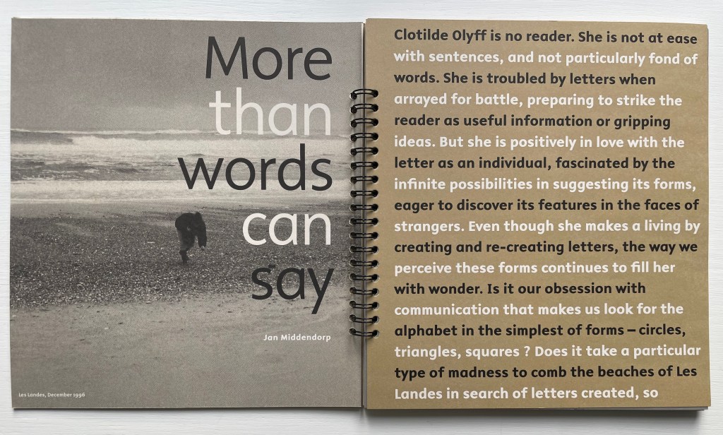
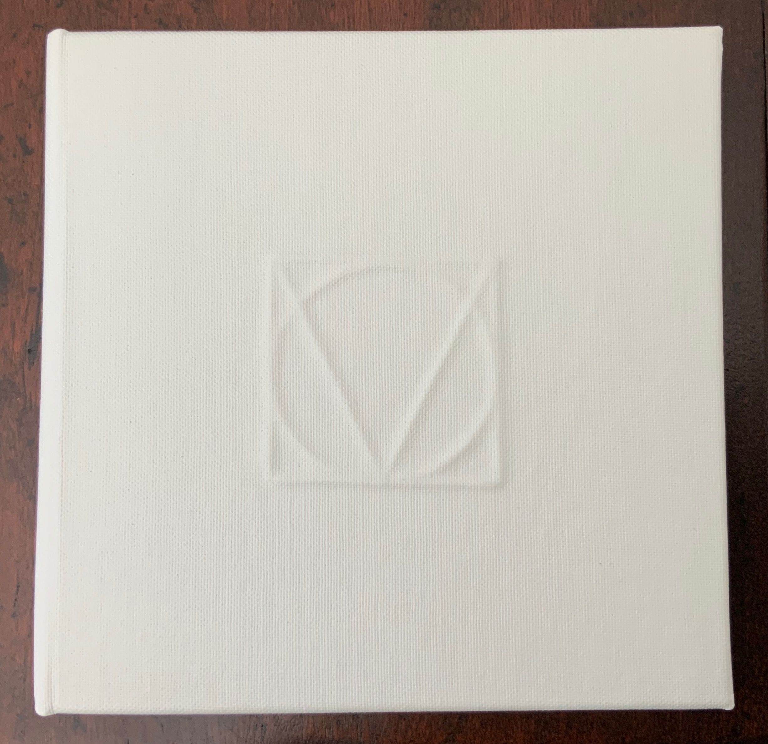
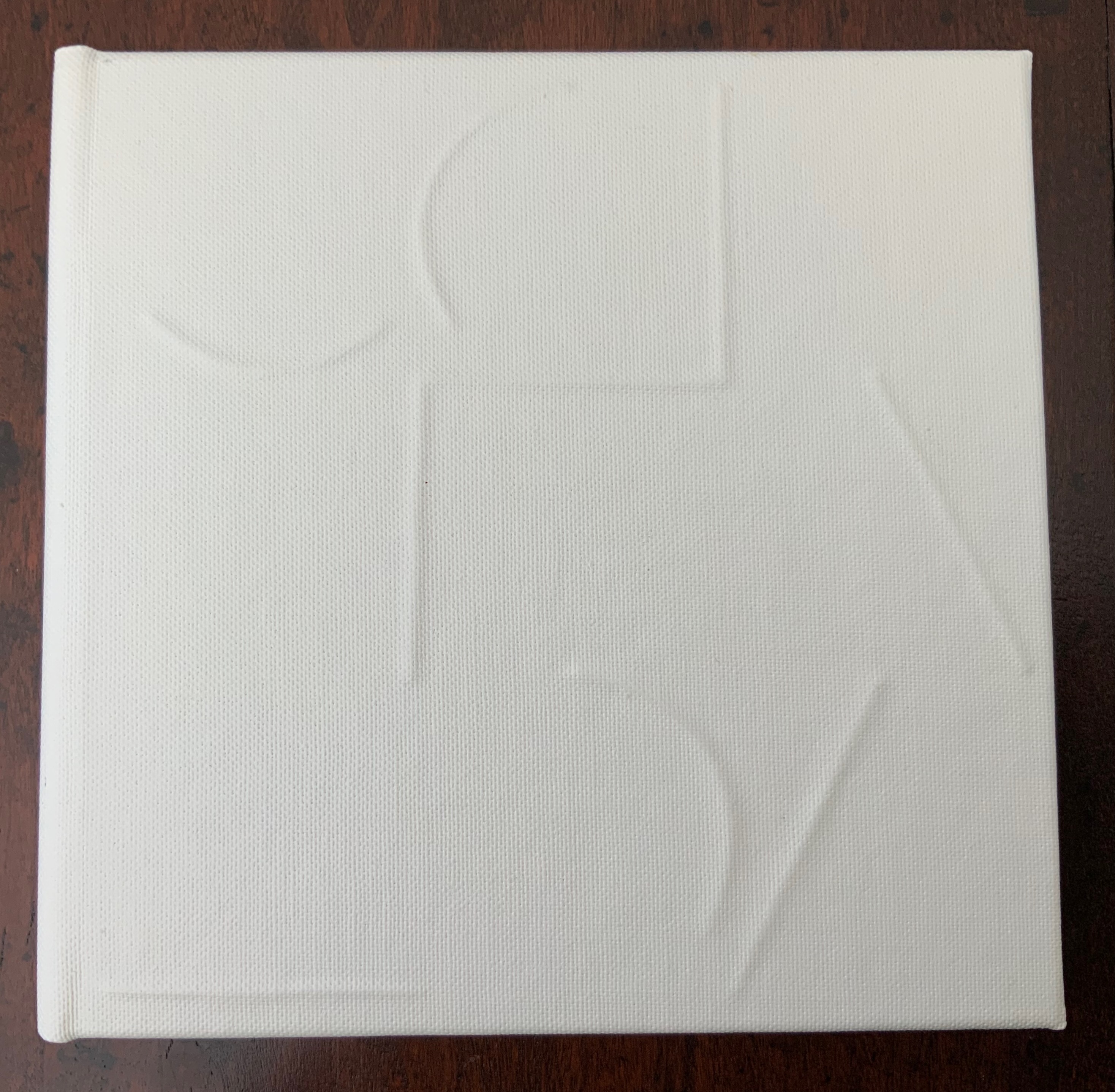
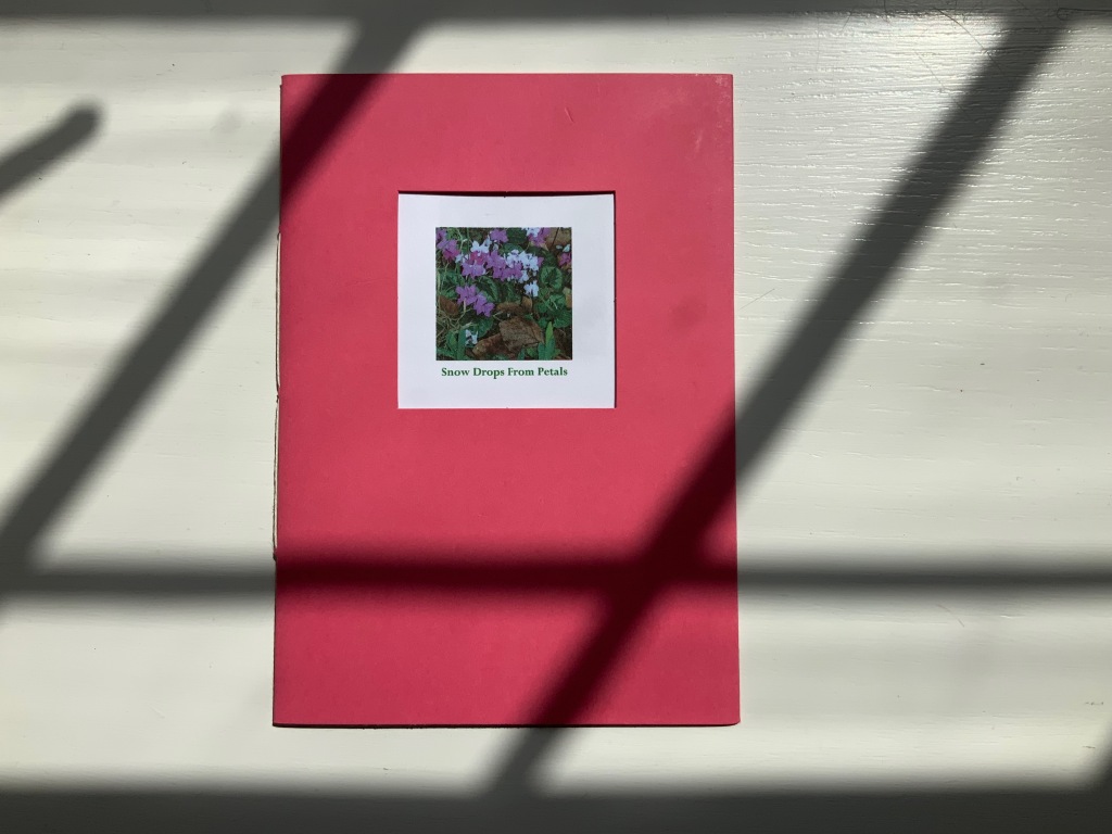
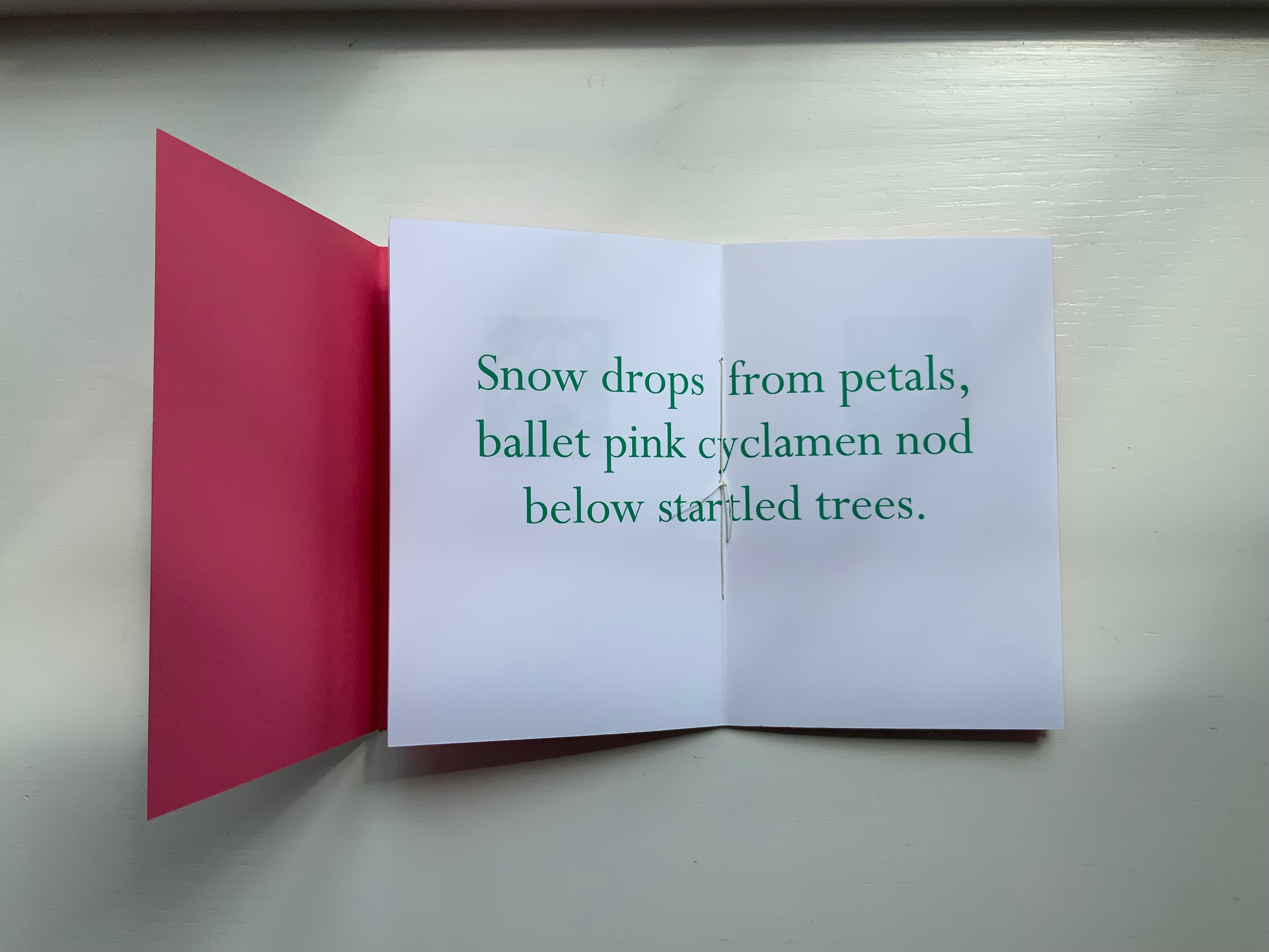
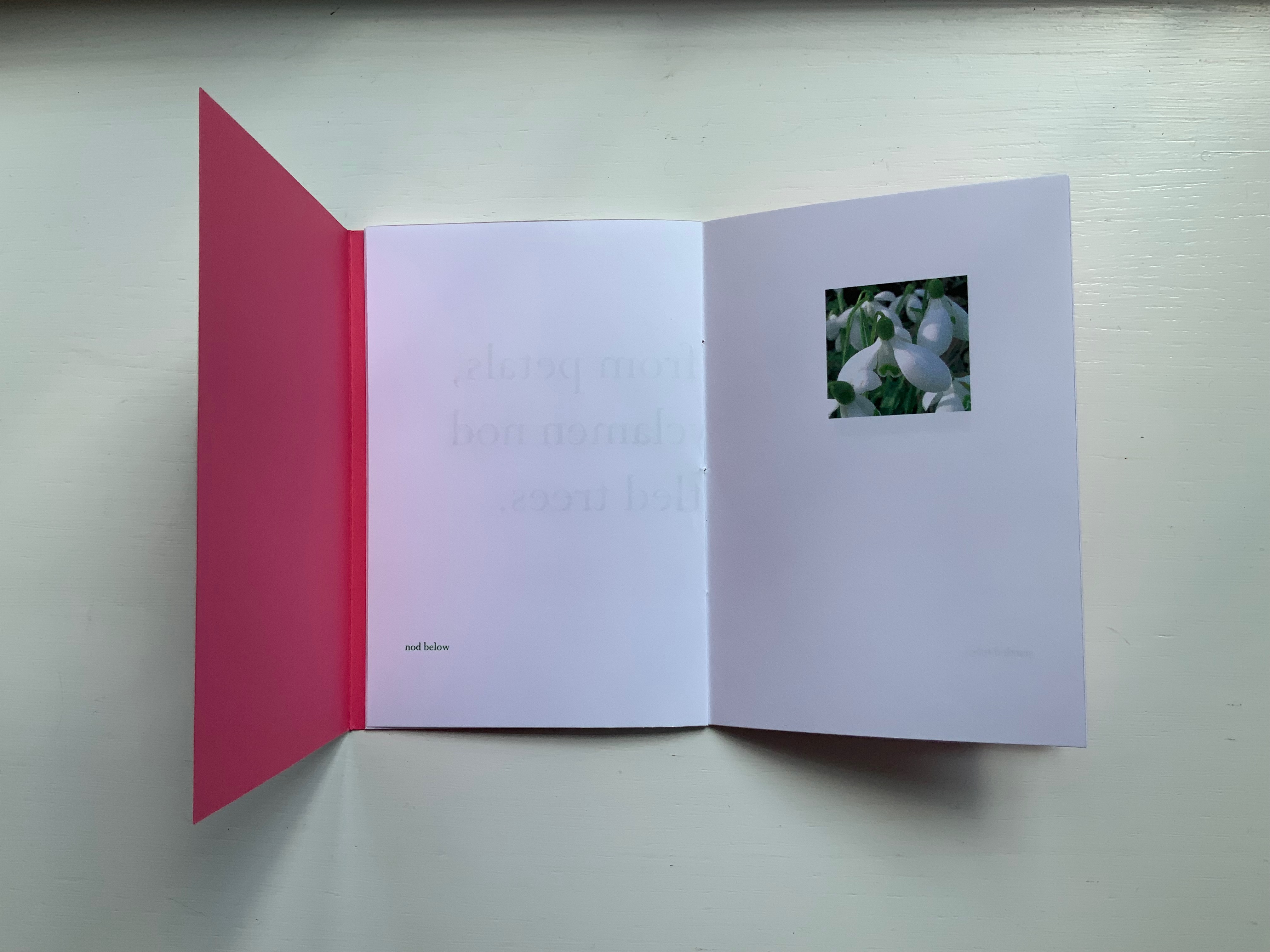
ABCing (2010)

ABCing: Seeing the Alphabet Differently
Colleen (Ellis) Comerford (2010)
Board book, illustrated paper-on-board cover. H160 x W160 mm. 66 pages. Acquired from Powell’s Bookstore, 29 June 2023.
Photos: Books On Books Collection. Displayed with artist’s permission.
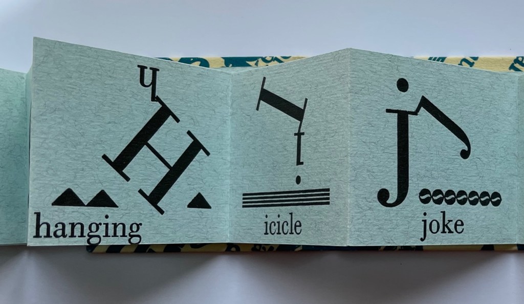
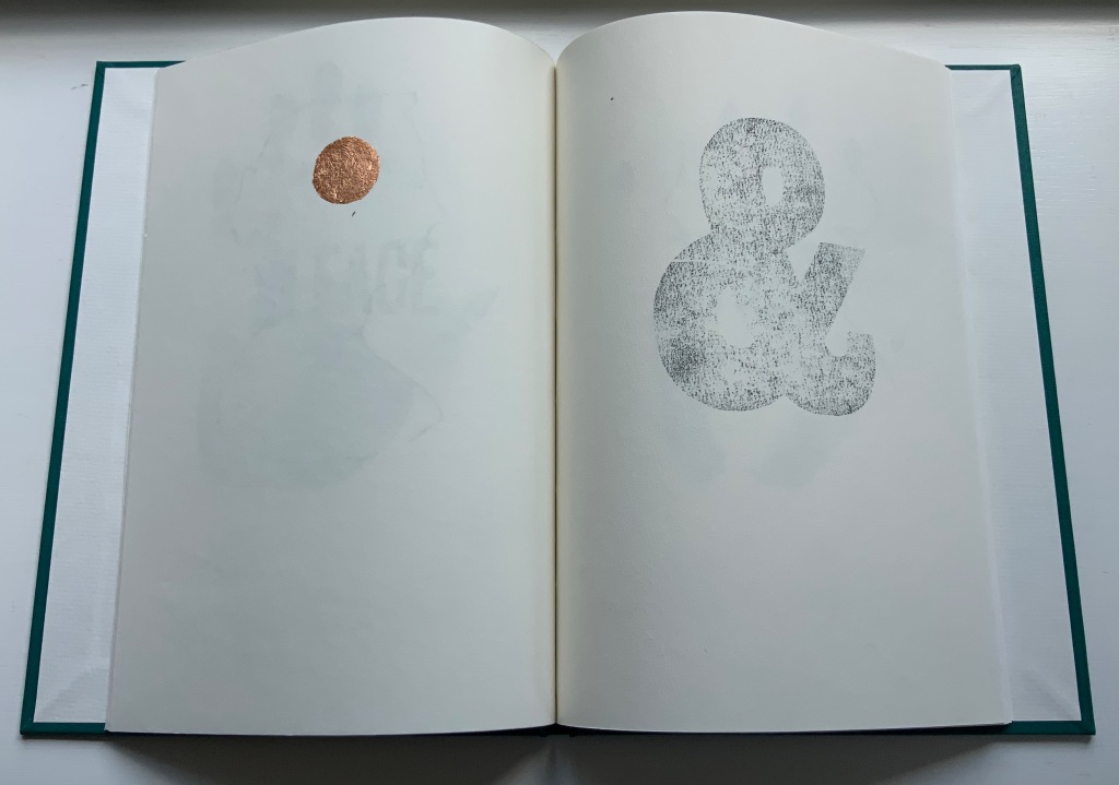
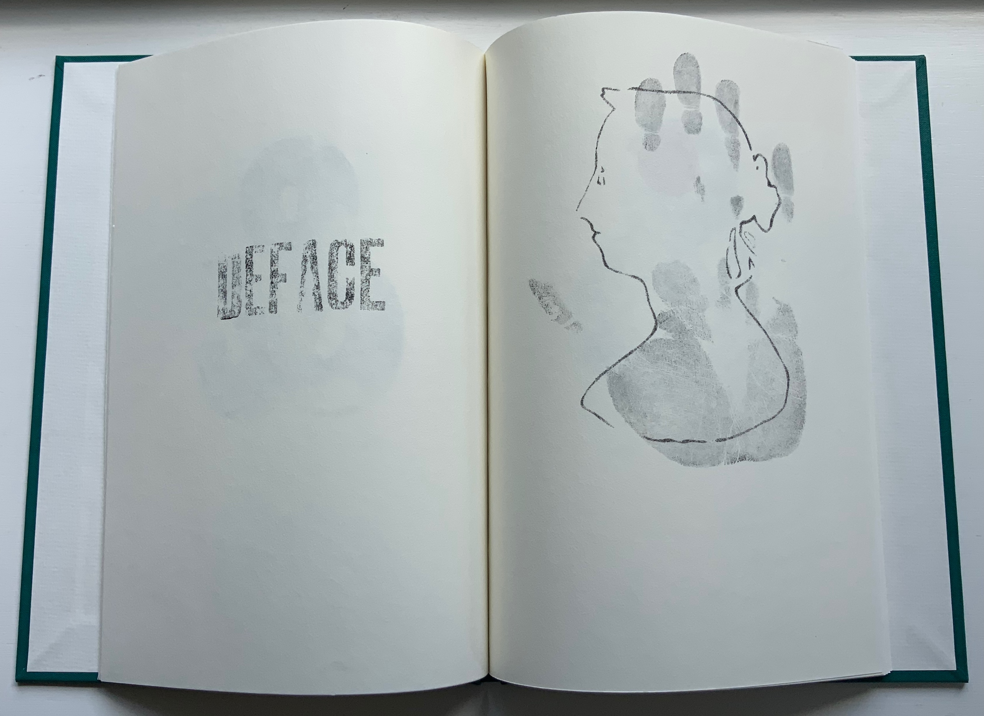
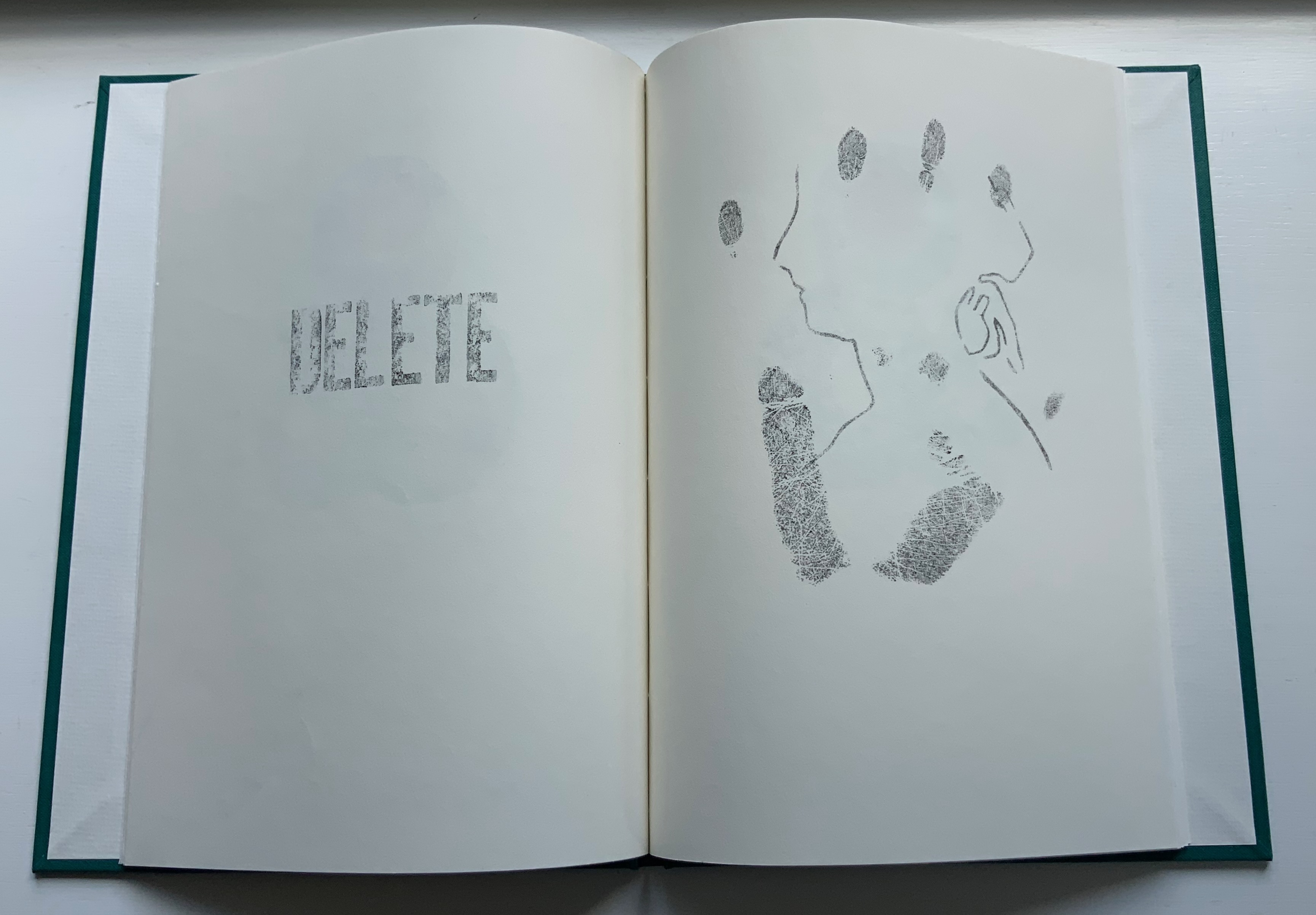
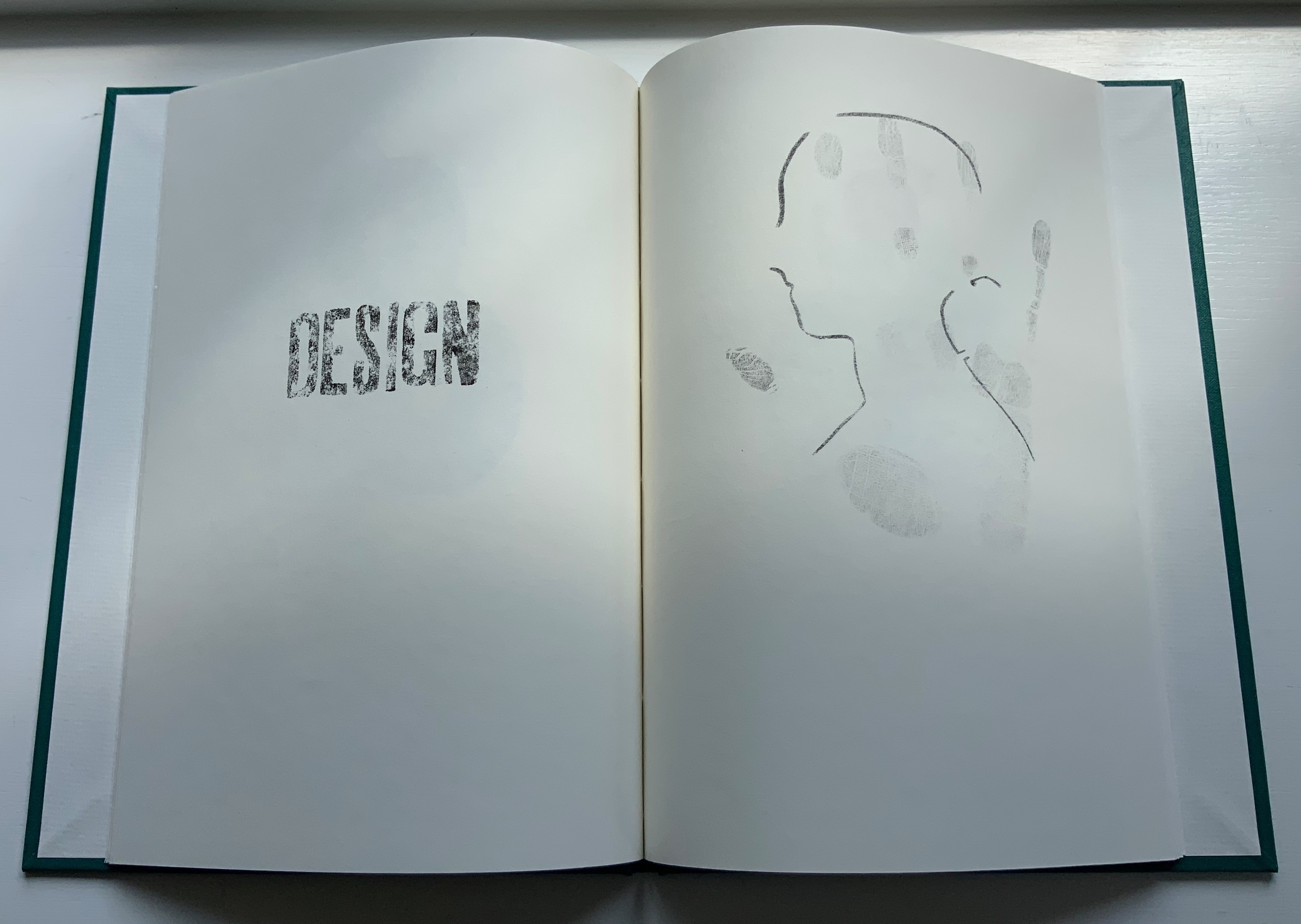
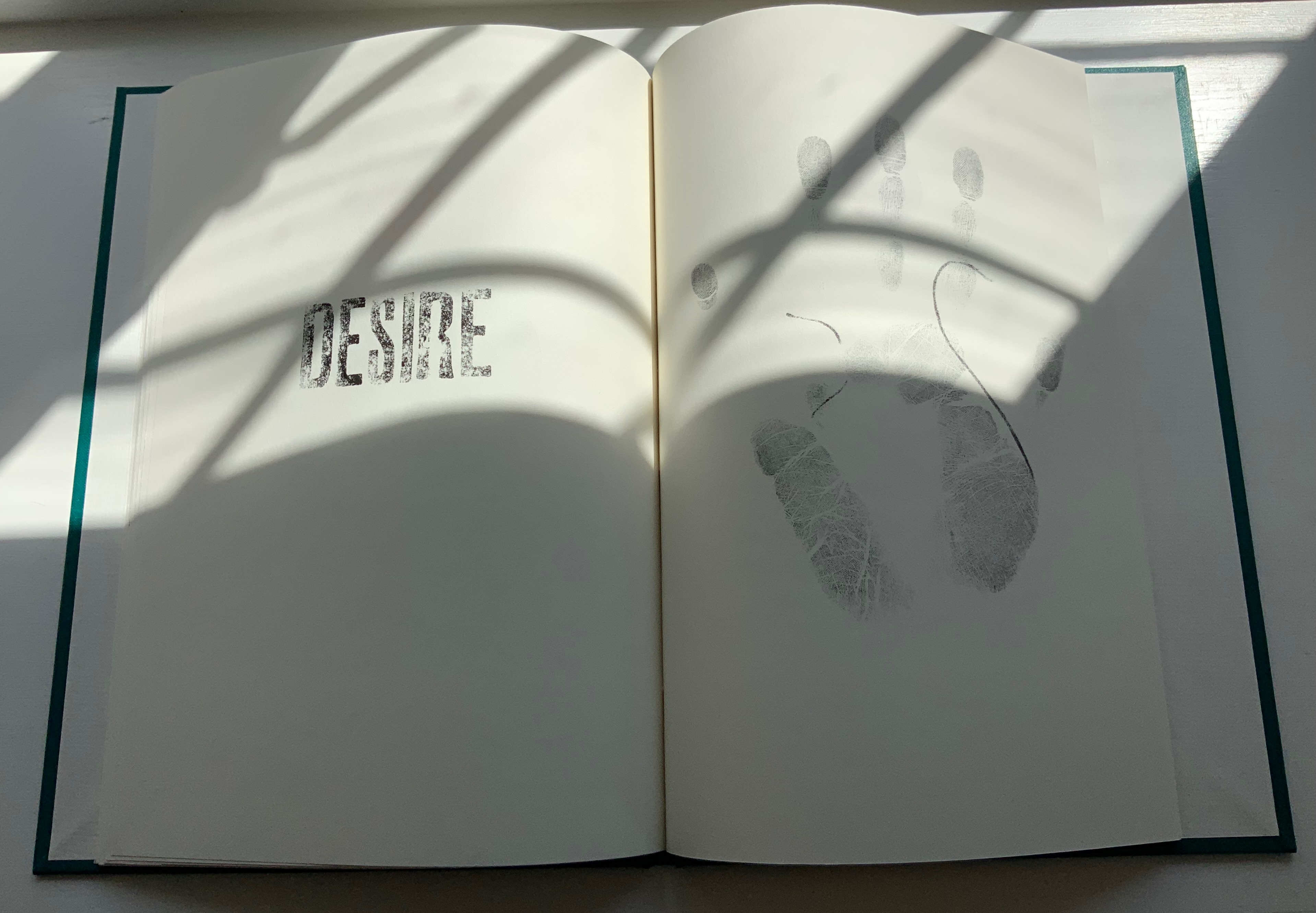
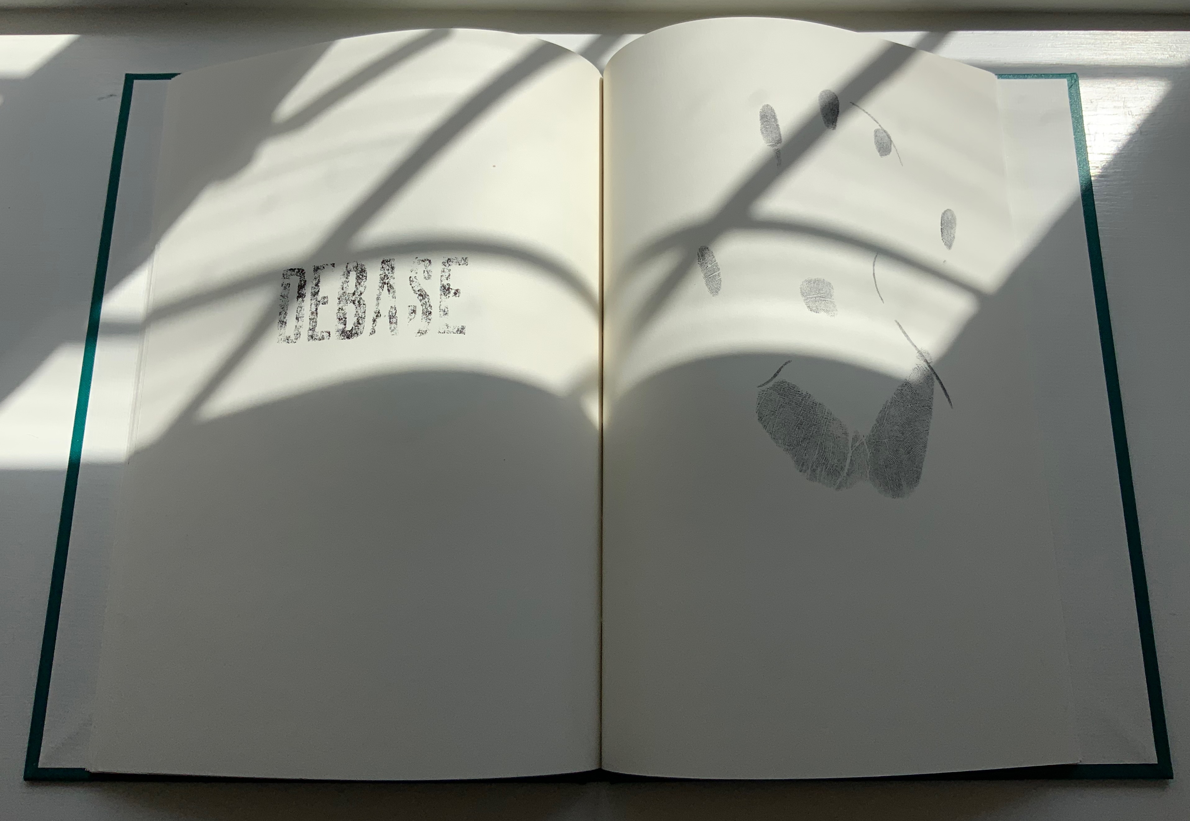
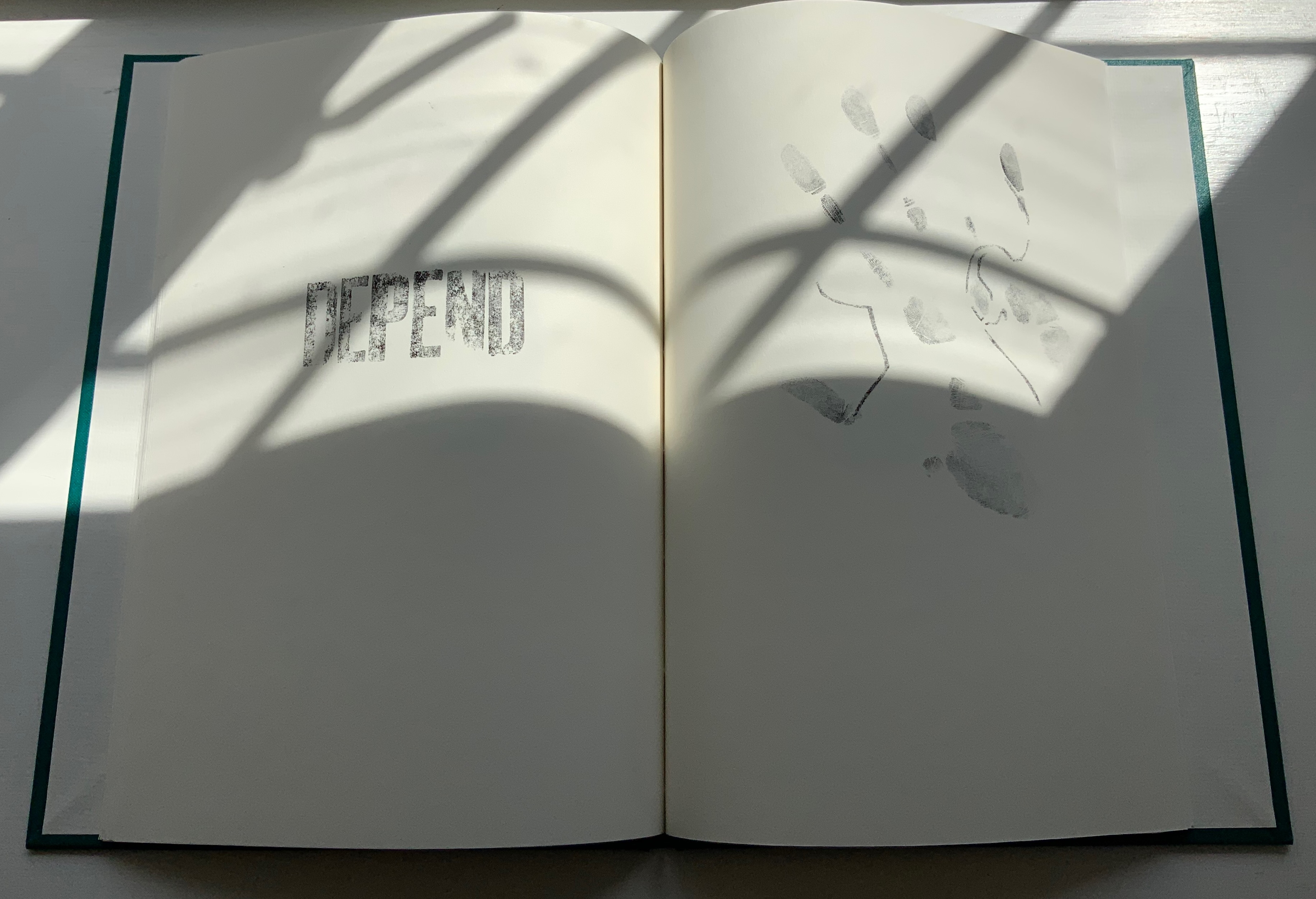
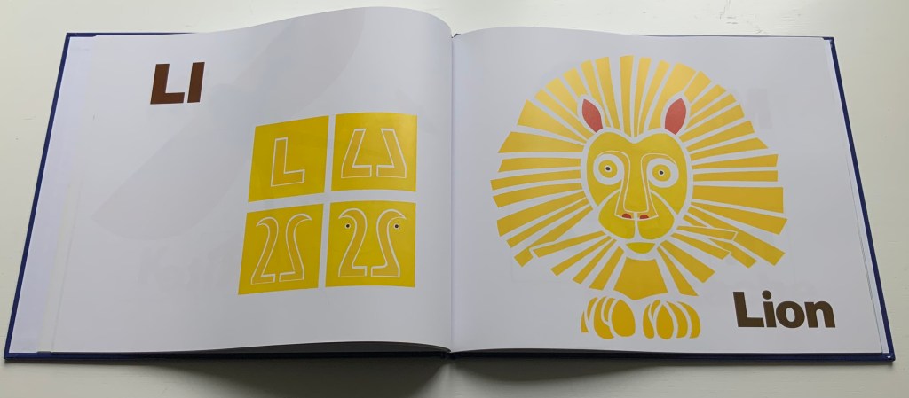
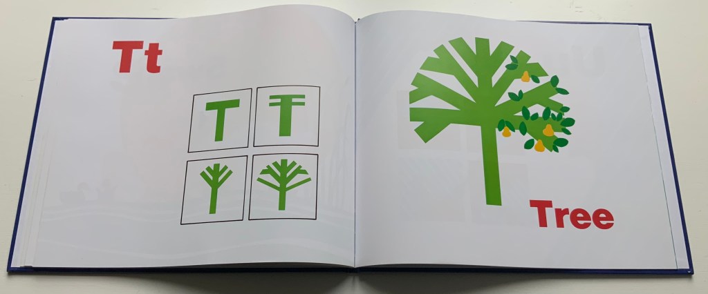
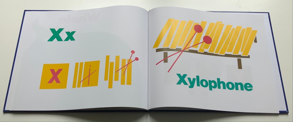
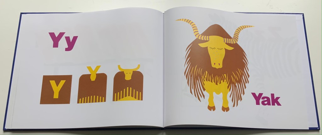
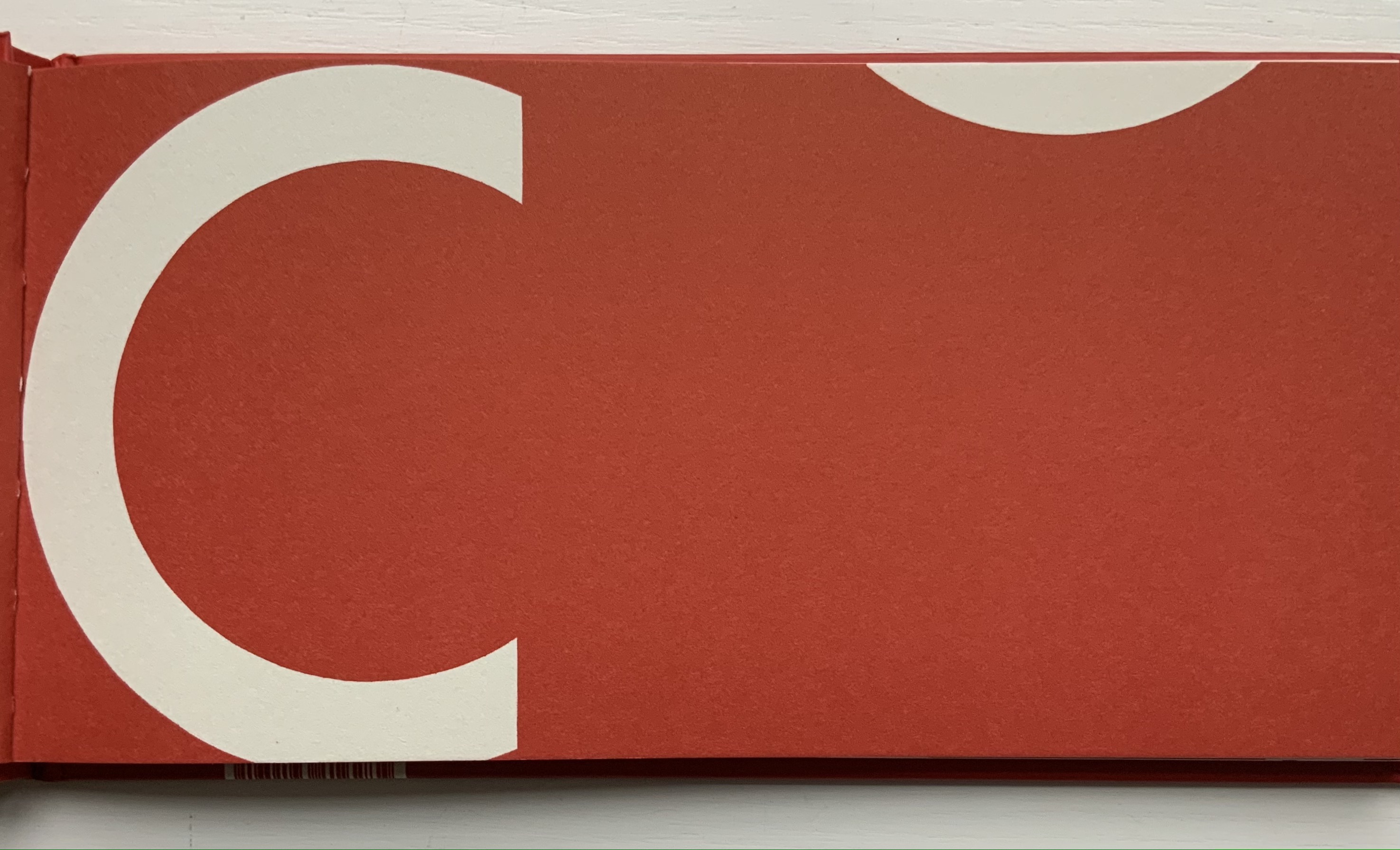
Presented by the publisher as a primer for designers and students, ABCing is also an artist’s book in its own right. Page after page, Colleen (Ellis) Comerford wields each alphabet character, the pages themselves, the shapes from the space around and within a letter, and bold colors alongside the most abstract concepts, their dictionary definitions and etymology like canvas, brush and paint, or block and chisel. She breaks off the negative space in and around a letter and resizes, reorients and recombines the pieces into an image that is a visual metaphor for the named concept beginning with the letter. Each spread is an epiphany.

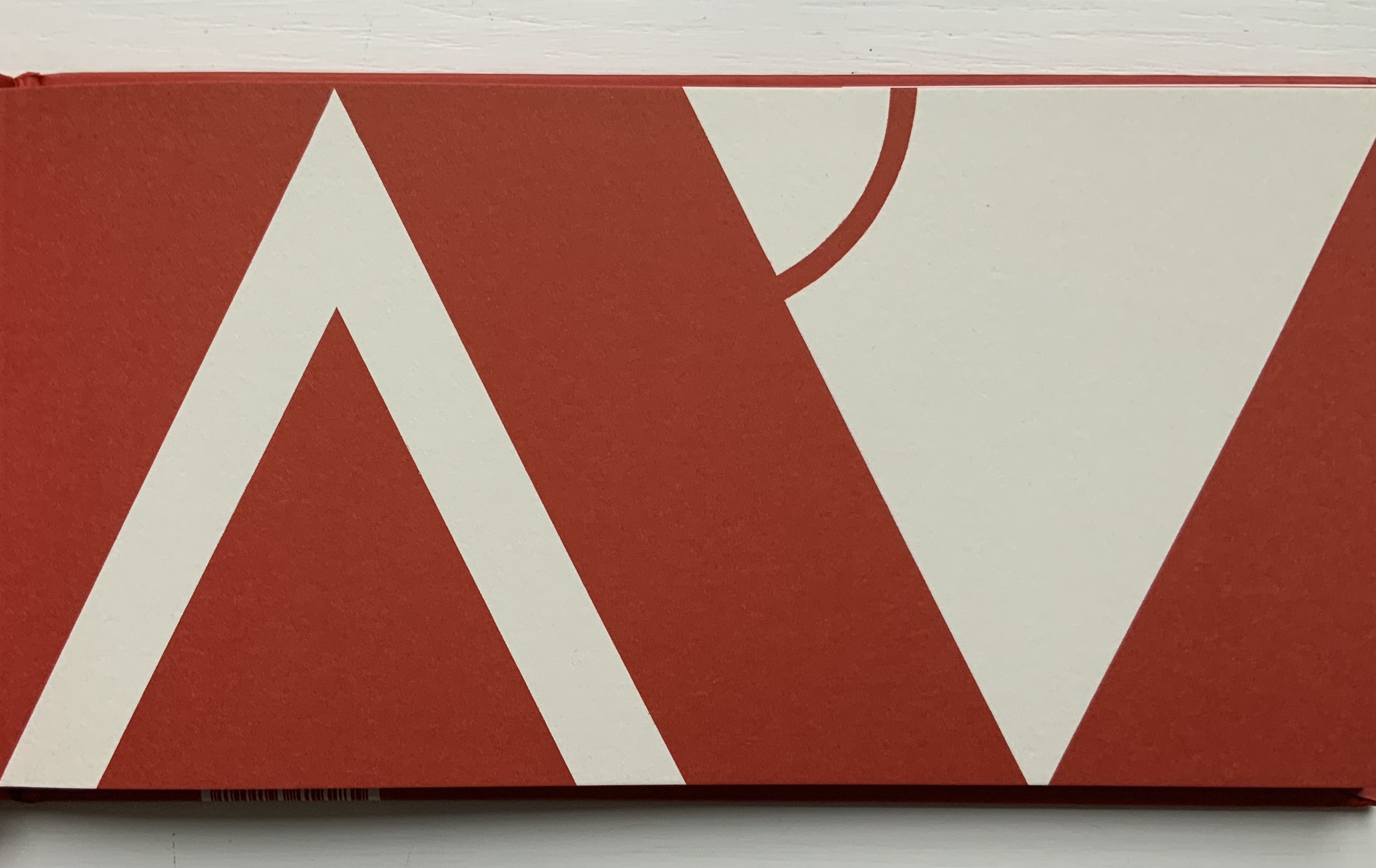
Sometimes the image represents an object that begins with the same letter as the concept. Consider for example the letter “m” (for metaphor). The artist repurposes the four shapes around the character on the left into a figure on the right that suggests “m is for moo” (or a Highland “koo”) in the analogous way that “a figure of speech in which one term is used to refer to something that it does not literally denote”.

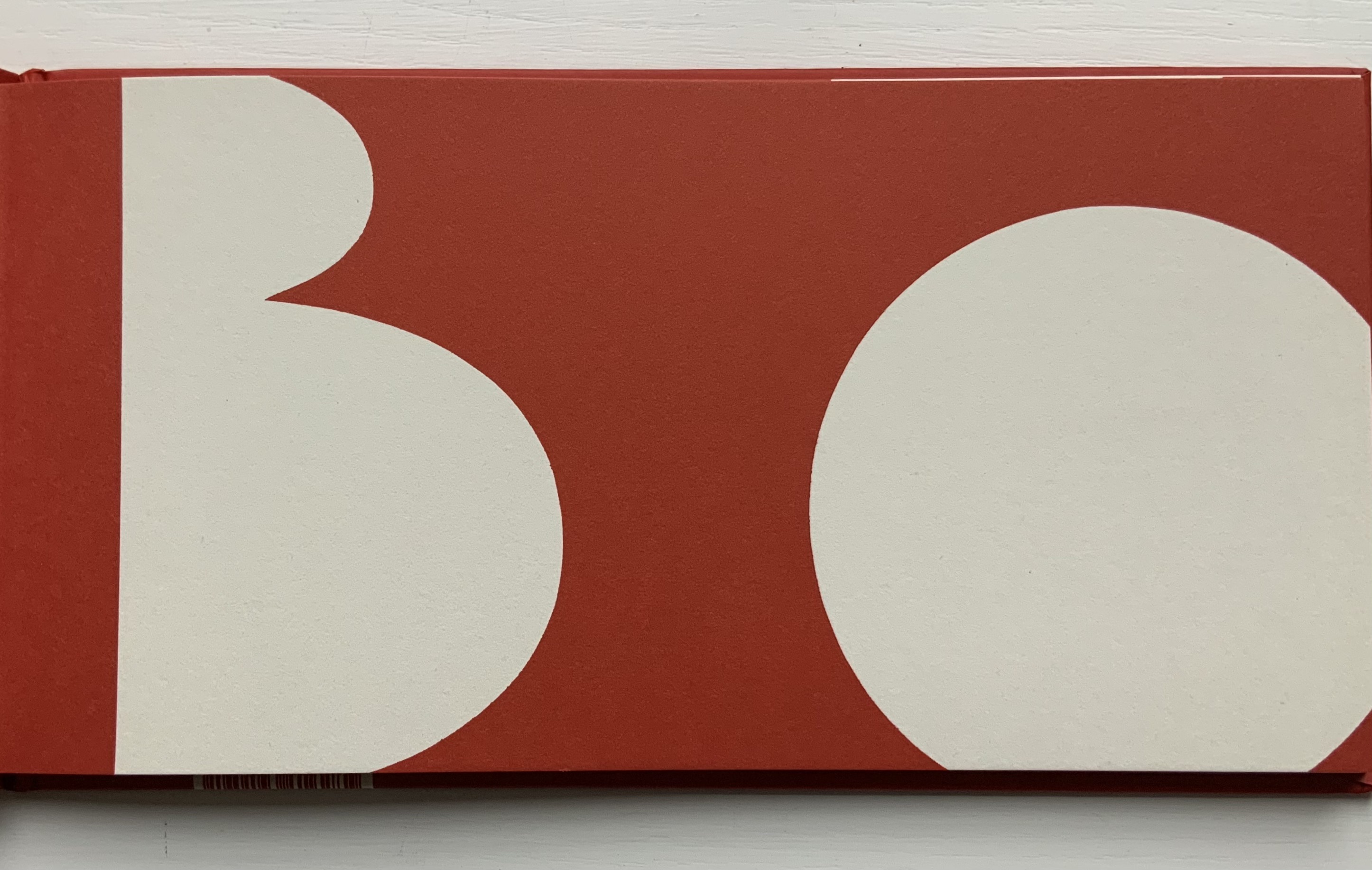
Sometimes the image enacts the concept, as with the letter “n” — appropriately so for the concept of negative space. Illustrating the “figure-ground relationship”, the large hump under the letter becomes the smallest of the three shapes and recedes into the background while the small triangle by the letter’s ear becomes the largest and foreground element of the image.

On more occasions, ABCing avails itself of the alphabet-art tradition of anthropomorphism. “Z for zeitgeist” is an almost Futurist reminder of how often artists have used the human body to form the letters of the alphabet. There’s a skateboarder, a clown, an oversized Sherlockian eye and magnifying glass, and an angry face made up of the bits from around the letter “t” for tone.


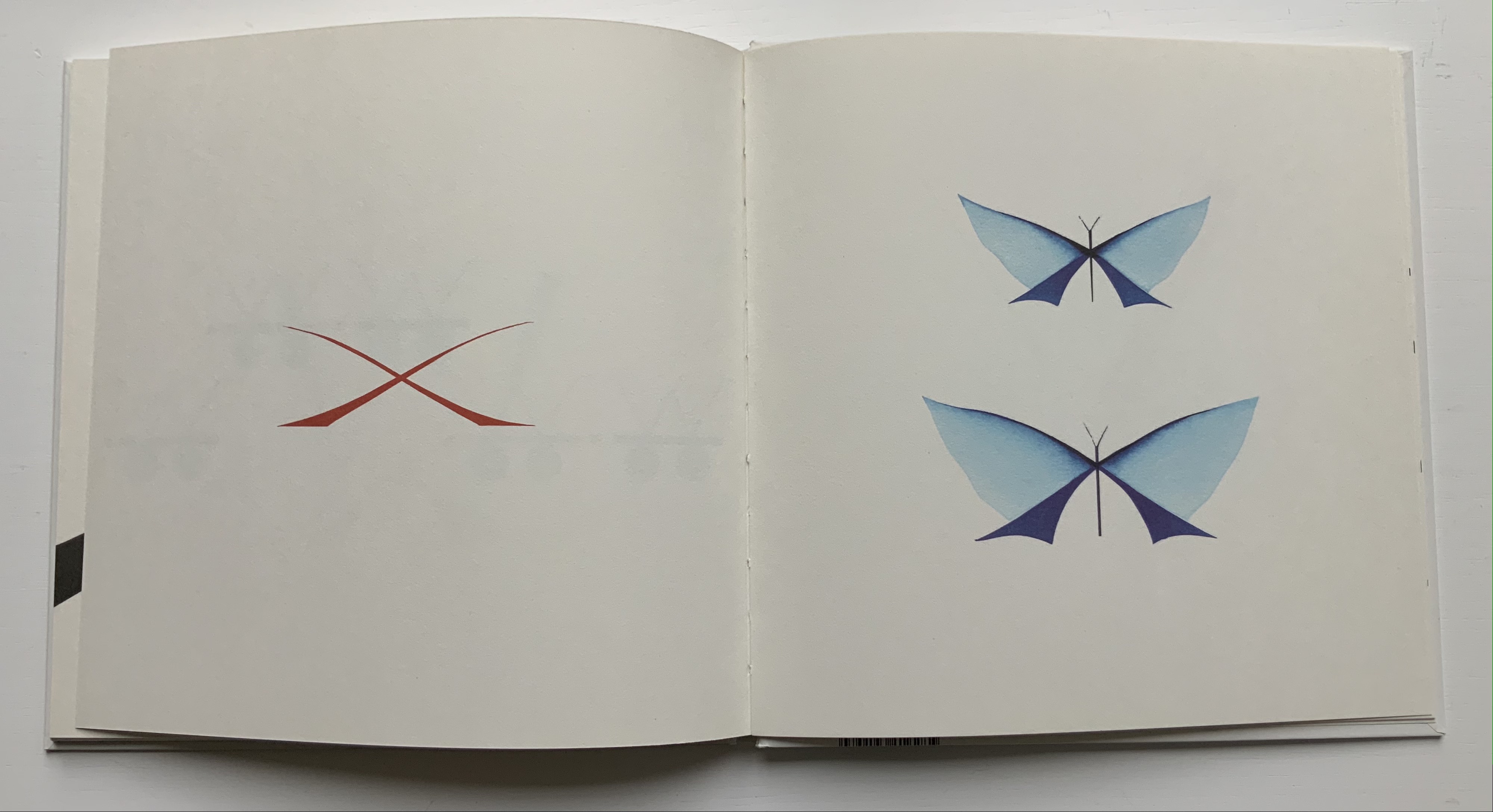
ABCing‘s letter “z”;
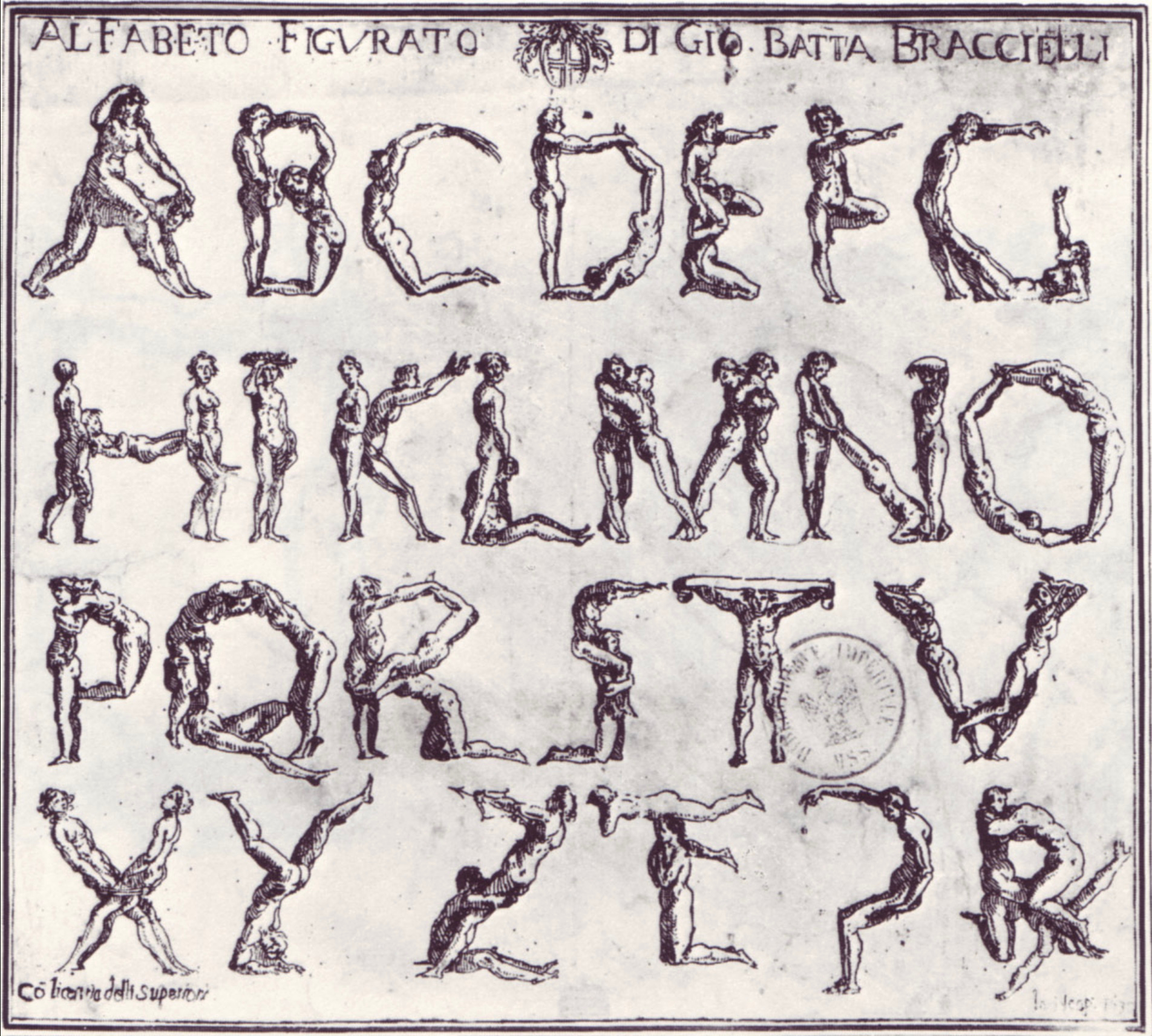
“Alfabeto figurato” (1632)
Giovanni Battista Braccelli Etching, Naples.
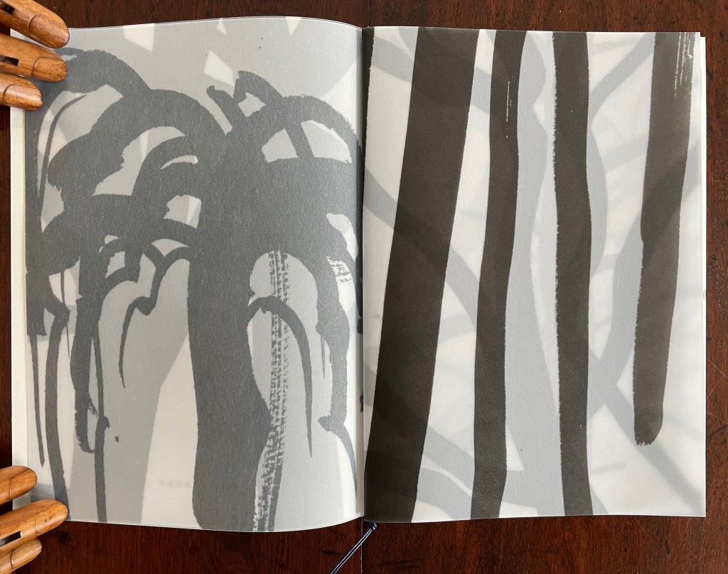
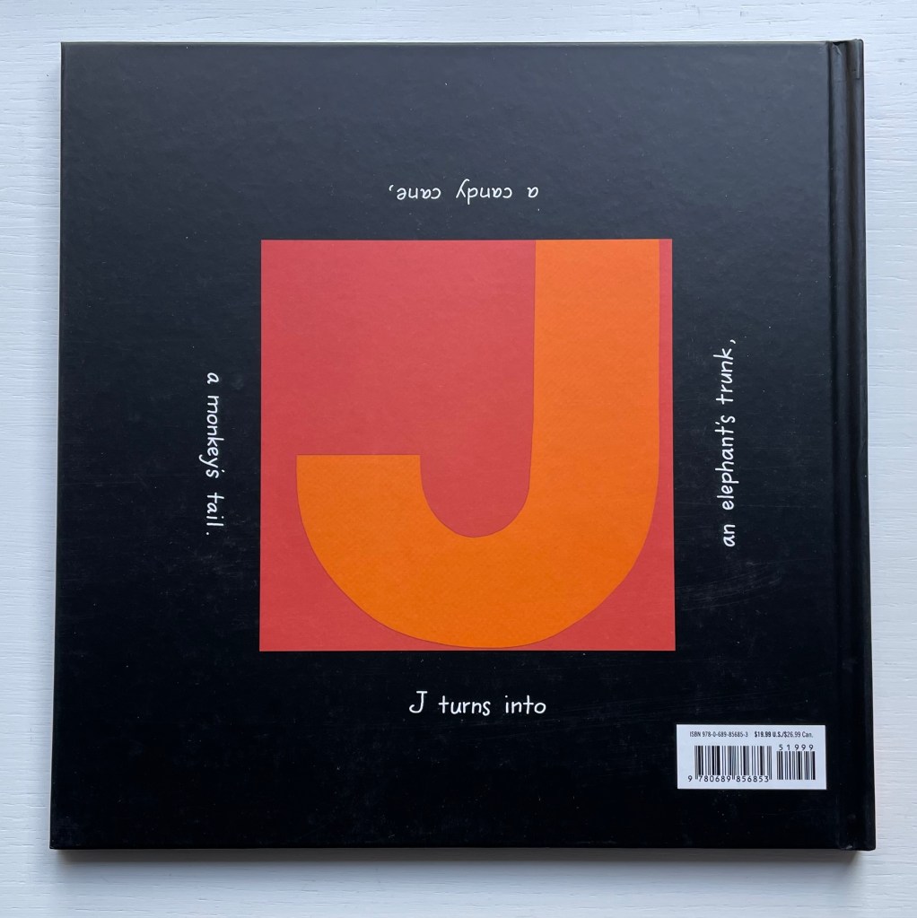
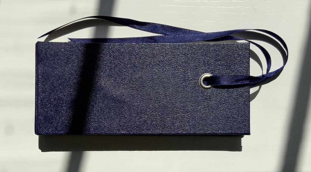
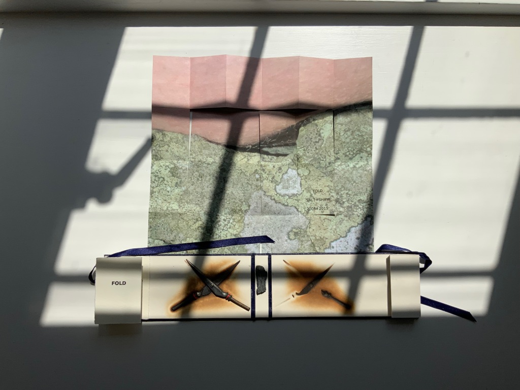
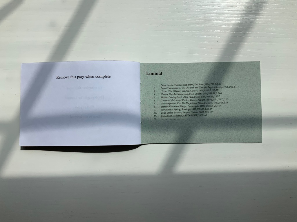
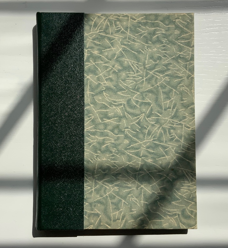
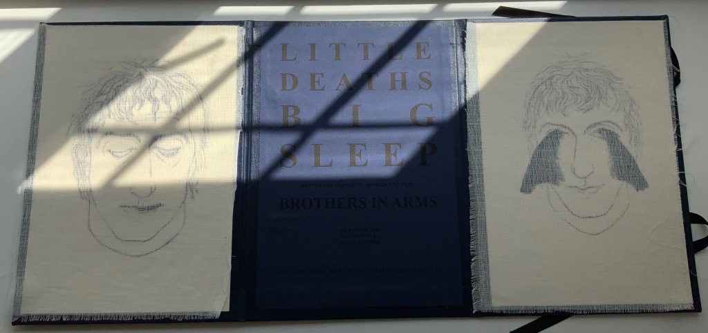
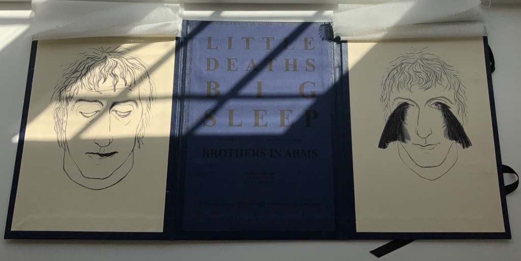
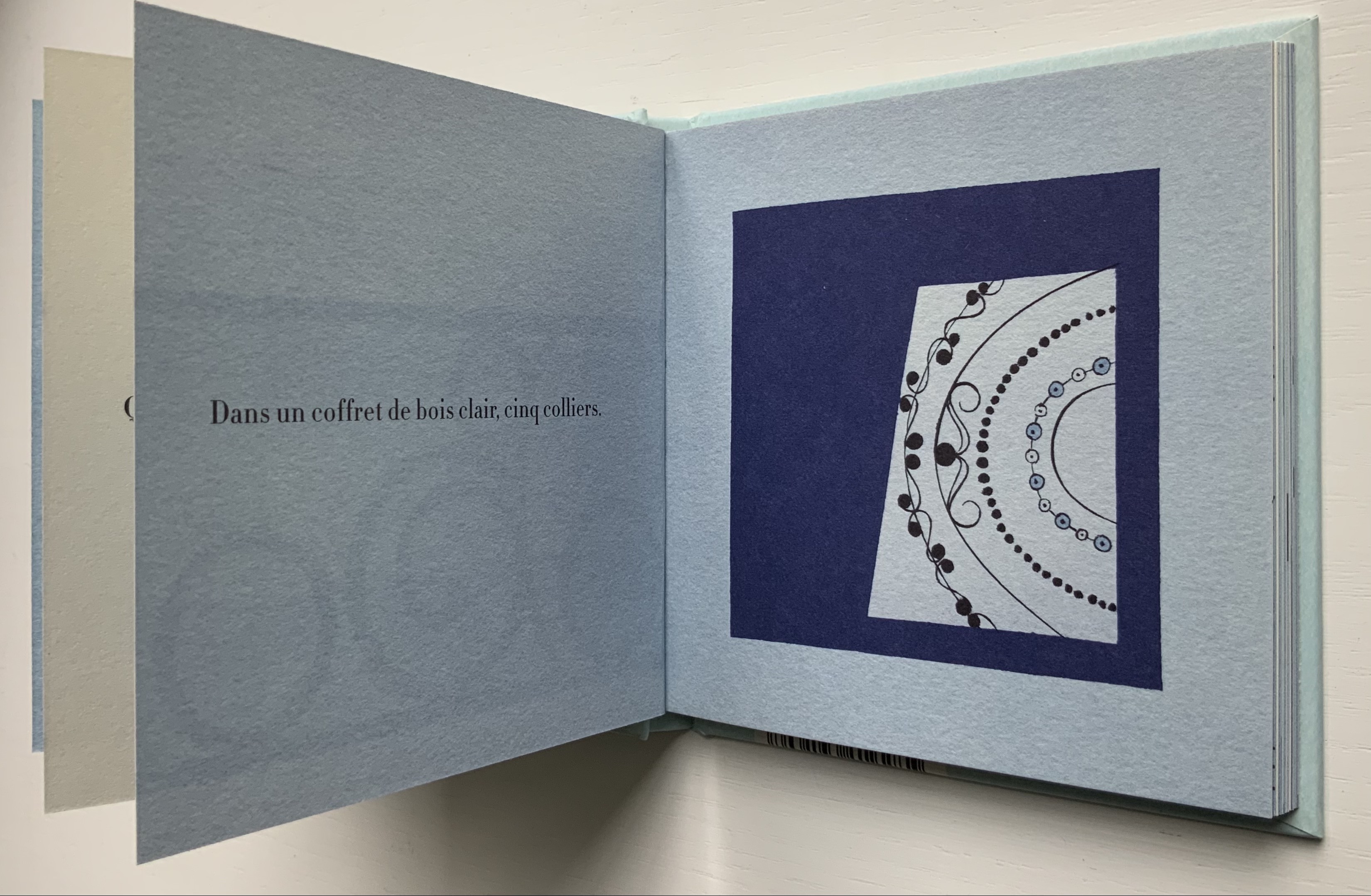
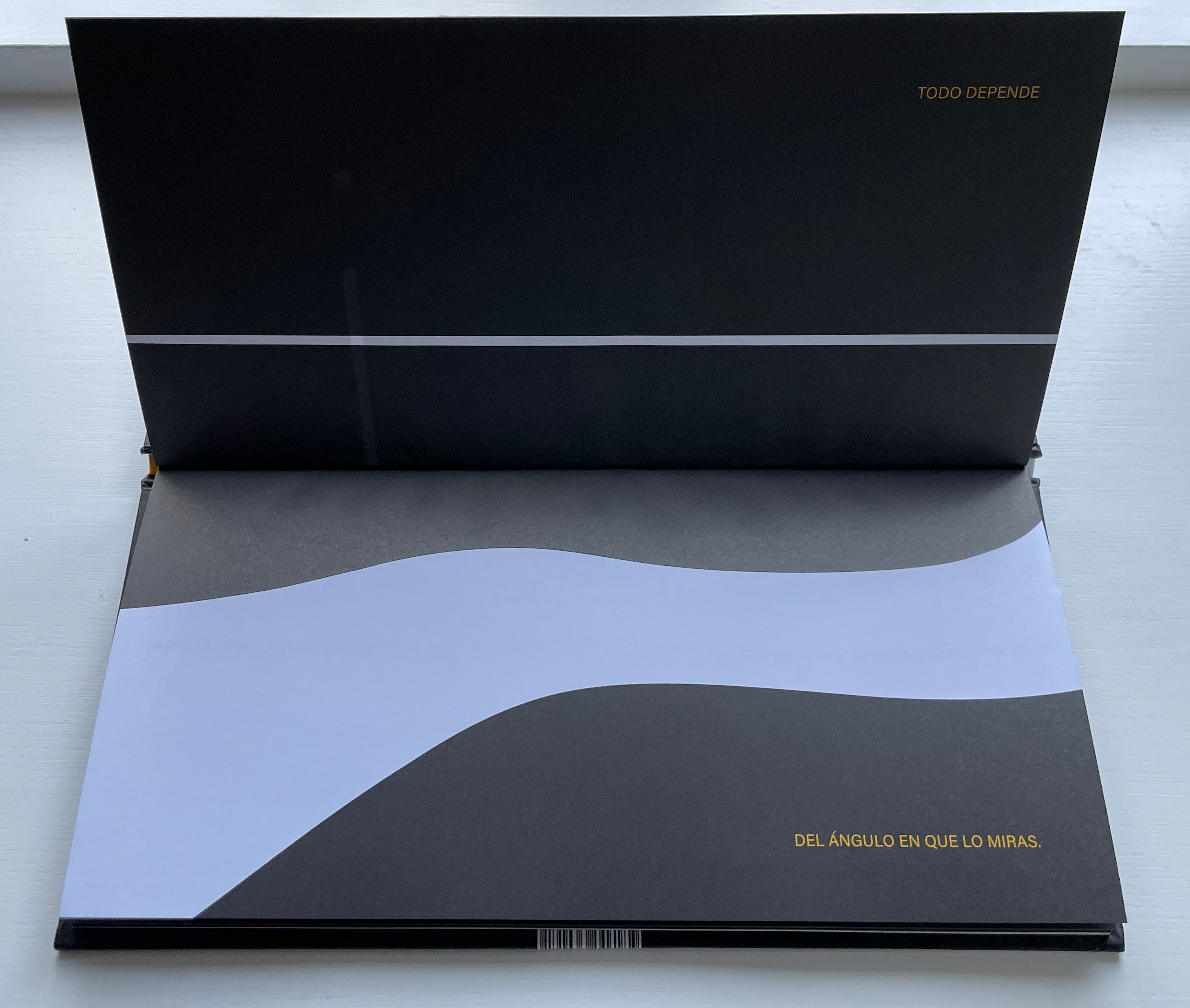
Love Letters: An Anthropomorphic Alphabet (2008)
Rowland Scherman
Casebound, doublures, perfect bound. H178 x W180 mm. 34 pages. Acquired from Rowland Scherman, 3 March 2023.
Photos of the book: Books On Books Collection. Displayed with permission of Rowland Scherman.
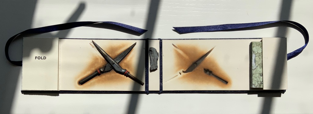
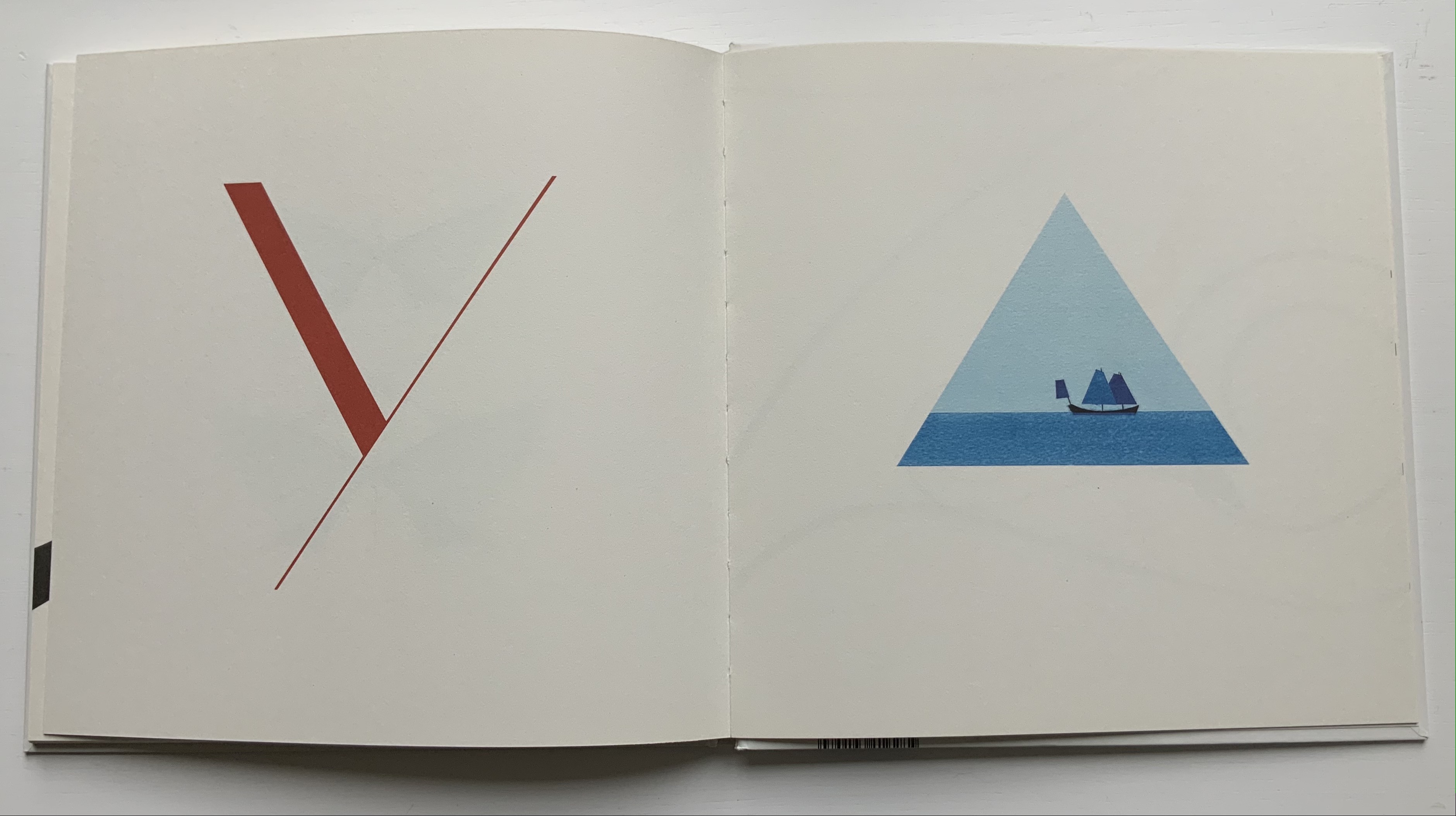
Most often the image is oblique. For instance, in “g” for ground, we have a boat sailing along the edge of the flat, enlarged triangle, taken from the space just before the ear of the “g”. As a large background in contrast with the small figure of the sailboat, it does illustrate the concept, but the figure and shape also allude to the flat-earth beliefs buried in “<Old English grund, ‘foundation, ground, surface of the earth’ < Proto-Germanic grundus“.

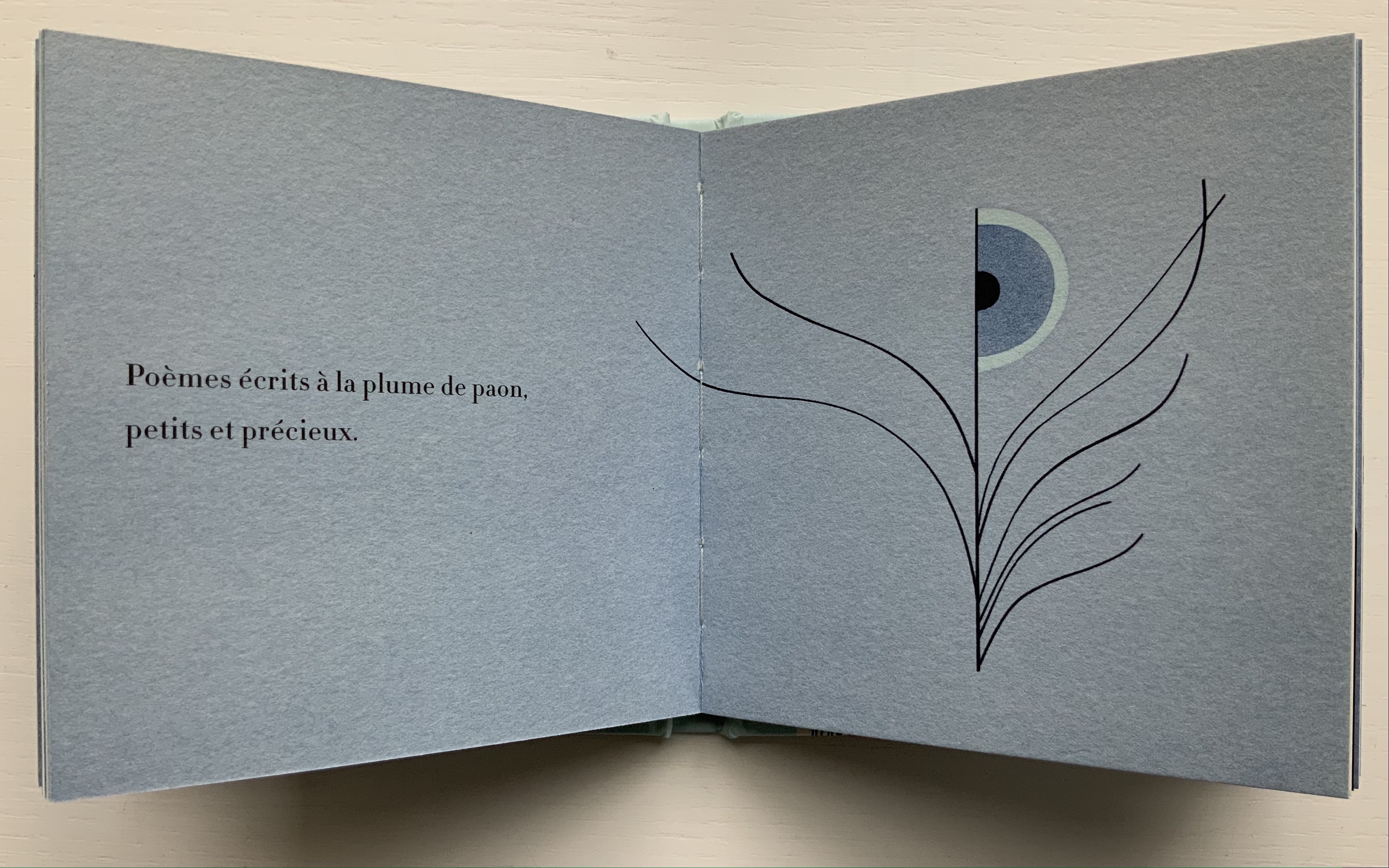
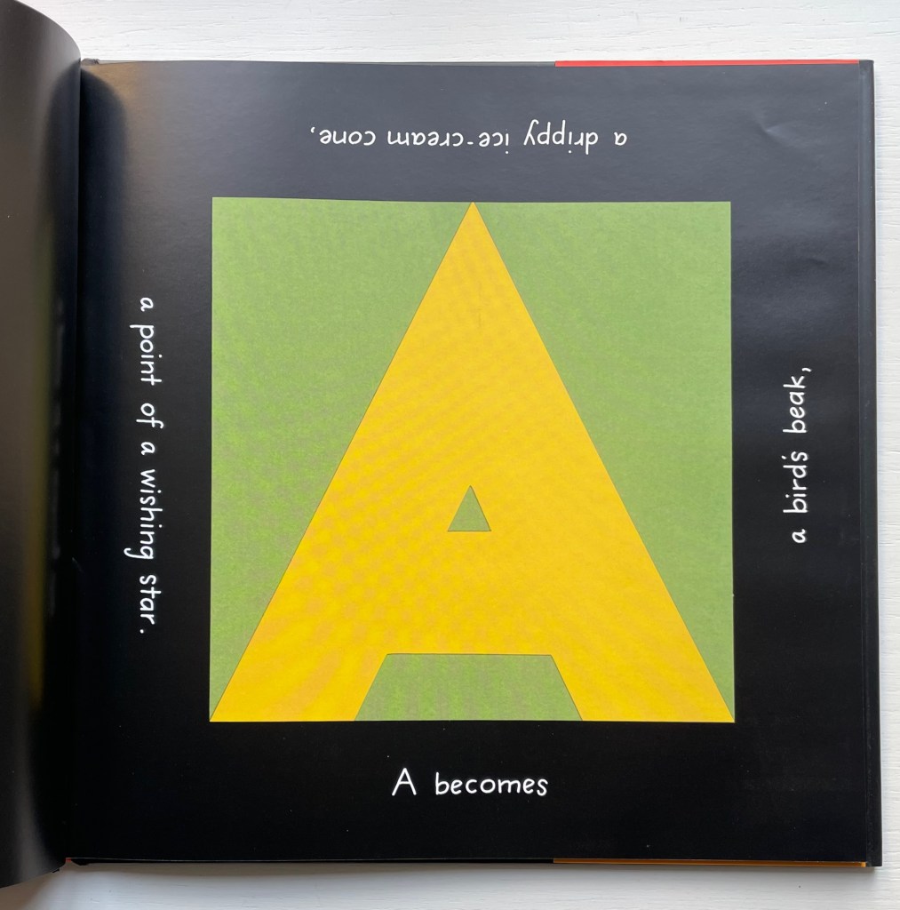
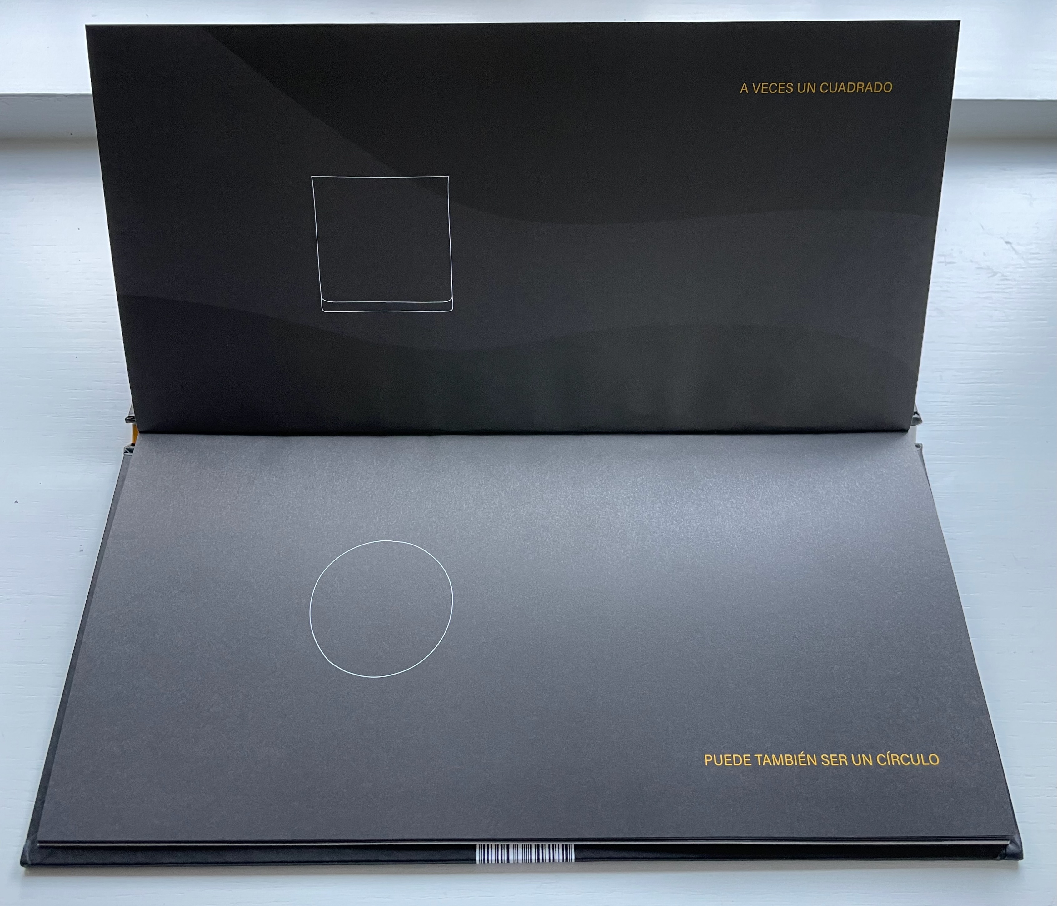
Others are less oblique: for example, “i” for imagination with the shapes from the negative space forming a snippet of cinema film; “p” for Polaris, with one piece being the star and rest the sea and sailboat; “r” for rhythm with pieces forming a bass drum pedal; “v” for variety with a multi-flavored ice-cream cone; and “x” for x-height with a caliper.
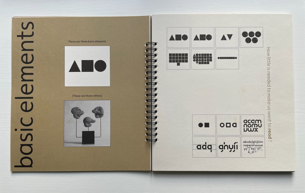
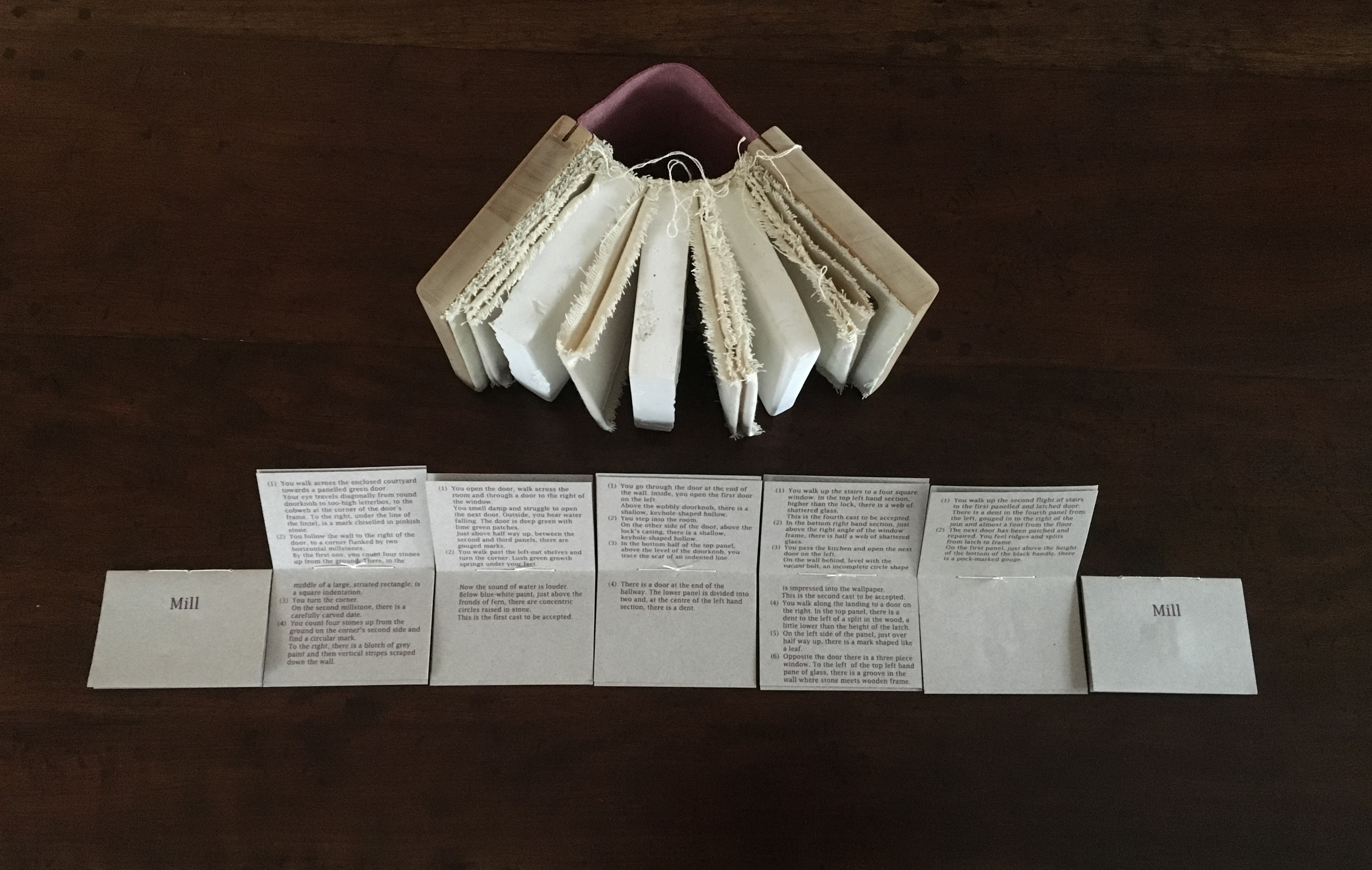
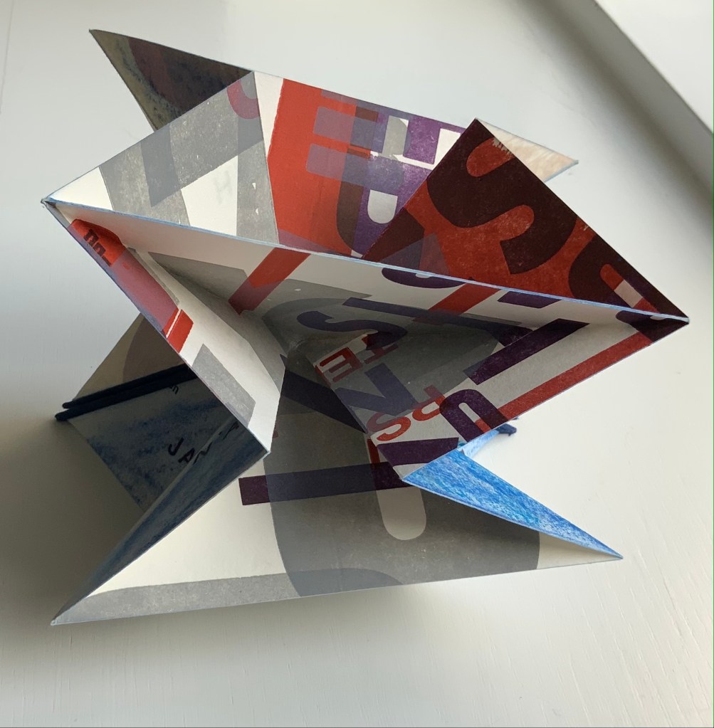
The alphabet and abstraction are, of course, deeply connected. In function, the letters are abstract signs representing sounds. In pictographic origins, they are abstract signs representing objects whose names begin with that sound (A for aleph, “ox”). In composition, just a small combination of strokes are abstraction enough to identify the letters themselves. Here are Bruno Munari and Lisa McGarry presenting that latter point in two very different ways.
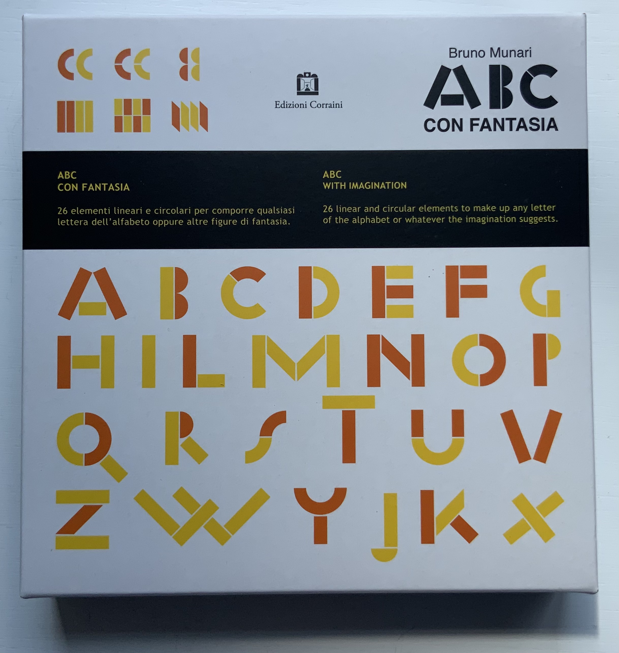

ABC con fantasia (2008)
Bruno Munari
Boxed set of shapes. H x W Acquired from Corraini Edizioni, 4 August 2020.
Photos of the work: Books On Books Collection. Displayed with permission of Corraini Edizioni. © Bruno Munari. All rights reserved to Maurizio Corraini s.r.l.

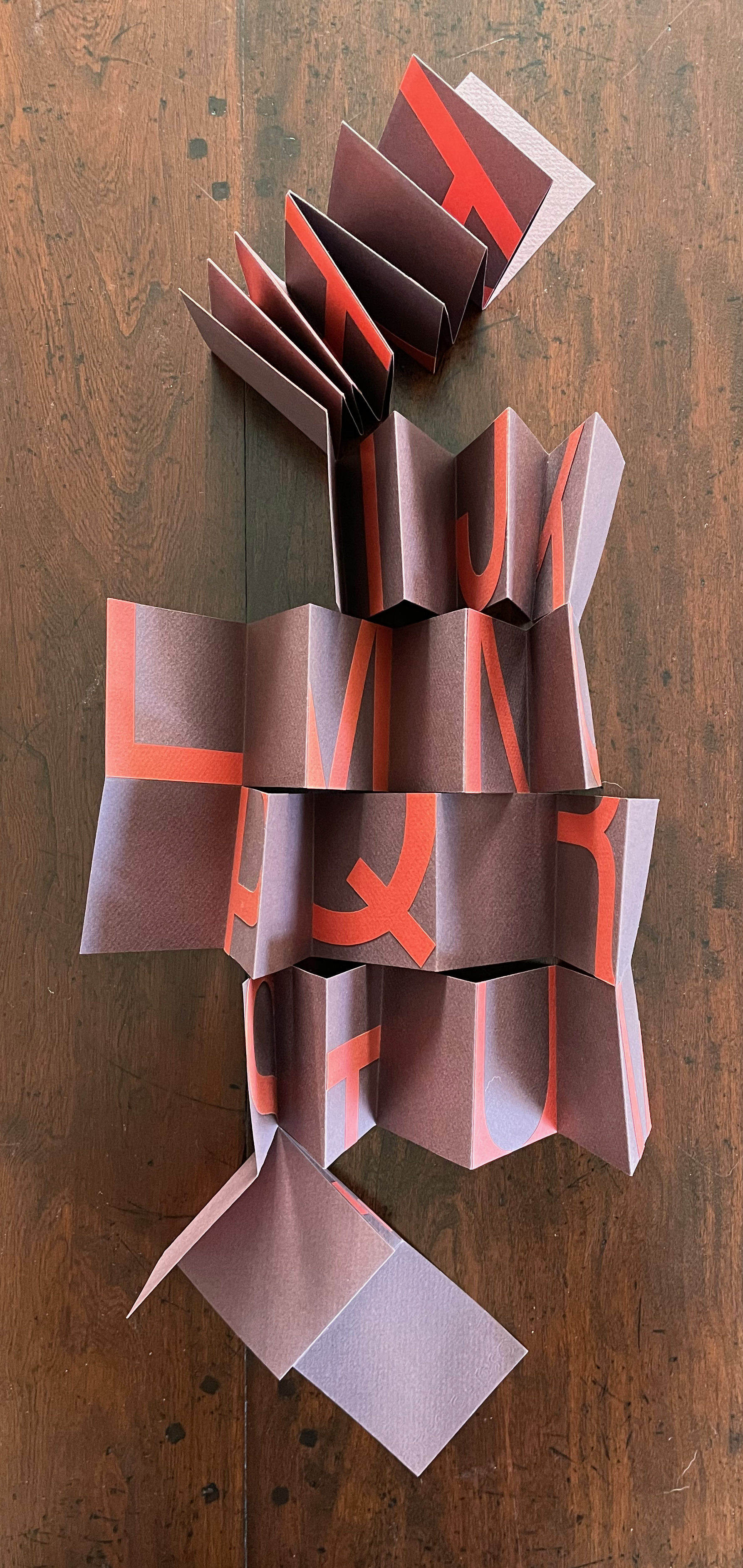

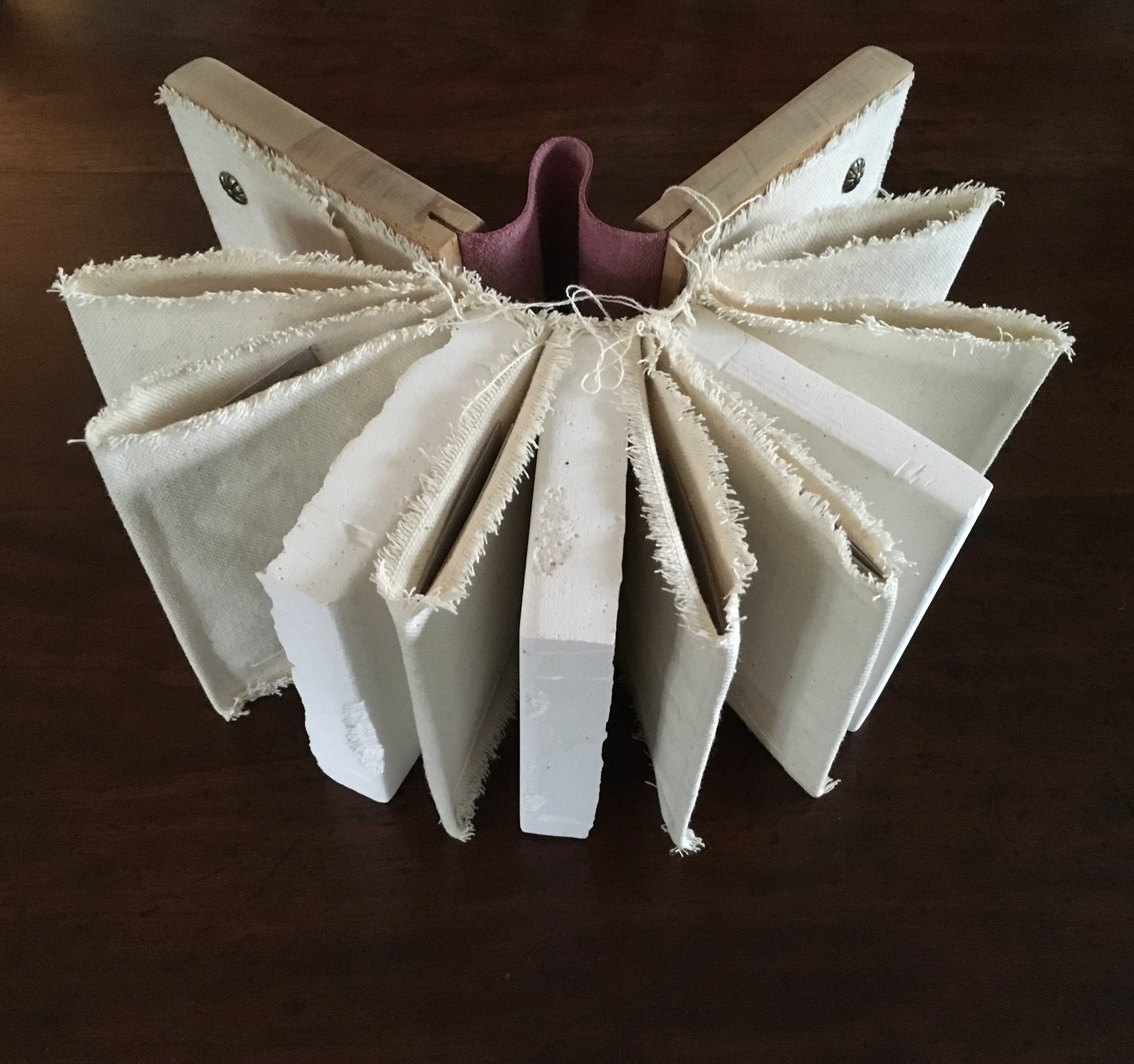
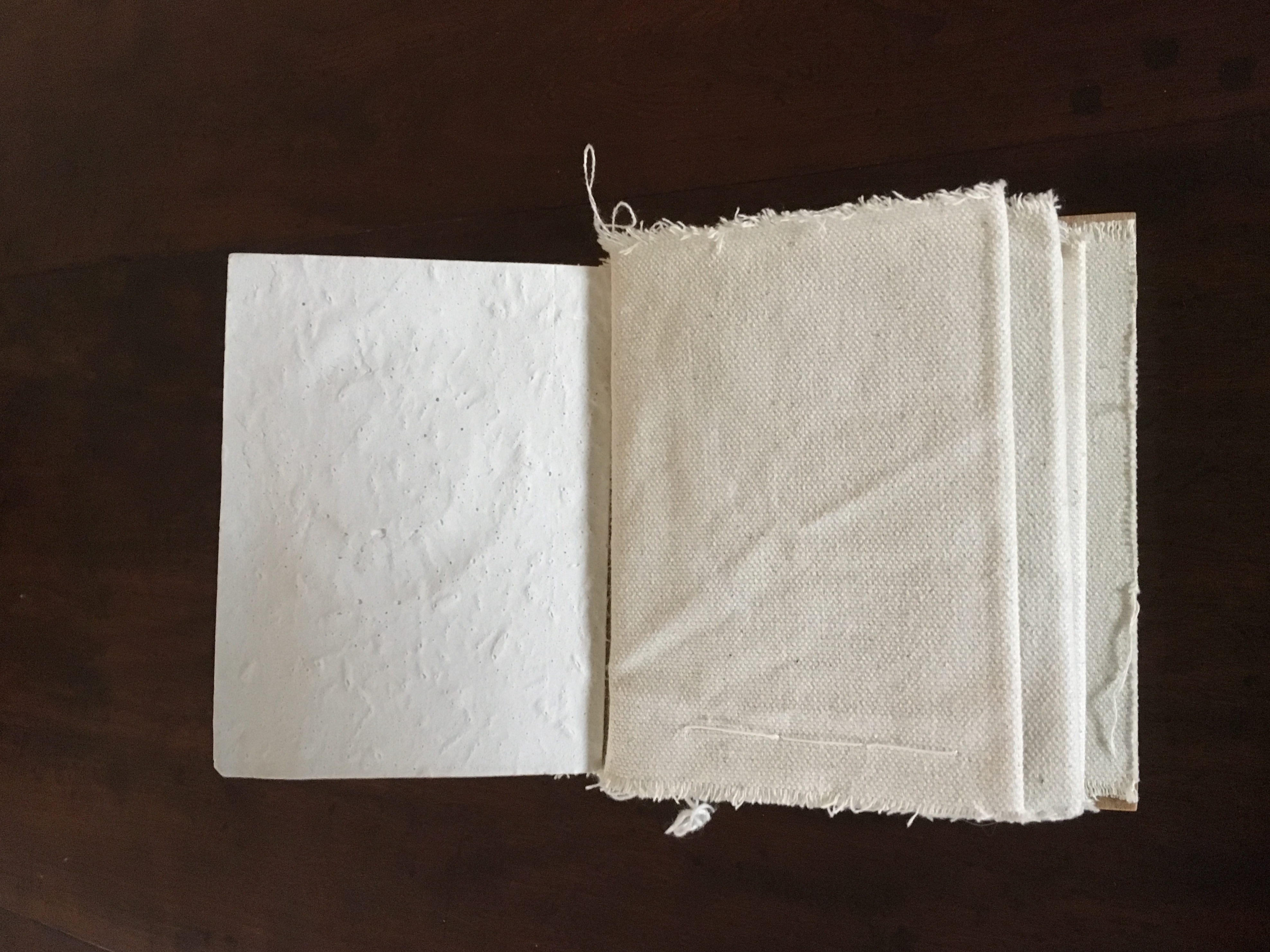
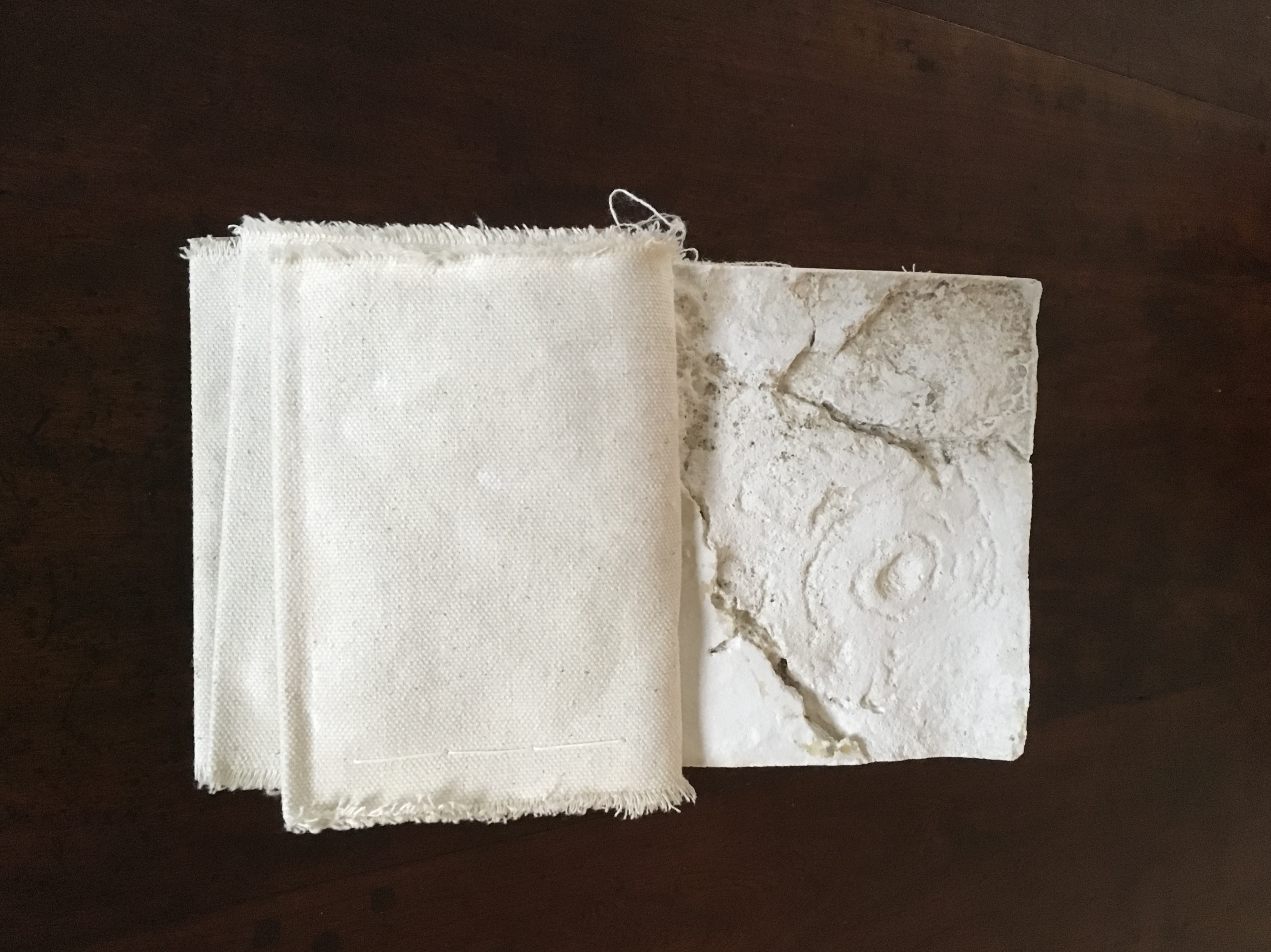
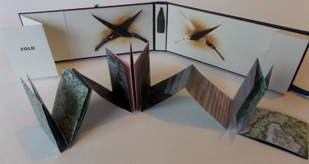
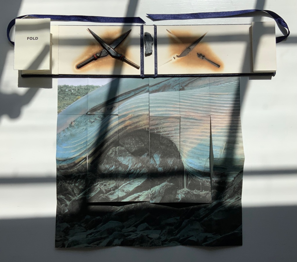
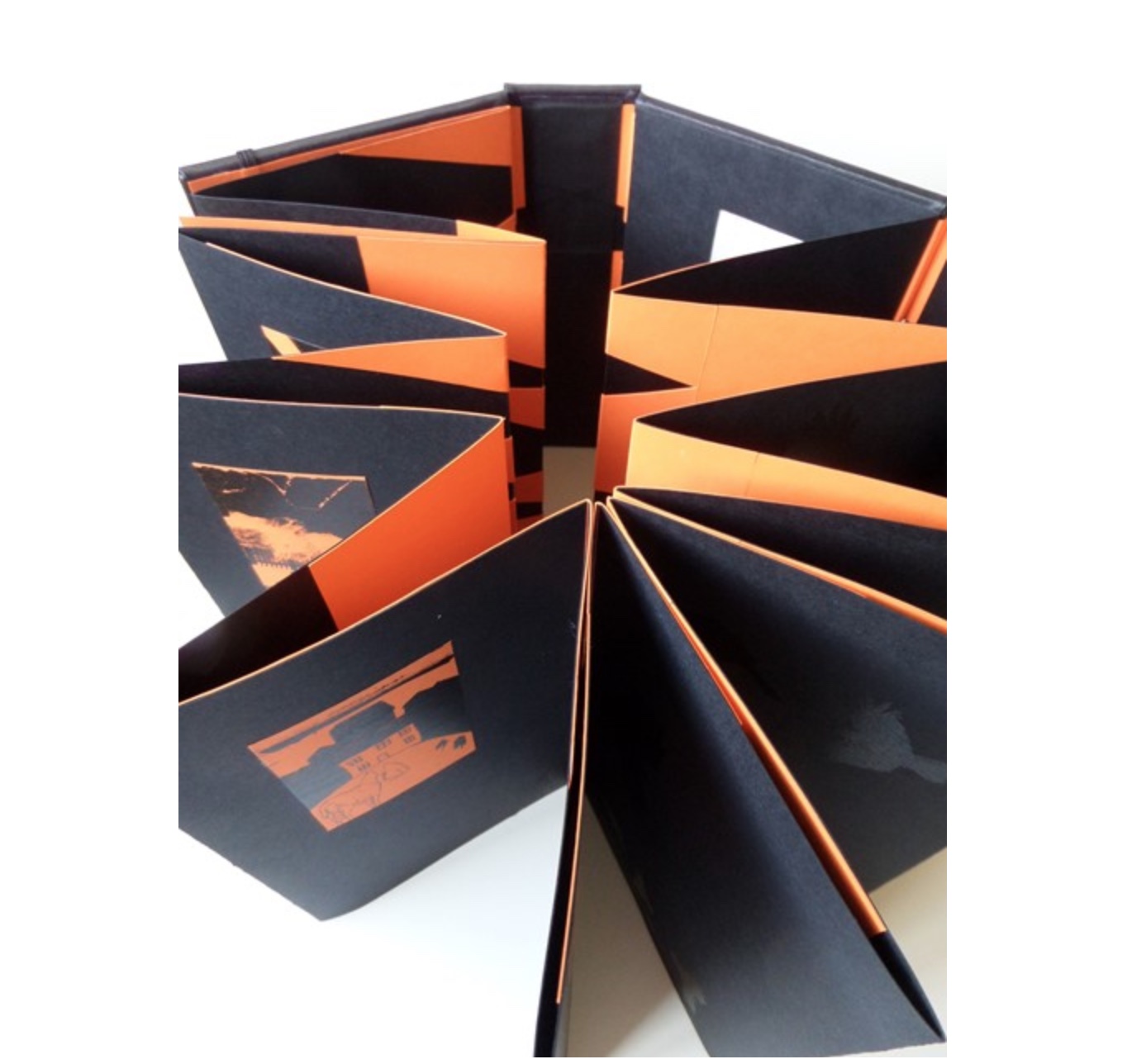
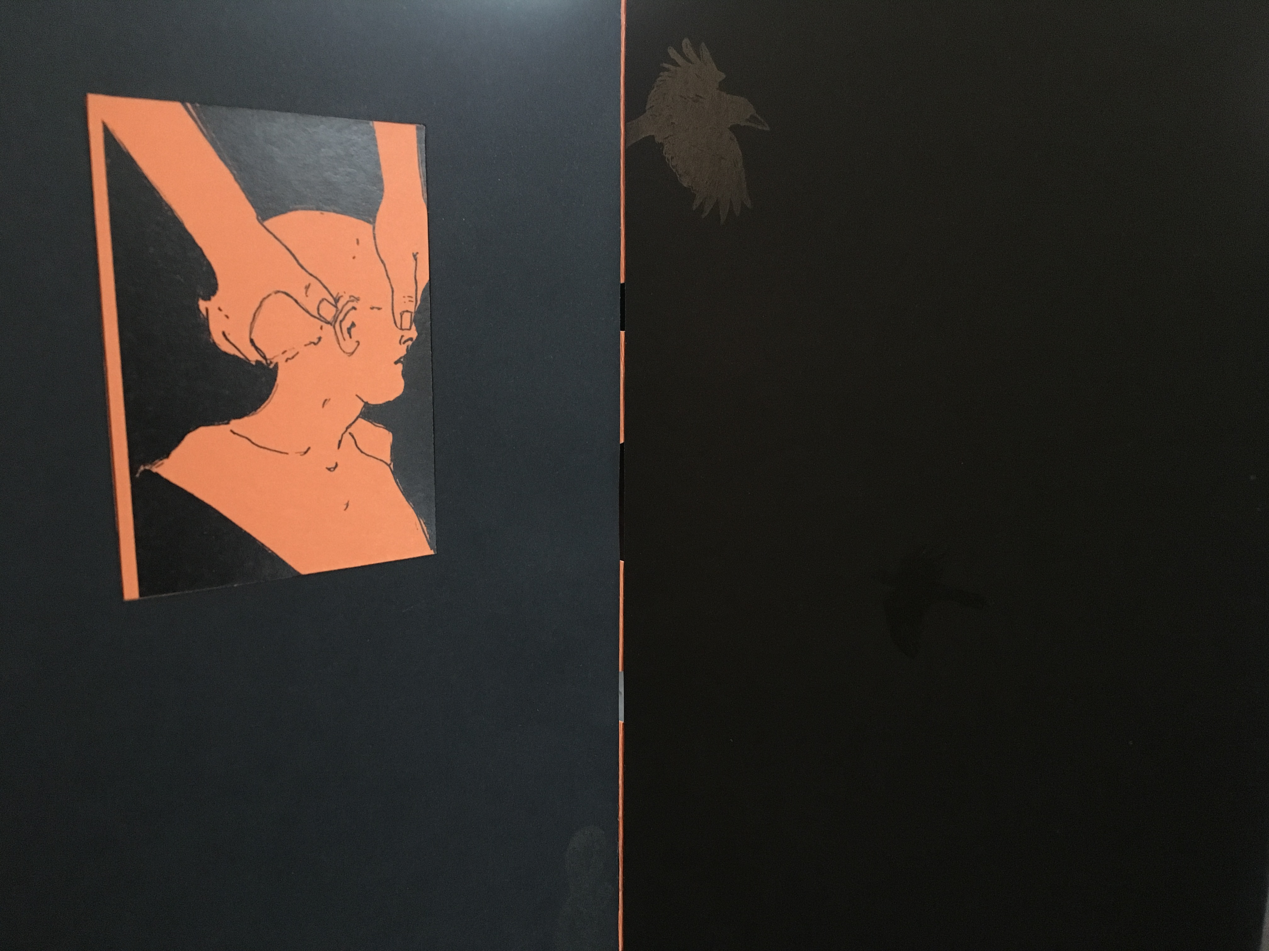
Twenty-six/Fragments (2012)
Lisa McGarry
Single sheet, collage, meander cut and fold. Closed: 70 x 70 x D15 mm. Open: 490 x 490 mm. Acquired from the artist, 20 March 2023.
Photos: Books On Books Collection. Displayed with artist’s permission.
ABCing, however, takes abstraction in a different direction — away from sounds and objects and toward ideas and concepts. The direction may be different, but the results are often like magnets pulling on works whose alphabet categories relate indirectly, subtly and delightfully to ABCing.
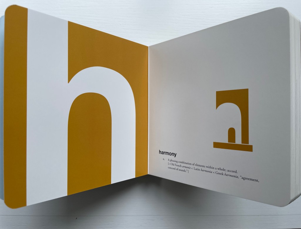
Consider this example in which the concept and object again start with the same letter: “h” (for harmony), where the bits of negative space construct a house or hearth.
It draws out the multifaceted subject of letters and architecture illustrated by Geofroy Tory’s Champ Fleury (1529/1927/1998), Antonio Basoli’s Alfabeto Pittorico (1839/1998), Giovanni Battista de Pian’s Alphabetto Pittoresque (1842).
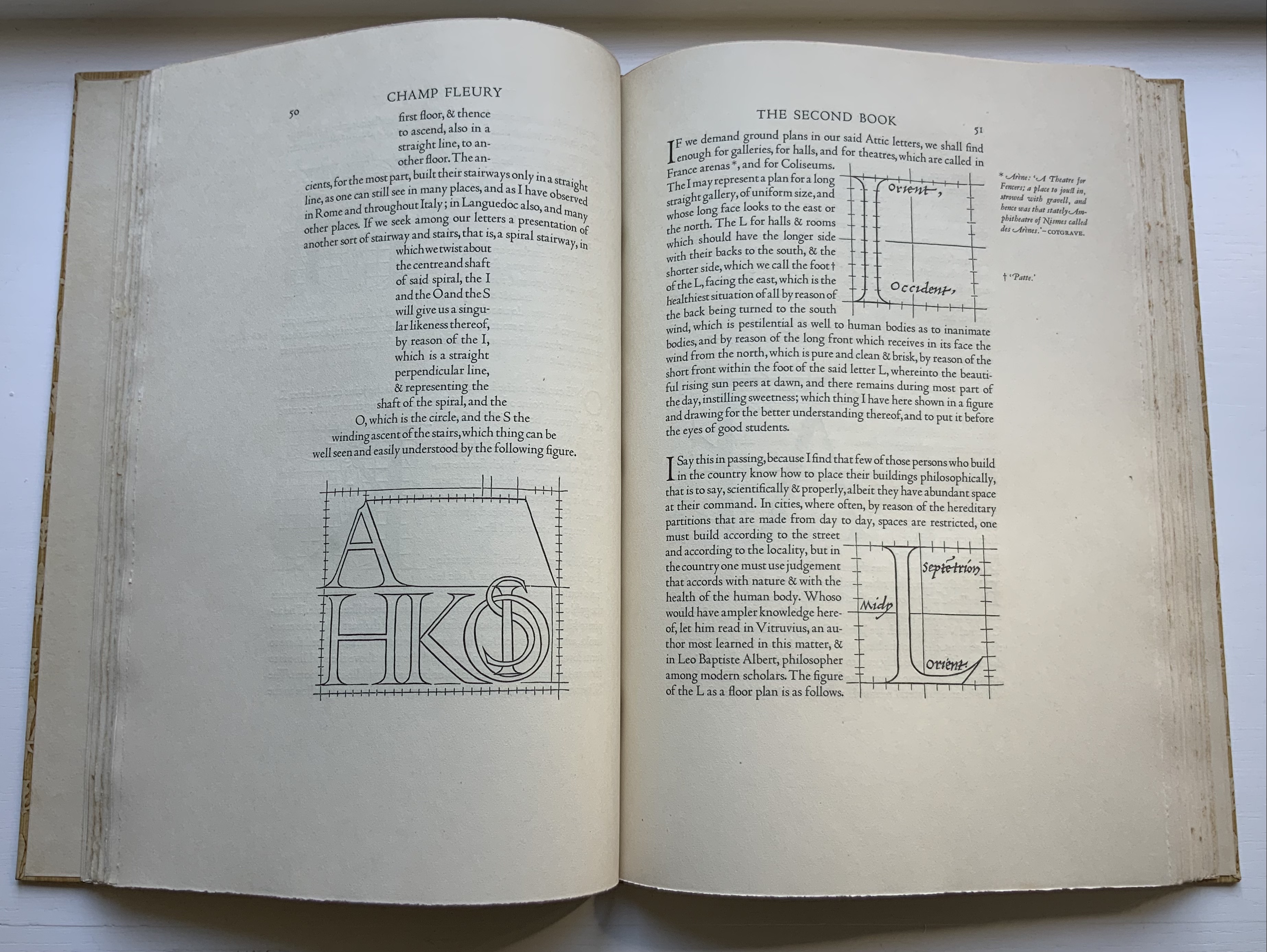


Left to right: Tory/Rogers, Champ Fleury; Basoli, Alfabeto Pittorico; Battista de Pian, Alphabetto Pittoresque. Photos by Books On Books Collection.
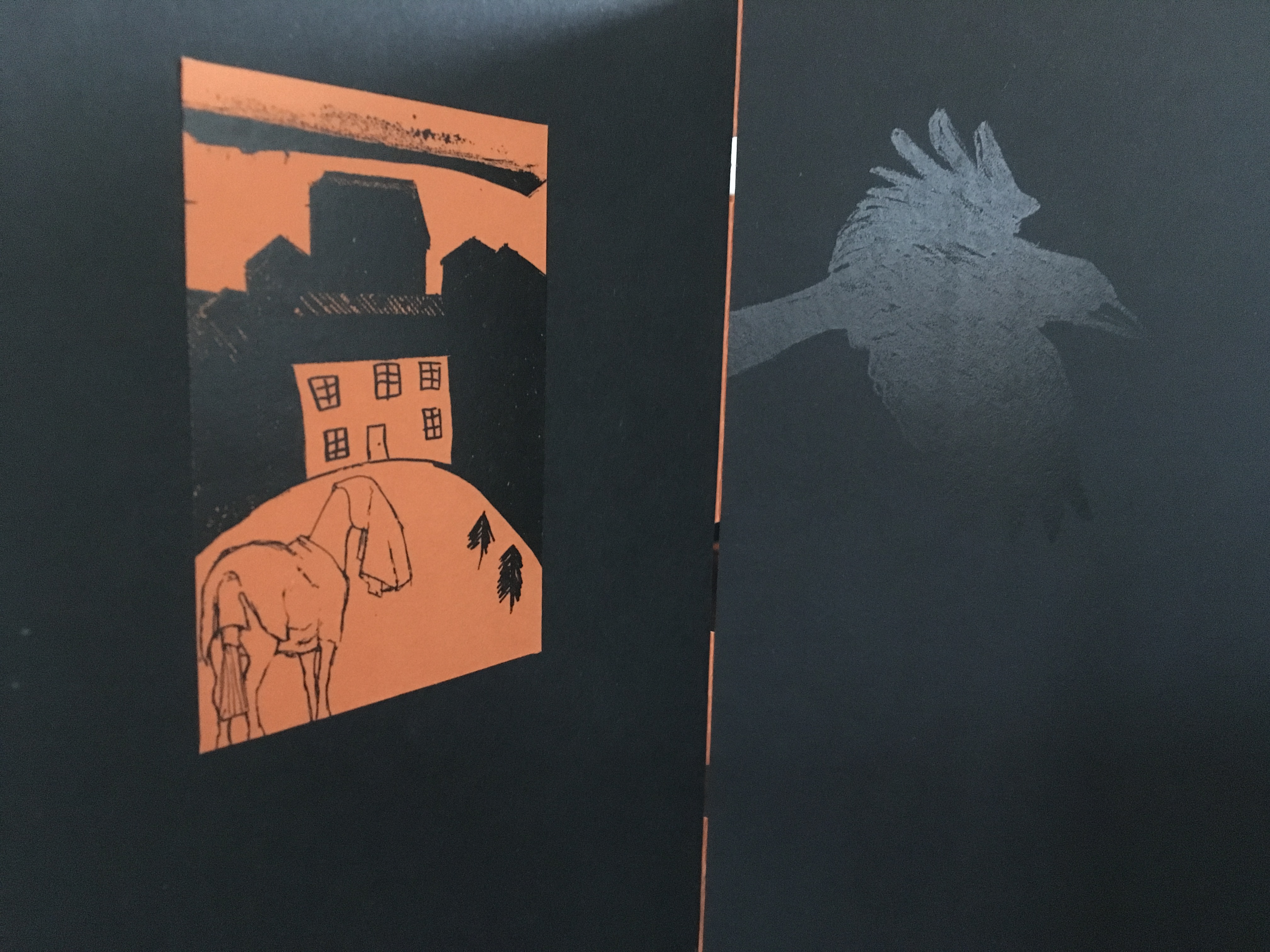
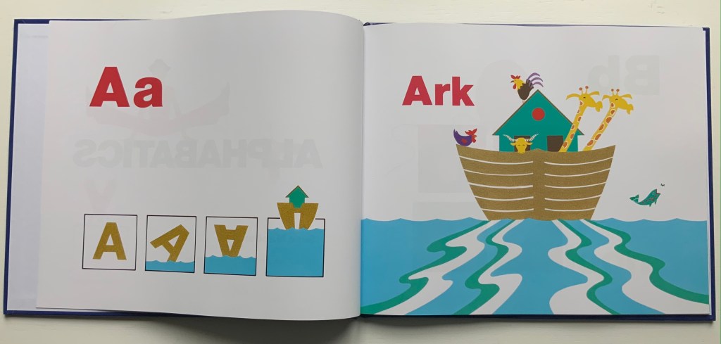
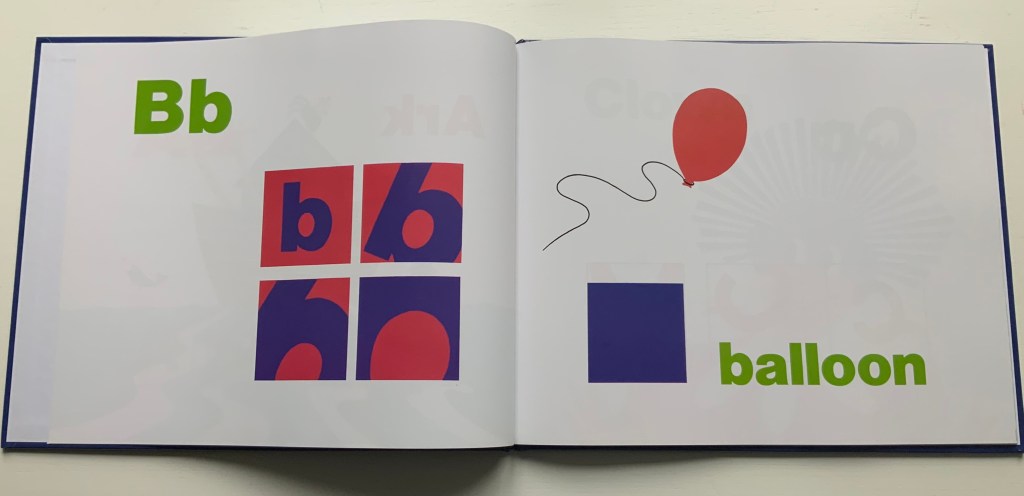
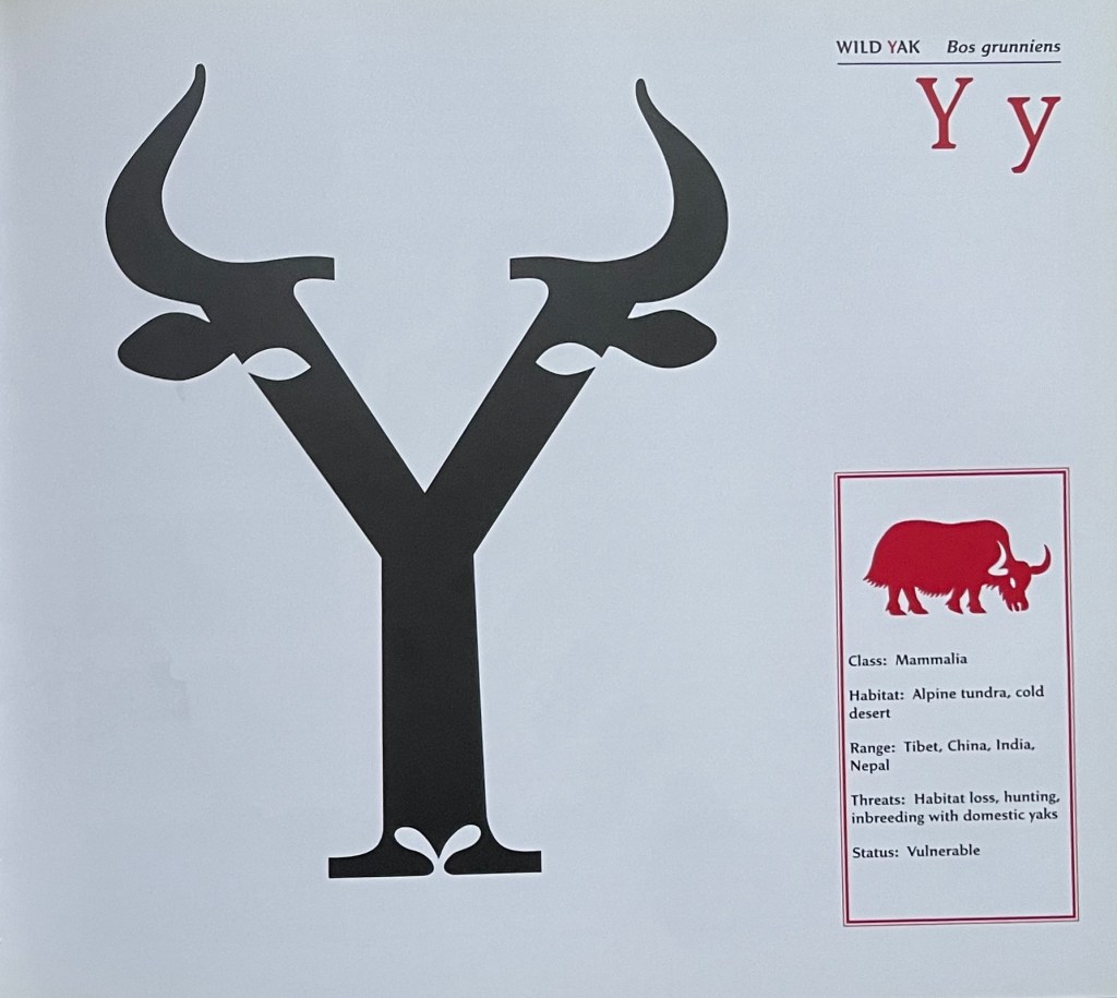
Consider again the “m” for metaphor and moo. Animals are the most frequent category of alphabet books in children’s literature, and so while there are dozens of them in the Books On Books Collection, it is the yaks in Suse MacDonald’s Alphabatics (1986) and David McLimans’ Gone Wild (2016) that ABCing conjures up.

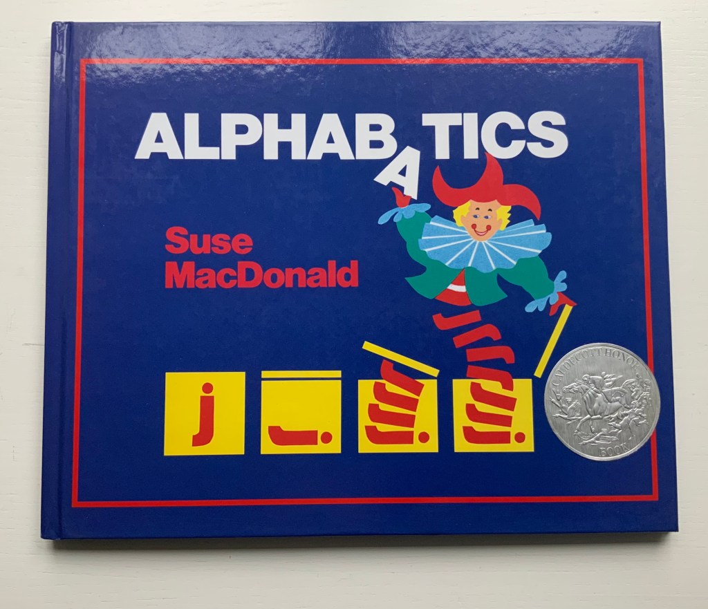
Alphabatics (1986)
Suse MacDonald
Paper on board, casebound sewn. H236 x 285 mm, 56 pages. Acquired from Book Depository, 10 September 2021.
Photos: Books On Books Collection.
Gone Wild: An Endangered Animal Alphabet (2016)
David McLimans
Casebound, illustrated paper over boards, illustrated doublures, sewn book block. Illustrated, debossed glossy paper dustjacket. H255 x W285 mm. 36 unnumbered pages. Acquired from Gargoyle Books, 25 August 2022.
Photos: Books On Books Collection.
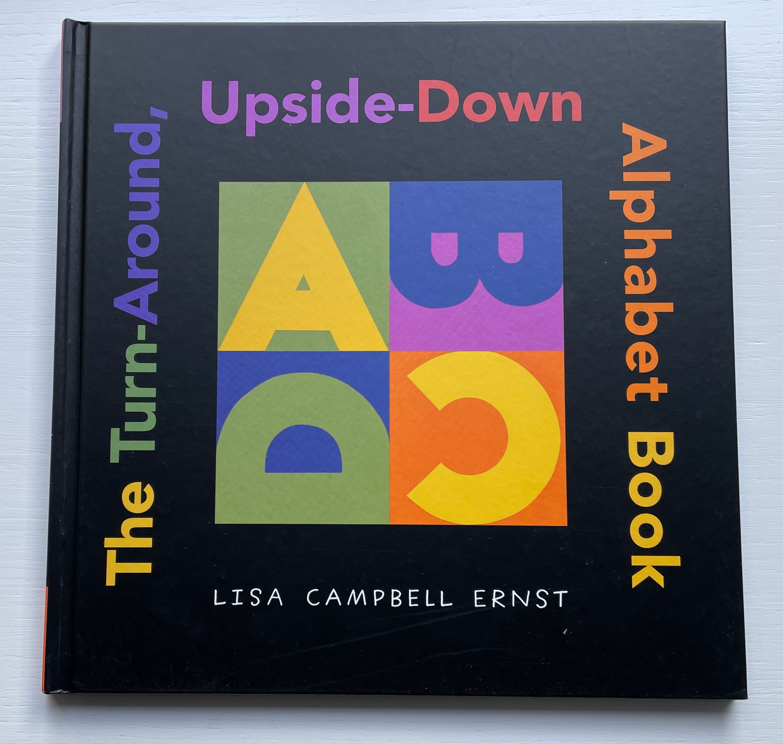
Consider again the “n” for negative space and its use of perspective to form its visual metaphor. Doesn’t it pull up Lisa Campbell Ernst’s The Turn Around, Upside Down Alphabet Book (2004), and Menena Cottin’s La Doble Historia de un Vaso de Leche (2019)?
The Turn Around, Upside Down Alphabet Book (2004)
Lisa Campbell Ernst
Casebound, colored doublures, sewn. H241 x W241 mm, 32 unnumbered pages. Acquired from Thrift Books, 5 November 2021.
Photos: Books On Books Collection.
La Doble Historia de un Vaso de Leche (2019)
Menena Cottin
Casebound landscape, paper over boards, with orange-yellow doublures, sewn. H160 x W310 mm. 24 unnumbered pages. Acquired from the artist, 2022.
Photos: Books On Books Collection.
Consider, too, the board book format of ABCing. ABCing underscores the crossover between concept and craft when the imagination draws on the “artistic toolkit of the book”. It might send the reader off to alphabet board books like Harold’s ABC (1963, 2015) by Crockett Johnson in the collection, but here are board books not for the children’s section.


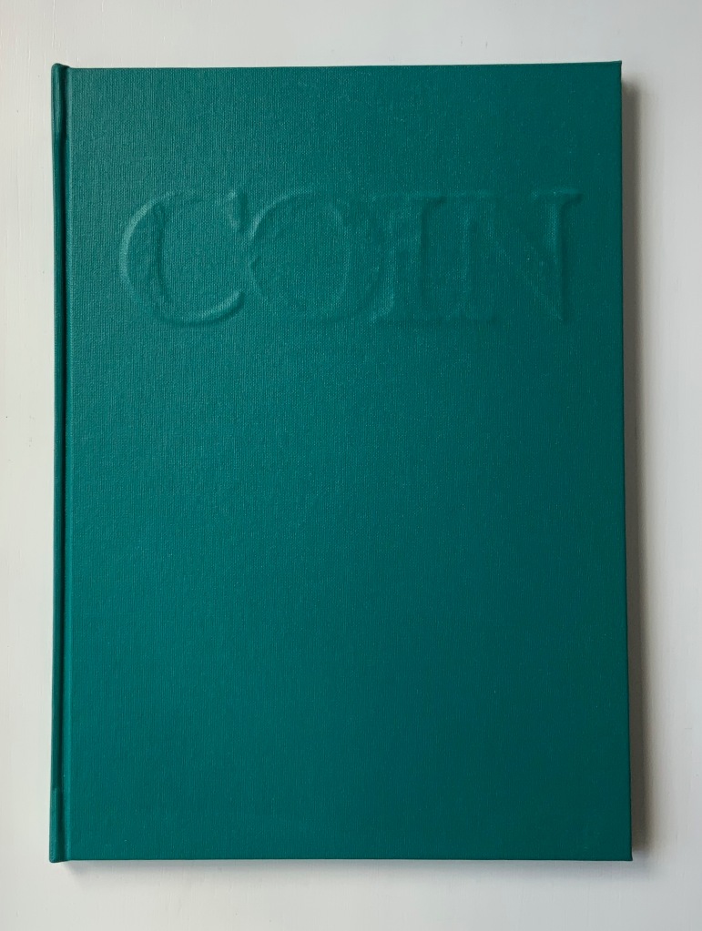
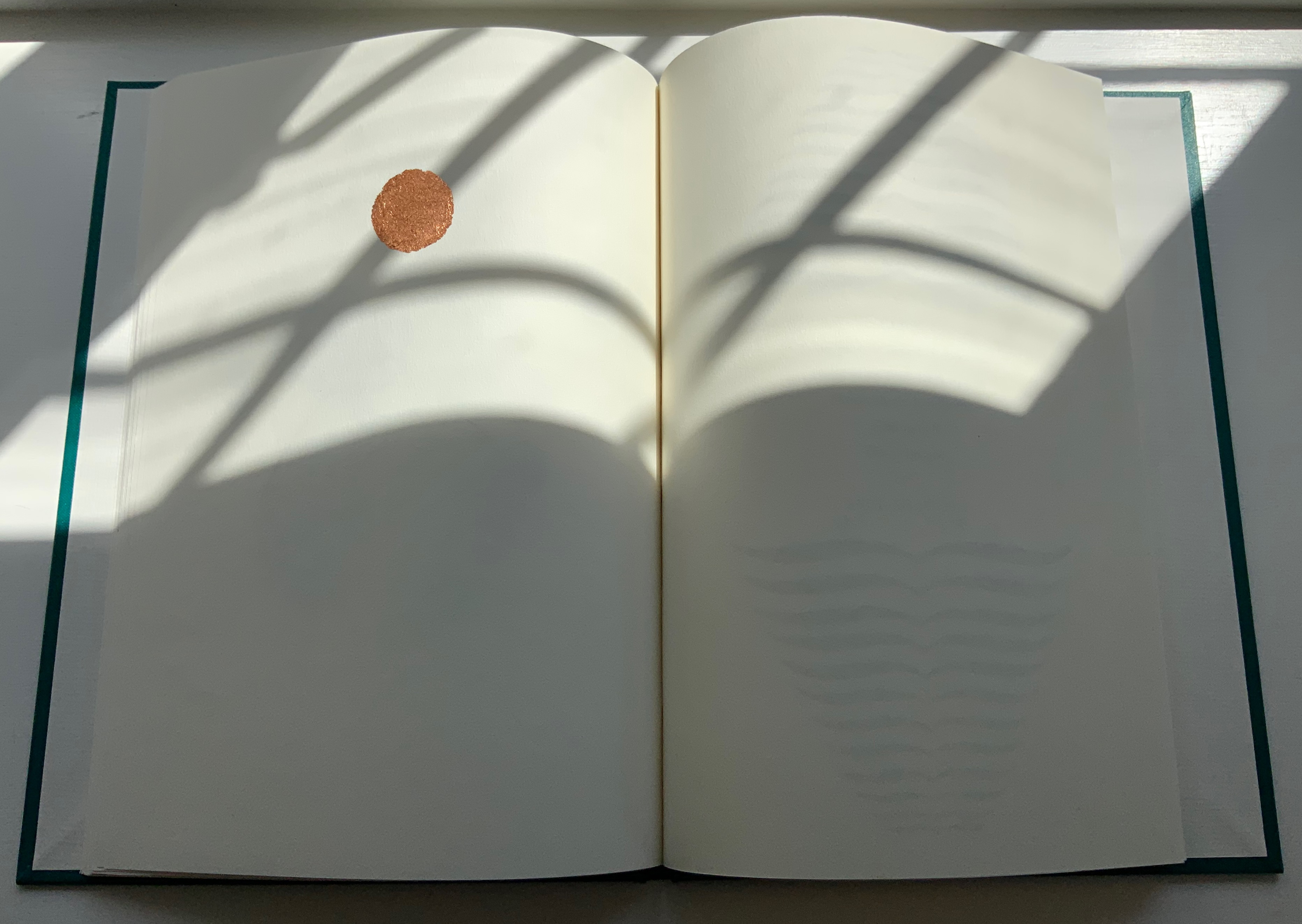
Chroma Numerica (2019)
Andrew Morrison
Perfect bound cased in quarter-hinged paper-on-board binding. H143 x W145 mm, 60 pages, printed on one side. Edition of 30, of which this is #17. Acquired from the artist, 2 September 2021.
Photos of the work: Books On Books Collection. Displayed with artist’s permission.

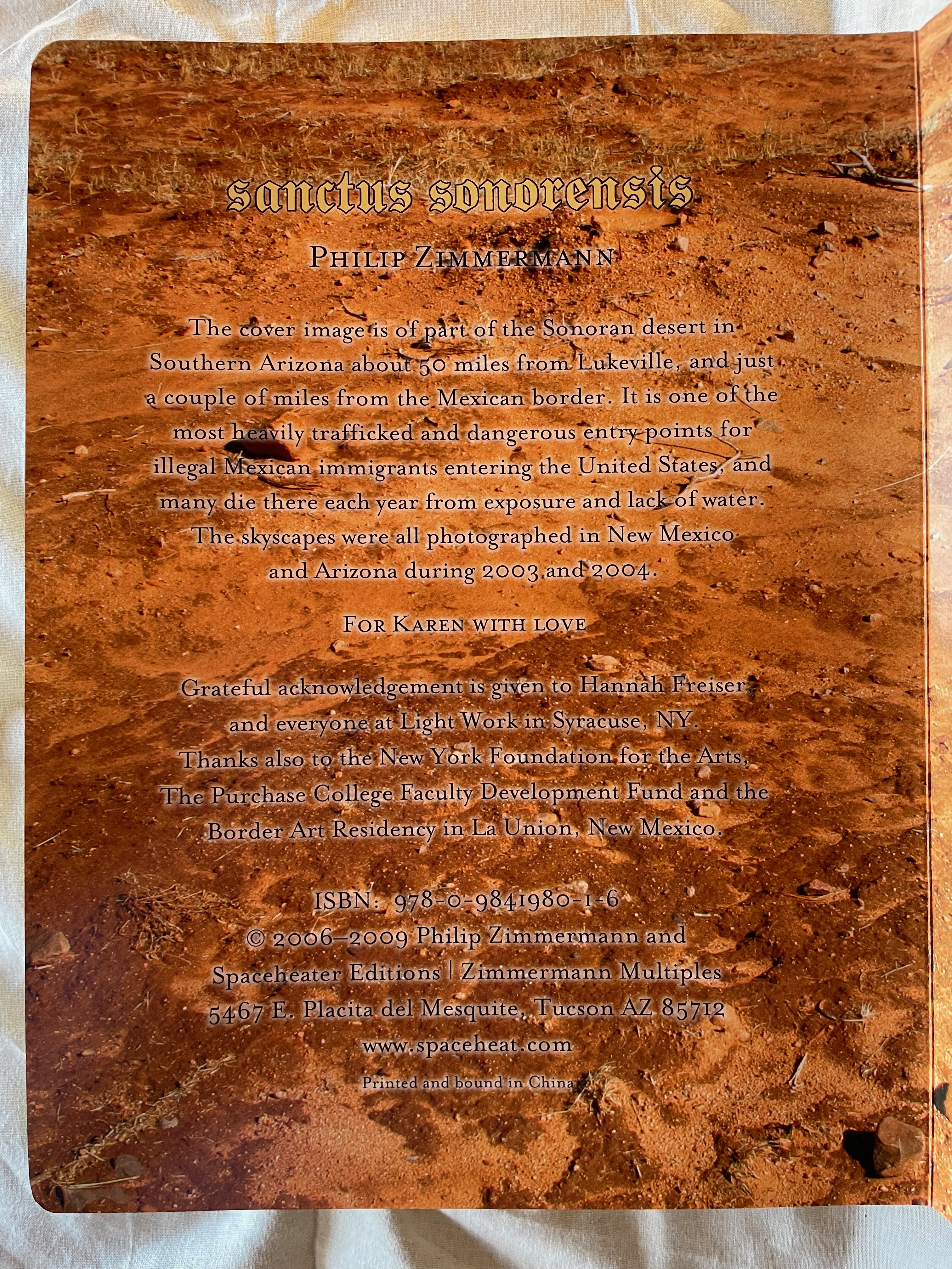
Sanctus Sonorensis (2009)
Philip Zimmermann
Perfect bound, self-covering board book, illustrated cover, gilt on top, bottom and fore edges. Gold-foiled title on the cover and spine. Four-color offset lithography. H273 x W208 x D35 mm. 90 pages. Edition of 1000. Acquired from Spaceheater Editions, 4 February 2024.
Photos: Books On Books Collection.

ABCing‘s abecedarian structure and its board book format underscore its intent in a wry manner. Introductory it may be, but its visual metaphors and use of negative space are subtle. Likewise, Chroma Numerica‘s counting book structure and board book format contrast with its Greco-Latinate title, limited print run and celebration of wood type printing, and the beatitudinal structure and religious gilding of the childhood book format of Sanctus Sonorensis heighten the biting condemnation in its message.
ABCing is more than “seeing the alphabet differently”. Like most effective artist’s books, it prods the reader/viewer into thinking about letter and image differently, the material aspects of the book differently — and looking for other artists’ books that take us further into reading and seeing differently.
Further Reading
“Abecedaries I (in progress)“. Books On Books Collection.
“Architecture“. 12 November 2018. Bookmarking Book Art.
“Antonio Basoli“. 23 April 2021. Books On Books Collection.
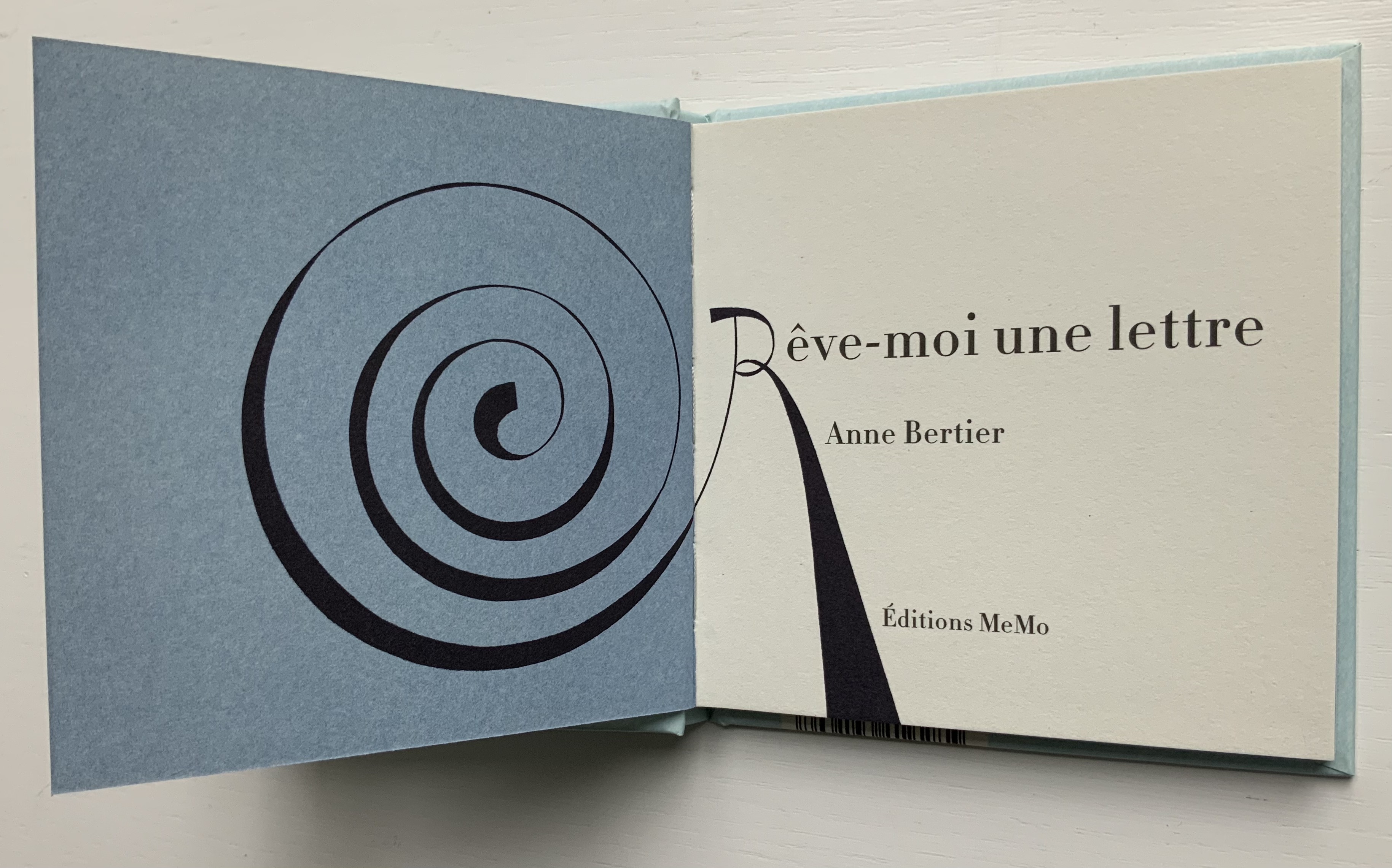
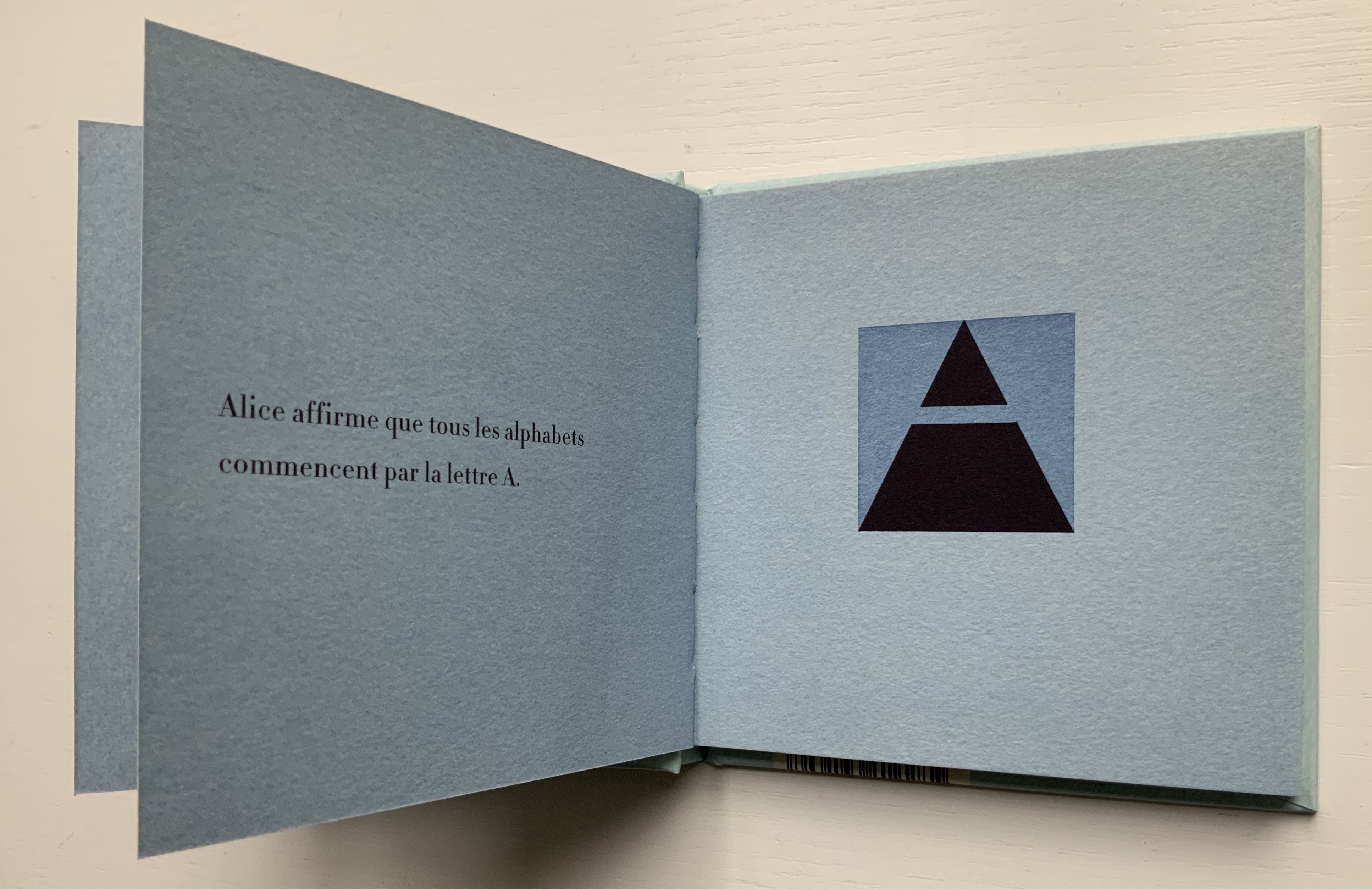
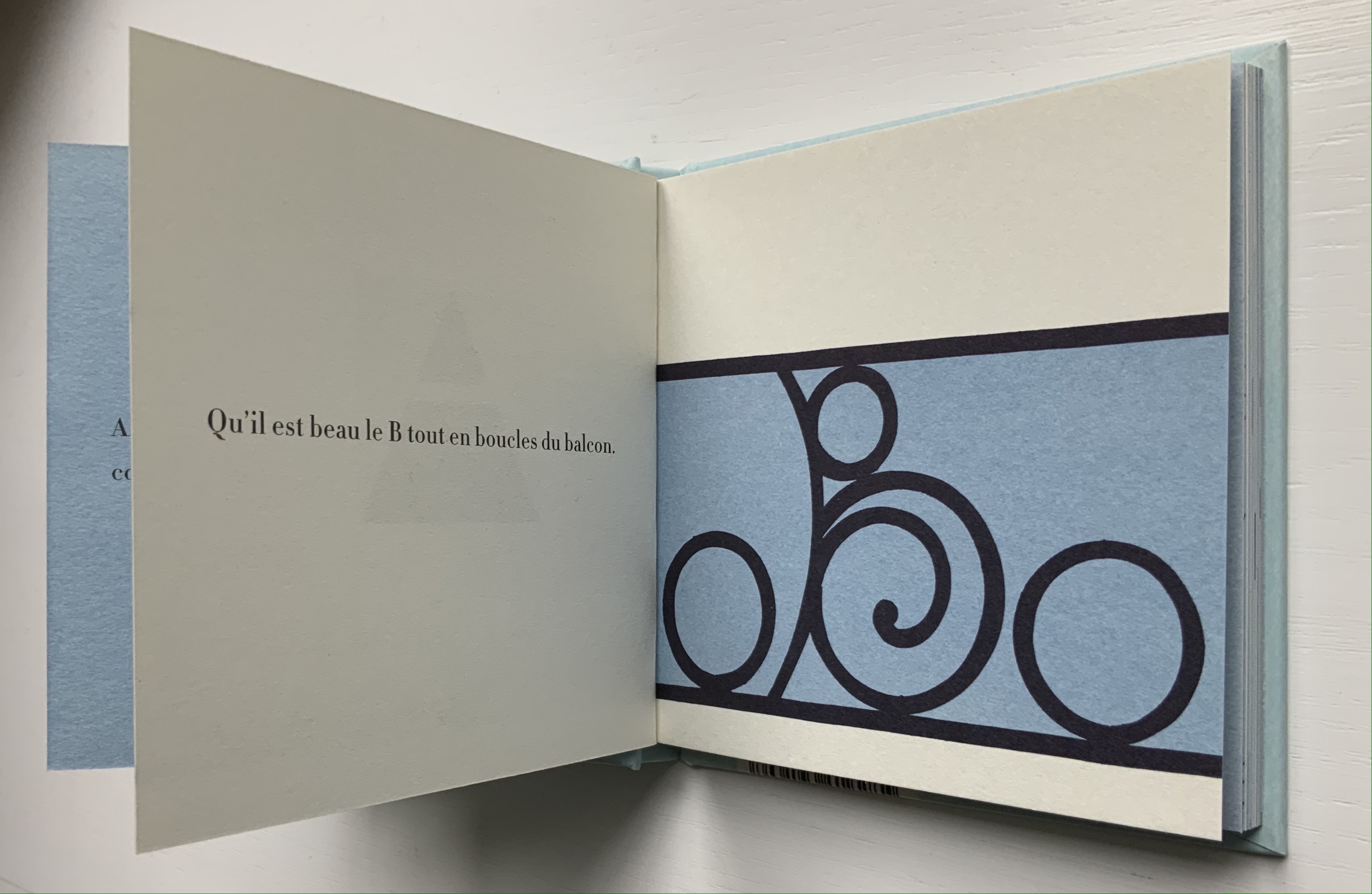
“Anne Bertier“. 10 August 2022. Books On Books Collection.
“Giovanni Battista Braccelli“. 11 September 2023. Books On Books Collection.
“Menena Cottin“. 12 July 2023. Books On Books Collection.
“Lisa Campbell Ernst“. 10 Deceember 2022. Books On Books Collection.
“Suse MacDonald“. 10 August 2022. Books On Books Collection.
“David McLimans“. 25 April 2023. Books On Books Collection.
“Andrew Morrison“. 15 September 2021. Books On Books Collection.
“Bruno Munari“. 19 August 2021. Books On Books Collection.
“Richard Niessen“. 23 April 2021. Books On Books Collection.
“Dave Pelletier“. 10 August 2022. Books On Books Collection.
“Giovanni Battista de Pian“. 23 April 2021. Books On Books Collection.
“Rowland Scherman“. 11 September 2023. Books On Books Collection.
“Laura Vaccaro Seeger“. 12 December 2022. Books On Books Collection.
“Geofroy Tory“. 21 June 2021. Books On Books Collection.
“Philip Zimmermann“. 14 January 2020. Books On Books Collection.