Despite today’s multilingual packaging labels, the ingeniously, confusingly folded directions for our new appliances, or the occasionally mistaken choice of subtitling for the latest episode of an imported detective TV show, we tend to forget that ours is not the only alphabet. Abecedarians and book artists alike have enjoyed playing with the many alphabets and writing systems there are, even making up new ones, posing codes, teasing us with the underlying randomness of these marks we think have inherent meaning or inviting us to the borders between image and letters, letters and image. [Links in the captions will take you to more images and details.]
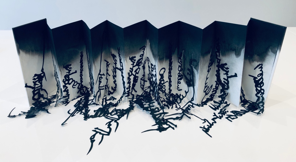
Lizzie Brewer, Babel (2019)
Inspired by a 2019 exhibition at the Scuola Internazionale di Grafica in Venice, Lizzie Brewer created Babel (2019),* a sculptural exploration of that border between image and letters. The black letters and words from Farsi, Japanese, Greek, English and more rain or drip down from the cloud of ink at the upper edge of the accordion structure implying our lack of knowledge of whatever Ur language preceded the Babylonians’ tower and also the punitive nature of the Old Testament deity.
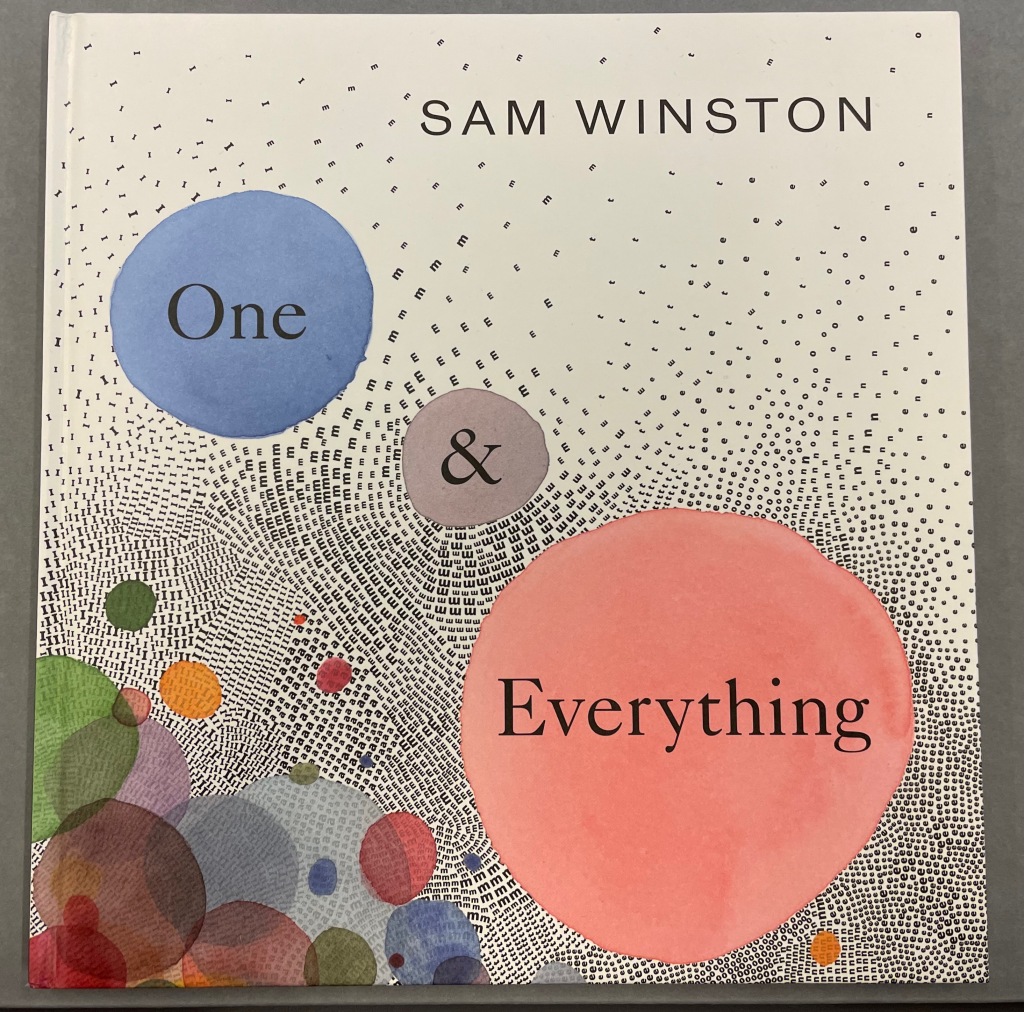
Sam Winston, One & Everything (2022)
Sam Winston is another book artist who regularly works at the border of image and text. “Once there were many stories for the world.” So begins One & Everything (2022).* Inspired by Tim Brookes’ Endangered Alphabets Project, Winston uses the striking shapes of letters and scripts from Ogham, Cherokee, Armenian, Hebrew, Tibetan and dozens more alphabets and syllabaries to create the characters in his fable about the story that decides one day that it is the “One & Everything” story. And of course, its alphabet is the “one and only” A to Z. The way One & Everything ends, perhaps Babel was more of a blessing than a curse.
This rest of this display space offers several examples of other alphabets and the book art they have inspired. You decide: curse or blessing?

Golnar Adili, Father Gave Water/Baabaa Aab Daad (2020)
Golnar Adili’s Father Gave Water/Baabaa Aab Daad (2020)* performs a linguistic and cultural bridging. The miniaturized shape of traditional Western alphabet blocks meets a pixellated and sculpted Persian in her modular wooden cubes and recessed felt base. By leaping into the third dimension, her invented typography mostly skirts the calligraphic concerns of letter shapes that change depending on position and combination with other letters. Language becomes tactile and three-dimensional not only in this work but in almost all of the work emanating from her studio.
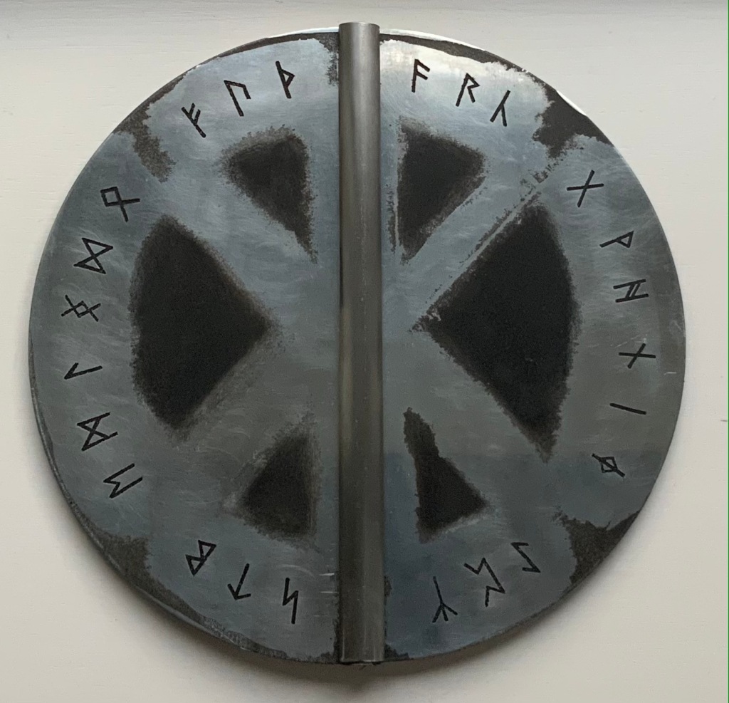
Fully open and laid face down, the shield-like covers of Brynja Baldursdottír’s Fuþorc (1992) display all twenty-four runes of the Runic alphabet — fuþorc — named for the first six runes, much as alphabet derives from the first two Greek letters alpha and beta. In the Middle Ages, books cut and bound in the shape of a heart were given as tokens of love or loyalty. Drawing on the Rune Poem, this shield-metal-covered, tree-trunk-round codex is a token to the Nordic and Anglo-Saxon tribes, whose shields, jewelry, tools and stone markers bore these angular letters of their alphabet, also used for divining fortunes (“casting the runes”).
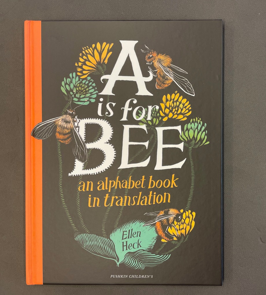
In another celebration of many alphabets and cultures, Ellen Heck’s A is for Bee (2022)
Ellen Heck, A is for Bee (2022).* Another clarion call to awareness of other languages and the consensual essence of the alphabet.
Satin’s Alphabook (Cherokee) (1998/9)* surprises the reader with four fan-shaped books in this circular portfolio. The character on the tile derives from Sequoyah’s syllabary, but the four books display the histories of multiple writing systems.
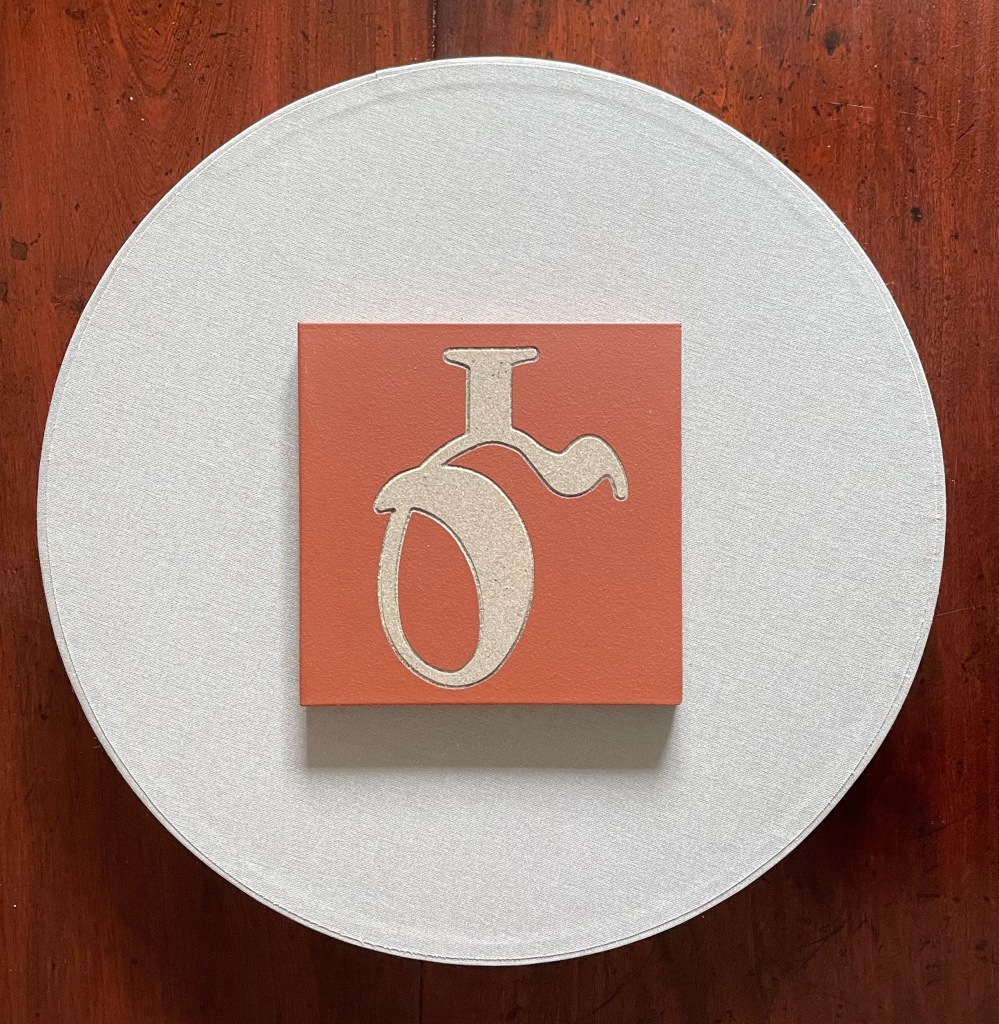
Online Exhibition Bonus!
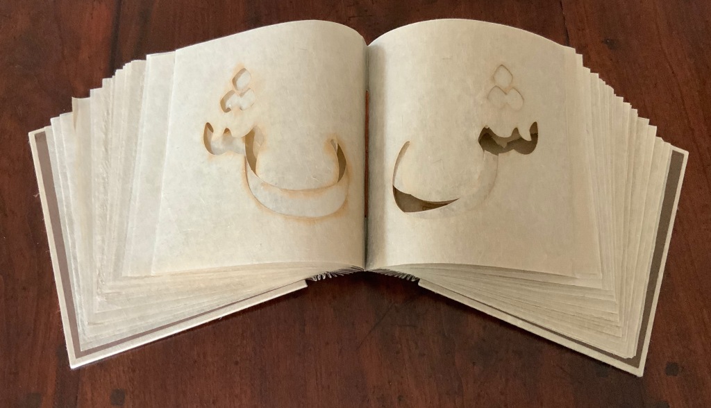
In Islam Aly’s 28 Letters (2013), the artist’s choice of paper and its color, laser-cutting and binding creates a work that conveys a feeling of Arabic’s cursiveness.
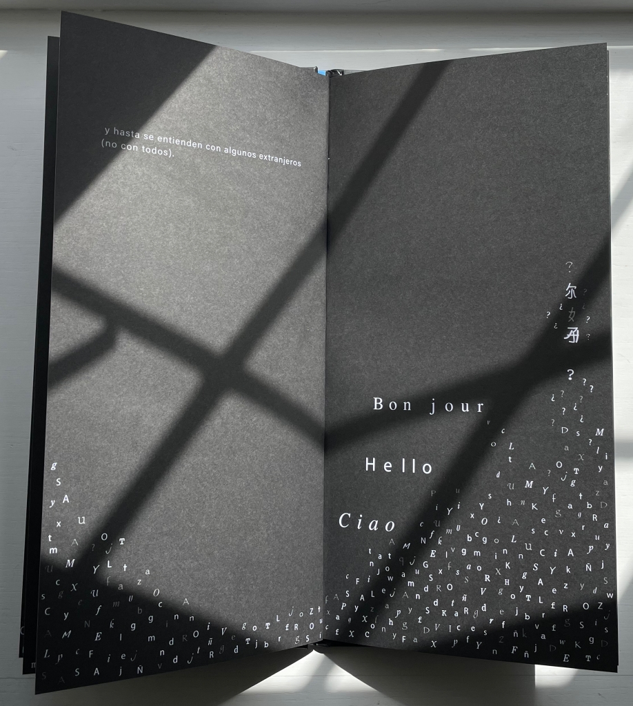
Menena Cottin, Las Letras (2008/2018)
According to Menena Cottin’s Las Letras (2008/2018), even letters themselves celebrate our differences. “People are like letters, each one is different from the other, with its own form, its own shape, its own voice and its own personality. They can be fat, skinny, simple or complicated. Some are very popular and are seen everywhere, while the shyer ones don’t like to go out much. Everyone has their own voice, some are deep, others high-pitched, and some are even mute. Alone, none of them makes sense, but just two together is enough for them to become important. And the more they get together, the more interesting the get-together.” (Translated from the Spanish)

Leonard Everett Fisher, Alphabet Art: Thirteen ABCs from around the world (1978)
Leonard Everett Fisher’s Alphabet Art (1978) is a rare early commercial effort to interest children in non-Latin alphabets. Above is Fisher’s hand drawing of Thai consonants and vowels.
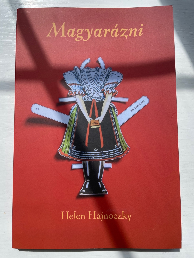
With all its diacritics and dipthongs, if there is an alphabet song in Hungarian, it must be operatic in length. It is fortunate, though, that it is as long as it is; otherwise we would have fewer poems in Helen Hajnoczky’s Magyarázni (2016). This is an abecedary that introduces monolingual English speakers to the “feel” of Hungarian and the feeling of growing up in a bilingual household.
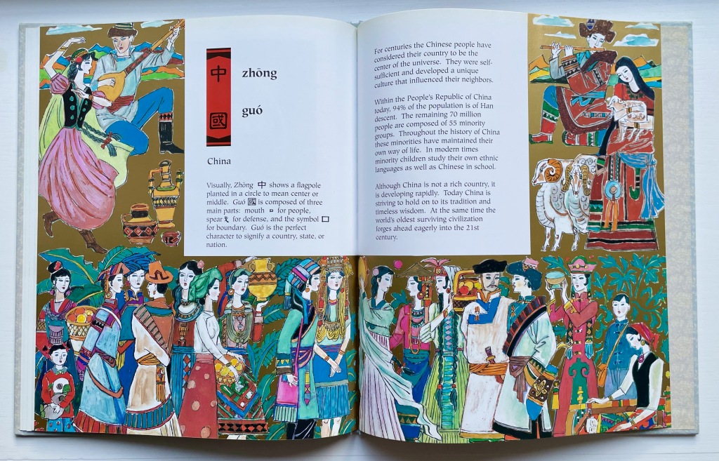
Maywan Shen Krach and Hongbin Zhang, D is for Doufu: An Alphabet Book of Chinese Culture (1997)
D is for Doufu: An Alphabet Book of Chinese Culture (1997) by Maywan Shen Krach and Hongbin Zhang is a “stand in” for an abecedary that cannot really exist since the Chinese writing system is not based on an alphabet but rather characters that are a mix of pictographs, ideographs, tonal markers and context indicators. For a different bridge between Western alphabets and Chinese characters, see the works of Xu Bing below.
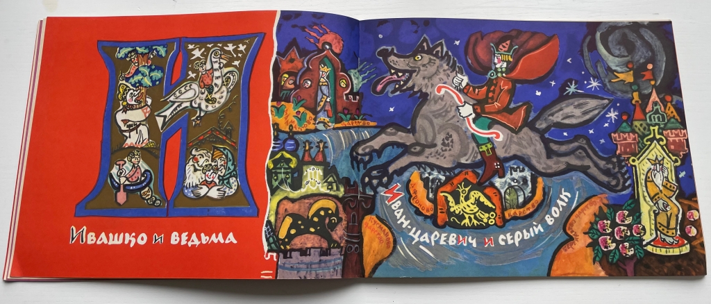
Tatyana Mavrina, Сказочная Азбука / Skazochnaia Azbuka / A Fairy Tale Alphabet (1969)
Tatyana Mavrina’s A Fairy Tale Alphabet (1969) provides this display case with its colorful example of one version of the Cyrillic alphabet.
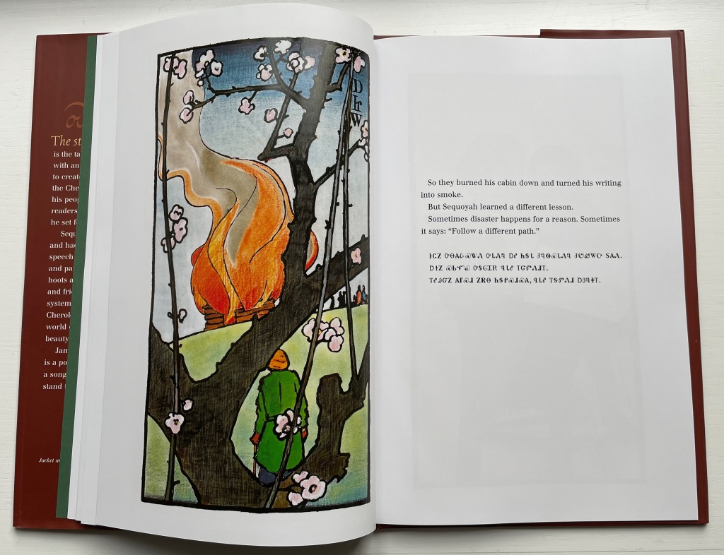
James Rumford’s Sequoyah (2004) recounts the story of the Cherokee Indian who, like Bouabré after him, invented a syllabary for his people. It was used by them on the walls of Manitou Cave in Alabama (US) in rituals and ancestral ceremonies.
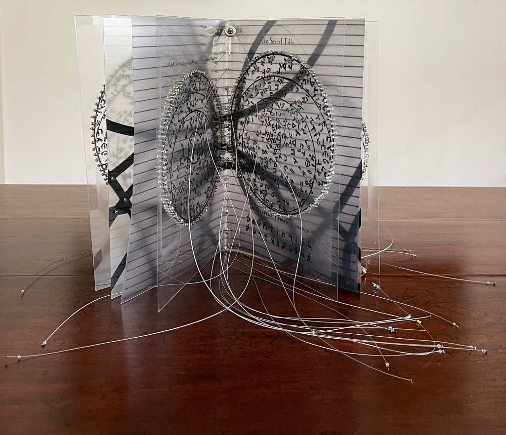
Claire Jeanine Satin, The Hebrew Alphabet Expressing the Celestial Constellations (2017)
One of the alphabets in Dr. Edmund Fry’s encyclopedic Pantographia (1799) is Chaldean I, which he notes is also called Celestial, “said to have been composed by ancient astrologers”. Claire Jeanine Satin’s The Hebrew Alphabet Expressing the Celestial Constellations (2017) goes back to the same source in which Fry found his Chaldean alphabet. The tangled fish line and the gold-accented exterior and silver-accented interior echo the mystic interpretation of the divine language of the heavens.
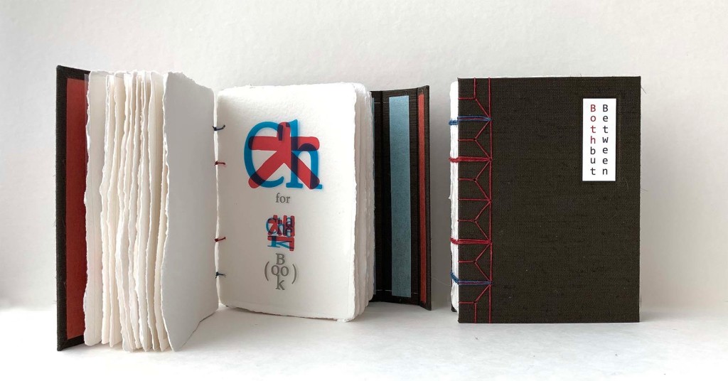
Jana Sim, Both but Between (2021)
Both but between is a bilingual abecedary. If punning in a foreign language indicates successful mastery of a non-native tongue, punning in that language and doing so materially with an artist’s book must indicate an altogether higher level and higher kind of mastery. Jana Sim demonstrates such mastery with an extraordinary use of letterpress printing and laser printing to underscore the “both but between” metaphor of her bicultural experience in this bilingual abecedary.
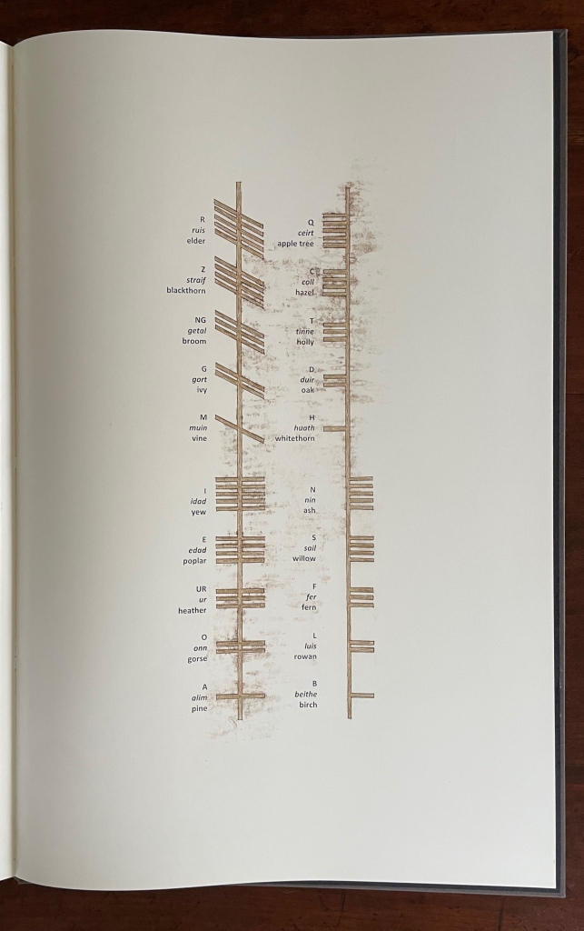
Serena Smith, Ekphrasis (2020)
The Ogham letters, appearing here at the end of Serena Smith’s Ekphrasis (2020), are collectively known as the Beith-luis-nin (a contraction of the five letters in the lower right above, like our alphabet from alpha and beta). They are associated with 4th to 6th century Irish inscriptions on stone and, according to early sagas and legends, wood. Although only some of the 20 core letter names are the names of trees, the Beith-luis-nin came to be known as the “Tree Alphabet”. Smith’s large lithographic book is not an abecedary for the Tree Alphabet. Rather it is a meditation on place (a Leicestershire country park — “part arboretum and part community”) and the art of lithography (drawing on and printing from stone) in which she wonders “if the hands of Celtic scribes also tired, whilst scoring the lines of Ogham script“.
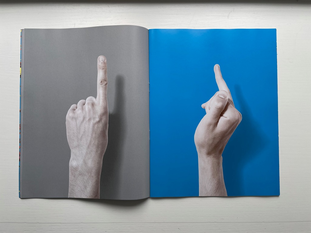
Stuart Whipps, Feeling with Fingers that See (2017)
Speculation has it that the Irish familiar with Ogham also used it for a secret sign language. No speculation is needed for the sign language shown in Stuart Whipps’ Feeling with Fingers that See (2017).* It comes from Sir Christopher Wren and can be found interleaved in the Royal Institute of British Architects’ “heirloom copy” of Parentalia, a family memoir published in 1750 by Wren’s grandson, also named Christopher. Whipps uses it in his A System For Communicating With The Ghost Of Sir Christopher Wren.
This online exhibition bonus concludes with three works by one of the most inventive and prolific artists of the 20th and 21st centuries: Xu Bing.
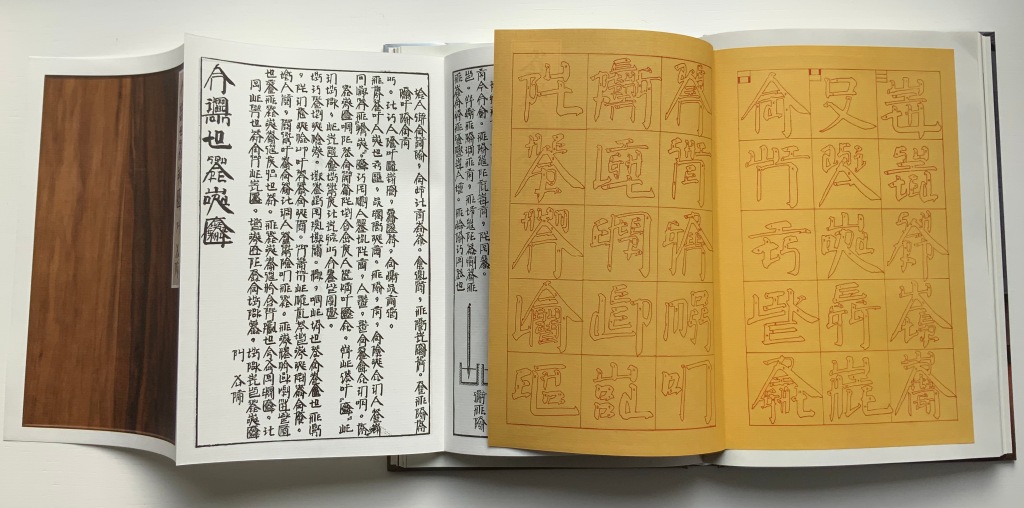
Xu Bing, Book from the Sky to Book from the Ground (2020)
This work —Book from the Sky to Book from the Ground (2020) — is perhaps the artist’s best introduction to Book from the Sky (1986-2012), Book from the Ground (2003~) and “square word calligraphy”, his writing system that bridges Chinese and English with humor and artistry.
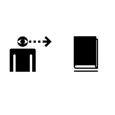
Book from the Ground (2014) was published by MIT Press. A throwback to the pictographic origins of most alphabets and writing systems, the book recounts a day in the life of Mr. Black, an office worker, in the symbols, icons and logos of modern life.
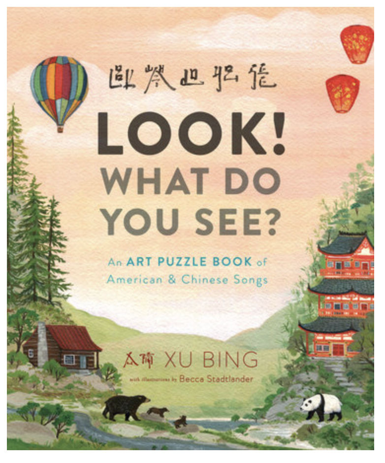
The artist’s cross-cultural humor shines in his children’s book Look! What do you see? (2017). Published by the trade publisher Viking, the lyrics to familiar US songs are printed with the sinographic letters from square word calligraphy.