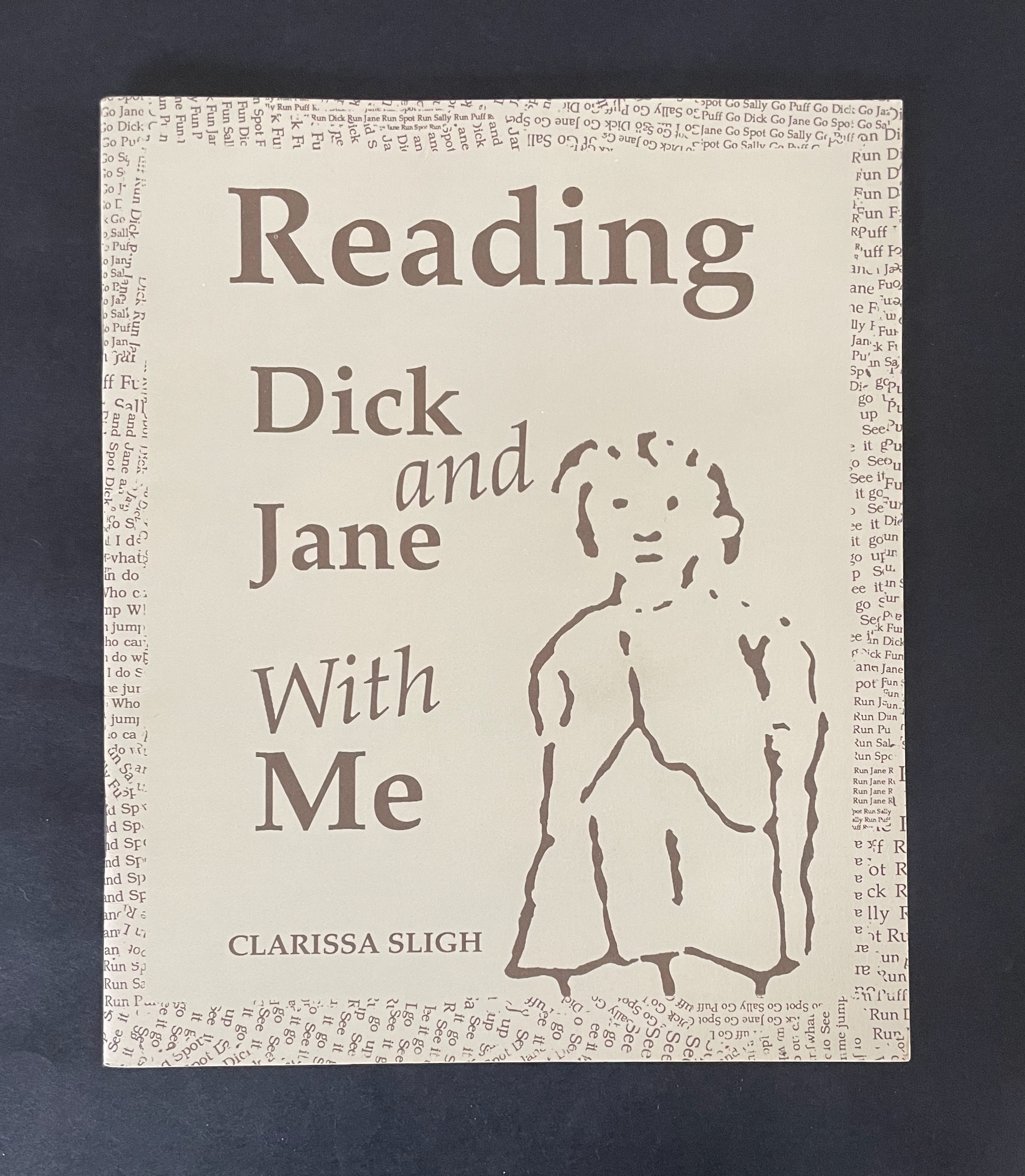
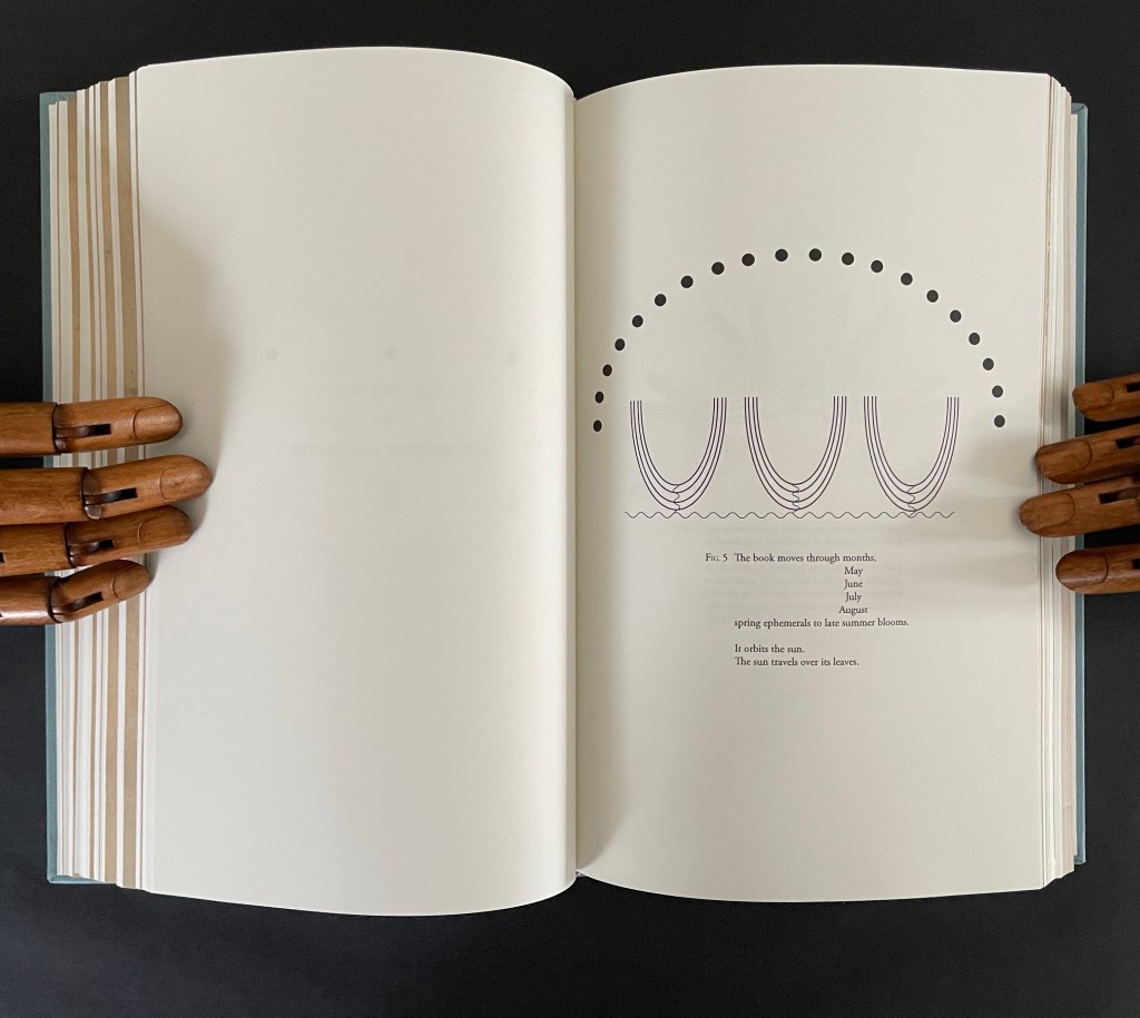
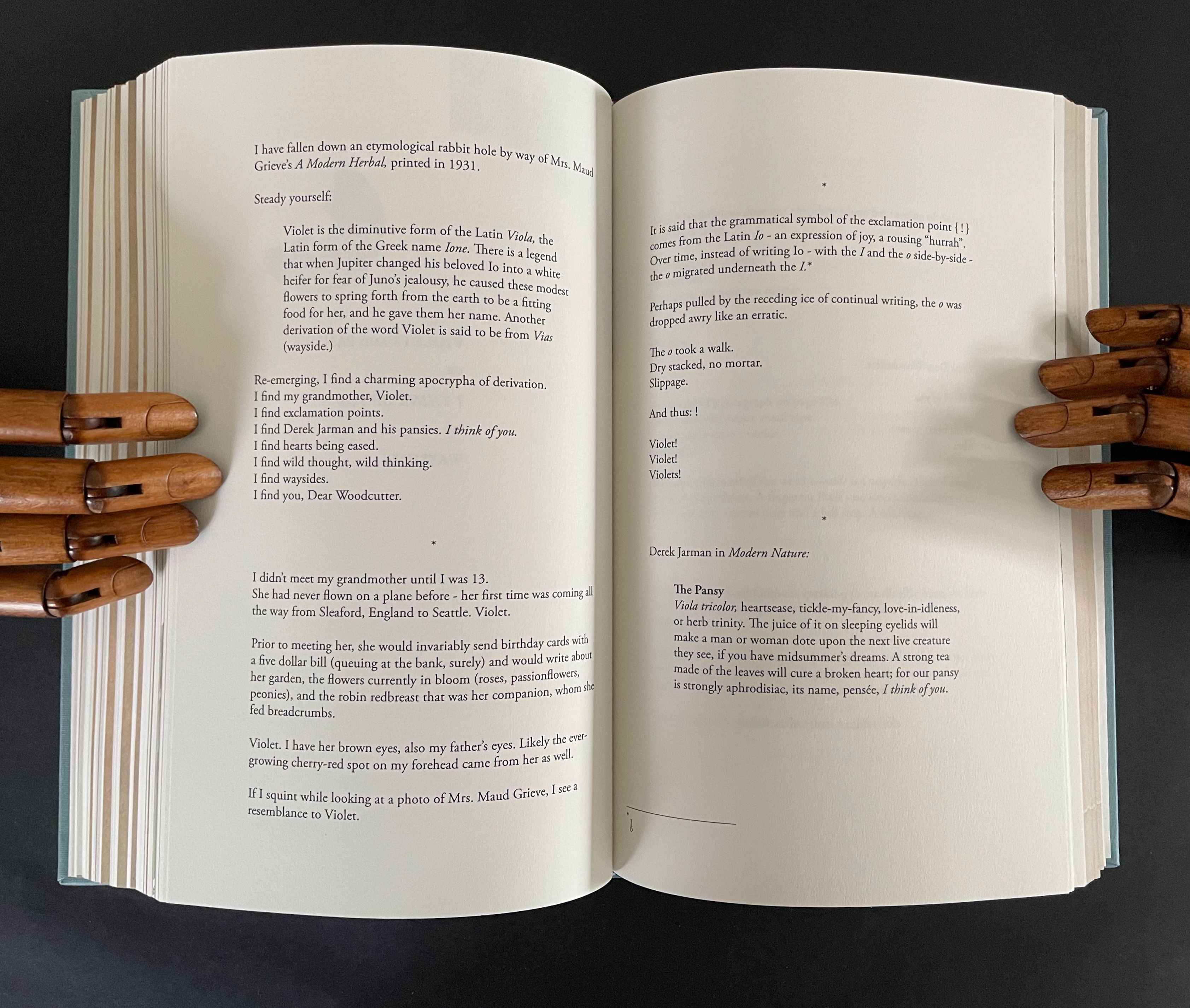
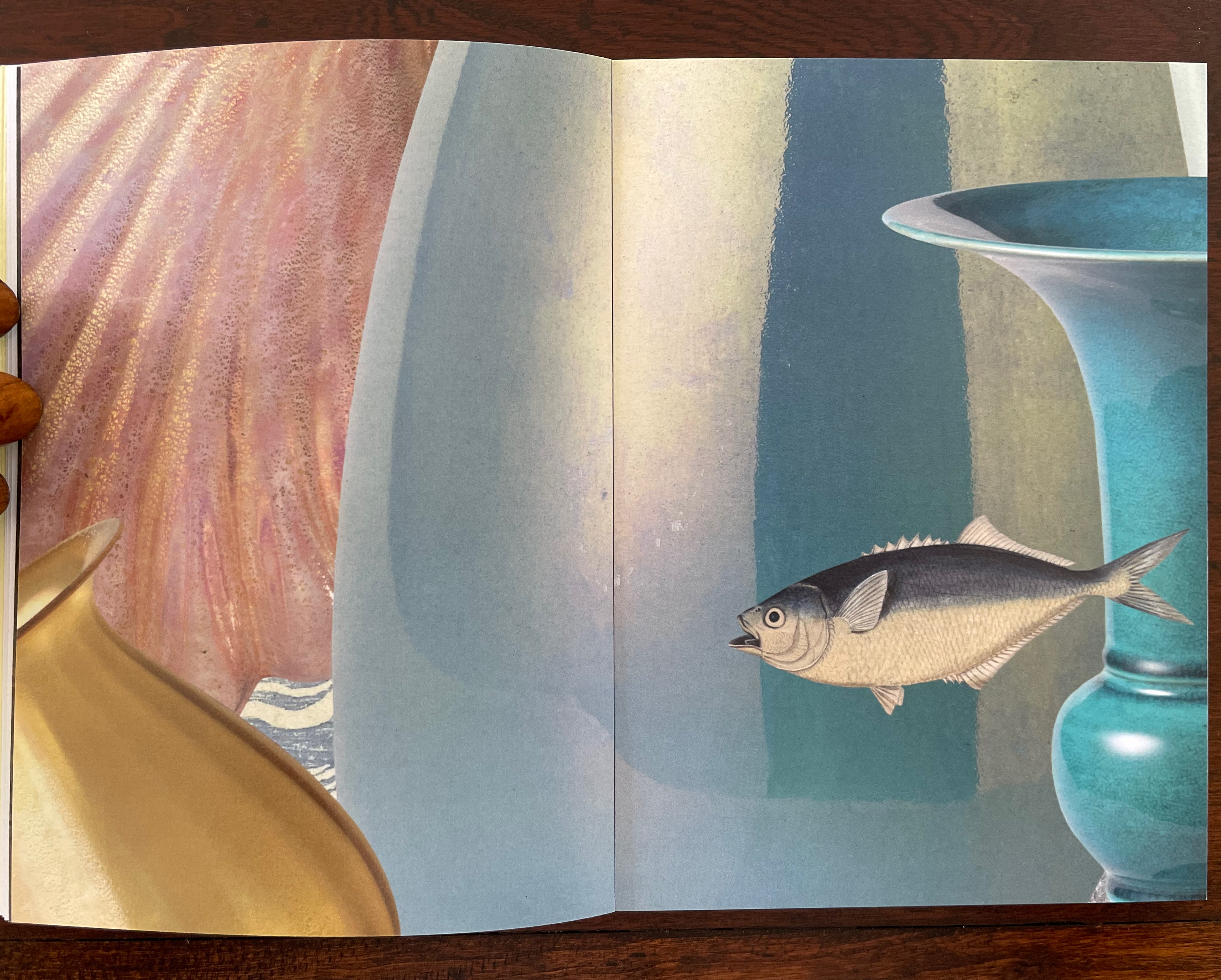
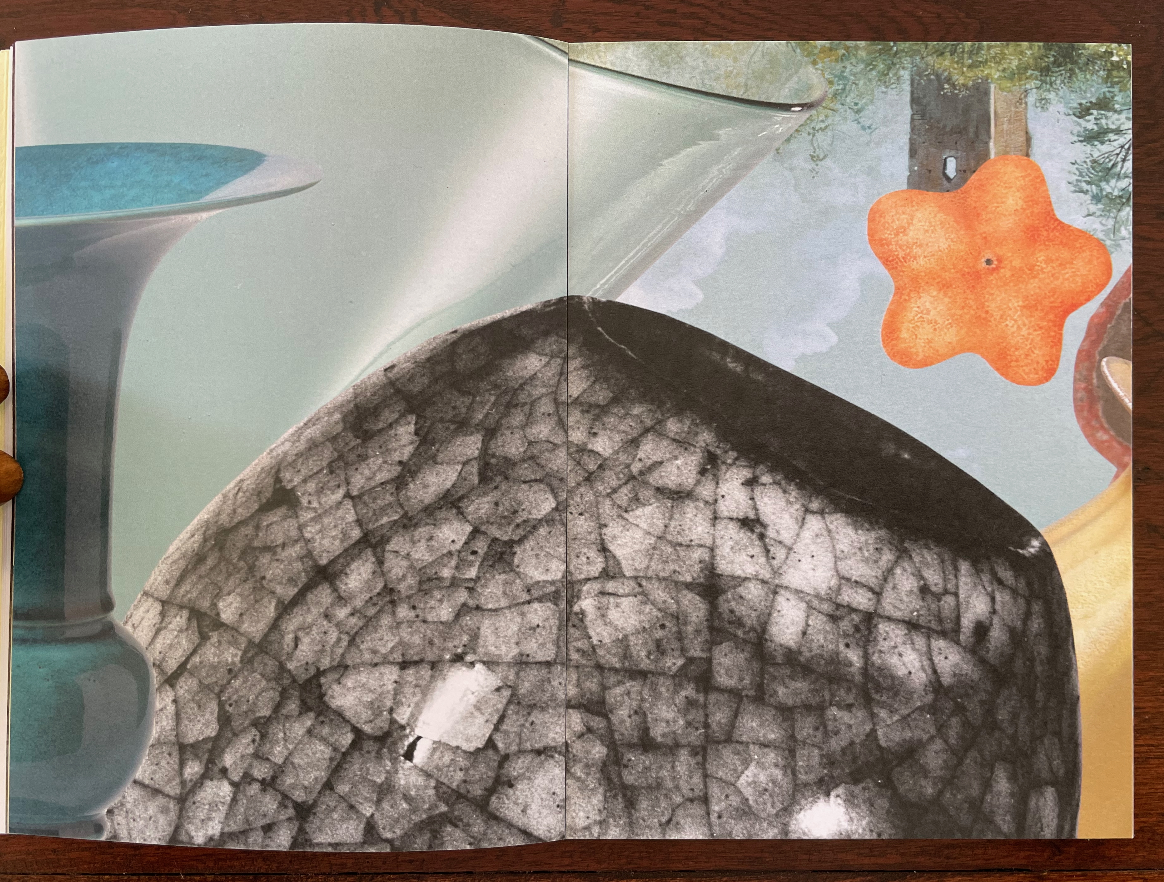
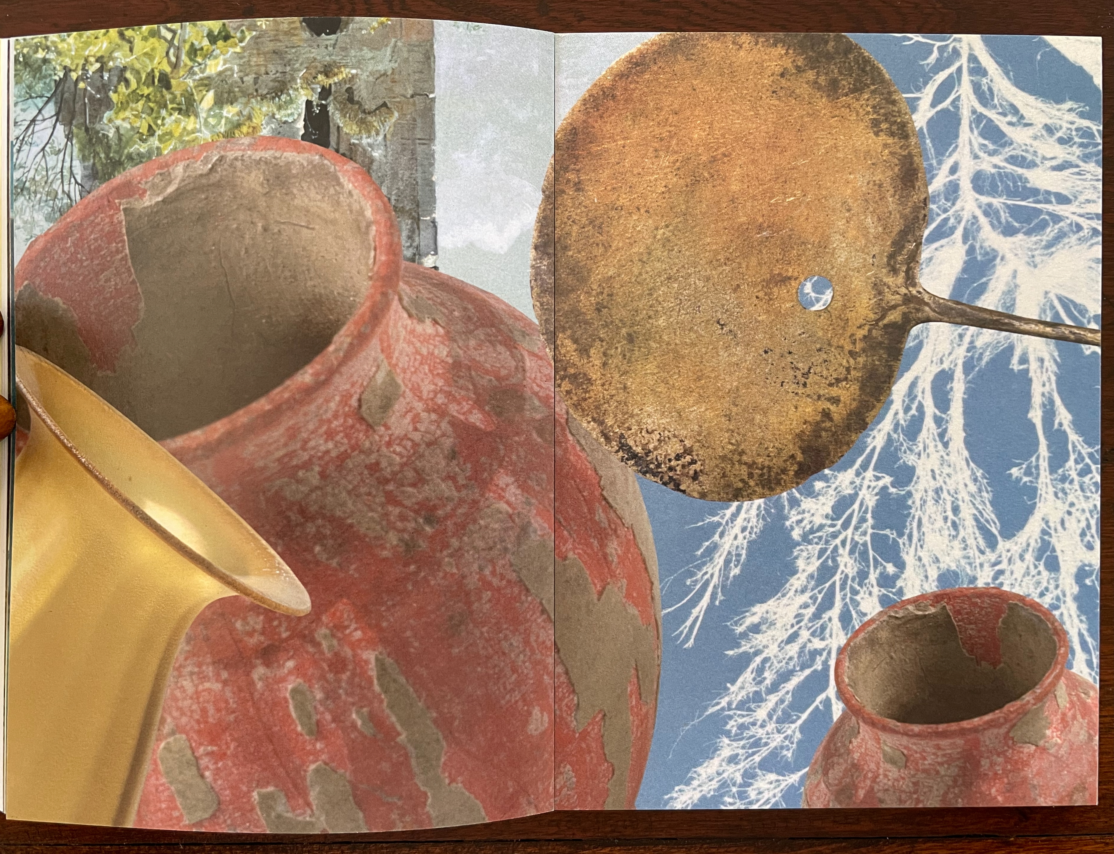
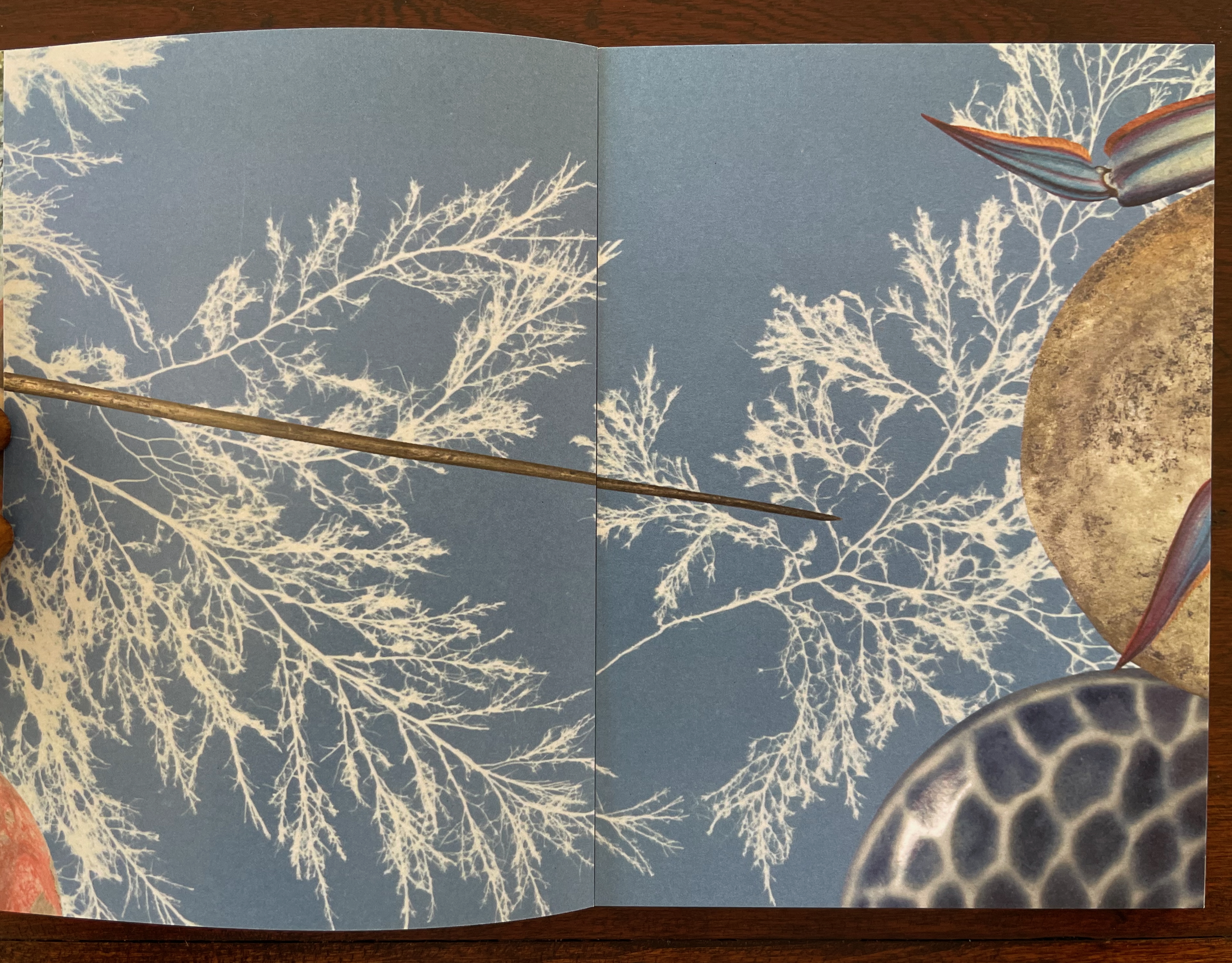
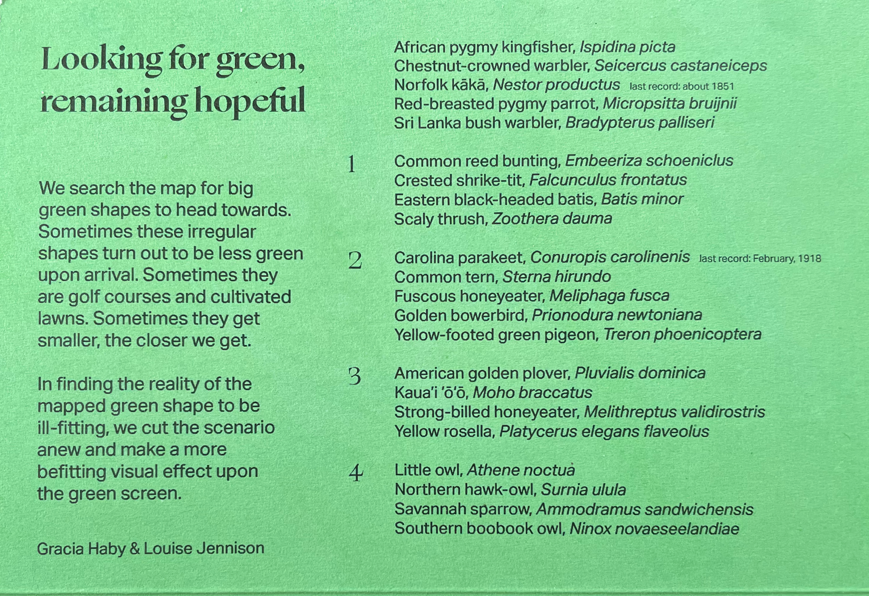
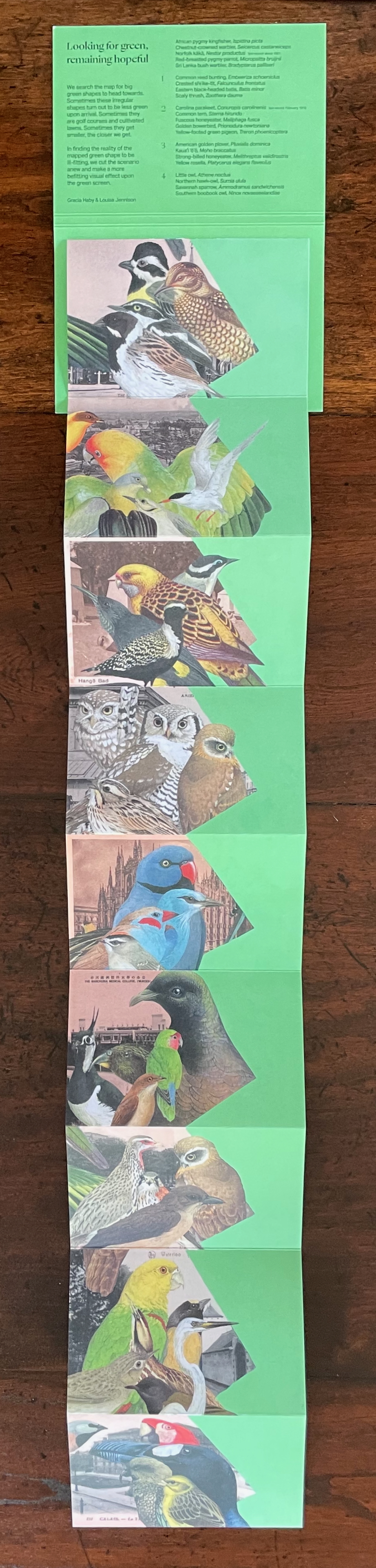
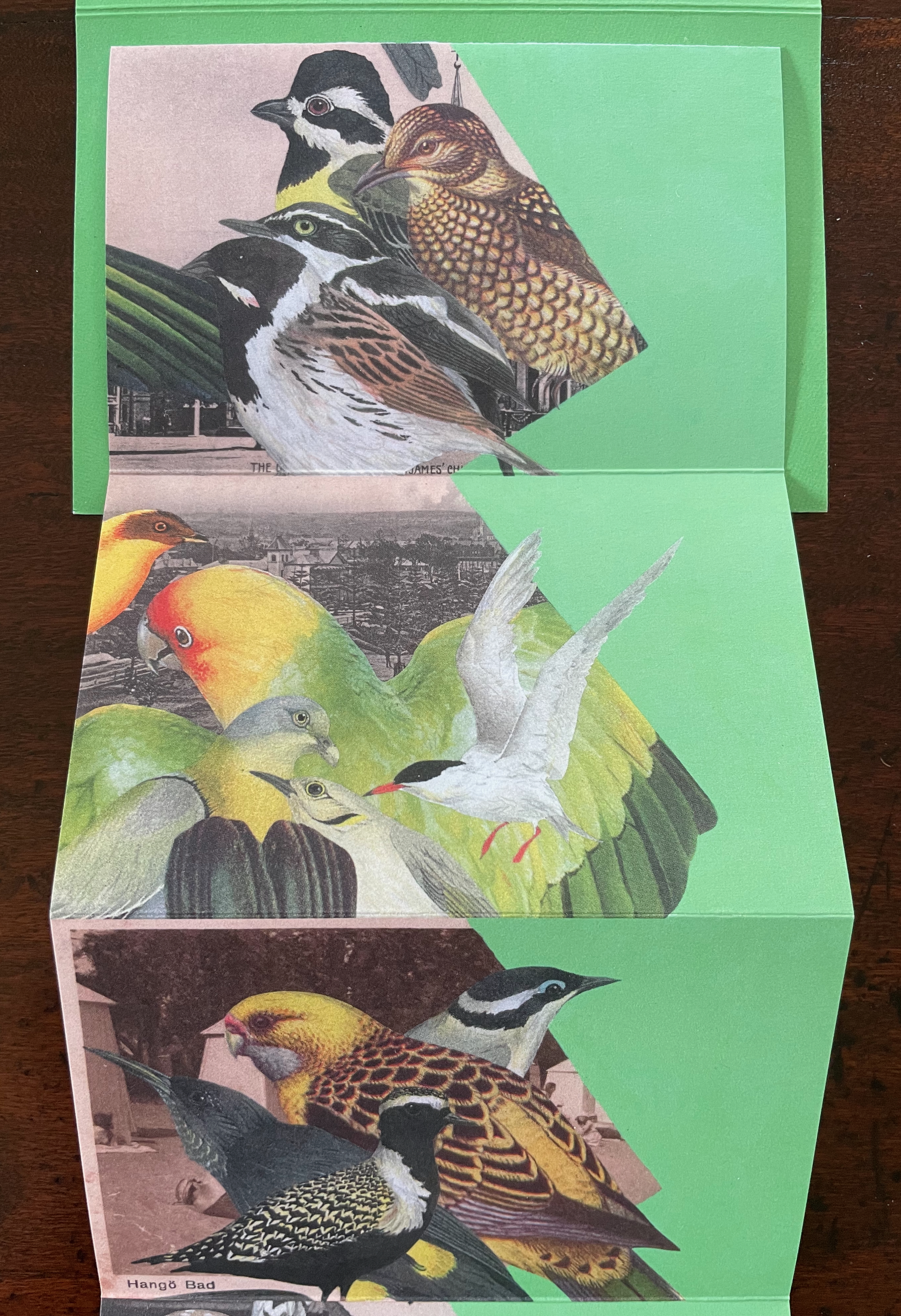
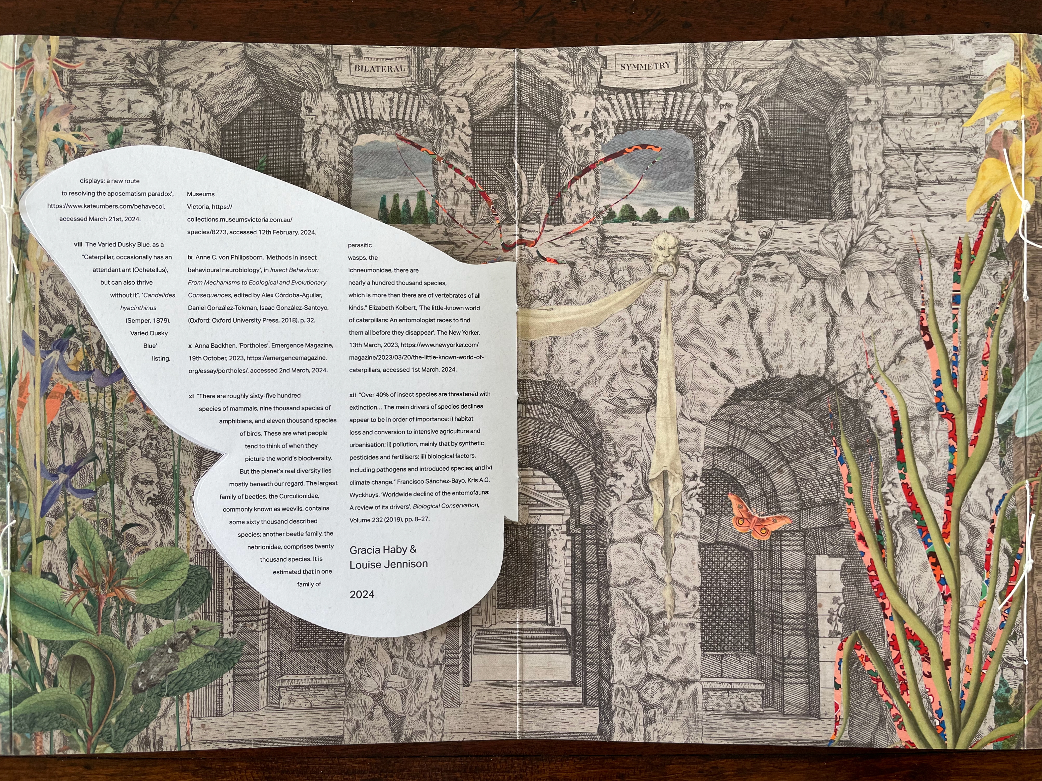
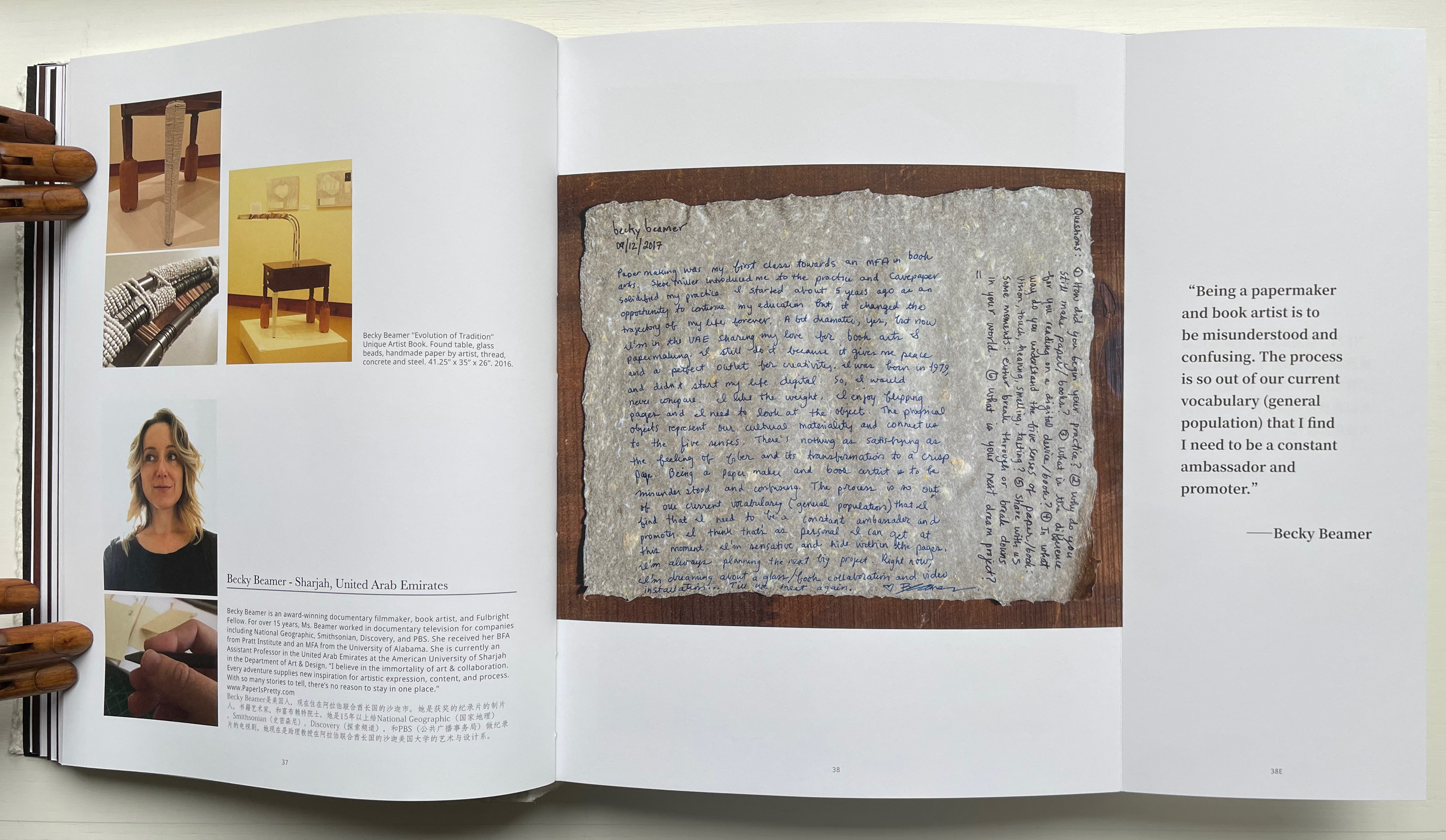
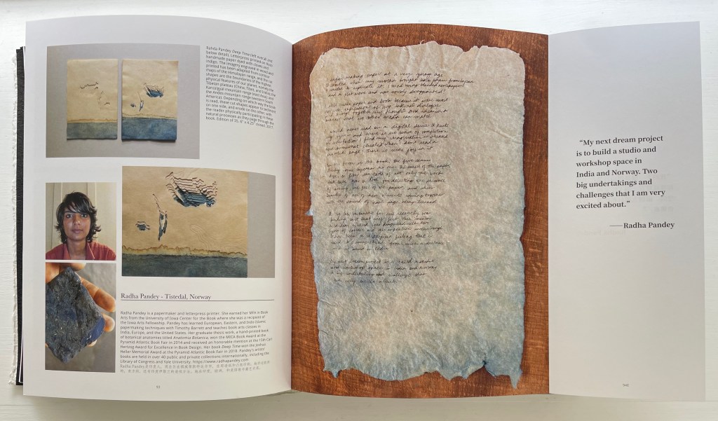
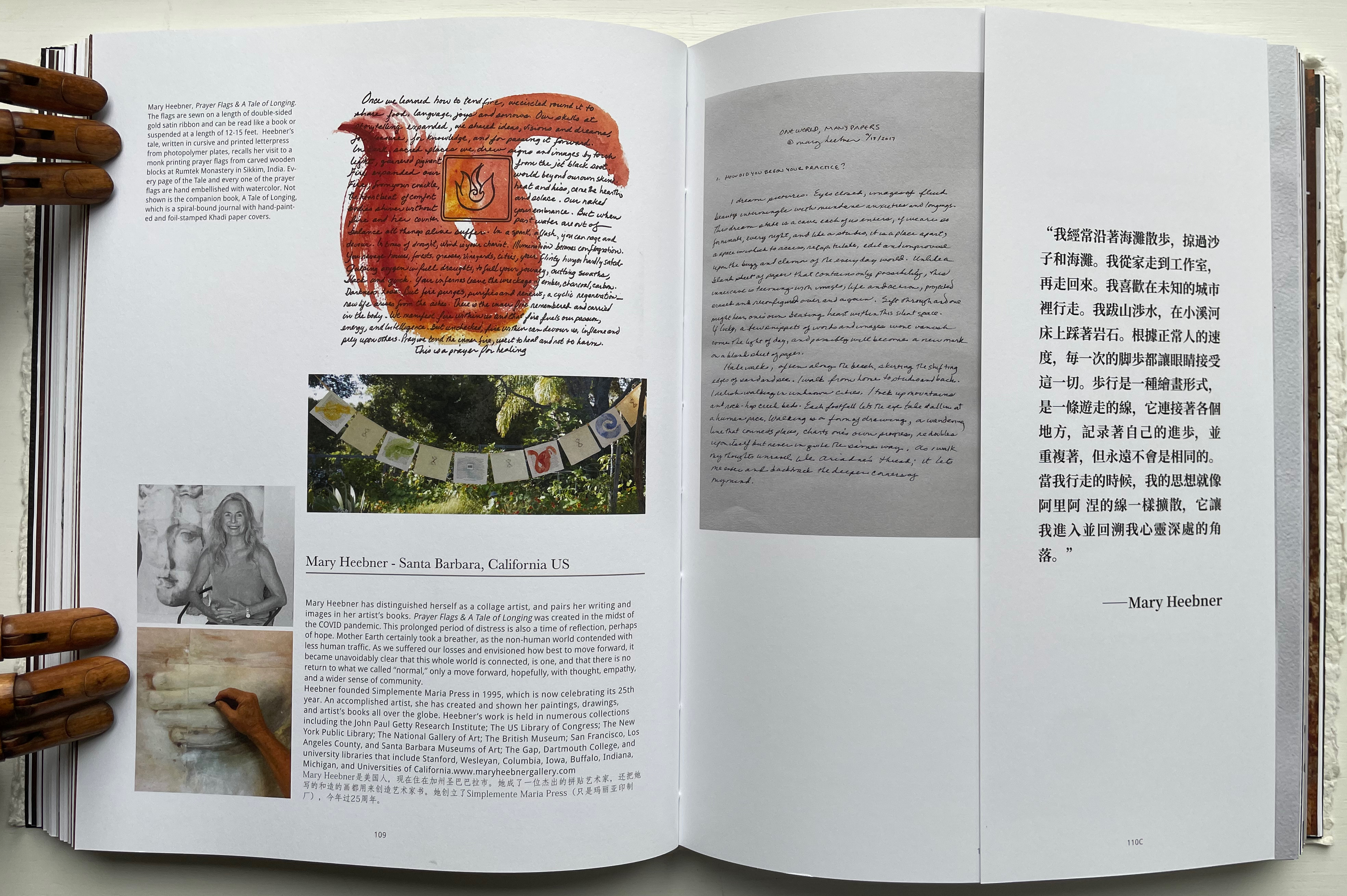
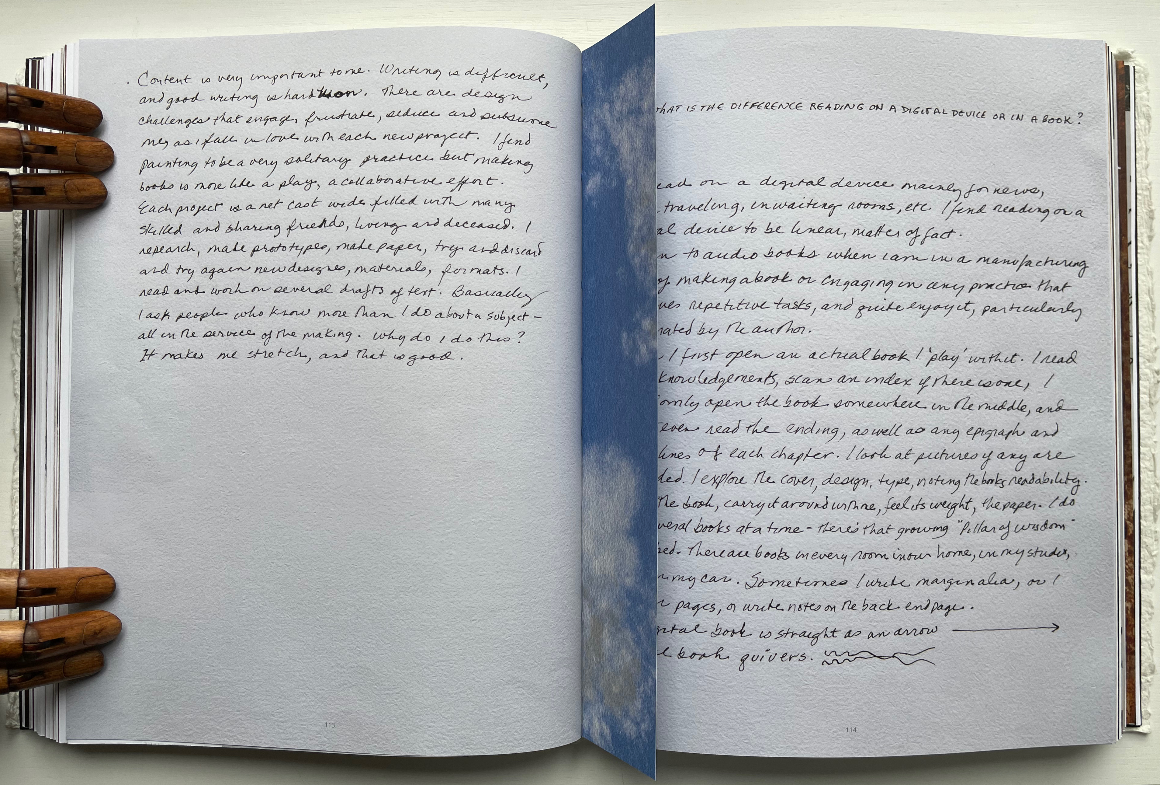
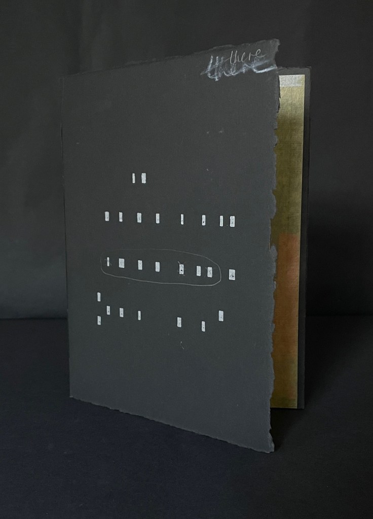
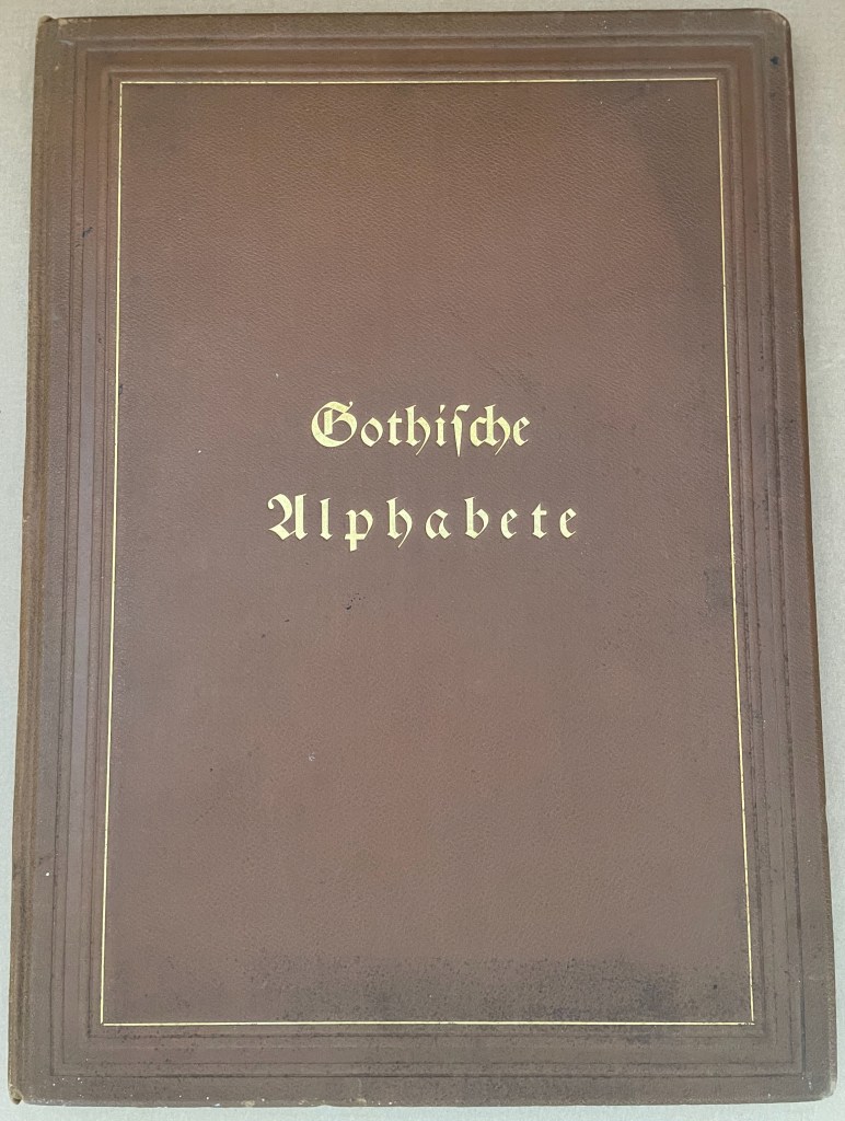
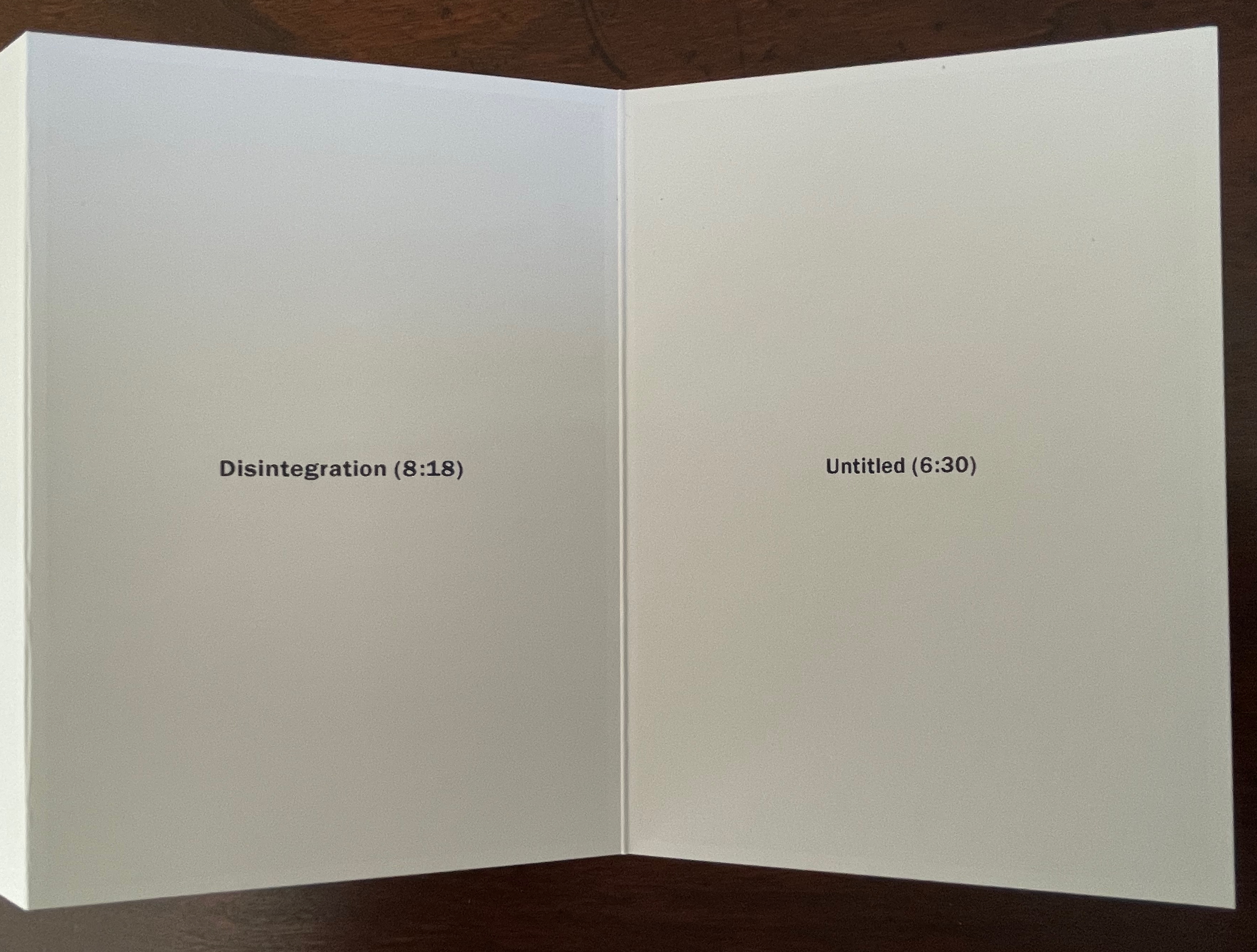
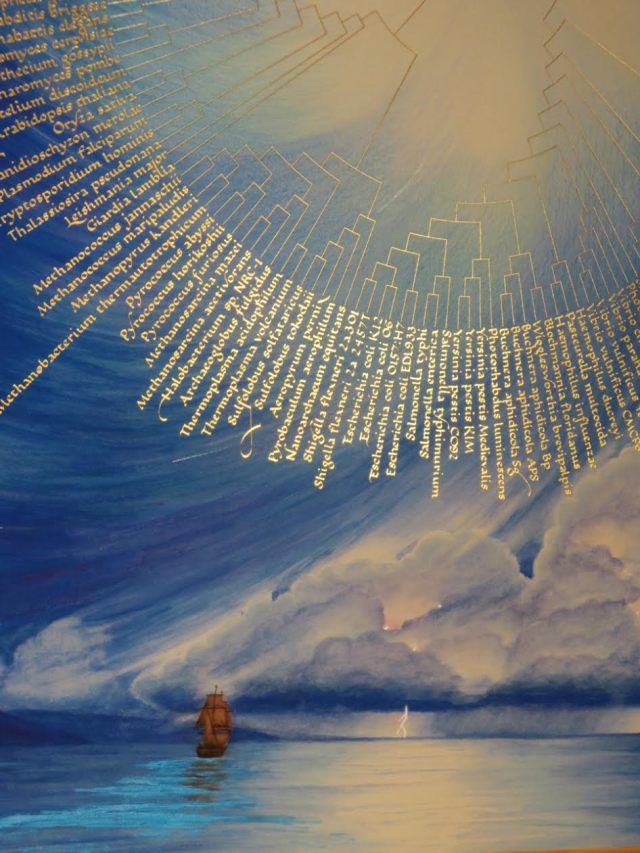
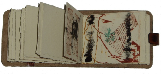
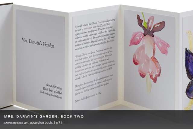
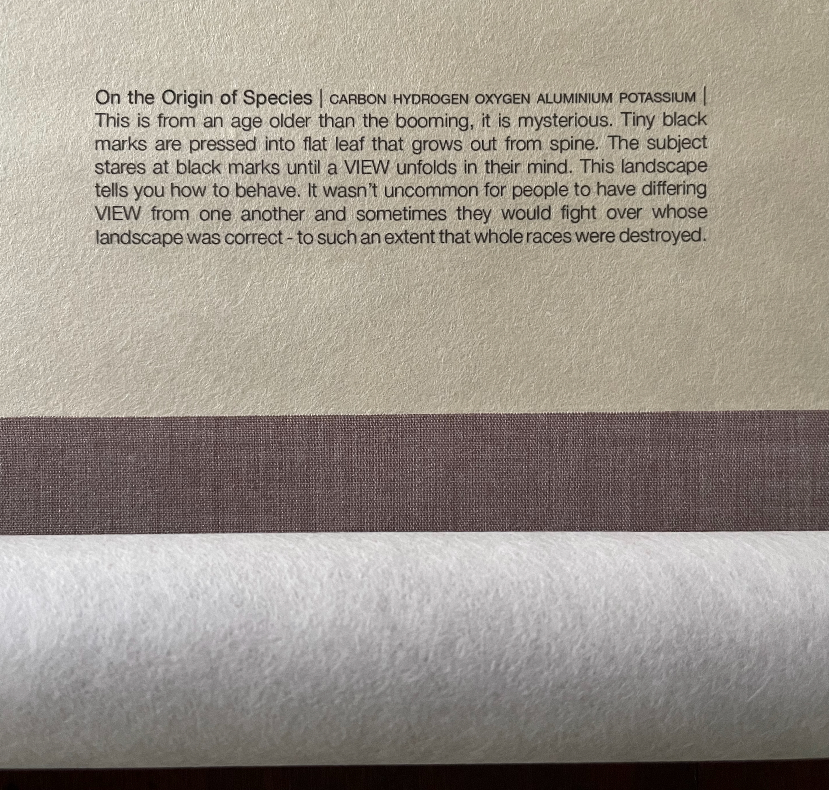
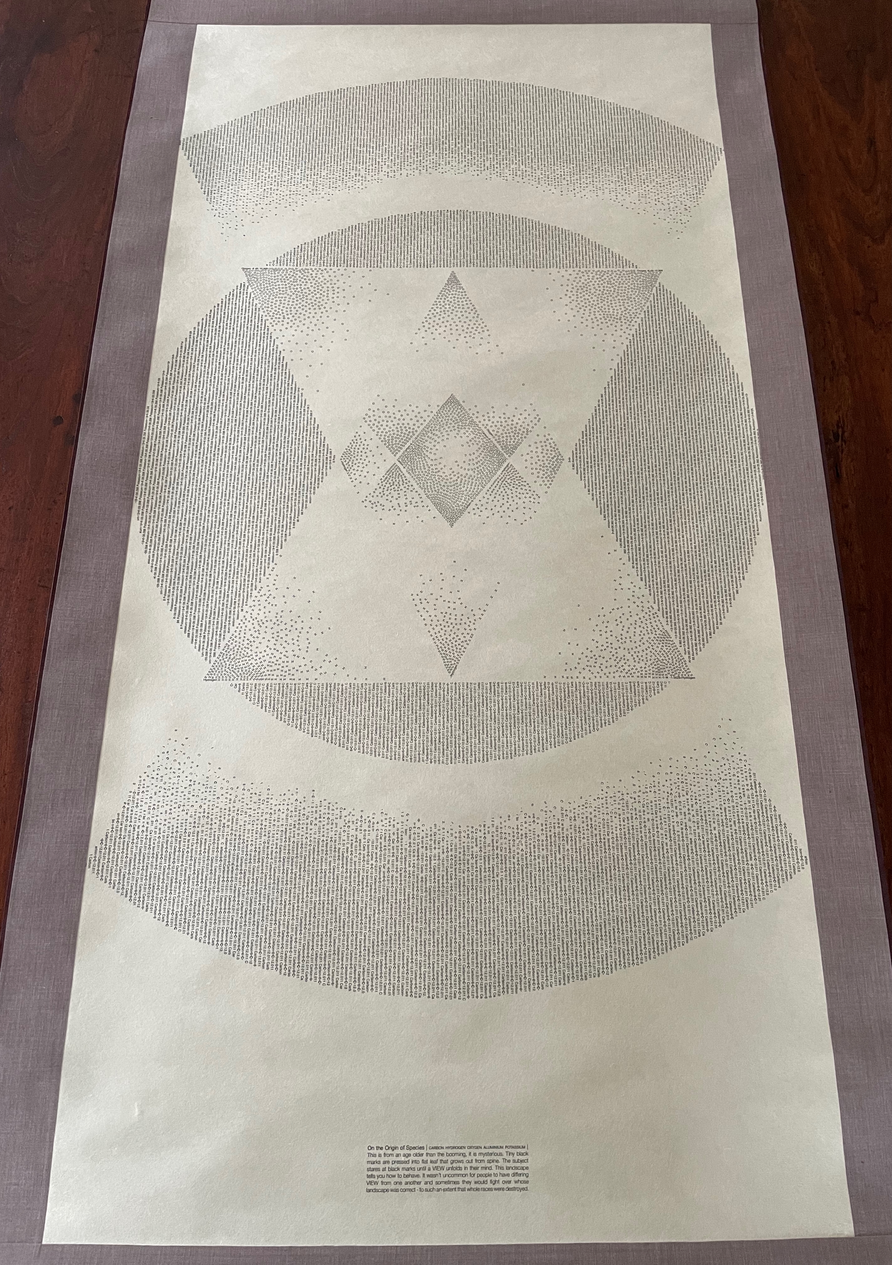
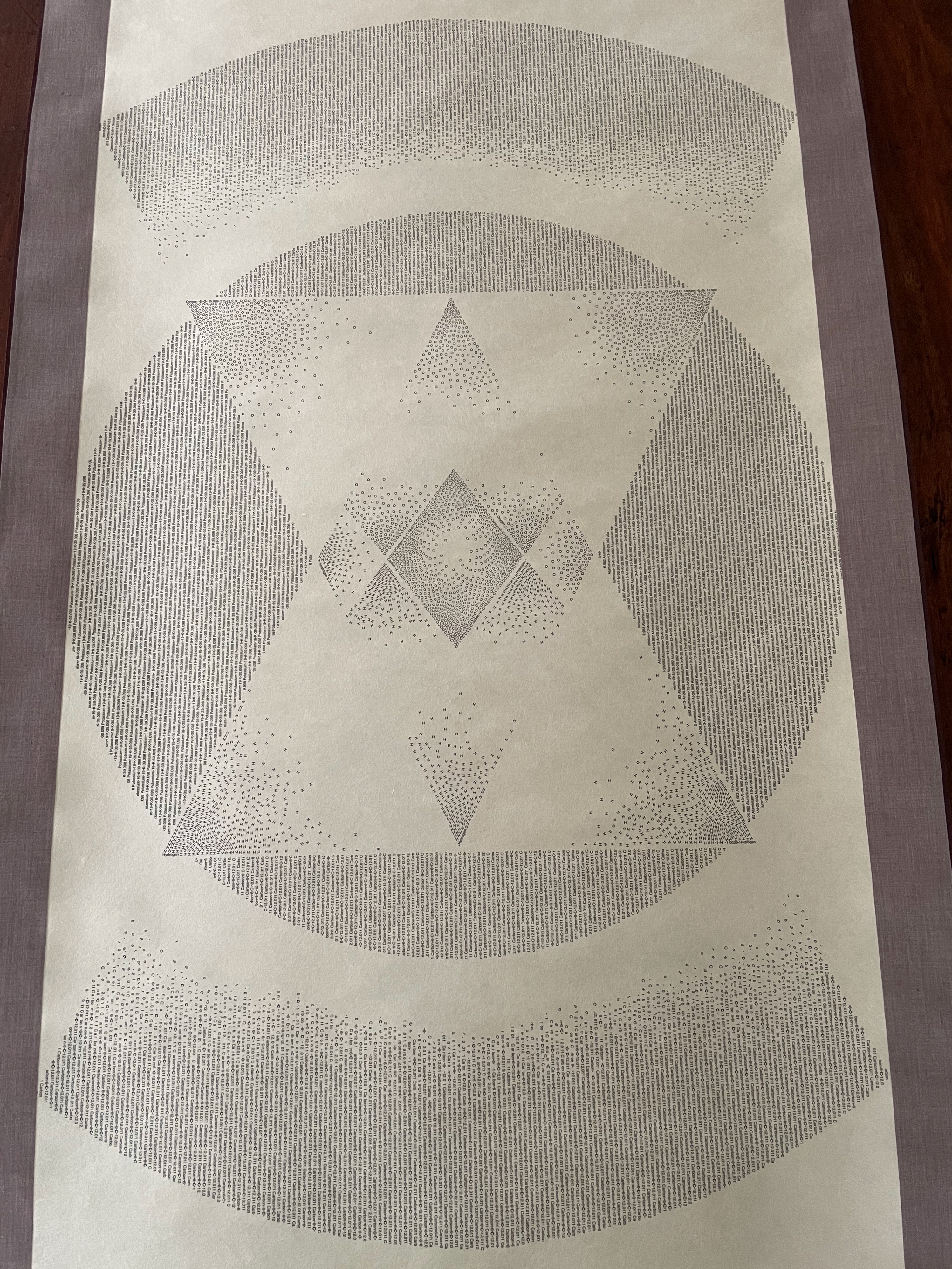
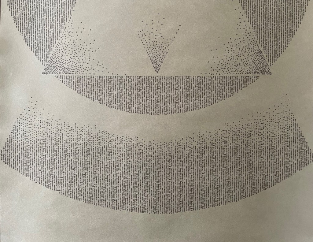
Reading Dick and Jane with Me (1989) Clarissa Sligh Saddle-stitched booklet, staples. H212 x W177 mm. [24] pages. Acquired from Marta Zlotnick, 6 October 2025. Photos: Books On Books Collection.
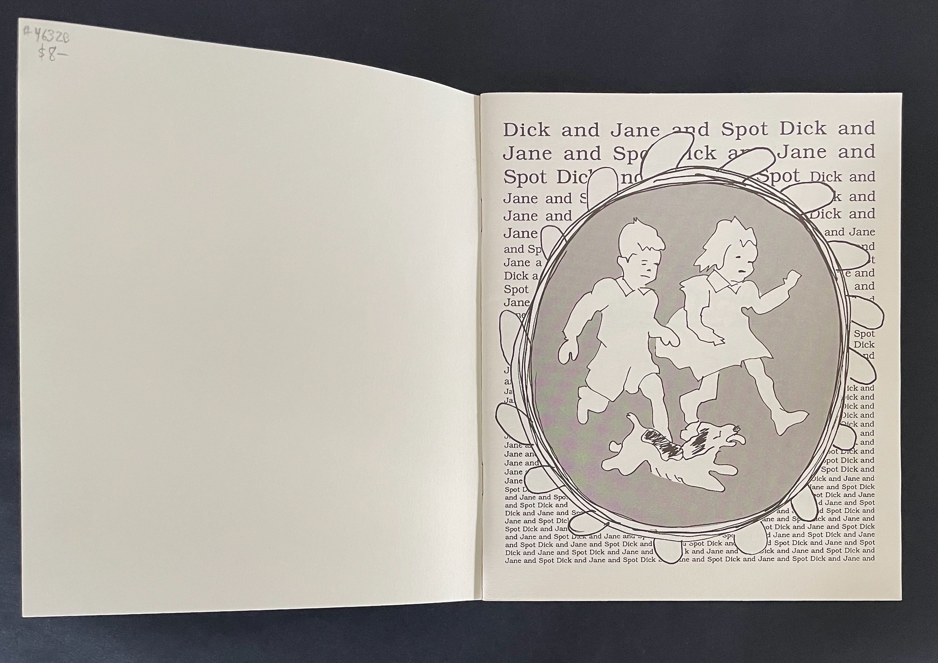
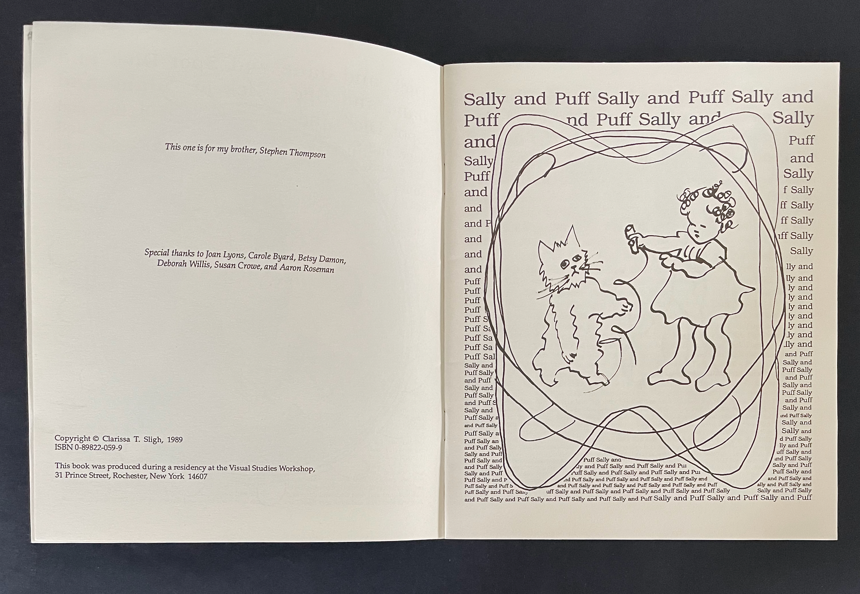
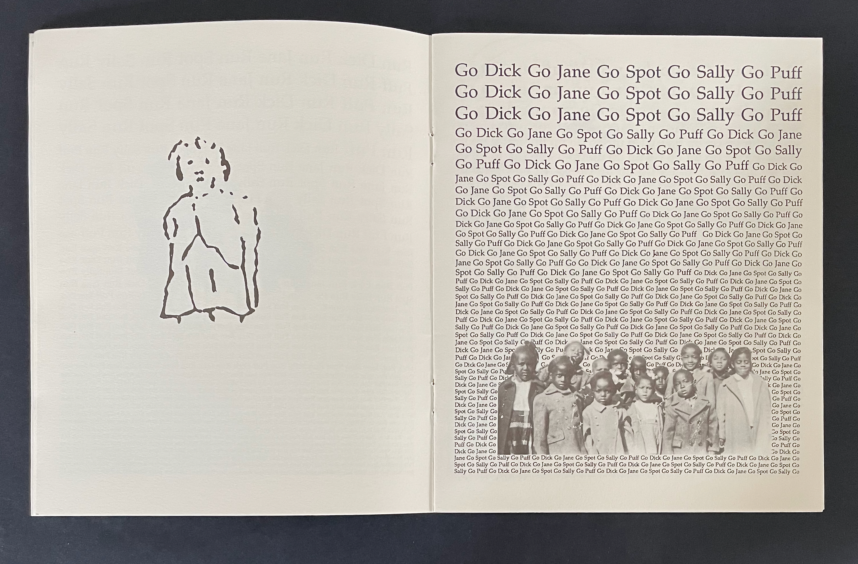
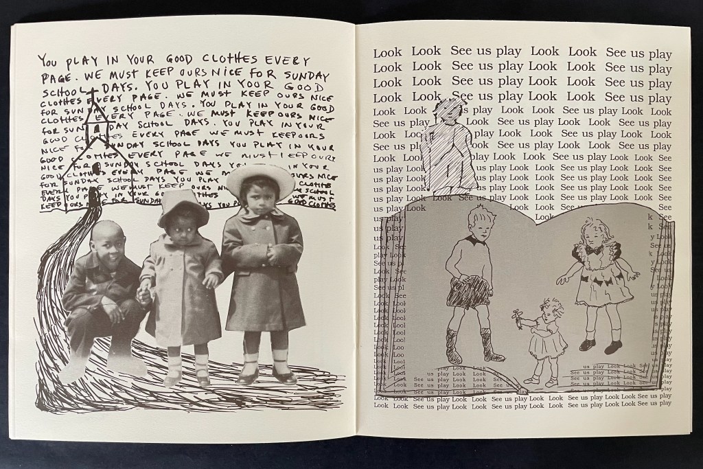
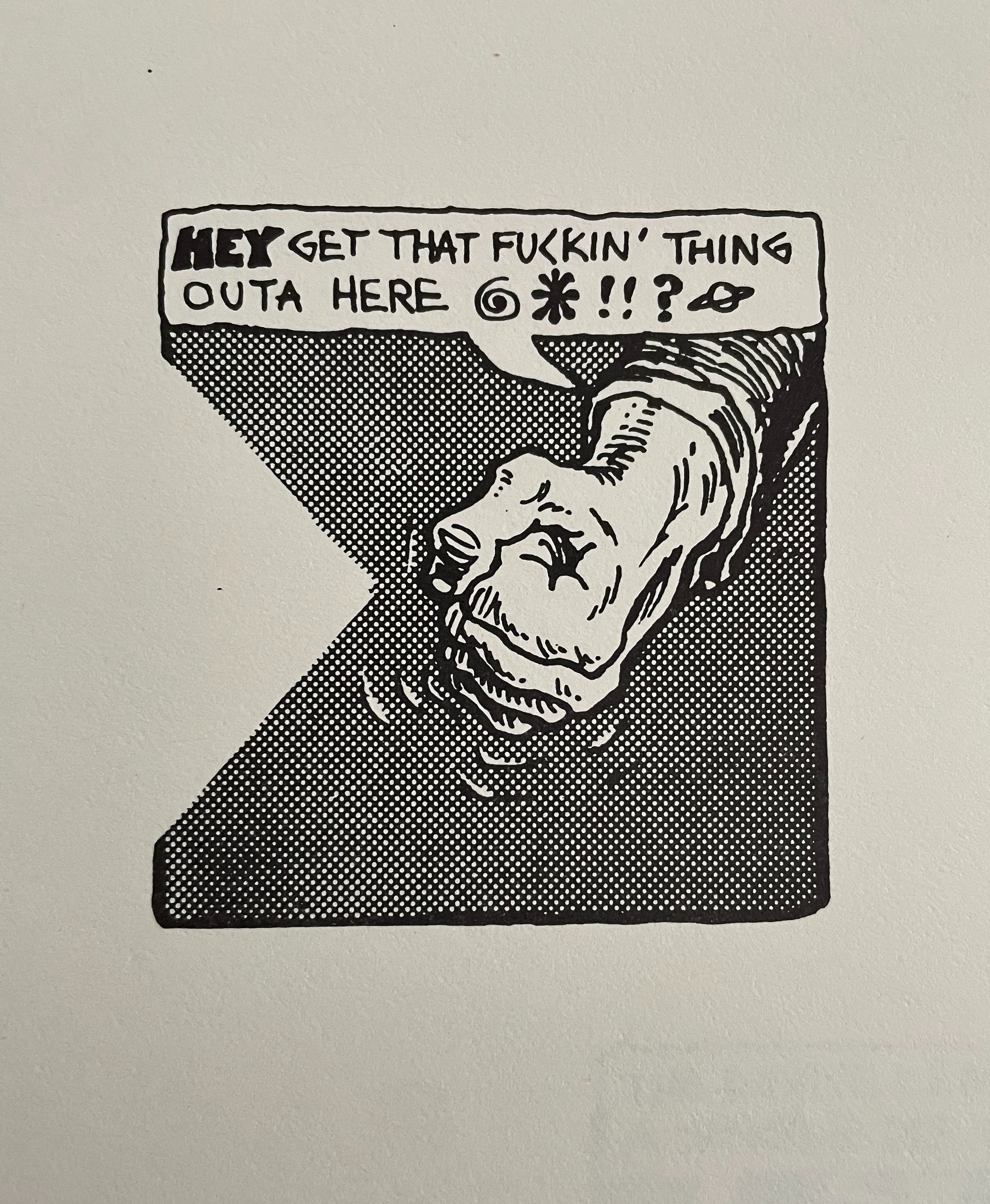
This is a painful artist’s book. In the repetitive style of the 1950s “Dick and Jane” beginning readers’ book, the child in the artist carries on a one-way conversation with children from those books. Dick, Jane, and Sally are white and upper middle class. They live in a suburban setting with their dog Spot and cat Puff, and the text of their lives is interpersed with “Fun”, “Fun”, “Fun”. They run and play, and tell the reader to “Look Look See us play”. Dick demands, “See me jump” and asks, “Who can jump Who can do what I do”. Sally insists on how pretty and white Puff is.
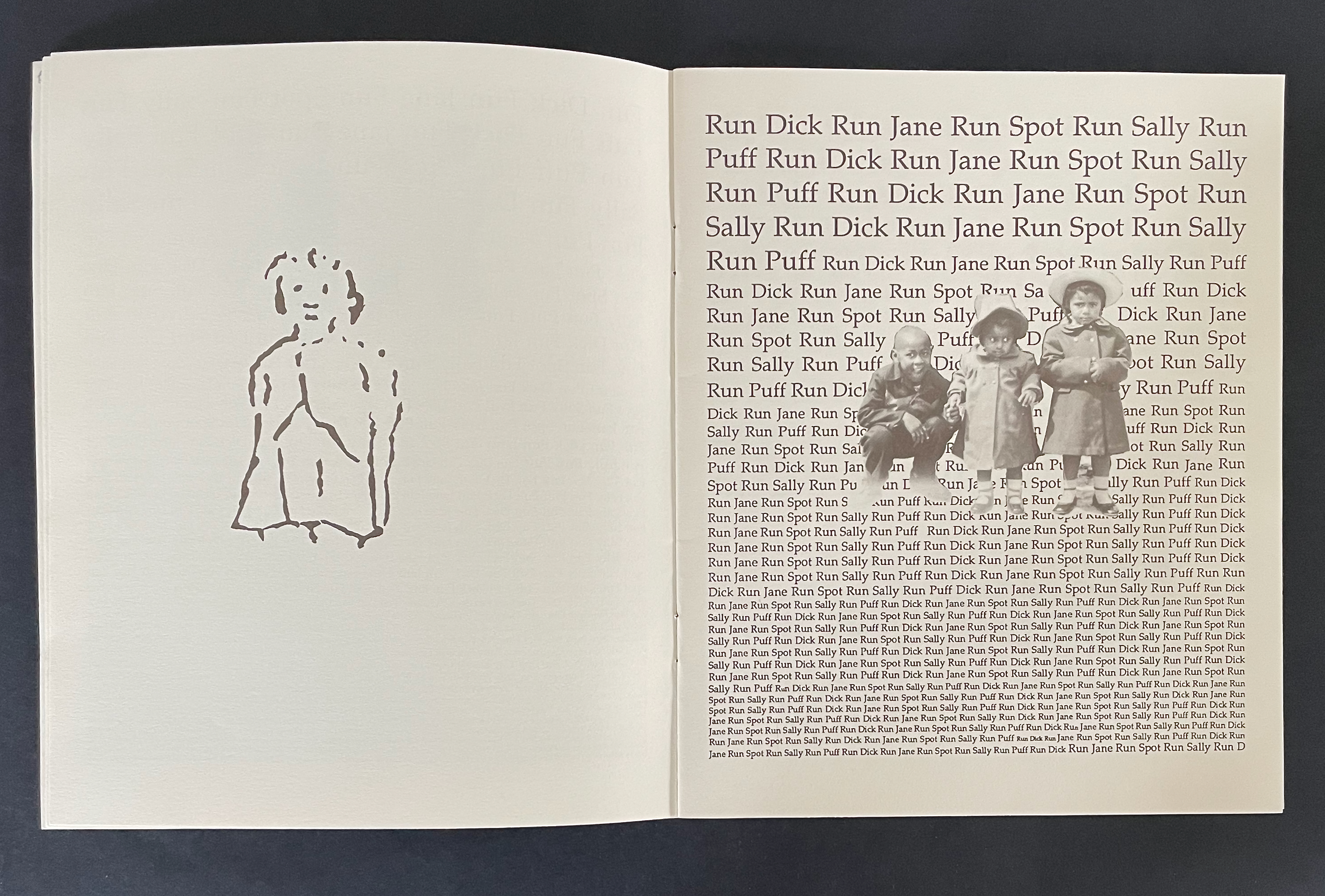
Alongside her redrawn versions of Dick, Jane, Sally, and their pets, the artist sketches in a cartoon self portrait and pastes in old photos of herself, siblings, and friends. For the first few pages, these images respond mutely to the “Dick and Jane” repetitions.
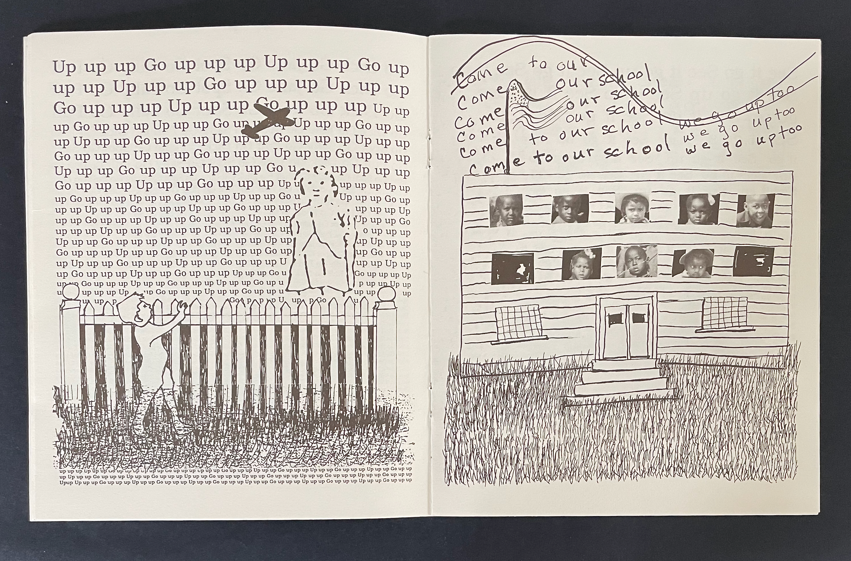
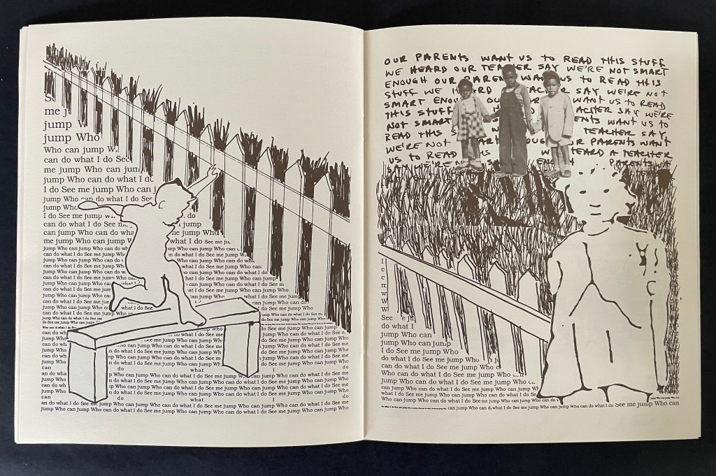
Facing the page below where a white picket fence separates the artist from Dick, she and her friends respond in a scrawled script (in contrast to Dick’s typeset exhortations to “Go up up up”). They invite Dick and the reader to “come to our school” where they “go up too”.
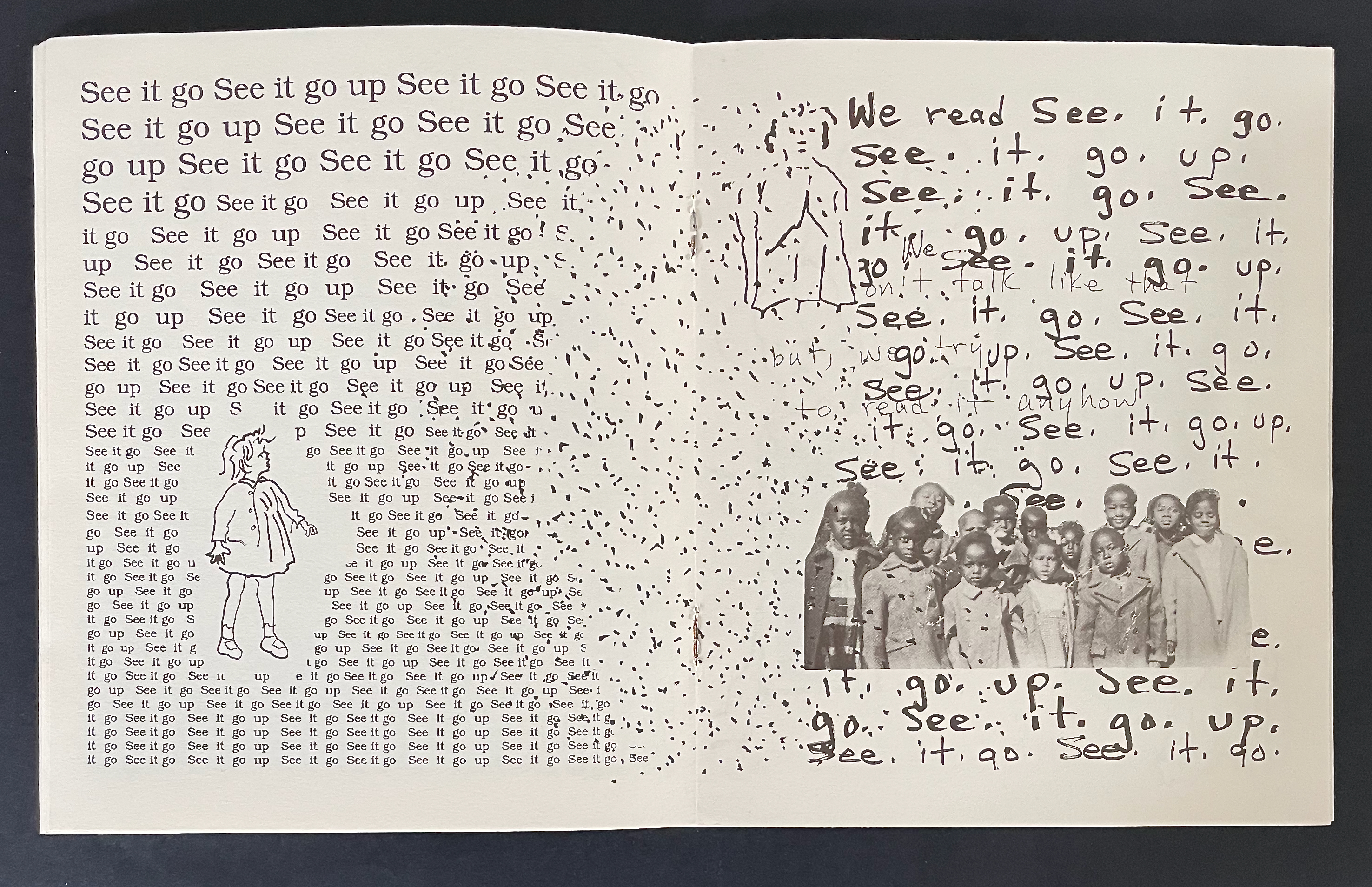
In the next spread, surrounded by imperatives to “See it go” and “See it go up”, Sally frowns and appears troubled by the encroachment of scrawls over the gutter and into her typeset page. On the facing recto page, the artist and friends stutter as they read the typeset lines: “We read See. it. go. see. it. go. up.” Maybe Sally is troubled by the words between the lines:
Between the lines: “We don’t talk like that but we try to read it anyhow”.
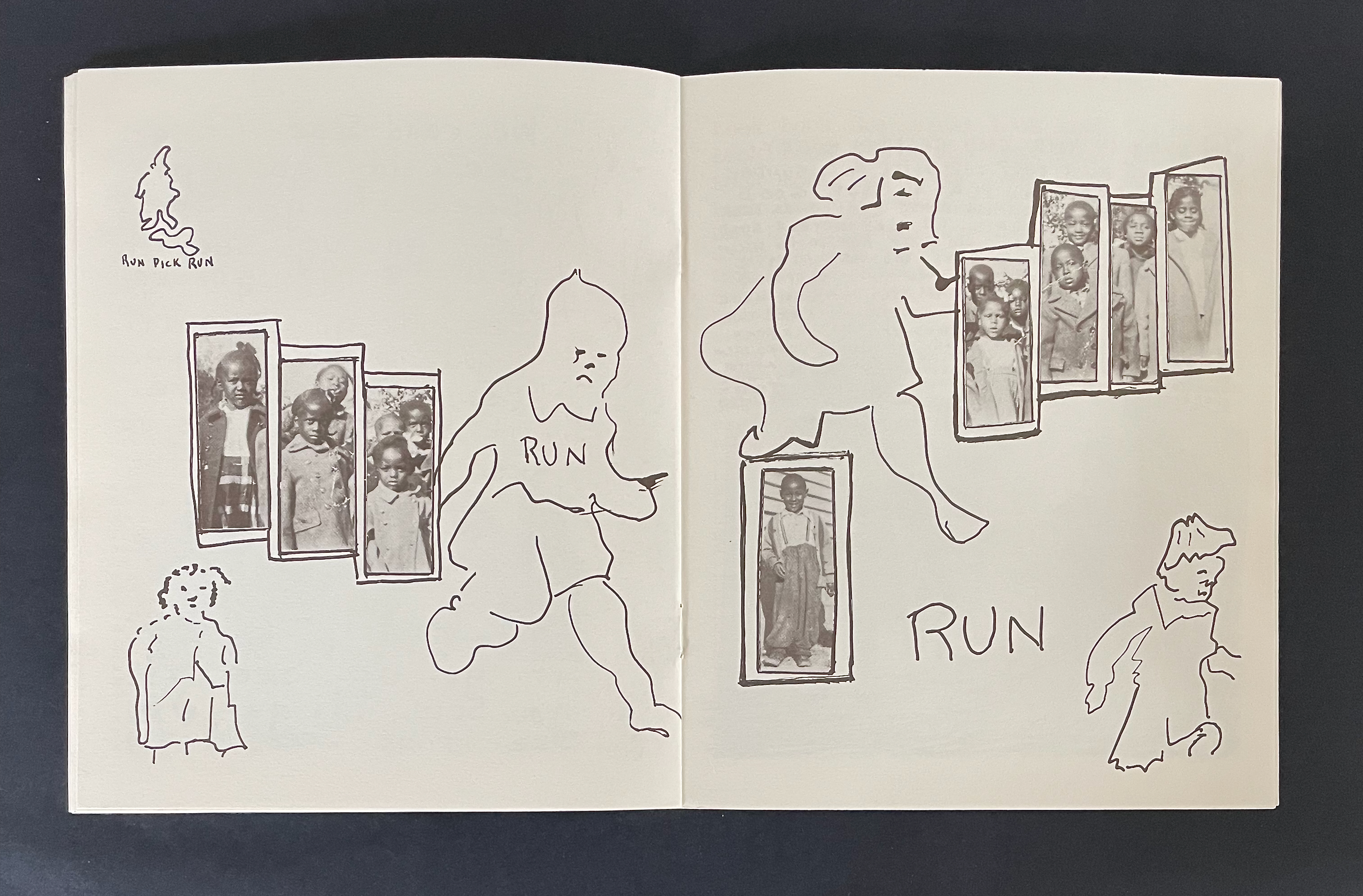
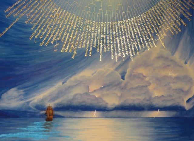
At this point, when the artist and her friends read “Run Dick Run”, the book takes a darker turn for us the readers — if we are reading with the child artist. Dick and Sally run across the double-page spread. Even though they are more roughly sketched than before and even though Dick wears a Ku Klux Klan hood, we know it is them. As the scrawled imperative RUN RUN RUN grows across the spread to its largest size, Dick’s mask slips aside. If you the reader are white, and if you understand that the scrawled (not typeset) command is in the artist’s voice, and if you are reading with the child who stands self-portrayed in the lower left hand corner and with the children in the photographs, maybe now you see what they see between the lines in Dick and Jane’s world.
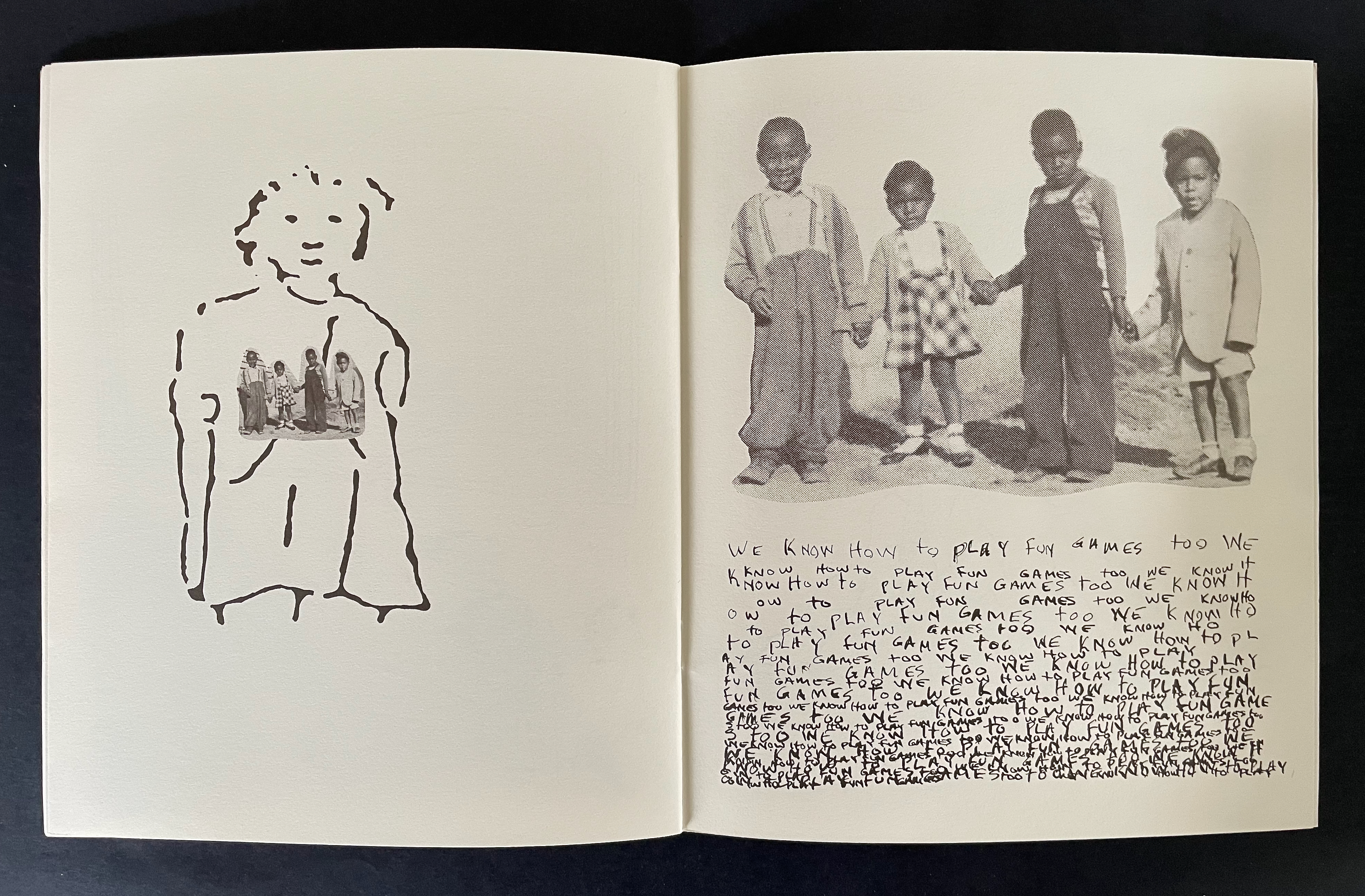
From here on, the child artist addresses Dick and Jane (white society) more directly. She signals her “encroachment” by taking over the verso page with all of her scrawl and places Dick, Jane, and Sally within the drawn pages of their book in the foreground of the recto page. For the first time, her self-portrait is shaded as she stands in the background of the shaded Dick and Jane book.
As she explains how she and her friends differ from Dick and Jane (not likely to be listening, embedded as they are in their book), the child artist’s voice is soft but insistent in its “Dick and Jane” style repetition. For the first time, her self-portrait appears larger than the white child, and she is on the same side of the picket fence.
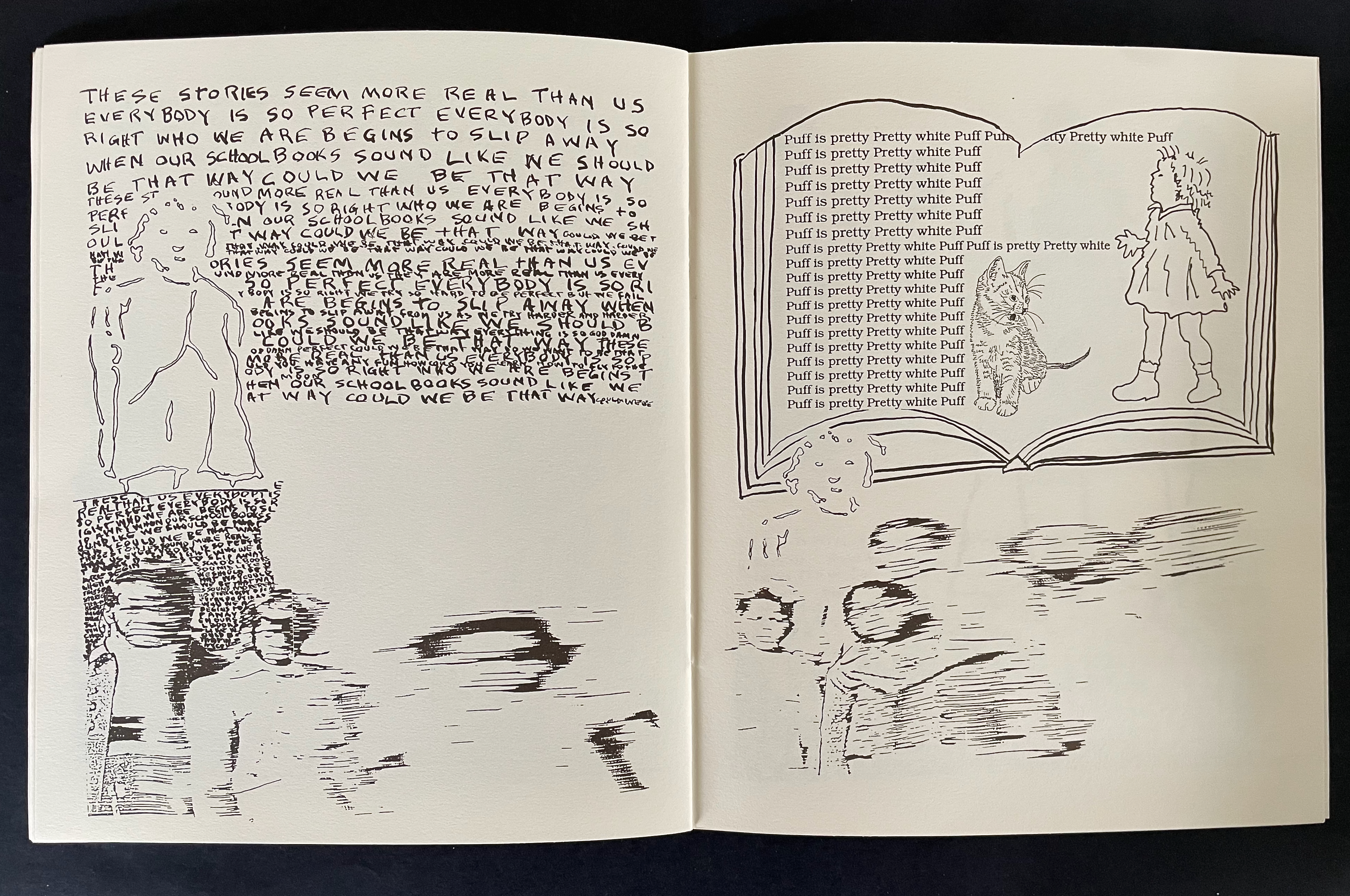
In the next spread, the impact of these “Dick and Jane” stories on her and her friends is spelled out and drawn to heartbreaking effect. Sally and “Pretty white Puff” stand in sharply drawn and typeset contrast to the erasure, the slipping away, of the self-portrait and the photograph. Even the book you hold in your hands and its hand scrawled text are smearing away in the lower left corner.
The artist’s voice is soft but, like the “Dick and Jane” style, insistent. In text and image, the message is heartfelt.
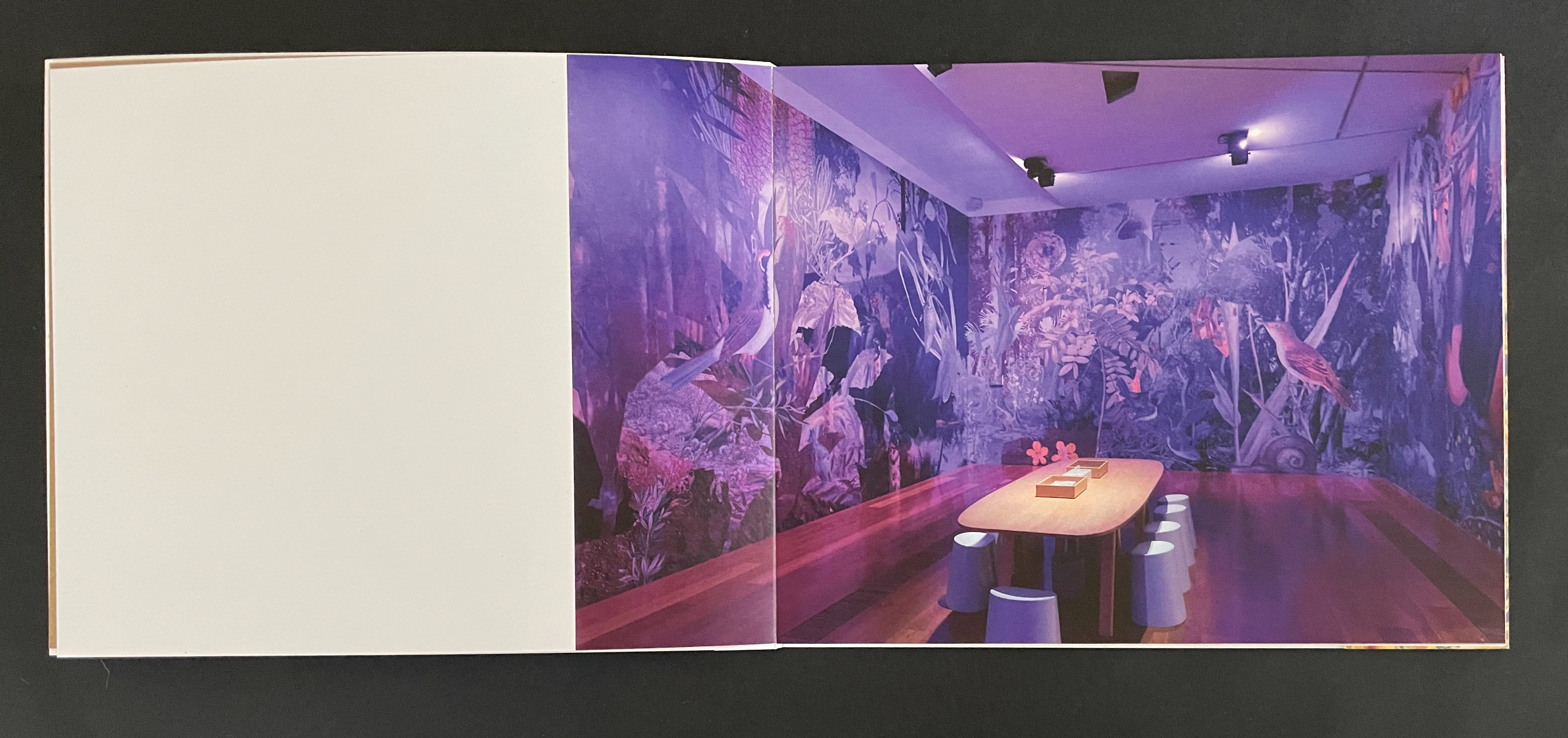
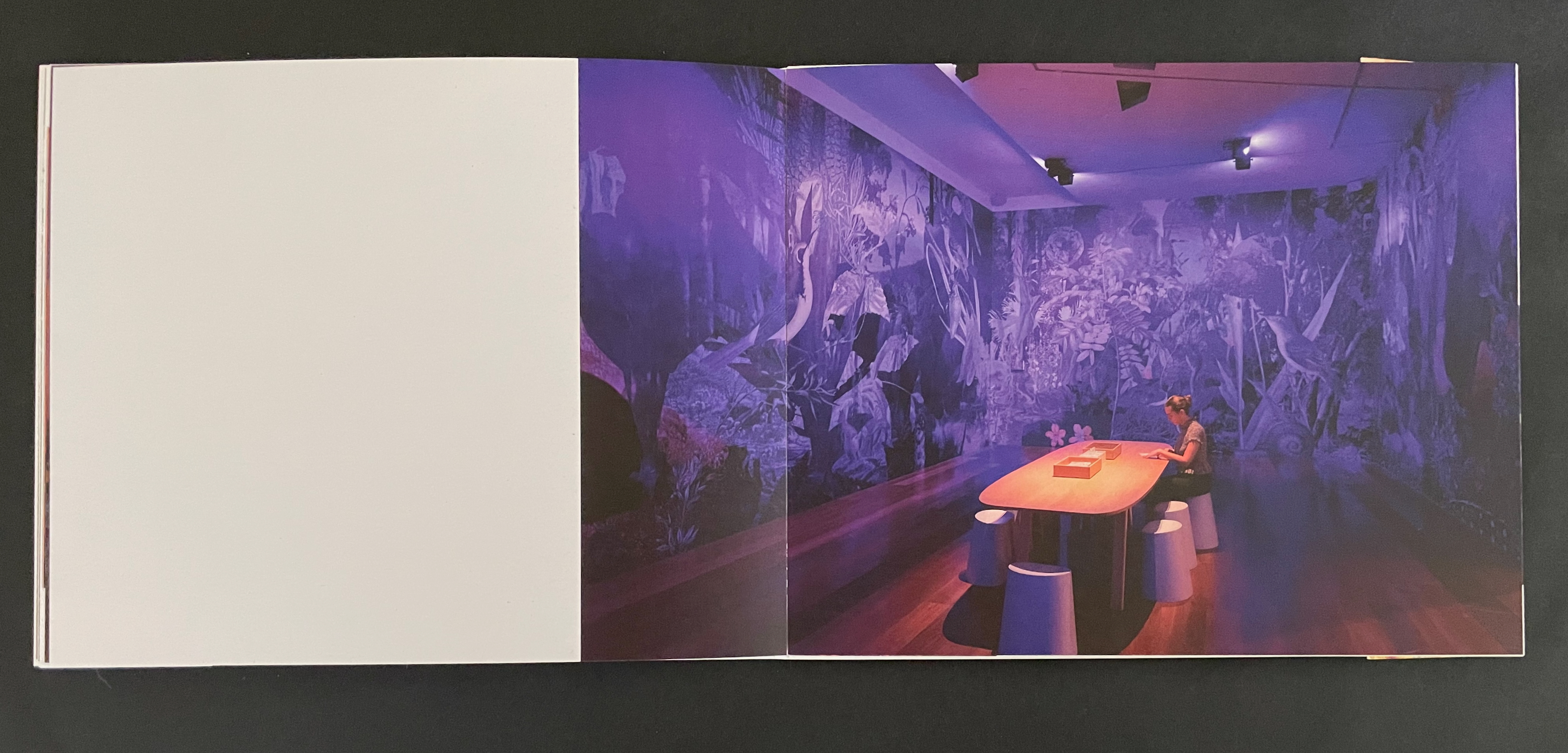
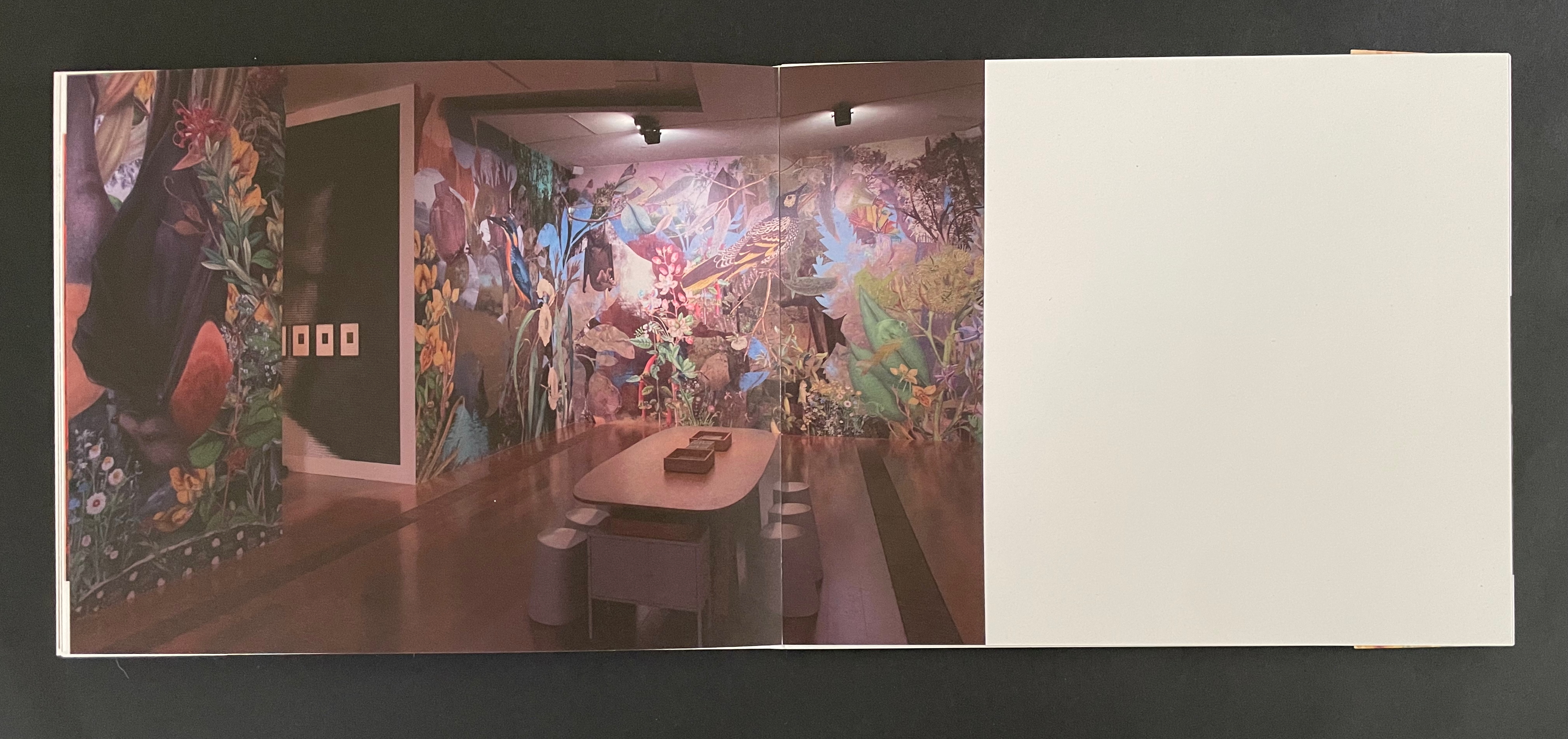
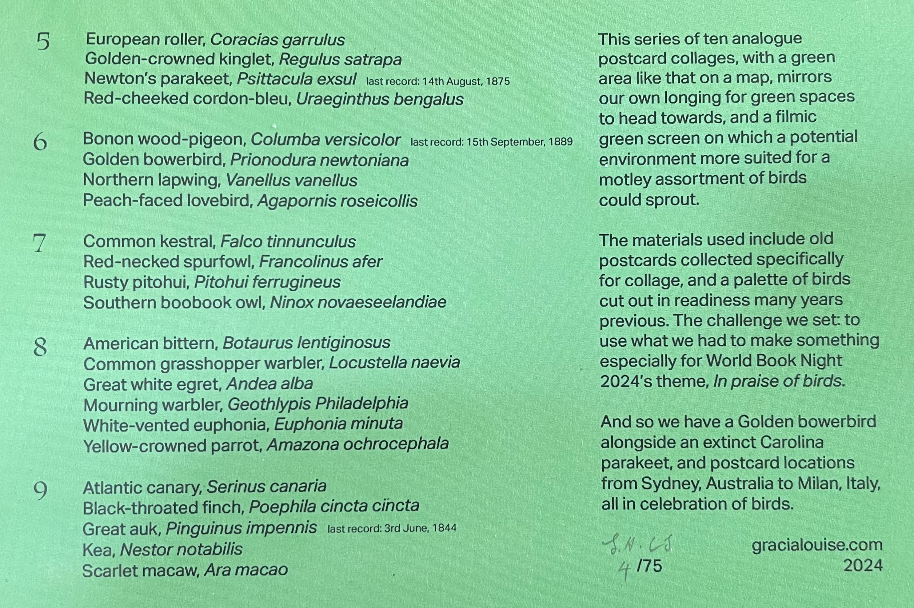
Reading Dick and Jane with Me also had an exhibition life, which Sligh describes on her website:
These cyanotype prints, 40 x 30 inches, 1990-2013, originated from artwork made for my artist’s book Reading Dick and Jane With Me while in residency at Visual Studies Workshop in 1989. The size of the original collage and the book page was about 8 ½ x 7 inches. During that residency at VSW, before the days of Photoshop, I learned to shoot the artwork onto film, strip and spot the films and make metal plates for the offset press printing of the book.
With the encouragement of Joan Lyons, the VSW Press director, I also used the large process camera to shoot and develop large negatives from the artwork. After returning home, I built a large light table, contact printed the negatives and processed them in my bathtub. The prints are sent to various exhibition sites. Viewers draw and mark on the prints in response to my image and text narratives. This process is done repeatedly until the prints are fully covered with marks and sketches left by the public.
The process continues. — Sligh website, accessed 17 July 2026.
As of this writing — in the time of Jim Crow 2.0, brutalization of children of color, and vicious beliefs in replacement theory and empathy as sin — Reading Dick and Jane With Me continues to insist — Read Dick. Read Jane. Read Sally. Read.
Further Reading
“Tia Blassingame”. 17 August 2020. Books On Books Collection.
Gabor, Nora. 18 February 2021. “Black History and Experiences through Book Arts“. The Full Text: News about library resources and services. Chicago, IL: DePaul University. Accessed 22 January 2024.
Gleek, Charlie. 2019. “Centuries of Black Artists’ Books“. Presented at “Black Bibliographia: Print/Culture/Art” conference at the Center for Material Culture Studies, University of Delaware, 27 April 2019, pp. 7-8. Accessed 20 July 2020.
Sligh, Clarissa. 1 July 2006. Interview with Steve Miller, Book Arts Podcasts, School of Library Information and Sciences, University of Alabama. Accessed 20 July 2020.
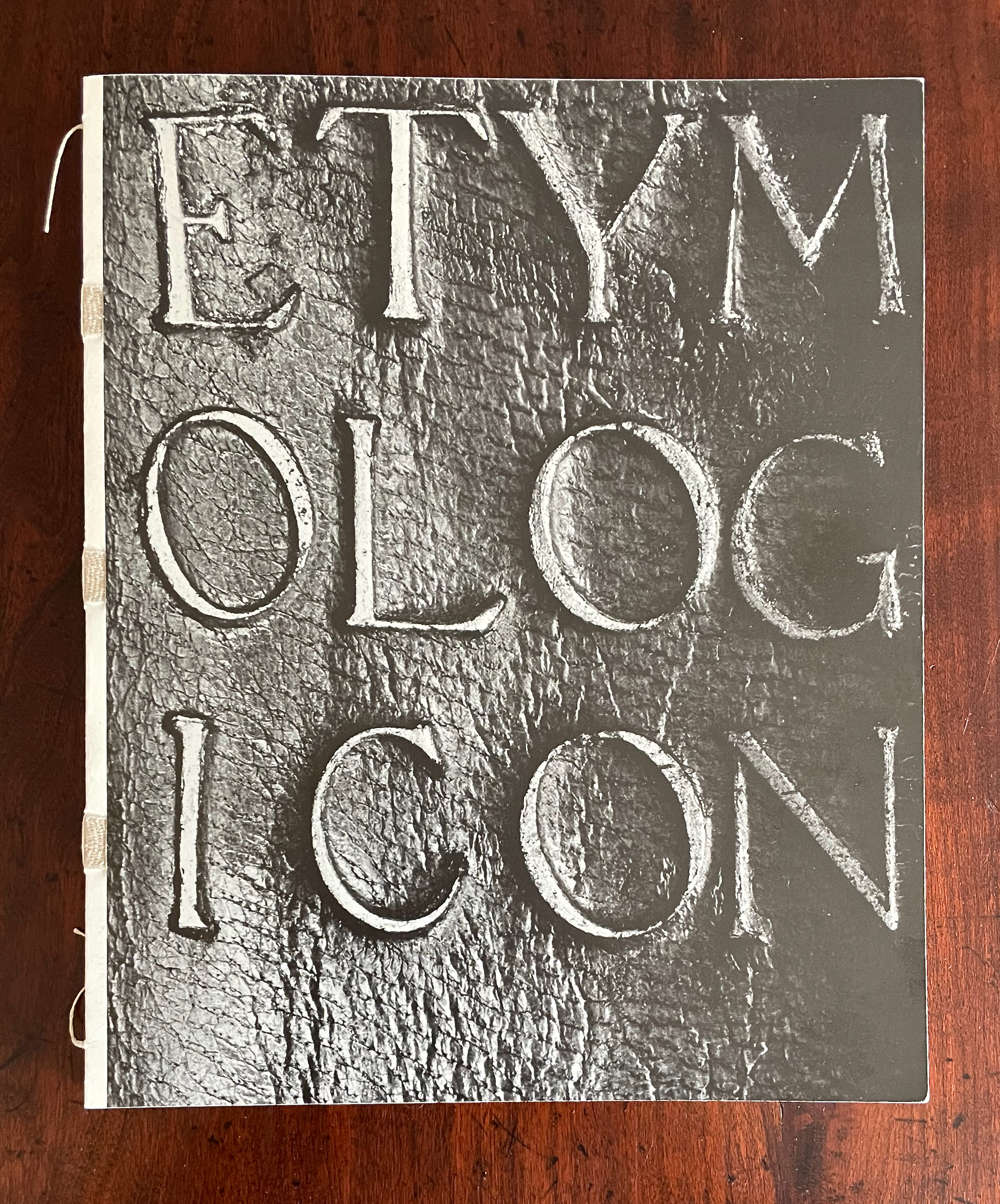
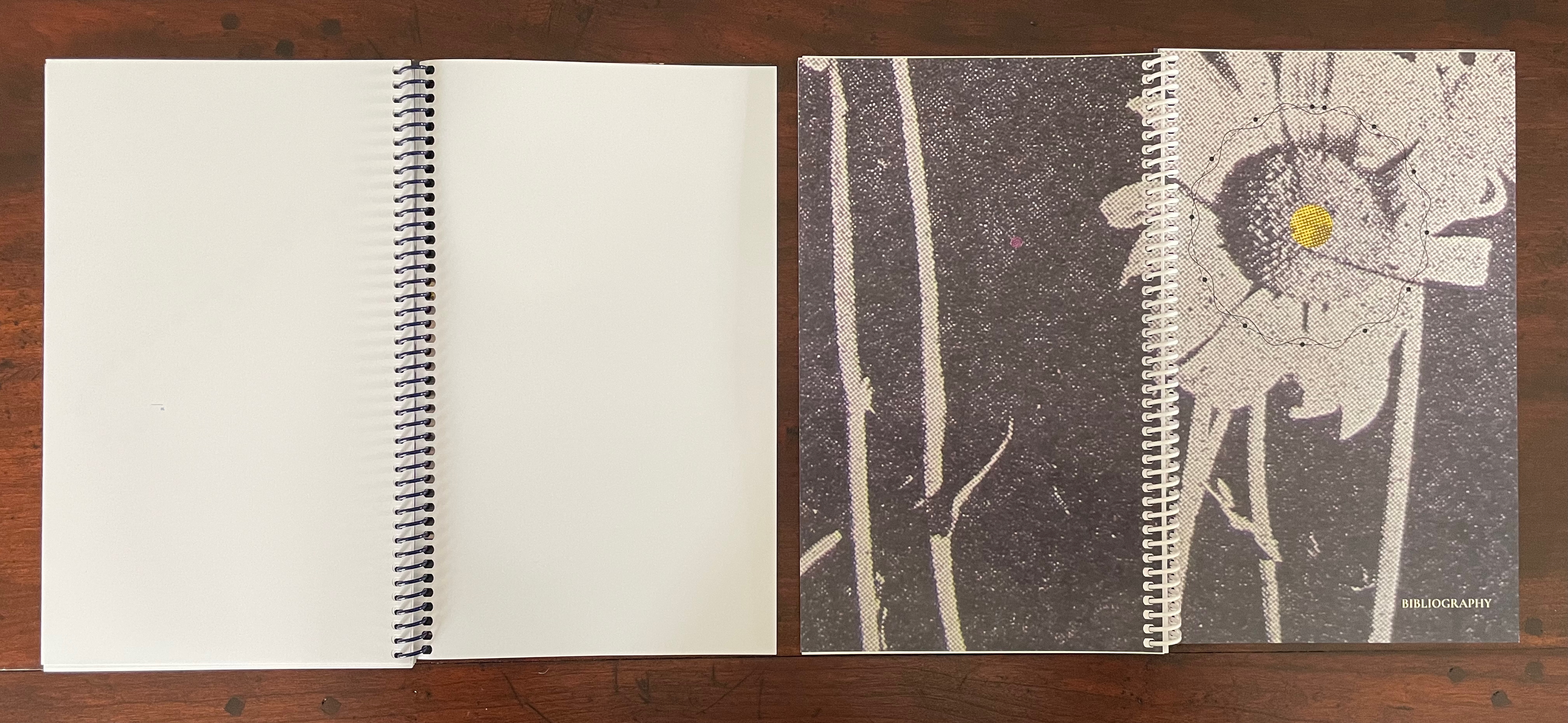
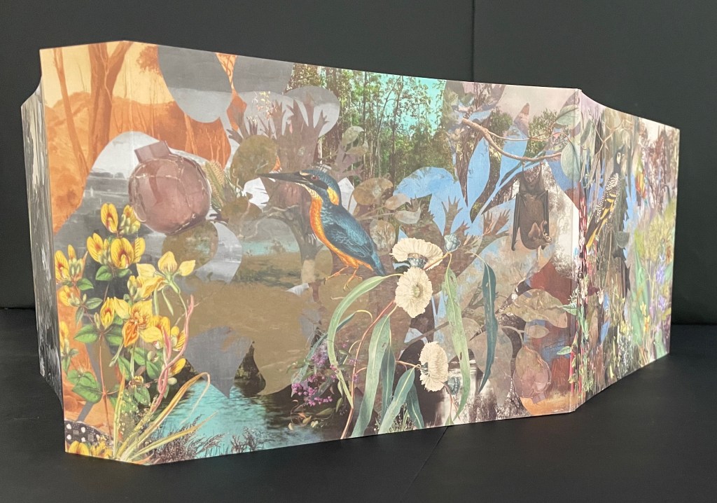
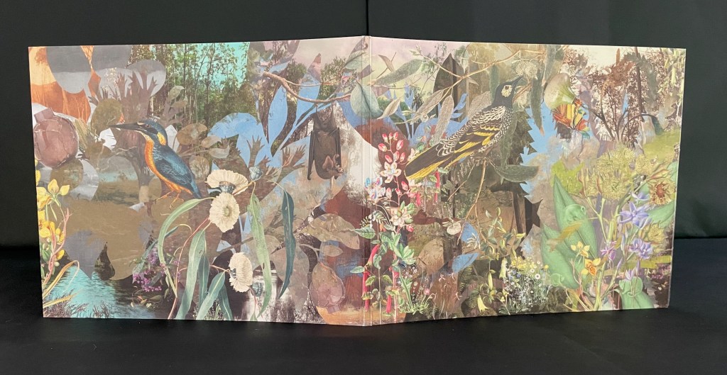
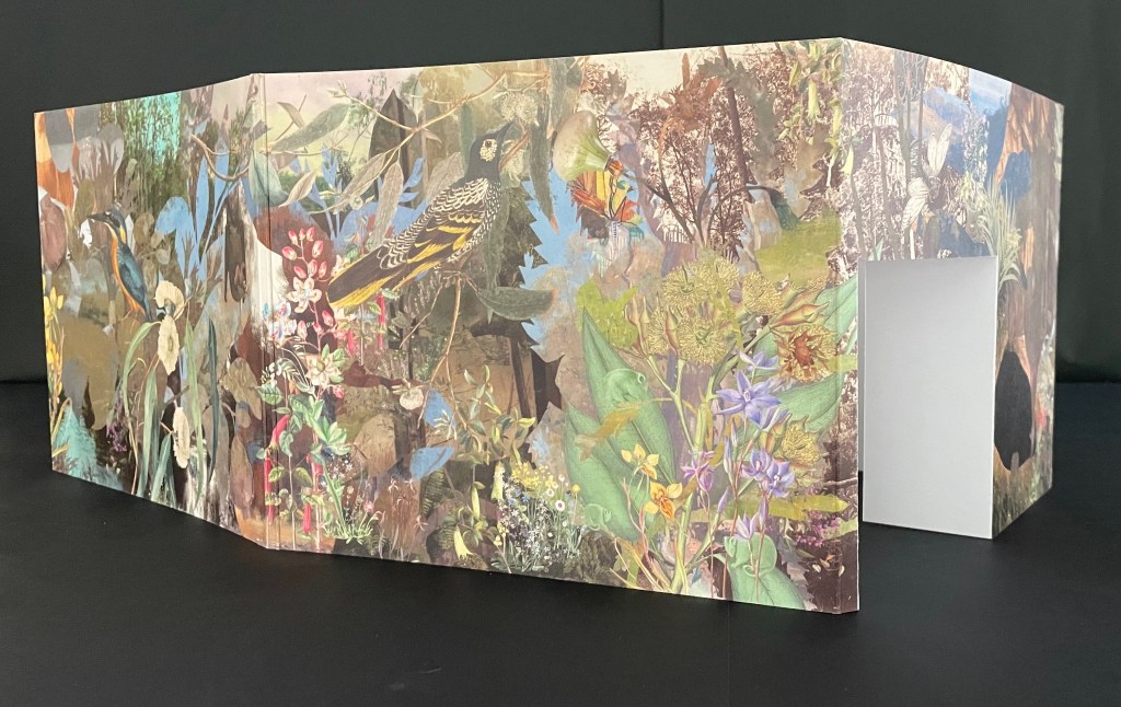
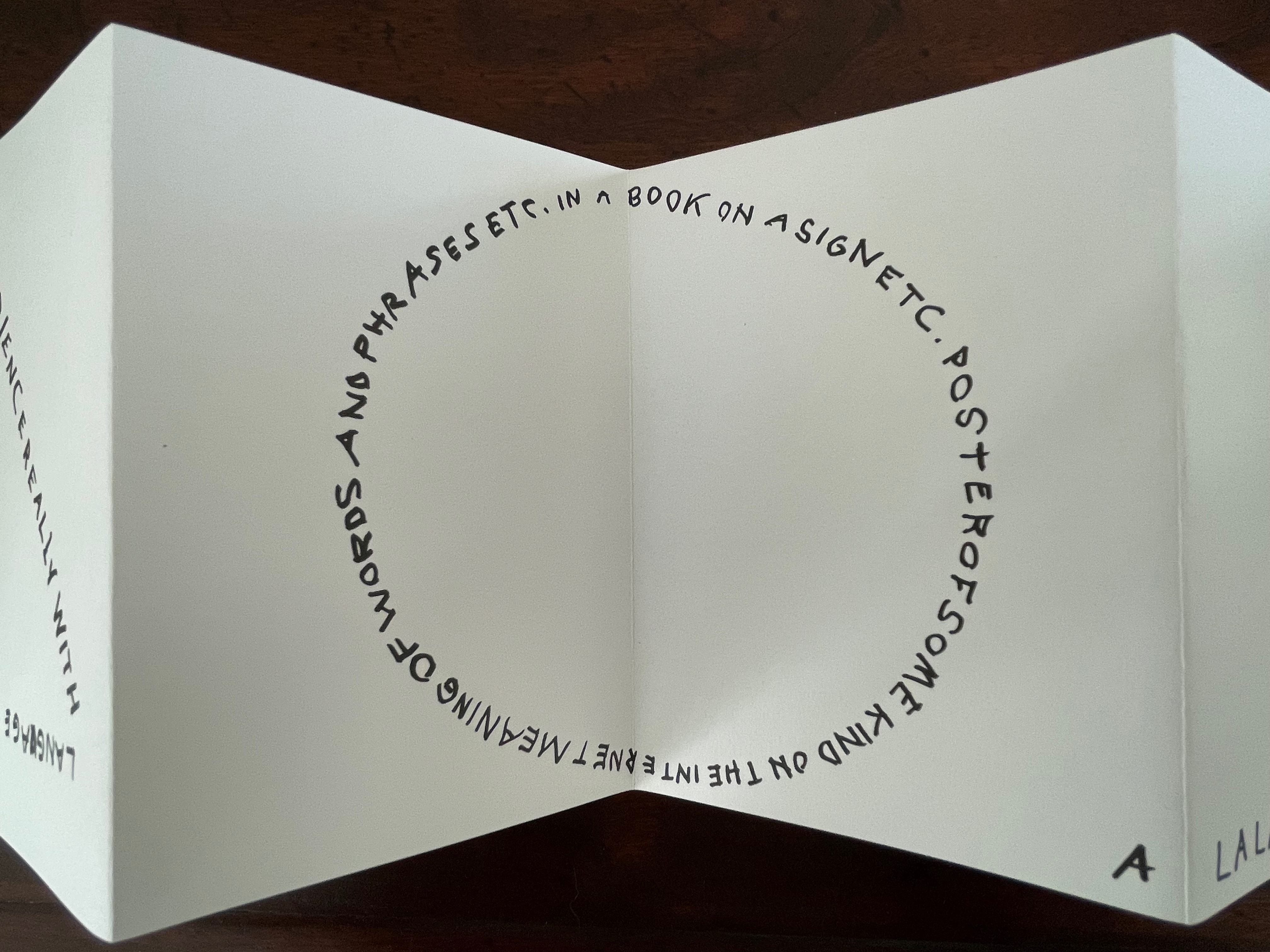
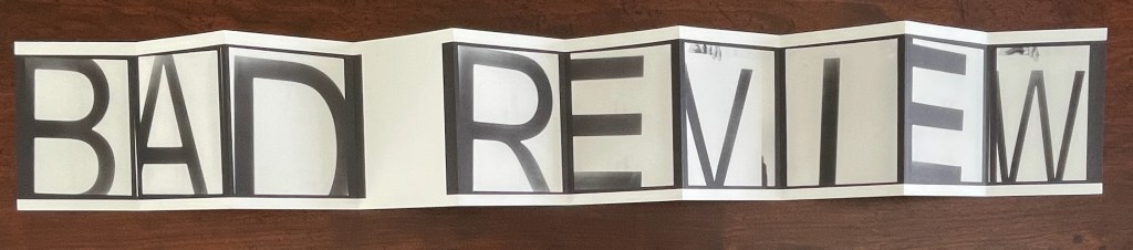
Deconstruction and Reconstruction of the Book (1990)
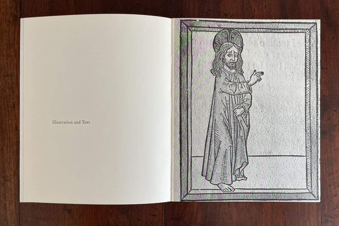
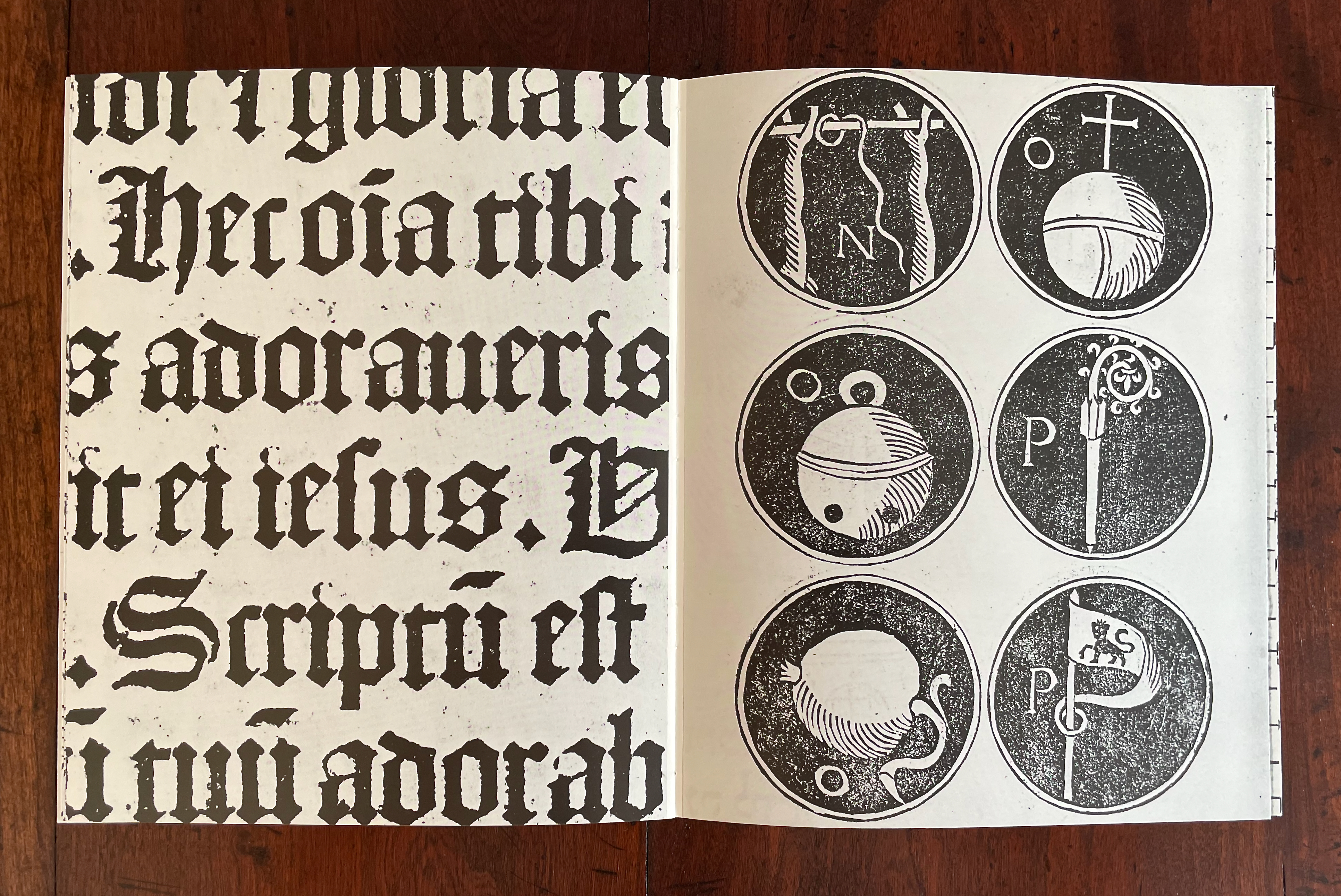
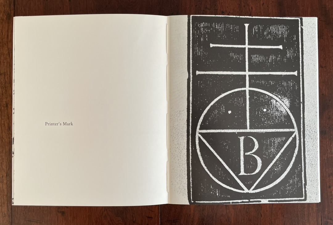
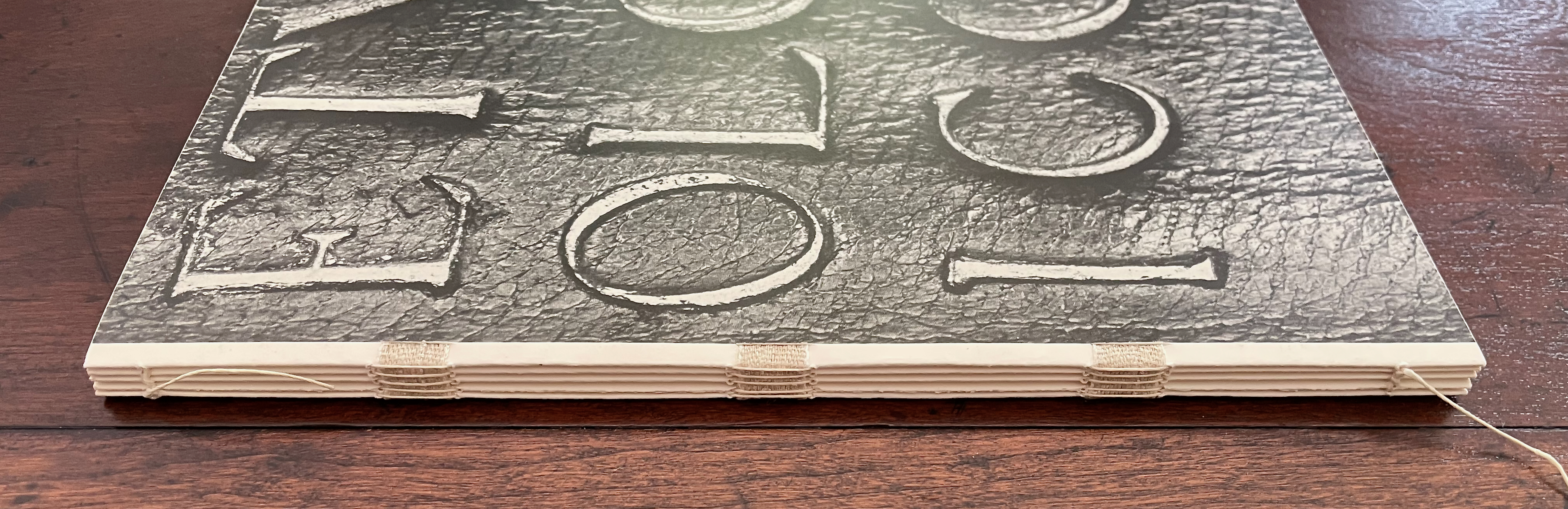
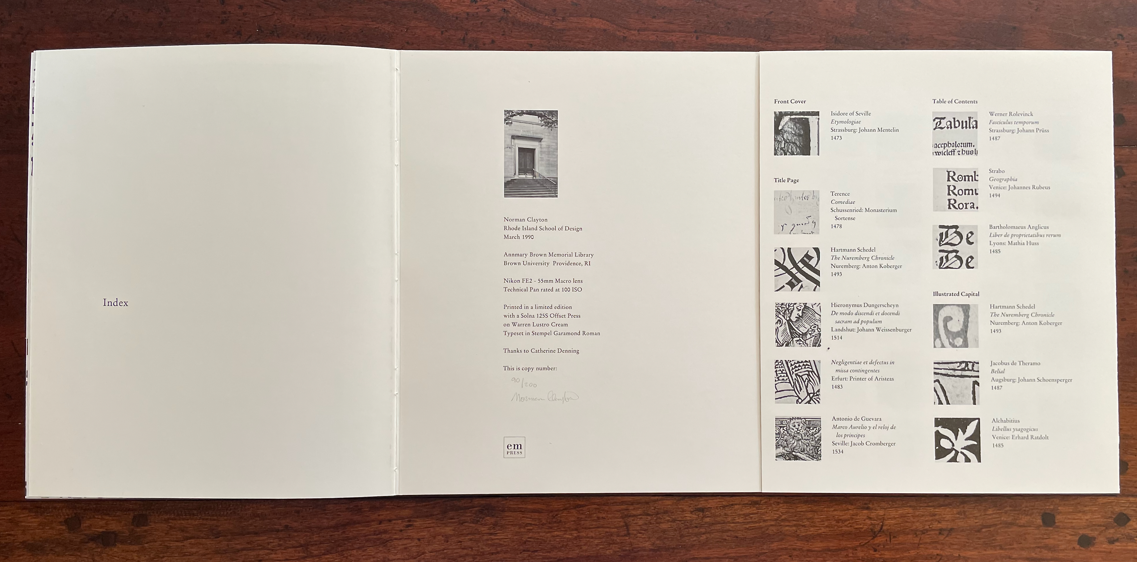
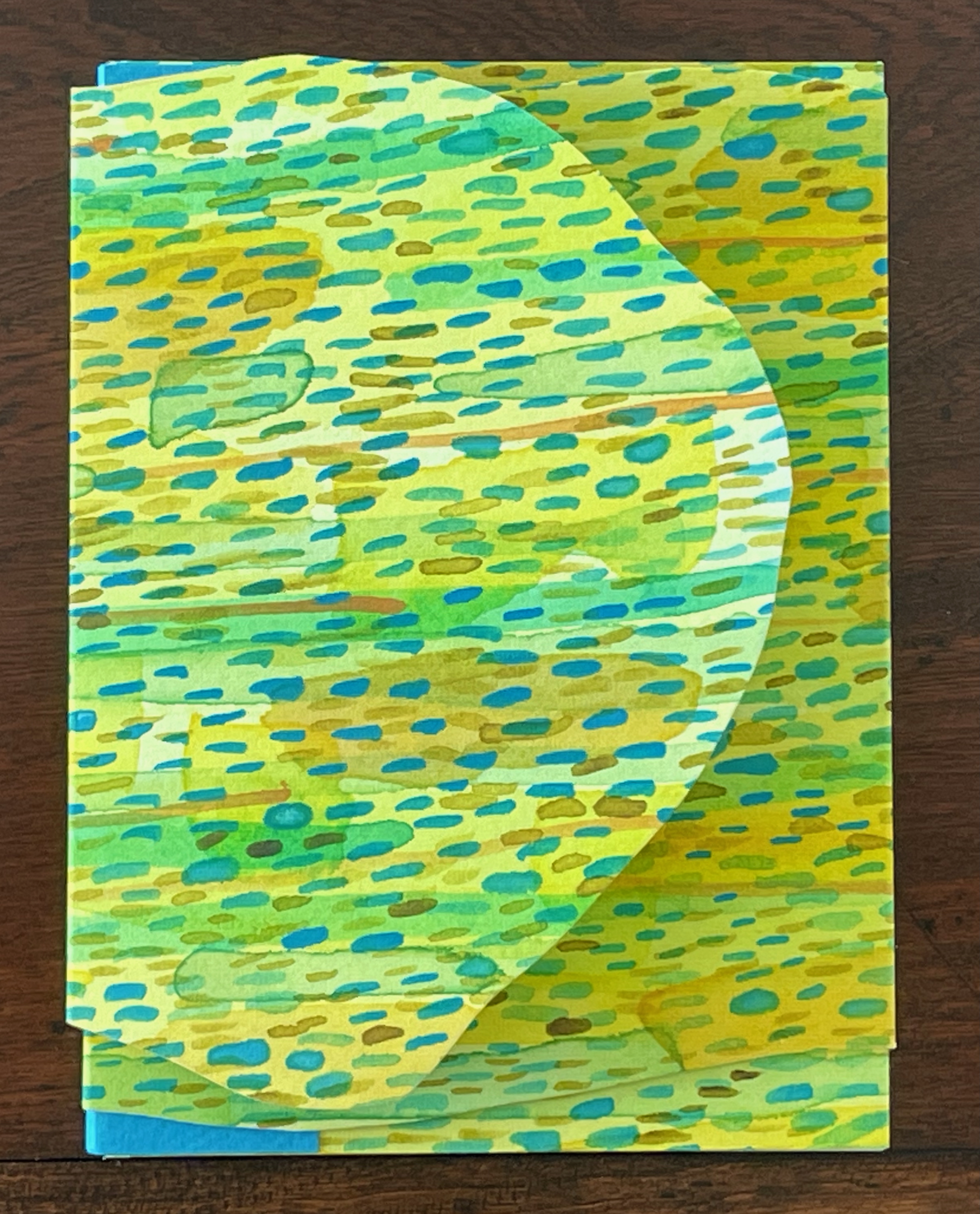
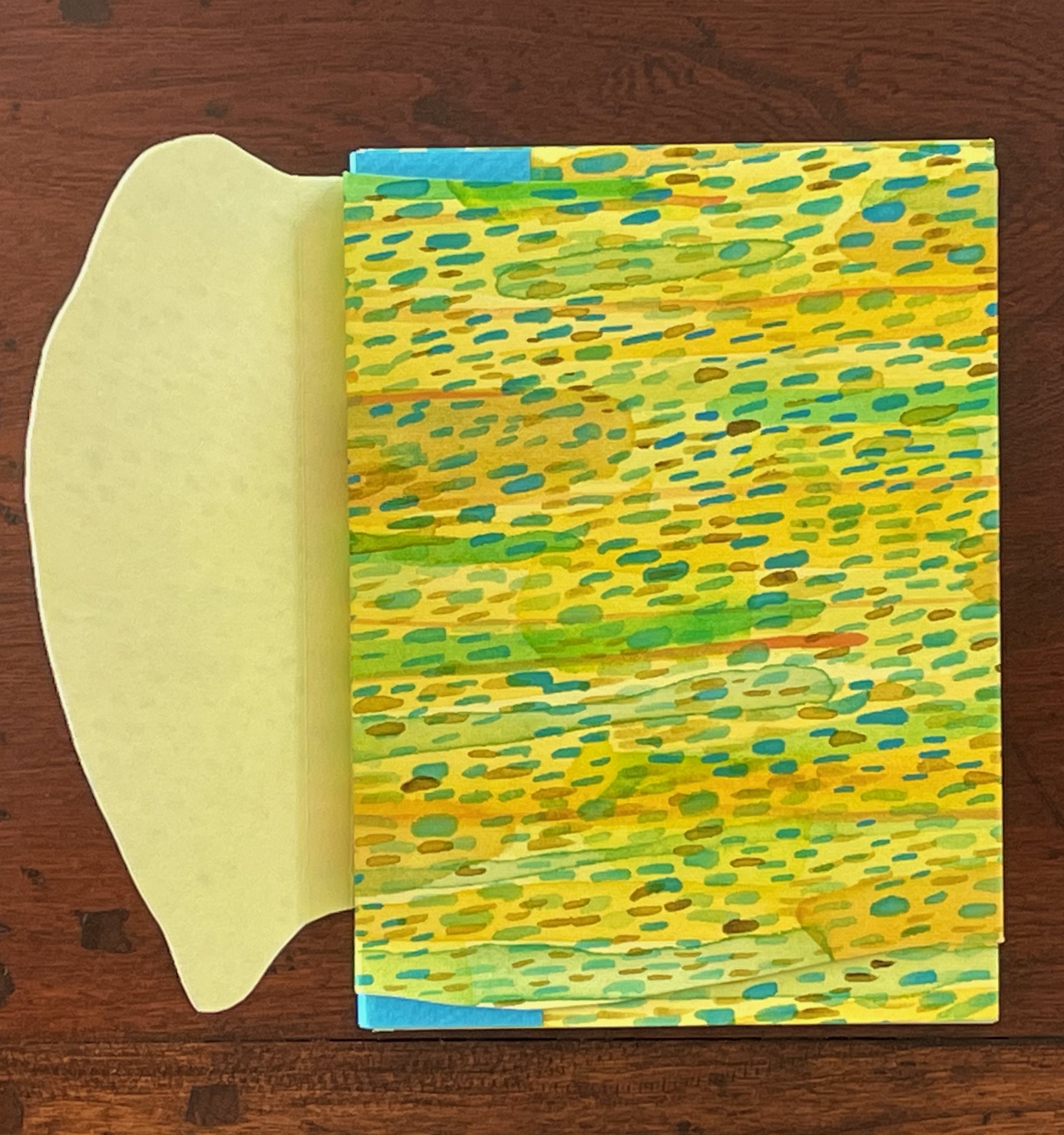
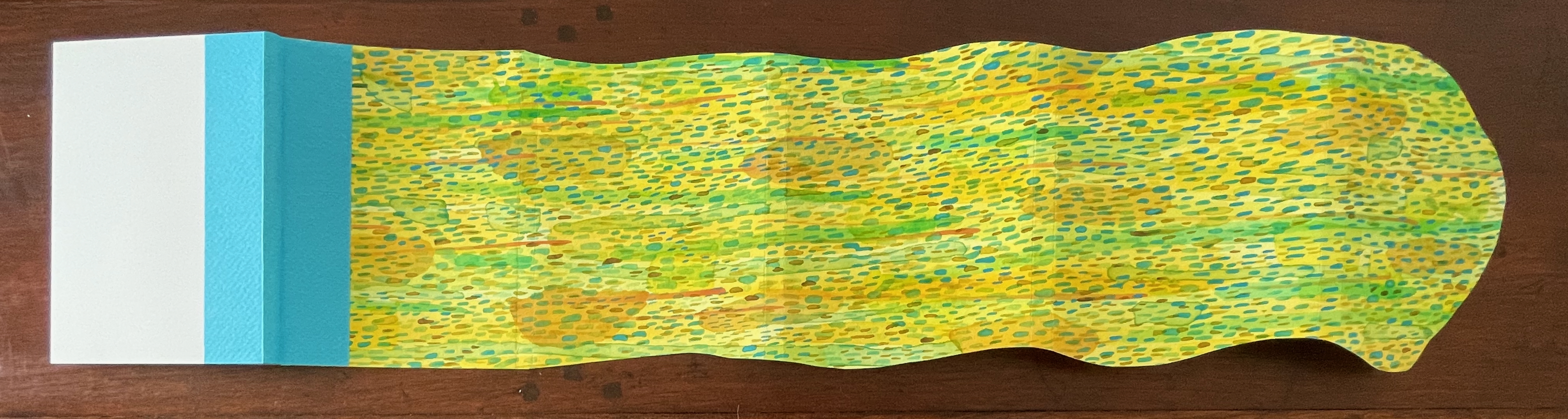
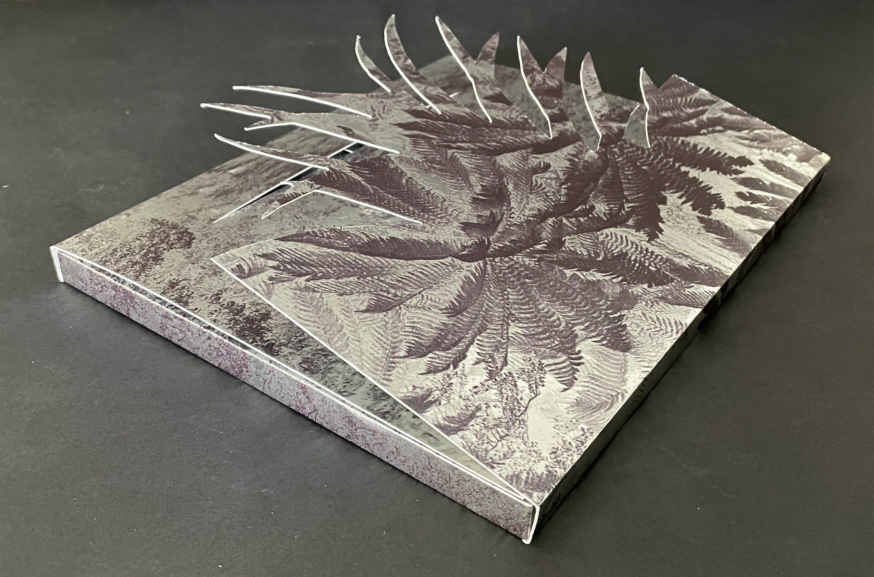
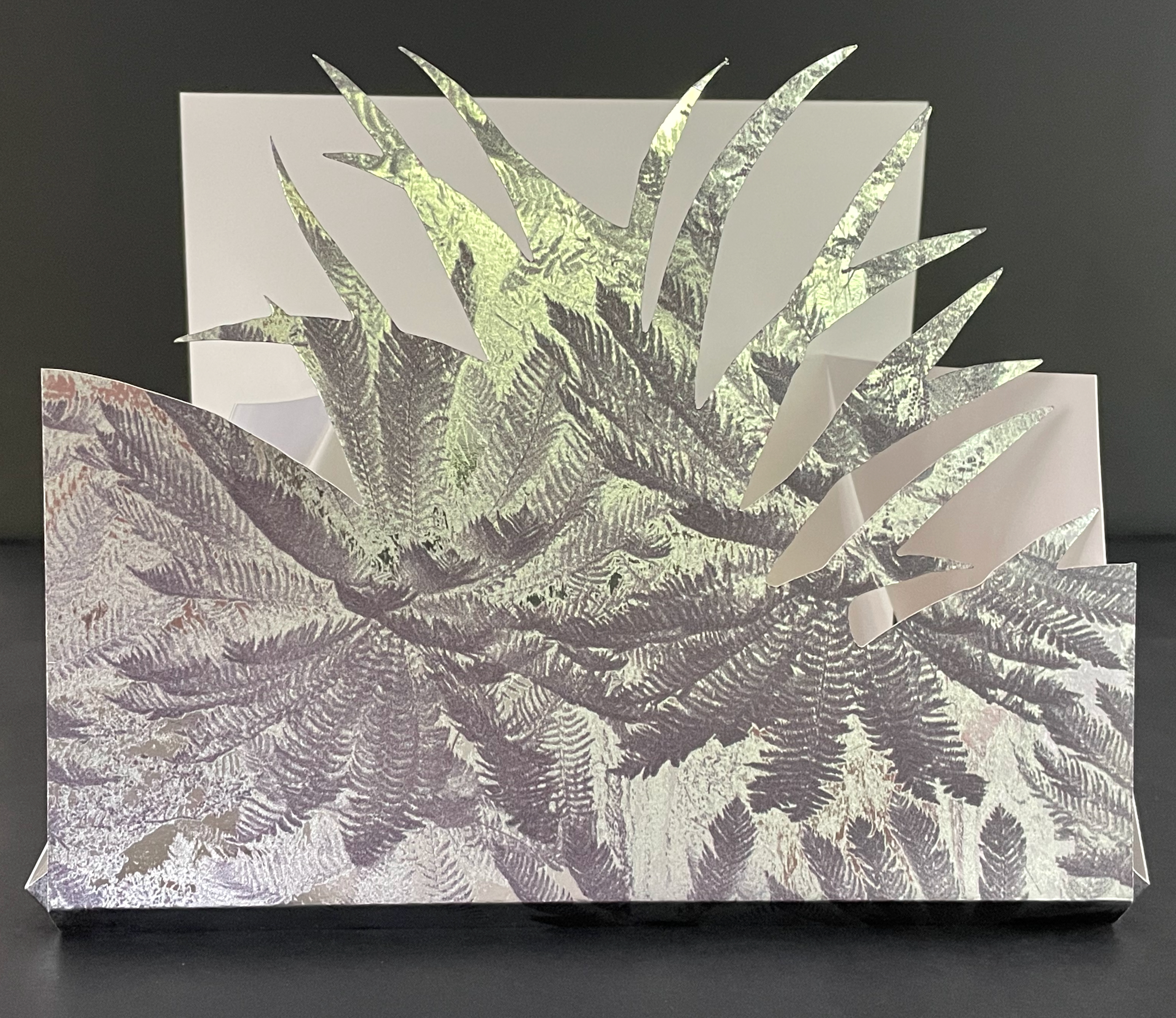
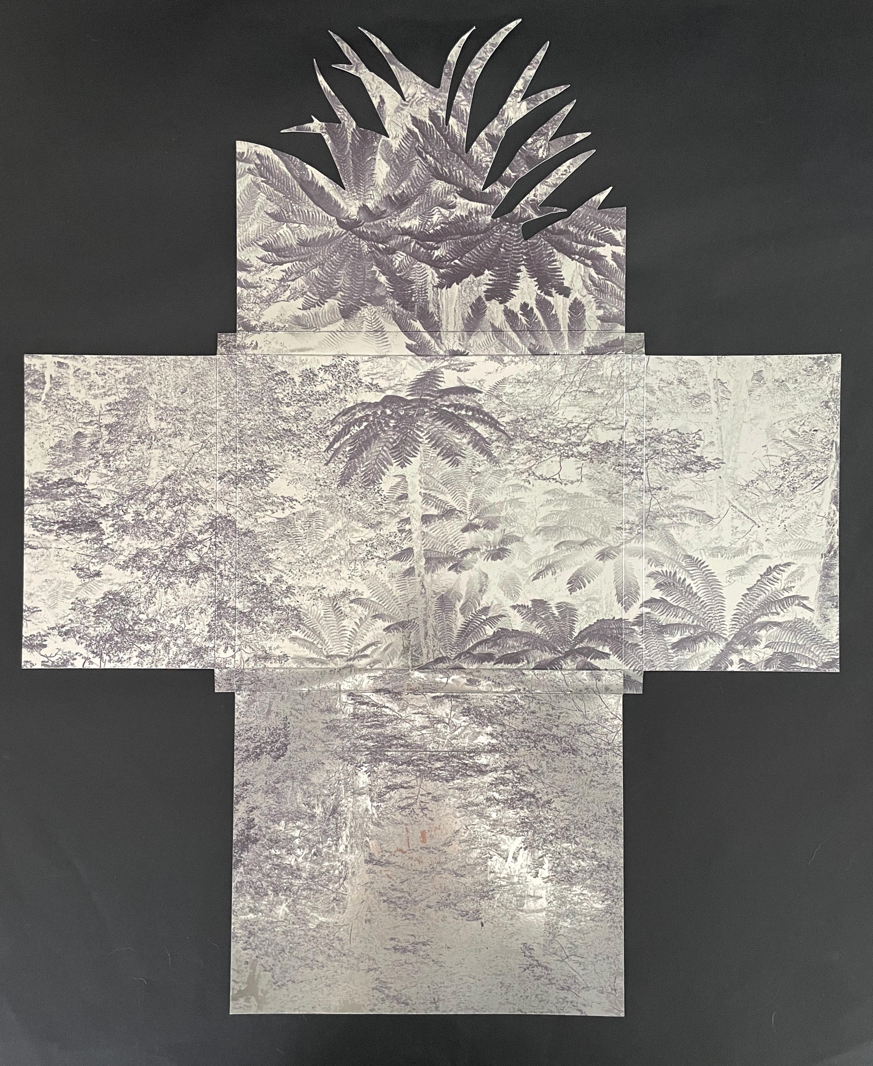
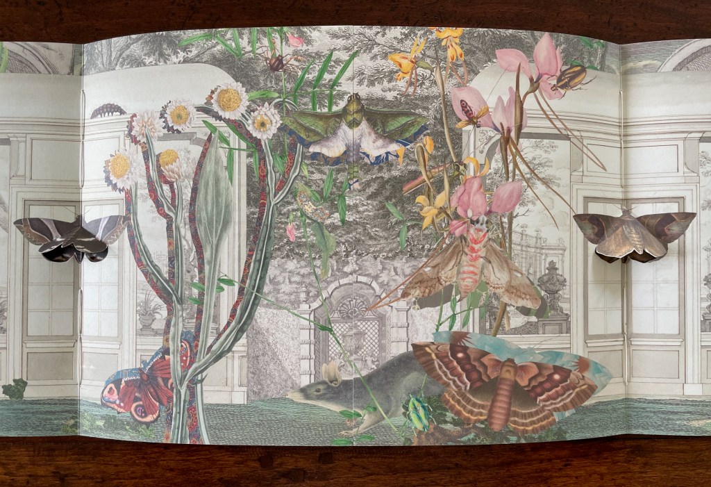
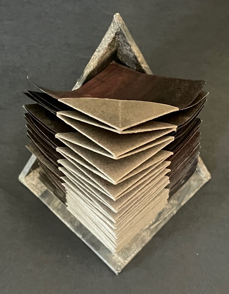
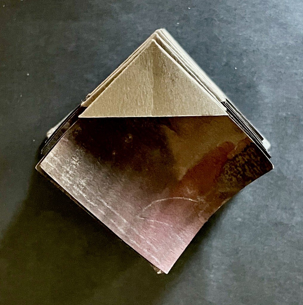
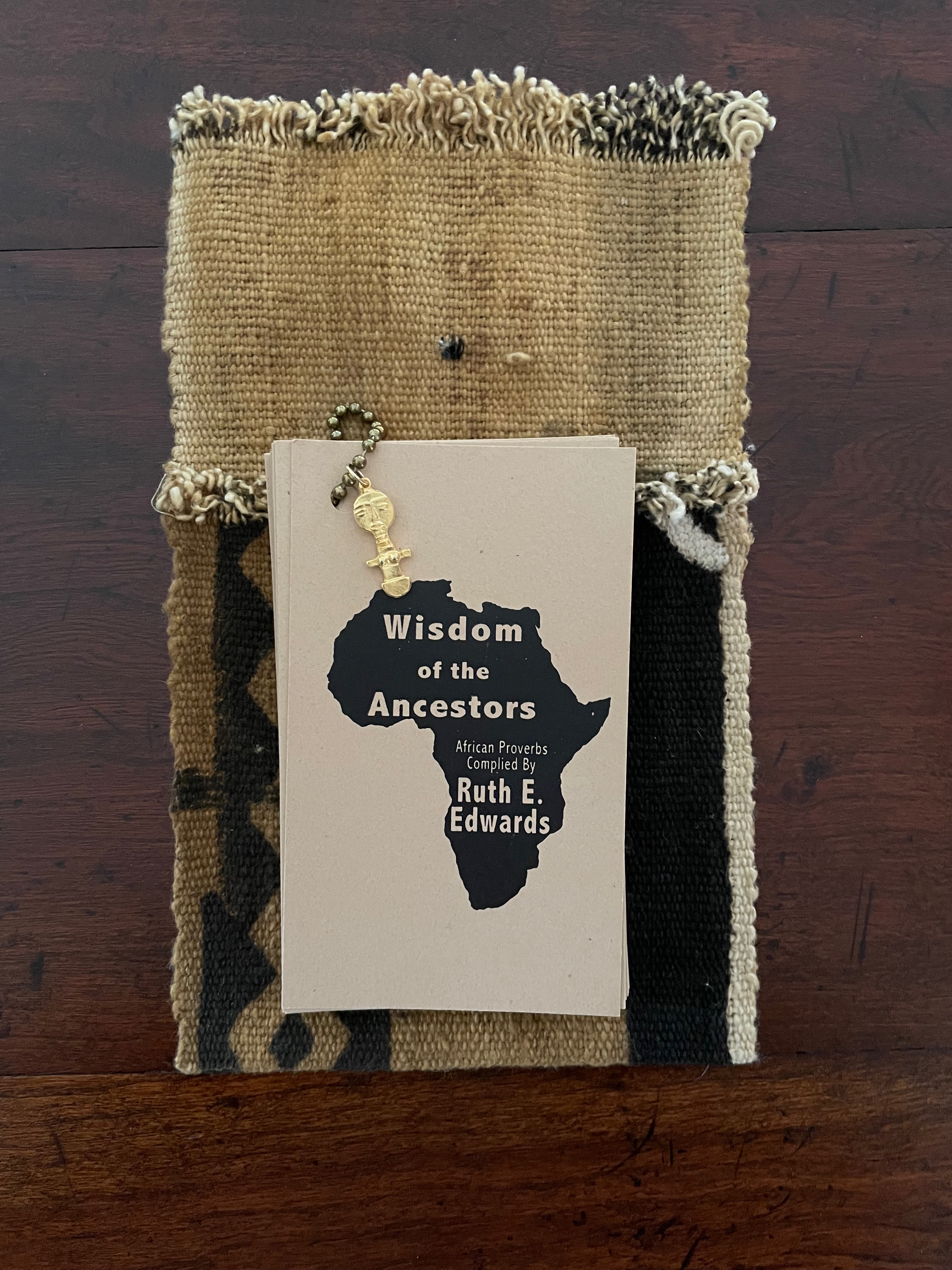
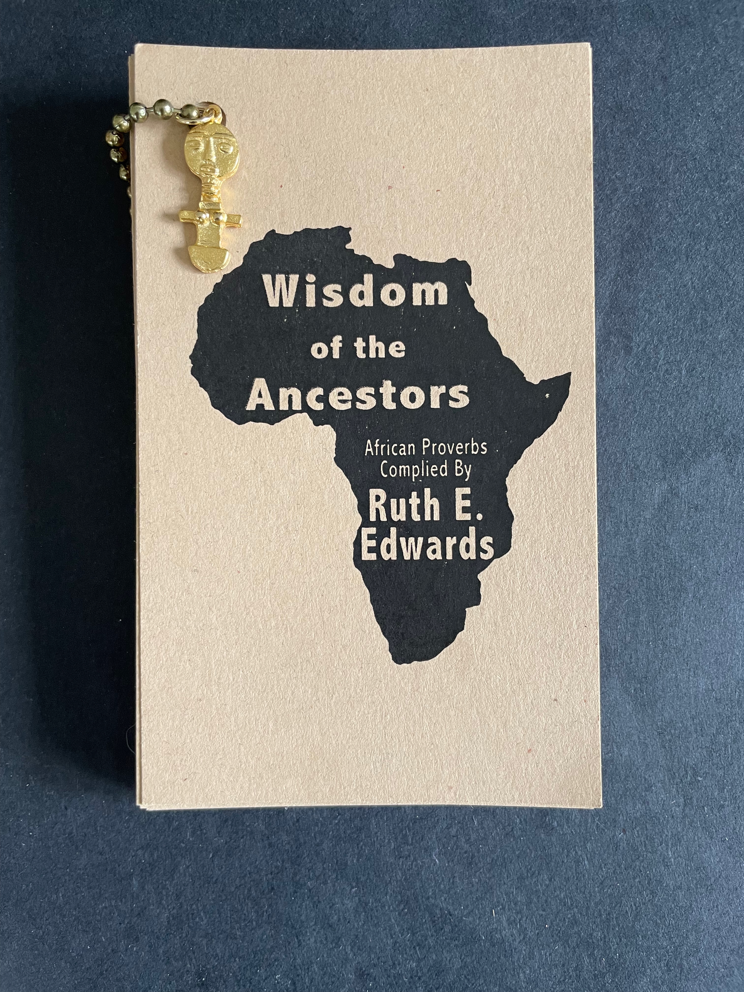
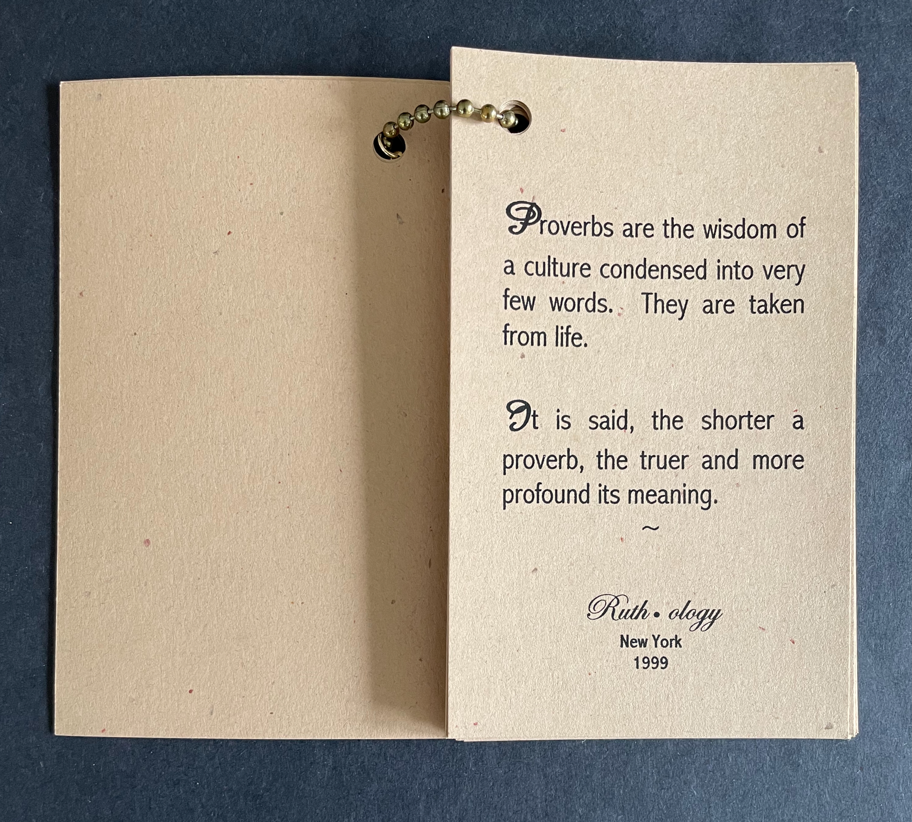
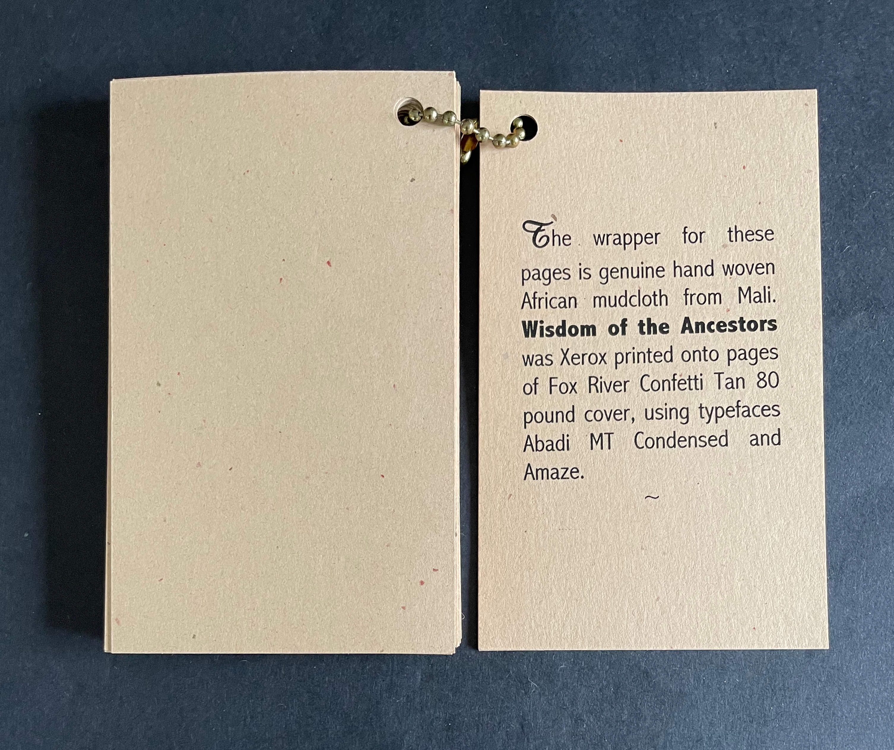
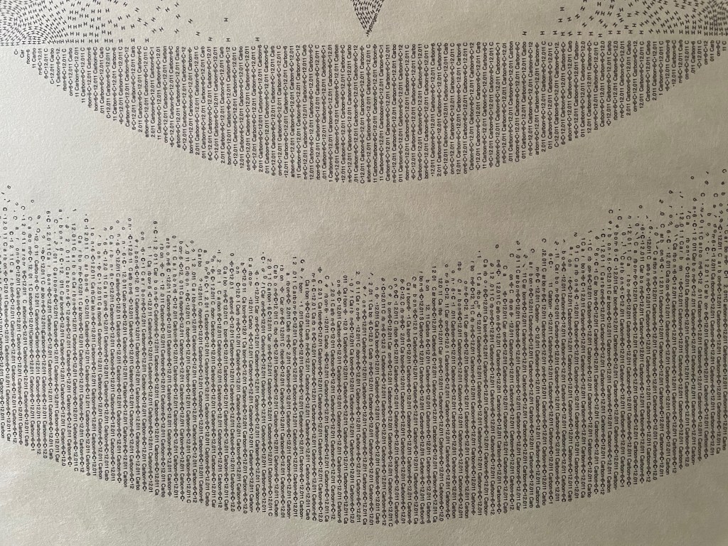
Deconstruction and Reconstruction of the Book (1990) Norman Clayton Softcover, exposed spine, hand sewn. H250 x W205 mm. [50] pages, including 4-page foldout. Edition of 200, of which this is #90. Acquired from the artist, 23 June 2026. Photos: Books On Books Collection.
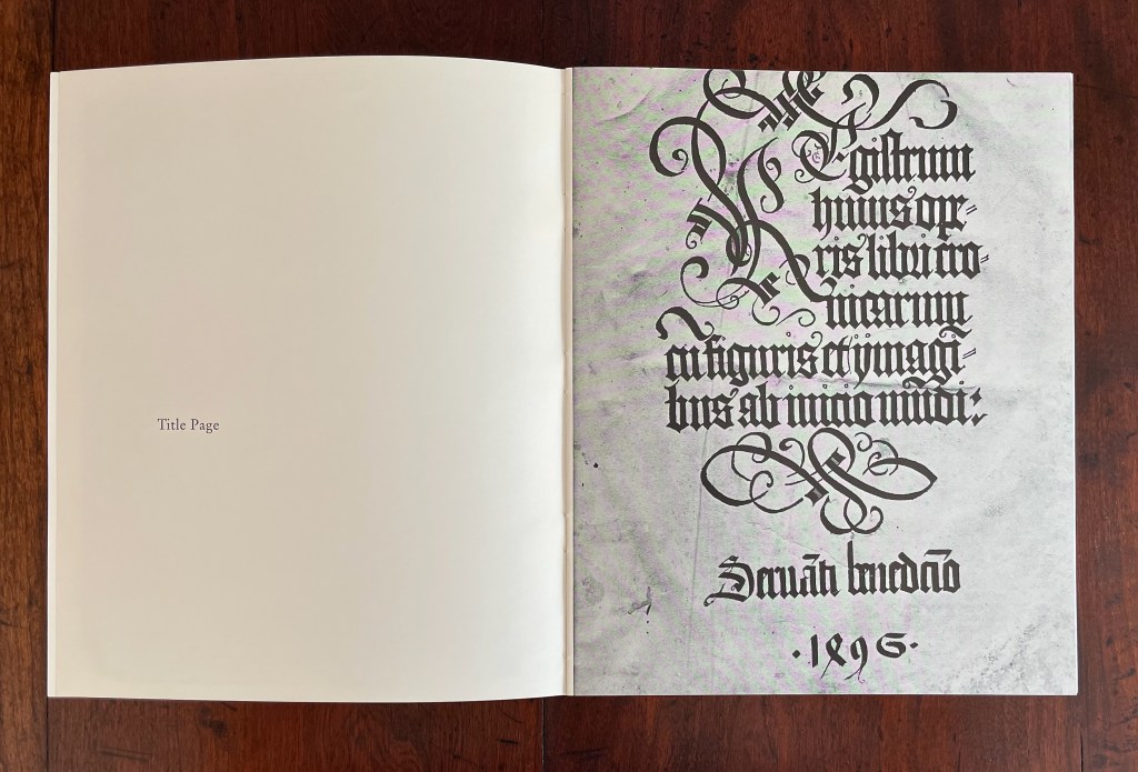
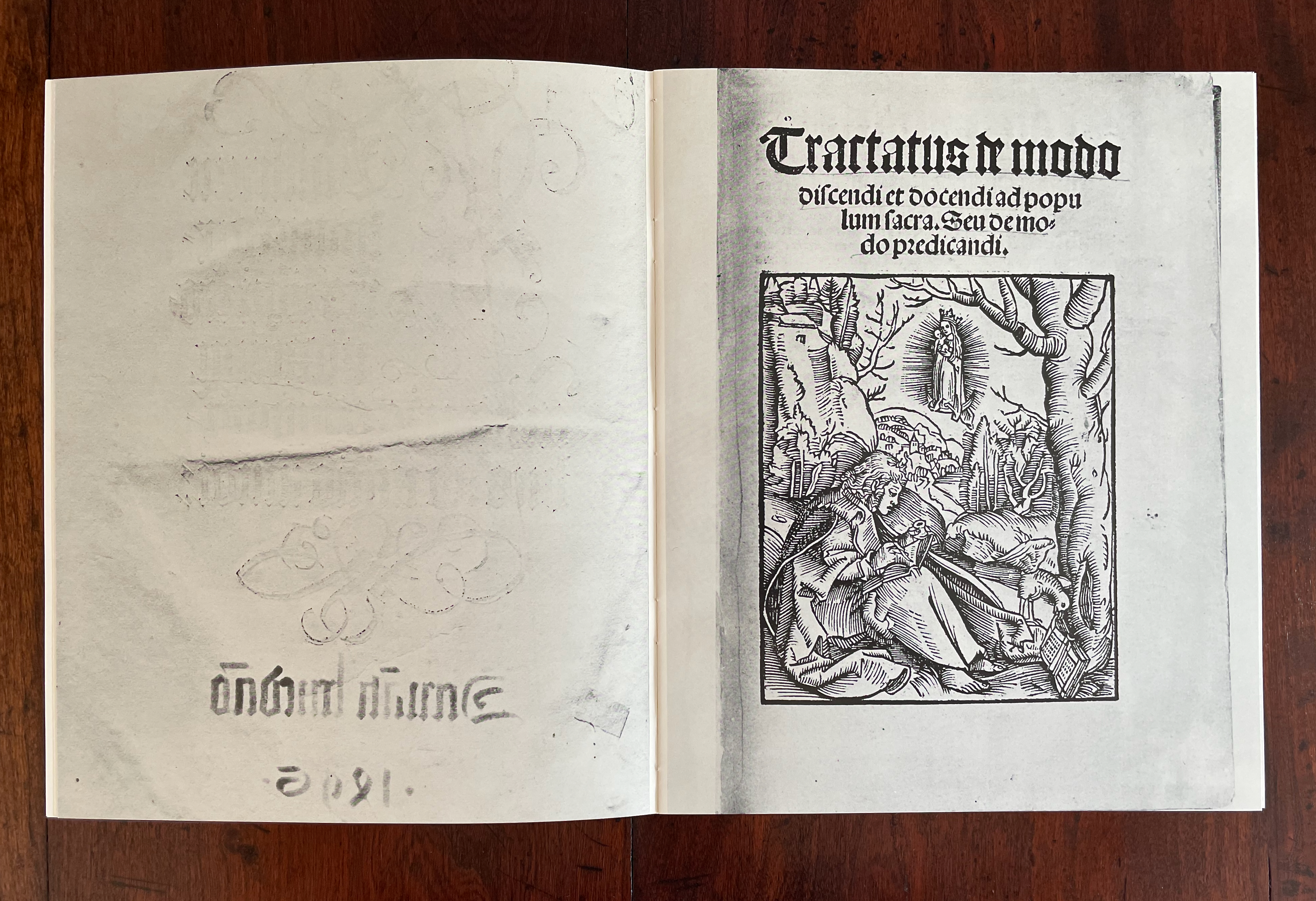
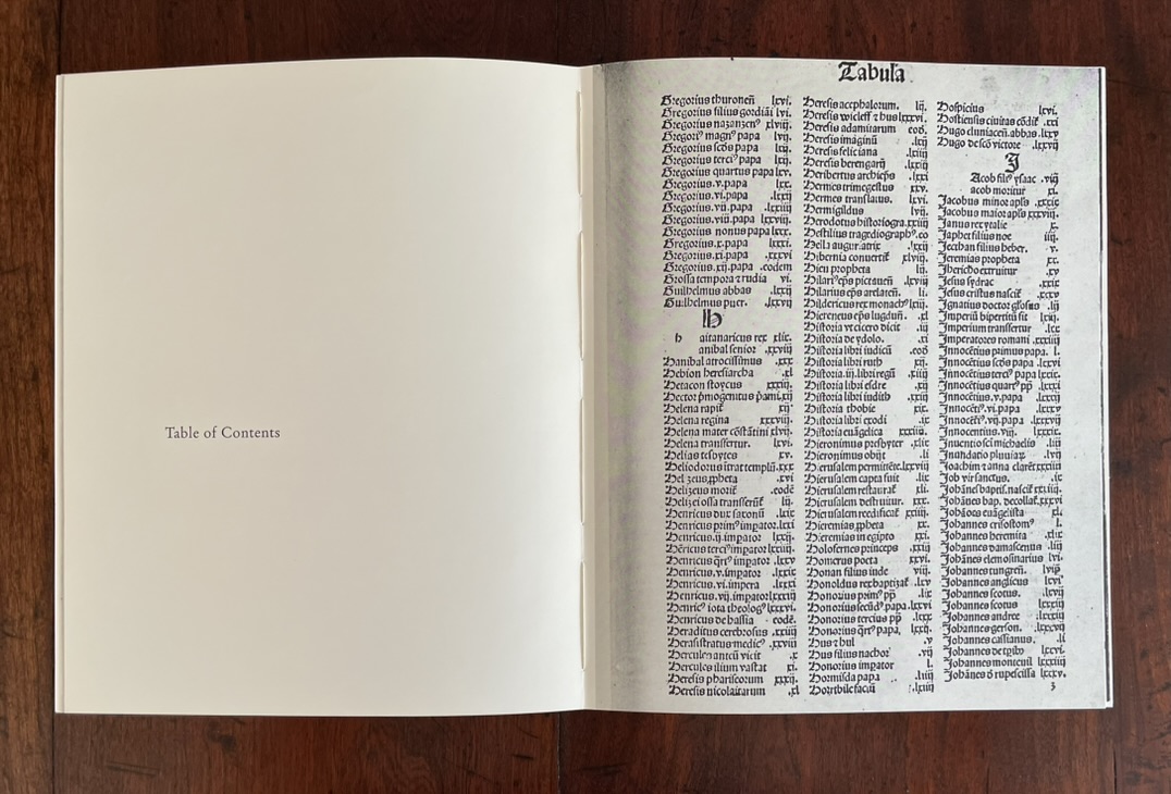
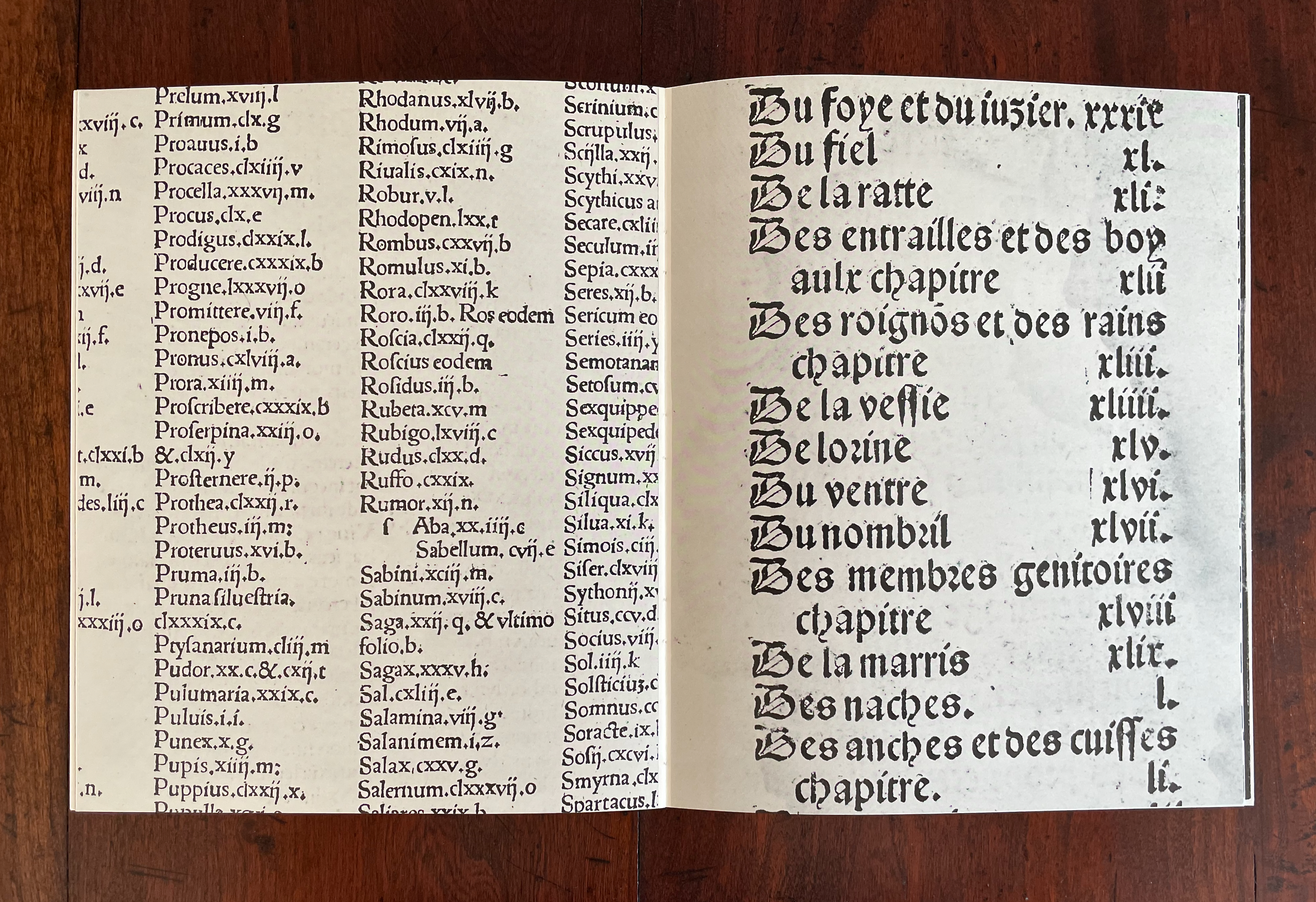
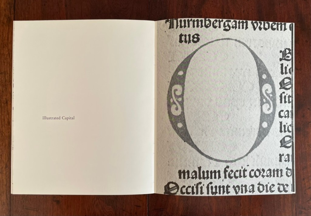
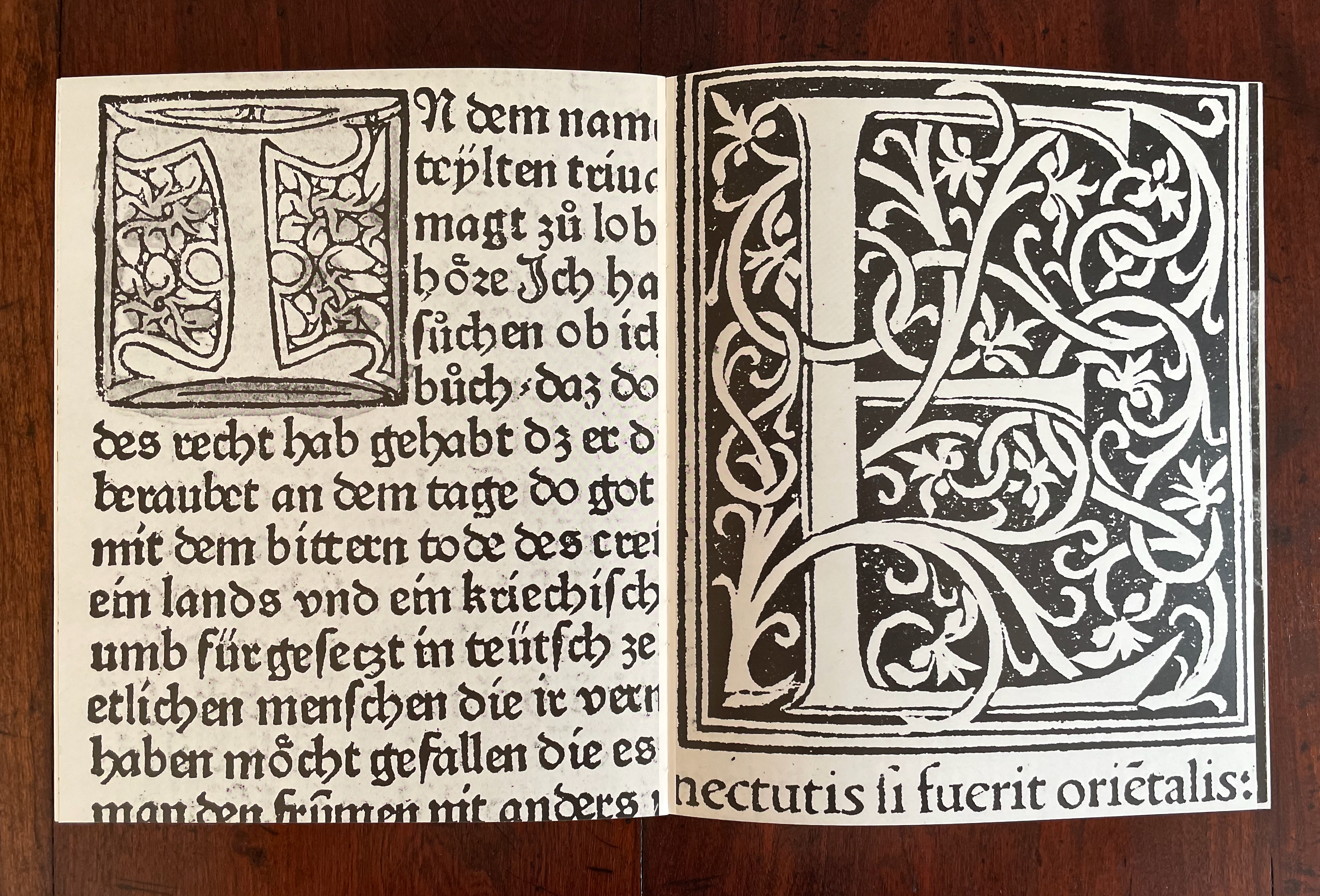
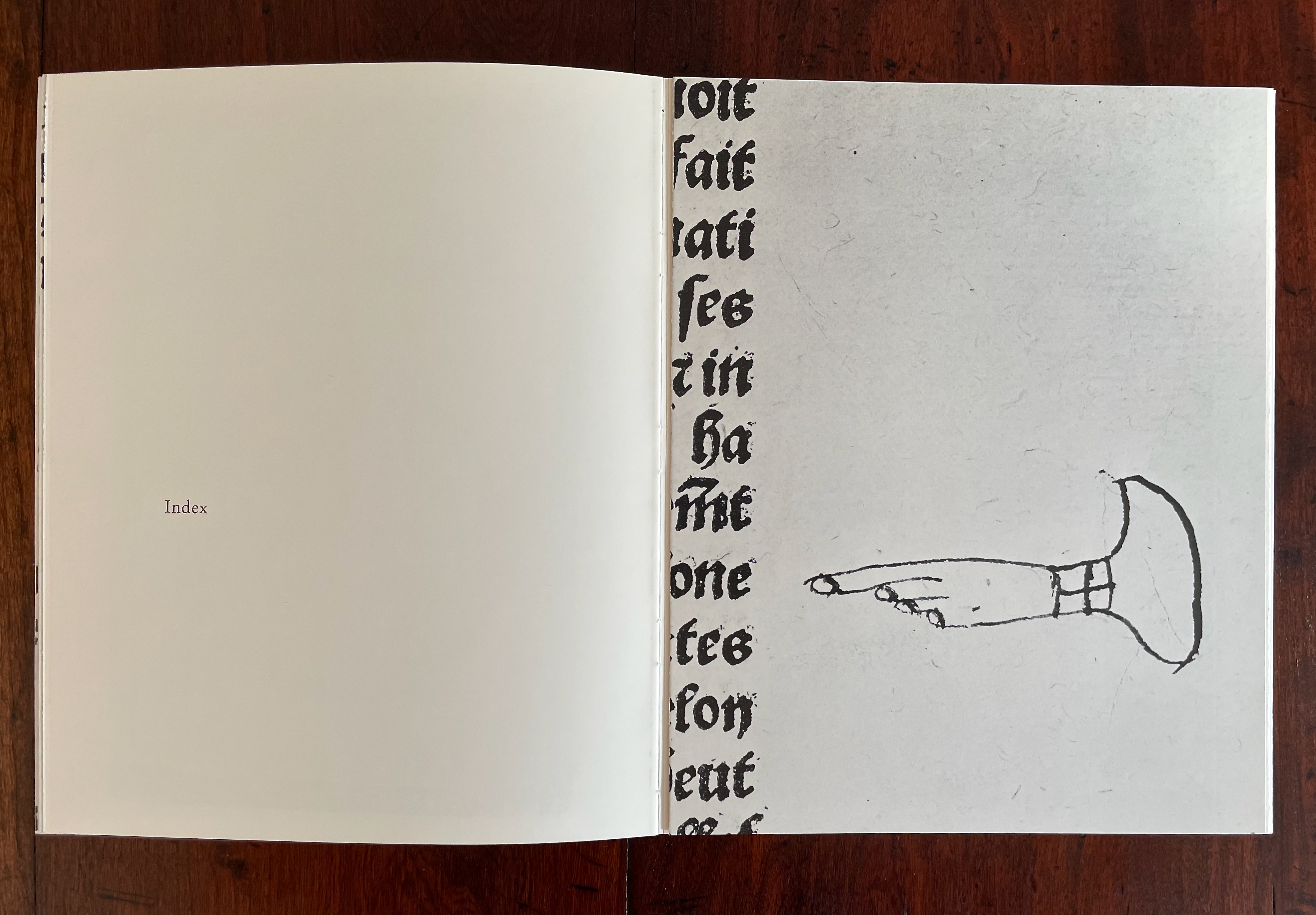
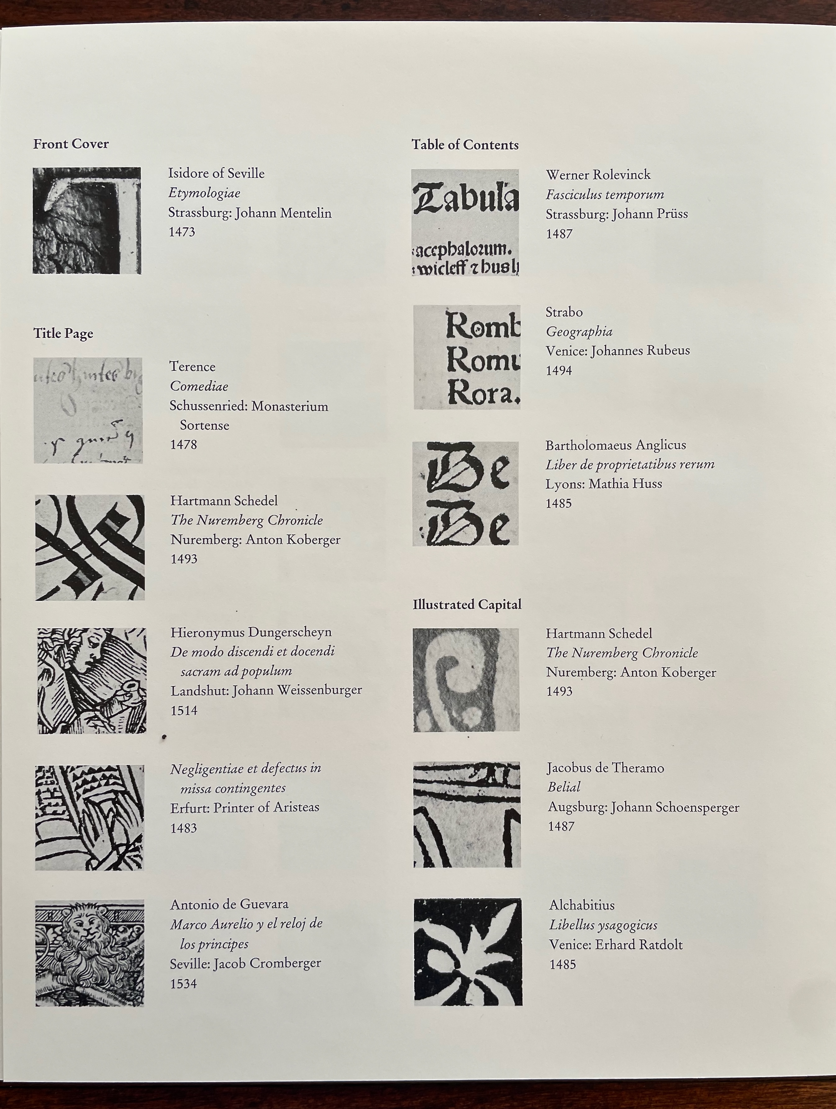
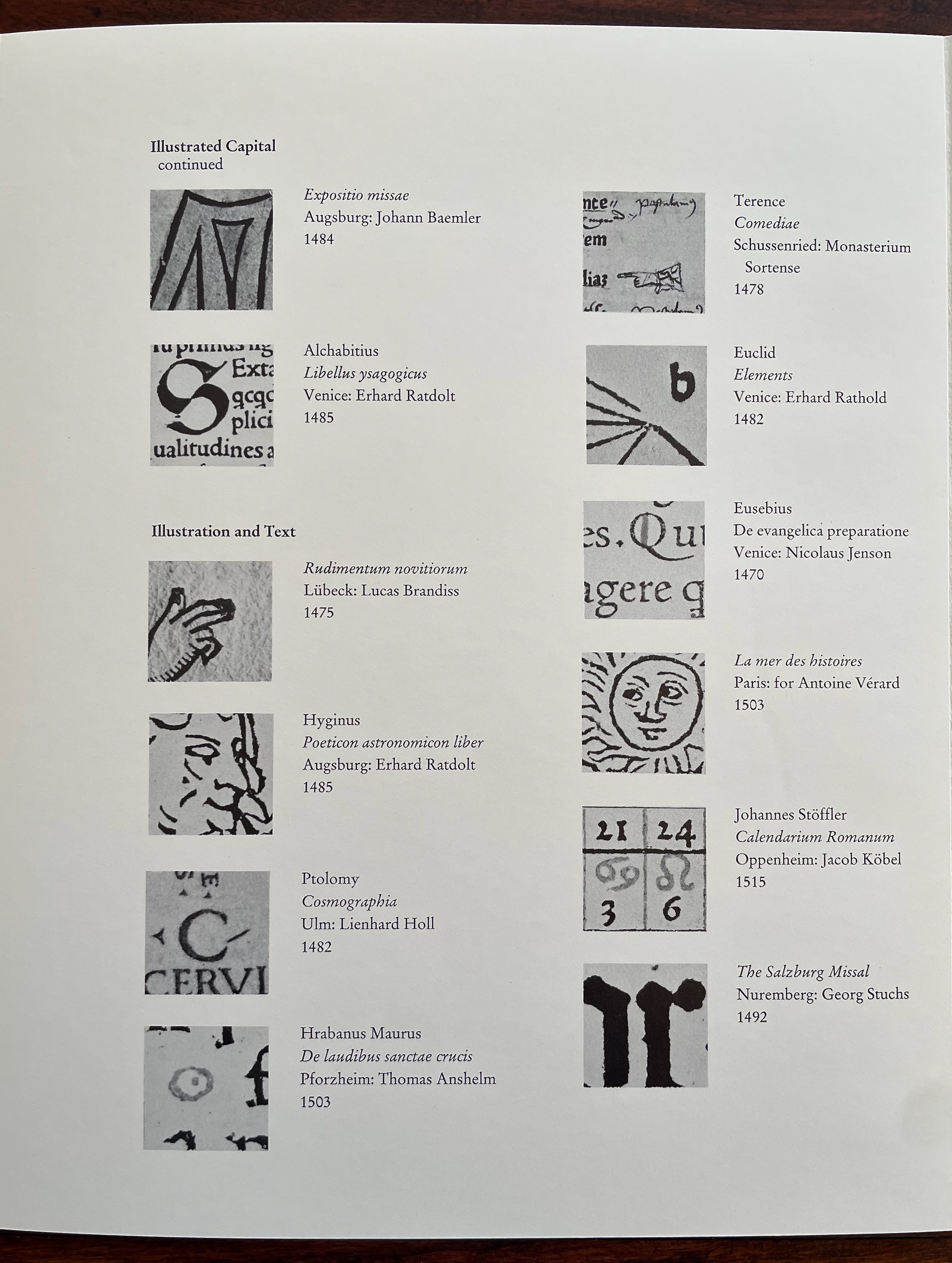
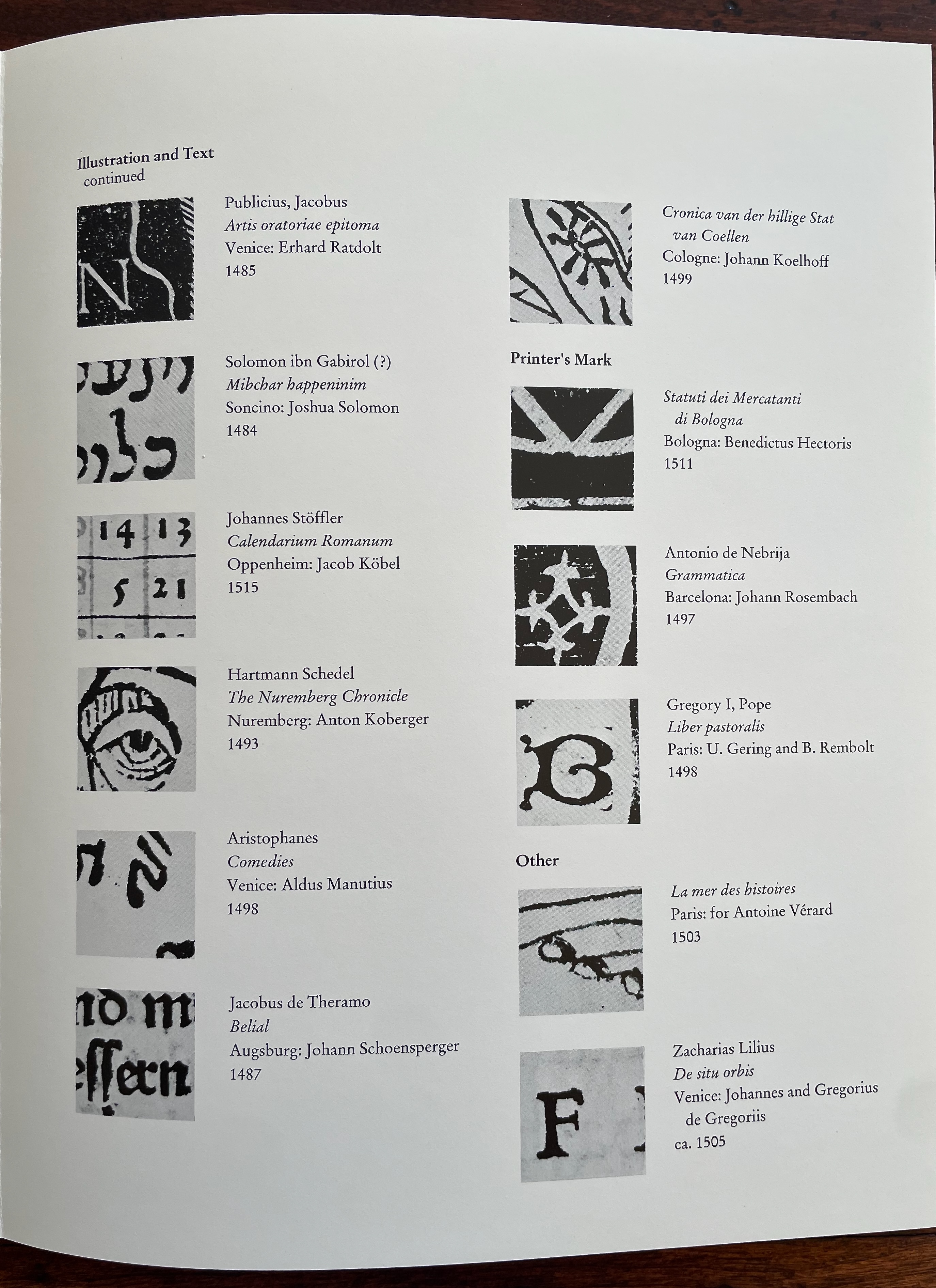
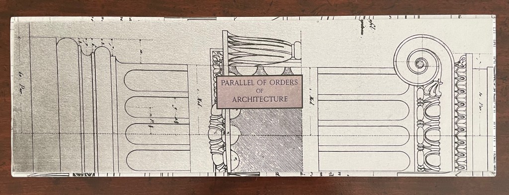
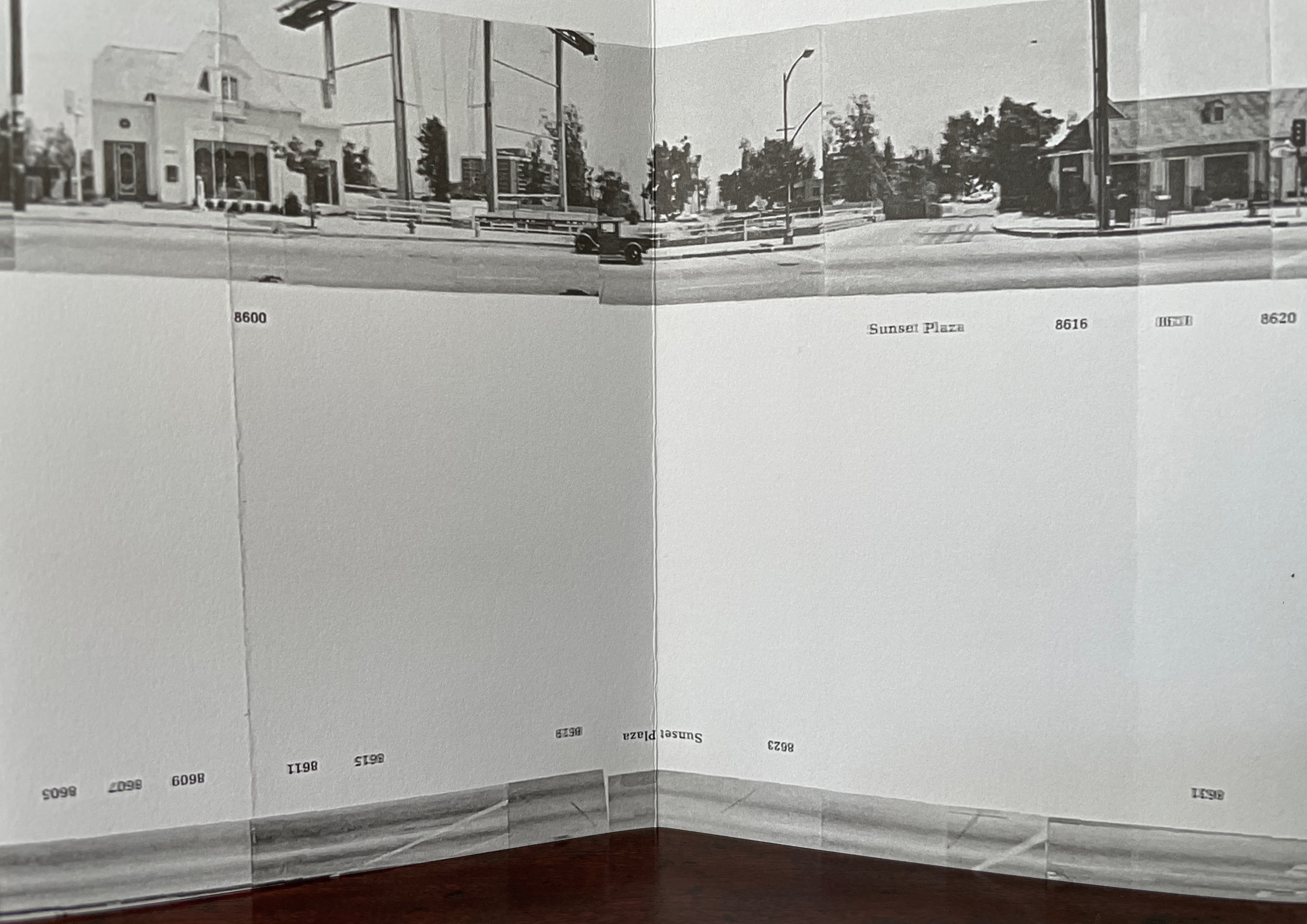
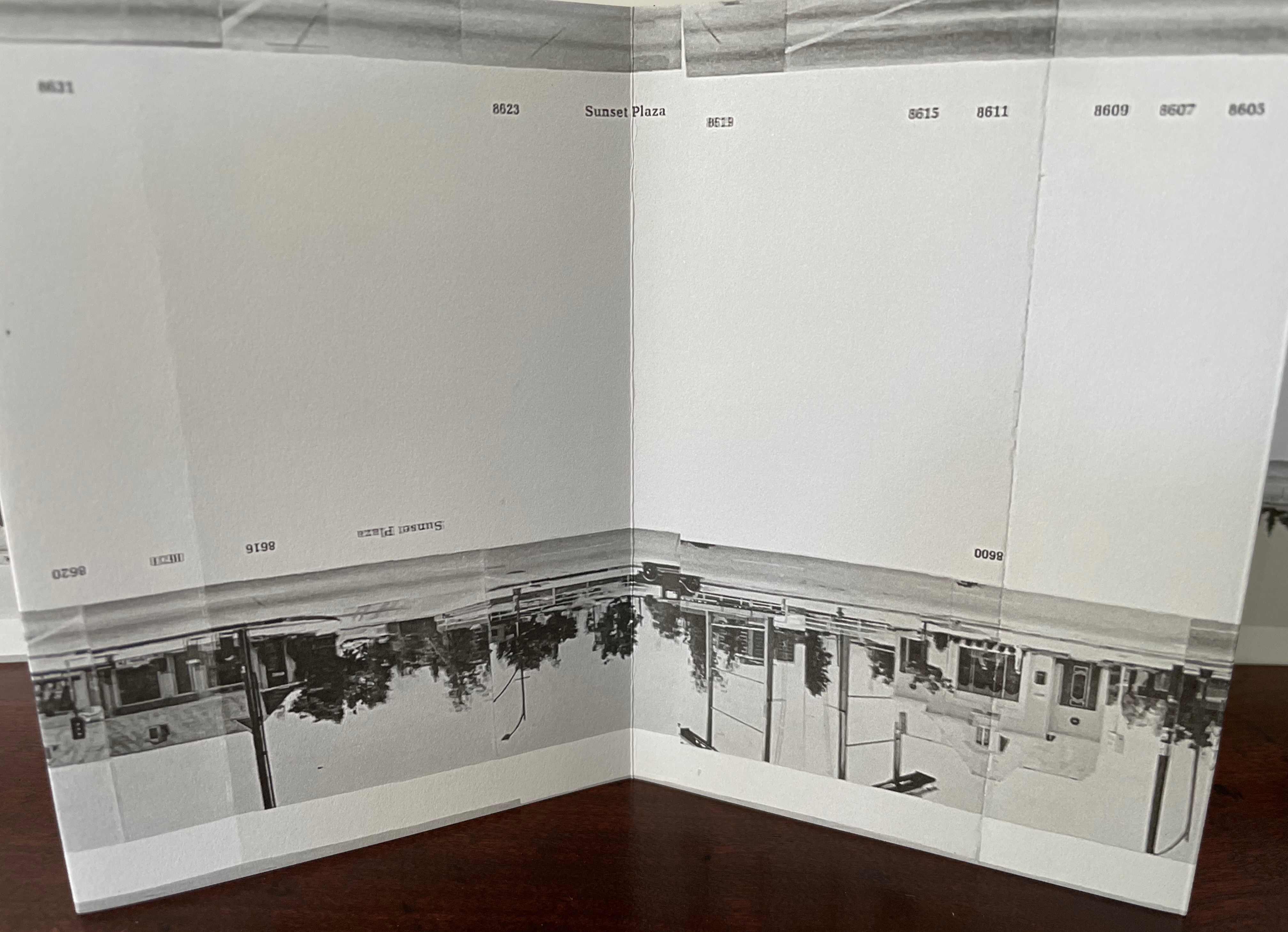
As a student at the Rhode Island School of Design, Norman Clayton journeyed back to the beginning of printed books in the western world with a Nikon FE2 and 55mm macro lens. He captured those elements that, during the age of incunabula (printed books before 1500), typesetters and printers-cum-editors were reshaping from manuscripts into what would become the received structure of the book. More satisfying, he poured those photos and the craft he was learning at RISD into an artist’s book. It is hand sewn over linen reinforcing tapes so that the booklet lies flat to offer up the images celebrating the title page, table of contents, illustrated capitals, illustrations and text, and printers’ marks — all drawn from thirty-six works in the Annmary Brown Memorial Library at Brown University in Providence, RI.
There are plenty of full color illustrated histories of the history of the book available, but Clayton’s black and white photographs, choice of font (Stempel Garamond Roman) and paper (Warren Lustro Cream), and neatly executed exposed-spine binding deliver a satisfying artist’s book with a sense of the texture and material of history.
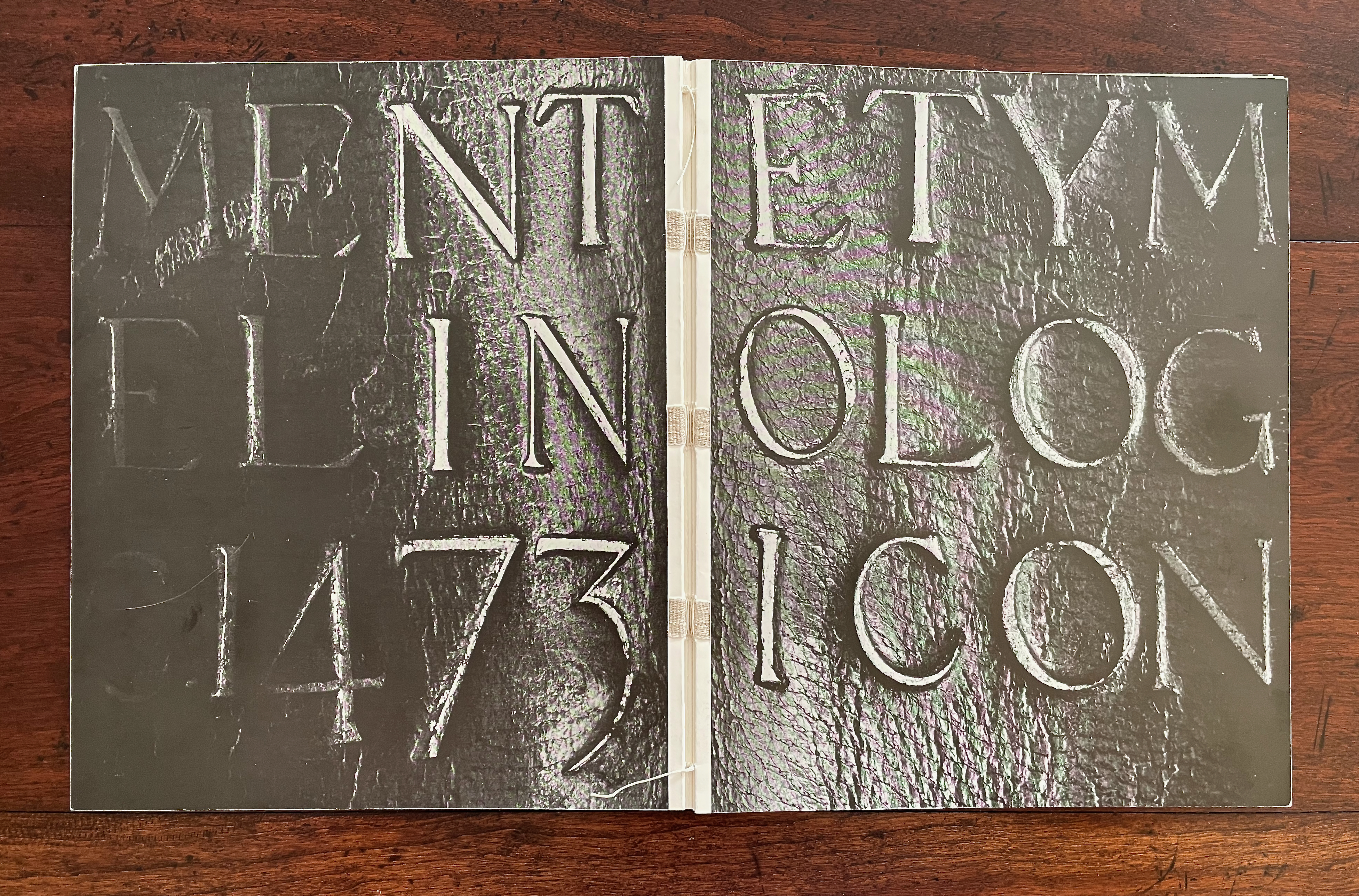
Clayton’s introduction to his fold-out index elicits a smile and a wish that he had also captured a colophon or two. Perhaps there’s a revised edition project looking for an intern or future book artist.
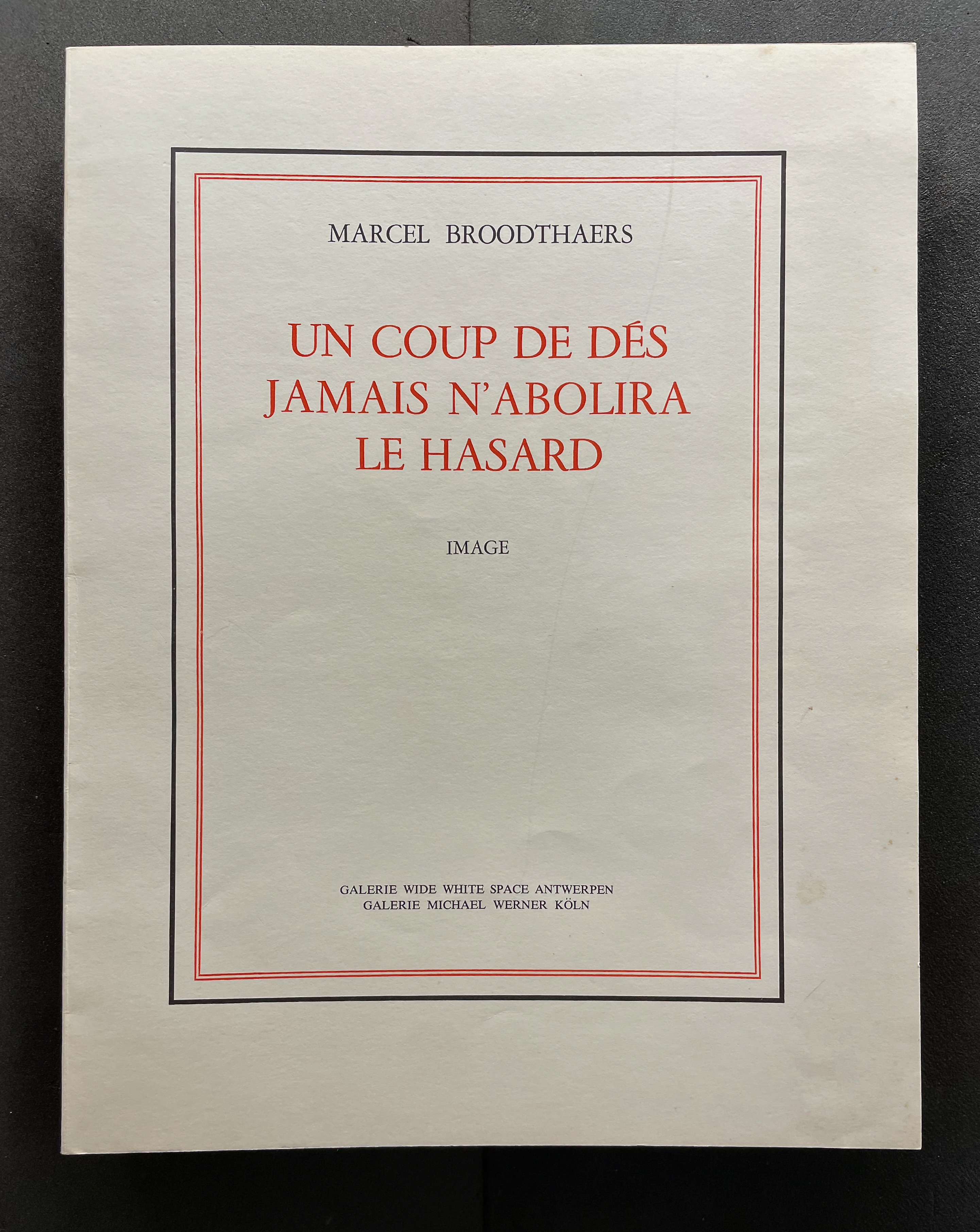
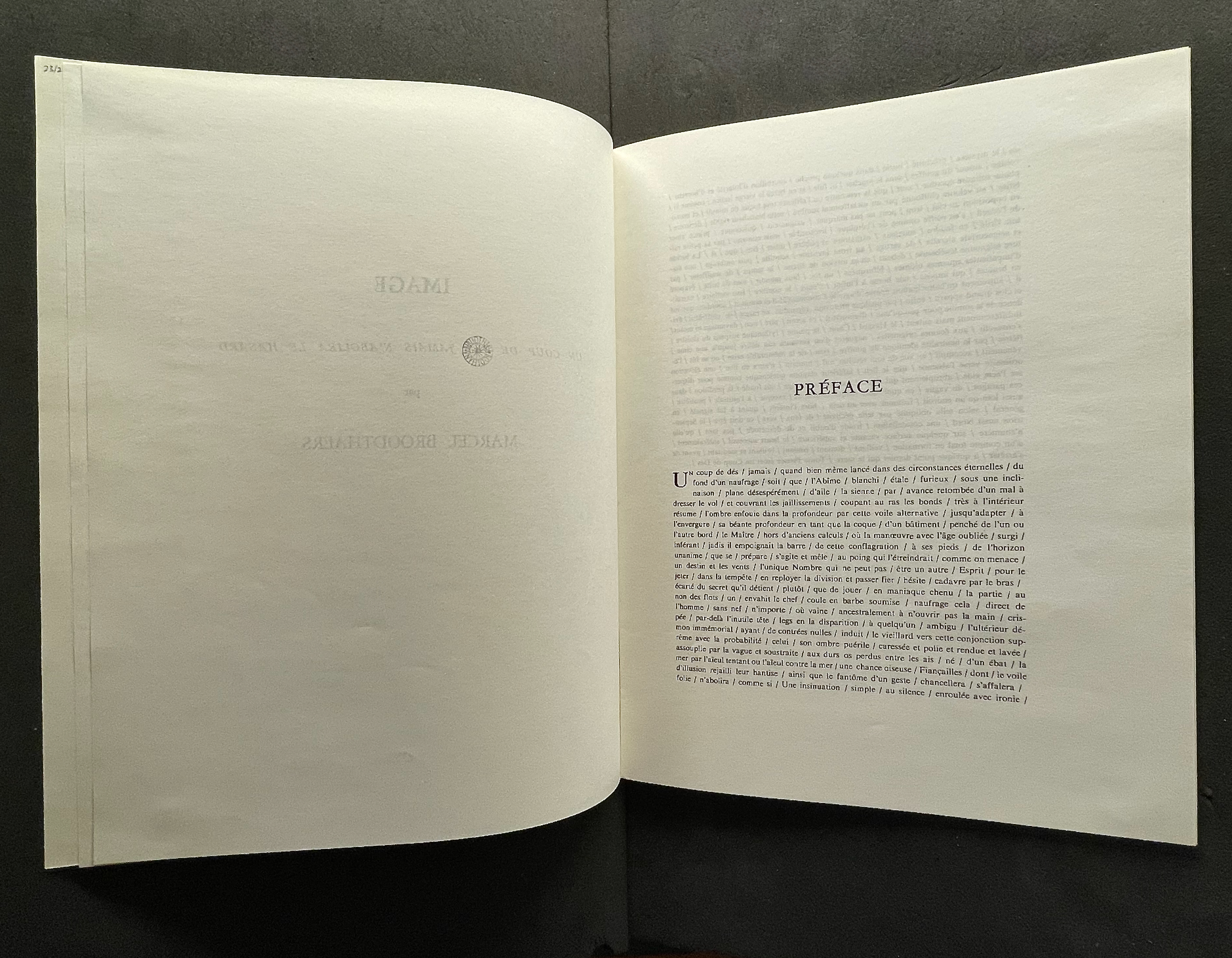
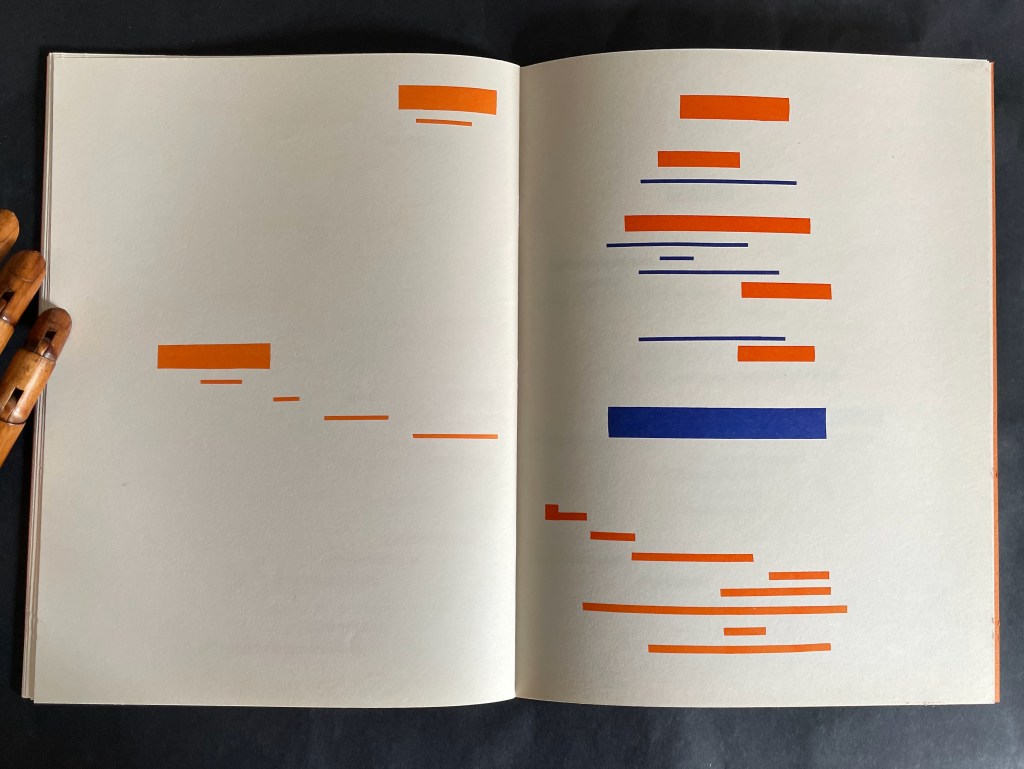
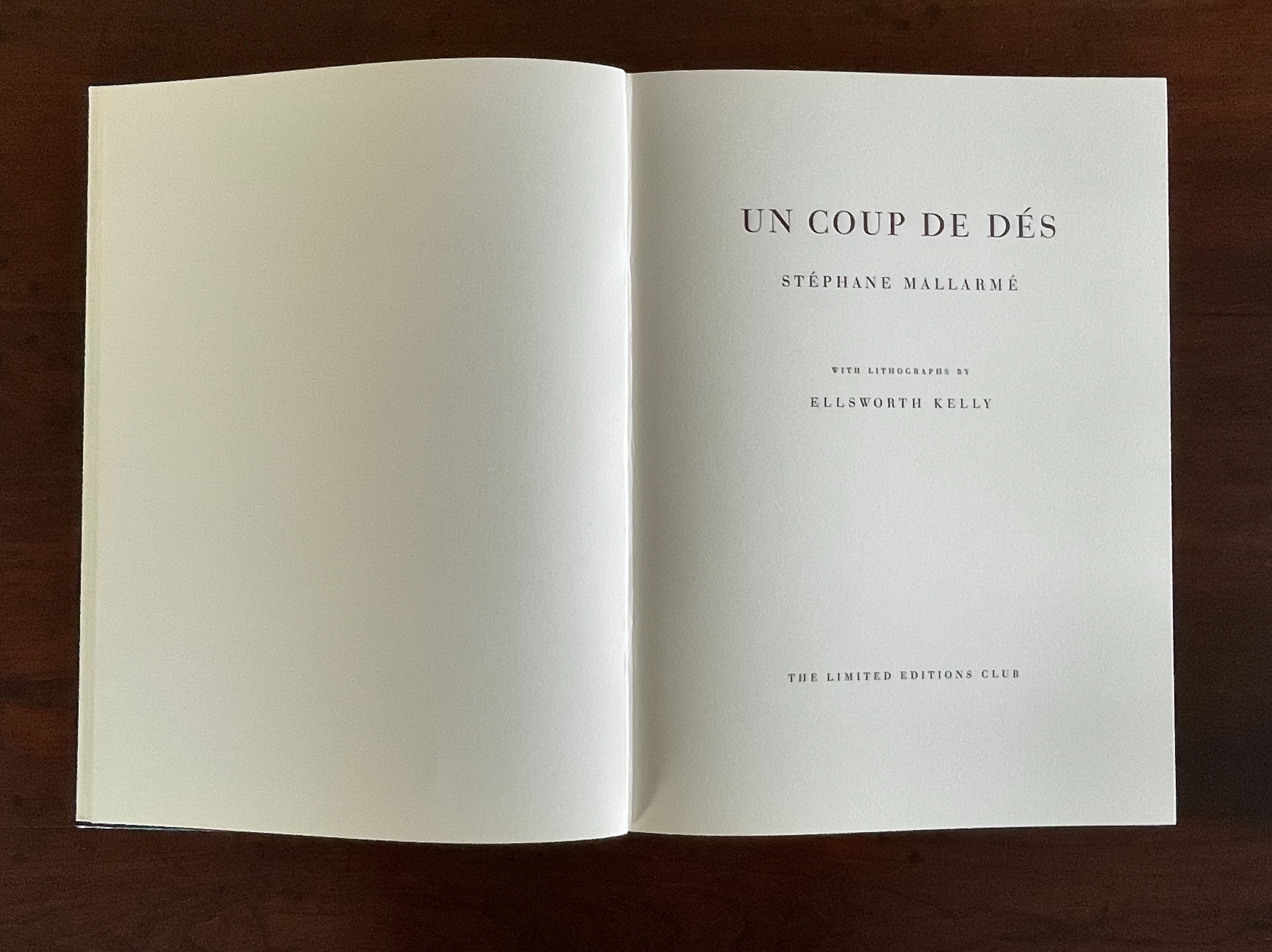
The story goes that in 1945 or 1946 René Magritte gave Marcel Broodthaers a copy of Mallarmé’s poem Un Coup de Dés Jamais N’Abolira le Hasard: Poème (1914). Twenty-three or twenty-four years later, Broodthaers organized an exhibition in homage to the poem. Entitled Exposition littéraire autour de Mallarmé: Marcel Broodthaers à la Deblioudebliou/S (“Literary exhibition around Mallarmé at the Deblioudebliou/S”), it presented three versions of an appropriation of the poem. The three versions consist of ten copies numbered I-X on anodized aluminum, ninety copies numbered 1-90 on transparent mechanographic paper (the original edition), and three hundred copies on opaque paper (the catalogue edition).
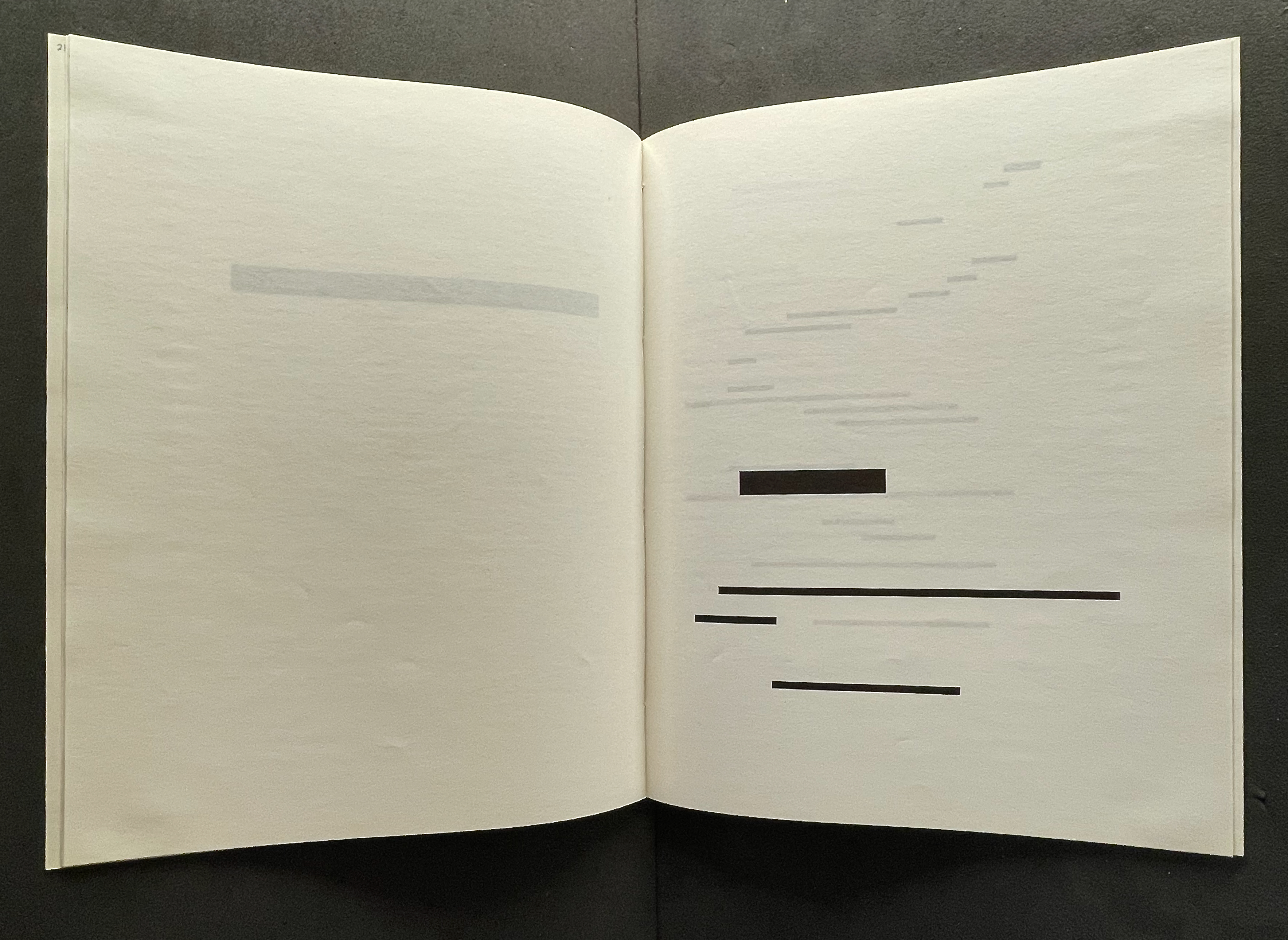
On Broodthaers’ cover, the word Image occupies the same space as Poème on the cover of the 1914 edition arranged by Mallarmé’s son-in-law. On the title page, however, Image comes first and in type larger than the poem’s title beneath it. The poem’s title is even smaller that Broodthaers’ name. Already this promises to be a bold appropriation of Mallarmé’s poem.
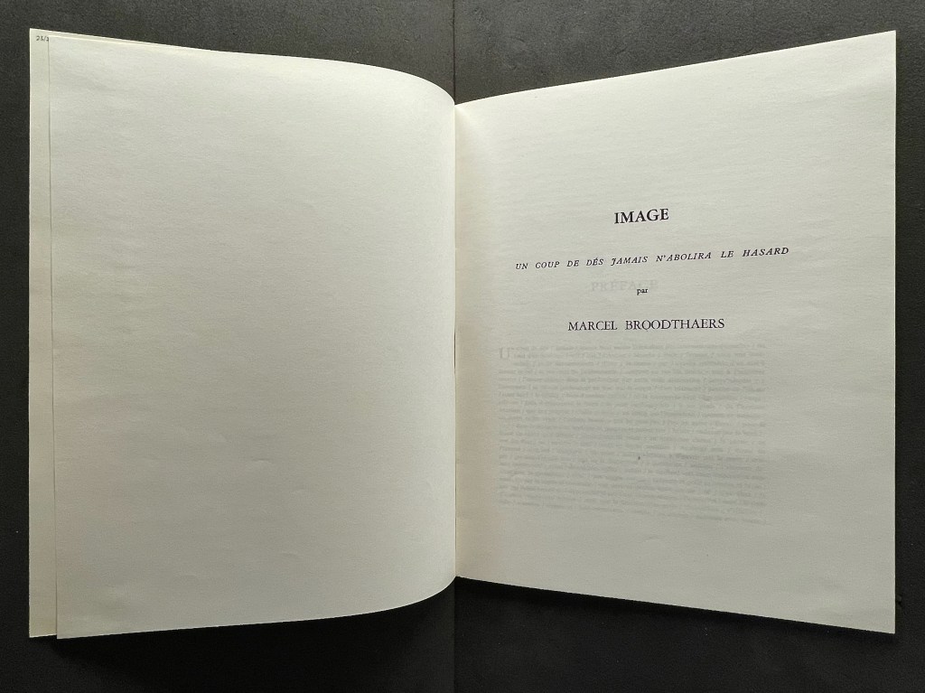
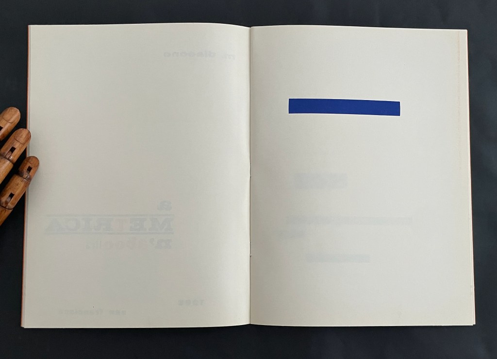
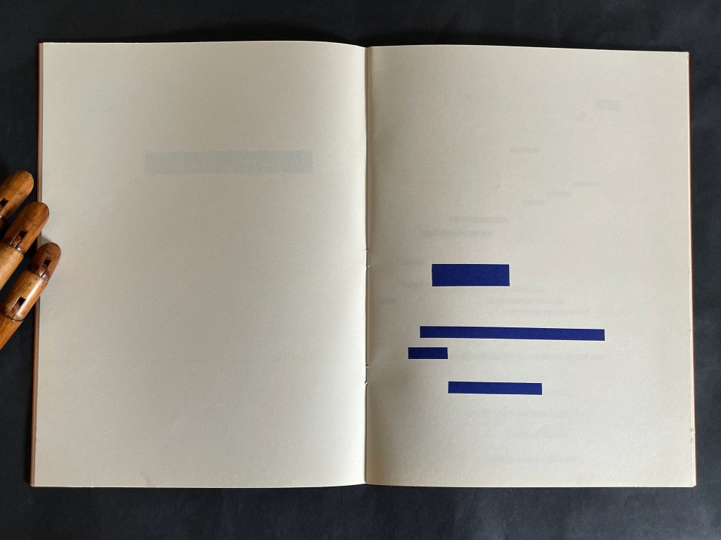
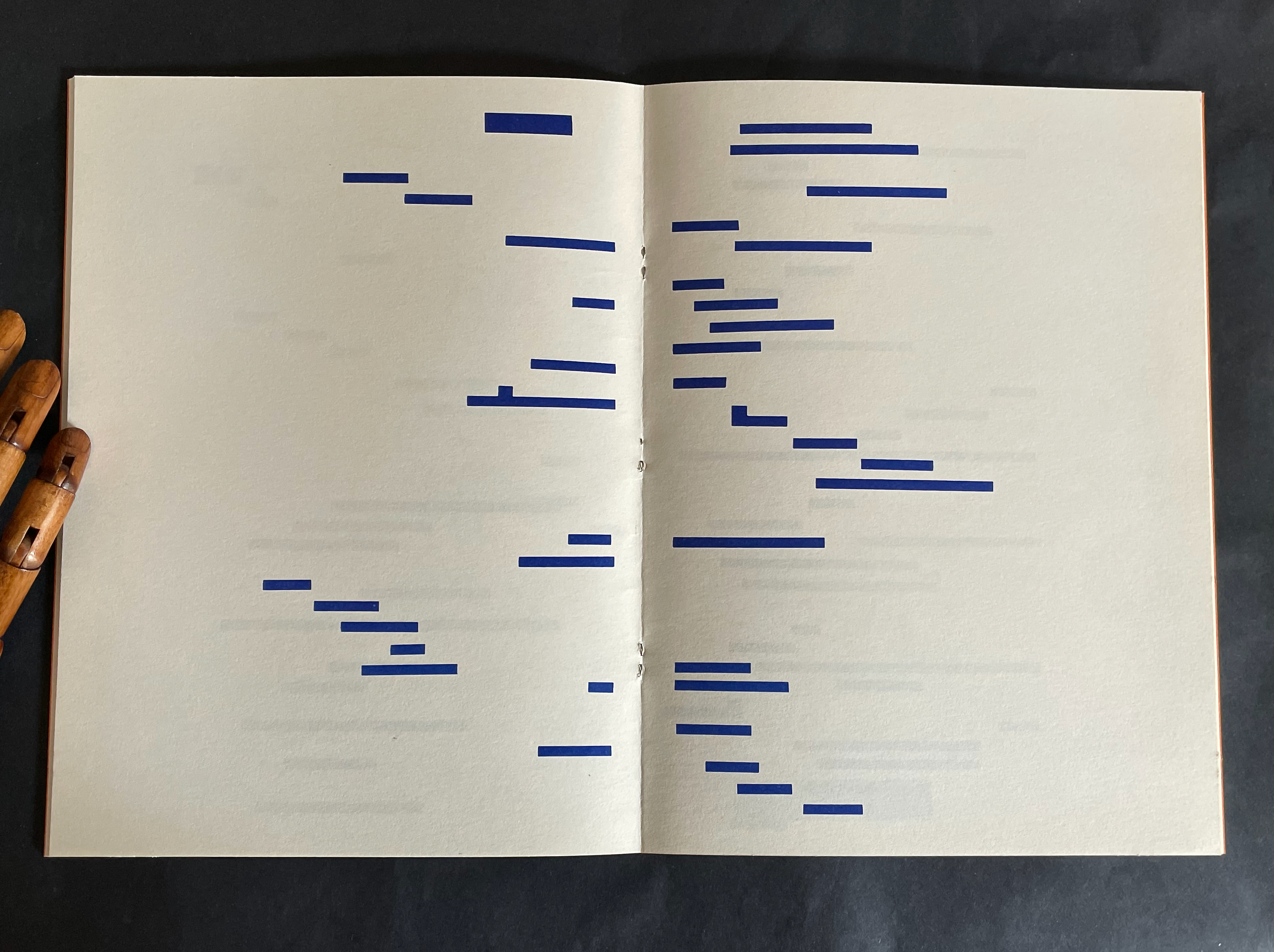
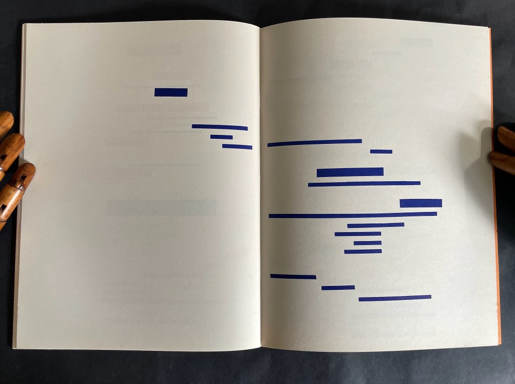
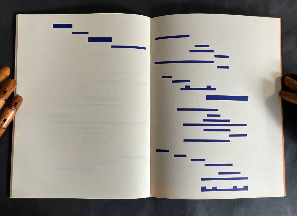
When the poem first appeared in the May 1897 issue of Cosmopolis, Mallarmé reluctantly provided a preface at the editors’ request. So reluctant was he that the preface urges readers not to read it. Broodthaers obliges. He displaces all of Mallarmé’s dismissive text with the poem’s entirety in a justified block of type with the line breaks indicated by slashes. Until the colophon, that will be the only legible text to appear in this homage.
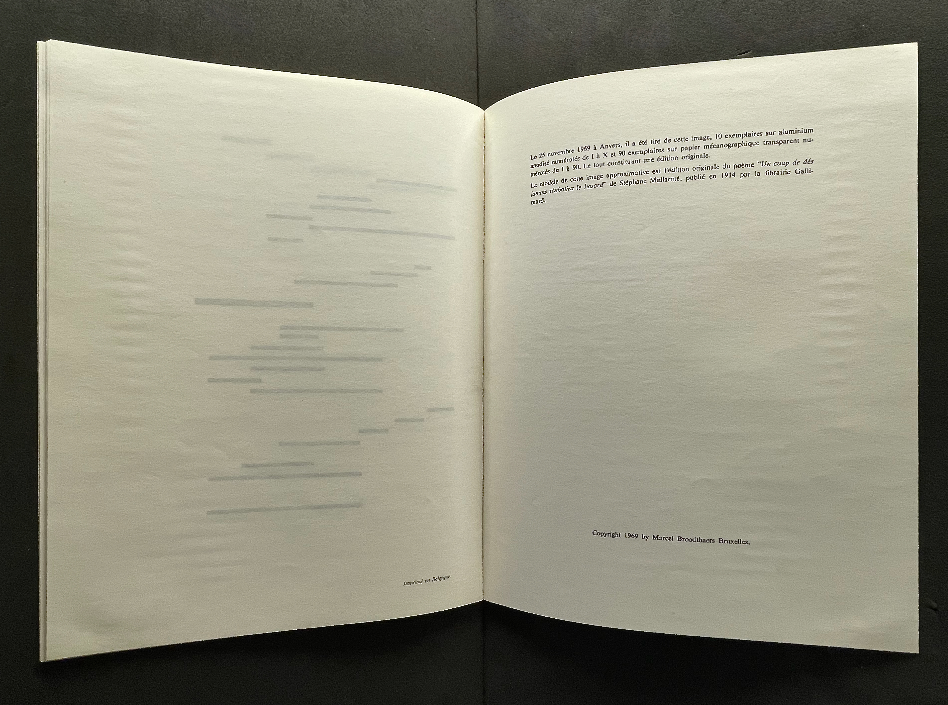
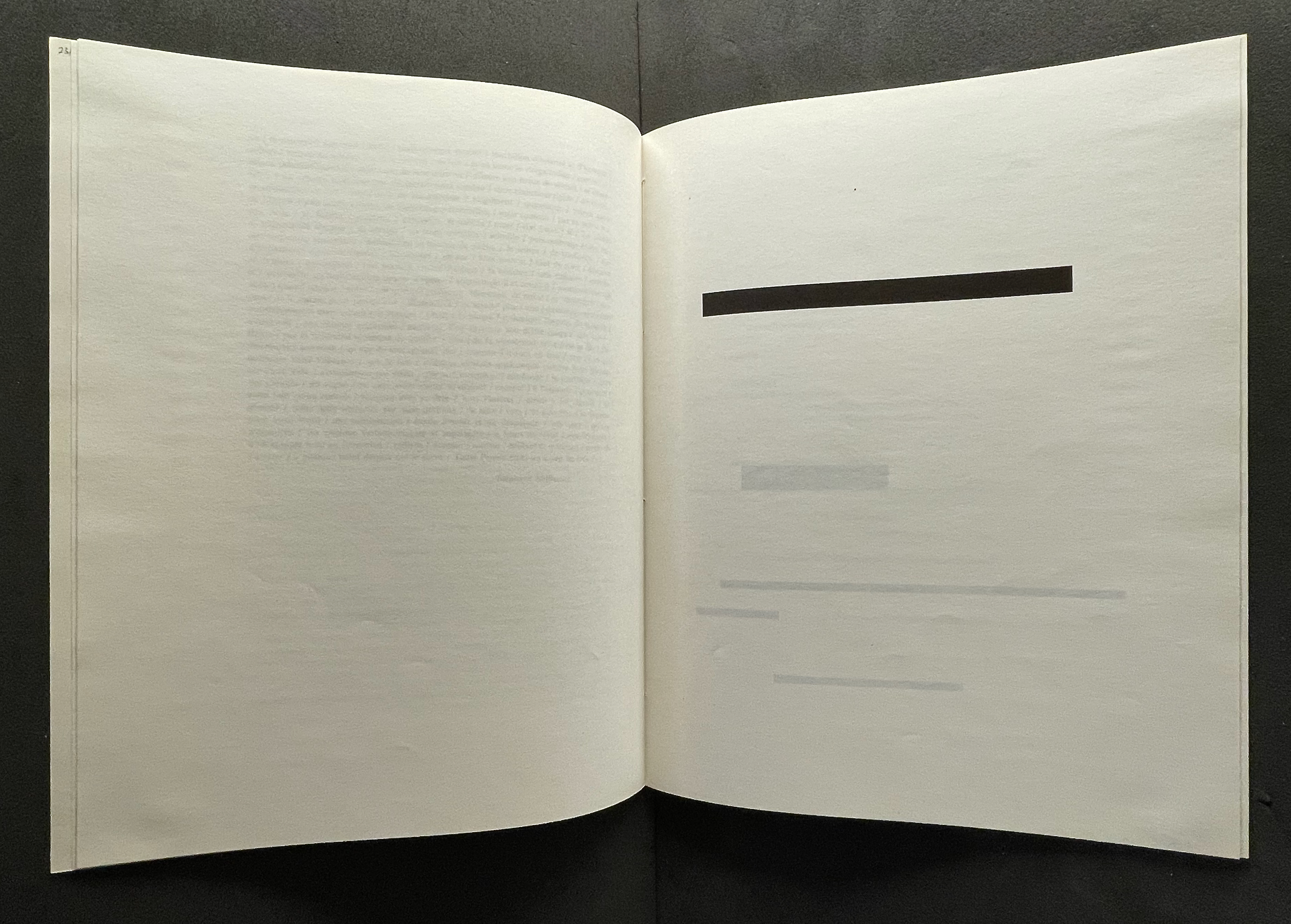
“Le modèle de cette image approximative est l’édition originale du poème ‘Un coup de dés jamais n’abolira le hasard’ de Stéphane Mallarmé, publié en 1914 par la librairie Gallimard.” Books On Books Collection.
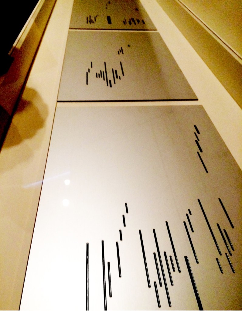
Between these two islands of text, Broodthaers offers his “image” of the poem: printer’s leading of the same dimensions as the types in the original edition of the poem. The image is the homage. In light of Magritte’s poster-essay “Les mots et les images” (1929) and its translation and appearance as an accordion-formatted catalogue for the Sidney Janis Gallery’s Magritte show in 1954, Broodthaers could equally have been paying homage to Magritte.
Top: Printer’s leading redacts “UN COUP DE DÉS”. Bottom: The leading redacts “JAMAIS” and the next three lines, which were set in smaller type. Books On Books Collection.
The other two versions were materially even more striking, and with the rest of the elements in play in the Wide White Space Gallery, Broodthaers made an innovative advance for post-Surrealism.
Top: the anodized aluminum edition; image courtesy of Charles Bernstein. Bottom: the translucent edition; image courtesy of MACBA.
As visitors to Broodthaers’ 1969 show perused the three editions, a tape recording of Broodthaers’ reading the poem played in the background. Broodthaers’ Image was not the only homage for Un Coup de Dés on display. Three hanging black shirts, allegedly taken from the Dallas Police Department, bore the full text of the poem transcribed in thin white chalk. With its floor painted black (the poem’s abyss?) and the works on display, the installation at the Wide White Space was also not Broodthaers’ first curation as art.
In 1968, Broodthaers established Le Musée d’art moderne, Département des aigles [The Museum of Modern Art, Department of Eagles]. Through 1972, museum shows occurred in various locations: his Brussels studio, the Städtischer Kunsthalle and a basement room at Burgplatz 12 both in Düsseldorf, at documenta 5 in Kassel, the A379089 alternative art center in Antwerp, and Galerie Michael Werner in Cologne. A 1968 manuscript in the Musées royaux des beaux-arts de Belgique in Brussels shows sketches of works of homage to Mallarmé that Broodthaers assigned to his museum’s “Literary Section”.
Broodthaers’ multimedia homage would provoke dozens of artists to create works of double-, triple- even quintuple-homage over the following decades into the new century. Among the most prolific of hommageurs, Michalis Pichler mounted Pichler: Exposition Littéraire autour de Mallarmé” in Milan in 2016. There he displayed many of those works of homage alongside his own. Later in 2024 at the Center for Book Art in New York, Pichler formalized Broodthaers’ concept of curation as art form in a show and book entitled Coup de dés (Collection) Books and Ideas after Mallarmé. Two years before, Galerie Michael Werner hosted an exhibition entitled “Footprints of a collector: Reiner Speck. Mallarmé, Broodthaers et les autres” (2 May – 23 July 2022). In addition to outstanding copies of the Image works, the curator Sabine Schiffer and Reiner Speck included Garniture Symbolique (1975), a blue-tinted glossy photo strip with nine photos on glossy paper, showing excerpts and phrases from the poem. Also included was a painting entitled Un coup de dés jamais quand bien même… (oil, gold paint, felt pen on canvas) from 1969, which is owned by Speck and, according to his afterword in the catalogue, has appeared in every exhibition of Broodthaers’ work since. For anyone looking for a description of Broodthaers’ 1969 exhibition, Sam Sackeroff ‘s “Literary Exhibitions” in the Speck catalogue is the gold standard.
The following collections offer more images of Image:
A Voyage on the North Sea (1974) Marcel Broodthaers Paperback (English version), Chinese wrapped-back binding. H148 x W178 mm. 38 pages. Edition of 1000. Acquired from Marcus Campbell Art Books, 9 October 2024. Photos: Books On Books Collection.
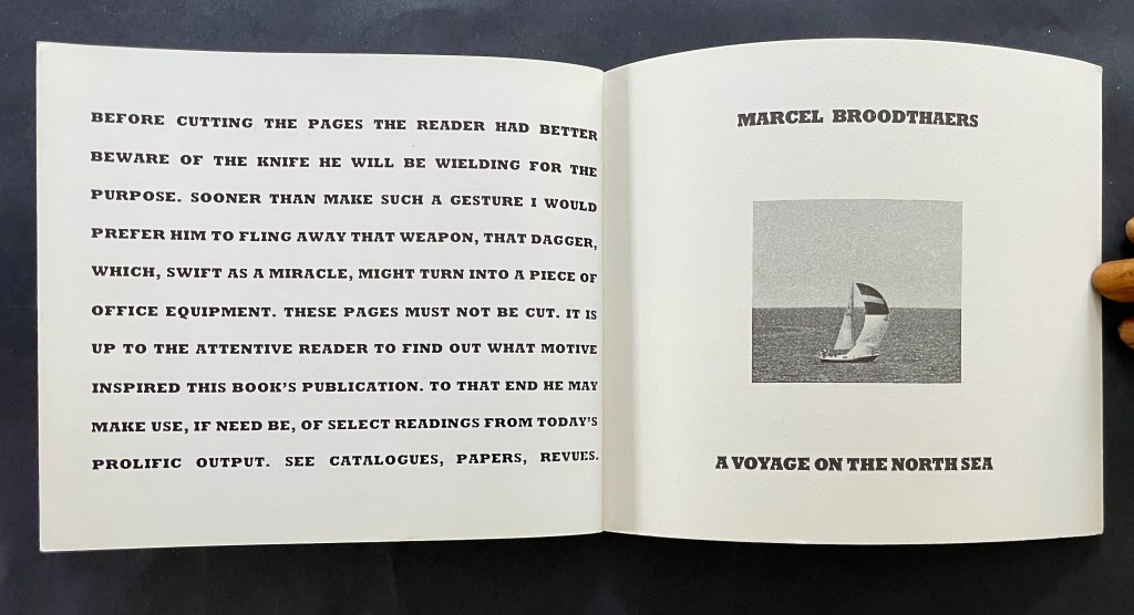
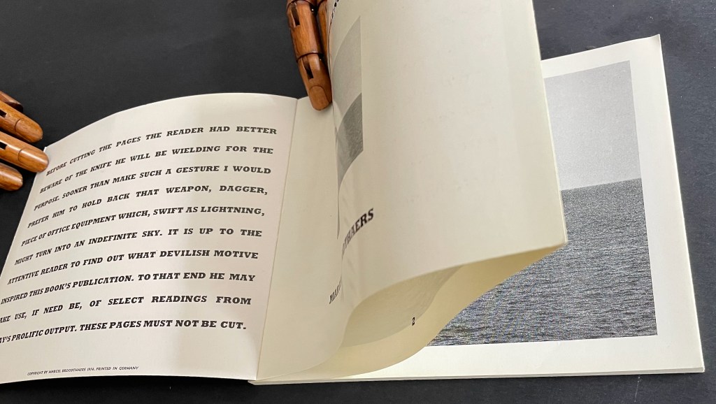
That over-elaborate and arch admonition to the reader on the inside cover doubles its mystery when it reappears on the last page of the book. The title page’s reappearance on the inside back cover underlines it. If the warning has been ignored the first time, the reader knows that cutting the fore edge folds reveals the page numbers inside, but does its reappearance at the end prompt some doubt and regret? There’s no going back.
Last page and inside back cover.
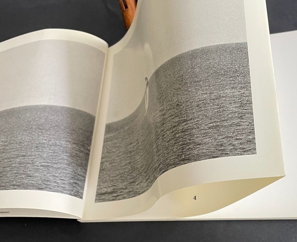
Alongside a 16mm film with the same title, the book premiered at the headquarters of the Petersburg Press, Portobello Road, London on 28 January 1974. In addition to the 1000 copies, Petersburg Press produced a numbered edition of 100 copies, signed by the artist, and distributed in a box with a copy of the film. Although developed together, the film preceded the book in 1973 and was originally entitled Analyse d’une Peinture. The painting in question is one found by Broodthaers at a Parisian flea market. To produce the film, Broodthaers added his own photographs of yachts at sea in the port of Ostend to stills of the painting and its details. With simple cuts and juxtapositions divided into “Page 1”, “Page 2”, etc., the film proceeds more like a book than a cinematic narrative, but there is no “booby-trap” in the film comparable to the prefatory warning once the book was prepared. The flea-market painting was also placed on display at the premiere.
To celebrate the peculiarity of the anniversaries of the artist’s birth (28 January 1924), the artist’s death (28 January 1976), and the book-film’s debut screening (28 January 1974), David Platzker organized his Specific Object exhibition Marcel Broodthaers : A Voyage on the North Sea on 28 January 2009. Platzker’s description provides just the right preface to the film and conclusion to this Books On Books Collection entry:
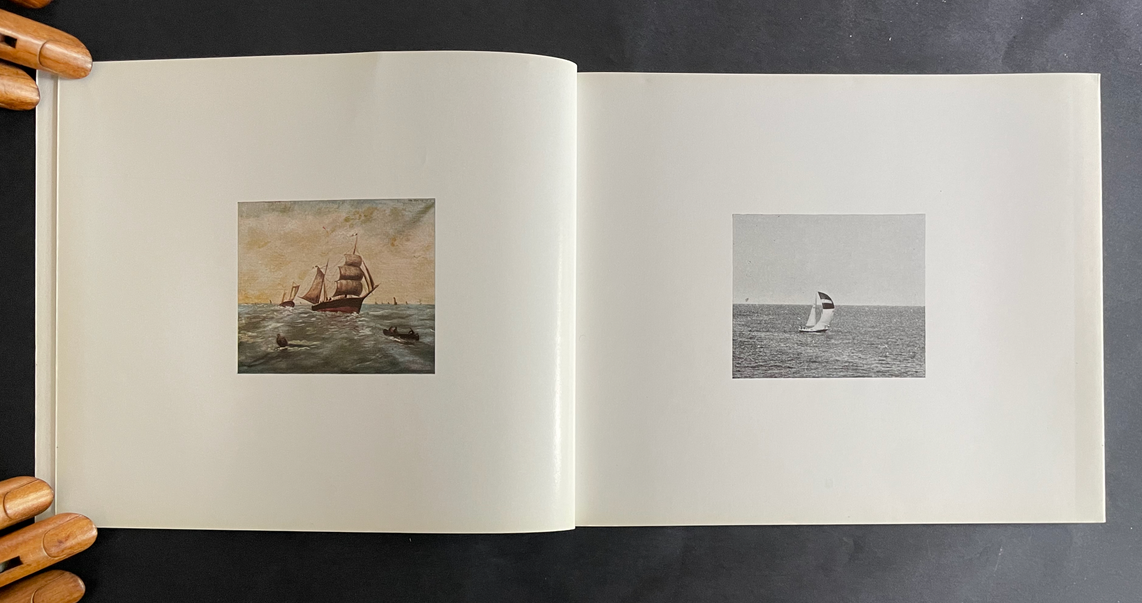
The subject of the exhibition focuses on Marcel Broodthaers’ film and book, both titled A Voyage on the North Sea which were distributed together as part and parcel of the same publishing plot. The ostensibly related subject of both book and film consists mutually of 19th and 20th century nautical images including: 1. photographic reproductions and details of an amateur’s 19th century painting of a fleet of fishing ships and 2. photographs of a contemporary sailboat. Bringing together film, books, ephemera, drawing, and the artist’s original maquette for the book, this specific exhibition sets out to map the local coordinates of A Voyage on the North Sea’s maiden launch on January 28, 1974 at the London offices of Petersburg Press. …
Referring a contemporary audience to the original screening context of Broodthaers’ book-film—itself very much like a reading lesson–this exhibition asks how a contemporary audience might begin to unpack the particular dialectics, obtuse poetics, and critical cargo of Broodthaers’ confounding enterprise. “It is up to the attentive reader,” Broodthaers writes in the preface of the book, “to find out what devilish motive inspired this book’s publication.”
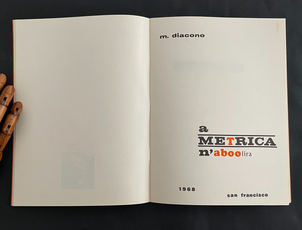
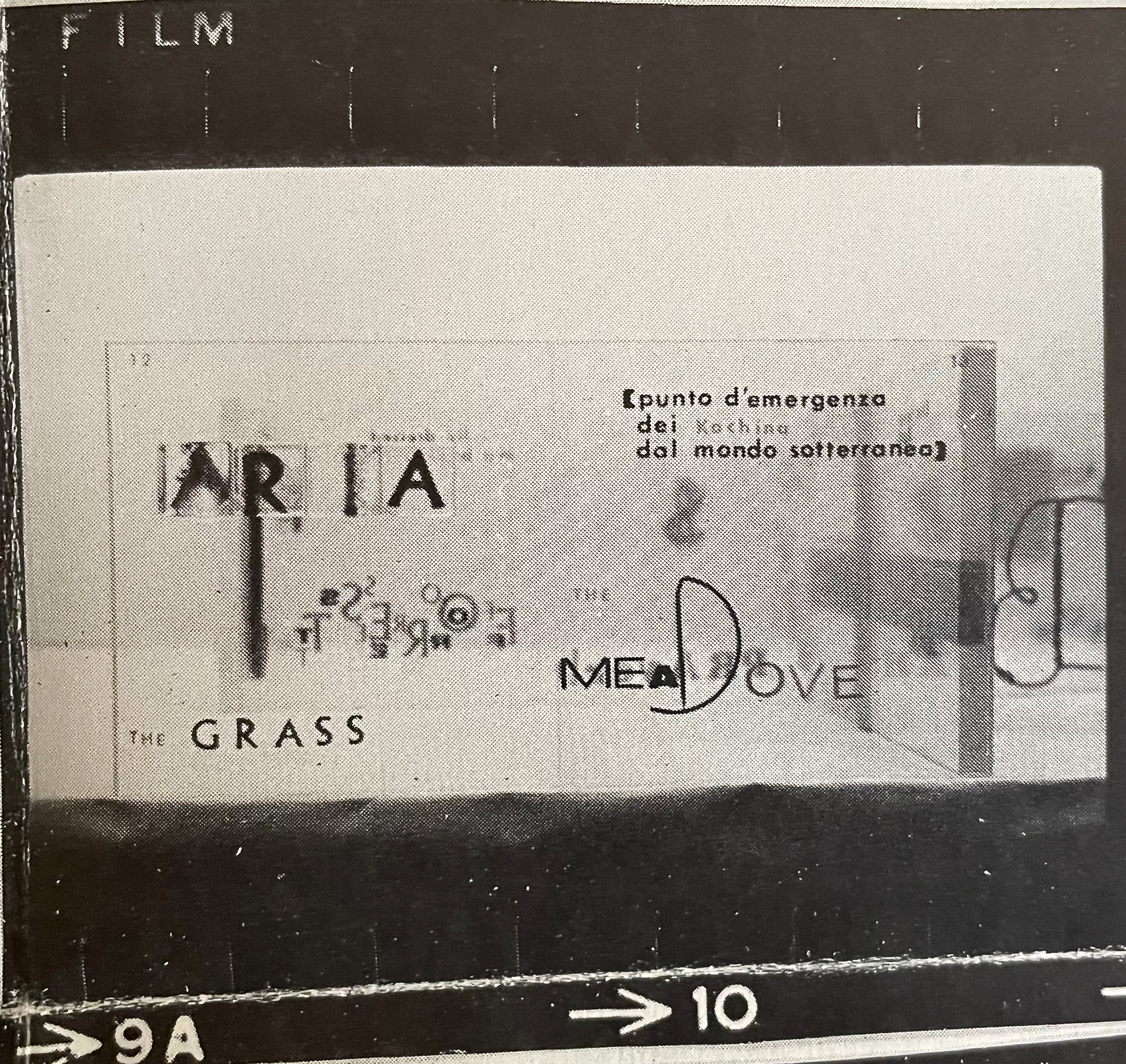
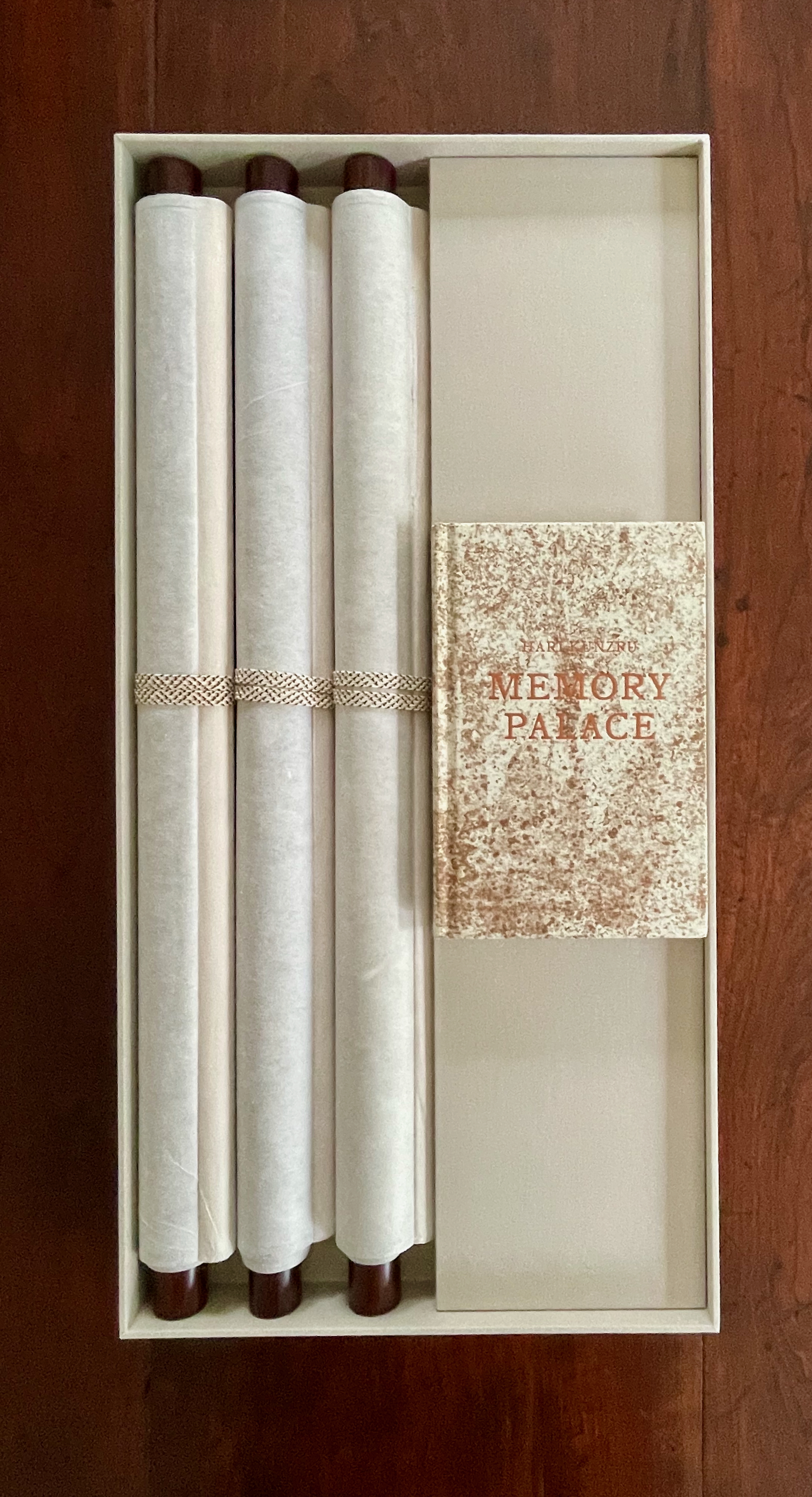
a METRICA n’aboolira JCT 1 (1968) Mario Diacono Booklet, saddle-stitched, staples. H259 x W190 mm. [32] pages. Edition of 199, of which this is #172. Acquired from Ars Libri Ltd, 18 February 2026. Photos: Arengario and Books On Books Collection. Displayed with permission of the artist.
From Ars Libri Ltd. description:
Mario Diacono relates that the manuscript of a METRICA n’aboolira was made in 1968 as a unique work, with no plans for its future publication. His idea to issue it as a limited edition artist’s book (and equally, as the first number of his review “JCT”) arose in the late summer of 1969, following a stay in New York, where he was in contact with Vito Acconci, Joseph Kosuth, and members of Art & Language. On his return to California in September, Diacono delivered the manuscript to the San Francisco printer, Futura Press, including with it a colophon which was dated November 1969, based on the expectation that the edition would take two months to complete.
With the colophon offering 1968 or 1969, the title page picks 1968 and presents that as the date of publication. The date only matters in determining who came first with the idea of replacing Mallarmé’s text with solid blocks: Diacono or Marcel Broodthaers, whose three versions of Un Coup de Dés Jamais N’Abolira le Hasard: Image (on translucent paper, solid paper, and anodized aluminum) were published by Wide White Space in 1969.
Besides being first out of the gate with an “homage by redaction” of Un Coup de Dés, Mario Diacono is perhaps the first hommageur to give a sociopolitical cast to the effort. In an interview in Ursula, Diacono comments
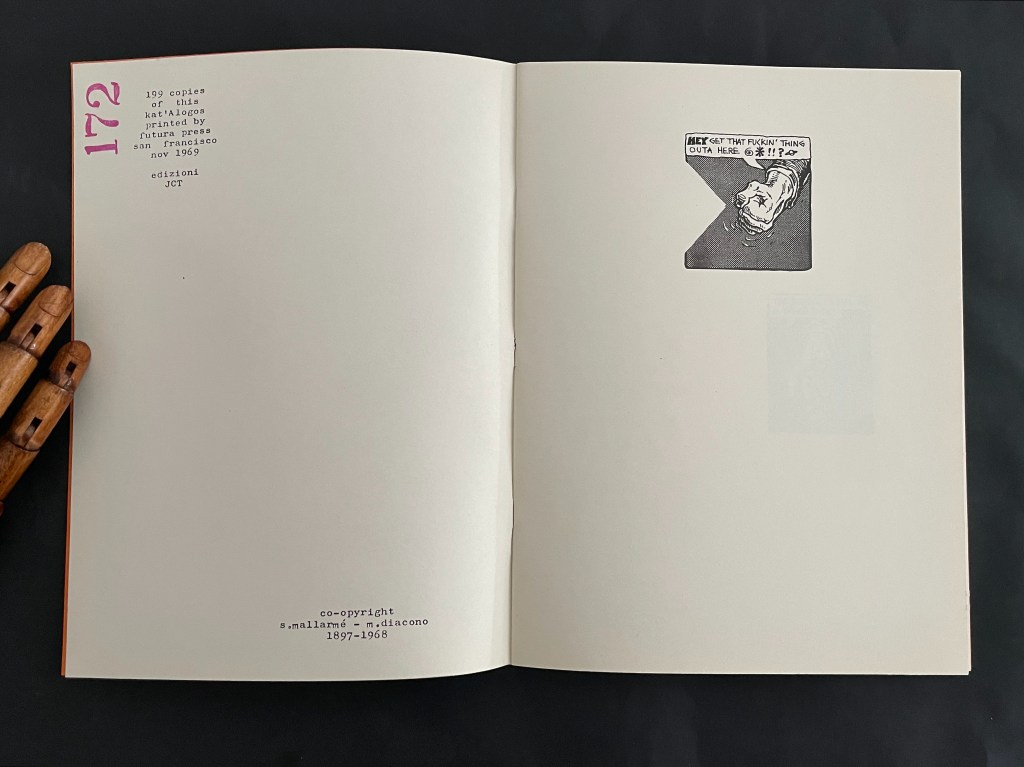
1968 was a year in which many things were abolished, or felt tempted to be abolished. Language was one of them, at least the traditional language of poetry, but also the language of ‘bourgeois/capitalist’ society. Berkeley is also present in the book through the reproduction of three frames from a cartoon in a local magazine, which functions as a kind of preface. The title alternates not only colors, black and orange, but also uppercase and lowercase letters. The wordplay in essence says: the absence of metrics, of language, will not abolish poetry. Neither will the American taboos.(Nickas, 2019).
Those comments align with the element of “pop” art and the underground comic in this homage.
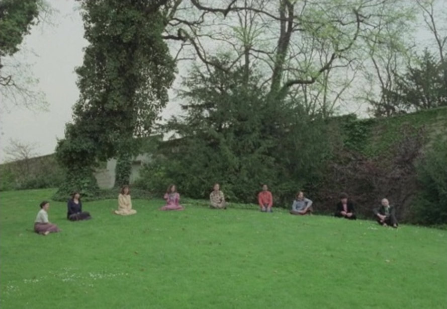
Later in the 1970s, Danièle Huillet and Jean-Marie Straub would pick up the thread of social critique by staging and filming a choral reading of the poem on the lawn of the Père Lachaise cemetery,
where there are the great memorials of the concentration camps: Ravensbrück, Auschwitz… it is in the corner of the cemetery where you can guess something about the city. Under this hill are buried the last members of the Paris Commune, who were shot in that same place. – Jean-Marie Straub
These three connected volumes explore graphic transpositioning from oral speeches to a visual representation. Though a new way to read/experience the speeches–to visualize their patterns–you can [still] not tell the truth from fiction. You can not tell what you are reading. “In the 3-part, 4 Speeches/Coup de Des, the images of audio waves are the same—but one purports to be a group of speeches by Bush 43 ; another, a group by Tony Blair; and the last—the real thing—is an unidentified man reading Mallarme’s “Un Coup de Dés Jamais N’Abolira Le Hasard”, that modern masterwork that launched a thousand artists’ books. The concept is trenchantly funny; the books are beautifully executed. [from the preface to Didier’s Manifesto by Tim Young]
Like Huillet, Straub and Mutel, Diacono is trying to balance his socio-political drive with the visual and historical homage to Un Coup de Dés. Huillet/Straub’s performative vocalization delivers its message only through the visual of its location. Mutel delivers his message by muting the poem with its sonographic visualization and sleight-of-hand substitution for political speeches. a METRICA n’aboolira delivers its message by balancing the textual and the visual, reminding us that Mallarmé wanted Un Coup de Dés to be looked at as well as read.
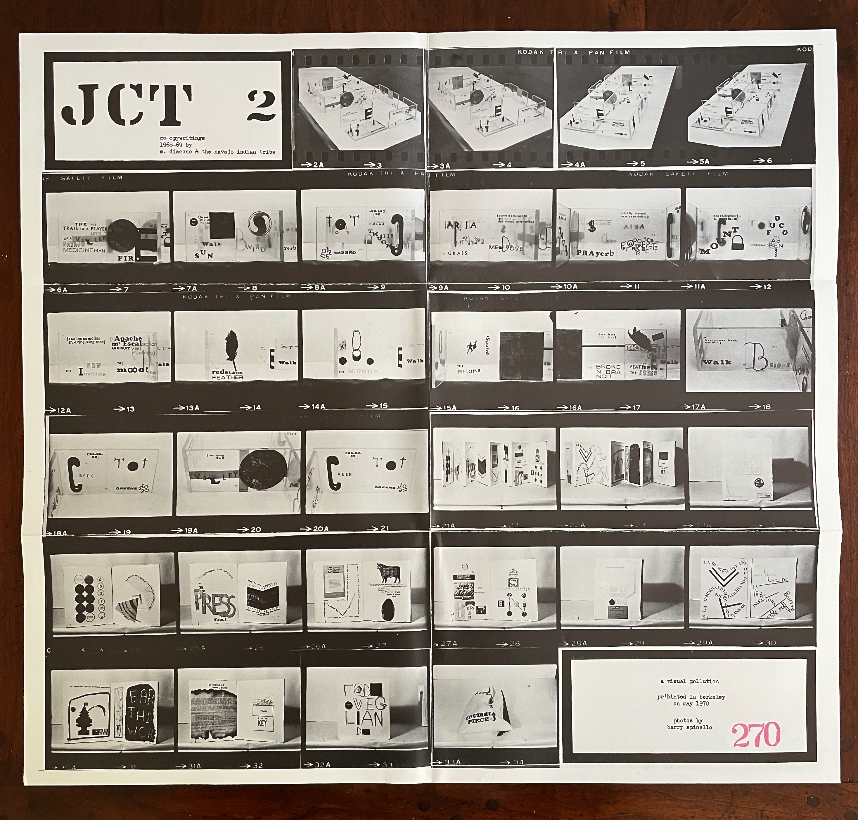
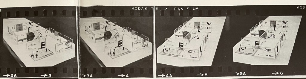
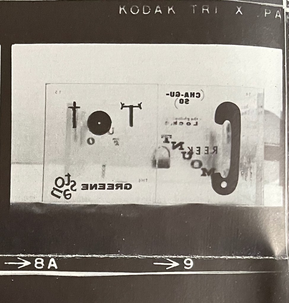
a visual pollution (1970) JCT 2 Mario Diacono & the Navajo Indian Tribe with photos by Barry Spinello Broadside, illustrated with 32 photographs in six strips. H157 x W254 mm (closed), H472 x W503 mm (open). #270. Acquired from Ars Libri Ltd, 18 February 2026. Photos: Books On Books Collection.
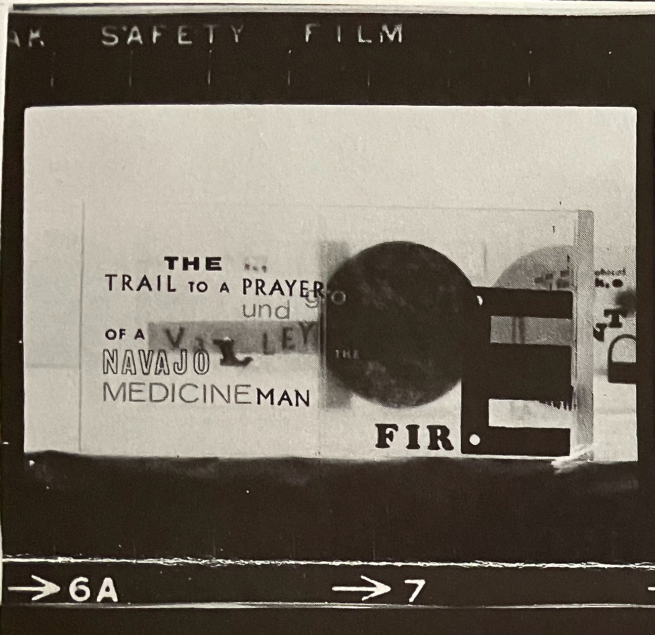
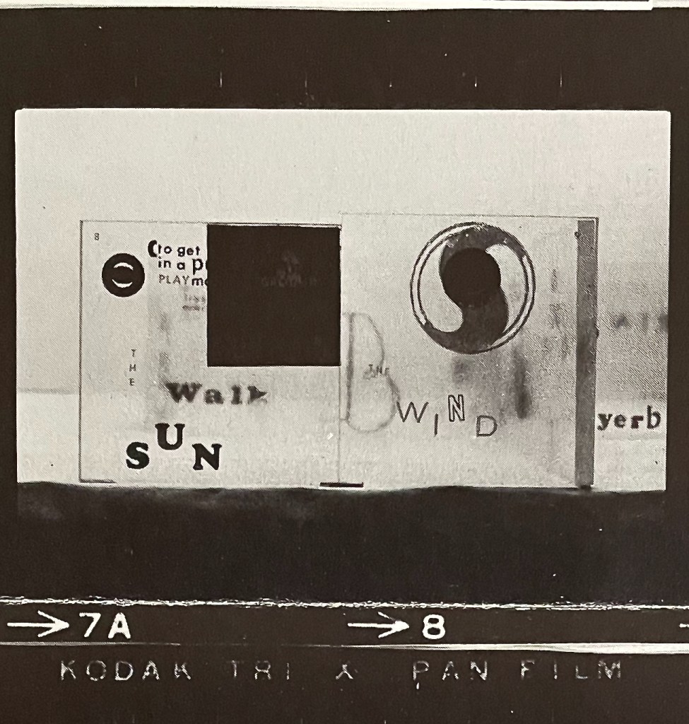
A broadside of books, or a photographic record of a display of three works of book art and some print works? On its surface, a visual pollution is a single sheet of paper displaying strips of Kodak film with frame numbers (2A to 34) appearing along the foot of the roll of film. The first four frames show photos of clear acetate blocks forming the Navajo ancestral emblem called the “Whirling Log” (tsil no’oli). On each block, double-page spreads have been printed containing phrases as text and images. In the fifteen frames that follow the first four, Diacono and Spinello give us close-ups of the acetate panels/pages. Page numbers can be seen in each spread’s upper left and right corners. The next eleven frames, starting with 21A/22, show two leporellos (one has eight panels, the other seven) with close-ups of the panels. The last two frames show two printed cards (or one double-sided one) in portrait and landscape orientations.
The first four frames, the arrangement of acetate blocks in the shape of the Navajo emblem “Whirling Log” (tsil no’oli). The Navajo Nation disavowed the totem in 1940 after its appropriation as the Nazi swastika.
In JCT 1, Diacono designated the work as “co-opywritings” of himself and Mallarmé. In JCT 2, the Navajo Indian tribes “join” Diacono. “Co-opywriting” is the perfect neologism to describe Diacono’s self-aware act of appropriation. There is no collaboration here; he has co-opted the French poet and the indigenous Americans. As an Italian and recent immigrant to the US, did his self-awareness extend to knowing that he was appropriating a disavowed emblem? “After the symbol was co-opted by the Nazi Party in Germany in 1920, the Navajo, Hopi, Apache, and Tohono O’odham tribes prohibited their communities’ use of the whirling logs motif by way of a 1940 intertribal proclamation. In the past few decades, Navajo people have begun to feature the motif in their weavings once again.” (Millicent Rogers Museum)
While it is nonsensical and inappropriate to assign authorship in this case to a tribe, the work’s title, the use of the tribal emblem, and the nature of the word mash-ups like (“U.S.A.lly dressed in a baby dollar“, “PRAyerb“, or “r’Apachem’EscalactionAGAIN,STviet Pueblos) suggest that something other than appropriation is at play. It is far from the offensive “playing Indian” in which the Italian artist Eliseo Mattiacci engaged (Salza). Diacono’s art seems to spring from an anti-establishment and counter-culture base. His assault on words as “visual pollution” and the need to mash them up into “object-oriented writing” (Martini) may or may not have appealed to the Diné-speaking people and the Red Power Movement of the 60s and 70s. But there is no denying Diacono’s critical enthusiasm and energetic claims of solidarity.
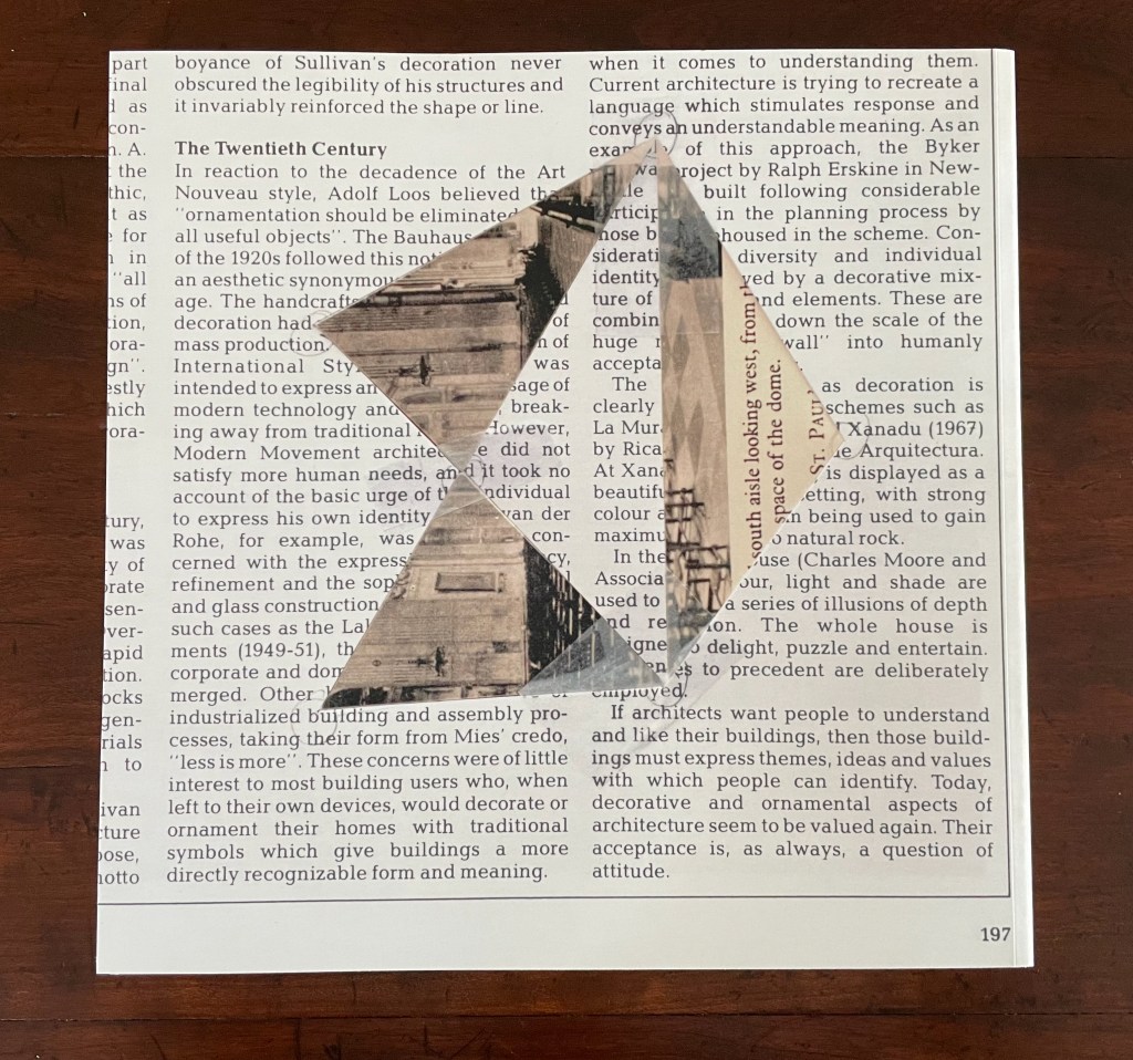
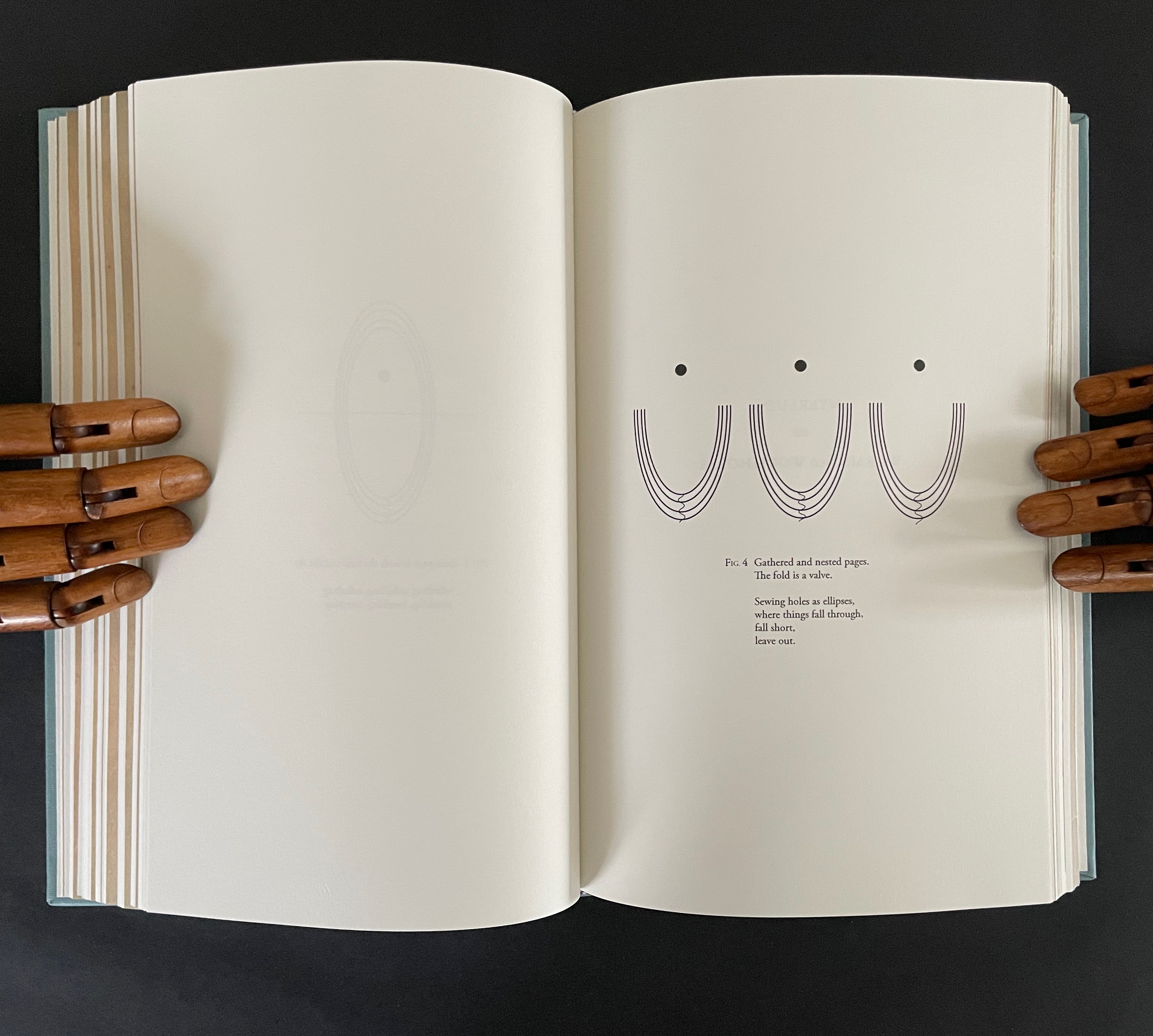
Book art always pushes at the edges. Whatever meets at the edges is book art’s business. Negative space and positive space. Letter stroke and counter. Margins and the gutter. Justified and unjustified. Legible and illegible. Bound and unbound. Art and craft. Unique and multiple. Self and other. Destruction and creation. Life and death.
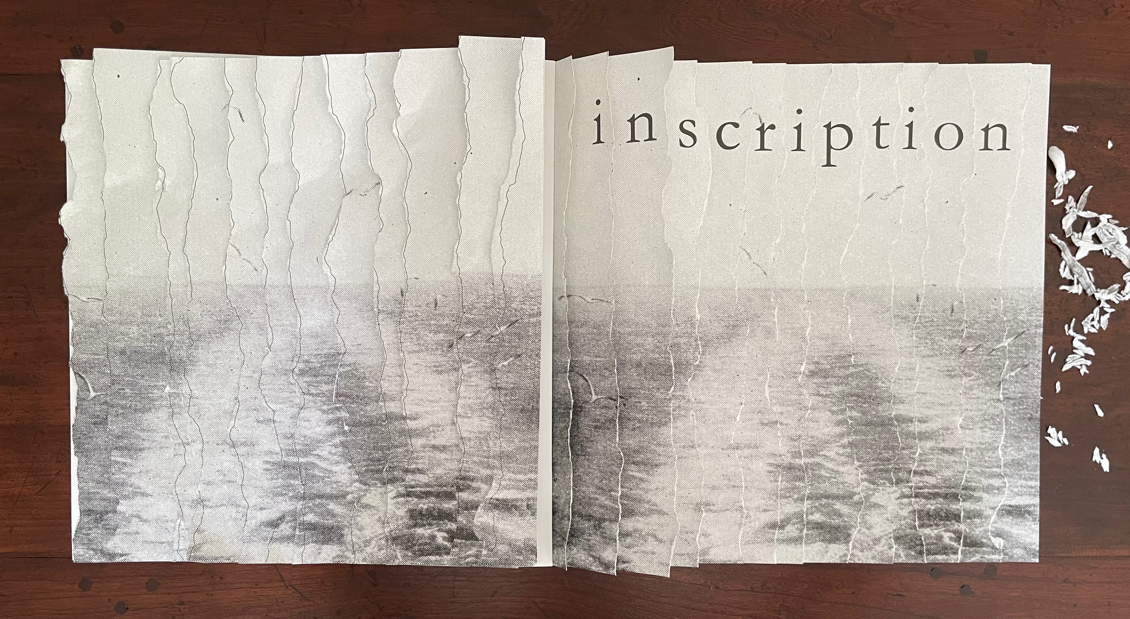
Inscription 6 is about cuts and tears, mostly tears — creating edges. “Tears” is also a heteronym, a word whose meaning changes with the change of the sound of the vowel but whose spelling remains the same. We can have tears [/tɛ(ə)rz/ tairz] as in “torn parts or places, or rips asunder”. Or we can have tears [/tɪ(ə)rz/] as in “teardrops, or weeps”. Or, with art, we might paradoxically have both simultaneously as we shall see in this issue’s first contributed essay. Also, with art, we might find that tearing — creating edges — paradoxically binds what it divides.
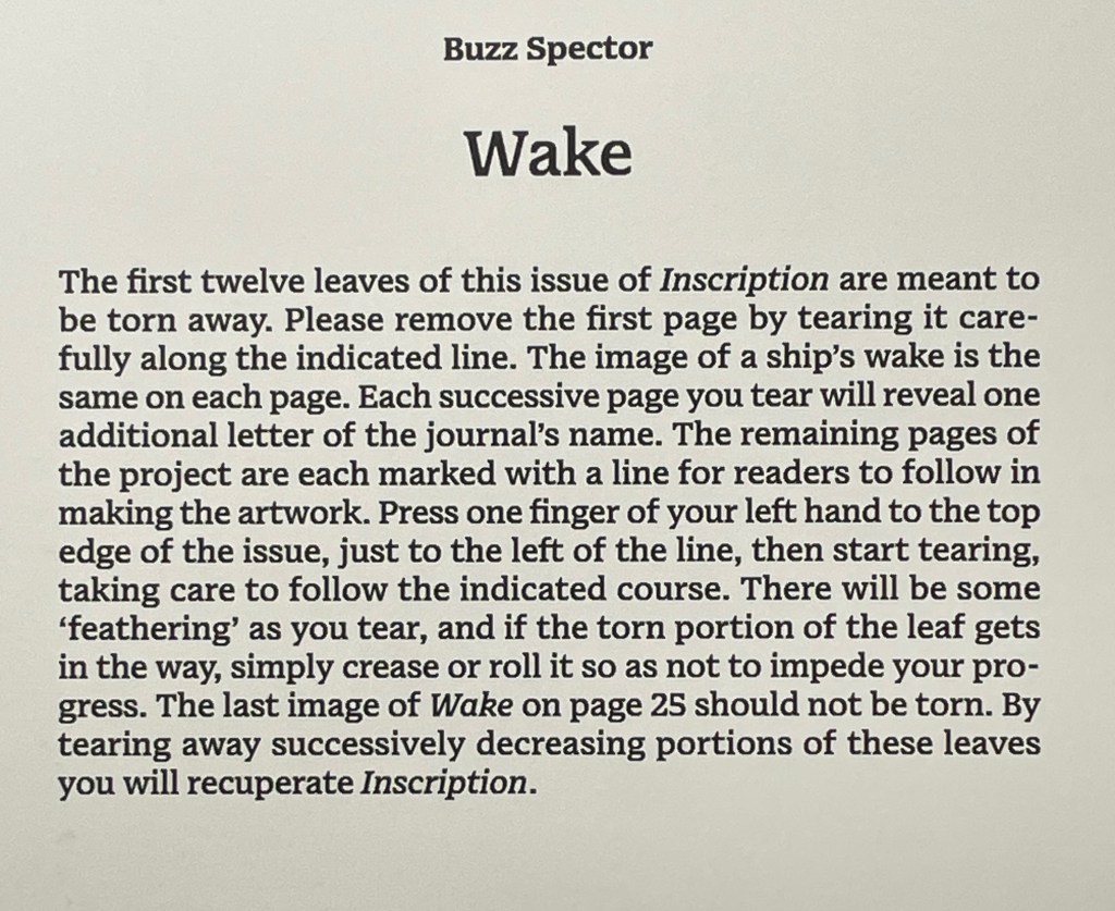
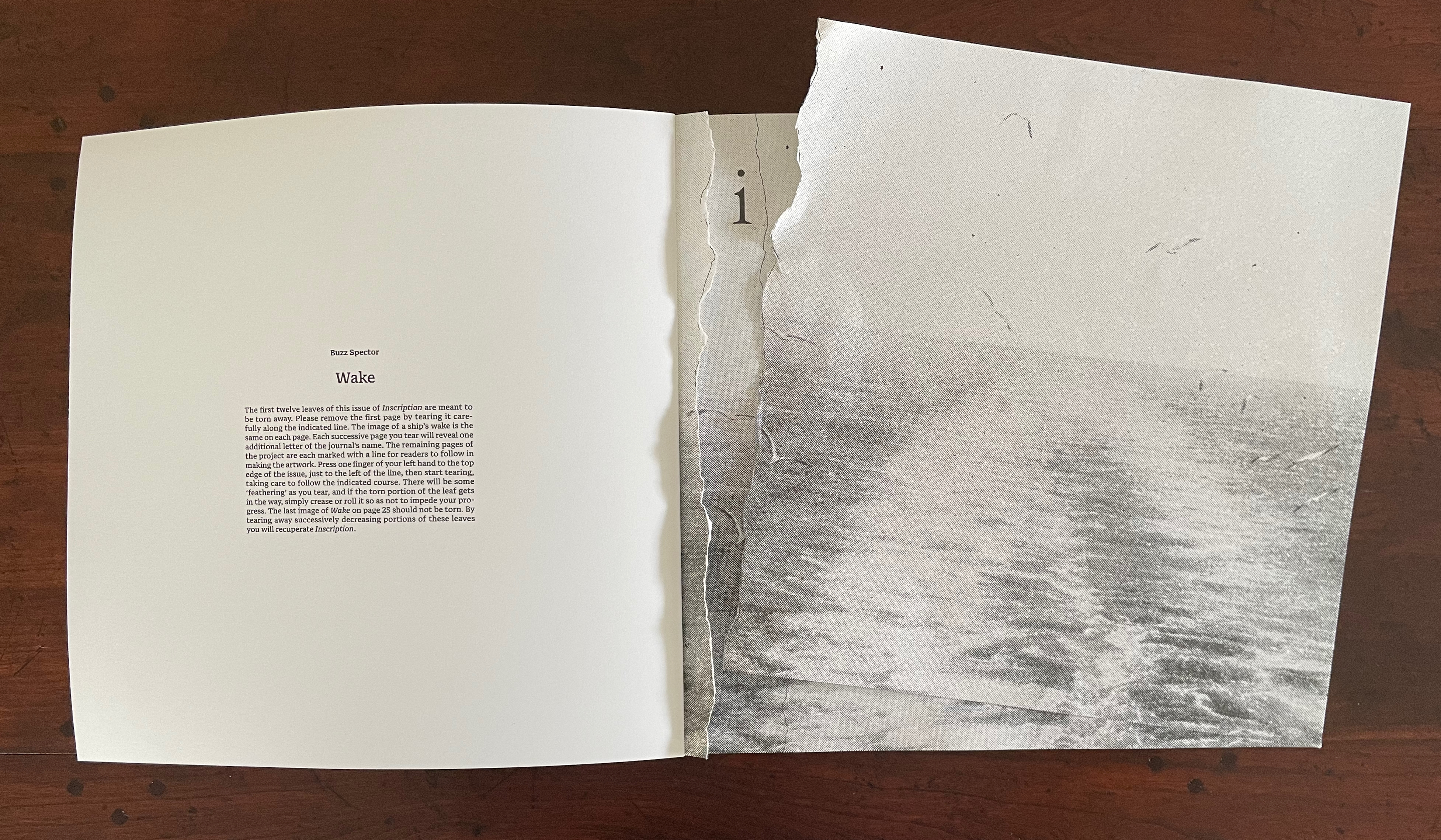
But first, as subscribers have come to expect, Inscription 6 opens with a surprise. Buzz Spector invites us to join in his artistic practice of tearing things up.
The artist says that he is asked all the time how he stands the tedium, to which he replies it is a meditative state he is sorry to see end. He is right. Once the initial unease over tearing pages from the issue subsides, a certain satisfaction ensues.
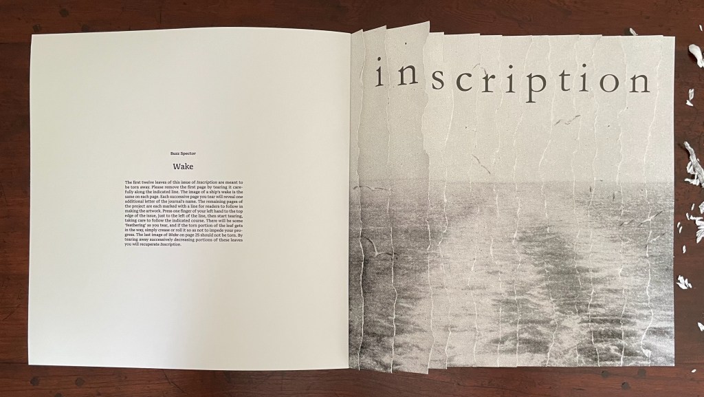
The “second” tear. (See further above for the first.)
The result is the wake’s image restored in a composition of torn strips still bound to the book.
Rather than surrendering themselves to the bin, the removed strips beg to be reassembled for a wake on the other side of the gutter in keeping with the creative productivity of turning the singular into the plural.
Left: the Spector-esque result. Right: the removed strips rearranged.
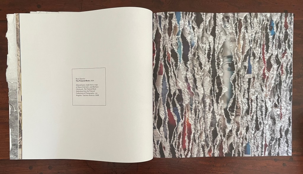
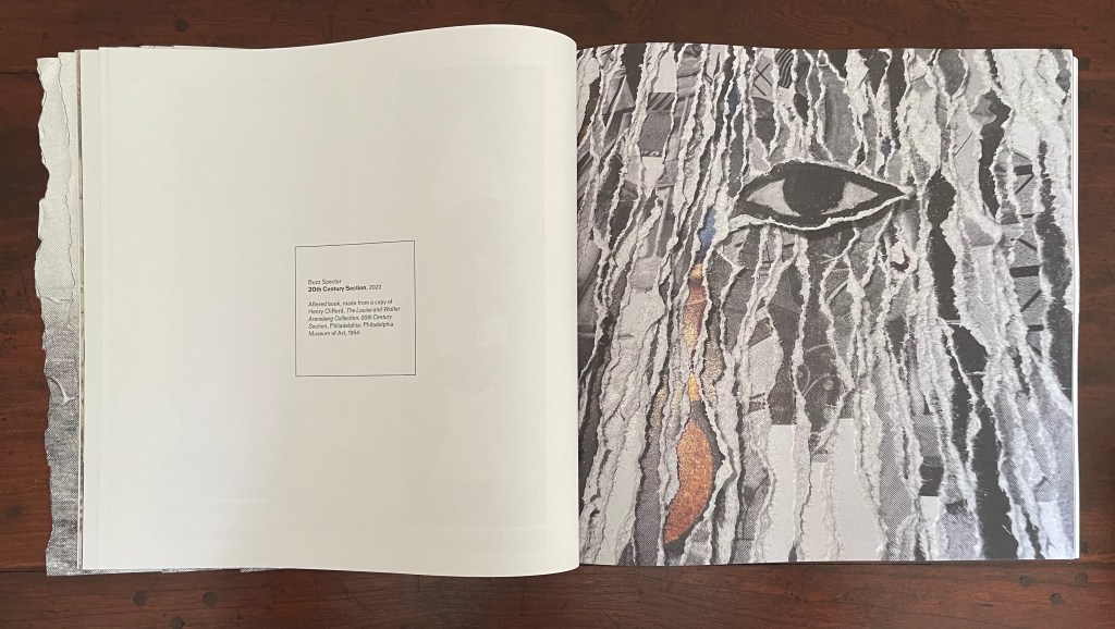
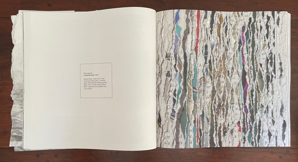
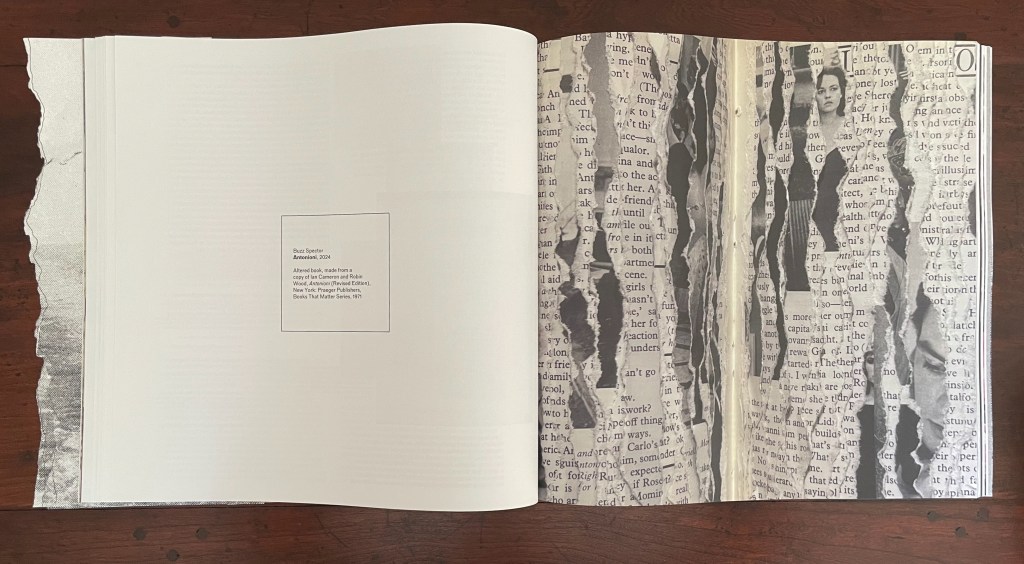
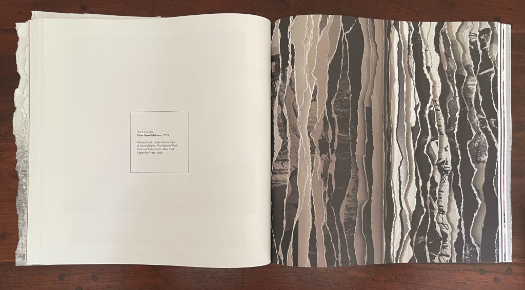
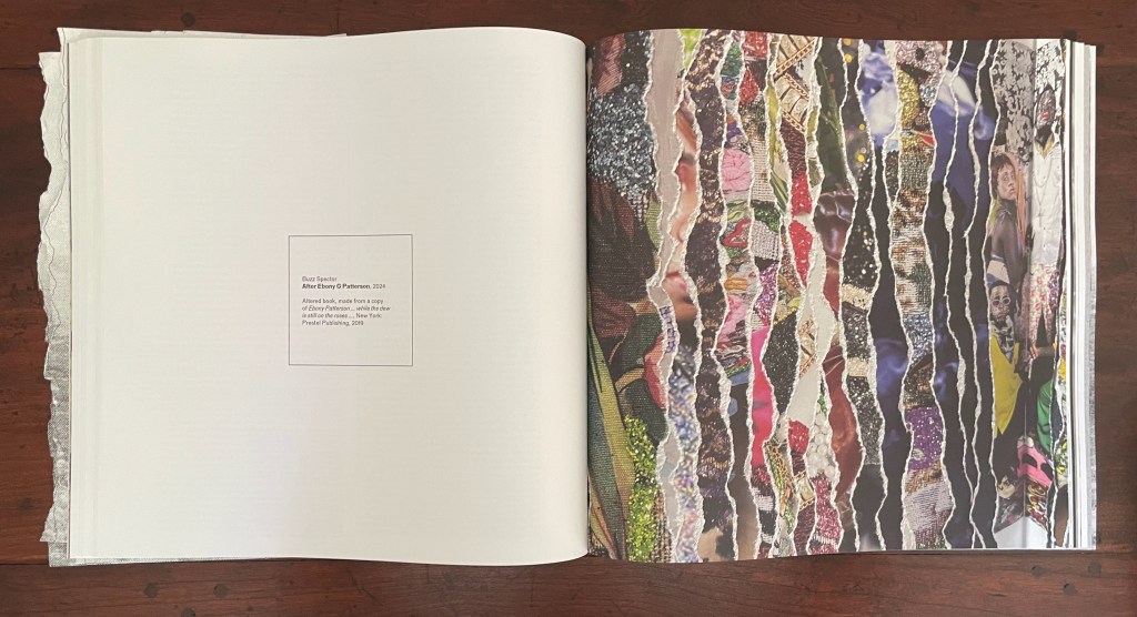
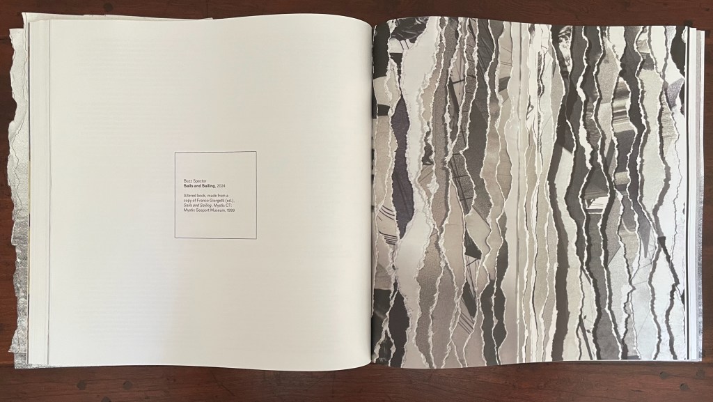
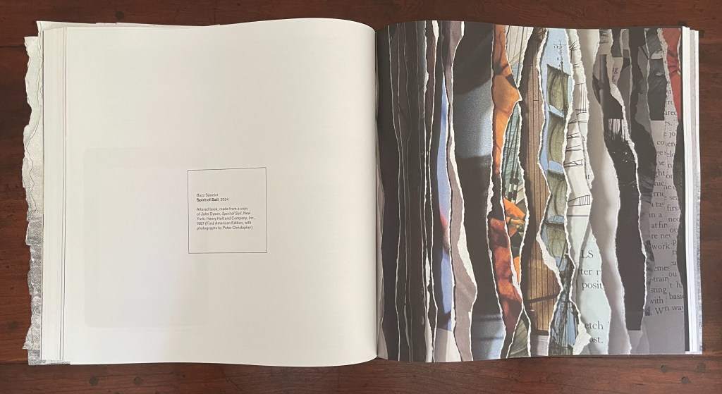
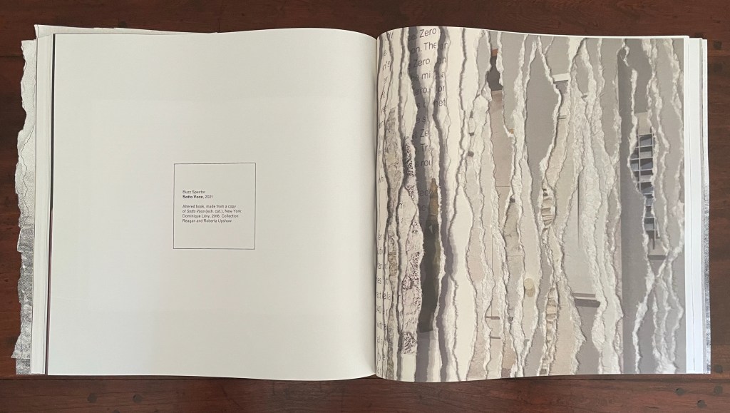
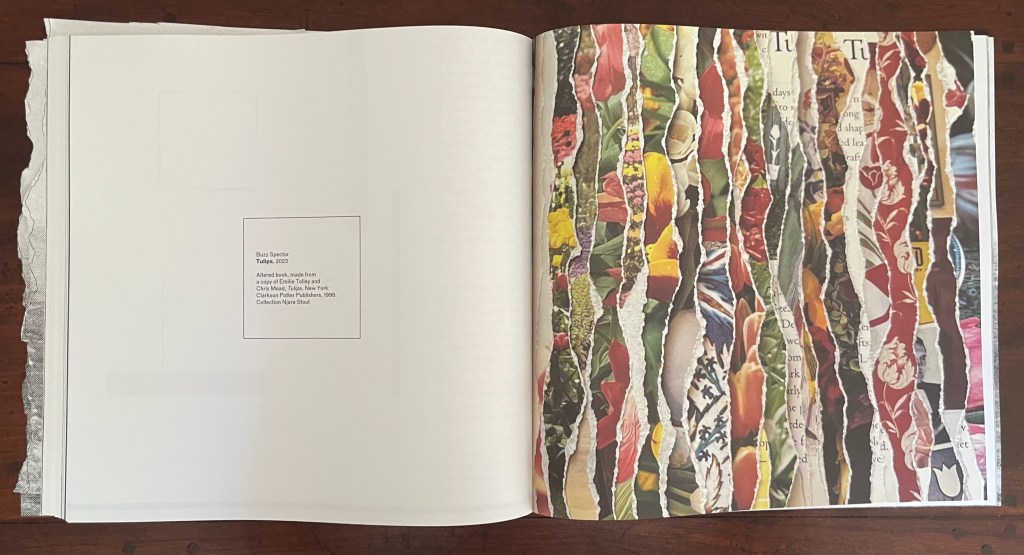
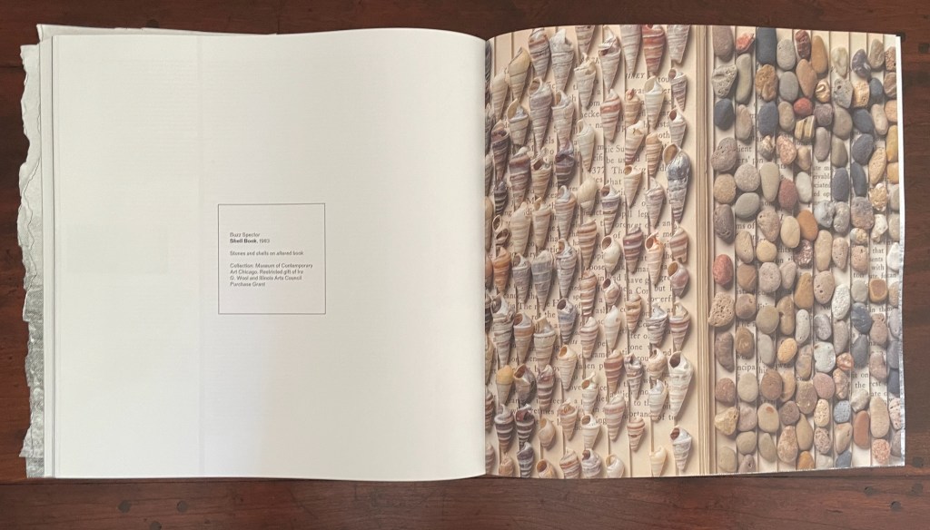
Buzz Spector is the star of this issue. Images from fourteen of his works divide the main sections and each contribution from one another. Works of torn edges create edges or boundaries between the issue’s contents. A stroke of genius from the issue’s editorial and design team. The range of Spector’s sources also draws attention to other boundaries inherent in the body of his work and the issue’s theme: the border between high and low in art, East and West, and Art and Nature. After the 12-page exercise, we have the altered Chinese translation of the self-help book Ego is the Enemy by Ryan Holiday; before the colophon, we have an array of shells and stones on an unidentified altered book, a sculpture held in the Museum of Contemporary Art Chicago. In between, there are alterations of catalogues of Ansel Adams’ photos and the Polaroid Collection, an academic study of Antonioni’s films, a foundational Italian volume on ancient and Renaissance glassmaking, a gardening book, and sailing photobooks.
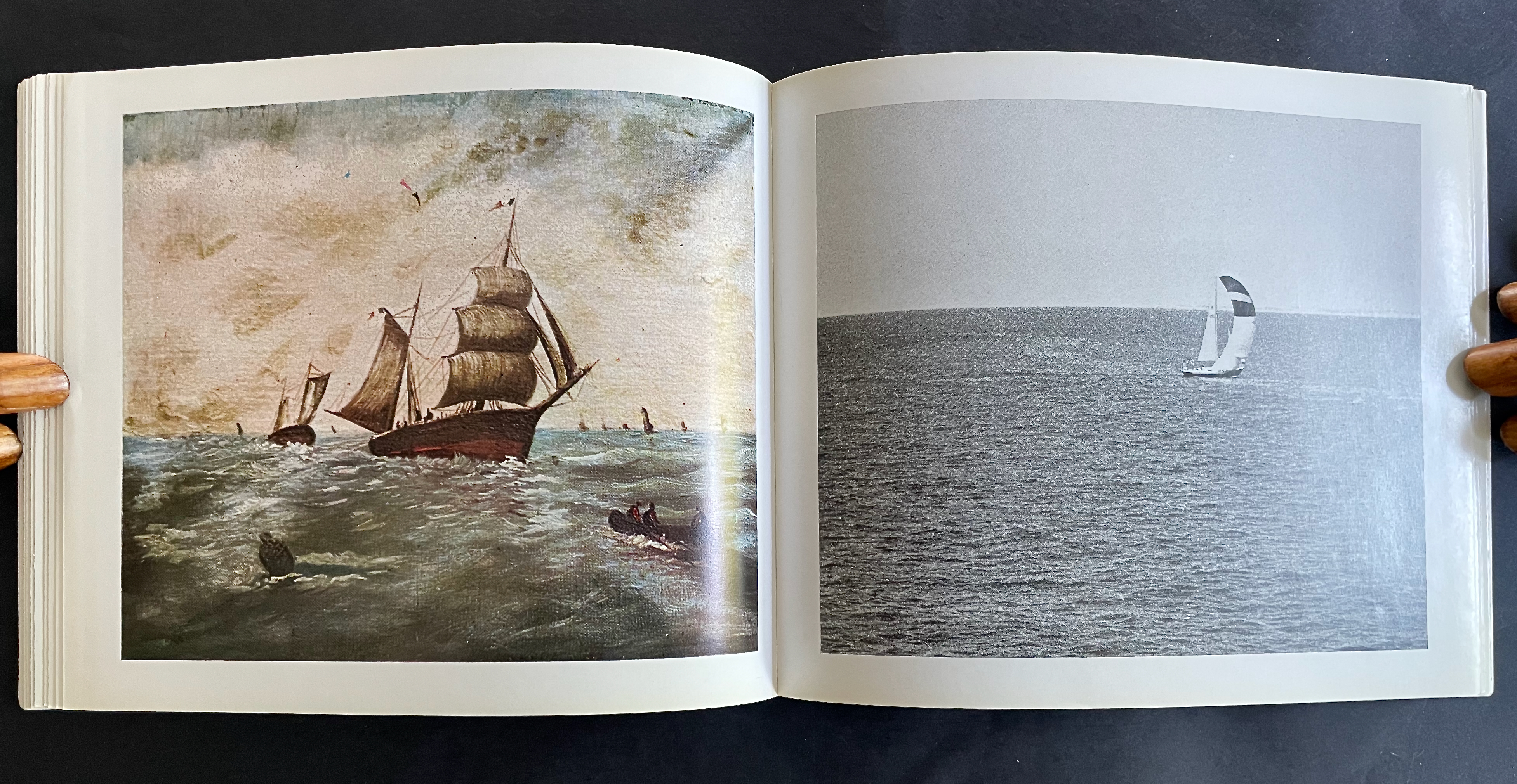
The altered sailing photobooks recall Spector’s North Sea (for M.B.) (1990), his homage to Marcel Broodthaers’ A Voyage on the North Sea (1974) in which Broodthaers juxtaposes a 19th century amateur painting of a tall-masted ship with his own photographs of a sailing ship. Tellingly for this issue of Inscription as well as the thrust of Spector’s homage, Broodthaers opens A Voyage with an elaborate warning not to cut the uncut pages of the book.
From A Voyage on the North Sea (1974) by Marcel Broodthaers. Photos: Books On Books Collection.
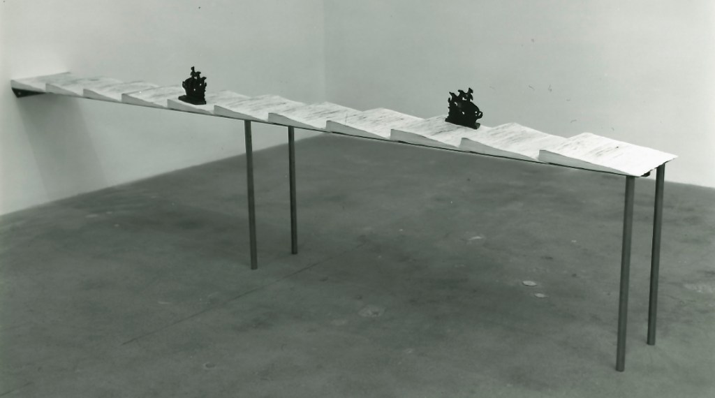
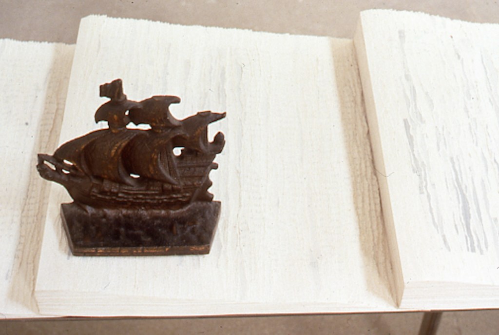
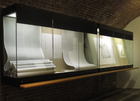
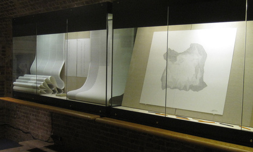
Spector’s homage is a work 10 feet long and presented on a table appropriately jutting out from the wall like a pier. The eleven “waves” of torn pages placed in a row on top of the steel shelf come from eleven copies of the Walker Art Center’s 1987 catalogue for Broodthaers’s first U.S. retrospective. Spector had all the pages in each copy painted with white gesso before tearing the pages. He saved the excised “wedges” and bound them at the fore edges. Because the gesso does not completely obscure the text and images from the catalogues, viewers who come close to the work can see slivers of some of Broodthaers’ works along with the word fragments typical of Spector’s altered books.
North Sea (for M.B.) (1990) by Buzz Spector
The echoes of Spector’s appropriation from the great appropriator (recall Broodthaers’ 1969 appropriation of Mallarmé’s poem in Image: Un Coup de Dés Jamais N’Abolira le Hasard) bring another set of boundaries into view: the space between originality and appropriation and the space between the auratic artwork and its mechanical reproduction raised in Walter Benjamin’s The Work of Art in the Age of Mechanical Reproduction (1936).
Across its 10 sections and 11 loose inserts, the sixth issue of Inscription takes the lead from Spector’s works and explores all these binaries and the cut or torn edges between them. As usual with Inscription, it isn’t all book art. There are prints, a vinyl record, bookmarks, postcards, installations, libraries, typography, a syllabary, and even moth-repellent cedarwood blocks, and its sources range from the London Missionary Society hospitals in early 20th century China, to an installation of Leonard and Virginia Woolf’s library shelves (at Washingon State University of all places), and to J.L. Carr’s home in Kettering. The eclecticism is a challenge to coherence as much as the number of contributors is a challenge to adherence to the theme. Complete success would be an issue that is an artwork of collage in itself.
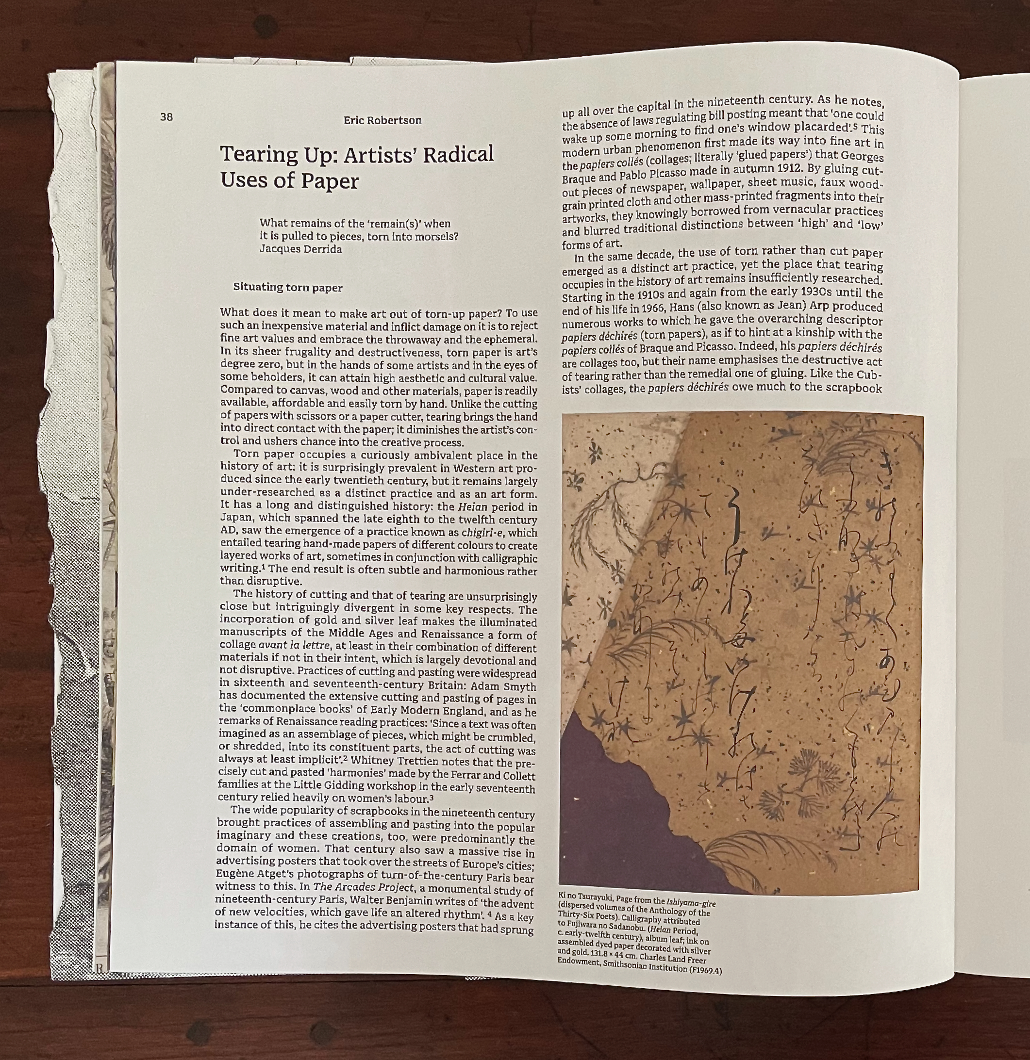
Collage is naturally where the first contributor’s article begins. “What does it mean to make art out of torn-up paper?” Eric Robertson uses Hans (Jean) Arp’s déchirés (torn pages), Raymon Hains’ and Jacques Villeglé’s torn posters, and Sol Lewitt’s “rip drawings” to take us beyond categorizing such works as vandalism, desecration, or iconoclasm.
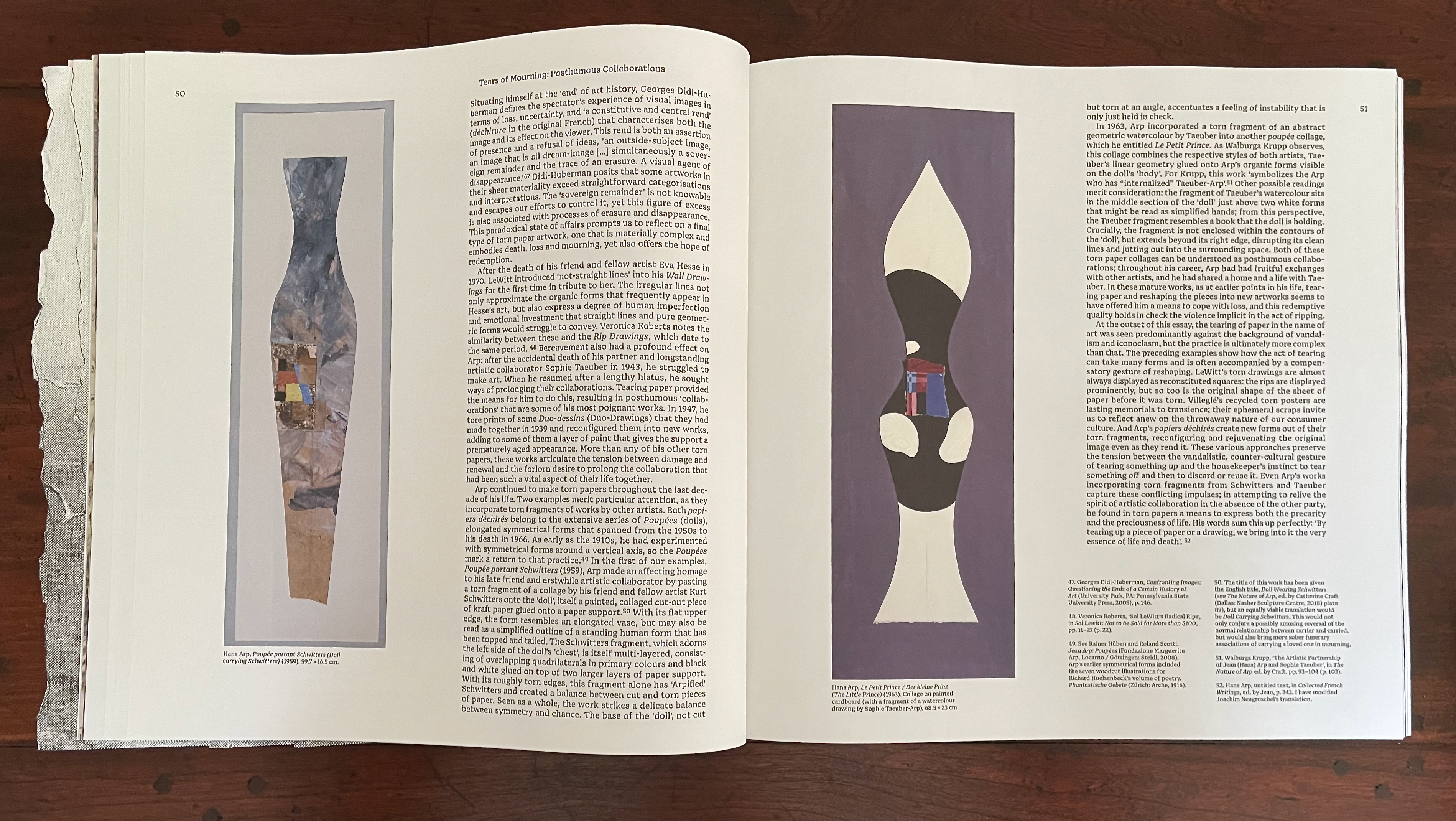
By discussing Arp’s posthumous collaborations with friend Kurt Schwitters and partner Sophie Taeuber under the heading “Tears of Mourning”, Robertson bridges the dual meanings of the heteronym and well prepares the ground for his moving quotation of Arp in conclusion: “By tearing up a piece of paper or a drawing, we bring into it the very essence of life and death”.
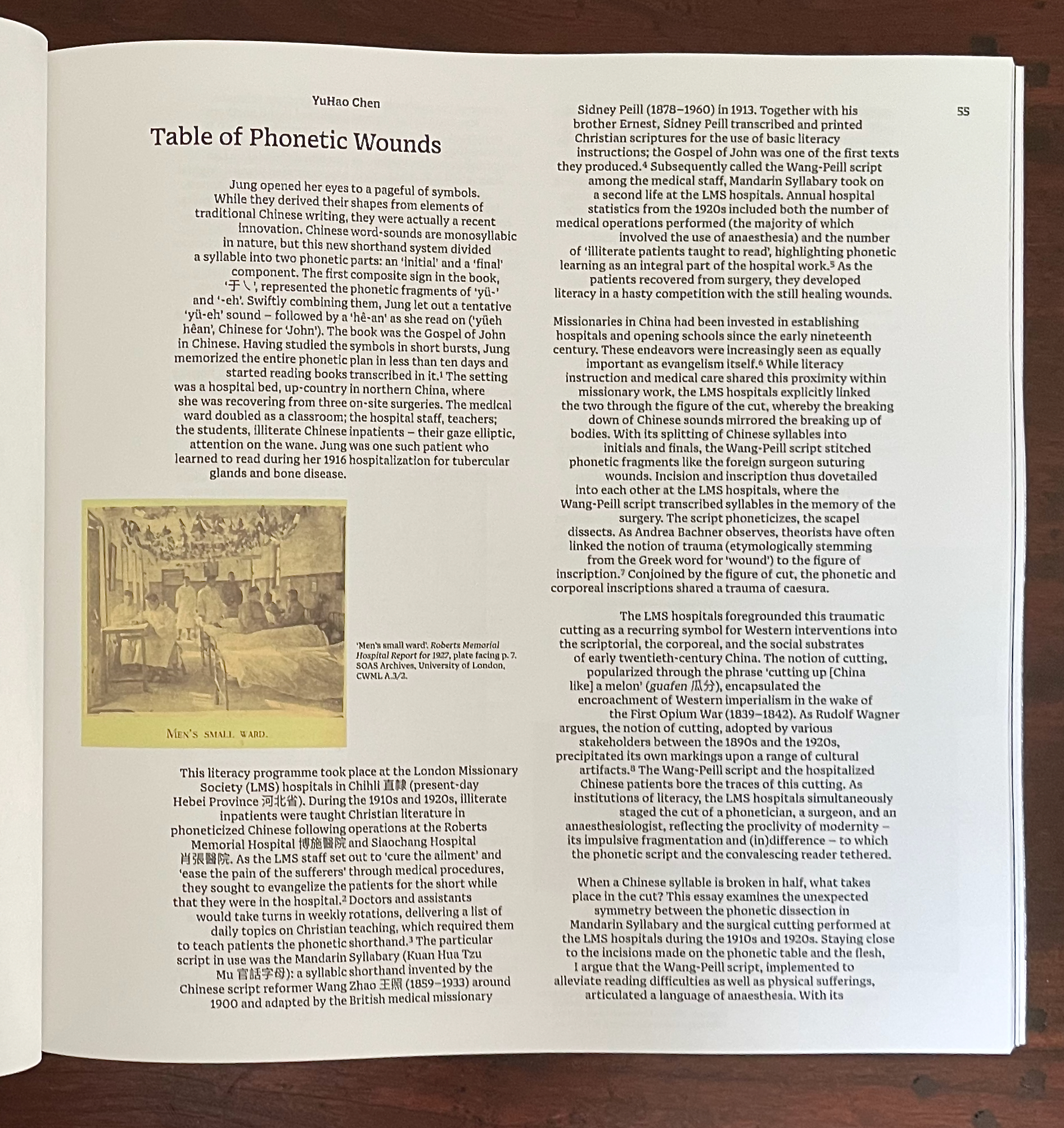
YuHao Chen‘s “Table of Phonetic Wounds” aims to make metaphorical connections among a host of pairings: surgical incision/skin, site of operation/cause for operation, the initial/final phoneme structure from the Wang-Peill Mandarin Syllabary, Western colonial intervention/China-the-sick-man-0f Asia, literacy/illiteracy, non-Christian/Christian, etc. Successful surgery equals achievement of literacy, healing equals conversion, etc., by which we should be convinced of causality (or not).
The justification running through the center of the article’s paragraphs offers a visual metaphor for all these binaries. Even the gap between the initial and final phonemes in the Mandarin Syllabary recalls the gap between the consonants of “tears”. It is a space in which something meaningful happens.
Reanna Brooks‘ “Cut and Paste: Virginia Woolf’s Bookcraft” provides a good case for looking carefully at the border between craft and art. Brooks finds a depth in Woolf’s bookbinding that should prompt us to ask more often, When do the book arts and book art overlap to create a new work of art?
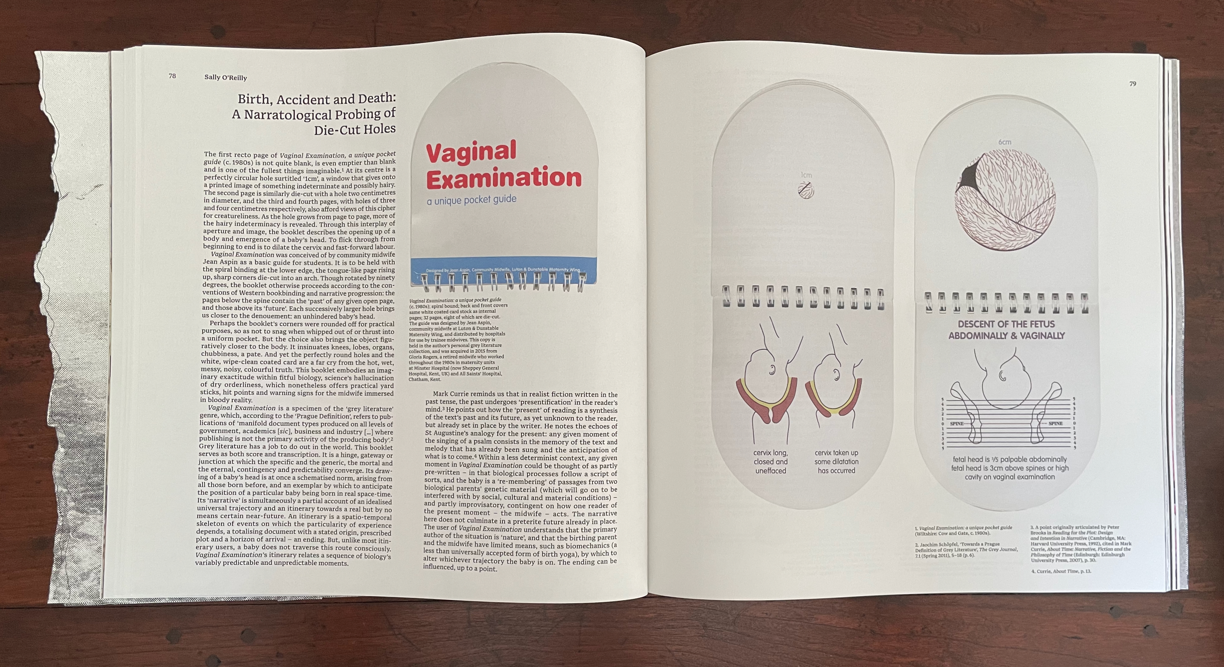
Sally O’Reilly‘s “Birth, Accident and Death: A Narratological Probing of Die-Cut Holes” would not have been out of place in Inscription No. 2 on “holes”. Its presence here demonstrates the extension of the theme of tearing to include cutting and holes. Removal by tearing or cutting may overlap, but the techniques are sharply different in their results as we saw with Arp’s “Doll carrying Schwitters” and “Le Petit Prince”. The differences here point to the messiness of giving birth contrasted with the tidiness of the neatly designed and pocketable guide for midwives that shows the growing diameter of the cervix stage by stage through a die-cut hole.
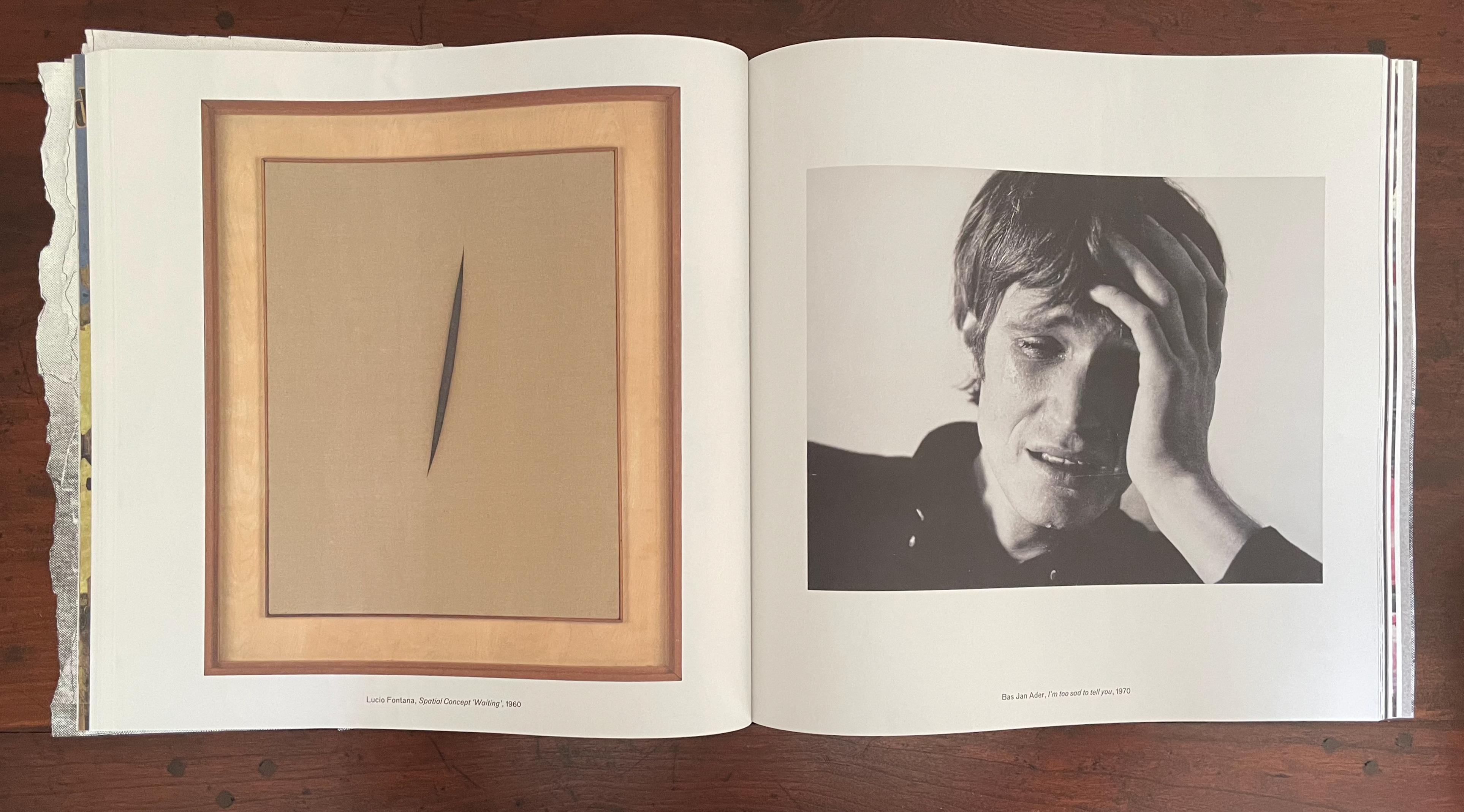
The following juxtaposition of Lucio Fontana‘s Spatial Concept “Waiting” and Bas Jan Ader‘s I’m too sad to tell you draws attention to the heteronym “tears”. It is set off in its own section, knowingly bracketed by Spector’s Displacement after Lawrence Weiner (2024) — conceptual artist — and After Ansel Adams (2024) — photographer. It is a meaningful curatorial gesture meant to be on a par with, say, Robertson’s effective bridging of the heteronymic meanings under the heading “Tears of Mourning”.
Tear: N1 A torn part or place; V1 To pull or split apart. Tear: N2 A secretion of the lachrymal gland; V2 To weep.
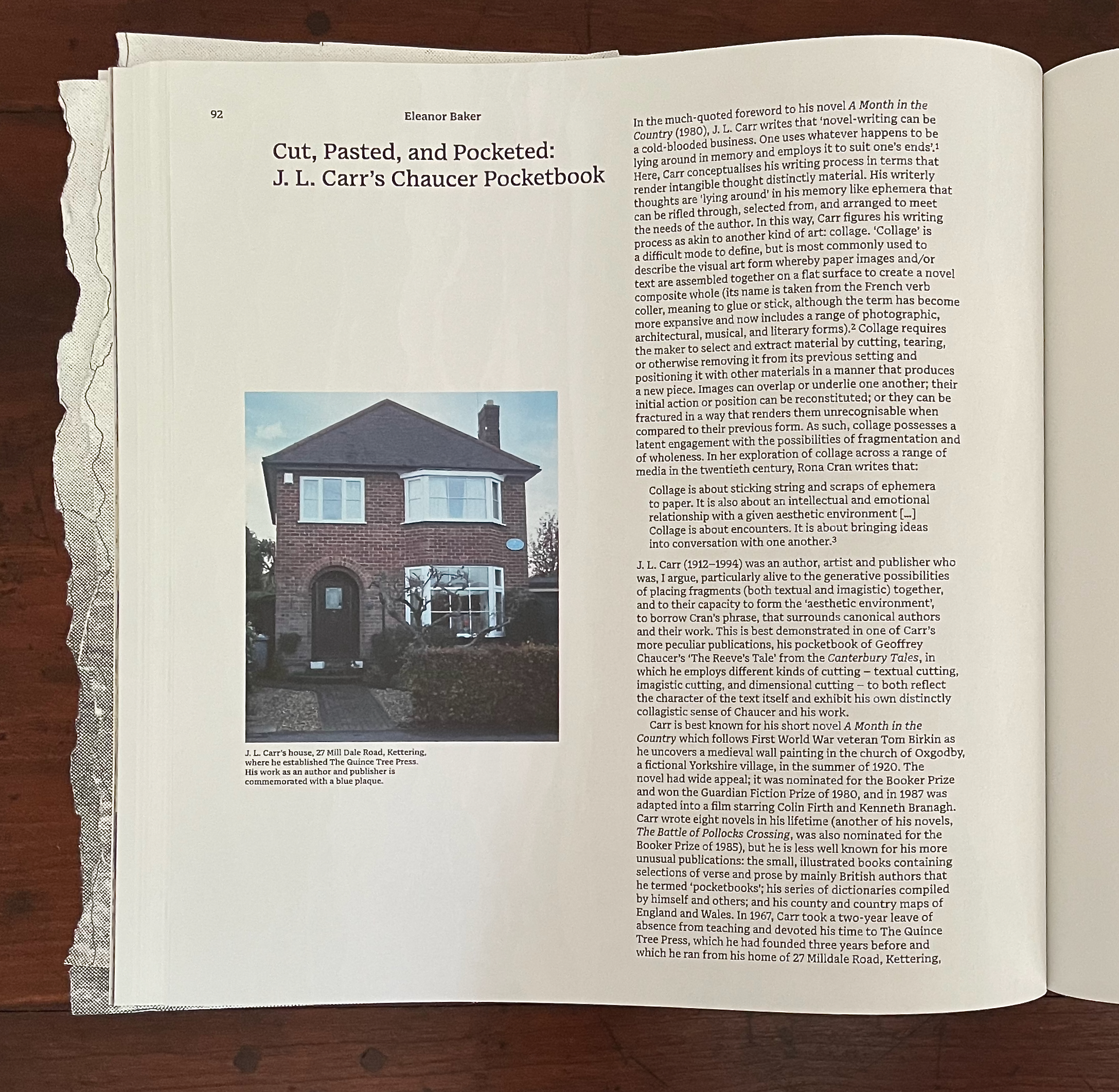
Eleanor Baker‘s “Cut, Paste, and Pocketed” explores J.L. Carr’s 1066 and All That treatment of Chaucer’s “The Reeve’s Tale”. While Carr would surely have been familiar with Sellar and Yeatman’s 1930 comic book history, Baker pegs Carr’s approach as a form of collage rather than comic strip. As we’ll see later with Angela Szczepaniak’s contribution, the two can be combined to drive a narrative forward. In Carr’s case, as Baker points out, the pocketbook approach and cheeky fragments of collage combine to deliver a comically modern sense of Chaucer’s world and an inventive match to the fragmentary nature of “The Reeve’s Tale”.
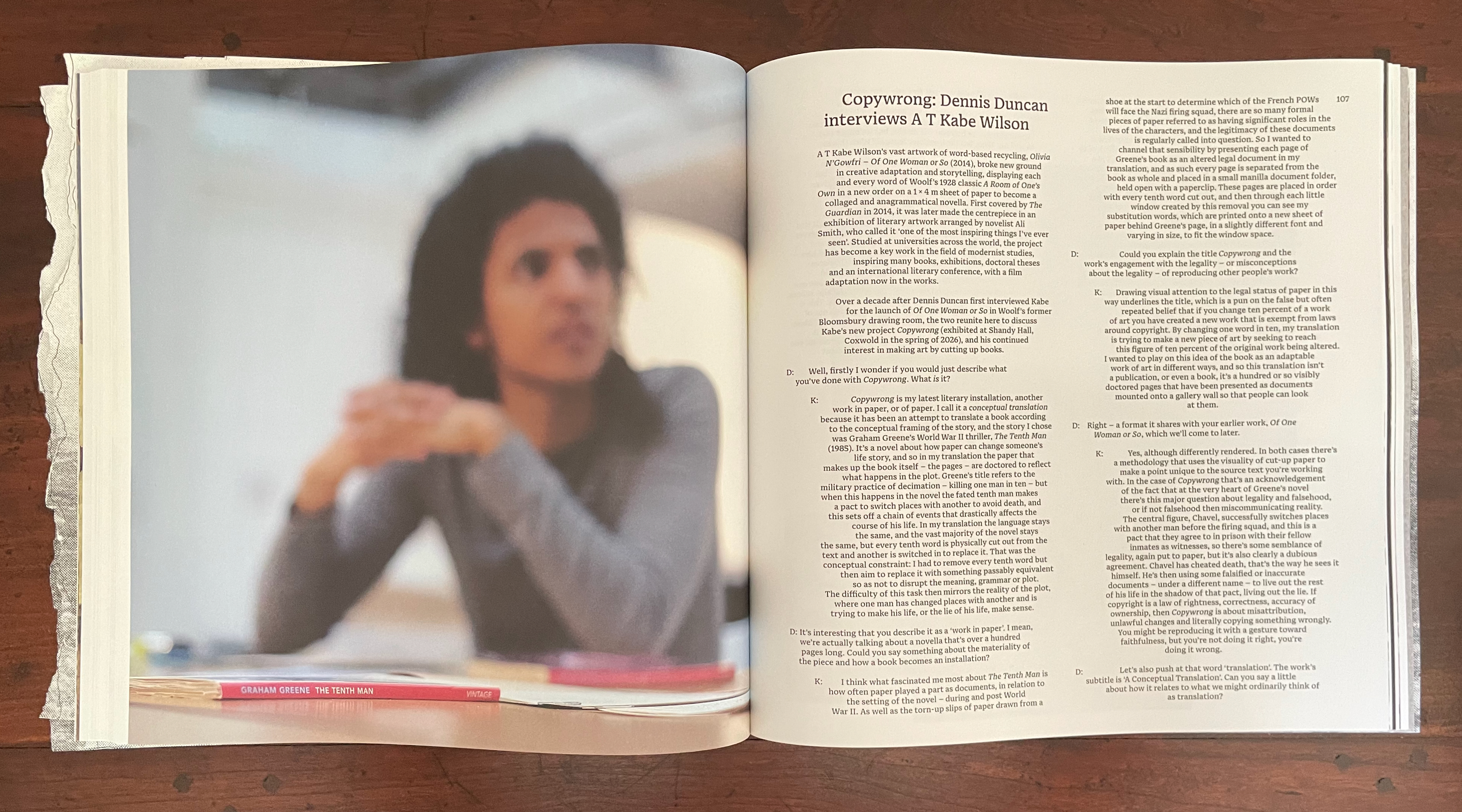
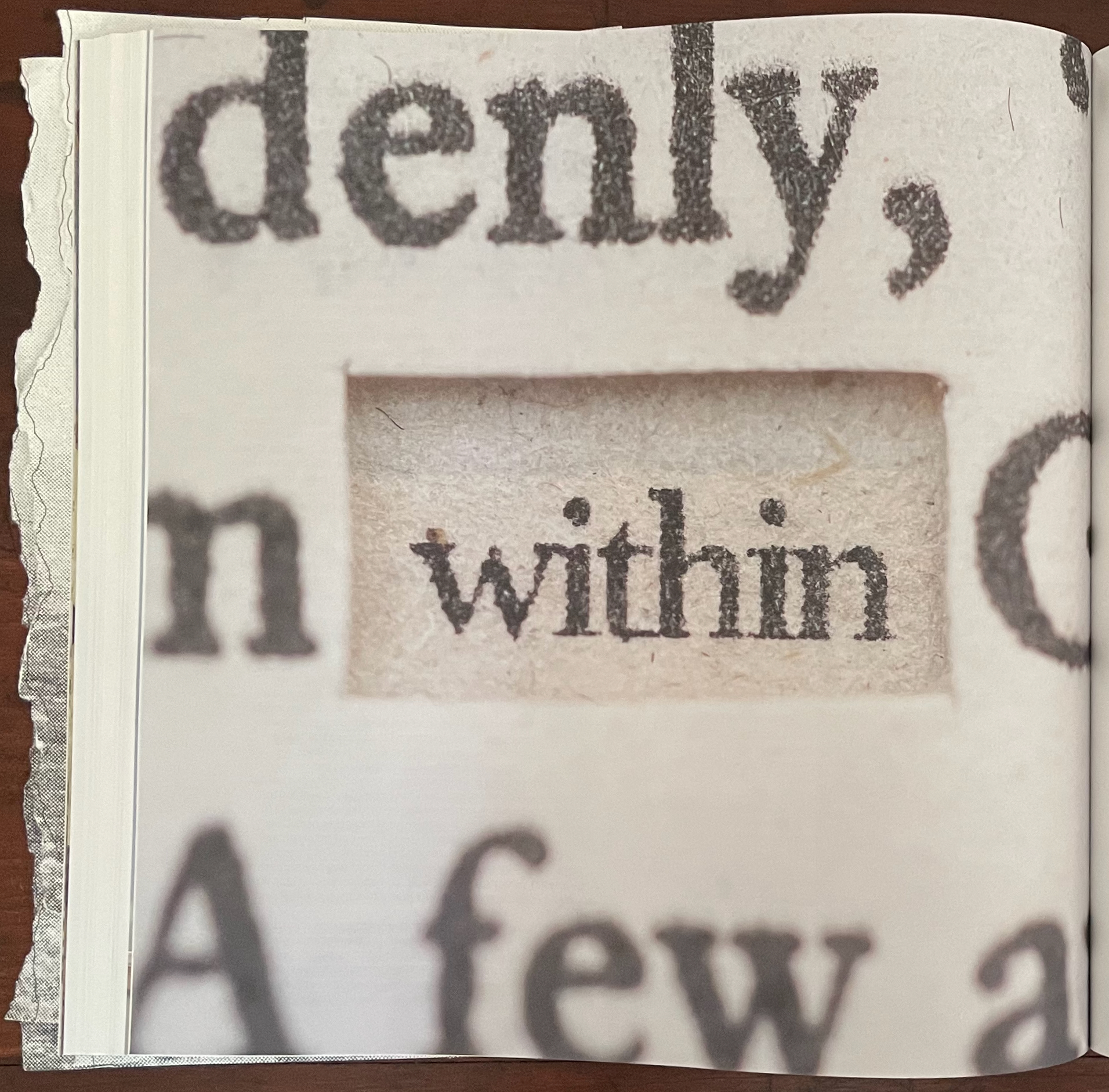
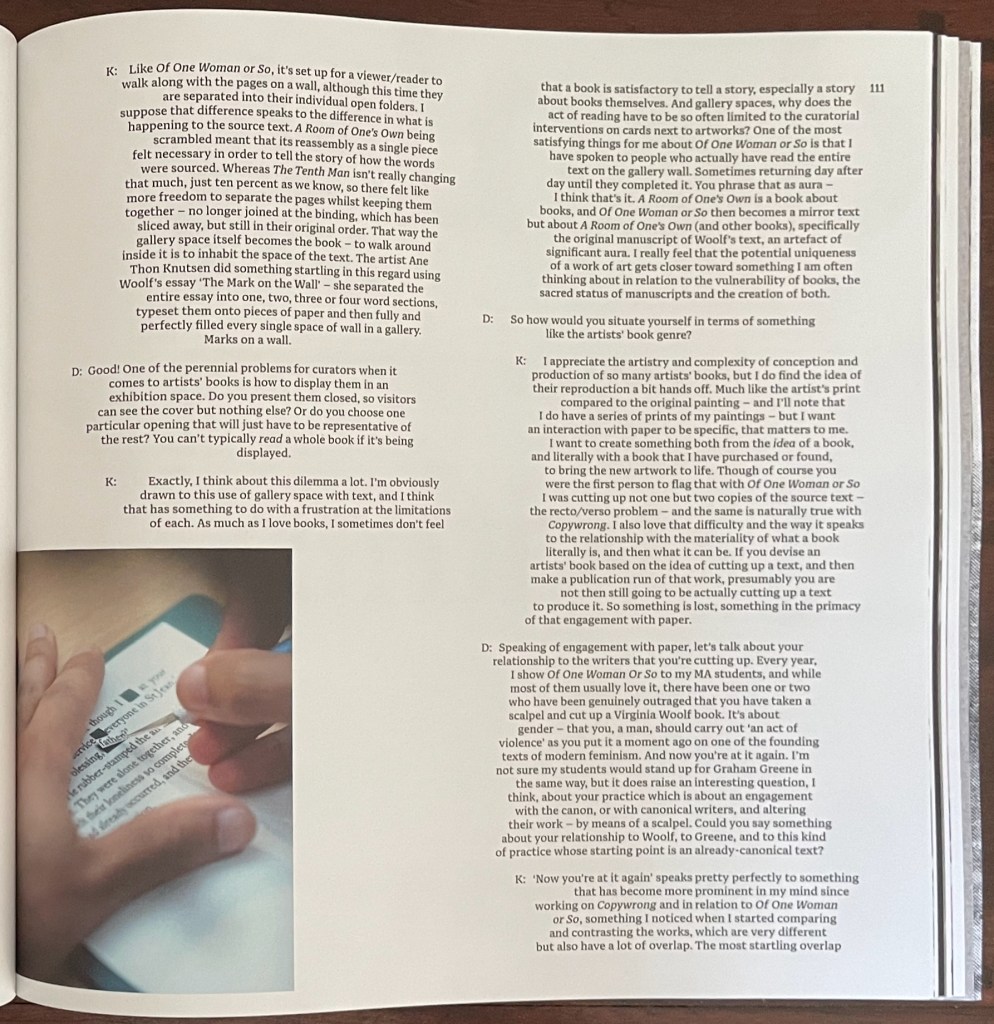
Using knives and punches, A T Kabe Wilson removes every tenth word in Graham Greene’s The Tenth Man and replaces it with a synonym or as near a proxy as he can manage to challenge the notion of copyright. The resulting pages are arranged to make up an installation where visitors can read the entire set of altered pages. There is no edition of Copywrong. It turns Walter Benjamin on his head: “The Unique Work of Art Produced from Two Copies of a Mechanical Reproduction”.
To bring this relevant work within the bounds of Inscription, the editors provide images of Wilson at work and rely on Dennis Duncan (University College of London) to elicit from Wilson where the work’s strange status places it in relationship to artists’ books and other visual art.
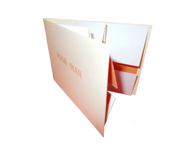
Kabe Wilson’s choice of every tenth word takes its impetus from the book’s story of collective punishment in wartime (“choose ten from among your number to be executed”). But it also turns on its head the common fallacy that ten percent of a work can be reproduced without violating copyright: hence the title Copywrong. In Greene’s novel, when the rich tenth man contracts with a poor man to trade places and switch identities in exchange for the rich man’s inheritance, a whole vein of copywrongs reveals itself for mining. Wilson sees his creative destruction of the novel as a form of translation and betrayal of the original. While challenging us to think where the line between book and not-book lies, and even to think of its sheets of paper as 3D objects, Copywrong becomes a way of asking where the line between original and copy, legal and illegal, and life and death lies.
The next contribution is Fraser Muggeridge‘s “Cuts and Tears as Justified and Unjustified Typesetting”. While the article gives an informative sketch of the history and development of the straight and ragged edges of print, its argument that unjustified typesetting is “torn typography” does not convince. An unjustified line does not begin with a justified line from which spacing is torn or cut. A justified setting may give a page the visual effect of having been evenly cut down the right, and a ragged right setting may give the visual effect of a tear down the right side, but whether they contribute to a work’s artistic meaning — not just an aesthetic effect on readability — needs convincing examples. With Apollinaire and his calligrammes, Stefan Themerson and his “internal vertical justification”, and Christian Bök’s Diamonds, Muggeridge make a good start. Most of the other variations on justified, unjustified, and mixed, however, are far cries from, say, Mallarmé’s breaks of the line and play with page layout in Un Coup de Dés Jamais N’Abolira le Hasard or from the meaningful typographical tearing and cutting that the avant-gardistes of the early 20th century perpetrated.
It’s odd, especially as the Fraser Muggeridge Studio designs Inscription, that the article does not mention the center justification used in several of the issue’s other articles. Their paragraphs decline to show off those even edges of justified-left and justified-right typesetting. Instead, they go for a ragged left and ragged right with a book-mimicking gutter of justified left and right in their center. When proofreaders were more a feature in typesetting houses, they not only had to catch “typos” but also to watch for “rivers in the type”, those breaks between words in one line that aligned with breaks in the next several lines to create a white rivulet of space trickling down the page and distracting the reader from the sense of the sentences. In Chen’s article, the “river” is a medial surgical cut. In Duncan’s interview with Wilson, the clear gutter in the middle of the paragraphs offers a sharp contrast with the uncomfortable binaries that Copywrong bids us to engage. Kudos to Fraser Muggeridge and studio.
Left: from Chen’s article. Right: from Wilson-Duncan interview.
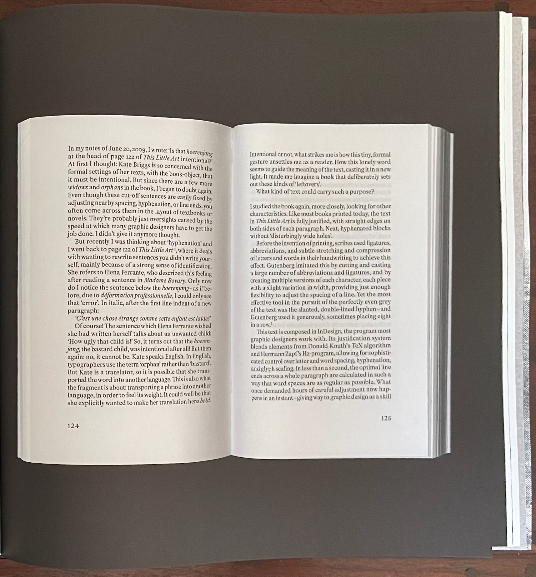
The next contribution — from the Leuven-based artists collective Rosetta, formed by Eva Moulaert, Anneleen Masschelein, and Willem Styfhals — continues with the topic of typesetting. Their starting point is those awkward phenomena of typesetting — widows and orphans. They are not deliberate renderings or loppings of words from a following or preceding sentence to be left stranded at the bottom or top of a page, respectively. But there they are. Are they tears or cuts, these weepy, abandoned strings of anthropomorphized type that are cause for tears among proofreaders, typesetters, and designers? No, they are cause for the fevered ponderings of the narrator in a book whose photographed pages make up this contribution.
No widows or orphans here.
This set of photographed double-page spreads (excised?) has plenty of widows and orphans. Even though they are likely deliberate, what is the point of them? And whose disembodied hand is that that keeps appearing, disappearing, and reappearing to hold the book facing out?
Orphan and widow.
The narrator winds “their” way through references to Gutenberg, Donald Knuth, Herman Zapf, Jean-François Lyotard, Martin Heidegger, Roland Barthes, Robert Bringhurst, Ellen Lupton, Frank Kermode, Amitav Ghosh, and half a dozen others to come to “a” point — an obsession with hyphenation. And the point of that? Why naturally for the narrator’s compound, hyphenated selves — Ro-set-ta — to hand over the pen to Rosetta, the widow at the end of “page 139”.
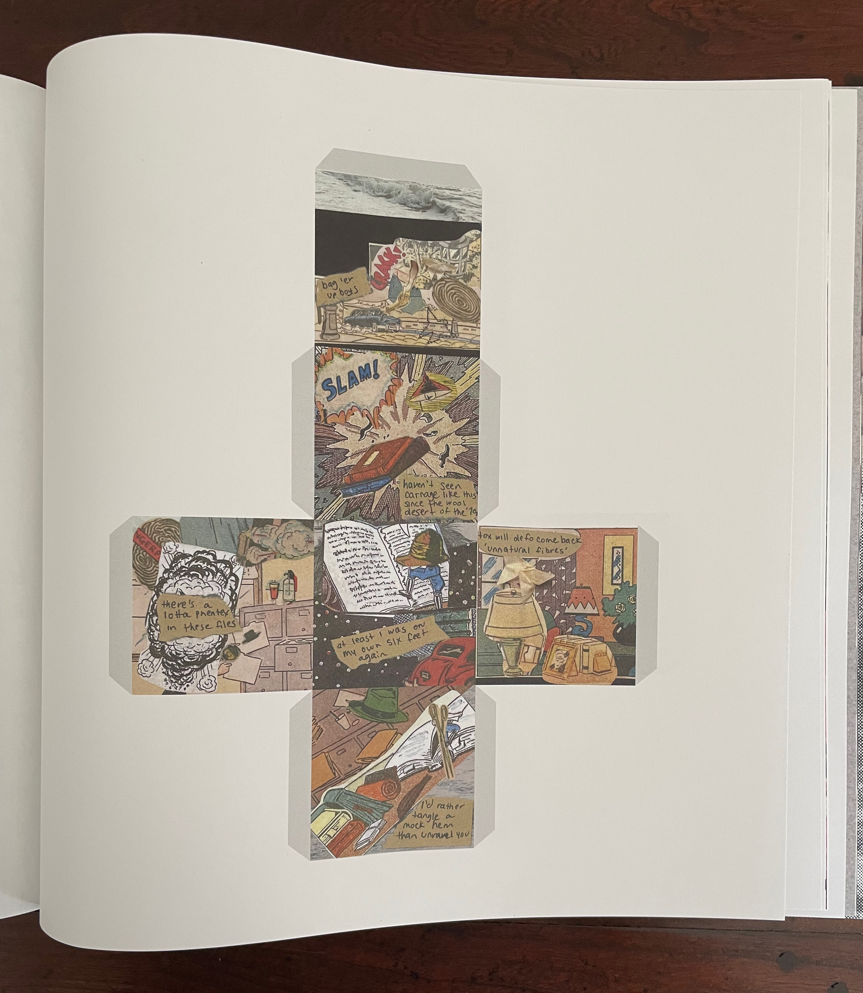
“The Extinctions Bureau” is a brilliant article with which to end this issue of Inscription. It offers readers a chance to wield scissors or papercutters if they are ready not to heed Broodthaers’ admonition above. It is also a clever conceptual extension of Will Eisner’s 1985 concept of “sequential art” that aimed to establish comics as a legitimate literary genre. Angela Szczepaniak first teases us with the narrative premise of a clothing moth-turned-detective on the trail of the Nylon Killer. If that is not hilarious enough, she posits conversion of the 2D linear narrative into a 3D existence around moth-repellent cedarwood. (She has created the blocks for exhibition display, but that’s not the point of the contribution.) Whether the blocks are more cruel to the detective or readers who now have to get their heads and hands around the idea of a “polysequential” story is a fine point. Readers who take up the challenge of cutting out the templates and folding them into cubes will have their own view.
By cutting and tearing the images for her collages from pulp comics, Szczepaniak rings all the bells of Inscription 6’s theme and reminds us of its subtitle: The Journal of Material Text.
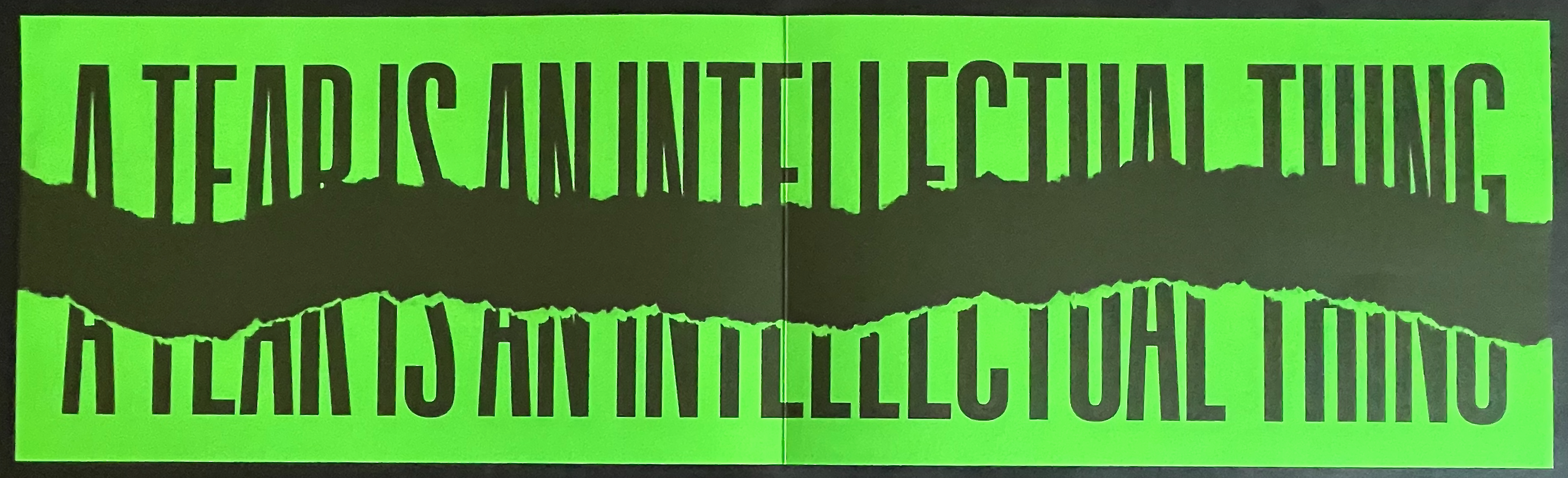
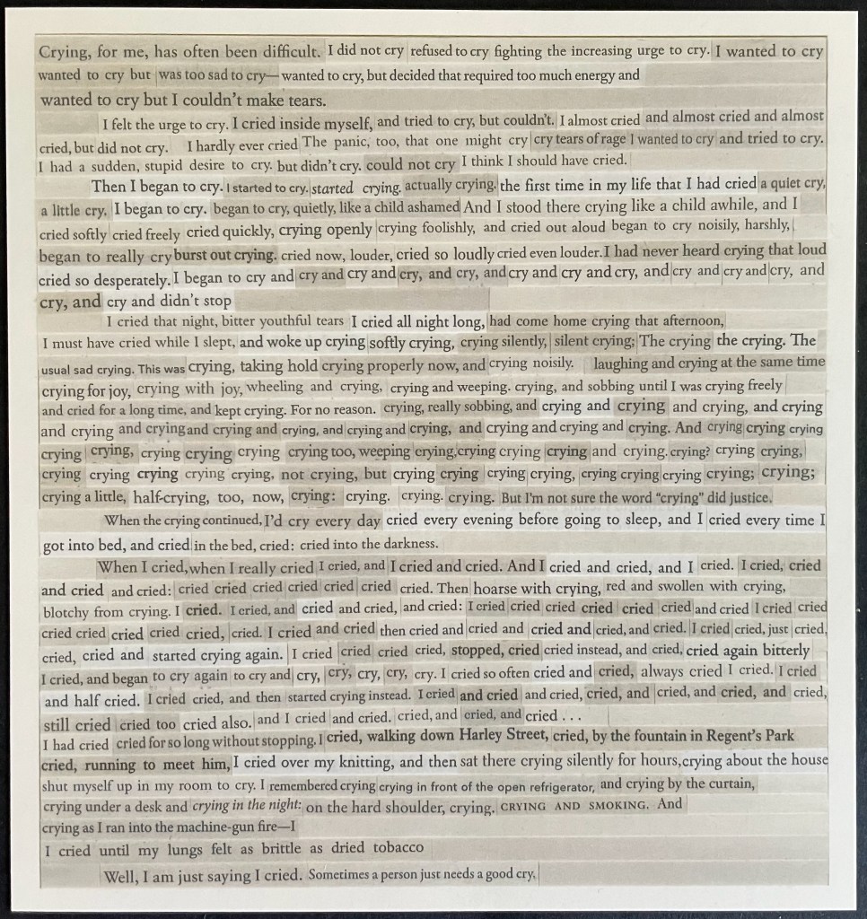
Reminiscent of Aspen, Fluxus, The Journal of Artists’ Books, and the deluxe editions of Parenthesis, Inscription‘s artwork inserts contribute to the sense of the issue as an exhibition, a wunderkammer, a performance. No 33 LP this time; instead there is appropriately a cutdown 45-rpm record, albeit no instructions on “ripping” tracks from it to make up our own playlists. Putting together a thematically coherent journal is tricky. The artworks underscore and strengthen the issue’s theme of tearing and cutting. Two examples: Nick Thurston’s print Rips and Floods (2026) and Carolyn Thompson’s Tearjerker (2026) cover all the thematic notes of tearing, cutting, and weeping.
Thurston’s title for his print ensures that we don’t miss the heteronymic “tear”, which the visually torn phrase “A tear is an intellectual thing” might cause us to do. For those not well-versed in William Blake, a helpful note on page 160 identifies the phrase’s source as “The Grey Monk“. The editors mention Thurston’s truncation of Blake’s line, but leave it to us to supply the pun that it has been ripped from the poem. Blake’s preceding lines rule out the heteronymic meaning; for him, it’s the “Widow’s tear” that is ” an intellectual thing”. What makes Thurston’s print a strong work of art is how the tearing from the poem brings with it other key elements of the poem. For Blake, the Widow’s tears have more power than war to free the world from fear of the “Purple Tyrant”. In 2026, Thurston’s print reminds us that intellectual things — [/tɪ(ə)rz/] and [/tɛ(ə)rz/] — may have more power than Tangerine or Religious Tyrants.
Rips and Floods (2026), Nick Thurston
For her print, Carolyn Thompson excises words “from 30 works of literary fiction she has read since” 2016 to compose a sob story that well sums up the effects of Brexit (and the US election).
Tearjerker (2026) Carolyn Thompson
Pages 154-61 list the twenty-one artists/performers alphabetically with descriptions of their editions. Self-reflexively and in keeping with the issue’s theme, page 161 shows a blanked version of the torn segments from page 31 on which Partington and Smyth provide their introduction to the authors’ and artists’ contributions. (This blanked version is curious. If page 161 were showing the blank sides of the slips of paper, the four slips on the left would be flipped and on the right. Since one of the editors has let slip in correspondence that the theme of Issue 7 will be “blanks”, might this be an Easter egg?)
In homage to the journal and its edition contributors, below is a collage of the eleven loose inserts.
The wunderkammer nature of Inscription will send insatiable readers in search of more examples of creative destruction. To that end, here are a handful from the Books On Books Collection. If you can only find time for two, make it Eleonora Cumer’s Circoscrivere lo spazio No. 3 [Circumscribing space] (2021) and Cercare nella memoria [Searching Memory] (2021). They are her most sophisticated metaphoric works in the collection. They offer a circumvention of circumscription, which is another way of thinking about tears and the material text.
“Islam Aly“. 13 January 2020. Books On Books Collection. See 28 Letters (2013).
“Doug Beube“. 21 April 2020. Books On Books Collection. See Empty Talk (2016), Red Infinity #4 (2017), and Breaking the Codex (2011).
“Lizzie Brewer“. 4 July 2023. Books On Books Collection. See Babel(2019).
“Eleonora Cumer“. 6 September 2019. Books On Books Collection. See l’attesa/ l’attente (2010), visioni urbane/ visions urbane (2015), contaminazione (2015), Circoscrivere lo spazio No. 3 (2021), Cercare nella memoria (2021)
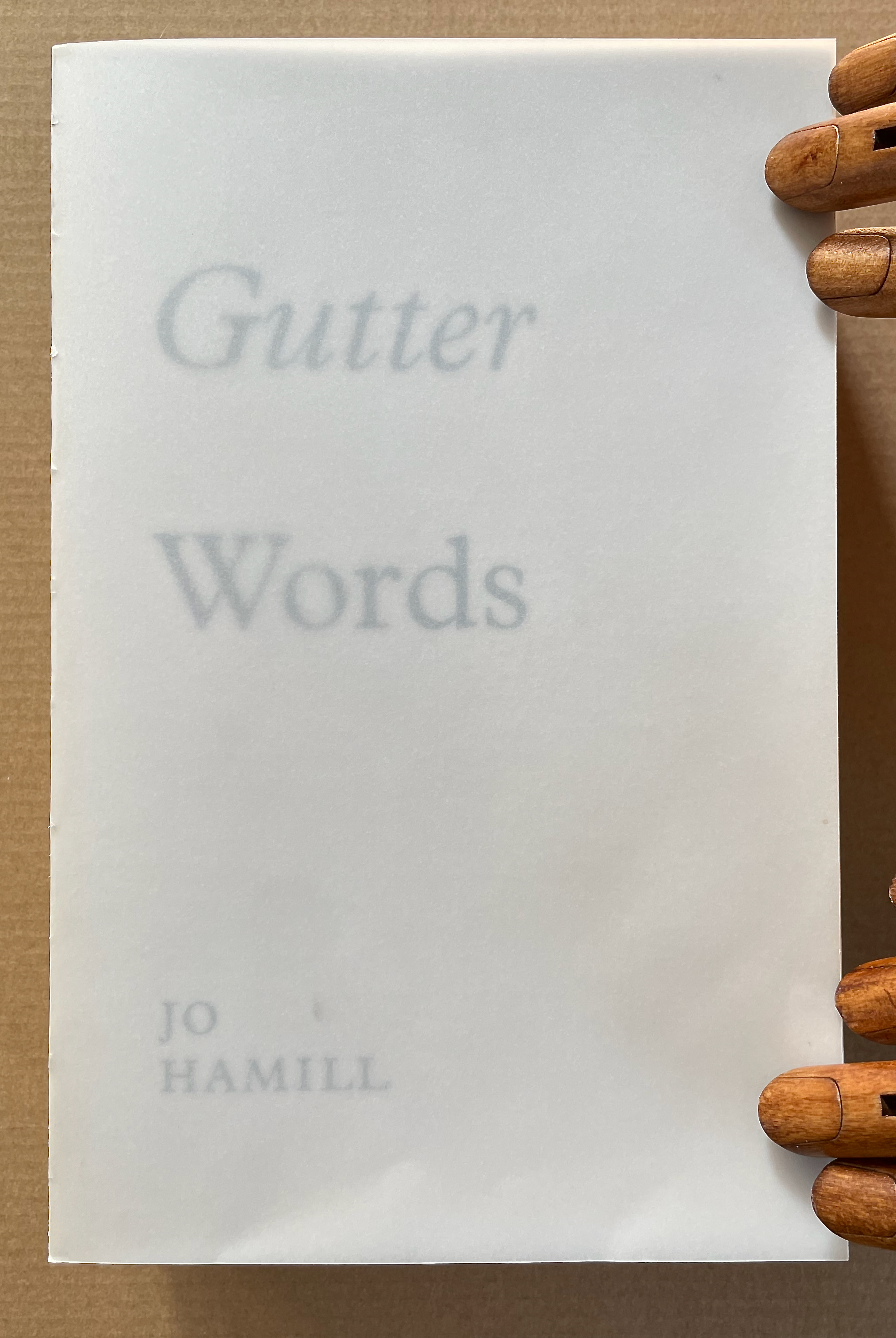
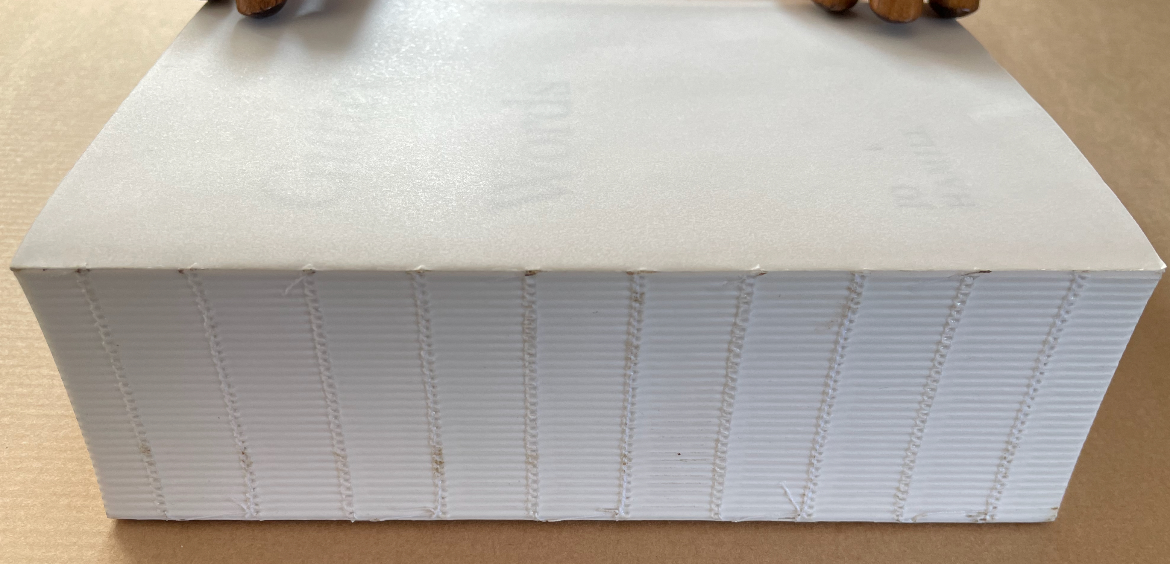
Working with an edition of James Joyce’s Ulysses, Hamill systematically obliterated the words of Joyce but carefully retained those words positioned closest to the gutter – the technical term used to describe the central margin of a bound page. The retained fragments form two extended columns that continue for 933 pages. Notable here is how design and typographic terminology is so entrenched in bodily references. Header, footer, body-copy, the arm of a “K”, the crotch of a “Y”, the foot of a “T”, the ear of a “G”, the shoulder of an “R” and so on. As is the architectural scaffolding of Joyce’s schema which underpins the structure of Ulysses, kidney, genitals, heart, lungs, oesophagus, Brain, Blood, Ear. etc. Lawrence Weiner refers to language as material for construction, the act of deletion in Gutter Words exposes the architectural scaffolding that holds words in place. Voids are physical spaces to be read and words become unanchored, set adrift in an uncertain space. The architectural qualities of this physical space will be exposed, Gutter Words will be devoid of the accoutrements associated with a “book” such as cover, boards, end papers, dust jacket and will retain only the innards, an unprotected text block.–Publisher’s website
Gutter Words (2019)
Gutter Words (2019) Jo Hamill Softcover, exposed spine. H197 x W128 x D60 mm. 956 pages. Acquired from Gill Partington, 20 June 2023. Photos: Books On Books Collection.
Artists’ books can run the risk of being a “one-trick pony” or a toddler’s newly learned knock-knock joke. Once seen, the trick succumbs rapidly to the law of diminishing returns. A dozen times heard, the joke verges on parental abuse. Conceptualist Simon Popper’s 2006 alphabetized version of James Joyce’s Ulysses(1922) falls into that camp, albeit a stunning one. There may be some ongoing amusement in perceiving the shift from letter to letter and the subsequent alteration of the visual pattern, or in spotting the singular invented words and considering the alphabetization as a comment on James Joyce’s play with language, or in contemplating it in comparison with similar efforts. Like Mikko Kuorinki’s 2012 alphabetized version of Foucault The Order of Things (1970) that cheekily challenges Michel Foucault’s theory of how we perceive social order. Or the alpha and omega of Tauba Auerbach’s BbeehHilloTy or the Alphabetized Bible (2006); well maybe not the alpha, since Silvio Lorusso and Rory Macbeth got there first with theirs in 1997, nor the omega, since Peter Harkins followed up with his 2013 Well-Sorted Version (WSV), algorithmically generated. Apparently, one-up-manship is inevitable. Even Gutter Words has its gatecrasher: John Morgan’s Usylessly (2021) with a pair of essays, not just one. But once the joke is “got”, how rewarding is it to return to it again and again. Is there more to it?
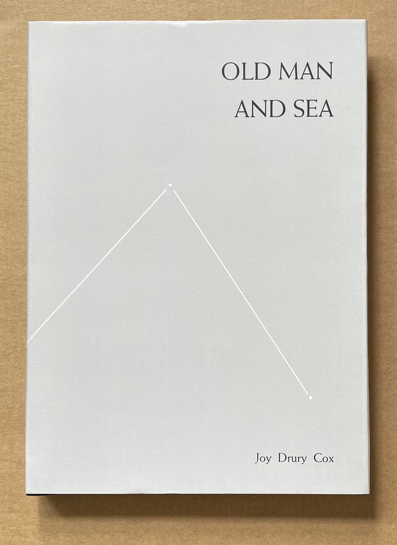
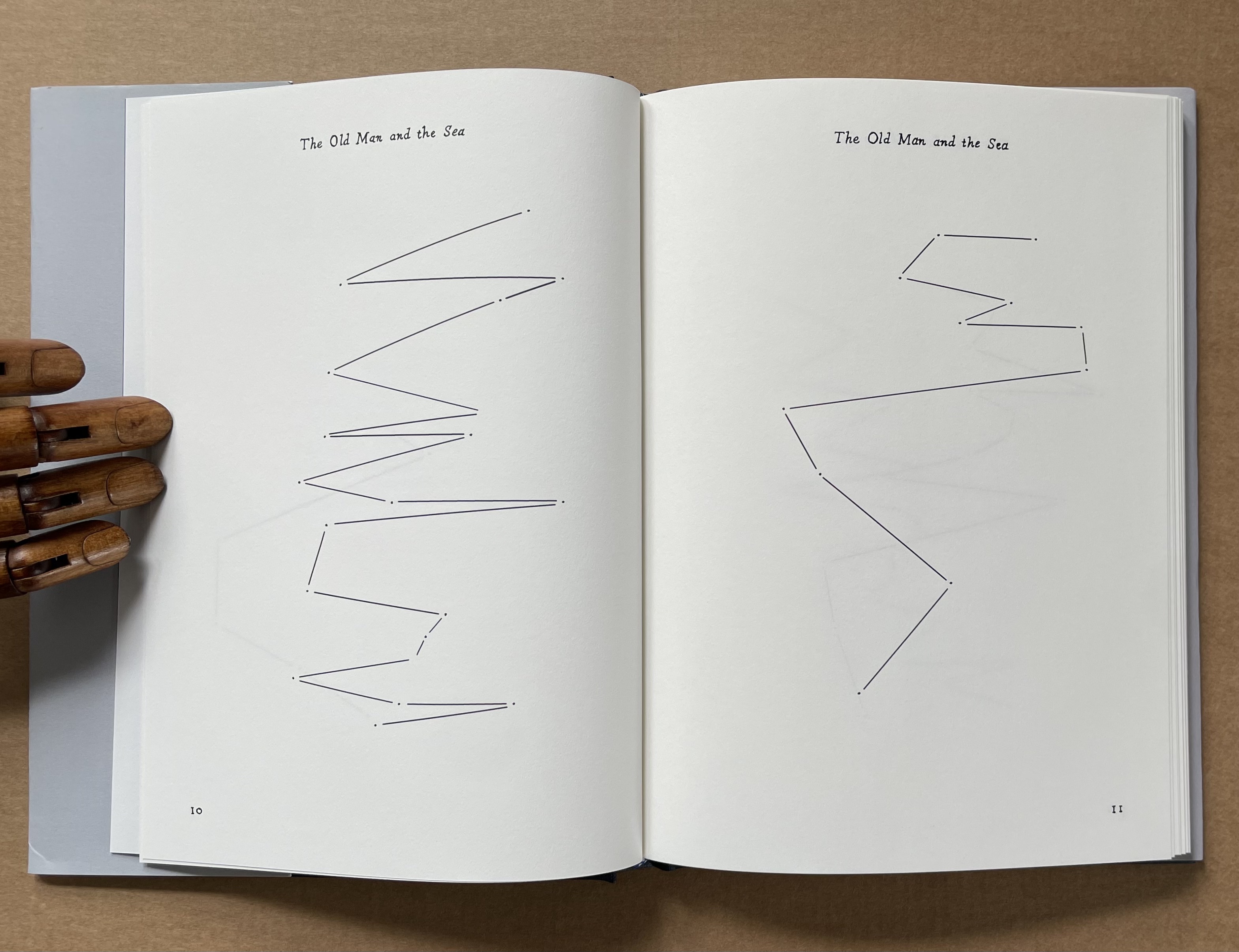
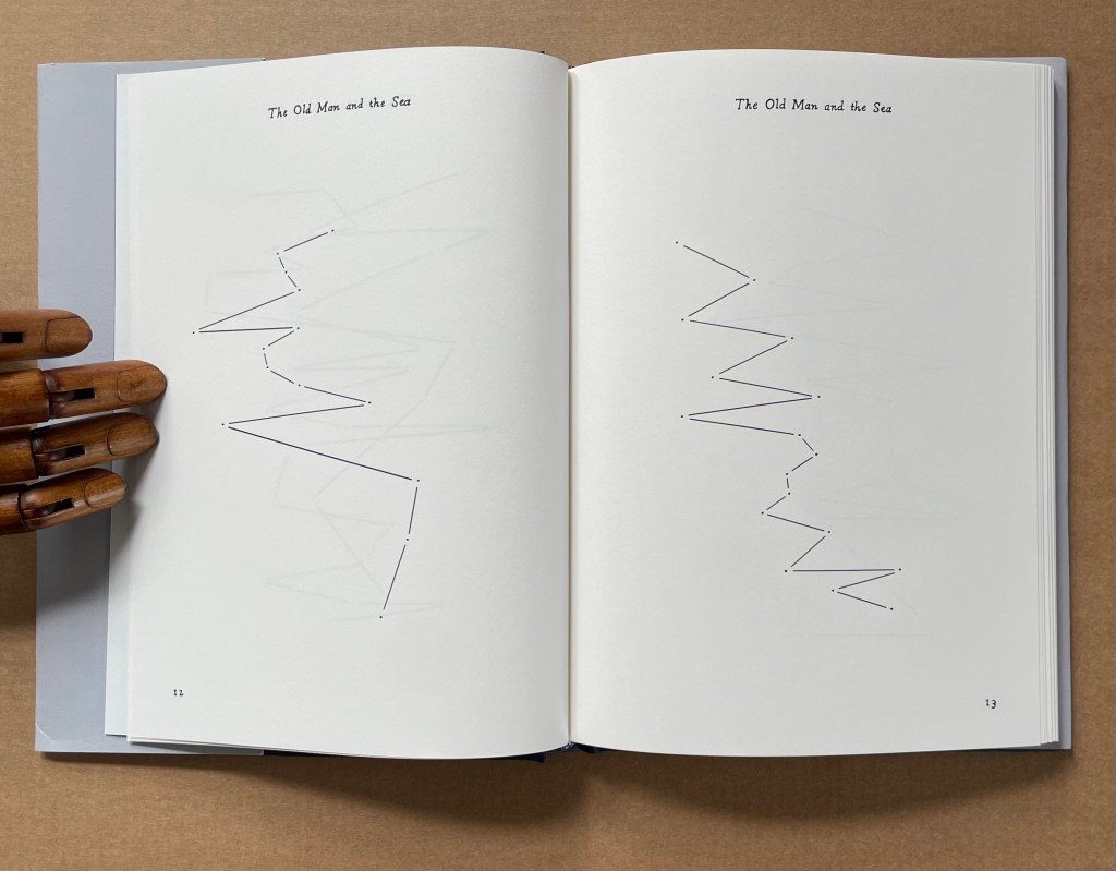
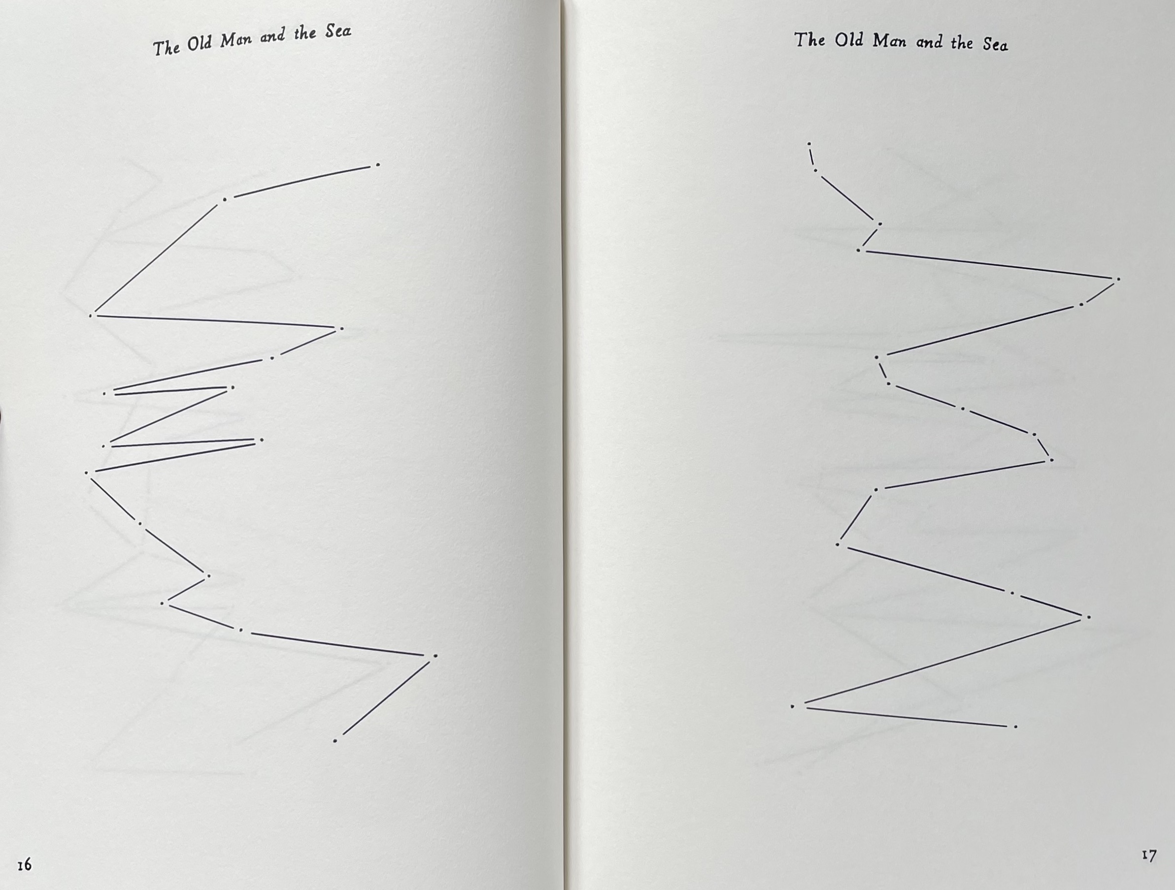
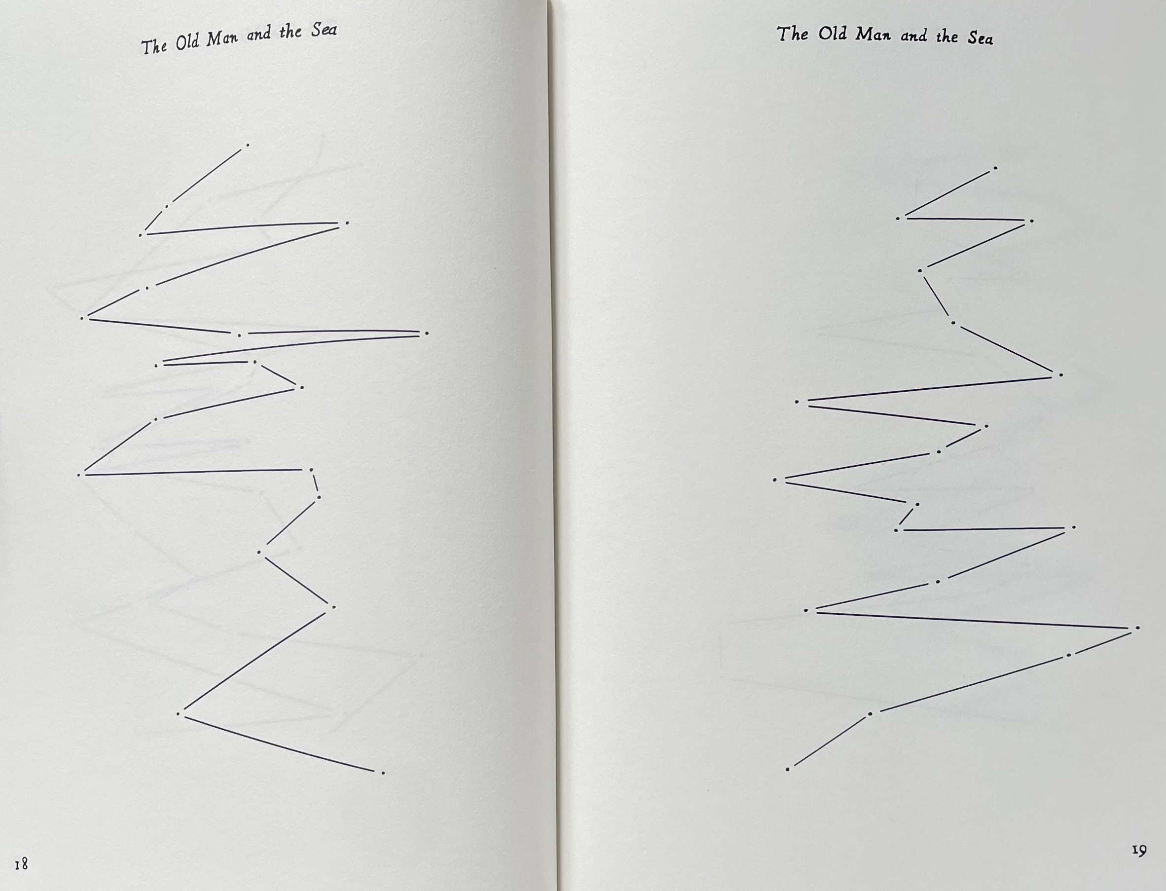
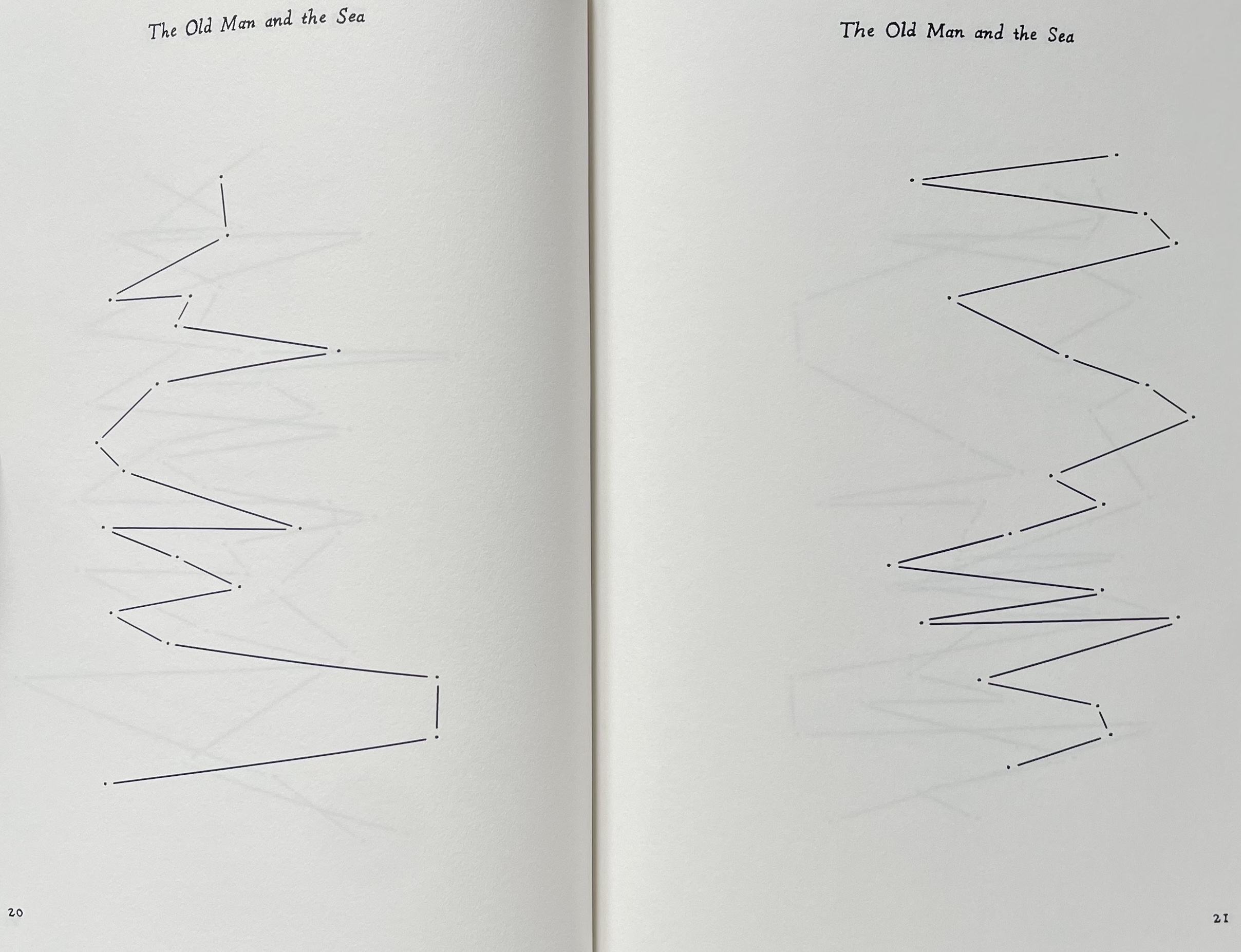
Old Man and Sea(2012) Joy Drury Cox Casebound, cloth over boards, doublures. H206 x W150 mm. 128 pages. Edition of 100. Acquired from Scott Hazard, 18 June 2017. Photos: Books On Books Collection.
The technique of erasure, excision, redaction, extraction, etc., serves the mastery of negative space. It has attracted a large number of book artists intent on altering an extant work of text. Even webpages can be subjected to it, courtesy of “The Deletionist“, a javascript devised by book artists of course. Negative space provides the background to the marks in the foreground. Likewise, the removed text of The Old Man and the Sea is the background to the marks in Old Man and Sea as foreground, as the running head continually reminds us.
By eliminating all of the text in Ernest Hemingway’s The Old Man and the Sea except for the periods (full stops) and then connecting them with straight lines, Joy Drury Cox offers a visual reading of Hemingway’s narrative style and pace that would have made Paul Klee smile. More than a line being “a dot that went for a walk”, we have lines taken for a walk between the dots at the end of lines. And presumably OuLiPian Georges Perec would nod along in agreement with Cox’s pan-lipogrammatic approach.
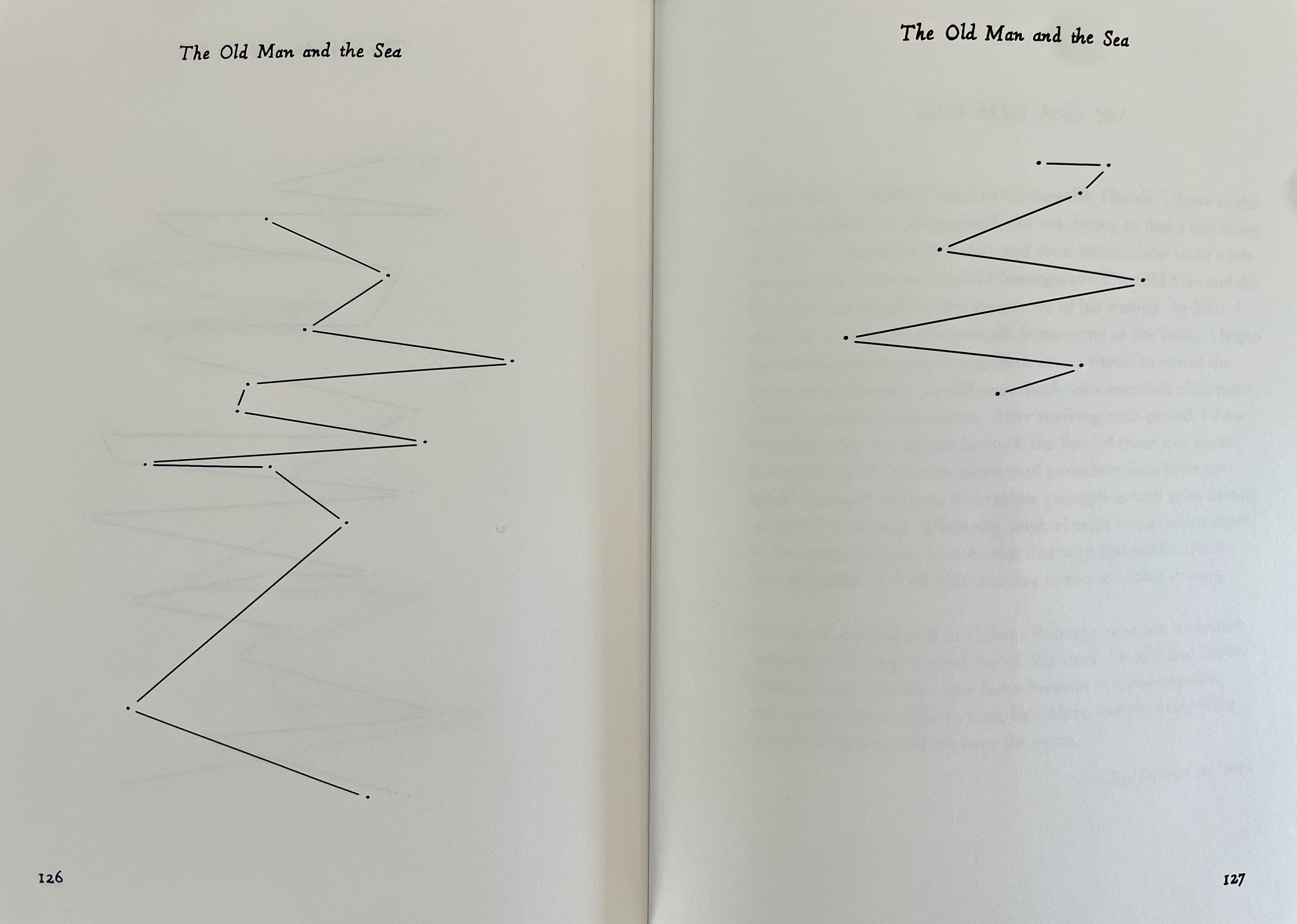
Or, Some of the Whale (2013)
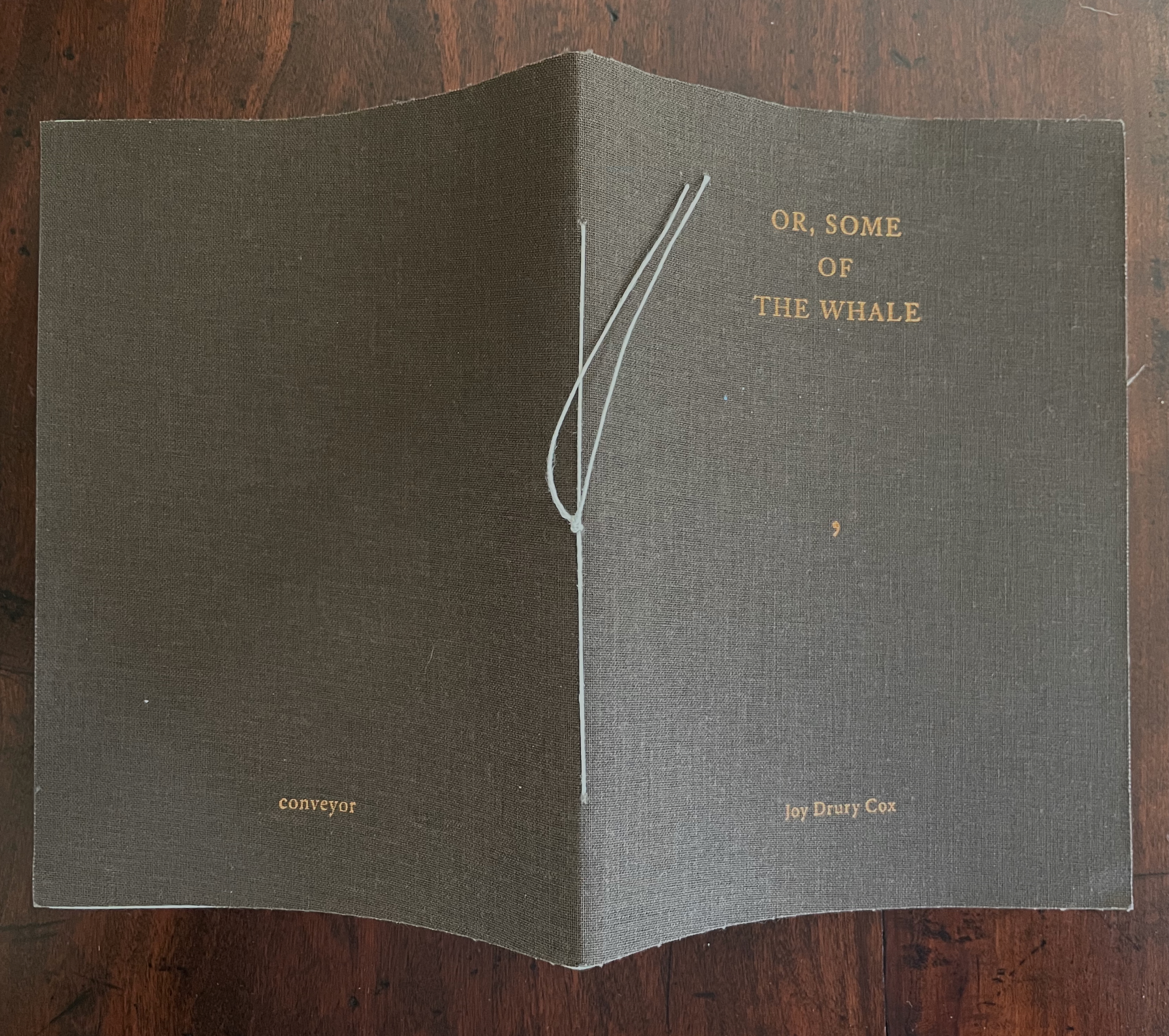
Or, Some of the Whale (2013) Joy Drury Cox Softcover sewn booklet. H184 x W136 mm. [36] pages. Edition of 100. Acquired from Southern California Vintage & Collectible Resale, 13 July 2025. Photos: Books On Books Collection.
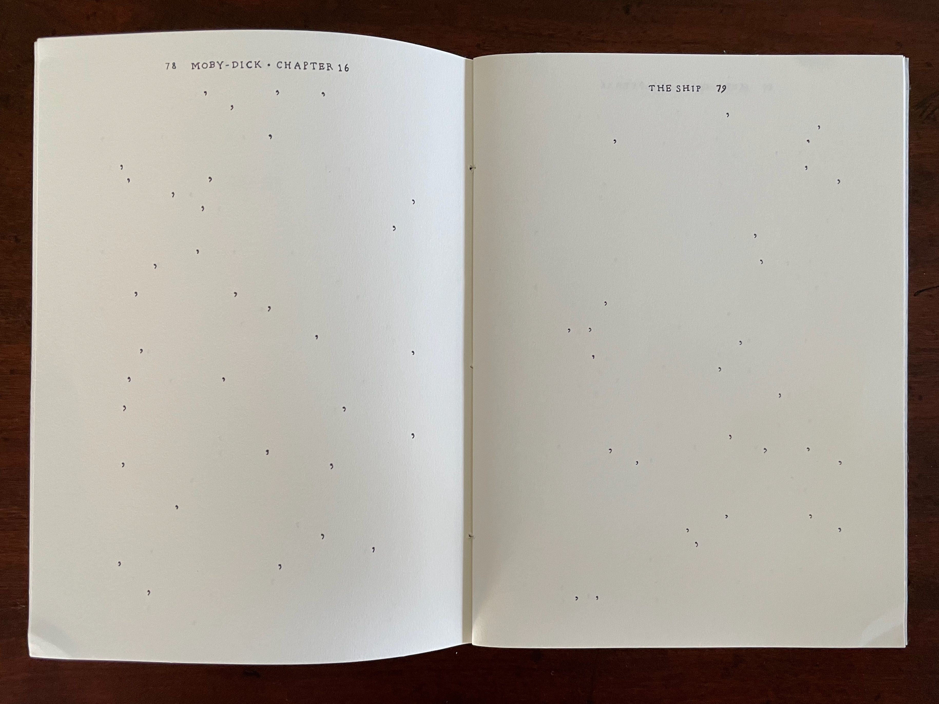
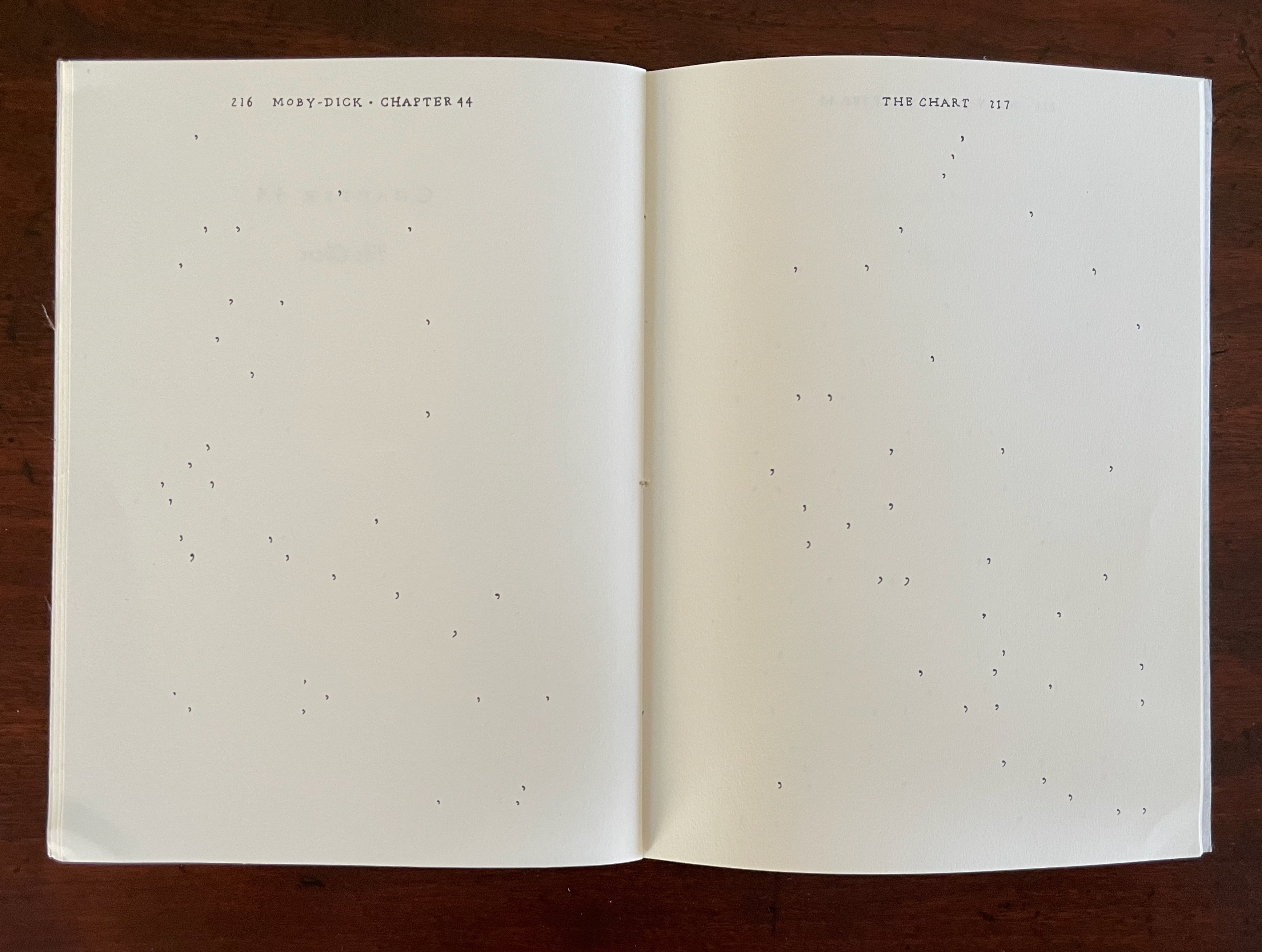
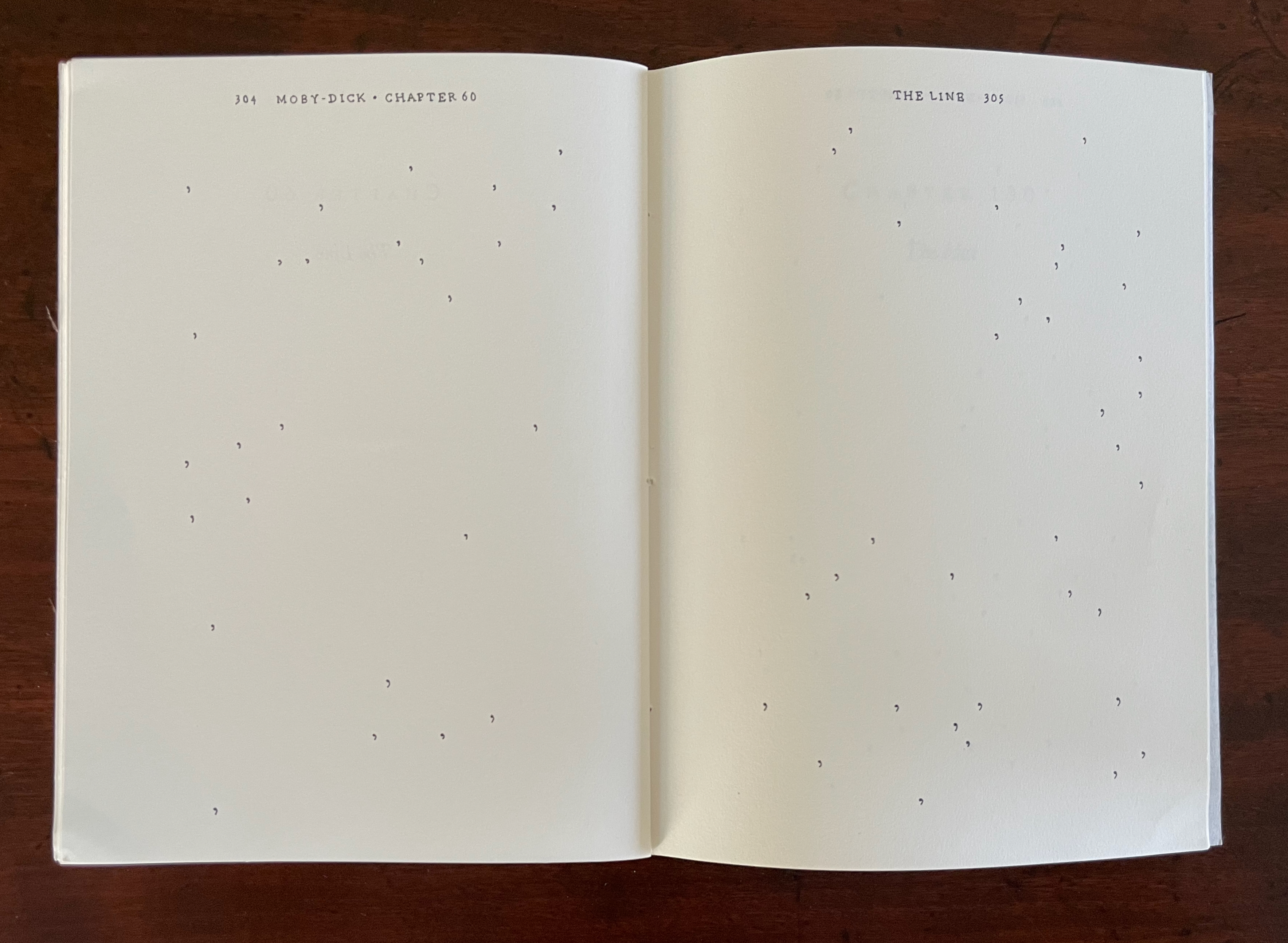
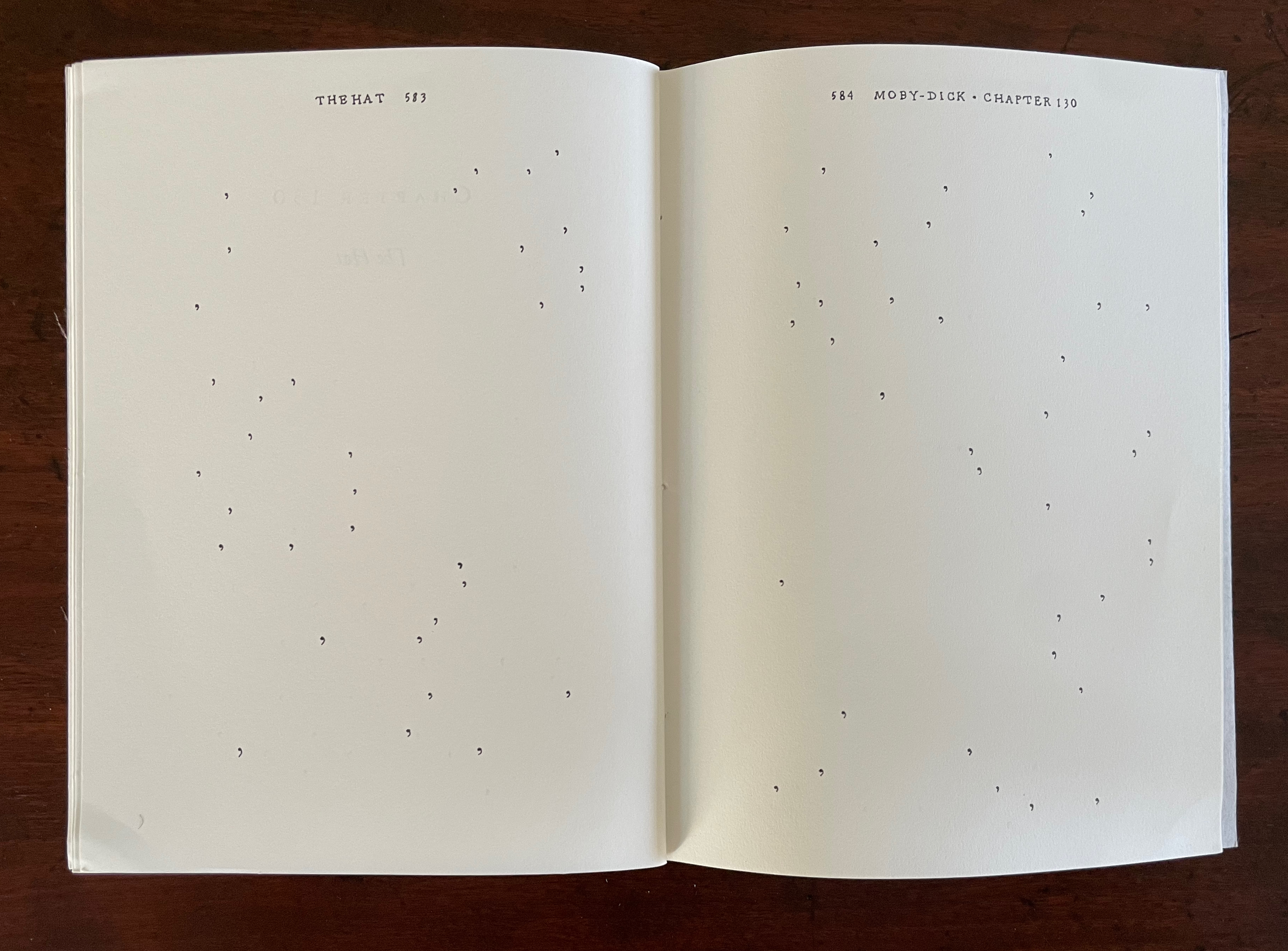
As long as we know the full title of Herman Melville’s novel — Moby-Dick; or, the Whale — the title on the cover of this entry in Joy Drury Cox’s “Punctuation Studies” (and its size) tells the story plain. Almost all of “Moby-Dick;” is gone, “Or, Some of the Whale” remains. A cover like sail-cloth, pamphlet stitched over 4 chapters of a 135-chapter novel reduced to only the commas in their positions in the original text, all swimming in the blank pages like sperm or breaching from it like microscopic sperm whales.
Chapter 16, The Ship, pp. 76-89.
Chapter 44, The Chart, pp. 215-20.
Chapter 60, The Line, pp. 303-06.
Chapter 130, The Hat, pp. 582-86
Cox’s “Punctuation Studies” are examples of inverse ekphrasis, turning a text into visual or conceptual art. Other works in the collection that use the technique of erasure, excision, etc., for that purpose are listed below. That technique is only one means of inverse ekphrasis; examples using other techniques can be found in “Notes on ‘Inverse Ekphrasis’ as a way into book art“.
Further Reading
“Derek Beaulieu“. In progress. Books On Books Collection.
Clercx, Byron, and Marian Cohn,. 2011. ‘Turning in on the Self’, in Marian Cohn (ed.), Doug Beube:Breaking the Codex. New York: The Iconoclastic Museum Press. pp 121-42.
Drucker, Johanna. 2004. The Century of Artists’ Books [Second edition] ed. New York City: Granary Books, pp. 109-19, “The Book Transformed”.
Dworkin, Craig Douglas. 2003. Reading the Illegible. Evanston, Ill.: Northwestern University Press.
Penn, Cheryl. 2009. “The Artists Book in General, the Altered Book in Particular“. Paper based on the dissertation The Use of the Artist’s Book as a Versatile Form of Expression in the Work of Selected Artists, With Particular Reference to the Altered Book submitted in partial fulfillment of the requirements for the degree Master of Technology in Fine Arts, Durban University of Technology (DUT): Durban, 2009. “By violating the ready made book, the artist challenges traditional reading patterns and inherent meaning, being at once destructive and constructive. ” (64)
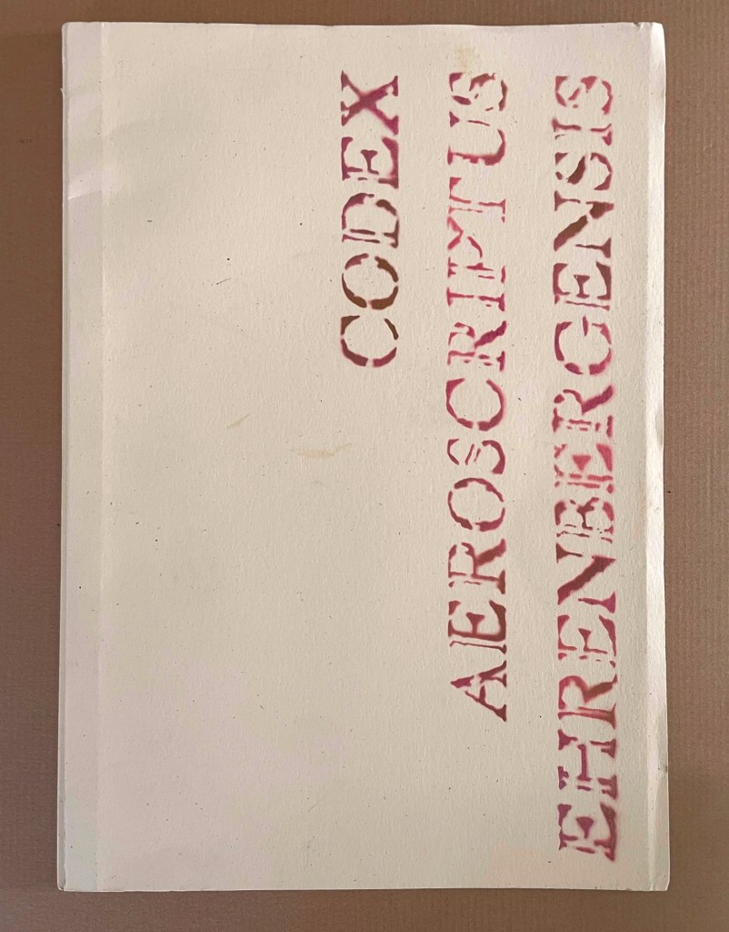
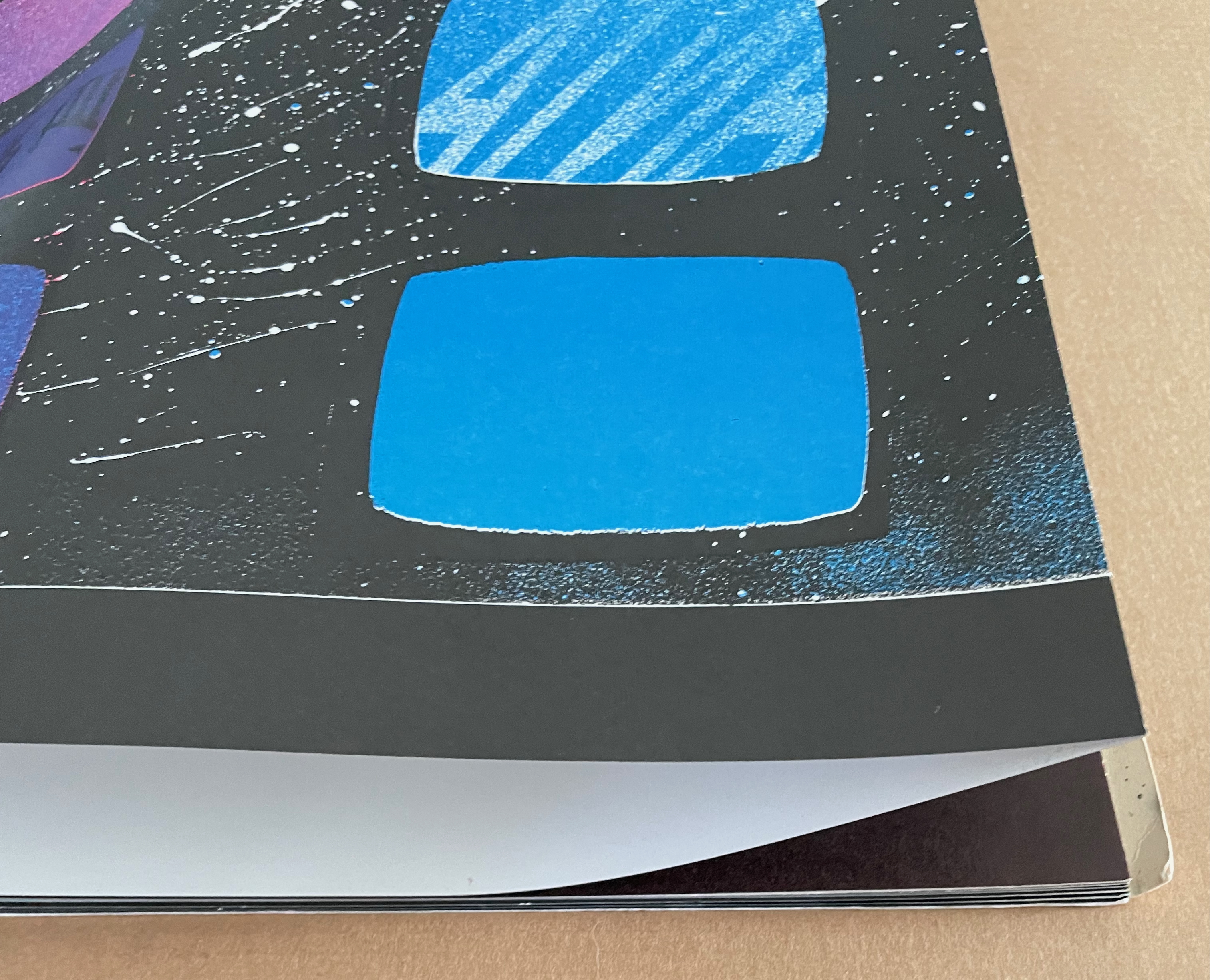
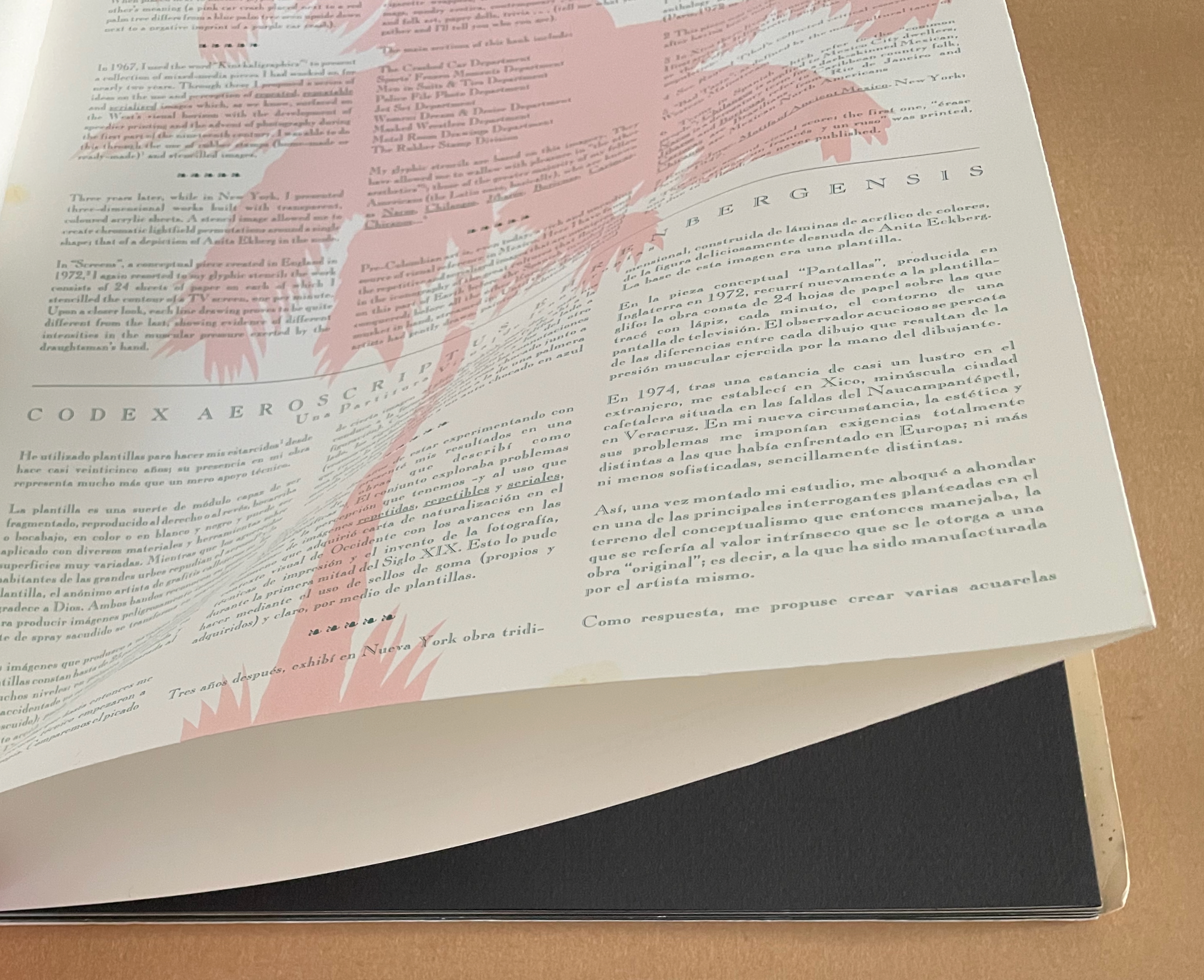
Codex Aeroscriptus Ehrenbergensis: A Visual Score of Iconotropisms (1990) Felipe Ehrenberg Casebound stiff cover, fly leaves around bifolios (fore-edge folded folios). H420 x W295 mm. 20 pages (10 bifolios, 9 with prints, 1 for title page and copyright page).Edition of 500. Acquired from Monograph Werks, 17 January 2024. Photos: Books On Books Collection.
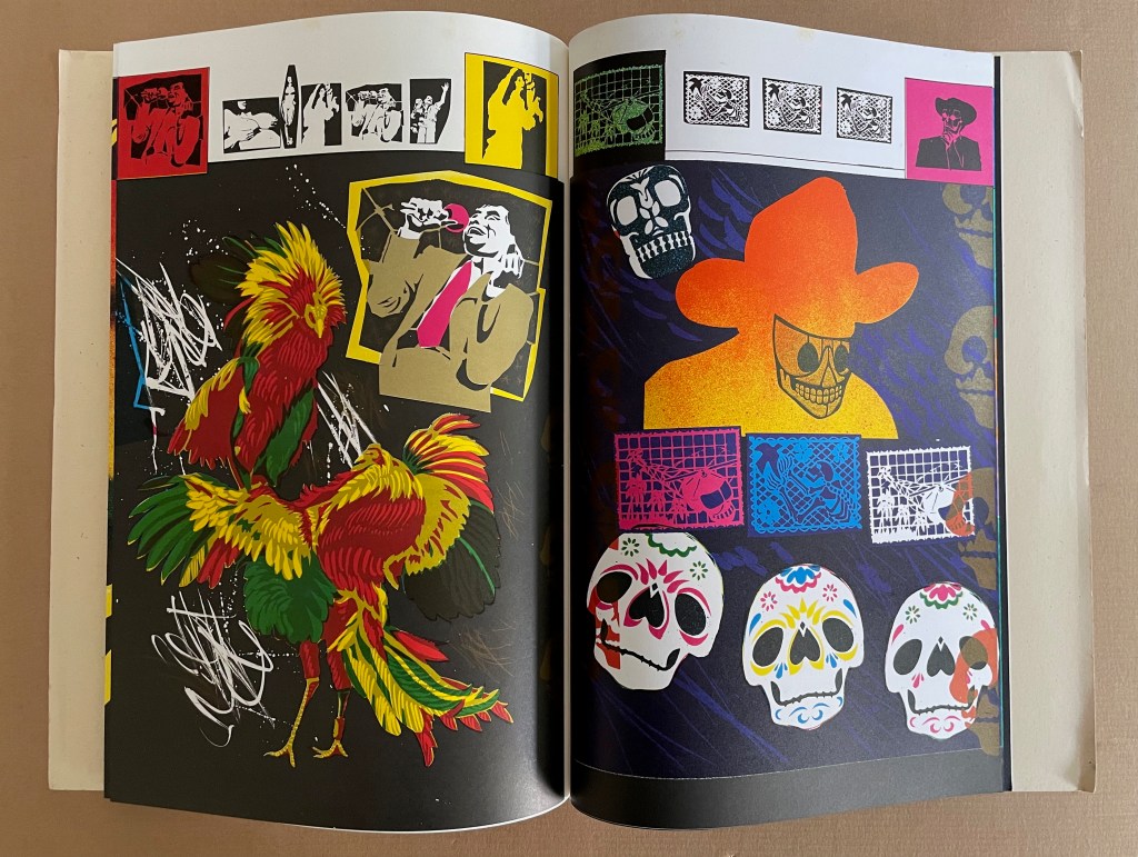
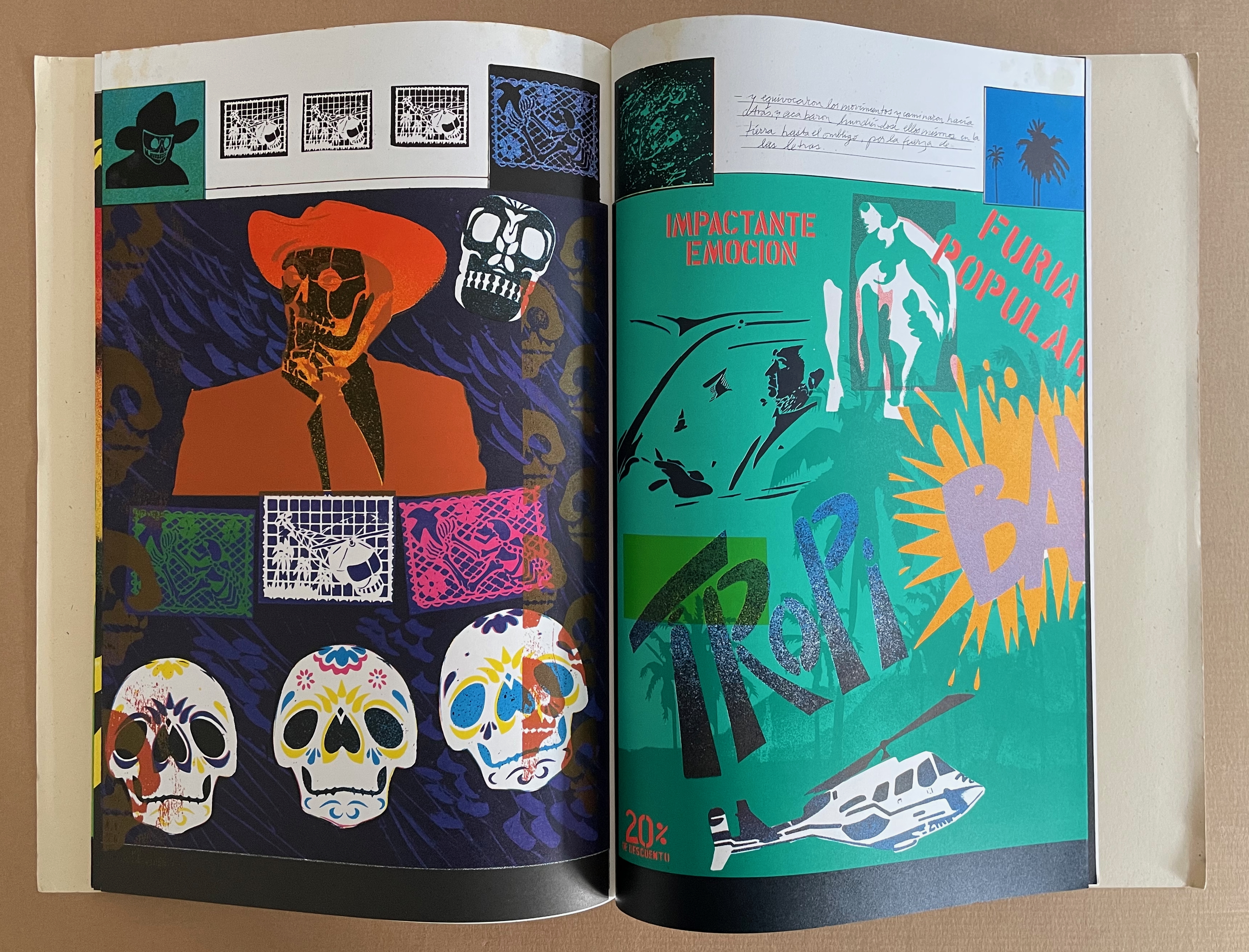
In his introduction, Felipe Ehrenberg variously recommends that we read Codex Aeroscriptus Ehrenbergensis “like a detective novel” for its “various clues that you may unravel the wondrous and dramatic events surrounding the life of this artist, another witness to the end of a century” or “as a musical score, perhaps to be composed by someone wishing to recreate the background music of our daily histories” or a “formulation of hieroglyphs”. The book’s subtitle succinctly rolls up these metaphors: “a visual score of iconotropisms”.
Stephen Perkins calls it “a mini-retrospective of his explorations in this medium” — stencils.
This work came out of a residency Ehrenberg completed at Atlanta’s Nexus Press. The images for the works came from what he called his Visual Information Bank which was a box with all sorts of ephemera that he would dip into for images for his stencils. In contrast to the frenetic energy of the stencils, the inside of the publication has a bucolic and calm feeling that is mirrored in the original stencil work Ehrenberg created across the front pages of each book. (Perkins, 2024)
The accordion, concertina, or leporello structure adopted by so many 20th and 21st century book artists has its Aztec analogue called a screenfold format. Ellen Baird and Cristián Roa-de-la-Carrera included Codex Aeroscriptus Ehrenbergensis in the Newberry Library’s 2006-07 exhibition “The Aztecs and the Making of Colonial Mexico”.
… Aztec heritage has become a vital component of Mexican and Mexican-American identity, influencing the work of many contemporary writers, artists, and scholars. The inherent flexibility of traditional indigenous creativity facilitates combination with contemporary artistic practices. Traditional screenfold books are layered with contemporary collage and print techniques, and indigenous images are juxtaposed with colonial scenes and pop icons. Contemporary Mexican and Mexican-American artists use traditional Aztec images and techniques to explore both contemporary life and Mexican cultural heritage. The screenfold format is an emblem of ancient Mesoamerican culture, and has become charged with historical and political meaning. Contemporary artists combine this format with humorous and provocative imagery to explore the cultural and political dynamics of preconquest identity, the colonization of Mexico and current relations between Mexico, Europe, and the United States. (Baird and Roa-de-la-Carrera, 2006)
Ehrenberg’s title is dipped in sarcasm. Most of the barely surviving screenfold Mesoamerican works reside in Anglo-European institutions under names like Codex Borbonicus at the Bibliothèque de l’Assemblée Nationale in Paris, Codex Borgianusat the Vatican, and Codex Mictlan at the Bodleian Libraries in Oxford. Ehrenberg’s modern version reflects their pictorial style and even the layout of their repetitive serialized images. But in doing so, his images speak to the continuing impact of colonialism.
Still, Ehrenberg’s book art went beyond any reductive anti-colonial message. His “Visual Information Bank”, as he called it, held a wealth of contemporary cultural iconography. Its main sections included:
The Crashed Car Department Sports’ Frozen Moments Department Men in Suits & Ties Department Police File Photo Department Jet Set Department Women: Dream & Desire Department Masked Wrestlers Department Motel Room Drawings Department The Rubber Stamp Division
And he drew on this — especially from the televisual world — to create his glyphic stencils and rubber stamps.
The leporello edition of Codex Aeroscriptus Ehrenbergensis is rare, but fortunately the wrap-back bound edition shown in this entry is a little less so. The wrap-back format is a traditional Chinese/Japanese book format. Takako Saito, who joined Ehrenberg at Beau Geste Press in 1973, may have been an influence in this regard, but as she left in 1975, an influence from others at Nexus in Atlanta, GA, where Ehrenberg completed this work, seems more likely.
The double-sided leporello edition of Codex Aeroscriptus Ehrenbergensis is not a folded continuous sheet. Viewable on Stephen Perkins’ site, it appears to have been formed from the codex edition’s double-page spreads glued together at the fore edge. Ehrenberg’s residency at Atlanta’s Nexus Press would have overlapped with Clifton Meador’s presence, and Meador’s works frequently use the wrap-back format.
Reed, Marcia. 2022. “Codex Espangliensis: From Columbus to the Border Patrol“, in Materialia Lumina : Contemporary Artists’ Books from the CODEX International Book Fair. Edited by Elizabeth Fischbach and Nann Parrett. Berkeley, California: The Codex Foundation.
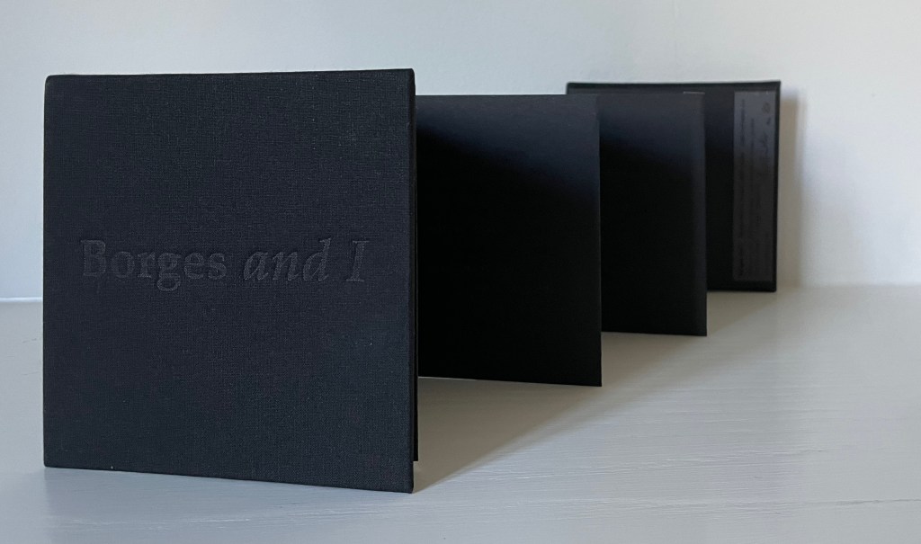
Borges and I(2001) Heather Weston Leporello, hardcover in cloth. 110 mm square. 6 panels. #88 of an open edition. Acquired from the artist, 4 September 2023. Photos: Books On Books Collection. Displayed with permission of the artist.
The technique among book artists of creating a fresh work within an older one by erasing, excising, or masking the text of the older has been famously used by Tom PhillipsinA Humument (1970-2016), Jonathan Safran Foer in Tree of Codes (2010), and Marcel Broodthaers in Image: Un Coup de Dés Jamais N’Abolira le Hasard(1969). Heather Weston’s twist on this is several fold.
Here are two works that show how the substrate of the book can be the primary element of making art and meaning. When it comes to paper, the fireworks in most artists’ books focus on printing or structural displays. Susan Mills describes herself as not just a book artist but “a conceptual rural urban bookbinding poet artist working in book form” (Mills, 2025). She does not practice printing or printmaking. She produces her books without the use of a printing press and handbinds them using innovative structures, bindings, and materials. She lets the paper itself shine — as surface and as “paint”.
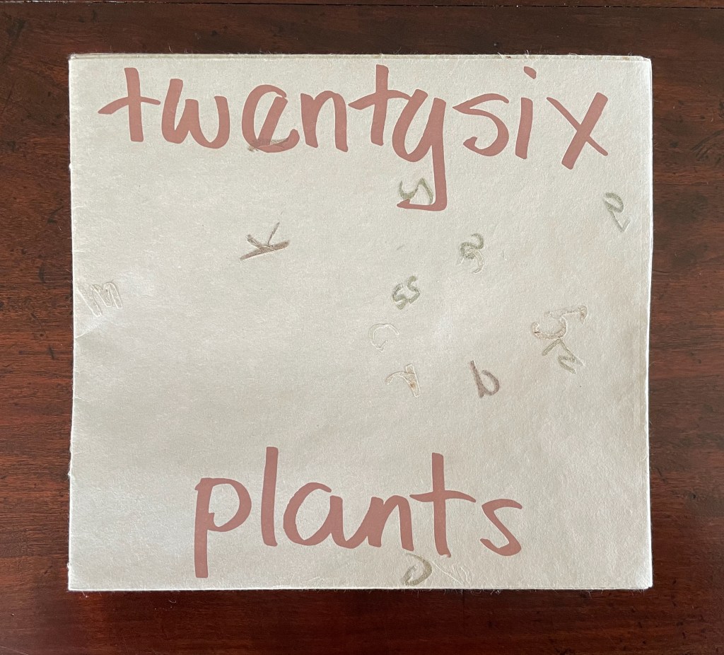
Twentysix Plants (2013)
Susan Mills’ Twentysix Plants puts handmade paper at the center of its artistry as it nods to Ed Ruscha’s Twentysix Gasoline Stations (1963). It consists of twenty-seven different papers. Twenty-six of them were each made from one of twenty-six different plants. A small amount of abaca was added to the different pulps to ease them through the Hollander Beater. After the sheets were couched, dried, and readied for use, Mills “labeled” them by cutting out the name of the constituent plant in distinctive callitomic letters. For the cover paper, the twenty-seventh paper, the twenty-six cut-out scripts went into the vat.
If Twentysix Plants were an abecedarium, it would be arguable that, just as our words are made from the alphabet’s letters, so the cover of Twentysix Plants is made from all the plants used in the book. There they are, embodied in their fragmented names, embedded in the cover. But neither Twentysix Plants nor Twentysix Gasoline Stations is an A-Z.
Twentysix Plants (2013) Susan Mills Softcover with exposed spine, link-stitch and kettle-stitch sewn, and non-adhesive interlocking folios. H205 x W225 mm. [26] pages. Edition of 50, of which this is #4. Acquired from the artist, 9 February 2026. Photos: Books On Books Collection.
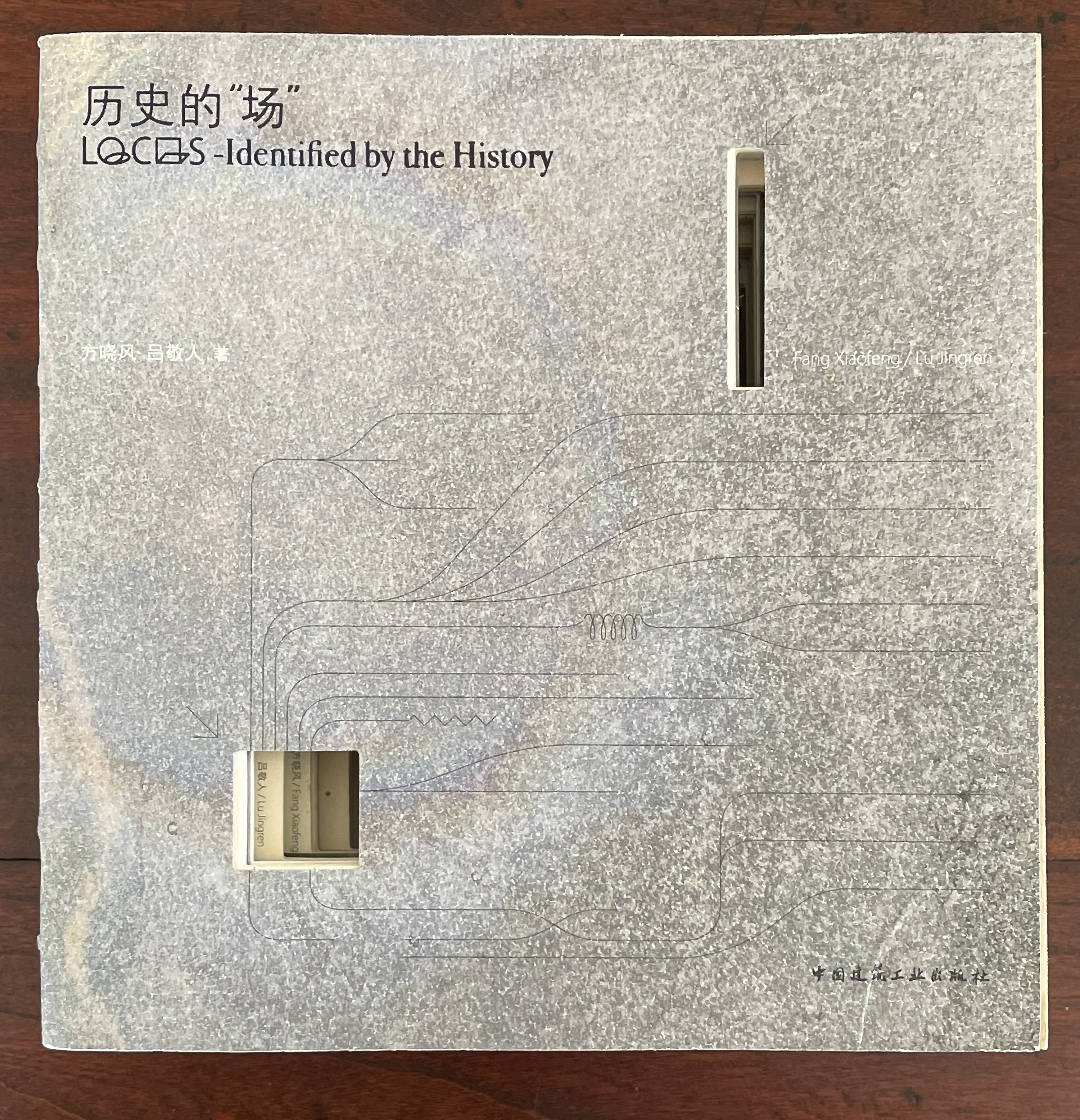
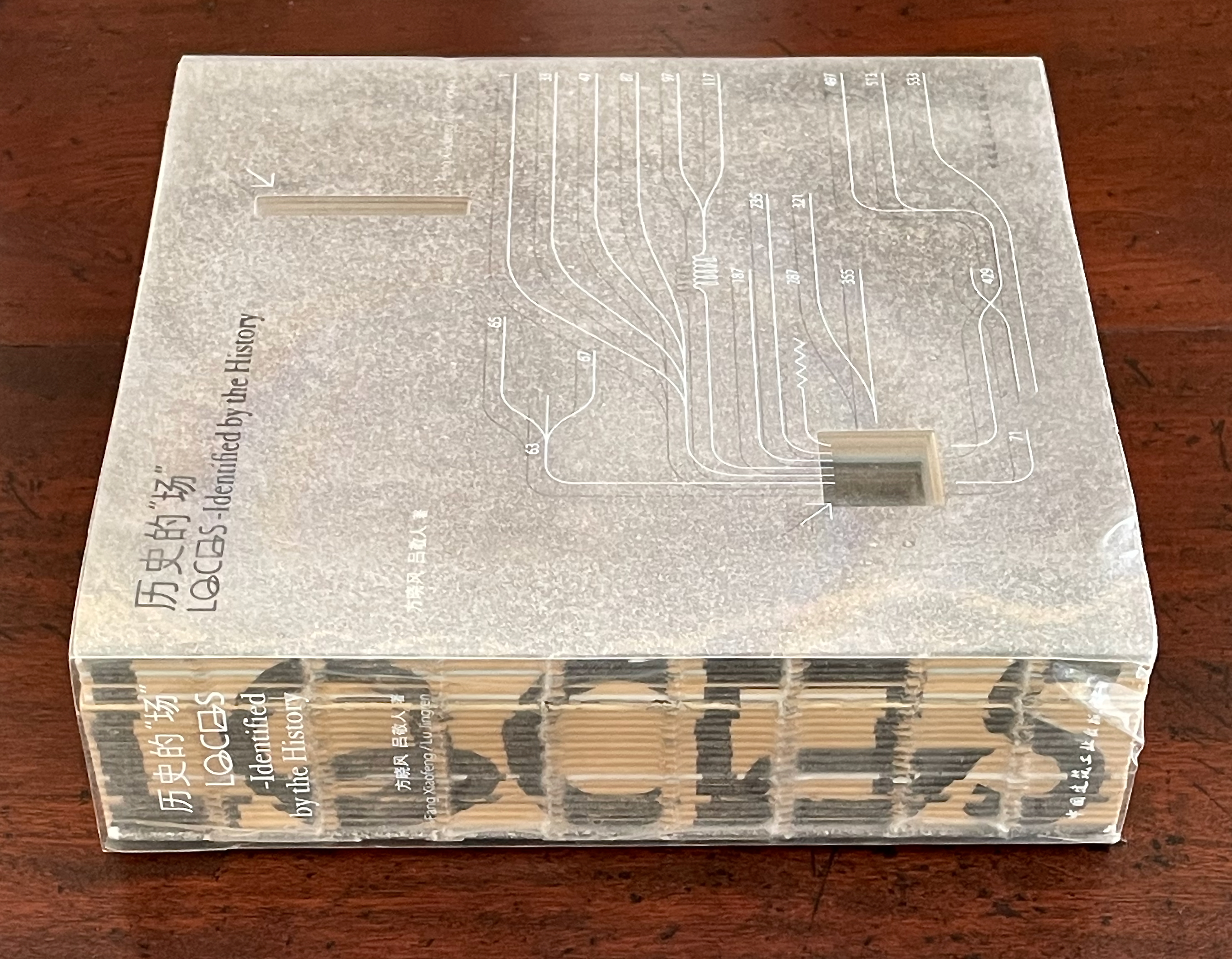
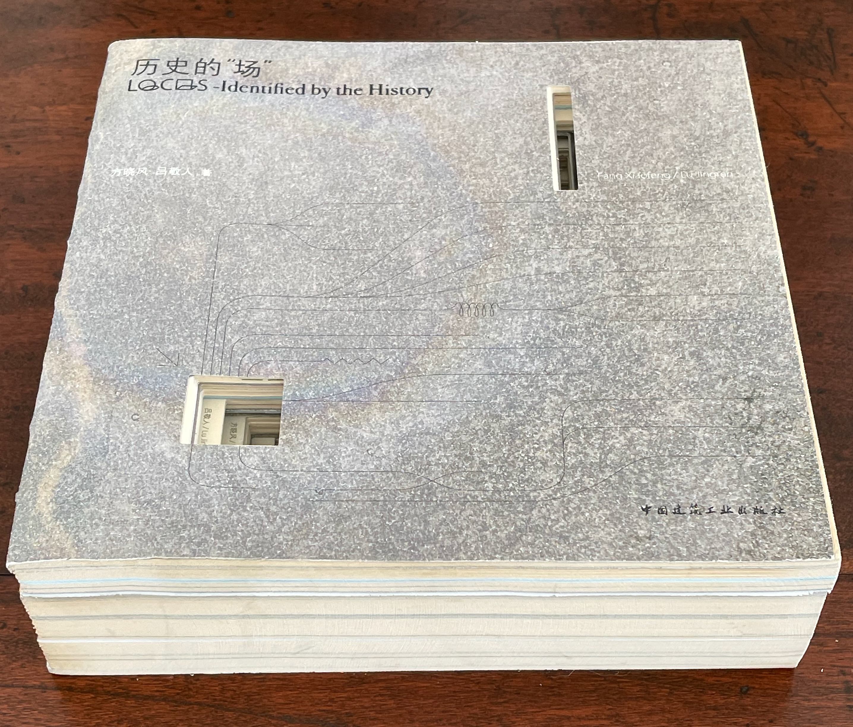
历史的”场 (Locus: Identified by the History) (2016) 方晓风 (Fang Xiaofeng) and 呂敬人 (Lu Jingren) Beijing Shi: Zhongguo jian zhu gong ye chu ban she.
Co-authored by architecture scholar Fang Xiaofeng and book designer Lu Jingren, Locus: Identified by the History (2016) springs from the Book – Architecture Project (书 – 筑 / Shu – Zhu Project), conceived by Lu Jingren, Fumihiko Maki (Japan), and Yi Ki-Ung (South Korea). The project initiated a multi-year series of exhibitions/forums called “Book – Architecture: Dialogues Between Architects and Book Designers” (2011-19) across all three countries. Locus was published on the occasion of the second exhibition/forum in 2016.
Locus pursues two overlapping lines of thought. The first and primary one rests on Lu’s design philosophy that a book is a built environment, a habitat for text and images to be engaged by readers and all five of their senses. Its layout, pacing, structure, and their interconnectedness with each other and the book’s materials mirror the architect’s design of rooms, hallways, stairs, windows, doors, thresholds, and their interconnectedness with each other and their materials. Likewise as habitats, they each have exteriors, are designed to occupy a locus in time and space, and relate to a world outside. In Lu’s philosophy, the design mechanics involve four pillars: binding + layout + editorial + information visualization. Successful execution results in an immersive spatial object (habitat) that triggers the reader’s visual, tactile, auditory, olfactory, and gustatory systems simultaneously.
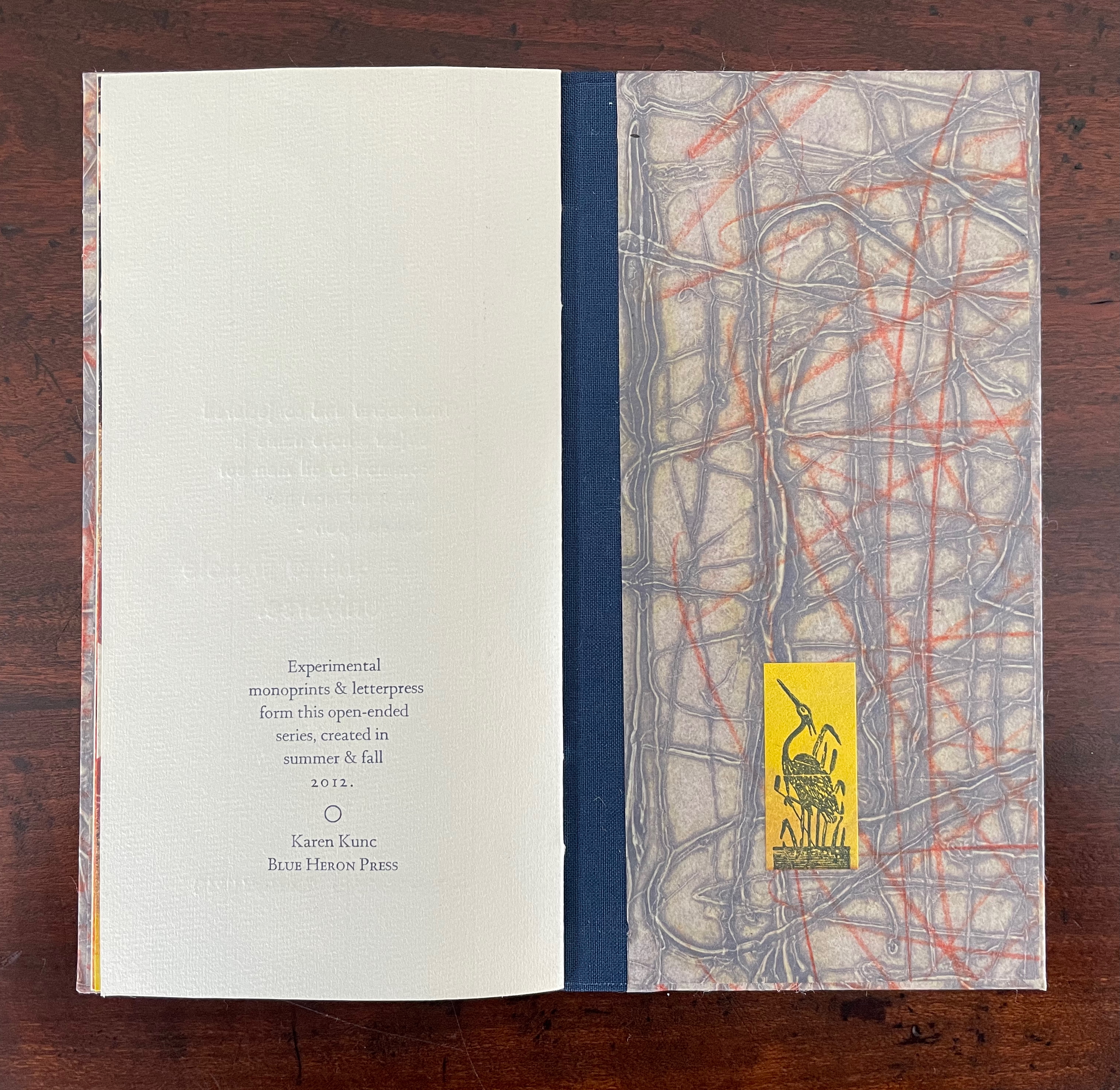
While Stéphane Mallarmé and his Un Coup de Dés may be the front runner among contenders for the title of literary patron saint of the artist’s book, Jorge Luis Borges and Italo Calvino appear in a tie for a distant but respectable second. Each have inspired some striking works. In her series Ten Thousand Things, Karen Kunc has boosted both Borges’ and Calvino’s chances and nudged Calvino’s with an additional homage in leporello format.
The series title of Ten Thousand Things springs from Chapter 42 of the Tao Te Ching:
The Tao begot one. One begot two. Two begot three. And three begot the ten thousand things. The ten thousand things carry yin and embrace yang. They achieve harmony by combining these forces.
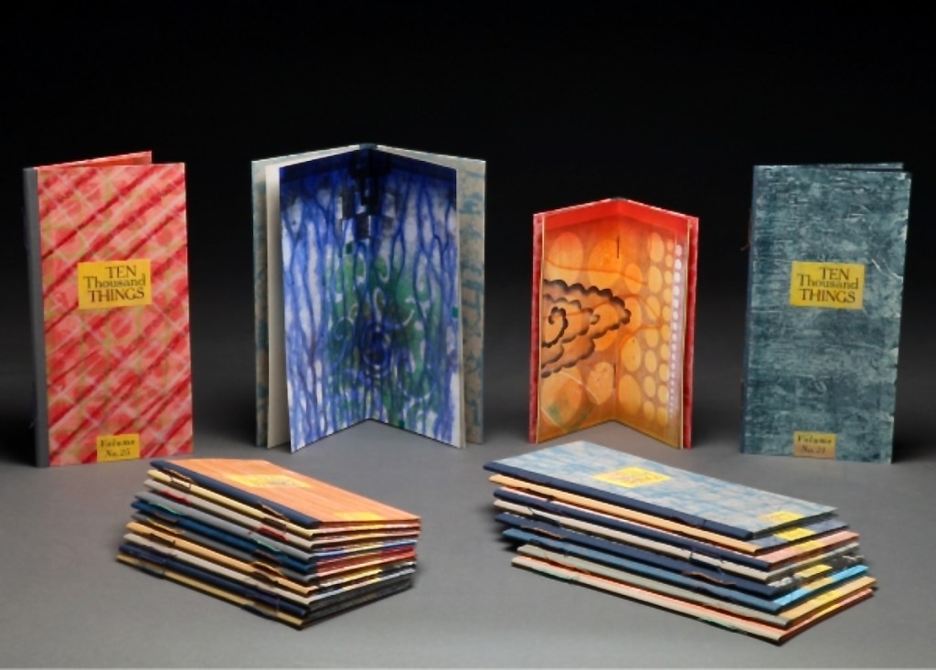
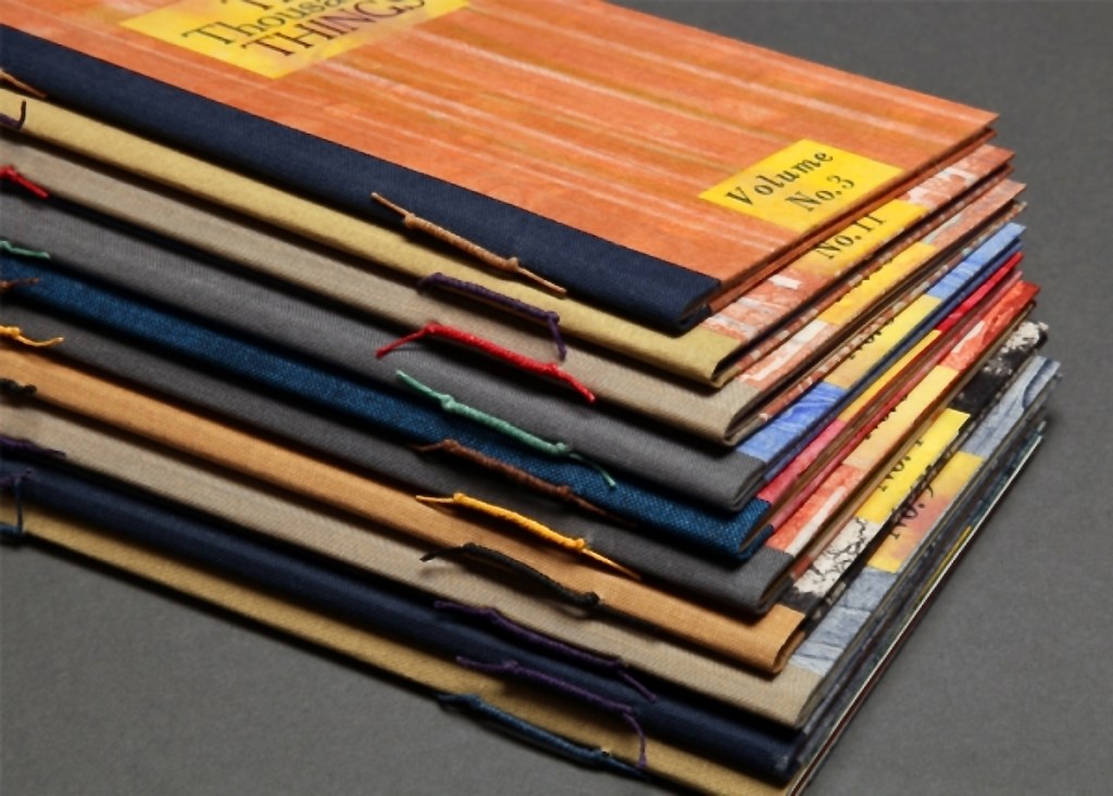
The series consists of 74 books in two sizes as the monoprints were made in two sizes of papers. The papers varied. Most of the works are on Torinoko, a Japanese paper that Kunc found to work well with waterbased Akua Intaglio inks. Some are on Arches 88 paper, a waterleaf she found also very absorbent for the Akua inks. Many of the prints have some handcoloring with ink or liquid acrylic. A few prints as well as all of the covers were made on Japanese Nishinouchi paper, a kozo fiber paper, which she has used extensively for her large woodcut prints. Printing is from collagraph plates on an etching press, with hand coloring and waxing afterwards.
Kunc chose excerpts from the works of five poets/authors and responded to each with several different monoprints not as illustrations of the text but as evocations prompted and to prompt. In addition to Borges and Calvino, she selected from Guillaume Apollinaire, Annie Dillard, and Marge Piercy. Kunc handset the metal type and letterpress printed several sheets of each text on different papers for variety with the monoprints. In each book, the text-bearing sheet folds around the sheet that bears two monoprints, one on each side.
The Tate Museum remarks that “The beauty of monoprinting lies in its spontaneity and its allowance for combinations of printmaking, painting and drawing media.” Kunc’s series extends that allowance to combinations with the elements of the book.
Ten Thousand Things, No. 51 (2012)
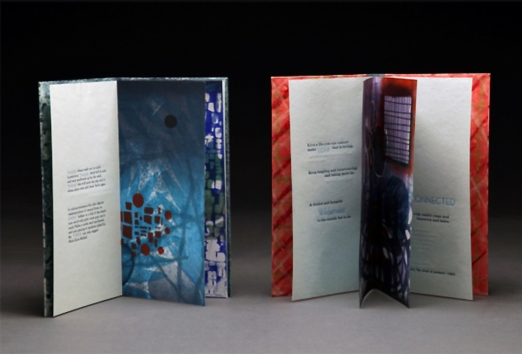
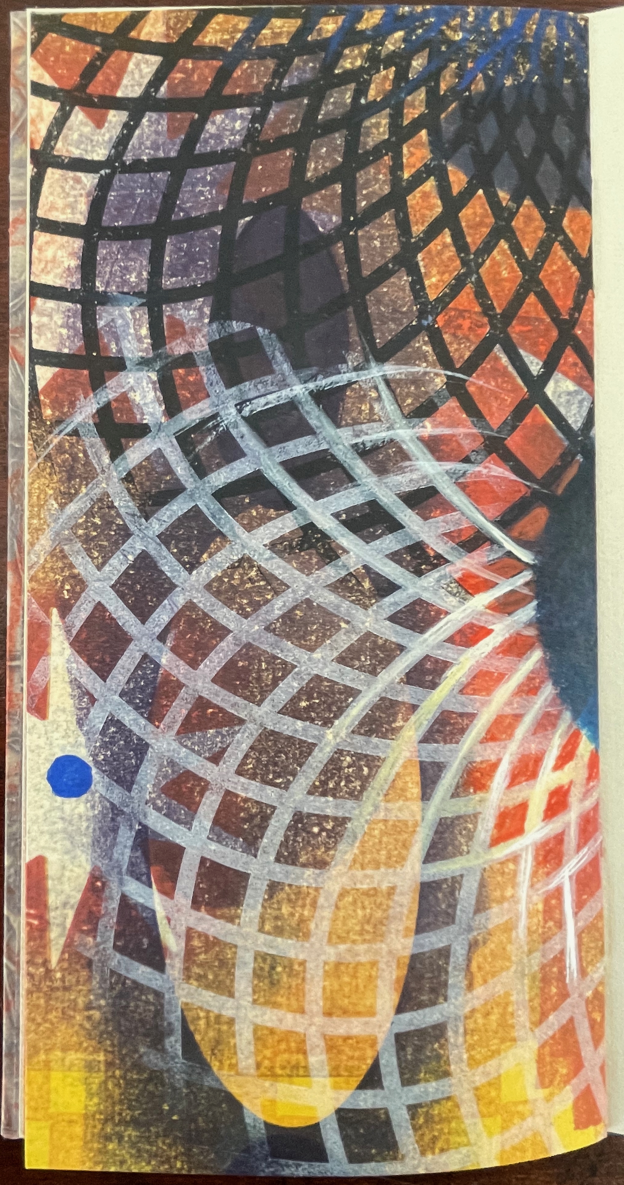
Ten Thousand Things, No. 51 (2012) Karen Kunc Single-signature booklet containing a recto and verso monoprint created by pressure printing, pochoir, and mixed media, with letterpress text. H205 x W110 mm. [8] pages. From a set of 75. Acquired from the artist, 9 February 2026. Photos: Books On Books Collection.
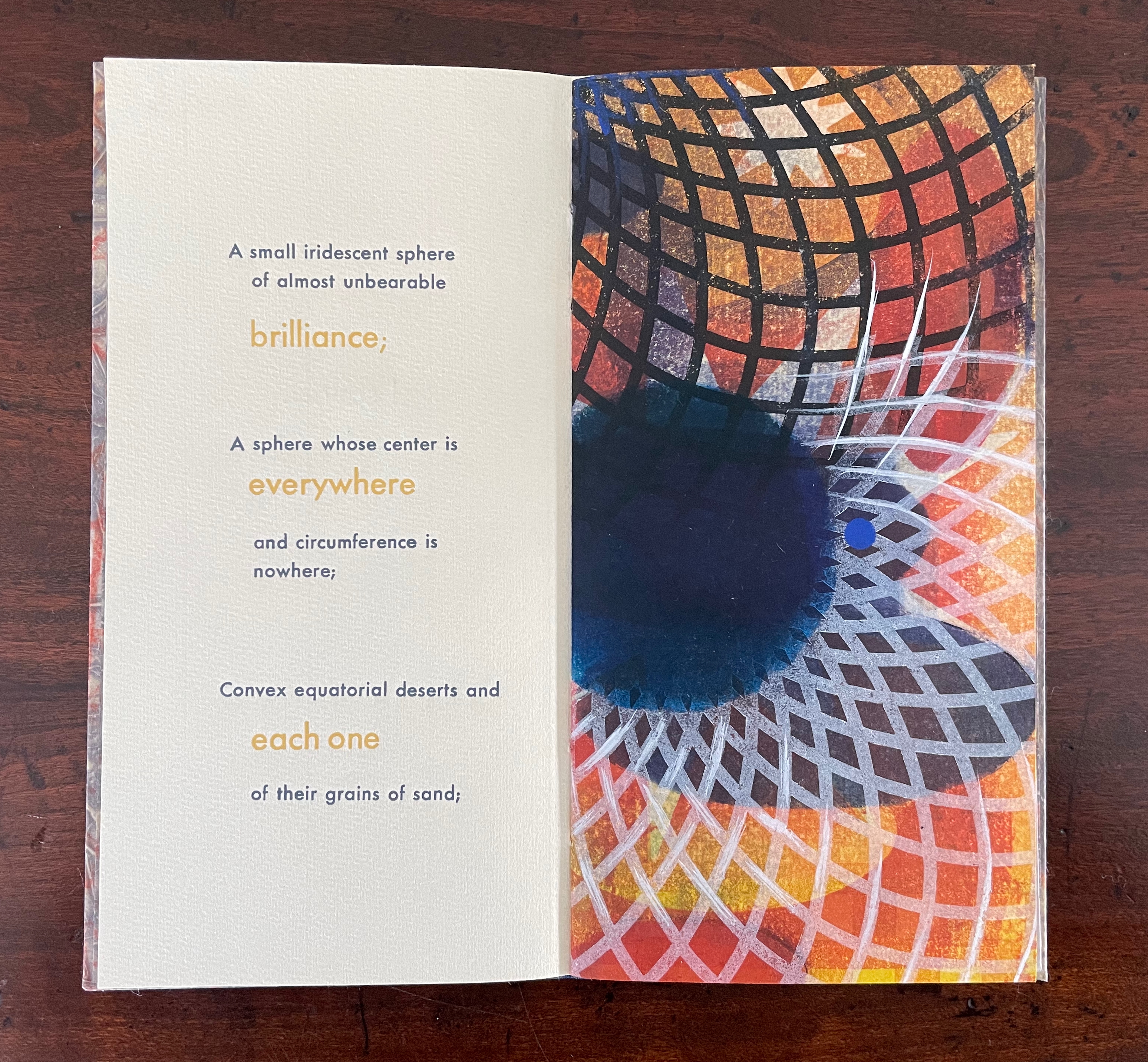
From Borges’ 1945 short story “The Aleph“, No. 51 in Kunc’s Ten Thousand Things series extracts four descriptions of the object or phenomenon Borges the narrator sees in the basement of his intolerable acquaintance Carlos Argentino Daneri:
I saw a small iridescent sphere of almost unbearable brilliance[;]
a sphere whose center is everywhere and circumference is nowhere;
convex equatorial deserts and each one of their grains of sand;
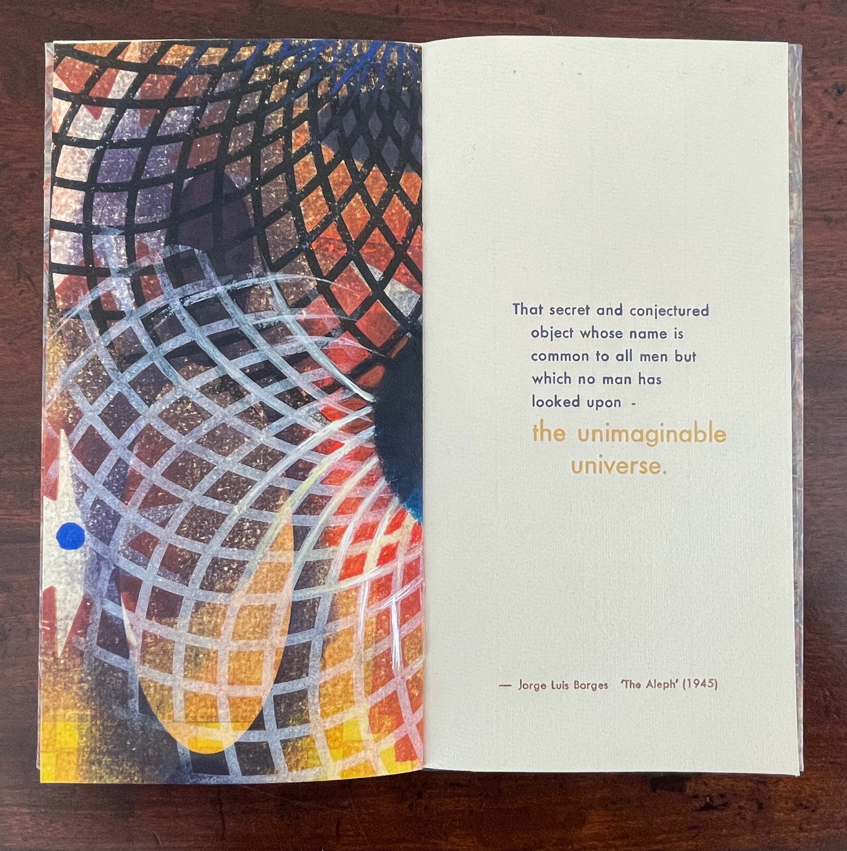
that secret and conjectured object whose name is common to all men but which no man has looked upon — the unimaginable universe.
With a deft touch, Kunc has selected and slightly altered the more abstract of Borges’ long Whitmanic observations (in the first, she inserts an ellipsis and substitutes a semicolon for a full stop; for the second and third, the order of appearance is changed). Borges prefaces his catalogue of what he sees with a caveat about the inadequacy of words to depict the concept of multum in parvo [“much in little”]:
All language is a set of symbols whose use among its speakers assumes a shared past. How, then, can I translate into words the limitless Aleph, which my floundering mind can scarcely encompass? Mystics, faced with the same problem, fall back on symbols: to signify the godhead, one Persian speaks of a bird that somehow is all birds; Alanus de Insulis, of a sphere whose center is everywhere and circumference is nowhere; Ezekiel, of a four-faced angel who at one and the same time moves east and west, north and south. (Not in vain do I recall these inconceivable analogies; they bear some relation to the Aleph.) Perhaps the gods might grant me a similar metaphor, but then this account would become contaminated by literature, by fiction. Really, what I want to do is impossible, for any listing of an endless series is doomed to be infinitesimal. In that single gigantic instant I saw millions of acts both delightful and awful; not one of them occupied the same point in space, without overlapping or transparency. What my eyes beheld was simultaneous, but what I shall now write down will be successive, because language is successive.
In light of the snide literary sniping and rivalry that forms the background to “The Aleph”, Borges may be forgiven for omitting William Blake’s spectacular translation of “the limitless Aleph”:
To see a World in a Grain of Sand,/ And a Heaven in a Wild Flower,/ Hold Infinity in the palm of your hand,/ And Eternity in an hour. (Auguries of Innocence, 1803).
It might have brought Borges’ descriptive and narrative enterprise to an harrumphing halt. We would then not have had this particular instance of Karen Kunc’s taking up the challenge of rendering in an artist’s book Borges’ verbal description of the Aleph. What image could resonate with or reflect his words and reflect the impossibility he describes? How might the arrangement of pages enhance/diminish it? How might the act of turning a page reflect or obscure it?
The vibrant circle of deep blue is only two dimensional, but perhaps the abstractions behind the dark convex grid suggest the three dimensionality of the story’s sphere. Perhaps the more brilliant but smaller blue circle beside the larger one conveys the multum in parvo concept in the style of medieval narration differentiating multiple points in time with images of different size in the same plane. Perhaps the full-page bleed of the image even suggests that paradoxically the image extends from the page yet encompasses the page. Likewise might the sheet’s fold that truncates the circle and the dark and light grids imply continuity coexisting with discontinuity? Does the dark blue grid that curves over the orange and burnt umber colors imply the “convex equatorial deserts”?
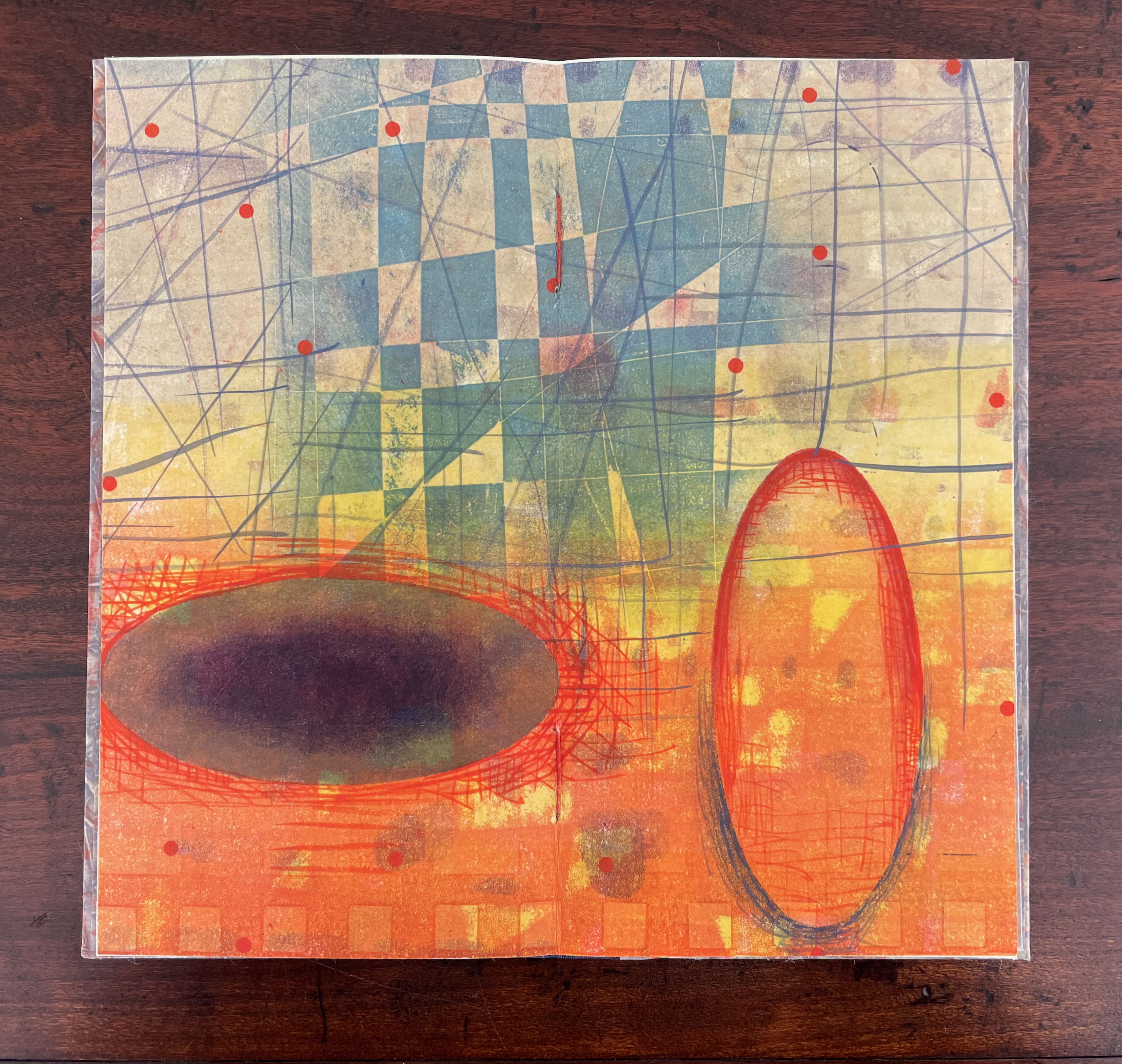
Turning from that half view of the monoprint, we have the full view of the monoprint on the other side of the sheet. An angular and checkered blue background hovers over two ellipsoid figures in an orange foreground. Is the background network with its numerous small red dots a version of Indra’s net, that cosmological metaphor of an infinite net with a jewel at each juncture reflecting and being reflected by every other? The dark ellipsoid seems to quiver surrounded by crosshatching. Is it in motion toward the upright orange ellipsoid? Is this a moment in time and space?
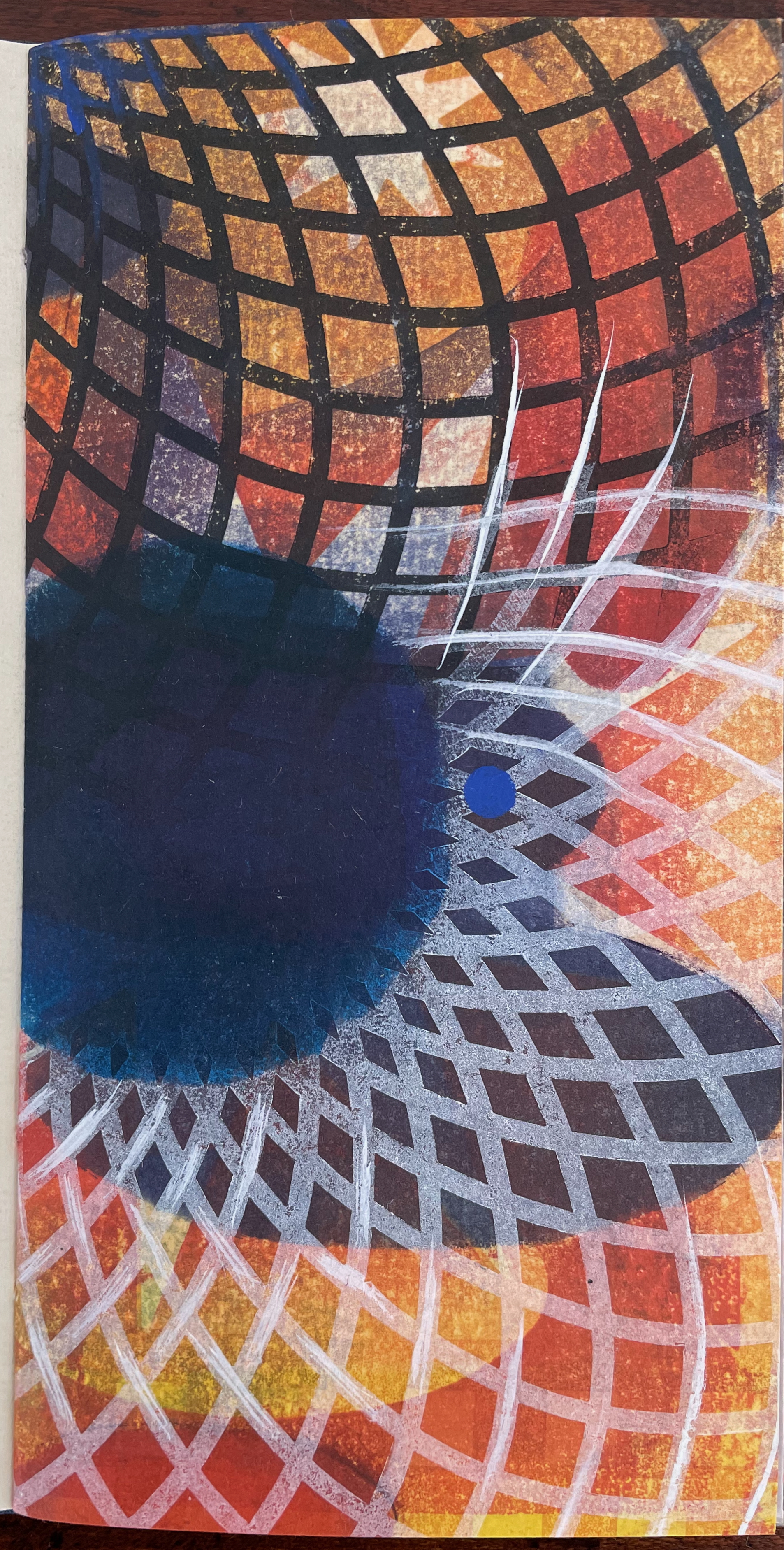
The other half of the monoprint with the dark blue circle comes into view with the last double page spread. If we could see all at once the monoprint with the dark blue circle, the juxtaposition of spheres and ellipses would stand out more.
The white stars behind the grid stand out a bit more, and the small bright circles seem more clearly positioned on curving white orbital tracks. Is it an allusion to planetary and constellatory movement, bring a universe within this small book? Without photographic manipulation, we have to open our minds to imagine it. As Carlos replies when Borges worries that it will be too dark in the cellar to see the Aleph, ““Truth cannot penetrate a closed mind. If all places in the universe are in the Aleph, then all stars, all lamps, all sources of light are in it, too.”
Of course, this photographic manipulation is a cheat and overlooks that Kunc has combined the half-views of one side of the monoprint with the full view on the other side to reflect the challenge of embodying a simultaneous phenomenon with successive phenomena.
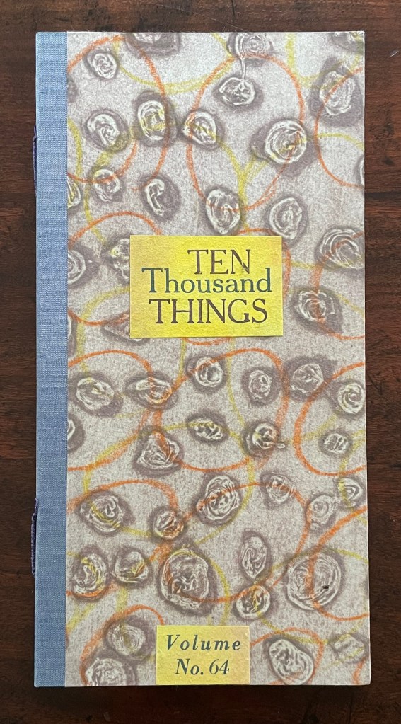
Ten Thousand Things, No. 64 (2012)
Ten Thousand Things, No. 64 (2012) Karen Kunc Single-signature booklet containing a recto and verso monoprint created by pressure printing, pochoir, and mixed media, and a letterpress text on various papers.H250 x W125 mm. [8] pages. From a set of 75. Acquired from the artist, 9 February 2026. Photos: Books On Books Collection.
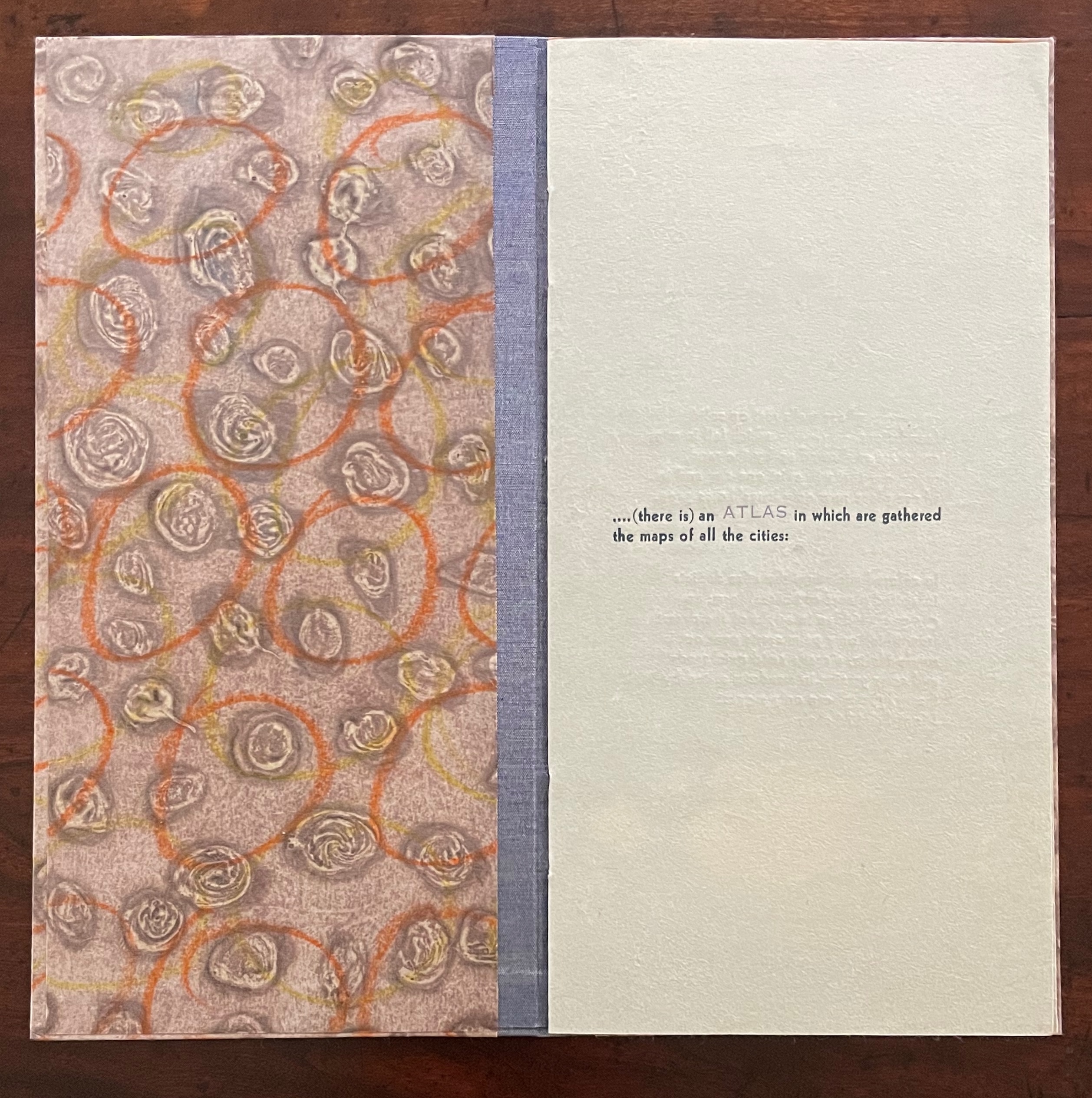
Of the 74 books in the Ten Thousand Things series, 11 of them pay homage to Italo Calvino’s Invisible Cities (1972/74). The book’s premise is that Kublai Khan sent Marco Polo out into the empire to visit the Khan’s cities and return with close descriptions. In nine parts, each prefaced and closed with a philosophical dialogue between the Khan and Polo, the traveller describes fifty-five cities — all of them imaginary. While most works of homage to Invisible Cities select one or more of these fictitious 55 cities on which to focus, Kunc chooses more general text from the preface to Part 9. This is the text used in all 11 of the works of homage to Calvino:
…. (there is) an ATLAS in which are gathered the maps of all the cities:
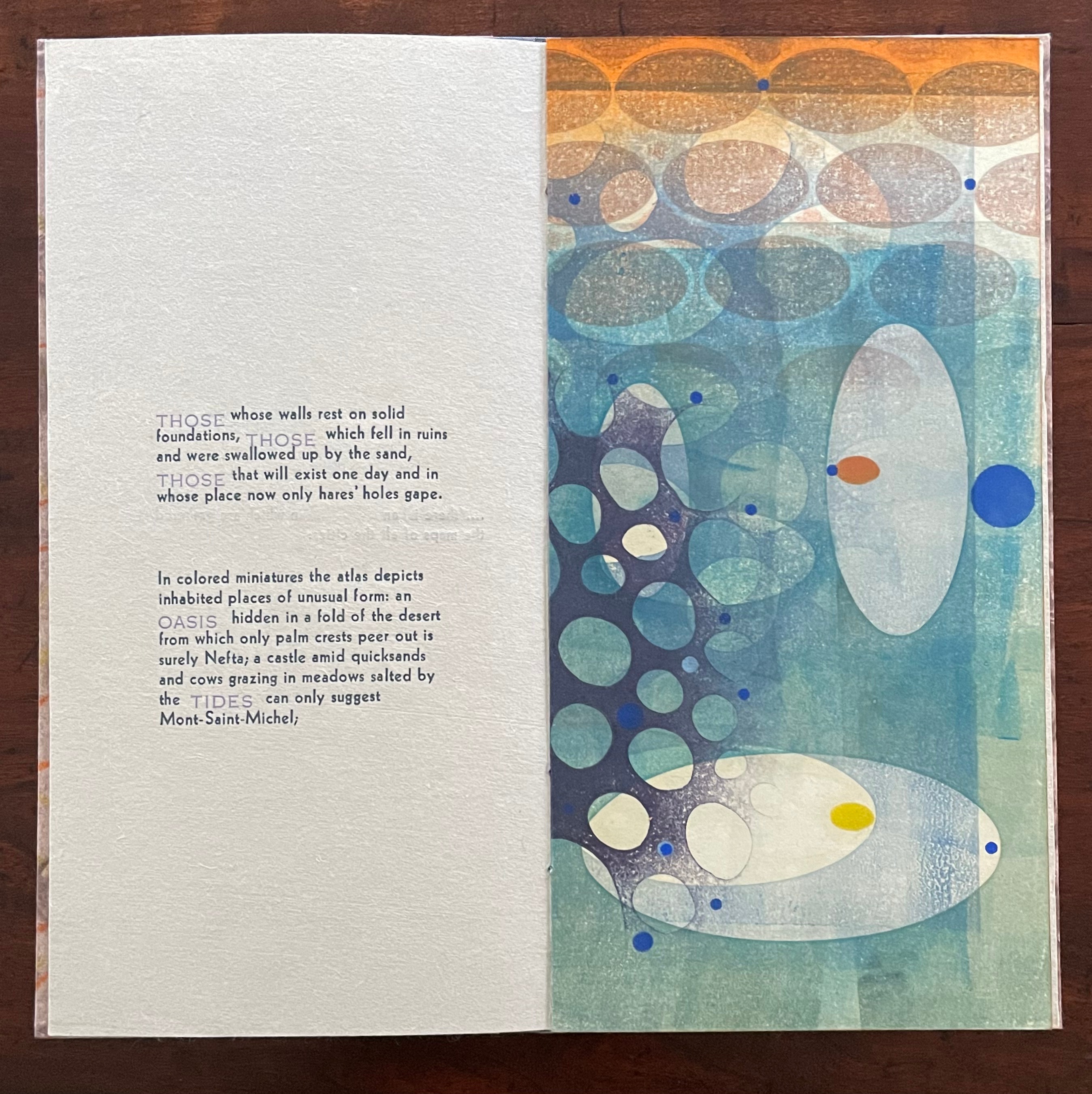
THOSE whose walls rest on solid foundations, THOSE which fell in ruins and were swallowed up by the sand, THOSE that will exist one day and in whose place now only hares’ holes gape.
In colored miniatures the atlas depicts inhabited places of unusual form: an OASIS hidden in a fold of the desert from which only palm crests peer out is surely Nefta; a castle amid quicksands and cows grazing in meadows salted by the TIDES can only suggest Mont-Saint-Michel;
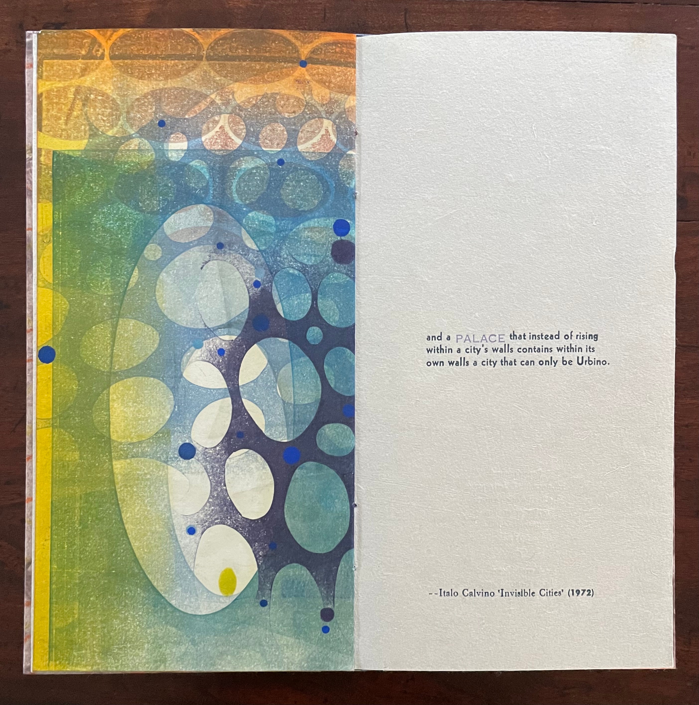
and a PALACE that instead of rising within a city’s walls contains within its own walls a city that can only be Urbino.
With certain words appearing in all caps in a lighter weight and lighter color than the surrounding text, the excerpts have a different texture from those in No. 51. The all caps words rise above or fall below the line of type.
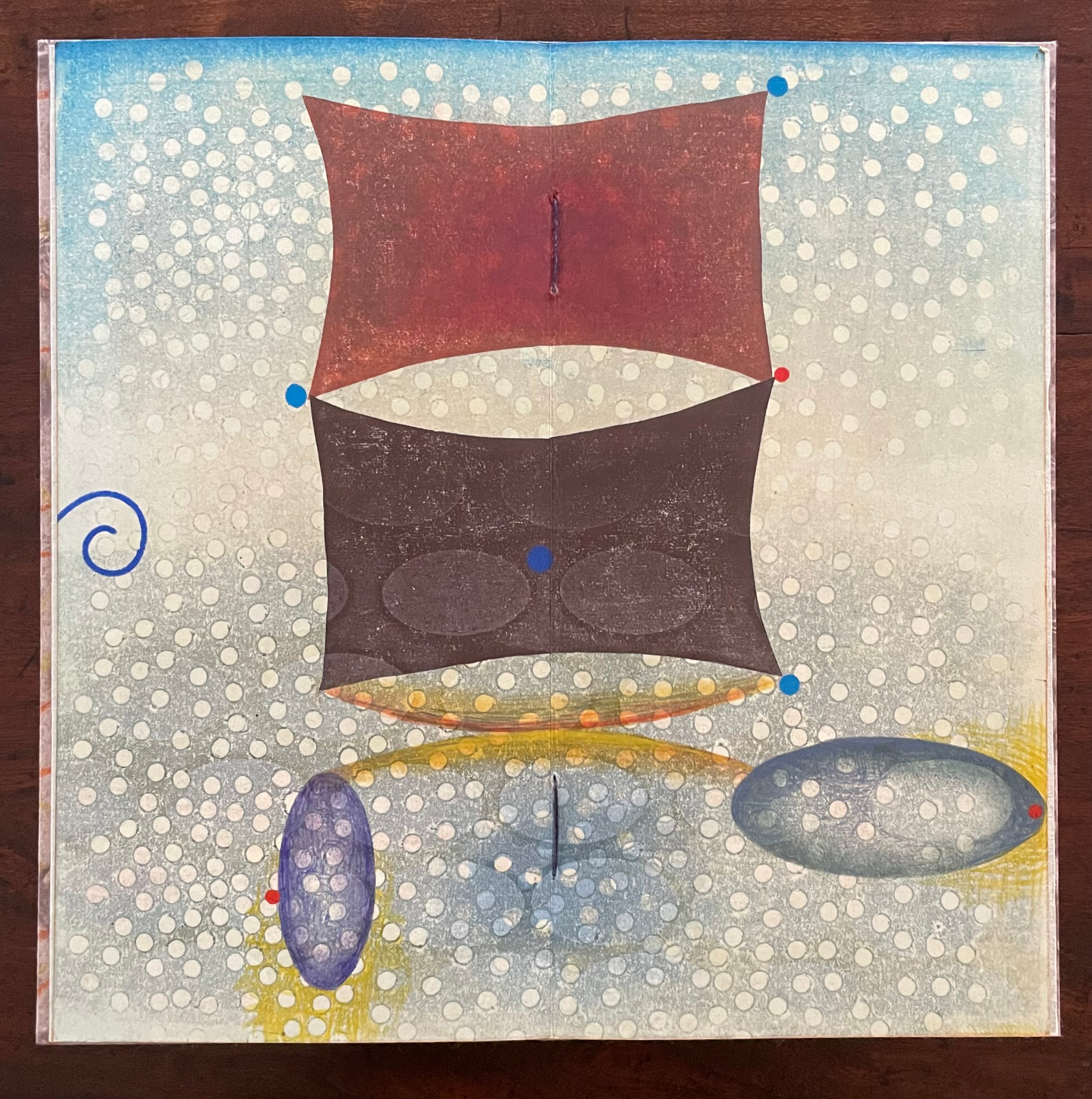
As with No. 51, only one side of the double-sided monoprint is viewable as a whole; the other side is viewable in halves. In No. 64’s first half-view, the shapes and colors have a submerged quality that echoes the now sinking or subsiding type of “THOSE”, “OASIS”, and “TIDES”:
As the most prominent feature of the full-view monoprint, perhaps the two rectangular sail-like shapes recall the Chinese emperor and Venetian traveler. Or perhaps they allude to the remnants of a tower poking above the sands. The ellipsoidal shapes might be the “hares’ holes” mentioned above. The seemingly non-allusive flurry of white dots across the spread behave strangely. They lie in the background in the upper two thirds of the spread but then shift into the foreground in the lower third. The four bright blue dots may have migrated from the first half-view, but the trio of red dots are new participants. The presence of both contributes to an urge to flip back and forth between the first half-view and this full view.
The second half-view faces text that again displays all caps letters that sink below the line: “PALACE”, but more notably, the palace does not sit within a city but a city sits within the palace, “a city that can only be Urbino”. So, a real city within a fictive palace.
We can perform the photographic cheat to bring the two halves of the monoprint together, but as with No. 51, we overlook the deliberate hiding of the whole within the halves — like the paradoxical fictive palace that holds a real city (Urbino).
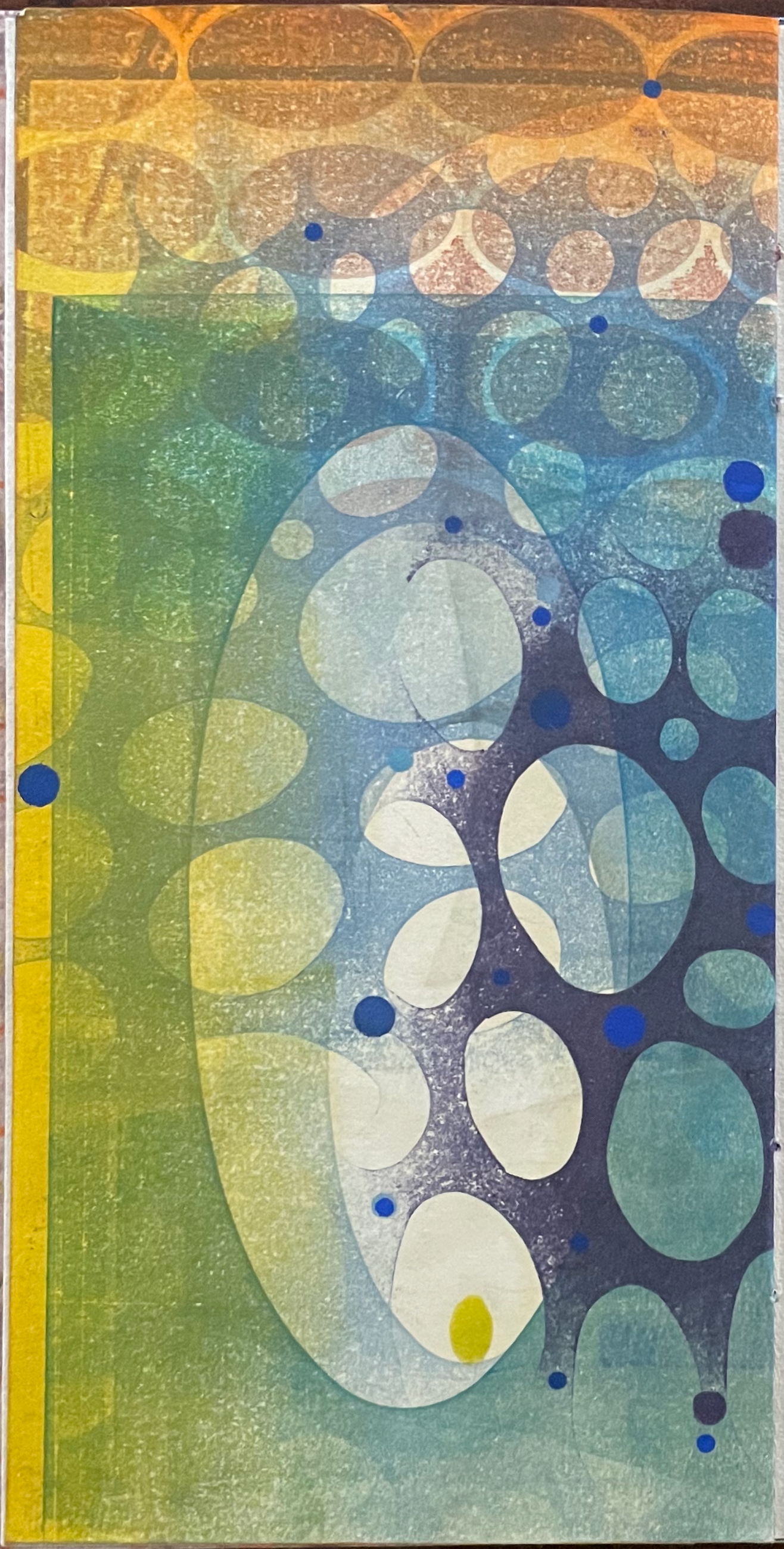
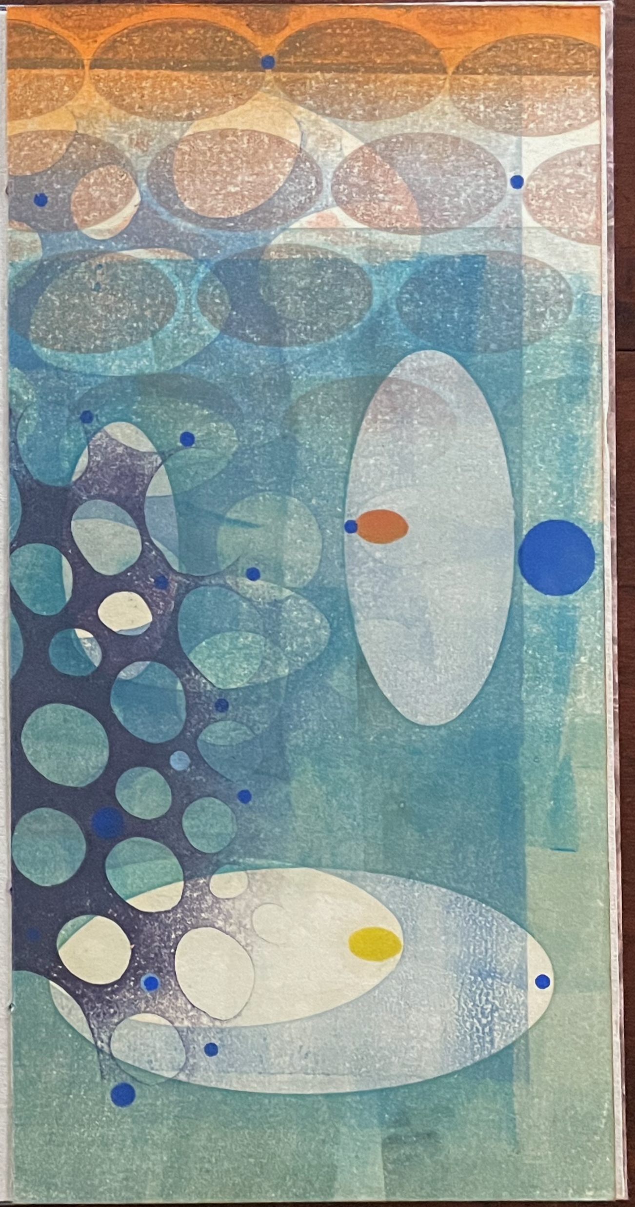
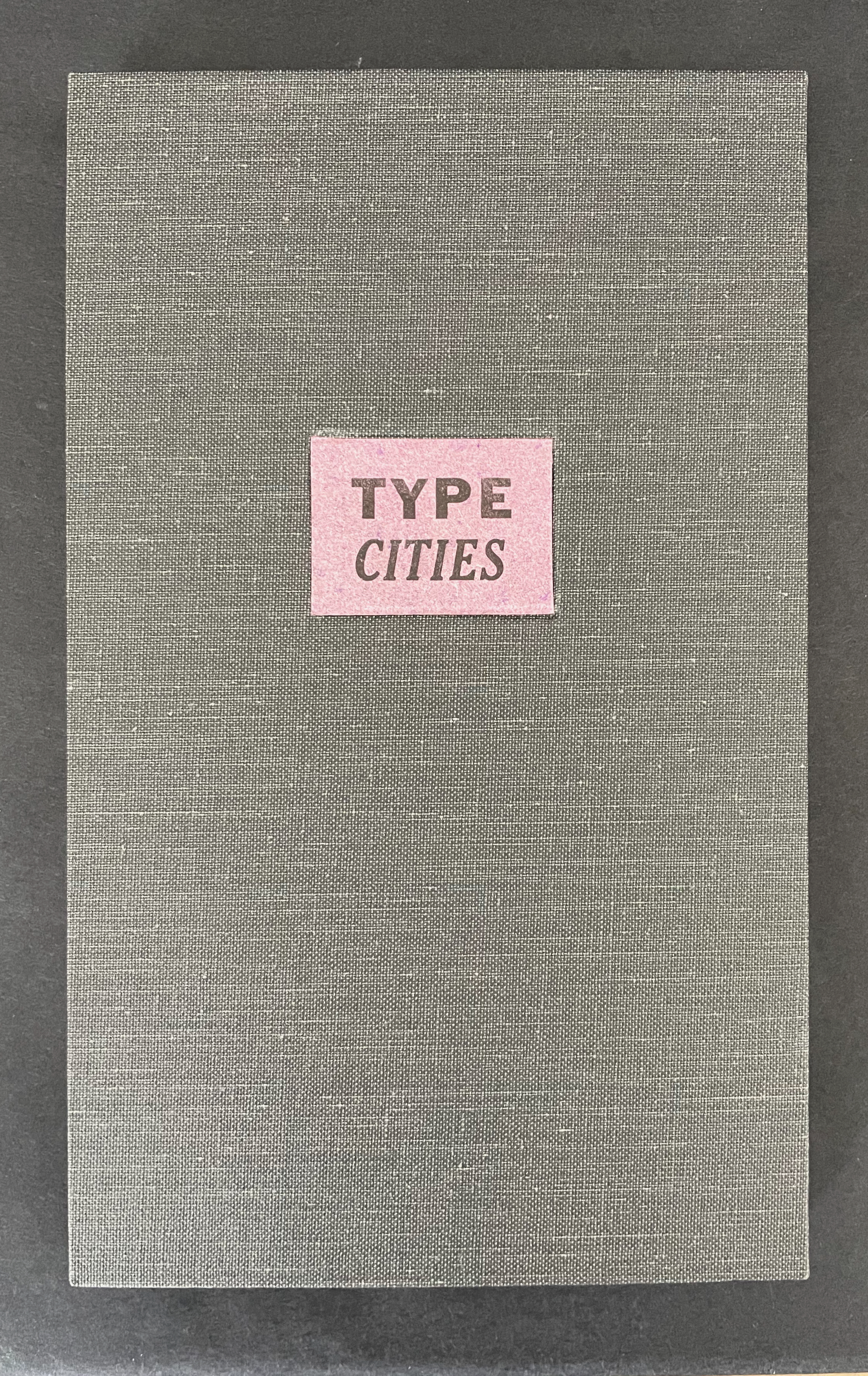
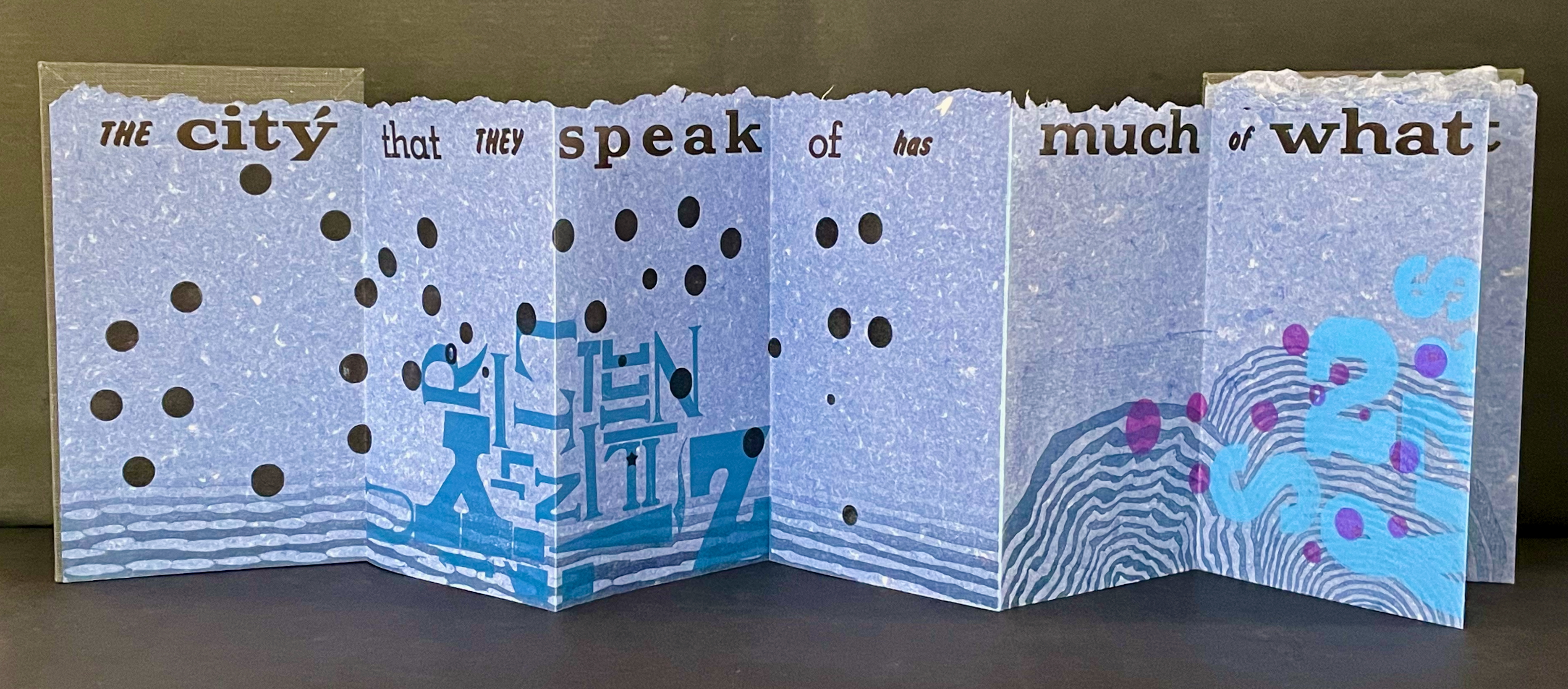
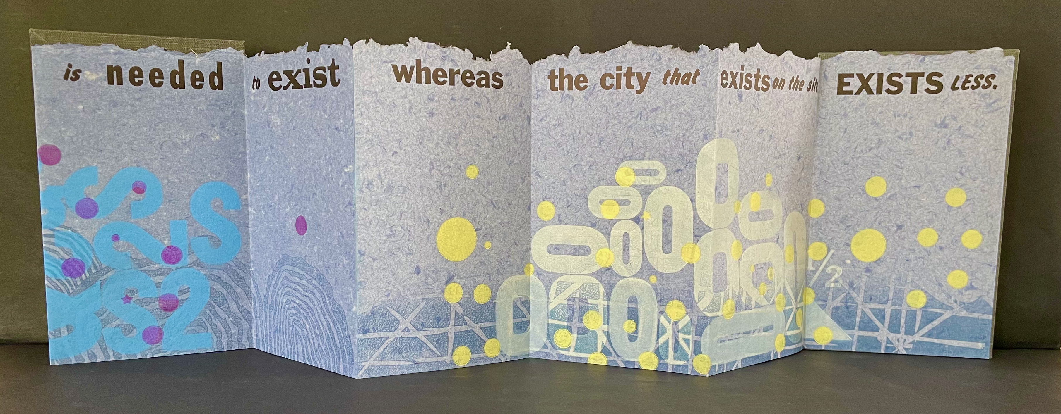
Type Cities (2018)
Type Cities (2018) Karen Kunc Leporello. H190 x W114 mm closed, extends to 1346 mm. [12] panels. Edition of 8, of which this is #2. Acquired from the artist, 25 March 2026. Photos: Books On Books Collection.
Like most other homages to Invisible Cities, Karen Kunc’s Type Cities (2018) focuses on one of the fictitious cities; in this case, Aglaura. As with Ten Thousand Things, she uses an excerpt:
The city that they speak of has much of what is needed to exist whereas the city that exists on the site, exists less.
That is cryptic. Just as the paradoxical characterizes the general cities in No.64, so it is for the particular city of Aglaura here:
So if I wished to describe Aglaura to you, sticking to what I personally saw and experienced, I should have to tell you that it is a colorless city, without character, planted there at random. But this would not be true either: at certain hours, in certain places along the street, you see opening before you the hint of something unmistakable, rare, perhaps magnificent; you would like to say what it is, but everything previously said of Aglaura imprisons your words and obliges you to repeat them than say. Therefore, the inhabitants still believe they live in an Aglaura which grows only with the name Aglaura and they do not notice the Aglaura that grows on the ground.
For Ten Thousand Things, the single-fold double-sided monoprint provided Kunc a surprisingly flexible tool with which to capture the paradoxical in two very different texts. This time she chooses the accordion structure. Also, as the title Type Cities suggests, she chooses type as an additional tool to capture what Marco Polo describes as Aglaura’s “enduring assortment of qualities”. Across the twelve panels of the leporello, Kunc lays out the text of her chosen excerpt in multiple faces and fonts:
Also across the twelve panels, the color change of black dots to purple, violet, and then yellow echoes the shift from the colorless city to something else “at certain hours, in certain places along the street”.
The “much of what is needed to exist” manifests at the bottom edge as wood type letters in dark blue floating along a river (?), then as Ss, 2s, and $s floating over a pond (?), and then yields to the less of zeroes scattered over a grid. The contrast of much and less even extends vertically to the handmade paper with its messily torn upper edge opposed to its neatly trimmed lower edge. It also extends horizontally to the paper as its tint shifts gradually from a deep blue to a light gray. These photographs do not do justice to the painted and stamped elements or texture of Type Cities.
Further Reading
Laozi. 2011. Tao Te Ching = Dao de Jing. Translated by Gia-fu Feng, Jane English, and Toinette Lippe. Third Vintage books edition. New York: Vintage Books, a division of Random House, Inc.
Works of homage to Jorge Luis Borges
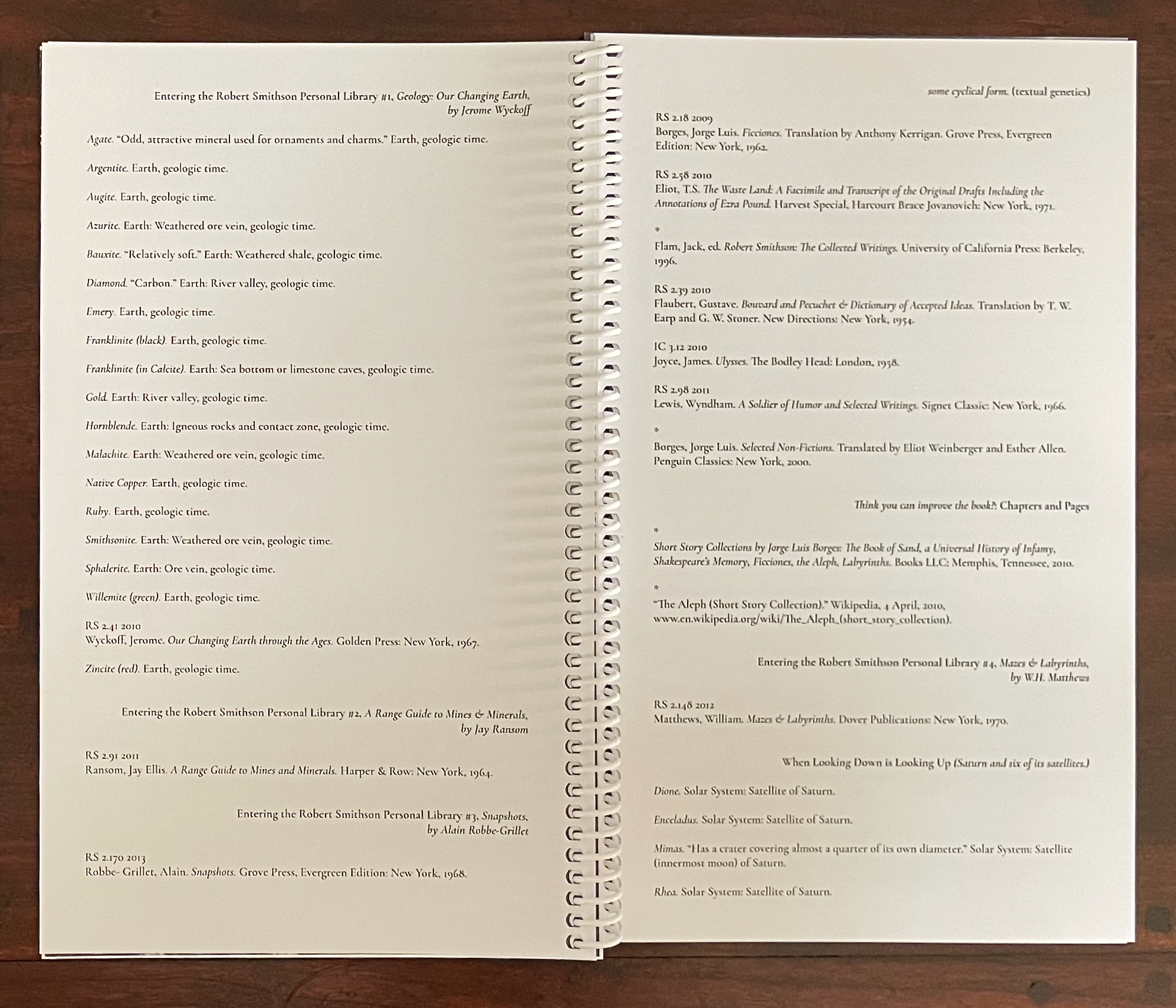
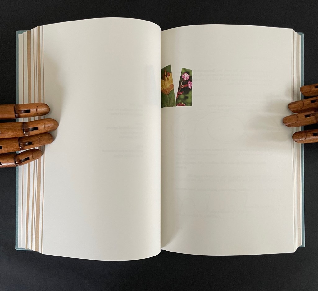
Louise Grimshaw’s Ethereal Worlds(2017) celebrates “The Library of Babel” with hexagonally shaped pages of prints rotating on a central post.
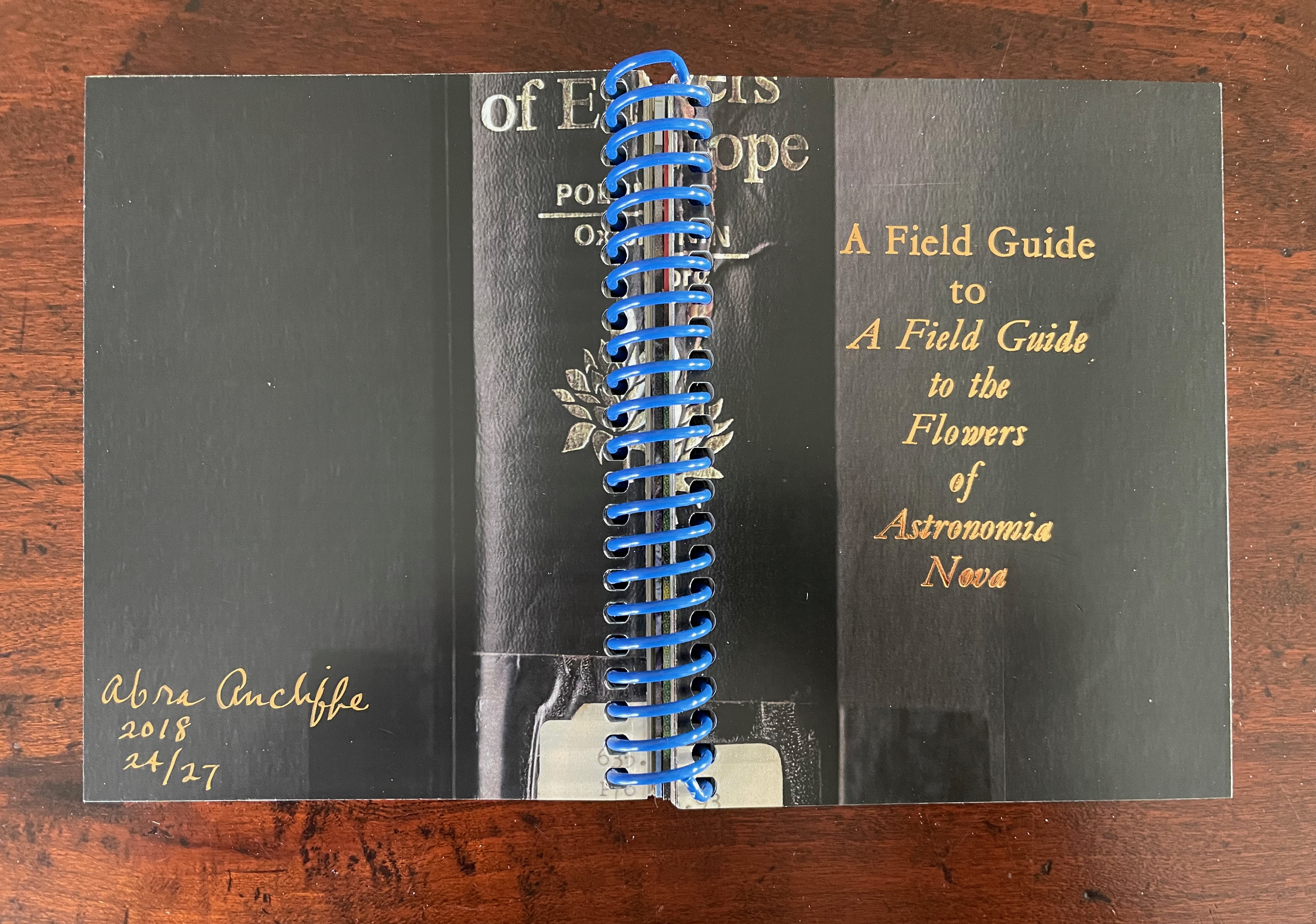
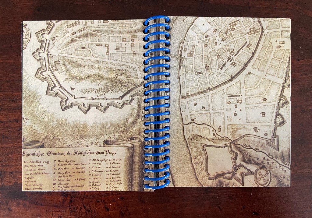
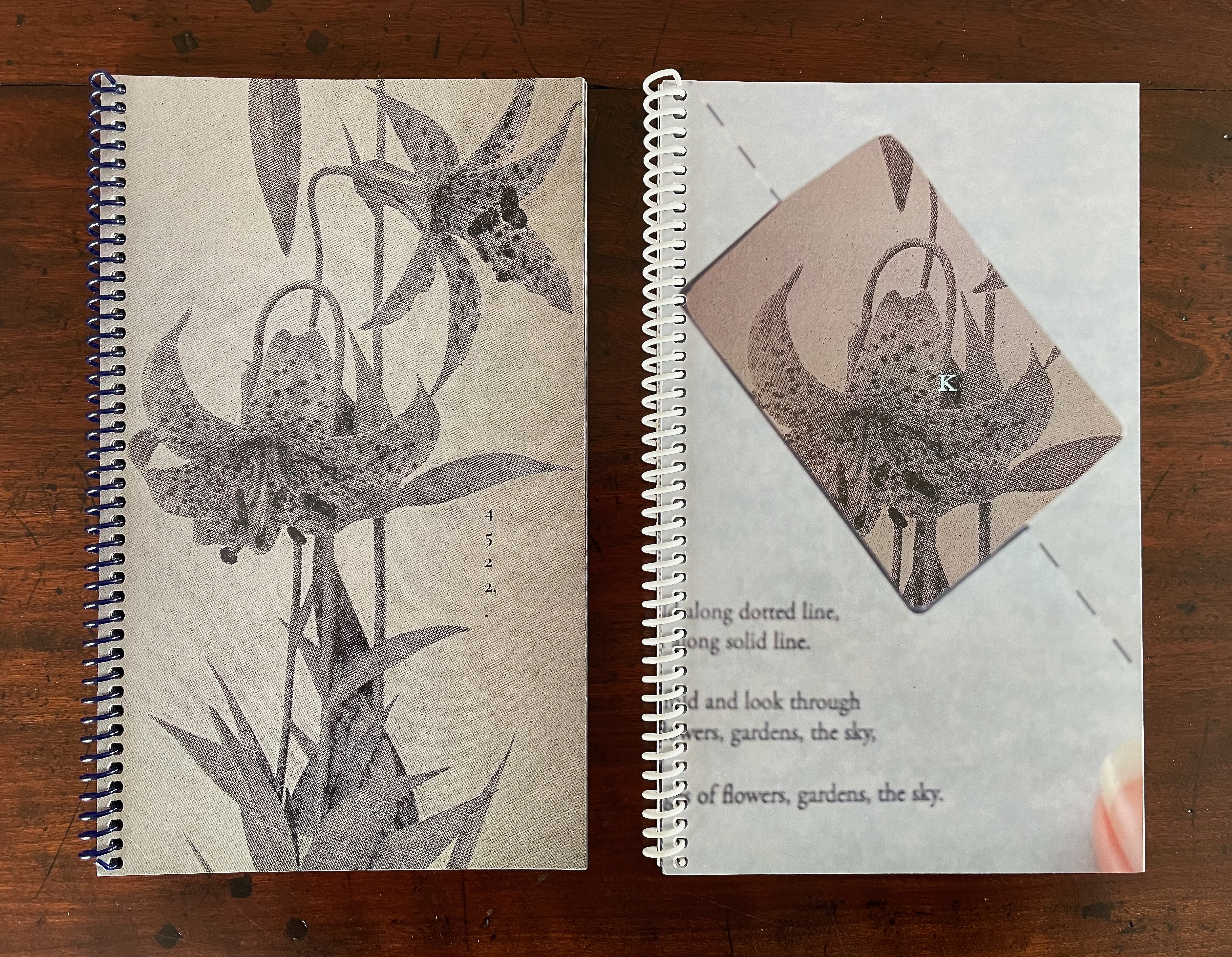
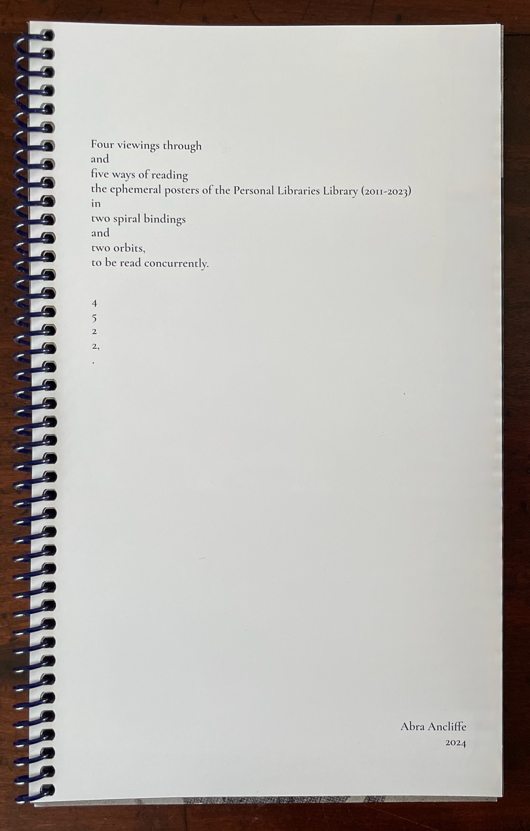
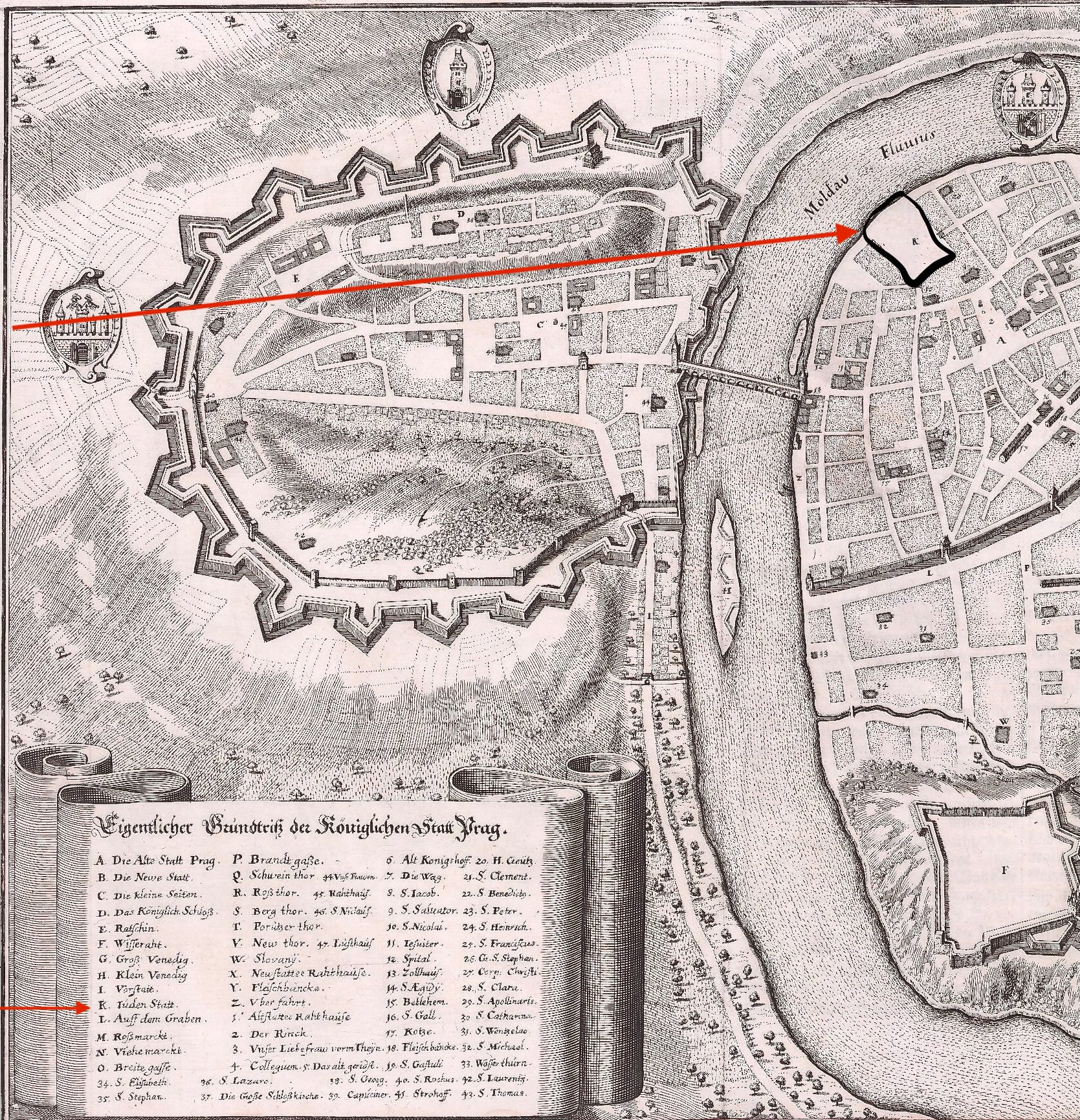
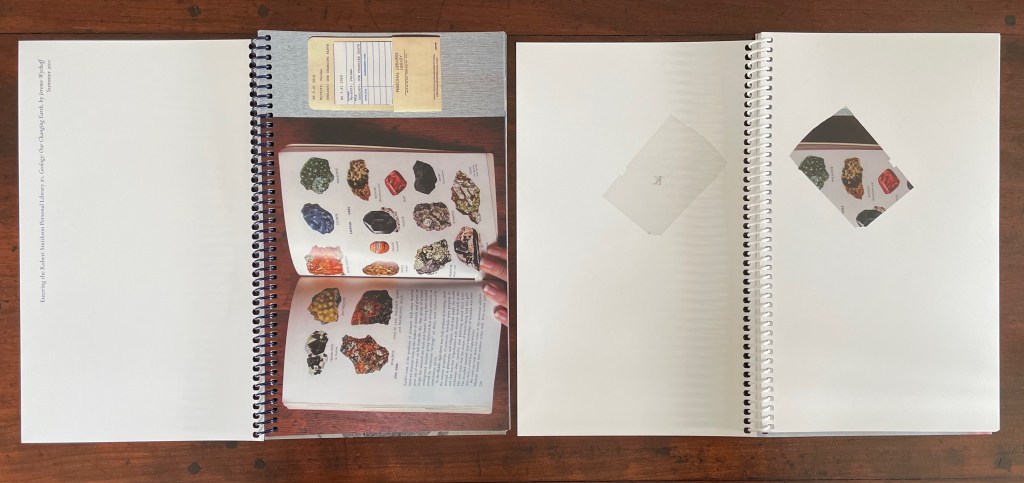
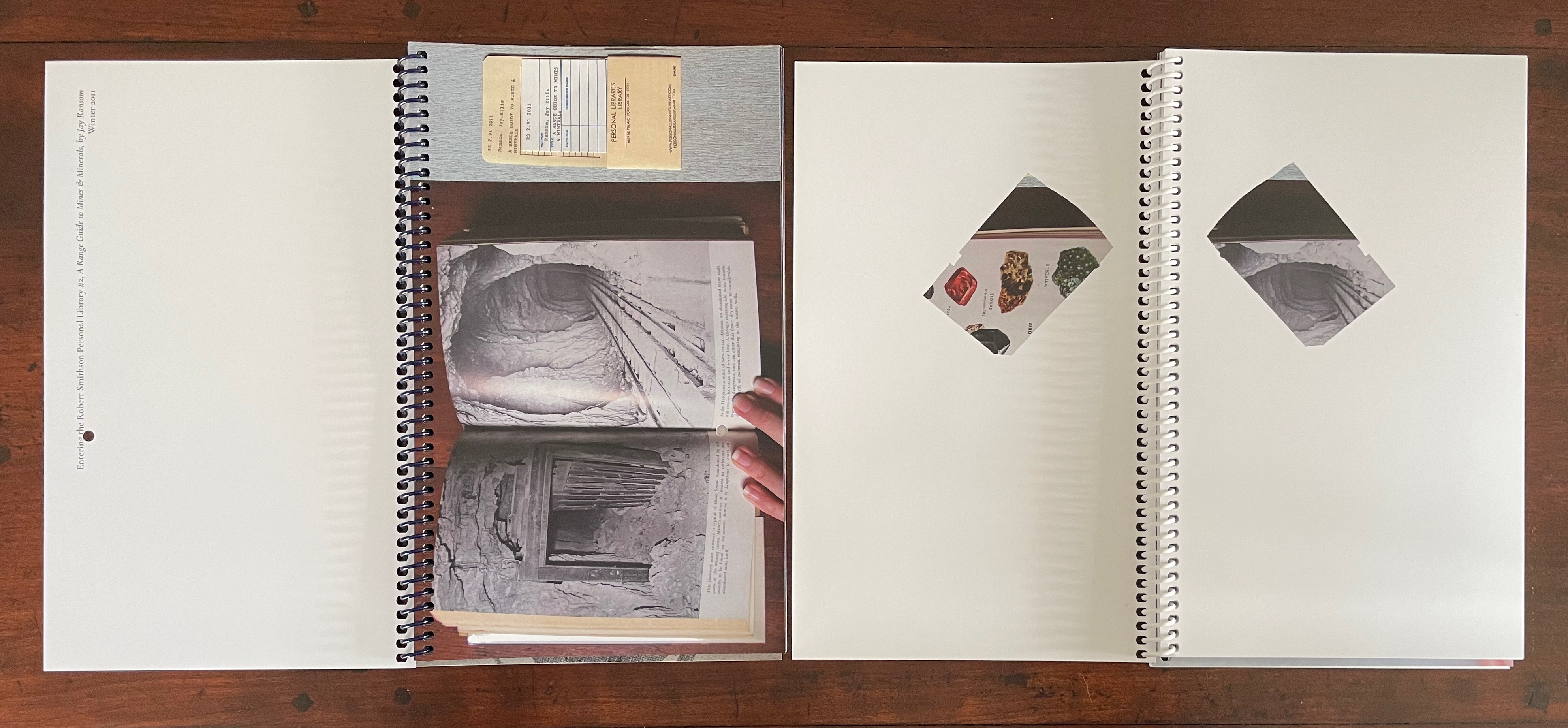
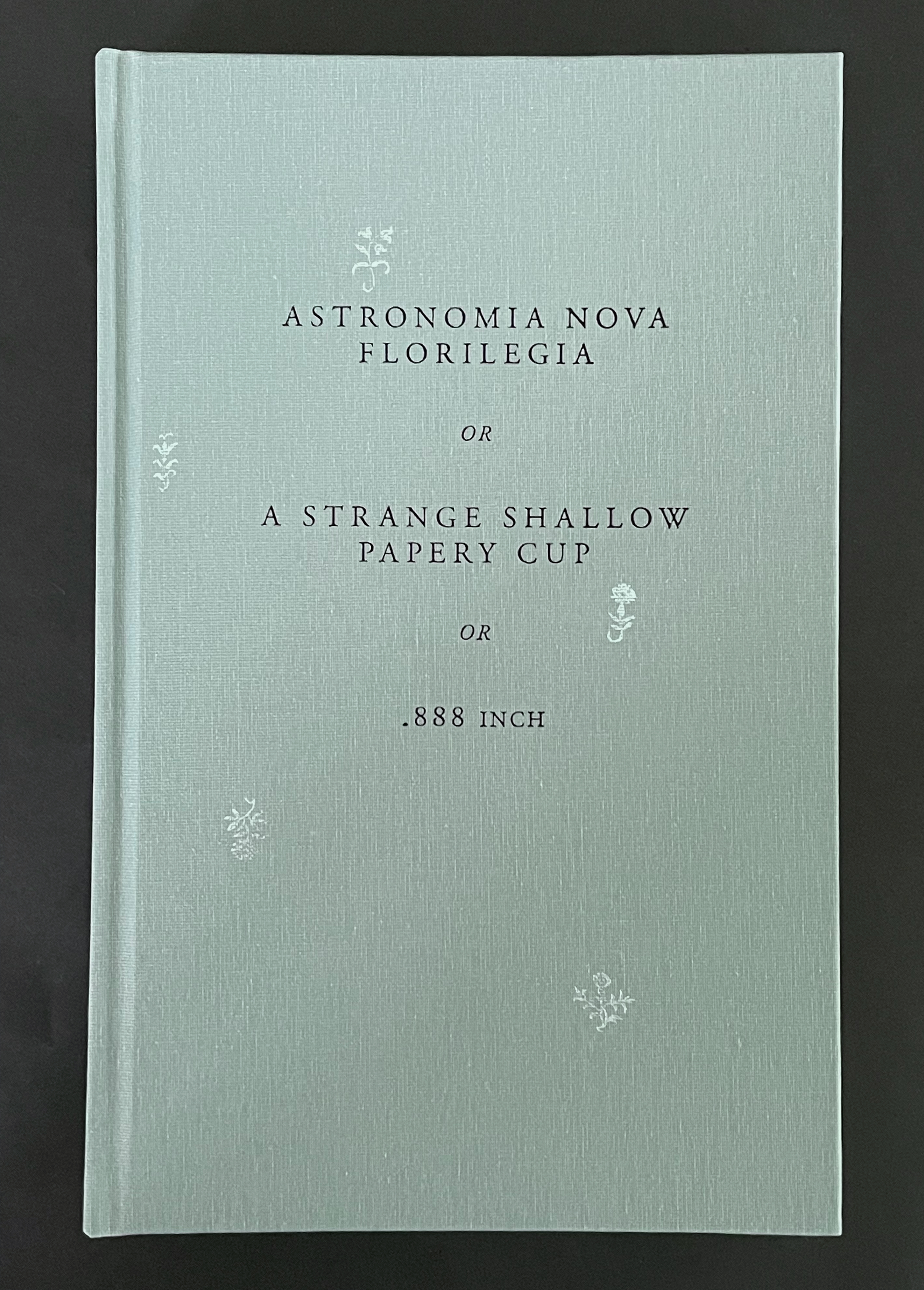
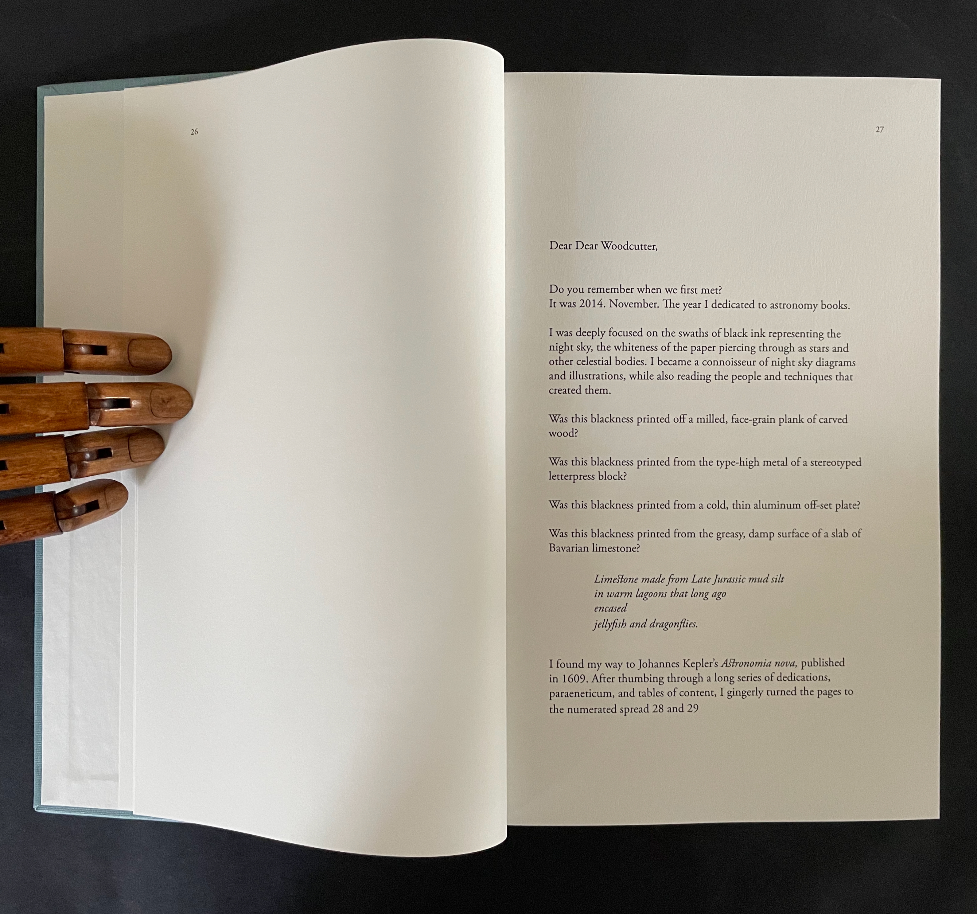
This entry is preceded by “Abra Ancliffe (I)“, which describes the Personal Libraries Library (Winter 2009-10 to Spring/Summer 2021) and The Secret Astronomy of Tristram Shandy (2015).
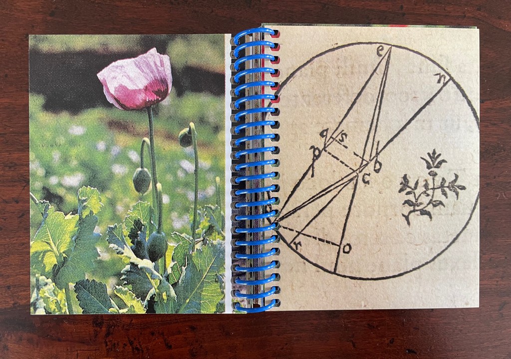
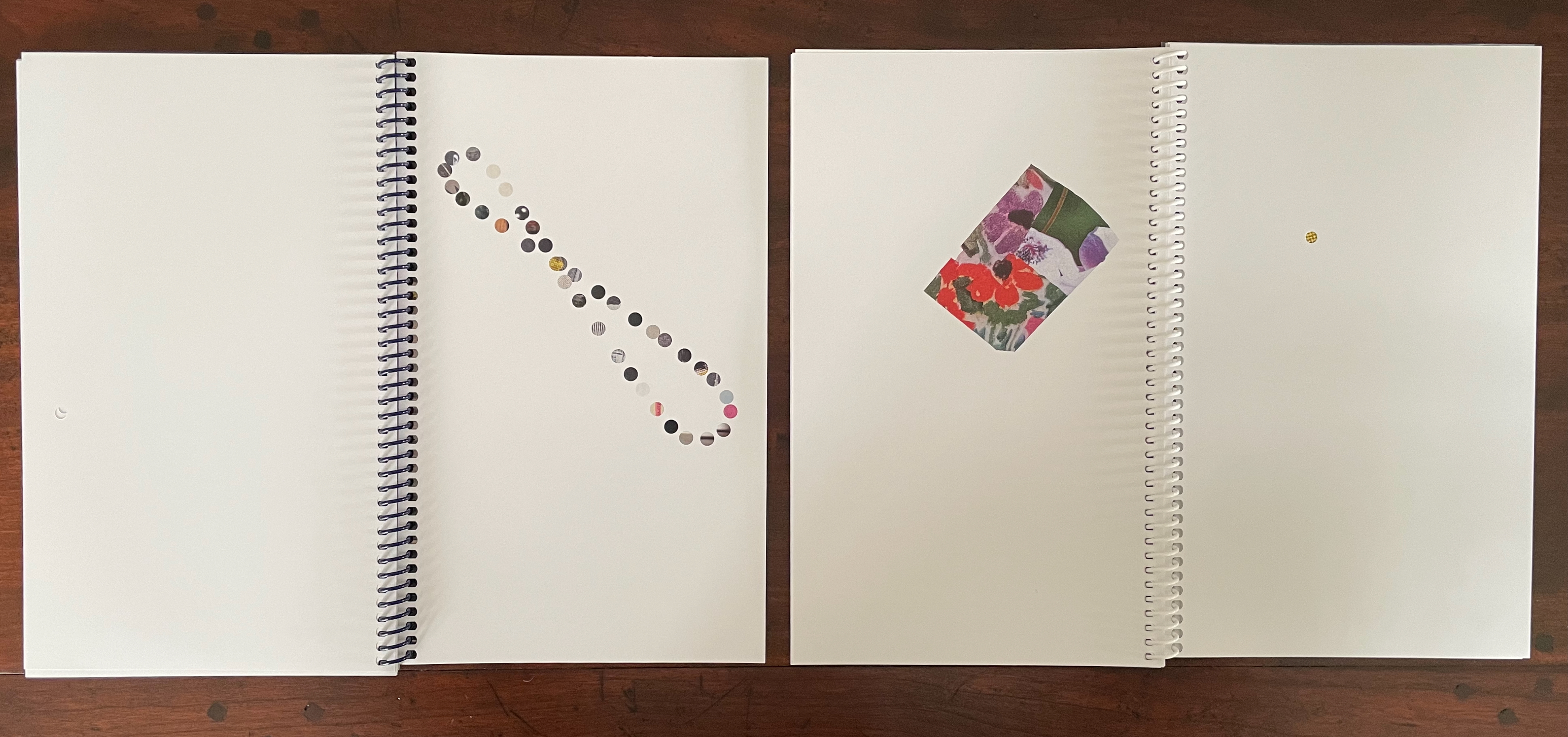
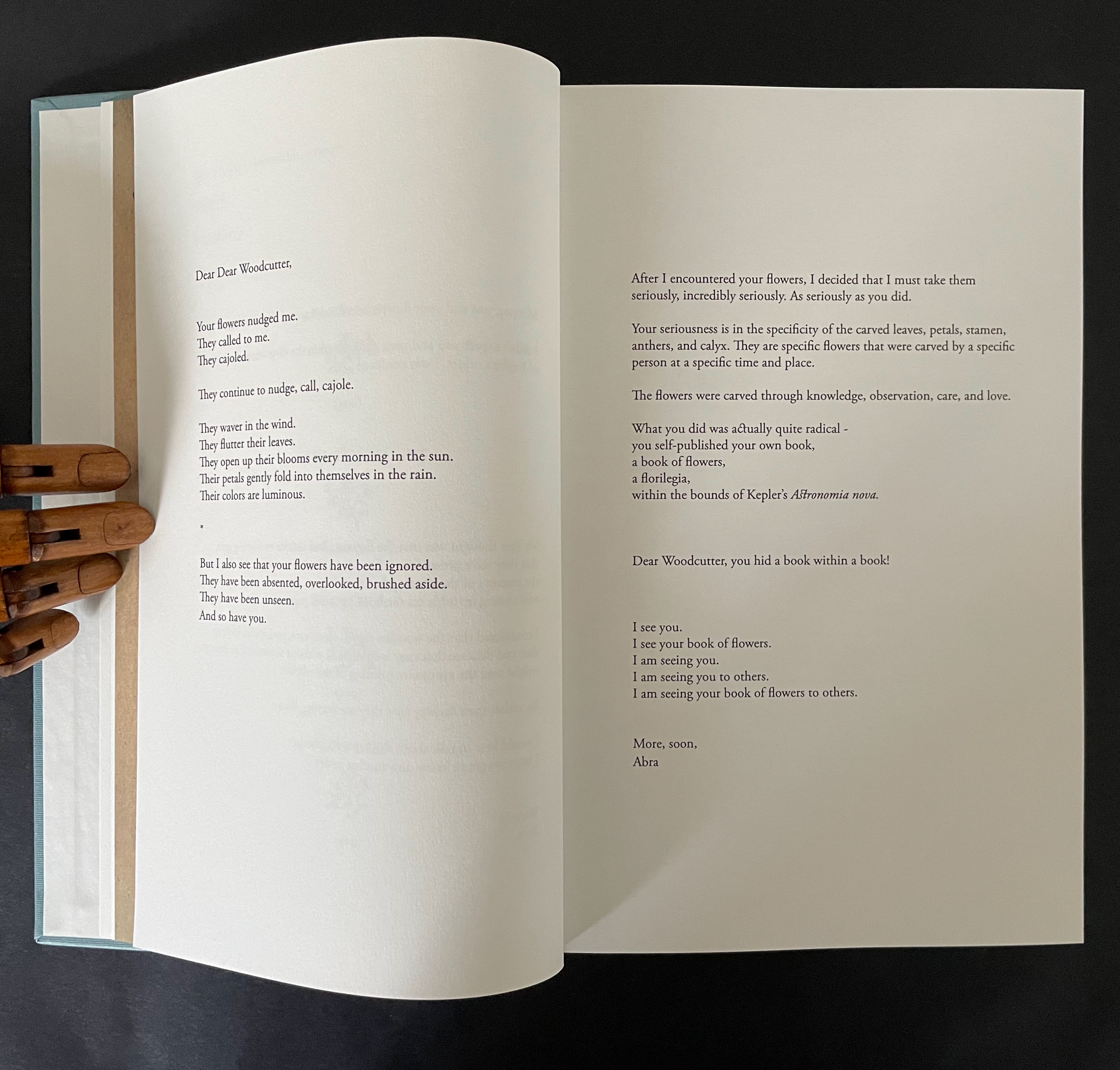
The constellatory asterisks in The Secret Astronomy of Tristram Shandy also evoke those flowers that our Personal Libraries Library (PLL) Artist/Librarian “picks” from the PLL and, later, Oleg Polunin’s Flowers of Europe: A Field Guide (1969) to include in the periodic issues of ephemera. Perhaps this confluence of stars and flowers created a predisposition in our Artist/Librarian that drew her to Johannes Kepler’s Astronomia Nova (1609). Unlike Sterne’s novel, which was part of Calvino’s personal library, Astronomia Nova lies outside the five personal collections. Of course, since Maria Mitchell was an astronomer, the works in her personal library refer to Kepler, and similarly, Robert Smithson had multiple books about astronomy, even Arthur Koestler’s Watershed: A Biography of Johannes Kepler. Still, Kepler’s “New Astronomy, Based upon Causes, or Celestial Physics, Treated by Means of Commentaries on the Motions of the Star Mars, from the Observations of Tycho Brahe, Gent.“, to give it its full and translated name, appears in Ancliffe’s heavens and garden like a new galaxy or specimen.
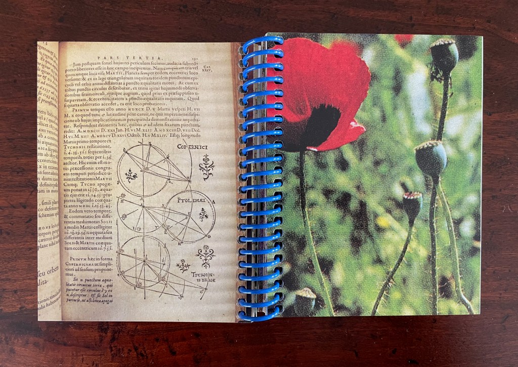
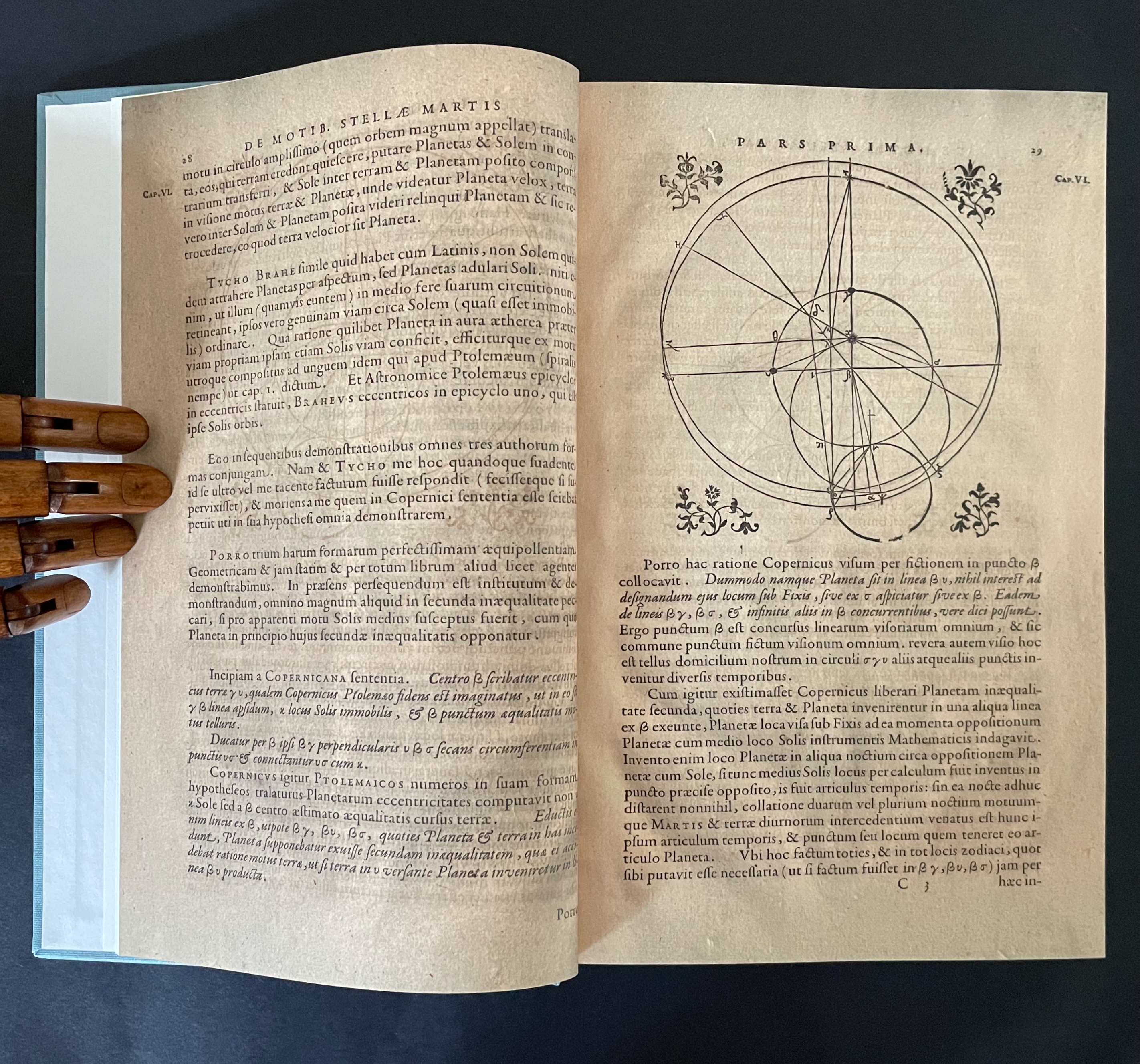
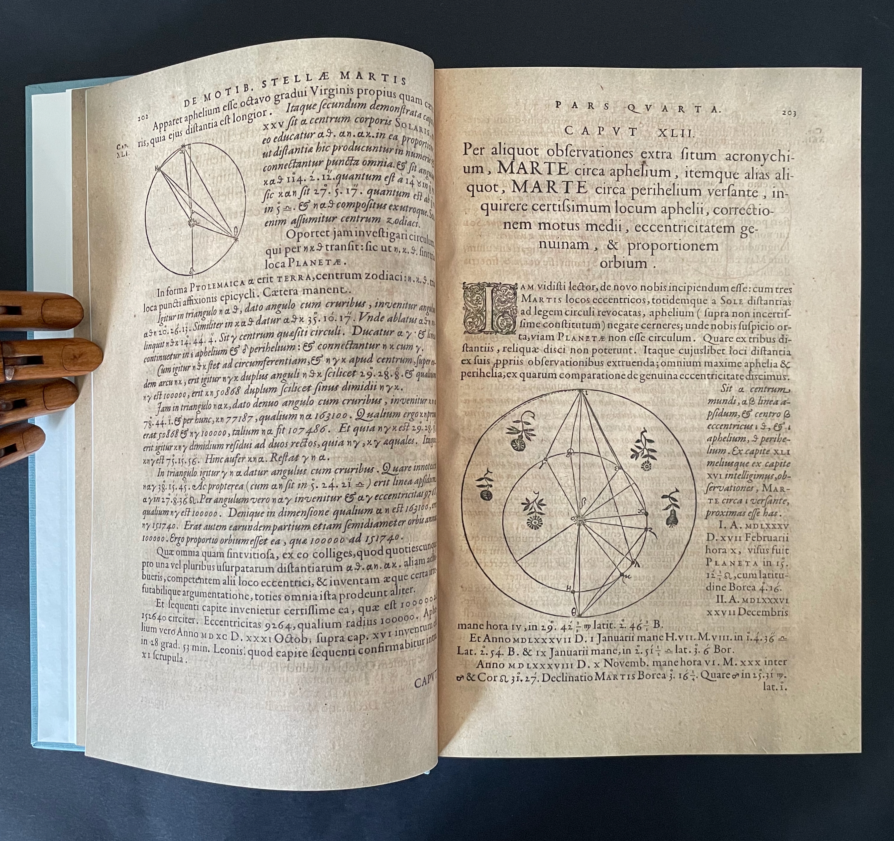
Astronomia Nova provided and further refined the mathematical and observational proofs of the Copernican planetary model of heliocentrism first laid out in De revolutionibus orbium coelestium [On the Revolutions of the Celestial Spheres] (1543). A little over 400 years later, our Ancliffe noticed in Kepler’s watershed publication something previously unobserved, something peculiarly geocentric about its heliocentric model.
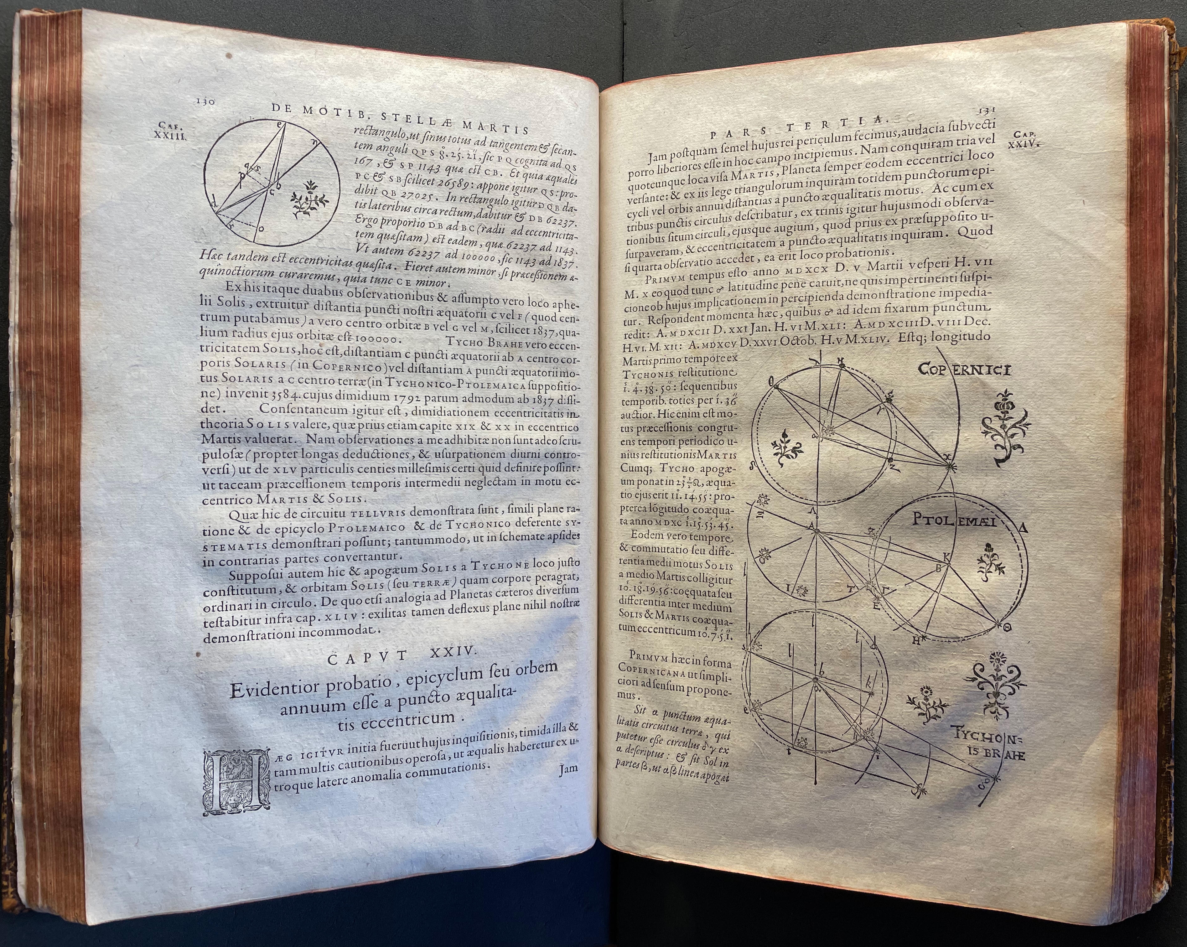
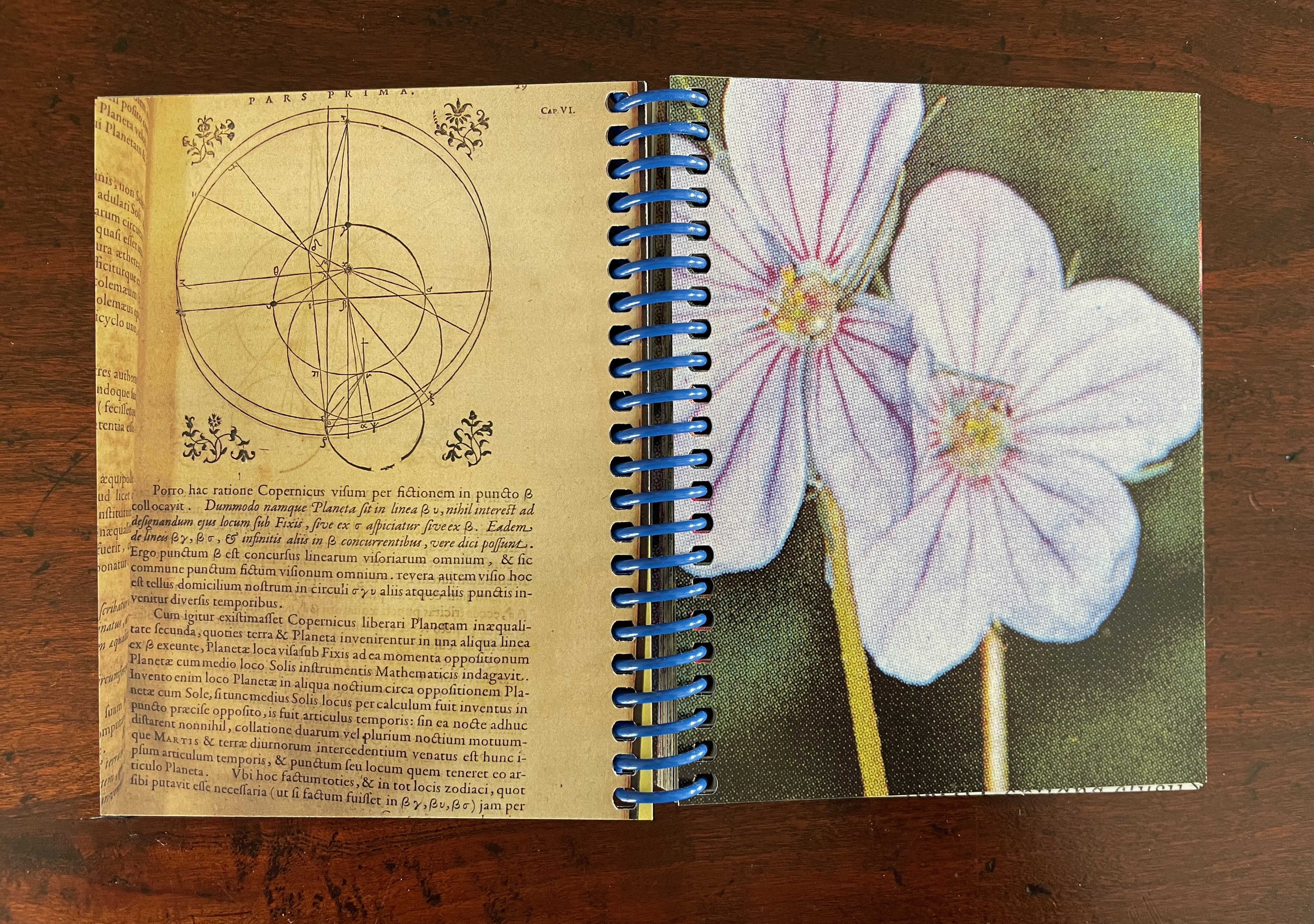
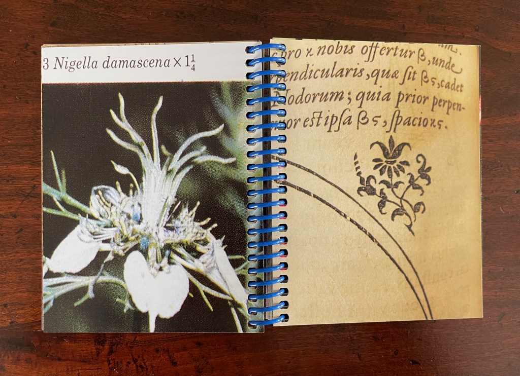
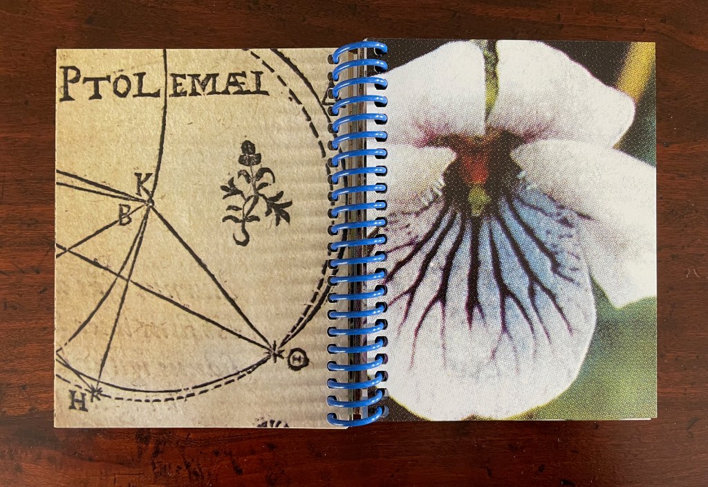
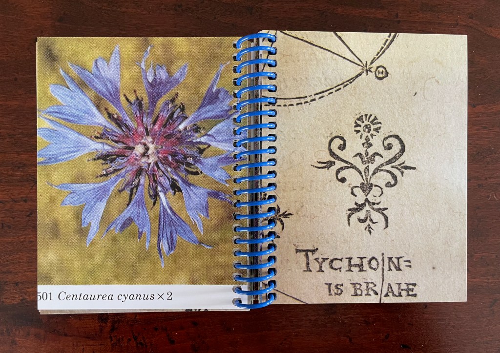
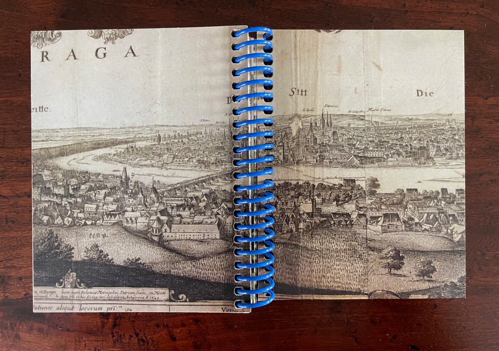
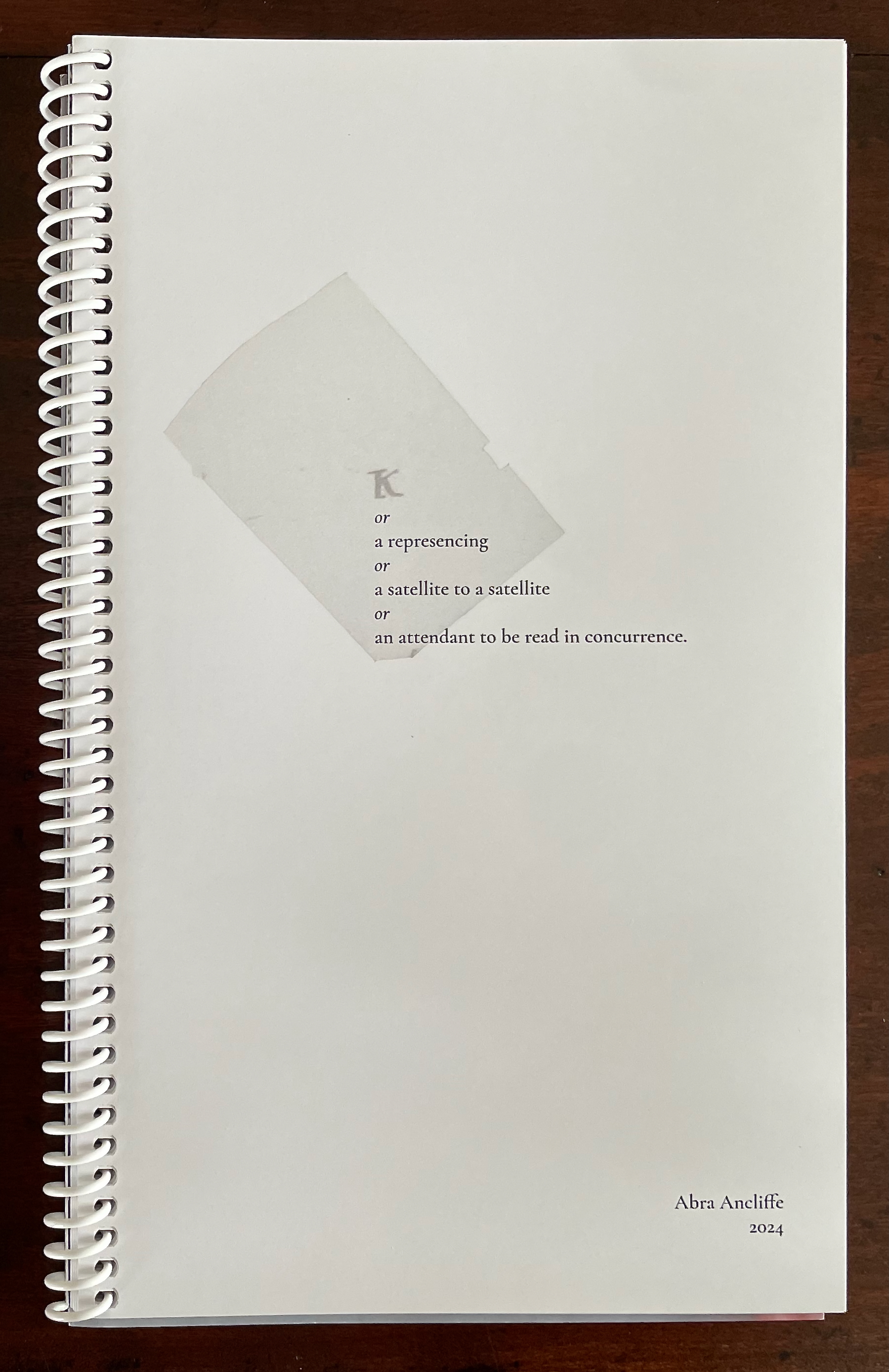
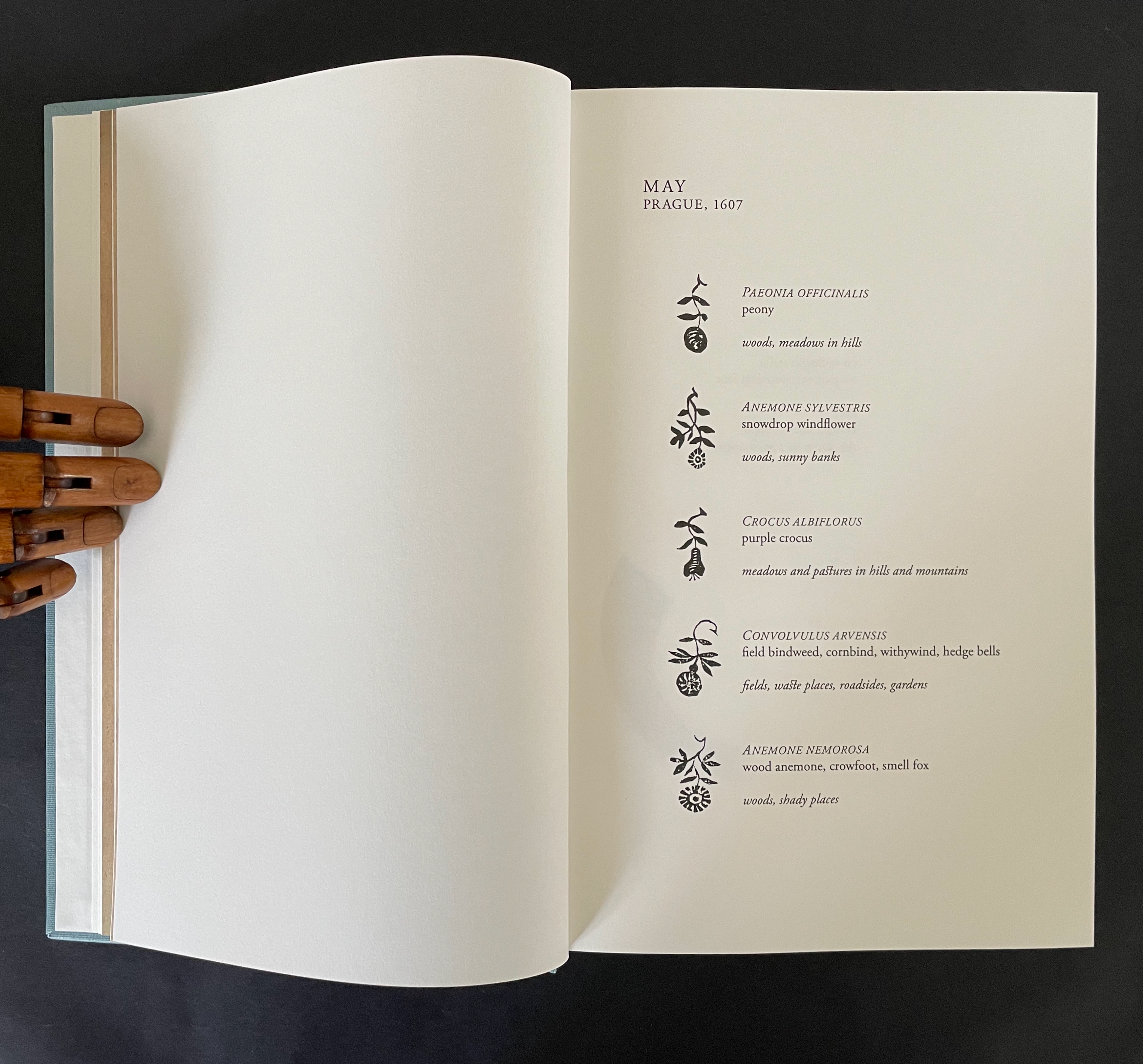
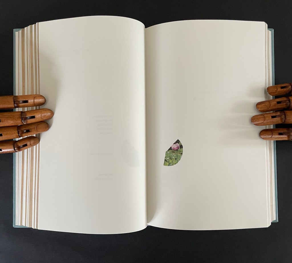
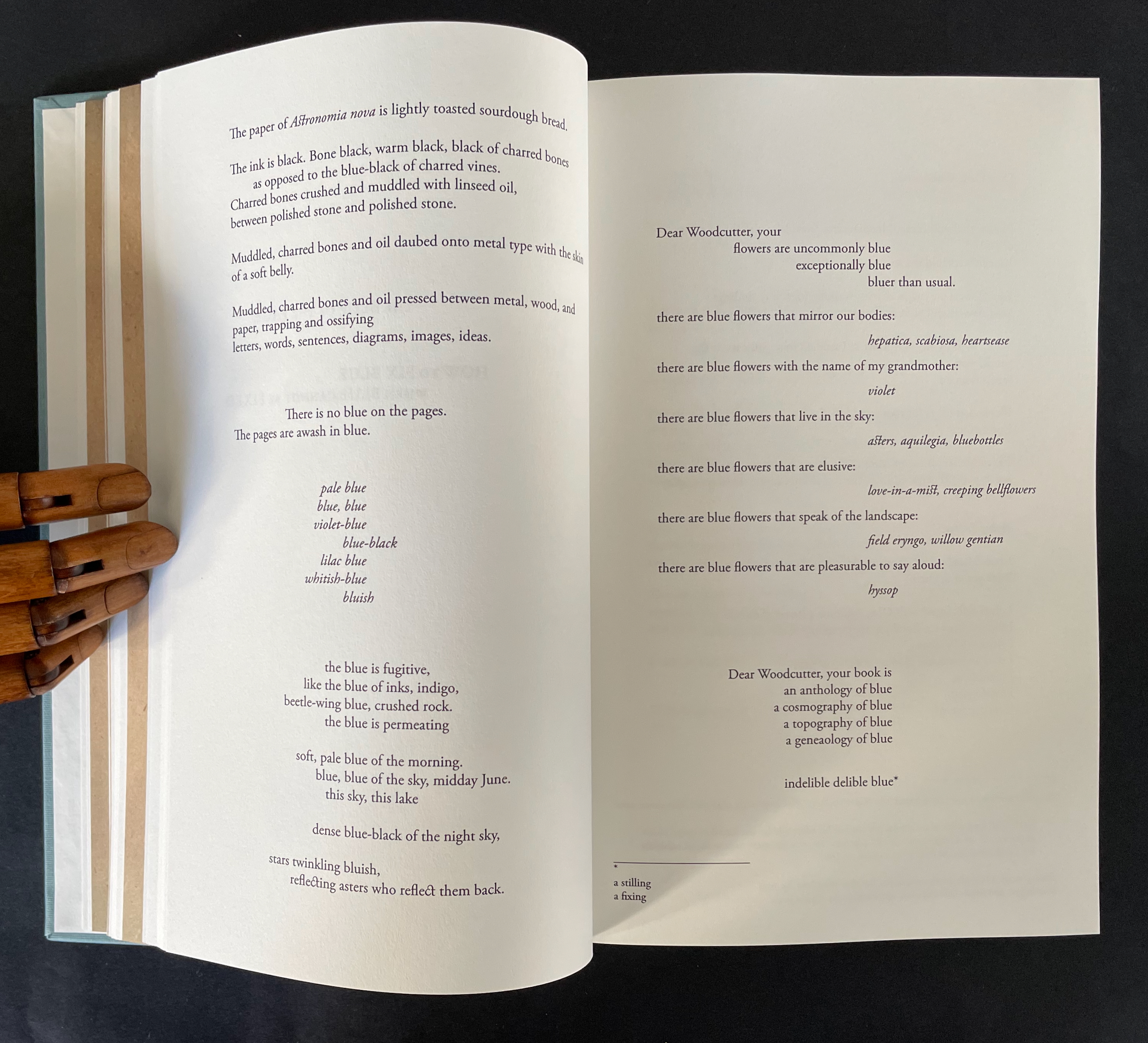
There is no florilegium or guide to these woodcut flowers, but there they are, sprinkled throughout Johannes Kepler’s 650-page investigation of Mars’ orbit, tracked by the observations of his mentor Tycho Brahe, Emperor Rudolph II’s imperial astronomer.
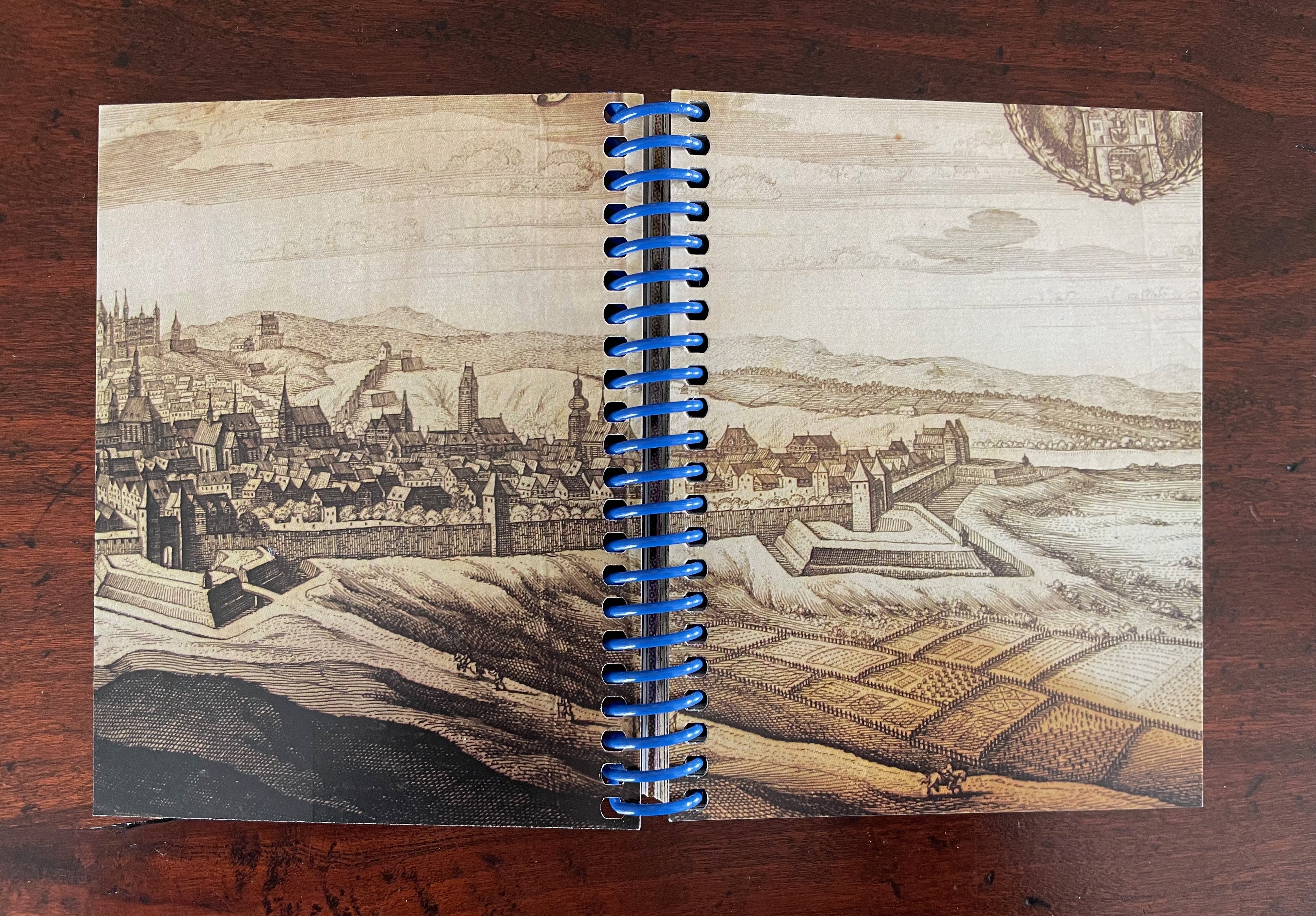
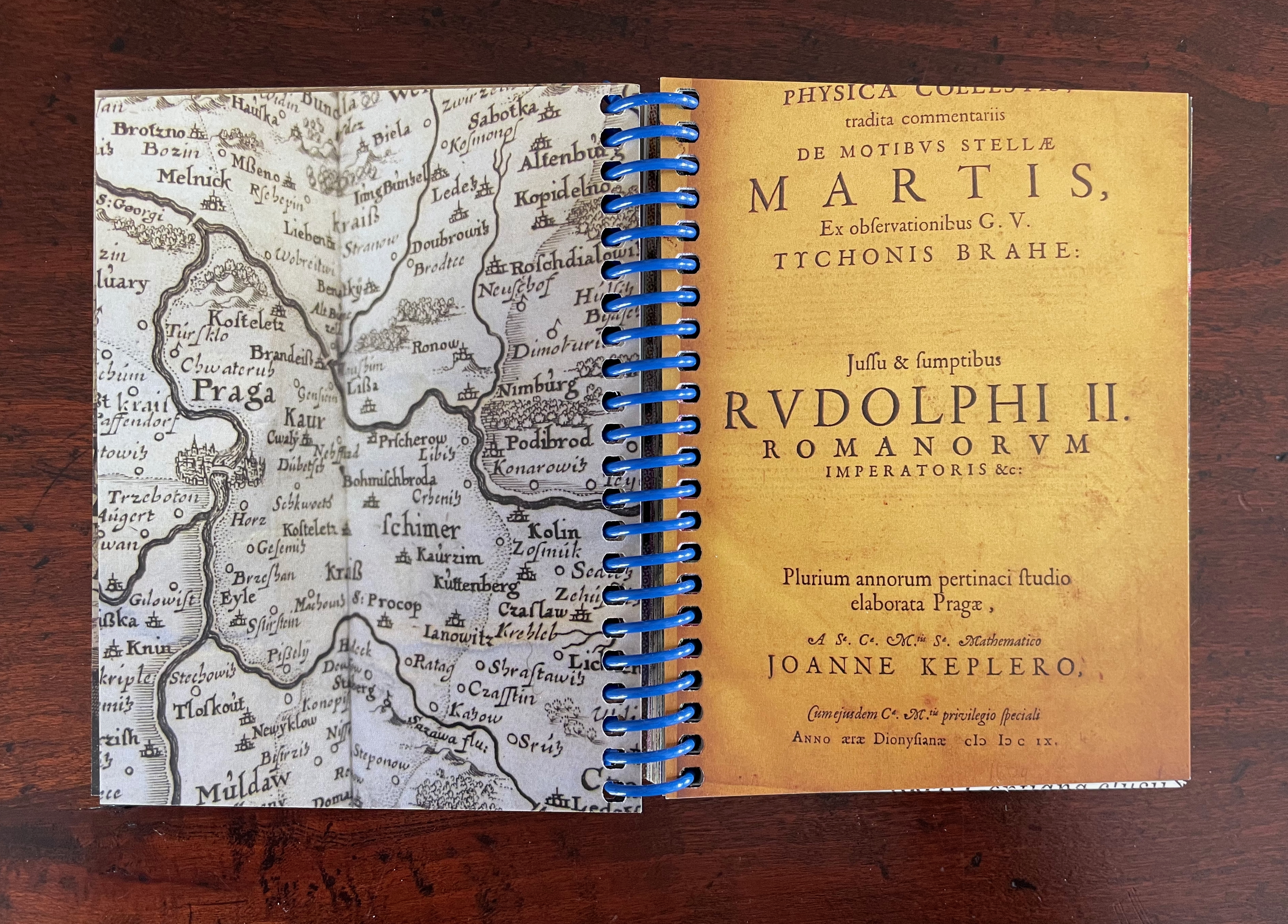
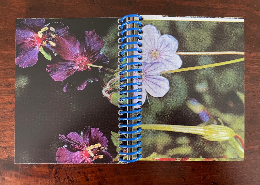
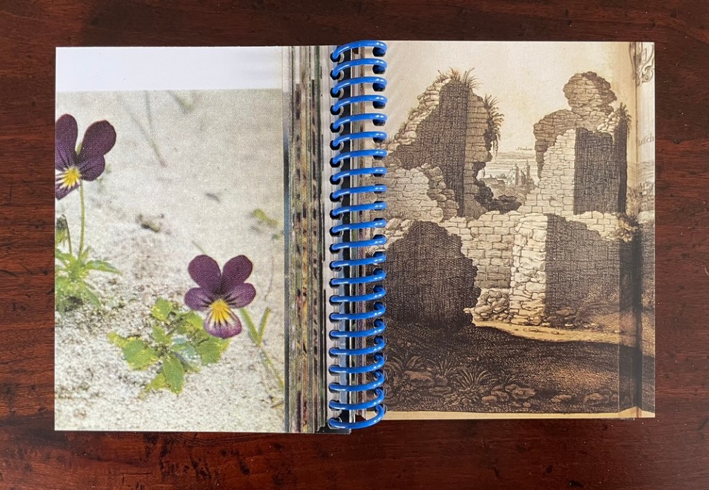
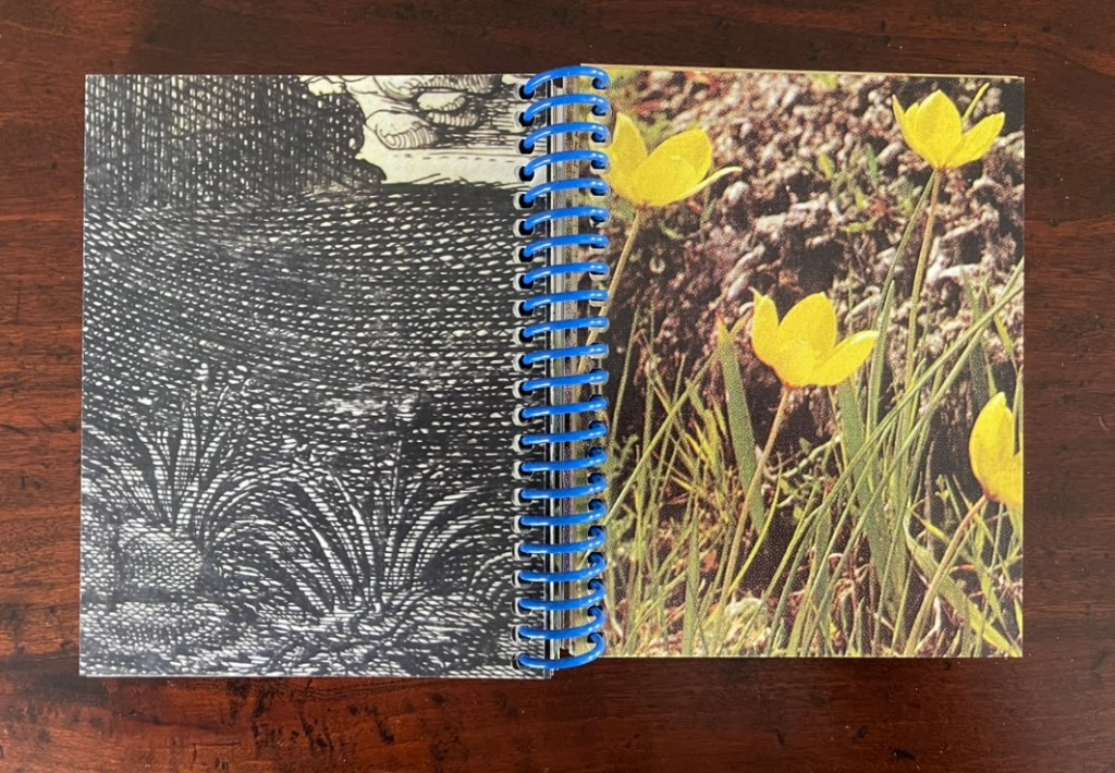
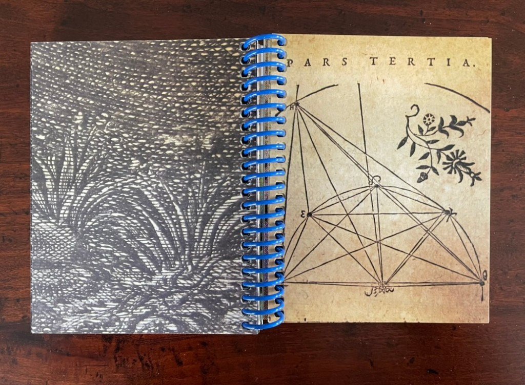
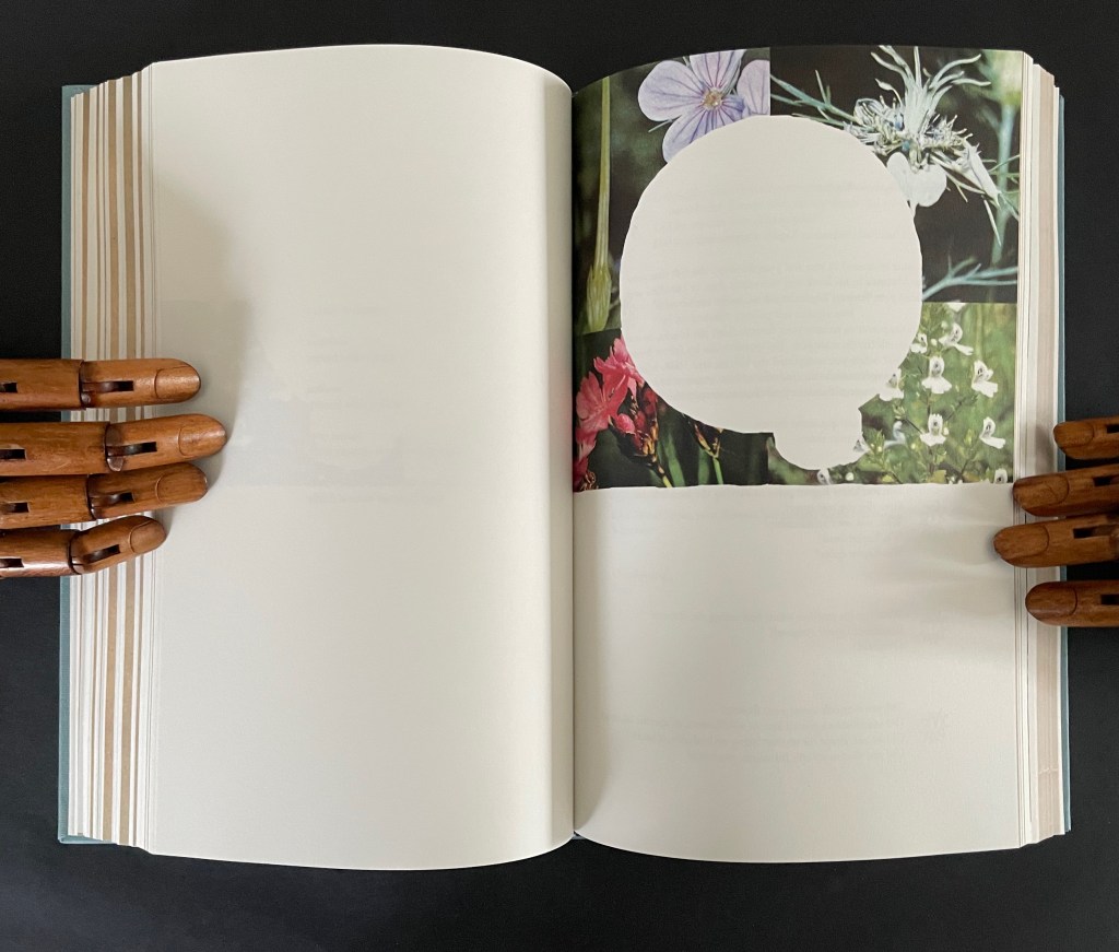
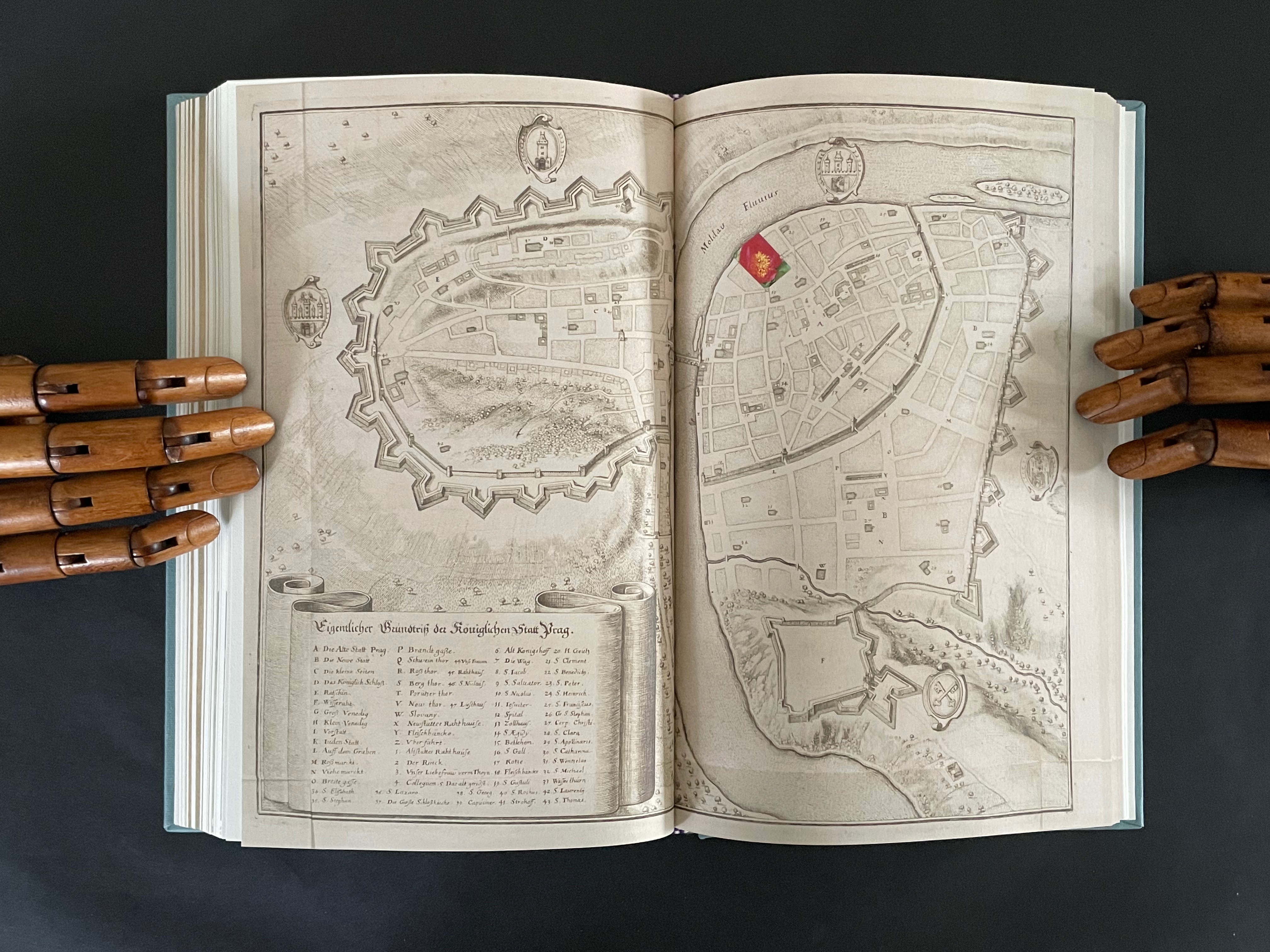
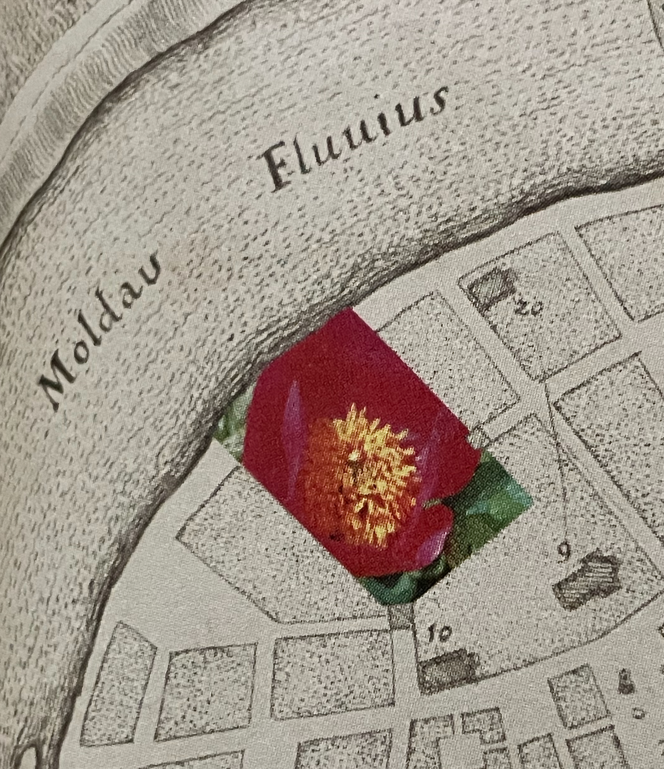
On one level, Ancliffe’s spiral bound handbook is the field guide to these flowers. Its photos of flowers , harvested from Pulinin’s Flowers of Europe, offer candidates for the historical real-life counterparts to the ornamental woodcuts. The handbook’s title, however, indicates another level: that of “a field guide to ‘a field guide’ “. But of what could such a meta-guide consist? In Ancliffe’s case, it is the artist’s book, the work before us that addresses the fields of vision and perspectives embedded in Kepler’s work, the engraver’s woodcuts, and the book artist’s work itself. The first three opening spreads of A Field Guide to “A Field Guide to the Flowers of ‘Astronomia nova‘ ” stake out the environment of the “field guide to a field guide” as well as the zooming-in approach it takes.
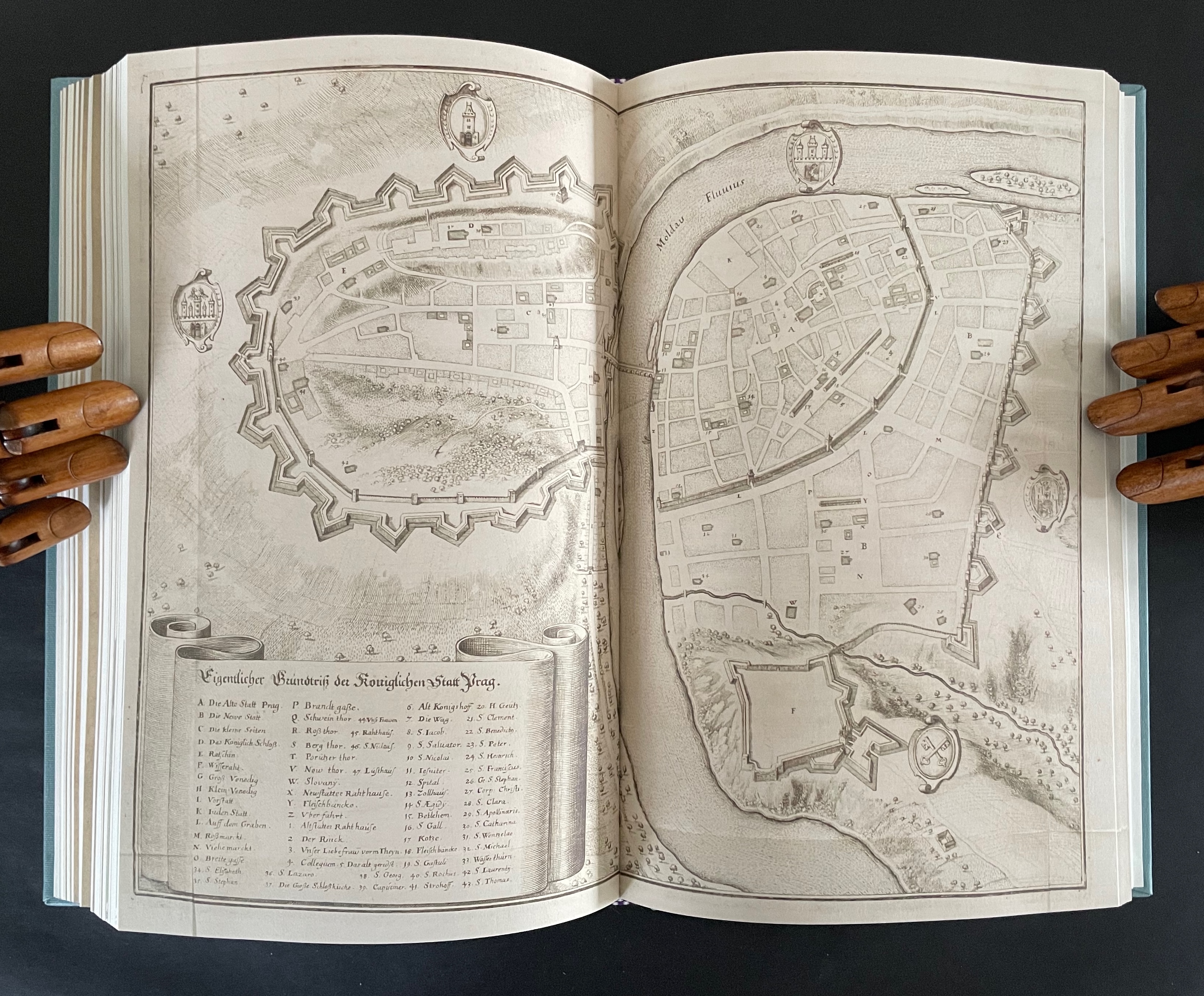
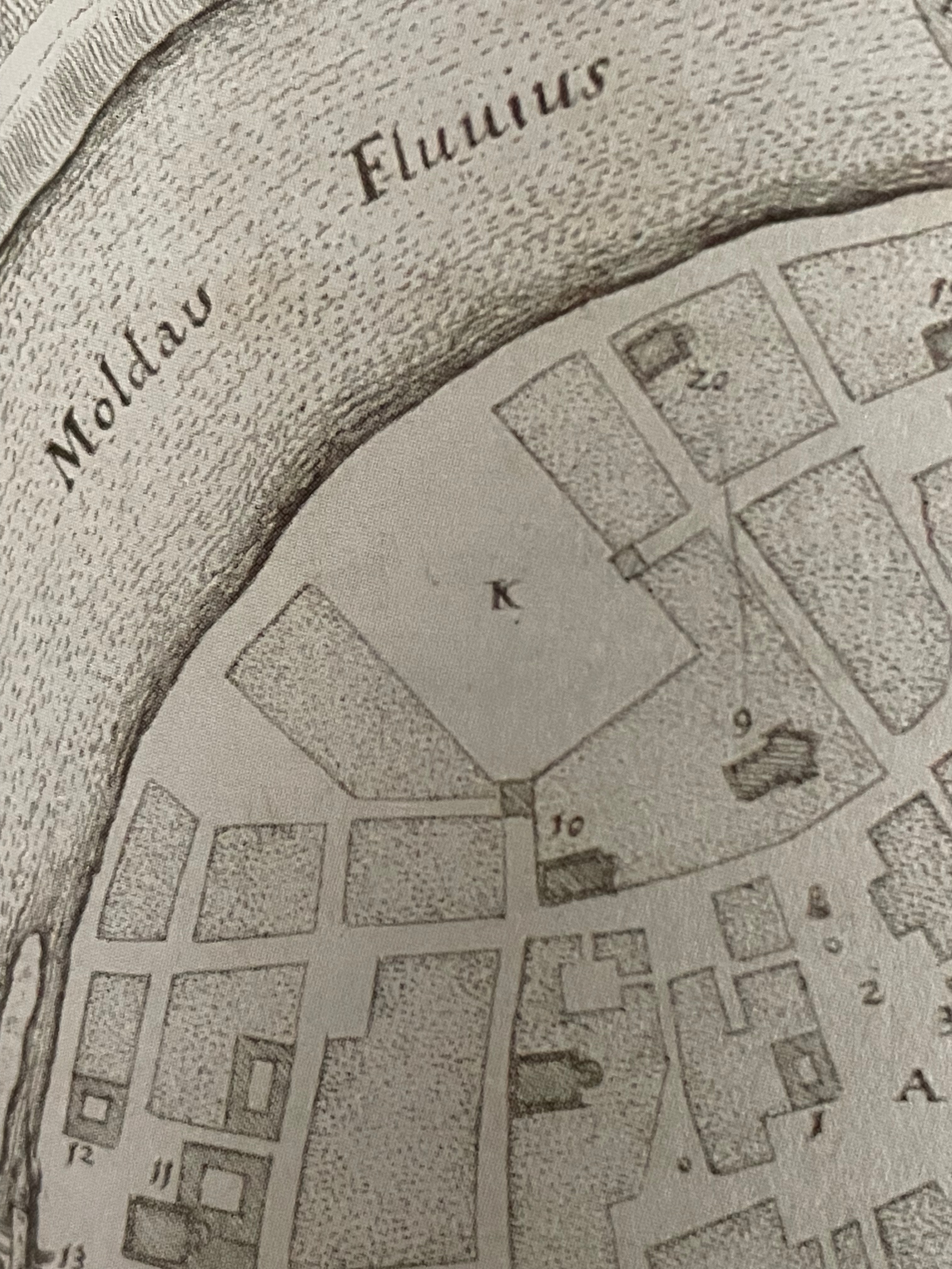
First three opening spreads: cityscape of Prague; map of Prague’s location and fragment of Astronomia Nova‘s title page; cropped page of AN showing ornamental flowers alongside cropped blown-up photo of the flower.
The field of vision hops from the cityscape of Prague to a geographical map, then to the cropped title page of Astronomia Nova, then to a detail of the Copernican model bracketed by ornamental flowers, and finally to a cropped blown-up image of one of those flowers from Polunin. The next two spreads that follow those first three underline the field guide’s zooming in across time and space.
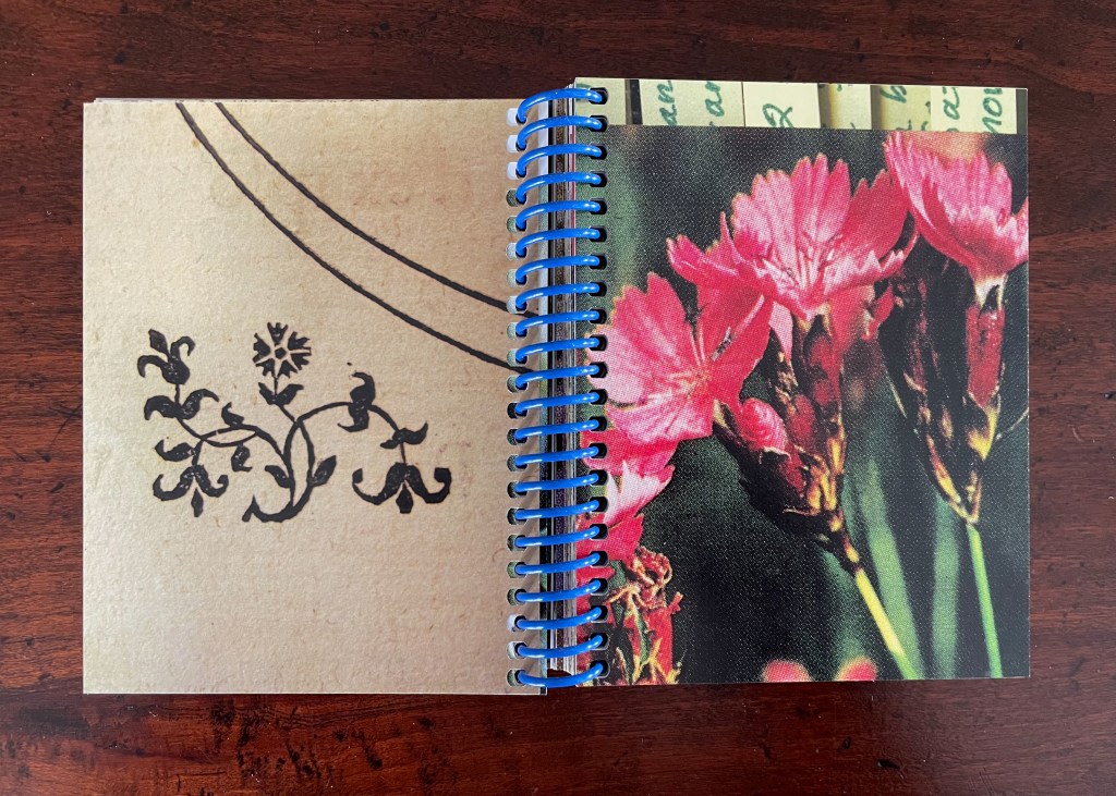
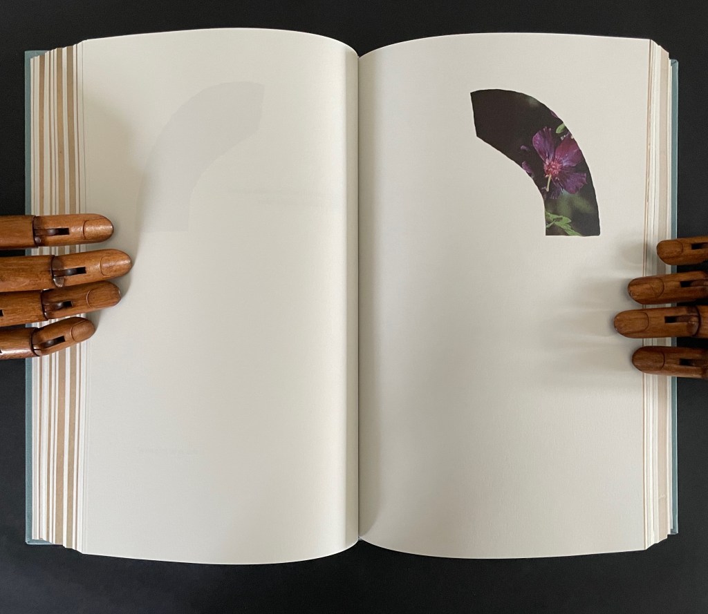
The fourth and fifth spreads: close-ups of the ornamental woodcut flowers and live photos; from the 17th century to the 21st.
Later spreads showing similar zoomed-in images highlight that we have actually hopped from the second century (Ptolemy) to the seventeenth (Tycho Brahe) to the twentieth (Polunin).
Zoomed-in images of woodcut flowers and live flowers; from Claudius Ptolemy (2d century) to Tycho Brahe (17th century) to Polunin (20th century).
Planetary diagrams, celestial maps, mathematical models, descriptive text, woodcuts and engravings are all at several representational removes from one another and from actual planetary movements over time. Likewise, the woodcutter’s ornaments had their corresponding actual flowers in the gardens and meadows of Prague. The closeness in appearance between the woodcuts and photos argues that Kepler’s artist was drawing and cutting from real-life observation. And yet the photos lie at historical and medial removes that question their correspondence. Like Kepler’s and Brahe’s mathematical and textual models of planetary movements, the artist’s book’s photos are speculative models of the flowers Kepler’s woodcut artist would have observed in Prague at the turn of the 17th century.
The field guide’s movement across media — engraving, printing, woodcut, photography, casebound book, and spiral bound book — is underscored by Ancliffe’s variation and sequencing of spreads. Just as we start to assume an alternating verso/recto rhythm of print/image then image/print, Ancliffe interrupts the flow with a double-page spread of print/print.
There is also interruption within the interruption: the double-page spread of text is an English translation whereas so far the text has been in Latin. Is the translation’s appearance a reminder that the various media are means of translating the observed?
Other interruptions consist of image/image spreads followed by text/text spreads. The juxtaposition seems to suggest an abstract affinity of shapes, as if the side-by-side flowers hint at an abstract shape of the map spread, and the side-by-side maps hint at an abstract shape of the flower spread.
If that seems an interpretive stretch, consider the following sequence that draws comparisons between flower photo and cityscape detail, between zoomed-in cityscape detail and flower photo, and between zoomed-in cityscape detail and ornamental woodcut detail.
Note the sequence — photo/engraving; engraving/photo; and engraving/woodcut — drawing attention to translation from medium to medium.
If we step back to take in the whole of the artist’s book and note the changing rhythms and punctuations across the spreads, it is hard not to conclude that this artist’s book as field guide is teaching us how to read the environment it has created.
Opening and closing landscape spreads.
Ancliffe’s next work in her astronomy series extends her aim of teaching us how to read her artist’s books.
4522,. + K (companion volumes, to be read concurrently) (2024)
The cryptic title of this dual-volume work signals that we have some detecting to perform in order to read it. In fact, we have to read the companion volumes concurrently to perform our detective work. More teaching us how to read. The volumes’ respective title pages shed some light on the cryptic titles, but only a little. As the first volume’s title page spells out the vertically arranged numerical title 4522,., we learn at least that it has its roots in Ancliffe’s Personal Libraries Library series.
The title page of the second volume presents the title K inside a shaded irregularly shaped rectangle extracted from a map of Prague (1650) by Matthaus Merian and Martin Zeiller (which we can track through the last entry in K‘s bibliography). The letter K comes from the key to that map, which tells us that it marks the Jewish quarter of the city. It’s a “nice-to-know” detail but not essential for appreciating how to read the second volume.
The title page tells us that K is “a represencing” or “a satellite to a satellite” or “an attendant to be read in concurrence”. We already know about the concurrence from the first volume’s title page. As for “satellite to a satellite”, we can see that K is a satellite to 4522,., which makes 4522,. a satellite to something. But to what? More on that in a minute. As for “a represencing”, the volumes’ covers (above) give us a hint. Notice how the irregular rectangle on K‘s cover re-presents or represences a snippet of the floral poster image shown on the cover of 4522,. That is the recurrent pattern between the two volumes:
From the poster image shown in 4522,. on the left, a snippet is taken and displayed within the map segment in K on the right.
Just with the covers and two title pages, we have detected two of the “Four viewings through … the ephemeral posters of the Personal Libraries Library (2011-2023)”:
The PLL posters viewed in 3/4 scale (as seen in 4522,.)
Snippets of the posters viewed through the map segment (as seen in K).
The third “viewing through” has a physical and literal form. In 4522,. a hole is punched in the recto pages where the poster images are displayed. Through that hole in one poster, the poster underneath can be viewed. In K, when a recto page turns t0 the left, its poster snippet reappears on the verso but in reverse as if we were looking through the other side of stained glass window.
With both volumes’ recto pages having been turned, we can see the punched hole on the verso of 4522,., a new poster image on its recto page, the mirror image of the three minerals from K‘s preceding recto page, and the new poster image’s snippet in K’s new recto page.
In this third “viewing through”, there is also a clue to what 4522,. is a satellite of. The small hole punched in each leaf of 4522,. seems to meander in its position from leaf to leaf. Actually it tracks a very specific shape: an analemma — a tilted, figure-8-like form. An analemma is the visual representation of the data recorded in ephemerides (tables of star positions at fixed times). In 1627, Kepler published his Rudolphine Tables, which became the new standard for accuracy of this data. If we were to point a camera skyward from a fixed location at the same angle and take multiple photos at the same time of day throughout the year, the sun’s position would form that figure across all the exposures. This is because the earth tilts on its axis as it orbits the sun and moves along an ellipse rather than a circle. So, the placement of punched holes in 4522,. embodies this projection of our orbit around the sun, and if we miss the point, the following near-to-last double-page spreads from 4522,. and K drive it home.
On the left, 4522,. shows the analemma diagram composed of the tiny views of the PLL posters’ images viewable through the holes in the book’s preceding pages. On the far right, K recapitulates the punched hole from 4522,. and wittily drives home the star/flower coordinates by positioning the hole over the center of the flower on the next spread, which doubles the wit with a black-and-white spread save for the strategically placed spot of yellow in the moon-gray center of the flower. The PLL posters’ images “light up” the recto pages of 4522,., and K reflects those images. In other words, K is the lunar satellite to 4522,., which is the terrestrial satellite orbiting the sun (the PLL project). These are the “two orbits” from the title page of 4522,.
The fourth “viewing through” comes into play with the Bibliography at the end of K. Although we had recourse to it to lead us to the map of Prague, a closer look reminds us of the PLL posters and the personal libraries from which they emerge.
So of course, the “five ways of reading” signaled on the title page of 4522,. refer to the five personal libraries from which the posters are composed.
This extraordinary part-autobiographical, part-biographical, part-bibliographical artist’s book brings Abra Ancliffe’s twin obsessions with astronomy and botany to their highest pitch of unity so far. Ancliffe has built it with an extended epistolary poem, collaged images from Polunin’s Flowers of Europe, and photos of the map of Prague (1650) by Merian and Zeiller, pages from Kepler’s Astronomia Nova (1609), and family memorabilia.
The poem addresses “Dear Dear Woodcutter”, the unknown artist who decorated Kepler’s orbital diagrams with flowers. Ancliffe’s observation of the flowers stands out when you consider that the still standard Collected Works (1938) omitted the flower images. Trying to identify the woodcutter, Ancliffe tracked down the sole reference to his existence and even visited William Donahue, Astronomia Nova‘s translator, in New Mexico to discuss the mystery. More impressively, she identified the woodcut flowers, their scientific names, and various common names, and their local habitats in and around Prague. From their unexplained presence, Ancliffe launches lyric observations on flowers (their colors, parts, and growth), astronomy, ink, paper, type, woodcutting, bookmaking, the idea of the book, and the interconnectedness of it all.
The book opens with Ancliffe’s first letter to “Dear Woodcutter”. It includes a facsimile double-page spread from Astronomia Nova , pages 28-29, showing where she first saw his woodcut flowers. From the start, Ancliffe signals how tightly woven she feels this autobiographical, biographical, bibliographical artist’s book will be. Instead of being numbered 2 and 3, her pages leading to the facsimile spread are numbered 26 and 27. So, at that moment of turning from “page 27” to page 28, the 21st century work strangely becomes part of the 17th century work as the book artist reaches back through time and craft. The letter’s tone blends fondness and fascination with matter-of-fact yet evocative observations about ink, printing methods, and the geology underlying lithography.
The intensity of her reaction to the woodcutter’s flowers and her absorption in her subject and craft translates into an affinity with the woodcutter that has Ancliffe addressing him in the present. This is poetic license and invention. In the act of addressing him, she is addressing us, her readers/viewers. If we are in any doubt of this, the second letter concludes with at a pitch that eliminates it and leaves us with a clear assertion of what she intends:
I see you. I see your book of flowers. I am seeing you. I am seeing you to others. I am seeing your book of flowers to others.
After this introductory section, Ancliffe lays out a recurrent marker of the book’s structure: a facsimile spread followed by a page reproducing a selection of woodcut flowers. There are twelve such markers.
After each of them, the poem continues, accompanied by brightly colored jigsaw-like cutouts from photos of flowers Ancliffe has matched to the woodcuts. In each section, a jigsaw puzzle piece appears, then another and so on until the section ends with a page of accumulated pieces. Below is the section that follows the marker above. The accumulation (or gathering) page brings together the five preceding pieces.
There are 12 gathering pages, and they are all brought together in a closing double-page display.
Twelve “gathering pages”.
The closing accumulation page, a gathering of gathering pages.
There are also four labelled subsections or interludes that appear out of the blue.
The first entitled “The Blue of the Page or How to fix Blue when Blue cannot be Fixed” addresses the color of the paper, ink, and flowers, what Ancliffe can see and cannot see but perceives (color of paper), knows (ink), imagines (flowers), metaphorizes, finds, and names.
The second entitled “The Shape of the Book or Ellipses or Ellipsis” draws metaphorical, etymological, and visual links between books and orbits (ellipses) and sewing holes (ellipsis).
The third interlude “Interlude or Worms and Wormholes” develops an extended metaphor of the book’s sewn edge as a sinuous gathering together of nature, type production, planetary charts, and seasonal movements. It also makes another extended metaphor of the book spine as the most interconnected point of organization and confusion, the orbital point closest to the sun, and the shapes of a shallow papery cup, sewn folds, and flowers.
The fourth interlude is “Violets and Pansies or I Think of You or Waysides” plays on Paul Klee’s observation that “A line is a dot that went for a walk”. In Ancliffe’s case the line begins with the dot of the etymology of “violet” that leads both to the Jupiter/Io myth and Ancliffe’s grandmother’s name, that links Io to the origin of the exclamation point, which Ancliffe appends to grandmother Violet and the flowers, that jumps to Derek Jarman’s etymological linking of the common names violet/pansy/heart’s ease to the French “pensée” and thus to “I think of you”, that leads to wild pensée (wild thought), which leads back to the dubious etymology of via leading to violet and thereby “wayside”, which leads to thinking of you (woodcutter) and the flowers found by the waysides.
What links these subsections is their use of the elements of book production to support Ancliffe’s theme of interconnectedness. At the start of the book, she wonders whether the purpose of the woodcut flowers is that of bearing type, an insertion to prevent the weight of the press from breaking the finer woodcut lines of the orbits. Now, as the final gathering of gatherings approaches, she returns to that notion. Notice below how the layout of text and flowers on the left and the layout of the collage on the right mimic one another, which echoes Ancliffe’s observation
your flowers and Kepler’s orbits correlate.
They hold each other up,
bear the weight for one another so that one,
alone,
is not crushed.
But for Ancliffe, a mutual bearing up is not the whole story of the interconnectedness she is pursuing in Astronomia Nova Florilegia or A Strange Shallow Papery Cup or .888 inch. For her, interconnectedness (correlation) is historical, metaphorical, etymological, rhetorical, seasonal, geographical, typographical, material, and personal. She sees in the woodcutter’s Prague flowers a florilegium (“you hid a book within a book!”) and a purpose — “I am seeing your book of flowers to others” — for which she chooses the medium of the artist’s book. Because this medium is so frequently recursive or self-reflexive, it is well-suited to a book hidden within a book. Like a planetary system, an artist’s book often has multiple orbits and multiple points of orbit. As noted in the interludes, any element of “the book” and its production can play a role — punctuation, words and wordplay, ink and its color, type and typesetting, images and carving, paper, sewing holes, thread, and so on.
In a final honor to Dear Woodcutter and personalizing capstone, Ancliffe adds two appendixes: “the first, Appendix or A Book within a Book or .918 inch”, and the second, “K or a Represencing or Studying an Engraving of Prague in Topographia Bohemiae, Moraviae et Silesiae, 1650″.
In the first appendix, Ancliffe introduces the map of Prague, familiar from the two earlier artist’s books and then points us to K, the Jewish quarter, by filling it with a thumbnail flower. This is her book within a book: 37 flowers laid within the Jewish quarter of Prague 1650. Their color re-presences the absence surrounding the K in the map.
In the second appendix, Ancliffe begins with the materiality of type and setting it — how it’s made, how it feels, what it looks like — in particular for the letter K and her maternal grandmother’s married last name set in type. Again, it is an element of the book that provides the metaphor that pulls “what connects” into the orbit of Ancliffe’s artist’s book. Absence evokes presence; presence evokes absence. The absence around the carved upside down and reversed metallic strokes defines K as much as does the ink transferred from them. Likewise the presence of her grandfather Victor’s and grandmother Ruth’s metal and messy tools evokes their absence, and it is their impression on the artist that defines their presence in her,
which brings us to the autobiographical closing statement framed by Dear Woodcutter’s flowers.
Abra Ancliffe has created a body of works that, as Brian Davis puts it, “not only exploit the material and expressive possibilities of the book as object, they function as physical sites for compiling and organizing heterogeneous collections of textual artifacts for narrative and other expressive purposes”. As aesthetic objects, they demand more than a glance in an exhibition or flick-through at a book fair. They richly repay the greater attention.
Further Reading
“J. J. Abrams & Doug Dorst“. 12 December 2024. Books On Books Collection. Another example of what Davis calls a “book-archive”.
“Helen M. Brunner“. 15 April 2026. Books On Books Collection. Further example of the “book -rchive” artist’s book.
“Gracia Haby & Louise Jennison“. 28 May 2026. Books On Books Collection. Intensely colorful artists’ books exemplifying the notion of “book-archives”.
“Michael Hampton“. 8 May 2026. Books On Books Collection. Hampton’s notion of parabibliography has an affinity with Brian Davis’ notion of archival poetics. In particular, see 410/411 (2025.
Davis, Brian. 1 May 2024. “Part One: The Rise of Multimodal Book-Archives“. Book Art Theory. Starkville, MS: College Book Arts Association. Explores “archival poetics”, finding art by harvesting archives and libraries.
Gracia Haby and Louise Jennison are exuberant archival eco-artists whose palette embraces the digital collections of the Metropolitan Museum of Art, New York Public Library, Rijksmuseum, State Library of New South Wales, State Library Victoria, and more. Their preferred media are paper, the artist’s book, and installations; their preferred technique, collage.
Dip and Bob (2021)
Dip and Bob (2021) Gracia Haby & Louise Jennison Casebound, softcover with five-panel irregular trim wraparound card. H149 x W110 mm. [72] pages. Edition of 50. Acquired from the artists, 21 February 2026. Photos: Books On Books Collection.
Like other works in the collection, Dip and Bob (2021) teases connections between the media of watercolor, artist’s book, performance, and installation. The cover is an original watercolor cover on Fabriano Artistico 300 gsm paper.
The 72 pages of prints on Impact 100% Recycled Uncoated 150gsm derives from a 620 cm long digital collage. Created for the 2021 NGV Melbourne Art Book Fair, its performance element was twofold. First, as the artists explain, the collage was made “in place of a swim”, the local pool being too busy. Second, toward the end of the making, several copies were bound live before the Book Fair attendees. Its installation element, however, is the greatest tease. There is and was no installation of the 620 cm long collage work. It rests in your hands, and you experience it by turning the pages, then turning them back, then turning them forward — like laps in the pool. Or if you happen to photograph the double-page spreads, you can jump out of the pool and look down on them joined end to end.
Their introduction, however, will lure you back into the collage, which is
Underwater, kind of. Yes. Dive in.
Don’t forget to hold your breath. …
Search the collection. Sift the collection. “Water”, Return key.
Invert a forest. A daguerreotype of poplars stretching across the plate could be bands of seaweed. …
A crab from a trade card. Not for the skillet. Zoom in, Moonfish.
The Young Saint John the Baptist hair tendrils ca. 1480–82, repurposed. Papyrus fragment with lines from Homer’s Odyssey, ca. 285–250 B.C., for kelp bands.
Haby and Jennison wear their eco-hearts on their sleeves and admit, or rather assert, “For us, above all, it is not the medium that is always of greatest import, but the message”, which is
Our only chance of a healthy, safe, joyous, and sustainable future is to return to being reciprocal with nature so nature can continue to look after us.
Stand up and fight for the oceans and the waterways.
And yet it is their long-held breath as they create their underwater collage and your breath caught as you paddle forwards and backwards over fore edges and through the collection of human and natural art that will most hold you.
The Remaking of Things (2023)
The Remaking of Things (2023) Gracia Haby & Louise Jennison Folded container with tab-and-slot closure, holding belly-band-secured front cover fold out, part of card cover casing a perfect bound book. Container: H186 x W228 x D15 mm. Book: H180 x W222 mm. [36] panels. Edition of 100, of which this is #25. Acquired from Vamp & Tramp, 21 May 2025. Photos: Books On Books Collection.
From 24 May through 20 August 2023, the Ian Potter Centre (NGV Australia) held hosted an installation of The Remaking of Things. This work produced for the exhibition comprises a silvery tab-and-slot folder, holding a casebound softcover artist’s book whose front cover opens into a desktop installation, making you wish for a sip of Alice’s “Drink me” potion or bite of the Caterpillar’s magic mushroom.
Tab-and-slot folder made of Silver Metalised Polyester satin paper 300 gsm, router cut, printed on a swissQprint inkjet printer. Image from Nicholas Caire‘s Fairy scene at the Landslip, Black’s Spur (c. 1878)
Although the work continues their archival poetics, drawing on “100 individual pieces in the NGV collection, spanning painting and photography by way of ceramics and silverware, textiles and works on paper”, it has its origin in Haby & Jennison’s restored eucalyptus forest habitat for the Grey-heading flying fox, the animal featured on the “wall” that serves for the front cover.
Front cover with and without belly band.
As the front cover unfolds, a double door appears, cut into one of the other walls. “Walking” to the right around the walls, you see the images that, enlarged, occupied the exhibition walls in Melbourne.
Within the exhibition rooms, a 24-minute for 24 hours sound track played as the lighting changed. Within the book, photographs of the exhibition rooms provide a sense of the visual experience and its scale.
The images within the book are likely to send you back to the images on your desktop installation. There, it is much easier to register James Sowerby‘s etching Tetratheca juncea (1793), John Lewin’s Warty-face Honey-sucker (1822), Richard Bunbury‘s Green native fuchsia (1844), Anne Paulson’s Sketches of Victorian bush flowers (c. 1861), Fanny Anne Charsley‘s The Wildflowers of Melbourne (1867), Eugene von Guérard‘s Ferntree gully (1867), Tom Humphrey‘s Summer walk (c. 1888), F.E. Striezel‘s Kookaburra carving (1915), A. Shelden‘s Possum and banksia (1920s), E.G. Adamson‘s Snow coral (1930s-40s), Grace Cossington Smith’s Bottlebrushes (1935), NASA’s Lunar Crater (1969), and the dozens of others listed in the center of the book that can be found on the NGV website. As Haby & Jennison indicate in the work, they “invite you to enter the pages of the book in a similar spirit as you would the gallery”. Across time, etchings, paintings, carvings, inkwells, snuff boxes, glass plate negatives, digital photographs and a host of other artefacts, they create a complex habitat of interconnectedness of art and species.
Given that aim, it is surprising that the fold-out cover is constructed for viewing around rather than within. Double-sided printing of the cover might have done the trick and offered an additional opportunity to show the change of lighting.
Looking for Green, Remaining Hopeful (2024)
Looking for Green, Remaining Hopeful(2024) Gracia Haby & Louise Jennison Accordion book. H135 x W92 mm (closed), W802 mm (open). [9] panels. Edition of 75, of which this is #4. Acquired from the artists, 21 February 2026. Photos: Books On Books Collection.
World Book Night’s 2024 theme was “in praise of birds”. Using old postcards from various locations and cut outs collected over the years, Gracia Haby and Louise Jennison selected 45 birds to arrange in this vertical collage in response. The Indigo Digital CMYK used on ecoStar 100 gsm for the body and ecoStar 300 gsm for the cover delivers the vibrant avian colors against a chroma-key-like green screen background. The choice of the green screen effect has layers of significance. One layer is its obvious echo of the “green” choice of 100% recycled paper. Another, not so obvious, requires the textual explanation from the covers:
A green screen enables video makers to fill in the background or environment behind actors after filming. Haby & Jennison’s mimicry of it says that we need to provide these avian actors with more befitting environments than those in the sepia and gray toned backgrounds. Against the minatory background, the exuberant “motley assortment of birds” points in signposts to the “potential environment” left to be filled in on the green screen.
Despite its format, this is not a perforated pack of postcards to be detached and dispatched. You want to see and keep it all at once, as prompted by the vertical zigzagging against the green screen. But you will want also to examine it panel by panel, as prompted by the key on the covers and the detail of the images. In doing so, you sense the celebration and take the warning that this conference of birds being celebrated may disperse into extinction as has happened with the Norfolk kākā (last recorded sighting, about 1851), Carolina parakeet (last recorded sighting, February 1918), Newton’s parakeet (last recorded sighting, 14 August 1875), Bonon wood-pigeon (last recorded sighting, 15 September 1889), and Great Auk (last recorded sighting, 3 June 1844).
Bilateral Symmetry (2024)
Bilateral Symmetry(2024) Gracia Haby & Louise Jennison Self-enclosing barn-fold artist’s book with tab-and-slot closure, pamphlet stitched, and pop-up components. H240 x W174 mm. [24] pages. Edition of 100. Acquired from the artists, 21 February 2026. Photos: Books On Books Collection.
Bilateral Symmetry (2024) is the most successful of the four of artist’s books in the collection. Every element supports its exploration of perception and bilateral symmetry: the sewing, the barn-fold structure, cut outs and pop-ups, the page spreads and alignment, the choice of imagery from the natural world and architecture, and presentation of text across moth-shaped pages.
From the start, it combines surprising trompe l’oeil with startling juxtapositions. On the front cover, a bookmark aligns with the architecture behind a ruined arch overseen by a giant lacewing perched on a tree-size plant leaf.
Opening the barn-fold book reveals a new set of perspectival surprises. Inside, there are two booklets facing each other. The edge of the recto page of the booklet on the left aligns with the edge of the verso page of the booklet on the right to form an image across a four-page spread. Between the two foregrounded columns and statues, we see a neatly divided and aligned building in a small formal landscape. Beyond the building and landscape, an arcade with statuary curves symmetrically to the left and to the right. In fact, the arcade extends in a circle that comes around to the columns and statues through which we are looking. But the proportions are impossible or, at least, surreal. Of course, the huge dragonfly, also neatly split by the pages meeting in the center, offers a strange perspective especially alongside the collage of other insects. Even the marbled columns offer peculiarities. Some are rounded, some are squared, some start square at the foot but end rounded at the capital. And the statuary, collaged with insects, are shadowed with bright marbled patterns.
With the turn to the next set of facing spreads, the two statues and view through the arcade disappear, yet the moths that were posed against them remain as lepidopteral pop-ups against double doors in the middle of seemingly detached greenhouse walls. On the left, a flying squirrel attributed to Louisa Atkinson (ca. 1849-72) hangs from a branch intruding through an open arch in the wall. Diversity and trompe l’oeil strain at the work’s bilateral symmetry.
The final spread on this side of the book displays further distortions challenging our perception — even of bilateral symmetry but somehow nevertheless underscoring the theme. The Scotts’ pop-up moths, each centered a booklet’s spine, are flanked by Atkinson‘s far too small ringtailed oppossum on the left and by Gerard Kreft‘s far too large water rat to the right, peering down on the scene. The huge mantis in the center hangs mid air against the formal tree lined garden abnormally far in the background. The garden is perspectivally more distant than the domed edifice behind it, and an impossibly large rodent peeps over it. Although the central rodent and mantis are not symmetrically divided, and although the scenes to the left and right of the spine are not symmetrical, the central spine bisects the garden and dome precisely. Likewise the left and right spines bisect the Scotts’ moths precisely, underscoring the theme of bilateral symmetry. Meanwhile, the spreads have reiterated the point about the variety and diversity of insects, flora, and mammals.
On the reverse side of the book, between the splayed-out back and front covers of the two booklets, a cut out moth with wings spread disappears in trompe l’oeil fashion into the facade against which it has alighted. Above the moth, the two-word title of the book appears on two engraved banners hanging over the two parallel open archways centered between two shuttered archways. Two Harriet Scott Emperor Gum moths hover in the two archways shown on the lower lobes of the cut out moth’s wings. (Did I mention how every element supports the exploration of bilateral symmetry?)
The book’s text appears on the reverse side of the cut out moth’s wings. As you turn to the first wing/page of text or turn to the last wing/page, you may notice how the two Emperor Gum moths have “jumped” from the cut out’s wings to the background underneath each wing. A sort of slow motion persistence of vision, it is another perceptual trick alongside the trompe l’oeil of the cut out moth.
The first paragraph of text picks up on this theme of visual legerdemain by recalling the first flea circus impresario Mark Scalliot. That is a rhetorical means of introducing Bilateral Symmetry as a “theatre for insects” and posing the depicted insects as “fellow exhibitors”, which in turn is a rhetorical sleight of hand by which Haby and Jennison place themselves and the insects on an equal footing as performers and artists. The equation elevates the insects from the hucksterism of the flea circus — “Not for them an ivory “landau with figures of six horses attached to it ….” and, in the next paragraph, even raises these performers over Robert Hooke’s fleas as large as “elephants seen with the naked eye”. The exhibitors of Bilateral Symmetry invite you to better Hooke’s microscope by crouching “by a potted plant and behold[ing] the wonderful world of insects, thrumming”.
Leaning into entomomorphism, the artists invite us “[d]own an ecological porthole [to] flitter, paying attention to the messages the ears on our chests might receive were we a mantis”. Familiar by now with the artists’ message, we know this leads to the ecological observation of declining diversity, but up to this point, their artistry has been primarily about visual perception. This is not to gainsay the message, but as important as the message is, their marvelous handling of the media (the archival sources, the innovative book structure, and the collage) and reorienting of our perspective do more than simply make us receptive to it. Only in its final two paragraphs does the text exhort the reader to care and do something about the decline in insect diversity. The paragraphs preceding them conjure a world of insect perception and behavior that is as surreal as the whimsical perceptual distortions of the collage. The collage may include insects registered as endangered, but the text does not identify them. If text and collage were to have included endangered insects such as the Angled Tiger butterfly, Beautiful Petaltail dragonfly, Illidge’s Ant-blue (Butterfly), Queen Alexandra’s Birdwing Butterfly, Fan-winged Katydids, or Zaprochilus ninae (Bush crickets), might we have arrived at the same exhortation on our own?
With its blend of architectural ruins and artificial landscaping with oversized and undersized insects at various stages of metamorphosis, Bilateral Symmetry urges a shift of perspective in our perception of nature and our interconnectedness. With its structural embodiment of bilateral symmetry and diversity, it offers a rich example of the perceptual and perspectival shift it urges.
Further Reading
“Carol Barton“. 10 August 2024. Books On Books Collection.
“Caren Florance“. 30 April 2026. Books On Books Collection. In particular, see L OO P (2019).
“Ernst Huebner“. 21 July 2023. Books On Books Collection.
“Willow Legge“. 16 February 2021. Books On Books Collection.
Un Coup de Dés Jamais N’Abolira le Hasard (1992) Ellsworth Kelly and Stéphane Mallarmé Hardback, case bound in full black morocco, spine gilt-lettered. 17 x 12 1/2 in Edition of 300, of which this is #204. Acquired at Swann Auctions, 24 October 2024. Photos: Books On Books Collection. Permission to display, courtesy of Limited Editions.
Is Ellsworth Kelly’s homage to Stéphane Mallarmé’s Un Coup de Dés Jamais N’Abolira Le Hasard an illustrated book, a livre d’artiste, or an artist’s book? It certainly resonates with and intensifies the poem’s design and imagery, but without being a spread-for-spread illustration. It is akin to the tributes paid by André Masson (1961), Jean Lecoultre (1975), Ian Tyson & Neil Crawford (1985), Jacques Vernière (1987), Christiane Vielle (1989), Ofer Lellouche (1997), Robert Bononno & Jeff Clark (2015), and Eric Zboya (2018). Some of these kindred spirits like Masson, Vielle, and Bononno & Clark intersperse artwork within the poem that evoke if not illustrate the setting and action of the sea and shipwreck. Some, like Masson, Lecoultre, Vernière, and Lellouche display images that have less to do with the poem’s imagery. Some, like Tyson & Crawford and Zboya, show more interest in capturing the poem’s numerological esotericism (LE NOMBRE). More than the others, though, Kelly builds on Mallarmé’s double-page spread principle and its structural importance for the poem.
The double-page spread is the chief design structure in Mallarmé’s poem and is essential to its workings. We know this from the differences in layouts between its first publication in Cosmopolis in 1897, its marked-up proofs Mallarmé left behind after his death, and his son-in-law’s effort with Gallimard in 1913 to reflect the poet’s plan. Just before his death, Mallarmé had been working on the volume with Ambroise Vollard, who had commissioned etchings from Odilon Redon to bring it to the status and price of the livre d’artiste, a genre he was shaping. Mallarmé was amenable to this as long as the etchings were grouped at the end of the book. He did not want the artwork to distract the reader from his careful arrangement of the text on and across eleven double-page spreads.
The fact of Ellsworth Kelly’s eleven lithographs aligns with Mallarmé’s plan for eleven double-page spreads of text, but the interweaving of the two sets of spreads runs contrary to Mallarmé’s wishes. To follow the poet’s wishes, Kelly and the book designer hired for The Limited Editions Club’s production could have been grouped at the end of the book, but they didn’t. To double down on the contravention, they added a blank double-page spread after each of the eleven spreads of text and after each of the eleven spreads of lithographs. Someone also decided to begin and end the volume with sets of four blank flyleaves. This is not mere padding to justify a deluxe price. The effect signals and enhances the importance of the double-page spread for Mallarmé’s poem. It underlines the importance of what Mallarmé called “les blancs”. More than underline it, those punctuations of blank space after each spread of text and then after each spread of image add a pace to the sequence and place an additional demand on the memory as it juggles Mallarmé’s interweaving of text in its different sizes, styles, and position across the double-page spread. The lithographs’ nature, their pattern, and their spatial relationship to everything in the book’s structure match Mallarmé’s architectural plans far more than Vollard’s impresario interventions.
Abstract as they are, Kelly’s lithographs subtly mirror the structure and content of Mallarmé’s poem. Just as Mallarmé’s first sentence begins and his last sentence ends with “un coup de dés”, Kelly reverses the image in his first lithograph to make the image in his last.
Just as inversions are recurrent in the poem, so they recur in Kelly’s lithographs.
The poem’s spread beginning and ending COMME SI [“AS IF“] is central to the poem physically and thematically. The sixth of the eleven spreads, it is the only one showing this spatial, syntactic, and typographic pattern. Likewise, Kelly’s sixth lithograph splits its page equally. No other lithograph depicts this equilibrium.
Kelly created a separate portfolio of four lithographs: The Mallarmé Suite. This work is meant to be displayed on a wall and arranged precisely according to Kelly ‘s instructions. Despite the four shapes’ replication from the book, the portfolio stands quite apart in its introduction of color and positioning of the shapes (see Bonfitto’s essay). Its mere conjunction with the book does not imbue it with what happens in the book, and that underscores the fact that Kelly’s eleven black-and-white lithographs are not in mere conjunction with Mallarmé’s poem. The reader/viewer can imagine billowing sails, overwhelming waves, or tilting masts in the lithographs, but what matters is how Kelly makes his distinctive shapes play with one another and all the book’s double-page spreads to mirror how Mallarmé makes his words, typography, and double-page spreads play with one another. If self-reflexiveness is one of the key markers for distinguishing an artist’s book from a livre d’artiste, we have here a self-reflexive poem and a self-reflexive visual artwork punctuated by blanks within the canvas of the book structure to create a self-reflexive artist’s book.
Handmade Path (2021) Lu Jingren, Amanda Degener, and Peng Wu Black-inked card wrapper with magnetic closure. Handbound, handsewn, handmade paper cover book. H285 x W220 x D40 mm. 268pages. Edition of 350, of which this is #152. Acquired from Amanda Degener, 5 December 2022. Photos: Books On Books.
Handmade Path presents 57 artists of paper and book who responded to 6 questions circulated by the editors. The editors asked the artists to provide handwritten replies to the questions as well as images of both their work and of their hands.
How did you begin your practice?
Why do you still make paper / books?
What is the difference for you reading on digital device or in a book?
In what way do you understand the 5 senses of paper/book: vision, touch, hearing, smelling, tasting?
Share with us some moments; eitherbreakthroughs or break downs in your work?
What is your next dream project?
Not all of the respondents replied in handwriting, but many sent their replies on material that reflected their work. The late Richard Flavin’s contribution arrived on gampi paper. Becky Beamer inked her reply on a gray handmade sheet. Radha Pandey’s came on indigo tinted handmade paper.
Richard Flavin
Becky Beamer
Radha Pandey
Jack Mader photographed these contributions in ways that render them visually haptic. It places that fourth question — “In what way do you understand the 5 senses of paper / book: vision, touch, hearing, smelling, tasting?” — at the core of the book. You’d swear you can feel the velvet texture of Mary Heebner’s 11 pages. Or the roughness of Helmut Becker’s colored handmade sheets or of Su Jin Kim’s white sculptural responses. The request for images of the artists’ hands naturally added to this sensory effect. There’s the glutinous wetness of pulp between the fingers of Jean Michel Letellier and Helen Hiebert and the imagined smell of the ink on George Roberts’ hands.
Mary Heebner
Helmut Becker
Kim Su Jin
Left: Jean Michel Letellier’s hands. Right: Helen Hiebert’s hands.
George Roberts’ hands.
Throughout the book are truncated pages that act almost like bookmarks. Only midway through do we learn that they bear scanned images of handmade paper from Amanda Degener and Cave Paper. Degener provides an index describing the handmade papers, which oddly appears at page 142. Not only does it function as an index, it delivers information expected in a colophon. It even describes the paper used for the book’s cover, endpapers, and the clamshell tray. But nevermind, it’s all part of diving into the artists’ process and practice.
Quite appropriately this midway index appears just after the entry for Nakagaki Nabuo, whose response to the opening question “How did you begin your practice?” comes in the form of an autobiographical handmade artist’s book. In the pages presenting his book, we see the artist, his hands at work on the book, and Mader’s precise photography of the book and its airmail envelope, followed by the bookmark-like stub with its image of Cave Paper’s Layered Indigo Day paper.
Nakagaki Nabuo and his hands at work.
Nakagaki’s My Life Journey
Verso: Nakagaki’s answer to question 6: “What is your next dream project?” Recto: “Handmade Paper Descriptions” index/colophon.
In their preface, the editors write:
Although reading is a private activity we are not alone; we are cooperating with the book, bringing it into ourselves. Reading is not only about transplanting ourselves to the beyond, but we modify ourselves to see the world differently. Our vision or purpose for Handmade Path is for you to participate in this collaboration.
Just holding Handmade Path and constantly feeling its Alphabet Dao cover, navigating its foldouts alternating Chinese with English according to the contributor, being tempted to lift a contributor’s sheet of paper from the photos, hearing the snap and creak of sewn pages turning, and absorbing the contributors’ testaments, we cannot help but be drawn into participating with the book. In doing so, we learn that, as Paulette Myers-Rich puts it, “Paper is not a substrate — it is story” (p. 197).
Hamady, Walter; Samuel Haatoum; and Hermann Zapf. 1982. Papermaking by Hand : A Book of Suspicions. Perry Township, Dane County, Wisconsin, USA: Perishable Press Limited.
Thomas, Peter, and Donna Thomas. 1999. Paper from Plants. Santa Cruz, Calif: Verf. You can find images of this and others by the artists online in the Special Collections website of the University of Wisconsin-Milwaukee Libraries.
RAGE PEN (2025) David Blackmore and Michael Hampton Soft cover, mitre sawn head and foot, perforated fore-edge. H210 x W148 mm. [108] pages. Edition of 100. Acquired from Folium, 13 November 2025. Photos: Books On Books Collection.
Folium, the publisher, describes RAGE PEN as “developed from a relational piece of the same name held at Chisenhale Studios 2017/18”. Per the Museum of Modern Art, relational aesthetics is
A mode of art practice that establishes spaces, situations, or environments for a variety of social interactions. In essence, the social space or interaction becomes the work of art itself. The term was popularized by French critic and curator Nicholas Bourriaud in 1998.
RAGE PEN‘s environment was a safe rage room equipped with a variety of handheld tools. Anonymous members of the public, or “ventees”, were invited to name an object that had caused them frustration, don protective equipment, and enter the shuttered room to smash said objects. The interactions filmed and photographed by David Blackmore formed the images in RAGE PEN the book. Holding the book with its mitre-sawn top and bottom edges and its perforated, still-sealed fore-edges, we might suspect that we are being invited into our very own private relational aesthetic piece.
Opera dei Pupi (2024) Valeria Brancaforte Casebound hardback, cloth over boards, print on front cover. Plain brown doublures. Three variants based on trim and paper. A: H272 x W368 mm; Drap, Catalan hand-made paper. B: H261 x W360 mm; Italian Magnani Incisione. C: H265 x W362 mm; Somerset Velvet White 250gsm. [20] pages with 14 prints. Each in an edition of 12, of which A is #11, B is #5, and C is #1. Acquired from the artist, 14 November 2025 and 7 February 2026. Photos: Books On Books Collection. Displayed with permission of the artist.
Puppets and marionettes have figured in more than a few artists’ books. Ron King and Roy Fisher’s The Left-handed Punch (1986) and Anansi Company (1992) are perhaps the best known. Others include Ann Kresge’s Shadow Play (1998), Antonio Nocera’s La Valigia di Pinocchio (2015), Emily Martin’s Funny Peculiar Funny Ha Ha (2017), Hormazd Narielwalla’s Paper Dolls(2018) Erminia De Luca’s Now it’s up to you (2023), and Rachel Simmons’ Dream of the Golden Empress (2023). Valeria Brancaforte’s recent addition to the cavalcade brings to it a new cultural tradition and a welcome chance to compare how variation in paper can play into appreciation of an artist’s book.
L OO P (2019) Caren Florance Handset letterpress and mixed media on Stonehenge Black, Chinese papers and found maps. Hand-stitched Z-fold dos-à-dos booklet. H193 x W143 mm. [48] pages. Edition of 16, of which this is #13. Acquired from the artist, 1 December 2025. Photos: Books On Books Collection. Displayed with artist’s permission.
L OO P is one to compare with Jack Oudyn’s Opening Dark Windows (2020) and Tim Mosely’s Grasping the Nettle (2020). All three of these Australian book artists create works responding to climate change. L OO P is also one to contrast with Barbara Beisinghoff’s Tau blau / Dew Blue (2013). Both thrust forward their works’ tactility, but while Beisinghoff’s offers the fond hope of natural and artistic renewal as it plays off H.C. Andersen’s fairy tale Hørren /The Flax, Florance’s embeds shards of John Bennett’s bird poem Overwintering in a back-to-back loop of despair over climate change.
In Visible Cities (2012) Jean-Pierre Hébert, Harry and Sandra Liddell Reese Custom-made box enclosing sewn board binding with cloth spine, treated abaca/cotton paper with painted inlays, pastedowns with drawings, valley-fold folios of Niyodo Natural paper printed on Epson Stylus Pro 4800. Box: H442 x W290 mm. Book: H424 x W276 mm. [46] pages. Edition of 73, of which this is #48. Acquired from the Reeses, 9 February 2026. Photos: Books On Books Collection. Displayed with permission of Claire Hébert and the Reeses.
More than a few artists have been drawn to Italo Calvino’s Invisible Cities (1972/74). Its attraction is not hard to understand. Calvino supposes a series of conversations between Marco Polo and Kublai Khan about cities across the Khan’s empire that he has not visited but Marco Polo has and which he describes for the Khan. The premise, however, is paradoxical: the fifty-five cities Marco Polo describes do not exist. Calvino’s sensuous and surrealistic prose and combinatorial arrangement of the conversations and descriptions create a book that is simultaneously inwardly and outwardly reflective. Simple but complex. Realistic but fantastical. Concrete but conceptual. A work ripe for homage and inspiration.
Nagori (2023) Ximena Pérez Grobet and Kati Riquelme Clothbound hardcover. H153 x W47 mm. Edition of 33, of which this is #14. Acquired from Ximena Pérez Grobet, 5 February 2024. Photos: Books On Books Collection. Permission to display from Ximena Pérez Grobet.
The Japanese word nagori has several meanings. Beware translation applications, but embrace the online discoveries that lead to Ryōko Sekiguchi, the Japanese expatriate writer, and Victor Burgin, the British conceptual artist and writer, who cites her. With Sekiguchi, you will find that it means “nostalgia for the season leaving us”, the longing for the taste of an early season fruit evoked by its late season taste, or a room’s sense of waiting for the return of someone who has just left. With Burgin, before he cites Sekiguchi, you will first find nagori‘s etymology — nami-nokori, referring to the remnant, remains or traces of receding waves. Burgin’s etymological explanation is obviously the most applicable to this collaborative artists’ book, but after you have put the book aside, you may feel a lingering nostalgia for the experience of it akin to the sensuousness Sekiguchi evokes.
Primer: Ritual Elements (Book One)(1982) Helen M. Brunner Softcover, pamphlet-stitched. H239 x W155 mm. 22 pages. Binding adapted from a design by Barbara Press, developed under the instruction of Hedi Kyle. Edition of 300. Acquired from JP Antiquarian Books, 14 February 2024. Photos: Books On Books Collection.
Primer is an unusually made booklet. Stitched with black cotton thread over three signatures, its two outer signatures are of white wove Curtis rag paper, the inner signature is of parchment or a translucent paper, and four 5-panel thumbnail accordions in translucent paper are glued to the beginning of the last outer signature. More unusual is that the booklet’s edges appear burnt into unevenness, yet there is no odor of ash. The edges of the sewing holes also appear burnt, one page has a scorch mark in its center, and even the edges of the collaged items appear to have been burnt before being photographed. The breadth of collaged items — from cave markings to cuneiform to Rosetta Stone to film strips or slides — is not unusual given the title; you would expect a primer on ritual elements to address a prehistoric to historic range of petroglyphs, pictographs, symbols, letters, photographs, etc. But most unusual — and perhaps the point of the work — is that the legible text undermines the aim suggested by the title. The script on the back cover makes the subversion plainest.
Quant au Livre(2011) Claude Lothier Slipcase around five cased and glued softcover booklets. Slipcase: H110 x W158 x D25 mm. AEIO TTNTN: H108 x W157 mm. Niv ula: H157 x W108 mm. C’est difficile: H108 x W157 mm. TUBED/NIF: H108 x W157 mm. U: H108 x W157 mm. [28] pages each except for TUBED/NIF, which has [20], and U, which has [24]. Edition of 200. Acquired from Biblio-Net, 16 October 2025. Photos: Books On Books Collection
In English, the phrase quant au livre would be “as for the book” or “concerning the book”. What is lost in translation is the phrase’s association with Stéphane Mallarmé’s volume of essays Divagations (1897) in which one section was entitled Quant au Livre. It included the essay “Le Livre, Instrument Spirituel”, which delivered the proclamation “tout, au monde, existe pour aboutir à un livre” (“everything in the world exists to end up in a book”). It was the proclamation scholars seized on to give artists’ books their metaphysical underpinning. If it swallows up everything in the world, What is a book? Many book artists have simply bypassed the discussion and jumped in with works of art that challenge how we read, how we make sense of a book, how we make sense of what a book is. Claude Lothier is one of those book artists.
Gotische Alphabete (1897) Jaro Springer Casebound hardcover in leather with cover title and cover illustration in gold and blind embossing. H415 x W300 mm. 1 sheet, 8 pages, 3 sheets, 39 plates. Acquired from Antiquariat Braun, 14 November 2024. Photos: Books On Books Collection.
Every history of letters or script begins with a scrawl. Someone somewhere at some time made a mark tied to an object tied to a sound — A is for Ox — and some others in the same place and time accepted that this handmade mark or shape could conjure up that object in the mind. Perhaps it seemed magical, perhaps it seemed mundane as they imagined that somehow meaning and reality inhered in that shape or sound, the connection just waiting to be discovered.
Regardless, the shapes of characters and their relationship to the sound or meaning they represent is arbitrary, a prehistorical and historical function of social convention, a collective making by individuals. Jaro Springer’s art historical specimen book reminds us of the fantastical visual elaborations to which 15th-16th century artists’ hands would put those “shapes for sounds” we call the alphabet.
Fugal (2025) Susan Johanknecht , Claire Van Vliet, and Andrew Miller-Brown Vertical double-sided accordion book bound in “Landscape with Cows In It” structure designed by Claire Van Vliet, cover in calendered Barcham Green India Office, interior in handmade Japanese Kozo Natural fixed to Monadnock Dulcet; slipcase of handmade paper. Slipcase: H123 x W248 x D22 mm. Book: H120 x W240 x D18 mm. [6] double-sided panels. Edition of 100, of which this is #8. Acquired from Susan Johanknecht, 26 September 2025. Photos: Books On Books Collection
In the hands of multiple readers, this collaboration among Susan Johanknecht’s Gefn Press, Claire Van Vliet’s Janus Press, and Andrew Miller-Brown’s Plowboy Press becomes the “book as performance” and “book as musical score”. Fugal is an artwork that works best with several simultaneous readers/voices/viewers.
A fugue generally has a “subject” (or main theme), an “exposition” in which voices or instruments each play out the subject, then an “episode” (or connecting passages) that builds on the previous material, then further alternating “entries” in which the subject is heard in related keys until a final entry that returns to the opening key. The subject of Fugal is the generative process of vocal changes due to aging. The phrases of the poem have been drawn from an unidentified speech and language textbook.
A Never-Ending Stone (2025) Laure Catugier Open spine, dos-à-dos with grey bookbinding board. 210 x H260 x 210 mm. 104 pages. Edition of 250. Acquired from einBuch.haus, 3 December 2025. Photos: Books On Books Collection.
A Never-Ending Stone is Laure Catugier’s first monographic catalog. Her skill with collage, alignment, shadows, materials, and the book format transform it into an artist’s book very much driven by her fascination with architecture and especially the architectural theories and practice of Oskar and Zofia Hansen. The Hansens eclectically embraced “human-scale” architecture, “environment art”, and what they called the “open form” structure, using space and time as its key elements. The Hansens also proposed that the architect should not be the all-knowing expert but should partner with clients as co-authors of their space, respecting how their interior and outside activities and relations with one another defined them and their space. Though somewhat a forerunner to User-Centered Design, Open Form radically aimed at structures that would evolve with interaction with the user and, as they unfolded, also align with nature.
John Eric Broaddus (1943 1990) was perhaps one of the most inventive and creative artists to approach the book form. He was a prominent figure in the New York City art scene in the 1970s and 1980s, creating books before the book form even had a suggestion of acceptance in the art world. He also created one-of-a-kind costumes that he wore out on the streets of New York and in iconic places like Studio 54. He was vibrant, outlandish, and did much to contribute to the world of artistic interplay in New York City of that time. His inspired life was cut short by AIDS in 1990. but his legacy lives on in the work he left behind, a muse in itself for book artists even twenty years later.” Visual AIDS
Since first seeing references to and images of John Broaddus’ artist’s books in 2012, I have watched for opportunities to add his work to the Books On Books Collection. So many of his artist’s books were unique works and already in institutional collections or private hands, it would be a long watch. In late 2025, this appeared: “Achingly scarce work from a major figure in the early book arts movement. Minimal shelf/edge wear, else tight, bright, and unmarred. Shape book (human hand), grey painted boards, black ink lettering, cut paper forms.”
Handbook (1980) John Eric Broaddus Hand-shaped boards over hand-shaped painted and cut pages, nailed tape hinge. Variable: H123 x W205 mm. [10] pages. Limited edition, unknown quantity. Acquired from Lux Mentis, 3 December 2025. Photos: Books On Books Collection.
The Lively Dance (1983) Anne-Catherine Fallen Handbound book, sewn; endflaps secured at fore edge with bamboo twig to create wedge-shaped book. Laid flat, H223 x W157 mm; wedge fore edge, W75 mm. [18] pages. Edition of 200. Acquired from Stand 132, Zurich. 18 January 2026. Photos: Books On Books Collection. Displayed with the artists permission.
The Lively Dance is an elaborate and simple artist’s book. It consists of an eleven-line poem arranged across ten of eighteen pages displaying a stand of bamboo. Four pleated sheets of translucent paper, also displaying the stand of bamboo, overlap and bind those ten pages at the fore edge. Here is the book’s opening double-page spread with the translucent overlay first in place and then pulled back to reveal the poem’s invitation: “Come join the solemn dance”.
Parallel Orders of Architecture (2024) Tony Broad Box with illustrated paper over boards with title board pastedown on top; enclosing three volumes. First volume: double-sided accordion with single- and triple panel inserts. Second volume: pop-up between illustrated paper over boards with magnet closure. Third volume: pop-up within French-fold box covered with illustrated paper over boards with magnet closure. Box: H137 x W413 x D45 mm. First volume: H130 x W110 x D30 mm. Second volume: H130 x W120 mm. Third volume: H130 x W120 x D38 mm. First volume: 60 panels. Second volume: spiral pop-up. Third volume: 4-layer pop-up. Unique. Acquired from the artist, 23 July 2025. Photos: Books On Books Collection.
Tony Broad’s Parallel Orders of Architecture (2024) consists of three differently structured volumes enclosed in a handmade illustrated box. The first is a double-sided accordion with single- and triple-panel inserts on both sides. The second is a single-panel pop-up book. The third is a variant on the tunnel book. With the raised outlay on its cover and the platformed interior, the box offers yet another order of structure that runs in parallel with the architectural orders from which Broad draws his inspiration.
Within Every Room There is an Echo of the First (2018)
Within Every Room There is an Echo of the First (2018) Sarah Maker Diagonally halved box, painted-paper over millboard, paste paper. H65 x W65 x D65 (closed) mm, W730 (extended diagonally) mm. [45] panels Unique. Acquired from Ink and Awl, Seattle, US, 10 December 2025. Photos: Books On Books Collection. Displayed with permission of the artist.
This small sculptural artist’s book that enacts its title is an engineered accordion with architectural pencil drawings on paste paper. Every aspect is remarkable. The millboard “cover” is a diagonally halved cube that forms the “corner” of the room from which its echoes will unfold. The accordion spine consists of folded tabs into which the pages are pasted. The pages have been shaped so that as the book is opened (the top page being pulled by its tab), they curve against each other like artichoke leaves and then spread as the angled spine pleats push them outwards.
Reparations (2010) Emory Douglas Cover enclosing leporello. Cover: H102 x W105 mm. Leporello: H89 x W95 mm (closed); W380 mm (open). [4] panels.Edition of 100, of which this is #45. Acquired from the San Francisco Center for the Book, 30 June 2025. Photos: Books On Books Collection. Displayed with permission of the publisher.
“Emory Douglas is renowned for his iconic representations of the Black Panther Party through his work as the Party’s Minister of Culture. For decades, he communicated the power and charisma of the movement through his compelling straightforward graphic style. … The imagery for this edition was initially a painting by Mr. Douglas’ which was then translated into a 2 color, letterpress graphic. The pages of the book are a one-sided, accordion fold piece. The folded cover is made of Amate bark with hand-spun hemp and silk thread and letterpress printed in 2 colors with interior colophon page attached””–San Francisco Center for the Book
The book as medium has played a minor adjunct role in Kara Walker’s art. Freedom: A fable … (1997) is one of the few exceptions. Its paper engineering lifts Walker’s signature silhouettes off the page physically, and the pop-up’s association with children’s books fits well with Walker’s uneasy blend of humor, horror, the individual and the stereotype. It is also the first of her three-dimensional works, which emerged more frequently around 2007-09 and rose to the monuments of Fons Americanus (2019) and Unmanned Drone (2025).
Silent Book, vol. 11 (2023) Ryuta Iida Altered book, camphor tree stump, and glue. H210 × W170 × D190 mm. Unique. Acquired from Fragile Books (Tokyo), 20 August 2024. Photos: Above, courtesy of Fragile Books; below, Books On Books Collection.
The cover, door, table of contents, numbering, text, and endnotes are all filled with a series of information. I thought to stop and crystallize all the functions of the “book,” … I decided to crystallize it. It took the time to go through the hands of people, the old book that finally reached me, sealed on a pedestal, it is now ripe for its next role. (Artist’s statement)
“Crystallized” is not the first word that comes to mind when viewing and handling this eleventh in Ryuta Iida’s series Silent Book. Perhaps it does for the angled planes of the cut block of camphor wood, but for the coverless codex, folded, draped, moulded, carved, and sculpted come closer. Two names that might not spring to mind (but should) are Giambologna (Jean Boulogne) and Gian Lorenzo Bernini. Like them, Iida offers us more than a single or primary vantage point from which to appreciate his work. Like Giambologna’s Abduction of a Sabine Woman (Loggia dei Lanzi, Florence) or Bernini’s Apollo and Daphne (Galleria Borghese, Rome) Silent Book must be circled and viewed in the round. The nine images below show the work turned right to left in stages.
Wisdom of the Ancestors (1999) Ruth E. Edwards Cloth bag with painted stone amulet, hand-woven African mudcloth from Mali, containing metal ball bead chain through single-hole punched in cards, with gold talisman hanging. Bag: H145 x W135 mm. Cards: H130 x W76 mm. 30 cards. Eclectic Art and Collections 23 October 2025. Photos: Books On Books Collection.
It appears the African ancestors had some inkling of and ancient words for the USA of 2016 and 2024.
Other expressions remind how best to learn. Others put growing anxieties about information overload in the shade of the ocean-wide context of knowledge.
The earth-tone cards “bound” with a metal ball bead chain and mudcloth bag imbue the thirty wise sayings with a further sense of the “make do” of craft and art, which carries its own wisdom
Further Reading
“Tia Blassingame“. 17 August 2020. Books On Books Collection.
Enthusiasts and collectors of artists’ books should congratulate LL’Editions (Göteborg, Sweden) on its leporello series not only for the artists enlisted so far but for the constraint to inspire them. Critics of book art have opined that book artists turned to the accordion structure in the 20th century for more freedom with visual images and another tool with which to question the notion of the book as book. LL’Editions has challenged its invited artists with a constraint: a fixed-format leporello of ten panels, nine folds and always H140 x W100 mm (closed). The works are printed on Mohawk Superfine Eggshell paper. Housed in a custom box with the title hot foiled both on its front and spine, each volume in the series is limited to 250 numbered copies.
The real pleasure in each work and across the series is how each artist handles the shape to make it dance to a personal style or stamp. With each new addition — brick by brick — LL’Editions is building a monument to book art’s most common structure.
Leporello #12 (2025)
Leporello #12 (2025) Endre Tót Box: 148×191×23 mm. Leporello: H142 x W99 mm (closed); W990 mm (open). 10 panels. Edition of 250, of which this #70. Acquired from LL’Editions, 28 August 2025. Photos: Books On Books Collection. Displayed with permission of LL’Editions.
Bespoke Eska Board 1260 G/M2, Insert: F-Flute Black 500 G/M2, Hot-foiled title on front and spine. Mohawk Superfine Eggshell Ultrawhite 175 gsm.
Endre Tót has worked with a wide range of media: telegrams, postcards, posters, actions, and artist’s books. This one self-reflexively celebrates his signature gladness statements “We are glad if we are happy”, “I am glad that I have stood here”, “I’m glad that I can write one sentence after another”, “We are glad if we can demonstrate” and so on.
I am glad to have Endre Tót’s work in the Books On Books Collection.
Leporello #11 (2024)
Leporello #11(2024) Alejandro Cesarco Box: H191 x W148 x D 23 mm. Leporello: H142 x W99 mm (closed). W990 mm (open). 10 panels. Edition of 250, of which this #229. Acquired from LL’Editions, 14 November 2024. Photos: Books On Books Collection. Displayed with permission of LL’Editions.
These are the titles and durations of the songs making up The Cure’s 1989 album. With each song on its own panel, Cesarco (b. 1975) seems to have created a photo album to remind himself of his youth. Given his artworks referencing/co-opting/implicating/appropriating John Baldessari, Marcel Broodthaers, Félix Gonzáles-Torres, Allen Ruppersberg, Ed Ruscha, and other book artists, the less-than-fans of The Cure may wonder if Cesarco is deliberately wrong-footing their expectations for his tackling the book artist’s platform. If you are one of them, consider that your horizons have been widened and that The Ramones (An Autobiography) (2008) — his list in chronological order of every Ramones song that begins with the pronoun “I” — does not neatly divide by 10.
Leporello #10 (2024)
Leporello #10 (2024) Kay Rosen Box: H191 x W148 x D 23 mm. Leporello: H142 x W99 mm (closed). W990 mm (open). 10 panels. Edition of 250, of which this #116. Acquired from LL’Editions, 14 November 2024. Photos: Books On Books Collection. Displayed with permission of LL’Editions.
There’s a lengthy and excellent essay entitle “The Gravity of Language” about Rosen’s work in Osmos Magazine (Winter 2019) by Stephanie Cristello. In it, she writes:
You will notice, by now, that the works discussed here are united by their allusions to the motions of up and down. Does this seem arbitrary to you? Or strike you as the imposition of a rule-based physics upon an artistic practice whose oeuvre certainly contains variances, divergences, and oddities–cut out for the purpose of being explored through a particular force?Perhaps. (Cristello, 2019)
Somehow this more recent artist’s book seems to confirm and repudiate the critic’s approach. As if to say, “Yes, I’m stuck in the muck despite my variances, divergences and oddities”, or “No, ducky, there’s no gravitas or gravity here”. Or perhaps it’s Rosen’s visual way of using permutations on language (starting with a common expression) to poke fun at LL’Editions’ constraint: “So you want to confine me like a duck in the muck? Well, quack, the joke’s on you”.
Leporello #9 (2024)
Leporello #9 (2024) Pieter Laurens Mol Box: H191 x W148 x D 23 mm. Leporello: H142 x W99 mm (closed). W990 mm (open). 10 panels. Edition of 250, of which this #111. Acquired from LL’Editions, 14 November 2024. Photos: Books On Books Collection. Displayed with permission of LL’Editions.
How many artists before and after Marcel Duchamp’s Prière de Toucher (1947) have played this joke in an artist’s book? Where Duchamp’s displayed work played against the usual museum injunction, Pol’s embraces and wrong-foots it with blind embossing.
Leporello #8 (2022)
Leporello #8 (2022) Jonathan Monk Box: H191 x W148 x D 23 mm. Leporello: H142 x W99 mm (closed). W990 mm (open). 10 panels. Edition of 250, of which this #175. Acquired from LL’Editions, 14 November 2024. Photos: Books On Books Collection. Displayed with permission of LL’Editions.
It helps to know or remember that in 2002, Jonathan Monk published None of the buildings on Sunset Strip with Revolver. Here, he has used his iPhone in panoramic mode to appropriate again Ed Ruscha’s Every Building on the Sunset Strip (1966). But when Monk’s leporello is turned over, notice that this side of the Strip has been truncated. Monk’s thoughts on appropriation and self-reflexivity can also be enjoyed in the three-handed interview Books on Books (2011) with Jérôme Saint-Loubert Bié and Yann Sérandour.
Leporello #7 (2022)
Leporello #7 (2022) Karl Holmqvist Box: H191 x W148 x D 23 mm. Leporello: H142 x W99 mm (closed). W990 mm (open). 10 panels. Edition of 250, of which this #110. Acquired from Unoriginal Sins, 14 November 2024. Photos: Books On Books Collection. Displayed with permission of LL’Editions.
Here’s one to add to Bruno Munari‘s collection of squares, circles, and triangles. While the yoga may also remind you of Ric Haynes‘s Aquatic Yoga with Dangerous Foods (1984), this leporello is a welcome opportunity to experience this Swedish artist’s ability to weld language and shapes together in perceptive and humorous (and sometimes acerbic) ways. Galerie Neu in Berlin has been astute enough to hold three solo exhibitions for Holmqvist since 2013; their display of his works here provides views of his several sculptures that chime with Leporello #7.
Leporello #6 (2022)
Leporello #6 (2022) Maurizio Nannucci Box: H185 x W148 x D 23 mm. Leporello: H143 x W90 mm (closed). W900 mm (open). 10 panels. Edition of 250, of which this #106. Acquired from Unoriginal Sins, 14 November 2024. Photos: Books On Books Collection. Displayed with permission of LL’Editions.
It’s hard to believe that Leporello #6 may be one of only three accordion books produced by this prolific and inventive artist associated with Fluxus. The other two are Sessanta Verdi Naturali (Sixty Natural Greens)(1977) and Up Above the Wor(l)d/A Guide for Aliens (1981). In Leporello #6, he has made the accordion structure, panel layout, and language reinforce one another simultaneously to create an ouroboros artwork.
Leporello #5 (2022)
Leporello #5(2022) Shannon Ebner Box: H185 x W148 x D 23 mm. Leporello: H143 x W90 mm (closed). W900 mm (open). 10 panels. Edition of 250, of which this #132. Acquired from Unoriginal Sins, 14 November 2024. Photos: Books On Books Collection. Displayed with permission of LL’Editions.
Since her participation in MoMA’s Ecstatic Alphabets/Heaps of Language in 2012, Shannon Ebner has been a book artist to watch for bringing the alphabet and the artist’s book together.
Her Strike (2014) concretely rewarded the alert. The textures of melting ice in Leporello #05 and concrete blocks in Strike seem to leap off the letters and paper. From the LL’Editions’ description of Leporello #05:
Ebner has selected specific materials based on their self-reflexive relationship to the subject of the writing itself. Each photographic typeface is in essence a material response to the various cultural conditions and societal pressures at hand. For Ebner’s leporello, the meteorological term RIME ICE is its single subject, though the phenomenon itself falls into two categories, soft or hard rime. In either case it is rime ice that forms when liquid droplets comprised of supercooled water freeze onto surfaces. RIME ICE is an outtake from Ebner’s recent exhibition FRET SCAPES (2022). FRET is acronym for the Forecast Reference Evapotranspiration Report, a report that is generated by climate scientists to measure the rate at which water that falls to the ground will evaporate to the sky.
Leporello #04 (2021)
Leporello #04 (2021) Ryan Gander Box: H191 × W148 x D23 mm. Leporello: H142 x W99 mm (closed), W990 mm (open). 10 panels. Edition of 250, of which this #32. Acquired from Unoriginal Sins, 14 November 2024. Photos: Books On Books Collection. Displayed with permission of LL’Editions.
Ryan Gander has repurposed his installation Staccato Reflections (2017-20) to create Leporello #04. The tiny text originates from the artist’s notebook. In Staccato Reflections, it appears in a normal-sized font in business-directory format on a freestanding reflective screen. Gander describes the installation this way in an interview in Art in America:
Staccato Reflections is based on the idea of the self in culture, the obsession with the me and the selfie and the narcissist wand. The surface is mirrored, so as you read the words, you see yourself. The work has devices in it that are self-referential. It asks you to touch the screen, and then says “don’t touch the screen.” So it seems like it is responding to you, but it’s not.” (Fullerton, 107)
With its miniscule print requiring the enclosed rectangular plastic magnifying glass, and with its overprint in glow-in-the-dark ink of a waxing full moon, Leporello #04 marks quite a departure from the installation.
Leporello #03 (2021)
Leporello #03 (2021) Fiona Banner Box housing leporello. Box: H185 xW140 xD25 mm. Leporello: H140 x W100 mm. 10 panels. Numbered edition of 250, of which this #42. Acquired from Unoriginal Sins, 14 November 2024. Photos: Books On Books Collection. Displayed with permission of LL’Editions.
With Leporello #03, Fiona Banner repurposes the previously repurposed conceptual artwork Bad Review. It has appeared as a C-typeprint with the words overlaid on a rearview mirror and as a sculpture. To reproduce the two words, Banner uses found letters photographed held up by hand and badly positioned. Is it serendipity or cheeky genius that, like readymades, the nine letters and space of Banner’s conceptual artwork fit the ten panels imposed by LL’Editions to give us another re-view?
Leporello #02 (2021)
Leporello #02(2021) Micah Lexier Box housing leporello. Box: H185 xW140 xD25 mm. Leporello: H140 x W100 mm. 10 panels. Edition of 250, of which this #171. Acquired from Unoriginal Sins, 14 November 2024. Photos: Books On Books Collection. Displayed with permission of LL’Editions.
Publisher’s description: A number of years ago Micah Lexier purchased a small paperback publication about the game of dominoes. The very end of the book consisted of a series of pages that reproduced a complete set of twenty-eight domino tiles. The images were printed on right-hand pages, four to a page, while the left-hand pages were blank. The idea was that you were supposed to cut these images out of the book and glue them to empty matchboxes to create your own do-it-yourself set. That sequence of pages, combined with the quality of their reproductions, was the inspiration for Lexier’s leporello. To that, he added two favourite print techniques – perforations and die-cut holes – to create a set of ten domino tiles. Lexier chose the denomination of each tile and its order in the leporello so that none of the thirty-four die-cut holes line up with each other, allowing each hole to be misread as a printed white domino dot.
If you stand Leporello #02 on its edge on a table and then lean forward to view the panels at eye level, the domino images seem to have grown into oversized hangings on gallery walls. You can see some of the die-cut holes if you look closely at the lower right corner below.
It’s a peculiar sensation, but it echoes Lexier’s website, which highlights mostly installations and large-scale works. Even more so it echoes Robert Birch Gallery in Toronto, which emphasizes his large wall displays. On both sites, Lexier’s play with patterns, shapes, tiles, and contrasts of black and white stands out. Although it’s not clear from those current sites, he has many book-related works. In the ’90s, he produced book sculptures in which each spine in a stack of books would have part of a life-size photo of a human subject printed on it. Properly stacked, the books display the human figure.
As can be seen in Leporello #02 and other works on display in the CCCA Canadian Art Database Project, Lexier likes to work with found objects. As can be seen in the book sculptures above and in the Database Project, Lexier’s art also reflects on relationships and community. Leporello #02 neatly and abstractly brings these two themes together with the found dominoes game book and the game’s communal roots.
Leporello #01 (2021)
Leporello #01 (2021) Heimo Zobernig Box housing leporello. Box: H185 xW140 xD25 mm. Leporello: H140 x W100 mm. 10 panels. Edition of 250, unnumbered. Acquired from Unoriginal Sins, 14 November 2024. Photos: Books On Books Collection. Displayed with permission of LL’Editions.
If you extend Leporello #01 fully, you are likely at first glance to project onto it the common expression “this and that”, but thwarted, you then start looking for another phrase comprised of “His”, “IS”, “And”, but you run into “Ew” or “nEw”, which throws you into renewed pattern-seeking behavior. Should you count the “this’s” and “and’s” in each row? Maybe there’s something in the pattern of lowercasing and uppercasing? Is there anything to the fact that the word “new” never begins with an uppercase N, or that it occurs only twice? Maybe you should read the rows aloud? With that, you may remember that, in earliest writings, words were not spaced and mixed majuscule and miniscule didn’t come along until later. Now you see how the folds are the primary means of separating the words in this book. This becomes clearer if you read the book panel by panel, or page by page codex-style. But now there are other possible patterns: does the book begin with “thIs, This, thIS” and proceed to “tHis, nEw, thIS”, and so on?
Somehow the acronym “WYSIWYG” — what you see is what you get — pops to mind, but Leporello #01 seems also a case of “WYGIWYS” — what you get is what you see. Fully extended or panel by panel, Leporello #01 offers more to see than a glance will get you.
Leporello #01 continues Zobernig’s love affair with Helvetica, which is also on display in Farben Alphabet (2018) and CMYK (2013), also in the Books On Books Collection.
Fullerton, Elizabeth. 28 April 2017. “In the Studio: Ryan Gander“. Art in America. Accessed 7 November 2025.
Hubert, Renée Riese, and Judd David Hubert. 1999. The Cutting Edge of Reading : Artists’ Books. New York City: Granary Books. See chapter 6, “Variations on the Accordion”, pp. 97-122.
The [artists’ book] movement had its beginnings with a few individuals (conceptual artists Dieter Roth, Hansjörg Mayer, and Ed Ruscha immediately come to mind), but in the area of structural experiment and invention only one person seems to have been markedly influential (albeit seriously ignored): Hedi Kyle.
Alastair Johnston, “Visible Shivers Running Down My Spine”, Parenthesis, Fall 2013, Number 25.
While Alastair Johnston’s 2013 interview with Hedi Kyle is a rich one and welcome, it is inaccurate to say Hedi Kyle has been seriously ignored. After all, in 2005, the Guild of Book Workers awarded her an honorary membership, and Syracuse University’s Library invited her to deliver that year’s Brodsky Series lecture. In 2008, the Philadelphia Senior Artists Initiative recorded her oral history and posted her artist’s statement along with an extensive list of prior exhibitions, honors, professional roles and board memberships stretching back to 1965.
If, however, Johnston’s assessment is accurate, subsequent events have rectified the situation. In 2015, Kyle delivered the keynote address “Four Decades under the Spell of the Book” for the Focus on Book Arts annual conference. In the same year, the 23 Sandy Gallery held a successful international juried exhibition entitled “Hello Hedi“, an echo of the 1993 exhibition organized by the New York Center for Book Arts entitled Hedi Kyle and Her Influence, 1973-1993. In 2016, the San Francisco Center for the Book held a solo exhibition for Kyle: “The World of Hedi Kyle: Codex Curios and Bibli’objets“.
And now, in 2018, Laurence King Publishers has brought out the eagerly awaited The Art of the Fold by Kyle and daughter Ulla Warchol, which is the immediate impetus for this essay. The authors aim their book at artists and craftworkers, but there is a secondary audience: anyone interested in book art or artists’ books or origami — and learning how better to appreciate them.
On picking up the book, the first thing its primary and secondary audiences should notice is the folded “dust jacket”. Why the quotation marks? Just look:
“Dust jacket” unfolded, side 1
“Dust jacket” unfolded, side 2
This innovative, subject-appropriate cut, fold and print can set the reader on a hunt for precursors such as Peter and Pat Gentenaar-Torley’s Paper Takes Flight/Papier op de Vlucht, designed by Loes Schepens, where the multilayered dust jacket has small envelopes attached to hold paper samples from the contributing artists, or Doug Beube’s Breaking the Codex, designed by Linda Florio, where the dust jacket includes a perforated bookmark, whose removal implicates the reader in a bit of biblioclasm and challenges Western parochialism.
Paper Takes Flight/Papier op de Vlucht (2006) Peter and Pat Gentenaar-Torley Note how the book’s title is revealed on the second dust jacket from the bottom.
The five opened dust jackets displayed beneath the title page
Bottom-most dust jacket folded from the backboard to the right revealing the airmail envelope, which contains a blank sheet of airmail stationery
The Art of the Fold‘s clean, balanced design (Alexandre Coco) and excellent diagrams (authors) mesh well with the text. While this integrated clarity in the introductory section on Tools, Materials, Terminology, Symbols and Techniques will be appreciated most by artists and paper engineers, the secondary audience of library/gallery curators, aficionados and collectors will benefit from the description and comments in particular on materials, terminology and techniques. Knowing these points about an object of book art enhances appreciation of it and improves its handling, presentation and preservation.
Following this introduction, Kyle and Warchol provide 36 sets of detailed instructions across 5 sections:
The Accordion
Blizzards
One-Sheet Books
Albums
Enclosures
This double-page spread introducing the accordion structure shows off the the diagrams’ clarity, a feature throughout the book. Also in this spread are two important statements in the verso page’s final paragraph:
The accordion fold as an independent component is our focus point in this book…. Let us start with a brief visual display of a variety of folding styles. Hopefully they will inspire you to grab some paper and start folding. (p .28)
The focus on structure “as an independent component” is a strength and weakness. The strength is self-evident in the thoroughness and attention to detail. The weakness? More than occasionally, the authors make asides about the meaningful interaction of structure with content and, occasionally, with other components (type, color, printing technique, etc.). Some exemplars selected by the authors would have been welcome. The artist’s and reader’s challenge is to provide their own examples of how the structural component might work with different types of content, mixed media and other components that combine to deliver the artistic object.
The second statement — the exhortation “to grab some paper and start folding” — illustrates an unalloyed strength of this book. As towering an authority and figure in the book arts and book art as Hedi Kyle is, she and her co-author go out of their way again and again to keep readers open to playing with the techniques and structures and finding their own inventiveness and creativity. For those content to collect or curate, both statements push them to look for or revisit outstanding examples and inventive variants of the structures elucidated. After this section, a browse of Stephen Perkins’ accordion publications, a site running since 2010, would be a good start.
This double-page spread introducing the section on Blizzard structures delivers that blend of the anecdotal with essential engineering-like detail that is characteristic of the authors’ style throughout. Having explained how this family of folded structures that bind themselves got its name (a fold discovered in a daylong fold-a-thon due to a blizzard’s shutting everything down), the authors dive into the proportionality so key to getting them right. Perhaps because of its non-adhesive, origami-centric nature, the blizzard book structure generates more than its fair share of kitsch exemplars. When blizzard books do come along that rise to the level of art — integrating structure, content, printing, typography, color and other components of bookmaking in an artistically meaningful way — they stand out all the more. One such work took first place in the 23 Sandy Gallery’s juried exhibition in 2015, “Hello Hedi”:
Next to The Accordion section, the One-Sheet Books section has the most models. It is also the section that most addresses that challenge mentioned above:
A book folded from a single sheet of paper, including covers, offers a unique opportunity to consider the content and cover as one comprehensive design exercise. We explore the coming together of printing, layout and folding. (P. 94)
Given this opportunity, some treatment of imposition would have been useful, especially for the Franklin Fold and the Booklet Fold Variations. For the Booklet Fold Variations, one could lightly pencil into the book’s clear diagrams the usual markings and enumerations as below.
Again, a few selected photographs of examples of One-Sheet Books that achieve the coming together of content, design, printing, layout and folding would have been welcome.
The double-page spread above with which the Albums section begins exemplifies the book’s quality of photography (by Paul Warchol, Ulla’s husband). Like the “dust jacket”, the crisply photographed Panorama Book structure (upper right) and the pages that explain it will send readers on a quest to make their own or hunt for outstanding examples such as these by Cathryn Miller and Cor Aerssens, a long-time friend and correspondent with Kyle.
Westron Wynde (2016) Cathryn Miller Author’s statement: “This book presents the poem ‘Westron Wynde’ in a purely visual form. Letters become colours, and are used as graphic elements. The book manifests the essence, if not the sense, of the poem.” Westron wynde when wyll thou blow, The smalle rayne down can rayne – Cryst, yf my love wer in my armys And I yn my bed agayne!
Memories (2012) Cor Aerssens
Memories (2012) Cor Aerssens
Memories (2012) Cor Aerssens
A cautionary, or perhaps encouraging, note though: the fact that some structures can enfold others will frustrate readers with strict classificatory minds and exhilarate the more freewheeling. The Phelps’ Blizzard Book highlighted above includes in its sections items exemplifying the Flag Book and Fishbone structures. Aerssens’ Memories is even more so an integrated variant of the Panorama Book structure, featuring as it does panels within panels, two 8-leaf booklets bound into front and back with paper hinges, and mylar folders holding pressed flora from Aerssen’s northern Dutch environs.
The Enclosures section presents fascinating structures, not all of which are suited “to fit many of the projects in the previous chapters”. For example, the second-most fascinating form — the Telescoping Ziggurat, shown in the lower left corner of the recto page above — looks incapable of enclosing any of the other 35 structures. The authors acknowledge it is “less of a book and more of a toy — a stimulating and curious object whose inherent mathematical quality mesmerizes as it spirals inward and outward”. The most fascinating form, however, is as much a book as stimulating and curious object: the Sling Fold structure.
This structure looks suited to enclosing scrolls or narrow, collapsed accordion books of diminishing height, and its mechanics invite playful integration with content and variations of color, typography or calligraphy, printing method and materials.
It would not do to conclude a review of this book without touching on the Flag Book structure, for which Kyle is so well-known. It is found in The Accordion section. The outstanding works implementing this structure are legion. Here it is below in all its glory, which is exceeded only by the Two-Sided Flag book in the pages following it.
The Art of the Fold should become an instant classic. If readers are tempted to “grangerize” their copies with photos and clippings of favorite examples and variants, they would do well instead to create one of the authors’ album structures in which to keep them. There could be many editions of this classic to come.
Update: for more on Kyle and Warchol, see their interview with Helen Hiebert in her series Paper Talk.
It is interesting to contemplate an entangled bank, clothed with many plants of many kinds, with birds singing on the bushes, with various insects flitting about, and with worms crawling through the damp earth, and to reflect that these elaborately constructed forms, so different from each other, and dependent on each other in so complex a manner, have all been produced by laws acting around us…. There is grandeur in this view of life, with its several powers, having been originally breathed into a few forms or into one; and that, whilst this planet has gone cycling on according to the fixed law of gravity, from so simple a beginning endless forms most beautiful and most wonderful have been, and are being, evolved.
– On the Origin of Species, 1869, the final paragraph.
In disparate “entangled banks” and micro-climates around the world, book artists and Charles Darwin have evolved a symbiotic relationship. By date and place, here are some bookmarks on that evolution.
1995, Washington, D.C., USA
Carol Barton and Diane Shaw organized the exhibition “Science and the Artist’s Book” for the Smithsonian Institution Libraries and the Washington Project for the Arts. Barton and Shaw invited book artists to respond to works in the Heralds of Science collection in the Smithsonian’s Dibner Library. Among twenty-one other pairings, George Gessert was invited to respond to Charles Robert Darwin’s On the Origin of Species by Means of Natural Selection, London, 1859.
Gessert’s response wasNatural Selection(1994), an artist’s book consisting of computer-printed handwriting and Cibachrome prints of the results of Gessert’s own experiments in hybridizing irises. Citing Darwin’s description of the breeding of pigeons for their ornamental characteristics, Gessert contends “that Darwin also recognized aesthetics as an evolutionary factor”. Since the 1980s, Gessert’s work and writings have focused on the way human aesthetics can affect evolution and the aesthetic, ethical and social implications. His work and that of artists/theorists such as Suzanne Anker, Eduardo Kac, Marta De Menezes, the Harrisons and Sonya Rapoport have constituted the bio art and eco art movements. A collection of his essays appeared as Green Light: Toward an Art of Evolution in the Leonardo Book Series, published by The MIT Press in 2010.
Emma Lloyd Evolution Triptych (2004) Part 1 – 10 x 7.5 x 1, Part 2 – 12 x 9 x 2, Part 3 – 8.5 x 6.5 x 1
Inspired by Darwin’s The Descent of Man, Part I, and cell structures in biology texts, Emma Lloyd‘s Evolution Triptych sparks thoughts of fossils, woodcarved altarpieces or the tooled cover of the St Cuthbert Gospel, the code of life embedded in DNA structure and the code of information embedded in the codex.
The artistic technique here – carving the book as artifact – is prevalent in book art; see the work of Doug Beube, Brian Dettmer and Guy Laramée, for example. Lloyd’s treatment of the Darwin volume is the only one of its type in this collection of bookmarks. Given the influence of On the Origin of Species, though, it would be unusual if other “book surgeons” have not been similarly inspired by it.
2009, London, UK
Storyteller and book artist Sam Winston set about categorizing the words in On the Origin of Species and poet Ruth Padel’s Darwin, A Life in Poems (Chatto & Windus, 2009). He sorted them by nouns, verbs, adjectives and “other”. As Winston puts it, he “wanted to present a visual map of how a scientist and a poet use language – a look at how much each author used real world names (Nouns) and more abstract terminology (Verb, Adjective and Other) in their writings.”
To do that, he categorized the 153,535 words in On the Origin – a dot with a 4H pencil for the 50,567 words categorized as “Other”, a 2H pencil for the 38,266 categorized as “Noun”, an HB pencil for the 26,435 categorized as “Verb” and a 4B pencil for the 38,266 categorized as “Adjective”. The result – Darwin, a series of visual “frequency poems” on display at Le Gun Studio in London – is a book altered through the DNA-like pattern of its own words into a completely “other” scroll and into a topographical map of itself – guided by the artist’s hand and mind.
Sam Winston Darwin (2009)
Right view. Sam Winston, Darwin (2009) Le Gun Studio, 19 Warburton Road, London, E8 3RT, UK
In the same sesquicentennial year, in the same city, Stefanie Posavec collaborated with Greg McInerny to issue (En)tangled Word Bank, a series of diagrams, each representing an edition of On the Origin of Species, and the work’s title alluding to Darwin’s “entangled bank” passage presented above.The pressed-dandelion-shaped chapters and subchapters are divided into paragraph ‘leaves’ with wedge-shaped ‘leaflets’ representing their sentences.
The sentences forming the ‘leaflets’ of the organism are of orange, senescent tones when they will be deleted in following editions. The green, growth tones are applied to those sentences that have life in the following edition. The tone of each colour is determined by its age, in editions, to that point. Through these differences in colouration the simplicity in structure in the early stages of the organism’s life develops into a complex form, showing when the structures developed to its changing environment. Around the organisms the textual code is provided, showing the changes in the size of the organism, and where the senescence and growth is derived in that code. A series of re-arrangements of the organism focus on changes at each level of organisation.
This is “structural infographic” as art.
Stefanie Posavec and Greg McInerny for Microsoft Research, Cambridge (En)tangled Word Bank (2009)
2009, Boston, MA, USA
Across the Atlantic, Ben Fry, author of Visualizing Data (O’Reilly, 2007), created a similar work of art called The Preservation of Favoured Traces. Fry color-coded each word of Darwin’s final text by the edition in which it first appeared and used the data to build an interactive display at fathom.com demonstrating the changes at the macro level and word-by-word. Fry went on to produce a poster version and print-on-demand book version.
Ben Fry The Preservation of Favoured Traces (2009)
2009, Vancouver, Canada
Three thousand miles away that summer, Canadian poets Stephen Collis and Jordan Scott placed multiple copies of On the Origin of Species in various outdoor locations “not … to put the natural into the text, [but] … to put the text out into the natural world and see what happens to it” (p. 2). After a year, Collis and Scott photographed the results in situ and collected and used the some of the still decipherable words as found text for their volume Decomp (Coach House Press, 2013).
Former science teacher and now botanical artist and bookmaker, Kelly Houle embarked on a 10-year plan to create an illuminated and scribed copy of the first edition of On the Origin. Where medieval scribes and rubricators had abbots to preside over them and their book art, Houle has University of Chicago Professor Emeritus Jerry A. Coyne and several other academics. As she notes about her process, the past techniques have also yielded to present concerns:
Kelly M. Houle The Illuminated Origin (2009 – ) Watercolor, gouache, interference watercolor, gold foil, shell gold on Fabriano Artistico, 22 x 30 inches
Today many artists still practice the tradition of illumination using medieval and renaissance-era materials and techniques. While many of these have stood the test of time, there are more earth-friendly materials than those used in the past….
Detail of frontispiece Courtesy of the artist
The Illuminated Origin of Species will be written on hot-pressed Fabriano Artistico paper made in Italy. It is the best paper in the world for both calligraphy and botanical art. These are extremely smooth, beautiful, and durable papers. They are chlorine-free, acid-free, and 100% cotton. No animal by-products are used in the sizing. Combined with Winsor and Newton watercolors and gouache, this paper will be perfect for the demands of The Illuminated Origin.
Detail of frontispiece Courtesy of the artist
To mimic the play of light on various shiny and iridescent surfaces in nature, I am using 23k gold foil, shell gold, and interference watercolors, which contain small flecks of mica to produce an iridescent effect. These metals will distinguish The Illuminated Origin as a truly “illuminated” manuscript. — Kelly M. Houle, “The Making of a Modern Illuminated Manuscript“
Houle aims to complete her work in 2019,On the Origin‘s 160th anniversary.
2009, Farnham, Surrey, UK
Between its hardback covers lined in marbled papers, Angela Thames’ Darwin’s Poetic Words has distilled the often liturgical, poetic passages of On the Origin of Species.
Angela Thames Darwin’s Poetic Words (2009) Hardbound, 12 pages, 12 x 8 cm, 8 linocuts, Somerset paper
Between 2009 and 2013, Thames created four more artist’s books besides Darwin’s Poetic Words, based on excerpts from On the Origin of Species. In this focus and technique, Thames takes and interprets portions rather than the whole of the source as do Houle, Collis and Scott, Fry, McInerny and Posavec, Winston, and Lloyd in their differing ways.
Angela Thames Evident Evolution (2009-13) Collagraph images of bone structures and text, 8 pages, Silkscreen covers, Spiral bound edition
Angela Thames A Grain in the Balance (2009-13) Collagraph images with rubber-stamped text, 8x10cm, 15 pages, Somerset beige paper
Angela Thames Poor Man (2009-13) Folded card with pop up flower, Words spoken by his gardener, Silkscreen, wood-stamped text, Open edition
Poor Man (2009-13) is the only exhibit in this survey that demonstrates the pop-up technique in book artistry, but as evolutionary biology and fossil-hunting have shown, who knows what undiscovered forms are out there.
2012, New York, NY, USA
Following in their tradition since 1984, Tim Rollins and K.O.S. (“Kids of Survival”) seized on Darwin’s “Tree of Life” diagram
Darwin’s notebook sketch of an evolutionary tree. Charles Robert Darwin, Transmutation of Species, 1837
and “jammed” to produce a series of paintings and preliminary works in ink and watercolor on pages of the book to create ON THE ORIGIN OF SPECIES (after Darwin). Eighteen students, aged 13 to 16, worked with Rollins on the preliminary studies, one of which appears below, that preceded the 2013 exhibition of paintings at the Lehmann Maupin Gallery.
Tim Rollins and K.O.S. Studies for ON THE ORIGIN OF SPECIES (after Darwin) (2014) Ink and watercolor on book page, 22.9 x 15.2 cm Photo credit: Lehmann Maupin Gallery
The large-scale paintings consist of almost all of the 360 pages of On the Origin fixed to canvas and ink-stamped over and over with the “Tree of Life” image, which had been cut into 60 handstamps. Rollins described the concept of the works in an interview for Brooklyn Rail:
The whole book is 360 pages but we don’t ever want to be literal so it’s not all of the pages. They’re there to inspire. It’s like an opera. The libretto inspires the music. You can watch an opera in a language you don’t know, without reading. It’s the same with our work. It’s about a visual correspondence with the text. The work is not about something. That’s why you can’t get hung up on interpretation. That’s a big issue, especially with so much politically engaged art. We want to create a situation, learning machines, so everyone is learning in the process of making and then hopefully the audience will be inspired too. Maybe they will pick up Darwin or continue with the idea. These are catalysts for action.
In a video interview with ArtNet, Rollins also refers to the K.O.S. jamming process -reading aloud from the book in a studio setting, discussing it with students and seeking inspiration from the text – not as a school lesson or classroom exercise but as a kind of séance, an assertion that touches the essence of “reverse ekphrasis” in book art. Rather than the literary work or book capturing the spirit of a work of art, the work of art captures the spirit of the book.
2013/14, Oxford, OH, USA
At the University of Puget Sound (2013) and Center for Book Art in New York (2014), Diane Stemper exhibited her Darwin-inspired book art that explores “the intersection between the natural world, daily living, science and the collective and individual experience of landscape”.
Diane Stemper Universal Sample (2014) Edition of 4, Intaglio and letterpress on Arches
Diane Stemper Universal Sample (2014) Edition of 4, Intaglio and letterpress on Arches
Diane Stemper Universal Sample (2014) Edition of 4, Intaglio and letterpress on Arches
Hand bound, printed and produced in her Plat 21 Studio, in Oxford, her Galapagos Map (2013), Darwin’s Atlantic Sea (2014) and Universal Sample (2014), these works have an eerie physical presence. At the Center for Book Art, I have seen and, with the kind permission of Alex Campos, the curator there, touched the works. The intaglio printing and richly textured creamy paper still communicate themselves even across the digital divide.
2014, Amsterdam, The Netherlands, and London, UK
Simon Phillipson completed a variorum edition of On the Origin of Species, in which every verso page is the evolved or amended text and the recto page is the final text from the the Sixth edition.
Charles Robert Darwin, On the Origin of Species, variorum edition designed by Simon Phillipson, 2014. Printed in the Netherlands on special 60gsm bible paper and finished with a special metallic bronze ink
The verso pages are completely printed in a special metallic bronze ink. The recto is printed in a combination of black and bronze ink. The bronze highlighted words in the recto correspond to the evolving or amending text in the verso. Very reminiscent of, but distinct from, Ben Fry’s The Preservation of Favoured Traces (see above).
2014, Minneapolis, MN
Vesna Kittelson, Mrs. Darwin’s Garden, Book Two (2014) Accordion book, 9 x 7 in
Vesna Kittelson is an American-Croatian artist based in Minneapolis. Her résumé cites public collections ranging from Tate Britain and Minnesota Museum of American Art to Cafesjian Center for the Arts in Armenia and the Modern Museum of Art in Croatia. In 2009, she spent time at Churchill College, Cambridge University, where she learned about the life and marriage of Charles Darwin and Emma Wedgwood. Subsequently she created four artist books titled Mrs. Darwin’s Garden depicting primitive-seeming plants imagined as flora that Darwin might have seen from the deck of the Beagle. The names of the plants are made-up Latin names or variations on those of contemporary plants.
Vesna Kittelson, Mrs. Darwin’s Garden, Book Two, 2014 Accordion book, 9 x 7 in
These abstract images are imagined plants for Mrs. Darwin’s garden. They are illustrations of named floral specimens that never existed in reality. In Mrs. Darwin’s Garden they are presented as if they correspond to data derived from Darwin’s experimentation in his greenhouse. In this book I replaced the 19th C methods of botanical drawing with pouring paints to incorporate the contemporary notion of valuing an accident, followed by drawing with brushes and pencils to gain control and give the images a place and time in the 21st C.
2014, Grasswood, Saskatchewan, Canada
Jonathan Skinner (Warwick University) wrote in his preface to Decomp (see above):
Writing rots, meaning flees. … Yet the book is written to locate (some) meaning here. Would it make any difference to leave Decomp itself in the wilderness? Probably not.
Book artist, papermaker and co-founder with her husband David Miller of Byopia Press, Cathryn Miller reviewed Decomp in 2013. If not prompted by Skinner’s preface, Miller must have felt how appropriately evolutionary it would be to attempt to replicate the Decomp experiment by substituting the result of that experiment for the subject of the replicating experiment. Thus, in January 2014, Miller nailed to a tree “a book based on letting brand new copies of On the Origin of Species rot in various locations”.
Cathryn Miller Recomp (2014) Copy of Decomp, Collis and Scott (2013) nailed to a tree Photo credit: David G. Miller
For over twenty months, Miller monitored and husband David photographed the book’s weathering. That, however, was not the transformation that would result in an altered book and possibly a work of book art. Nature had some ironic appropriateness in store for Miller, Skinner, Collis, Scott and all of us. The blown pages were visited by Bald-faced Hornets, who digested them á la John Latham and his students but regurgitated them as cellulose with which to build a large nest.
Cathryn Miller Recomp (2015) Photo credit: David G. Miller
Cathryn Miller and Bald-faced Hornets Recomp (2015) Nest composed of pages from Decomp, Collis and Scott (2013) Photo credit: David G. Miller
In the context of book art, the nest offers a curiously serendipitous digression. In 1719, the French naturalist René Antoine Ferchault de Réaumur published an essay to the Royal Academy of Sciences on the natural history of wasps. In the passage below, he hypothesizes how their natural papermaking industry could be adopted by man.
In 2015, Miller presented the results as Recomp in her blog at Byopia Press. In September that year, however, critics (raccoons, the artist thinks) visited the work and deconstructed it.
Recomp vandalized, 2015 Photo credit: David G. Miller
Might this prove that, to paraphrase the last paragraph of On the Origin, “by laws acting around us…. from the war of nature, from famine and death, the most exalted object which we are capable of conceiving, namely, the production of the higher animals [and their art], directly follows”? If so, that makes raccoons and critics equal laws of nature.
2015, Umeå, Sweden
Johannes Heldén’s work Field is book, visual art and installation all in one. Heldén’s is perhaps the darkest variant on Darwin’s theme here.
It consists of interactive landscape animations on a floor touchscreen of 20 sqm,
Johannes Heldén Field (2015) Produced, and premiered, at HUMlab, Umeå University
a series of sculptural mutations of the Eurasian Jackdaw*,
Johannes Heldén Field (2015) Produced, and premiered, at HUMlab, Umeå University
an ever-changing soundscape and an interactive screen wall with a text responding to the changing DNA of the bird
Johannes Heldén Field (2015) Produced, and premiered, at HUMlab, Umeå University
– as the ”code” of todays species is slowly lost, so is the code and context of language. The gaps in the text correspond to the shift in the DNA sequence, prose turns into dark poetry, connections and meaning changing for each iteration.
Johannes Heldén Field (2015) Produced, and premiered, at HUMlab, Umeå University
Johannes Heldén Field (2015) Produced, and premiered, at HUMlab, Umeå University
All these pieces are connected: as you explore the landscape and trigger the glowing touch points with your body, time is rapidly speeding up (clouds move over the scene, trees wither away, a flood is coming), one by one the four bird sculptures in the installation will be ”activated” with light and sound, spiraling the species further down into mutations. At the end of the piece, no lights remain in the landscape, the sound is immense, all mutations have occurred, the last poetry dissolves into entropy. Then all fades to black.
Since Darwin’s theory encompassed extinction, perhaps Heldén’s vision is not so much a variant on Darwin as it is a pessimistic appreciation and warning about the impact of our interaction with the entangled bank.
2016, Guildford, Surrey, UK
Cathryn Miller’s “bio-book-art” and that of Collis and Scott stand at the collaboration end of the bio art spectrum, where the artist yields considerable control to nature in the creative process. At the coordination end of the spectrum – closer to domestication of species – stands Dr. Simon F. Park’s bio-book-art – The Origin of Species – perhaps “the first book to be grown and produced using just bacteria”. Presented at the Edinburgh International Science Festival, the small book has pages made of bacterial cellulose, produced by the bacterium Gluconoacetobacter xylinus (GXCELL). Its cover is even printed with naturally pigmented bacteria.
Dr. Simon F Park The Origin of Species “The small book shown here was grown from and made entirely from bacteria. Not only is the fabric of its pages (GXCELL) produced by bacteria, but the book is also printed and illustrated with naturally pigmented bacteria. ” Posted 27 March 2016 Photo credit: Dr. Simon F. Park
Although Park’s science-driven process for paper manufacturing and printing echoes the speculations of French naturalist René Antoine Ferchault de Réaumur (see above), it seems to have much in common with the painstaking craft of handmade paper and hand letterpress printing. The first sheet of Park’s micro-organically grown paper took a little under two weeks to be generated and stencilled with his bacterial ink.
2016, Colchester, Essex, UK
It seems chronologically backwards to move from bio-book-art’s live media to Chris Ruston’s ammonites of The Great Gathering. As should be evident by now, however, the evolution of the symbiotic relationship between book artists and Darwin has been anything but a straight line. It has curved, circled and recursed.
Tim Rollins + K.O.S may have had their séance 30-50 feet away from Darwin’s lodgings in Edinburgh, but Chris Ruston brought her Darwin-inspired book art to an even more fitting venue: a church converted into Colchester’s Natural History Museum.
Natural History Museum Colchester, Essex, England Photo credit: Chris Ruston
As the artist comments at her site:
The Great Gathering refers to our continued exploration of where we have come from, and where we are going. Combined the seven volumes tell an amazing story spanning 650 million years. Sculptural in form, each book reflects a moment of this journey. From black holes and dark beginnings, through ocean and sediment layers, Darwin’s On the Origin of Species, and recycled National Geographic magazines the work charts the inevitability of change.
View of exhibition of The Great Gathering Natural History Museum, Colchester Photo credit: Chris Ruston
They are a response to visiting Museum collections, in particular the Natural History Museum, Colchester and the Sedgwick Museum of Earth Sciences Cambridge. Fossils have enabled us to unlock the story of our Origins – from the largest creatures to the smallest organisms. The 19th century saw an explosion of knowledge and understanding, culminating in Darwin’s publication of On the Origin of Species. By piecing together the riddle of the fossil record, Darwin and his contemporaries began asking revolutionary and challenging questions, the results of which are still felt today.
View of exhibition of The Great Gathering Natural History Museum Photo credit: Chris Ruston
Science and art are the presiding geniuses over The Great Gathering. In The sciences of the artificial (1969), Herbert Simon emphasized: “The natural sciences are concerned with the way things are” and engineering, with the way things ought to be to attain goals. Like the scientist, the artist, too, is concerned with the way things are. They are the raw material with which the artist works or to which he or she responds. But like the engineer or the designer, the artist is concerned with the way things ought to be:
Chris Ruston The Great Gathering, 2016 Photo credit: Chris Matthews
how a solander box ought to be constructed to operate with the work and, in enclosing it, be “the work”;
Chris Ruston The Great Gathering (2016) Photo credit: Chris Matthews
what materials (photos from the Hubble telescope) ought to be used to reflect a moment in time;
Chris Ruston The Great Gathering (2016) Photo credit: Chris Matthews
how thread, tape and stitch ought to be to hold together a spine that will flex and spiral into the shape of a fossil;
Chris Ruston The Great Gathering (2016) Photo credit: Chris Matthews
how the color of the material ought to be juxtaposed with the material’s altered shape to carry meaning;
Chris Ruston The Great Gathering (2016) Photo credit: Chris Matthews
how the shift from content to blankness ought to be juxtaposed with the material’s altered shape to carry meaning;
Chris Ruston The Great Gathering (2016) Photo credit: Chris Matthews
how the selection and alteration of text ought to be made to show the fixity and flux of knowledge and ourselves;
Chris Ruston The Great Gathering (2016) Photo credit: Chris Matthews
and how our reflection in the mirror in Volume VII under the maker’s tools and the made thing ought to implicate us — the viewer here and now – in an ongoing process of making and remaking.
On display at “Turn the Page”, Norwich, England (2016) Photo credit: Chris Ruston
If you have come this far with these bookmarks on the evolution of book artists’ symbiosis with Darwin, note that today and every 12th of February is Darwin Day, marking international celebrations of the birth of Charles Darwin and his contributions to science. From today’s engagements and all those to come with the concepts of On the Origin of Species and (I hope) with these bookmarks, perhaps new discoveries and new creations of book art will emerge.
Update
Sam Winston Modern Gods (2013) Photo: Books On Books Collection
Modern Gods follows on from Winston’s Darwin (2009) and consists of three “sacred” scrolls, each bearing a mandala formed by the names and symbols in type of the chemical elements that compose the modern god the scroll represents: the Rolex President watch, the pay-as-you-go SIM card, and Darwin’s On the Origin of Species.
Modern Gods is partially an example of inverse ekphrasis — where a visual artwork aims to re-present something already presented by a written text. Not the same thing as an illustrated book or livre d’artiste.
Rolex, SIM, On the Origin of Species
Like the works displayed above, Winston’s third scroll offers an example of visual and textual representation of Darwin’s On the Origin of Species, which adds to the unusually lengthy list of works inspired by Darwin’s book. (Perhaps no surprise, but the Memory Palace project also commissioned Stephanie Posavec, whose earlier work also appears above).
Modern Gods was commissioned by Victoria & Albert Publishing as a response to a new piece of fiction it had commissioned from novelist Hari Kunzru along with 19 other visual works in response. As the V&A curators put it, Kunzru’s Memory Palace (2013) and the original commissions from the 20 graphic designers and illustrators would form the basis of an “exhibition that can be read. … [to explore] what happens when a story leaves the pages of a book and enters the gallery space.” Modern Gods stands on its own as an extraordinary fusion of type, word, image, material, and structure.