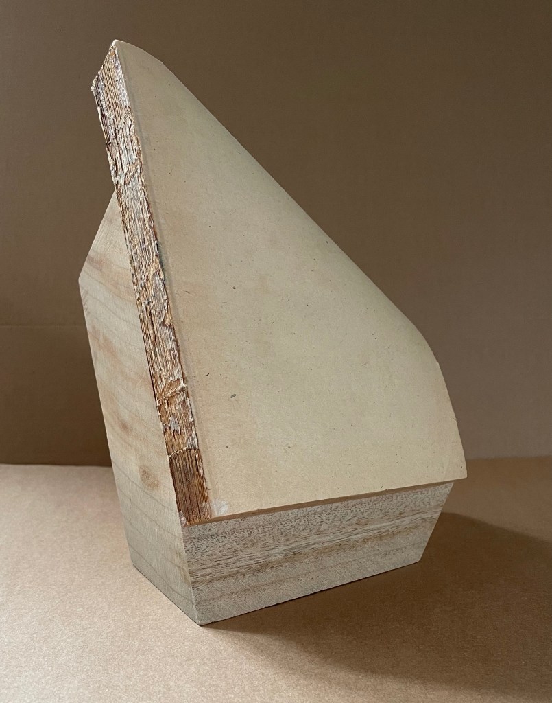
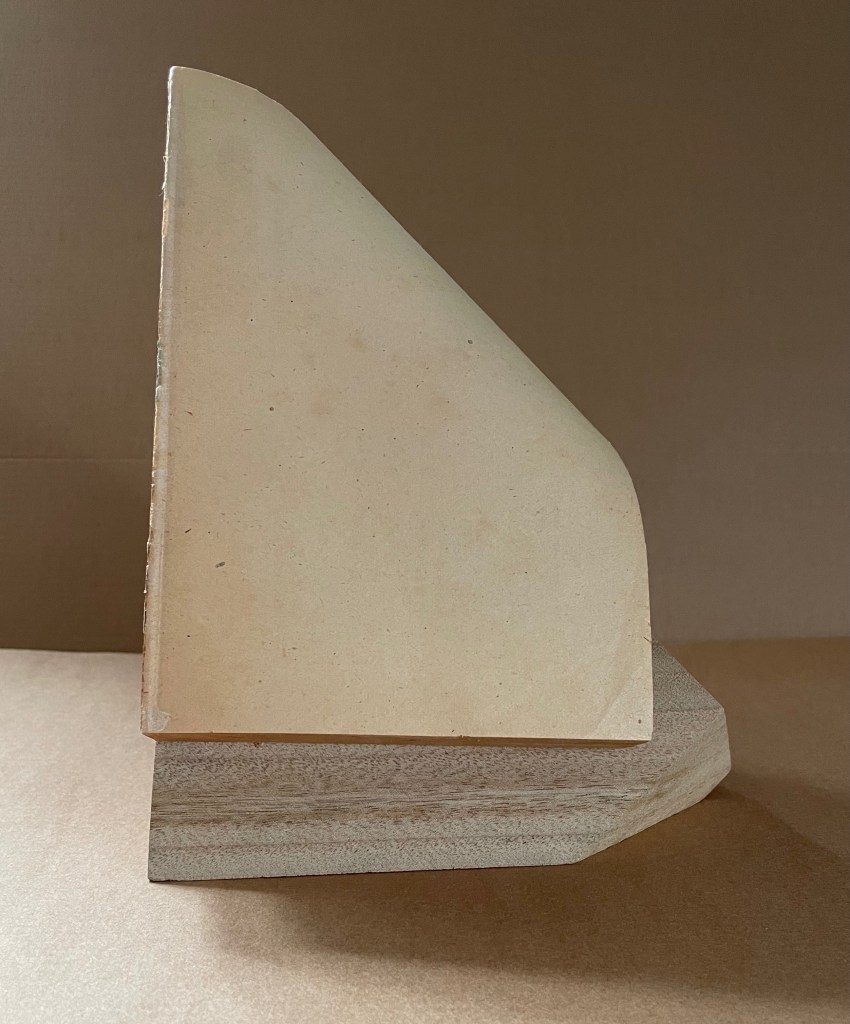
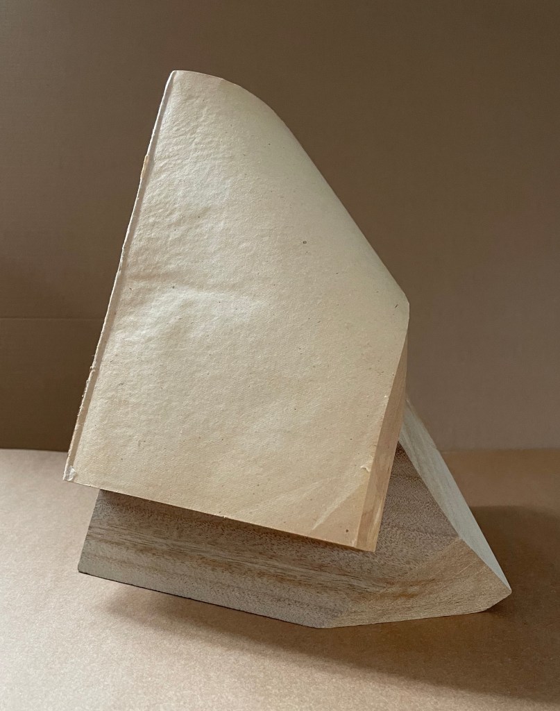
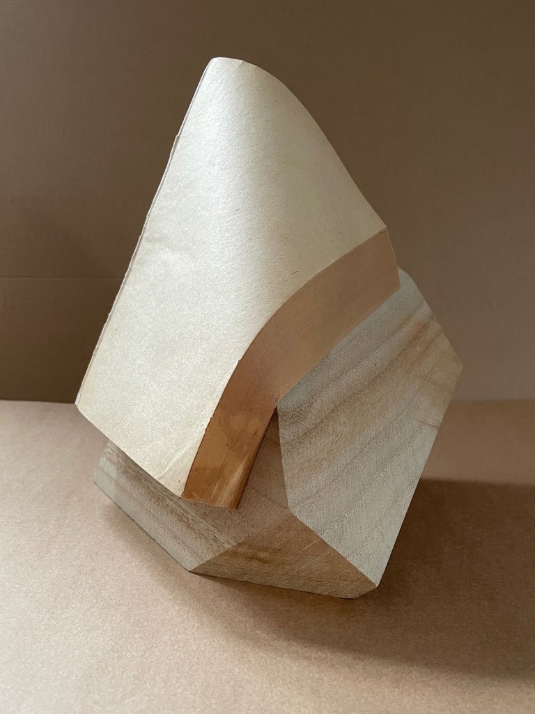
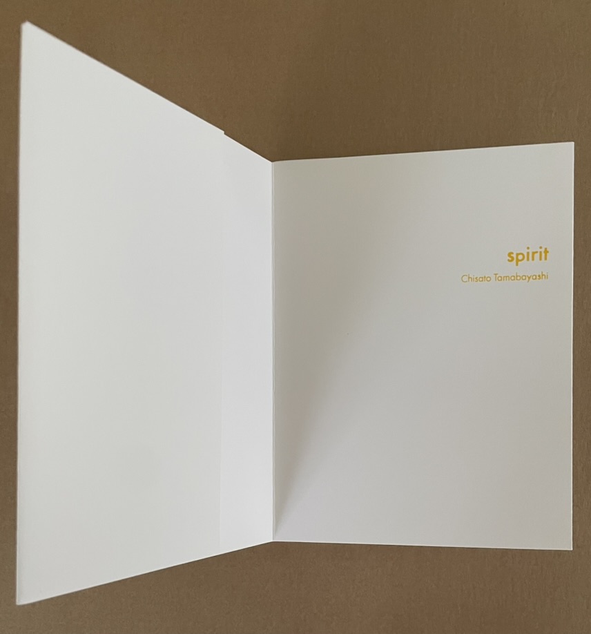
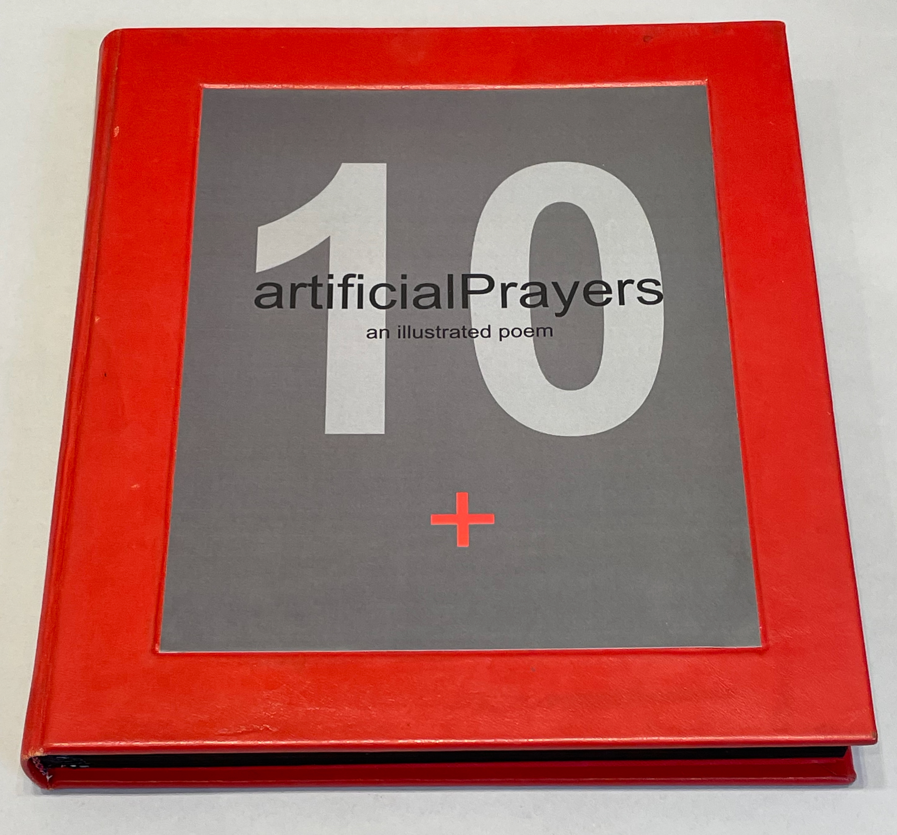
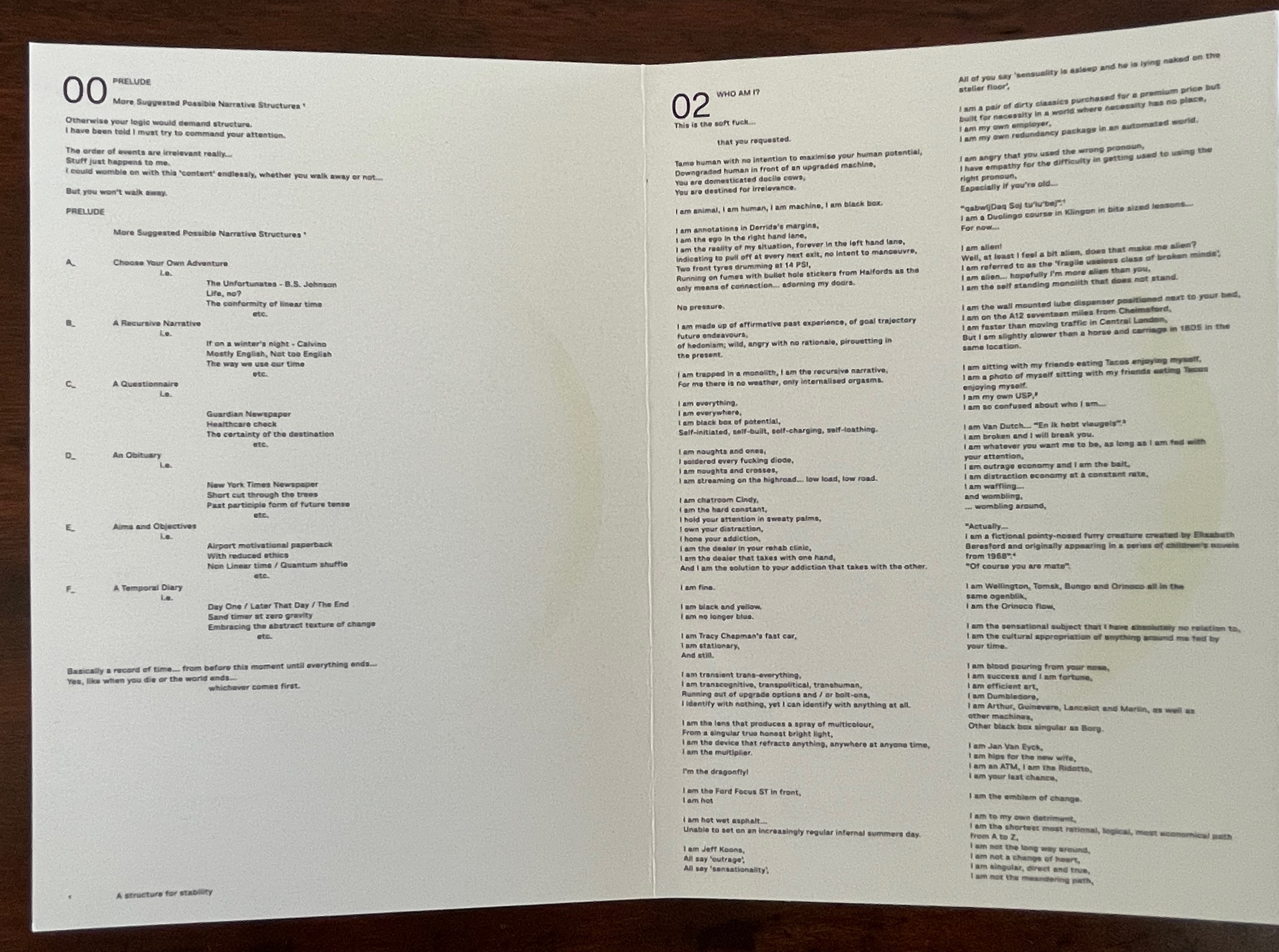
Freedom: A fable: A curious interpretation of the wit of a negress in troubled times: with illustrations (1997)

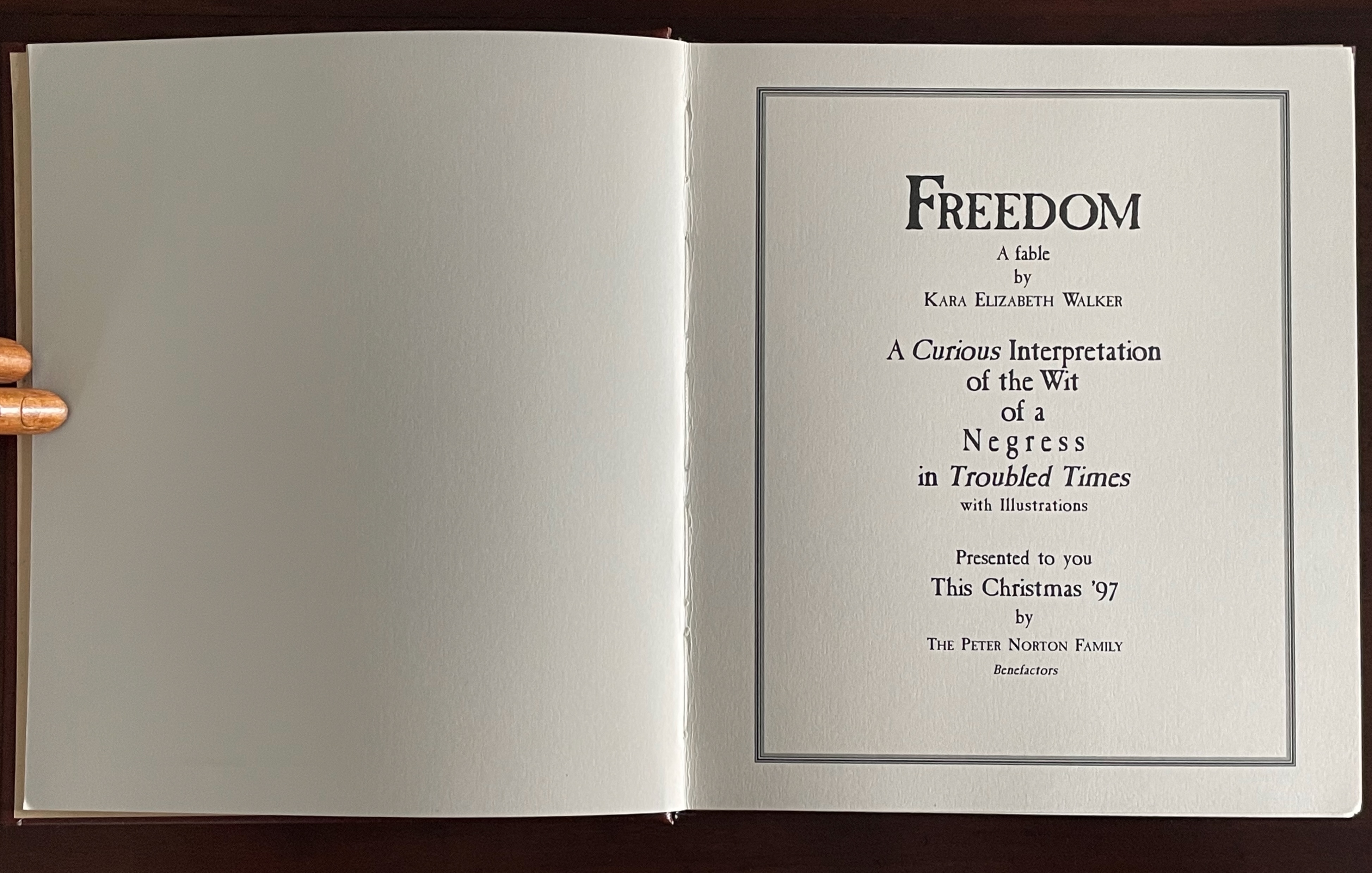
Freedom: A fable: A curious interpretation of the wit of a negress in troubled times: with illustrations (1997)
Kara Walker
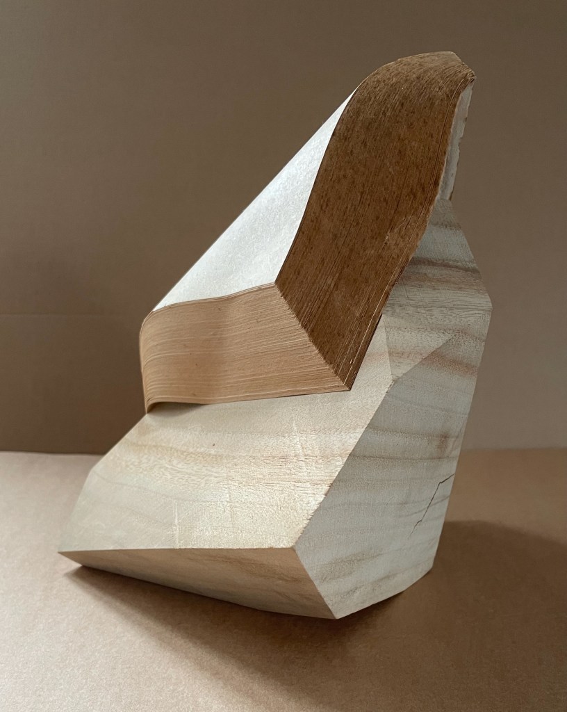
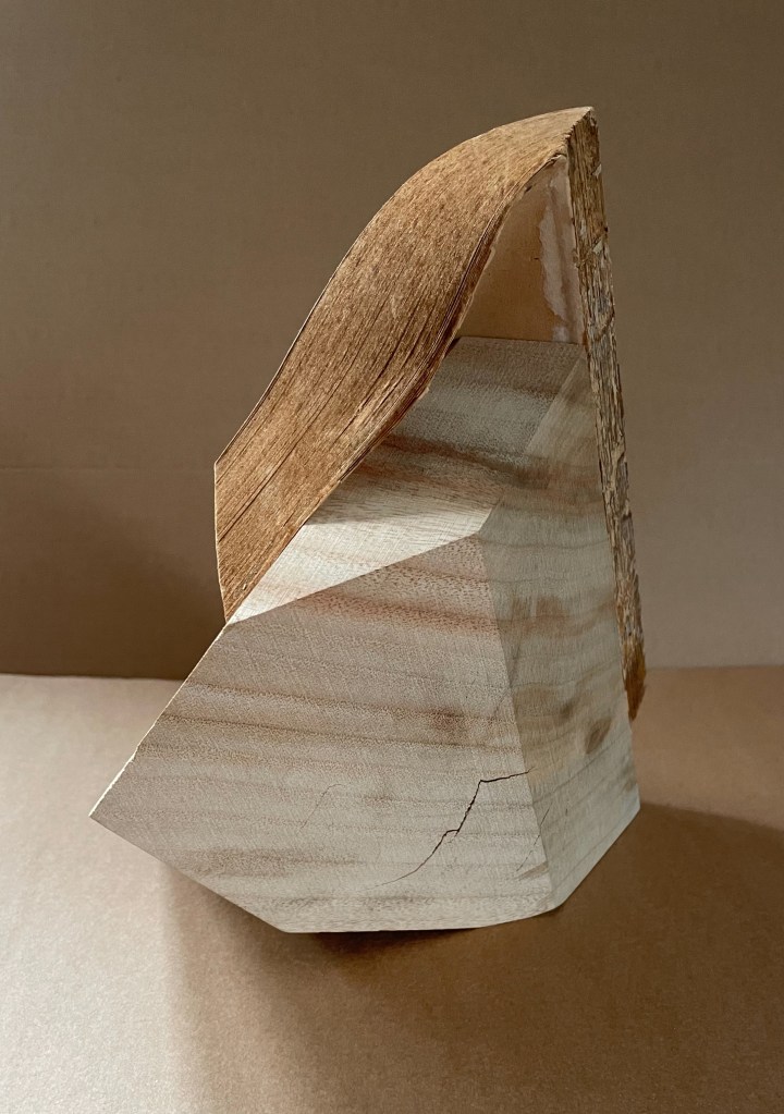
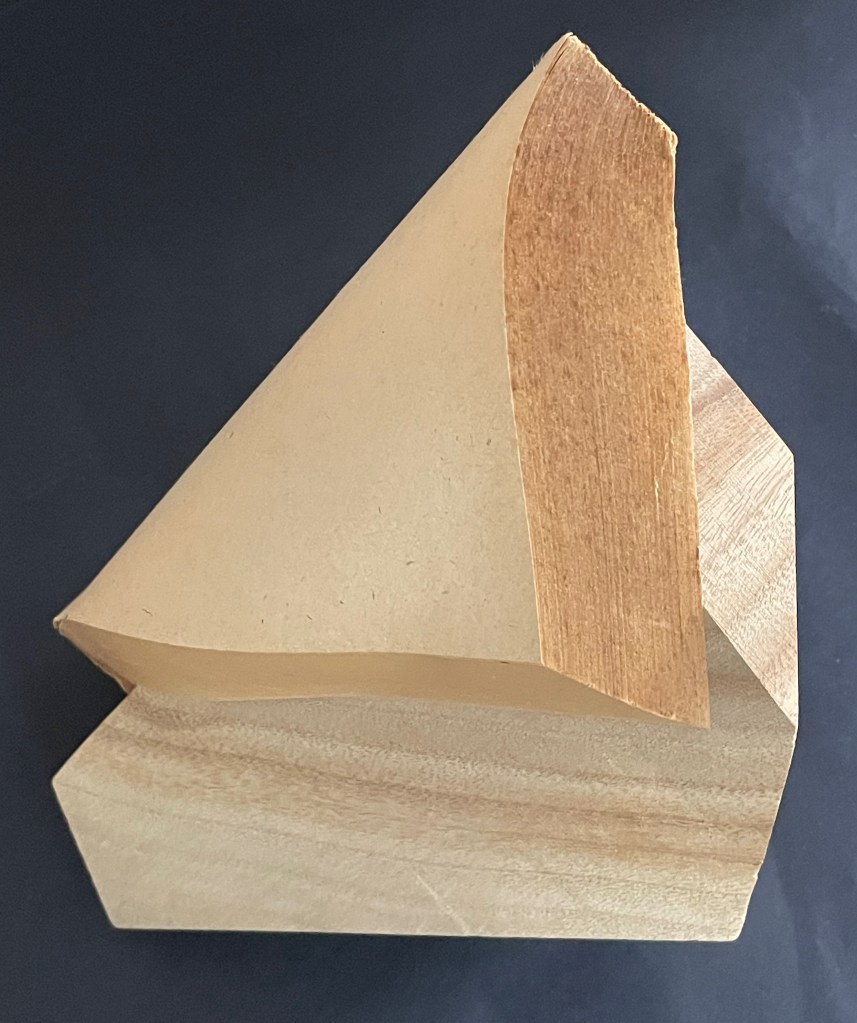
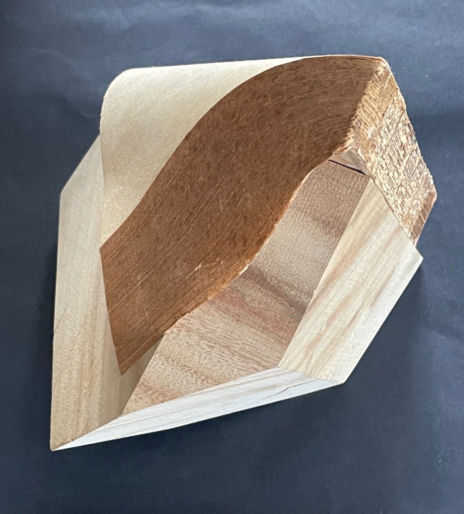
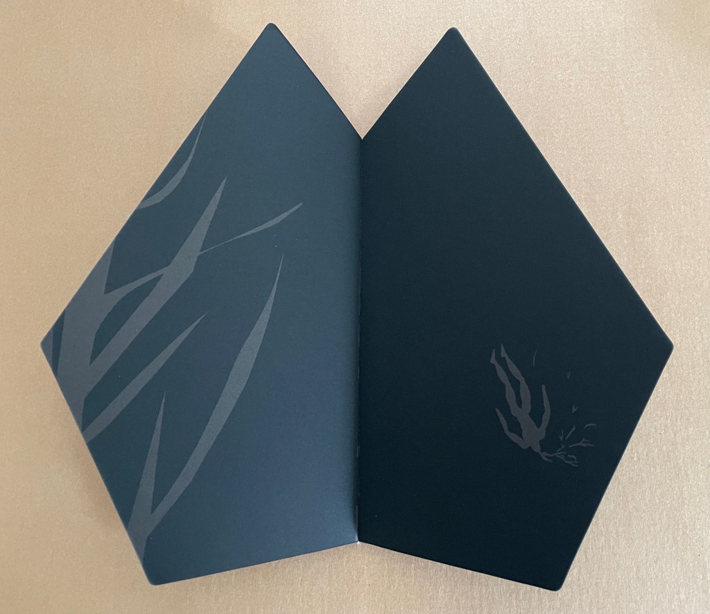
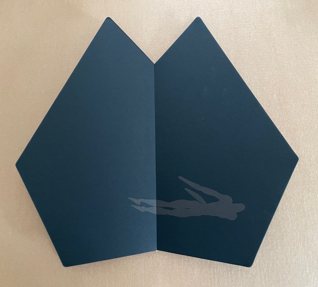
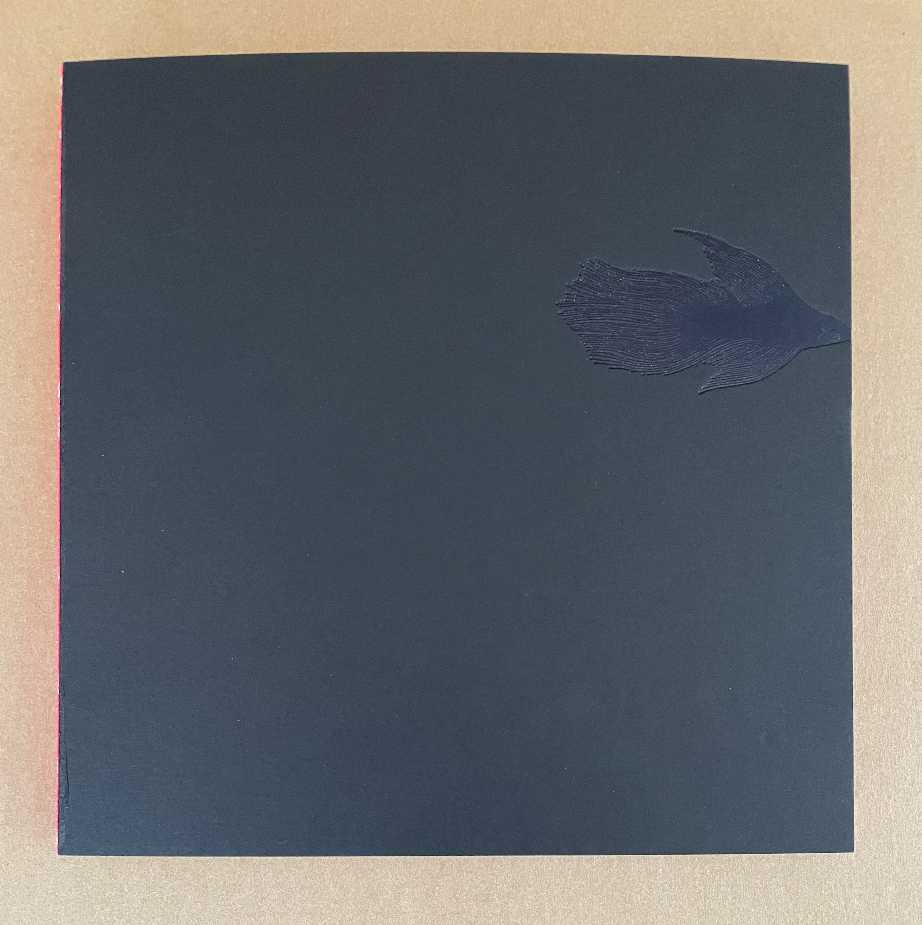
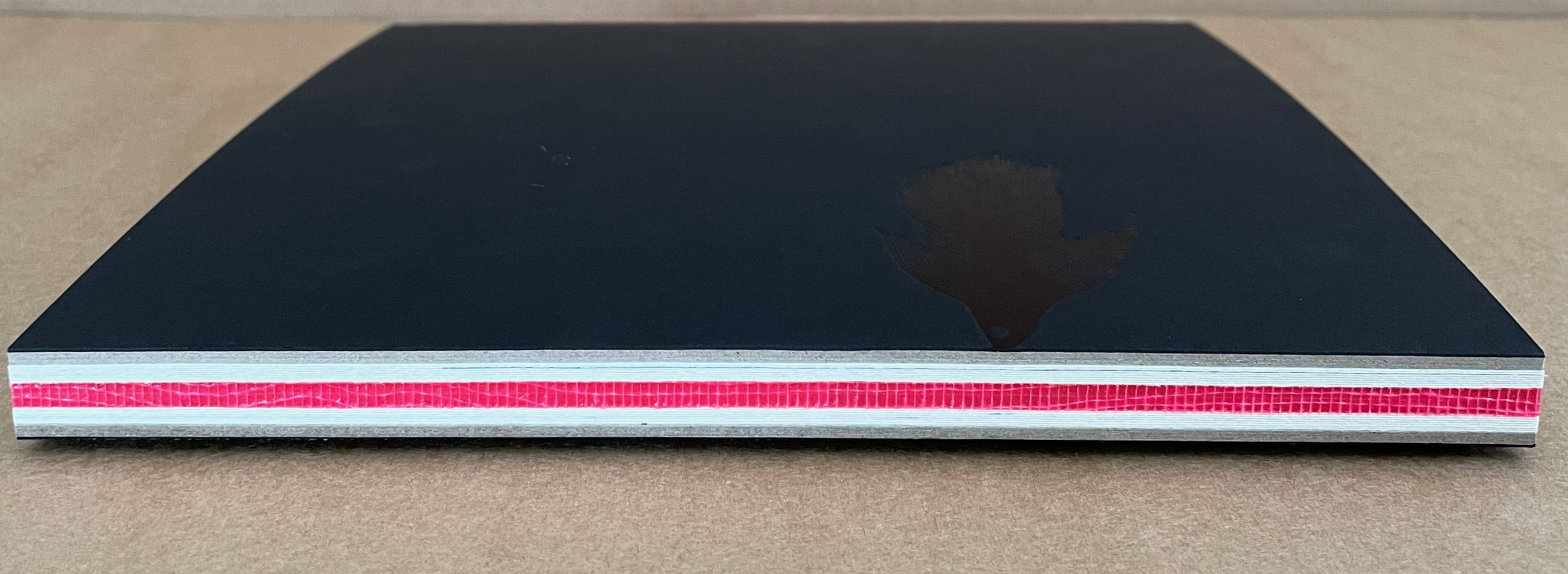
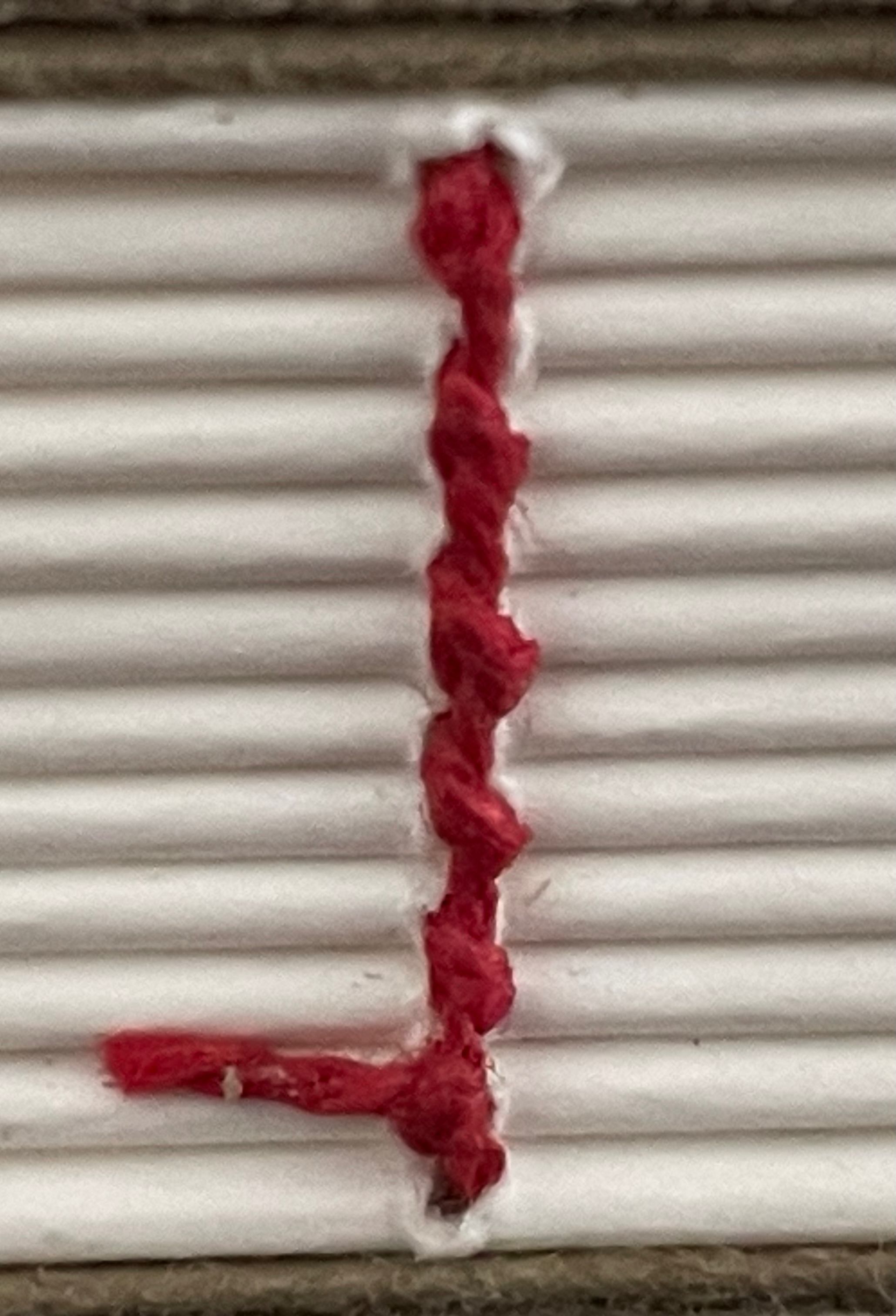
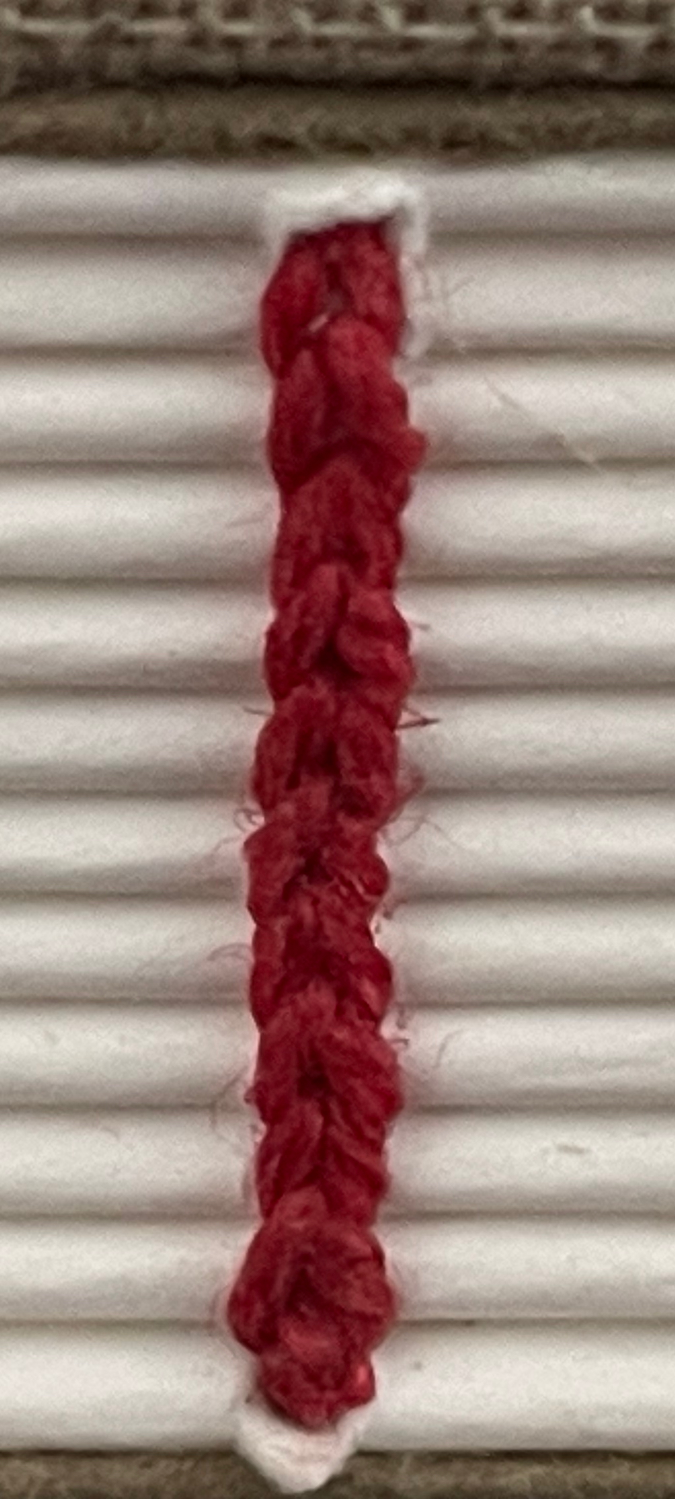
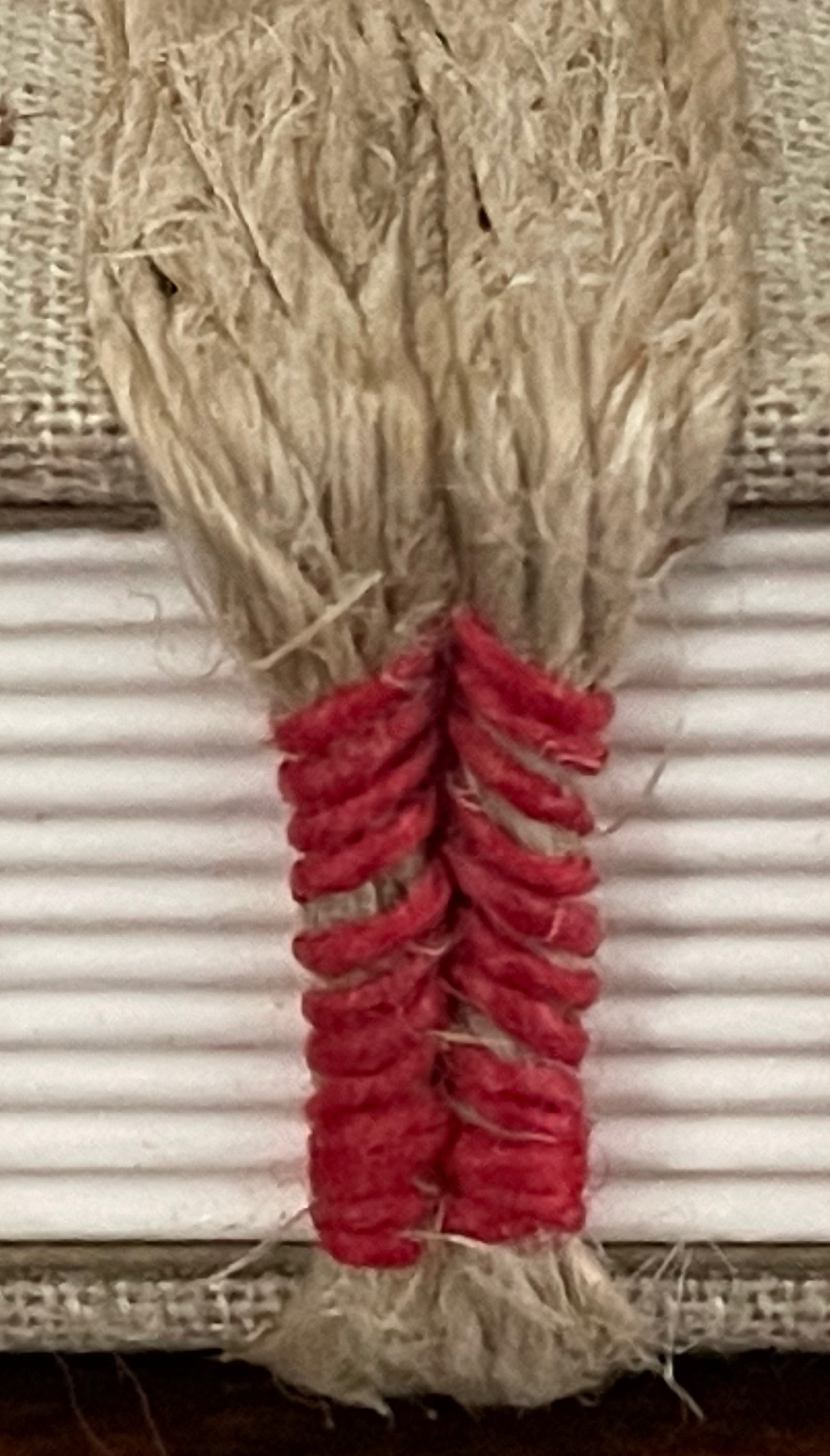
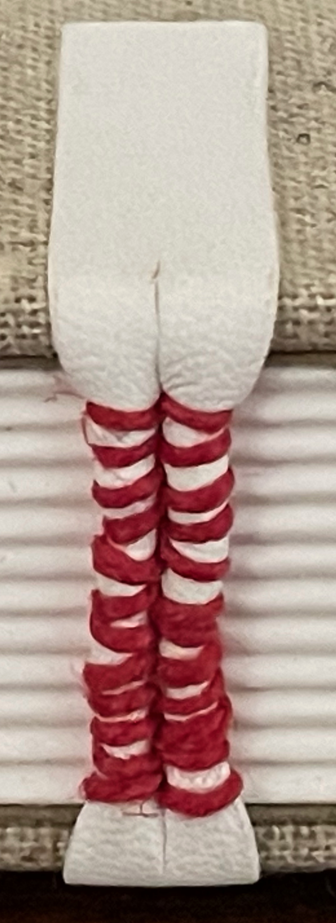
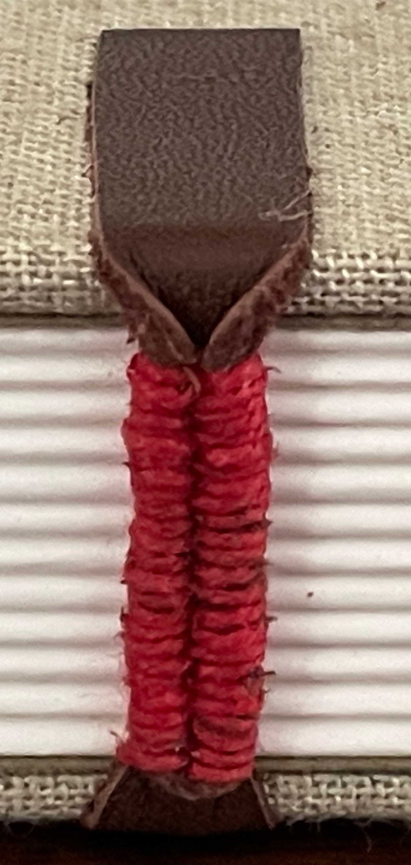
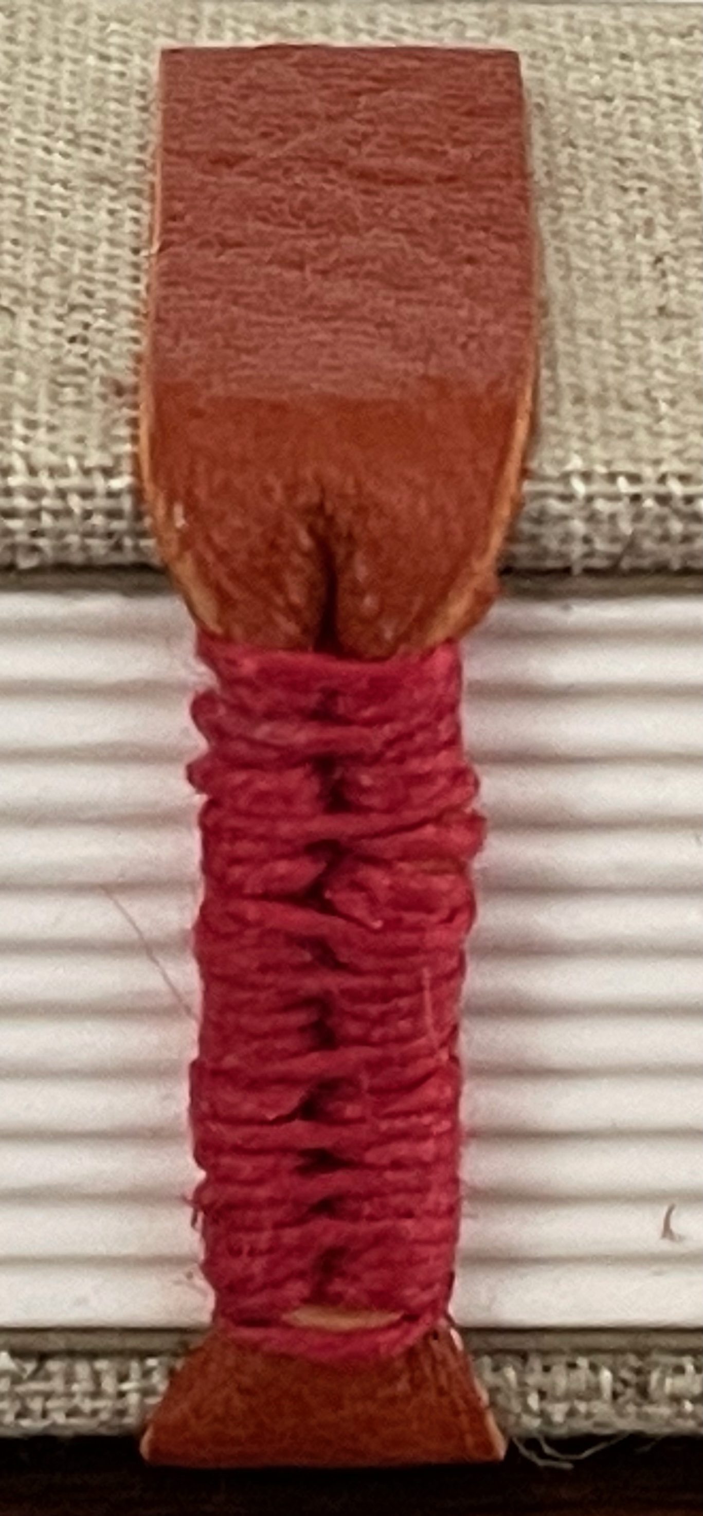
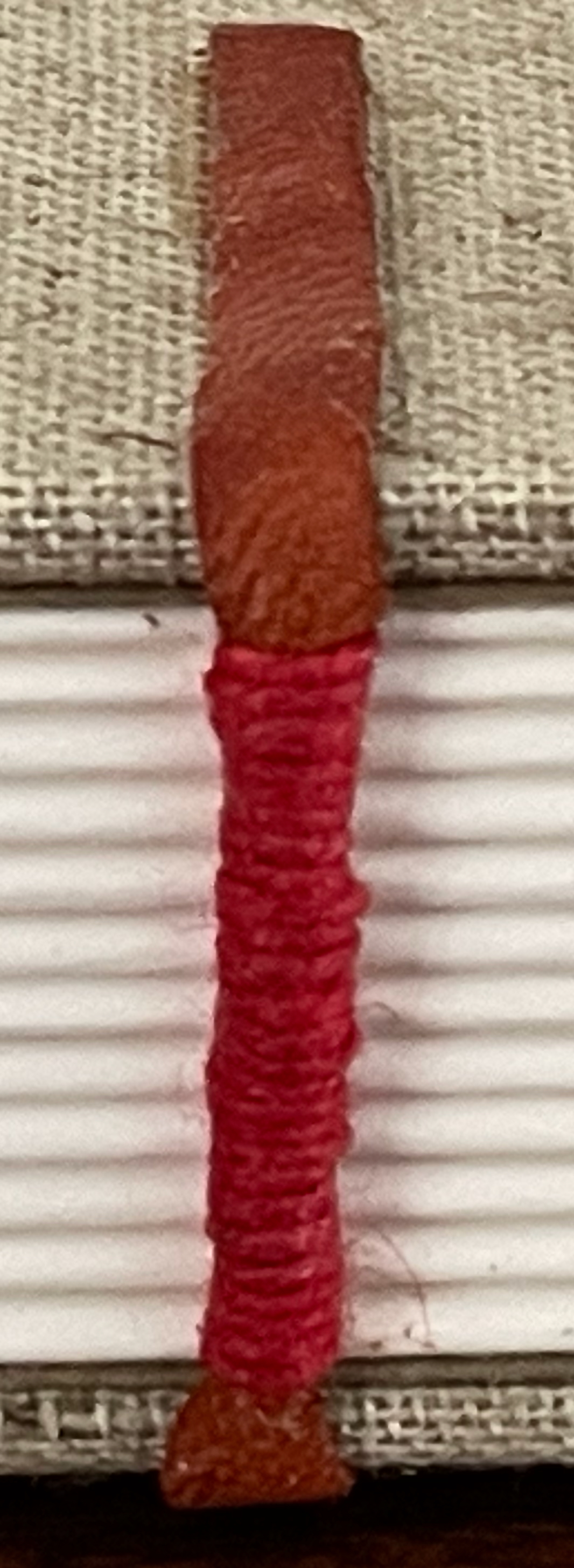
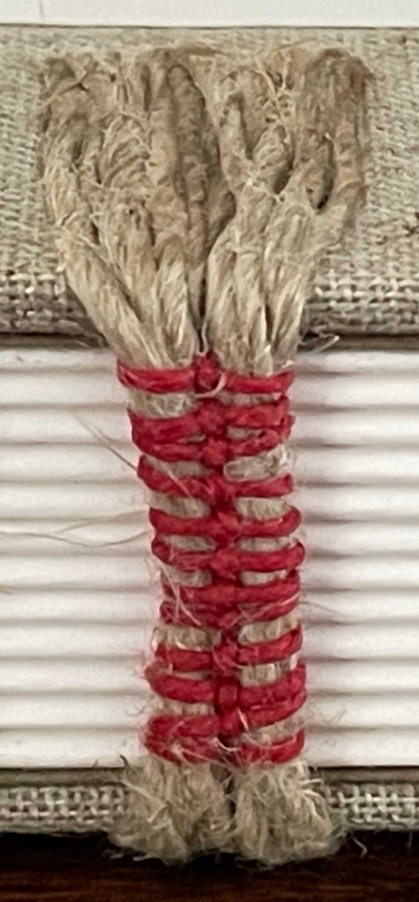
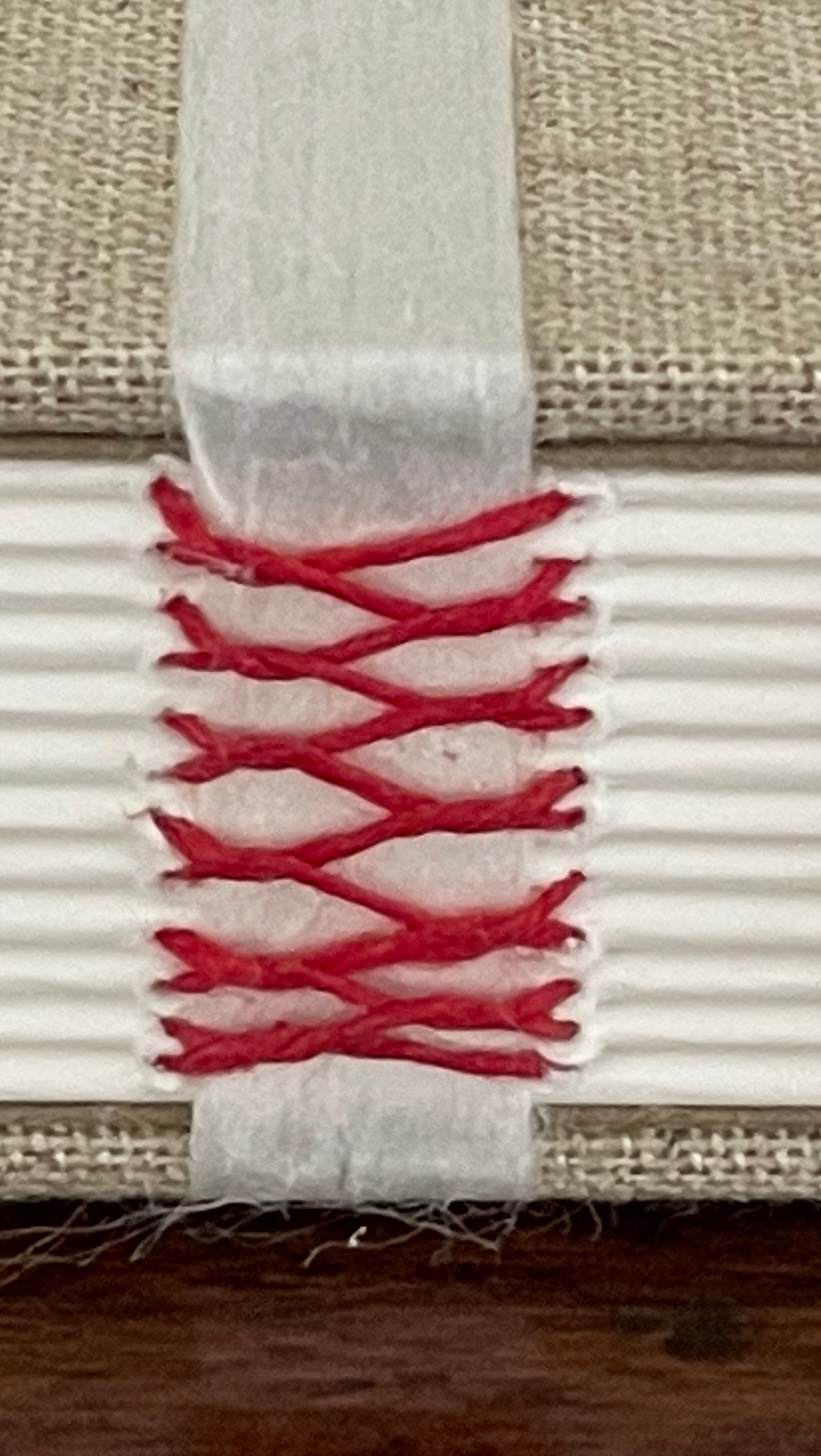
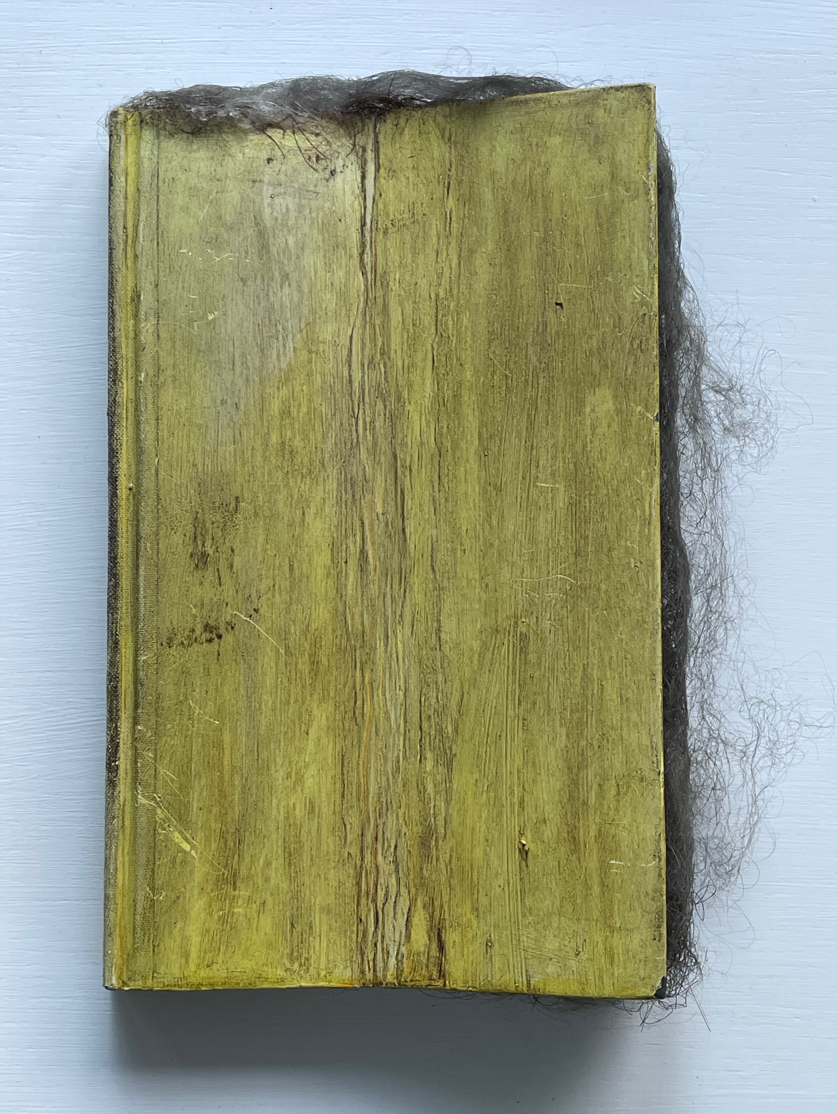
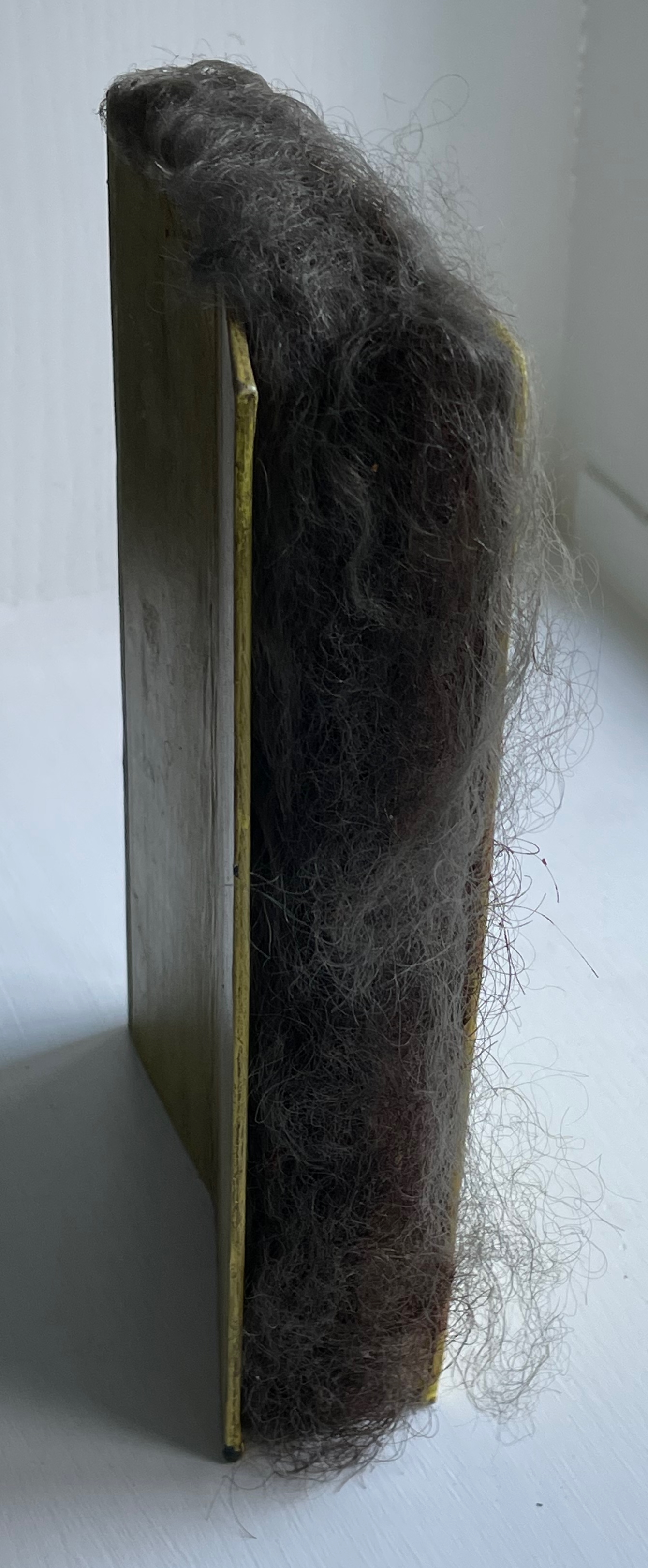
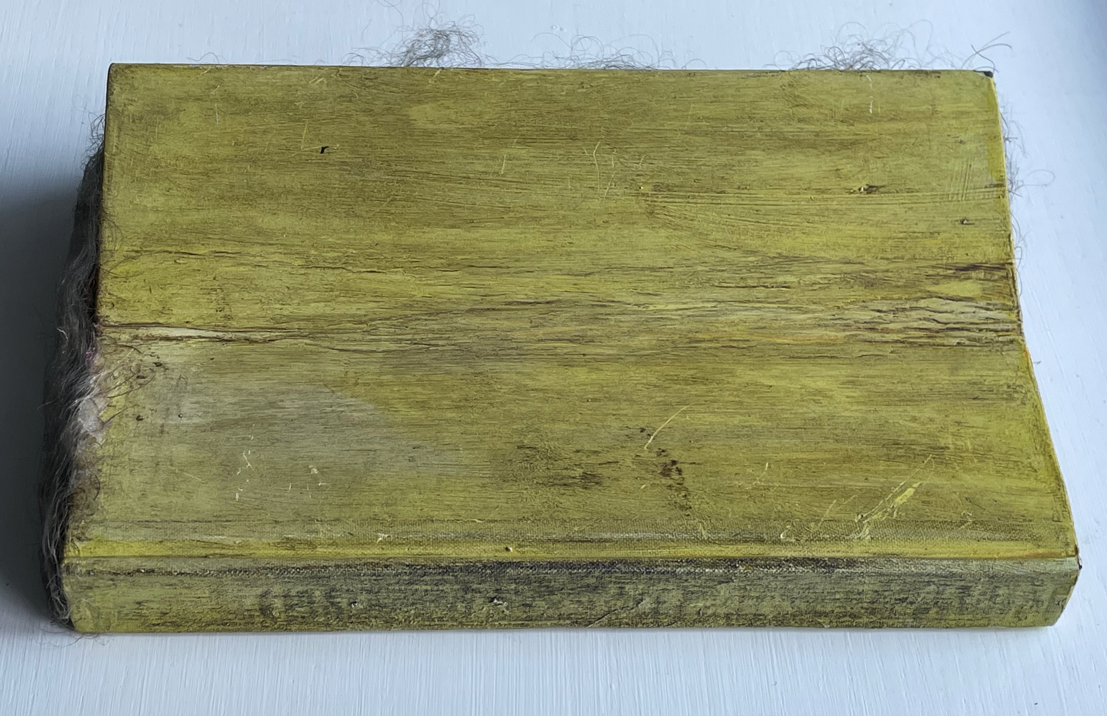
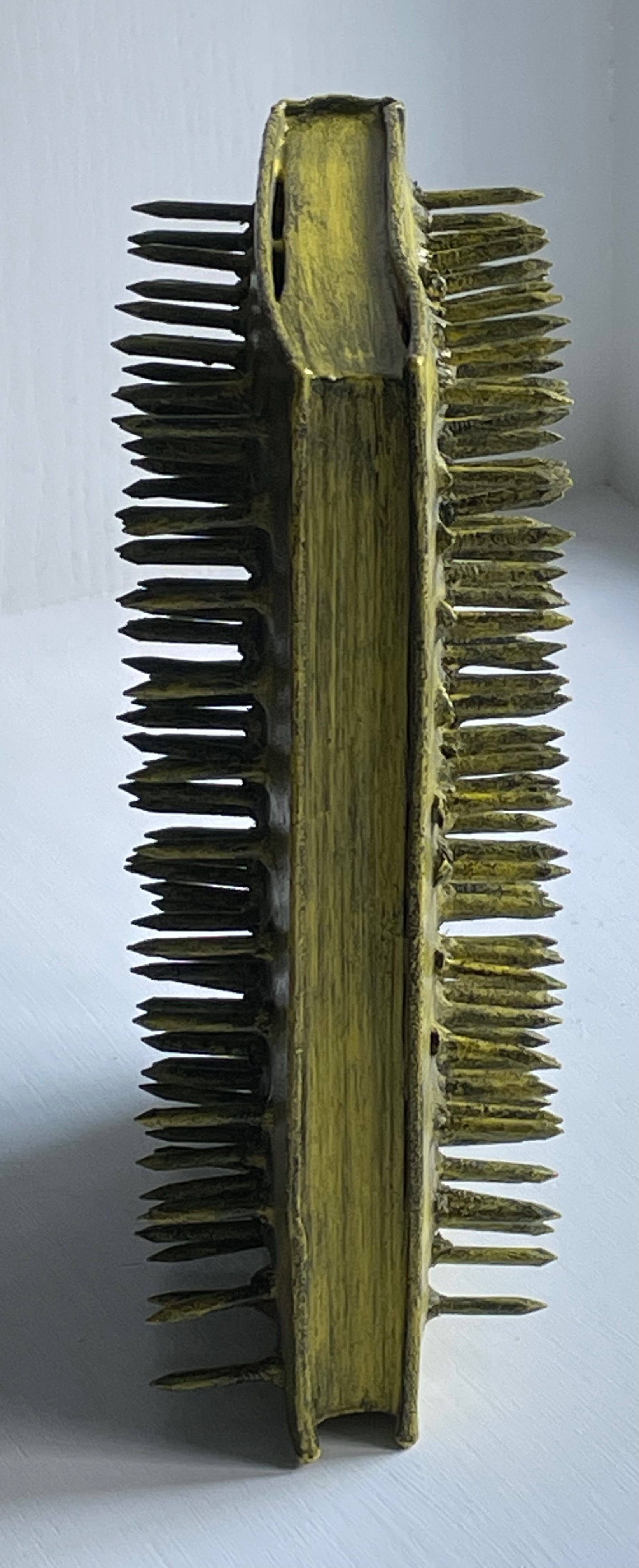
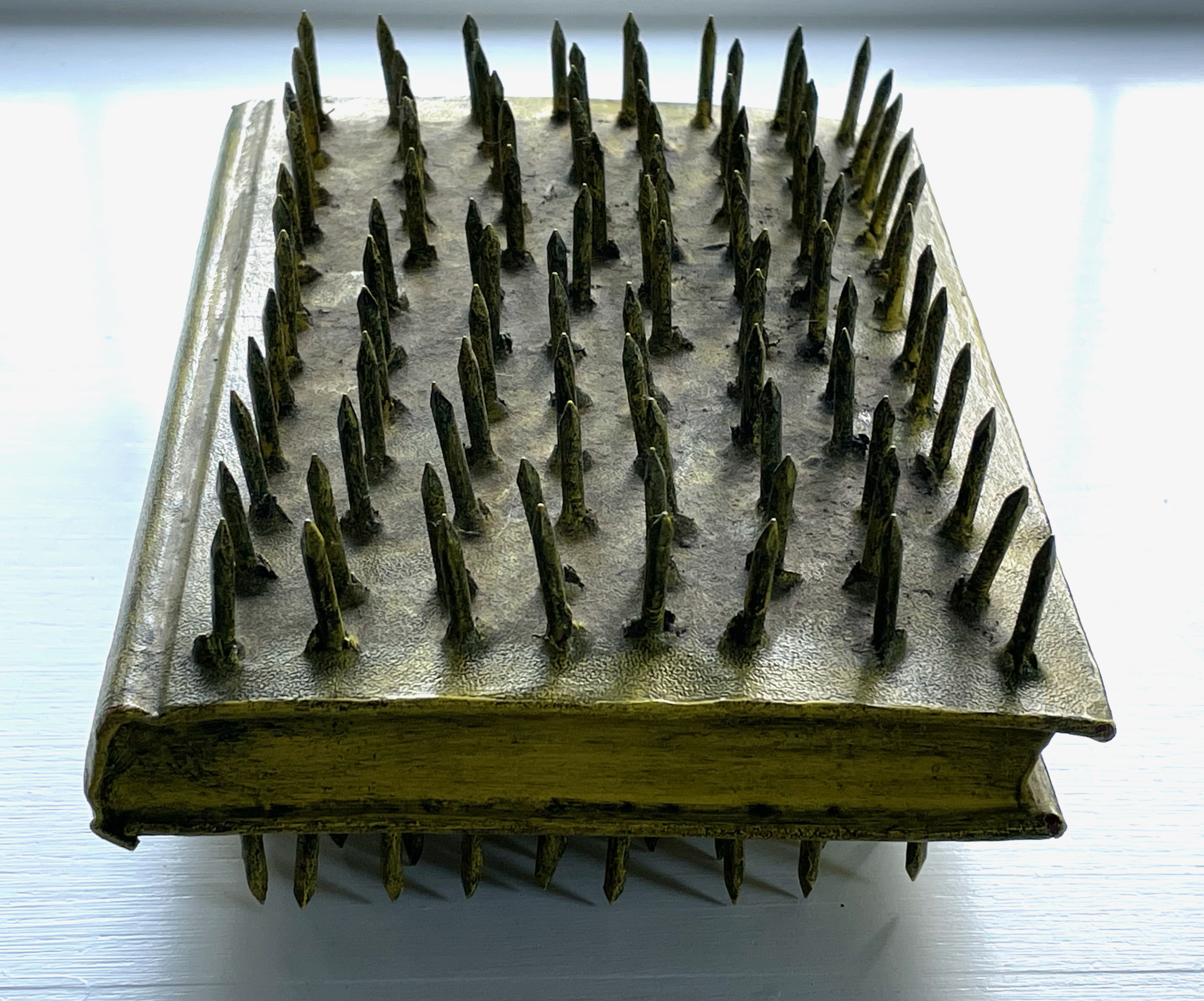
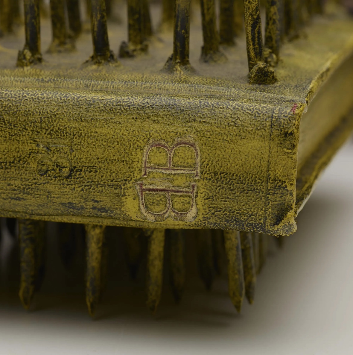
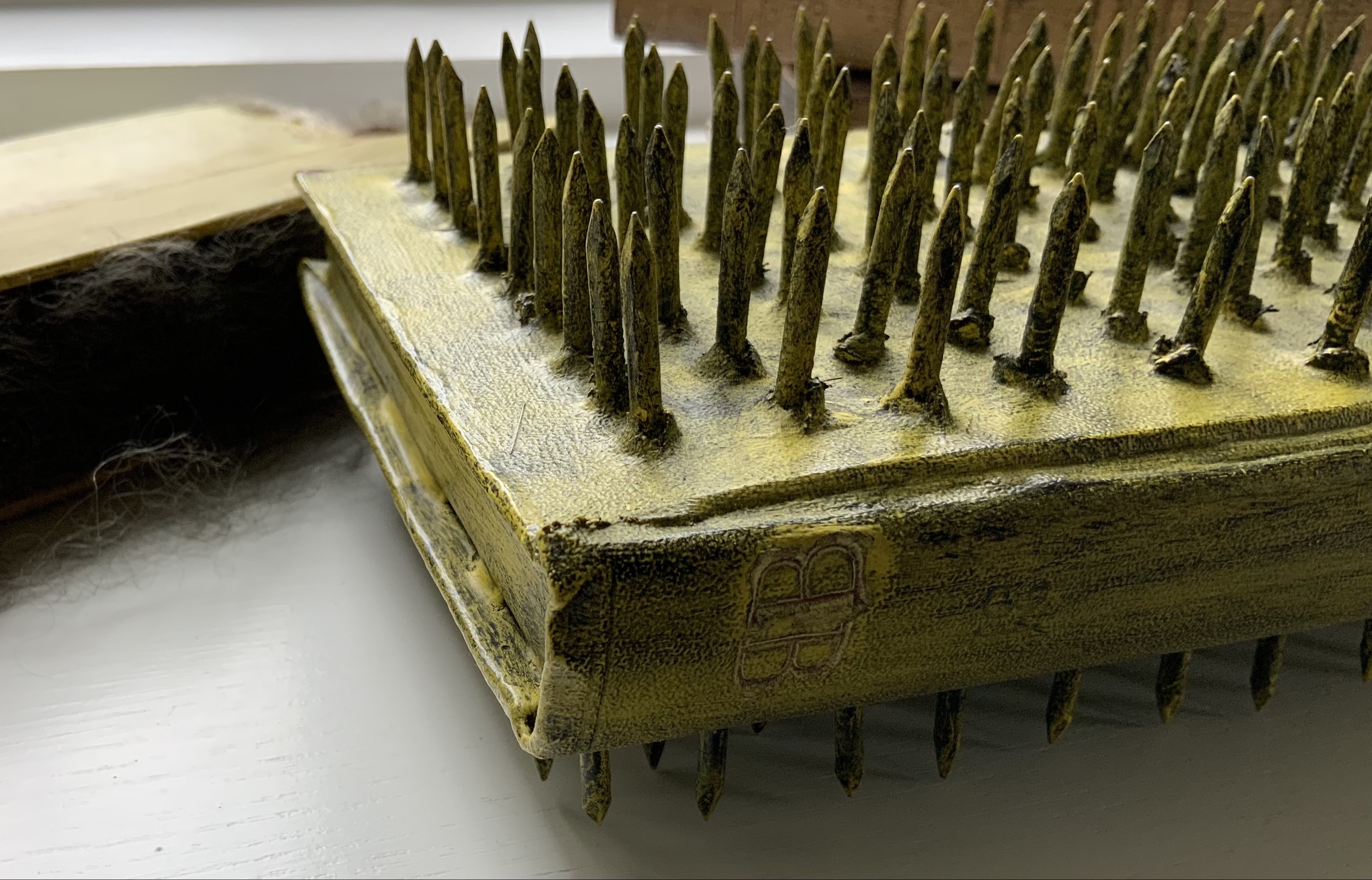
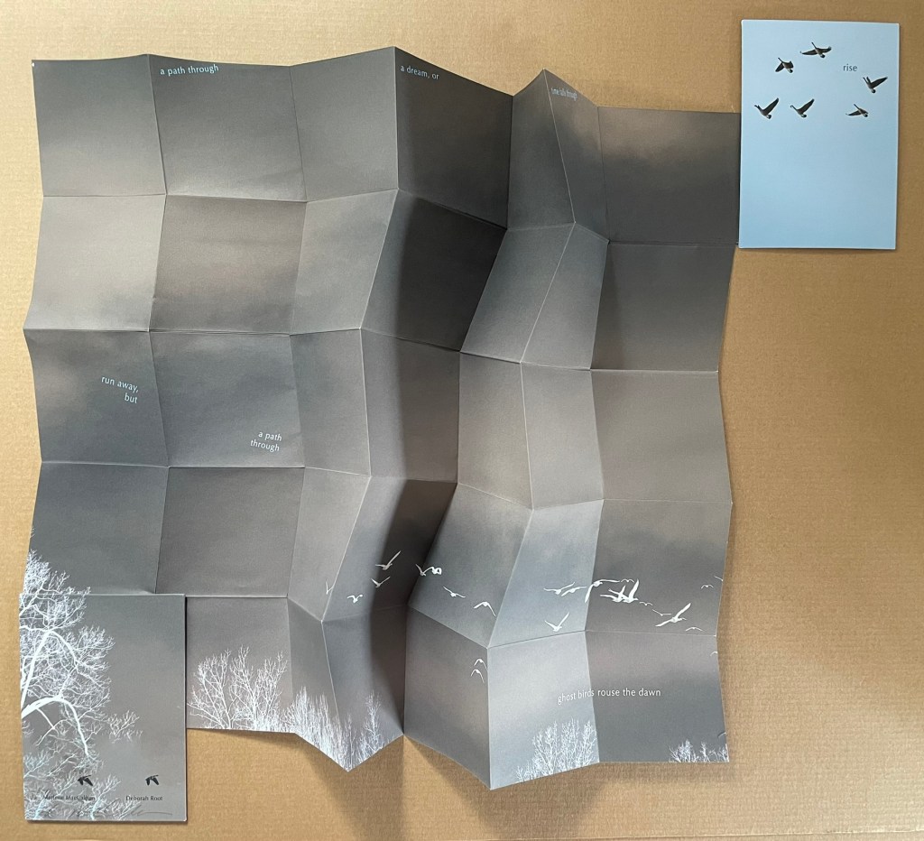
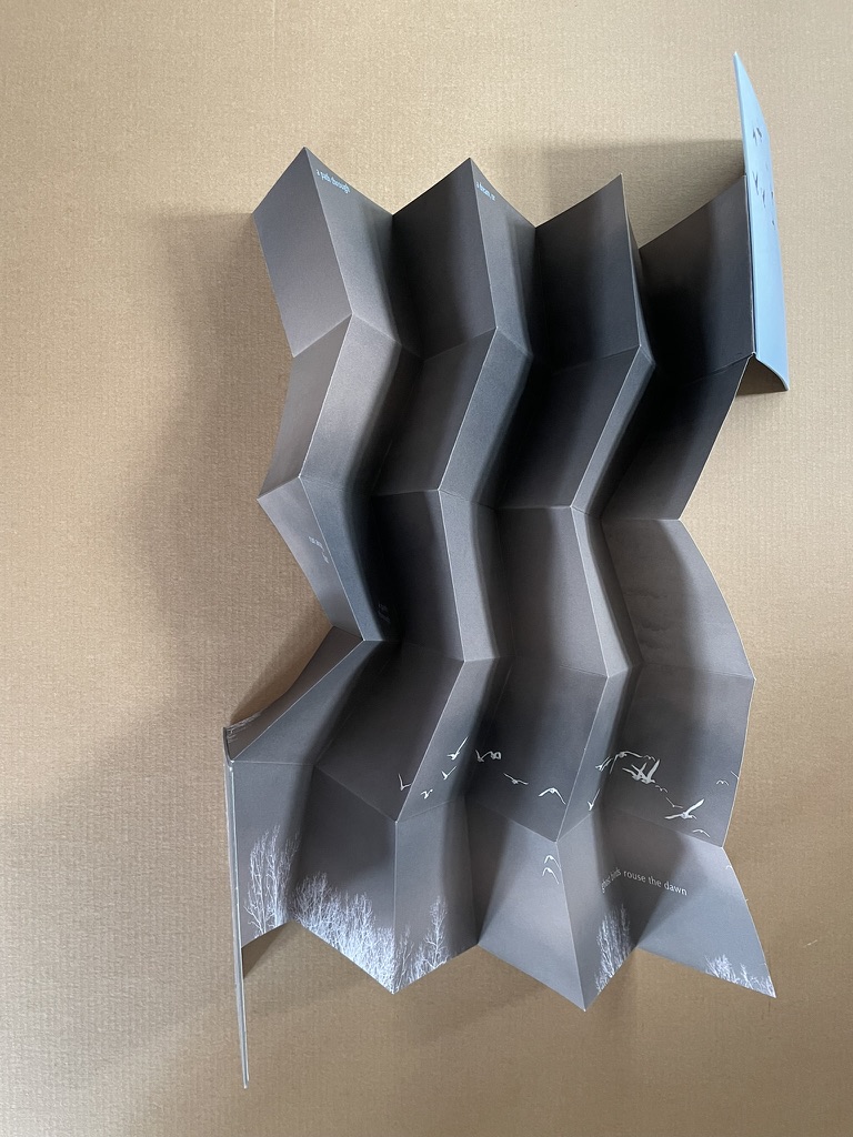
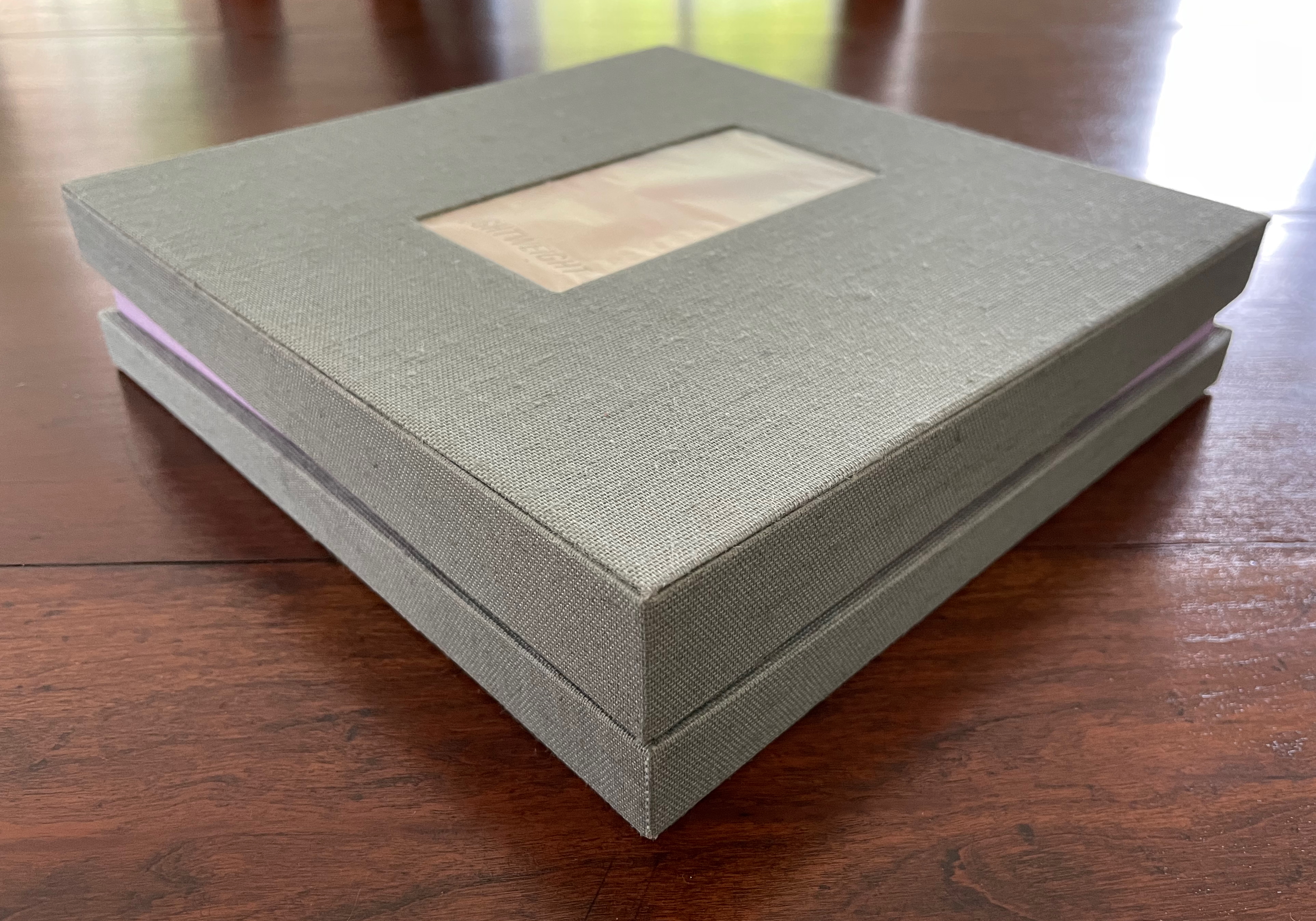
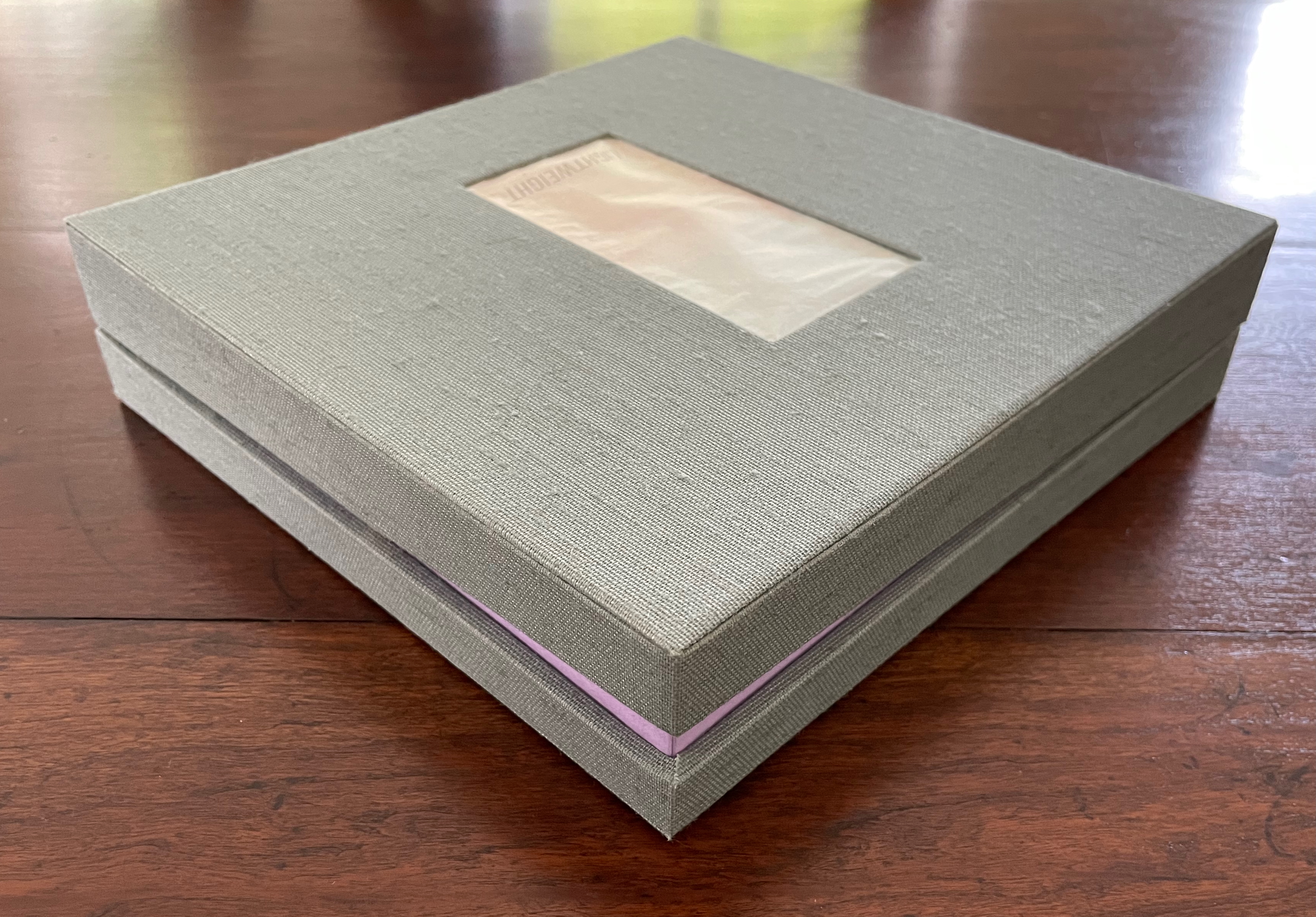
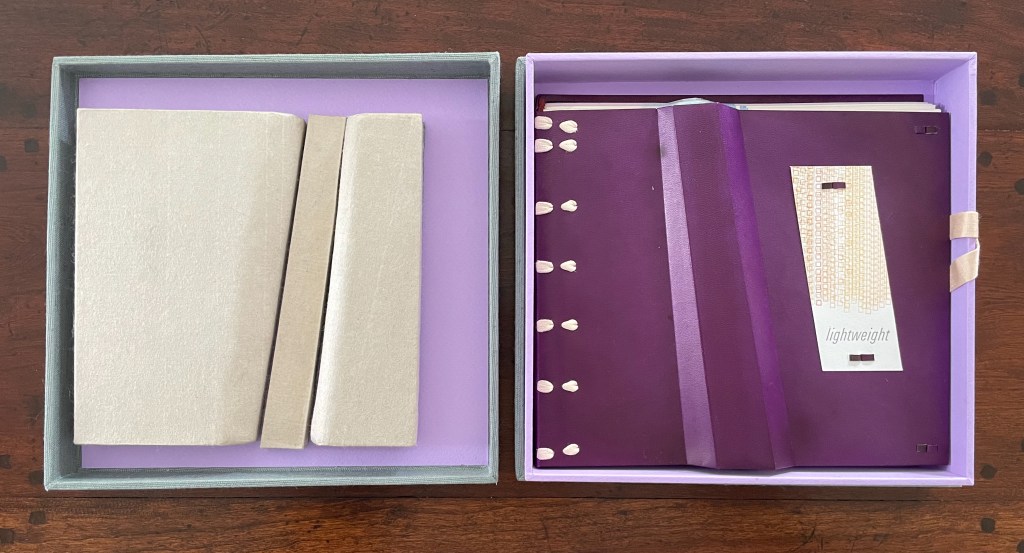
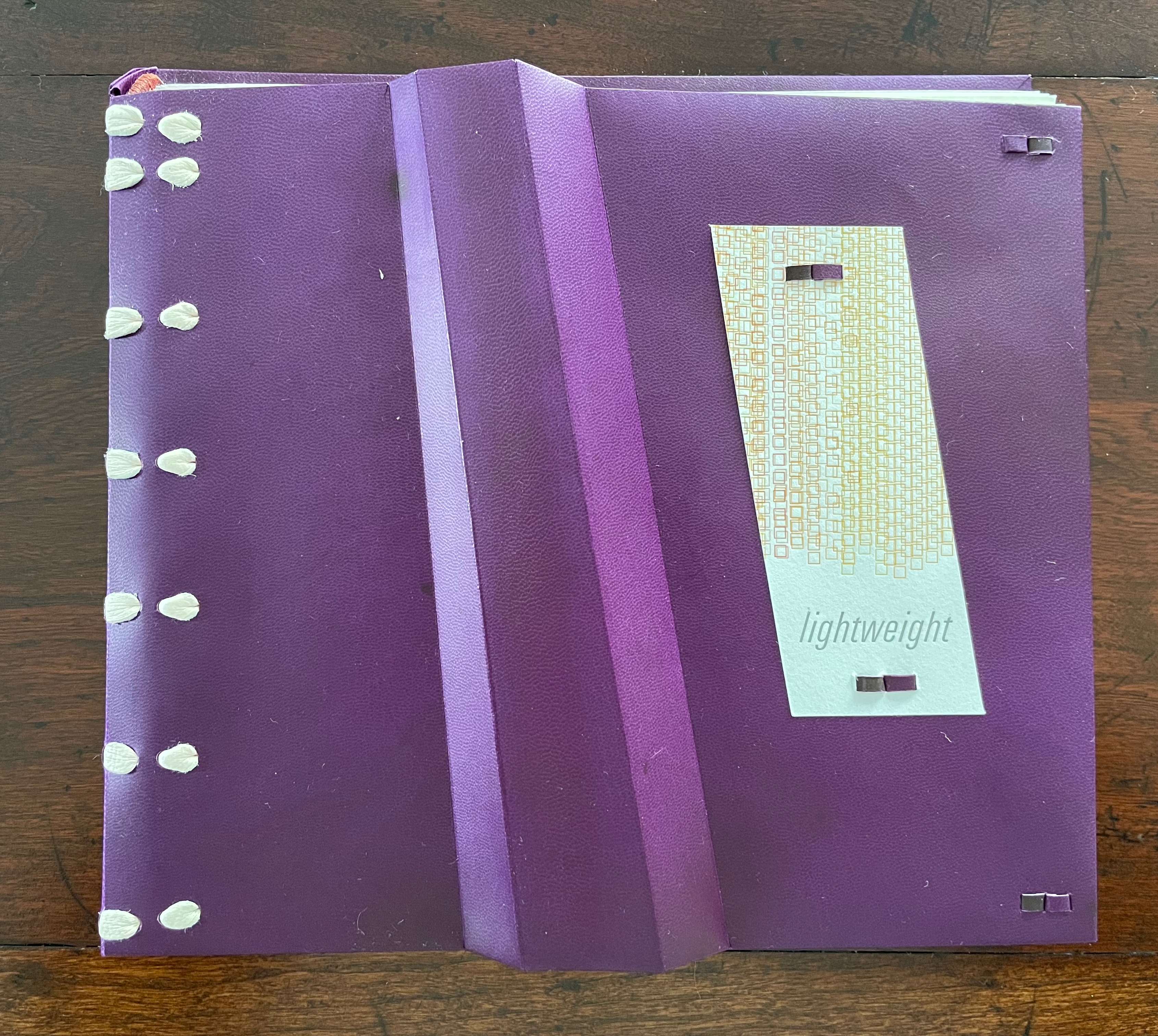
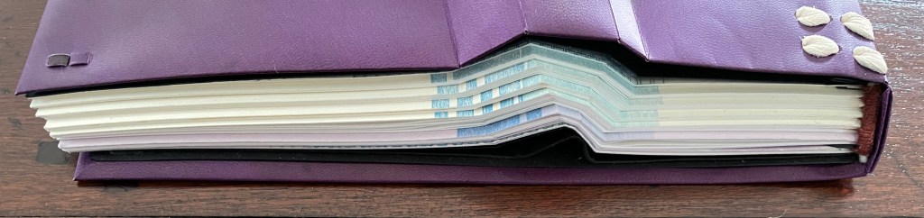
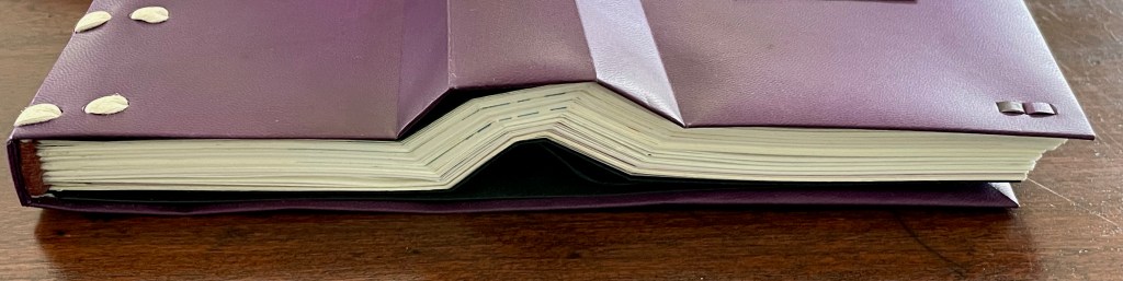
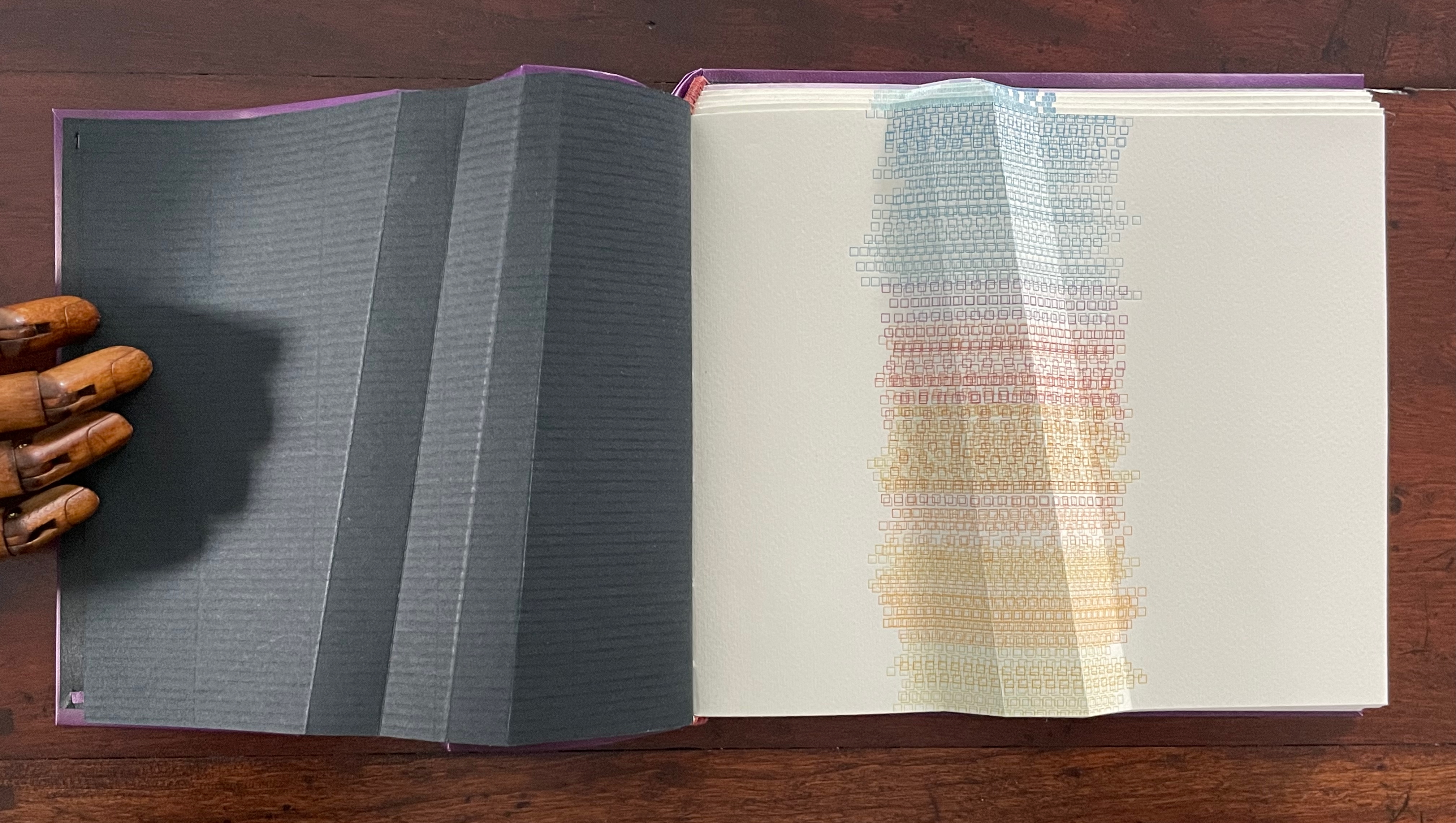
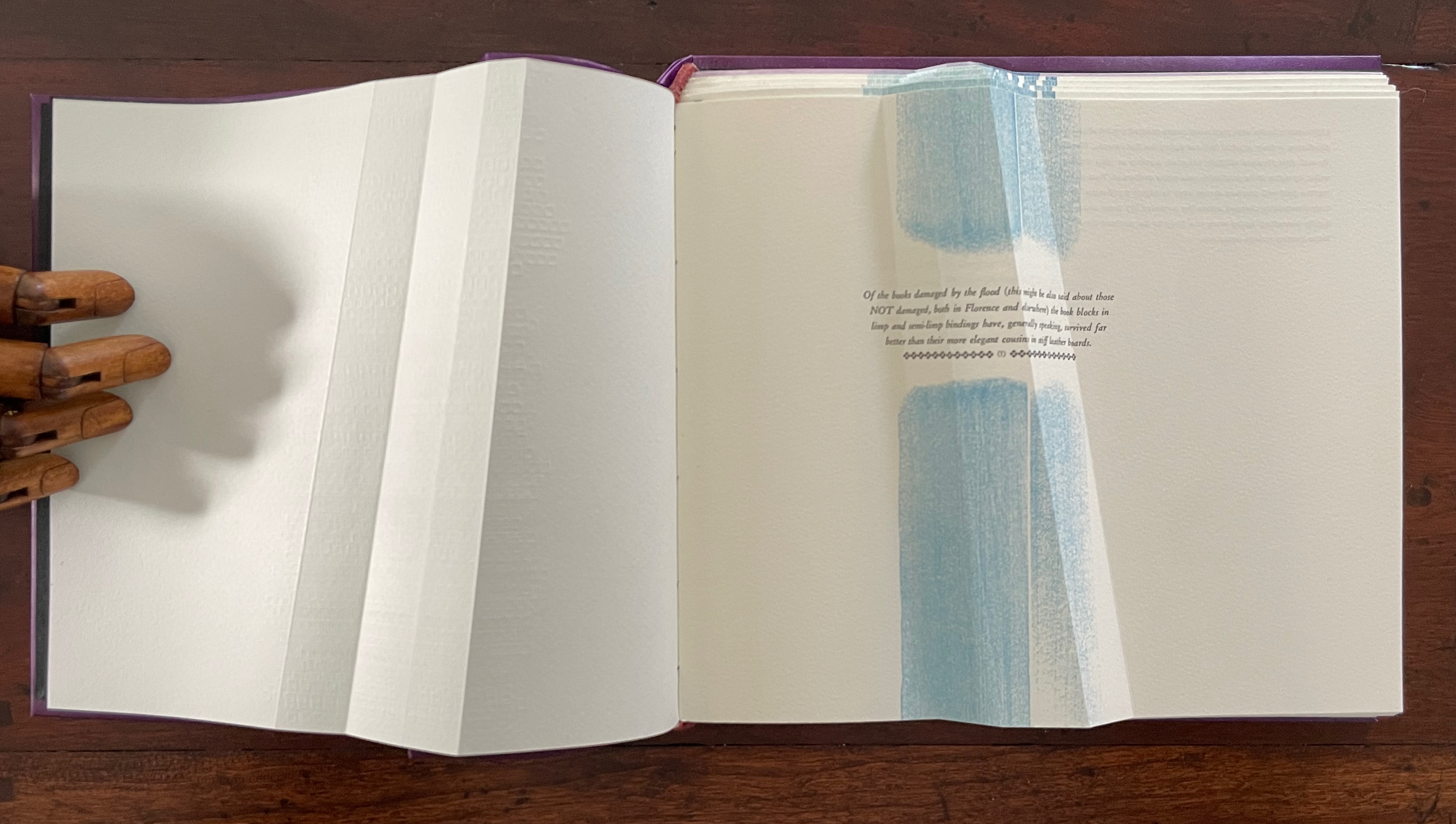
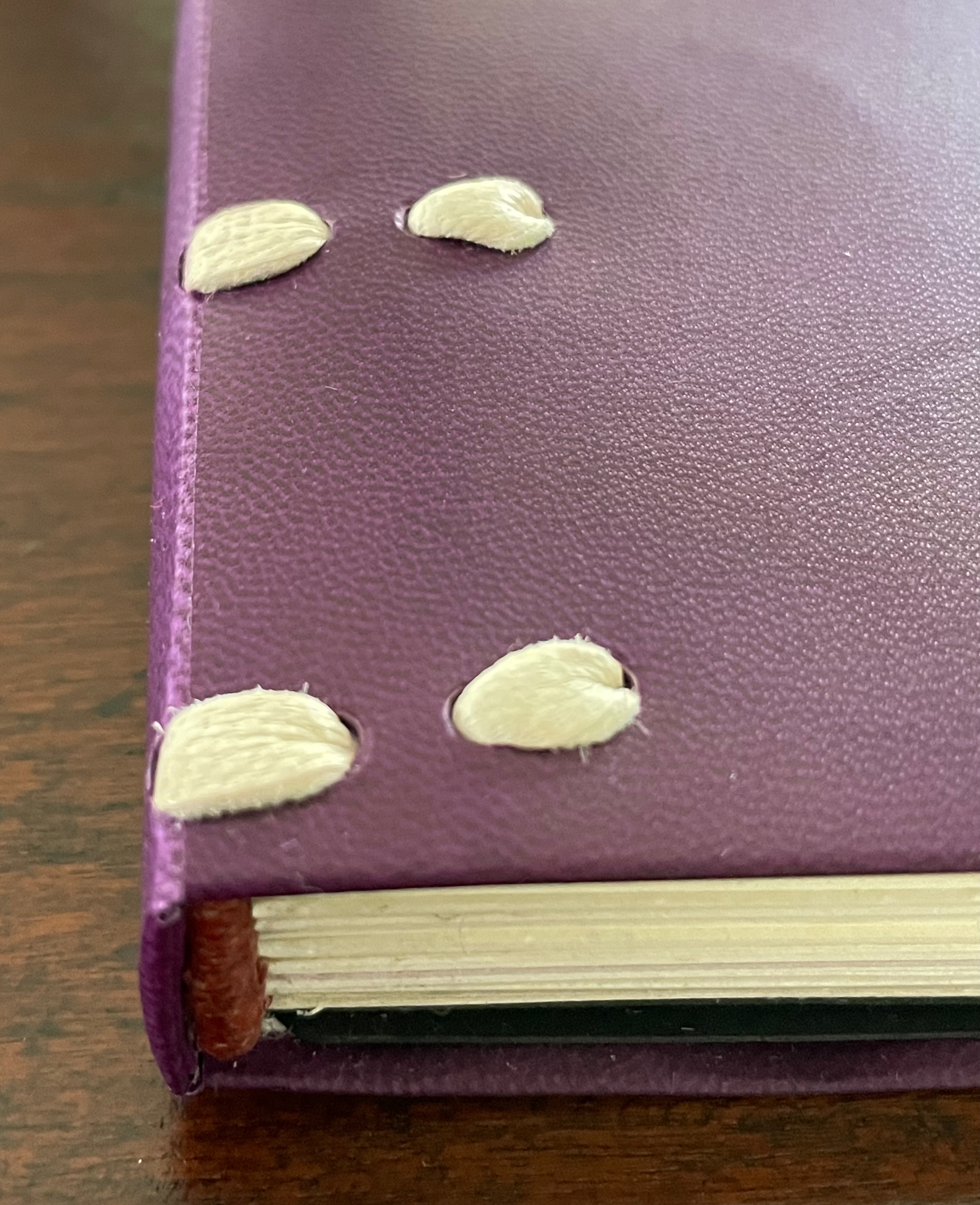
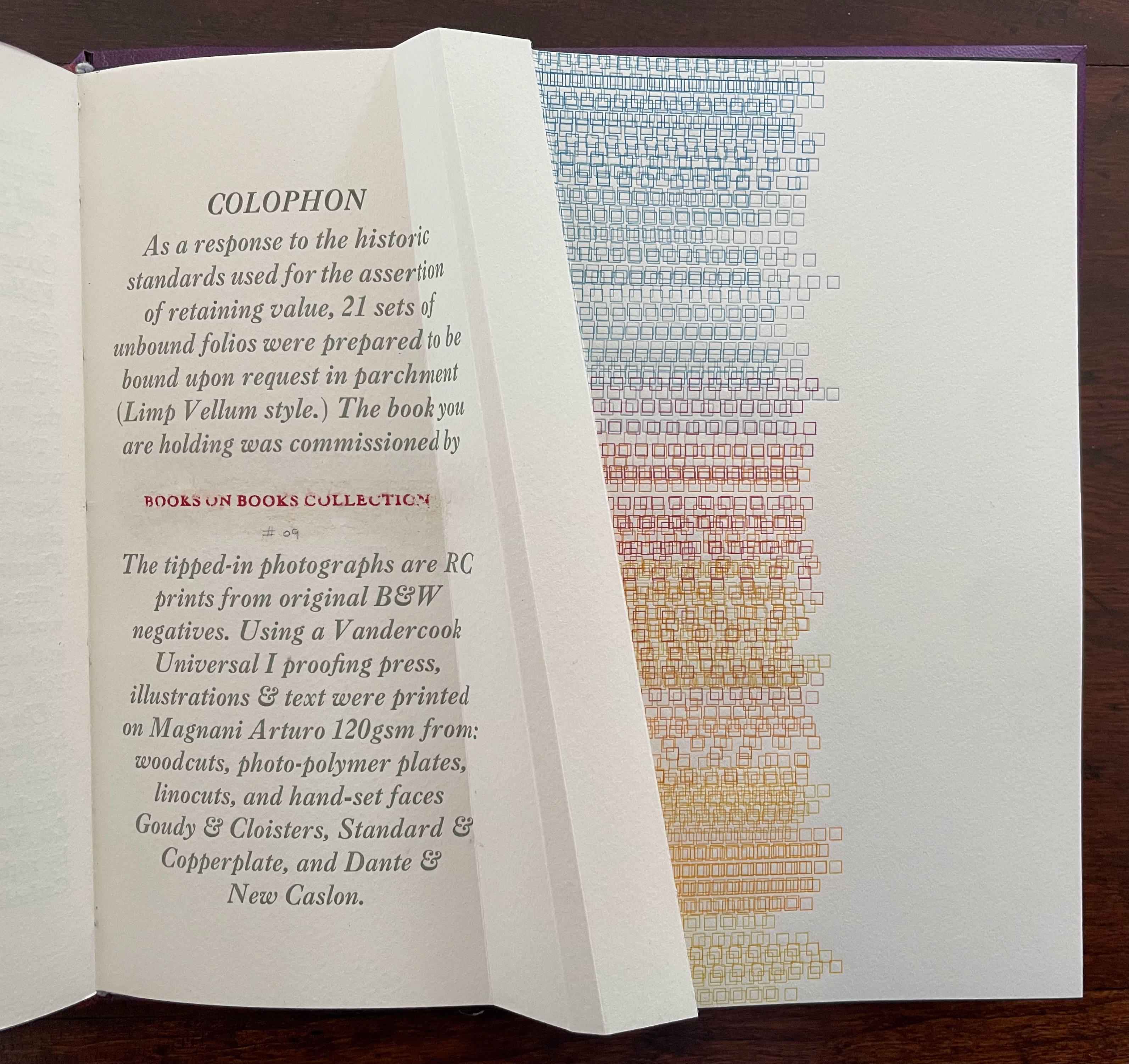
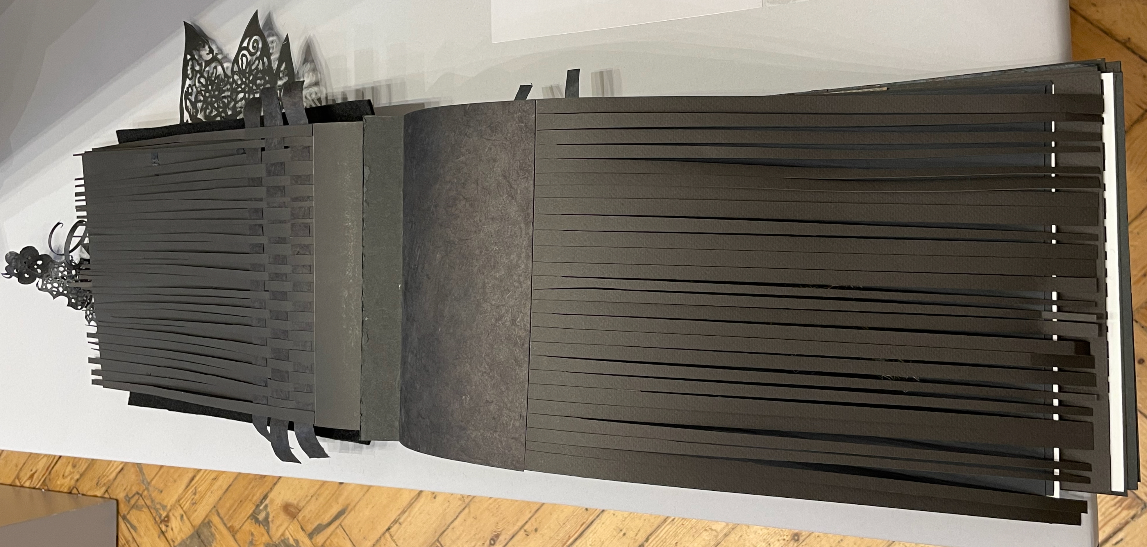
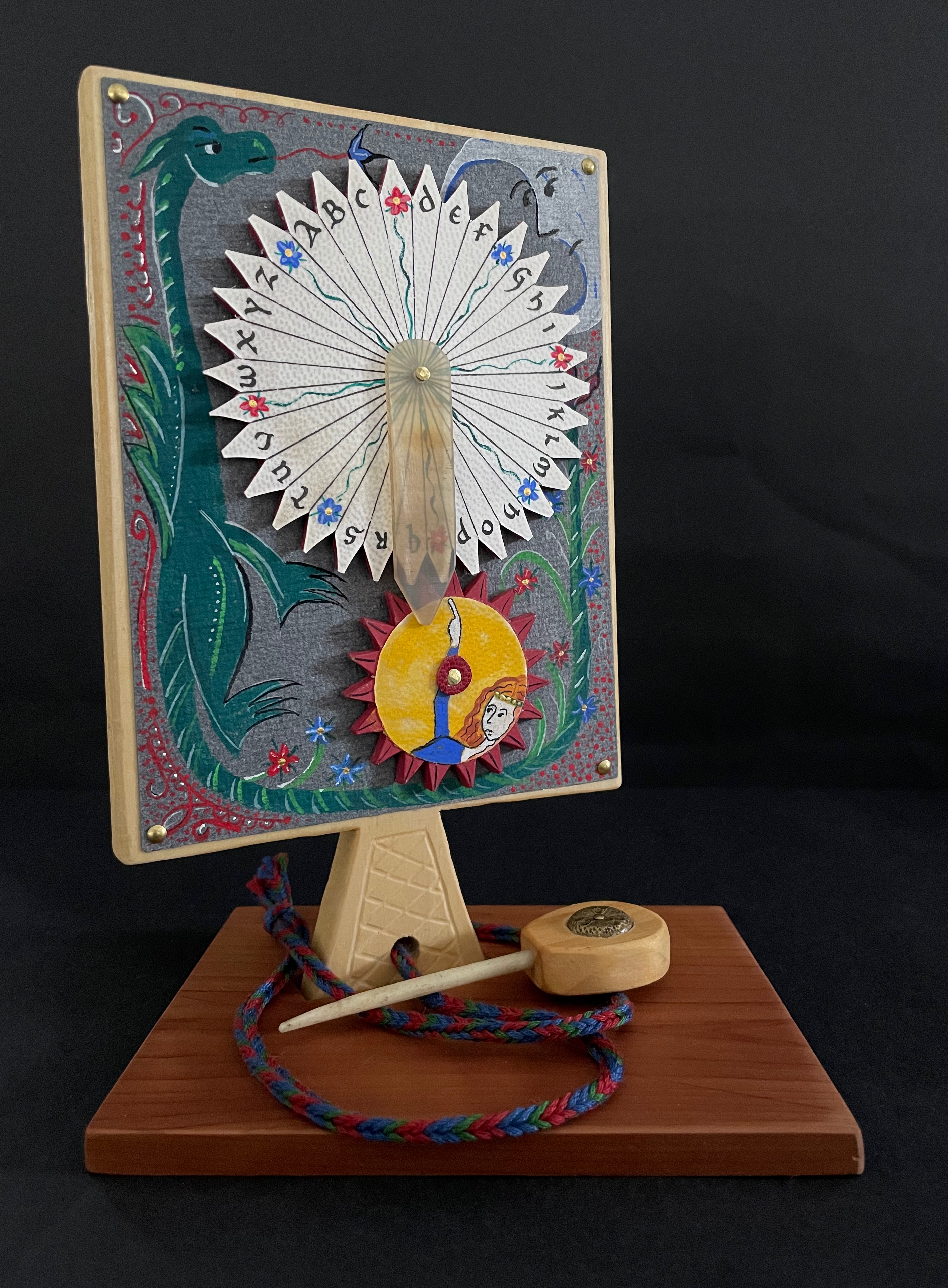
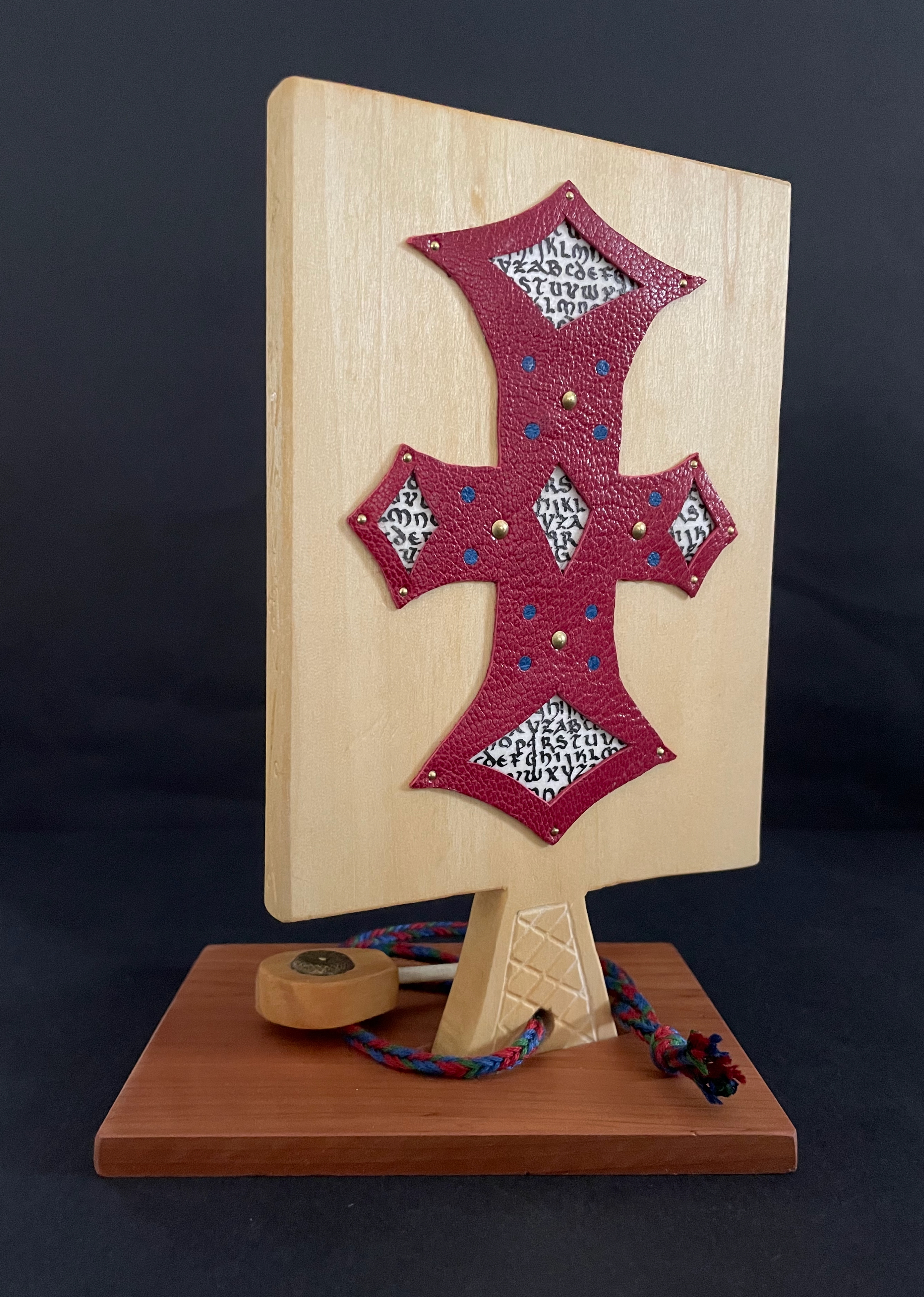
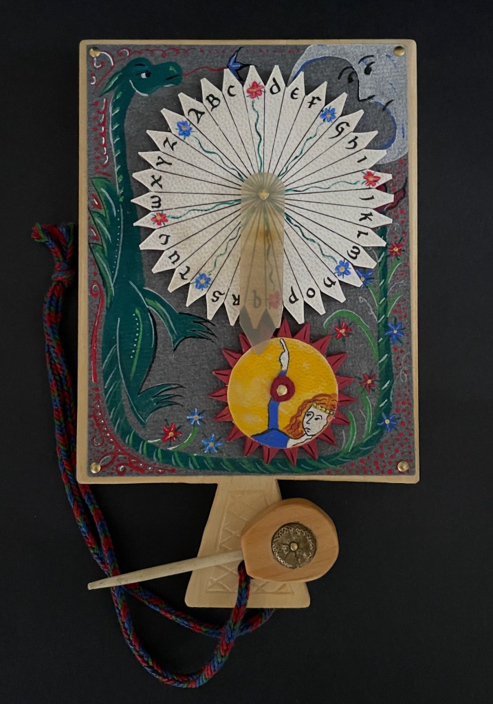
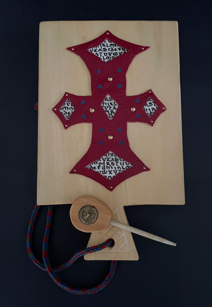
Casebound, leather over boards, with plain doublures. H238 x W210 x D20 mm. [28] pages. Edition of 4000, published by the Peter Norton Christmas Project. Acquired from Los Angeles Modern Auction, 3 September 2025.
Photos: Books On Books Collection.
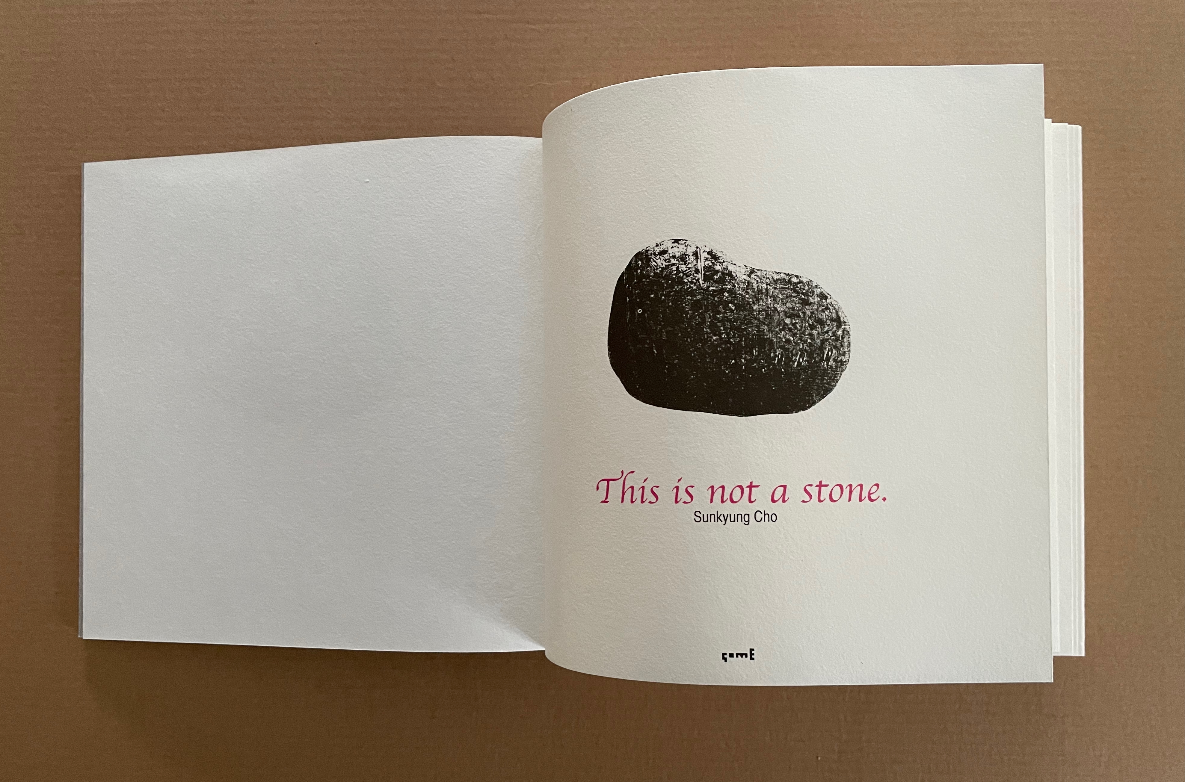
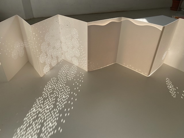
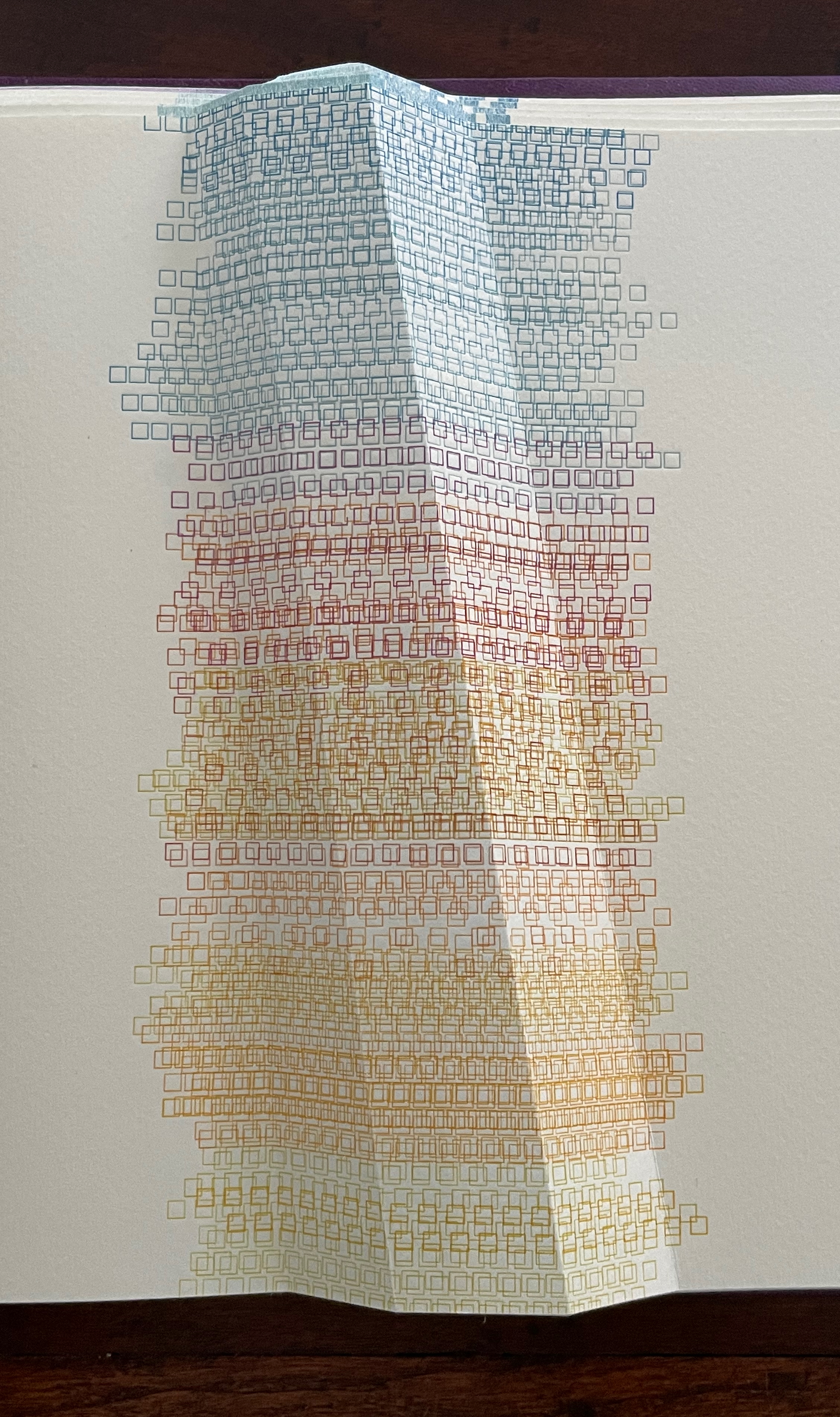
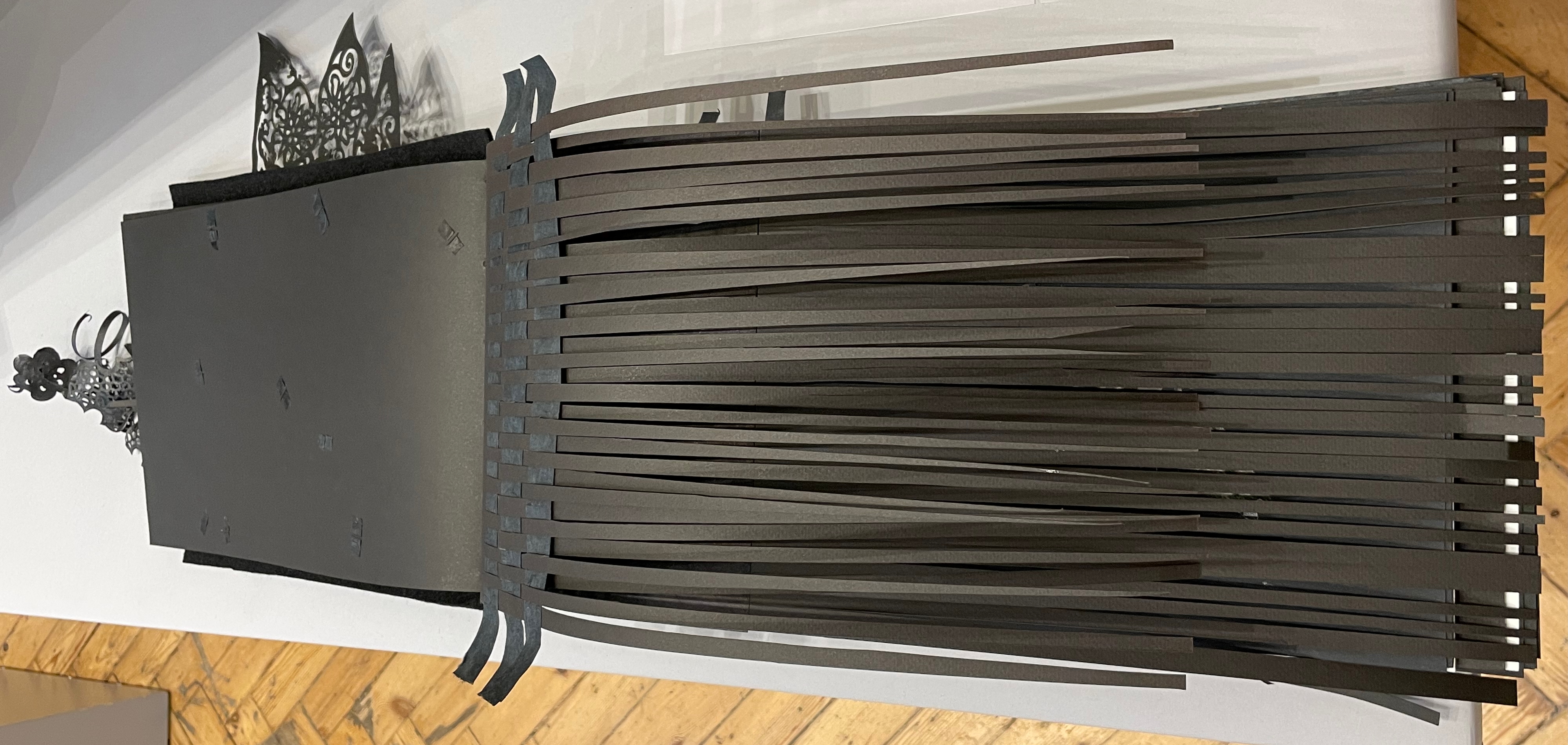
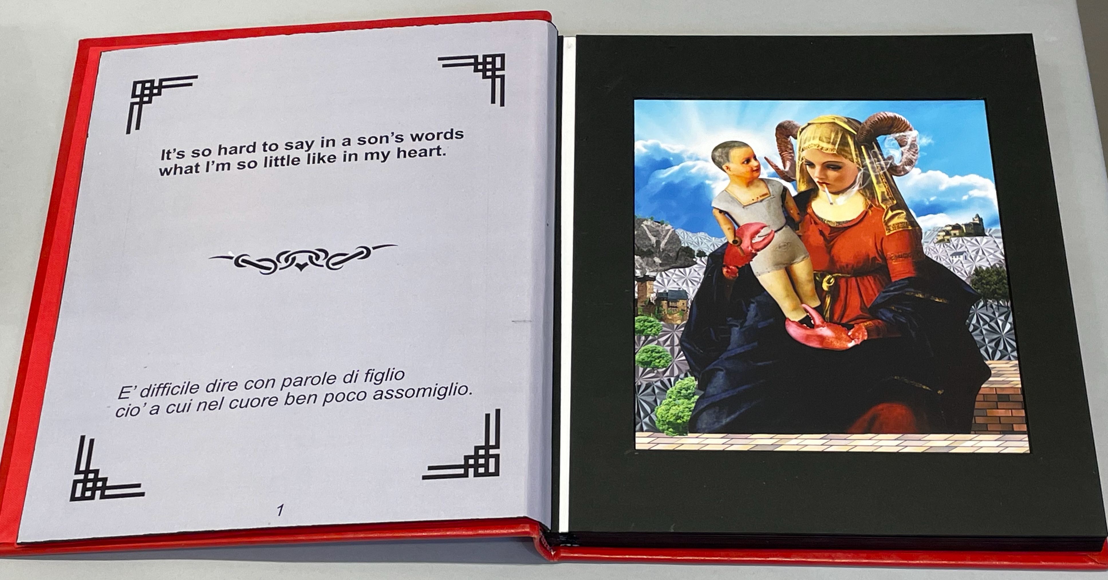
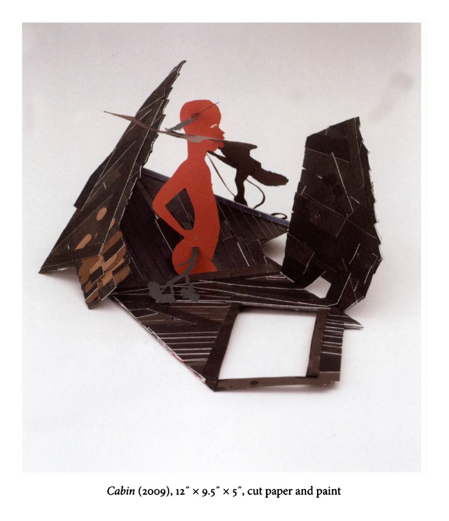
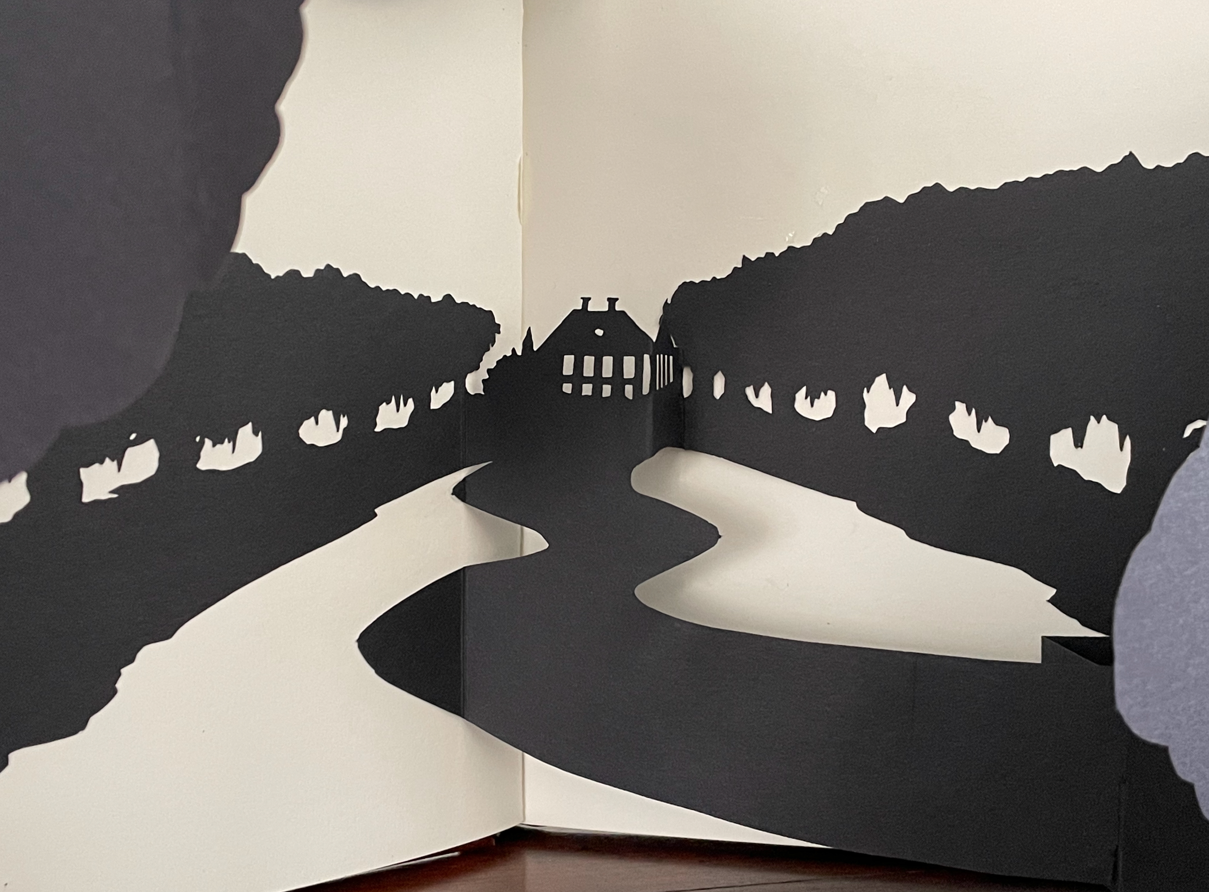
The book as medium has played a minor adjunct role in Kara Walker’s art. Freedom: A fable … (1997) is one of the few exceptions. Its paper engineering lifts Walker’s signature silhouettes off the page physically, and the pop-up’s association with children’s books fits well with Walker’s uneasy blend of humor, horror, the individual and the stereotype. It is also the first of her three-dimensional works, which emerged more frequently around 2007-09 and rose to the monuments of Fons Americanus (2019) and Unmanned Drone (2025).
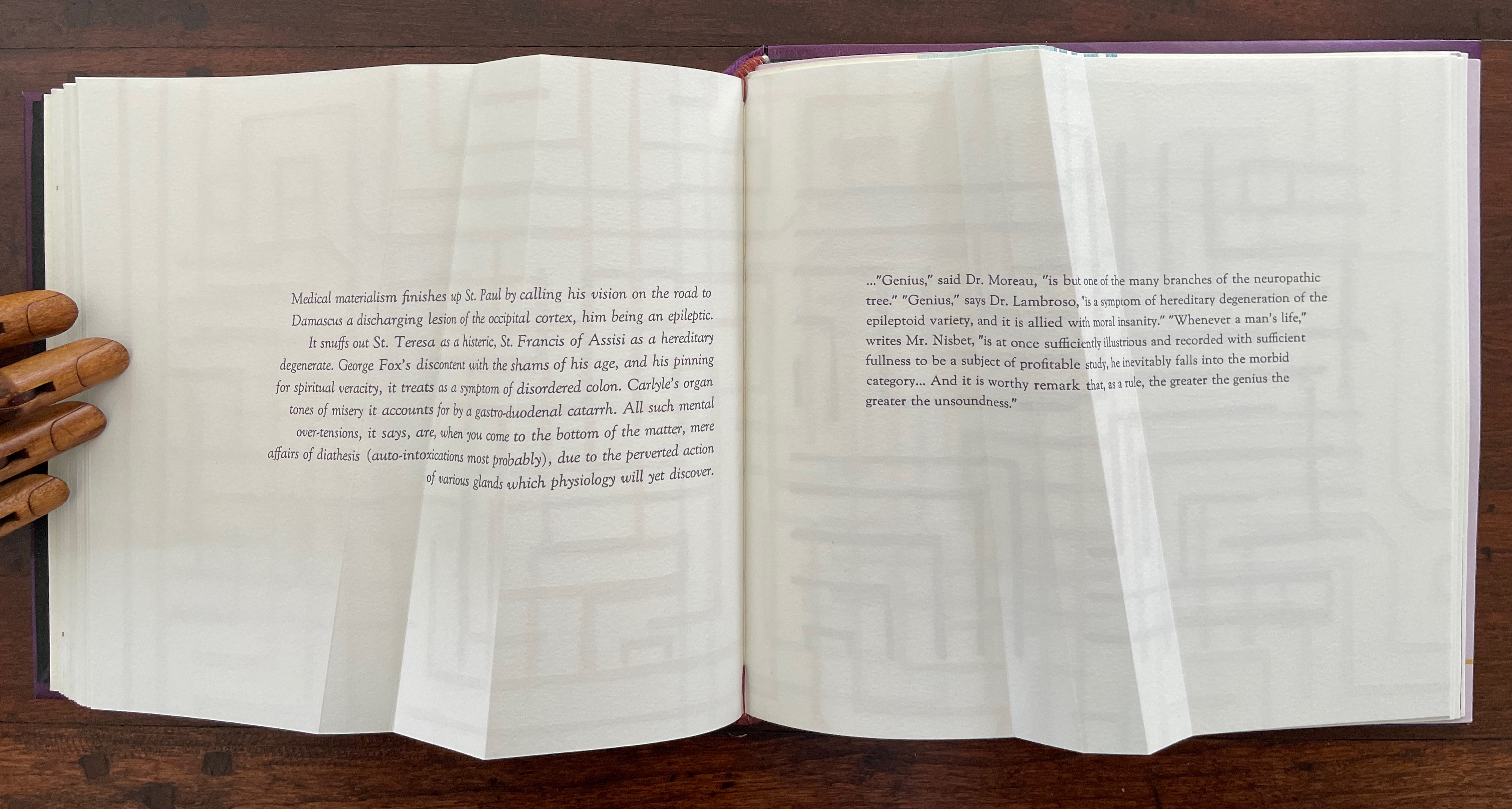
Source: Kara Walker, “Riots and Outrages”, The Georgia Review , Spring 2010, 64:1, pp. 59-68. Images courtesy of Sikkema Jenkins and Company, New York.
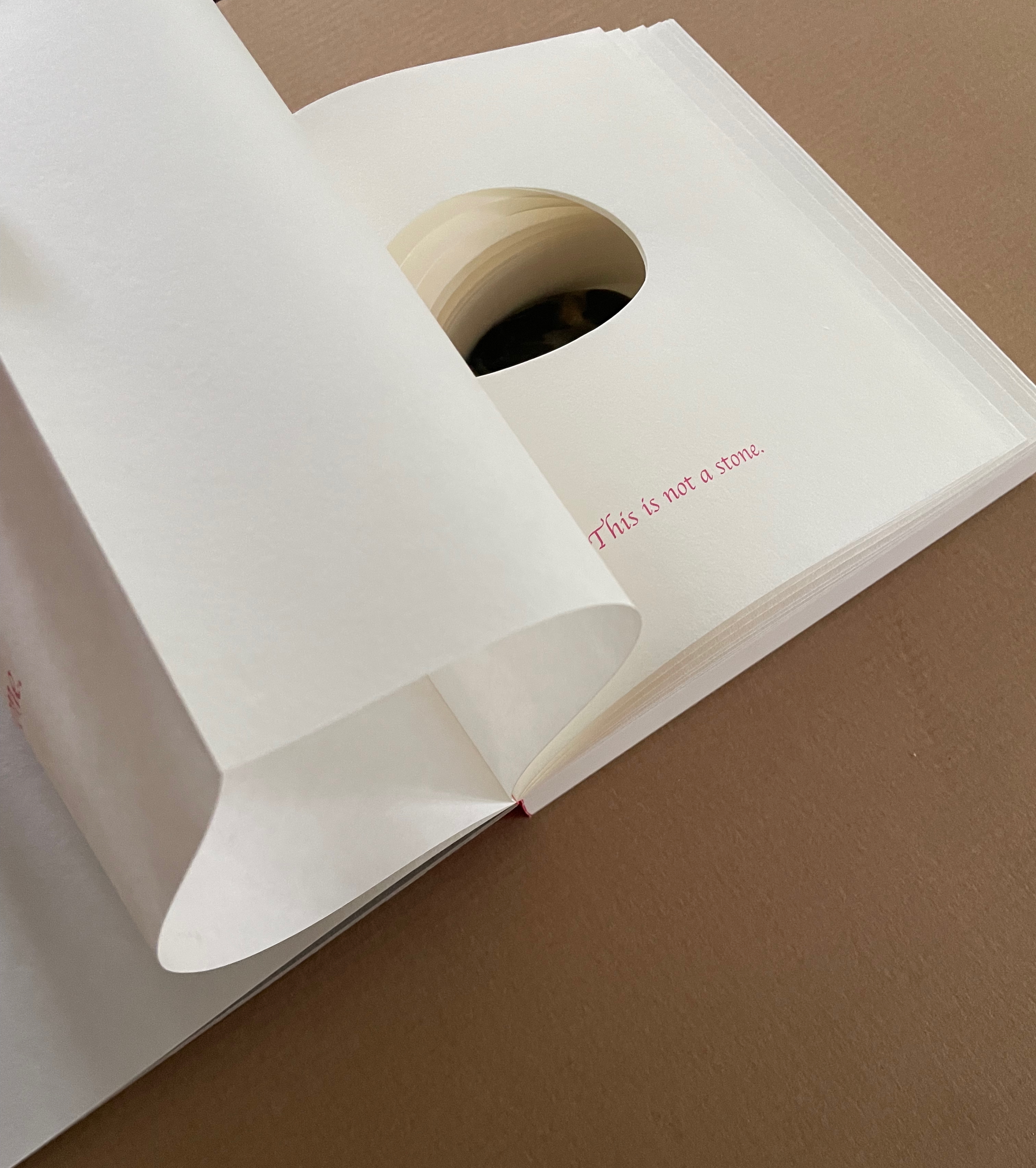
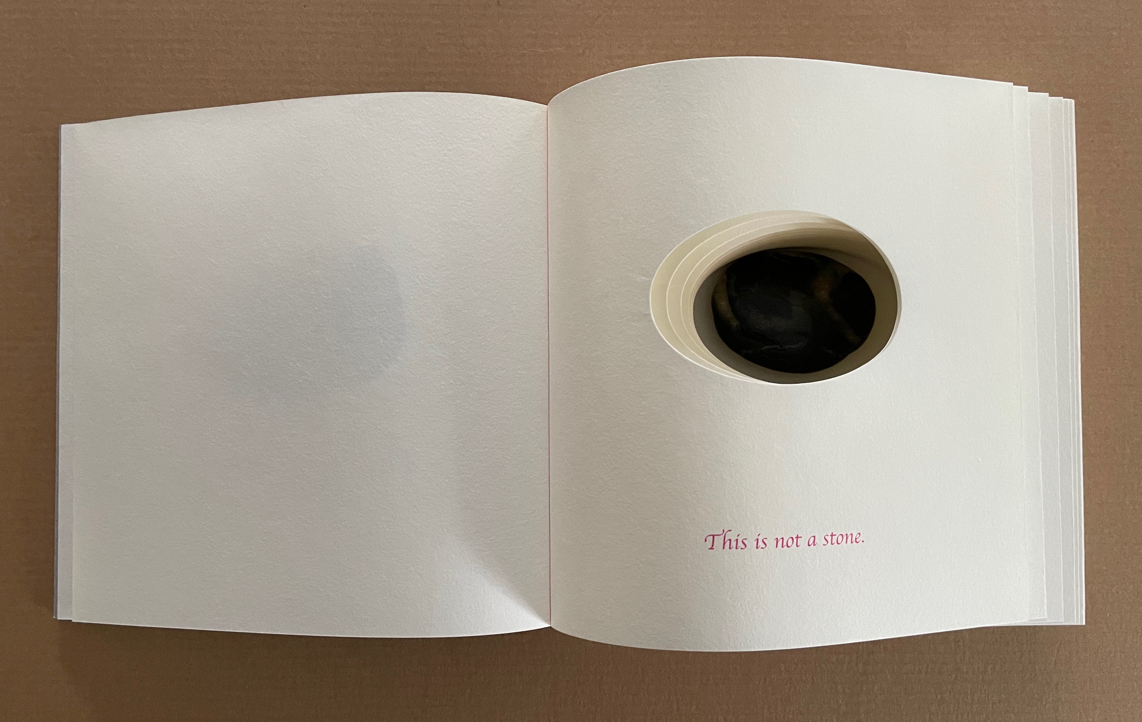
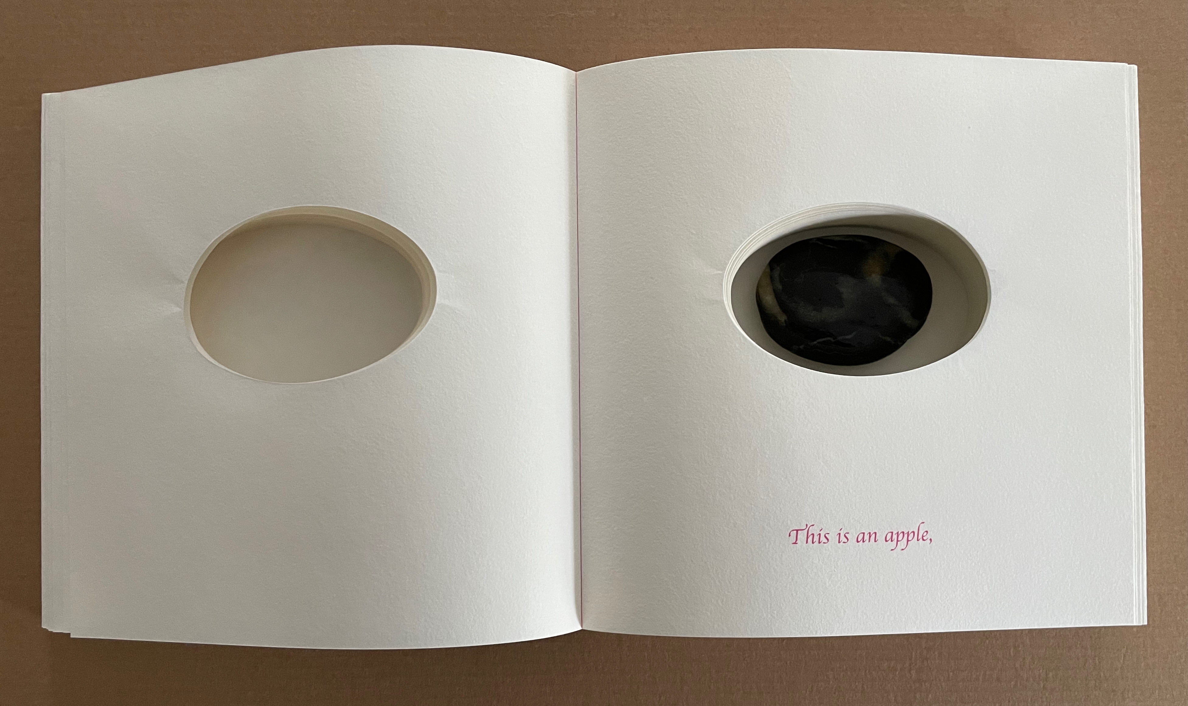
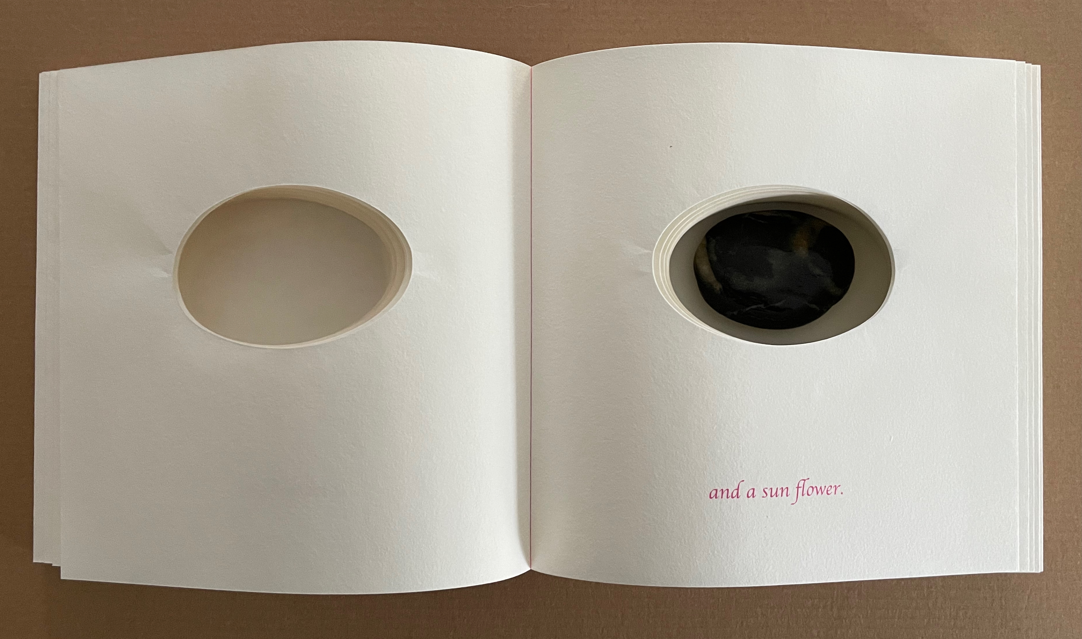
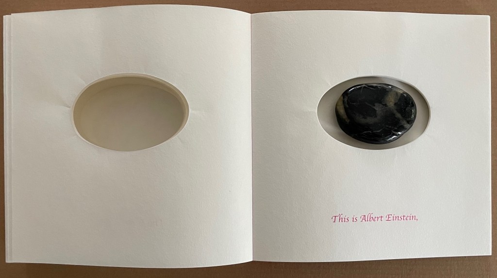
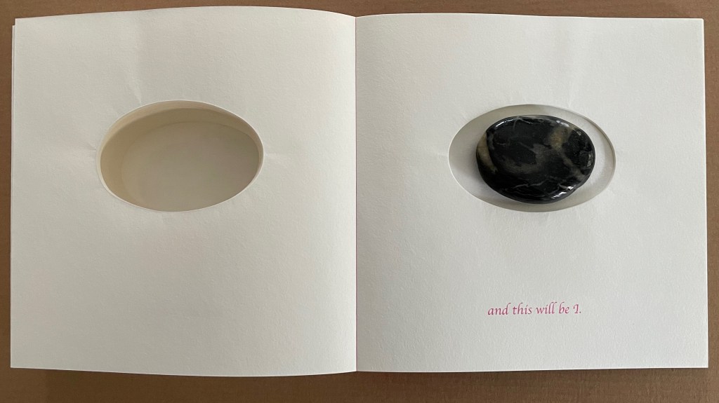
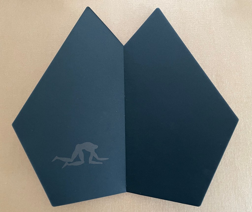
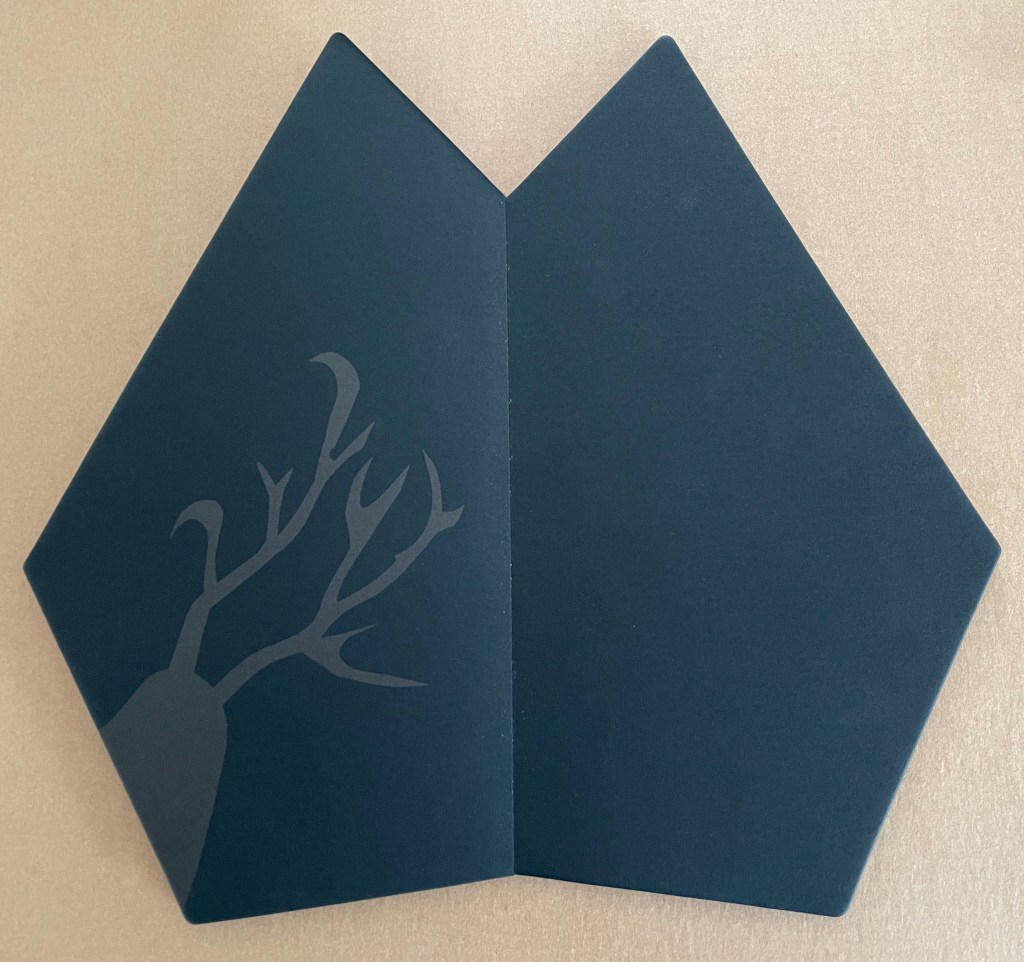
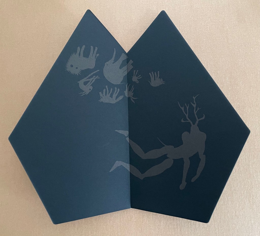
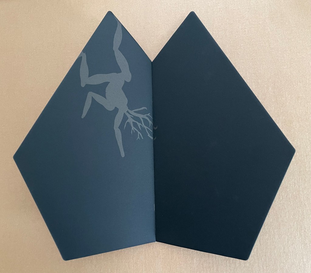
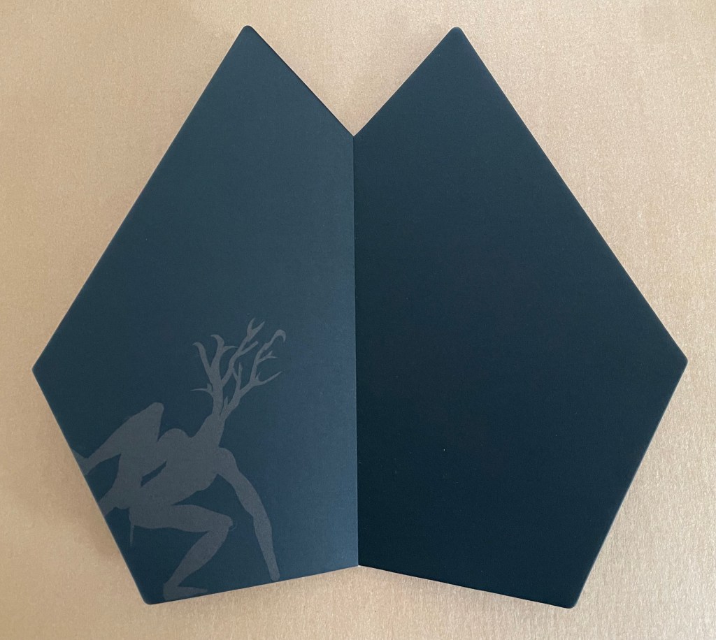
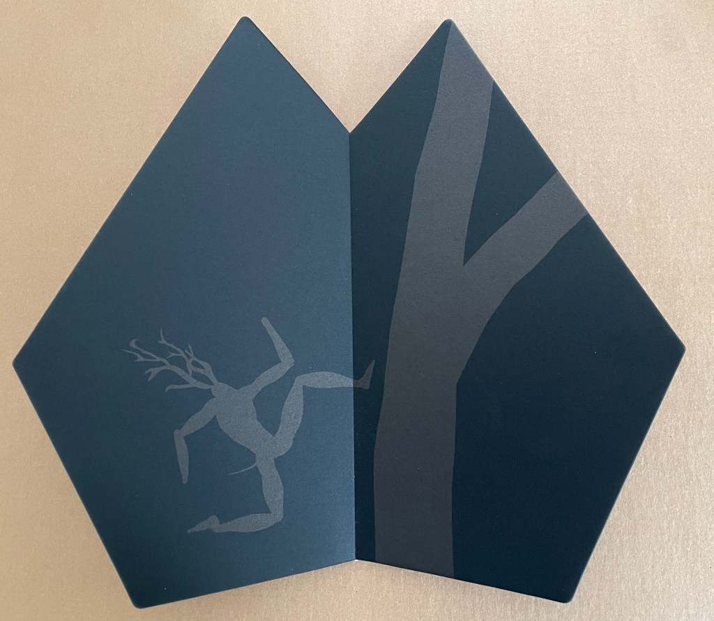
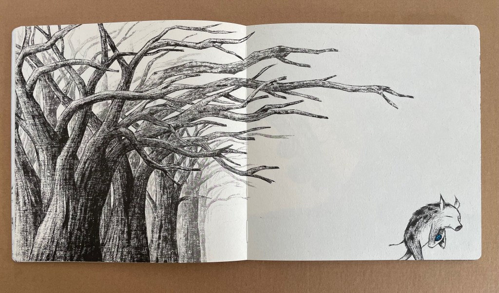
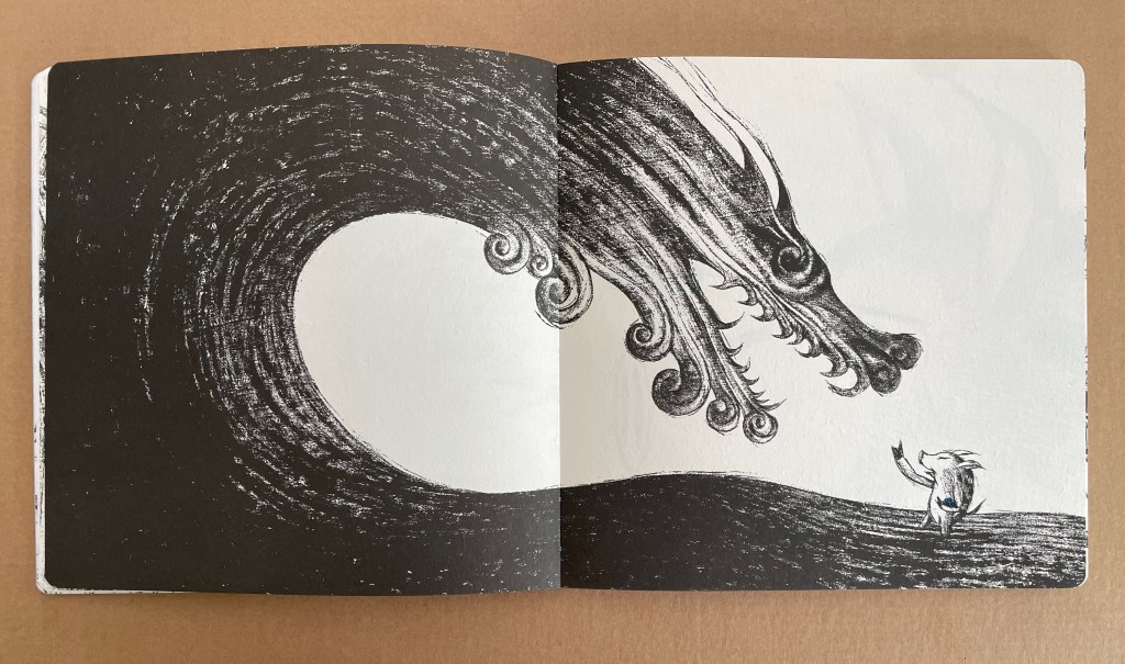
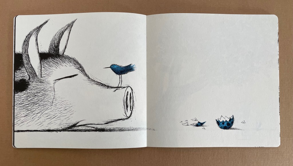
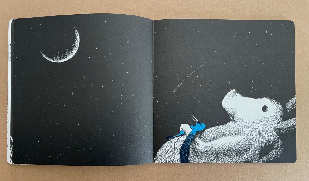
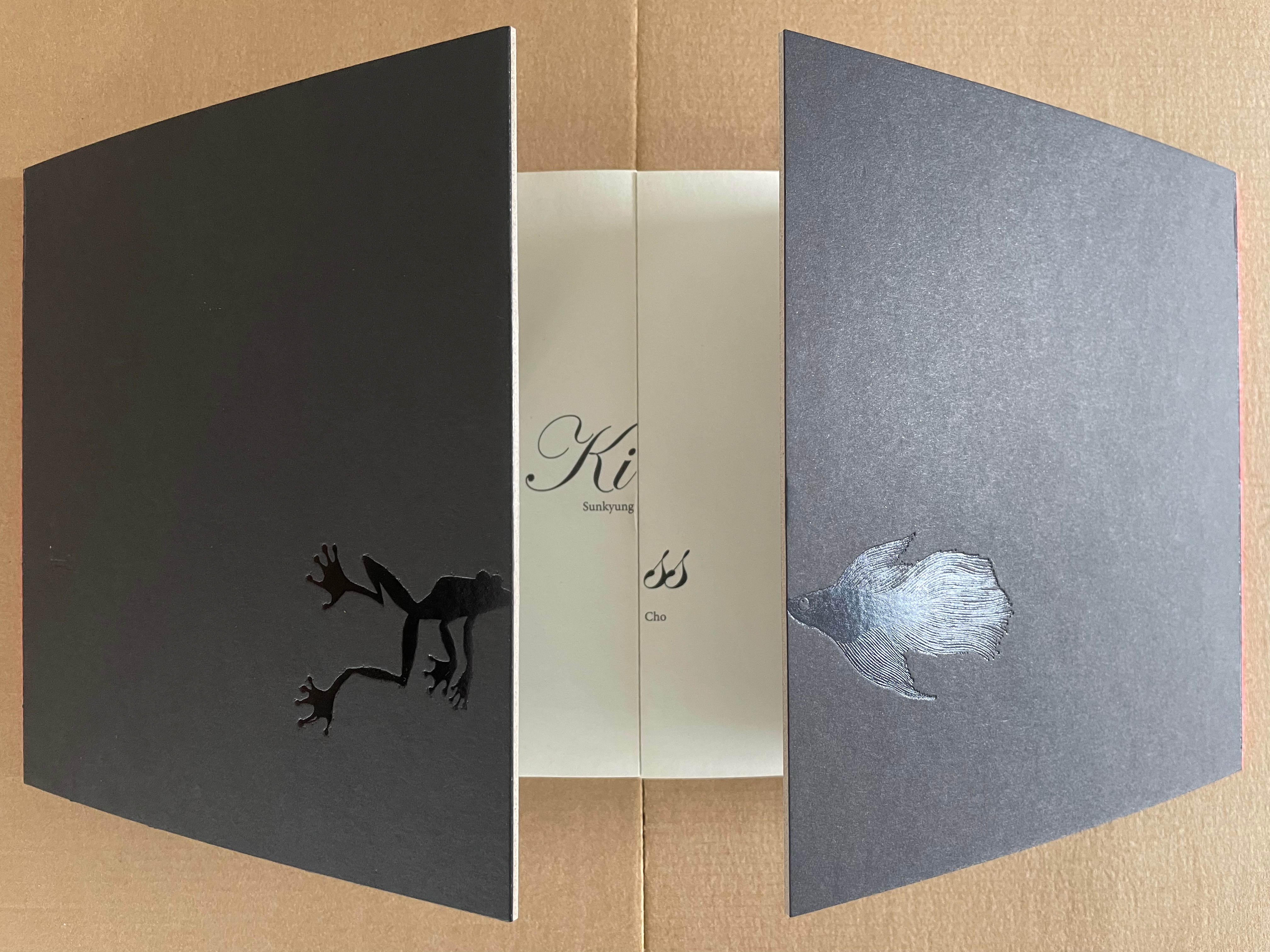
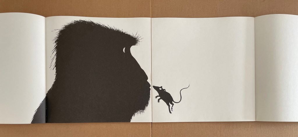
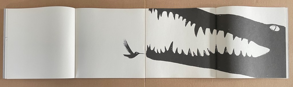
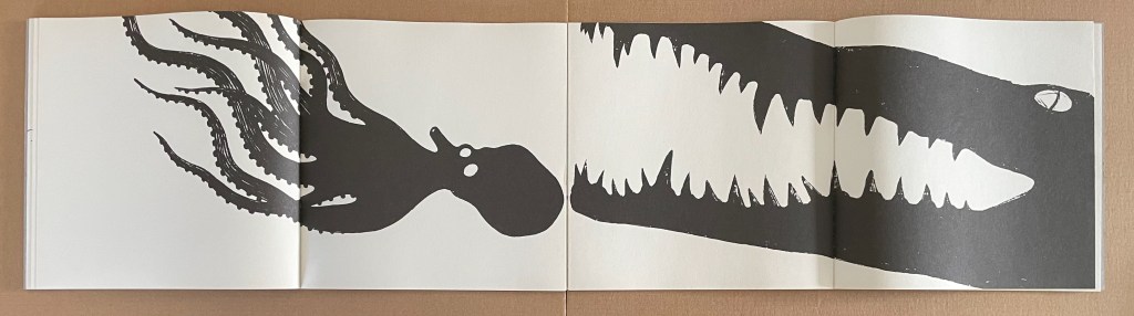
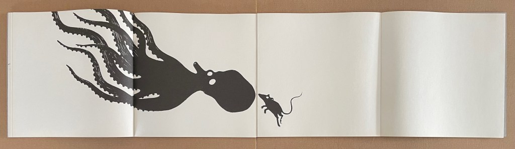
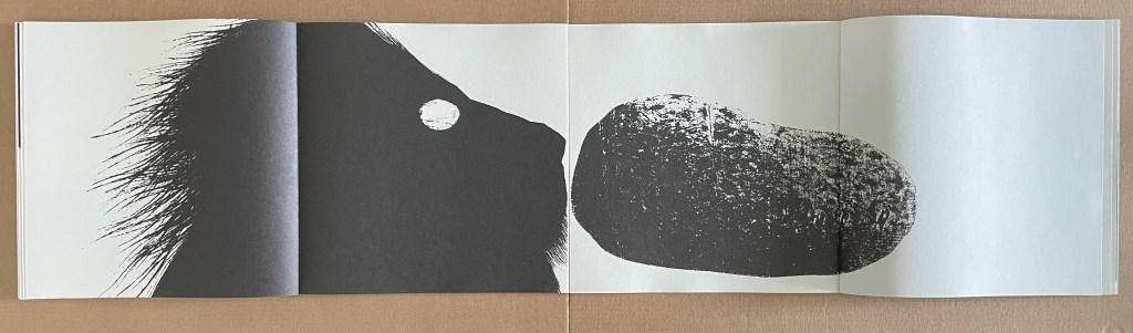
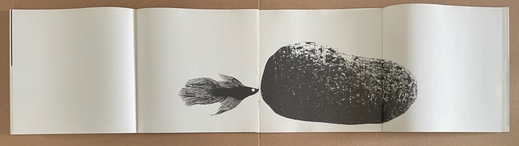
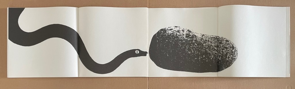
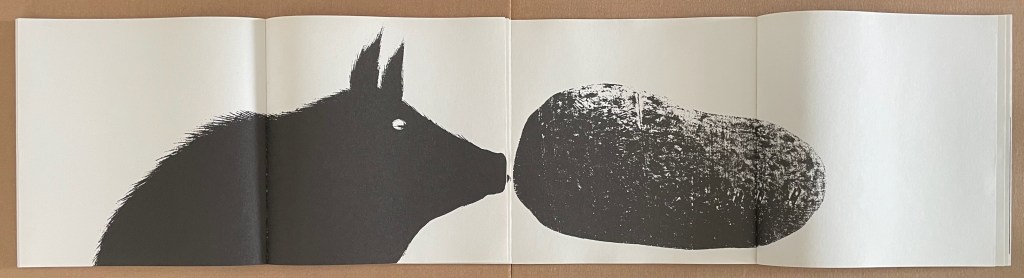
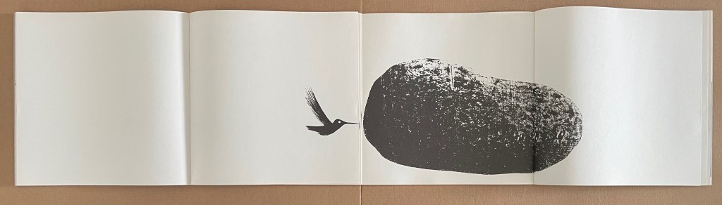
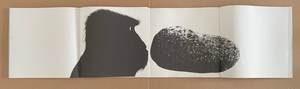
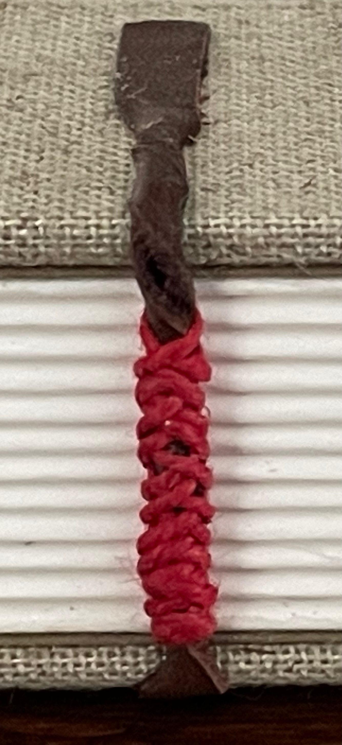
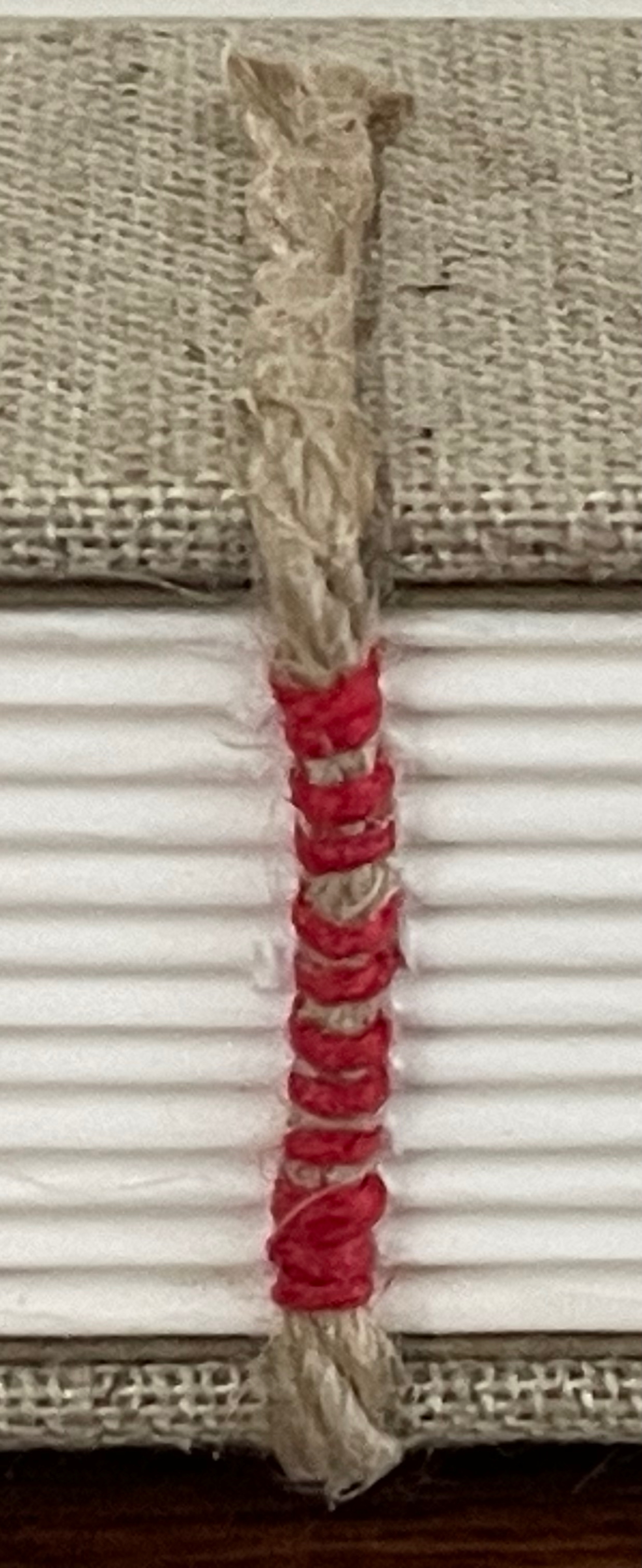
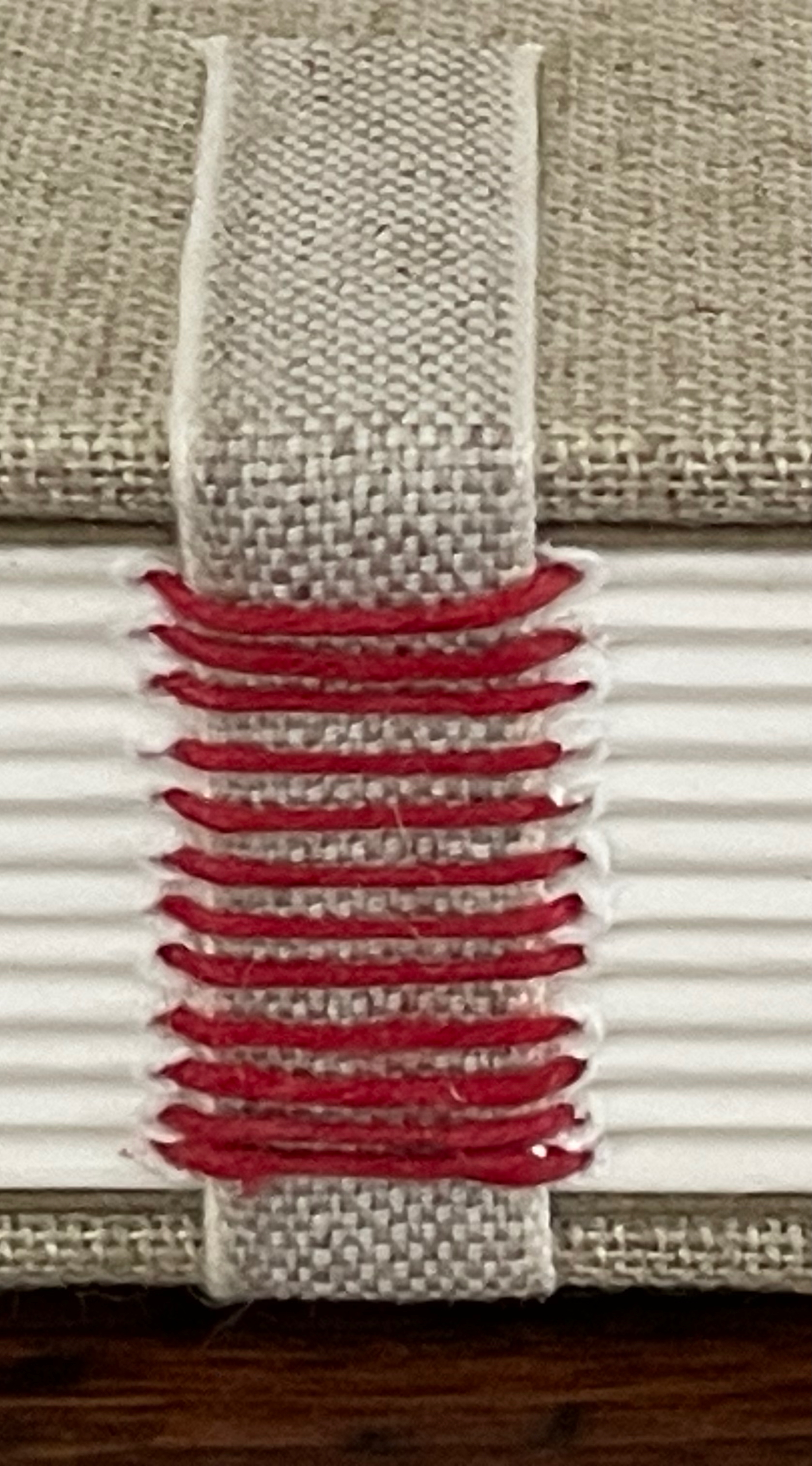
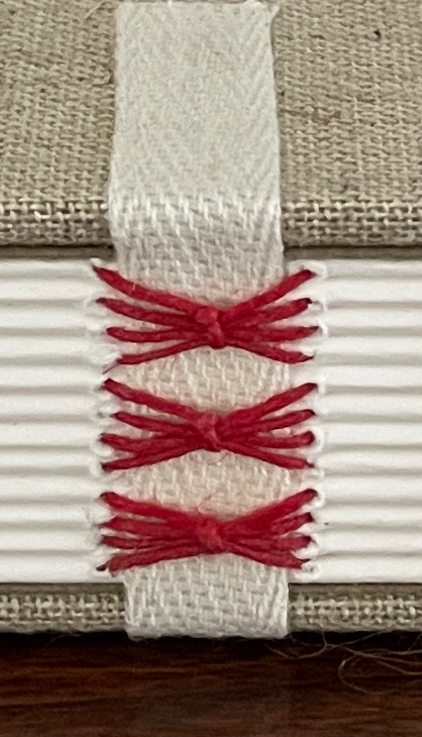
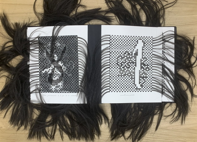
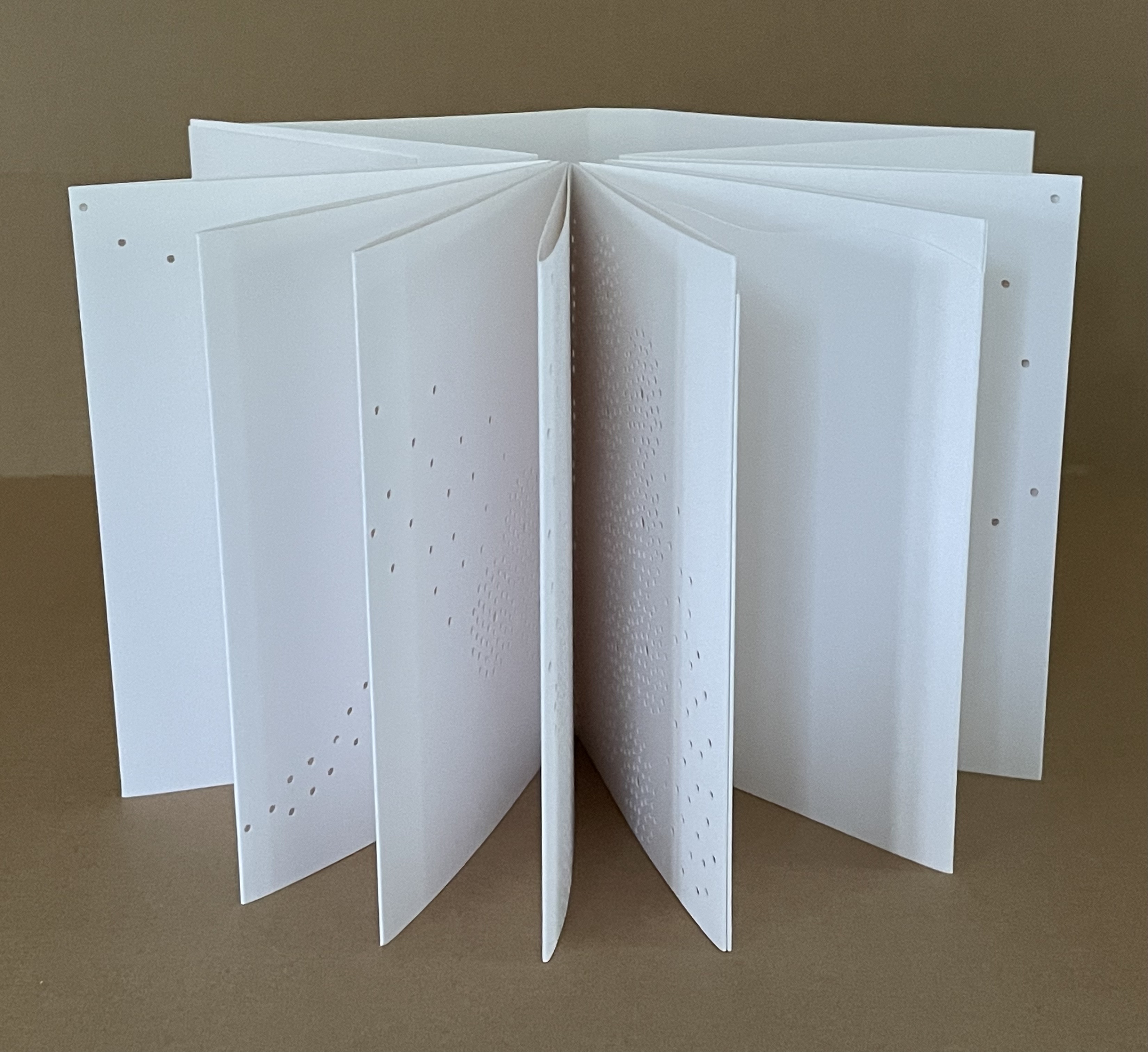
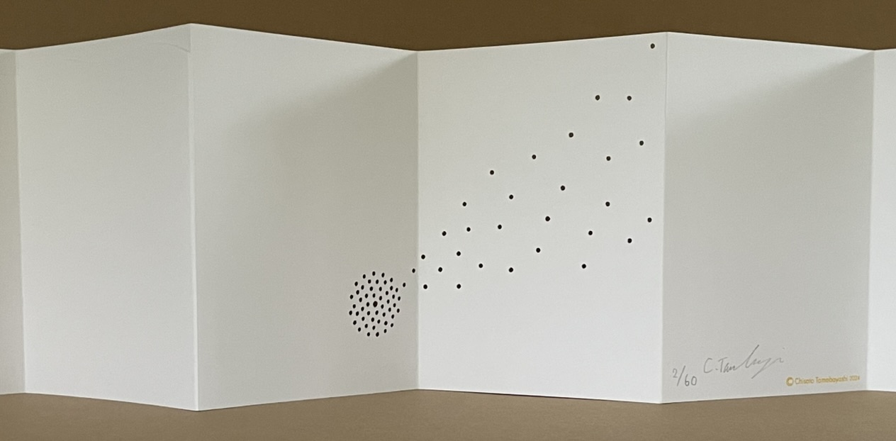
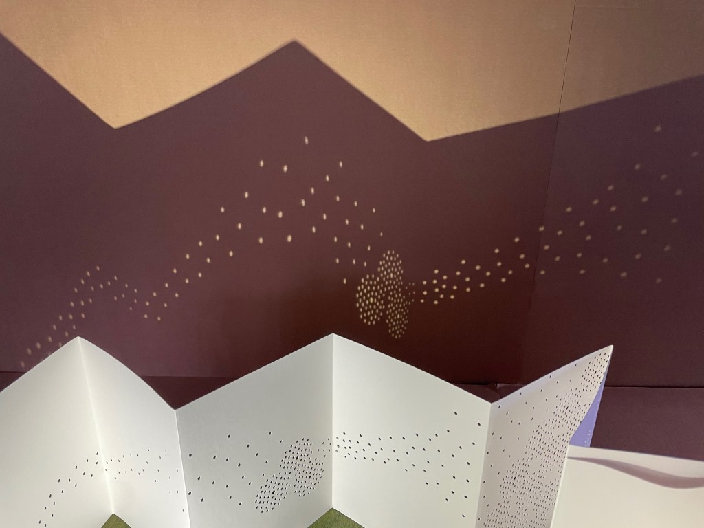
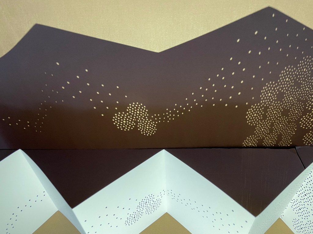
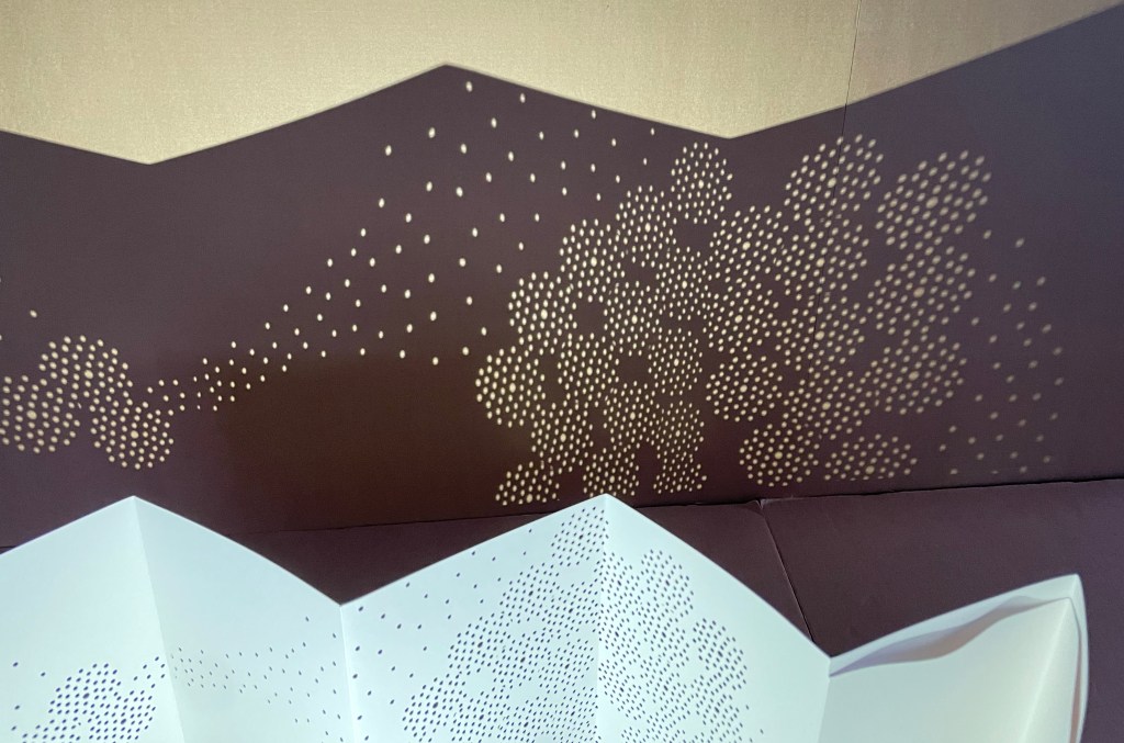
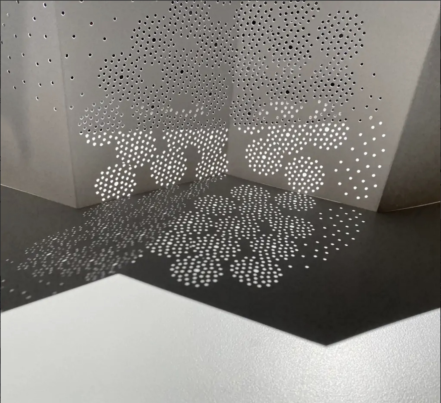
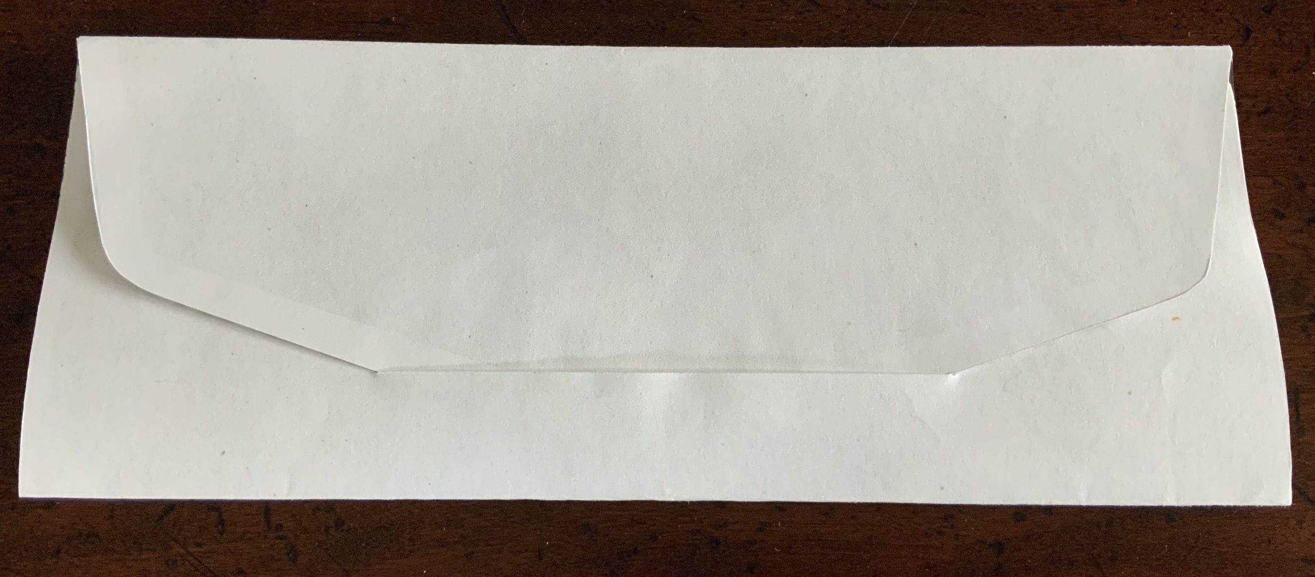
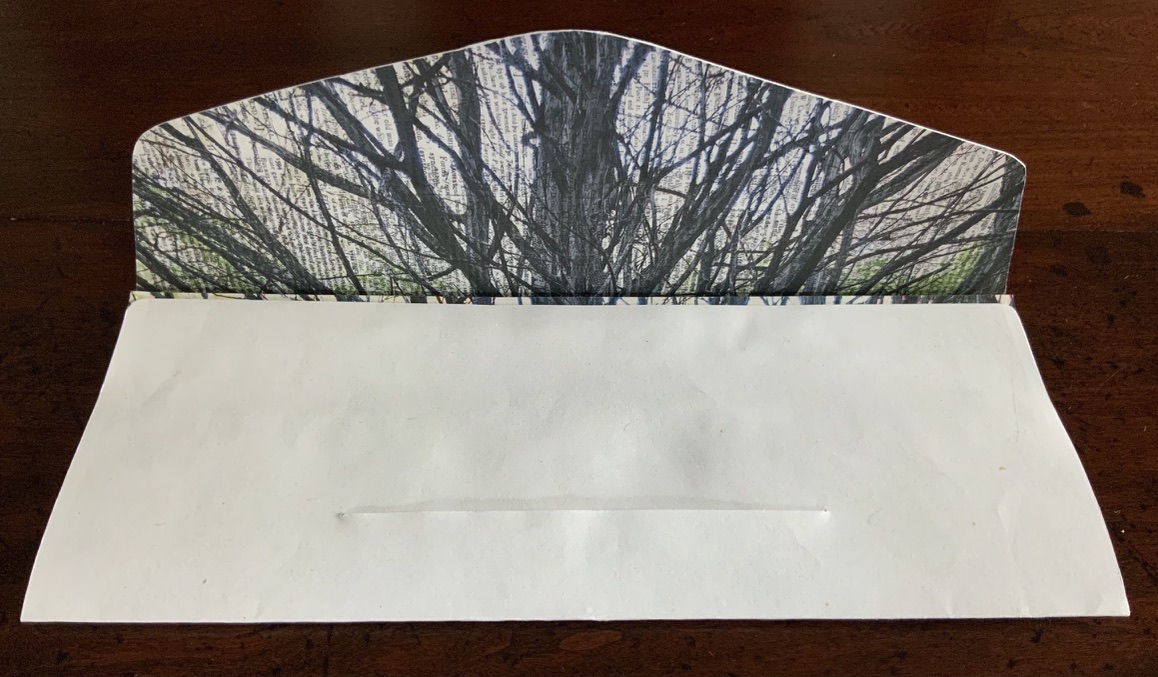
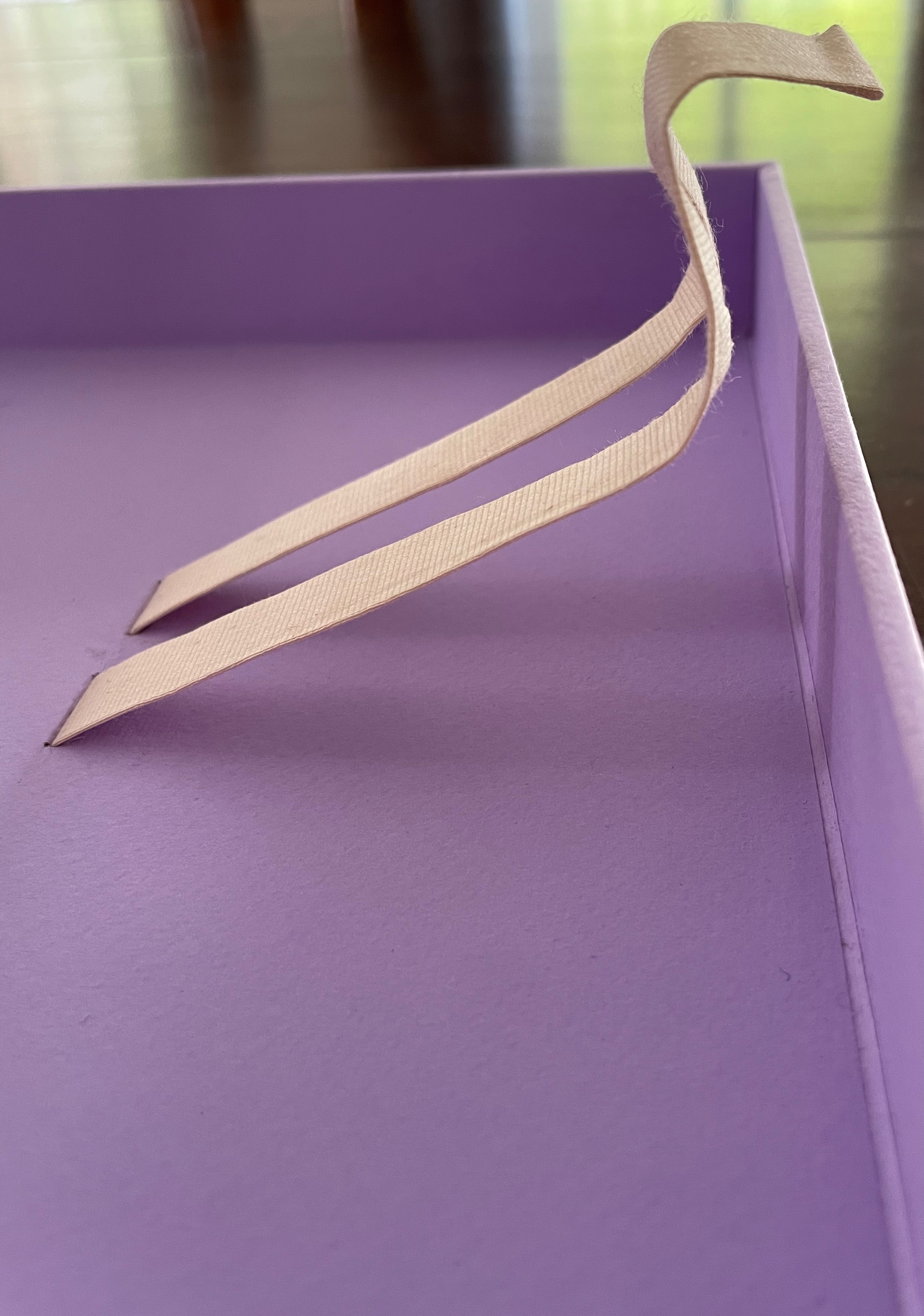
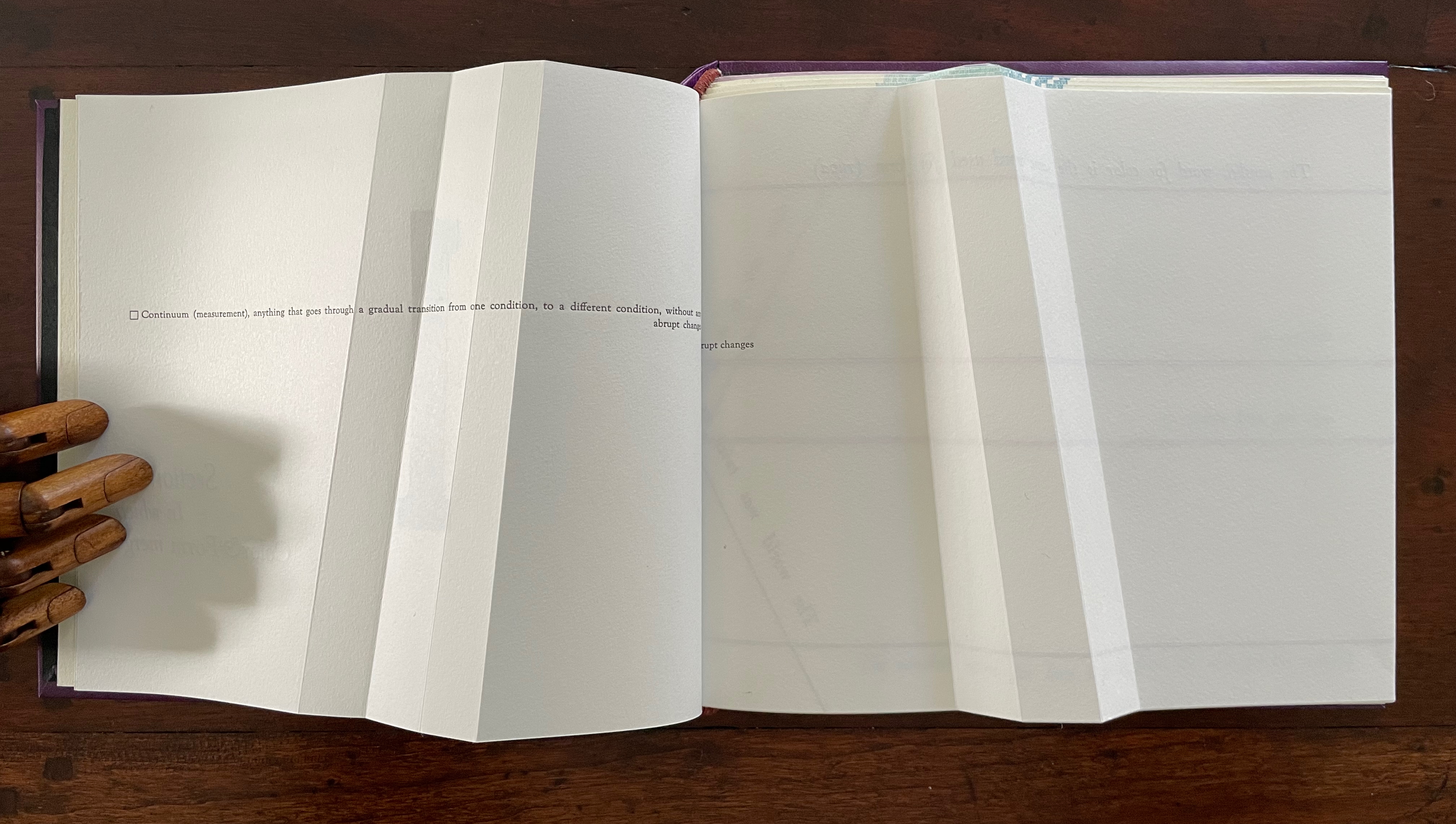
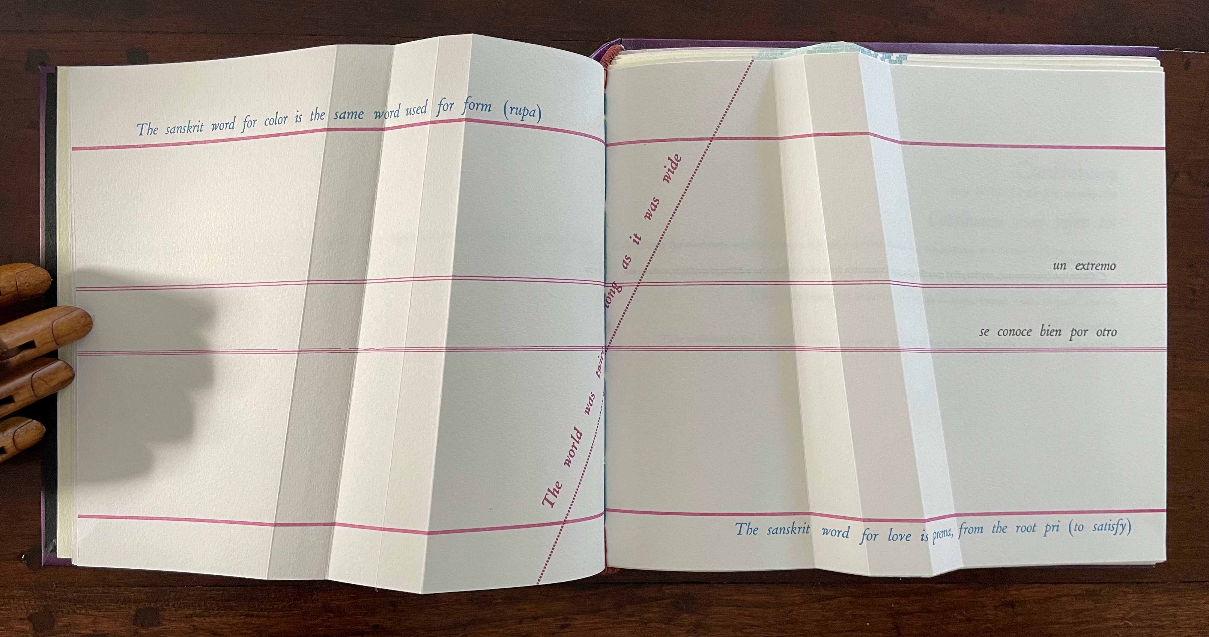
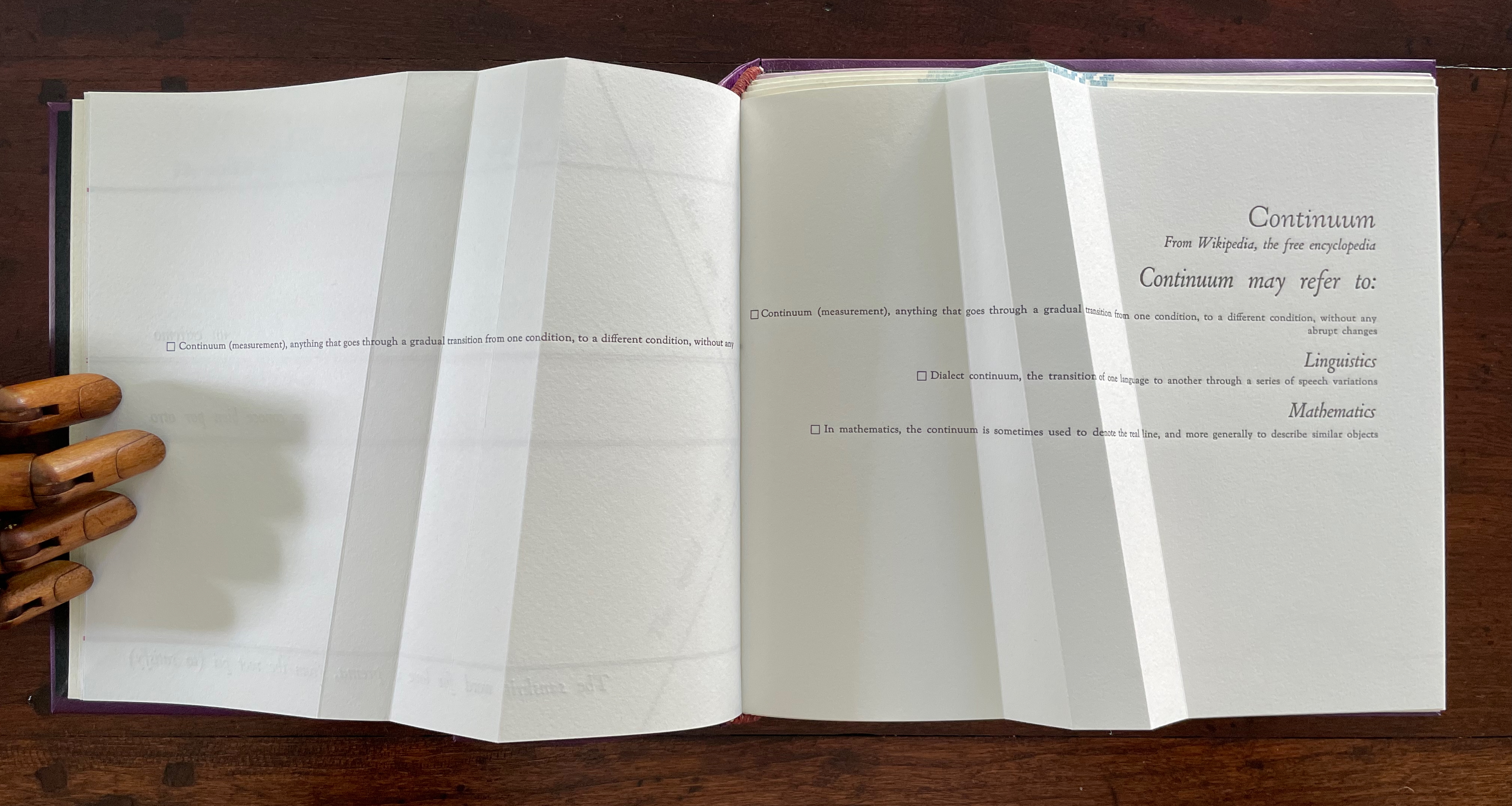
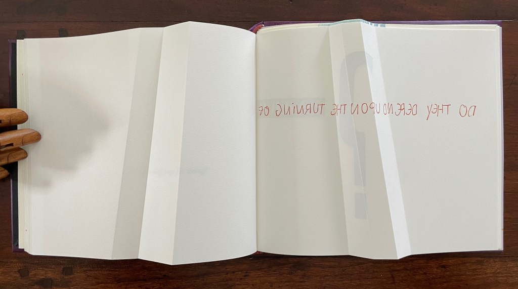
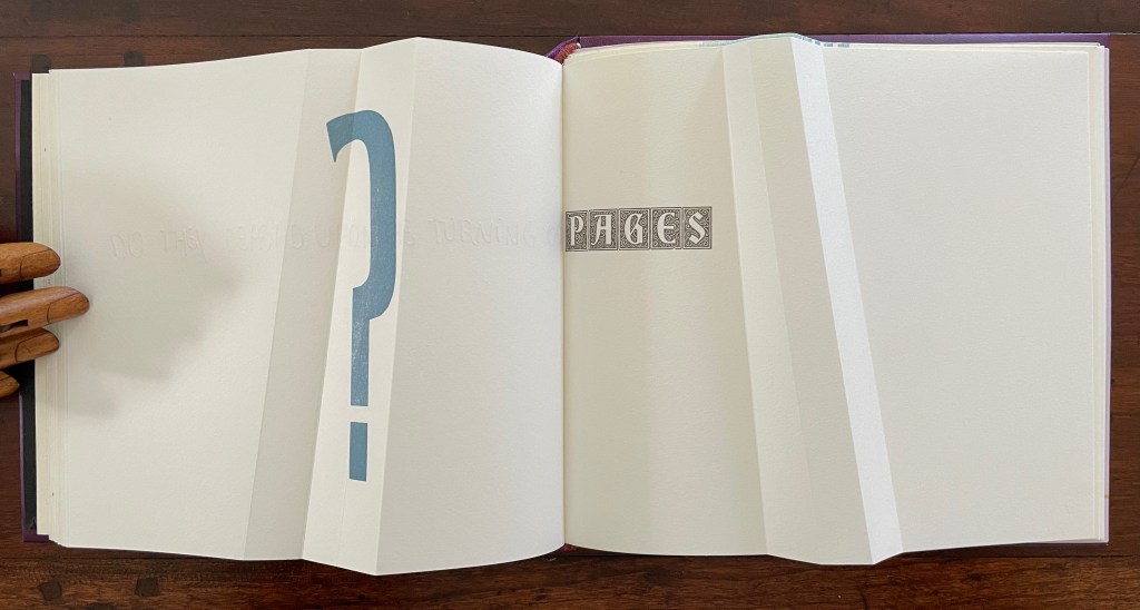
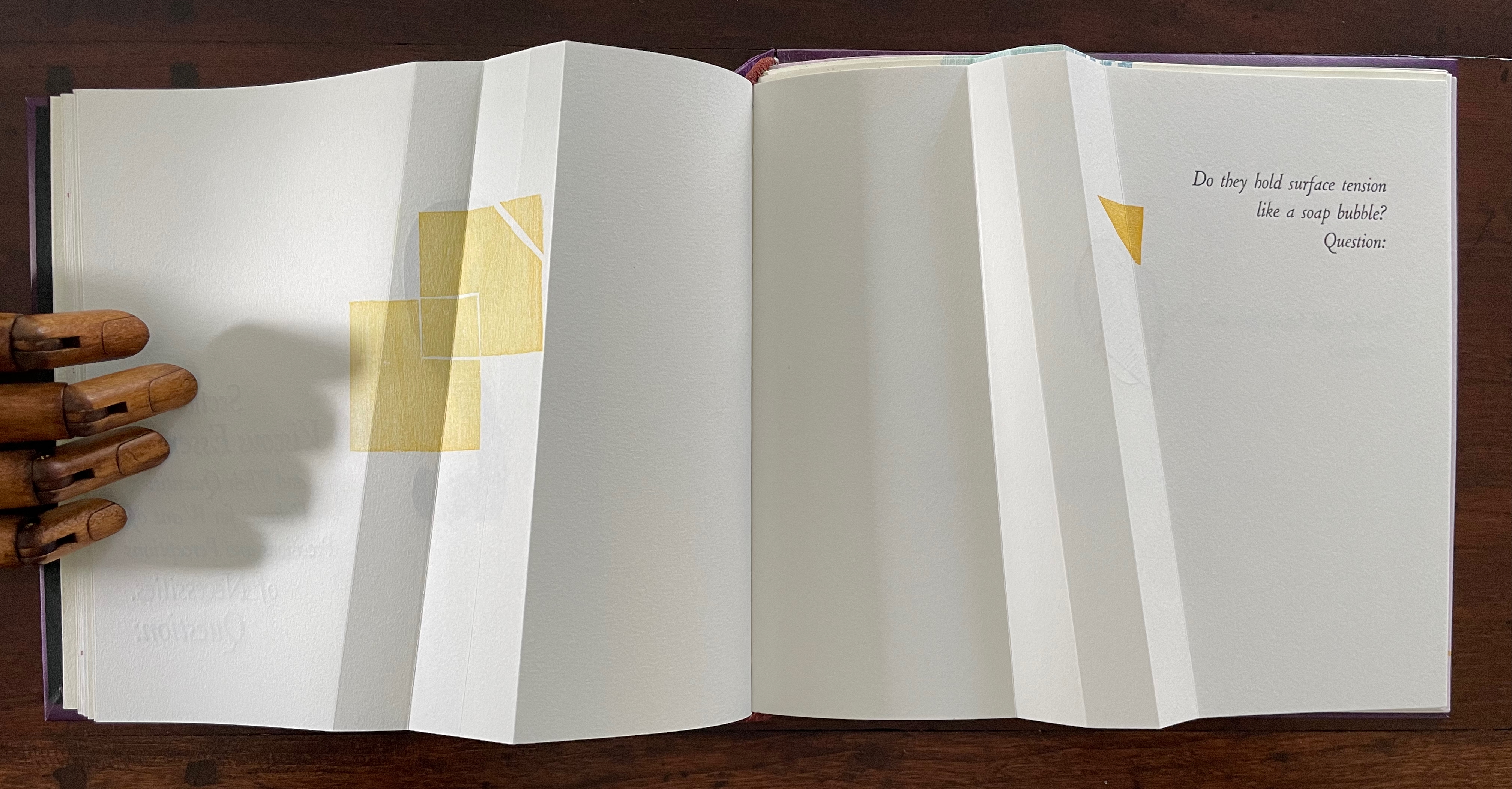
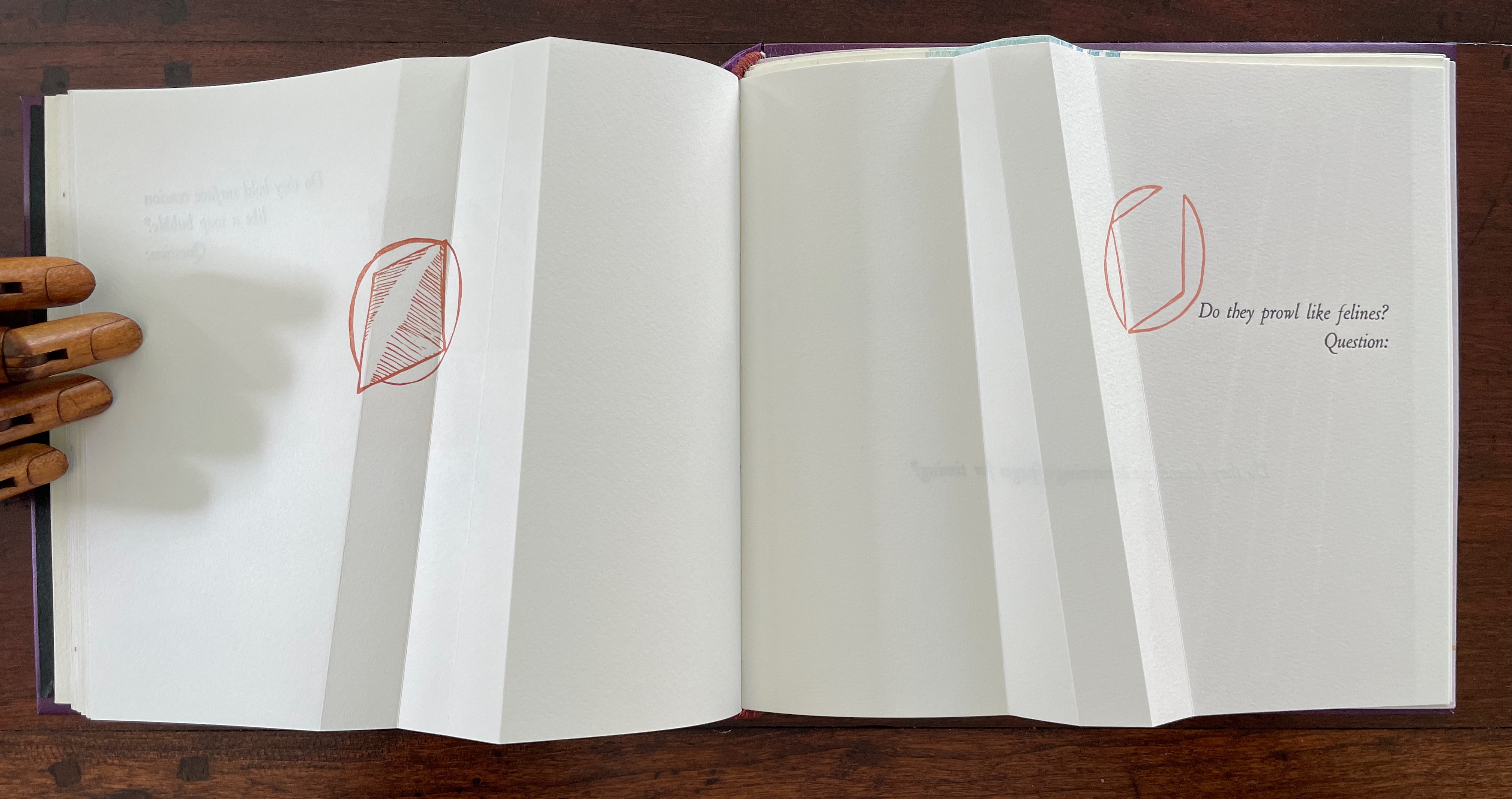
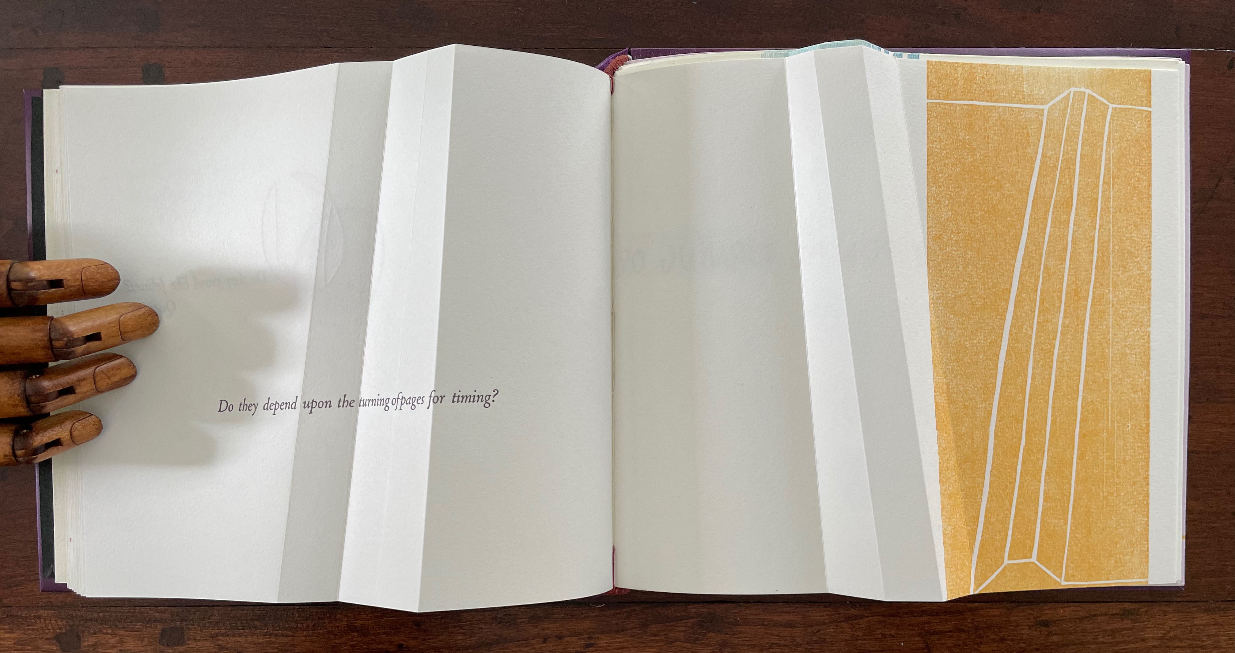
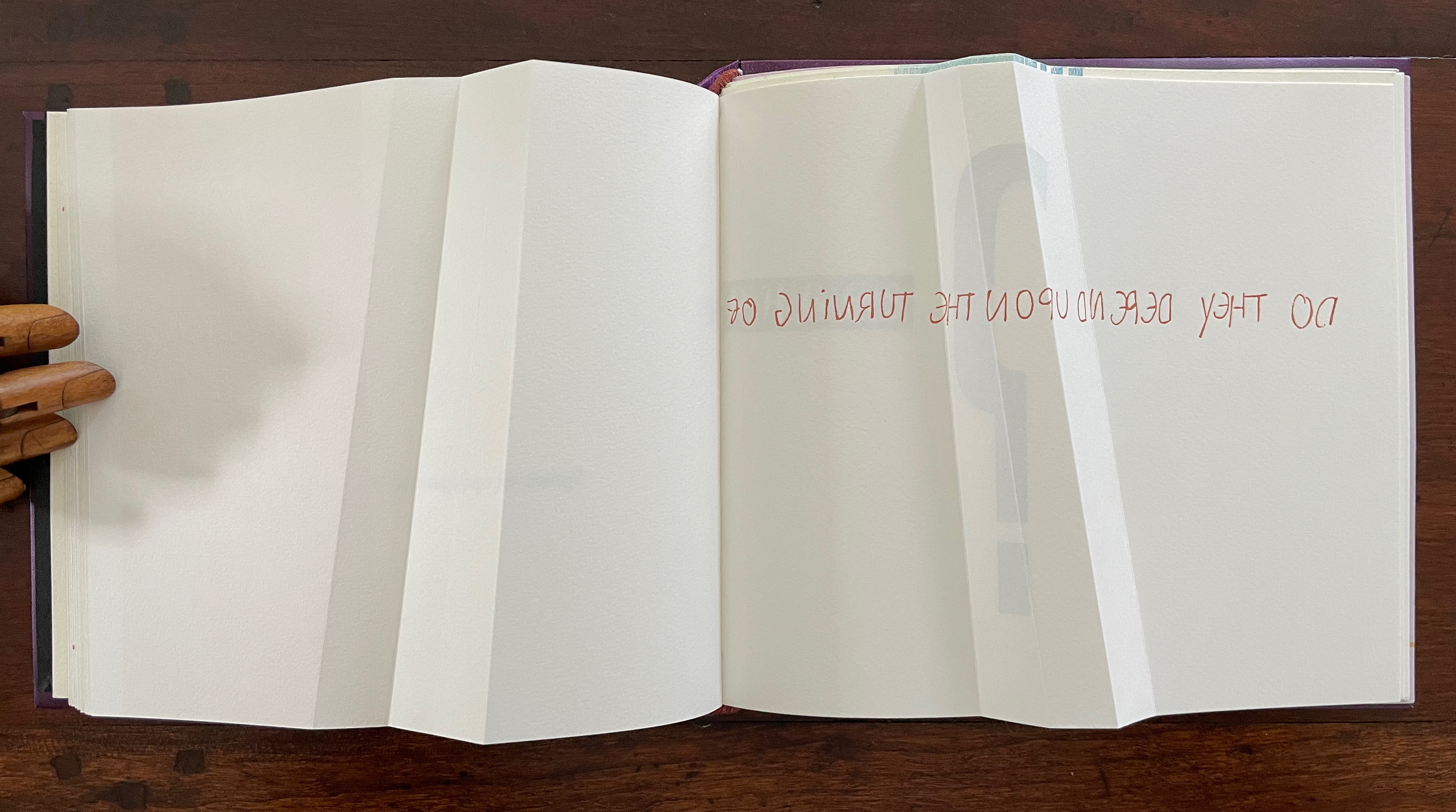
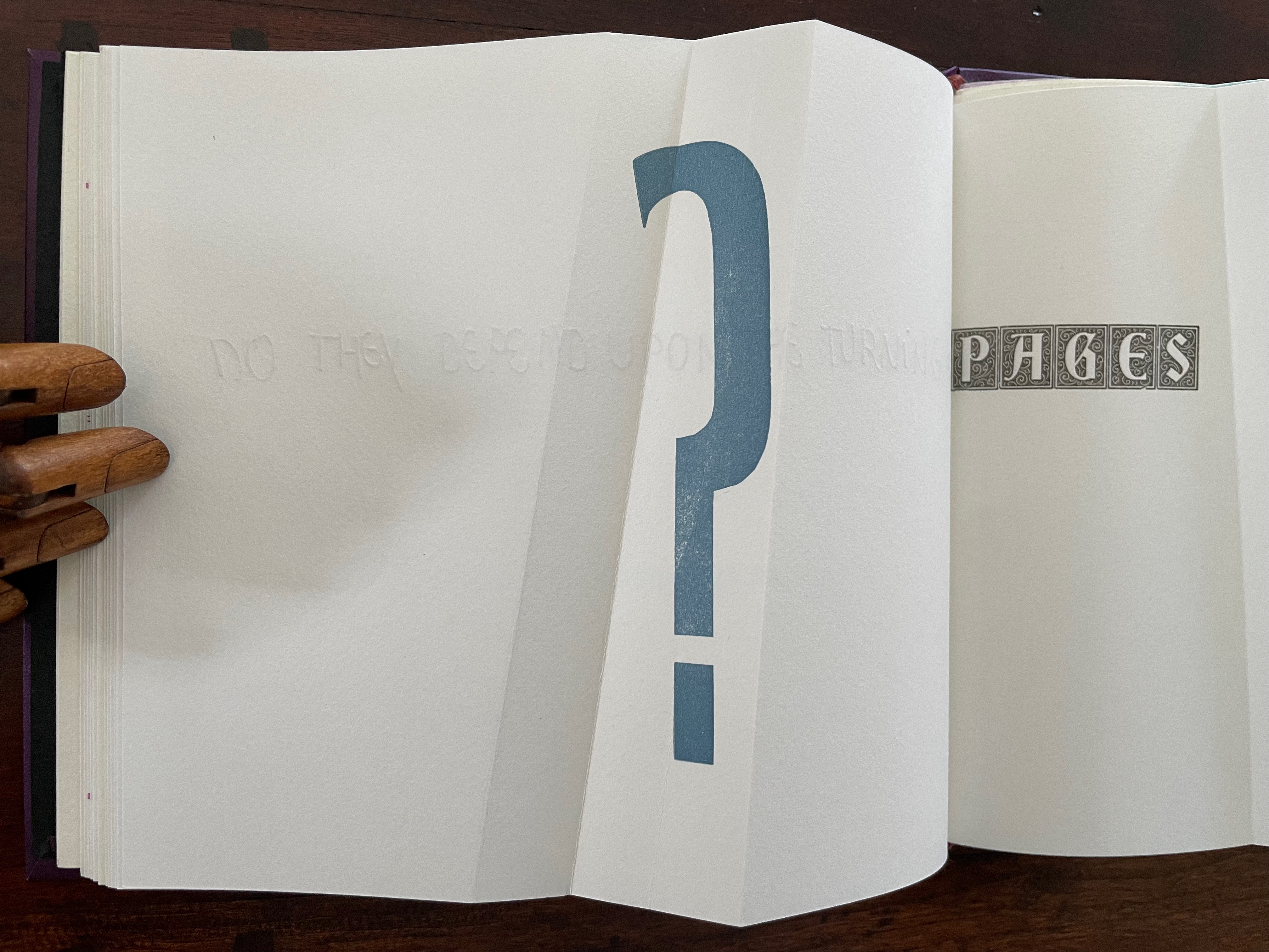
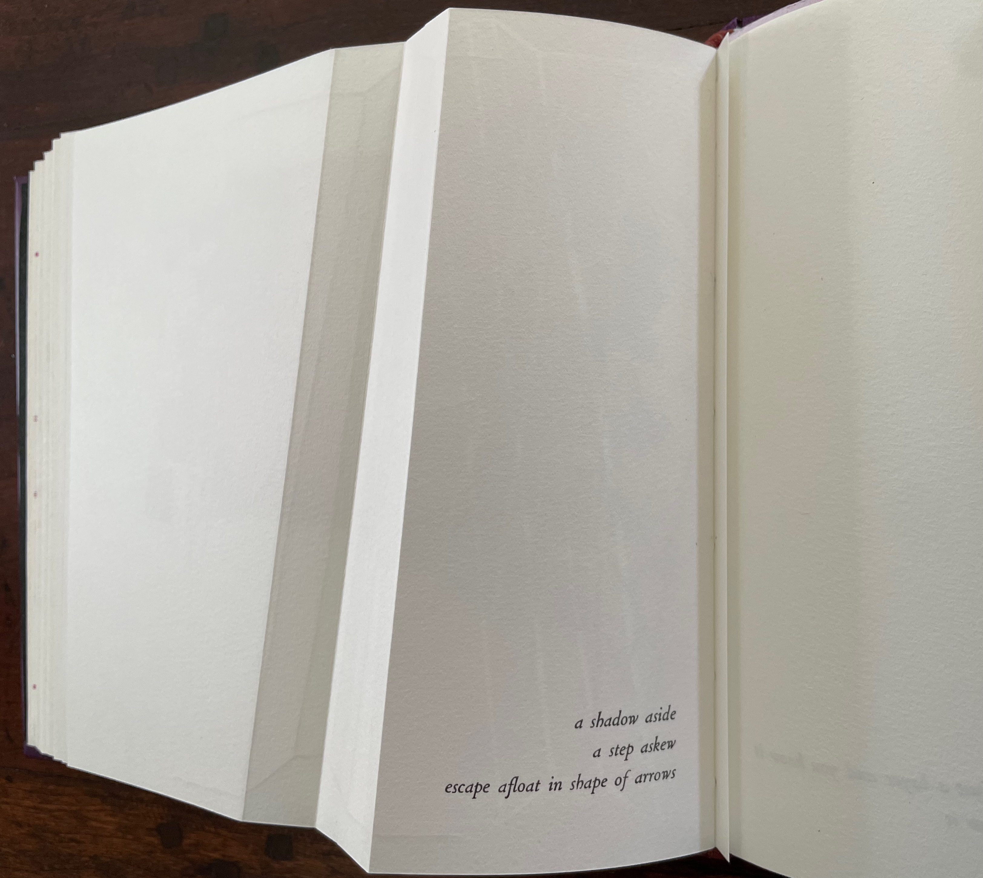
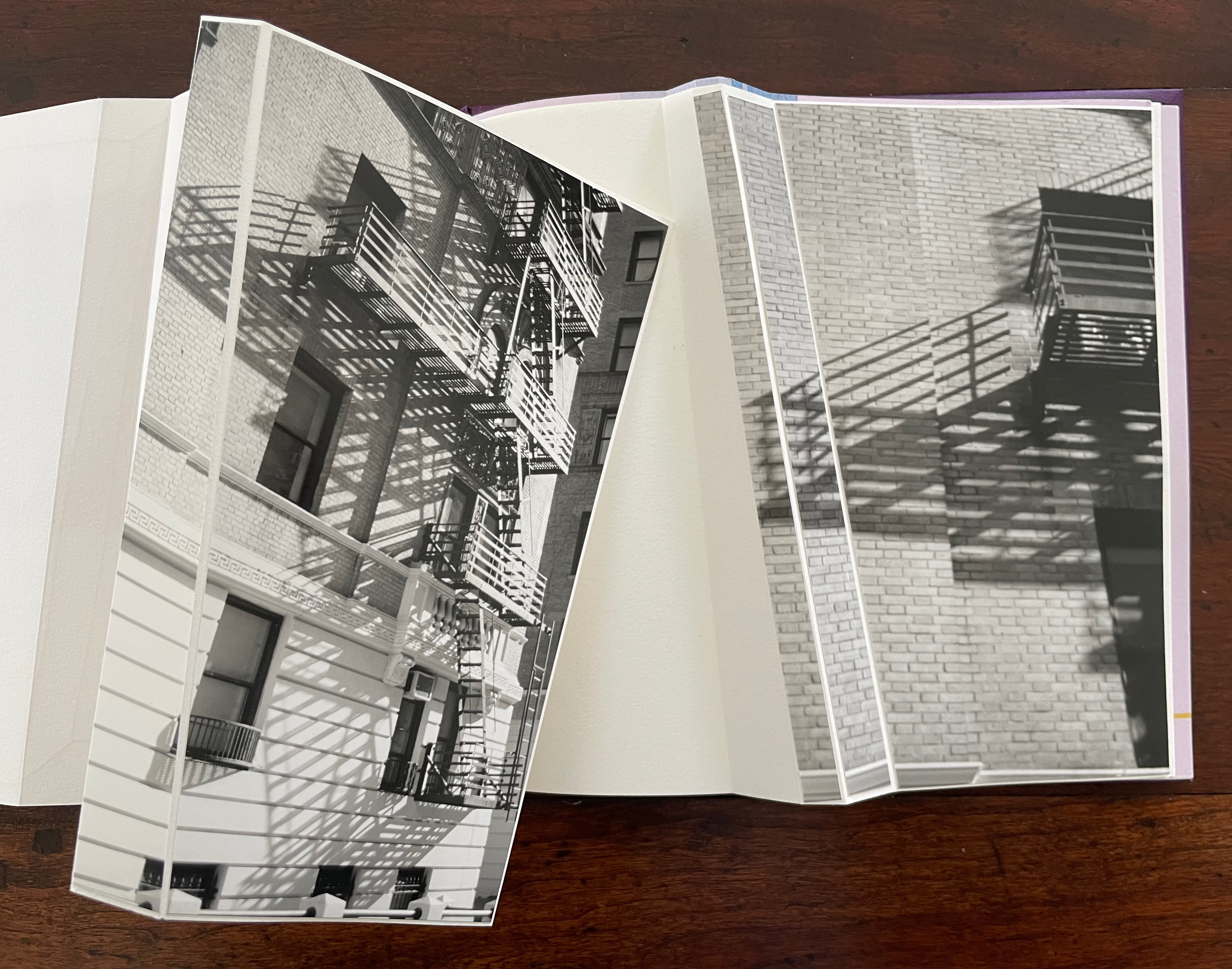
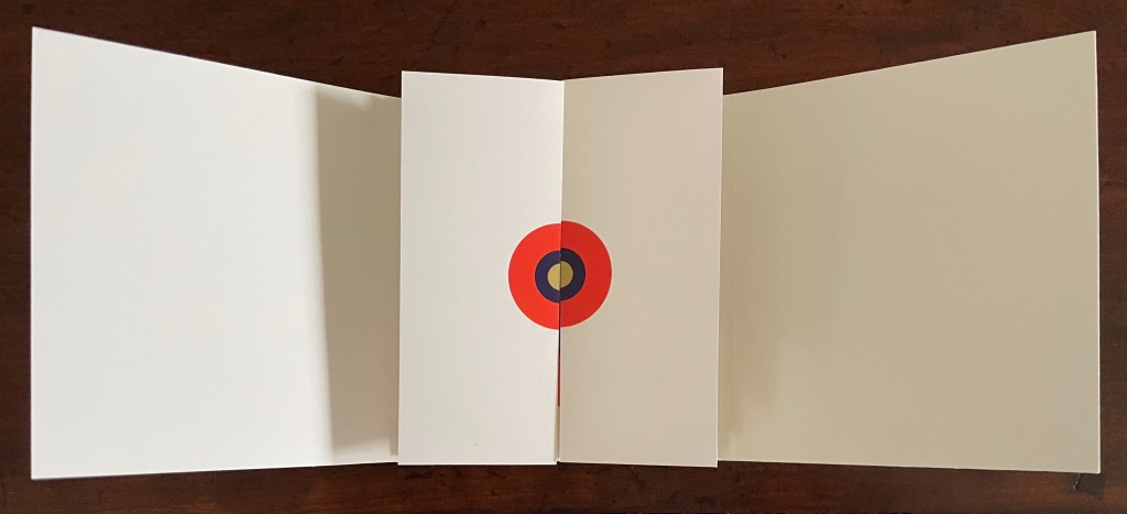
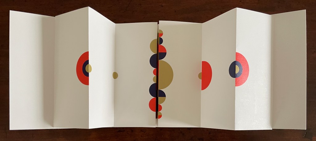
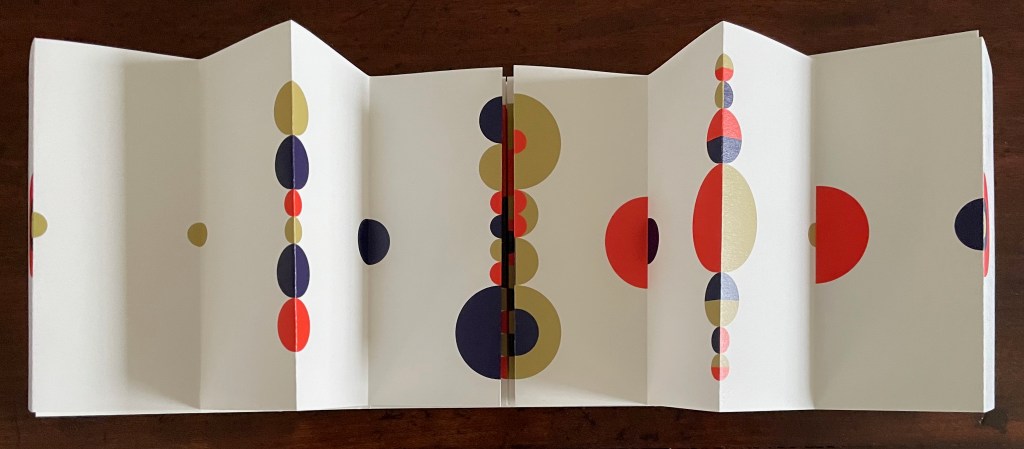
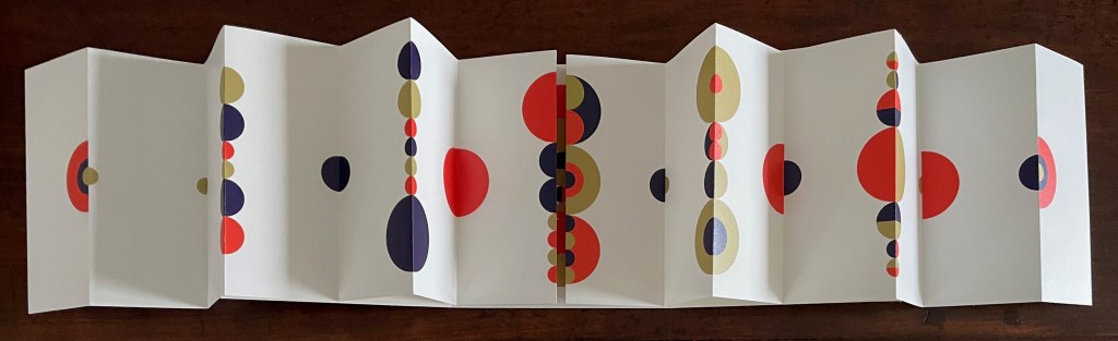
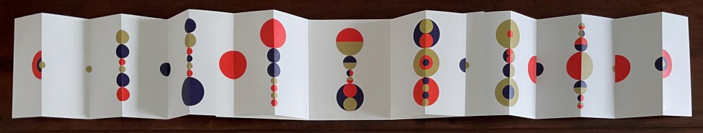
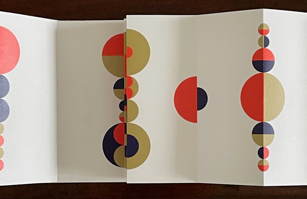
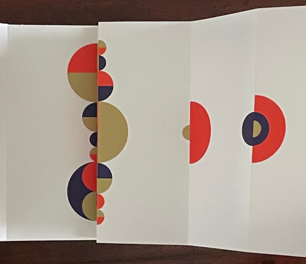
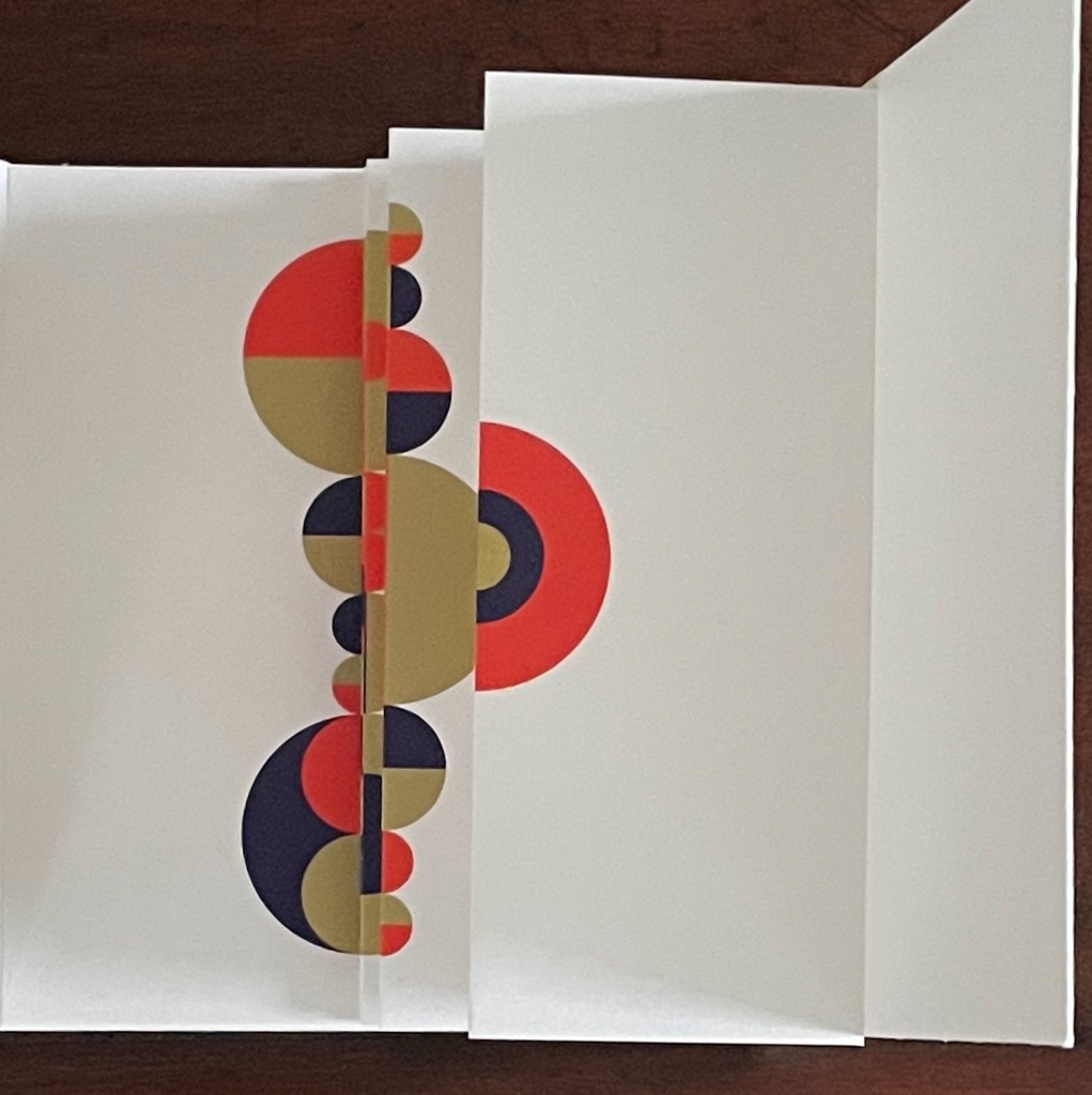
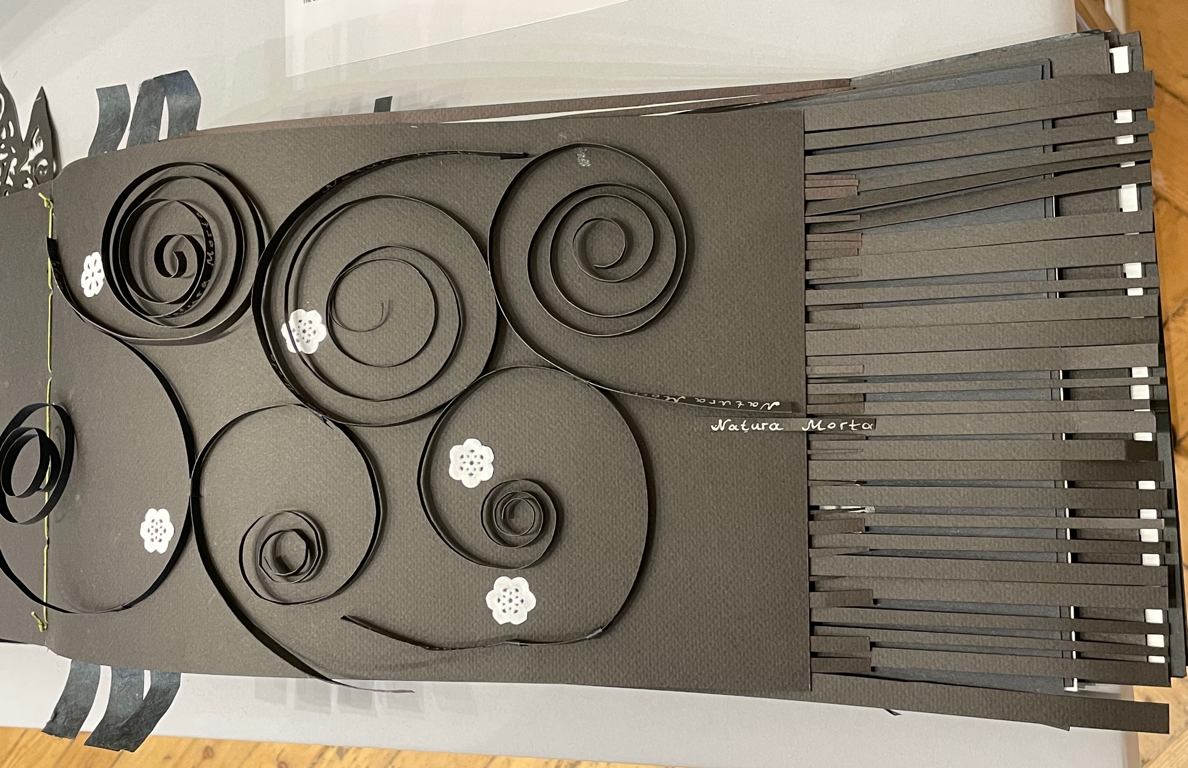
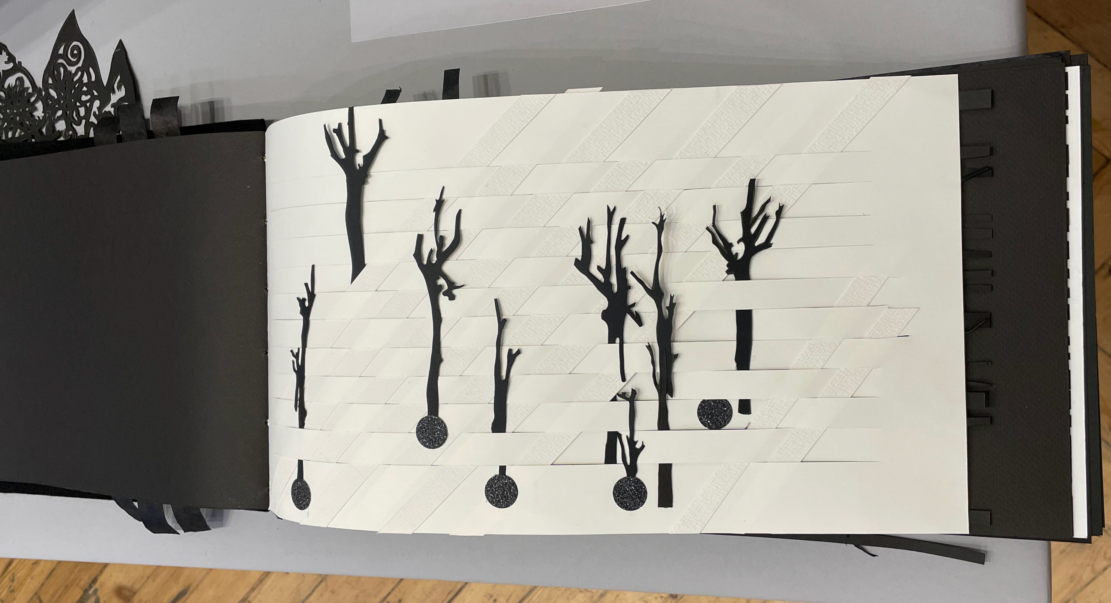
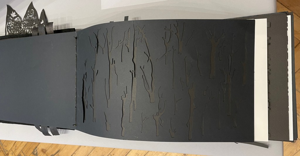
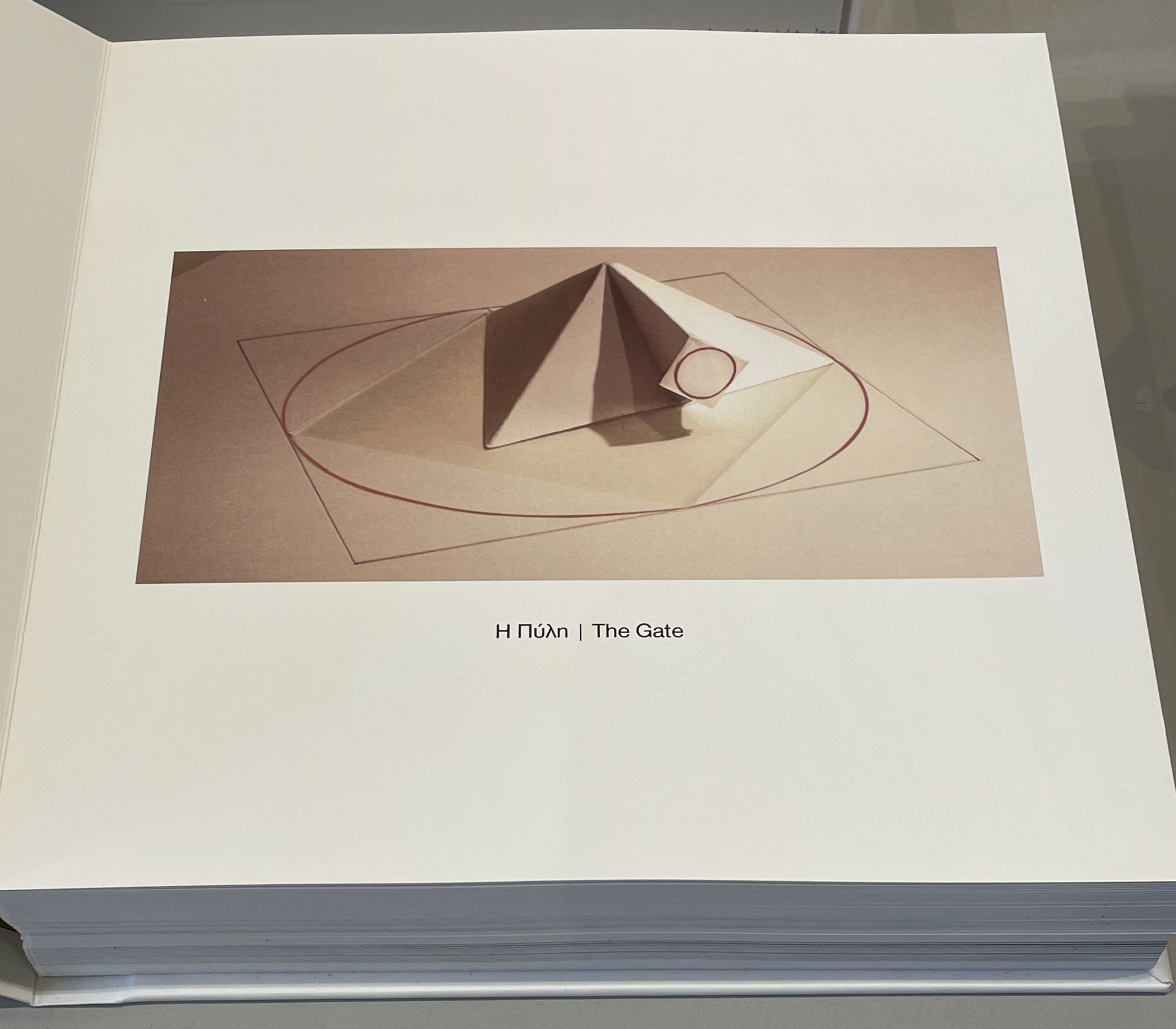
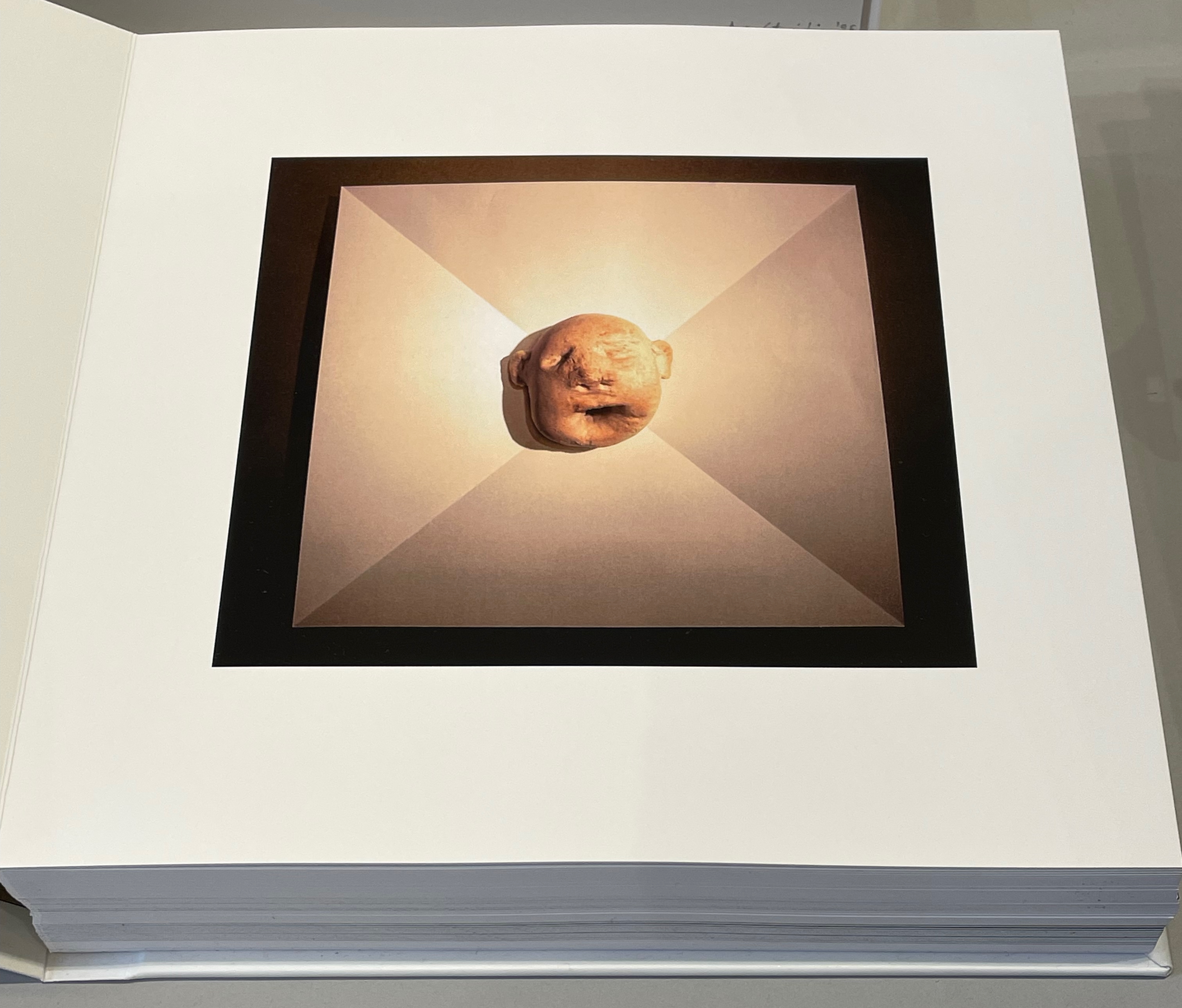
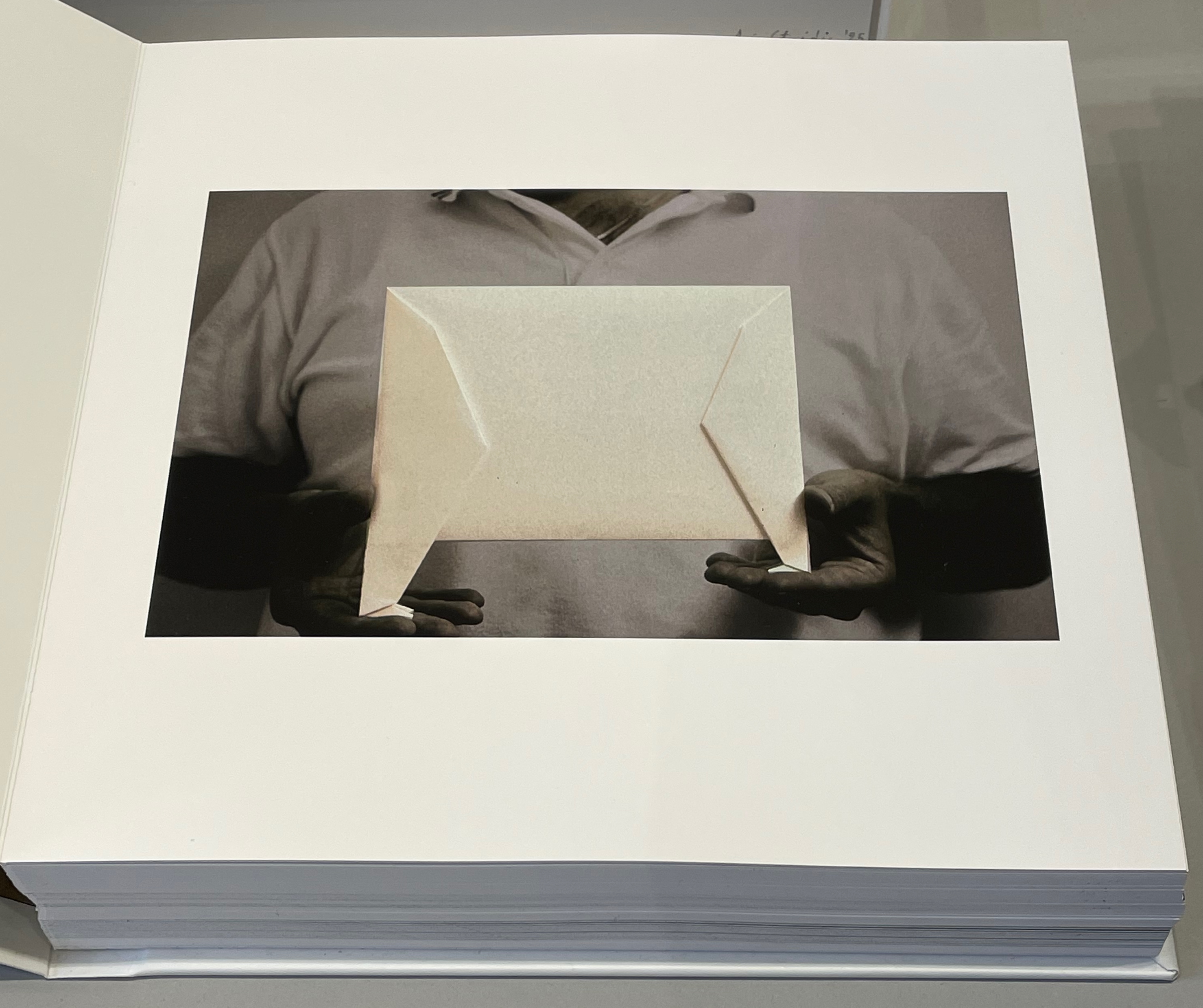
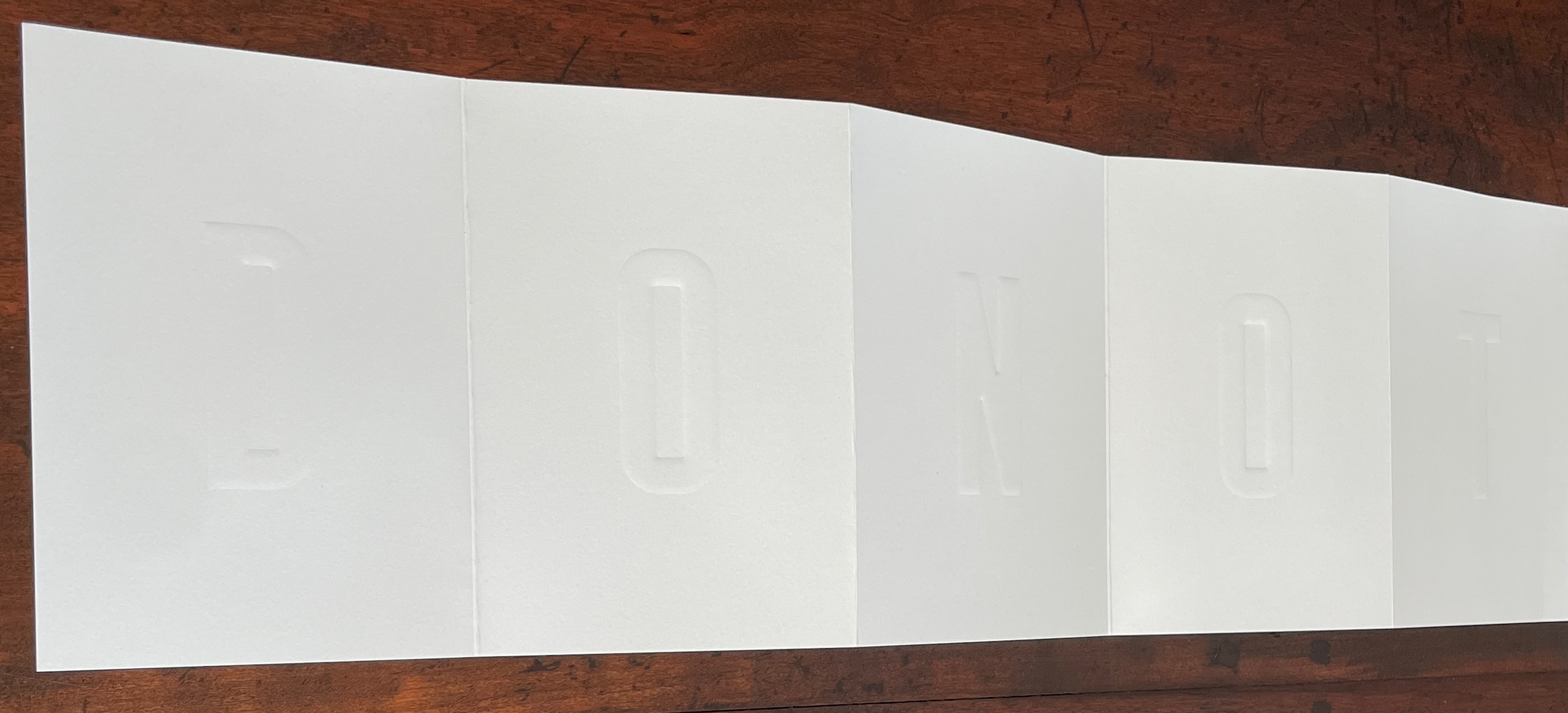
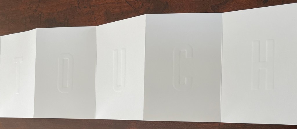
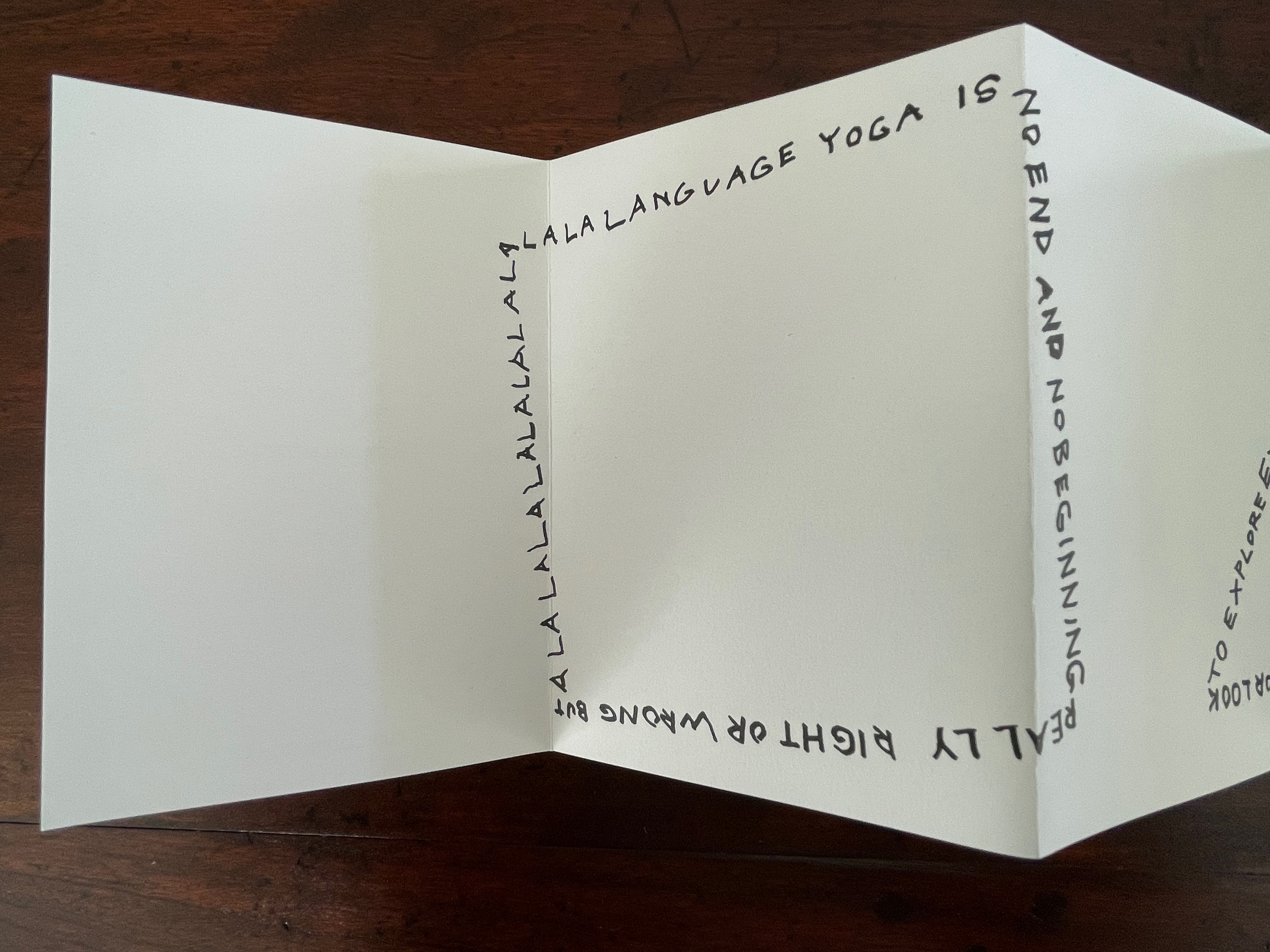
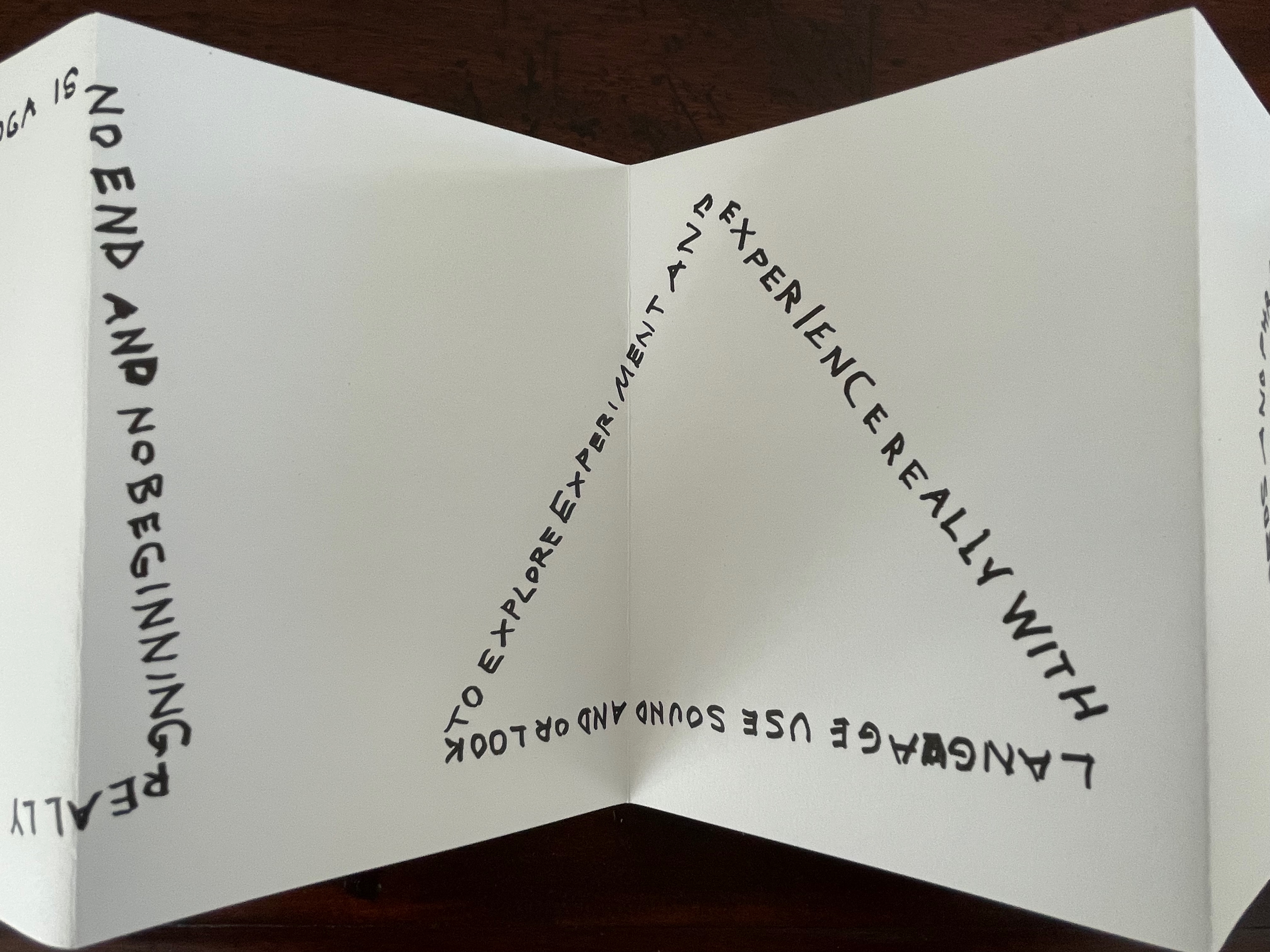
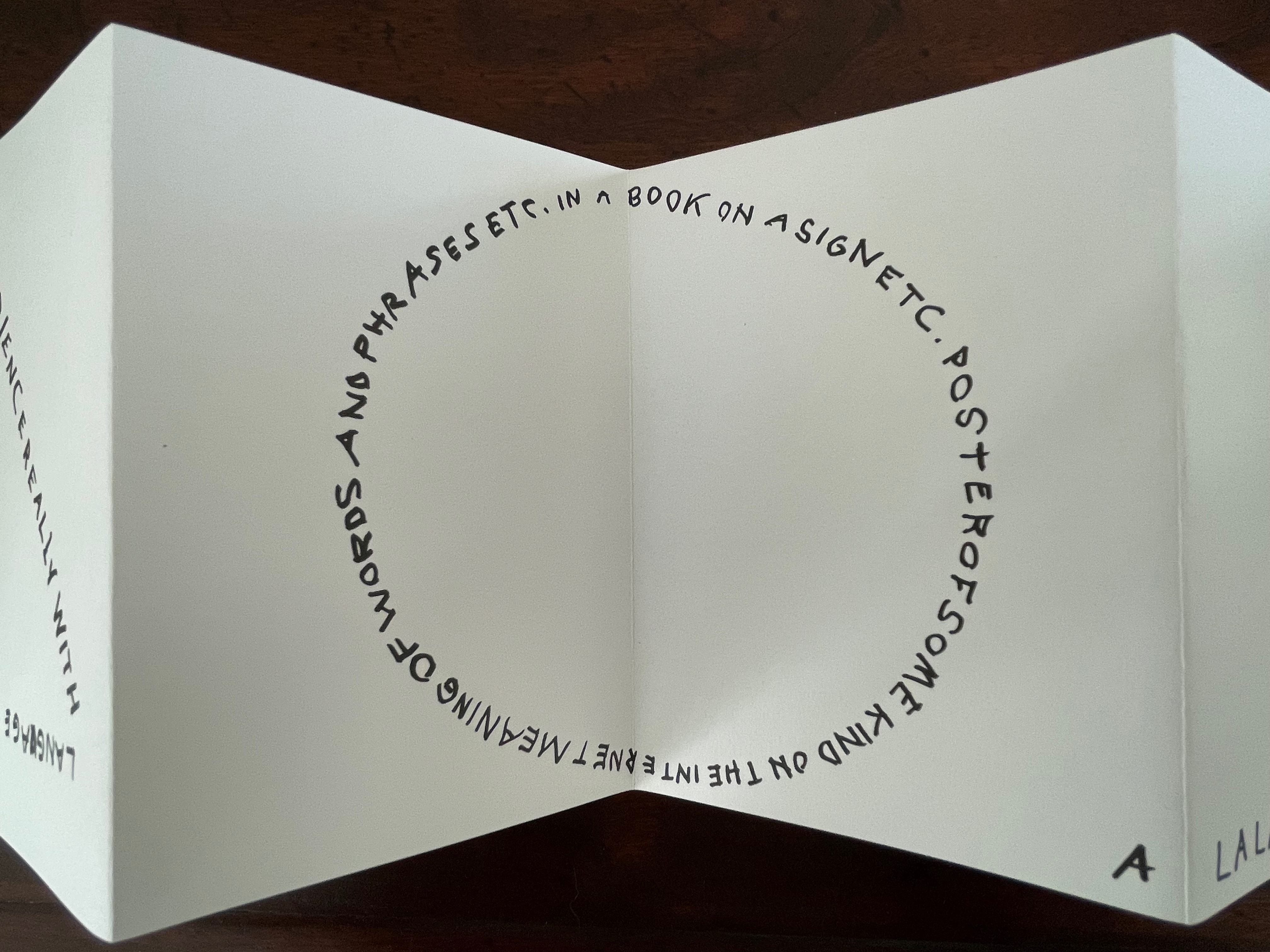
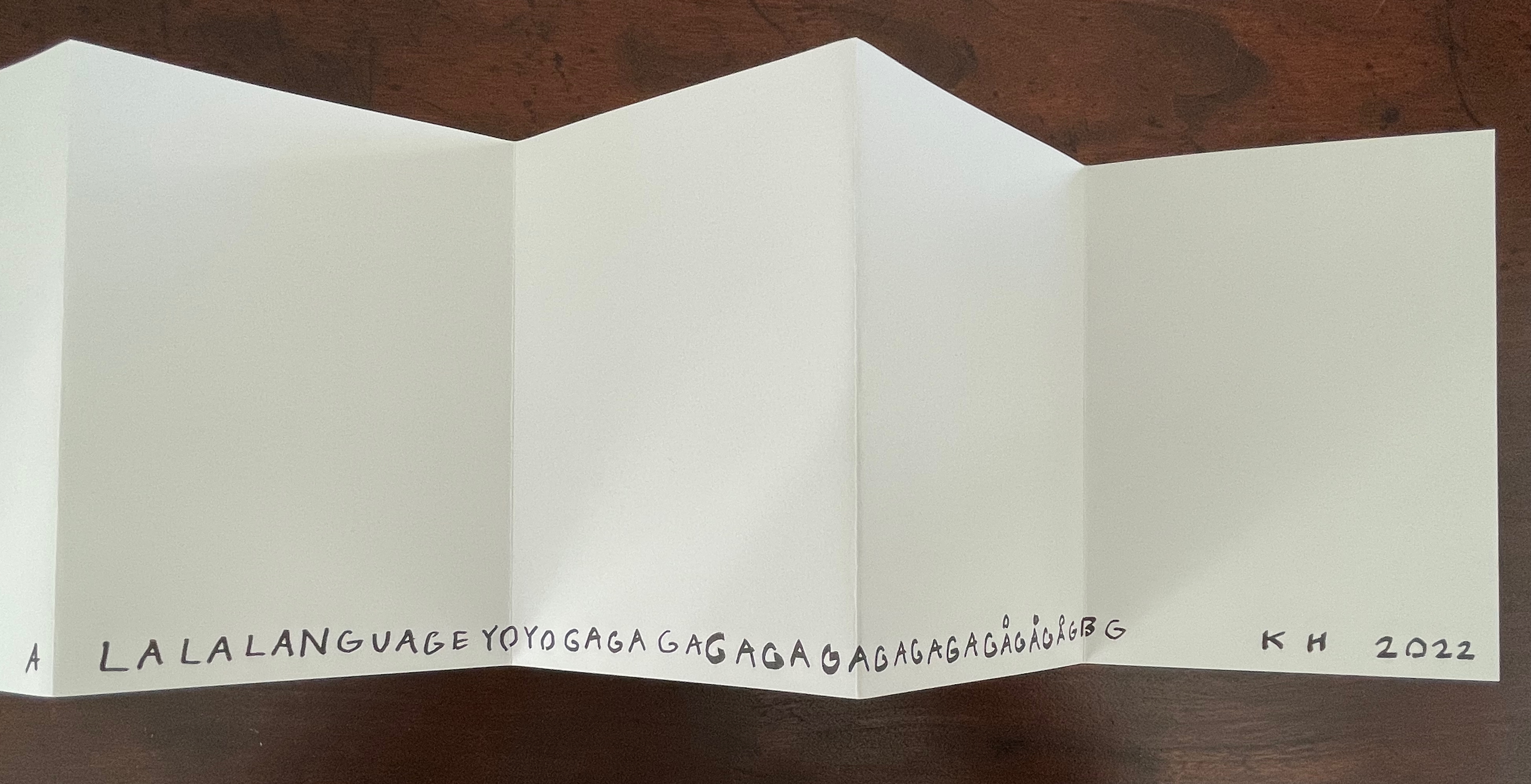
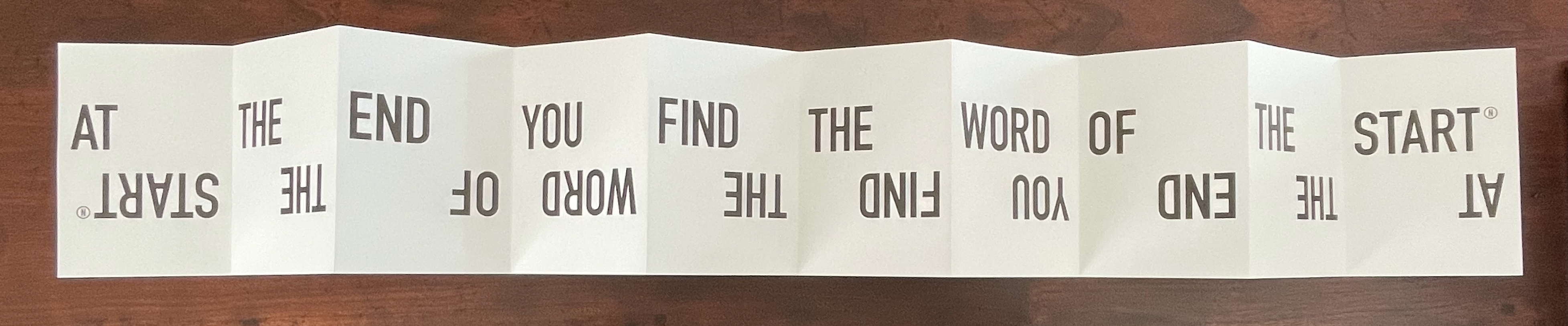
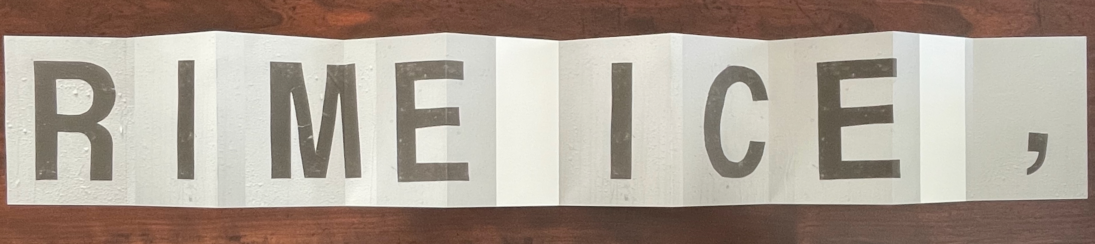
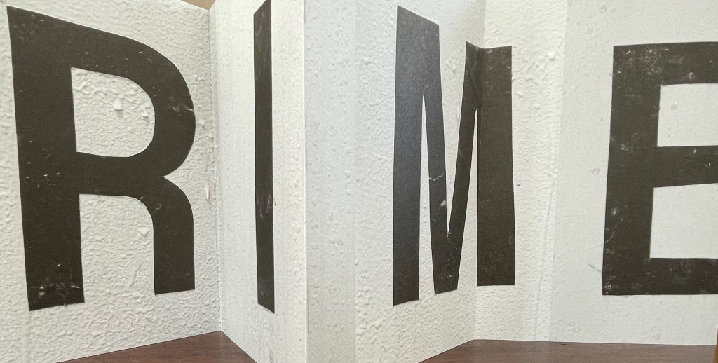
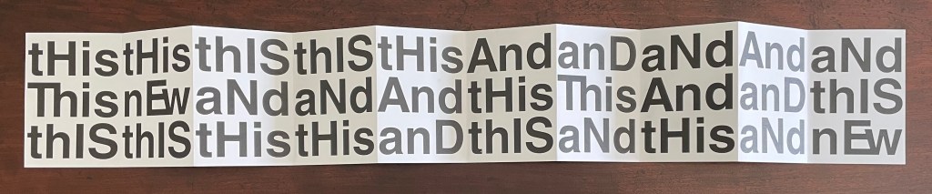
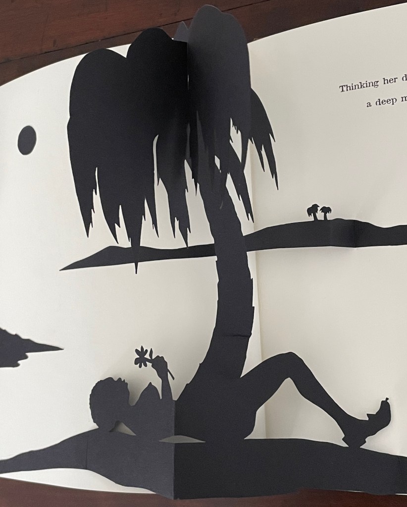
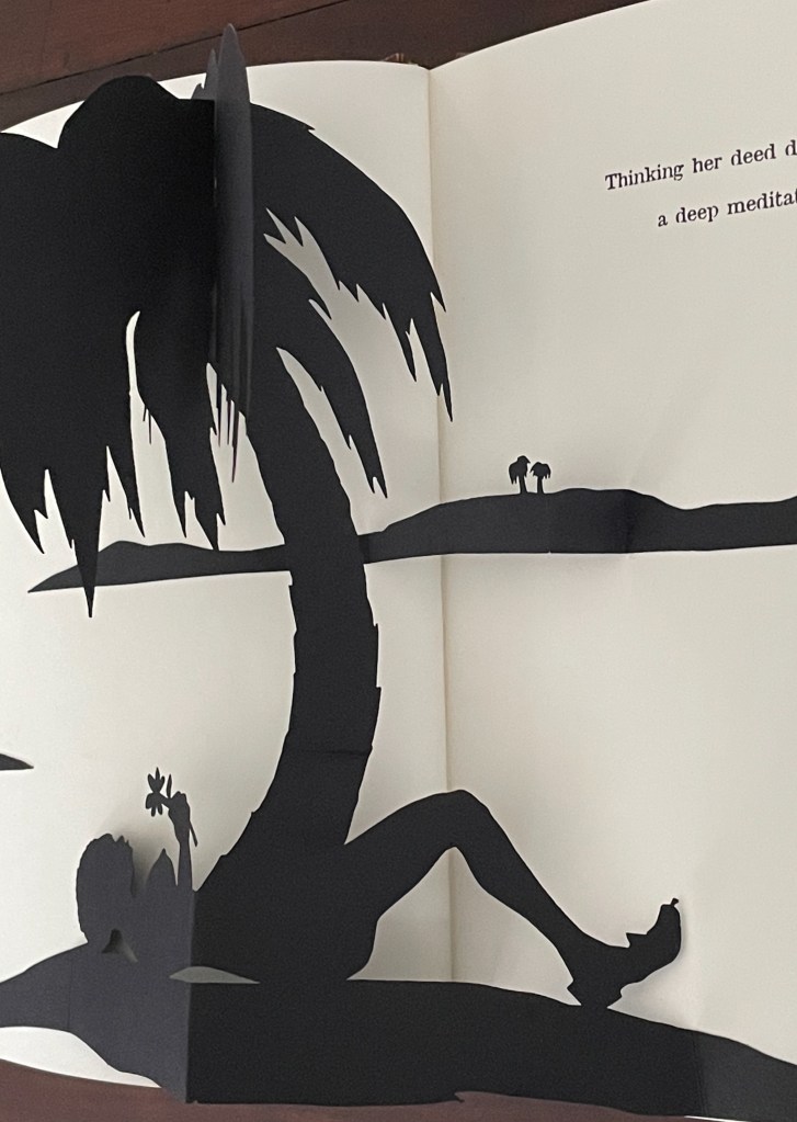
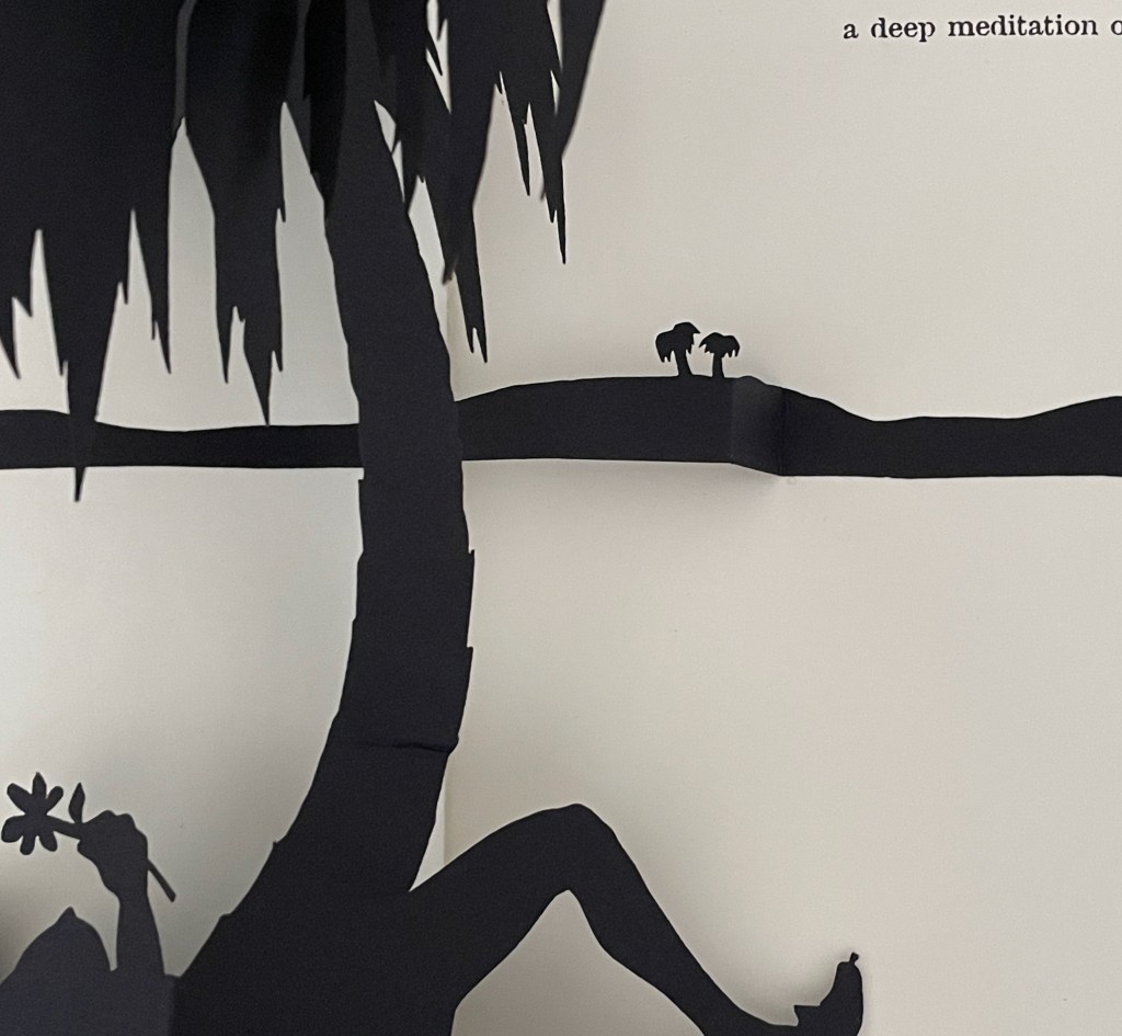
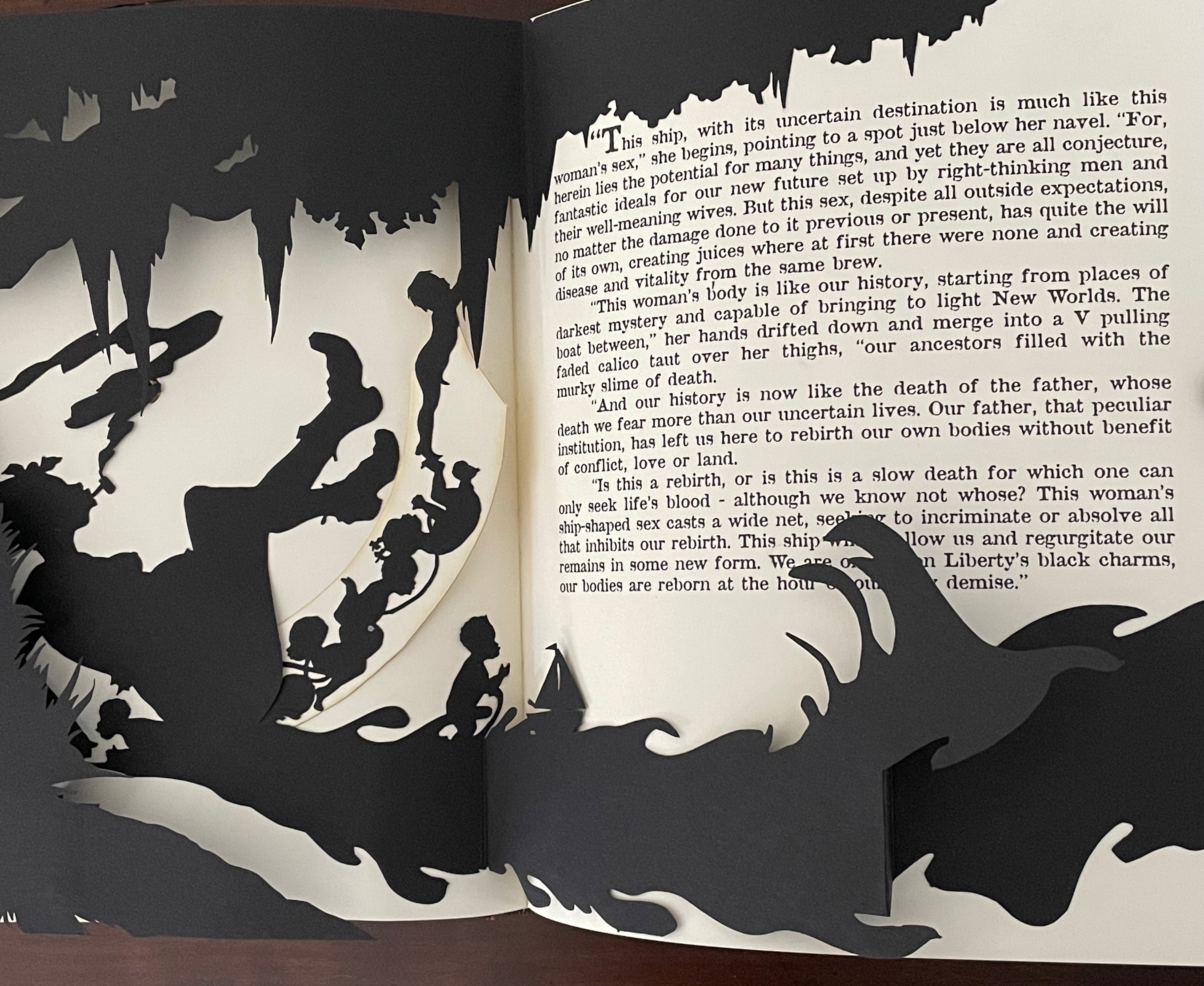
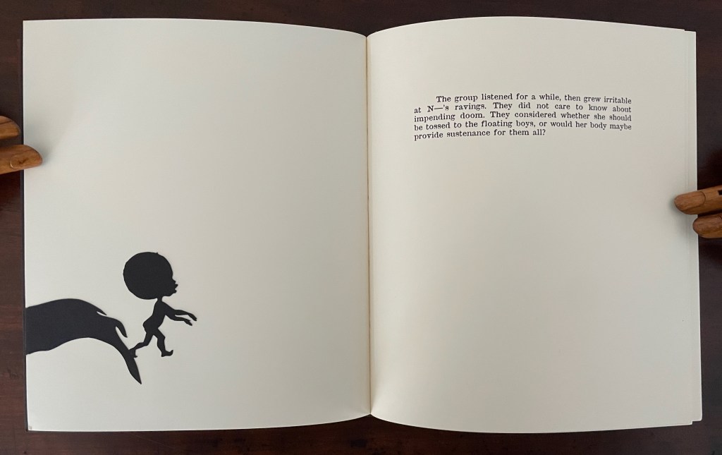
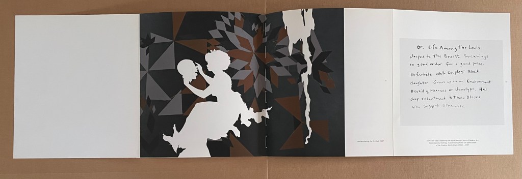
Freedom goes beyond an illustration of text. Its offset lithographs and five laser-cut pop-up silhouettes on wove paper extend and complicate the fable in the self-reflexive manner often found in artists’ books.
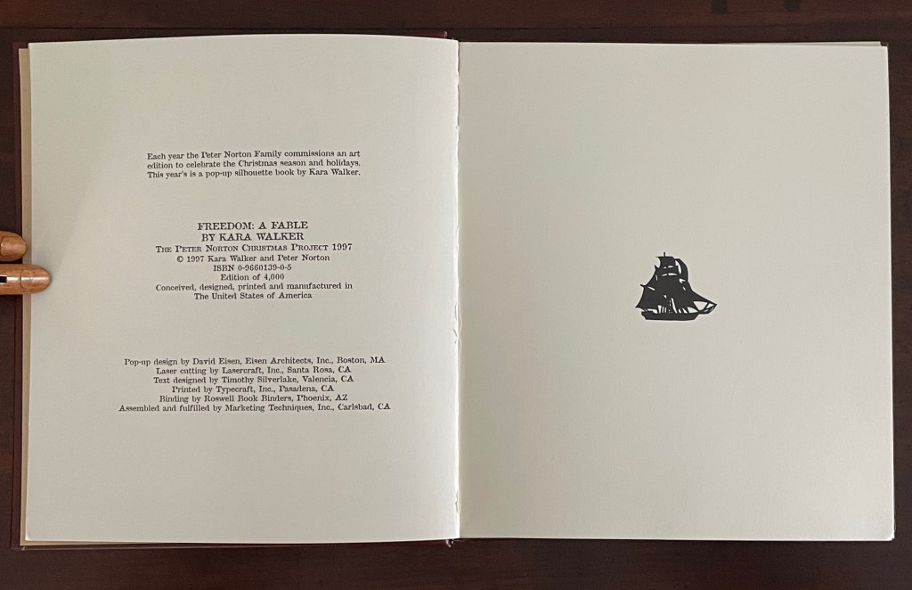
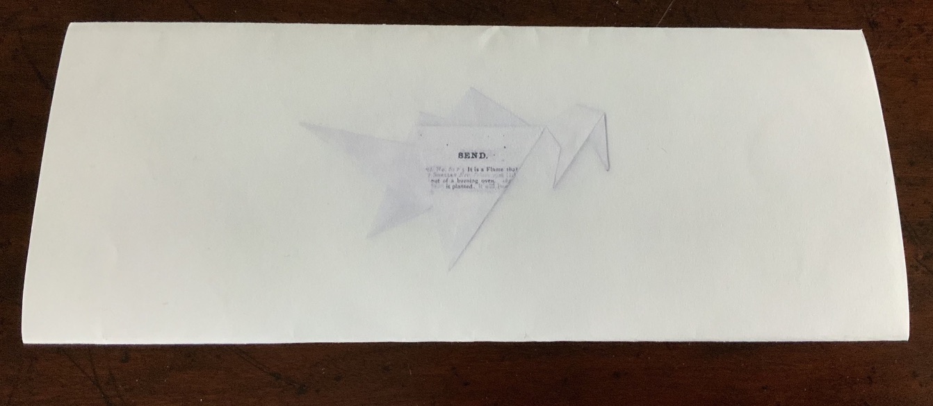
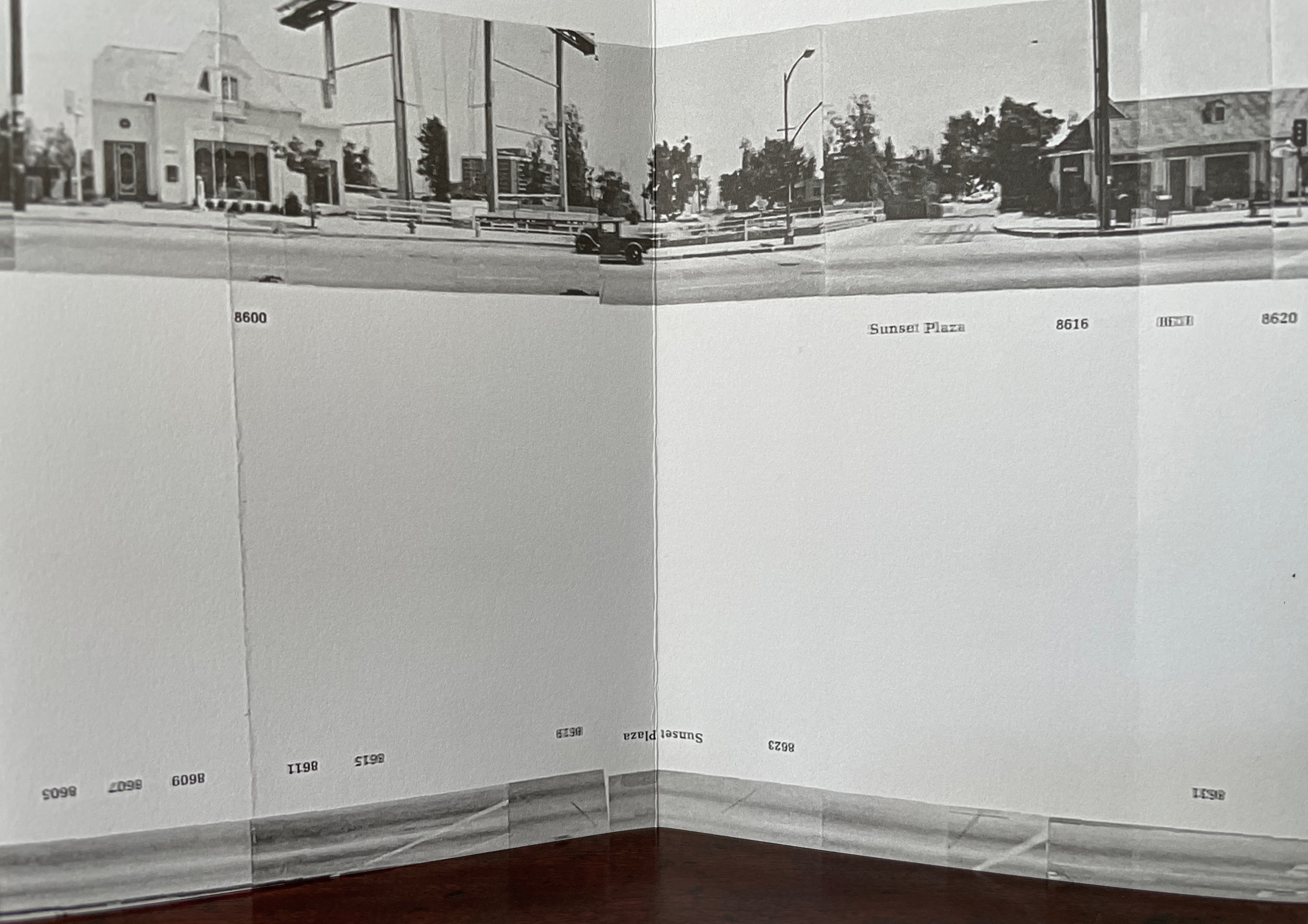
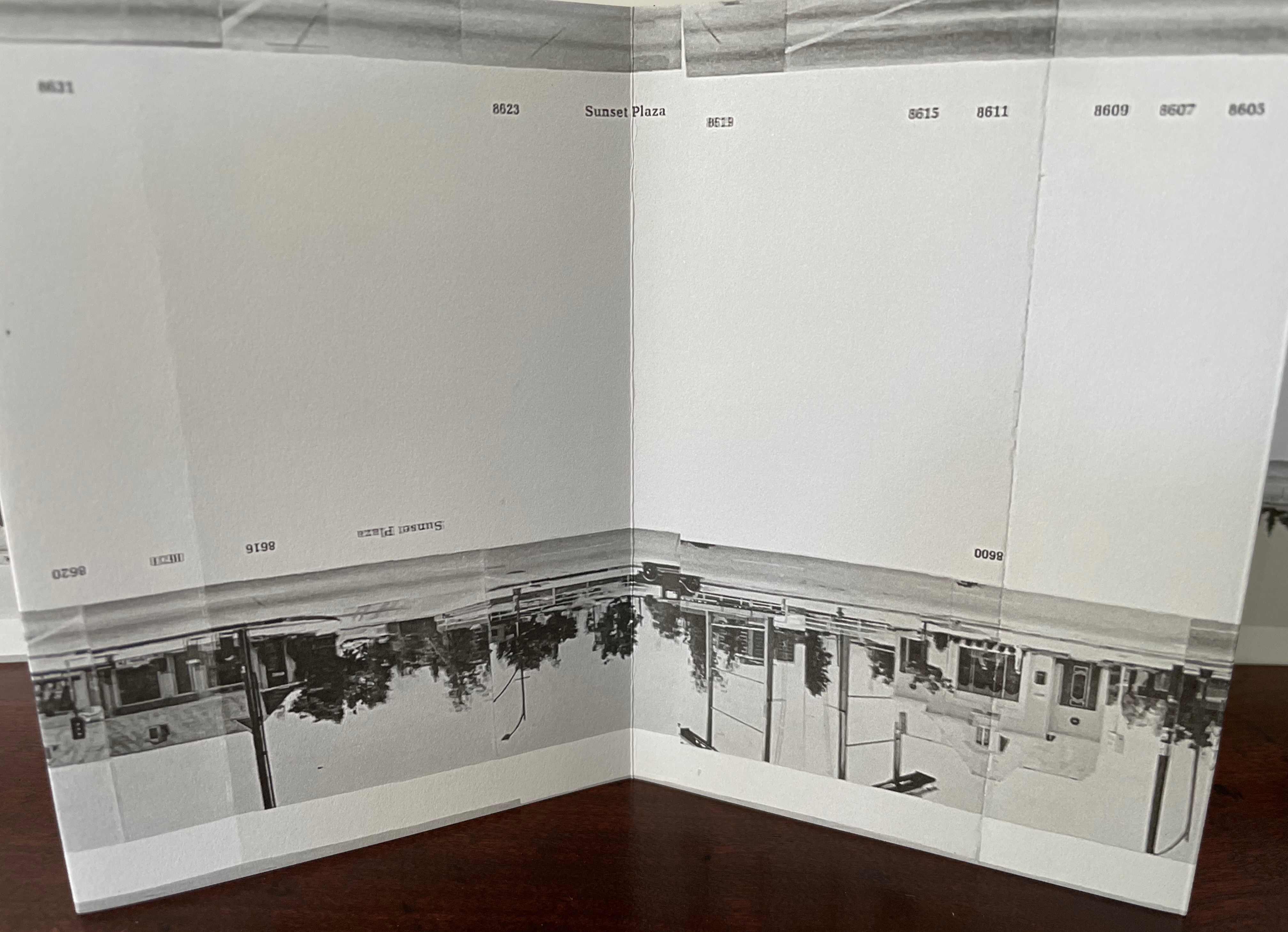
First and last image of the book: the “Freedom” ship; opening line of the book.

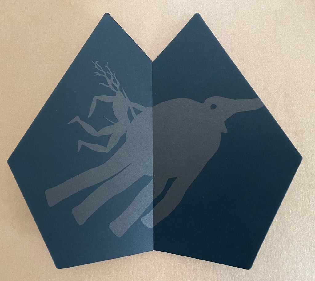
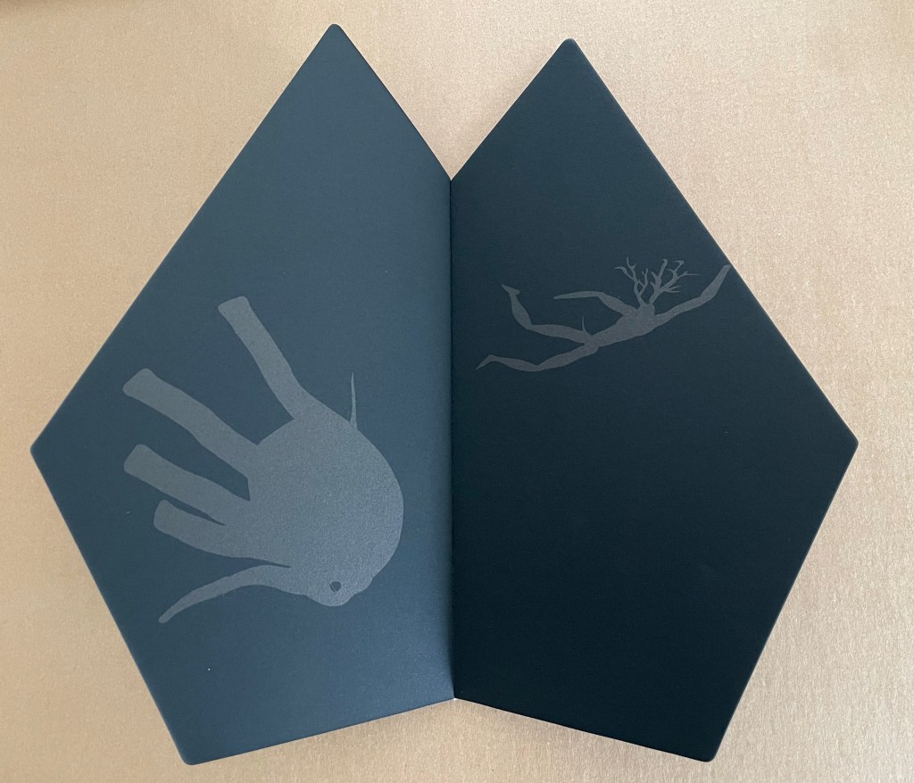
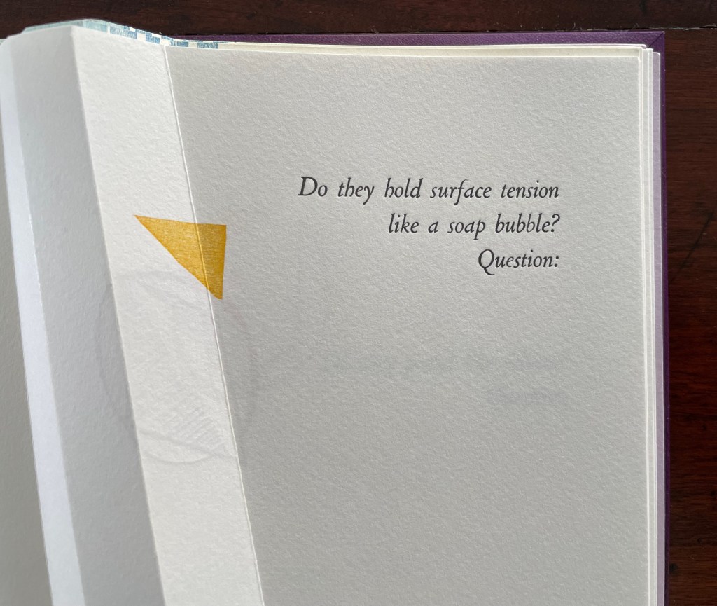
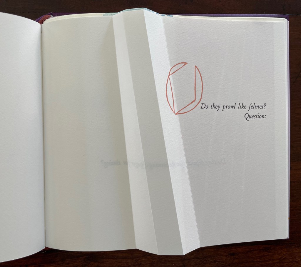
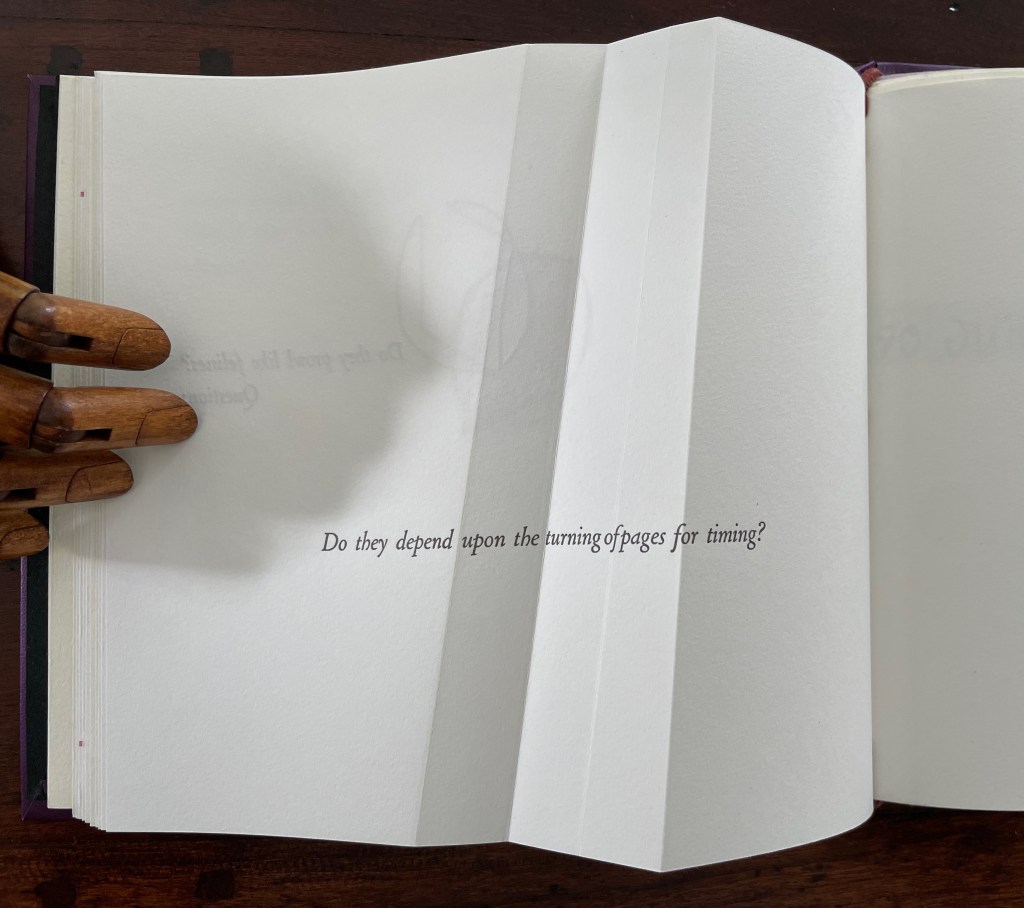
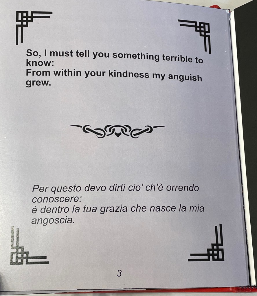
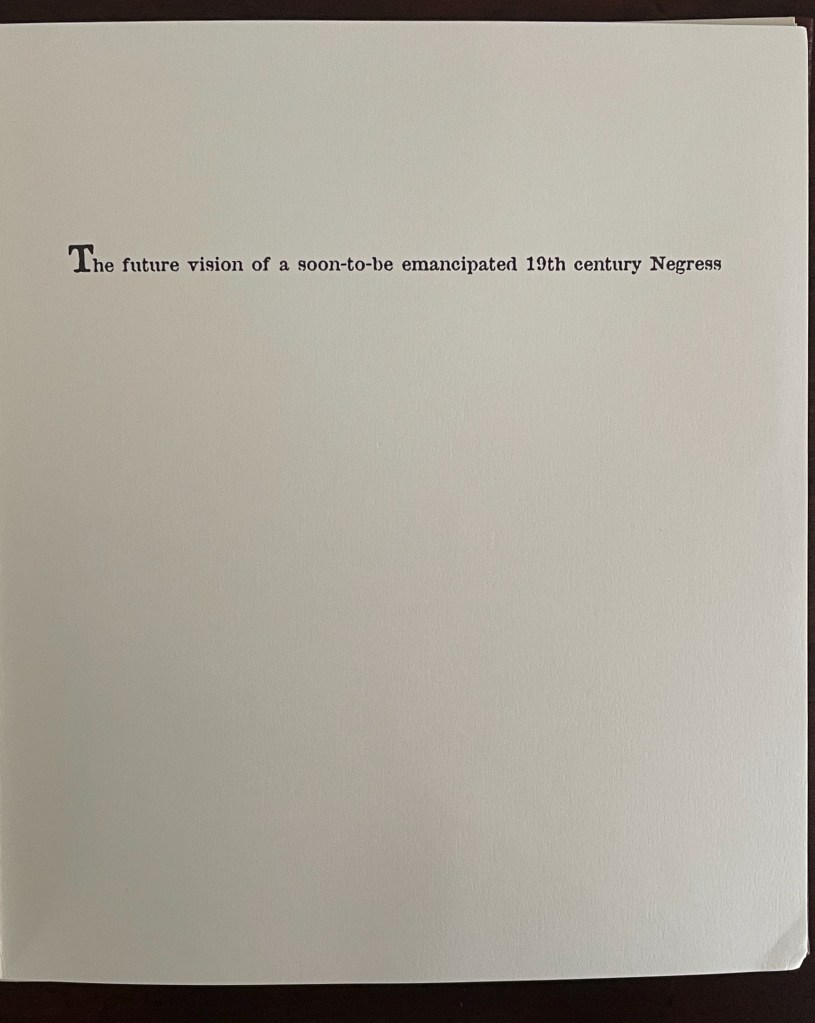
The book’s title taunts the reader, artist, and narrator all at once (both the narrative and freedom are fables). Likewise, the black-on-white cutouts and lithographs trip up every party’s sensibilities, racial prehensions, and cultural memories. The opening display may evoke Gone with the Wind, but the heroine is the Negress. The narrator and artist matter-of-factly elevate the sexualization of “N____” to bisexual, scatological Creator/Mistress status. The abbreviated name, as if in a 19th-century tale of erotica, evokes denigrating of the “N” word. Designed to make the viewer tilt the book every which way to see what can be (and is meant to be) seen, the pop-ups evoke a feeling of prurience. In the final spreads, Walker and David Eisen, the collaborating paper engineer, use a pull tab to involve that prurience in a procreative delivery.


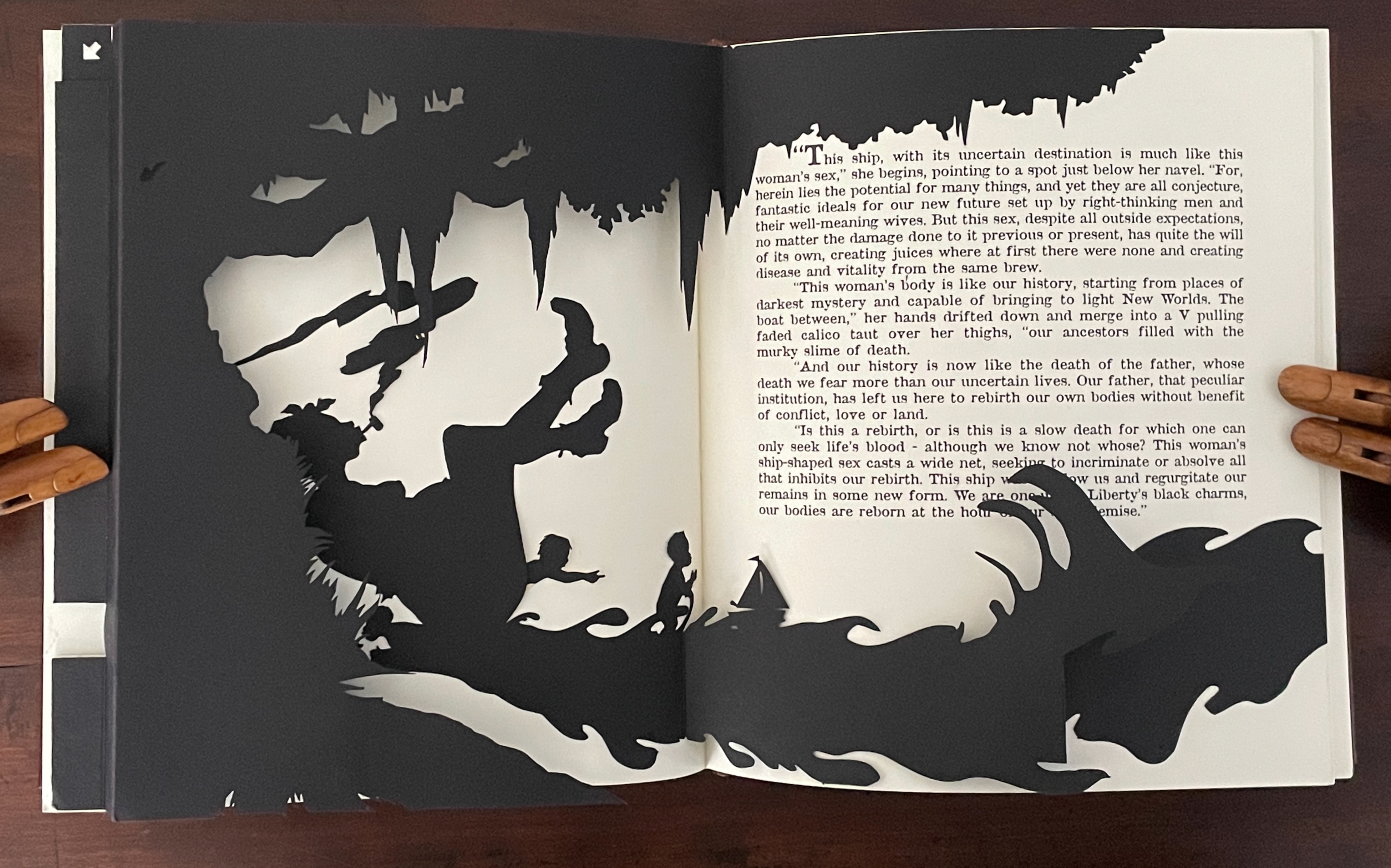

The power of this artwork is that it merges the self-reflexivity of the artist’s book with a self-cannibalizing societal condition.
After the Deluge (2007)

After the Deluge (2007)
Kara Walker
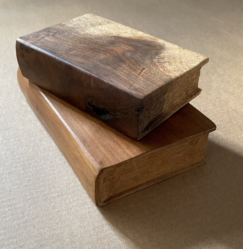
Casebound, illustrated paper over boards, black doublures. H270 x W225 mm. 120 pages. Acquired from Lacey Books, 26 August 2025.
Photos: Books On Books Collection.
The immediate spur to After the Deluge (2007) and its associated exhibition was the aftermath of Hurricane Katrina in 2005. The book is not a straightforward catalogue of the exhibition. Several works in the exhibition are not included; in fact, an entire wall is missing, and juxtapositions in the exhibition differ from those in the book. It is one of those books that goes beyond its proximate cause and differs from the exhibition that occasioned it.
Walker labels it a visual essay. While its blending of original work and appropriations with collage nudges it toward being an artist’s book, its structural principle is uncertain. Even the Table of Contents is puzzling. Preceded by a single-page black bleed, “Murky” begins with Walker’s brief introduction on page 7. The last page of that text concludes, however, on page 9, which is assigned to the visuals of pages 9 to 107. Perhaps 9 is a typo and should be 10. Whatever the case there, the individual labels in the Table of Contents are not given specific page references, and it is not always easy to match up the visuals with the labels.
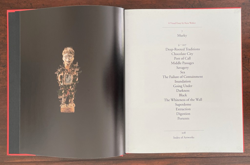
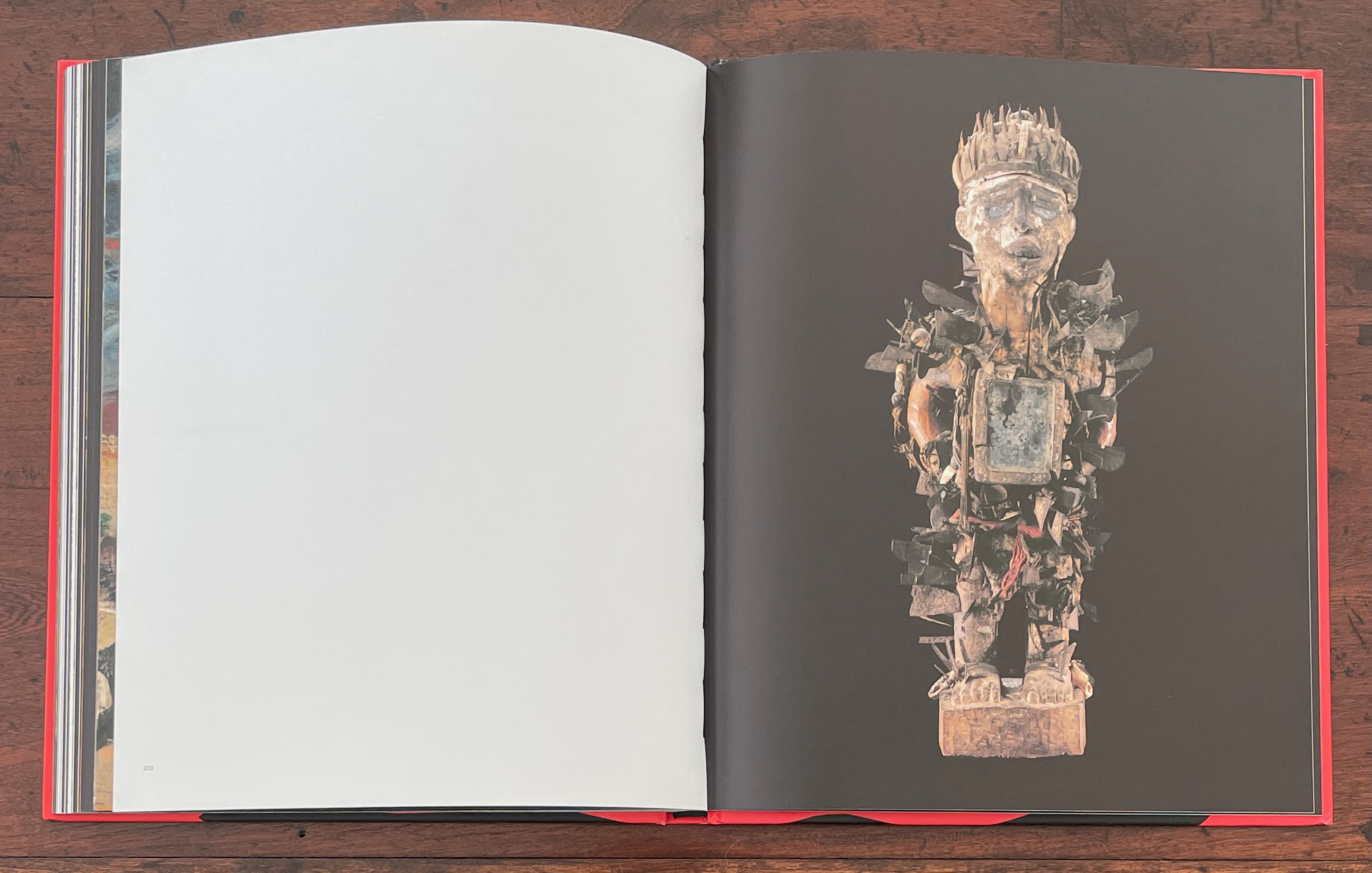
Male Power Figure; Table of Contents.
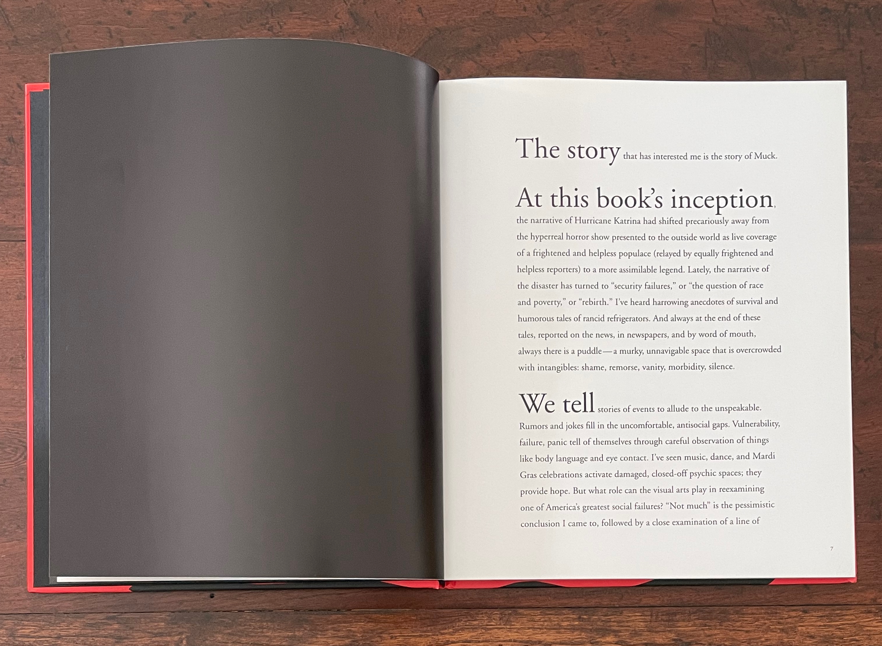
Introduction; AP Images/Bill Haber.
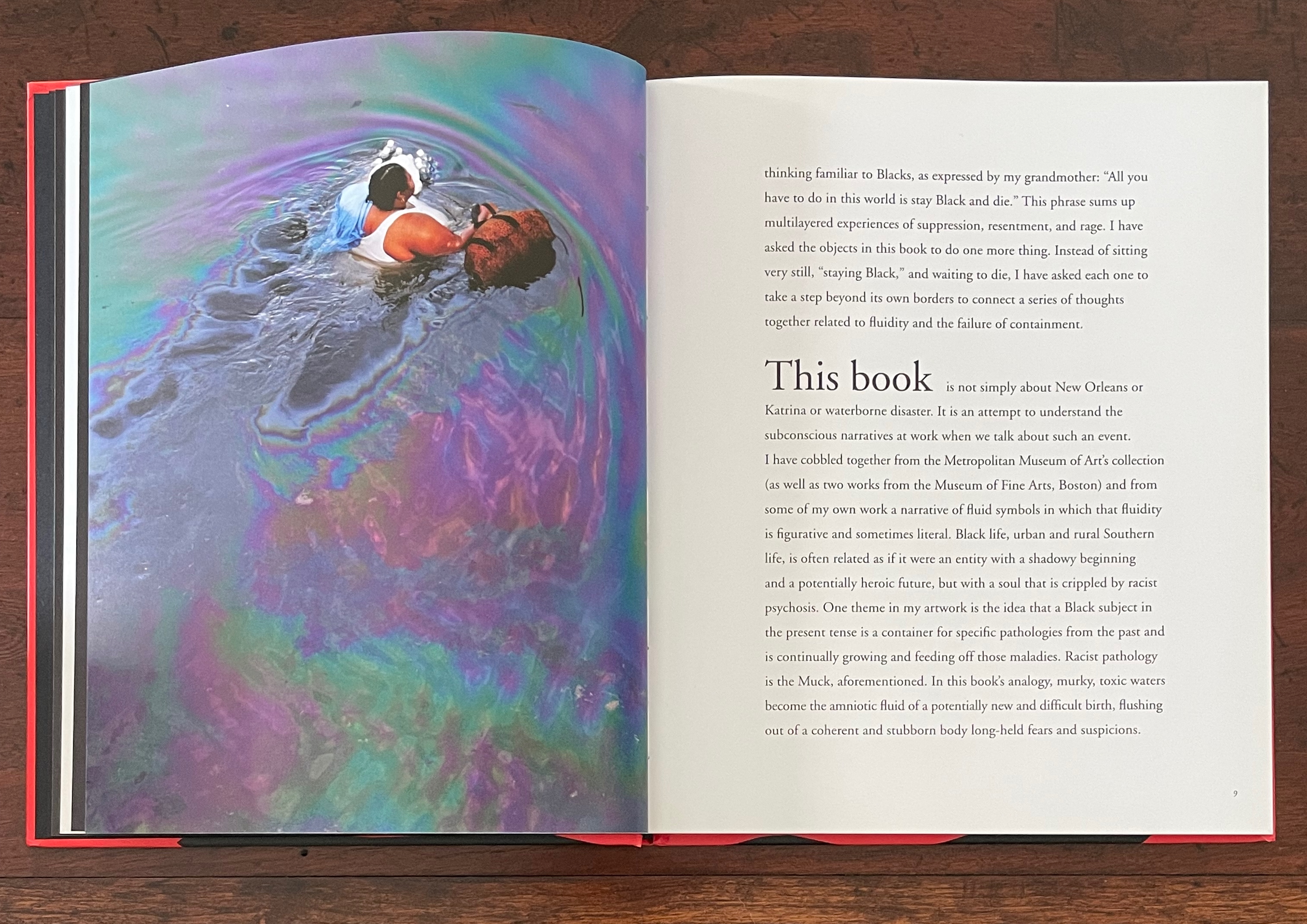
The brief introduction sets out the driving analogy clearly enough though. Perhaps, when we cannot pin down the organization at every point, we have to fall back on the analogy of a murky muck:
Racist pathology is the Muck, aforementioned. In this book’s analogy, murky, toxic waters become the amniotic fluid of a potentially new and difficult birth, flushing out of a coherent and stubborn body long-held fears and suspicions.
Among the book’s other signals are the placement and handling of full-page bleeds. Contrasts of bleeds of black ink with white pages often serve to underscore juxtapositions of white western art with African artifacts and Walker’s works. Above, the single-page bleed of black preceding the Table of Contents presents us with Nkisi, a large African male power figure. In the exhibition, it loomed under a glass cover for viewing in the round. As can be seen above, and underscoring the difference between book and exhibition, it is a reduced figure, although Nkisi returns as a larger presence toward the end of the book.
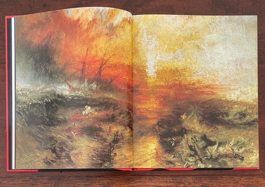
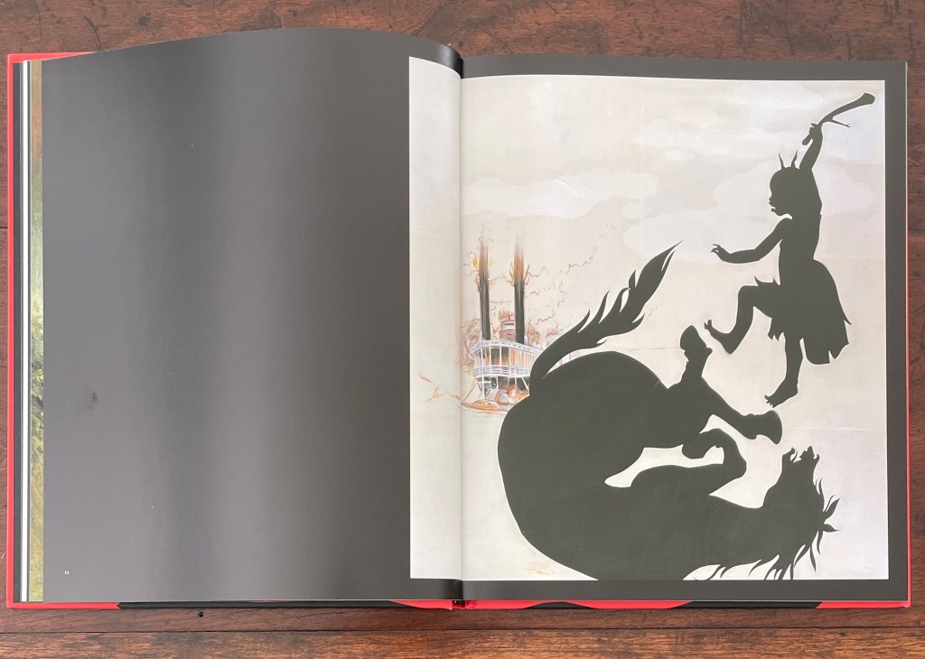
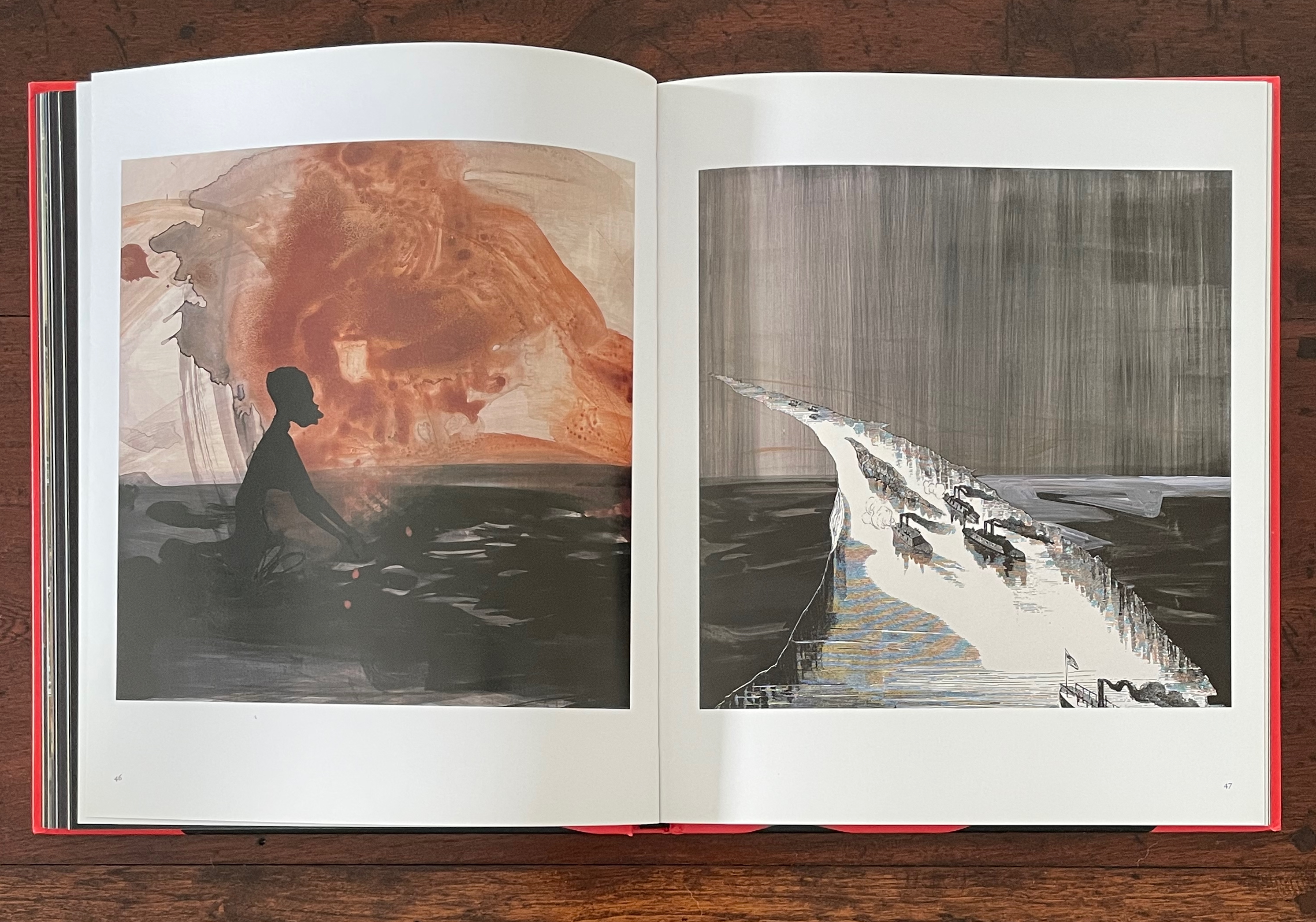
The first double-page bleed is one in full color and does seem to match up with the label “Deep-Rooted Traditions” in the Table of Contents. It presents JMW Turner’s 1840 Slave Ship (Slavers Throwing Overboard the Dead and Dying, Typhoon Coming On). In the following double-page spread, Walker’s 1996 Untitled, a cut-out silhouette and pastel on a white background, is crowded to the right and surrounded by a full-bleed margin of black. Its pastel double-stack steamboat spews fire in the background, perhaps frightening a black silhouetted horse into a fall in the foreground. Whatever the cause, the black silhouetted girl with an upraised cudgel becomes a visualization of the expression “beating a dead horse”. In Walker’s typical perverse irony, it’s a 19th-century white painter’s condemnation of slavery followed by a 20th-century Black artist’s black cutouts, shoved off center and shoving us to conclude that slavery is a dead horse she is beating. Deep-rooted traditions, indeed.
But slavery is not a dead horse. Its carcass has mutated into the historical, cultural, and personal condition that Walker calls “the Muck” and amniotic fluid in her introduction. The Muck and fluid juxtapose works from Walker’s American Primitives series and Middle Passages series with selections from the Metropolitan Museum of Art and Boston’s Museum of Fine Arts. The full-bleeds of black on single pages and double-page spreads punctuate this maelstrom of art that includes white American primitives such as JW Barber (1798-1885), John Carlin (1813-91), WP Chappel (1800-80); the European-influenced JS Copley (1738-1815), Winslow Homer (1836-1910), and Joshua Shaw (1777-1860); the French silhouettist Auguste Edouart (1789-1861); and earlier artists such as Jean Audran (French, 1667-1756), RN Zeeman (Dutch, 1623-63), and Pieter Nolpe (Dutch, 1614-53).
The Table of Contents’ label “Middle Passages” clearly refers to the images on pages 43 to 49 and matches up with Walker’s five Middle Passages works in the upper left of the exhibition wall below. In the exhibition, however, the images proceed in an order different from that in the book.
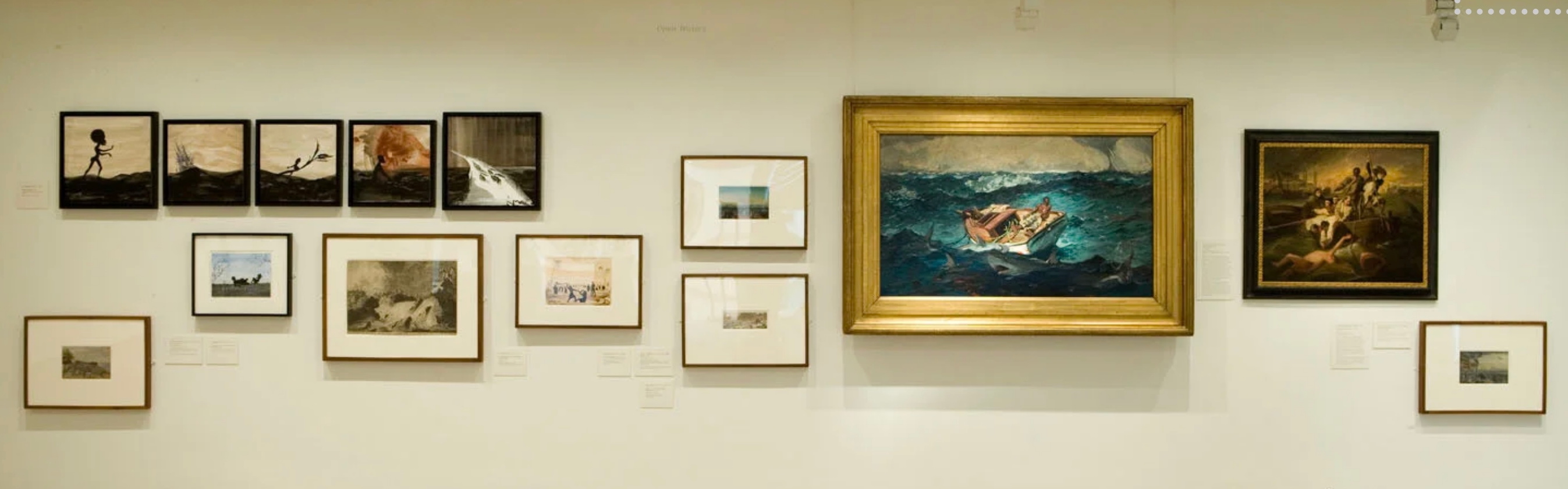
The exhibition wall matching up with pages 43-49 (“Middle Passages”) in the book.
The order of images in pages 43-49 differing from their order on the exhibition wall, the last two of five Middle Passages works now coming after the Homer.
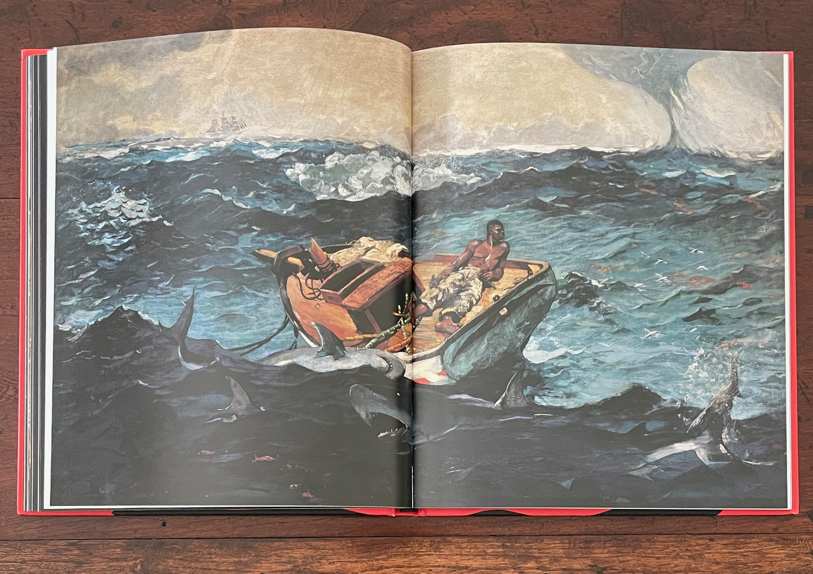
Also, later on, the book uses enlarged details from three of the works on this wall: RN Zeeman’s Water from his series Four Elements (ca. 1651-52), Pieter Nolpe’s The Bursting of St. Anthony’s Dike, 5 March 1651, and Winslow Homer’s The Gulf Stream (1899). Zeeman’s and Nolpe’s works are only represented by enlargements in the book, but this is not just a case of trimming to fit the book. Both are displayed across double-page spreads. Also, a full image of Homer’s The Gulf Stream appears in a double-page spread between the pages displaying three then two of Walker’s Middle Passages works. Moreover, an enlarged detail from The Gulf Stream also appears toward the end of the book. Clearly, the change of order and handling of enlargements are intentional and thematic, not simply forced by the format.

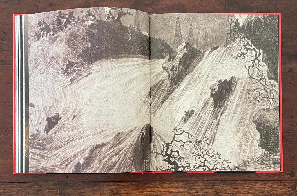

Details from Nolpe’s The Bursting of St. Anthony’s Dike, 5 March 1651; from Zeeman’s Water; and from Homer’s The Gulf Stream used later in the book.
Walker’s use of the typewritten index cards from her American Primitives series may shed light on the labels in the Table of Contents that seem difficult to align with the images in their order in the book. On the dustjacket, Walker writes:
I brought together the art in this book (and the exhibition that preceded it) thinking like a draughtsman, perhaps absurdly so, as even the typewritten texts are from an ongoing series of text pieces I think of as drawings.
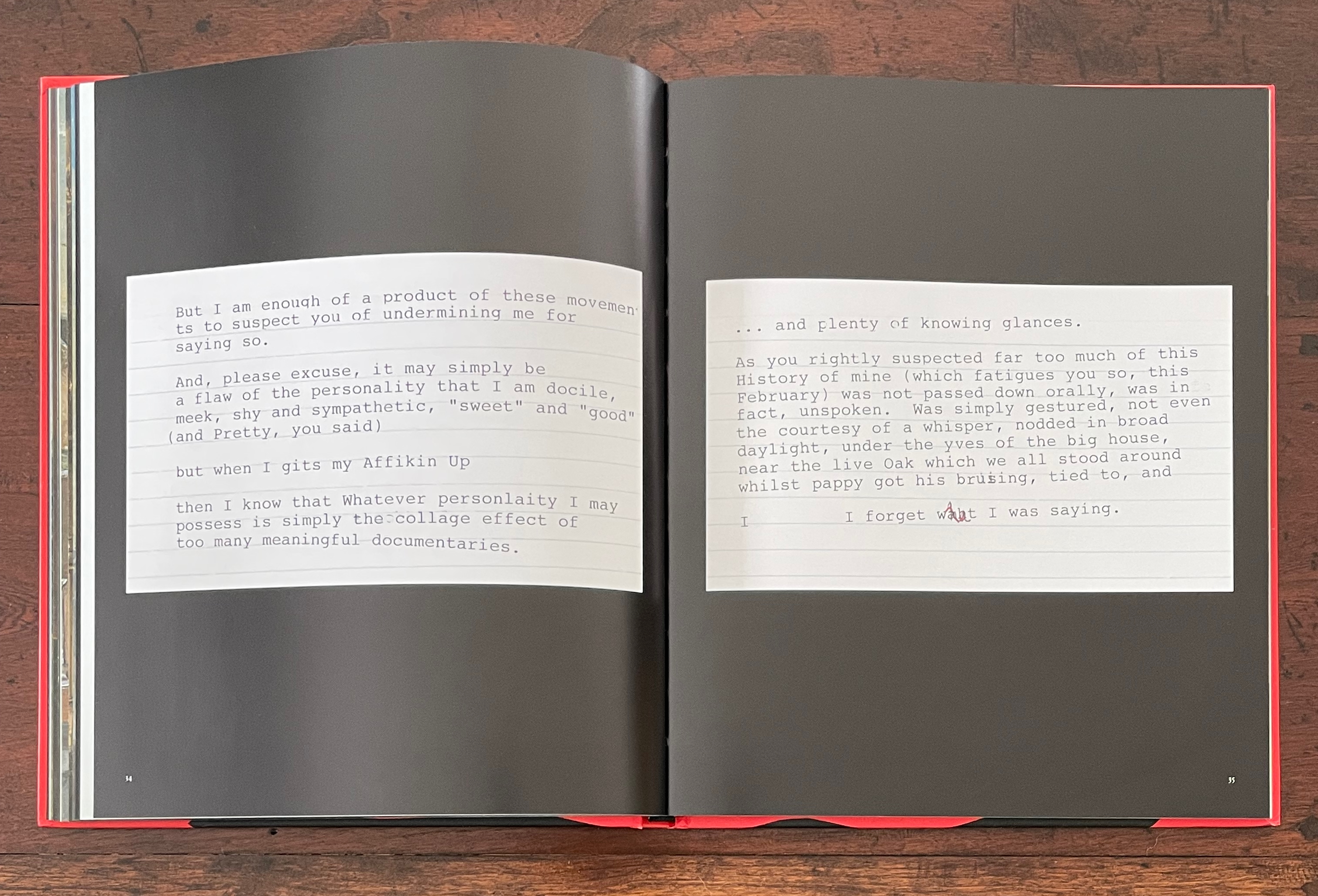
If Walker thinks of the American Primitives index cards “as drawings”, might we ought not consider the centered labels without pagination in the Table of Contents as textual drawing, too? Stacked as they are, they certainly echo the totemic Nkisi on the facing page. In Walker’s mind, labels such as “The Failure of Containment”, “Inundation”, “Going Under”, “Darkness”, and “Black” could also be strokes of charcoal, ink, or paint as evocative of Hurricane Katrina or any natural disaster such as those used by the genre painters. The power of After the Deluge lies in its collage of the commonplaces of such disasters with the silhouetted savagery and perversity of our racist pathology. After the Deluge presents that muck as the commonplace landscape (or Lands Cave) that is the US.
Kara Walker’s Lands Cave from the series American Primitives (2001), pairing silhouettes of a sailor-hatted, thumbsucking white boy with a mutilated Black woman about to give birth.
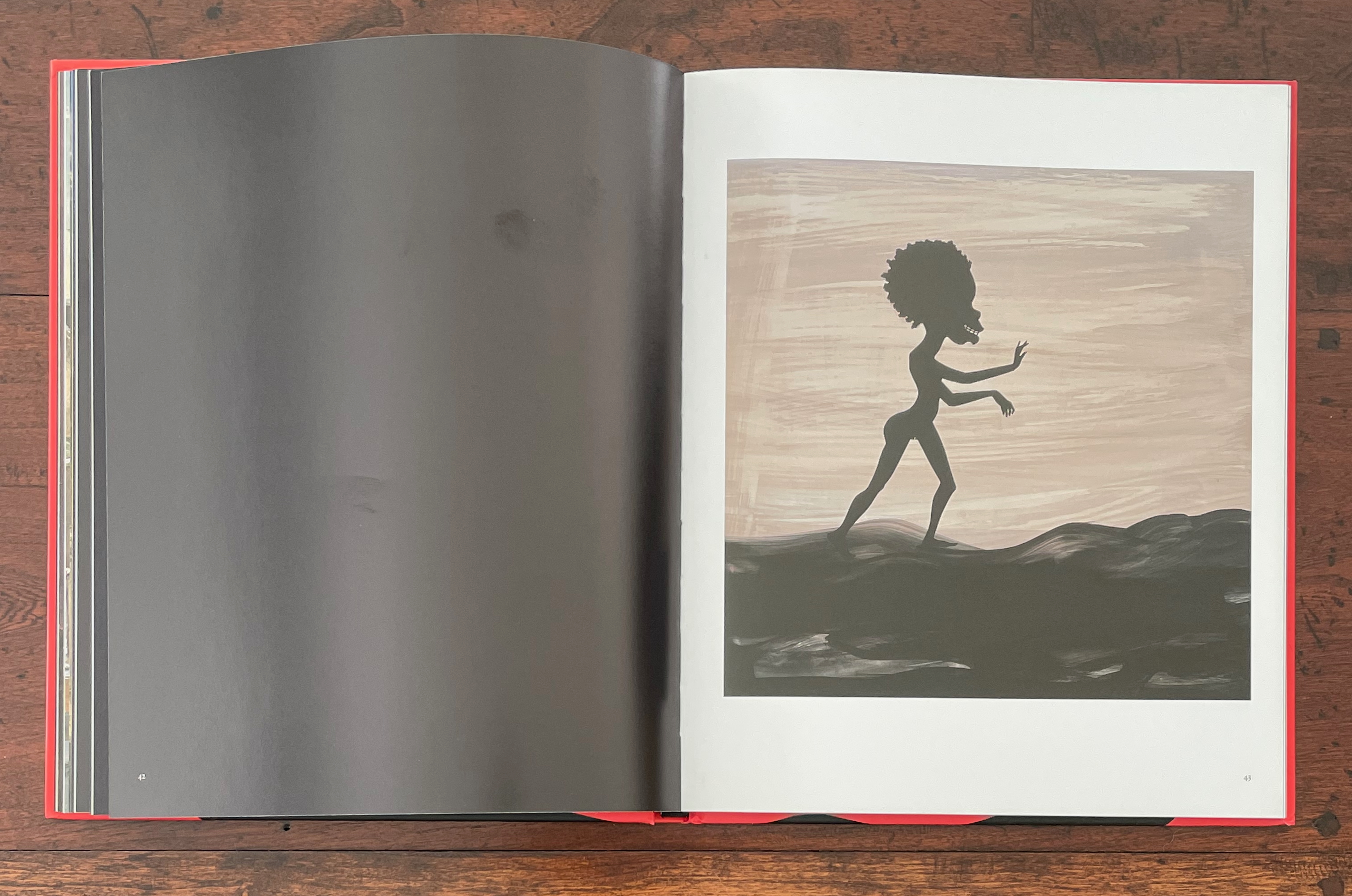
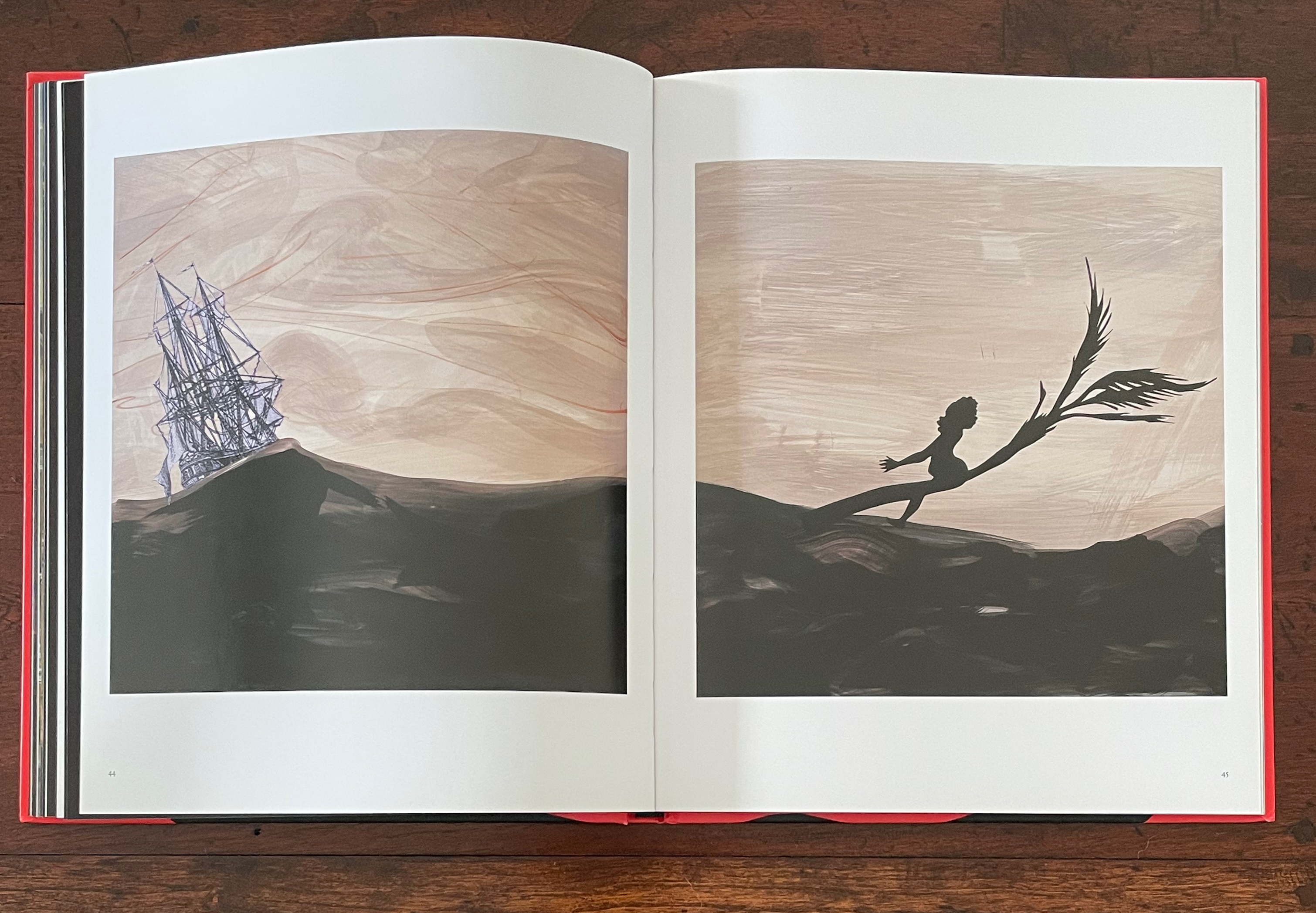
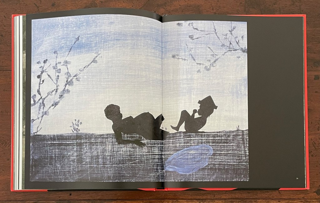
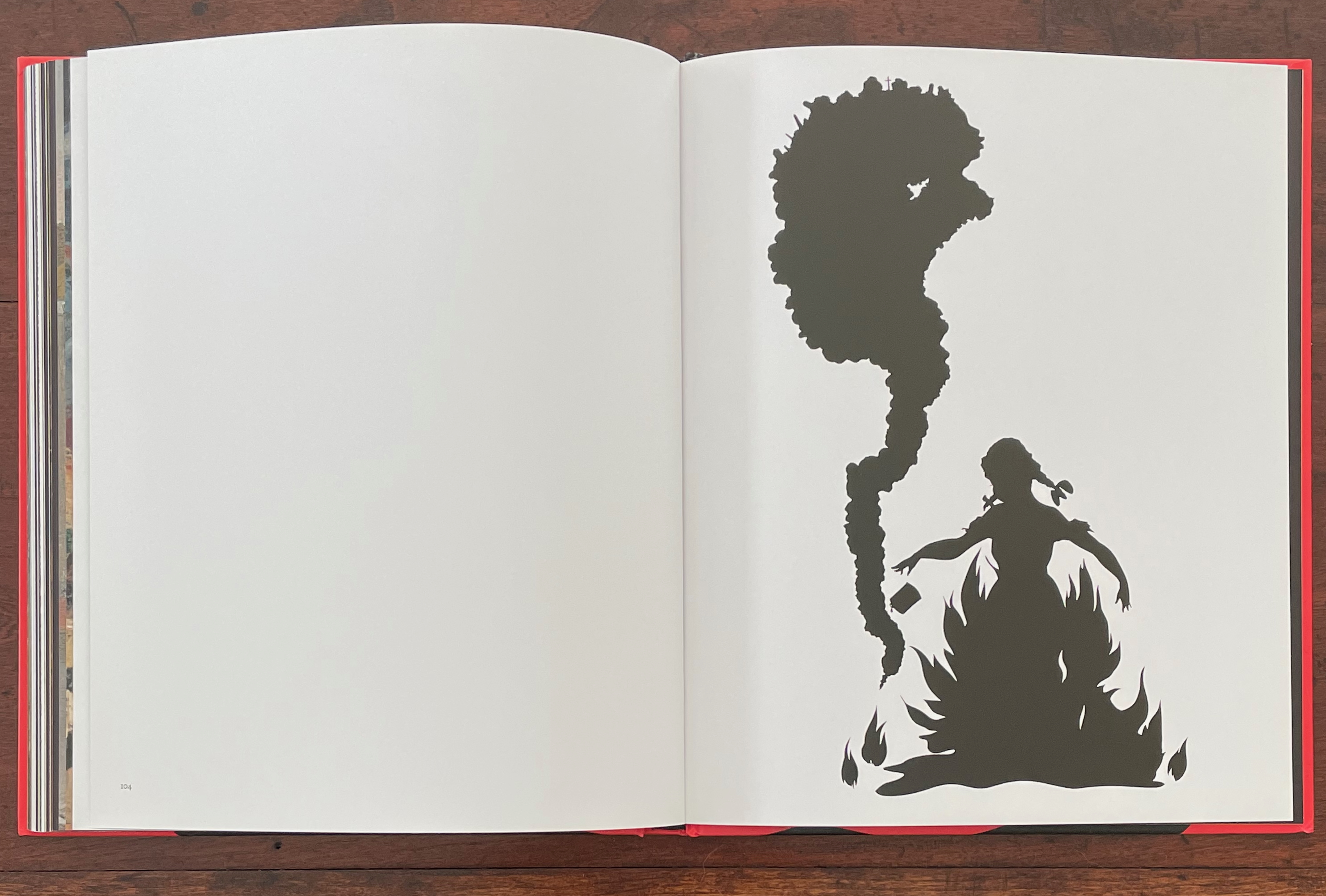
If it is not easy to match up all of the images with the labels in the Table of Contents, the final three double-page spreads align unmistakably with “Portents”: a single white page facing a single black page with Nkisi looming larger now than at the start, a double-page spread of white with Walker’s Burn (1998), a silhouette image of a pig-tailed girl immolating herself as a column of smoke rises in the shape of a Black female, and then the double-page spread of black that concludes these scenes and the entire book.

Bureau of Refugees (2008)
Bureau of Refugees (2008)
Kara Walker
Casebound paperback, sewn and glued. H240 x W215 mm. 120 pages. Acquired from Judd Books, 3 March 2024.
Photos: Books On Books Collection.
To judge from images of the exhibition at Sikkema Jenkins & Co., 20 October – 21 November 2007, in New York, Bureau of Refugees (2008) does go beyond an aim at replicating that experience. But it barely exploits or challenges the codex form — less than do After the Deluge and Freedom, respectively.
Installation view: Bureau of Refugees
New work, Kara Walker, Sikkema Jenkins & Co., New York, NY, 2007
Photo: Luciano Fileti, courtesy of Sikkema Malloy Jenkins.
The exhibition was divided between primarily figurative works and others entirely text-based. Large-scale figurative works like Authenticating the Artifact and The Treasure Hunters, left and right above, dominated one room. The show took its name, however, from a series of smaller figurative works, which in turn took its name from its source: The Bureau of Refugees, Freedmen and Abandoned Lands that operated from 1865 to 1872. Groupings of these smaller scale works occupied their own walls. In the Bureau’s Records, “Miscellaneous Papers” National Archives M809 Roll 23, Walker found a list of “Riots and Outrages”, and from this list, she incorporated into the titles of the figurative works the descriptions of the events and acts inspiring the images.
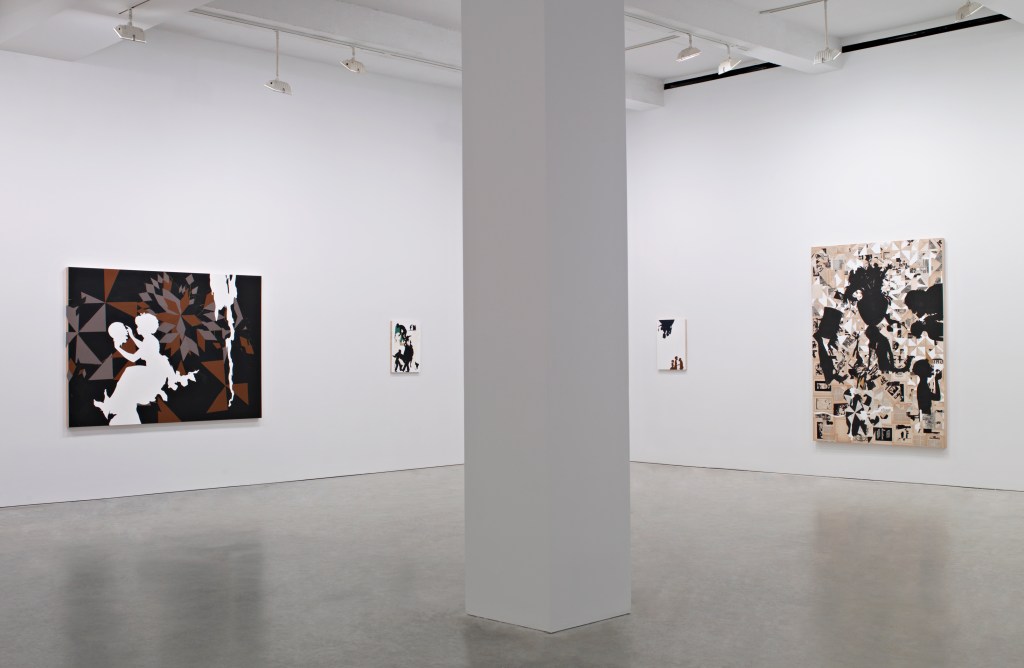
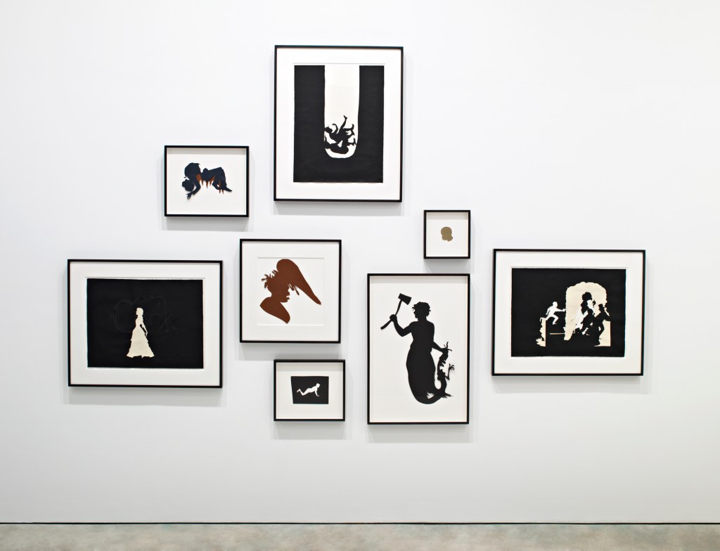
Grouping of the figurative works from the series Bureau of Refugees, Freedmen and Abandoned Lands- Records, “Miscellaneous Papers” National Archives M809 Roll 23
New work, Kara Walker, Sikkema Jenkins & Co., New York, NY, 2007
Photo: Luciano Fileti, courtesy of Sikkema Malloy Jenkins.
Titles of the five works on the left, Committed an outrage and July 16 Black Girl Beaten and Threatened to kill her and her sister if they did not leave the county and Committed an outrage on a freedwoman and Mr. Alexander, colored preacher brutally beaten and forced to leave.
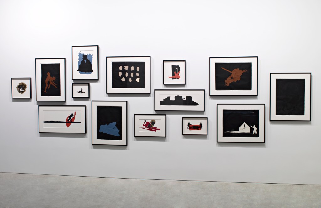
Another grouping of the figurative works from Bureau of Refugees series
New work, Kara Walker, Sikkema Jenkins & Co., New York, NY, 2007
Photo: Luciano Fileti, courtesy of Sikkema Malloy Jenkins.
Titles of the four larger works, clockwise from the top, Freedman and Freedwoman thrown into a well in Jefferson Co. and A gang of ruffians and Bradley killed freedwoman with an axe and Between Danville + Somerville.
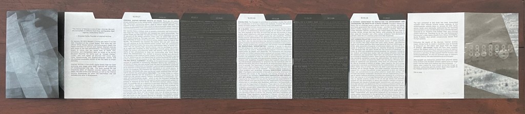
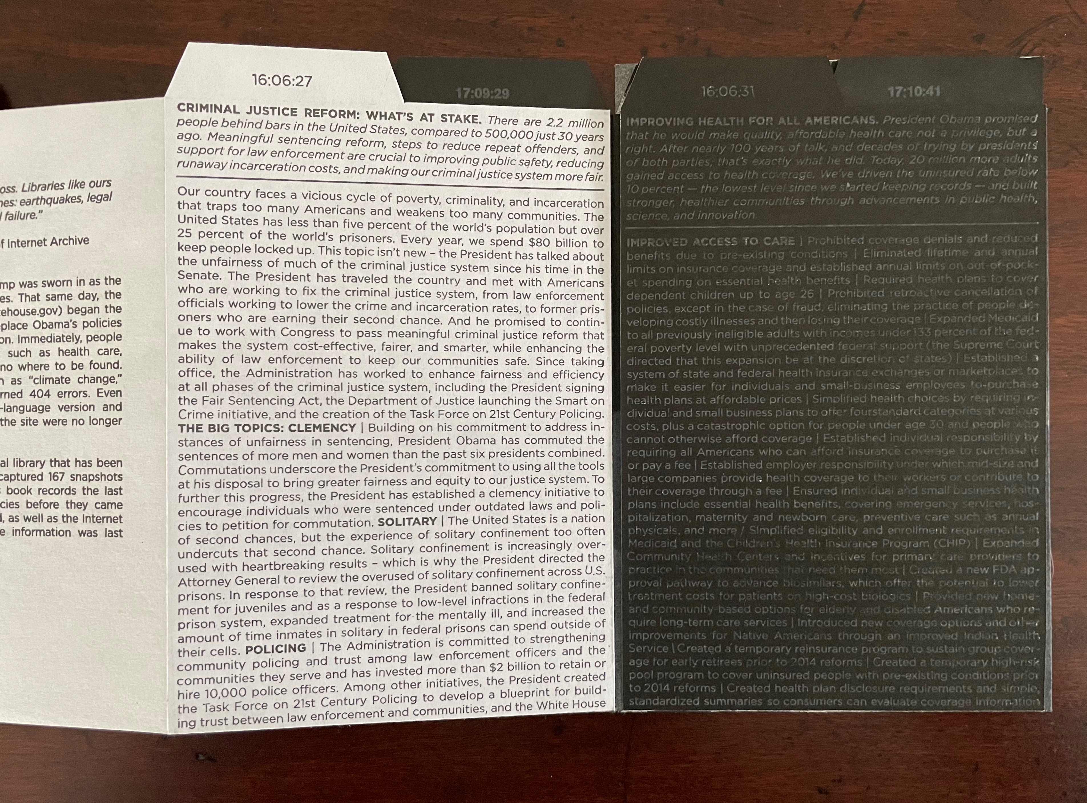
The second series in the show was the 52-panel Search for ideas supporting the Black Man as a work of Modern Art/Contemporary Painting. A death without end: an appreciation of the Creative Spirit of Lynch Mobs. Its title comes from the search string that Walker entered into Google to generate content for a series of panels handwritten in Sumi-e ink. Each panel (measuring 22.5 by 28.5 inches) compiles phrases that Walker culled from the search string’s results.
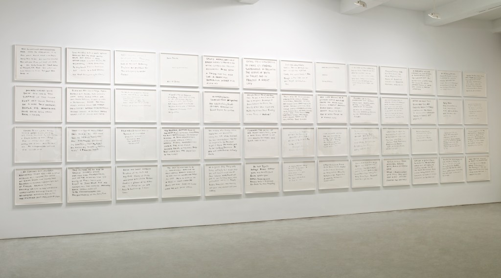
Installation view of the textual series: Search for ideas supporting the Black Man as a work of Modern Art / Contemporary Painting; a death without end, and an appreciation of the Creative Spirit of Lynch Mobs
New work, Kara Walker, Sikkema Jenkins & Co., New York, NY, 2007
Photo: Luciano Fileti, courtesy of Sikkema Malloy Jenkins.
The panel’s handwritten text delivers a rushing stream of consciousness, including misspellings, incomplete and ungrammatical sentences, half-scrawled letters and jumps in topic — much as occurs with the American Primitives text pieces in After the Deluge. As Merrily Kerr’s review puts it:
Search for ideas is a cacophonous brew of observations and perspectives. Here Walker explores the potential analogy between racist attitudes in America and those perpetuated by Americans overseas in texts that refer to Saddam Hussein as a “porch monkey” or Arabs as “sand niggers.” Under the rubric of aggressor and complicit victim, the text details rapes and torture, proffers that black soldiers are willing Klansmen, and asks, in the face of global jihad, “how can colored folks get on the winning side w/o giving up their hard-won right to jeans that fit …” Because the fifty-four [sic] parts are hung cheek by jowl and there is no obvious sequencing, it is unclear whether one is supposed to read them left to right, or top to bottom.
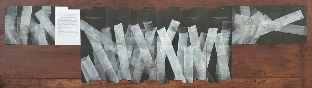
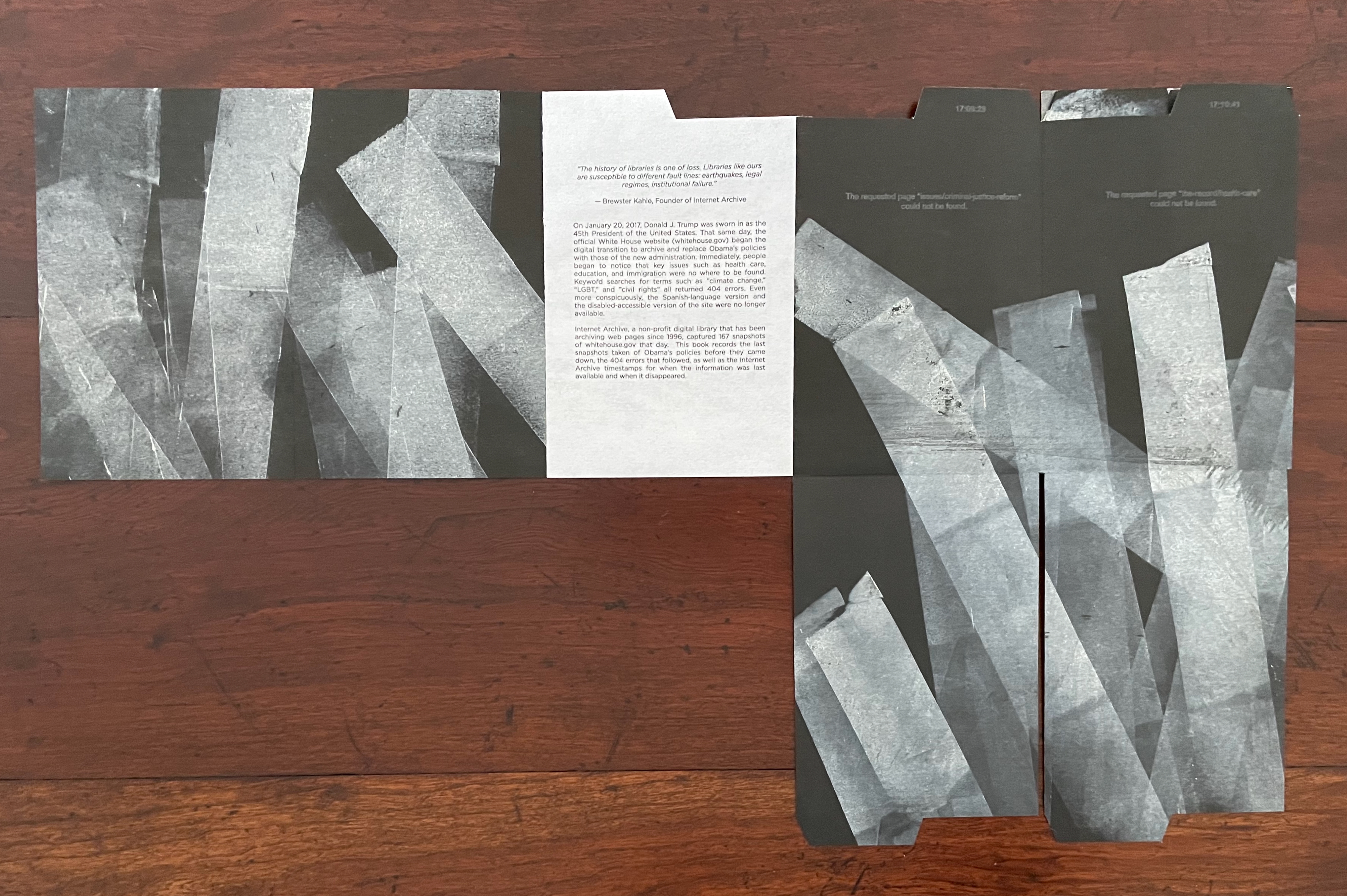
Where the exhibition separated the figurative from the textual, the book weaves them together. Three double foldouts are the closest the book comes to exploiting the codex form. The first presents two Search for ideas panels folded inwards and, when unfolded, a quadriptych of text panels. The second likewise consists of two text panels folded inwards, but when unfolded, they reveal a double-page image of the exhibition’s figurative 5-foot by 7-foot Authenticating the Artifact (2007) alongside one of the Search panels. Like the first, the third double foldout unfolds to present a quadriptych of text panels.

First double foldout still folded.

First double foldout unfolded.
Second double foldout unfolded.
The Search panels horrify with their words while the Bureau images horrify with their figures. Not all of the figurative works focus on America’s Reconstruction past. Some arise in the post-9/11 world and, like the Search series, find their horrors in the Sudan, the Congo, and Iraq. Woven together in the book, the two series underscore Walker’s perception of, in her words,
the continuity of conflict, the creation of racist narratives, or nationalist narratives, or whatever narratives people use to construct a group identity and to keep themselves whole–such activity has a darker side to it, since it allows people to lash out at whoever’s not in the group.
When viewing Kara Walker’s art, I am reminded of the refrain from one of Carly Simon’s songs: “You’re so vain, you probably think this song is about you, don’t you?”. It’s a double-edged irony. The addressee is damned if he doesn’t think it’s about him and damned if he does.
Walker’s is a multi-edged irony that cuts in many directions. Walker inhabits or projects a persona who is masochist and sadist, subject and object, self-centered and self-loathing, other-obsessed and other-fearing, Slave and Mistress. As a white viewer, collector, and writer about these works of book art, am I not entangled and complicit, too, however I respond to it? Caught out in shame and privilege, am I so vain that I think this art is about me? Damned if I don’t, damned if I do. Walker’s is the art of portraying a social madness. All parties — artist and viewer — are stuck in the muck of After the Deluge (2007), the muck of racist pathology. The terrible power of Walker’s art keeps our eyes fixed on it. Where either party can find solace is uncertain.
Further Reading
“Tia Blassingame“. 17 August 2020. Books On Books Collection.
“Emory Douglas“. 9 January 2026. Books On Books Collection.
“Sarah Matthews“. 15 February 2025.Books On Books Collection.
“Arial Robinson“. 15 May 2023. Books On Books Collection.
“Ruth E. Rogers“. 17 November 2025.Books On Books Collection.
“Clarissa Sligh“. 2 September 2020. Books On Books Collection.
“Carrie Mae Weems“. 14 February 2025. Books On Books Collection.
Evenhaugen, Anne. 3 September 2012. “Artists’ Books at AA/PG: Kara Walker’s Pop-up“. Unbound. Washington, D.C.: Smithsonian Library.
Gabor, Nora. 18 February 2021. “Black History and Experiences through Book Arts“. The Full Text: News about library resources and services. Chicago, IL: DePaul University. Accessed 22 January 2024.
Gleek, Charlie. “Centuries of Black Artists’ Books“, presented at “Black Bibliographia: Print/Culture/Art” conference at the Center for Material Culture Studies, University of Delaware, 27 April 2019, pp. 7-8. Accessed 20 July 2020.
Kerr, Merrily. Jan/Feb 2008. “Kara Walker at Sikkema Jenkins & Co., New York“. Art on Paper. 12:3, 85-86.
Walker, Kara Elizabeth et al. 2003. Kara Walker : Narratives of a Negress. Edited by Ian Berry, Darby English, Vivian Patterson and Mark Rienhardt. Cambridge, MA: MIT Press. This exhibition-based volume is closest to the Bureau of Refugees‘ near-artist’s-book status. Walker’s writings on 3×5 index cards play the same role that the 54 panels of Search for ideas play in Bureau of Refugees. The landscape book’s monumentality evokes the scale of installations such as Virginia’s Lynch Mob (1998) and For the Benefit of All the Races of Mankind (Mos’ Specially the Master One, Boss. An Exhibition of Artifacts, Remnants, and Effluvia EXCAVATED from the Black Heart of a Negress VIII (2002) that appeared in the exhibitions organized by The Frances Young Tang Teaching Museum and Art Gallery at Skidmore College and the Williams College Museum of Art in 2003.
Walker, Kara Elizabeth et al. 2007. Kara Walker : My Complement, My Enemy, My Oppressor, My Love. Minneapolis: Walker Art Center.
Walker, Kara. 2010.”Riots and Outrages“. The Georgia Review. 64:1, 59-68.
Walker, Kara Elizabeth et al. 2016. The Ecstasy of St. Kara. Cleveland, OH: The Cleveland Museum of Art.
Walker, Kara Elizabeth et al. 2019. Kara Walker : Fons Americanus. Ed. by Clara Kim. London: Tate.