
…, the newly emerging form of the book qua book is simultaneously a visual book and a tactile book, wherein the meaning of the work is inextricably tied to both content and form as well as to the economic factors that surround the making and selling processes. In the most exciting work being done today, a text (idea) is interpreted, amplified, and sometimes even dictated, by structure, materials, and the act of publishing. At the extreme end, Tim Mosely in Brisbane, Australia is experimenting with a form that he calls the haptic book, in which shape, color, the sound of the turning page, and texture (touch) carry the significance we most often associate with a written text. Mosely intends us to read without words. His books are privately published, and the act of acquiring and learning how to read them includes personal contact with the artist. This is not the business-as-usual model at all! — Peter Koch, 2017, p. 22.
Grasping the Nettle (2020)
Grasping the Nettle (2020)
Tim Mosely
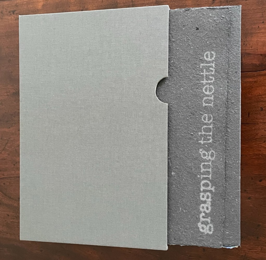
Slipcase holding title wrapper around three sewn booklets and one accordion structure. Slipcase, H238 x W158 x D23 mm; Title wrapper, H228 x W155 mm; Booklets and accordion closed, H225 x W154 mm; Accordion open, W616 mm. 14 pages per booklet. Variable edition of 8. Acquired from the artist, 17 January 2024.
Photos: Books On Books Collection. Displayed with permission of the artist.


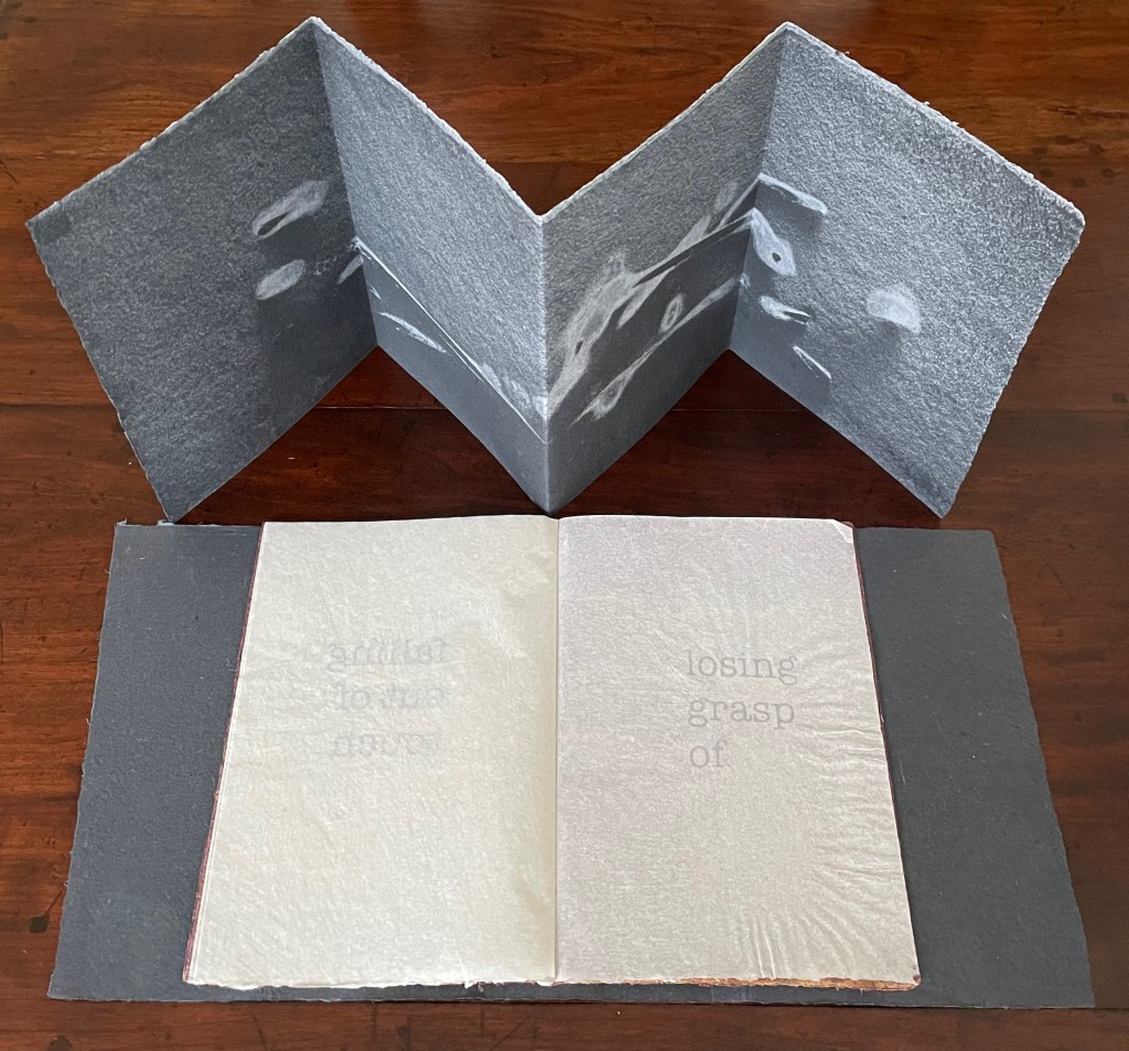
Three booklets and accordion resting on the opened dustjacket.
Grasping the Nettle is the second work in a series called representation by touch that offers the results of Tim Mosely’s ongoing studio research into the relationship between touch and sight / the haptic and the optic. His drive to draw us into involving touch in our reception and evaluation of art has its roots in a long tradition of concern that Western society has become too ocularcentric for a whole-bodied appreciation of art. If the artist’s aim is to express how the world touches us (as Cézanne put it), a full appreciation of art requires all the senses.

Image side of accordion structure.
That phrase “representation by touch” is too easily skated over. It requires unpacking. Start with three facts: first, what appears to be concave or convex in the surface of some pages is only an appearance, the surface is flat though rough; second, the rough texture of the surface is down to the handmade nature of the papermaking and pulp printing technique applied to it; and third, the images in the four parts of Grasping the Nettle bear no visual or pictorial resemblance to the objects that gave rise to them. For example, the image in the accordion comes from eight twigs resting on couched paper before being sprayed with fine pulp and then later pressed. It is the touch of water, paper and colored pulp against one another that compresses, enfolds, unfolds, and expresses an embodied abstraction. Mosely calls it a “cast imprint”.

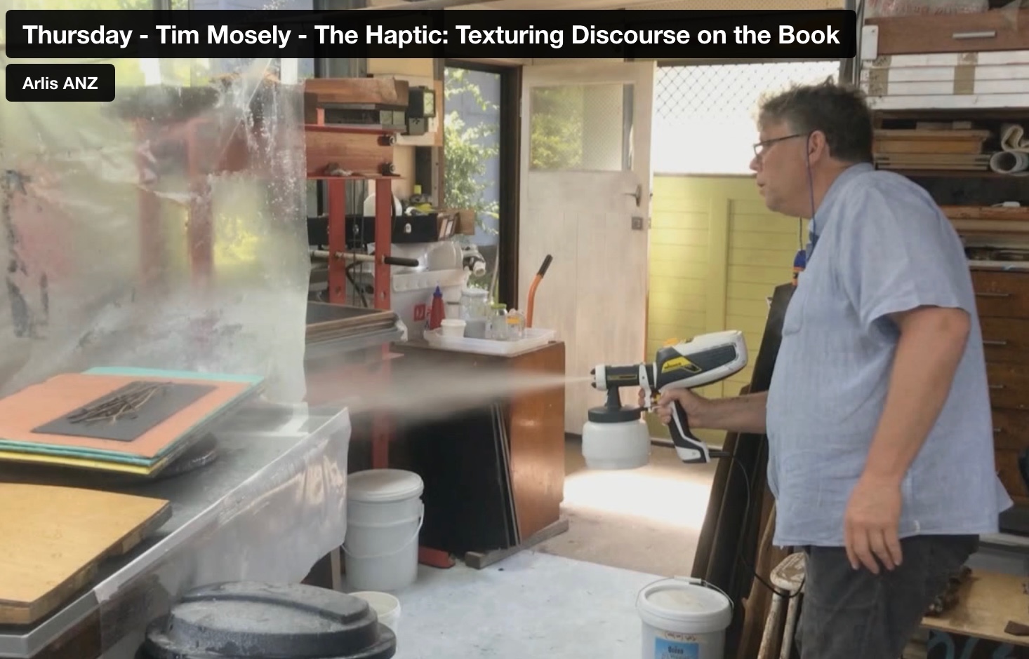
From the 11’37” mark. Tim Mosely, “The Haptic: Texturing Discourse on the Book“. Reimagining the material: artists books, printed matter, digital transformation, engagement. ARLIS-NZ Biennial Conference, 11-13 November 2020, Brisbane.
As the artist puts it, These are representations achieved by touch, highlighted by touch, migrated across dimensions by touch; they are marks that compel readers to touch in an effort to recalibrate their vision, and marks that in the medium of the book invite the public’s touch (Mosely, 2021, p. 31). The cast imprint involves a double materiality or hapticity. First, in the maker’s hands: the papermaking and image-making process fusing the three-dimensional attributes of texture, volume, and shape/contours of bushland detritus into the two dimensions of paper. Second, in the reader’s/viewer’s hands as the eye senses it may be being fooled: a lateral motion seeking texture, an enclosing motion seeking volume, and a tracing motion seeking shape and contour.
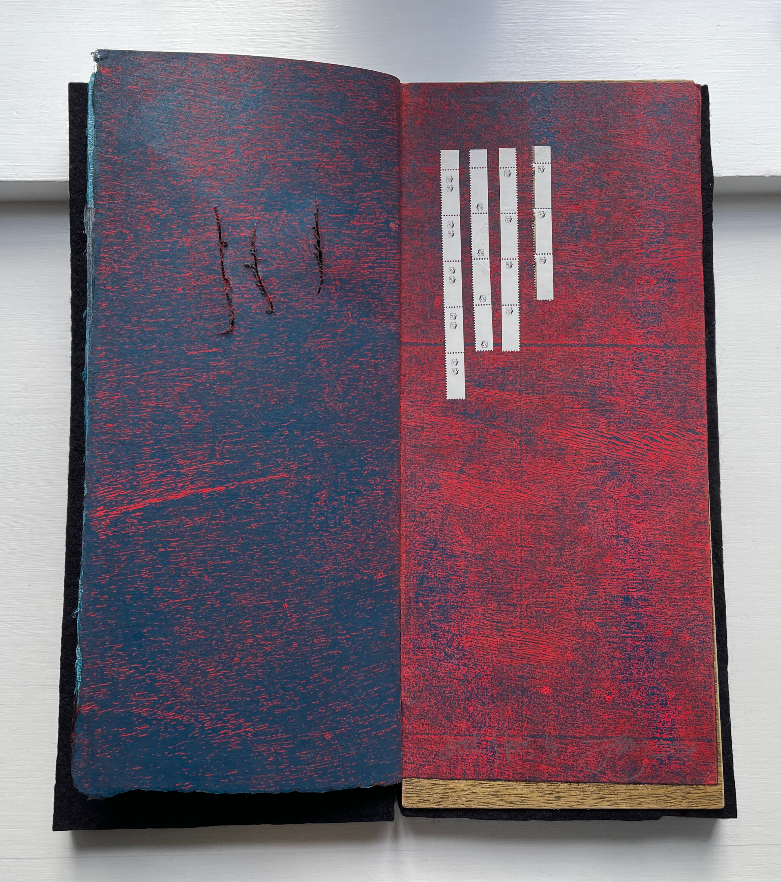
Along with the overlapping manipulation of papermaking and cast printing, Grasping the Nettle manipulates “the medium of the book”. Instead of a codex’s front cover to bear the work’s title, the overlapping wrapper with a slant cut performs that role before sliding into the protective slipcase. The accordion, loose alongside the three booklets, performs the role of colophon. Information that would otherwise appear in the colophon at the end of a book — the number of the copy, count of the edition, etc. — appears faintly on the cover side of the accordion. By offering a display backdrop to the three booklets, the accordion also performs in form and image its role of colophon: the final stroke for the three booklets whose imagery and text make up the core of Grasping the Nettle.
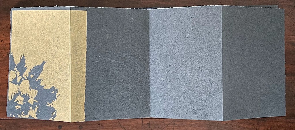
Cover side of accordion structure.

“Colophon”: Copy 6 of 8, title of work, artist’s signature, year of publication.
Mosely calls the other three booklets, though loose and individually sewn, signatures. None of a codex’s usual navigational signs — table of contents, part titles, page numbers, etc. — are present to indicate an order in which to read these three signatures. The reading order depends on the reader.
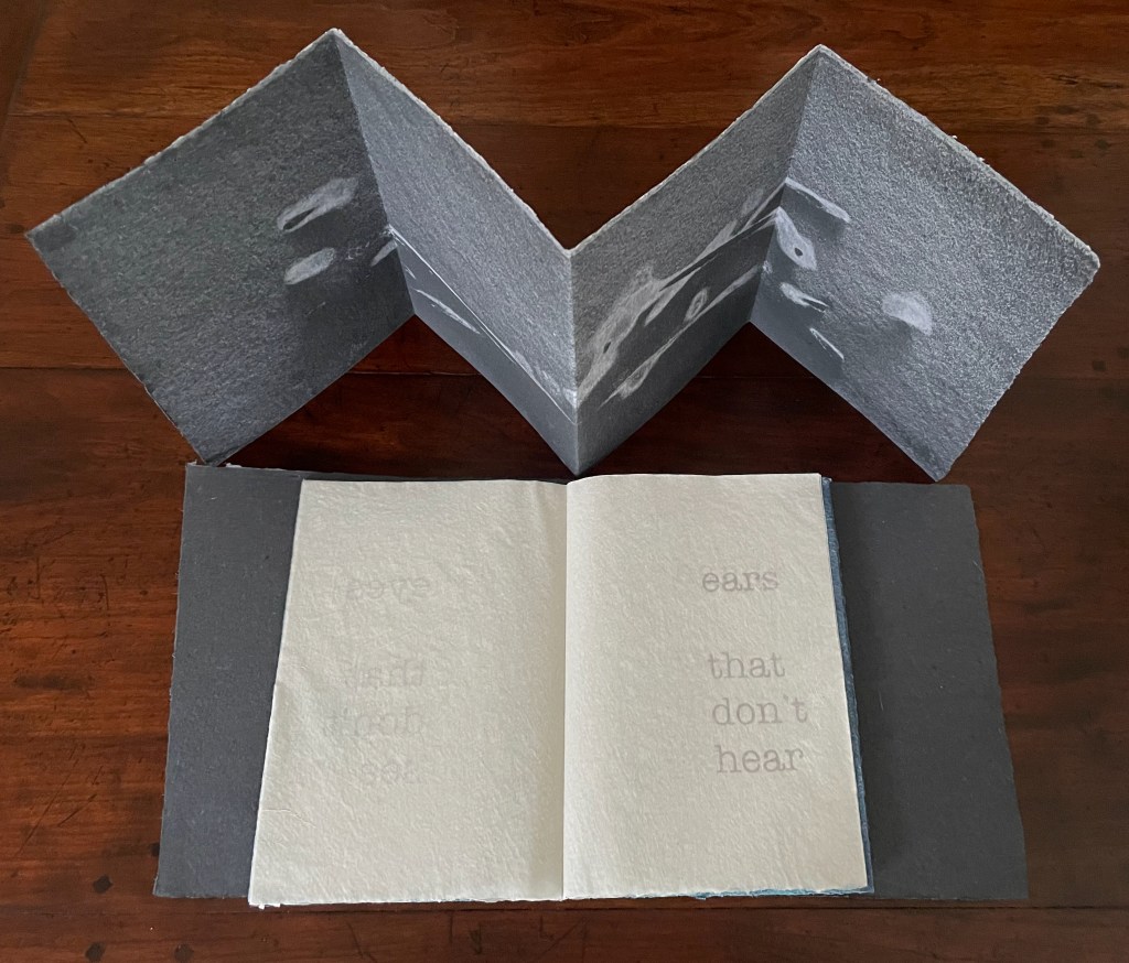
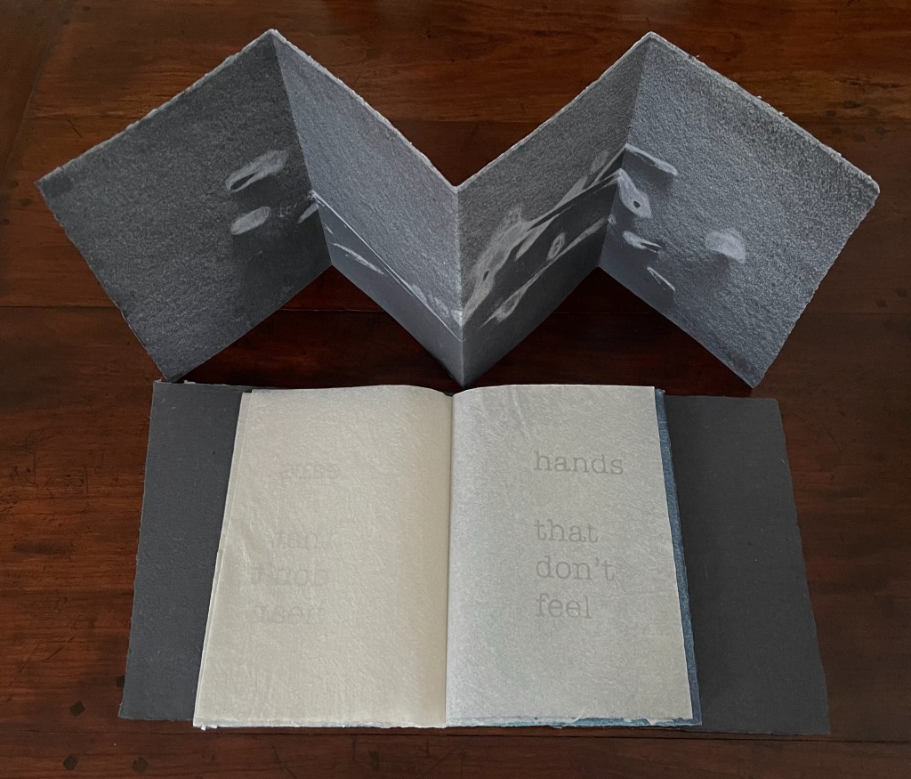
Just as the accordion’s imagery is drawn from twigs, the signatures’ imagery comes from other bushland detritus — a flat stone just under a cm thick for the blue booklet, a fragment of weathered branch for the striated markings in the black one, and twigs for the straight and curved lines in the maroon one. The booklets are loose alongside the accordion, but their text implies the possibility of some syllogism or some order — perhaps from the particular, physical and concrete to the general, emotional and abstract. The blue booklet’s text places sensory organs not performing their functions at the fore (“eyes that don’t see”). The black one’s text reverses sensual agency from sensory organs to their output (“tears that see”). The maroon one’s text consists of phrases describing states of unsuccessful perception (“an aesthetic distance”).


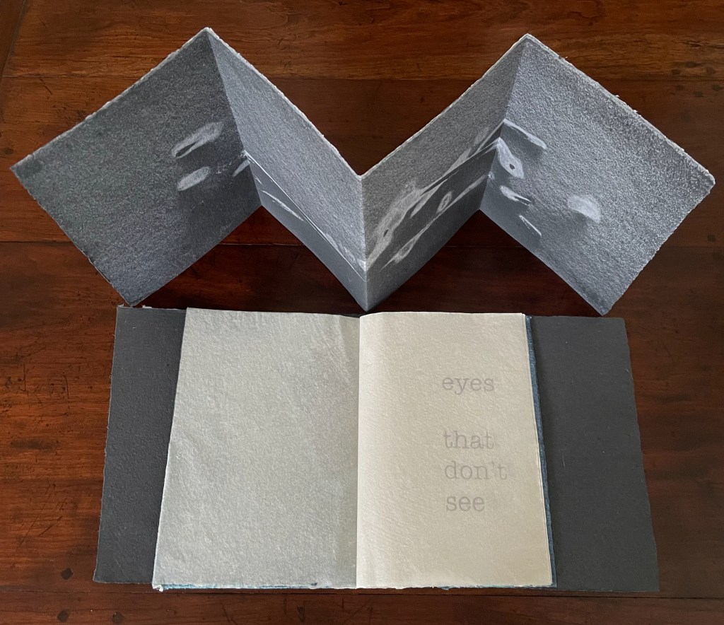
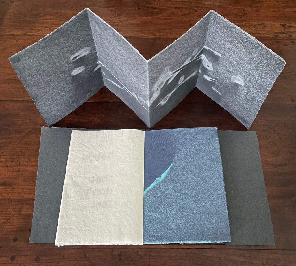
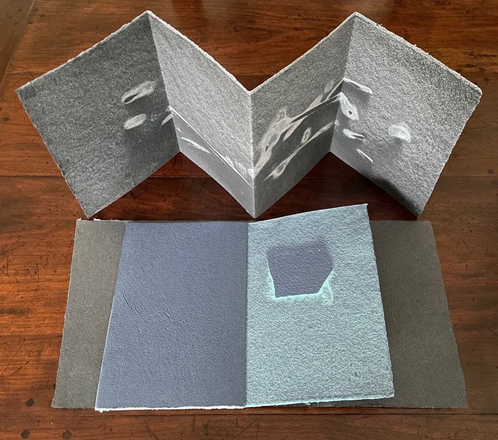
The blue booklet or signature: a flat stone laid atop couched paper and sprayed with fine pulp generates the images embracing the kozo pages pulp printed with text.
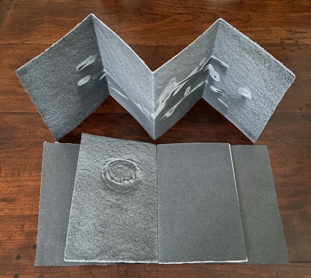

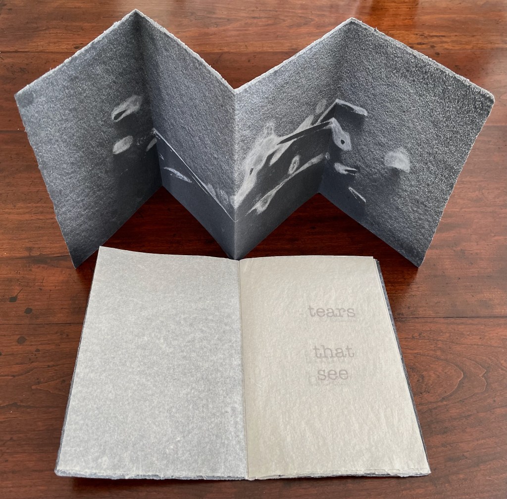
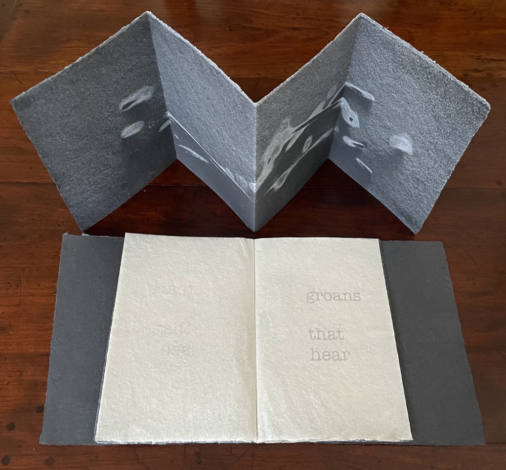
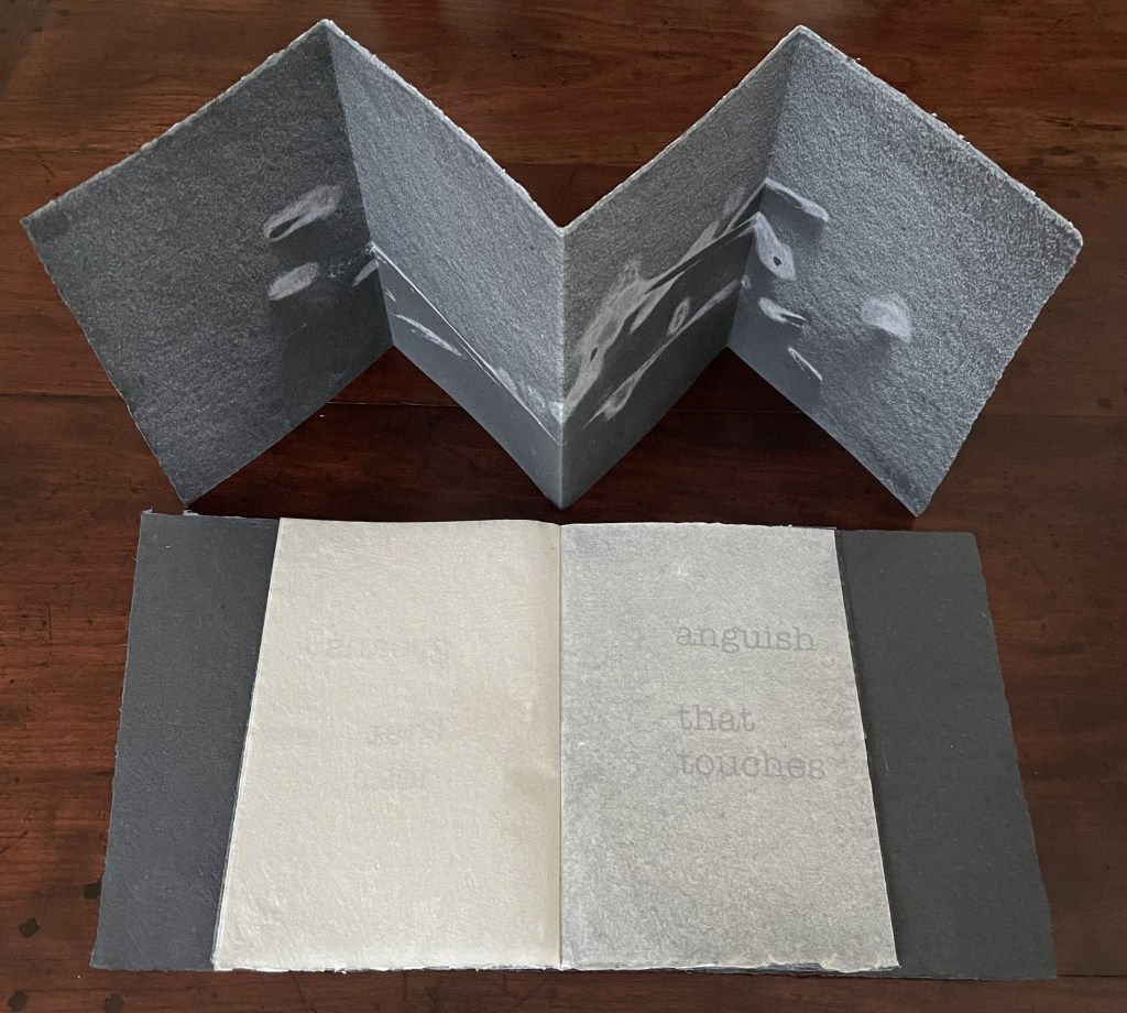

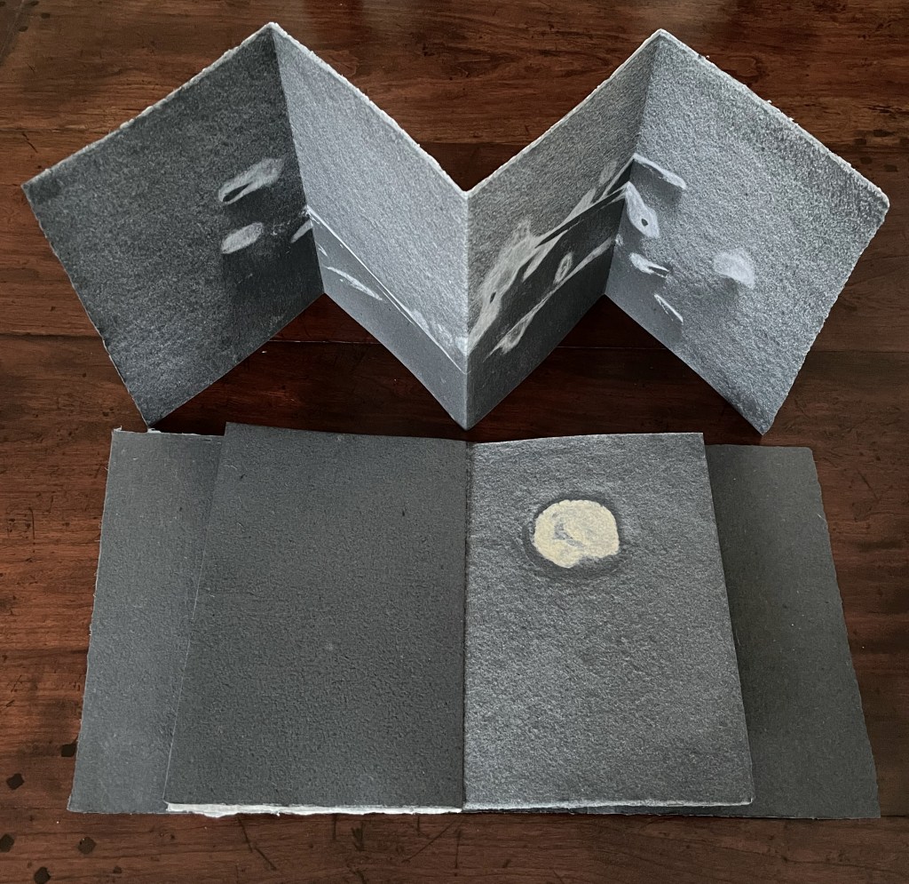
The black signature: a weathered branch generates the images surrounding the physical expressions of emotion that usurp perceptual functions. The circular image is formed from the notch left in a tree branch where a smaller branch had broken off.
To the lateral motion of the reader’s fingers seeking texture, their enclosing motion seeking volume, and their tracing motion seeking shape and contour, Mosely has added what perceptual psychologists call the “function test” (the motions of inserting and extracting), which is replicated in the haptic and visual discovery that the cast imprints on the handmade paper continue from left to right underneath kozo leaves bearing the text. The image-bearing leaves “embrace” the text-bearing leaves, or recalling that developmental stage in perception where the child recognizes the continued existence of an object briefly hidden then revealed, the text-bearing leaves “hide” the continuation of the image-bearing leaves. This exploitation of the codex structure calls attention to Grasping the Nettle‘s layers of hapticity by making the reader’s hands do more than turn pages in a predetermined order.


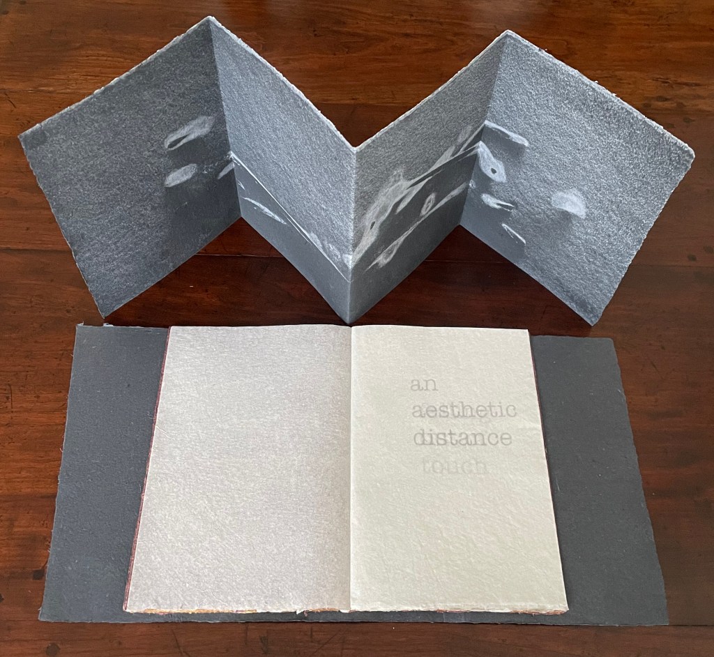



The maroon signature: twigs are used again but separated and sprayed with different colors of fine pulp for these images.
Grasping the Nettle could have challenged our overly ocularcentric world with cast imprints of man-made objects. Mosely’s choice to use detritus collected from ravines, scrubland and the beach, however, sharpens the challenge with an anxiety about losing touch with nature. As Mosely (Winter 2021, p.31) puts it: The pages have been in touch—direct contact—with the wilderness. The imprints move beyond mimetic reflection and, carrying with them the attributes of haptic explorative procedures, their ambiguity draws in the reader’s touch (of the wilderness). The same concern and aim can also be detected in the next work but through entirely different techniques and approaches.
Directed Smooth Space (2016)

Directed Smooth Space (2016)
Tim Mosely
Softcover, saddle-stitched with staples. H133 x W102 mm. [48] pages. Acquired from the artist, 17 January 2024.
Photos: Books On Books Collection. Displayed with artist’s permission.
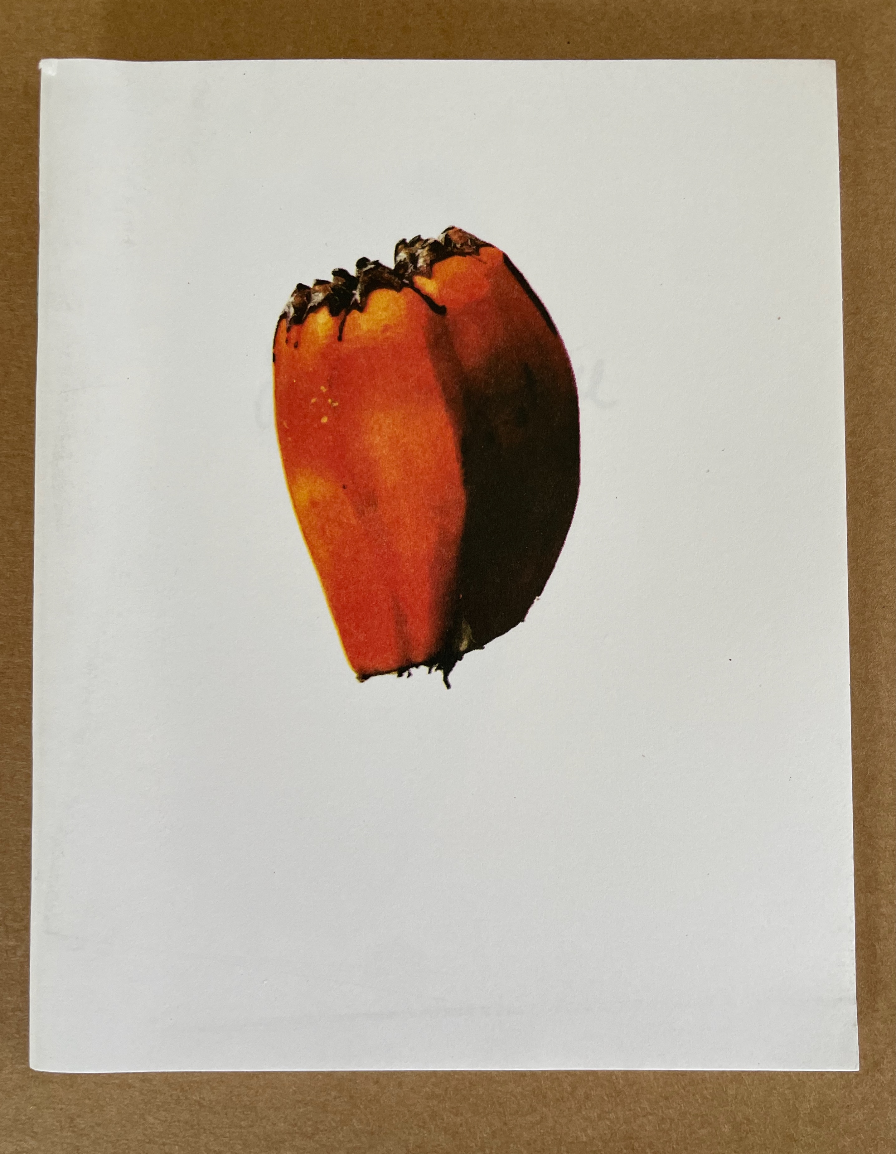
In Directed Smooth Space, high-definition photos of breadfruit seed evoke the eye’s haptic sense that the image is so real you’d swear you could pick the object up. As in Grasping the Nettle, text accompanies image, but does so in a regular rhythm of alternating double-page spreads. Here are the first five:


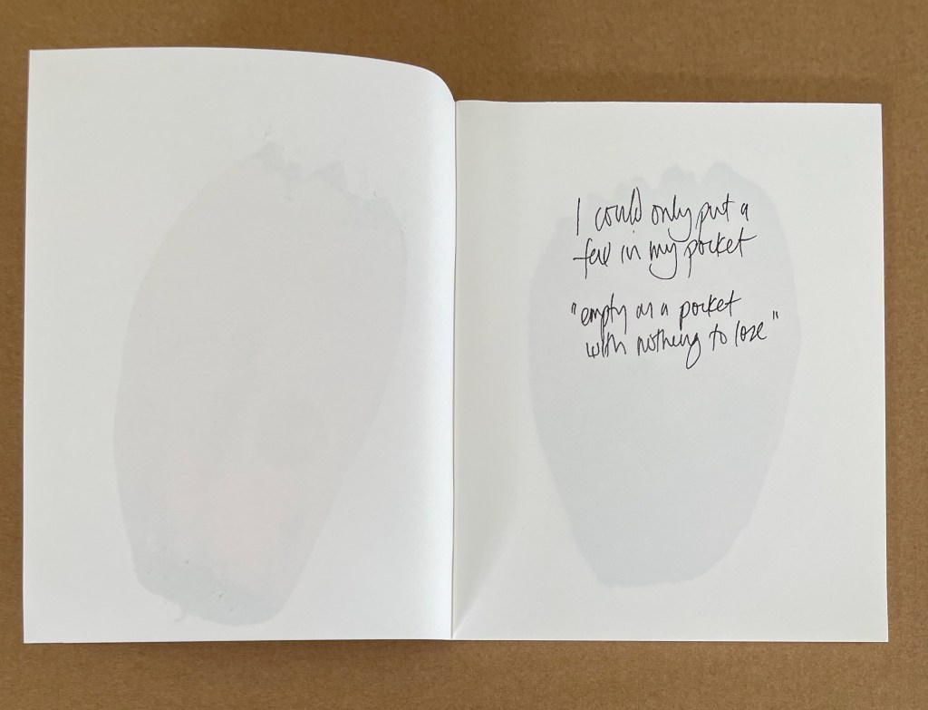
Note the orientation in the spreads: text and image each appear on the right.
Directed Smooth Space has a subtlety in its title, its text and and its order of content that echo the subtleties of Grasping the Nettle. The title, text and order allude to the aesthetic, cultural and philosophical observations by Gilles Deleuze and Félix Guattari in A Thousand Plateaus (1987). In their philosophical observations of how we perceive the world, the two philosophers introduce the concepts of “smooth space” and “striated space”, which may seem in opposition but are always intermingled:
It seems to us that the Smooth is both the object of a close vision par excellence and the element of a haptic space (which may be as much visual or auditory as tactile). The Striated, on the contrary, relates to a more distant vision, and a more optical space — although the eye in turn is not the only organ to have this capacity. … The first aspect of the haptic, smooth space of close vision is that its orientations, landmarks, and linkages are in continuous variation; it operates step by step. Examples are the desert, steppe, ice, and sea, local spaces of pure connection. … Orientations are not constant but change according to temporary vegetation, occupations, and precipitation. … Striated space, on the contrary, is defined by the requirements of long-distance vision: constancy of orientation, invariance of distance through an interchange of inertial points of reference, interlinkage by immersion in an ambient milieu, constitution of a central perspective. It is less easy to evaluate the creative potentialities of striated space, and how it can simultaneously emerge from the smooth and give everything a whole new impetus (Deleuze & Guattari, p. 493).
As in Grasping the Nettle, Mosely plays with the structure of the codex, but he does so differently. In Directed Smooth Space, he first places text and image each on a recto page facing blank verso pages (see above). Then at the center of the book, a large horizontal image of the breadfruit seed occupies the double-page spread. After that, the text and image each shift to the verso page faced by blank recto pages (see below).
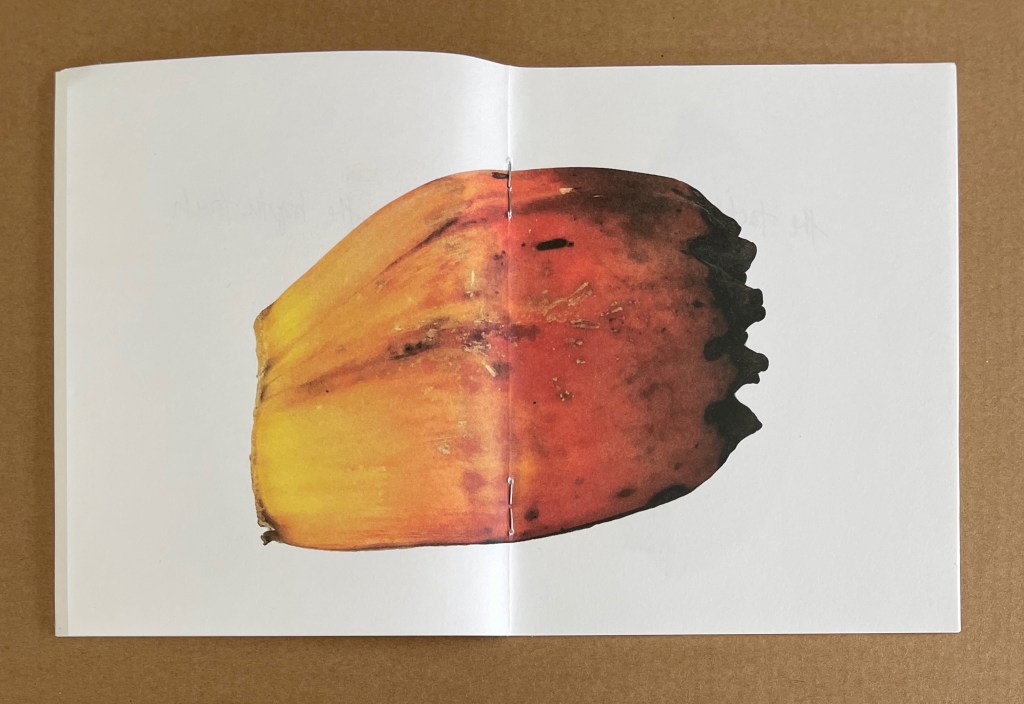


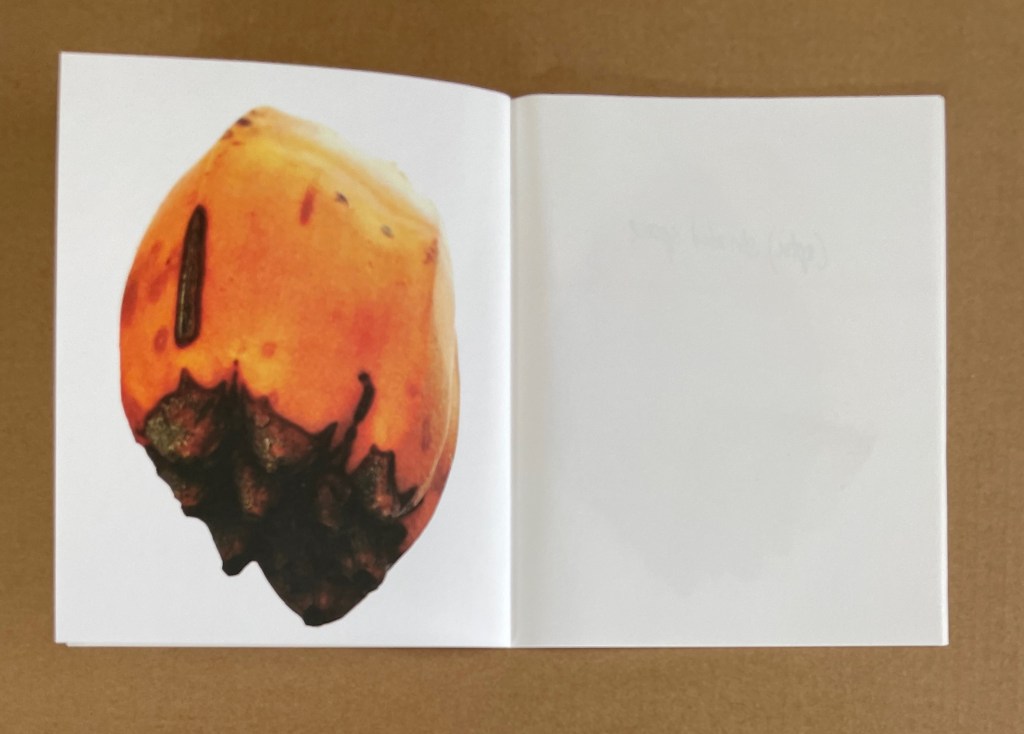

Note the changed orientation in the spreads: now the text and image are on the left.
Echoing A Thousand Plateaus, here is smooth space “in continuous variation … step by step”. Also, the breadfruit seed — “the object of a close vision … and of haptic space” — changes in orientation, opening upwards in the first half of the book and downwards in the second half.
Here, too, is striated space in the constancy of the codex orientation. The codex provides the “ambient milieu” (p. 493) in which the breadfruit seed is immersed. Paradoxically, at the center of the codex, the smooth-space-evoking breadfruit seed is posed to constitute the “central perspective” (p. 493) that, bookwise, defines striated space. As the work’s title announces, the artist has directed smooth space, and he has used book structure to evoke striated space, thereby intermingling the two as Deleuze & Guattari would have it.
Like the title, the internal text is sometimes hard work (like that of Deleuze & Guattari), but the text is also always hard at work reinforcing the message that “(haptic) smooth space” and “(optic) striated space” work together. The phrase “tears that see”, which also occurs in Grasping the Nettle, is a good example.
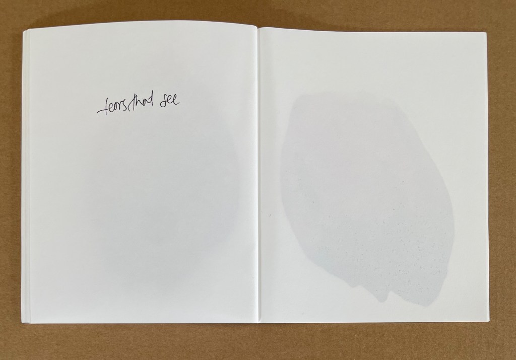

It comes from Jacques Derrida’s Memoirs of the Blind (1993). Like Deleuze & Guattari, Derrida is often hard to follow, but it helps to remember that all three are concerned with “the ways viewers approach philosophical ideas through art, and the ways art enriches philosophical reflection”. Derrida’s book is a dialogue between the author and an unidentified reader/listener on the occasion of an exhibition curated by Derrida at the request of the Louvre.
The phrase “tears that see” comes at the end of the book’s dialogue. First, Derrida quotes from Andrew Marvell’s poem “Eyes and Tears”:
Thus let your streams o’erflow your springs,
Till eyes and tears be the same things:
And each the other’s difference bears;
These weeping eyes, those seeing tears.
And then Derrida’s imagined reader muses and asks, “Tears that see … Do you believe that?” To which the author replies, “I don’t know, one has to believe…”, and there ends the book. But that is not where Directed Smooth Space ends. Mosely’s book ends with a different but just as curious phrase: “swells in the fold”. It could simply be a descriptive reference to the breadfruit at the center of the codex or to any signature within the book where the paper swells away on either side of the fold. But it derives from the book We, the Navigators by David Lewis.
It documents what the author terms as the most significant navigational feat in the history of humanity, essential navigation between the small islands of the vast pacific ocean with no aid other than lived experience. … These sailors were able to undertake journeys of hundreds of miles between islands using nothing other than the haptic perception of interference patterns in the ocean swells. … Deleuze and Gutarri make a brief mention of these navigators in the chapter “1440 the smooth and striated”. (Artist’s correspondence)
Eyes closed and lying down on the floor of the boat, these nomadic sailors could feel what oceanographers have documented — the pattern of undulations caused within the ocean currents by distant bodies of land. How ambitious that a small booklet produced by offset printing, juxtaposing double-page swells of almost touchable images of breadfruit seeds with double-page swells of handwritten cryptic philosophical phrases, should invoke this most haptic means of perceiving where we are.
The Book of Tears (2014)


The Book of Tears (2014)
Tim Mosely
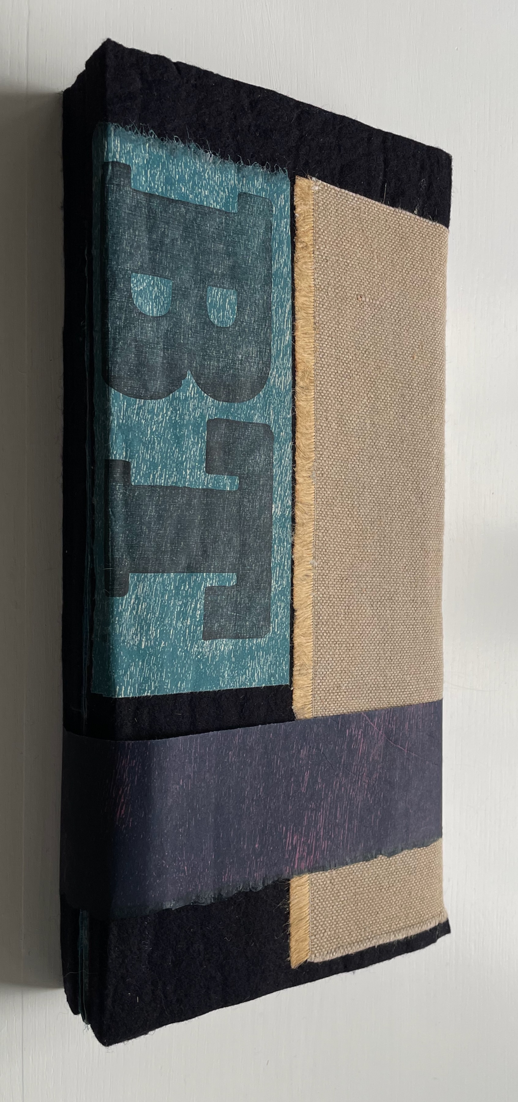
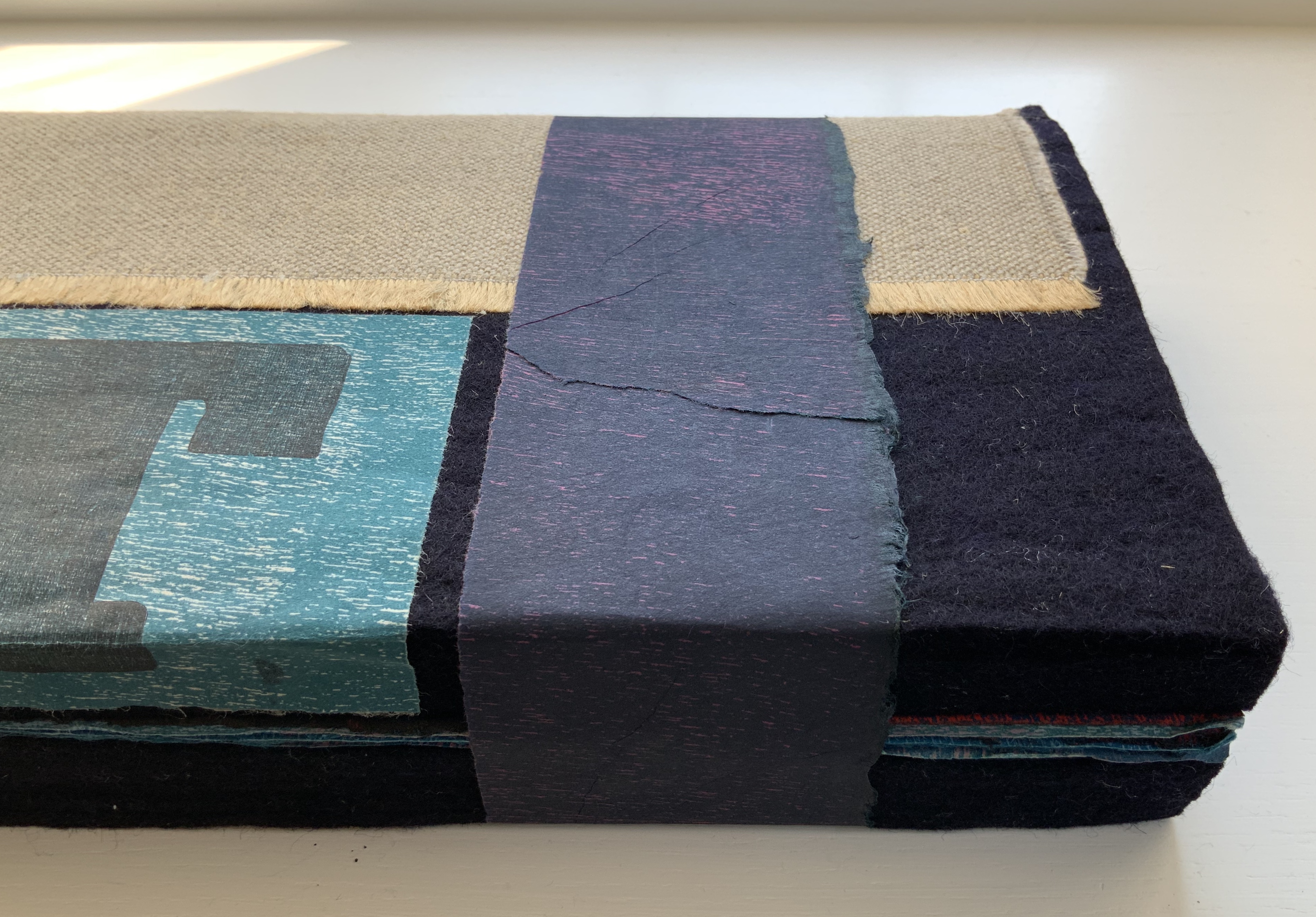
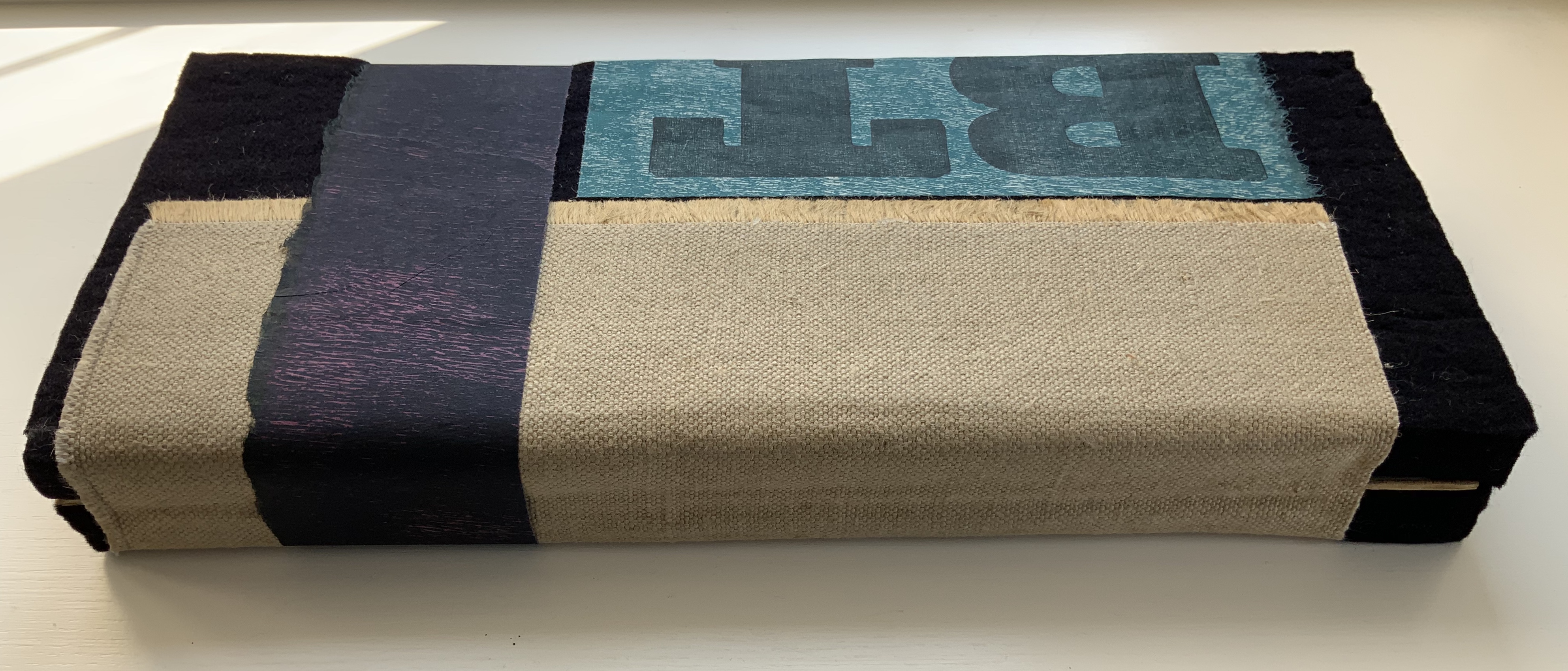
Single segment casebound codex, relief prints (rainforest plywood and linocuts) on Awagami Kozo, rainforest plywood, felt front and back boards. H390 x W170 x D45 mm. Variable pages. Edition of 4, of which this is #4. Acquired from the artist, 15 September 2020.
Photos: Books On Books Collection and Bodleian Libraries.
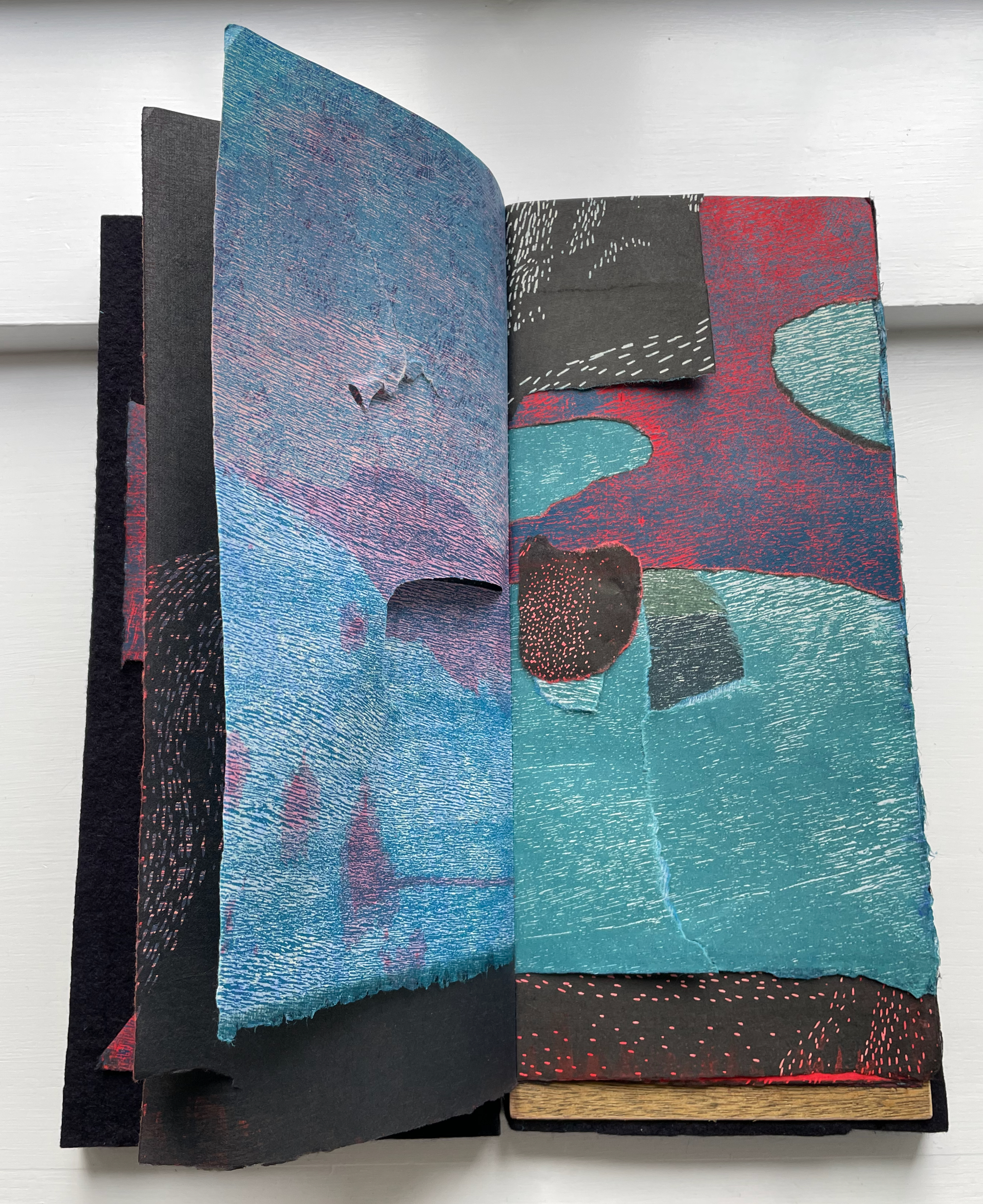
Where Grasping the Nettle‘s sense-ambiguous images draw the reader’s fingers to the page to question the eye’s primacy in seeing, The Book of Tears draws the reader into a creative/destructive manual activity to question the eye’s primacy in reading — and even the idea of what it is to read a book.
The Book of Tears poses ambiguities and tensions from the start — even in the name of the suite to which it belongs, the haptic atolls. As a form of island, an atoll surrounds and is surrounded by water. The title of the work itself puns deeply on the word tears, referring to /tɪəz/ for liquid from the eyes or to /tɛəz/ for rips or somehow to both at the same time. Like an atoll whose definition hovers between land and water, the word tears hovers between noun and verb.
Even the painterly and sculptural qualities of The Book of Tears offer ambiguity and multivalences. The burlap hinge securing the front and back covers hints at the painter’s canvas. The covers’ bulk belies their lightness and sponginess, while their deep blackness plays a dark Caravaggesque background against which the book’s pages will play. The plywood is rainforest plywood. The book block, usually the thickest part of a book, is the thinnest, like a sheet of wet paper being squeezed between the two blocks of felt. The pages themselves vary in weight, texture, color and size. The prints derive from multiple relief techniques, oil and water based inks. Peering into this book, the reader is pulled into all these tensions — oil and water, size and apparent weight, thickness and thinness, artifice and nature, light and shadow, complete and incomplete, and the haptic and the optical. How are the tensions to be read? Can they be resolved?
Even as an edition, The Book of Tears is ambiguous. It consists of four copies — one held at Carleton College Library in Artists Books Collection, a second in the Susan Filter & Peter Koch Collection of the Art of the Book, a third in a private collection, and the fourth in the Books On Books Collection –but each of the four is unique due to the handmade materials and process of composition. Even that uniqueness is ambiguous because each relies on its readers’ participation in what Mosely describes as the book’s “resolution”.
Readers, at the invitation of the books’ owners, have the opportunity to make a tear in the pages of the books (or if conservators, a repair). The final state of a copy is determined by its owner. So there lies yet more ambiguity and tension. When to determine the final state? What of future readings/resolutions? What if the owner is an institution? Do conservation or preservation outweigh The Book of Tears‘ destructive/creative imperative? Can there be tears without tears? Or no tears with tears?
Imagine the tension in a performance of resolution. The title’s pun could become distressingly or hilariously alive. In putting readers and owners in that awkward position, The Book of Tears is serious and facetious, destructive and creative, thoughtful and whimsical — tensely ambiguous.
Instead of imagining the tension, the Books On Books Collection invited the Oxford Bibliophile Society’s members to “resolve” this copy of the book in the haptic atolls suite. The Oxford English Dictionary dates the first use of the word atoll to the first half of the 17th century. Around the same time, Rembrandt painted two anatomy lessons, the less famous being The Anatomy Lesson of Dr. Joan Deijman, which depicted a dissection of the cerebral membrane. To misquote and paraphrase the 17th century poet John Milton and set the scene for resolving The Book of Tears:
“As good almost dissect a book as dissect a brain.”
So, in keeping with the seriousness and whimsy of The Books of Tears, the Oxford Bibliophile Society under the guidance of Chris Fletcher, the Bodleian’s chief book surgeon (aka Keeper of Rare Books), the Society’s members restaged Rembrandt’s The Anatomy Lesson of Dr. Joan Deijman and dissected/resolved/read The Book of Tears.


Left: From IJpma, F. F. A. et al. 2013. A digital reconstruction of Anatomy Lesson of Dr. Deijman. A large part of the original painting was destroyed by fire in the guild room. Only the center of the composition has been preserved. Reconstruction by Thijs Wolzak and Norbert Middelkoop. Amsterdam Museum inv. No. A41060. Right: “Resolution” of The Book of Tears from the Books On Books Collection by Chris Fletcher, Keeper of Rare Books, and members of the Oxford Bibliophiles Society.
The results of their efforts appear below.
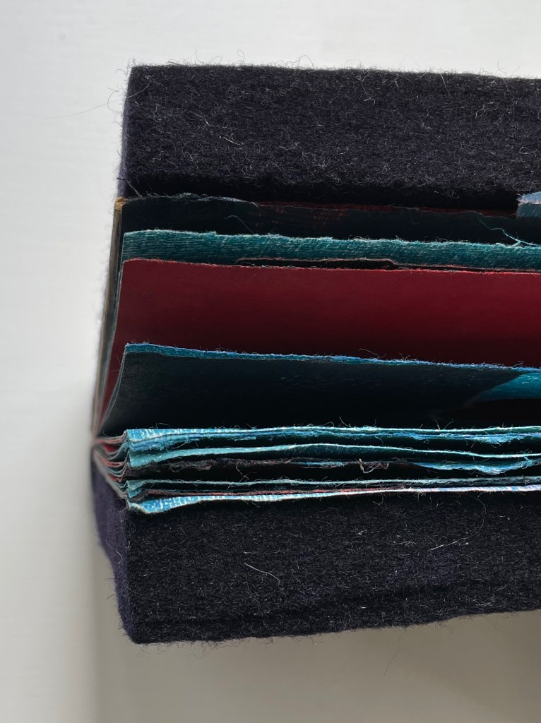
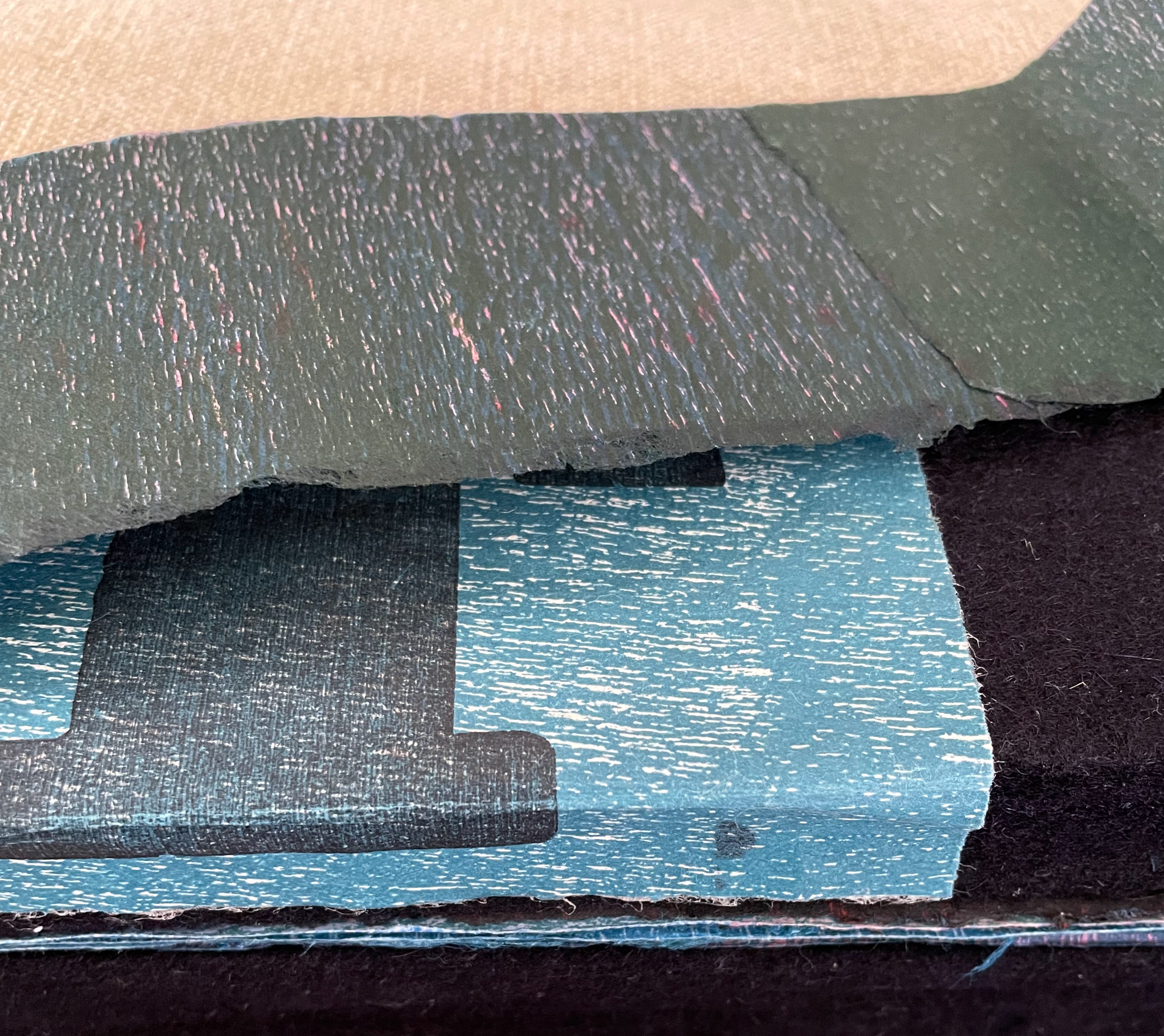
Note the thickness of the felt boards.

The striated coloring of the title pastedown here and the pages throughout come from relief printing with rainwood plywood, linocuts and oil and water-based inks.


In its colors, shape and composition, this multi-page spread suggests atolls and archipelagoes.


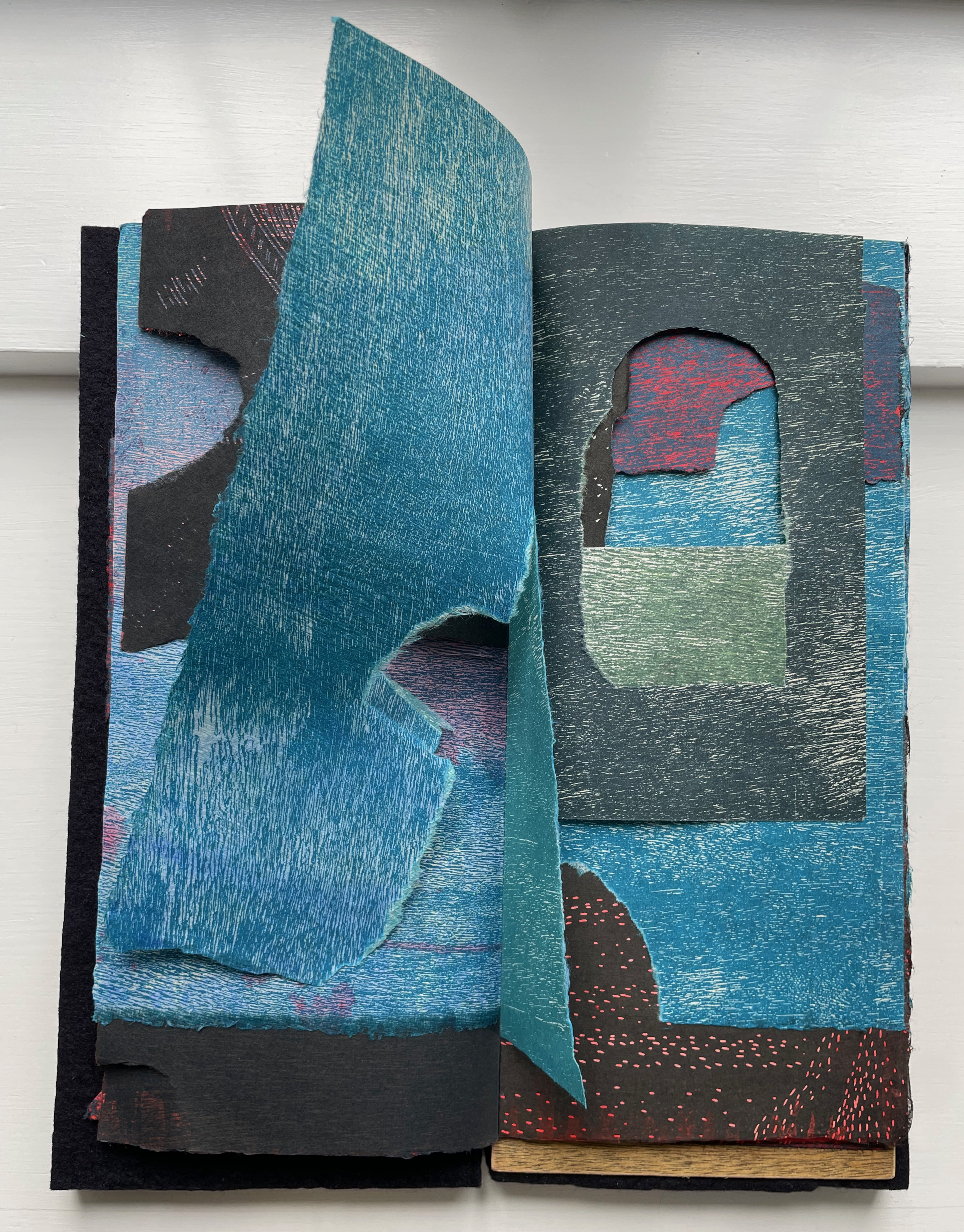
As the torn pages turn, different “bookscapes” appear. The idea of landscapes and seascapes and their implication of the nomadic perception of our world occurs repeatedly in Deleuze & Guattari’s A Thousand Plateaus.


Is that red a volcano around whose rim the coral will form an atoll? Is lava flowing beneath the water?


Windows, doors, walls , tunnels?


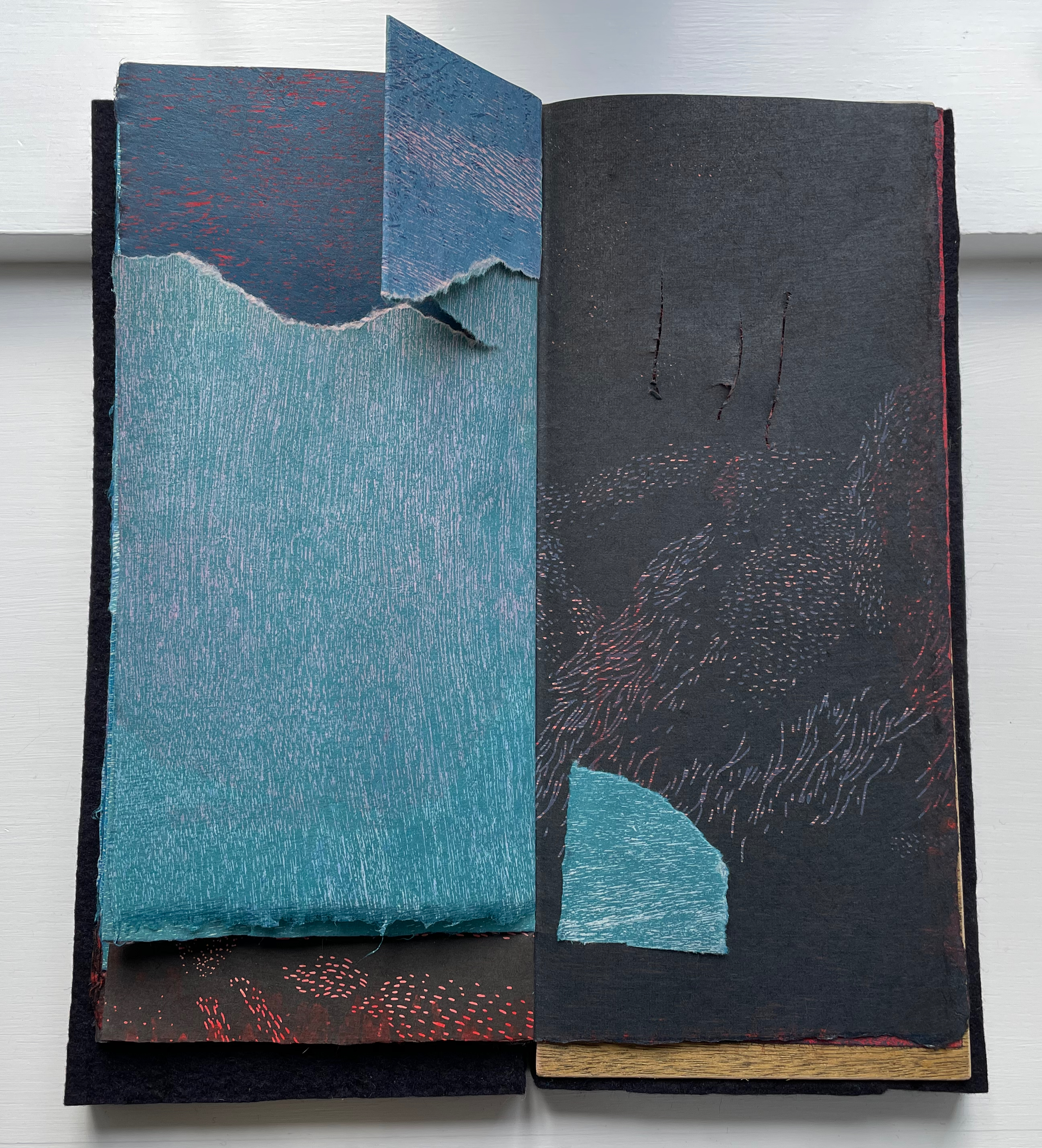
Evening and nightfall closing in?

Any book allows a reader to re-read — to “re-peer” into — it. The Book of Tears also provides the conservation-minded reader with a perforated sheet of “koala bear” stickers to re-pair the tears.
With all its tensions, The Book of Tears is resolvable only if its owners and readers engage and embrace them.
Further Reading
For other works of pulp painting, see:
- “Pat Gentenaar-Torley“. 8 October 2020. Books On Books Collection.
- “John Gerard“. 13 August 2020. Books On Books Collection.
- “Helen Hiebert“. 18 June 2021. Books On Books Collection.
- “Jane Paterson“. 1 December 2020. Books On Books Collection.
- “Maria G. Pisano“. 15 August 2021. Books On Books Collection.
- “Fred Siegenthaler“. 10 January 2021. Books On Books Collection.
- “Claire Van Vliet“. 3 July 2022. Books On Books Collection.
- “Maria Welch“. 18 September 2020. Books On Books Collection.
Collins, Kim. 2024. “Discovering New Things: Creative Instruction & Artists’ Books presented as part of the Opening the CANon: envisioning new futures for teaching with distinctive collections“. Presentation at ARLIS/NA 2024 52nd annual conference in Pittsburgh, PA. Modern Language Association, Humanities Core. Collins’ presentation covers the performance on 3 March 2024, at Emory University, in which book artists Peter and Donna Thomas ceremoniously opened a copy of their John Steinbeck’s Cannery Row (2003).

Deleuze, Gilles, and Guattari, Félix. Massumi, Brian (trans.). 1987. A Thousand Plateaus. Minneapolis, MN: University of Minnesota Press.
Derrida, Jacques, and Irizarry, Christine (trans). 2005. On Touching: Jean-Luc Nancy. Stanford: Stanford
University Press. Pp. 124-25 citing Deleuze & Guattari, pp.543-44.
Derrida, Jacques. 1993. Memoirs of the Blind : The Self-Portrait and Other Ruins. Chicago: University of Chicago Press.
Hubert, Christian. 13 August 2019. “smooth/striated“. Christian Hubert Studio/Writings.
IJpma, F. F. A., Middelkoop, N. E., & van Gulik, T. M. 2013. “Rembrandt’s anatomy lesson of Dr. Deijman
of 1656 dissected“. Neurosurgery, 73:3, 381-5. DOI:10.1227/01.neu.0000430284.62810.4b.
Koch, Peter Rutledge, et al. 2017. Peter Koch Printer: Embodied Language and the Form of the Book. Interview by Roberto G. Trujillo. Edited by Camden M. Richards and Russell Maret. California: Editions Koch : Stanford University Libraries.
Lewis, David. 1975. We, the Navigators; the Ancient Art of Landfinding in the Pacific. Honolulu: University Press of Hawaii.
Marks, Laura. 2014. “Haptic Aesthetics“. In Encyclopedia of Aesthetics (2 ed.), edited by Michael Kelly. Oxford: Oxford University Press.
Merleau-Ponty, Maurice. 1971. Sense and Non-Sense. 1st pbk. ed. Evanston, Ill.: Northwestern University Press. “We see the depth, the smoothness, the softness, the hardness of objects; Cézanne even claimed that we see their odor. If the painter is to express the world, the arrangement of his colors must carry with it this indivisible whole, or else his picture will only hint at things and will not give them in the imperious unity, the presence, the insurpassable plenitude which is for us the definition of the real.” — Merleau-Ponty, Sense and Non-Sense, p. 15. Paraphrase: If the book artist is to express the world, the arrangement of the elements of the book — its structure, its materials in all their surfaces, textures and colors, its signs, its apparatus, and very idea of the book — must deliver an “indivisible whole” that, Merleau-Ponty says, defines for us the real.
Milton, John. 1644. Areopagitica; a Speech for the Liberty of Unlicenc’d Printing [by J. Milton.]. London: N.p. “… as good almost kill a Man as kill a good Book …”
Montagu, Ashley. 1986. Touching : The Human Significance on the Skin. 3. ed. New York: Harper & Row. “Touch is the mother of the senses”. Every sense, including sight, comes biologically from touch.
Mosely, Tim. 2014. The Book of Tears. [Goonellabah, New South Wales]: [Silverwattle Press].
__________. 2016. Directed Smooth Space. Chicago, IL: JAB – Center for Book and Paper Arts.
__________. 2020. Grasping the Nettle. Queensland: [The (Silverwattle) Bookfoundry].
__________. 2020. “The Haptic: Texturing Discourse on the Book“. Reimagining the material: artists books, printed matter, digital transformation, engagement. ARLIS-NZ Biennial Conference, 11-13 November 2020, Brisbane.
Mosely, Tim. 2015. “The material folio”. Artist’s Book Yearbook 2016-2017. Sarah Bodman, T. Peixoto, John Bently (eds). Bristol: Impact Press/Centre for Fine Print Research. Pp. 14-19.
_________. Winter 2021. “Texturing artist’s book discourse“. The Blue Notebook. 16:1: 26-33.
_________. Spring 2016. “The Haptic and the Emerging Critical Discourse on Artists’ Books”. Journal of Artists’ Books. 39: 36-39.
__________ . 12 July 2024. Correspondence with Books On Books Collection.
Pallasmaa, Juhani. 2012. The Eyes of the Skin : Architecture and the Senses. 3. ed. Chichester,UK: Wiley. Pallasmaa’s words about a “sense of focus and presence in the paintings of Caravaggio and Rembrandt [arising] from the depth of shadow in which the protagonist is embedded like a precious object on a dark velvet background that absorbs all light” prompted the observation about the felt covers of The Book of Tears.
Pelzer-Montada, R. 2008. “The Attraction of Print: Notes on the Surface of the (Art) Print“. Art Journal. 67:2, pp. 74-91.
Plotnitsky, Arkady. 2003. “Algebras, Geometries and Topologies of the Fold: Deleuze, Derrida and Quasi- Mathematical Thinking (with Leibniz and Mallarmé)”, in Between Deleuze and Derrida. Eds. Paul Patton and John Protevi. New York, N.Y.: Continuum. Pp. 98-119.
Smith, Keith A. 2003. Two Hundred Books by Keith Smith : Book Number 200 ; an Anecdotal Bibliography. 1. ed. 2. print. Rochester, N.Y: Keith Smith Books. See Book 40, p. 89, and consider it alongside Mosely’s Book of Tears for variable page width and the differences arising from the reader’s intervention and the paper’s materiality.