Winterbook (2010)

Winterbook (2010)
Till Verclas
Main title set in Frutiger 65 Bold, 48 point. Text set in Frutiger 57 Condensed, 24 point.
Book: H196 x W277 x D10 mm, Box: H222 x W294 x D31 mm
Published by Un Anno Un Libro in an edition of 12, of which this is #7.
Acquired from the artist, 26 February 2019. Photos: Books On Books

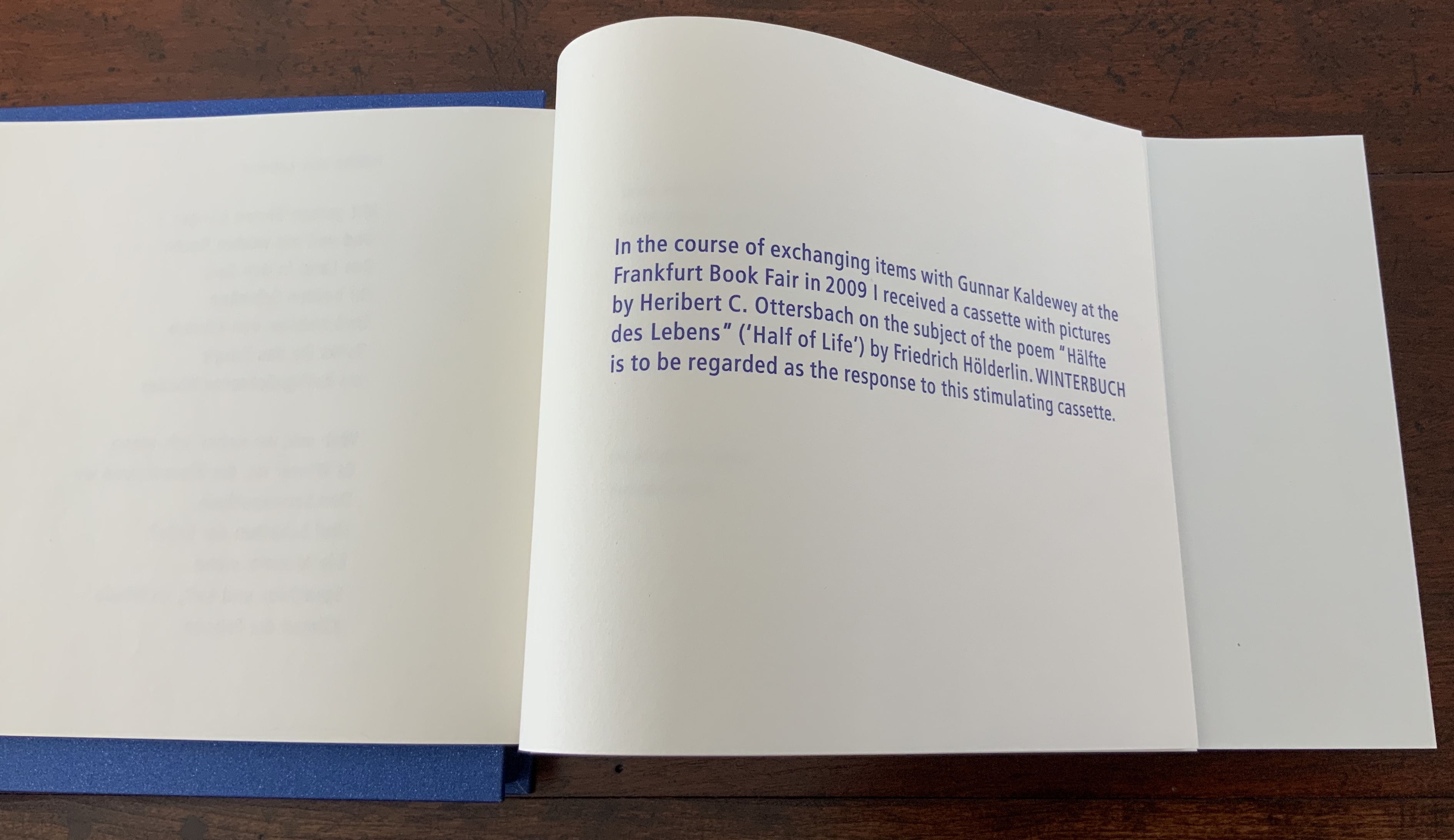
Un Anno Un Libro is the Verclas imprint, and Winterbook is a response to an artist’s book produced by another maestro of the book Gunnar Kaldewey with the artist Heribert Ottersbach. Ottersbach provided pictures in response to Friedrich Hölderlin’s fourteen-line poem “Hälfte des lebens”, which provides the title to their artist’s book. In any event, the Kaldewey/Ottersbach effort is not needed to appreciate Verclas’ book, and besides, only a glimmer of the Kaldewey book is available to most of us — two pages in a catalogue raisonnée.
Winterbook is housed in a box whose silver-flecked blue cloth echoes the embossed silver-stamped spine, which in turn together echo the embossed title in blue metallic ink on the front cover of the book itself.


The half-title page carries over the colour blue and Frutiger typeface from the box and title page, and it surprises the reader by being made of clear acetate. Verclas uses fourteen more sheets of acetate to reproduce Michael Hamburger’s translation of Hölderlin’s poem. (The book is also available in German.)

Each of the first seven sheets repeats the whole of the first seven-line stanza, each of the second seven repeats the whole of the second stanza. On each sheet, one line stands out in blue ink, the rest are filtered. The acetates are separated by sheets of Whatman paper (118 gsm) folded in half with the fold to the book’s fore-edge and, on either side of the fold, photographs of the snowbound landscape of Katschberg-Aineck taken by Verclas.

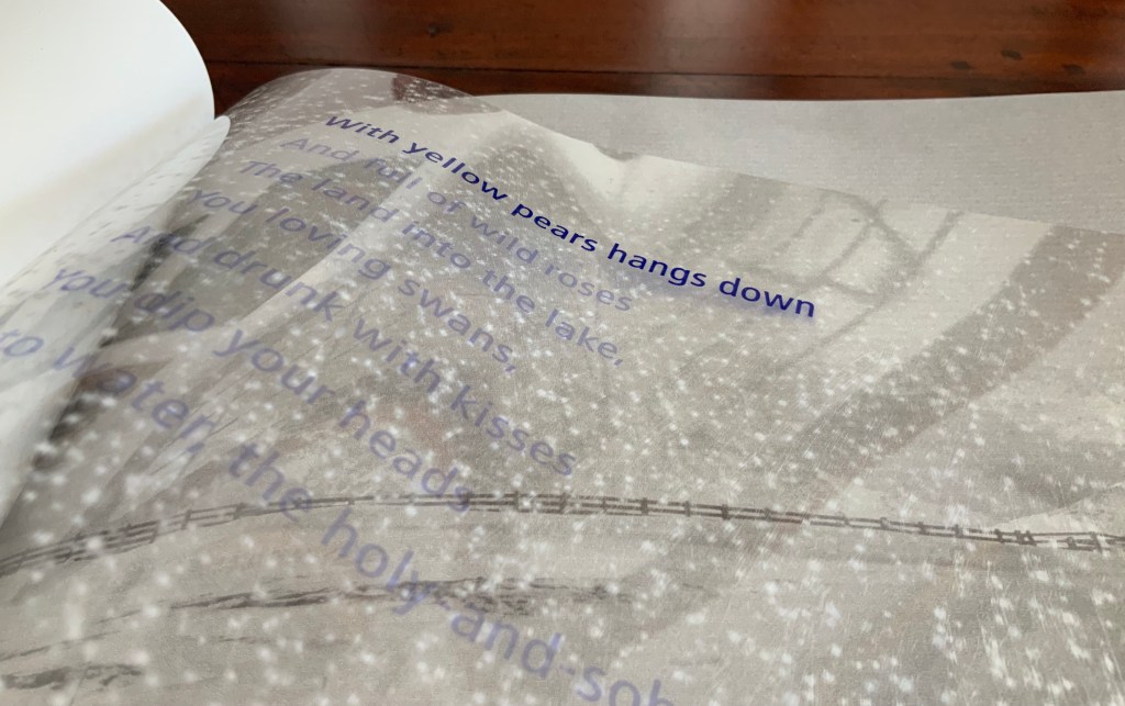


The acetate pages reflect light like ice, and turning them creates an effect of snowfall and snowflakes’ shadows on the photos on either side of the fold — an effect achieved with a light sandpapering of the acetate.
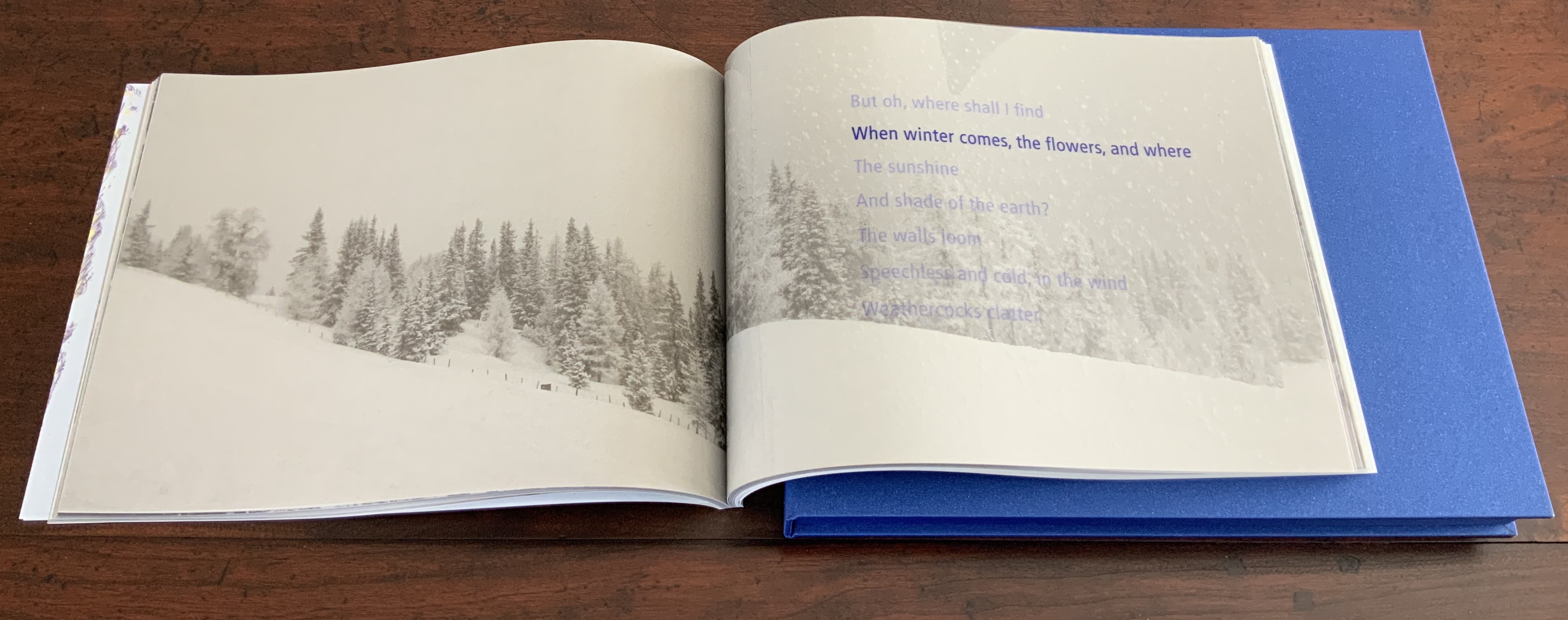

With their assonance and evocation of the cold, those words “weathercock” and “clatter” are brilliant choices over the more common “weathervane” and “creak”. The bright blue highlighting of each line slows the reading down to a pace at which such brilliance can be felt.

Hölderlin’s poem is best read at the end of autumn and alongside Robert Frost’s “Stopping by the woods“, W.B. Yeats’ “The Wild Swans at Coole” and Wallace Stevens’ “The Snowman“. But, most important, read it in this work of art by Till Verclas.
Further Reading (& Listening)
Made in Germany : the work of five book artists (Santa Barbara, CA : College of Creative Studies, 2009).
Herrndorff, Ursula. “Kunst ist immer Haarspalterei“(“Art is always hairsplitting”), Hamburger Abendblatt, 29 December 1999. Accessed 7 October 2019.
Sennewald, Jens. “Till Verclas : Künstler, Drucker, Büchermacher“, Aus dem Antiquariat, 2004, 4, 278-281.
Verclas, Till. “Black Truffles, Vibrant Colours Set Between Black and White“, talk at the 7th Biennial Codex Book Fair and Symposium, 3-6 February 2019 in Richmond, California. Podcast from Podfanatic: Bookbinding Now, 3 April 2019. Accessed 7 October 2019.
Wettig, Christiane. “Lieblingsdrucker von Baselitz und Immendorf” (“Favorite printer of Baselitz and Immendorff”), Die Welt, 9 December 1999. Accessed 7 October 2019.
