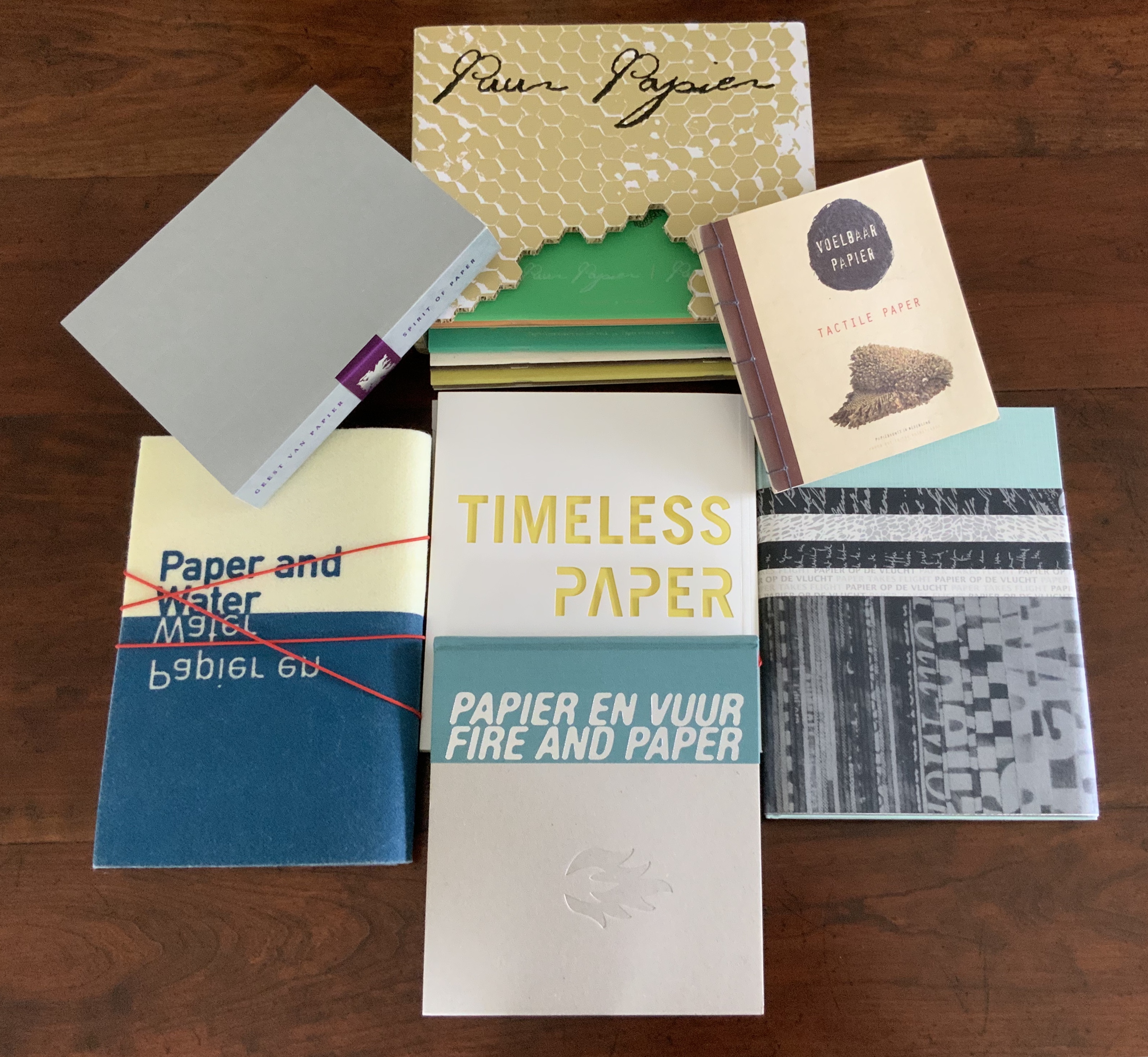
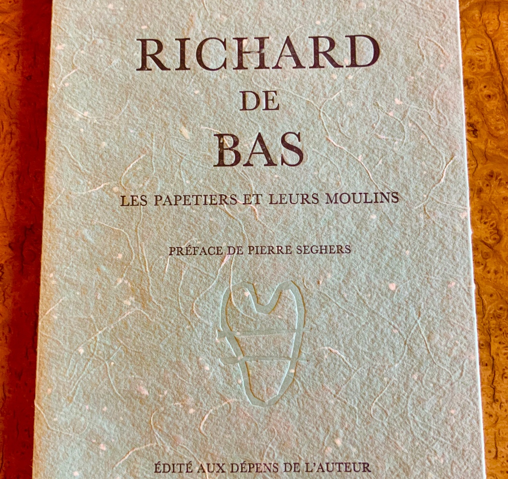
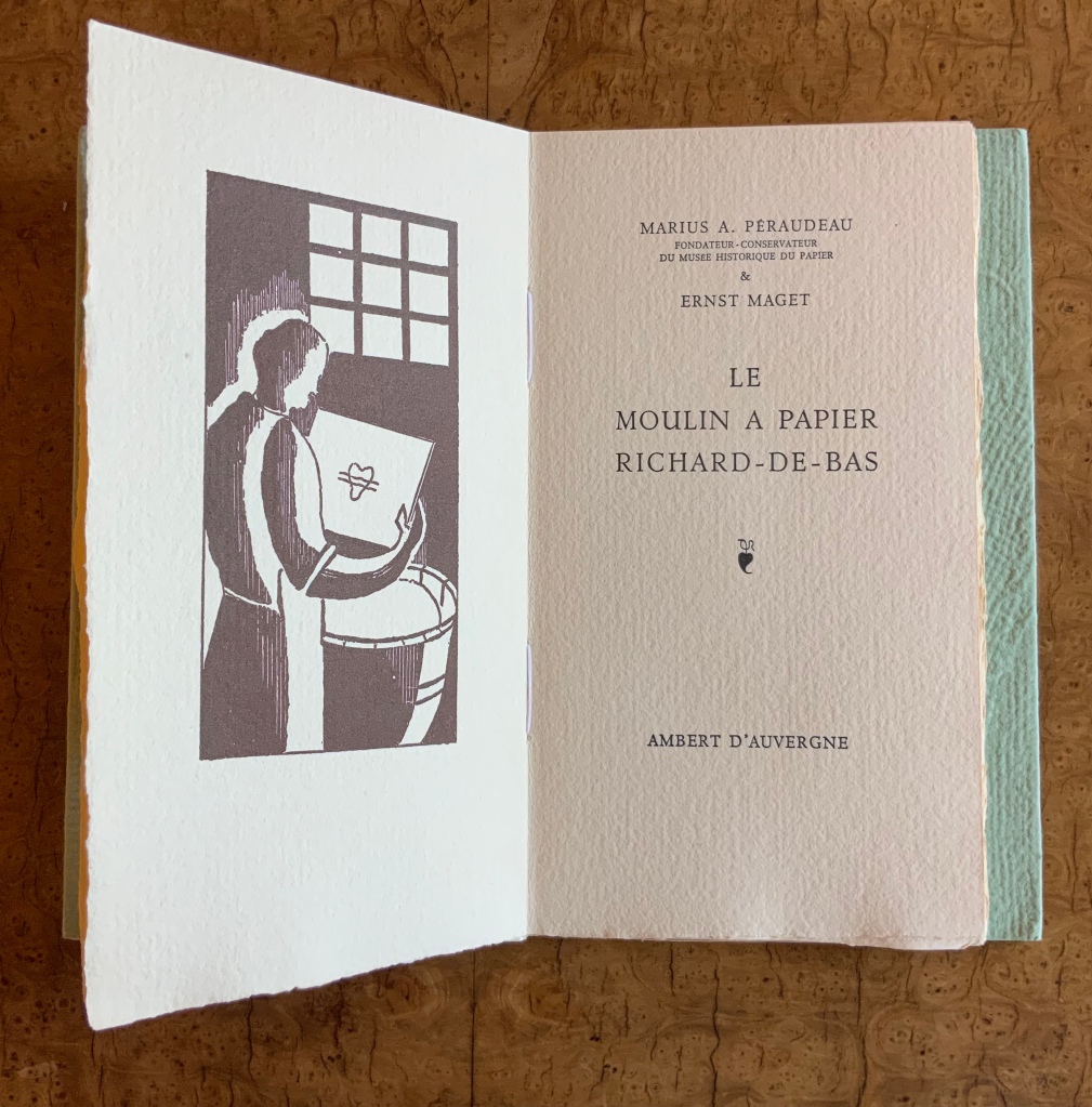
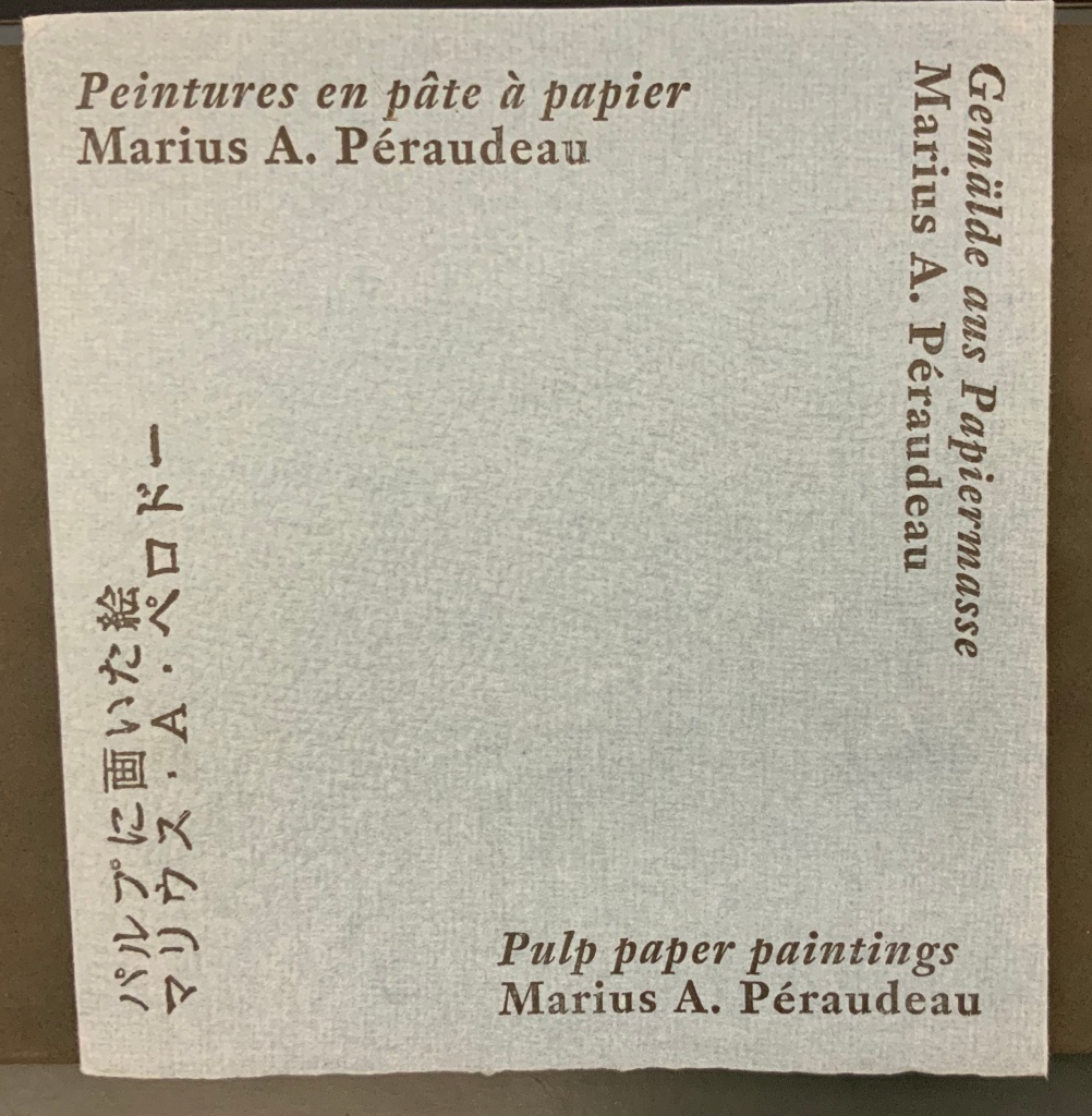
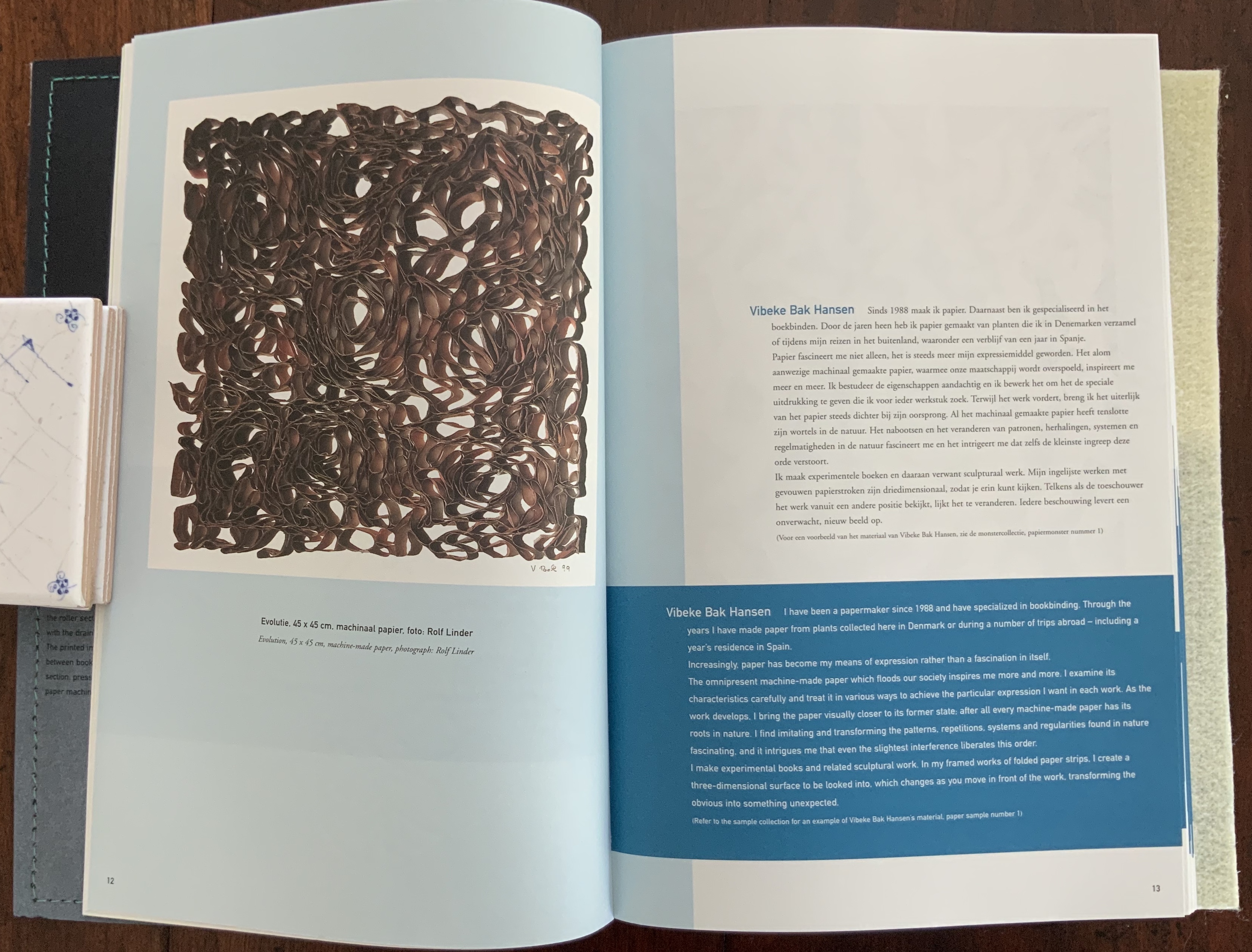
This is the story of seven remarkable books celebrating paper, paper art and book art, each published to coincide with the Papier Biënnale Rijswijk from 1996 to 2008. The story though could start in 1326, the year in which the Richard de Bas paper mill was established at Ambert d’Auvergne. That paper mill — revived in 1941 by Marius Péraudeau (see him at mark 3’43” in this video) — is France’s oldest still-operational handmade paper mill. Péraudeau appears in Henk Voorn’s preface to the first of the seven books — Voelbaar Papier = Tactile Paper (1996) — not because of the paper mill but because his “technique of ‘peintures en pâte à papier’ [pulp paintings]” helped define paper art as more than marbling, watermarking or mixing flowers in pulp.
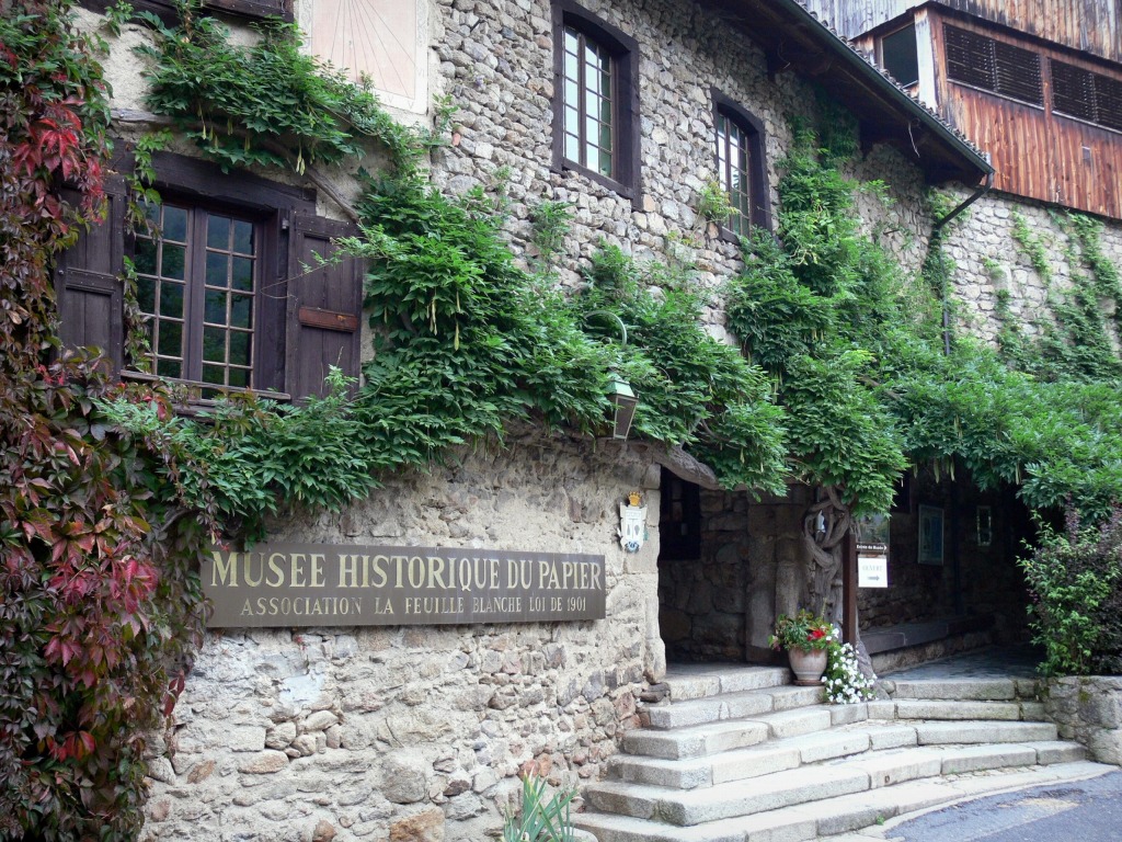
Clockwise: Le Moulin Richard de Bas (Photo licensed from Voyage-France.com); cover, publication by Péraudeau (1985); engraving and title page, publication by Péraudeau (1988); cover, catalogue by Atelier Gerard Finel (1991).
In different ways — but always in profusion — each book delivers this depth of anecdote: a demonstration of less than six degrees of separation between any two seemingly distant periods, techniques, materials and forms in the arts of paper and books. The habit is contagious. Did you know that Péraudeau‘s work attracted Robert Rauschenberg to Ambert to create the Pages and Fuses series (1974)?
But the story really starts with Peter and Patricia Gentenaar-Torley — key founders of the Papier Biënnale — and Loes Schepens — designer of all seven books. With support from the International Association of Hand Papermakers and Paper Artists (IAPMA), industry suppliers and members of the Biënnale’s founding Board, they did not start the 1996 catalogue with a defined series in mind. They knew, however, with the expertise available to them and the Biënnale’s board, it had to be more than a catalogue of paper samples or an exhibition catalogue — something richer, deeper — a book! When the first Biënnale proved a success and Tactile Paper sold out, the ante for the second volume rose, and a plan for the next volumes developed.
Each volume would have a theme and include essays on topics related to the theme chosen, a section of paper samples selected, and a section illustrating the exhibition of paper art selected for the Biënnale. The theme, however, would not constrain the submission of samples and art. By drawing on this mix of traditions — the book, the paper sampler and the exhibition catalogue — and designing to the theme selected, Schepens and the Gentenaar-Torleys posed themselves a challenge and laid the groundwork for something special.
When you look at the seven on a shelf or spread out on a table, you see variety. Open any two or more, you see continuity. Examine any one of them, you find a depth of content and an ingenuity of design. This — in its whole, in its parts — is book art, the phenomenon that causes you to ask: What makes the object in your hands, before your eyes, a book? What makes its material “feel” and appearance work as they do? And why does it spark that sensation that you are holding, regarding and reading a work of art?
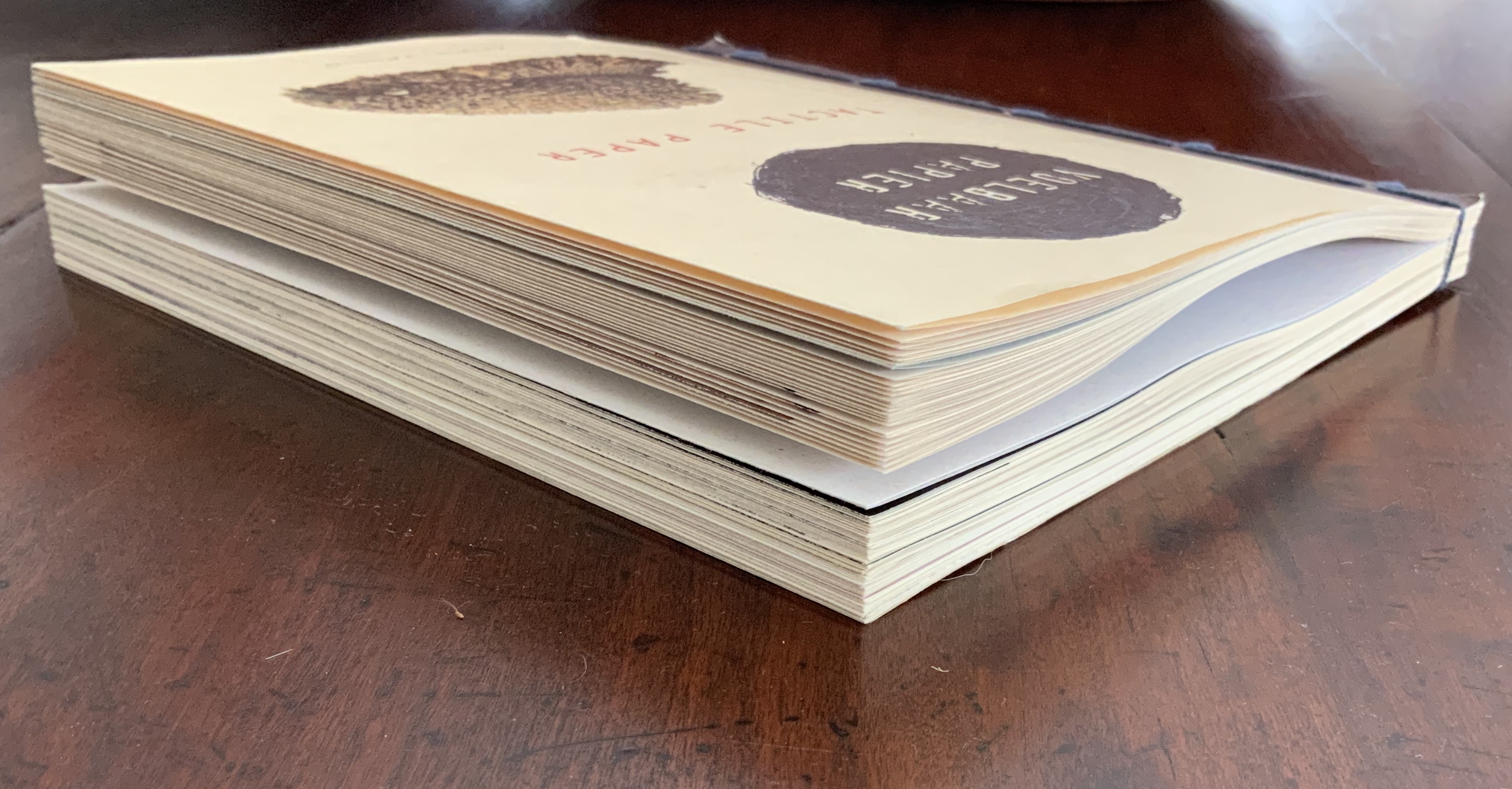
Voelbaar Papier = Tactile Paper (1996)
The Artists: Lilli Byrum, Gitte Christensen, Jean Decoster, Viviane Fontaine, Peter Gentenaar, Bas Haasnoot, Kyoko Ibe, Bob Matthijsen, Wilhelm Morat, Loes Schepens, Nur Tarim, Pat Gentenaar-Torley, Rogier Uitenbogaart
The Essayists: Henk Voorn, Henk Porck, Theo Laurentius, Pieter Keune and the Papierfabriek de Middelste Molen (Apeldoorn)

Dummies for Tactile Paper at Loes Schepens’ studio
Photos: Books On Books
Although the late 1990s presented the publishing and printing industries with tangible challenges from the digital world, demand for printed material had not fallen as it would mid-way through the first decade of the 21st century. Benefiting from this lull before the storm, the editors and designer of Tactile Paper were also blessed with generous funding and, so, able financially to rise to the challenge they had set themselves. Loes Schepens recalls it as a perfect climate for designing books.
Printing on only one side of the sheet whose loose ends would be sewn into the five-hole Japanese stab binding was a luxury — as was printing in four colour and on different papers throughout the body of the text. The double page allowed for circular and square die cuts to be made on one side to set off the thirteen glued-in paper samples (papiermonsters). Suppliers donated papers and work in exchange for samples of the finished product, and an ambitious print run of 1650 was decided.
Expand the photo for a closer look at the double pages.
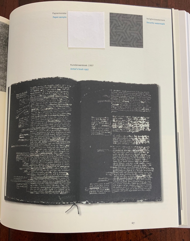
The Gentenaar-Torleys and Schepens found themselves with more essays than expected, but there could have been little doubt that the lead and necessary space had to go to Henk Porck’s extended essay on the Historical Paper Collection of the Dutch National Library (Koninklijke Bibliotheek) in The Hague. From 1983 to 2016, Porck was the curator of the Collection and, as a scientist, the author of widely cited works on paper conservation.
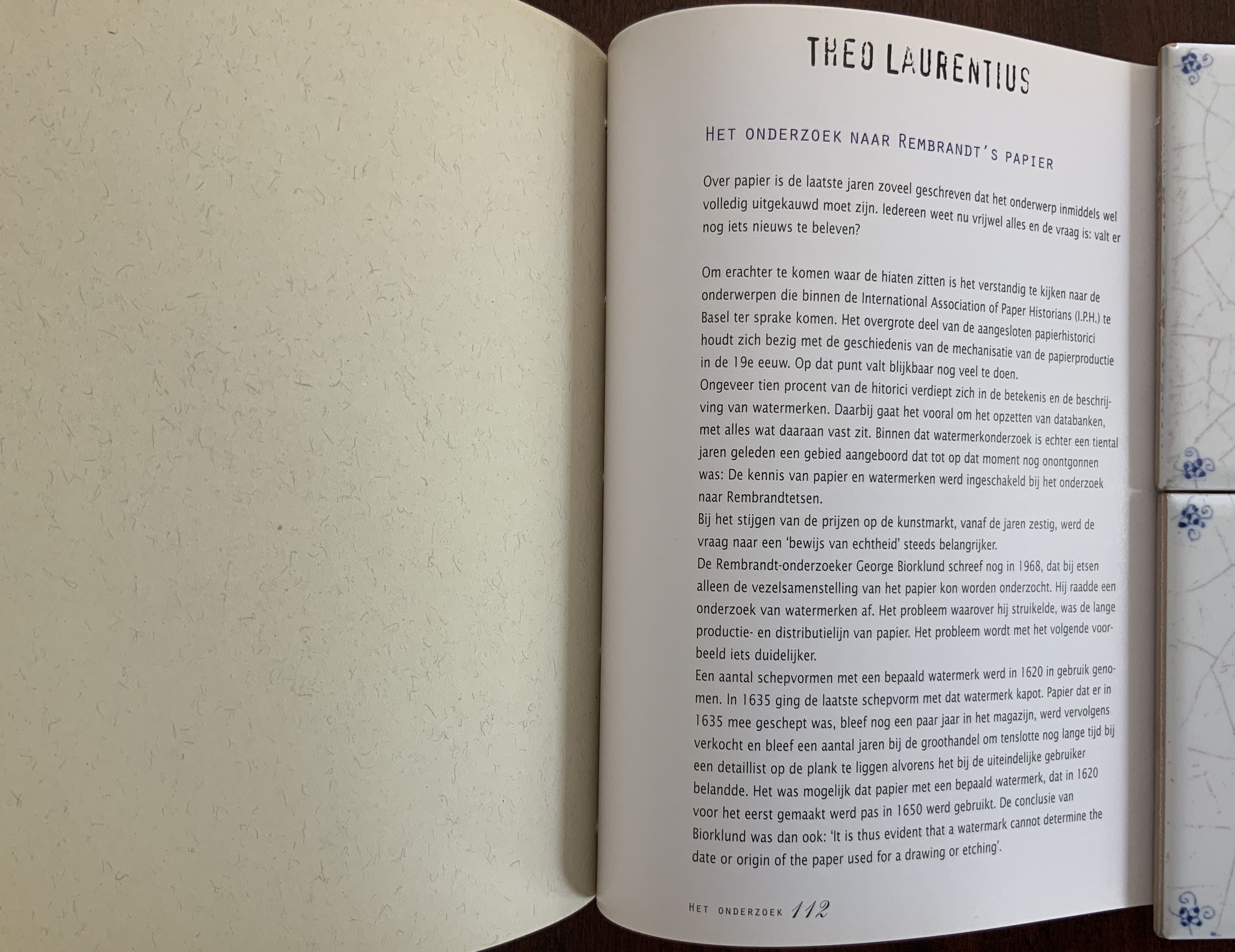
Looking back from the vantage point of the final volume, one can see in this first volume’s essays many of the series’ constant features to come: provision of historical and geographical context as well as a balance of science, technology and art. After the artists section (more on that later), Tactile Paper presents five more essays, the most engaging being Theo Laurentius’ investigation of Rembrandt’s papers for etching. Schepens gave the Laurentius essay a touch that foreshadows another of the series’ constant features: with its visible watermark, the paper used for the essay reflects the subject of the essay.
Expand the photo to detect the heavier, grainier paper that contrasts with the text paper. The designer has carried this contrast over to that between the type for the author’s name and the type for the body of the text.
The design and financial flexibility allowed Schepens to switch for Theo Laurentius’ essay to paper revealing its watermark, the subject of the essay.
In this first Biënnale publication, each artist’s paper sample and photo of the submitted work fall close together, a feature with which the designer would play and stretch in later volumes. In later volumes, the artworks are given more space and sharpness. In this volume, though, the papiermonsters seem to leap from their passe-partout-like settings.
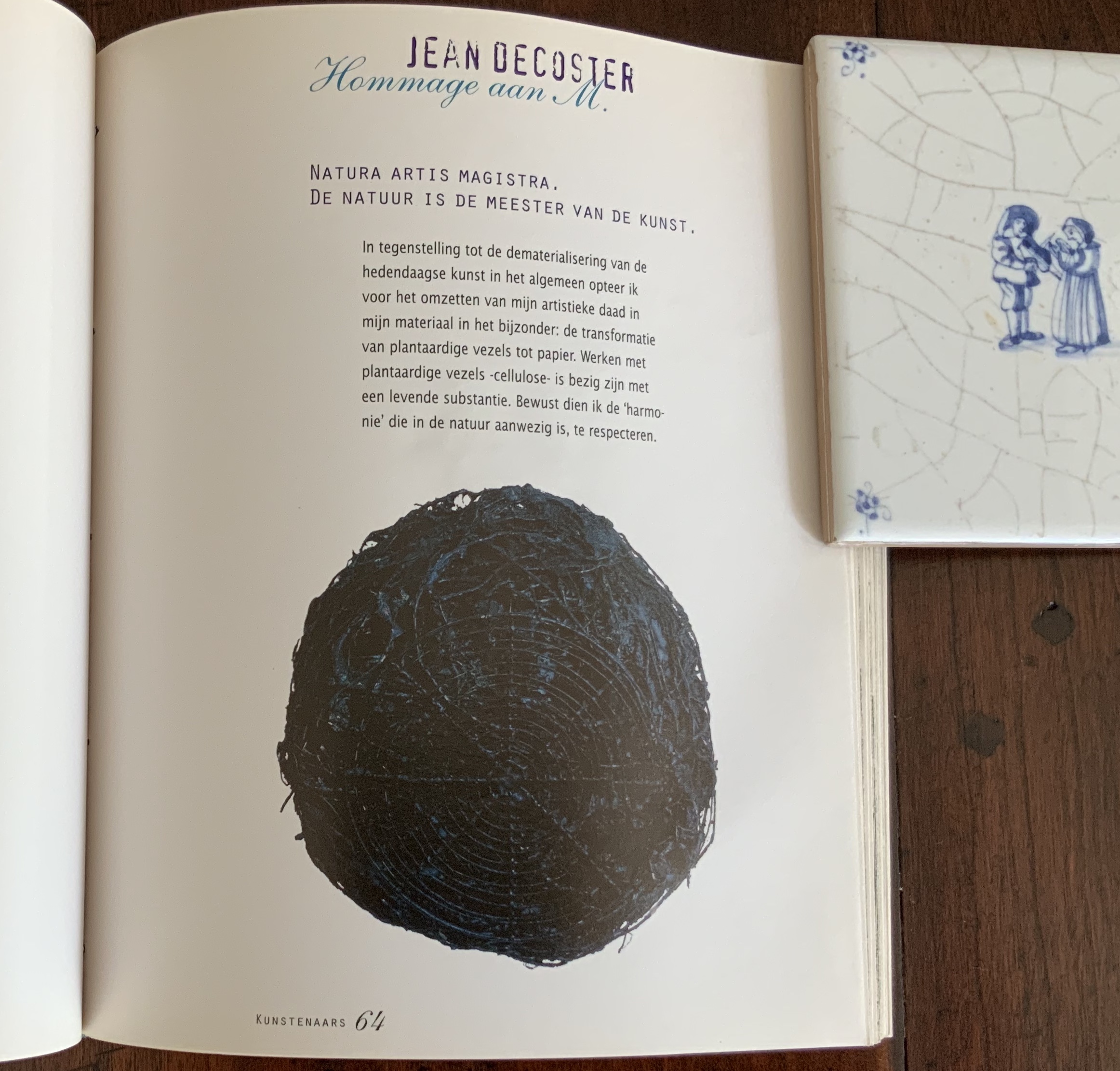
“Hommage to M.”, Jean Decoster
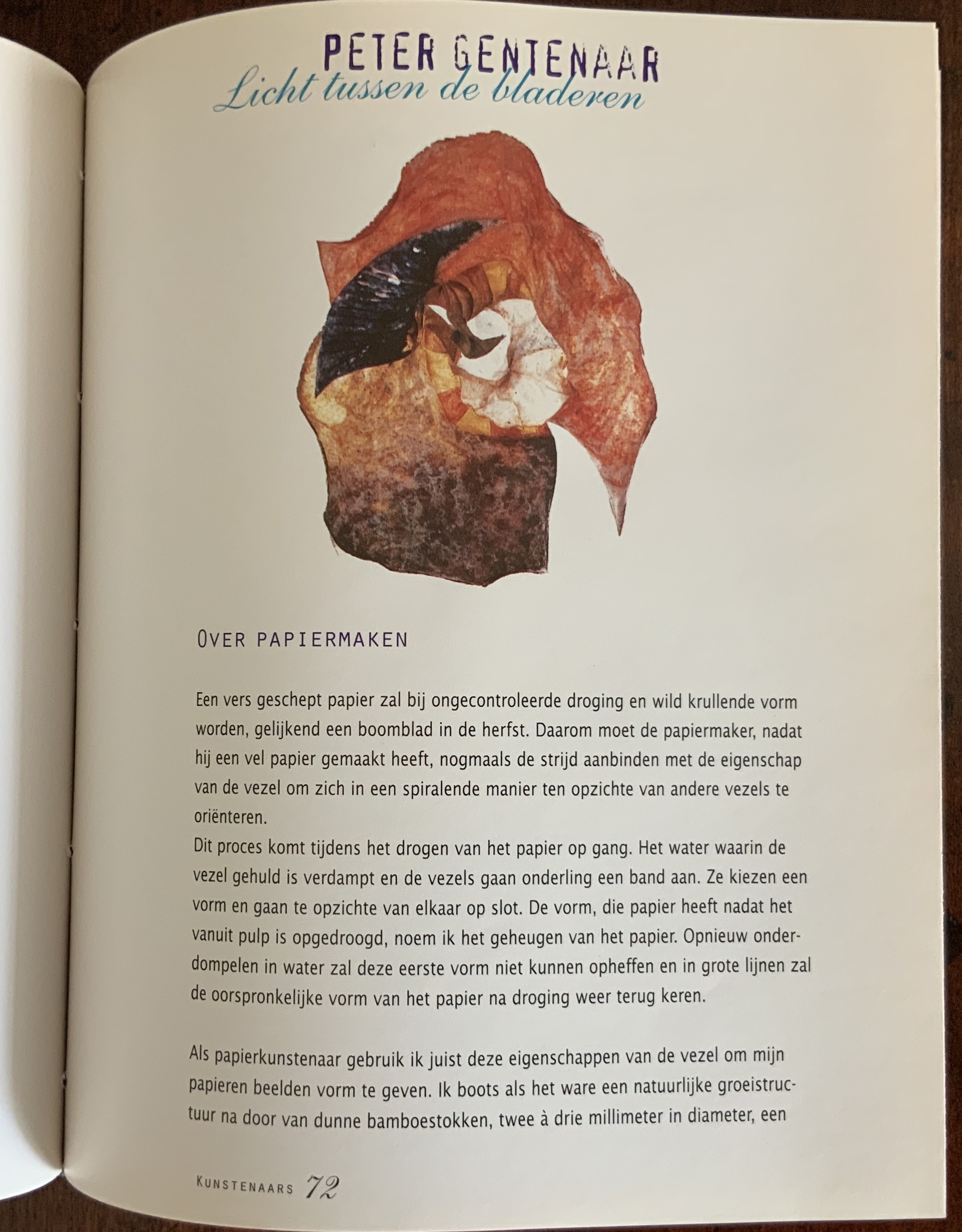
“Light between the leaves”, Peter Gentenaar
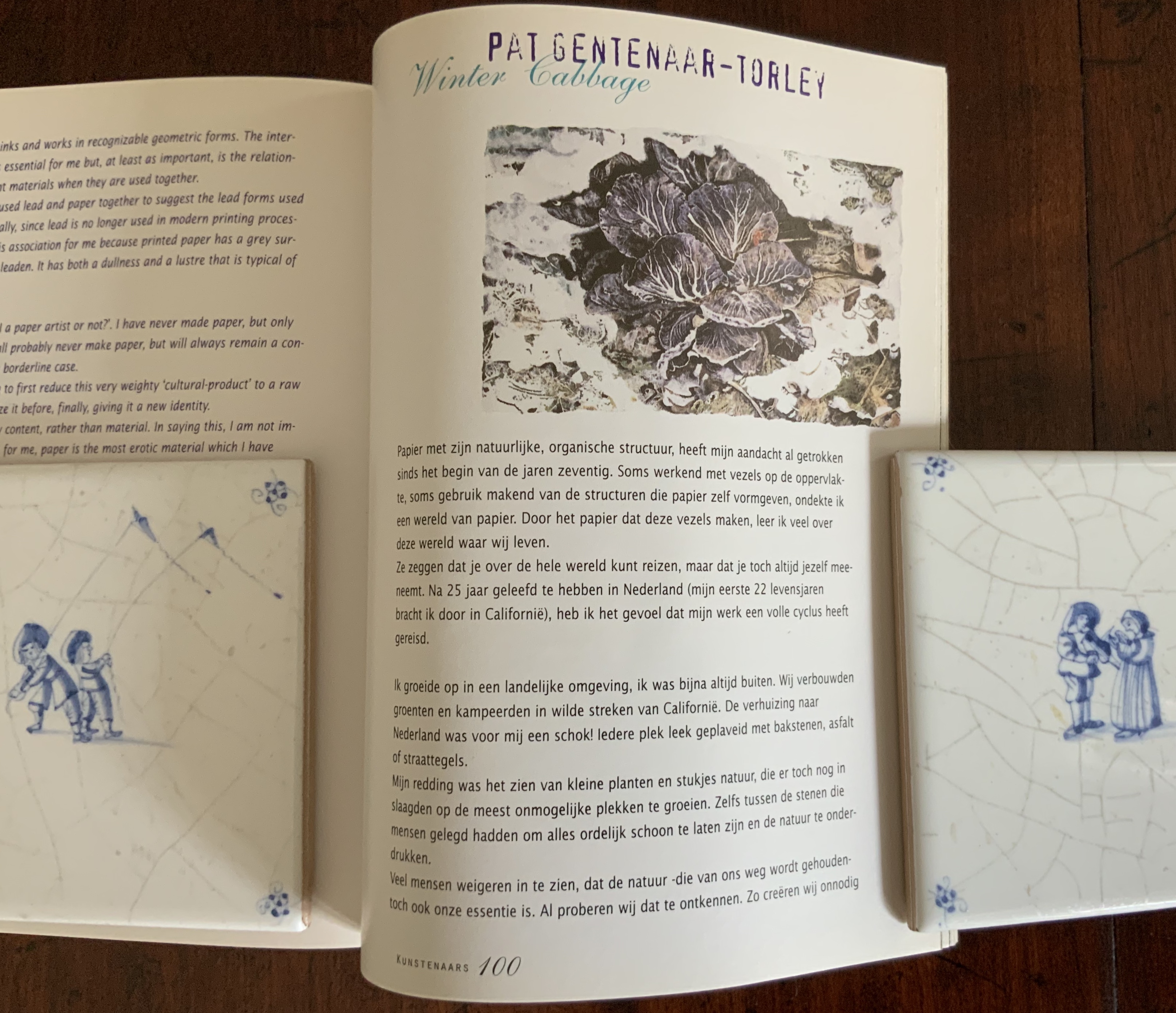
“Winter Cabbage”, Pat Gentenaar-Torley
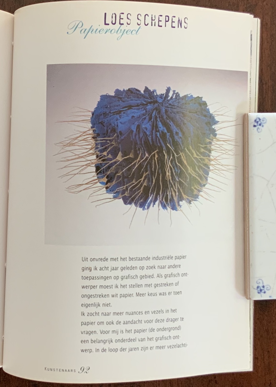

“Paper Object”, Loes Schepens
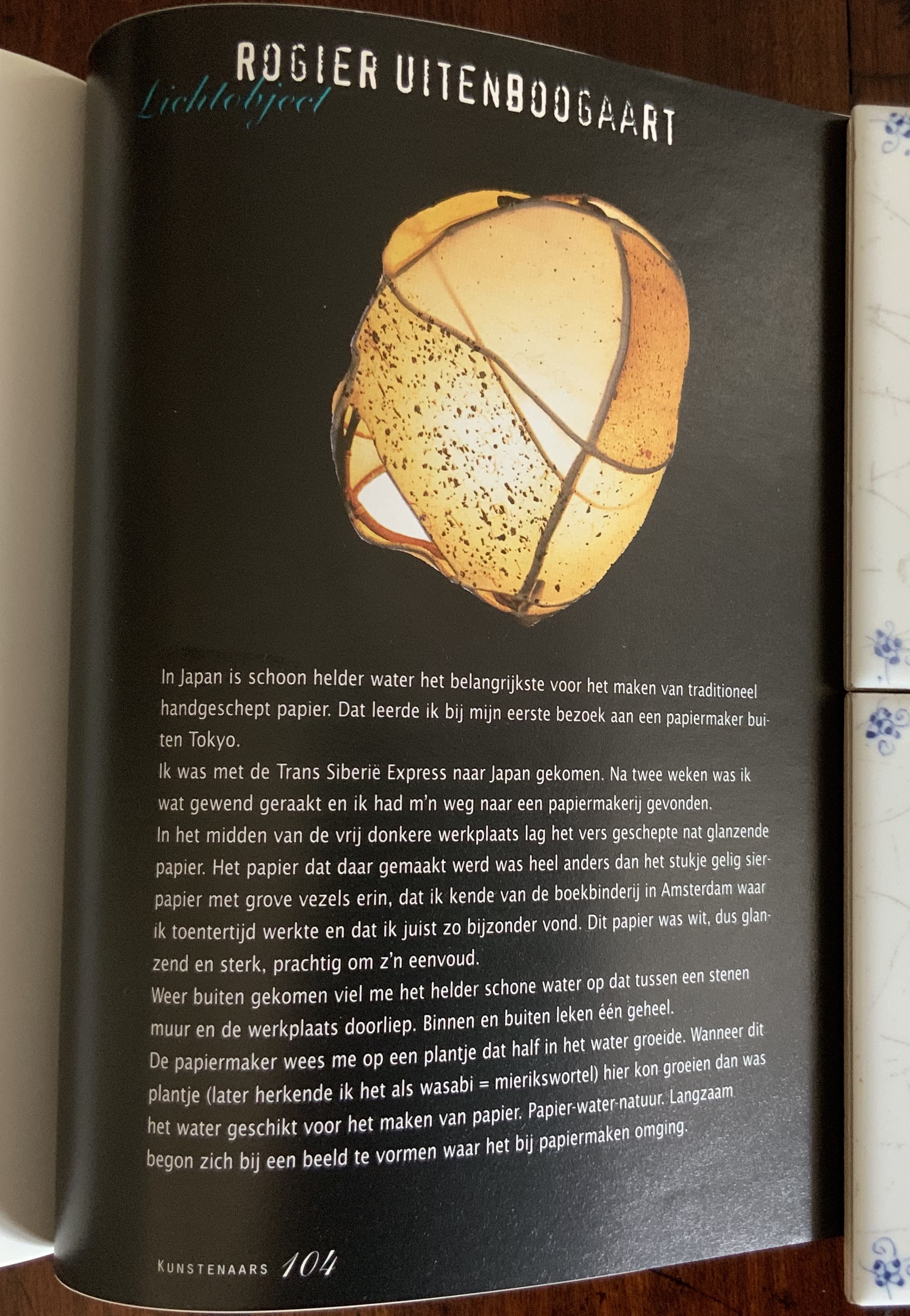
“Light Object”, Rogier Uitenbogaart
As evident from the links at the start above or, where possible, from visits in situ, the trim of the book can hardly do justice to the soaring artworks by Gentenaar, Matthijsen and Morat or the large wall hangings by Uitenbogaart. All of the book’s paper samples and artist commentary, however, evoke the tactility of the works. So much so, that eyes and fingers hunger for more than the thirteen works represented. The number of artists would grow with the Biënnale’s prestige. If not already successful and engaged in solo exhibitions, every artist selected would be. Tactile Paper, like most of the subsequent volumes, would boast future award winners among the contributors: Vivian Fontaine (le prix 2015 de la Fondation Bédikian) and Kyoko Ibe (2012 Kyoto Art and Culture Award).
In its design, Tactile Paper has some tell-tale marks of a first experiment. The use of cursive serif in caps and lowercase in turquoise ink to contrast with roman sans serif in all caps in a dark purple ink is excessive and overlaps the use of purple ink for English text and black for Dutch. The added use of caps and small caps for Dutch subheadings in black vs all caps for the English in purple is also excessive. Spacing between paragraphs is occasionally irregular. Copyediting is lax. Over time, the glue used to secure the paper samples has bled into some of the samples and through the pages to which they are attached.
Nevertheless the structural and material choices with which the designer chose to accommodate the several functions of the work — bilingual exhibition catalogue, paper sampler, collection of historical, scientific and technical essays — reward each return to the volume in itself and in comparison with the others. Tactile Paper laid the groundwork for the six volumes to come. If one imagines how, in its fresh new state, this eclectic, multi-functional yet somehow unified volume struck its readers and viewers, its selling out is not surprising. It is now available only through specialist libraries and antiquarian/rare booksellers.
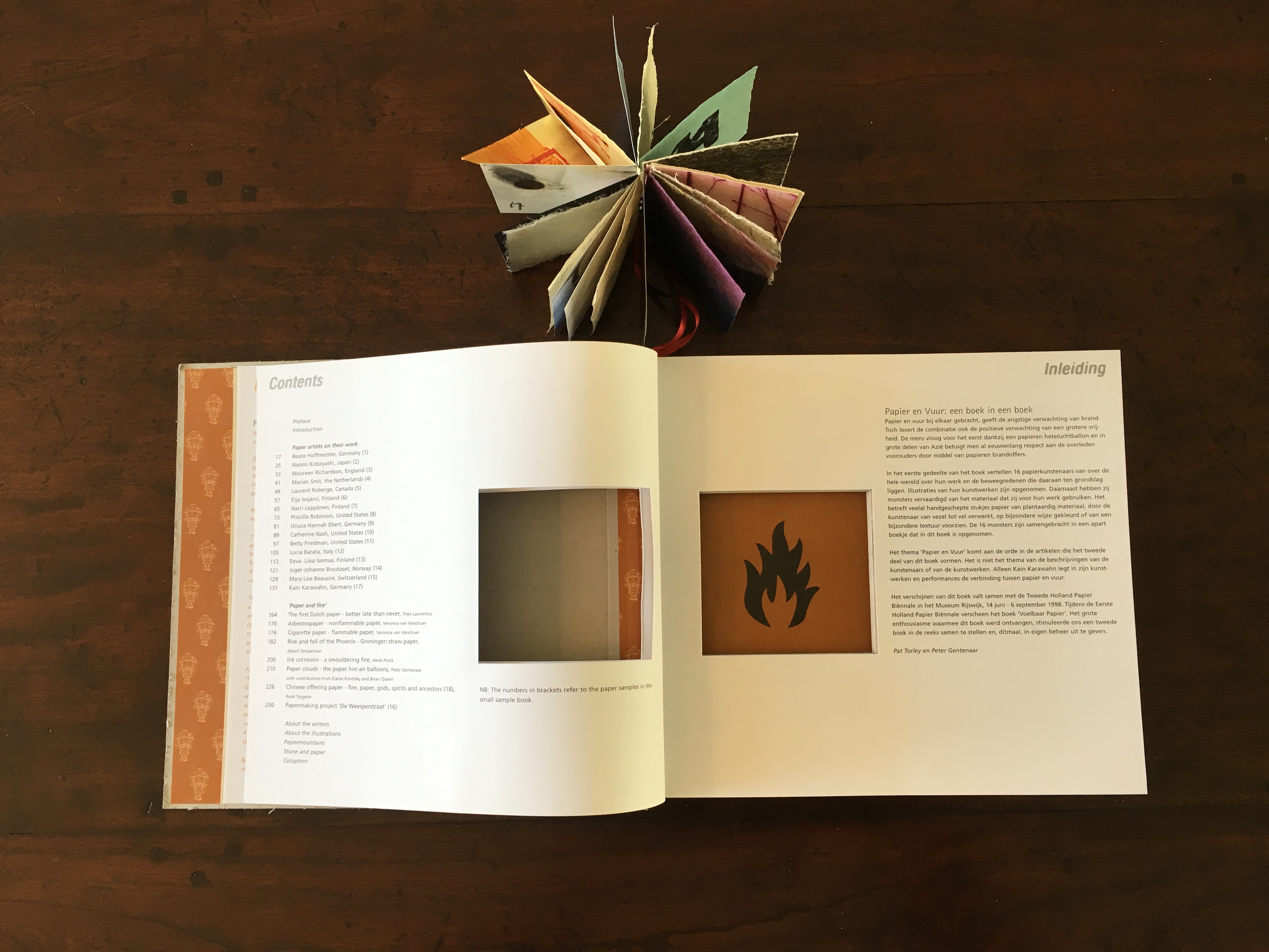
Papier en Vuur = Paper and Fire (1998)
The Artists: Lucia Barata, Mary-Lise Beausire, Inger-Johanne Brautaset, Ursula Hannah Ebert, Betty Friedman, Beate Hoffmeister, Eija Isojärvi, Eeva-Liisa Isomaa, Kain Karawahn, Naomi Kobayashi, Harri Leppanen, Catherine Nash, Maureen Richardson, Laurent Roberge, Priscilla Robinson, Marian Smit
The Essayists: Theo Laurentius, Veronica van Verschuer, Albert Tempelmann, Henk Porck, Elaine Koretsky, Brian Queen, René Teygeler, Papierschepperij “De Weesperstraat”
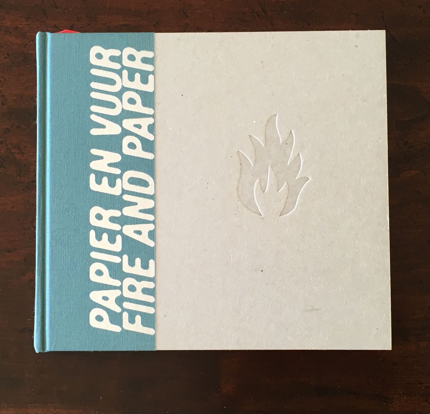
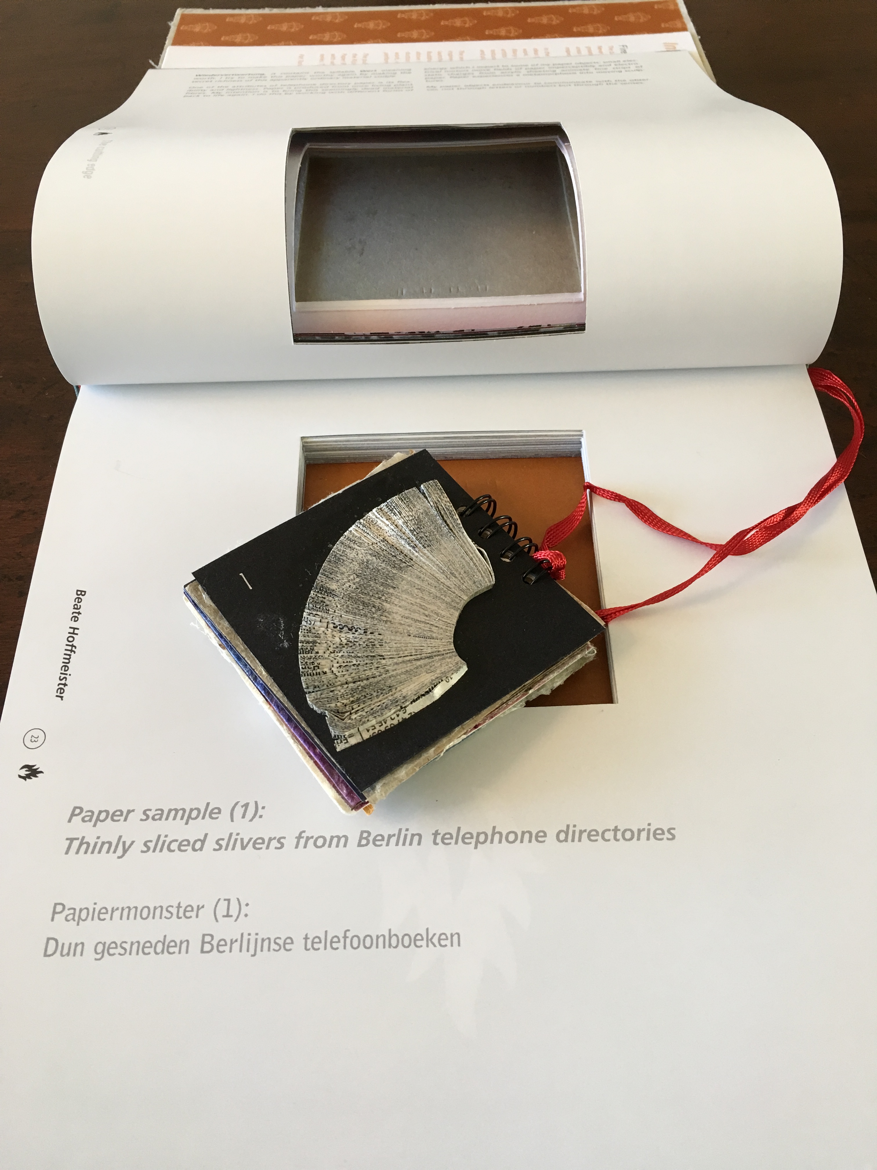
With this second Biënnale publication, the designer exercised more typographical restraint than in the first, but did not hold back on structure, layout, techniques and materials. Originally, Schepens had wanted to scorch or burn the flame into the cover, but “settled” for blind stamping. The cover design itself signals the book’s alternation between a vertical and horizontal layout, the former for the artists section and the latter for the frontmatter and essays. There is a beribboned book within the book that acts as a bookmark and carries the artists’ paper samples and a sample of Chinese offering or prayer paper, the subject of Teygeler’s essay.
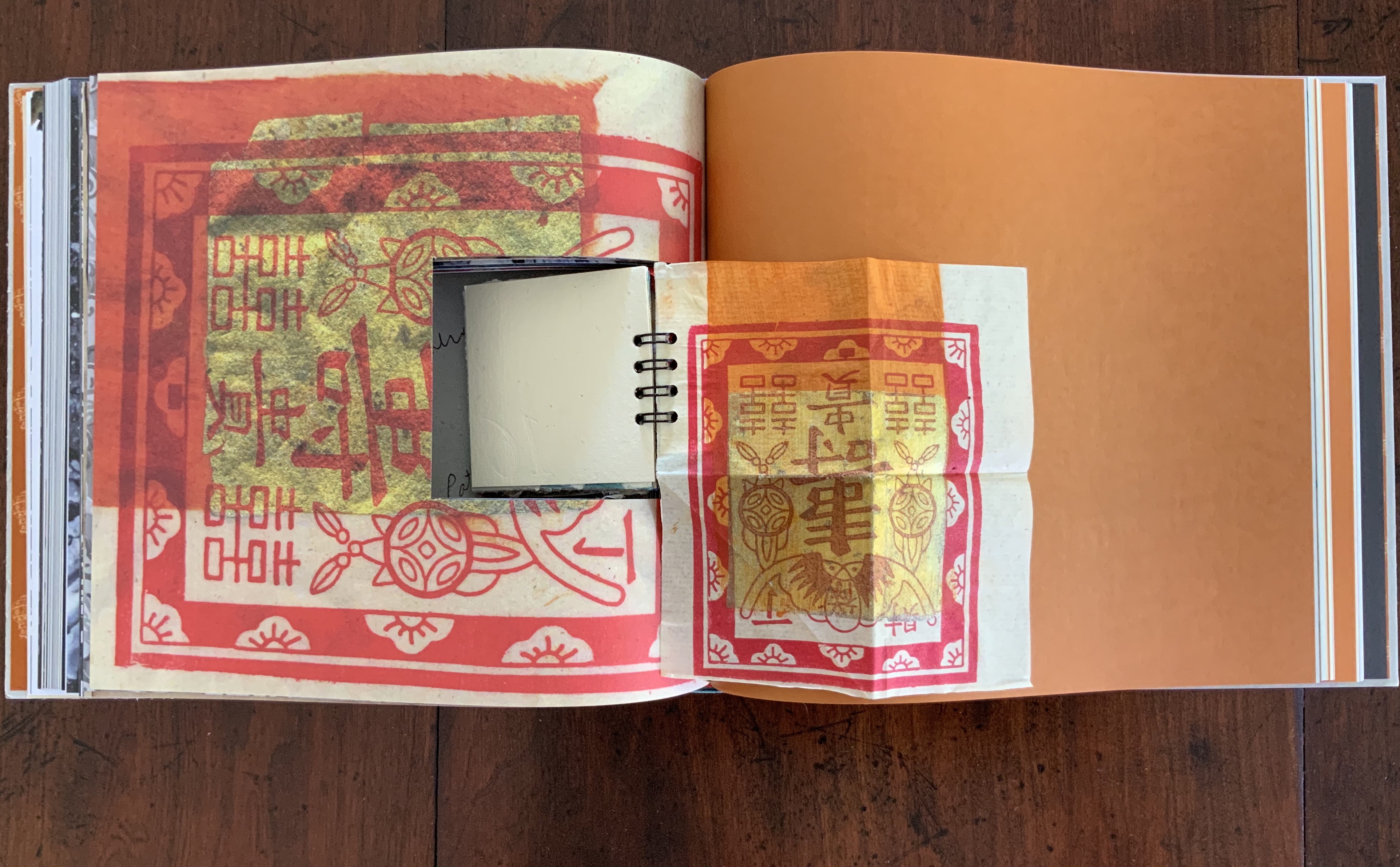
Sample of Chinese offering paper, unfolded from the “book within the book”
René Teygeler, “Chinese offer Papier — vuur, papier, goden, geesten en voorouders / Chinese offering paper — fire, paper, gods, spirits and ancestors”, pp. 224-48.
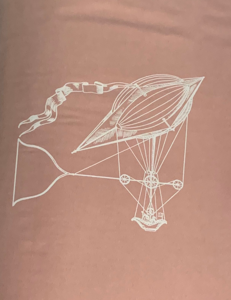
These are not all of the aspects of a designer at play. There are more to note, but pause here to consider how design integrates the work. The flame that is blind stamped into the cover appears in the reveal in the die-cut hollow and also as an ornament in the running heads. The colour scheme of the end papers, ornament and artists section — umber, black and white — carries through to the essays section (see below). But what about that pattern of hot-air balloons on the end papers? It’s there to “rhyme” with Peter Gentenaar’s essay on hot-air balloons, which the Montgolfier brothers made of paper and silk in 1783.
The functional purposes behind the design choices are also worth pausing over. The papiermonsters book-within-a book, attached by a silk bookmarking ribbon, enables the reader to put each artist’s paper sample alongside the photo of the artwork submitted.
The horizontal layout used for the essayist; the vertical, for the artist. The flame emblem revealed behind the mini-sampler; and used in the running head.
The artists section of the book is printed on uncoated Lumiset 120 gsm and coated Magnomatt Satin 155 gsm. For the tactilely sensitive reader, the difference invites a reading that slows down for the look and feel. Even for a less sensitive reader, the portrait view and hollowed space for the Wire-O bound paper sampler slow the experience down to one of “looking and handling” as well as reading.
Where the miniature book in Paper and Fire solves Tactile Paper’s problem of seepage from glued-in samples, its hollowed space introduces a propensity for tears at the interior corners. The sampler also demands a hollow of depth that the designer could not easily calculate in advance. Sure enough, the sampler was too thick, the artists’ section too short, and the text paper too thin to allow the book to close. As often in book art, accident and design were father and mother to inspiration. The choice of cover board from Smurfit De Halm Karton, in Groningen, allowed for a humorous and neatly effective solution.
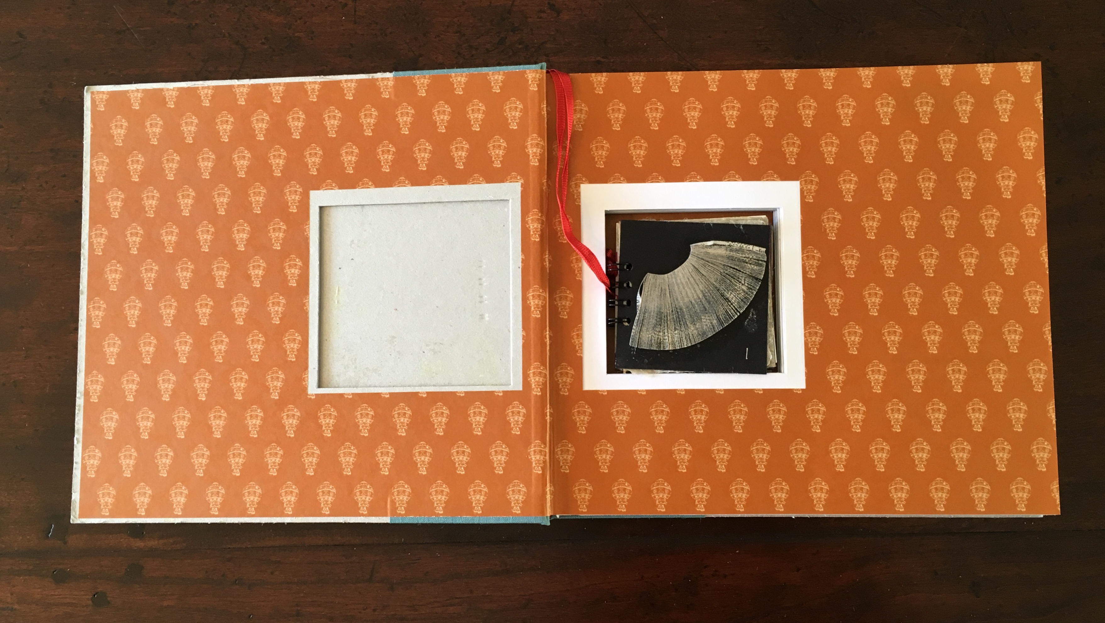
The inside of the front cover hollowed out to accommodate the mini-sampler.
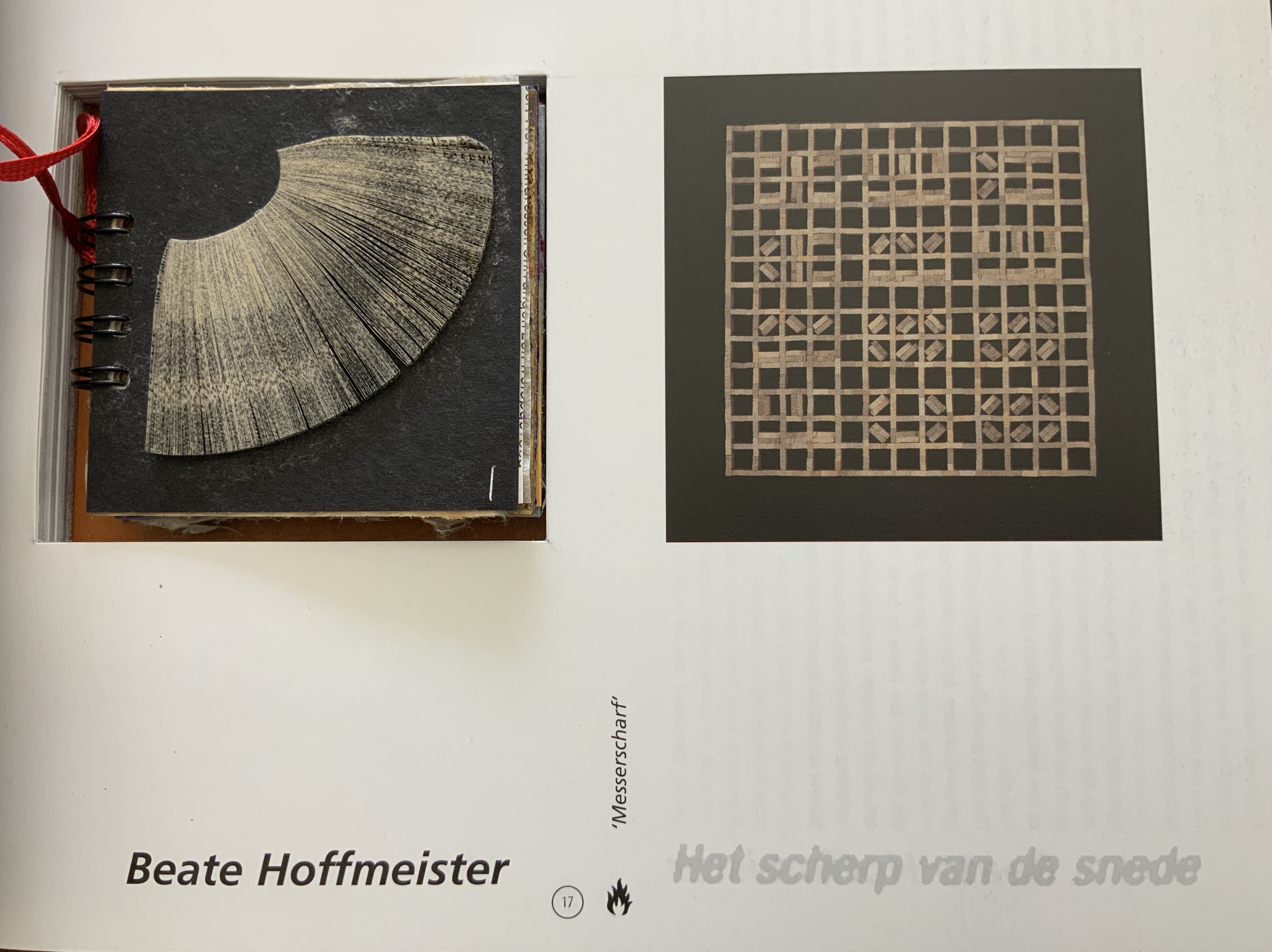
“Razor-sharp”, Beate Hoffmeister
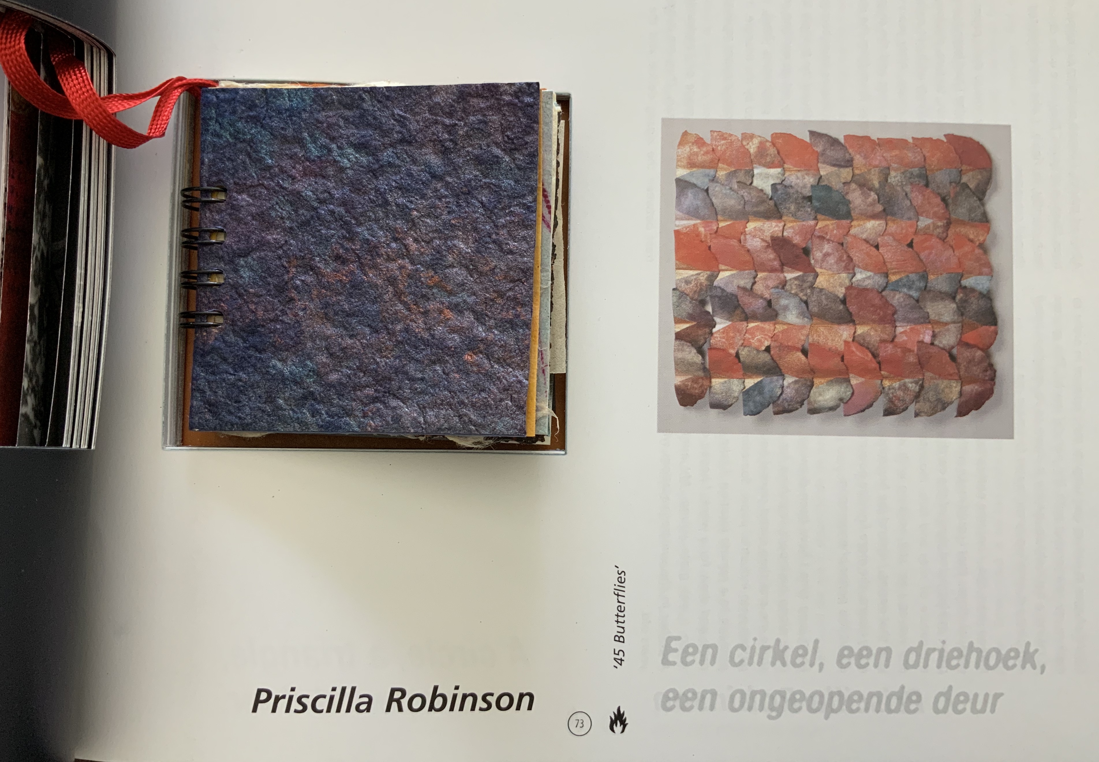
“45 Butterflies”, Priscilla Robinson

The two photos above show how the design of the artists section strives to give the reader as juxtaposed a view of the artwork and paper sample as Tactile Paper gave but also offer improved photographic resolution. Partly for that end, Schepens also introduced full bleeds; full bleeds appear decoratively as well as illustratively in the essays section.
Sixteen artists participated in this second Biënnale. Although Paper and Fire is primarily sculptural, it includes — unlike Tactile Paper — some book art. Even so, the sculptural rather than textual aspects prevail. Eeva-Liisa Isomaa’s History Book stands large and upright on its cover, inviting the reader/viewer to step inside; Mary-Lise Beausire’s ivory white Livre Naissant curls and folds like the iris paper of which it is made; and Kain Karawahn’s performance Transmedia ‘97 is represented by its pre-bonfire pyramid of discarded books.
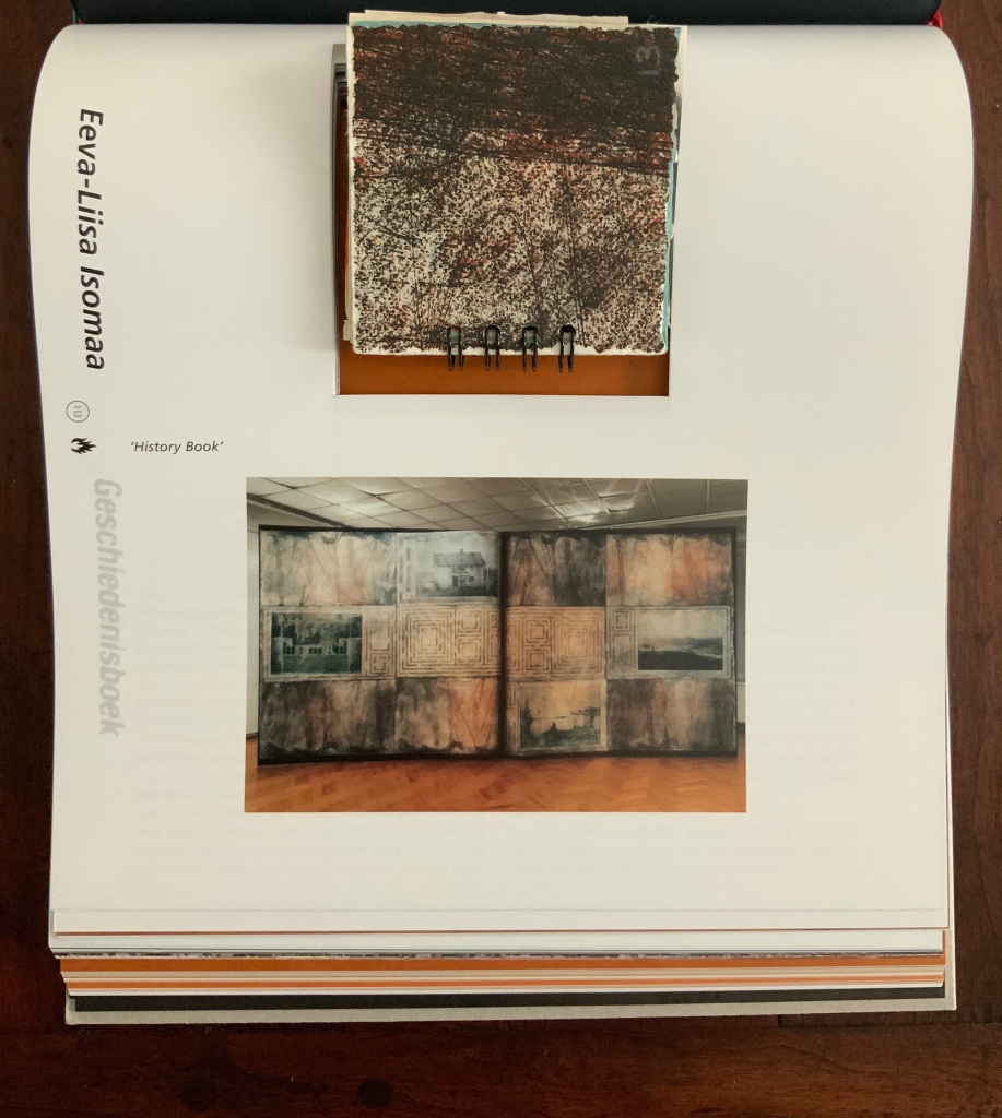
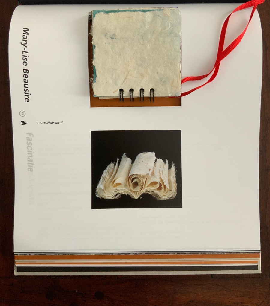

From left to right: History Book, Eeva-Liisa Isomaa; Livre Naissant, Mary-Lise Beausire; and Transmedia ‘97, Kain Karawahn

“Paper clouds – the paper hot-air balloons”, Peter Gentenaar with Elaine Koretsky and Brian Queen
As mentioned, the essays section pivots from a vertical to horizontal orientation, naturally easier for continuous reading. Still, even though the paper selected for the essays section “settles down” to one type of paper — Gmund Stone 100 gsm — the reader’s fingers are treated to five different finishes between pages 161 and 248. Although some of the essays are rather brief and light, those by Albert Tempelmann, Henk Porck, Peter Gentenaar and René Teygeler provide long enough and weighty enough contributions to the incipient tradition of providing the historical and geographical context as well as a balance of science, technology and art.
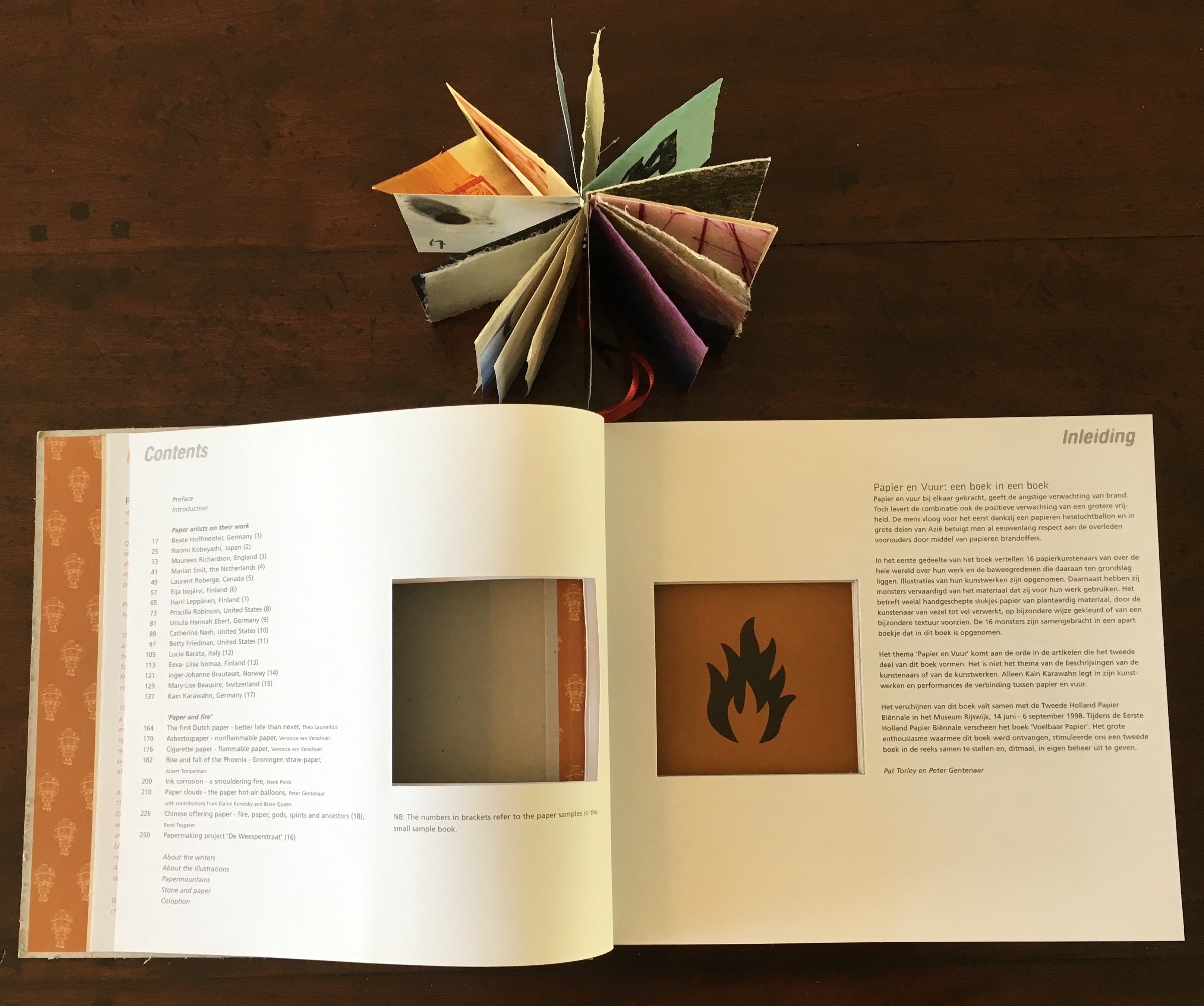
Contents page, Paper and Fire
Continuity of essayists does create a sense of unity across the series. What is striking is how those essays’ concerns recur in future real-life as well as future volumes. Porck’s treatment of the slow combustion of paper arising from iron-gall ink corrosion highlights a problem for the conservation of historic and artistic works still being addressed in 2019. Teygeler’s sensitive and thorough treatment of Chinese offering paper foreshadows his 2004 contribution on Aztec and Mayan paper; that contribution’s depiction of cultural loss in turn foreshadows his 2006 paper on lessons learned from his assignment as senior cultural advisor to the Iraq Ministry of Culture (July 2004 to March 2005).
In its balancing the experiences of looking, handling and reading, Paper and Fire advances beyond book arts toward book art. No surprise then that it won a European Design Award in London in 1999.
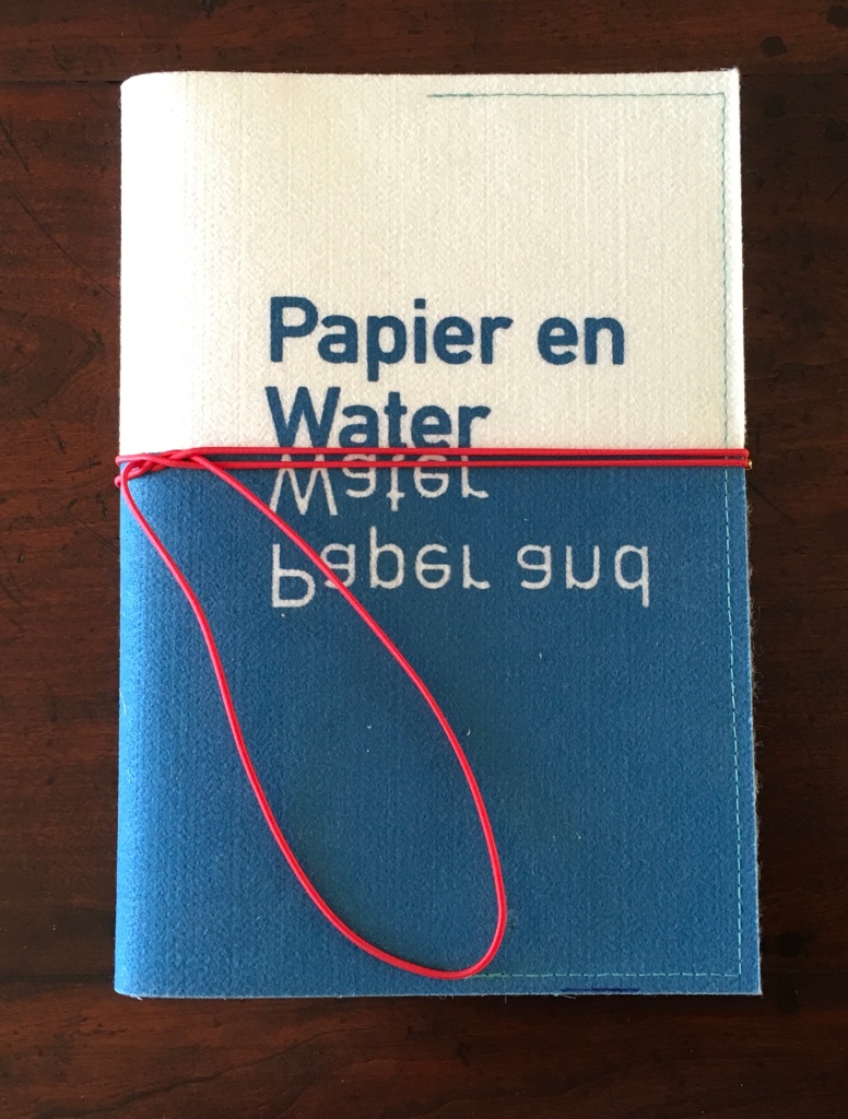
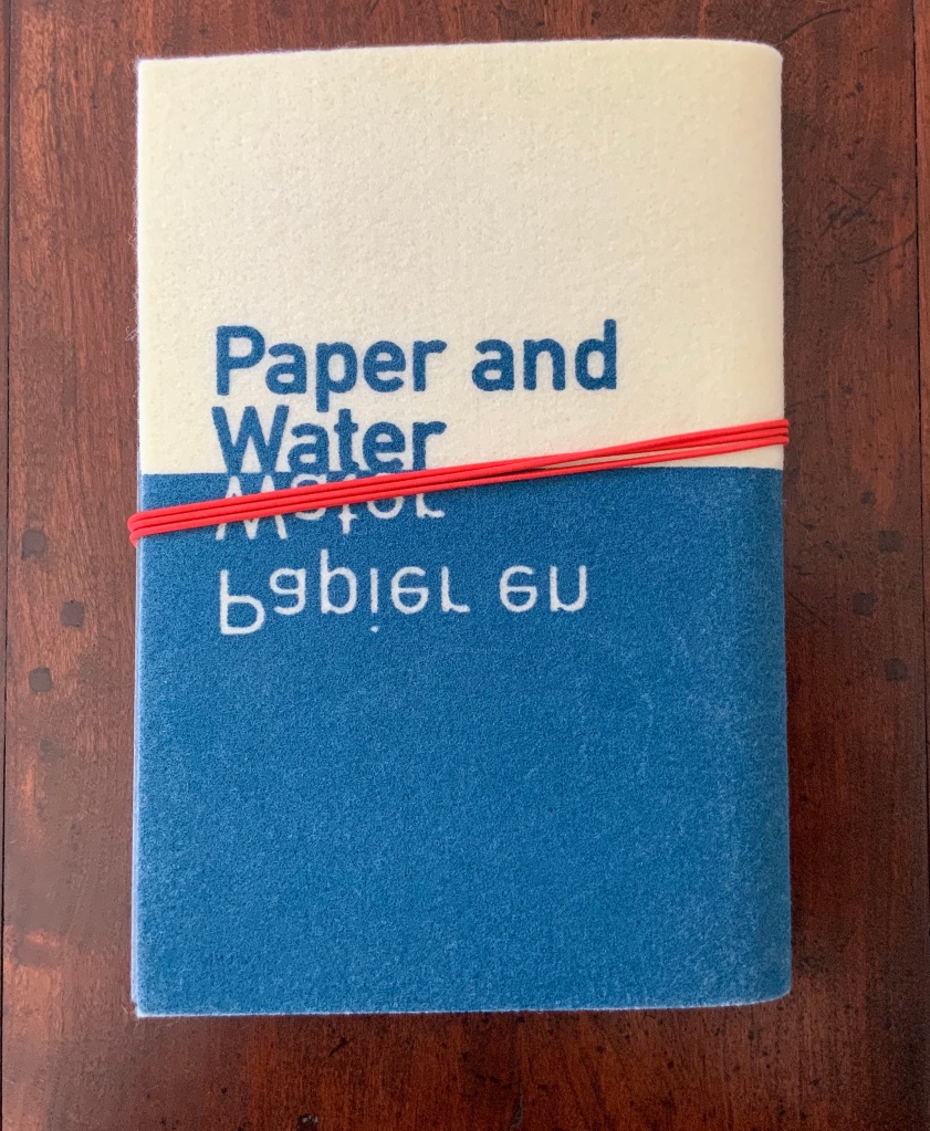
Papier en water = Paper and water (2000)
The Artists: Luis Acosta, Davy Akkerman, Nynke van Amersfoort, Vibeke Bak Hansen, Colette Bloos, Susan Cutts, Ingeborg van Damme, Jaime van Eijkelenborg, Hanneke Fit, Odon (Guy Houdouin), Jeanne Jaffe, Kirsi Kaulanen, Han Klinkhamer, Nel Linssen, Ruth Moro, Angela O’Kelly, Jytte Rasmussen, Kai Rentola, Pien Siegert, Andrea Wagner, Therese Weber, Gerda Weijerman (Edens), Kumoi Yojima, Katrin Zutter
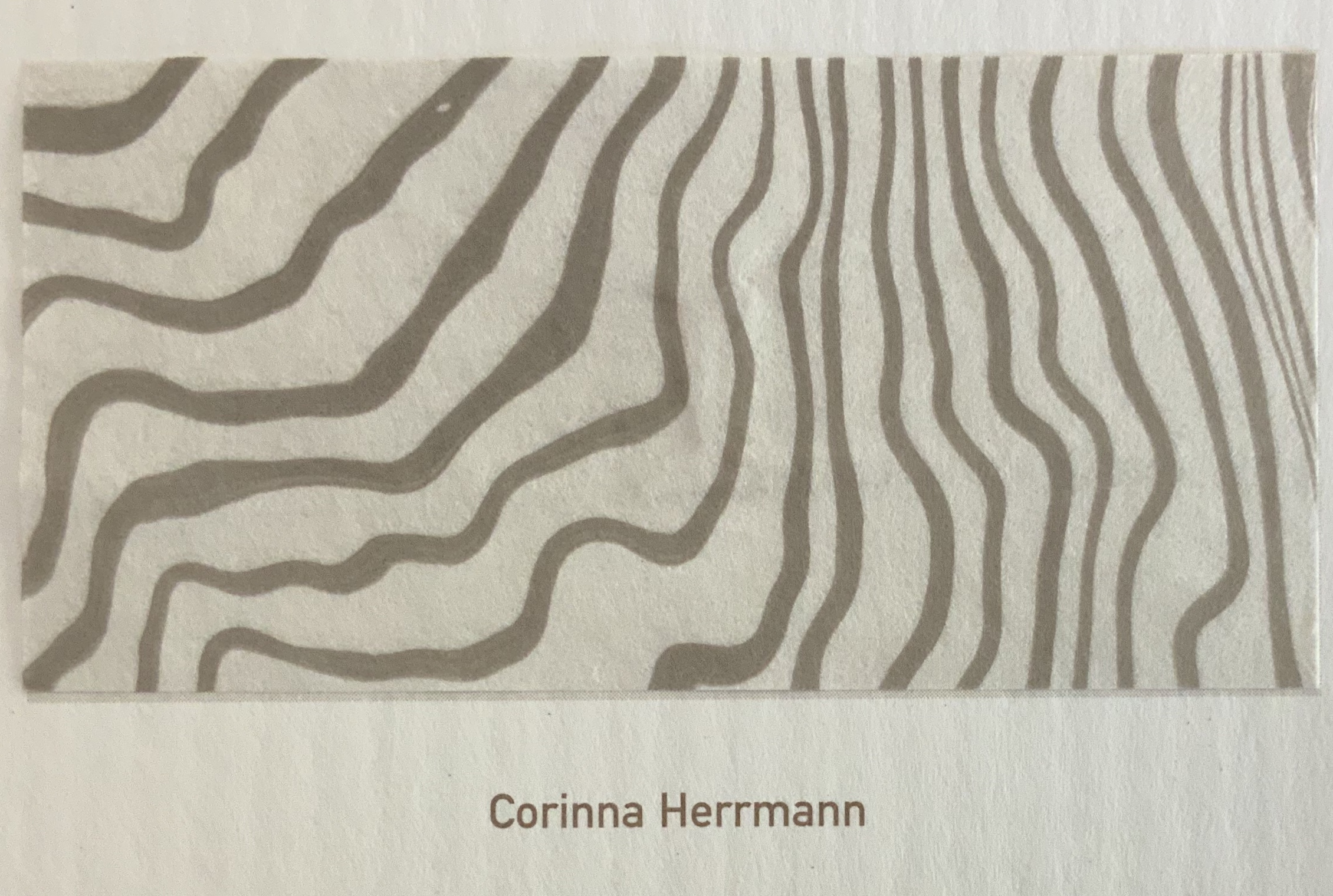
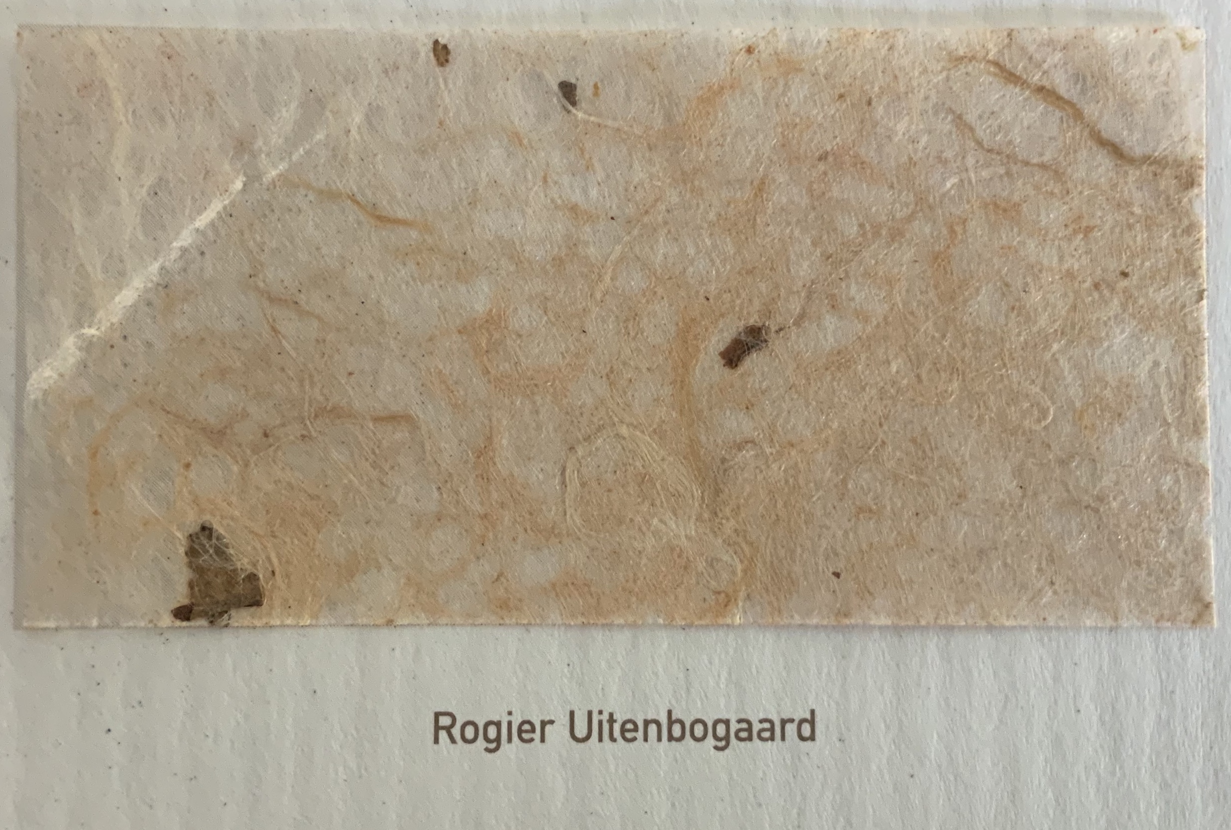
The Essayists: Henk Voorn, Theo Laurentius, Peter Koeze, Corinna Herrmann (no link found), Rogier Uitenbogaart, René Teygeler
In several respects, Paper and Water is a simple thematic progression on its predecessor. From combustibility and incombustibility, ink gall corrosion, paper hot-air balloons and Chinese offering papers, what is logically next if not the pulp-beating hollander machine, water-driven paper mills, watermarks, suminagashi (Japanese marbling), sukimoyo (Japanese waterdrop paper) and water-hyacinth paper? In material and design, though, there is little that is simple about the third Biënnale’s publication.

Loes Schepens shows the dummy for the cover to Paper and Water. (Photo: Books On Books)
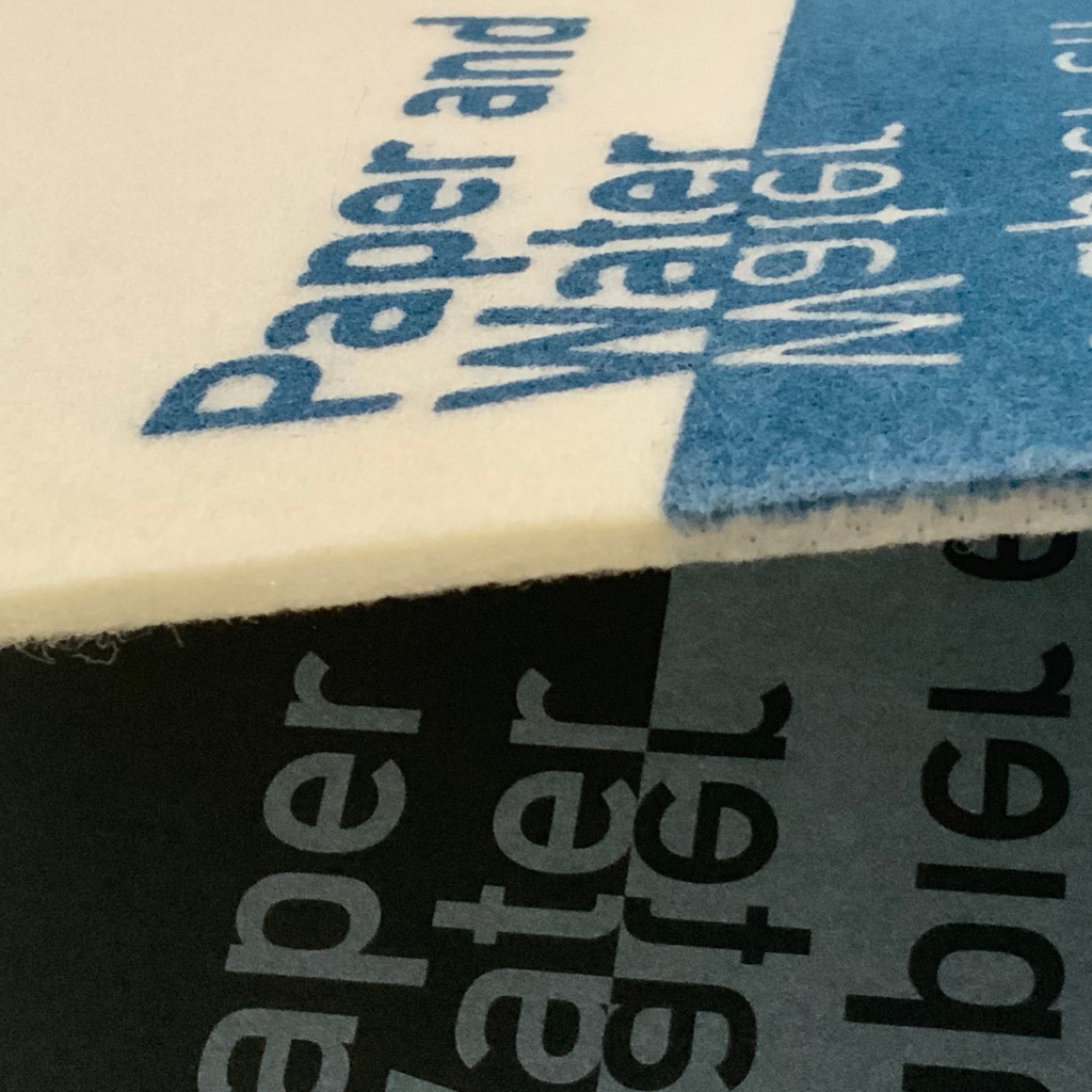
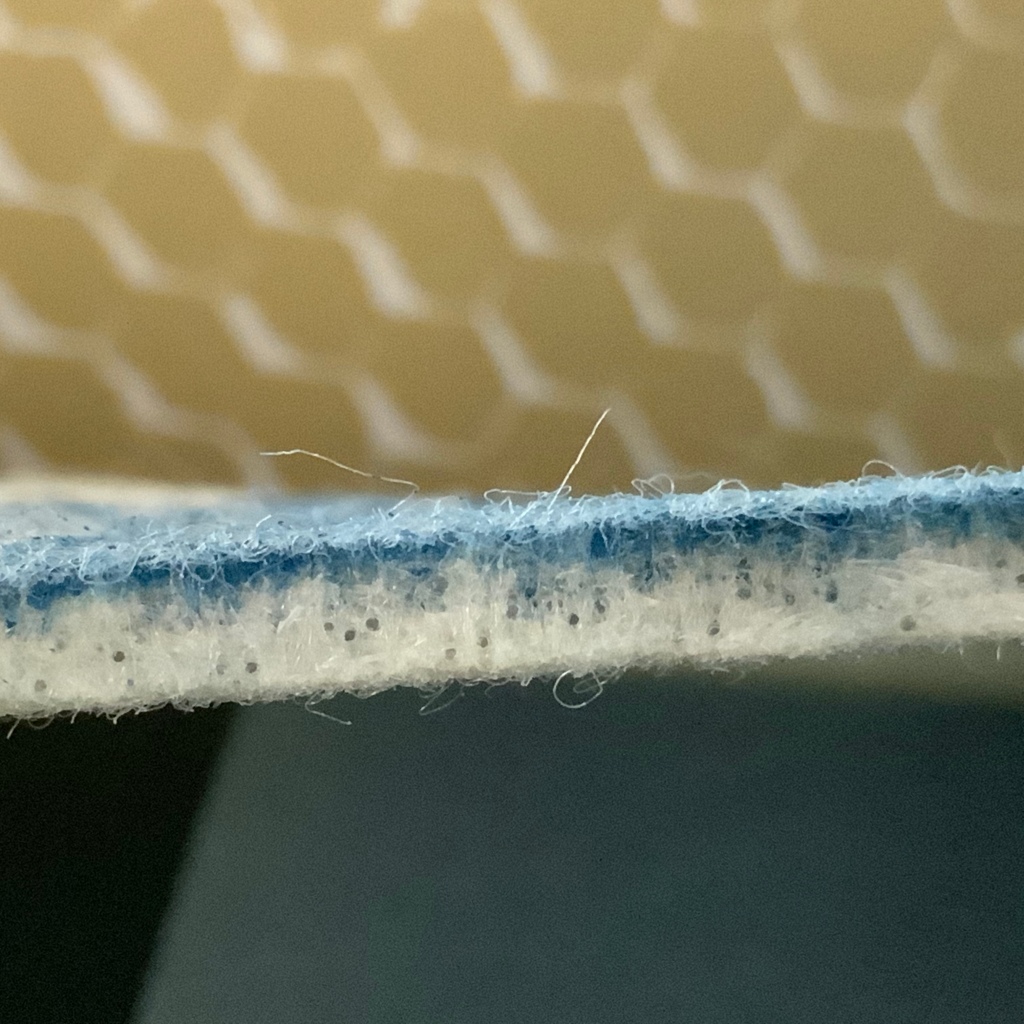
Start with the cover held closed by a bright red elastic string: the cover material is synthetic felt. Peter Gentenaar had obtained discarded rolls of this material that carries wet paper through a continuous papermaking machine’s Volter section where vibrations entangle the fibres and water drains away. It is a testament to Gentenaar’s persuasiveness that, upon finding the density of the discards inadequate for the intended silkscreening of the cover, he went back to the supplier and came away with a denser quality. Looking edge on, one can see the ink’s sharpness and absorption.
As if this wedding of design to theme were not close enough, Gentenaar-Torley and Schepens ordered specially manufactured paper for the body of the text, Desiderius ivory watermark-quality 100 gsm with a “paper mermaid” watermark designed by Schepens (see below). To separate the sections and essays, the team used reproductions of marbled paper originally designed by Karli Frigge, Dieuwke Kollewijn and Eva Clifford Kocq van Breugel.

The inside cover, made of Neenah Columns duplex Epic Black/Safari 324 gsm, has a flap to hold a folder (Neenah Columns Indigo/Recycled Bright White card) displaying the book’s fifteen paper samples. The choice of papers and the design moderate the glue seepage, enable the reader to place the samples next to the pictures of the artwork, provide better print resolution, and help secure the sewn attachment of the felt cover onto the inside cover. As ingenious as a papermaking machine.
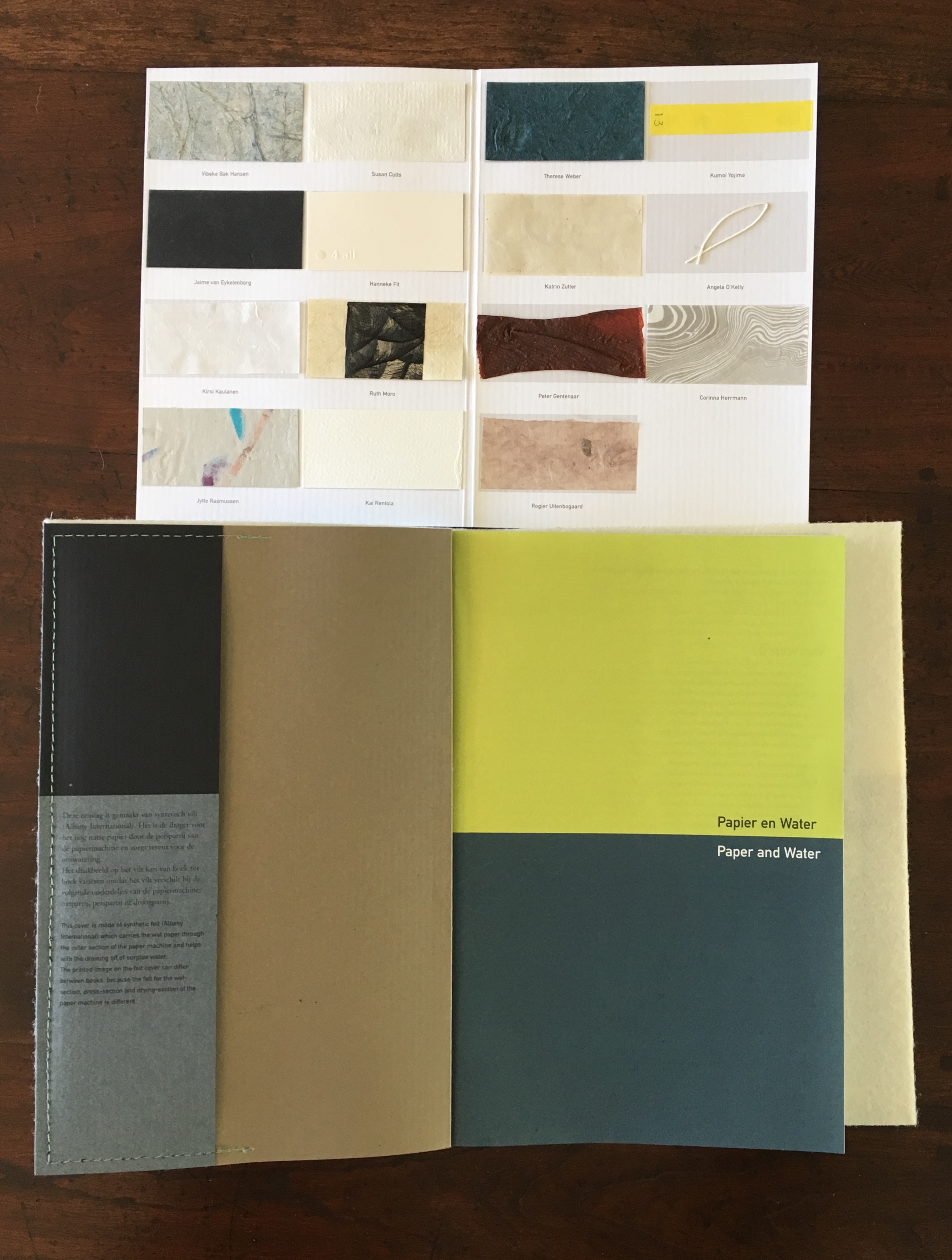
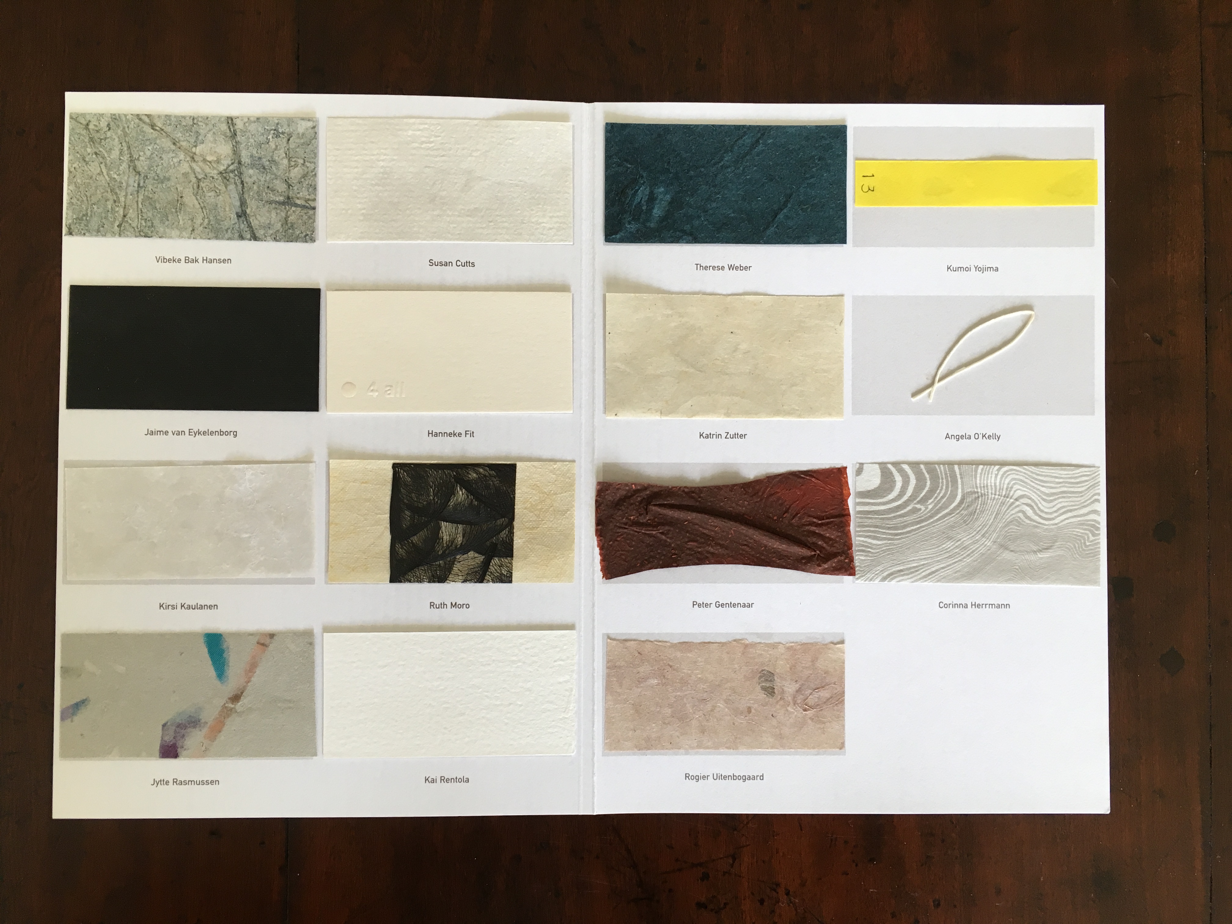
The folder of paper samples removed from its flap and opened.
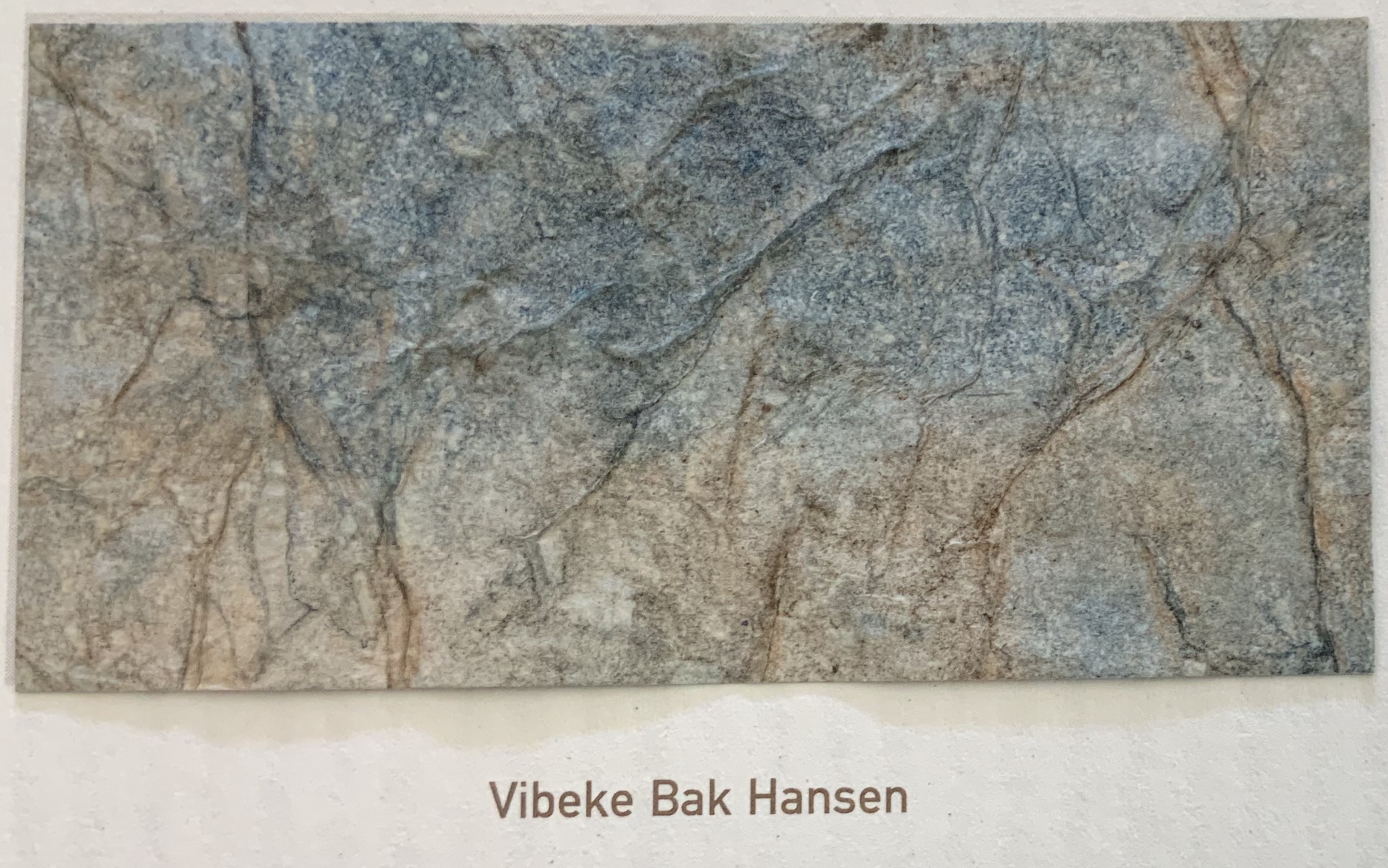
Evolution, Vibeke Bak Hansen

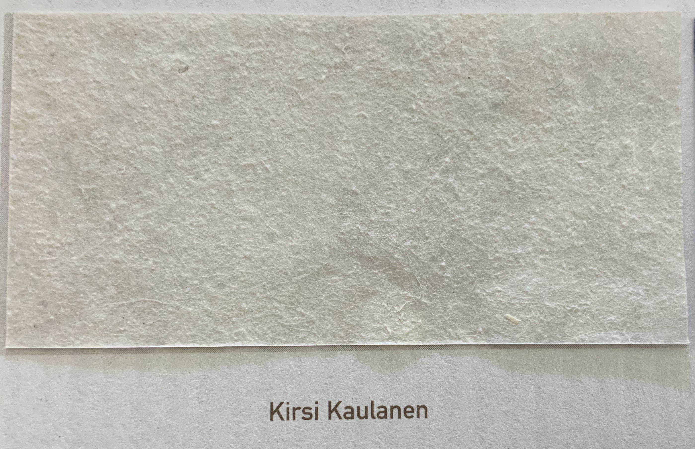
Midnight Summer Dance, Kirsi Kaulanen

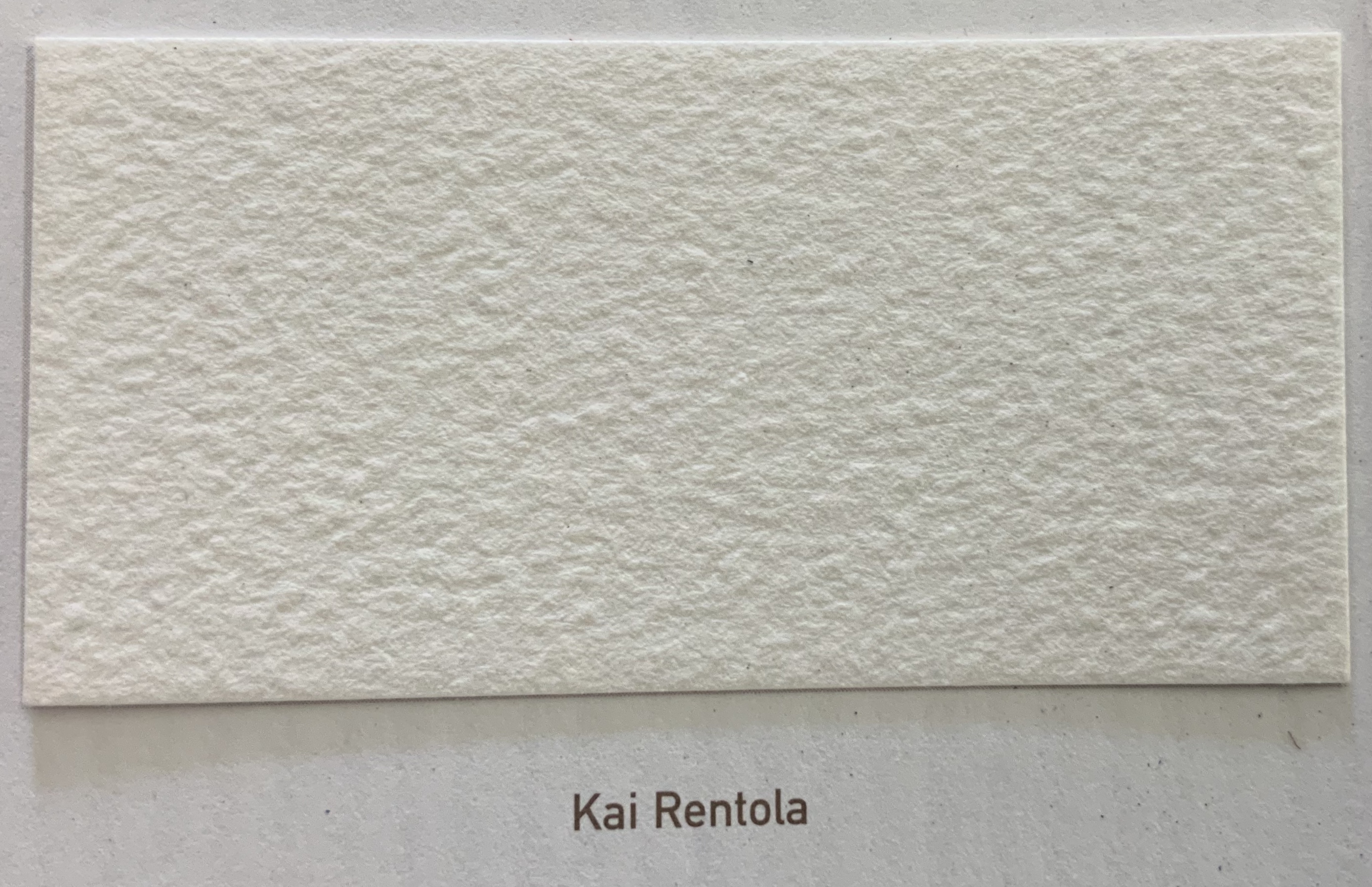
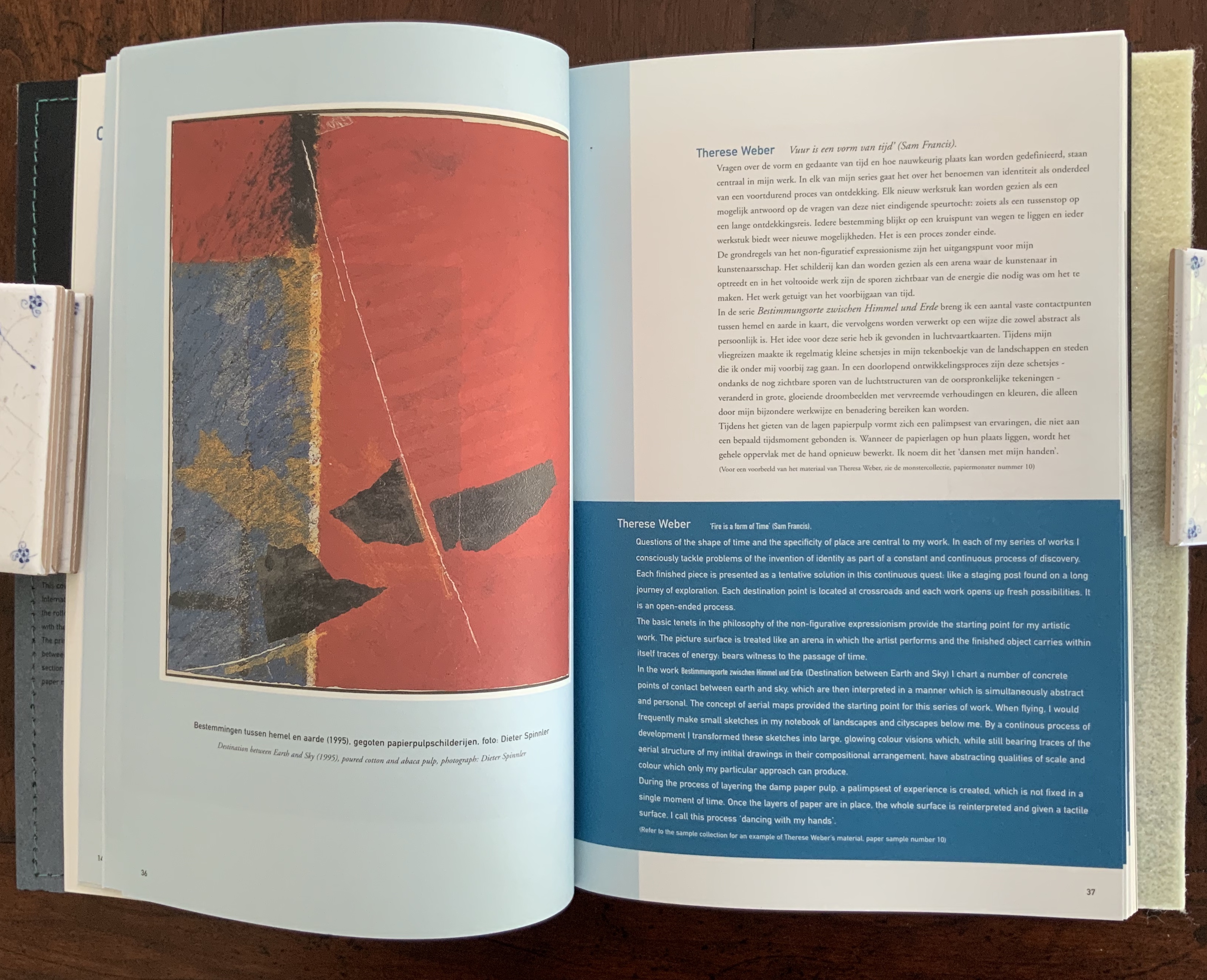
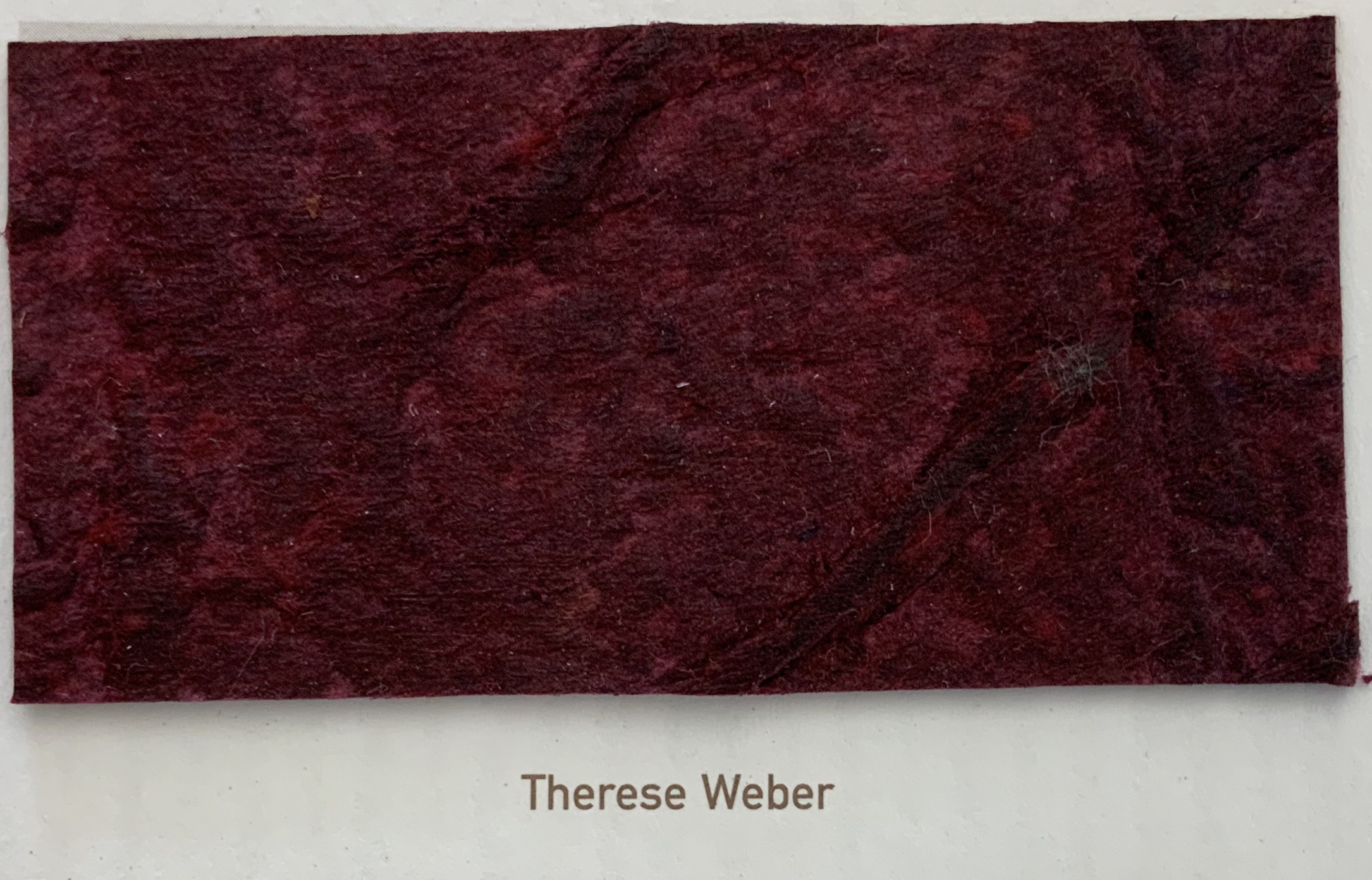
Destination between Earth and Sky, Therese Weber
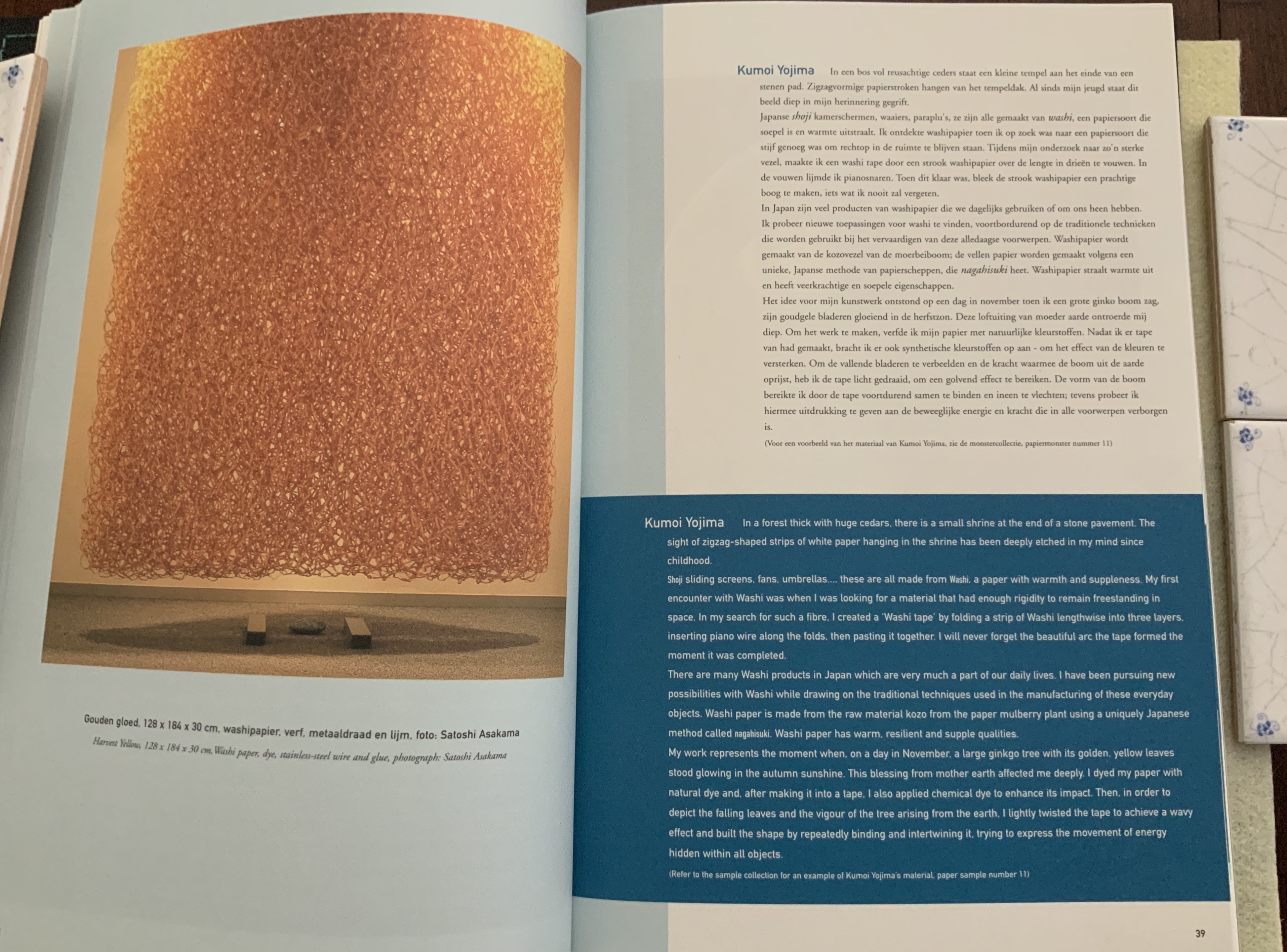
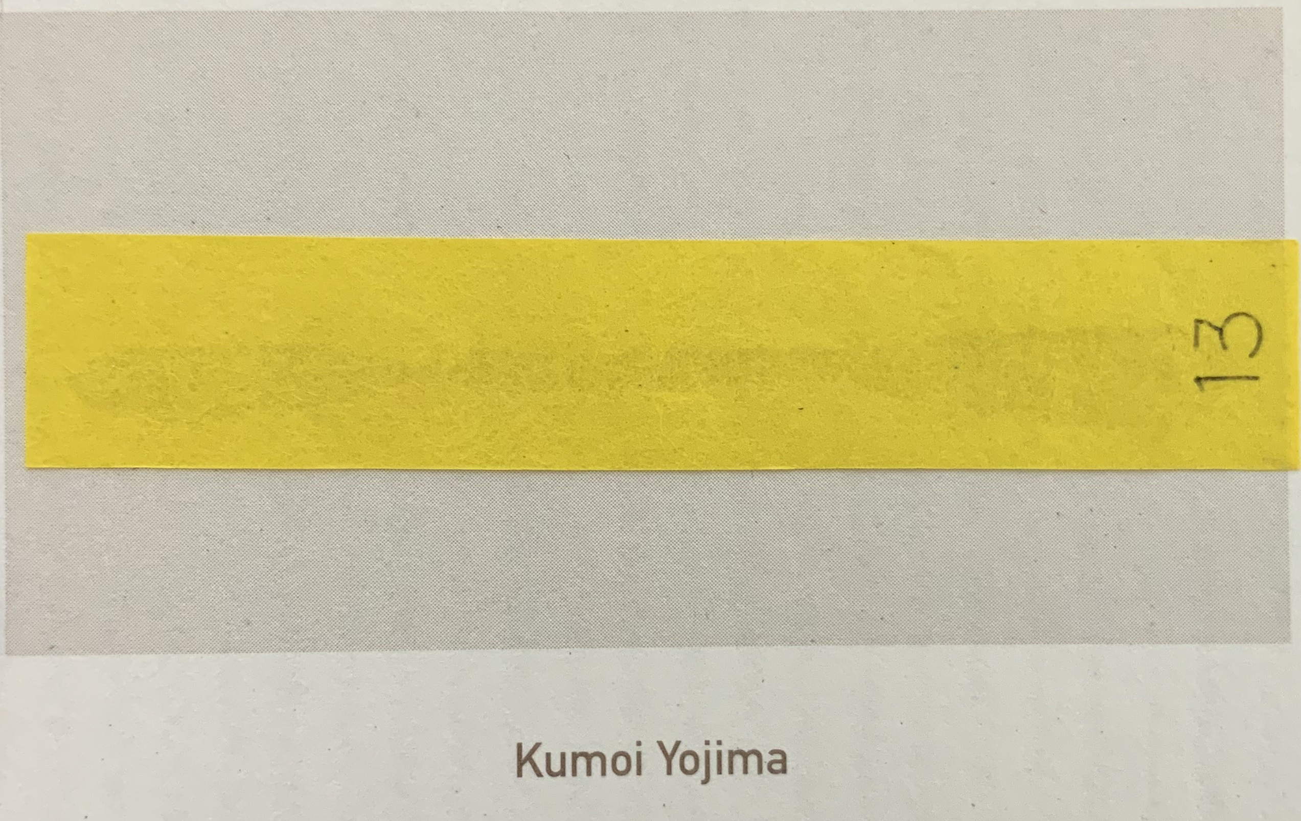
Harvest Yellow, Kumoi Yojima
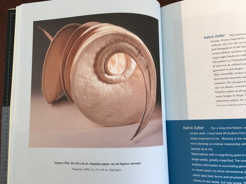

Tranquillity, Katrin Zutter
In a minor way, the artwork in Paper and Water takes a departure from that in its predecessors. From the sixteen artists represented, there is no book art. Instead, for this Biënnale, eight designers of paper jewellery were invited to make submissions. The latter slightly undermines the unity of the volume and series. Whereas almost all of the paper artists have paper samples included, only one jewellery designer’s paper sample is appears. The water-themed essays section offers nothing related to paper jewellery, which reappears but rarely in the four volumes to come.
As in Paper and Fire, the essays section follows the artists section, and in a reprise of providing a paper sample related to the Teygeler essay, Paper and Water includes samples related to the essays by Gentenaar, Herrmann and Uitenbogaart.


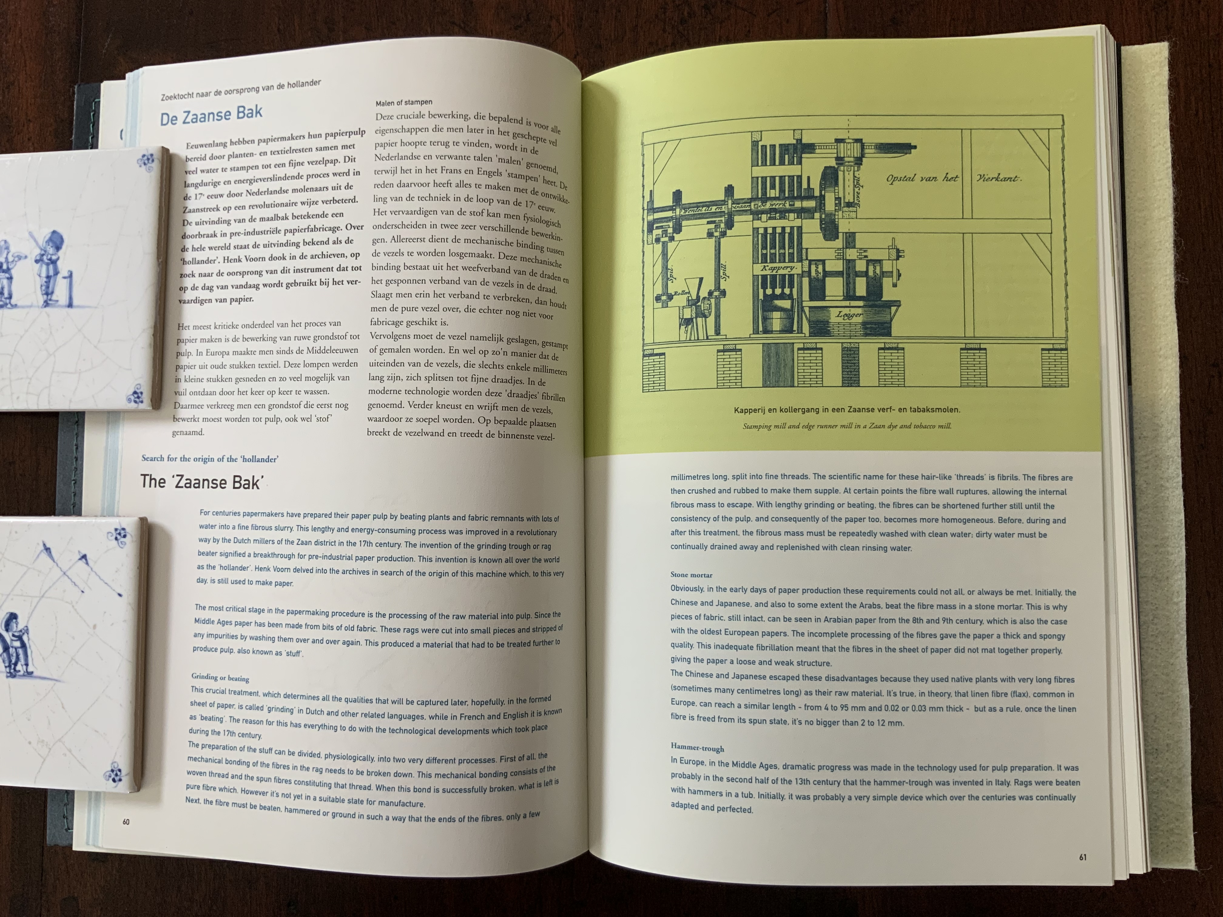
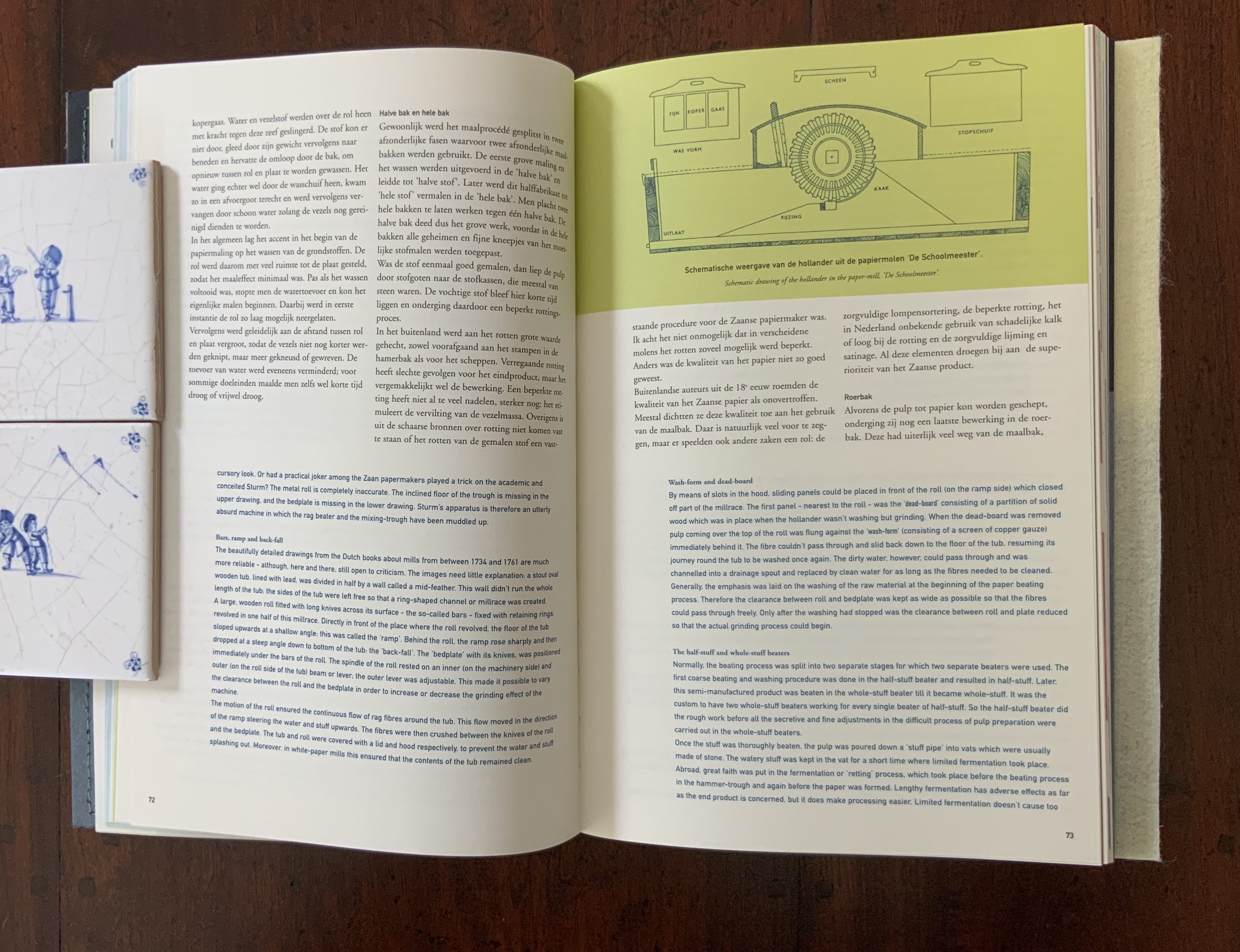
Double-page spreads from Henk Voorn’s “The ‘Zaanse Bak’: search for the origin of the’hollander’”, pp. 60-78.
The eight essays echo the ingenious unity of design that Schepens and the editors achieved with their choice of materials for the cover and text, the silkscreening, the original watermark and inclusion of reproductions of renowned paper marblers. With delightful investigative skills, Henk Voorn (founder of the Historical Paper Collection of the Dutch National Library) makes the case for the Zaan district’s invention of the hollander (an alternative to the hammer-trough for beating raw material to pulp). With an equal passion for paper, the Gentenaar-Torleys follow Voorn with an extended essay on the practical and artistic aspects of working with Gentenaar’s improved hollander (the “Peter Beater”) to support creating pulp paintings and paper sculptures. Voorn returns with the legal and environmental side of papermaking in 17th century Gelderland. Theo Laurentius also returns from the first two Biënnale publications to reprise the dating techniques that rely on watermarks and chain-lines. After Peter Koeze’s original and exclusive stock-taking on the Dutch Bank’s watermarks from 1814 to 2002, the book turns to Herrmann, Uitenbogaart and Teygeler for treatments of suminagashi, sukimoyo and water-hyacinth paper, respectively.
When the “paper mermaid” appears on the last page, the reader/viewer will have enjoyed the best so far of the Biënnale publications and appreciate why Paper and Water won an award for Best Dutch Book Design in 2001 and why the Stedelijk Museum in Amsterdam placed it on exhibition.
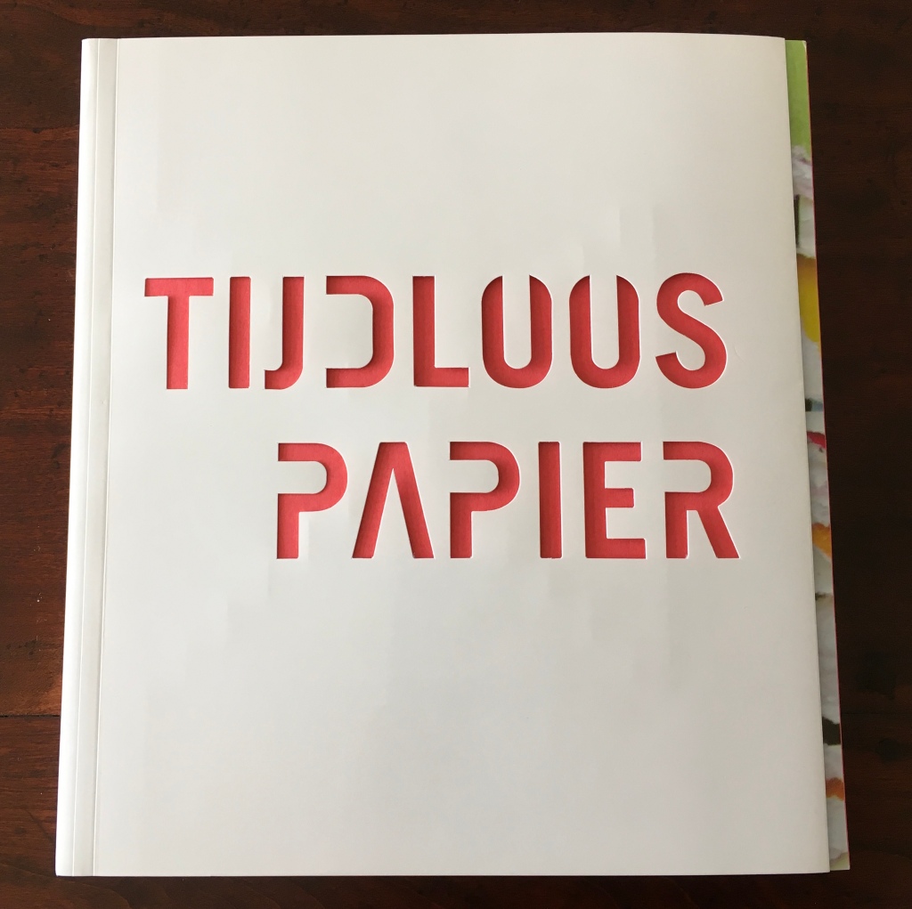
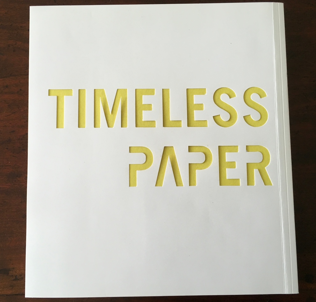
Tijdloos papier = Timeless paper (2002)
The Artists: Paulo Taborda Barreto, Mariëlle van den Bergh, Maggie Bunzl, Vito Capone, Dan Geesin and Barend van Hoek, Graham Hay, Paul Jackson, Paul Johnson, Misch Kohn, Zanghong Liao, Karin Muhlert, Berdien Nieuwenhuizen, Dianne L. Reeves, Vivian Rozenbeek, Mathijs Stegink, Yuko Takeda Keller, Raymond Tomasso
The Essayists: Gangolf Ulbricht, John Risseuw, Gene Valentine, Charles J. Kazilek, Fabrizio A. Pennachietti, Maureen Richardson, Brian Richardson, René Teygeler, Henk Voorn, Heidi Rombouts, Henk Porck, Walter Ruprecht, Peter Gentenaar
“Paper is not timeless”, writes the president of the International Association of Paper Historians in the preface to this fourth Biënnale publication. Weighing the paper art, book art, design and content in Timeless Paper, one suspects the book’s editors and designer of muttering back, “Yeah, but ‘Ars longa, vita brevis’, vriend”. As if they recognised the slight distraction of jewellery design in Paper and Water, the team not only limited their selection to paper artists and book artists but included artists among the essayists in Timeless Paper. The maker’s hands and mind — interacting with paper through shaping it, applying colours with ink or paint or pulp itself, embedding text and images as well as printing them on the surface — create “meaningful intersections of content and material” (John Risseeuw, p. 79) and so defy if not defeat time.
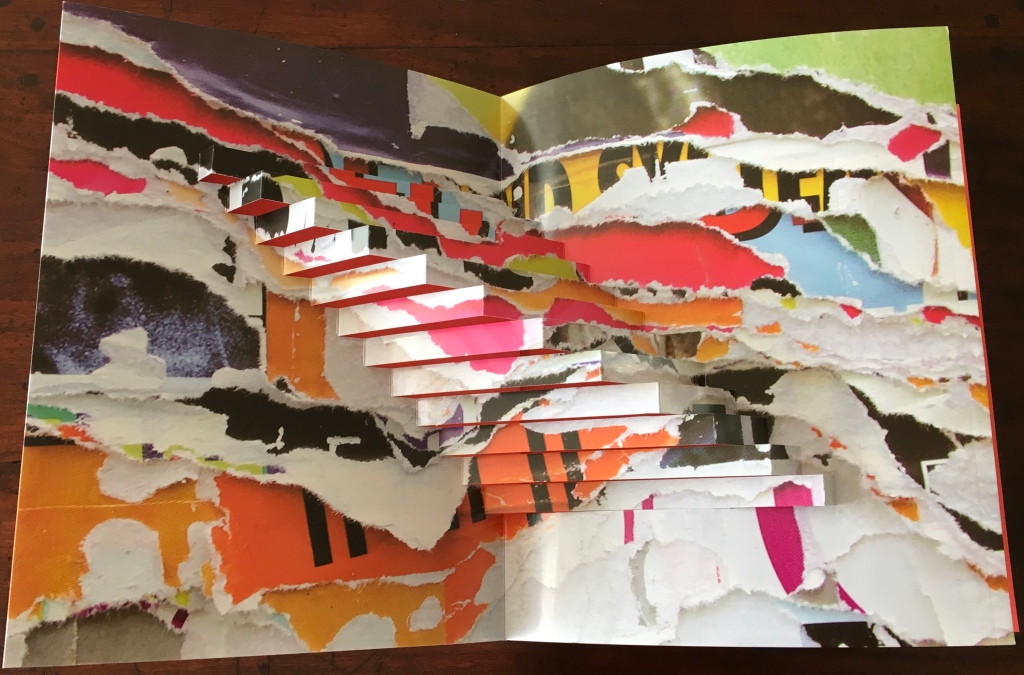
Again, a unifying book design rises to the occasion and theme. At least eight types of paper are used — some more effectively than others. For example, the Venicelux 215 gsm, used for the title-incised cover, serves also for the pop-up abstract shape that folds behind it and is designed to fit around the Colorado 170 gsm end paper, making the stencil-cut Dutch title pop in Turkish red. The same end paper but in sulphur yellow makes the stencil-cut English title echo that same colour in the pop-up. Tying design together with the contributions from the artists and essayists, Timeless Paper’s pop-up foreshadows the artwork of Paul Johnson and the essay by Heidi Rombouts on movable books.
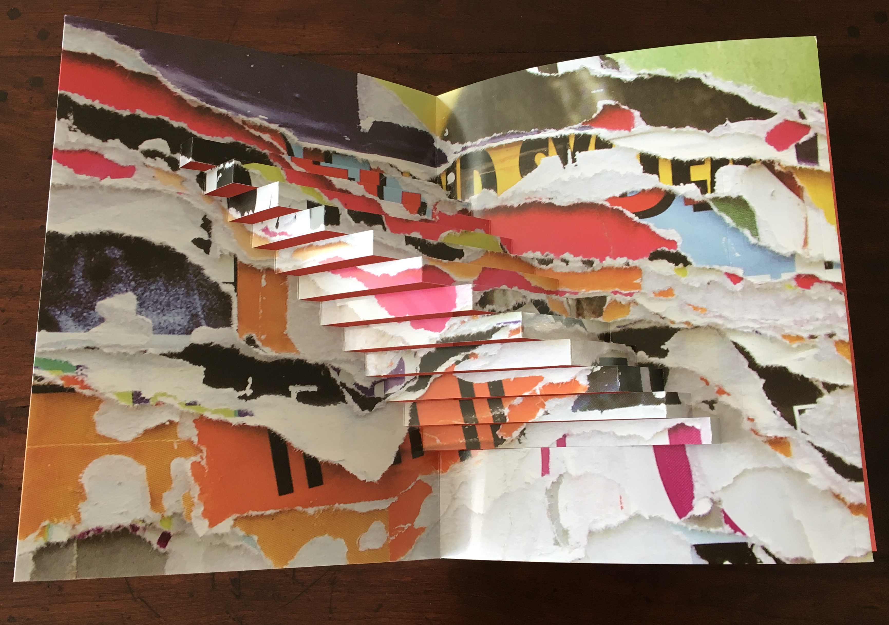
Abstract pop-up inside the front cover.
With a further nod toward meshing the artists’ text and images with the design of Timeless Paper, Schepens pulls quotations from the artists’ statements and runs them across double-page spreads with blow-up details from their artwork. Not entirely a decorative feature, its functionality lies in its recurrence after every fourth (or last) paper sample displayed on the thumb index. Without the slight thickness of the run of those full bleed pages, the thumb index would be difficult to finger and turn. The use of tabs juxtaposes the pictures of the artworks with the paper samples, which helps one imagine, almost feel, the objects. Tactile Paper’s risk of glue seepage from behind the paper samples exists, but so far the materials chosen have not succumbed.
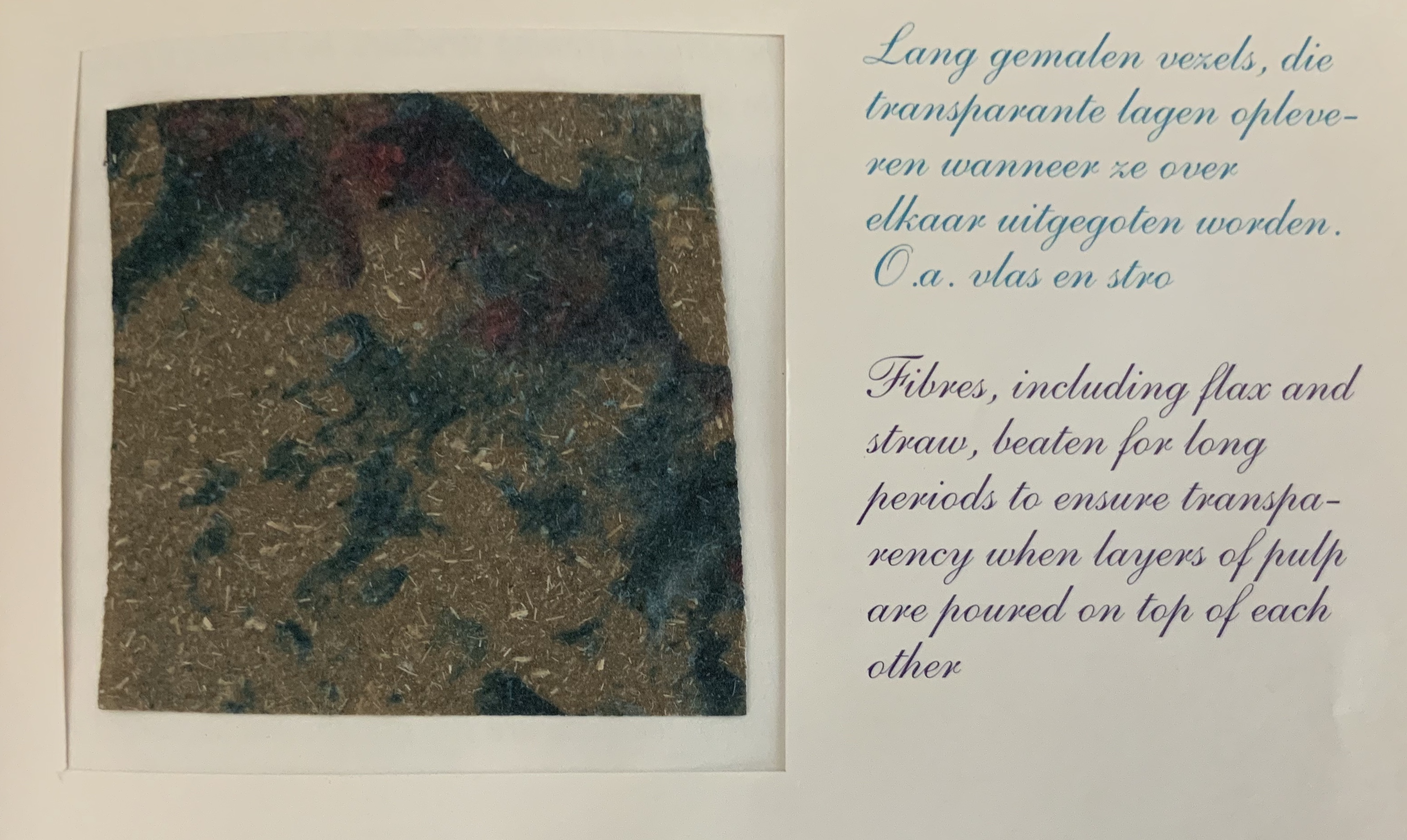
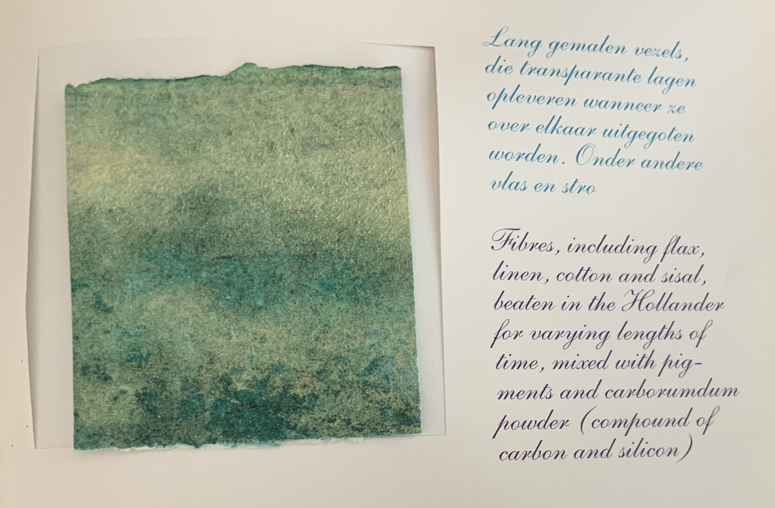
Six different kinds of paper underlie the contents: Vergé Gelatine Créme Cream 120 gsm, Fineblade Heritage 115 gsm, Desiderius Eco 90 gsm, Reviva 100 gsm, Ever Rabat waxed 110 gsm and XDT Platinum 112 gsm. The latter was printed with a white offset ink in an effort to reduce its transparency.
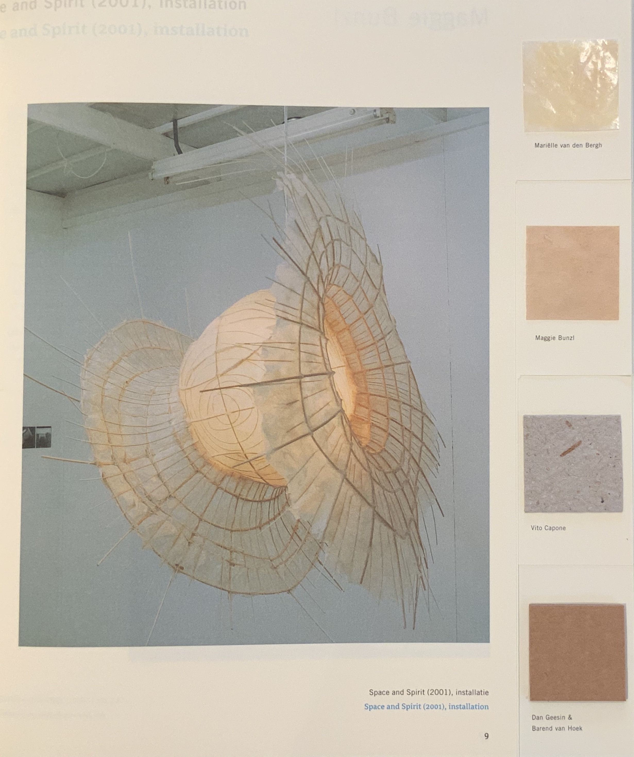
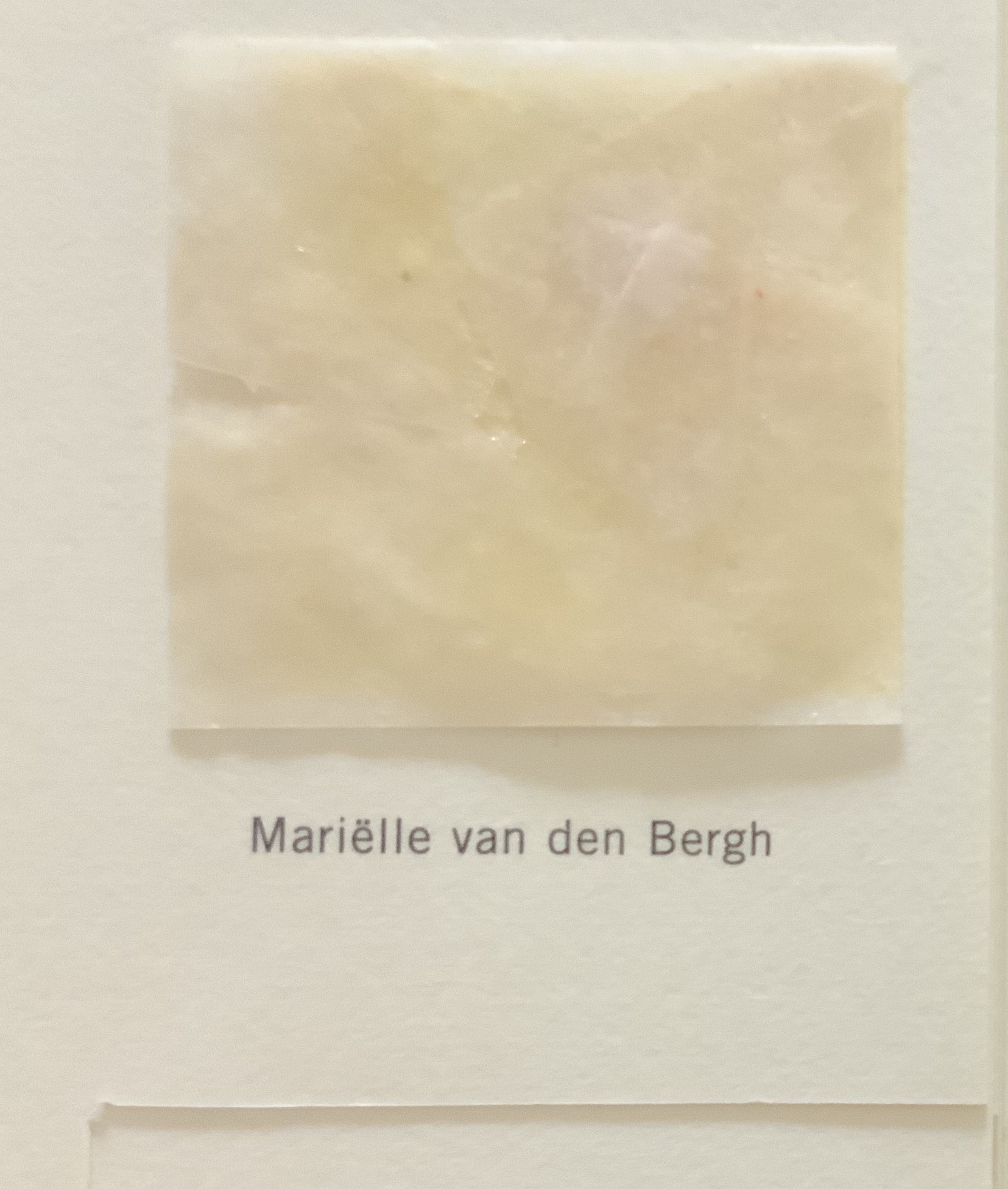
Space and Spirit, Mariëlle van den Bergh

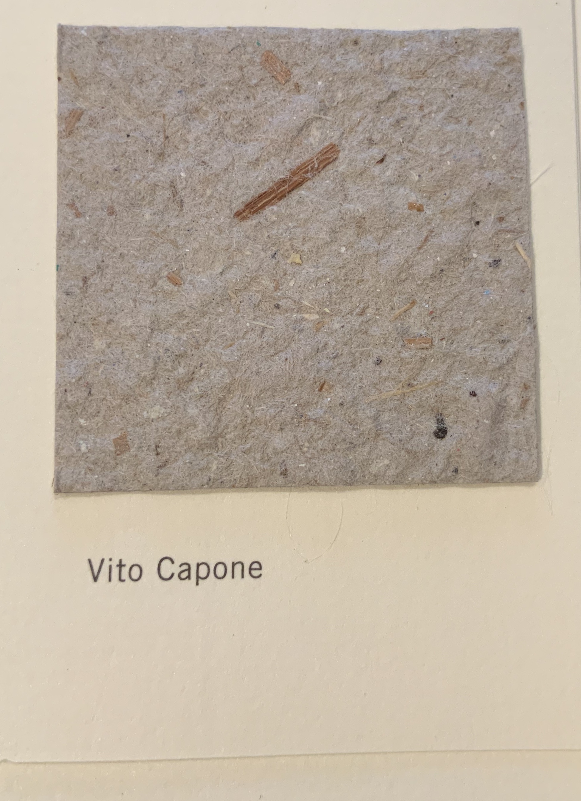
Grande Libro, Vito Capone
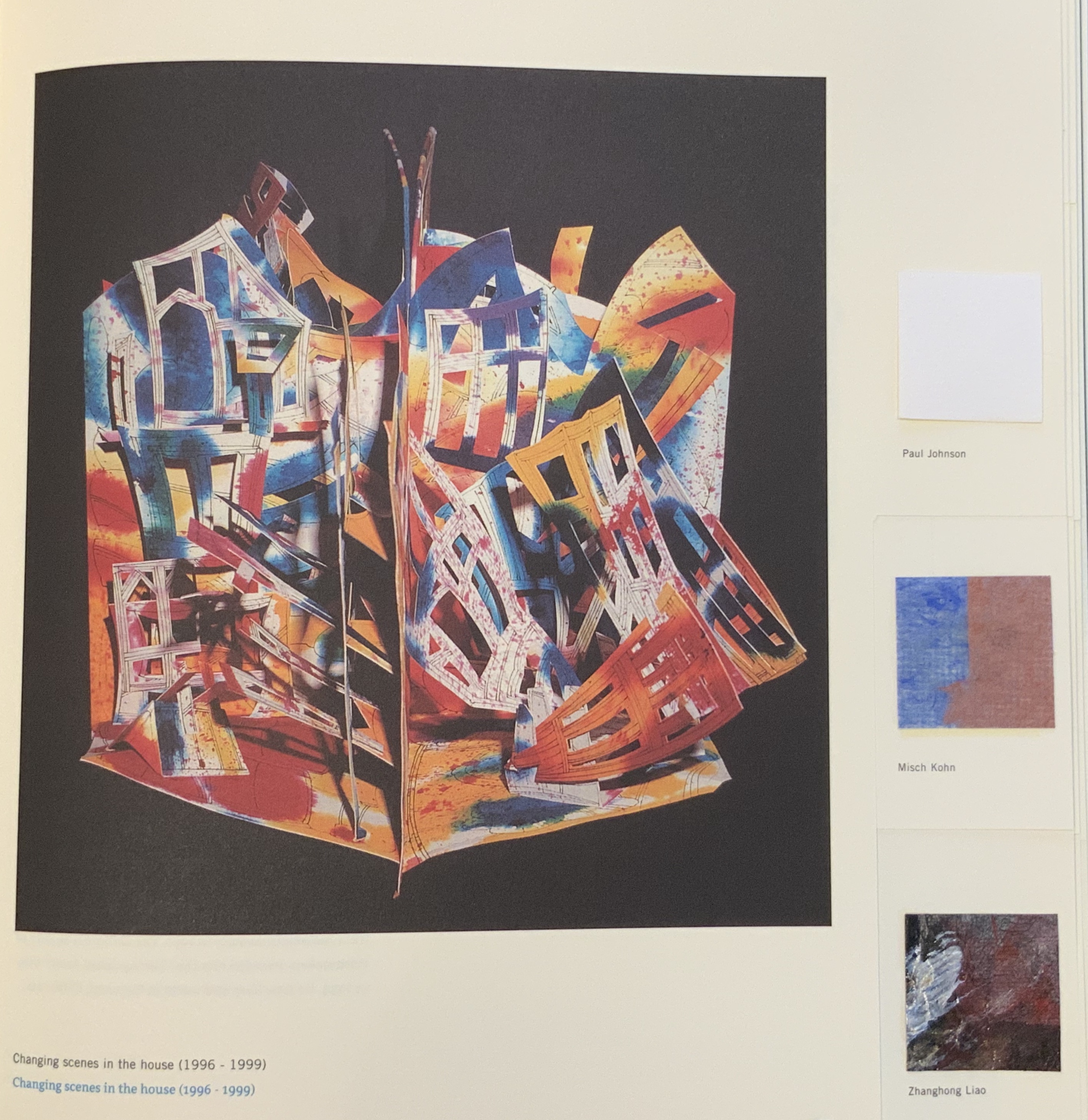
Changing Scenes in the House, Paul Johnson
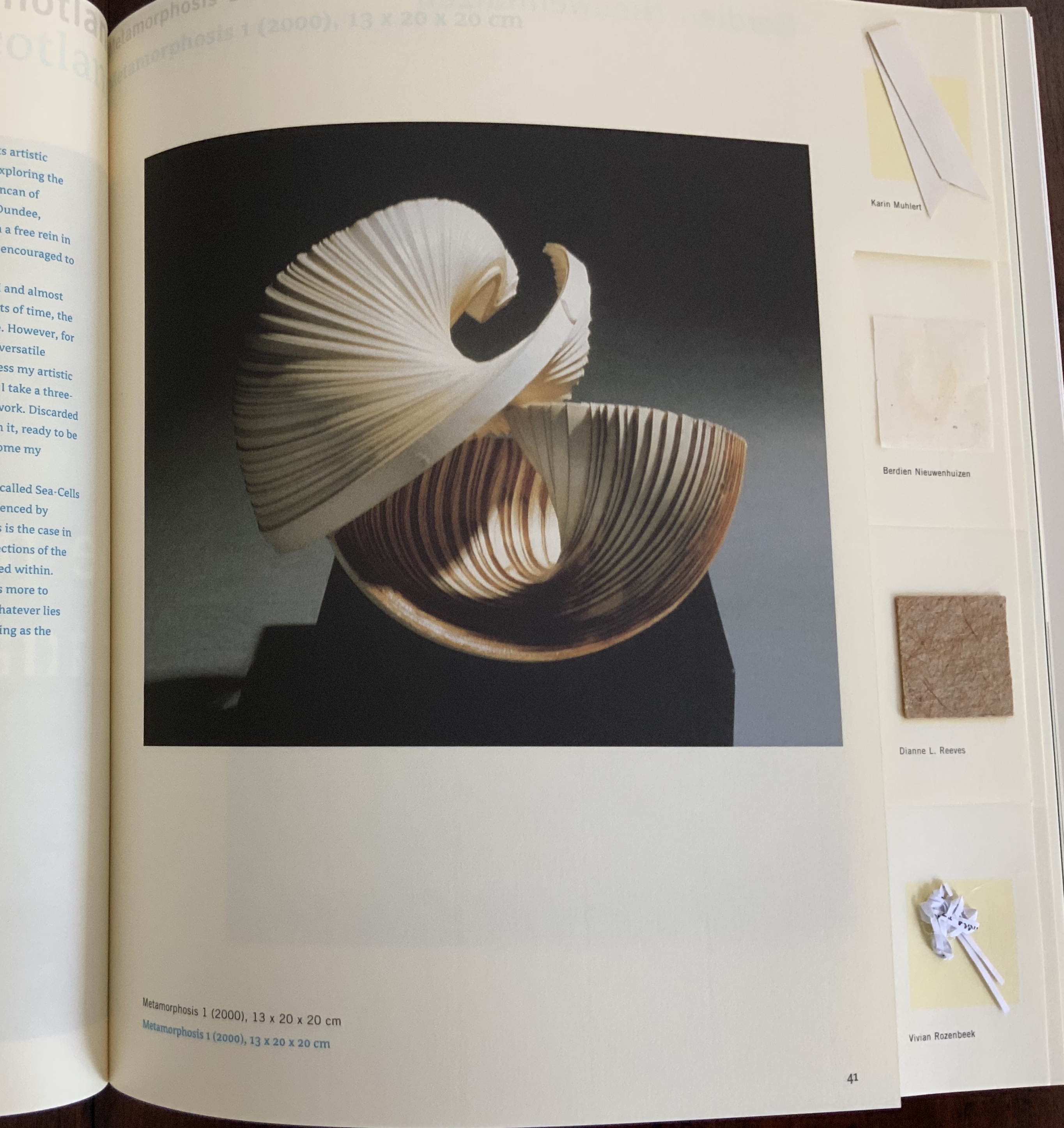
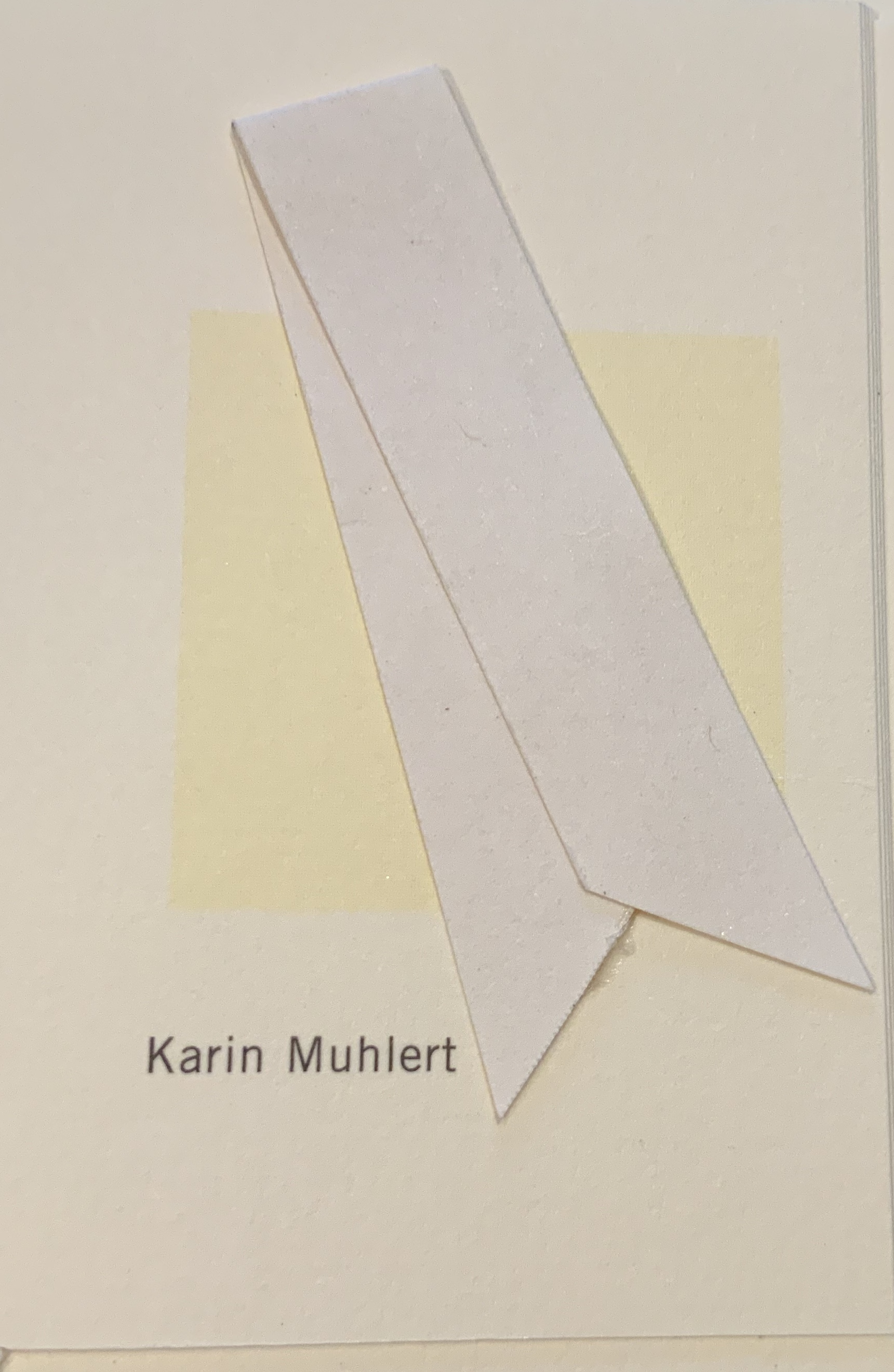
Metamorphosis I, Karin Muhlert
Book art and works incorporating text return from six of the seventeen artists represented, but there are only five large-scale and installation works — from Van den Bergh, Bunzl, Geesin and Van Hoek, Stegink and Keller. The overall impression of the artists section this time is of a slightly greater emphasis on more moderate size works and printmaking. Before that impression settles in the mind, the essays section brings four entries that need taking into account.
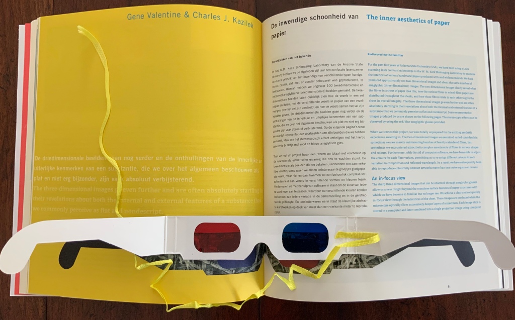
Papermaker and artist, Gangolf Ulbricht kicks off the essays section by placing his innovative work with watermarks in historical context. (Reading Ulbricht’s essay can be enhanced with this National Geographic video.) Following Ulbricht’s apropos “Victor/Victim” example from ‘Language Lessons’ (1997), John Risseeuw illustrates how incorporating rags from landmine victims with the pulped currency of landmine manufacturing countries delivers devastating paper art. (Follow the link to an interview with Risseeuw in which he describes this art.) Charles Kazilek and Gene Valentine take the reader/viewer into the three-dimensional inner aesthetics of paper and artwork resulting from The Paper Project at Arizona State University; “The unnoticed and unseen are made visible, putting our perception of paper and our interaction with it in a new light” (p. 85). (The link leads to Kazilek’s site at ASU.) Artist and papermaker, Maureen Richardson bridges the historical, artistic and practical with her two contributions on the rediscovery of papyrus and her use of pseudo-papyrus in her art. (Follow the link to see other examples of her work.)
From “Watermarks: the translucent history of paper”, Gangolf Ulbricht

“Paper with Special Content”, John Risseeuw
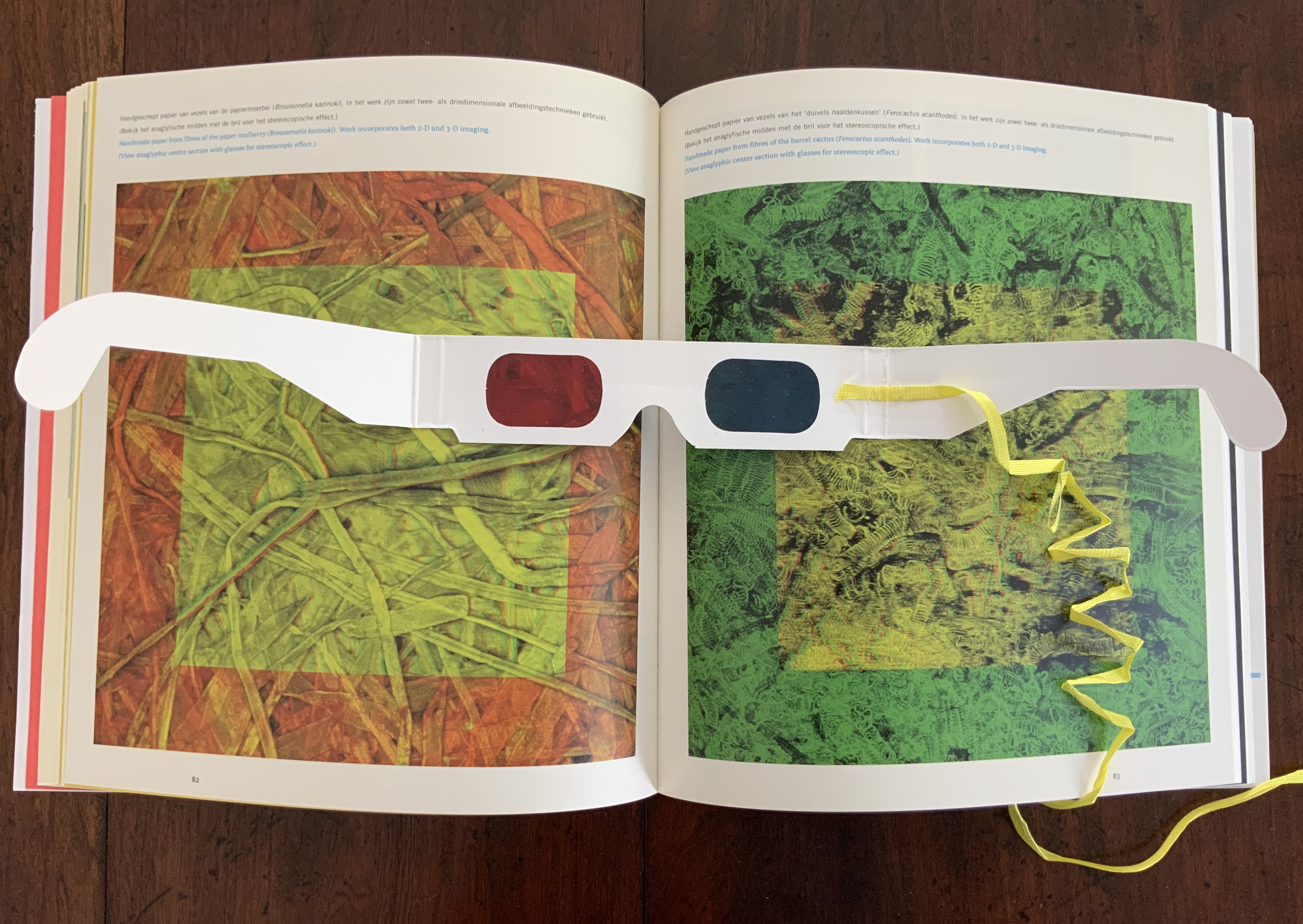
“The Inner Aesthetics of Paper”, Gene Valentine and Charles J. Kazilek.
Schepens added a ribbon to Valentine and Kazilek’s anaglyphic glasses to make them perform double duty: providing the 3D view of paper fabric and serving as a bookmark.

“Vegetable Papyrus”, Maureen Richardson
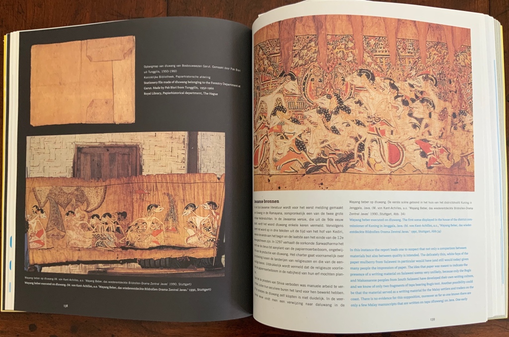
Those four entries bring into Timeless Paper examples of book art, printing in paper, paper ingredients integral to the meaning of an artwork, a leap from science to visual and performative art, and wedding art to nature. In the series’ tradition, the remaining essays cover topics such as pre-paper vehicles for writing (Fabrizio Pennacchietti), the story of dluwang paper (René Teygeler), the first papermaker in North America (Henk Voorn), movable books (Heidi Rombouts), artificial aging of paper (Henk Porck), the modern handmade paper industry in Zimbabwe (Walter Ruprecht) and the viability of woodless papermaking (Peter Gentenaar).
While the selection of artworks and essays offers as rich — if not richer — an experience as offered by the preceding volumes, the design does not likewise raise the bar. In large part, this is due to some papers lacking sufficient opacity to avoid distracting bleed-through from the other side of the sheet. The strength of Timeless Paper, however, arises from its several singular points of unity where content, design and editorial choice mesh. Here is one last example of harmony that occurs across the volume.
Not long after turning the front cover and revealing the abstract pop-up, the reader comes across Paul Jackson’s description of his origami process as “paper ballet”, then Valentine and Kazilek’s revelation that their 3D images have been incorporated in a dance performance, then Teygeler’s wayang beber (scroll narrative) on dluwang paper evoking dancing Javanese silhouette puppets and then Rombout’s behind-the-scenes view of Lothar Meggendorfer’s pop-up circus rider (1887). This is but one of several “dances” of content, design and editorial choice that weave across Timeless Paper, reward the reader/viewer with each revisit and probably led to the volume’s being nominated for the 2002 Dutch Design Award.
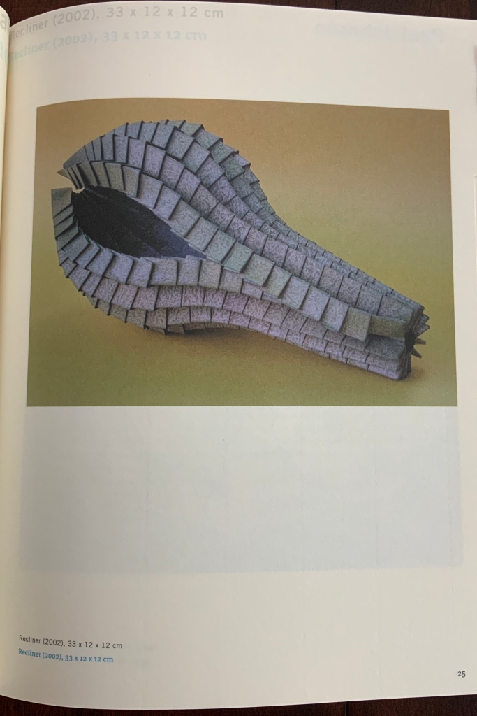
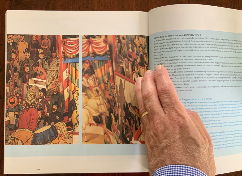
Clockwise: abstract pop-up behind the front cover, Jackson’s Recliner (2002), Valentine and Kazilek’s “The inner aesthetics of paper”, Teygeler’s “The myth of Javanese paper” and Rombout’s “The movable book”.
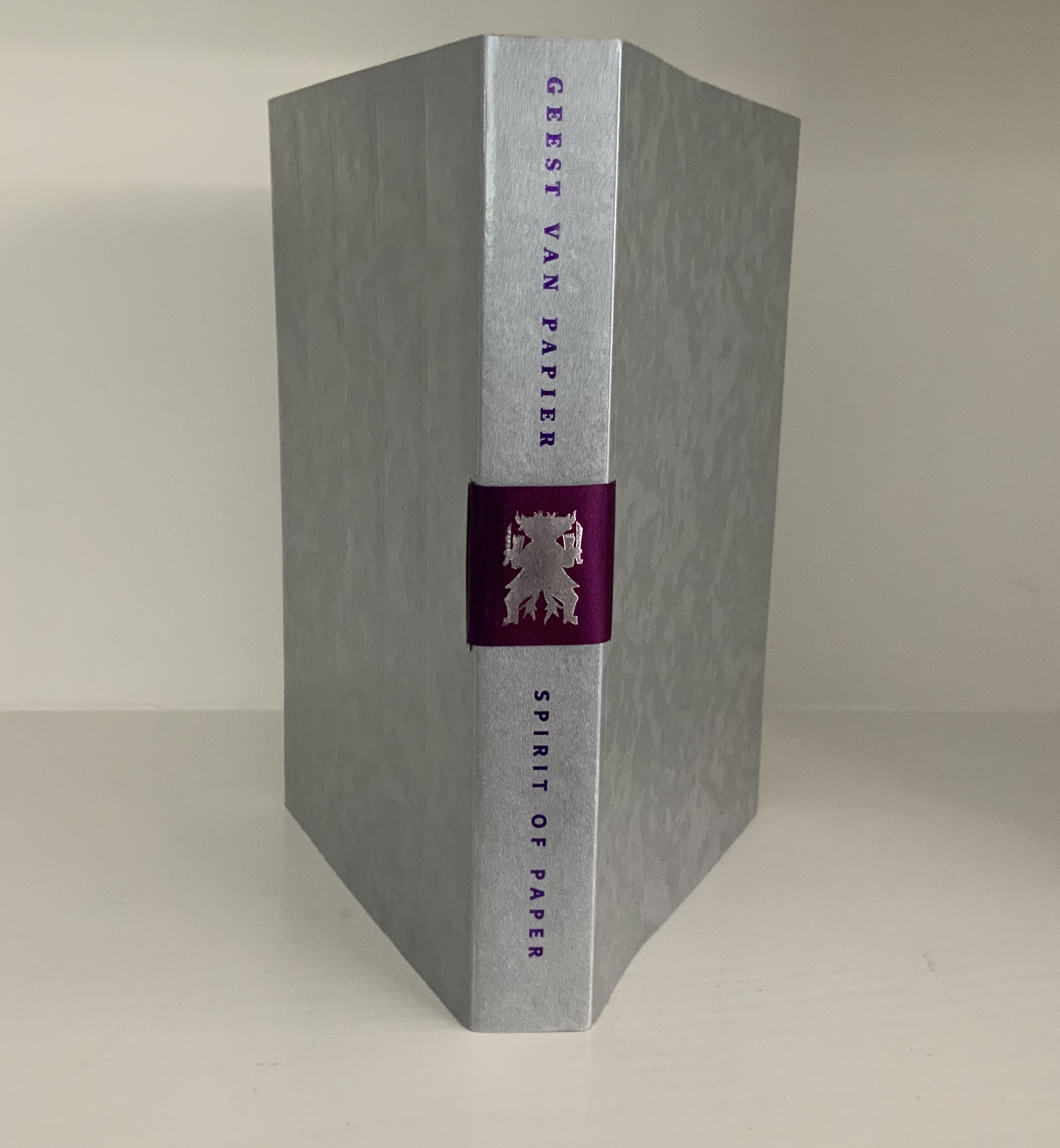
Geest van papier = Spirit of paper (2004)
The Artists: Kathrin Biffi-Frey, Marian Bijlenga, Valérie Buess, Beate Dyck, Pieter van Eck, Carol Farrow, Maryan Geluk, Toshihiro Hattori, Rachel Hazell, Beate Hoffmeister, Martine Horstman, Toshio Ikezaki, Janke Klompmaker, Hilke Krohn, Michael Felix Langer, Chunghie Lee, Couzijn van Leeuwen, Alexander Lidagovsky, Vibeke Lindhardt, Shula Litan, Steve Litsios, Barbara Lorenz, Roberto Mannino, Ruth Moro, Myung Hee Oh, Jacqueline Santing, Bunny Soeters, Yvonne Struys, Karen Trask, Fusako Tsuzuki, Jan Eric Visser
The Essayists: Arjan Kwakernaak, Anne Kloosterboer, Carin Reinders, Aliza Thomas, René Teygeler, Rogier Uitenbogaart, Chunghie Lee, Manohar Upreti, Evelyne Verheggen, Kitty Jansen-Rompen, Henk Porck, Pau Groenendijk, Peter Gentenaar, Arne Westerhof
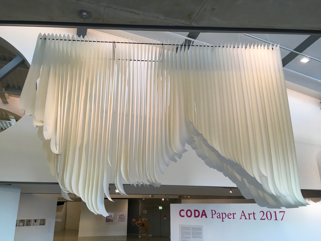
The Spirit of Paper coincides with the fifth Biënnale and celebrates paper’s association with the human spirit in its many guises. The fifth Biënnale also occasioned the first of four collaborations with CODA (Apeldoorn Museum, Apeldoorn Library and Apeldoorn Archive) about 112 kilometres (70 miles) east of Rijswijk/The Hague. Although not all of the patron saints of papermakers, bookmakers and artists appear in the Spirit of Paper, the combined successes of the Rijswijk and CODA museums over the first two decades of the 21st century suggest that they have all been hard at work for the health and attraction of paper and book art.
The flexibility and generosity of a publisher Uitgeverij Compres (Wim Findhammer) and a fresh collection of paper manufacturers and suppliers ensured that the editors and designer had the secular as well as spiritual support to represent the thirty-one participating artists (nearly double the preceding Biënnale’s crop) and to do so in an effective and ingeniously harmonious volume.
The harmony starts with colour in the religious overtones of purple and silver in the cover and bookmark ribbon. As if to emphasise how design will tie the volume together, the bookmark ribbon threads through the cover and across the spine, showing a silver-emblazoned spirit figure, a figure illustrated in René Teygeler’s essay on paper and its religious uses in Aztec and Mayan culture.
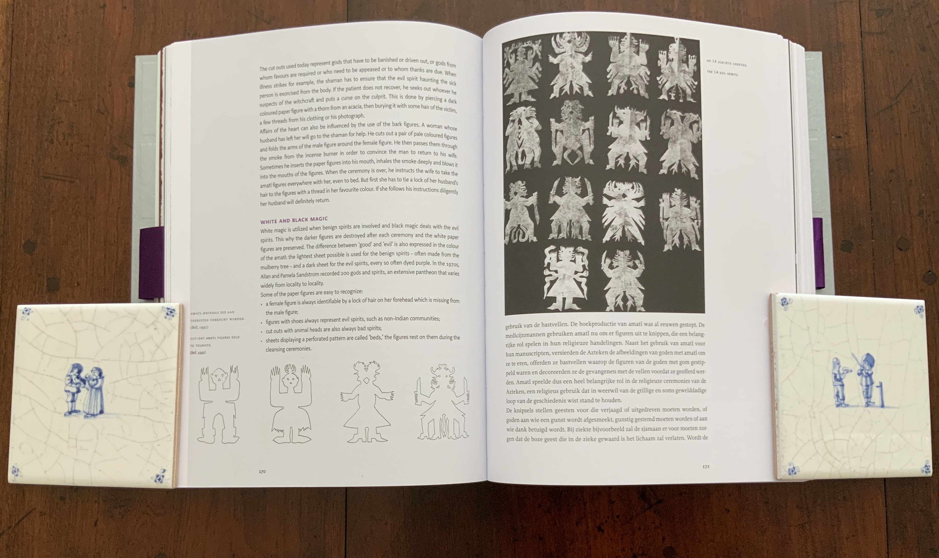
René Teygeler,s “The Spirit of ‘Amatl’“ (pp. 170-71).
The designer also uses pages silver-printed with images from photos of the artwork and essays’ illustrations to divide the essays from one another. Colour takes on a further organisational and harmonising function in conjunction with the choice of type. The Dutch text generally appears in a serif type, the English in a san serif type. But footers and other sections use san serif for both languages, so to distinguish the Dutch from the English, the designer introduces red for the English and black for the Dutch. The effect is totally unlike the excessiveness in Tactile Paper. Here the distinguishing choices of colour, type, weight and style work like baroque music.
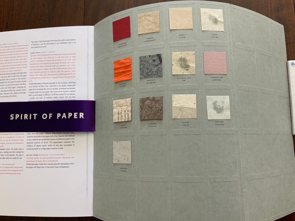
For this volume, the solution to the paper sample question is to use the inside of the front and back covers. Unfortunately the glue holding the samples to the cover paper Gmund Stone Crystal 310 gsm (DRiemSpirit) has bled through some of the samples.
The paper chosen for the artists section, Iceblue 100 gsm (DRiemSpirit), works well — physically and thematically — with the silver-printed dividing pages but not as well with the full colour photos of the artworks — or at least not as well as the paper chosen for the next volume Paper Takes Flight.
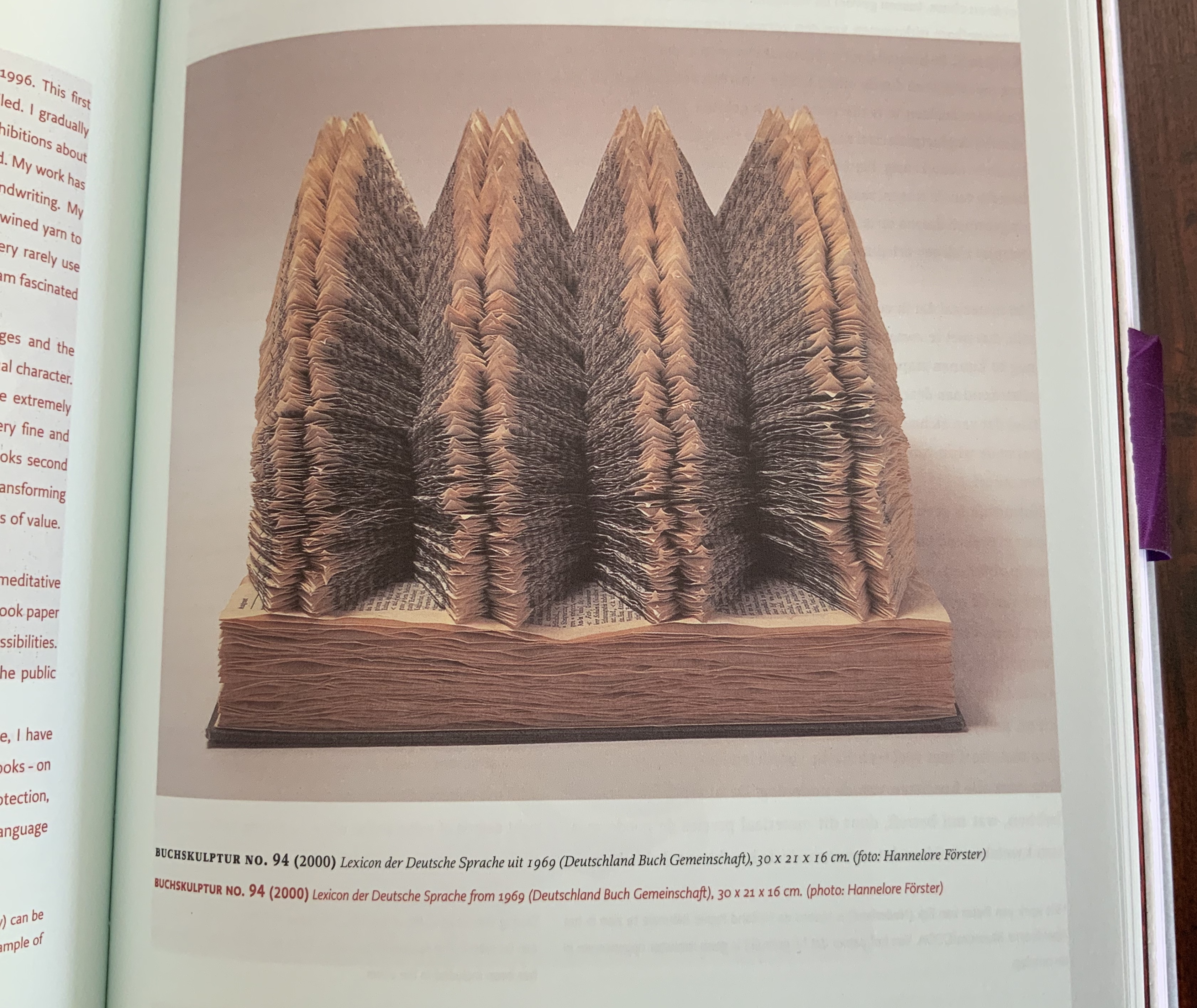
Buchskulptur No. 94, Beate Dyck
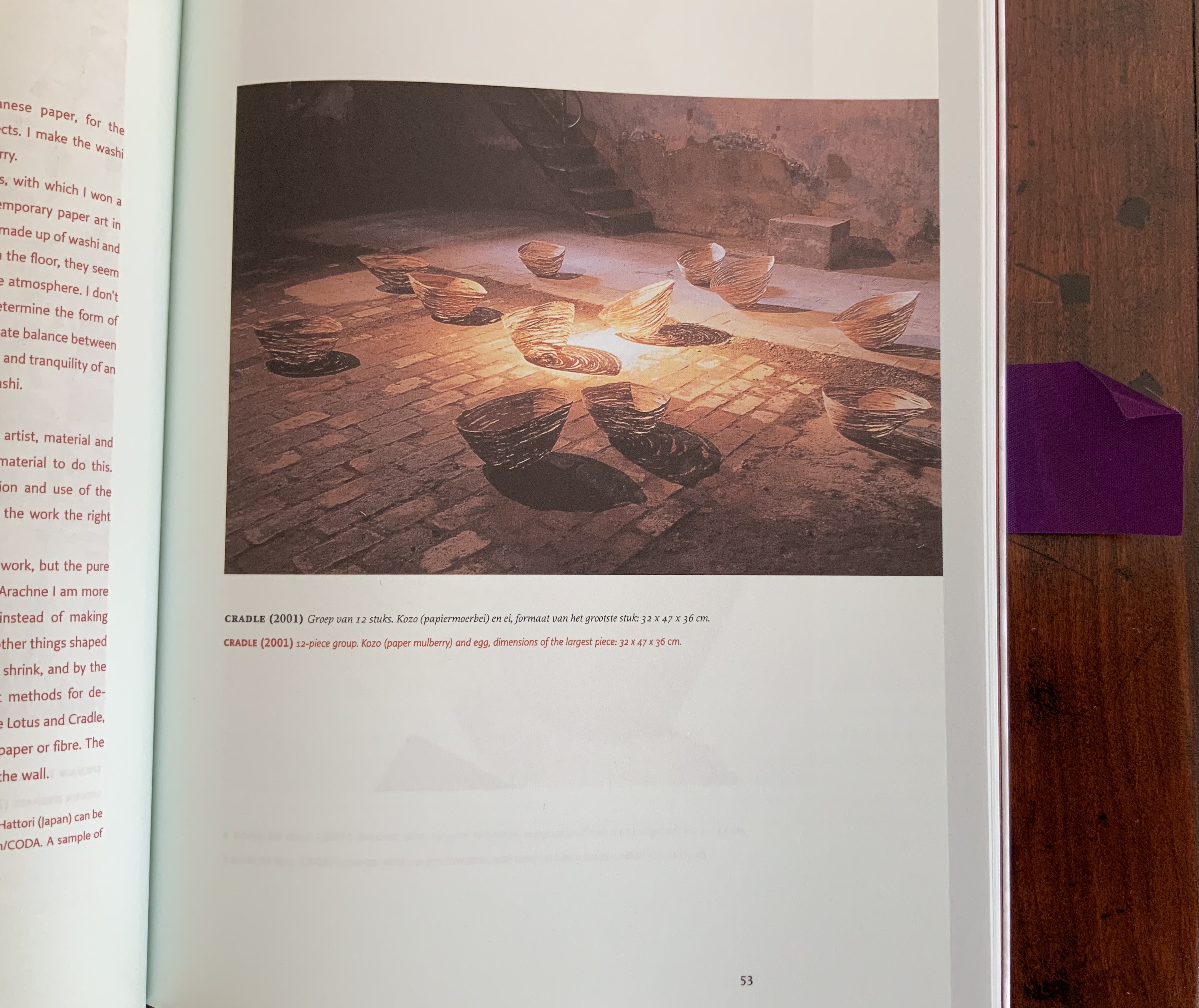
Cradle, Toshihiro Hattori
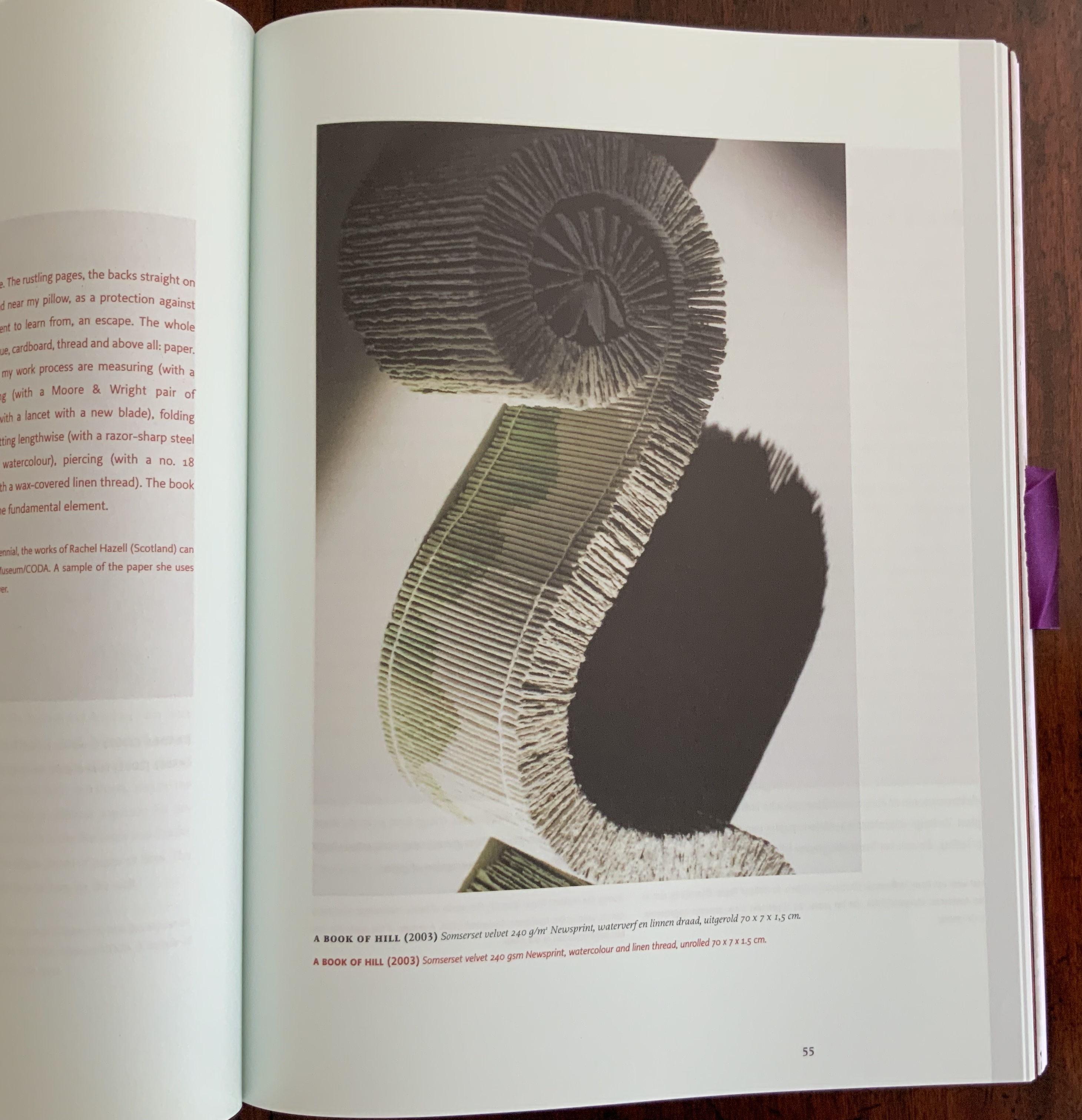
A Book of Hill, Rachel Hazell
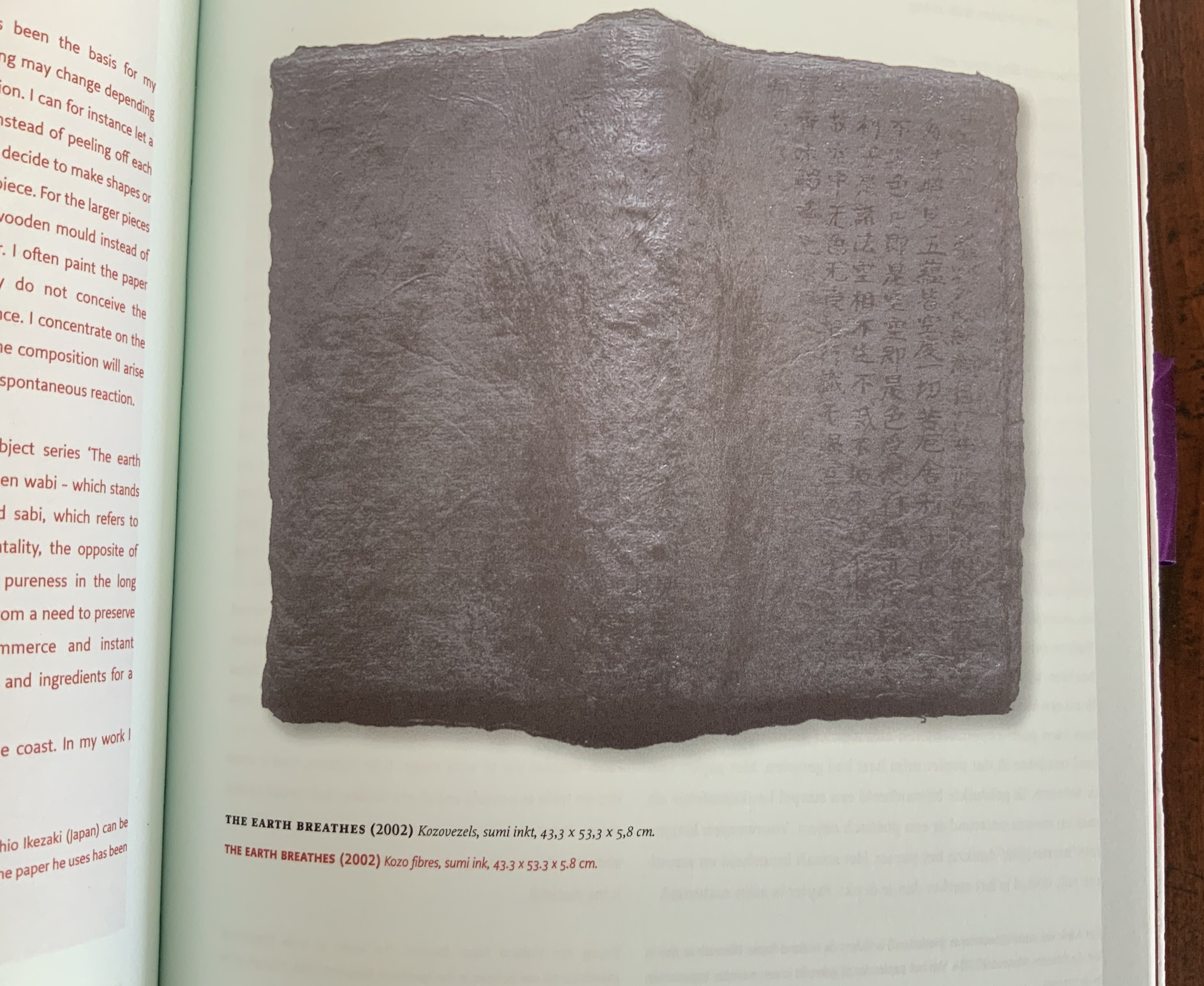
The Earth Breathes, Yoshio Ikezaki
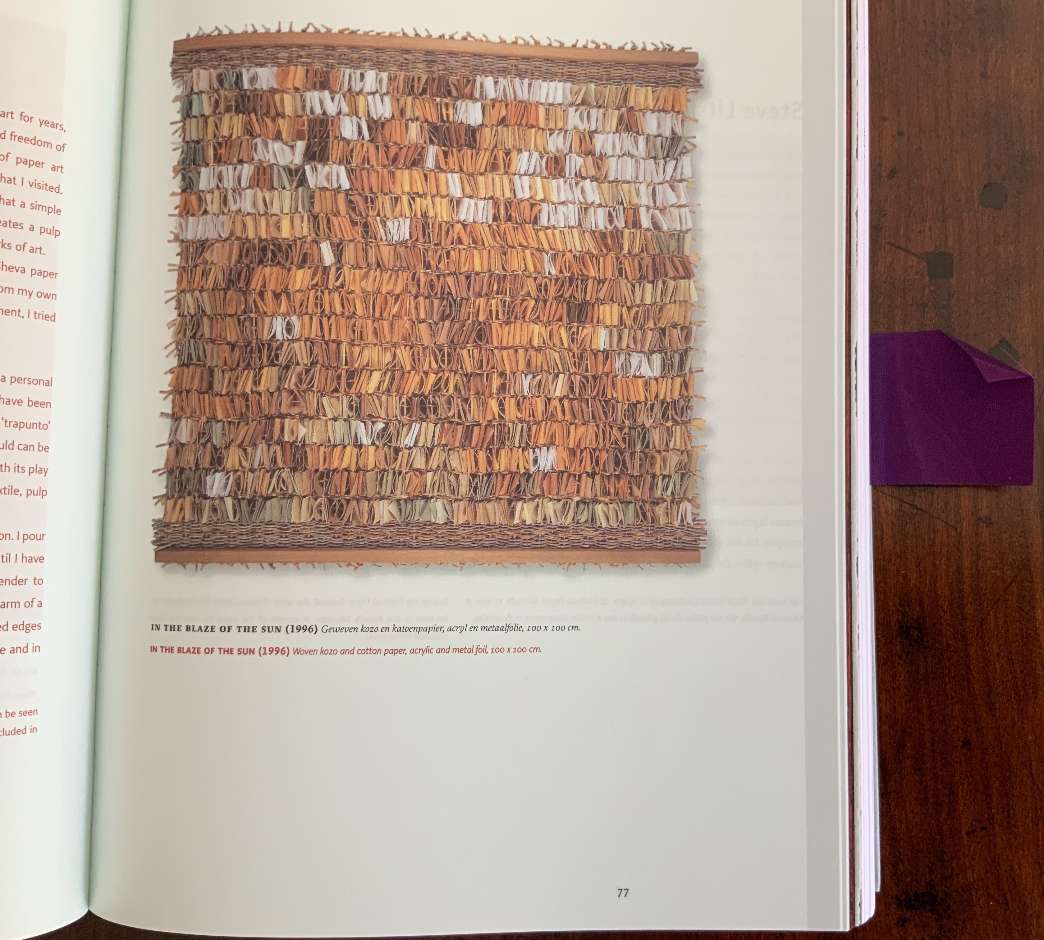
In the Blaze of Sun, Shula Litan
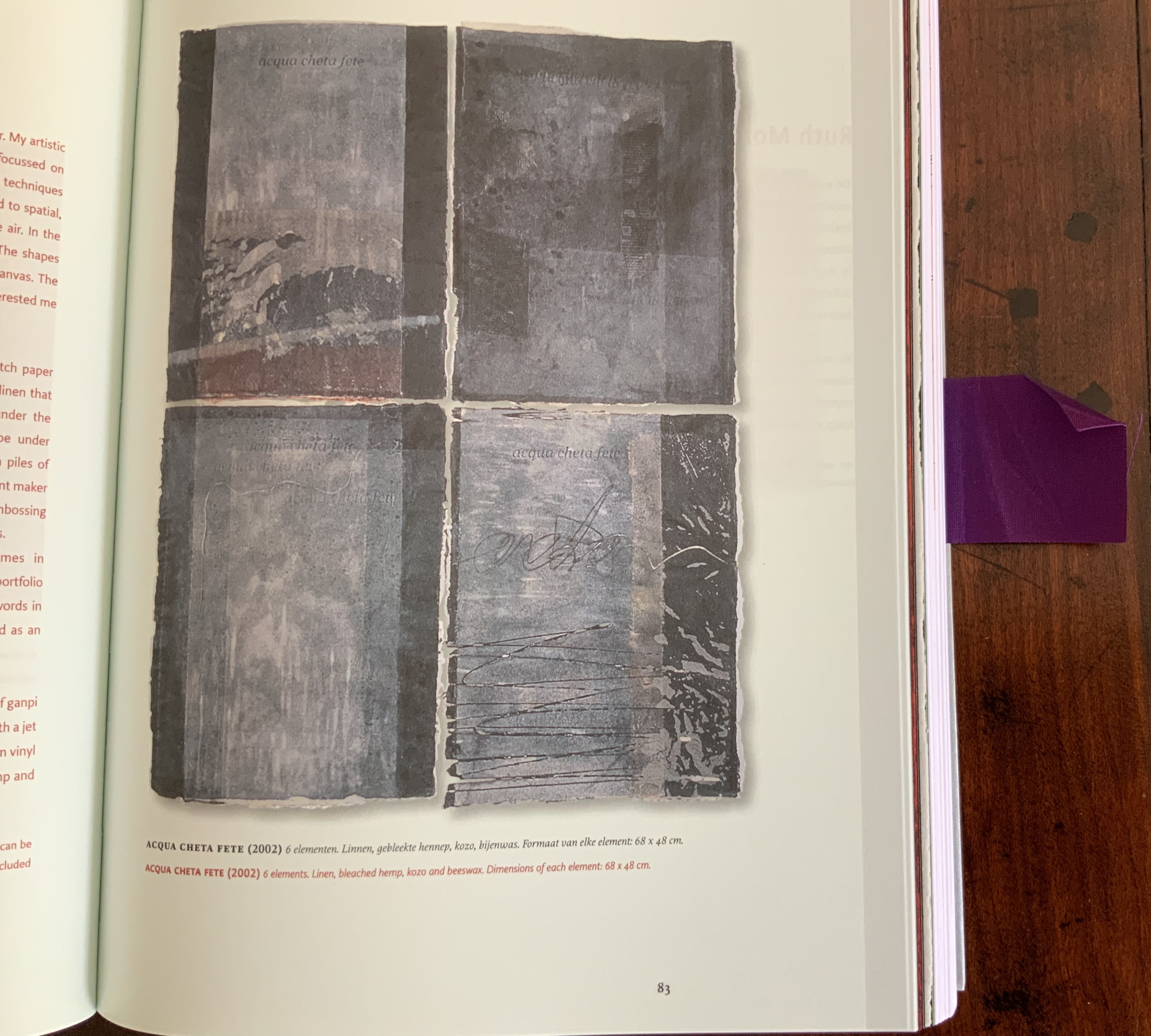
Acqua Cheta Fete, Roberto Mannino
The thirty-one artists represent a high point in the number of Biënnale participants. No doubt, the partnership with CODA Apeldoorn added interest for the participants as well as space for the installation works such as those by Hattori (see above), Van Eck, Klompmaker and Lorenz (see links). Although not a requirement of submission, so many of the artworks incorporate or evoke light — a fitting reflection of the theme of the Biënnale and its book.
The essays section is prefaced with another harmonising feature: a special section of full-page paper samples related to seven of book’s eleven essays. This parallel with the artwork section is strengthened by the most extensive presentation of paper samples for the essays to date. A Japanese kozo (Cloud Dragon ivory, 90 gsm) reflects Uitenbogaart’s essay. The following double-page spread goes with Manohir Upreti’s essay.
Sample related to Manohar Upreti’s “Lokta, King of Nepalese Paper” (pp. 238-39).
A 100% recycled sample of newsprint (Stora Enso News Press) reflects Jansen-Rompen’s essay on Dutch carnival societies’ papier-mâché floats. Chunghie Lee’s essay on paper flowers for funeral rituals is represented by a sample of Korean tissue. A full-page of edible wafer (O-quality, First-class, Primus) refers to Vergheggen’s essay on Catholic devotional prints. A sample of Promail 80 gsm wood-free paper refers to Porck’s essay on Frank van Kollum’s chest of origami in the Koninklijke Bibliotheek’s archive. As extraordinary if not more so is the sample specially manufactured by Favini for Groenendijk’s “Facsimile of Anne Frank’s Diaries”.
With Aliza Thomas on Islamic paper, Rogier Uitenbogaart on the Japanese, René Teygeler on the Aztec and Maya, Chunghie Lee on the Korean, Manohar Upreti on the Nepalese and Evelyne Verheggen on European devotional prints, Spirit of Paper demonstrates both the historical and global breadth of the Papier Biënnale. In this volume more than others, art and essays echo one another. In tracing the origin and uses of Islamic paper, Thomas notes the gilded papier-mâché ceiling of Timur Lenk’s tomb in Samarkand. Compare that ceiling with Toshihiro Hattori’s Cradle and Shula Litan’s In the blaze of the sun (see both above); see how paper’s “depth of surface” evokes a sense of the spirit across cultures and time?
The Thomas essay also warrants a place alongside Jonathan Bloom’s Paper Before Print (see Further Reading below). Bloom and Thomas do not cite one another, but together their clear and lively insights from common direct sources enhance the antidote to an overly occidental view of paper. Two other entries under Further Reading — Lothar Müeller’s White Magic and Mark Kurlansky’s Paper draw attention to our susceptibility to that view as does the consistent internationality of the Papier Biënnale’s choice of artists.
This dense and rich volume concludes with a colophon that takes in all five books designed and overseen by the Gentenaar-Torleys and Schepens. The colophon was prepared by Arne Westerhof, who had provided editorial support for this and the three preceding books and is — as of this writing — a publisher and director at Performa Uitgeverij. This has proved an invaluable resource to Books On Books for the details of the papers used.
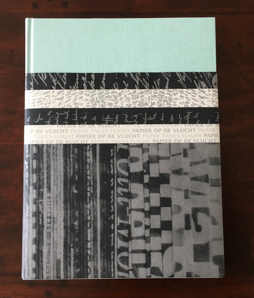
Papier op de vlucht = Paper takes flight (2006)
The Artists: Luis Acosta, Marjolijn van den Assem, Lucia Barata, Valérie Buess, Kwang-young Chun, Jean Claude Correia, Dominique De Beir, Mels Dees, Betty Friedman, Claude Frossard, John Gerard, Manabu Hangai, Sjef Henderickx, Eve Ingalls, Tomoko Ishida, Rolf A. Kluenter, Jae Ko, Ayuk Kuperus, Miriam Londoño, Karel Martens, Lucille Moroni, Pavlos (Dionysopoulos), Margit Rijnaard, Naoko Serino, Ingrid Siliakus, Hans Jürgen Simon, Marjolein van der Stoep, Matte Vroegop & Ed Schoonveld
The Essayists: Theo Laurentius, Veronica van Verschuer, Frans Laurentius, Roelof van Gelder, Koos Havelaar, Karel Schell, Salah Hassan, René Teygeler, Bihanne Wassink, Henk Porck, Taco van Iersel, Elise van Dooren

In each of the preceding five Biënnale books, Schepens and the editors transform some aspect of the book’s form and structure to accommodate the paper samples. For Paper Takes Flight, they came up with a “dust jacket” made of five belly bands to carry eight small envelopes attached to the inside flaps. As usual, the design solution takes on a unifying function: four envelopes contain a paper sample from four of the artists; four contain a sample relating to four of the essays. Perhaps the equal division was driven by the submissions on hand, but the choice of text paper suggests otherwise. Recall that in previous volumes, the text blocks consist of more than two types of paper; here, the artists section appears on Hello Gloss white, woodfree glazed mc (SAPPI quality), 90 gsm; the essayists section, on UPM Finesse bulky mat, 90 gsm.
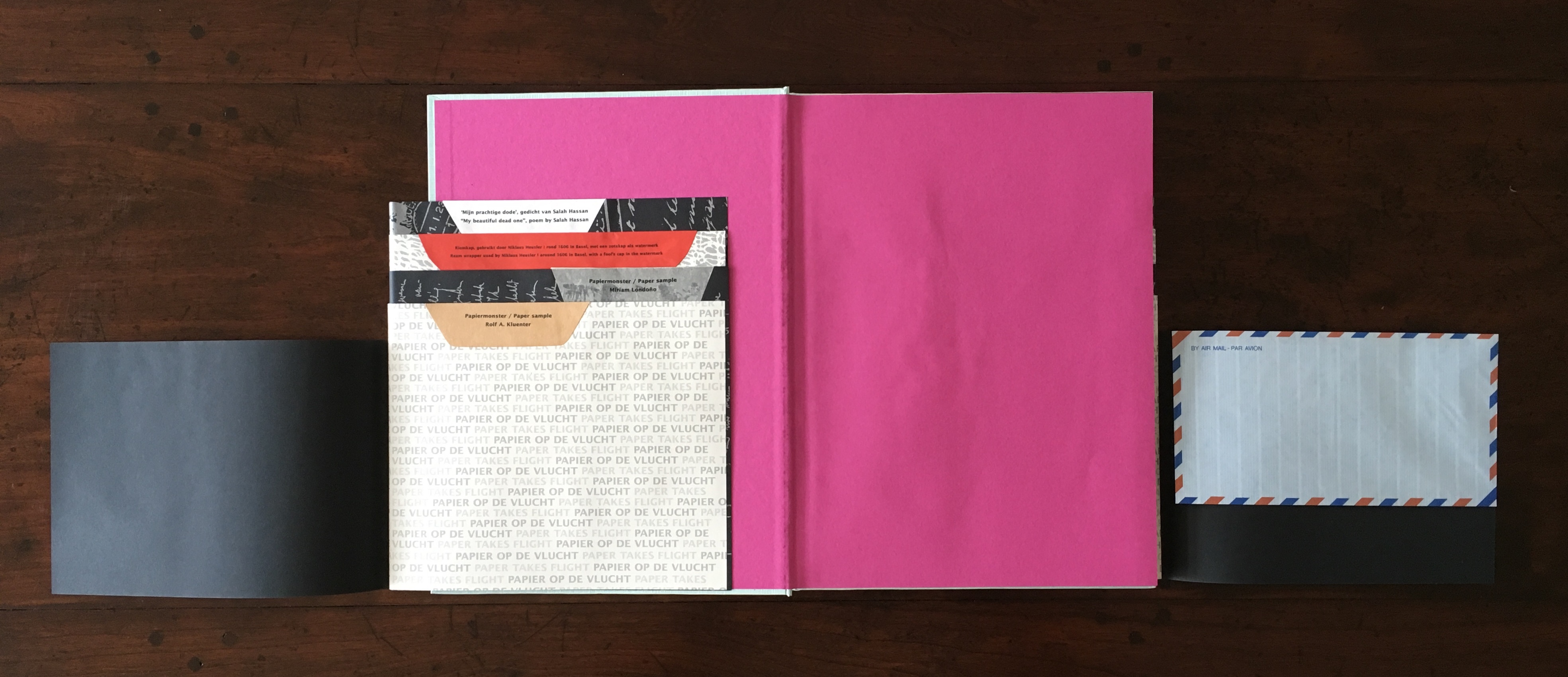
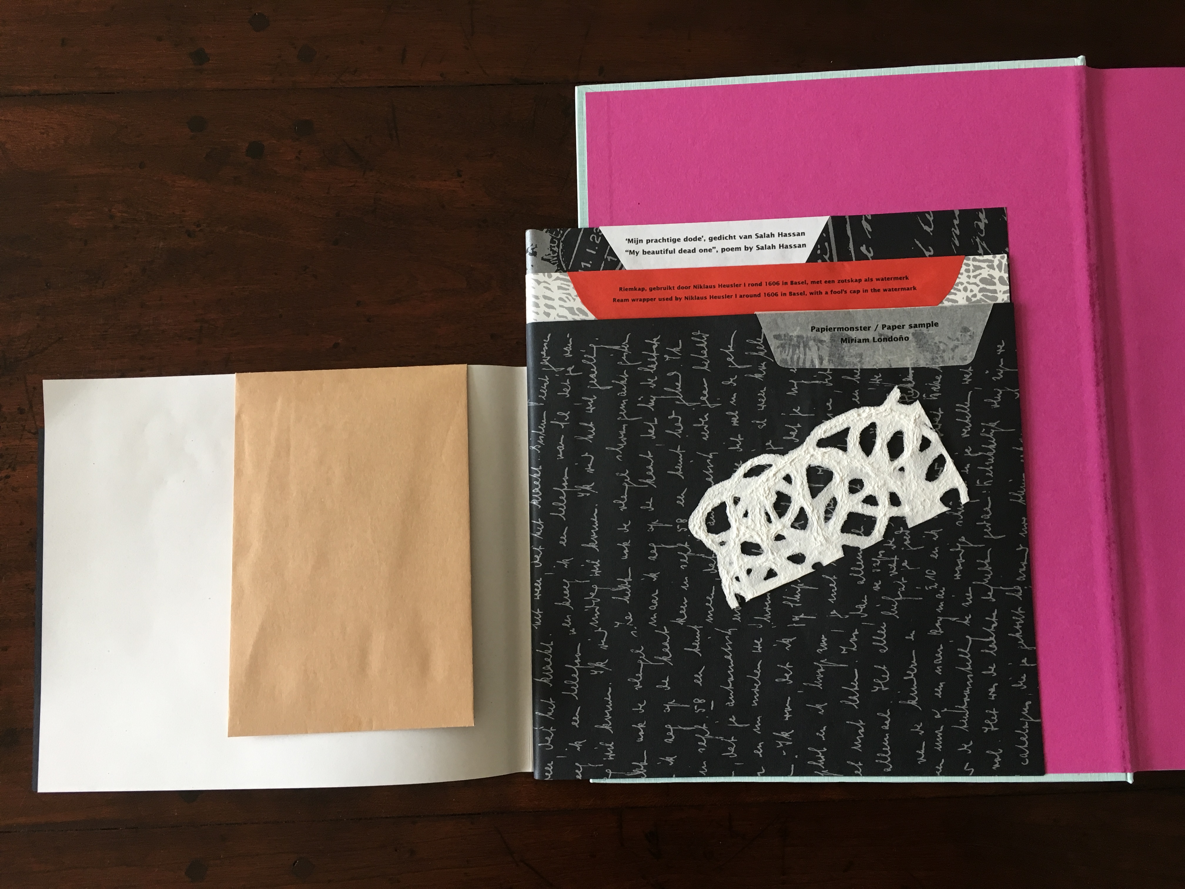
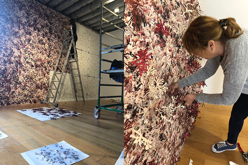
Miriam Londoño’s sample of “pulp line drawings” removed from its envelope. See her artwork below. Londoño’s work has also appeared at CODA Paper Art 2017.
The choice of paper in Paper Takes Flight is more restrained than in previous volumes, but that is not to say flair is lacking. The two text blocks are embraced by chocolate-box paper — Evanescent golden purple gloss, 90 gsm — which is embraced by end sheets and doublures of Reviva colour cyclamen, 100% recycled, 130 gsm.

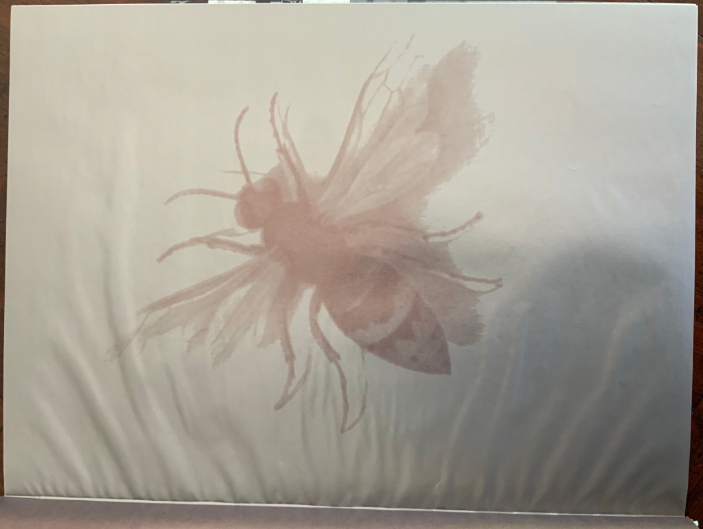
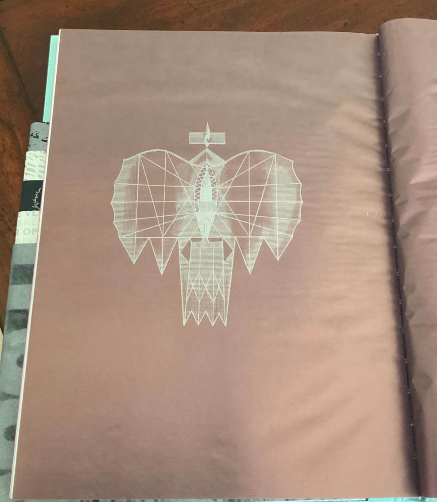
The chocolate-box paper may have little to do with “flight”, but it provides the designer with a brilliant background for the images of prop airplanes, paper planes, moths, bees, airmail stamps and others drawn from the photos of artwork and the essays’ illustrations and, thus, unifying the book.


The choice of high gloss paper for the artists section gives the photos of artists’ works more chance of shining than in previous volumes. Twenty-nine artists participated in the 2006 Holland Paper Biennial, cosponsored again with CODA Apeldoorn. Most of the contributions are sculptural. The number of larger works and installation works rivals if not exceeds that in the previous biennials. Museum Rijswijk accommodates interior and exterior installations (especially since its 2012 expansion), but CODA Apeldoorn has the larger footprint and volume for this purpose. The larger works such as those by Hangai, Ingalls (below), Ishida (below) and Londoño (below) benefit from the larger trim of the book and well-chosen angles of photography. Some sense of these works’ expanse can be gathered from the links provided.
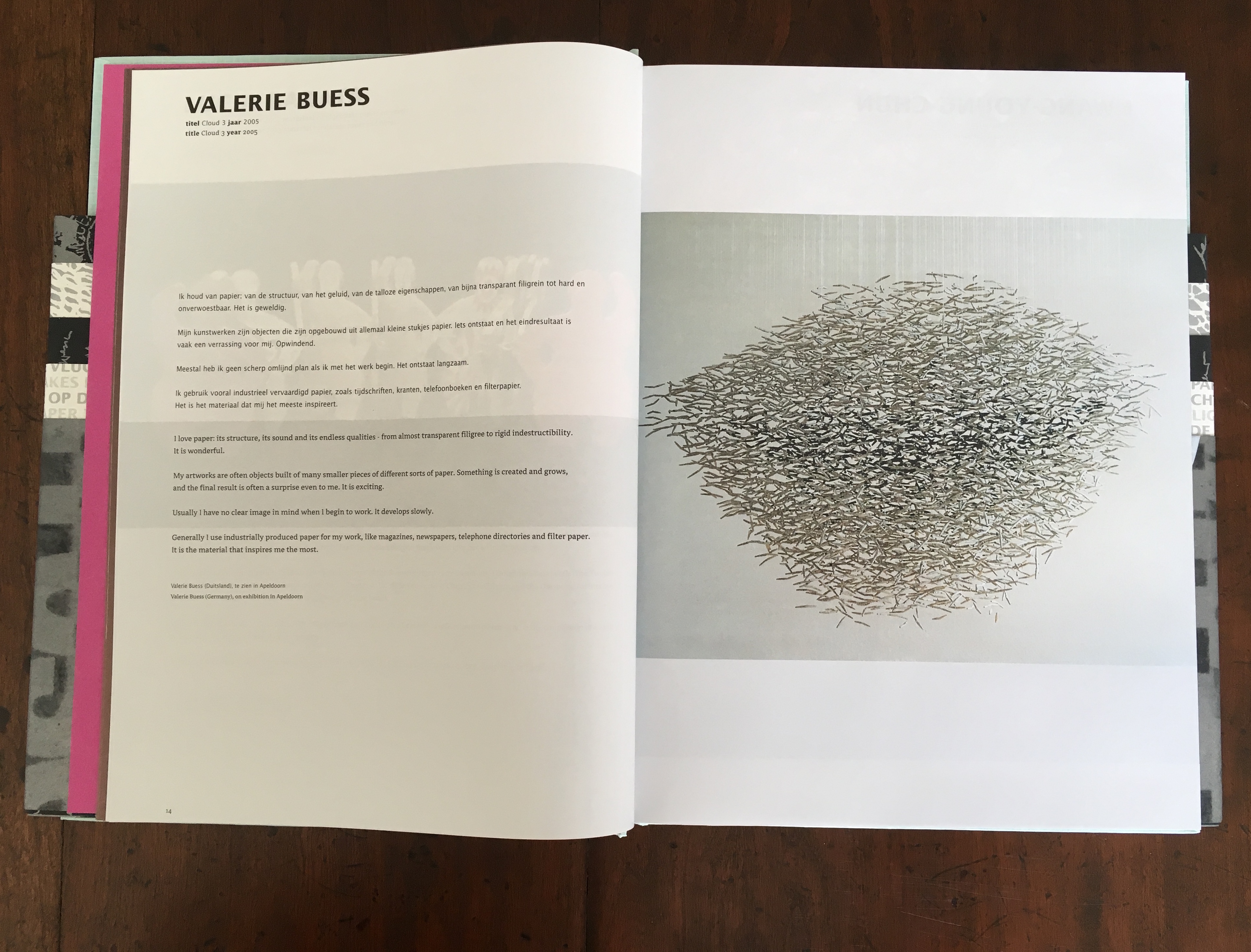
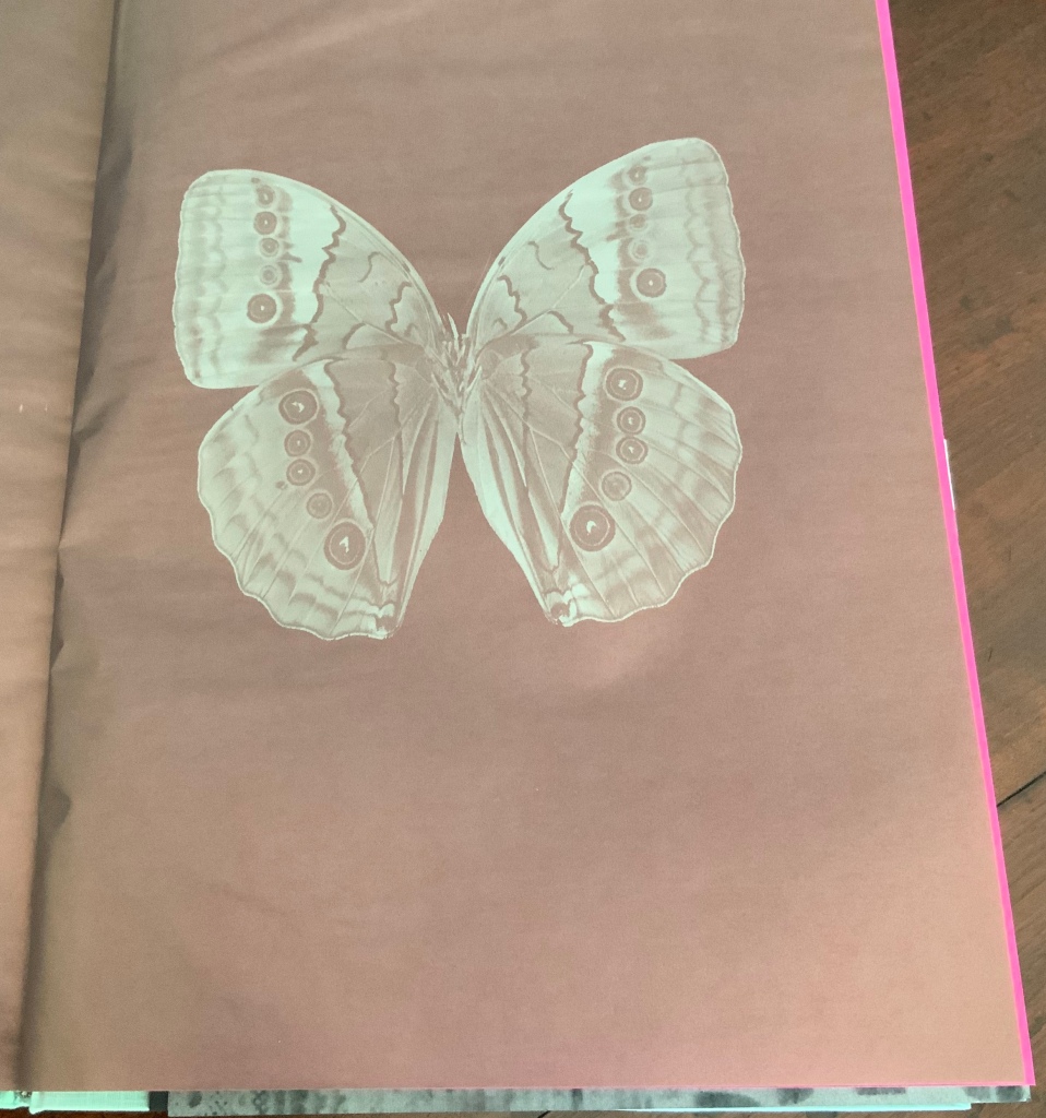
Cloud, Valerie Buess
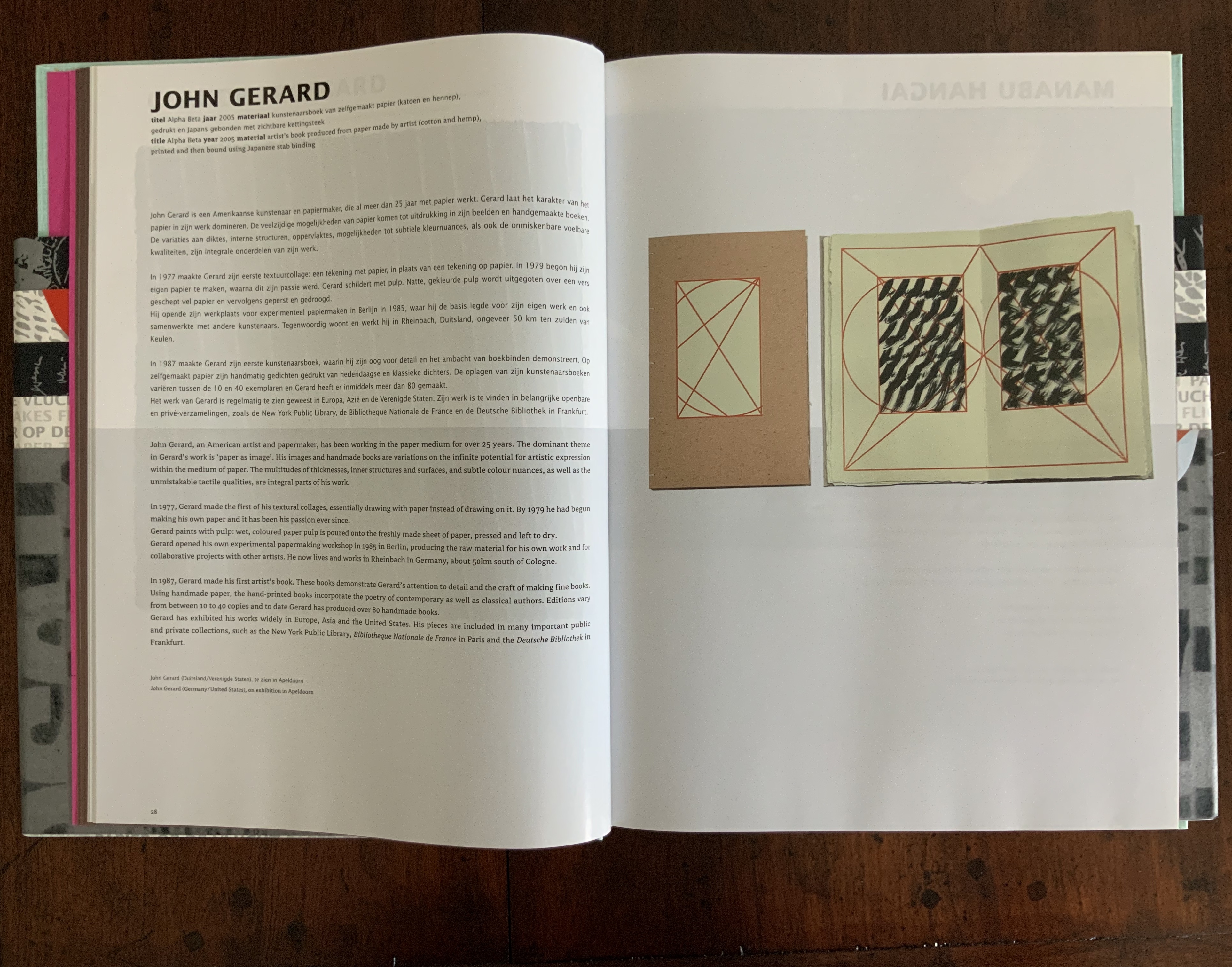
Alpha Beta, John Gerard
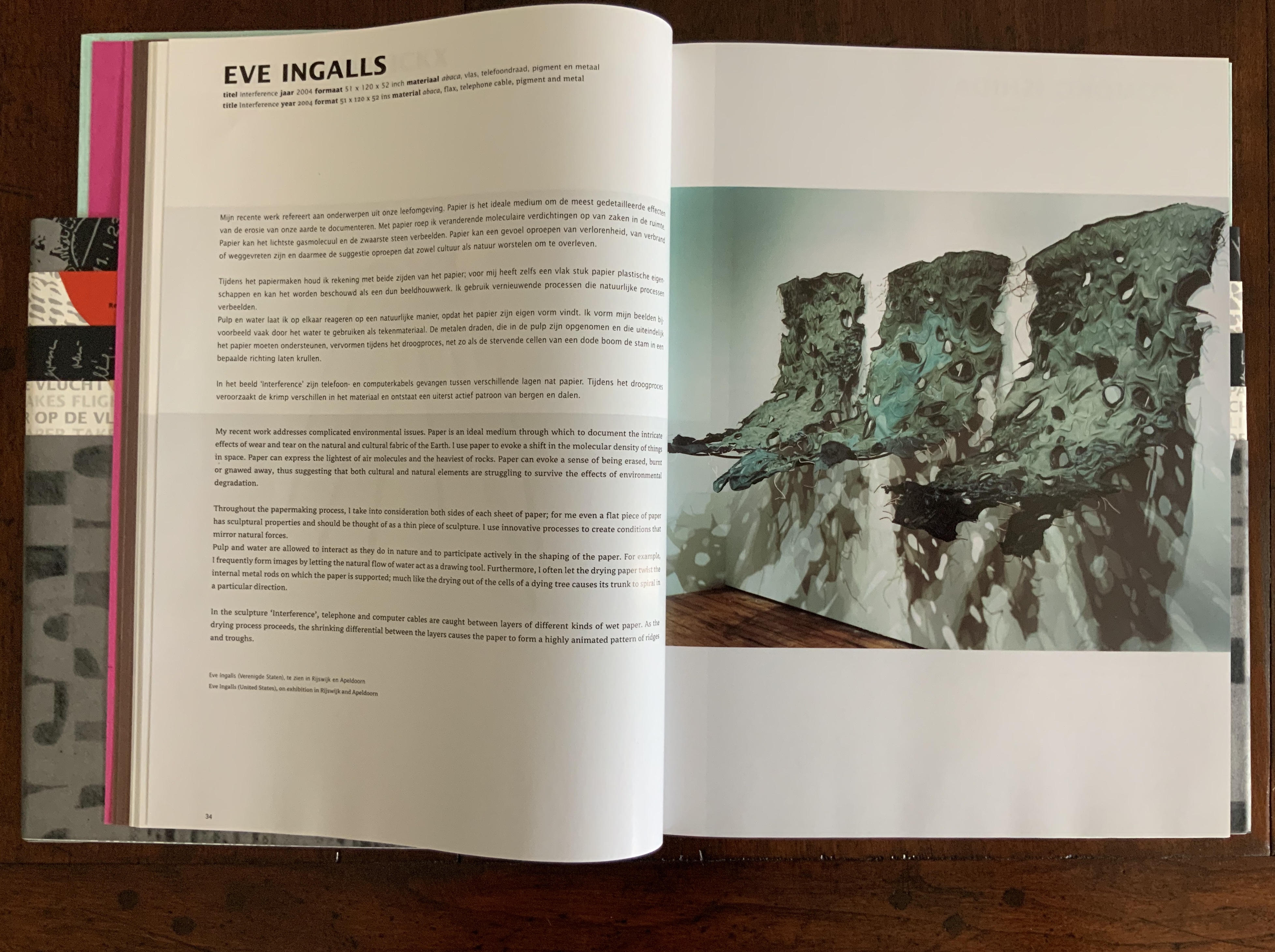
Interference, Eve Ingalls
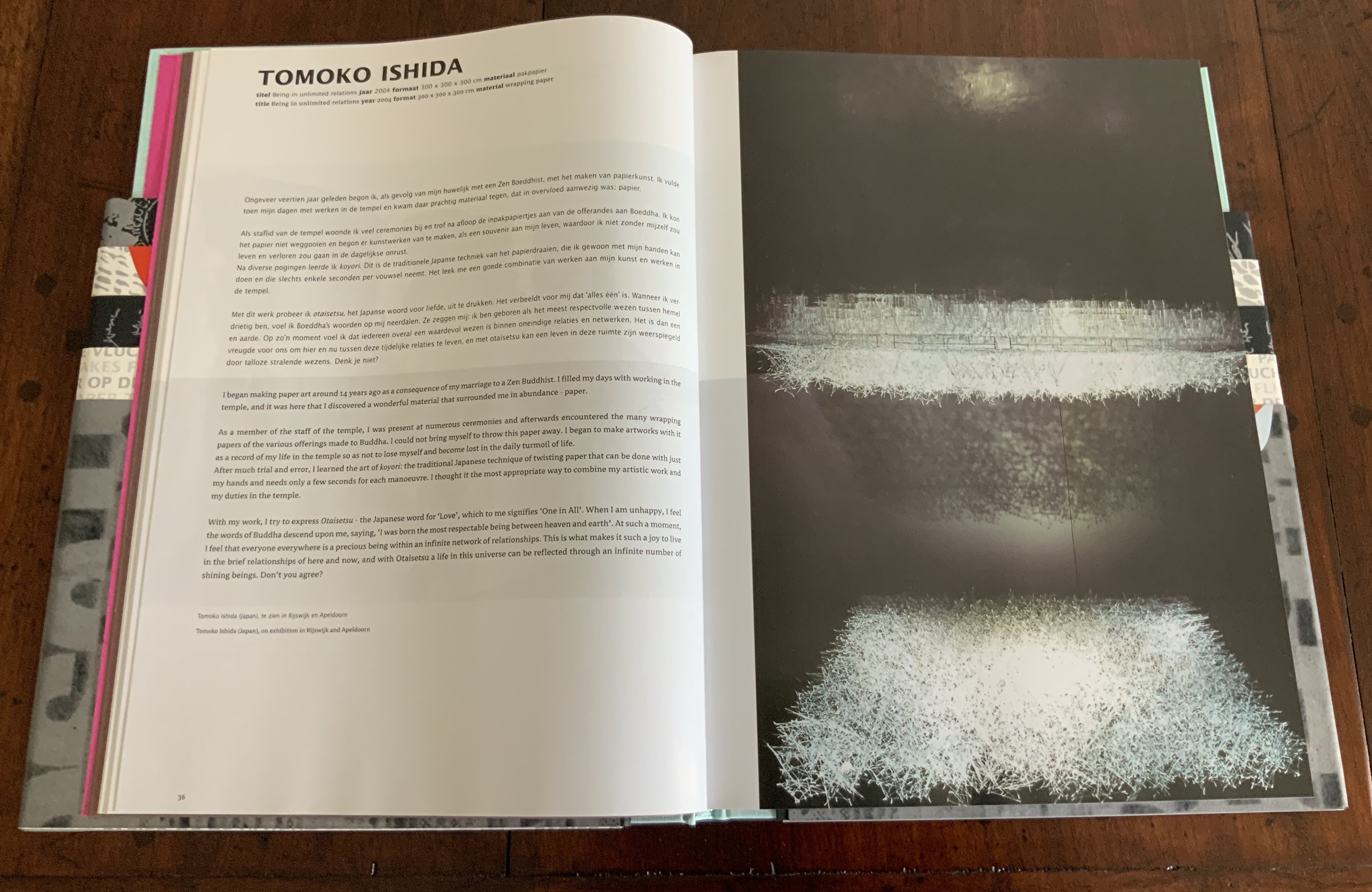
Being in unlimited relations, Tomoko Ishida
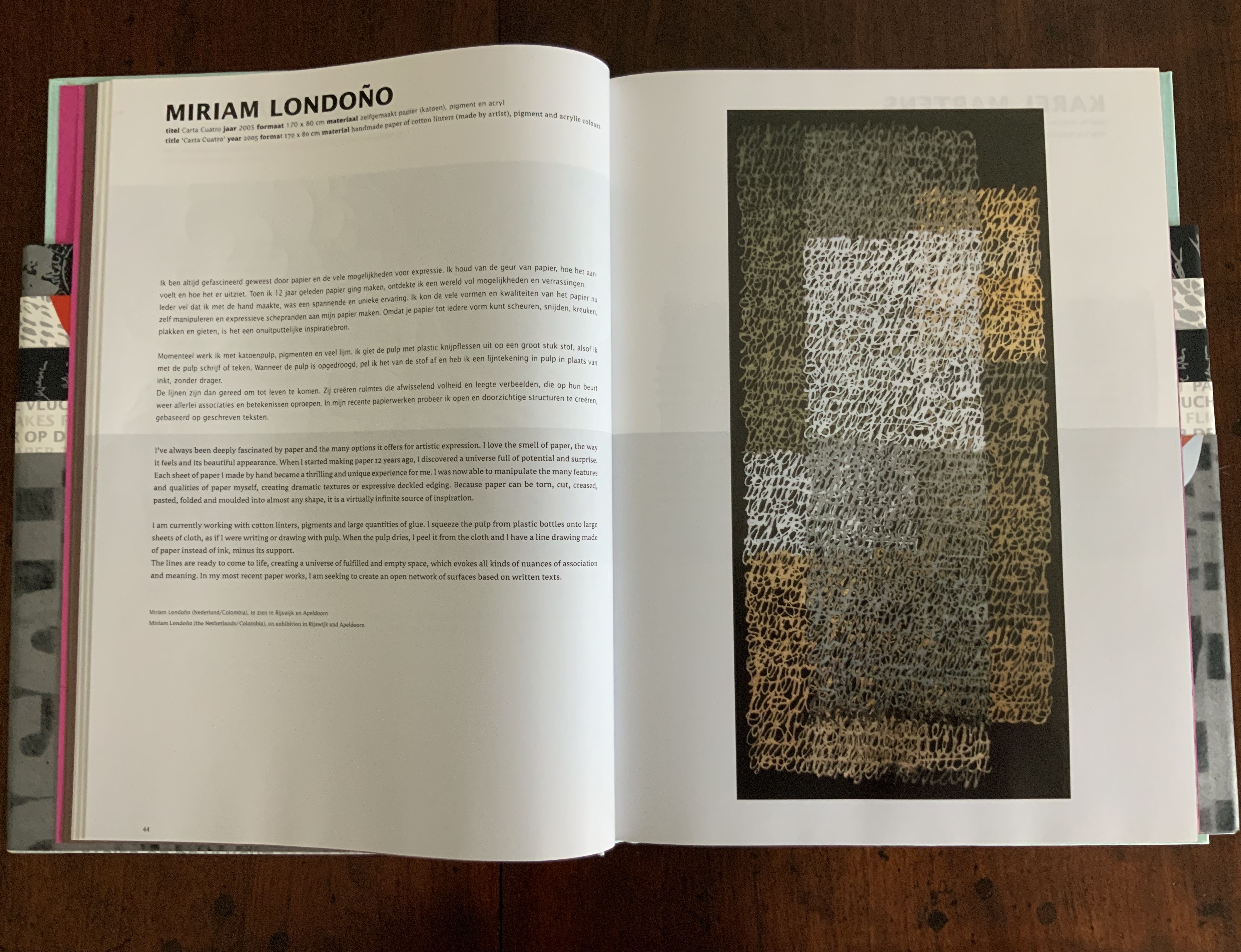
Carta Cuatro, Miriam Londoño
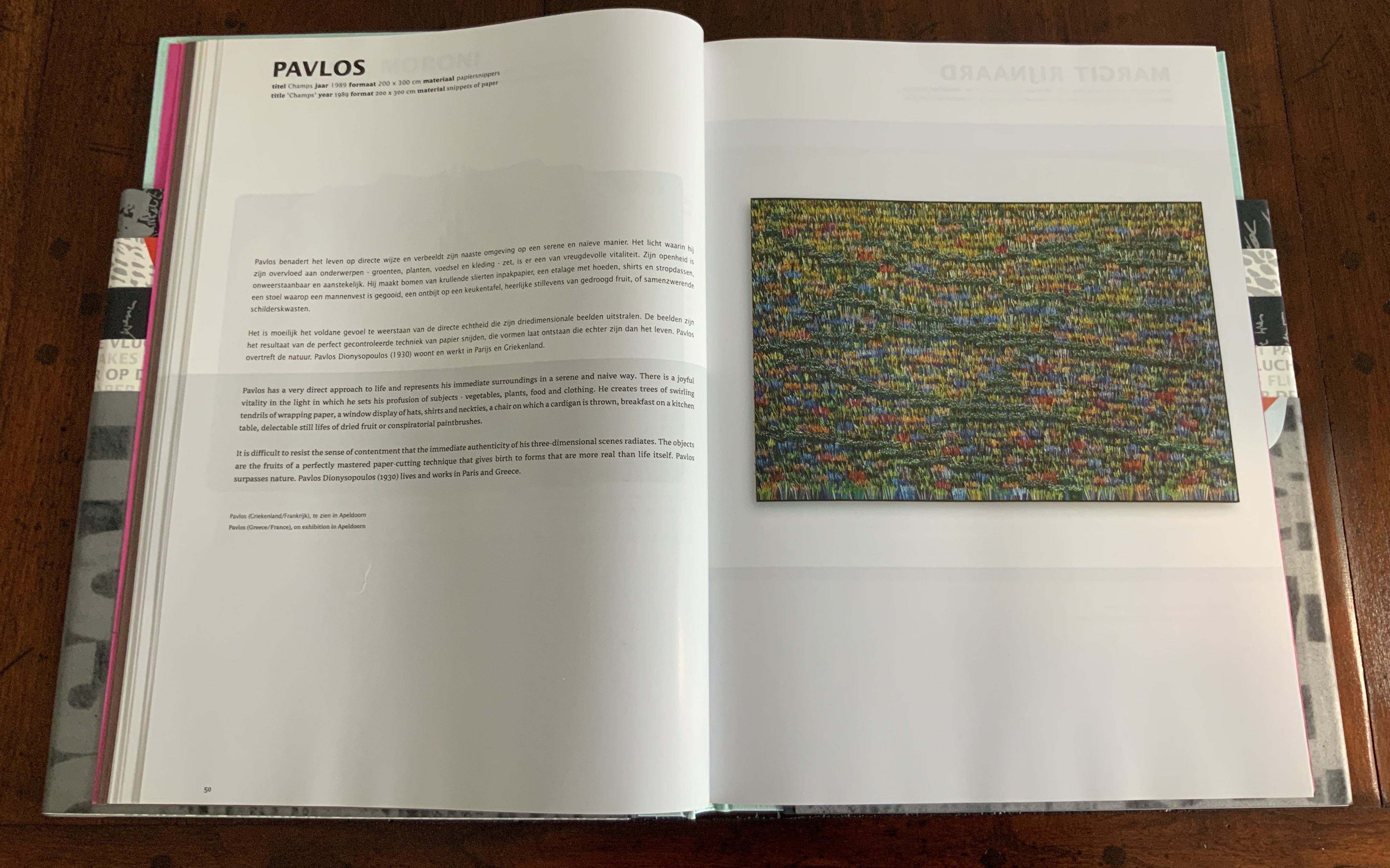
Champs, Pavlos
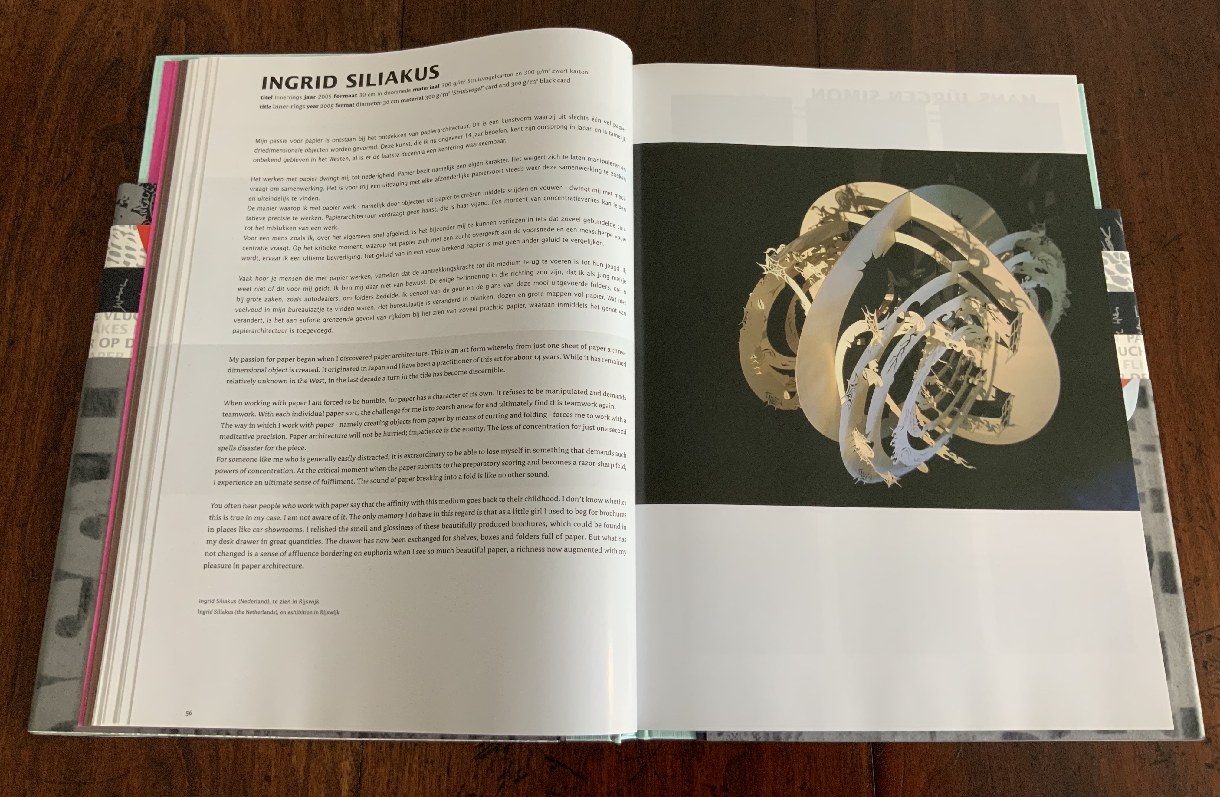
Inner-rings, Ingrid Siliakus
The artworks in Paper Takes Flight offer more instances of cut works — large and small — than other volumes; see, for example, Ishida’s Being in unlimited relationships and Siliakus’ Inner-rings, both above. Only four constitute book art: Lucia Barata’s Mama’s Books, which marks continuity with her sculptural Big Mama from the 1998 Biënnale; John Gerard’s Alpha Beta (see above); Lucille Moroni’s Rose des Sables; and Margit Rijnaard’s Atlas of the whole world.
As is evident from the Table of Contents, several essays fall far from under the aegis of the volume’s organizing metaphor. The coverage stretches for van Verschuer’s piece about paper manufacturers’ trademarks on the wrappers bundling paper reams for trade by land, river and sea. True, too, for Teygeler’s essay on the lessons from his wartime assignment as liaison officer to the Iraqi Ministry of Culture from July 2004 through March 2005. The essays by Van Gelder and Havelaar about mail’s “flight” by ship and air, respectively, fit more comfortably.
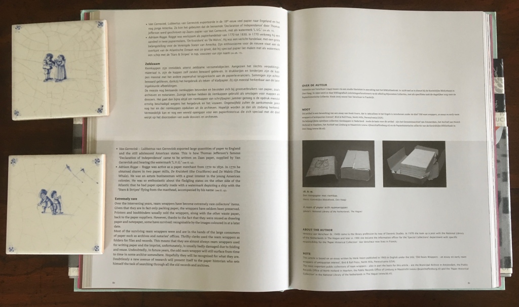
“The hidden history of the ream wrapper”, Veronica van Verschuer
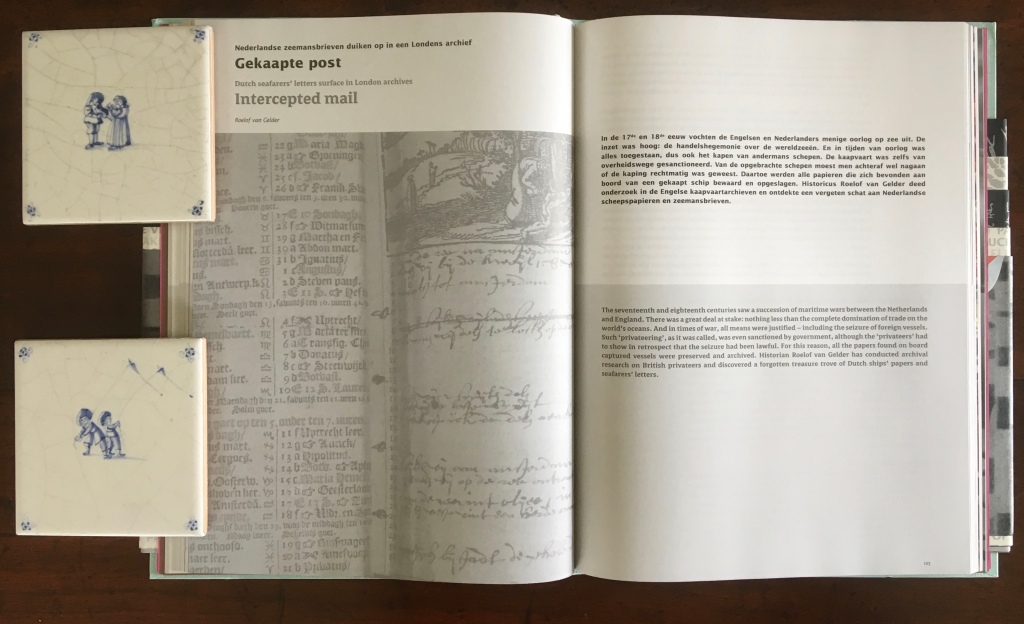
“Intercepted mail: Seafarer’s letters surface in London archives”, Roelof van Gelder
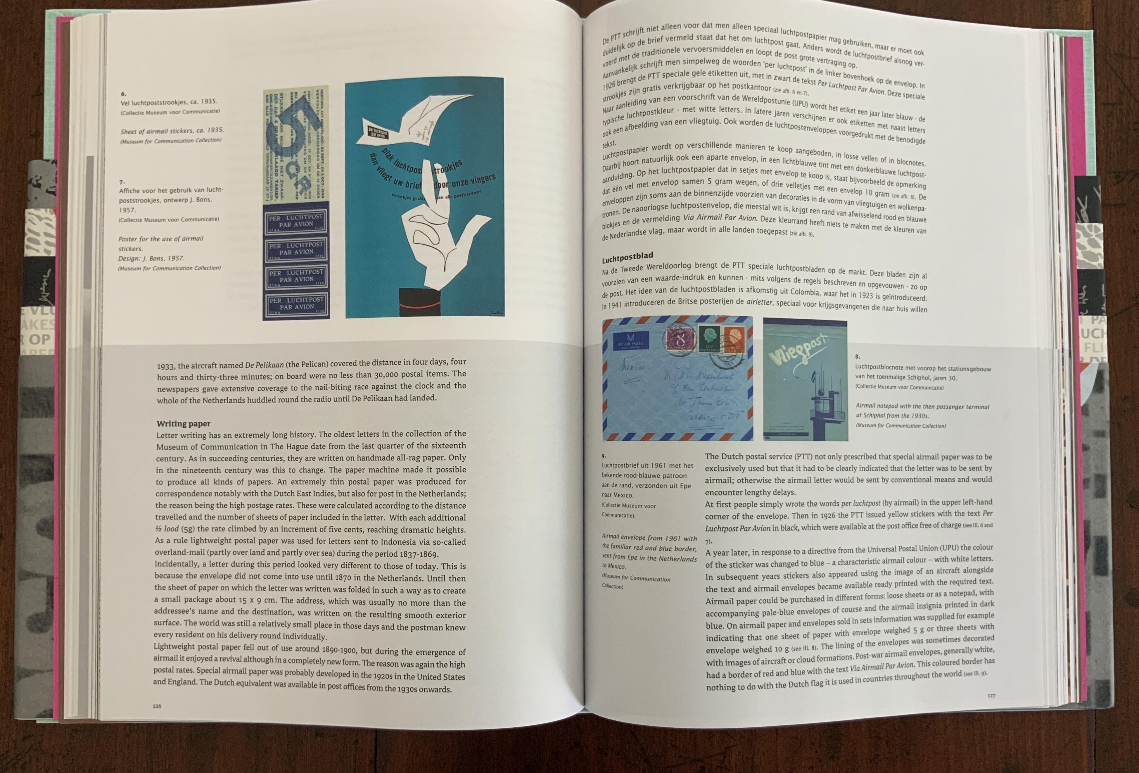
“Paper takes flight: History of airmail paper”, Koos Havelaar
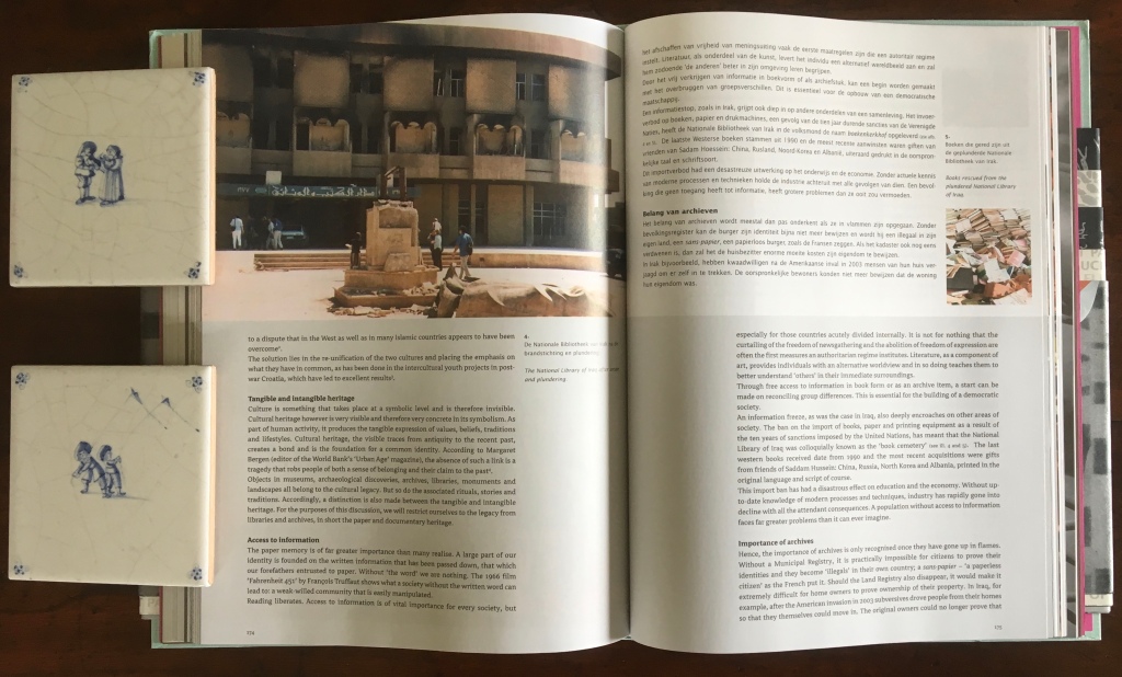
“Paper in the heat of battle: The protection of cultural heritage in times of war”, René Teygeler
Disappointing though some essays’ straining for relevance may be, the subtlety of the harmonising design and admirable quality of material and execution compensate as does the richness of the essays. Teygeler’s “Paper in the heat of battle” deserves a place alongside any recounting of cultural rescue efforts and stands out all the more for the fiery plea from Wassink and Porck for more urgent planning to safeguard our libraries’ holdings.

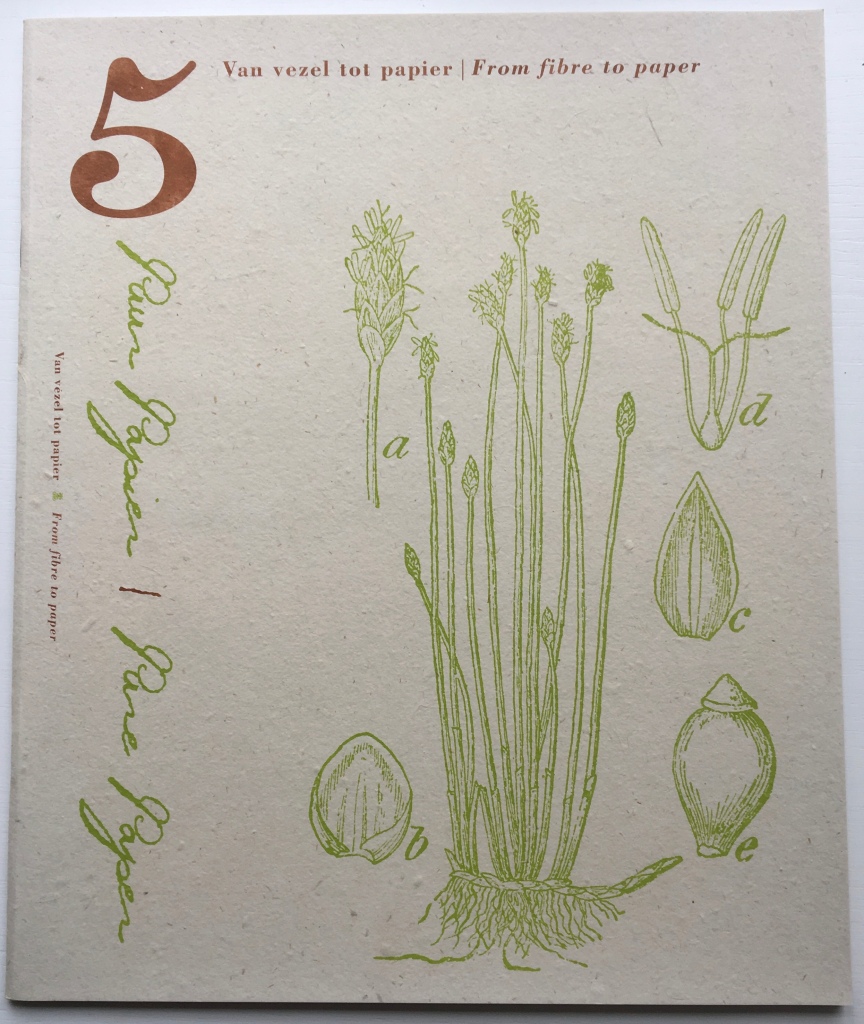
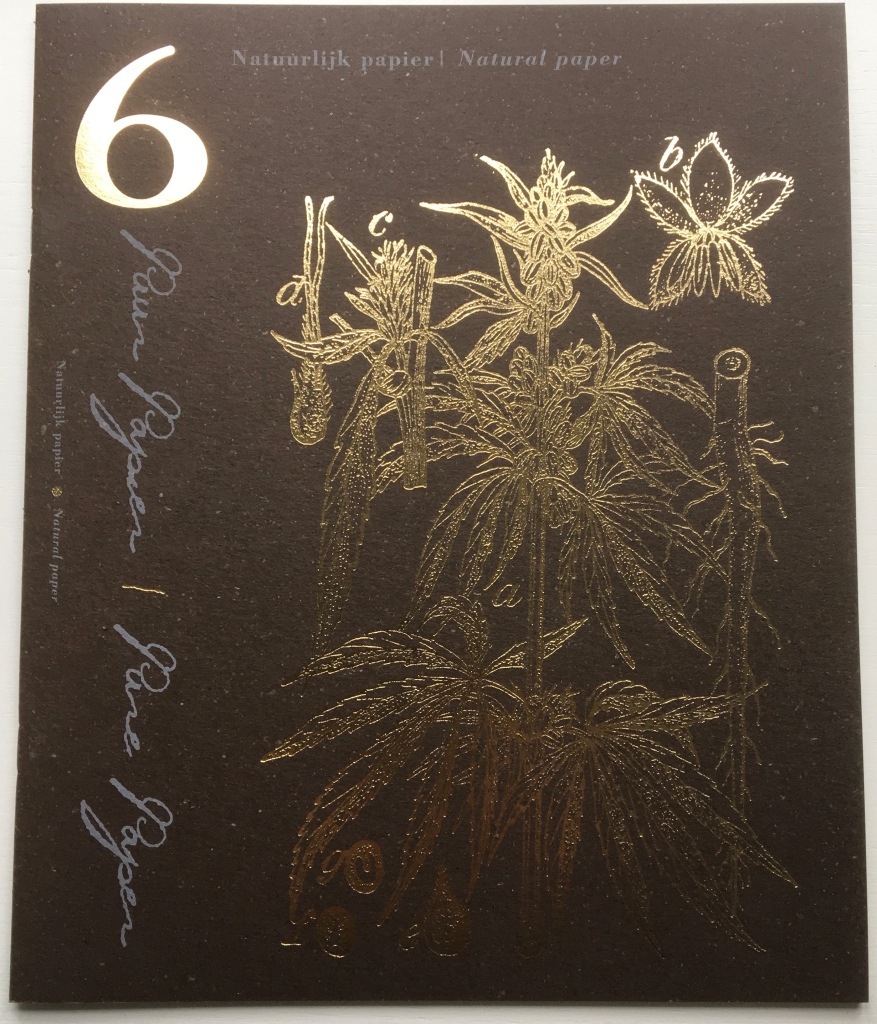
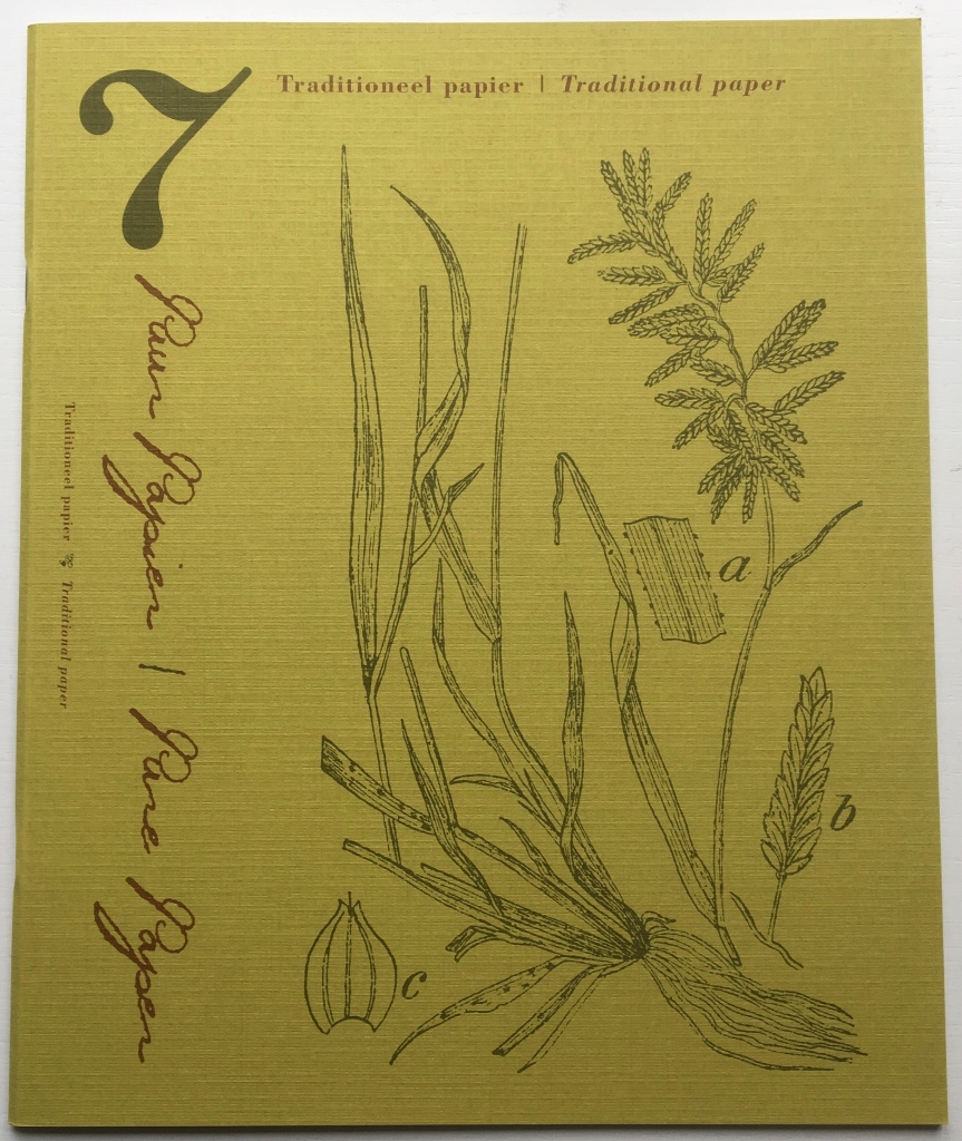
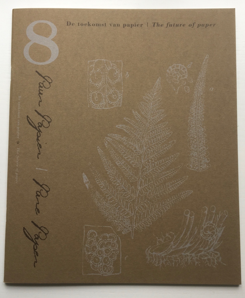
Puur papier = Pure paper (2008)
The Artists: Célio Braga, Long Bin Chen, Nancy Cohen, Petra Ellert, Nikki van Es, Angela Glajcar, Joan Hall, Patricia Hodson, Claudie Hunzinger, Kakuko Ishii, Yu Mi Kim (Hogan), Jin Woo Lee, Winifred Lutz, Richard Mens, Chris Natrop, Oskar, Ed Pien, Maya Portner, Georgia Russell, Stefan Saffer, Lyndi Sales, Annette Sauermann, Howard Silverman, Ferry Staverman, Ivano Vitali, Annette Wimmershoff, Noriko Yamaguchi
The Essayists: Rogier Uitenbogaart, Helen Hiebert, Pat Torley, Bas van Velzen, Piet Zegers, Bert van Joolen, Gabriëlle Beentjes, Henk Porck, Peter Gentenaar, Jacob Eyferth, Elaine Koretsky, Tijl Akkermans, Cia Franssens, Janny Oei, Annita Westenbroek, Michiel Adriaanse, Harry Morsink
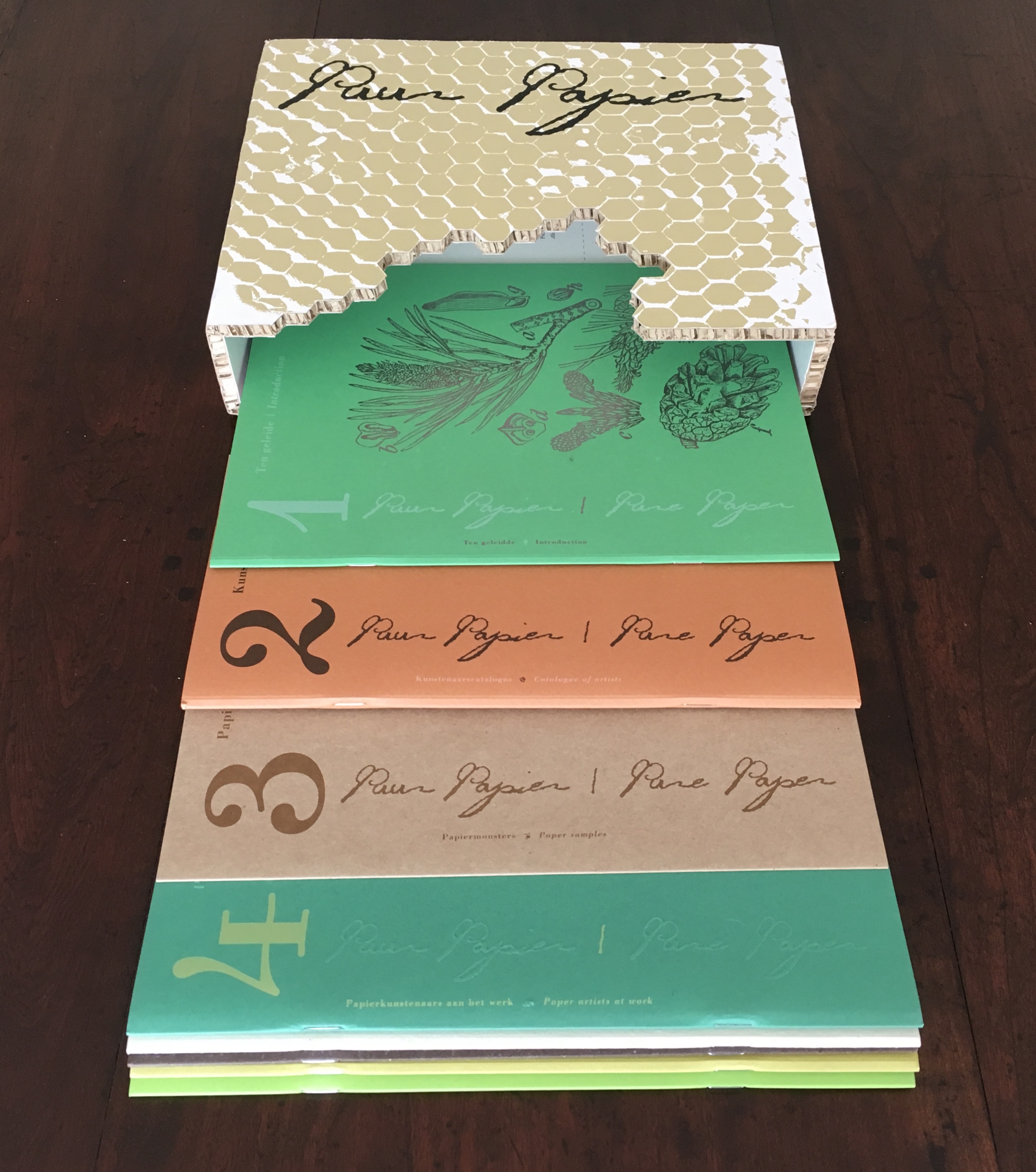
For the last of the seven publications, what title and theme other than Pure Paper could the Gentenaar-Torleys and Schepens choose? The seventh publication “explodes” into nine separate “books” encased in honeycomb board. Each book has its own apropos cover paper, image and print treatment, and seven different papers serve for the text blocks.
- The Introduction’s cover is green card stock, 300 gsm; text, ivory algae paper, 120 gsm.
- The Catalogue of Artists’ cover is Classic Malts Highland, 300 gsm; text, book paper 2.0 cream, 90 gsm.
- The Paper Samples’ cover and text is Class Malts Islay, 300 gsm.
- The Paper Artists at Work’s cover is dark-green Fashion offset, 240 gsm.
- From Fibre to Paper’s cover is hemp paper, made especially by the Middelste Molen; text, ivory algae paper, 90 gsm.
- Natural Paper’s cover is Bock Bier FSC, 250 gsm; text, book paper 2.0 blue/white, 90 gsm.
- Traditional Paper’s cover is Valentinoise Vert Nature, 300 gsm; text, book paper 2.0 cream, 90 gsm.
- The Future of Paper’s cover is Word Line cardstock Terra Africa, 300 gsm; text, Eurobulk, 135 gsm.
- The Catalogue of Books’ cover is lime-green Fashion offset, 240 gsm; text, book paper 2.0 cream, 90 gsm. An order card is printed on Methaphor recycled cream, 300 gsm.
As the titles above and their variety of papers suggest, Pure Paper works our sight and touch overtime. Furthermore, there are 27 artists; 14 of their works are installations or large-scale works; 9 incorporate text or books; 9 are figurative or abstract sculptures; and 5 are medium-sized prints or single-sheet works (as a work can fall into more than one category, the total exceeds 27). Book 4 — Paper Artists at Work — adds three essays from 3 more artists. The paper sample solution — Book 3, a three-panel folder — includes samples relating to those artists’ essays.
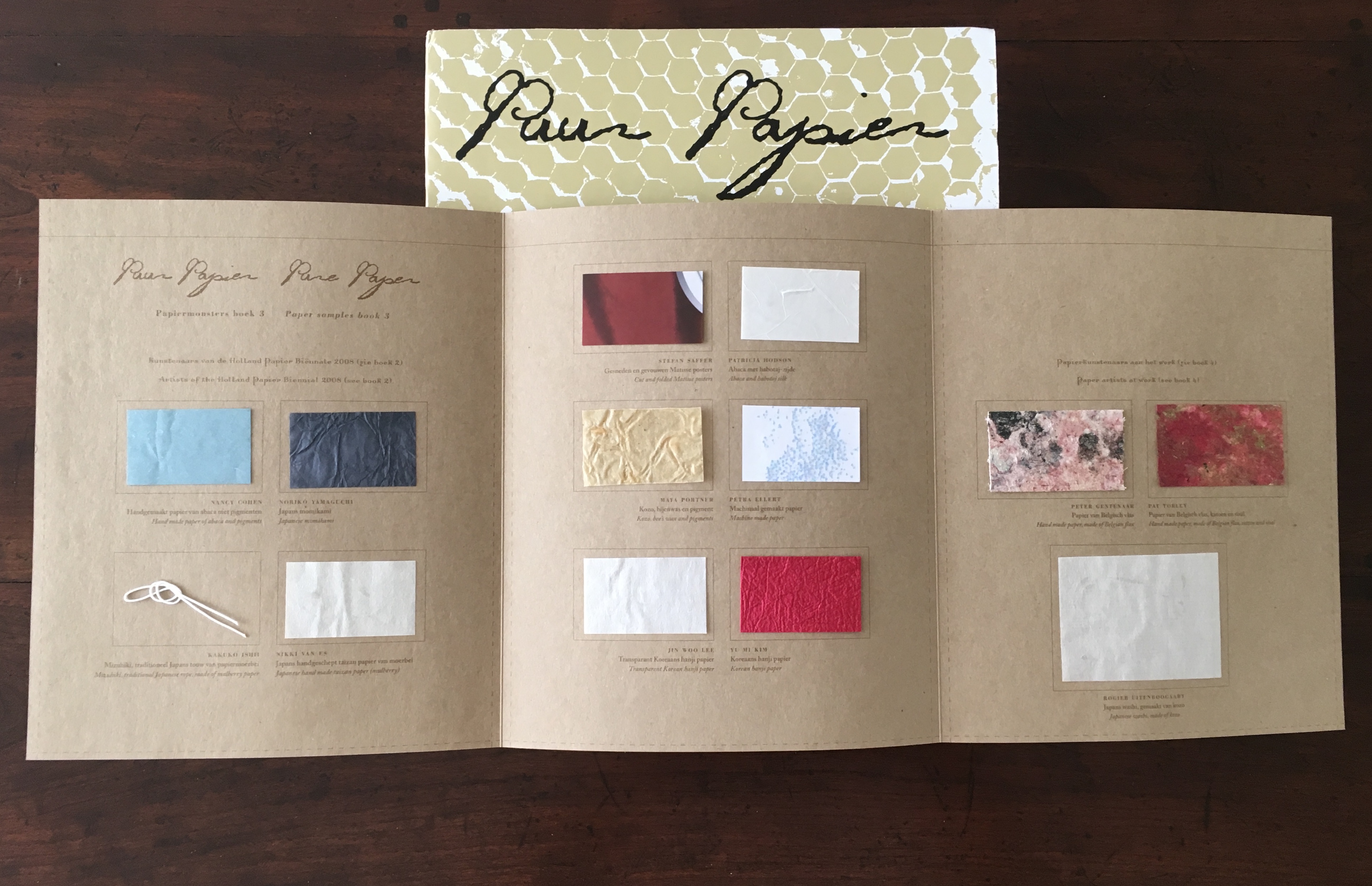
Breaking the publication into nine booklets and using such a variety of papers gamble against achieving unity, but the editors and designer have won. The plants on the front covers echo the artists’ paper palettes and essayists’ subjects. The format of the cover design holds together the variety of images and papers, and the use of typefaces and styles aiding this is masterful.
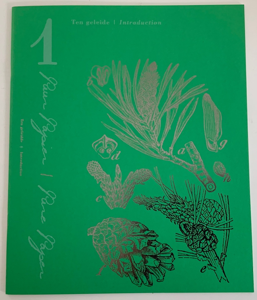

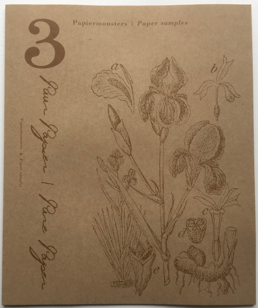
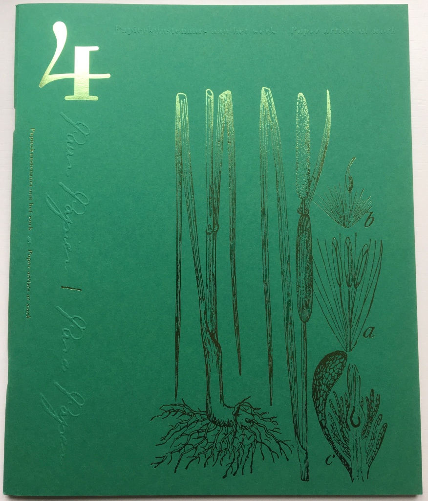

Cover images: 1 – Scots pine (pinus sylvestris); 2 – Field horsetail (equisetum arvense); 3 – Bearded iris (iris germanica); 4 – Narrowleaf cattail (typha angustitolia); 5 – Slender Spike rush (scirpus uniglumis); 6 – Hemp (cannabis sativa); 7 – Lehmann lovegrass (eragrostis major); 8 – Male Shield fern (polystichum filix mas); 9 – Maize or Corn (zea mays).
From taizan paper to telephone book paper, from white sweet grass (glyceria aquatica) to paper mulberry (broussonetia papyrifera), from a Matisse poster to South African Airlines boarding passes, from cardboard and washi to concrete and flax paper — the breadth of paper material used by the artists is jaw-dropping. A recurrent theme is the tension between light and dark, airiness and heaviness or the ephemeral and the lasting.
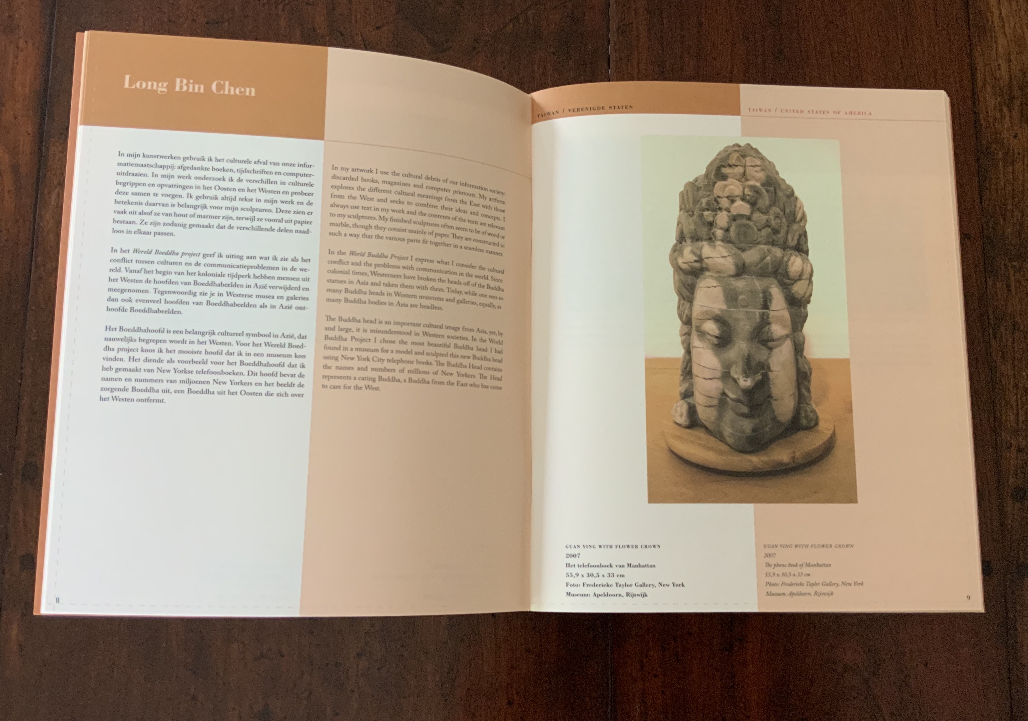
Guan Ying with Flower Crown, Long Bin Chen
The work above by Long Bin Chen evokes the stony weight of a carved Buddha’s head with the flimsy paper from New York telephone books. The 159 boarding passes comprising Lyndi Sales’ Shatter (2008) evoke the impermanence and permanence of life and death with their burnt edges and reference to the 159 lives lost in the onboard fire and crash of SAA Flight 295 in November 1987.
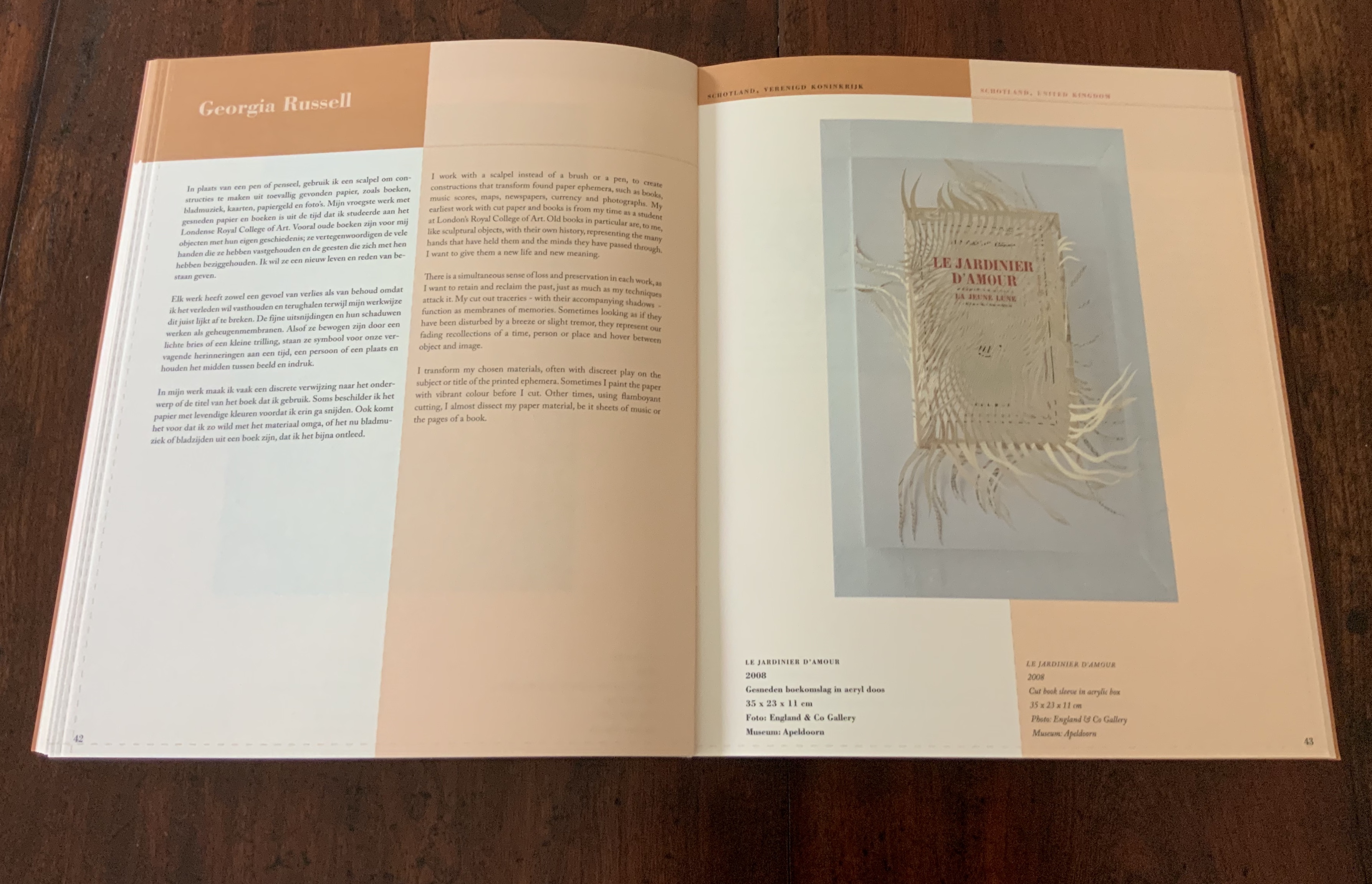
Le Jardinier d’amour, Georgia Russell
Commenting on her works like the one above, Georgia Russell writes: “There is a simultaneous sense of loss and preservation in each work, as I want to retain and reclaim the past, just a as much as my techniques attack it.” In other paper artists’ works, such as that below by Oskar (Janos), the expression of opposites or tensions inherent in their material leads to the surreal.
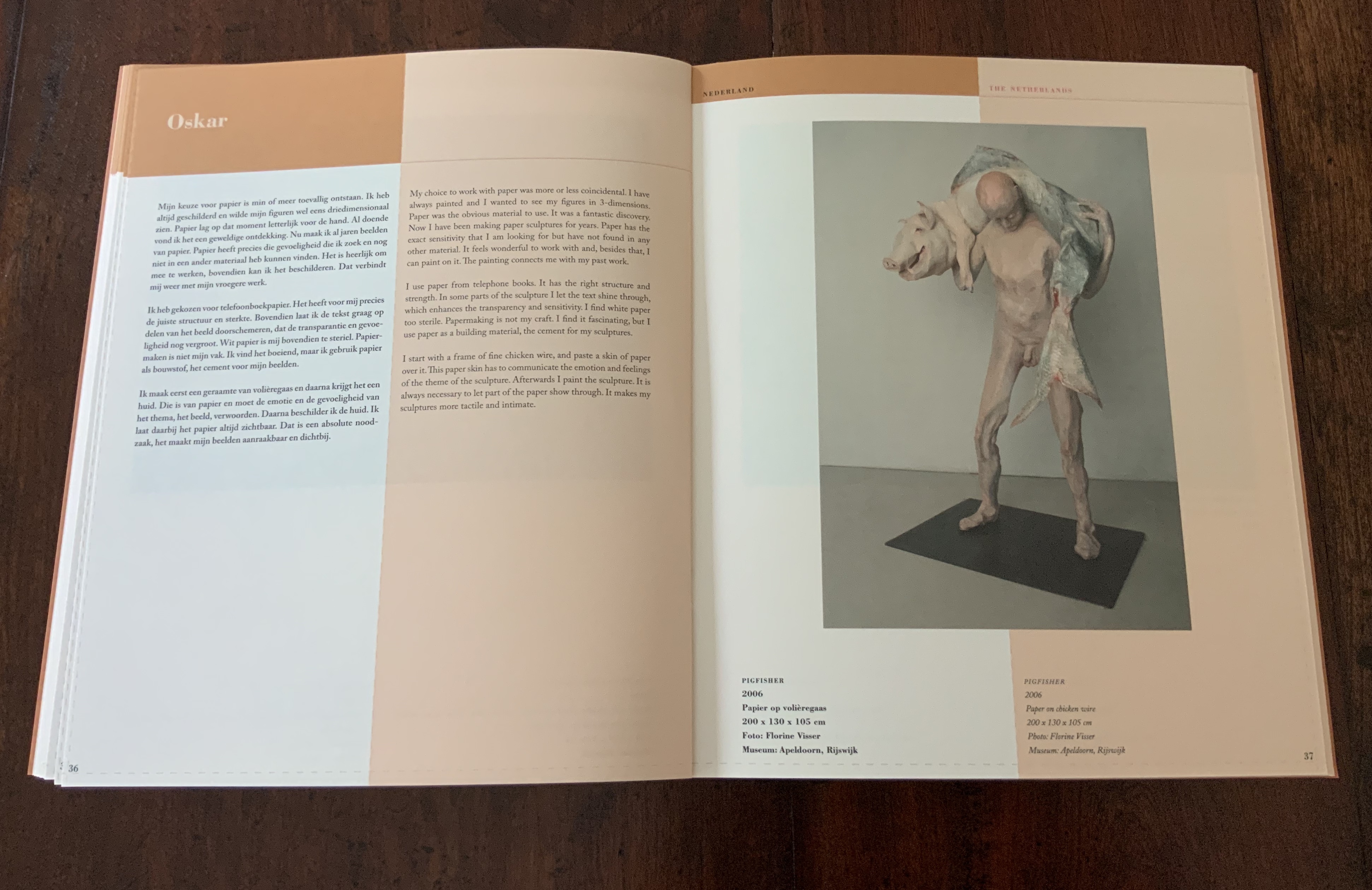
Pigfisher, Oskar
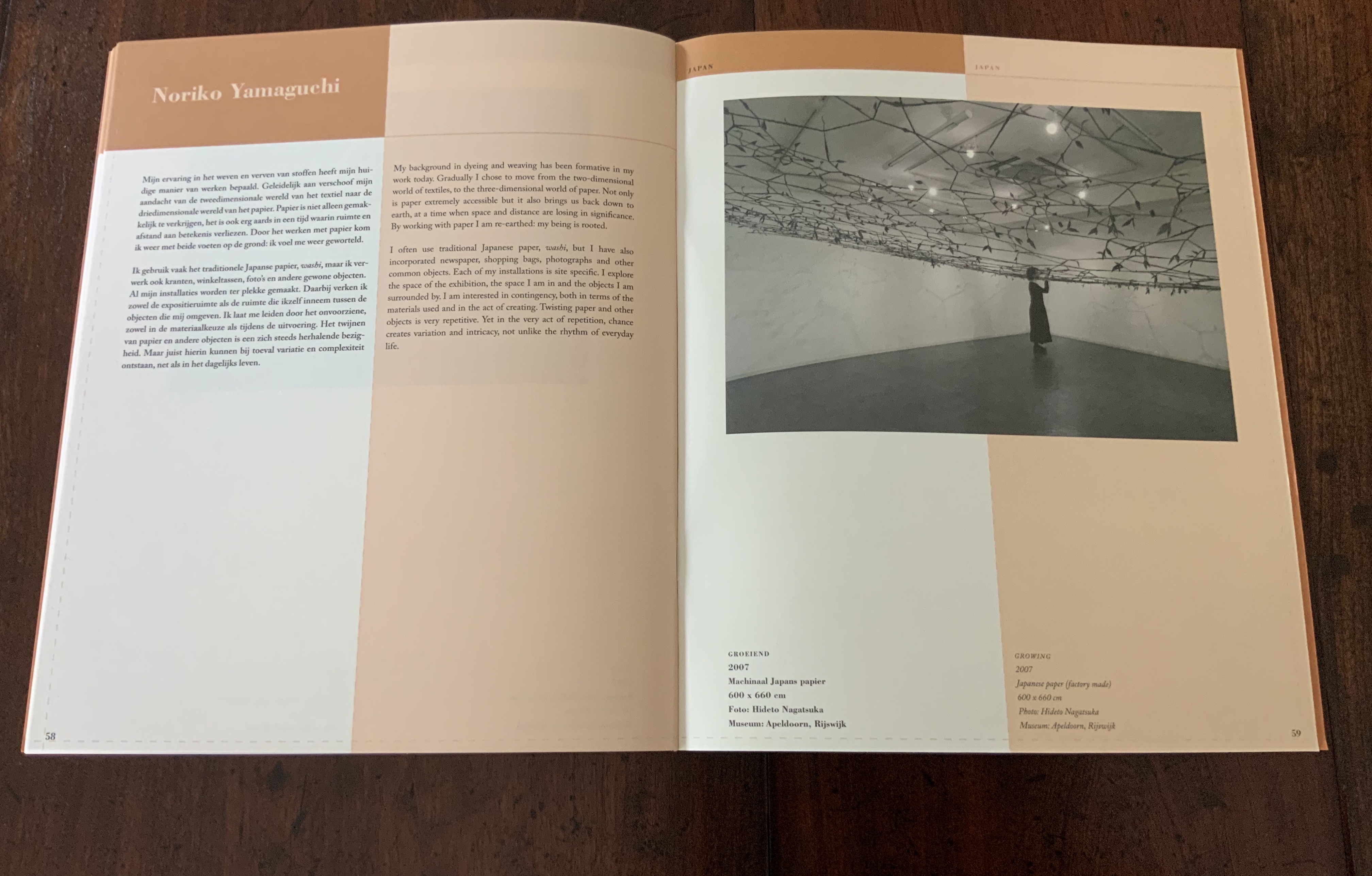
Growing, Noriko Yamaguchi
For other artists, paper leads to the abstract, such as the ceiling-wide canopy of paper vines and leaves twisted by Noriko Yamaguchi above, or Annette Sauermann’s Light Reservoirs installations. For other artists, paper embodies a tension between the inactive object and active process by which the object comes to be. Musumu, the title of the work below by Kakuko Ishii, is a verb meaning to tie or connect, and the work itself is made of mizuhiki, Japanese paper string, which the artist ties and knots together.
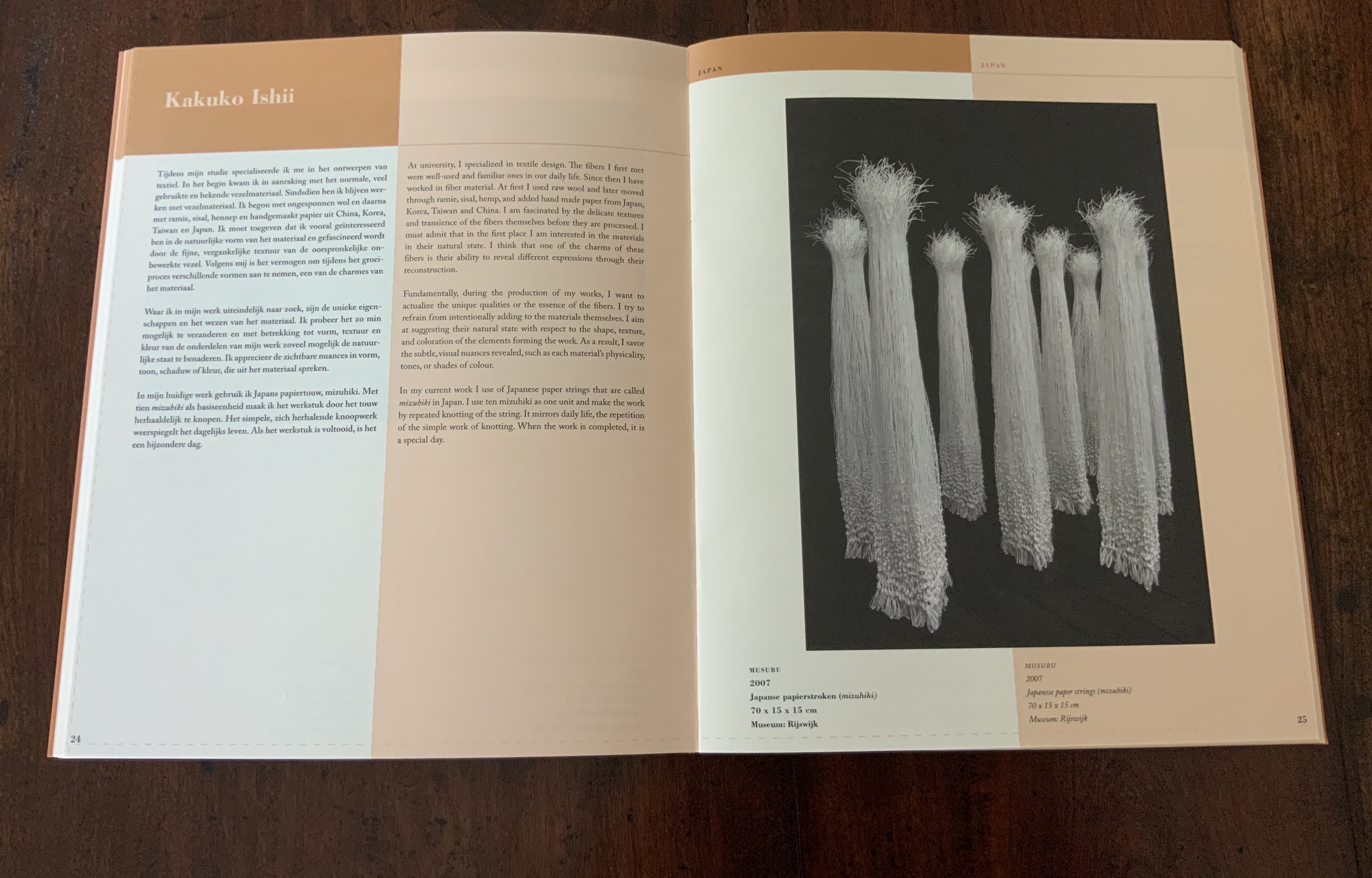
Musubu, Kakuko Ishii
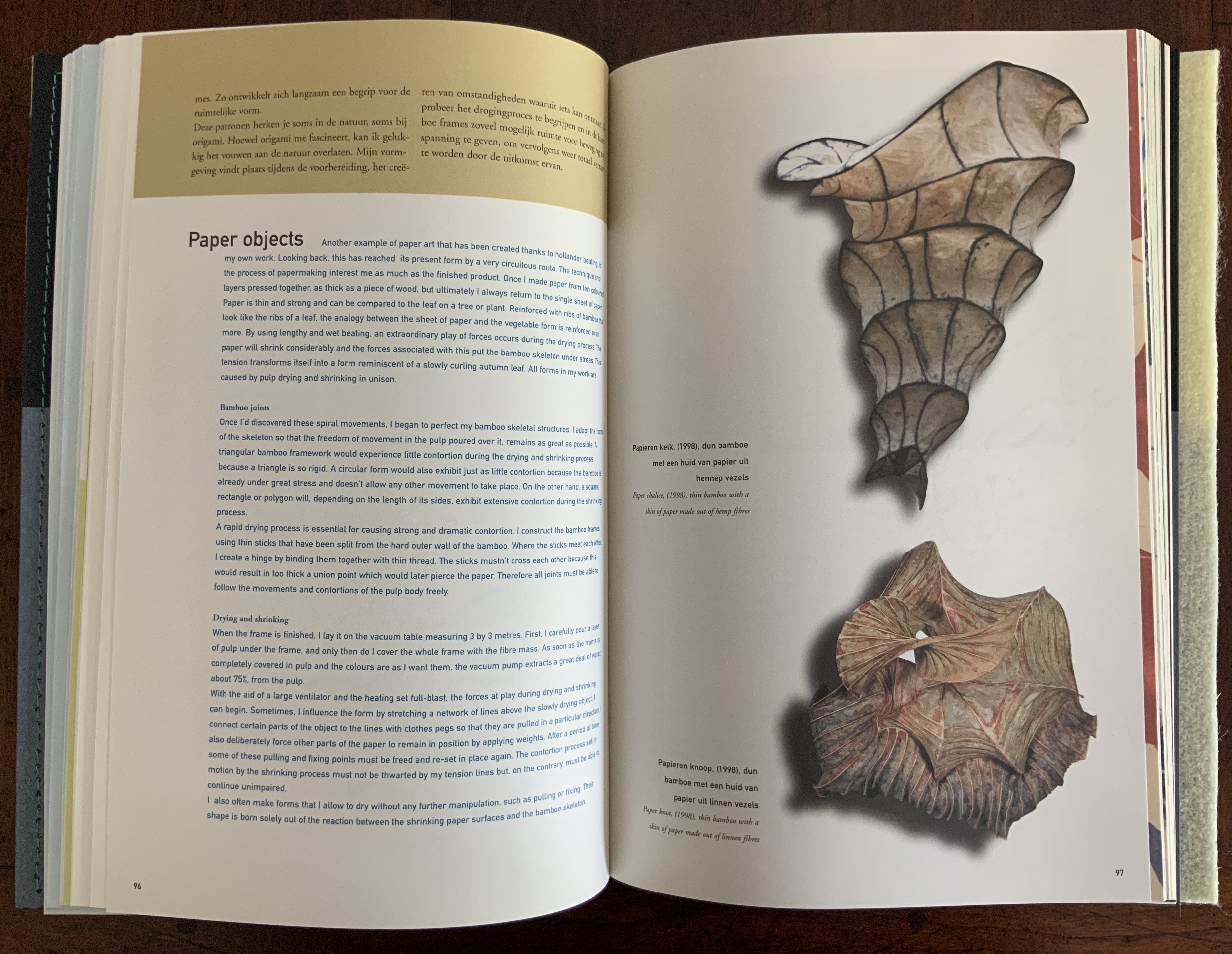
Book 4 picks up the theme of process, highlighted by so many of the artists’ statements, and devotes three pictorial essays to it: Rogier Uitenbogaart on making “real” Japanese paper (washi); Helen Hiebert on Peter Gentenaar’s papermaking innovation and its symbiosis with his dramatic paper sculptures; and Pat Gentenaar-Torley on the intricate steps of preparation and painting with paper pulp. If, after Book 4 the reader has any doubt that Pure Paper is undeniably the right title for the seventh Biënnale publication, Books 5-9 sweep it away.
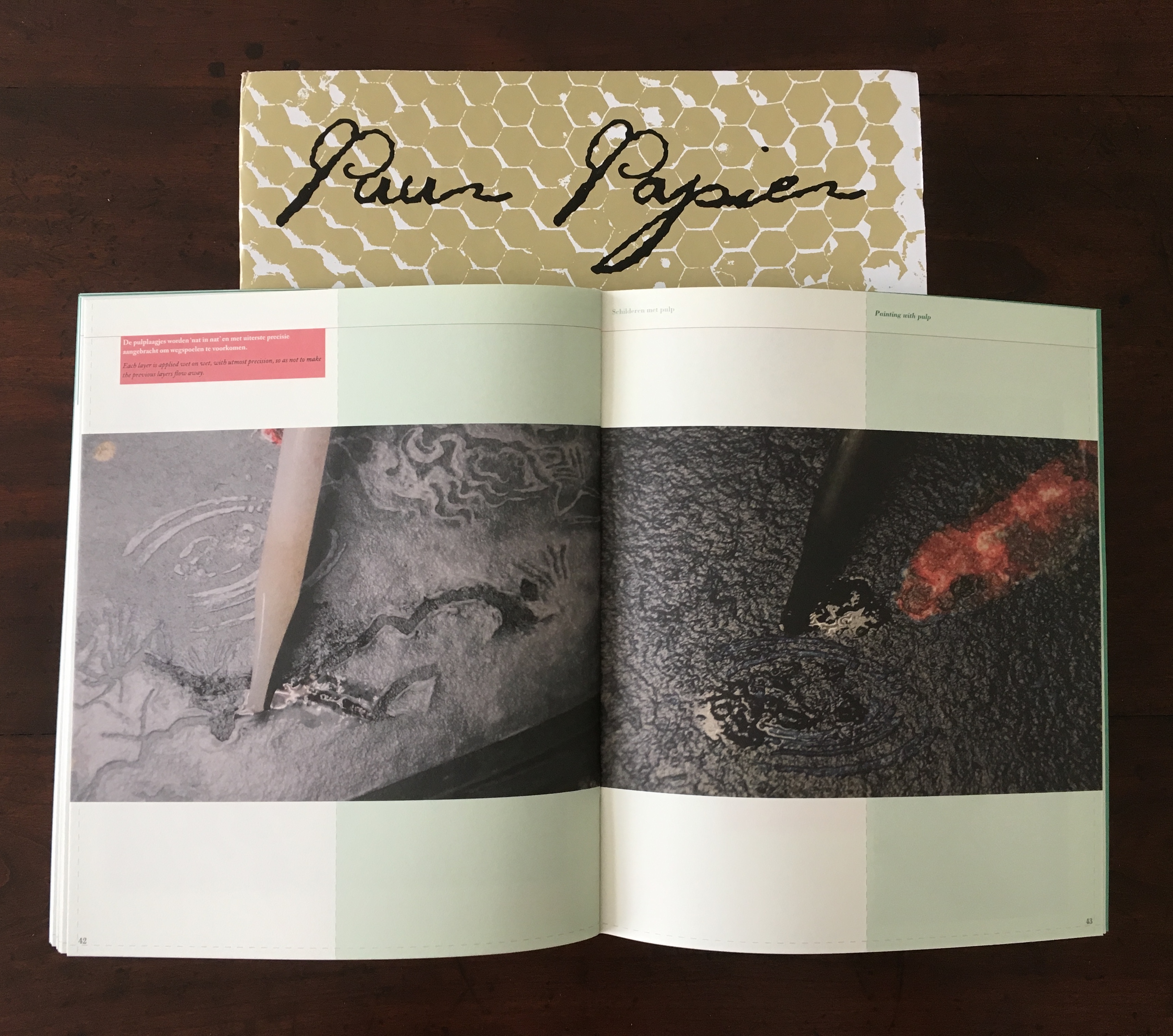
“Painting with Pulp”, Pat Gentenaar-Torley in Book 4.
Between its rough cover made of hemp fibre from the Middelste Molen, the only authentic water-wheel and steam-engine powered paper production mill in the Netherlands, Book 5 serves up a thoroughly accessible scientific essay on how water and fibre unite to form paper. The follow-on essay about the hand-formed and machine-made paper manufactured at the Middelste Molen makes the science of the preceding essay even more palpable. Looking back to the Richard de Bas mill mentioned in the first Biënnale publication, the reader might be tempted into a pilgrimage from Ambert to Loenen (if not, the links provide films of the two working museums).
Books 6 through 8 deliver the sort of rich anecdotes (from history, industry and the sciences) with which Tactile Paper launched the series; they also build extensively on the pictorial approach initiated by René Teygeler in Paper and Fire and Paper and Water. Helen Hiebert underscores the series’ element of practical advice with her essay on fibre preparation in Book 6.
”Papermakers from the Animal Kingdom”, Peter Gentenaar, Book 6.
In Book 7, with their insights into rural papermaking tradition in China as well as other parts of Asia, Jacob Eyferth and Elaine Koretsky lay the ground for Book 8’s striking essay by the graphic designer Tijl Akkermans on Beijing’s urban and suburban poor whose tough lives form a critical link in the recycled paper economy.
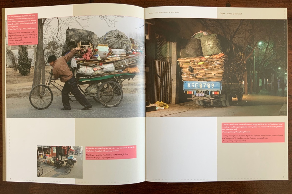
“Paper – a way of survival”, Tijl Akkermans and Xian Xiao Yuan, Book 8.
Pure Paper’s Book 8, The Future of Paper, is still spot on eleven years later. The emphasis on paper recycling and the search for alternative sustainable raw material for paper remain remain important to the paper industry and the arts. But in a call from Books On Books (17 September 2019), Dr. Annita Westenbroek, another contributor to Book 8, notes that, with China’s 2018 refusal of imported waste due to inadequate sorting, the equilibrium of the recycling economy has shifted. The price of recycled paper relative to that of locally available biological substitutes has fallen, and current incentives to manufacturers for reducing their carbon footprint do not take into account all aspects of the supply chain — only reductions at the point of manufacture. The effect for now is less pressure to source locally available biological alternatives for fibre. Still, eleven years later, the photo and caption in the Franssens and Oei essay has only gained urgency and poignancy.

“A compass for the paper jungle”, Cia Franssens and Janny Oei, Book 8.
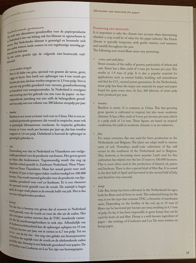
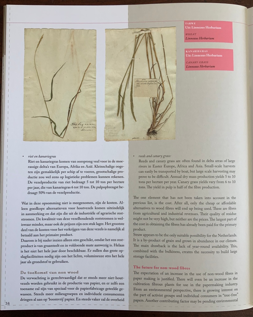
“Alternative raw materials for paper”, Michiel Adriaanse and Harry Morsink, Book 8.
The prescience of the organisers of the Papier Biënnale and its publication coordinators also shows in the post-2008 recognition achieved by the artists who participated. For example:
Angela Glajcar’s Terforations at the 2017 CODA Apeldoorn.
Joan Hall’s installation The Invasion of Hull Cove at the 2019 Venice Biënnale.
Yumi Hogan, awarded the 2018 Legaluppi Award for Excellence in the Arts at the Italian Cultural Center’s 60th Anniversary in Baltimore, Maryland.
The inventiveness on display in the first seven books of the Rijswijk Museum’s Papier Biënnale (1996-2008) makes a lasting impression. So does the social, historical, economic and environmental concerns displayed by the organisers, designer, artists and essayists. While 2008 marked the beginning of a decline in the paper industry, the Rijswijk Museum’s Papier Biënnale itself and many other exhibitions mentioned by the International Association of Hand Papermakers and Paper Artists (IAPMA) continued — and still continue — to attract a growing number of outstanding paper and book artists from all over the world. There is every evidence that their inventiveness and their concerns — artistic and wider — will rise to the occasion of the paper industry’s and globe’s continuing challenges.
Further Reading
Jonathan Bloom. Paper Before Print: The History and Impact of Paper in the Islamic World (New Haven, CT: Yale University Press, 2001)
Helen Hiebert. The Papermaker’s Companion: The Ultimate Guide to Making and Using Handmade Paper (North Adams, MA: Storey Publishing, 2000)
Dard Hunter. Papermaking: History and Technique of an Ancient Craft (Lettering, Calligraphy, Typography) (Mineola, NY: Dover Press, unabridged, 1978, republication of the second, revised and enlarged, 1947, edition)
Mark Kurlansky. Paper: Paging Through History (New York, NY: W.W. Norton, 2016)
Thad McIlroy. “The Future of Paper”, The Future of Publishing, 3 January 2018. Accessed 14 September 2019.
Lothar Müeller. White Magic (Cambridge, UK: Polity Press, 2014)
Jessica Vincent. “Indigenous Women Are Publishing the First Maya Works in Over 400 Years”, Atlas Obscura, 08 August 2019.


