Tau blau / Dew Blue (2013) Barbara Beisinghoff ; Solander box in linen, handbound Vera Schollemann; Flax paper, handmade by John Gerard. Solander box: H240 x W200 x D32 mm. Flagbook: H220 x W180 mm. Edition of 38, of which this is #22. Acquired from the artist, 30 December 2024. Photos: Books On Books Collection.
Familiarity with Hans Christian Andersen’s fairy tale Hørren /The Flax enhances appreciation of Barbara Beisinghoff’s Tau blau / Dew Blue. Andersen gives a voice to the plant that expresses its joy, pain, hope and observations at each stage of its blooming, being harvested, turned into linen and clothing then paper, and finally consigned to flames. The H.C. Andersen Centre offers Jean Hersholt’s translation of it here.
Only the opening paragraph of the story appears in Tau blau / Dew Blue, but Beisinghoff documents and illustrates the stages from her own cultivation of flax, observation of its growth and preparation of its processing. And with the etching, drawing, watermarking, handmade papers, linen cloth and thread, and binding structure, Beisinghoff suffuses the spirit of the tale’s metamorphosizing plant throughout the whole of Tau blau / Dew Blue.
From the blue of the plant’s blossoms to the white of its change into linen and paper to the red, burnt orange and black of its sparks and ash when it is consumed by fire in the end, all of the story’s colors are replayed across Tau blau / Dew Blue from its Solander box to its covers and spine like motives in a Baroque musical piece.
In a concerto, motives play off one another and develop. In Tau blau / Dew Blue, the motif of nature (the plant) plays off the motif of artifice and the manmade (the fairy tale, music, linen, paper, etc.). On the front cover (above), a young girl, surrounded by large damselflies, plays a fiddle or violin and seems to hover above a silver foil image of flax thread and tools for making it. In the spread above alongside the front cover, the specks rising over the staves and musical notes (a recurring motif in itself) recall the tale’s final passage in which the bundle of papers (made from linen rags) is cast into a fire:
“I’m going straight up to the sun!” said a voice in the flame. It was as if a thousand voices cried this together, as the flames burst through the chimney and out at the top. And brighter than the flames, but still invisible to mortal eyes, little tiny beings hovered, just as many as there had been blossoms on the flax long ago. They were lighter even than the flame which gave them birth, and when that flame had died away and nothing was left of the paper but black ashes, they danced over the embers again. Wherever their feet touched, their footprints, the tiny red sparks, could be seen.
Images of tools — whether for preparing flax or for making the products from it — also recur on the inside of the front and back covers and throughout the book. The human figures alongside the tools, however, appear engaged in more than manufacturing. Elsewhere in the book, they dance, they sit and meditate or write, they row on ponds beside the growing flax. The fairy tale, too, has these Romantic juxtapositions of nature, art and craft. So, again, the spirit of Andersen’s tale finds another way into Tau blau / Dew Blue.
Inside front and inside back covers.
The front cover also announces another motif in those coils of thread below the young girl’s feet. Within the coils is the image of a Fibonacci spiral, which appears on the back cover and throughout the book in different ways. It can be found drawn and printed. It can be found in watermarks in the handmade paper. It can be found in the arrangement of florets in flax. Being a composite flower, flax blossoms display the spiral based on the Fibonacci sequence 1, 2, 3, 5 … 233, and so on. These numbers are waterjet-drawn on the pure flax paper below and explained in an entry printed on the adjacent plain handmade paper folio. By appearing on the book’s front and back covers, the spiral echoes the beginning and ending cycles of birth and rebirth the flax goes through in the folktale.
The Fibonacci spiral on the front and back covers.
The sequence of Fibonacci numbers 1, 2, 3, 5 … 55, 89, 144, 233 … watermarked on handmade flax paper with a water jet.
Description of the Fibonacci spiral side by side with quotation from Thompson’s On Growth and Form (1917), drawing on Leibniz’s Rationalist philosophy.
To organize and weave her motives together, Beisinghoff uses an accordion spine to whose peaks eleven sets of folios are sewn with linen thread. Three of the eleven are 4-page folios consisting of blue handmade paper. Another three 4-page folios consist of pure flax paper (handmade by John Gerard). The remaining five gatherings have 8-page folios, each consisting of a pure flax paper folio around a blue or plain one.
Side and top views of the accordion spine.
The first pure flax folio begins the book, displaying two title pages (German and English) and two etchings on its first and last pages. In the center spread, two more etchings appear. A watermark symbolizing phyllotaxis shows through in the upper left, balanced by a watermark with a cross section of a flax stalk in the upper right of the center spread. The texture and weight of the flax paper allows the impress and shadow of the etchings to stand out on both sides against the inking and watermarks.
Inside front cover and Tau blau title page and etching.
Center spread of first flax paper folio. Note the watermarks in the upper left and right corners.
Dew Blue title page and etching, loop of flax fibers, first page of blue handmade paper folio; note its boating image repeated from the prior center spread.
Following the pure flax folio, the first all blue folio gives us that introductory excerpt from Andersen’s fairy tale. Next comes a description of flax comes from Leonhart Fuchs’ Book of Herbs (1543), then the series of planting and harvesting observations from Beisinghoff, then the refrain from Clemens Brentano’s poem “Ich darf wohl von den Sternen singen” (1835), then philosophical observations drawing on G.W. Leibniz from D’Arcy Wentworth Thompson’s On Growth and Form (1917), a much-quoted theorem of musical composition from Bernd Alois Zimmermann’s Intervall und Zeit (1974), and finally (below) a passage of text by Gottfried Benn from the Hindemith oratorio Das Unaufhörliche / The Neverending (1936). In the valleys of the accordion spine, some of the lines from Andersen, Fuchs, Beisinghoff and Been appears handwritten in orange paint.
Translated fragment of Benn’s lyrics for Paul Hindemith’s oratorio Das Unaufhörliche / The Neverending (1936).
Even with these additional texts, Andersen’s fairy tale remains the most central text in Tau blau / Dew Blue, despite the brevity of its excerpt. Brentano’s Romantic/religious expostulations (“O Star and Bloom, Garb and Soul, Love, Hurt and Time for evermore”) sound like those of the plant in the story’s final passage. The occurrence of Fibonacci’s spiral in the plant may be a physical fact, but Beisinghoff turns it into something more mystical by placing the description of phyllotaxis next to Leibniz’ and Thompson’s transcendental view of mathematical science and natural philosophy. Likewise she links the texts from Bernd Alois Zimmermann and Gottfried Benn to the fairy tale by placing them beneath the etching that captures the flax plant’s singing and dancing into its transformation by fire.
Below is the final folio of the work. Like the first, it is made completely of flax paper, but its center spread offers a fuller image: flax blossoms and stalks float in the foreground, and in the background is a sketch of Beisinghoff’s residence where she grows her flax. Like the Fibonacci spiral on the front and back covers, the first and last flax folios round out the work. But go back and listen for the hidden sound installations accompanying Dew Blue. Noticing Beisinghoff’s abstract musical notation, indulge yourself with recordings of a Swedish folk song (“Today is supposed to be the big flax harvest” here or here) to which the notation and phrases allude, and as the flax papers turn and wave on their accordion peaks, listen carefully for their musical rustle.
The final pure flax paper folio.
Tule Bluet damselfly perched on flax leaf. Photo: John Riutta, The Well-Read Naturalist (2009). Displayed with permission.
Die wilden Schwäne (2001)
Die wilden Schwäne (2001) Barbara Beisinghoff Box with embossed cover holding folios wrapped in chemise. H35o x W250 mm. 18 folios. Edition of 25, of which this is #6. Acquired from the artist, 20 December 2024. Photos: Books On Books Collection.
Barbara Beisinghoff’s Die wilden Schwäne is an exemplar of collaboration and craft. In it, she even requires collaboration between Hans Christian Andersen and the Brothers Grimm. Andersen’s Die wilden Schwäne and the Grimms’ Die sechs Schwäne are based on the same tale of brothers turned into swans who are saved by their sister Elisa’s diligent and mute harvesting, pulping, spinning and sewing of stinging nettles into shirts that break the spell when donned. H.C. Andersen, however, is verbose and elaborate in his telling (even including vampires!), and Beisinghoff has done a bit of nipping and tucking with the more succinct Brothers Grimm to create a version more suited to the artist’s book she creates.
To match Elisa’s effort with stinging nettles, Beisinghoff enlisted the collaboration of Johannes Follmer, the owner of a paper mill. Together they obtained cultivated stinging nettles from the Institute for Applied Botany in Hamburg, cut the fibers, left them to rot, boiled them into a pulp, mixed that with water in a vat, scooped up layers in a sieve embroidered with illustrations, couched the sheets, then pressed and dried them into paper. Beisinghoff applied further drawings with a water jet, watercolor and pencil to the watermark-embossed sheets to illustrate aspects of the tale. To present the Andersen/Grimm “collage”, Beisinghoff had the type set and printed at the Gutenberg Museum. Andersen is printed in light green and Grimm in light red on seven numbered translucent sheets and interleaved with the nine folios of paper art (two more translucent sheets carry the cover page and colophon). To wrap the folios together, Beisinghoff made an embossed chemise or “feather dress” of pure nettle fiber, which could represent Andersen’s description of the brothers’ blowing off each other’s feathers every evening when the sun has set or one of the shirts that their sister makes to break their spell.
The “feather dress” of stinging nettle fiber.
“The King’s little daughter was standing in the cottage room, playing with a green leaf, for she had no other toys. She pricked a hole right through the leaf, looked up at the sun, and there it was, she saw the clear eyes of her brothers, but every time the warm rays of the sun shone on her cheeks, she thought of all their kisses.” Translation with DeepL.
“When she had fallen asleep, it seemed to her as if she were flying high through the air, and she met a fairy, beautiful and radiant, yet she looked very much like the old woman who had given her berries in the forest and told her about the swans with gold crowns on their heads.” Translation with DeepL.
“The swans swooped down to her and lowered themselves so that she could throw the shirts over them: and as she touched them, the swan skins fell off, and her brothers stood before her in the flesh, fresh and beautiful.” Translation with DeepL.
“Barbara Beisinghoff (head in the background) covers the frame with this transparent, embroidered and sewn gauze, which is used to scoop and emboss her nettle papers. This is how her large-format watermark illustrations end up on the sheets.” Translation with DeepL. Peter Holle. 30 August 2001. Frankfurter Rundschau. Photo: Oliver Weiner.
This art by watermarking recalls that of other artists in the collection: Fred Siegenthaler and Gangolf Ulbricht, in particular. The technique of pulp painting also finds other practitioners in the collection: Pat Gentenaar-Torley, John Gerard, Helen Hiebert, Tim Mosely, Maria G. Pisano, Taller Leñateros, Claire Van Vliet and Maria Welch. Beisinghoff’s blend of embroidered watermarks, waterjet marking and pulp painting, however, creates a bas relief effect that is echoed only in the collection’s works by Mosely, Taller Leñateros and Van Vliet, albeit achieved differently. These workings of the substrate — as material, color, surface, and even narrative — with the workings of book structure is one of the more magical locations of book art. It is perfect for Beisinghoff’s metamorphical interpretation of the Andersen/Grimm fairy tale.
Co-founder of The Alembic Press with David Bolton, Claire Bolton is an independent historian of printing and type as well as an aficionado of handmade paper. She recently donated works in shifu (a spun and woven paper textile) to the Bodleian. Although she disclaims classification as a book artist, her works in the Books On Books Collection — especially her collaboration with Molly Coy called Handscapes (2016) — argue with her persuasively.
A Little Black Book (1995)
A Little Black Book(1995) Claire Bolton Miniature, exposed-spine, stab-bound with red cotton thread to hard boards. H73 x W60 mm. 64 pages. Edition of 100, of which this is #4. Acquired from Oak Knoll Books, 11 October 2023. Photos: Books On Books Collection. Displayed with artist’s permission.
Alpha Beta(2010) Helen Hiebert Lantern-structure book in open-sided box. Closed, H158.75 x W114.3 mm; opens out to 2971.8 mm. Box size: H171.45 x W114.3 x D133.35 mm.Edition of 25, of which this is #22. Acquired from the artist, 17 February 2021.
Each panel displays an alphabet letter cutout casting a shadow against a second layer of handmade paper. Appropriately, the letters follow in the Arts and Crafts style font designed by Dard Hunter, “the father of hand papermaking in 20th century America”, renowned scholar and author of Papermaking: The History and Technique of an Ancient Craft.
The book’s flexible hinges between the panels allow it to be set up in a variety of ways. As can be seen above and below, the right-reading alphabet appears on the less colorful side of the structure. When viewed from the more colorful side, the letters show in reverse, which is, of course, more evident with C-B-A than Y-X-W. The swirling strokes that shadow the right-reading letters reveal themselves on the more colorful side as asemic characters watermarked into the handmade paper. A fusion of paper, letters, form and meaning.
On the reverse side: C-B-A and Y-X-W.
The Secret Life of Paper: 25 Years of Works in Paper (2016)
The Secret Life of Paper: 25 Years of Works in Paper (2016) Helen Hiebert Artist-made paper covers sewn over two signatures with an original string drawing in the center. H282 x W218 mm, 22 pages. Acquired from the artist, 4 April 2016. Photos: Books On Books Collection.
Catalogues like this are works of art about works of art. It came about as a result of an exhibition held at the Kalamazoo Book Arts Center and the Waldo Emerson Library at Western Michigan University. The catalogue contains an illustrated chronology of the artist’s art and career up to 2015-16. Not only does it contain that work of string art in its center, its cover is hand bound and features a pulp stenciled handmade paper.
Curated Paper Collection #1 (2021)
Hiebert has begun a series of curated collection of papers from around the world. The first collection contains eleven papers. The largest sheet comes from Laureli Spokes: a handmade recycled rag paper from India (100 gsm), 357 x 502 mm. It features an exclusive retro two color silkscreened design that features a retro two-color silkscreened design. The smallest sheets are ten 200 x 200 mm squares of Kite Paper at 42 gsm in brilliant colors. Similar to waxed paper, it is translucent and folds well.
In material and process, the two most interesting papers are Tangram Watermark (100 gsm with thinner watermarked areas, 310 x 460 mm) and Portugese Cork Paper (140 gsm, 255 x 255 mm). Handmade with 100% bleached flax fiber and deckle-edged on all four sides, the Tangram Watermark comes from the Helen Hiebert Studio. The first image below shows the deep impression left by the watermark design cut out of a thin vinyl material and adhered to the papermaking mould. The second image, created with the sheet held up to the light, shows more clearly the tangram design left as a sheet is pulled. The cork tree sourced is highly renewable and organically grown. Handmade in Portugal from the tree’s outer bark, the naturally water-resistant sheet consists of thin layers of cork laminated to a coated base paper. The cork is acid free, but the backing paper, shown in the last image, is not.
The next two curated papers show similarities and differences arising in the Japanese and Korean traditions. The Nanohana Washi (48 gsm, 315 x 470 mm) is a “nature paper” from Awagami Factory in Tokushima, Japan. The images show the changes under different light and from views of different sides. Traditionally, Japanese washi (like Korean hanji) is made from mulberry plant fibers. Here, Awagami has used the nanohana plant (related to broccoli). It grows along the local Yoshino river, and Awagami collects the florets each Spring to mix into these sheets of washi, resulting in the green and yellow flecks. The lightweight hanji (15-19 gsm, 325 x 490 mm) is made from 100% dak (mulberry) fiber, grown and harvested in Korea by Seongwoo Jang, a fourth generation papermaker at Jangjibang, a hanji mill in Gapyeong, Korea. Hiebert notes, “The sheet was formed using the traditional Korean technique called webal or heulim ddeugi, where the slurry flows onto and off the frame in multiple directions, resulting in a strong sheet without a prominent grain direction”. The images in the middle row aim to show this with the sheet laid atop dark art paper in full sunlight and draped over the hand. The detail of the corner in the last row shows the two-ply of the sheet, where — in another interesting difference between the washi and hanji –two thin layers were couched together to form a single strong hanji sheet.
The next two papers are paired for uses and decorativeness. The silk-screened, matte-finish Italian Carta Varese Origami Paper (100 gsm, 350 x 500 mm) is heavier than traditional origami paper, it has a smooth surface and creases well with crisp folds. Smooth-surfaced and creasing well for turned in corners, this sheet with its red scroll pattern would serve well for endpapers. Debra Glanz designed the next set of papers — Paper Assembly (28#-32# text weight, 305 x 305 mm) — with that use, among others, in mind for book and paper artists.
The next two papers demonstrate the curator’s attraction to painterly surfaces. Silkscreen printed by hand with a lacquer-like ink, the Red and Blue Dragonfly Pattern Japanese Lacquered Yuzen Paper (140 gsm, 330 x 485 m) has the depth, texture and glow Japanese lacquer ware, which the first three images attempt to convey. The painting base consists of kozo and wood sulfite. The sheet of paste paper (230 x 305 mm) in the last image comes from the late Louise Lawrence (Larry Lou) Foster. It has an op-art feel to it. More of her unique papers painted with pigmented paste can be found in the limited-edition book The Paste Papers of Louise Lawrence Foster and in the Metropolitan Museum’s Thomas J. Watson Paper Legacy Project.
A blend of abaca fibers and cotton rag, Bistre Mixed Media (150 gsm, 280 x 360 mm) from Kelsey Pike’s Sustainable Papercraft in Kansas City, Kansas, is at once hard, resilient, durable, bulky, thick and soft. The images below attempt to show the sheet’s homogeneous surface and smooth, fine grain texture, intended as the name suggests for all fine art media – pencils, charcoal, conte, pastel, acrylic, watercolor, ink, gouache, etc.
For the Books On Books Collection, Curated Collection #1 presents a challenge for display and storage alongside Fred Siegenthaler’s Strange Papers and the Gentenaar-Torley’s first seven books of the Rijswijk Paper Biennial. Helen Hiebert’s contribution to book and paper art warrants that place.
Curated Paper Collection #2 (2021)
Hiebert’s second round of curation comes with a helpful printed cheat sheet (although it was challenging fun to identify the samples in #1 without the initial help). With inclusion of a video link for creating a “butterfly” book, the cheat sheet also recalls Hiebert’s bustling business in lectures and workshops as well as tempts a collector to raid the collection with a ham-handed attempt.
The first paper in the curation comes from the Fujimori family business. According to its website, 6th generation Minoru Fujimori took over in 1945. In 1970, he was designated an “Intangible Cultural Property of Tokushima” in recognition of his skills. In 1976, Awagami washi was designated as a “Traditional Craft Industry”. In 1986, Fujimori-san was further honored as Master Craftsman and awarded the “Sixth Class Order of Merit, Sacred Treasure” by the Emperor.
Naturally the flecks of onion skin show up differently on the two sides of the sample, and the density almost completely disguises the lines of the mesh. The way the color varies in the light at different angles accentuates the supple drape of the paper.
Awagami Onion Skin Paper, 48 gsm
Like Minoru Fujimori above, Iris Nevins is a cultural treasure. Specializing in the reproduction of early marbled papers, she has delved into its past prior to the advent of marbling machines during the Victorian era and creates her “own marbling colors using, where possible, the same pigments used during the period”. On what shelves and in what crusty containers do such pigments reside?
As of August 2021, her work is still being accessioned by the Paper Legacy Project, a permanent collection house in the Metropolitain Museum Of Art, in The Thomas J. Watson Library.
Iris Nevins Marbled Paper
Madeleine Durham’s paste paper is also part of the Watson Library Digital Collection. In her artist’s statement, she refers to samples “representative of my landscape artwork”. With the sample that follows, dunescapes and seascapes come to mind.
Madeleine Durham Paste Paper, 129 gsm
This green banana paper comes from a company of the same name based in Kosrae, Micronesia. Among its products is the Green Banana Paper Wallet. The pictures cannot do justice to the toughness and almost slick feel of this paper. A raincoat or wallet made from it would keep a person and valuables dry and safe.
Green Banana Paper, 180 gsm
Dó paper is a traditional Vietnamese hand-made paper dating back to the 3rd century BC. Made from the self-stripping bark of the Rhamnoneuron balansae tree, Dó paper appears to be headed toward the state of papyrus. Urbanization leading to scarcity of the tree, the narrow seasonality of the bark’s availability (between August and October) and incursion of industrial paper production pose sharp challenges to its survival. The sample below may become a rarity.
Vietnamese Dó Paper, 15 gsm
This piece of translucent unbleached abaca is best appreciated alongside Hiebert’s video “Making a sheet of abaca” (15 August 2020).
Translucent Unbleached Abaca, 75 gsm
Like Shibori, this paper below is thin or tissue washi that has been folded and dyed. The dark, irregular lines where the dye has accumulated in the folds create a sharp contrast with the translucence of the laid lines and chain lines imprinted by the mesh in the papermaking frame.
Itajameshi, 35 gsm
Manohir Upreti discusses lokta paper, “the King of Nepalese paper”, in the Geest van papier = Spirit of paper(2004), one of the Rijswijk Biennial volumes put together by Peter and Pat Gentenaar-Torley. Upreti’s sample and this one below from Hiebert’s curation demonstrate the dramatic patterns possible with this paper.
Nepalese Lokta Paper, 60 gsm
Tony Carlone‘s cattail paper reflects his artistic aim to source material “in a proper and sustainable manner”. His output includes sculptural pieces formed by spraying, pouring and casting processes, large-scale pulp paintings, and straightforward flat sheets for print processes. The cattail paper appears heavy but is actually light and supple.
Cattail Paper, medium weight
Nicholas Cladis is an American-born interdisciplinary artist who lives and works in Fukui Prefecture, Japan. An active researcher and practitioner of traditional and non-traditional papermaking processes, he makes the paper elements of his work in Echizen—an area with over 1,500 years of papermaking history—and is also an international liaison for the papermaking community there. The contrast of the Coral paper’s two sides invites standing a window and turning the sheet over and over against the light.
Coral Paper, 45 gsm
Patty paper, as in waxed paper for food patties, makes its way into Curated Paper Collection #2 for its properties of translucence, proportions suited to origami and challenge as a printing surface. While a butterfly book might make result in an interesting use of this paper, a White Ermine Moth book would respond to all three features.
Jury, David, and Peter Rutledge Koch (eds.) 2008. Book Art Object. Edited by David Jury. Berkeley, California: Codex Foundation. Pp. 246 (Sound Blocks), 247 (Alpha, Beta …).
Strange Papers: A Collection of the World’s Rarest Handmade Papers (1987)
Strange Papers(1987) Fred Siegenthaler Wooden, felt-lined briefcase, containing a large box enclosing a book and 101 rare handmade paper samples in individual portfolios. Covering paper for the box and book is two-layer handmade paper from Nepal made with the bast fiber of the Daphne papyracea. Briefcase: H x W x D mm. Box: H x W x D Book: H x W mm, 127 pages. Portfolios: Edition of 200 copies, of which this is #28, signed by Fred Siegenthaler. Acquired from Berkelouw Rare Books, 13 Aug 2020. Romana-Butten cover paper from Papierfabrik August Koehler in Oberkirch, W. Germany. Printed by G. Krebs in Basel, Switzerland.
As Siegenthaler explains in his preface, this is the work that started an international organization: the International Association of Hand Papermakers and Paper Artists (IAPMA). By 1986, Siegenthaler was well positioned to start this international association focused on paper art and the craft and science of papermaking. Since the late 1960s, he had been experimenting with strange material for paper — glass beads, hay, leather waste, stinging nettles, tobacco, wasps’ nests and much more. By the 1970s, he was supplying handmade custom papers to Helen Frankenthaler, Jasper Johns, Marisol, Claes Oldenburg among others. Travelling the world for business reasons (Sandoz), he began collecting paper samples from like-minded artists and papermakers in Mexico, Thailand, Viet Nam and more than 87 other countries. And he was “convinced that [he] had a duty to include these exclusive, beautiful and rare creations in [his] collection and preserve them for posterity”.
So, in November 1985, he began writing (by hand) to his network and, later, new association colleagues telling them of his plan for assembling Strange Papers. With the 200 samples of each paper, each selected contributor also provided a structured description of the raw materials and process used. The resulting book not only delivers a wealth of knowledge on the portfolios of samples but also contains items worth placing alongside the portfolios in an exhibition: a sample of a Taoist sacrificial money note on handmade rice paper with embossed gold leaf, plant drawings by Marilyn Wold and small samples of shifu and kinu-shifu (woven papers).
To hold a piece of papyrus and feel its natural curl toward scrolling, its roughness on one side and its smoothness yet segmentedness on the other, brings the history of paper alive. The differences among all the samples — in touch, appearance and, for some, even smell — is extraordinary. It is hard to choose what is most enjoyable about Strange Papers: reading the entries, holding each sample up to the light to examine it, comparing one sample with another, or deciding which is the strangest raw material.
Sample 33.2 Composed of Cyperus papyrus L.
The text — Browsing and reading the entries yields fascinating tidbits. Hawaii’s Akia plant has poisonous bark, roots and leaves, which are discarded in papermaking, but, according to Pam Barton, Hawaiians pound them, put them in a porous container and sink it in salt water pools to narcotize fish to be caught. Donna Koretsky advises observing the Fancy Manila Hemp paper under varying angles of light to see how the coloring changes. From the region where the Hollander beater was invented, De Zaanse Molen’t Weefhuis cites a letter from the paper scholar Henk Voorn that in large shipbuilding works, Moss Paper “was nailed to wood with so-called paper nails under the copper skin of the hull.” In making Jute Paper, Natan Kaaren in Israel “used old sacks … cut up into shreds and placed to rot in a barrel of water … about a year.” The confluence of patience, planning, sense of tradition, attention to detail, awareness of function with creative exuberance is the chief effect of the entries.
Inspection and comparison — Each of the 101 samples calls for inspection. Holding each one to the light and turning it side to side to see the change in effect is seductive. Photographing each paper backlit through its portfolio’s oval cutout shares some of this pleasure of inspection. To the oval cutout’s left, the number-stamped side is shown; to the right, the reverse side. Each sheet rests on its portfolio folder and is angled for viewing the surface. The six similarly named papers of the twelve composed of some form of grass leap out for comparison.
Sample 1.1 Composed of Poaceae — poa annua, poa trivialis. Netherlands. Not of the same family as the following sample, which goes to show how the same common name does not always identify the same substance. Both Lawn Grass samples were cut by lawn mower, but 1.1 was harvested over a longer period and fermented. Both were cooked for two hours, but 1.1 underwent another half hour of boiling. This sample’s darker color and slightly greater heft may be due to its difference in family or the washing process. Both feel brittle and make a crinkling sound when flexed.
Sample 19.5 Composed of Stenotaphrum secundatum. Israel. With this sample, the pulp was washed for a further two hours after boiling and then strained through a screen under high pressure, which may account for its greater translucence. Sample 19.5’s wrinkles are more shallow than 1.1’s and resembles wax paper. Both samples have a pungent dry grass smell.
Sample 14.2 Composed of Cortaderia selloana. Australia. The color and texture differ greatly from those of the next sample. This one is almost linen-like, not fully apparent from the photo, and is lighter, more flexible and less brittle than the next sample. It has almost no smell. The sample’s description is not extensive, which limits comparison of processing.
Sample 22.1 Also composed of Cortaderia selloana. USA. The darker color may be due to inclusion of stalks and fibrous plumes and possibly the season of harvesting. This sample is far less dense and far more brittle than 14.2. Where 14.2 has that linen-like texture on its number-stamped side, 22.1 is actually more polished between the bits of stalk or leaf. Its smell is slightly metallic.
Sample 15.5 Composed of Phragmites australis. Australia. Cut with a garden shredder before soaking then boiling in a solution of 17% caustic soda (500 gms in 30 liters). Beating occurred by chopping with a Chinese-style vegetable cleaver, then running through a sink garbage disposal unit, then running through a kitchen blender. Its color, lighter than the next sample’s, matches with its weight and stiffness, both less than the next sample’s.
Sample 18.1 Composed of Phragmites communis. USA. Cut into 2-3 inch length. Soaked then boiled in 20% caustic soda. Processed with a Hollander beater. The densest and least translucent of all the grass samples above. It has a huskier smell than the Common Reed sample above.
The strangest raw material — This is truly a contest. Carrots are a strong contender, but so are hemp from old fire brigade hoses, moss, peat and stinging nettles. The following are chosen due to their inorganic, silicate and worrisome nature. Except for the sample made of 100% polyethylene fibers, all others consist of organic material.
Sample 32.1 Composed of 100% asbestos fiber. Light and flimsy, it feels like cloth; seems odorless; but this is not one to handle or sniff too closely. Its white, greyish color and dimpled texture will be familiar to anyone who attended school in the latter half of the twentieth century and looked up the ceilings.
Sample 28.1 Composed of 70% strands of glass, containing about 200 tiny fibers, 20% Kozo and 10% polyvinyl alcohol fibers for binding. The glass strands feel tough and breakable; they shine like satin under glancing light; their pinkness comes from dye. Odorless.
Among the contributors with other works represented in the Books On Books Collection are Winifred Lutz, Maureen Richardson, Raymond Tomasso and Therese Weber. Each also appeared in one of the first seven books published for the Rijswijk Paper Biennial, which along with Siegenthaler’s works here, Helen Hiebert’s The Secret Life of Paper, paper samplers from Velma Bolyard and Maureen Richardson, works from Taller Leñateros, watermark art from Gangolf Ulbricht, and pulp painting works from Pat Gentenaar-Torley, John Gerard, Claire Van Vliet and Maria Welch form the core of the collection’s subset focused on paper. Other references are listed under Further Reading.
The Works and its update (below) are useful and valuable to have alongside Strange Papers. Both illustrate Siegenthaler’s breadth of artistry beyond papermaking, and the former includes a comprehensive essay on that artistry by Nana Badenberg. Along with John Gerard and Gangolf Ulbricht, Siegenthaler is one of the twentieth and twenty-first centuries’ masters at using watermarking to make art. His self-portrait, included in The Works, provides an outstanding example of watermark art, described at length by Badenberg. She records Siegenthaler’s watermark contributions to works by Horst Antes and Meret Oppenheim as well as his papermaking for the artists mentioned in this entry’s introduction. Her commentary on the technical, material and conceptual aspects of Siegenthaler’s work in each of its areas of development — “incorporation” (similar but more subtle than appropriation), “revealments”, book objects, paper castings of the human form, “repulpings” (recycling of precious papers), pulp painting and sculpturing, signage, erotica and religious works — enriches any encounter with his art.
Nachtrag zu: Fred Siegenthaler Das Werk: neue Arbeiten aus den Jahren 2010 bis 2015 / Addendum to: Fred Siegenthaler The Works: New Works from 2010 to 2015 (2016)
This double-page spread provides a snapshot of continuity and development. The cards made from repulping and recalling Siegenthaler’s earlier work with this technique speak to continuity — as does the juxtaposition of the overpaintings from 2000 and 2011 on the next page. The nature of Siegenthaler’s 2010-2015 absorption with color on the verso page contrasts with his earlier handling of color in the Kopfüssler and the facsimile leaf of the Gutenberg Bible on the recto. Like Strange Papers, the Addendum reflects the careful planning and exuberant creativity characteristic of Siegenthaler’s entire career.
“Taller Leñateros“. 19 November 2020. Books on Books Collection.
@incunabula. 7 July 2019. “The German paper artist Fred Siegenthaler’s monumental 1987 ‘Strange Paper’“. Twitter thread. Accessed 4 September 2019. An extended thread of commentary provides close-ups of the samples made with carrot, US dollar bills, eggplant, steel and glass fiber. Some, like the steel sample, are in the special edition of Strange Papers, for which only 20 copies were produced.
Blum, André, and Harry Miller Lydenberg. 1934. On the origin of paper. New York: R.R. Bowker Company.
Hamady, Walter; Samuel Haatoum; and Hermann Zapf. 1982. Papermaking by Hand : A Book of Suspicions. Perry Township, Dane County, Wisconsin, USA: Perishable Press Limited.
Hiebert, Helen. 12 August 2014. “Strange Papers“, Helen Hiebert Studio. Accessed 3 November 2020.
Blue Whale (2015) Jane Paterson Self-covering accordion book. H140 x W155 x D10 mm (closed); W750 mm (open). Unique. Acquired from the artist, 15 April 2015. Photos: Books On Books Collection.
An acquisition early in the early days of this collection, Blue Whale forged the way for later acquisitions that painted with paper. At the time, the artist was asked how Blue Whale was created:
In answer to your questions about the processes I use, I should explain that I have a background in textile design and a great love for indigo dye. Since starting making books I have experimented with dyeing paper in an indigo vat. I use khadi and various mulberry papers that have excellent wet strength and allow me to use many of the decorative processes that I use with textiles. I also dye card board from boxes and have exciting results tearing the wet layers apart. I made the sea in the Blue Whale book from fine paper that had partly disintegrated in the vat. The cover was made by clamping khadi paper between 2 square blocks so that the dye seeped underneath in interesting ways. The whales are made from dyed khadi. Artist’s correspondence, 9 April 2015.
Paterson’s technique in Blue Whale occupies a middle ground between collage and pulp painting. The way the artist has manipulated the nearly disintegrated, indigo-dyed fine paper to evoke the depth, surface and spray of the sea is remarkable. Additional examples of her work with indigo dye as well as other book art techniques can be found in the Artists Book Club Dove (ABCD) site.
Khadi is also the name of a papermaking company founded in the 1980s in India. Based outside the village of Tarihal near Hubli, in Karnataka, South India, Khadi runs a mill that manufactures the 100% cotton-rag paper. The company also works with suppliers in Nepal (GET Paper) and Bhutan (Jungshi). The process is described here and demonstrated here.
Pulp painting. H370 x W475 mm, excluding frame and matte. Acquired from the artist, July 2018. Photos: Books On Books Collection.
Here is Gentenaar-Torley’s explanation of her technique:
I work from the front of the painting on the surface of the vacuum table. Using the colored pulps, I pour thin, often transparent, layers of pulp, next to and on top of each other, sometimes shaping them with a knife as I go along. As the water drains down, I gradually build up the pulp layers to the back, finishing with a layer of hemp pulp overall, for strength, and then a layer of cotton pulp overall, to act as a cushion for drying on a board.
Screenshots of Gentenaar-Torley’s pulp painting process from artist’s website. Permission of the artist.
Gentenaar-Torley explains the technique in additional detail in the fourth booklet of Puur Papier/Pure Paper (Rijswijk : Stichting Holland Papier Biënnale, 2008). More recently, Lynn Sures and Michelle Samour included Gentenaar-Torley in Radical Paper (2024), from which here again the artist’s own words:
My pulp-painting process involves working front to back, where the details are laid down first and the image is built up by adding multiple layers of pulp, applied on top. Once a layer of pulp has been covered, there is no changing what I have put underneath. Unlike the process of painting, I have to imagine the outcome beforehand and manipulate the wet pulp with extreme care. This puts me into a meditative, flow state. I have to keep all the layers that make up the image in my mind and keep track of the layer that I am working on at the moment, so that all the puzzle pieces fit together in the end.
Ende, Willem van der. 1999. Pat Gentenaar-Torley. Rijswijk: Gentenaar and Torley Publishers. Exhibition catalogue: cover, paper sample and double-page spread.
Frederiks, Catherina. 2012. Pat Gentenaar: Leidraad in Papier. Voorburg: Stichting Haagse Beeldende Kunst en Kunstnijverheid. Exhibition catalogue: cover and double-page spread.
Hiebert, Helen. 30 March 2018. Interview with Pat & Peter Gentenaar-Torley. Paper Talk.
Chapbook, handmade paper covers, risograph printed on French Paper. H180 x W78 mm, 16 unnumbered pages. Edition of 200, of which this is #8. Acquired from the artist, 20 August 2020.
Created as a handout for an exhibition, this small chapbook delivers a powerful haptic effect with its pulp-painted handmade paper cover and risograph printing on French paper. The cover feels like bark, the paper like dry leaves. The tree-branch layout of lines echoes the sensation, and the content recalls “Silent Poem” by Robert Francis, which itself begs for a book artist’s interpretation.
This work of pulp painting that sits so well with that of Pat Gentenaar-Torley and Claire Van Vliet deploying the same technique came into the collection because of Welch’s contribution below to the tenth Artists’ Book Cornucopia, organized by Alicia Bailey.
Erratic Obsession (2019)
Erratic Obsession(2019)
Maria Welch
Single sheet cut in meander fold. H106 x W 71 mm (closed), H424 x W568 (open). Wrapped in sleeve with slot-and-tab closure, housed in four-flap linen box with ribbon tie. Edition of 10, of which this is #8. Acquired from the artist, 20 August 2020.
Erratic Obsession speaks to several obsessions in the Books On Books Collection. The first is one with the short story “The Yellow Wallpaper” (1892) by Charlotte Perkins Gilman (Stetson), an obsession provoked by book art from Harriet Bart and Caroline Penn (and teaching a class in Philadelphia on American fiction). The text in Erratic Obsession comes in part from the Gilman short story about a woman driven mad by social and marital pressures, and in part from Annie Payson Call’s Nerves and Commonsense (1909). The latter is a collection of Call’s self-help articles in the Ladies’ Home Journal and runs contrary to the subversive early feminism of Gilman’s story.
What Maria Welch has done with a single piece of paper speaks to a second obsession: the fusion of structure and content.
Unfolding this spiral-cut, single-sheet meander-fold booklet feels like pulling strips of wallpaper from the wall, as the main character does in “The Yellow Wallpaper”. By printing on both sides of the single sheet, Welch has doubled down on the structure. By going dark on one side and light on the other, she has tripled down on it. All of these structural choices echo the oxymoronic face-off of the title — the erratic vs the obsession — which in turn echoes the themes of Gilman’s story: a wife’s freedom vs a husband’s control, the individual’s mind and self vs society’s expected behavior. Welch’s structural tensions are also responding to the tension between Gilman’s and Call’s perspectives.
Interesting that the artist provides instructions on how the work should be displayed. Preferably in the round. Preferably that folds 1 and 31 (the first and last) stand upright, that folds 2-6 and 26-30 lay flat, that folds 7-9 and 23-25 stand upright, that folds 10-12 and 20-22 create mountain peaks, and that folds 13-19 form the central upright accordion. But the work displays equally well in an erratic spill. Again, a fusion of structure and content.
In its techniques of pulp painting, blow-out papermaking, kirigami (paper cutting) and origami (paper folding), Erratic Obsession rings a third obsession in the collection: the fusion of technique with content. With pulp painting and blow-out papermaking, the image or patterns are intrinsic to the paper, just as a character might think its personality and will are intrinsic to its self. With paper folding and cutting, the techniques are external to the paper, just as societal and marital pressures bend and sever the character’s self. Of course, Call would likely have it the other way round: socialization and commonsense provide the wholesome; willful personality cuts and bends it. No wonder: another of Call’s books was How to Live Quietly (1918).
This is the story of seven remarkable books celebrating paper, paper art and book art, each published to coincide with the Papier Biënnale Rijswijk from 1996 to 2008. The story though could start in 1326, the year in which the Richard de Bas paper mill was established at Ambert d’Auvergne. That paper mill — revived in 1941 by Marius Péraudeau (see him at mark 3’43” in this video) — is France’s oldest still-operational handmade paper mill. Péraudeau appears in Henk Voorn’s preface to the first of the seven books — Voelbaar Papier = Tactile Paper (1996) — not because of the paper mill but because his “technique of ‘peintures en pâte à papier’ [pulp paintings]” helped define paper art as more than marbling, watermarking or mixing flowers in pulp.
In different ways — but always in profusion — each book delivers this depth of anecdote: a demonstration of less than six degrees of separation between any two seemingly distant periods, techniques, materials and forms in the arts of paper and books. The habit is contagious. Did you know that Péraudeau‘s work attracted Robert Rauschenberg to Ambert to create the Pages and Fuses series (1974)?
But the story really starts with Peter and Patricia Gentenaar-Torley — key founders of the Papier Biënnale — and Loes Schepens — designer of all seven books. With support from the International Association of Hand Papermakers and Paper Artists (IAPMA), industry suppliers and members of the Biënnale’s founding Board, they did not start the 1996 catalogue with a defined series in mind. They knew, however, with the expertise available to them and the Biënnale’s board, it had to be more than a catalogue of paper samples or an exhibition catalogue — something richer, deeper — a book! When the first Biënnale proved a success and Tactile Paper sold out, the ante for the second volume rose, and a plan for the next volumes developed.
Each volume would have a theme and include essays on topics related to the theme chosen, a section of paper samples selected, and a section illustrating the exhibition of paper art selected for the Biënnale. The theme, however, would not constrain the submission of samples and art. By drawing on this mix of traditions — the book, the paper sampler and the exhibition catalogue — and designing to the theme selected, Schepens and the Gentenaar-Torleys posed themselves a challenge and laid the groundwork for something special.
When you look at the seven on a shelf or spread out on a table, you see variety. Open any two or more, you see continuity. Examine any one of them, you find a depth of content and an ingenuity of design. This — in its whole, in its parts — is book art, the phenomenon that causes you to ask: What makes the object in your hands, before your eyes, a book? What makes its material “feel” and appearance work as they do? And why does it spark that sensation that you are holding, regarding and reading a work of art?
Dummies for Tactile Paper at Loes Schepens’ studio Photos: Books On Books
Although the late 1990s presented the publishing and printing industries with tangible challenges from the digital world, demand for printed material had not fallen as it would mid-way through the first decade of the 21st century. Benefiting from this lull before the storm, the editors and designer of Tactile Paper were also blessed with generous funding and, so, able financially to rise to the challenge they had set themselves. Loes Schepens recalls it as a perfect climate for designing books.
Printing on only one side of the sheet whose loose ends would be sewn into the five-hole Japanese stab binding was a luxury — as was printing in four colour and on different papers throughout the body of the text. The double page allowed for circular and square die cuts to be made on one side to set off the thirteen glued-in paper samples (papiermonsters). Suppliers donated papers and work in exchange for samples of the finished product, and an ambitious print run of 1650 was decided.
Expand the photo for a closer look at the double pages.
The Gentenaar-Torleys and Schepens found themselves with more essays than expected, but there could have been little doubt that the lead and necessary space had to go to Henk Porck’s extended essay on the Historical Paper Collection of the Dutch National Library (Koninklijke Bibliotheek) in The Hague. From 1983 to 2016, Porck was the curator of the Collection and, as a scientist, the author of widely cited works on paper conservation.
Looking back from the vantage point of the final volume, one can see in this first volume’s essays many of the series’ constant features to come: provision of historical and geographical context as well as a balance of science, technology and art. After the artists section (more on that later), Tactile Paper presents five more essays, the most engaging being Theo Laurentius’ investigation of Rembrandt’s papers for etching. Schepens gave the Laurentius essay a touch that foreshadows another of the series’ constant features: with its visible watermark, the paper used for the essay reflects the subject of the essay.
Expand the photo to detect the heavier, grainier paper that contrasts with the text paper. The designer has carried this contrast over to that between the type for the author’s name and the type for the body of the text.
The design and financial flexibility allowed Schepens to switch for Theo Laurentius’ essay to paper revealing its watermark, the subject of the essay.
In this first Biënnale publication, each artist’s paper sample and photo of the submitted work fall close together, a feature with which the designer would play and stretch in later volumes. In later volumes, the artworks are given more space and sharpness. In this volume, though, the papiermonsters seem to leap from their passe-partout-like settings.
As evident from the links at the start above or, where possible, from visits in situ, the trim of the book can hardly do justice to the soaring artworks by Gentenaar, Matthijsen and Morat or the large wall hangings by Uitenbogaart. All of the book’s paper samples and artist commentary, however, evoke the tactility of the works. So much so, that eyes and fingers hunger for more than the thirteen works represented. The number of artists would grow with the Biënnale’s prestige. If not already successful and engaged in solo exhibitions, every artist selected would be. Tactile Paper, like most of the subsequent volumes, would boast future award winners among the contributors: Vivian Fontaine (le prix 2015 de la Fondation Bédikian) and Kyoko Ibe (2012 Kyoto Art and Culture Award).
In its design, Tactile Paper has some tell-tale marks of a first experiment. The use of cursive serif in caps and lowercase in turquoise ink to contrast with roman sans serif in all caps in a dark purple ink is excessive and overlaps the use of purple ink for English text and black for Dutch. The added use of caps and small caps for Dutch subheadings in black vs all caps for the English in purple is also excessive. Spacing between paragraphs is occasionally irregular. Copyediting is lax. Over time, the glue used to secure the paper samples has bled into some of the samples and through the pages to which they are attached.
Nevertheless the structural and material choices with which the designer chose to accommodate the several functions of the work — bilingual exhibition catalogue, paper sampler, collection of historical, scientific and technical essays — reward each return to the volume in itself and in comparison with the others. Tactile Paper laid the groundwork for the six volumes to come. If one imagines how, in its fresh new state, this eclectic, multi-functional yet somehow unified volume struck its readers and viewers, its selling out is not surprising. It is now available only through specialist libraries and antiquarian/rare booksellers.
With this second Biënnale publication, the designer exercised more typographical restraint than in the first, but did not hold back on structure, layout, techniques and materials. Originally, Schepens had wanted to scorch or burn the flame into the cover, but “settled” for blind stamping. The cover design itself signals the book’s alternation between a vertical and horizontal layout, the former for the artists section and the latter for the frontmatter and essays. There is a beribboned book within the book that acts as a bookmark and carries the artists’ paper samples and a sample of Chinese offering or prayer paper, the subject of Teygeler’s essay.
Sample of Chinese offering paper, unfolded from the “book within the book” René Teygeler, “Chinese offer Papier — vuur, papier, goden, geesten en voorouders / Chinese offering paper — fire, paper, gods, spirits and ancestors”, pp. 224-48.
These are not all of the aspects of a designer at play. There are more to note, but pause here to consider how design integrates the work. The flame that is blind stamped into the cover appears in the reveal in the die-cut hollow and also as an ornament in the running heads. The colour scheme of the end papers, ornament and artists section — umber, black and white — carries through to the essays section (see below). But what about that pattern of hot-air balloons on the end papers? It’s there to “rhyme” with Peter Gentenaar’s essay on hot-air balloons, which the Montgolfier brothers made of paper and silk in 1783.
The functional purposes behind the design choices are also worth pausing over. The papiermonsters book-within-a book, attached by a silk bookmarking ribbon, enables the reader to put each artist’s paper sample alongside the photo of the artwork submitted.
The horizontal layout used for the essayist; the vertical, for the artist. The flame emblem revealed behind the mini-sampler; and used in the running head.
The artists section of the book is printed on uncoated Lumiset 120 gsm and coated Magnomatt Satin 155 gsm. For the tactilely sensitive reader, the difference invites a reading that slows down for the look and feel. Even for a less sensitive reader, the portrait view and hollowed space for the Wire-O bound paper sampler slow the experience down to one of “looking and handling” as well as reading.
Where the miniature book in Paper and Fire solves Tactile Paper’s problem of seepage from glued-in samples, its hollowed space introduces a propensity for tears at the interior corners. The sampler also demands a hollow of depth that the designer could not easily calculate in advance. Sure enough, the sampler was too thick, the artists’ section too short, and the text paper too thin to allow the book to close. As often in book art, accident and design were father and mother to inspiration. The choice of cover board from Smurfit De Halm Karton, in Groningen, allowed for a humorous and neatly effective solution.
The inside of the front cover hollowed out to accommodate the mini-sampler.
The two photos above show how the design of the artists section strives to give the reader as juxtaposed a view of the artwork and paper sample as Tactile Paper gave but also offer improved photographic resolution. Partly for that end, Schepens also introduced full bleeds; full bleeds appear decoratively as well as illustratively in the essays section.
Sixteen artists participated in this second Biënnale. Although Paper and Fire is primarily sculptural, it includes — unlike Tactile Paper — some book art. Even so, the sculptural rather than textual aspects prevail. Eeva-Liisa Isomaa’s History Book stands large and upright on its cover, inviting the reader/viewer to step inside; Mary-Lise Beausire’s ivory white Livre Naissant curls and folds like the iris paper of which it is made; and Kain Karawahn’s performance Transmedia ‘97 is represented by its pre-bonfire pyramid of discarded books.
From left to right: History Book, Eeva-Liisa Isomaa; Livre Naissant, Mary-Lise Beausire; and Transmedia ‘97, Kain Karawahn
“Paper clouds – the paper hot-air balloons”, Peter Gentenaar with Elaine Koretsky and Brian Queen
As mentioned, the essays section pivots from a vertical to horizontal orientation, naturally easier for continuous reading. Still, even though the paper selected for the essays section “settles down” to one type of paper — Gmund Stone 100 gsm — the reader’s fingers are treated to five different finishes between pages 161 and 248. Although some of the essays are rather brief and light, those by Albert Tempelmann, Henk Porck, Peter Gentenaar and René Teygeler provide long enough and weighty enough contributions to the incipient tradition of providing the historical and geographical context as well as a balance of science, technology and art.
Contents page, Paper and Fire
Continuity of essayists does create a sense of unity across the series. What is striking is how those essays’ concerns recur in future real-life as well as future volumes. Porck’s treatment of the slow combustion of paper arising from iron-gall ink corrosion highlights a problem for the conservation of historic and artistic works still being addressed in 2019. Teygeler’s sensitive and thorough treatment of Chinese offering paper foreshadows his 2004 contribution on Aztec and Mayan paper; that contribution’s depiction of cultural loss in turn foreshadows his 2006 paper on lessons learned from his assignment as senior cultural advisor to the Iraq Ministry of Culture (July 2004 to March 2005).
In its balancing the experiences of looking, handling and reading, Paper and Fire advances beyond book arts toward book art. No surprise then that it won a European Design Award in London in 1999.
In several respects, Paper and Water is a simple thematic progression on its predecessor. From combustibility and incombustibility, ink gall corrosion, paper hot-air balloons and Chinese offering papers, what is logically next if not the pulp-beating hollander machine, water-driven paper mills, watermarks, suminagashi (Japanese marbling), sukimoyo (Japanese waterdrop paper) and water-hyacinth paper? In material and design, though, there is little that is simple about the third Biënnale’s publication.
Loes Schepens shows the dummy for the cover to Paper and Water. (Photo: Books On Books)
Start with the cover held closed by a bright red elastic string: the cover material is synthetic felt. Peter Gentenaar had obtained discarded rolls of this material that carries wet paper through a continuous papermaking machine’s Volter section where vibrations entangle the fibres and water drains away. It is a testament to Gentenaar’s persuasiveness that, upon finding the density of the discards inadequate for the intended silkscreening of the cover, he went back to the supplier and came away with a denser quality. Looking edge on, one can see the ink’s sharpness and absorption.
As if this wedding of design to theme were not close enough, Gentenaar-Torley and Schepens ordered specially manufactured paper for the body of the text, Desiderius ivory watermark-quality 100 gsm with a “paper mermaid” watermark designed by Schepens (see below). To separate the sections and essays, the team used reproductions of marbled paper originally designed by Karli Frigge, Dieuwke Kollewijn and Eva Clifford Kocq van Breugel.
The inside cover, made of Neenah Columns duplex Epic Black/Safari 324 gsm, has a flap to hold a folder (Neenah Columns Indigo/Recycled Bright White card) displaying the book’s fifteen paper samples. The choice of papers and the design moderate the glue seepage, enable the reader to place the samples next to the pictures of the artwork, provide better print resolution, and help secure the sewn attachment of the felt cover onto the inside cover. As ingenious as a papermaking machine.
The folder of paper samples removed from its flap and opened.
In a minor way, the artwork in Paper and Water takes a departure from that in its predecessors. From the sixteen artists represented, there is no book art. Instead, for this Biënnale, eight designers of paper jewellery were invited to make submissions. The latter slightly undermines the unity of the volume and series. Whereas almost all of the paper artists have paper samples included, only one jewellery designer’s paper sample is appears. The water-themed essays section offers nothing related to paper jewellery, which reappears but rarely in the four volumes to come.
As in Paperand Fire, the essays section follows the artists section, and in a reprise of providing a paper sample related to the Teygeler essay, Paper and Water includes samples related to the essays by Gentenaar, Herrmann and Uitenbogaart.
Double-page spreads from Henk Voorn’s “The ‘Zaanse Bak’: search for the origin of the’hollander’”, pp. 60-78.
The eight essays echo the ingenious unity of design that Schepens and the editors achieved with their choice of materials for the cover and text, the silkscreening, the original watermark and inclusion of reproductions of renowned paper marblers. With delightful investigative skills, Henk Voorn (founder of the Historical Paper Collection of the Dutch National Library) makes the case for the Zaan district’s invention of the hollander (an alternative to the hammer-trough for beating raw material to pulp). With an equal passion for paper, the Gentenaar-Torleys follow Voorn with an extended essay on the practical and artistic aspects of working with Gentenaar’s improved hollander (the “Peter Beater”) to support creating pulp paintings and paper sculptures. Voorn returns with the legal and environmental side of papermaking in 17th century Gelderland. Theo Laurentius also returns from the first two Biënnale publications to reprise the dating techniques that rely on watermarks and chain-lines. After Peter Koeze’s original and exclusive stock-taking on the Dutch Bank’s watermarks from 1814 to 2002, the book turns to Herrmann, Uitenbogaart and Teygeler for treatments of suminagashi, sukimoyo and water-hyacinth paper, respectively.
When the “paper mermaid” appears on the last page, the reader/viewer will have enjoyed the best so far of the Biënnale publications and appreciate why Paper and Water won an award for Best Dutch Book Design in 2001 and why the Stedelijk Museum in Amsterdam placed it on exhibition.
“Paper is not timeless”, writes the president of the International Association of Paper Historians in the preface to this fourth Biënnale publication. Weighing the paper art, book art, design and content in Timeless Paper, one suspects the book’s editors and designer of muttering back, “Yeah, but ‘Ars longa, vita brevis’, vriend”. As if they recognised the slight distraction of jewellery design in Paper and Water, the team not only limited their selection to paper artists and book artists but included artists among the essayists in Timeless Paper. The maker’s hands and mind — interacting with paper through shaping it, applying colours with ink or paint or pulp itself, embedding text and images as well as printing them on the surface — create “meaningful intersections of content and material” (John Risseeuw, p. 79) and so defy if not defeat time.
Again, a unifying book design rises to the occasion and theme. At least eight types of paper are used — some more effectively than others. For example, the Venicelux 215 gsm, used for the title-incised cover, serves also for the pop-up abstract shape that folds behind it and is designed to fit around the Colorado 170 gsm end paper, making the stencil-cut Dutch title pop in Turkish red. The same end paper but in sulphur yellow makes the stencil-cut English title echo that same colour in the pop-up. Tying design together with the contributions from the artists and essayists, Timeless Paper’s pop-up foreshadows the artwork of Paul Johnson and the essay by Heidi Rombouts on movable books.
Abstract pop-up inside the front cover.
With a further nod toward meshing the artists’ text and images with the design of Timeless Paper, Schepens pulls quotations from the artists’ statements and runs them across double-page spreads with blow-up details from their artwork. Not entirely a decorative feature, its functionality lies in its recurrence after every fourth (or last) paper sample displayed on the thumb index. Without the slight thickness of the run of those full bleed pages, the thumb index would be difficult to finger and turn. The use of tabs juxtaposes the pictures of the artworks with the paper samples, which helps one imagine, almost feel, the objects. Tactile Paper’s risk of glue seepage from behind the paper samples exists, but so far the materials chosen have not succumbed.
Six different kinds of paper underlie the contents: Vergé Gelatine Créme Cream 120 gsm, Fineblade Heritage 115 gsm, Desiderius Eco 90 gsm, Reviva 100 gsm, Ever Rabat waxed 110 gsm and XDT Platinum 112 gsm. The latter was printed with a white offset ink in an effort to reduce its transparency.
Book art and works incorporating text return from six of the seventeen artists represented, but there are only five large-scale and installation works — from Van den Bergh, Bunzl, Geesin and Van Hoek, Stegink and Keller. The overall impression of the artists section this time is of a slightly greater emphasis on more moderate size works and printmaking. Before that impression settles in the mind, the essays section brings four entries that need taking into account.
Papermaker and artist, Gangolf Ulbricht kicks off the essays section by placing his innovative work with watermarks in historical context. (Reading Ulbricht’s essay can be enhanced with this National Geographic video.) Following Ulbricht’s apropos “Victor/Victim” example from ‘Language Lessons’ (1997), John Risseeuw illustrates how incorporating rags from landmine victims with the pulped currency of landmine manufacturing countries delivers devastating paper art. (Follow the link to an interview with Risseeuw in which he describes this art.) Charles Kazilek and Gene Valentine take the reader/viewer into the three-dimensional inner aesthetics of paper and artwork resulting from The Paper Project at Arizona State University; “The unnoticed and unseen are made visible, putting our perception of paper and our interaction with it in a new light” (p. 85). (The link leads to Kazilek’s site at ASU.) Artist and papermaker, Maureen Richardson bridges the historical, artistic and practical with her two contributions on the rediscovery of papyrus and her use of pseudo-papyrus in her art. (Follow the link to see other examples of her work.)
From “Watermarks: the translucent history of paper”, Gangolf Ulbricht
“The Inner Aesthetics of Paper”, Gene Valentine and Charles J. Kazilek. Schepens added a ribbon to Valentine and Kazilek’s anaglyphic glasses to make them perform double duty: providing the 3D view of paper fabric and serving as a bookmark.
Those four entries bring into Timeless Paper examples of book art, printing in paper, paper ingredients integral to the meaning of an artwork, a leap from science to visual and performative art, and wedding art to nature. In the series’ tradition, the remaining essays cover topics such as pre-paper vehicles for writing (Fabrizio Pennacchietti), the story of dluwang paper (René Teygeler), the first papermaker in North America (Henk Voorn), movable books (Heidi Rombouts), artificial aging of paper (Henk Porck), the modern handmade paper industry in Zimbabwe (Walter Ruprecht) and the viability of woodless papermaking (Peter Gentenaar).
While the selection of artworks and essays offers as rich — if not richer — an experience as offered by the preceding volumes, the design does not likewise raise the bar. In large part, this is due to some papers lacking sufficient opacity to avoid distracting bleed-through from the other side of the sheet. The strength of Timeless Paper, however, arises from its several singular points of unity where content, design and editorial choice mesh. Here is one last example of harmony that occurs across the volume.
Not long after turning the front cover and revealing the abstract pop-up, the reader comes across Paul Jackson’s description of his origami process as “paper ballet”, then Valentine and Kazilek’s revelation that their 3D images have been incorporated in a dance performance, then Teygeler’s wayang beber (scroll narrative) on dluwang paper evoking dancing Javanese silhouette puppets and then Rombout’s behind-the-scenes view of Lothar Meggendorfer’s pop-up circus rider (1887). This is but one of several “dances” of content, design and editorial choice that weave across Timeless Paper, reward the reader/viewer with each revisit and probably led to the volume’s being nominated for the 2002 Dutch Design Award.
Clockwise: abstract pop-up behind the front cover, Jackson’s Recliner (2002), Valentine and Kazilek’s “The inner aesthetics of paper”, Teygeler’s “The myth of Javanese paper” and Rombout’s “The movable book”.
The Spirit of Paper coincides with the fifth Biënnale and celebrates paper’s association with the human spirit in its many guises. The fifth Biënnale also occasioned the first of four collaborations with CODA (Apeldoorn Museum, Apeldoorn Library and Apeldoorn Archive) about 112 kilometres (70 miles) east of Rijswijk/The Hague. Although not all of the patron saints of papermakers, bookmakers and artists appear in the Spirit of Paper, the combined successes of the Rijswijk and CODA museums over the first two decades of the 21st century suggest that they have all been hard at work for the health and attraction of paper and book art.
The flexibility and generosity of a publisher Uitgeverij Compres (Wim Findhammer) and a fresh collection of paper manufacturers and suppliers ensured that the editors and designer had the secular as well as spiritual support to represent the thirty-one participating artists (nearly double the preceding Biënnale’s crop) and to do so in an effective and ingeniously harmonious volume.
The harmony starts with colour in the religious overtones of purple and silver in the cover and bookmark ribbon. As if to emphasise how design will tie the volume together, the bookmark ribbon threads through the cover and across the spine, showing a silver-emblazoned spirit figure, a figure illustrated in René Teygeler’s essay on paper and its religious uses in Aztec and Mayan culture.
René Teygeler,s “The Spirit of ‘Amatl’“ (pp. 170-71).
The designer also uses pages silver-printed with images from photos of the artwork and essays’ illustrations to divide the essays from one another. Colour takes on a further organisational and harmonising function in conjunction with the choice of type. The Dutch text generally appears in a serif type, the English in a san serif type. But footers and other sections use san serif for both languages, so to distinguish the Dutch from the English, the designer introduces red for the English and black for the Dutch. The effect is totally unlike the excessiveness in Tactile Paper. Here the distinguishing choices of colour, type, weight and style work like baroque music.
For this volume, the solution to the paper sample question is to use the inside of the front and back covers. Unfortunately the glue holding the samples to the cover paper Gmund Stone Crystal 310 gsm (DRiemSpirit) has bled through some of the samples.
The paper chosen for the artists section, Iceblue 100 gsm (DRiemSpirit), works well — physically and thematically — with the silver-printed dividing pages but not as well with the full colour photos of the artworks — or at least not as well as the paper chosen for the next volume Paper Takes Flight.
The thirty-one artists represent a high point in the number of Biënnale participants. No doubt, the partnership with CODA Apeldoorn added interest for the participants as well as space for the installation works such as those by Hattori (see above), Van Eck, Klompmaker and Lorenz (see links). Although not a requirement of submission, so many of the artworks incorporate or evoke light — a fitting reflection of the theme of the Biënnale and its book.
The essays section is prefaced with another harmonising feature: a special section of full-page paper samples related to seven of book’s eleven essays. This parallel with the artwork section is strengthened by the most extensive presentation of paper samples for the essays to date. A Japanese kozo (Cloud Dragon ivory, 90 gsm) reflects Uitenbogaart’s essay. The following double-page spread goes with Manohir Upreti’s essay.
Sample related to Manohar Upreti’s “Lokta, King of Nepalese Paper” (pp. 238-39).
A 100% recycled sample of newsprint (Stora Enso News Press) reflects Jansen-Rompen’s essay on Dutch carnival societies’ papier-mâché floats. Chunghie Lee’s essay on paper flowers for funeral rituals is represented by a sample of Korean tissue. A full-page of edible wafer (O-quality, First-class, Primus) refers to Vergheggen’s essay on Catholic devotional prints. A sample of Promail 80 gsm wood-free paper refers to Porck’s essay on Frank van Kollum’s chest of origami in the Koninklijke Bibliotheek’s archive. As extraordinary if not more so is the sample specially manufactured by Favini for Groenendijk’s “Facsimile of Anne Frank’s Diaries”.
With Aliza Thomas on Islamic paper, Rogier Uitenbogaart on the Japanese, René Teygeler on the Aztec and Maya, Chunghie Lee on the Korean, Manohar Upreti on the Nepalese and Evelyne Verheggen on European devotional prints, Spirit of Paper demonstrates both the historical and global breadth of the Papier Biënnale. In this volume more than others, art and essays echo one another. In tracing the origin and uses of Islamic paper, Thomas notes the gilded papier-mâché ceiling of Timur Lenk’s tomb in Samarkand. Compare that ceiling with Toshihiro Hattori’s Cradle and Shula Litan’s In the blaze of the sun (see both above); see how paper’s “depth of surface” evokes a sense of the spirit across cultures and time?
The Thomas essay also warrants a place alongside Jonathan Bloom’s Paper Before Print (see Further Reading below). Bloom and Thomas do not cite one another, but together their clear and lively insights from common direct sources enhance the antidote to an overly occidental view of paper. Two other entries under Further Reading — Lothar Müeller’s White Magic and Mark Kurlansky’s Paper draw attention to our susceptibility to that view as does the consistent internationality of the Papier Biënnale’s choice of artists.
This dense and rich volume concludes with a colophon that takes in all five books designed and overseen by the Gentenaar-Torleys and Schepens. The colophon was prepared by Arne Westerhof, who had provided editorial support for this and the three preceding books and is — as of this writing — a publisher and director at Performa Uitgeverij. This has proved an invaluable resource to Books On Books for the details of the papers used.
In each of the preceding five Biënnale books, Schepens and the editors transform some aspect of the book’s form and structure to accommodate the paper samples. For Paper Takes Flight, they came up with a “dust jacket” made of five belly bands to carry eight small envelopes attached to the inside flaps. As usual, the design solution takes on a unifying function: four envelopes contain a paper sample from four of the artists; four contain a sample relating to four of the essays. Perhaps the equal division was driven by the submissions on hand, but the choice of text paper suggests otherwise. Recall that in previous volumes, the text blocks consist of more than two types of paper; here, the artists section appears on Hello Gloss white, woodfree glazed mc (SAPPI quality), 90 gsm; the essayists section, on UPM Finesse bulky mat, 90 gsm.
Miriam Londoño’s sample of “pulp line drawings” removed from its envelope. See her artwork below. Londoño’s work has also appeared at CODA Paper Art 2017.
The choice of paper in Paper Takes Flight is more restrained than in previous volumes, but that is not to say flair is lacking. The two text blocks are embraced by chocolate-box paper — Evanescent golden purple gloss, 90 gsm — which is embraced by end sheets and doublures of Reviva colour cyclamen, 100% recycled, 130 gsm.
The chocolate-box paper may have little to do with “flight”, but it provides the designer with a brilliant background for the images of prop airplanes, paper planes, moths, bees, airmail stamps and others drawn from the photos of artwork and the essays’ illustrations and, thus, unifying the book.
The choice of high gloss paper for the artists section gives the photos of artists’ works more chance of shining than in previous volumes. Twenty-nine artists participated in the 2006 Holland Paper Biennial, cosponsored again with CODA Apeldoorn. Most of the contributions are sculptural. The number of larger works and installation works rivals if not exceeds that in the previous biennials. Museum Rijswijk accommodates interior and exterior installations (especially since its 2012 expansion), but CODA Apeldoorn has the larger footprint and volume for this purpose. The larger works such as those by Hangai, Ingalls (below), Ishida (below) and Londoño (below) benefit from the larger trim of the book and well-chosen angles of photography. Some sense of these works’ expanse can be gathered from the links provided.
The artworks in Paper Takes Flight offer more instances of cut works — large and small — than other volumes; see, for example, Ishida’s Being in unlimited relationships and Siliakus’ Inner-rings, both above. Only four constitute book art: Lucia Barata’s Mama’s Books, which marks continuity with her sculptural Big Mama from the 1998 Biënnale; John Gerard’s Alpha Beta (see above); Lucille Moroni’s Rose des Sables; and Margit Rijnaard’s Atlas of the whole world.
As is evident from the Table of Contents, several essays fall far from under the aegis of the volume’s organizing metaphor. The coverage stretches for van Verschuer’s piece about paper manufacturers’ trademarks on the wrappers bundling paper reams for trade by land, river and sea. True, too, for Teygeler’s essay on the lessons from his wartime assignment as liaison officer to the Iraqi Ministry of Culture from July 2004 through March 2005. The essays by Van Gelder and Havelaar about mail’s “flight” by ship and air, respectively, fit more comfortably.
“The hidden history of the ream wrapper”, Veronica van Verschuer
“Intercepted mail: Seafarer’s letters surface in London archives”, Roelof van Gelder
“Paper takes flight: History of airmail paper”, Koos Havelaar
“Paper in the heat of battle: The protection of cultural heritage in times of war”, René Teygeler
Disappointing though some essays’ straining for relevance may be, the subtlety of the harmonising design and admirable quality of material and execution compensate as does the richness of the essays. Teygeler’s “Paper in the heat of battle” deserves a place alongside any recounting of cultural rescue efforts and stands out all the more for the fiery plea from Wassink and Porck for more urgent planning to safeguard our libraries’ holdings.
For the last of the seven publications, what title and theme other than Pure Paper could the Gentenaar-Torleys and Schepens choose? The seventh publication “explodes” into nine separate “books” encased in honeycomb board. Each book has its own apropos cover paper, image and print treatment, and seven different papers serve for the text blocks.
The Introduction’s cover is green card stock, 300 gsm; text, ivory algae paper, 120 gsm.
The Catalogue of Artists’ cover is Classic Malts Highland, 300 gsm; text, book paper 2.0 cream, 90 gsm.
The Paper Samples’ cover and text is Class Malts Islay, 300 gsm.
The Paper Artists at Work’s cover is dark-green Fashion offset, 240 gsm.
From Fibre to Paper’s cover is hemp paper, made especially by the Middelste Molen; text, ivory algae paper, 90 gsm.
Natural Paper’s cover is Bock Bier FSC, 250 gsm; text, book paper 2.0 blue/white, 90 gsm.
Traditional Paper’s cover is Valentinoise Vert Nature, 300 gsm; text, book paper 2.0 cream, 90 gsm.
The Future of Paper’s cover is Word Line cardstock Terra Africa, 300 gsm; text, Eurobulk, 135 gsm.
The Catalogue of Books’ cover is lime-green Fashion offset, 240 gsm; text, book paper 2.0 cream, 90 gsm. An order card is printed on Methaphor recycled cream, 300 gsm.
As the titles above and their variety of papers suggest, Pure Paper works our sight and touch overtime. Furthermore, there are 27 artists; 14 of their works are installations or large-scale works; 9 incorporate text or books; 9 are figurative or abstract sculptures; and 5 are medium-sized prints or single-sheet works (as a work can fall into more than one category, the total exceeds 27). Book 4 — Paper Artists at Work — adds three essays from 3 more artists. The paper sample solution — Book 3, a three-panel folder — includes samples relating to those artists’ essays.
Breaking the publication into nine booklets and using such a variety of papers gamble against achieving unity, but the editors and designer have won. The plants on the front covers echo the artists’ paper palettes and essayists’ subjects. The format of the cover design holds together the variety of images and papers, and the use of typefaces and styles aiding this is masterful.
From taizan paper to telephone book paper, from white sweet grass (glyceria aquatica) to paper mulberry (broussonetia papyrifera), from a Matisse poster to South African Airlines boarding passes, from cardboard and washi to concrete and flax paper — the breadth of paper material used by the artists is jaw-dropping. A recurrent theme is the tension between light and dark, airiness and heaviness or the ephemeral and the lasting.
The work above by Long Bin Chen evokes the stony weight of a carved Buddha’s head with the flimsy paper from New York telephone books. The 159 boarding passes comprising Lyndi Sales’ Shatter (2008) evoke the impermanence and permanence of life and death with their burnt edges and reference to the 159 lives lost in the onboard fire and crash of SAA Flight 295 in November 1987.
Commenting on her works like the one above, Georgia Russell writes: “There is a simultaneous sense of loss and preservation in each work, as I want to retain and reclaim the past, just a as much as my techniques attack it.” In other paper artists’ works, such as that below by Oskar (Janos), the expression of opposites or tensions inherent in their material leads to the surreal.
For other artists, paper leads to the abstract, such as the ceiling-wide canopy of paper vines and leaves twisted by Noriko Yamaguchi above, or Annette Sauermann’s Light Reservoirs installations. For other artists, paper embodies a tension between the inactive object and active process by which the object comes to be. Musumu, the title of the work below by Kakuko Ishii, is a verb meaning to tie or connect, and the work itself is made of mizuhiki, Japanese paper string, which the artist ties and knots together.
Book 4 picks up the theme of process, highlighted by so many of the artists’ statements, and devotes three pictorial essays to it: Rogier Uitenbogaart on making “real” Japanese paper (washi); Helen Hiebert on Peter Gentenaar’s papermaking innovation and its symbiosis with his dramatic paper sculptures; and Pat Gentenaar-Torley on the intricate steps of preparation and painting with paper pulp. If, after Book 4 the reader has any doubt that Pure Paper is undeniably the right title for the seventh Biënnale publication, Books 5-9 sweep it away.
“Painting with Pulp”, Pat Gentenaar-Torley in Book 4.
Between its rough cover made of hemp fibre from the Middelste Molen, the only authentic water-wheel and steam-engine powered paper production mill in the Netherlands, Book 5 serves up a thoroughly accessible scientific essay on how water and fibre unite to form paper. The follow-on essay about the hand-formed and machine-made paper manufactured at the Middelste Molen makes the science of the preceding essay even more palpable. Looking back to the Richard de Bas mill mentioned in the first Biënnale publication, the reader might be tempted into a pilgrimage from Ambert to Loenen (if not, the links provide films of the two working museums).
Books 6 through 8 deliver the sort of rich anecdotes (from history, industry and the sciences) with which Tactile Paper launched the series; they also build extensively on the pictorial approach initiated by René Teygeler in Paper and Fire and Paper and Water. Helen Hiebert underscores the series’ element of practical advice with her essay on fibre preparation in Book 6.
”Papermakers from the Animal Kingdom”, Peter Gentenaar, Book 6.
In Book 7, with their insights into rural papermaking tradition in China as well as other parts of Asia, Jacob Eyferth and Elaine Koretsky lay the ground for Book 8’s striking essay by the graphic designer Tijl Akkermans on Beijing’s urban and suburban poor whose tough lives form a critical link in the recycled paper economy.
“Paper – a way of survival”, Tijl Akkermans and Xian Xiao Yuan, Book 8.
Pure Paper’s Book 8, The Future of Paper, is still spot on eleven years later. The emphasis on paper recycling and the search for alternative sustainable raw material for paper remain remain important to the paper industry and the arts. But in a call from Books On Books (17 September 2019), Dr. Annita Westenbroek, another contributor to Book 8, notes that, with China’s 2018 refusal of imported waste due to inadequate sorting, the equilibrium of the recycling economy has shifted. The price of recycled paper relative to that of locally available biological substitutes has fallen, and current incentives to manufacturers for reducing their carbon footprint do not take into account all aspects of the supply chain — only reductions at the point of manufacture. The effect for now is less pressure to source locally available biological alternatives for fibre. Still, eleven years later, the photo and caption in the Franssens and Oei essay has only gained urgency and poignancy.
“A compass for the paper jungle”, Cia Franssens and Janny Oei, Book 8.
“Alternative raw materials for paper”, Michiel Adriaanse and Harry Morsink, Book 8.
The prescience of the organisers of the Papier Biënnale and its publication coordinators also shows in the post-2008 recognition achieved by the artists who participated. For example:
Angela Glajcar’s Terforations at the 2017 CODA Apeldoorn.
Joan Hall’s installation The Invasion of Hull Cove at the 2019 Venice Biënnale.
Yumi Hogan, awarded the 2018 Legaluppi Award for Excellence in the Arts at the Italian Cultural Center’s 60th Anniversary in Baltimore, Maryland.
The inventiveness on display in the first seven books of the Rijswijk Museum’s Papier Biënnale (1996-2008) makes a lasting impression. So does the social, historical, economic and environmental concerns displayed by the organisers, designer, artists and essayists. While 2008 marked the beginning of a decline in the paper industry, the Rijswijk Museum’s Papier Biënnale itself and many other exhibitions mentioned by the International Association of Hand Papermakers and Paper Artists (IAPMA) continued — and still continue — to attract a growing number of outstanding paper and book artists from all over the world. There is every evidence that their inventiveness and their concerns — artistic and wider — will rise to the occasion of the paper industry’s and globe’s continuing challenges.
Photo: Agnieszka Czeblakow, University of Texas at San Antonio Special Collections
Staff in Special Collections at the University of San Antonio libraries caught this sudden slant of sunlight on insect-damaged pages. It makes a good start for a serendipitous trek across conservation, book history and book art.
Those dry tunneled pages tear easily with turning, compounding the loss with further damage. To forestall such damage, the areas of loss could be filled page by page with Japanese paper (kozo or gampi) or with paper pulp. The Smithsonian’s book conservation lab illustrates the former method here:
The mending with Japanese paper reminds me of passages in A Degree of Mastery, where the author describes mending rare books with kozo paper under the eagle eye of the late Bill Anthony. The mending with paper pulp though recalls the painstaking art of Pat Gentenaar-Torley.
Working on pulp painting from the front to the back Photo credit: courtesy of Pat Gentenaar-Torley
Three centuries before the paper in the San Antonio book was printed, bound and readied for damage in the centuries to follow, parchment — sturdier as it was — had its inherent flaws and elicited peculiar remedies for tears and loss. Erik Kwakkel’s site and books illustrate and celebrate several examples of what he calls “the beauty of the injured book”:
Dreamcatchers spring to mind. What were the thoughts caught in words now missing on these pages, words slipped from the dreamcatching pages? Our medieval “dreamcatcher” conservator seems to have in mind more than the principles of modern conservation — perhaps something more akin to kintsugi.
Kintsugi (or kintsukuroi) is a Japanese method for repairing broken ceramics with a special lacquer mixed with gold, silver, or platinum. The philosophy behind the technique is to recognize the history of the object and to incorporate the repair visibly into the new piece instead of disguising it.
Several centuries later, confronted with an 18th century volume of Horace, UK bookbinder Kathy Abbott was similarly inspired. Her story is recounted in Flash of the Hand (13 December 2015) and Skin Deep (Spring 2017).
Q. Horatii Flacci Carmina Expurgata (1784) Conserved binding ‘Kintsugi’ style, 2011 Hand-dyed alum tawed thongs, hand-gilded hand-made paper Kathy Abbott Photo from Skin Deep (Spring 2017). Accessed 31 December 2018.
Whether this is “conservation binding” is a debated point. According to Jeff Peachey, it is “very creative repurposing of existing binding elements that add a new layer of meaning to old books, which is, I submit, more properly considered book arts” [Correspondence with Books On Books, 13 August 2018].
The extensive and well-documented work of Mark Cockram, book artist, master bookbinder and founder of Studio 5 Book Arts in London, bridges the debate. Cockram’s first venture with kintsugi occurred by accident, falling out of a separate, deliberate experiment to collaborate with nature — by burying books with the help of friends around the world and by submitting them to tanks of insects with the help of forensic entomologist Amoret Whitaker. Marc Webb (Park Light Pictures) captures Cockram’s original intent and results in this video created to accompany Cockram’s and nature’s works of art displayed at Pestival (2010). Cockram’s first kintsugi work, entitled Kintsugi (2013), came as a response to cracks appearing after freeze-drying the cover of one of sketchbooks buried in a garden in Bangkok.
Kintsugi (2013) Mark Cockram Unique. Buried book with 23.5 ct gold leaf inclusions. 15cm x 20cm. Courtesy of Maggs Brothers Ltd
So pleased with the outcome of the accident, Cockram produced Kintsugi 2 (2018).
Another work of kintsugi-by-accident is Michele Emerick Brown‘s Miscellany, which began as an entry to the 2016 Guild of Book Workers’ binding exhibition. Sewn with a link stitch and of German paper case construction, it consists of printing examples from the bookbinding and restoration program at the Camberwell School of Art and Crafts, as it was known back in the 70s. Of more interest, its boards are made of Rockite (a concrete mix) and marble dust.
Miscellany (2018) Before breakage Michele Emerick Brown
After its not being accepted to the GBW exhibition, Brown writes,
I decided to enter it in the Artistree exhibit. I have a cottage in NH and thought I’d drop it off the same week-end I was meeting some friends. I took it out of the bag to show them, turned, tripped and dropped the book. Each board broke in several pieces. Very traumatic. It seemed like this book wasn’t meant to be exhibited.
After a couple of weeks I decided to glue it back together using construction adhesive and thought I would use gold leaf to highlight the cracks. While I was thinking about how to do it (what kind of glaire to use etc), someone told me about kintsugi. I ended up using gold acrylic (Golden). I went ahead and submitted it and it was accepted.[Correspondence with Books On Books, ]
Miscellany (2018) After breakage and “kintsugi” repair Michele Emerick Brown
Miscellany (2018) Inside view of concrete boards “before” breakage Michele Emerick Brown
Miscellany (2018) Inside front cover after breakage and “kintsugi” repair Michele Emerick Brown
Another “kintsugi book artist” is Lorenzo Perrone. Much like Werner Pfeiffer, Perrone has focused on the book as unreadable object and, as his site called “Libribianchi” implies, almost completely white.
Kintsugi (2018) Lorenzo Perrone Mixed media: book, plaster, white and gold pigments 42x26x16cm
Evident from this video about Perrone and this one about Pfeiffer, Perrone’s work is more romantic in a literary sense. His recent adoption of bronze and installations adds an elemental, alchemical, even phenomenological feel to his oeuvre. As he puts it, “Before, water was enough to make paper malleable, now I need fire to make bronze compliant.” Despite the disappearance of text in Perrone’s works, they still perform that ekphrastic act of book art and send me back to re-read — this time Bachelard’s Water and Dreams and Fragments of a Poetics of Fire.
Like the pleasure of kintsugi, an increase of enjoyment in something elemental, something fusing the past with the present, the broken with the re-created and the head with the heart.
The [artists’ book] movement had its beginnings with a few individuals (conceptual artists Dieter Roth, Hansjörg Mayer, and Ed Ruscha immediately come to mind), but in the area of structural experiment and invention only one person seems to have been markedly influential (albeit seriously ignored): Hedi Kyle.
Alastair Johnston, “Visible Shivers Running Down My Spine”, Parenthesis, Fall 2013, Number 25.
While Alastair Johnston’s 2013 interview with Hedi Kyle is a rich one and welcome, it is inaccurate to say Hedi Kyle has been seriously ignored. After all, in 2005, the Guild of Book Workers awarded her an honorary membership, and Syracuse University’s Library invited her to deliver that year’s Brodsky Series lecture. In 2008, the Philadelphia Senior Artists Initiative recorded her oral history and posted her artist’s statement along with an extensive list of prior exhibitions, honors, professional roles and board memberships stretching back to 1965.
If, however, Johnston’s assessment is accurate, subsequent events have rectified the situation. In 2015, Kyle delivered the keynote address “Four Decades under the Spell of the Book” for the Focus on Book Arts annual conference. In the same year, the 23 Sandy Gallery held a successful international juried exhibition entitled “Hello Hedi“, an echo of the 1993 exhibition organized by the New York Center for Book Arts entitled Hedi Kyle and Her Influence, 1973-1993. In 2016, the San Francisco Center for the Book held a solo exhibition for Kyle: “The World of Hedi Kyle: Codex Curios and Bibli’objets“.
And now, in 2018, Laurence King Publishers has brought out the eagerly awaited The Art of the Fold by Kyle and daughter Ulla Warchol, which is the immediate impetus for this essay. The authors aim their book at artists and craftworkers, but there is a secondary audience: anyone interested in book art or artists’ books or origami — and learning how better to appreciate them.
On picking up the book, the first thing its primary and secondary audiences should notice is the folded “dust jacket”. Why the quotation marks? Just look:
“Dust jacket” unfolded, side 1
“Dust jacket” unfolded, side 2
This innovative, subject-appropriate cut, fold and print can set the reader on a hunt for precursors such as Peter and Pat Gentenaar-Torley’s Paper Takes Flight/Papier op de Vlucht, designed by Loes Schepens, where the multilayered dust jacket has small envelopes attached to hold paper samples from the contributing artists, or Doug Beube’s Breaking the Codex, designed by Linda Florio, where the dust jacket includes a perforated bookmark, whose removal implicates the reader in a bit of biblioclasm and challenges Western parochialism.
Paper Takes Flight/Papier op de Vlucht (2006) Peter and Pat Gentenaar-Torley Note how the book’s title is revealed on the second dust jacket from the bottom.
The five opened dust jackets displayed beneath the title page
Bottom-most dust jacket folded from the backboard to the right revealing the airmail envelope, which contains a blank sheet of airmail stationery
The Art of the Fold‘s clean, balanced design (Alexandre Coco) and excellent diagrams (authors) mesh well with the text. While this integrated clarity in the introductory section on Tools, Materials, Terminology, Symbols and Techniques will be appreciated most by artists and paper engineers, the secondary audience of library/gallery curators, aficionados and collectors will benefit from the description and comments in particular on materials, terminology and techniques. Knowing these points about an object of book art enhances appreciation of it and improves its handling, presentation and preservation.
Following this introduction, Kyle and Warchol provide 36 sets of detailed instructions across 5 sections:
The Accordion
Blizzards
One-Sheet Books
Albums
Enclosures
This double-page spread introducing the accordion structure shows off the the diagrams’ clarity, a feature throughout the book. Also in this spread are two important statements in the verso page’s final paragraph:
The accordion fold as an independent component is our focus point in this book…. Let us start with a brief visual display of a variety of folding styles. Hopefully they will inspire you to grab some paper and start folding. (p .28)
The focus on structure “as an independent component” is a strength and weakness. The strength is self-evident in the thoroughness and attention to detail. The weakness? More than occasionally, the authors make asides about the meaningful interaction of structure with content and, occasionally, with other components (type, color, printing technique, etc.). Some exemplars selected by the authors would have been welcome. The artist’s and reader’s challenge is to provide their own examples of how the structural component might work with different types of content, mixed media and other components that combine to deliver the artistic object.
The second statement — the exhortation “to grab some paper and start folding” — illustrates an unalloyed strength of this book. As towering an authority and figure in the book arts and book art as Hedi Kyle is, she and her co-author go out of their way again and again to keep readers open to playing with the techniques and structures and finding their own inventiveness and creativity. For those content to collect or curate, both statements push them to look for or revisit outstanding examples and inventive variants of the structures elucidated. After this section, a browse of Stephen Perkins’ accordion publications, a site running since 2010, would be a good start.
This double-page spread introducing the section on Blizzard structures delivers that blend of the anecdotal with essential engineering-like detail that is characteristic of the authors’ style throughout. Having explained how this family of folded structures that bind themselves got its name (a fold discovered in a daylong fold-a-thon due to a blizzard’s shutting everything down), the authors dive into the proportionality so key to getting them right. Perhaps because of its non-adhesive, origami-centric nature, the blizzard book structure generates more than its fair share of kitsch exemplars. When blizzard books do come along that rise to the level of art — integrating structure, content, printing, typography, color and other components of bookmaking in an artistically meaningful way — they stand out all the more. One such work took first place in the 23 Sandy Gallery’s juried exhibition in 2015, “Hello Hedi”:
Next to The Accordion section, the One-Sheet Books section has the most models. It is also the section that most addresses that challenge mentioned above:
A book folded from a single sheet of paper, including covers, offers a unique opportunity to consider the content and cover as one comprehensive design exercise. We explore the coming together of printing, layout and folding. (P. 94)
Given this opportunity, some treatment of imposition would have been useful, especially for the Franklin Fold and the Booklet Fold Variations. For the Booklet Fold Variations, one could lightly pencil into the book’s clear diagrams the usual markings and enumerations as below.
Again, a few selected photographs of examples of One-Sheet Books that achieve the coming together of content, design, printing, layout and folding would have been welcome.
The double-page spread above with which the Albums section begins exemplifies the book’s quality of photography (by Paul Warchol, Ulla’s husband). Like the “dust jacket”, the crisply photographed Panorama Book structure (upper right) and the pages that explain it will send readers on a quest to make their own or hunt for outstanding examples such as these by Cathryn Miller and Cor Aerssens, a long-time friend and correspondent with Kyle.
Westron Wynde (2016) Cathryn Miller Author’s statement: “This book presents the poem ‘Westron Wynde’ in a purely visual form. Letters become colours, and are used as graphic elements. The book manifests the essence, if not the sense, of the poem.” Westron wynde when wyll thou blow, The smalle rayne down can rayne – Cryst, yf my love wer in my armys And I yn my bed agayne!
Memories (2012) Cor Aerssens
Memories (2012) Cor Aerssens
Memories (2012) Cor Aerssens
A cautionary, or perhaps encouraging, note though: the fact that some structures can enfold others will frustrate readers with strict classificatory minds and exhilarate the more freewheeling. The Phelps’ Blizzard Book highlighted above includes in its sections items exemplifying the Flag Book and Fishbone structures. Aerssens’ Memories is even more so an integrated variant of the Panorama Book structure, featuring as it does panels within panels, two 8-leaf booklets bound into front and back with paper hinges, and mylar folders holding pressed flora from Aerssen’s northern Dutch environs.
The Enclosures section presents fascinating structures, not all of which are suited “to fit many of the projects in the previous chapters”. For example, the second-most fascinating form — the Telescoping Ziggurat, shown in the lower left corner of the recto page above — looks incapable of enclosing any of the other 35 structures. The authors acknowledge it is “less of a book and more of a toy — a stimulating and curious object whose inherent mathematical quality mesmerizes as it spirals inward and outward”. The most fascinating form, however, is as much a book as stimulating and curious object: the Sling Fold structure.
This structure looks suited to enclosing scrolls or narrow, collapsed accordion books of diminishing height, and its mechanics invite playful integration with content and variations of color, typography or calligraphy, printing method and materials.
It would not do to conclude a review of this book without touching on the Flag Book structure, for which Kyle is so well-known. It is found in The Accordion section. The outstanding works implementing this structure are legion. Here it is below in all its glory, which is exceeded only by the Two-Sided Flag book in the pages following it.
The Art of the Fold should become an instant classic. If readers are tempted to “grangerize” their copies with photos and clippings of favorite examples and variants, they would do well instead to create one of the authors’ album structures in which to keep them. There could be many editions of this classic to come.
Update: for more on Kyle and Warchol, see their interview with Helen Hiebert in her series Paper Talk.
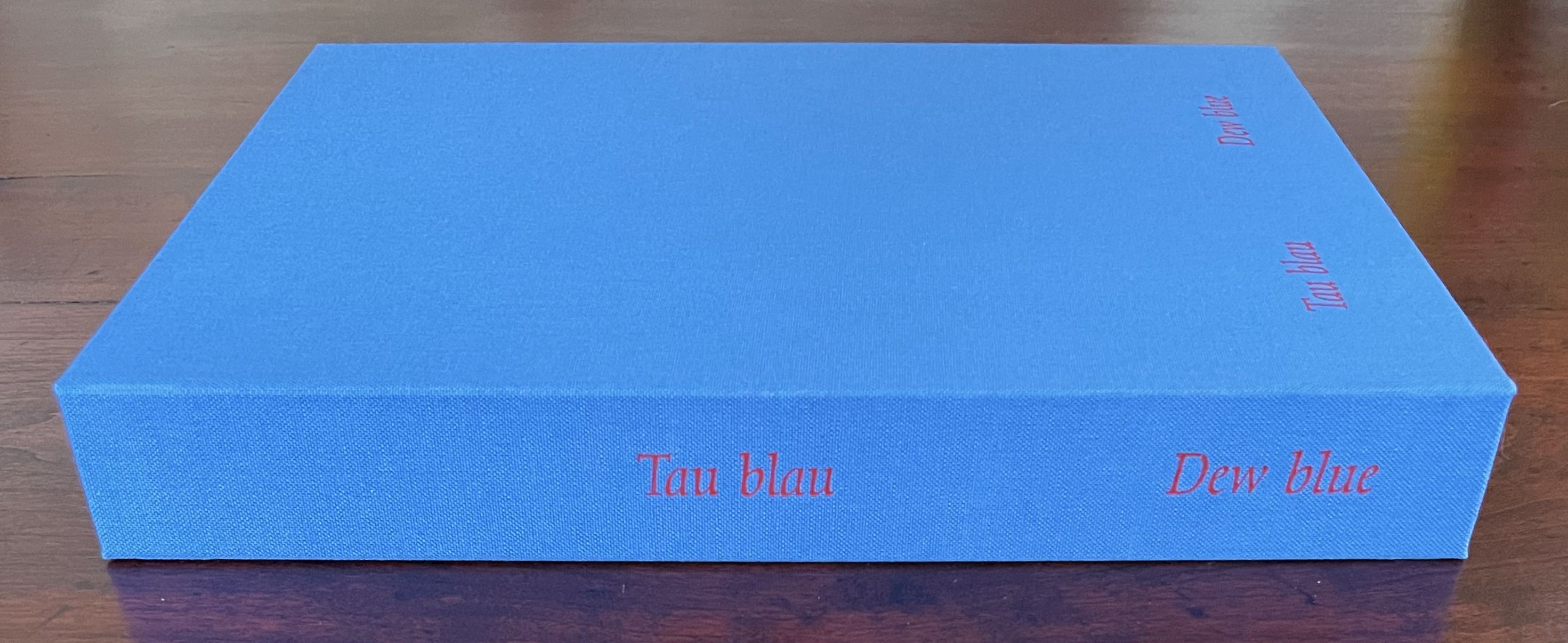
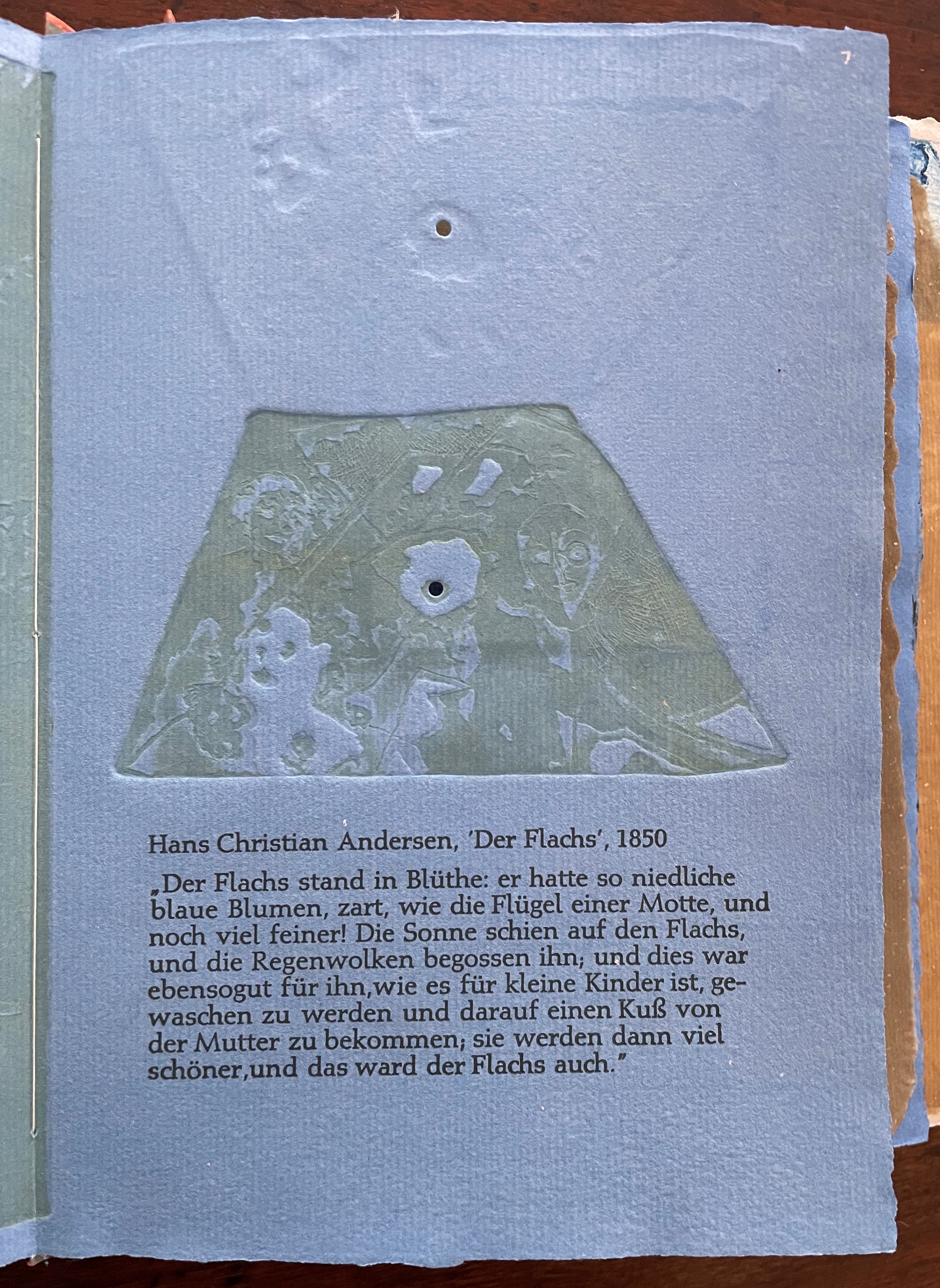
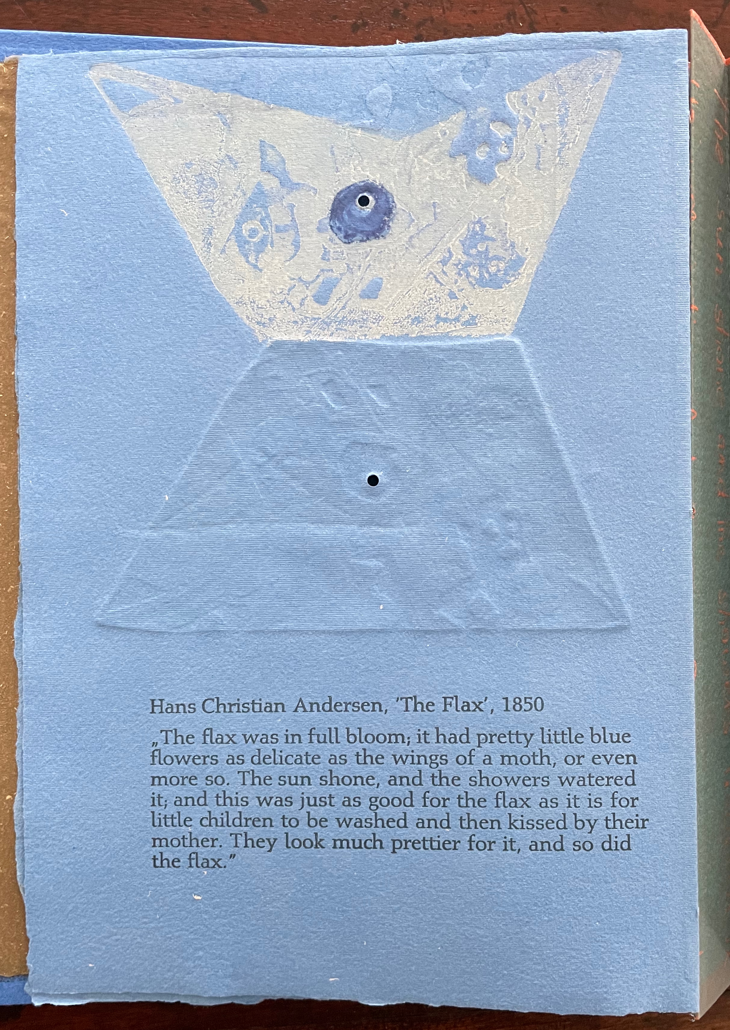
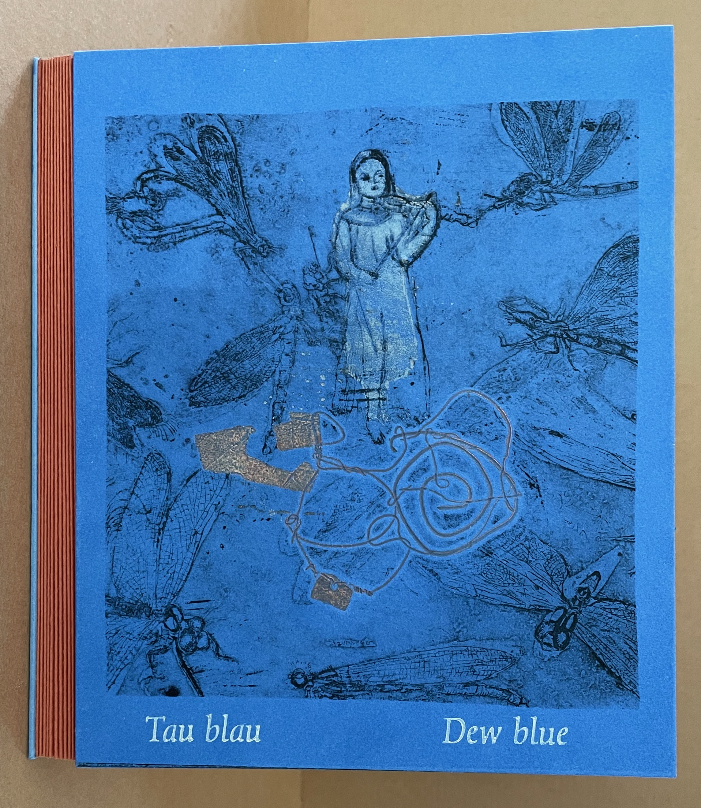
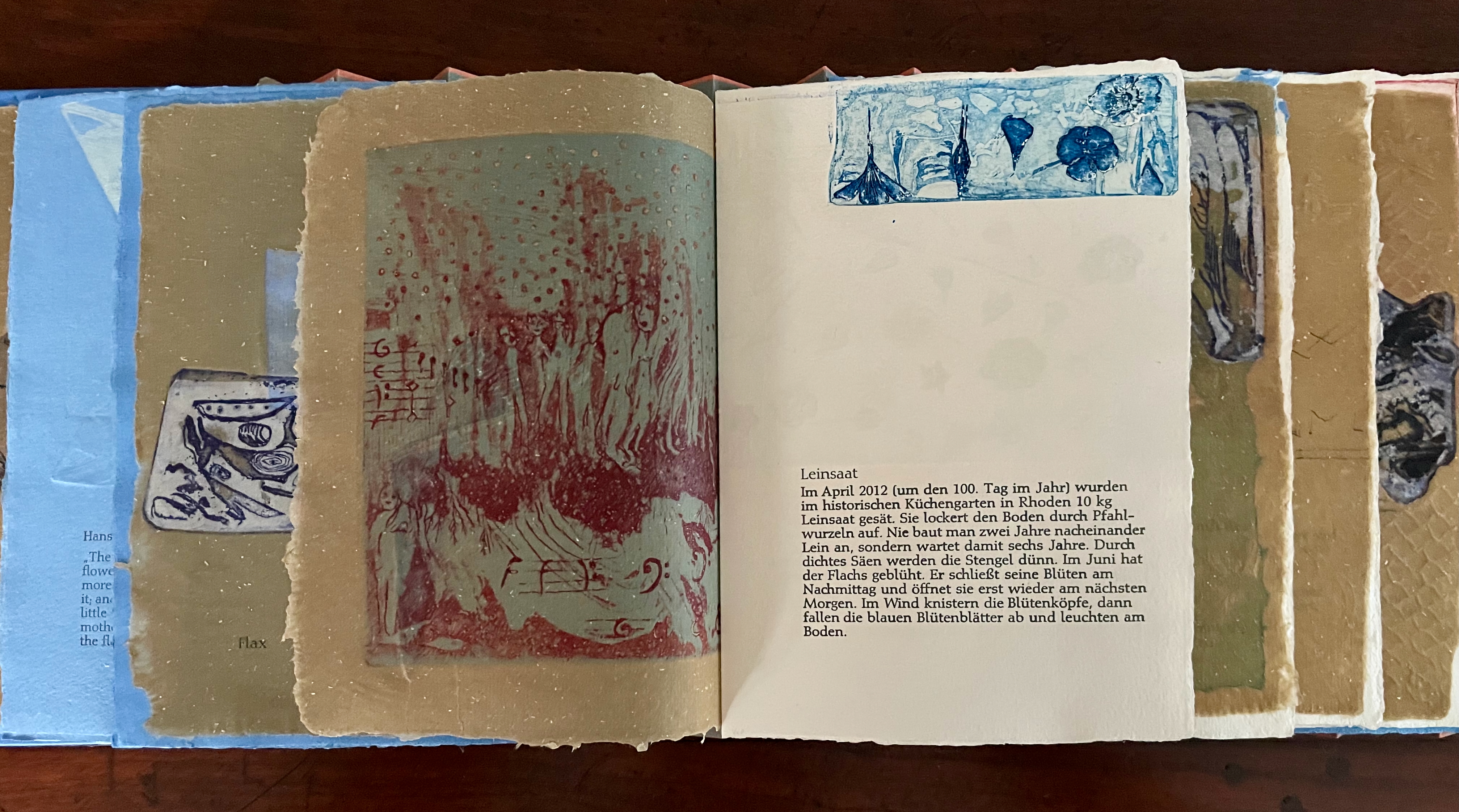
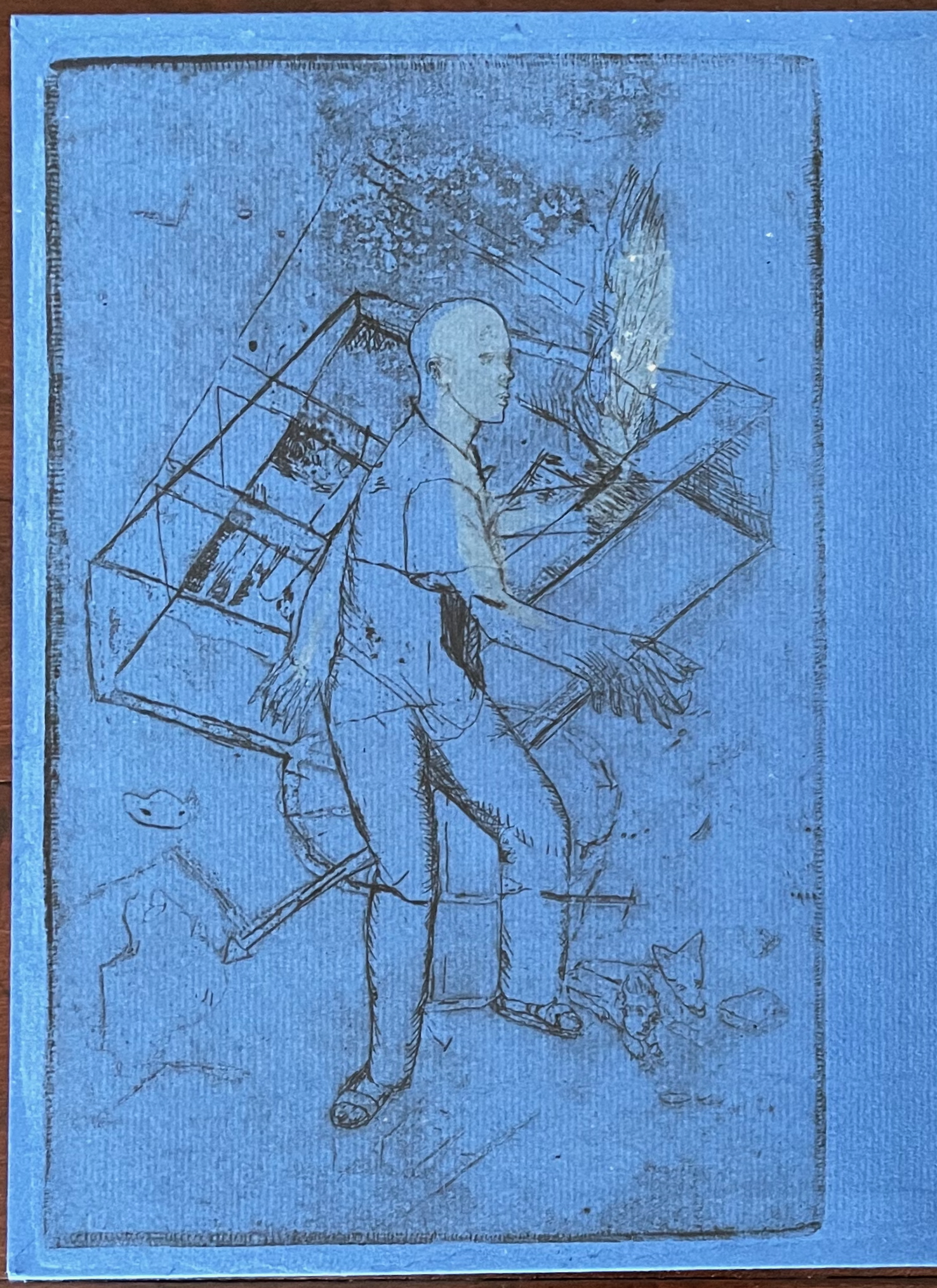
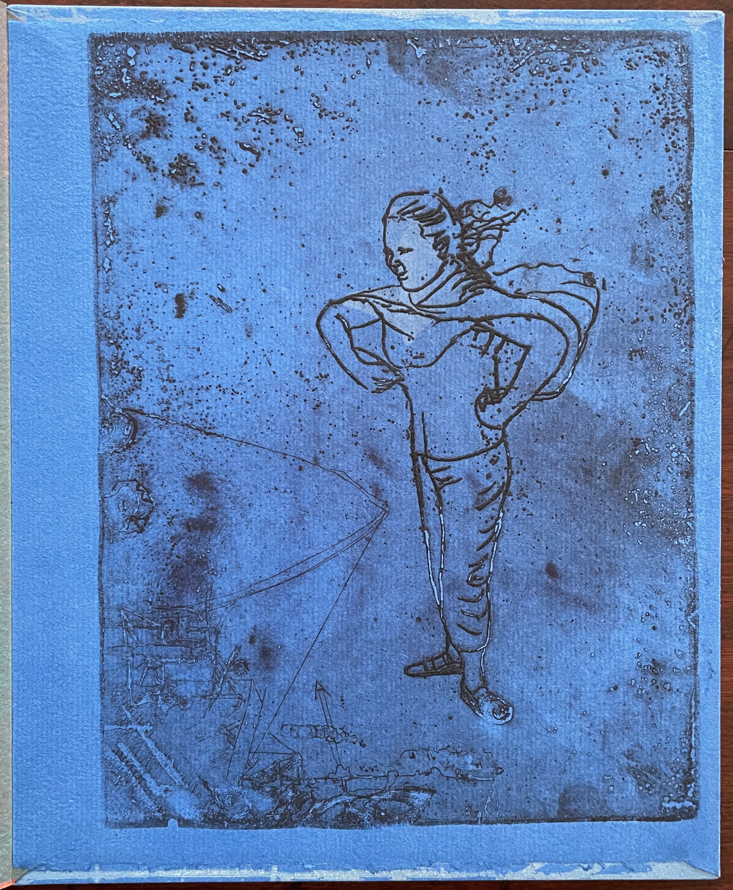
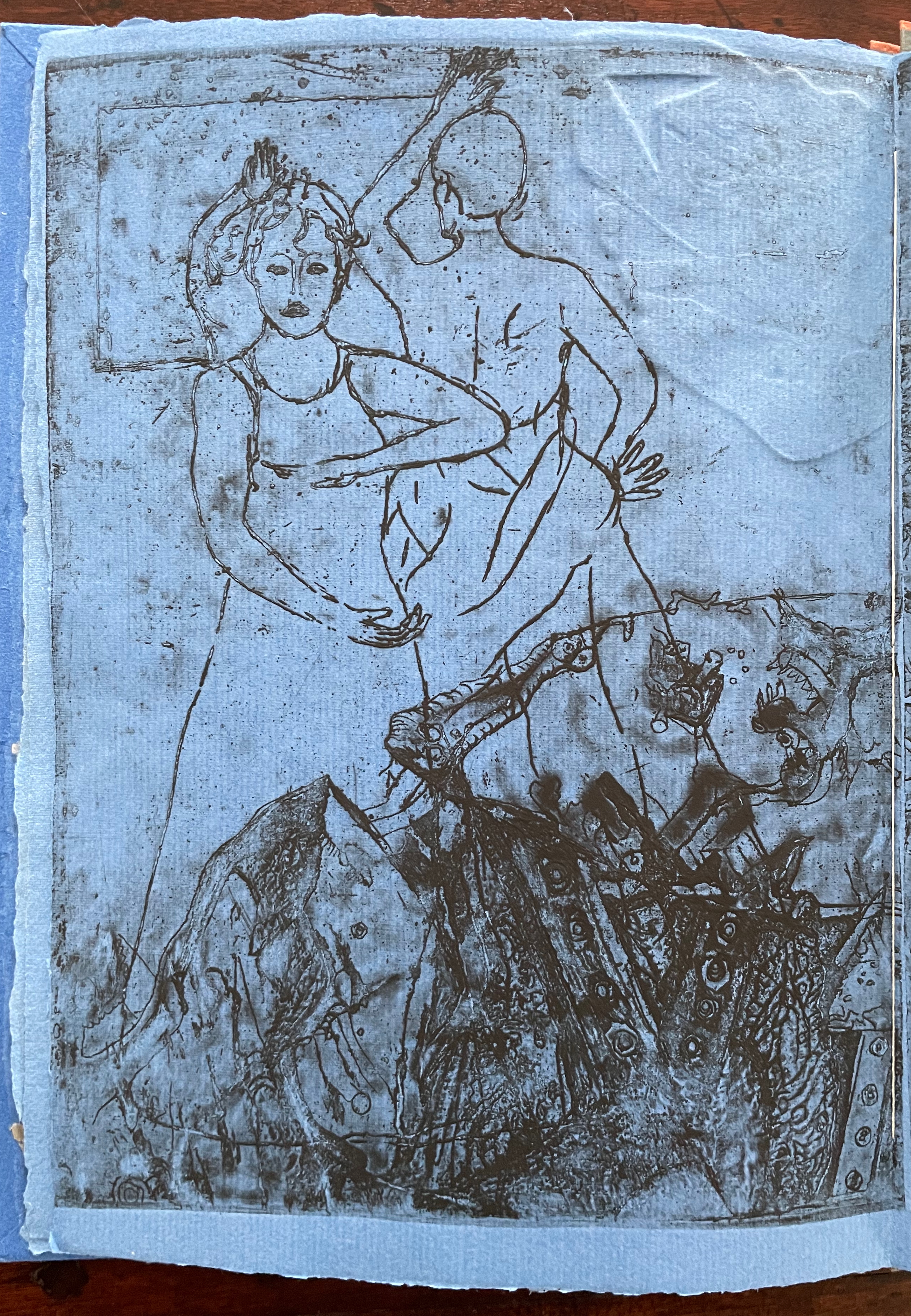
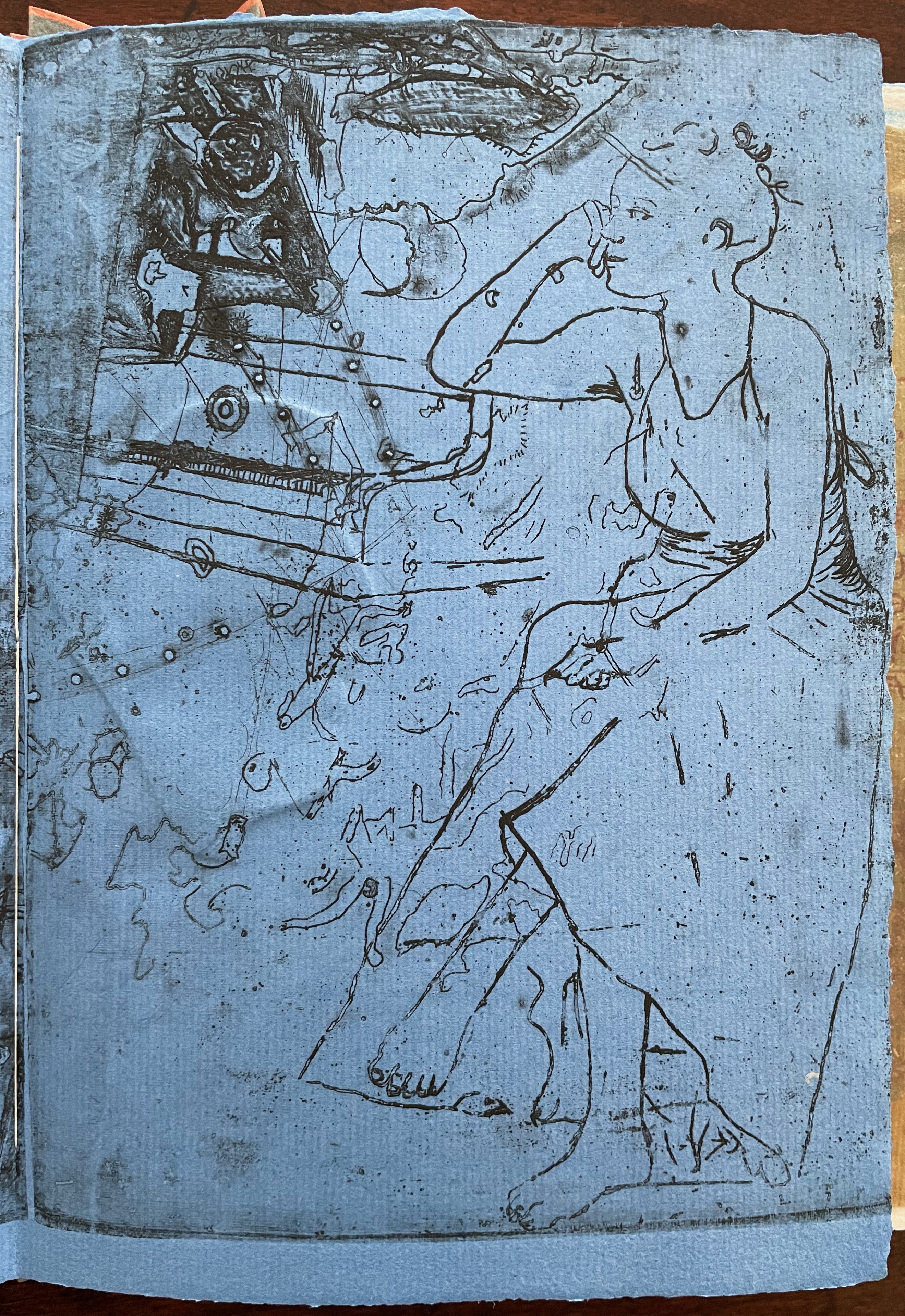
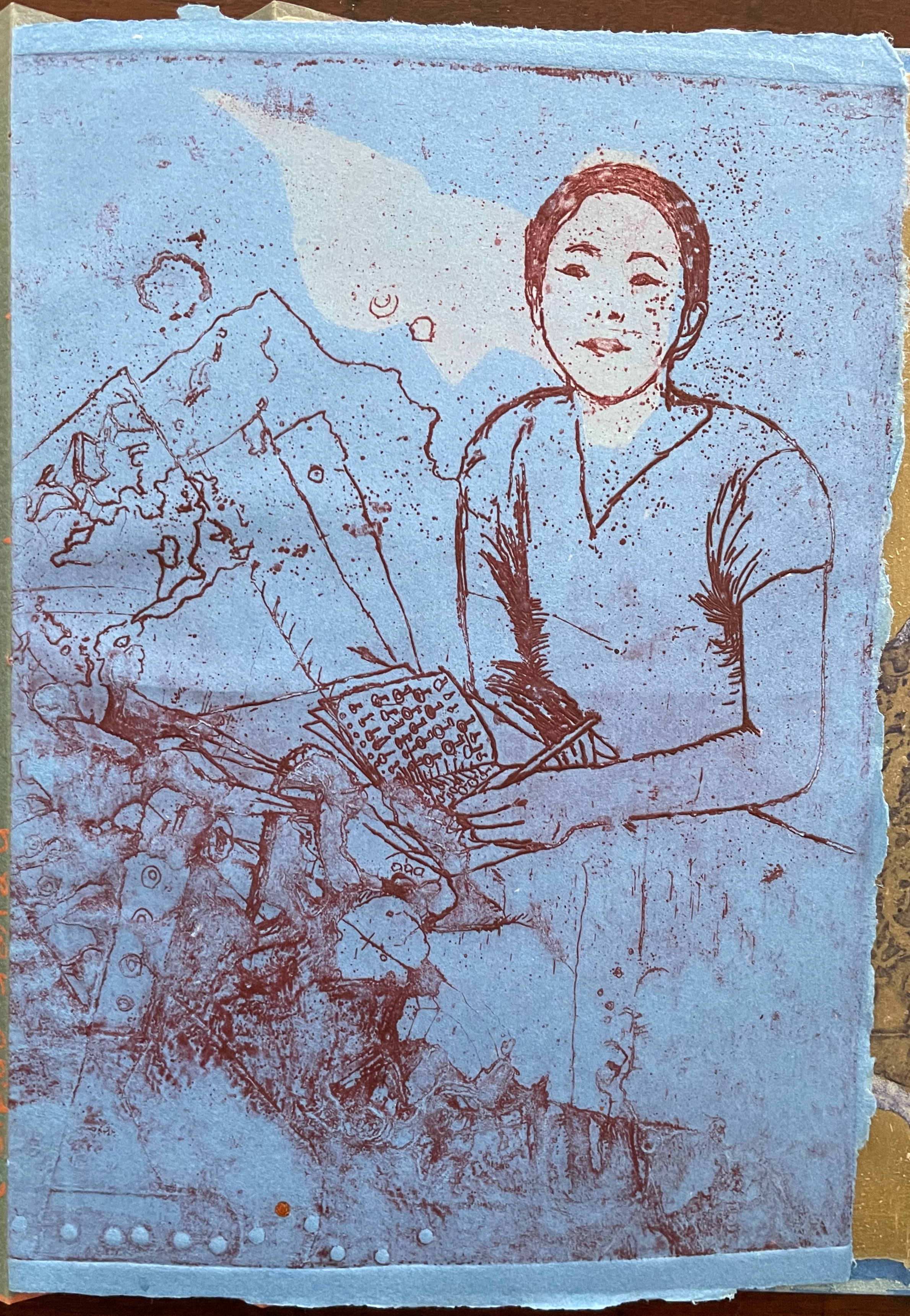
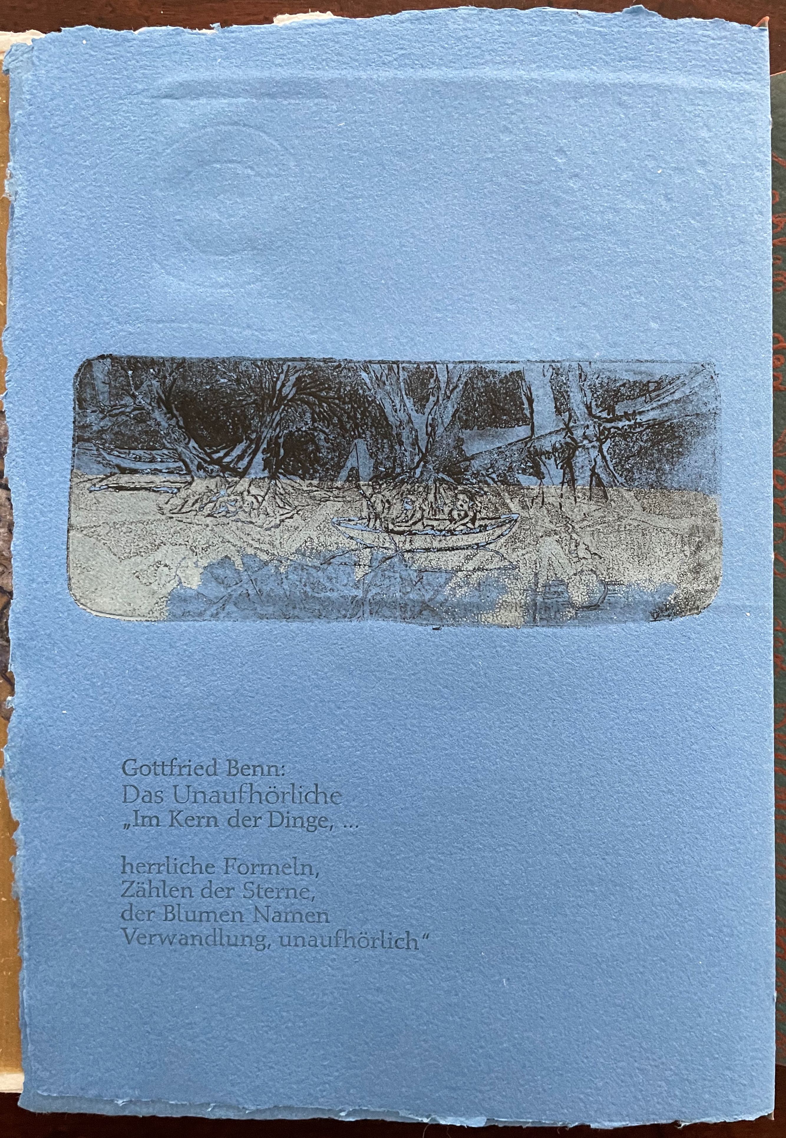
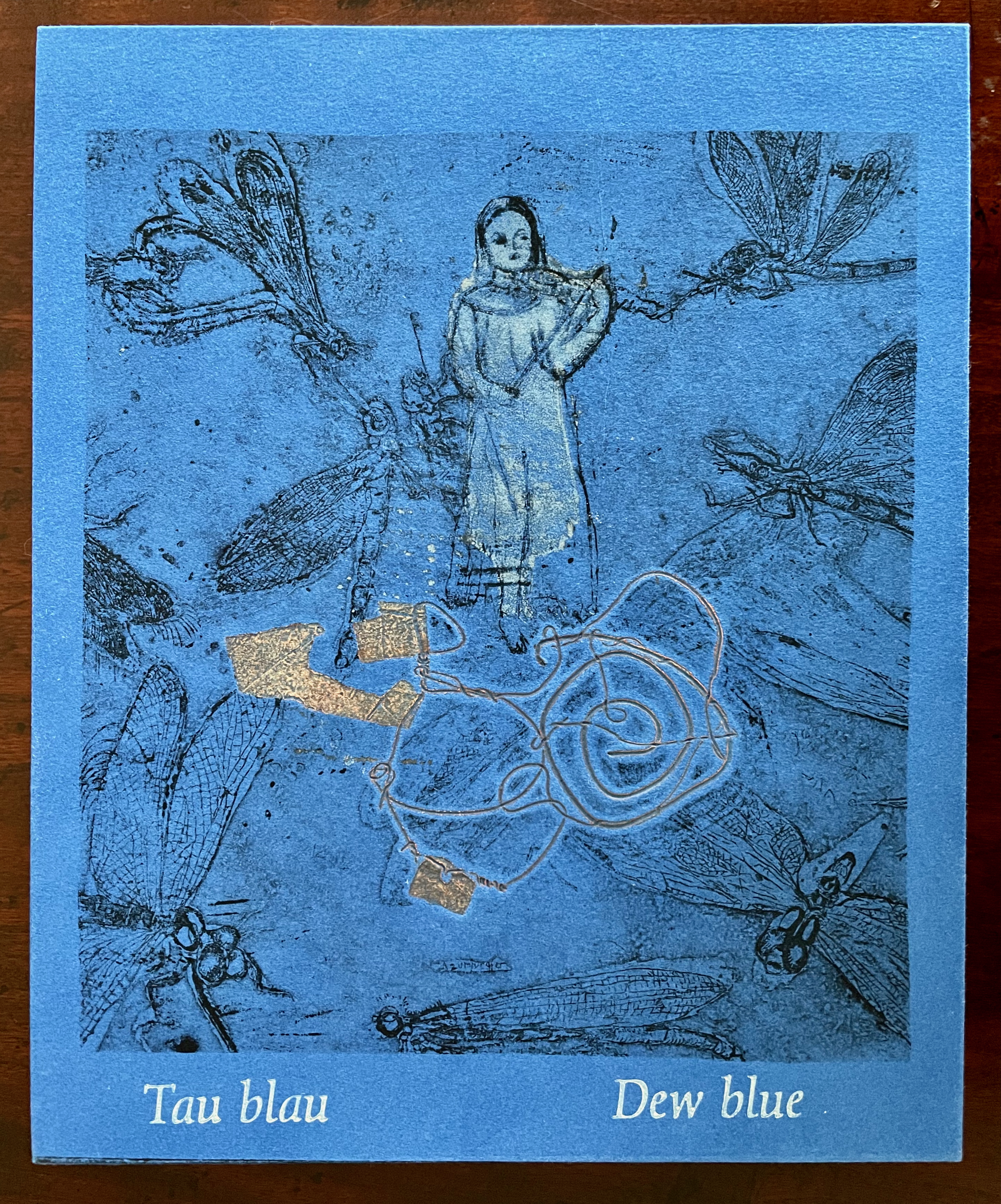
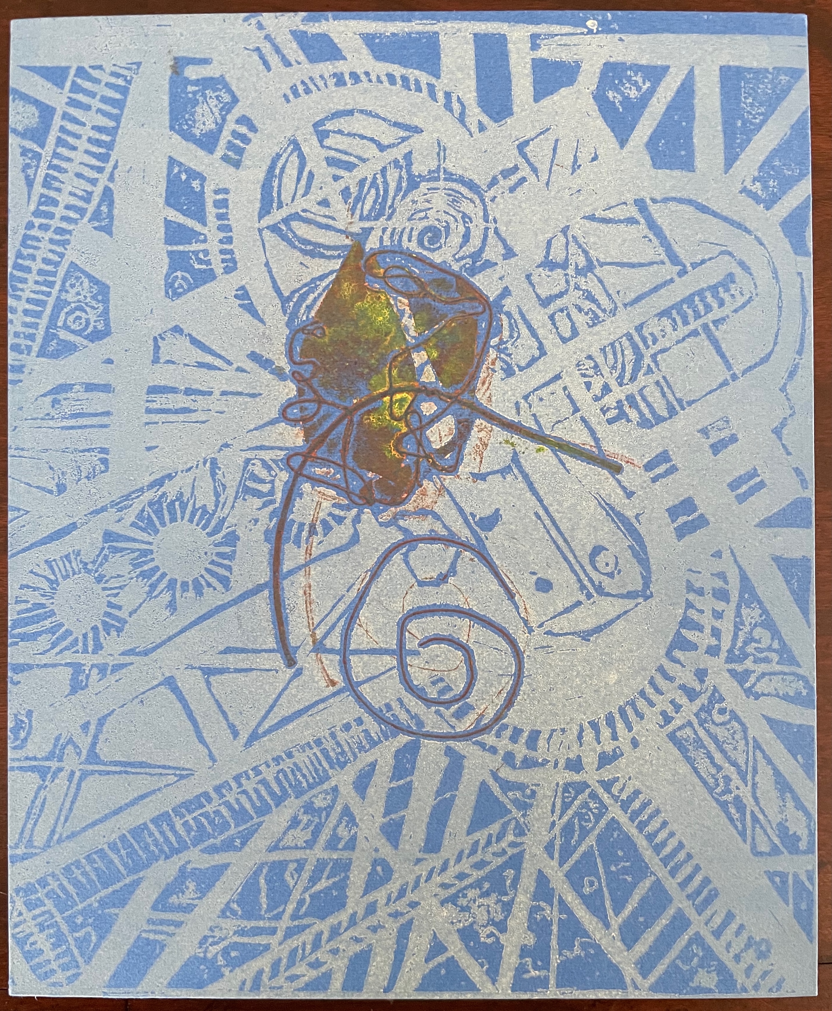
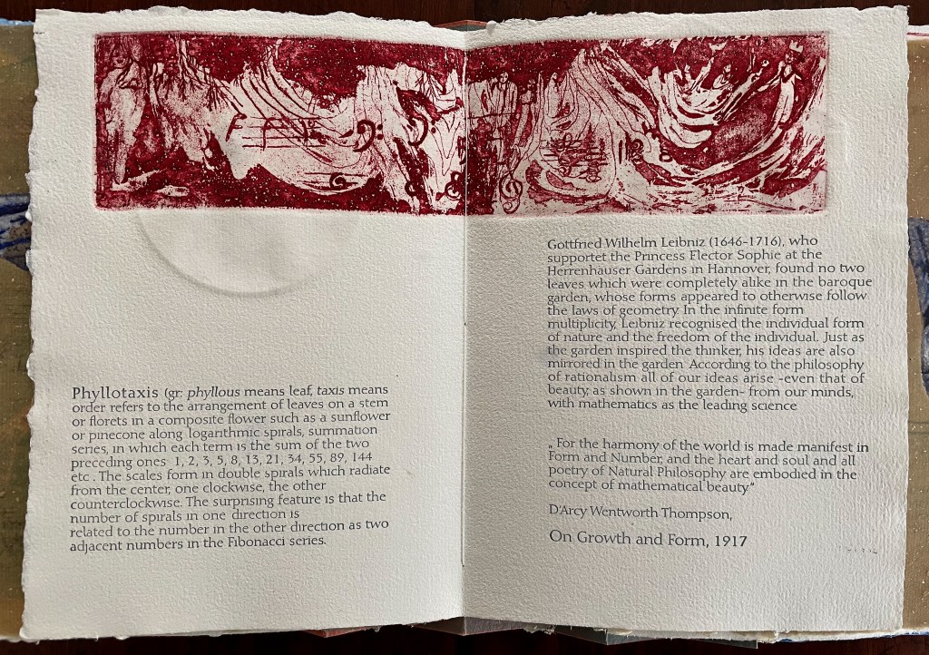
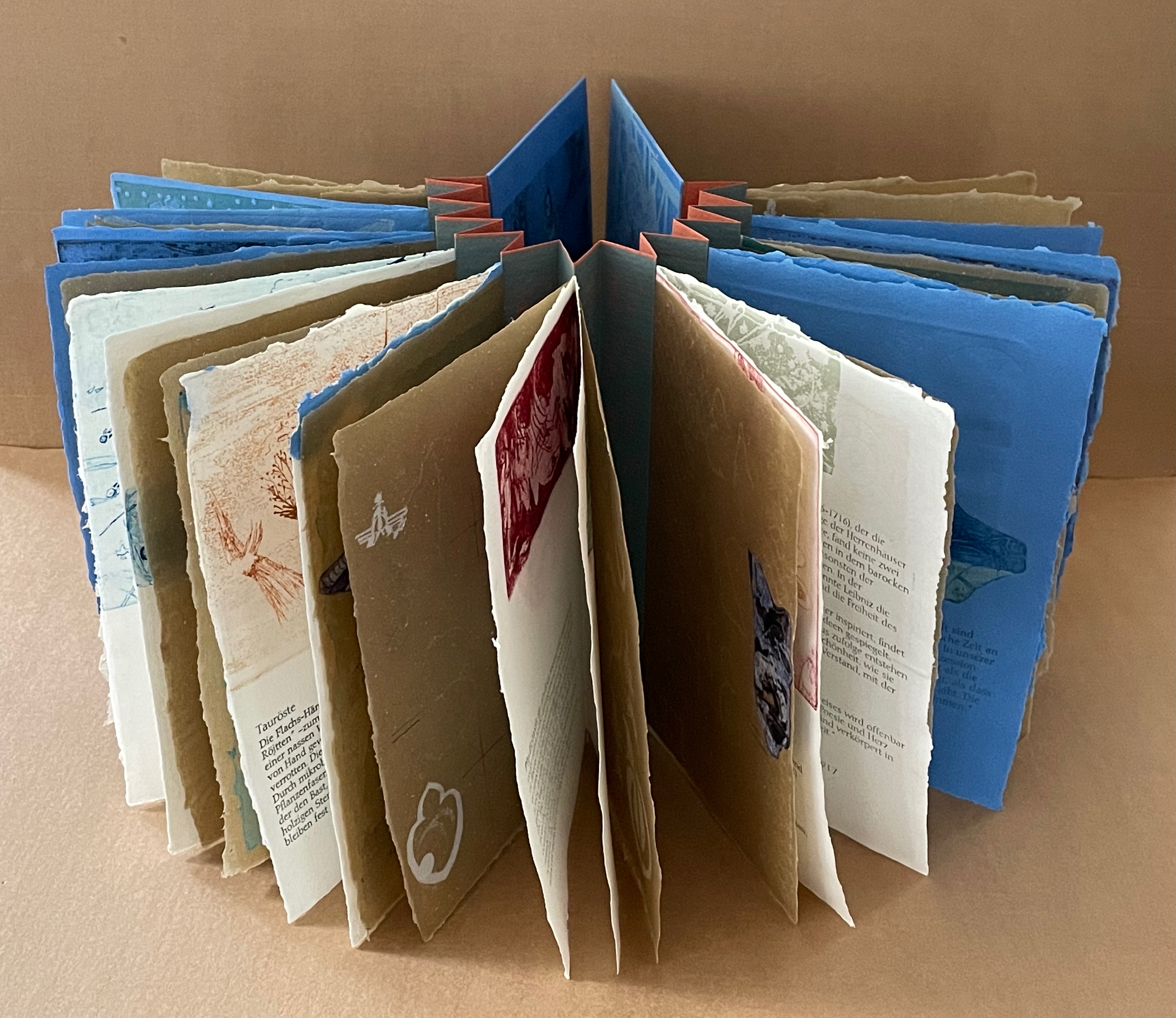
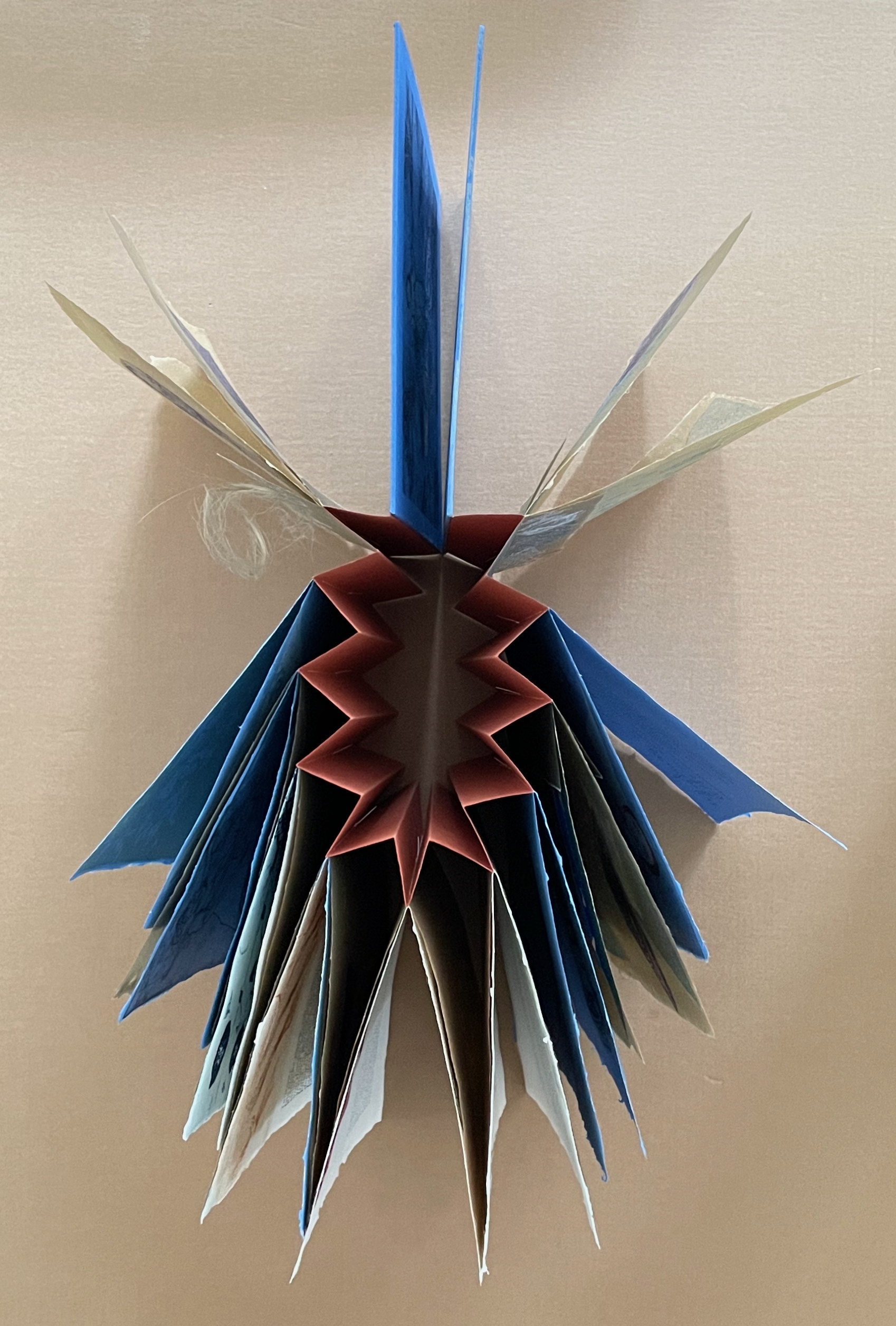
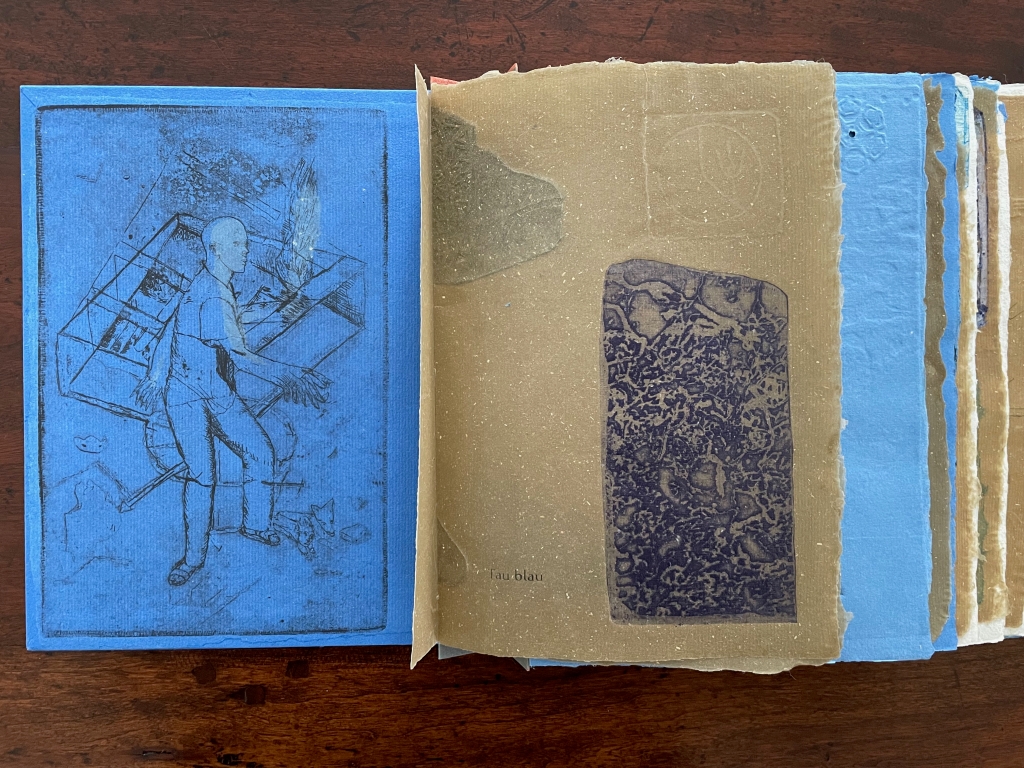
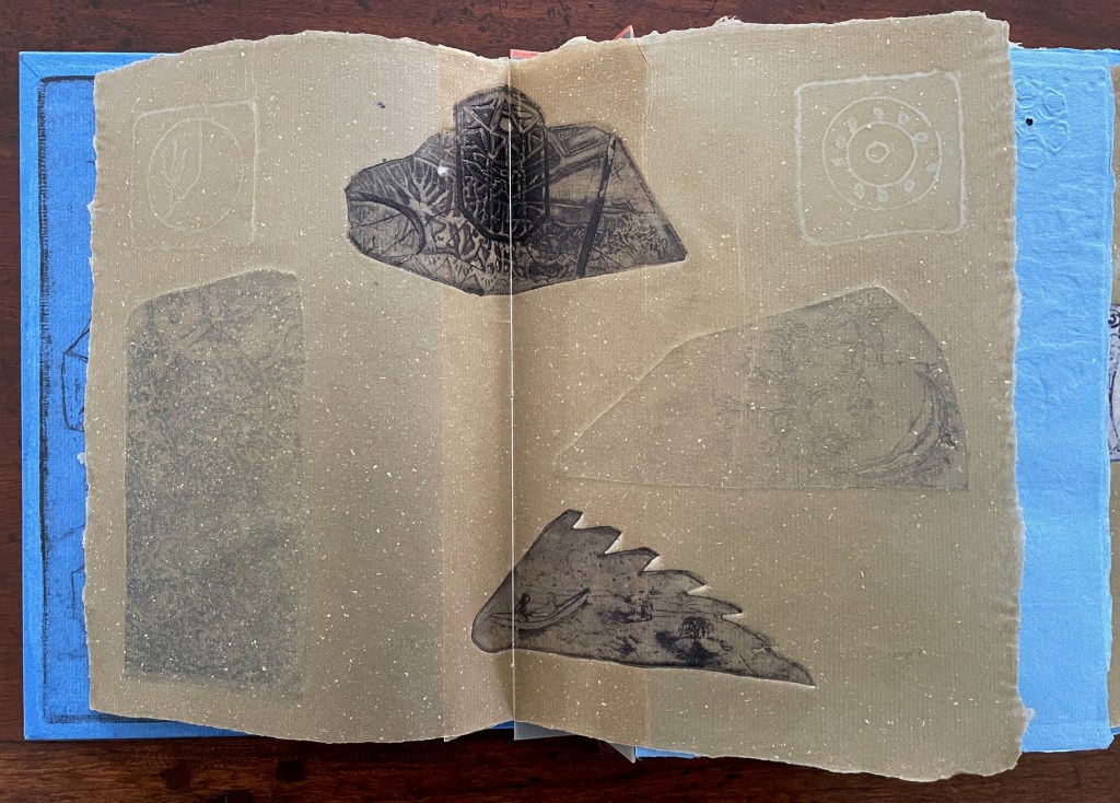
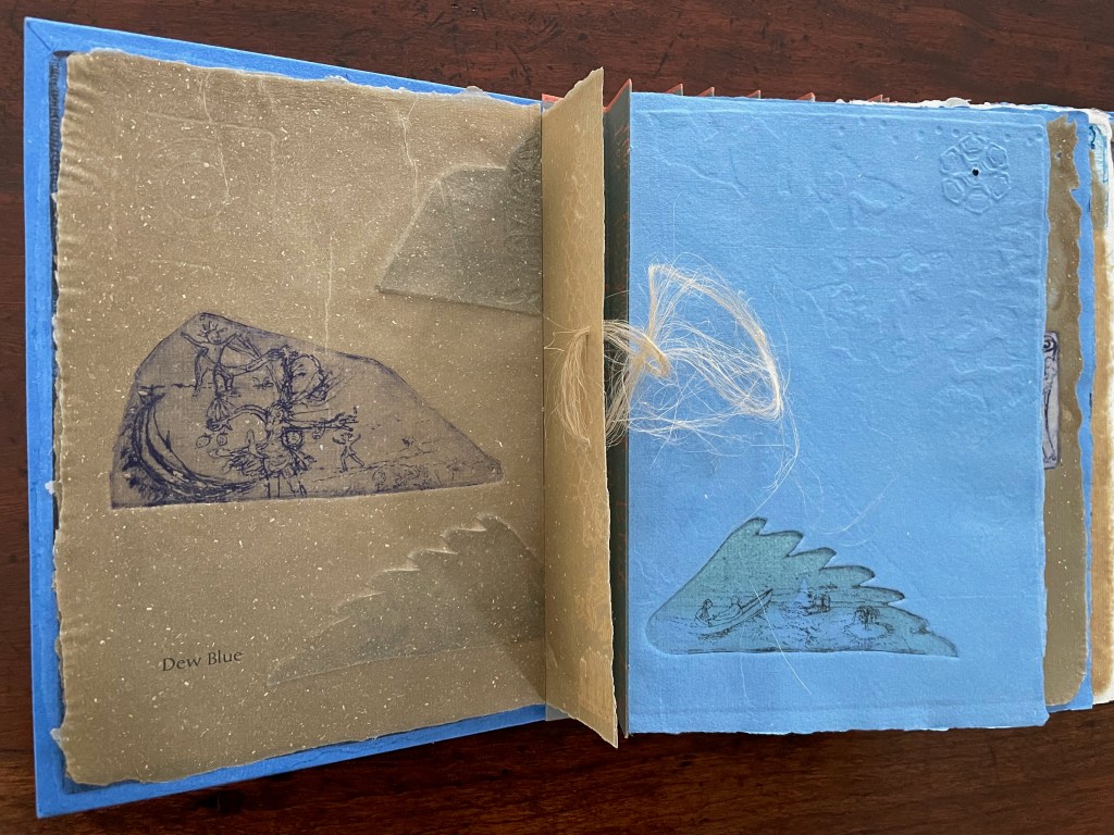
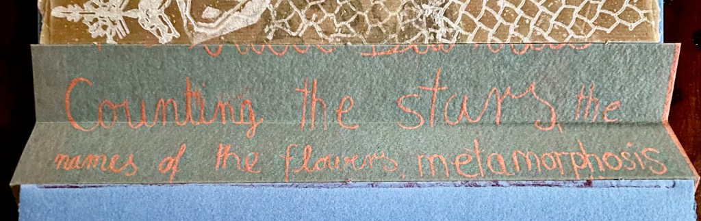
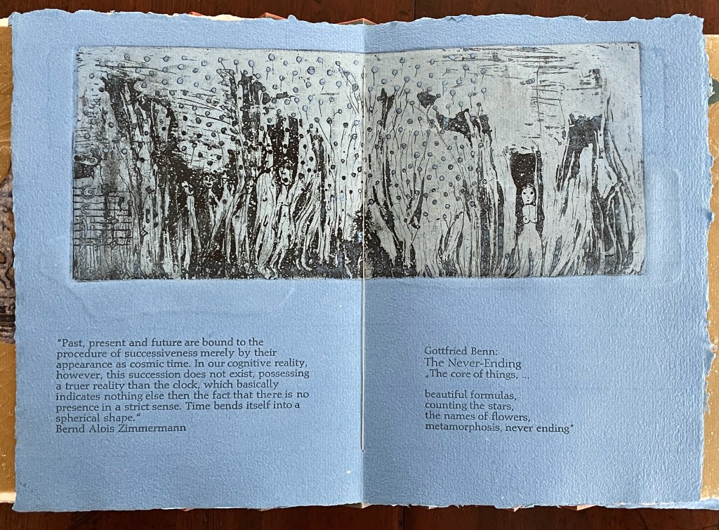
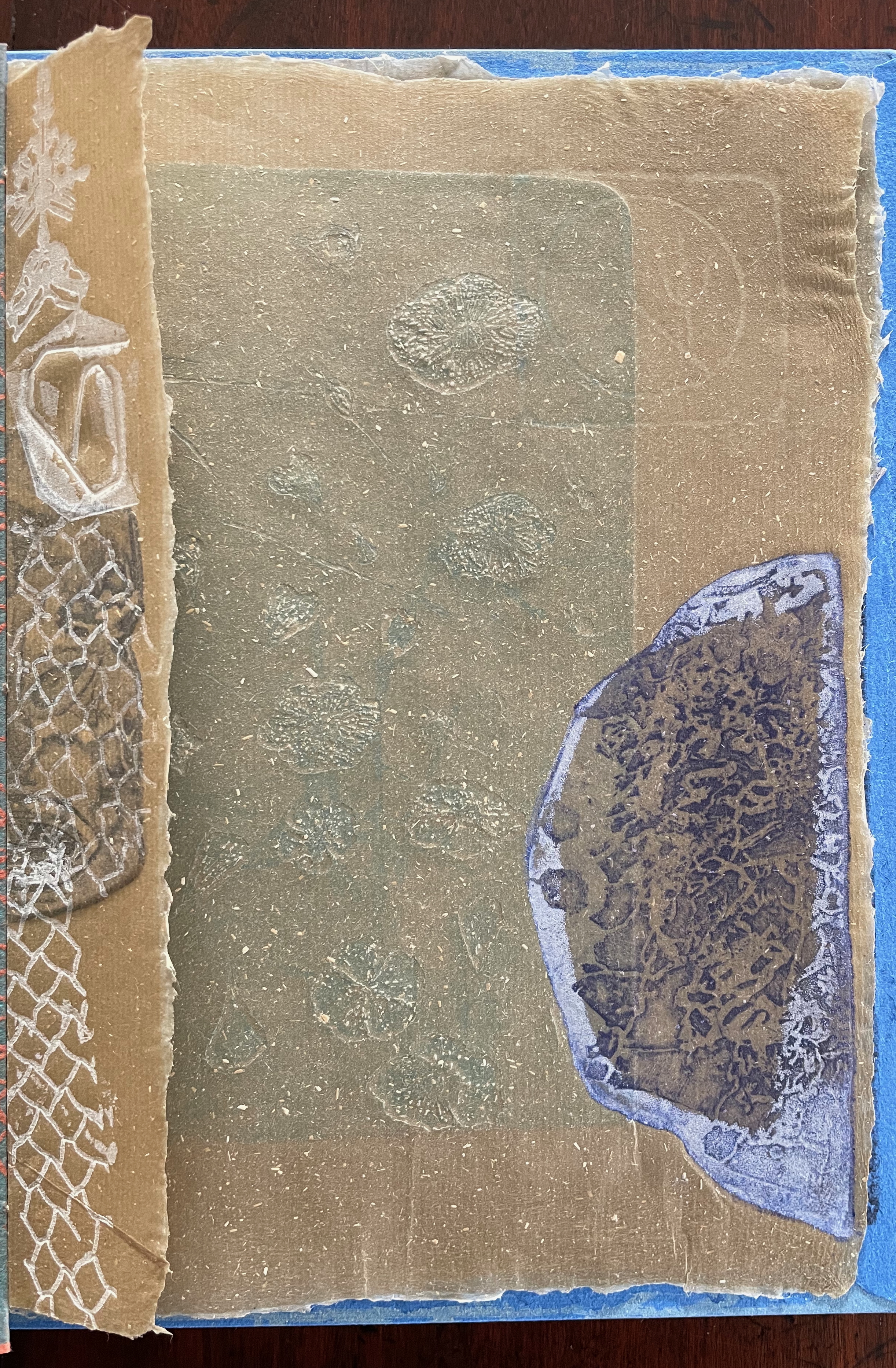
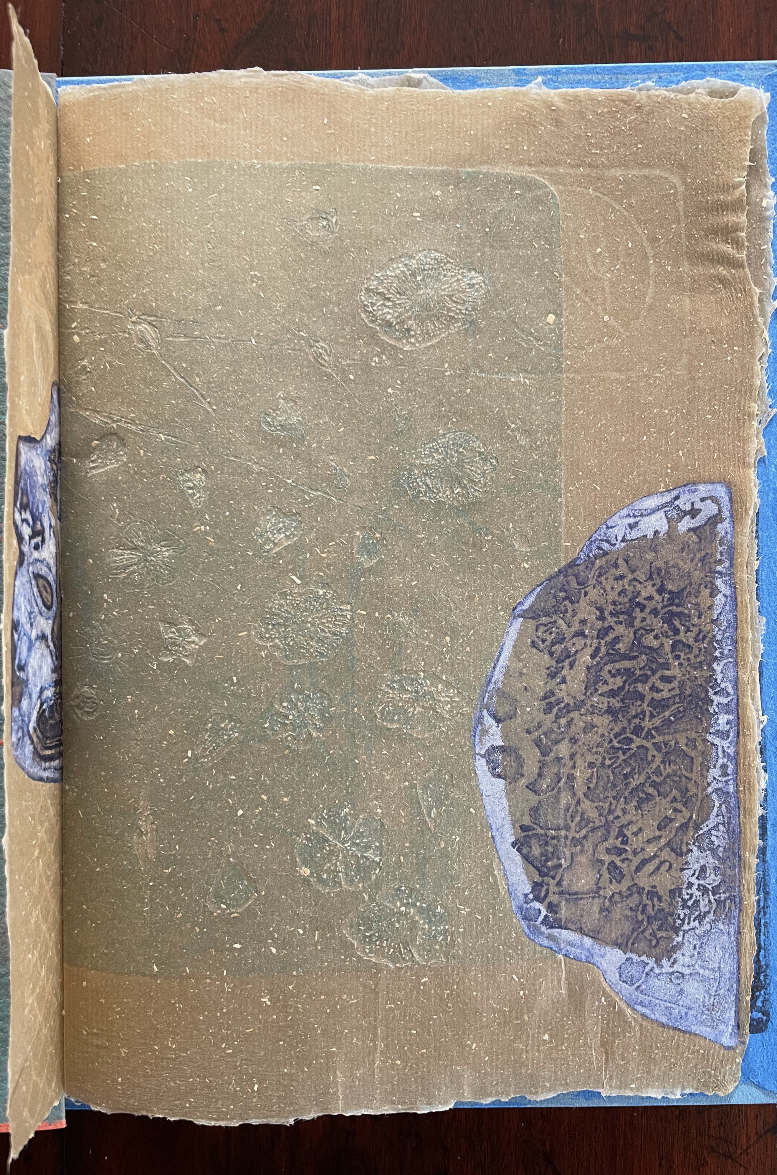
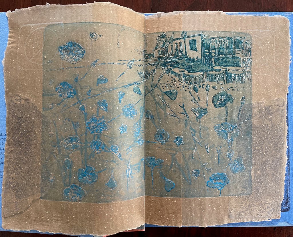
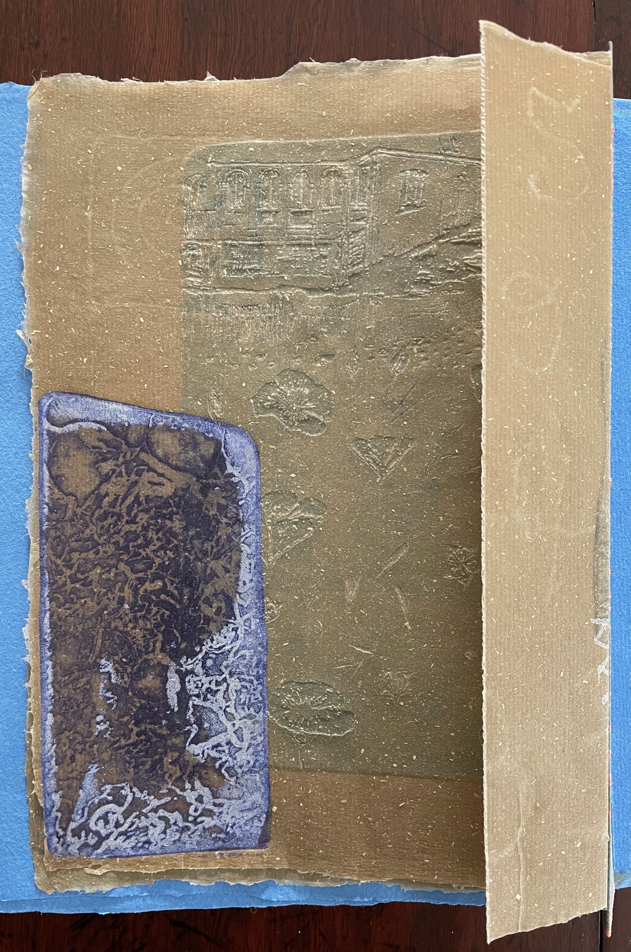
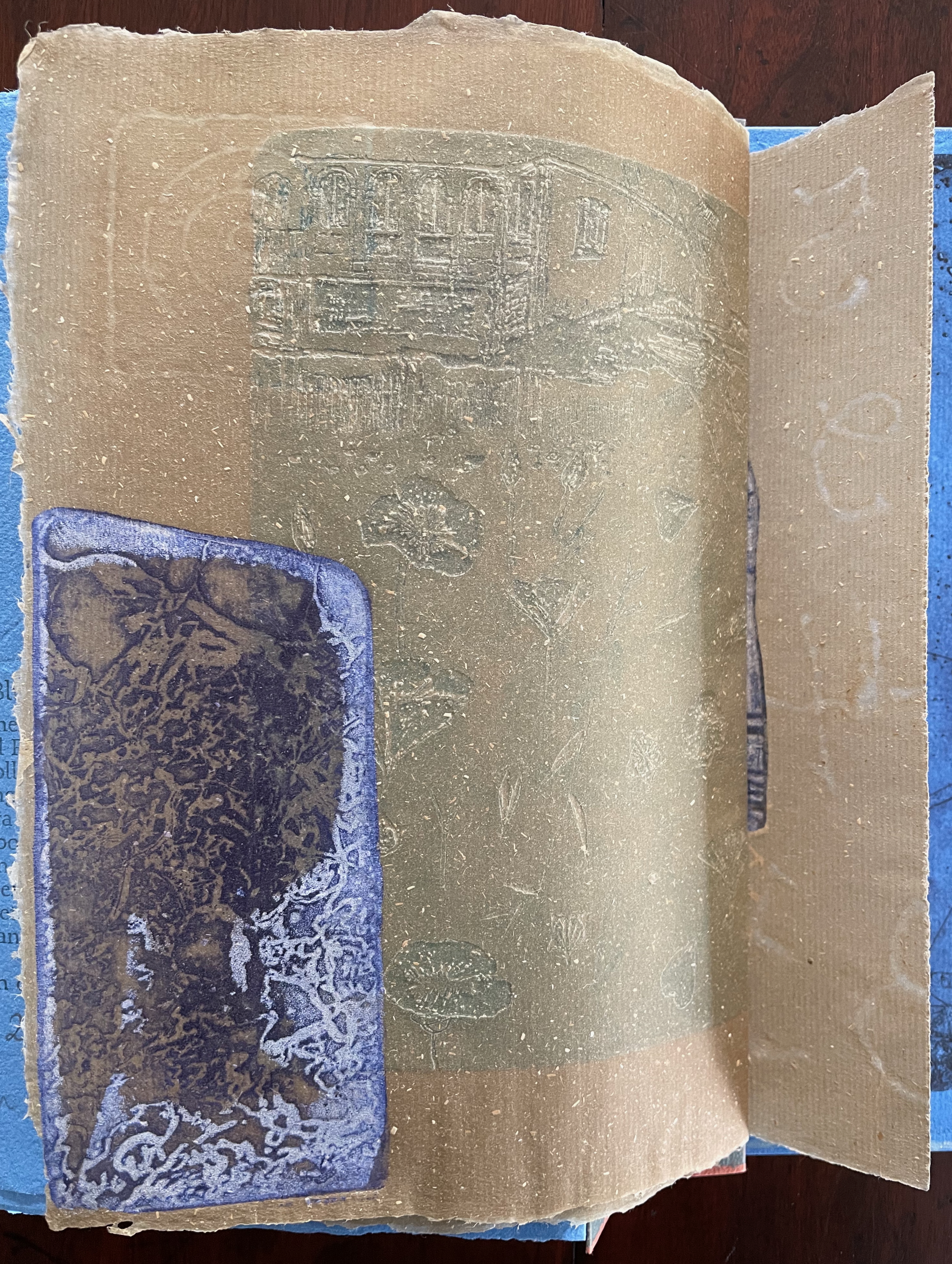
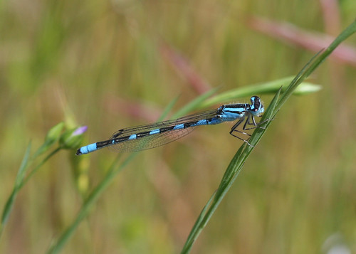
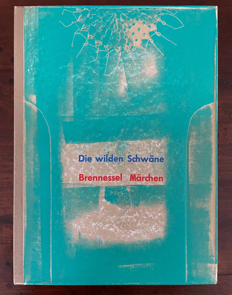
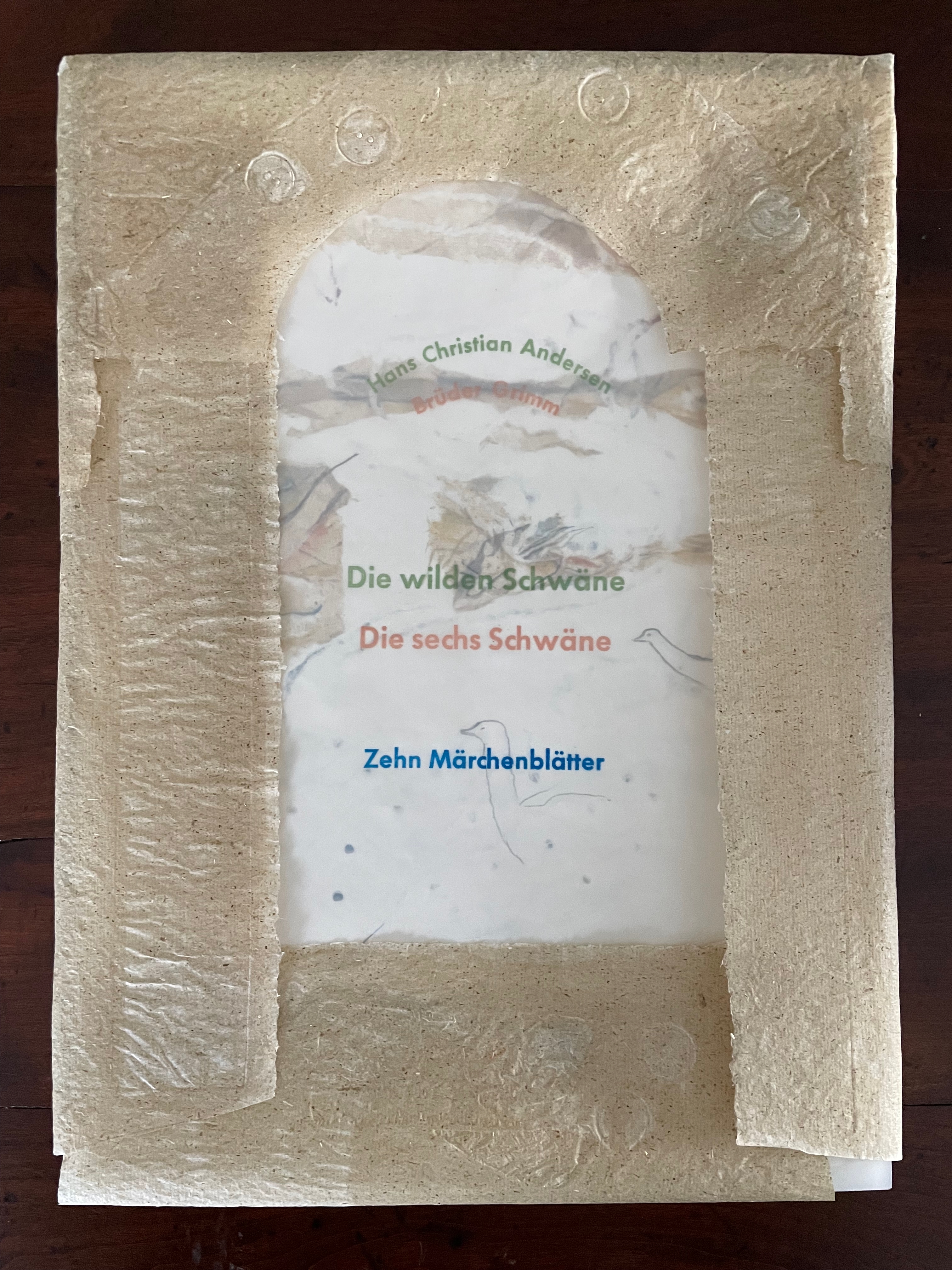
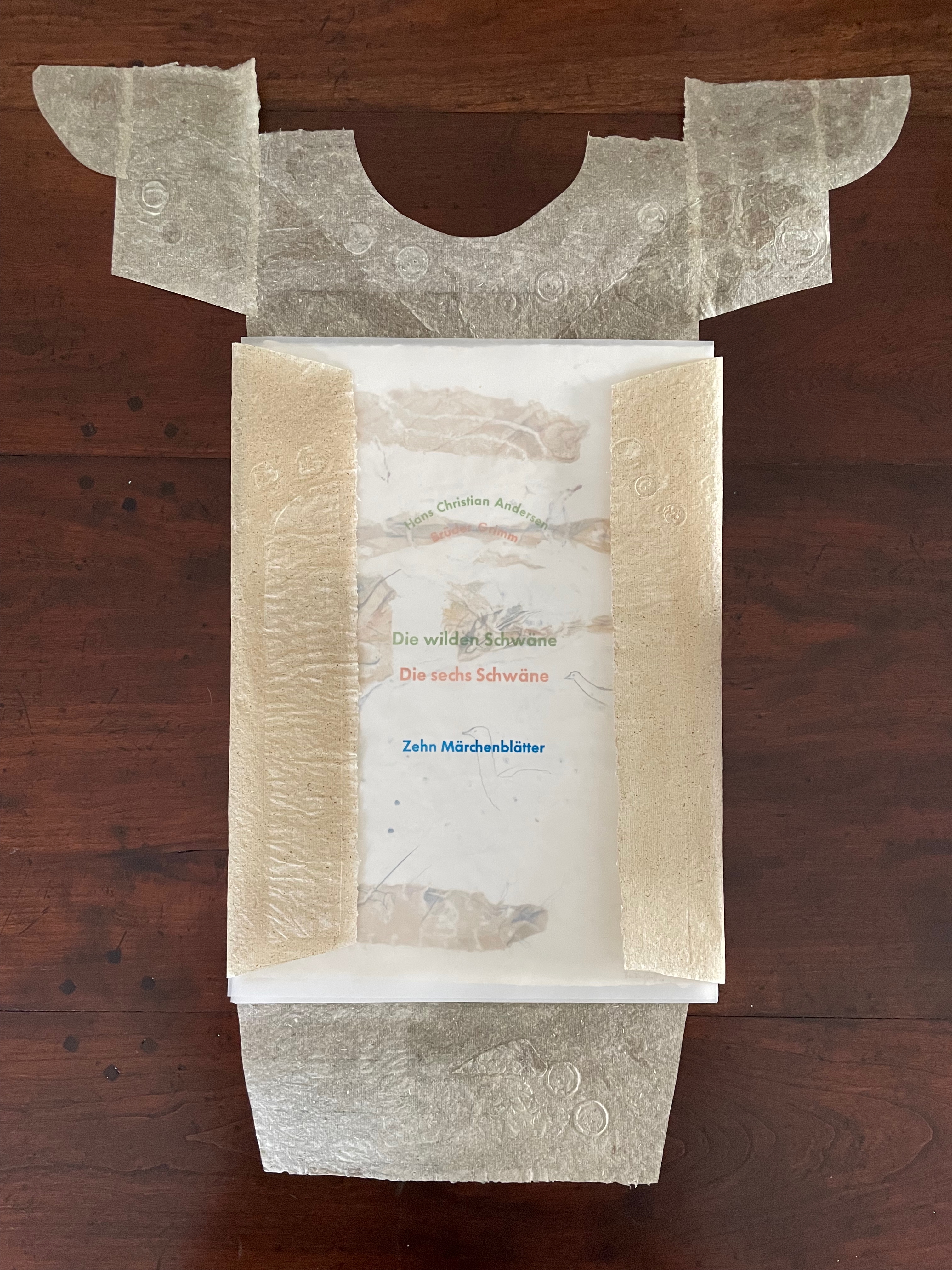
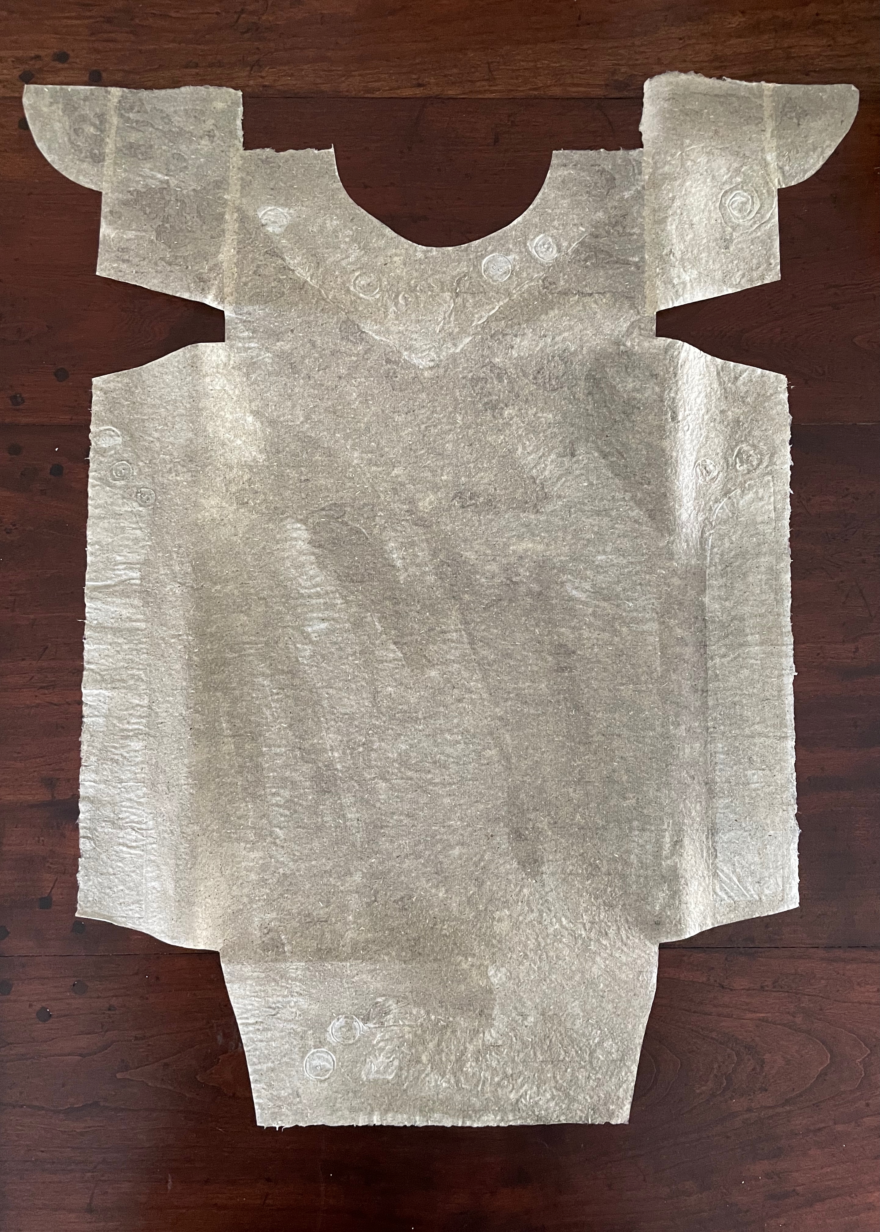
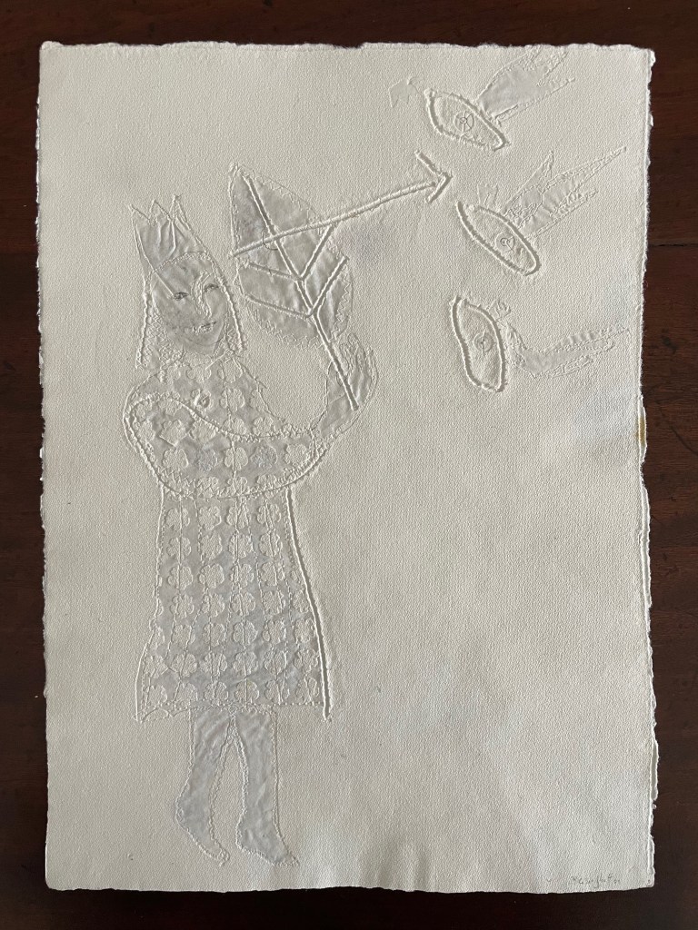
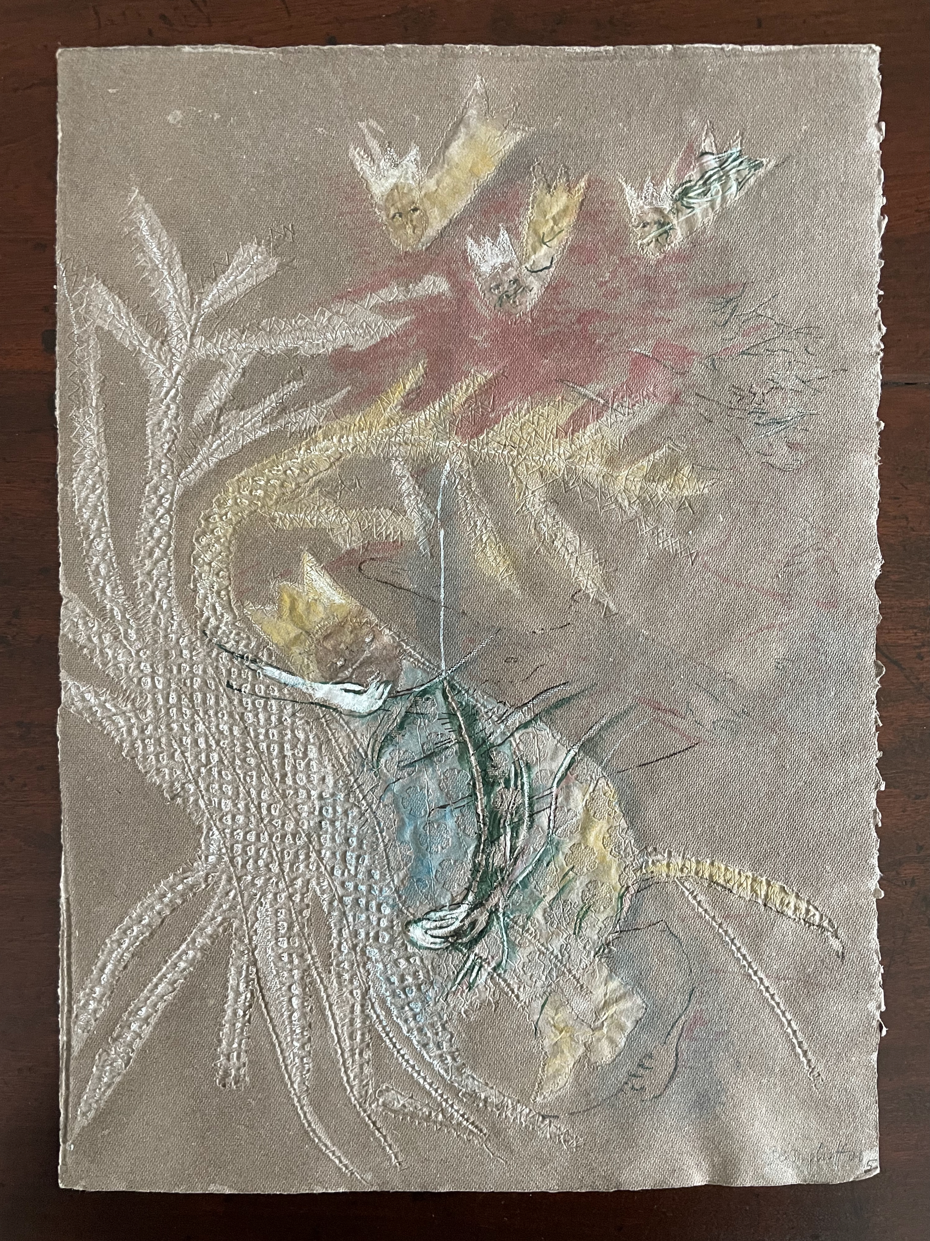
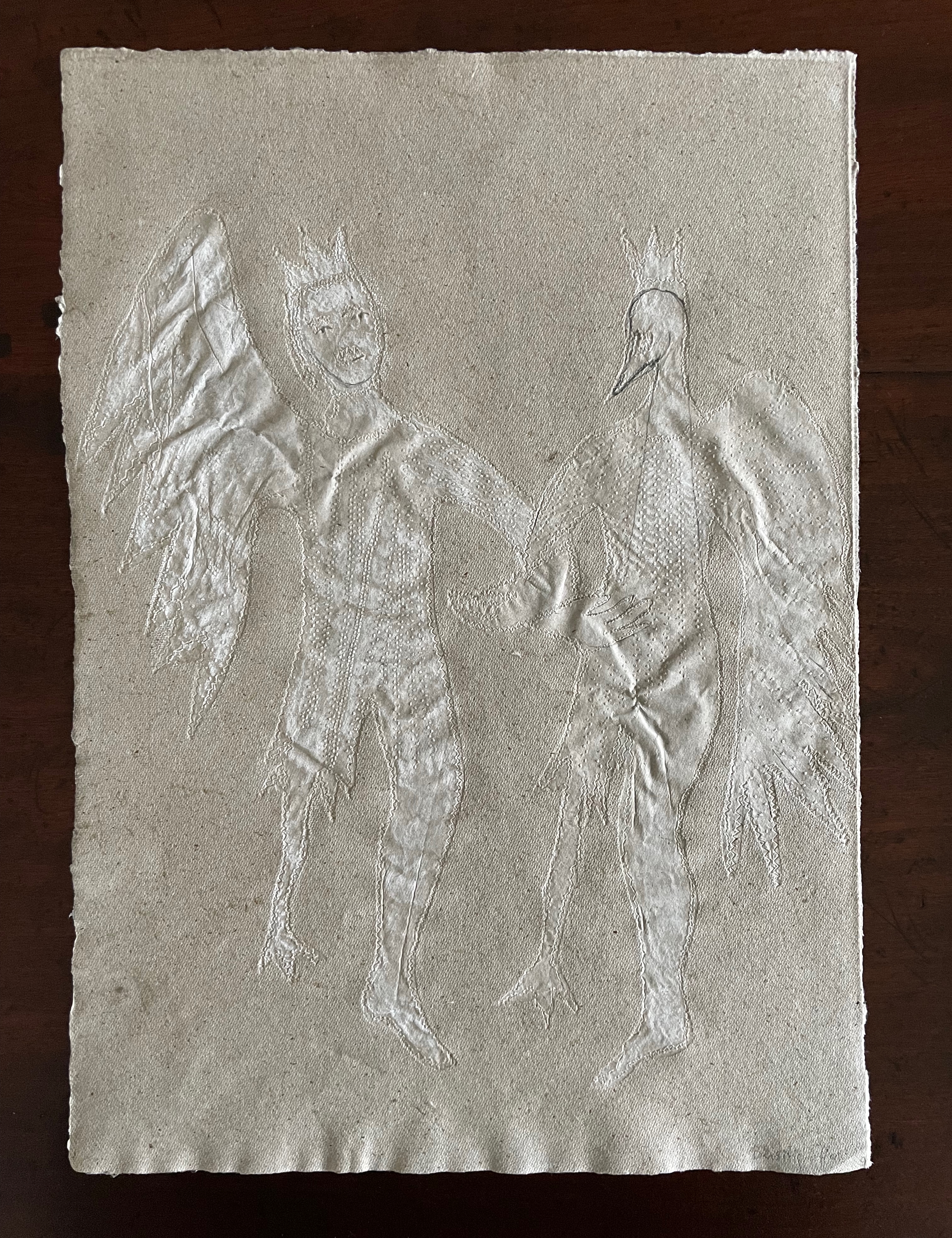
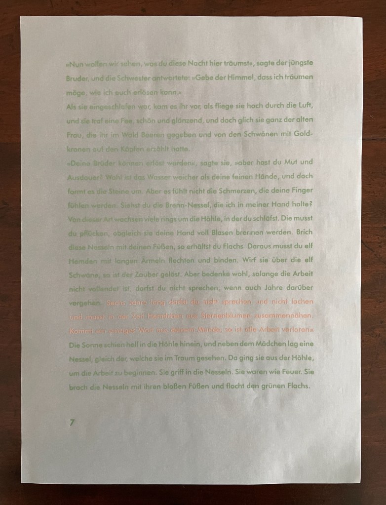
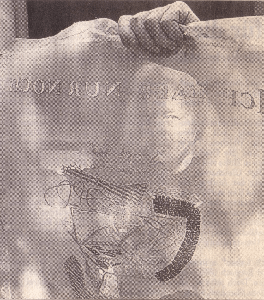


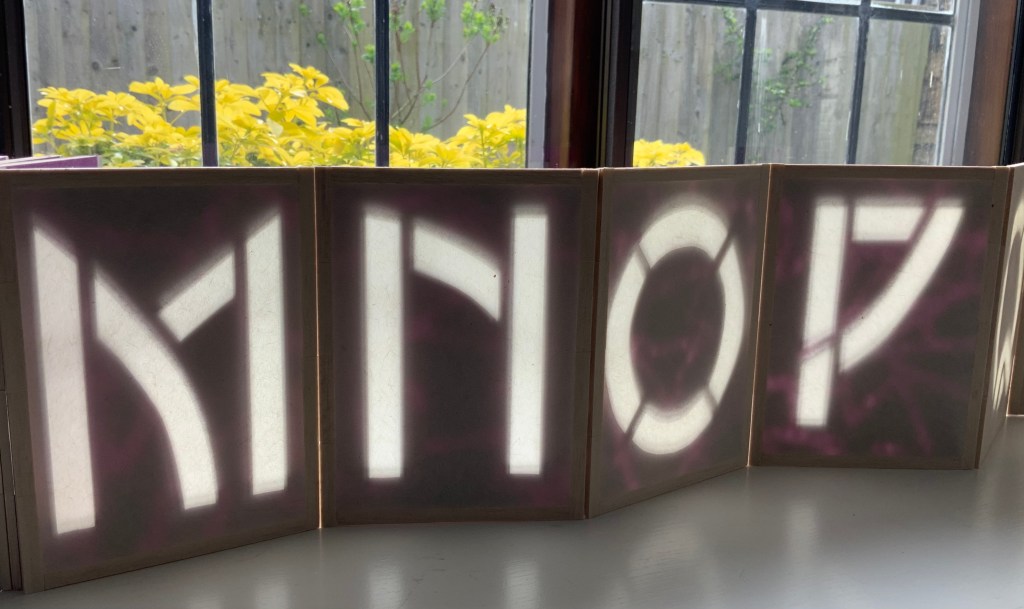
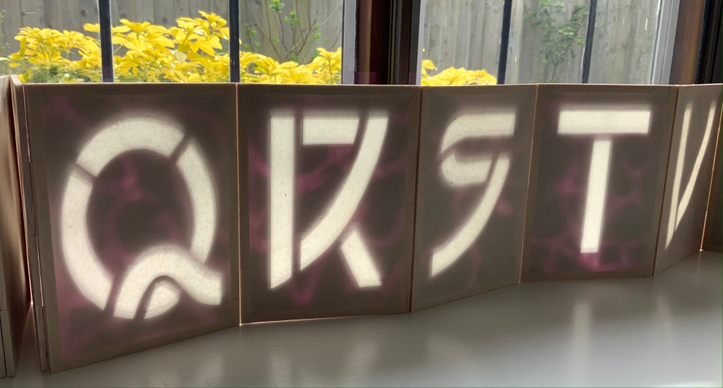
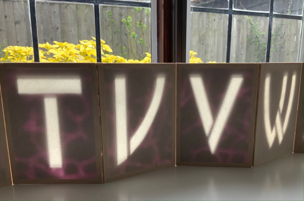
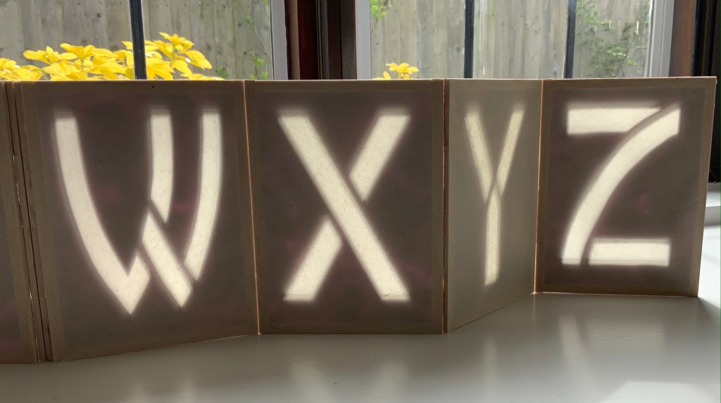

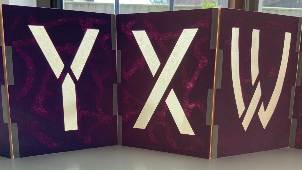

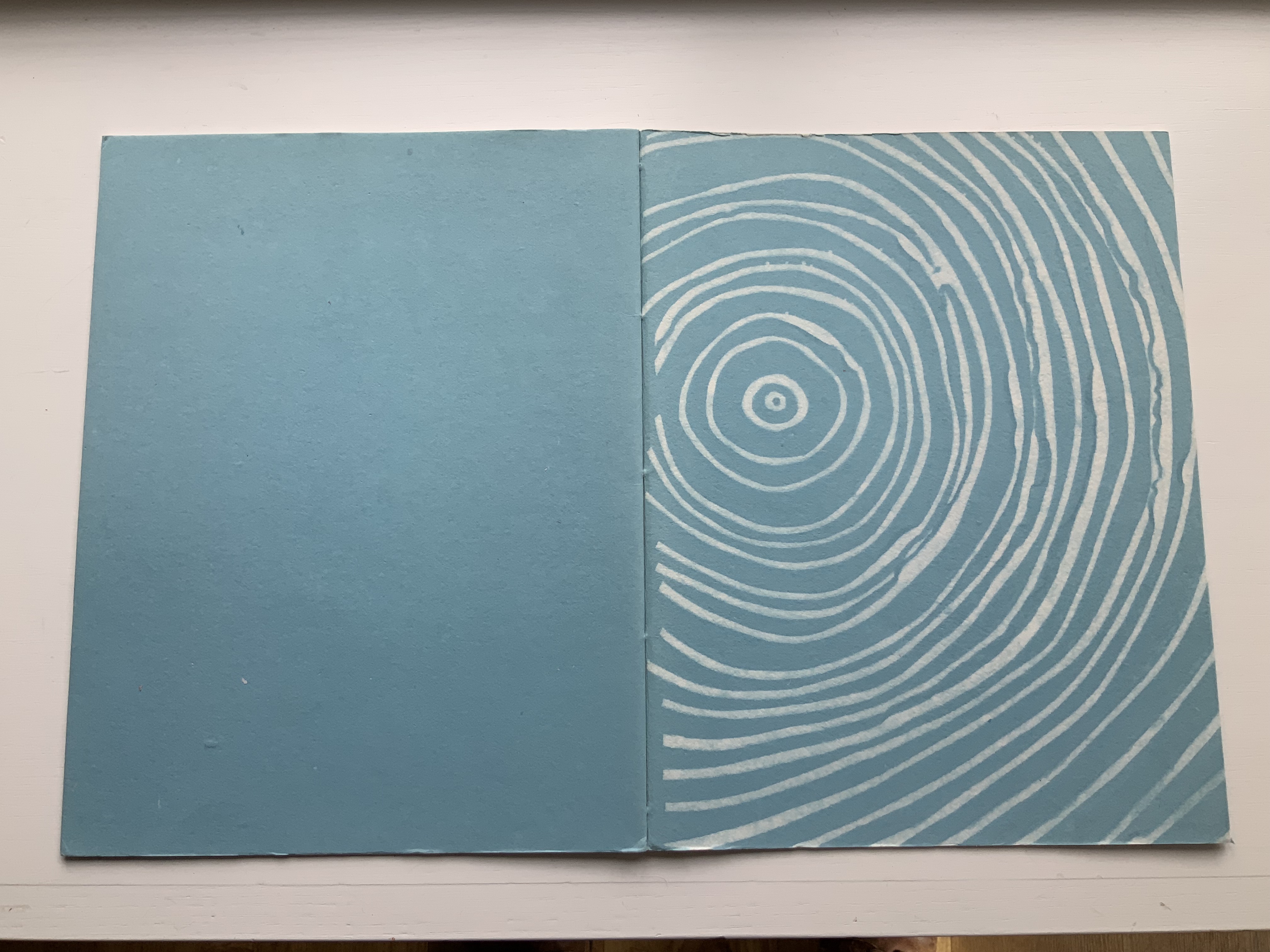


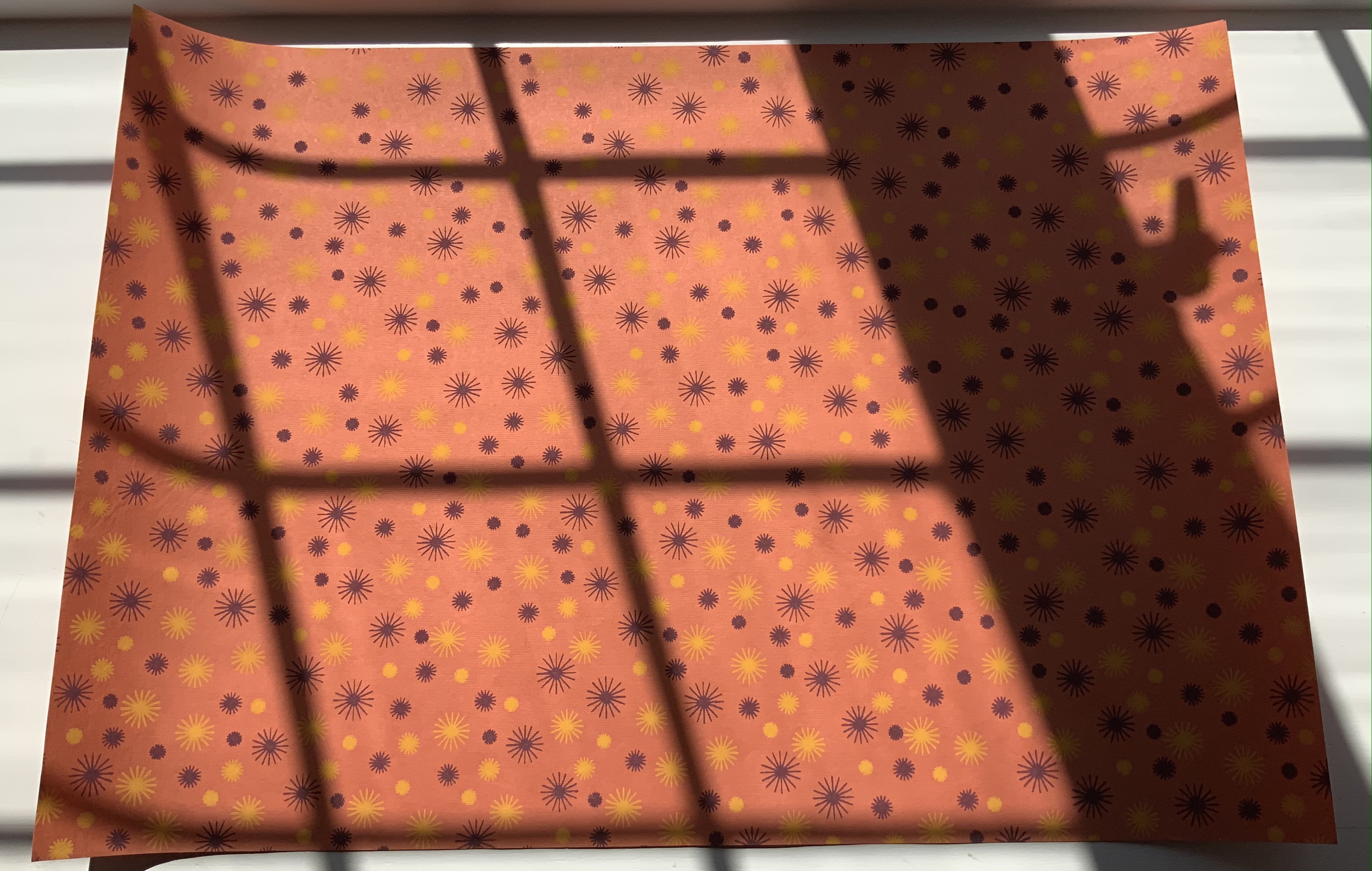
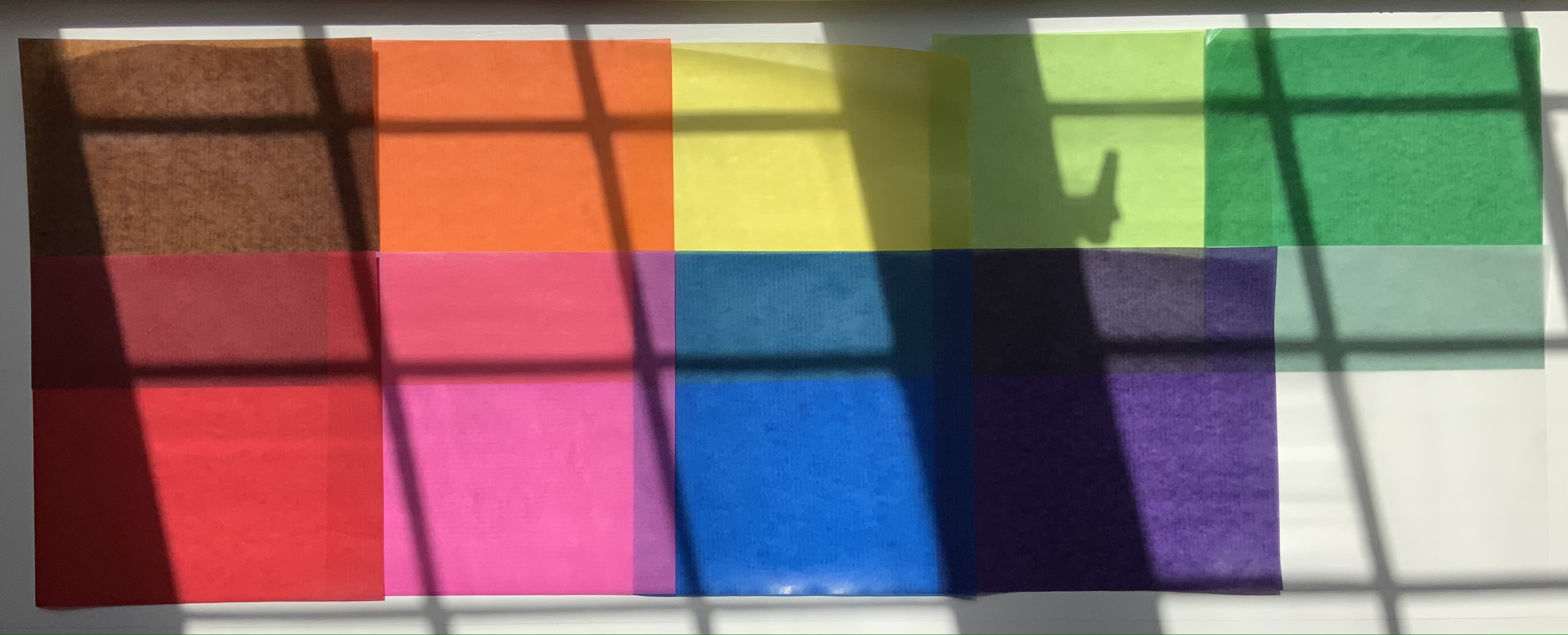
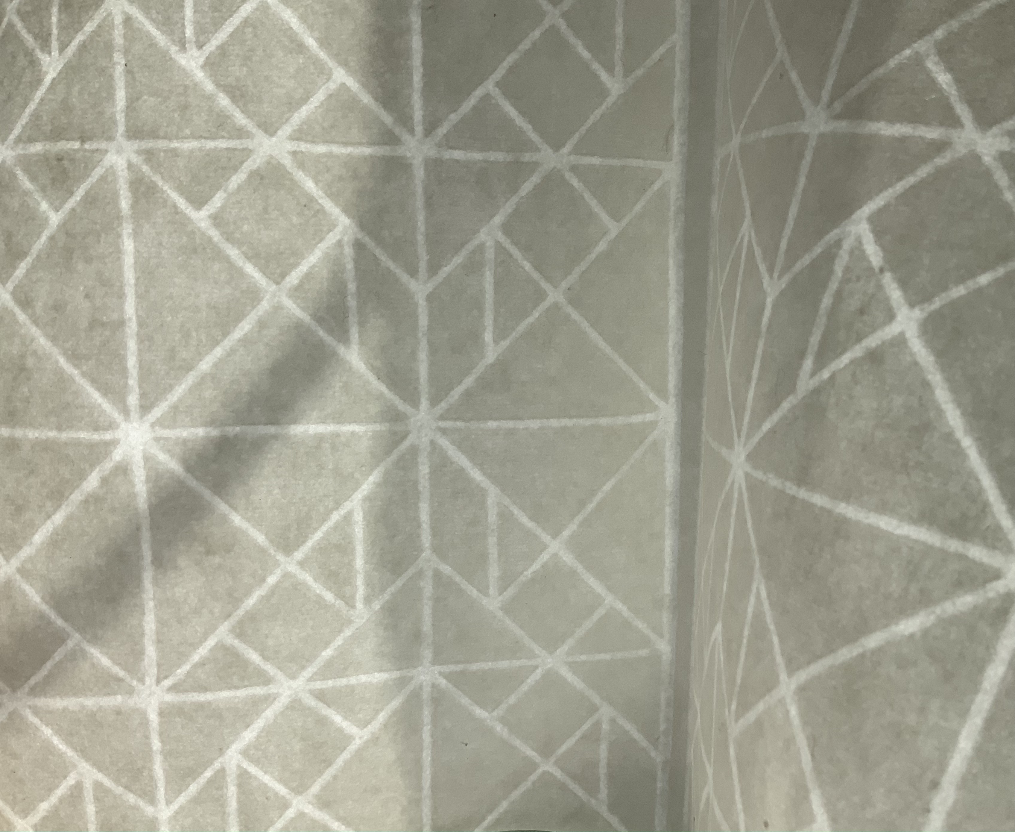
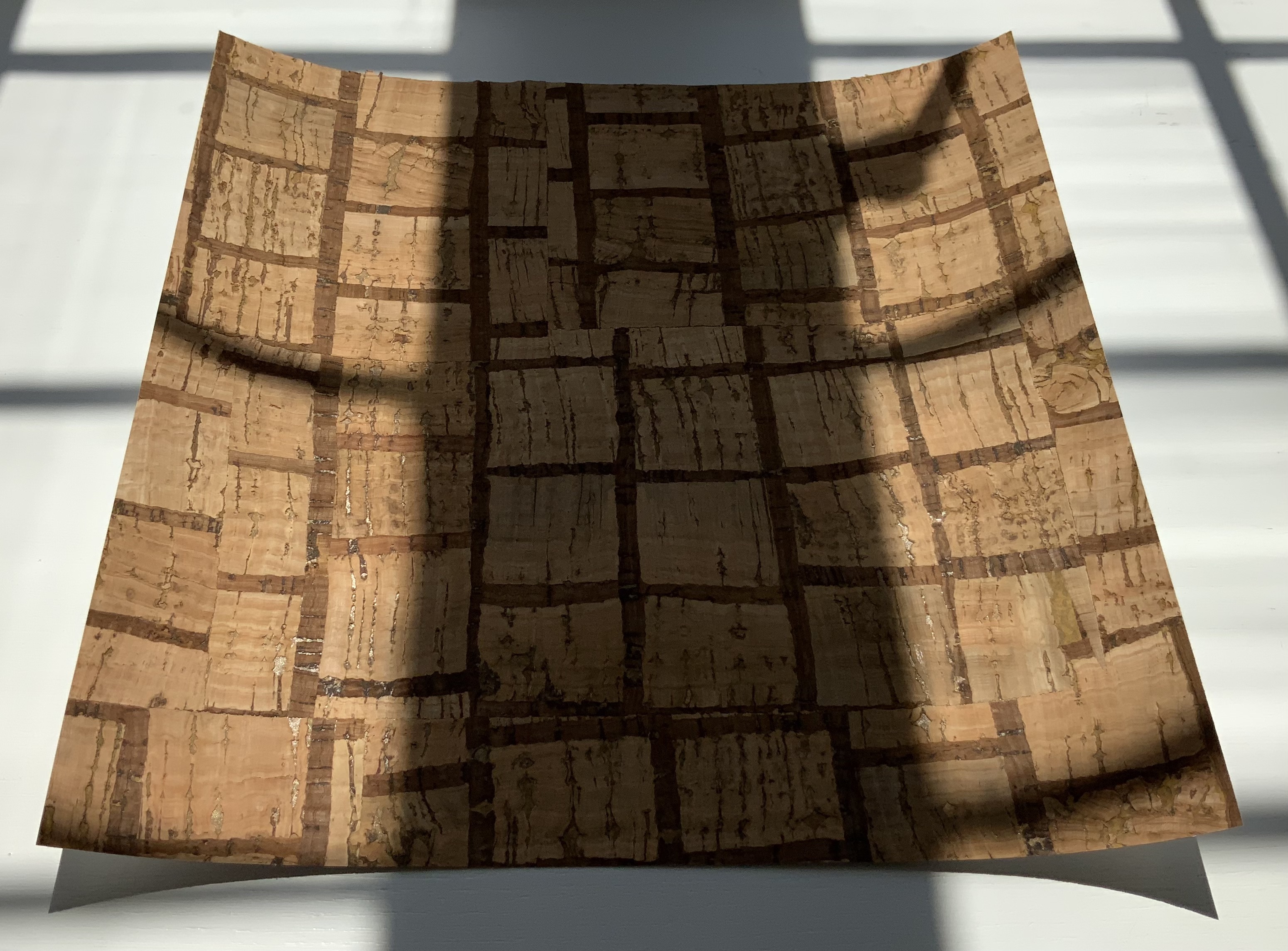


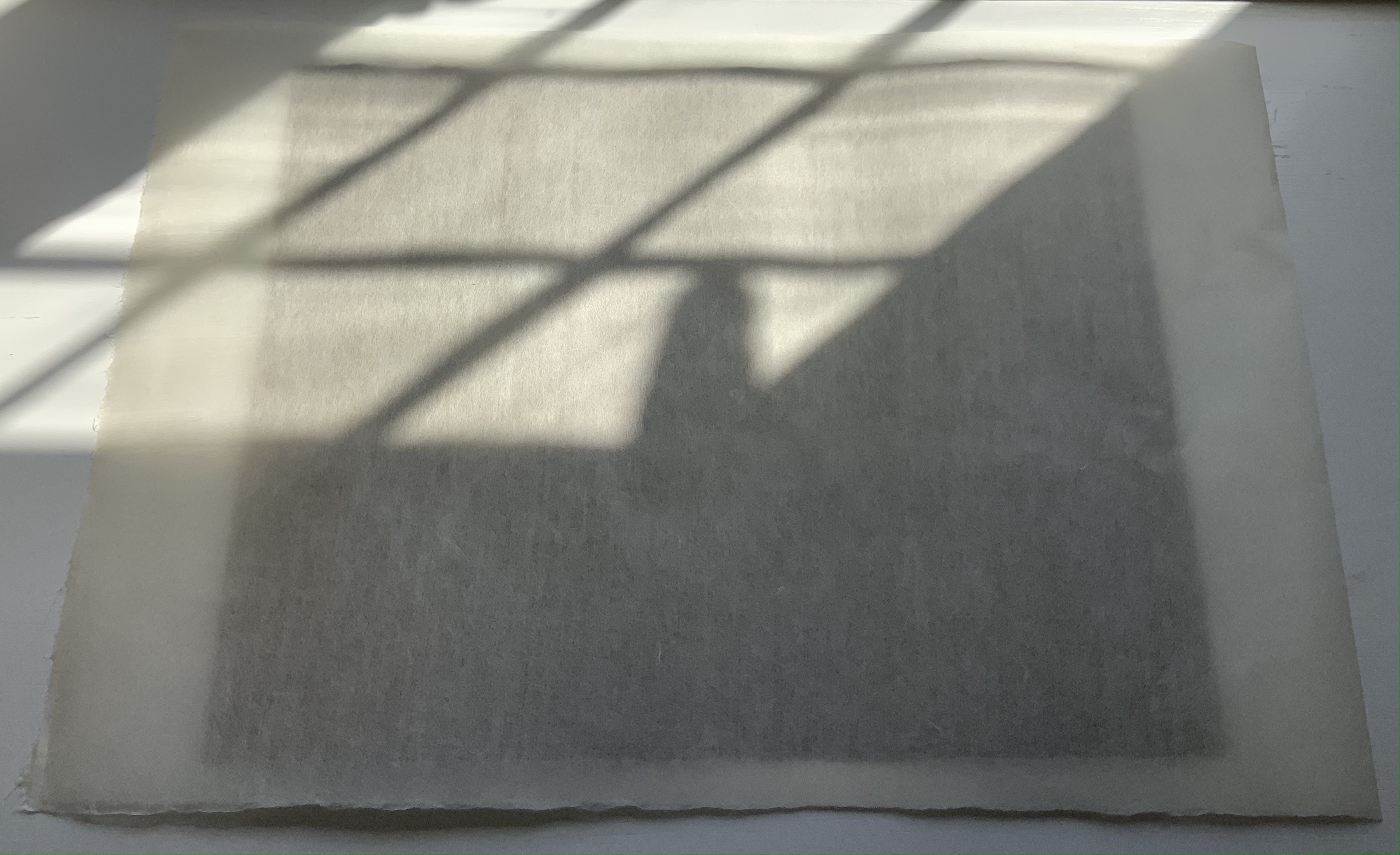


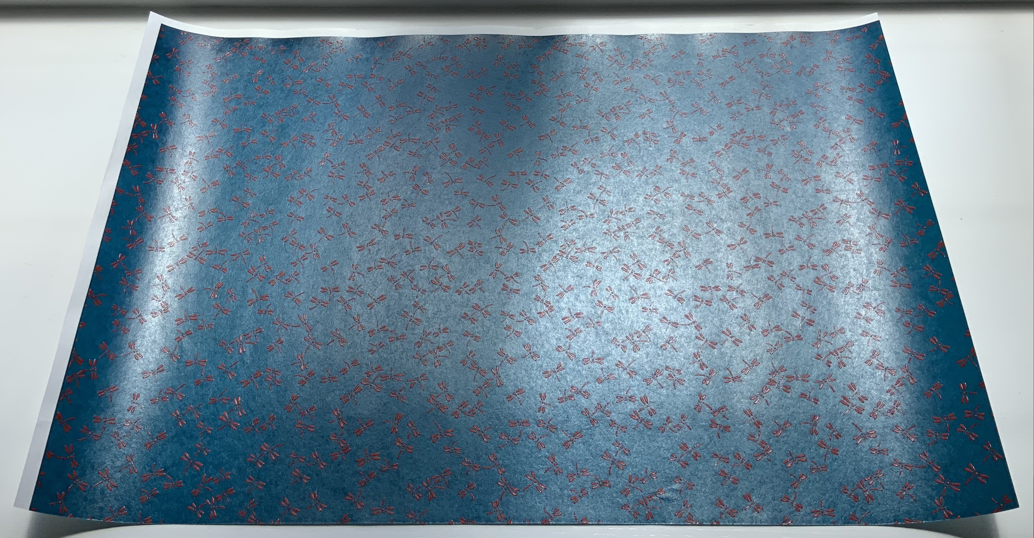
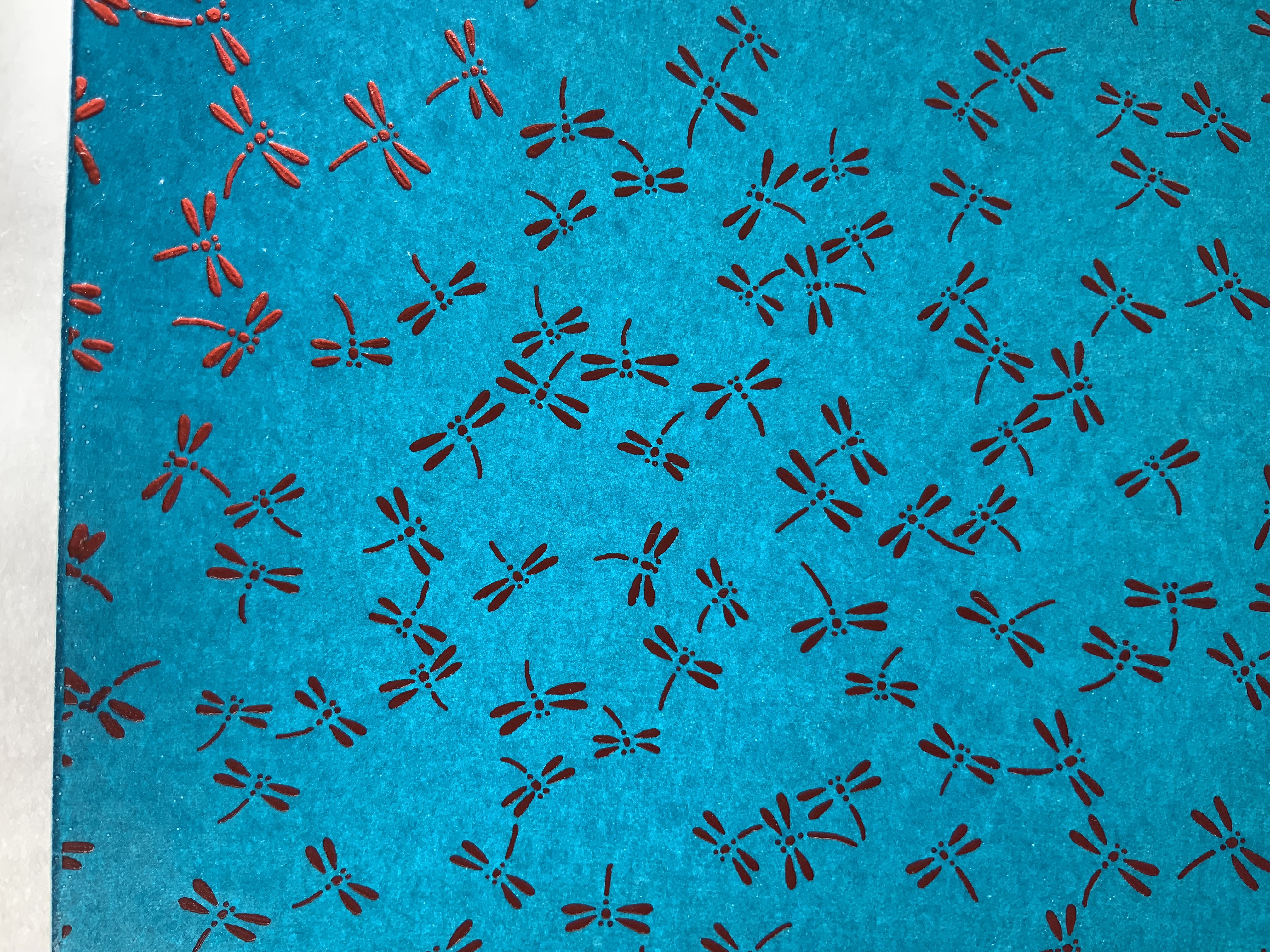


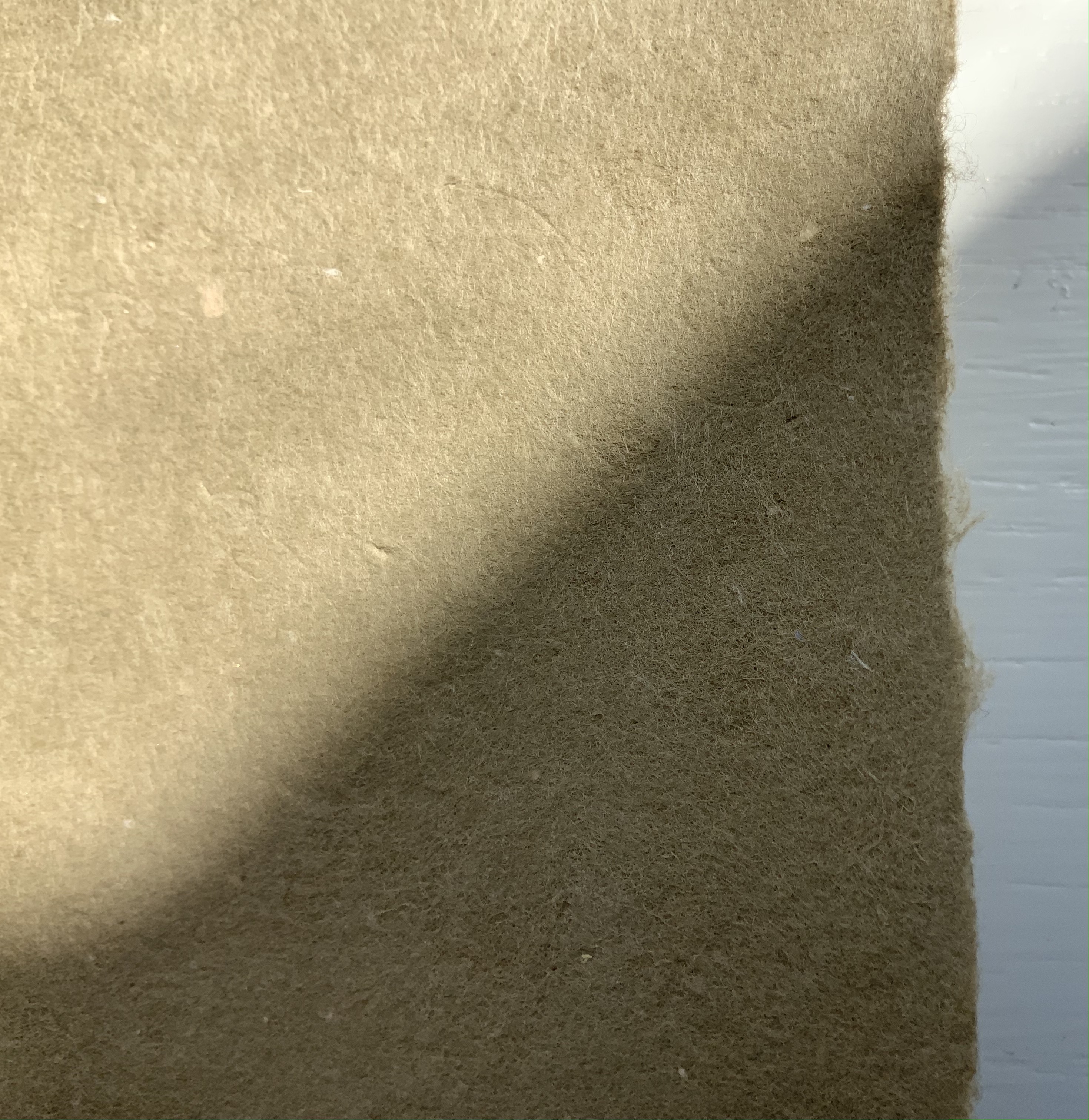

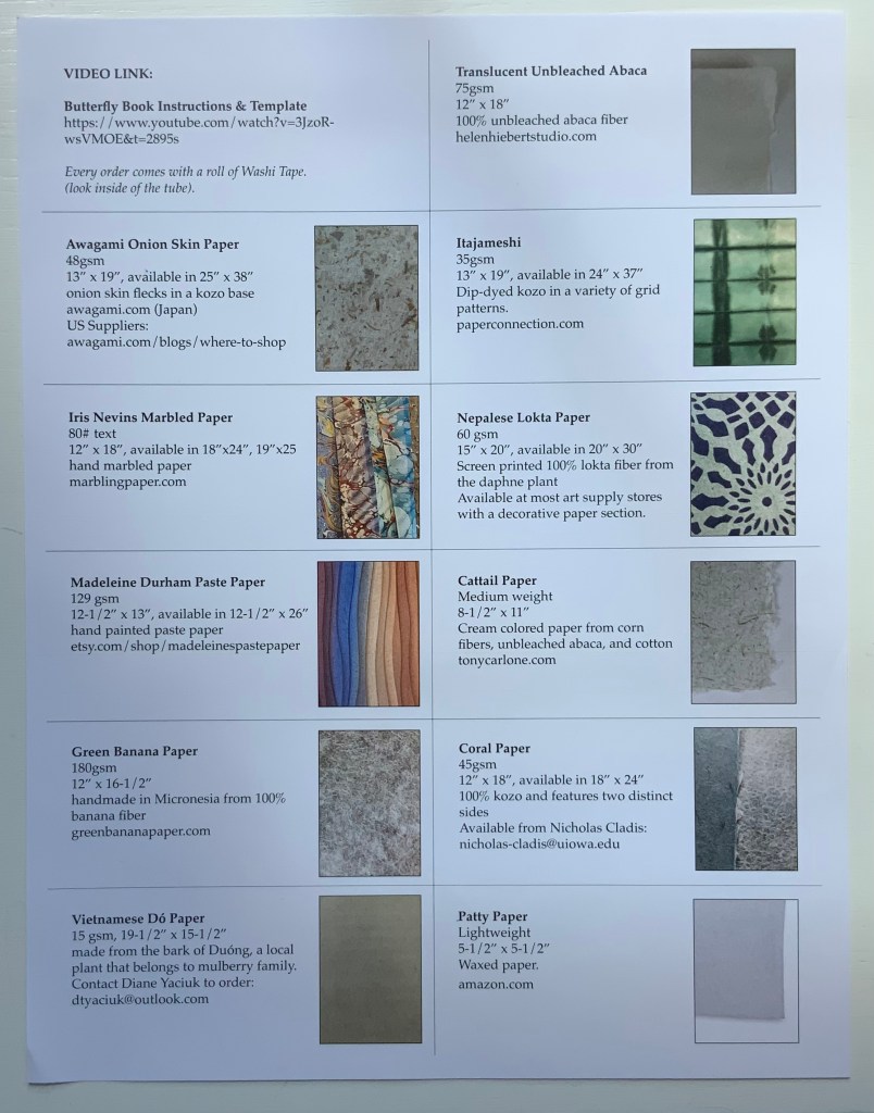
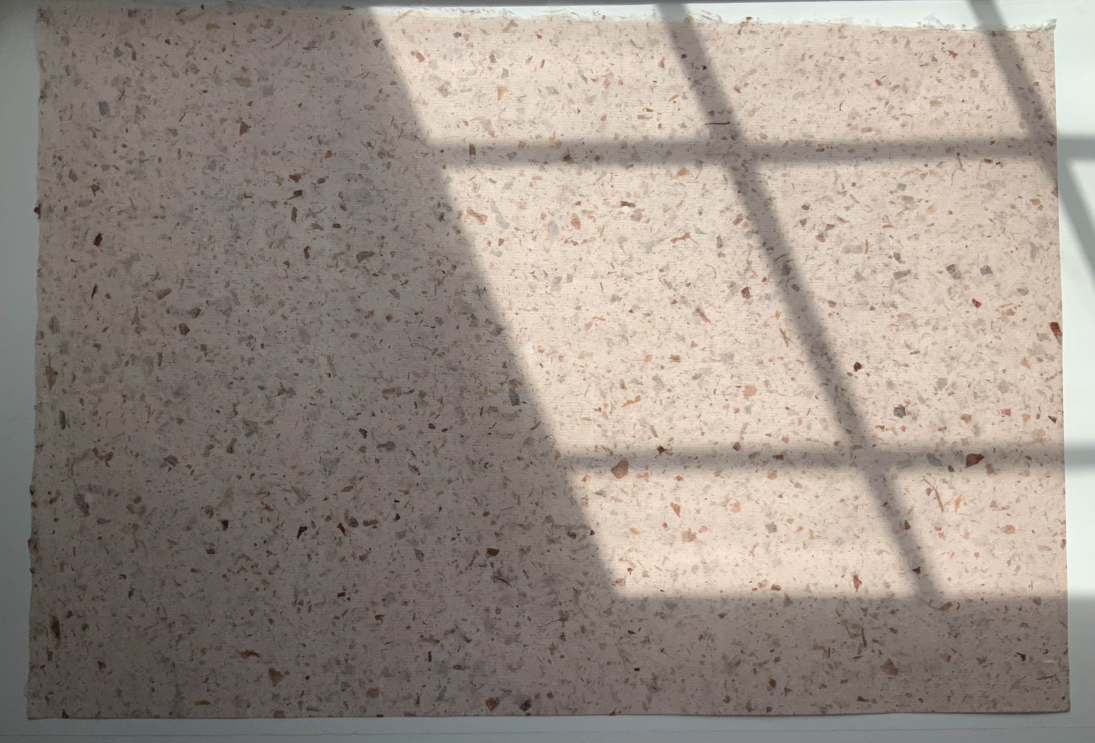
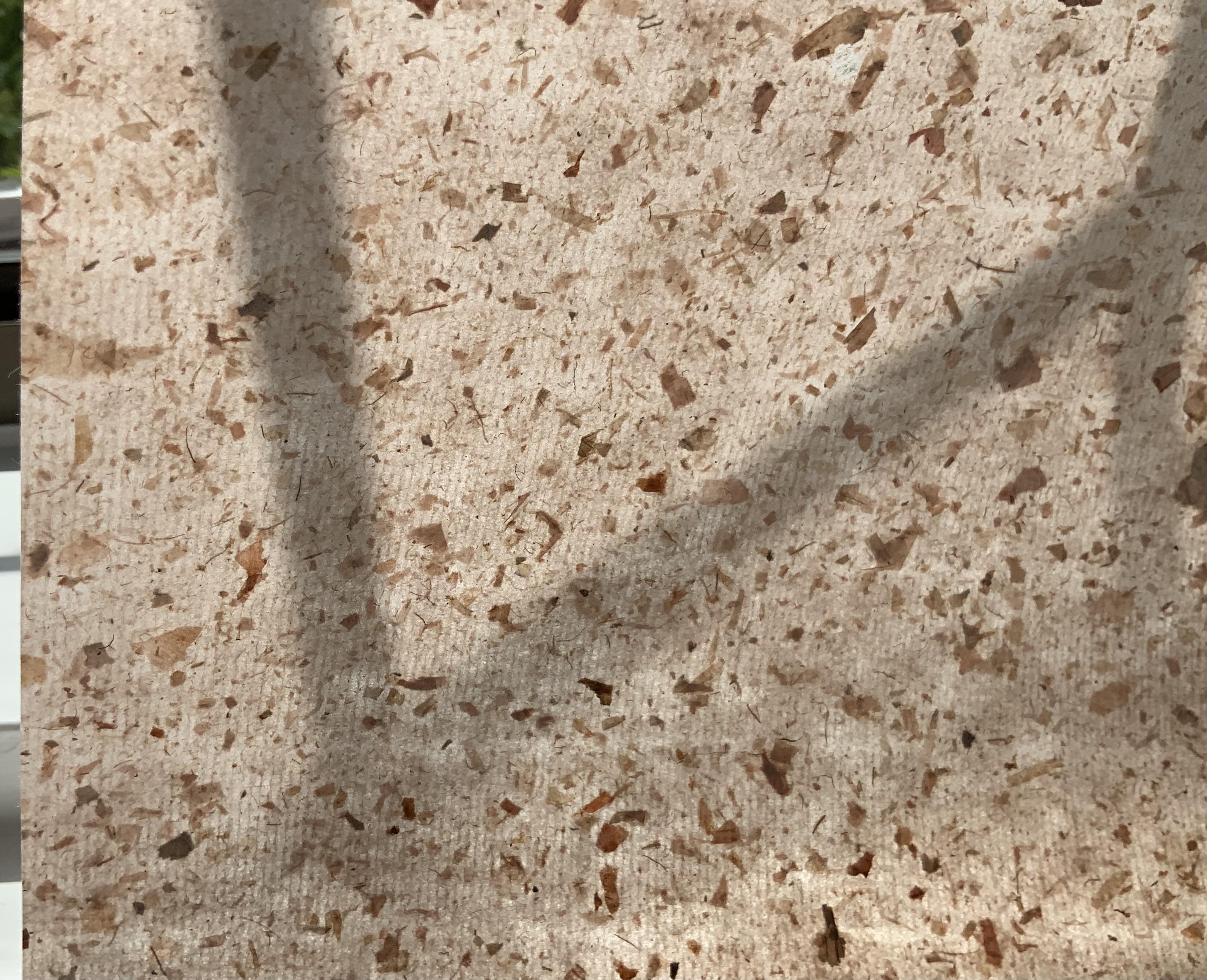
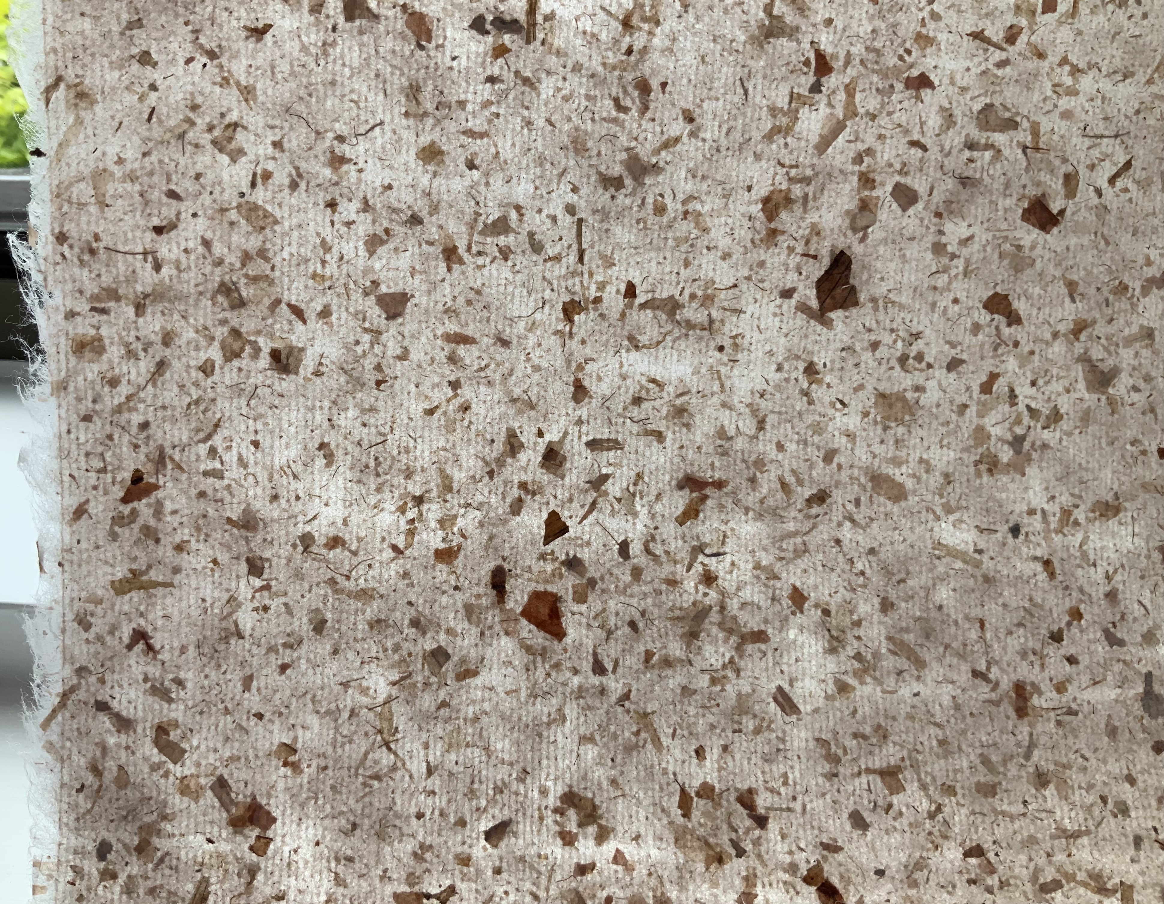
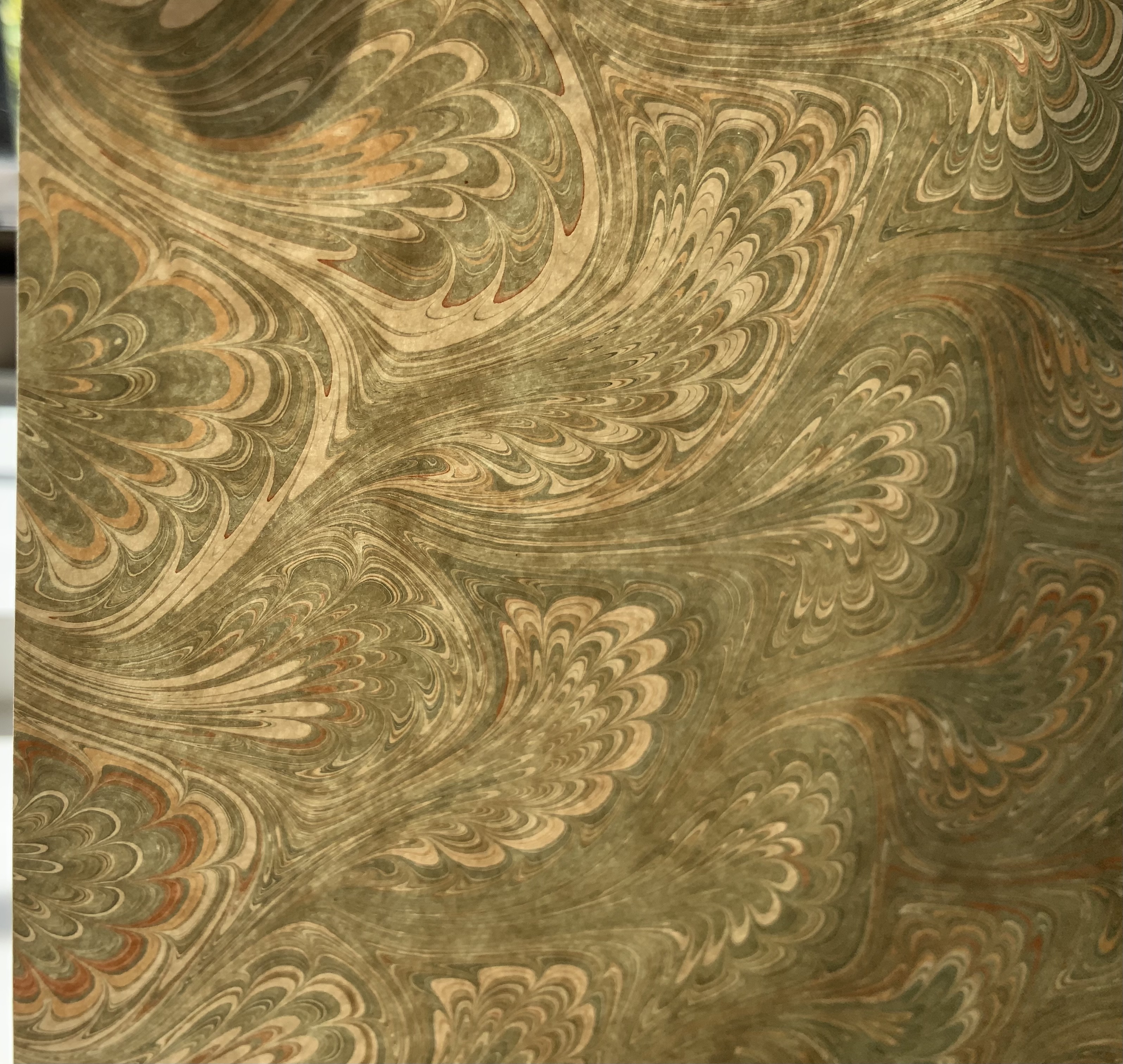
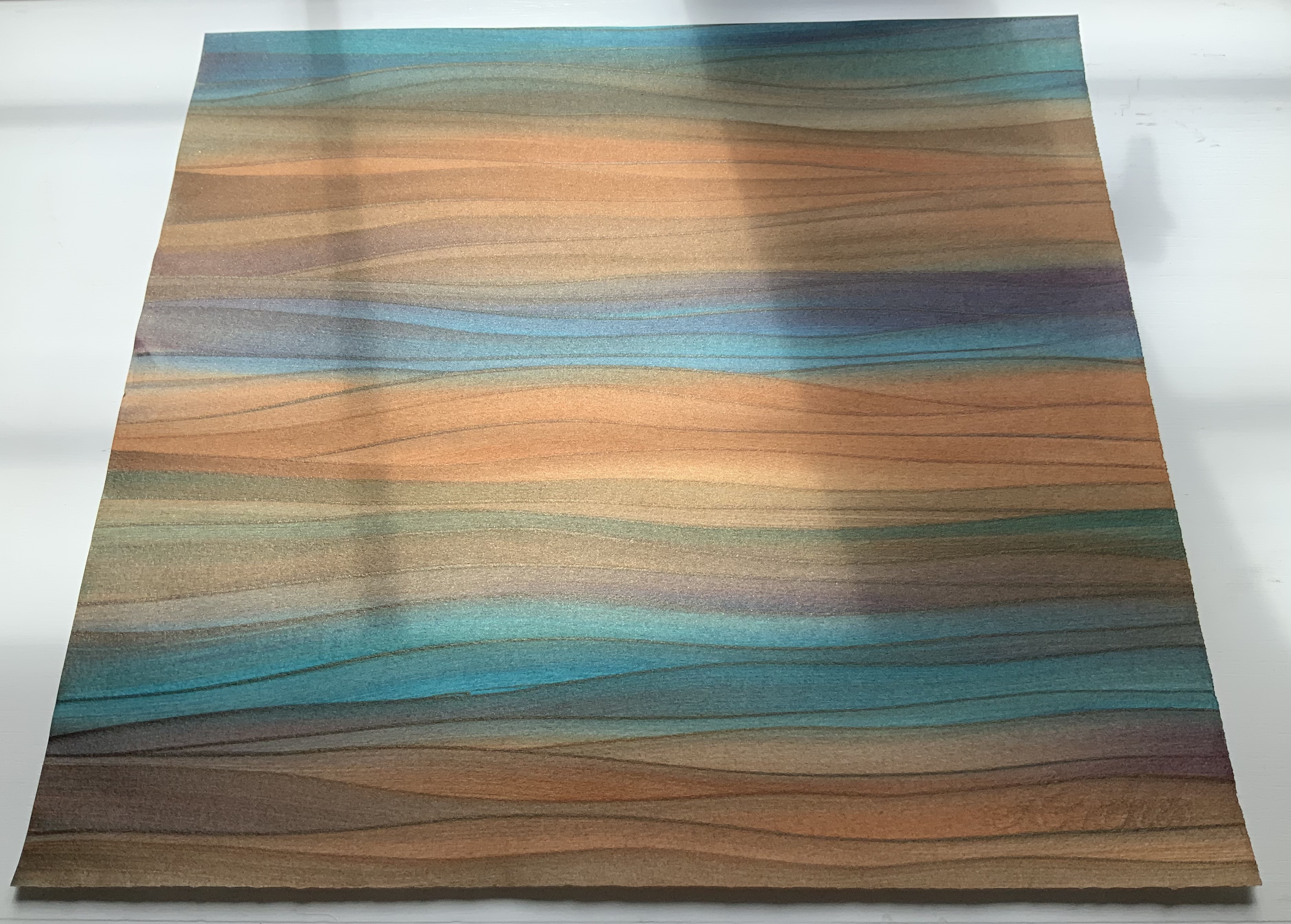

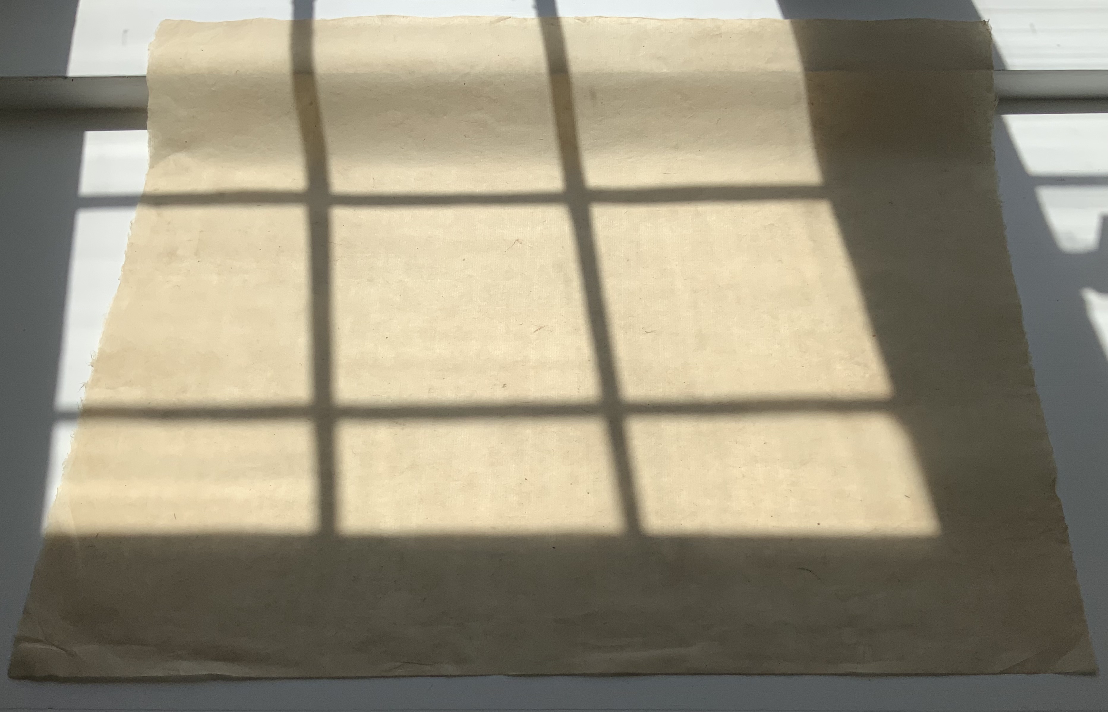
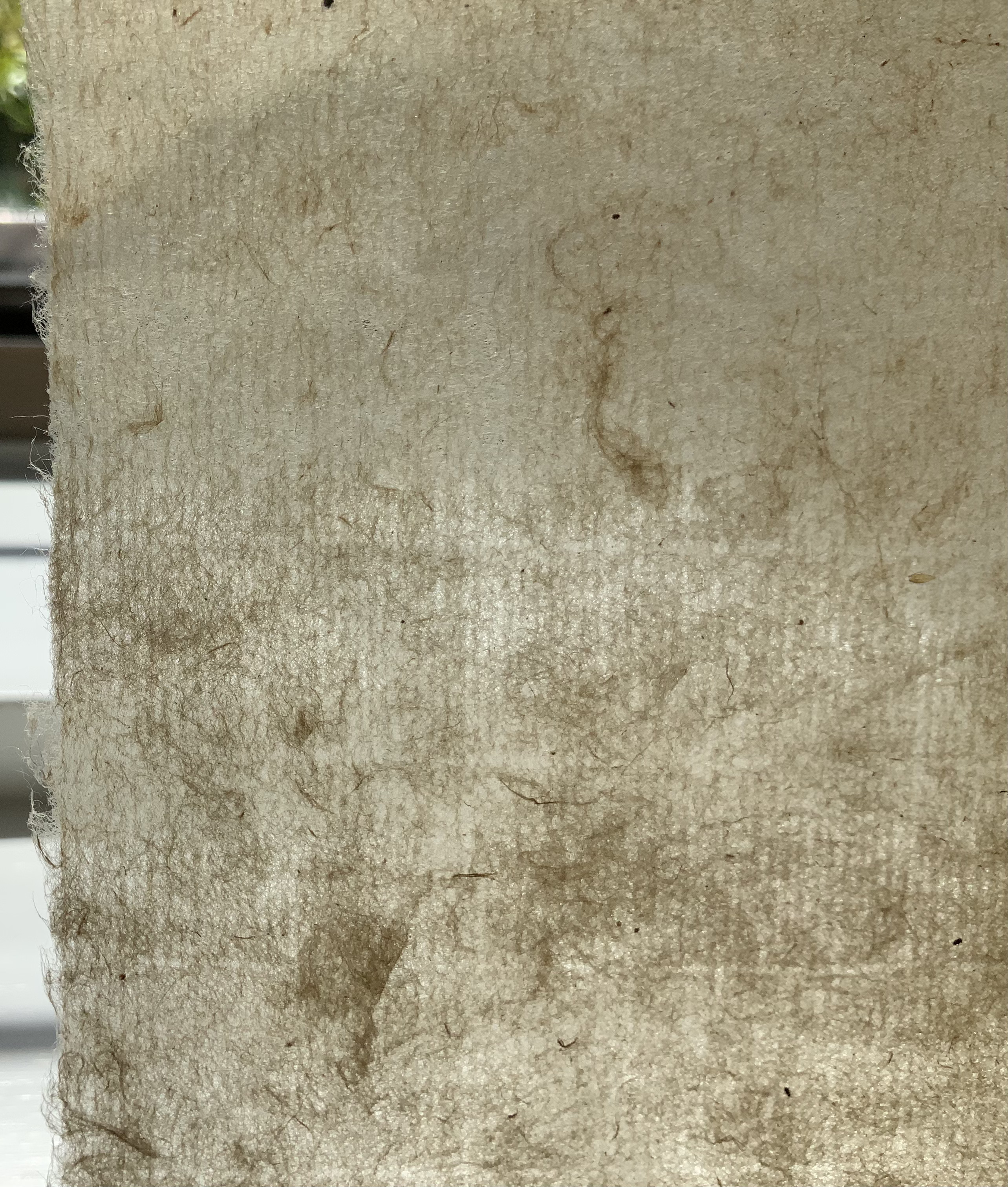


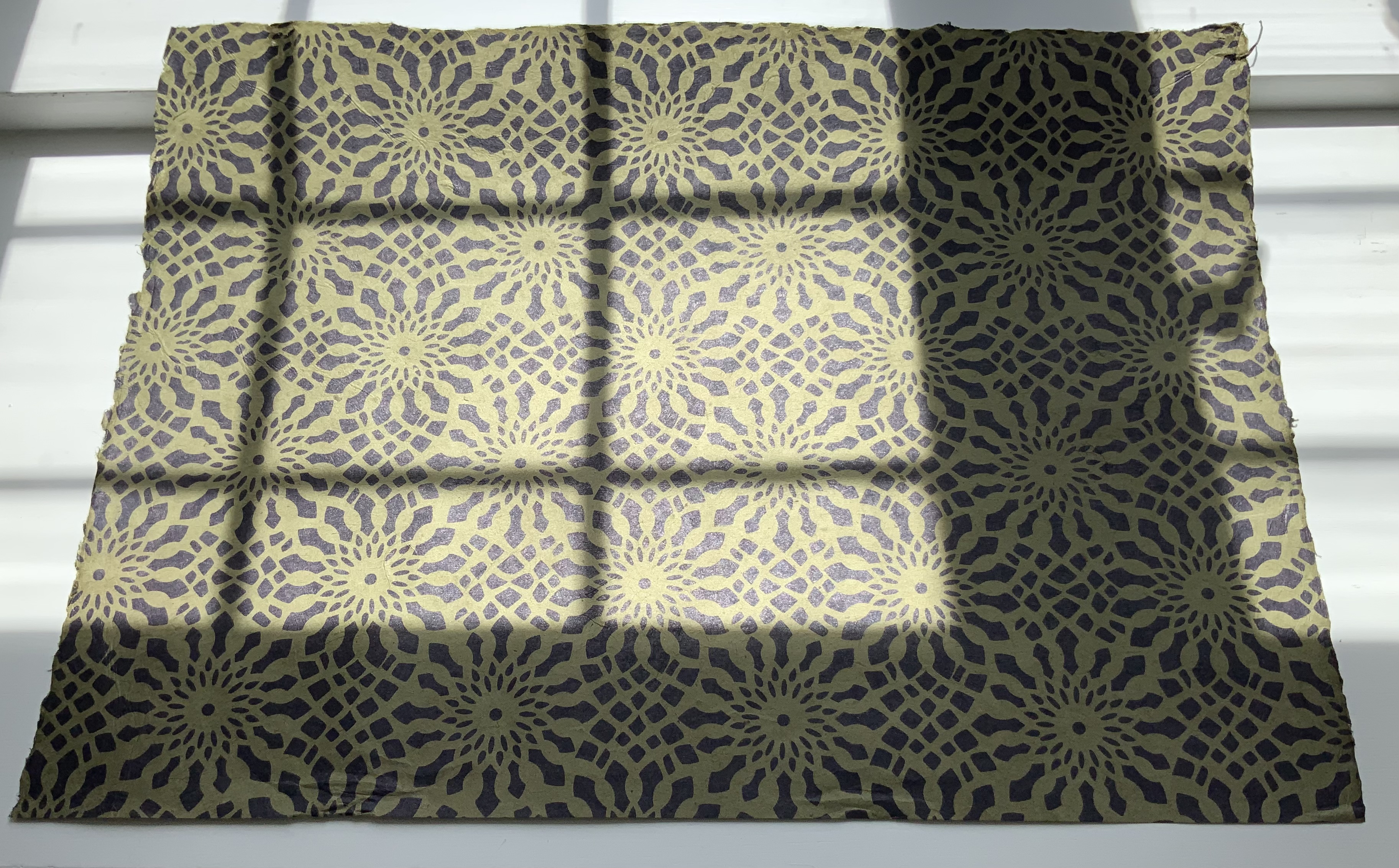

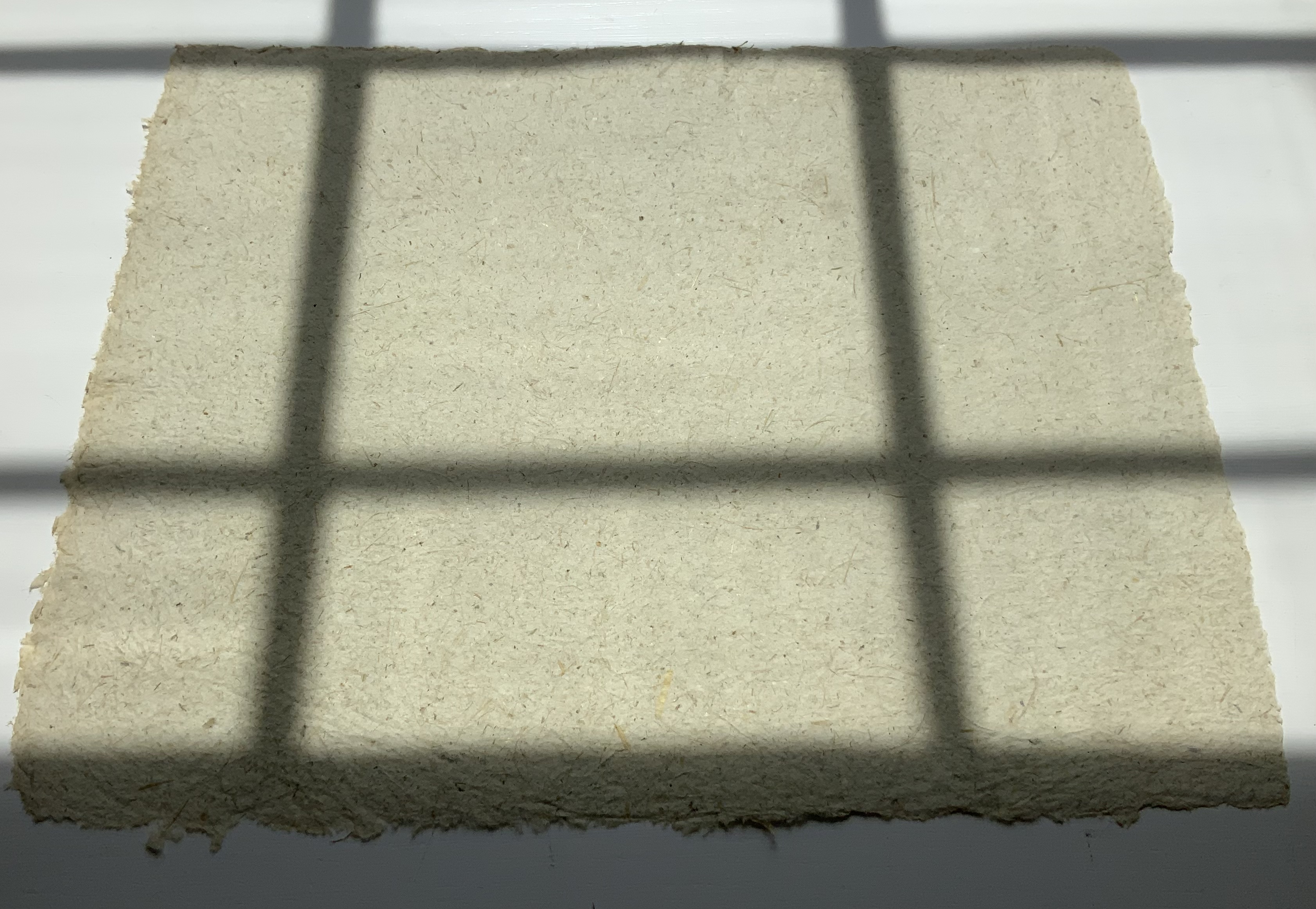

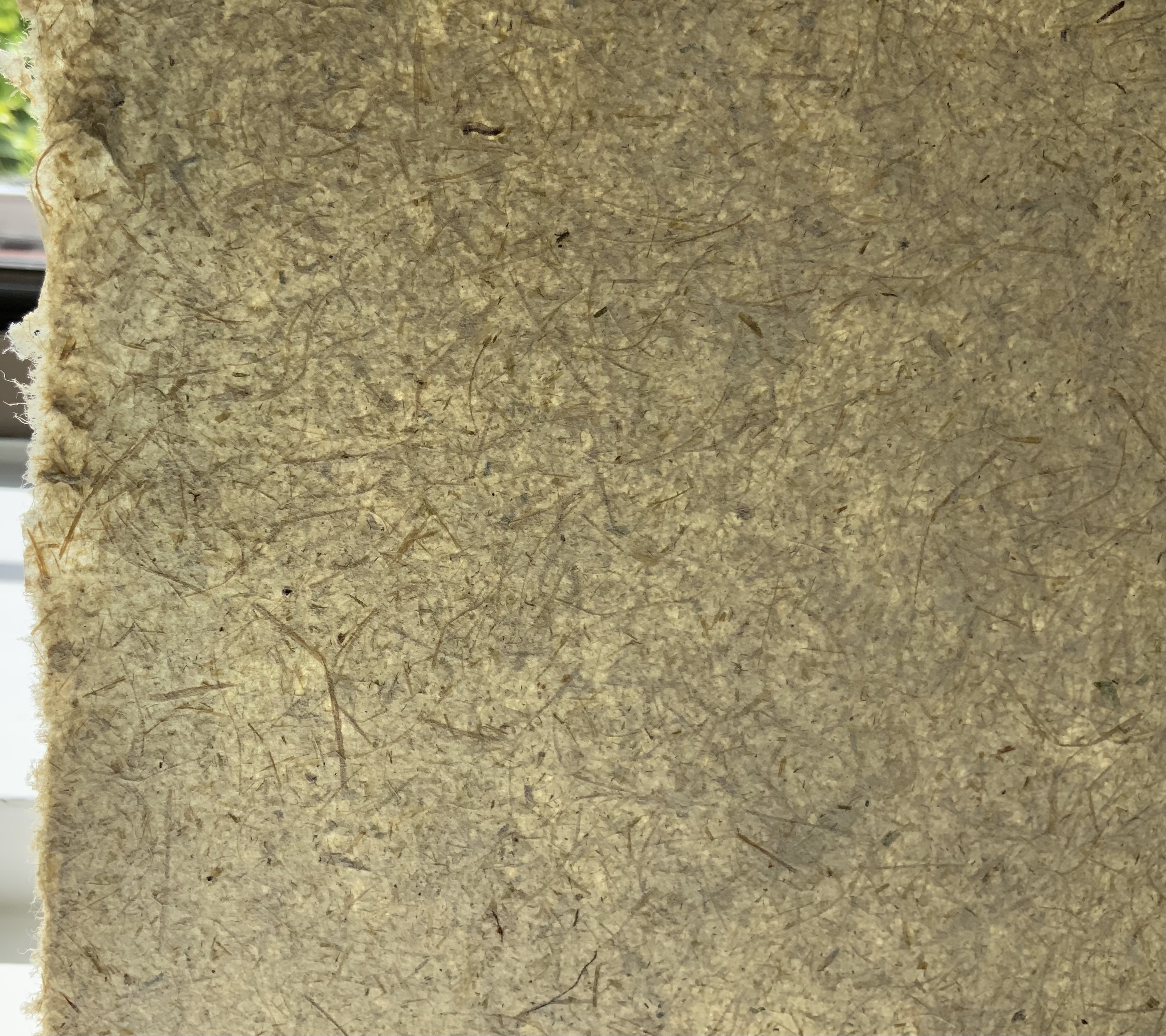
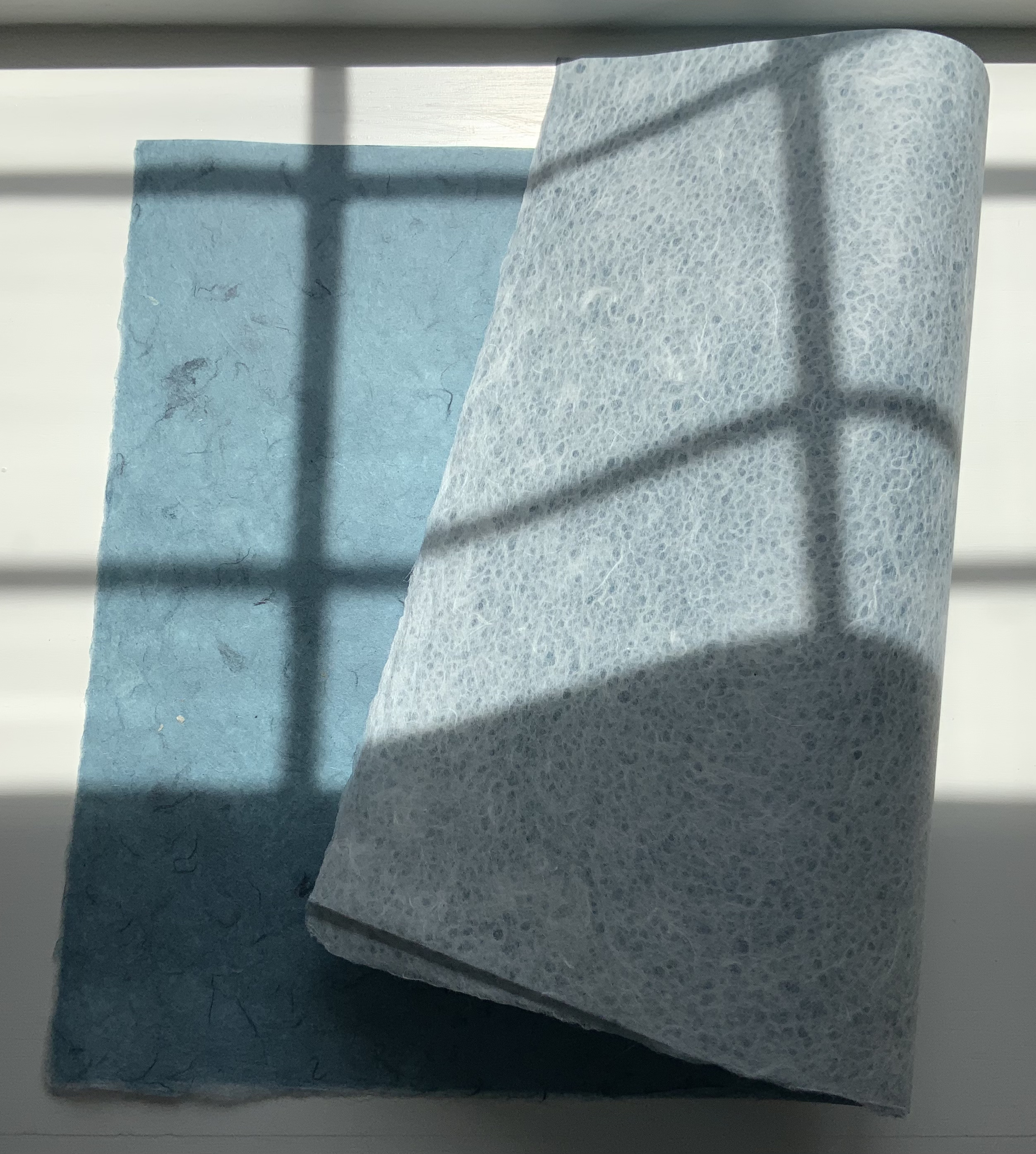
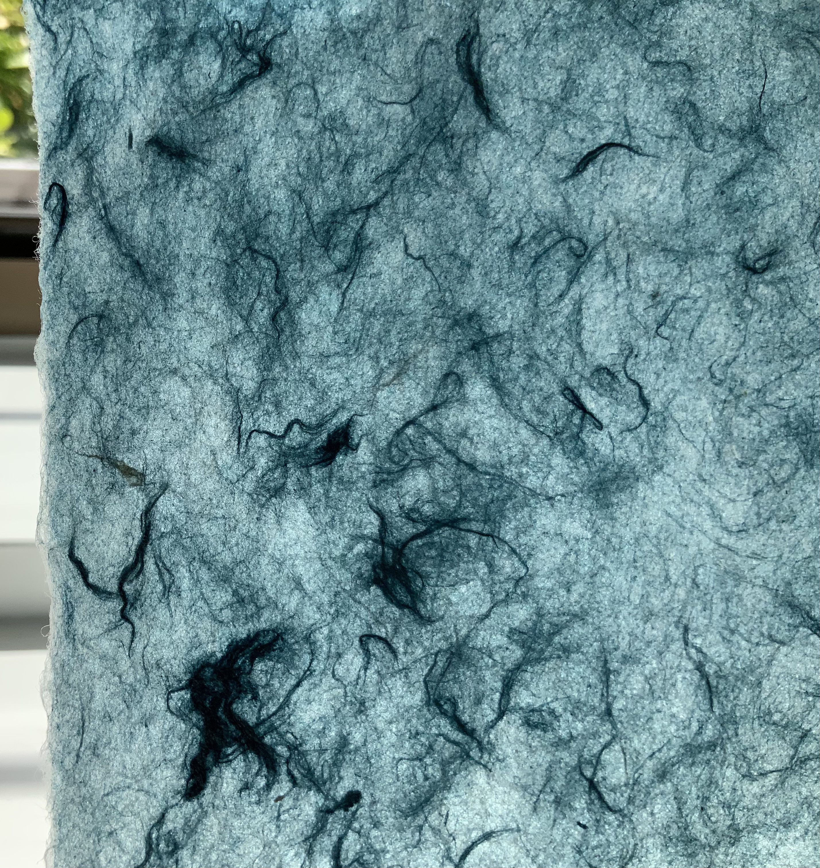
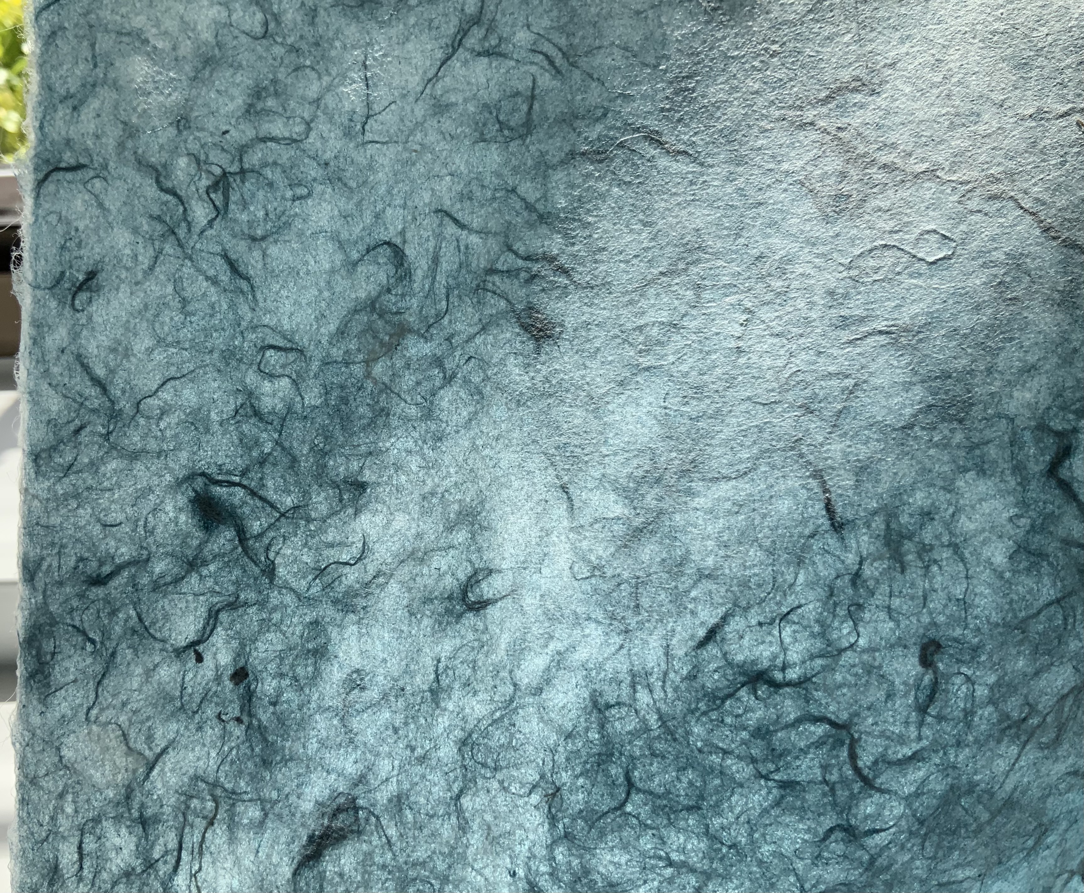


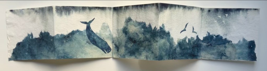
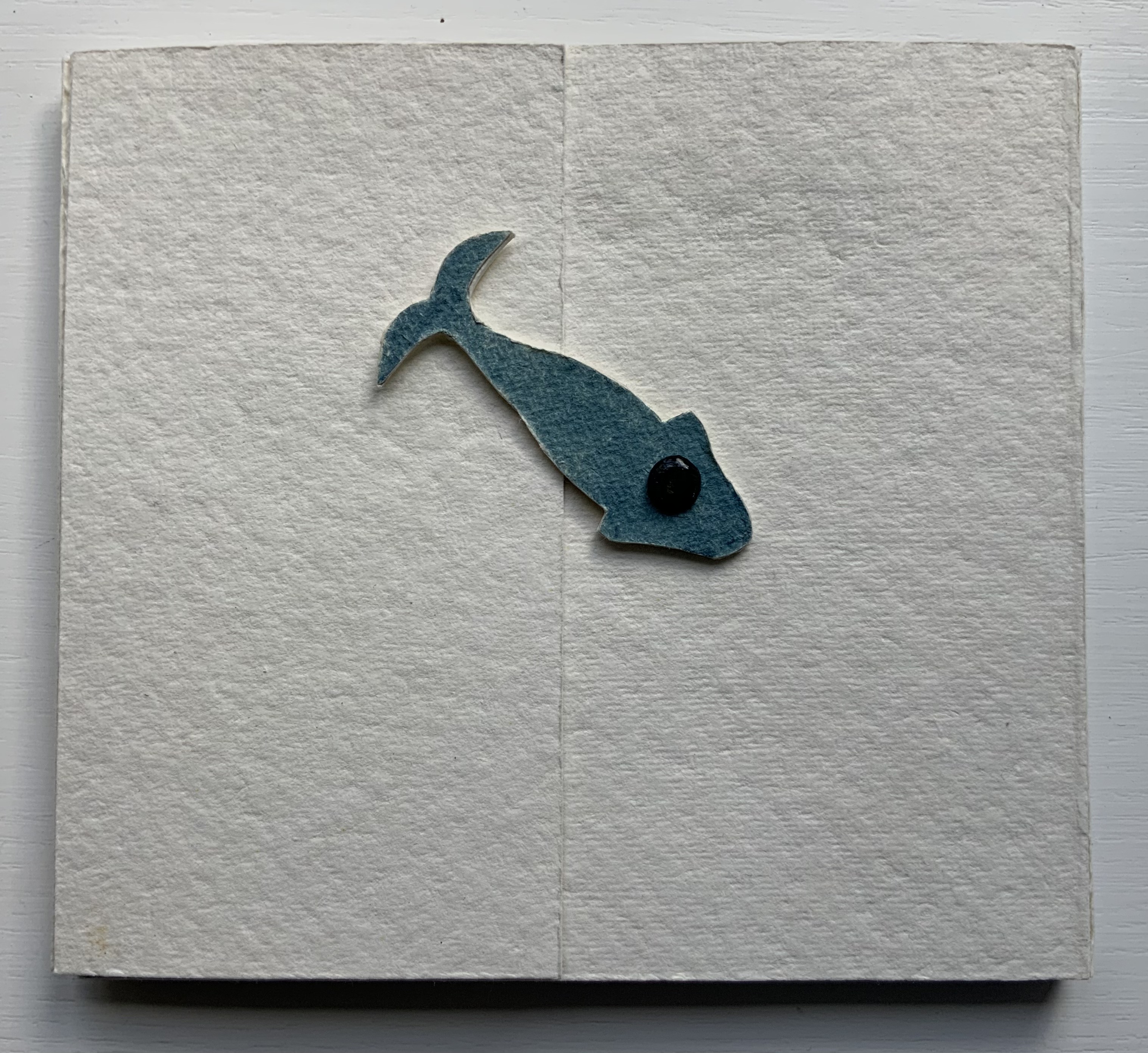
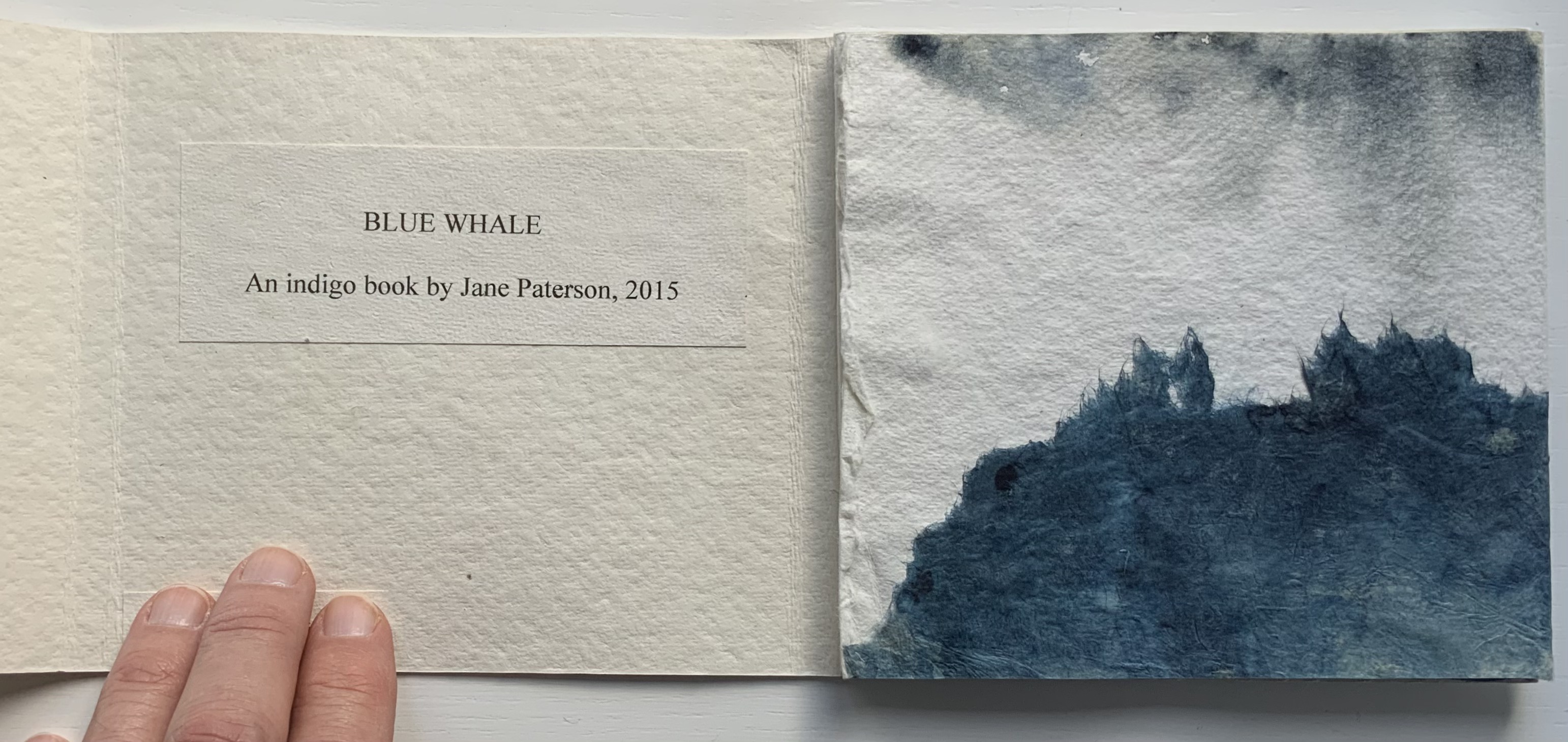
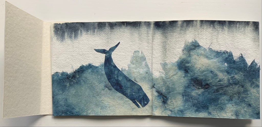
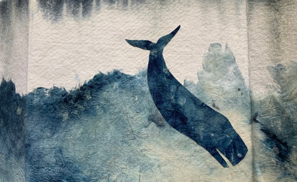
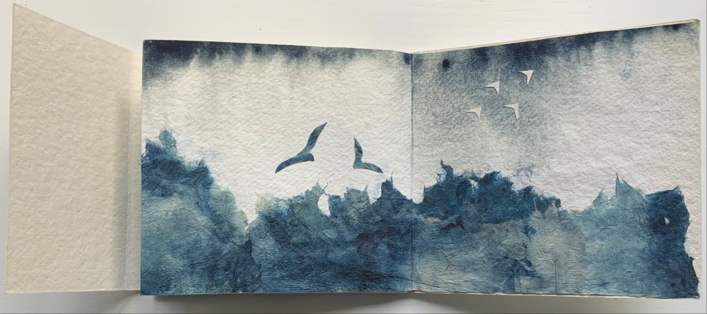
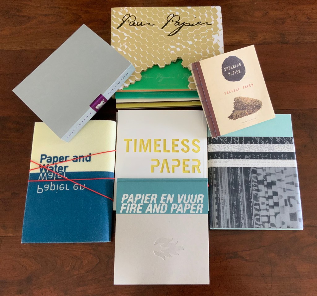
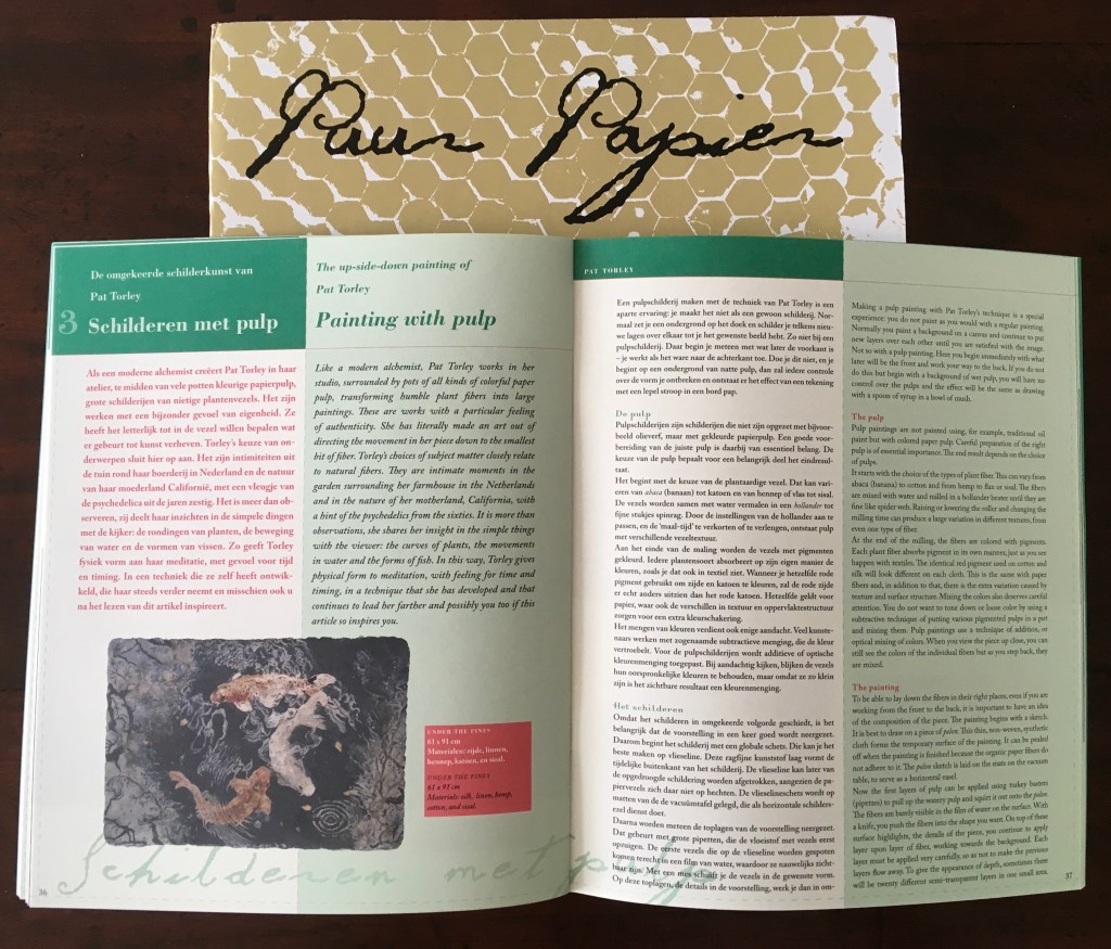
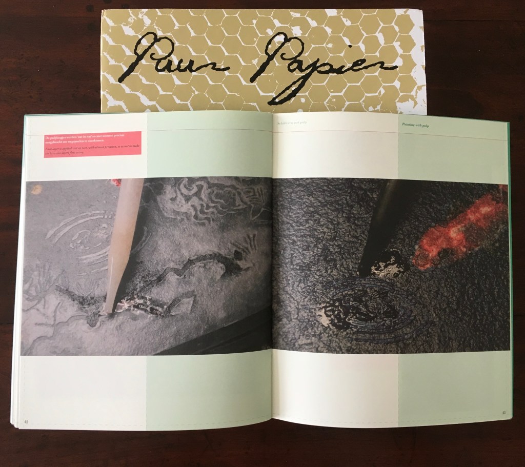
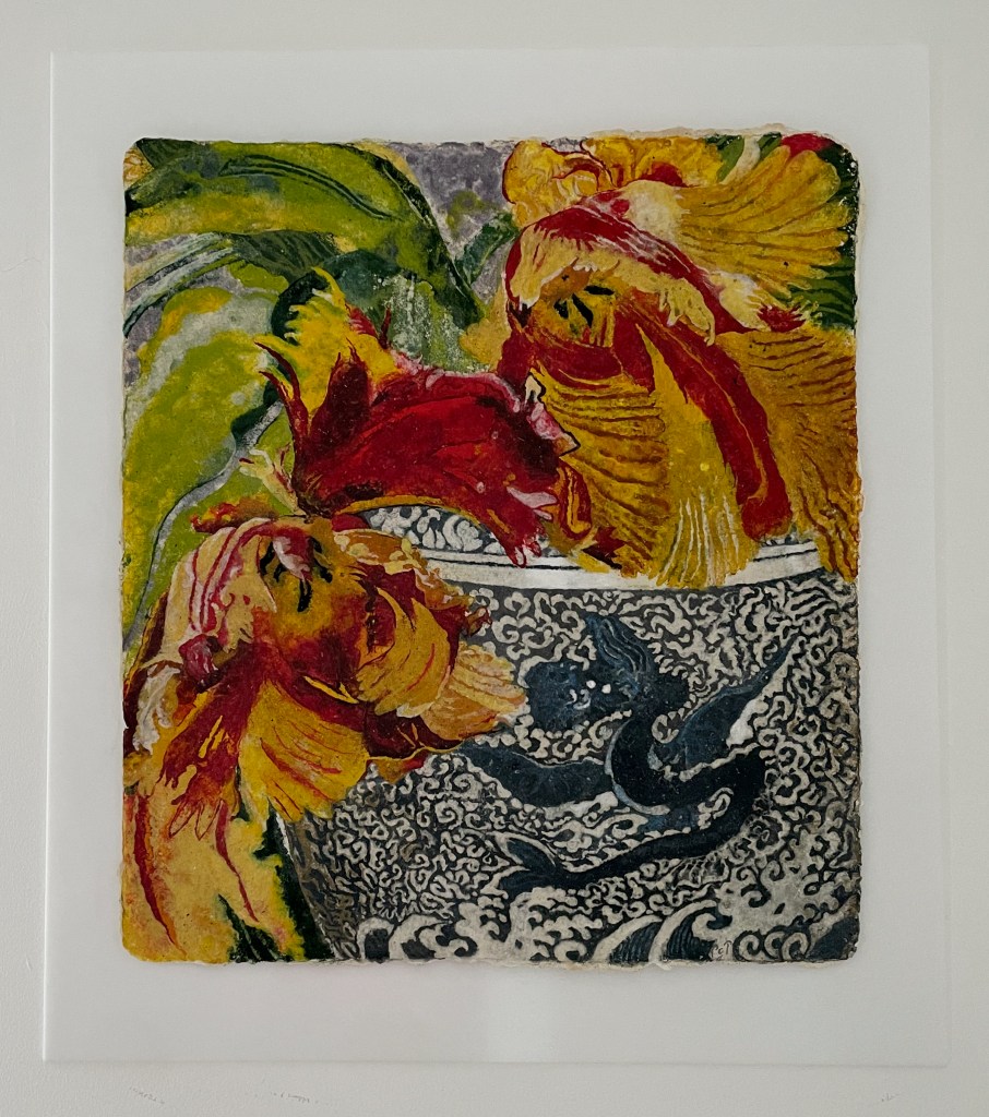
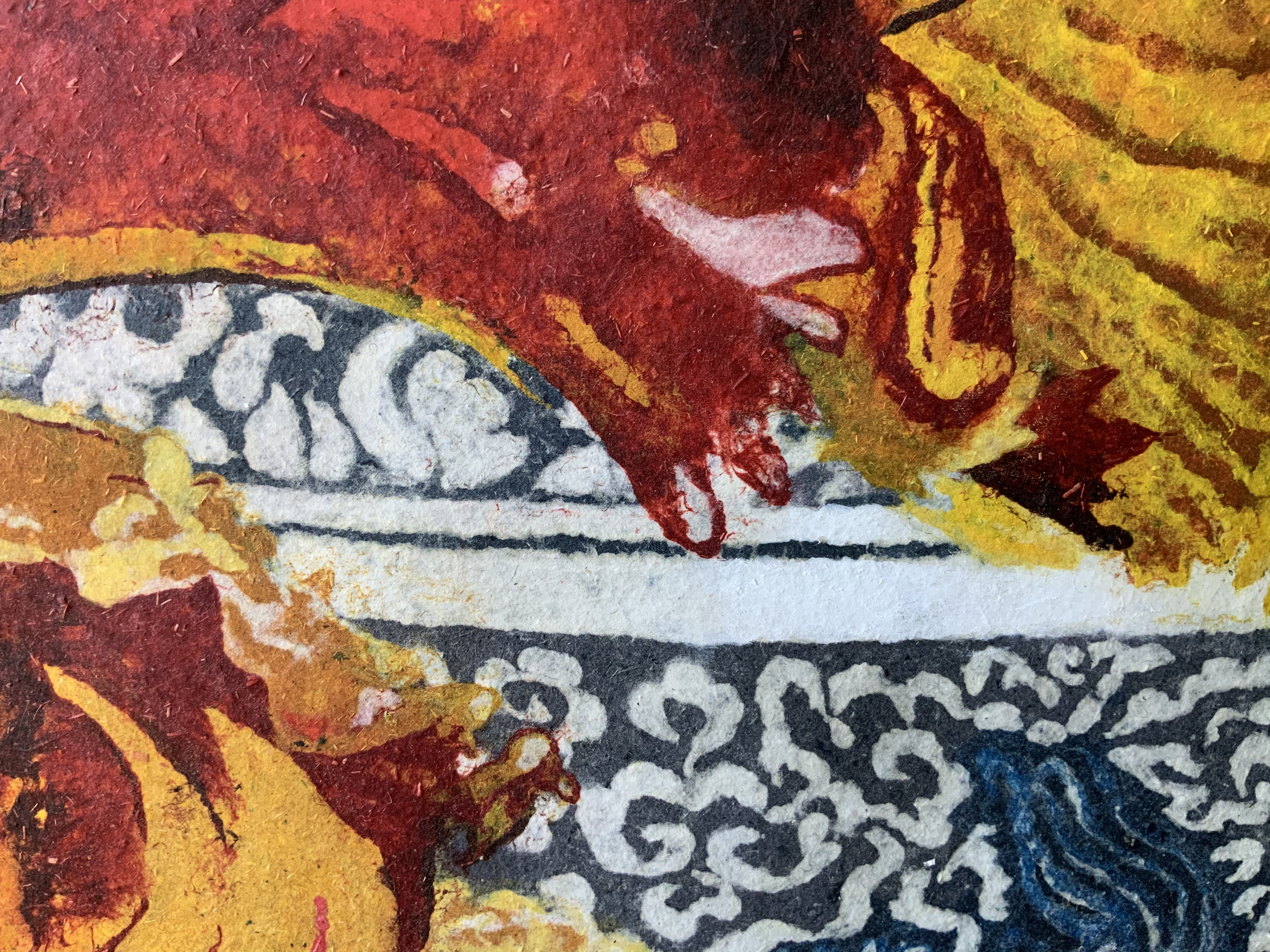
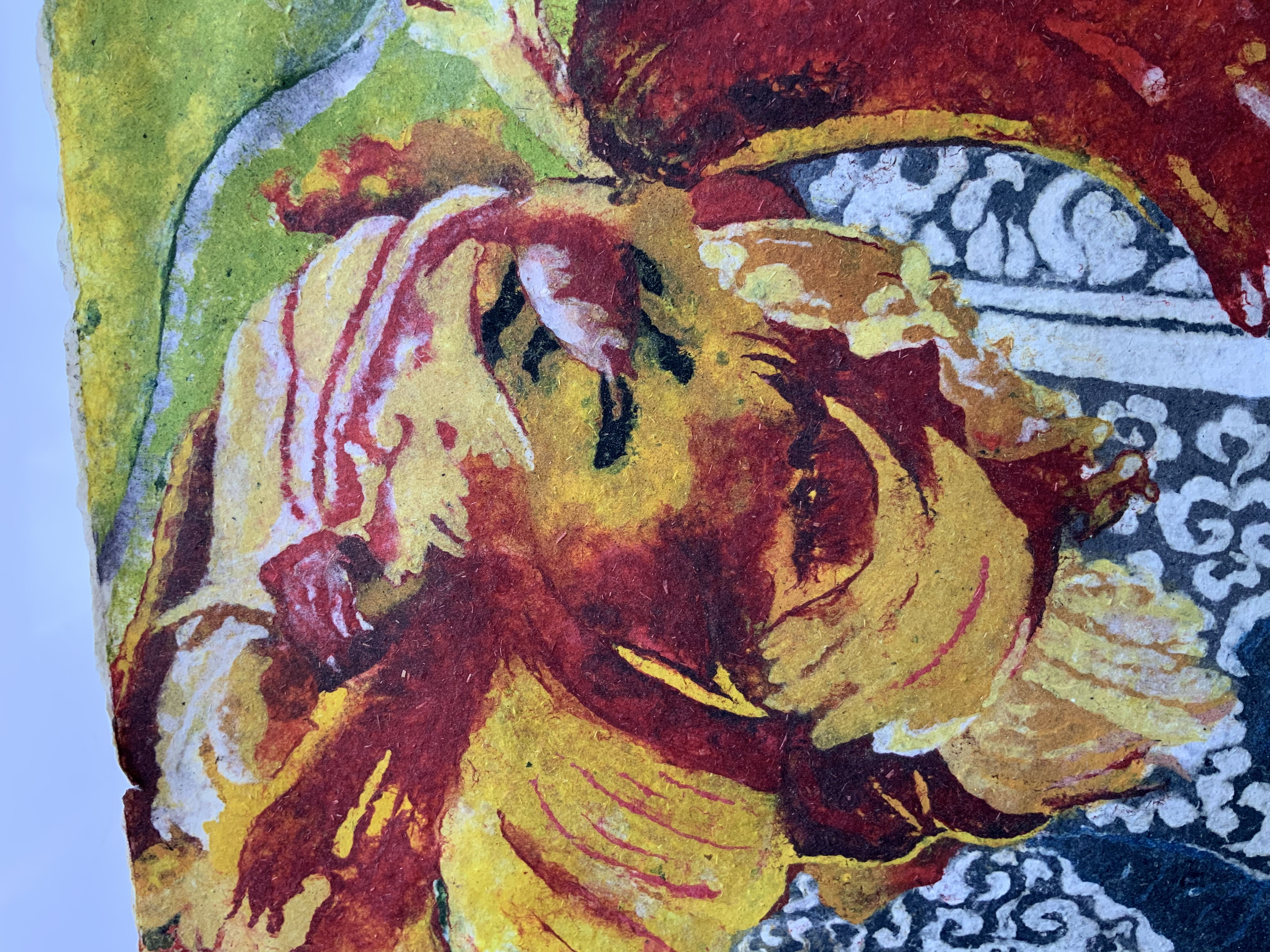
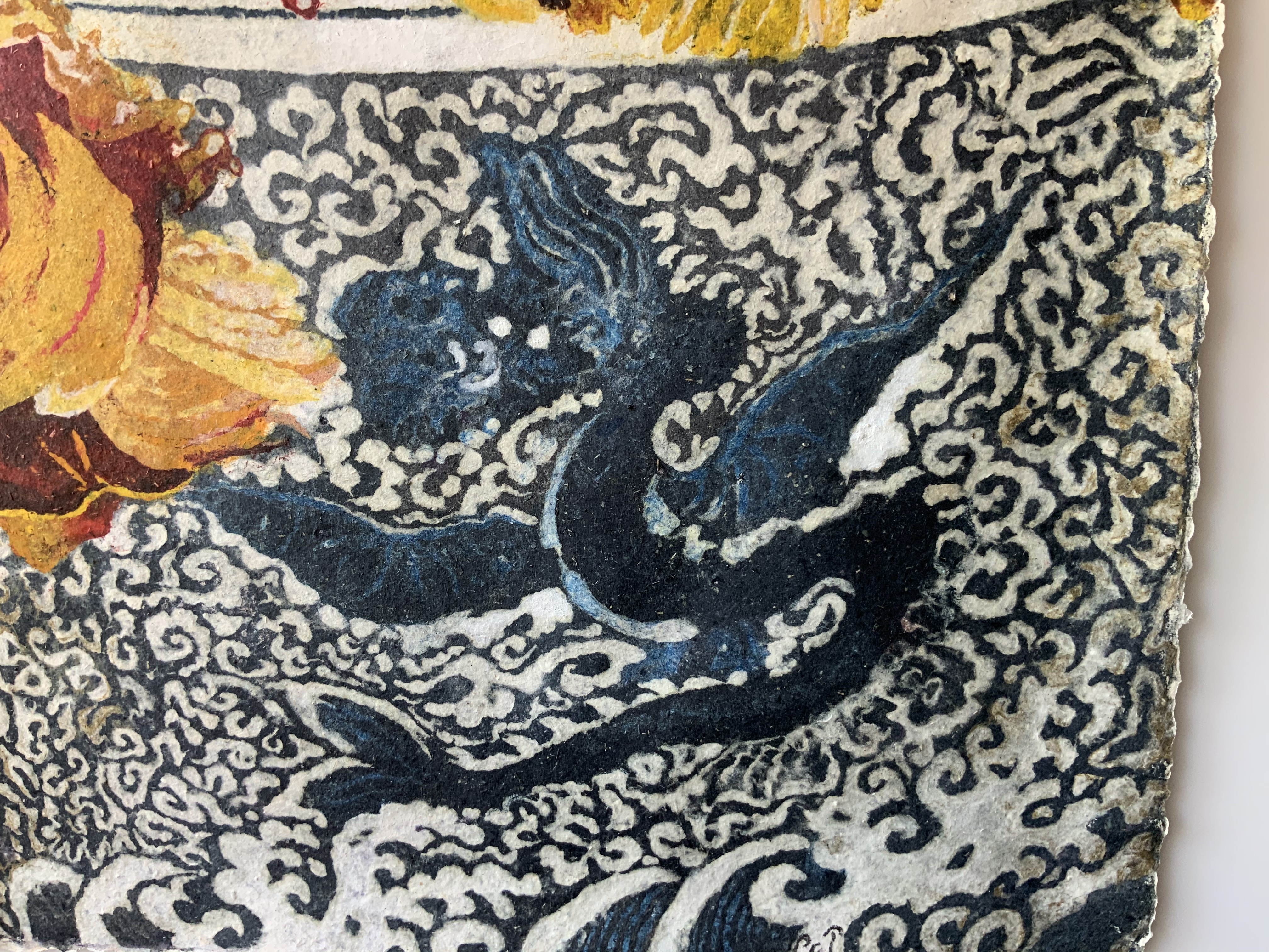
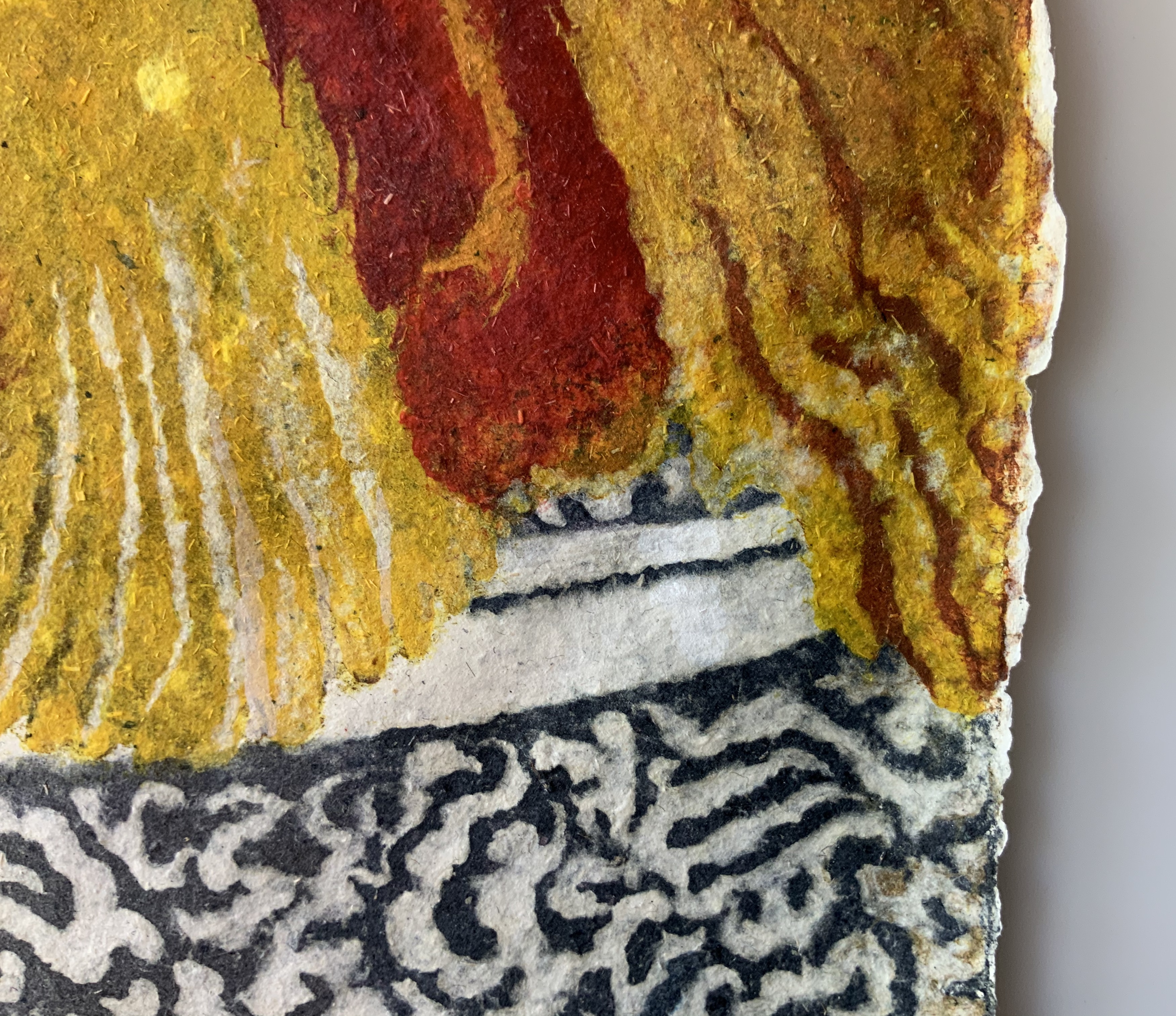
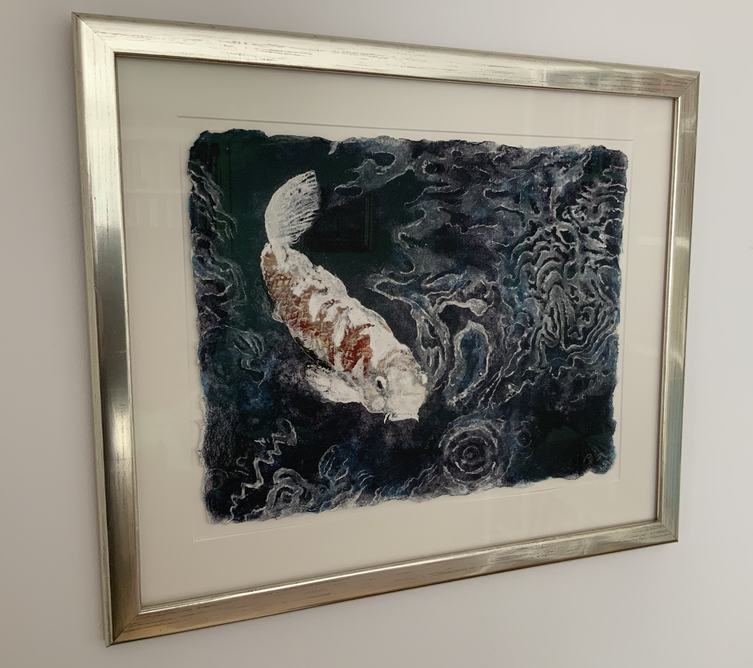
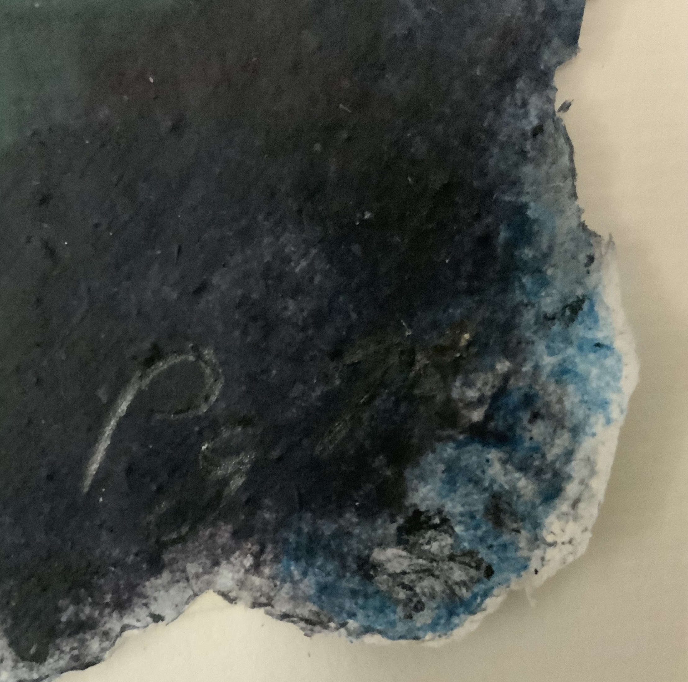
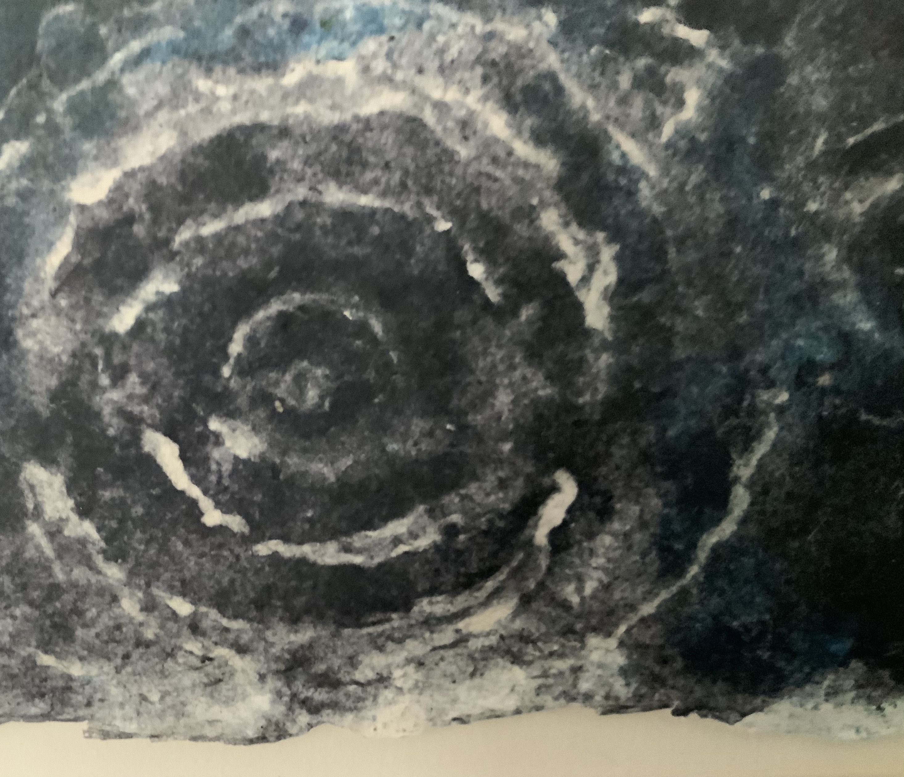

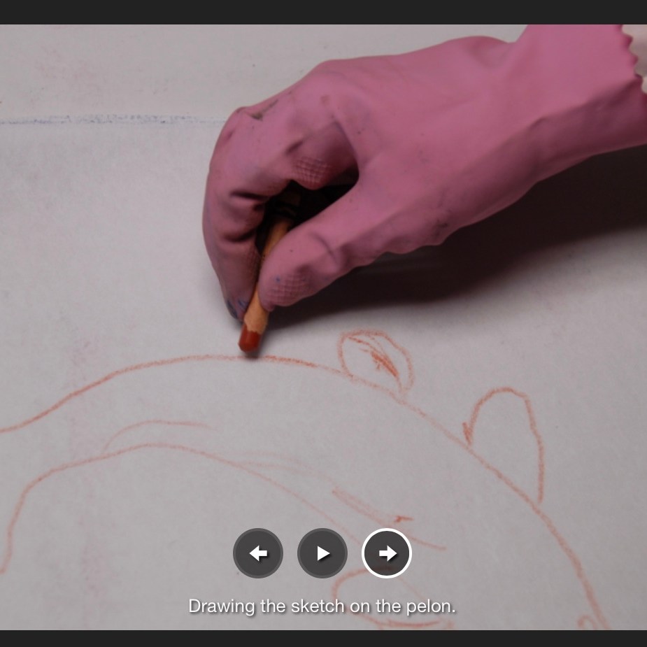
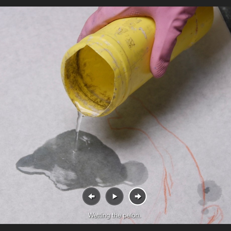

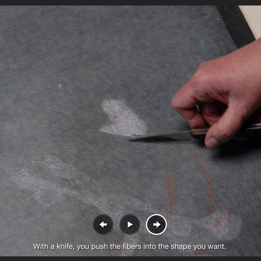
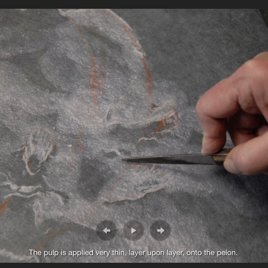
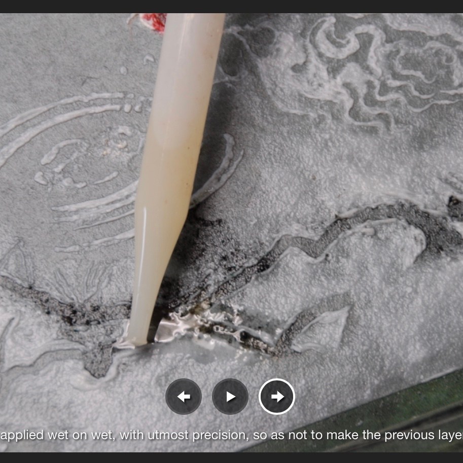
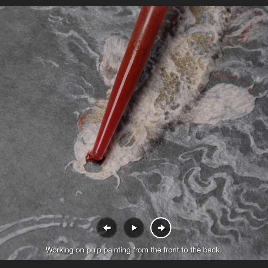
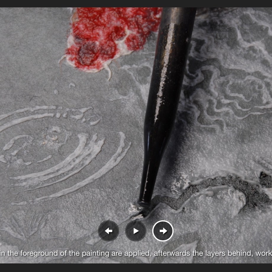
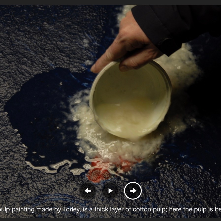
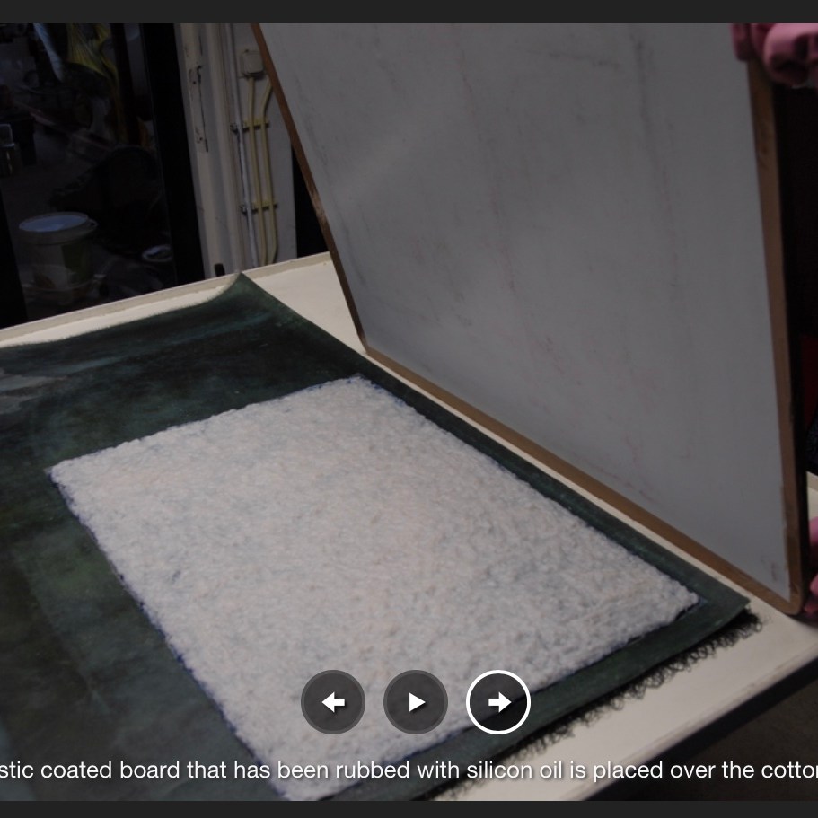
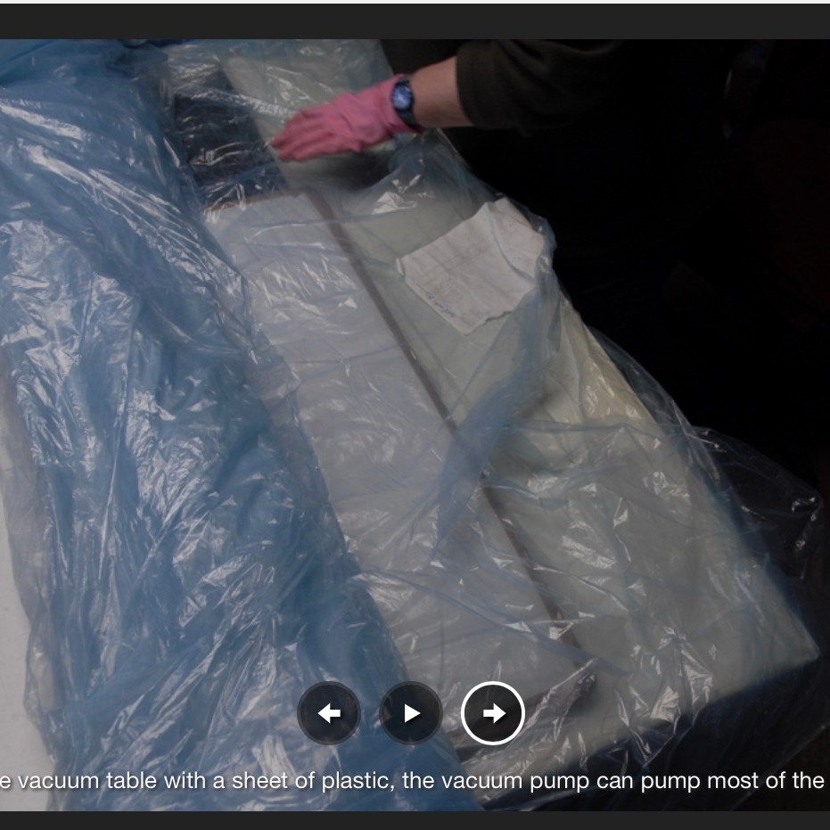
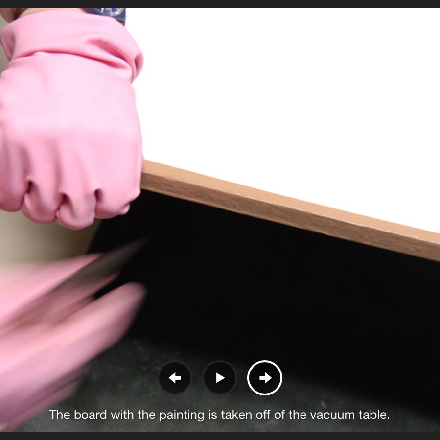
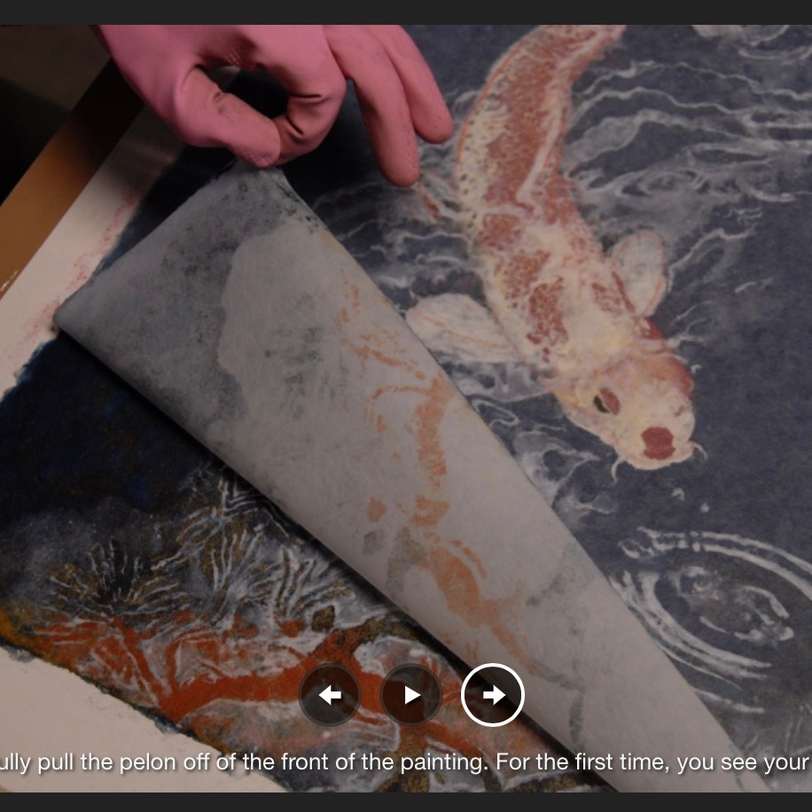
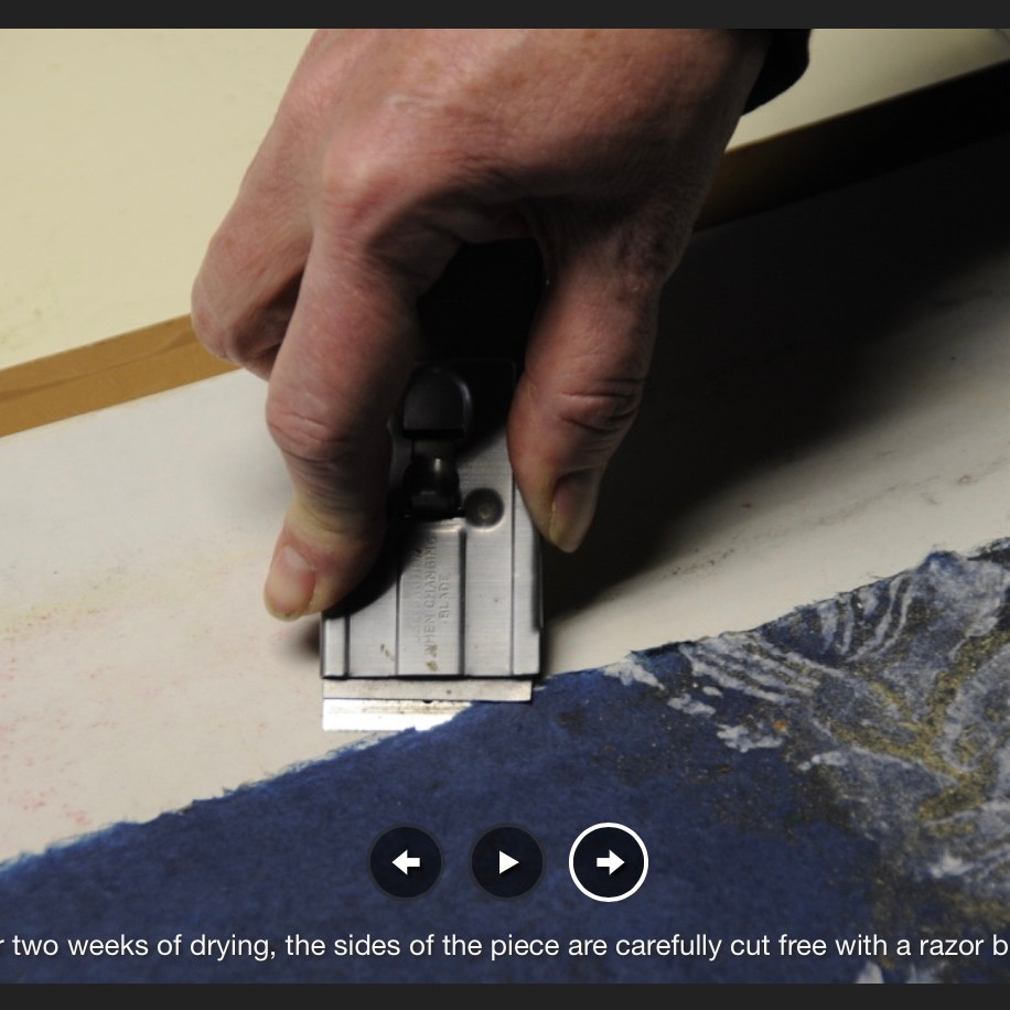
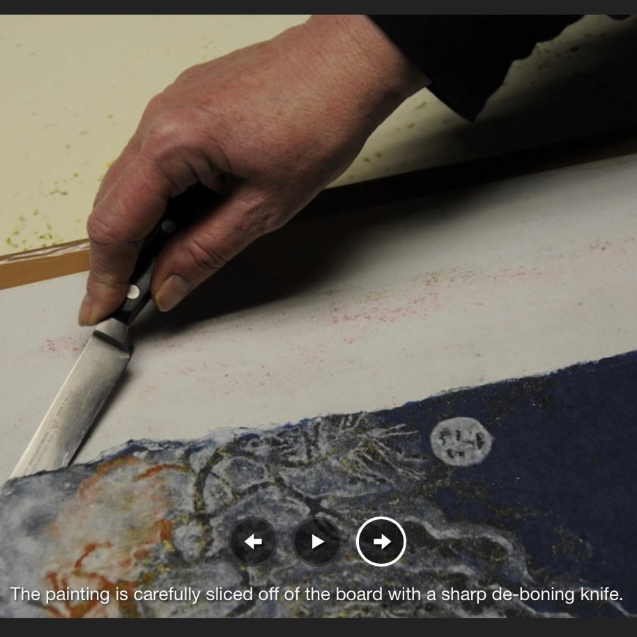
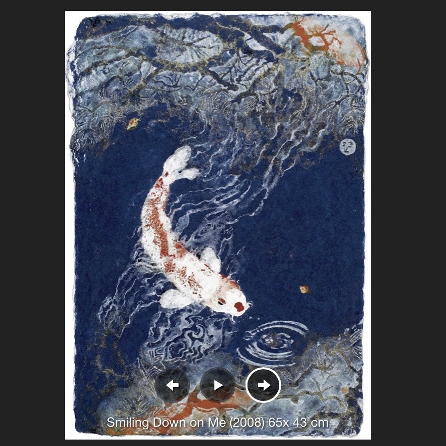
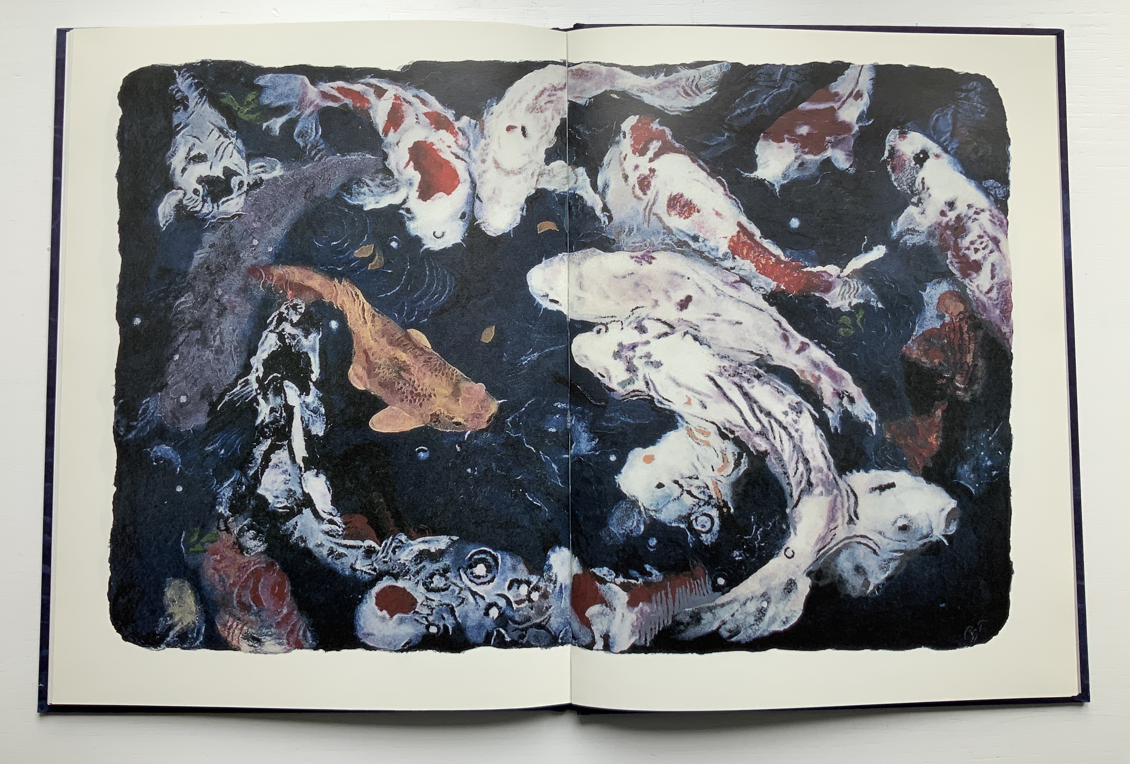
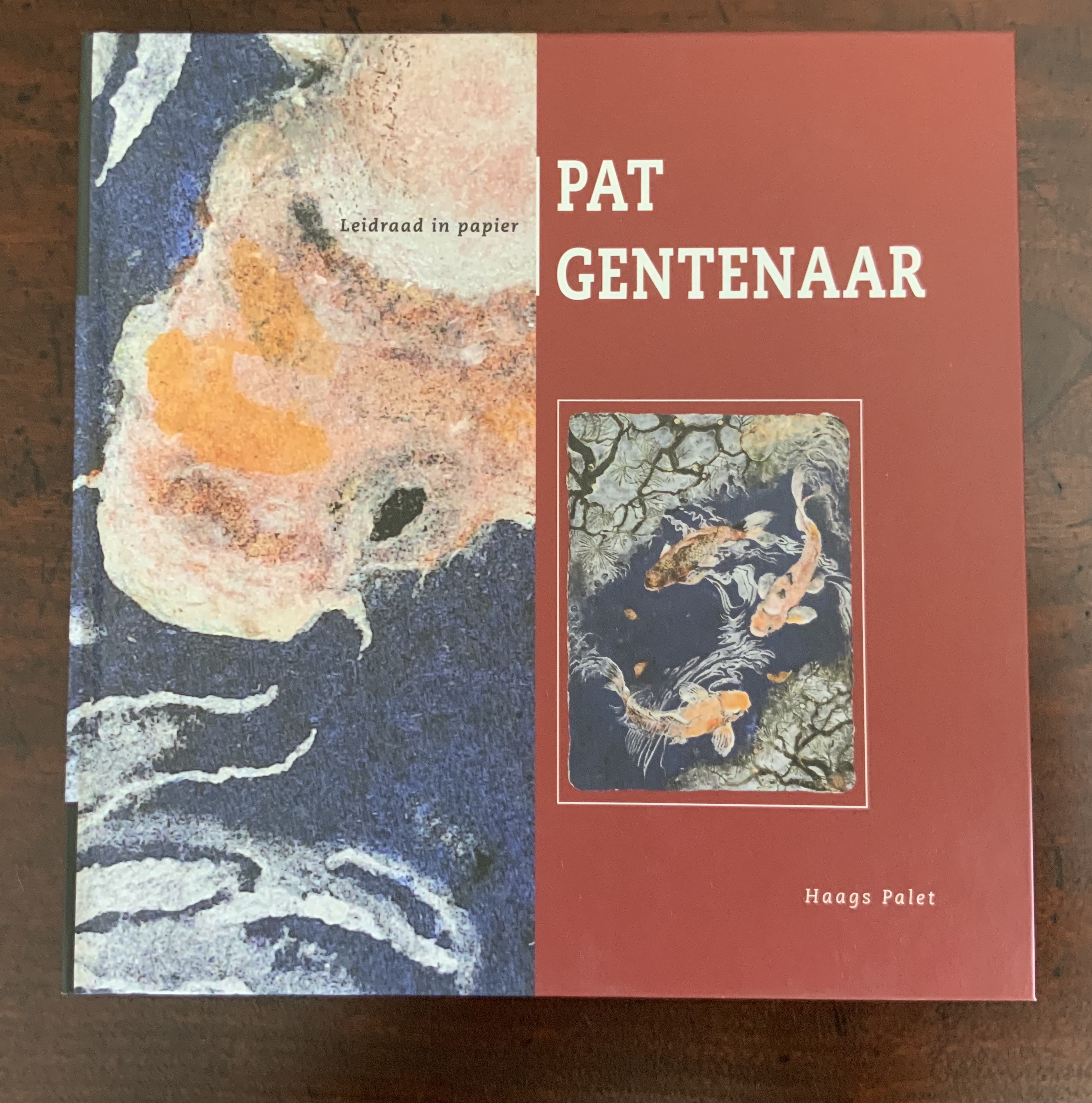
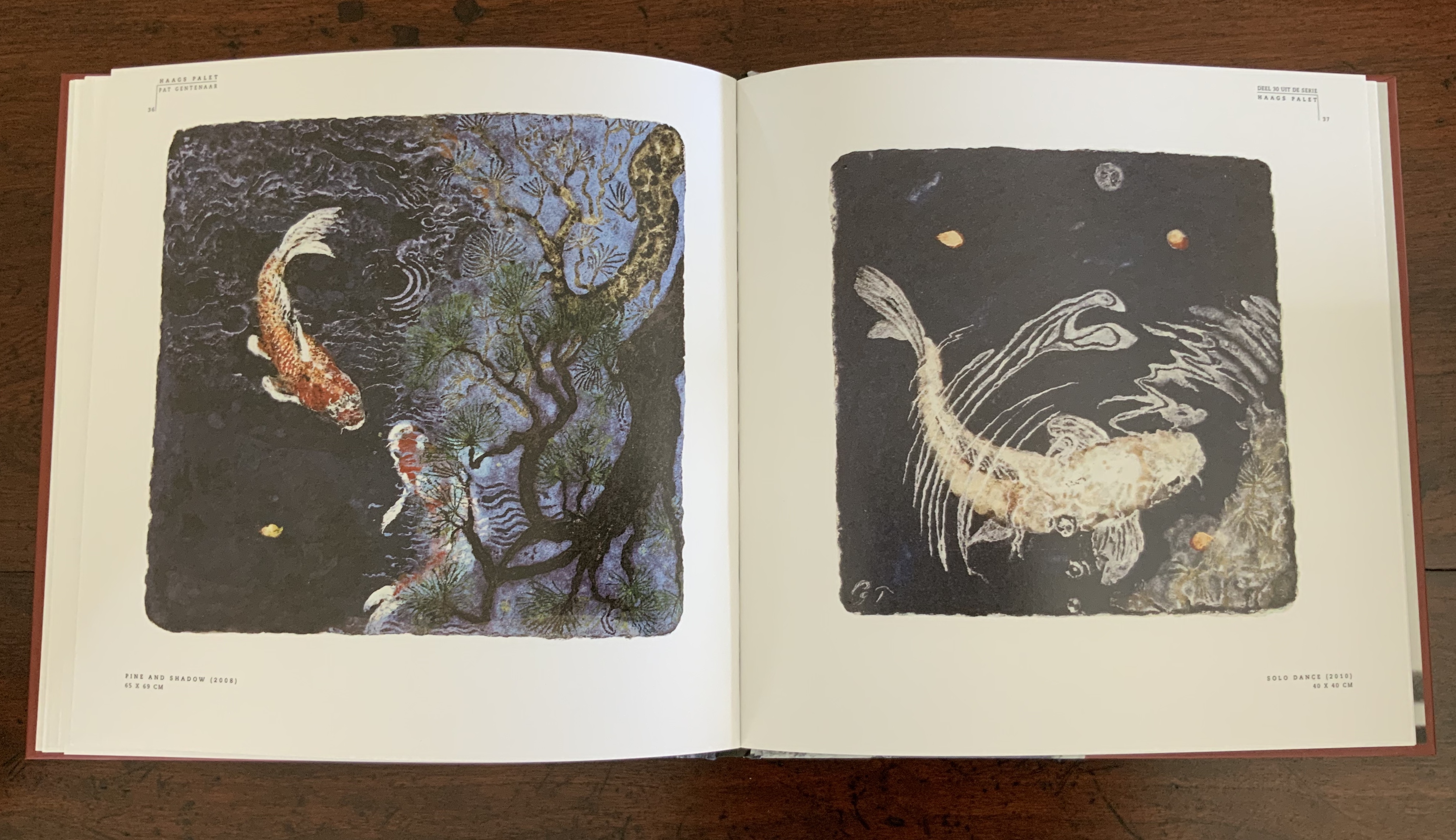
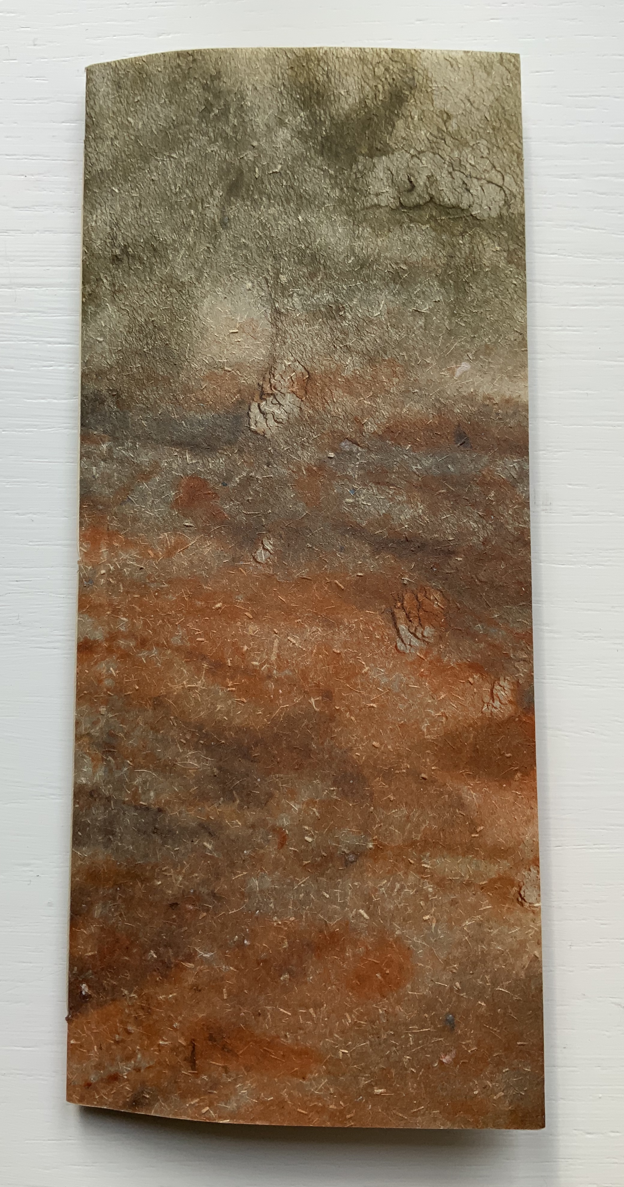
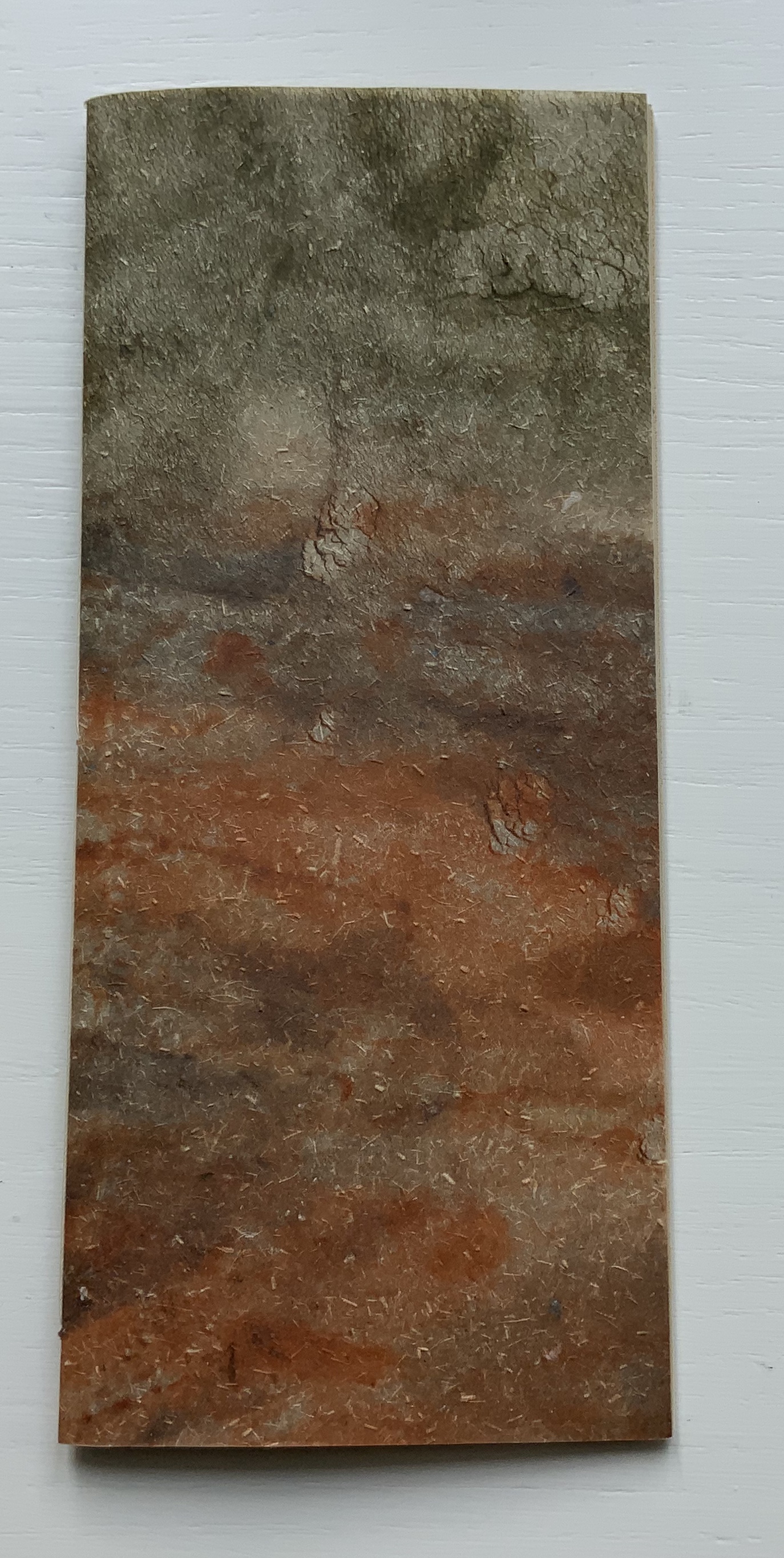
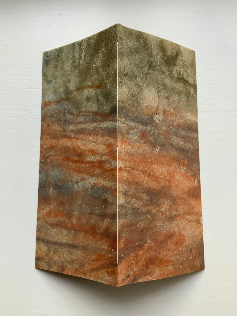
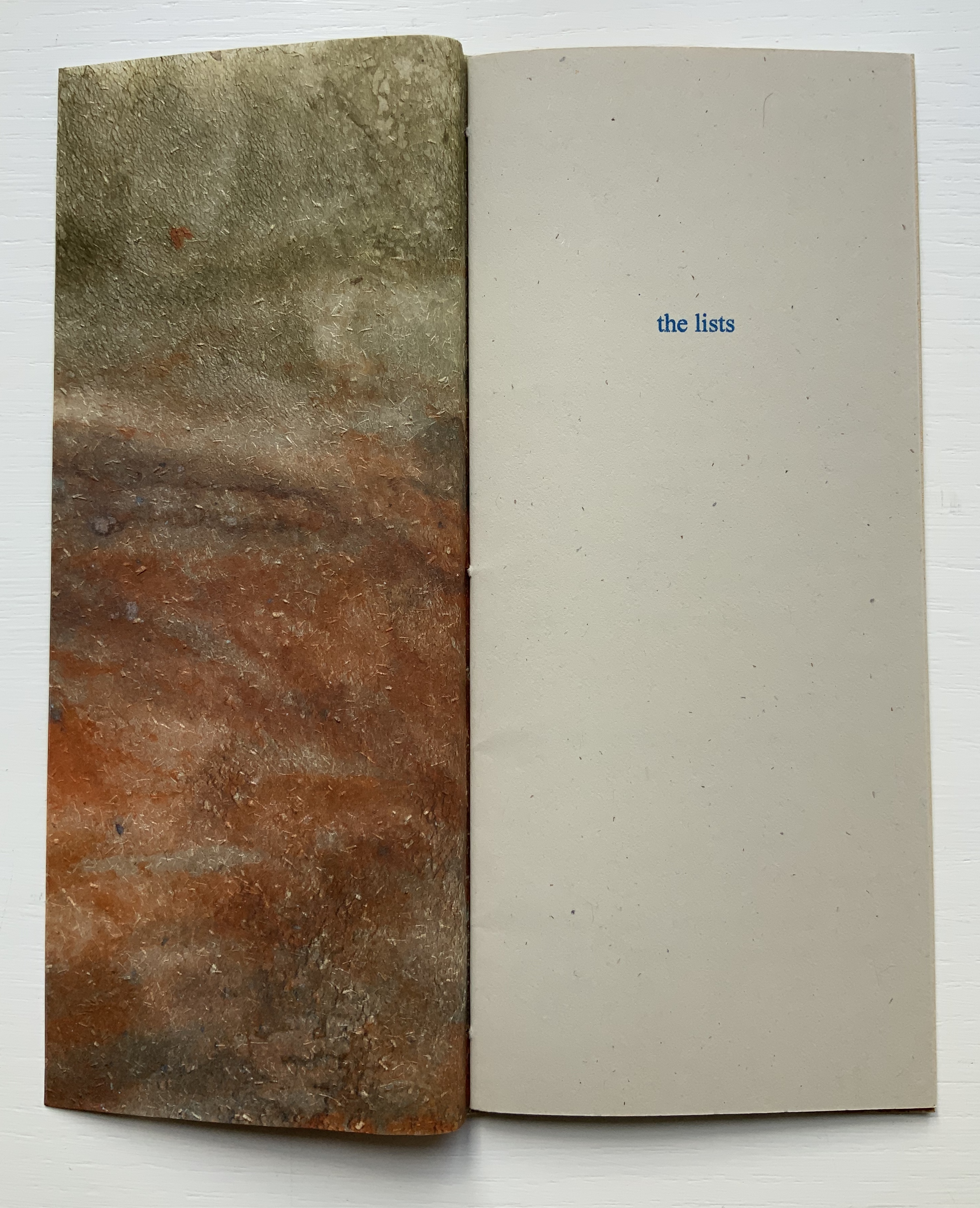
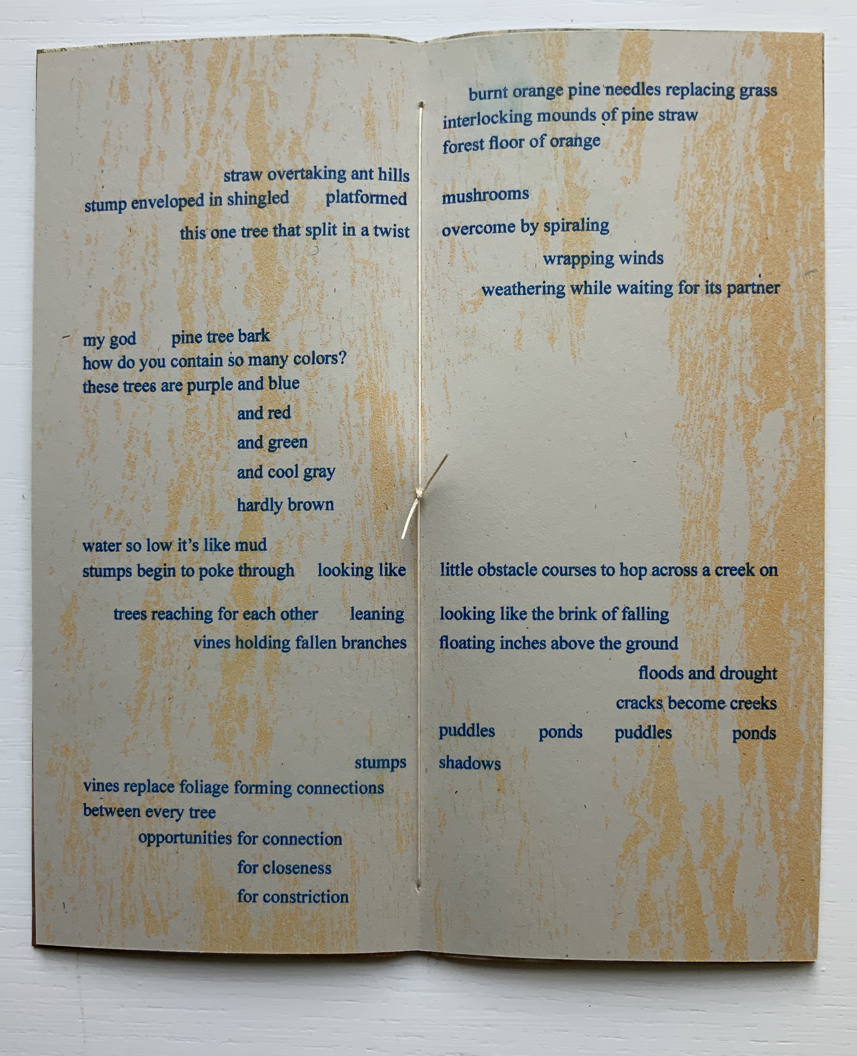
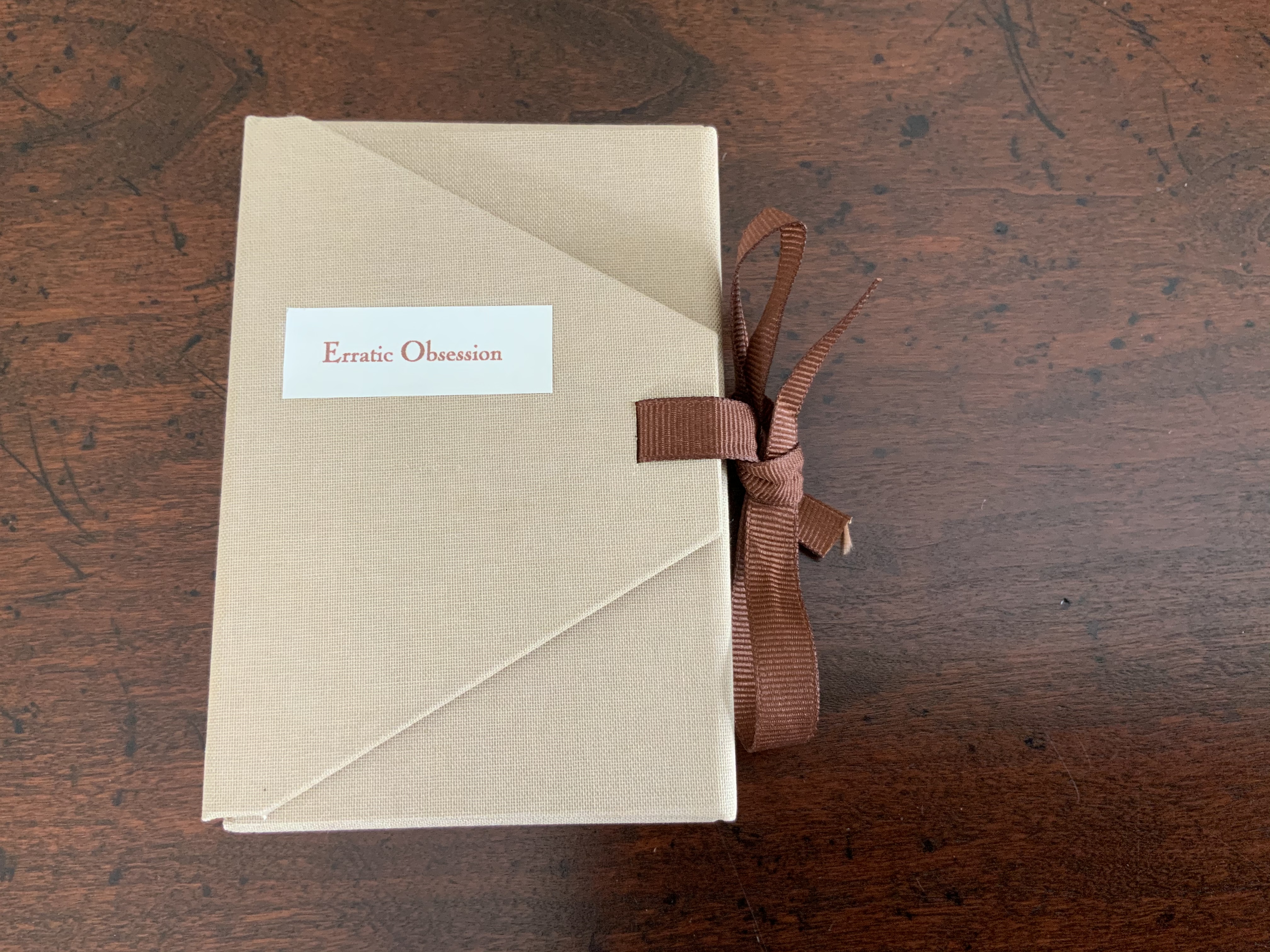
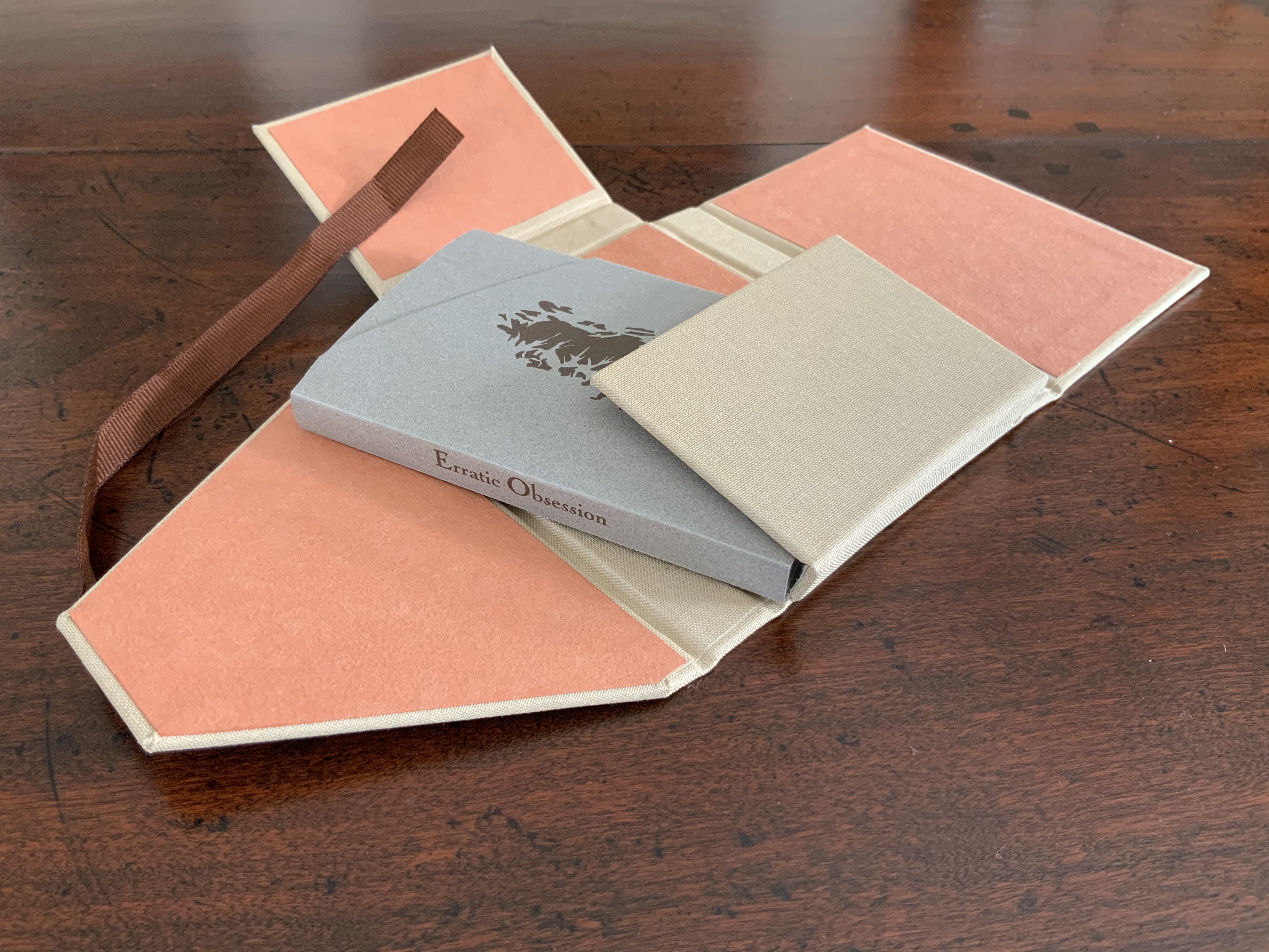
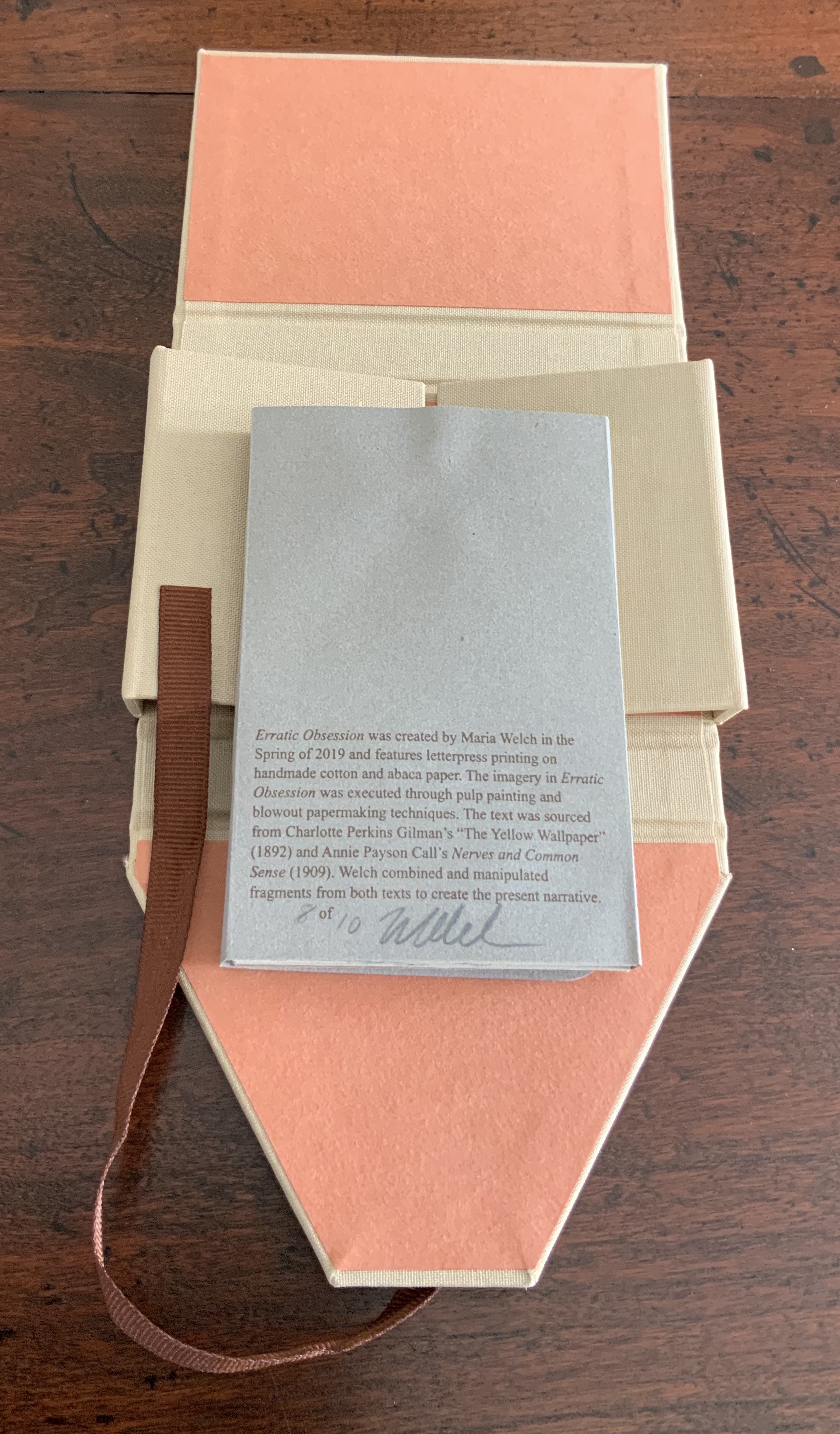

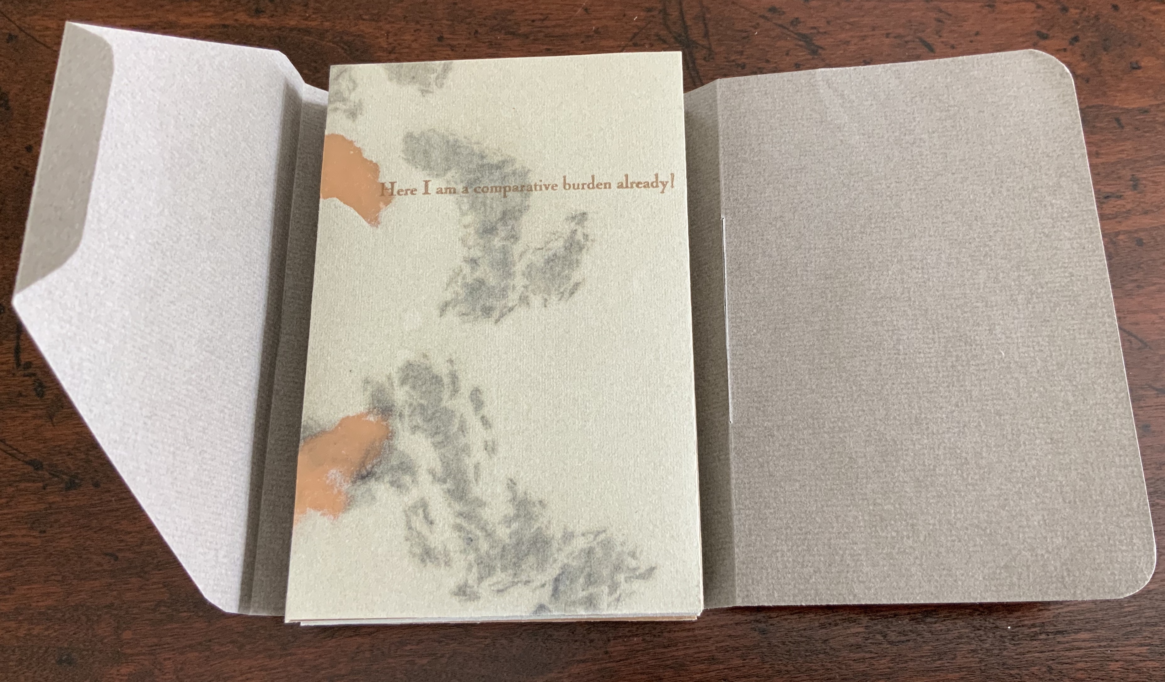
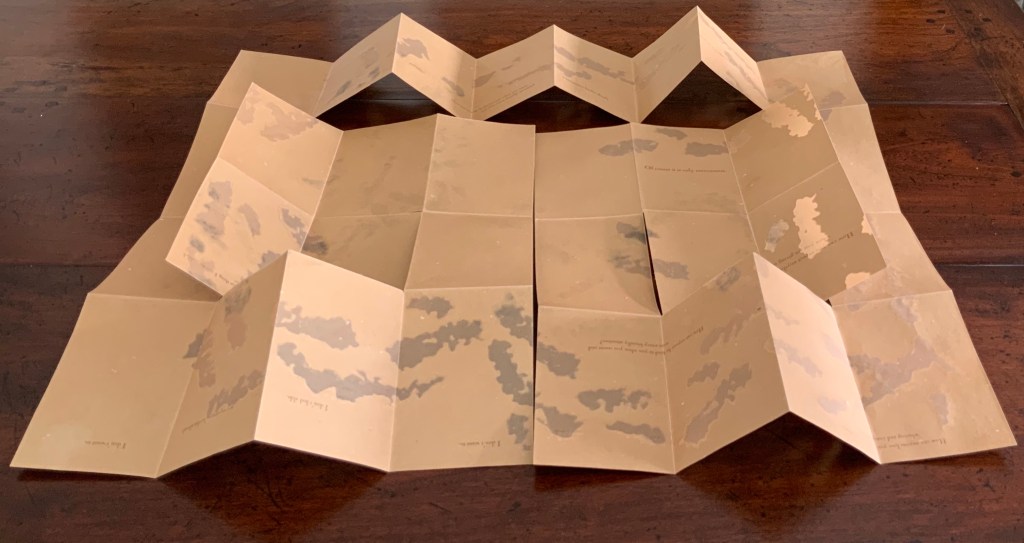
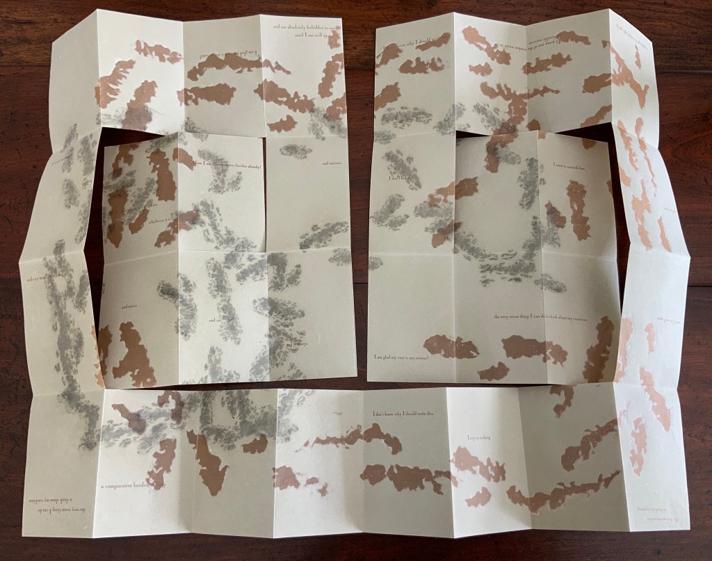
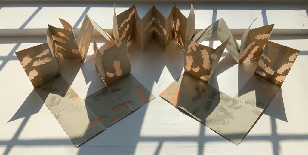
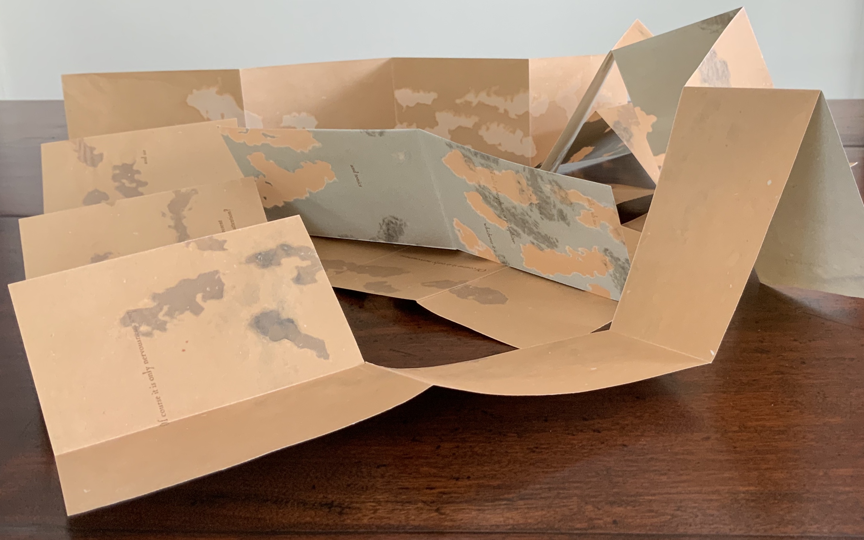
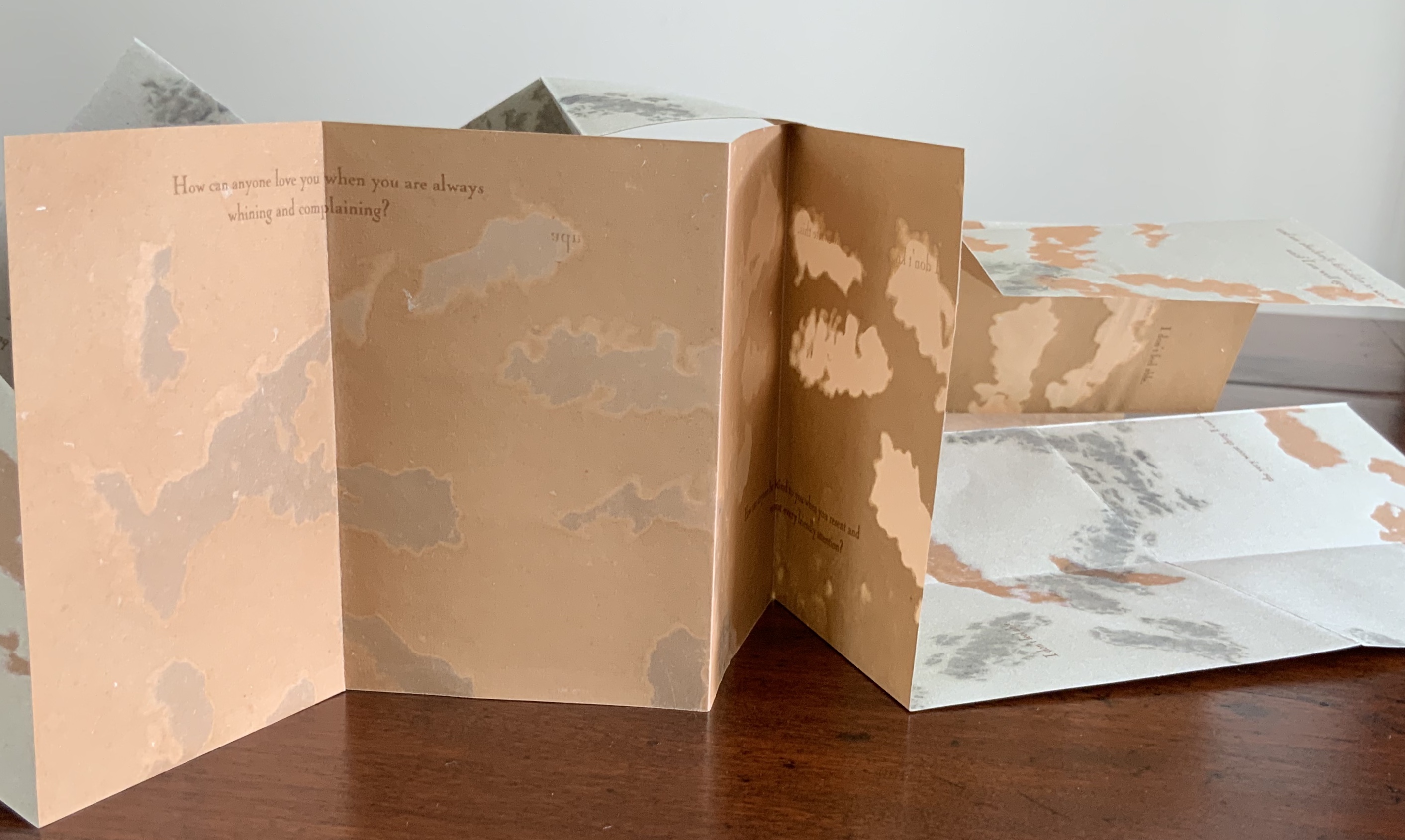
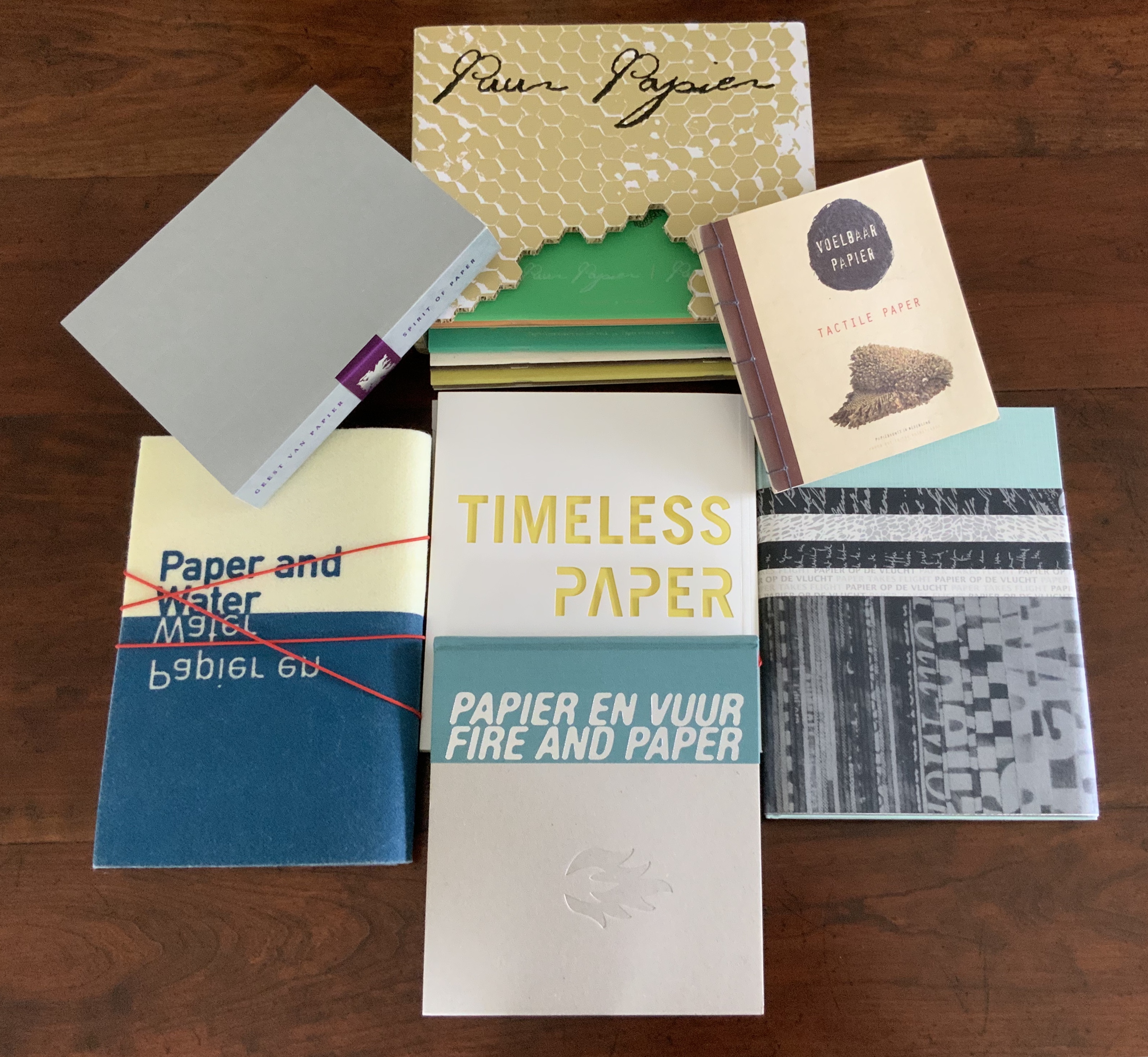
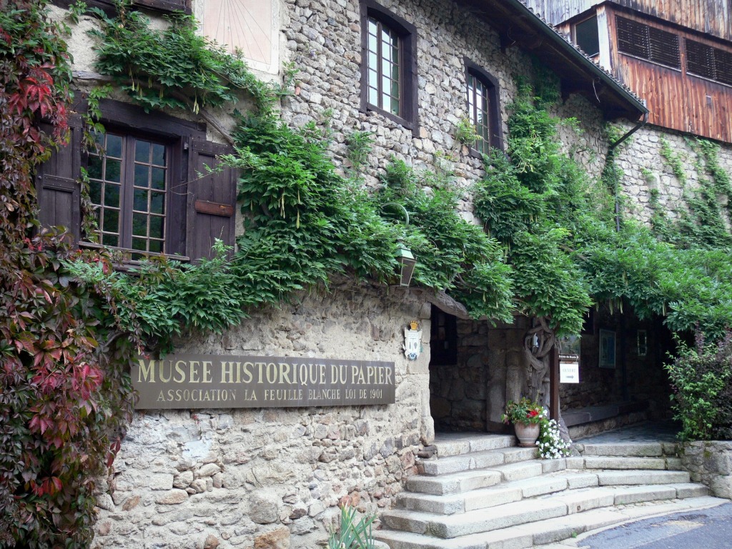
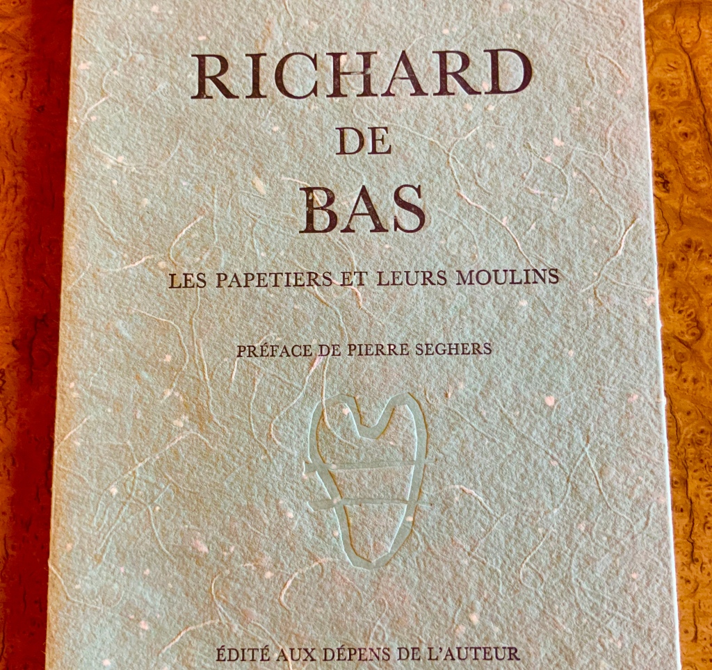
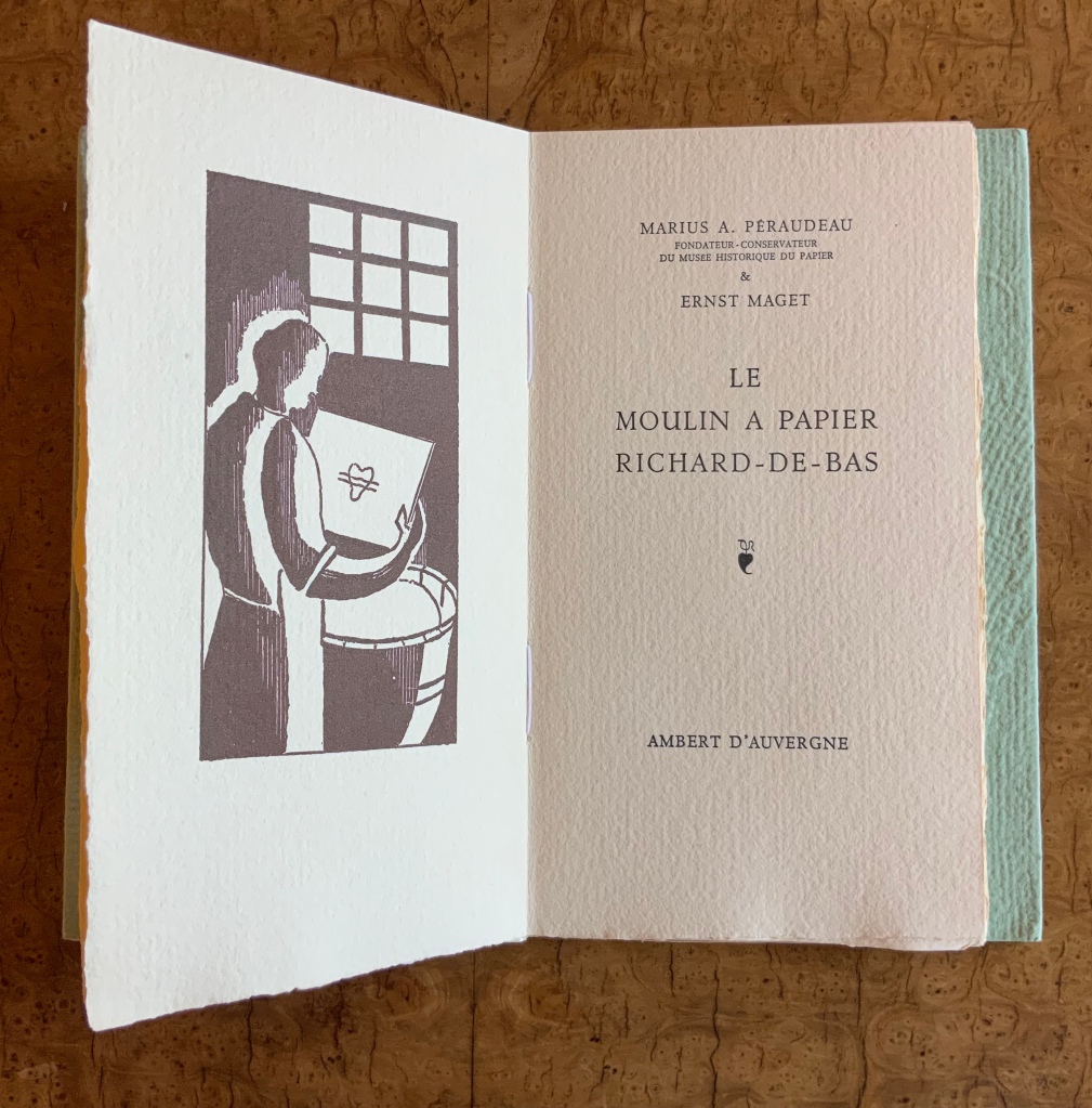
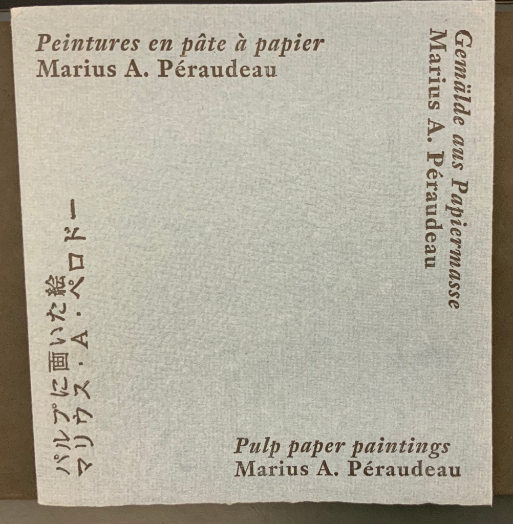

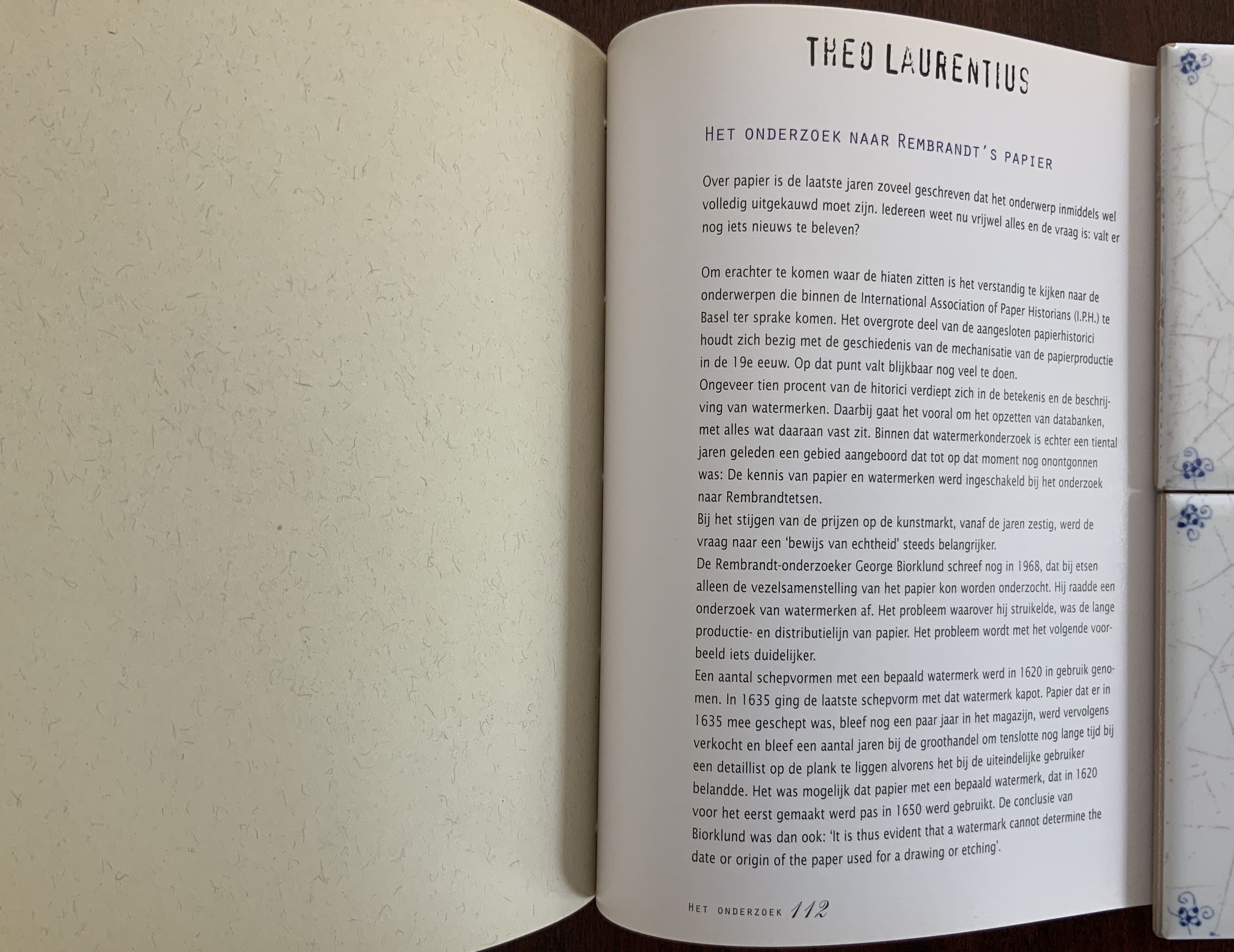
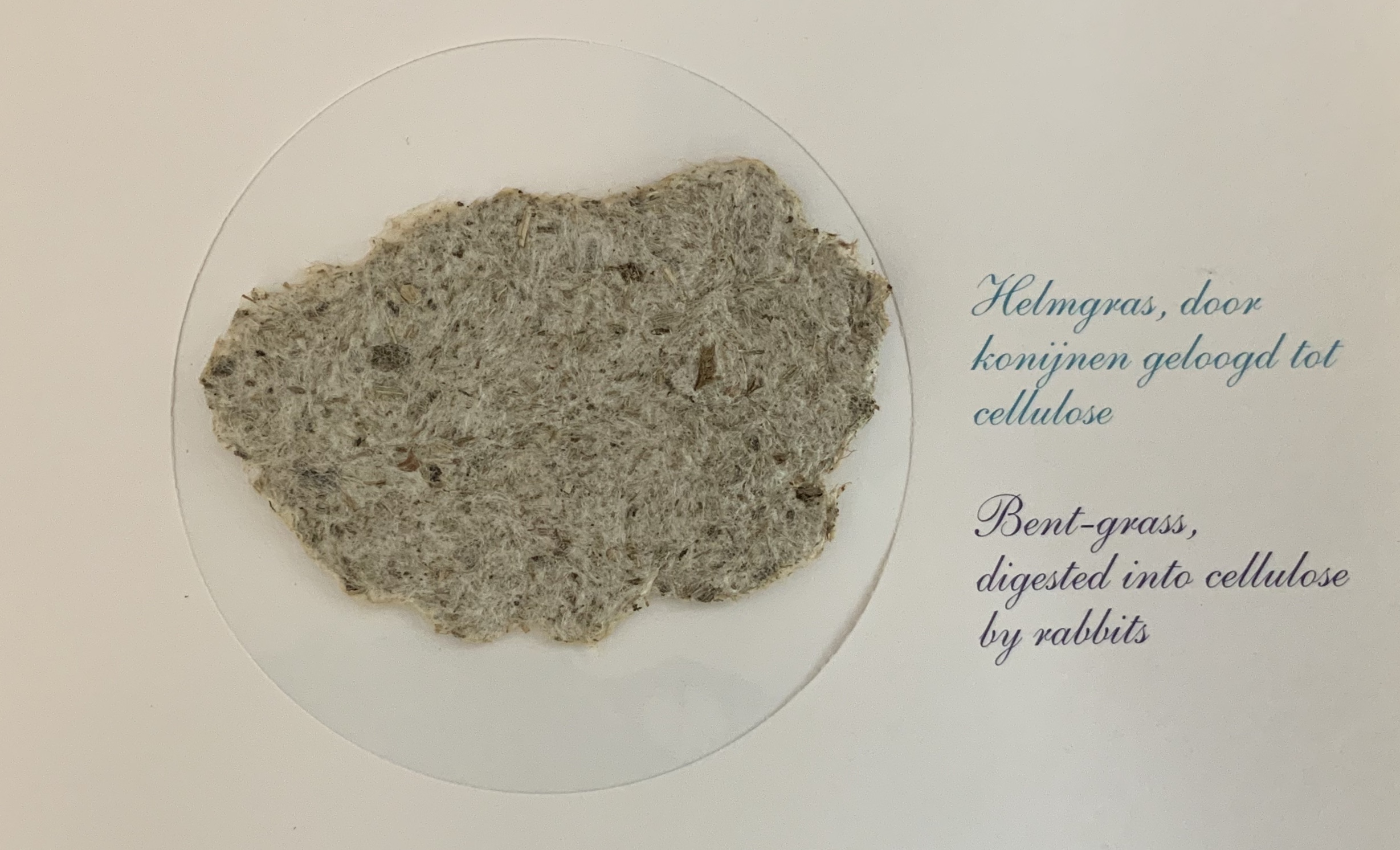
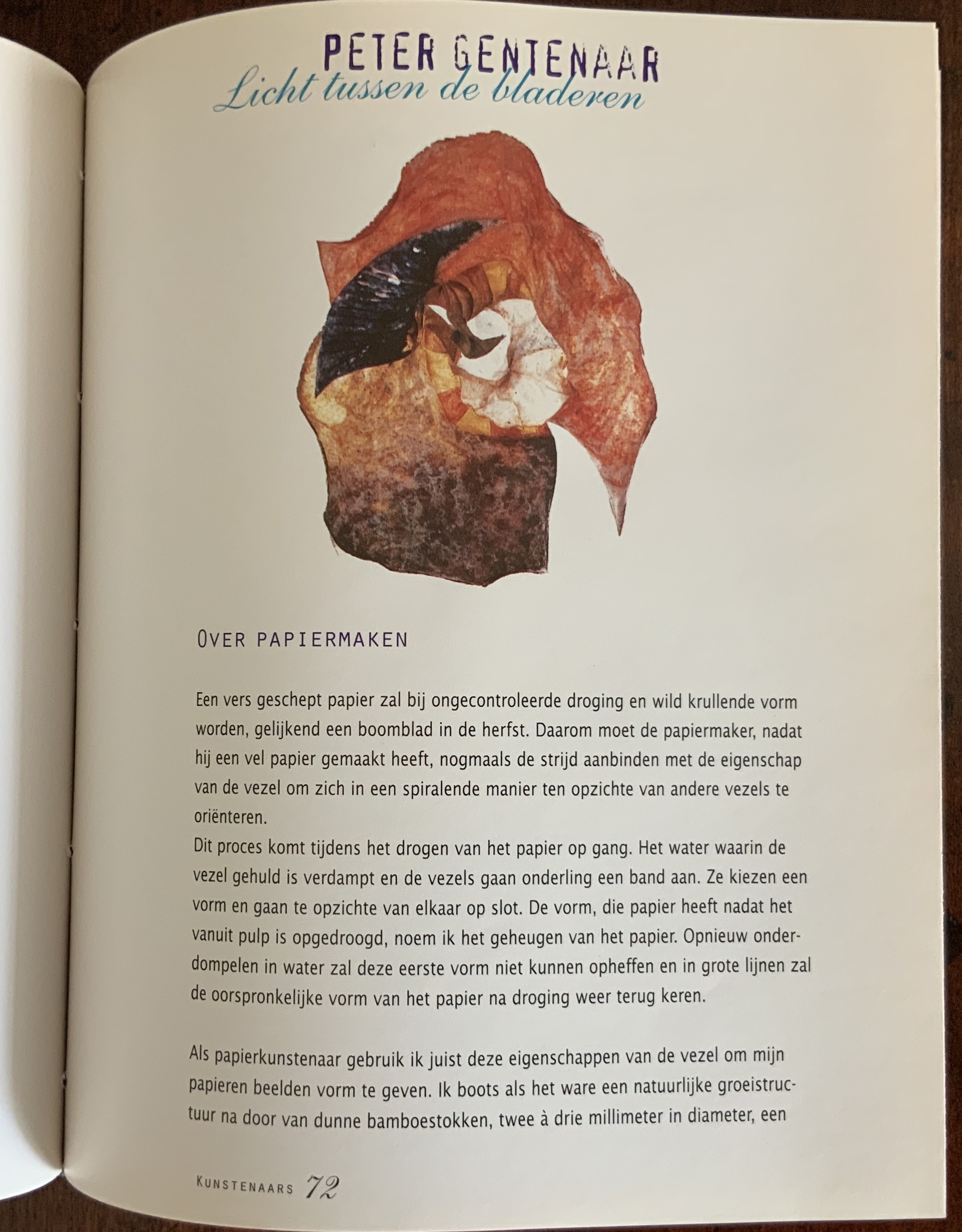
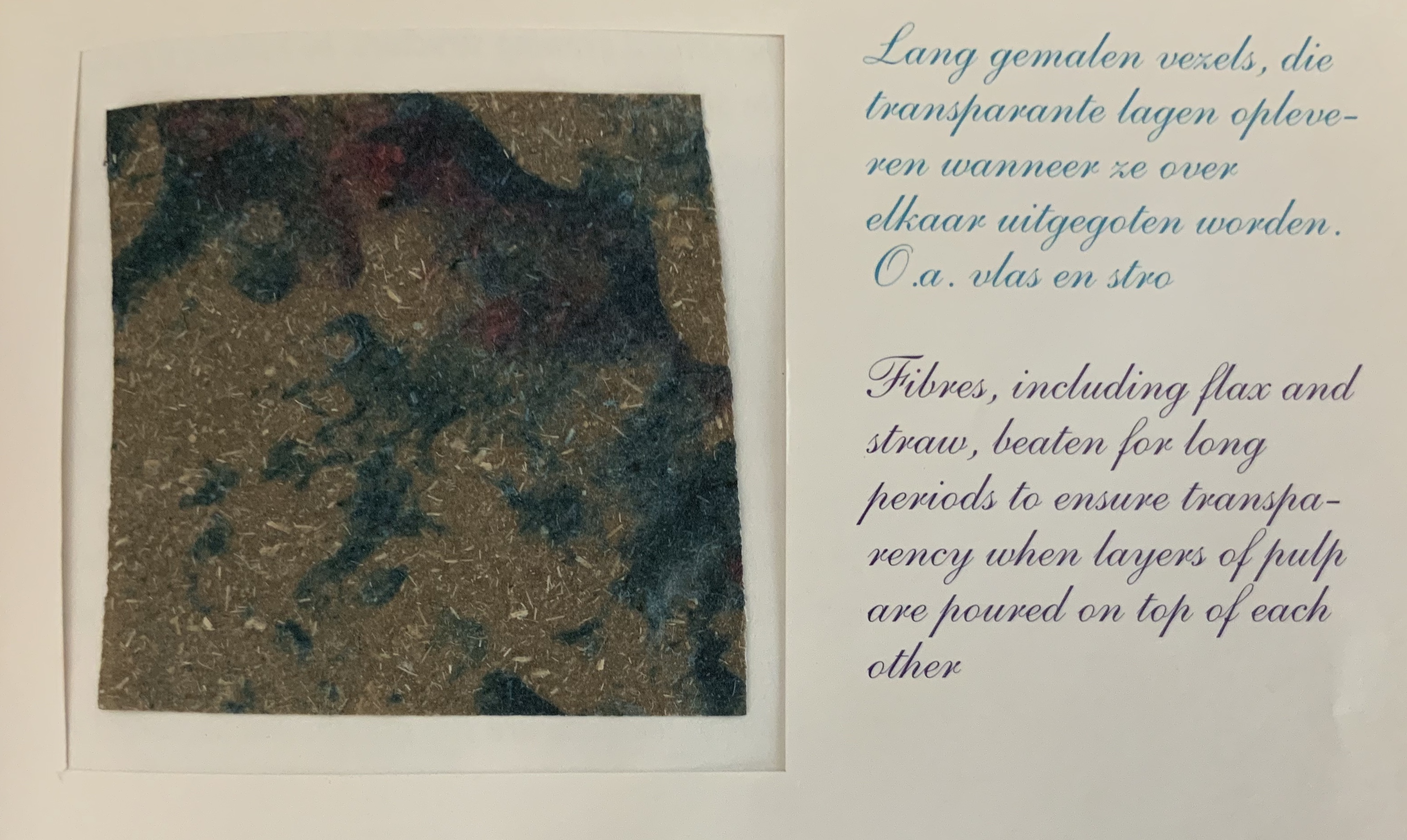
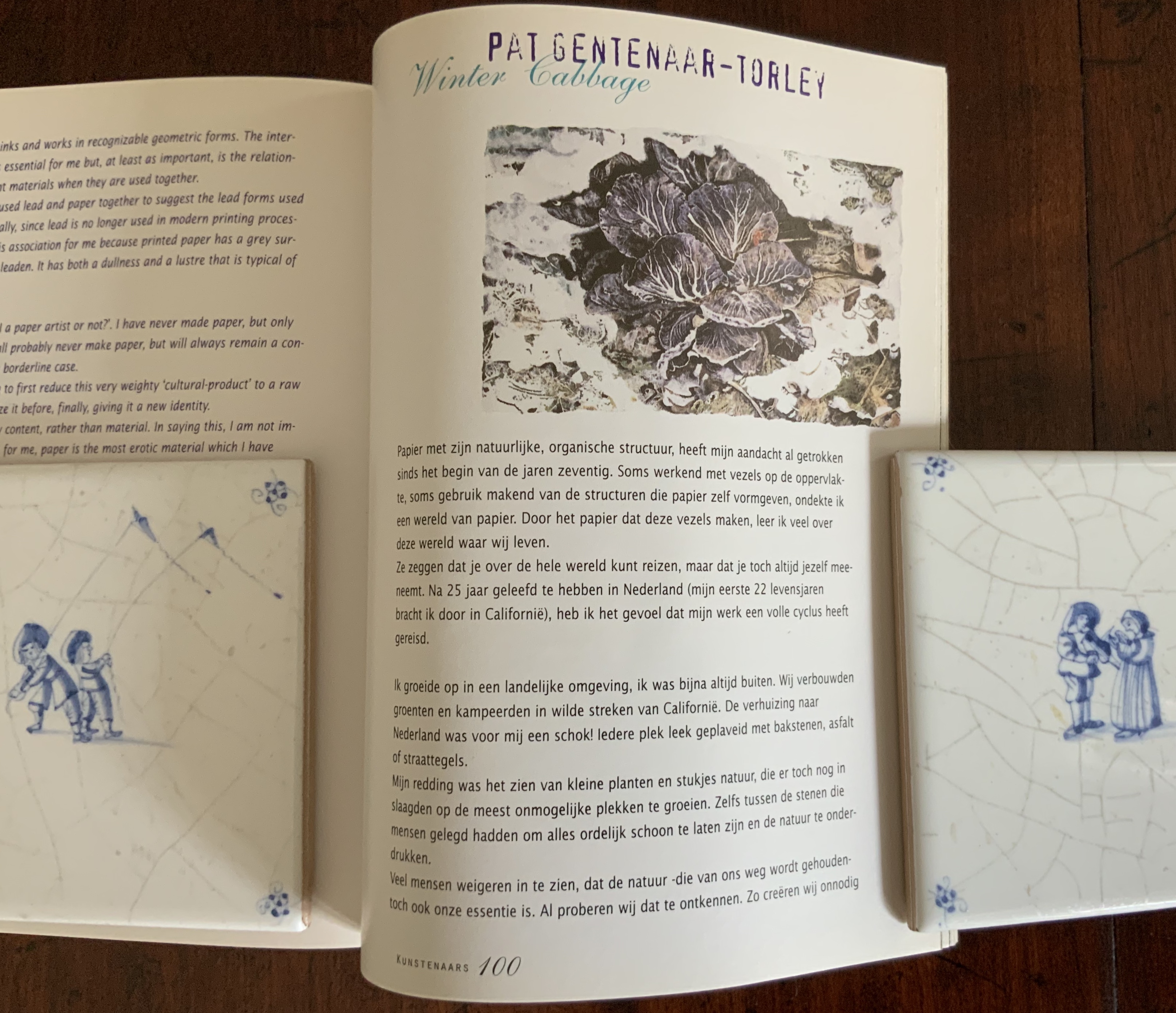
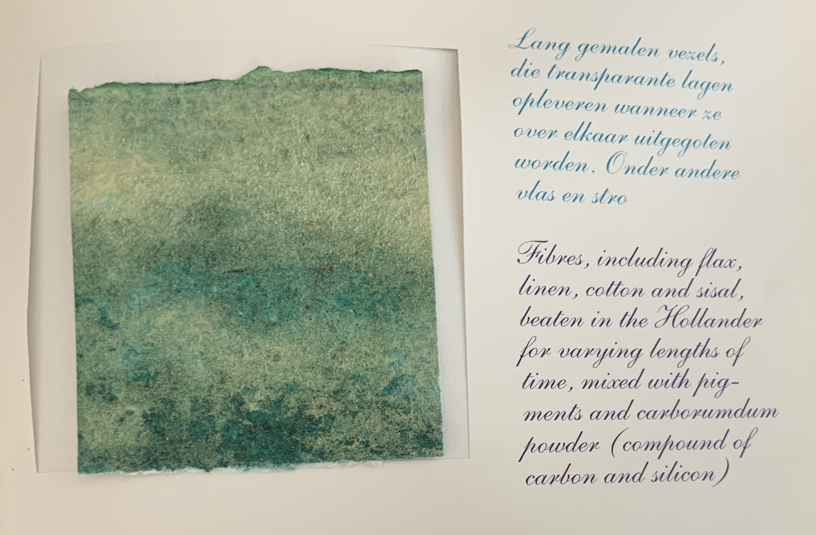
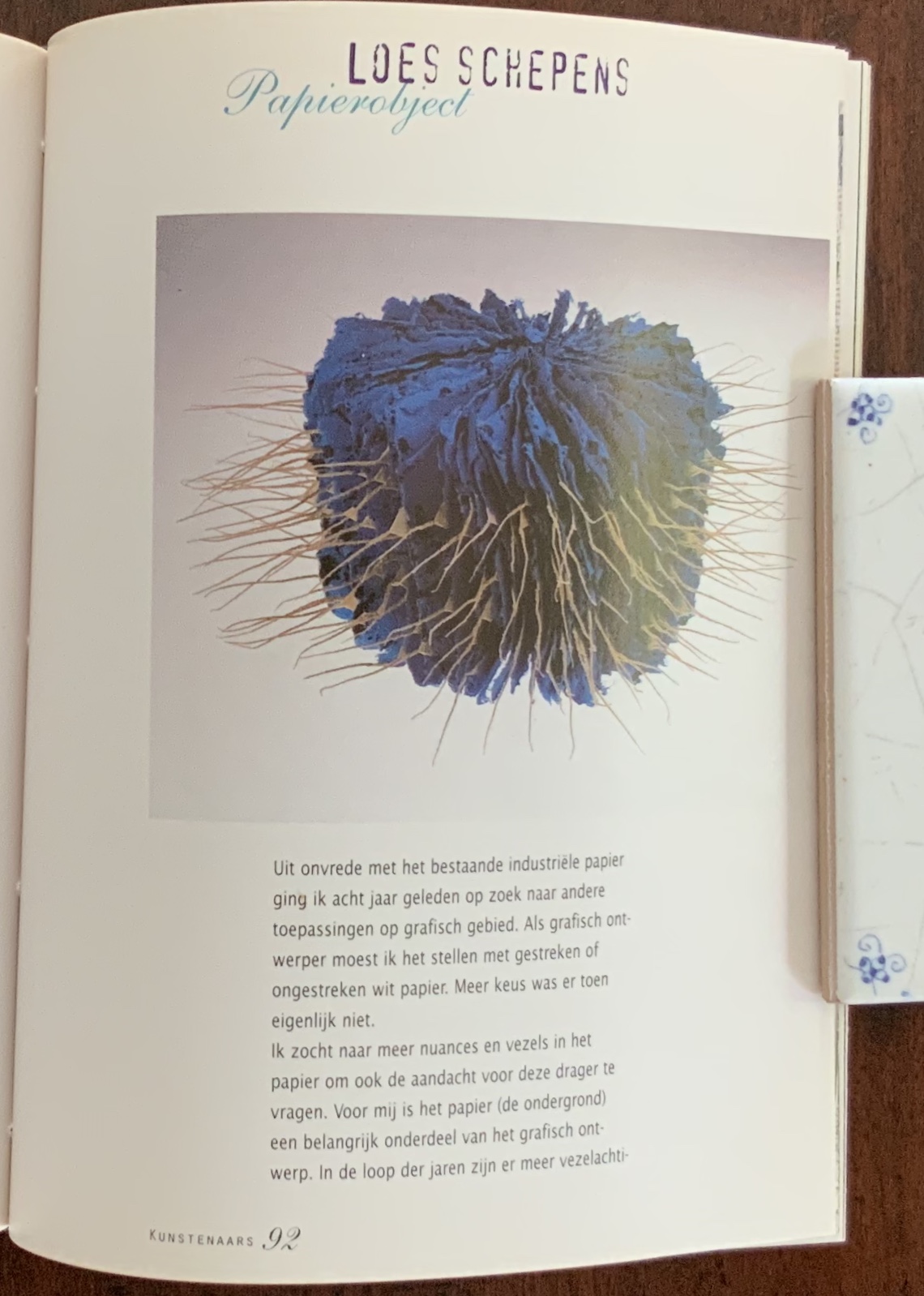

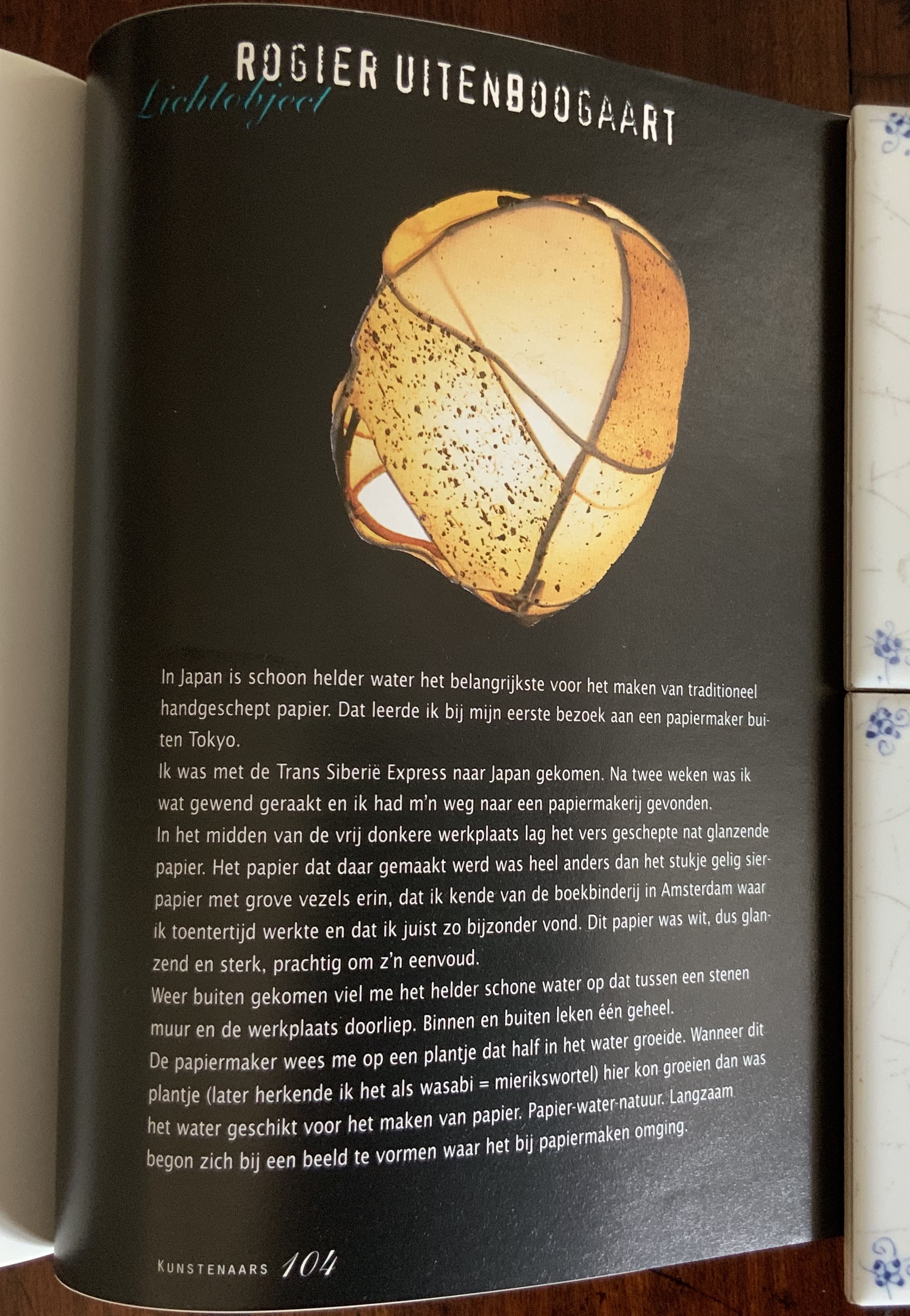
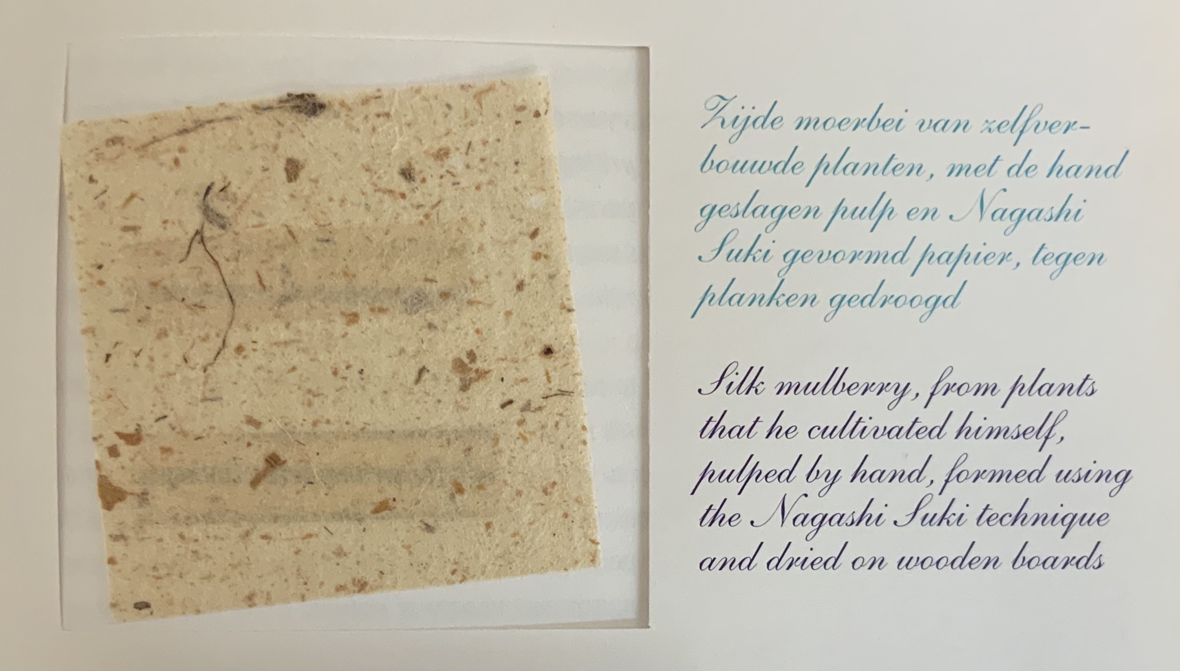
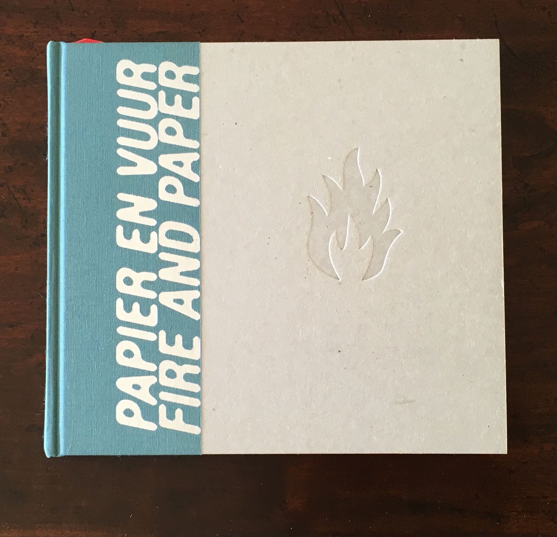
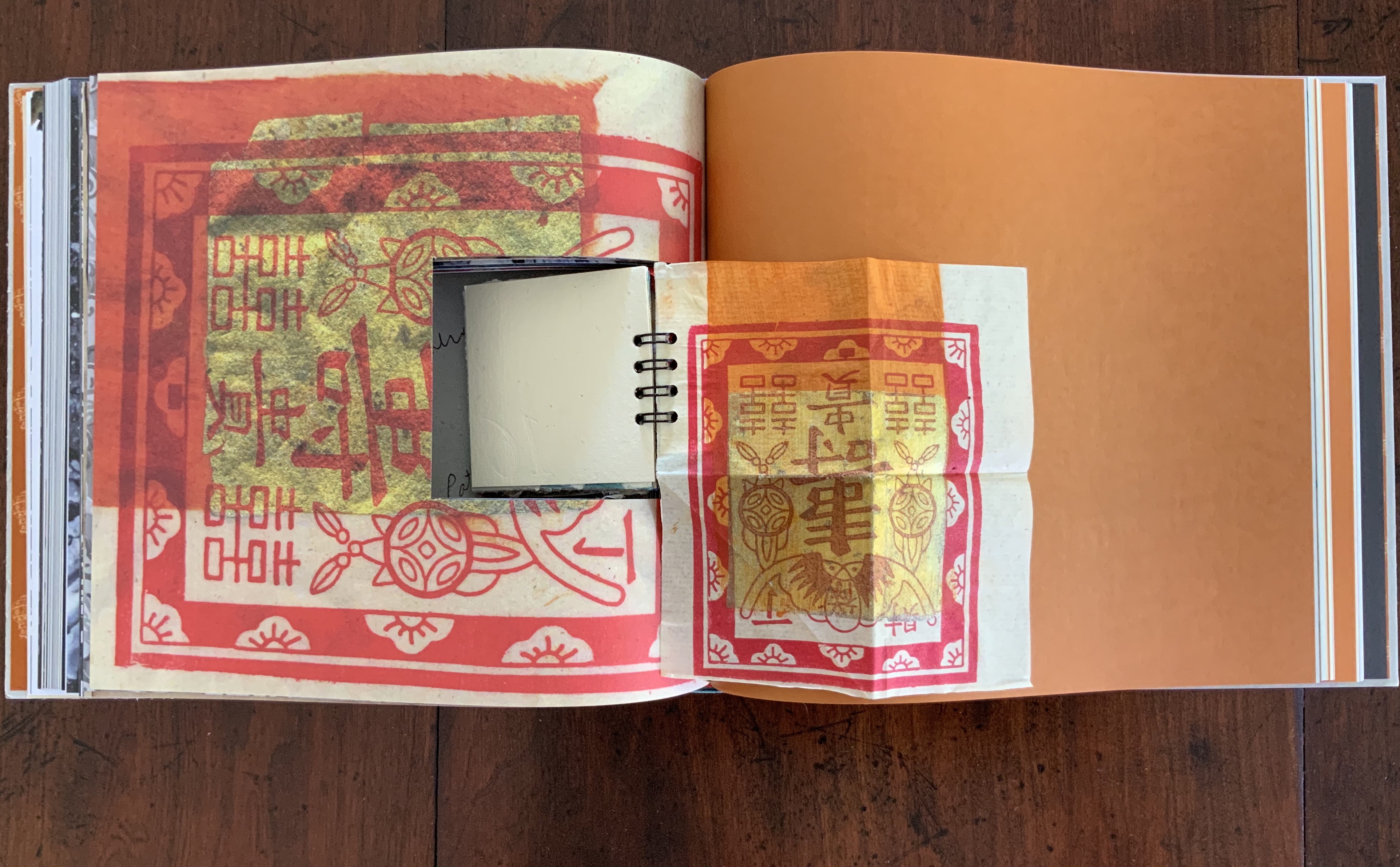
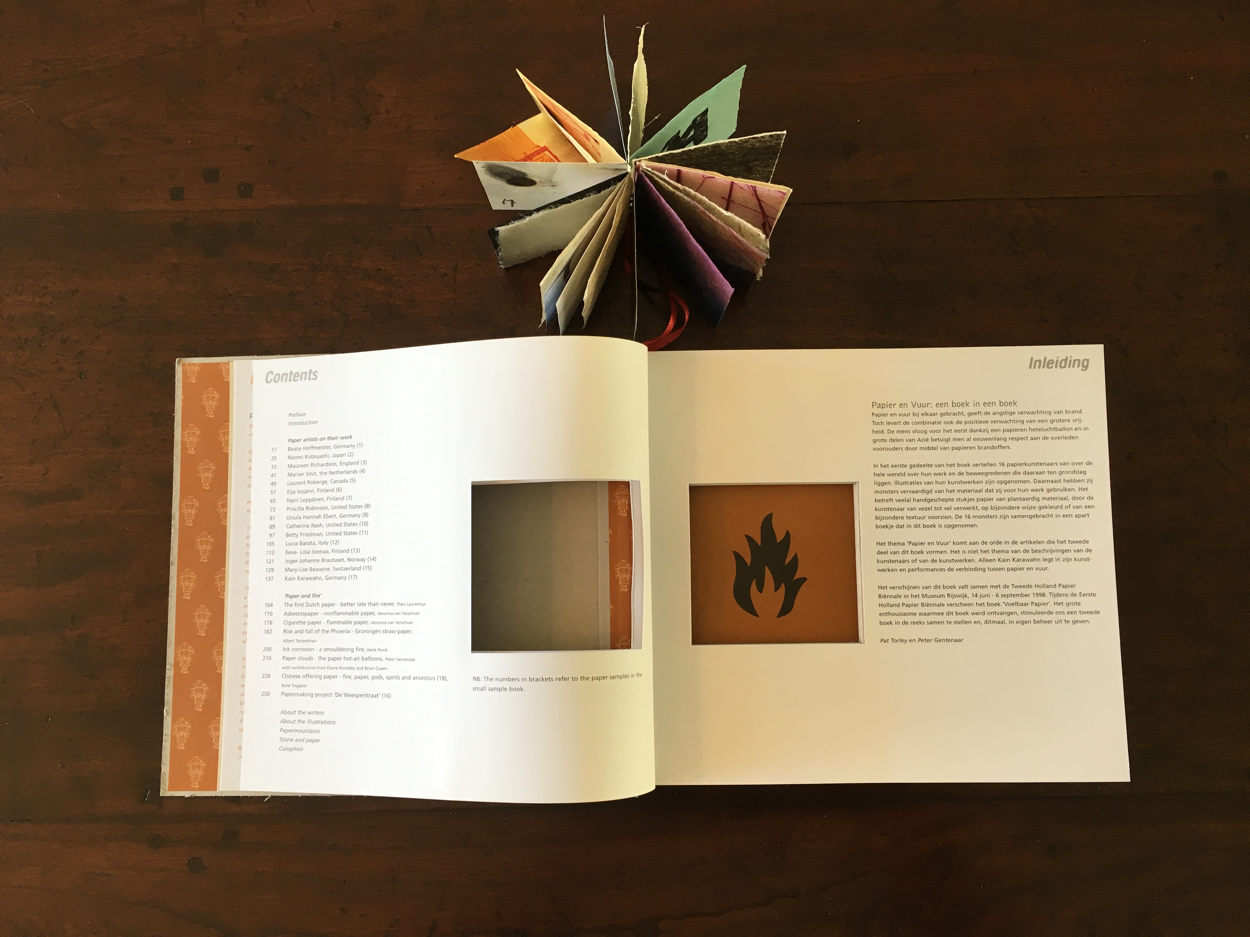
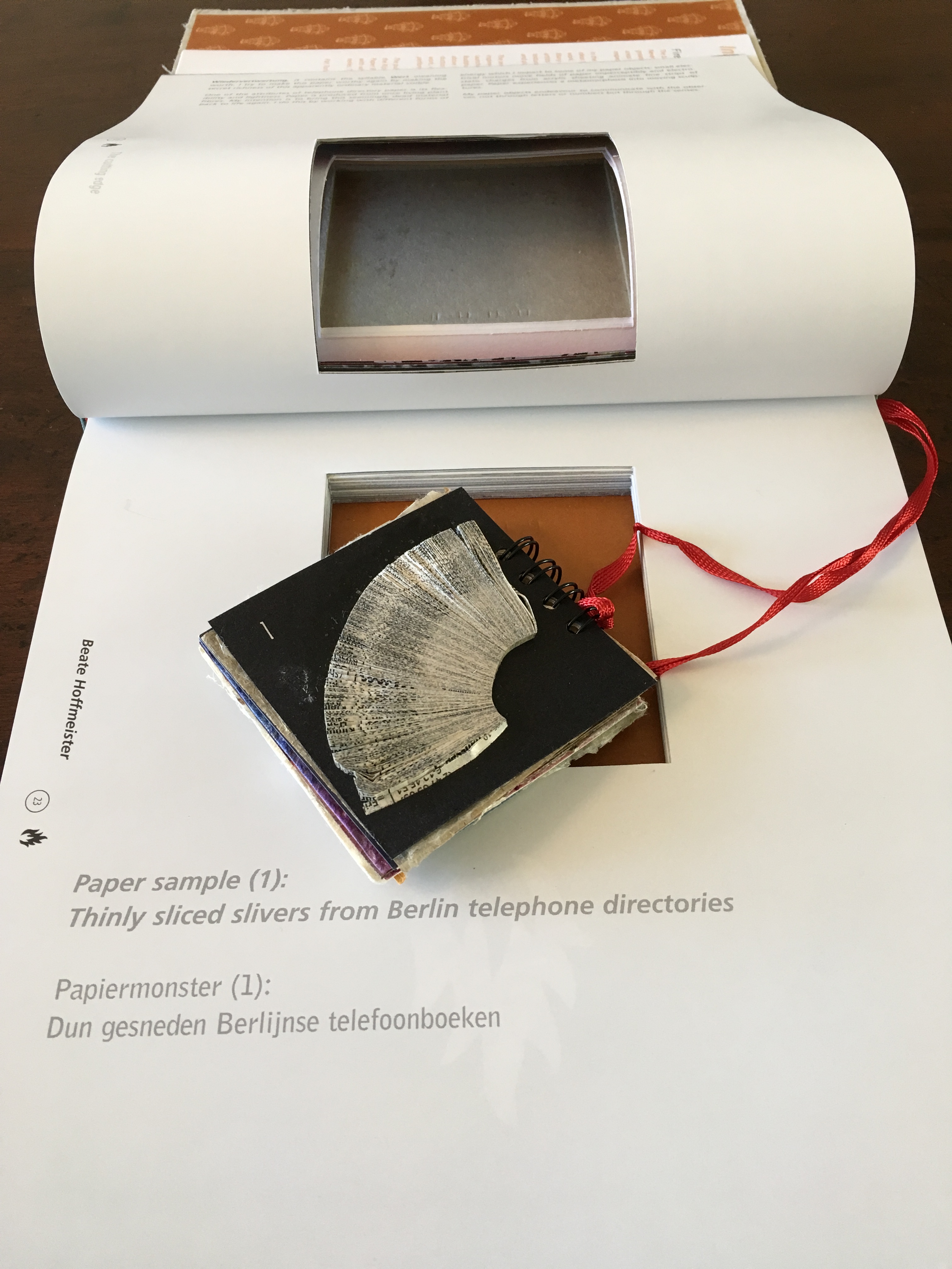
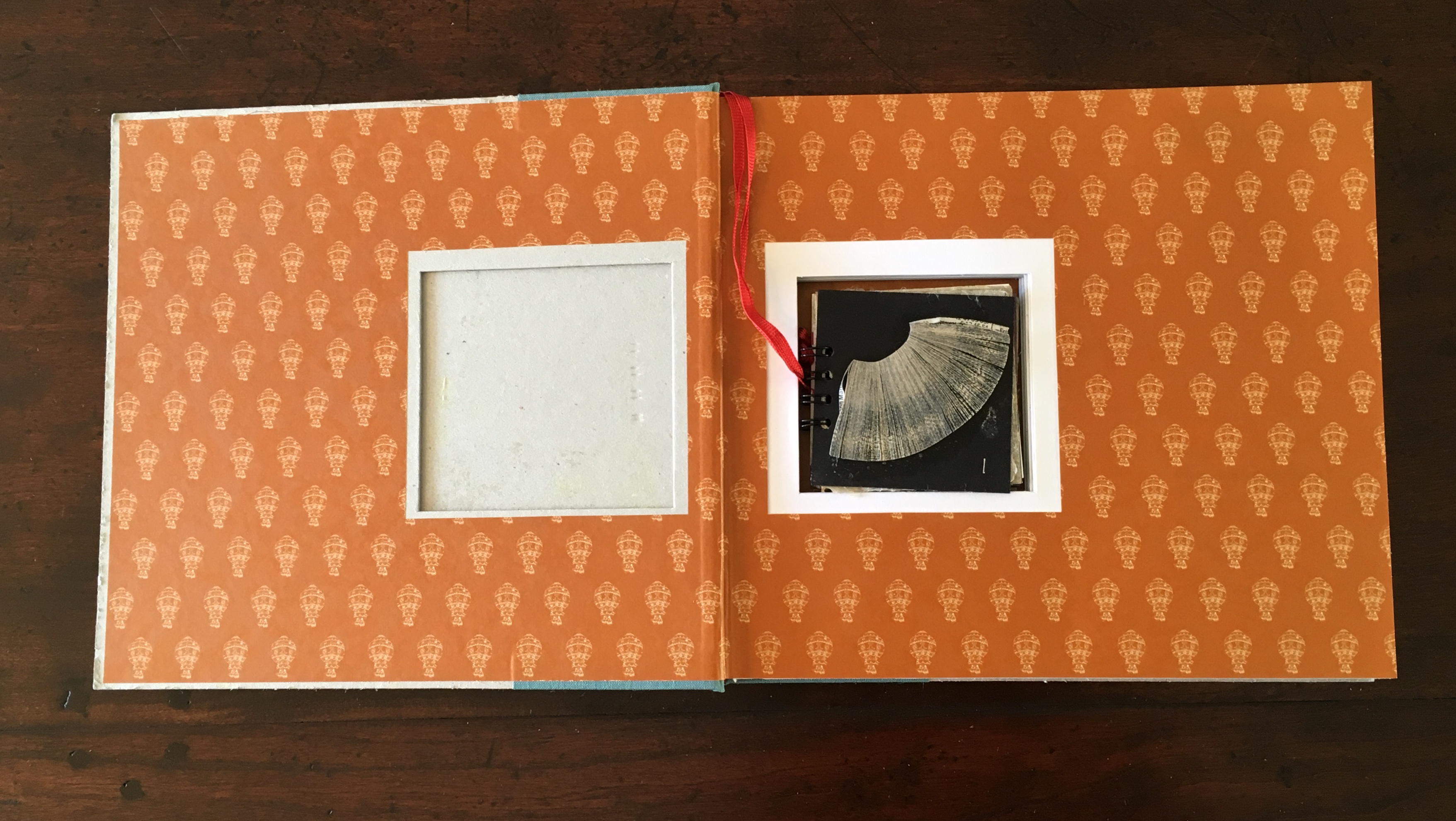
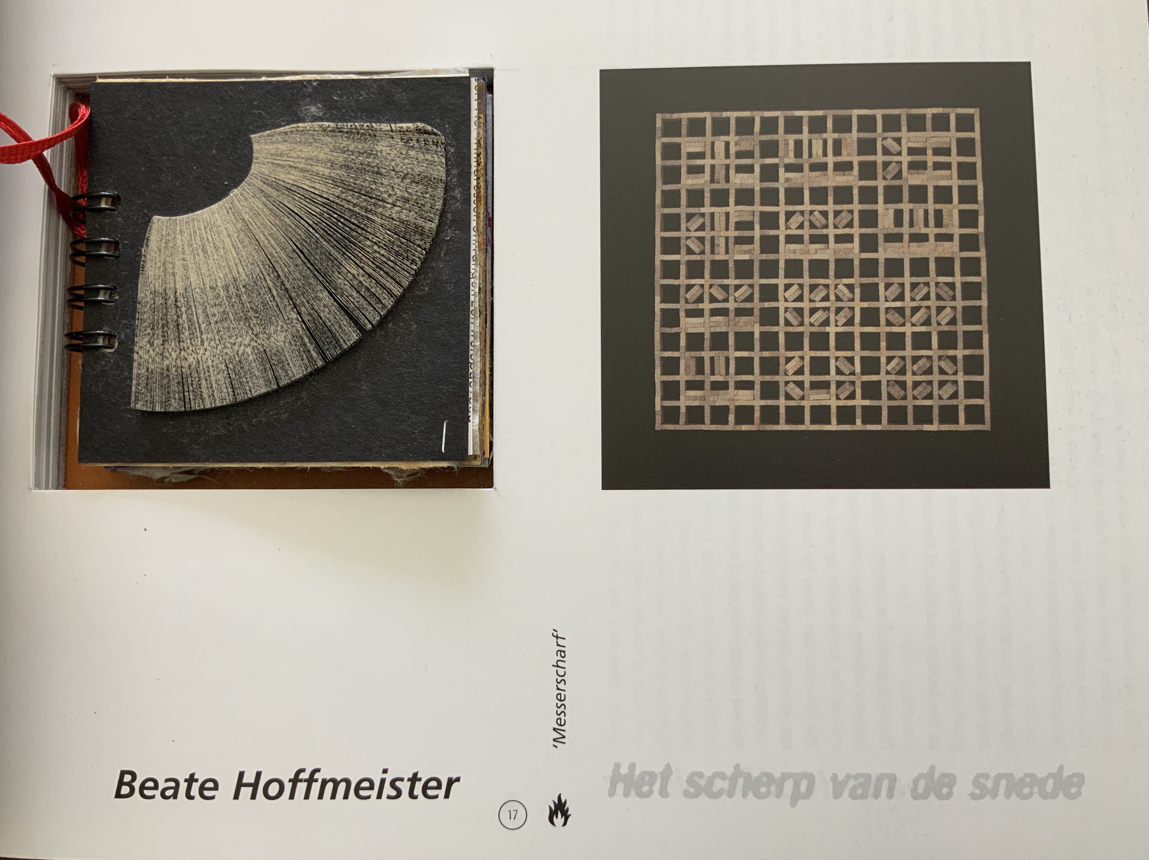
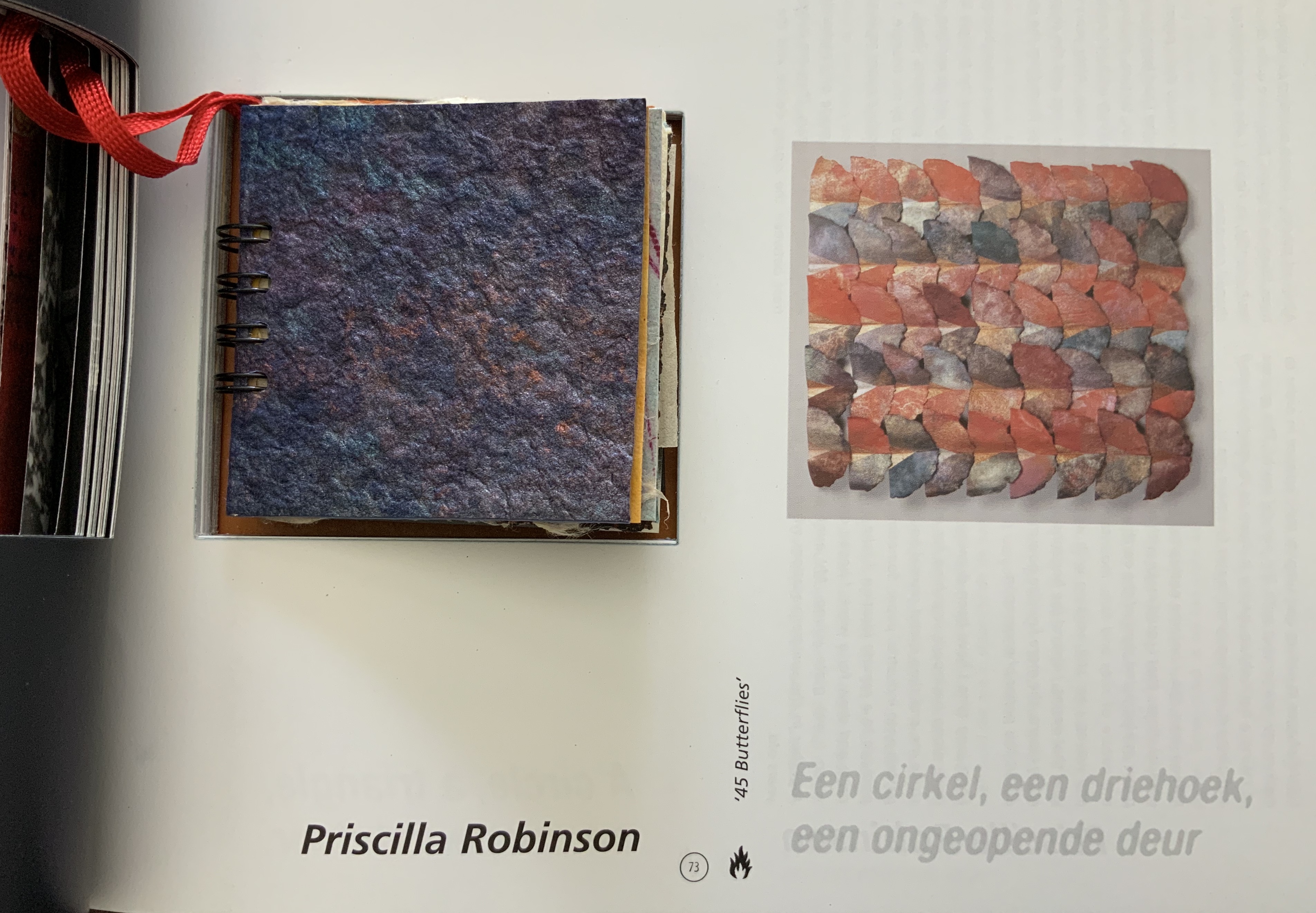

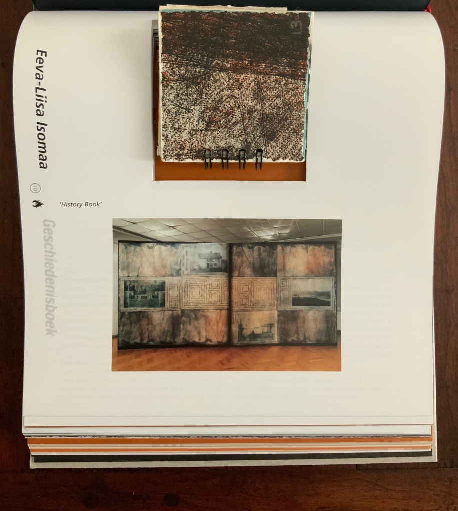
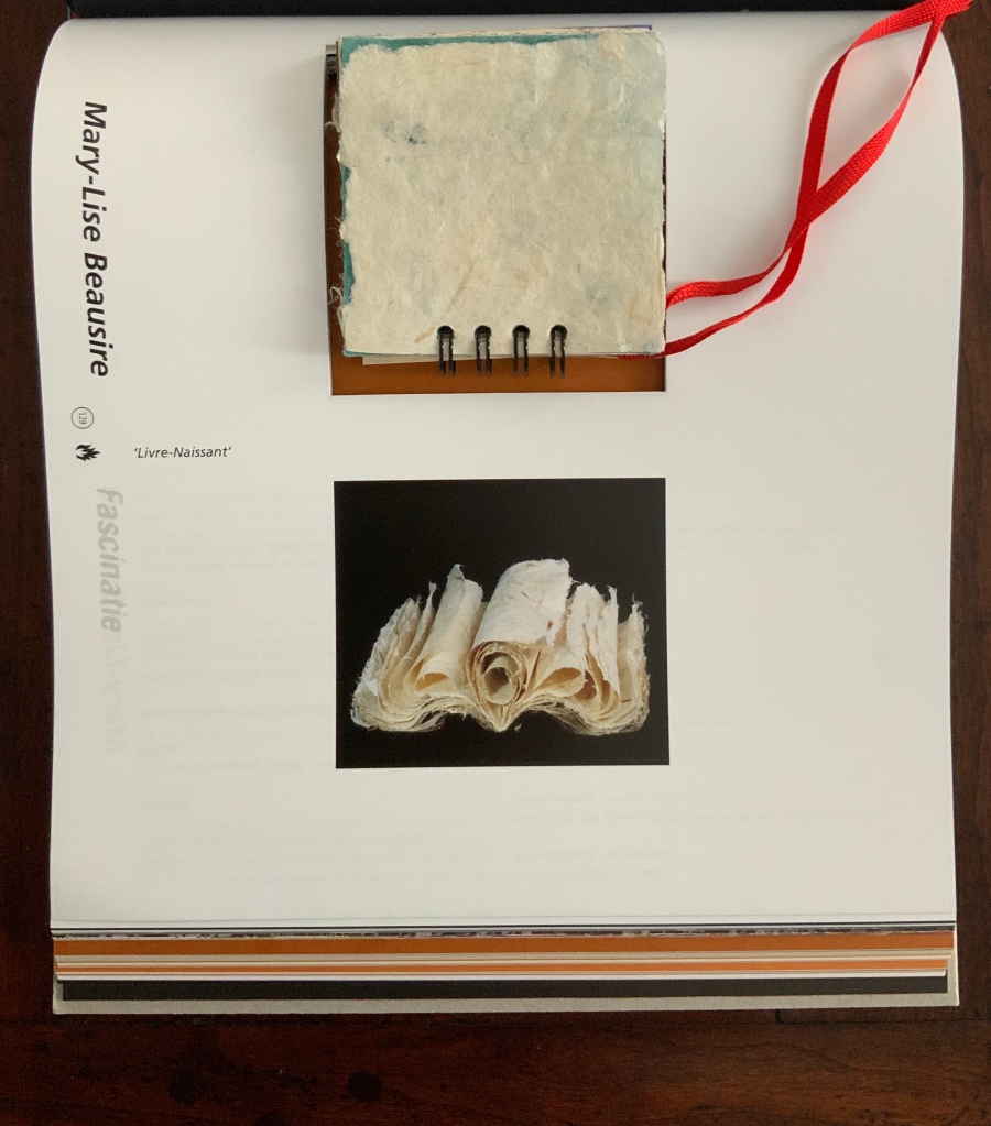


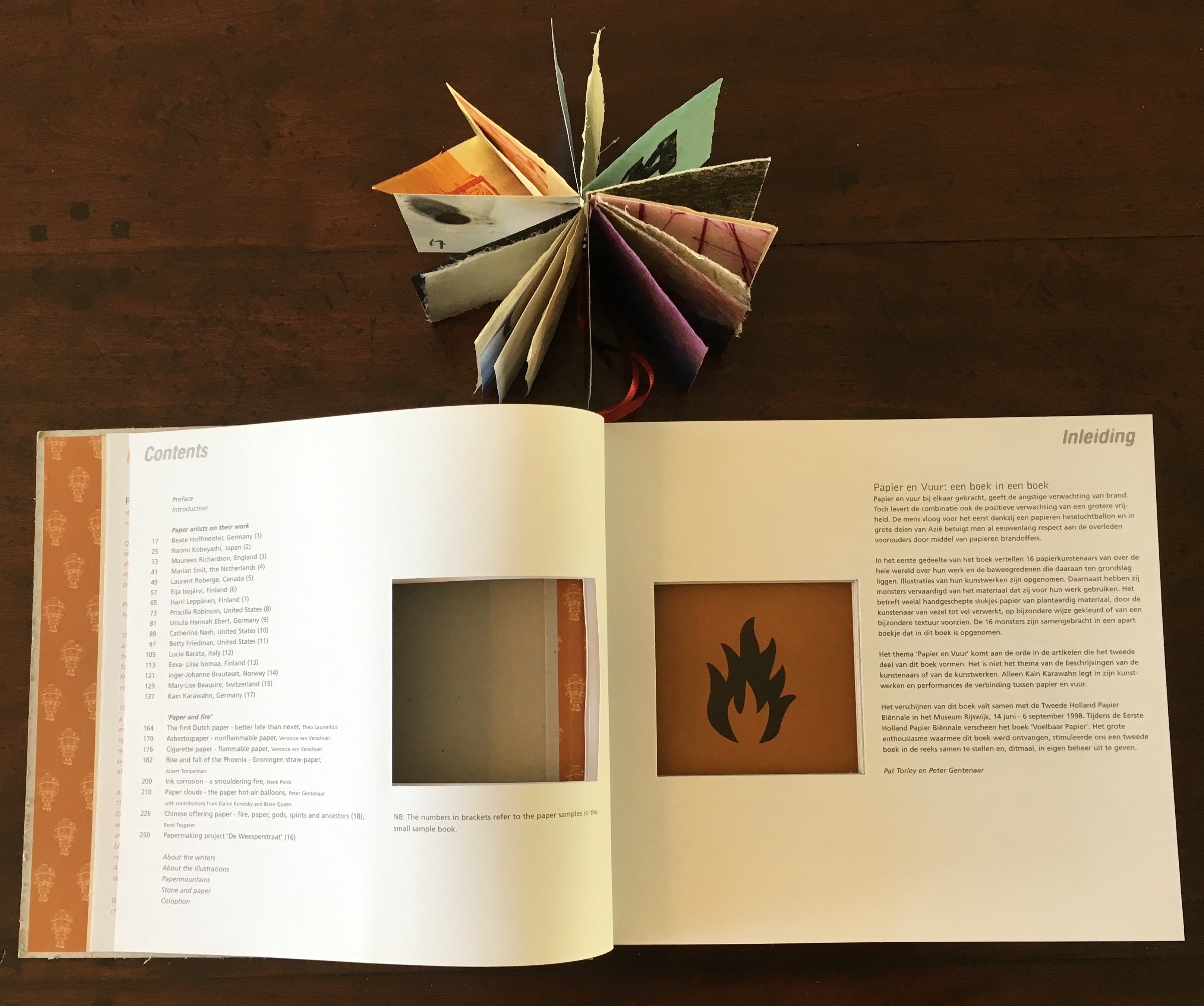
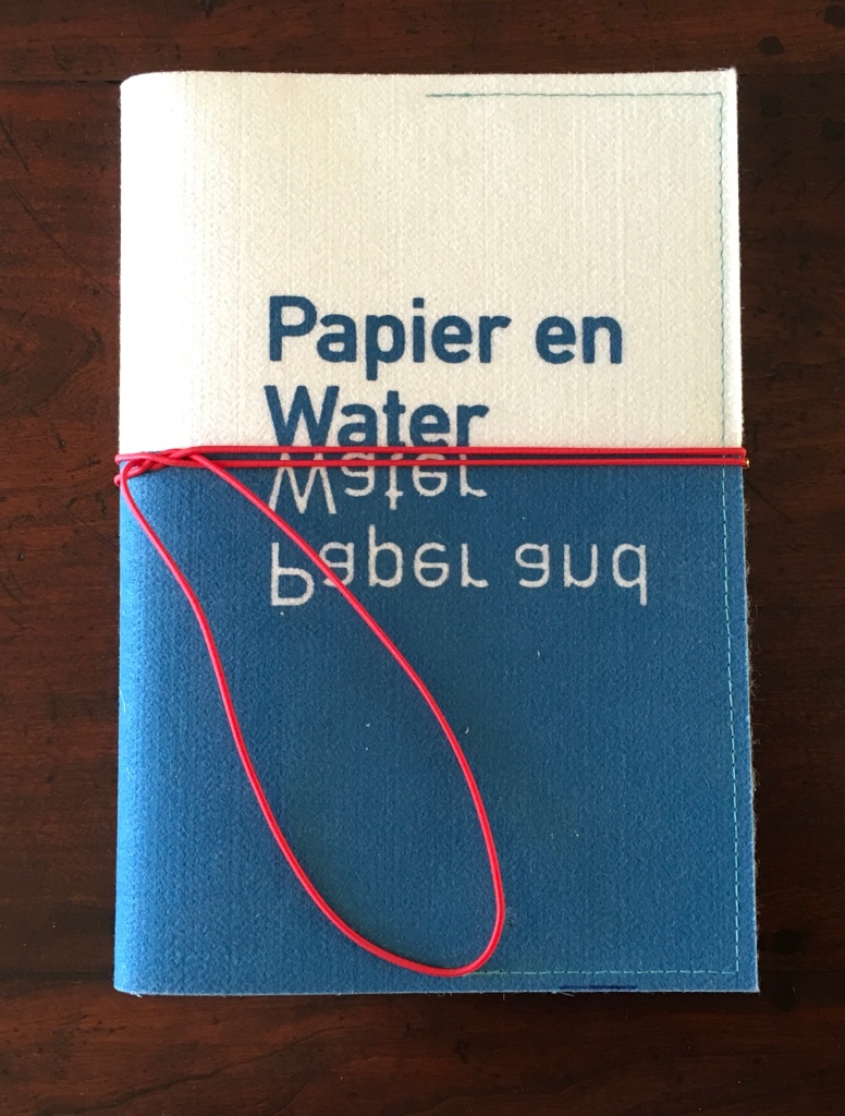
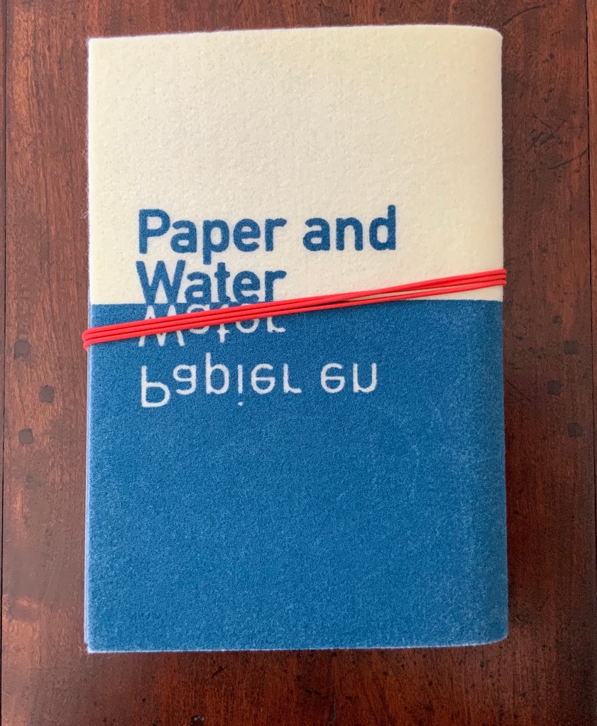

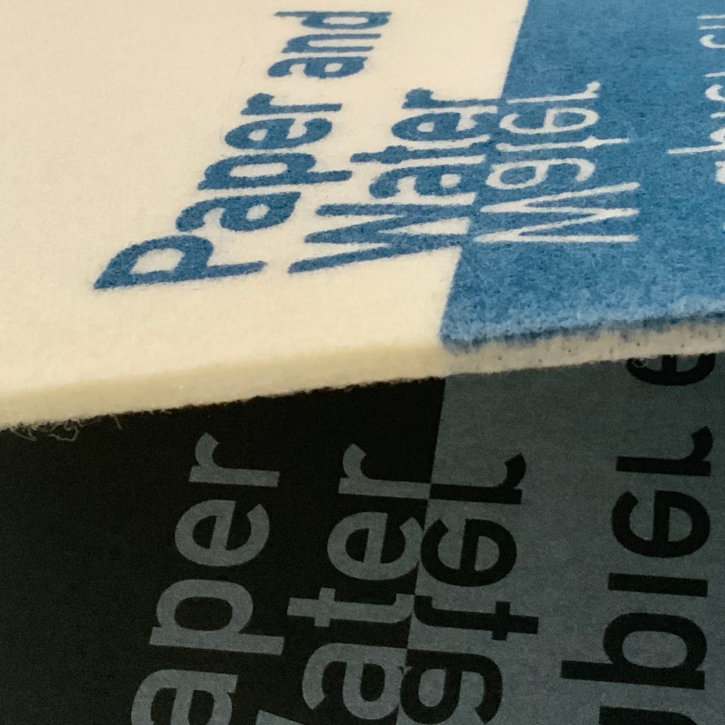
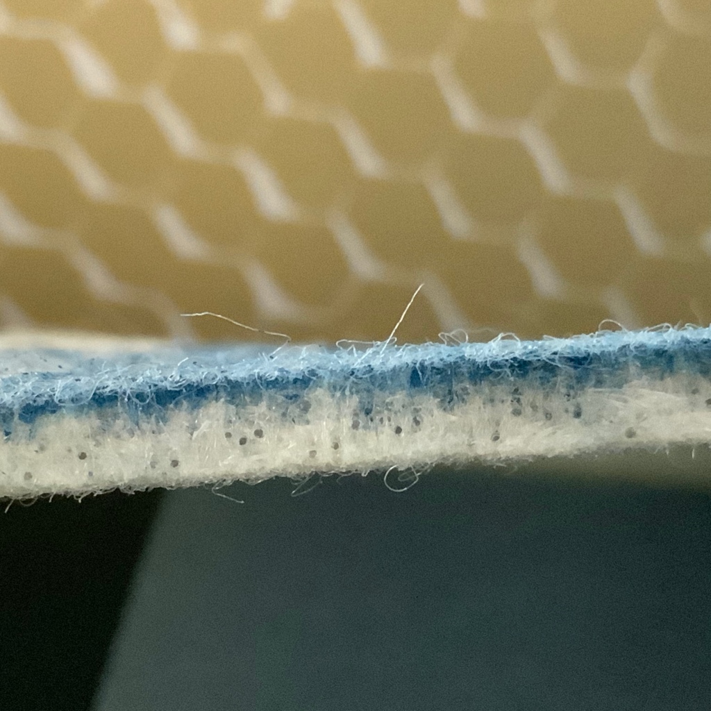

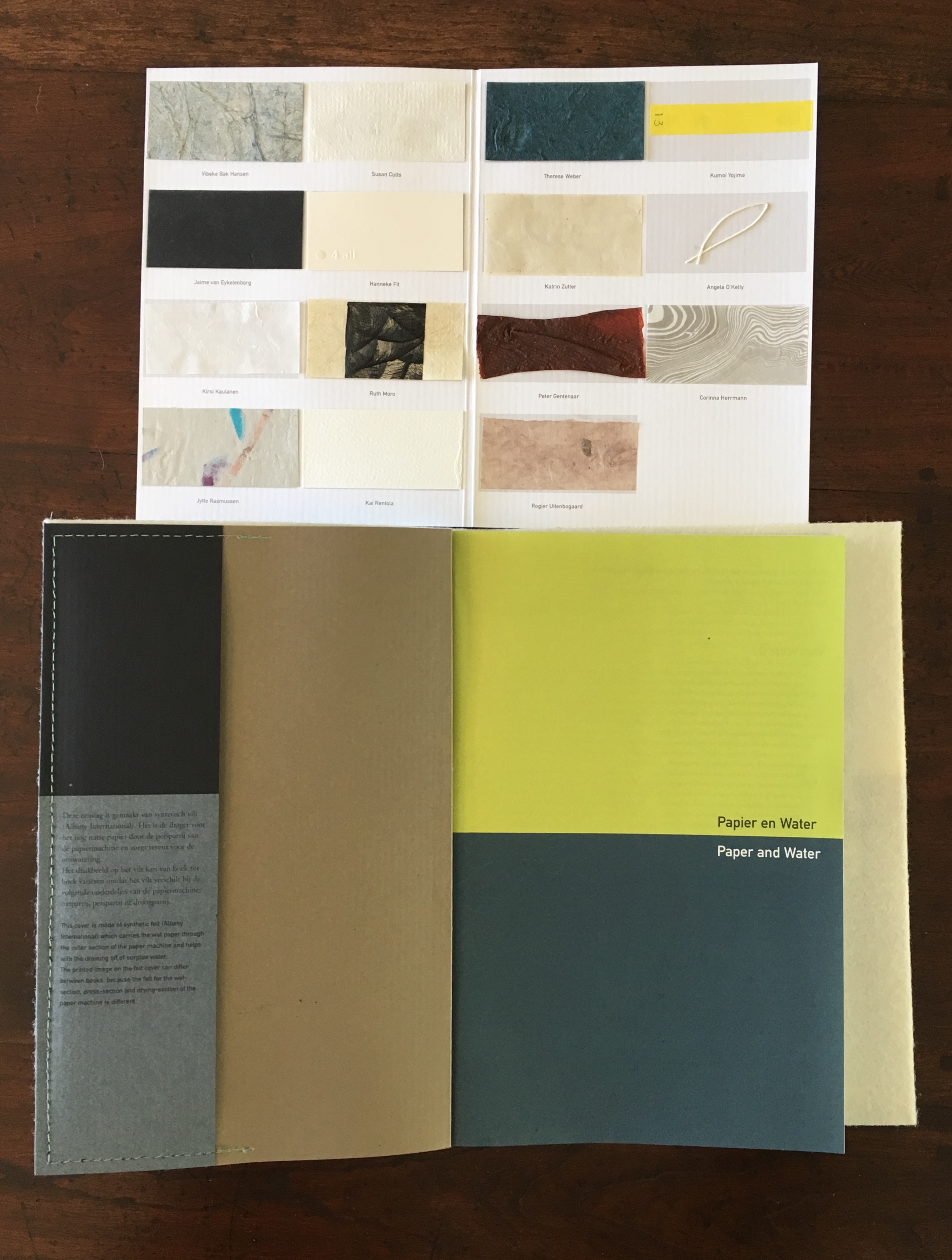
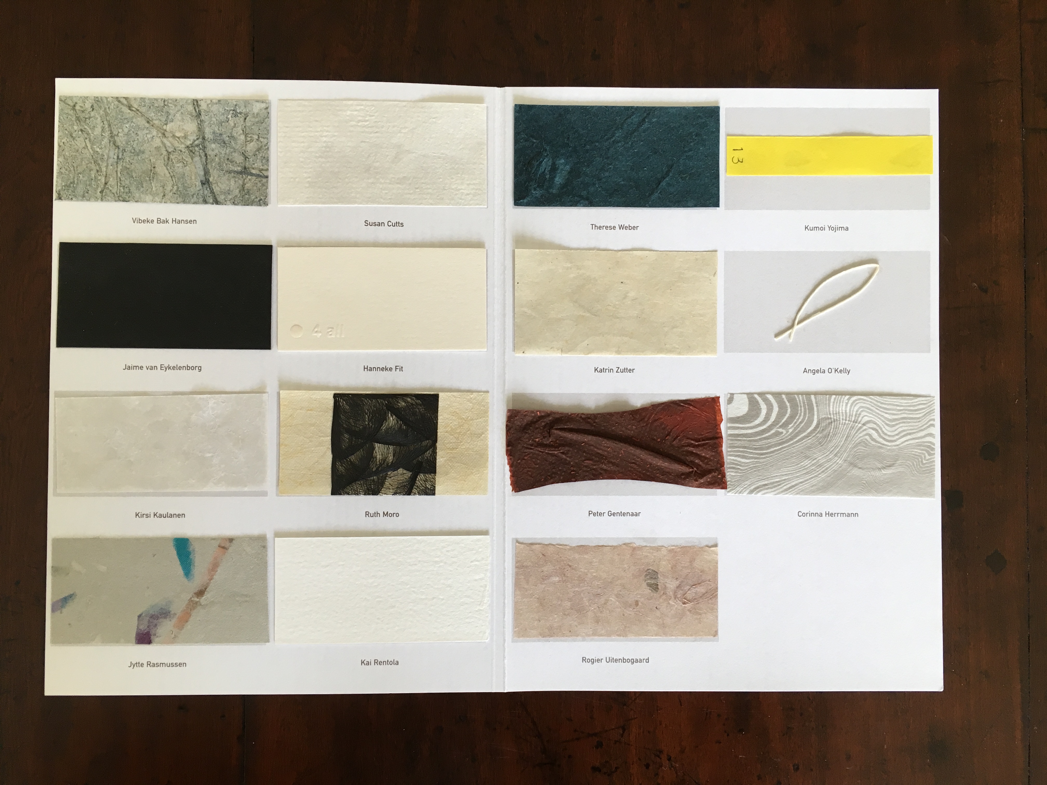
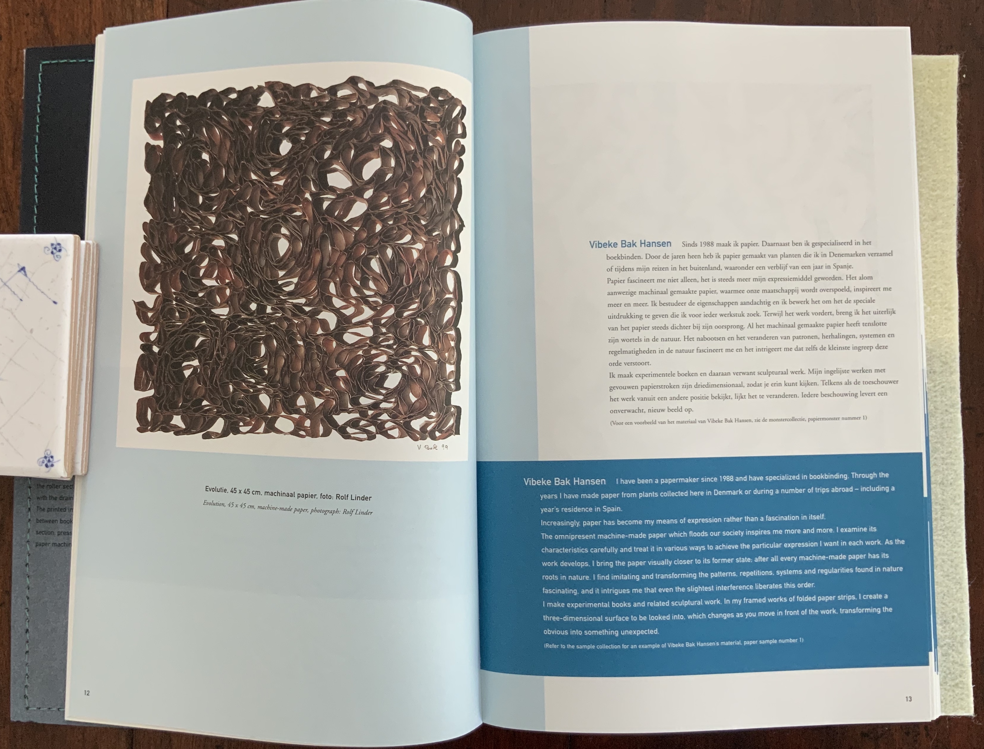
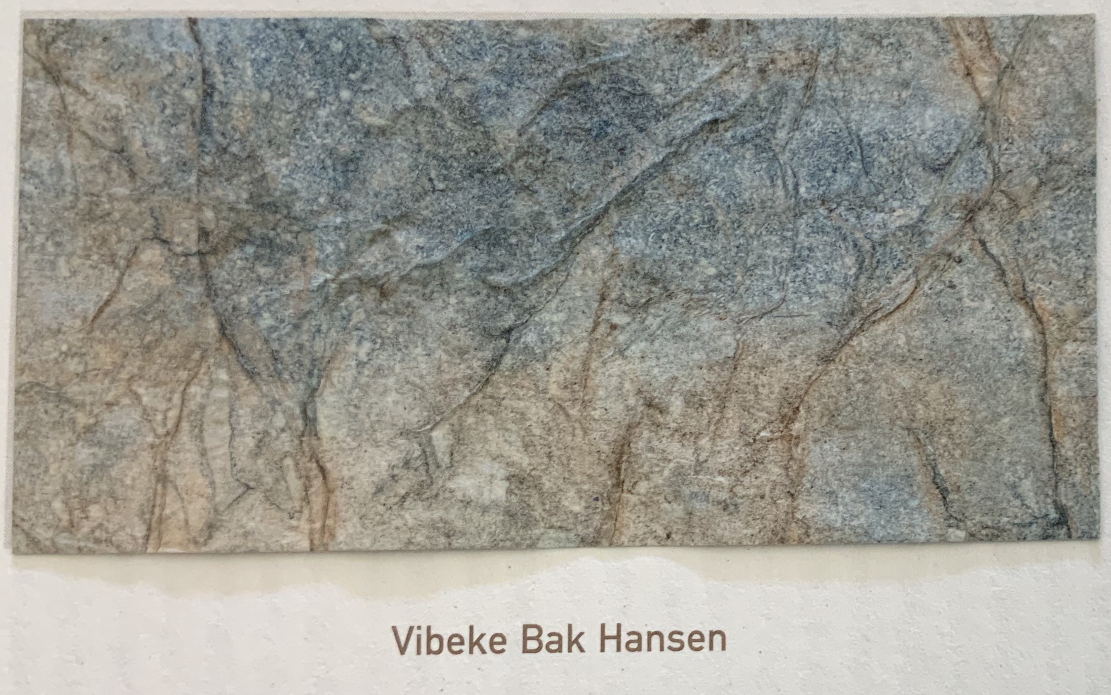

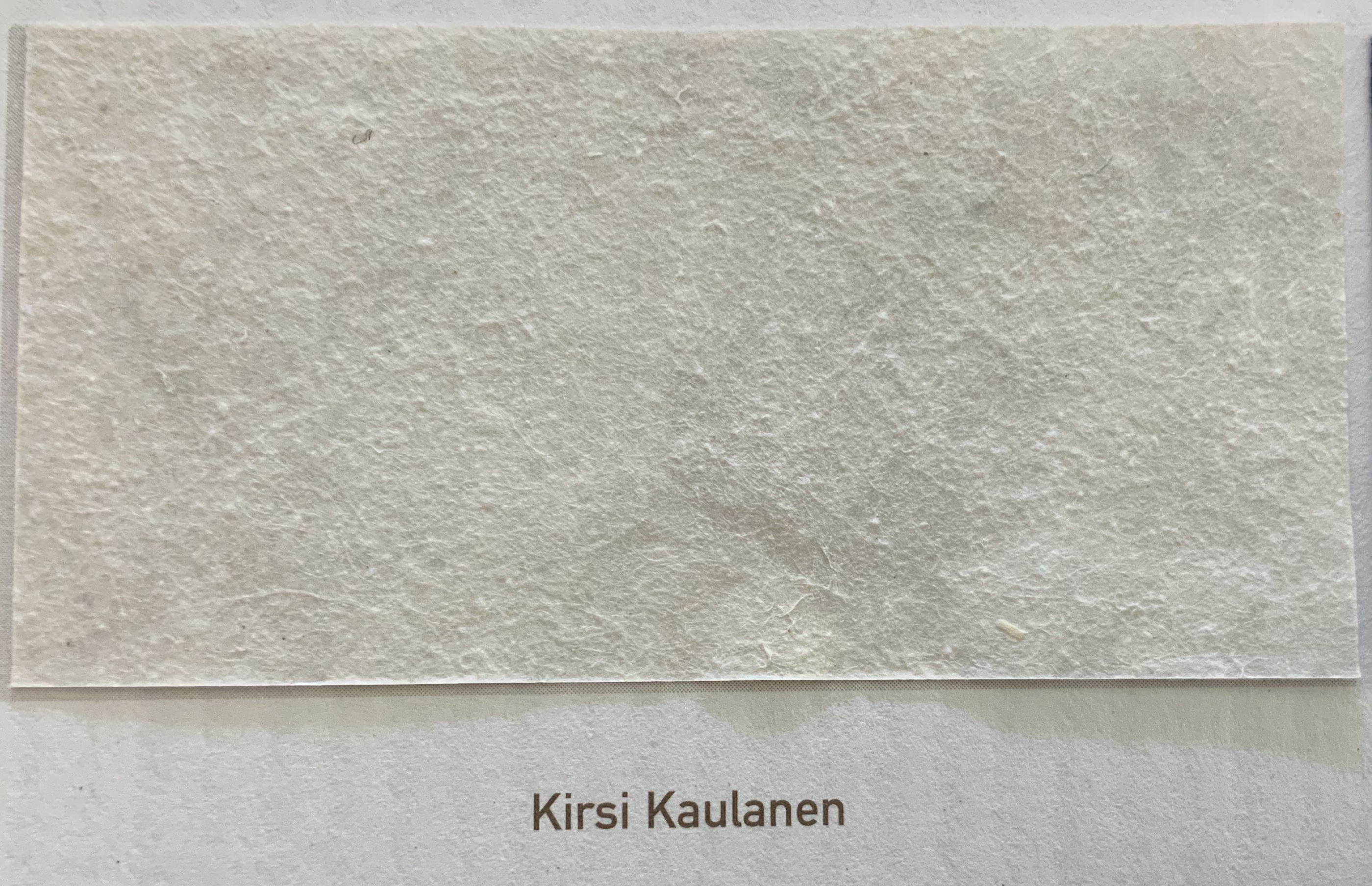

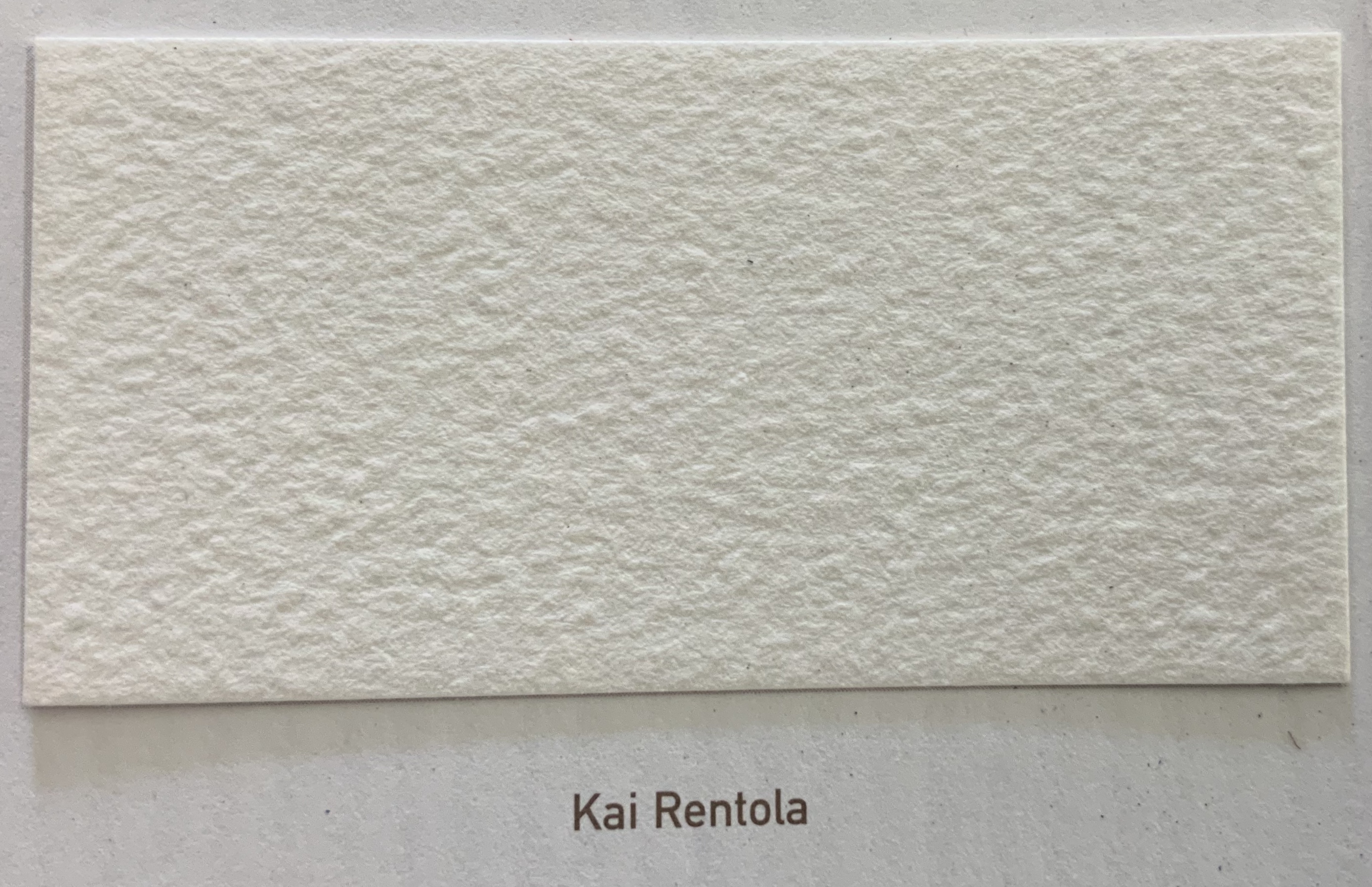
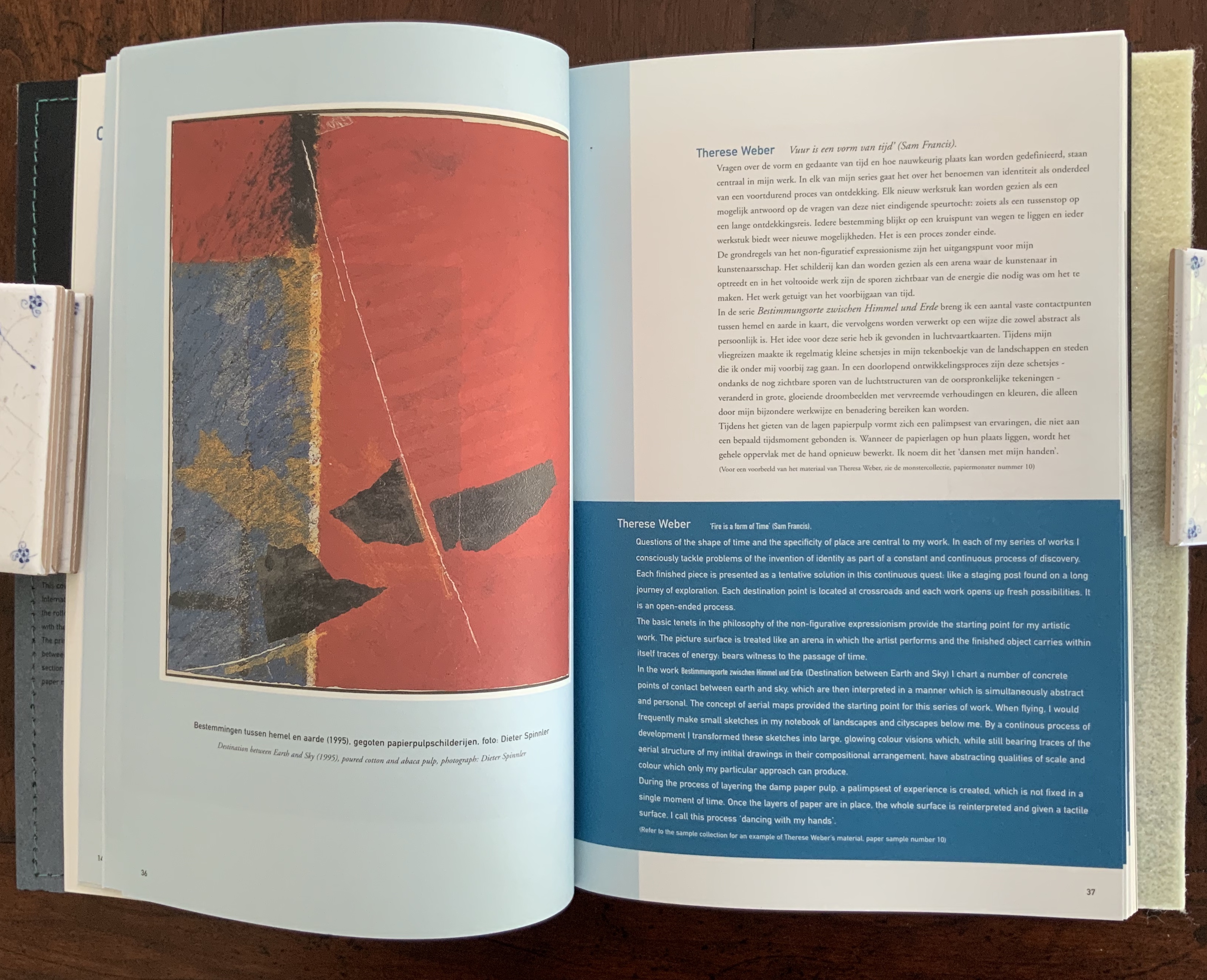
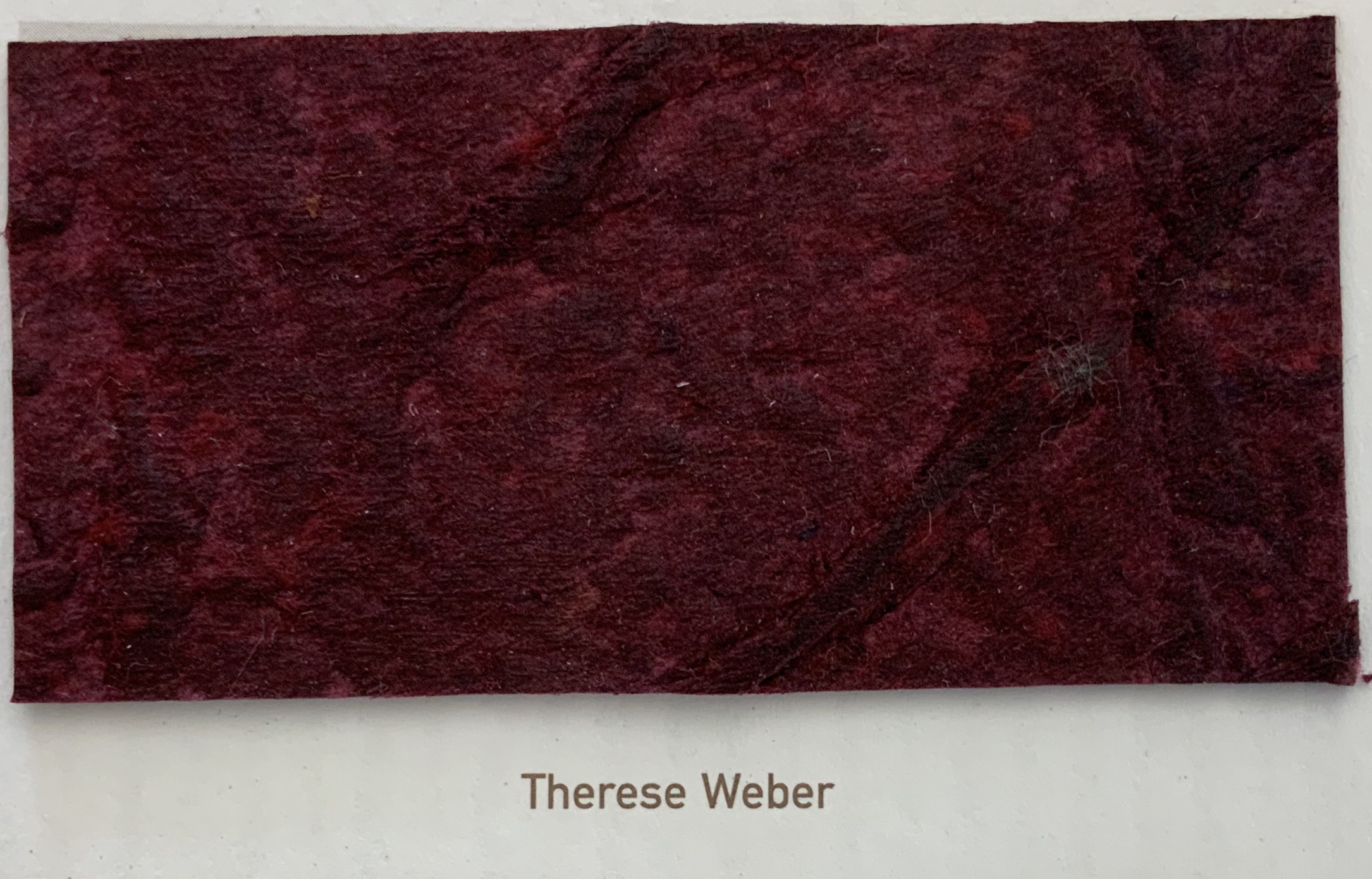
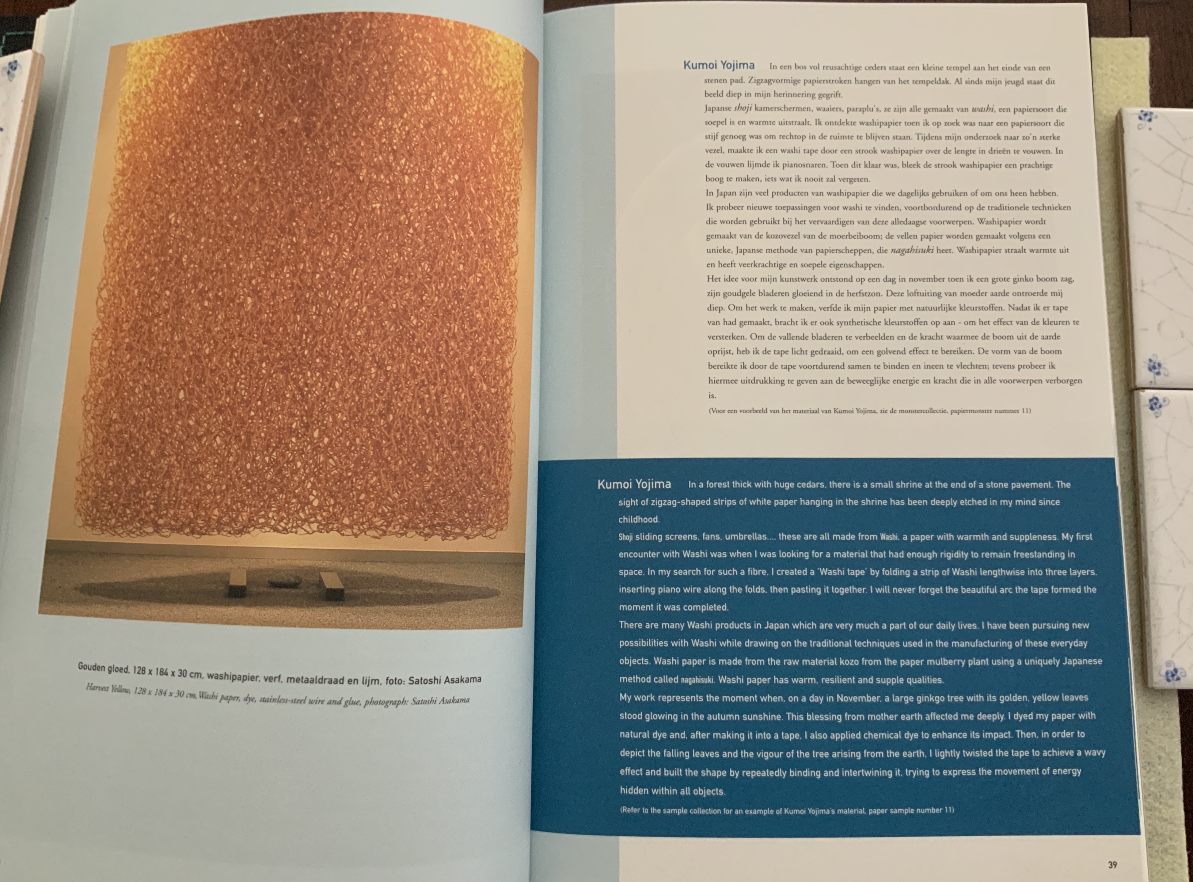
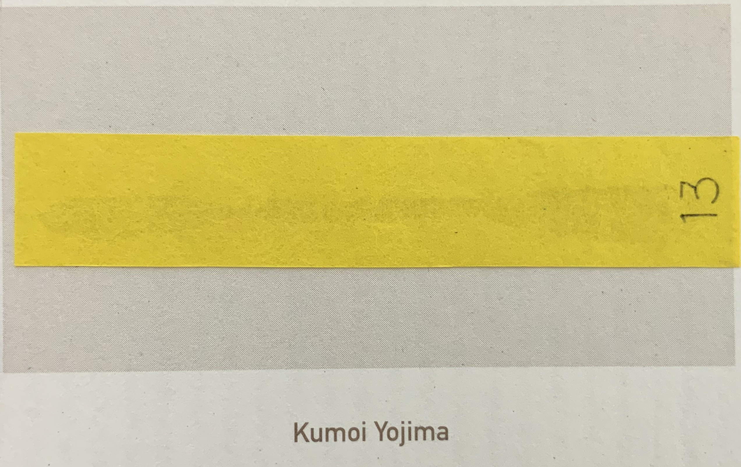
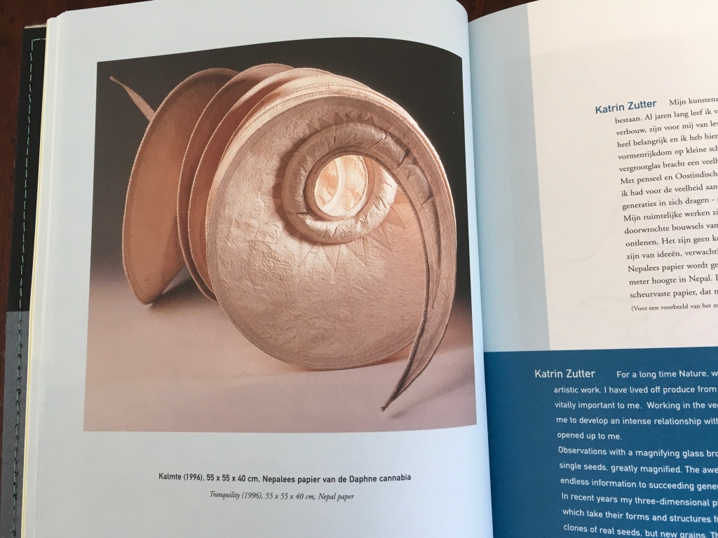

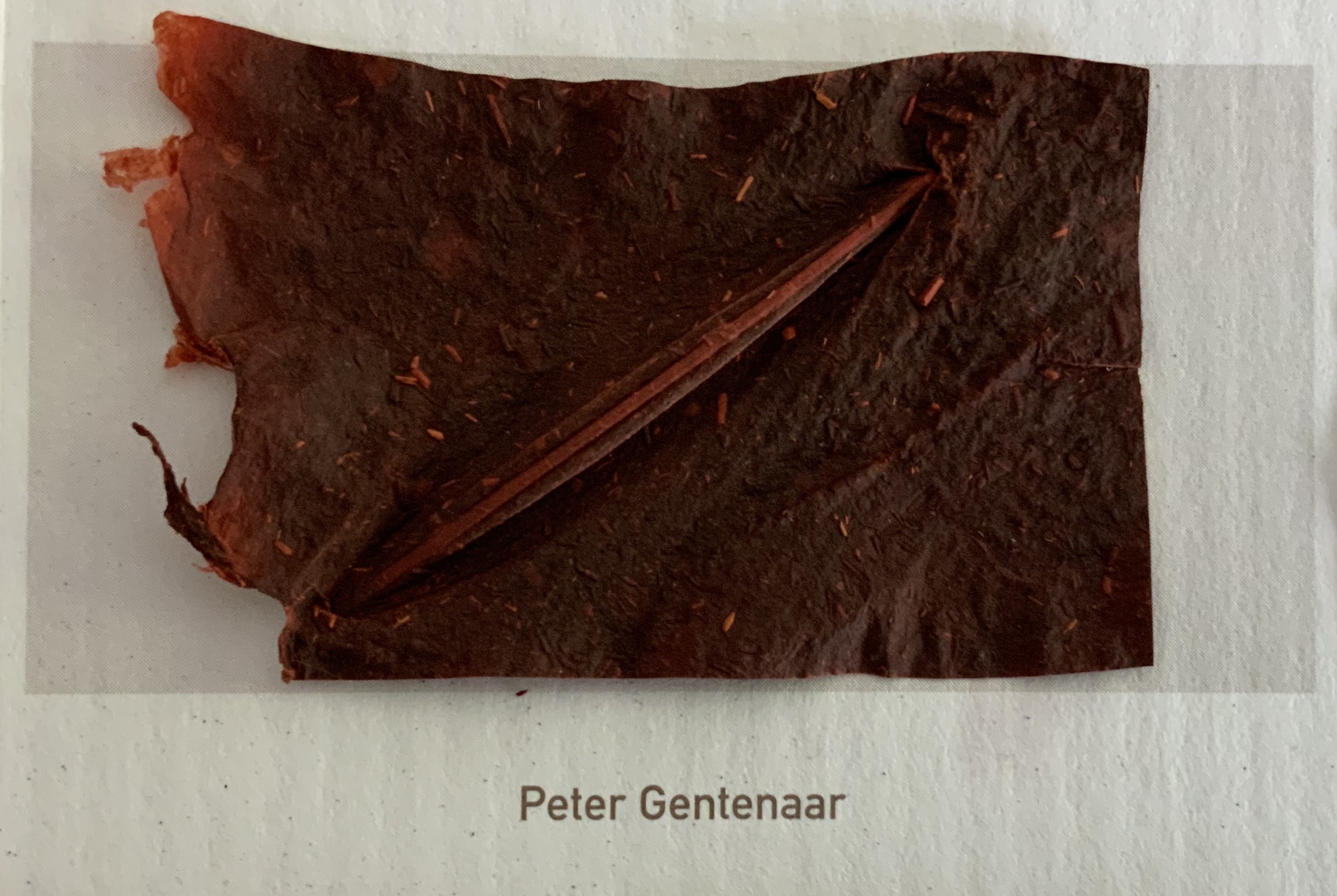
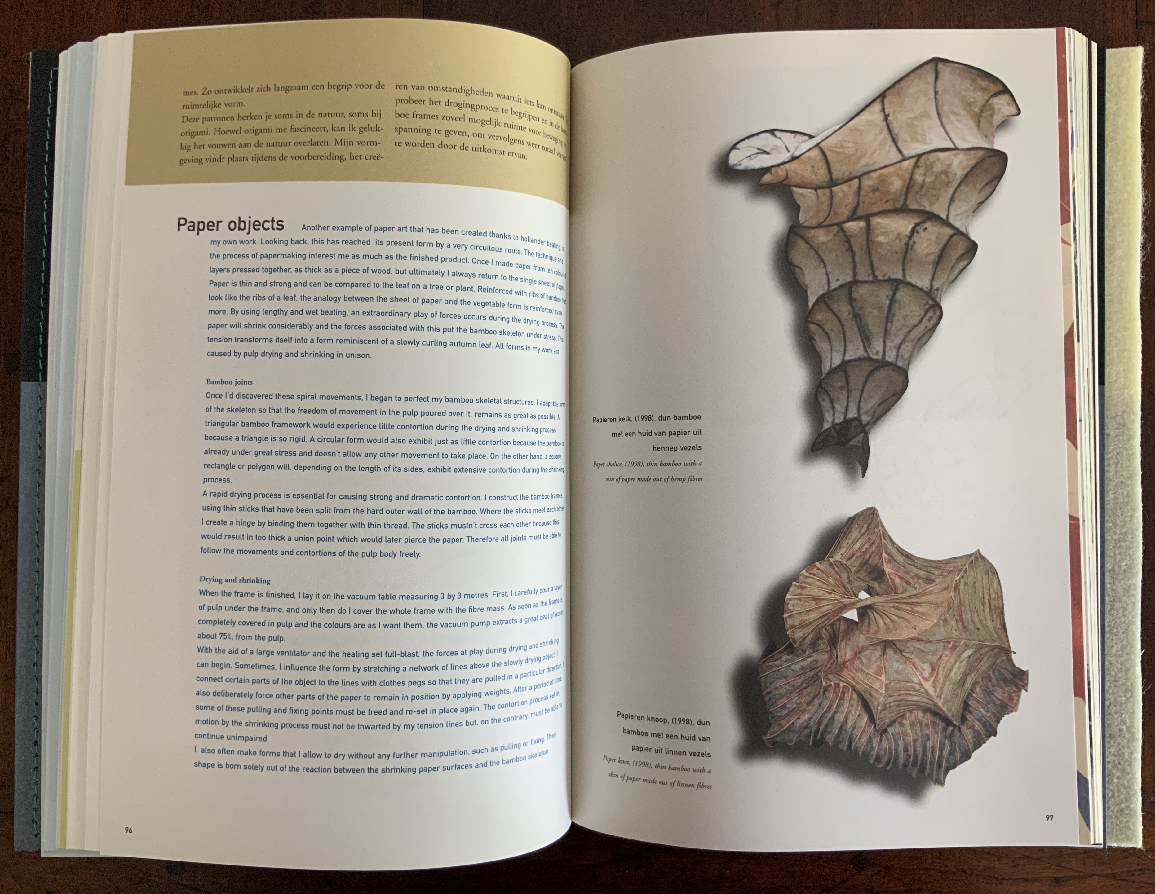
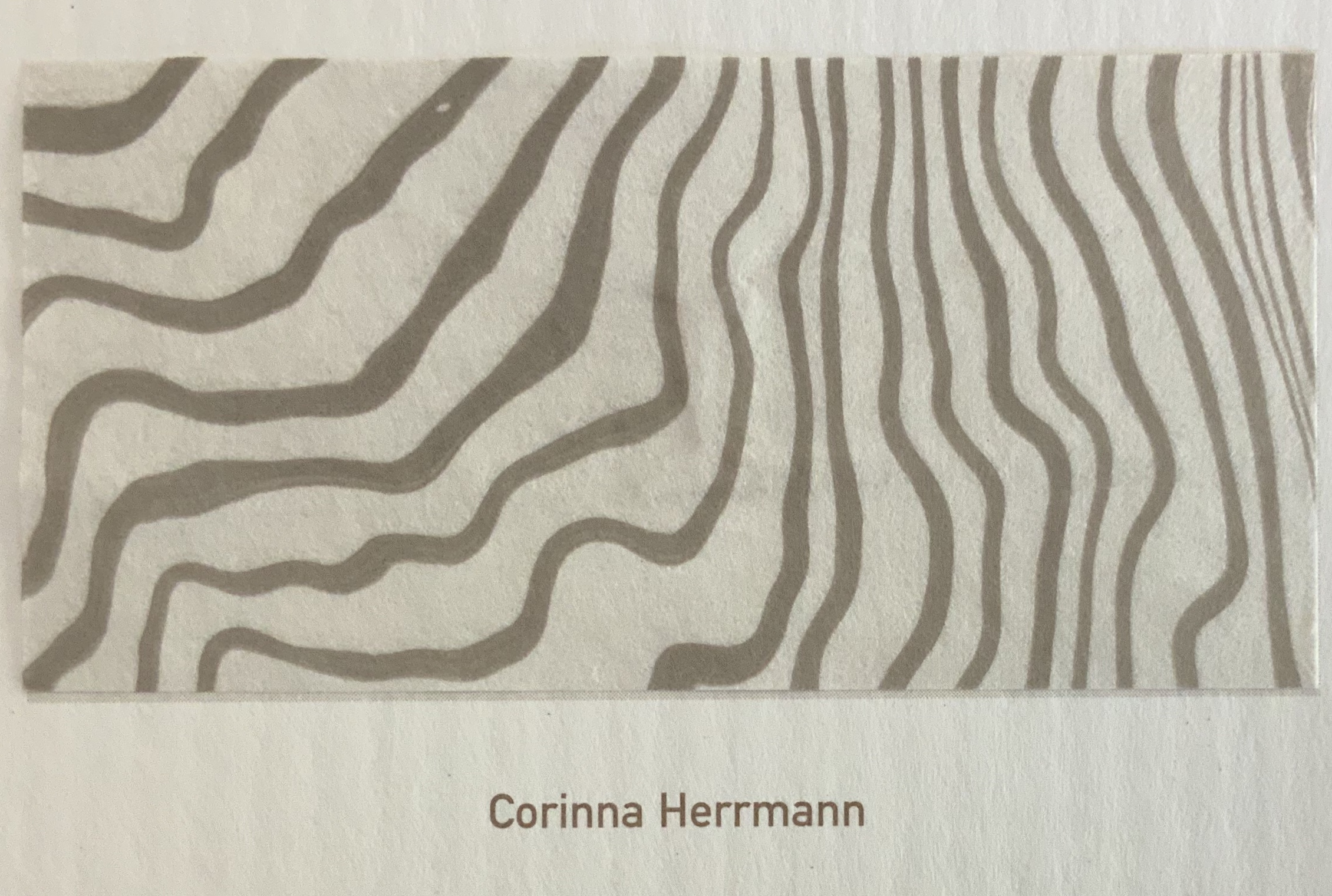

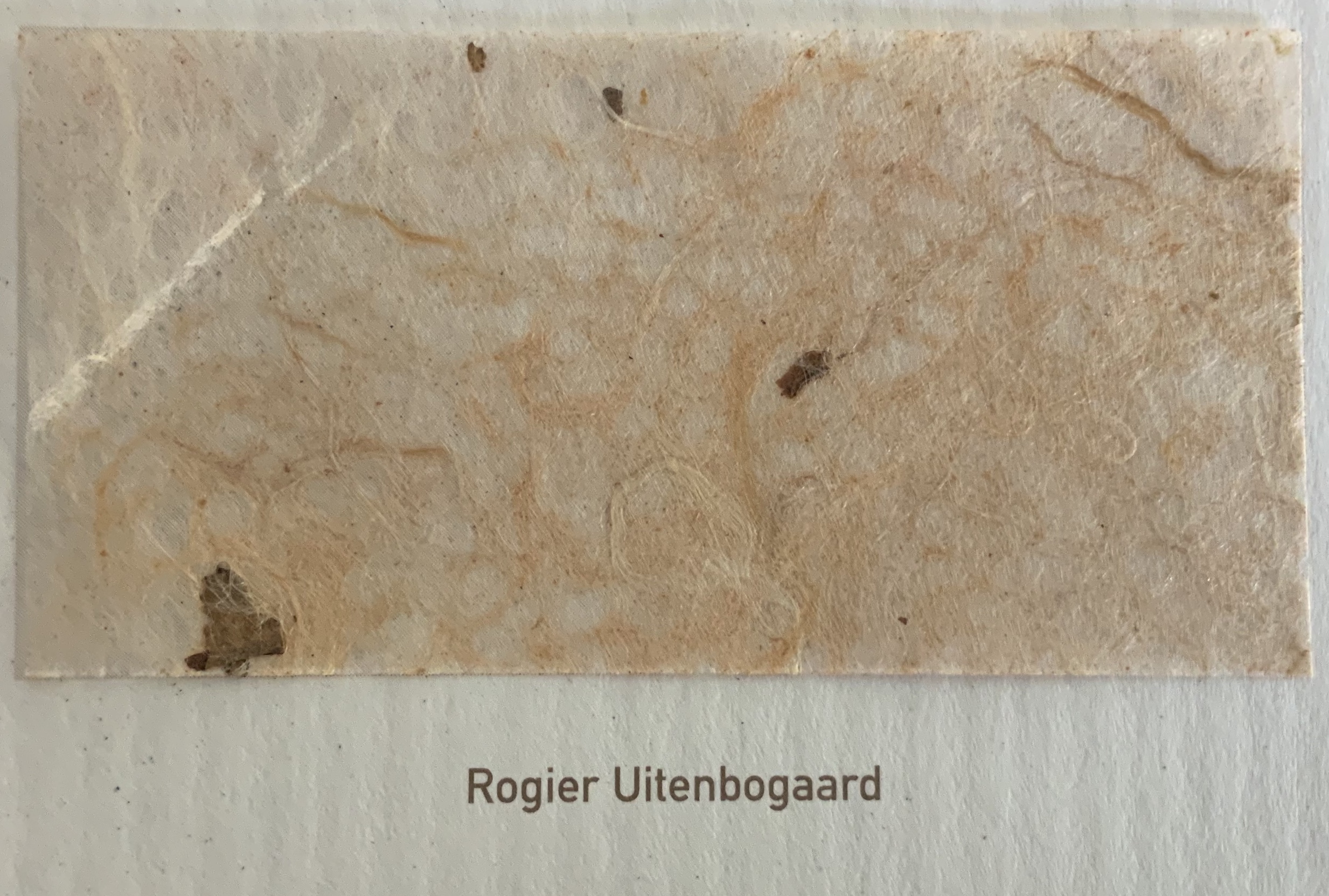

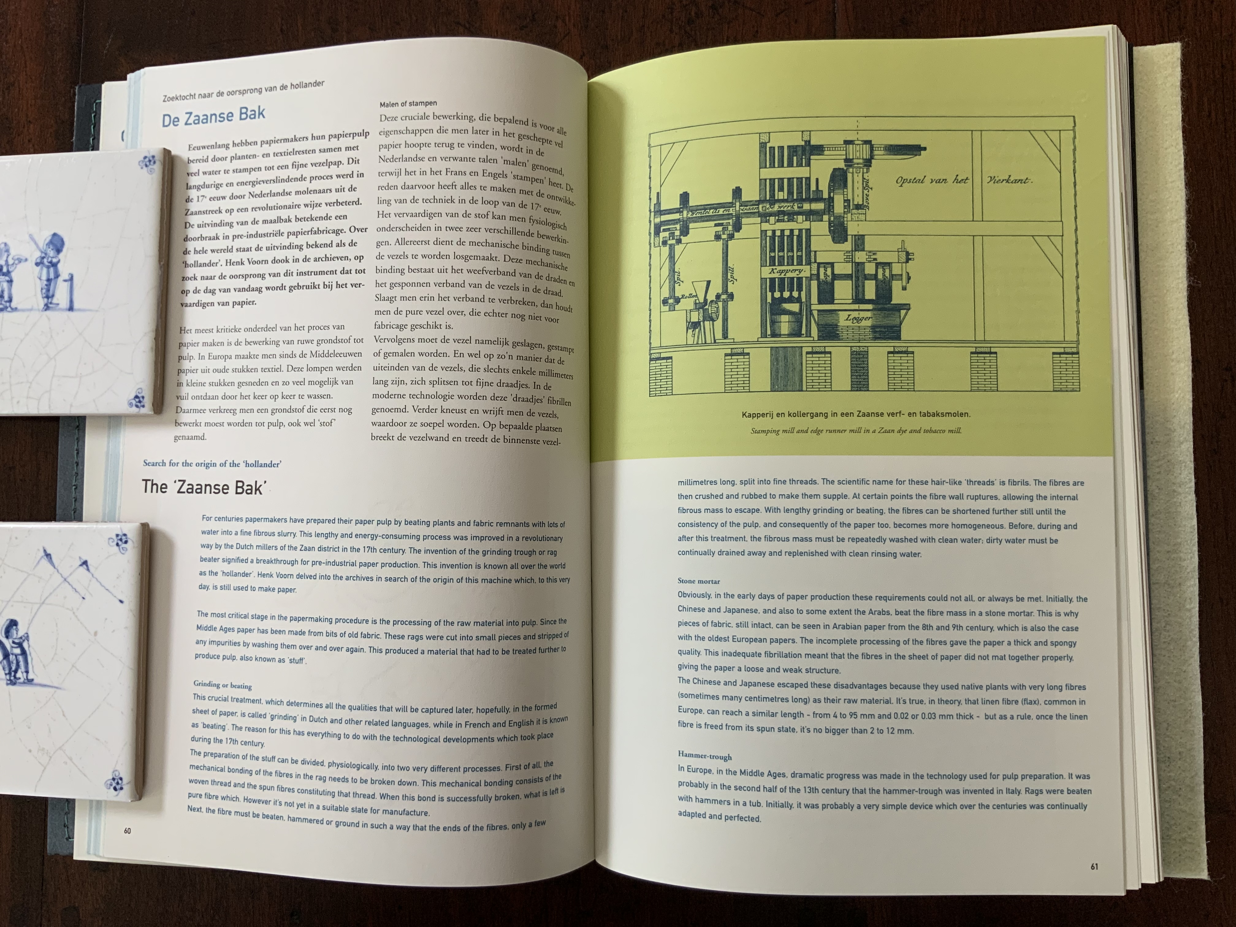
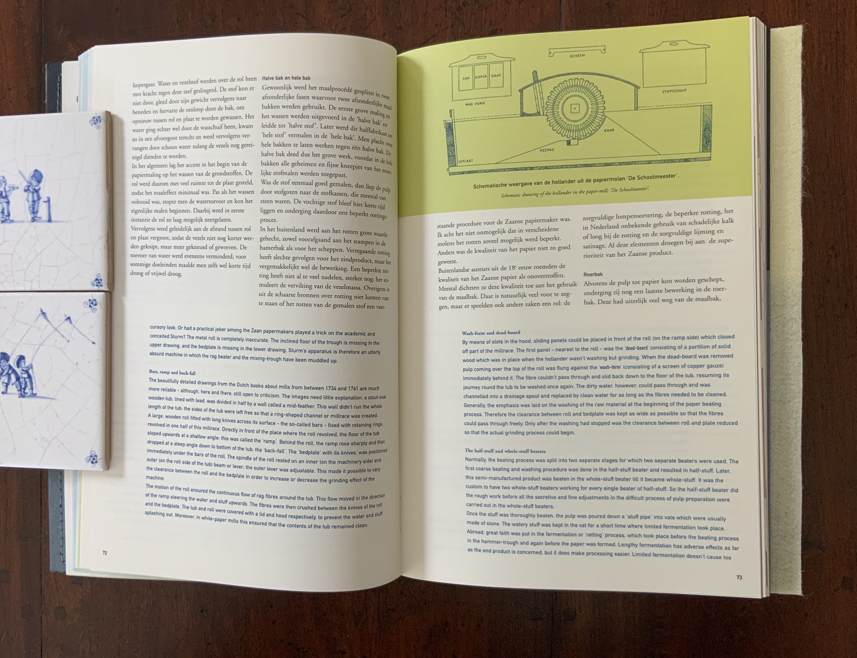
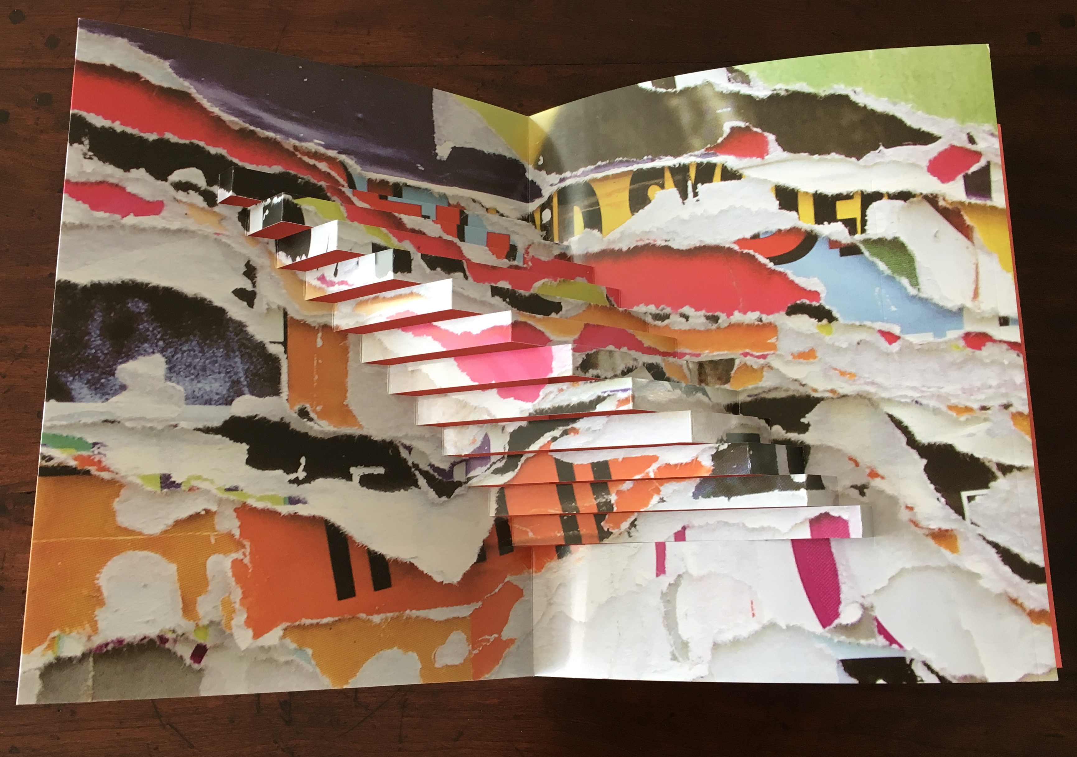
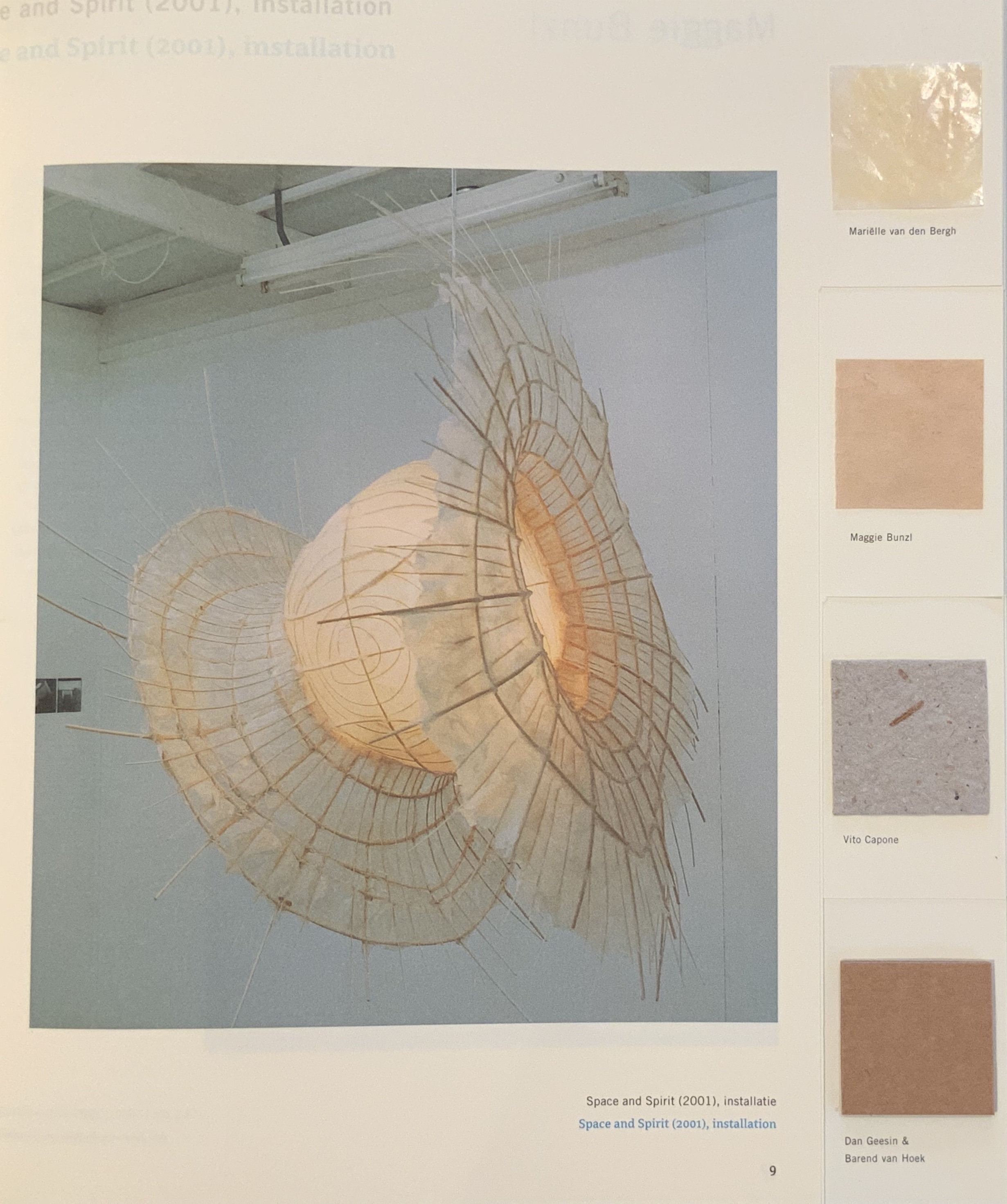
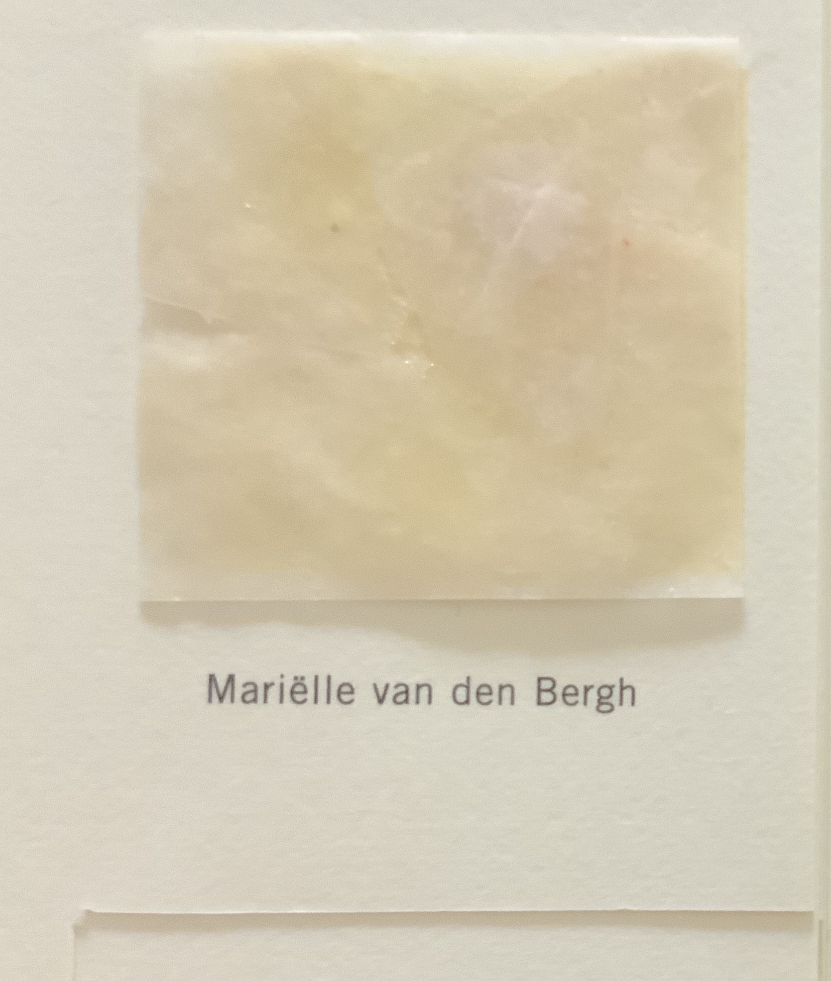

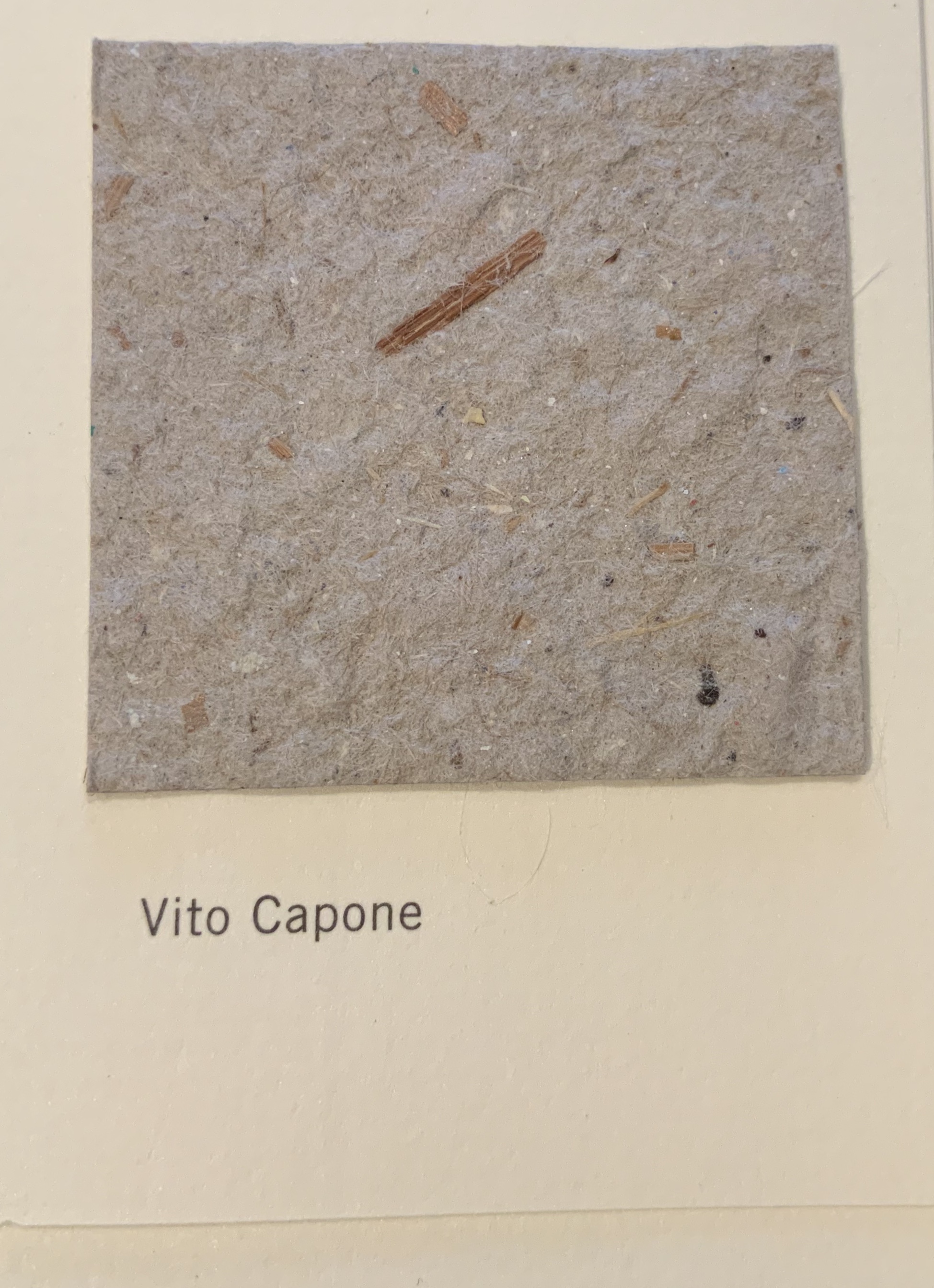
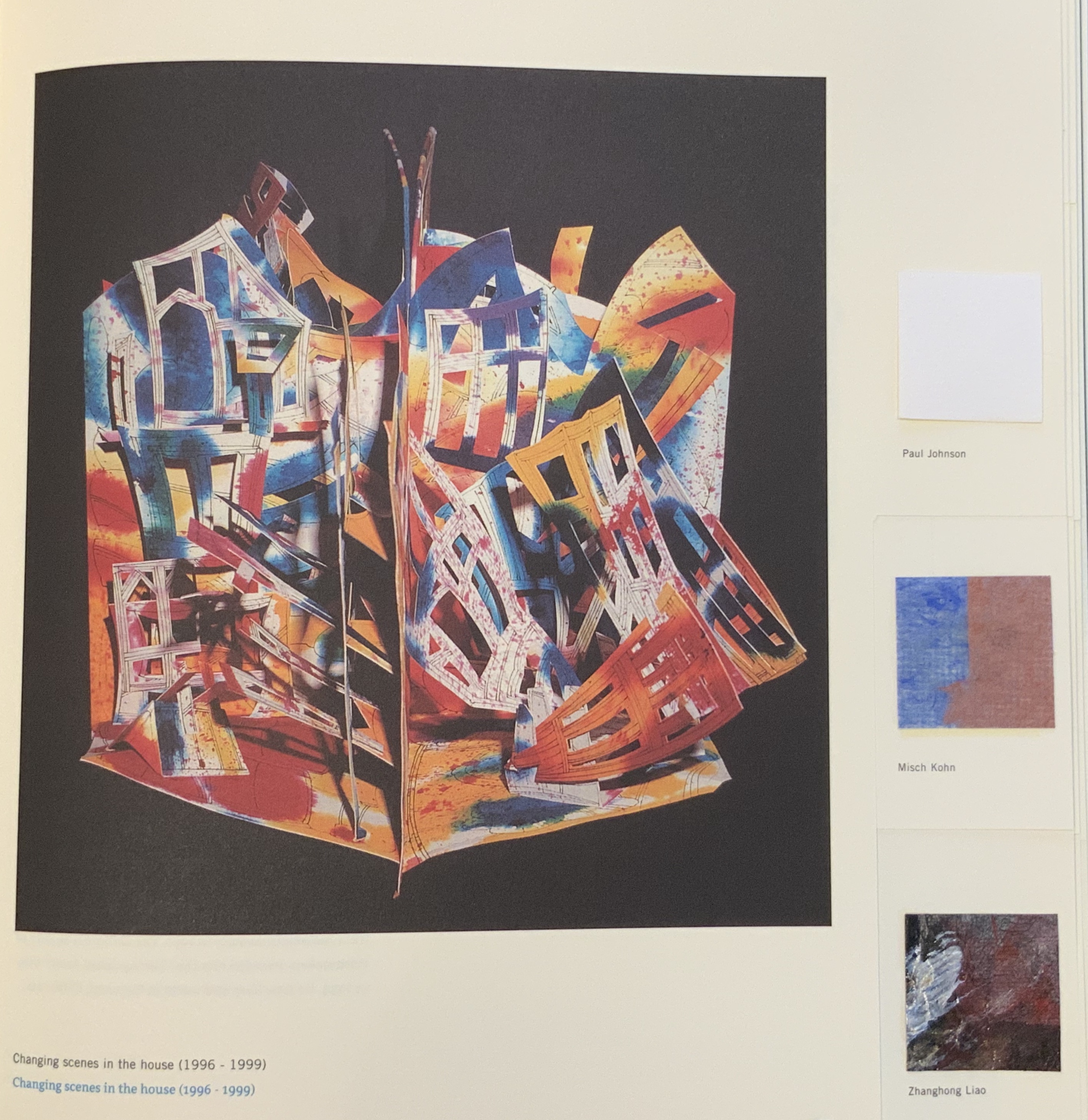
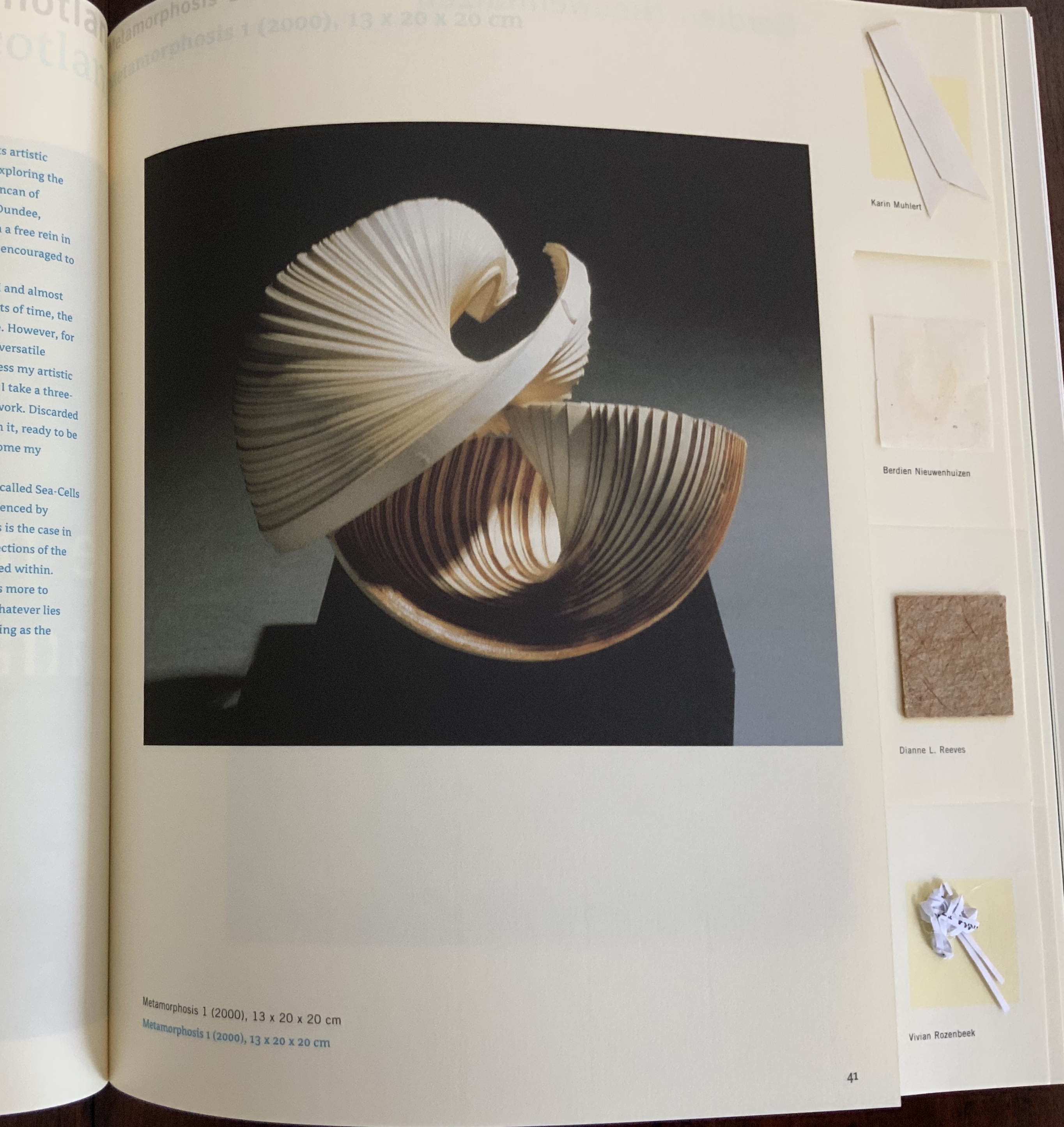
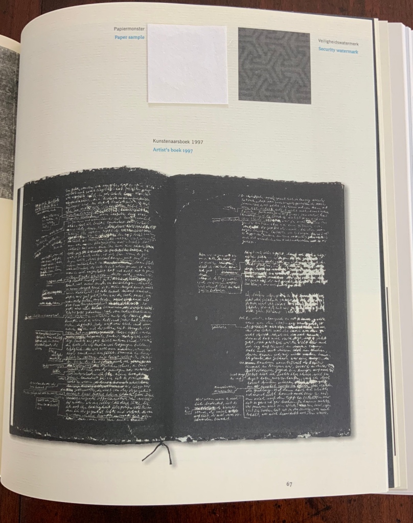

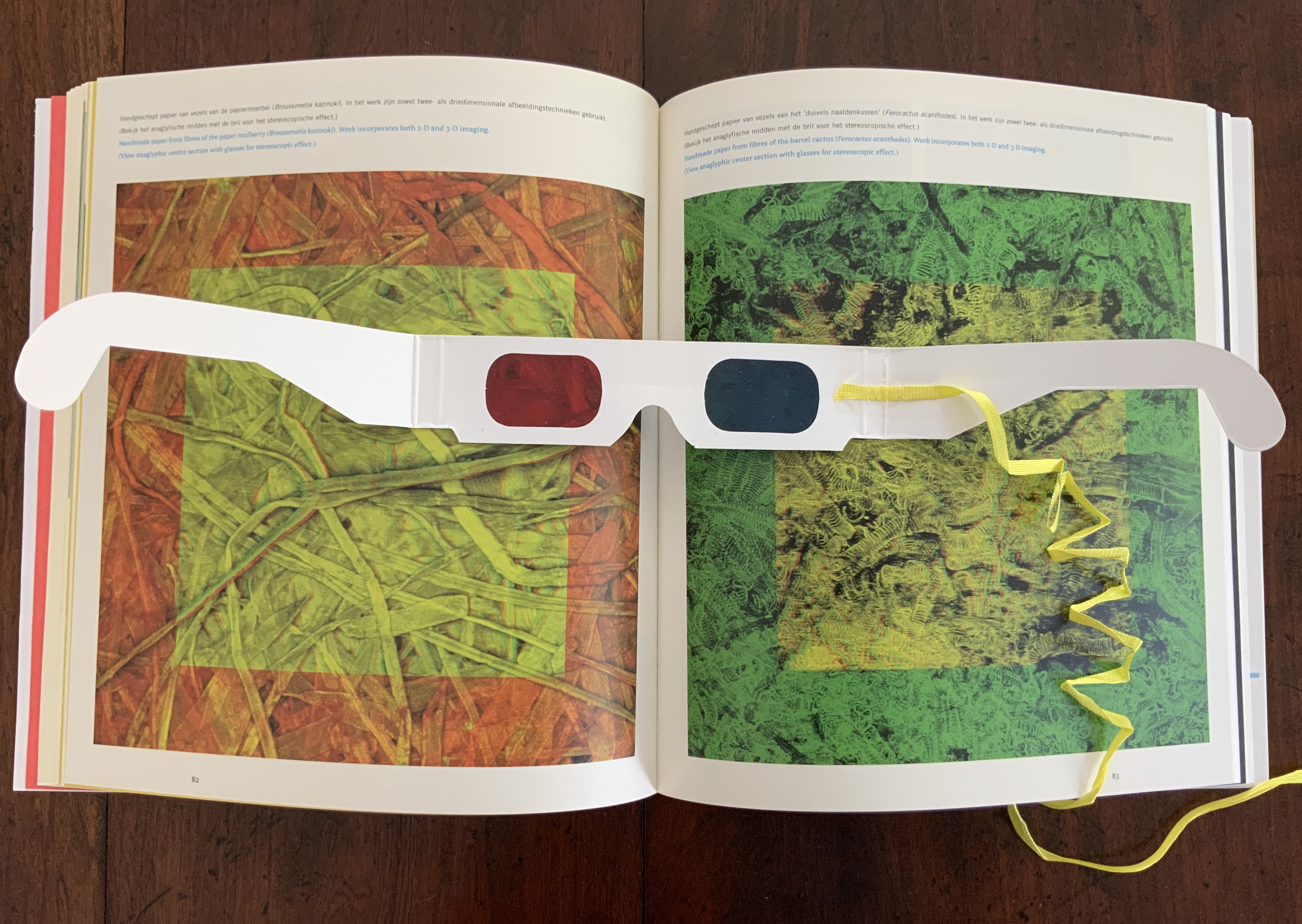

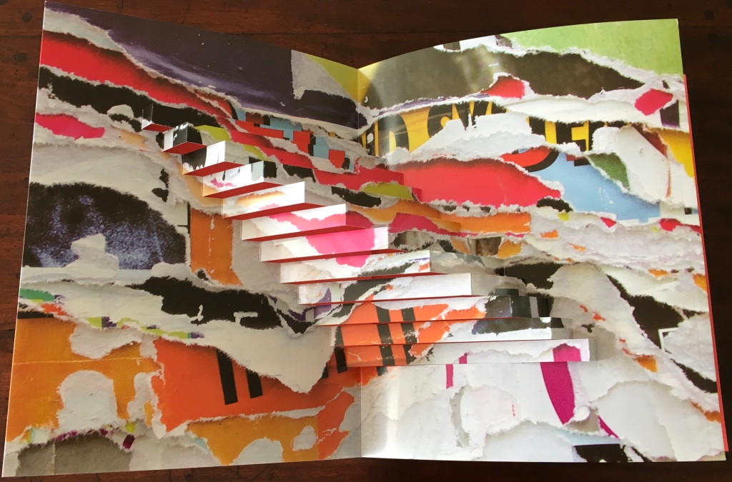
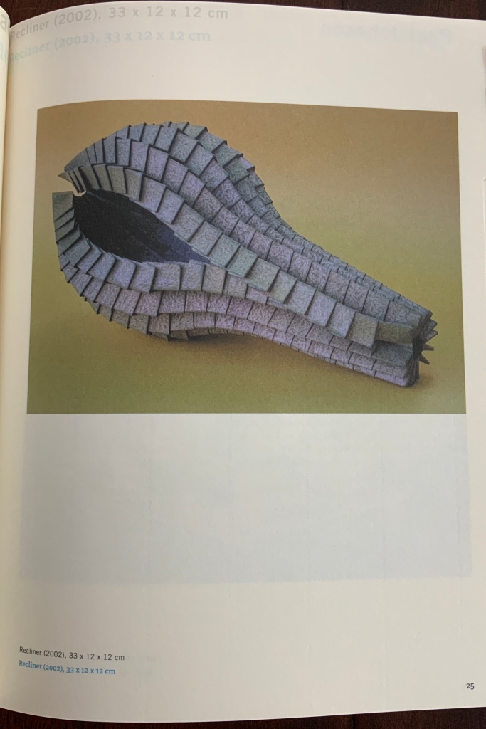
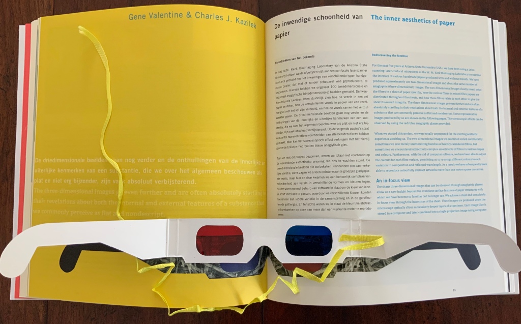
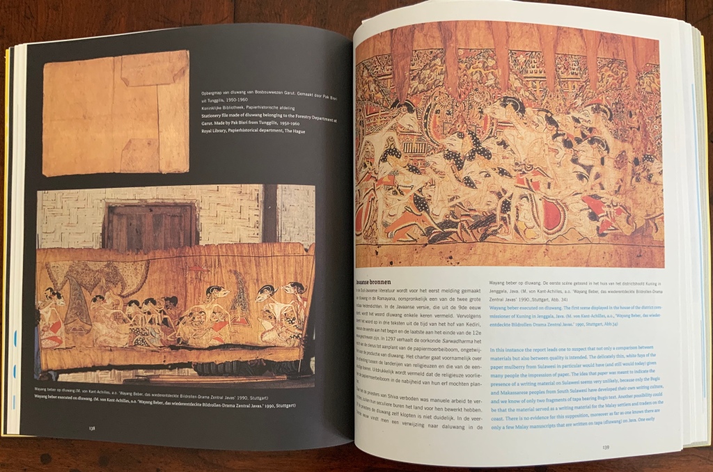
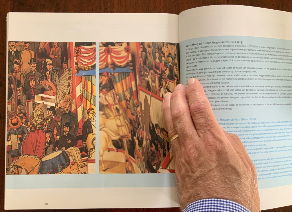
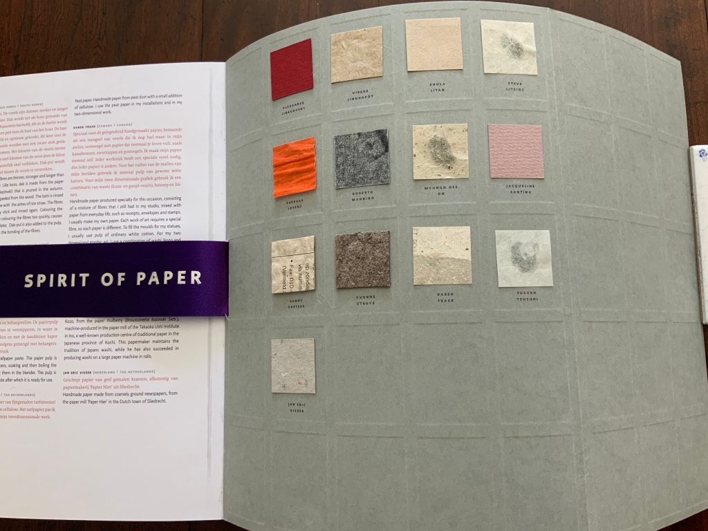
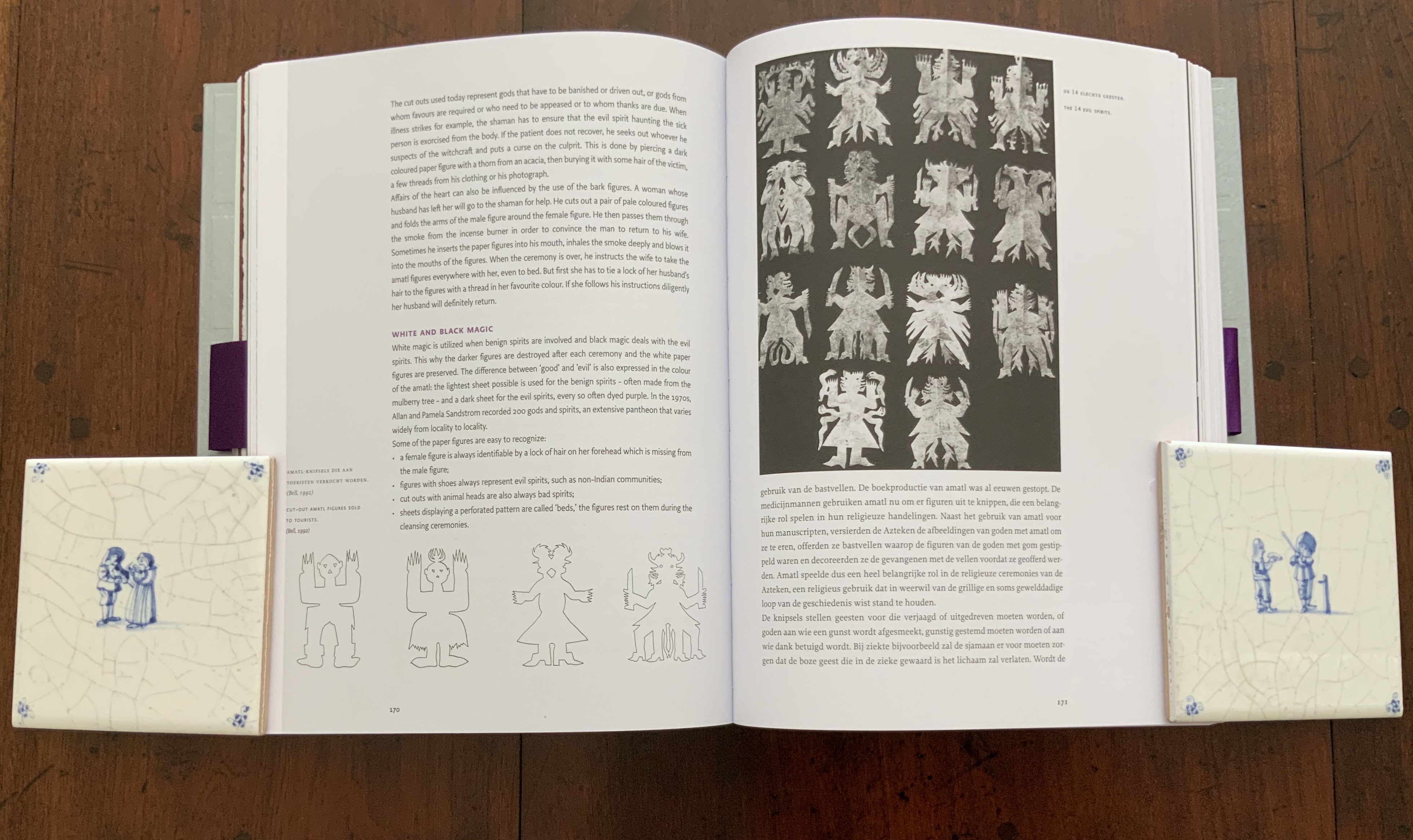
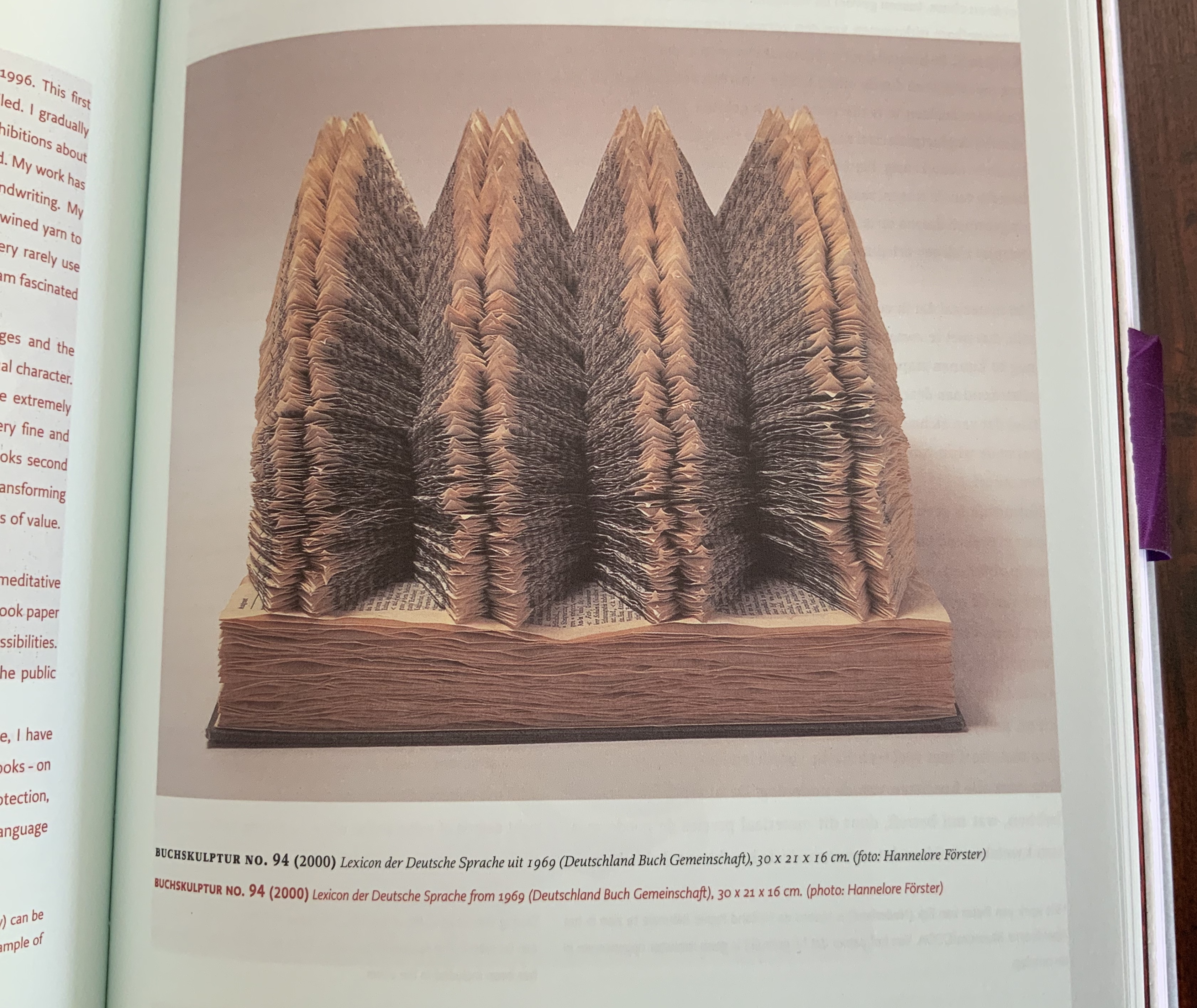
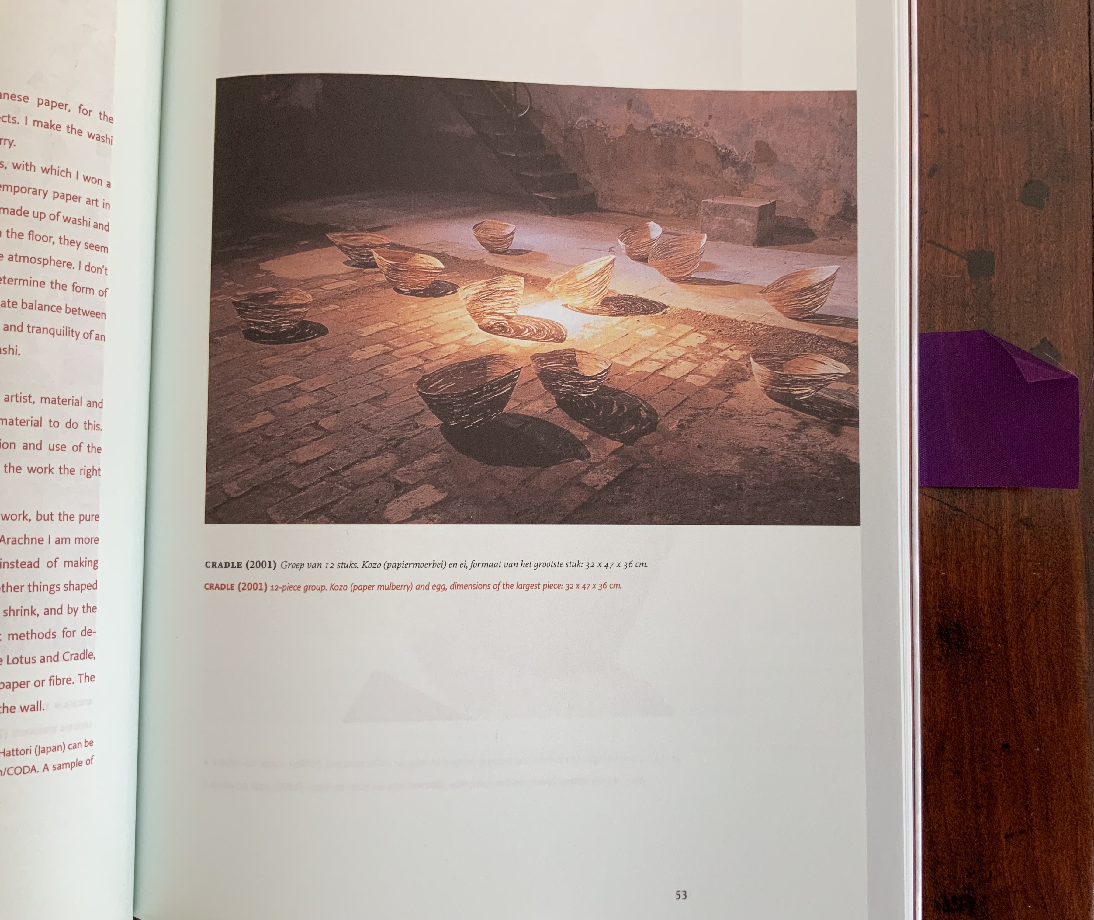
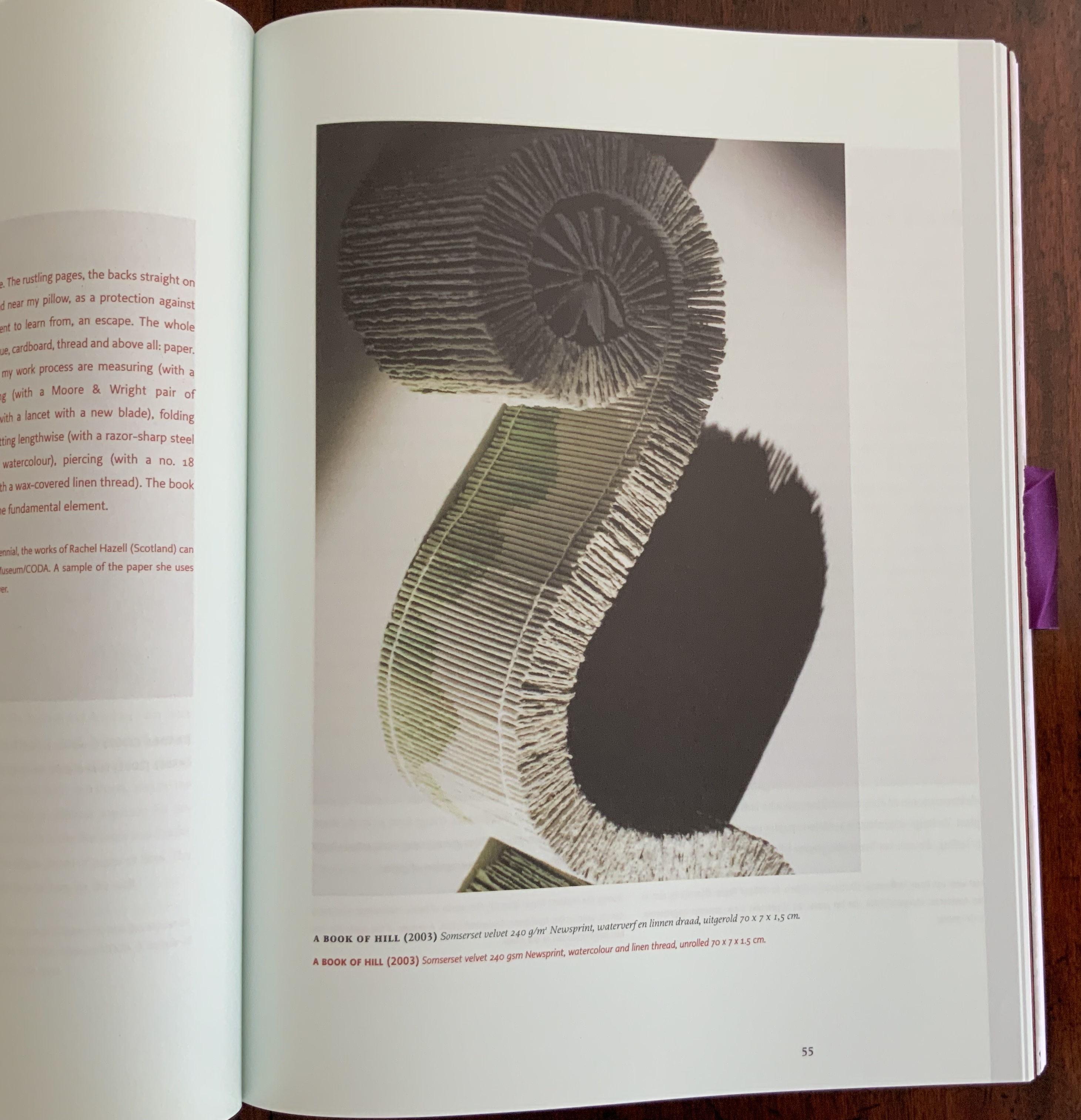
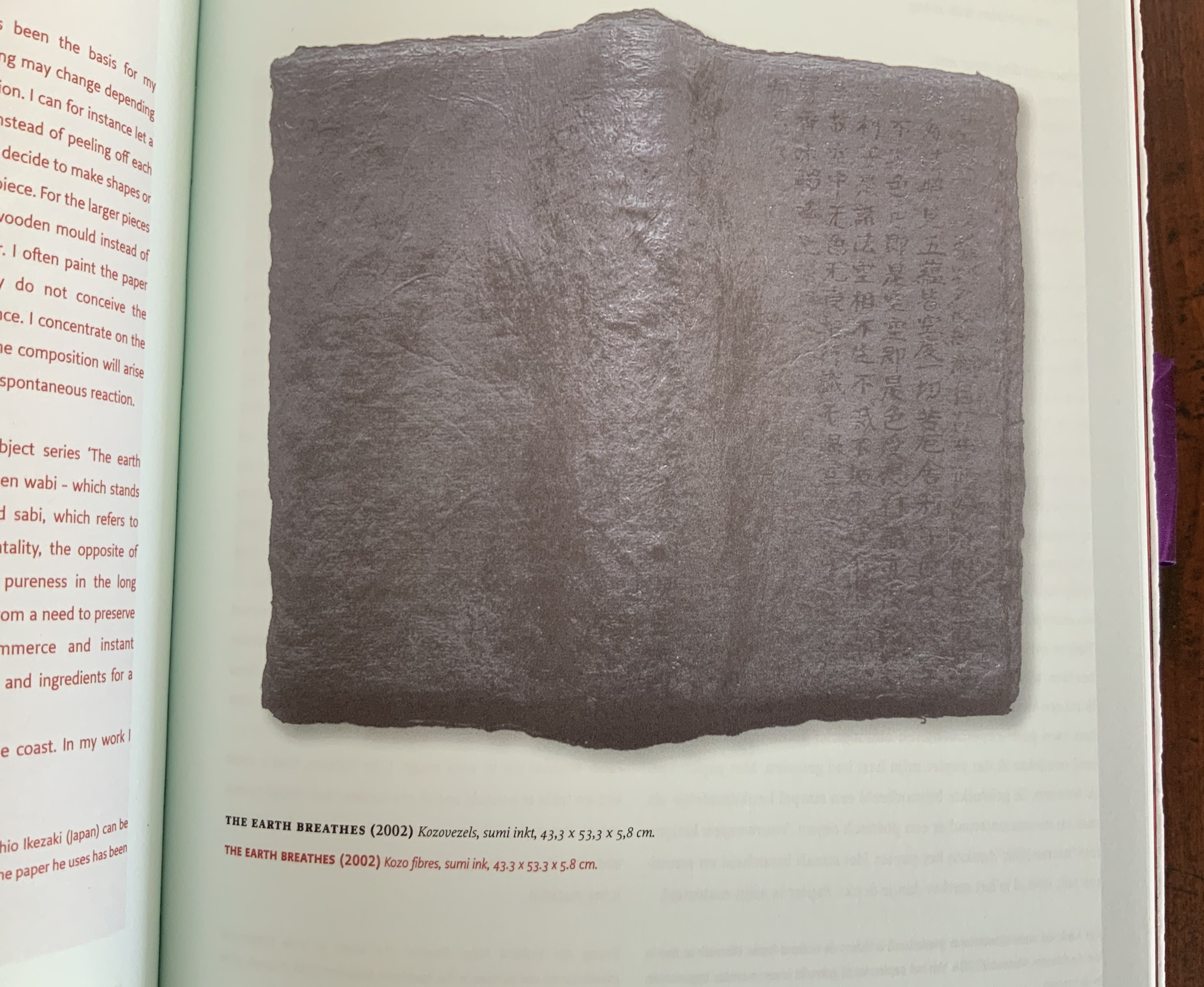
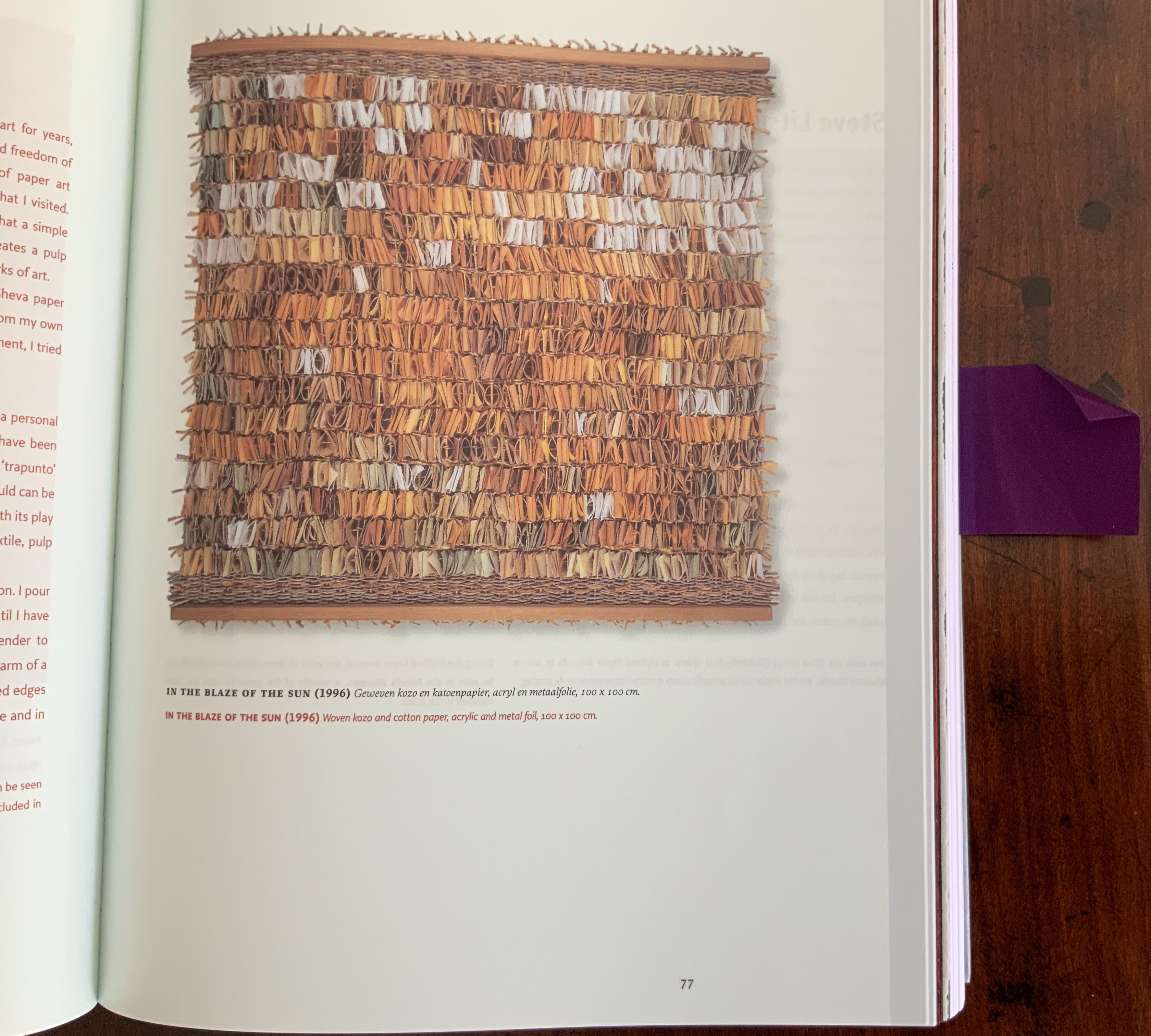
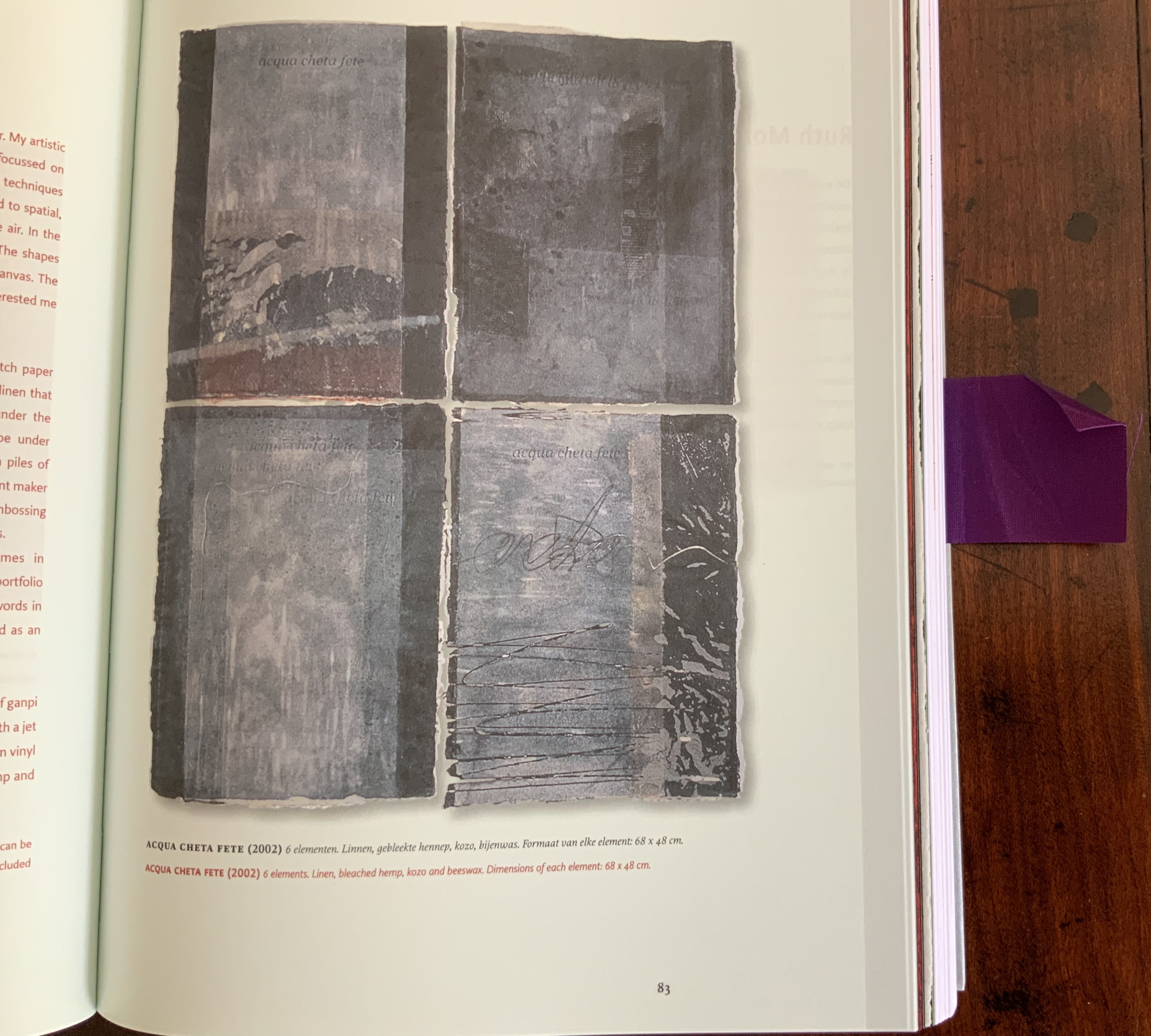
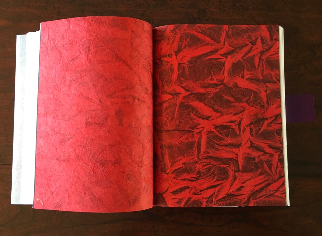
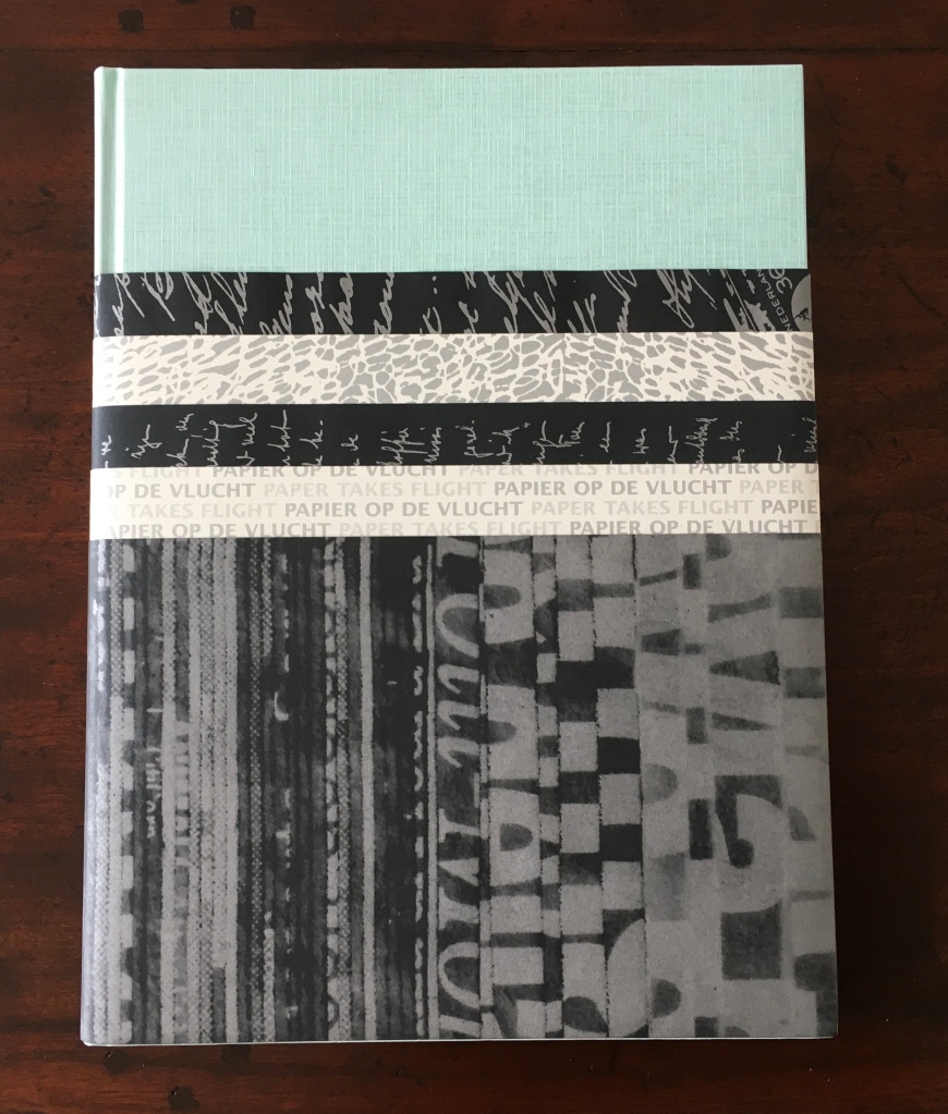

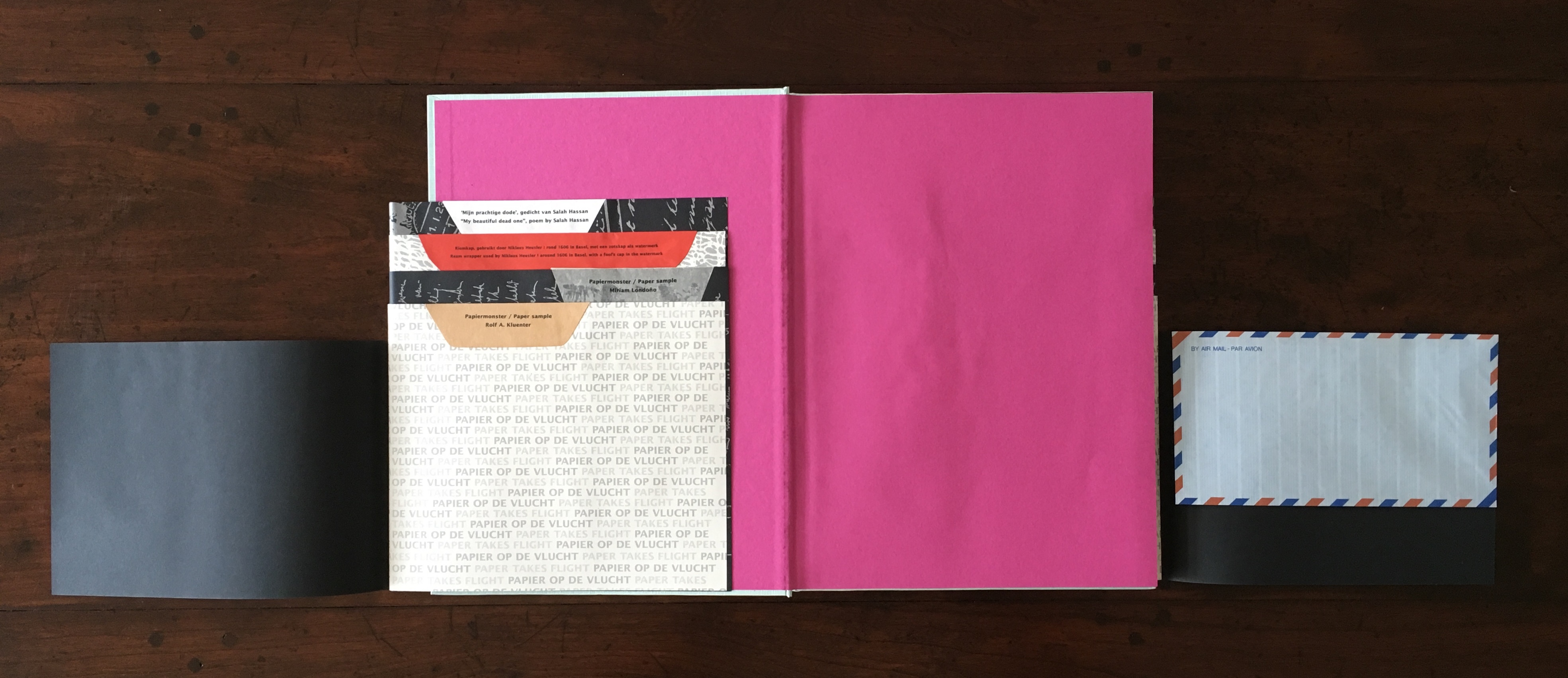
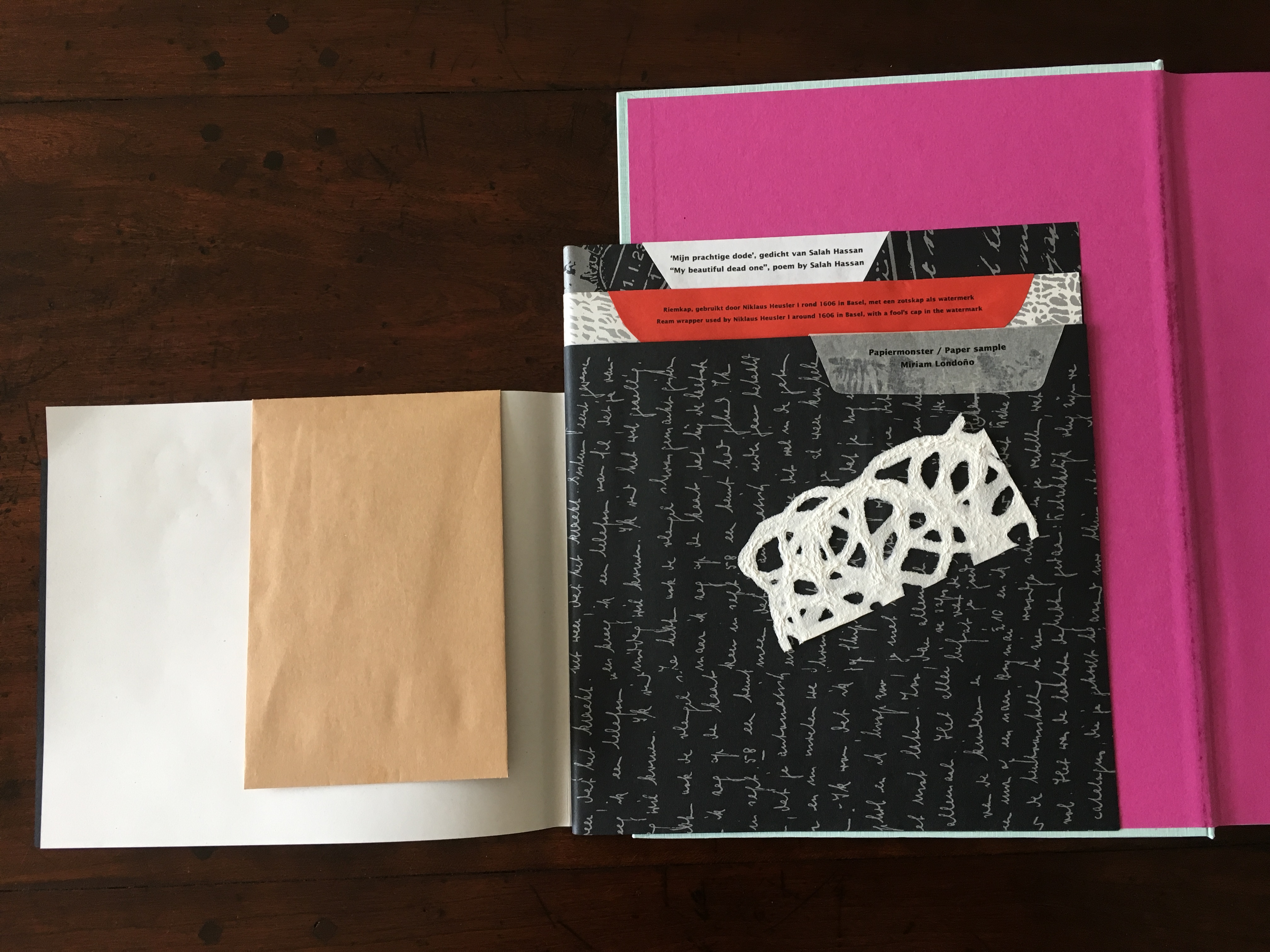

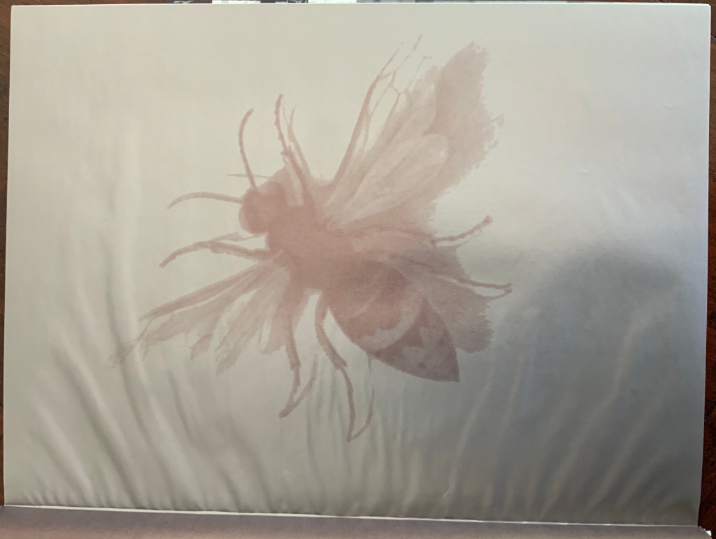
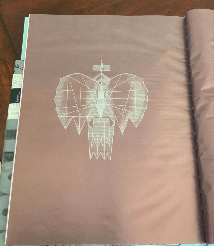


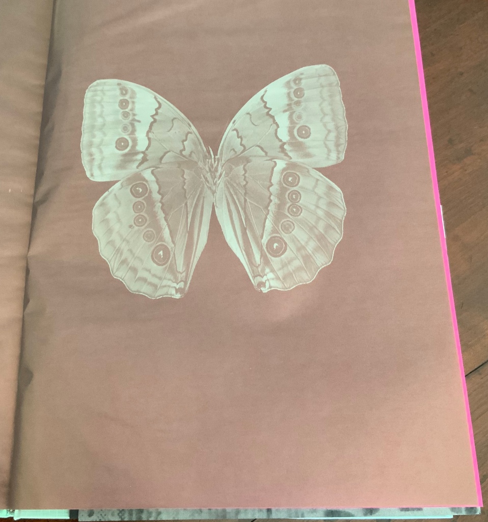
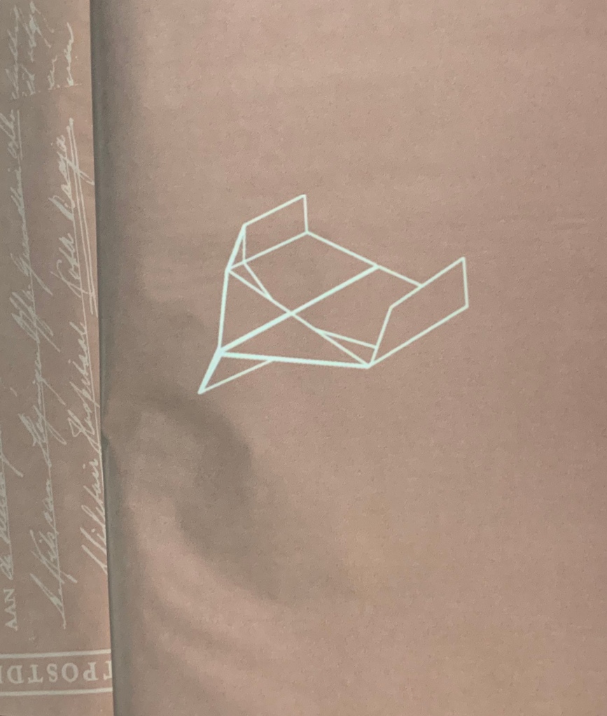
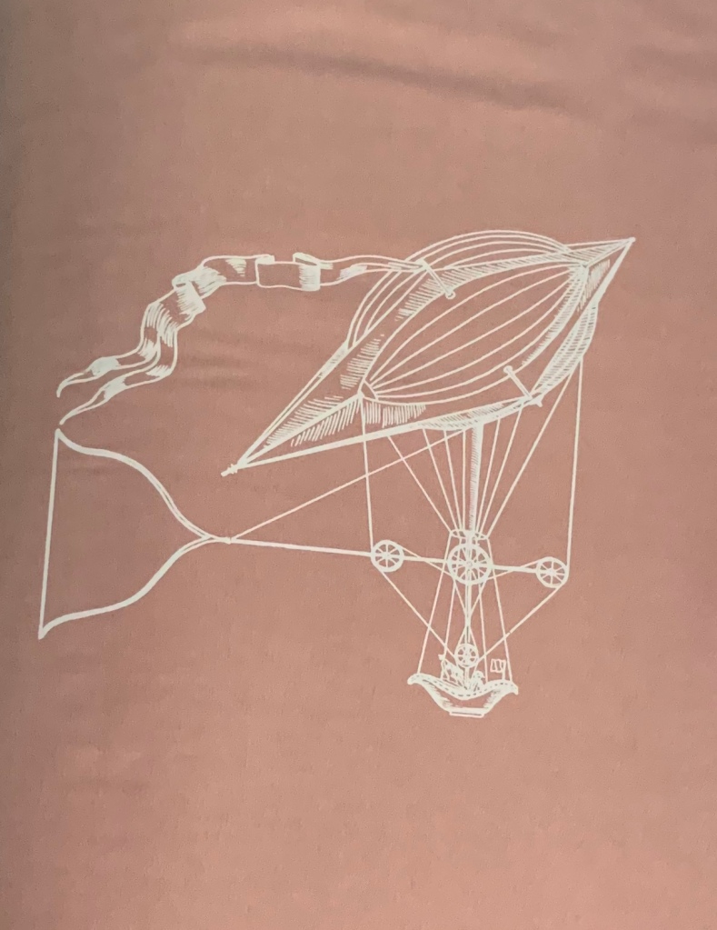
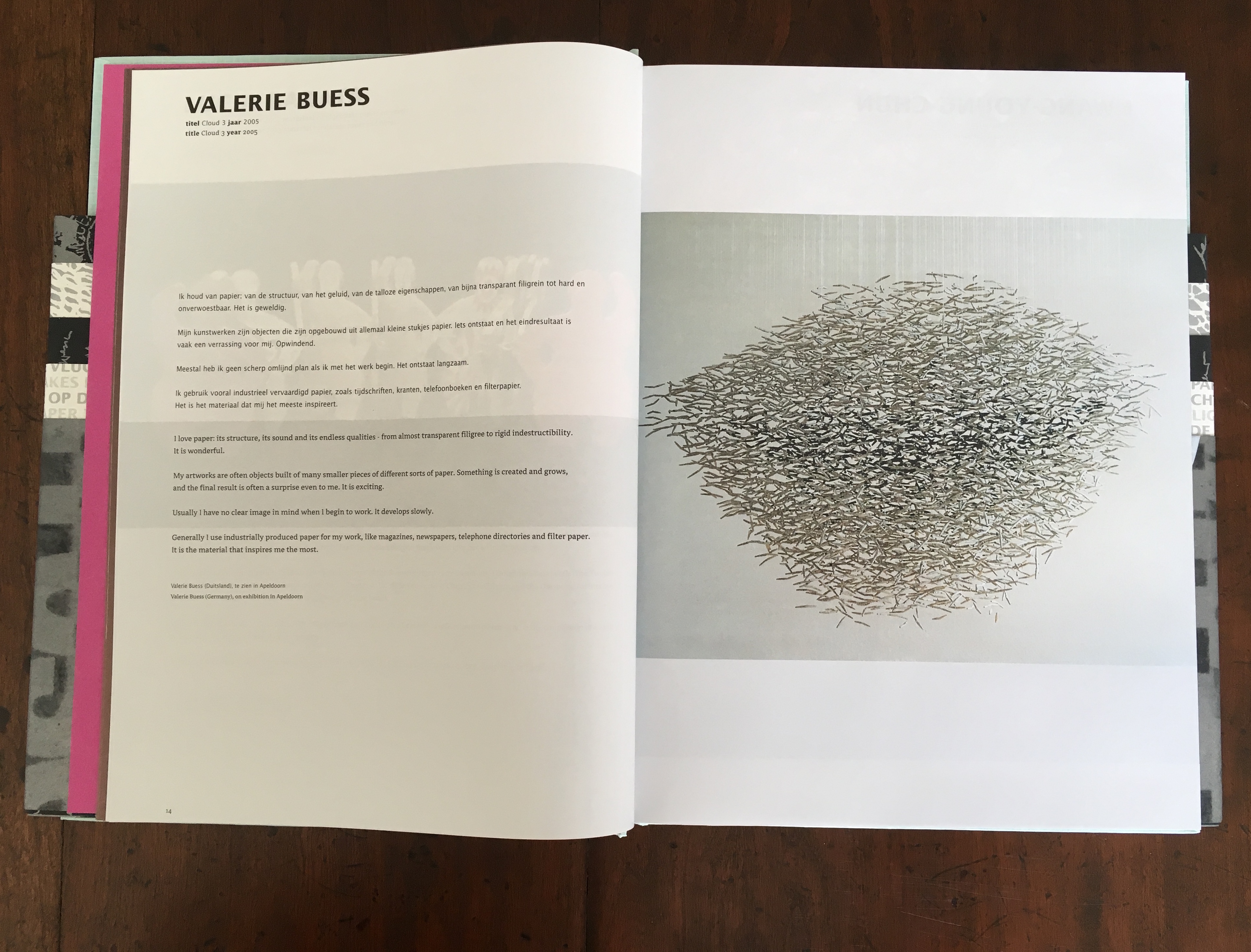
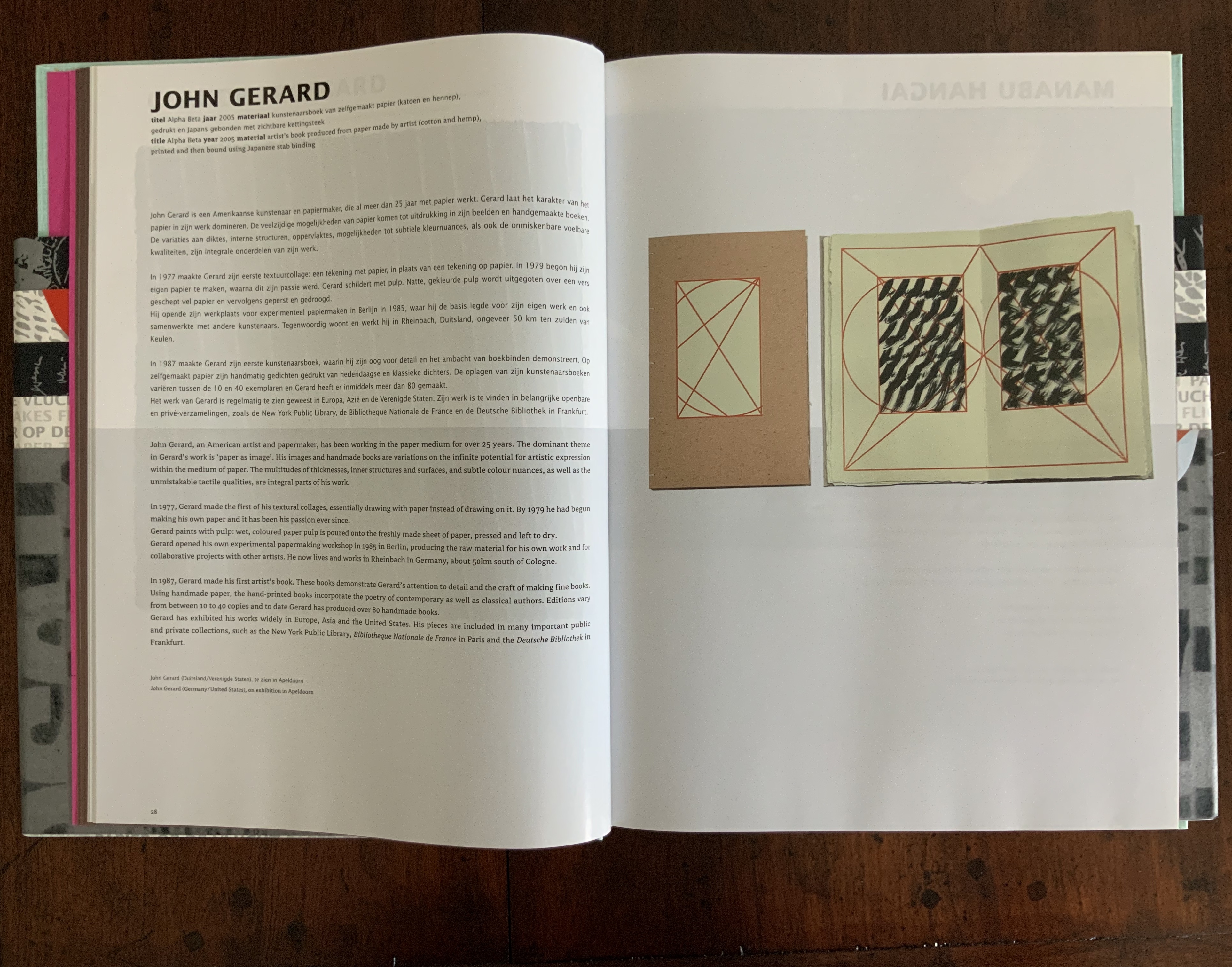
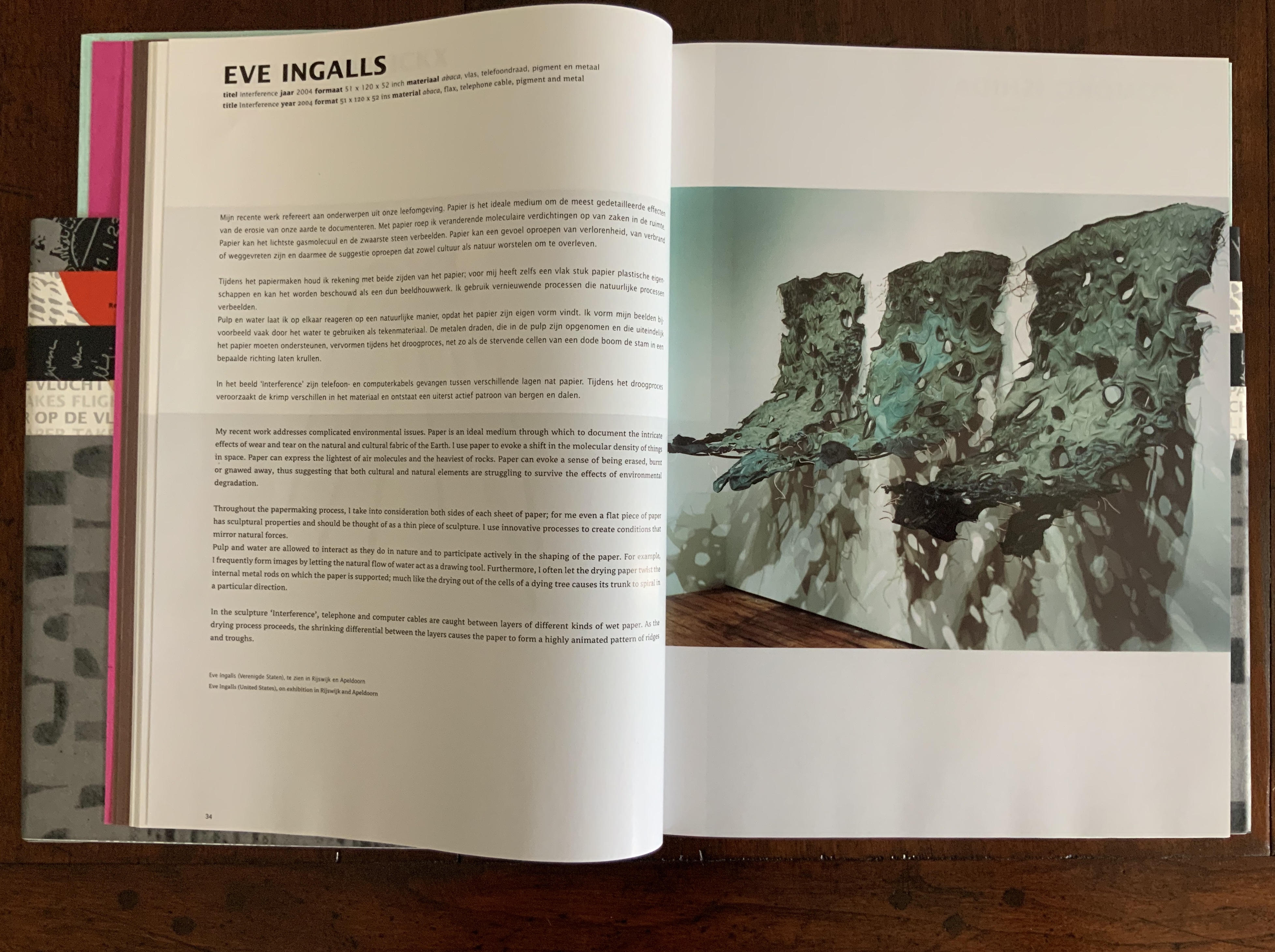
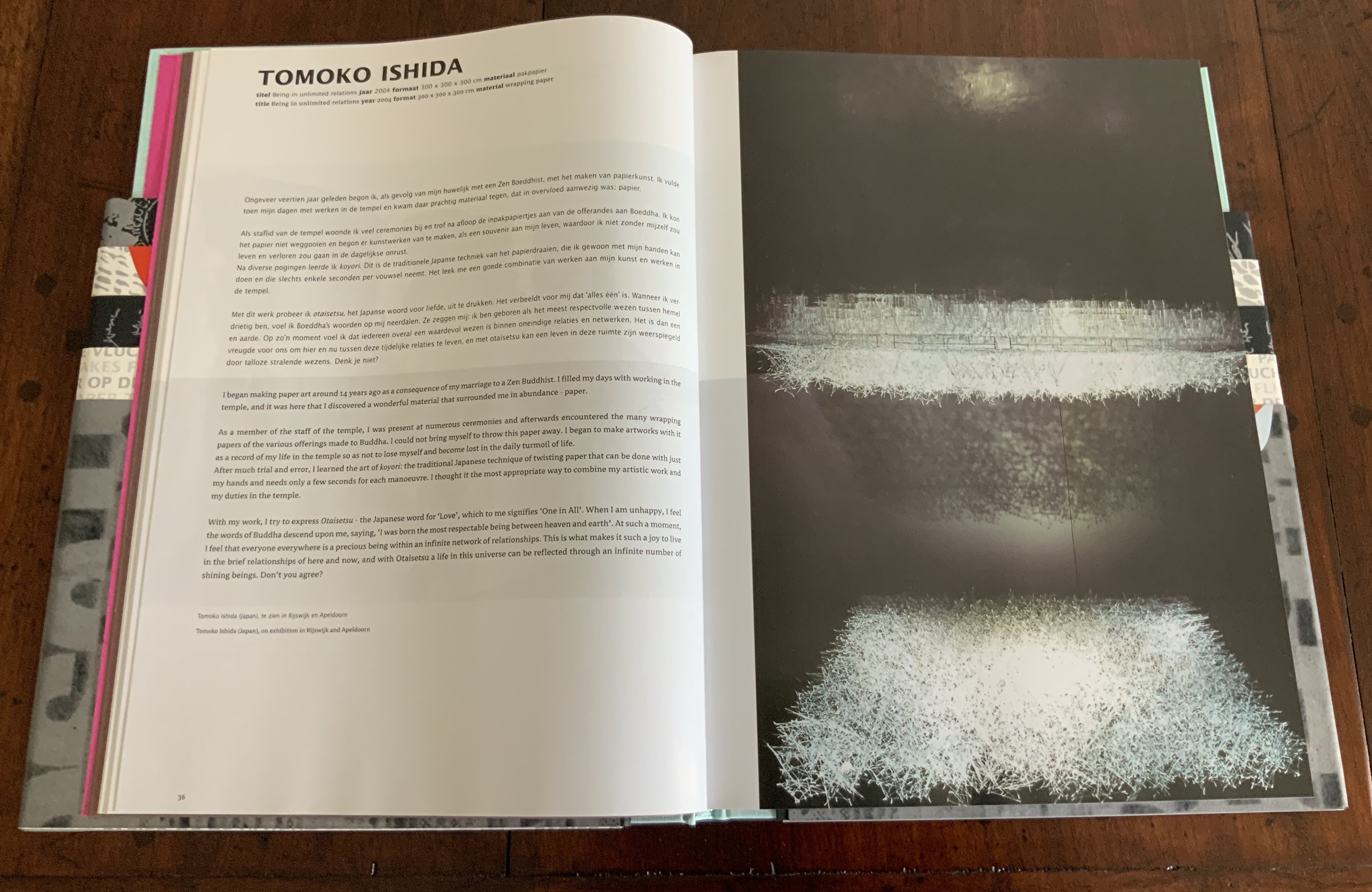
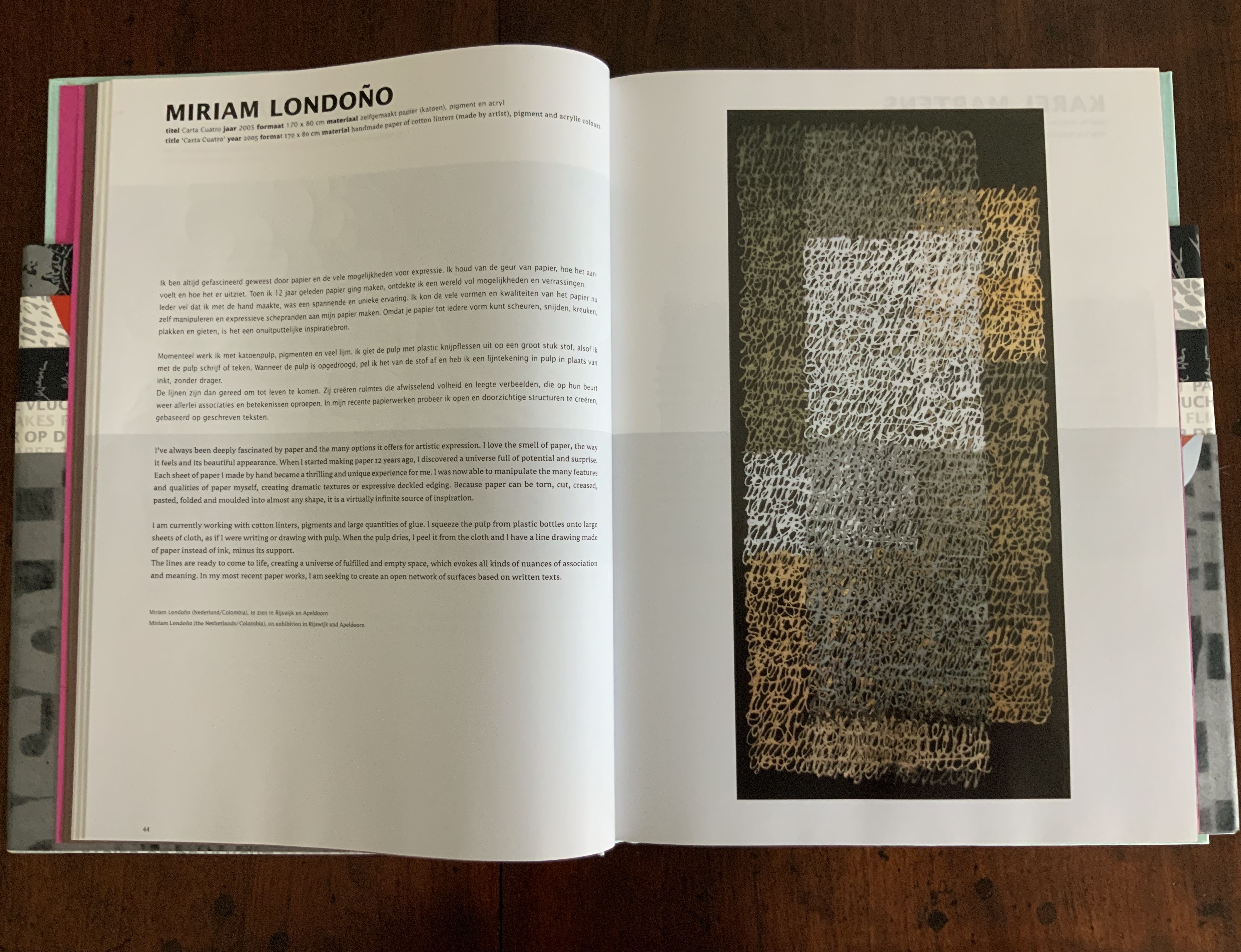
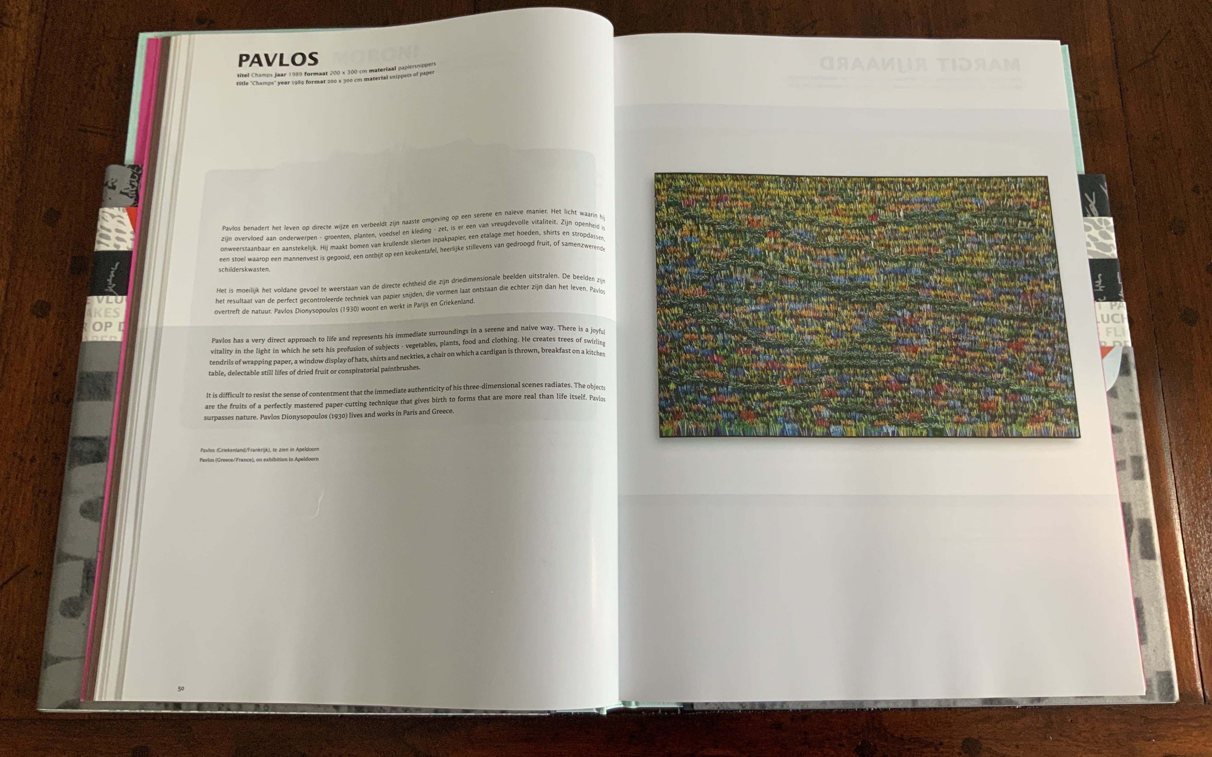
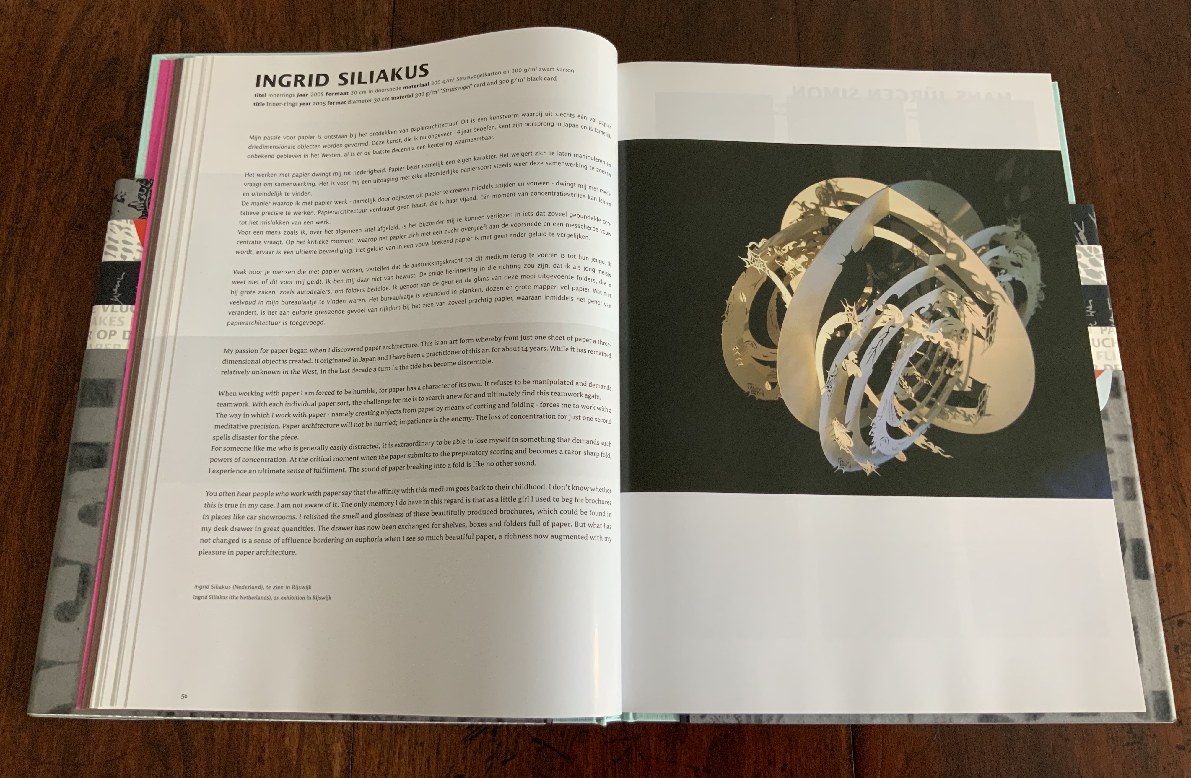
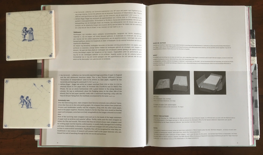
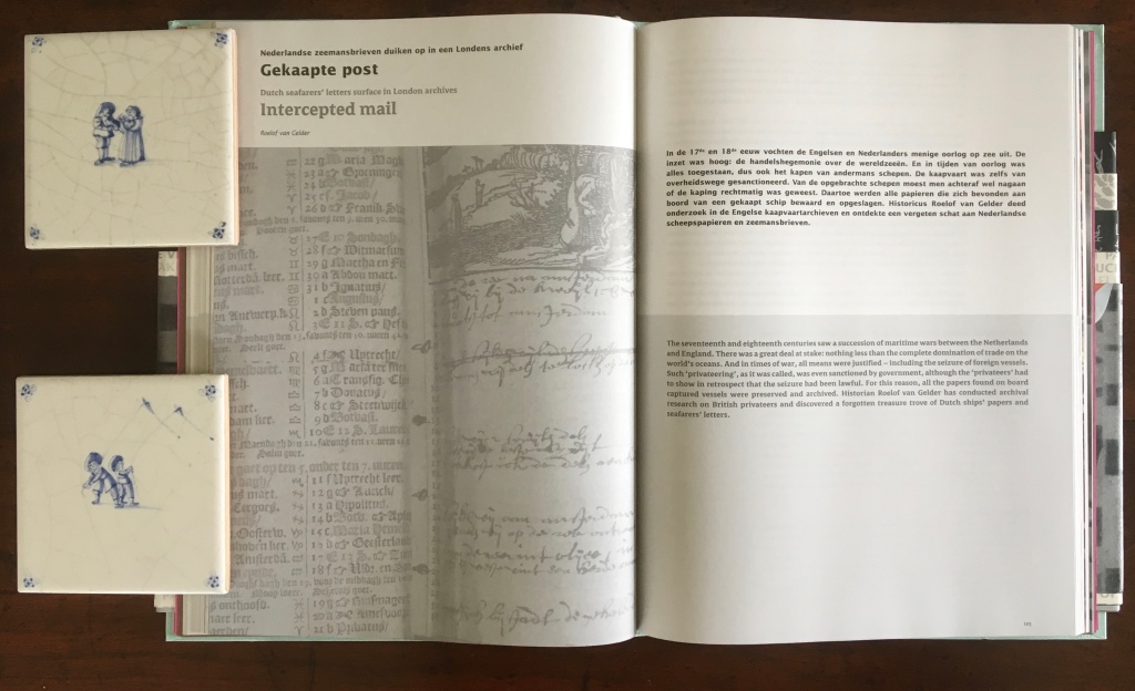
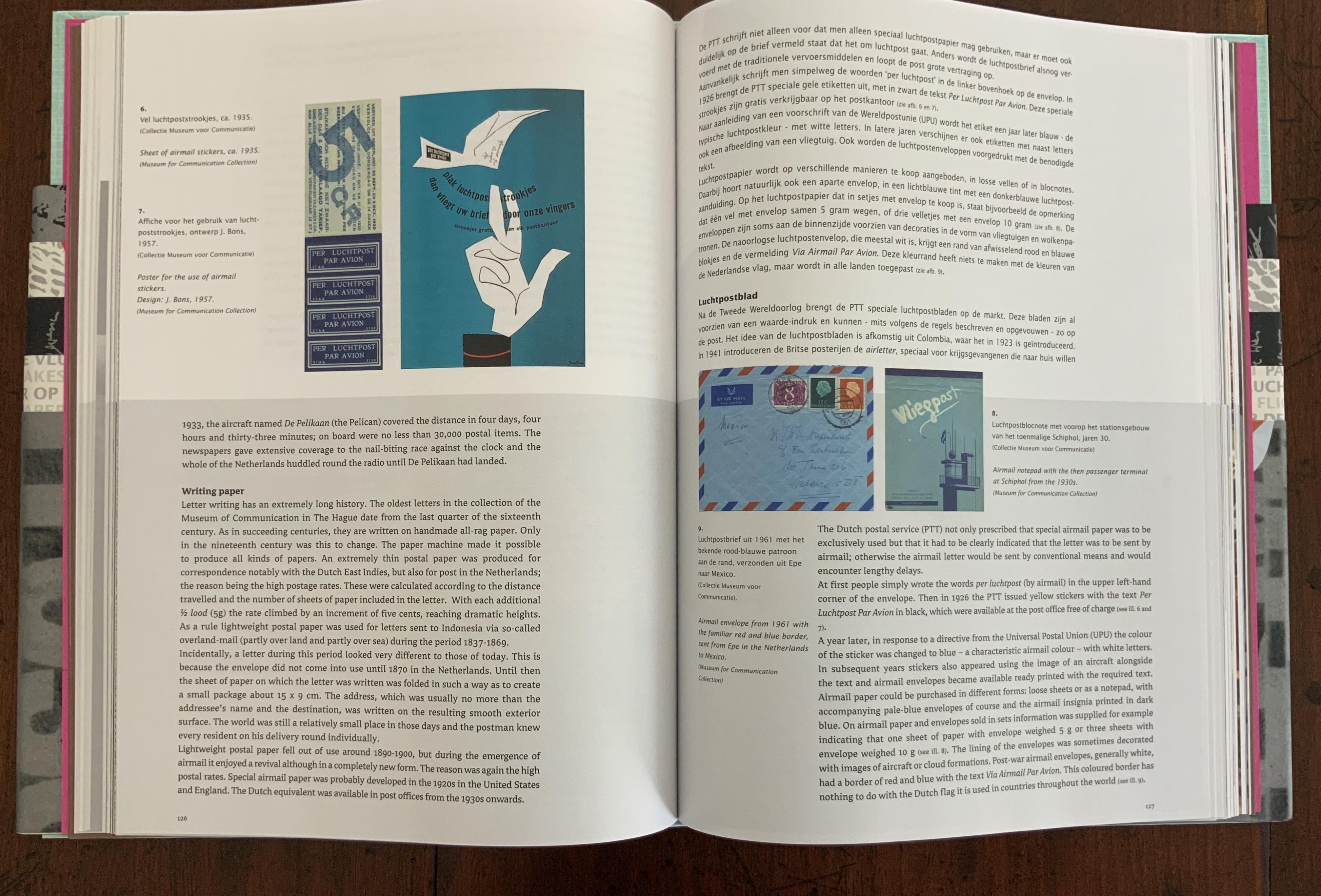
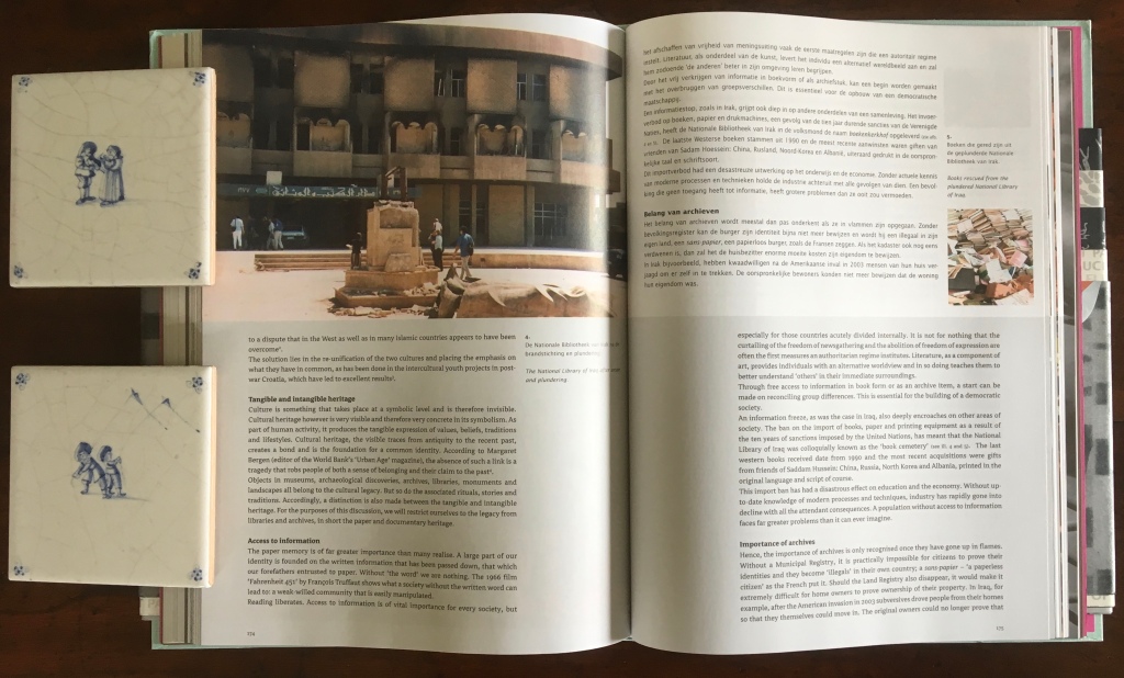

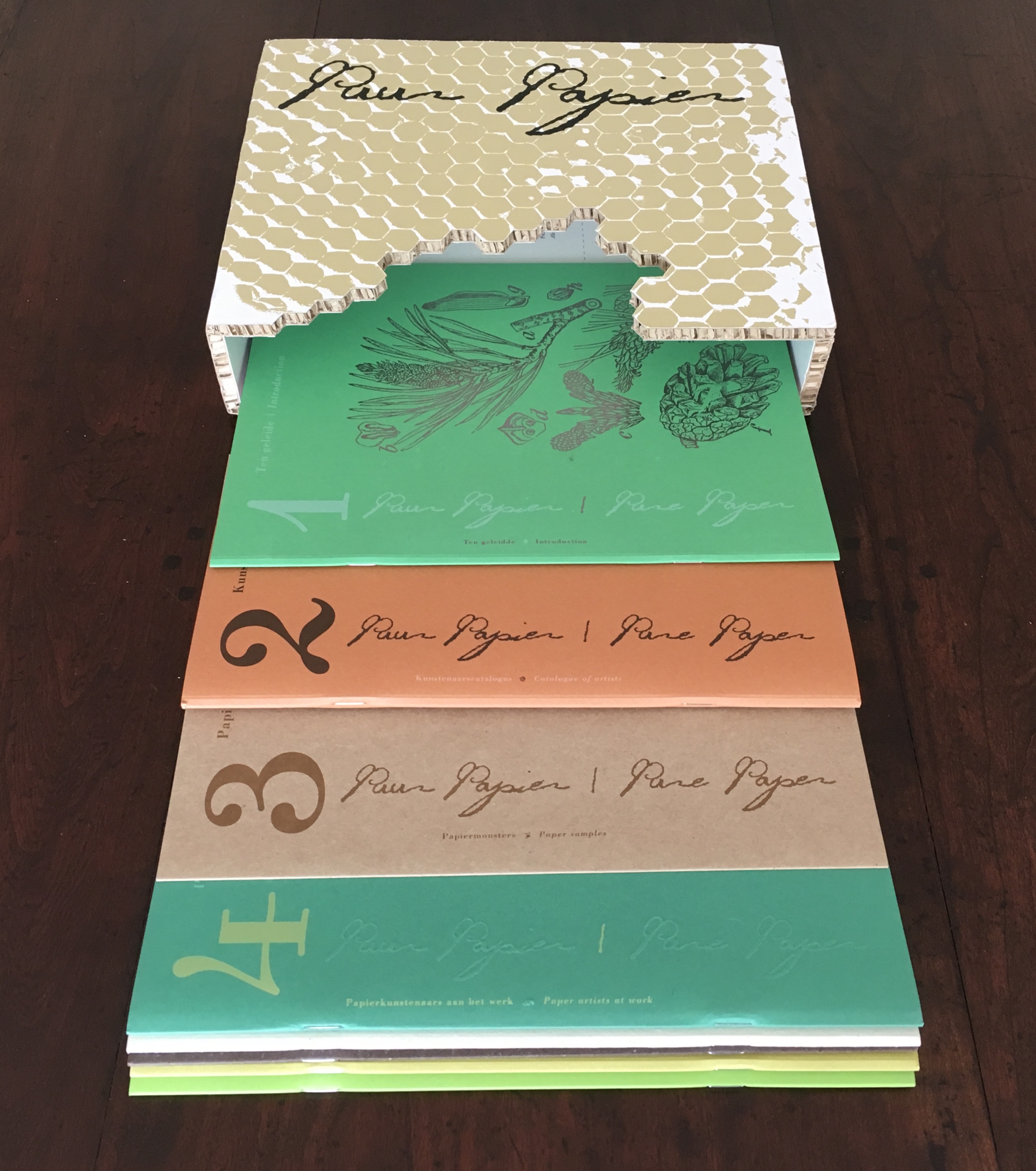
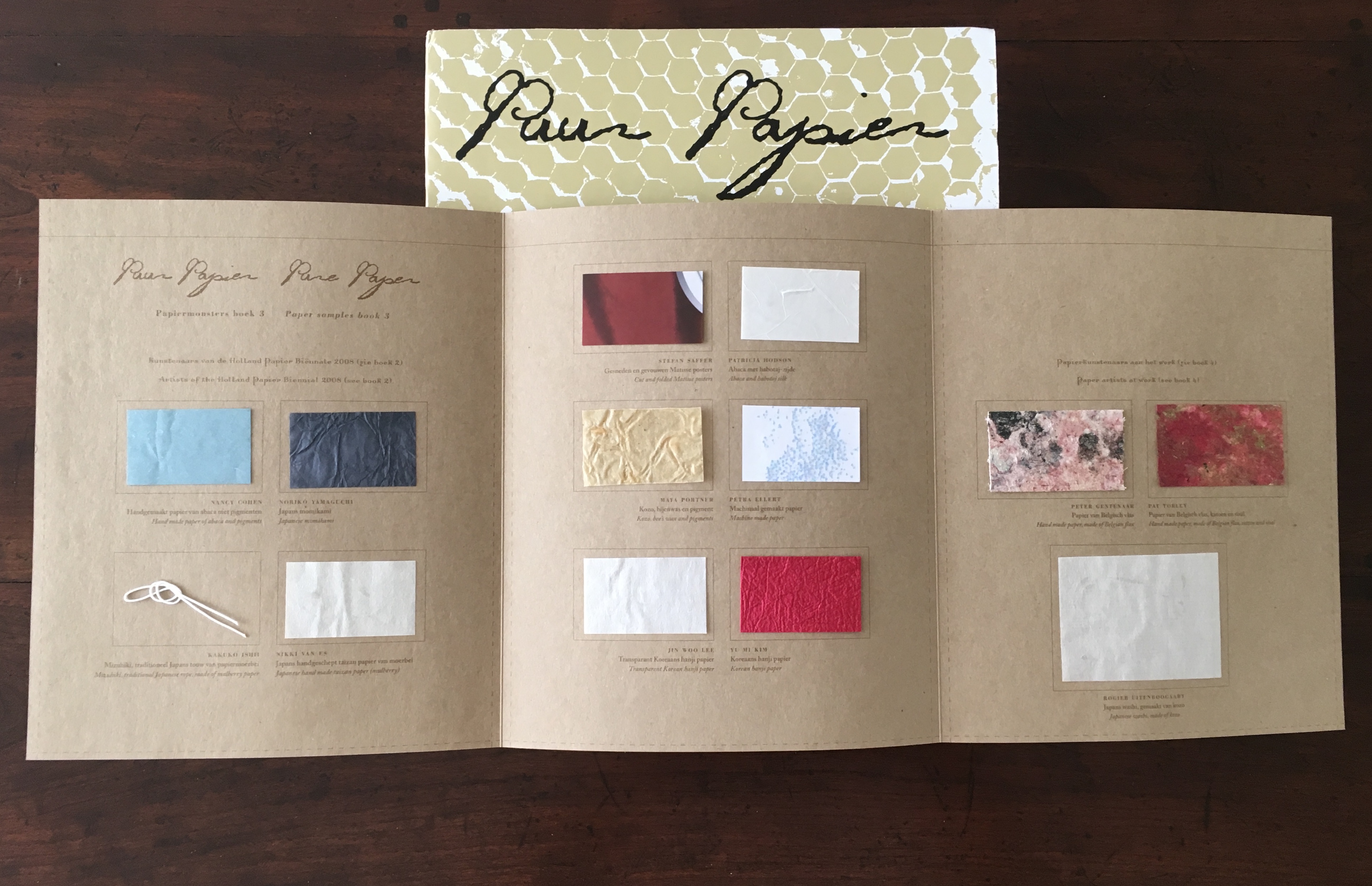
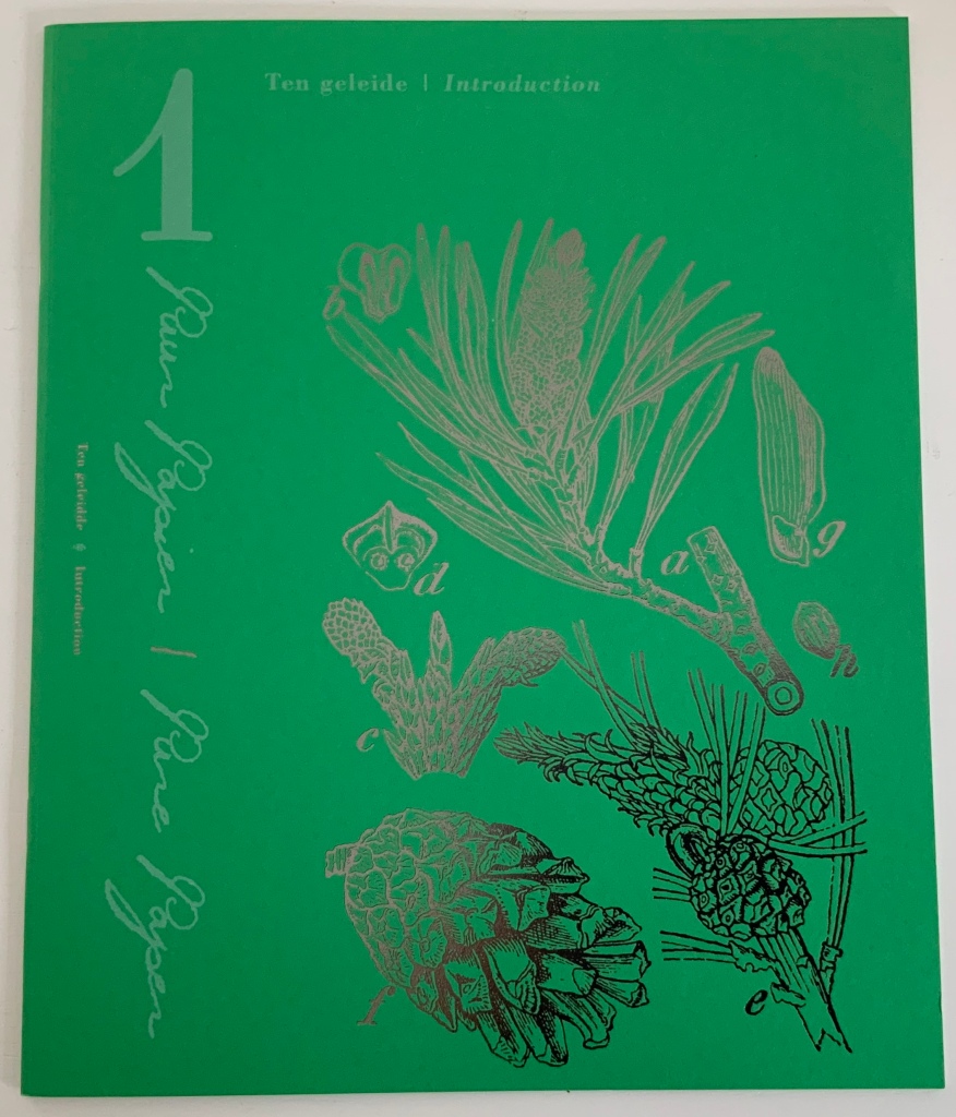

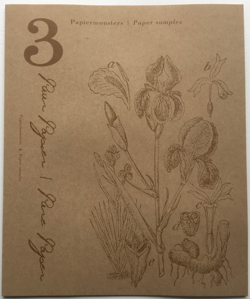
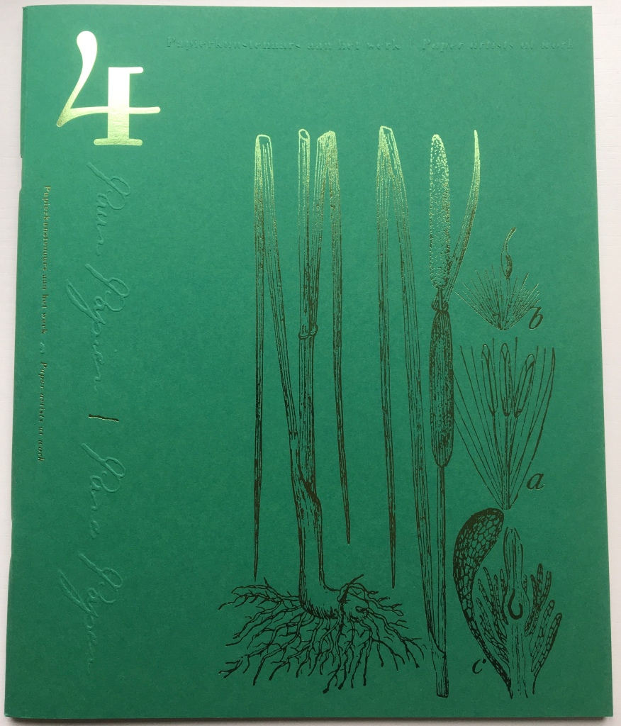
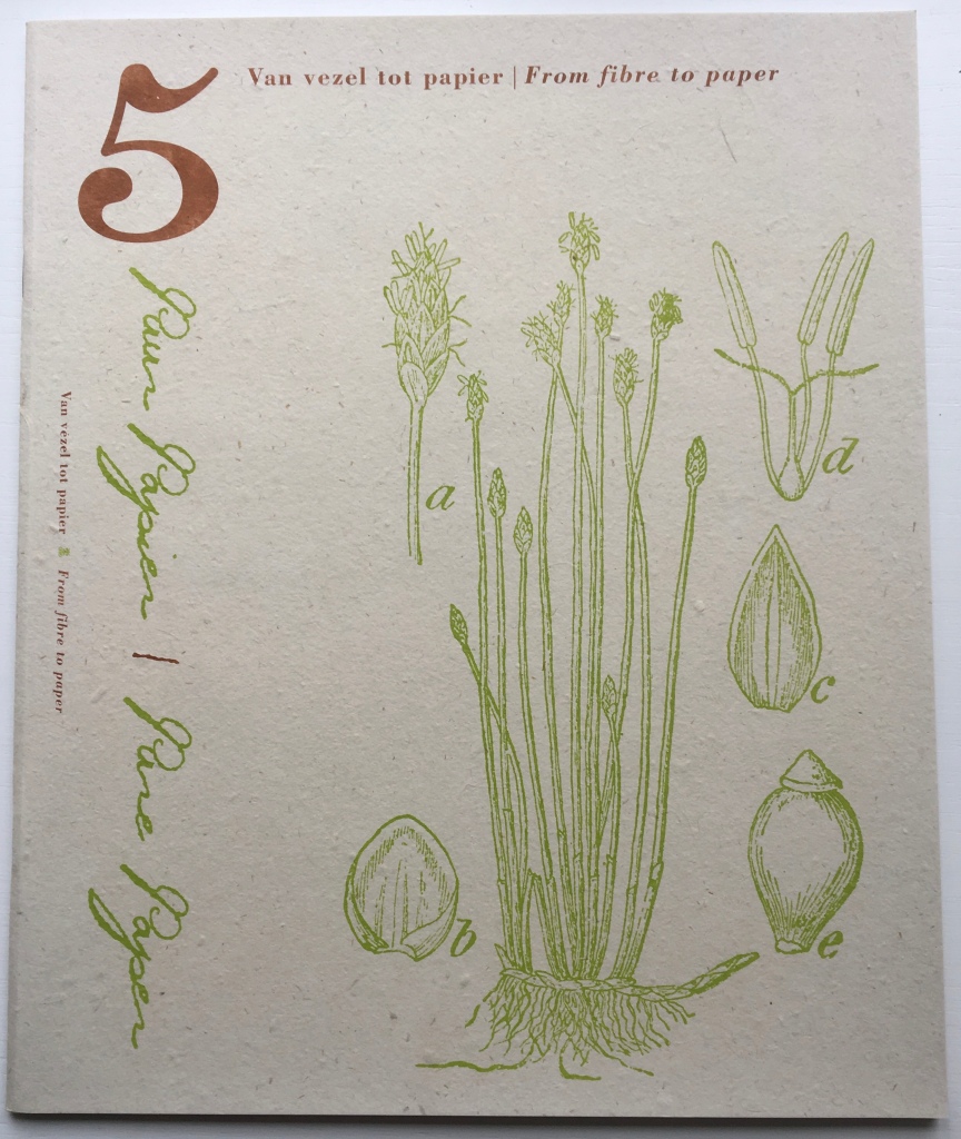
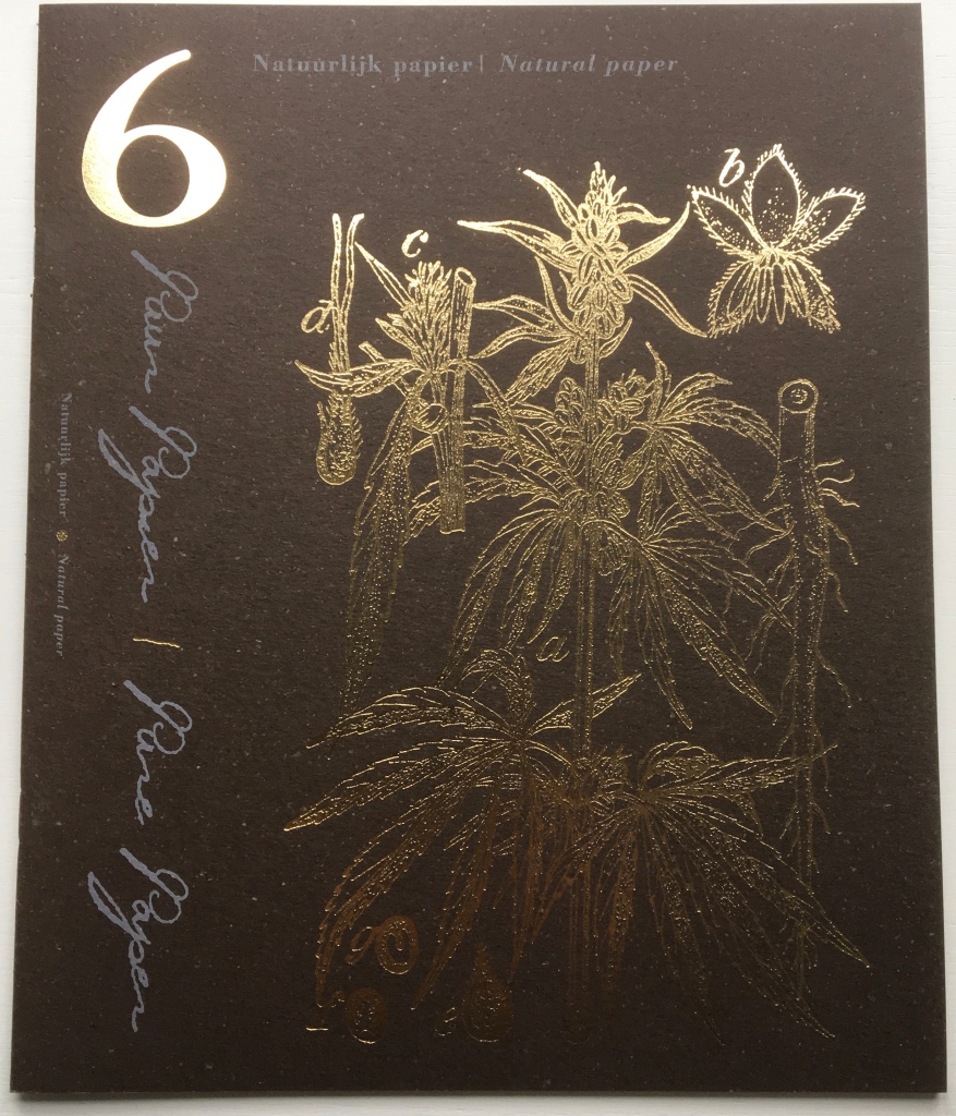
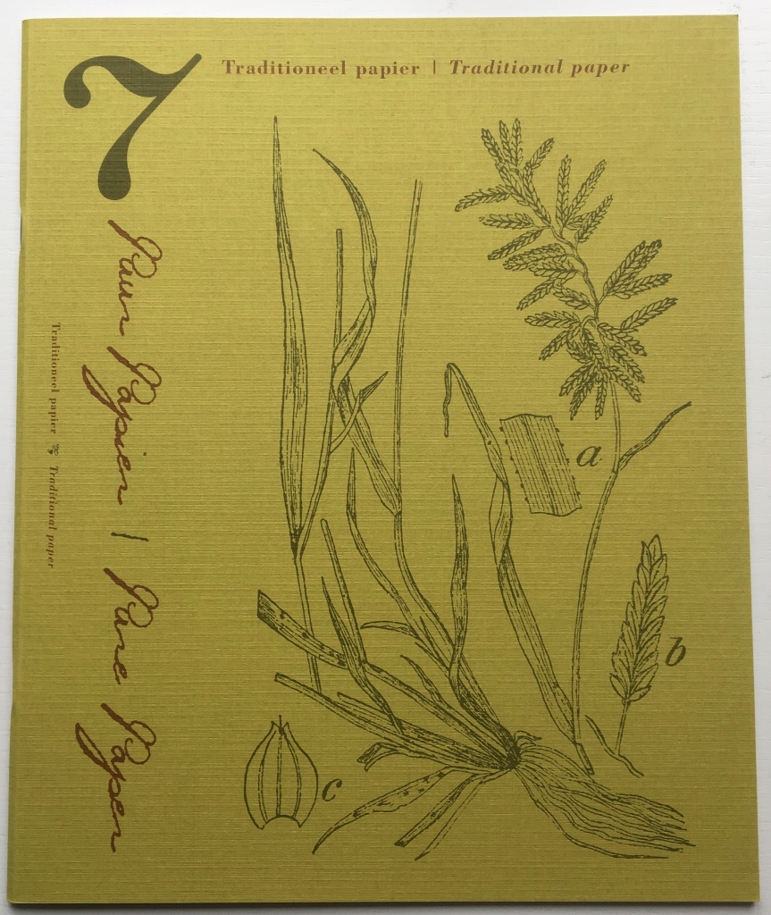
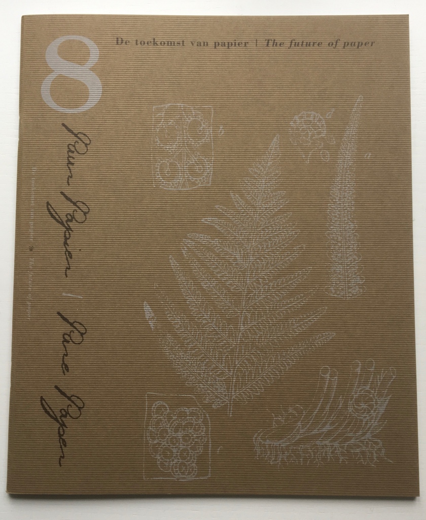

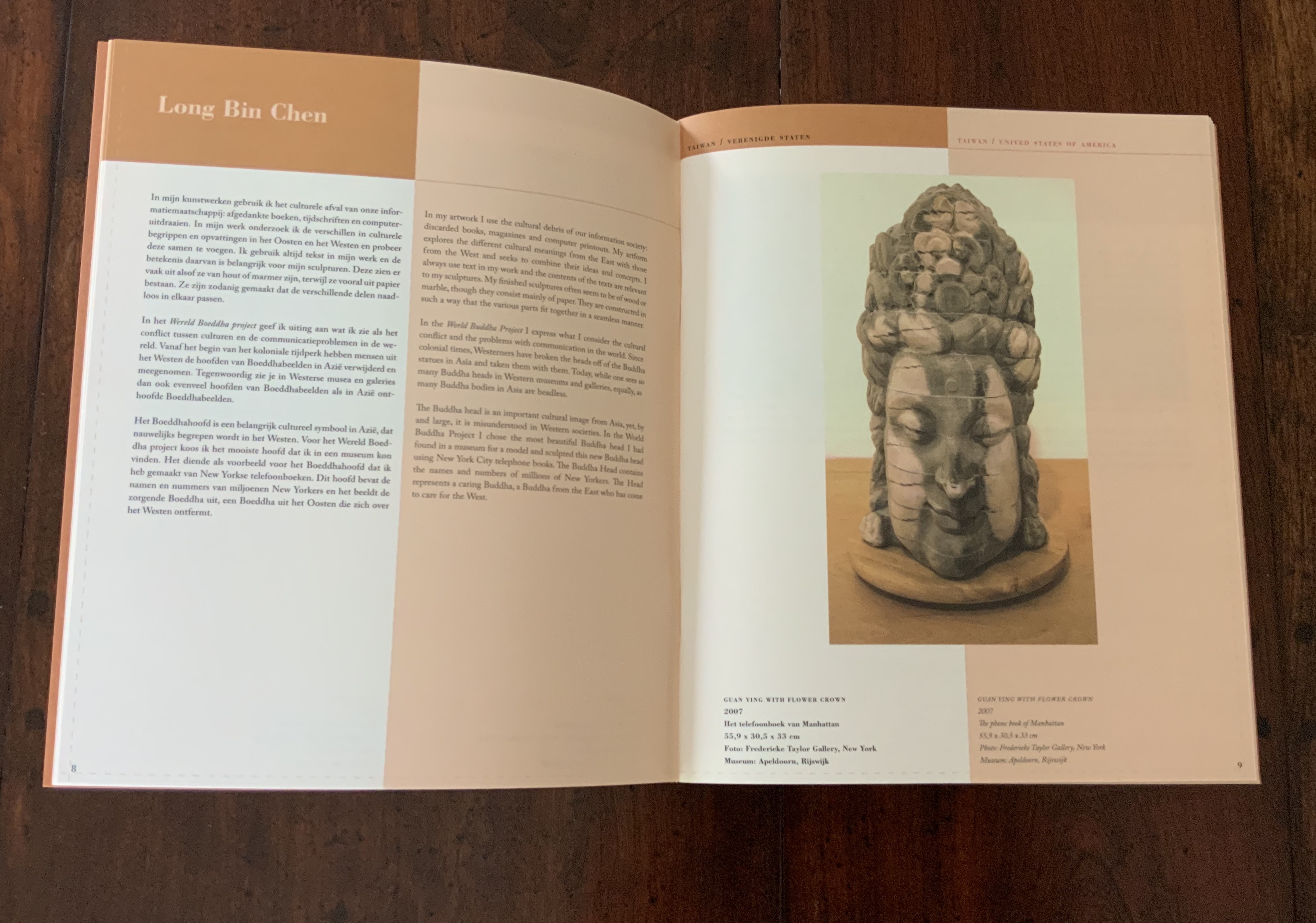
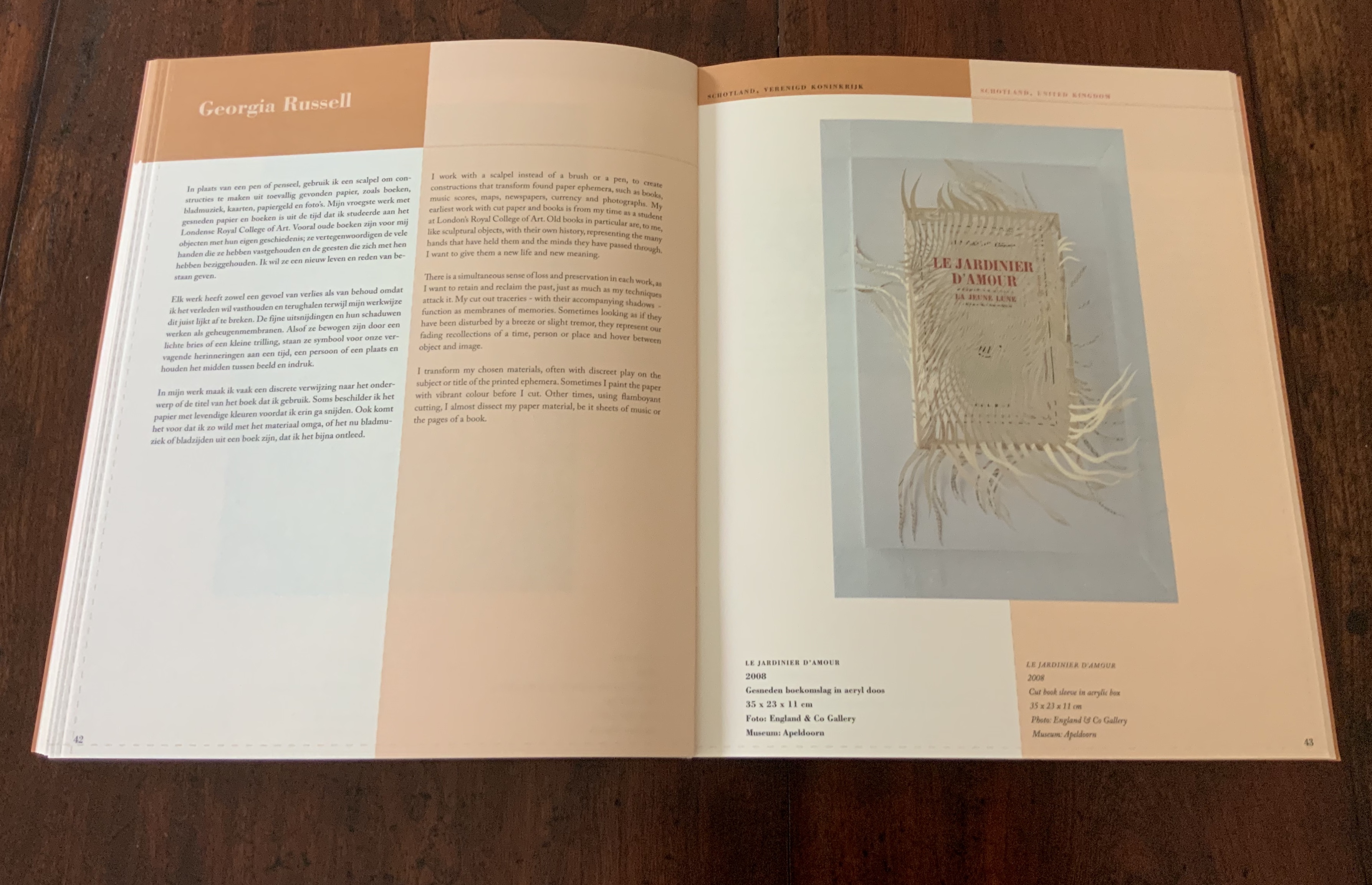
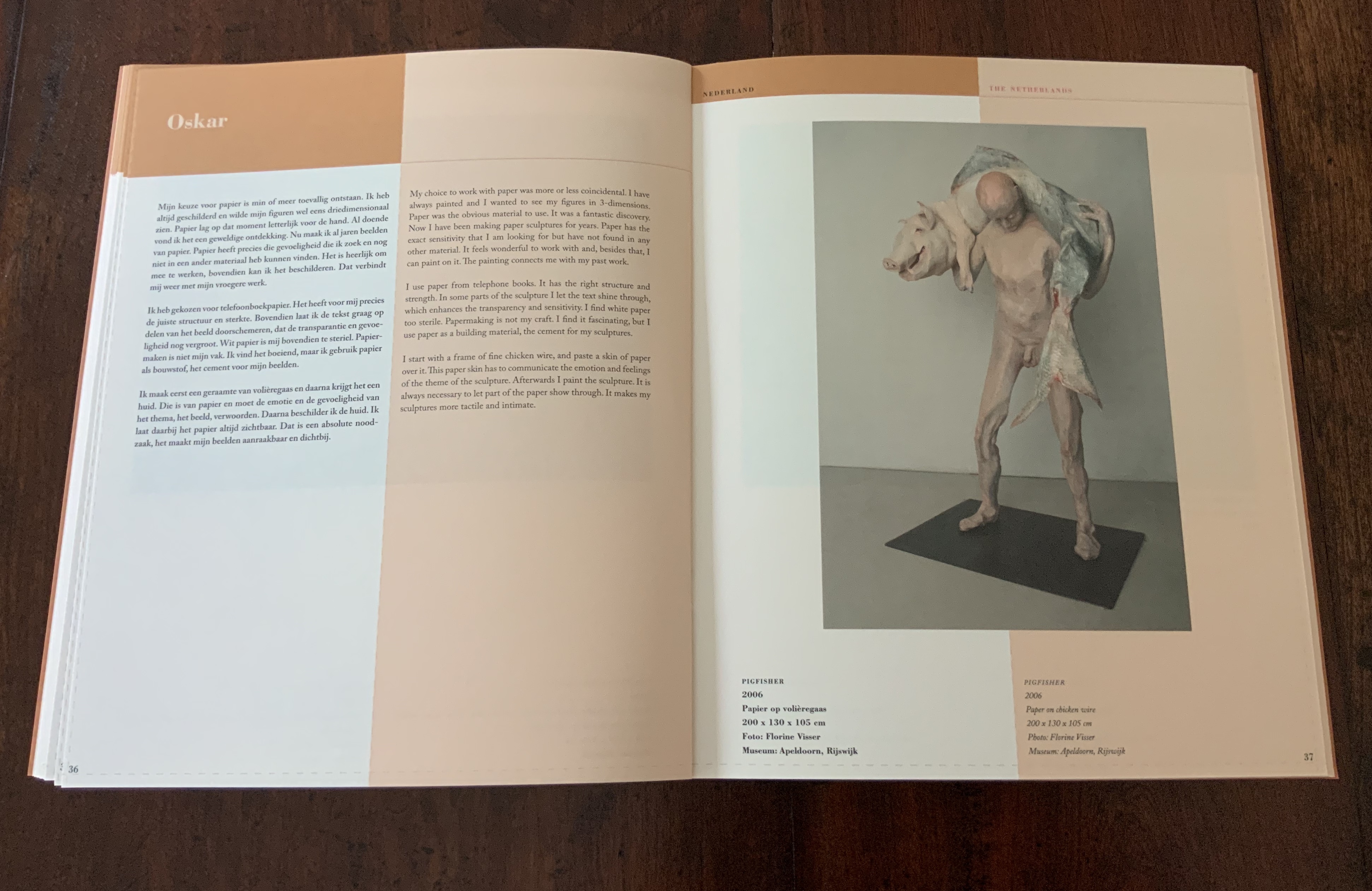
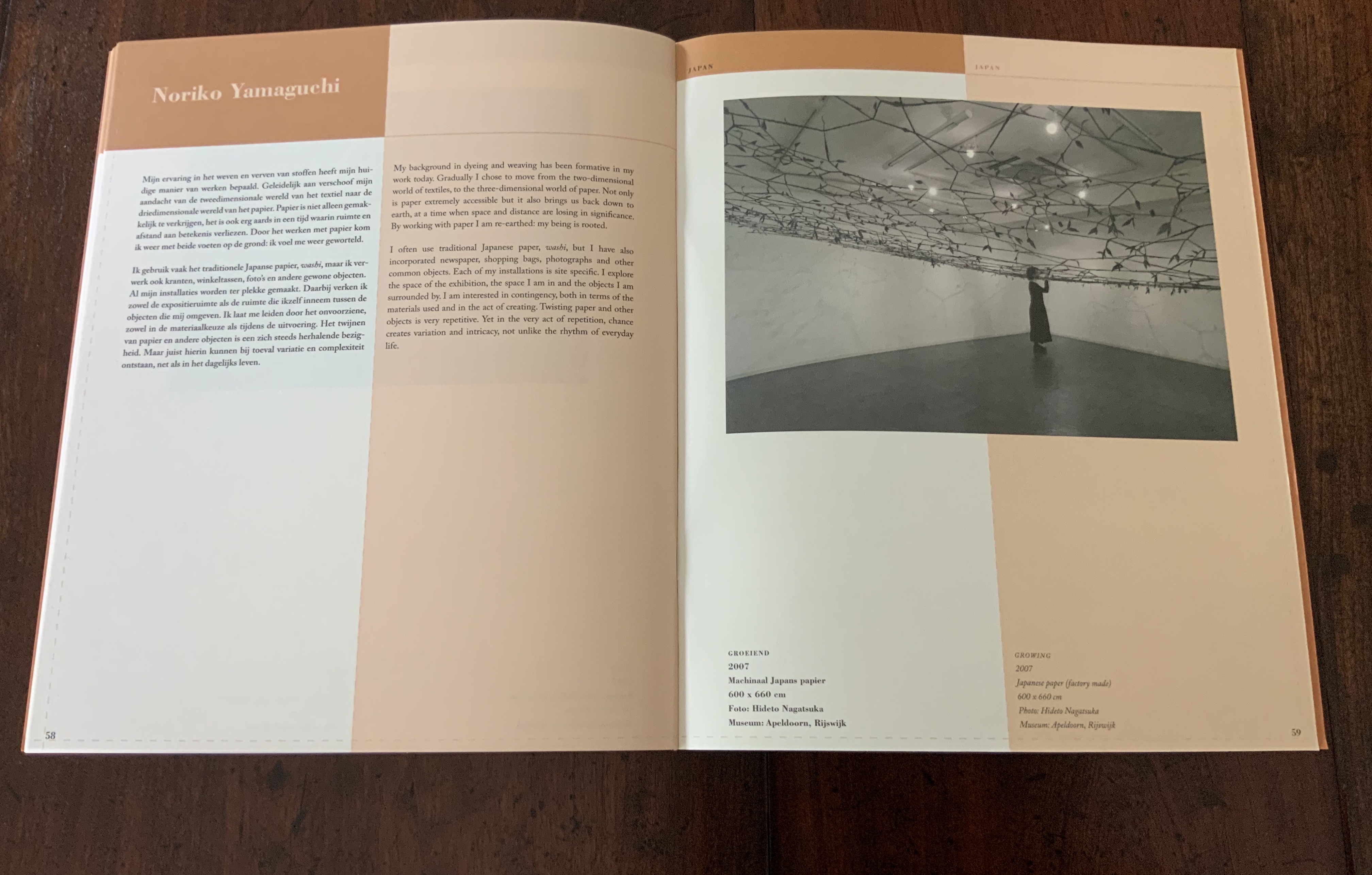
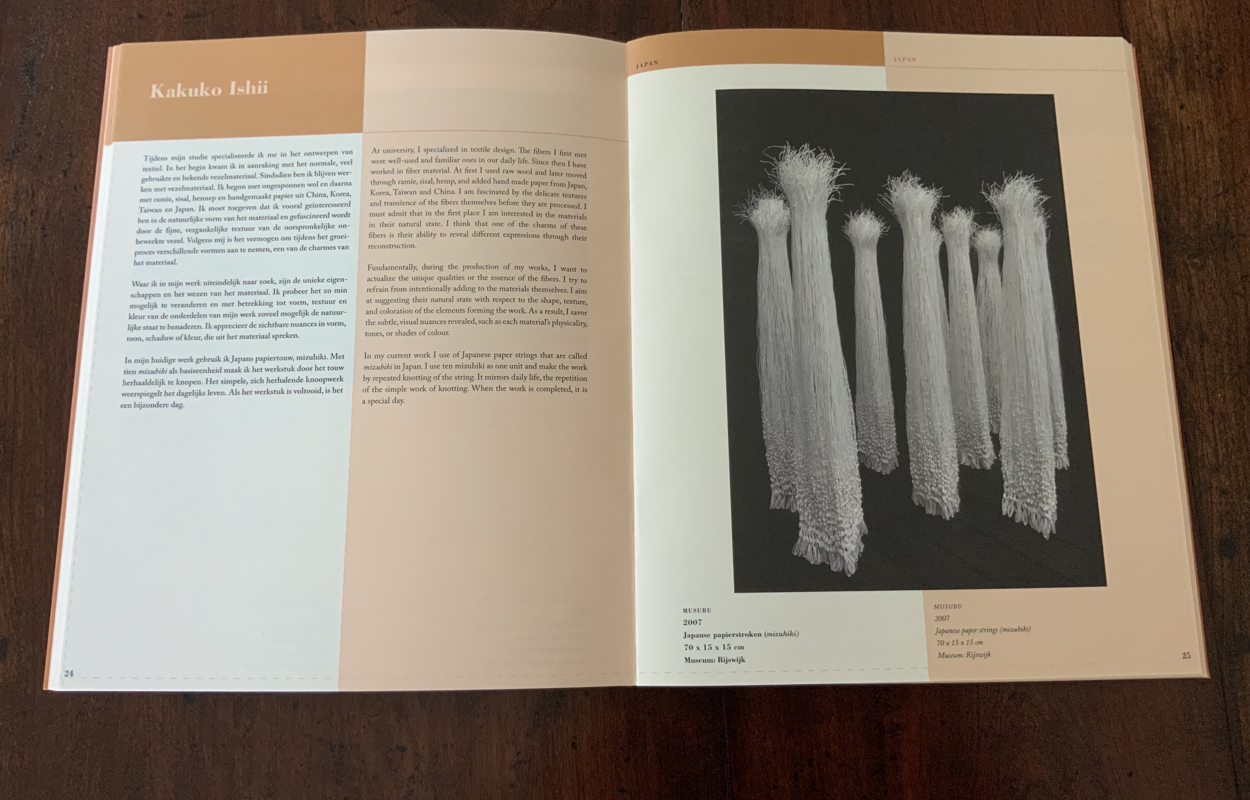
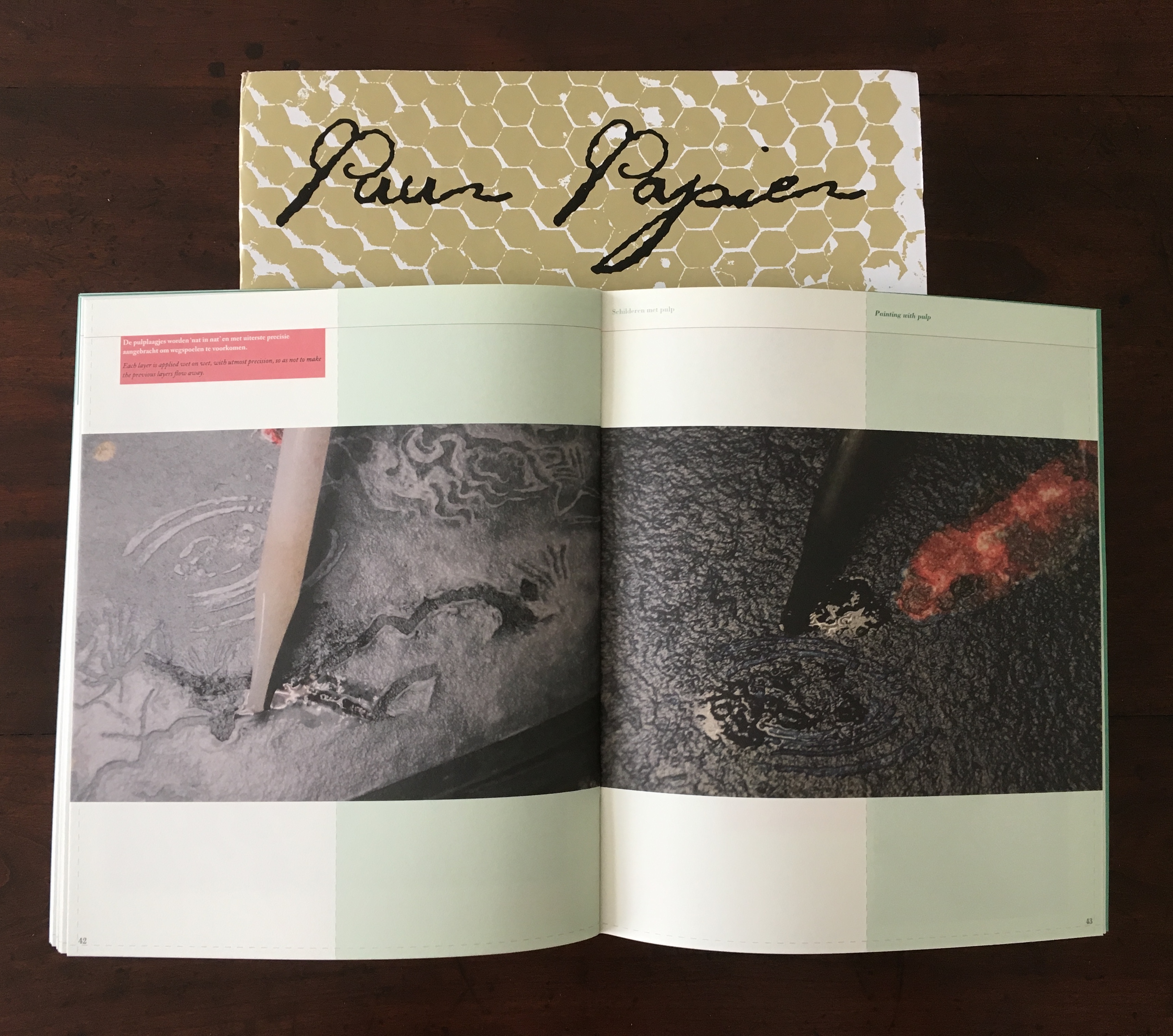
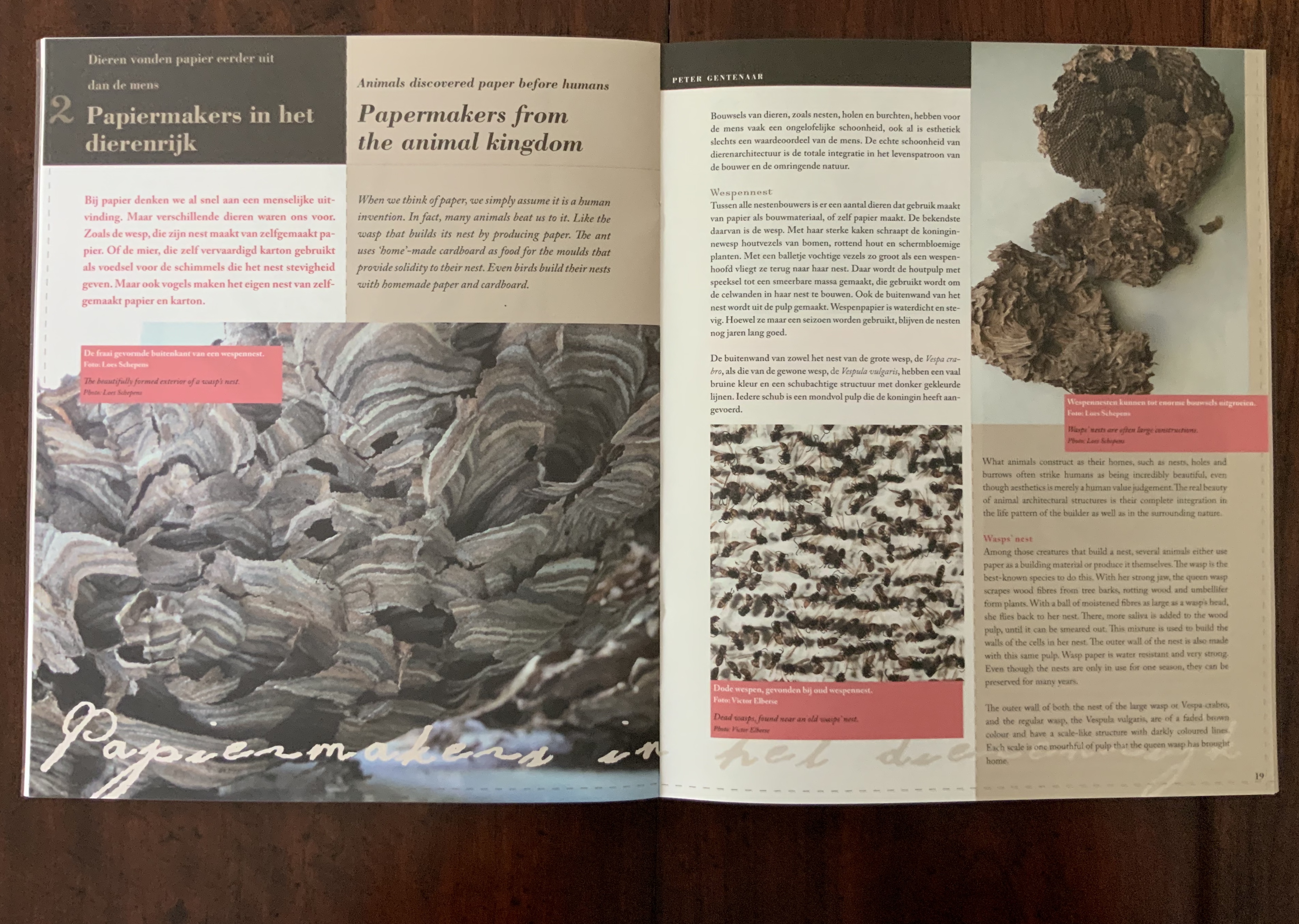
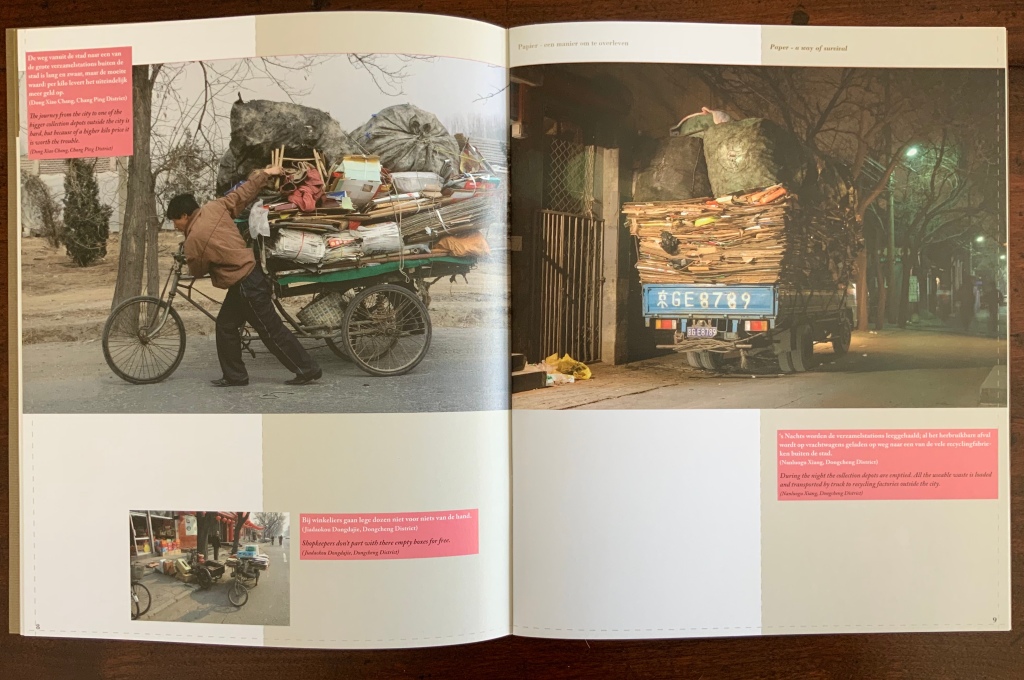

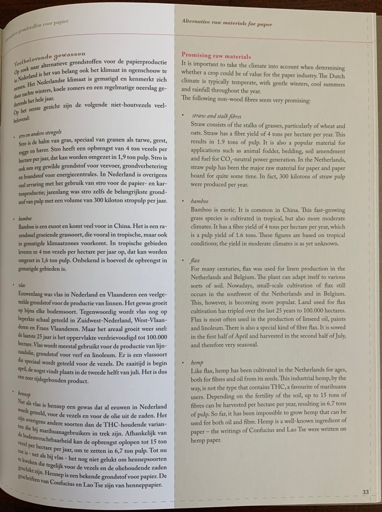
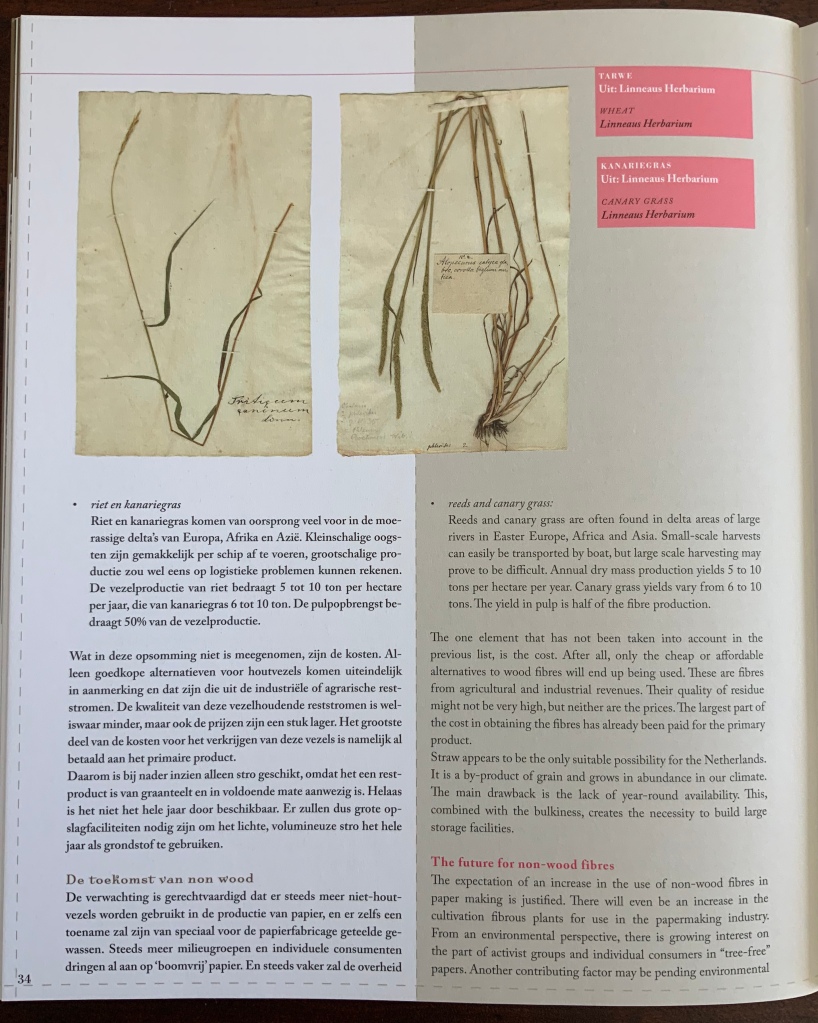
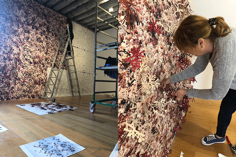
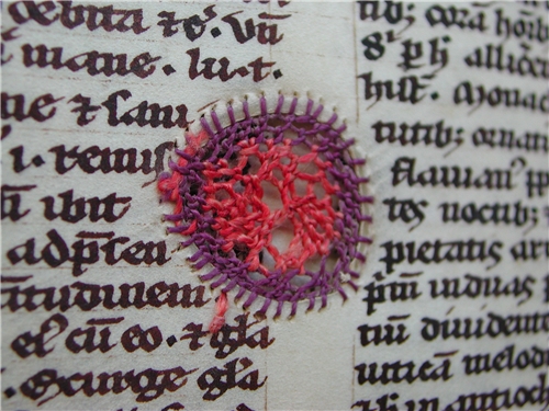
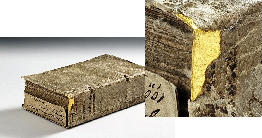
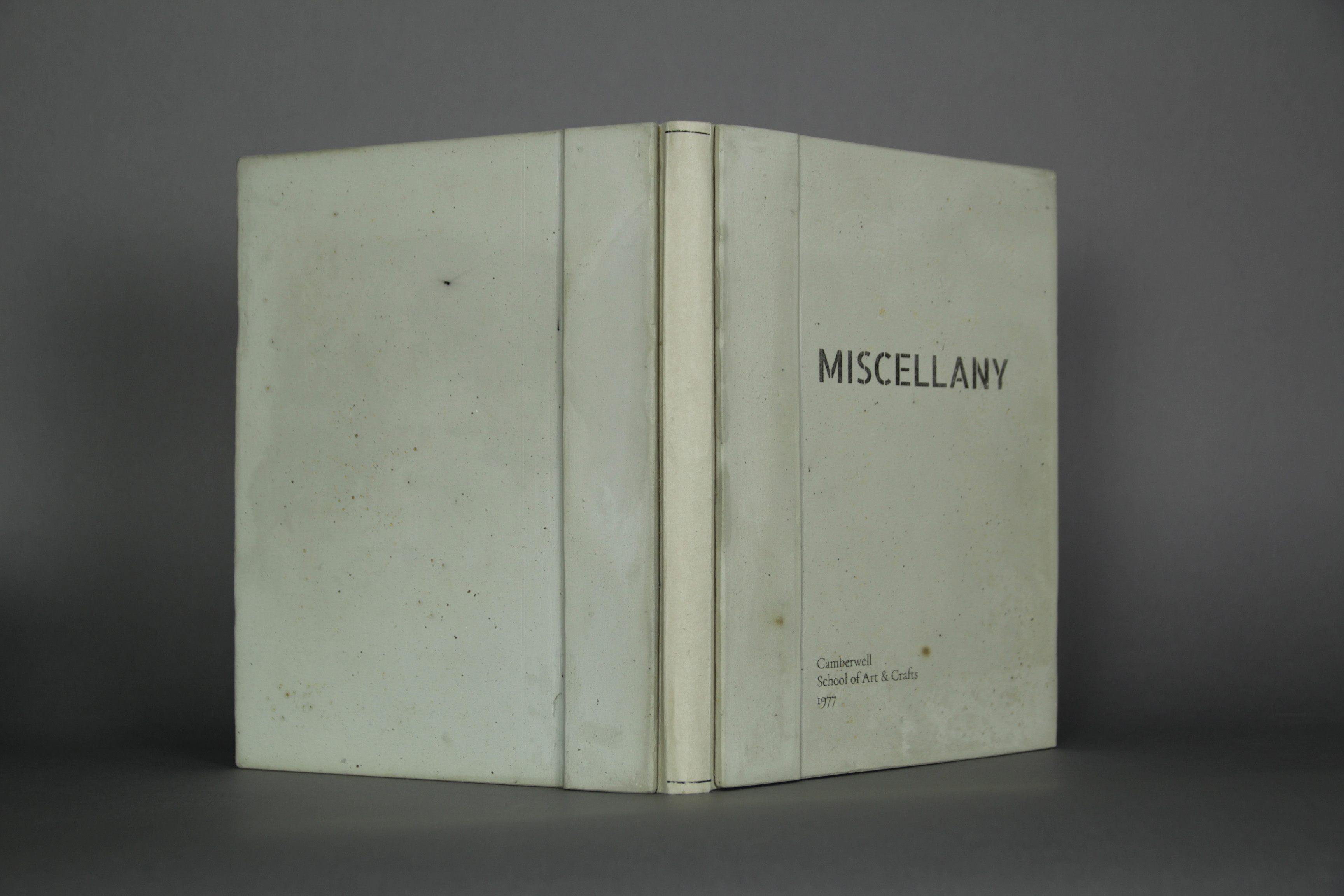
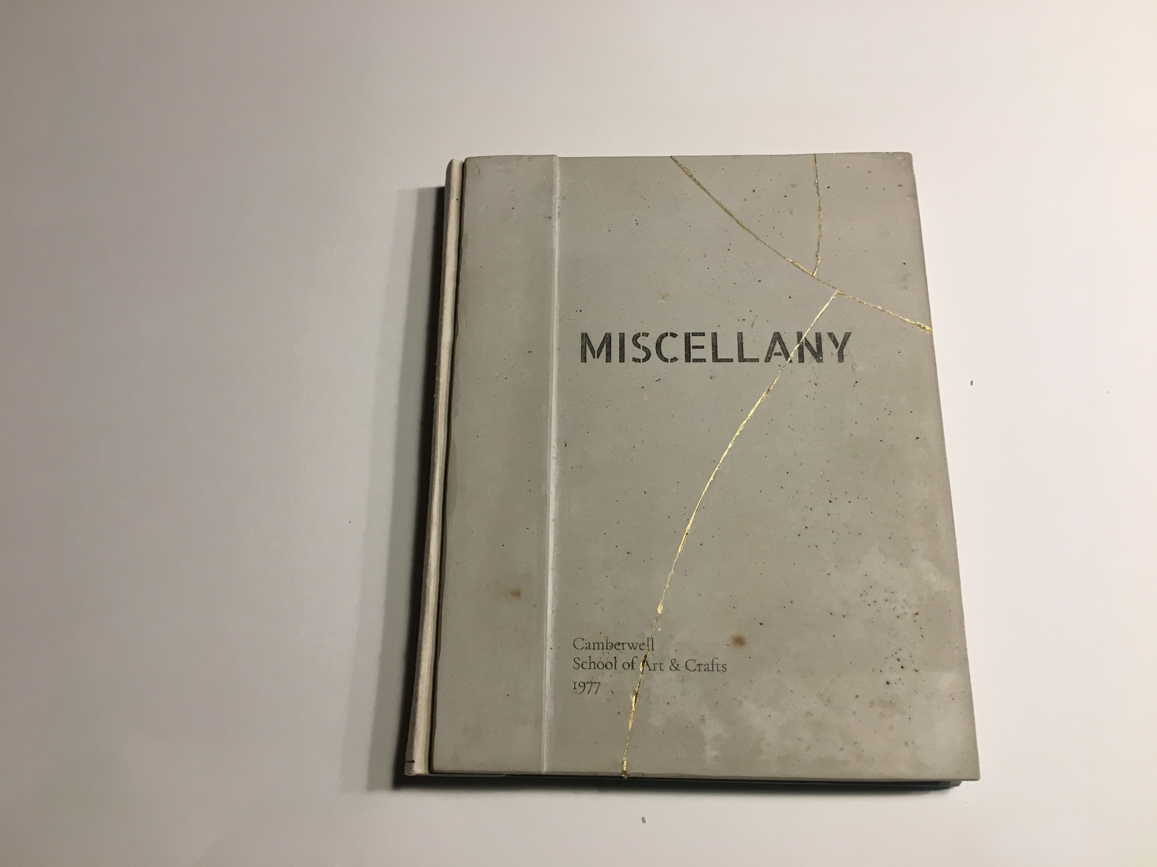
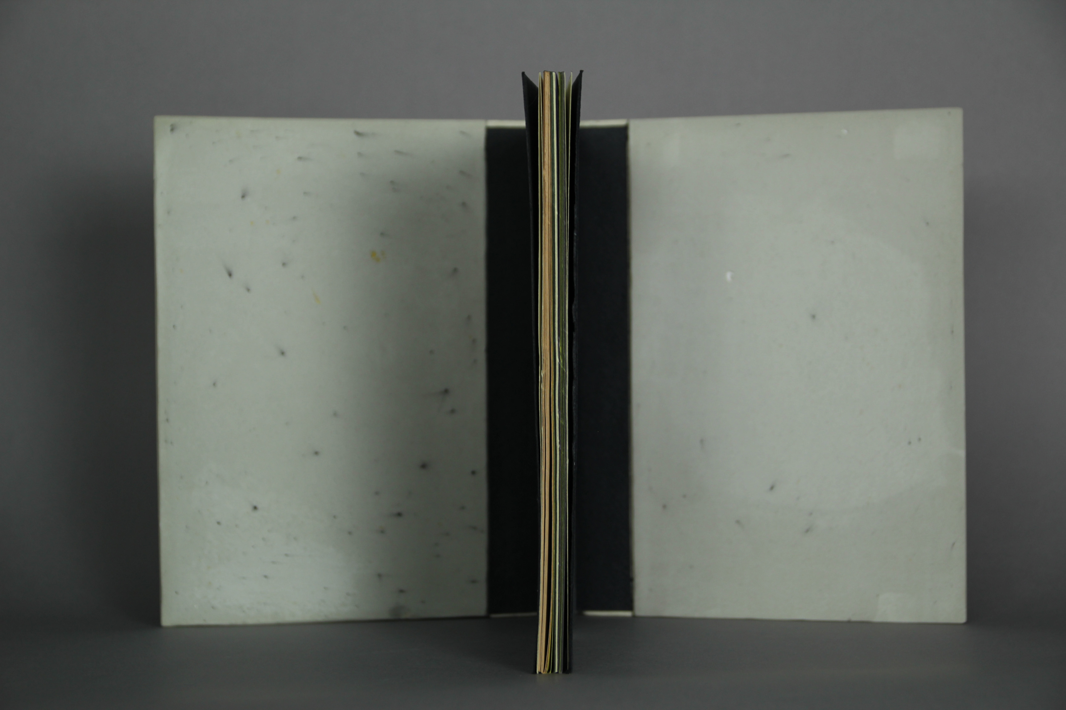
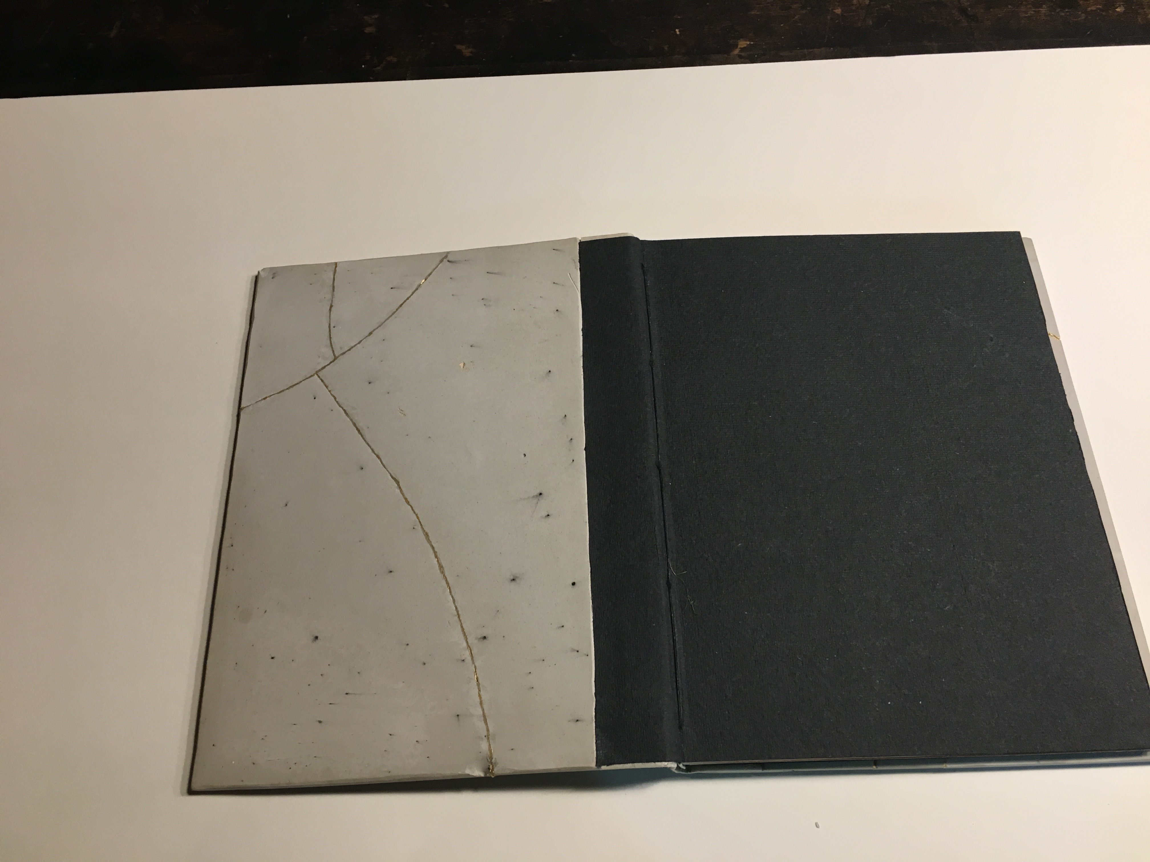
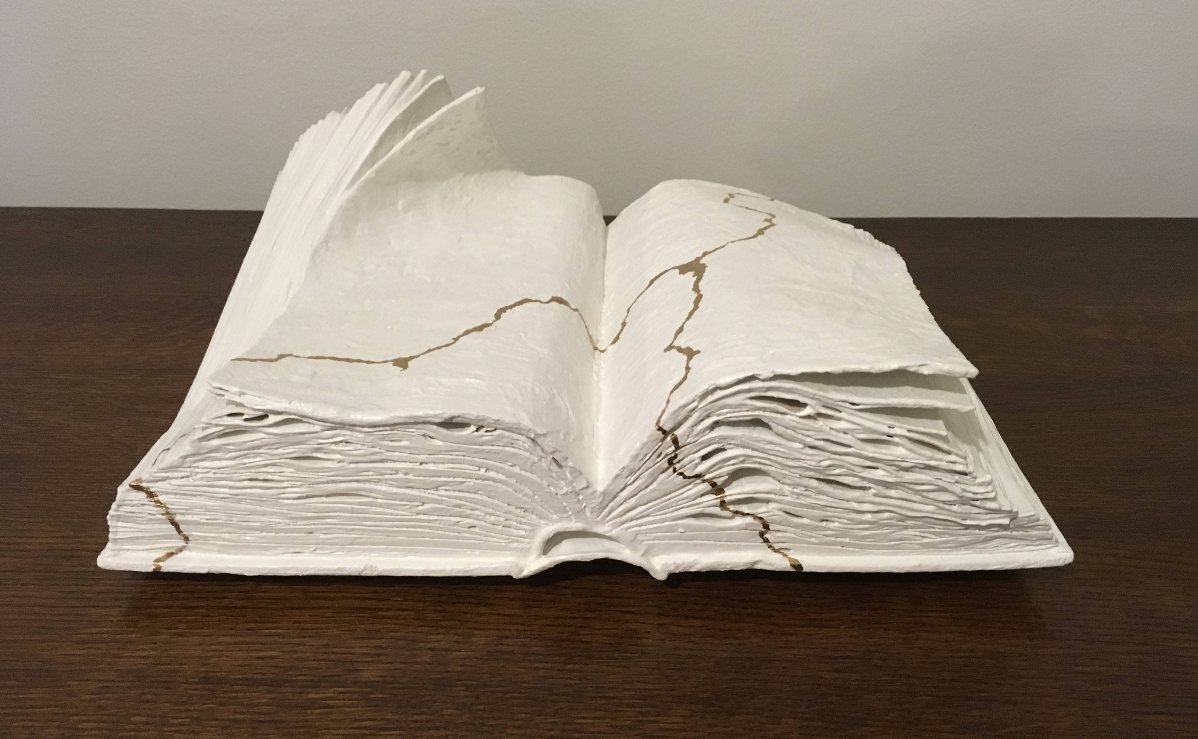
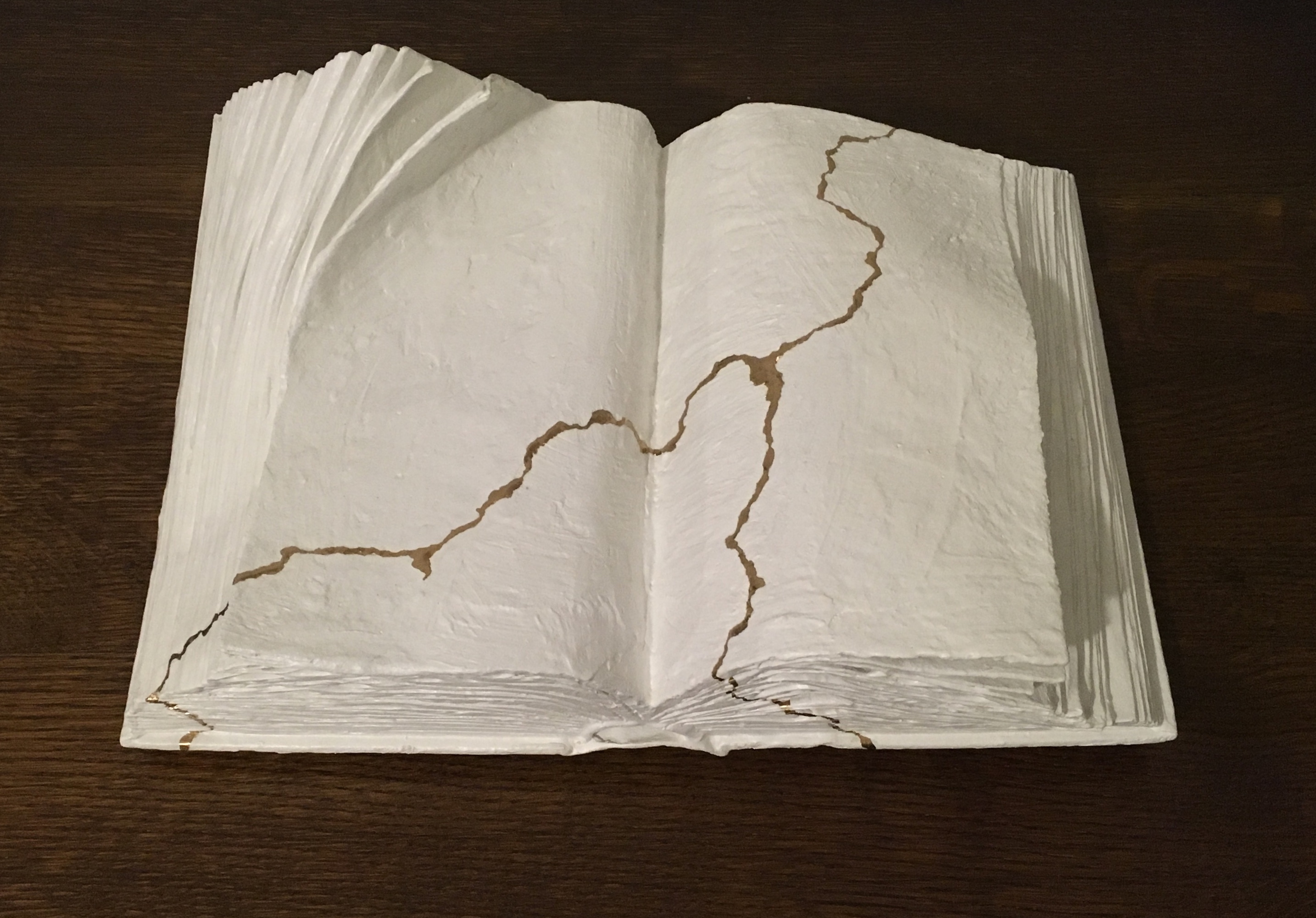
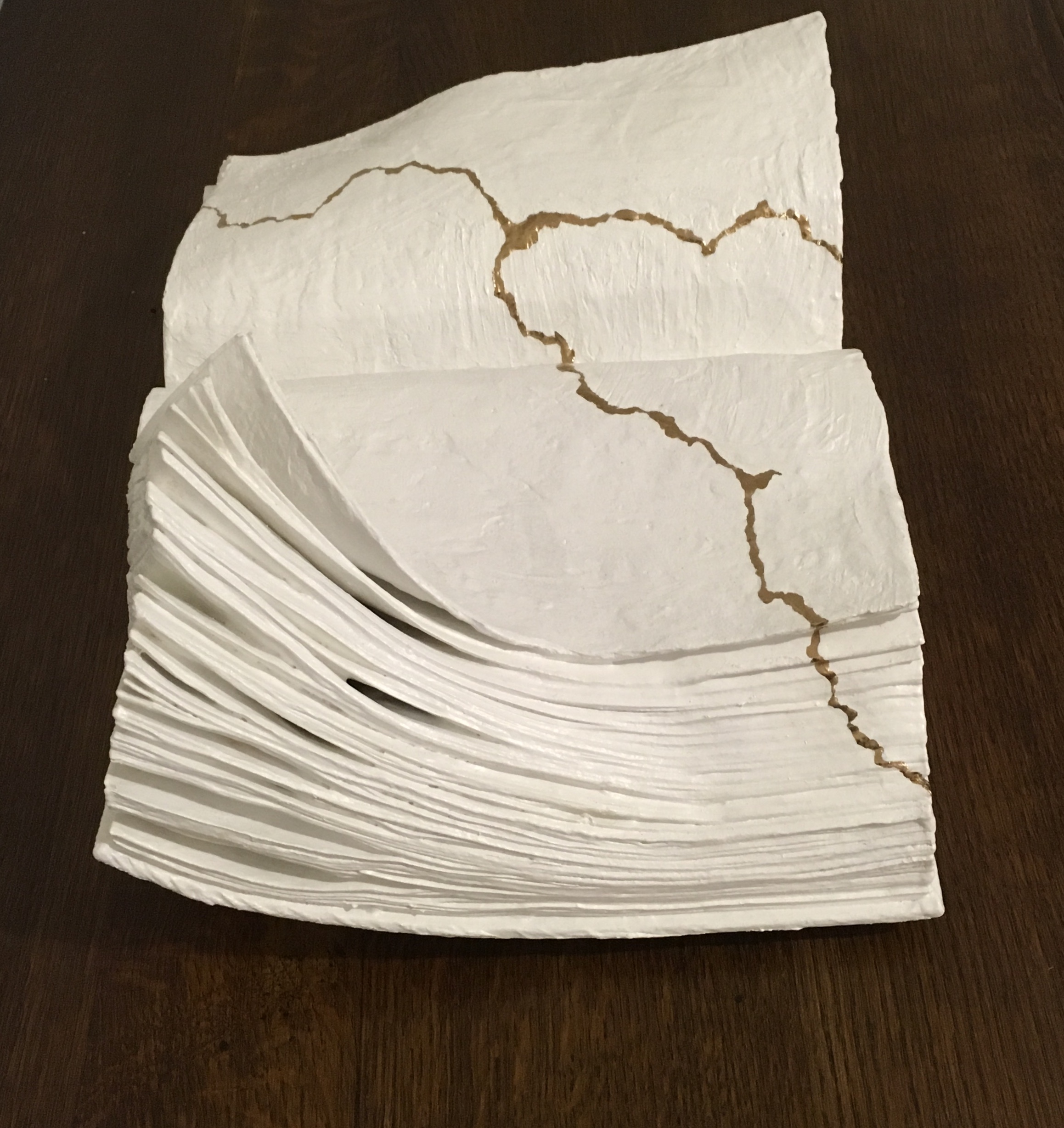


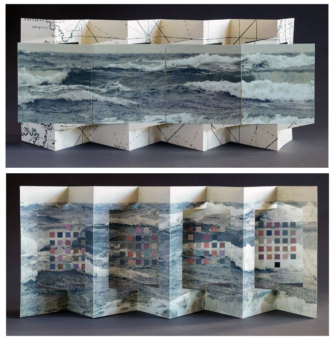


