Walt Whitman’s “Faces” (2012)
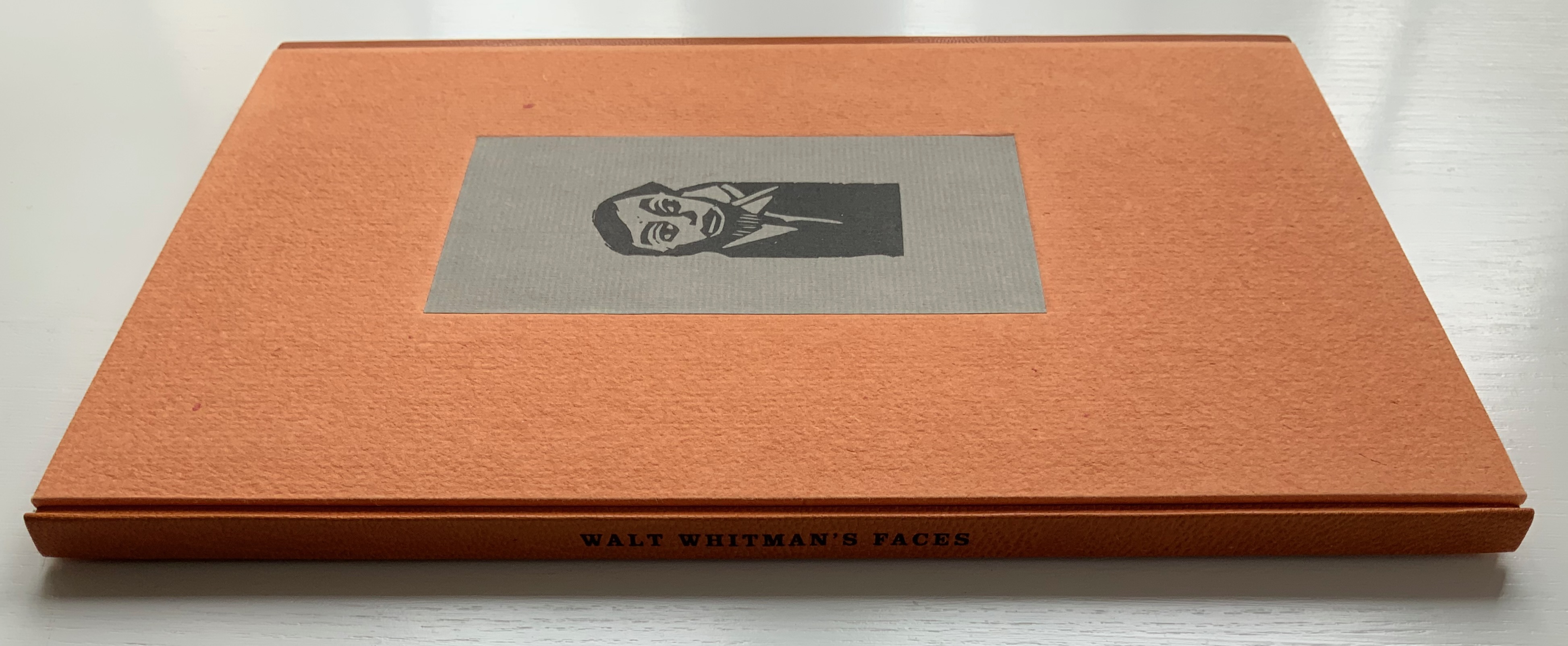
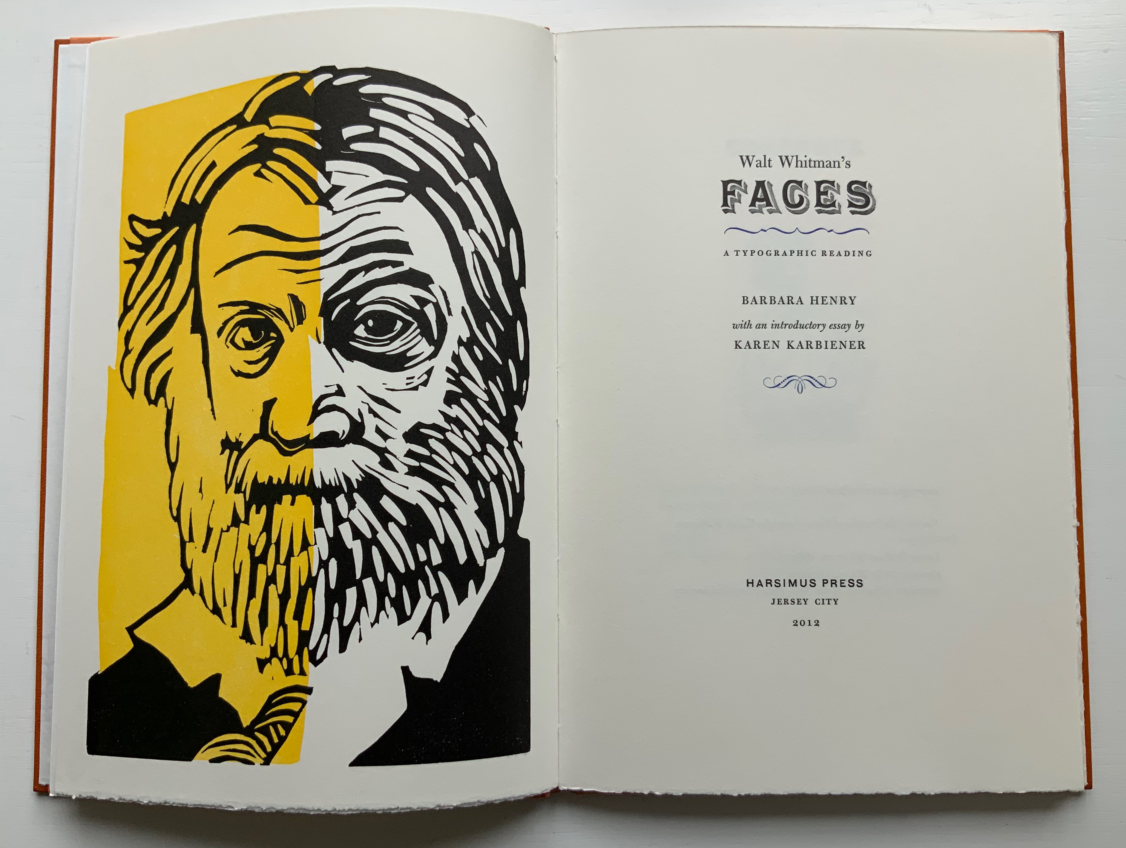
Walt Whitman’s “Faces”: A Typographic Reading (2012)
Barbara Henry
Case bound in boards in quarter-leather. H270 x W182 mm, 34 pages. Linocuts by Barbara Henry. Edition of 80, of which this is #69. Acquired from the artist, 11 April 2022.
Photos of the work: Books On Books Collection. Displayed with permission.
Although Whitman knew some of Victor Hugo’s work (in translation), it is unlikely that he knew of Hugo’s declaration “man in his entirety is in the alphabet … The alphabet is a source”. If he had, and if he had the French text as well, he would have appreciated that that last word in the original is font.
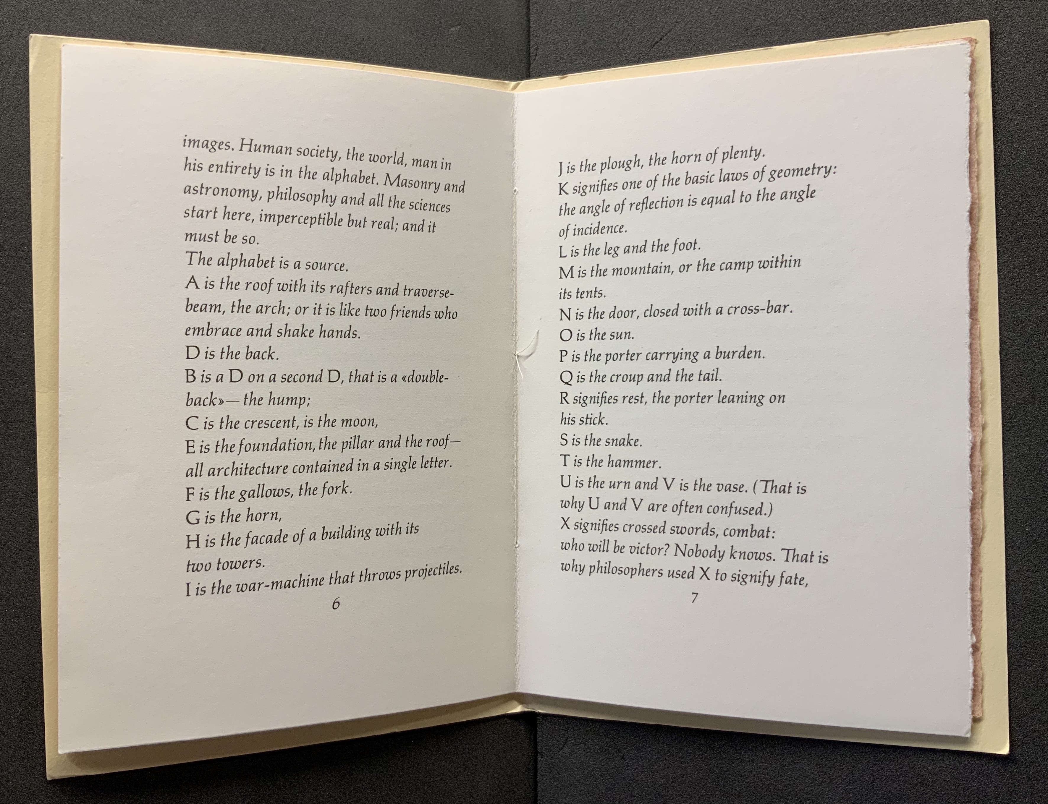
Man and his World in the Alphabet (1991)
Victor Hugo
Design and production by Kenneth Hardacre. Translation by Paul Standard for Hermann Zapf’s Manuale Typographicum (1954).
Photos of the work: Books On Books.
Working in a printing shop, Whitman could hardly overlook the metaphors on offer: the font or fount as source or mine, the typeface for the human face and vice versa. Barbara Henry has harvested from the Leaves of Grass the two short poems — “A Font of Type” and “Leaf of Faces” — that explore those metaphors. Bringing them together alongside an essay by Karen Karbiener (New York University) and one of her own, Henry embeds them in a well-crafted fine press book and embodies “Leaf of Faces” in its own set of typographic fireworks.
First though come the two essays. Karbiener’s sets the familiar biographical stage for Whitman and provides a sympathetic reading of Henry’s “typographic reading” to come. Henry’s is an earnest and plausible justification for her explication of the typographic references in each section of “Leaf of Faces”. Her essay closes with a paragraph explaining that many of the typefaces Whitman would have known are no longer available, that today’s measure of type size (the point) did not exist in Whitman’s day and that in homage she has mostly used 12 point Bulmer, a typeface from “the American Type Founders Company, a conglomerate of most of the type foundries formed in 1892, the year of Whitman’s death”. Also, she has set the type for “Leaf of Faces” by hand in a composing stick as Whitman would have done.
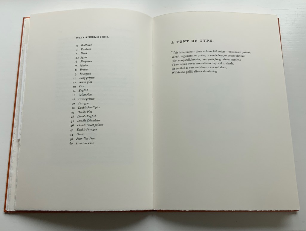
Then on the following pages comes a list of the names by which Whitman and his fellow print workers knew the various sizes of type. Without the list, the reader would miss the parenthetical allusions in “A Font of Type” — “nonpareil, brevier, bourgeois, long primer” — to what today are known as 6pt, 8pt, 9pt and 10pt type sizes. Whitman’s clever choice of names that have connotations beyond his extended metaphor possibly makes the lines comprehensible even without the finer points of the allusion. Or perhaps the reader still needs to be familiar with loose hot metal type and how the slivers of individual letters rest all sorted into their sections of a wooden typecase before they are mined or pulled from their latent slumbers to form words and expressions to be voiced.
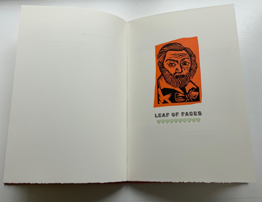
Then, after this prefacing short poem, the fireworks begin with Henry’s orange and black linocut of Whitman’s face over the title of the second poem, underlined with green fleurons (like leaves of grass).
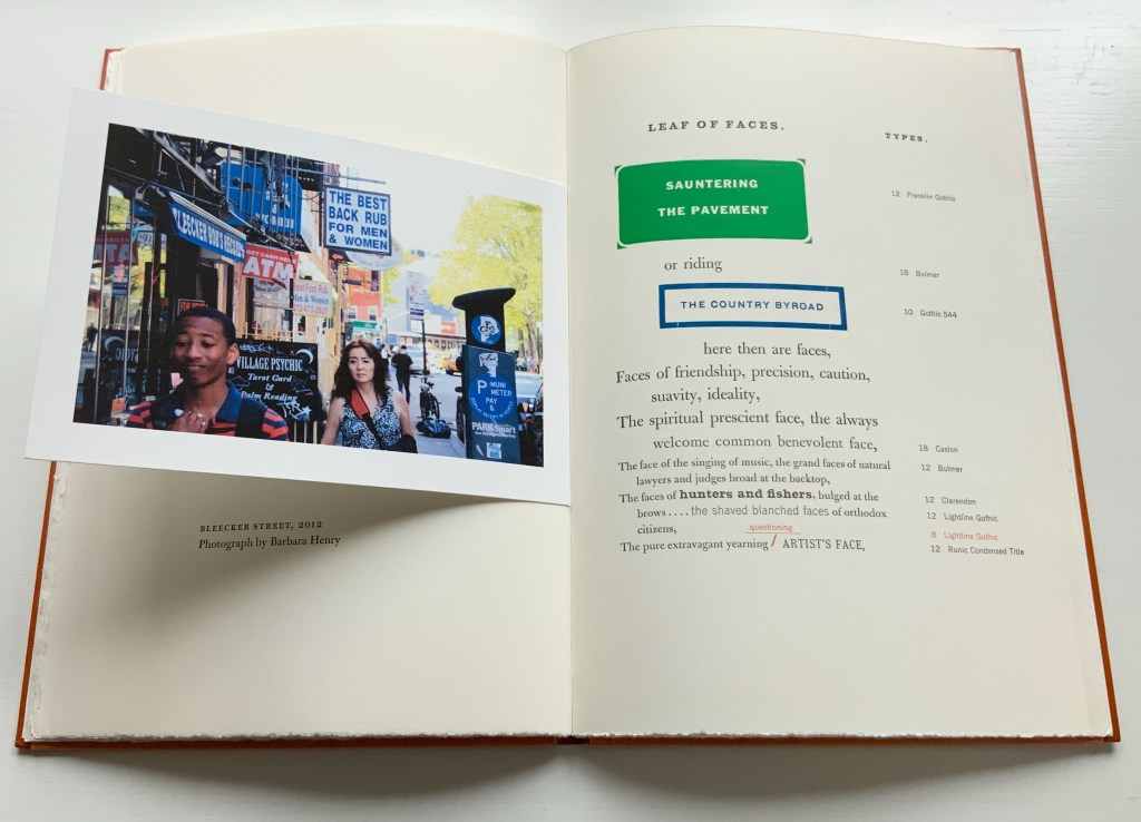
In the poem’s first double-page spread, Henry’s postcard-size digital photo of pedestrians and signs on Bleecker Street in 2012 not only illustrates lines of the facing poem, it echoes the postcard-size vintage photo by Marcus Ormsbee of Lower Hudson Street in 1865 used at the start of her essay. Her photo’s startling colors contrast with Ormsbee’s black and white and complement the bold colors and foundry typefaces that follow in her treatment of the poem. A true book artist, Henry is making these features in her book refer to what she is doing in the book — bringing her 21st century eye to eye with Whitman’s 19th century.
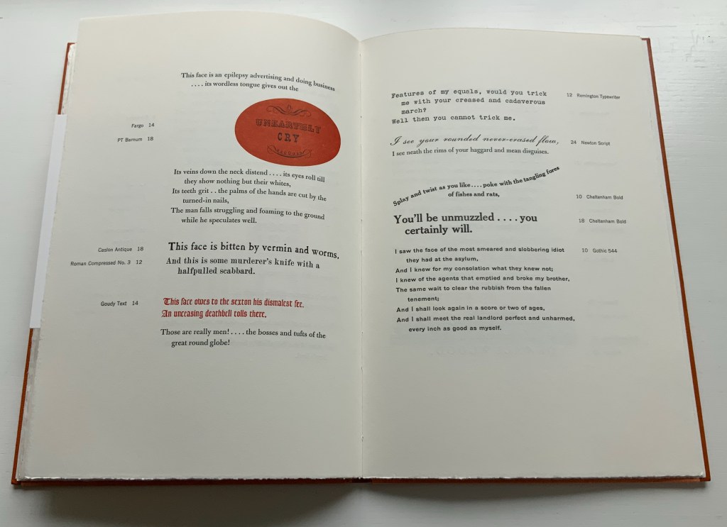
These are but three of the six spreads across which Henry transforms Whitman’s “Leaf of Faces” into her typographic spectacle. It and the whole of the book bring to life what Anne M. Royston calls “artistic arguments (my emphasis), a term that indicates theory that pushes back against the expectations of the theory or criticism genre, specifically by employing signification that exceeds the semantics of printed text”.
One last observation: Just as there is no evidence that Whitman knew Victor Hugo’s mystic reference to the alphabet as source, there is also no evidence that he knew the Sufi poets. But Ralph Waldo Emerson did know them. His Complete Works, Volume VIII, has a section entitled “Persian Poetry” and translates a key passage of Farid ud-Din Attar’s The Conference of the Birds (1177). As Karbinier notes in her essay, Whitman called Ralph Waldo Emerson the “Master”, so perhaps it is not so uncanny that “Leaf of Faces” includes a similar recognition of divinity at which the birds arrive when they finally meet the Simorgh, lord of all birds, whom they have been seeking, only to be told by the Simorgh:
It is yourselves you see and what you are.
(Who sees the Lord? It is himself each sees; …)
Or as Whitman more egotistically puts it:
And I shall look again in a score or two of ages,
And I shall meet the real landlord perfect and unharmed,
every inch as good as myself.
Further Reading
Behbehani, Farak K., and Farid ud-Din Attar. 2009. The Conference of the Birds: A Study of Farid ud-Din Attar’s Poem using Jali Diwani Calligraphy. London: Thames & Hudson. Uses the translation by Dick Davis from the 2005 Penguin edition, which is used above — not Emerson’s.
Chen, Julie. 2013. 500 Handmade Books. Volume 2. New York: Lark. P. 167 (Life Drawing without Instruction).
Emerson, Ralph Waldo. 1903/1979. The Complete Works of Ralph Waldo Emerson. New York: AMS Press.
Henry, Barbara. 1 March 2011. “Walt Whitman’s ‘Leaf of Faces’“. Book 2.0, Vol.1, No. 2, pp. 127-137.
Hugo, Victor, and Kenneth Hardacre. 1991. Man and his World in the Alphabet. Moreton-in-Marsh: Kit-Cat Press.
Maret, Russell. 11 June 2024. “The Work & Play of Barbara Henry“. Shelf Readings. A review of two other works by Henry: Th Playbook (2014) and Th Workbook (2010).
Royston, Anne M. 2019. Material Noise: Reading Theory as Artist’s Book. Cambridge, MA: MIT Press.