Books On Books Collection – Barbara Henry

Walt Whitman’s “Faces” (2012)

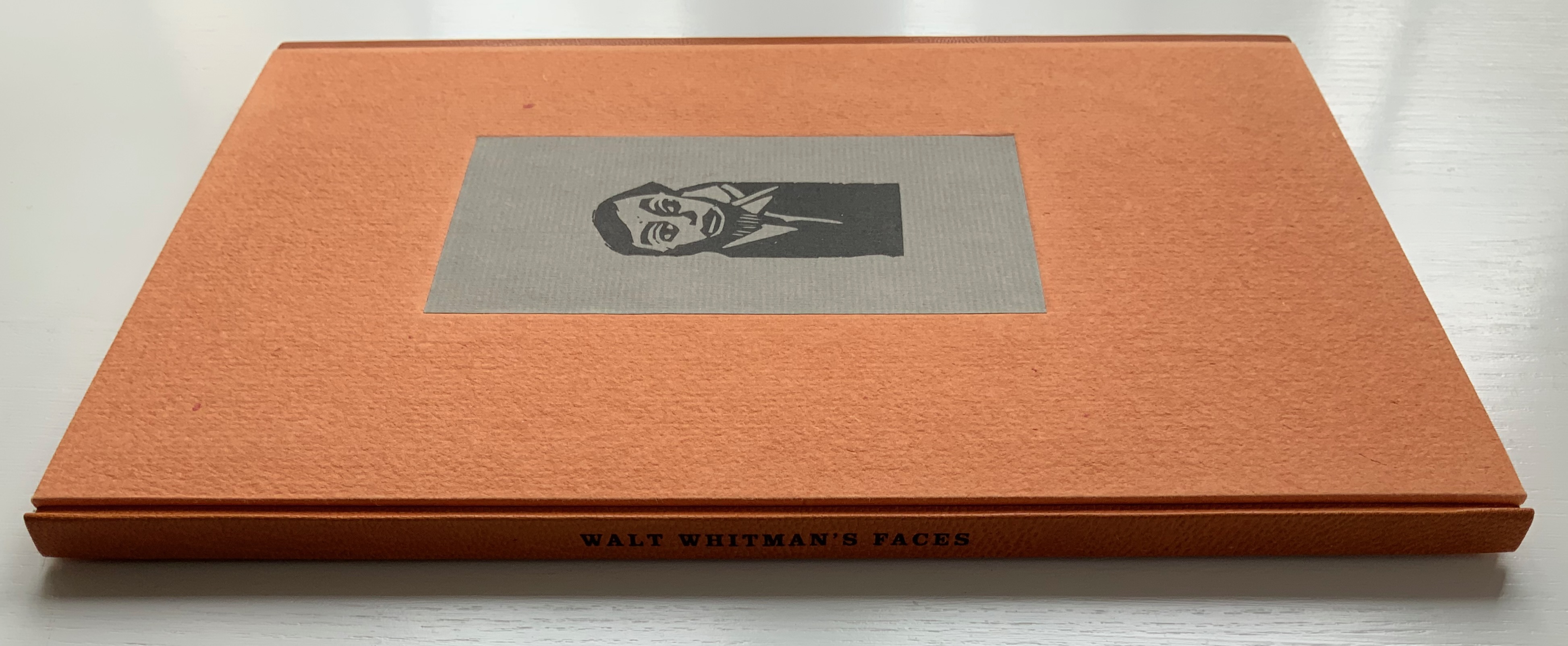
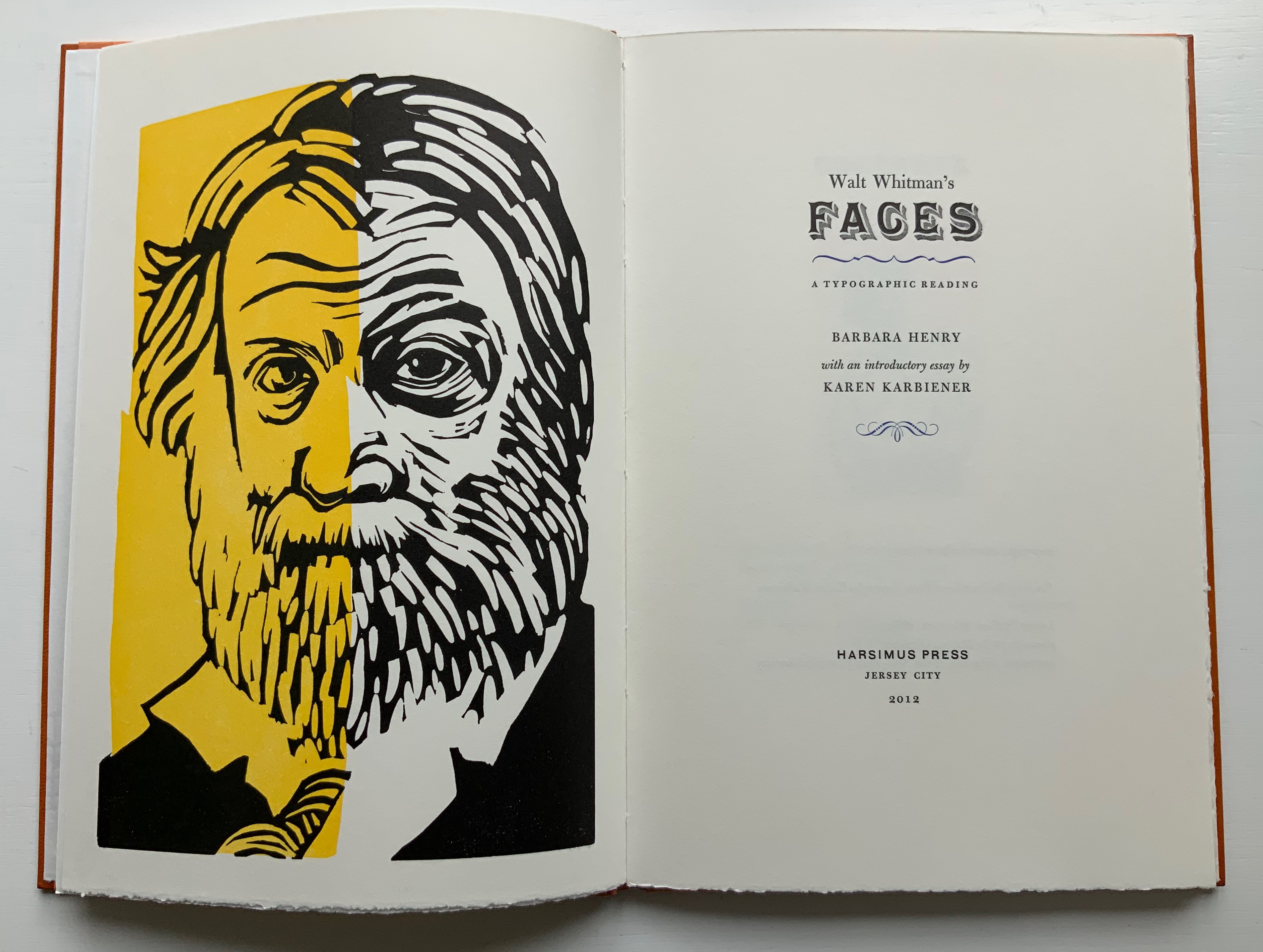
Walt Whitman’s “Faces”: A Typographic Reading (2012)
Barbara Henry
Case bound in boards in quarter-leather. H270 x W182 mm, 34 pages. Linocuts by Barbara Henry. Edition of 80, of which this is #69. Acquired from the artist, 11 April 2022.
Photos of the work: Books On Books Collection. Displayed with permission.

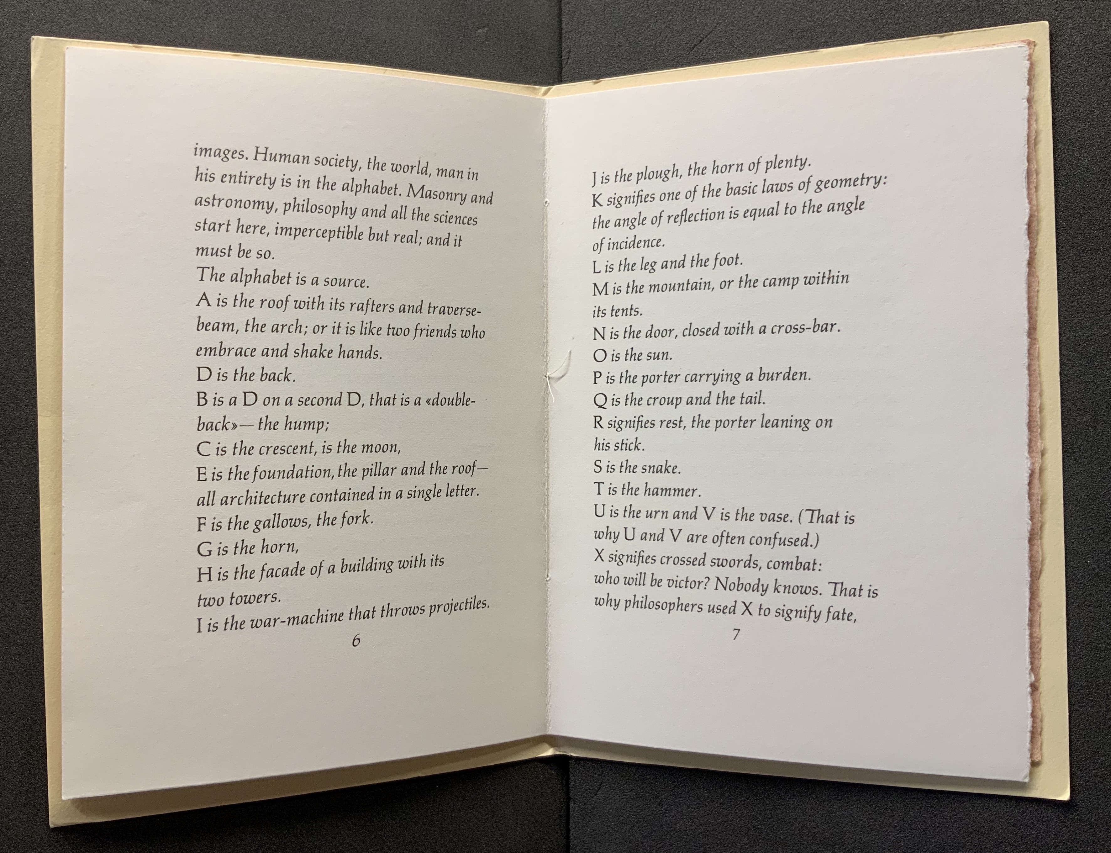
Although Whitman knew some of Victor Hugo’s work (in translation), it is unlikely that he knew of Hugo’s declaration “man in his entirety is in the alphabet … The alphabet is a source”. If he had, and if he had the French text as well, he would have appreciated that that last word in the original is font.

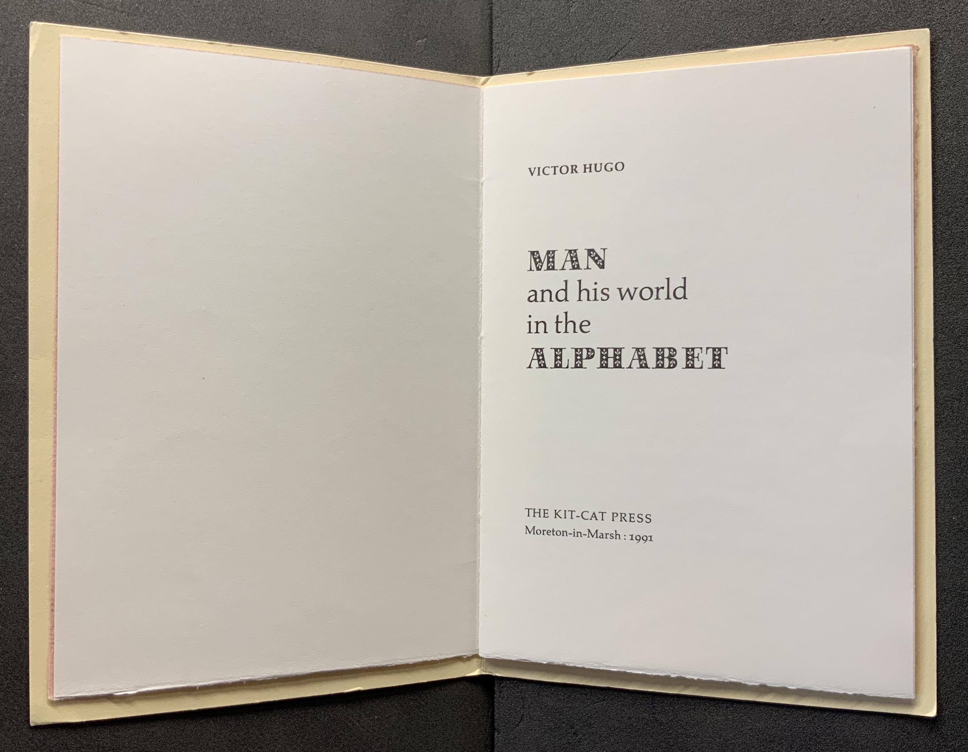
Man and his World in the Alphabet (1991)
Victor Hugo
Design and production by Kenneth Hardacre. Translation by Paul Standard for Hermann Zapf’s Manuale Typographicum (1954).
Photos of the work: Books On Books.

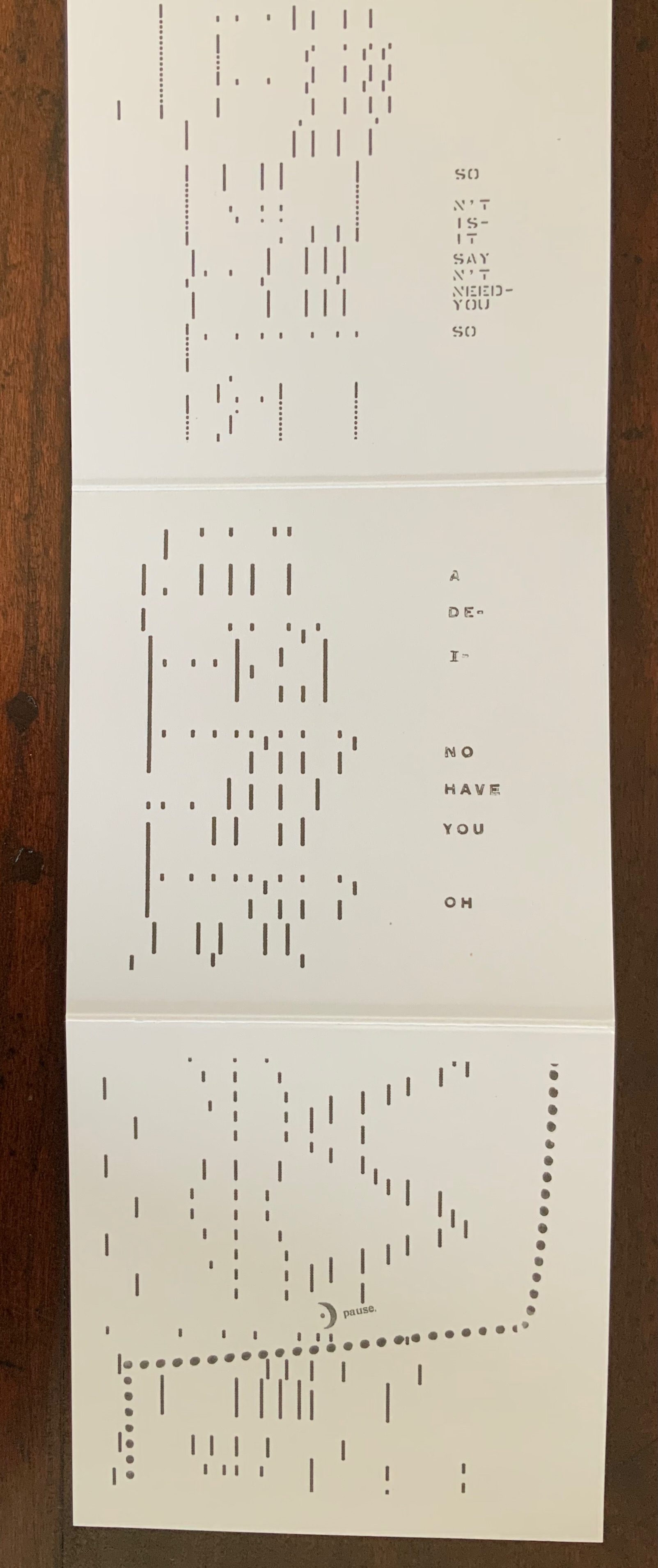
Working in a printing shop, Whitman could hardly overlook the metaphors on offer: the font or fount as source or mine, the typeface for the human face and vice versa. Barbara Henry has harvested from the Leaves of Grass the two short poems — “A Font of Type” and “Leaf of Faces” — that explore those metaphors. Bringing them together alongside an essay by Karen Karbiener (New York University) and one of her own, Henry embeds them in a well-crafted fine press book and embodies “Leaf of Faces” in its own set of typographic fireworks.

First though come the two essays. Karbiener’s sets the familiar biographical stage for Whitman and provides a sympathetic reading of Henry’s “typographic reading” to come. Henry’s is an earnest and plausible justification for her explication of the typographic references in each section of “Leaf of Faces”. Her essay closes with a paragraph explaining that many of the typefaces Whitman would have known are no longer available, that today’s measure of type size (the point) did not exist in Whitman’s day and that in homage she has mostly used 12 point Bulmer, a typeface from “the American Type Founders Company, a conglomerate of most of the type foundries formed in 1892, the year of Whitman’s death”. Also, she has set the type for “Leaf of Faces” by hand in a composing stick as Whitman would have done.

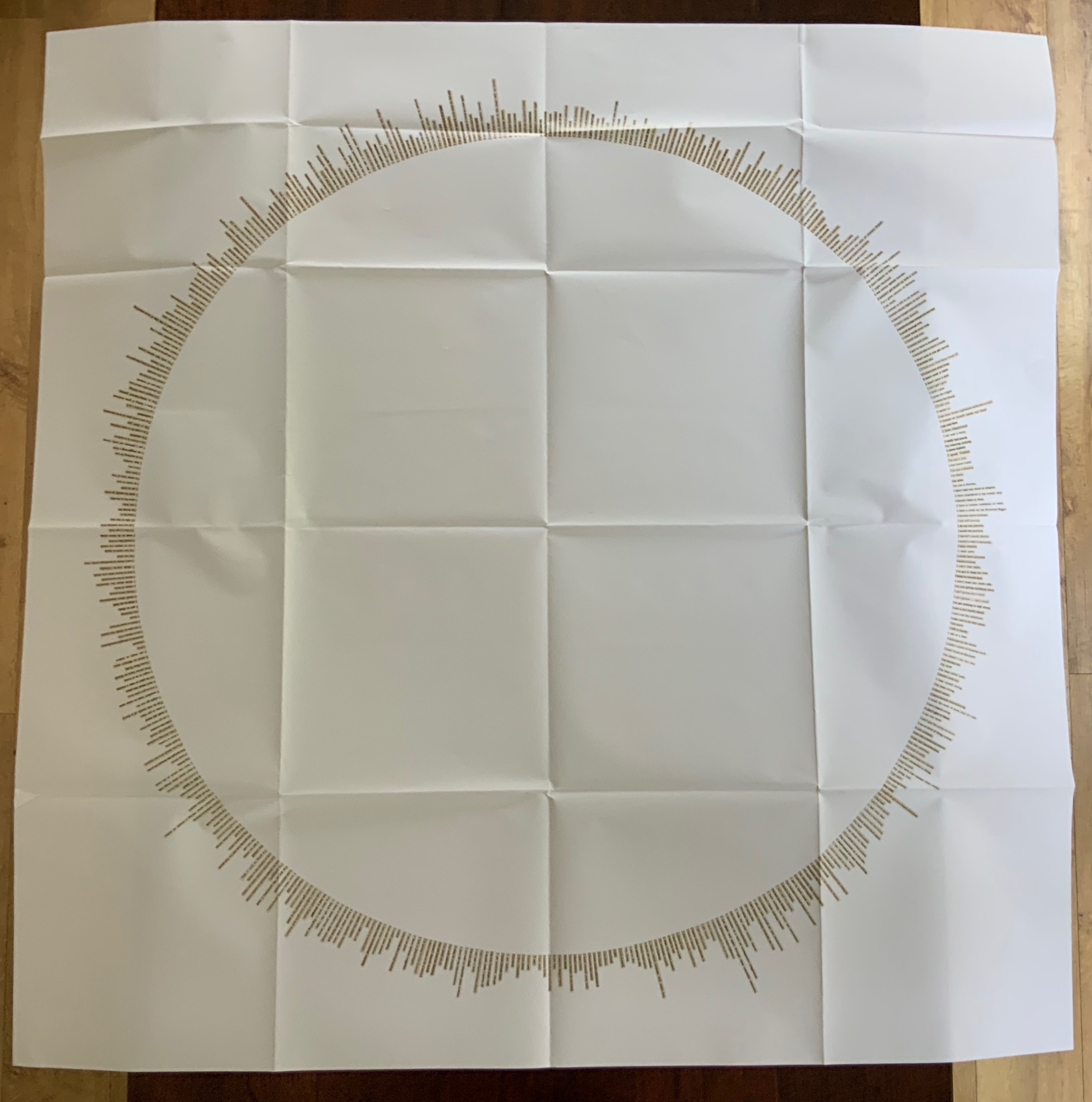
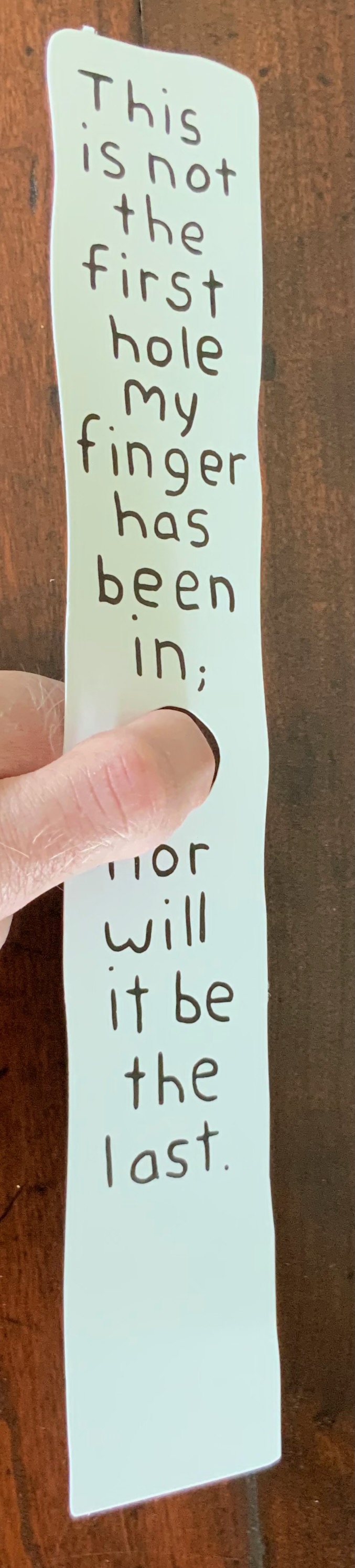
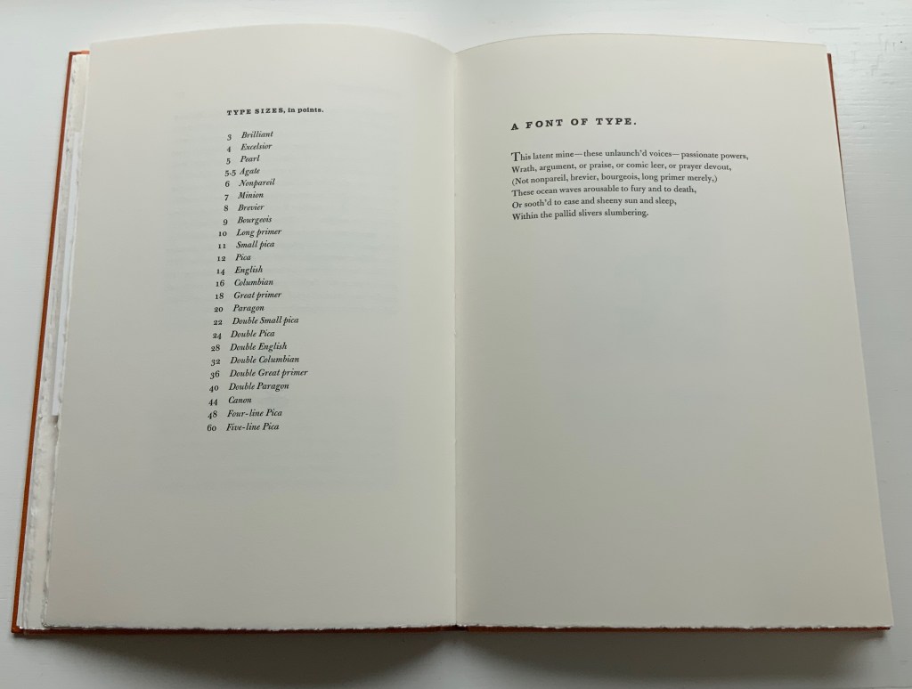
Then on the following pages comes a list of the names by which Whitman and his fellow print workers knew the various sizes of type. Without the list, the reader would miss the parenthetical allusions in “A Font of Type” — “nonpareil, brevier, bourgeois, long primer” — to what today are known as 6pt, 8pt, 9pt and 10pt type sizes. Whitman’s clever choice of names that have connotations beyond his extended metaphor possibly makes the lines comprehensible even without the finer points of the allusion. Or perhaps the reader still needs to be familiar with loose hot metal type and how the slivers of individual letters rest all sorted into their sections of a wooden typecase before they are mined or pulled from their latent slumbers to form words and expressions to be voiced.

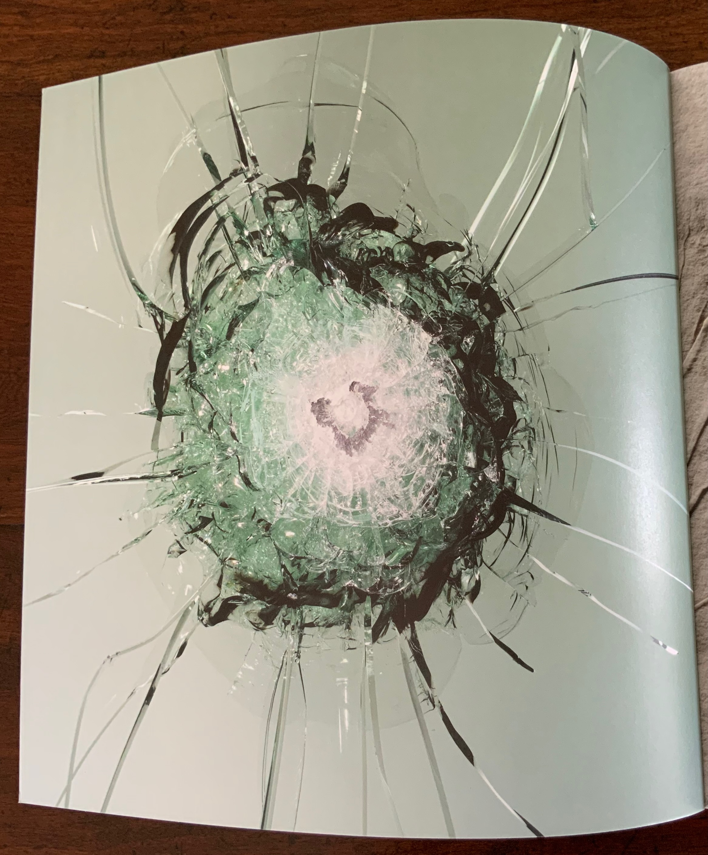
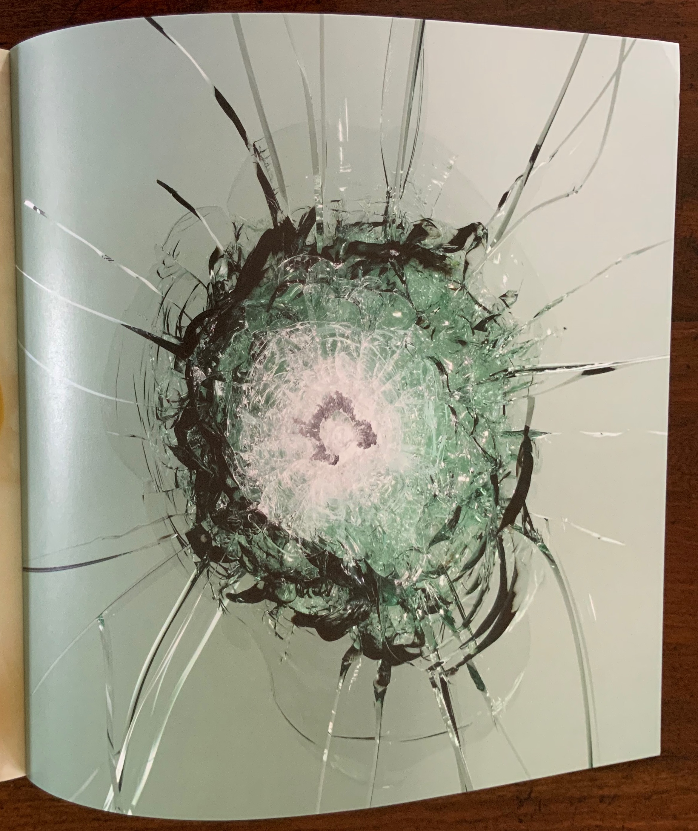
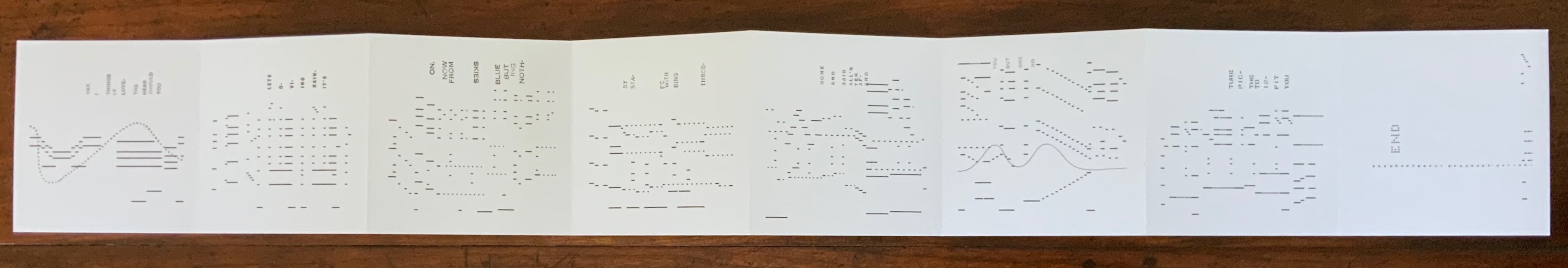
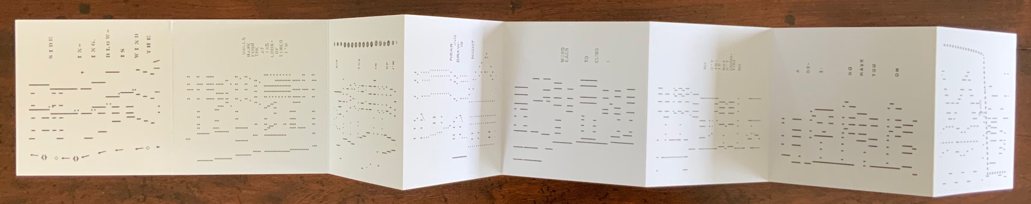
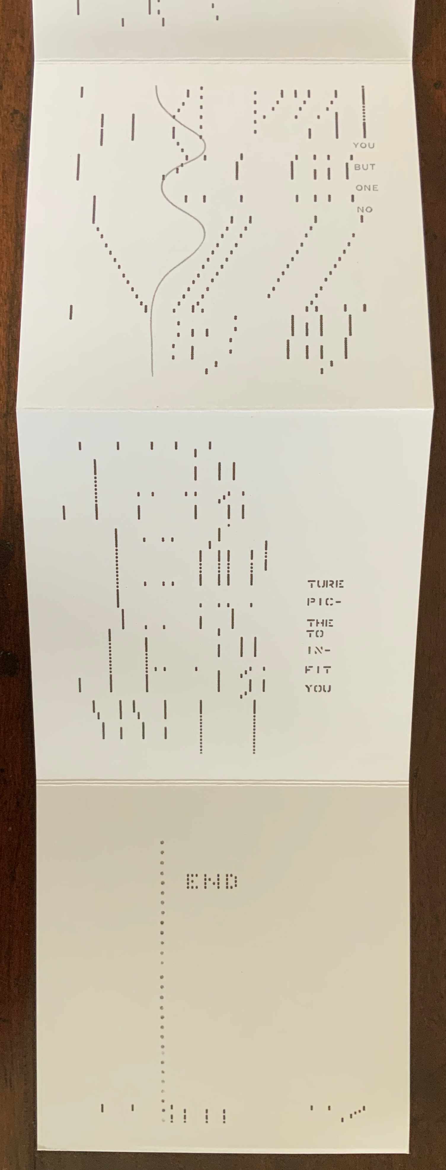
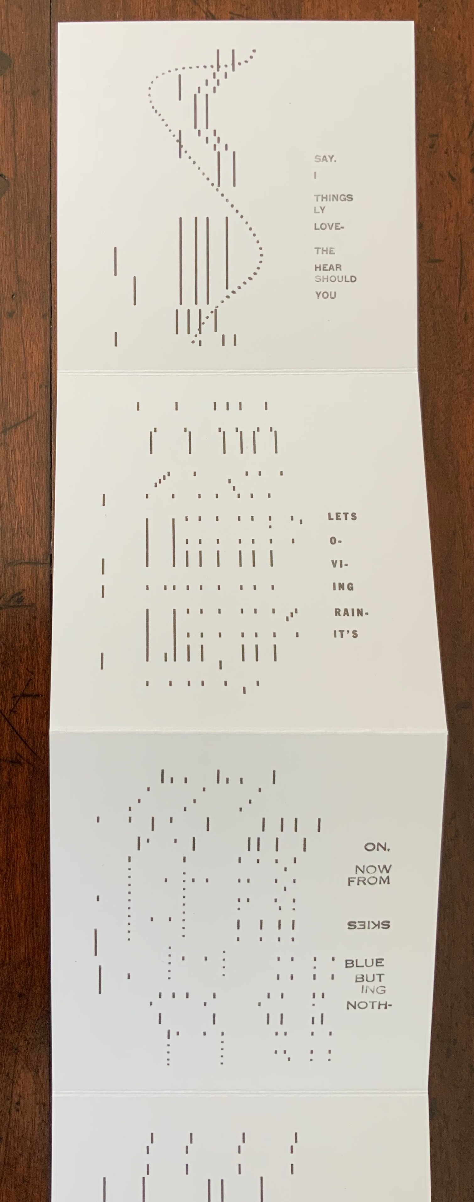
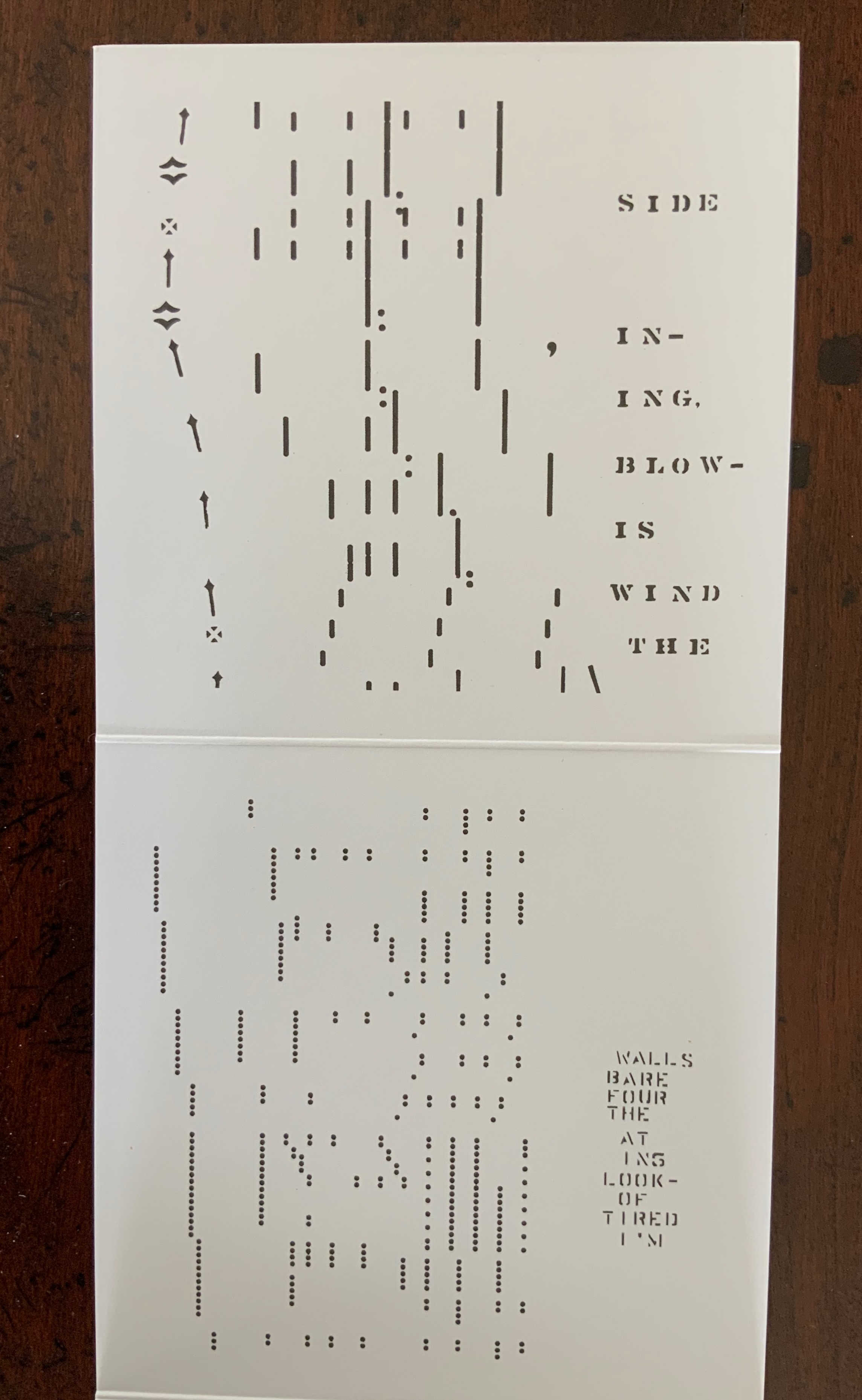
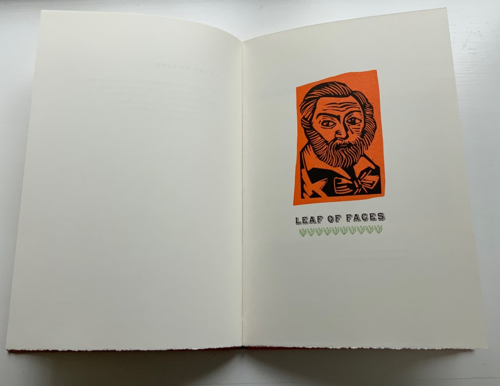
Then, after this prefacing short poem, the fireworks begin with Henry’s orange and black linocut of Whitman’s face over the title of the second poem, underlined with green fleurons (like leaves of grass).

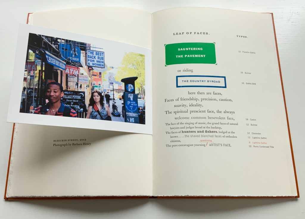
In the poem’s first double-page spread, Henry’s postcard-size digital photo of pedestrians and signs on Bleecker Street in 2012 not only illustrates lines of the facing poem, it echoes the postcard-size vintage photo by Marcus Ormsbee of Lower Hudson Street in 1865 used at the start of her essay. Her photo’s startling colors contrast with Ormsbee’s black and white and complement the bold colors and foundry typefaces that follow in her treatment of the poem. A true book artist, Henry is making these features in her book refer to what she is doing in the book — bringing her 21st century eye to eye with Whitman’s 19th century.

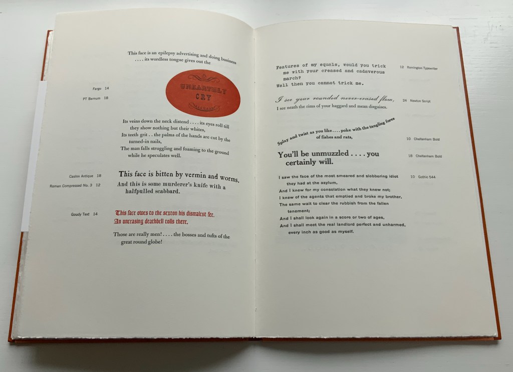
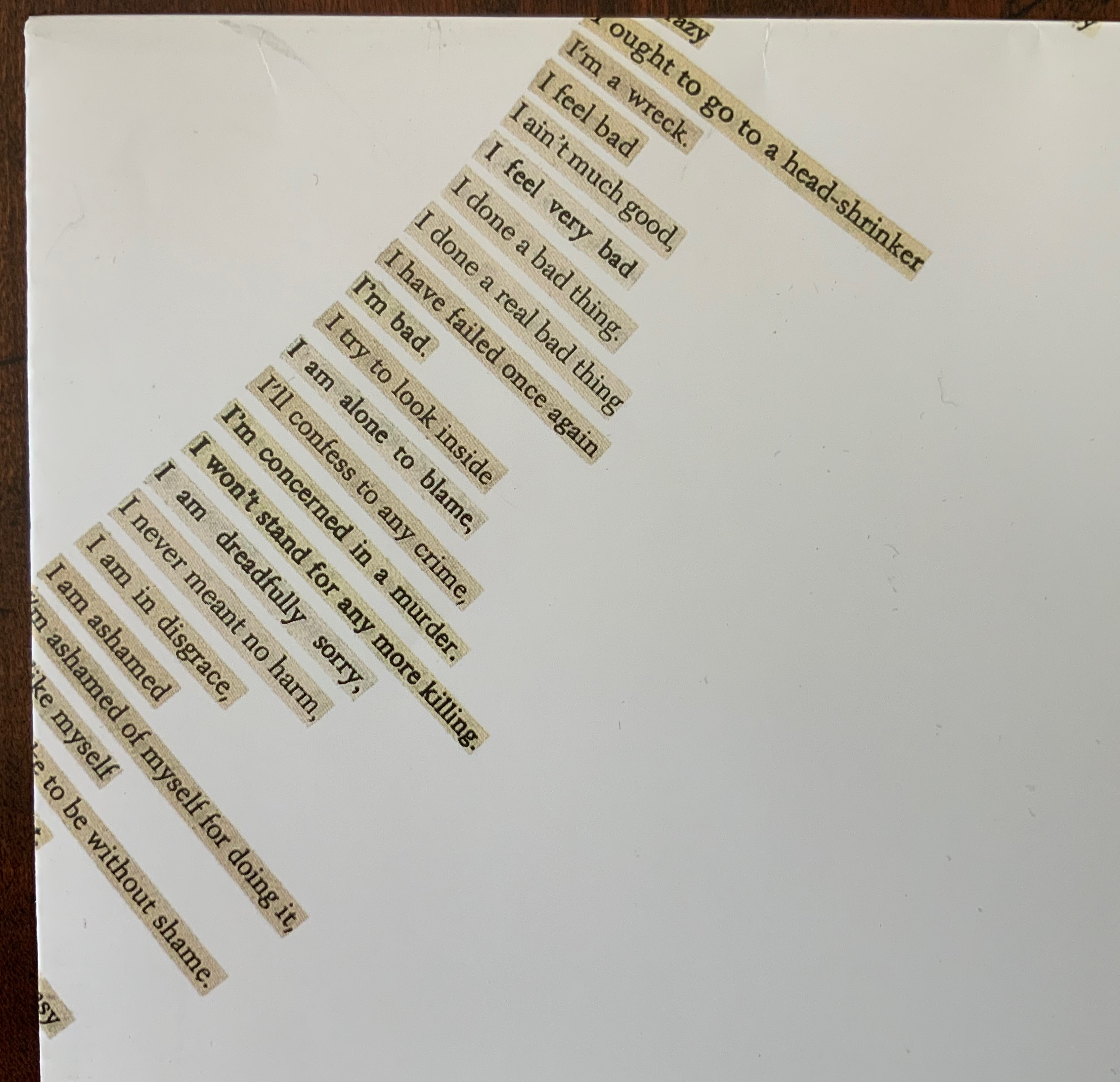
These are but three of the six spreads across which Henry transforms Whitman’s “Leaf of Faces” into her typographic spectacle. It and the whole of the book bring to life what Anne M. Royston calls “artistic arguments (my emphasis), a term that indicates theory that pushes back against the expectations of the theory or criticism genre, specifically by employing signification that exceeds the semantics of printed text”.

One last observation: Just as there is no evidence that Whitman knew Victor Hugo’s mystic reference to the alphabet as source, there is also no evidence that he knew the Sufi poets. But Ralph Waldo Emerson did know them. His Complete Works, Volume VIII, has a section entitled “Persian Poetry” and translates a key passage of Farid ud-Din Attar’s The Conference of the Birds (1177). As Karbinier notes in her essay, Whitman called Ralph Waldo Emerson the “Master”, so perhaps it is not so uncanny that “Leaf of Faces” includes a similar recognition of divinity at which the birds arrive when they finally meet the Simorgh, lord of all birds, whom they have been seeking, only to be told by the Simorgh:

It is yourselves you see and what you are.
(Who sees the Lord? It is himself each sees; …)

Or as Whitman more egotistically puts it:

And I shall look again in a score or two of ages,
And I shall meet the real landlord perfect and unharmed,
every inch as good as myself.

Further Reading

Behbehani, Farak K., and Farid ud-Din Attar. 2009. The Conference of the Birds: A Study of Farid ud-Din Attar’s Poem using Jali Diwani Calligraphy. London: Thames & Hudson. Uses the translation by Dick Davis from the 2005 Penguin edition, which is used above — not Emerson’s.

Emerson, Ralph Waldo. 1903/1979. The Complete Works of Ralph Waldo Emerson. New York: AMS Press.

Henry, Barbara. 1 March 2011. “Walt Whitman’s ‘Leaf of Faces’“. Book 2.0, Vol.1, No. 2, pp. 127-137.

Hugo, Victor, and Kenneth Hardacre. 1991. Man and his World in the Alphabet. Moreton-in-Marsh: Kit-Cat Press.

Royston, Anne M. 2019. Material Noise: Reading Theory as Artist’s Book. Cambridge, MA: MIT Press.

Books On Books Collection – “Inscription: the Journal of Material Text”, Issue 2

Inscription: the Journal of Material Text – Theory, Practice, History, Issue 2 (2021)
Edited by Gill Partington, Adam Smyth and Simon Morris
Perfect bound softcover, H314 x W314 mm, 180 pages. Editions included: Fiona Banner (aka Vanity Press), Full Stop, front & back covers; Kendell Geers, Stripped Bare, end papers; Carolyn Thompson, The Beast in Me, H1180 x W1180 mm; Erica Baum, Piano Rolls, H120 x W120 closed, W960 mm open; Harold Offeh, Crystal Mouths, H210 x W105 closed, W480 mm open; David Bellingham, Cigar Burn Apertures, H210 x W105 mm; Miranda July, Bookmark, H302 x W54 mm; Christian Bök, Supermassive, LP. Acquired from Information as Material, 10 October 2021.
Photos of the issue: Books On Books Collection.

How materially perverse is it that the second issue of Inscription is devoted to “the hole”, yet it is the first issue that actually has a hole in it? The first issue of Inscription did set a seriously playful — or playfully serious — tone, and the second issue does not fail to maintain it. The second issue continues the dos-à-dos binding but with only the front and back covers as the external giveaway. In the middle of this single-spine paperback, pages 1-90 meet an inverted pages 90-1 in the middle, which prompts the reader to turn the open book 180° and flip back to page 1. From either direction, the reader meets the traditional backmatter of a journal in the middle.

Inverted cover and center of Inscription (2021).

Such reversals of expectation call for a countervalent design element to avoid too much confusion. In this issue, that element consists of constant earth-tone backgrounds framing constant black-on-white text boxes (square holes?) for each article. Even within these constants, reversals of expectation play out. The backgrounds are drawn from 14 different sources, ranging from laid paper samples, parchment, pulp and brown boards to a slice of Emmental cheese (sorry, Gromit, no Wensleydale), and the layouts for each square hole differ, being taken from 16 other journals such as The Criterion, The Egoist and National Geographic.

List of backgrounds used throughout the issue.

List of publications whose layouts are used throughout the issue.

The Emmental cheese background around the opening of Marcinkowski’s essay; Hybrid wove/laid paper made for James Watt & Co around the opening of Lüthi’s essay.

There is an even more recurrent “bass” line in this issue. It comes from the South African artist Kendell Geers, interviewed by the Editors. Even this bass line plays with variable perspective. Marking the start of most articles is a sheet bearing on recto and verso pages the image of a bullet hole (entry then exit) taken from Geers’ work Point Blank (2004). Bullet holes in glass — from Geers’ Stripped Bare (2009) — punctuate inversely the inside covers, bringing two symmetric/asymmetric openings to this topsy turvy production.

Kendell Geers, Point Blank (2004), front and back covers; Stripped Bare (2009; inside covers of Inscription (2021).

Long-time admirers of the 1960s-70s multimedia magazine Aspen, the editors have continued their practice of including unbound elements. In this issue, they have included Carolyn Thompson enormous poster The Beast in Me, whose sentences and part-sentences beginning with “I” have been cut from eight different novels and pasted down to form the hole seen below. Also included are Erica Baum’s Piano Rolls, Harold Offeh’s Crystal Mouths, David Bellingham’s Cigar Burn Apertures, Miranda July’s, Bookmark and Christian Bök’s Supermassive LP.

Carolyn Thompson, The Beast in Me, H1180 x W1180 mm. Photo: Ricky Adam. Photos of the work: Books On Books Collection.

Erica Baum, Piano Rolls, H120 x W120 closed, W960 mm open. Photos of the work: Books On Books Collection.

Harold Offeh, Crystal Mouths, H210 x W105 closed, W480 mm open; David Bellingham, Cigar Burn Apertures, H210 x W105 mm; Miranda July, Bookmark, H302 x W54 mm; Christian Bök, Supermassive, LP. Photos of the works: Books On Books Collection.

Like the famous combined Aspen issue Nos.5/6 — an homage to Stéphane Mallarmé — Inscription manages to pull off an eclectic unity with the essays included, which unlike Aspen was accomplished after a double-blind review process. Inscription‘s editors have turned on its head Robert Frost’s dismissive characterization of free verse as playing tennis without a net; they are playing doubles with a net and blindfolded and have created a work of art. This issue’s entries range from Paul Reynold’s erudite and whimsical definitions of all sorts of holes; the scholarly detective work on the holes that bind (pin holes and punch holes by Craig Robertson and Deirdre Lynch and filing holes by Heather Wolfe); James Mission’s tracking the crafts of scribe, typesetter and coder in representing lacunae, gaps or holes in the text; Louis Lüthi’s puncturing juxtaposition of W. Somerset Maugham’s 1948 abridgment of Moby-Dick, Orion Books’ 2007 Moby-Dick in Half the Time and Damion Searls’ 2009 riposte ; or The Whale; to Fiona Banner’s photo-essay on her hole-creating Full Stop‘s, granite sculptures of full stops (periods) created from the Peanuts , Klang and Orator typefaces, two of which were dropped into the marine protected area of Dogger Bank to put a sure stop to industrial fishing there. Here is the table of contents:

Michael Marcinkowski — “house / table”
Galina Oustinova-Stjepanovíc — “Reading the Hole on the Last Address Memorial Plaques in Moscow”
Fiona Banner — “Full Stop intervention with Greenpeace”
Simon Morris — “Perspective Correction”
Dianna Frid, Carla Nappi and Ian Truelove — “Wormholes, The Cascabel Butterfly and an AR collaboration”
Aleksandra Kaminska and Julian De Maeyer — “The Perfect Cut: Talking with Myriam Dion”
Paul Reynolds — “A Glossary of Holes”
Louis Lüthi — “A Snow Hill in the Air”
James Mission — “Signifying Nothing: Follow a Hole Through Three Text Technologies”
Editors — “An Interview with Kendell Geers”
Heather Wolfe — “On Curating Filing Holes”
Craig Robertson and Deirdre Lynch — “Pinning and Punching: A Provisional History of Holes, Paper, and Books”

Inscription continues to provide one of the liveliest examples of what Anne M. Royston calls “artistic arguments (my emphasis), a term that indicates theory that pushes back against the expectations of the theory or criticism genre, specifically by employing signification that exceeds the semantics of printed text”.

Further Reading

“Inscription: the Journal of Material Text”, Issue 1. 15 October 2020. Books On Books Collection.

Royston, Anne M. 2019. Material Noise: Reading Theory as Artist’s Book. MIT Press.