“The shapes a bright container can contain!” (Theodore Roethke)
Artists’ books take on as many structural forms as artists can imagine. They may take them from the organizational structures of the traditional codex: page, columns, front and back matter, chapter, part, volume and binding. They may take them from ancient structures: the scroll, leaf books or the orihon (what the West calls the leporello, concertina or accordion structure). Or take the form of a simple wrapped or boxed portfolio. They may adopt more playful forms — flipbook, flagbook, tunnel book, volvelle and more — many of which have a long tradition in children’s books, especially the alphabet book.
When the letters of the alphabet are added to these structural sources of inspiration, a kaleidoscope of bright containers emerges, so let’s begin with Kathleen Amt’s Kaleidoscopic ABCs. [Links in the captions will take you to more images and details.]
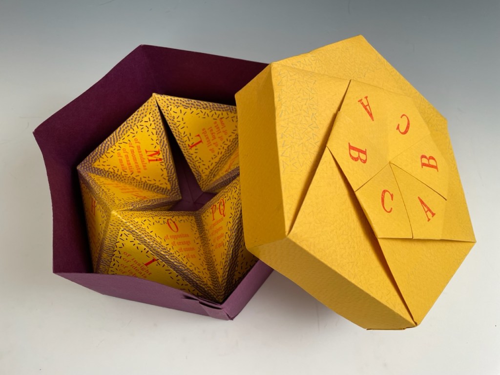
Kathleen Amt, Kaleidoscopic ABC’s (1991)*. What rests inside the paper box is a flexagon, six paper pyramids bound together to create a “fidget toy” alphabet book of 24 “pages” (4 panels x 6 pyramids) to be read by turning it inside out again and again. Look for the tricky panel page at the end.
Matsumasa Anno, Anno’s Magical Alphabet (1981)*. An anamorphic alphabet requires great skill from the illustrator and a bit of effort from the reader. To read the pages of this alphabet, the reader removes a piece of mirrored paper from the envelope at the back of the book, furls it into a column and places it in the center of each page. Then the image at the bottom and the letter at the top of the page take their proper shapes in the mirror. To see the letter, though, the reader must spin the page around or go to the other side of the table. The physics of vision meets the physics of reading.
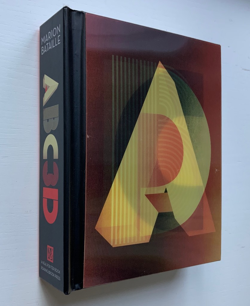
Marion Bataille, ABC3D (2008).* More than an alphabet pop-up book, this is a book of shapes, moving parts, optical illusions and visual puns. It demonstrates Bataille’s preeminence as a paper engineer and book artist.
Carol DuBosch, Rainbow Alphabet Snowflake (2013).* Magnets hidden in the front and back covers hold this star book open in its standing sculptural form.


Karen Hanmer, The Spectrum A to Z (2003). Compare this tunnel book with Amy Lapidow’s below. Such similar concepts but distinctive interpretations.
Helen Hiebert, Alpha Beta (2010).* In this lantern-structure book, each panel displays an alphabet letter cutout casting a shadow against a second layer of handmade paper.


Ron King, Alphabeta Concertina majuscule (2007) and alphabeta concertina miniscule (2007). On one side, the uppercase of A-M (or a-m), and on the other, that for N-Z (or n-z), these works combine pop-up structure with the double-sided concertina (or leporello). It’s surprising how little of each letter we need to recognize it whether it is lowercase or uppercase.

Ron King, ABC Paperweights .* Not really “bookish”, but they display in a pure sculptural form the artist’s eye for the minimal lines and spaces in the three basic geometric shapes — triangle, square and circle.
Amy Lapidow, Spiralbet (1998).* The spectrum of colors and the sequence of A to Z are so locked in a spiral that perhaps this tunnel book should be termed a “funnel book”.

Scott McCarney, Alphabook 3 (1986).* In this two-volume leporello, the cover wrap for the first volume is cut, tabbed and slotted to suggest the letter A; that for the second, to suggest the letter Z. Like three-dimensional stencils, the letters show multiple ways in which the space inside a letter and outside that letter combine to define the letter.
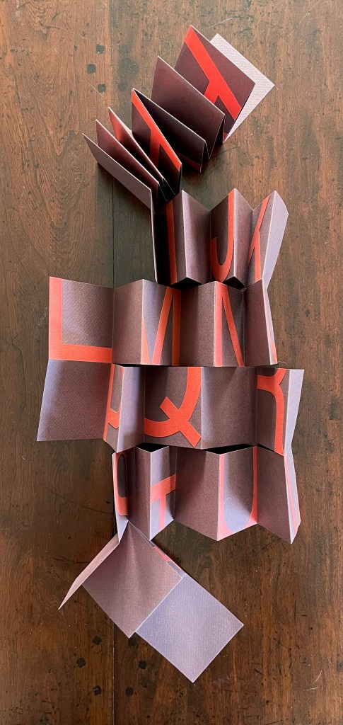
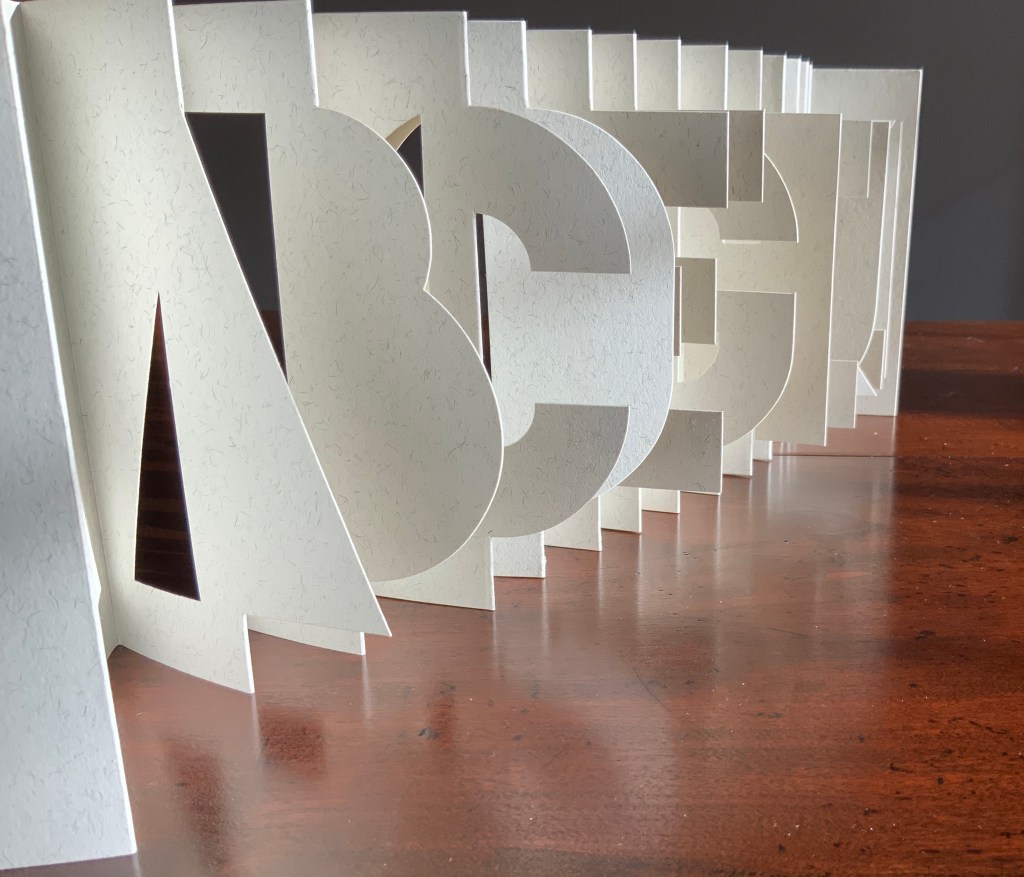
Lisa McGarry, Twenty-six/Fragments (2012).* Although it folds down into a nearly miniature book, this meander fold book unfolds into a poster-sized single sheet that, like several works here, takes its artistic inspiration from how little it takes to be able to identify the letters.

Patrice Miller (Edward Gorey), The Eclectic Abecedarium (2022).* The flag-book structure, which has the reader twisting and peering from so many angles, provides an ideal form with which to celebrate Edward Gorey’s eclectic vignettes and mysterious rhyming couplets.
Jeff Morin and Steven Ferlauto, Sacred Space (2003).* This flat-pack kit of parts becomes a model of the collapsible and portable shed celebrated as the sacred space in the book that comes in the wooden box holding the flat-pack kit.


Published to commemorate the Movable Books Society’s 25th anniversary, A to Z Marvels in Paper Engineering (2018) is aptly subtitled. A video created by Christopher Helkey gives 26 brief cameos to the contributing artists in which they demonstrate those marvels.

An alphabet-related work that underscores Picasso’s calling Bruno Munari “our Leonardo” is ABC con fantasia (1973/2008). If we are to believe Fra Luca Pacioli, it was Leonardo da Vinci who inspired his “straight lines and curves” exposition for creating letters. Following in their footsteps, Munari provides the linear and curvilinear basics for the collector and offspring to join the game.
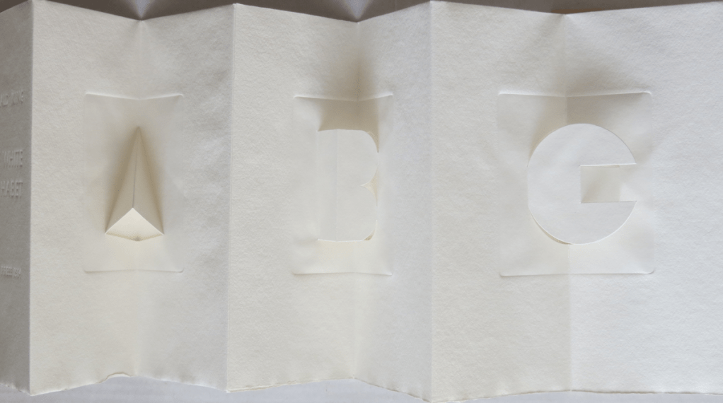
Bruno Riboulot, ABCD’Air (2005).* Codex of letters made from the “air” around and in them — formed by cut0uts, torn pages and “reveals” with different colored papers.


Merrill Shatzman, Calligrafitti #3 (2011).* While there are several leporellos on the exhibition, this one displays the letters of multiple alphabets in an intricate, handcut form.

Emmett Williams, abcdefghijklmnopqrstuvwxyz (1963).* In progress More than seven feet in length, this alphabet scroll was originally published around 1961 by Verlag Kalender, the same publisher that published the Kalender Rolle, whose form influenced this work. Intended for performance, the scroll is gradually unfurled and read aloud.
Online Exhibition Bonus!
Helen Hajnoczky, alpha seltzer (2023)*. Meant to hang from its beginning or ending loop and be read vertically to see the alpha seltzer tablets fizzing down or floating up, this double-sided structure is a blend of the double-sided leporello and palm leaf structure.

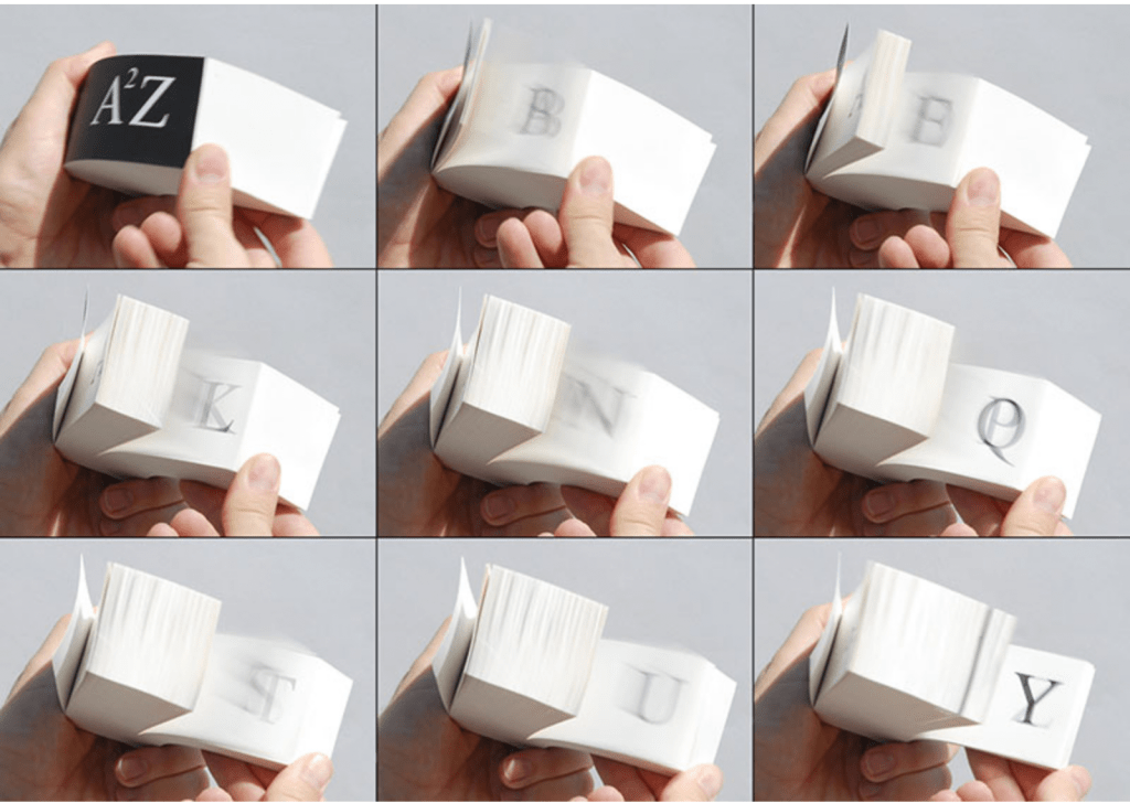
Karen Hanmer, A²Z (2013). In progress. As this flip-book shows, there is more than one way to get from A to Z. Scott McCarney’s Alphabook 13 (below) provides another.
Ron King, The White Alphabet (1984). This double-sided leporello’s larger scale offers another opportunity to explore how light, paper, folds and cuts interact to provide the simple clues we need to distinguish a letter — and, by comparing it with the smaller versions, the chance to see how King has changed those sculptures over the years.
Scott McCarney, Alphabook 13 (1991). Another flip-book (see Helen Hanmer’s above), but only the A and Z appear.


Scott McCarney, Alphabook 10 (2015) This book combines the alphabet sequence with the harlequinade (“flap-book”, “turn-up”, “metamorphosis” or “lift-the-flap”) structure invented in 17th century, in which the book’s narrative unfolds as each flap is lifted.
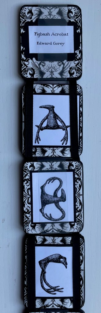
Patrice Miller (Edward Gorey), Figbash Acrobate (2023). In progress Likewise the tumbling Jacob’s ladder structure is perfect for reading the Figbash acrobats as they bend and twist into the shapes of the letters. See also “Alphabets Alive! B is for Bodies”.
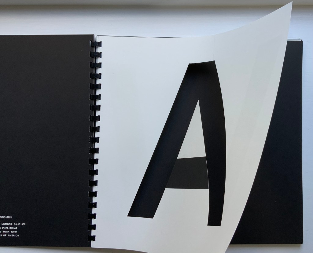
Thomas Ockerse, The A-Z Book (1969/2014). In progress Ockerse’s spiral-bound harlequinade does not proceed from A to Z. Instead, a turn of the page demonstrates how an A can become a V, which then becomes an M, which then becomes an E. It has more in common with Munari’s ABC con fantasia than McCarney’s alphabetically sequenced Alphabook 10.

Maria Pisano, XYZ (2002). Two important features distinguishing this leporello from others are its miniature status and its being made with pulp paint.

Borje Svensson & James Diaz, Letters (1982). Tunnel block. This little diorama reveals itself inside a small cardboard box designed to look like an alphabet block. The author and illustrator teamed up to create another on the theme of A for animals.
