Be Amazed (and other words to live by) (2013)
Be Amazed (and other words to live by) (2013)
Lisa McGarry
Nine cards cut and glued to be formed into cubes. 70 mm. Acquired from the artist, 18 February 2023.
Photos: Books On Books Collection and courtesy of the artist.
A frequent activity in book art is the thematic challenge. In 2010 from her studio in Maleny, Queensland, Australia, Fiona Dempster initiated an annual global challenge to calligraphers to create a letter a week reflecting a particular set theme. The challenge ran through 2014 and generated not only outstanding works of calligraphy but artists’ books and installations as well. Here are the rules and theme for 2012:
Welcome to A Letter a Week 2012, a project that began in 2010 and is primarily about having fun, experimenting and having a regular, small project to focus on each week.
The aim is simply to:
- Write/create a letter a week
- Creating 52 letters
- Which must form 2 x alphabets (that is not 52 x the letter ‘A’)
- By the end of 2012
The main rule is that the letter must be presented on a piece of material measuring 7cm x 7cm
– this helps keep a sense of uniformity amongst the pieces which helps with exhibition coherence.
The other criterion for 2012 is that ONE alphabet has to meet the criteria of “Going dotty – polka dots and pixels”
– that means the alphabet uses dots or circles in some form, but is still presented on the square. It could mean dotted letters, dotted backgrounds, pixelated letters, nail heads into timber or letters within circles or…your imagination can have fun going dotty.
Each alphabet must be turned into a final piece which could be used for possible publication or exhibition.
– that is, you must put all the letters together into a final piece of art.
Apparently, Lisa McGarry’s studio and kitchen in Florence, Italy, enjoy a certain overlap, which led to her inspiration in answer to the dotty part of the challenge. In her own words:
As I was making polenta one day, the formation of circles when oil was added to the water caught my attention. I quickly photographed the pan of spotted water with the idea of indulging in some play time with Photoshop. By using the “Selective Color” sliders, I was able to introduce some vibrant colors into the rather bland photograph. I further varied the colors, and ended up with a whole rainbow of “dotty” designs.
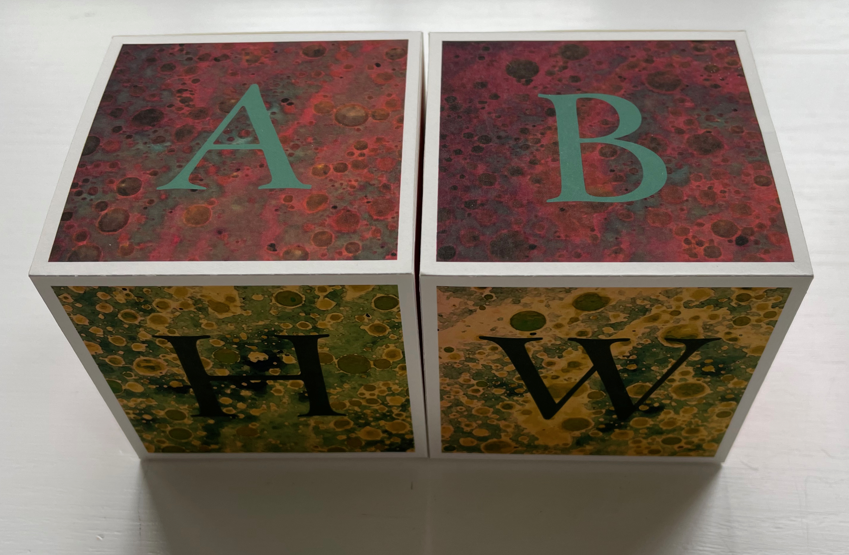
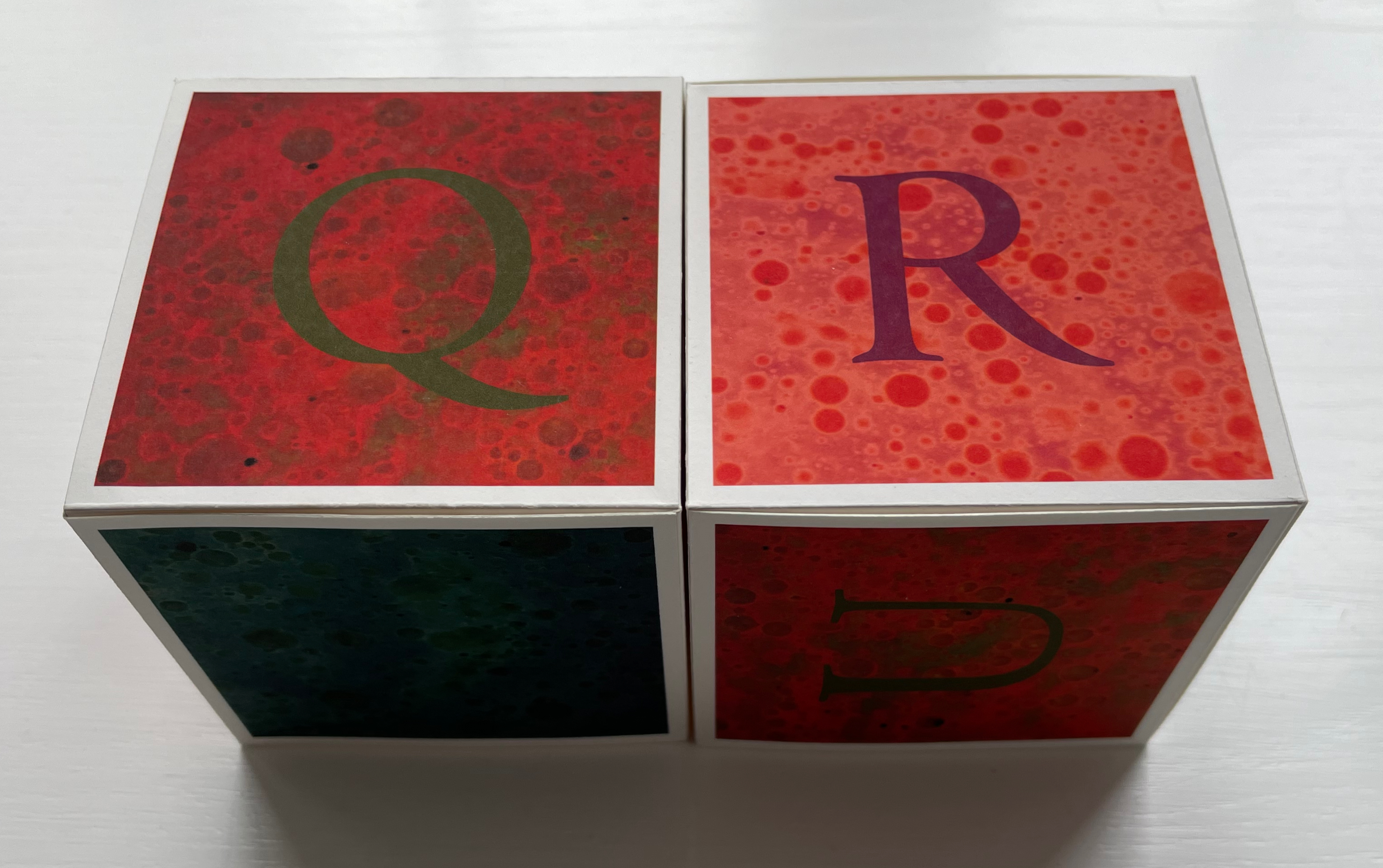
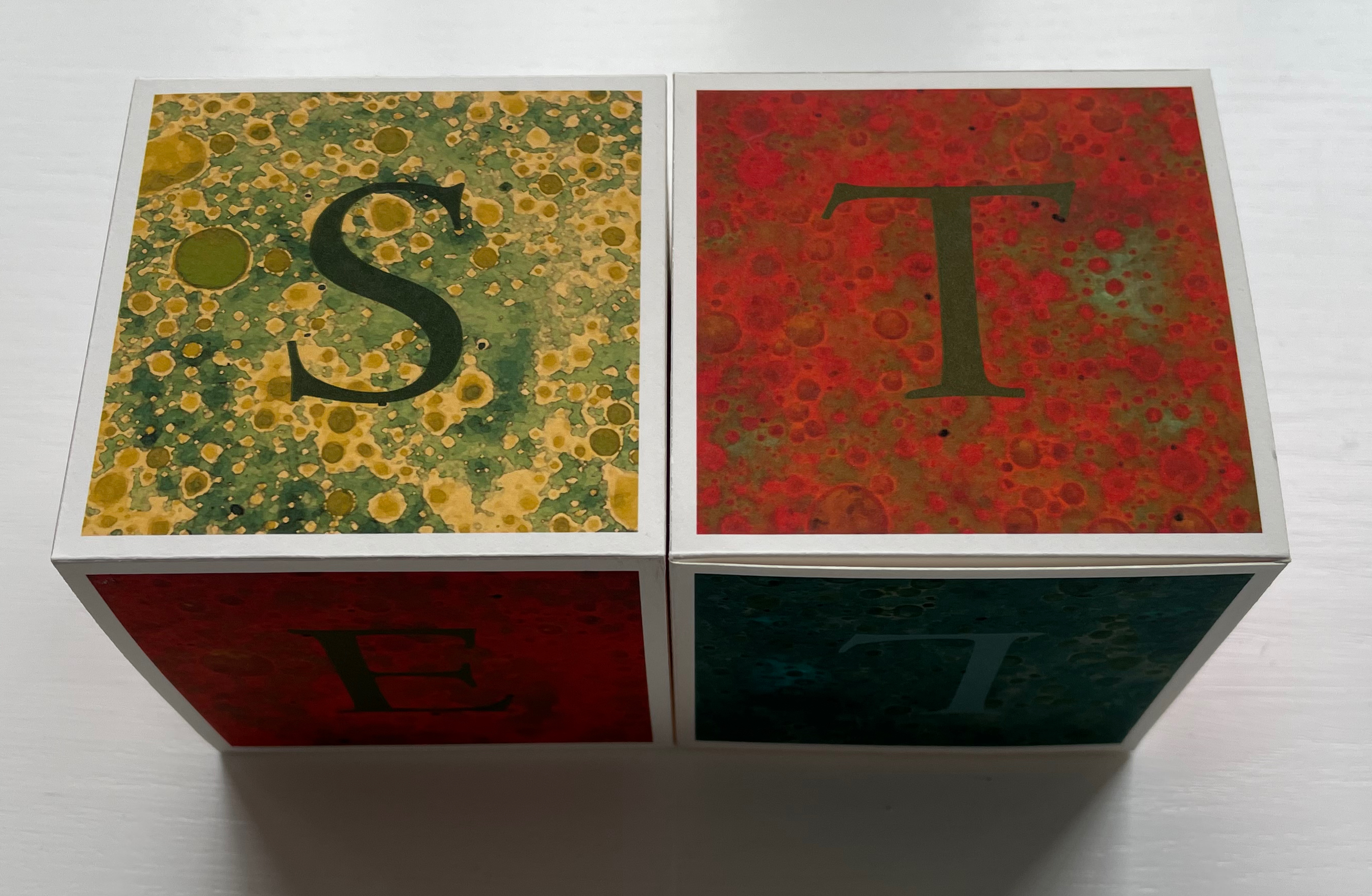
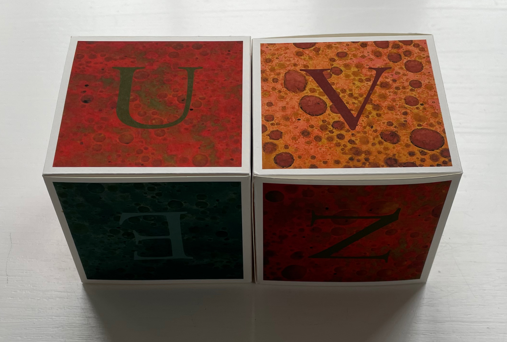
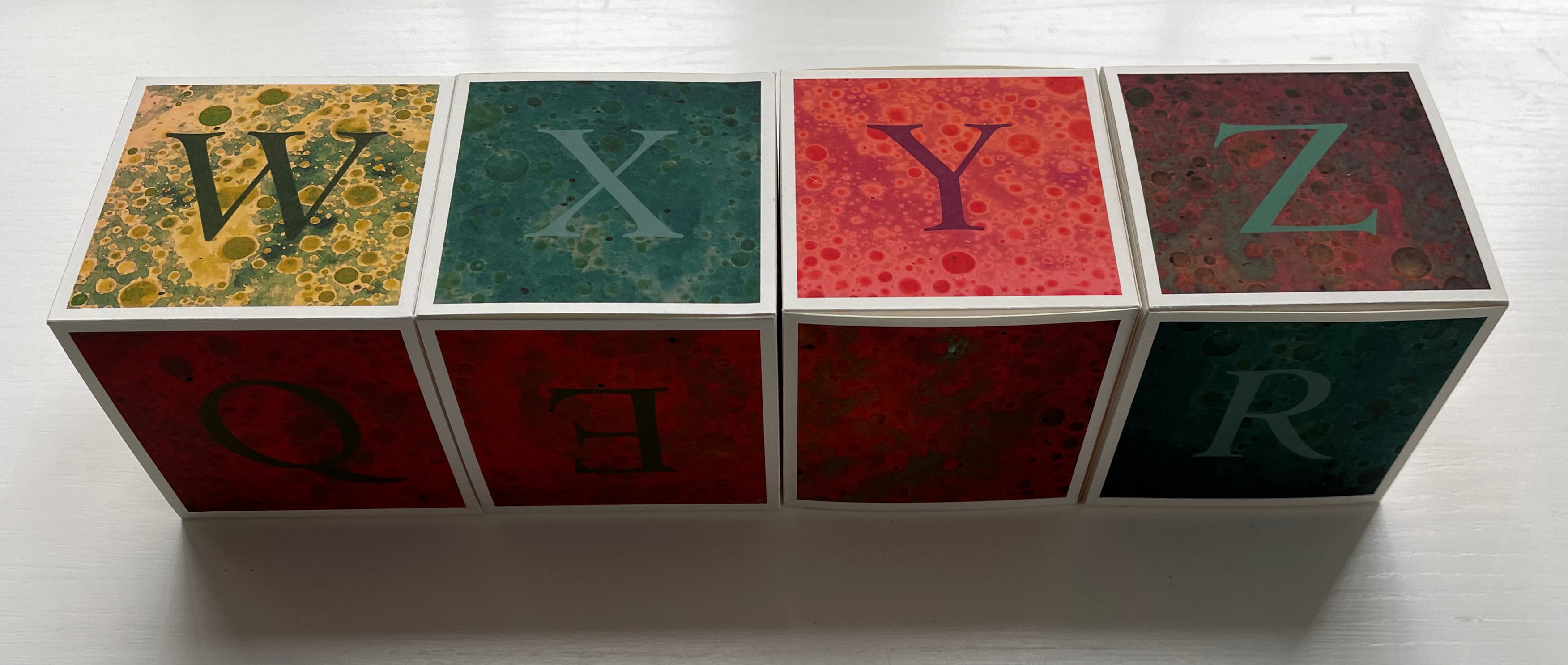
Dotty as the source of the image (or its result) may be, the effect is more of marbling than of boiling polenta. More stone than water. Of course, since Trajan’s Column and before, stone and alphabet go together in Italy. But for the challenge, what arrangement of letters, how many cubes? A minimum of five cubes (30 sides) would be needed for all the letters. Two simple sets of children’s alphabet blocks would then meet the basic requirement. But what about that phrase “still presented on the square” so open to multiple interpretations? Five cubes together would not make up a square, but nine cubes stacked 3×3 would.
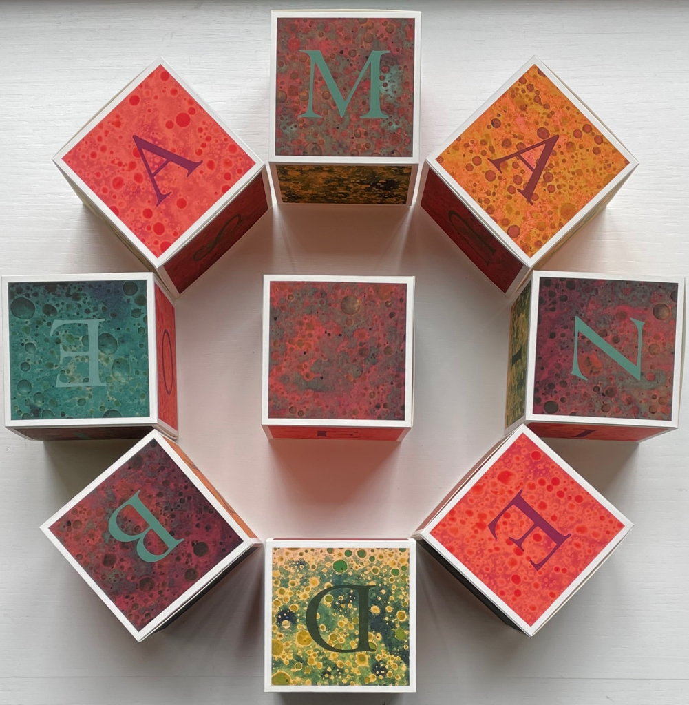
Next I spent some time considering words of nine letters or less, with the idea that the letters of the various color could form a word. Each letter of the alphabet is included at least once, for a complete “alphabet,” though there are multiples of several letters. I wanted to include each letter of the alphabet at least once, for a complete ‘alphabet’. Despite the flexibility gained from the availability of 54 faces, finding words that used all of the letters was much more difficult than I expected (perhaps because I limited myself to words that I associated with living a creative life).
Many words had to be eliminated because their letters were too ‘common’. After filling several journal pages with various letter/word combos, I got out the Scrabble tiles (which were immensely helpful).
These are the words I chose:
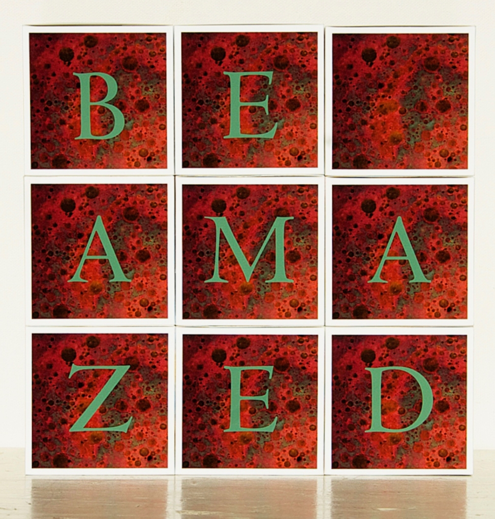
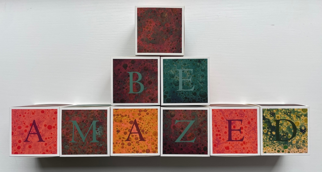
be amazed
explore
question
make/give
create joy
wish/find
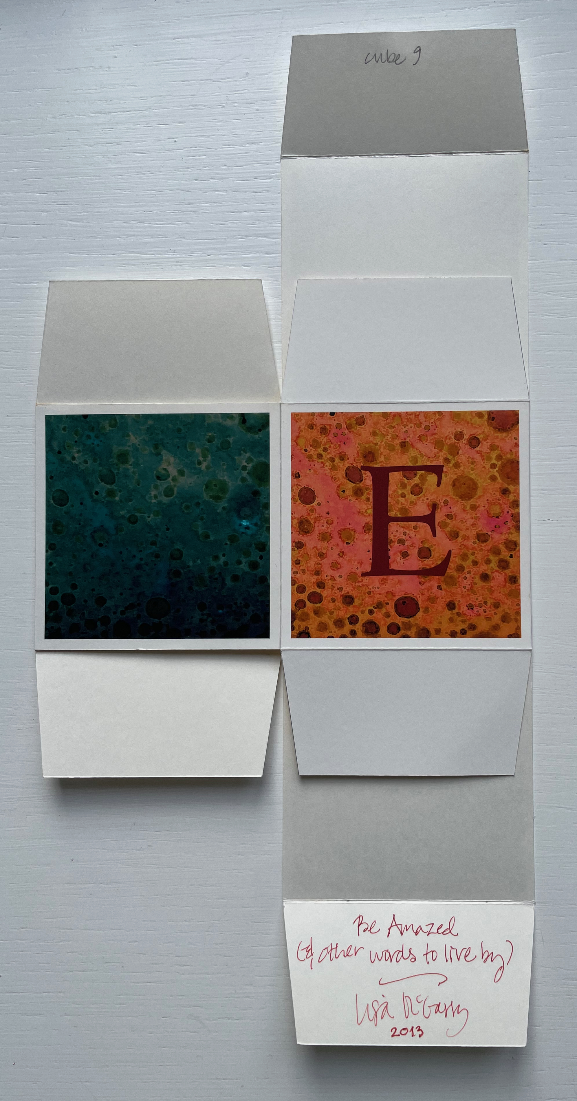
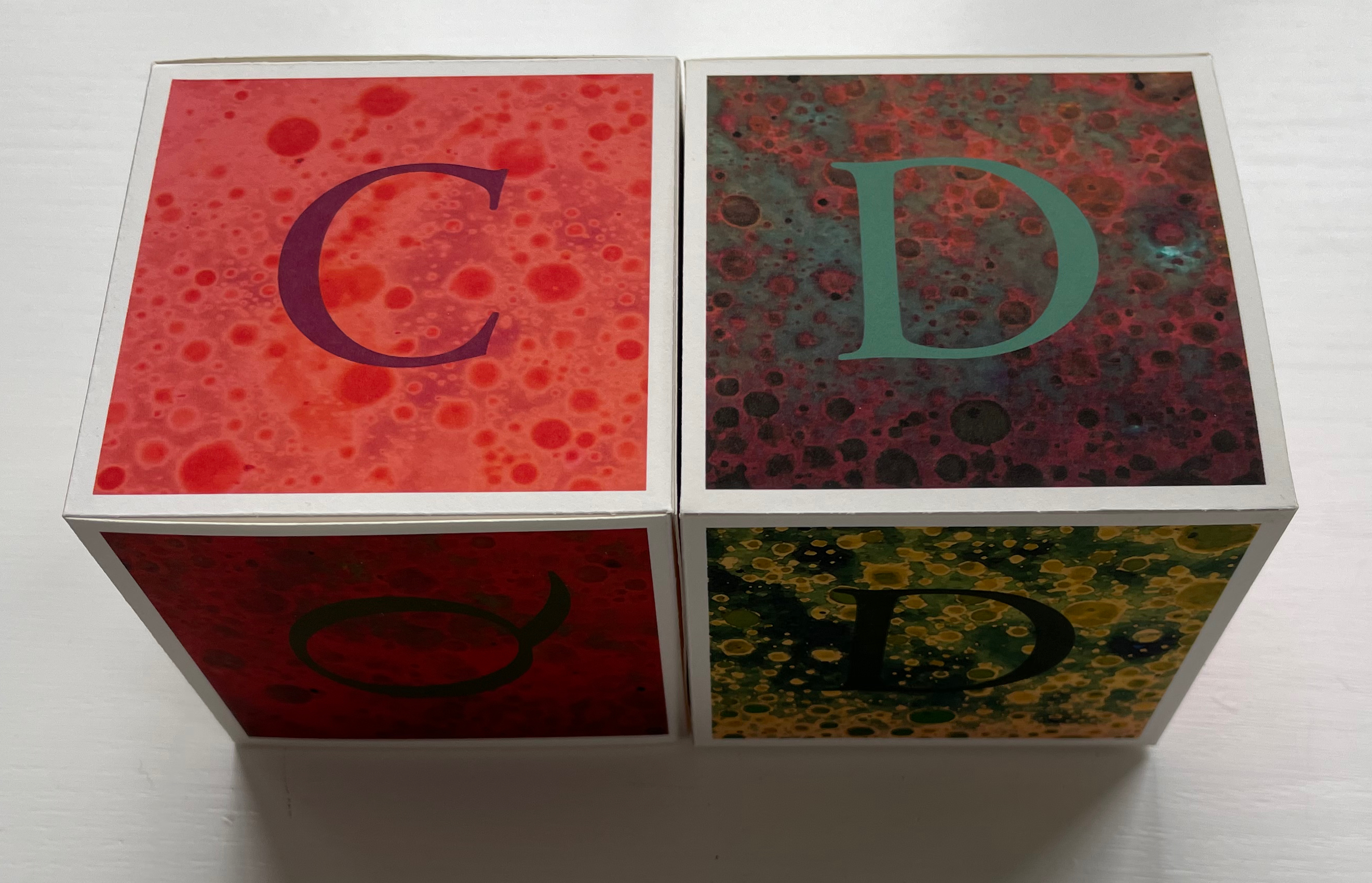
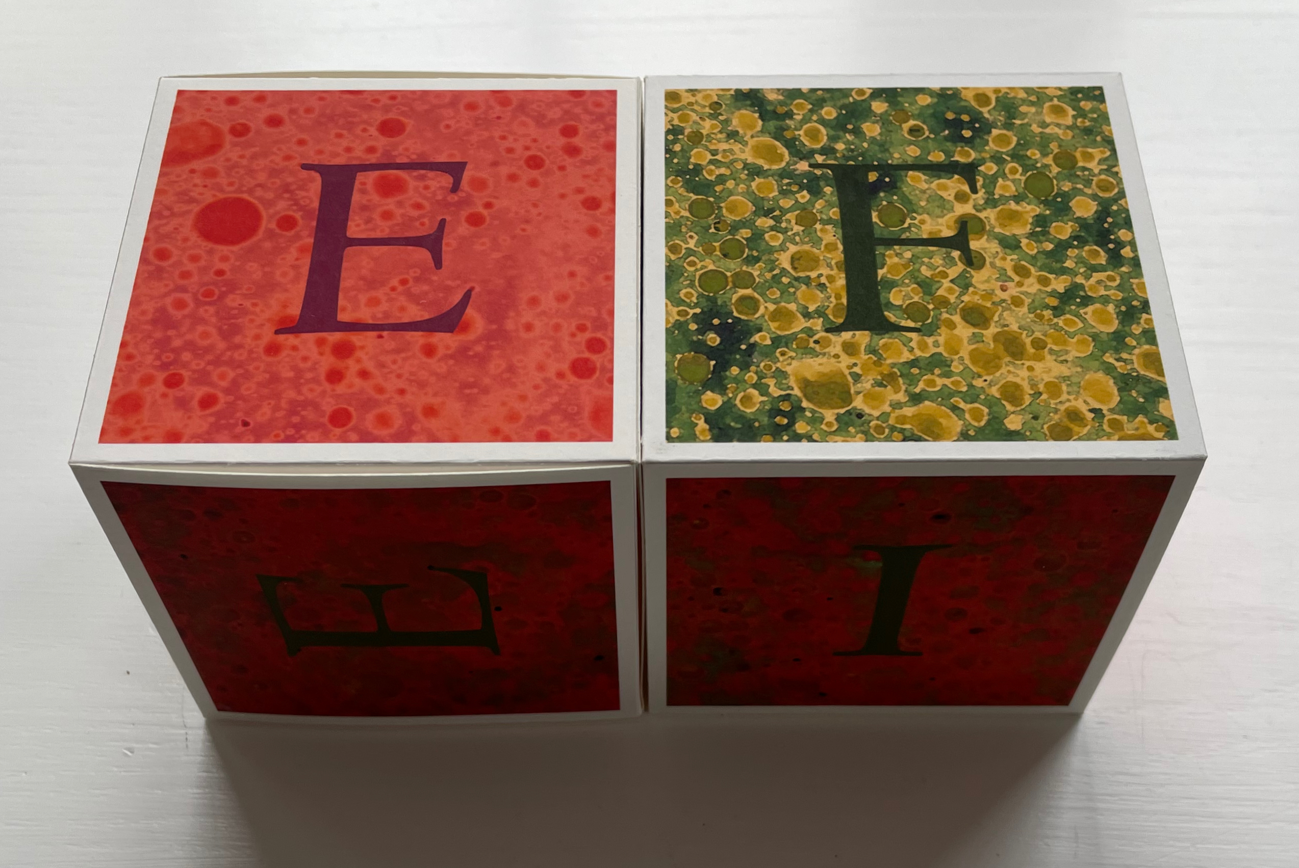
After the flatpack of cubes arrived and had been constructed, the pleasure of letting them tumble from hand to hand and inspecting each panel had to yield to documenting them for the collection. The alphabetic order asserted itself over a grouping by colors. Failing to sort itself into the rhythm of the ABC song (certain pairs of letters appear on one block only), it slowly became obvious that the blocks would need to be paired for their photos (although WXYZ managed to slip by).
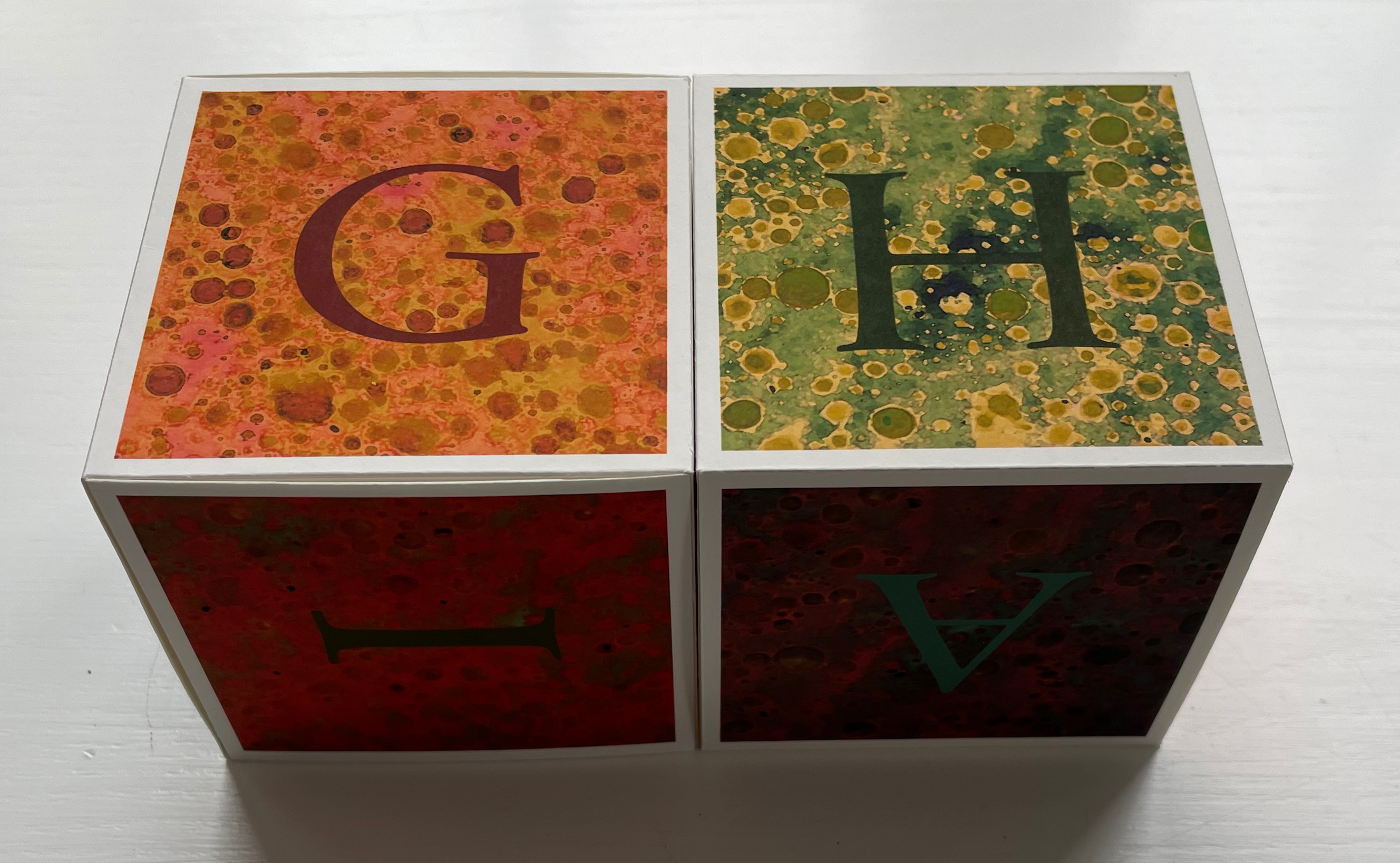
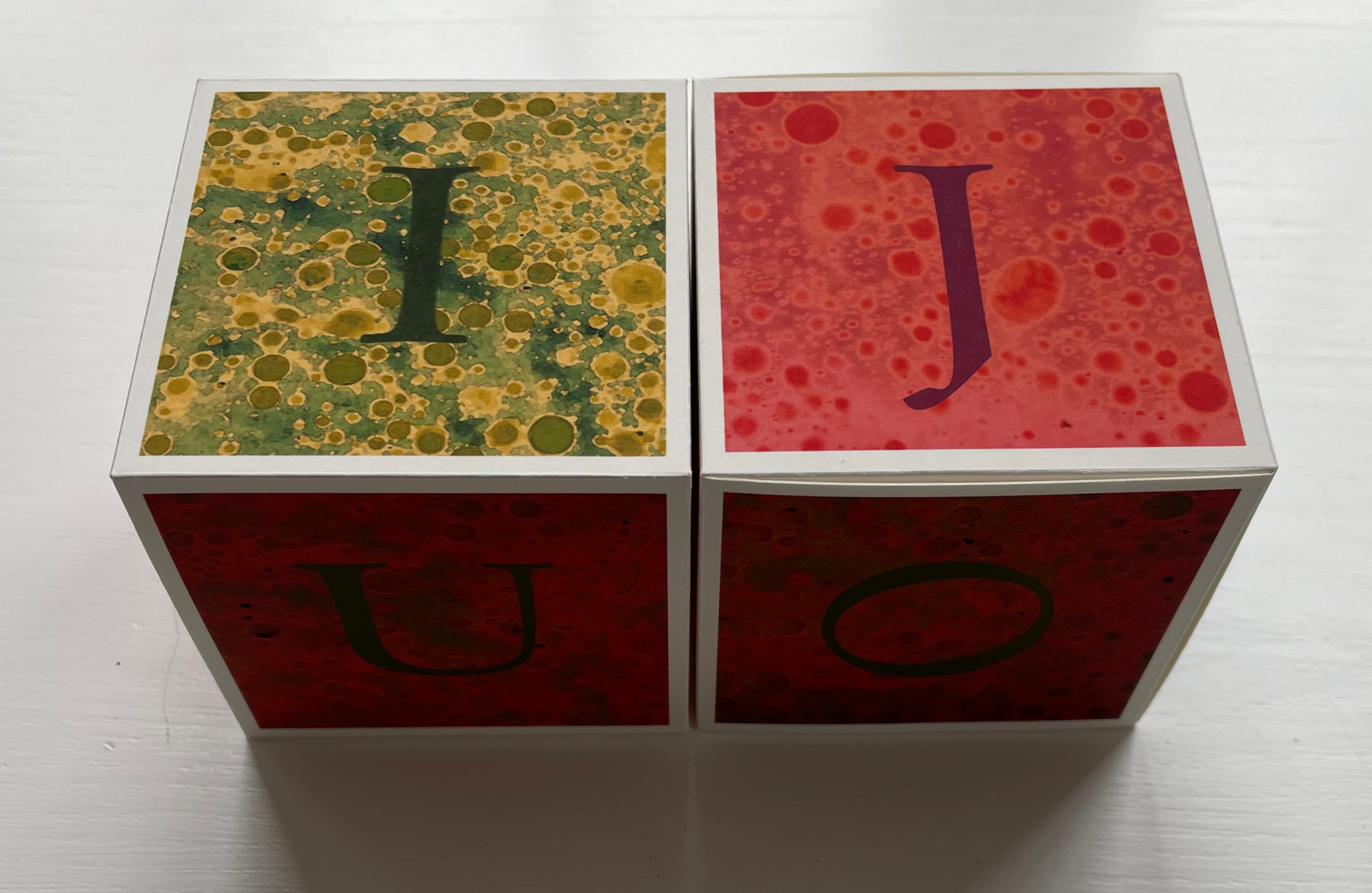
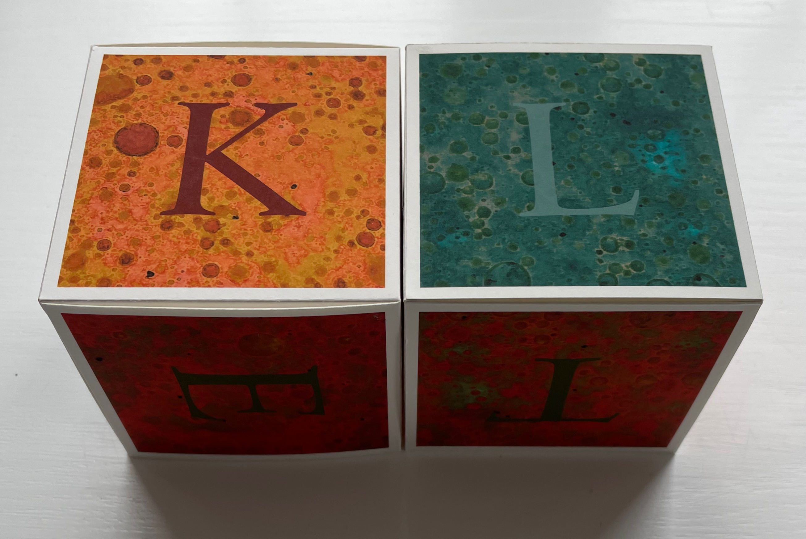
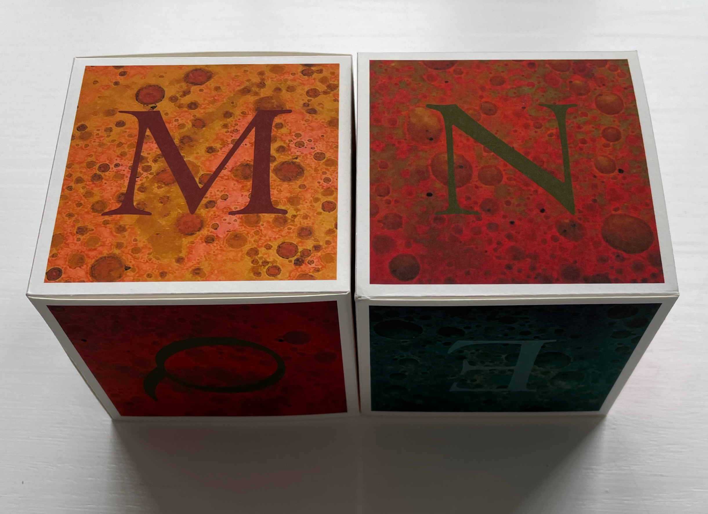
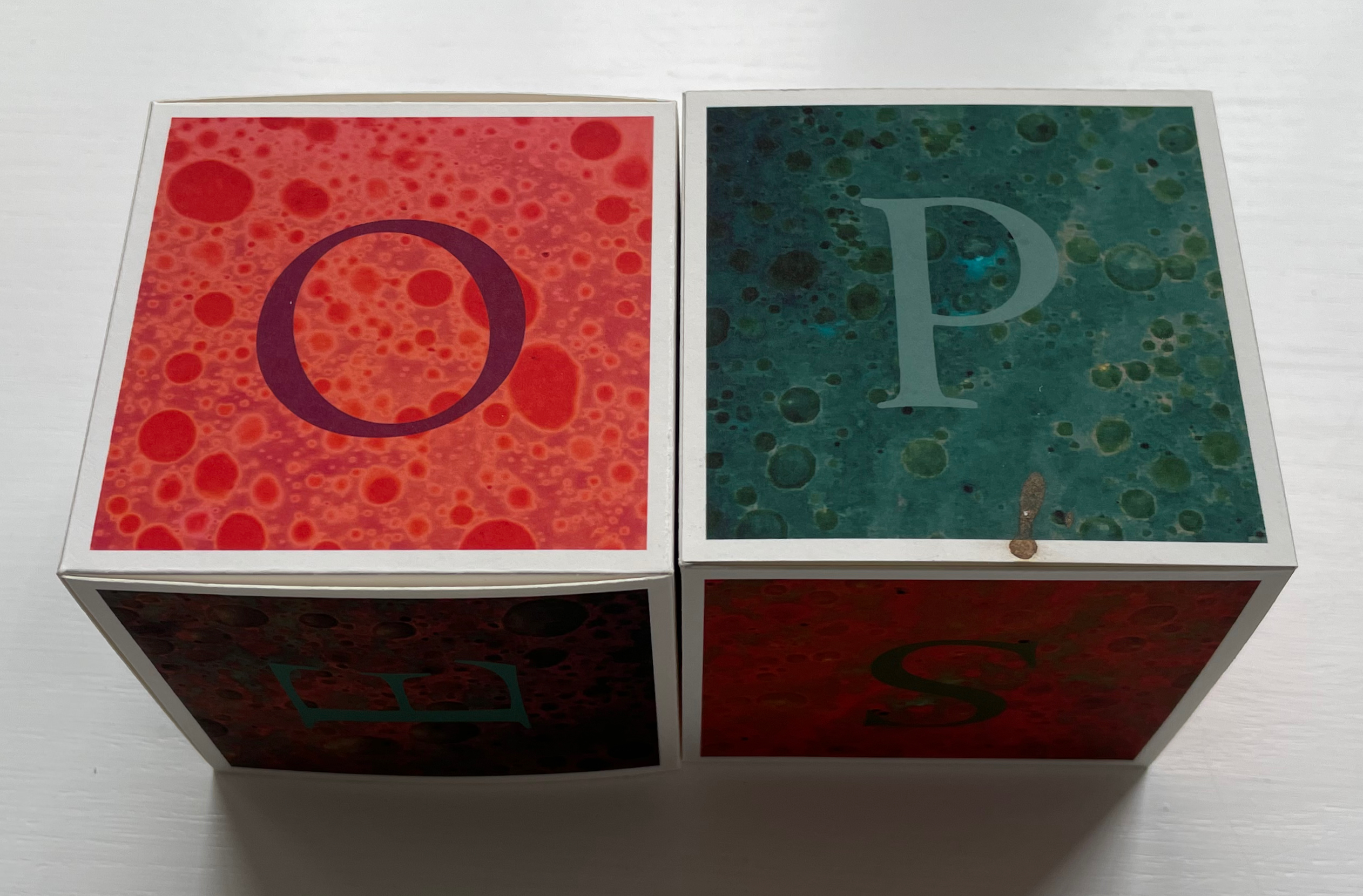
To spell out and display the words for those six words/phrases required letterless faces with just the right color on some of the cubes, which is apparent in the artist’s presentation of the first phrase: BE AMAZED.
Alternative displays (collector’s prerogative, of course) are possible. To see the unified color presentation for the other five words/phrases, the Books On Books Collection visitor should go to the artist’s site and be to prepared to …
Be Amazed was not McGarry’s only response to Fiona Dempster’s “A Letter a Week (ALaW)” challenge.
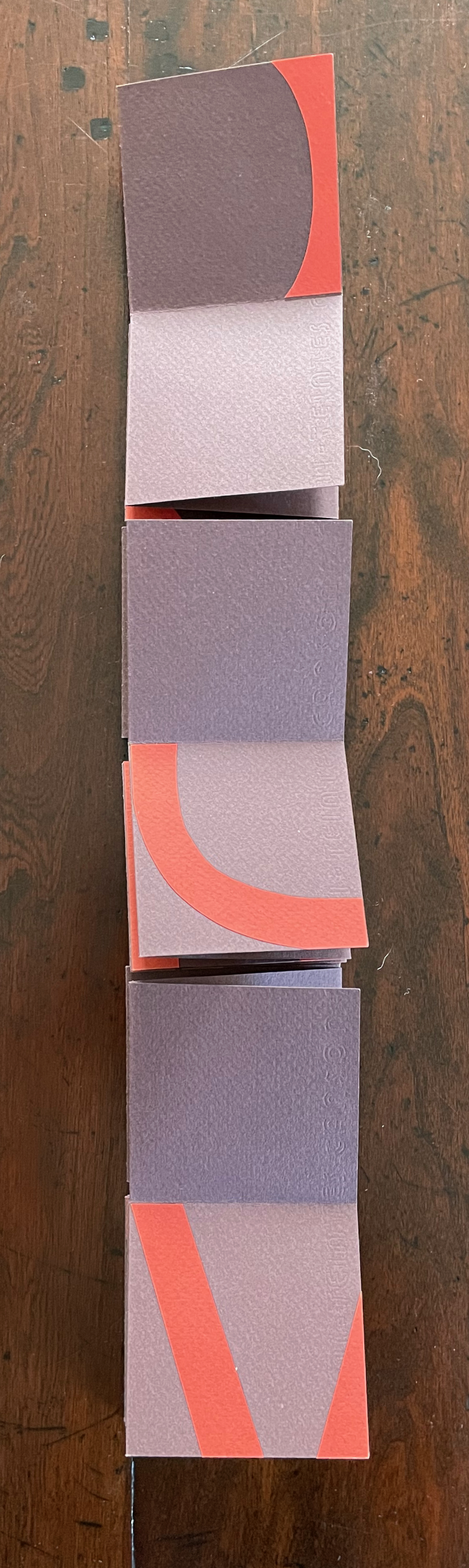
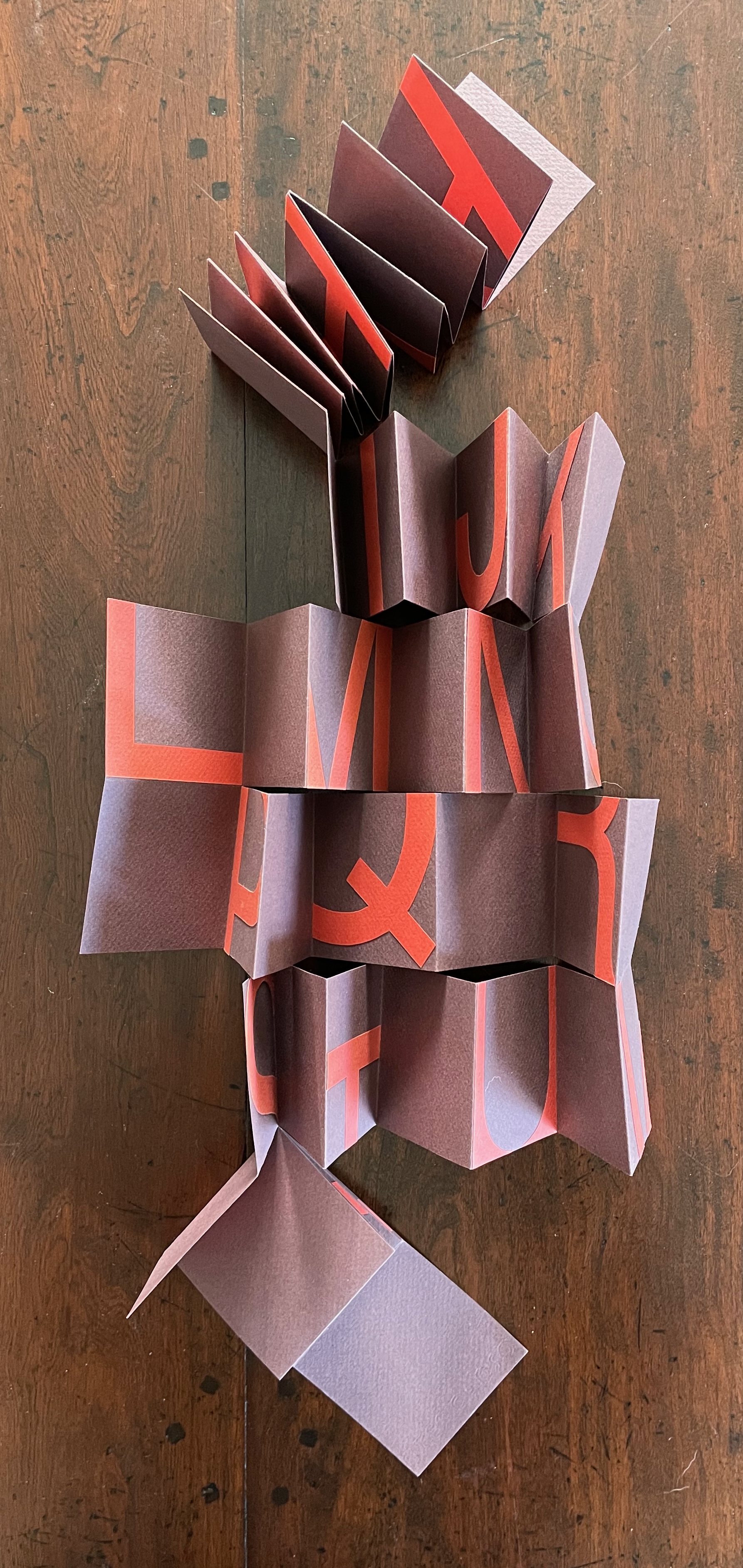
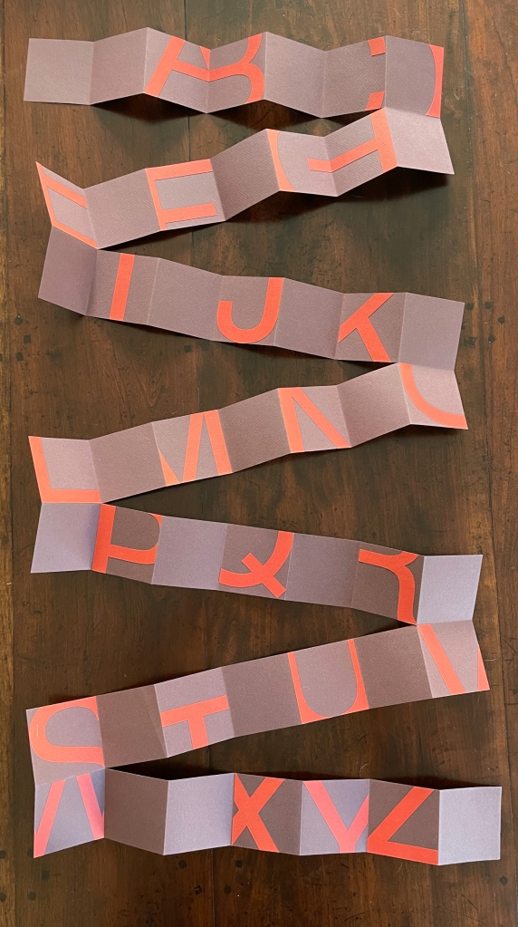
Twenty-six/Fragments (2012)
Twenty-six/Fragments (2012)
Lisa McGarry
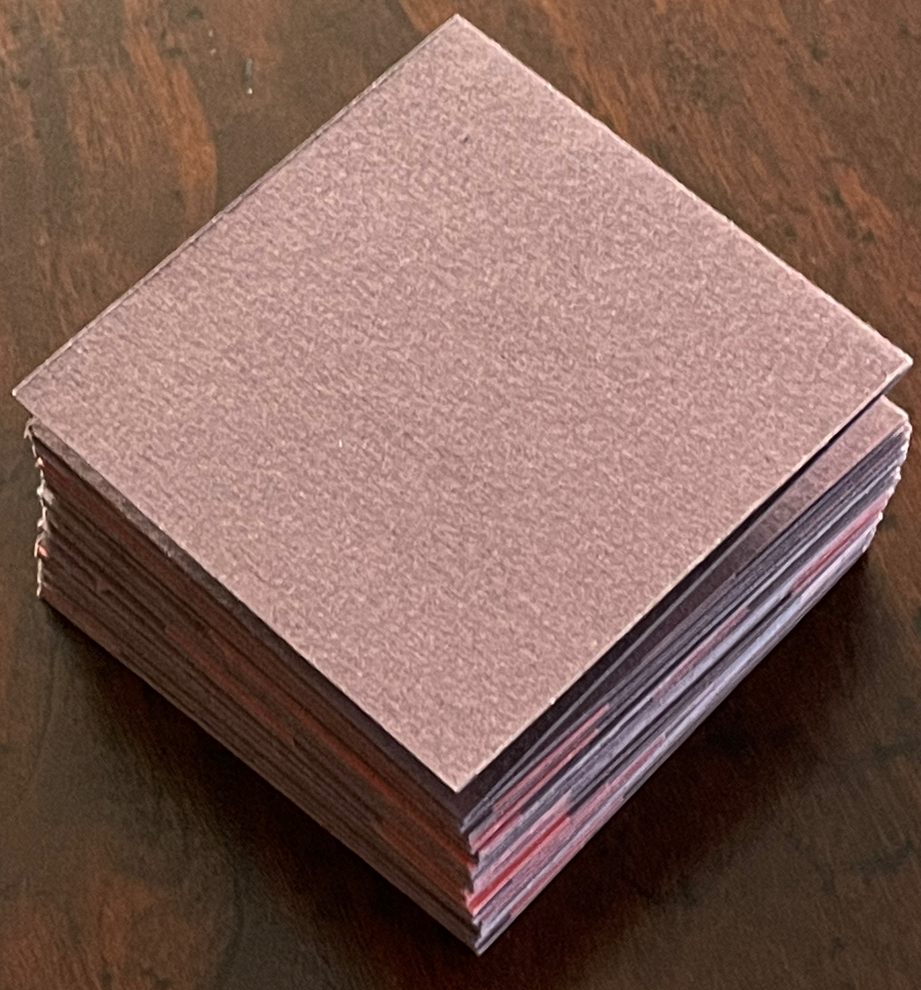
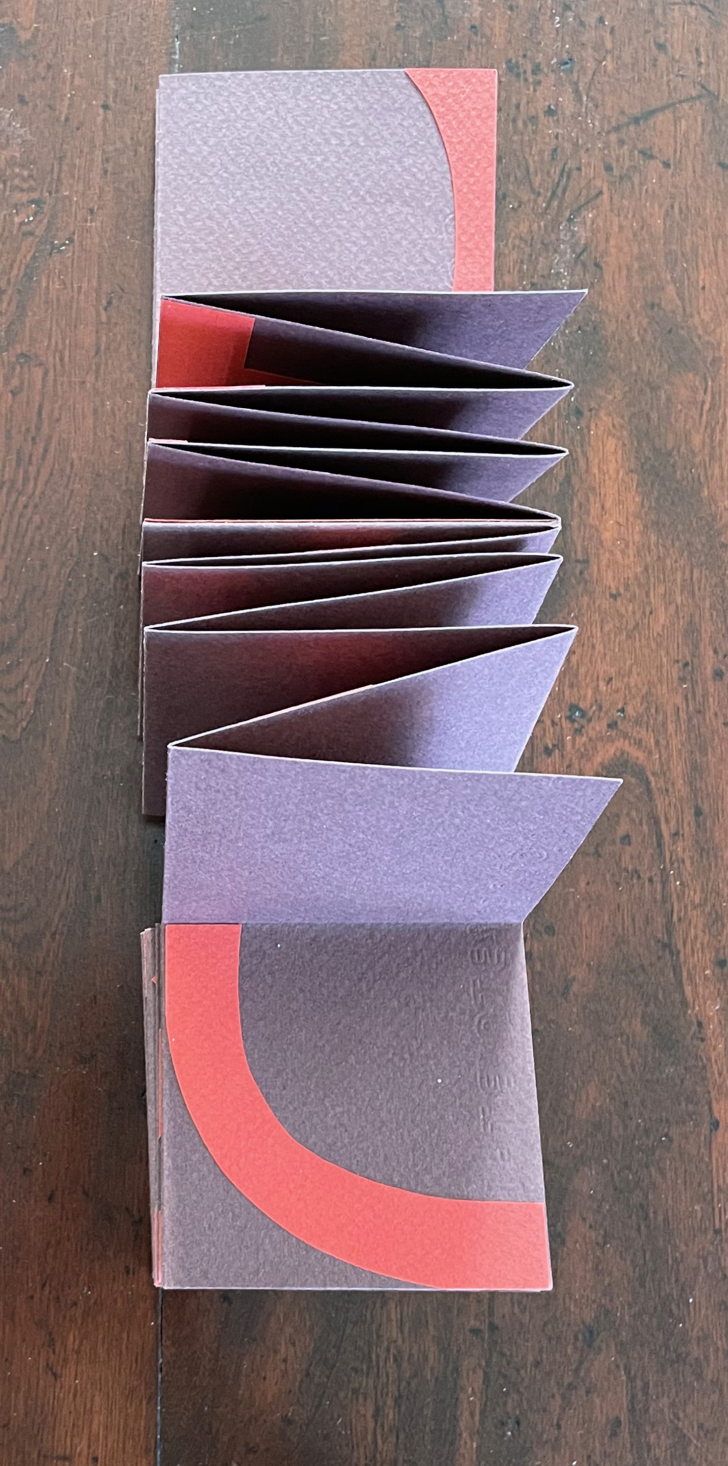
Single sheet, collage, meander cut and fold. Closed: 70 x 70 x D15 mm. Open: 490 x 490 mm. Acquired from the artist, 20 March 2023.
Photos: Books On Books Collection.
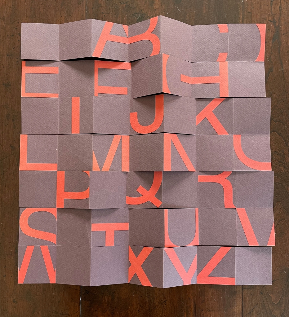
How much of a letter still makes it a letter?
Looking at Lisa McGarry’s Twenty-six/Fragments might prompt thoughts of paleographers and philologists like Jacques-Joseph Champollion-Figeac, Flinders Petrie, Yu Xingwu or Ada Yardeni deciphering markings on bone, bamboo, papyrus, clay and stone …
or psychologists and linguists like Max Coltheart, Matthew Finkbeiner, James J. and Eleanor Gibson or Shimon Ullman pondering the data of visual experiments or the workings of algorithms …
or ancient poets like Anacreon, Archilochos or Sappho known primarily from their fragments.
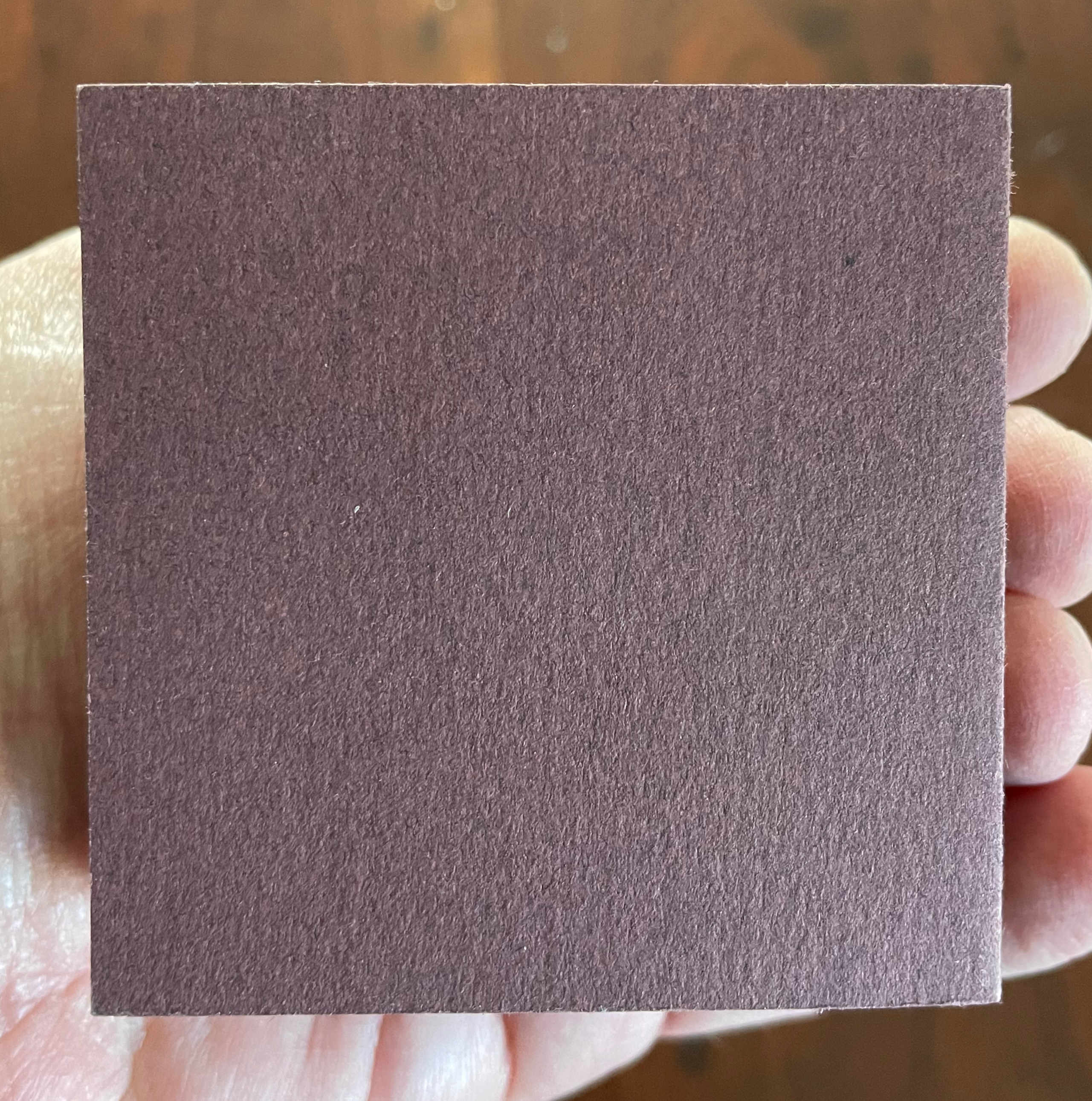
Why not? Eyes, hands and mind cannot help but wander. Twenty-six/Fragments is a “meander” book. Against a 7 x 7 cm, purple-brown, creased and cut background, its tomato red shapes (inspired by the documentary Helvetica) take irregular but alphabetic steps that lead any viewer’s hands to fold, unfold and fold, shape and reshape the work to extract its signals and enjoyment over and over. The font size of 450 yields the right combination of abstraction vs figure. The texture of the 160 gsm Canson Mi-Teintes paper gives a firm tactility that contrasts with the plum color’s fluctuation between purple and brown. A simple but complex work of art.
Further Reading
“Abecedaries I (in progress)“. Books On Books Collection.
“Carol DuBosch“. 25 February 2023. Books On Books Collection.
Chen, Julie. 2013. 500 Handmade Books. Volume 2. New York: Lark. P. 345 (Where Sea and Sky Meet)
Salamony, Sandra, and Peter and Donna Thomas. 2012. 1,000 Artists’ Books : Exploring the Book as Art. Minneapolis: Quarto Publishing Group USA. P. 167 (A Florentine Alphabet).
Dempster, Fiona. 2010, 2011, 2012, 2013 and 2014. A Letter a Week.
