Alphabet City (2009)
Alphabet City (2009)
Scott Teplin
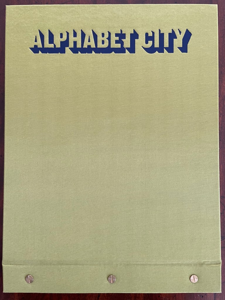
Bolted folio. H270 x W360 mm. [29] pages. Edition of 26, of which this is L. Acquired from the artist, April 2023.
Photos: Books On Books Collection and Courtesy of the artist.
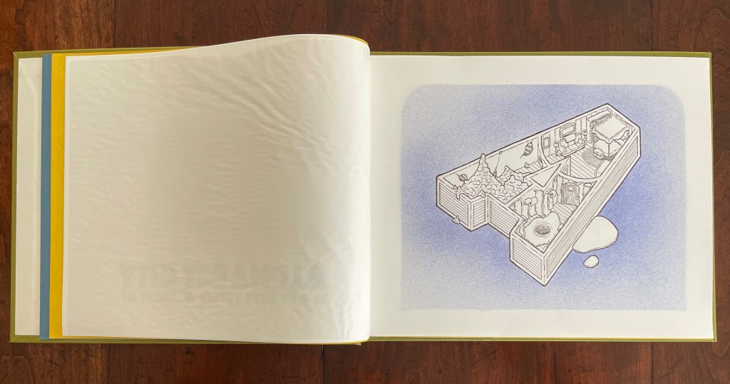
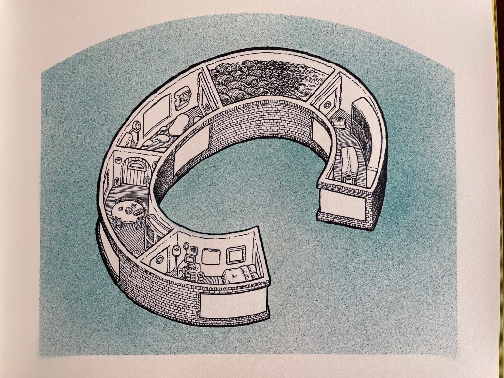
Scott Teplin’s Alphabet City follows in the long line of building designs based on alphabetical foundations. Perhaps first was John Thorpe (1565–1655?), an English architect, who drew up a property based on his initials. Thomas Gobert (1625-90), a French architect, produced Traitté d’Architecture dedié à Louis XIV, a manuscript whose building plans spelled out “LOVIS LE GRAND”. Anton Glonner (1723–1801) designed a Jesuit church and college around the monogram “IHS”. More famous is Johann David Steingruber (1702-87) and his Architectonisches Alphabeth (1773).
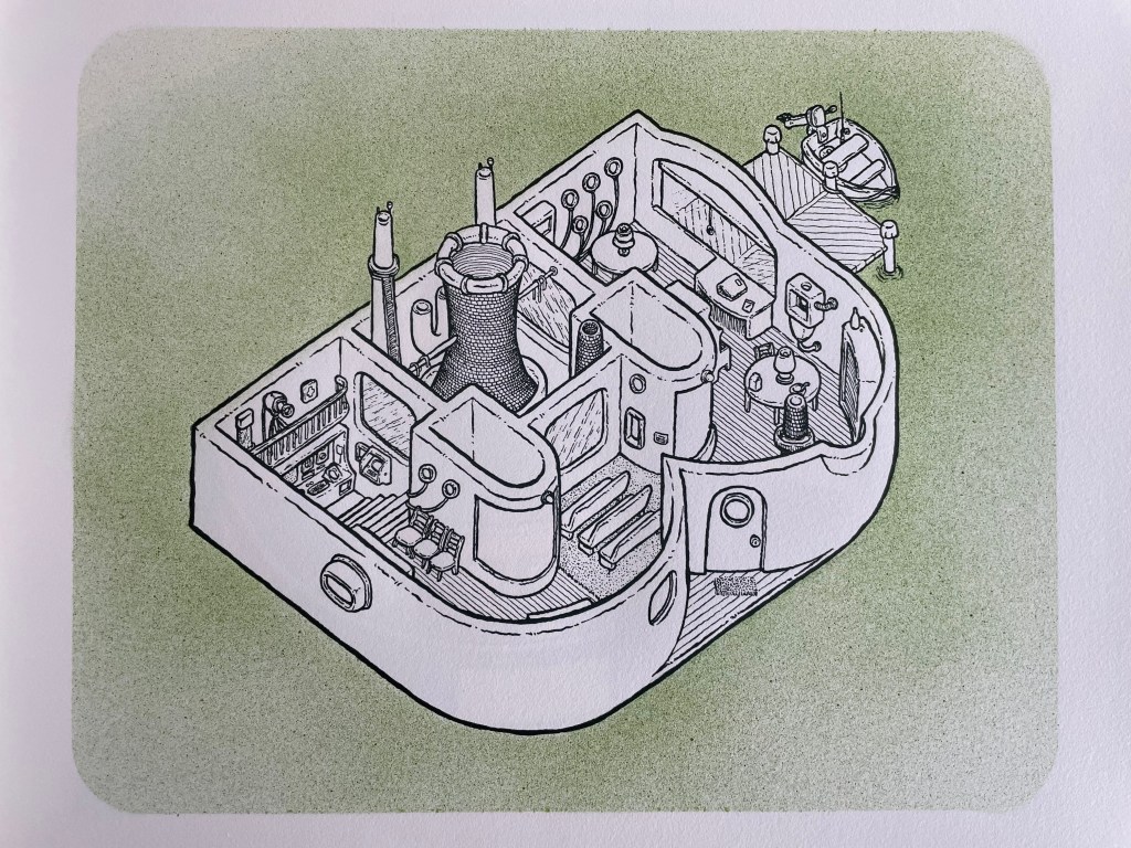
Teplin committed twenty years to his task (Steingruber committed ten) and came to it more from the school of graphic design than the school of architecture. While we might expect bewigged 18th century servants and lords to ride up in carriages to Steingruber’s A to Z, we would not be surprised to find characters from R. Crumb or Mad Magazine inhabiting Teplin’s alphabet-shaped houses, gaming arcades, strange laboratories, ice cream parlors, power plants, and other bizarre edifices. Some houses have no entries or exits. Some have doorless bedrooms. Others have rooms filled with oozing substances or piles of dirt. Some have outdoor swimming pools inside. One, seeming to float on a grass-colored sea, has a boat funnel inside, capped with a life ring, and rooms with deckchairs and portholes. Whimsical and bizarre free association drives Alphabet City.
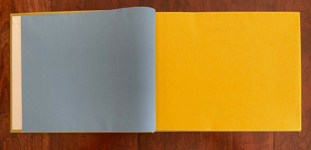
Although the binding of Alphabet City is intended to facilitate removal and mounting of individual folios, it recalls Fortunato Depero’s “bolted book” and, by extension, the “startle” factor intended by Futurism, Surrealism, Dadaism, and all the -isms of that period. From original drawings in pen & ink to scanned images etched to magnesium plates and printed on Zerkall vellum, then airbrushed with Winsor & Newton and Holbein watercolors and pencilled with matching Prismacolor pencils, Alphabet City leans more toward a fine press livre d’artiste than an artist’s book. The foil-stamped Asahi bookcloth cover with its yellow Moriki endsheets would not be out of place at Arion Books or Three Star Books.


Big School (2016)

Big School (2016)
Scott Teplin
Softcover, saddle-stitched with staples. H255 x W203 mm. [16] pages. Acquired from the artist, 23 April 2023.
Photos: Books On Books Collection.
Here’s our chance to pull out a set of colored pencils and join Scott Teplin’s whimsy. The fantastical multi-story school house is what we imagine him to have been drawing in the back row of Algebra class.

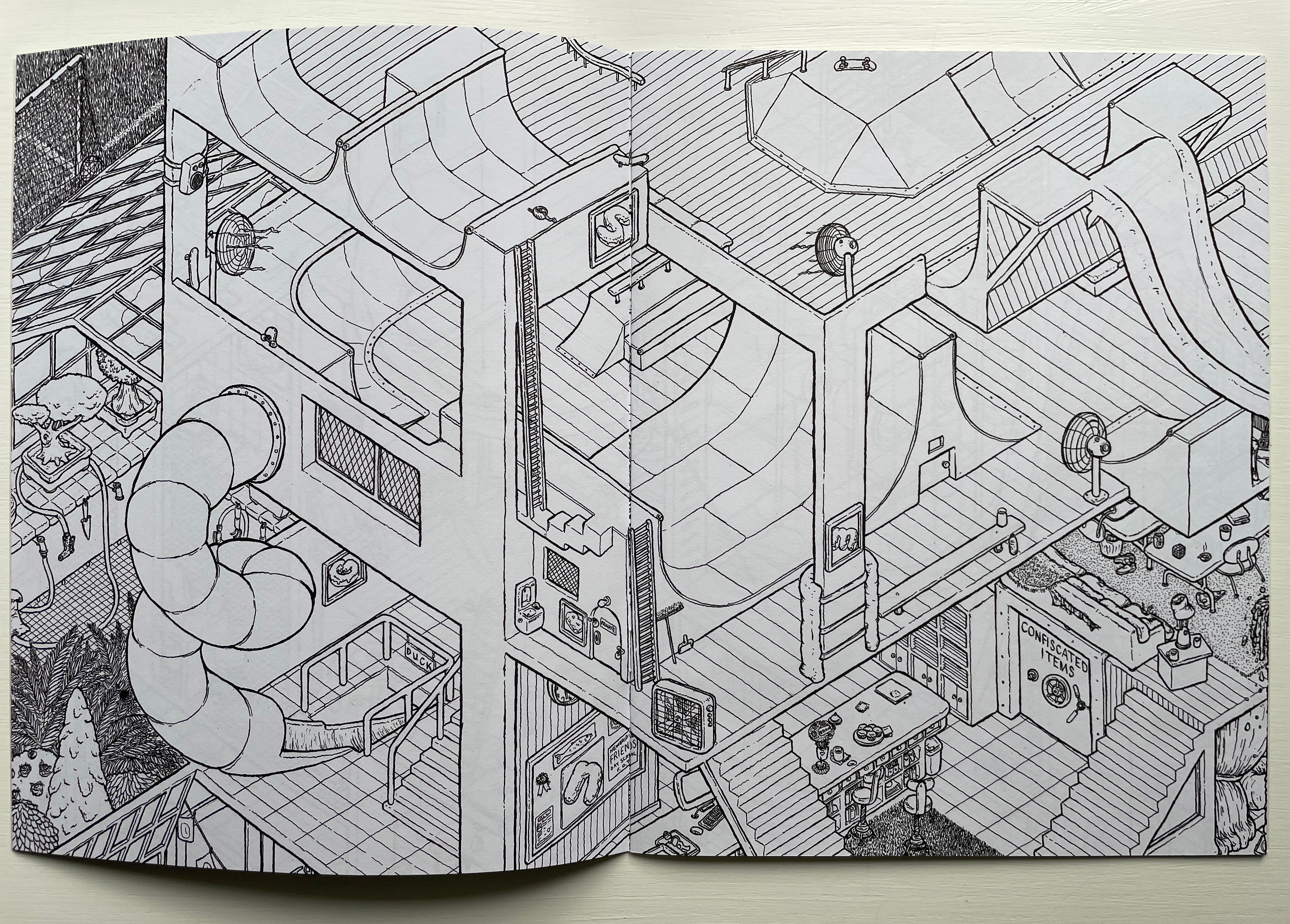

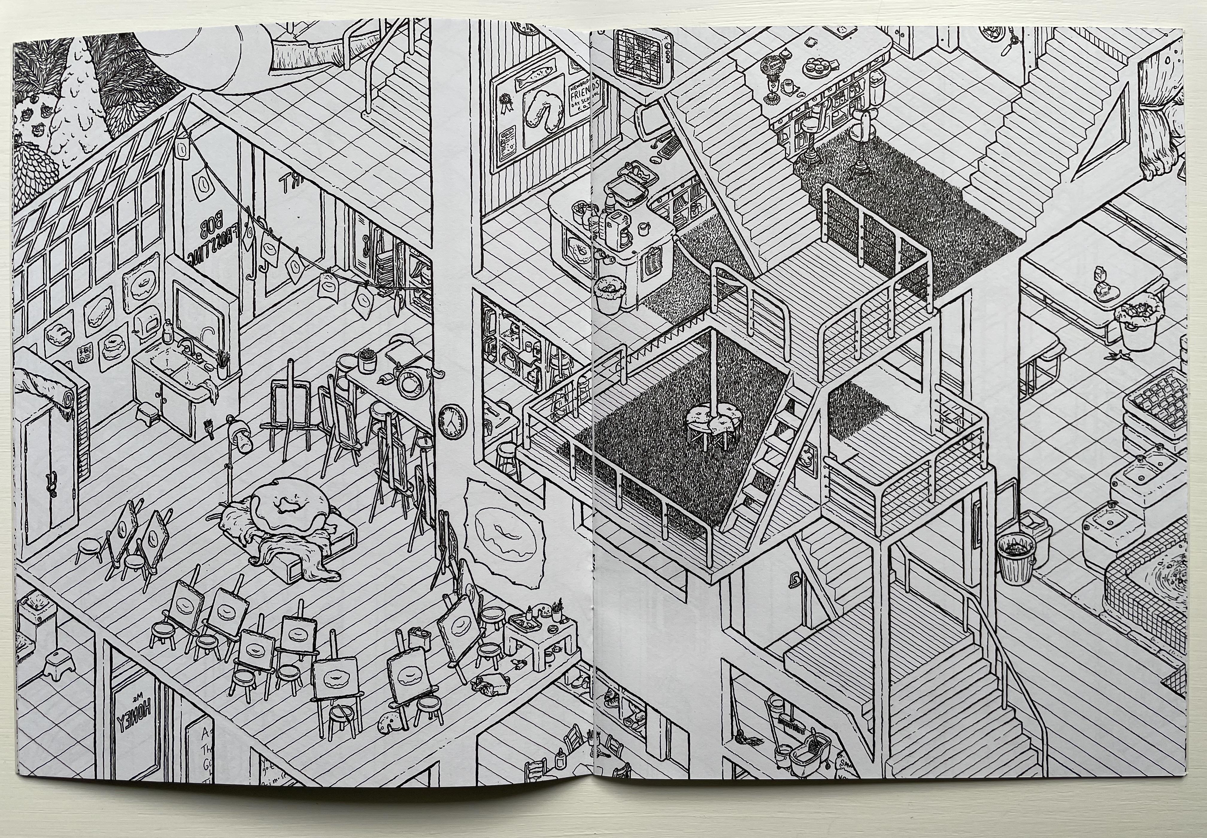

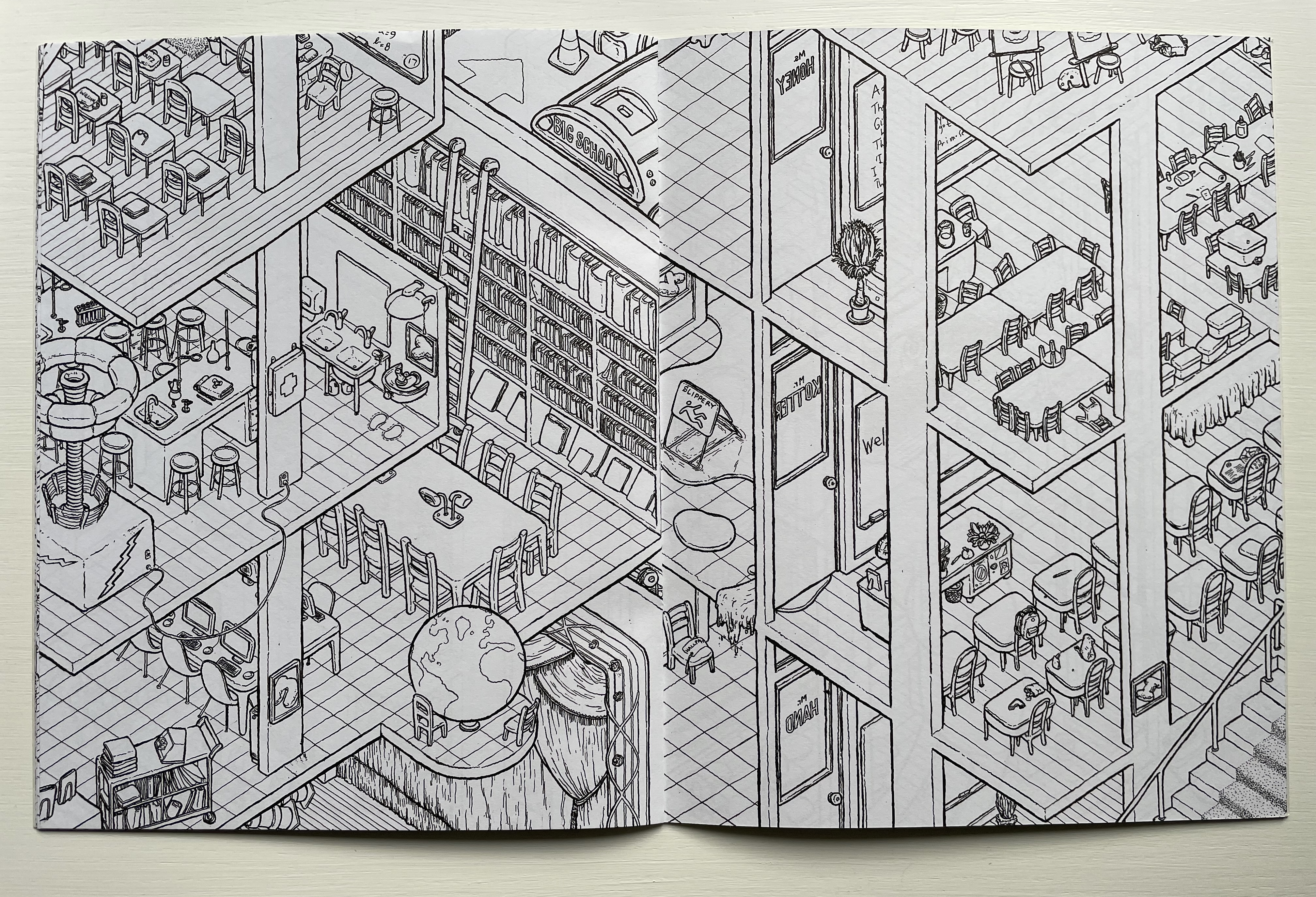
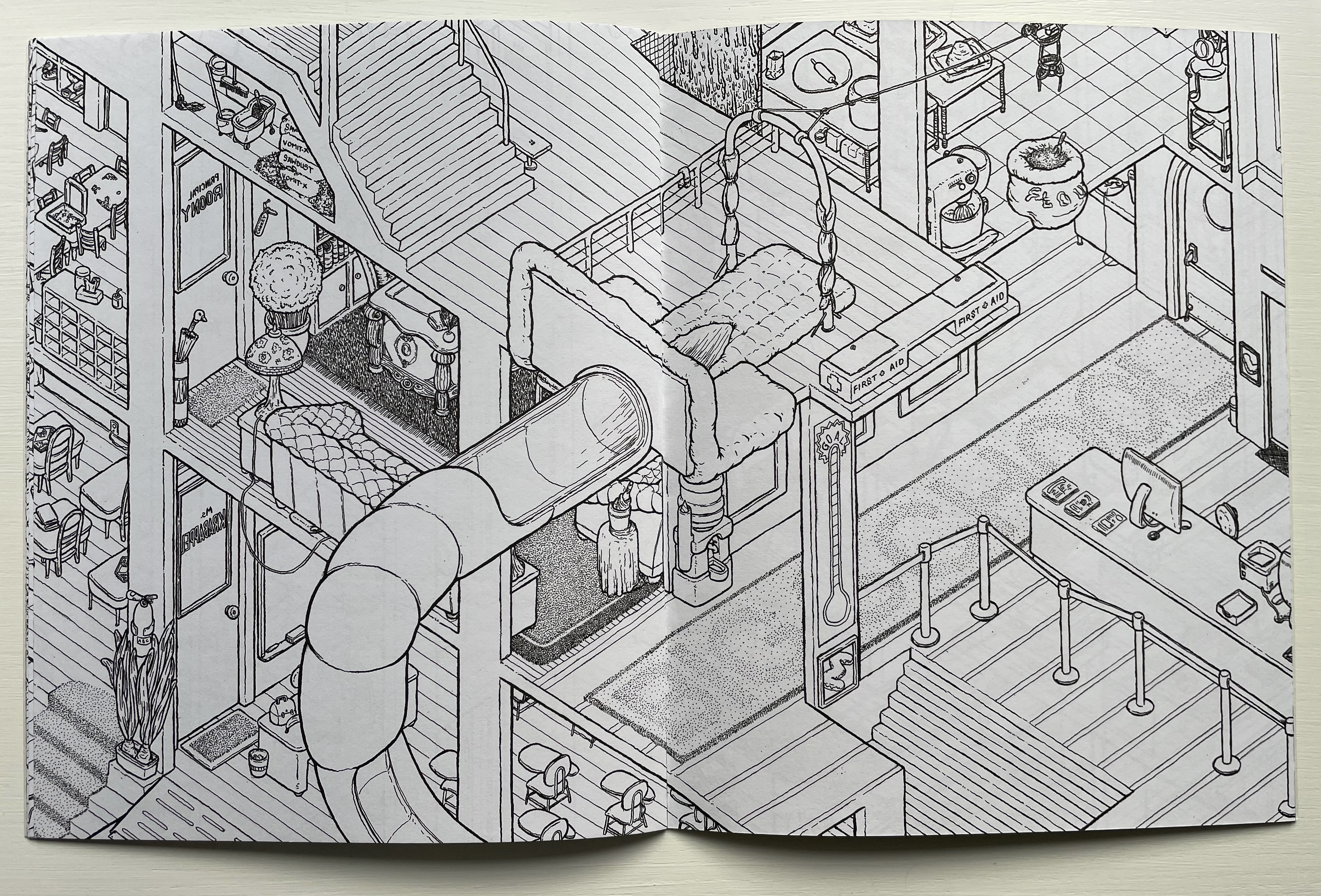
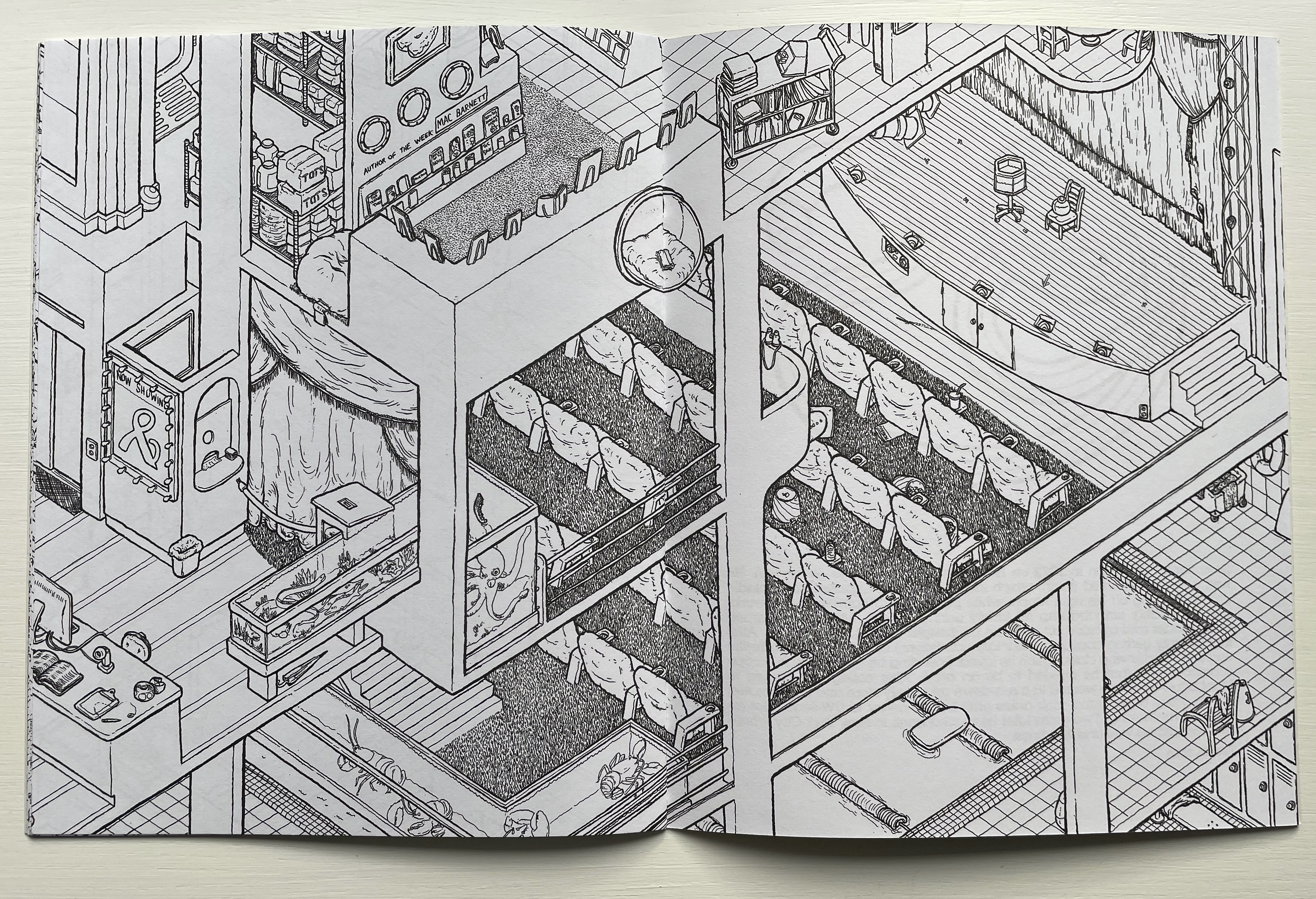

The pencil twisted into the letter BS seems superfluous to the wildness of the biographical blurb. Strangely though, the label has the effect of making the blurb a little more than half-credible.
Crash (2022)
Crash (2022)
Scott Teplin
Illustrated softcover catalogue, saddle-stitched with staples. H305 x W230 mm. [16] pages. Acquired from the artist, 23 April 2023.
Photos: Books On Books Collection.
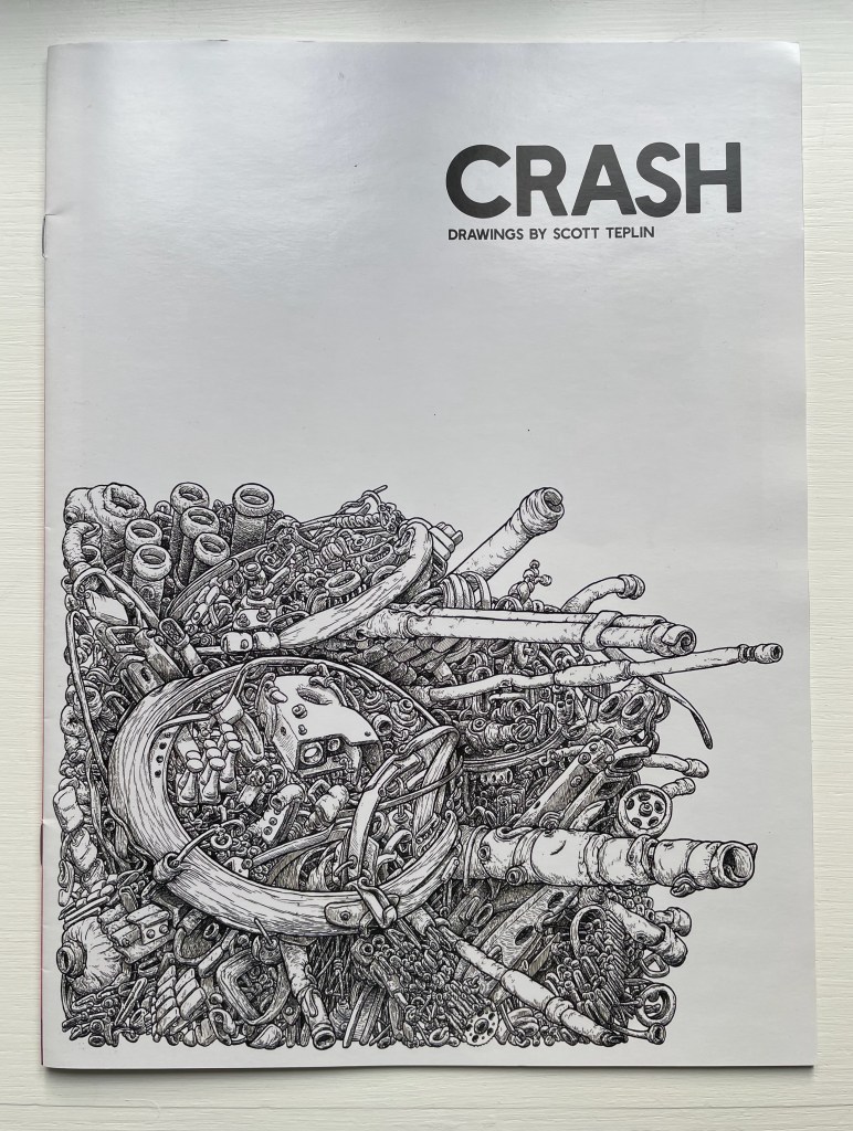
The absence of human figures or cartoon characters so far comes crashing in with Crash. It’s an absence marked by the presence of their agency in all of the works so far. The stuffed rooms in Alphabet City imply our excresences. The peculiar slides and chutes in Big School imply our exuberance and silliness. These mangled vehicles and objects imply us a cause. And yet, their titles, colors, and intricacies seem to distance us before the implication pulls us back in. The green, blue, orange, purple, and pink of the compressed train engine in Choo Choo Crunch suggest the artifical colors of a breakfast cereal. Rainbow Wheels looks like a wadge of fresh bubble gum.
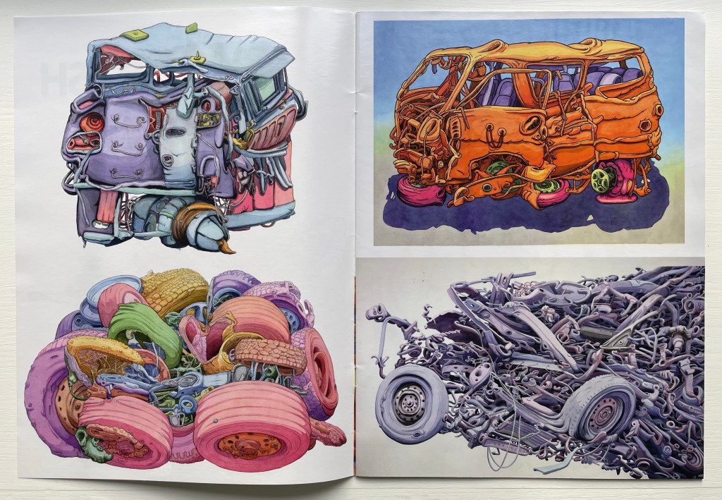
Left: Choo Choo Crunch (2011) above and Rainbow Wheels (2009) below. Right: Orange Van (2022) above and Accident from the Right (2012) below.
The distancing of the jokey titles would likely be most appreciated in a gallery hanging for the large-scale (53 by 62 inches) Accident from the Right. It doesn’t refer to the point of impact but rather the fact that the massive image is coming from the full-bleed on the right. While with a wink the artist steps between us and our roadside gawking, the violent motion of the Giger-esquely intricate horror pulls us back in with a shudder. A smaller but still ominous image (on the far right below) is Ruth’s Shoes. It, too, has a Giger-esque feel, looking like some sort of cicada of mechanical parts crouching on a pile of empty shoes. Where is Ruth?
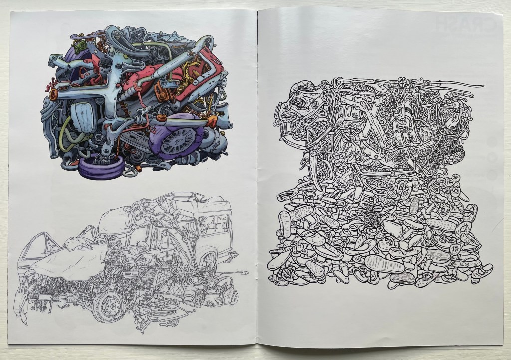
Left: Candy Crash (2022) above and Bent Benz (2012) below. Right: Ruth’s Shoes (2022).
Untitled (eyepiece)

Untitled (eyepiece) (2022)
Scott Teplin
Print (pen & ink, watercolor). H135 x W180 mm. Acquired from the artist, 23 April 2023.
Photos: Books On Books Collection.
The verbal/visual pun of this print is typical of the artist’s humor and worth sharing for its being the only one of Teplin’s artwork with an actual human presence.
Further Reading
“Architecture“. 12 November 2018. Books On Books Collection.
“Federico Babina“.20 April 2021. Books On Books Collection.
“Antonio Basoli“. 20 April 2021. Books On Books Collection.
“Antonio & Giovanni Battista de Pian“. 20 April 2021. Books On Books Collection.
“Jeffrey Morin“. 20 April 2021. Books On Books Collection.
“Richard Niessen“. 20 April 2021. Books On Books Collection.
“Paul Noble“. 20 April 2021. Books On Books Collection.
“Johann David Steingruber“. 23 April 2023. Books On Books Collection.
McEwen, Hugh. Polyglot Buildings. 12 January 2012. Issuu. Accessed 13 March 2021.
Tsimourdagkas, Chrysostomos. 2014. Typotecture: Histories, Theories and Digital Futures of Typographic Elements in Architectural Design. Doctoral dissertation, Royal College of Art, London. Accessed 13 March 2021.