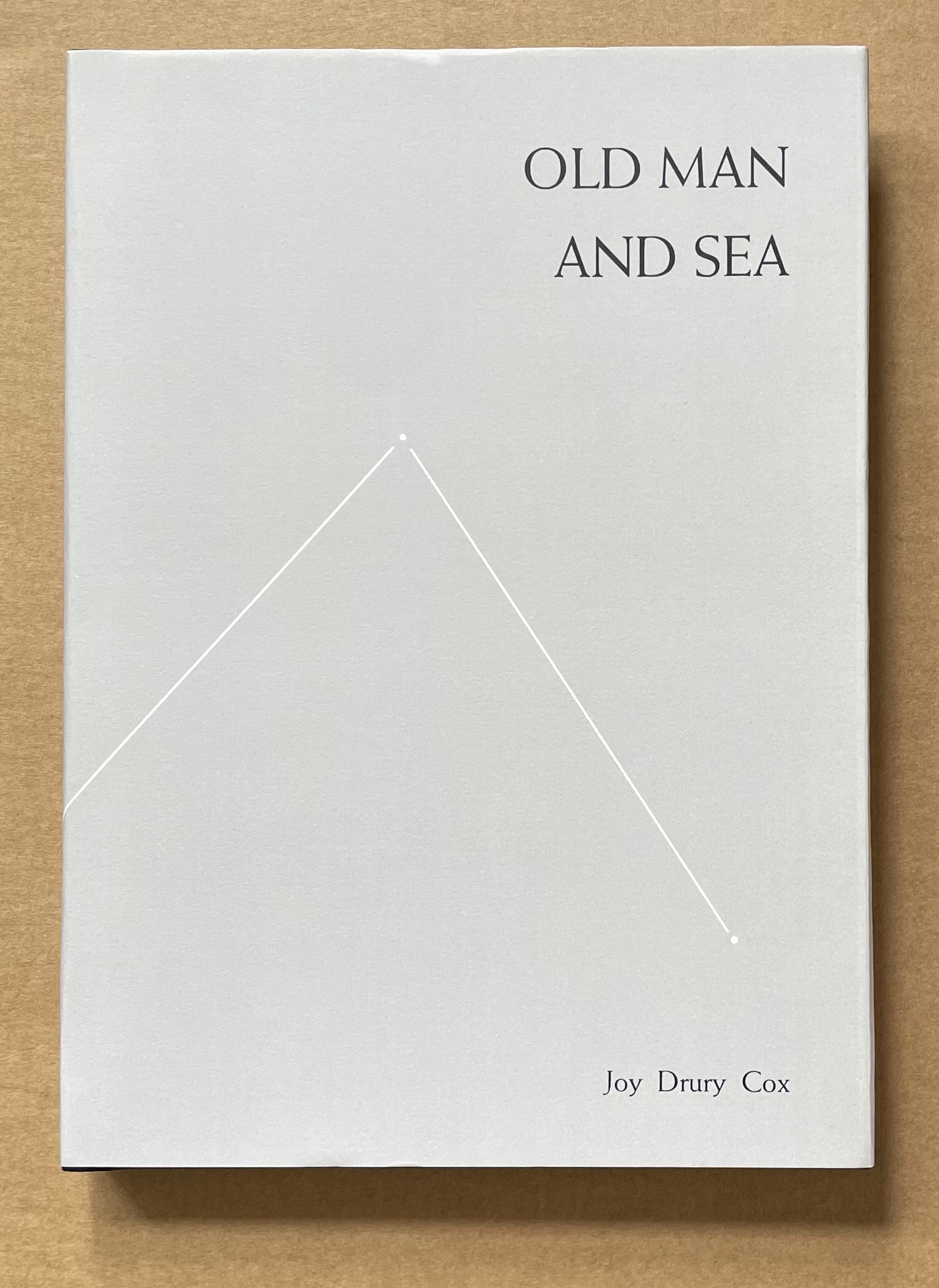
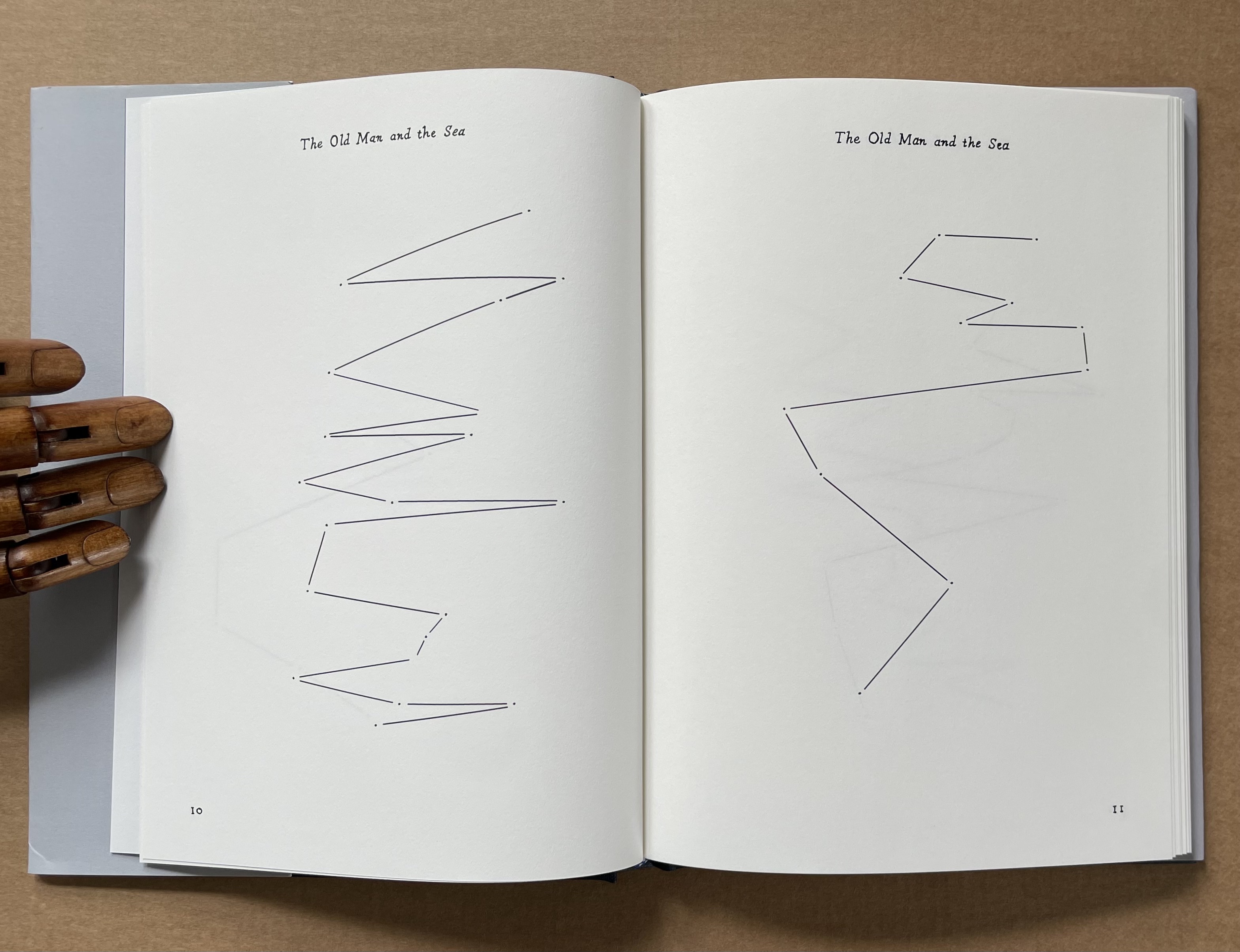
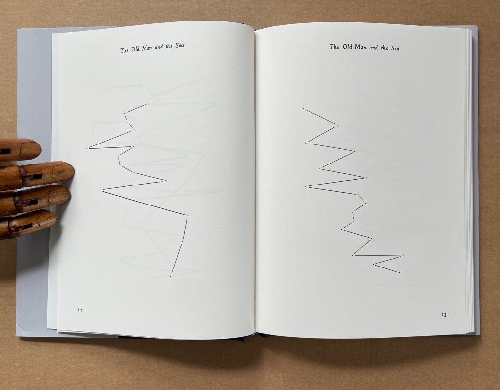
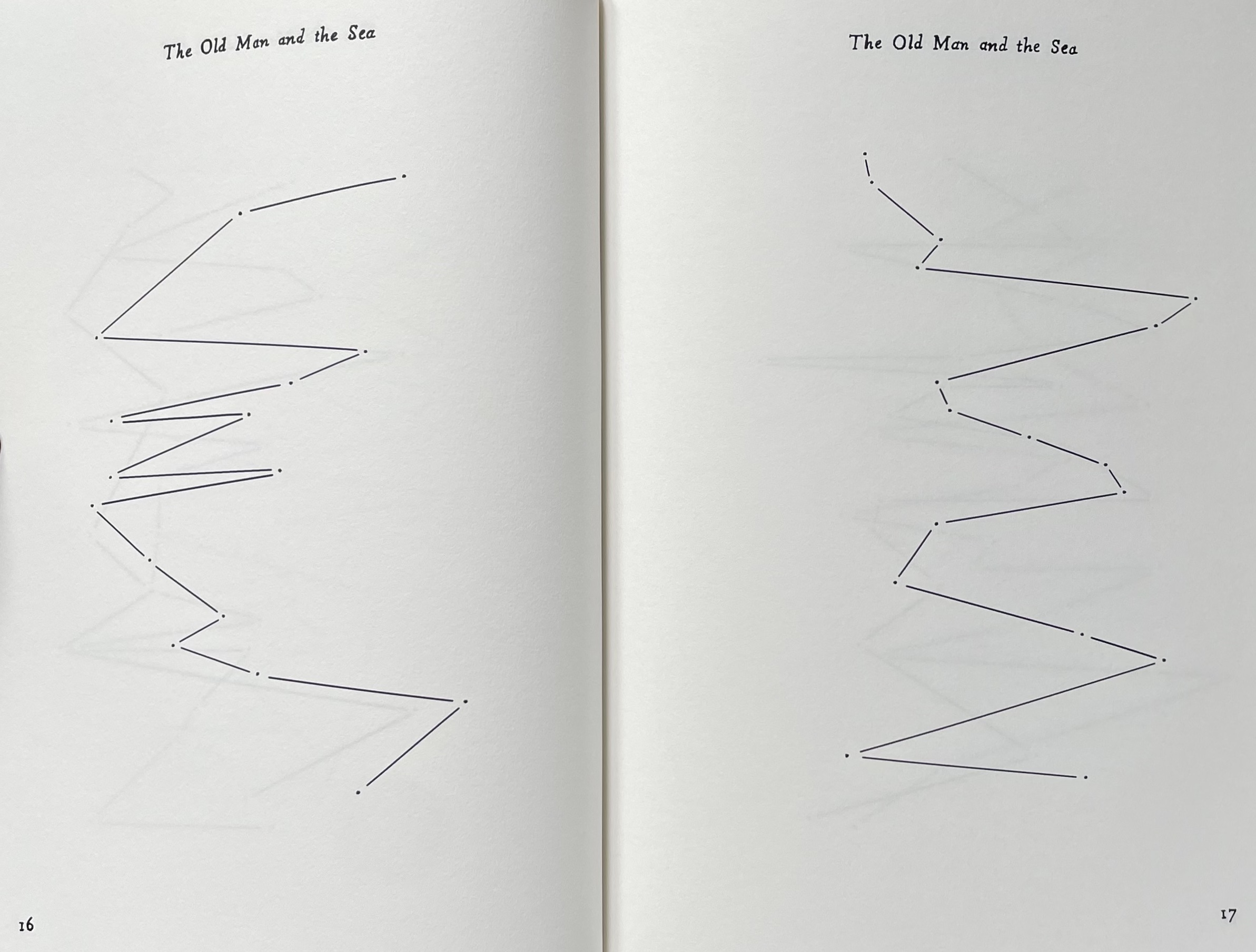
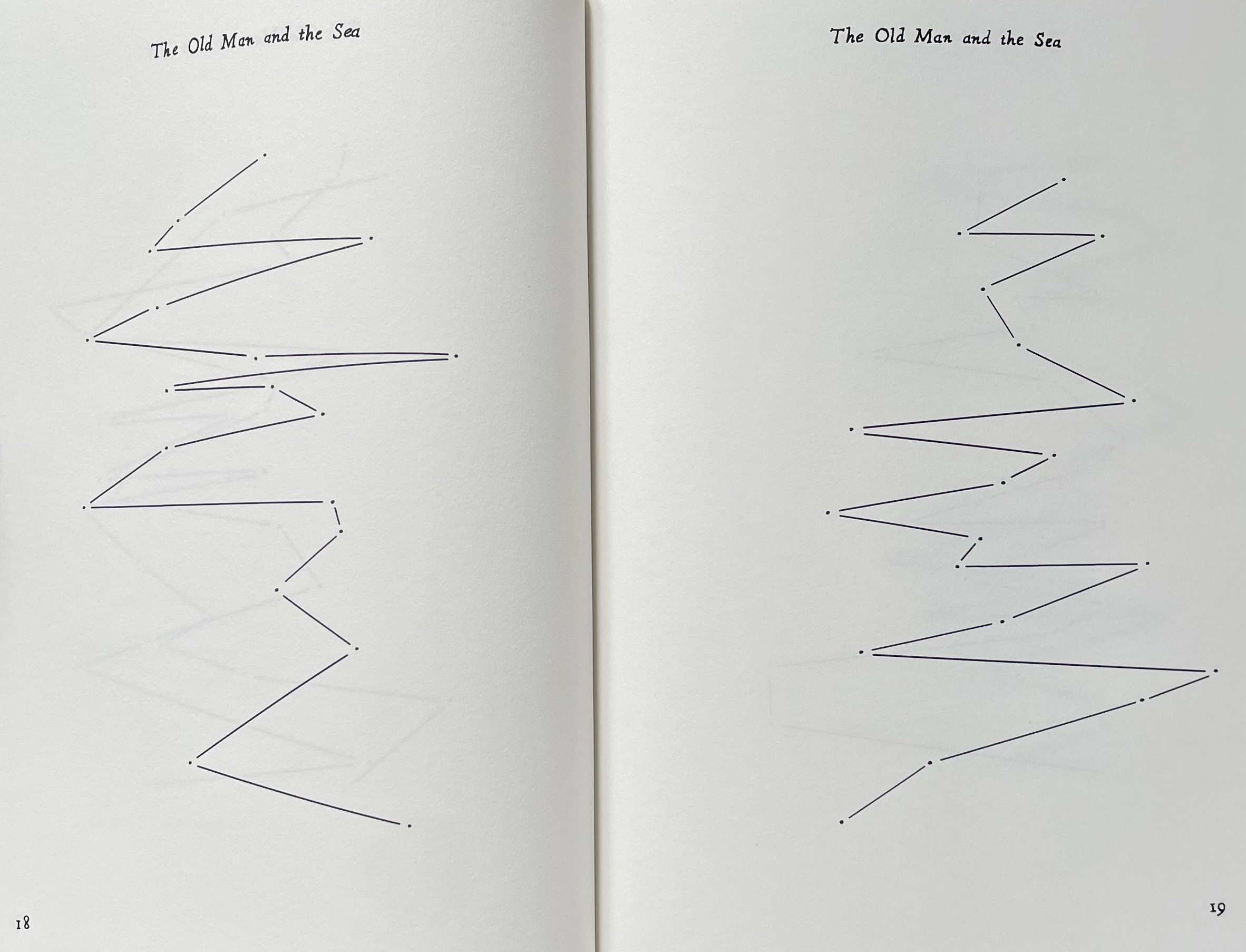
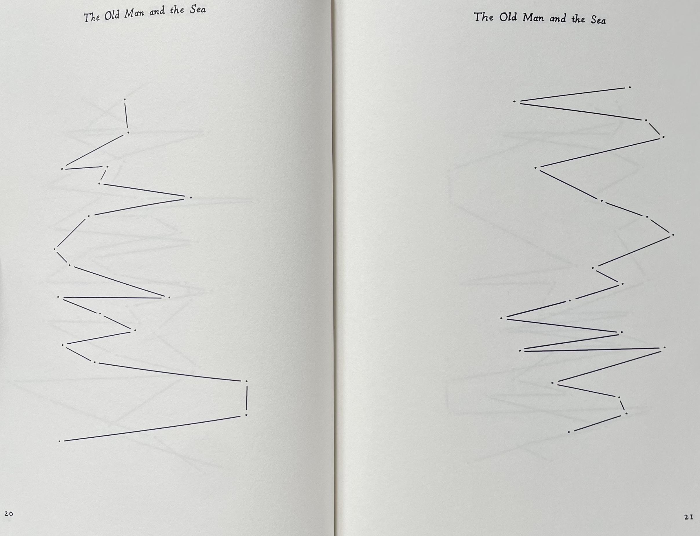
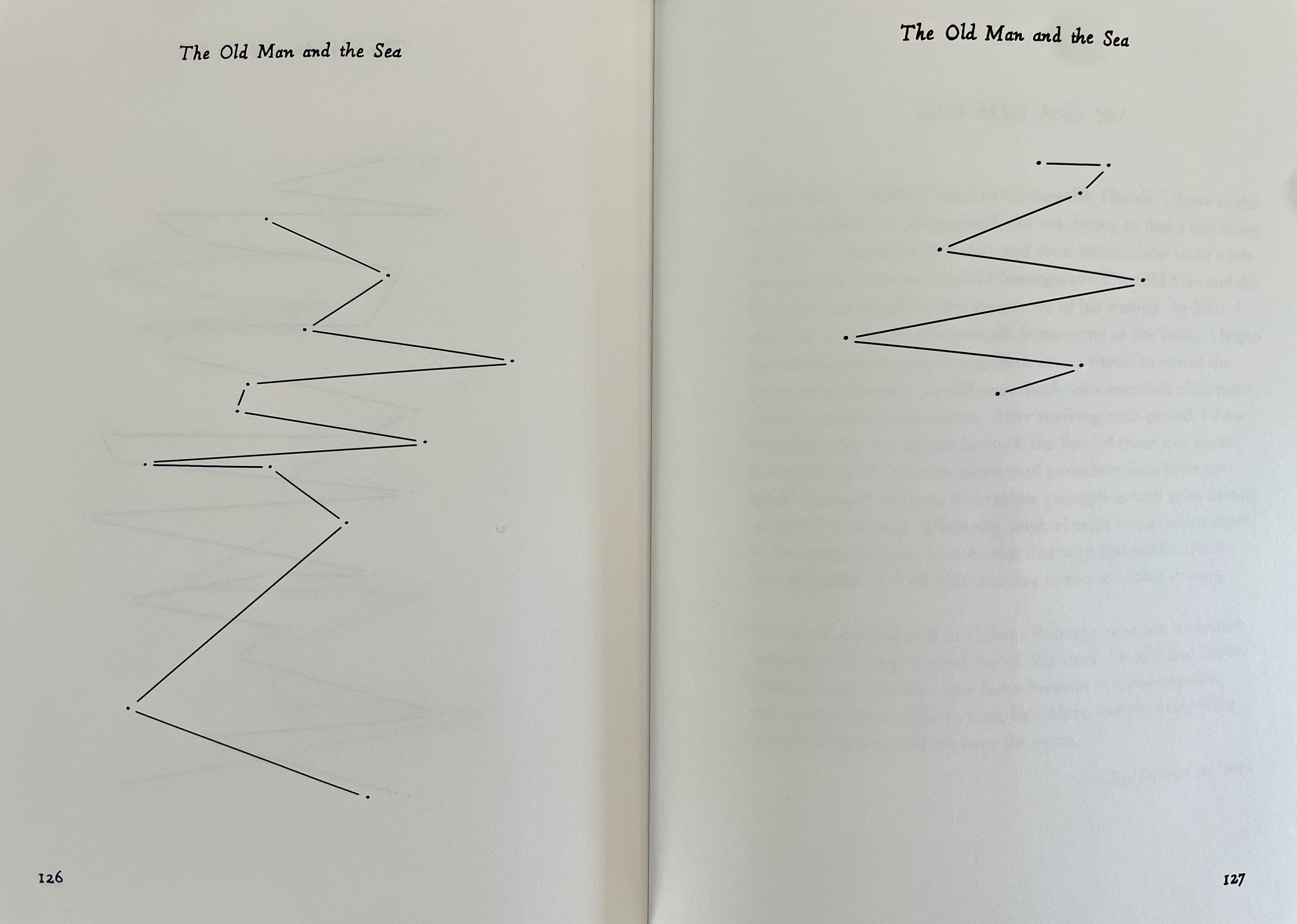
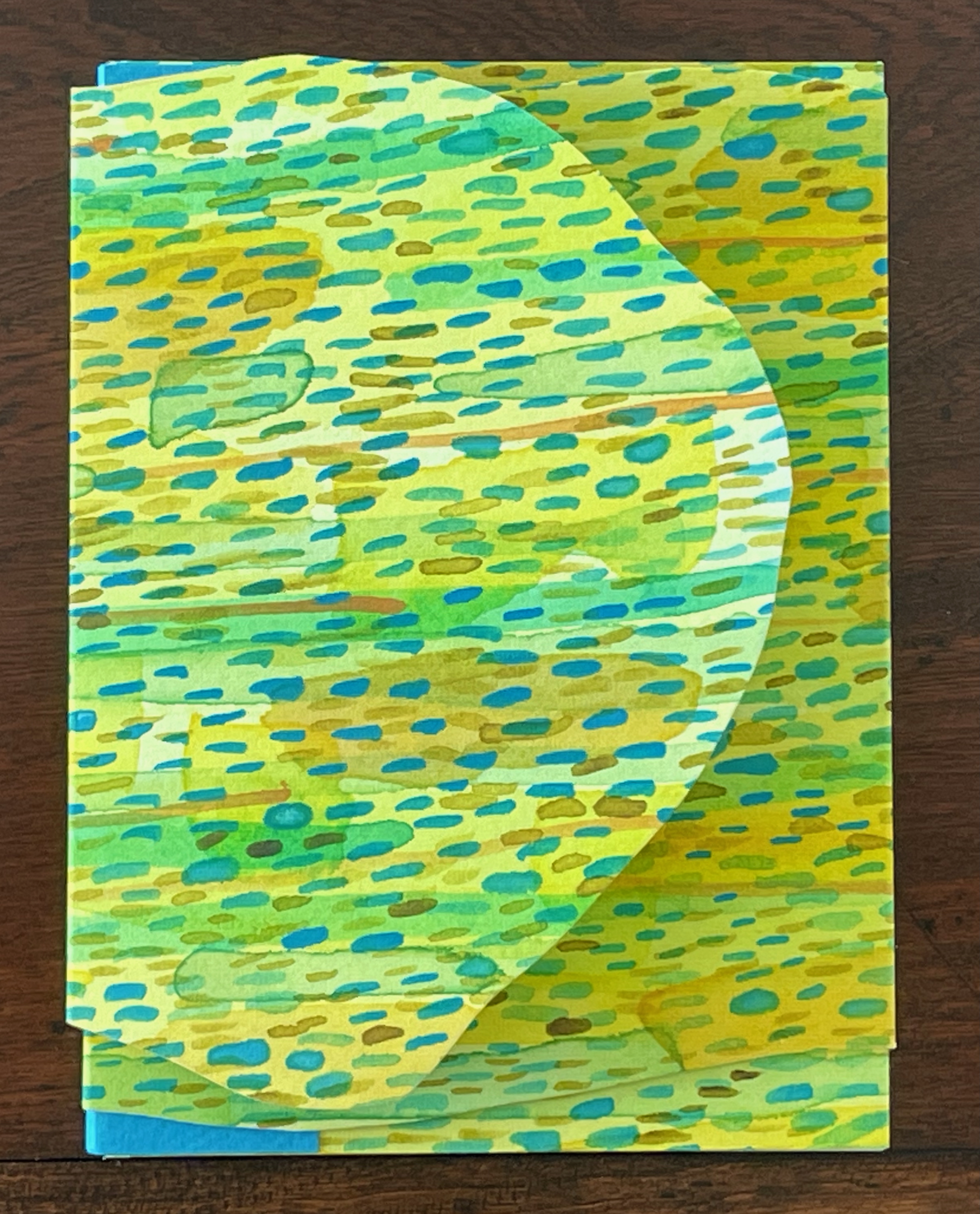
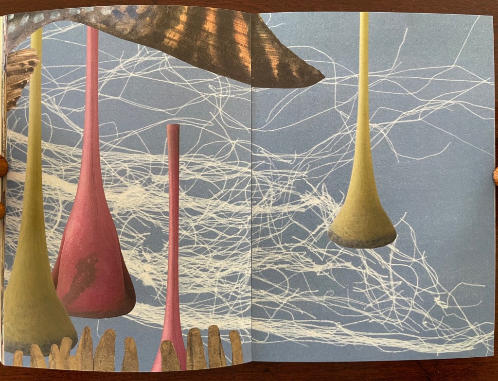
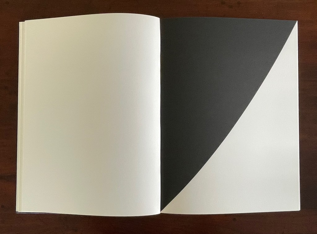
Old Man and Sea(2012) Joy Drury Cox Casebound, cloth over boards, doublures. H206 x W150 mm. 128 pages. Edition of 100. Acquired from Scott Hazard, 18 June 2017. Photos: Books On Books Collection.
The technique of erasure, excision, redaction, extraction, etc., serves the mastery of negative space. It has attracted a large number of book artists intent on altering an extant work of text. Even webpages can be subjected to it, courtesy of “The Deletionist“, a javascript devised by book artists of course. Negative space provides the background to the marks in the foreground. Likewise, the removed text of The Old Man and the Sea is the background to the marks in Old Man and Sea as foreground, as the running head continually reminds us.
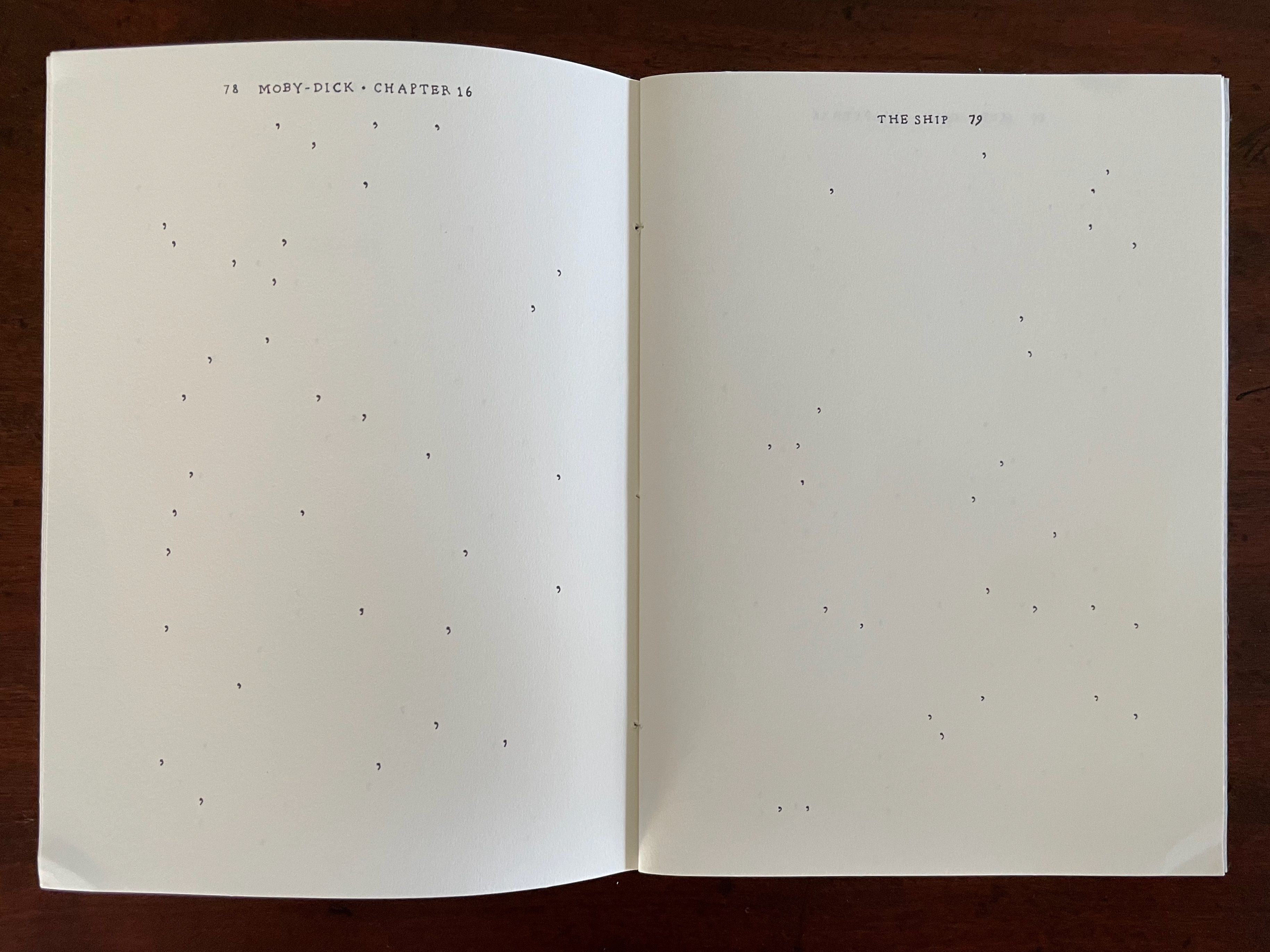
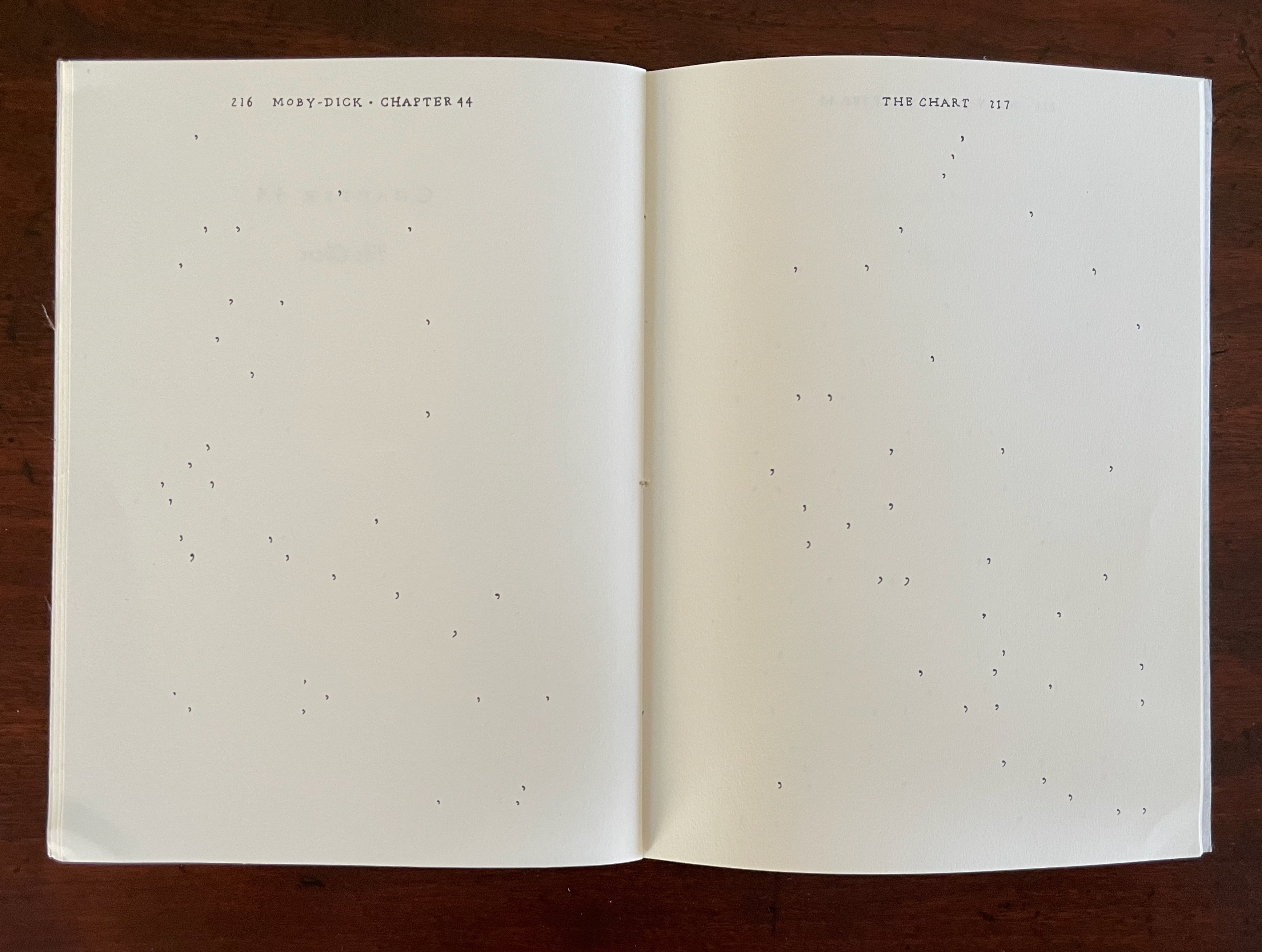
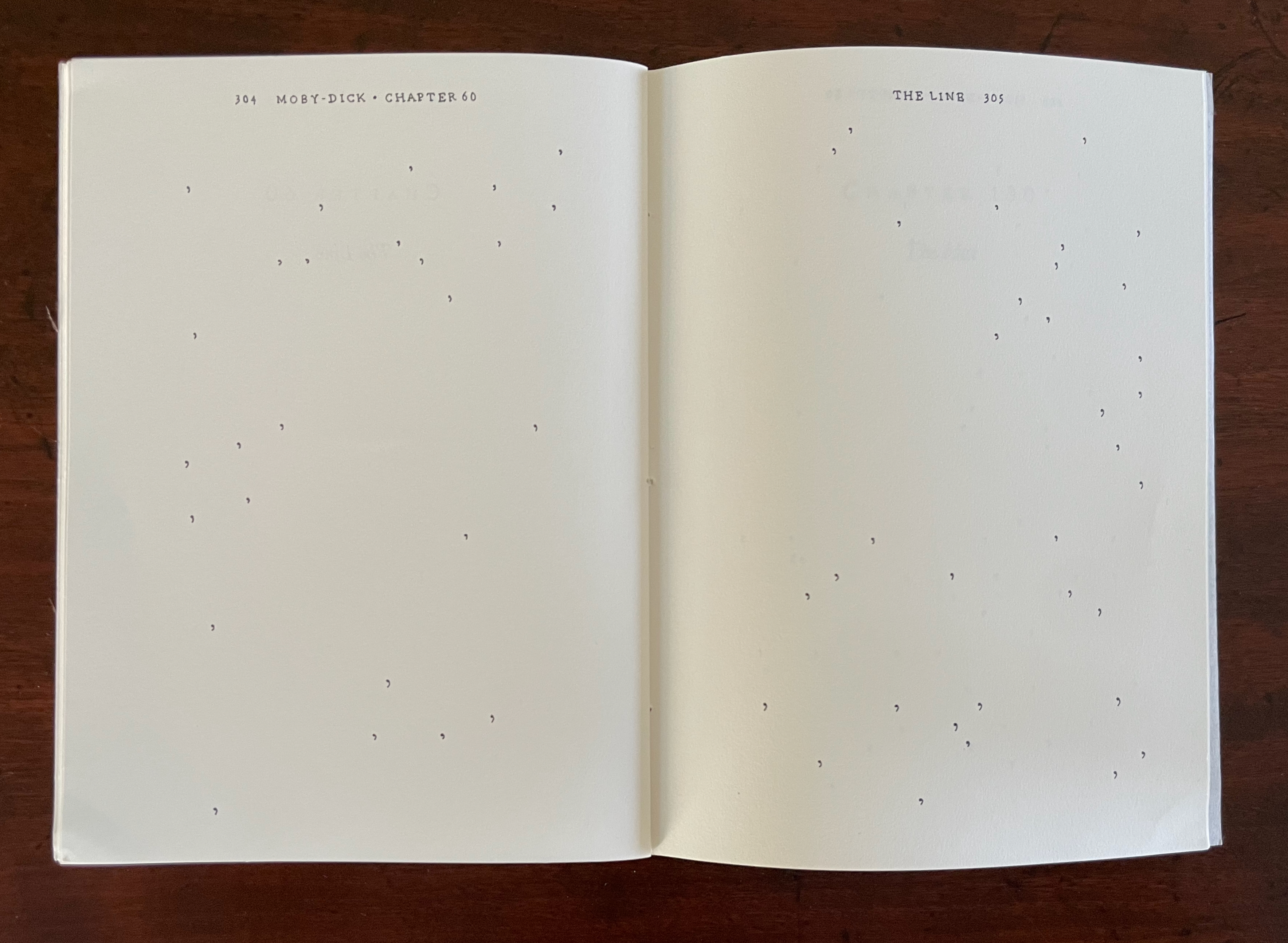
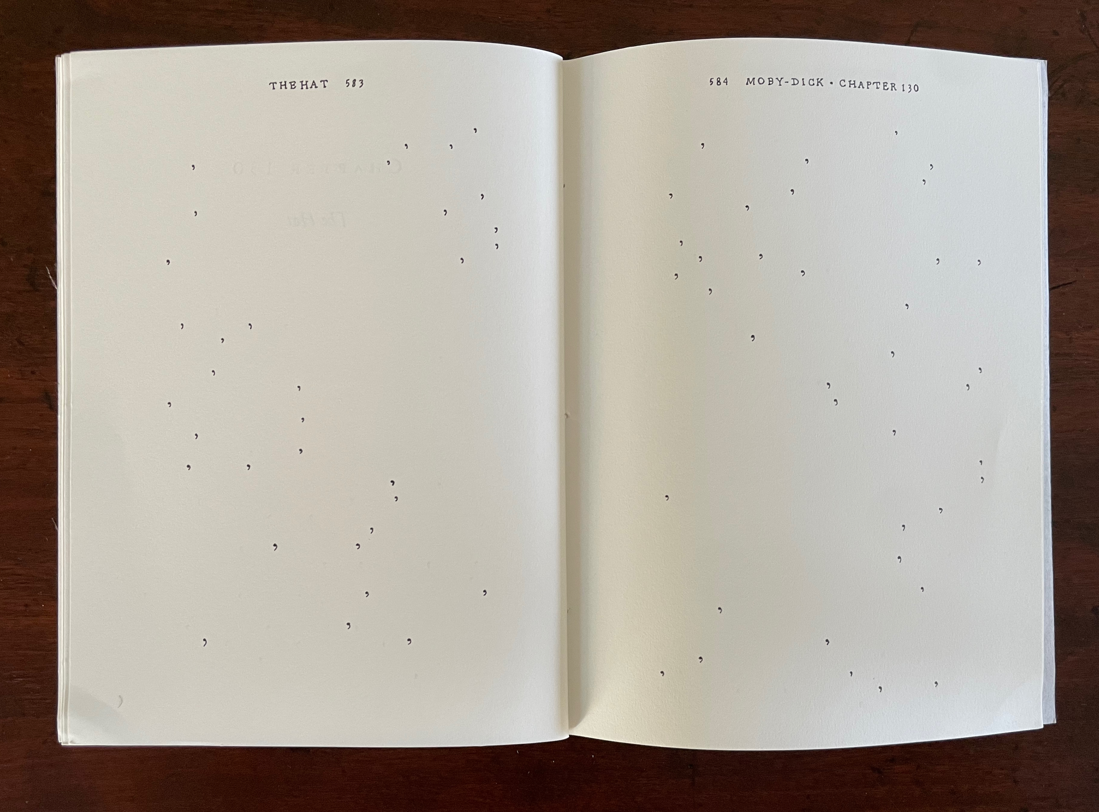
By eliminating all of the text in Ernest Hemingway’s The Old Man and the Sea except for the periods (full stops) and then connecting them with straight lines, Joy Drury Cox offers a visual reading of Hemingway’s narrative style and pace that would have made Paul Klee smile. More than a line being “a dot that went for a walk”, we have lines taken for a walk between the dots at the end of lines. And presumably OuLiPian Georges Perec would nod along in agreement with Cox’s pan-lipogrammatic approach.
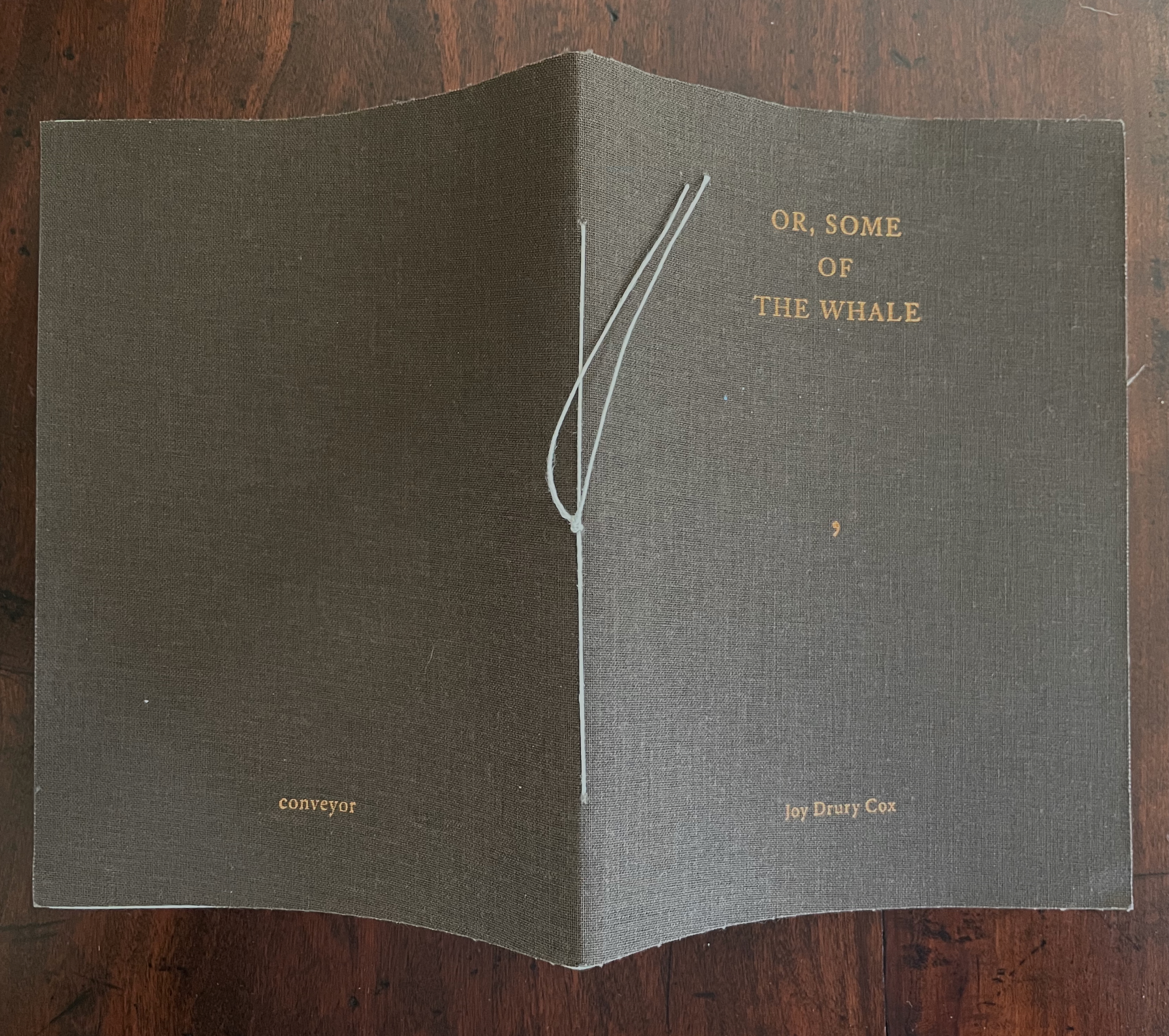
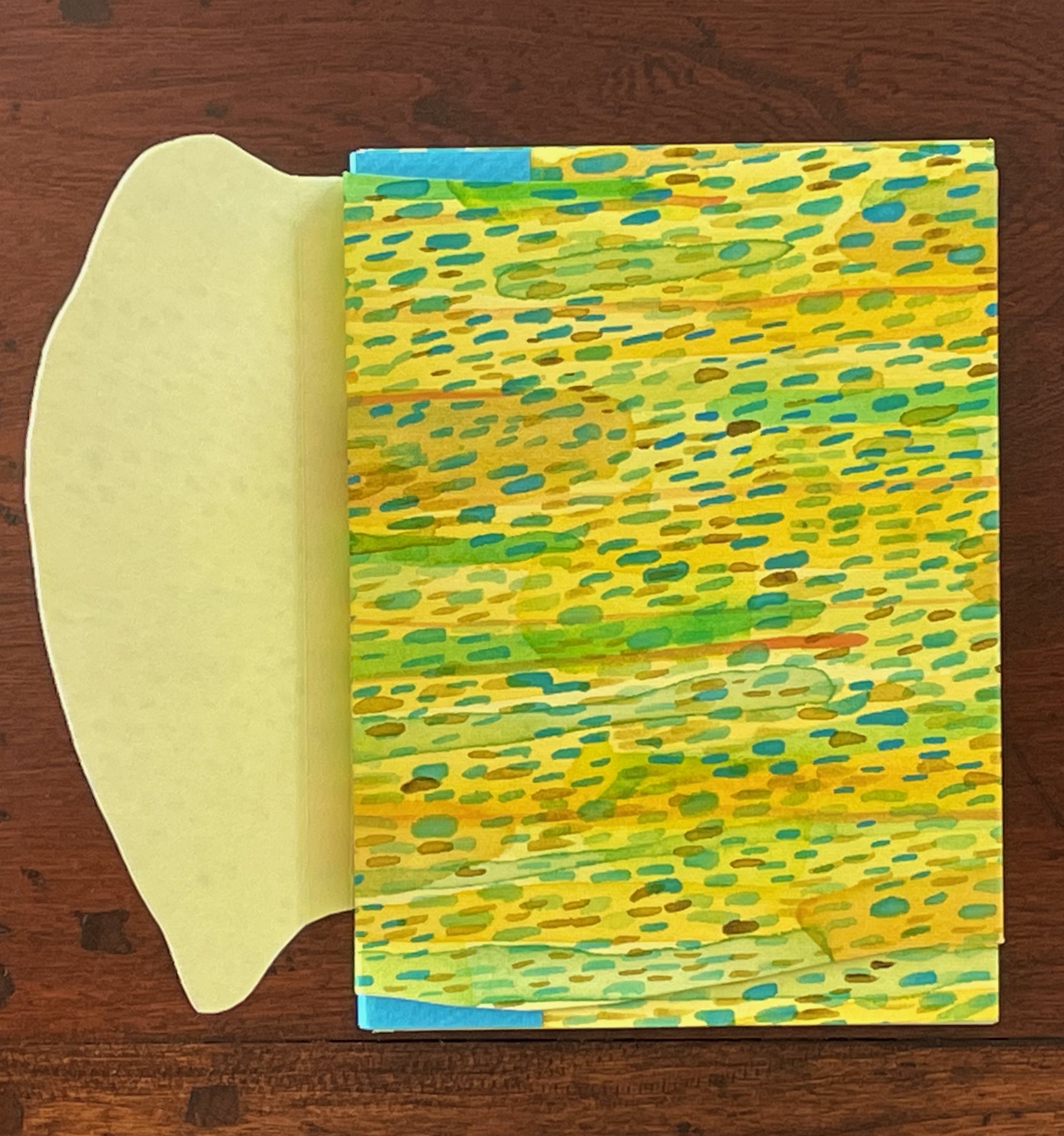
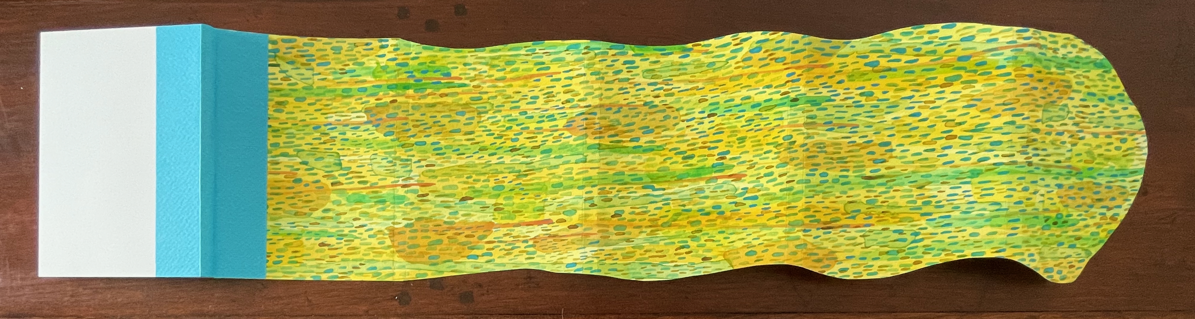
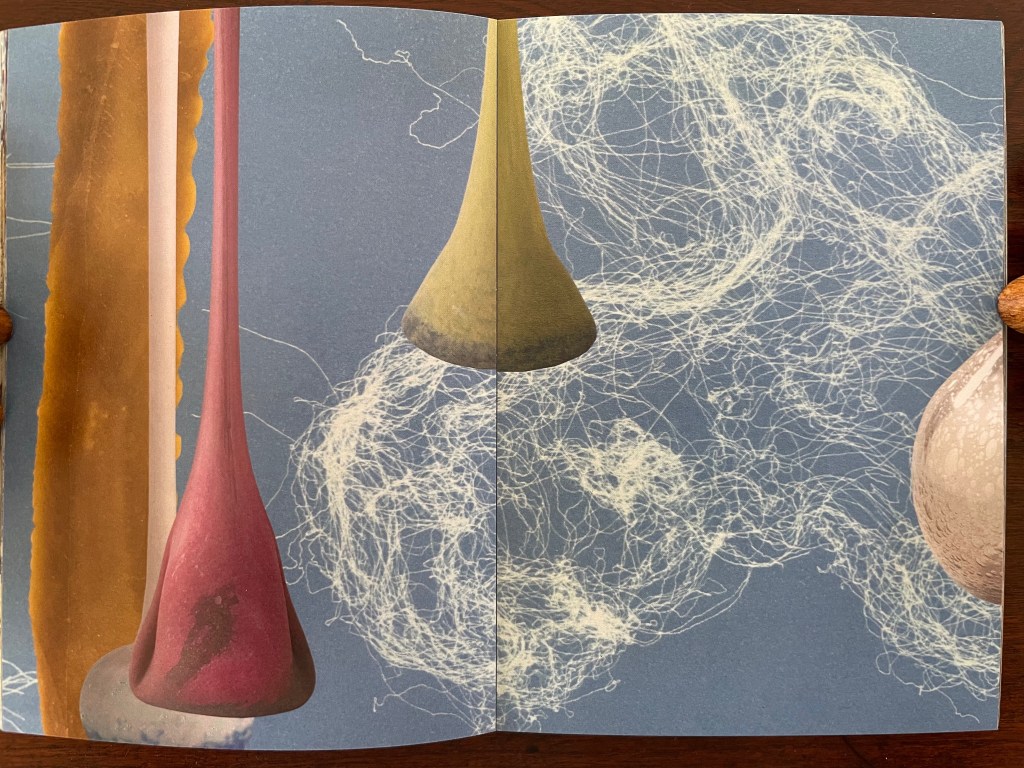
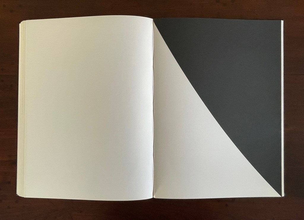
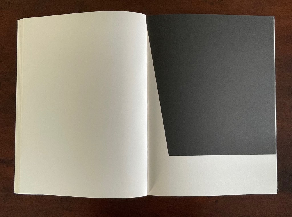
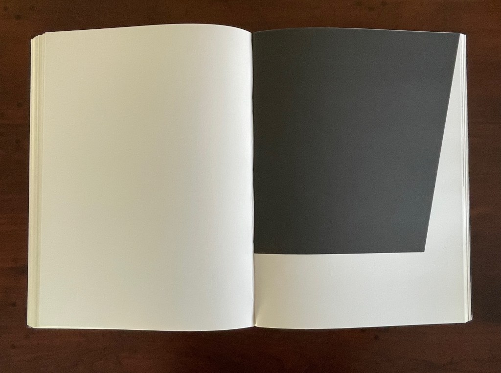
Or, Some of the Whale (2013)
Or, Some of the Whale (2013) Joy Drury Cox Softcover sewn booklet. H184 x W136 mm. [36] pages. Edition of 100. Acquired from Southern California Vintage & Collectible Resale, 13 July 2025. Photos: Books On Books Collection.
As long as we know the full title of Herman Melville’s novel — Moby-Dick; or, the Whale — the title on the cover of this entry in Joy Drury Cox’s “Punctuation Studies” (and its size) tells the story plain. Almost all of “Moby-Dick;” is gone, “Or, Some of the Whale” remains. A cover like sail-cloth, pamphlet stitched over 4 chapters of a 135-chapter novel reduced to only the commas in their positions in the original text, all swimming in the blank pages like sperm or breaching from it like microscopic sperm whales.
Chapter 16, The Ship, pp. 76-89.
Chapter 44, The Chart, pp. 215-20.
Chapter 60, The Line, pp. 303-06.
Chapter 130, The Hat, pp. 582-86
Cox’s “Punctuation Studies” are examples of inverse ekphrasis, turning a text into visual or conceptual art. Other works in the collection that use the technique of erasure, excision, etc., for that purpose are listed below. That technique is only one means of inverse ekphrasis; examples using other techniques can be found in “Notes on ‘Inverse Ekphrasis’ as a way into book art“.
Further Reading
“Derek Beaulieu“. In progress. Books On Books Collection.
Clercx, Byron, and Marian Cohn,. 2011. ‘Turning in on the Self’, in Marian Cohn (ed.), Doug Beube:Breaking the Codex. New York: The Iconoclastic Museum Press. pp 121-42.
Drucker, Johanna. 2004. The Century of Artists’ Books [Second edition] ed. New York City: Granary Books, pp. 109-19, “The Book Transformed”.
Dworkin, Craig Douglas. 2003. Reading the Illegible. Evanston, Ill.: Northwestern University Press.
Penn, Cheryl. 2009. “The Artists Book in General, the Altered Book in Particular“. Paper based on the dissertation The Use of the Artist’s Book as a Versatile Form of Expression in the Work of Selected Artists, With Particular Reference to the Altered Book submitted in partial fulfillment of the requirements for the degree Master of Technology in Fine Arts, Durban University of Technology (DUT): Durban, 2009. “By violating the ready made book, the artist challenges traditional reading patterns and inherent meaning, being at once destructive and constructive. ” (64)
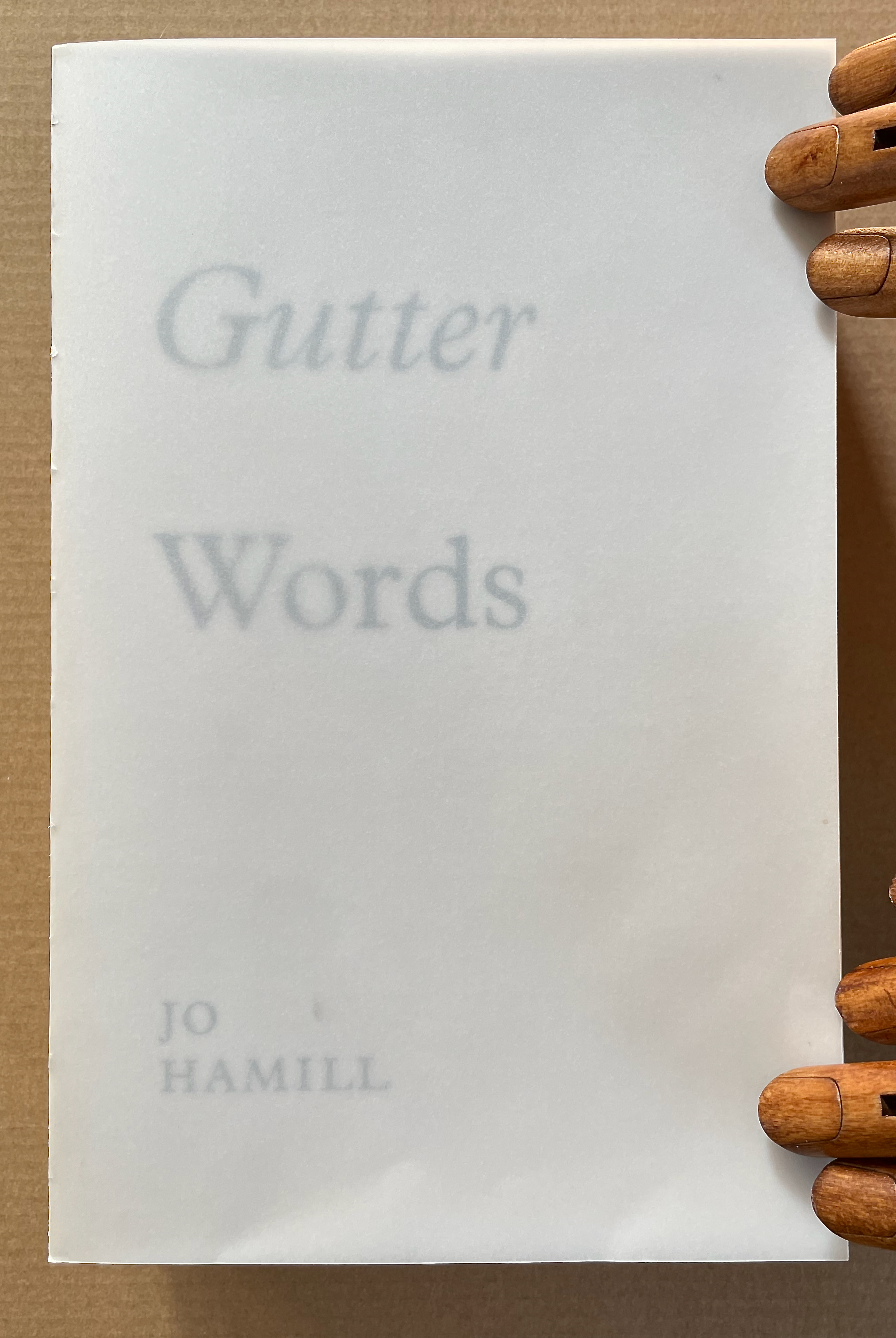
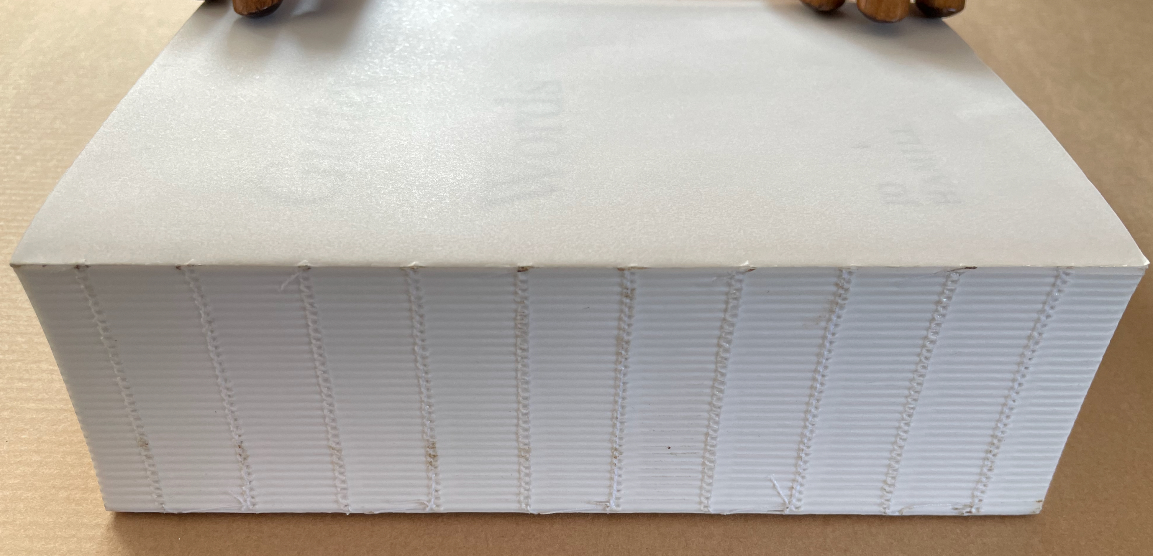
Working with an edition of James Joyce’s Ulysses, Hamill systematically obliterated the words of Joyce but carefully retained those words positioned closest to the gutter – the technical term used to describe the central margin of a bound page. The retained fragments form two extended columns that continue for 933 pages. Notable here is how design and typographic terminology is so entrenched in bodily references. Header, footer, body-copy, the arm of a “K”, the crotch of a “Y”, the foot of a “T”, the ear of a “G”, the shoulder of an “R” and so on. As is the architectural scaffolding of Joyce’s schema which underpins the structure of Ulysses, kidney, genitals, heart, lungs, oesophagus, Brain, Blood, Ear. etc. Lawrence Weiner refers to language as material for construction, the act of deletion in Gutter Words exposes the architectural scaffolding that holds words in place. Voids are physical spaces to be read and words become unanchored, set adrift in an uncertain space. The architectural qualities of this physical space will be exposed, Gutter Words will be devoid of the accoutrements associated with a “book” such as cover, boards, end papers, dust jacket and will retain only the innards, an unprotected text block.–Publisher’s website
Gutter Words (2019)
Gutter Words (2019) Jo Hamill Softcover, exposed spine. H197 x W128 x D60 mm. 956 pages. Acquired from Gill Partington, 20 June 2023. Photos: Books On Books Collection.
Artists’ books can run the risk of being a “one-trick pony” or a toddler’s newly learned knock-knock joke. Once seen, the trick succumbs rapidly to the law of diminishing returns. A dozen times heard, the joke verges on parental abuse. Conceptualist Simon Popper’s 2006 alphabetized version of James Joyce’s Ulysses(1922) falls into that camp, albeit a stunning one. There may be some ongoing amusement in perceiving the shift from letter to letter and the subsequent alteration of the visual pattern, or in spotting the singular invented words and considering the alphabetization as a comment on James Joyce’s play with language, or in contemplating it in comparison with similar efforts. Like Mikko Kuorinki’s 2012 alphabetized version of Foucault The Order of Things (1970) that cheekily challenges Michel Foucault’s theory of how we perceive social order. Or the alpha and omega of Tauba Auerbach’s BbeehHilloTy or the Alphabetized Bible (2006); well maybe not the alpha, since Silvio Lorusso and Rory Macbeth got there first with theirs in 1997, nor the omega, since Peter Harkins followed up with his 2013 Well-Sorted Version (WSV), algorithmically generated. Apparently, one-up-manship is inevitable. Even Gutter Words has its gatecrasher: John Morgan’s Usylessly (2021) with a pair of essays, not just one. But once the joke is “got”, how rewarding is it to return to it again and again. Is there more to it?
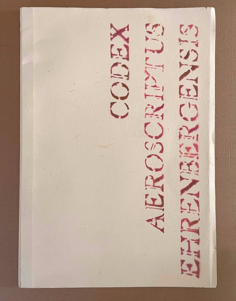
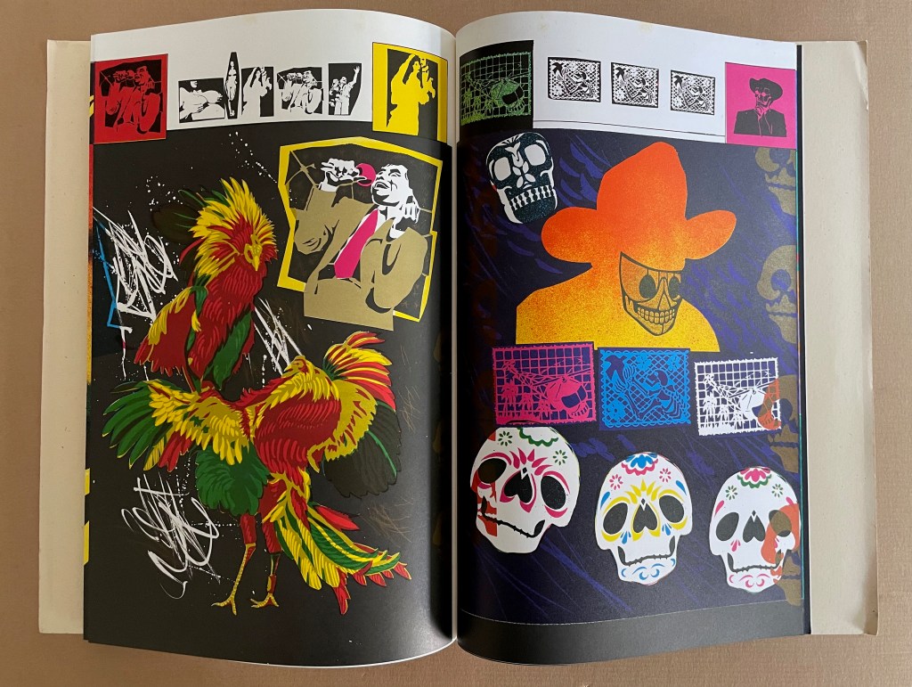
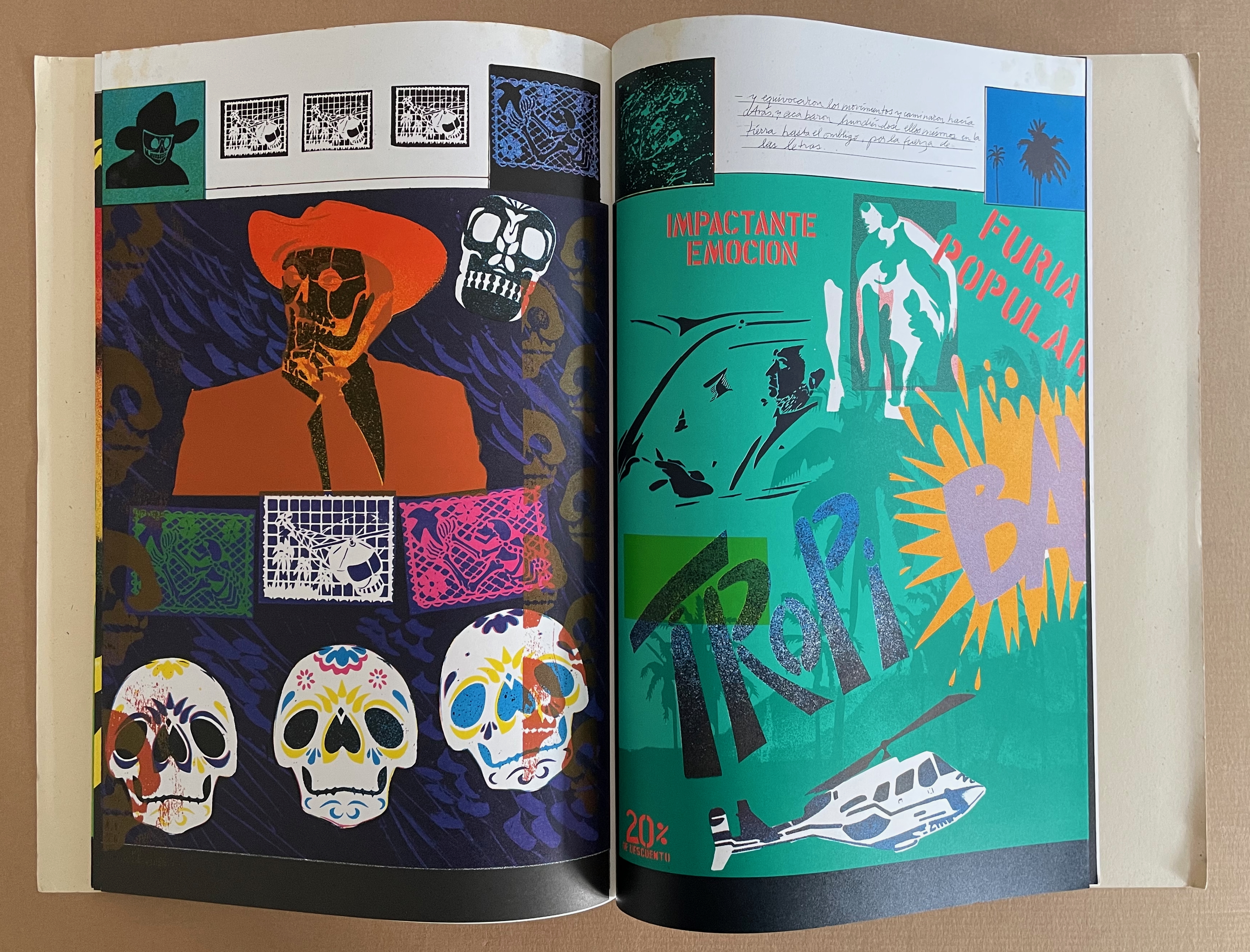
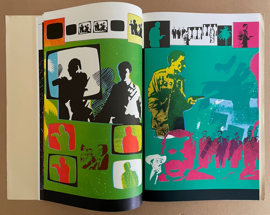
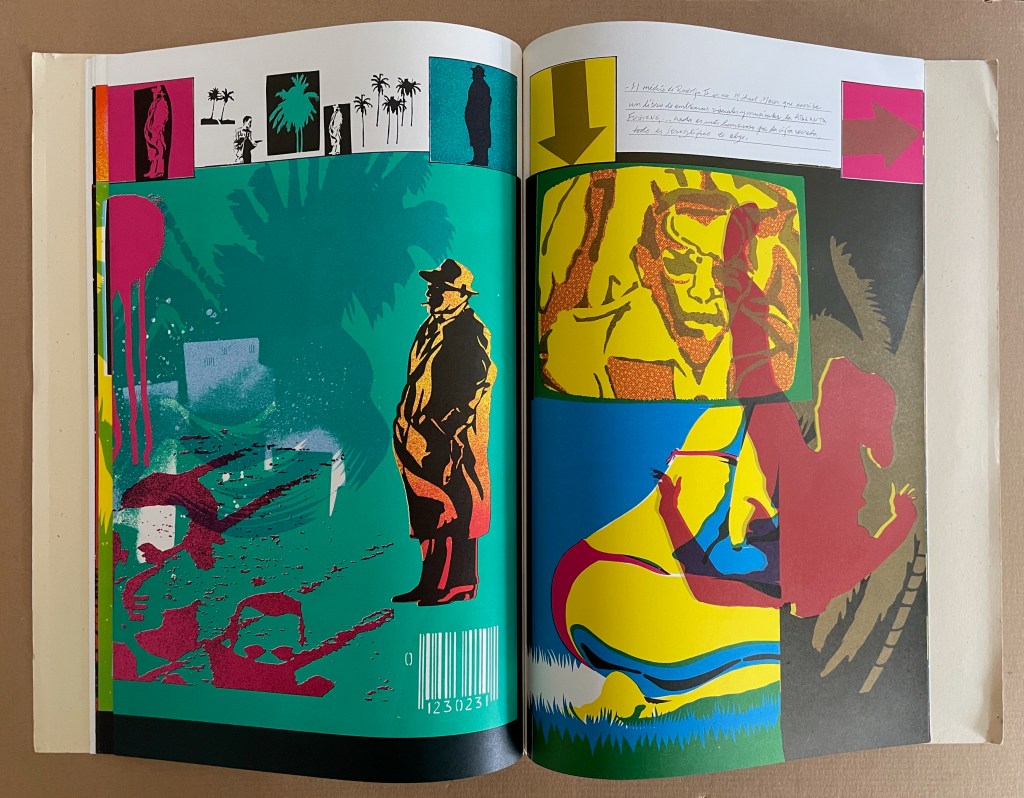
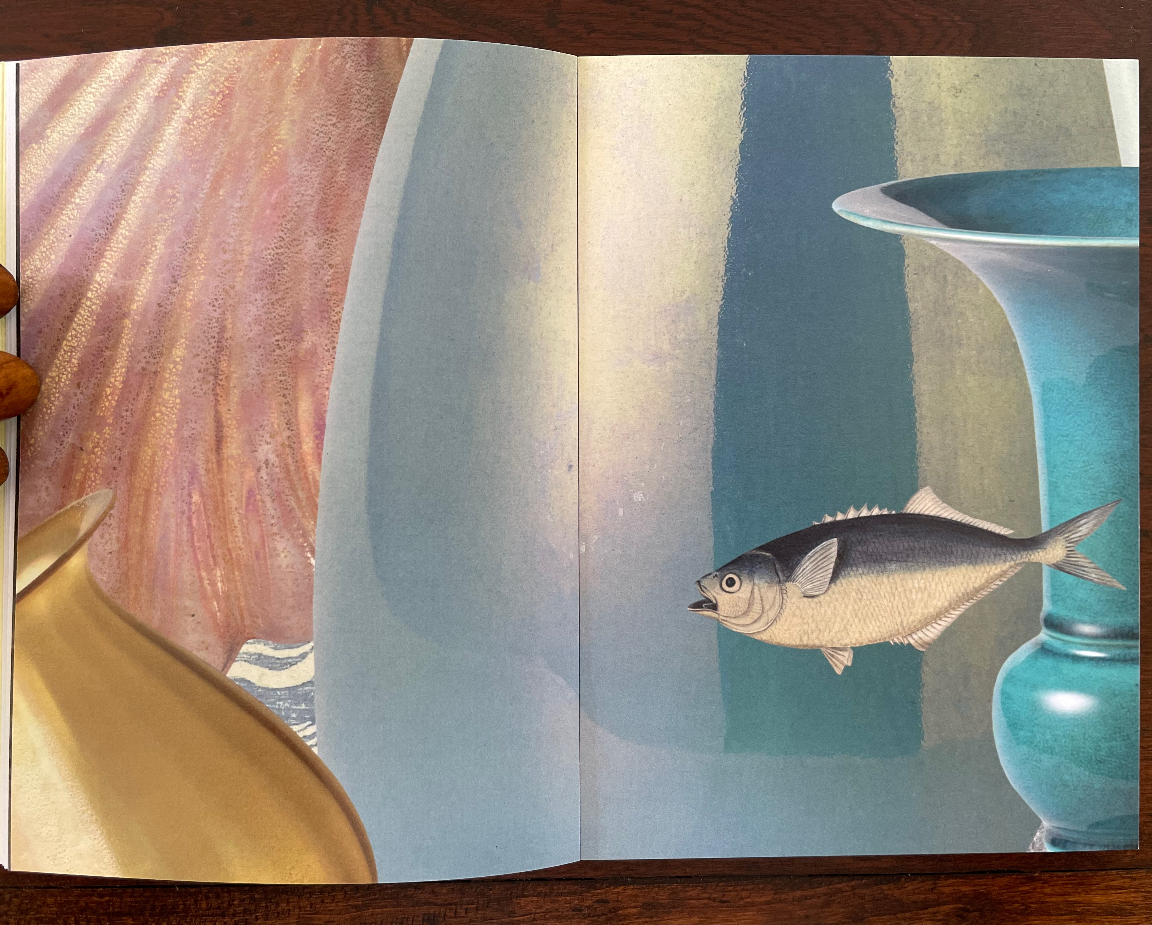
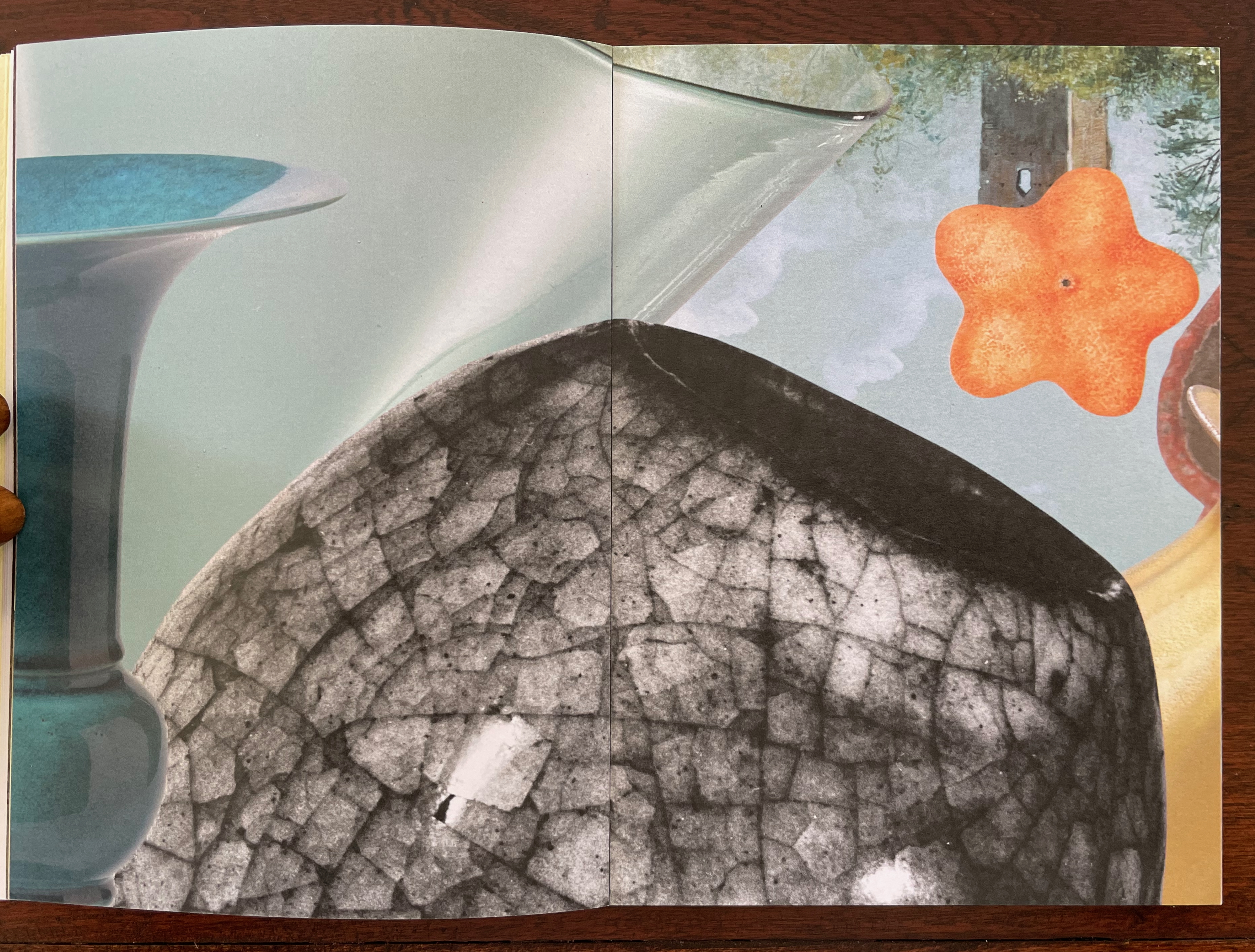
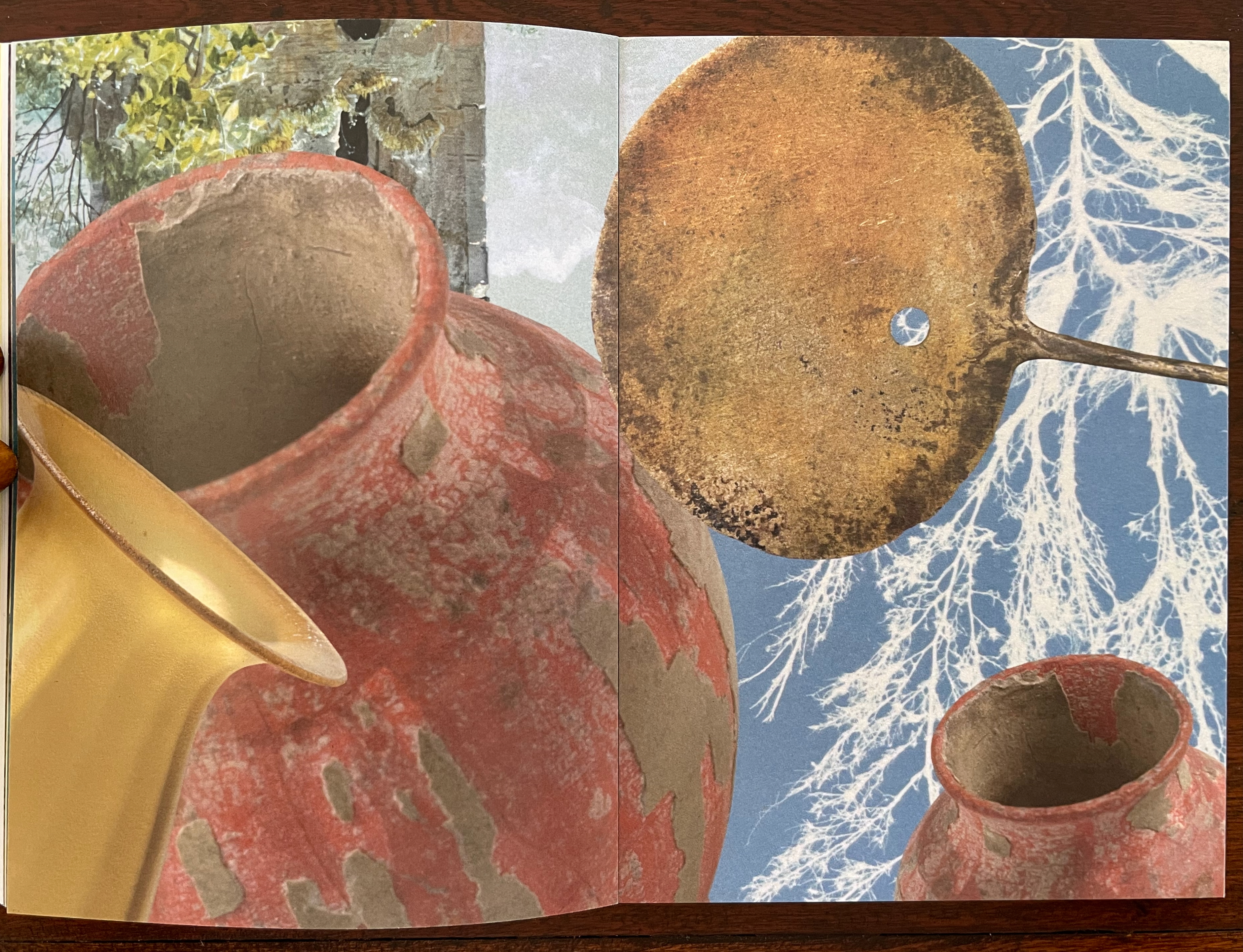
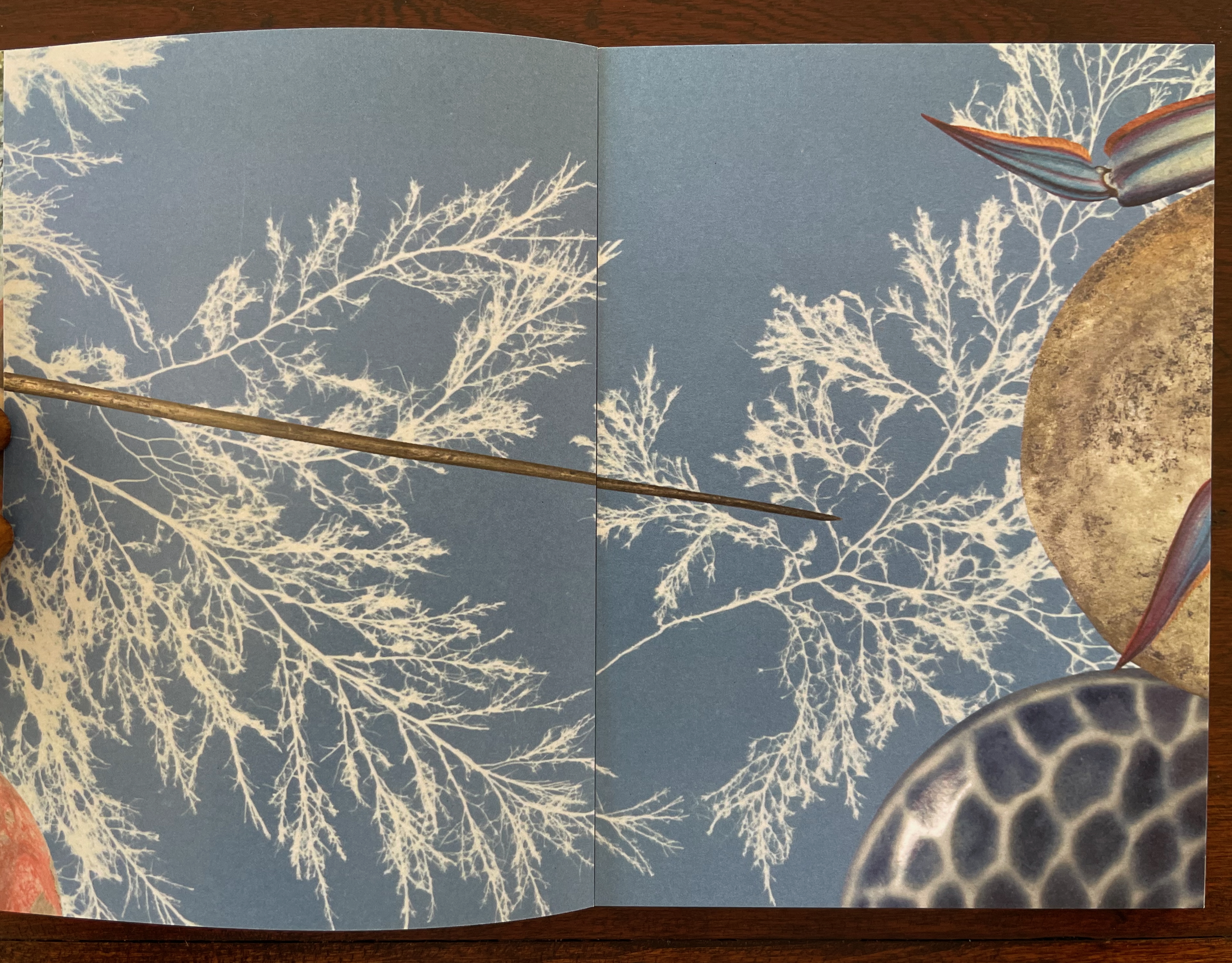
Codex Aeroscriptus Ehrenbergensis: A Visual Score of Iconotropisms (1990) Felipe Ehrenberg Casebound stiff cover, fly leaves around bifolios (fore-edge folded folios). H420 x W295 mm. 20 pages (10 bifolios, 9 with prints, 1 for title page and copyright page).Edition of 500. Acquired from Monograph Werks, 17 January 2024. Photos: Books On Books Collection.
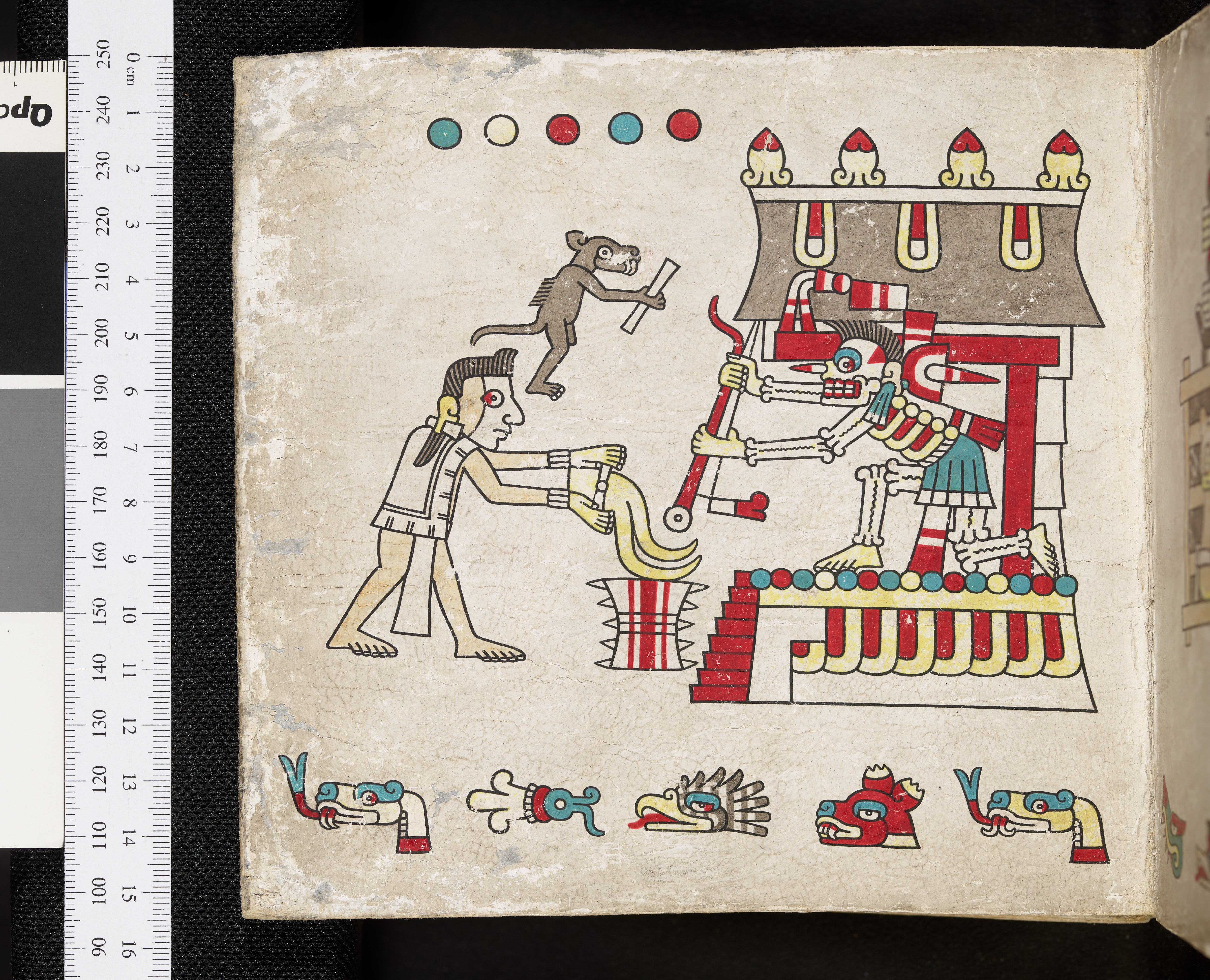
In his introduction, Felipe Ehrenberg variously recommends that we read Codex Aeroscriptus Ehrenbergensis “like a detective novel” for its “various clues that you may unravel the wondrous and dramatic events surrounding the life of this artist, another witness to the end of a century” or “as a musical score, perhaps to be composed by someone wishing to recreate the background music of our daily histories” or a “formulation of hieroglyphs”. The book’s subtitle succinctly rolls up these metaphors: “a visual score of iconotropisms”.
Stephen Perkins calls it “a mini-retrospective of his explorations in this medium” — stencils.
This work came out of a residency Ehrenberg completed at Atlanta’s Nexus Press. The images for the works came from what he called his Visual Information Bank which was a box with all sorts of ephemera that he would dip into for images for his stencils. In contrast to the frenetic energy of the stencils, the inside of the publication has a bucolic and calm feeling that is mirrored in the original stencil work Ehrenberg created across the front pages of each book. (Perkins, 2024)
The accordion, concertina, or leporello structure adopted by so many 20th and 21st century book artists has its Aztec analogue called a screenfold format. Ellen Baird and Cristián Roa-de-la-Carrera included Codex Aeroscriptus Ehrenbergensis in the Newberry Library’s 2006-07 exhibition “The Aztecs and the Making of Colonial Mexico”.
… Aztec heritage has become a vital component of Mexican and Mexican-American identity, influencing the work of many contemporary writers, artists, and scholars. The inherent flexibility of traditional indigenous creativity facilitates combination with contemporary artistic practices. Traditional screenfold books are layered with contemporary collage and print techniques, and indigenous images are juxtaposed with colonial scenes and pop icons. Contemporary Mexican and Mexican-American artists use traditional Aztec images and techniques to explore both contemporary life and Mexican cultural heritage. The screenfold format is an emblem of ancient Mesoamerican culture, and has become charged with historical and political meaning. Contemporary artists combine this format with humorous and provocative imagery to explore the cultural and political dynamics of preconquest identity, the colonization of Mexico and current relations between Mexico, Europe, and the United States. (Baird and Roa-de-la-Carrera, 2006)
Ehrenberg’s title is dipped in sarcasm. Most of the barely surviving screenfold Mesoamerican works reside in Anglo-European institutions under names like Codex Borbonicus at the Bibliothèque de l’Assemblée Nationale in Paris, Codex Borgianusat the Vatican, and Codex Mictlan at the Bodleian Libraries in Oxford. Ehrenberg’s modern version reflects their pictorial style and even the layout of their repetitive serialized images. But in doing so, his images speak to the continuing impact of colonialism.
Still, Ehrenberg’s book art went beyond any reductive anti-colonial message. His “Visual Information Bank”, as he called it, held a wealth of contemporary cultural iconography. Its main sections included:
The Crashed Car Department Sports’ Frozen Moments Department Men in Suits & Ties Department Police File Photo Department Jet Set Department Women: Dream & Desire Department Masked Wrestlers Department Motel Room Drawings Department The Rubber Stamp Division
And he drew on this — especially from the televisual world — to create his glyphic stencils and rubber stamps.
The leporello edition of Codex Aeroscriptus Ehrenbergensis is rare, but fortunately the wrap-back bound edition shown in this entry is a little less so. The wrap-back format is a traditional Chinese/Japanese book format. Takako Saito, who joined Ehrenberg at Beau Geste Press in 1973, may have been an influence in this regard, but as she left in 1975, an influence from others at Nexus in Atlanta, GA, where Ehrenberg completed this work, seems more likely.
The double-sided leporello edition of Codex Aeroscriptus Ehrenbergensis is not a folded continuous sheet. Viewable on Stephen Perkins’ site, it appears to have been formed from the codex edition’s double-page spreads glued together at the fore edge. Ehrenberg’s residency at Atlanta’s Nexus Press would have overlapped with Clifton Meador’s presence, and Meador’s works frequently use the wrap-back format.
Reed, Marcia. 2022. “Codex Espangliensis: From Columbus to the Border Patrol“, in Materialia Lumina : Contemporary Artists’ Books from the CODEX International Book Fair. Edited by Elizabeth Fischbach and Nann Parrett. Berkeley, California: The Codex Foundation.
Here are two works that show how the substrate of the book can be the primary element of making art and meaning. When it comes to paper, the fireworks in most artists’ books focus on printing or structural displays. Susan Mills describes herself as not just a book artist but “a conceptual rural urban bookbinding poet artist working in book form” (Mills, 2025). She does not practice printing or printmaking. She produces her books without the use of a printing press and handbinds them using innovative structures, bindings, and materials. She lets the paper itself shine — as surface and as “paint”.
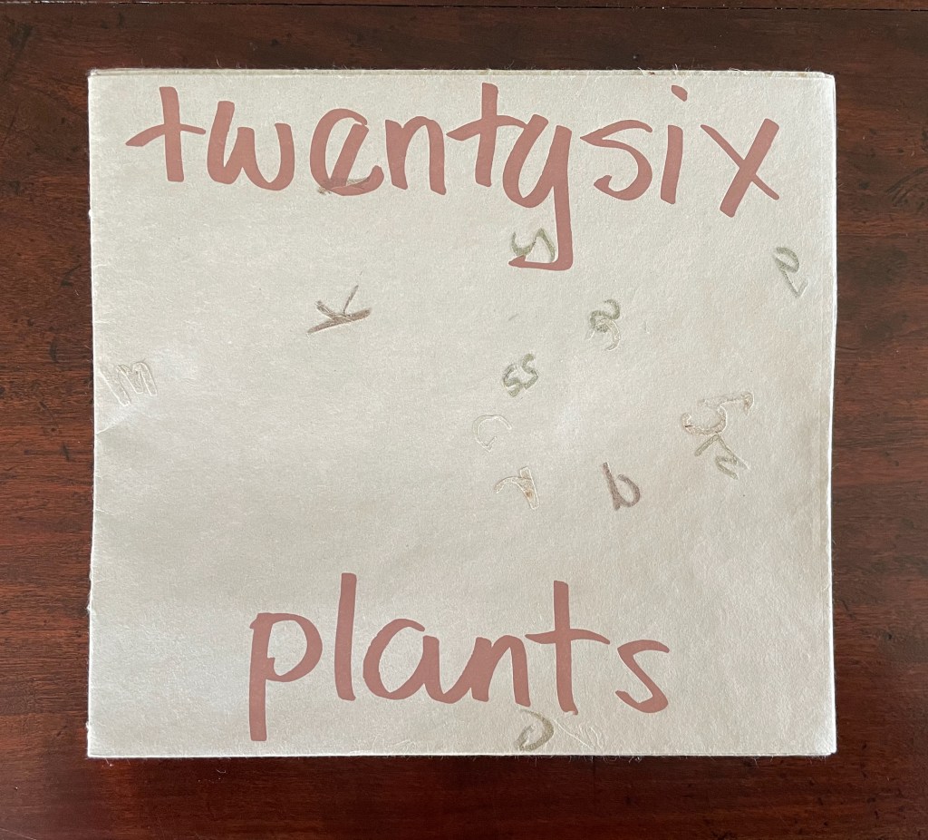
Twentysix Plants (2013)
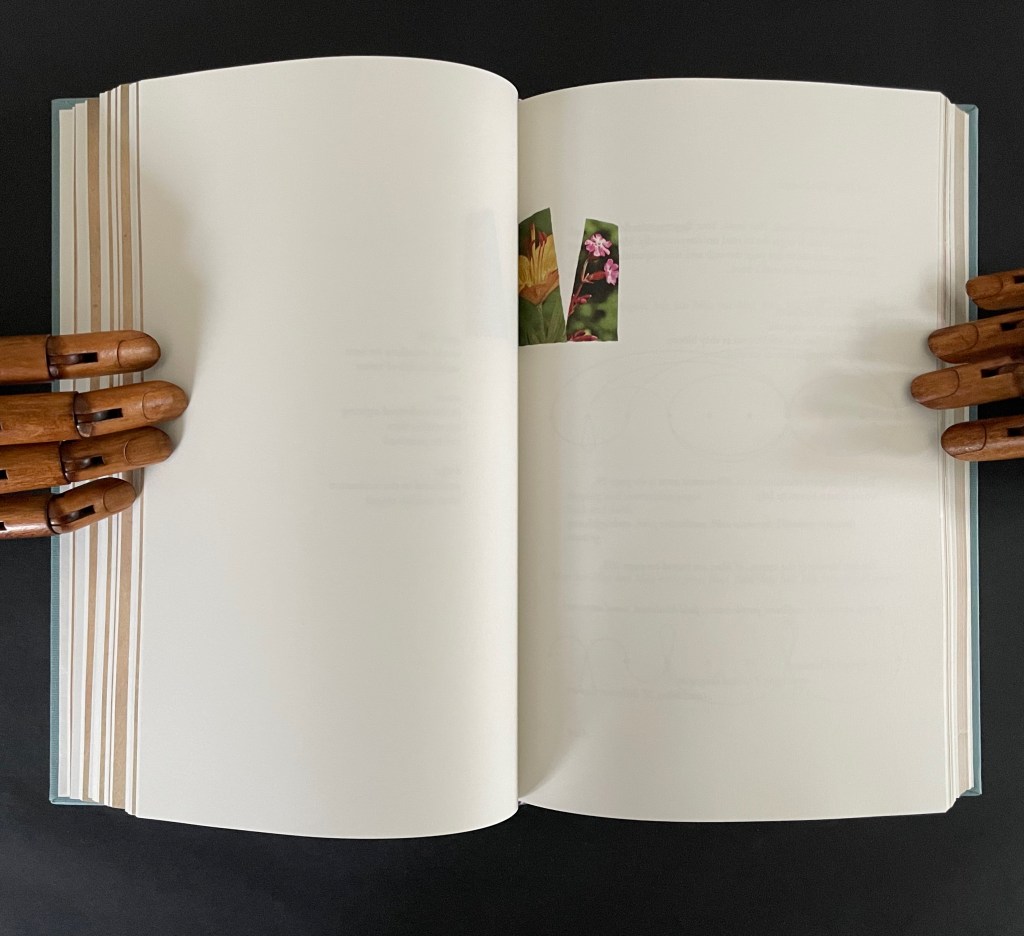
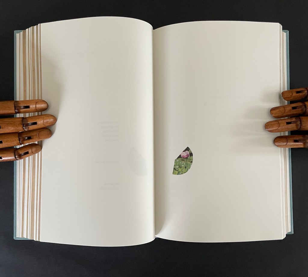
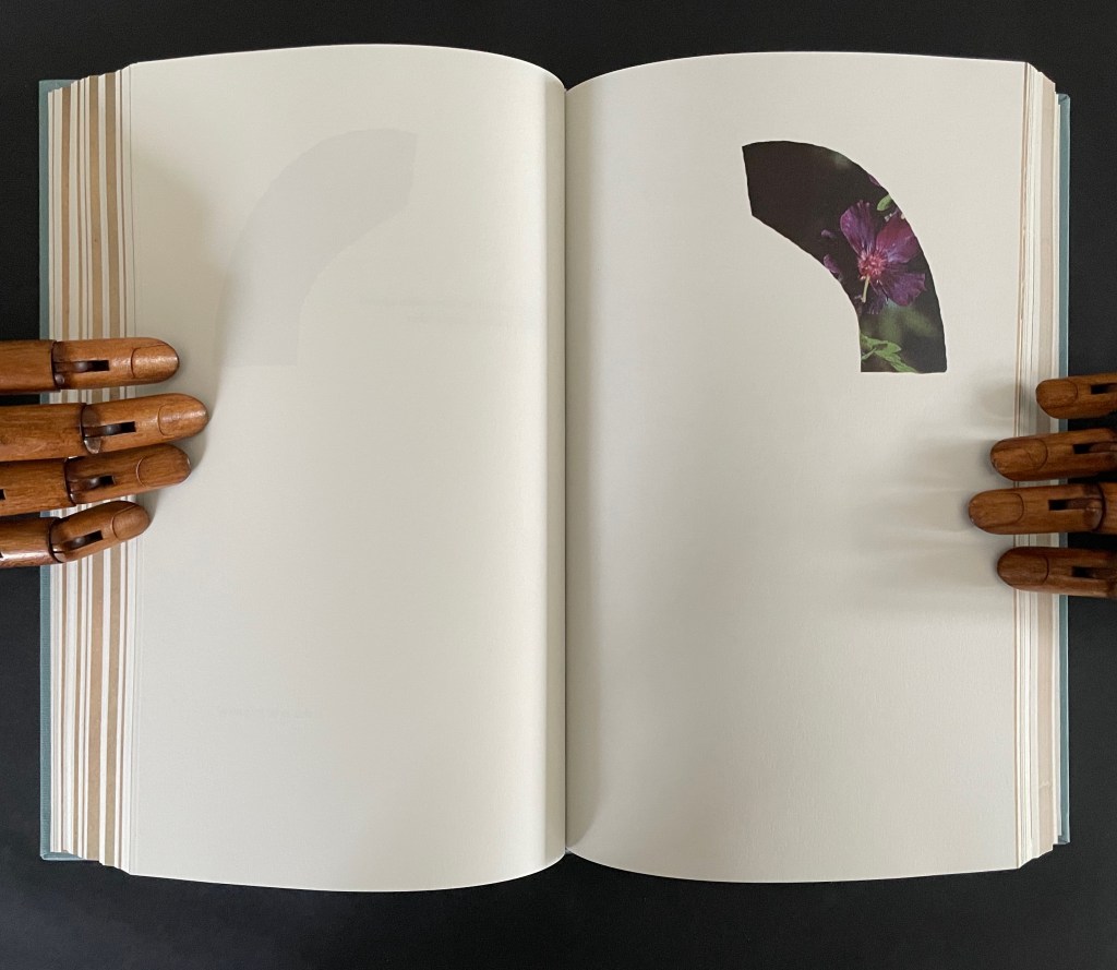
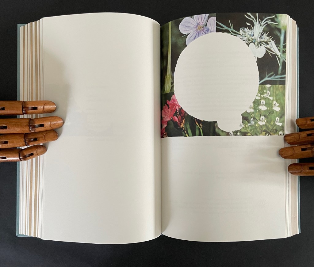
Susan Mills’ Twentysix Plants puts handmade paper at the center of its artistry as it nods to Ed Ruscha’s Twentysix Gasoline Stations (1963). It consists of twenty-seven different papers. Twenty-six of them were each made from one of twenty-six different plants. A small amount of abaca was added to the different pulps to ease them through the Hollander Beater. After the sheets were couched, dried, and readied for use, Mills “labeled” them by cutting out the name of the constituent plant in distinctive callitomic letters. For the cover paper, the twenty-seventh paper, the twenty-six cut-out scripts went into the vat.
If Twentysix Plants were an abecedarium, it would be arguable that, just as our words are made from the alphabet’s letters, so the cover of Twentysix Plants is made from all the plants used in the book. There they are, embodied in their fragmented names, embedded in the cover. But neither Twentysix Plants nor Twentysix Gasoline Stations is an A-Z.
Twentysix Plants (2013) Susan Mills Softcover with exposed spine, link-stitch and kettle-stitch sewn, and non-adhesive interlocking folios. H205 x W225 mm. [26] pages. Edition of 50, of which this is #4. Acquired from the artist, 9 February 2026. Photos: Books On Books Collection.
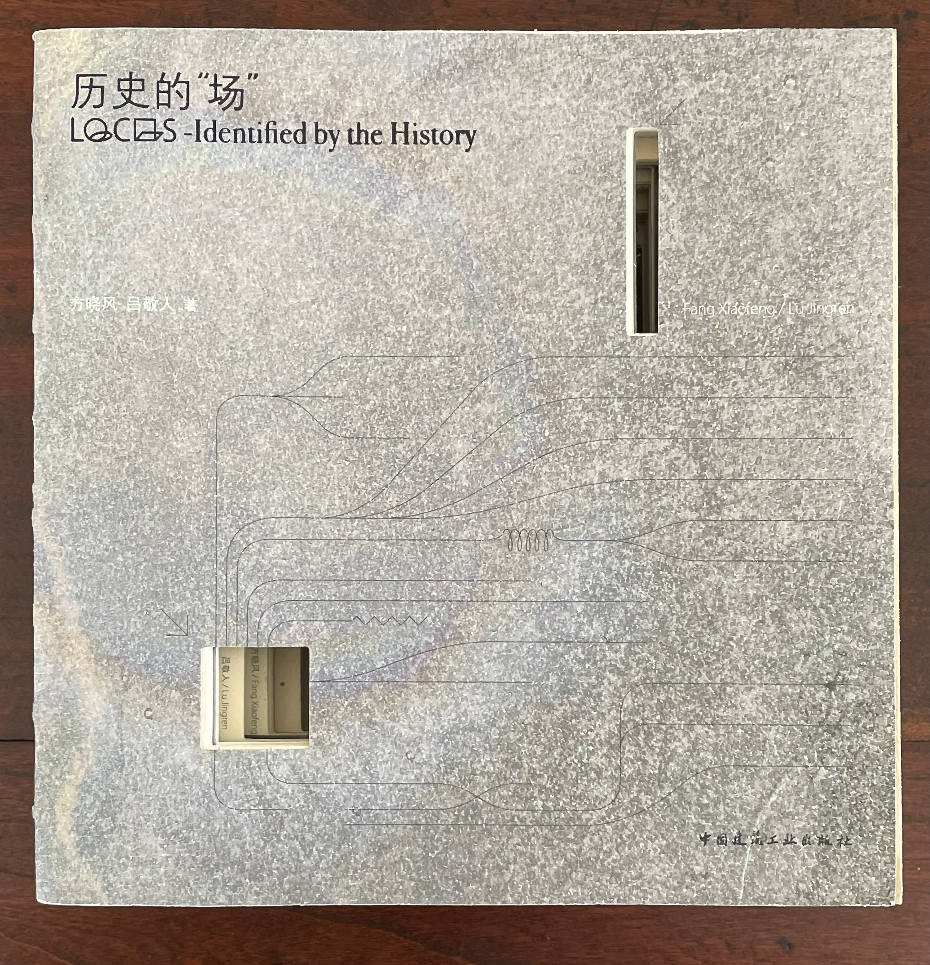
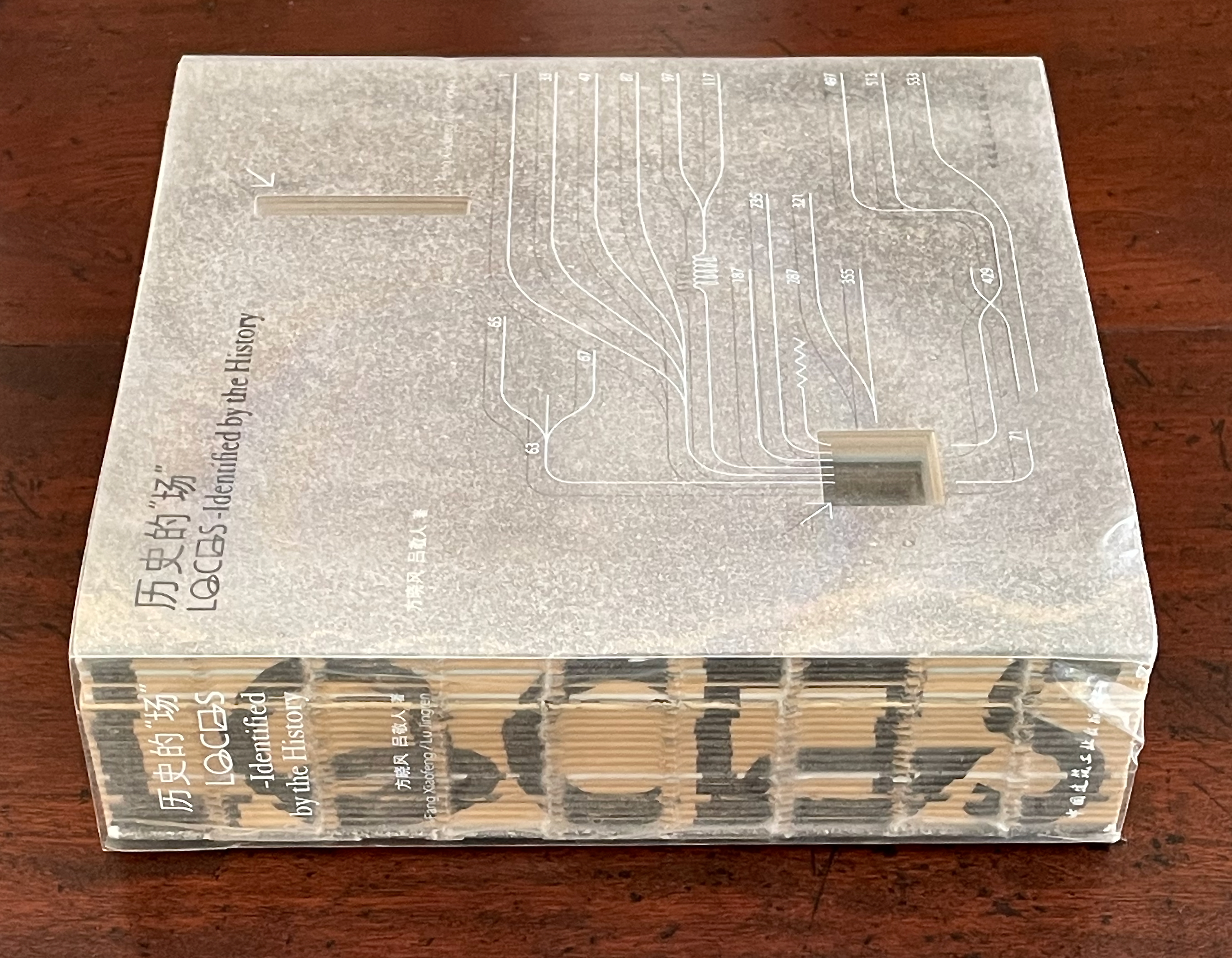
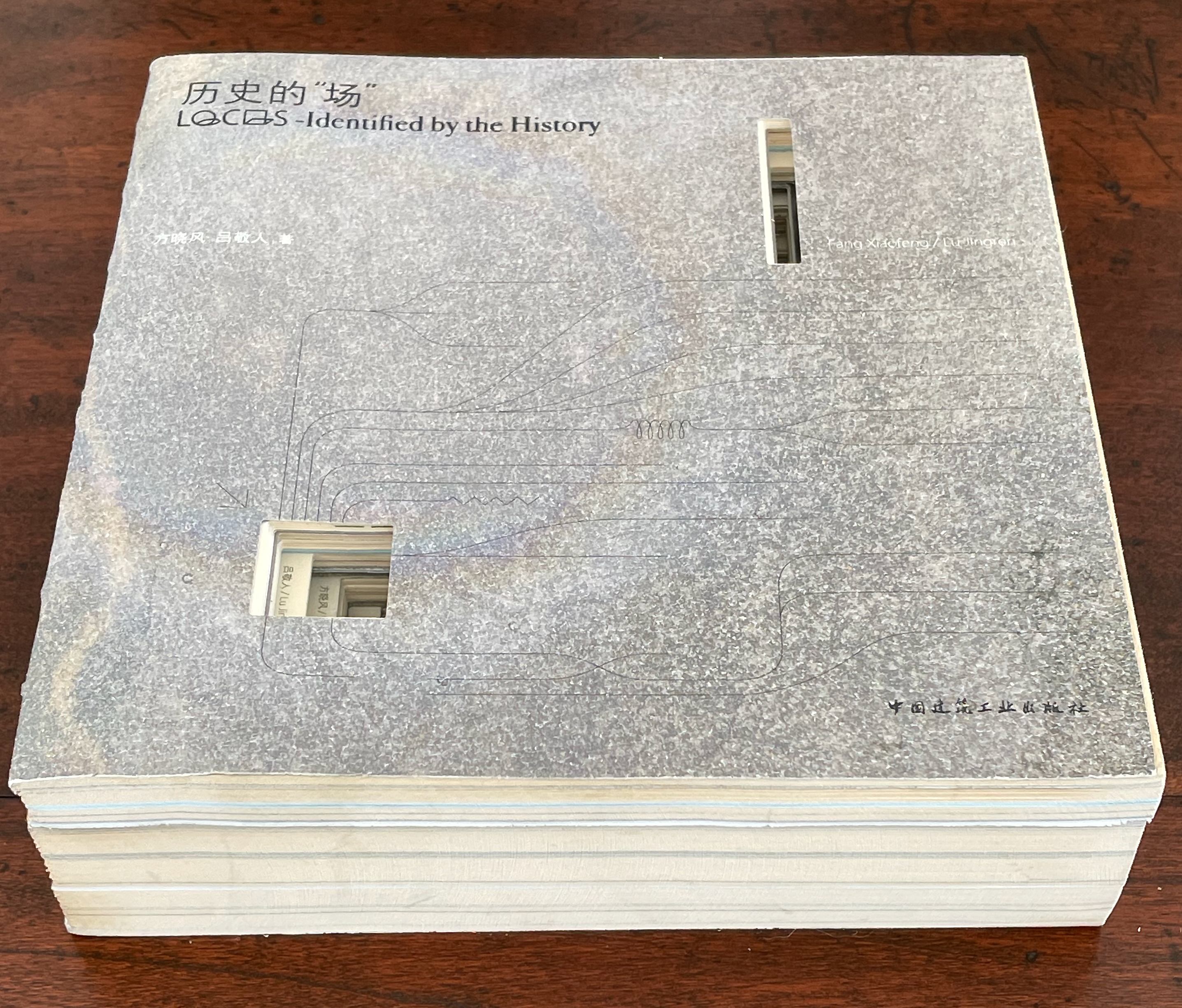
历史的”场 (Locus: Identified by the History) (2016) 方晓风 (Fang Xiaofeng) and 呂敬人 (Lu Jingren) Beijing Shi: Zhongguo jian zhu gong ye chu ban she.
Co-authored by architecture scholar Fang Xiaofeng and book designer Lu Jingren, Locus: Identified by the History (2016) springs from the Book – Architecture Project (书 – 筑 / Shu – Zhu Project), conceived by Lu Jingren, Fumihiko Maki (Japan), and Yi Ki-Ung (South Korea). The project initiated a multi-year series of exhibitions/forums called “Book – Architecture: Dialogues Between Architects and Book Designers” (2011-19) across all three countries. Locus was published on the occasion of the second exhibition/forum in 2016.
Locus pursues two overlapping lines of thought. The first and primary one rests on Lu’s design philosophy that a book is a built environment, a habitat for text and images to be engaged by readers and all five of their senses. Its layout, pacing, structure, and their interconnectedness with each other and the book’s materials mirror the architect’s design of rooms, hallways, stairs, windows, doors, thresholds, and their interconnectedness with each other and their materials. Likewise as habitats, they each have exteriors, are designed to occupy a locus in time and space, and relate to a world outside. In Lu’s philosophy, the design mechanics involve four pillars: binding + layout + editorial + information visualization. Successful execution results in an immersive spatial object (habitat) that triggers the reader’s visual, tactile, auditory, olfactory, and gustatory systems simultaneously.
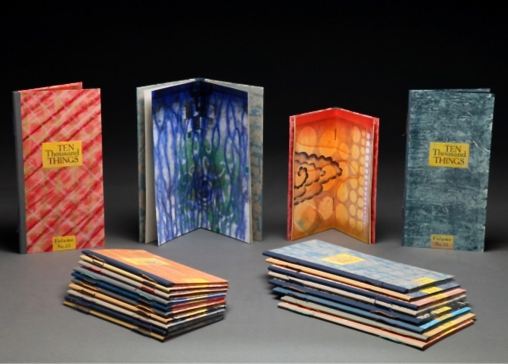
While Stéphane Mallarmé and his Un Coup de Dés may be the front runner among contenders for the title of literary patron saint of the artist’s book, Jorge Luis Borges and Italo Calvino appear in a tie for a distant but respectable second. Each have inspired some striking works. In her series Ten Thousand Things, Karen Kunc has boosted both Borges’ and Calvino’s chances and nudged Calvino’s with an additional homage in leporello format.
The series title of Ten Thousand Things springs from Chapter 42 of the Tao Te Ching:
The Tao begot one. One begot two. Two begot three. And three begot the ten thousand things. The ten thousand things carry yin and embrace yang. They achieve harmony by combining these forces.
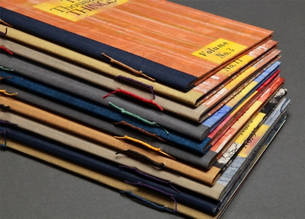
The series consists of 74 books in two sizes as the monoprints were made in two sizes of papers. The papers varied. Most of the works are on Torinoko, a Japanese paper that Kunc found to work well with waterbased Akua Intaglio inks. Some are on Arches 88 paper, a waterleaf she found also very absorbent for the Akua inks. Many of the prints have some handcoloring with ink or liquid acrylic. A few prints as well as all of the covers were made on Japanese Nishinouchi paper, a kozo fiber paper, which she has used extensively for her large woodcut prints. Printing is from collagraph plates on an etching press, with hand coloring and waxing afterwards.
Kunc chose excerpts from the works of five poets/authors and responded to each with several different monoprints not as illustrations of the text but as evocations prompted and to prompt. In addition to Borges and Calvino, she selected from Guillaume Apollinaire, Annie Dillard, and Marge Piercy. Kunc handset the metal type and letterpress printed several sheets of each text on different papers for variety with the monoprints. In each book, the text-bearing sheet folds around the sheet that bears two monoprints, one on each side.
The Tate Museum remarks that “The beauty of monoprinting lies in its spontaneity and its allowance for combinations of printmaking, painting and drawing media.” Kunc’s series extends that allowance to combinations with the elements of the book.
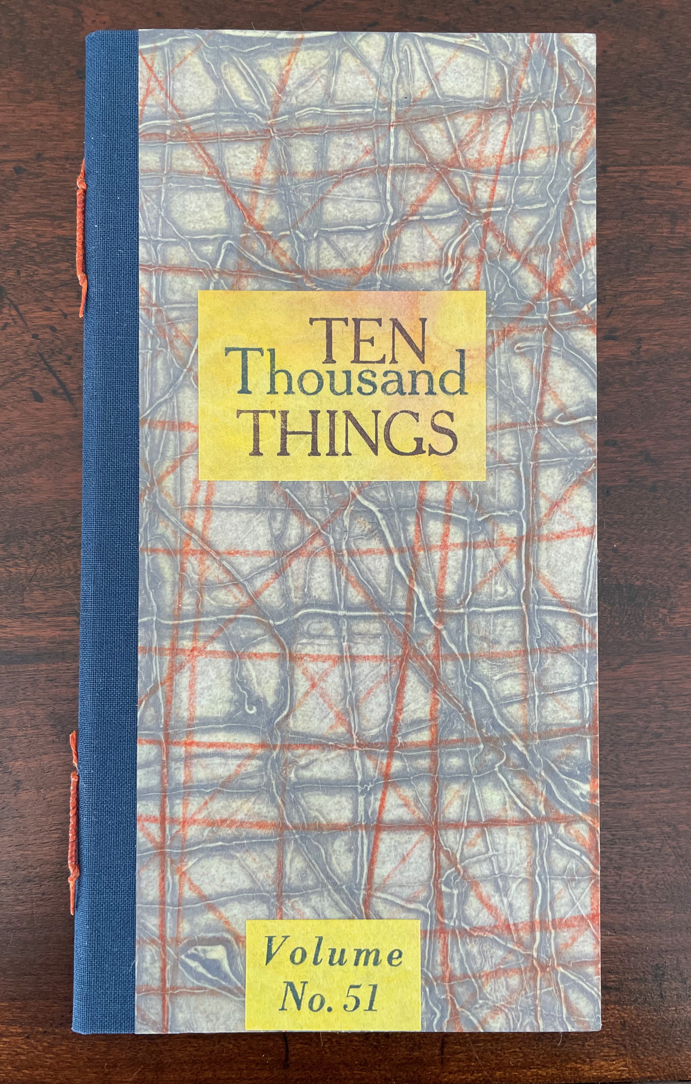
Ten Thousand Things, No. 51 (2012)
Ten Thousand Things, No. 51 (2012) Karen Kunc Single-signature booklet containing a recto and verso monoprint created by pressure printing, pochoir, and mixed media, with letterpress text. H205 x W110 mm. [8] pages. From a set of 75. Acquired from the artist, 9 February 2026. Photos: Books On Books Collection.
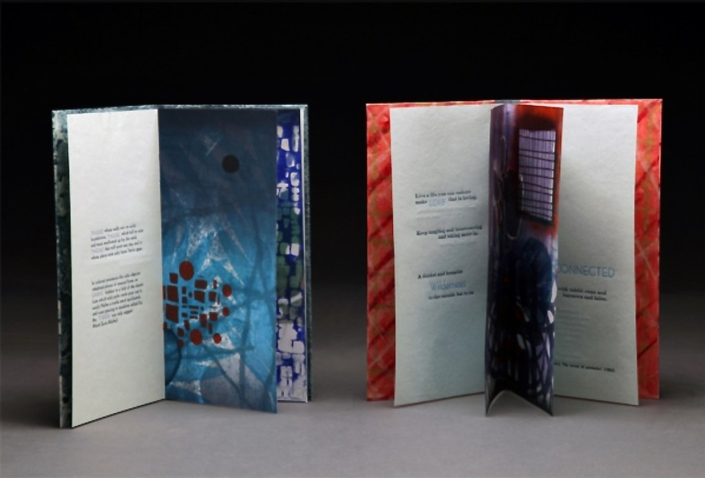
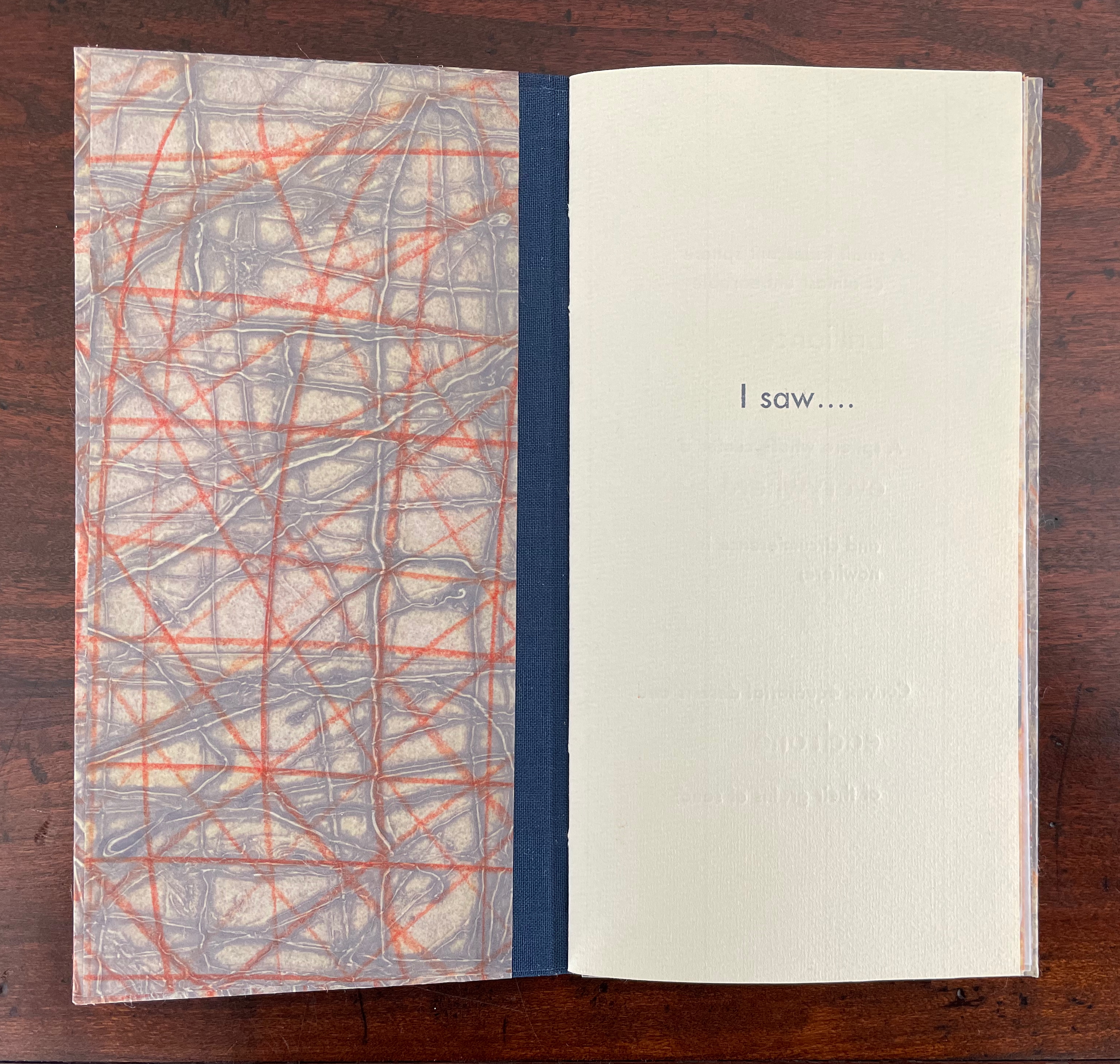
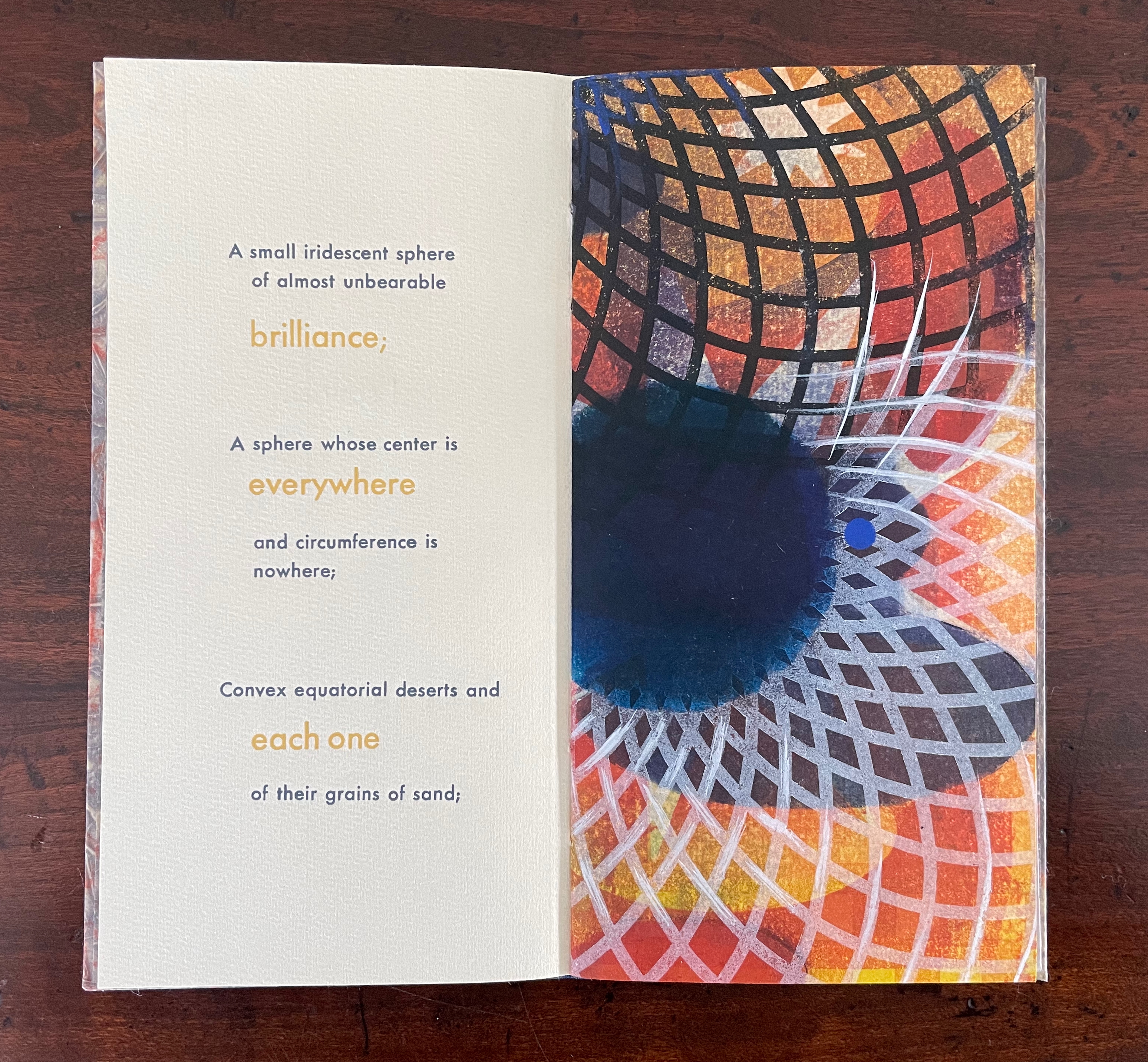
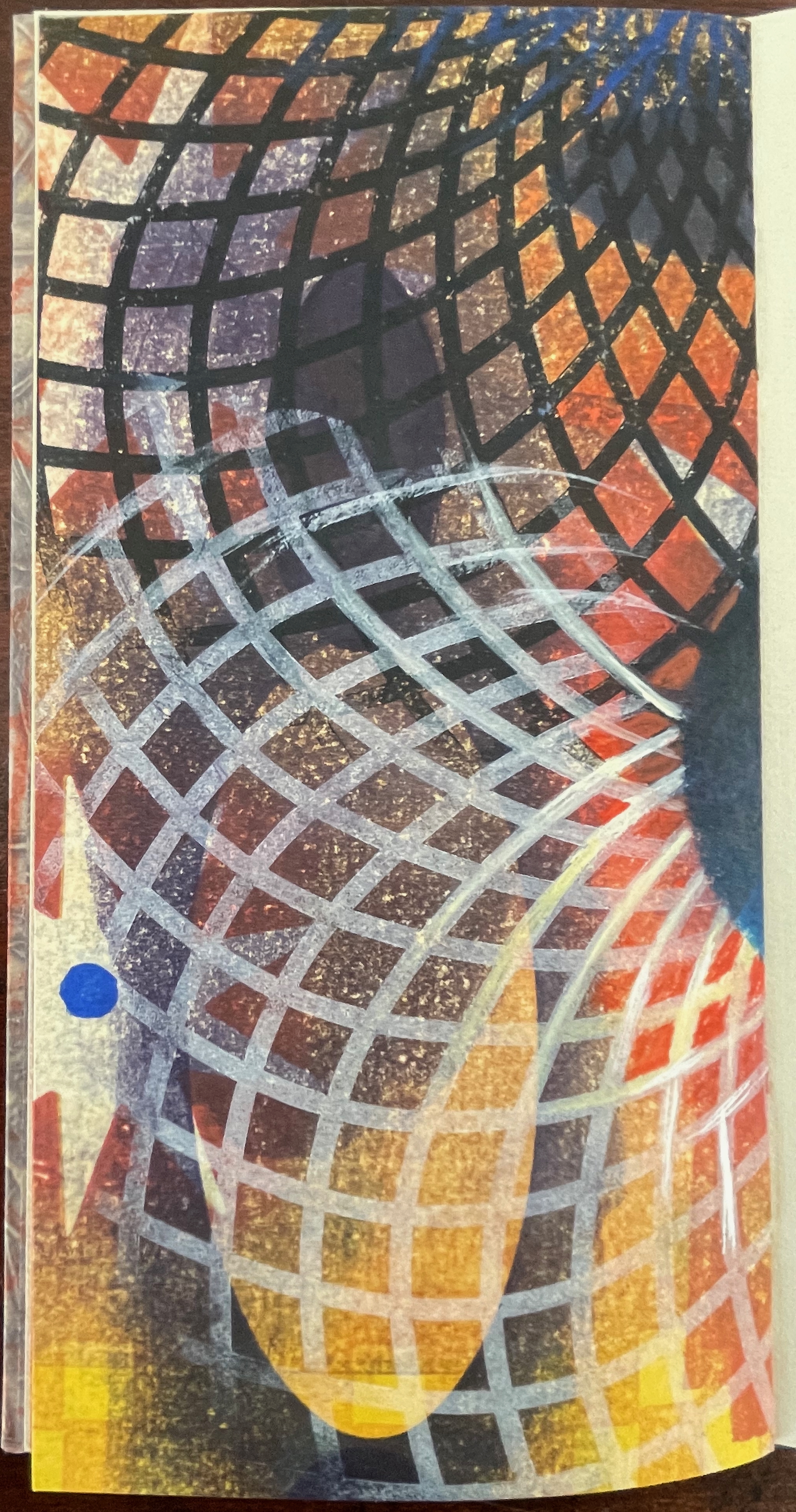
From Borges’ 1945 short story “The Aleph“, No. 51 in Kunc’s Ten Thousand Things series extracts four descriptions of the object or phenomenon Borges the narrator sees in the basement of his intolerable acquaintance Carlos Argentino Daneri:
I saw a small iridescent sphere of almost unbearable brilliance[;]
a sphere whose center is everywhere and circumference is nowhere;
convex equatorial deserts and each one of their grains of sand;
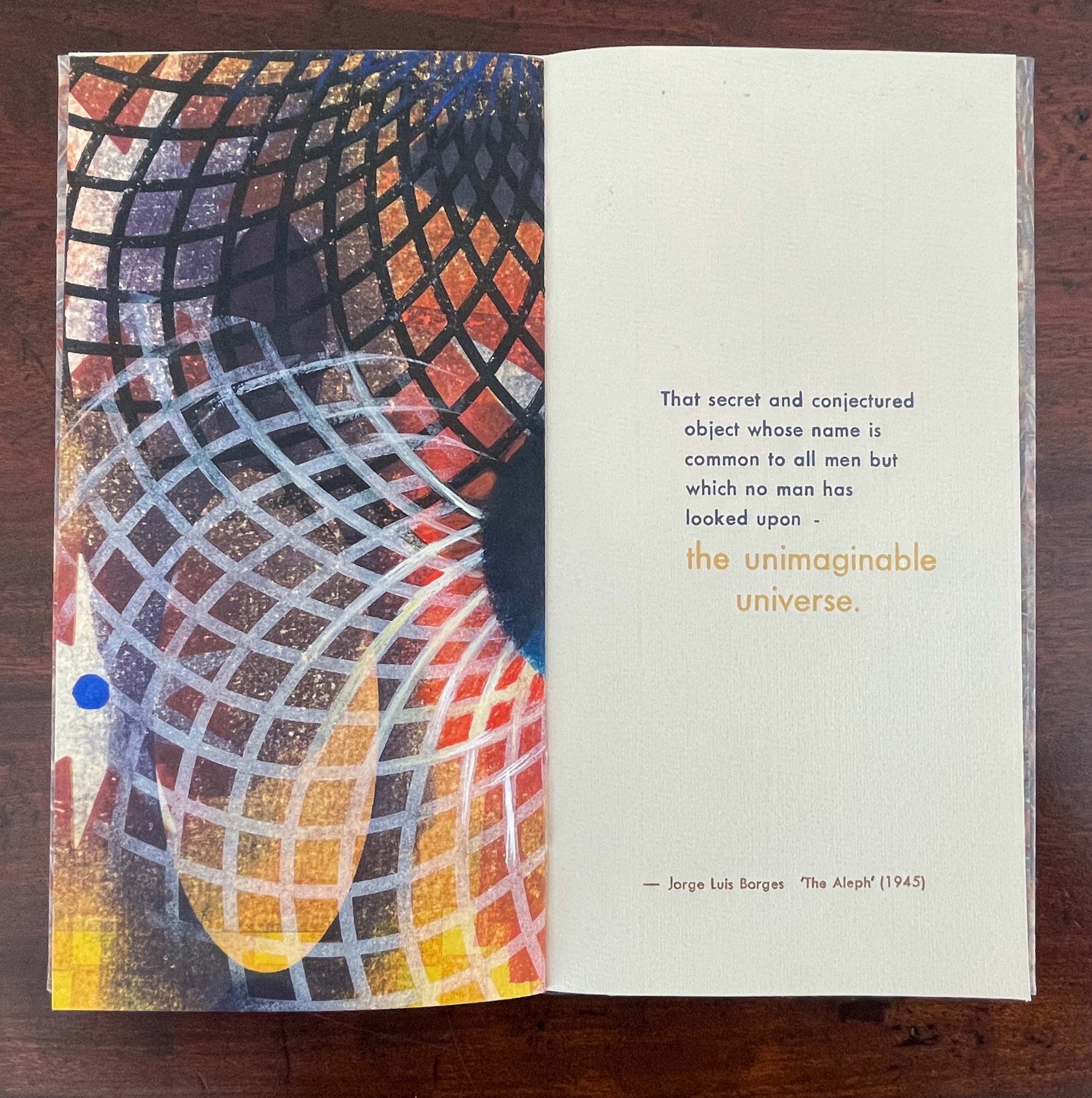
that secret and conjectured object whose name is common to all men but which no man has looked upon — the unimaginable universe.
With a deft touch, Kunc has selected and slightly altered the more abstract of Borges’ long Whitmanic observations (in the first, she inserts an ellipsis and substitutes a semicolon for a full stop; for the second and third, the order of appearance is changed). Borges prefaces his catalogue of what he sees with a caveat about the inadequacy of words to depict the concept of multum in parvo [“much in little”]:
All language is a set of symbols whose use among its speakers assumes a shared past. How, then, can I translate into words the limitless Aleph, which my floundering mind can scarcely encompass? Mystics, faced with the same problem, fall back on symbols: to signify the godhead, one Persian speaks of a bird that somehow is all birds; Alanus de Insulis, of a sphere whose center is everywhere and circumference is nowhere; Ezekiel, of a four-faced angel who at one and the same time moves east and west, north and south. (Not in vain do I recall these inconceivable analogies; they bear some relation to the Aleph.) Perhaps the gods might grant me a similar metaphor, but then this account would become contaminated by literature, by fiction. Really, what I want to do is impossible, for any listing of an endless series is doomed to be infinitesimal. In that single gigantic instant I saw millions of acts both delightful and awful; not one of them occupied the same point in space, without overlapping or transparency. What my eyes beheld was simultaneous, but what I shall now write down will be successive, because language is successive.
In light of the snide literary sniping and rivalry that forms the background to “The Aleph”, Borges may be forgiven for omitting William Blake’s spectacular translation of “the limitless Aleph”:
To see a World in a Grain of Sand,/ And a Heaven in a Wild Flower,/ Hold Infinity in the palm of your hand,/ And Eternity in an hour. (Auguries of Innocence, 1803).
It might have brought Borges’ descriptive and narrative enterprise to an harrumphing halt. We would then not have had this particular instance of Karen Kunc’s taking up the challenge of rendering in an artist’s book Borges’ verbal description of the Aleph. What image could resonate with or reflect his words and reflect the impossibility he describes? How might the arrangement of pages enhance/diminish it? How might the act of turning a page reflect or obscure it?
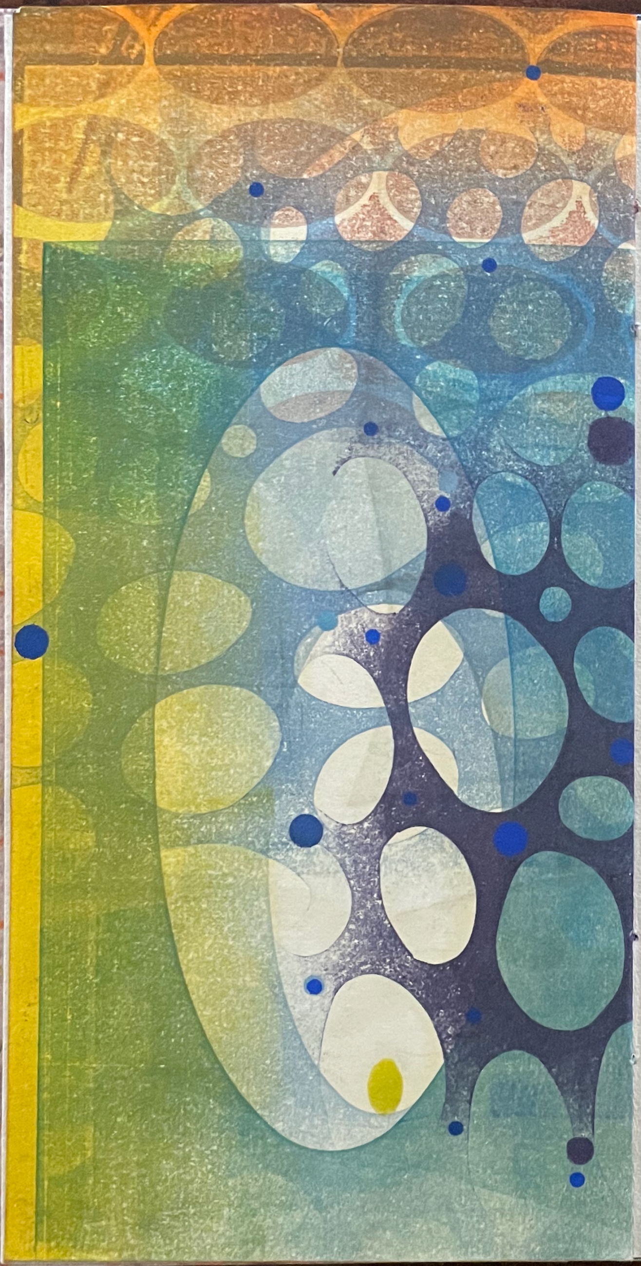
The vibrant circle of deep blue is only two dimensional, but perhaps the abstractions behind the dark convex grid suggest the three dimensionality of the story’s sphere. Perhaps the more brilliant but smaller blue circle beside the larger one conveys the multum in parvo concept in the style of medieval narration differentiating multiple points in time with images of different size in the same plane. Perhaps the full-page bleed of the image even suggests that paradoxically the image extends from the page yet encompasses the page. Likewise might the sheet’s fold that truncates the circle and the dark and light grids imply continuity coexisting with discontinuity? Does the dark blue grid that curves over the orange and burnt umber colors imply the “convex equatorial deserts”?
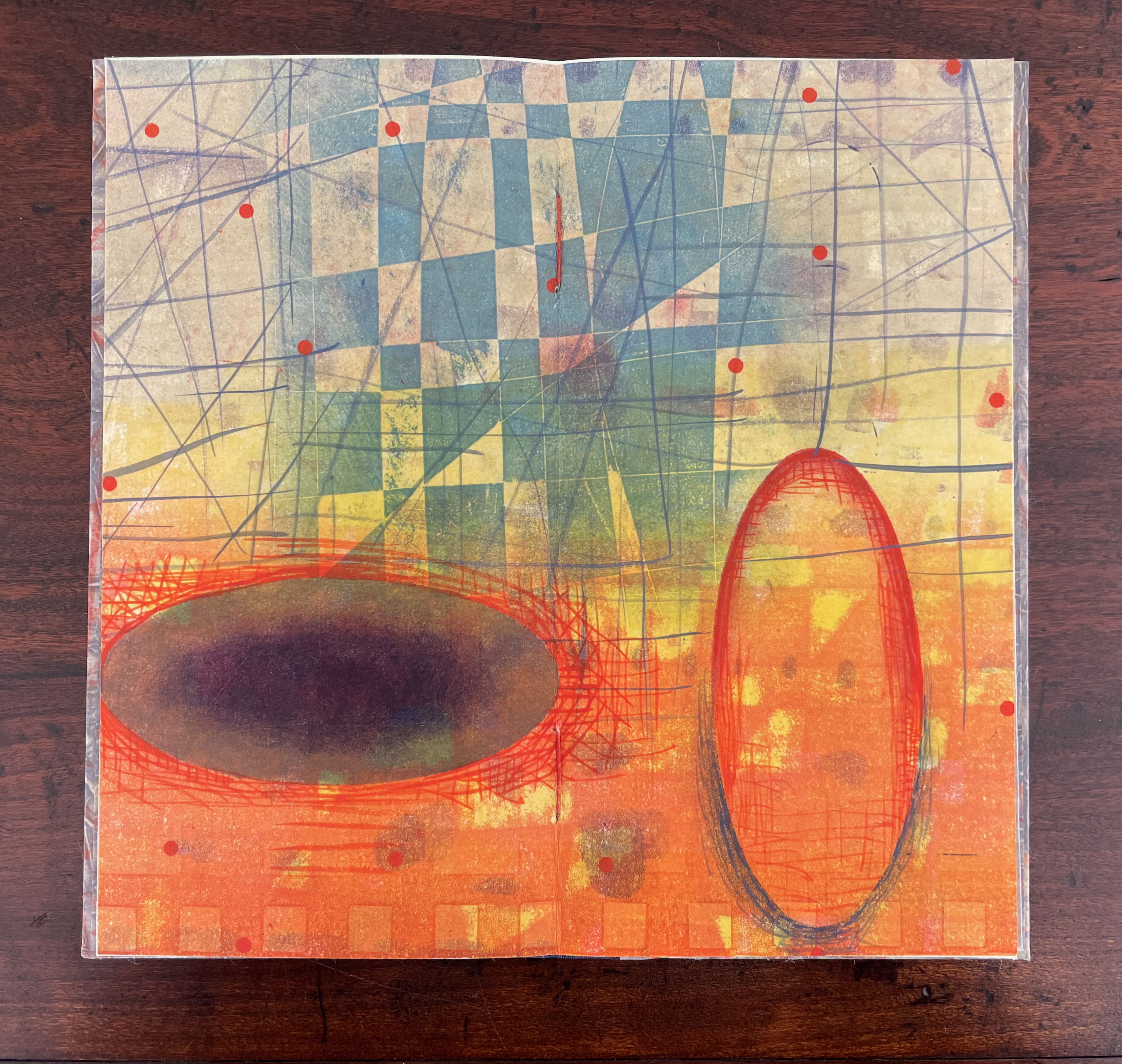
Turning from that half view of the monoprint, we have the full view of the monoprint on the other side of the sheet. An angular and checkered blue background hovers over two ellipsoid figures in an orange foreground. Is the background network with its numerous small red dots a version of Indra’s net, that cosmological metaphor of an infinite net with a jewel at each juncture reflecting and being reflected by every other? The dark ellipsoid seems to quiver surrounded by crosshatching. Is it in motion toward the upright orange ellipsoid? Is this a moment in time and space?
The other half of the monoprint with the dark blue circle comes into view with the last double page spread. If we could see all at once the monoprint with the dark blue circle, the juxtaposition of spheres and ellipses would stand out more.
The white stars behind the grid stand out a bit more, and the small bright circles seem more clearly positioned on curving white orbital tracks. Is it an allusion to planetary and constellatory movement, bring a universe within this small book? Without photographic manipulation, we have to open our minds to imagine it. As Carlos replies when Borges worries that it will be too dark in the cellar to see the Aleph, ““Truth cannot penetrate a closed mind. If all places in the universe are in the Aleph, then all stars, all lamps, all sources of light are in it, too.”
Of course, this photographic manipulation is a cheat and overlooks that Kunc has combined the half-views of one side of the monoprint with the full view on the other side to reflect the challenge of embodying a simultaneous phenomenon with successive phenomena.
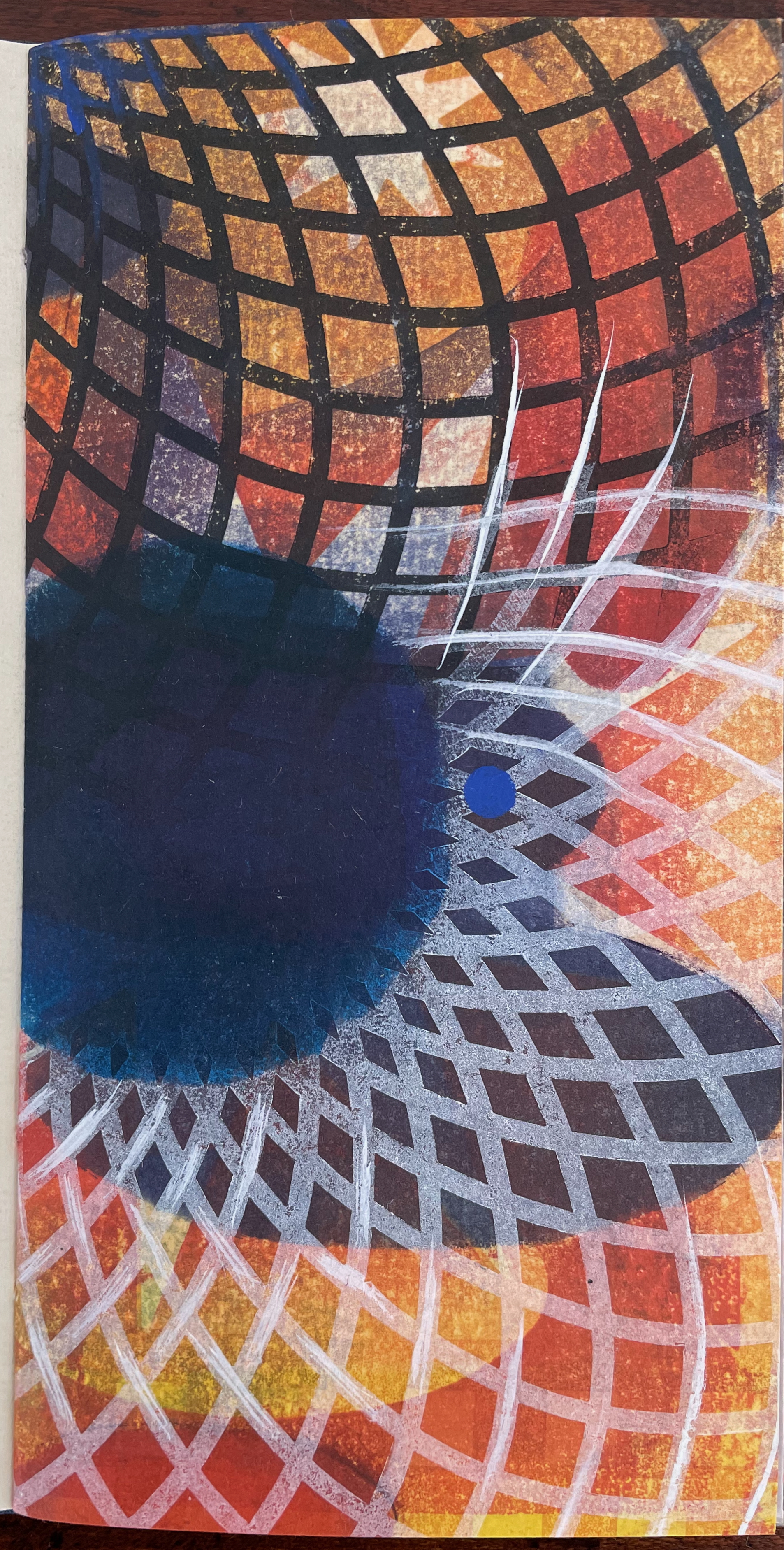
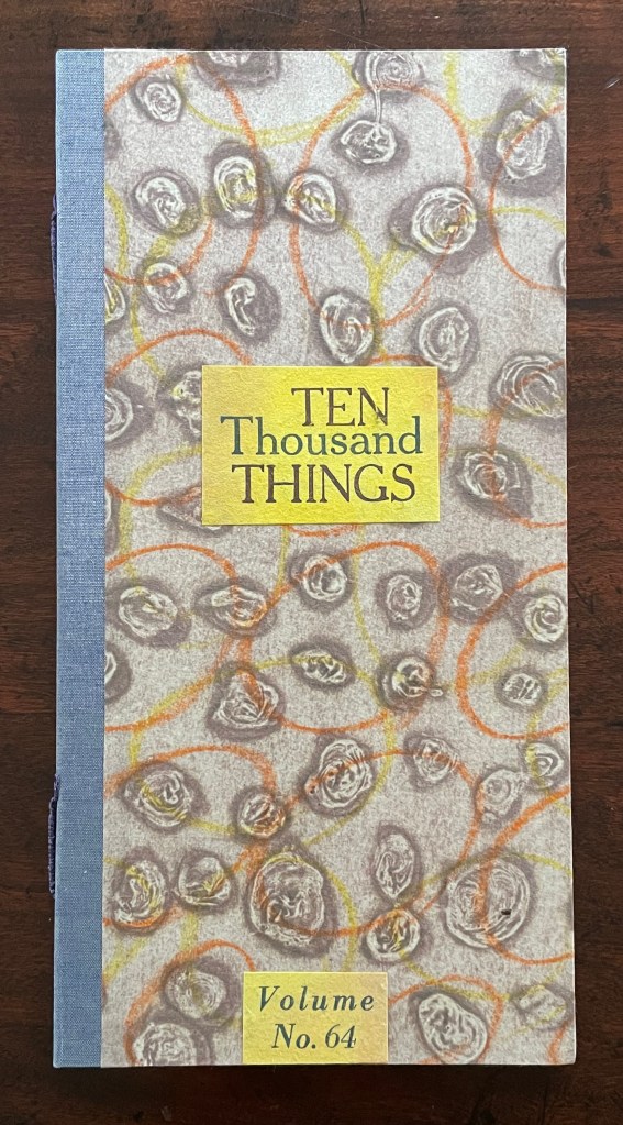
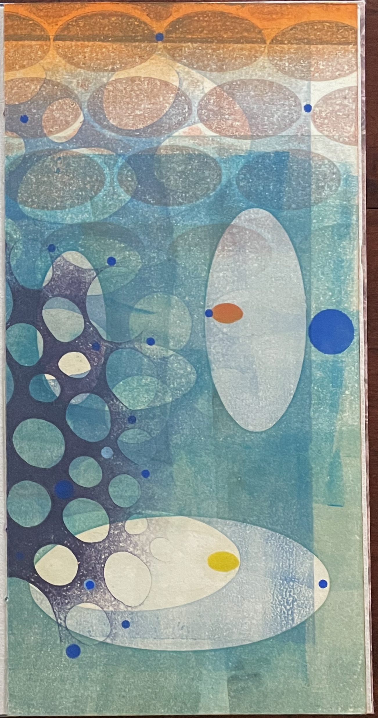
Ten Thousand Things, No. 64 (2012)
Ten Thousand Things, No. 64 (2012) Karen Kunc Single-signature booklet containing a recto and verso monoprint created by pressure printing, pochoir, and mixed media, and a letterpress text on various papers.H250 x W125 mm. [8] pages. From a set of 75. Acquired from the artist, 9 February 2026. Photos: Books On Books Collection.
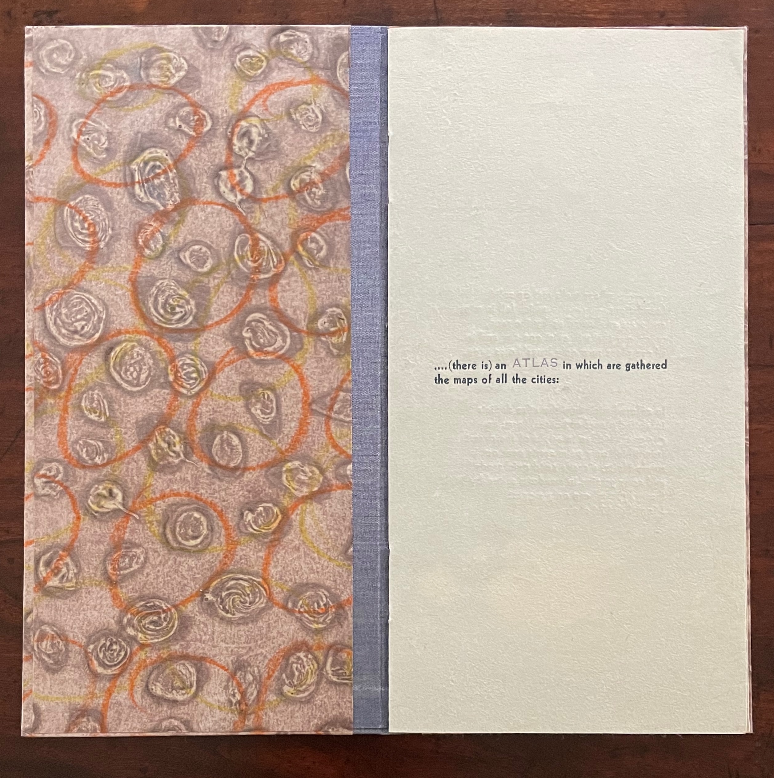
Of the 74 books in the Ten Thousand Things series, 11 of them pay homage to Italo Calvino’s Invisible Cities (1972/74). The book’s premise is that Kublai Khan sent Marco Polo out into the empire to visit the Khan’s cities and return with close descriptions. In nine parts, each prefaced and closed with a philosophical dialogue between the Khan and Polo, the traveller describes fifty-five cities — all of them imaginary. While most works of homage to Invisible Cities select one or more of these fictitious 55 cities on which to focus, Kunc chooses more general text from the preface to Part 9. This is the text used in all 11 of the works of homage to Calvino:
…. (there is) an ATLAS in which are gathered the maps of all the cities:
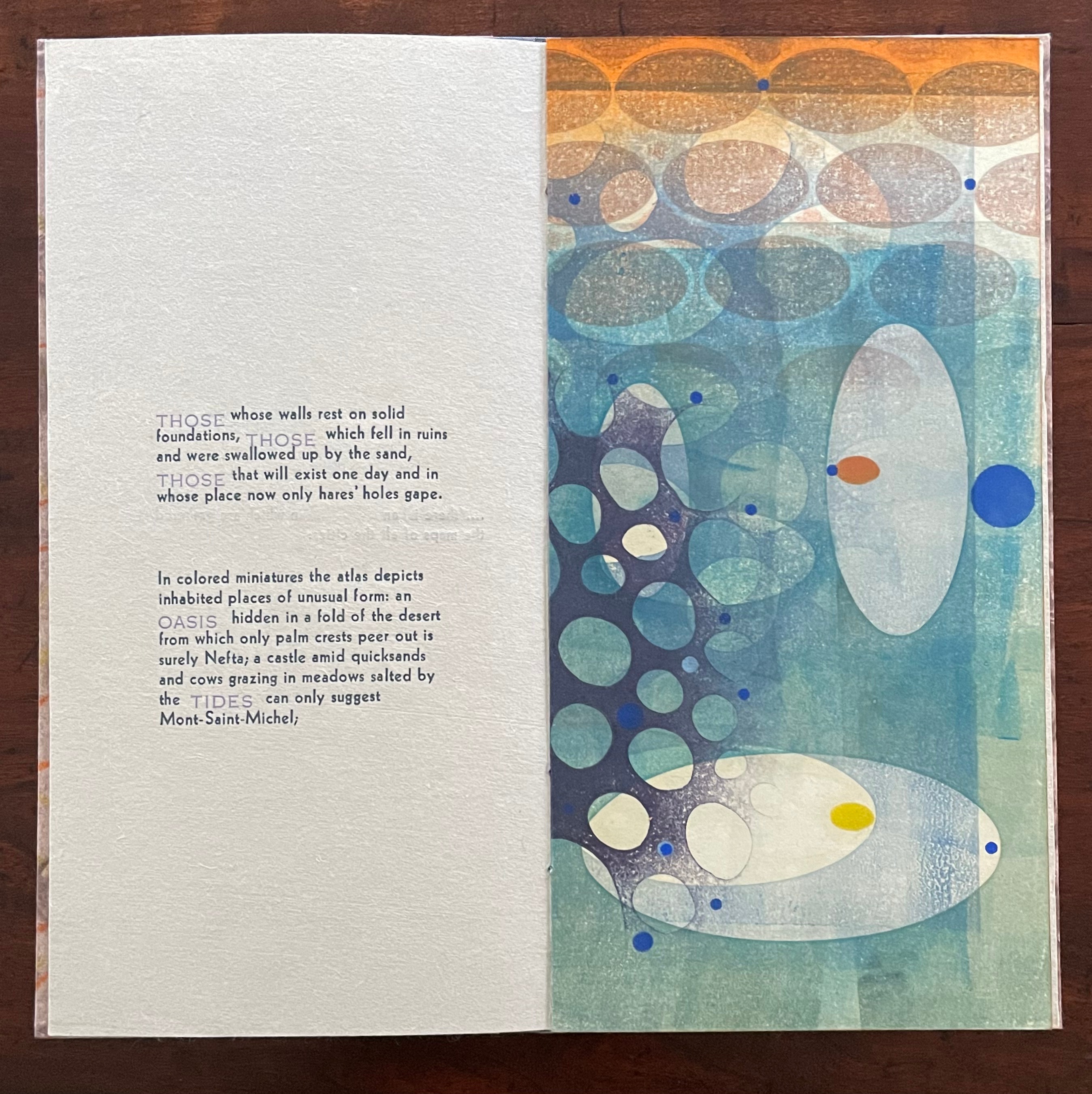
THOSE whose walls rest on solid foundations, THOSE which fell in ruins and were swallowed up by the sand, THOSE that will exist one day and in whose place now only hares’ holes gape.
In colored miniatures the atlas depicts inhabited places of unusual form: an OASIS hidden in a fold of the desert from which only palm crests peer out is surely Nefta; a castle amid quicksands and cows grazing in meadows salted by the TIDES can only suggest Mont-Saint-Michel;
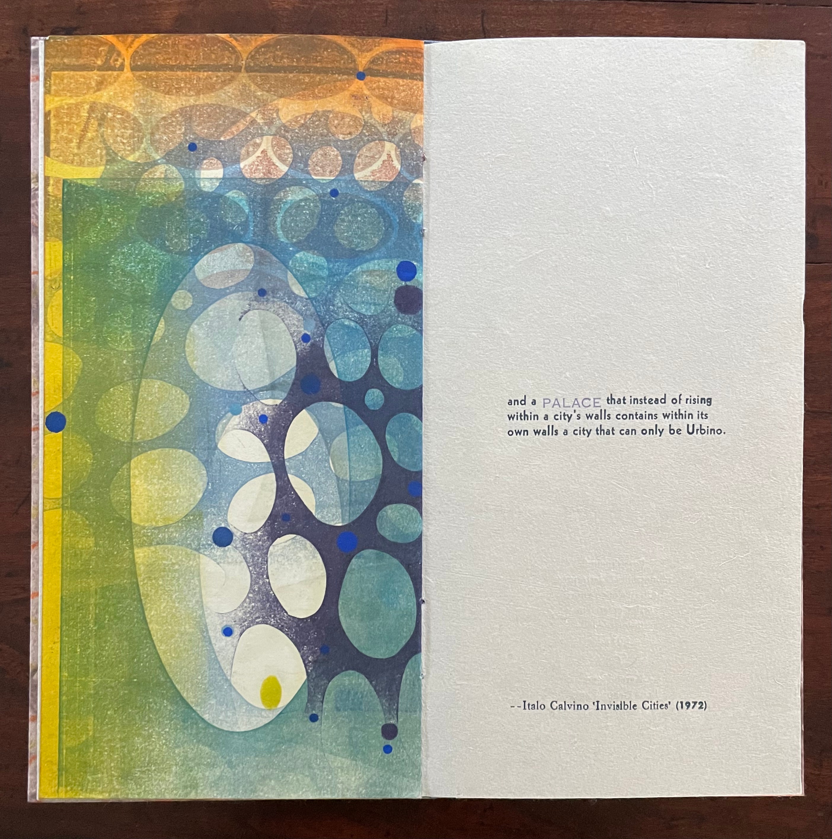
and a PALACE that instead of rising within a city’s walls contains within its own walls a city that can only be Urbino.
With certain words appearing in all caps in a lighter weight and lighter color than the surrounding text, the excerpts have a different texture from those in No. 51. The all caps words rise above or fall below the line of type.
As with No. 51, only one side of the double-sided monoprint is viewable as a whole; the other side is viewable in halves. In No. 64’s first half-view, the shapes and colors have a submerged quality that echoes the now sinking or subsiding type of “THOSE”, “OASIS”, and “TIDES”:
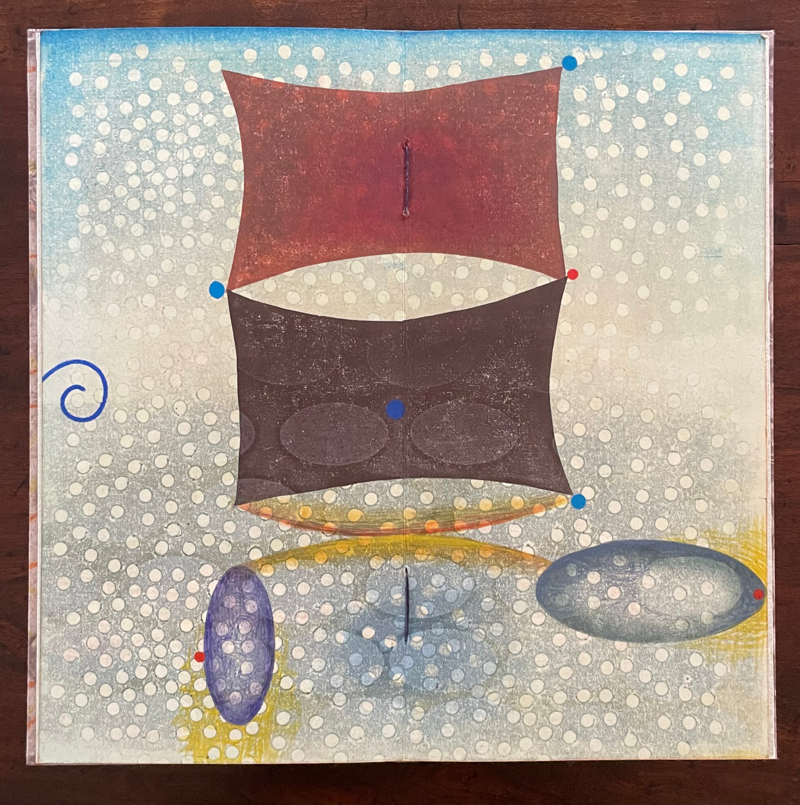
As the most prominent feature of the full-view monoprint, perhaps the two rectangular sail-like shapes recall the Chinese emperor and Venetian traveler. Or perhaps they allude to the remnants of a tower poking above the sands. The ellipsoidal shapes might be the “hares’ holes” mentioned above. The seemingly non-allusive flurry of white dots across the spread behave strangely. They lie in the background in the upper two thirds of the spread but then shift into the foreground in the lower third. The four bright blue dots may have migrated from the first half-view, but the trio of red dots are new participants. The presence of both contributes to an urge to flip back and forth between the first half-view and this full view.
The second half-view faces text that again displays all caps letters that sink below the line: “PALACE”, but more notably, the palace does not sit within a city but a city sits within the palace, “a city that can only be Urbino”. So, a real city within a fictive palace.
We can perform the photographic cheat to bring the two halves of the monoprint together, but as with No. 51, we overlook the deliberate hiding of the whole within the halves — like the paradoxical fictive palace that holds a real city (Urbino).
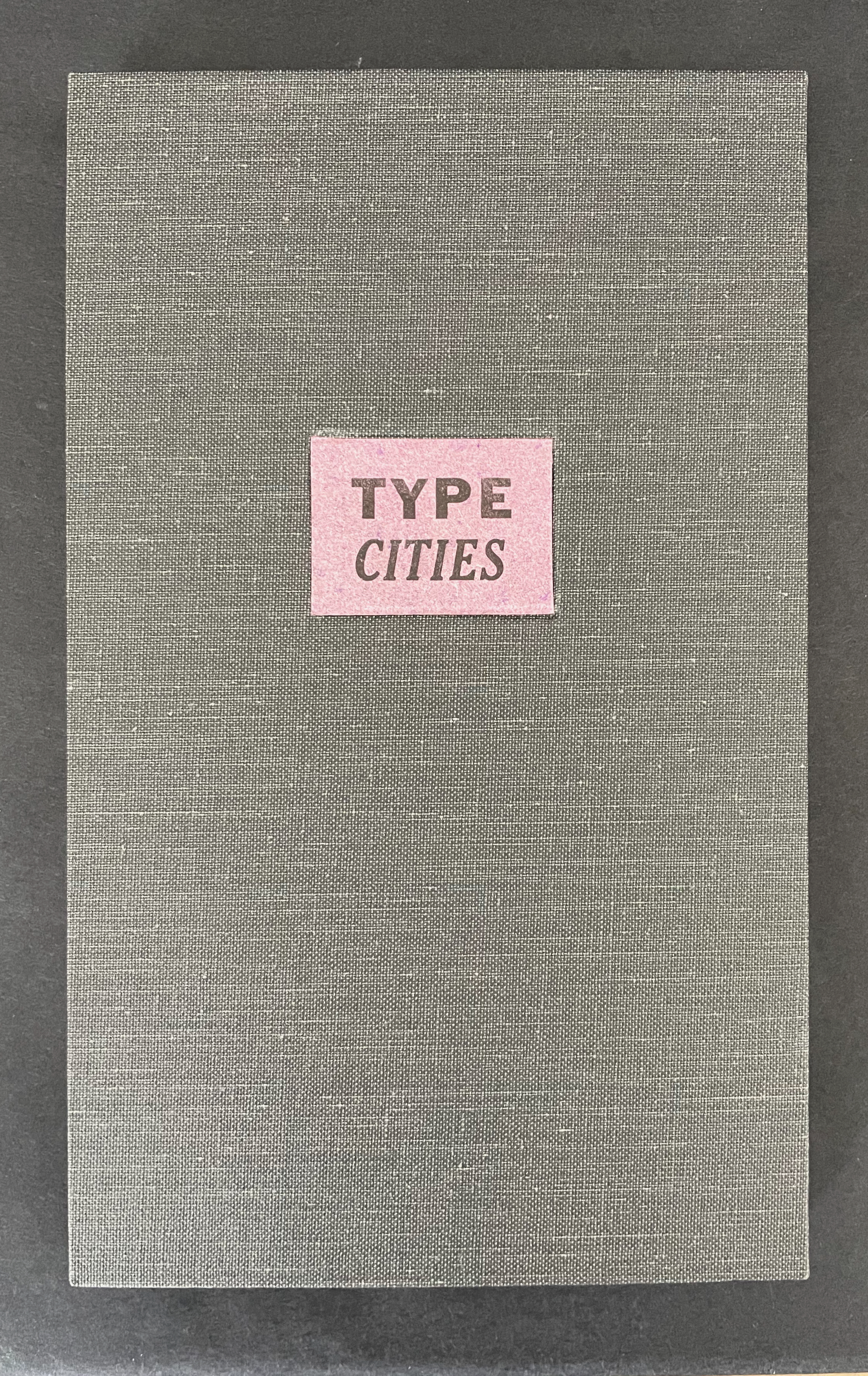
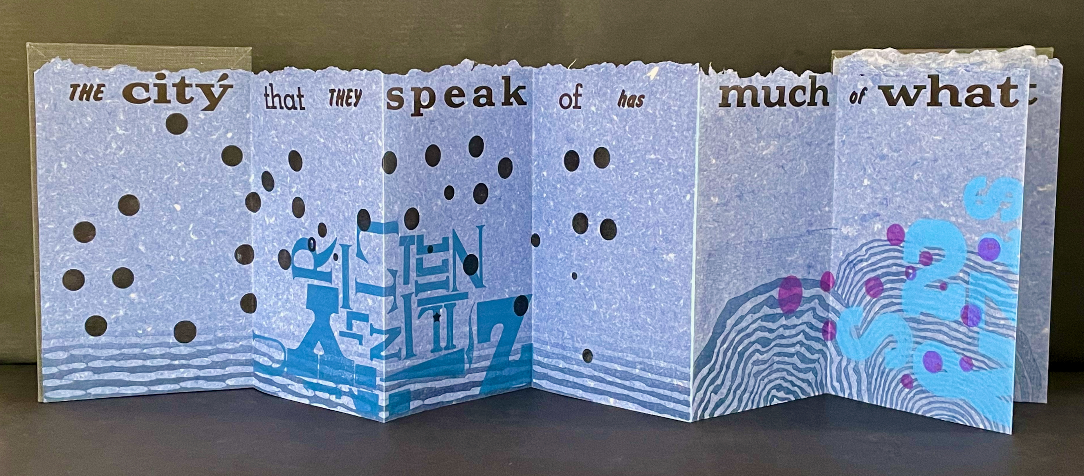
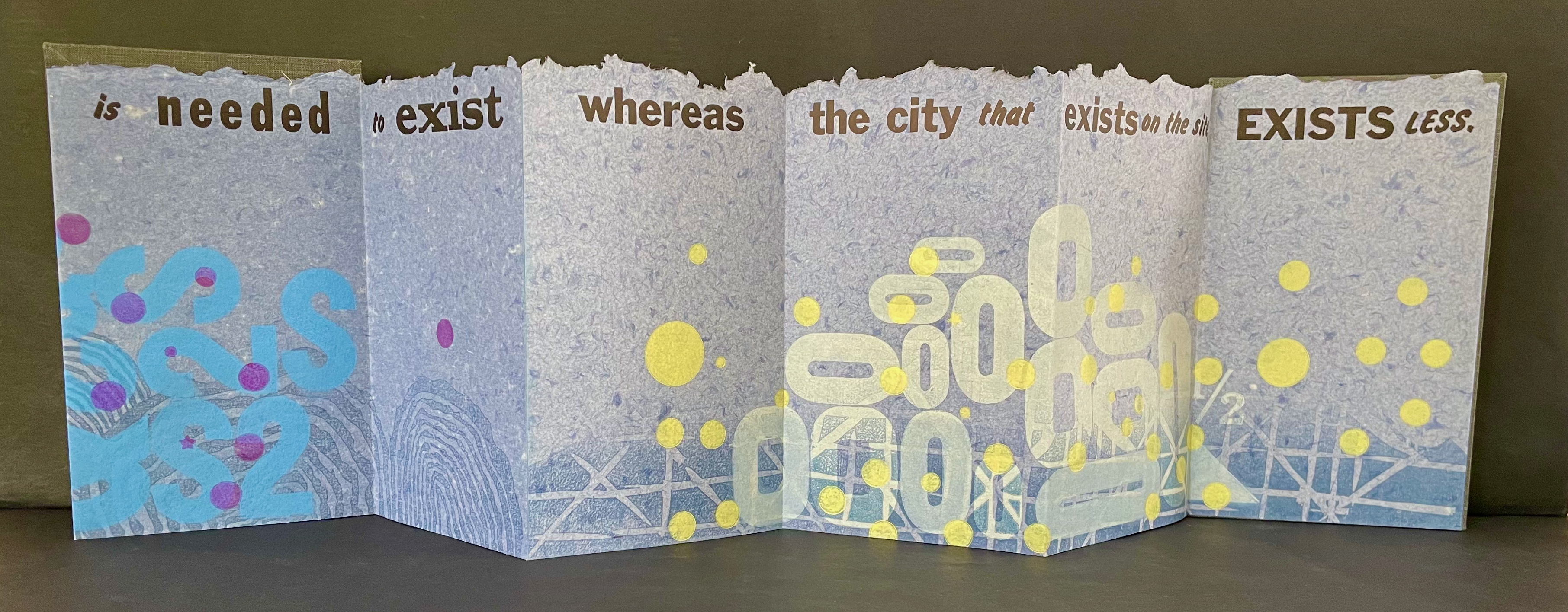
Type Cities (2018)
Type Cities (2018) Karen Kunc Leporello. H190 x W114 mm closed, extends to 1346 mm. [12] panels. Edition of 8, of which this is #2. Acquired from the artist, 25 March 2026. Photos: Books On Books Collection.
Like most other homages to Invisible Cities, Karen Kunc’s Type Cities (2018) focuses on one of the fictitious cities; in this case, Aglaura. As with Ten Thousand Things, she uses an excerpt:
The city that they speak of has much of what is needed to exist whereas the city that exists on the site, exists less.
That is cryptic. Just as the paradoxical characterizes the general cities in No.64, so it is for the particular city of Aglaura here:
So if I wished to describe Aglaura to you, sticking to what I personally saw and experienced, I should have to tell you that it is a colorless city, without character, planted there at random. But this would not be true either: at certain hours, in certain places along the street, you see opening before you the hint of something unmistakable, rare, perhaps magnificent; you would like to say what it is, but everything previously said of Aglaura imprisons your words and obliges you to repeat them than say. Therefore, the inhabitants still believe they live in an Aglaura which grows only with the name Aglaura and they do not notice the Aglaura that grows on the ground.
For Ten Thousand Things, the single-fold double-sided monoprint provided Kunc a surprisingly flexible tool with which to capture the paradoxical in two very different texts. This time she chooses the accordion structure. Also, as the title Type Cities suggests, she chooses type as an additional tool to capture what Marco Polo describes as Aglaura’s “enduring assortment of qualities”. Across the twelve panels of the leporello, Kunc lays out the text of her chosen excerpt in multiple faces and fonts:
Also across the twelve panels, the color change of black dots to purple, violet, and then yellow echoes the shift from the colorless city to something else “at certain hours, in certain places along the street”.
The “much of what is needed to exist” manifests at the bottom edge as wood type letters in dark blue floating along a river (?), then as Ss, 2s, and $s floating over a pond (?), and then yields to the less of zeroes scattered over a grid. The contrast of much and less even extends vertically to the handmade paper with its messily torn upper edge opposed to its neatly trimmed lower edge. It also extends horizontally to the paper as its tint shifts gradually from a deep blue to a light gray. These photographs do not do justice to the painted and stamped elements or texture of Type Cities.
Further Reading
Laozi. 2011. Tao Te Ching = Dao de Jing. Translated by Gia-fu Feng, Jane English, and Toinette Lippe. Third Vintage books edition. New York: Vintage Books, a division of Random House, Inc.
Works of homage to Jorge Luis Borges
Louise Grimshaw’s Ethereal Worlds(2017) celebrates “The Library of Babel” with hexagonally shaped pages of prints rotating on a central post.
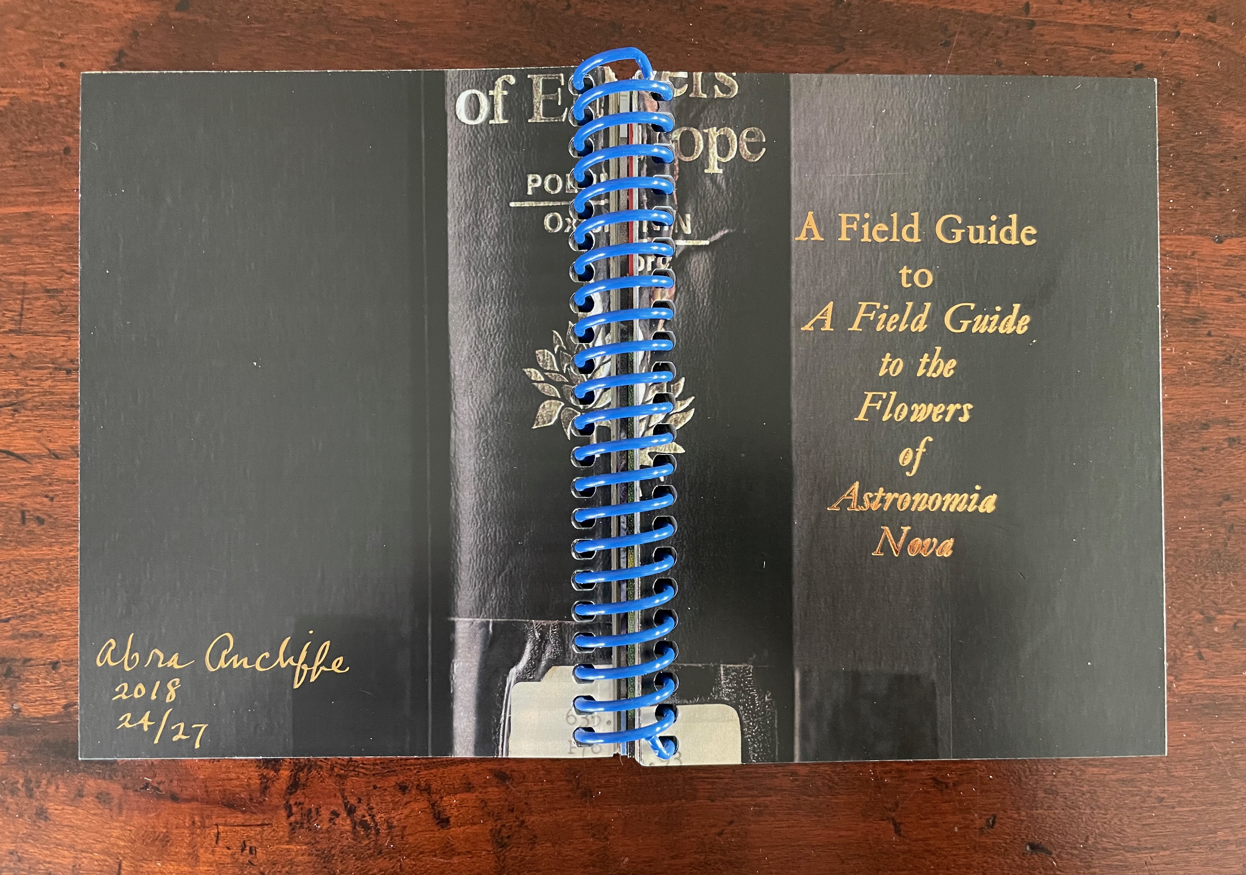
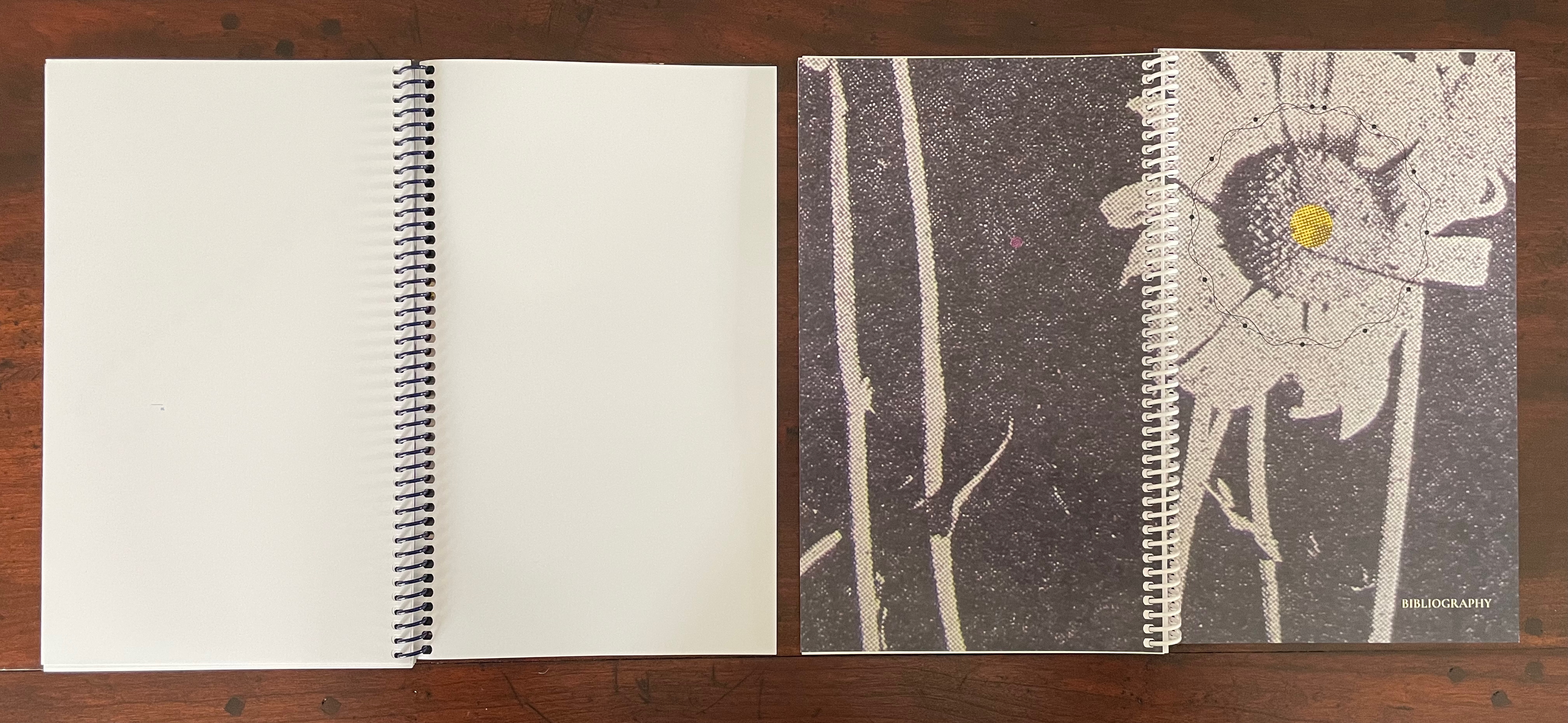
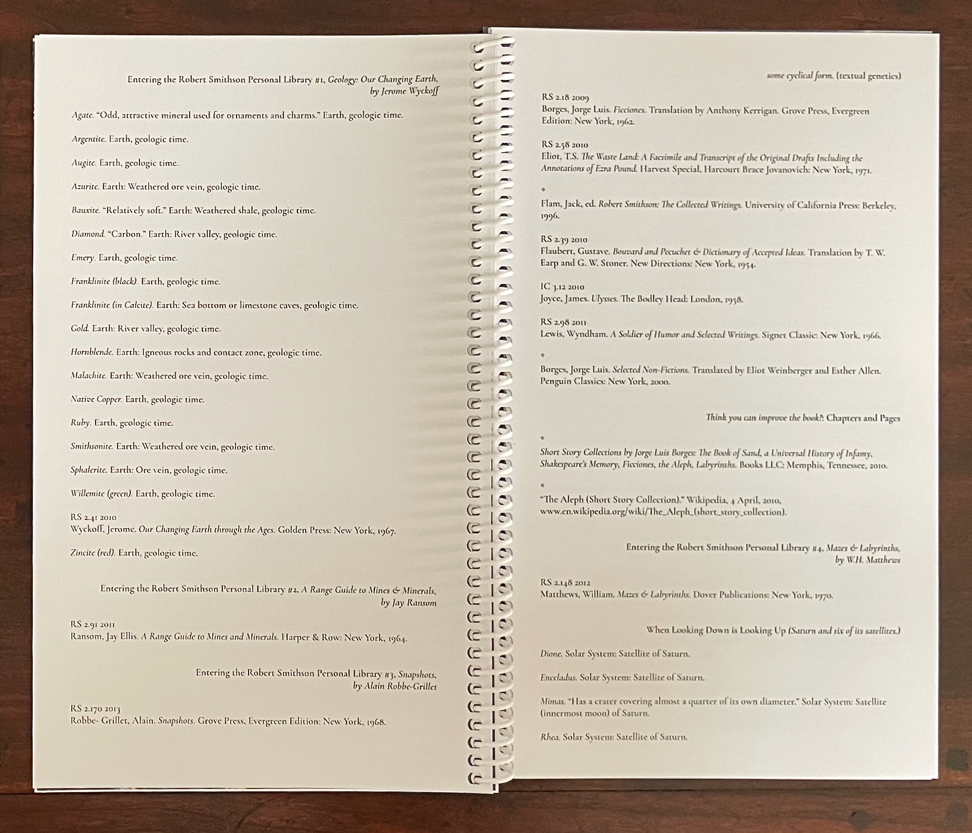
This entry is preceded by “Abra Ancliffe (I)“, which describes the Personal Libraries Library (Winter 2009-10 to Spring/Summer 2021) and The Secret Astronomy of Tristram Shandy (2015).
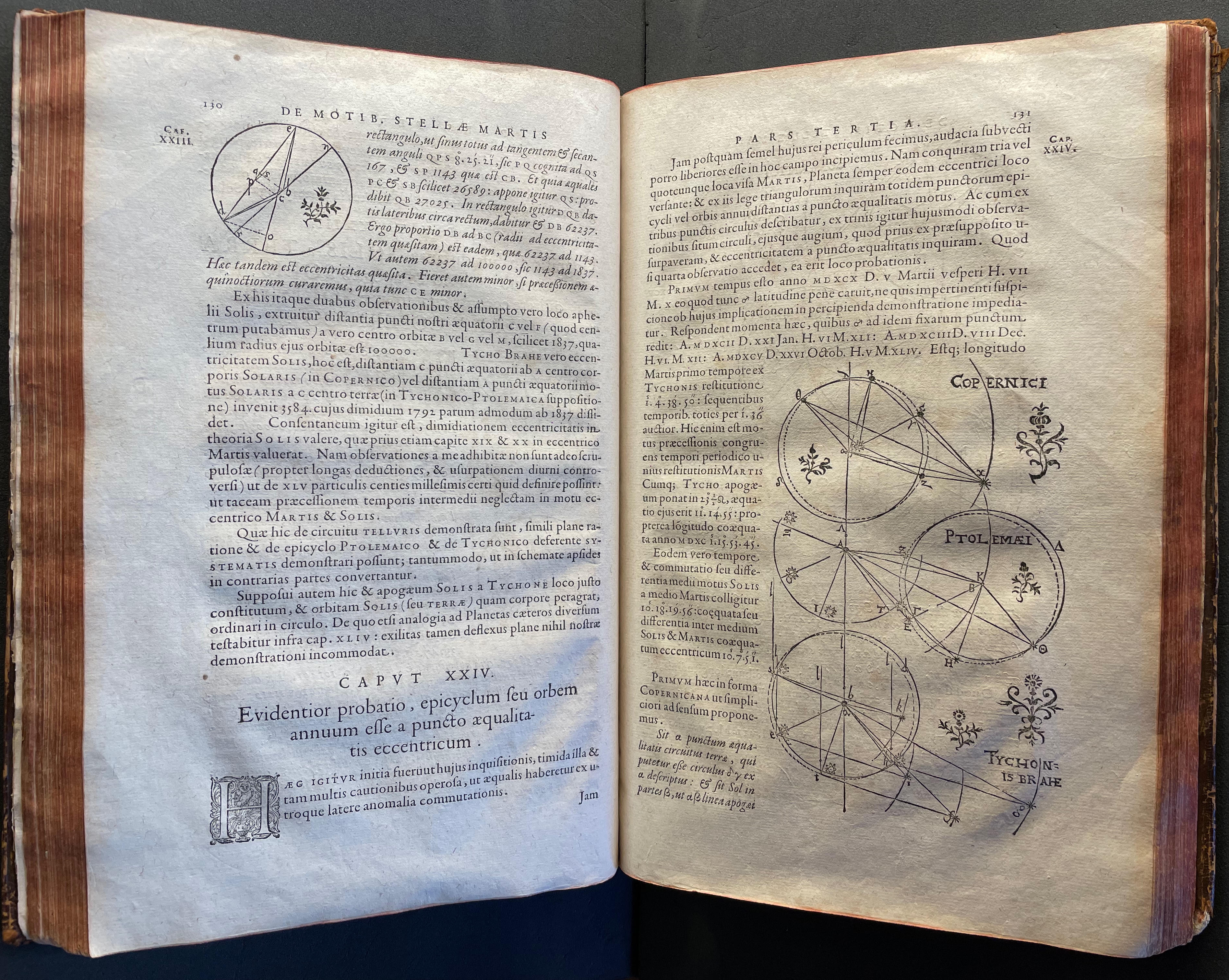
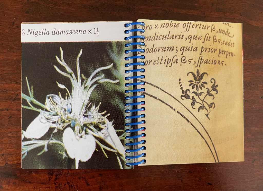
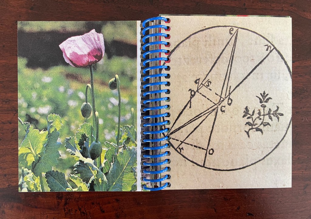
The constellatory asterisks in The Secret Astronomy of Tristram Shandy also evoke those flowers that our Personal Libraries Library (PLL) Artist/Librarian “picks” from the PLL and, later, Oleg Polunin’s Flowers of Europe: A Field Guide (1969) to include in the periodic issues of ephemera. Perhaps this confluence of stars and flowers created a predisposition in our Artist/Librarian that drew her to Johannes Kepler’s Astronomia Nova (1609). Unlike Sterne’s novel, which was part of Calvino’s personal library, Astronomia Nova lies outside the five personal collections. Of course, since Maria Mitchell was an astronomer, the works in her personal library refer to Kepler, and similarly, Robert Smithson had multiple books about astronomy, even Arthur Koestler’s Watershed: A Biography of Johannes Kepler. Still, Kepler’s “New Astronomy, Based upon Causes, or Celestial Physics, Treated by Means of Commentaries on the Motions of the Star Mars, from the Observations of Tycho Brahe, Gent.“, to give it its full and translated name, appears in Ancliffe’s heavens and garden like a new galaxy or specimen.
Astronomia Nova provided and further refined the mathematical and observational proofs of the Copernican planetary model of heliocentrism first laid out in De revolutionibus orbium coelestium [On the Revolutions of the Celestial Spheres] (1543). A little over 400 years later, our Ancliffe noticed in Kepler’s watershed publication something previously unobserved, something peculiarly geocentric about its heliocentric model.
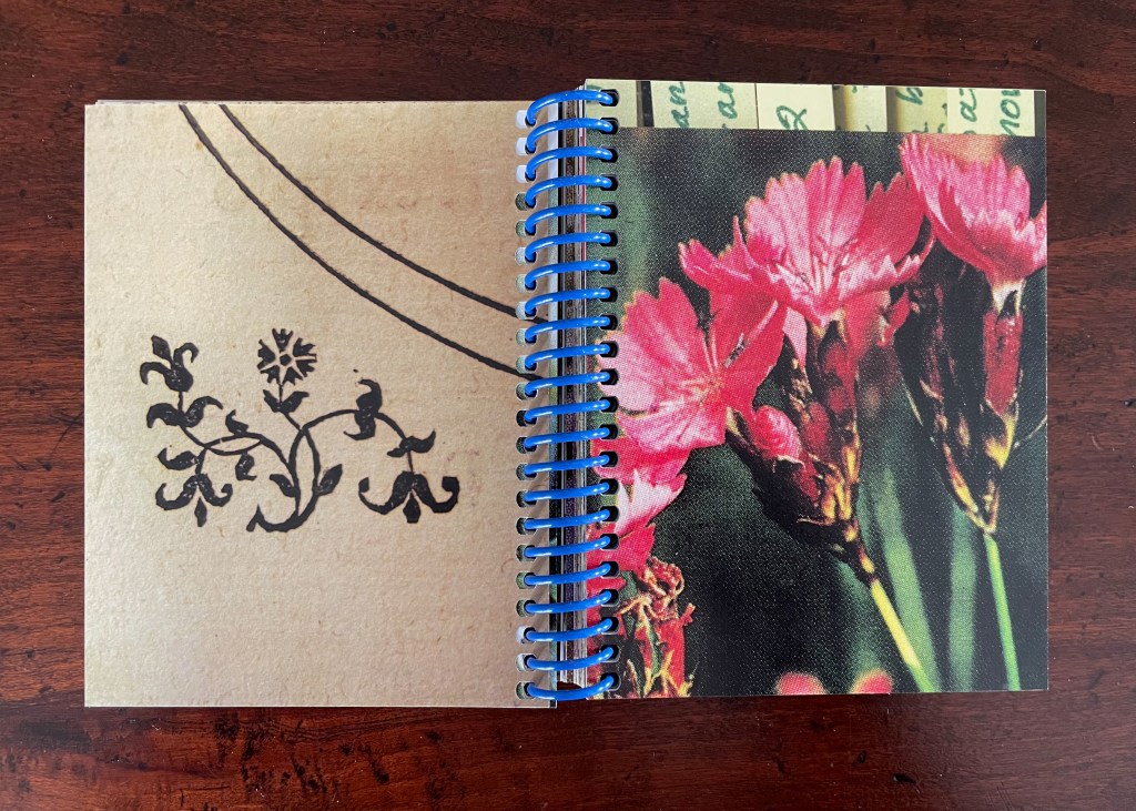
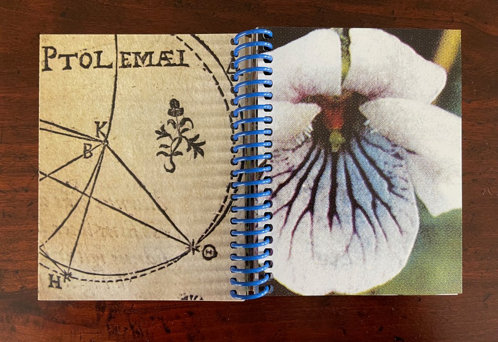
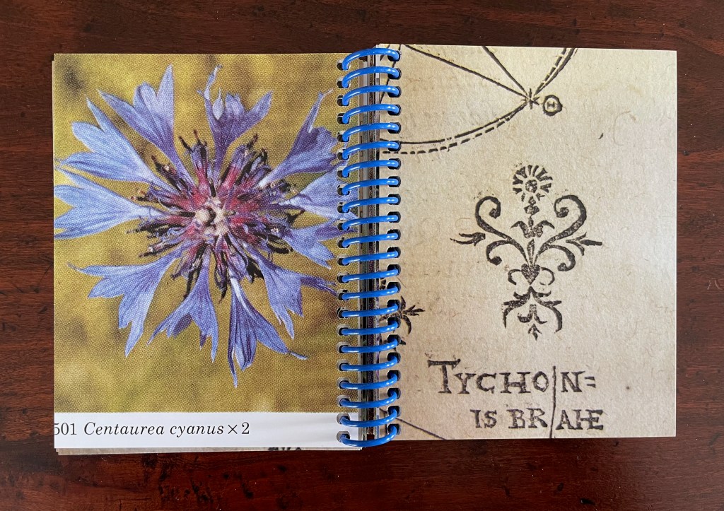
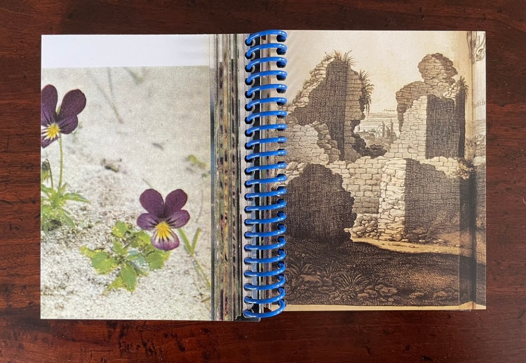
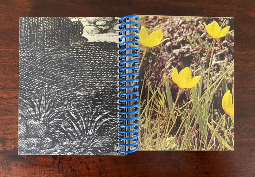
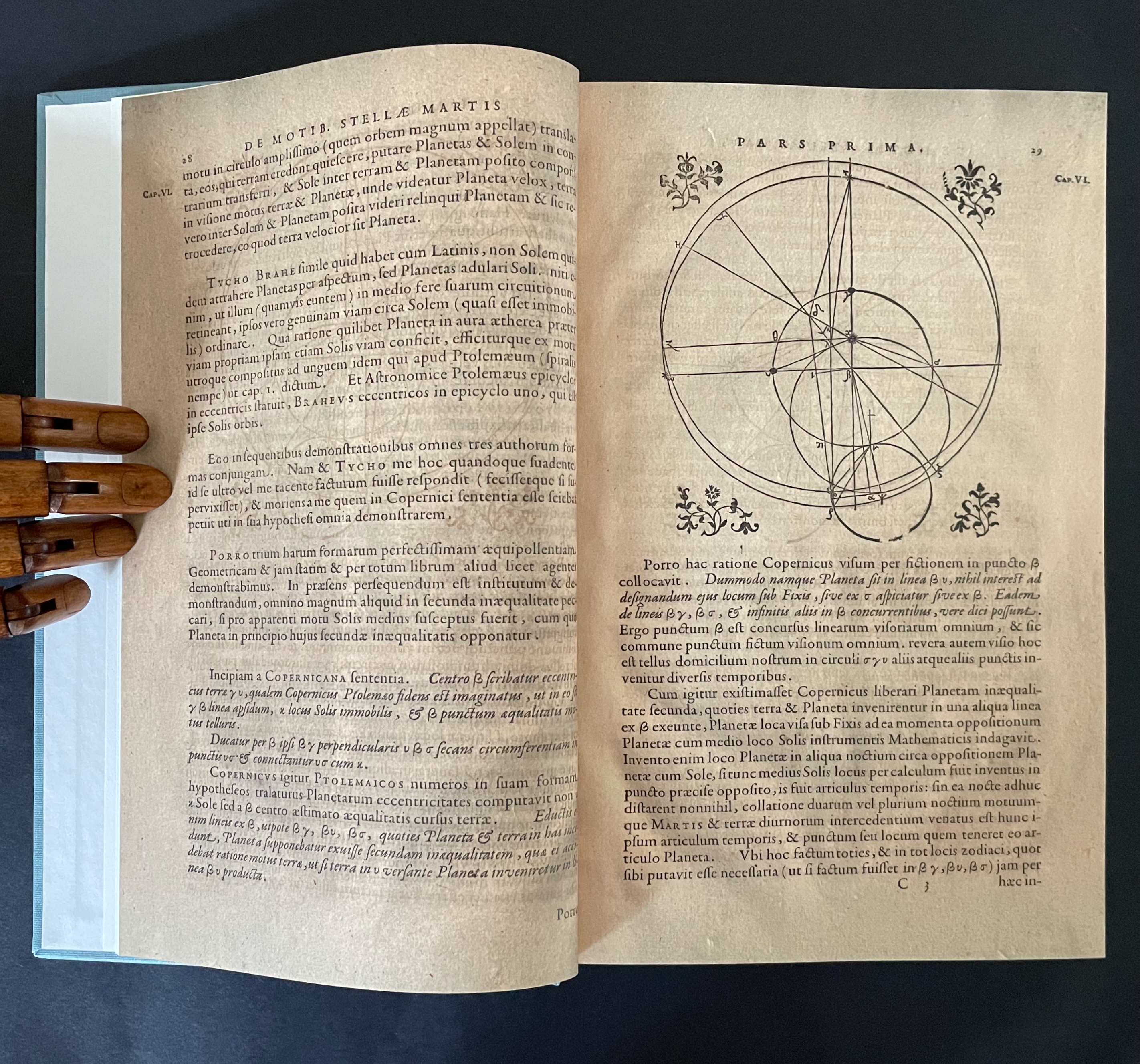
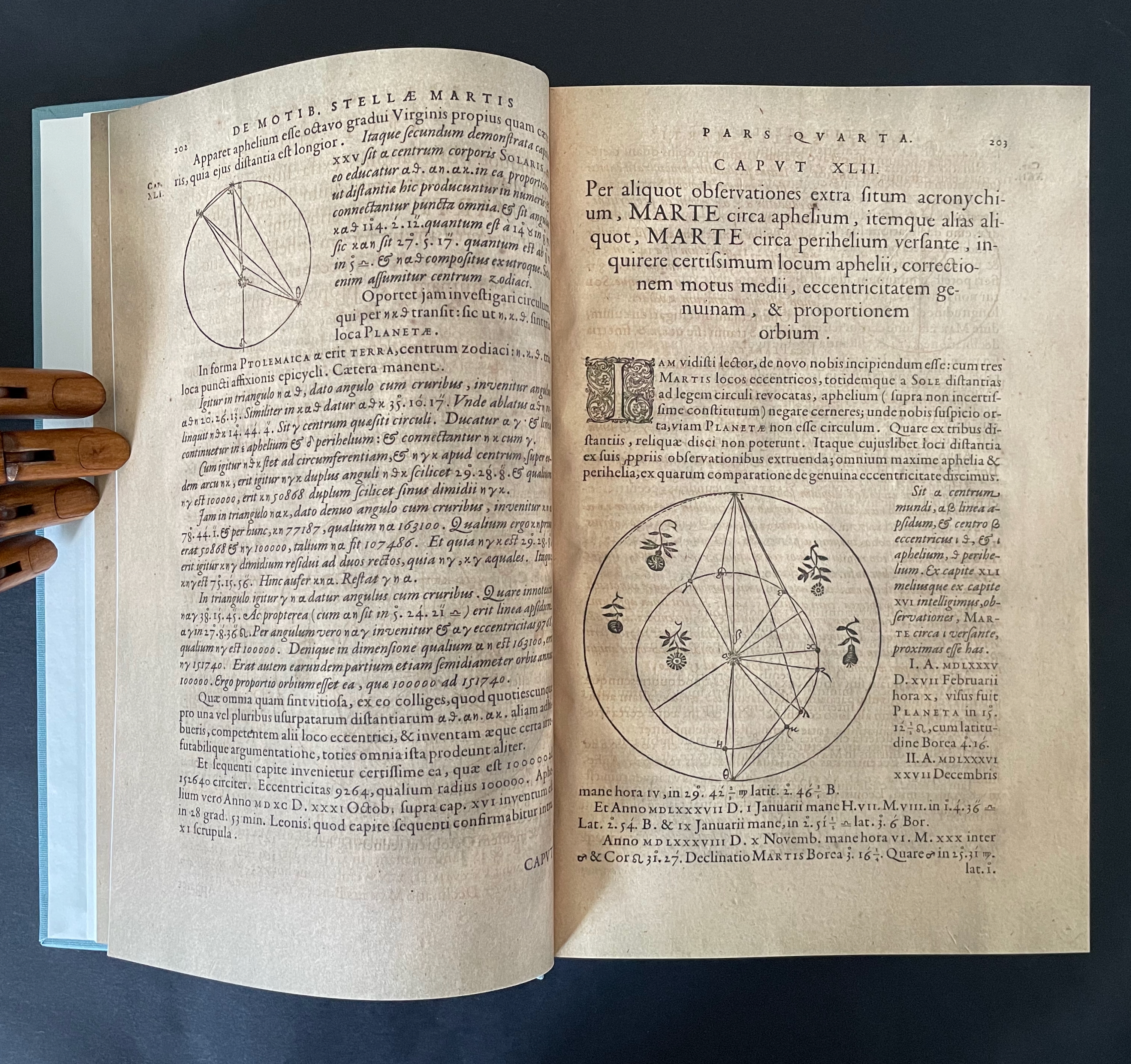
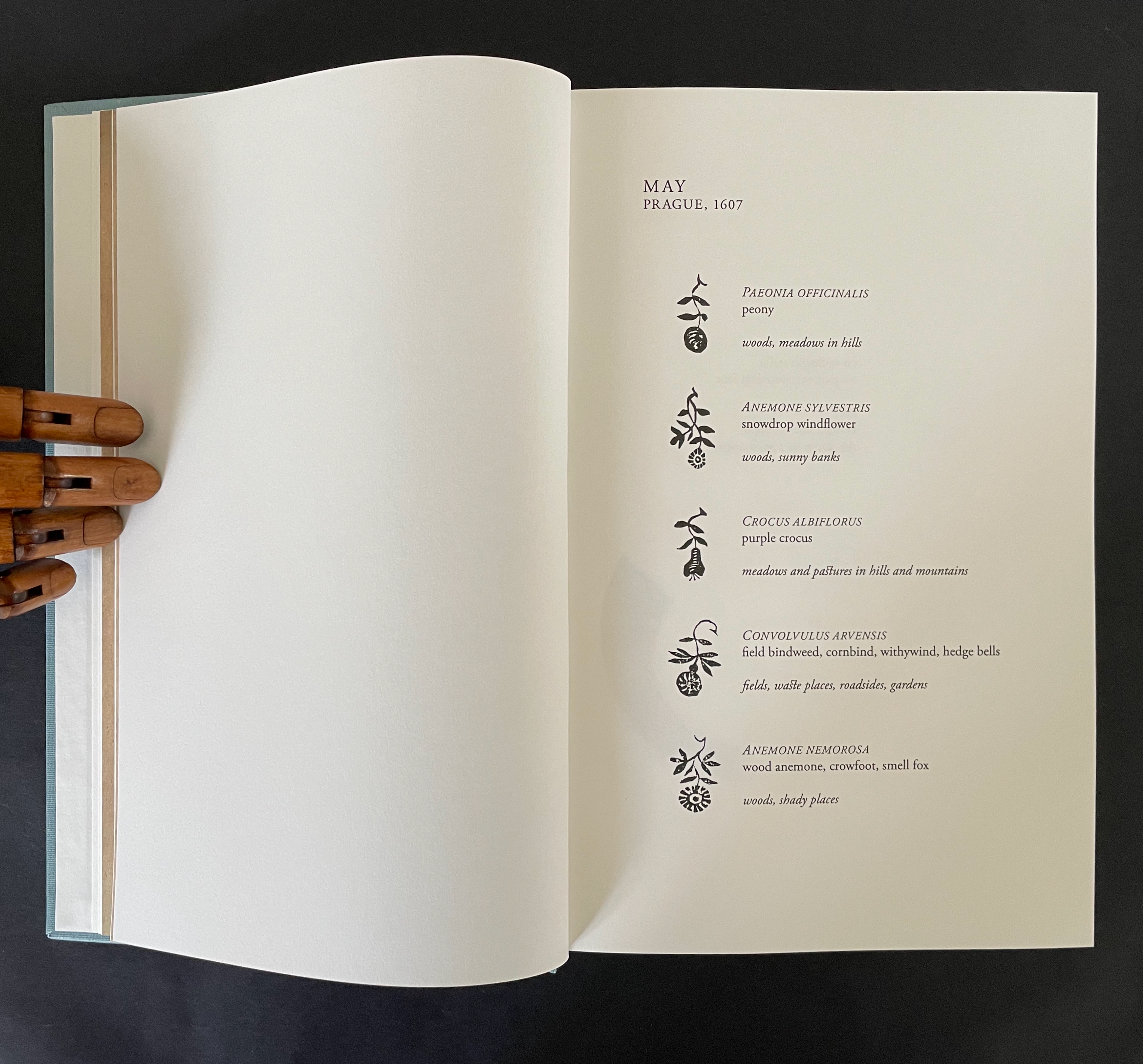
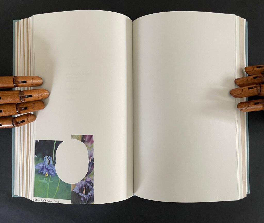
There is no florilegium or guide to these woodcut flowers, but there they are, sprinkled throughout Johannes Kepler’s 650-page investigation of Mars’ orbit, tracked by the observations of his mentor Tycho Brahe, Emperor Rudolph II’s imperial astronomer.
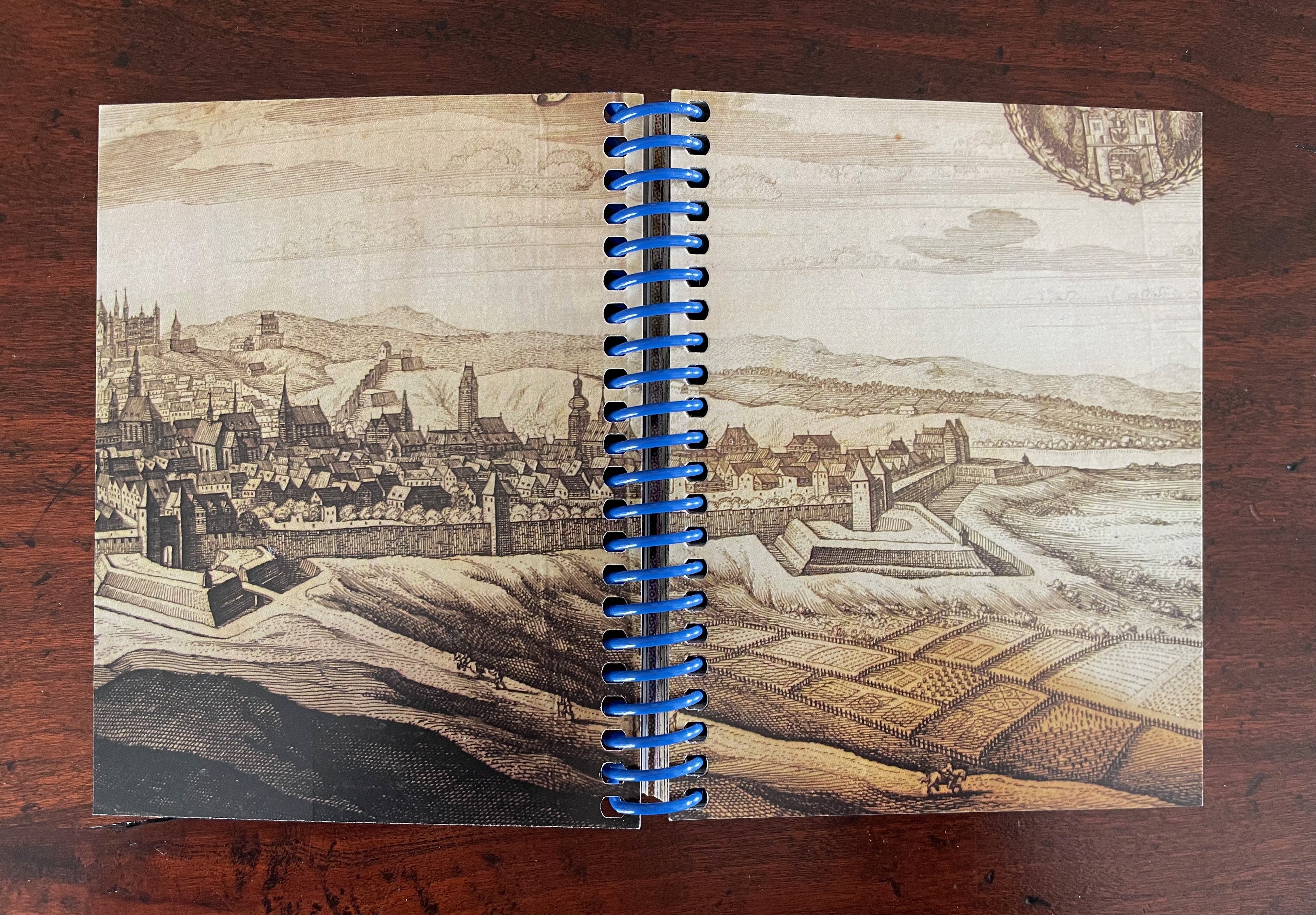
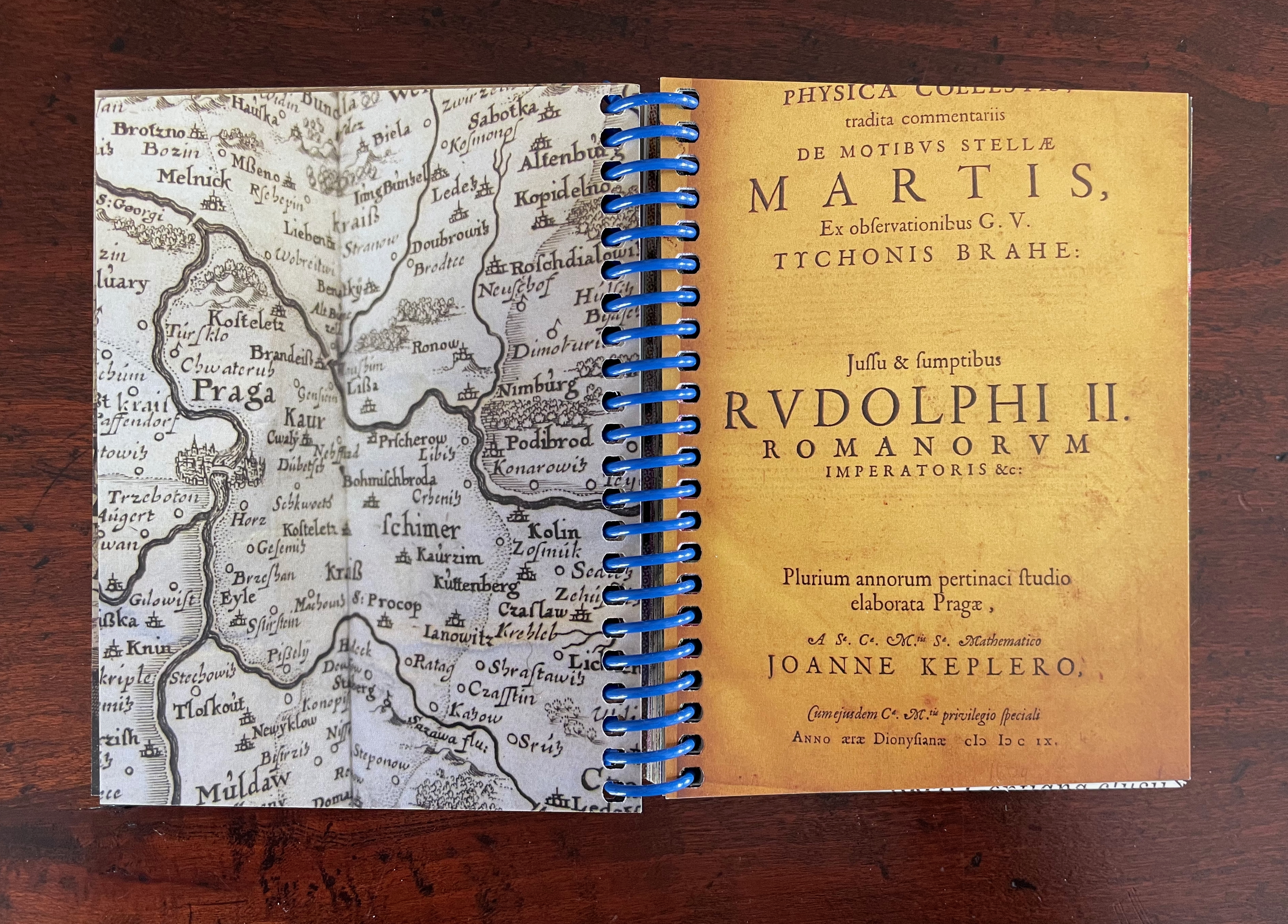
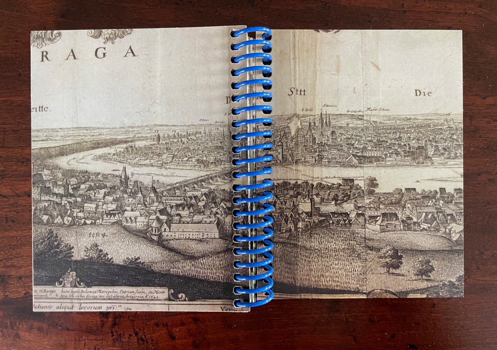
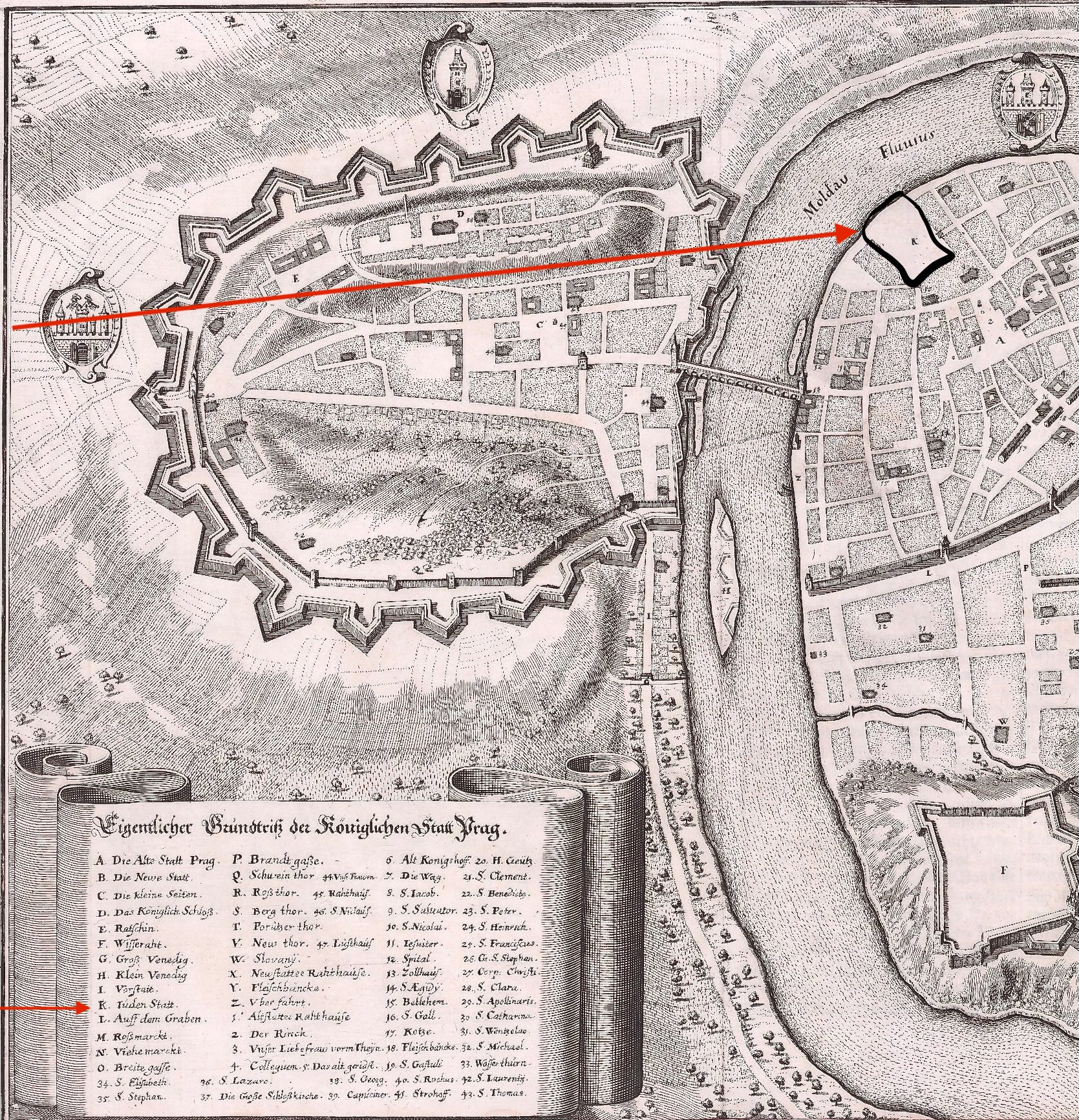
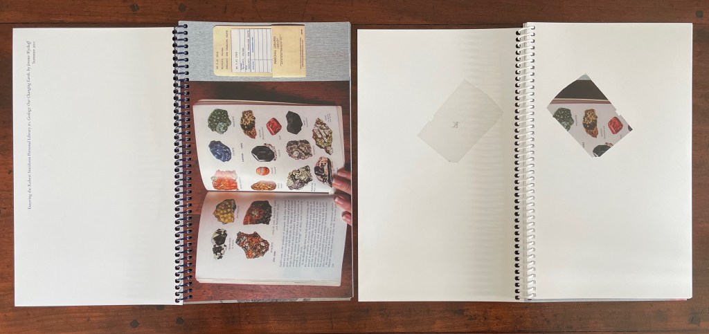
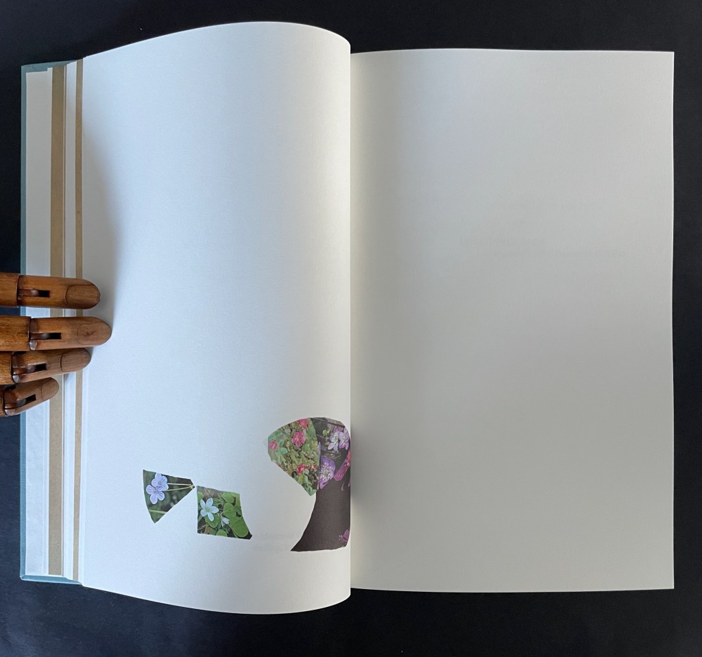
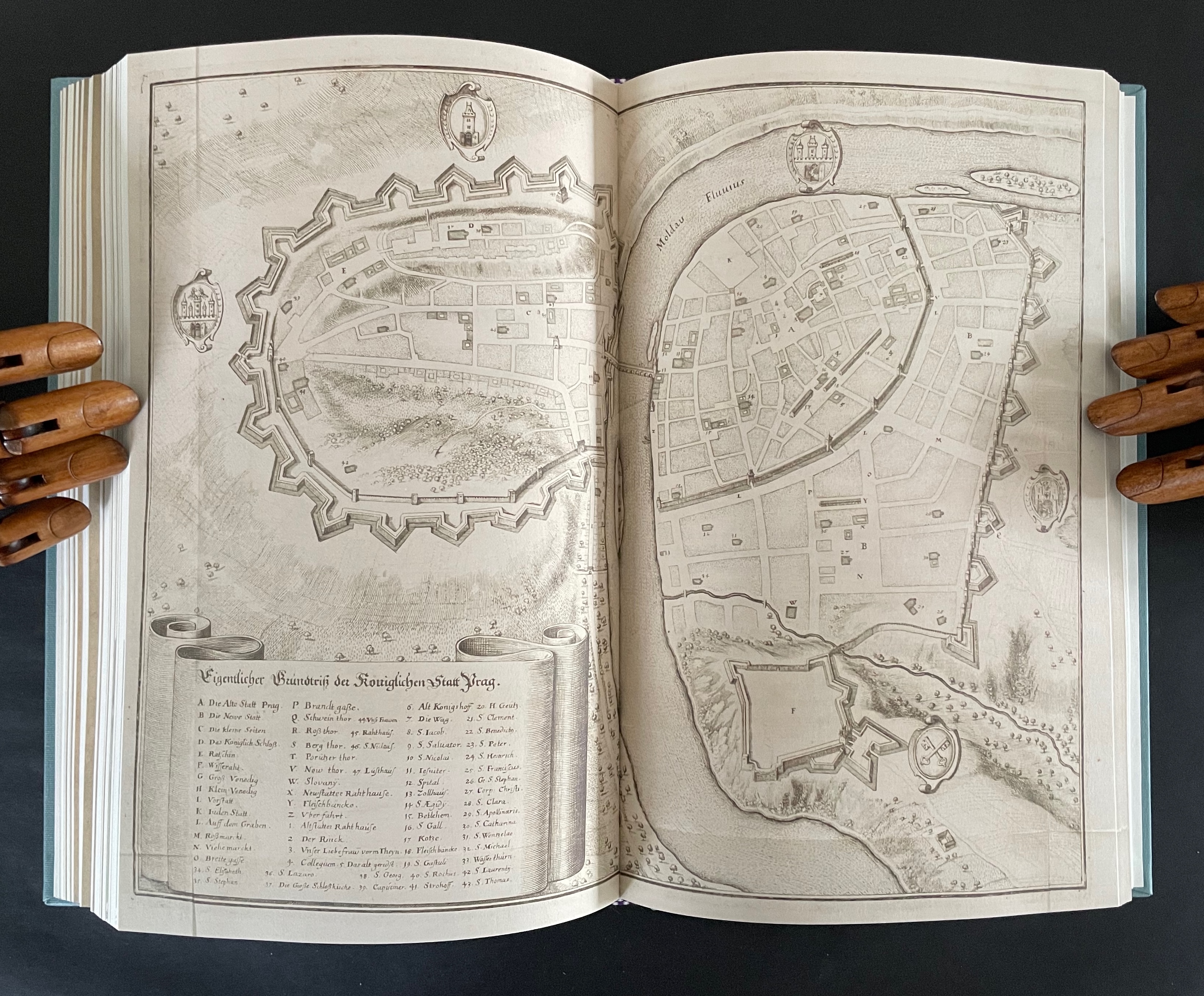
On one level, Ancliffe’s spiral bound handbook is the field guide to these flowers. Its photos of flowers , harvested from Pulinin’s Flowers of Europe, offer candidates for the historical real-life counterparts to the ornamental woodcuts. The handbook’s title, however, indicates another level: that of “a field guide to ‘a field guide’ “. But of what could such a meta-guide consist? In Ancliffe’s case, it is the artist’s book, the work before us that addresses the fields of vision and perspectives embedded in Kepler’s work, the engraver’s woodcuts, and the book artist’s work itself. The first three opening spreads of A Field Guide to “A Field Guide to the Flowers of ‘Astronomia nova‘ ” stake out the environment of the “field guide to a field guide” as well as the zooming-in approach it takes.
First three opening spreads: cityscape of Prague; map of Prague’s location and fragment of Astronomia Nova‘s title page; cropped page of AN showing ornamental flowers alongside cropped blown-up photo of the flower.
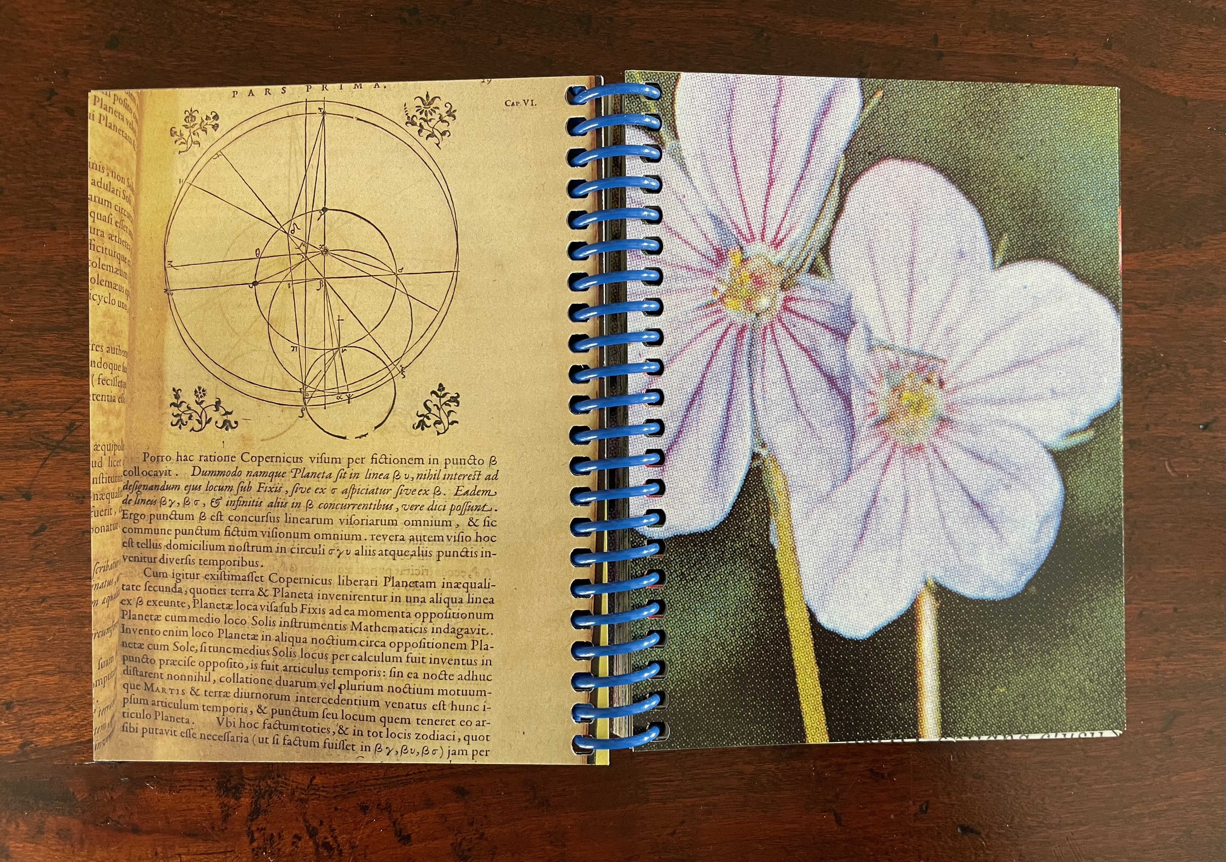
The field of vision hops from the cityscape of Prague to a geographical map, then to the cropped title page of Astronomia Nova, then to a detail of the Copernican model bracketed by ornamental flowers, and finally to a cropped blown-up image of one of those flowers from Polunin. The next two spreads that follow those first three underline the field guide’s zooming in across time and space.
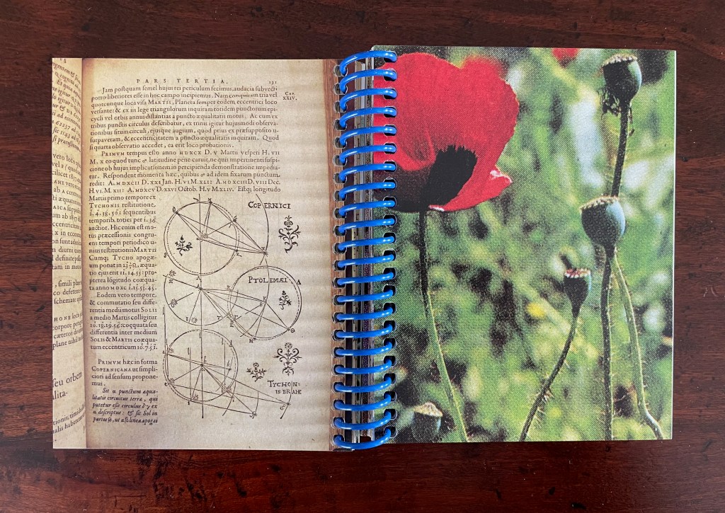
The fourth and fifth spreads: close-ups of the ornamental woodcut flowers and live photos; from the 17th century to the 21st.
Later spreads showing similar zoomed-in images highlight that we have actually hopped from the second century (Ptolemy) to the seventeenth (Tycho Brahe) to the twentieth (Polunin).
Zoomed-in images of woodcut flowers and live flowers; from Claudius Ptolemy (2d century) to Tycho Brahe (17th century) to Polunin (20th century).
Planetary diagrams, celestial maps, mathematical models, descriptive text, woodcuts and engravings are all at several representational removes from one another and from actual planetary movements over time. Likewise, the woodcutter’s ornaments had their corresponding actual flowers in the gardens and meadows of Prague. The closeness in appearance between the woodcuts and photos argues that Kepler’s artist was drawing and cutting from real-life observation. And yet the photos lie at historical and medial removes that question their correspondence. Like Kepler’s and Brahe’s mathematical and textual models of planetary movements, the artist’s book’s photos are speculative models of the flowers Kepler’s woodcut artist would have observed in Prague at the turn of the 17th century.
The field guide’s movement across media — engraving, printing, woodcut, photography, casebound book, and spiral bound book — is underscored by Ancliffe’s variation and sequencing of spreads. Just as we start to assume an alternating verso/recto rhythm of print/image then image/print, Ancliffe interrupts the flow with a double-page spread of print/print.
There is also interruption within the interruption: the double-page spread of text is an English translation whereas so far the text has been in Latin. Is the translation’s appearance a reminder that the various media are means of translating the observed?
Other interruptions consist of image/image spreads followed by text/text spreads. The juxtaposition seems to suggest an abstract affinity of shapes, as if the side-by-side flowers hint at an abstract shape of the map spread, and the side-by-side maps hint at an abstract shape of the flower spread.
If that seems an interpretive stretch, consider the following sequence that draws comparisons between flower photo and cityscape detail, between zoomed-in cityscape detail and flower photo, and between zoomed-in cityscape detail and ornamental woodcut detail.
Note the sequence — photo/engraving; engraving/photo; and engraving/woodcut — drawing attention to translation from medium to medium.
If we step back to take in the whole of the artist’s book and note the changing rhythms and punctuations across the spreads, it is hard not to conclude that this artist’s book as field guide is teaching us how to read the environment it has created.
Opening and closing landscape spreads.
Ancliffe’s next work in her astronomy series extends her aim of teaching us how to read her artist’s books.
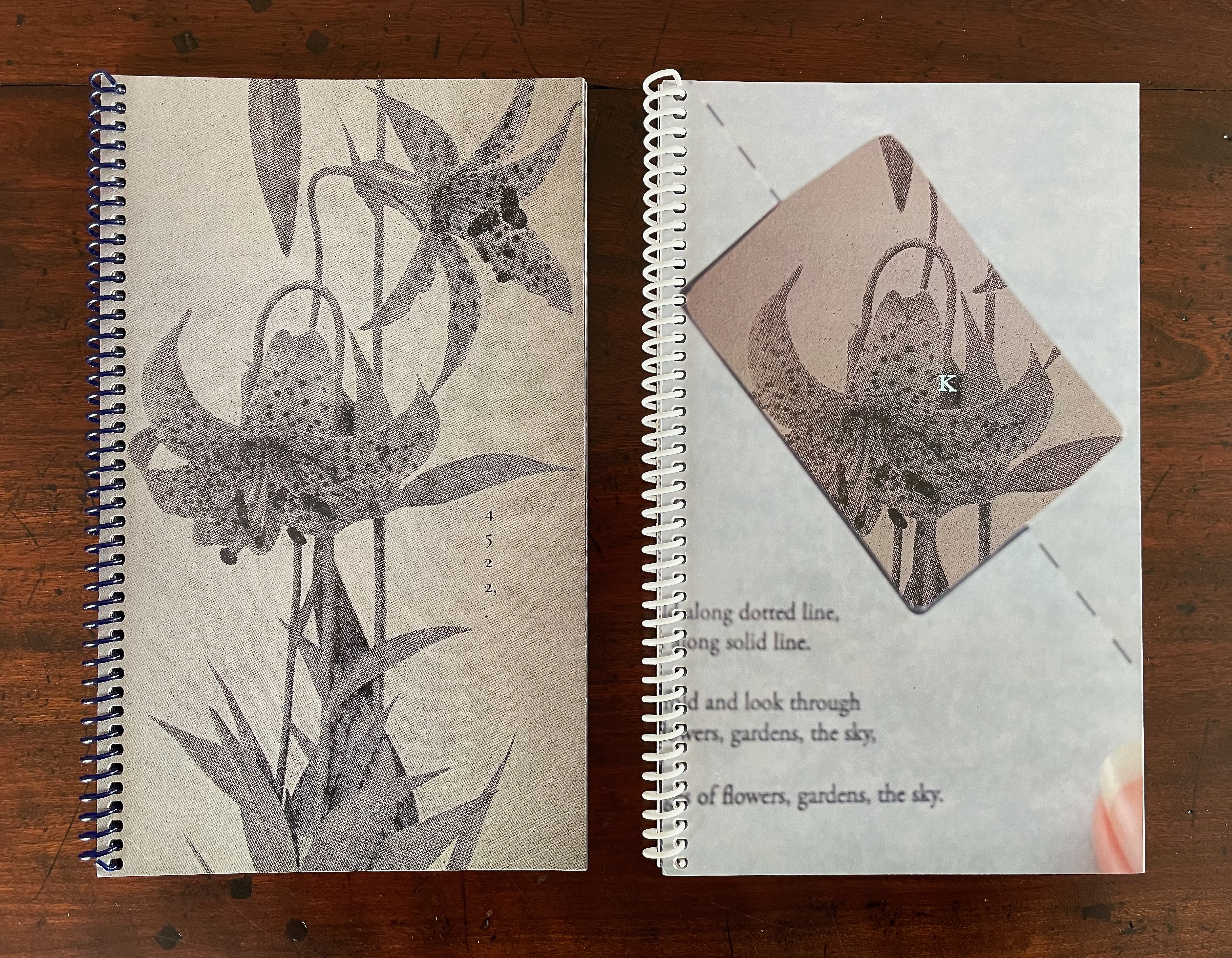
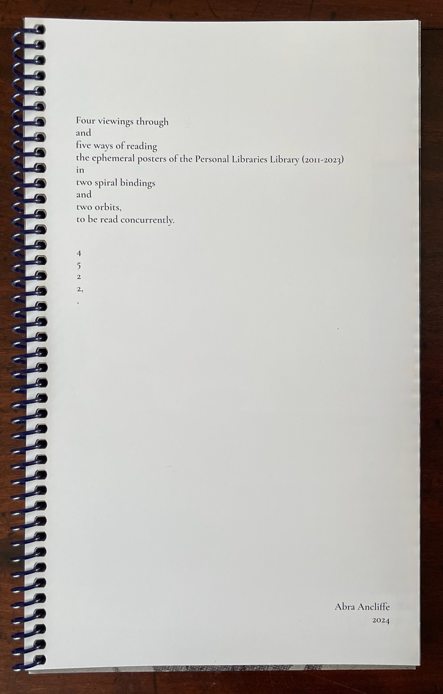
4522,. + K (companion volumes, to be read concurrently) (2024)
The cryptic title of this dual-volume work signals that we have some detecting to perform in order to read it. In fact, we have to read the companion volumes concurrently to perform our detective work. More teaching us how to read. The volumes’ respective title pages shed some light on the cryptic titles, but only a little. As the first volume’s title page spells out the vertically arranged numerical title 4522,., we learn at least that it has its roots in Ancliffe’s Personal Libraries Library series.
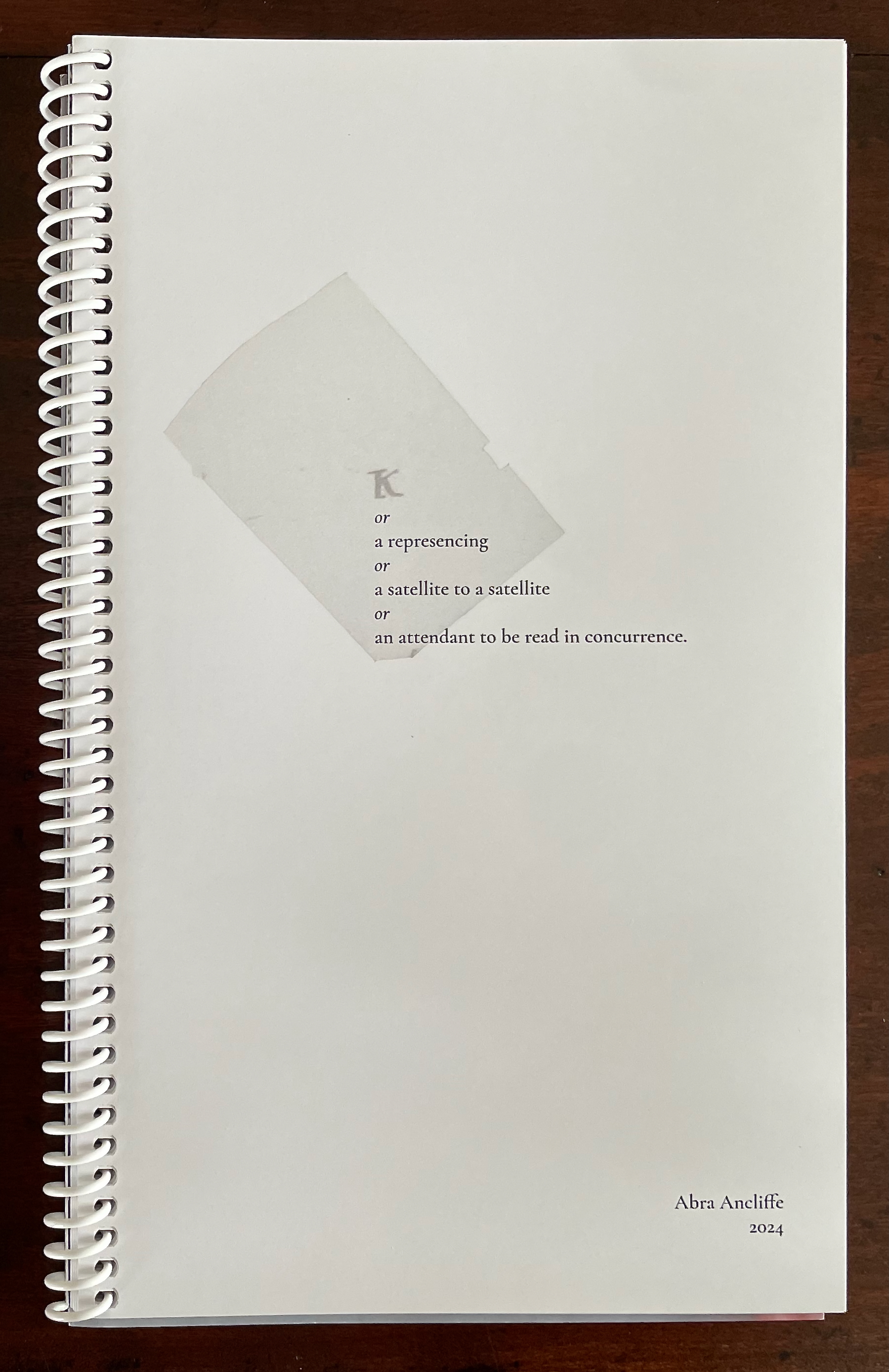
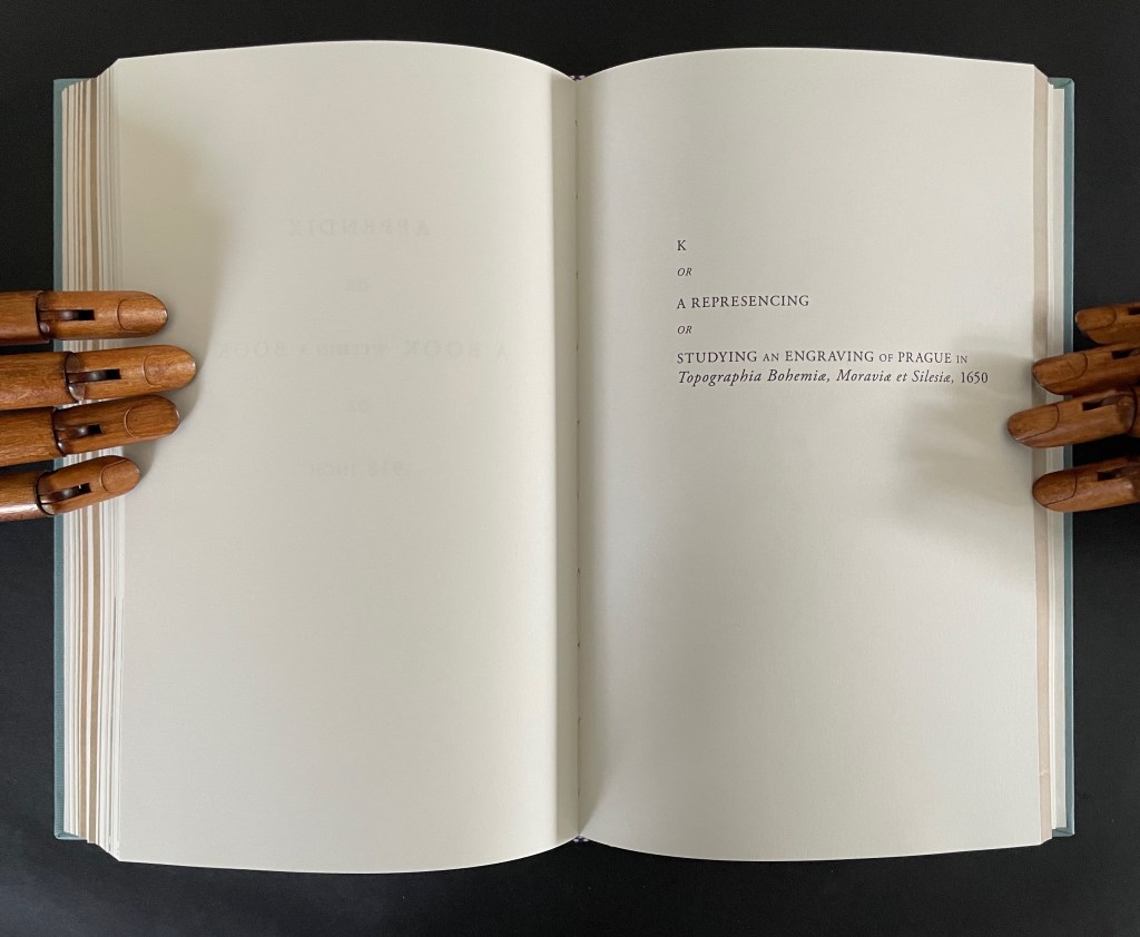
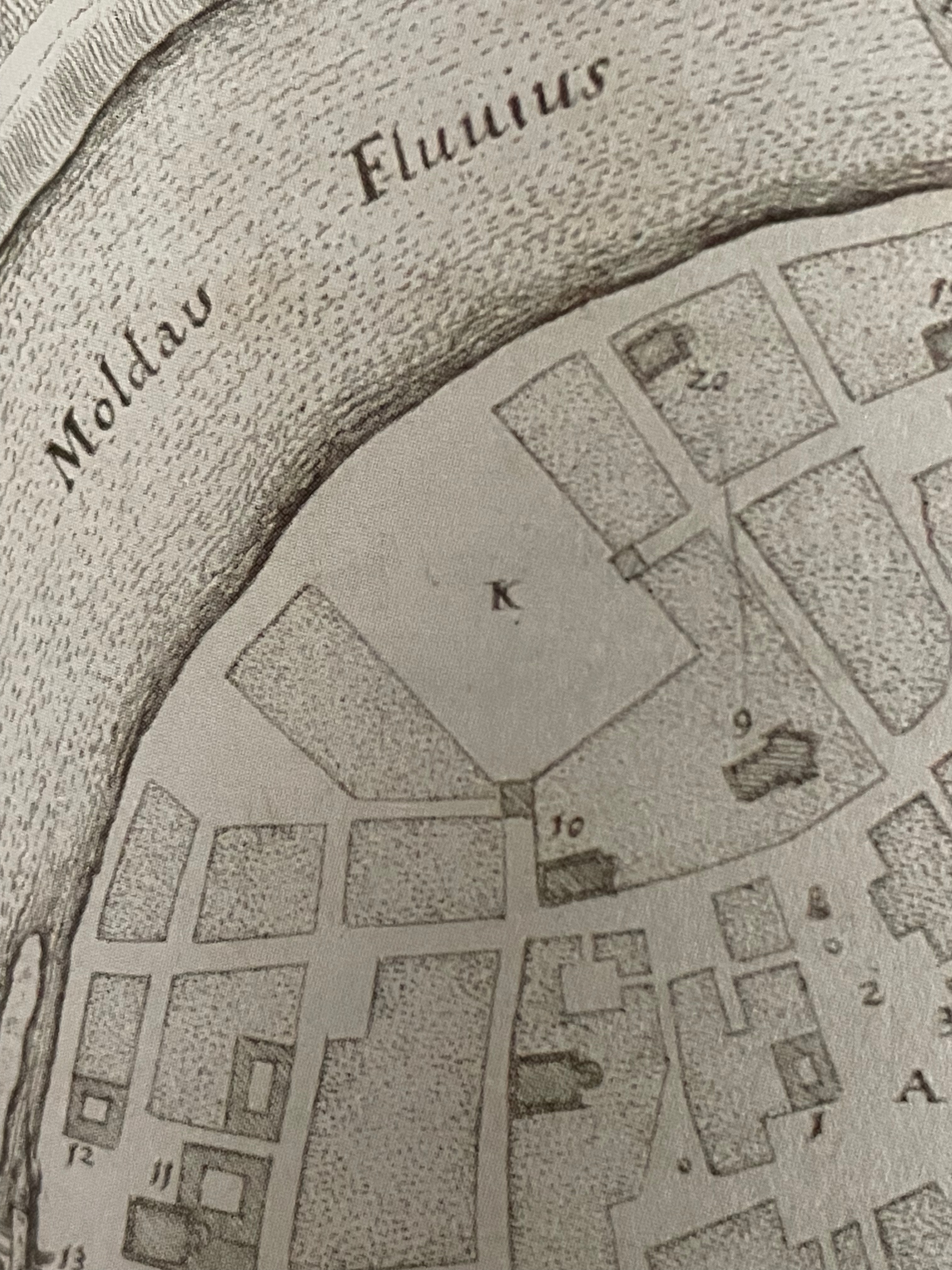
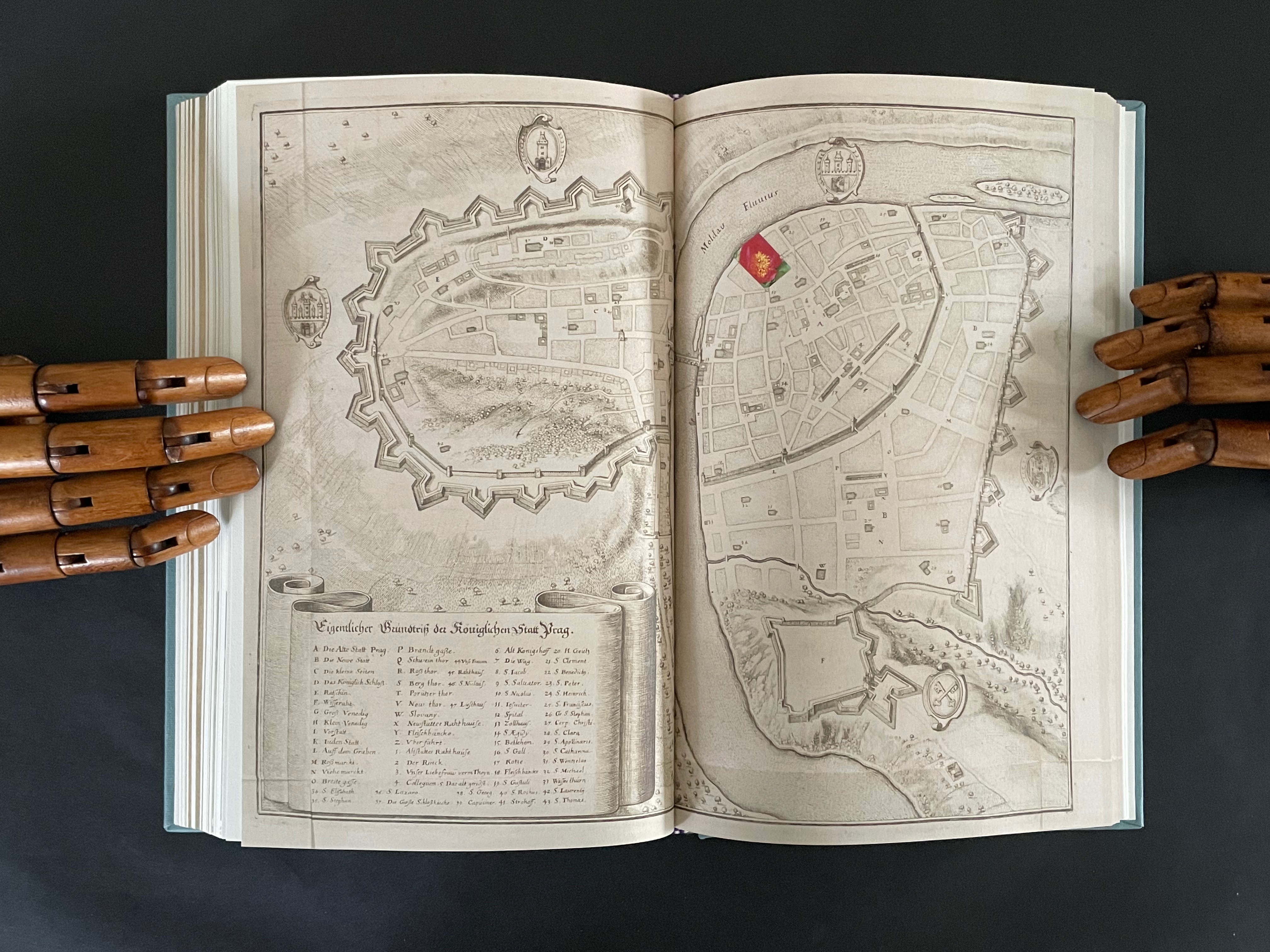
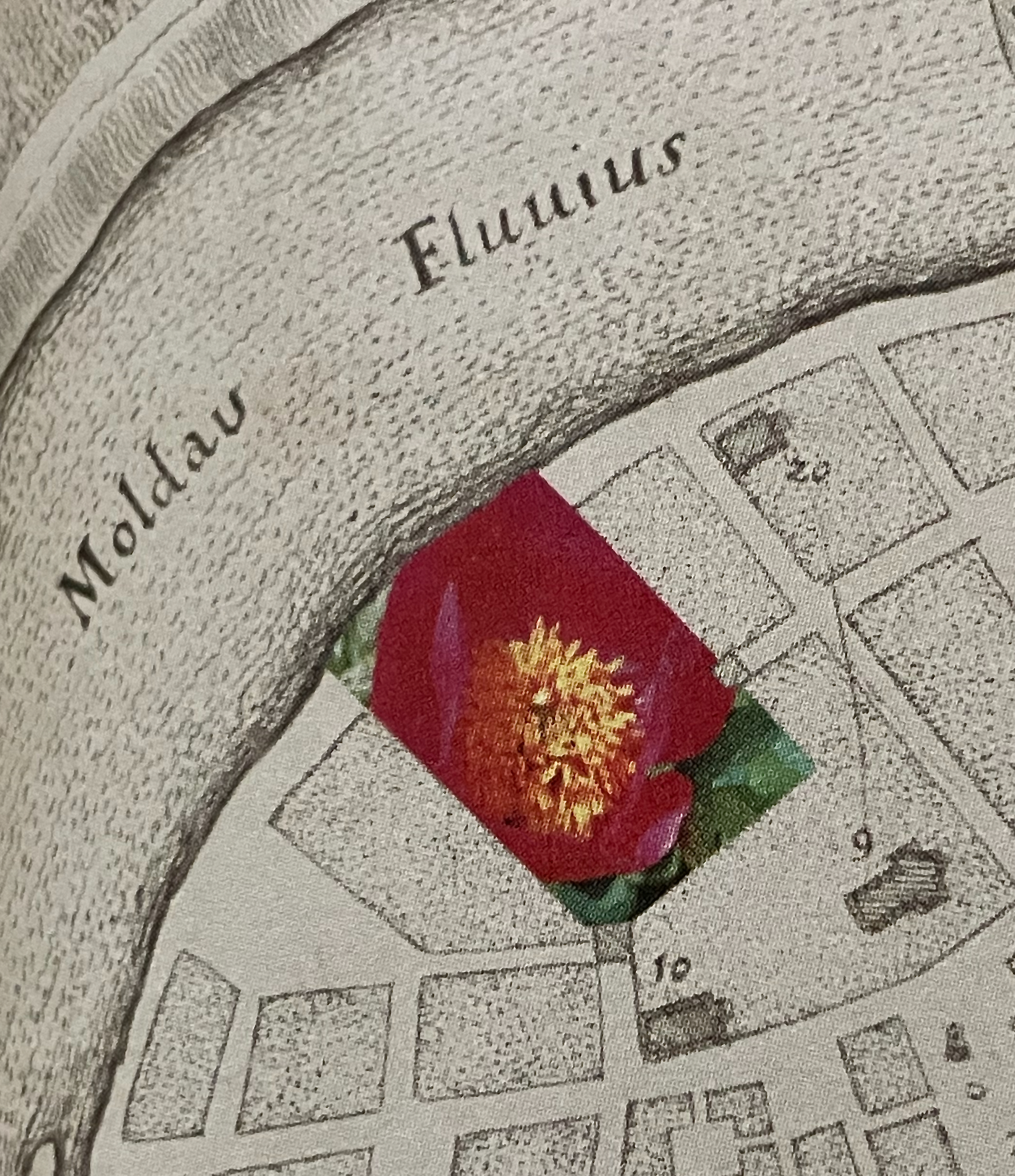
The title page of the second volume presents the title K inside a shaded irregularly shaped rectangle extracted from a map of Prague (1650) by Matthaus Merian and Martin Zeiller (which we can track through the last entry in K‘s bibliography). The letter K comes from the key to that map, which tells us that it marks the Jewish quarter of the city. It’s a “nice-to-know” detail but not essential for appreciating how to read the second volume.
The title page tells us that K is “a represencing” or “a satellite to a satellite” or “an attendant to be read in concurrence”. We already know about the concurrence from the first volume’s title page. As for “satellite to a satellite”, we can see that K is a satellite to 4522,., which makes 4522,. a satellite to something. But to what? More on that in a minute. As for “a represencing”, the volumes’ covers (above) give us a hint. Notice how the irregular rectangle on K‘s cover re-presents or represences a snippet of the floral poster image shown on the cover of 4522,. That is the recurrent pattern between the two volumes:
From the poster image shown in 4522,. on the left, a snippet is taken and displayed within the map segment in K on the right.
Just with the covers and two title pages, we have detected two of the “Four viewings through … the ephemeral posters of the Personal Libraries Library (2011-2023)”:
The PLL posters viewed in 3/4 scale (as seen in 4522,.)
Snippets of the posters viewed through the map segment (as seen in K).
The third “viewing through” has a physical and literal form. In 4522,. a hole is punched in the recto pages where the poster images are displayed. Through that hole in one poster, the poster underneath can be viewed. In K, when a recto page turns t0 the left, its poster snippet reappears on the verso but in reverse as if we were looking through the other side of stained glass window.
With both volumes’ recto pages having been turned, we can see the punched hole on the verso of 4522,., a new poster image on its recto page, the mirror image of the three minerals from K‘s preceding recto page, and the new poster image’s snippet in K’s new recto page.
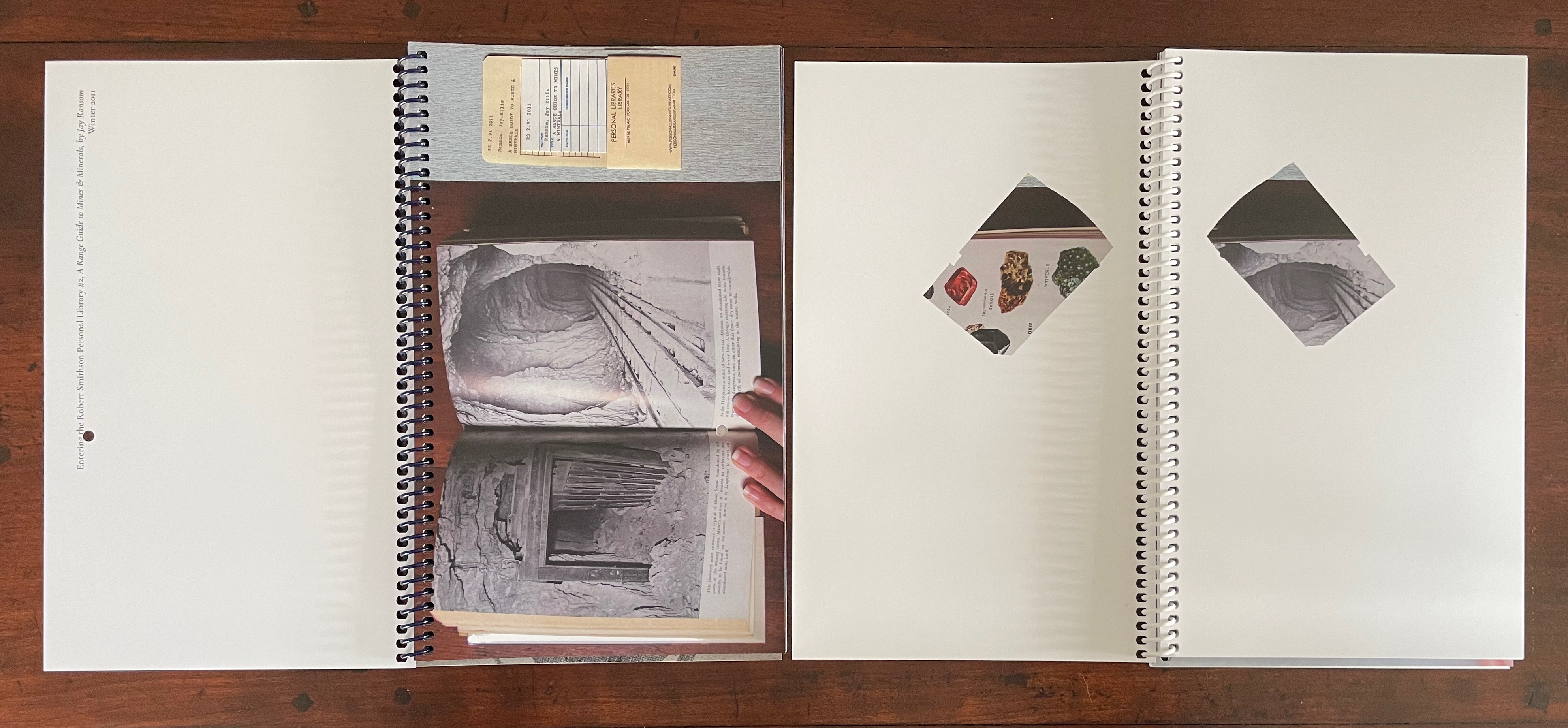
In this third “viewing through”, there is also a clue to what 4522,. is a satellite of. The small hole punched in each leaf of 4522,. seems to meander in its position from leaf to leaf. Actually it tracks a very specific shape: an analemma — a tilted, figure-8-like form. An analemma is the visual representation of the data recorded in ephemerides (tables of star positions at fixed times). In 1627, Kepler published his Rudolphine Tables, which became the new standard for accuracy of this data. If we were to point a camera skyward from a fixed location at the same angle and take multiple photos at the same time of day throughout the year, the sun’s position would form that figure across all the exposures. This is because the earth tilts on its axis as it orbits the sun and moves along an ellipse rather than a circle. So, the placement of punched holes in 4522,. embodies this projection of our orbit around the sun, and if we miss the point, the following near-to-last double-page spreads from 4522,. and K drive it home.
On the left, 4522,. shows the analemma diagram composed of the tiny views of the PLL posters’ images viewable through the holes in the book’s preceding pages. On the far right, K recapitulates the punched hole from 4522,. and wittily drives home the star/flower coordinates by positioning the hole over the center of the flower on the next spread, which doubles the wit with a black-and-white spread save for the strategically placed spot of yellow in the moon-gray center of the flower. The PLL posters’ images “light up” the recto pages of 4522,., and K reflects those images. In other words, K is the lunar satellite to 4522,., which is the terrestrial satellite orbiting the sun (the PLL project). These are the “two orbits” from the title page of 4522,.
The fourth “viewing through” comes into play with the Bibliography at the end of K. Although we had recourse to it to lead us to the map of Prague, a closer look reminds us of the PLL posters and the personal libraries from which they emerge.
So of course, the “five ways of reading” signaled on the title page of 4522,. refer to the five personal libraries from which the posters are composed.
This extraordinary part-autobiographical, part-biographical, part-bibliographical artist’s book brings Abra Ancliffe’s twin obsessions with astronomy and botany to their highest pitch of unity so far. Ancliffe has built it with an extended epistolary poem, collaged images from Polunin’s Flowers of Europe, and photos of the map of Prague (1650) by Merian and Zeiller, pages from Kepler’s Astronomia Nova (1609), and family memorabilia.
The poem addresses “Dear Dear Woodcutter”, the unknown artist who decorated Kepler’s orbital diagrams with flowers. Ancliffe’s observation of the flowers stands out when you consider that the still standard Collected Works (1938) omitted the flower images. Trying to identify the woodcutter, Ancliffe tracked down the sole reference to his existence and even visited William Donahue, Astronomia Nova‘s translator, in New Mexico to discuss the mystery. More impressively, she identified the woodcut flowers, their scientific names, and various common names, and their local habitats in and around Prague. From their unexplained presence, Ancliffe launches lyric observations on flowers (their colors, parts, and growth), astronomy, ink, paper, type, woodcutting, bookmaking, the idea of the book, and the interconnectedness of it all.
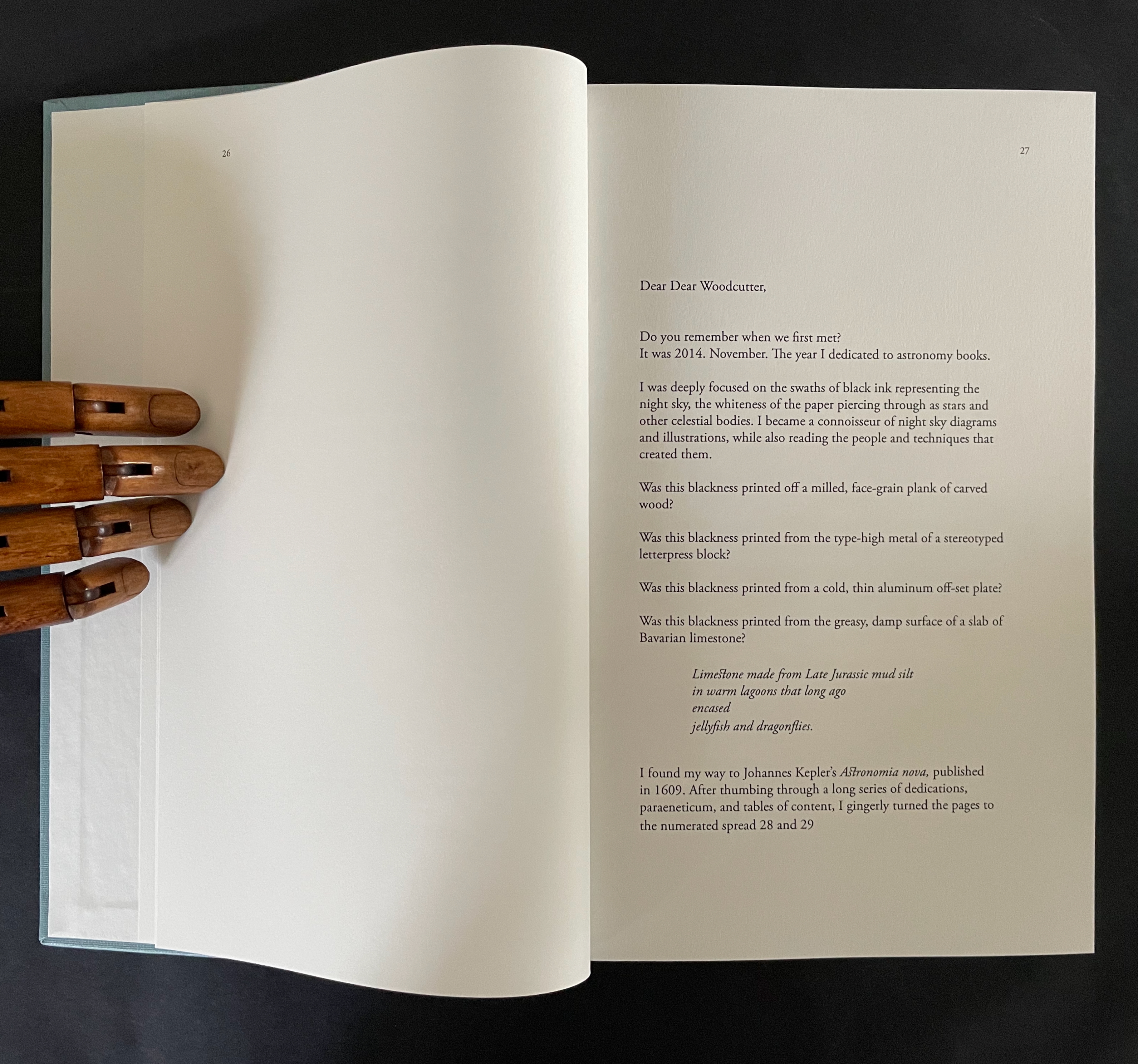
The book opens with Ancliffe’s first letter to “Dear Woodcutter”. It includes a facsimile double-page spread from Astronomia Nova , pages 28-29, showing where she first saw his woodcut flowers. From the start, Ancliffe signals how tightly woven she feels this autobiographical, biographical, bibliographical artist’s book will be. Instead of being numbered 2 and 3, her pages leading to the facsimile spread are numbered 26 and 27. So, at that moment of turning from “page 27” to page 28, the 21st century work strangely becomes part of the 17th century work as the book artist reaches back through time and craft. The letter’s tone blends fondness and fascination with matter-of-fact yet evocative observations about ink, printing methods, and the geology underlying lithography.
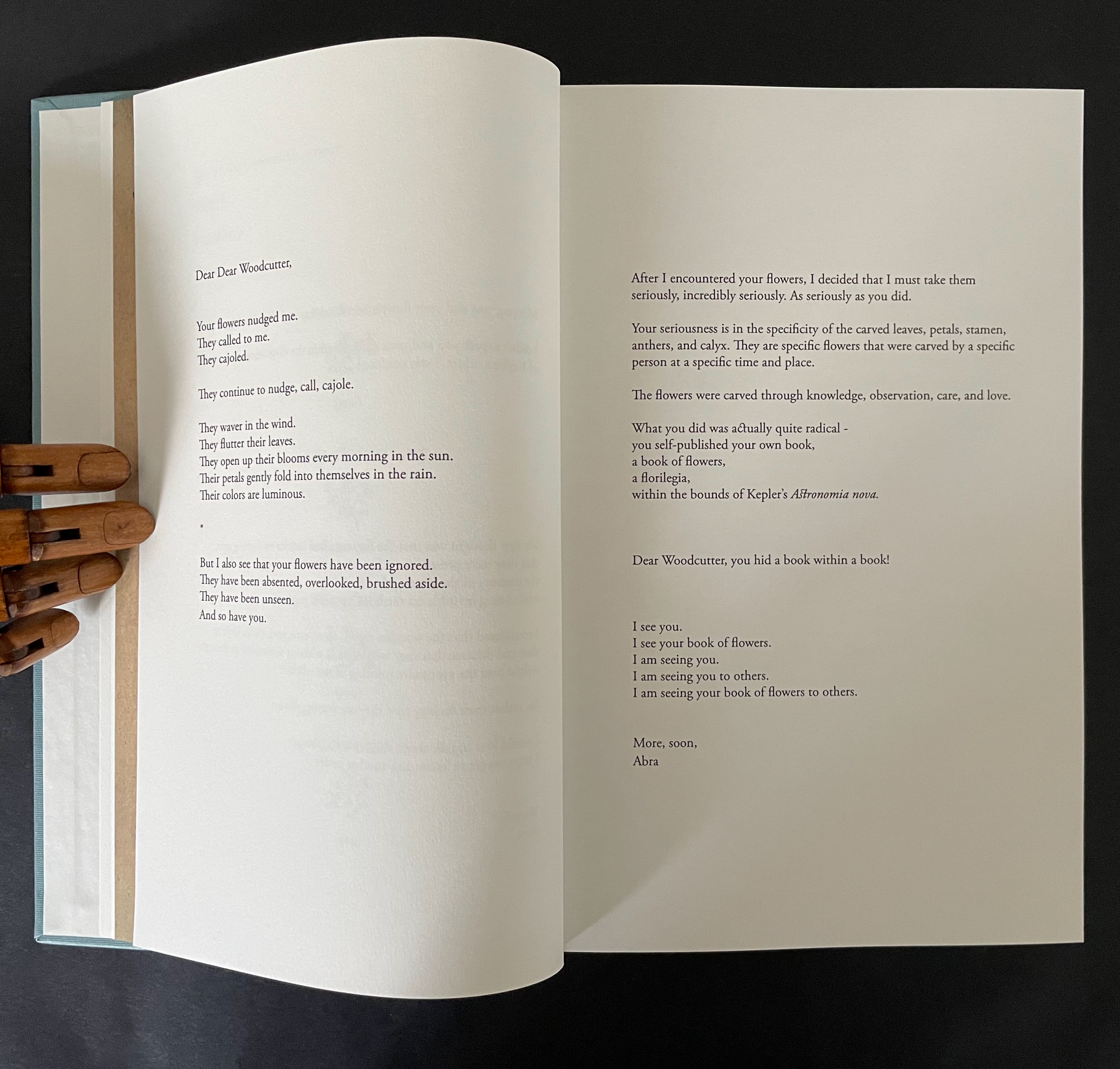
The intensity of her reaction to the woodcutter’s flowers and her absorption in her subject and craft translates into an affinity with the woodcutter that has Ancliffe addressing him in the present. This is poetic license and invention. In the act of addressing him, she is addressing us, her readers/viewers. If we are in any doubt of this, the second letter concludes with at a pitch that eliminates it and leaves us with a clear assertion of what she intends:
I see you. I see your book of flowers. I am seeing you. I am seeing you to others. I am seeing your book of flowers to others.
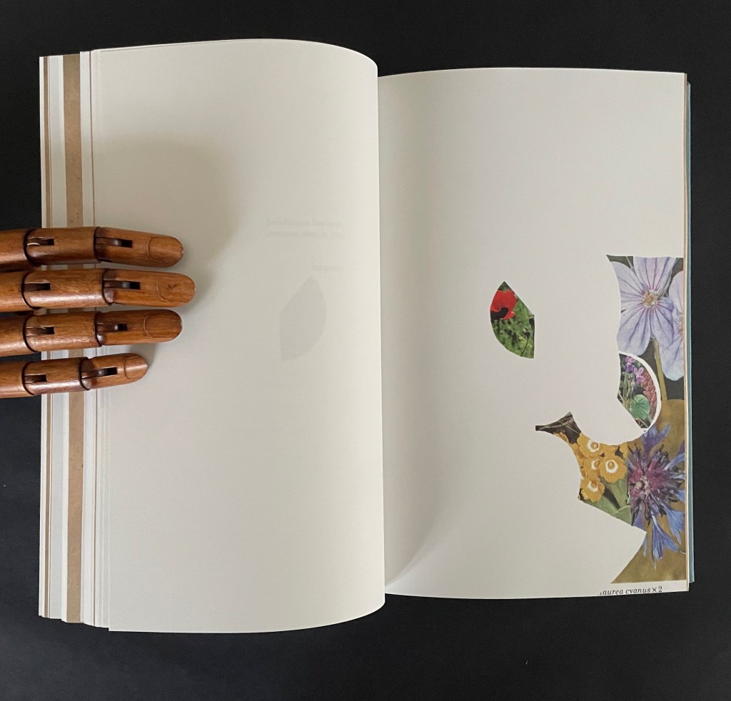
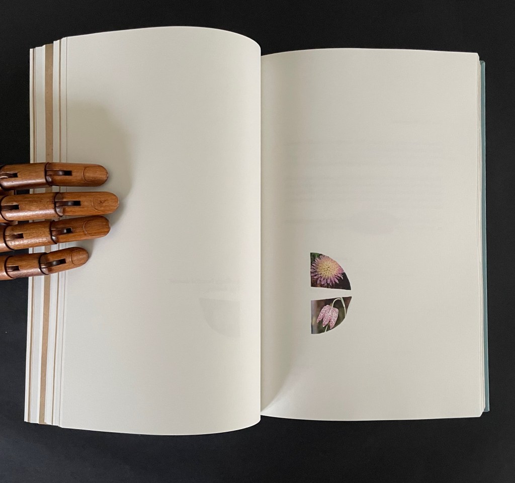
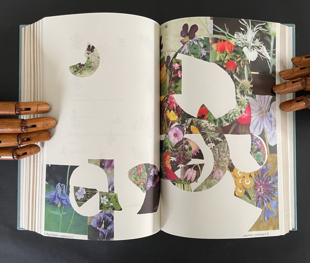
After this introductory section, Ancliffe lays out a recurrent marker of the book’s structure: a facsimile spread followed by a page reproducing a selection of woodcut flowers. There are twelve such markers.
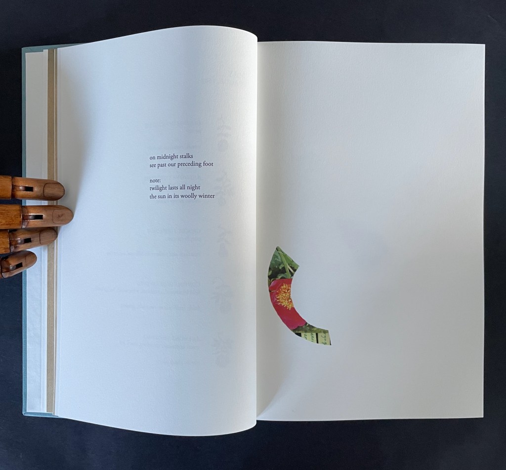
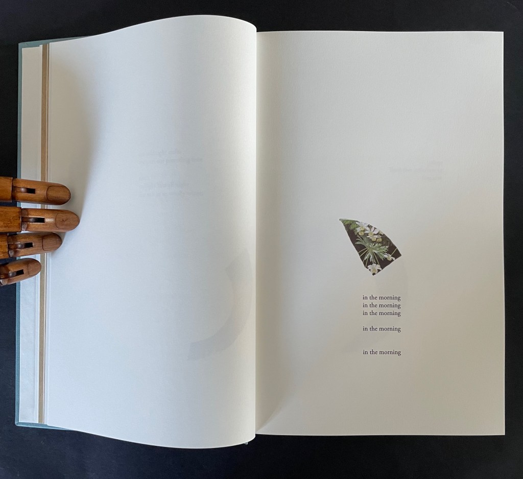
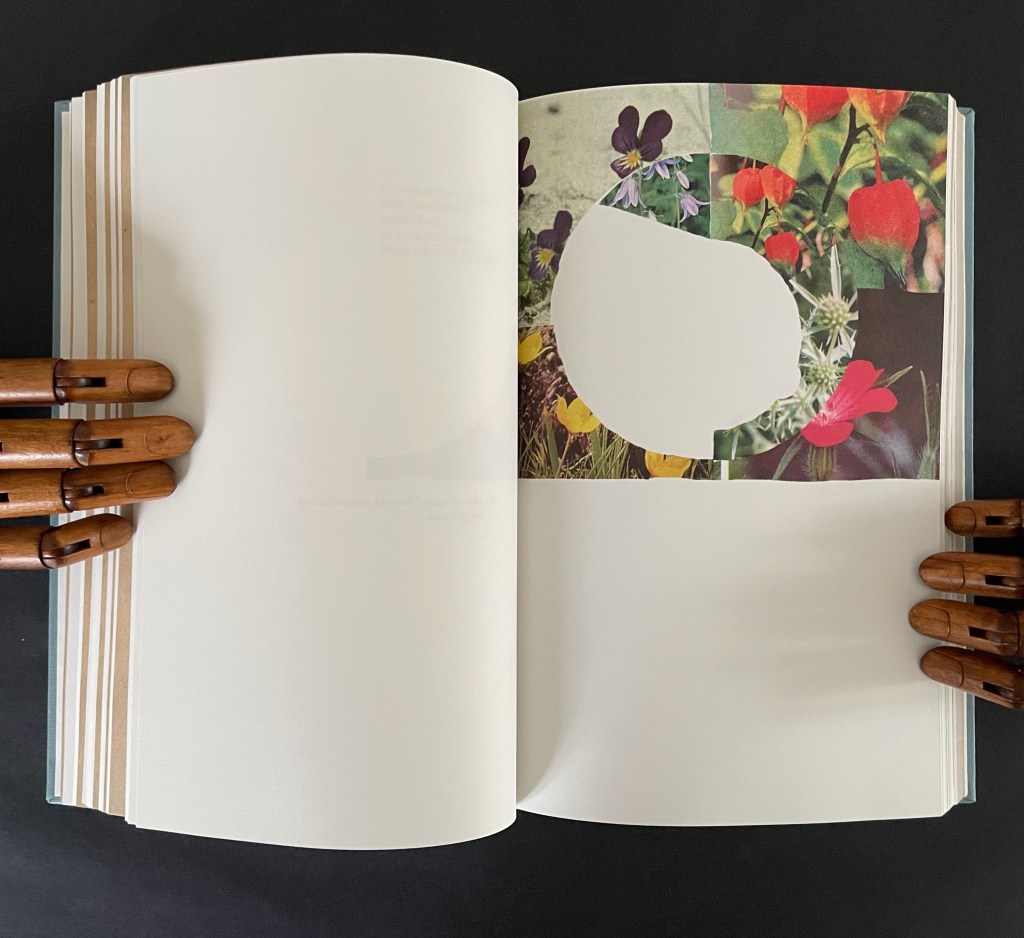
After each of them, the poem continues, accompanied by brightly colored jigsaw-like cutouts from photos of flowers Ancliffe has matched to the woodcuts. In each section, a jigsaw puzzle piece appears, then another and so on until the section ends with a page of accumulated pieces. Below is the section that follows the marker above. The accumulation (or gathering) page brings together the five preceding pieces.
There are 12 gathering pages, and they are all brought together in a closing double-page display.
Twelve “gathering pages”.
The closing accumulation page, a gathering of gathering pages.
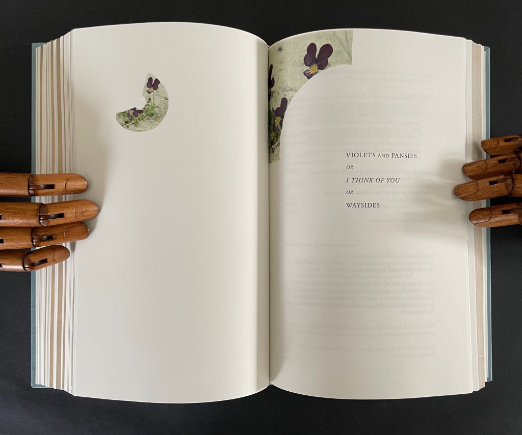
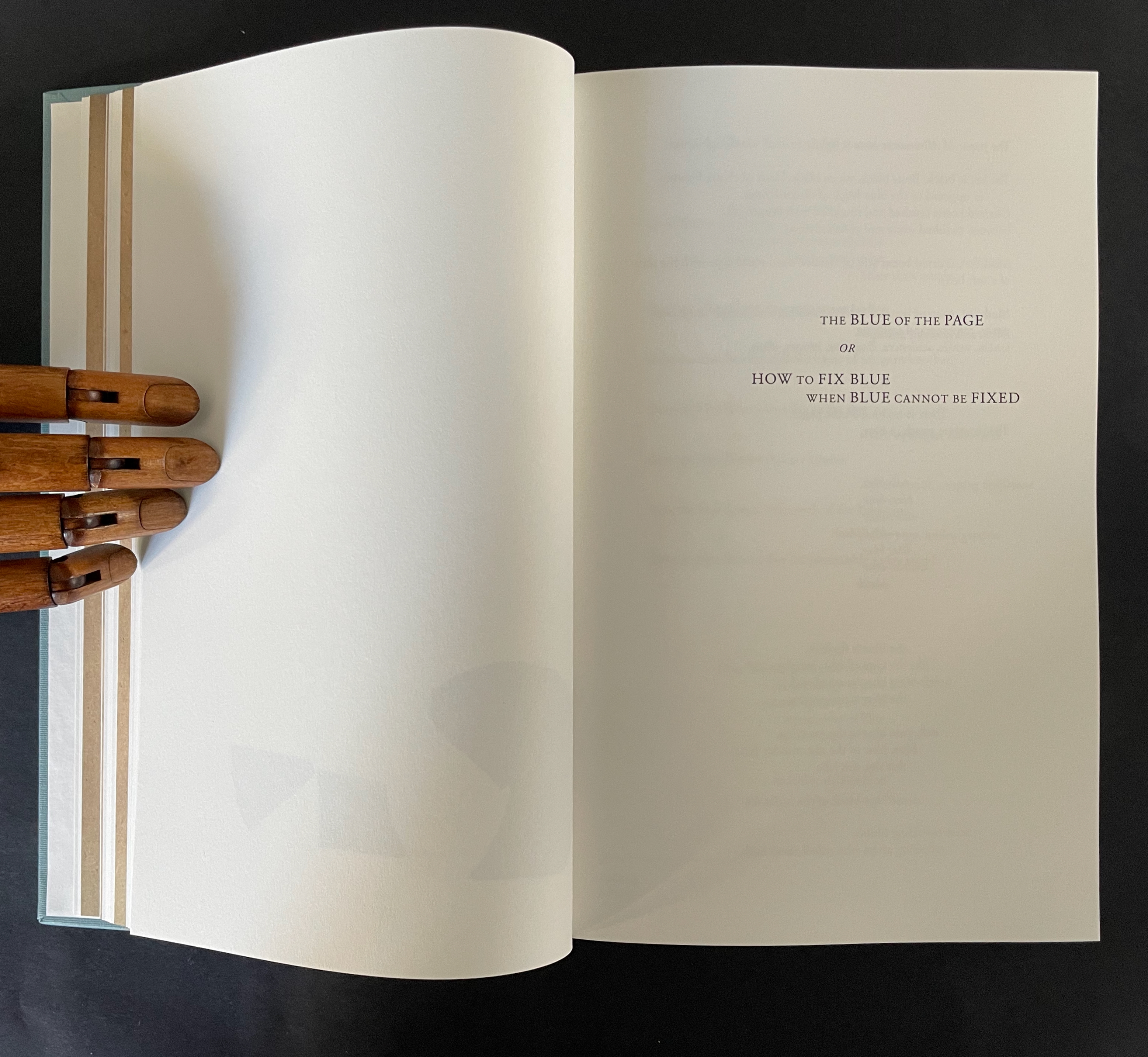
There are also four labelled subsections or interludes that appear out of the blue.
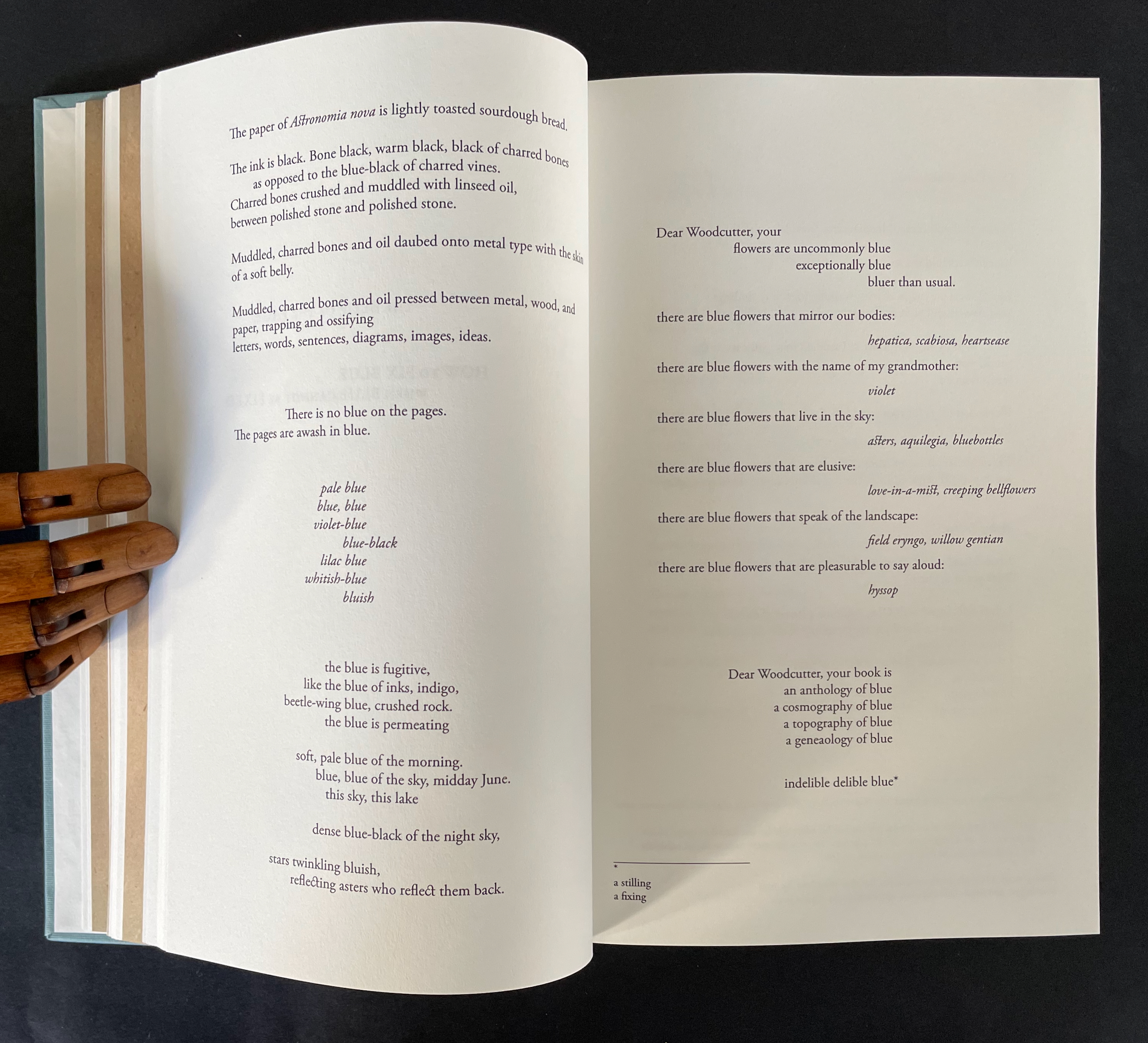
The first entitled “The Blue of the Page or How to fix Blue when Blue cannot be Fixed” addresses the color of the paper, ink, and flowers, what Ancliffe can see and cannot see but perceives (color of paper), knows (ink), imagines (flowers), metaphorizes, finds, and names.
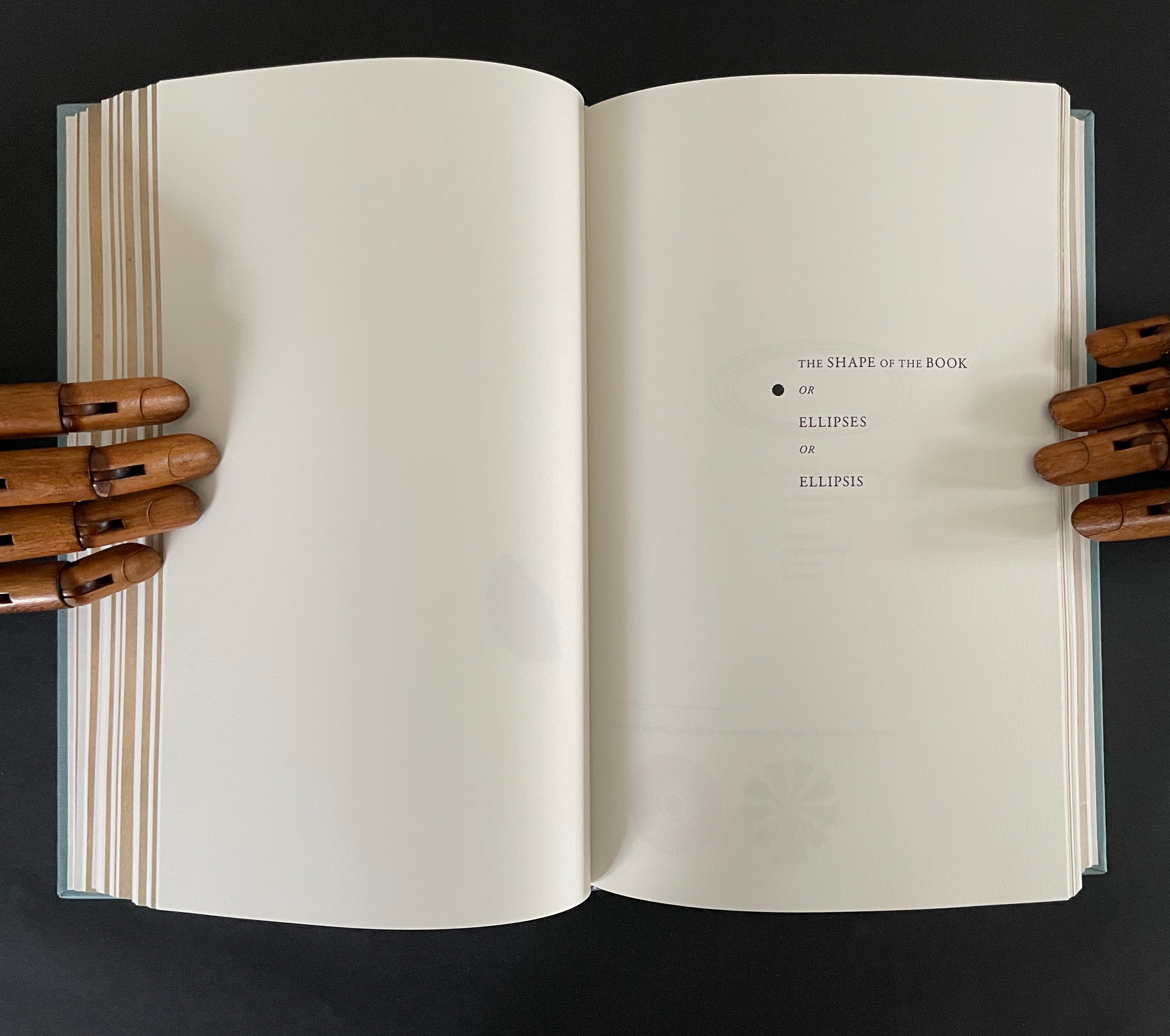
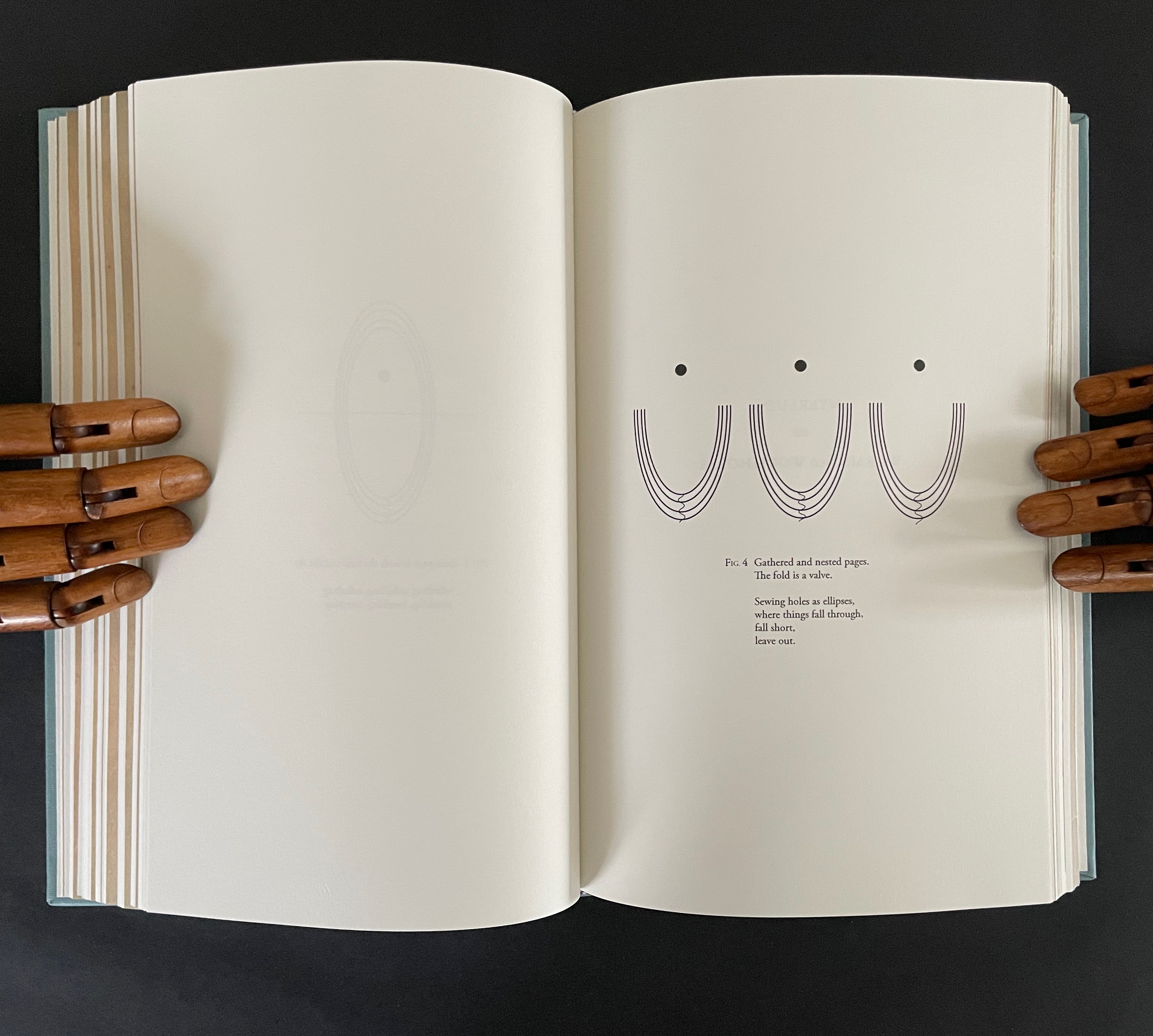
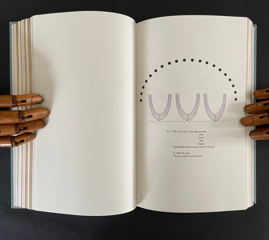
The second entitled “The Shape of the Book or Ellipses or Ellipsis” draws metaphorical, etymological, and visual links between books and orbits (ellipses) and sewing holes (ellipsis).
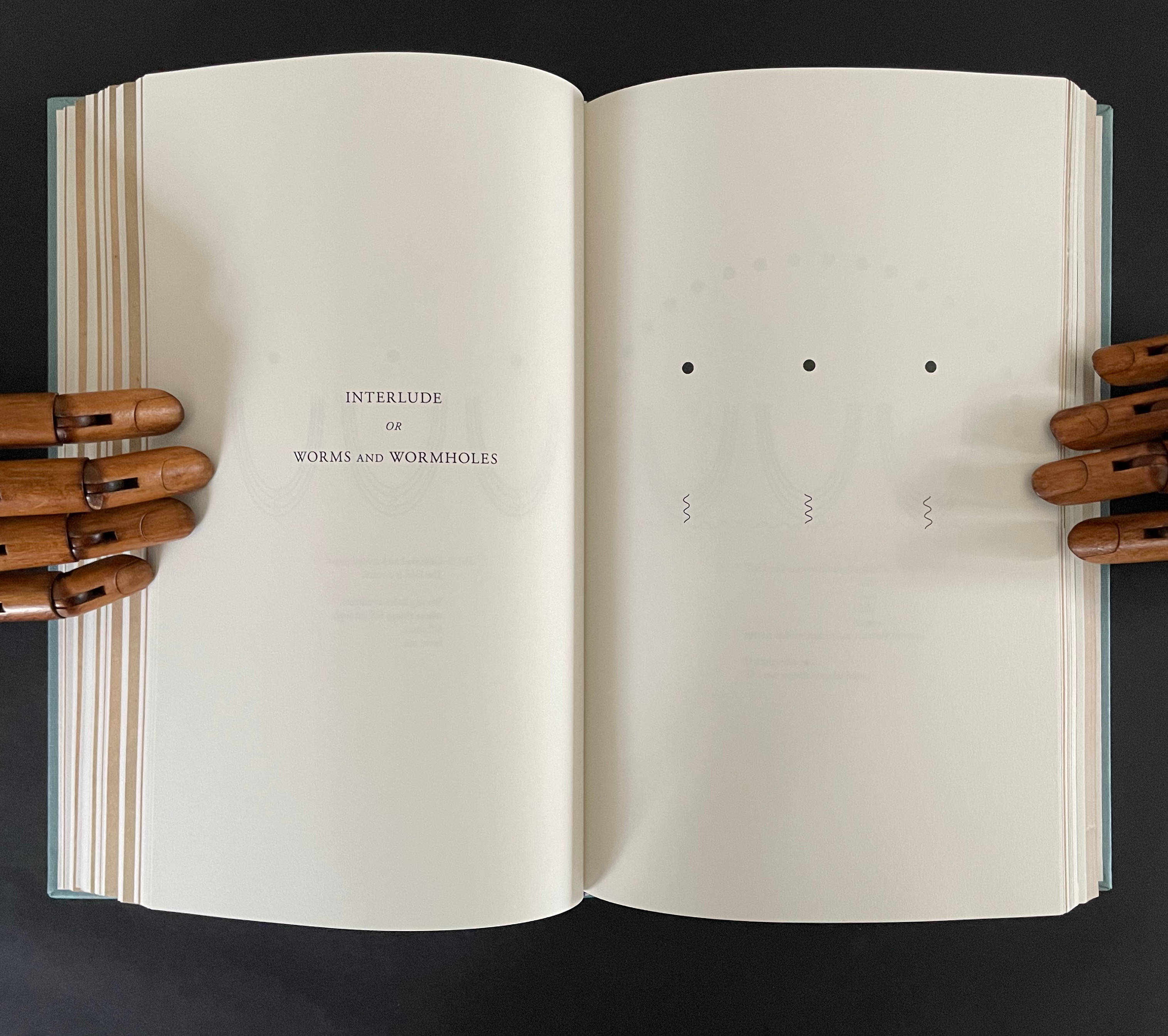
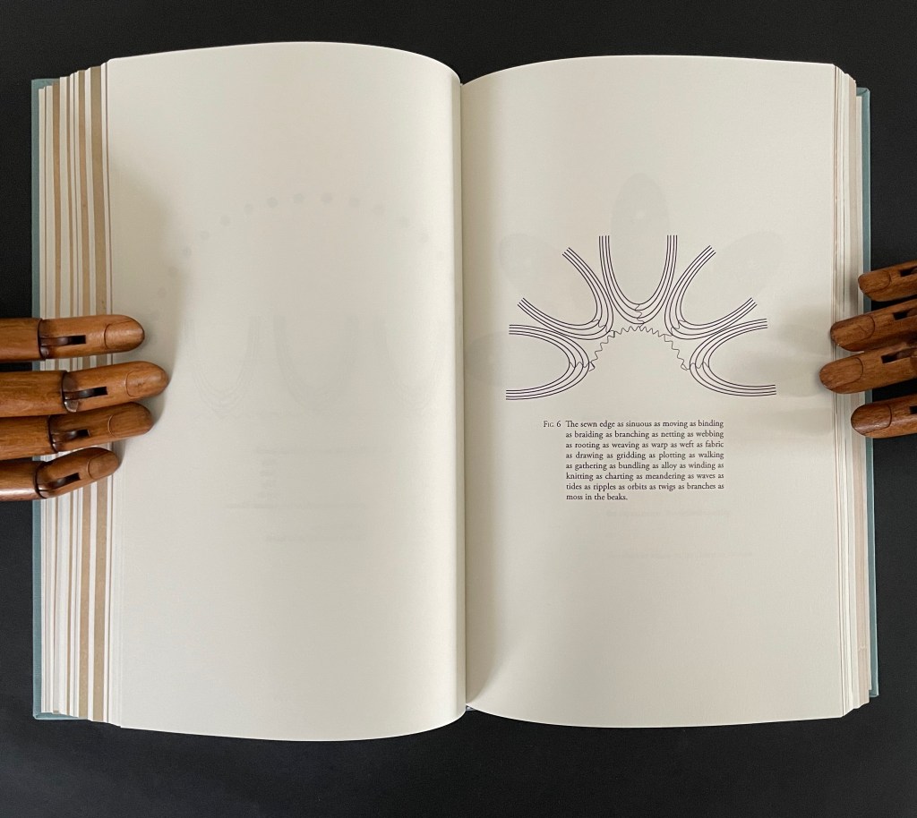
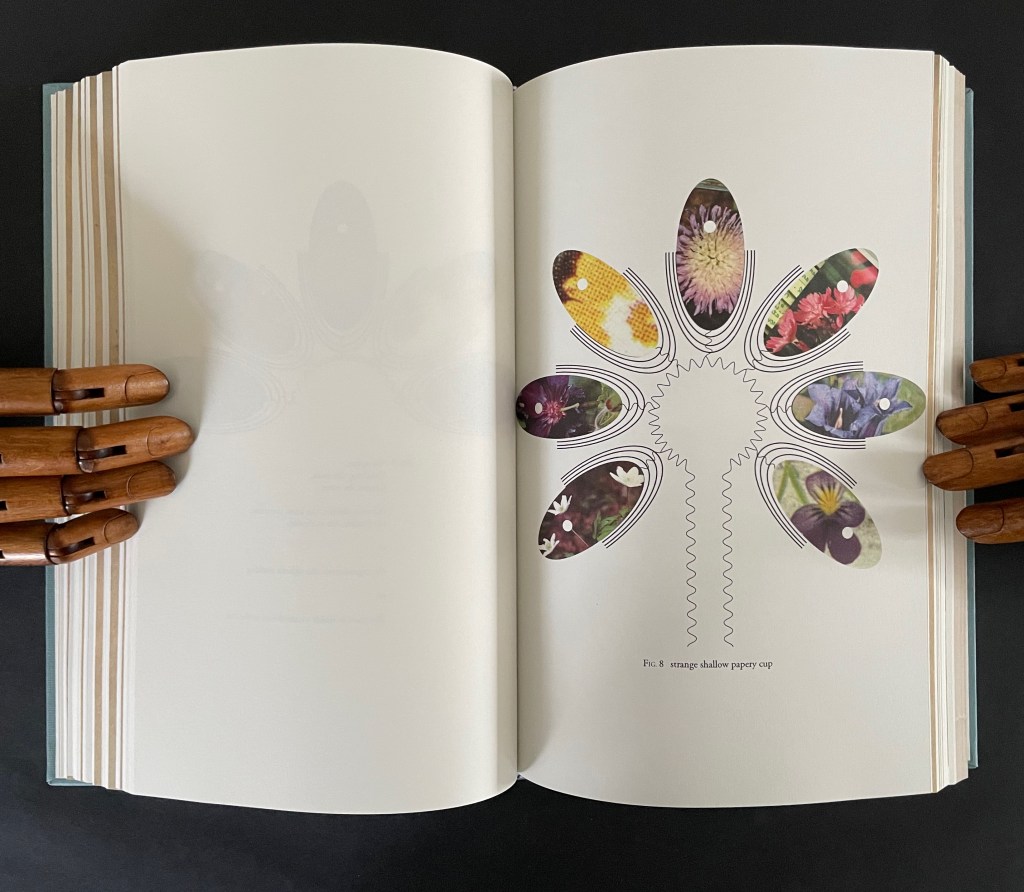
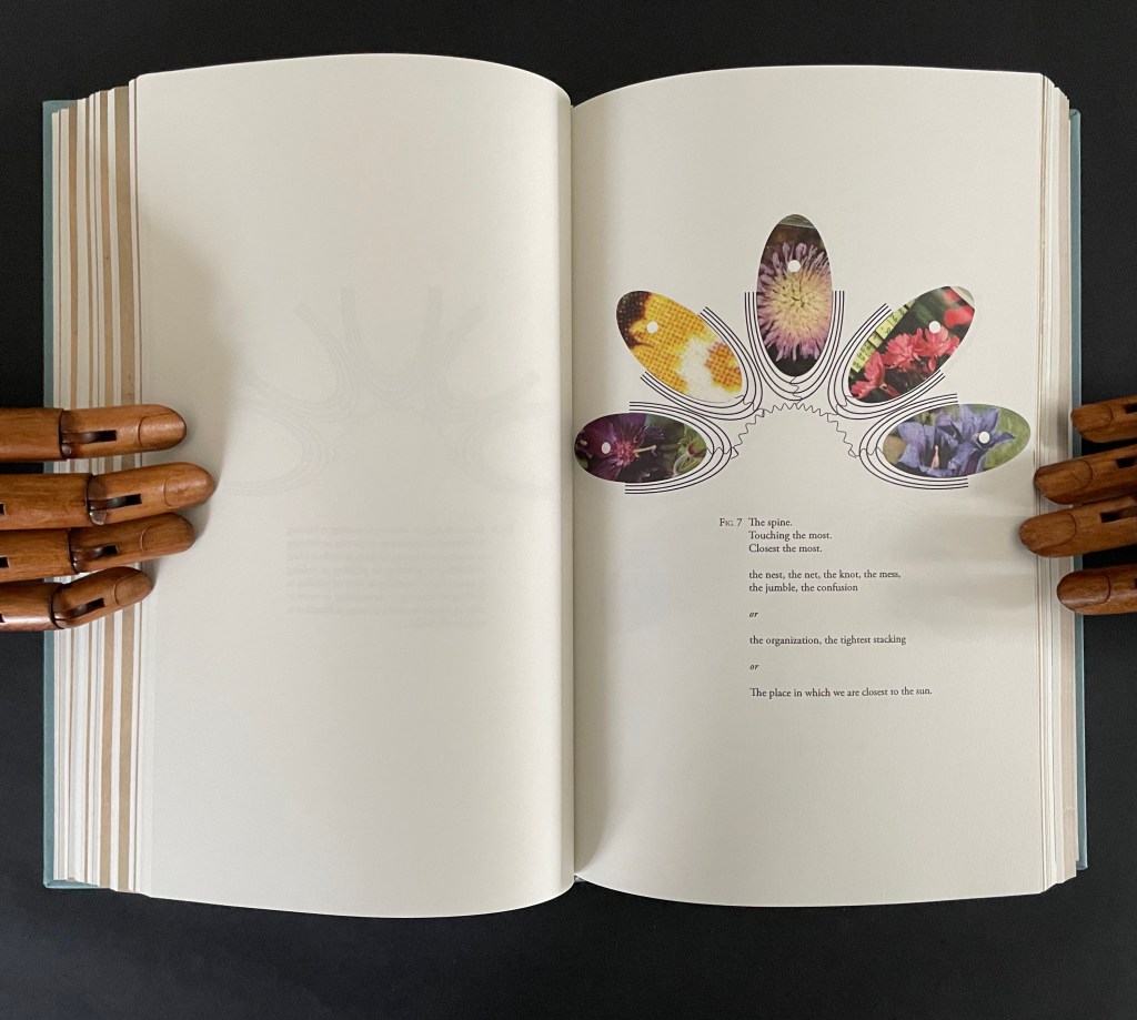
The third interlude “Interlude or Worms and Wormholes” develops an extended metaphor of the book’s sewn edge as a sinuous gathering together of nature, type production, planetary charts, and seasonal movements. It also makes another extended metaphor of the book spine as the most interconnected point of organization and confusion, the orbital point closest to the sun, and the shapes of a shallow papery cup, sewn folds, and flowers.
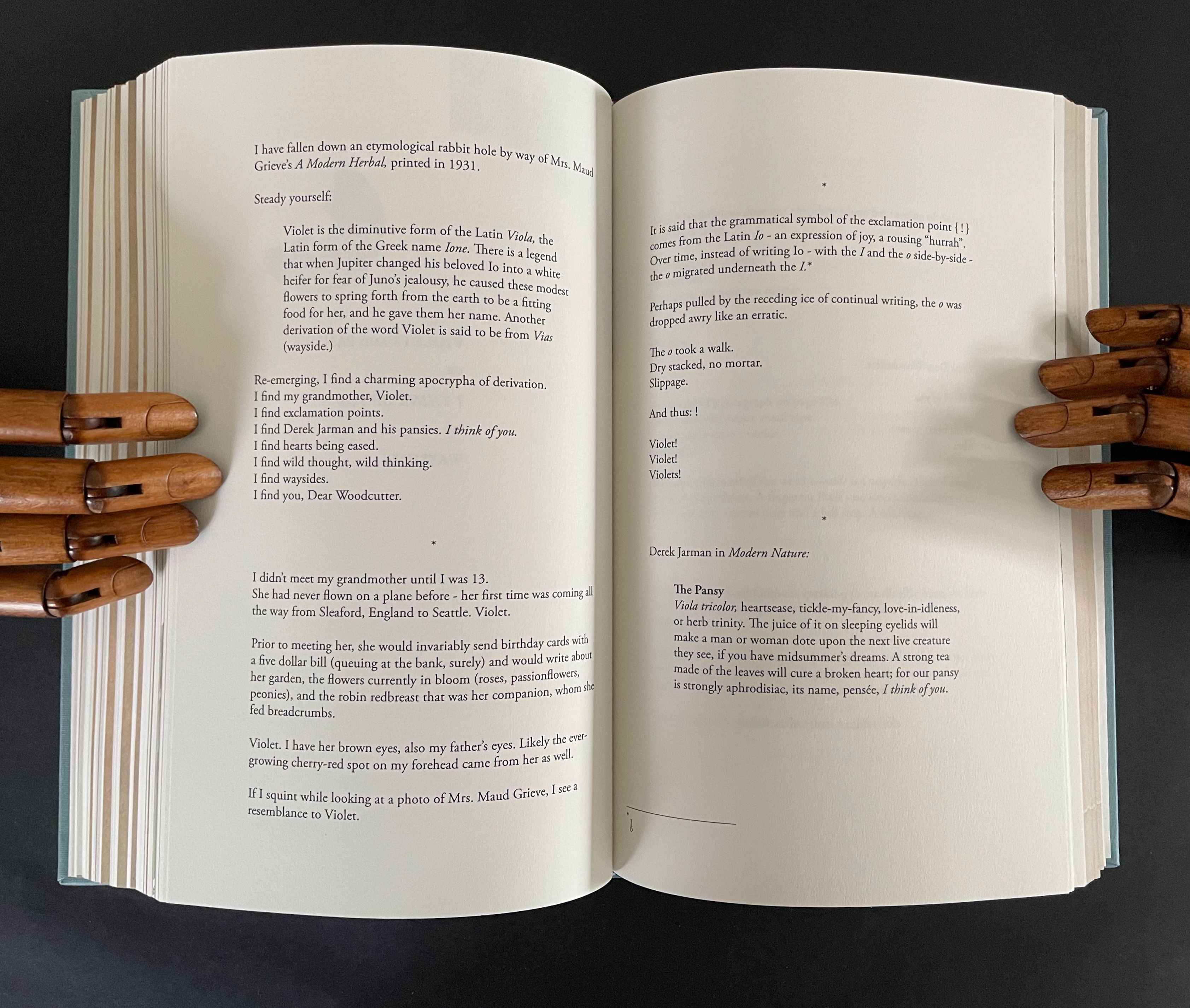
The fourth interlude is “Violets and Pansies or I Think of You or Waysides” plays on Paul Klee’s observation that “A line is a dot that went for a walk”. In Ancliffe’s case the line begins with the dot of the etymology of “violet” that leads both to the Jupiter/Io myth and Ancliffe’s grandmother’s name, that links Io to the origin of the exclamation point, which Ancliffe appends to grandmother Violet and the flowers, that jumps to Derek Jarman’s etymological linking of the common names violet/pansy/heart’s ease to the French “pensée” and thus to “I think of you”, that leads to wild pensée (wild thought), which leads back to the dubious etymology of via leading to violet and thereby “wayside”, which leads to thinking of you (woodcutter) and the flowers found by the waysides.
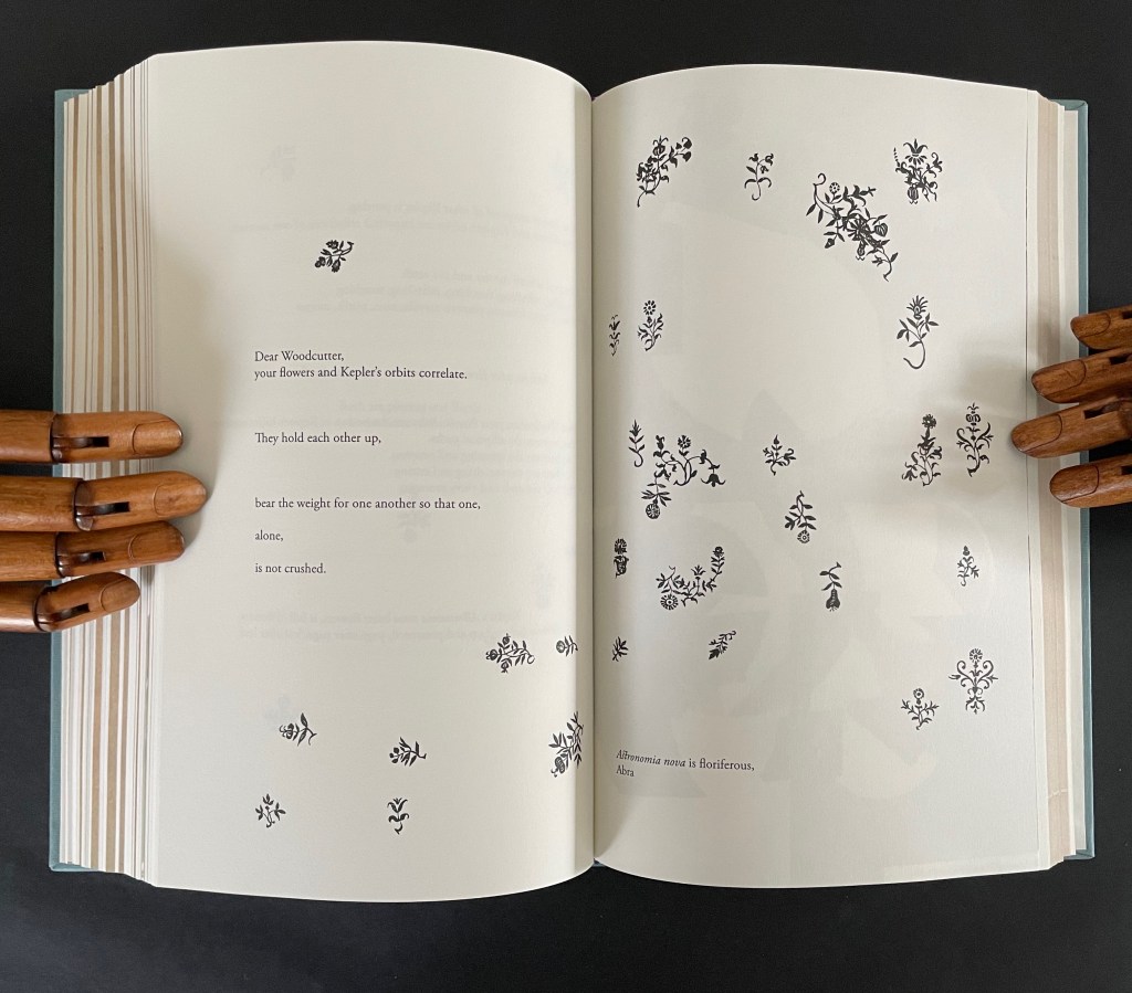
What links these subsections is their use of the elements of book production to support Ancliffe’s theme of interconnectedness. At the start of the book, she wonders whether the purpose of the woodcut flowers is that of bearing type, an insertion to prevent the weight of the press from breaking the finer woodcut lines of the orbits. Now, as the final gathering of gatherings approaches, she returns to that notion. Notice below how the layout of text and flowers on the left and the layout of the collage on the right mimic one another, which echoes Ancliffe’s observation
your flowers and Kepler’s orbits correlate.
They hold each other up,
bear the weight for one another so that one,
alone,
is not crushed.
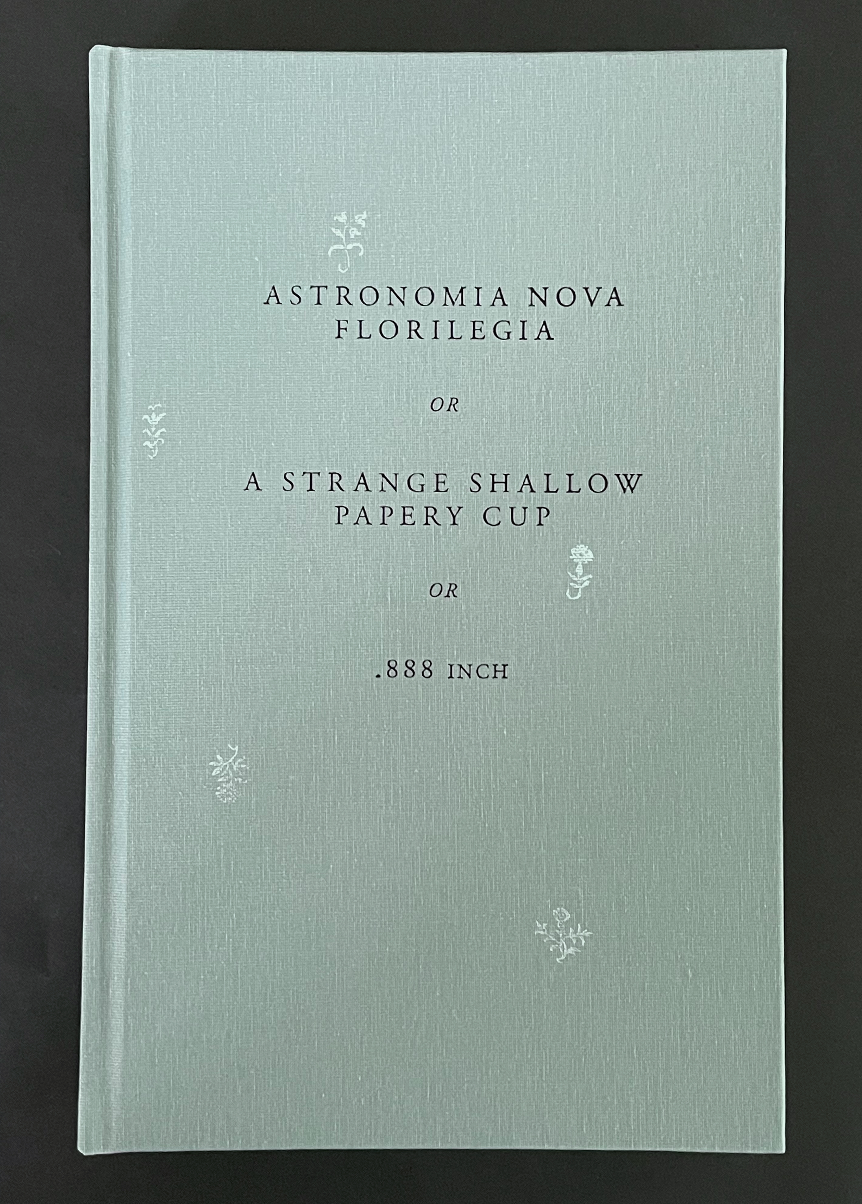
But for Ancliffe, a mutual bearing up is not the whole story of the interconnectedness she is pursuing in Astronomia Nova Florilegia or A Strange Shallow Papery Cup or .888 inch. For her, interconnectedness (correlation) is historical, metaphorical, etymological, rhetorical, seasonal, geographical, typographical, material, and personal. She sees in the woodcutter’s Prague flowers a florilegium (“you hid a book within a book!”) and a purpose — “I am seeing your book of flowers to others” — for which she chooses the medium of the artist’s book. Because this medium is so frequently recursive or self-reflexive, it is well-suited to a book hidden within a book. Like a planetary system, an artist’s book often has multiple orbits and multiple points of orbit. As noted in the interludes, any element of “the book” and its production can play a role — punctuation, words and wordplay, ink and its color, type and typesetting, images and carving, paper, sewing holes, thread, and so on.
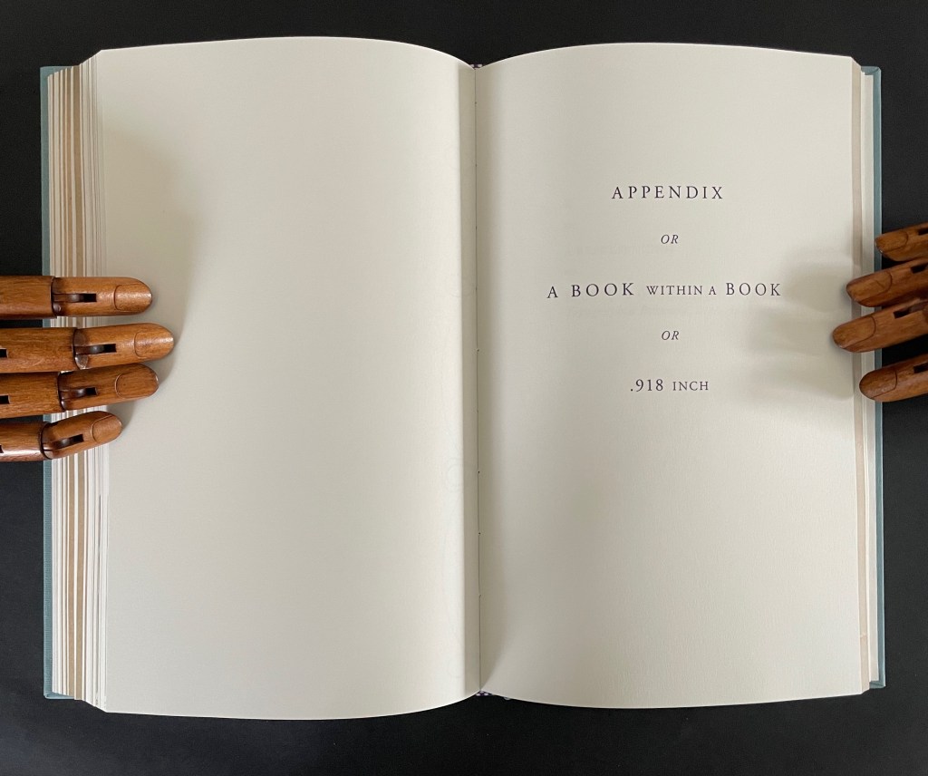
In a final honor to Dear Woodcutter and personalizing capstone, Ancliffe adds two appendixes: “the first, Appendix or A Book within a Book or .918 inch”, and the second, “K or a Represencing or Studying an Engraving of Prague in Topographia Bohemiae, Moraviae et Silesiae, 1650″.
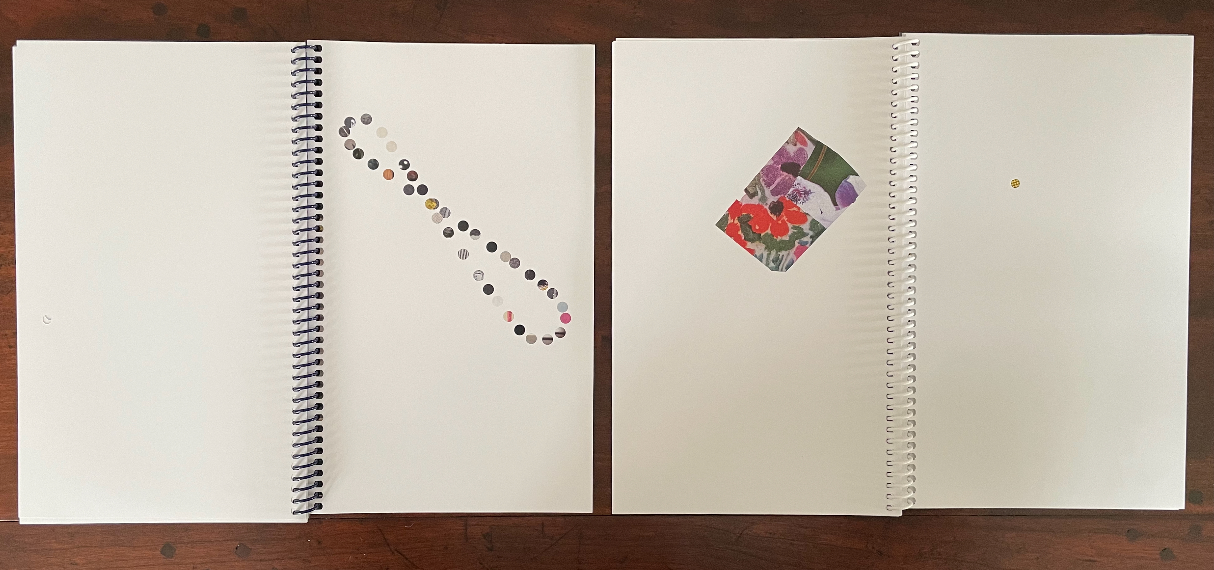
In the first appendix, Ancliffe introduces the map of Prague, familiar from the two earlier artist’s books and then points us to K, the Jewish quarter, by filling it with a thumbnail flower. This is her book within a book: 37 flowers laid within the Jewish quarter of Prague 1650. Their color re-presences the absence surrounding the K in the map.
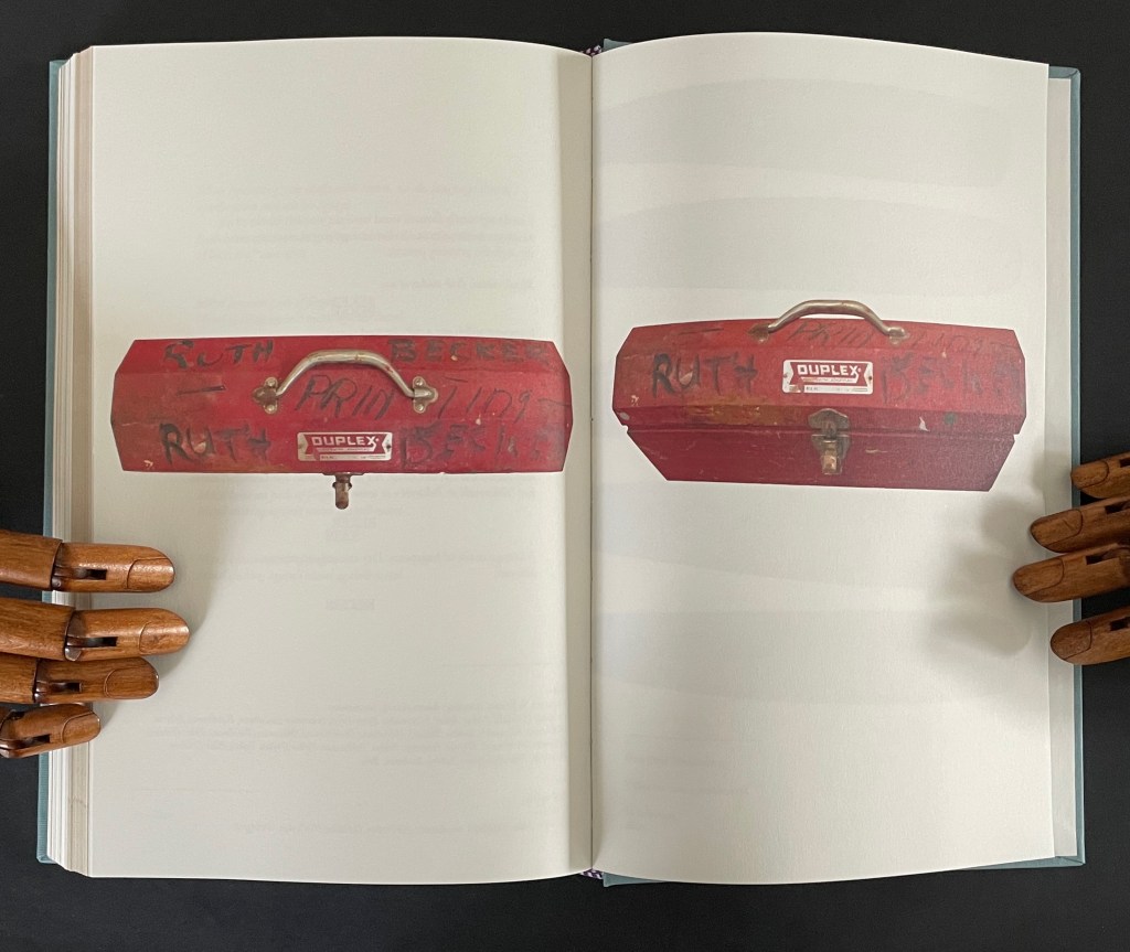
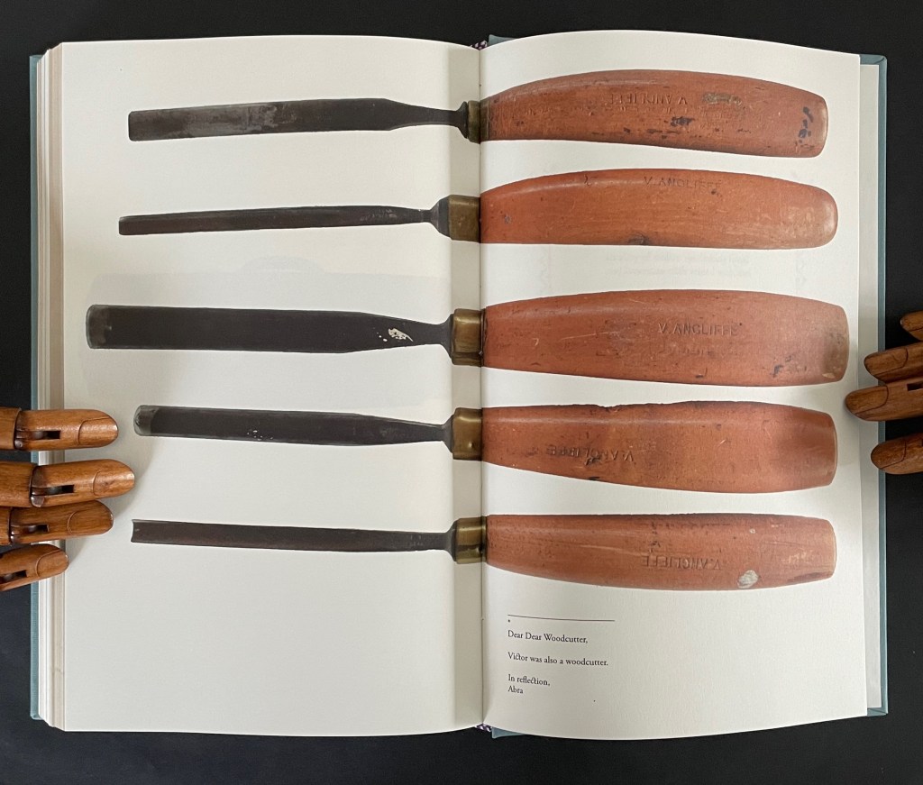
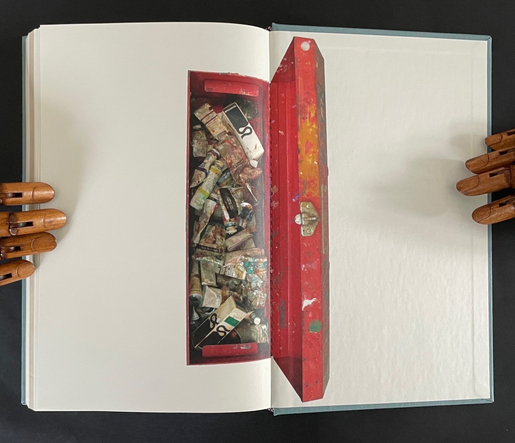
In the second appendix, Ancliffe begins with the materiality of type and setting it — how it’s made, how it feels, what it looks like — in particular for the letter K and her maternal grandmother’s married last name set in type. Again, it is an element of the book that provides the metaphor that pulls “what connects” into the orbit of Ancliffe’s artist’s book. Absence evokes presence; presence evokes absence. The absence around the carved upside down and reversed metallic strokes defines K as much as does the ink transferred from them. Likewise the presence of her grandfather Victor’s and grandmother Ruth’s metal and messy tools evokes their absence, and it is their impression on the artist that defines their presence in her,
which brings us to the autobiographical closing statement framed by Dear Woodcutter’s flowers.
Abra Ancliffe has created a body of works that, as Brian Davis puts it, “not only exploit the material and expressive possibilities of the book as object, they function as physical sites for compiling and organizing heterogeneous collections of textual artifacts for narrative and other expressive purposes”. As aesthetic objects, they demand more than a glance in an exhibition or flick-through at a book fair. They richly repay the greater attention.
Further Reading
“J. J. Abrams & Doug Dorst“. 12 December 2024. Books On Books Collection. Another example of what Davis calls a “book-archive”.
“Helen M. Brunner“. 15 April 2026. Books On Books Collection. Further example of the “book -rchive” artist’s book.
“Gracia Haby & Louise Jennison“. 28 May 2026. Books On Books Collection. Intensely colorful artists’ books exemplifying the notion of “book-archives”.
“Michael Hampton“. 8 May 2026. Books On Books Collection. Hampton’s notion of parabibliography has an affinity with Brian Davis’ notion of archival poetics. In particular, see 410/411 (2025.
Davis, Brian. 1 May 2024. “Part One: The Rise of Multimodal Book-Archives“. Book Art Theory. Starkville, MS: College Book Arts Association. Explores “archival poetics”, finding art by harvesting archives and libraries.
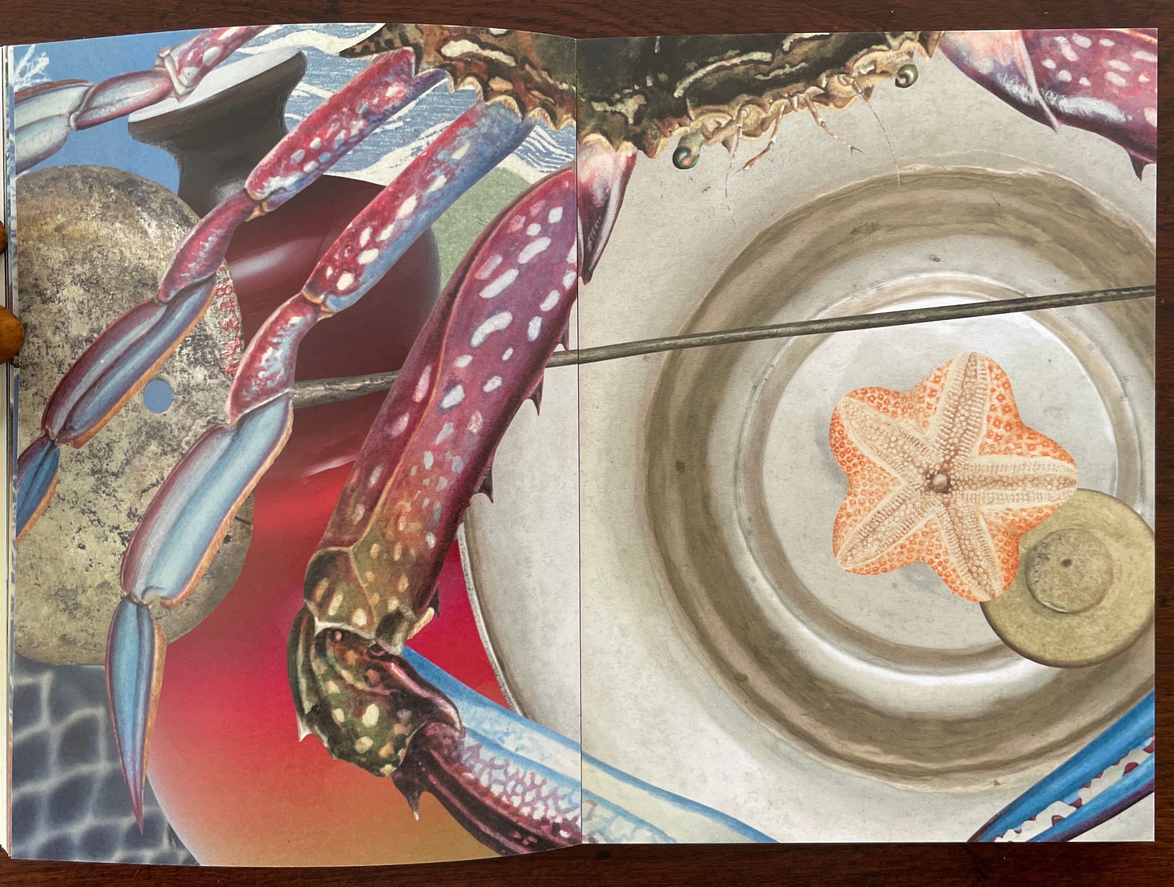
Gracia Haby and Louise Jennison are exuberant archival eco-artists whose palette embraces the digital collections of the Metropolitan Museum of Art, New York Public Library, Rijksmuseum, State Library of New South Wales, State Library Victoria, and more. Their preferred media are paper, the artist’s book, and installations; their preferred technique, collage.
Dip and Bob (2021)
Dip and Bob (2021) Gracia Haby & Louise Jennison Casebound, softcover with five-panel irregular trim wraparound card. H149 x W110 mm. [72] pages. Edition of 50. Acquired from the artists, 21 February 2026. Photos: Books On Books Collection.
Like other works in the collection, Dip and Bob (2021) teases connections between the media of watercolor, artist’s book, performance, and installation. The cover is an original watercolor cover on Fabriano Artistico 300 gsm paper.
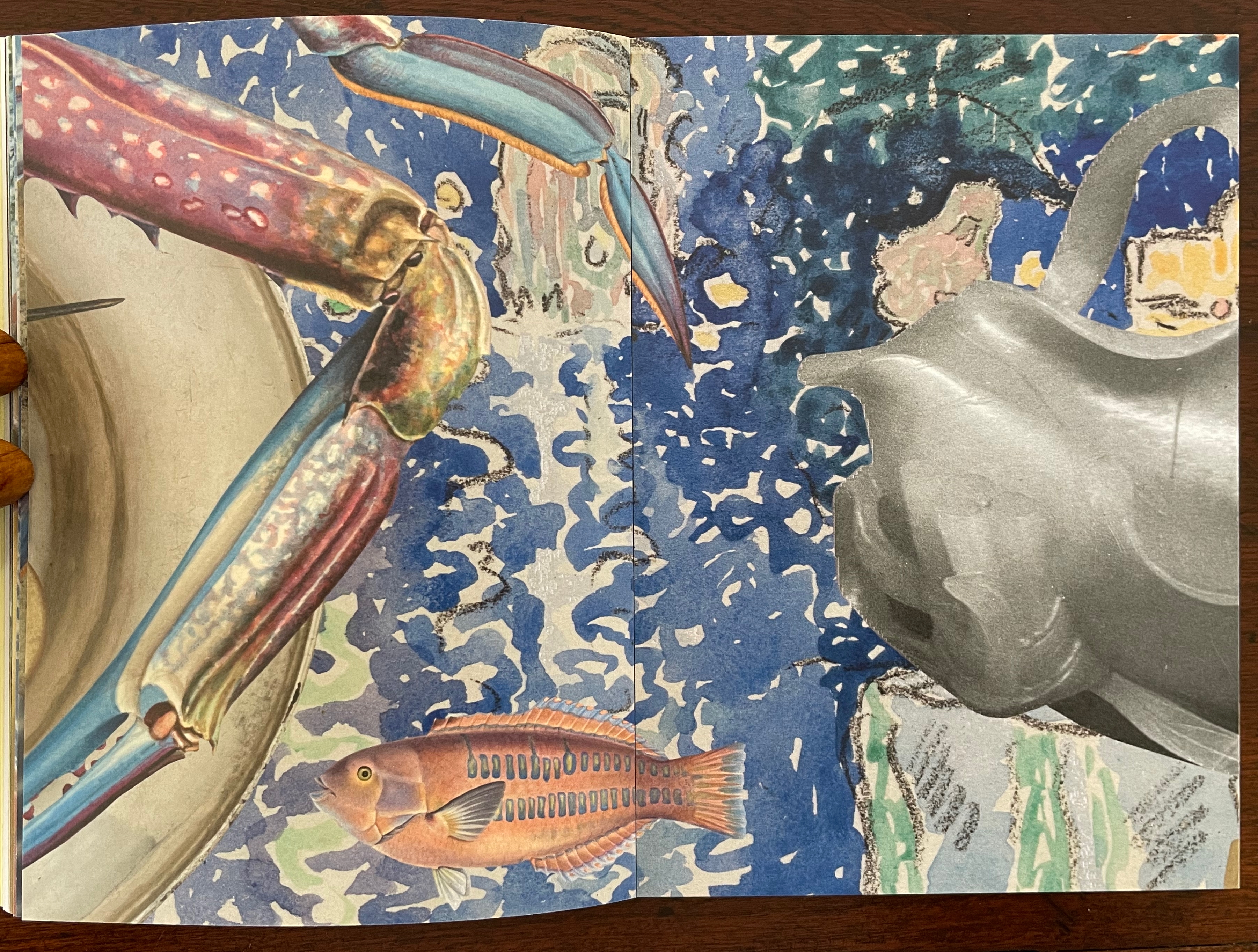
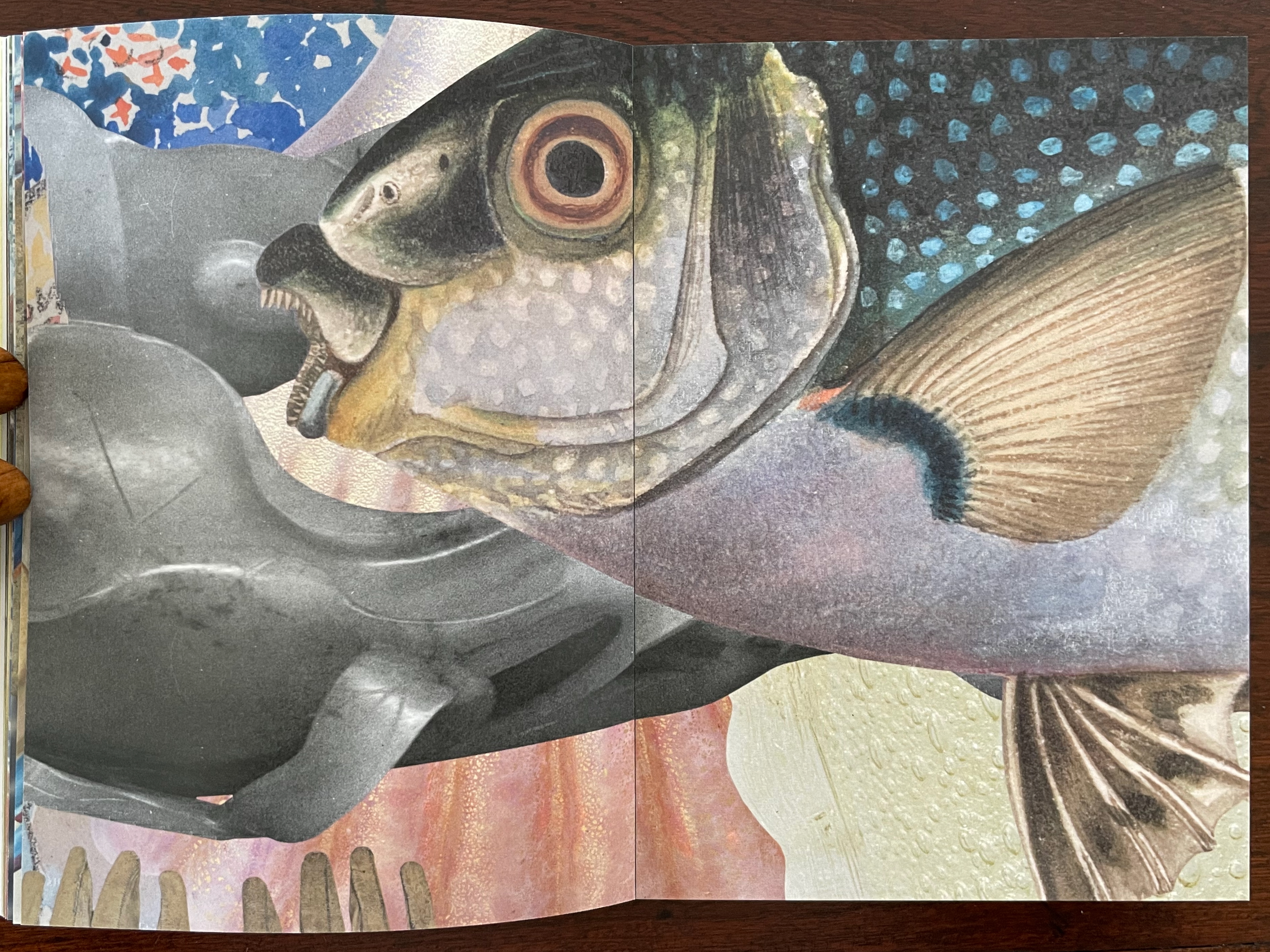
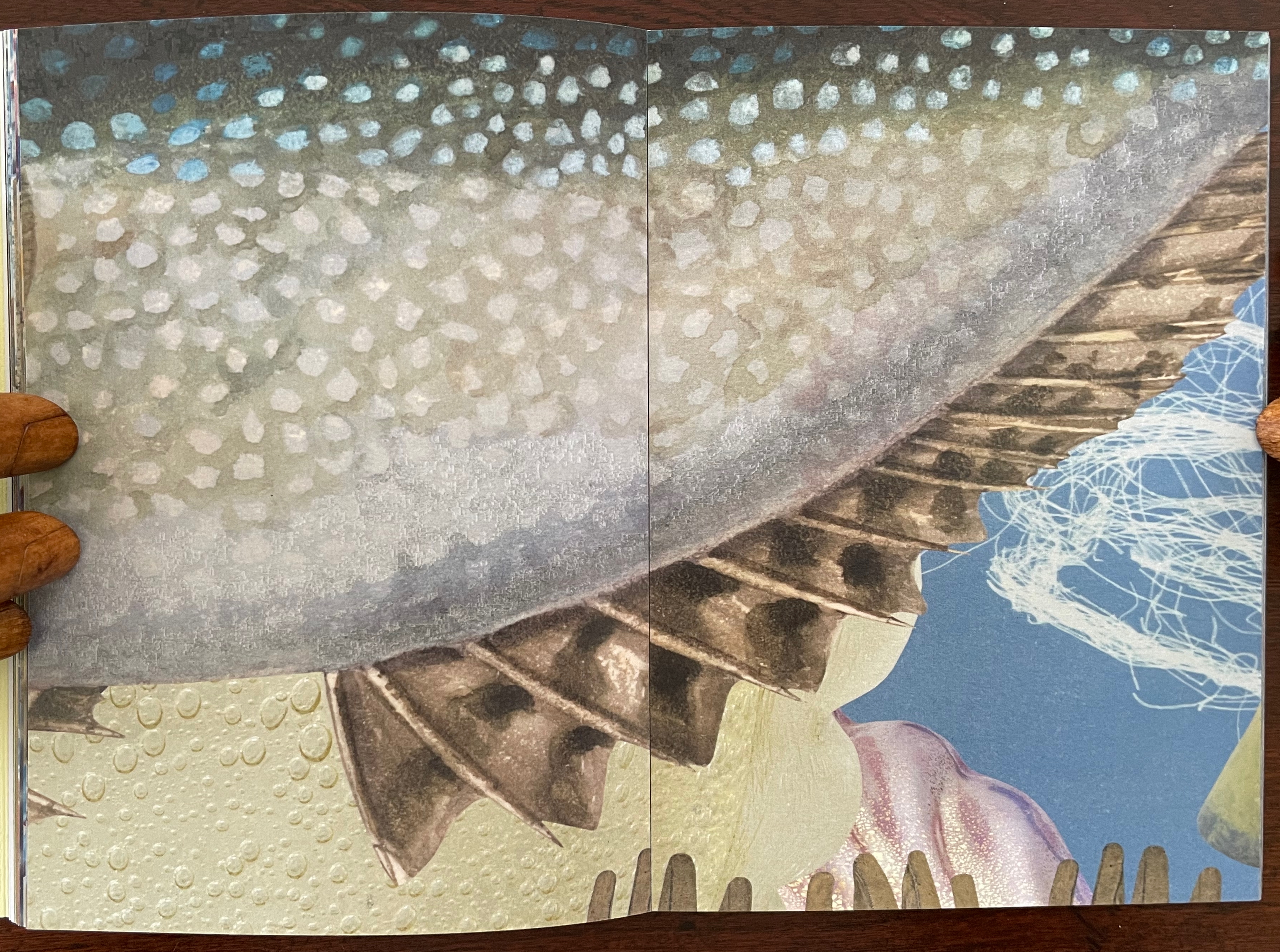
The 72 pages of prints on Impact 100% Recycled Uncoated 150gsm derives from a 620 cm long digital collage. Created for the 2021 NGV Melbourne Art Book Fair, its performance element was twofold. First, as the artists explain, the collage was made “in place of a swim”, the local pool being too busy. Second, toward the end of the making, several copies were bound live before the Book Fair attendees. Its installation element, however, is the greatest tease. There is and was no installation of the 620 cm long collage work. It rests in your hands, and you experience it by turning the pages, then turning them back, then turning them forward — like laps in the pool. Or if you happen to photograph the double-page spreads, you can jump out of the pool and look down on them joined end to end.
Their introduction, however, will lure you back into the collage, which is
Underwater, kind of. Yes. Dive in.
Don’t forget to hold your breath. …
Search the collection. Sift the collection. “Water”, Return key.
Invert a forest. A daguerreotype of poplars stretching across the plate could be bands of seaweed. …
A crab from a trade card. Not for the skillet. Zoom in, Moonfish.
The Young Saint John the Baptist hair tendrils ca. 1480–82, repurposed. Papyrus fragment with lines from Homer’s Odyssey, ca. 285–250 B.C., for kelp bands.
Haby and Jennison wear their eco-hearts on their sleeves and admit, or rather assert, “For us, above all, it is not the medium that is always of greatest import, but the message”, which is
Our only chance of a healthy, safe, joyous, and sustainable future is to return to being reciprocal with nature so nature can continue to look after us.
Stand up and fight for the oceans and the waterways.
And yet it is their long-held breath as they create their underwater collage and your breath caught as you paddle forwards and backwards over fore edges and through the collection of human and natural art that will most hold you.
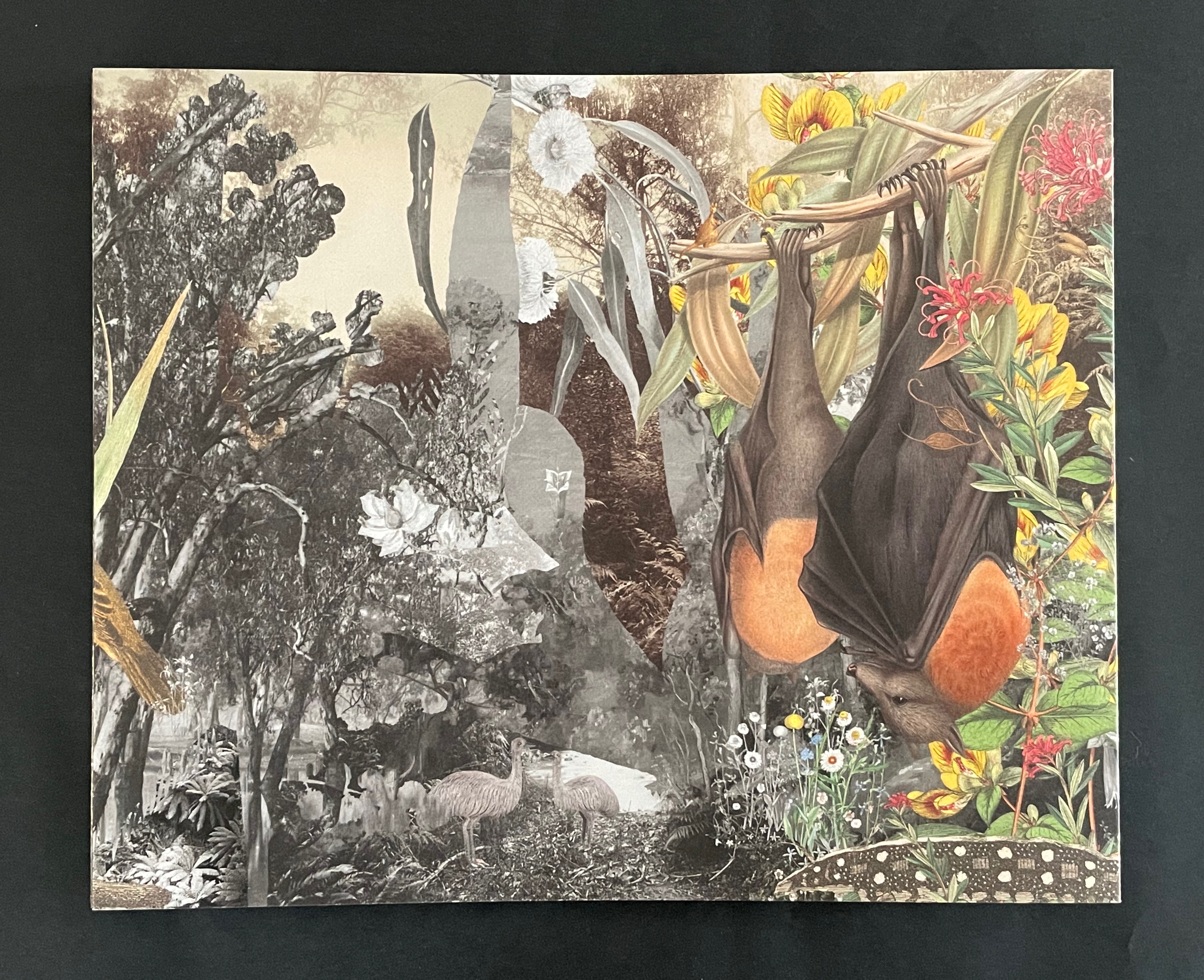
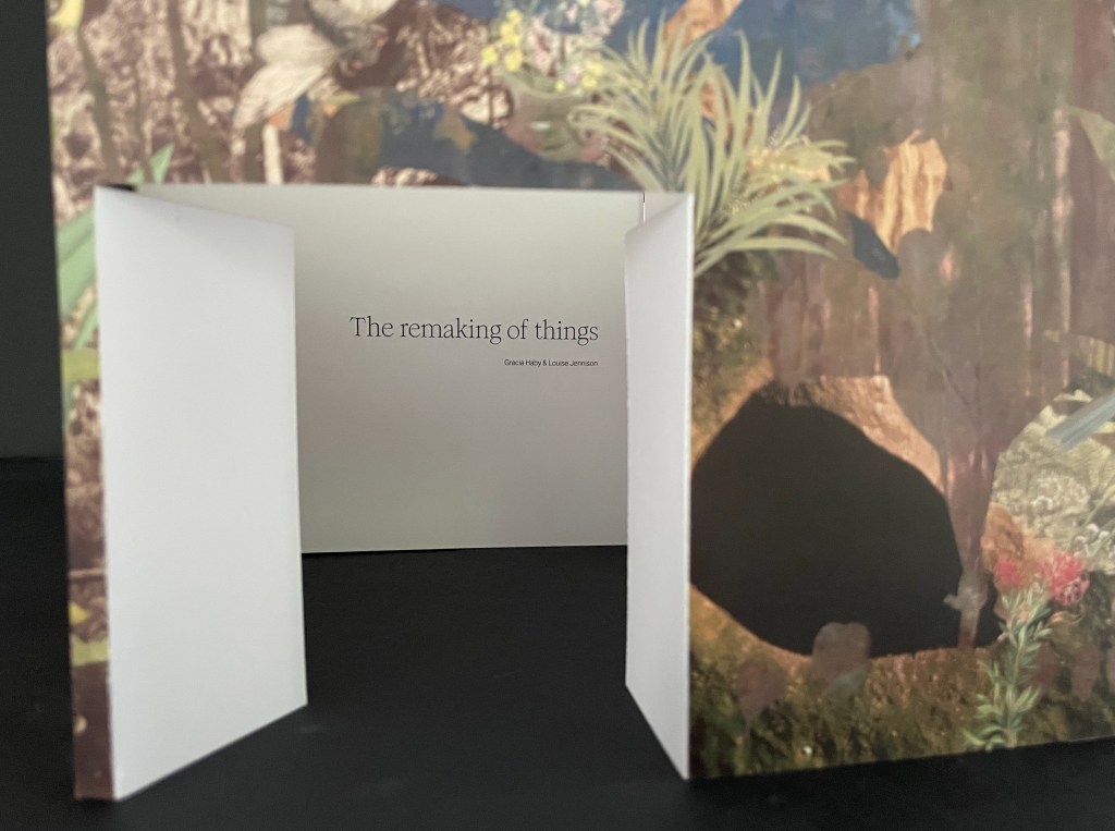
The Remaking of Things (2023)
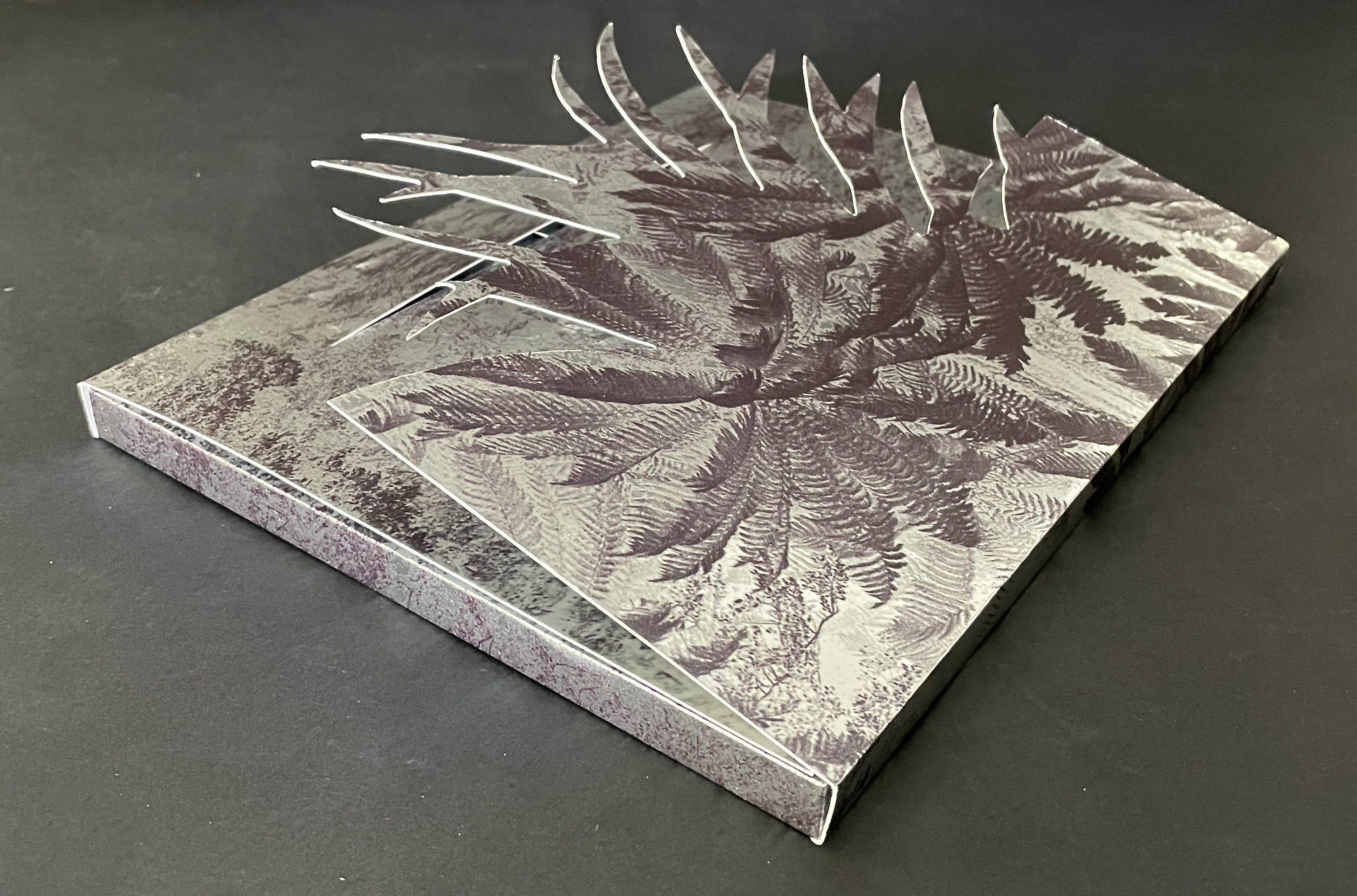
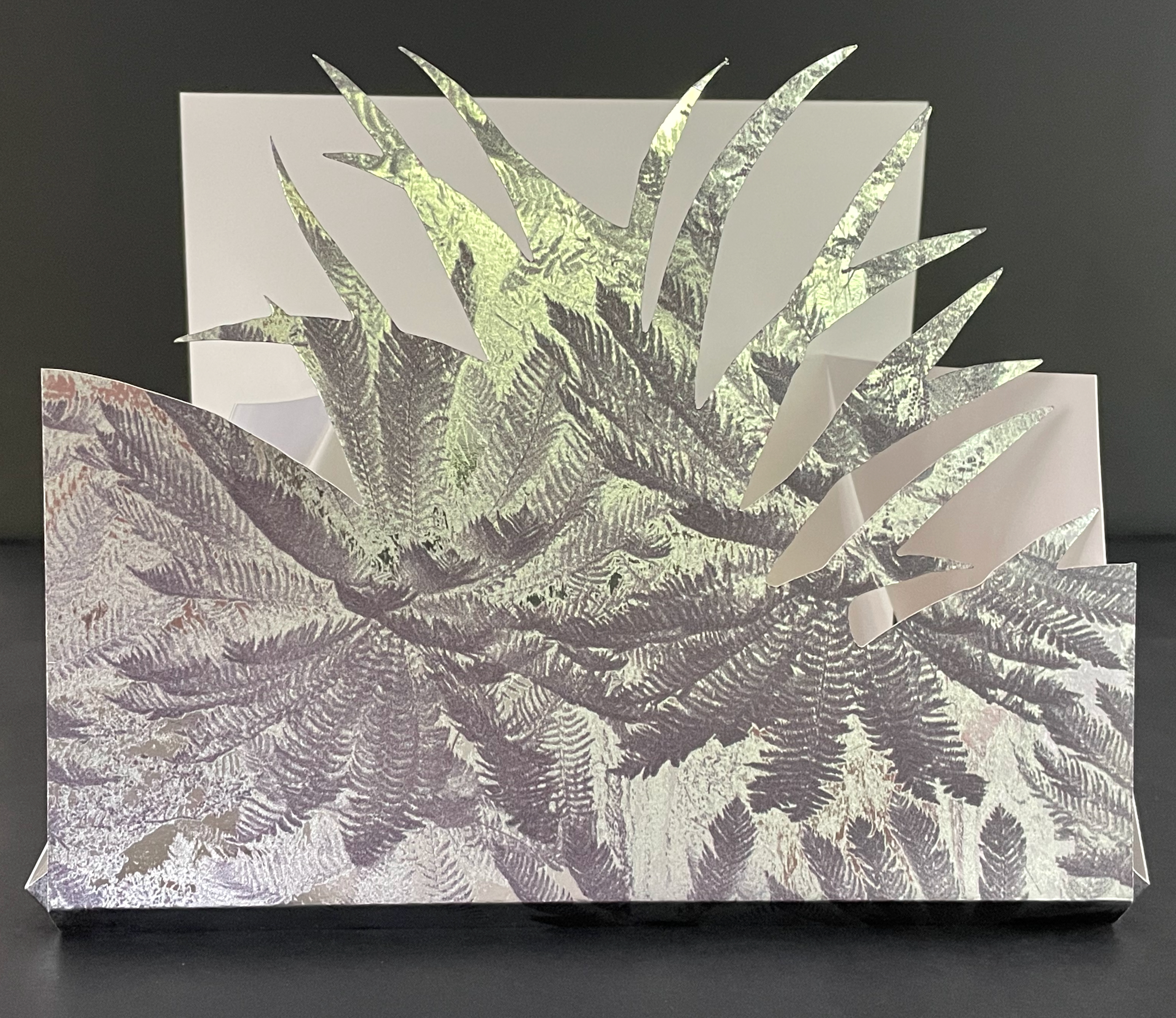
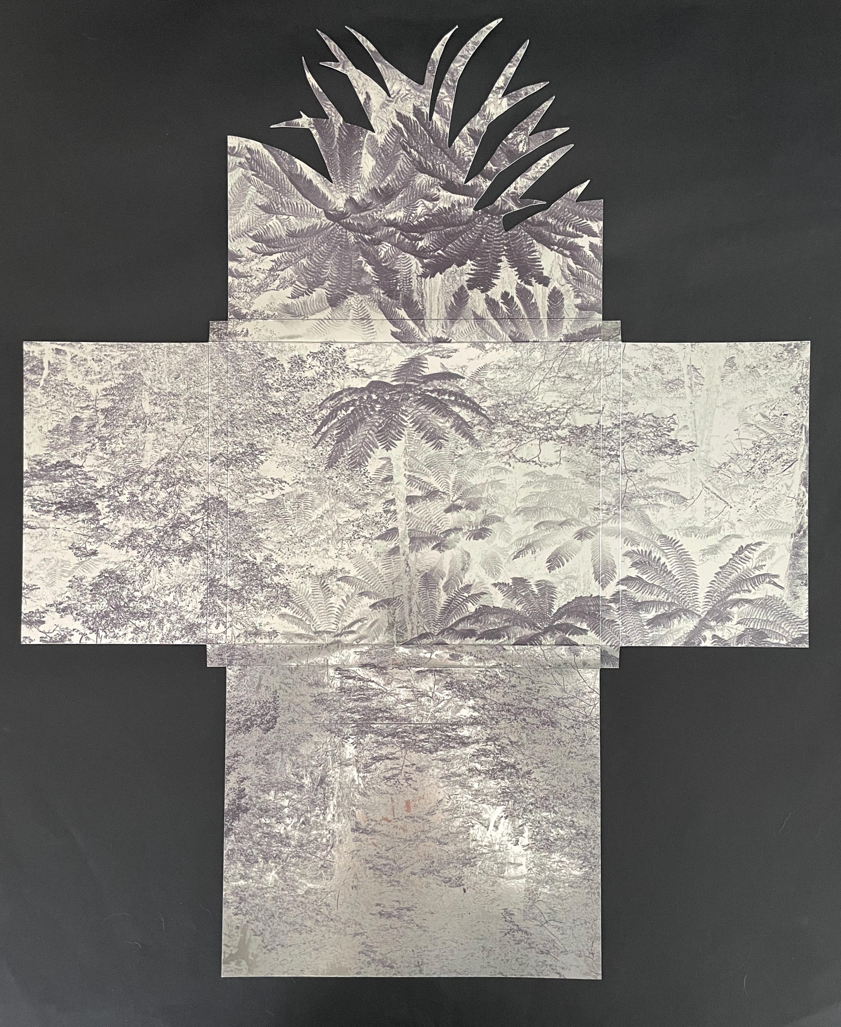
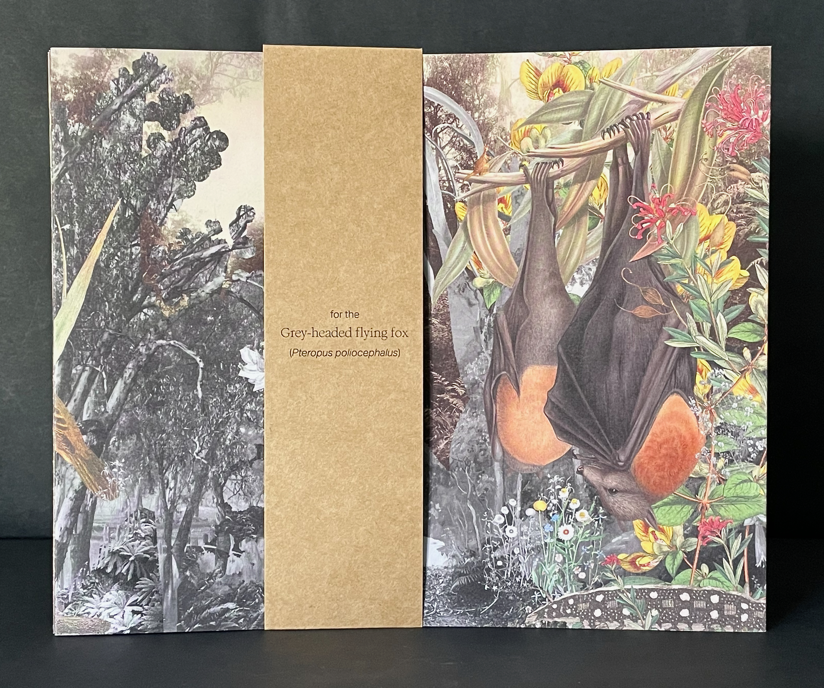
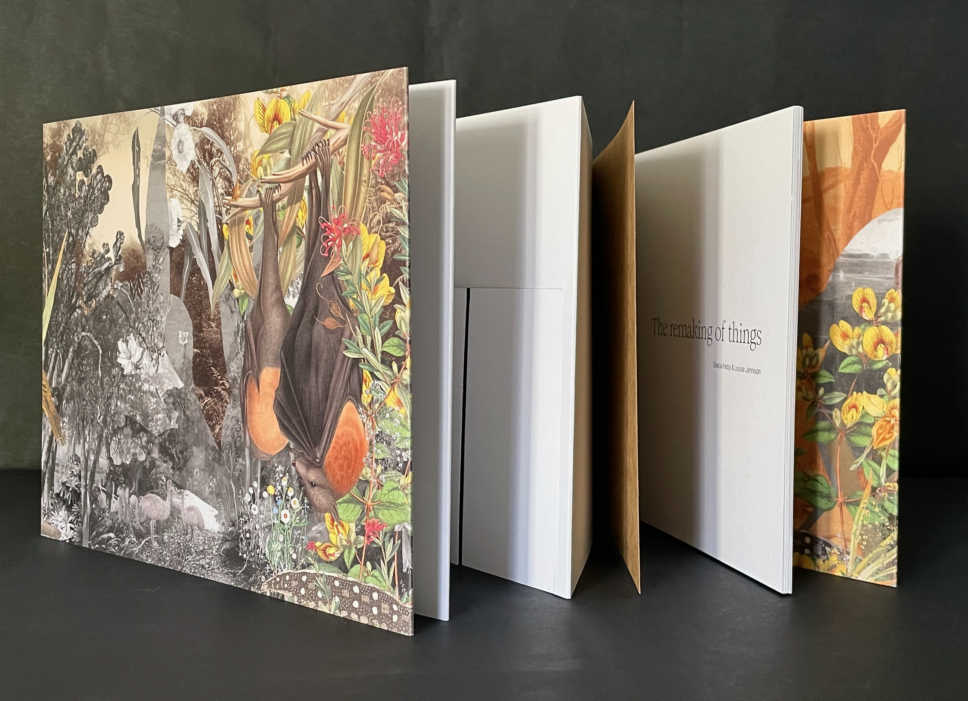
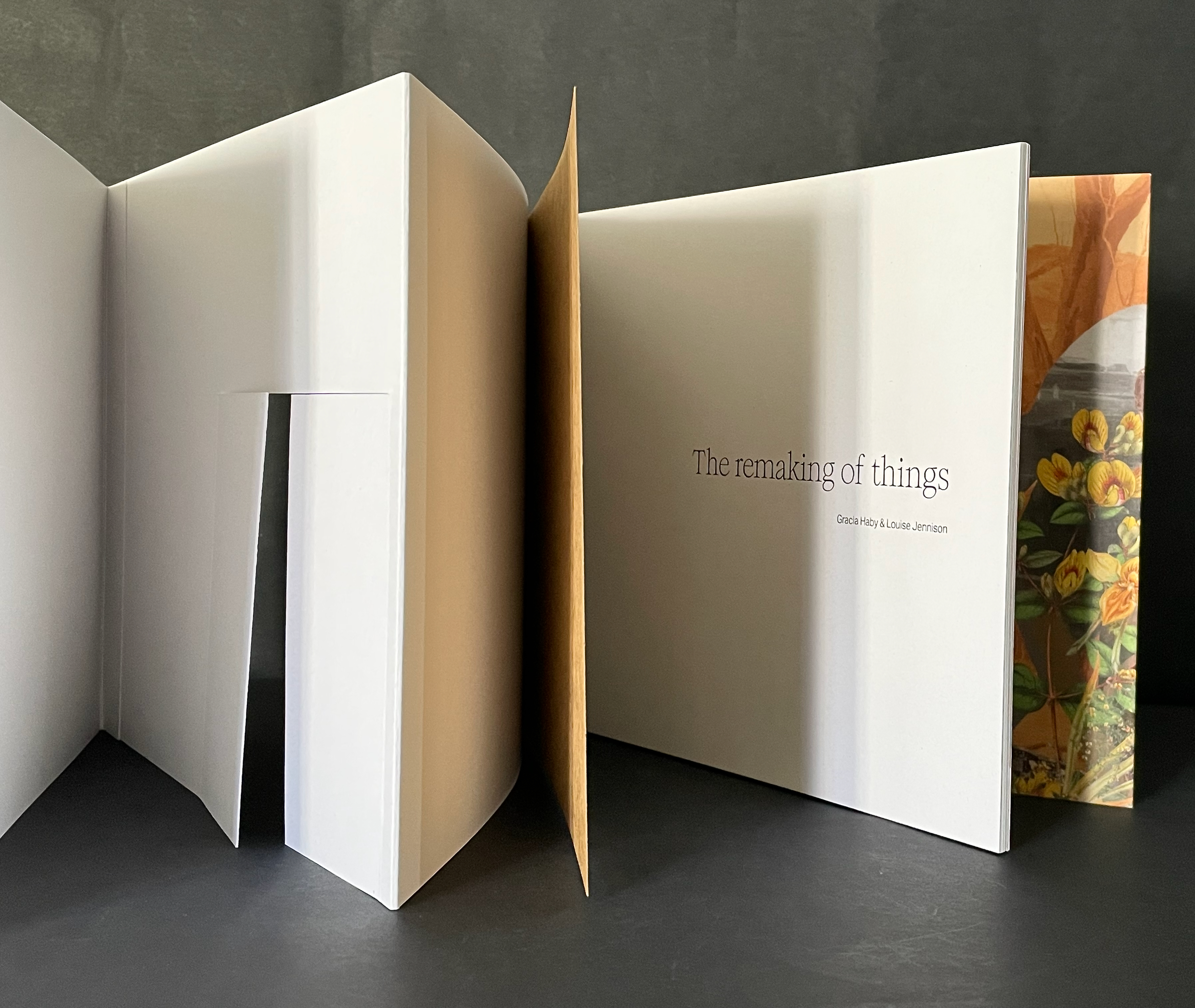
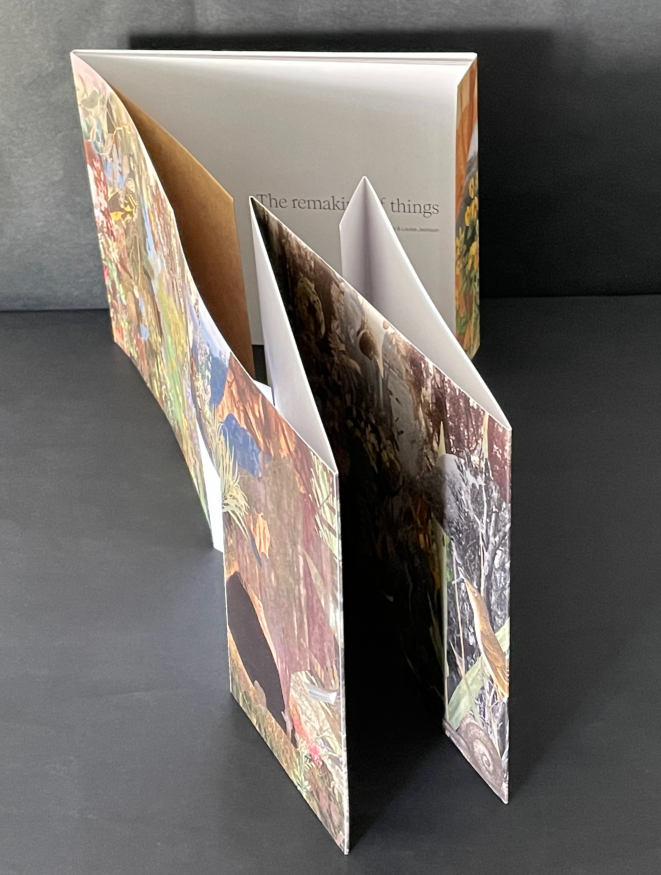
The Remaking of Things (2023) Gracia Haby & Louise Jennison Folded container with tab-and-slot closure, holding belly-band-secured front cover fold out, part of card cover casing a perfect bound book. Container: H186 x W228 x D15 mm. Book: H180 x W222 mm. [36] panels. Edition of 100, of which this is #25. Acquired from Vamp & Tramp, 21 May 2025. Photos: Books On Books Collection.
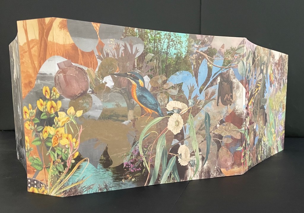
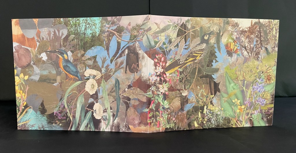
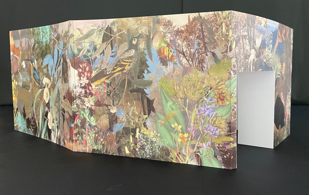
From 24 May through 20 August 2023, the Ian Potter Centre (NGV Australia) held hosted an installation of The Remaking of Things. This work produced for the exhibition comprises a silvery tab-and-slot folder, holding a casebound softcover artist’s book whose front cover opens into a desktop installation, making you wish for a sip of Alice’s “Drink me” potion or bite of the Caterpillar’s magic mushroom.
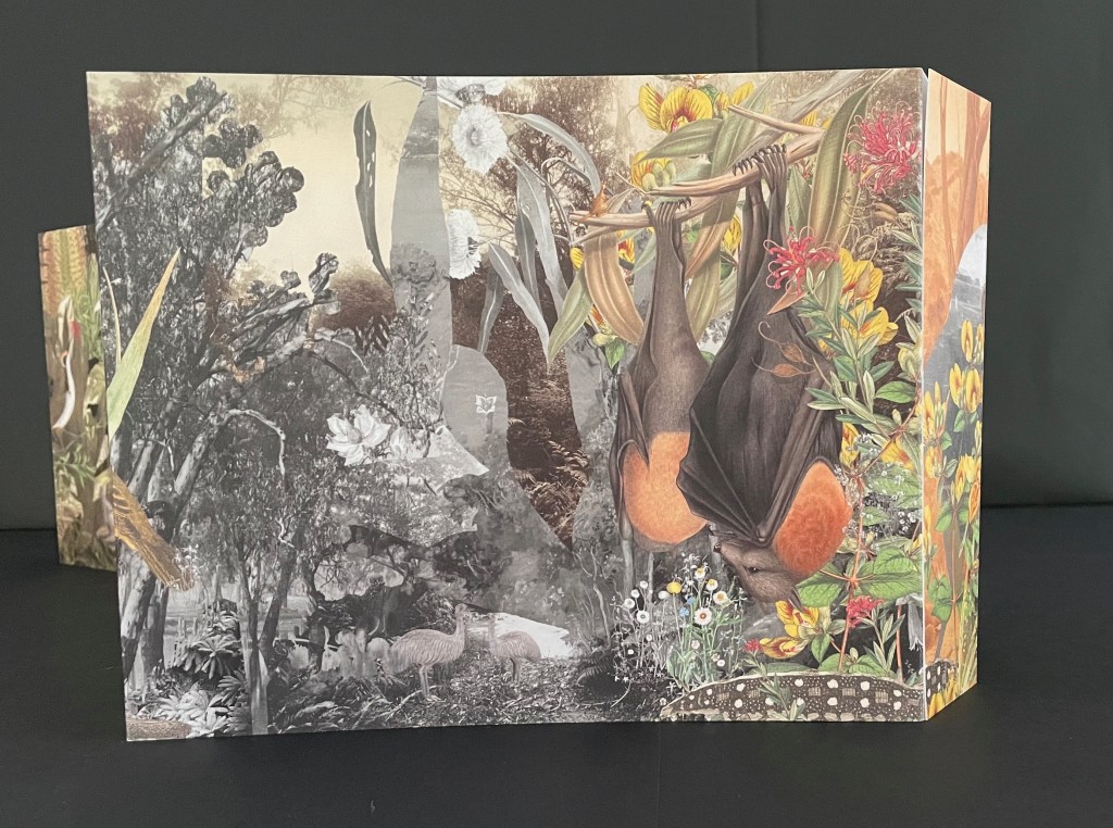
Tab-and-slot folder made of Silver Metalised Polyester satin paper 300 gsm, router cut, printed on a swissQprint inkjet printer. Image from Nicholas Caire‘s Fairy scene at the Landslip, Black’s Spur (c. 1878)
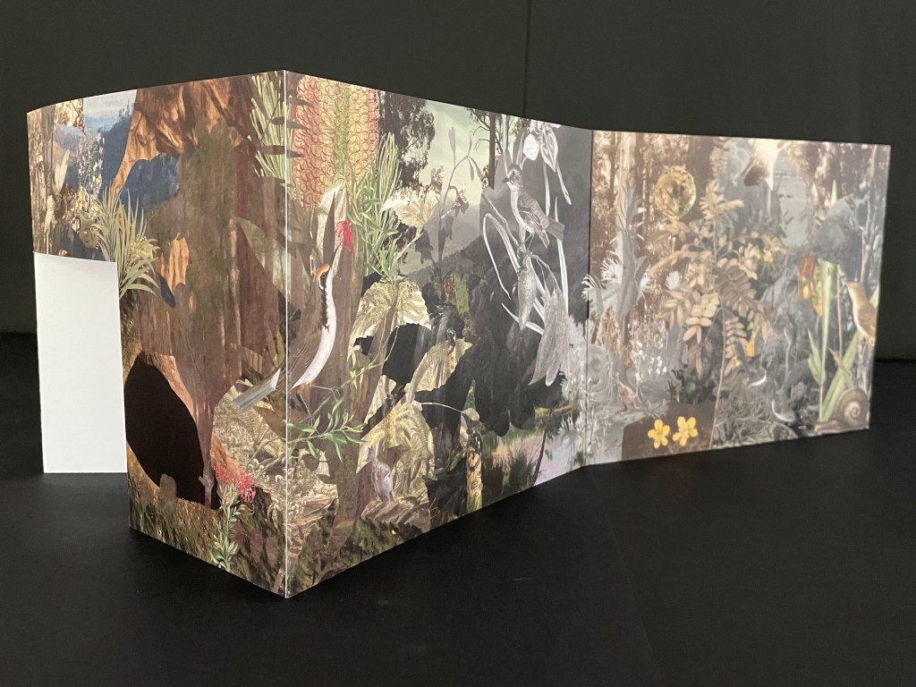
Although the work continues their archival poetics, drawing on “100 individual pieces in the NGV collection, spanning painting and photography by way of ceramics and silverware, textiles and works on paper”, it has its origin in Haby & Jennison’s restored eucalyptus forest habitat for the Grey-heading flying fox, the animal featured on the “wall” that serves for the front cover.
Front cover with and without belly band.
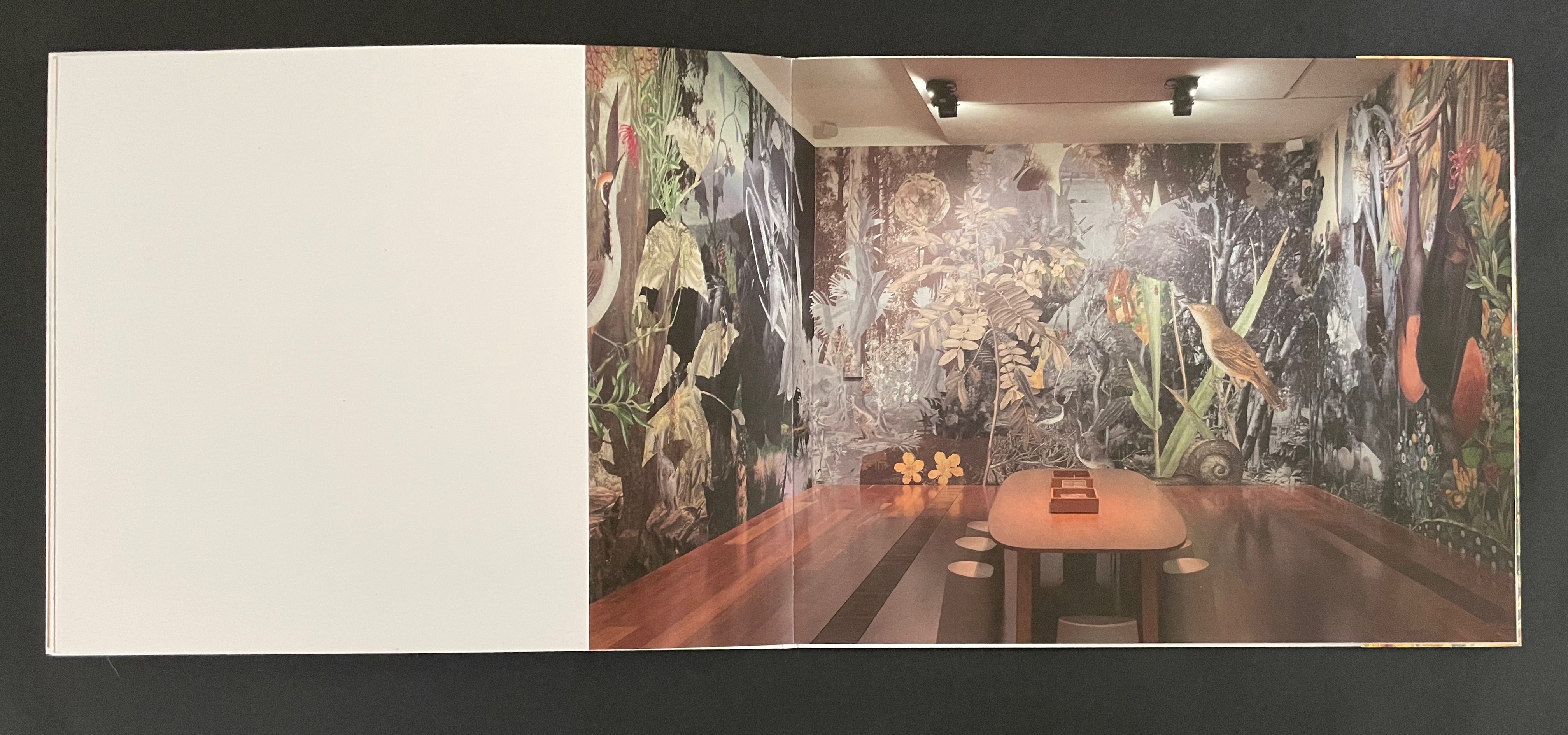
As the front cover unfolds, a double door appears, cut into one of the other walls. “Walking” to the right around the walls, you see the images that, enlarged, occupied the exhibition walls in Melbourne.
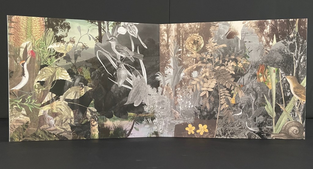
Within the exhibition rooms, a 24-minute for 24 hours sound track played as the lighting changed. Within the book, photographs of the exhibition rooms provide a sense of the visual experience and its scale.
The images within the book are likely to send you back to the images on your desktop installation. There, it is much easier to register James Sowerby‘s etching Tetratheca juncea (1793), John Lewin’s Warty-face Honey-sucker (1822), Richard Bunbury‘s Green native fuchsia (1844), Anne Paulson’s Sketches of Victorian bush flowers (c. 1861), Fanny Anne Charsley‘s The Wildflowers of Melbourne (1867), Eugene von Guérard‘s Ferntree gully (1867), Tom Humphrey‘s Summer walk (c. 1888), F.E. Striezel‘s Kookaburra carving (1915), A. Shelden‘s Possum and banksia (1920s), E.G. Adamson‘s Snow coral (1930s-40s), Grace Cossington Smith’s Bottlebrushes (1935), NASA’s Lunar Crater (1969), and the dozens of others listed in the center of the book that can be found on the NGV website. As Haby & Jennison indicate in the work, they “invite you to enter the pages of the book in a similar spirit as you would the gallery”. Across time, etchings, paintings, carvings, inkwells, snuff boxes, glass plate negatives, digital photographs and a host of other artefacts, they create a complex habitat of interconnectedness of art and species.
Given that aim, it is surprising that the fold-out cover is constructed for viewing around rather than within. Double-sided printing of the cover might have done the trick and offered an additional opportunity to show the change of lighting.
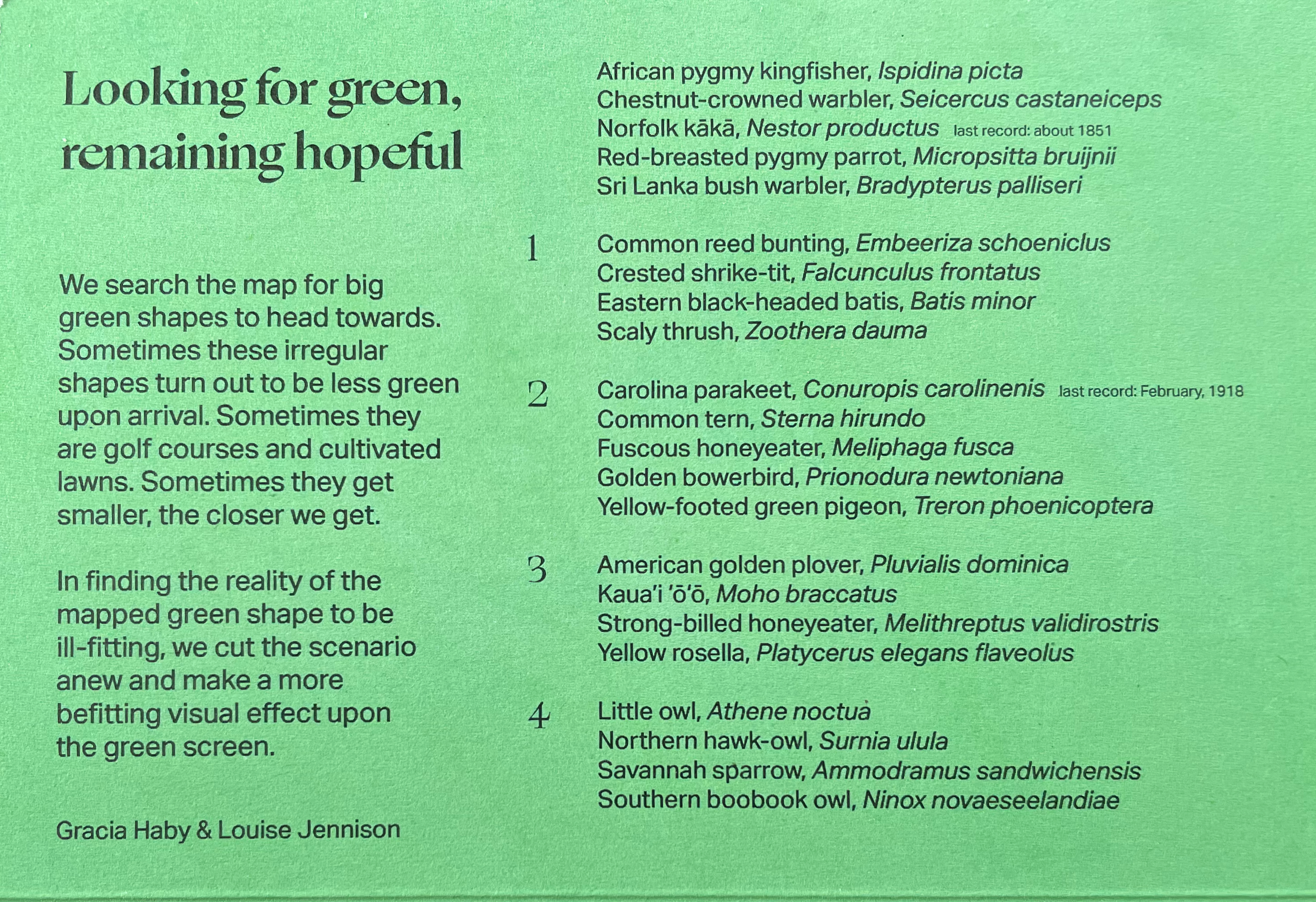
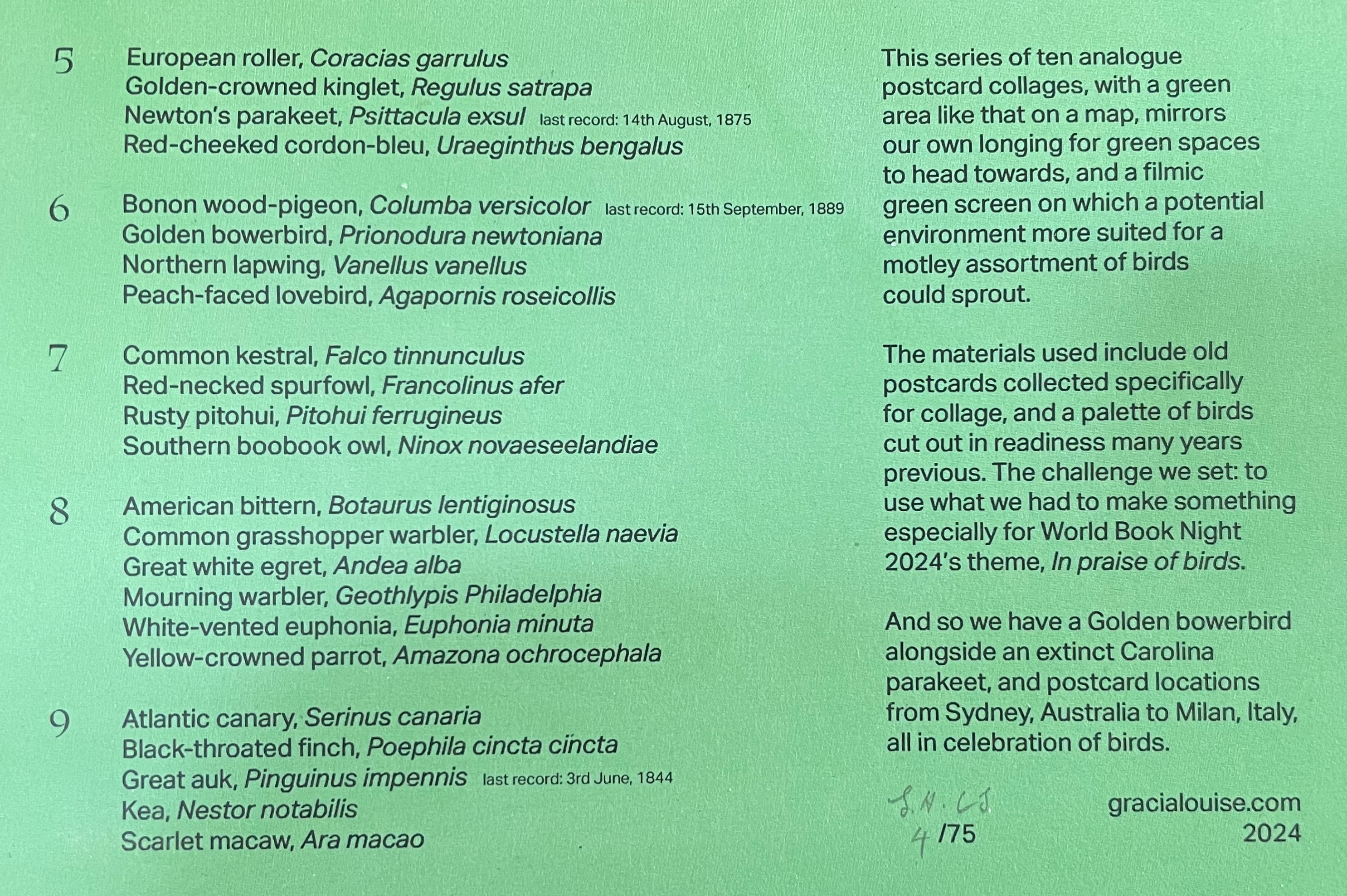
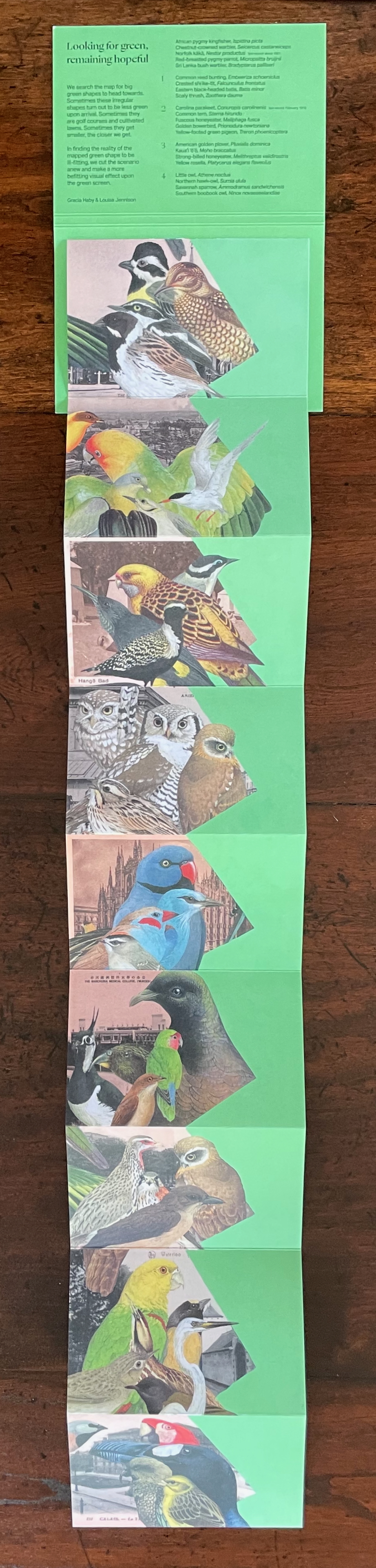
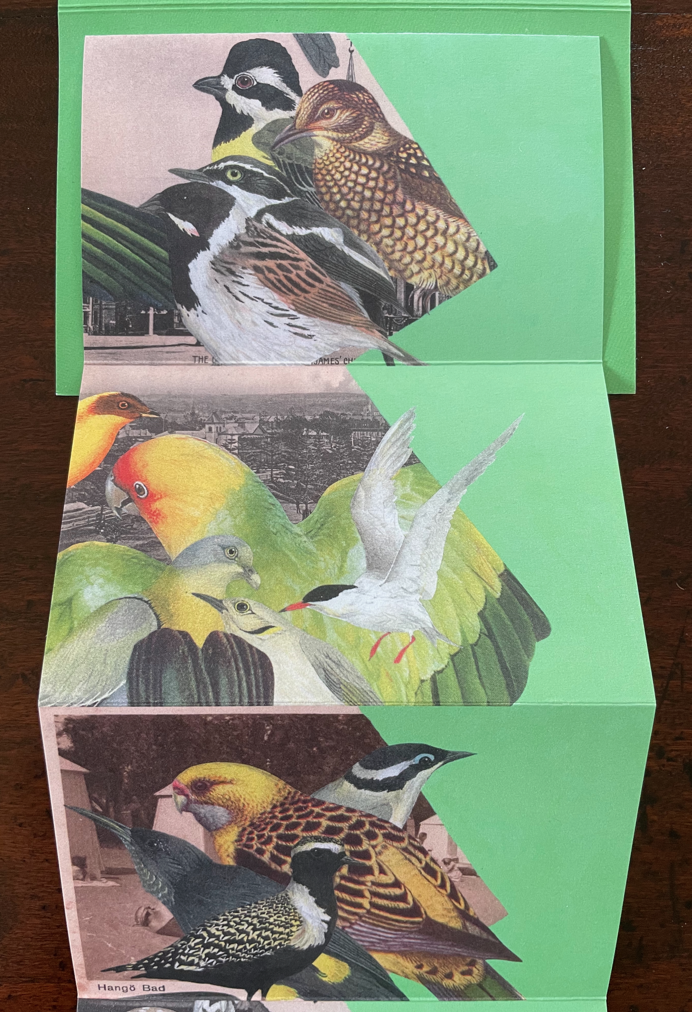
Looking for Green, Remaining Hopeful (2024)
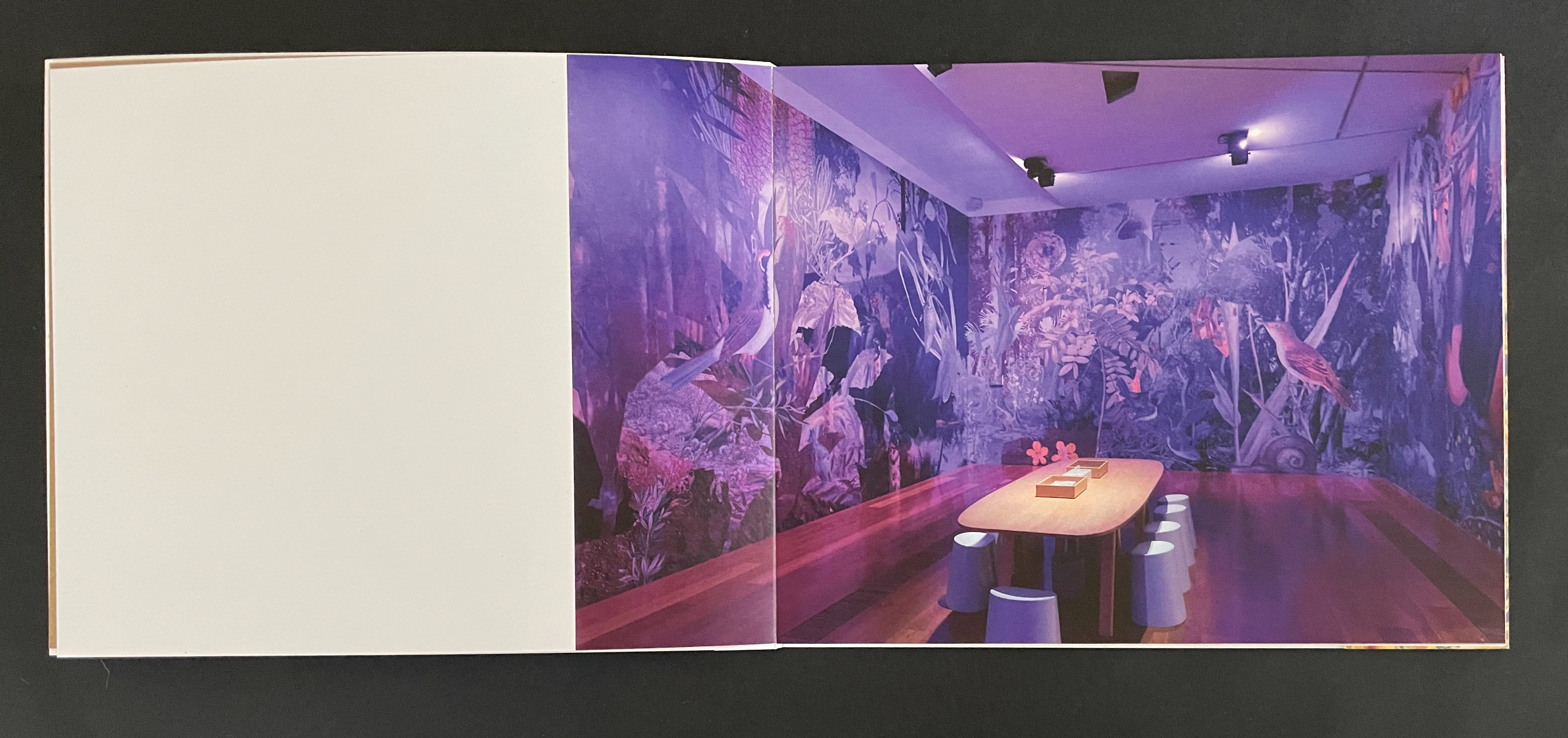
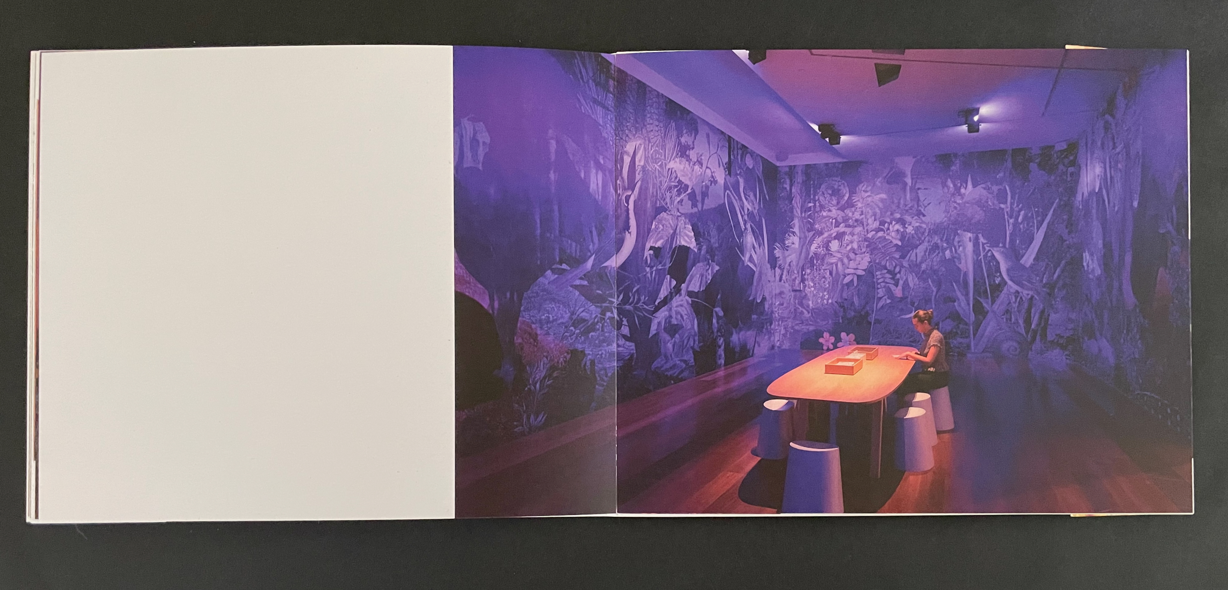
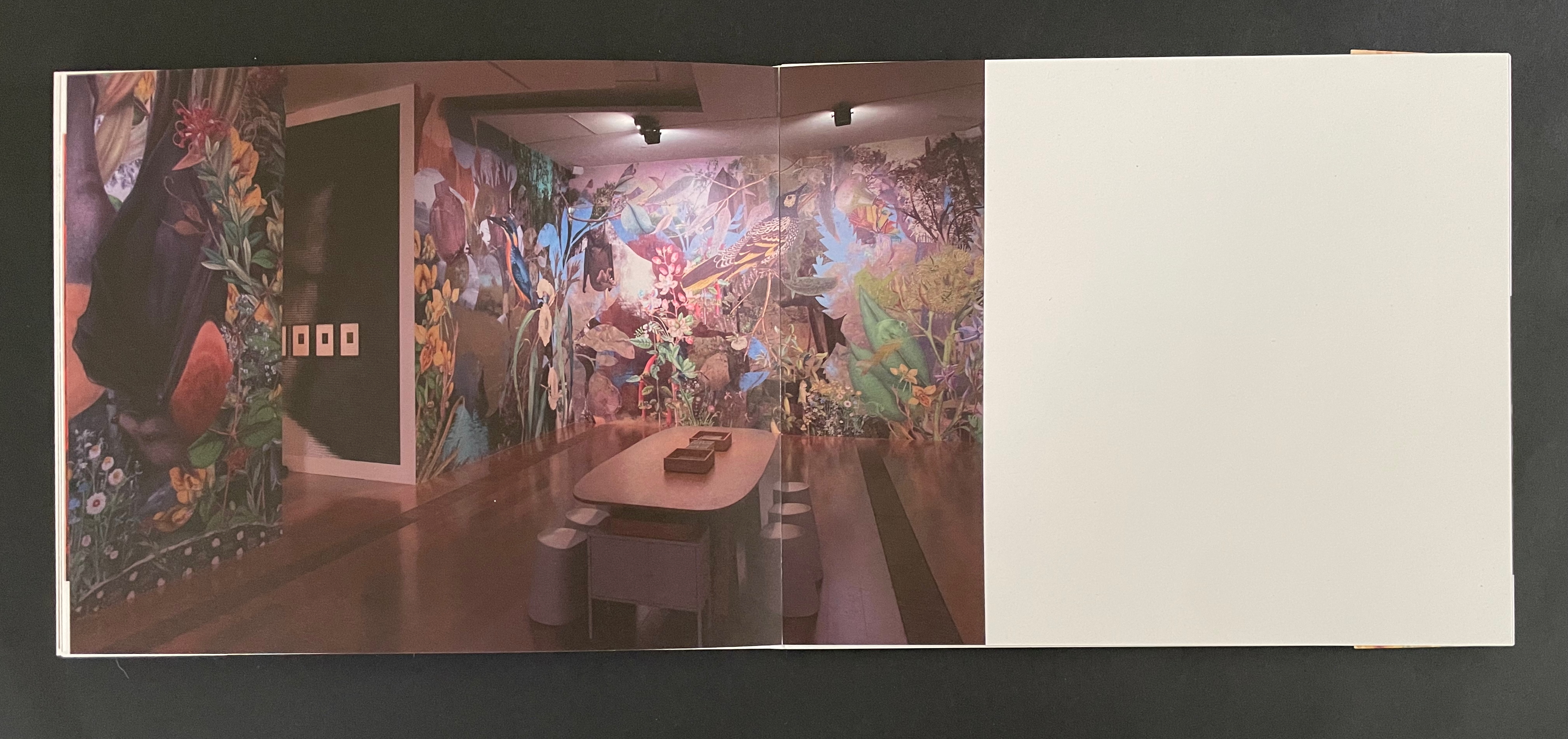
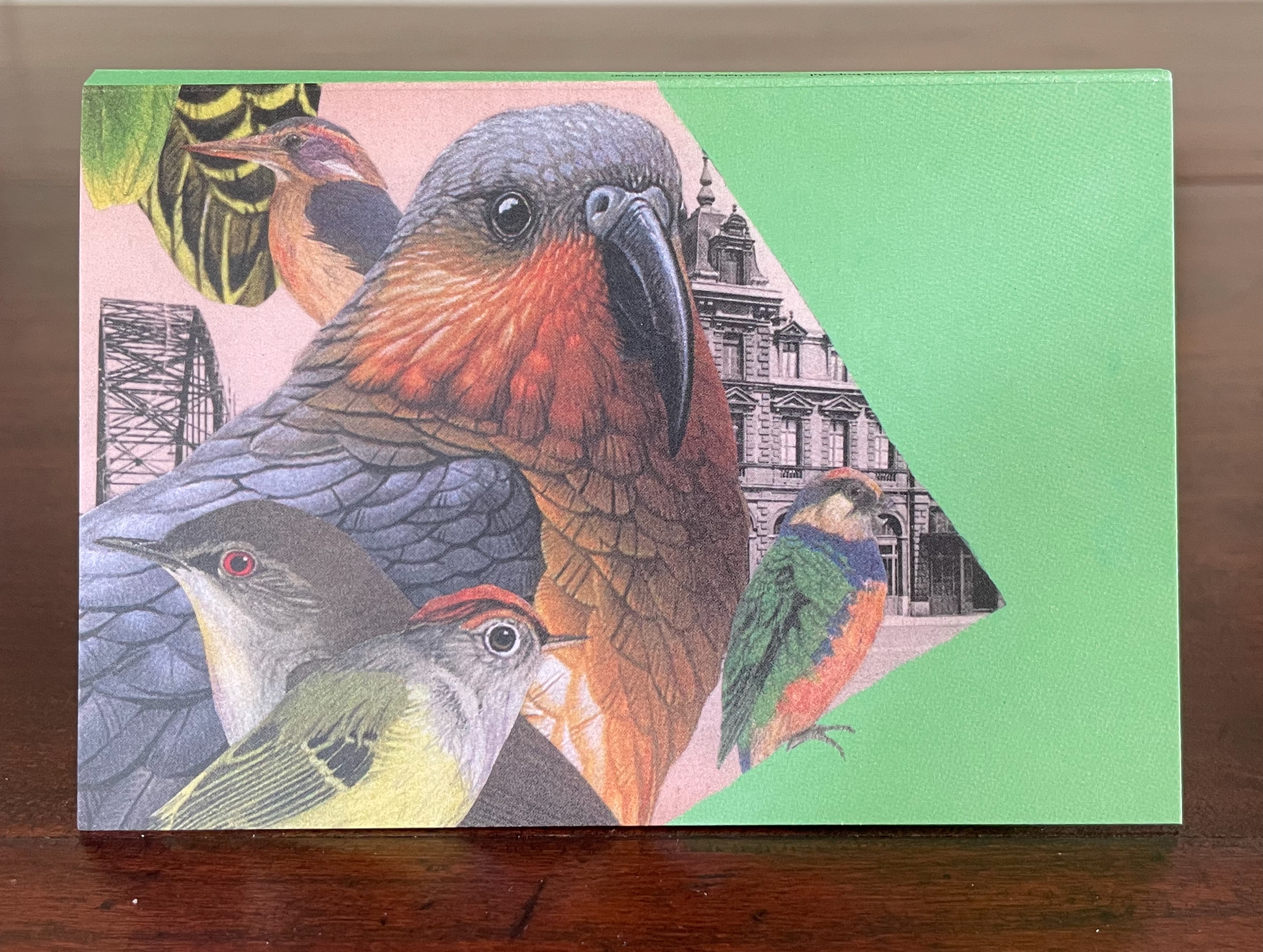
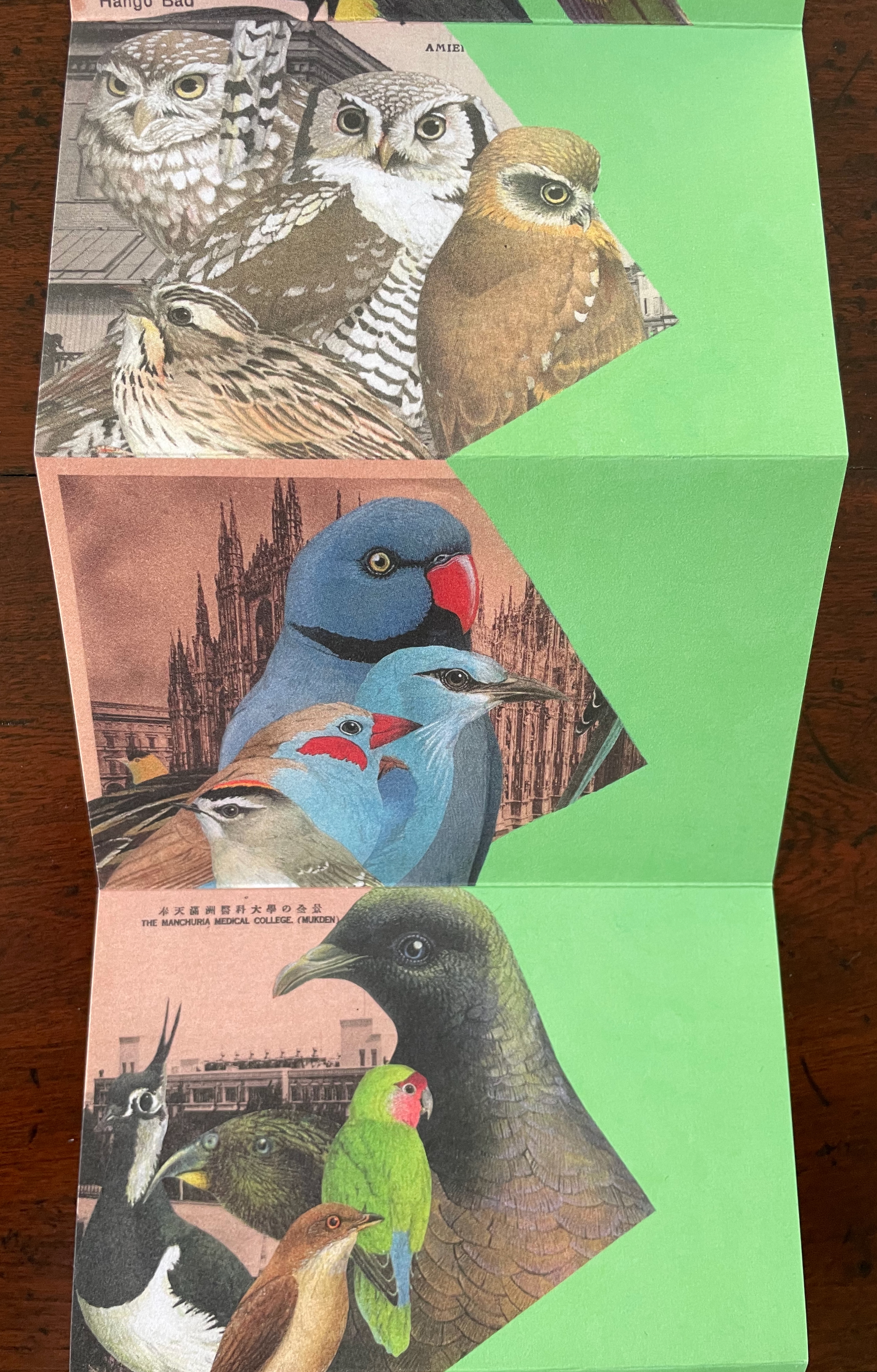
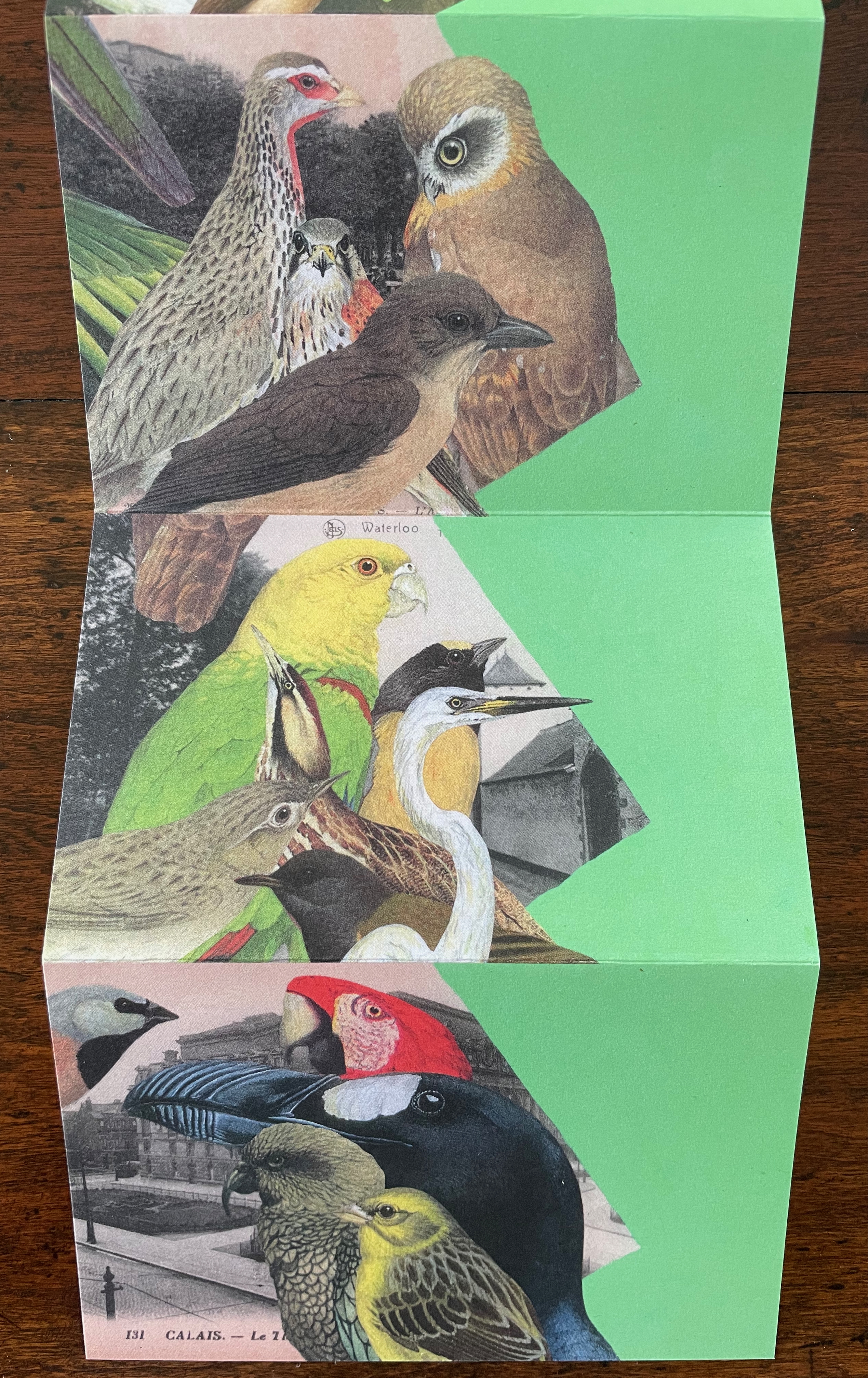
Looking for Green, Remaining Hopeful(2024) Gracia Haby & Louise Jennison Accordion book. H135 x W92 mm (closed), W802 mm (open). [9] panels. Edition of 75, of which this is #4. Acquired from the artists, 21 February 2026. Photos: Books On Books Collection.
World Book Night’s 2024 theme was “in praise of birds”. Using old postcards from various locations and cut outs collected over the years, Gracia Haby and Louise Jennison selected 45 birds to arrange in this vertical collage in response. The Indigo Digital CMYK used on ecoStar 100 gsm for the body and ecoStar 300 gsm for the cover delivers the vibrant avian colors against a chroma-key-like green screen background. The choice of the green screen effect has layers of significance. One layer is its obvious echo of the “green” choice of 100% recycled paper. Another, not so obvious, requires the textual explanation from the covers:
A green screen enables video makers to fill in the background or environment behind actors after filming. Haby & Jennison’s mimicry of it says that we need to provide these avian actors with more befitting environments than those in the sepia and gray toned backgrounds. Against the minatory background, the exuberant “motley assortment of birds” points in signposts to the “potential environment” left to be filled in on the green screen.
Despite its format, this is not a perforated pack of postcards to be detached and dispatched. You want to see and keep it all at once, as prompted by the vertical zigzagging against the green screen. But you will want also to examine it panel by panel, as prompted by the key on the covers and the detail of the images. In doing so, you sense the celebration and take the warning that this conference of birds being celebrated may disperse into extinction as has happened with the Norfolk kākā (last recorded sighting, about 1851), Carolina parakeet (last recorded sighting, February 1918), Newton’s parakeet (last recorded sighting, 14 August 1875), Bonon wood-pigeon (last recorded sighting, 15 September 1889), and Great Auk (last recorded sighting, 3 June 1844).
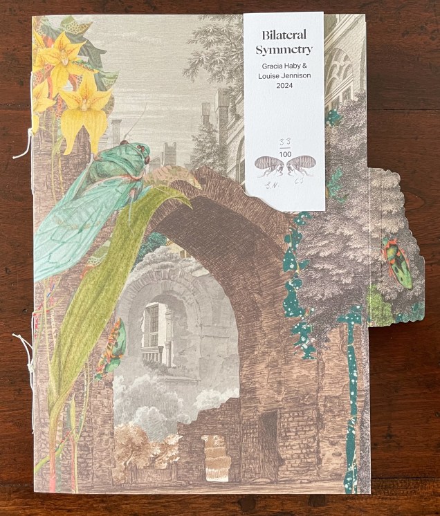
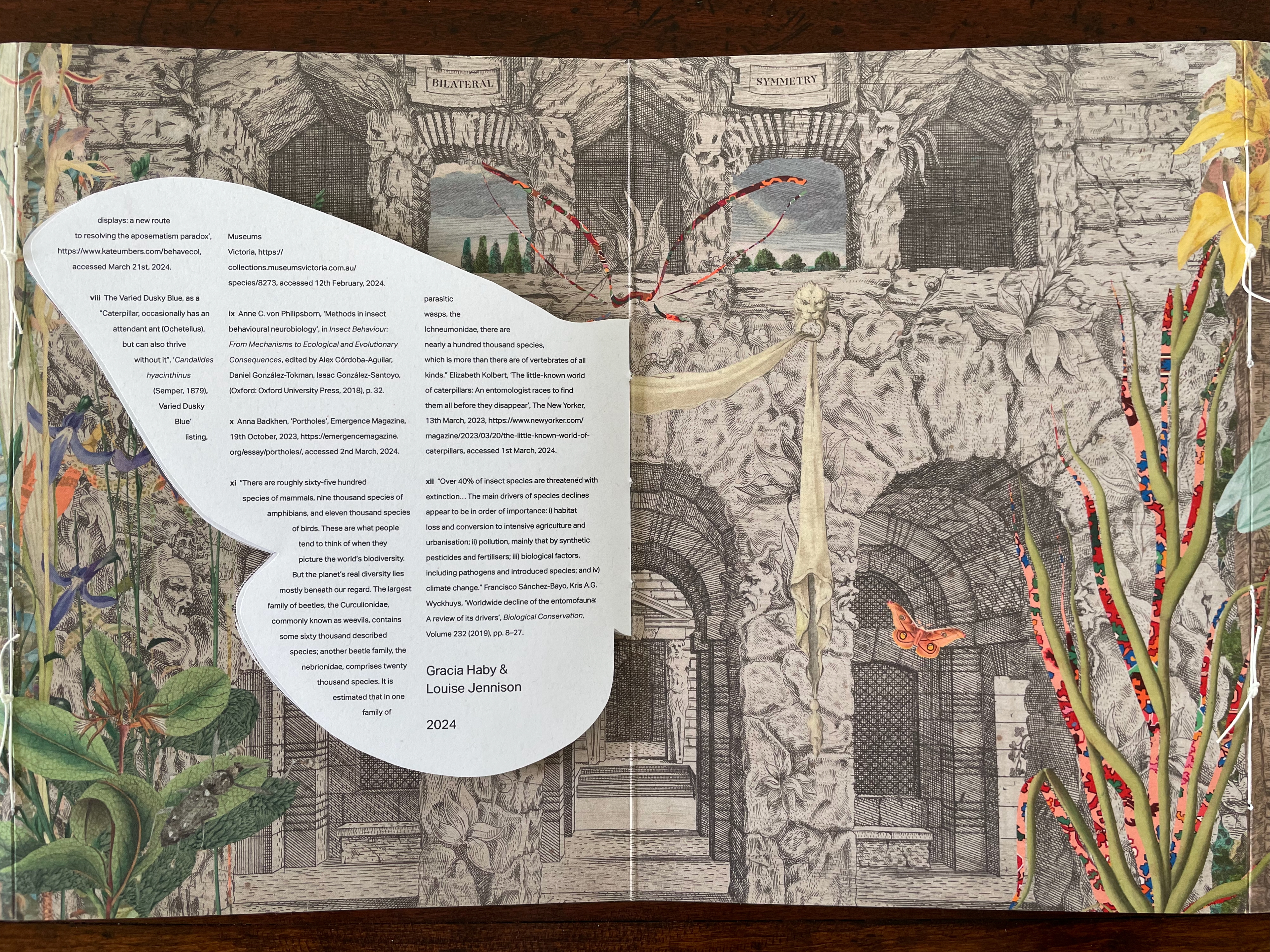
Bilateral Symmetry (2024)
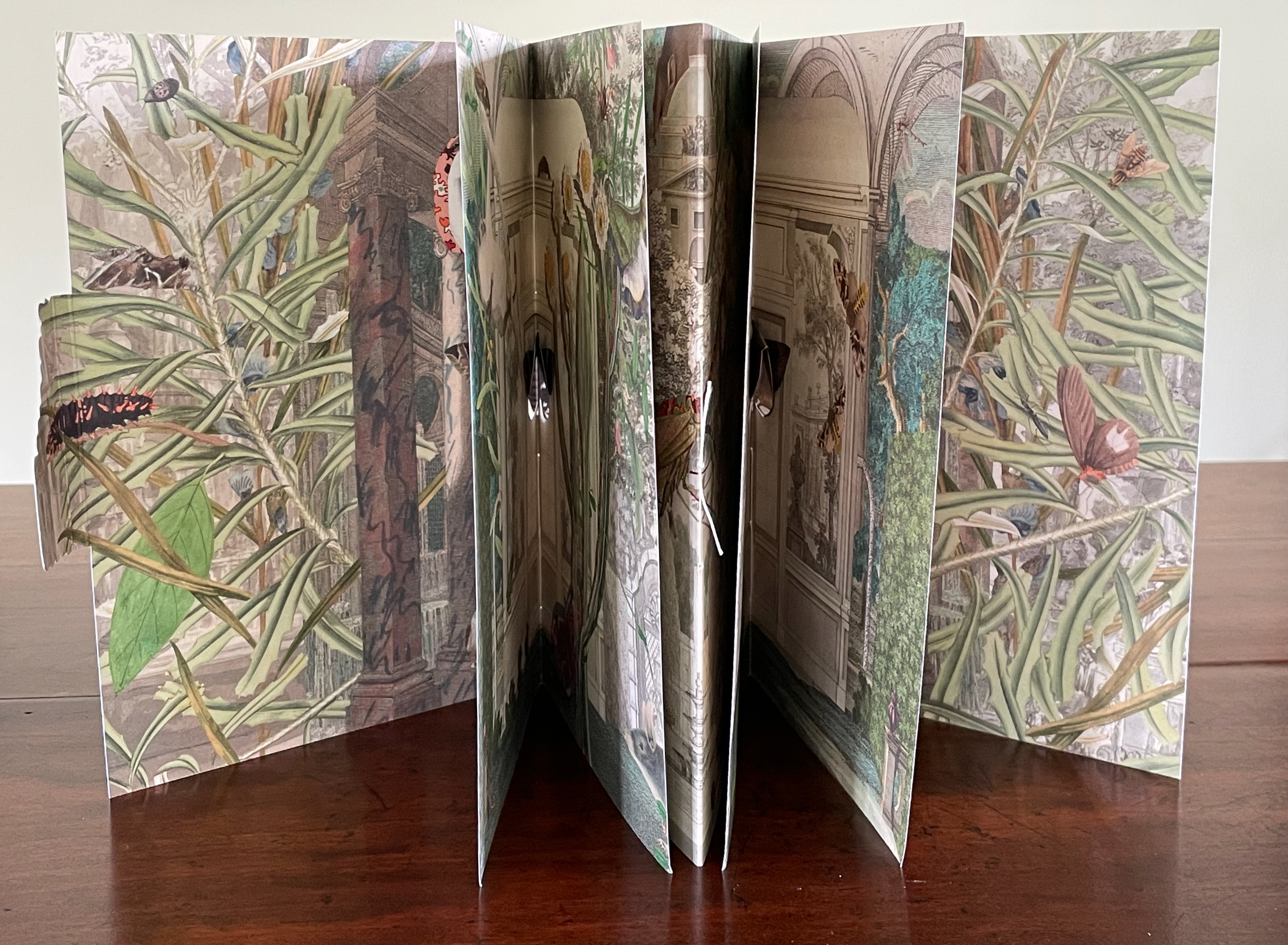
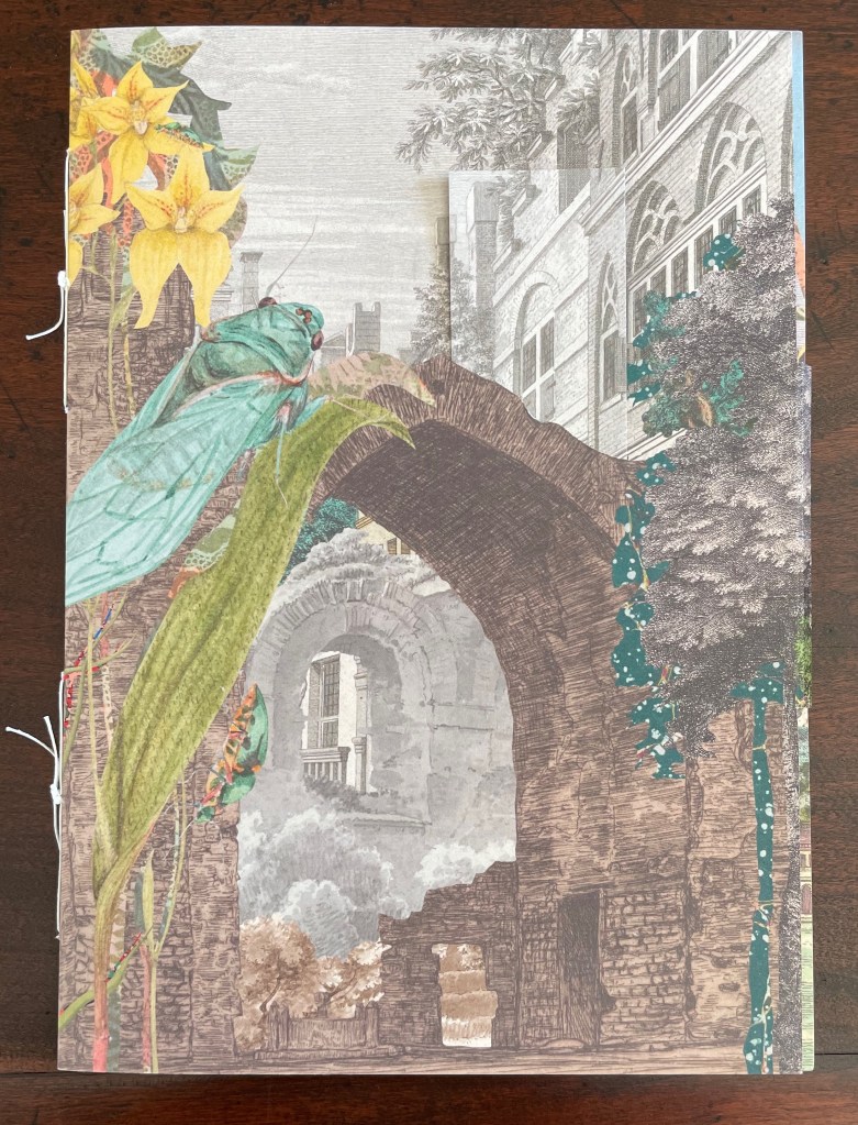
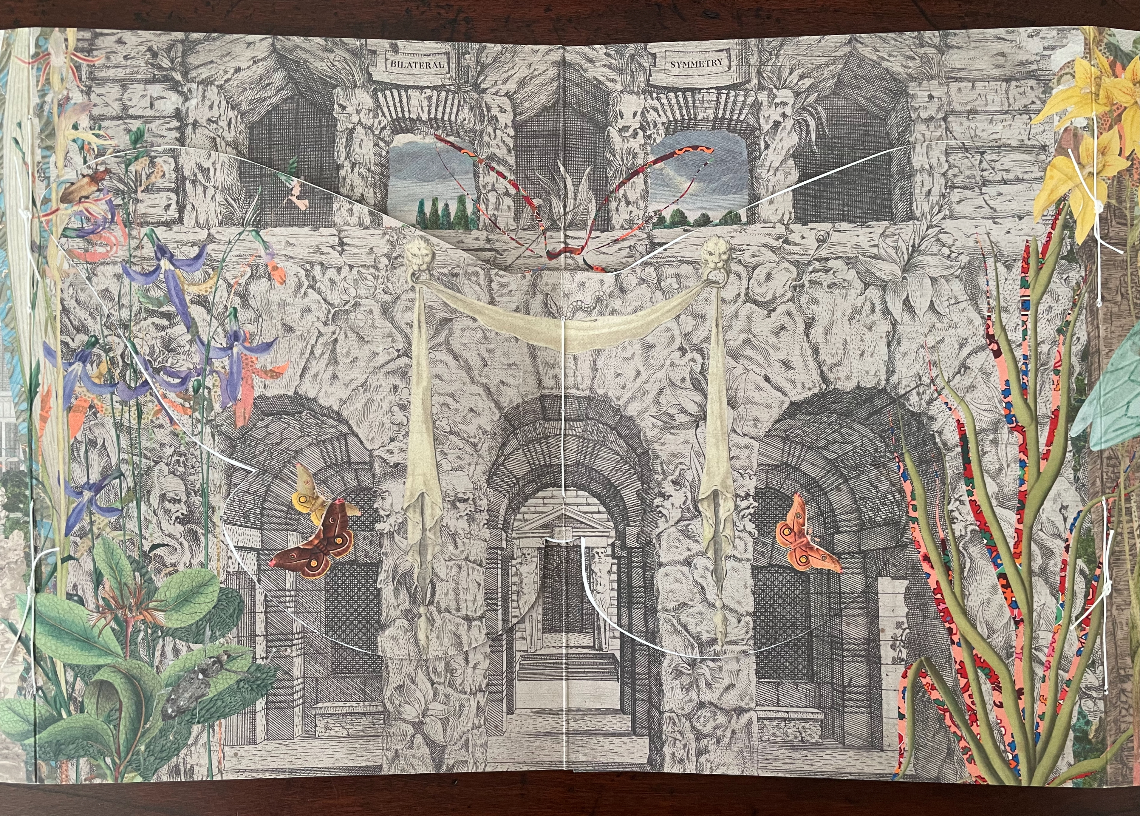
Bilateral Symmetry(2024) Gracia Haby & Louise Jennison Self-enclosing barn-fold artist’s book with tab-and-slot closure, pamphlet stitched, and pop-up components. H240 x W174 mm. [24] pages. Edition of 100. Acquired from the artists, 21 February 2026. Photos: Books On Books Collection.
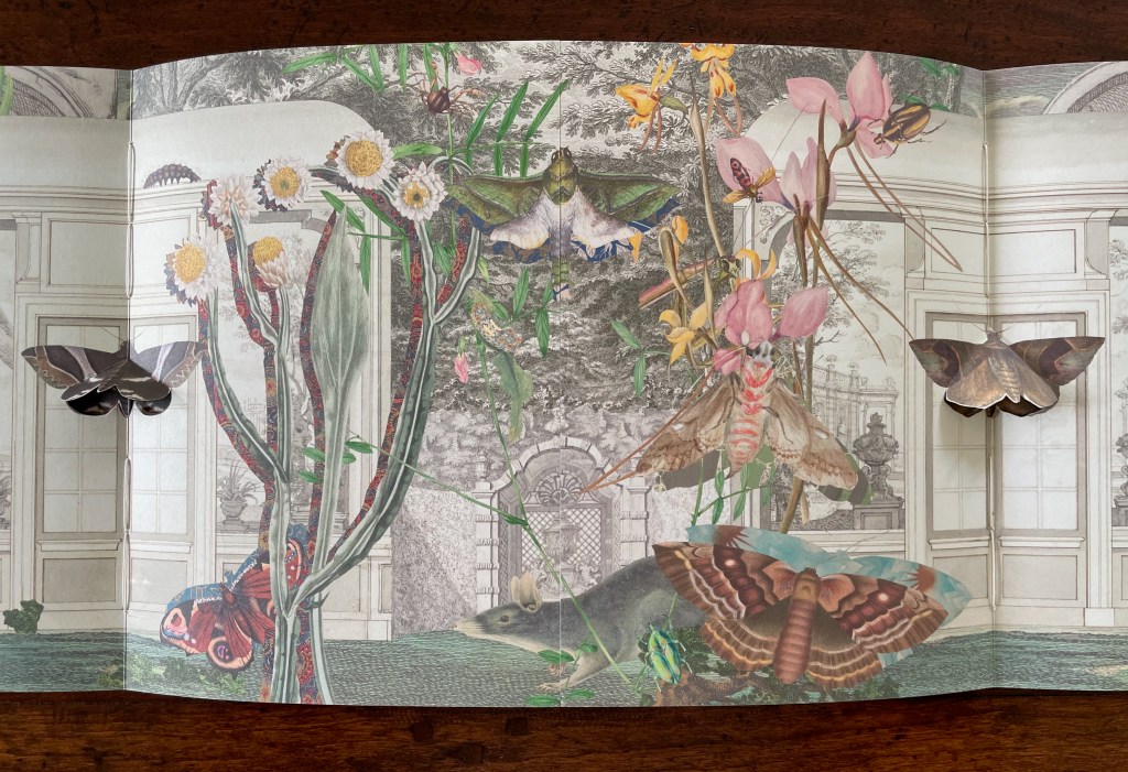
Bilateral Symmetry (2024) is the most successful of the four of artist’s books in the collection. Every element supports its exploration of perception and bilateral symmetry: the sewing, the barn-fold structure, cut outs and pop-ups, the page spreads and alignment, the choice of imagery from the natural world and architecture, and presentation of text across moth-shaped pages.
From the start, it combines surprising trompe l’oeil with startling juxtapositions. On the front cover, a bookmark aligns with the architecture behind a ruined arch overseen by a giant lacewing perched on a tree-size plant leaf.
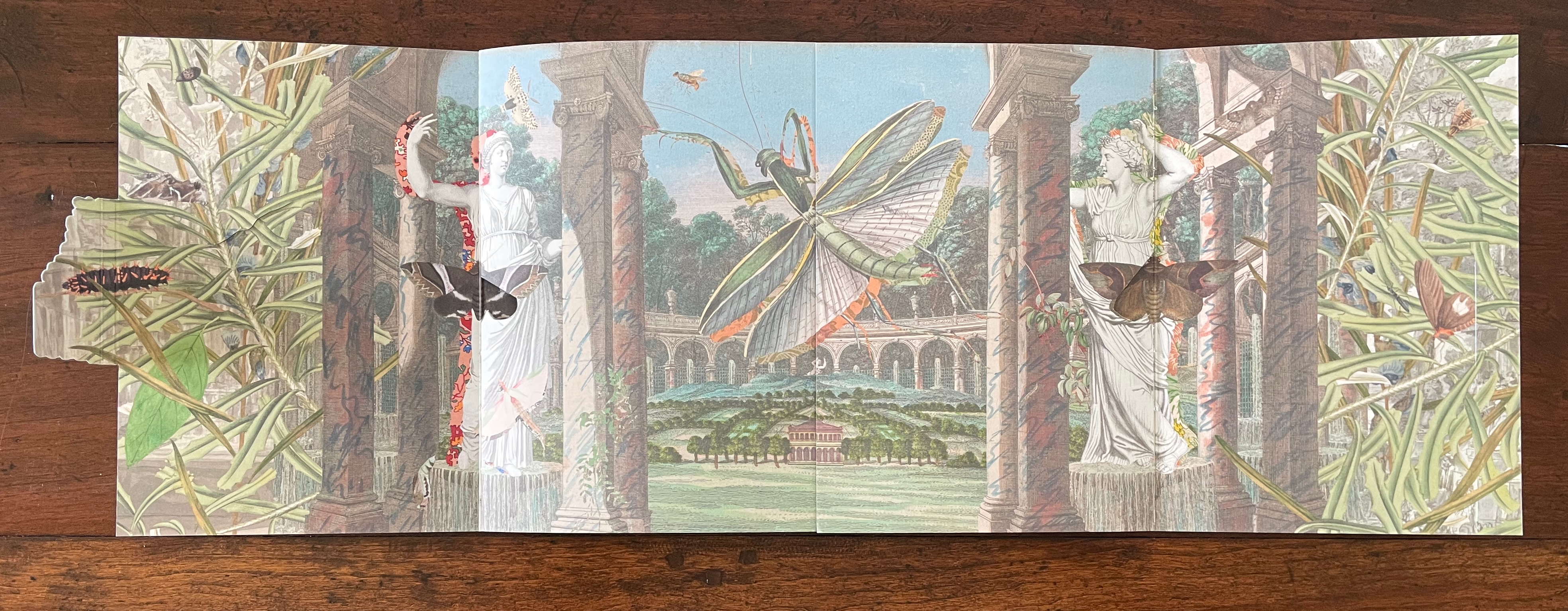
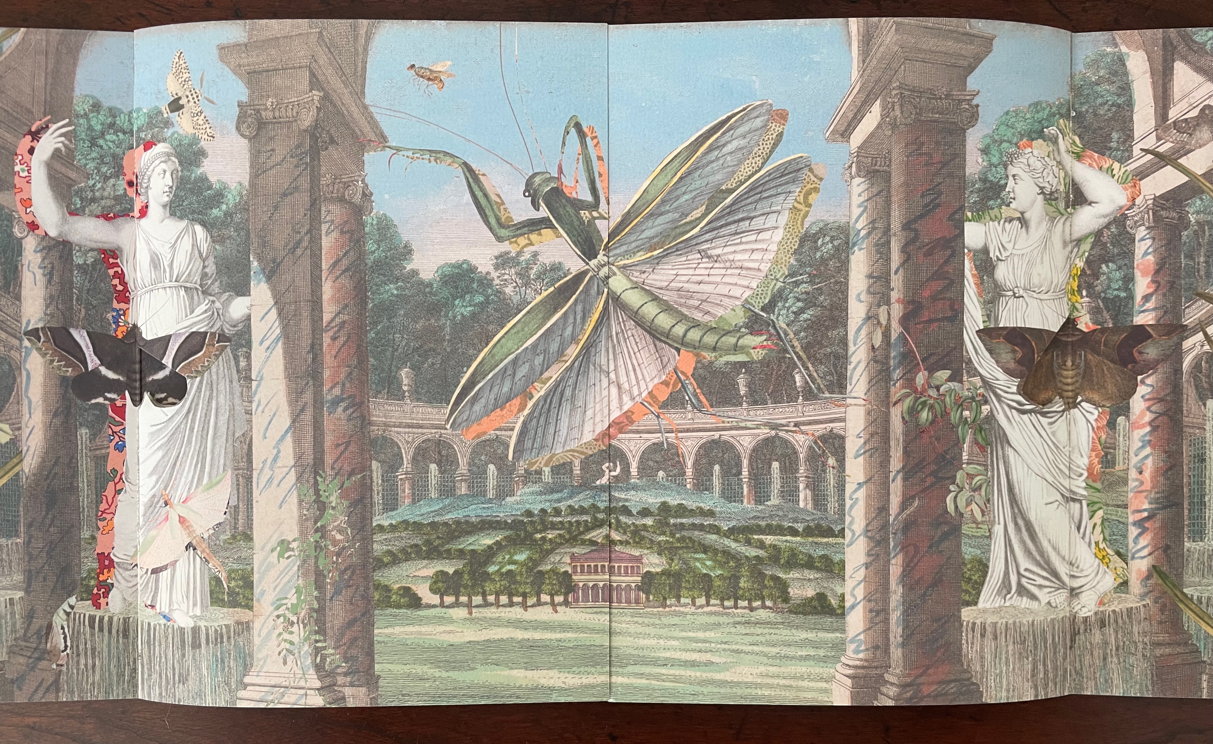
Opening the barn-fold book reveals a new set of perspectival surprises. Inside, there are two booklets facing each other. The edge of the recto page of the booklet on the left aligns with the edge of the verso page of the booklet on the right to form an image across a four-page spread. Between the two foregrounded columns and statues, we see a neatly divided and aligned building in a small formal landscape. Beyond the building and landscape, an arcade with statuary curves symmetrically to the left and to the right. In fact, the arcade extends in a circle that comes around to the columns and statues through which we are looking. But the proportions are impossible or, at least, surreal. Of course, the huge dragonfly, also neatly split by the pages meeting in the center, offers a strange perspective especially alongside the collage of other insects. Even the marbled columns offer peculiarities. Some are rounded, some are squared, some start square at the foot but end rounded at the capital. And the statuary, collaged with insects, are shadowed with bright marbled patterns.
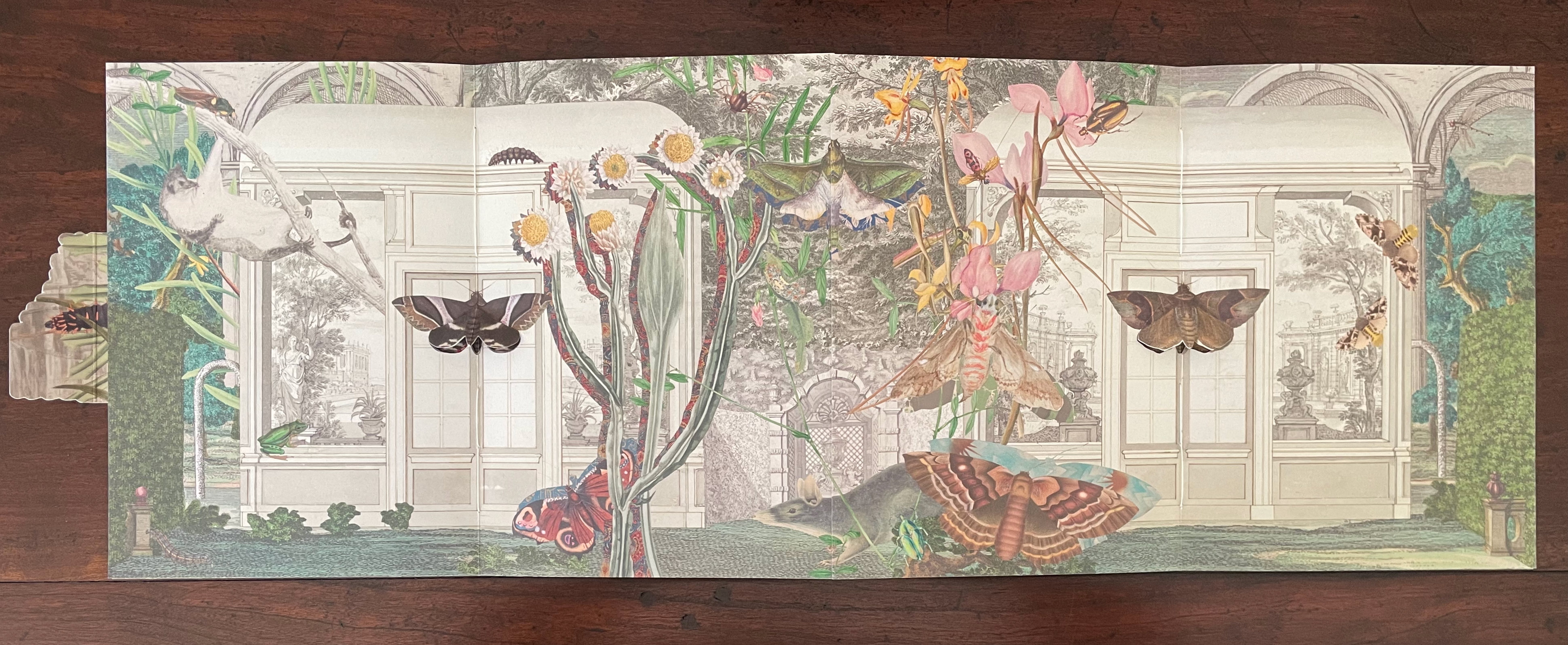
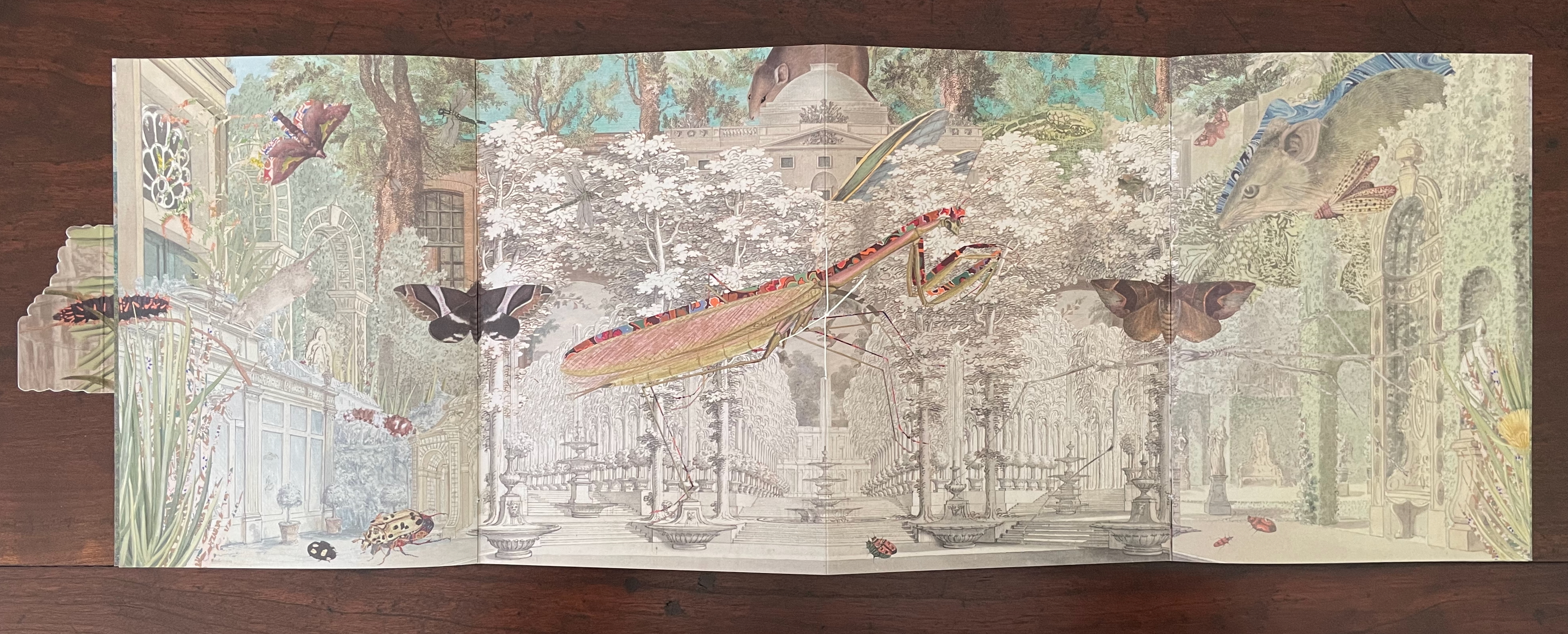
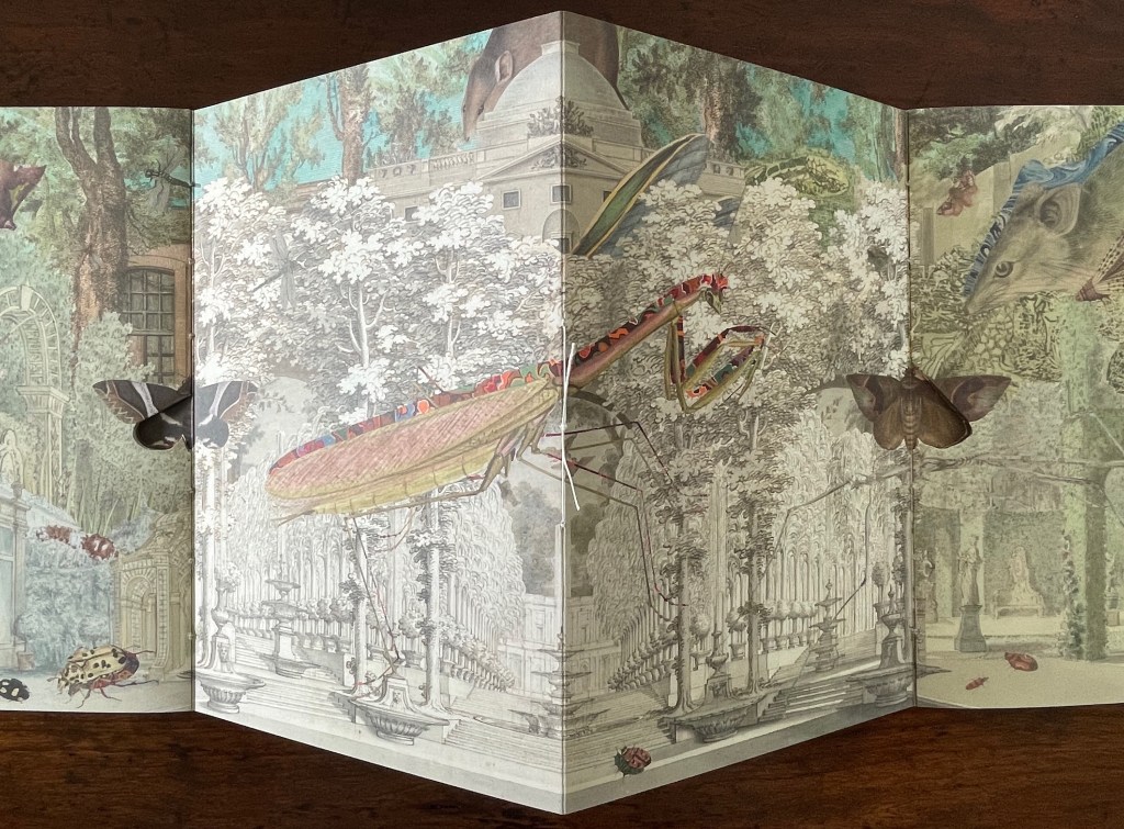
With the turn to the next set of facing spreads, the two statues and view through the arcade disappear, yet the moths that were posed against them remain as lepidopteral pop-ups against double doors in the middle of seemingly detached greenhouse walls. On the left, a flying squirrel attributed to Louisa Atkinson (ca. 1849-72) hangs from a branch intruding through an open arch in the wall. Diversity and trompe l’oeil strain at the work’s bilateral symmetry.
The final spread on this side of the book displays further distortions challenging our perception — even of bilateral symmetry but somehow nevertheless underscoring the theme. The Scotts’ pop-up moths, each centered a booklet’s spine, are flanked by Atkinson‘s far too small ringtailed oppossum on the left and by Gerard Kreft‘s far too large water rat to the right, peering down on the scene. The huge mantis in the center hangs mid air against the formal tree lined garden abnormally far in the background. The garden is perspectivally more distant than the domed edifice behind it, and an impossibly large rodent peeps over it. Although the central rodent and mantis are not symmetrically divided, and although the scenes to the left and right of the spine are not symmetrical, the central spine bisects the garden and dome precisely. Likewise the left and right spines bisect the Scotts’ moths precisely, underscoring the theme of bilateral symmetry. Meanwhile, the spreads have reiterated the point about the variety and diversity of insects, flora, and mammals.
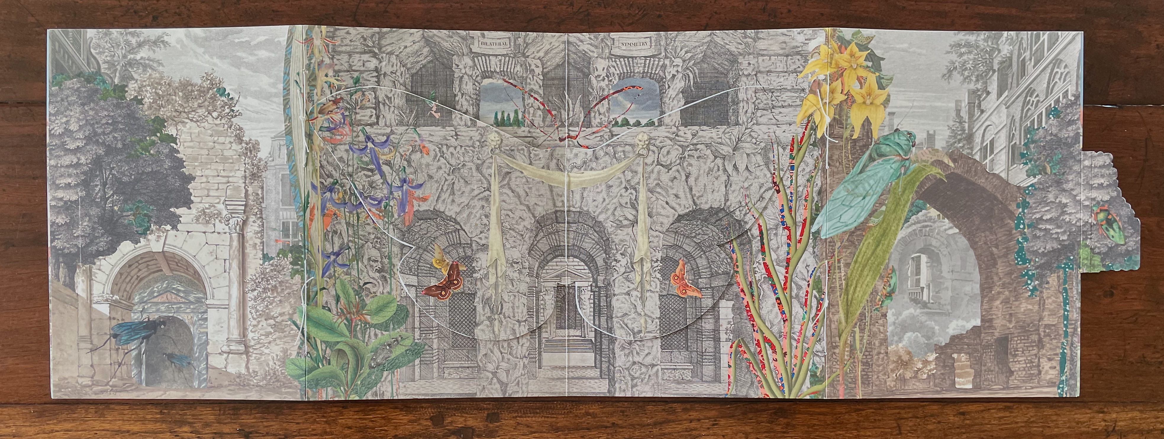
On the reverse side of the book, between the splayed-out back and front covers of the two booklets, a cut out moth with wings spread disappears in trompe l’oeil fashion into the facade against which it has alighted. Above the moth, the two-word title of the book appears on two engraved banners hanging over the two parallel open archways centered between two shuttered archways. Two Harriet Scott Emperor Gum moths hover in the two archways shown on the lower lobes of the cut out moth’s wings. (Did I mention how every element supports the exploration of bilateral symmetry?)
The book’s text appears on the reverse side of the cut out moth’s wings. As you turn to the first wing/page of text or turn to the last wing/page, you may notice how the two Emperor Gum moths have “jumped” from the cut out’s wings to the background underneath each wing. A sort of slow motion persistence of vision, it is another perceptual trick alongside the trompe l’oeil of the cut out moth.
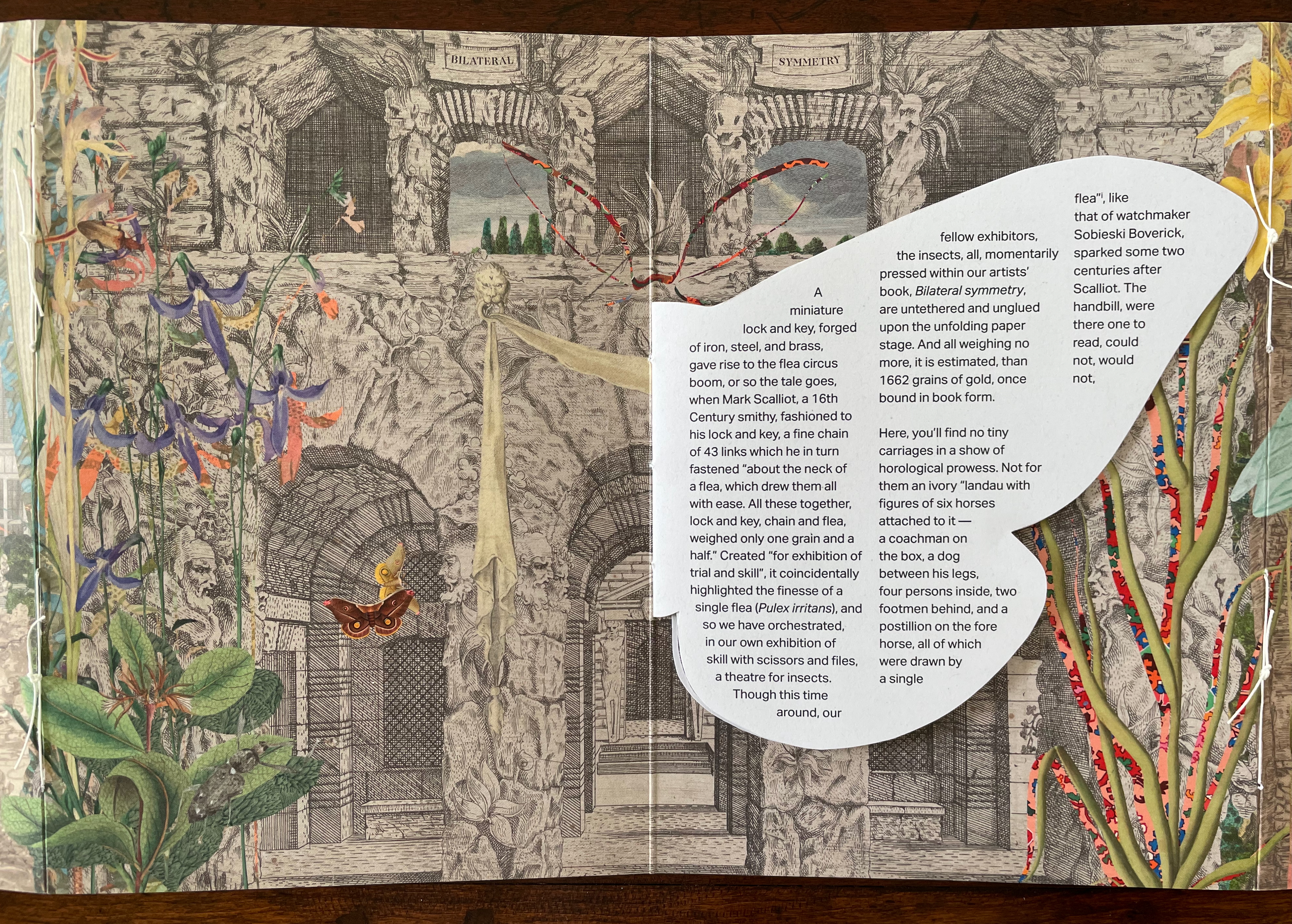
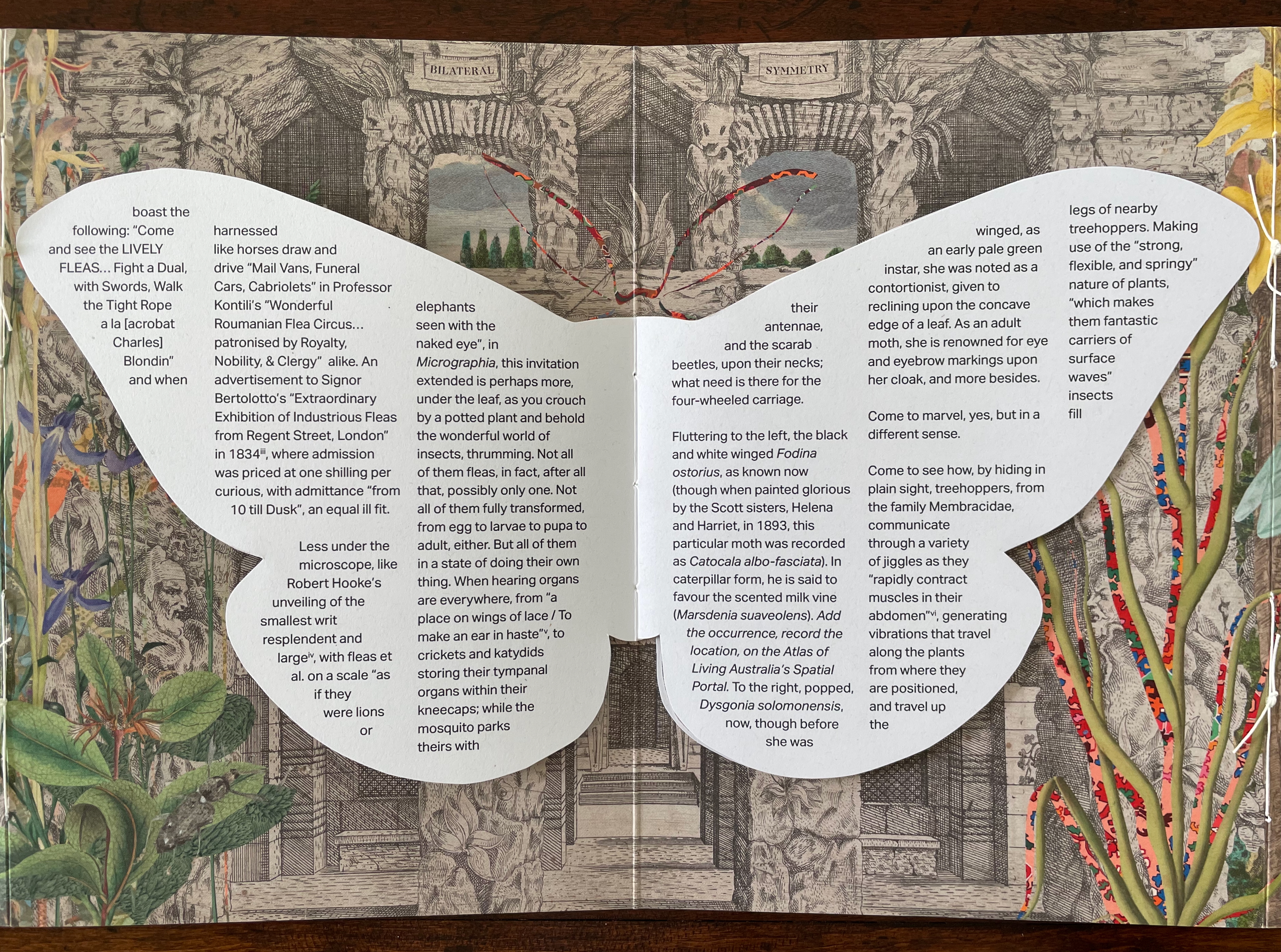
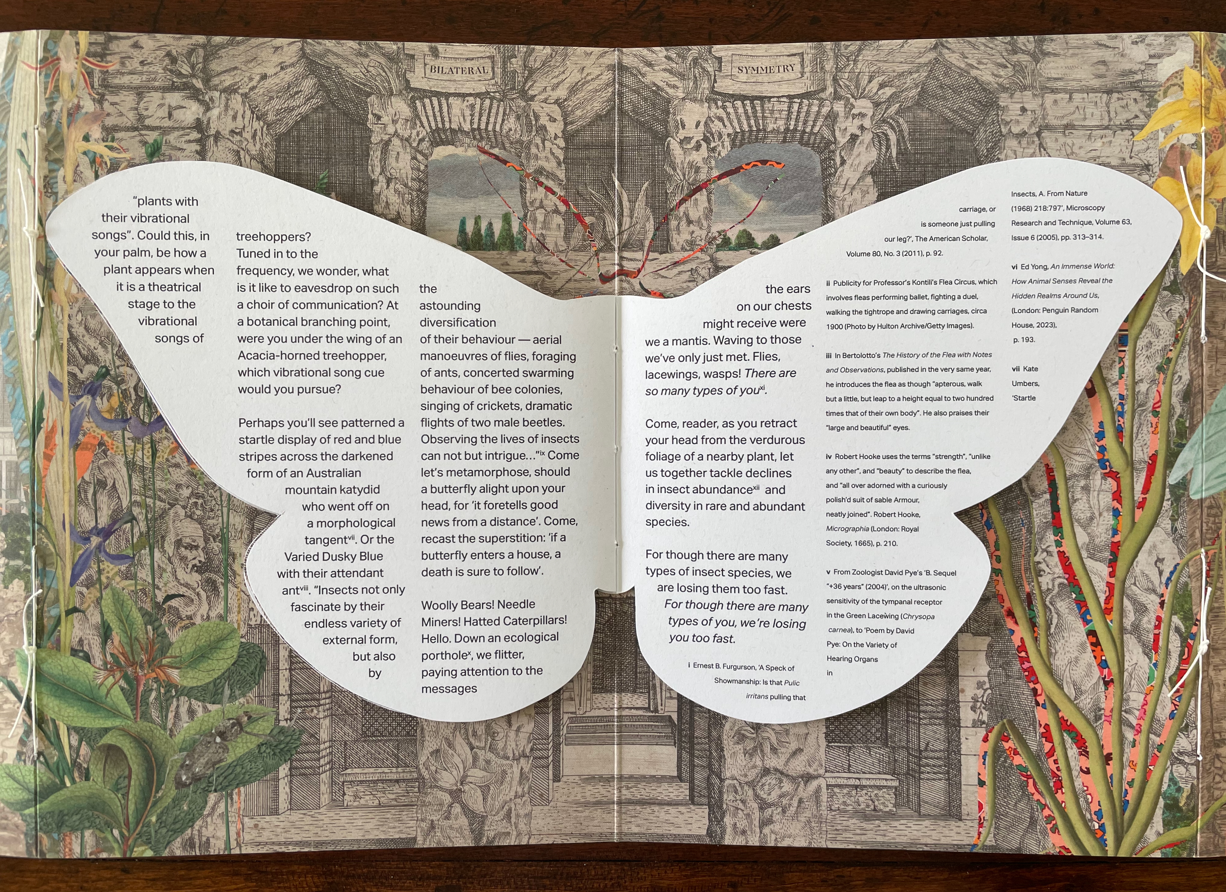
The first paragraph of text picks up on this theme of visual legerdemain by recalling the first flea circus impresario Mark Scalliot. That is a rhetorical means of introducing Bilateral Symmetry as a “theatre for insects” and posing the depicted insects as “fellow exhibitors”, which in turn is a rhetorical sleight of hand by which Haby and Jennison place themselves and the insects on an equal footing as performers and artists. The equation elevates the insects from the hucksterism of the flea circus — “Not for them an ivory “landau with figures of six horses attached to it ….” and, in the next paragraph, even raises these performers over Robert Hooke’s fleas as large as “elephants seen with the naked eye”. The exhibitors of Bilateral Symmetry invite you to better Hooke’s microscope by crouching “by a potted plant and behold[ing] the wonderful world of insects, thrumming”.
Leaning into entomomorphism, the artists invite us “[d]own an ecological porthole [to] flitter, paying attention to the messages the ears on our chests might receive were we a mantis”. Familiar by now with the artists’ message, we know this leads to the ecological observation of declining diversity, but up to this point, their artistry has been primarily about visual perception. This is not to gainsay the message, but as important as the message is, their marvelous handling of the media (the archival sources, the innovative book structure, and the collage) and reorienting of our perspective do more than simply make us receptive to it. Only in its final two paragraphs does the text exhort the reader to care and do something about the decline in insect diversity. The paragraphs preceding them conjure a world of insect perception and behavior that is as surreal as the whimsical perceptual distortions of the collage. The collage may include insects registered as endangered, but the text does not identify them. If text and collage were to have included endangered insects such as the Angled Tiger butterfly, Beautiful Petaltail dragonfly, Illidge’s Ant-blue (Butterfly), Queen Alexandra’s Birdwing Butterfly, Fan-winged Katydids, or Zaprochilus ninae (Bush crickets), might we have arrived at the same exhortation on our own?
With its blend of architectural ruins and artificial landscaping with oversized and undersized insects at various stages of metamorphosis, Bilateral Symmetry urges a shift of perspective in our perception of nature and our interconnectedness. With its structural embodiment of bilateral symmetry and diversity, it offers a rich example of the perceptual and perspectival shift it urges.
Further Reading
“Carol Barton“. 10 August 2024. Books On Books Collection.
“Caren Florance“. 30 April 2026. Books On Books Collection. In particular, see L OO P (2019).
“Ernst Huebner“. 21 July 2023. Books On Books Collection.
“Willow Legge“. 16 February 2021. Books On Books Collection.
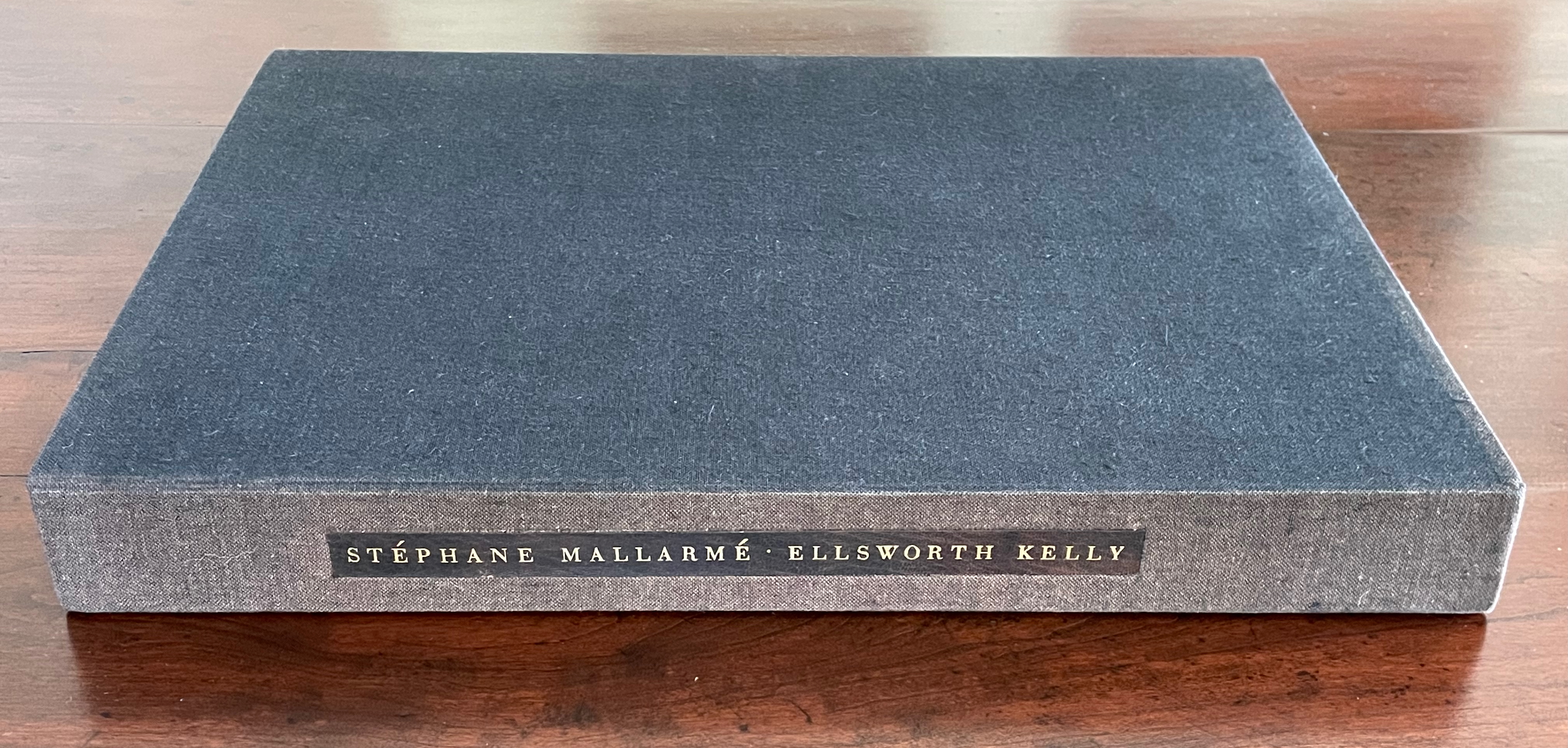
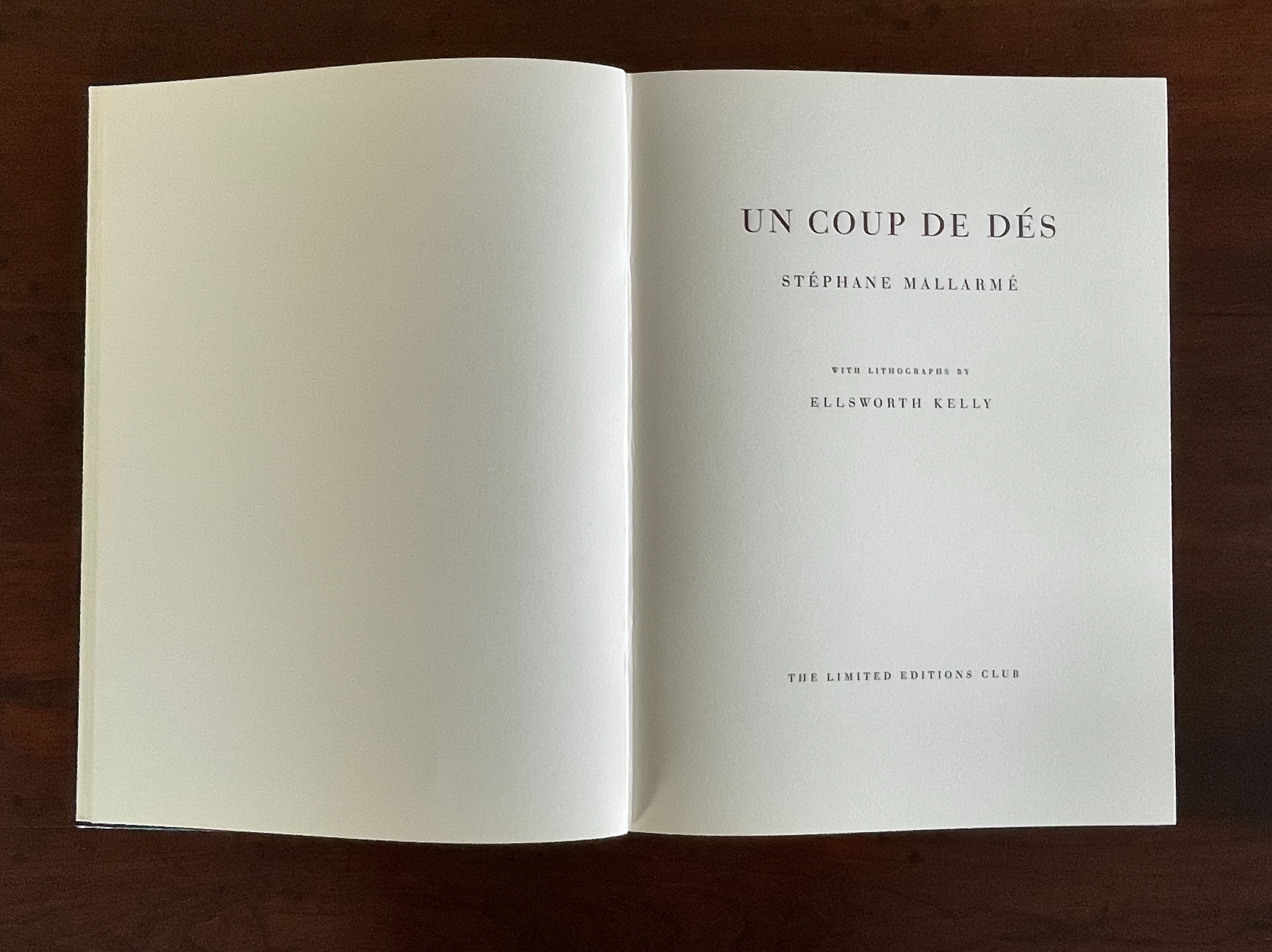
Un Coup de Dés Jamais N’Abolira le Hasard (1992) Ellsworth Kelly and Stéphane Mallarmé Hardback, case bound in full black morocco, spine gilt-lettered. 17 x 12 1/2 in Edition of 300, of which this is #204. Acquired at Swann Auctions, 24 October 2024. Photos: Books On Books Collection. Permission to display, courtesy of Limited Editions.
Is Ellsworth Kelly’s homage to Stéphane Mallarmé’s Un Coup de Dés Jamais N’Abolira Le Hasard an illustrated book, a livre d’artiste, or an artist’s book? It certainly resonates with and intensifies the poem’s design and imagery, but without being a spread-for-spread illustration. It is akin to the tributes paid by André Masson (1961), Jean Lecoultre (1975), Ian Tyson & Neil Crawford (1985), Jacques Vernière (1987), Christiane Vielle (1989), Ofer Lellouche (1997), Robert Bononno & Jeff Clark (2015), and Eric Zboya (2018). Some of these kindred spirits like Masson, Vielle, and Bononno & Clark intersperse artwork within the poem that evoke if not illustrate the setting and action of the sea and shipwreck. Some, like Masson, Lecoultre, Vernière, and Lellouche display images that have less to do with the poem’s imagery. Some, like Tyson & Crawford and Zboya, show more interest in capturing the poem’s numerological esotericism (LE NOMBRE). More than the others, though, Kelly builds on Mallarmé’s double-page spread principle and its structural importance for the poem.
The double-page spread is the chief design structure in Mallarmé’s poem and is essential to its workings. We know this from the differences in layouts between its first publication in Cosmopolis in 1897, its marked-up proofs Mallarmé left behind after his death, and his son-in-law’s effort with Gallimard in 1913 to reflect the poet’s plan. Just before his death, Mallarmé had been working on the volume with Ambroise Vollard, who had commissioned etchings from Odilon Redon to bring it to the status and price of the livre d’artiste, a genre he was shaping. Mallarmé was amenable to this as long as the etchings were grouped at the end of the book. He did not want the artwork to distract the reader from his careful arrangement of the text on and across eleven double-page spreads.
The fact of Ellsworth Kelly’s eleven lithographs aligns with Mallarmé’s plan for eleven double-page spreads of text, but the interweaving of the two sets of spreads runs contrary to Mallarmé’s wishes. To follow the poet’s wishes, Kelly and the book designer hired for The Limited Editions Club’s production could have been grouped at the end of the book, but they didn’t. To double down on the contravention, they added a blank double-page spread after each of the eleven spreads of text and after each of the eleven spreads of lithographs. Someone also decided to begin and end the volume with sets of four blank flyleaves. This is not mere padding to justify a deluxe price. The effect signals and enhances the importance of the double-page spread for Mallarmé’s poem. It underlines the importance of what Mallarmé called “les blancs”. More than underline it, those punctuations of blank space after each spread of text and then after each spread of image add a pace to the sequence and place an additional demand on the memory as it juggles Mallarmé’s interweaving of text in its different sizes, styles, and position across the double-page spread. The lithographs’ nature, their pattern, and their spatial relationship to everything in the book’s structure match Mallarmé’s architectural plans far more than Vollard’s impresario interventions.
Abstract as they are, Kelly’s lithographs subtly mirror the structure and content of Mallarmé’s poem. Just as Mallarmé’s first sentence begins and his last sentence ends with “un coup de dés”, Kelly reverses the image in his first lithograph to make the image in his last.
Just as inversions are recurrent in the poem, so they recur in Kelly’s lithographs.
The poem’s spread beginning and ending COMME SI [“AS IF“] is central to the poem physically and thematically. The sixth of the eleven spreads, it is the only one showing this spatial, syntactic, and typographic pattern. Likewise, Kelly’s sixth lithograph splits its page equally. No other lithograph depicts this equilibrium.
Kelly created a separate portfolio of four lithographs: The Mallarmé Suite. This work is meant to be displayed on a wall and arranged precisely according to Kelly ‘s instructions. Despite the four shapes’ replication from the book, the portfolio stands quite apart in its introduction of color and positioning of the shapes (see Bonfitto’s essay). Its mere conjunction with the book does not imbue it with what happens in the book, and that underscores the fact that Kelly’s eleven black-and-white lithographs are not in mere conjunction with Mallarmé’s poem. The reader/viewer can imagine billowing sails, overwhelming waves, or tilting masts in the lithographs, but what matters is how Kelly makes his distinctive shapes play with one another and all the book’s double-page spreads to mirror how Mallarmé makes his words, typography, and double-page spreads play with one another. If self-reflexiveness is one of the key markers for distinguishing an artist’s book from a livre d’artiste, we have here a self-reflexive poem and a self-reflexive visual artwork punctuated by blanks within the canvas of the book structure to create a self-reflexive artist’s book.
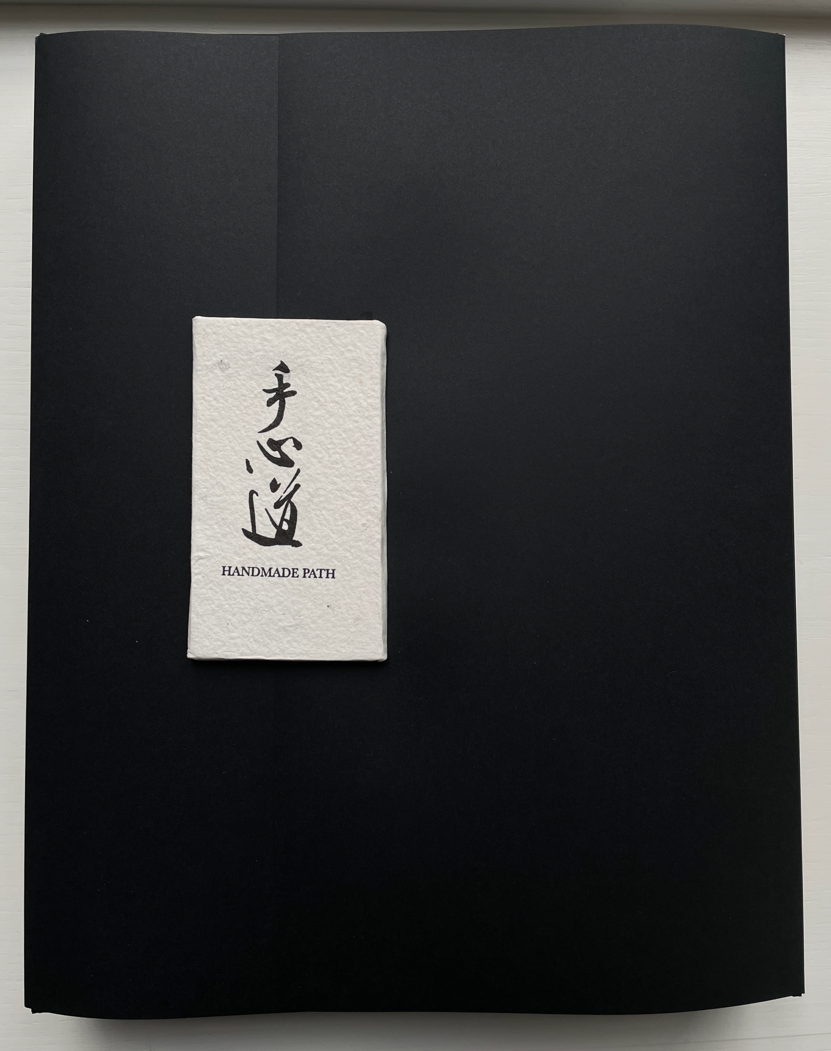
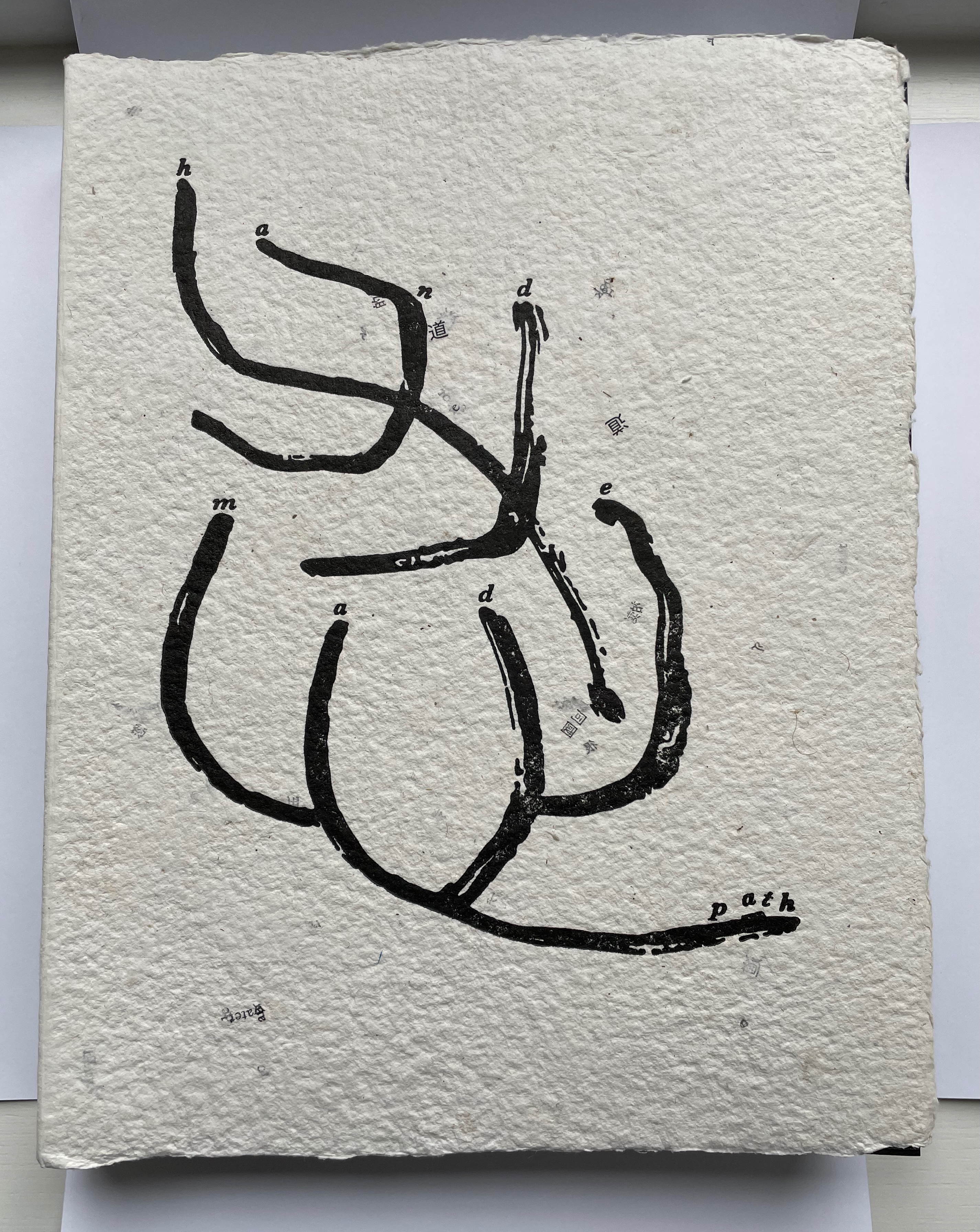
Handmade Path (2021) Lu Jingren, Amanda Degener, and Peng Wu Black-inked card wrapper with magnetic closure. Handbound, handsewn, handmade paper cover book. H285 x W220 x D40 mm. 268pages. Edition of 350, of which this is #152. Acquired from Amanda Degener, 5 December 2022. Photos: Books On Books.
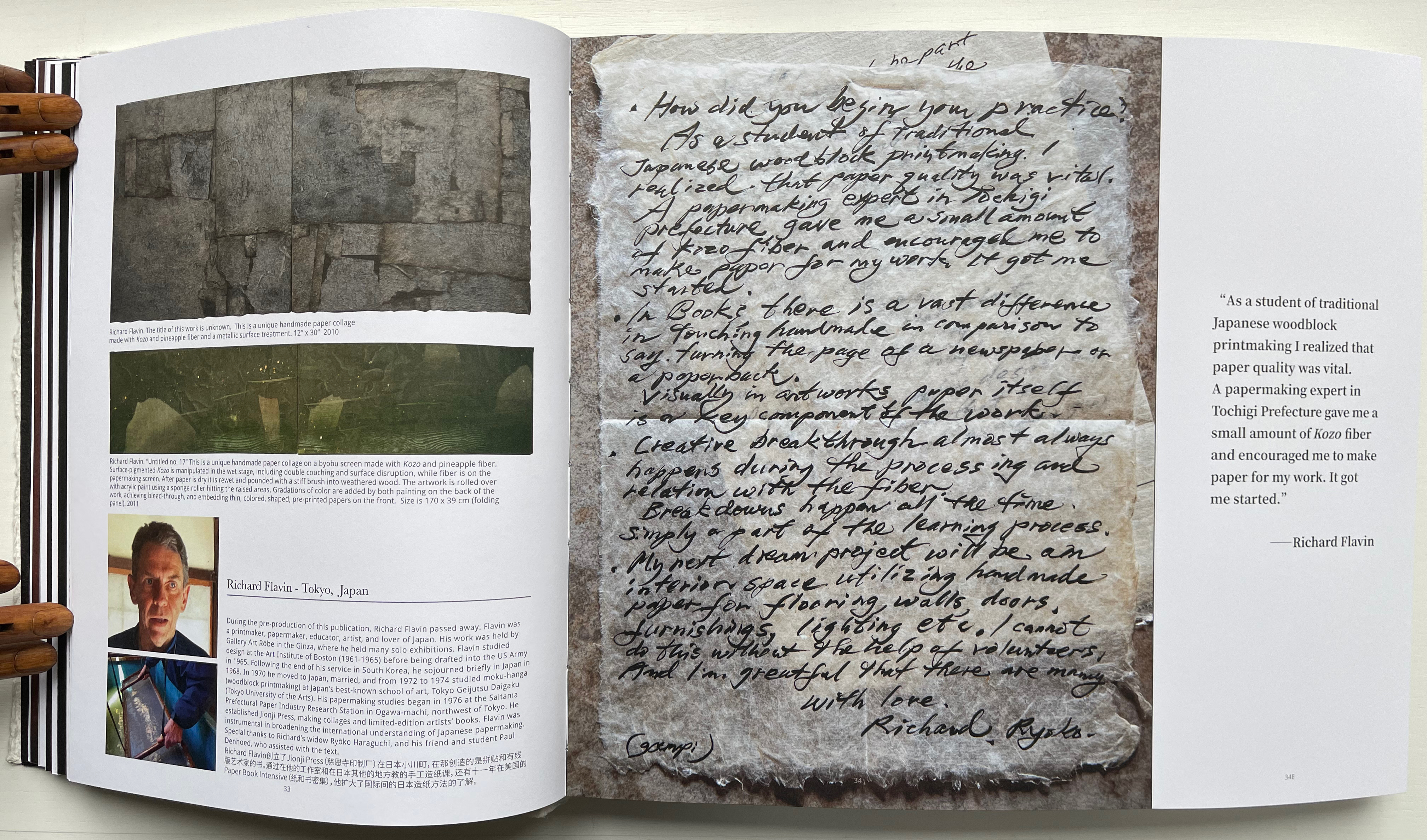
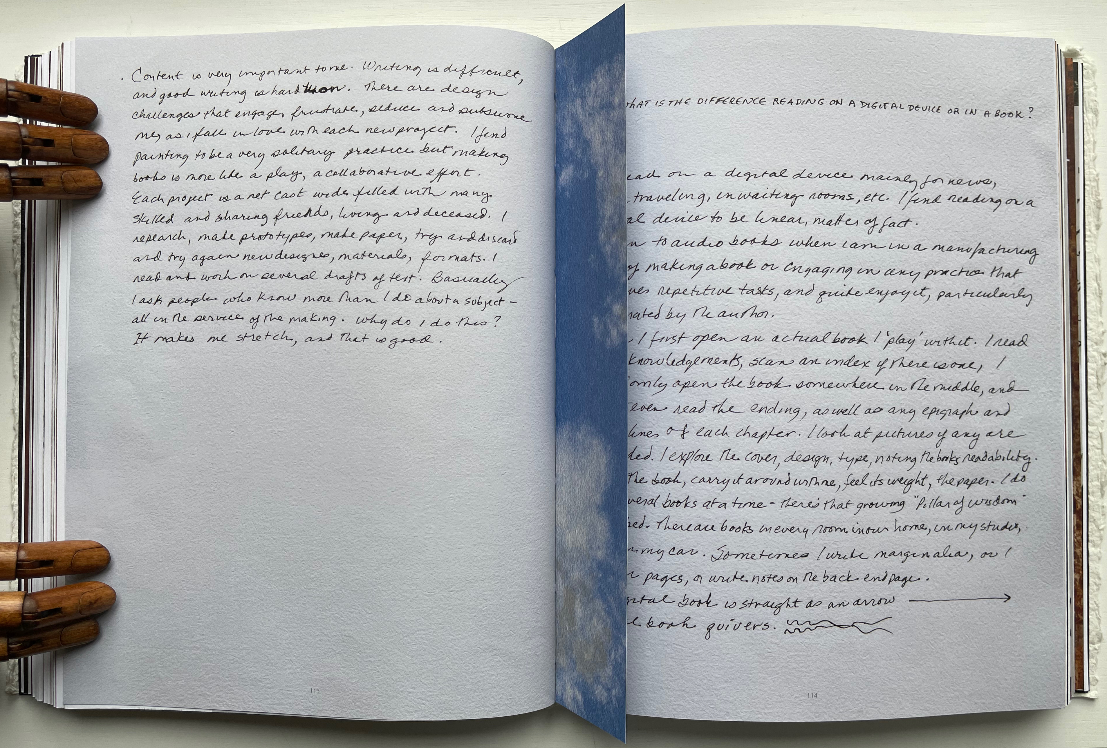
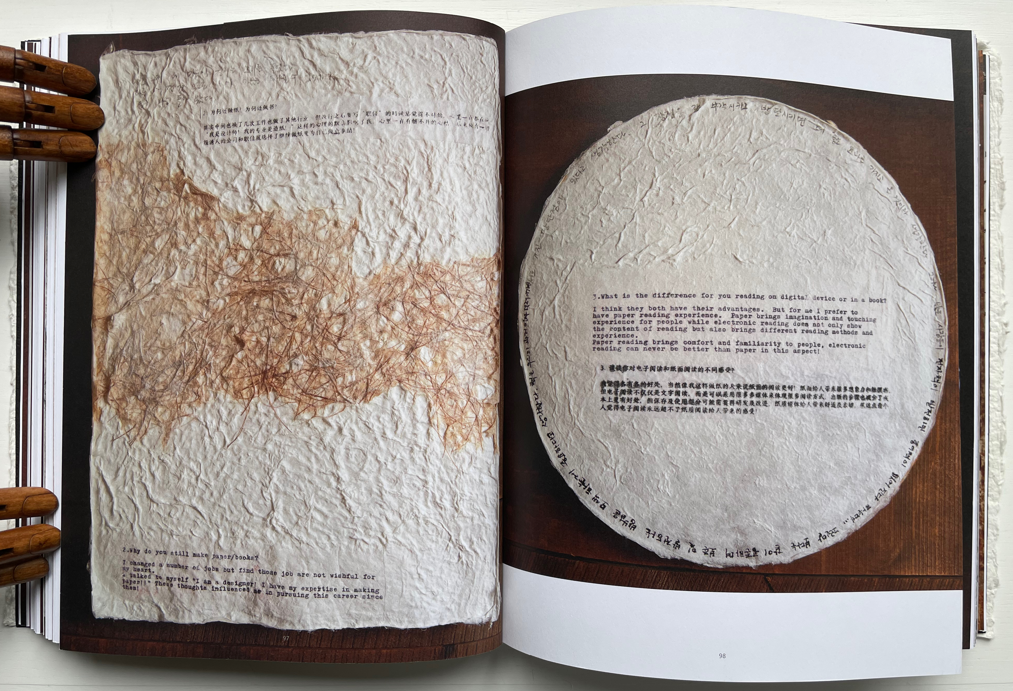
Handmade Path presents 57 artists of paper and book who responded to 6 questions circulated by the editors. The editors asked the artists to provide handwritten replies to the questions as well as images of both their work and of their hands.
How did you begin your practice?
Why do you still make paper / books?
What is the difference for you reading on digital device or in a book?
In what way do you understand the 5 senses of paper/book: vision, touch, hearing, smelling, tasting?
Share with us some moments; eitherbreakthroughs or break downs in your work?
What is your next dream project?
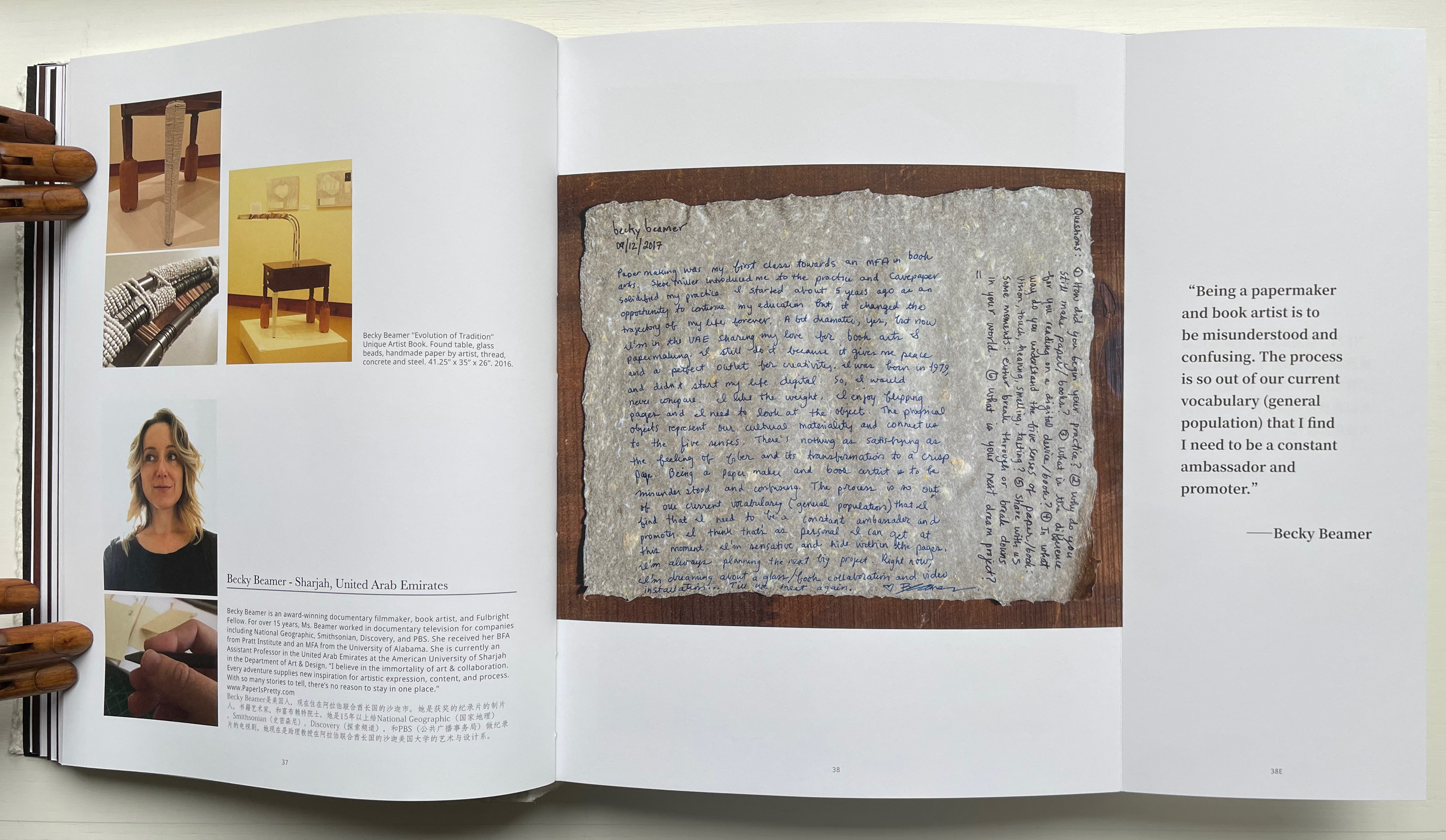
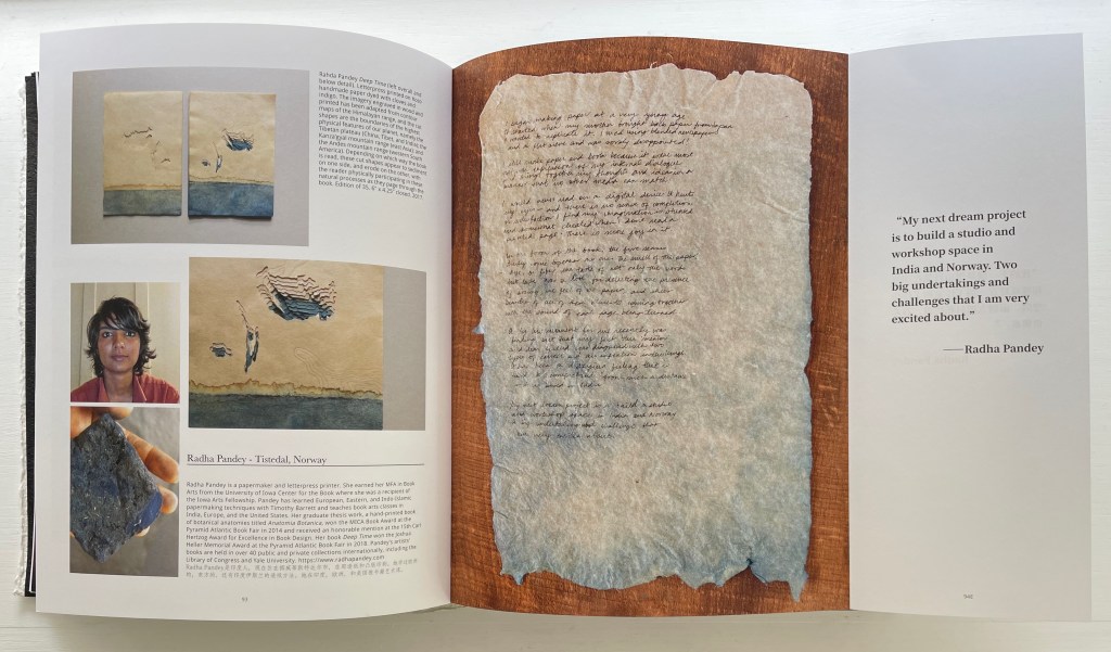
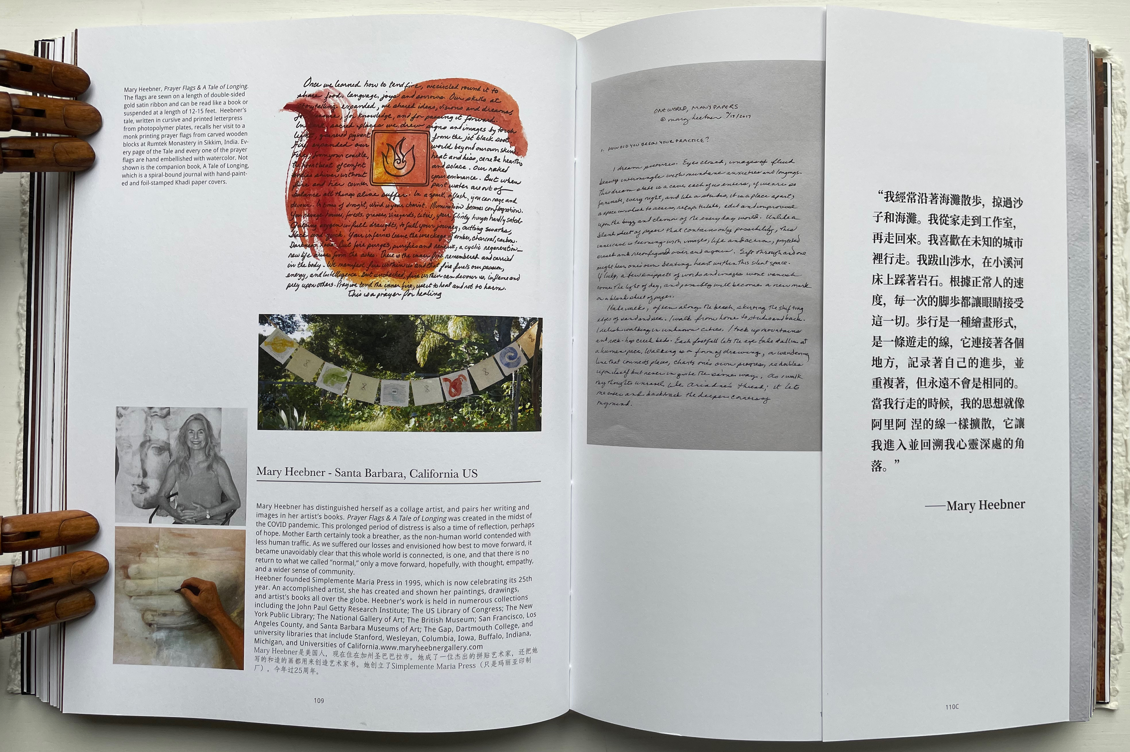
Not all of the respondents replied in handwriting, but many sent their replies on material that reflected their work. The late Richard Flavin’s contribution arrived on gampi paper. Becky Beamer inked her reply on a gray handmade sheet. Radha Pandey’s came on indigo tinted handmade paper.
Richard Flavin
Becky Beamer
Radha Pandey
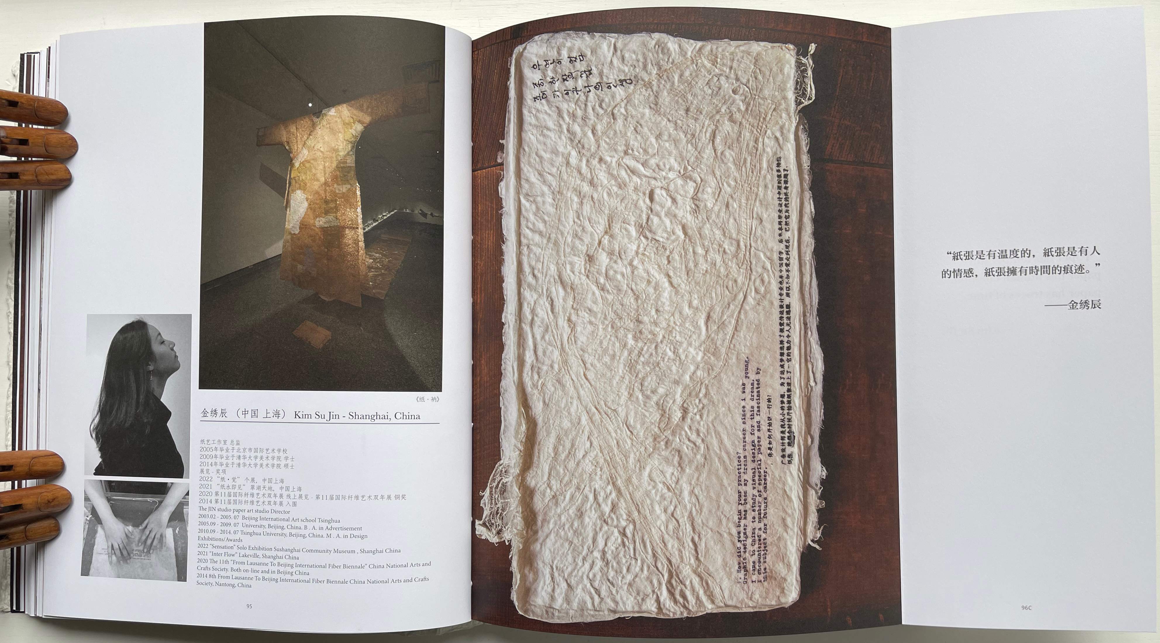
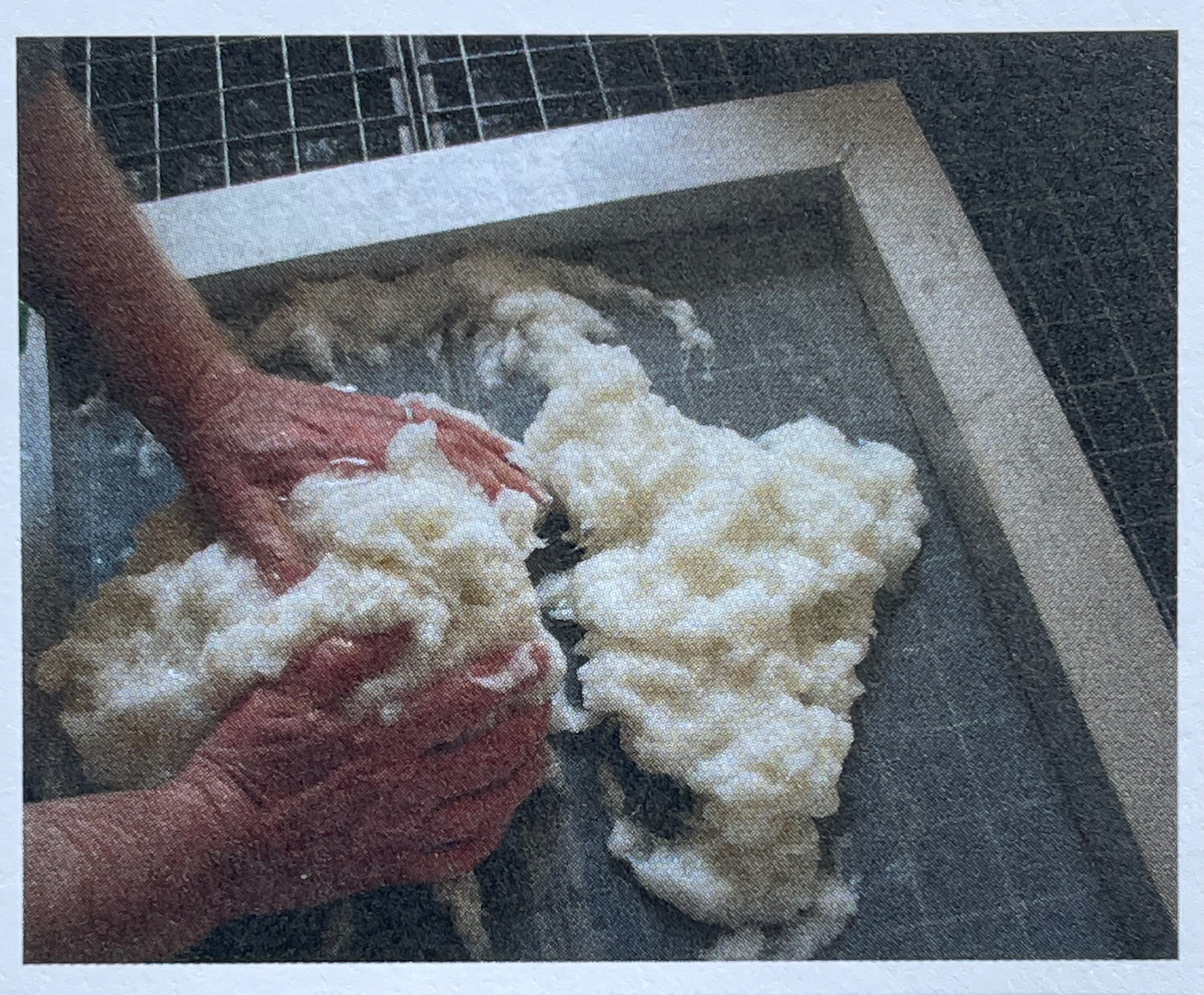
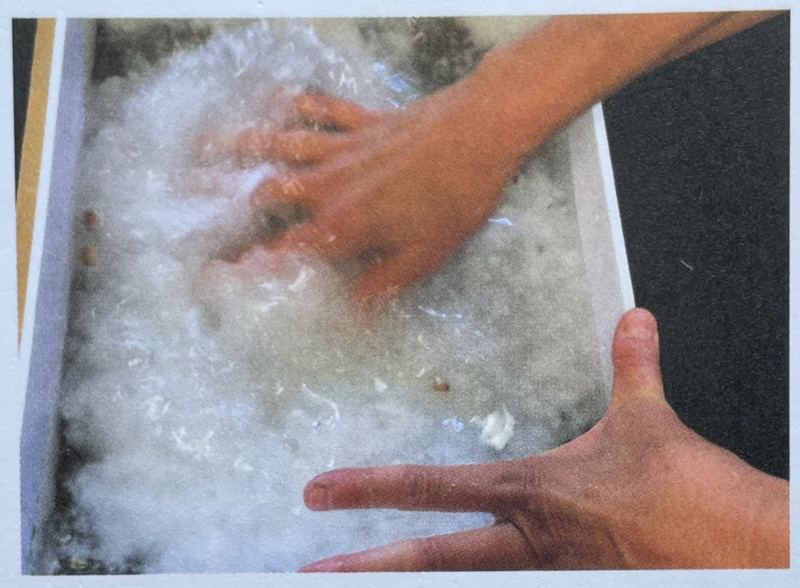
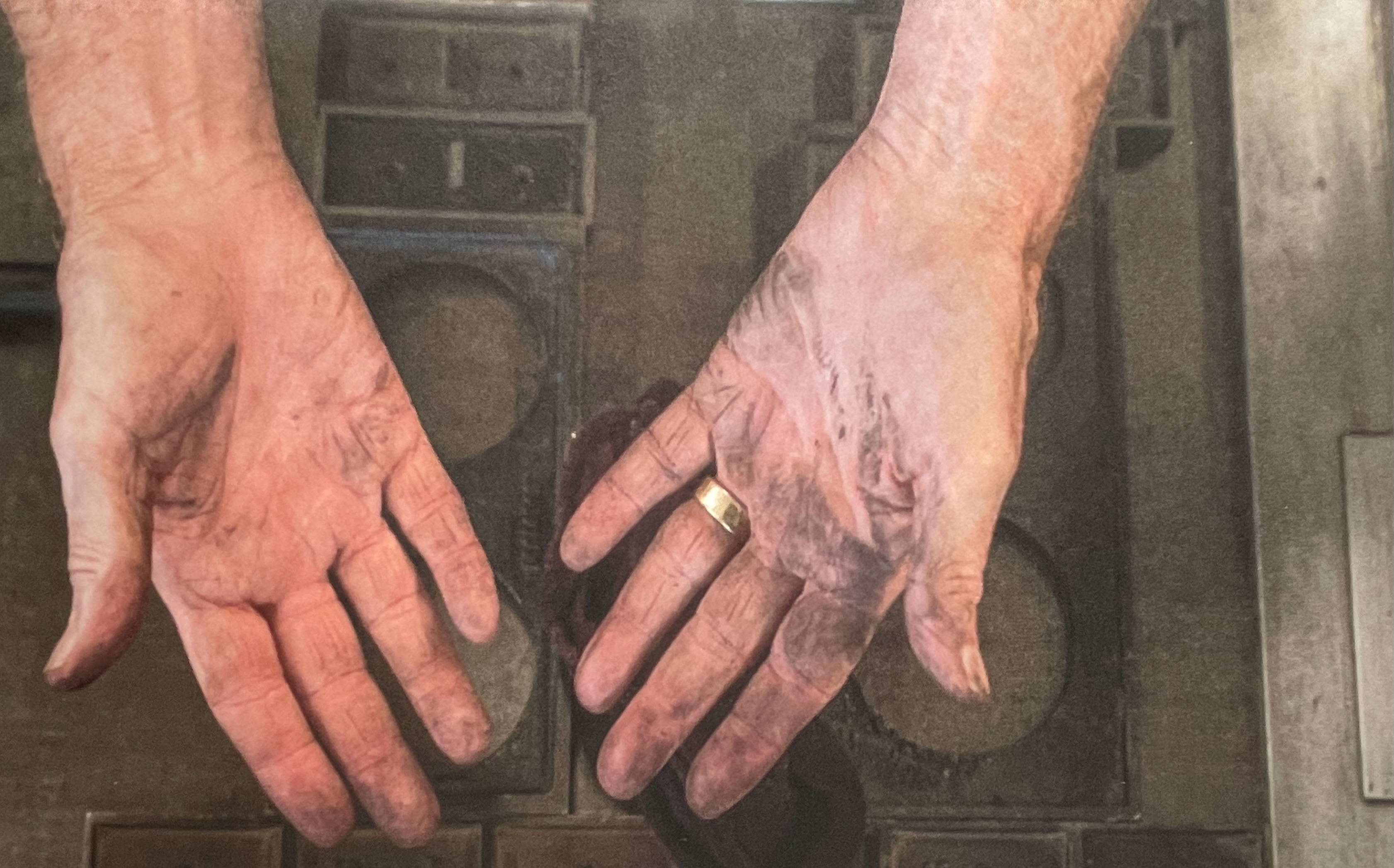
Jack Mader photographed these contributions in ways that render them visually haptic. It places that fourth question — “In what way do you understand the 5 senses of paper / book: vision, touch, hearing, smelling, tasting?” — at the core of the book. You’d swear you can feel the velvet texture of Mary Heebner’s 11 pages. Or the roughness of Helmut Becker’s colored handmade sheets or of Su Jin Kim’s white sculptural responses. The request for images of the artists’ hands naturally added to this sensory effect. There’s the glutinous wetness of pulp between the fingers of Jean Michel Letellier and Helen Hiebert and the imagined smell of the ink on George Roberts’ hands.
Mary Heebner
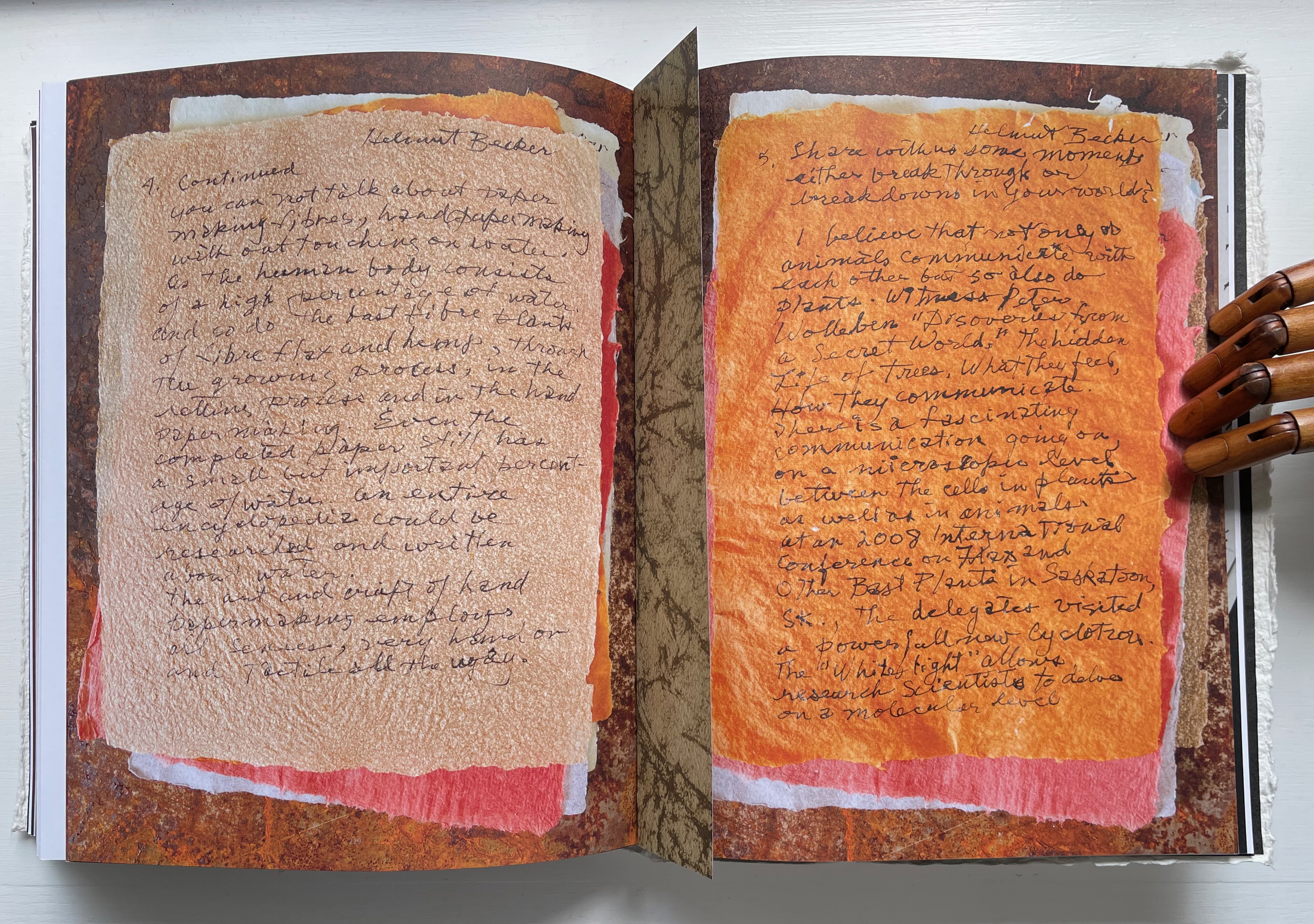
Helmut Becker
Kim Su Jin
Left: Jean Michel Letellier’s hands. Right: Helen Hiebert’s hands.
George Roberts’ hands.
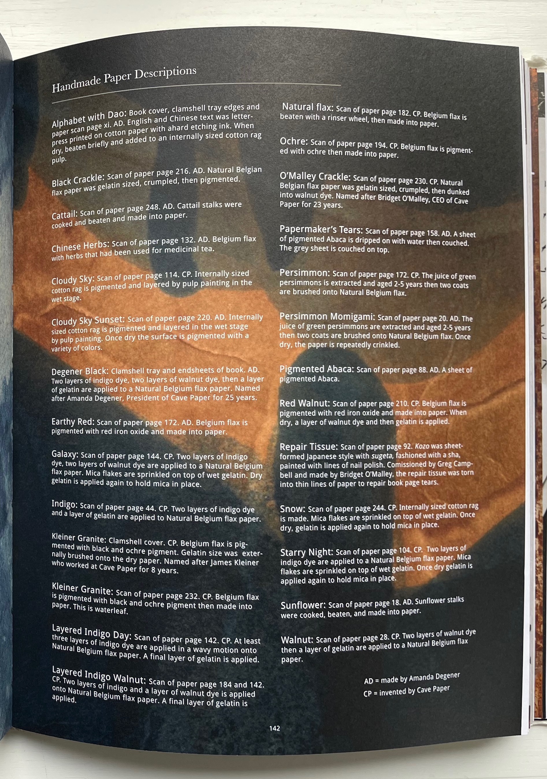
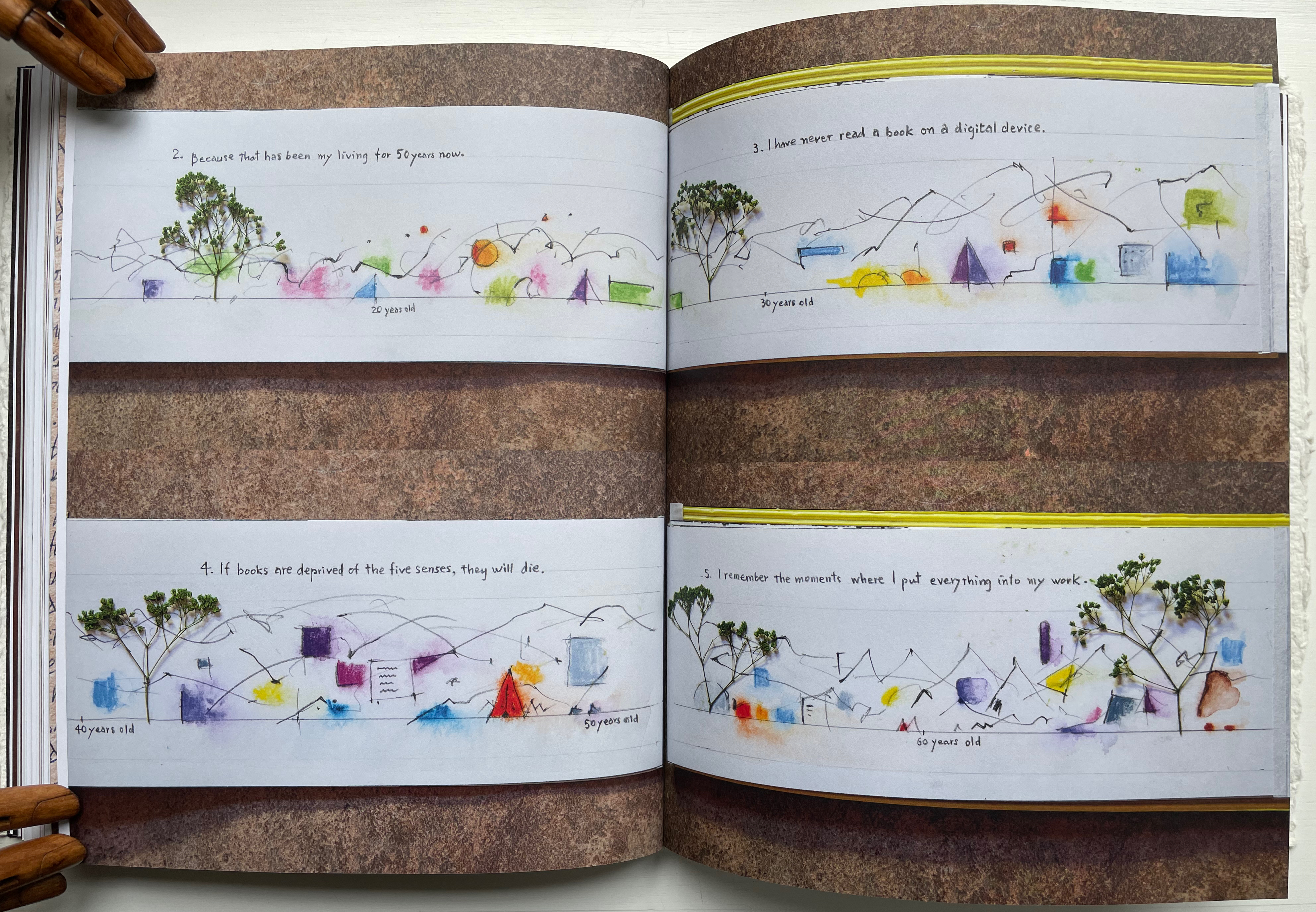
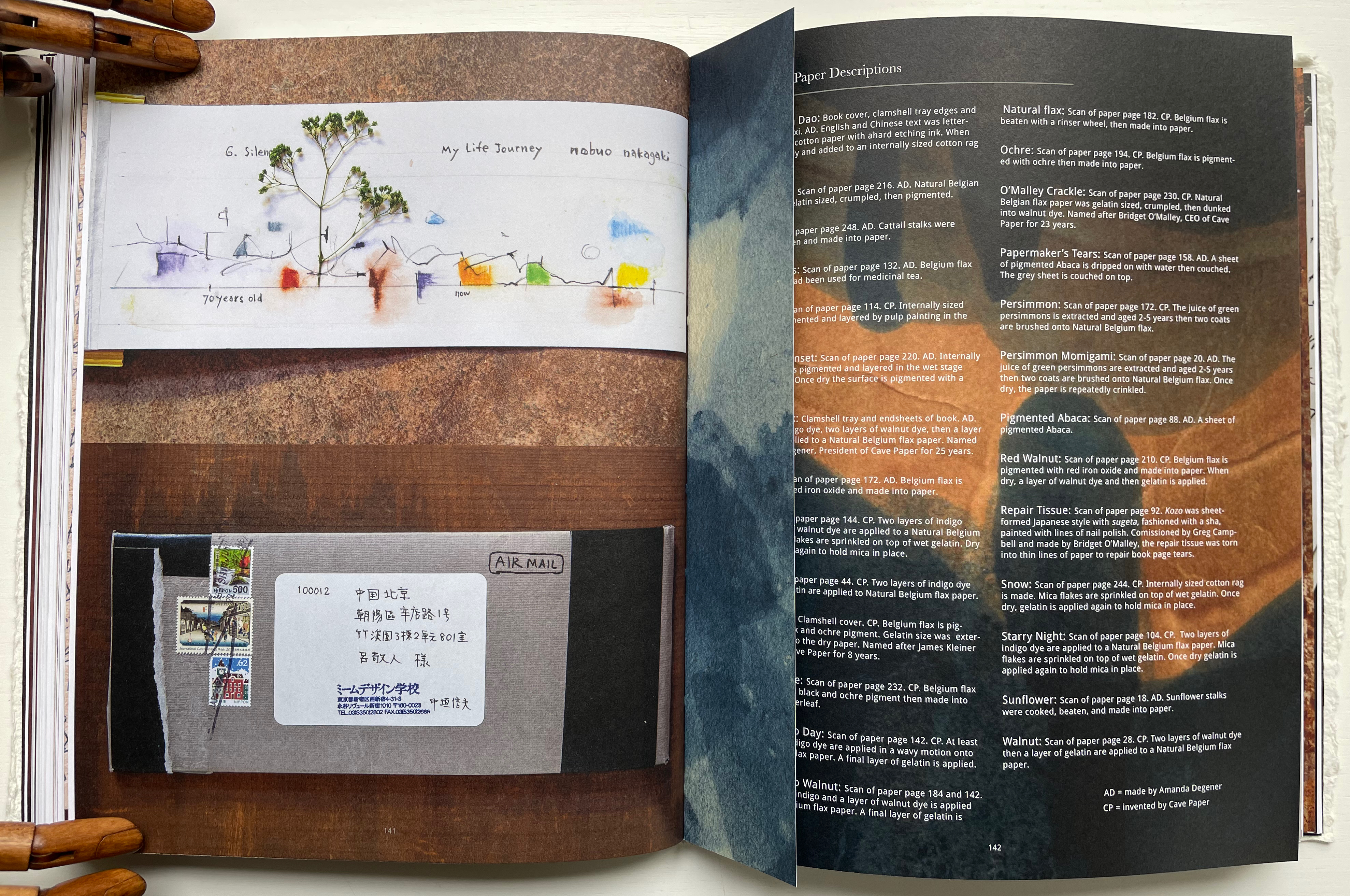
Throughout the book are truncated pages that act almost like bookmarks. Only midway through do we learn that they bear scanned images of handmade paper from Amanda Degener and Cave Paper. Degener provides an index describing the handmade papers, which oddly appears at page 142. Not only does it function as an index, it delivers information expected in a colophon. It even describes the paper used for the book’s cover, endpapers, and the clamshell tray. But nevermind, it’s all part of diving into the artists’ process and practice.
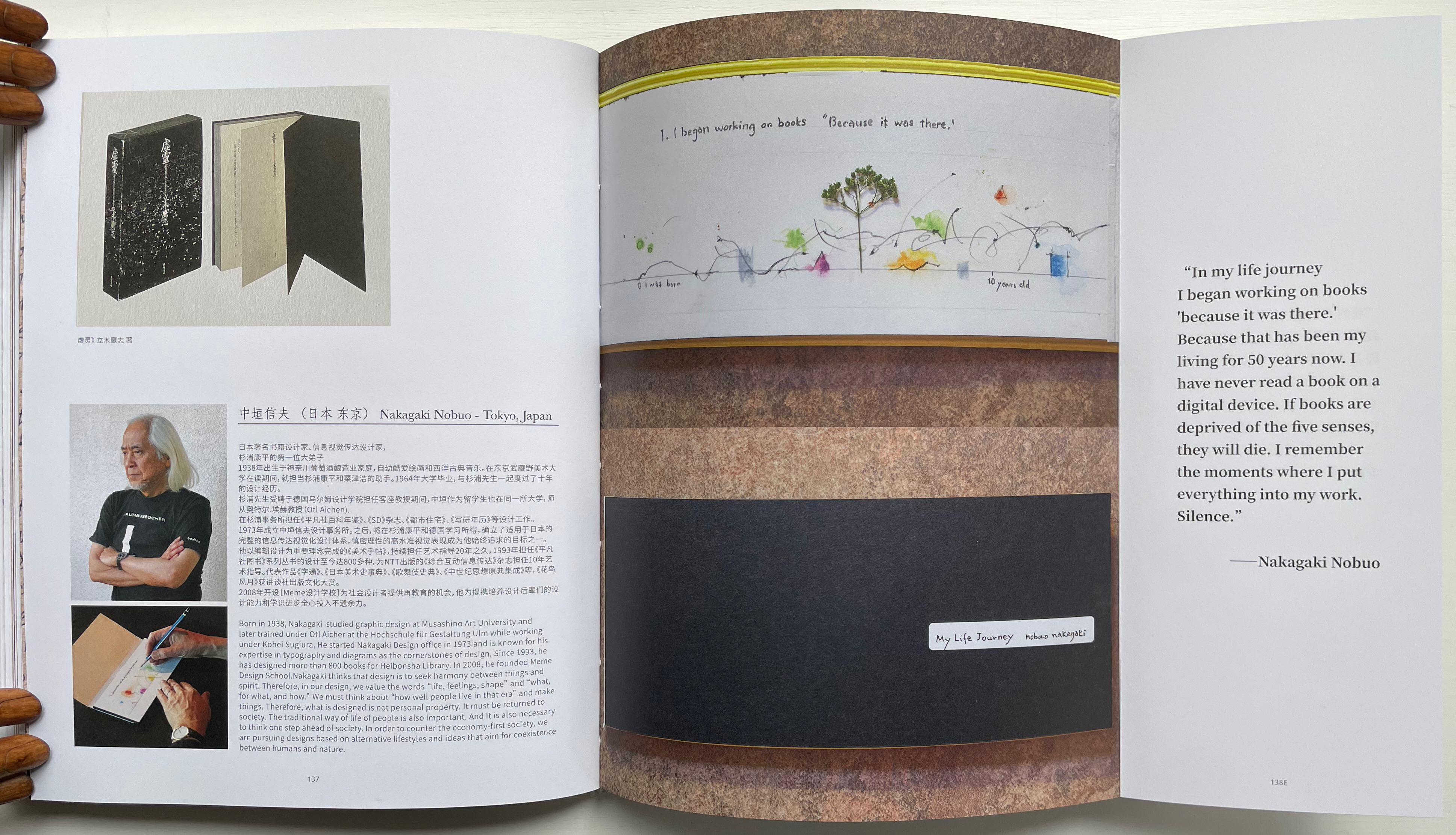
Quite appropriately this midway index appears just after the entry for Nakagaki Nabuo, whose response to the opening question “How did you begin your practice?” comes in the form of an autobiographical handmade artist’s book. In the pages presenting his book, we see the artist, his hands at work on the book, and Mader’s precise photography of the book and its airmail envelope, followed by the bookmark-like stub with its image of Cave Paper’s Layered Indigo Day paper.
Nakagaki Nabuo and his hands at work.
Nakagaki’s My Life Journey
Verso: Nakagaki’s answer to question 6: “What is your next dream project?” Recto: “Handmade Paper Descriptions” index/colophon.
In their preface, the editors write:
Although reading is a private activity we are not alone; we are cooperating with the book, bringing it into ourselves. Reading is not only about transplanting ourselves to the beyond, but we modify ourselves to see the world differently. Our vision or purpose for Handmade Path is for you to participate in this collaboration.
Just holding Handmade Path and constantly feeling its Alphabet Dao cover, navigating its foldouts alternating Chinese with English according to the contributor, being tempted to lift a contributor’s sheet of paper from the photos, hearing the snap and creak of sewn pages turning, and absorbing the contributors’ testaments, we cannot help but be drawn into participating with the book. In doing so, we learn that, as Paulette Myers-Rich puts it, “Paper is not a substrate — it is story” (p. 197).
Hamady, Walter; Samuel Haatoum; and Hermann Zapf. 1982. Papermaking by Hand : A Book of Suspicions. Perry Township, Dane County, Wisconsin, USA: Perishable Press Limited.
Thomas, Peter, and Donna Thomas. 1999. Paper from Plants. Santa Cruz, Calif: Verf. You can find images of this and others by the artists online in the Special Collections website of the University of Wisconsin-Milwaukee Libraries.