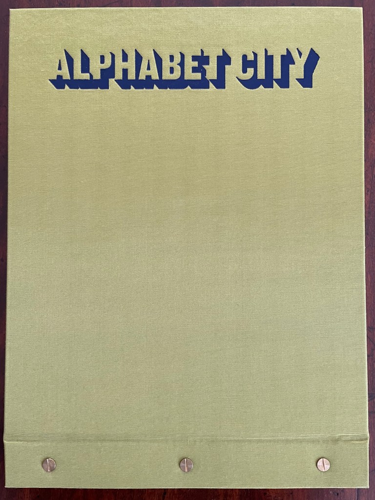
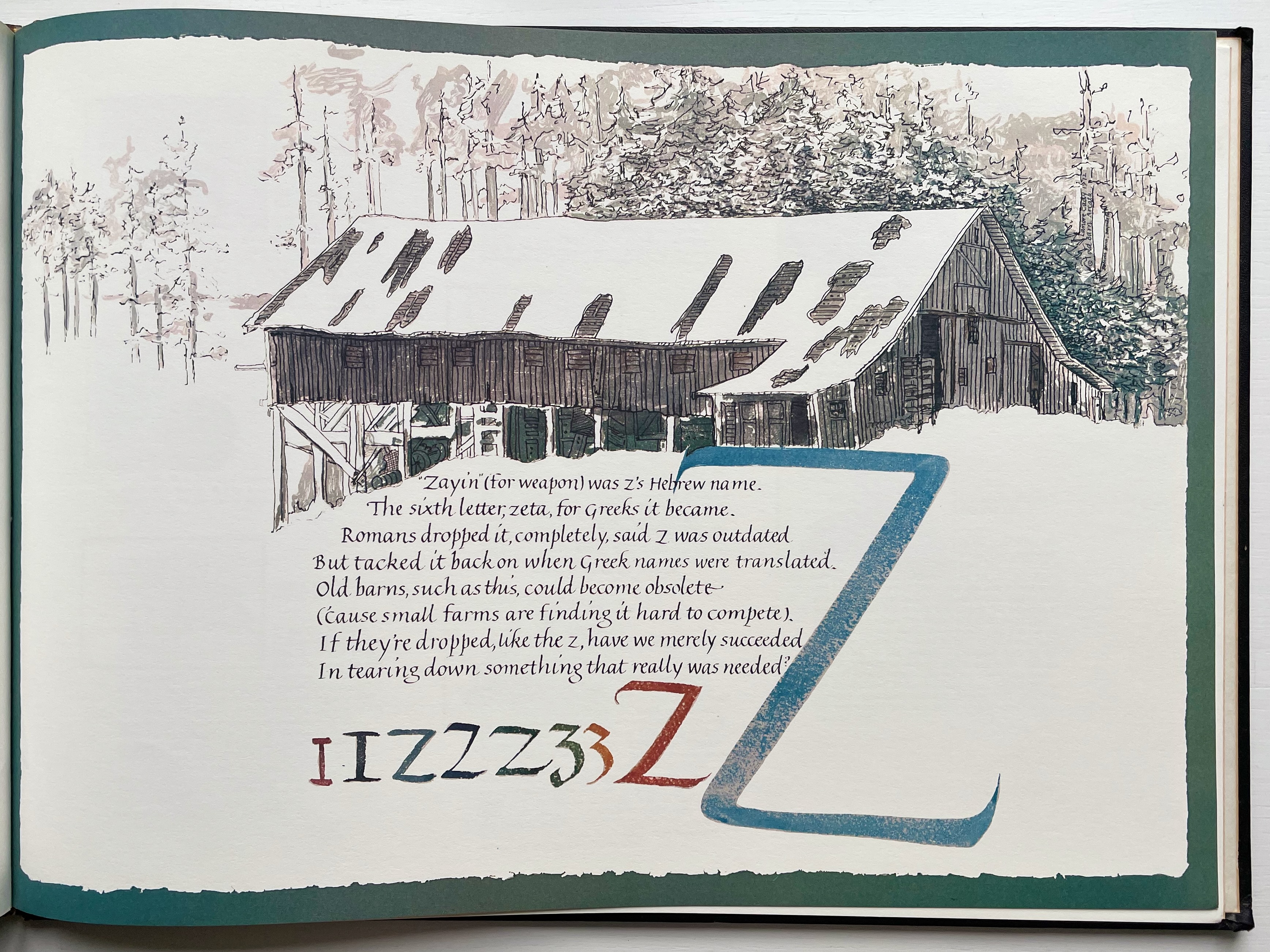
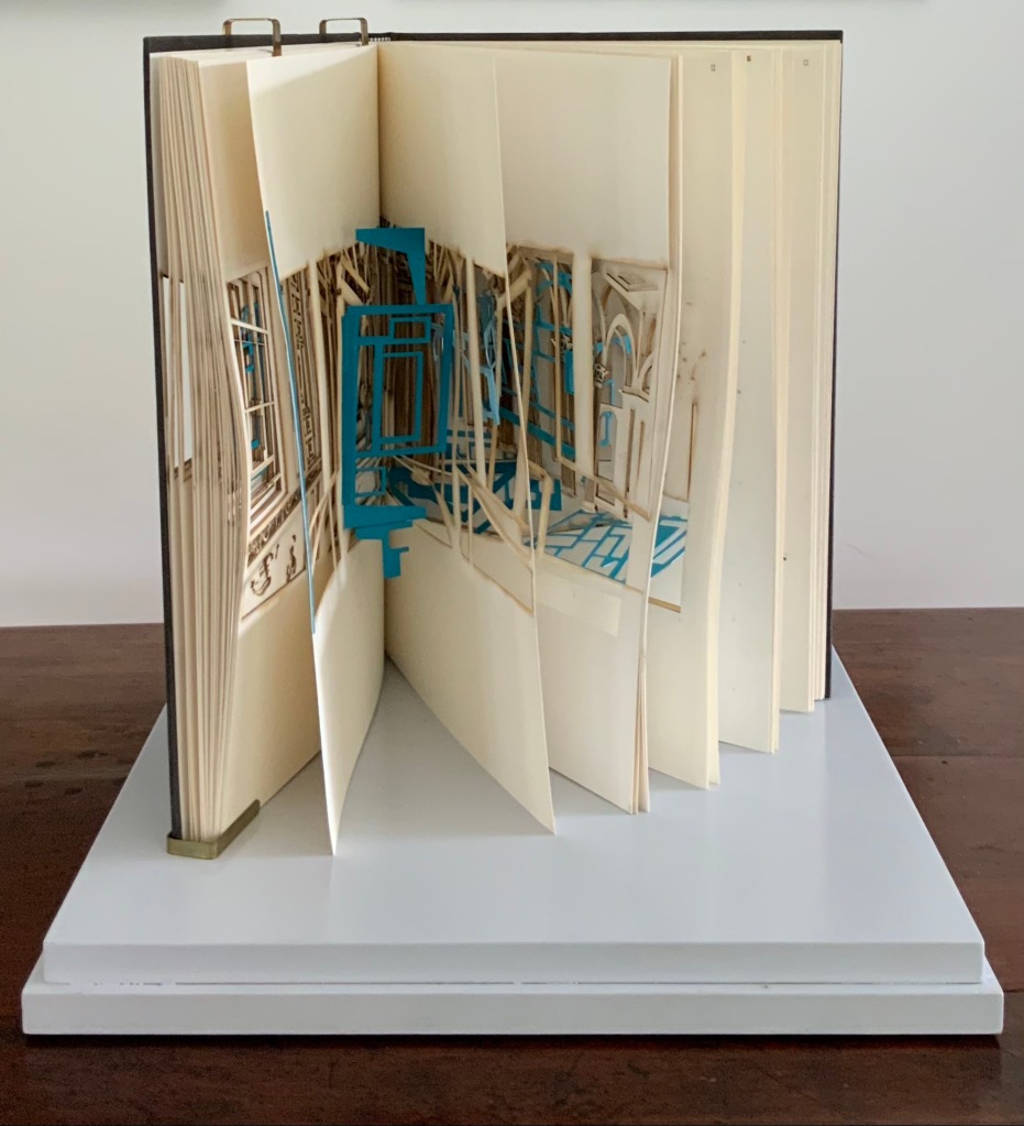
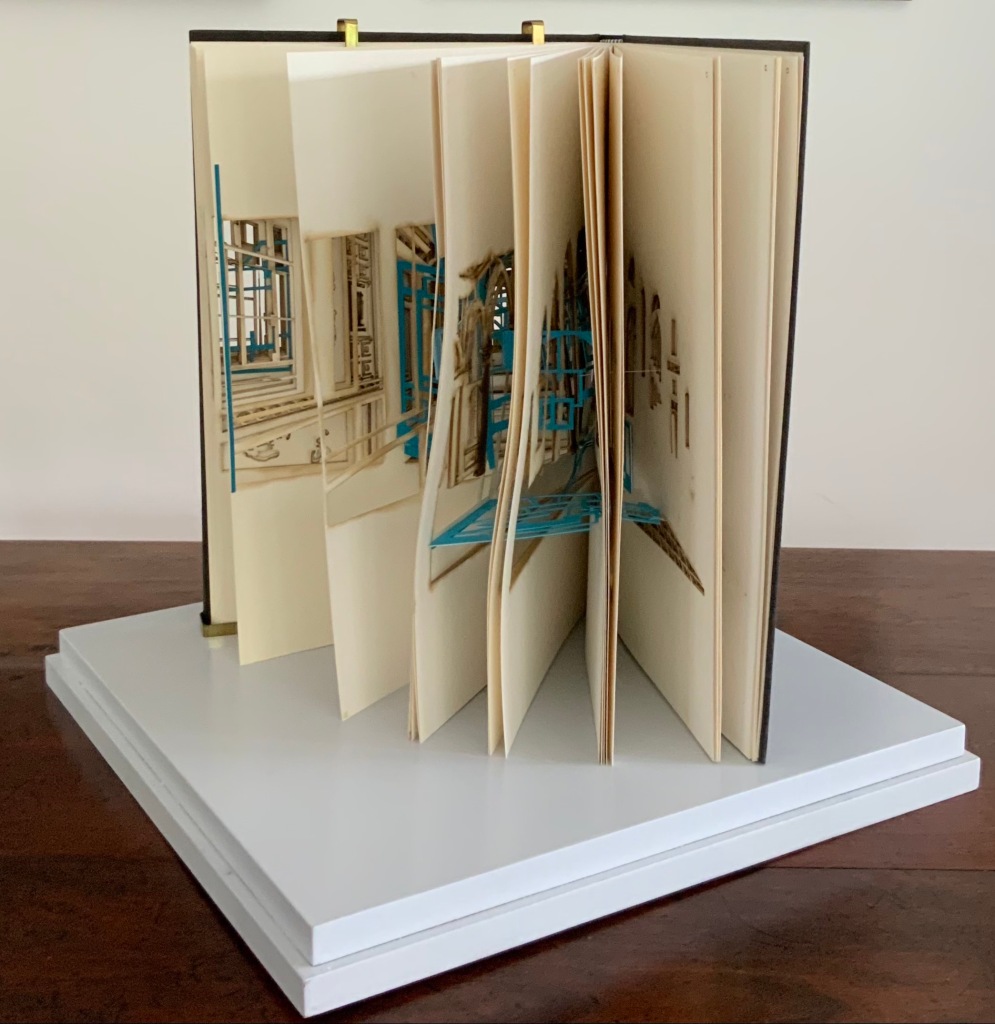
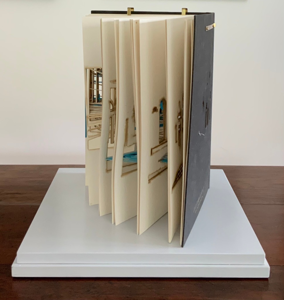
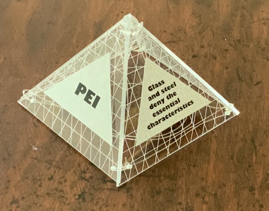
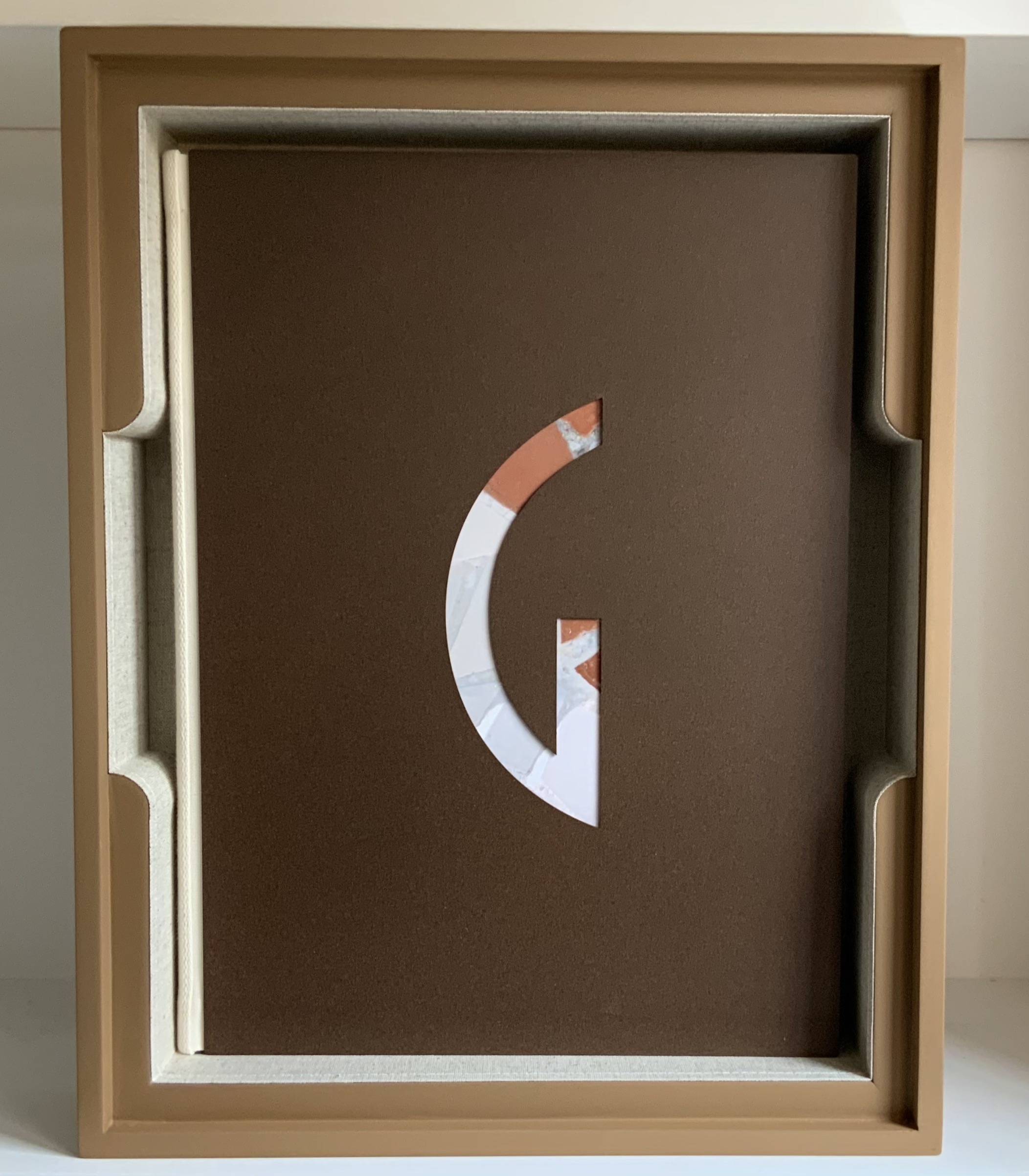
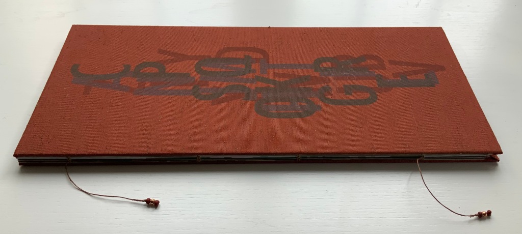
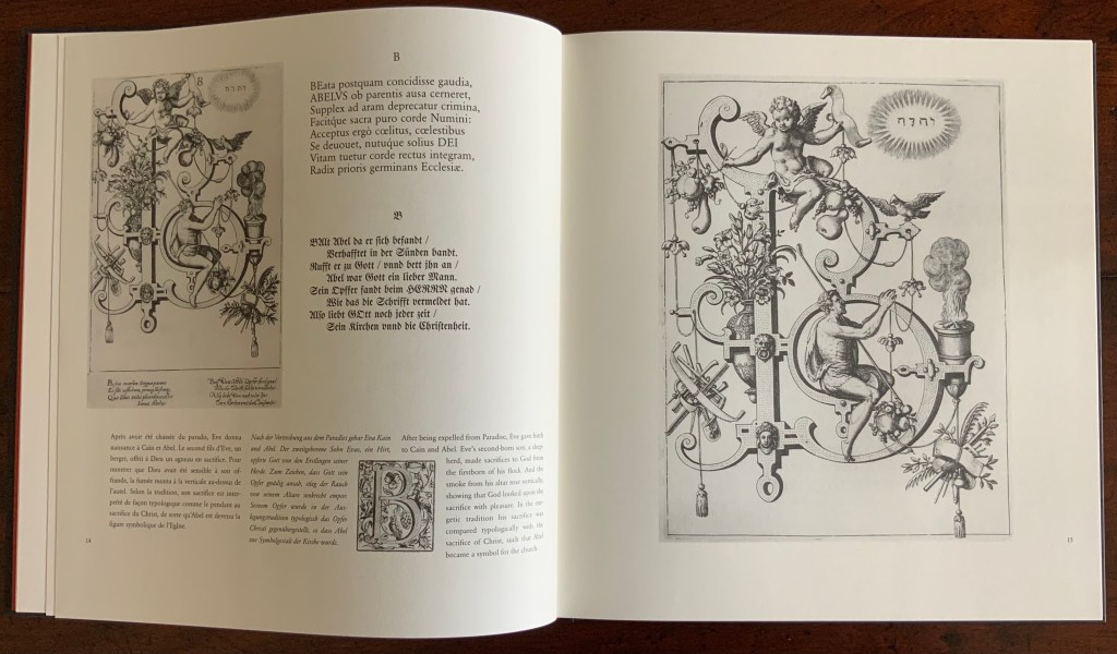
Alphabet City (2009) Scott Teplin Bolted folio. H270 x W360 mm. [29] pages. Edition of 26, of which this is L. Acquired from the artist, April 2023. Photos: Books On Books Collection and Courtesy of the artist.
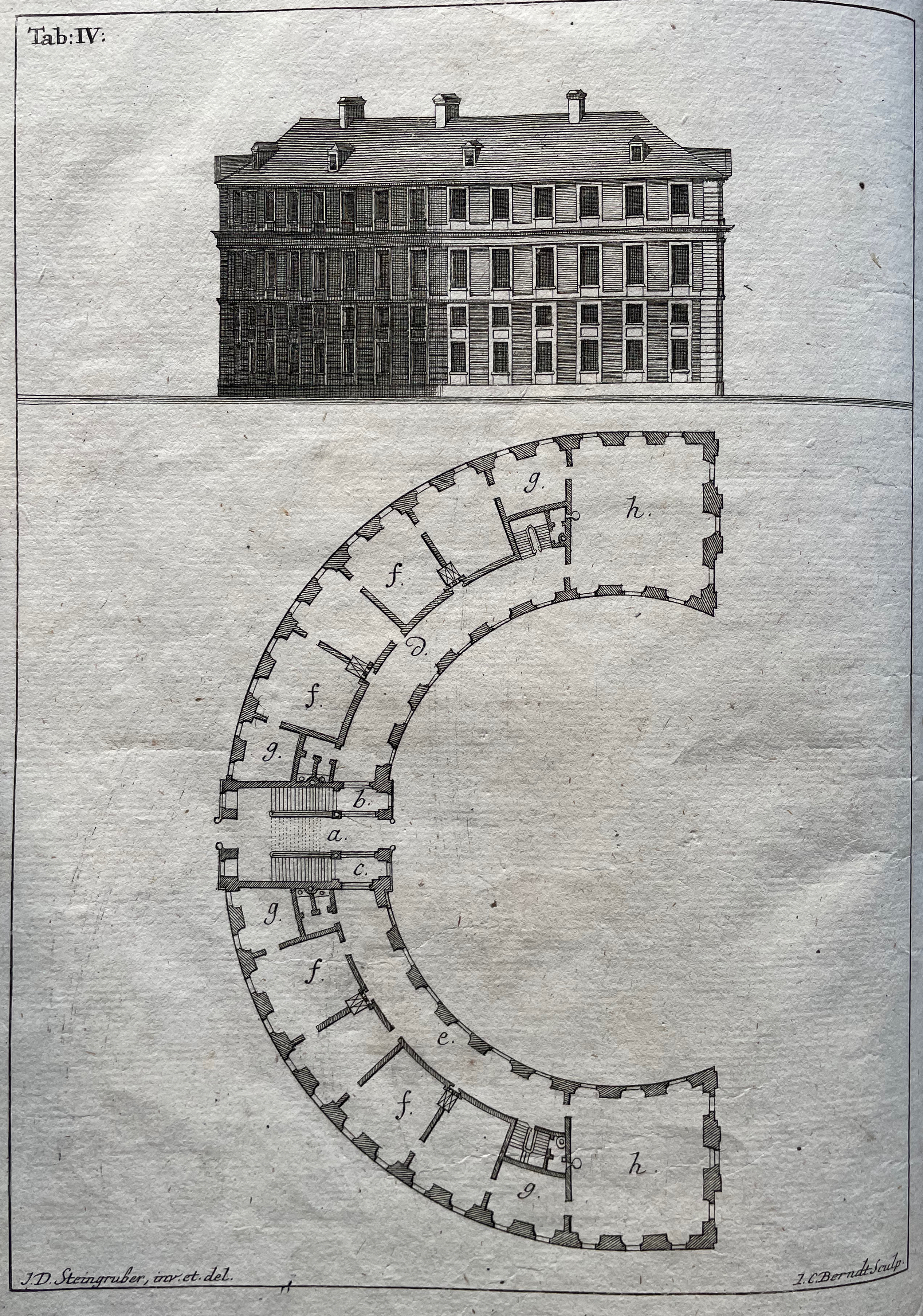
Scott Teplin’s Alphabet City follows in the long line of building designs based on alphabetical foundations. Perhaps first was John Thorpe (1565–1655?), an English architect, who drew up a property based on his initials. Thomas Gobert (1625-90), a French architect, produced Traitté d’Architecture dedié à Louis XIV, a manuscript whose building plans spelled out “LOVIS LE GRAND”. Anton Glonner (1723–1801) designed a Jesuit church and college around the monogram “IHS”. More famous is Johann David Steingruber (1702-87) and his Architectonisches Alphabeth (1773).
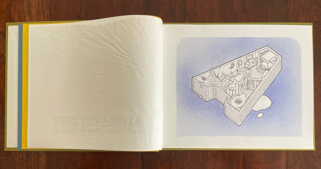
Teplin committed twenty years to his task (Steingruber committed ten) and came to it more from the school of graphic design than the school of architecture. While we might expect bewigged 18th century servants and lords to ride up in carriages to Steingruber’s A to Z, we would not be surprised to find characters from R. Crumb or Mad Magazine inhabiting Teplin’s alphabet-shaped houses, gaming arcades, strange laboratories, ice cream parlors, power plants, and other bizarre edifices. Some houses have no entries or exits. Some have doorless bedrooms. Others have rooms filled with oozing substances or piles of dirt. Some have outdoor swimming pools inside. One, seeming to float on a grass-colored sea, has a boat funnel inside, capped with a life ring, and rooms with deckchairs and portholes. Whimsical and bizarre free association drives Alphabet City.
Although the binding of Alphabet City is intended to facilitate removal and mounting of individual folios, it recalls Fortunato Depero’s “bolted book” and, by extension, the “startle” factor intended by Futurism, Surrealism, Dadaism, and all the -isms of that period. From original drawings in pen & ink to scanned images etched to magnesium plates and printed on Zerkall vellum, then airbrushed with Winsor & Newton and Holbein watercolors and pencilled with matching Prismacolor pencils, Alphabet City leans more toward a fine press livre d’artiste than an artist’s book. The foil-stamped Asahi bookcloth cover with its yellow Moriki endsheets would not be out of place at Arion Books or Three Star Books.
Alphabet Everywhere (2012) Elliott Kaufman Casebound, paper over board, cutout cover. 235 x 235 mm. 62 pages. Published by Abbeville Press. Acquired from Amazon, 22 September 2022. Photos: Books On Books Collection. Displayed with permission of the artist.
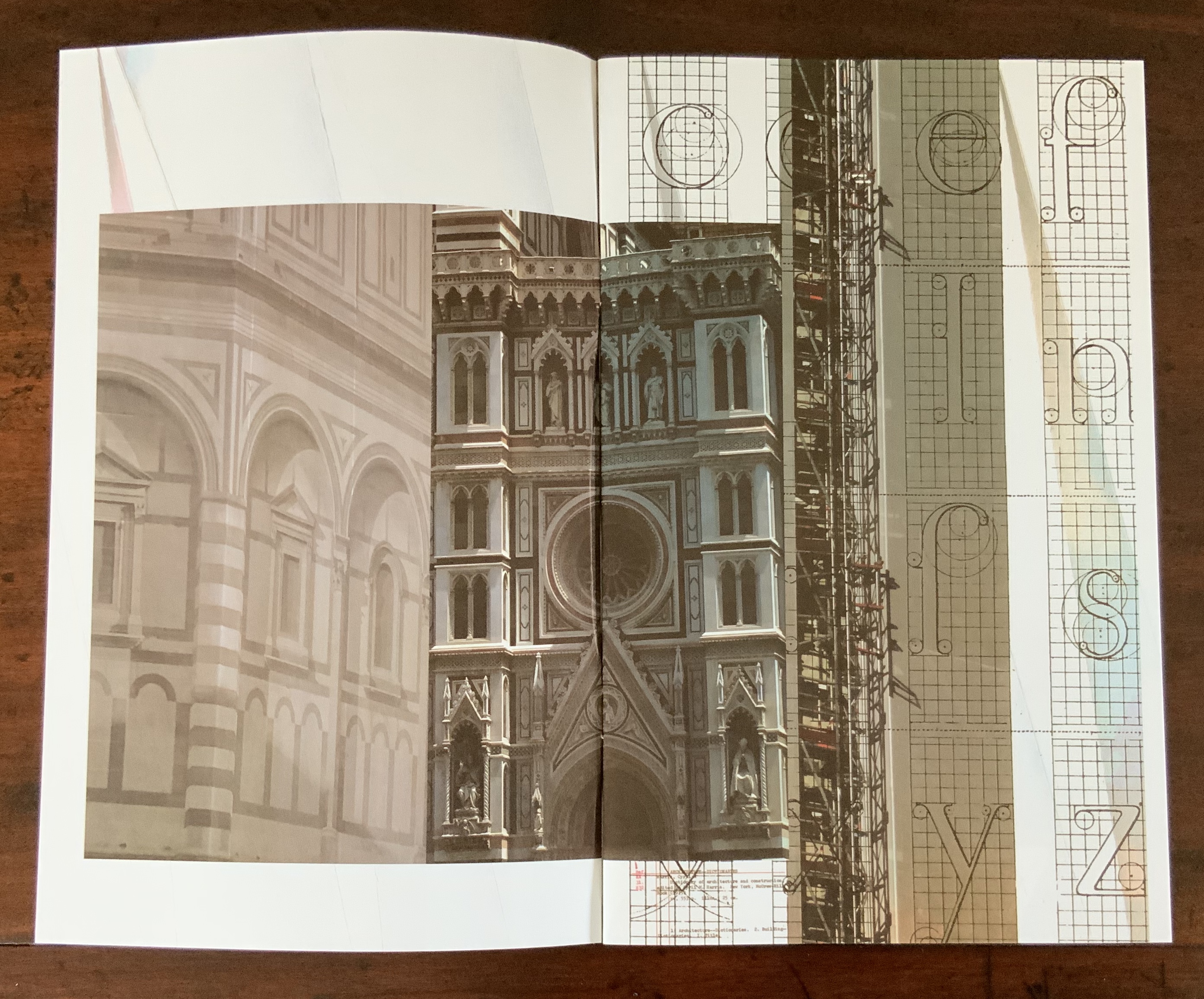
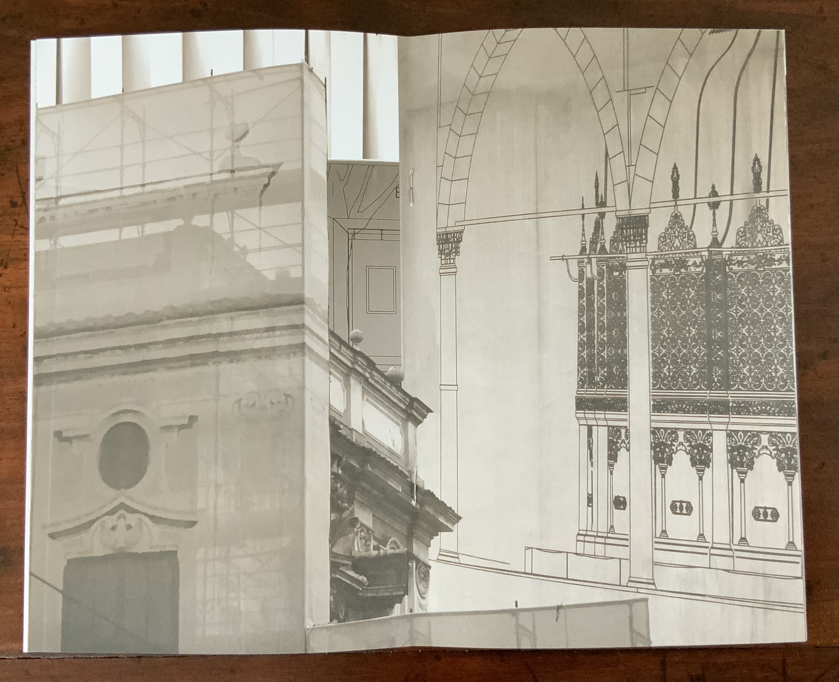
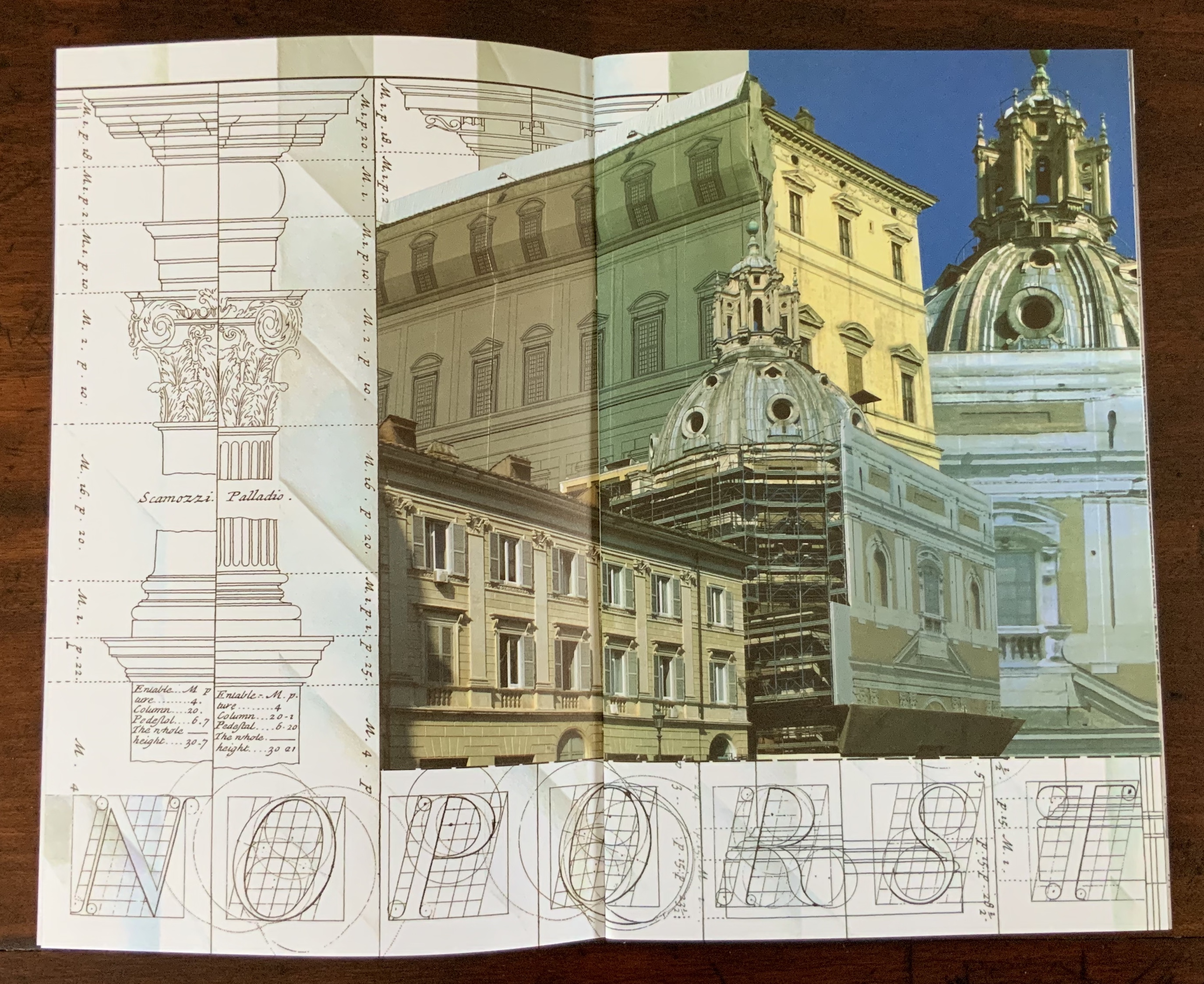
Evident across the images in his alphabet book and website, Elliott Kaufman’s work revolves around architectural motives. The Books On Books collection has found a recurrent theme in architectural alphabets. Would that Johann David Steingruber’s designs for palaces in the shape of the letters from A to Z had actually been built so that Kaufman could photograph them.
Architectonisches Alphabeth (1773) bestehend aus dreyßig Rissen wovon Jeder Buchstab nach seiner kenntlichen Anlage auf eine ansehnliche und geräumige Fürstliche Wohnung, dann auf alle Religionen, Schloß-Capellen und ein Buchstab gänzlich zu einen Closter, übrigens aber der mehreste Theil nach teutscher Landes-Art mit Einheiz-Stätte auf Oefen und nur theils mit Camins eingerichtet, wobey auch Nach den mehrest irregulairen Grund-Anlagen vielerley Arten der Haupt- und Neben-Stiegen vorgefallen, dergleichen sonsten in Architectonischen Rissen nicht gefunden werden, zu welchen auch Die Façaden mit merklich abwechslender Architectur aufgezogen sind. Johann David Steingruber Casebound. H395 x W240 mm. 71 folios. Acquired at auction from Kiefer Buch- und Kunstauktionen, 15 December 2022. Photos: Books On Books Collection.
More Romantic than romantic, Victor Hugo wrote to his wife while traveling that the alphabet is all around us in nature. Kaufman has a different view. Kaufman’s several images per letter prove the point of his book’s title but in keeping with his architectural slant: our constructions distribute our oldest construction all around us.
Ironically if inadvertently, Kaufman gives the Romantic another tweak of the nose. In his Hunchback of Nôtre Dame, Hugo has his character Archdeacon Claude Frollo point to a book in his hand and then to the cathedral outside and say, “This will kill that”, by which he meant among other things that the book’s permanence of replicability will outlast the building’s permanence of stone. If by fictional time travel we could put Kaufman’s book in the archdeacon’s hand, we could point to the cathedral and retort: “But Venerable Sir, look here how ‘that’ foretells the building blocks of ‘this’.”
What is it about artists’ books and architecture that they intersect so often? Architectural interiors and exteriors, ideas, themes, styles, landmark dwellings and edifices have found their metaphorical expression and embodiment in book art with such regularity that they make up a genre within the genre. Perhaps it is that, as Victor Hugo expresses it in Nôtre Dame de Paris (1831/1902),
… the human race has two books, two registers, two testaments: masonry and printing; the Bible of stone and the Bible of paper. … The past must be reread upon these pages of marble. This book, written by architecture, must be admired and perused incessantly; but the grandeur of the edifice which printing erects in its turn must not be denied. (Book V, Chapter 2, p. 187)
Or perhaps it is even more fundamental. As Hugo asserts in his posthumous The Alps and the Pyrenees (1890/1895):
All letters were signs at first, and all signs were images at first…. Human society, the world, man as a whole, is in the alphabet….A is the roof, the gable with its cross-beam, the arch, arx; … Z is the lightning, it is God. (pp. 64-65)
Beneath the mysticism and pareidolia, Hugo is on to something. Maybe the affinity of books and architecture lies in the origin of the raw material of books — the alphabet — whose second letter comes from a mark signifying shelter or house.
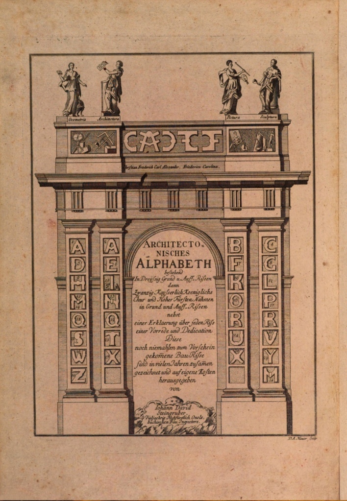
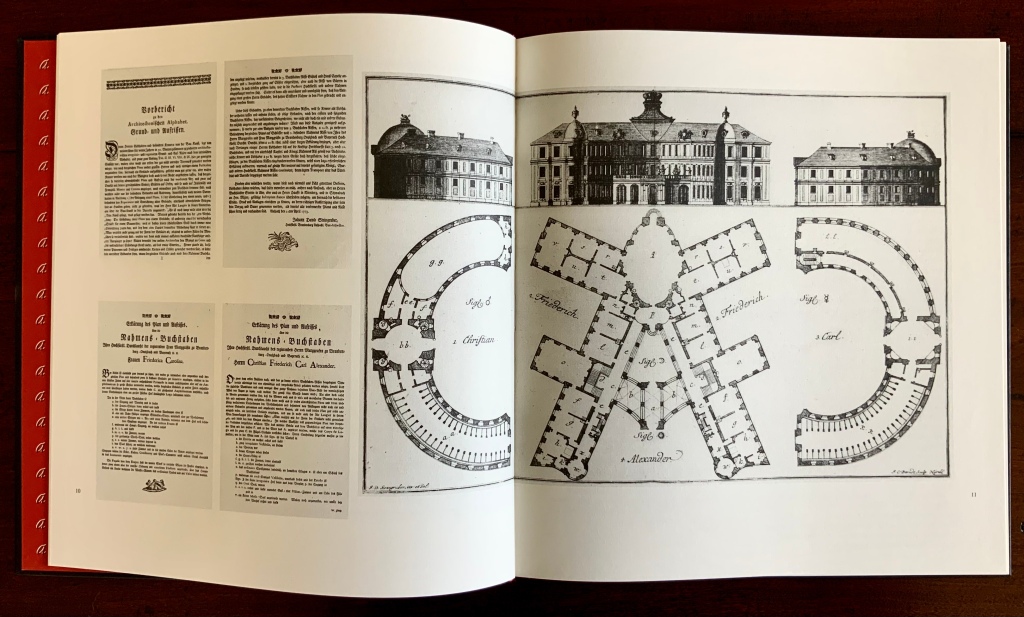
This wondering and wandering about the intersection of architecture and the artist’s book is prompted by the 250th anniversary of the publication of Johann David Steingruber’s Architectonisches Alphabeth(1773). This postcard-famous volume of print folios depicts architectural elevations and plans for residences in the shape of the letters of the alphabet. It is dedicated to Christian Friedrich Carl Alexander, Margrave of Brandenburg-Ansbach, not to be confused with the paying dedicatee of Bach’s Brandenburg Concertos, the Margrave of Brandenburg-Schwedt. By a baroque coincidence, however, the first Brandenburg concertos, the ones composed by Giuseppe Torelli and influencing Bach, are dedicated to the Margrave of Brandenburg-Ansbach, then George Friedrich II, Alexander’s great-uncle who employed Torelli as court composer. Unlike Bach, however, Torelli received no direct payment for his composition. Steingruber too had to be satisfied with his payment as an appointee (court and public surveyor, and later principal architect of the board of works).
Steingruber may have felt he had good reason to be miffed. After all he had published the volume in installments at his own expense and made sure that the Margrave’s monogram (and that of Carolina Frederica, his wife) in building form appeared in the span above the roman arch on the title page. His elevations and plans draw attention to the heating, kitchen, toilet and servants’ arrangements as if conferring with a prospective client ready to commission one of these typographic palaces. Perhaps he was thinking, Who would not want a serif with a view? Or conduct guests on a tour of the bowl, capline, crossbar, stem, stroke and tail of the property? In a flourish that illustrates the intersection of book and architecture, the title page presents the title and subtitle inside an arch and serves double duty as a Table of Contents with thumbnail images of the letter-shaped buildings to come inscribed on the columns.
Munich, Bavarian State Library
To celebrate the Architectural Alphabet‘s 250th anniversary, this online essay/exhibition explores sixteen propositions about the affinity of architecture and artists’ books. Examples supporting each proposition include works from within and without the Books On Books Collection, and each example includes a link or links for additional views of the work. Every effort has been made to provide bibliographical (or webliographical?) links from WorldCat and the Internet Archive. The former will allow the reader to find local libraries that hold a copy of the exhibited work to be viewed in person; the latter will partly address the problem of broken links. Where broken links (or factual errors) do appear, readers are encouraged to alert the curator in the Comments section at the end of the essay/exhibition.
Proposition #1: The affinity of architecture and artists’ books lies in the alphabet.
Architectonisches Alphabeth (1773/1995) Prepared by Joseph Kiermeier-Debre and Fritz Franz Vogel for Ravensburger Verlag.
Of course the first exhibit would be Steingruber’s Architectural Alphabet, but related works — before and after, published or built — will clamor for admission: Geofroy Tory’s Champ Fleury (1529/1927/1998), Antonio Basoli’sAlfabeto Pittorico(1839/1998), Giovanni Battista de Pian’s Alphabetto Pittoresque (1842), and Daniel Libeskind’s Contemporary Jewish Museum (2000), whose form within the walls of a former power substation is composed of two Hebrew letters — the Yud and the Chet — which make up the word Chai (“Life”).
Left to right: Tory/Rogers, Basoli, Battista de Pian (Photos by Books On Books Collection), Libeskind (The Yud Gallery, Photo by Paul Dyer).
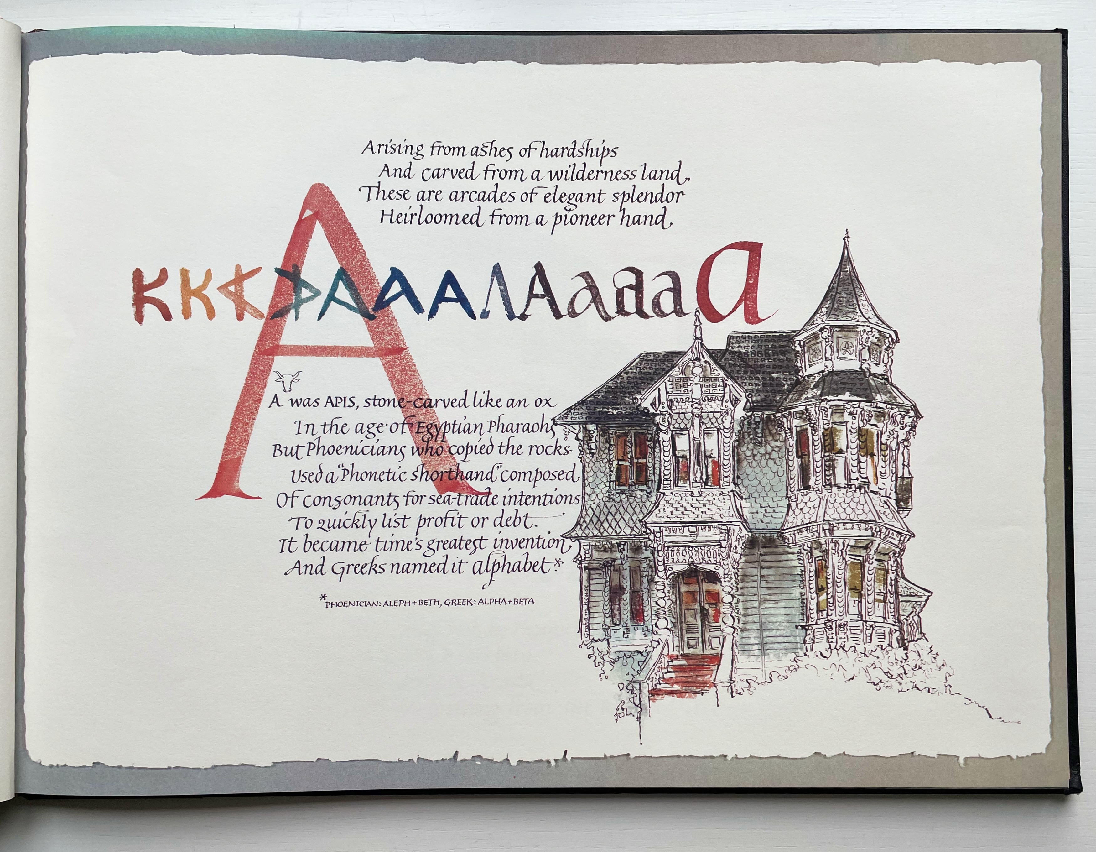
Lanore Cady’s Houses & Letters(1977) is another work supporting the proposition, in this case with calligraphy, watercolor and verse.
More than the novel inventions and historical associations above, though, the space within and around a letter, a building and the artist’s book suggests the real root of the affinity. As cultural historian Fiona MacCarthy put it: “‘the Italians knew by instinct what we are slowly grasping, that the meaning of the city is not so much a matter of the buildings as the spaces in between.’” To which John Ryder added: “‘This is exactly how typography works.’” (From David Esslemont’s Inside the Book, 2002). And it is exactly how book art works.
Proposition #2: The affinity of architecture and artists’ books lies in telling stories.
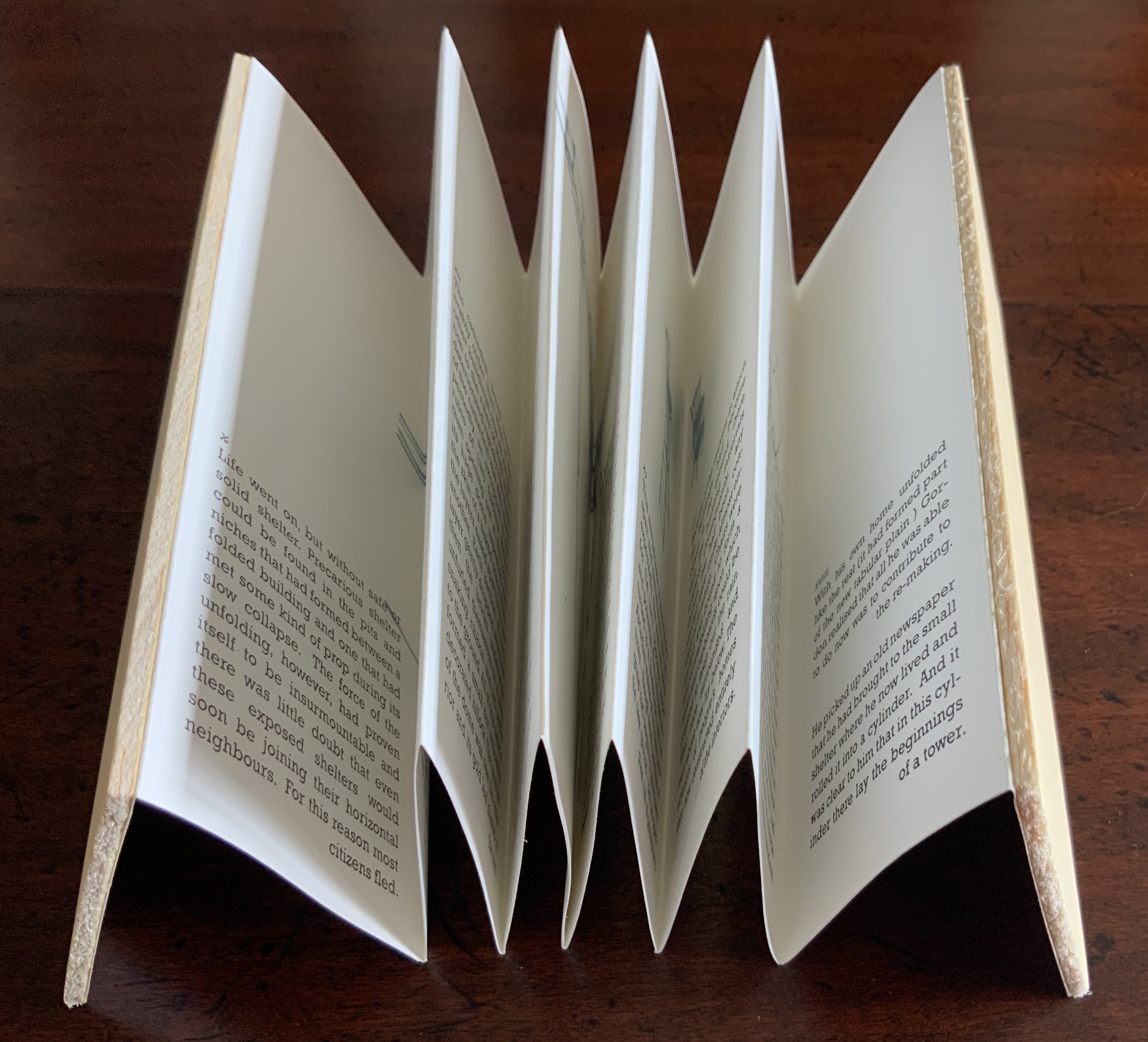
As Daniel Libeskind has said, “For me, a building is a medium to tell a story.” Emily Speed’s Unfolding Architecture (2007) tells the tale of Gordon, a city dweller who witnesses the collapse of public buildings and, ultimately, his own home as the urban fabric begins to unfold around him — a story replicated by the housing’s structure and the book’s accordion fold.
But Ulises Carrión denied that books are about narrative. Instead they are about space and time, which leads to the next proposition.
Proposition #3: The affinity of architecture and artists’ books lies in space and time.
Olafur Eliasson’s Your House (2006) is a laser-cut model of his residence in Copenhagen at a scale of 1:85, which means that each page equates to a 220 mm section of the actual house. In the film Russian Ark (2003), Aleksandr Sokurov made cinematic history with his one continuous shot in 90 minutes, depicting a 17th century time traveller moving through different periods of history as he moves through the rooms of St. Petersburg’s Winter Palace. The film inspired Johan Hybschmann’sBook of Space (2009).
How do you read works like this? The size, weight and delicacy of Eliasson’s book and the fragility of Hybschmann’s book and its need for an armature to freeze-frame it defy a simple turning of pages. They must be turned slowly and carefully. Both works heed the task of the arts as posed by architect Juhani Pallasmaa for our age of speed: to defend the comprehensibility of time, its experiential plasticity, tactility and slowness (The Embodied Image, p. 78).
Proposition #4: The affinity of architecture and artists’ books lies in process.
A trained architect and book artist, Marian Macken articulates and illustrates in her book Binding Space why and how the artist’s book can serve as an important tool for design, documentation and critique of architecture. Macken’s perceptive descriptions show how to observe materiality and its functioning and understand how they contribute to the making of art.
Investigating bookness results in the book becoming a highly productive intervening medium with which one can imagine, investigate, analyze, represent and exhibit particular qualities — haptically, and with narrative and ambiguity — of a built environment and the design process. Through the book, we read spatial practice anew (p. 163).
Reading Macken’s book will sharpen the ability of any reader or viewer to appreciate book art, especially her Ise Jingū: Beginning Repeated. Ise Jingū is a Shinto shrine complex in the Mie Prefecture, Japan. “Once every 20 years, since … the seventh century, every fence and building is completely rebuilt on an identical adjoining site, a practice of transposition known as shikinen-zōkan” (Binding Space, p. 101). For Macken, this ritualistic rebuilding poses architecture as performative process rather than as inert object; it “manifests the replication of a beginning, of a process” (p. 100).
Macken’s artwork consists of 61 loose sheets with a watermarked image within each, the number reflecting the 61 iterations of the shrine up until the making of this work of book art. The watermark is a perspective image based on Yoshio Watanabe’s photograph of the Inner Shrine, taken in 1953 on the occasion of the 59th rebuilding. The contrast of the watermark in kozo and the movement of its placement from one sheet to the next entice reflection on the phenomenon of representation and the architectural process of shikinen-zōkan.
Proposition #5: The affinity of architecture and artists’ books lies in phenomenology.
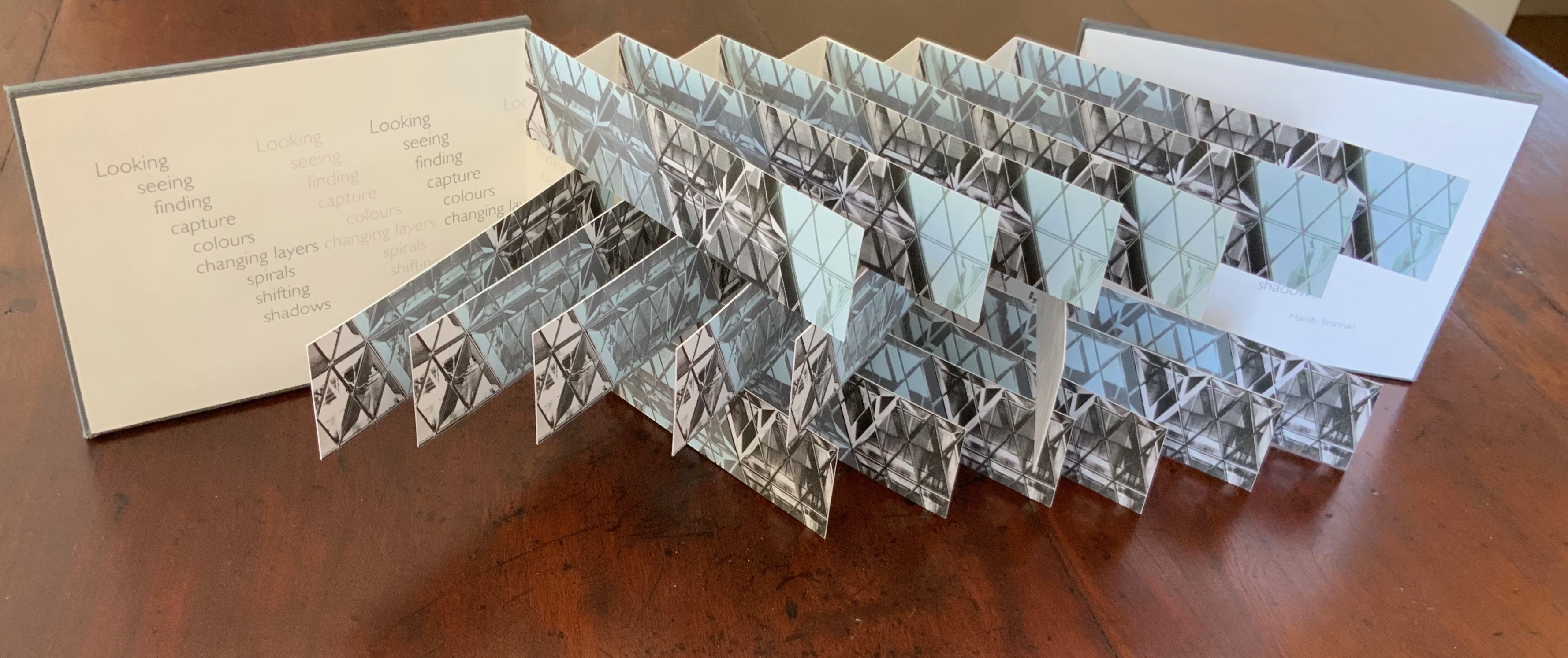
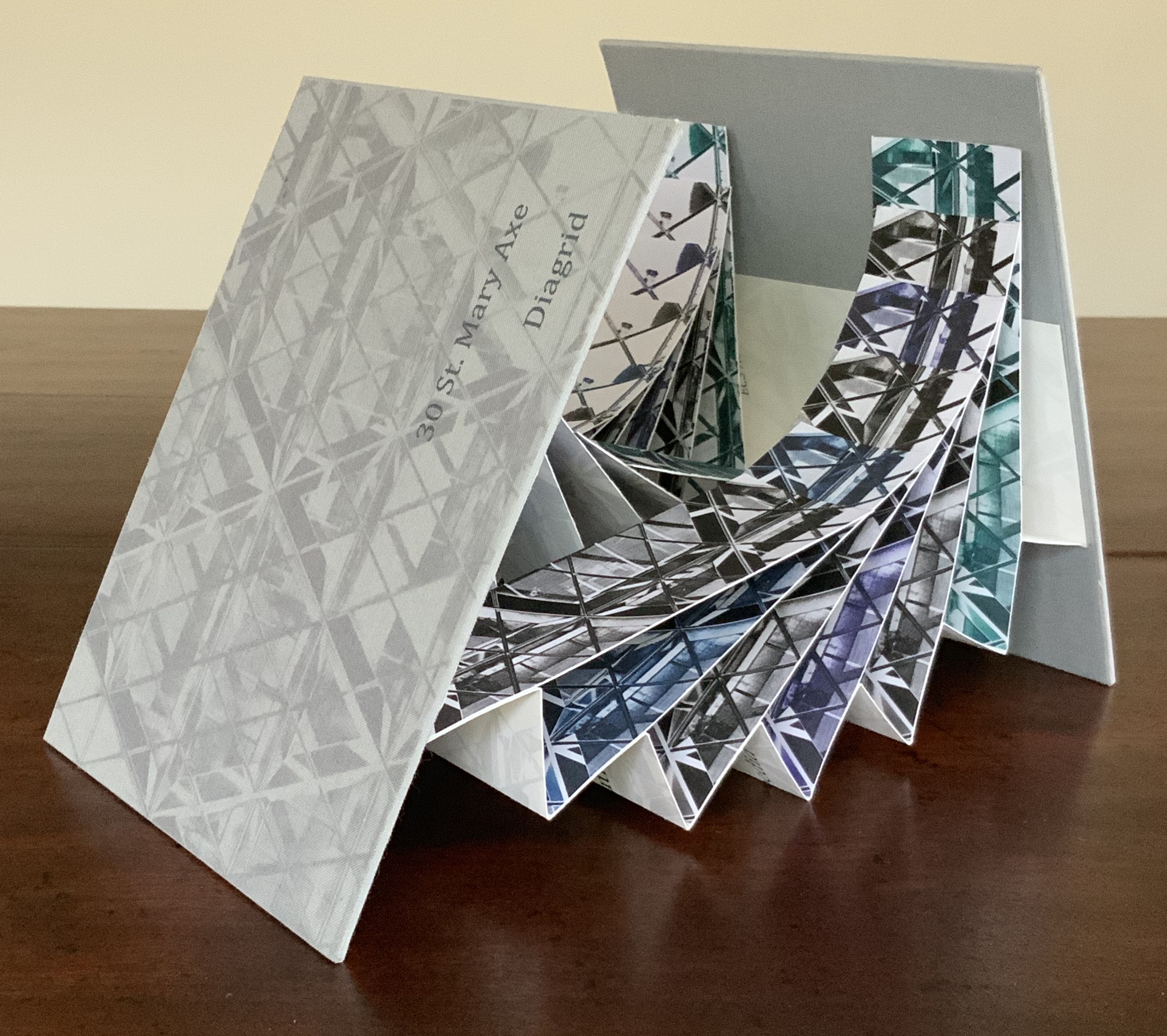
Architects such as Alfredo Muñoz and his firm ABIBOO, Juhani Pallasmaa and Peter Zumthor are among those often associated with architectural phenomenology, concerned with perception psychology, focused on the primacy of sensory and experiential qualities. Norman Foster and phenomenology are not so often yoked, but 30 St Mary Axe: Diagrid (2009) and 30 St. Mary Axe: Cladding(2009)– Mandy Brannan’s treatments of his iconic London office tower (aka “the Gherkin”) that refocus the perception and experience of it — might prompt reconsideration.
Proposition #6: The affinity of architecture and artists’ books lies in geometry.
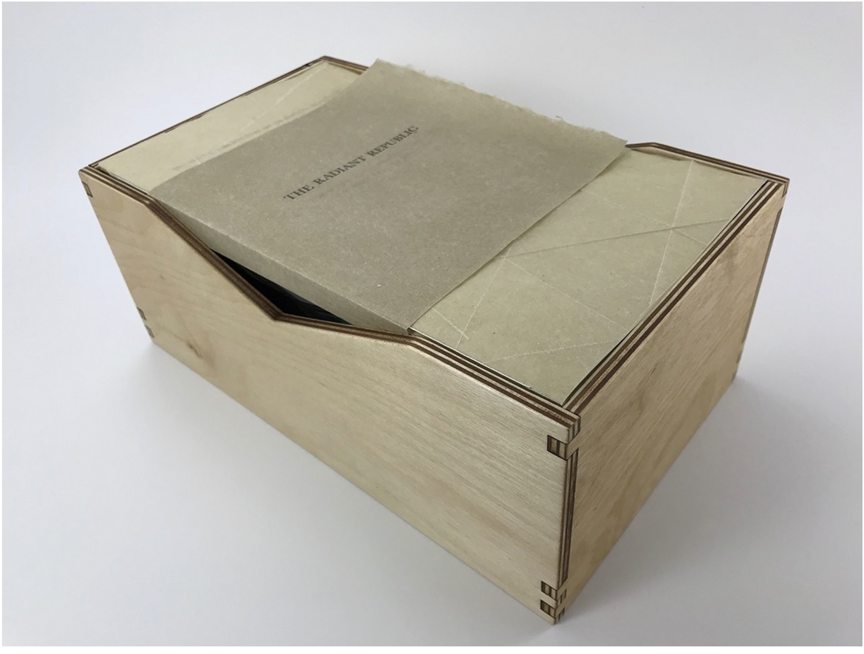
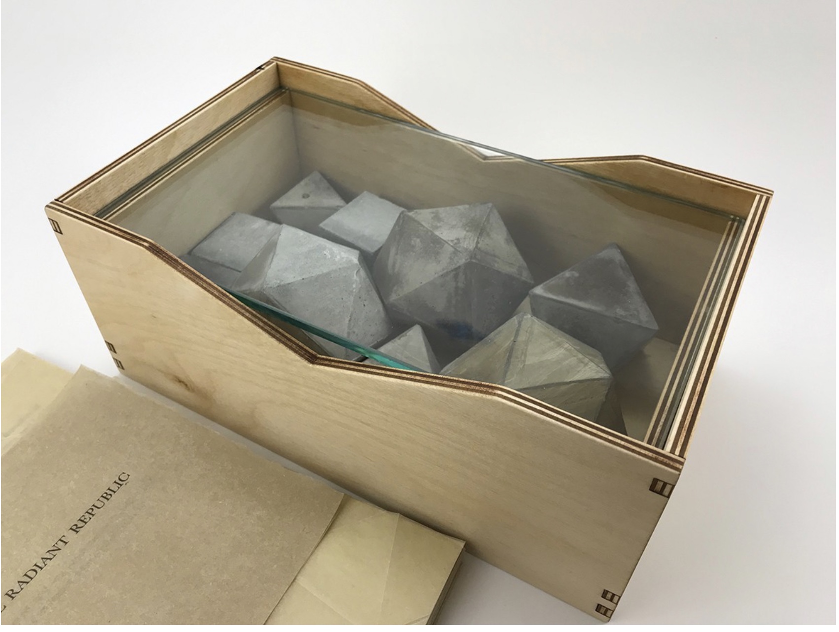
Sarah Bryant’s The Radiant Republic(2019) insightfully integrates Plato’s and Le Corbusier’s texts and ideas. The very physicality of the blond wood, linen cover, glass window, concrete representations of Platonic solids, embossed type and sewn papers could easily be a response to Juhani Pallasmaa’s comment: “The current overemphasis on the intellectual and conceptual dimensions of architecture contributes to the disappearance of its physical, sensual and embodied essence” (The Eyes of the Skin, p. 35).
Proposition #7: The affinity of architecture and artists’ books lies in modelling.
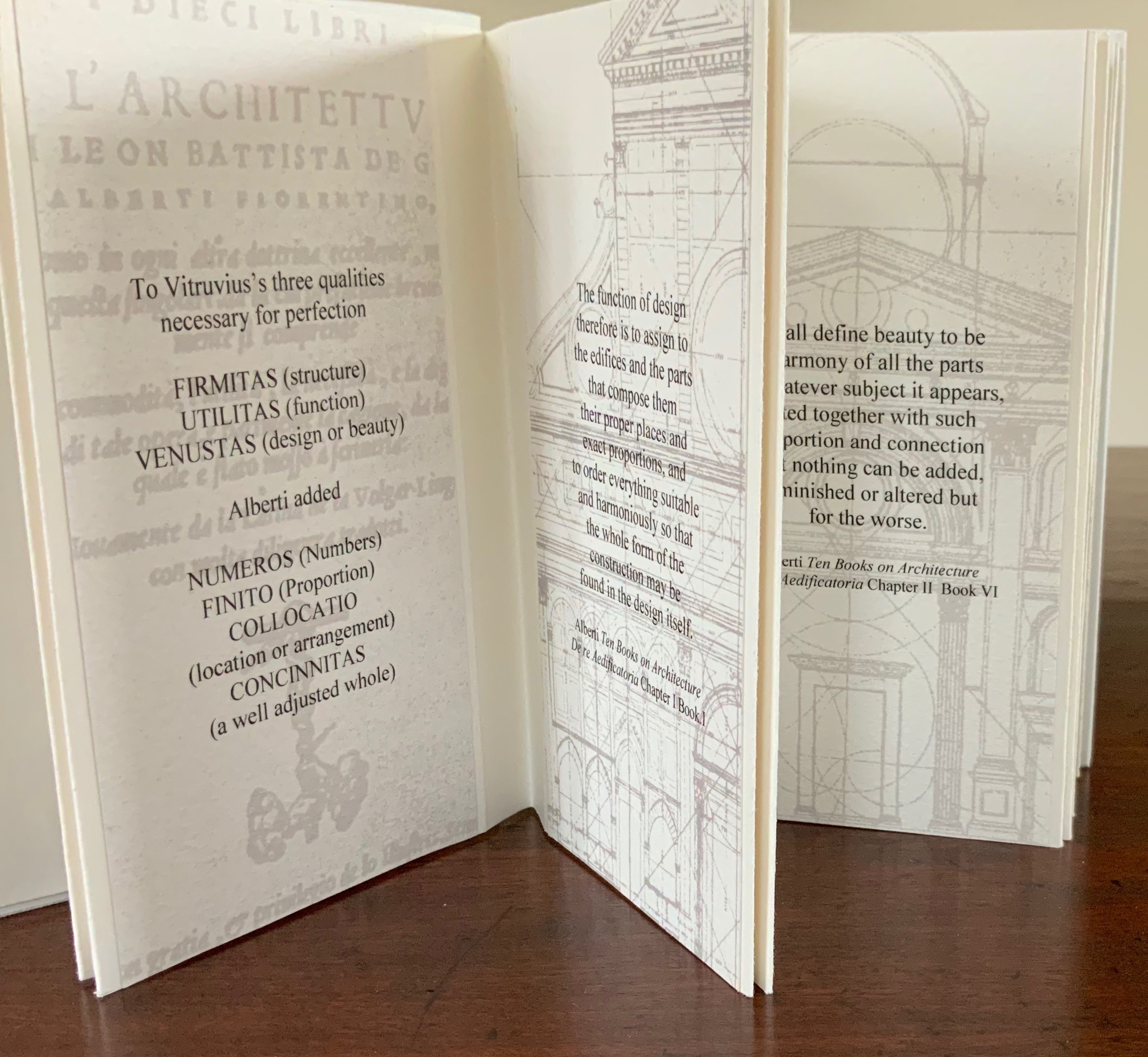
Helen Malone’s Ten Books of Architecture (2017) takes a broad historical and, most important, haptic view of architecture from Vitruvius to Hadid. Each of the ten books is a bookwork that models its architectural subject.
Proposition #8: The affinity of architecture and artists’ books lies in folding.
At the end of the 20th century, architects like Peter Eisenman, Jeffrey Kipnis and Greg Lynn latched on to computer-aided design and Gilles Deleuze’s Le pli: Leibniz et le baroque (1988) / The Fold: Leibniz and the Baroque (1993). This led to real constructions such as Eisenman’s Rebstock Park in Frankfurt as well as to the seminal books Folding in Architecture (1993), edited by Lynn, and Folding Architecture 92003) by Sophia Vyzoviti.
Folded book pages rarely generate a work that rises above mere craft. Heather Hunter’s Observer Series: Architecture(2009) achieves the necessary height. It combines the altered book with an accordion book that incorporates a found poem composed of the words excised and folded outwards from the folded pages of The Observer’s Book of Architecture.
Proposition #9: The affinity of architecture and artists’ books lies in light.
Marlene MacCallum’sTheme and Permutation(2012) is a response to the permutations and variations over time in five houses built to a common plan in Townsite area of Corner Brook, Newfoundland. MacCallum used digital tools to translate the original film source of eight different window images from the houses. A tritone image of a single Townsite window under translucent pages opens the book. As the pages turn, new window images appear and layer over each other, darkening up to the book’s mid-point. In the center spread, two text blocks appear speaking to the history, architectural permutations and economic shifts of the Townsite area. The tonality begins to lighten over the ensuing new combinations of window layers. A third text block of personal narrative is introduced, and a tritone image of one of the Townsite windows in its original condition concludes the work.
Proposition #10: The affinity of architecture and artists’ books lies in perspective.
Cees Nagelkerke’s Piranesian Window (1996) resides in the Vedute Foundation’s collection of “spatial manuscripts”, invited works that must conform to the dimensions of the Gutenberg Bible. Piranesian Window‘s form and title capture multiple meanings of vedute (“views”). Views are things seen — which this spatial manuscript is. Views are prospects from which to see — which a window offers. Views are perspectives — for which Giambattista Piranesi’s etchings are famous. Views are thoughts held — which “Piranesian” implies (the work’s title could be that of a manuscript on art history and philosophy). Piranesi’s mid-eighteenth century etchings Vedute di Roma(“Views of Rome”) and Carceri d’invenzione (“Imaginary Prisons”) are the obvious sources of inspiration, but Nagelkerke provides an interview describing the dream source of the work:
– … Please, continue relating your dream … – I wandered through vast ruins … along wrecked bridges … feeling remarkably at ease. – How did you find the window in this windowless world? – When a cool breeze wafted inside, I suddenly saw it. It showed a landscape, within the distance a city. There was complete tranquillity and harmony there, like in a painting by Piero della Francesca … I stood there for some considerable time and I became increasingly saddened, because I discovered that I was looking at something that had vanished forever. – But how did you manage to take the window? – I wanted to touch it … as a result, I immediately fell down. The gap left in the wall closed by itself … I picked it up and continued on my way, meeting people who spoke to me saying that I should leave the Carceri. I was taken to a gateway. No one looked at, or said anything about, the window… In the square where I found myself, there was an intense, chaotic commotion. The window still reflected something of the vast space I had left. The exterior showed traces of the wall in which it had been mounted. I looked through it and saw everyday life …
Proposition #11: The affinity of architecture and artists’ books lies in archaeology.
Mill: A journey around Cromford Mill, Derbyshire (2006) by Salt + Shaw (Paul Salt and Susan Shaw) is the result of the artists’ exploration of Cromford Mill in Derbyshire, the first water-powered, cotton-spinning mill developed by Richard Arkwright in 1771. Bound in a cover of recycled wooden library shelves, three plaster cast blocks and seven calico pocket pages containing hidden texts imply the hidden archaeological history to be found. The forensic-like casts are taken from interior surfaces, and the texts walk the reader step by step through each area of the mill.
Proposition #12: The affinity of architecture and artists’ books lies in assemblage and collage.
Based on an architectural installation at the Minnesota College for Art and Design and drawing on her photos of Ayvalik, Amsterdam, Florence, Istanbul, New York City, Rome, San Diego and Venice, Karen Wirth’sPaper Architecture (2017) certainly prompts a revisit to MoMA’s “Cut ’n’ Paste: From Architectural Assemblage to Collage City“, 10 July 2013 – 5 January 2015, to prove this proposition.
Proposition #13: The affinity of architecture and artists’ books lies in luxe.
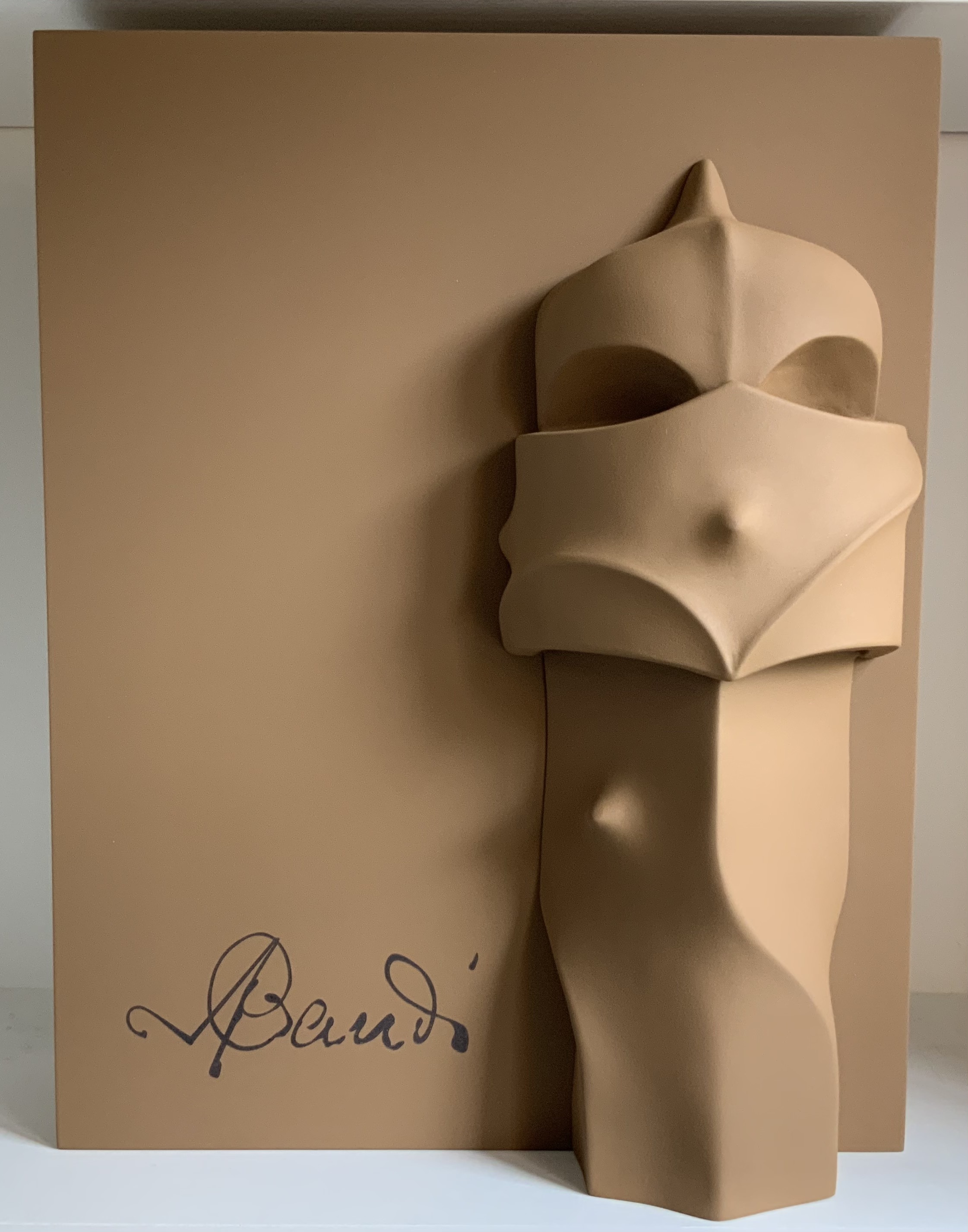
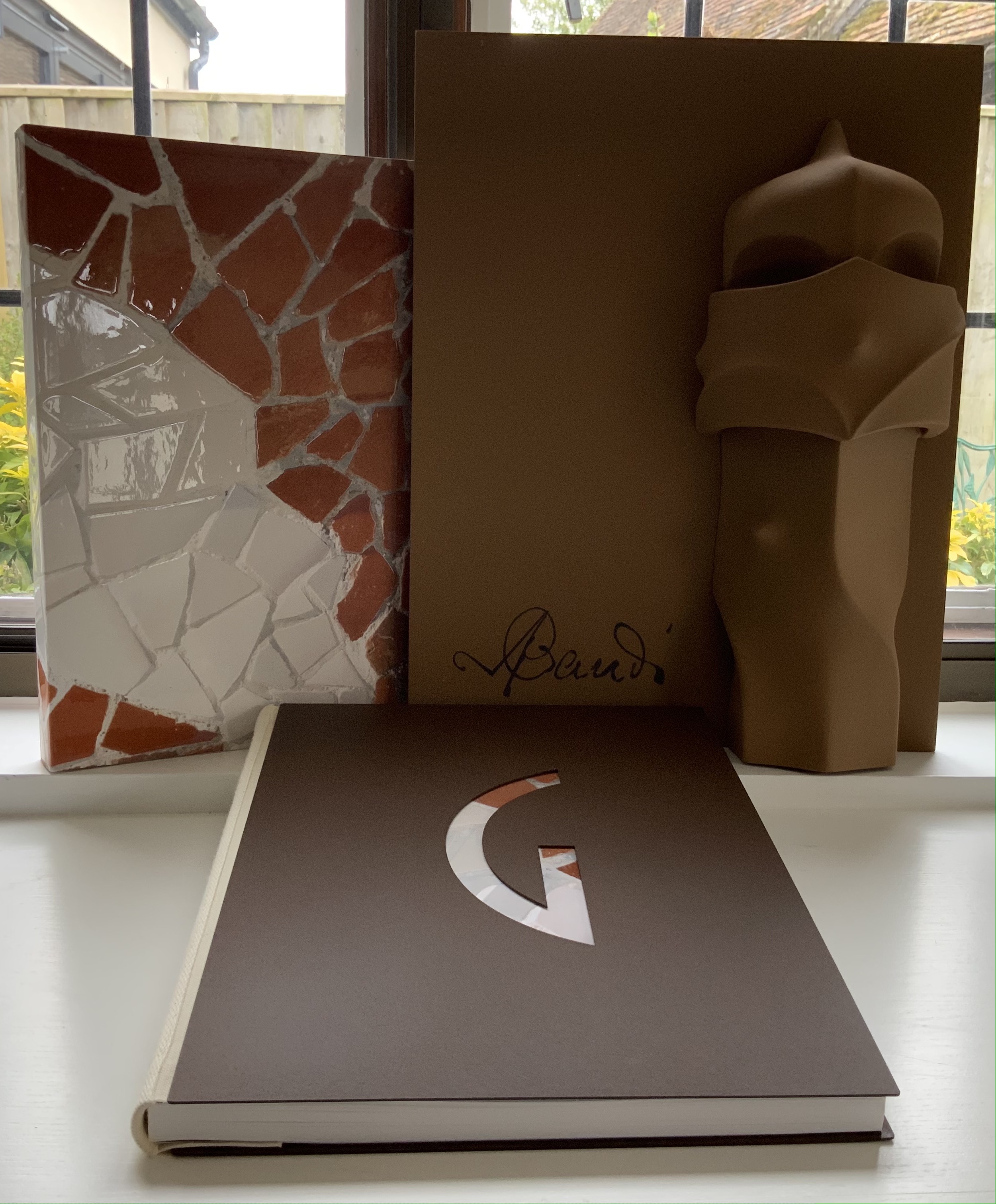
Early theorists, critics and artists of book art expended great effort to exclude livres d’artiste and deluxe productions from the definition of a form of art that struggled to find a name: artist’s book, artists’ books, bookworks, book art, etc. The spectrum from objects of conspicuous consumption to democratic multiples characterizes both architecture and book art. Antoni Gaudí’s architectural efforts easily span that spectrum — from his Casa Milà to his tiles found underfoot in Barcelona’s Passeig de Gràcia. Under the guidance of Juan José Lahuerta (chief curator at the National Museum of Art of Catalonia), the publisher Artika produced Gaudí Up Close(2020), enclosed in a wooden case with marble sculpture finished in paint, cement powder and anti-graffiti varnishes and lined with Naturlinnen fabric.
Gaudí Up Close(2020) Published by Artika. Photos: Books On Books Collection.
Proposition #14: The affinity of architecture and artists’ books lies in the memorial.
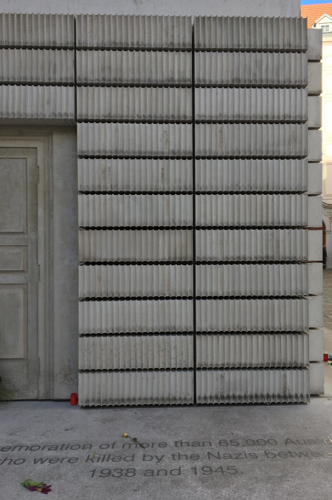
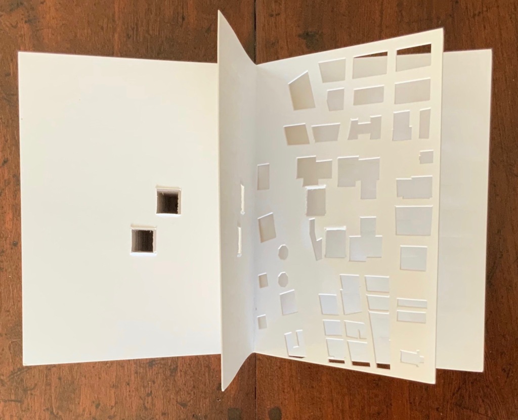
As you turn the corner into Judenplatz in Vienna, Rachel Whiteread’s great cube appears showing only the fore edge of book after book. As you hold J. Meejin Yoon’s small white brick of paper and turn its thick pages, a small pinhole appears on the page. Then two larger square holes emerge, one of which falls over the pinhole. Page after page, the two square holes repeat, creating two small dark wells in the field of white, until on the last page they take their place in the cut-out schematic footprint of the city blocks and buildings surrounding the Twin Towers. Whiteread’sNameless Library (2000) and Yoon’sAbsence (2004) surely underscore this proposition of memorial.
Proposition #15: The affinity of architecture and artists’ books lies in the sacred.
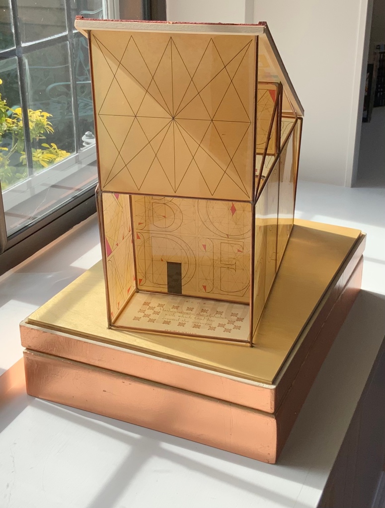
Jeffrey Morin and Steven Ferlauto’s Sacred Space (2003) is an intimate monument of book art. Made intimate by the content and texture of its book, made more intimate by the viewer’s having to construct the chapel. Made monumental by the echo of typographic history, made more monumental in Galileo Galilei’s echo from its floor: Mathematics is the alphabet with which God has created the universe.
Proposition #16: The affinity of architecture and artists’ books lies in collaboration.
In Victor Hugo’s Nôtre-Dame de Paris (1831), Archdeacon Claude Frollo points to the book in his hand and then to the cathedral and says, “This will kill that”. It is ironic that Hugo’s book (popularly known now by its English title The Hunchback of Nôtre-Dame) was written in large part to save the then-decaying cathedral (post-Revolution, it served as a warehouse), and it succeeded. It is also ironic that, while the fictional character’s metaphor has a point about the book’s permanence of replicability outlasting the building’s permanence of stone, it misses the collaborative foundations of both.
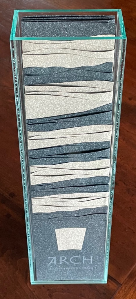
Created by ten students at Scripps College under the direction of Kitty Maryatt, Arch (2010) reminds us that the creation of a book — even a work of book art — is a collaborative effort.
Arch (2010) Kitty Maryatt, Jenny Karin Morrill, Ali Standish, Alycia Lang, Jennifer Wineke, Mandesha Marcus, Catherine Wang, Kathryn Hunt, Ilse Wogau, Jennifer Cohen, Winnie Ding Photos: Books On Books Collection
Maryatt’s preface to Arch is entitled “Blueprint” and is brief enough to warrant citing in full:
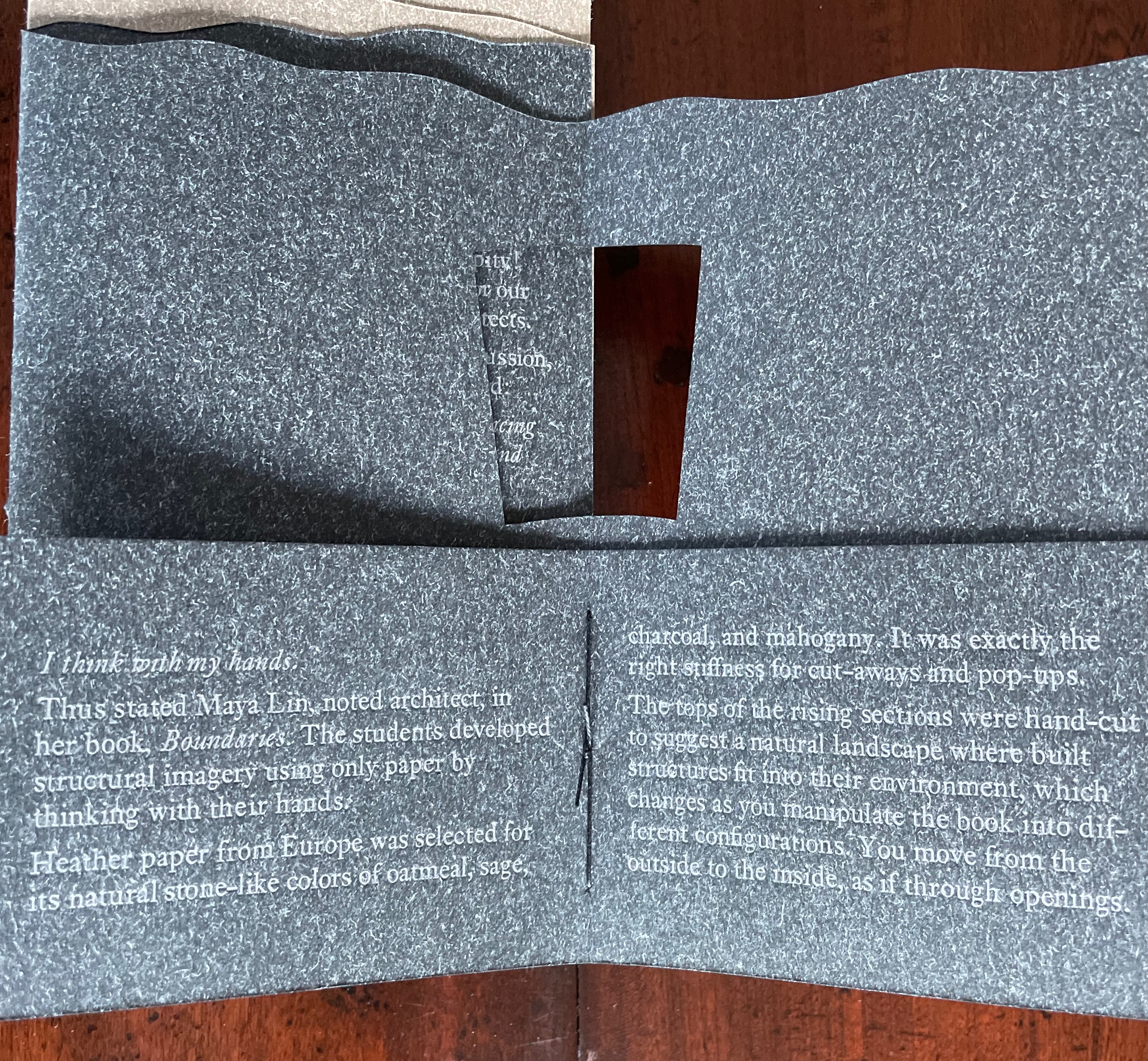
Books are inherently architectonic. Studying architecture would naturally be profitable to students building their own books.
On January 17, 2010, just days before class was to start, the Los Angeles Times published a fascinating article on contemporary women architects, highlighting a striking building by Jeannie Gang.
Earlier this year, the brand-new President of Scripps College chose The Genius of Women as her inaugural theme. What serendipity! This gave us the perfect inspiration for our artist book: the genius of women architects.
After extensive research and class discussion, a mission statement for the book evolved:
Architecture, like books, is a delicate balancing act between stability and motion, interior and exterior, aesthetic values and structural practicalities.
Books, like building, are fundamentally inhabited spaces. They are incomplete without human interaction.
The first portals were built of post and lintel construction. A curved arch is more difficult: the keystone is needed at the apex to lock the other pieces into position. Building a book is a similarly difficult feat. — Professor Kitty Maryatt
Conclusion: The affinity of architecture and artists’ books lies in our attraction to the beauty of form.
No doubt the proximity of the need for shelter and the need for oral and written language have played some gravitational role of mutual attraction for architecture and books (and latterly artists’ books). But equally, both architecture and artists’ books speak to our attraction to the beauty of form. All of the examples above are re-offered here in support of this proposition. Look at them again.
“Architecture”, “art” and “the book” are all fluid concepts. So it should be no surprise that we arrive at the equally fluid similes: architecture is like book art, book art is like architecture.
An earlier version of this essay appeared in The Blue Notebook, Volume 16 No 2, Spring – Summer 2022.
Further Reading
“Architecture“. 12 November 2018. Bookmarking Book Art.
Lynn, Greg. 2004. Folding in Architecture Rev. ed. Chichester, West Sussex: Wiley-Academy. See for references to Mario Carpo, Gilles Deleuze and Peter Eisenman.
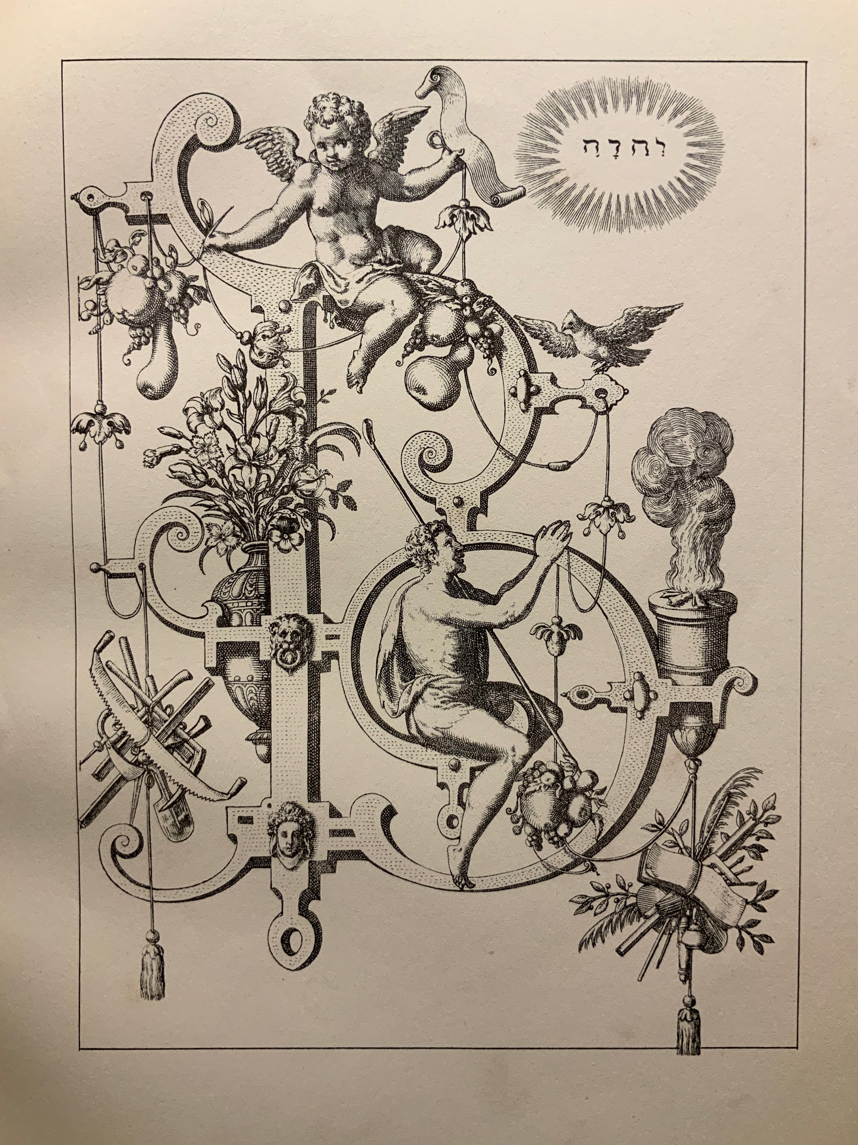
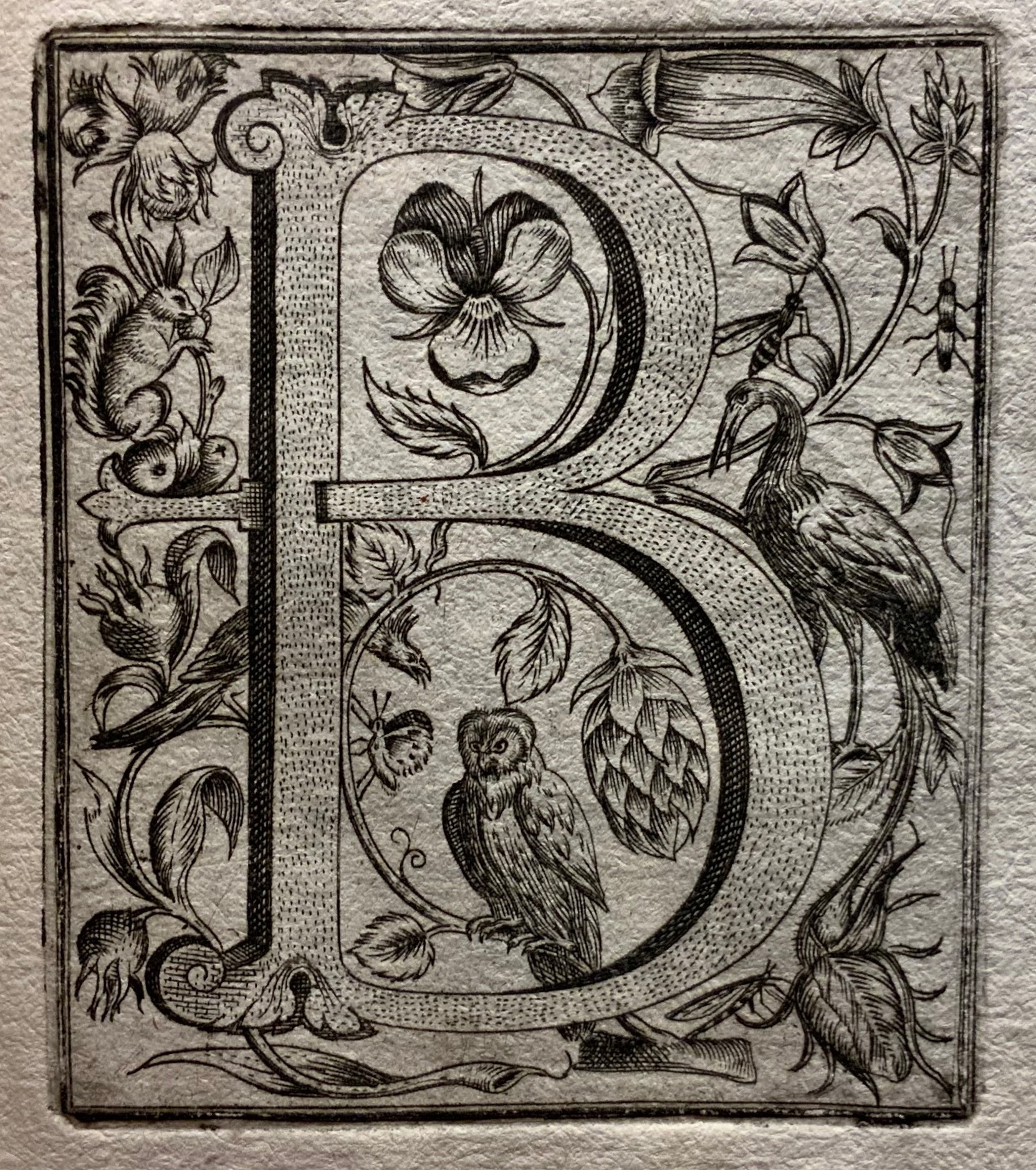
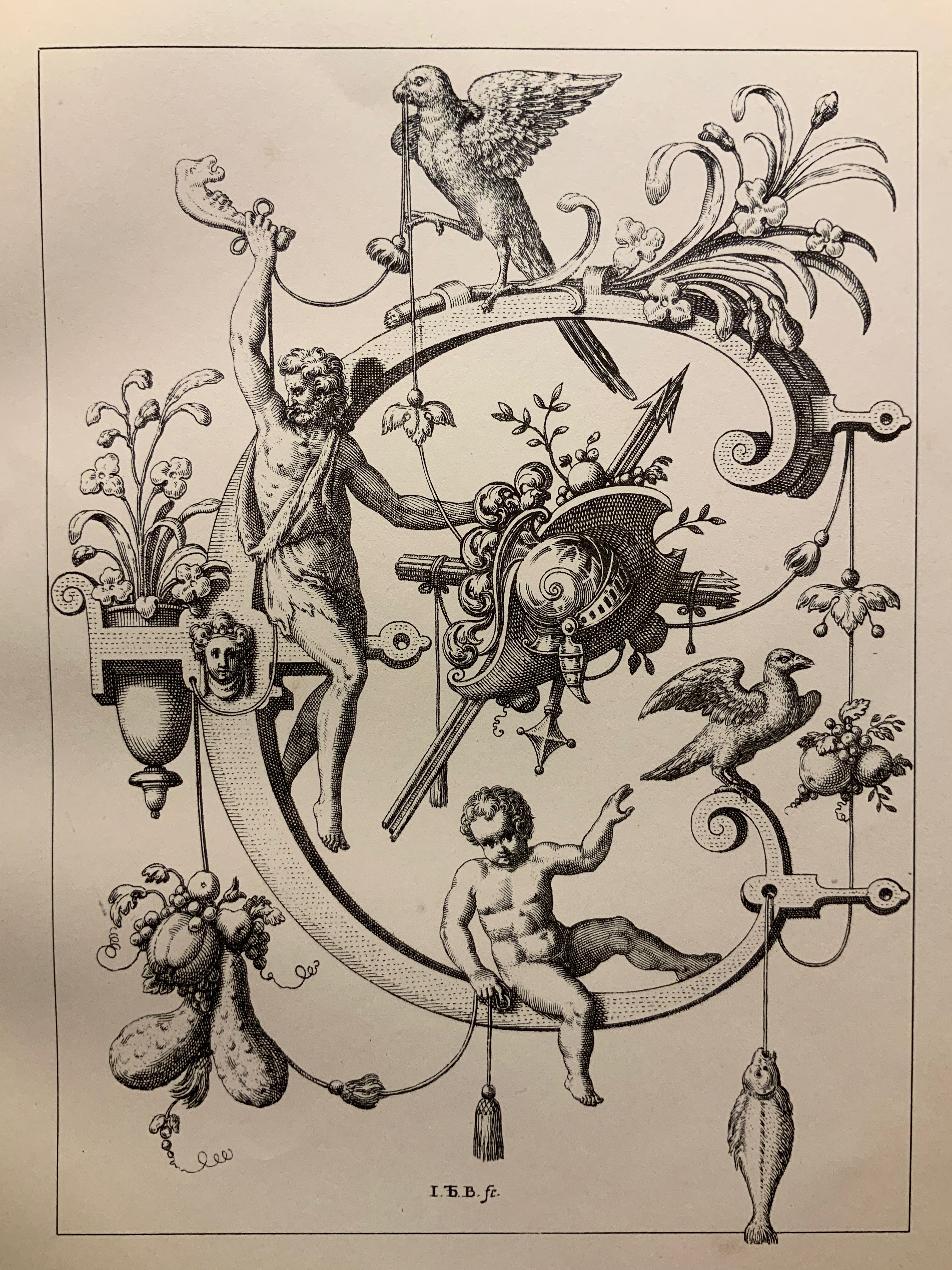
Neiw Kunstliches Alphabet (1595/1995) Johann Theodor de Bry Facsimile edition created by Joseph Kiermeier-Debre and Fritz Franz Vogel as part of the boxed set Alphabets Buchstaben Calligraphy, published by Ravensburger Buchverlag (1998). H275 x W255 mm, 80 pages. Acquired from Antiquariat Terrahe & Oswald, 14 March 2021. Photos: Books On Books Collection.
Johann Theodor de Dry and his sons were copperplate engravers, best known for their Grands and Petits Voyages (1590-1634) of 57 separate parts, containing over 500 different engravings illustrating the explorations of the world beyond the shores of 16th and 17th century Europe. While the De Brys’ place in the history of book art might be traced from their illustrations of Hans Staden’s tales of Brazilian cannibals to Oswald de Andrade’s “Manifesto Antropófago” [Cannibal Manifesto] (1928) and Moussa Kone’s Nowhere Land (2017), their equally strong, if not better, claim rests on the Neiw Kunstliches Alphabet (1595) and the Alphabeta et characteres (1596).
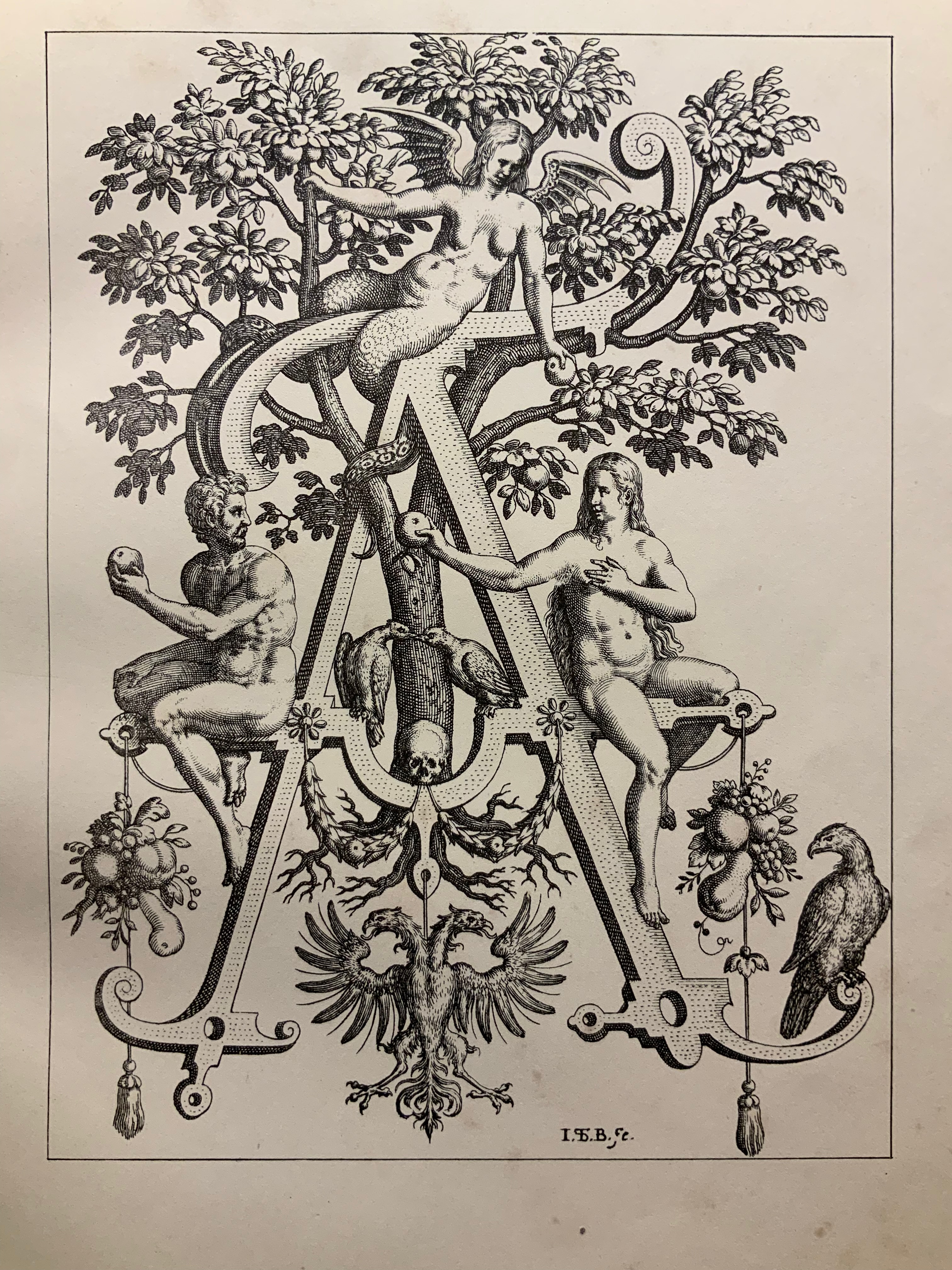
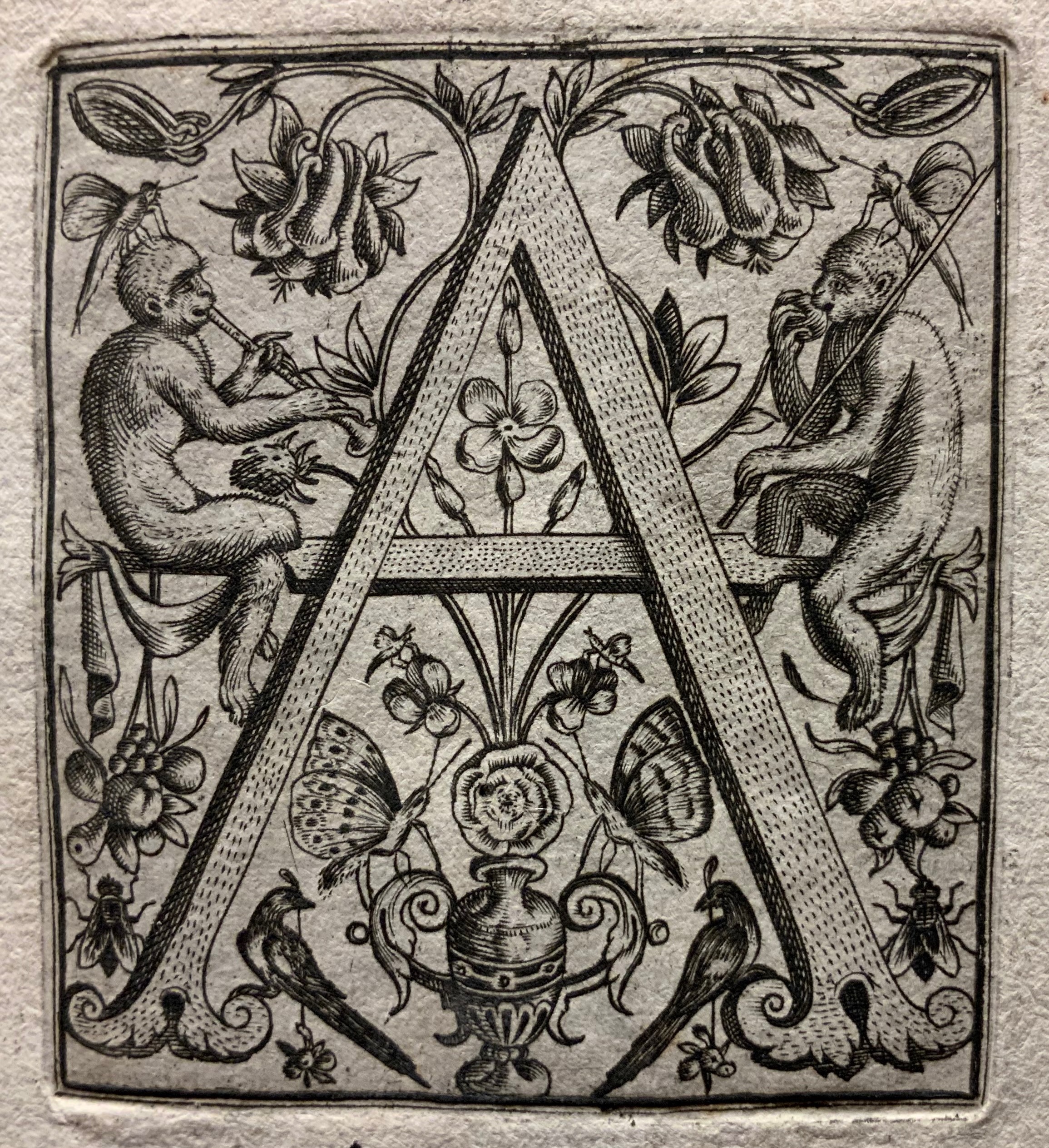
The Neiw Kunstliches Alphabet presents the letters of the alphabet adorned with Judaeo-Christian allegorical figures, vegetation, birds and animals, instruments, implements, weapons and regal emblems. An octave in Latin and one in German provide hints for identifying the allegorical and emblematic references. At the end of the De Brys’ alphabet atlas Alphabeta et characteres, iam inde a creato mundo ad nostra usq. tempora, apud omnes omnino nationes usurpat (1596) depicting dozens of alphabets — the Chaldaic, Egyptian, Hebrew, Greek, Slavonic, Hispanic, Latin and so on — another decorated alphabet and an alphabet formed of human figures make their appearance.
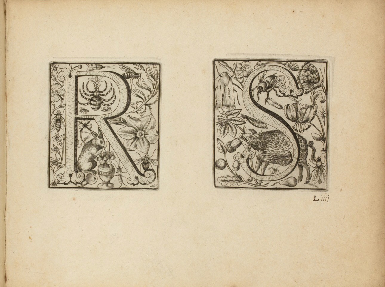
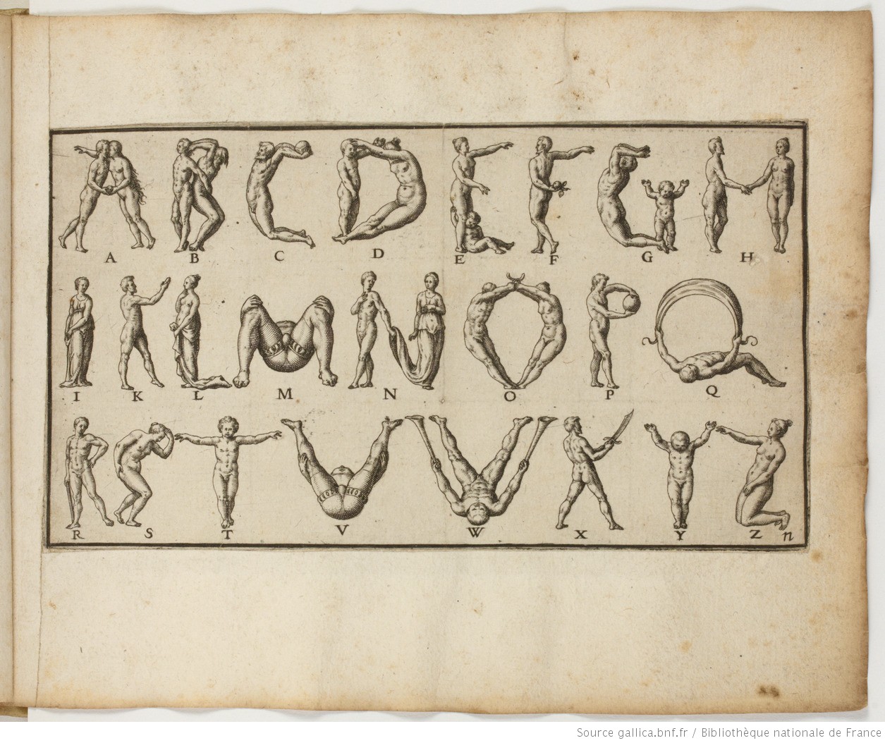
Letters R&S and the human alphabet from Alphabeta et characteres, iam inde a creato mundo ad nostra usq. tempora, apud omnes omnino nationes usurpat (1596). Images: Bibliothèque nationale de France.
Kiermeier-Debre and Vogel reproduce to scale the letters from the Neiw Kunstliches Alphabet and present thumb-nail versions of the alphabets as well as the decorated letters from Alphabeta et characteres. Their facsimile is not the first for these works. J.N. Stoltzenberger printed Alphabeta et characteres in translation for William Fitzer in 1628, and George Waterston & Sons published Neiw Kunstliches Alphabet as The New Artistic Alphabet in 1880 (albeit without the original’s text and verses). By juxtaposing all these originals, Kiermeier-Debre and Vogel provide a concentration of what makes the De Brys partial forerunners in the history of book art: images embracing letters (and letters embracing images).
Joseph Kiermeier-Debre and Fritz Franz Vogel facsimile (1995) of Neiw Kunstliches Alphabet (1595), pp. 12-13. Photos: Books On Books Collection.
Other abecedaries in the Books On Books Collection that strike the Baroque note or blend image and letter in ways that argue a descendancy from the De Brys include
De Bry also published Michael Maier’s Atalanta Fugiens or Emblemata Nova (1618), which is represented in the Books On Books Collection by Daniel E. Kelm’s Möbius version Neo Emblemata Nova (2005).
Further Reading
“Paulus Franck“. 22 March 2022. Books On Books Collection.
“Richard Niessen“. 23 April 2021. Books On Books Collection.
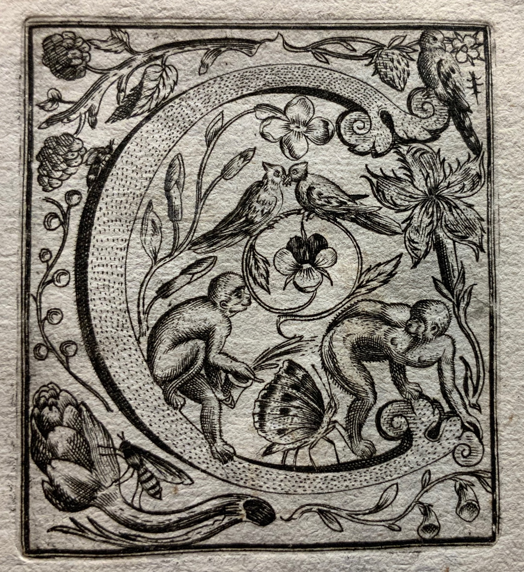
Schatzkammer Allerhand Versalien (1601/1995) Paulus Franck Facsimile edition created by Joseph Kiermeier-Debre and Fritz Franz Vogel as part of the boxed set Alphabets Buchstaben Calligraphy, published by Ravensburger Buchverlag (1998). Hardback. H275 x W255 mm, 80 pages. Acquired from Antiquariat Terrahe & Oswald, 14 March 2021. Photos: Books On Books Collection.
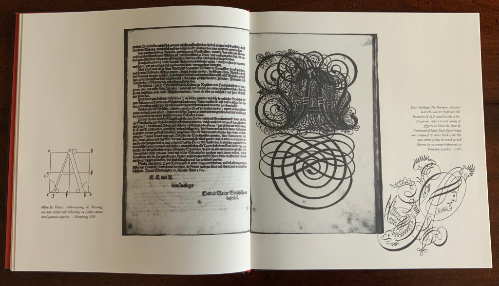
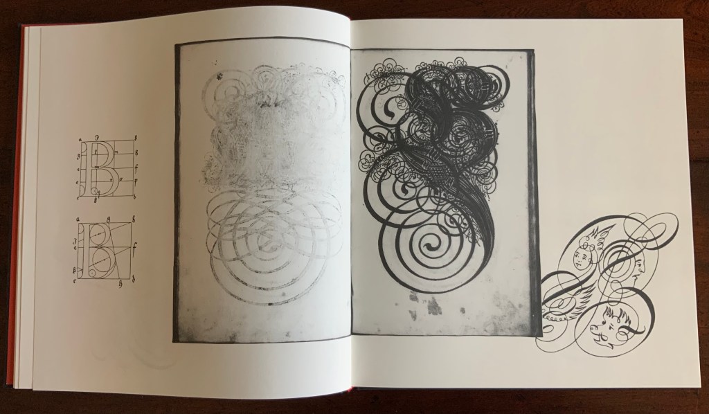
Little is known of Paulus Franck himself (although the editors reveal a Caravaggesque manslaughter charge in his home town of Memmingen), so the focus rests mainly on Schatzkammer, Allerhand Versalien Lateinisch vnnd Teutsch: allen Cantzleyen Schreibstuben Notaren Schreibern vnd denen so sich des zierlichen schreibens befleissigen zudienst vnd wolgefallen von neüen in Druckh also verferttiget (as the full title goes). The editors position Franck’s Treasury in the context of the phenomena of the writing master, penmanship and calligraphy from 1500 to 1800, even regaling the reader with tales of poor Franck’s castigation by Nuremberg’s calligraphic dynasty the Neudörffers. The editors neatly use the margins of their book to add to the historical context. Below, on the verso page, they have the geometrically controlled design of Albrecht Durer (1525), and on the recto, the exuberance of John Seddon (1695).
One element not extolled by the editors is the printing from woodcuts. The quality of the woodcuts can be better appreciated by looking at the scanned original available from the Bayerische Staats Bibliothek (BSB). Conveniently, the site BibliOdyssey has downloaded the letters and provided additional links. At his Type Design Information Page, Luc Devroye also reproduces Franck’s ornate letters from the 1601 manual as well as from a later volume produced by Paul Fürst (better known for his print “Der Doctor Schnabel von Rom“) and printed by Christoph Gerhard in 1655.
This facsimile of Franck’s Treasury makes up one of four volumes in a box set, edited by Joseph Kiermeier-Debre and Fritz Franz Vogel. The other three present works by Antonio Basoli, Johann Theodor de Bry and Johann David Steingruber. To see Franck’s continuing influence, visit the collection entry on Tauba Auerbach.
Further Reading
“Tauba Auerbach“, Books On Books Collection, 23 March 2021.
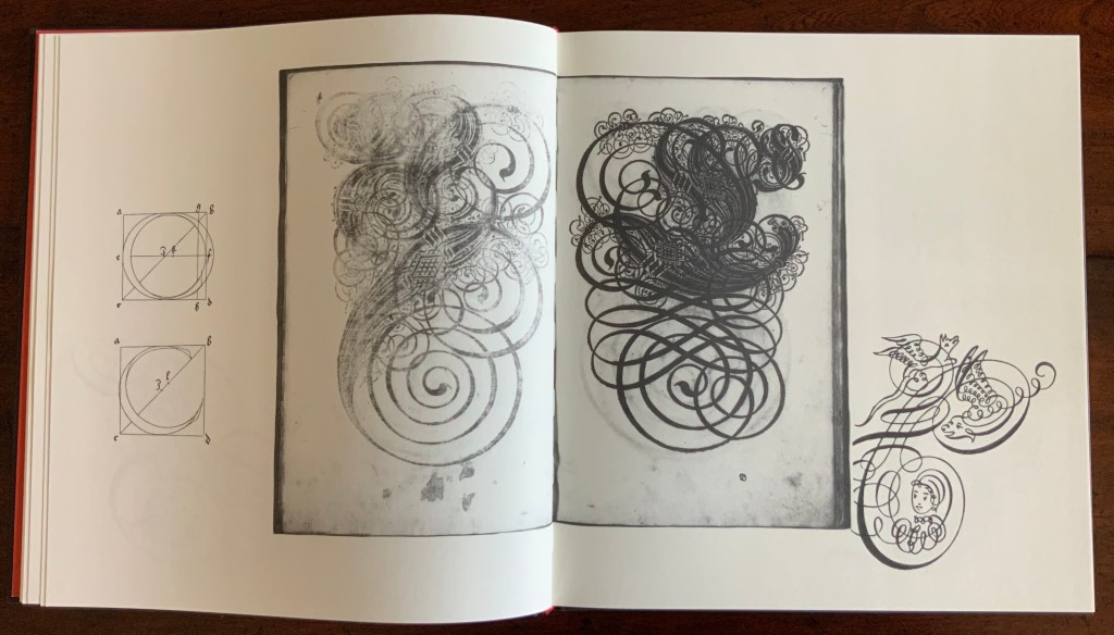
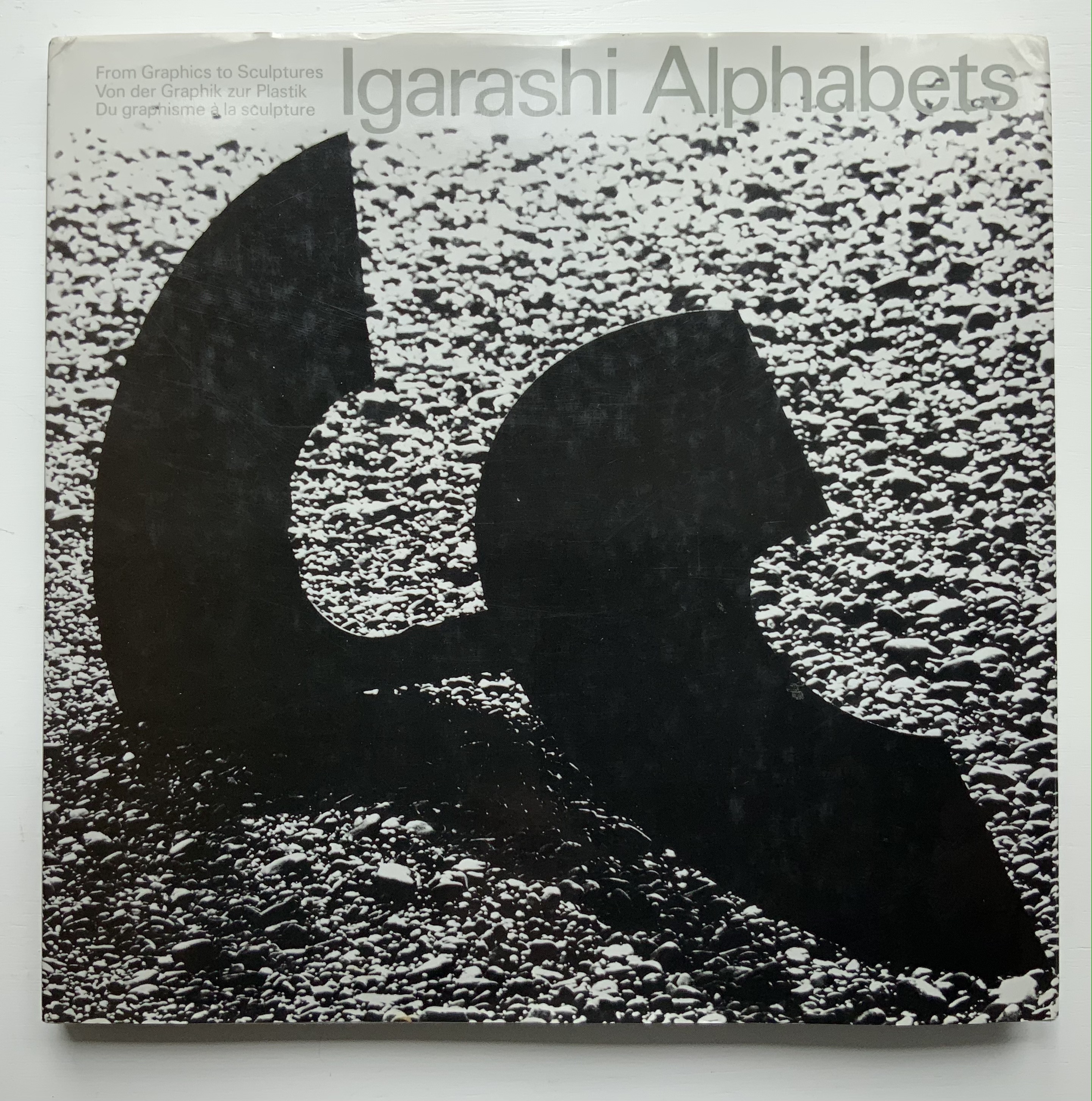
Thirty-three years after this rare volume’s appearance, some renewed interest in Igarishi’s design and artistry has arisen. The Thames & Hudson volume noted below was widely noted but reviewed in depth in only a few places (see below).
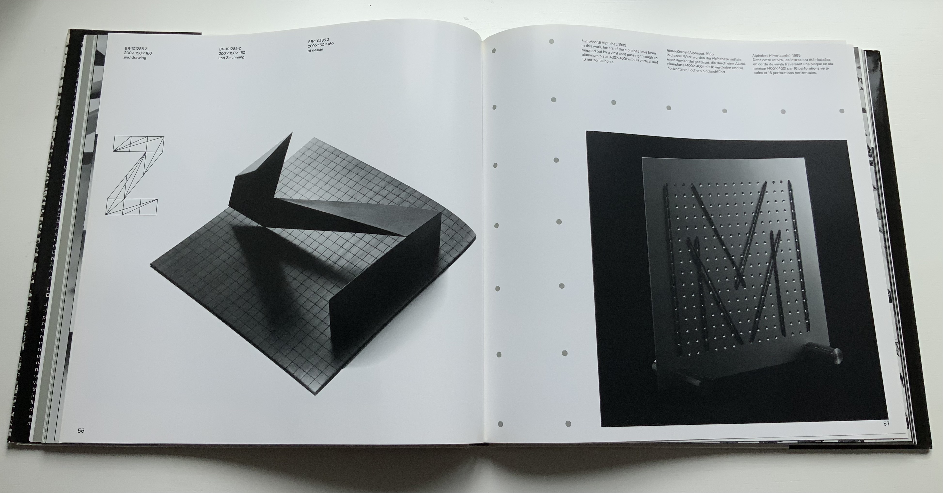
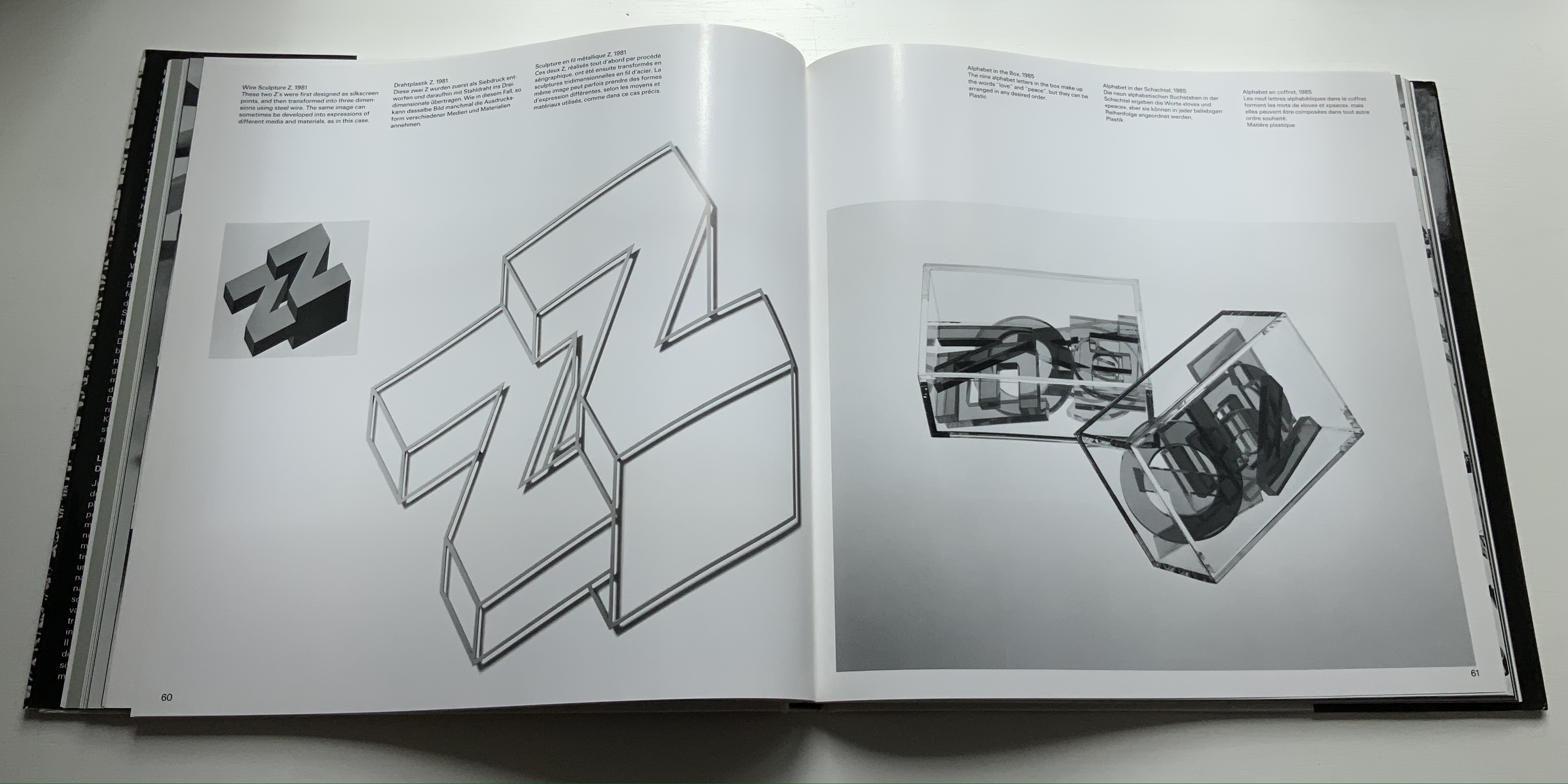
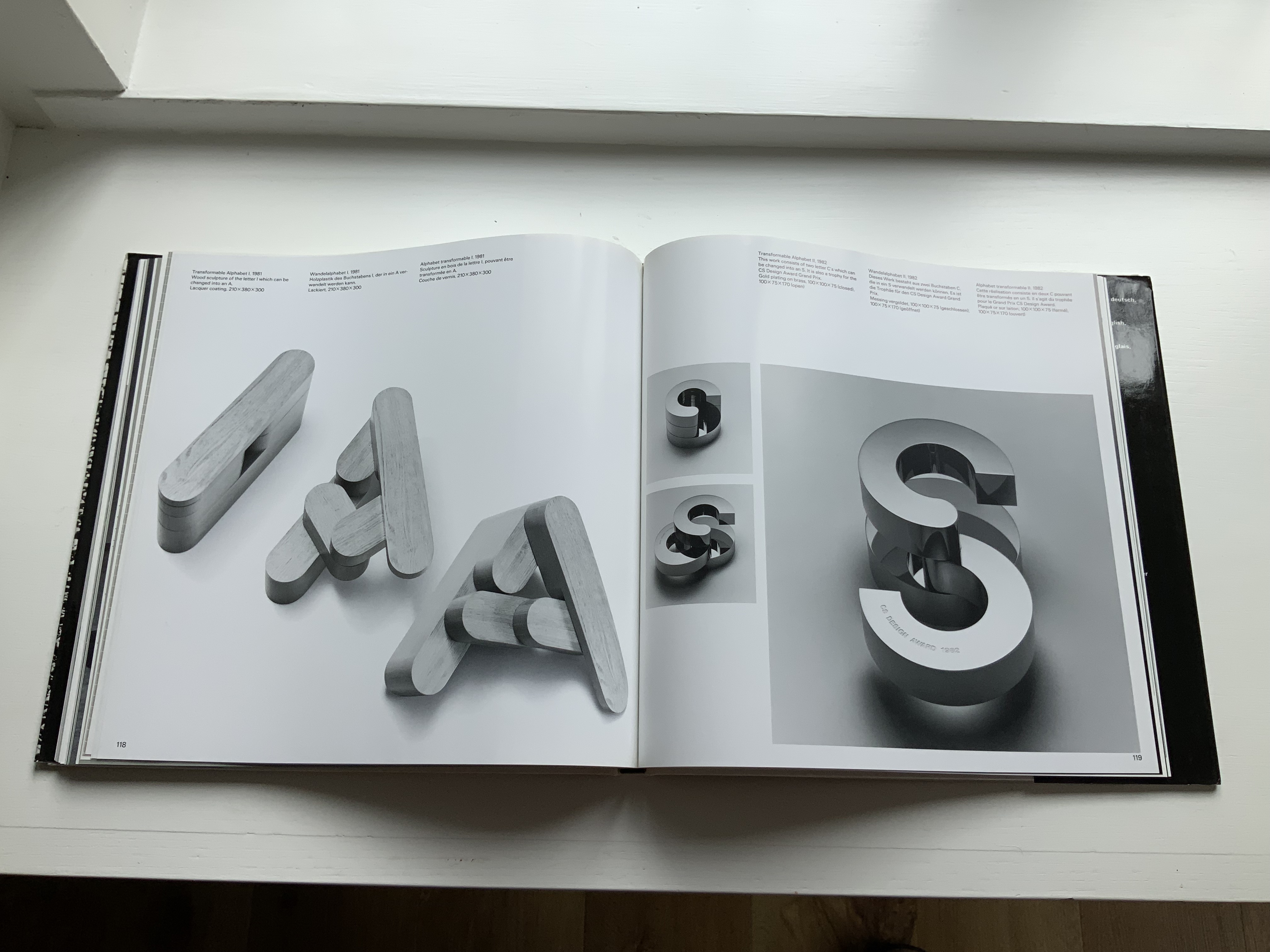
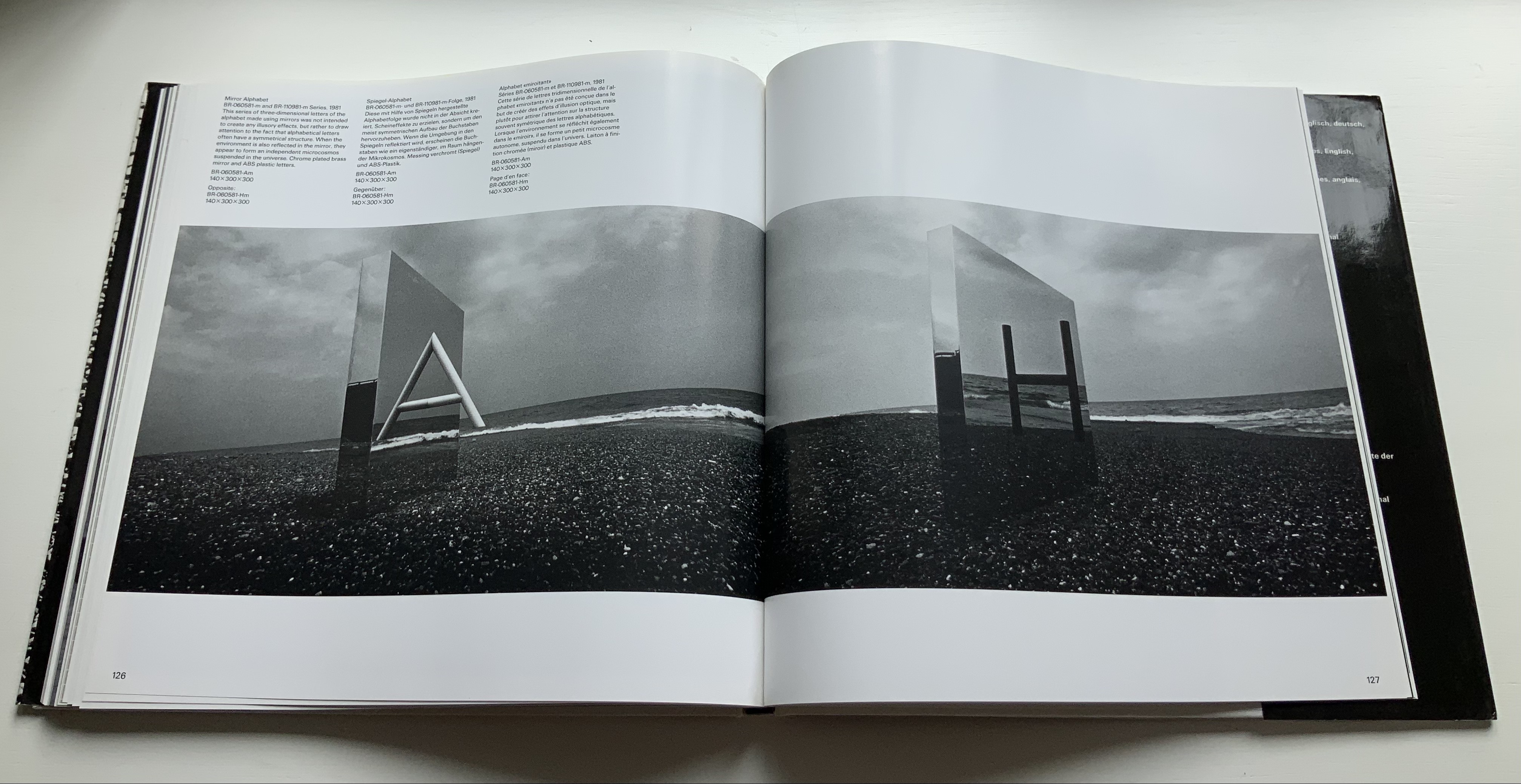
In noting in their 1995 facsimile of Johann David Steingruber’s Architectonisches Alphabeth that three-dimensional alphabet design inevitably reflects its typographic and architectural milieu, Joseph Kiermeier-Debre and Fritz Franz Vogel single out Igarishi’s work in aluminum, concrete, wood and plastic as a perfect 20th century example. Unlike that of his European predecessors, Igarashi’s milieu has been both Eastern and Western. It shows not only in his design, surfaces and choice of material but also in the global attention paid to his work. The briefest search online yields sources in Poland, the Czech Republic, Spain, Singapore and many others besides those expected in the US and Japan.
Along with the works of Katsumi Komagata, Yasushi Cho and Zhang Xiaodong, Igarashi’s volume adds some Eastern balance to the Western bias in the Books On Books Collection.
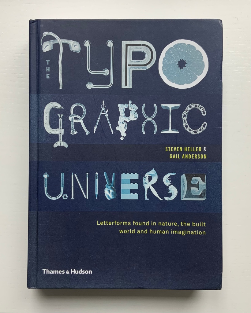
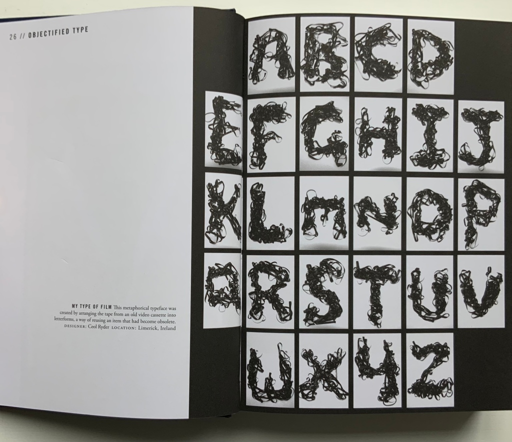
Heller and Anderson’s exploration of “the alphabet of everyday things” goes beyond finding the alphabet in everyday things (a form of pareidolia or “the tendency to perceive a specific, often meaningful image in a random or ambiguous visual pattern” — Merriam-Webster). Many (most?) of their examples involve making the alphabet from everyday things. Some, not so everyday like this one by Ceol Ryder.
Photo of the work: Books On Books Collection. Displayed with permission of Ceol Ryder.
Not all are as intricate or as long in the making as the alphabetic architectural efforts of Johann David Steingruber or Takenobu Igarashi, who are not mentioned. Still, the book serves as a useful mixed spice of images with which to season any appreciation of the interaction of the imagination with the alphabet.
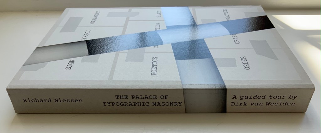
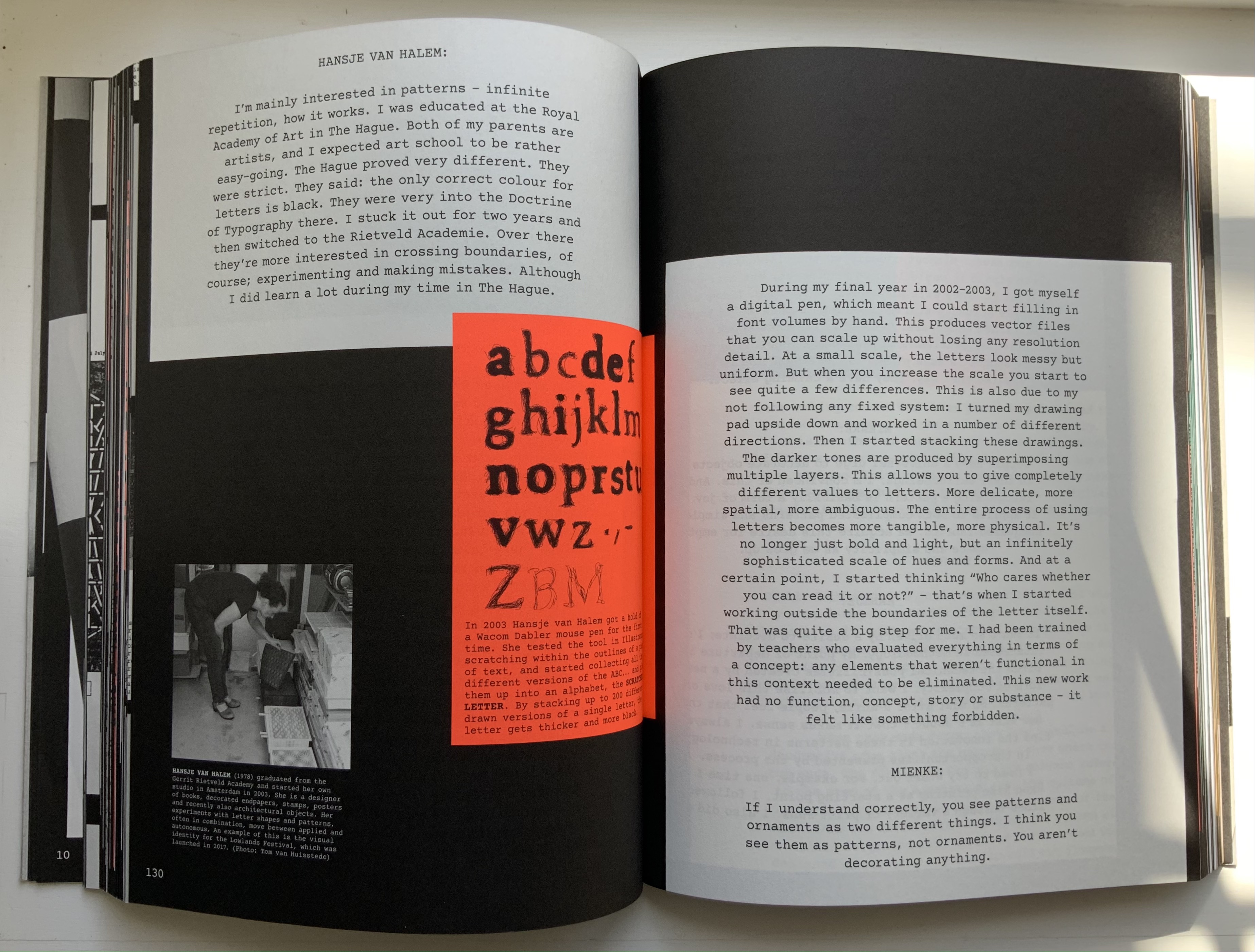
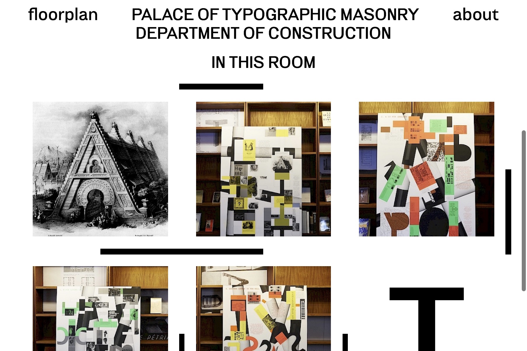
The Palace of Typographic Masonry (2018) Richard Niessen Paperback, perfect bound. H300 x W215 mm, 348 pages. Acquired from Wordery, 29 March 2021. Photos of the work: Books On Books Collection. Displayed with permission of Richard Niessen.
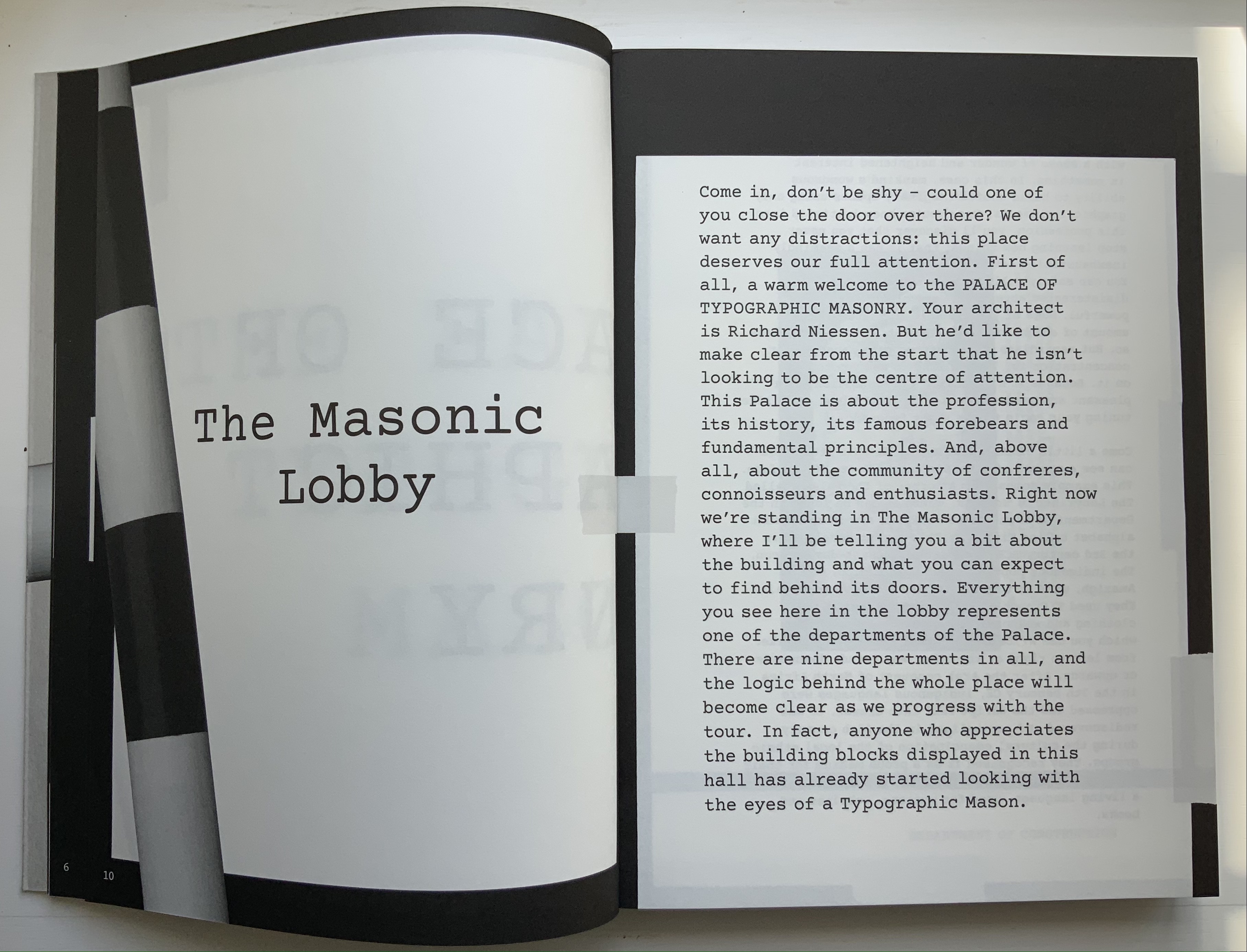
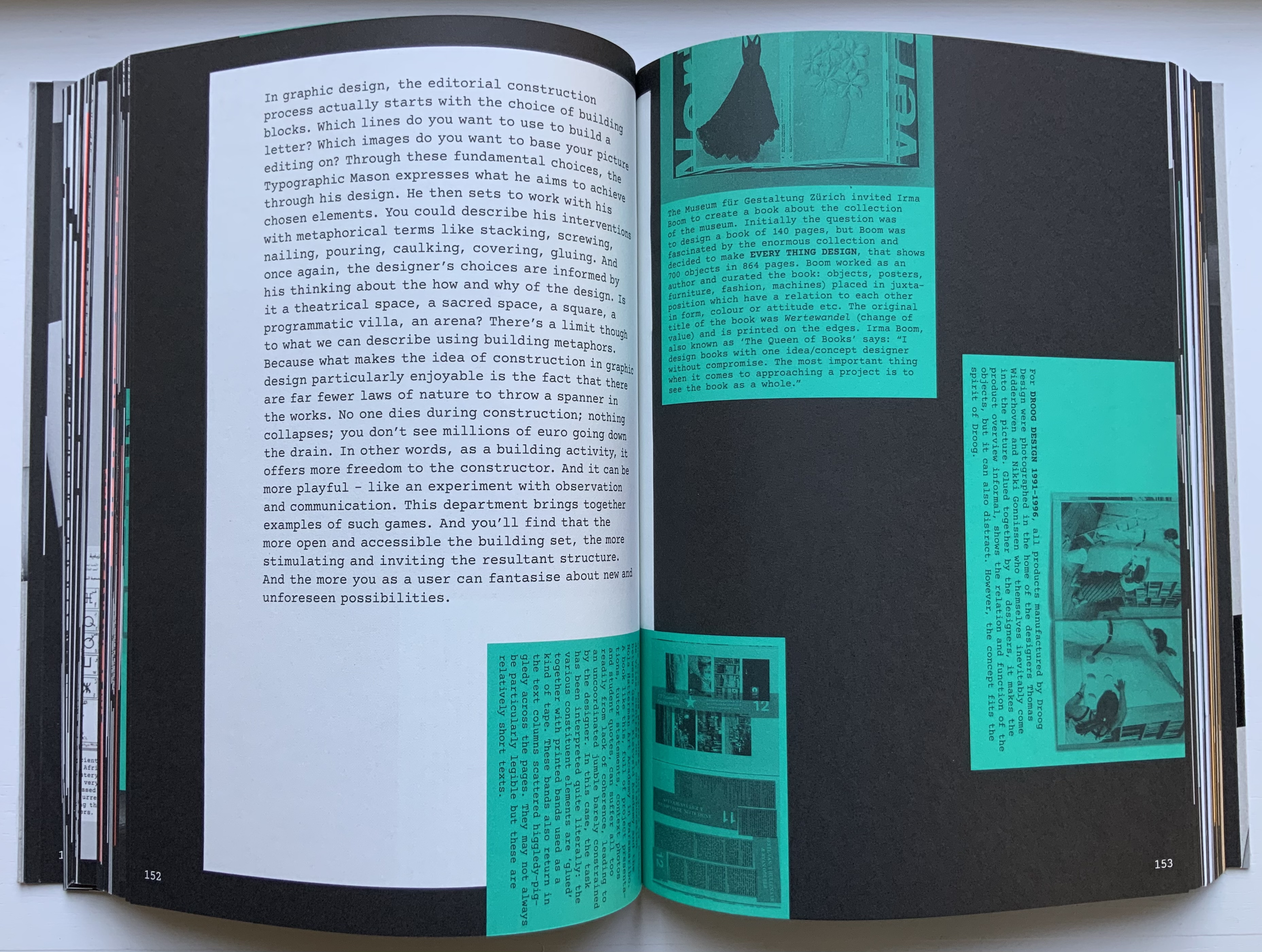
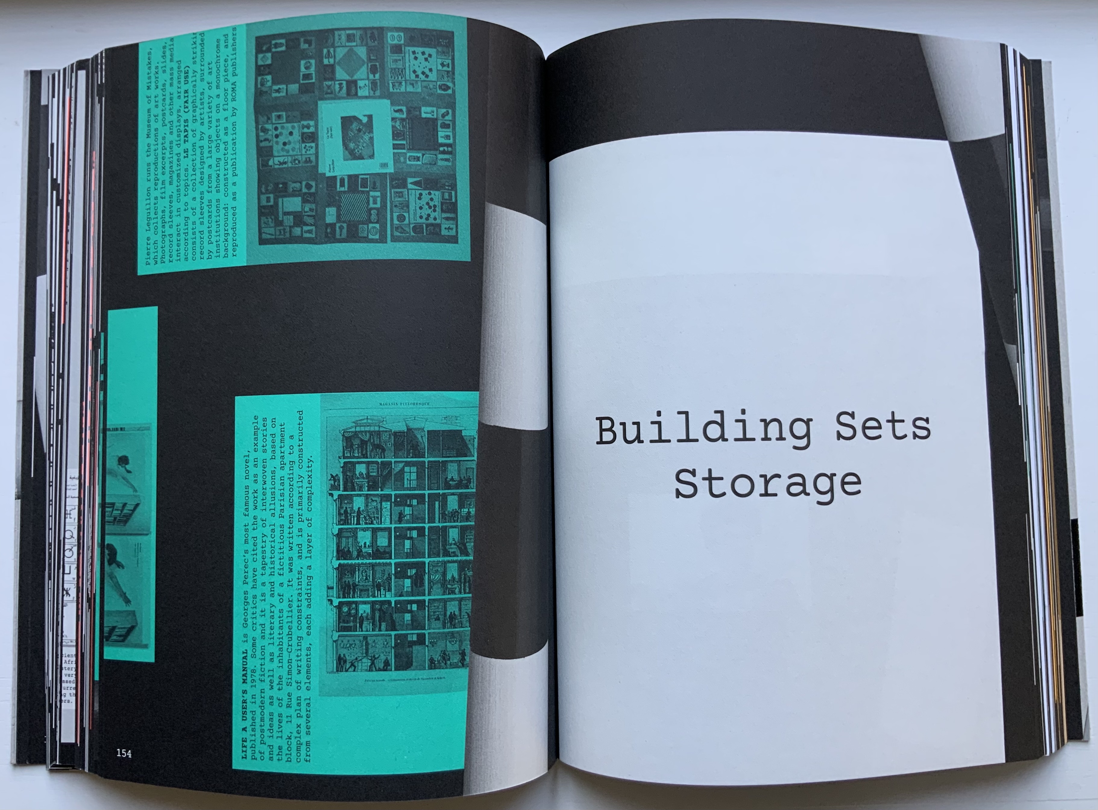
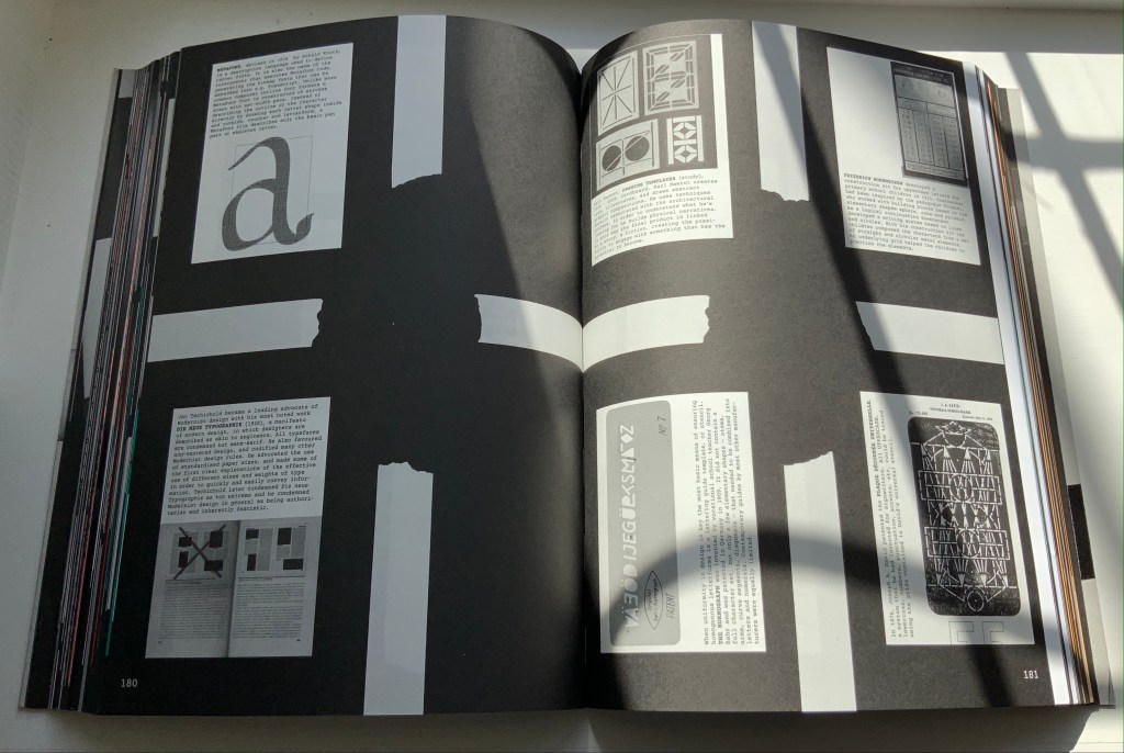
Website, perforated poster, exhibition and paperback, The Palace of Typographic Masonry occupies its place in the Books On Books Collection unlike any other work. The book itself is a shape shifter. Its size competes with those of museum catalogues. In fact, the Palace of Typographic Masonry is like a museum, so much so that it requires a tour guide, which is one shape the book takes. With its nine departments (Sign, Symbol, Ornament, Construction, Poetics, Play, Order, Craft and Practice), it is like a working museum of graphic design, and Dirk van Weelden, our tour guide, often hands us off to departmental “staff” for a lecture or overheard interview.
Given the guided-tour premise, the page layouts strangely, or perhaps appropriately, disorient. On almost every page, at almost every turn, we are rubbernecking and twisting to follow text that appears in a typewriter font on sheets and cards that seemingly have been stuck to a black surface with masking tape, photographed and then printed. Some of the text-bearing cards wrap from the recto page to the verso, leading the reader to think that perhaps the pages are on Chinese fold sheets. A card or sheet may be displayed complete on a page, but the next page may show its edge as if an overlapping photo had been taken. On some pages, the items overlap like a collage. At times, the effect is one of moving down a corridor of blackboards that are covered with notices and captioned photos on white, green and fluorescent orange paper. At other times, the page contains multiple cards as if lying on a flat surface — much the same as objects might be arranged in gallery glass cases — and in different orientations so that the book has to be turned clockwise or anti-clockwise to read each item — much the same as having to walk around a glass case to look at each object in it.
Interspersed glossy sections showcase projects illustrating or responding to the text or the department. For example, Slovenian graphic designer Nejc Prah delivers variations on Masonic tools for Symbols; Paris-based Fanette Mellier, on grid-based design for Poetics; and the Amsterdam-based studio Moniker, “board game cut-ups” for Play. While these sections fit their context in the book, their content and “slippery floor” substrate ratchet up the sense of disorientation. Museum visitors easily tire, and they can be bored in some departments.
Nejc Prah‘s variations on Masonic tools and symbols. Photo: Books On Books Collection. Displayed with artist’s permission.
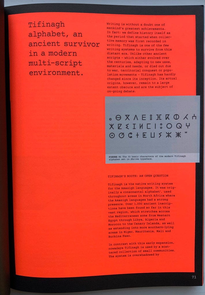
For example, the palace’s labyrinth of scripts — also reproduced separately on the perforated poster — is followed by a discussion of the revival of Tifinagh, the nearly extinct written language of the Tuareg in the Maghreb. The labyrinth presents thirty-six scripts in those varying orientations mentioned above and is wonderful in its breadth but also tiring — especially from the effort required by the font size and orientations. The story of Tifinagh’s revival and integration through typeface design is inspiring, usefully makes the point about the cultural conventionality of alphabets and more, but also makes for a long trek before our guide moves us along into the next department.
With the website for The Palace of Typographic Masonry, Richard Niessen aims for both a collective (imagined) building and an encyclopedic (digital) space, organized into those nine departments or frames. Contributors can add to the source collections or, within the departments and their subdivisions, create new rooms based on the source collections. One contribution particularly appropriate for the Books On Books Collection comes from Tony Côme: “The Typotectural Suites“. Here in one location, the visitor can find those “language towers, typographic islands, cities to decipher, plans in the shape of letters, encrypted walls, speaking bricks, habitable capitals” created by Johann David Steingruber, Antonio Basoli, Antonio and Giovanni Battista de Pian, Paul Noble and others.
The Departments of Sign, Symbol or Order could give more prominence to the role of numbers in the world of typographic masonry. Numerals do appear in the tables for Morse Code and International Maritime Signal Flags, but the visitor would not know that counting and numbers preceded writing and letters. Perhaps the curator could persuade the art historian and archaeologist Denise Schmandt-Besserat to contribute images of those clay tokens to which
The Mesopotamian cuneiform script can be traced furthest back into prehistory to an eighth millennium BC counting system using clay tokens of multiple shapes. The development from tokens to script reveals that writing emerged from counting and accounting. (Schmandt-Besserat, 2015)
Or perhaps the curator could persuade William Joyce to donate some clips from The Numberlys (2012) to the Palace source collection, even preferably some snippets of interactive code with which the visitor can help the five animated characters transform numbers into letters.
Universal languages are highlighted in an Annex, which has been compiled by Edgar Walthert. An update soon to come includes excerpts from Book from the Ground by Xu Bing. A link to Xu’s film The Character of Characters would make a useful addition. It will be interesting to see whether the Annex’s accompanying lecture covers the stir over a “post-text future” and whether typographic masons are returning full circle to pictographic language.
Further Reading
“Architecture“. 12 November 2018. Books on Books Collection
Architectural alphabet (1773/1972) Johann David Steingruber Casebound, sewn, headbands. H356 x W260 mm, 112 pages, including 33 facsimile prints. Published by Merrion Press, London. Edition of 425, of which this is #9. Acquired from Chevin Books, 24 July 2020. Photos: Books On Books Collection.
Several professional and academic architects and designers as well as academics from other disciplines have delved into the intersection of the alphabet and architecture. A few of them have also noted the intersection’s expansion to include artist books and fine press works. Since Johann David Steingruber’s effort in the 18th century, it has become quite a busy intersection.
Originally published in installments at Steingruber’s own expense, the volume opens with its gloriously long title in an “arch of contents”, the columns inscribed with thumbnail images of the letter buildings to come. Although the title page lists 1773 as the publication date, the last installment came in March 1774. In his lifetime, Steingruber published three other works, illustrated and described toward the end of this facsimile, but Architectonisches Alphabeth became his most famous — “postcard” famous.
Architectonisches Alphabeth: bestehend aus dreyßig Rissen wovon Jeder Buchstab nach seiner kenntlichen Anlage auf eine ansehnliche und geräumige Fürstliche Wohnung, dann auf alle Religionen, Schloß-Capellen und ein Buchstab gänzlich zu einen Closter, übrigens aber der mehreste Theil nach teutscher Landes-Art mit Einheiz-Stätte auf Oefen und nur theils mit Camins eingerichtet, wobey auch Nach den mehrest irregulairen Grund-Anlagen vielerley Arten der Haupt- und Neben-Stiegen vorgefallen, dergleichen sonsten in Architectonischen Rissen nicht gefunden werden, zu welchen auch Die Façaden mit merklich abwechslender Architectur aufgezogen sind.
Steingruber dedicated his Architectural Alphabet to Christian Friedrich Carl Alexander, Margrave of Brandenburg-Ansbach, and his first wife Frederica Carolina, not to be confused with the paying dedicatee of Bach’s Brandenburg Concertos, the Margrave of Brandenburg-Schwedt. By a baroque coincidence, however, the first Brandenburg concertos, the ones composed by Giuseppe Torelli but not really influencing Bach, were dedicated to the Margrave of Brandenburg-Ansbach, then George Friedrich II, Alexander’s great-uncle who employed Torelli as court composer. Like Torelli, Steingruber too had to be satisfied with his payment as an appointee — court and public surveyor, and later principal architect of the board of works — even though he went to the trouble of making sure that his employers’ monograms and their associated buildings appeared in the span above the roman arch.
Steingruber seemed unaware of other building designs from alphabetical foundations. This facsimile’s editor gently and genially fills in the missing context. John Thorpe (1565–1655?), an English architect, drew up a property based on his initials. Thomas Gobert (1625-90), a French architect, produced Traitté d’Architecture dedié à Louis XIV, a manuscript whose building plans spelled out “LOVIS LE GRAND”. Anton Glonner (1723–1801) designed a Jesuit church and college around the monogram “IHS”.
There was not much chance of these letter-shaped edifices’ being built. Nevertheless, Steingruber adds matter-of-fact descriptions to his elevations and plans, calling out heating, kitchen, toilet and servants’ arrangements as if conferring with a prospective client ready to commission one of these typographic palaces. Who would not want a serif with a view? Or conduct guests on a tour of the bowl, capline, crossbar, stem, stroke and tail of the property?
The main text appears to be set in Van Dijck (before Robin Nicholas’ revision between 1982 and 1989) and printed on a cream laid paper. The special earmarks of Van Dijck — the sloped apex of the A, the stepped center strokes of the W, the non-lining numerals and especially the downward stroke at the top of the 5 , the tilted lower bowl of the g, etc., identifiable in Morison’s A Tally of Types and Rookledge’s Classic International Type Finder — all seem to be present.
The laid paper is not only tactilely pleasant, it visually supports the clarity of the facsimile prints. Their sharpness outdoes what is achieved even with the zoom function applied to the freely available digital version, which can be seen in the interactive comparison below.
Kiermeier-Debre and Vogel edition (1995)
Architectonisches Alphabeth (1773/1995) Johann David Steingruber Facsimile edition prepared by Joseph Kiermeier-Debre and Fritz Franz Vogel. H356 x W260 mm, 80 pages. Acquired from Antiquariat Terrahe & Oswald, 14 March 2021.
In smaller dimensions, this edition does not present the prints in their full size. Partially making up for the deficit is the Munken Pure paper’s brightness, against which the Garamond Berthold typeface and photolithography work well. Also, the book includes French, German and English text as well as illustrations that broaden the context to the present. Alongside Steingruber’s elevations and plans, Kiermeier-Debre and Vogel have included several birds-eye views of inventive roofing of 20th-century architectural models inspired by Steingruber’s plans.
Christian Friedrich Carl Alexander’s monogram buildings reduced alongside reductions of Steingruber’s original foreword and explanations of Federica Carolina’s and Alexander’s buildings.
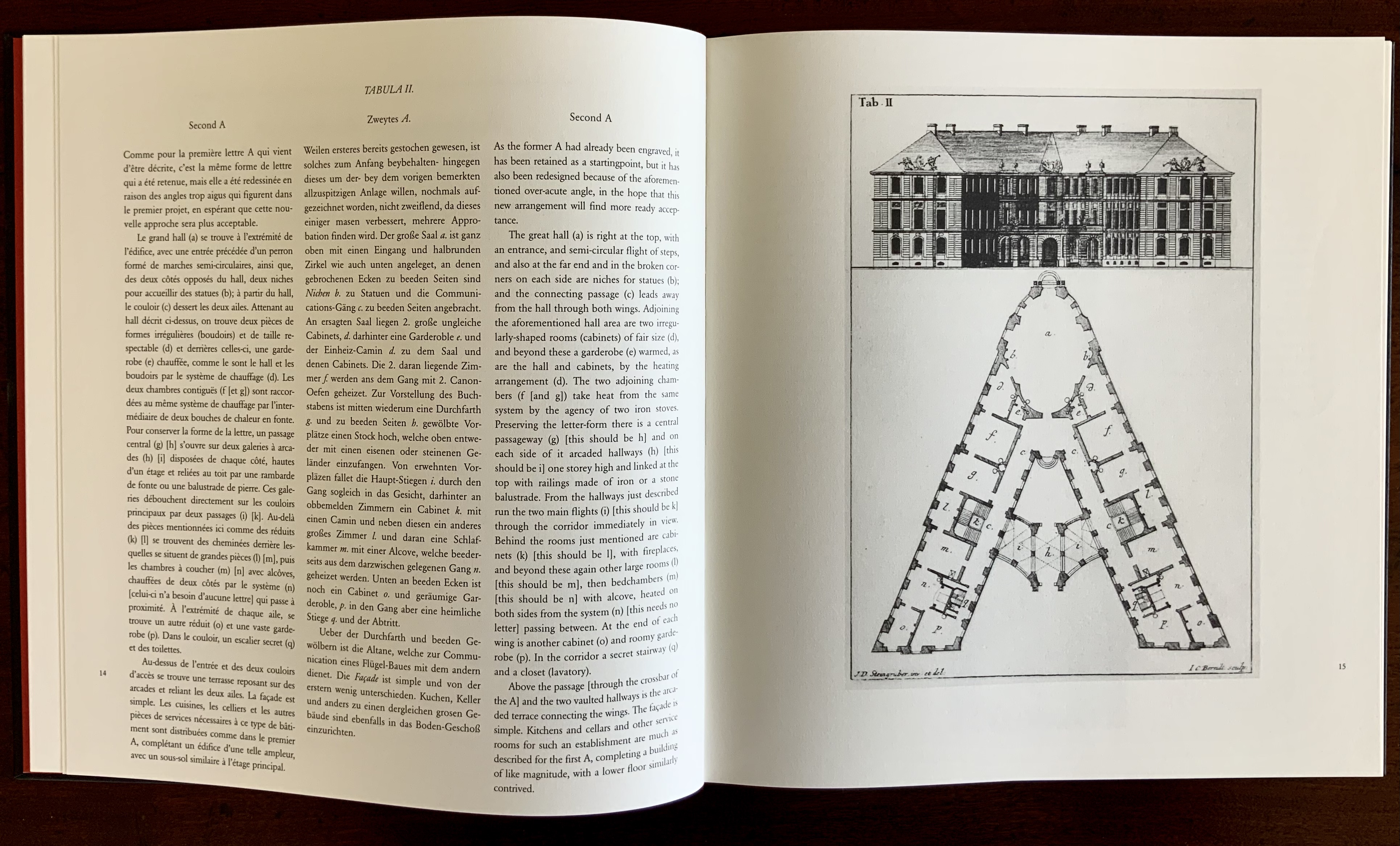
Not satisfied with some of his efforts, Steingruber offered second options; here, for the letter A, and later, for the letters M, Q, R and X.
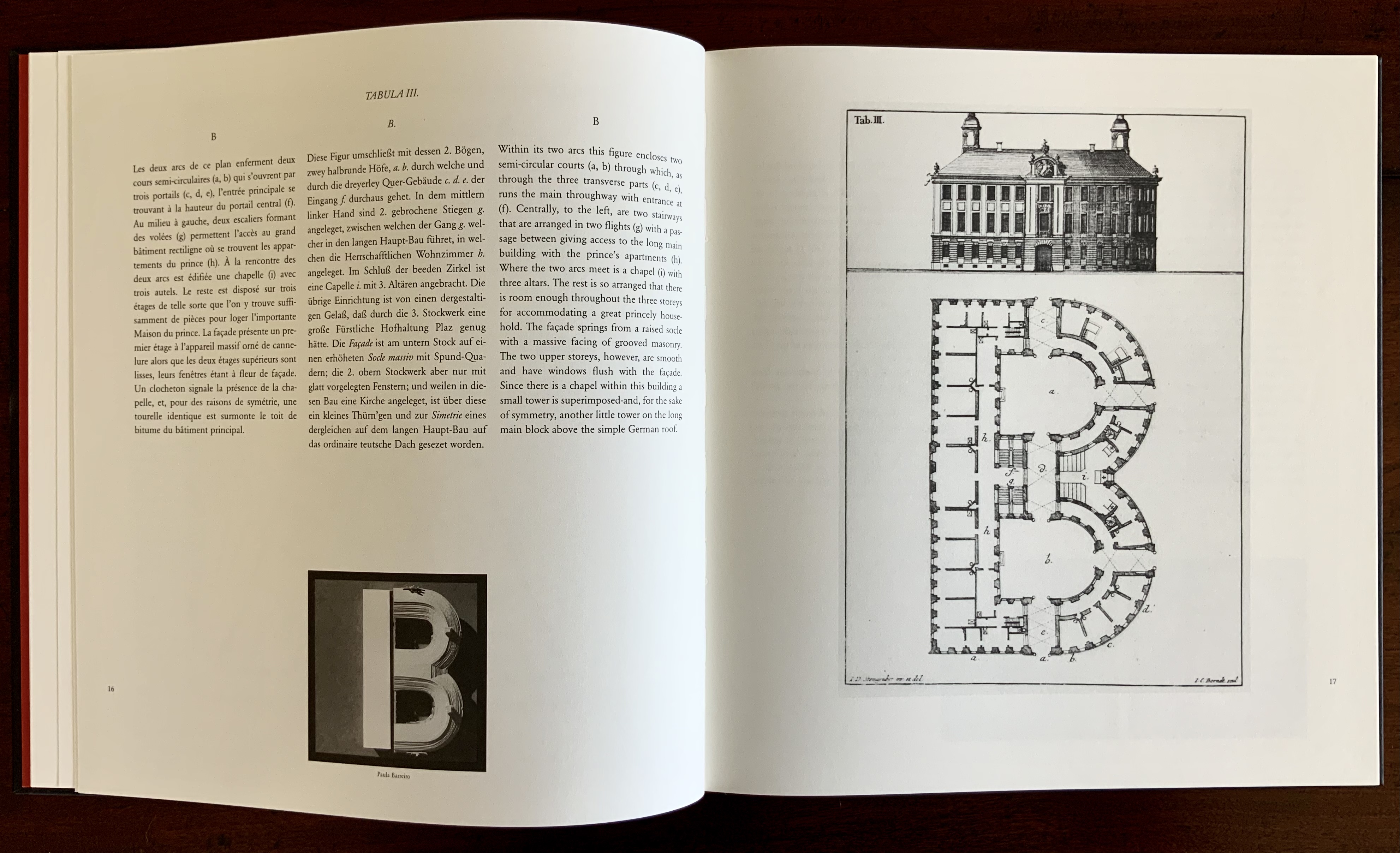
Verso: Paula Barreiro’s roofing design for Steingruber’s letter B.
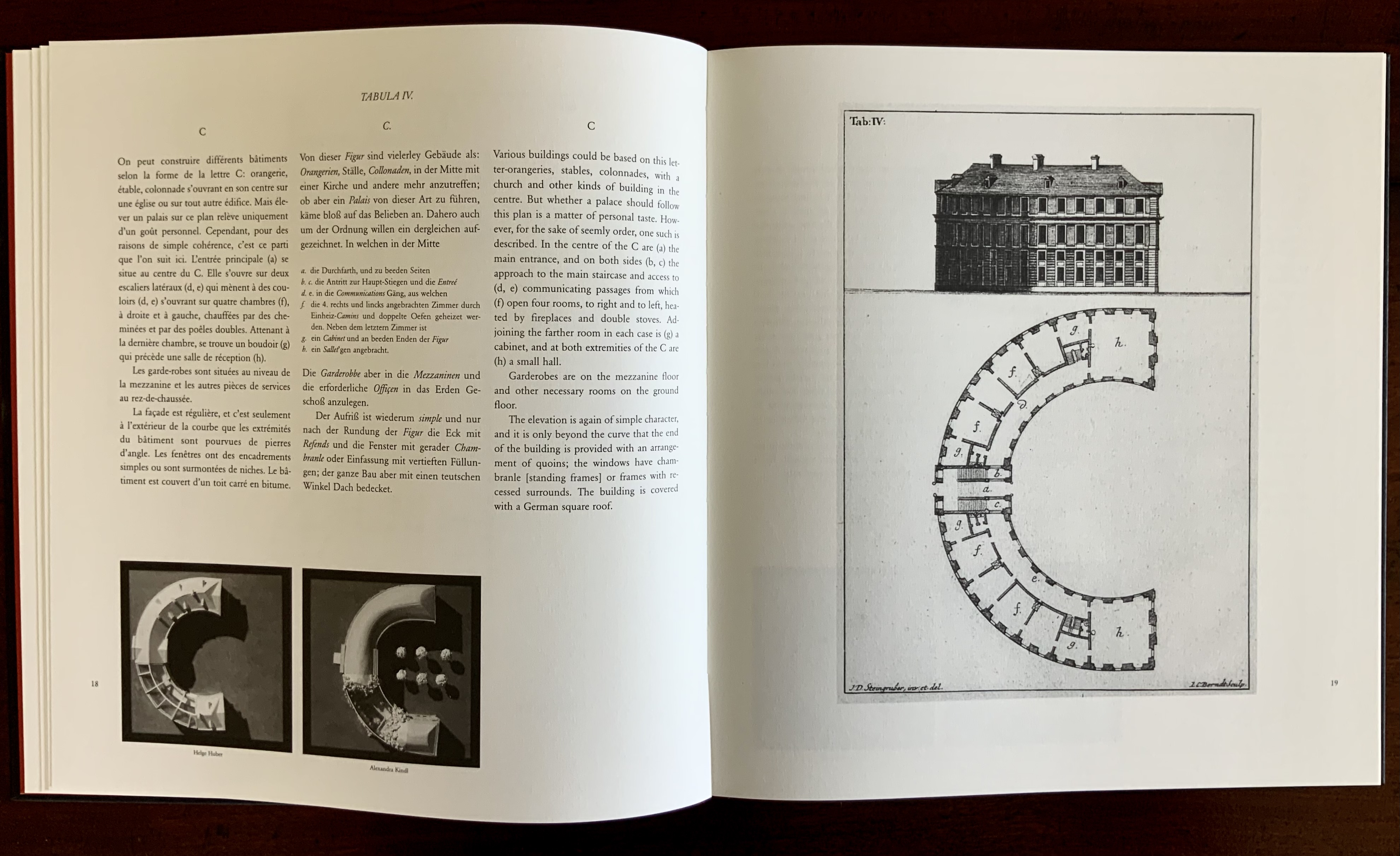
Verso: Helge Huber’s and Alexandra Krull’s roofing designs for Steingruber’s letter C.
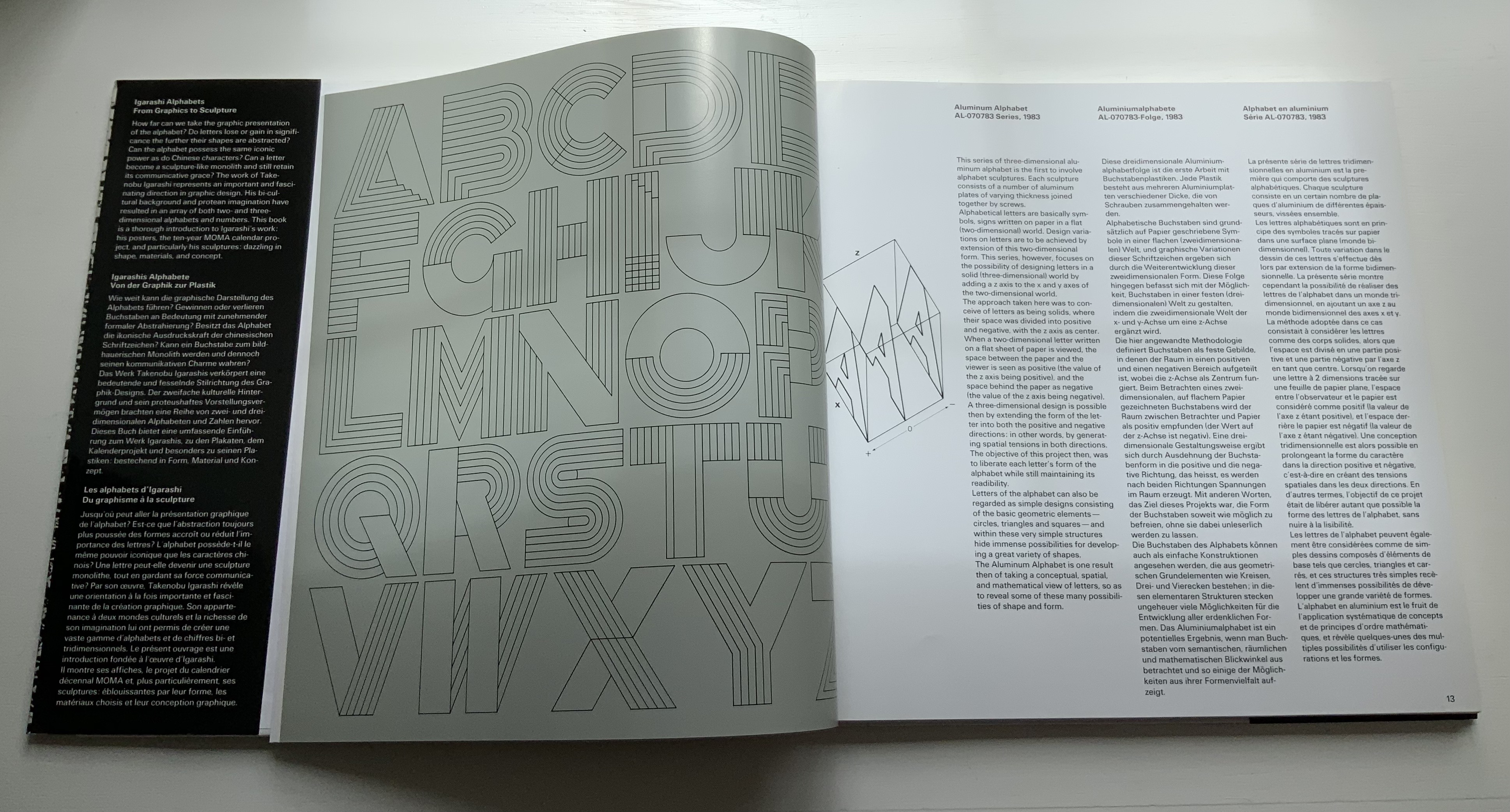
In another instance of positioning Steingruber’s book in the history of alphabetic architecture (or architectural alphabets), the editors include a complete set of small reproductions of Thomas Gobert’s designs and elevations spelling out “LOVIS LE GRAND” from his manuscript mentioned above. Although created a century before, his drawings do not seem as stylistically distant from Steingruber’s as those of the 20th-century rooftop drafts do. Driving home their point that “the design of alphabetical buildings must not be based slavishly on a Baroque roman type or a classicist roman version”, the editors conclude by drawing attention to Takenobu Igarashi‘s 20th-century sculptural celebrations of the alphabet in aluminum, concrete, wood, chrome and gold.
Photo: Mike Sullivan, “Igarashi Alphabets“, Typetoken, 25 November 2013. Accessed 26 March 2021. Displayed with permission of the reviewer.
In print and online as well, new original and secondary works have continued to busy the intersection of the alphabet, architecture and artist books. Richard Niessen’s The Palace of Typographic Masonry (2018) and Sergio Polano’s “Architectural Abecedari” (2019) are two recent examples. And, as if to confirm the busying of the intersection, we have Takenobu Igarashi: A to Z (2020) in print and making up for the scarcity of Igarashi Alphabets (1987).
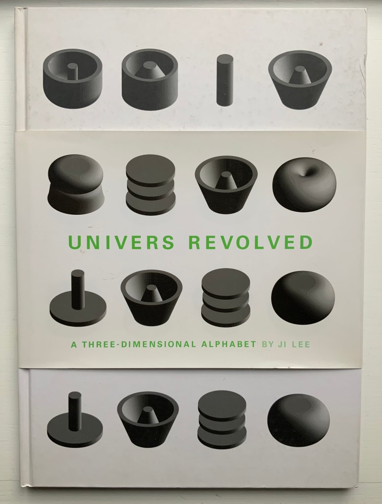
Univers Revolved: A Three-Dimensional Alphabet (2004)
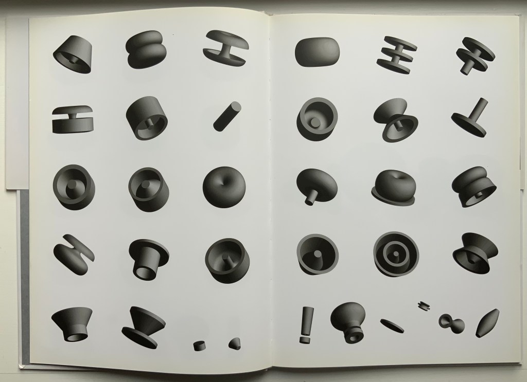
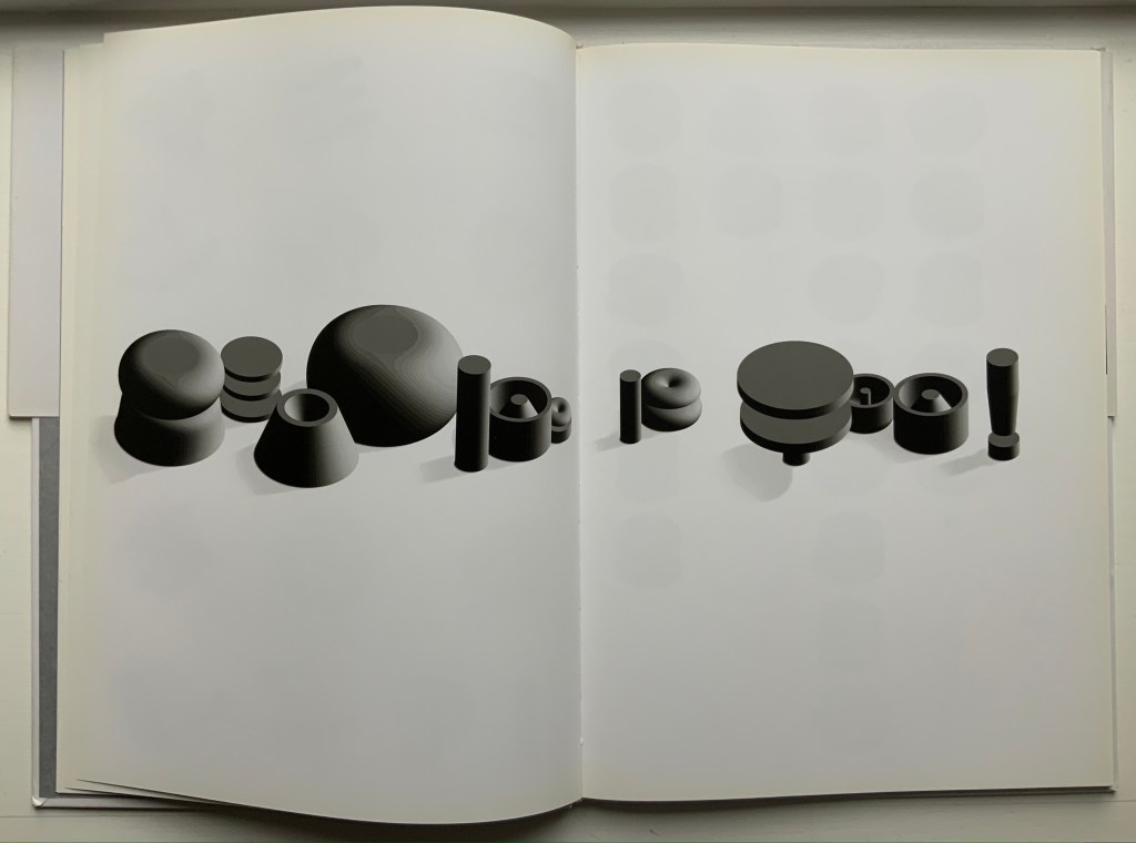
Univers Revolved: A Three-Dimensional Alphabet (2004) Ji Lee Sewn paper on board hardback. H338 x W238 mm, 64 unnumbered pages. Acquired from Unoriginal Sins, 12 December 2020. Photos: Books On Books Collection.
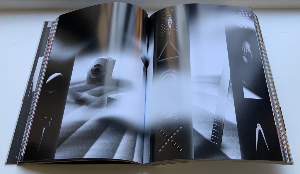
In his extended essay on Stéphane Mallarmé’s Un Coup de Dés Jamais N’Abolira le Hasard, Eric Zboya celebrates Ji Lee’s 3D typeface by rendering the entire poem in that face. The discovery of that essay led to the acquisition of Zboya’s artist book, which led to the acquisition of Ji Lee’s scarce volume Univers Revolved: A Three-Dimensional Alphabet (2004). Lee’s book resonates with several other works in the Books On Books Collection. Compare it, for example, with Johann David Steingruber’s alphabet book Architectonisches Alphabeth (1773/1973), Paul Noble’s alphabet book Nobson Newtown (1998) and Sammy Engramer’s three-dimensional rendition of Mallarmé’s poem.
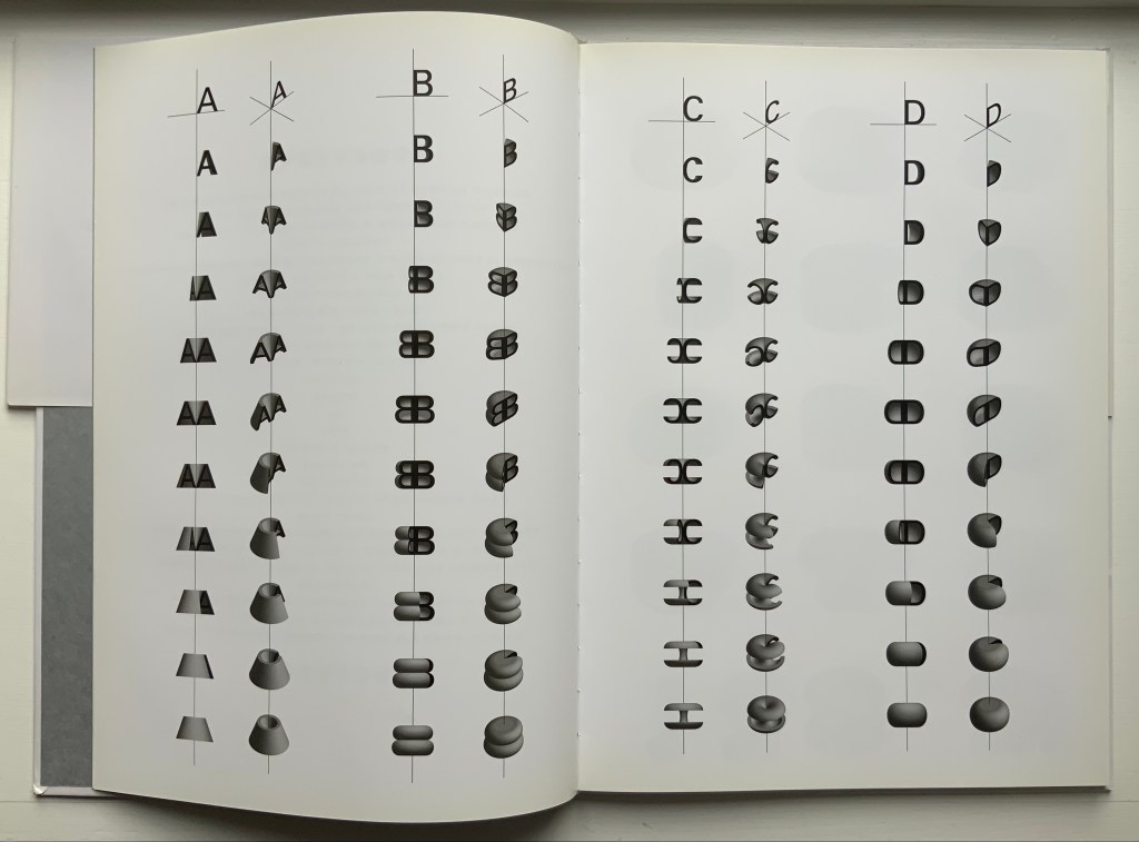
This double-page spread displays the manipulation of the alphabet’s first four letters around their axes at two different angles to render their 3D shapes.
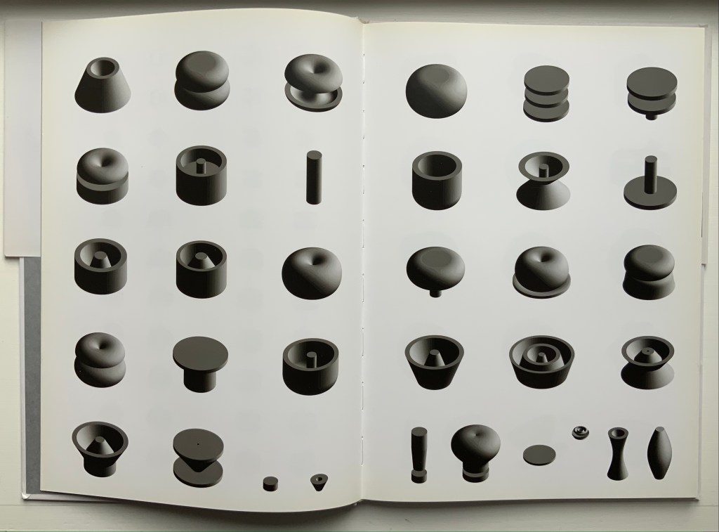
These two double-page spreads show the complete alphabet and punctuation marks at two different angles, which provide a key with which to begin reading text spelled out in the book.
Lee teases his reader by composing sentences with different sized letters. “Reading is Fun!” is one of the easier to decipher.