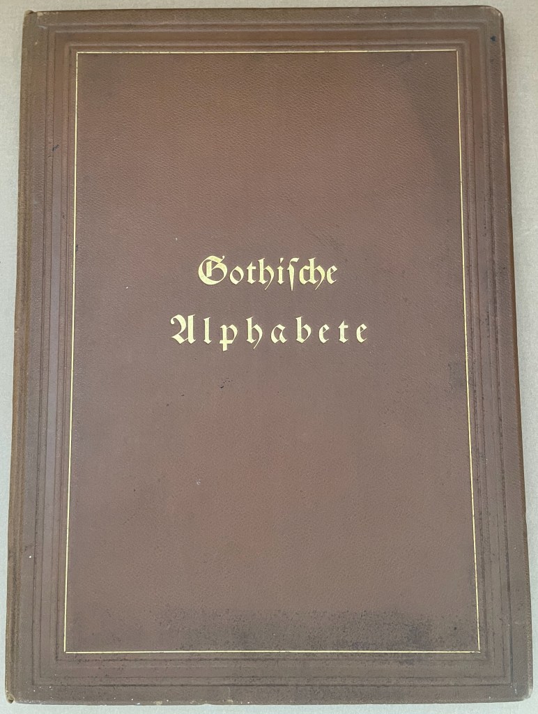
Gotische Alphabete (1897) Jaro Springer Casebound hardcover in leather with cover title and cover illustration in gold and blind embossing. H415 x W300 mm. 1 sheet, 8 pages, 3 sheets, 39 plates. Acquired from Antiquariat Braun, 14 November 2024. Photos: Books On Books Collection.
Every history of letters or script begins with a scrawl. Someone somewhere at some time made a mark tied to an object tied to a sound — A is for Ox — and some others in the same place and time accepted that this handmade mark or shape could conjure up that object in the mind. Perhaps it seemed magical, perhaps it seemed mundane as they imagined that somehow meaning and reality inhered in that shape or sound, the connection just waiting to be discovered.
Regardless, the shapes of characters and their relationship to the sound or meaning they represent is arbitrary, a prehistorical and historical function of social convention, a collective making by individuals. Jaro Springer’s art historical specimen book reminds us of the fantastical visual elaborations to which 15th-16th century artists’ hands would put those “shapes for sounds” we call the alphabet.
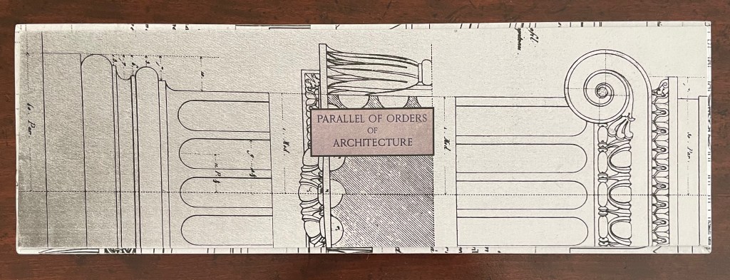
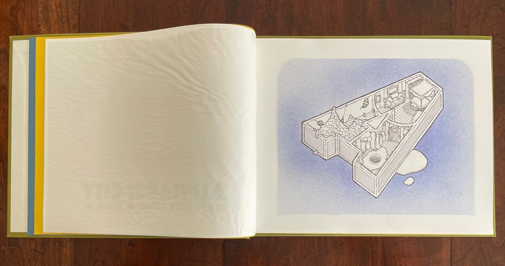
Parallel Orders of Architecture (2024) Tony Broad Box with illustrated paper over boards with title board pastedown on top; enclosing three volumes. First volume: double-sided accordion with single- and triple panel inserts. Second volume: pop-up between illustrated paper over boards with magnet closure. Third volume: pop-up within French-fold box covered with illustrated paper over boards with magnet closure. Box: H137 x W413 x D45 mm. First volume: H130 x W110 x D30 mm. Second volume: H130 x W120 mm. Third volume: H130 x W120 x D38 mm. First volume: 60 panels. Second volume: spiral pop-up. Third volume: 4-layer pop-up. Unique. Acquired from the artist, 23 July 2025. Photos: Books On Books Collection.
Tony Broad’s Parallel Orders of Architecture (2024) consists of three differently structured volumes enclosed in a handmade illustrated box. The first is a double-sided accordion with single- and triple-panel inserts on both sides. The second is a single-panel pop-up book. The third is a variant on the tunnel book. With the raised outlay on its cover and the platformed interior, the box offers yet another order of structure that runs in parallel with the architectural orders from which Broad draws his inspiration.
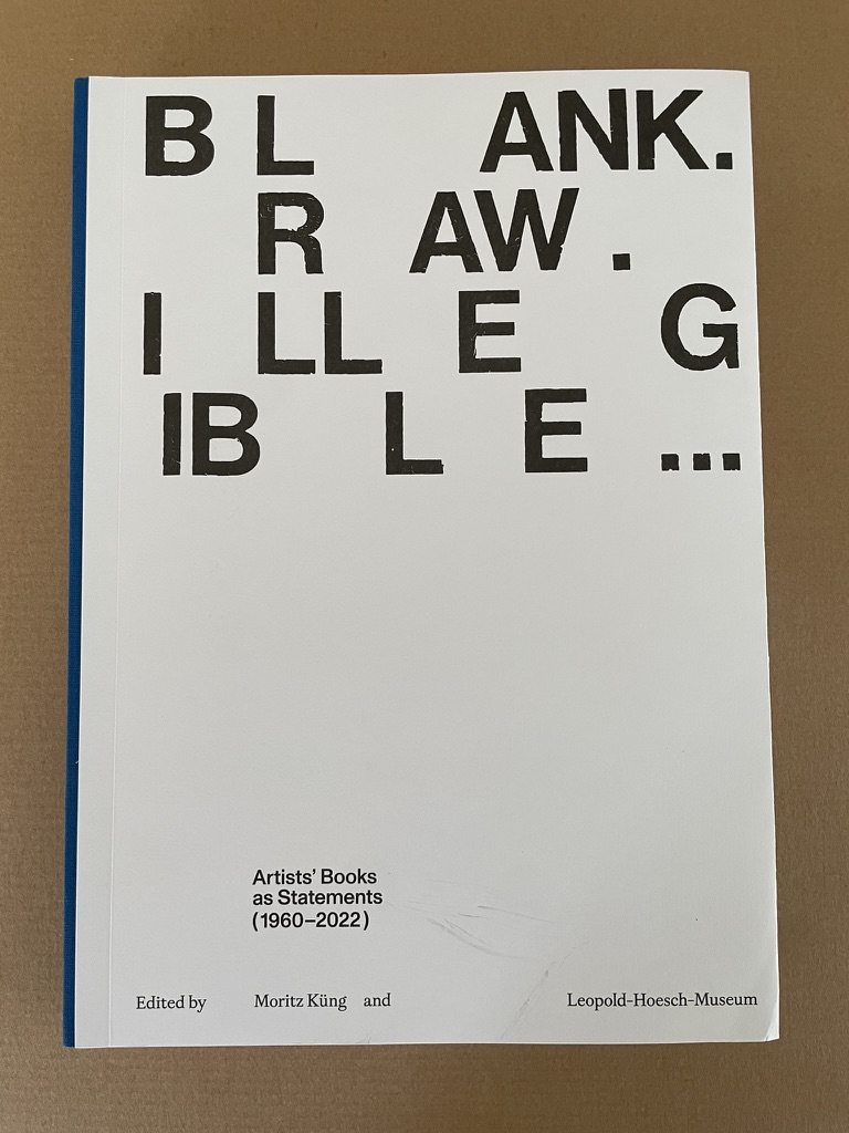
Published on the occasion of the exhibition by the same name at the Leopold-Hoesch-Museum in Düren, Germany, this tome is far more than an exhibition catalogue. With its thematic structure being a form of commentary on and insight into 259 individual works of 200 book artists, Blank. Raw. Illegible becomes one of the more important reference works on book art to have appeared in the last five years. And this is despite its singular focus on artists’ books blank (most of them), inacessible, or illegible.
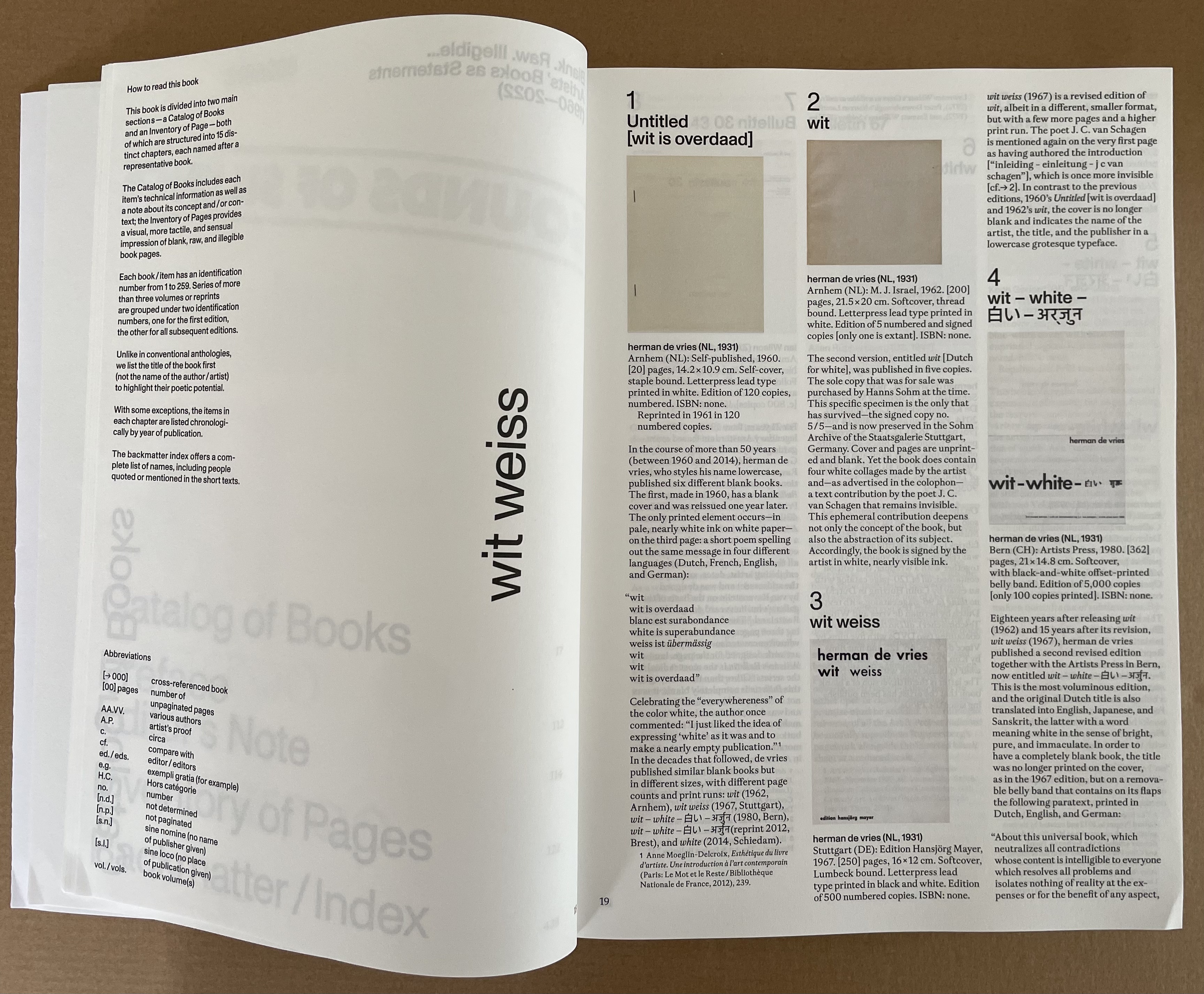
The opening spreads for its fifteen thematic sections are shown below.
“wit weiss” takes its title from the third of six blank-page works by herman de vries. In addition to cataloging the other five, the section presents sixteen other variations on the theme, including Christiaan Wikkerink’s Conceptual Art for Dummies (1968, 1977, 2010).
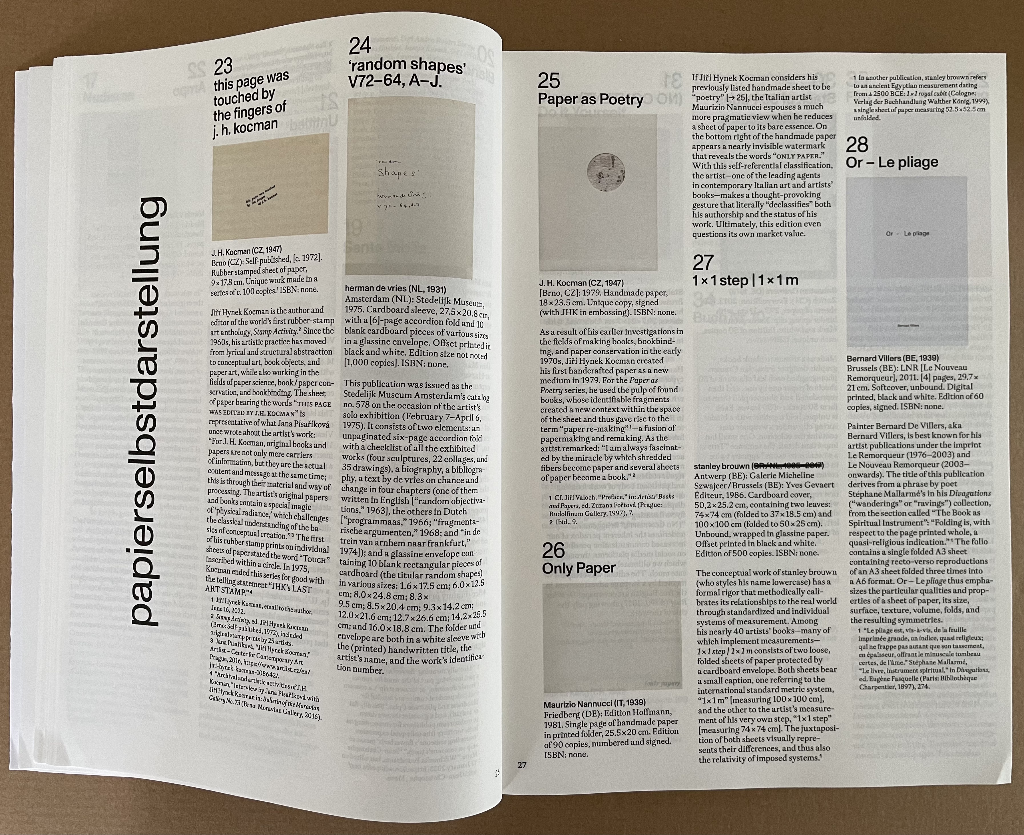
“papierselbstdarstellung” presents us with thirty-three works of “paper self-portrait”. Blank or not, paper takes the conceptual and physical center stage in this section. It’s a pleasure to see the two rare works from the 1970s by J.H. Kocman introducing this group that includes another of herman de vries’ works, one of Bernard Villers’ Mallarméan pieces, some of the output of the prolific polymath Julien Nédélec, a unique piece from Paul Heimbach, Richard Long’s dipped River Avon Book, and more paper-allusive papierselbstdarstellungen.
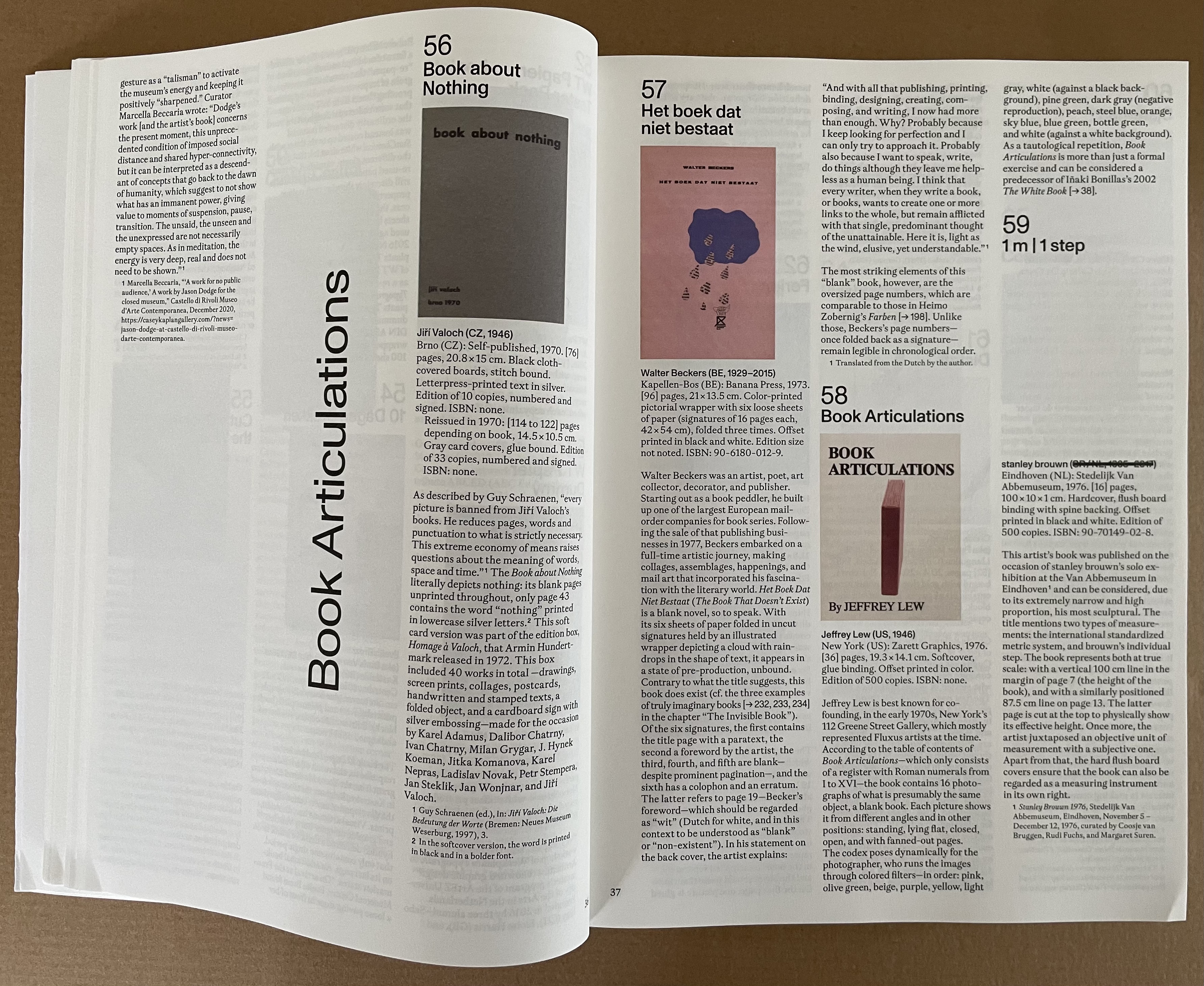
“Book Articulations” takes its title from the work by Jeffrey Lew, which “articulates” the codex through various poses and color filters, but the fourteen other works included explore other forms of “articulation”. The Oxford English Dictionary gives nineteen definitions. Some of those are obsolete, but we can give Küng the benefit of the doubt that this section’s fifteen works exemplify the ones still active.
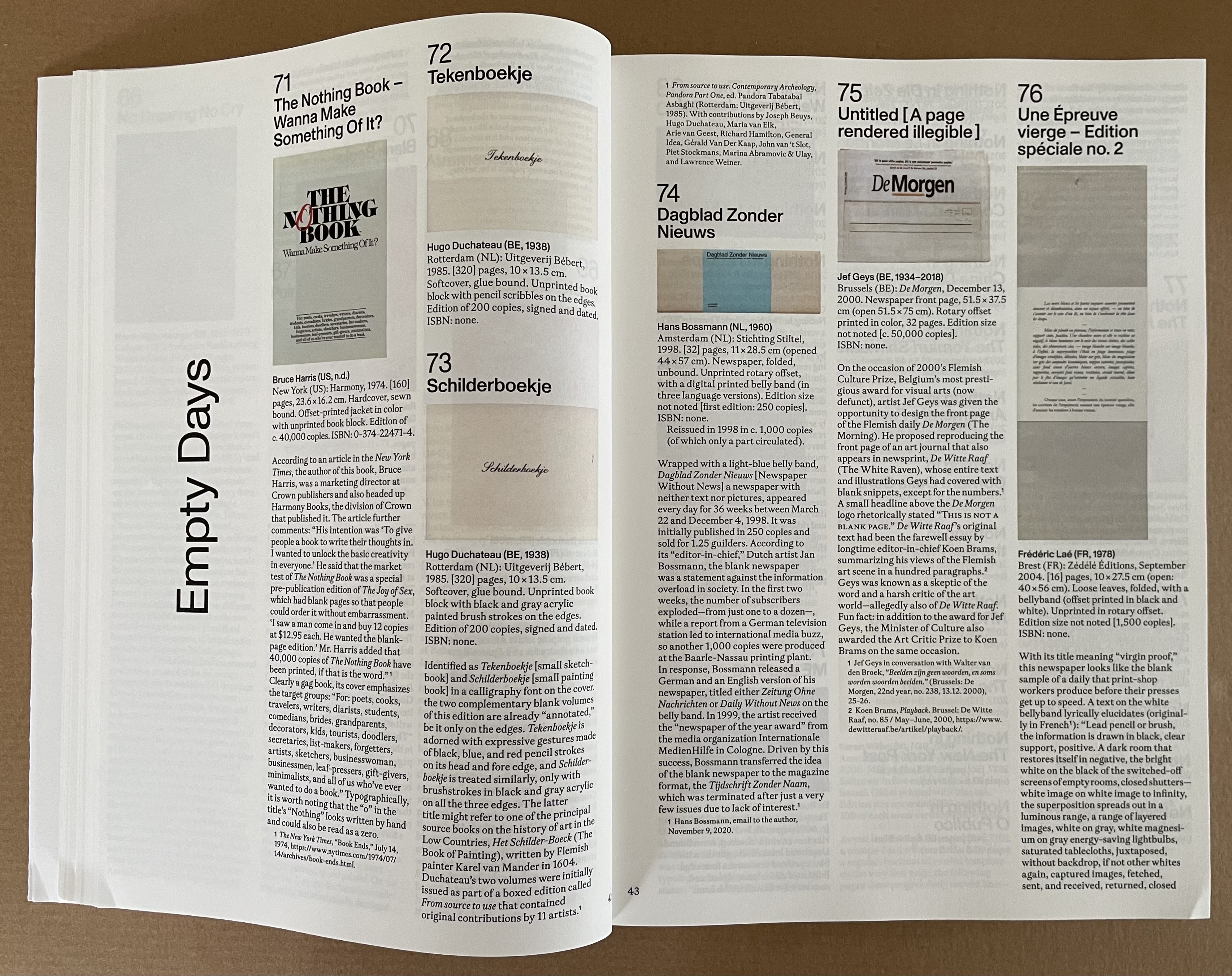
“Empty Days” takes its title from the last work in the section, a volume offered as an annual planner whose pages are blank, its months distinguished by different makes of paper, and its bookmarker printed on both sides with reminders of the names of the days and months. Leading with Bruce Harris’ gag book The Nothing Book, the section follows applications of the blank joke to newspapers, notebooks, exercise books, chronicles, and advice books.
The blank books of “life and work” demonstrate subtleties ranging from Paul Heimbach’s careful inclusion of 273 clear sheets to allude to the 273 seconds of John Cage’s 4’33” (1972) to Arnaud Desjardin’s Why I am no longer an artist.
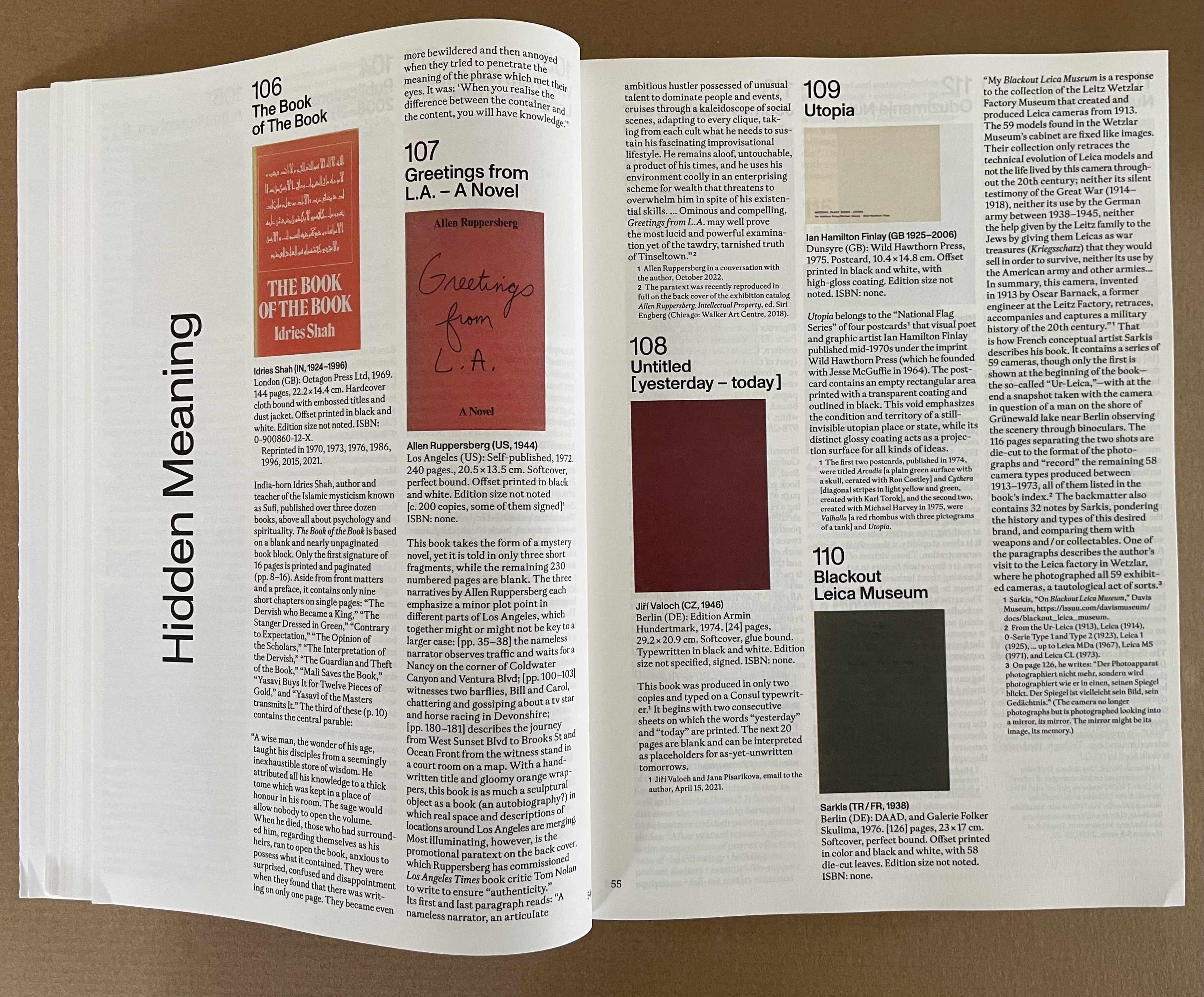
Some of the blank works in “Hidden Meaning” play the joke of being the answer to the title, such as Reasons to Vote for Republicans (2017), a plagiaristic response to Michaels Knowles’ Reasons to Vote for Democrats (2017), published one month before. Other require the reader to uncover the hidden meaning (as in Christian Boltanski’s 2002 Scratch, which reveals images of atrocities when the surfaces of its silvered pages are scratched off) or to hide meaning (as in Russell Weeke’s 2016 blank postcard Hidden Meaning, which has only those words printed in the block where the stamp goes.
The thirty-one works in this section remind us that for book artists, black and white are also colors on the palette and tools in the book artist’s conceptual tool box. “Various colors in black and white” comes from the title of Pierre Bismuth’s 2005 book with onestar press. Onestar boasts that its artists’ books are “strictly unedited by the publisher”, but there is a cost-control constraint: no color inside the books. So Bismuth demanded a different color for each letter of his name and reproduced 139 monochromatic Pantone colors in black and white, representing a variety of hues in shades of gray.
raum means “space, room” in German and is the title of Heinz Gappmayr’s physically and metaphysically blank book. In this section, the other eight blank books take on a more sculptural aspect than others in the exhibition. There’s the massive Your House (2006) by Olafur Eliasson and the slim A Cloud (2007) by Katsumi Komagata, both examples of die cut leaves.
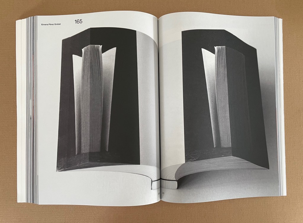
Ximena Pérez Grobet’s Around the Corner (2020) is an extraodinary example of flip-book and fore-edge printing combined. This spread represents the 312 pages of full-page samples of all 259 works in the exhibition.
Redaction, excision, erasure , and substitution are the only four “point blank” methods of making empty words in this section. The rest “verb” the word “empty” and go with pages emptied of words to meet the curator’s criterion for inclusion in “Empty Words”. Two exceptions: Roberto Equisoain’s gradual removal of word spaces and merging of the remaining letters into one in La lectura rápida … (2014) and Jürg Lehni and Alex Rich’s hole-punching of letters in their book naturally entitled Empty Words (2011).
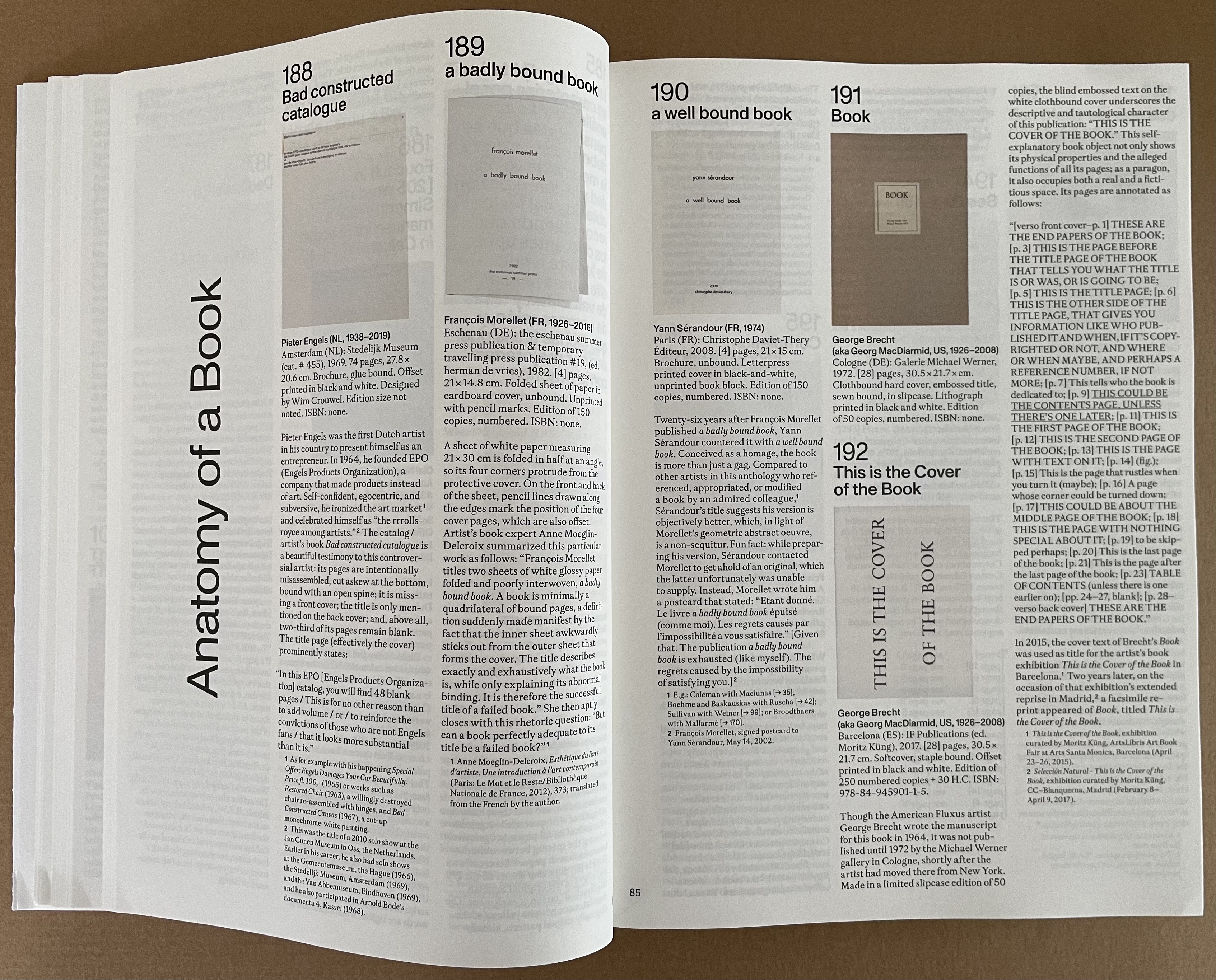
“Anatomy of a Book”, whose title comes from the 2010 unique work by Fiona Banner (aka The Vanity Press), reminds us of how book artists can create works of art by focusing attention on individual parts of the book or simply naming its parts as George Brecht did with This is the Cover of the Book (1972).
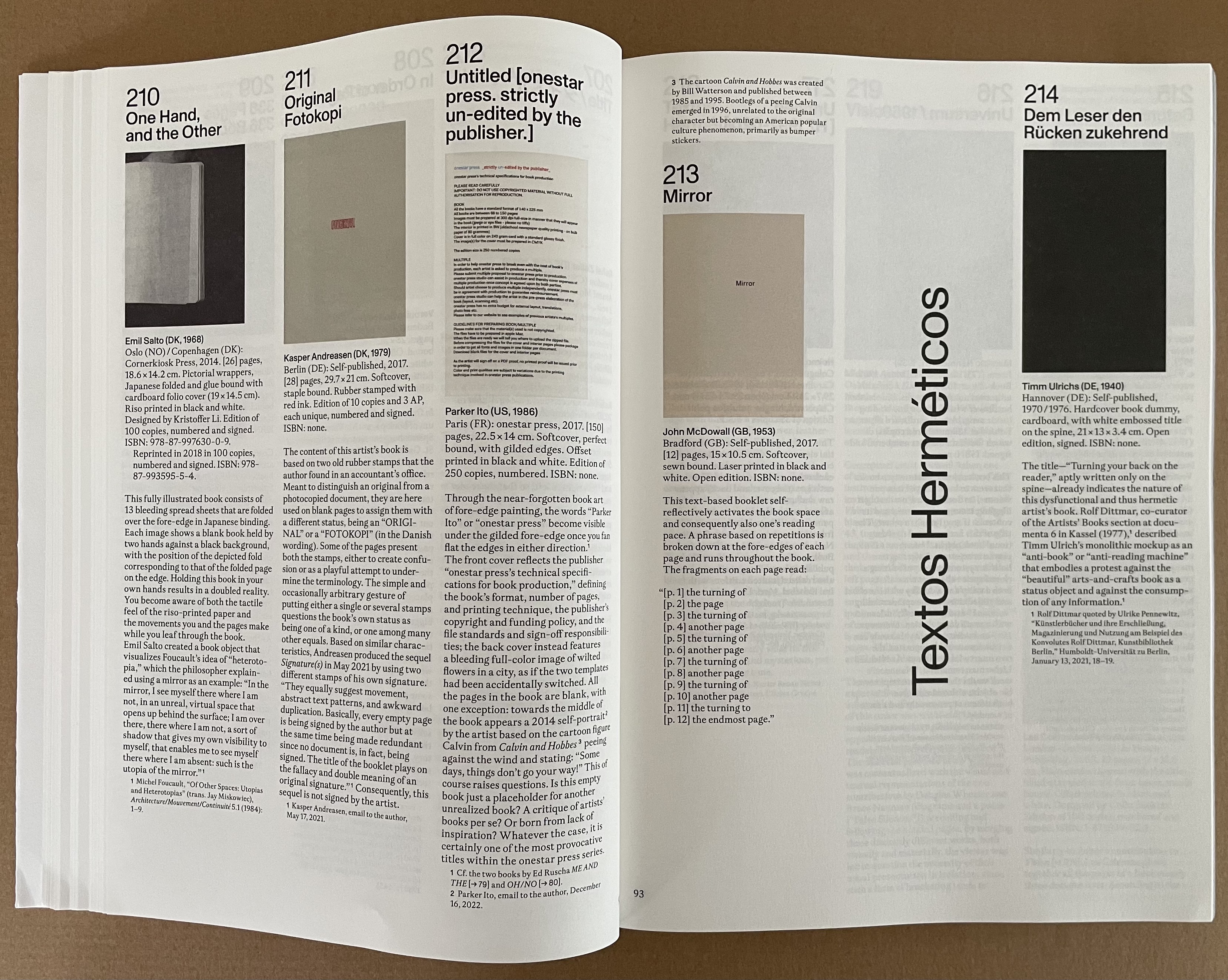
The word hermetic means “sealed”. So naturally, “Textos Herméticos” presents ten examples of artists’ books that physically cannot be opened.
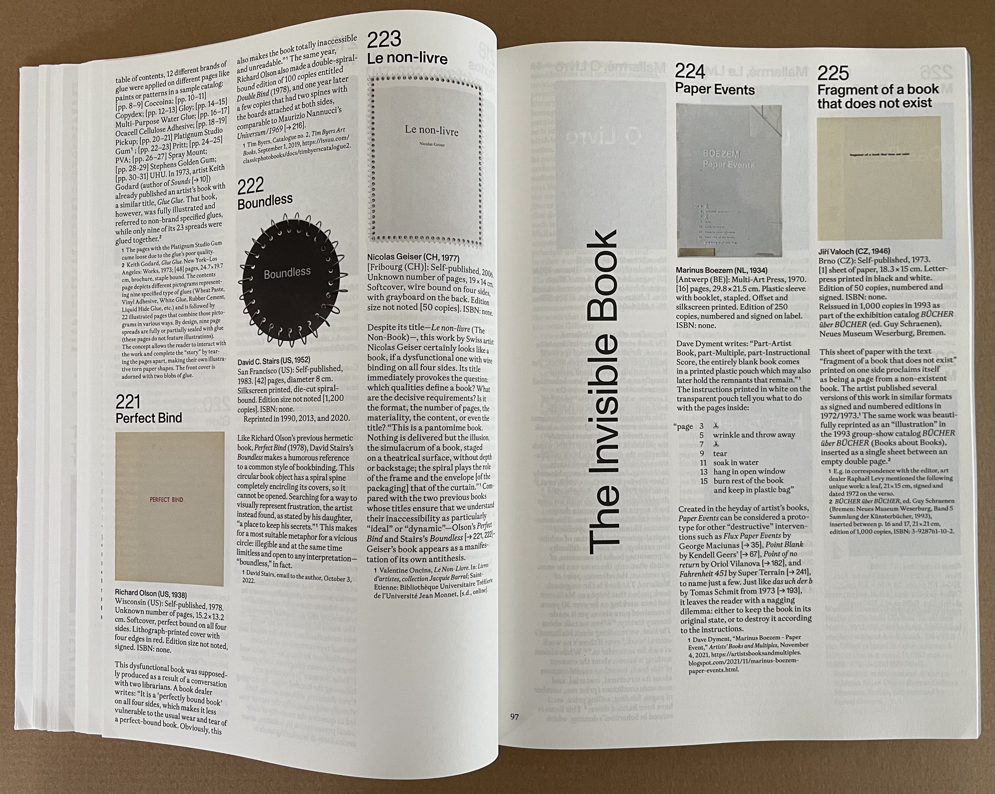
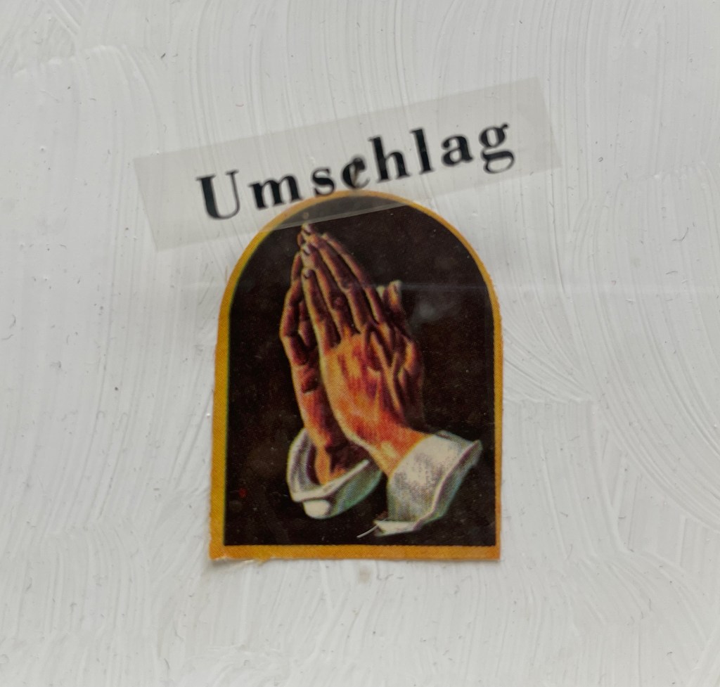
Elizabeth Tonnard’s entry The Invisible Book (2012) entitles this section of thirteen works. It was advertised on the artist’s website in an edition of 100, unnumbered and unsigned at the price of €0.00. After Joachim Schmid scarfed up all 100, Tonnard issued a second edition with a limit of one “copy” per customer. It, too, is now “out of print”. The catalogue’s full-page illustration for it is naturally blank, as is that for Enric Farrés Duran’s Para aprender a encontrar, primero hay que saber esconder (which was offered in a physical store for €20, resulting in only a receipt with the artist’s email address so that the buyer could arrange a face-to-face meeting to have the book explained verbally). Likewise Paul Elliman’s Ariel (the aptly named invisible and non-material typeface used, according to the inventor’s correspondence with Küng, to record extinct human and animal languages as well as sounds obsolete machines) is represented by a blank page.
The three invisible books “displayed”! Photo: Courtesy of Moritz Küng, photo by Peter Hinschläger.
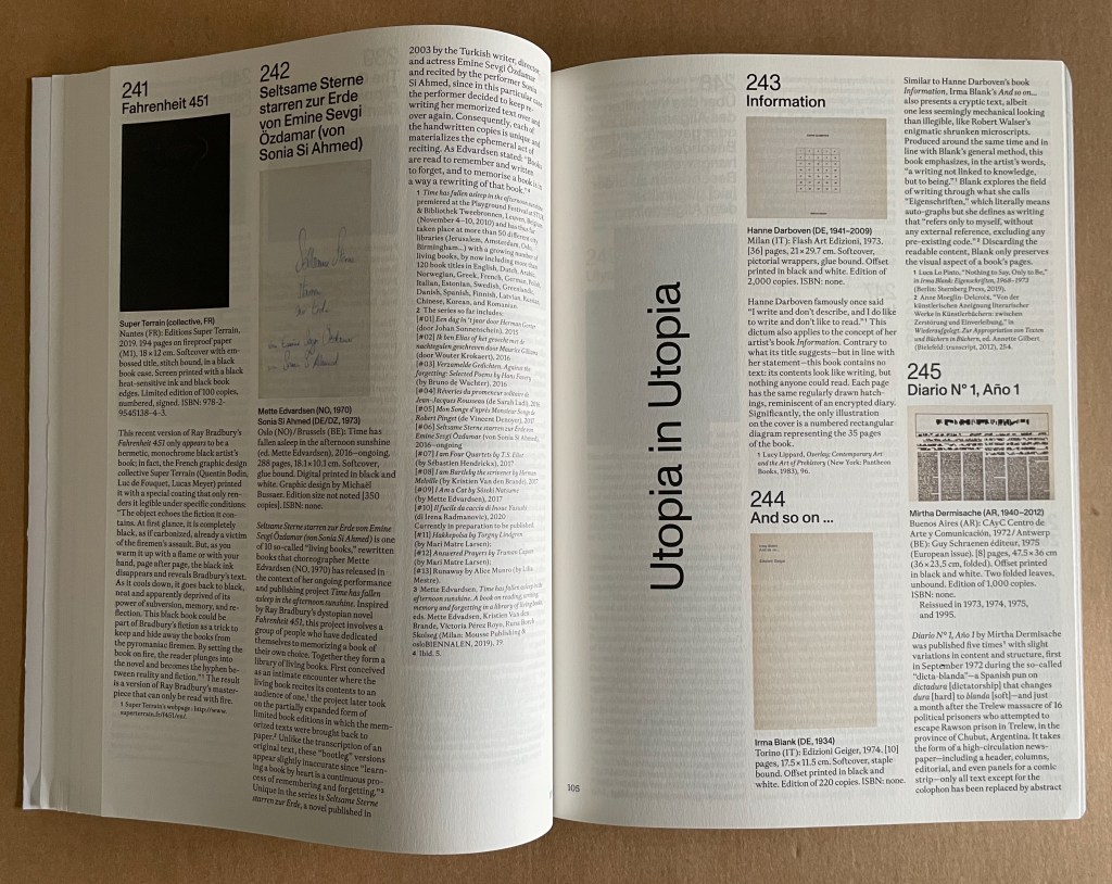
There are seven works in this section “Fahrenheit 451”, although one of Dora Garcia’s is not numbered. None of them are blank, raw, or completely illegible. Nevertheless, their appropriateness for the exhibition is particularly underlined by the blackened pages of #241, which can be read if burned (see below).
“Utopia in Utopia” pays homage to Thomas More’s satire Utopia (1516) with sixteen works of varying illegibility, several engendered with invented fonts arising from More’s invention of an alphabet for the Utopians. No blank pages, unless you count Irma Blank’s entry (but we’ve had that pun in an earlier section).
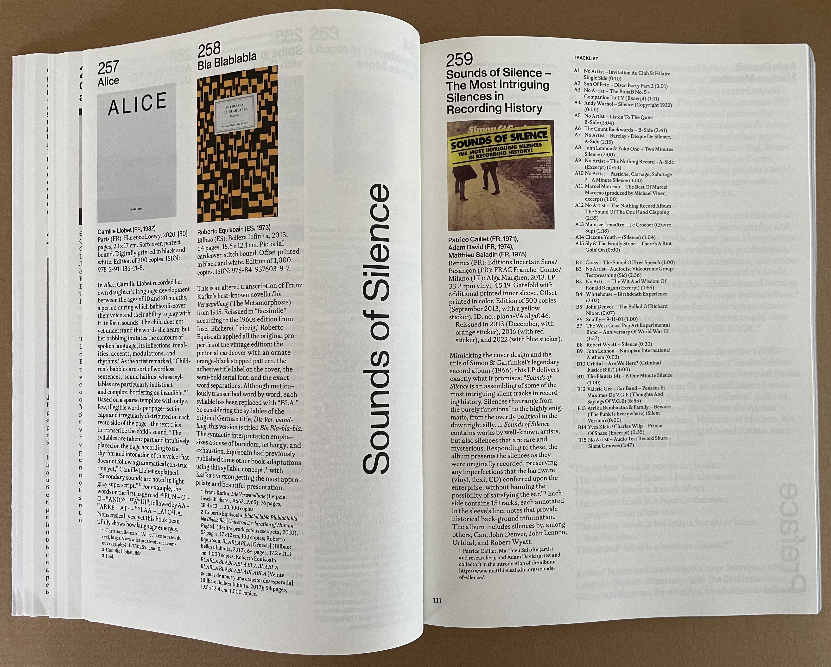
The last section “Sounds of Silence” has only the one entry, and it is a vinyl LP album, not a book. To add to that quibble, there’s oddly no recording of John Cage’s 4″33″ among the tracks of this platter. But as the final entry in the exhibition, it extends the enterprise beyond blankness, rawness, and illegibility to inaudibility!
200 artists, 259 works.
Like Megan Liberty’s exhibition in the same year, Craft & Conceptual Art : Reshaping the Legacy of Artists’ Books, it also demonstrates that the factions of the dematerialized and conceptual works, the democratic multiples, the limited editions and the unique finely or rawly crafted works were not so walled off from one another as implied in polemics, manifestos and critical essays so concerned with defining the “artist’s book”, the existence or placement of its apostrophe and securing its role in the larger history of art. With its captions, numerous full-page images, and curation by Moritz Küng, Blank. Raw. Illegible. joins the list of significant exhibitions documenting the evolving history of the artist’s book that David Senior identified in his contribution to Liberty’s catalogue:
and Guy Schraenen’s boxed set of 25 catalogues of exhibitions organized by him and representing the archive donated to Neues Museum Weserburg in Bremen, Germany.
Above all, Blank. Raw. Illegible. … Artists’ Books as Statements (2023) demonstrates that the book constitutes a medium for, and genre of, Art. No library or collection that aims to represent book art or Art should be without it.
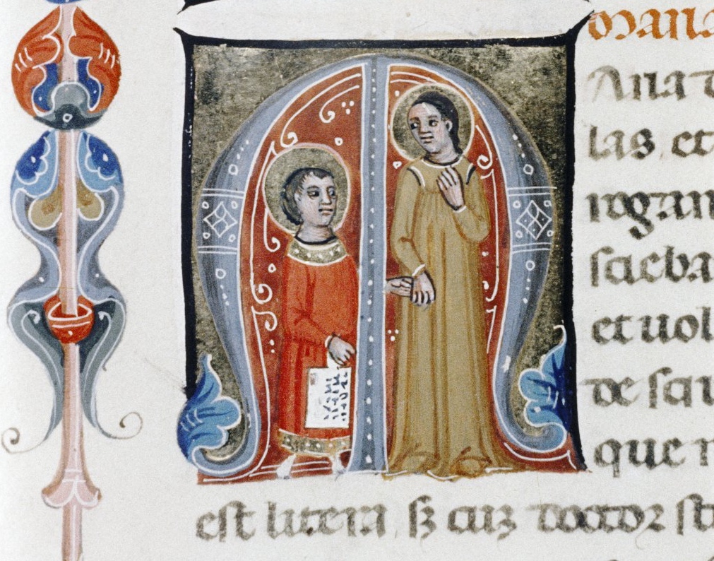
First, the back-dating. This comes from the delightfully annoying or annoyingly delightful belated discovery of Erik Kwakkel’s 2015 entry on the history of the horn-book “Book on a Stick” in Medievalbooks. Delightful and annoying to find the truly earliest appearance of a horn-book right under my nose in the Bodleian Libraries but too late to include it in the Alphabets Alive! exhibition at the Bodleian in 2023.
Andrew White Tuer’s History of the Horn-Book (1897) came close with its dating of the horn-book’s first appearance as 1450, but as Kwakkel writes:
The image shows Christ being brought to school by his mother. He is bringing his “textbook” to class: a hornbook, which dangles from his wrist by a string, just like many of the later specimens did … Quite intriguingly, we are shown a real medieval snapshot of how children carried their hornbook to and at school. More importantly, it shows that the hornbook was indeed a medieval invention….While no actual hornbooks appear to survive from the medieval period, these visual representations show that educating young children was also the driving force behind the production of hornbooks in the age before print.
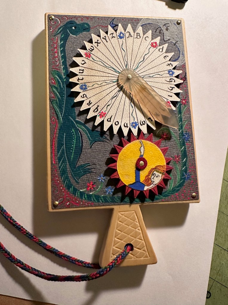
And for the updating, here is Ashley Thayer’s Mechanical Horn-book (2025) just arrived in the Books On Books Collection.
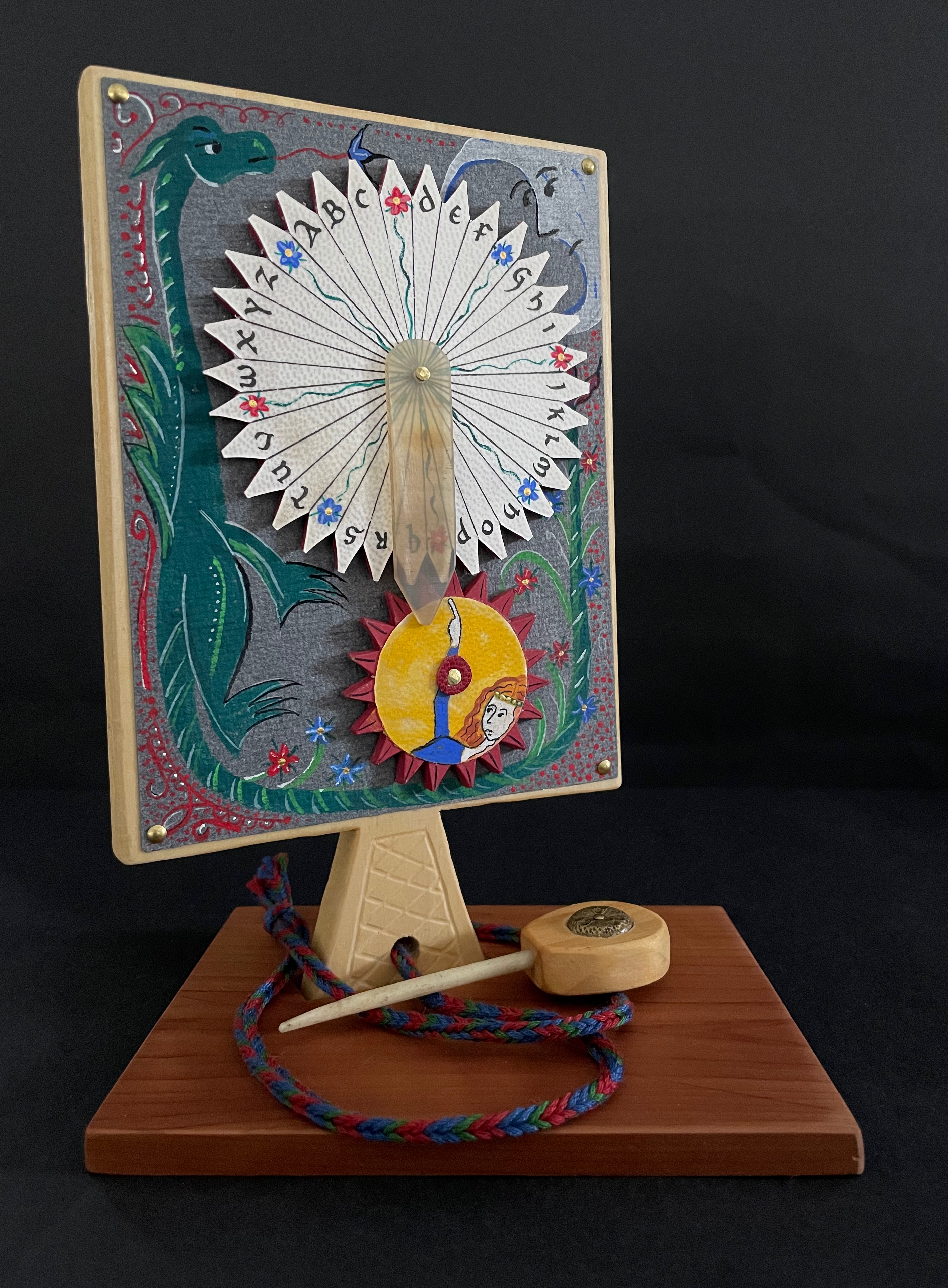
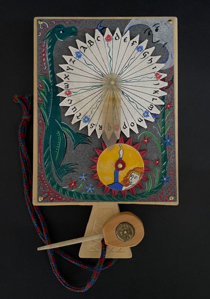
Mechanical Horn-book (2025) Ashley Rose Thayer Horn-book. On stand: H192 x W160 mm. Off stand: H192 x W115 mm. Unique. Acquired from the artist, 17 October 2025. Photos: Courtesy of the artist. Books On Books Collection.
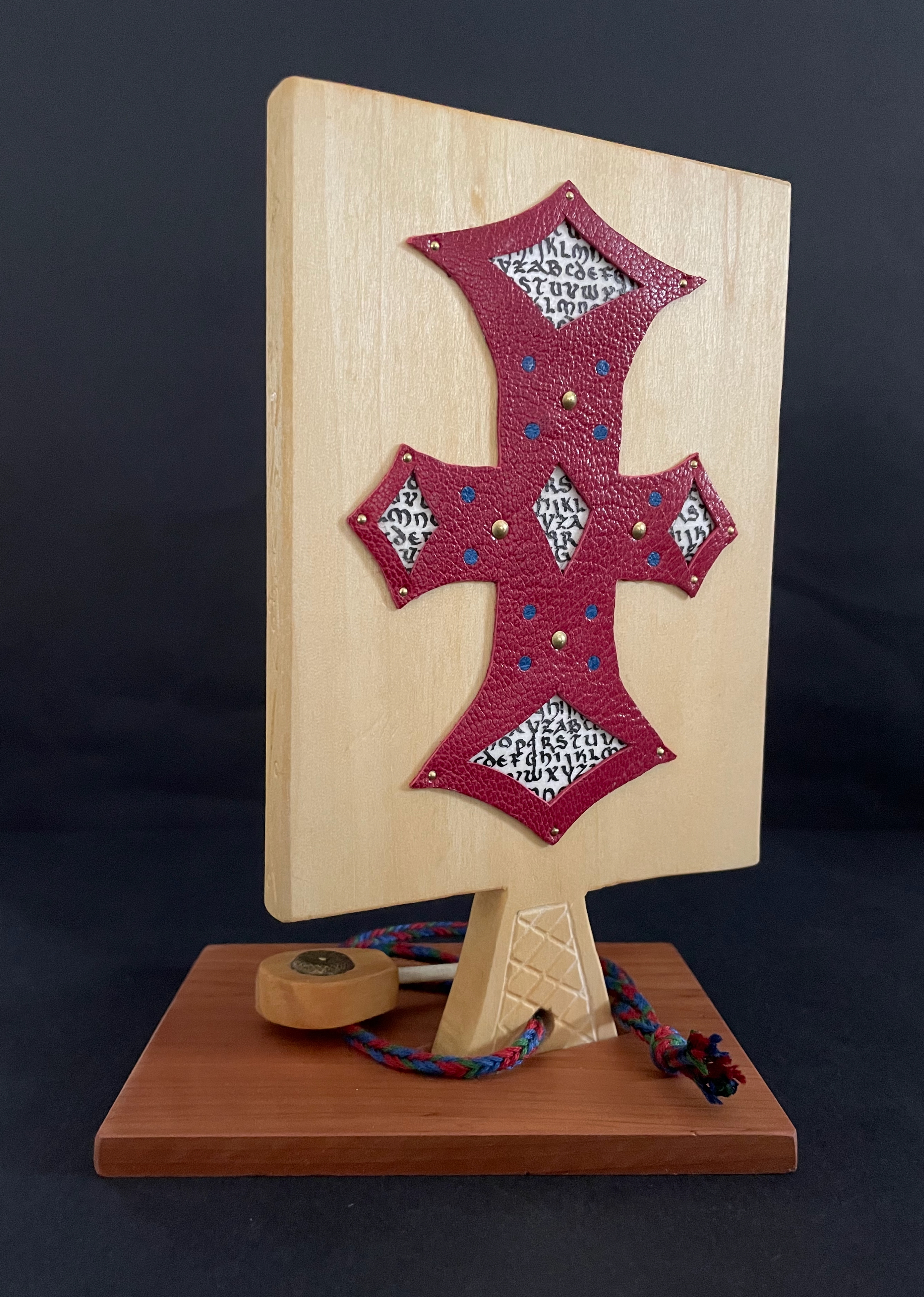
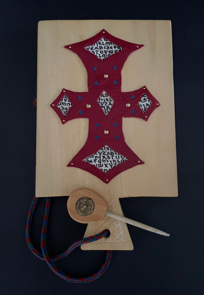
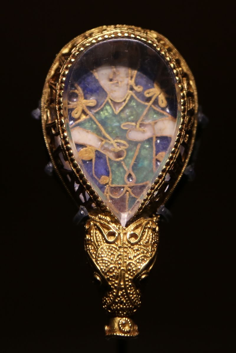
The paddle is made of pine wood, the gears of vellum-covered bookboard, the spinning “arm” of authentic cow horn, and the wrist loop of embroidery thread by a medieval finger loop braiding technique. On dark grey-blue Khadi paper, Thayer has painted a border of the moon, a berried floral garland, and a wyvern, the heraldic emblem associated with Wessex, the Anglo-Saxon kingdom from which Alfred the Great emerged in the 9th century. On the reverse, a cross of cut red leather with five inserts of calligraphed vellum alluding to Christ’s five wounds reflects the horn-book tradition of combining religion with learning the alphabet. It also makes this horn-book reflective of Alfred’s Anglo-Saxon and Christian background.
The pointer, called an aestel in Old English, is made from poplar wood, an antique button, and antique bone. Its inclusion isn’t simply functional. Appearing alongside the Wessex wyvern, it points to that famous aestel on display at the Ashmolean in Oxford: the Alfred Jewel.
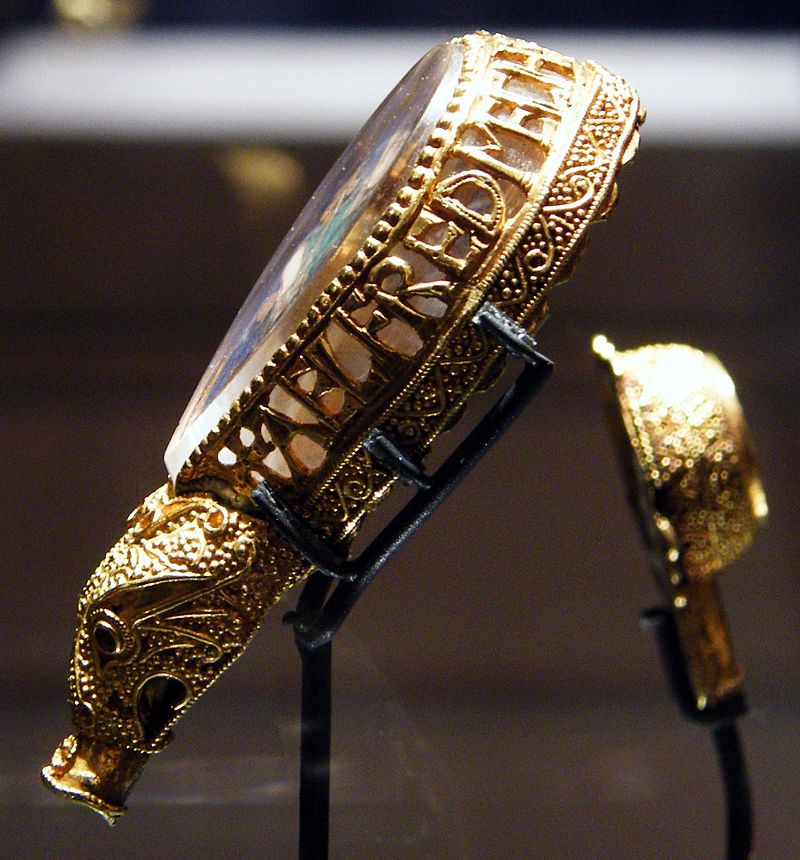
The Alfred Jewel, Ashmolean Museum, Oxford. Photo taken from the front by Geni CC BY-SA 4.0. Photo taken from the side by Richard M Buck CC BY SA 3.0.
If there’s ever an Alphabets Alive! redivivus, Erik Kwakkel and Ashley Thayer have provided the pointers to the other treasures in Oxford that should be included.
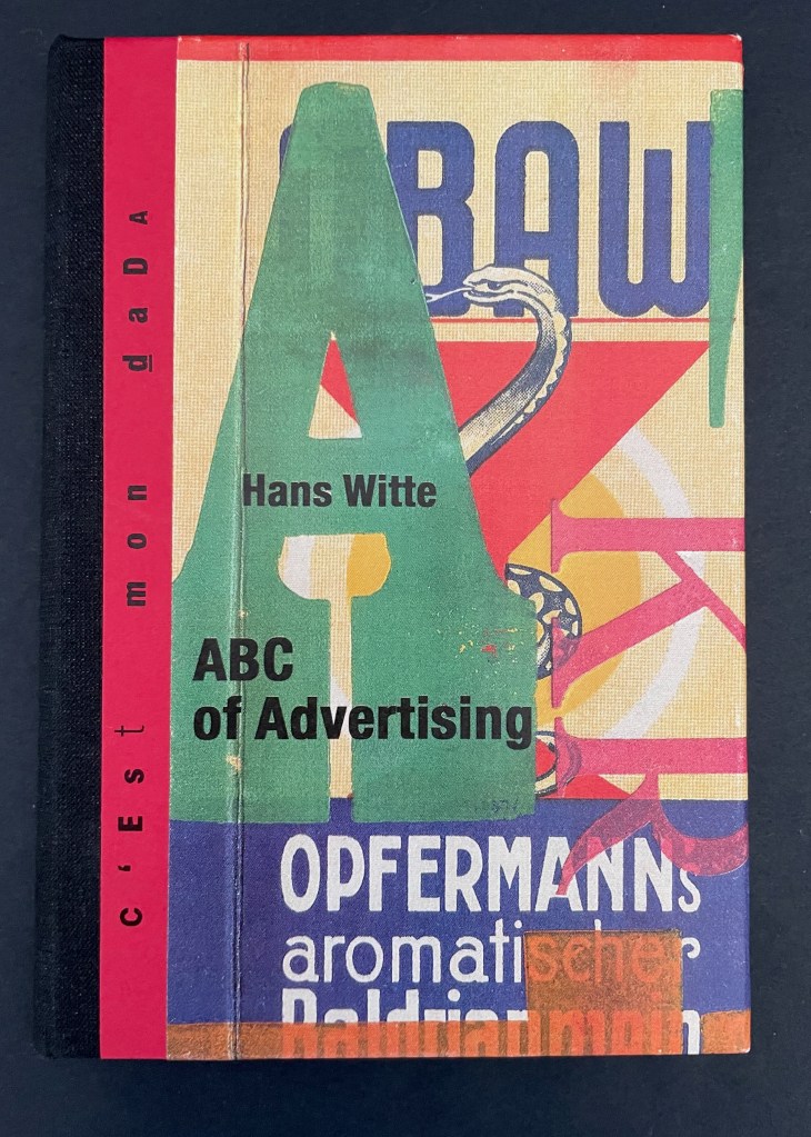
ABC of Advertising (2024) Hans Witte Casebound, cloth spine and paper over boards, sewn to doublures. H150 x W105 mm. [40] pages. Acquired from Redfoxpress, 2024. Photos: Books On Books Collection.
The ABC of Advertising is No. 205 in the RedFoxPress “c’est mon dada” series. The series name comes from the French expression meaning “it’s my thing”. Dada is also a colloquial child’s expression for “horsie” or “hobbyhorse”. So, of course, the French adopted it as the name for one of the avant garde movement of the early 20th century. Although you might think from The ABC of Advertising that wood type and letter press are Hans Witte’s “hobbyhorse”, it’s clear from his artist’s books, children’s books, and book object installations that he has a herd of them.
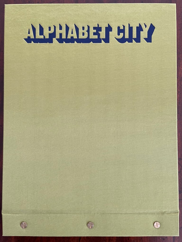
Alphabet City (2009) Scott Teplin Bolted folio. H270 x W360 mm. [29] pages. Edition of 26, of which this is L. Acquired from the artist, April 2023. Photos: Books On Books Collection and Courtesy of the artist.
Scott Teplin’s Alphabet City follows in the long line of building designs based on alphabetical foundations. Perhaps first was John Thorpe (1565–1655?), an English architect, who drew up a property based on his initials. Thomas Gobert (1625-90), a French architect, produced Traitté d’Architecture dedié à Louis XIV, a manuscript whose building plans spelled out “LOVIS LE GRAND”. Anton Glonner (1723–1801) designed a Jesuit church and college around the monogram “IHS”. More famous is Johann David Steingruber (1702-87) and his Architectonisches Alphabeth (1773).
Teplin committed twenty years to his task (Steingruber committed ten) and came to it more from the school of graphic design than the school of architecture. While we might expect bewigged 18th century servants and lords to ride up in carriages to Steingruber’s A to Z, we would not be surprised to find characters from R. Crumb or Mad Magazine inhabiting Teplin’s alphabet-shaped houses, gaming arcades, strange laboratories, ice cream parlors, power plants, and other bizarre edifices. Some houses have no entries or exits. Some have doorless bedrooms. Others have rooms filled with oozing substances or piles of dirt. Some have outdoor swimming pools inside. One, seeming to float on a grass-colored sea, has a boat funnel inside, capped with a life ring, and rooms with deckchairs and portholes. Whimsical and bizarre free association drives Alphabet City.
Although the binding of Alphabet City is intended to facilitate removal and mounting of individual folios, it recalls Fortunato Depero’s “bolted book” and, by extension, the “startle” factor intended by Futurism, Surrealism, Dadaism, and all the -isms of that period. From original drawings in pen & ink to scanned images etched to magnesium plates and printed on Zerkall vellum, then airbrushed with Winsor & Newton and Holbein watercolors and pencilled with matching Prismacolor pencils, Alphabet City leans more toward a fine press livre d’artiste than an artist’s book. The foil-stamped Asahi bookcloth cover with its yellow Moriki endsheets would not be out of place at Arion Books or Three Star Books.
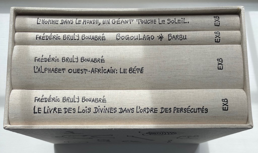
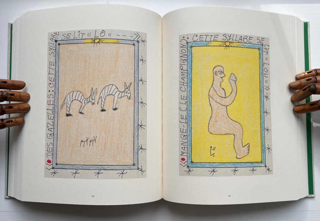
Frédéric Bruly Bouabré designed the covers and bound each of the four volumes in this set the year before his death. For the Books On Books Collection, the thematic connection of this last monument by Bruly Bouabré lies in Volume two, L’Alphabet Ouest-Africain: Le Bété. Bruly Bouabré invented this syllabary for the Ivory Coast’s Bété peoples in 1954. Later he compiled it in a Toyota 1983 Agenda-Journal, which in effect created the artist’s book La méthodologie de la nouvelle écriture africaine “bété” : suivi de, L’alphabet de l’Ouest Africain (2003). An artwork version, entitled Alphabet Bété and consisting of 449 original drawings, resides at the Museum of Modern Art in New York.
Bruly Bouabré is one of the few individuals to have invented a syllabary or alphabet on his own. Sequoyah, the Cherokee Indian, was another. The Guinean brothers Ibrahima and Abdoulaye Barry also belong to the fellowship; they created ADLaM, a new alphabet for the Pulaar language of the Fulani people of West Africa.
Left: [This syllable is pronounced “LÔ.”] Right: [Eat it (the mushroom). This syllable is pronounced “LOU.” ] Photos: Books On Books Collection. Displayed with permission of the publisher Éditions Xavier Barral.
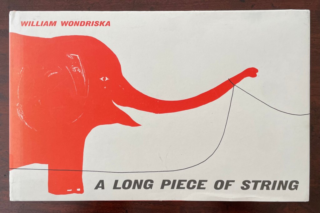
A Long Piece of String (2010 [1963]) William Wondriska Casebound, illustrated paper over boards, illustrated pasteboards. H185 x W290 mm. [44] pages. Acquired from Thrift Books, 25 May 2025. Photos: Books On Books Collection.
In the 1970s, post-Minimalism, post-Conceptualism, Language-based Art, Neo-Dada, Fluxus, Arte Povera, OuLiPo, the commodification of art and the “dematerialization of the art object” — all made a messy milieu for visual and literary artists. According to Stefan Klima, this is also the period when the messy notion of the artist’s book or “book art” gained recognition as a genre with exhibitions curated by Dianne Vanderlip for Moore College of Art and Design, Germano Celant for Nigel Greenwood Gallery, and Martin Attwood for the Arts Council of Great Britain.
Into this environment came Bronx-born Karen Shaw, an aspiring artist and data analyst for the broadcaster NBC. On the job, she learned about the hash function — that one-way cryptographic algorithm that condenses input data of any size into an output of fixed lengths. When she saw that she could change a word into a number by assigning each letter a number according to its place in the alphabet and then summing them up, she arrived at the idea of reducing “the masterpieces of literature, poetry and prose to a number, which would signify the ‘essence’ of the work”.
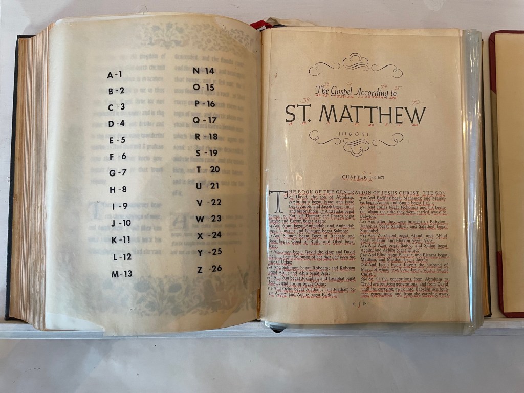
After applying the approach to Blake, Shelley, Keats and others, she tackled the King James version of the Gospel according to St. Matthew. Here’s her description of the procedure:
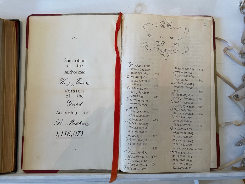
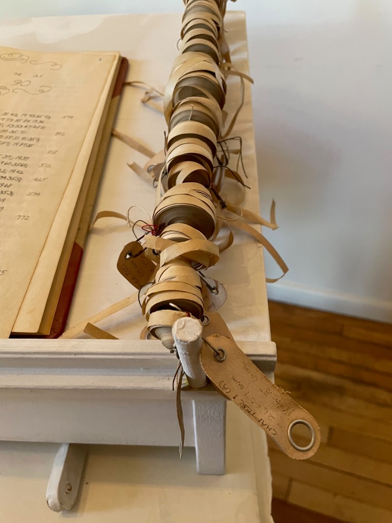
I wrote the numerical equivalent of each letter under each letter … in the Bible itself. Then I added up the number/letter of each word until I had the sum for each word, verse, and chapter. I then recorded the sums in an accounting book. This became the second version …. Next I added it all up on adding tapes, one tape for each chapter, which I measured to find out the length of each chapter. I then attached each labeled tape to a rod at the edge of a shelf that had been built to hold the work. This was the third version …. (Sellem, “Karen Shaw = 100”.)
Here was an utterly different form of artist’s book by alteration: an assemblage of a “Rembrandt” Bible’s St. Matthew Gospel with each letter hand-numbered according to its place in the alphabet; each of the gospel’s words summed and recorded in an accounting book with all of its word-sums summed to its essence of 1,116,071; and the “scrolls” of the adding machine tapes for each chapter ranged alongside the Bible and accounting book. For Shaw, this altered-book form of art was merely a first step into a series of discoveries and inventions that led to a lifetime of artistic exploration and creation.
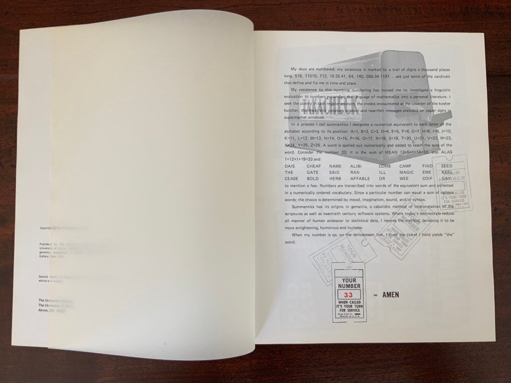
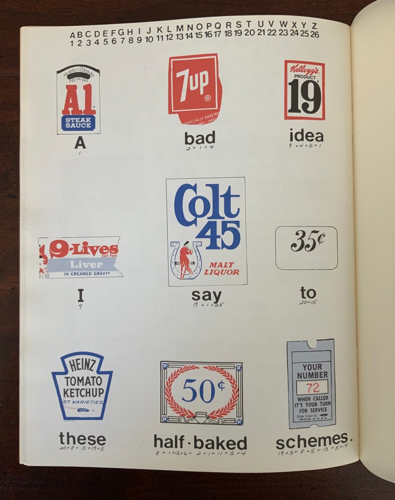
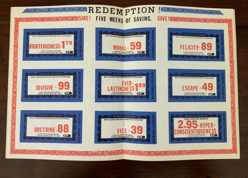
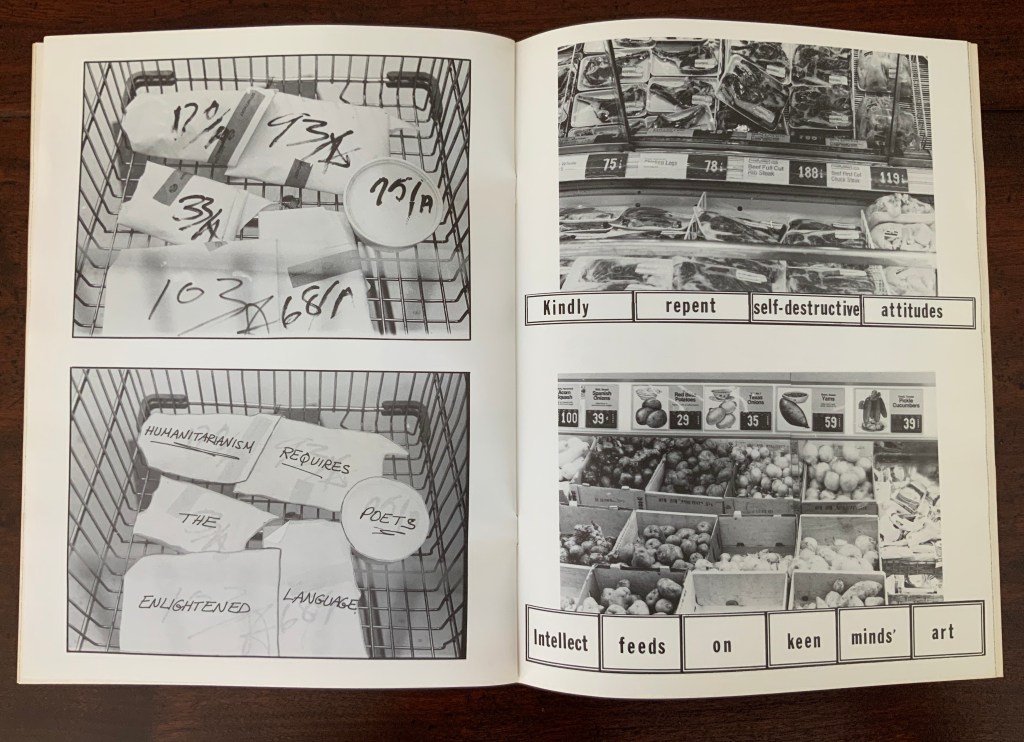
As she plied her calculations, she noticed that obviously many words had the same number. The impulse to collect words equalling 100 (the sum of her name’s letters) led to creating a numerical dictionary — the Sumantic Vocabulary Collection — listing words with equal sums. With that, Shaw began to see words in what she called “the numerical waste” surrounding her: numbers on receipts, savings coupons clipped from newspapers, brand labels, barcodes and pricing stickers and other everyday consumer signage. Strange poems could be derived from them. Eventually “sumantic” — playing on sum and semantics — evolved into “summantics” as her description of her artistic methodology. Her 1978 artist’s book Market Research spells (or numbers?) this out in its foreword.
Market Research (1978)
Market Research (1978) Karen Shaw Softcover booklet, saddle stitched with staples, translucent fly leaves. H280 x W215 mm. 24 pages. Acquired from , . Photos: Books On Books Collection.
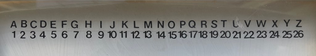
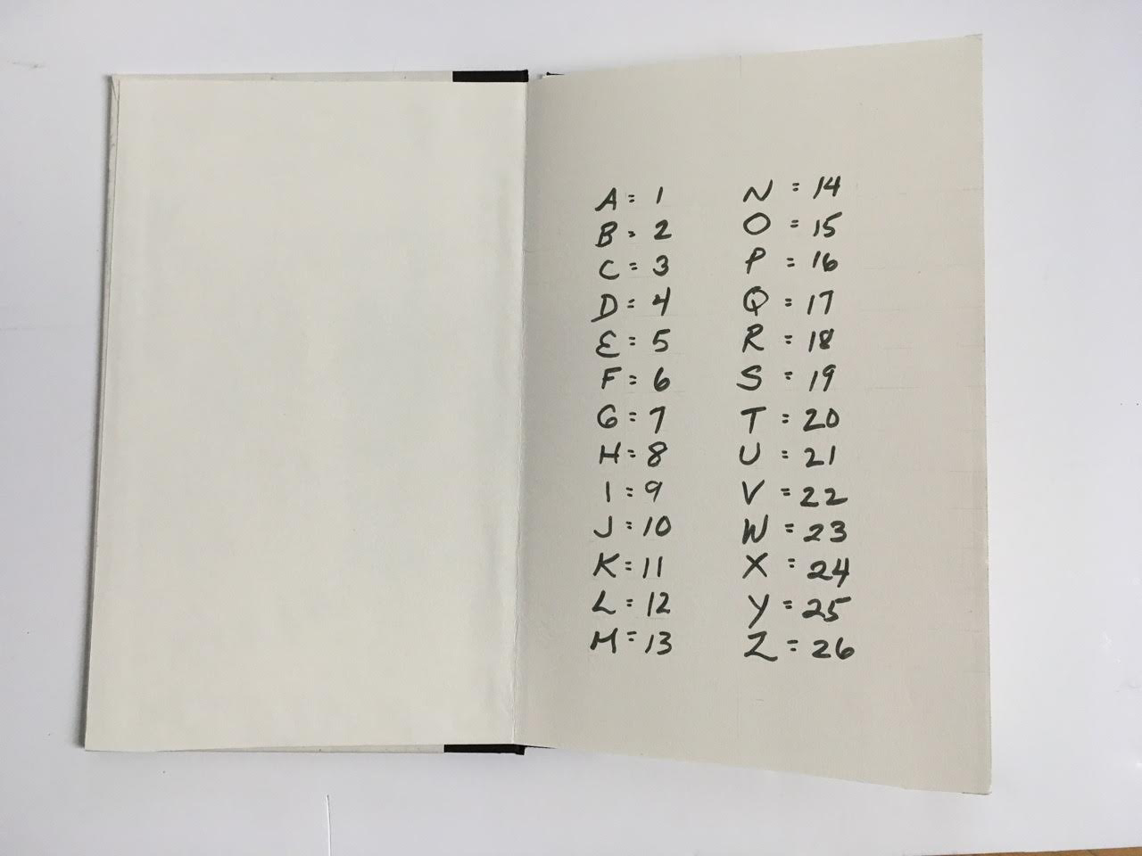
In a process I call summantics, I designate a numerical equivalent to each letter of the alphabet according to its position: A=1, B=2, C=3, D=4, E=5, F=6, G=7, H=8, I=9, J=10, K=11, L=12, M=13, N=14, O=15, P=16, Q=17, R=18, S=19, T=20, U=21, V=22, W=23, X=24, Y=25, Z=26. A word is spelled out numerically and added to reach the sum of a word. Consider the number 33. It is the sum of MEAN = 13+5+1+14 = 33, also ALAS = 1+12+1+19 = 33 and:
DIAS CHEAP NAME ALIBI COMB CAMP FIND SEED THE GATE SAID RAN ILL MAGIC EWE KEEL CEASE BOLD HERB AFFABLE OR WEE COIF GAY
to mention a few. Numbers are transcribed into words of the equivalent sum and collected in a numerically ordered vocabulary. Since a particular number can equal the sum of various words the choice is determined by mood, imagination, sound, syntax and/or grammatical structure.
Summantics has its origins in gematria, a cabalistic method of interpretation of the scriptures as well as late twentieth century software systems. Where today’s technocrats reduce all manner of human endeavor to statistical data, I reverse the process believing it to be more enlightening, humorous and humane.
Given the humor of the work’s opening, it’s likely that the title Market Research cheekily refers to her data analysis work with NBC questionnaires completed by mothers for tracking the impact of TV violence on their young sons.
In his review of the 1978 exhibition “Artists’ Books and Notations” (Touchstone Gallery, 118 E. 64th Street, New York), Lawrence Alloway noted Karen Shaw’s methodology as another instance of “the ways by which language has entered recent visual art, formerly protected from such incursions by the prestige of Form. If artists use words in their work, it is not because they are now more dependent on writers or on theory than in the past, as has been suggested, but because language has become available as subject matter” (p.653). With Shaw in particular, it was a case of language and numbers becoming available as subject matter.
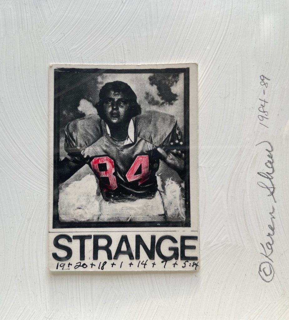
George Orwell 1984 (1984-89)
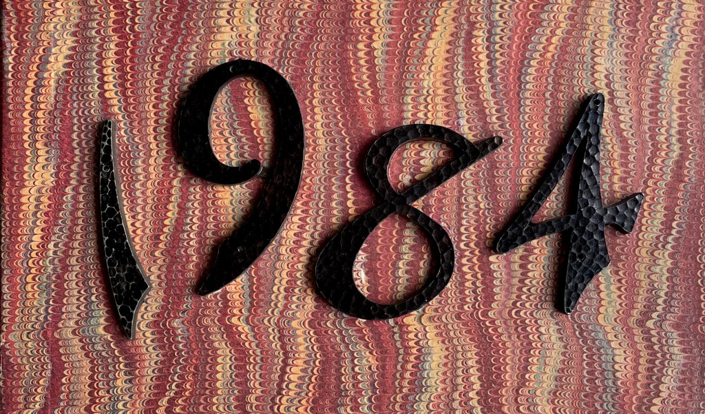
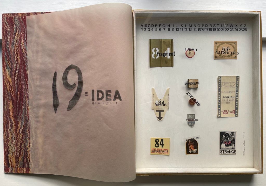
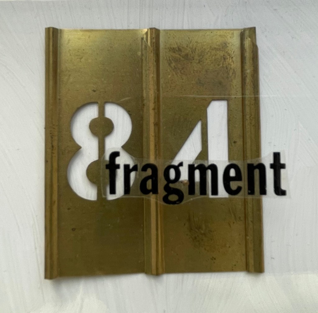
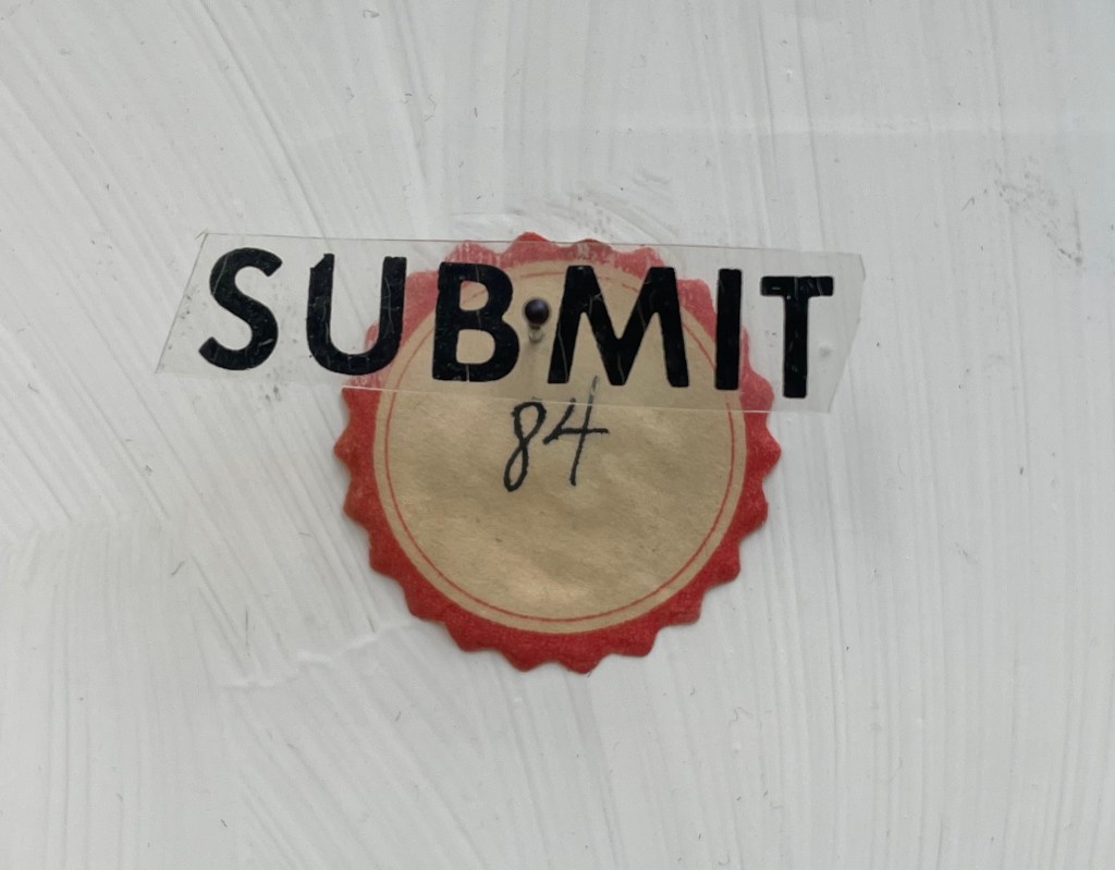
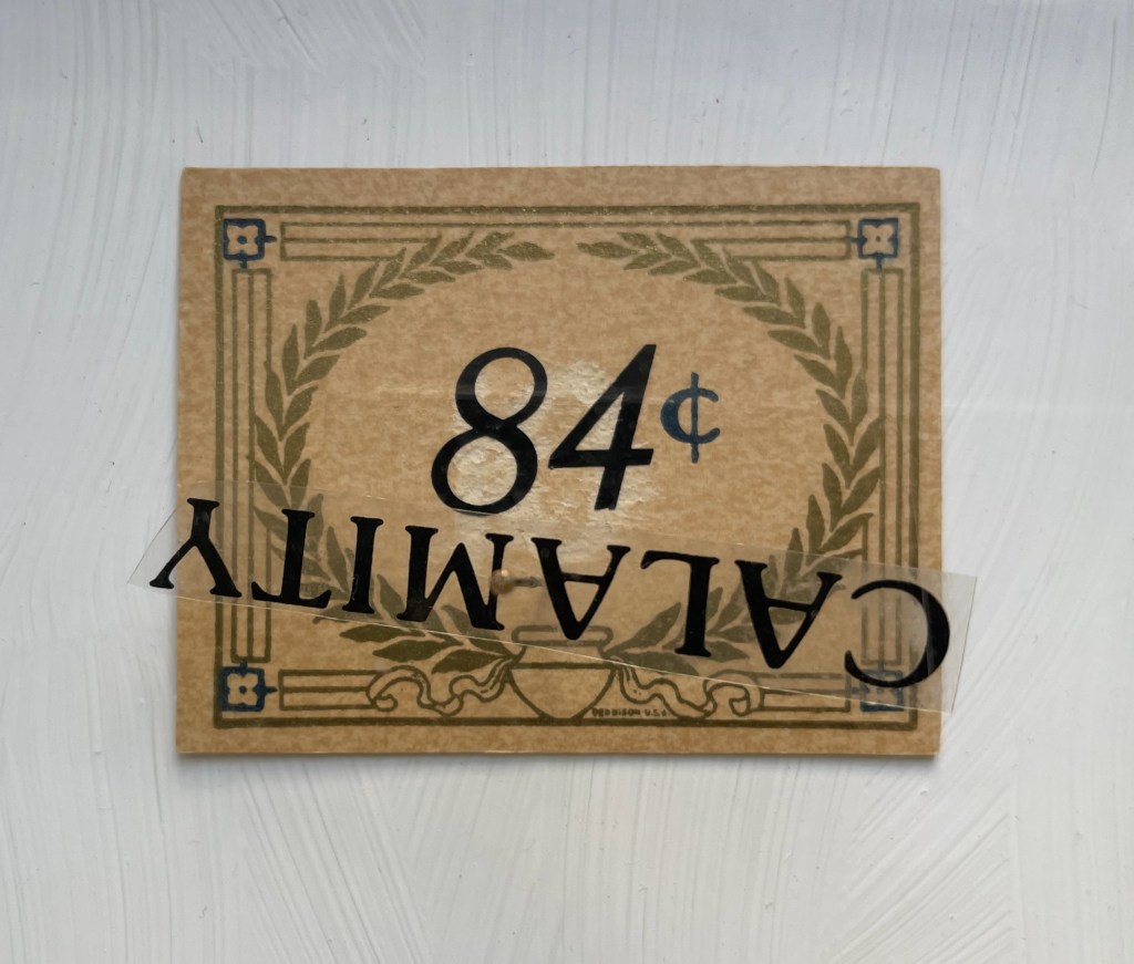
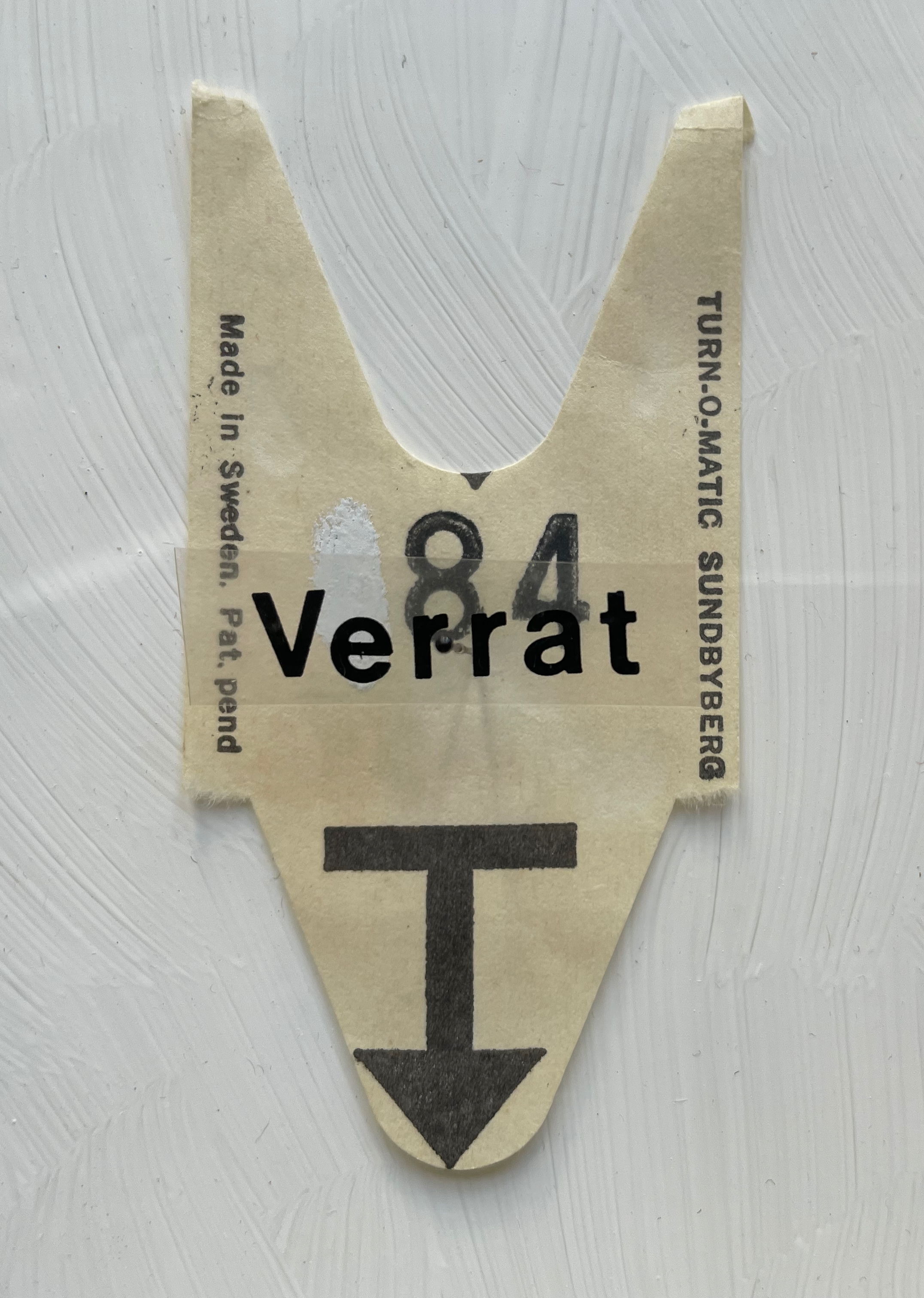
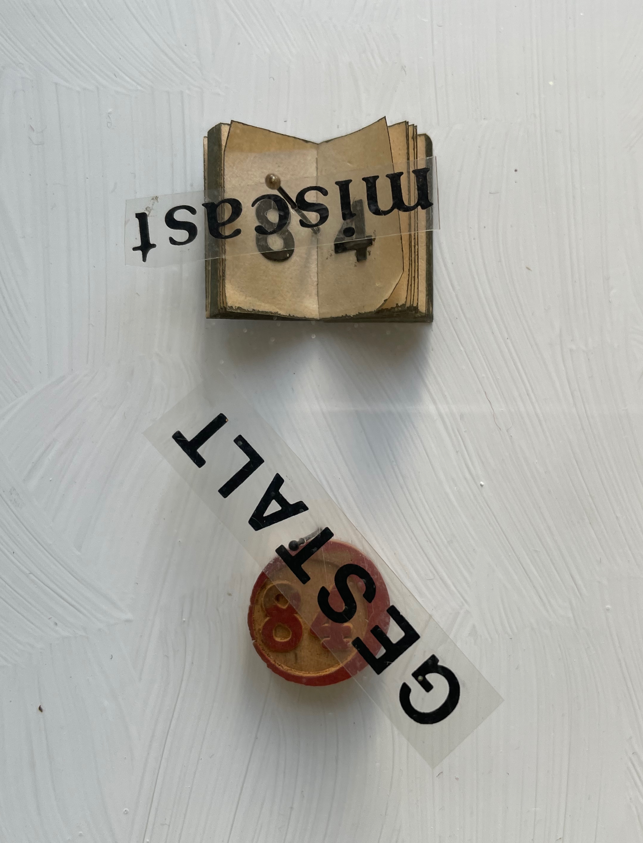
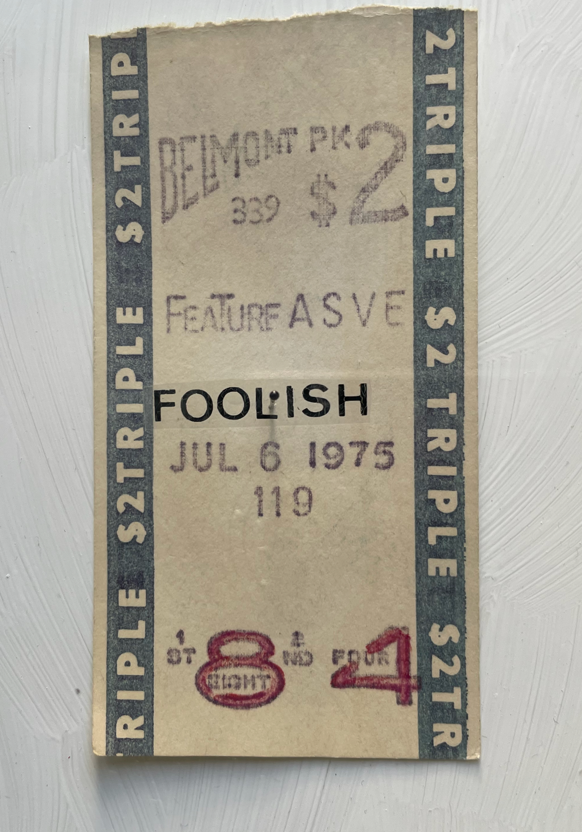
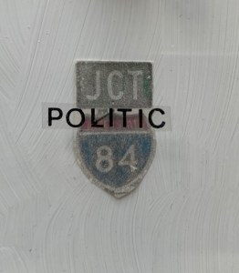
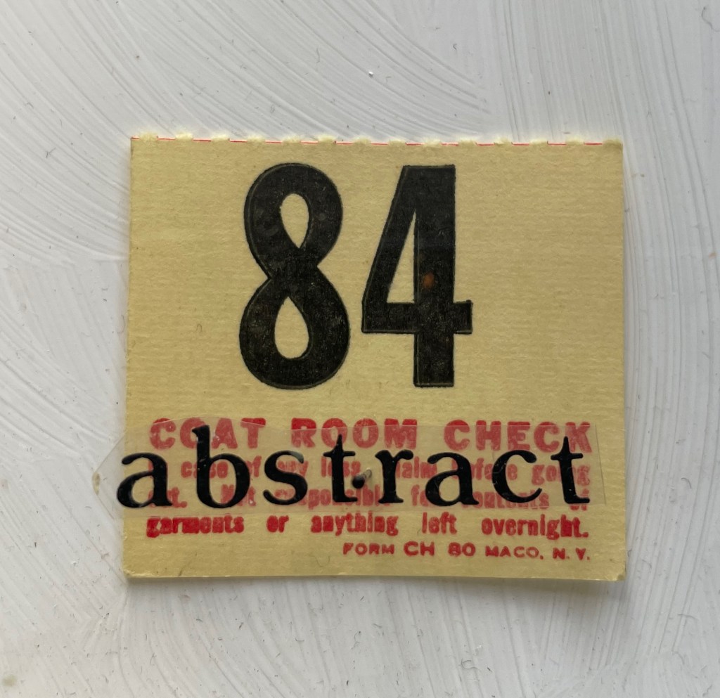
George Orwell 1984 (1984-89) Karen Shaw Diptych box covered with marbled paper on front and spine, wrought iron numerals 1984 and plastic letters fixed to front cover, translucent flyleaf with inked symbols and numbers, with text colored and cut out from translucent paper, plexiglas glued to wooden case with gessoed interior and 11 found items bearing the number 84, each fixed to the interior wooden panel with a black-bead-headed pin. H360 x W290 x D40 mm. Unique work. Acquired from Peter Kiefer Buch- und Kunstauktionen, 21 October 2023. Photos: Books On Books Collection.
Whether tabulating words or deciphering numbers, Shaw leaned further into three-dimensional assemblages resembling one- or two-page books. The somewhat-damaged homage George Orwell 1984 blends her interest in transposing literary works into hash codes with that of reversing numbers in the numerical wasteland into words with the help of her dictionary. Shaw plays off Orwell’s idea of double-speak by splitting his title in two. The first half is the sum of the numerical values of the letters in “idea”, appropriate for an idea-driven book. For the second half, however, she seeks out words that sum up to 84, letrasets them on clear plastic, and pins them over found and sometimes manipulated objects. A word may allude to its found object, or it may vaguely relate to Orwell’s book, or whether there’s any association at all may be obscure. A Belmont racetrack betting slip makes an ironic match with “foolish”, but seems unrelated to the novel. The German word Verrat translates as “betrayal”, which certainly fits the book, but what it has to do with the queue ticket (manipulated to show “84”) is unclear. That the word “calamity” has spun upside down over its manipulated token is an accidental irony, and what association the overwritten token has with the word or novel is also unclear.
Like Louis Lüthi’s A Die with Twenty-six Faces (2019), built on a collection of literary works entitled with a single letter, Shaw might have extended this part of her oeuvre with other number-titled works: Ray Bradbury’s Fahrenheit 451 or Joseph Heller’s Catch-22. Had she been inclined, she could have even used Lüthi’s book and its reference to Marcel Broodthaers’ quip “The alphabet is a die with 26 faces”. These might have yielded results more compelling than George Orwell 1984, but she would have still been captive to finding luckily appropriate words with the right word-sums.
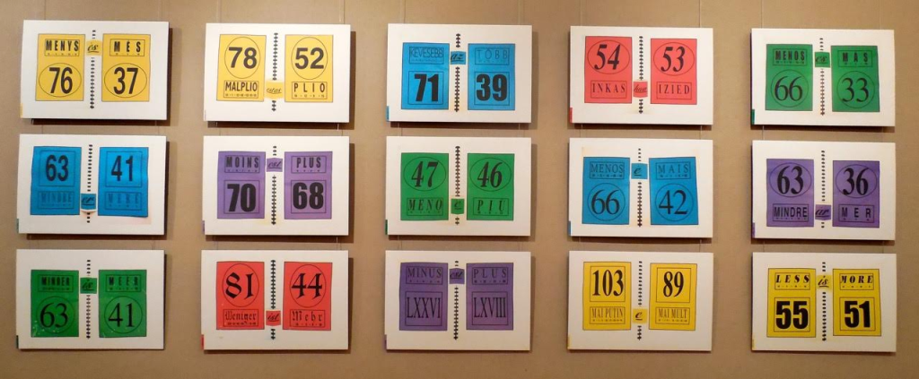
Two summantic works not in the collection — Less is More: Proof in 15 Languages (1999) and Summantic Proofs (2019) — are more compelling and uncanny. The fact that so many languages’ words for “less” have word-sums greater than the word-sums for the words for “more” is simply uncanny, and Shaw’s typography, color and layout in her spiral sketchbook presentation are compelling.
Less is More: Proof in 15 Languages (1999) Karen Shaw Photo: Courtesy of the artist.
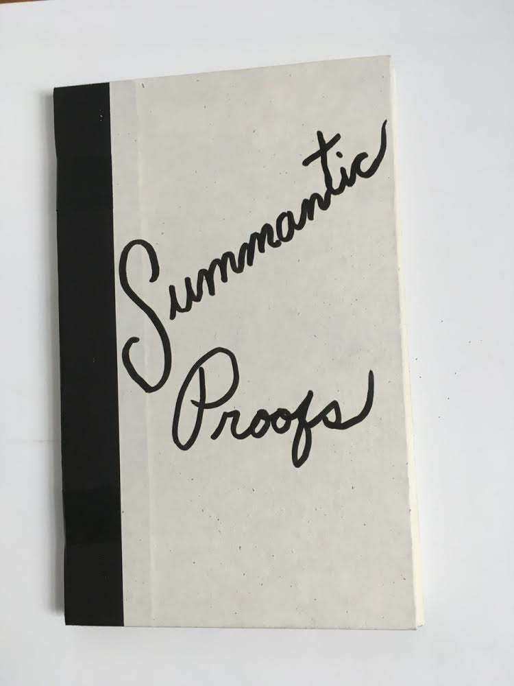
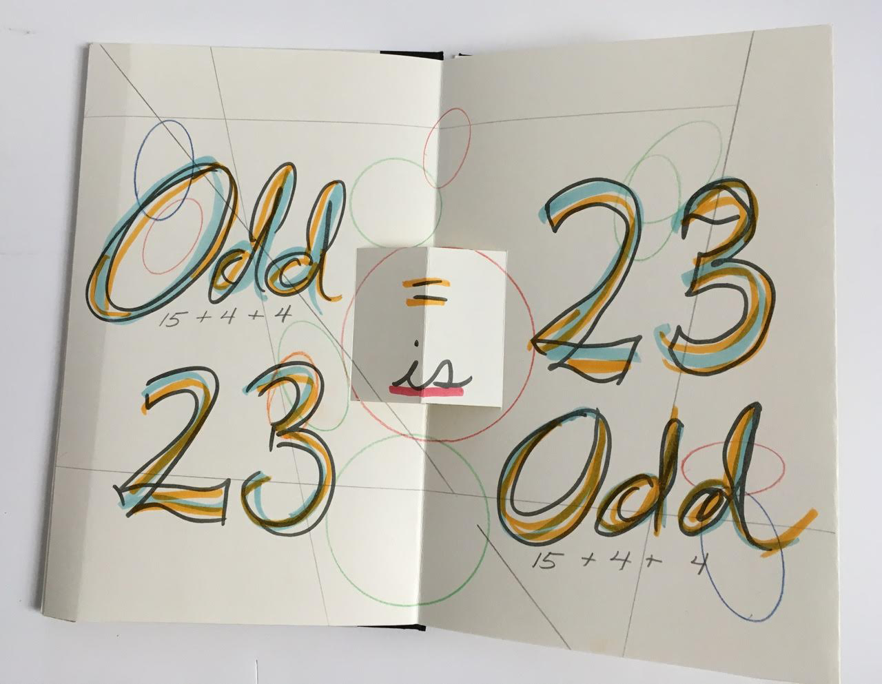
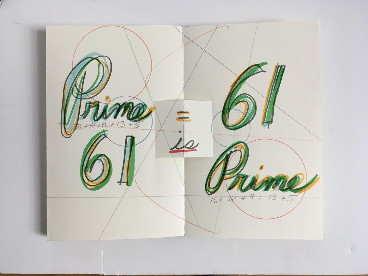
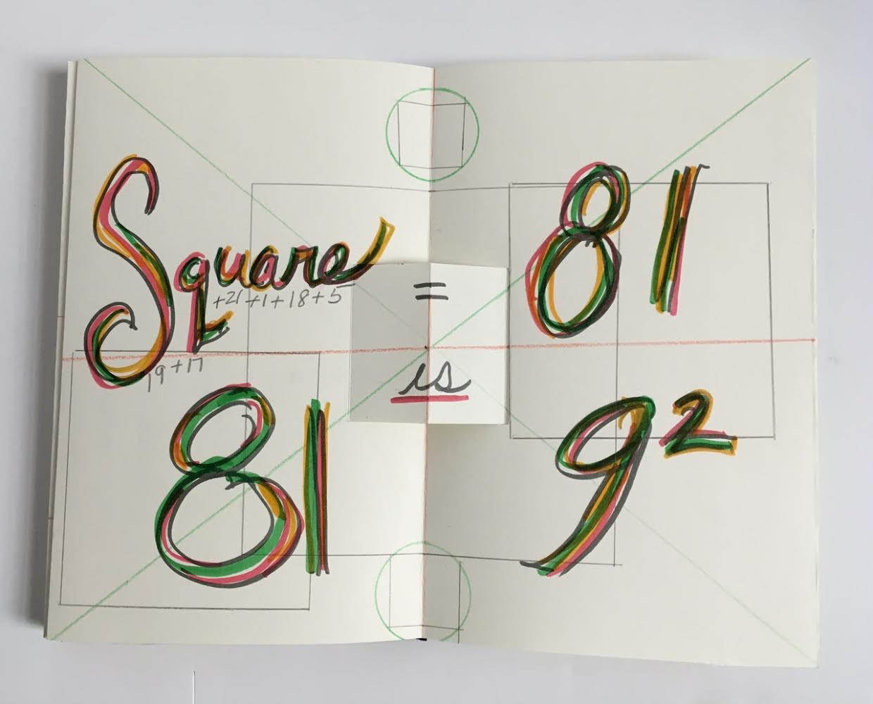
Also uncanny is her later collection of “proofs” in which she demonstrates that the word-sum for “odd” is an odd number, that the word-sum for “prime” is a prime number, and that the word-sum for “square” is 9 x 9. The pop-up equals sign, the ruler-drawn lines and the hand-colored script in this late mock-up reflect her ongoing artistic drive.
Summantic Proofs (2019) Karen Shaw Photos: Courtesy of the artist.
The most striking and consistent of Shaw’s works in the collection departs from her summantic method. It nevertheless embodies the ingenuity, humor, and humanity at play in her art.
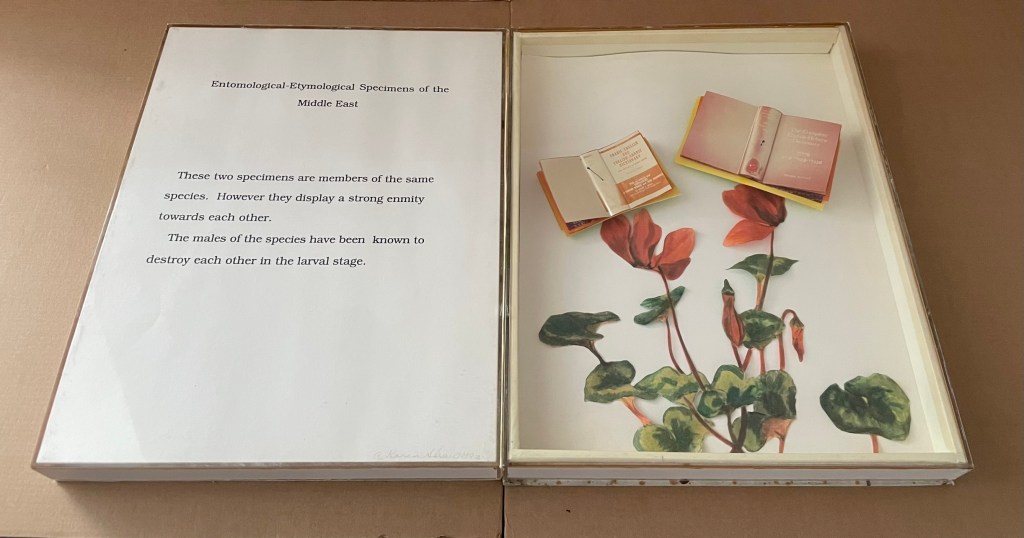
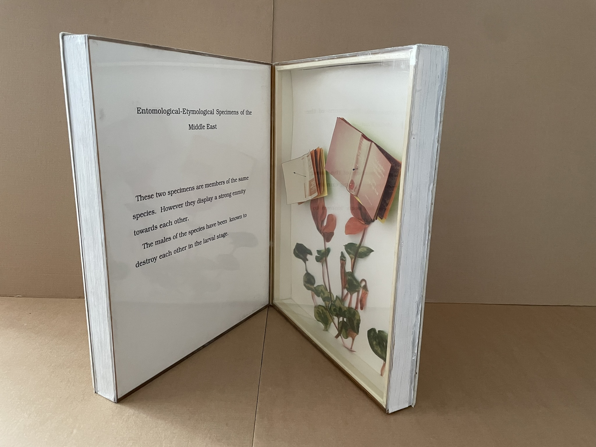
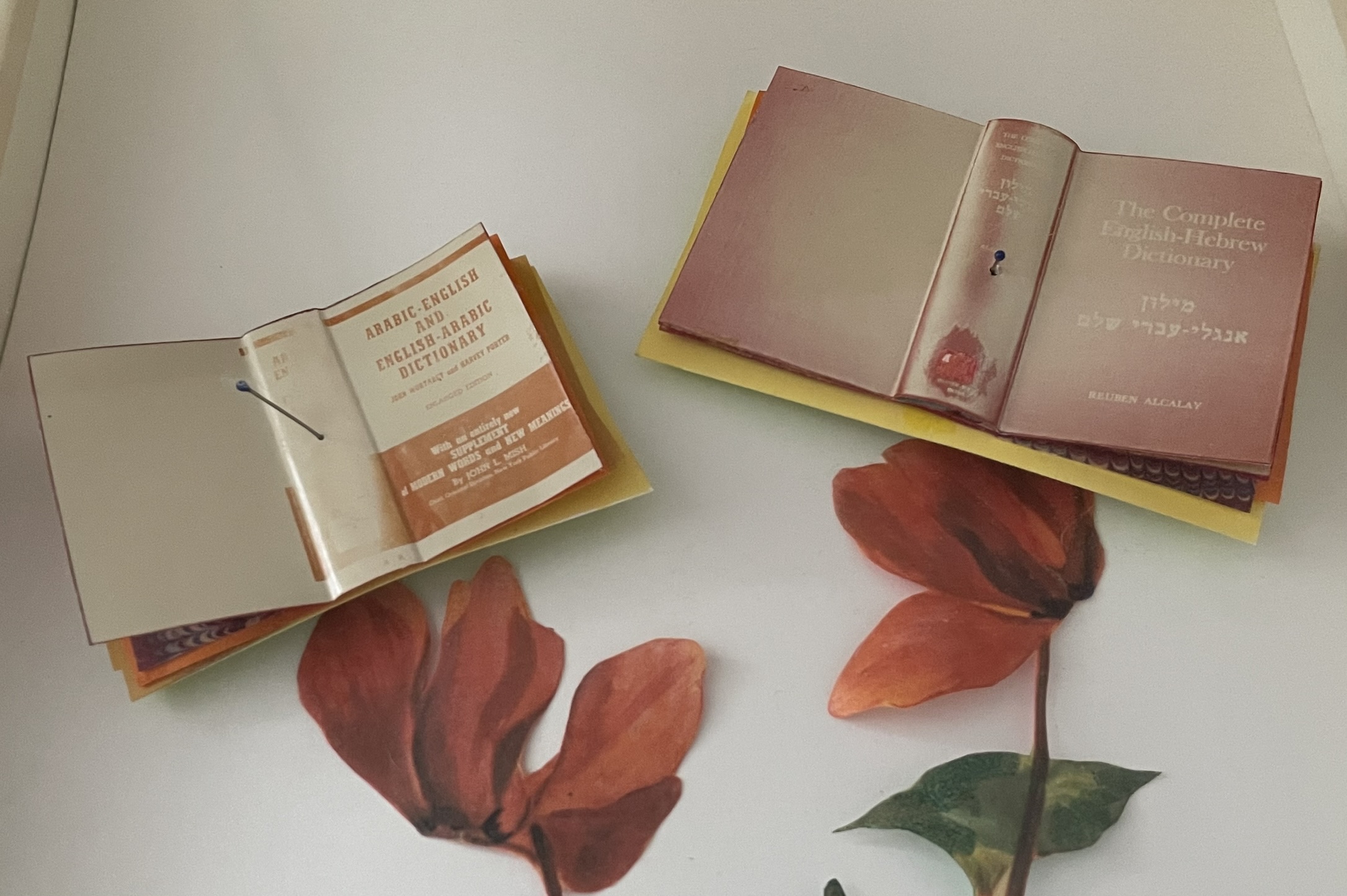
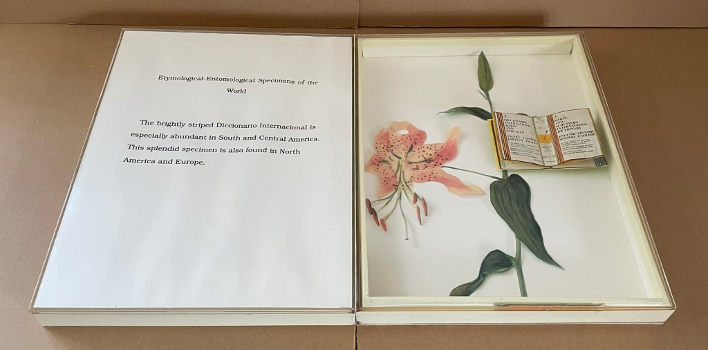
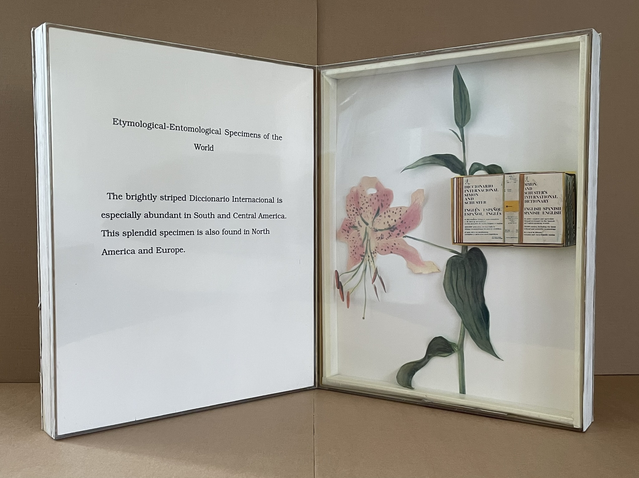
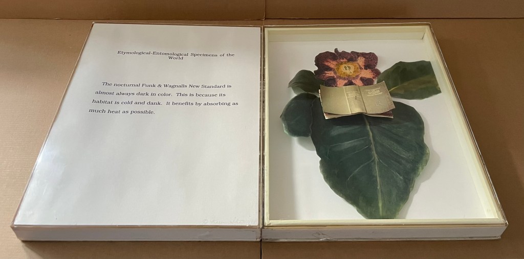
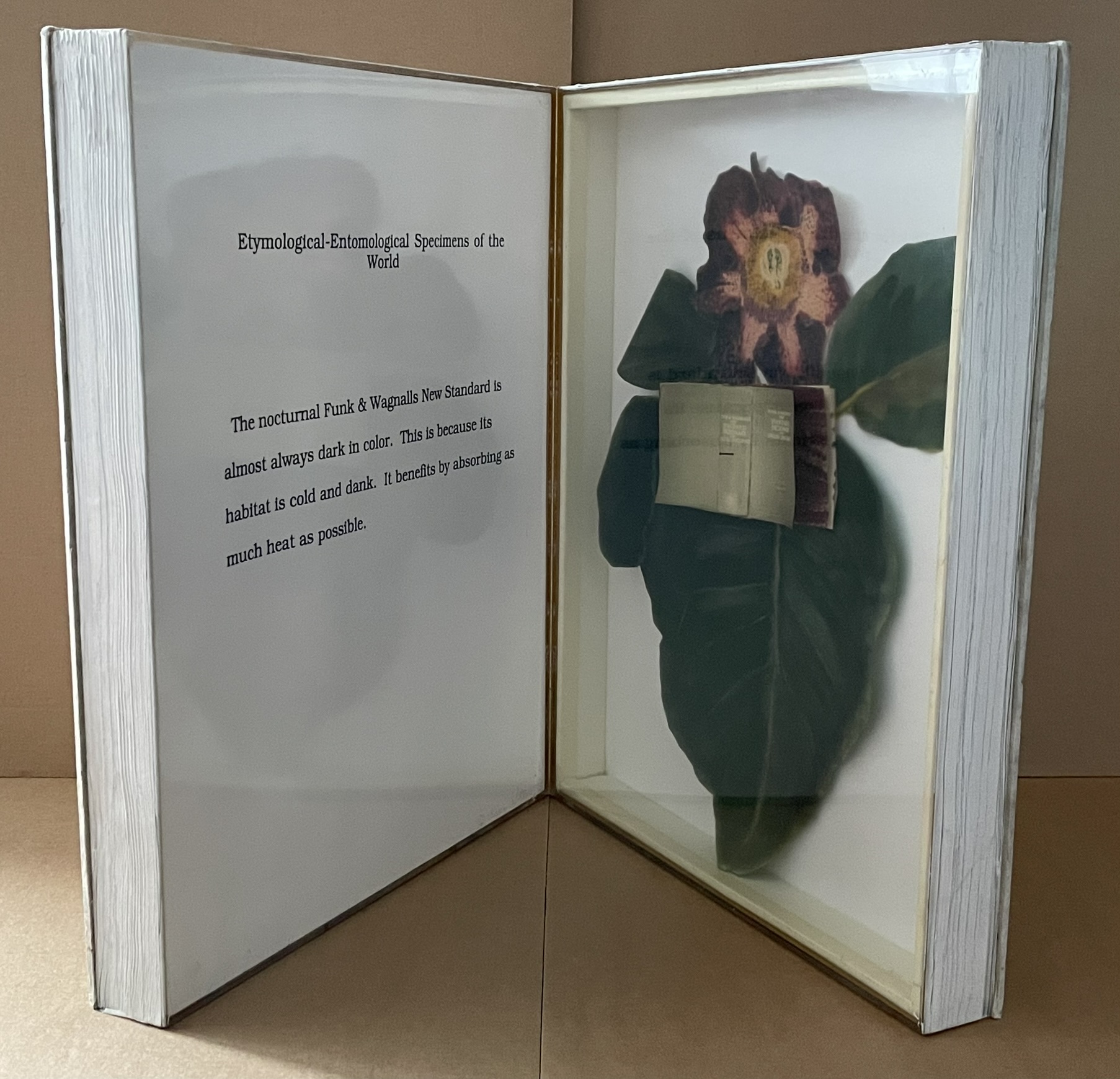
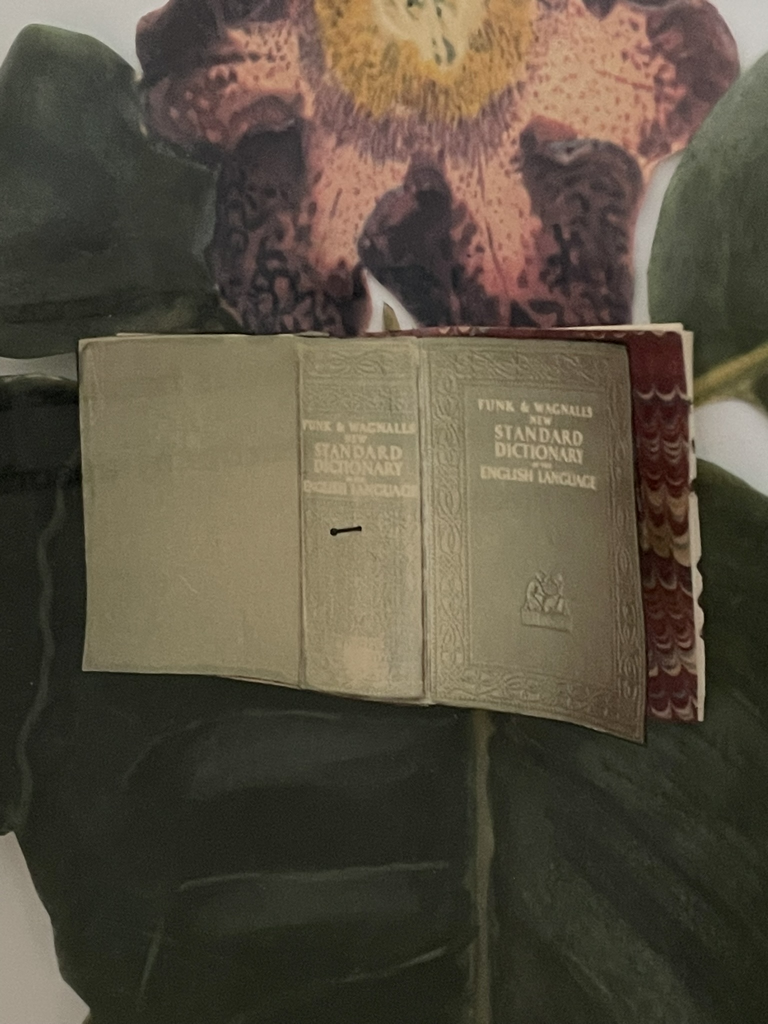
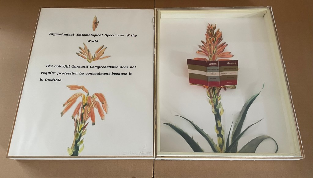
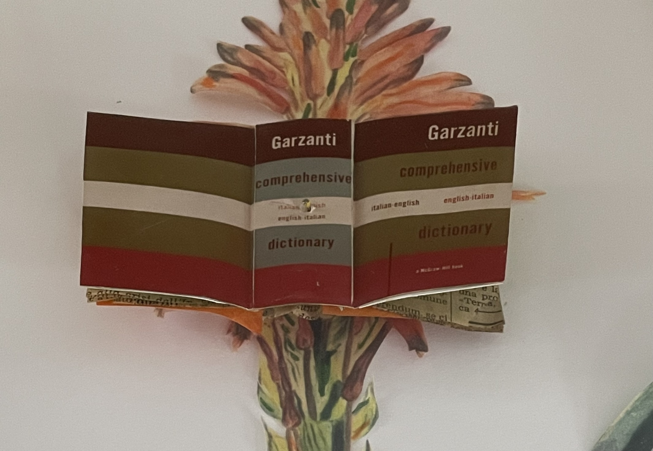
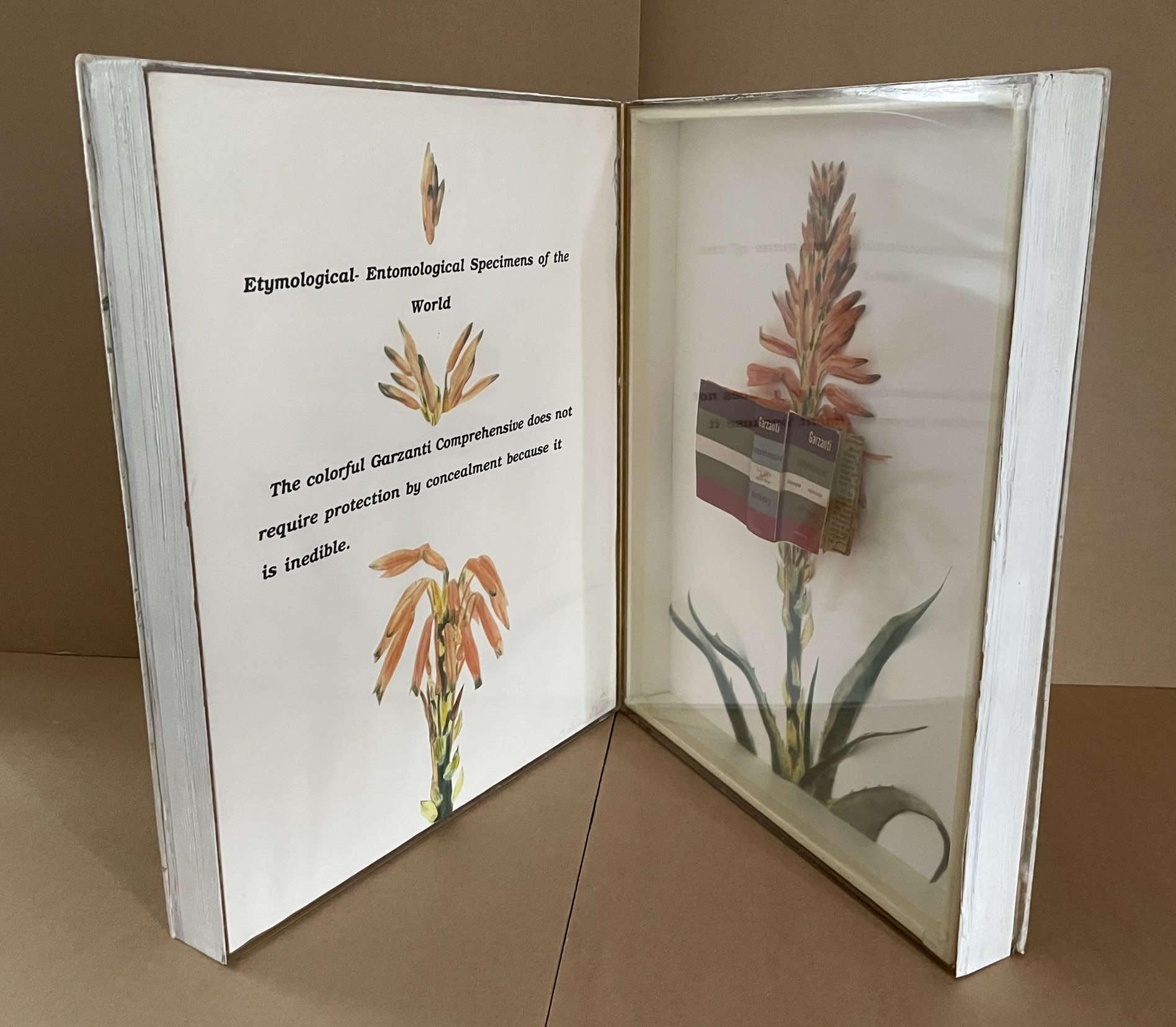
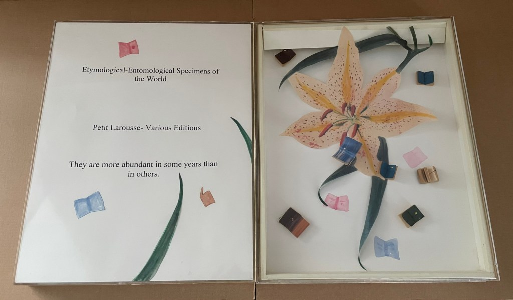
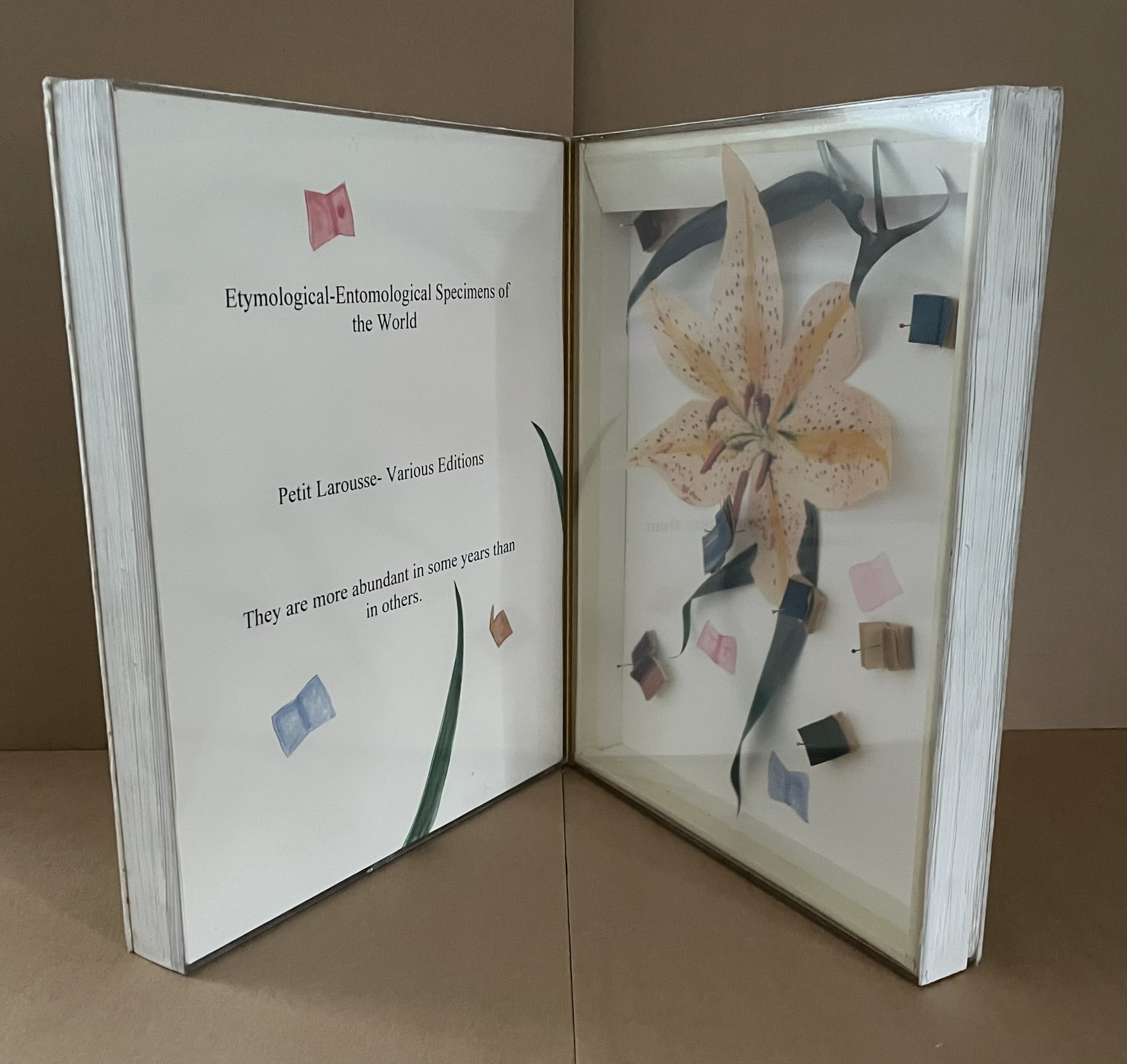
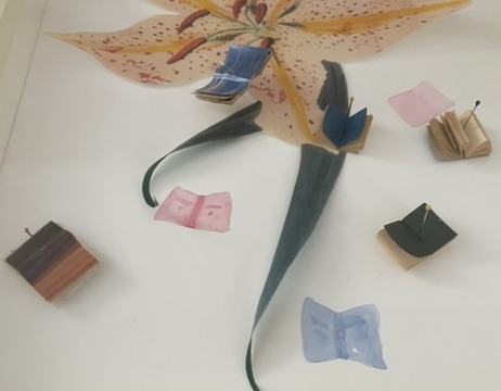
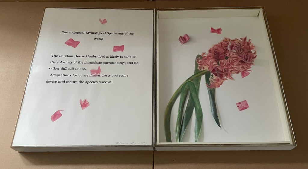
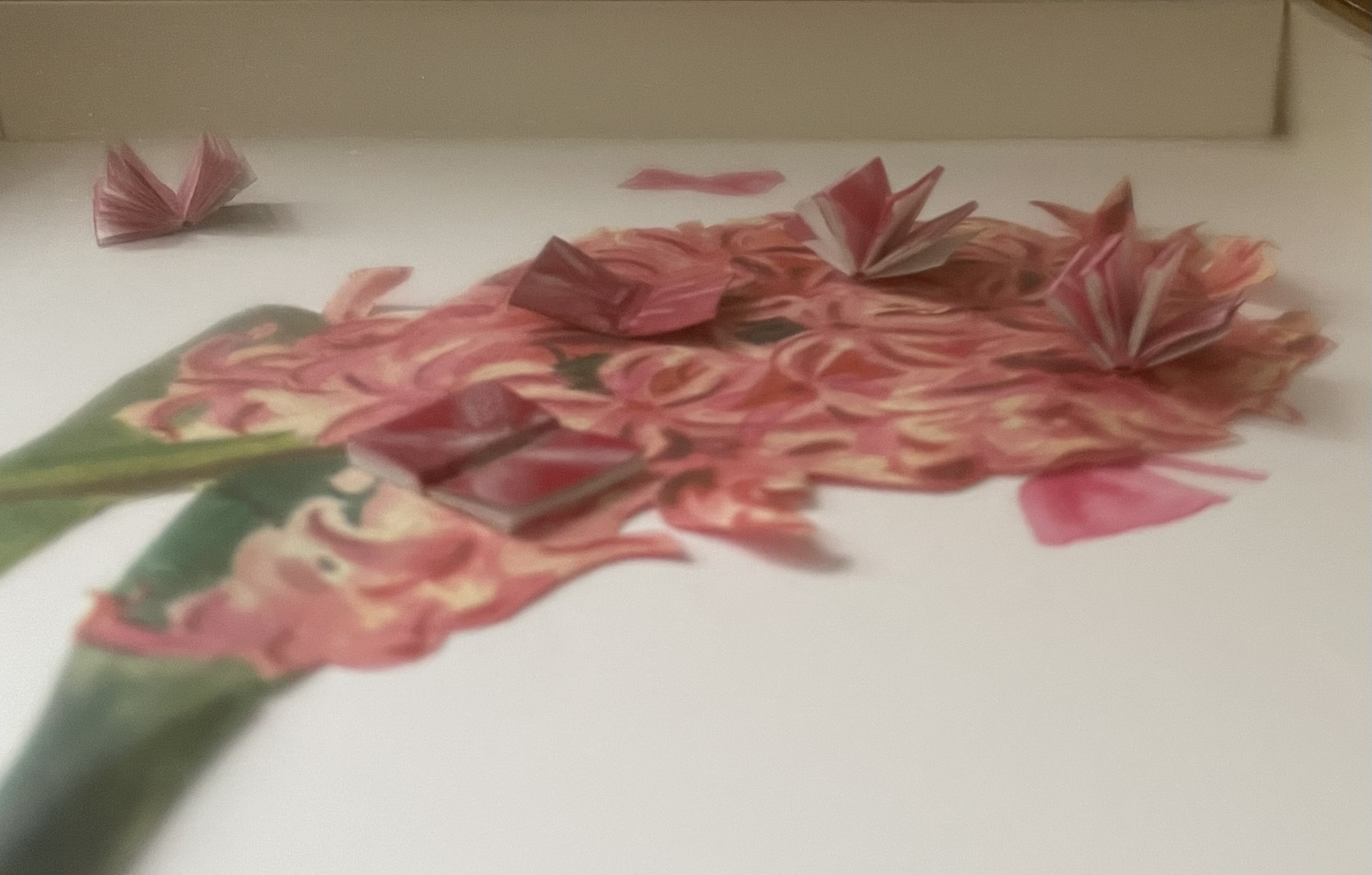
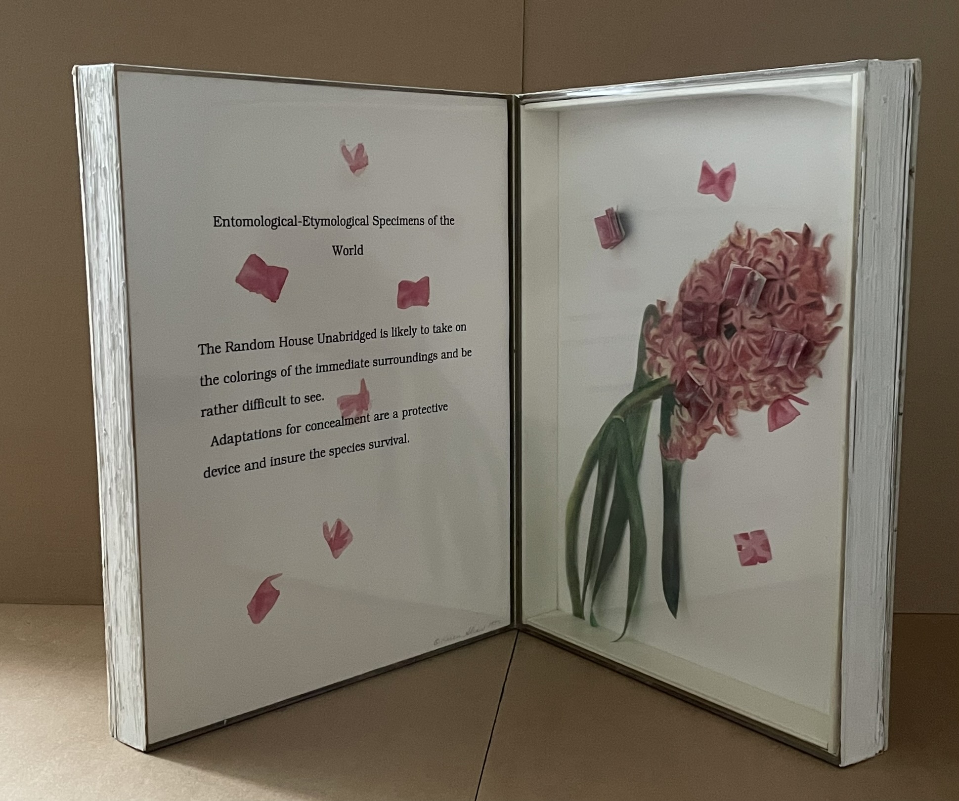
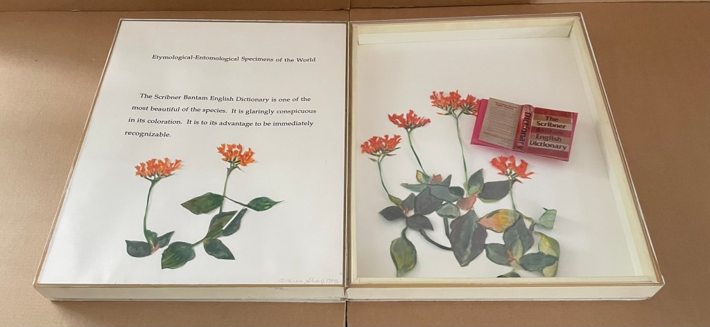
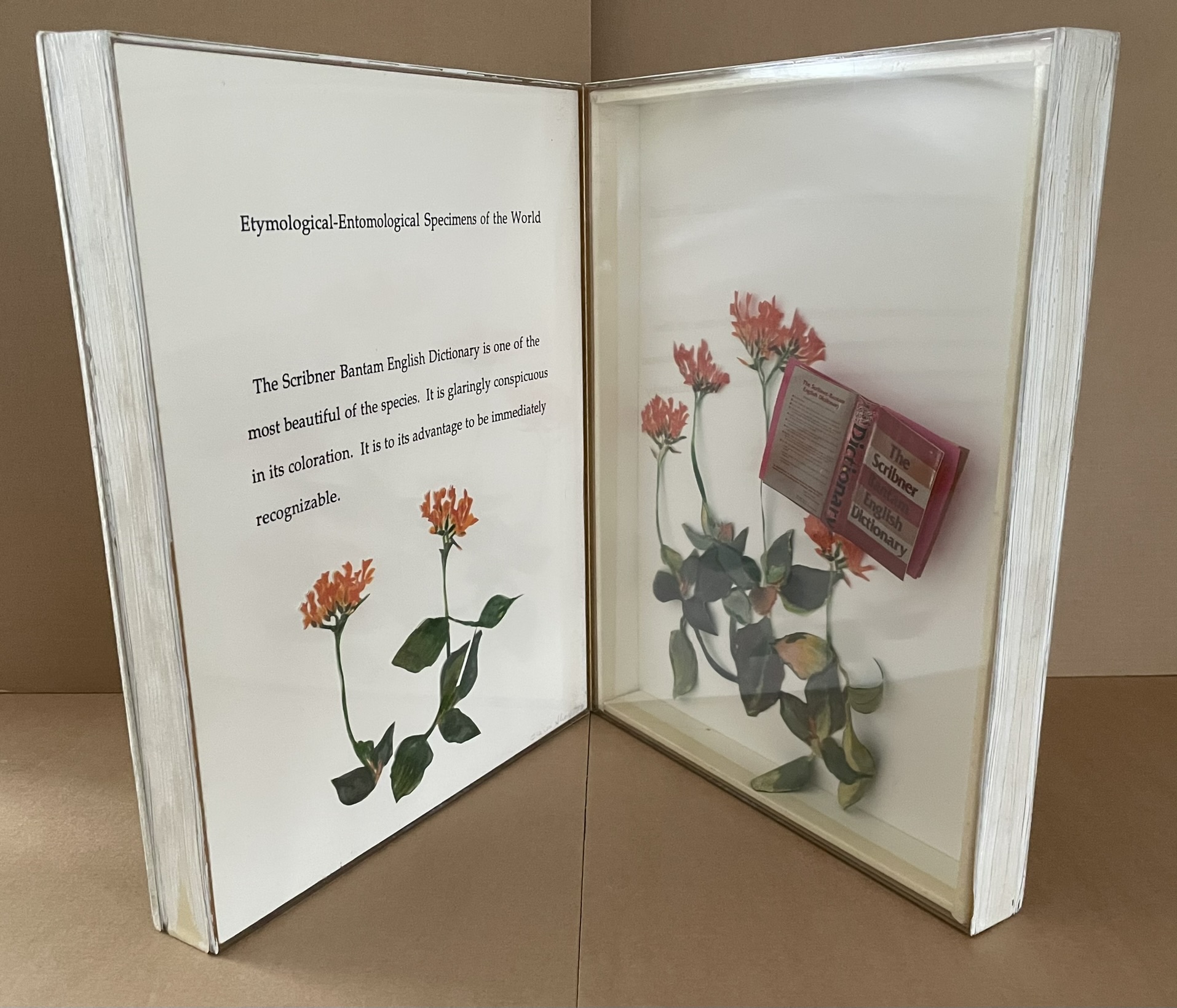
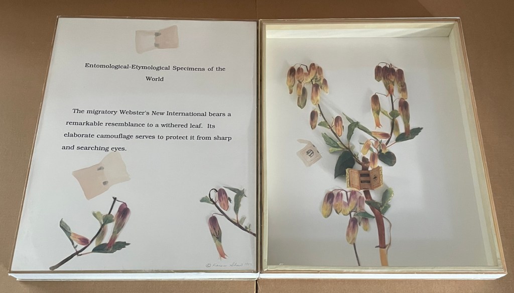
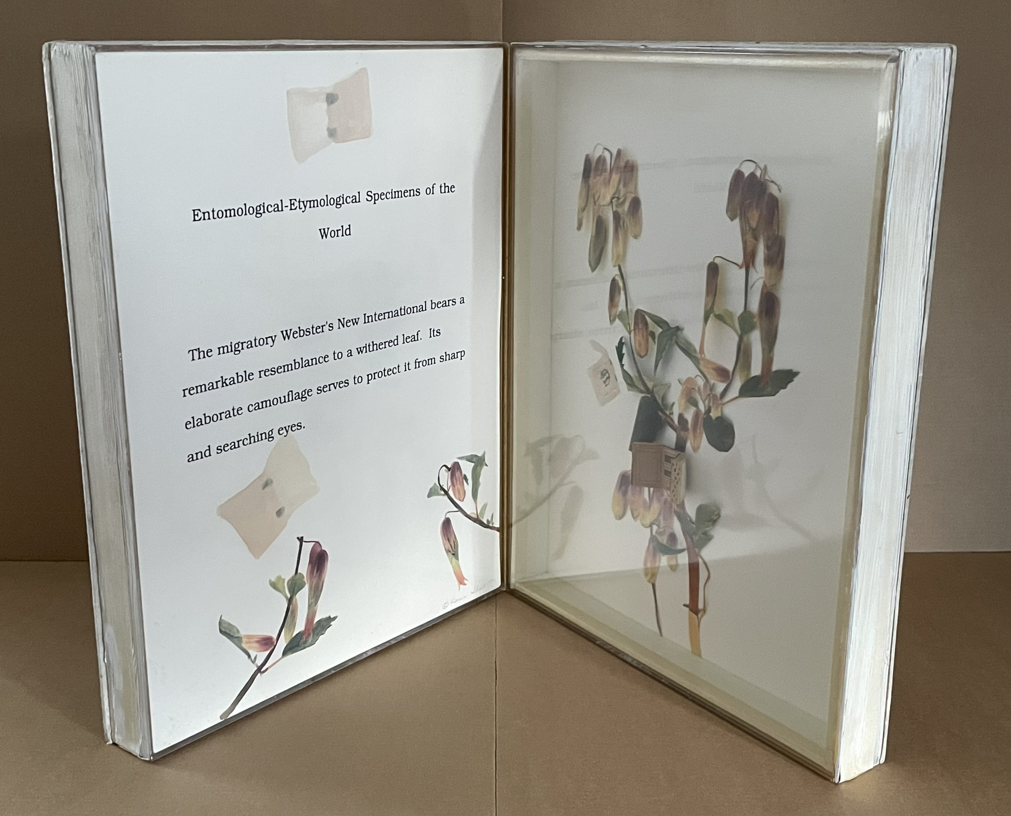
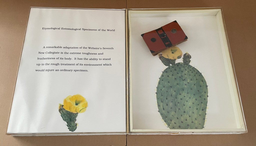
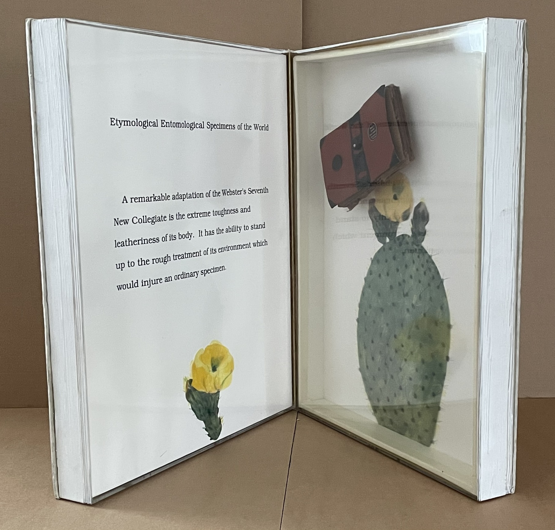
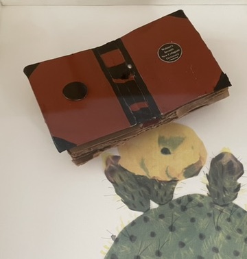
Etymological-Entomological Specimens of the World (1993)
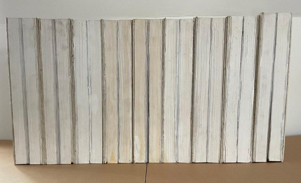
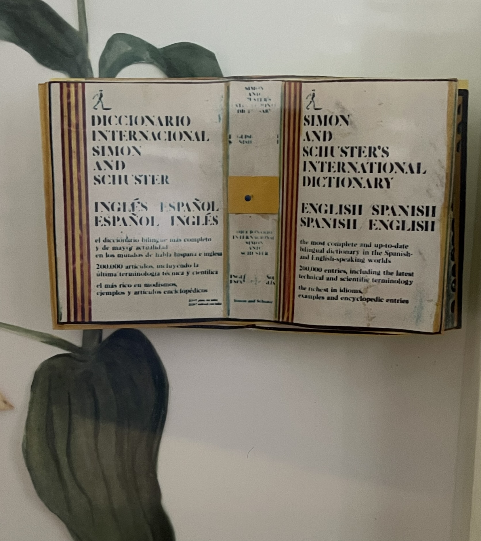
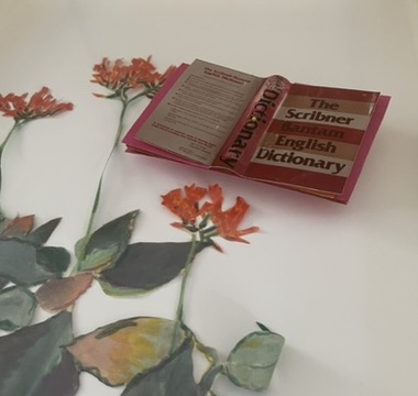
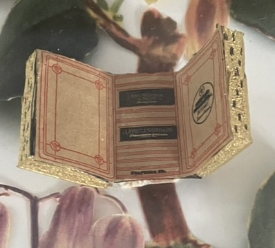
Etymological-Entomological Specimens of the World (1993) Karen Shaw Nine codex-shaped boxes of paper-covered boards, each opening to plexiglas-covered diptychs miniature books of various sizes posed as butterflies among text, handcut and painted paper foliage and flowers. H368 x W268 x D77 mm. Acquired from Karen Shaw, 8 October 2024. Photos: Books On Books Collection.
Jean Sellem’s interview with Shaw in the bilingual review Heterogénesis has been quoted earlier. In that exchange, we are lucky to have Shaw’s reply to question: “Why do you combine the concept of entomology with that of etymology?”
KS : In the past, I always used to confuse those two words. I knew the definition of each of them, but I couldn’t remember which definition belonged to which word. Eventually, I taught myself a mnemonic method to remember which word was which. “Ent” sounds like ant, so entomology is the study of insects, and so etymology is the study of words. When I was looking for a format for my ideas, using entomology pins seemed like the perfect way to attach words to numbers. The closeness of the spelling and the complicity of the two words was fun and made sense to me. The needles themselves are beautiful, long and thin. It just seemed like the perfect solution.
It’s happenstance. It’s the physical material. It’s the fun and humor of wordplay. It’s the artistic eye that finds meanings at the curious intersections of nature and language. All of this in Karen Shaw comes to the fore in the nine volumes of Etymological-Entomological Specimens of the World (1993). The top, bottom and fore edges of these book-shaped diptychs mimic closed books, whose mimicry yields to a mimicry of entomological display cases under clear covering, which in turn yields to miniature dictionaries posed to mimic butterflies. A mnemonic solution to an unwanted confusion of words leads to the book artist’s deliberate visual and verbal punning of dictionaries with insects.
In the interview, the only movements and artists directly influencing her work that Shaw remembers are Dada, new-Dadaism, Eva Hesse, On Kawara, Douglas Huebler, Joseph Kosuth and Conceptual Art. For Specimens, she has noted in correspondence a direct inspiration: the interest of Vladimir Nabokov in lepidoptery. Seeing butterflies as miniature dictionaries also overlaps a bit with Nabokov’s perceiving letters of the alphabet as having colors. Nabokov’s chasing butterflies and leaping from letter to color finds a simulacrum in Shaw’s chasing words, numbers, and meaning in her everyday environs with her artist’s book butterfly net.
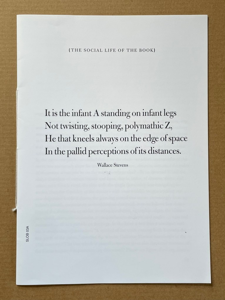
Infant A (2012) Louis Lüthi Thread-stitched signature. H225 x W160 16 pages. Edition of 1000. Acquired from Torpedo Books, 8 January 2024. Photos: Books On Books Collection
Infant A is part of a collection of essays commissioned by castillo/corrales and published by Paraguay Press under the series title The Social Life of the Book. Lüthi’s contribution fits the Books On Books Collection on several scores. First is the epigram’s invocation of the alphabet, which echoes the collection’s concentration of alphabet-related artists’ books and children’s books. See Alphabets Alive! Second is the epigram’s source: Wallace Stevens, whose poetry has inspired Ximena Pérez Grobet’s Words (2016). Would that other book artists be so inspired. Third is the narrator’s fictional conversation with Ulises Carrión in a celebration of all things A-related, in particular Andy Warhol’s novel a: a novel (1968), which finds analogues in Warren Lehrer’s A Life in Books: The Rise and Fall of Bleu Mobley (2013) and Derek Beaulieu’s a, A Novel by Andy Warhol (2017) (entry in progress). Fifth is how the dialogue reminds me of Suzanne Moore’s A Musings (2015).
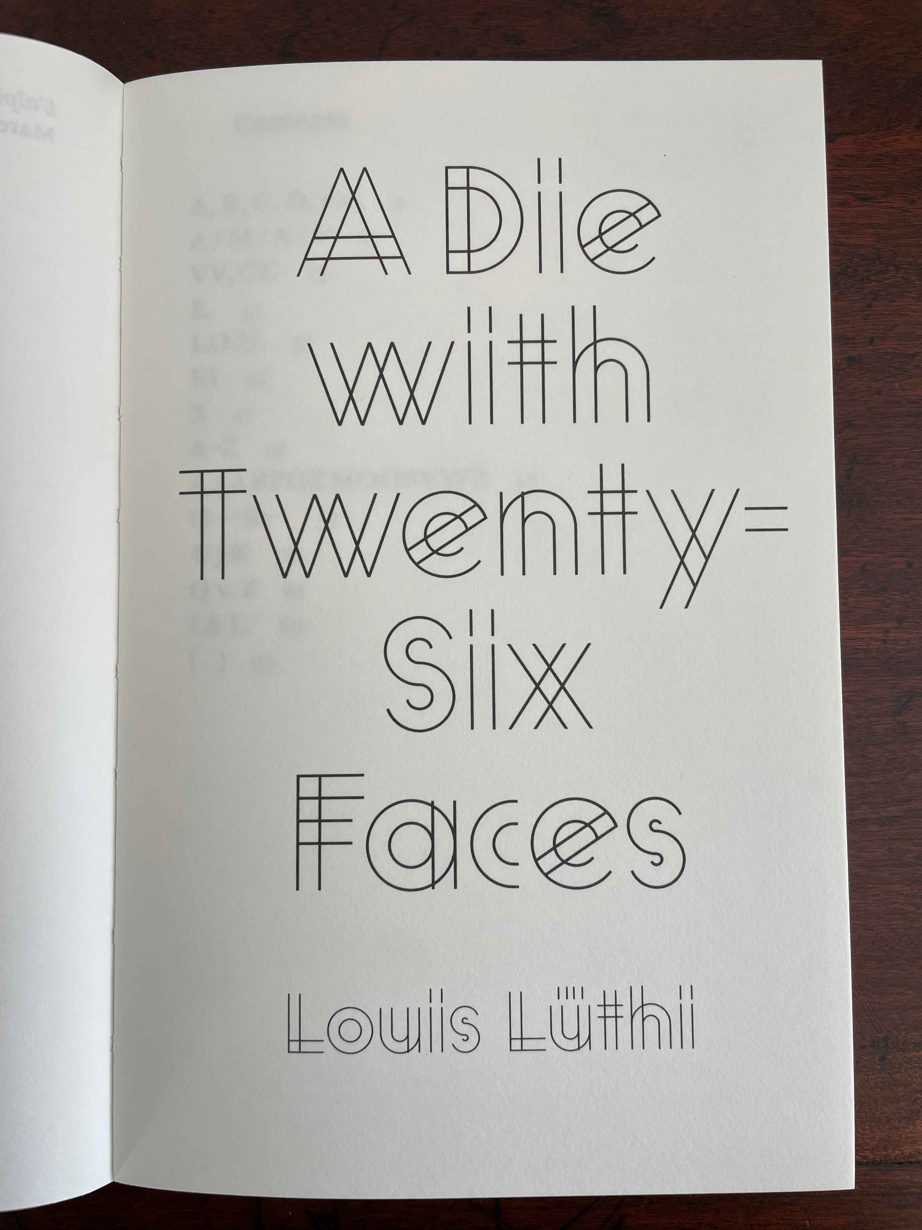
A Die With Twenty-six Faces (2019)
A Die With Twenty-six Faces(2019) Louis Lüthi Paperback. H200 x W130 mm. 104 pages. Acquired from Amazon, 18 September 2022. Photos: Books On Books Collection
Walter Benjamin’ unpacking of his library has a lot to answer for. Not only do we have Buzz Spector‘s take on it in 1995, but Jo Steffens’ Unpacking trilogy of photos of architects’, artists’ and writers’ bookshelves, Alberto Manguel’s elegiac Packing My Library (2018), and here is Louis Lüthi’s.
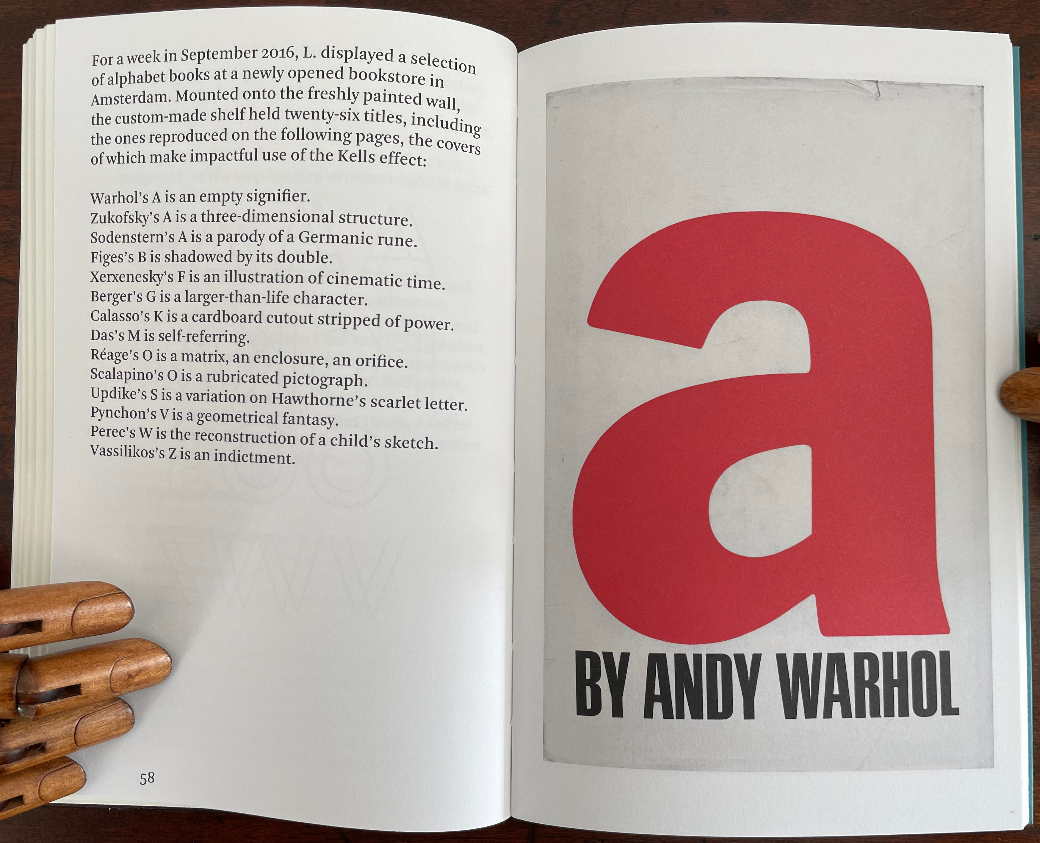
Publisher’s website: In A Die with Twenty-Six Faces, the author — let’s call him L. — guides the reader through his collection of alphabet books, that is, books with letters for titles. Some of these titles are well known: Andy Warhol’s “a,” Louis Zukofsky’s “A”, Georges Perec’s W. Others are obscure, perhaps even imaginary: Zach Sodenstern’s A, Arnold Skemer’s C and D. Tracing connections between these books, L. elaborates on what the critic Guy Davenport has called the “Kells effect”: “the symbolic content of illuminated lettering serving a larger purpose than its decoration of geometry, imps, and signs.”
The title stirs thoughts of Marcel Broodthaers’ oracular statement in 1974 “I see new horizons approaching me and the hope of another alphabet”. An alphabet that unrolls across the twenty-six faces of a die would certainly qualify as another alphabet. Broodthaers and the die also stir thoughts of Stéphane Mallarmé’s Un Coup de DésJamais N’Abolira le Hasard to which Broodthaers paid repeated homage. Throwing a twenty-six-sided die would certainly no more abolish chance than would a roll of Mallarmé’s six-sided die. Lüthi’s game, however, has little to do with chance unless we count his luck in finding the works to build his library of single-letter-entitled books. Even less to do with luck if some of the library is fictitious, a likelihood that the “publisher’s” statement suggests. Lüthi’s die is loaded!
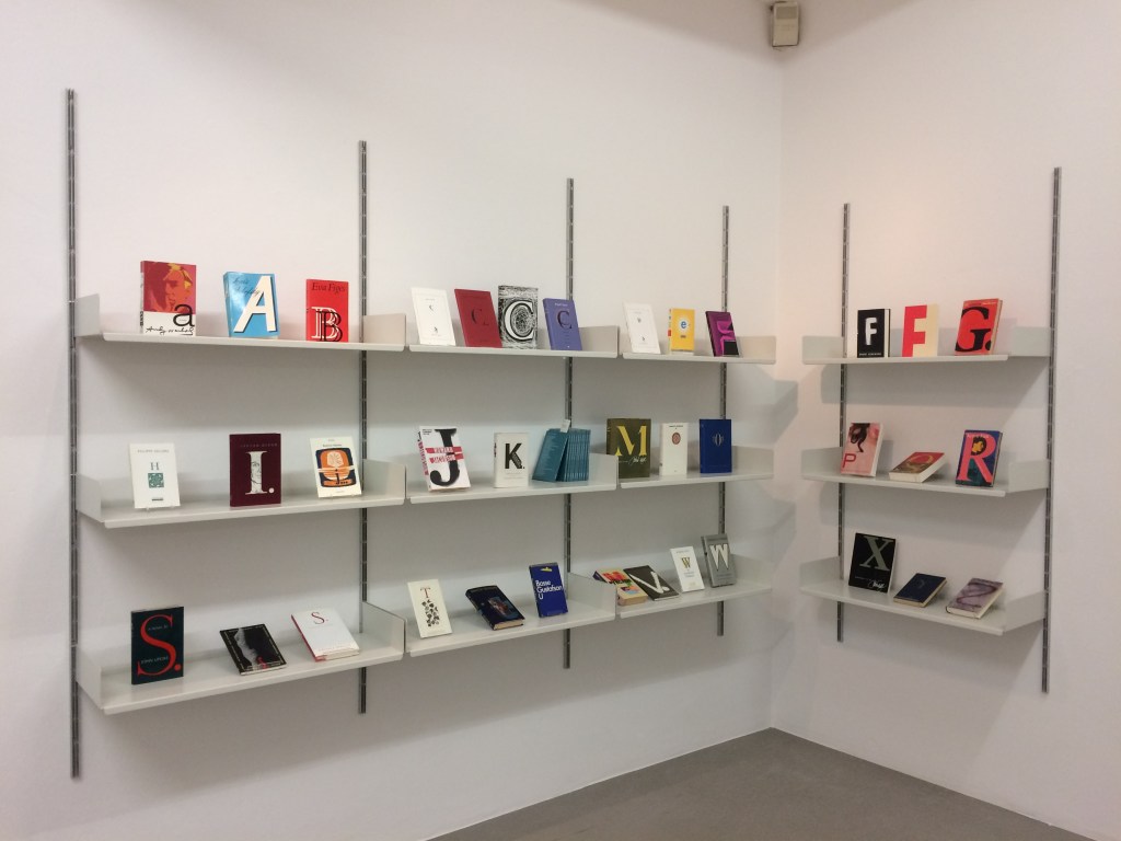
A selection of Lüthi’s “alphabet” books on display. Courtesy of the author. Photo: Gesellschaft für Aktuelle Kunst Bremen
On the Self-Reflexive Page II (2021)
On the Self-Reflexive PageII(2021) Louis Lüthi Paperback. H200 x W130 mm. 304 pages. Acquired from Idea Books, 18 September 2022. Photos: Books On Books Collection.
This is a peculiar book in its order and nature. After two variant half-title pages, it begins with a section entitled “Black Pages”. Only on flipping through the volume can we find the remaining front matter — just after page 208. There’s another half-title and then the Table of Contents. Reproducing the marbled page from Laurence Sterne’s The Life and Opinions of Tristram Shandy, Gentleman (1759–1767), the book’s cover gives a clue to this peculiarity. Sure enough, Lüthi spells it out later in the section entitled “On Drawing Pages”.
So much in Tristram Shandy is presented out of order: a second dedication comes not after the first but on page 27, the preface is not at the beginning of the novel but in chapter 20 of volume three, and chapters 18 and 19 of volume nine come not after chapter 17 but are inserted after chapter 25. In a similar act of transposition, we find a marbled page in volume three, even though hand marbling is customarily used to decorate covers and endpapers. As Viktor Shklovsky observed, “It is precisely the unusual order of even common, traditional elements that is characteristic of Sterne.” (p. 240)
This one paragraph confers on Lüthi’s entire book the very self-reflexivity that it explores across a range of literature and artists’ books. Reflecting the custom to which it refers, On The Self-Reflexive Page II carries Sterne’s marbled pages on its front and back covers. In the text before his marbled leaf, Sterne refers to it as the “(motly emblem of my work!)“. Lüthi has taken that exclamation to heart (and cover) as if it were advice in creating this hybrid, motley work of his own: “part artist’s book and part essay, part literary excavation and part typographical miscellany” as he calls it in his middle-of-the-book Foreword.
Lüthi’s work is just one in the Books on Books collection of several inspired by Tristram Shandy. There is Erica Van Horn’s Born in Clonmel (2011), Simon Morris’ Do or DIY (2012), Abra Ancliffe’s The Secret Astronomy of Tristram Shandy (2015), and Shandy Hall‘s The Black Page Catalogue (2010), Emblem of My Work (2013), Paint Her To Your Own Mind (2018) and The Flourish of Liberty (2019). Outside the collection, there is Brian Dettmer’s Tristram Shandy (2004), commissioned by Shandy Hall’s Laurence Sterne Trust, and also Sean Silver’s Shandean online venture called The Motley Emblem (2022~) celebrating Sterne’s marbled leaf and the analytical chemistry of marbling. The latter may become a book, even an artist’s books to add to the tally. In The Century of Artists’ Books, Johanna Drucker draws attention to Sterne’s novel twice as an example of self-reflexivity or self-interrogation, but in 1994 and 2004, Sterne did not rise to the same level of precursor to book artists as William Blake or Stéphane Mallarmé in Drucker’s view. With these later works of book art inspired by Uncle Toby’s nephew in the bag, a dozen or so more might nudge Sterne up the scale.
In the meantime, anyone interested in artists’ books could fruitfully apply to the medium Sterne’s exhortation to his own readers:
Read, read, read, read, my unlearned reader! read, — or by the knowledge of the great faint Paraleipomenon — I tell you before-hand, you had better throw down the book at once; for without much reading , by which your reverence knows, I mean much knowledge, you will no more be able to penetrate the moral of the next marbled page (motly emblem of my work!) than the world with all its sagacity has been able to unraval the many opinions, transactions and truths which still lie mystically hid under the dark veil of the black one.
Artists’ books are to be read, handled and digested, not stored away in the archives.