Alphabet City (2009)
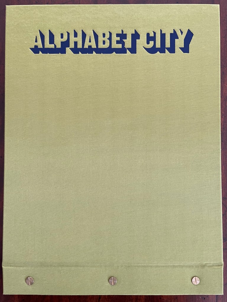
Alphabet City (2009)
Scott Teplin
Bolted folio. H270 x W360 mm. [29] pages. Edition of 26, of which this is L. Acquired from the artist, April 2023.
Photos: Books On Books Collection and Courtesy of the artist.
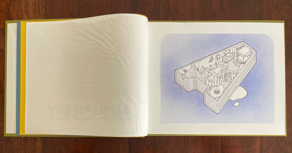
Scott Teplin’s Alphabet City follows in the long line of building designs based on alphabetical foundations. Perhaps first was John Thorpe (1565–1655?), an English architect, who drew up a property based on his initials. Thomas Gobert (1625-90), a French architect, produced Traitté d’Architecture dedié à Louis XIV, a manuscript whose building plans spelled out “LOVIS LE GRAND”. Anton Glonner (1723–1801) designed a Jesuit church and college around the monogram “IHS”. More famous is Johann David Steingruber (1702-87) and his Architectonisches Alphabeth (1773).
Teplin committed twenty years to his task (Steingruber committed ten) and came to it more from the school of graphic design than the school of architecture. While we might expect bewigged 18th century servants and lords to ride up in carriages to Steingruber’s A to Z, we would not be surprised to find characters from R. Crumb or Mad Magazine inhabiting Teplin’s alphabet-shaped houses, gaming arcades, strange laboratories, ice cream parlors, power plants, and other bizarre edifices. Some houses have no entries or exits. Some have doorless bedrooms. Others have rooms filled with oozing substances or piles of dirt. Some have outdoor swimming pools inside. One, seeming to float on a grass-colored sea, has a boat funnel inside, capped with a life ring, and rooms with deckchairs and portholes. Whimsical and bizarre free association drives Alphabet City.
Although the binding of Alphabet City is intended to facilitate removal and mounting of individual folios, it recalls Fortunato Depero’s “bolted book” and, by extension, the “startle” factor intended by Futurism, Surrealism, Dadaism, and all the -isms of that period. From original drawings in pen & ink to scanned images etched to magnesium plates and printed on Zerkall vellum, then airbrushed with Winsor & Newton and Holbein watercolors and pencilled with matching Prismacolor pencils, Alphabet City leans more toward a fine press livre d’artiste than an artist’s book. The foil-stamped Asahi bookcloth cover with its yellow Moriki endsheets would not be out of place at Arion Books or Three Star Books.