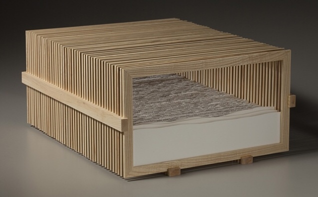
Scott Hazard
Ash wood, paper, text. 10″ X 18″ X 23″
Looking at Endless Sea, you might think of Robert Frost’s poem “Neither out far nor in deep”, where the people looking at the sea
… cannot look out far.
But when was that ever a bar
To any watch they keep?“
Or looking at Rise, another of what Hazard calls his “text constructs”, and its brilliantly white Canson’s archival paper Edition, you might recall Wallace Stevens’ “Thirteen Ways of Looking at a Blackbird”, where
Among twenty snowy mountains,
The only moving thing
Was the eye of the blackbird.

Scott Hazard
Ash wood, paper, text. 28″ X 53″ X 55″

By making the viewer’s eye move from layer to layer — looking in, through and side to side — Hazard’s work achieves a sense of movement. But somehow, despite or because of that, a sense of stillness takes over. When I noted the Zen-like sense of stillness I felt from the two works, Hazard showed me a photo of the Fushimi-Inari torii, whose influence on his art is clear, and spoke of how the creation of the text constructs — stamping the same word in archival black ink in precisely the right spot on carefully torn sheets of paper, then placing each sheet one behind another in wooden lattice boxes to create landscapes — is Zen-like in itself.
So, here is another statement of intent: In the context of America’s and the West’s complex, conflicted sense of nature and the wilderness, Hazard says that, where once the aim of gardens seemed to be to wall out wilderness, he finds himself seeking to bring the wilderness into the enclosed. Hazard’s comment reminded me of what the book artist Joan Lyons once said to Cathy Courtney in the late 90s:
Life needs some translation and transformation to become art. I’ve always visualized the point at which personal consciousness encounters the phenomenal world as experiential screen or filter that separates the interior from the exterior, the personal from the public space. It is very much like a garden I once visited with a great lawn and tidy rows of annuals that hovered eight thousand feet on the edge of the Rocky Mountains. The place where garden and wilderness meet is the place where creative work is born and where work exists. (Cathy Courtney, Speaking of Book Art, 1999, p. 52)
In assessing Hazard’s work as “the place where garden and wilderness meet” — or “the place where creative work is born and where work exists” — I am picking up on the artist’s intention as reflected in material aspects of the work and in how the artist/work is manipulating my faculties of perception. To understand better Hazard’s artwork and its effect, I followed up my visit with a series of questions.
BoB: Can you walk me through the process of preparing the structures? What kind of tools? How long does it take?
SH: I use soft maple or ash wood for the bulk of the structures I make. For a piece like Rise or Endless Sea I start with rough cut ash, mill the wood using a small jointer and planer, and then cut the slats for the multiple frames using many passes on a table saw to rip the wood. I then clean these up on the planer, cut miter joints with a chop saw, glue and then sand all sides. The additional wood pieces that hold the individual frames in place are made with ash also – I cut the dados with a dado blade so the frames fit snugly in the dados. The more simple box like frames I make are typically soft maple. These are made with all of the same tools. I have not kept close track of time spent on the production of my work but estimate a piece like Endless Sea might take 30+ hours for the wood elements. The smaller box frames might take 3 to 5 hours each – I typically make these in batches so there is some efficiency built in. Some of the larger boxes or frames for pieces such as Read This Line are fabricated by an excellent furniture maker in Raleigh that I like to work with.

Read This Line
Scott Hazard
Wood, paper, text. 28″ X 43″ X 15″
BoB: And the process of preparing the paper, stamping it, fixing to the structure, etc.?”
SH: After sketching the concept for the work and then drawing the piece to scale, I then cut the multiple sheets of paper and backing/spacing materials to size. After all of the sheets are prepared I create a template for the text if necessary, and then proceed to carefully apply the words to the first sheet. Once the desired form and texture is on the sheet, I sketch the outline of the hole to be torn in the sheet and then carefully tear it. I cut a larger hole in the backing material and insert both into the frame to assess. I then remove the sheet from the frame and trace the outline of the first hole onto the back of the second sheet. I then repeat the process for the second and all remaining sheets, assessing the development of the work to make minor adjustments along the way to completion.
On larger pieces it has taken me over 2 hours per sheet/layer in the composition. On smaller pieces, depending on the complexity of the form and amount of text, it can take anywhere from 20 to 60 minutes per sheet. My most recent pieces have had 25 to 45 layers – a small one might take 20 to 40 hours for the production of the paper sculpture. Time spent on concept, concept development, and installing it in the structure are on top of that and add anywhere from 6 to 20 hours per work.
BoB: Which artists and landscape architects have influenced you – early and later?
SH: Artists who have had a significant influence on my thinking and work include Robert Irwin, Robert Smithson, Nancy Holt, and Vito Acconci. I am a big fan of Acconci’s early poetry/concrete poetry and the architectural/built work he had focused on since the 1980’s. Additional artists that have influenced me include Aldwyth, John Cage, Martin Puryear, Oskar Fischinger and Jackie Winsor. I often refer to the Hudson River School painters and traditional Japanese garden design.
Designers and (landscape) writers that have had impacts on the evolution of my work and understanding of the natural and built worlds include James Wines/SITE, Rudolph Schindler, JB Jackson, Anne Whiston Spurn and Peter Schaudt. I was fortunate to have had the chance to work with Mr. Schaudt as a consultant on a few landscape projects over a span of about 10 years – the sense of restraint in his work grounded in an intuitive and tacit understanding of landscape, as well as his enthusiastic and collaborative demeanor were a big influence.
I had a lot of fantastic instructors in my undergraduate studies, but two professors from that time were very important in opening doors and exposing me to a lot of visual art that was new to me at the time; Terry Hargraves (architecture) and Gary Dwyer (landscape architecture). Both helped me drastically expand my notions of what space and landscape could be, and fostered my interest in the exploration of how materials and ideas can inform and articulate space and landscape.
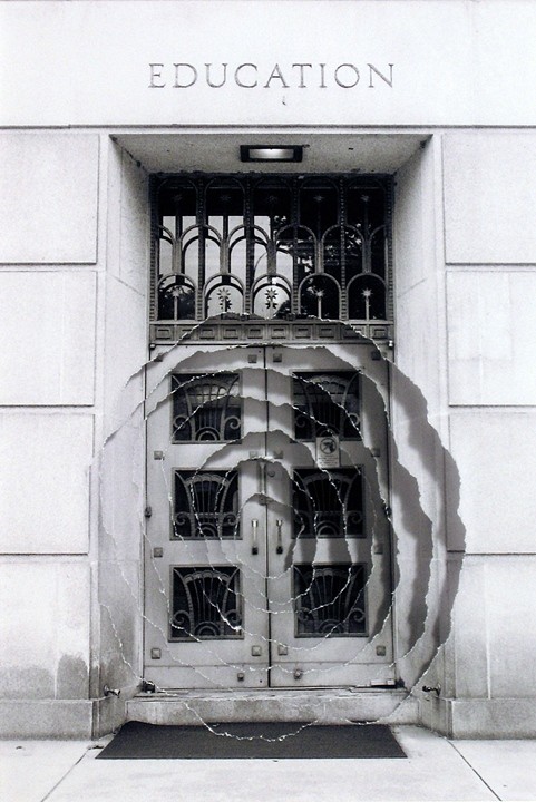
Scott Hazard
Sculpture/Photography
5.75″ X 4.5″, 17 3/4″ X 15 3/4″ w/ Frame
BoB: Some of your “photo constructs” — for example, Introjection: Education — echo the very title of the Acconci studio’s 2012 digital animation “WHEN BUILDINGS MELT INTO AIR & THE AIR RE-FORMS INTO BUILDINGS”, but I am curious: How did text come to play the role it plays in your more three-dimensional work? After all, despite the trompe l’oeil, the photo constructs are two dimensional; words and letters are creatures of the two-dimensional page or screen; landscape and architecture generally do not feature words and letters — certainly not in the way your paradoxical enclosure of paper landscapes within wooden lattice-work boxes features them. From where did your distinctive use of text come?
SH: With a background in landscape design and construction, I tend to look at the physical built world as a manifestation of ideas. Every building, built landscape, piece of furniture, tool, article of clothing, pencil, etc. exists initially as an idea. Whether the idea is drawn as a rough sketch, explained in detail, or carefully drafted, reviewed and vetted before anything is built – it is providing the direction for the physical realization. Even something like a protected forest or national park, as untouched as it might be, essentially exists the way it is because someone had the idea at some point in time to protect that place. In this sense everything we perceive and experience is a mix of physical reality and information. (We can go deep into a rabbit-hole (or the matrix) on this topic, but I’ll try to keep this brief…)
With this in mind, I am very keen on how the information we absorb from many, many sources, in turn informs how we perceive the world, and to a large extent what we perceive in the world. Text, whether a poem, novel, essay or song lyric, can obviously articulate ideas, and can articulate space as well. In Walden, Thoreau wrote about people being able to read and understand the landscape. Most people don’t have the skill set or temperament in this era in the same way Thoreau might have fashioned his own perceptual skills, but we are still reading our environment, most of us with minds overflowing with stimulus and information.
My aim with my text-based work is to create an experience that allows people to read in space – the content of the text informs how the viewer might perceive the sculptural elements in the piece, and the forms of the piece affect how the text reads also. I am exploring how text can become as much of a material as any of the physical matter incorporated into the work.
BoB: What is the earliest exposure to art that you can recall from childhood and adolescence?
SH: I don’t recall a lot of significant experiences with art in my childhood years – other than what I might have seen in history museums or pop culture, visual art was not really on my radar. In high school I was exposed to a number of forms of art through an excellent humanities course. My exposure to visual art increased significantly in may late teens and early twenties through landscape architecture, architecture and fine art courses I enrolled in. My interest in art really took hold in the last two years of my undergraduate education, and steadily increased from there.
Two installations I experienced around this time had a big impact in solidifying my drive in visual art. One was The eyes of Gutete Emerita by Alfredo Jaar. I can’t forget the visceral effect this piece had on so many people who experienced it. A work of art can’t ever relay the complete magnitude and protracted horror of something like the Rwandan genocide, but Mr. Jaar managed to succinctly and poetically capture a brief but intimate glimpse of one person’s story, while also conveying the immensity of the genocide.
The other piece that I have vivid memories of is “1° 2° 3° 4°,” by Robert Irwin. Installed at the Museum of Contemporary Art in San Diego, Mr. Irwin had three rectangles cut in the windows overlooking the coast. Each hole cut in the windows effectively became an aperture for viewing and tacitly connecting people with the environment, in this case the coastal breeze and sound of the ocean, outside.
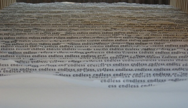
BoB: There is a technically unusual chromatic effect in text constructs like Rise, where the intensity of the black ink is modulated in a way that works strikingly with the shadow from one layer of paper to the next. Do you recall what led you to blending the chiaroscuro effects of one material with another?
SH: To heighten the effect of the text flowing and dissipating from the back of the piece to the front, the text at the back and top of the work is much more dense and dark versus the lighter gray and graduates to a much less dense text at the bottom and front. Moving from front to back, layer by layer the density and darkness of the text increases until the paper is nearly solid black at the rear of the piece which is also the darkest part of the work. The interaction of light with the work is paramount and helps reinforce the rhythm found in the multiple layers of paper. I am intent on trying to pull the viewer perceptually into the work to heighten a sense of focus and departure. The interaction of lighter and darker areas of light on the layers of paper encourages the viewer to track their vision into the space in the work layer by layer. Ideally this provides both an invitation to delve in and also a sense of mystery.
BoB: You mentioned that you are experimenting with repurposing printed book pages in your constructs. Can you tell me more about that? Will you combine that material with the archival paper or replace the archival paper entirely? What prompted the experimentation?
SH: Yes, this has been an interesting and slightly different strain of work I have been pursuing. I have been interested in experimenting with and developing work with portions of pages from books, periodicals and catalogues for a few years. About a year ago a curator I enjoy meeting with suggested trying the use pages from books in my work so I put some more energy into this body of work. It has been a fascinating, slight diversion from the ink stamp based text work I have been focused on lately , and the used books I have been collecting over the past couple of years have been great catalysts for new pieces and great sources for words used in my other text based work.
BoB: Are there other materials beckoning for experimentation?
SH: Of course! I am still focused on the many, many possibilities I see in the wood/paper/ink/text based work and how that will evolve, but I would love to work with steel, stone, concrete and other landscape oriented materials at a larger scale.
BoB: You mentioned that, with your text constructs, you seem to be cycling back to fewer layers as in Intermediate and Landscape Meditation or flatter objects like your photo construct Reaching Branch compared to Rise and Endless Sea. What lies behind this return? Technical, conceptual, textural effect, chromatic effect?”
SH: The recent move back to work that is more shallow than the deeper text based work I have been making is focused on conceptual and technical aspects of the work. I love the spaces that can be created in the deeper works like Rise and Endless Sea. I am also very interested in exploring the interplay between the use of text and the forms/voids housed in the physical work. Using text to help articulate a physical and conceptual space, and shaping forms and space in the work to in turn impact the reading of the text is a very large part of what drives my thinking and energy in developing the text-based work. Making the work more shallow is in many ways very challenging – it forces the composition in each work to be more concise and focused.
BoB: The installation shown on your site must have been even more striking live. Do you have plans for future installations? How does creating the timebound experience of installations compare with creating more permanent sculptures? ”
SH: Thank you for your comments! Yes, I do have plans for future installations but nothing immediate. I am often on the lookout for projects or venues to do an installation. It is exciting to literally envelop the viewer in a space where passing through the space impacts how the space and work is perceived. As you reference above, I consider each piece I make to ‘function’ and be experienced much like a garden (whether 4 inches wide or 400 feet (or meters) wide they are spaces for exploration, meditation and/or a moment of respite). The text in my work is composed to be read in conjunction with movement – to be read in space. Larger, installation scaled work allows for the physical immersion of the viewer as they pass through the space along with the perceptual immersion that can come from simply viewing a work from a single point in space. This notion brings us back to Japanese gardens, which were often designed to be experienced by passing through them.
Although not an installation, Hazard’s latest exhibition echoes his concluding comment above and takes me back to that moment of stepping

Scott Hazard
Exhibition view at Artspace, Raleigh, North Carolina

Scott Hazard
Exhibition view at Artspace, Raleigh, North Carolina
from his workshop back into the Piedmont heat: I immediately began to yearn for one of his installations in whose cool I could immerse myself. Character Space remains on display in Gallery 2 at Artspace until 27 January 2018.
Further reading on Scott Hazard and his work:
The text based constructs I create consist of layers of paper that are carefully torn or cut, spaced apart and aligned to define sculptural voids. Cathartic micro-gardens punctuated with masses of text beckon the viewer to delve in for a brief journey. As the viewer’s gaze enters and traverses the layers of paper in each work, vision becomes tactile, lending an articulated viewing experience and a space for the eyes to linger. The movement and placement of words in and around the composed landscapes and intimately scaled spaces provides for a kinaesthetic reading experience that draws the viewer in for momentary reflection and a temporary departure. The viewer looks ‘at’ and ‘through’ each composition simultaneously.
