The New Concrete: Visual Poetry in the 21st Century is a testament on where this art made of letters has been and where it goes. We have put a sharp focus on the word ‘new’ in our title, exploring how image manipulation, cut and paste, digital text and the internet have all influenced work in this area. One of the most exciting strands can be seen in the work of James Hoff and Eric Zboya who use algorithms and viruses to form work in which text is in the back – rather than foreground; the ghost of the machine of visual poetics. This isn’t a book that could have been made through simply surfing the web. We asked all 106 contributors to suggest names of poets or artists that we should consider for the book. Visual poets spiralled into more visual poets. We have looked at well over 500 possible candidates. Enjoy the knowledge with us.
Among the Books On Books favorites included in this volume are Sam Winston, Julie Johnstone, Ian Hamilton Finlay and Vito Acconci. For a related MoMA exhibition of artists engaged in the material use of letters, words and language (Ecstatic Alphabets, Heaps of Language), click here.
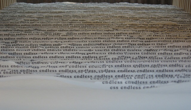
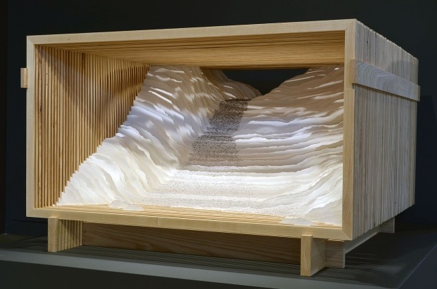
On one hot, humid North Carolina day, I had the pleasure of stepping into Scott Hazard’s workshop behind his home in Raleigh to talk to him about his artwork — in particular, Endless Sea and Rise, which had caught my attention on his site.
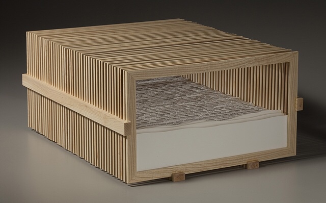
Endless Sea Scott Hazard Ash wood, paper, text. 10″ X 18″ X 23″
Endless Sea (detail)
Looking at Endless Sea, you might think of Robert Frost’s poem “Neither out far nor in deep”, where the people looking at the sea
… cannot look out far.
They cannot look in deep. But when was that ever a bar To any watch they keep?“
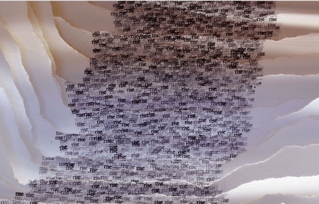
Or looking at Rise, another of what Hazard calls his “text constructs”, and its brilliantly white Canson’s archival paper Edition, you might recall Wallace Stevens’ “Thirteen Ways of Looking at a Blackbird”, where
Among twenty snowy mountains,
The only moving thing
Was the eye of the blackbird.
Rise Scott Hazard Ash wood, paper, text. 28″ X 53″ X 55″
Rise (detail)
By making the viewer’s eye move from layer to layer — looking in, through and side to side — Hazard’s work achieves a sense of movement. But somehow, despite or because of that, a sense of stillness takes over. When I noted the Zen-like sense of stillness I felt from the two works, Hazard showed me a photo of the Fushimi-Inari torii, whose influence on his art is clear, and spoke of how the creation of the text constructs — stamping the same word in archival black ink in precisely the right spot on carefully torn sheets of paper, then placing each sheet one behind another in wooden lattice boxes to create landscapes — is Zen-like in itself.
This idea — that the creative process, artistic result and the beholder’s response coincide — flirts with what the last century’s New Critics scorned as the “intentional fallacy” (assessing a work by the creator’s intent). What the New Critics had not experienced was the self-reflexiveness or recursiveness of minimalist, conceptualist, performative, land, and text (or book) artists’ works. By virtue of their fusion of text/image/structure, Endless Sea and Rise are intentionally recursive.
So, here is another statement of intent: In the context of America’s and the West’s complex, conflicted sense of nature and the wilderness, Hazard says that, where once the aim of gardens seemed to be to wall out wilderness, he finds himself seeking to bring the wilderness into the enclosed. Hazard’s comment reminded me of what the book artist Joan Lyons once said to Cathy Courtney in the late 90s:
Life needs some translation and transformation to become art. I’ve always visualized the point at which personal consciousness encounters the phenomenal world as experiential screen or filter that separates the interior from the exterior, the personal from the public space. It is very much like a garden I once visited with a great lawn and tidy rows of annuals that hovered eight thousand feet on the edge of the Rocky Mountains. The place where garden and wilderness meet is the place where creative work is born and where work exists. (Cathy Courtney, Speaking of Book Art, 1999, p. 52)
In assessing Hazard’s work as “the place where garden and wilderness meet” — or “the place where creative work is born and where work exists” — I am picking up on the artist’s intention as reflected in material aspects of the work and in how the artist/work is manipulating my faculties of perception. To understand better Hazard’s artwork and its effect, I followed up my visit with a series of questions.
BoB: Can you walk me through the process of preparing the structures? What kind of tools? How long does it take?
SH: I use soft maple or ash wood for the bulk of the structures I make. For a piece like Rise or Endless Sea I start with rough cut ash, mill the wood using a small jointer and planer, and then cut the slats for the multiple frames using many passes on a table saw to rip the wood. I then clean these up on the planer, cut miter joints with a chop saw, glue and then sand all sides. The additional wood pieces that hold the individual frames in place are made with ash also – I cut the dados with a dado blade so the frames fit snugly in the dados. The more simple box like frames I make are typically soft maple. These are made with all of the same tools. I have not kept close track of time spent on the production of my work but estimate a piece like Endless Sea might take 30+ hours for the wood elements. The smaller box frames might take 3 to 5 hours each – I typically make these in batches so there is some efficiency built in. Some of the larger boxes or frames for pieces such as Read This Line are fabricated by an excellent furniture maker in Raleigh that I like to work with.
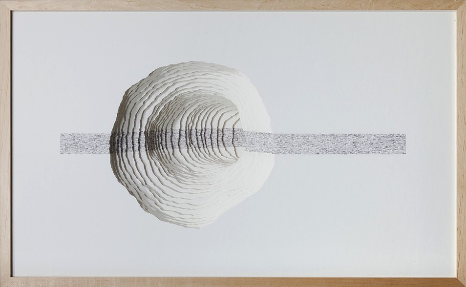
Read This Line Scott Hazard Wood, paper, text. 28″ X 43″ X 15″
BoB: And the process of preparing the paper, stamping it, fixing to the structure, etc.?”
SH: After sketching the concept for the work and then drawing the piece to scale, I then cut the multiple sheets of paper and backing/spacing materials to size. After all of the sheets are prepared I create a template for the text if necessary, and then proceed to carefully apply the words to the first sheet. Once the desired form and texture is on the sheet, I sketch the outline of the hole to be torn in the sheet and then carefully tear it. I cut a larger hole in the backing material and insert both into the frame to assess. I then remove the sheet from the frame and trace the outline of the first hole onto the back of the second sheet. I then repeat the process for the second and all remaining sheets, assessing the development of the work to make minor adjustments along the way to completion.
On larger pieces it has taken me over 2 hours per sheet/layer in the composition. On smaller pieces, depending on the complexity of the form and amount of text, it can take anywhere from 20 to 60 minutes per sheet. My most recent pieces have had 25 to 45 layers – a small one might take 20 to 40 hours for the production of the paper sculpture. Time spent on concept, concept development, and installing it in the structure are on top of that and add anywhere from 6 to 20 hours per work.
BoB: Which artists and landscape architects have influenced you – early and later?
SH: Artists who have had a significant influence on my thinking and work include Robert Irwin, Robert Smithson, Nancy Holt, and Vito Acconci. I am a big fan of Acconci’s early poetry/concrete poetry and the architectural/built work he had focused on since the 1980’s. Additional artists that have influenced me include Aldwyth, John Cage, Martin Puryear, Oskar Fischinger and Jackie Winsor. I often refer to the Hudson River School painters and traditional Japanese garden design.
Designers and (landscape) writers that have had impacts on the evolution of my work and understanding of the natural and built worlds include James Wines/SITE, Rudolph Schindler, JB Jackson, Anne Whiston Spurn and Peter Schaudt. I was fortunate to have had the chance to work with Mr. Schaudt as a consultant on a few landscape projects over a span of about 10 years – the sense of restraint in his work grounded in an intuitive and tacit understanding of landscape, as well as his enthusiastic and collaborative demeanor were a big influence.
I had a lot of fantastic instructors in my undergraduate studies, but two professors from that time were very important in opening doors and exposing me to a lot of visual art that was new to me at the time; Terry Hargraves (architecture) and Gary Dwyer (landscape architecture). Both helped me drastically expand my notions of what space and landscape could be, and fostered my interest in the exploration of how materials and ideas can inform and articulate space and landscape.
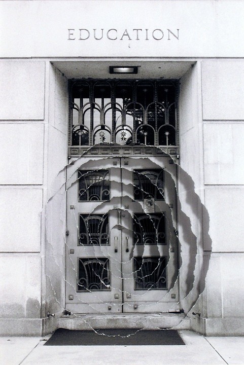
Introjection: Education Scott Hazard Sculpture/Photography 5.75″ X 4.5″, 17 3/4″ X 15 3/4″ w/ Frame
BoB: Some of your “photo constructs” — for example, Introjection: Education — echo the very title of the Acconci studio’s 2012 digital animation “WHEN BUILDINGS MELT INTO AIR & THE AIR RE-FORMS INTO BUILDINGS”, but I am curious: How did text come to play the role it plays in your more three-dimensional work? After all, despite the trompe l’oeil, the photo constructs are two dimensional; words and letters are creatures of the two-dimensional page or screen; landscape and architecture generally do not feature words and letters — certainly not in the way your paradoxical enclosure of paper landscapes within wooden lattice-work boxes features them. From where did your distinctive use of text come?
SH: With a background in landscape design and construction, I tend to look at the physical built world as a manifestation of ideas. Every building, built landscape, piece of furniture, tool, article of clothing, pencil, etc. exists initially as an idea. Whether the idea is drawn as a rough sketch, explained in detail, or carefully drafted, reviewed and vetted before anything is built – it is providing the direction for the physical realization. Even something like a protected forest or national park, as untouched as it might be, essentially exists the way it is because someone had the idea at some point in time to protect that place. In this sense everything we perceive and experience is a mix of physical reality and information. (We can go deep into a rabbit-hole (or the matrix) on this topic, but I’ll try to keep this brief…)
With this in mind, I am very keen on how the information we absorb from many, many sources, in turn informs how we perceive the world, and to a large extent what we perceive in the world. Text, whether a poem, novel, essay or song lyric, can obviously articulate ideas, and can articulate space as well. In Walden, Thoreau wrote about people being able to read and understand the landscape. Most people don’t have the skill set or temperament in this era in the same way Thoreau might have fashioned his own perceptual skills, but we are still reading our environment, most of us with minds overflowing with stimulus and information.
My aim with my text-based work is to create an experience that allows people to read in space – the content of the text informs how the viewer might perceive the sculptural elements in the piece, and the forms of the piece affect how the text reads also. I am exploring how text can become as much of a material as any of the physical matter incorporated into the work.
BoB: What is the earliest exposure to art that you can recall from childhood and adolescence?
SH: I don’t recall a lot of significant experiences with art in my childhood years – other than what I might have seen in history museums or pop culture, visual art was not really on my radar. In high school I was exposed to a number of forms of art through an excellent humanities course. My exposure to visual art increased significantly in may late teens and early twenties through landscape architecture, architecture and fine art courses I enrolled in. My interest in art really took hold in the last two years of my undergraduate education, and steadily increased from there.
Two installations I experienced around this time had a big impact in solidifying my drive in visual art. One was The eyes of Gutete Emerita by Alfredo Jaar. I can’t forget the visceral effect this piece had on so many people who experienced it. A work of art can’t ever relay the complete magnitude and protracted horror of something like the Rwandan genocide, but Mr. Jaar managed to succinctly and poetically capture a brief but intimate glimpse of one person’s story, while also conveying the immensity of the genocide.
The other piece that I have vivid memories of is “1° 2° 3° 4°,” by Robert Irwin. Installed at the Museum of Contemporary Art in San Diego, Mr. Irwin had three rectangles cut in the windows overlooking the coast. Each hole cut in the windows effectively became an aperture for viewing and tacitly connecting people with the environment, in this case the coastal breeze and sound of the ocean, outside.
BoB: There is a technically unusual chromatic effect in text constructs like Rise, where the intensity of the black ink is modulated in a way that works strikingly with the shadow from one layer of paper to the next. Do you recall what led you to blending the chiaroscuro effects of one material with another?
SH: To heighten the effect of the text flowing and dissipating from the back of the piece to the front, the text at the back and top of the work is much more dense and dark versus the lighter gray and graduates to a much less dense text at the bottom and front. Moving from front to back, layer by layer the density and darkness of the text increases until the paper is nearly solid black at the rear of the piece which is also the darkest part of the work. The interaction of light with the work is paramount and helps reinforce the rhythm found in the multiple layers of paper. I am intent on trying to pull the viewer perceptually into the work to heighten a sense of focus and departure. The interaction of lighter and darker areas of light on the layers of paper encourages the viewer to track their vision into the space in the work layer by layer. Ideally this provides both an invitation to delve in and also a sense of mystery.
BoB: You mentioned that you are experimenting with repurposing printed book pages in your constructs. Can you tell me more about that? Will you combine that material with the archival paper or replace the archival paper entirely? What prompted the experimentation?
SH: Yes, this has been an interesting and slightly different strain of work I have been pursuing. I have been interested in experimenting with and developing work with portions of pages from books, periodicals and catalogues for a few years. About a year ago a curator I enjoy meeting with suggested trying the use pages from books in my work so I put some more energy into this body of work. It has been a fascinating, slight diversion from the ink stamp based text work I have been focused on lately , and the used books I have been collecting over the past couple of years have been great catalysts for new pieces and great sources for words used in my other text based work.
BoB: Are there other materials beckoning for experimentation?
SH: Of course! I am still focused on the many, many possibilities I see in the wood/paper/ink/text based work and how that will evolve, but I would love to work with steel, stone, concrete and other landscape oriented materials at a larger scale.
BoB: You mentioned that, with your text constructs, you seem to be cycling back to fewer layers as in Intermediate and Landscape Meditation or flatter objects like your photo construct Reaching Branch compared to Rise and Endless Sea. What lies behind this return? Technical, conceptual, textural effect, chromatic effect?”
SH: The recent move back to work that is more shallow than the deeper text based work I have been making is focused on conceptual and technical aspects of the work. I love the spaces that can be created in the deeper works like Rise and Endless Sea. I am also very interested in exploring the interplay between the use of text and the forms/voids housed in the physical work. Using text to help articulate a physical and conceptual space, and shaping forms and space in the work to in turn impact the reading of the text is a very large part of what drives my thinking and energy in developing the text-based work. Making the work more shallow is in many ways very challenging – it forces the composition in each work to be more concise and focused.
BoB: The installation shown on your site must have been even more striking live. Do you have plans for future installations? How does creating the timebound experience of installations compare with creating more permanent sculptures? ”
SH: Thank you for your comments! Yes, I do have plans for future installations but nothing immediate. I am often on the lookout for projects or venues to do an installation. It is exciting to literally envelop the viewer in a space where passing through the space impacts how the space and work is perceived. As you reference above, I consider each piece I make to ‘function’ and be experienced much like a garden (whether 4 inches wide or 400 feet (or meters) wide they are spaces for exploration, meditation and/or a moment of respite). The text in my work is composed to be read in conjunction with movement – to be read in space. Larger, installation scaled work allows for the physical immersion of the viewer as they pass through the space along with the perceptual immersion that can come from simply viewing a work from a single point in space. This notion brings us back to Japanese gardens, which were often designed to be experienced by passing through them.
Although not an installation, Hazard’s latest exhibition echoes his concluding comment above and takes me back to that moment of stepping
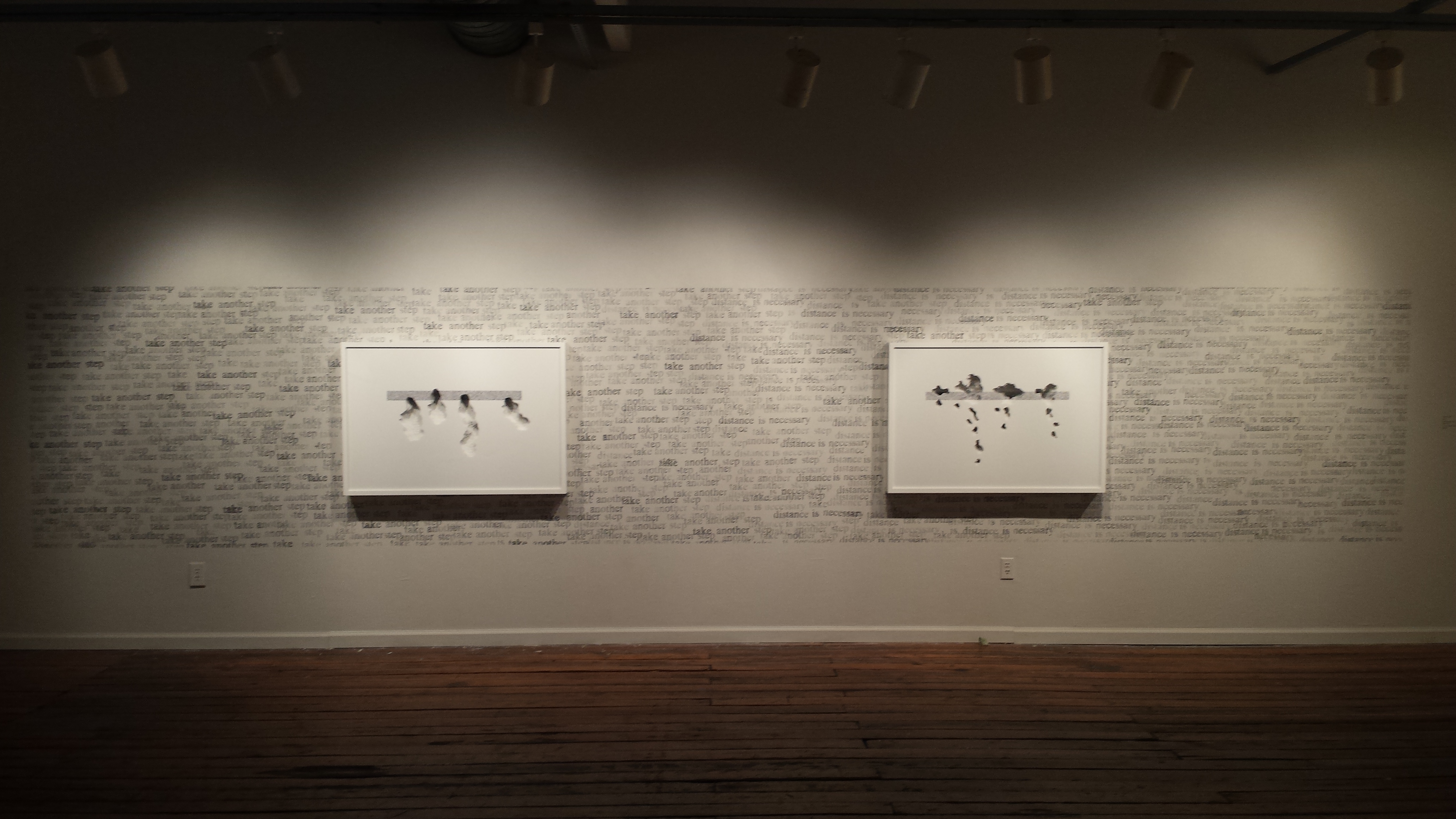
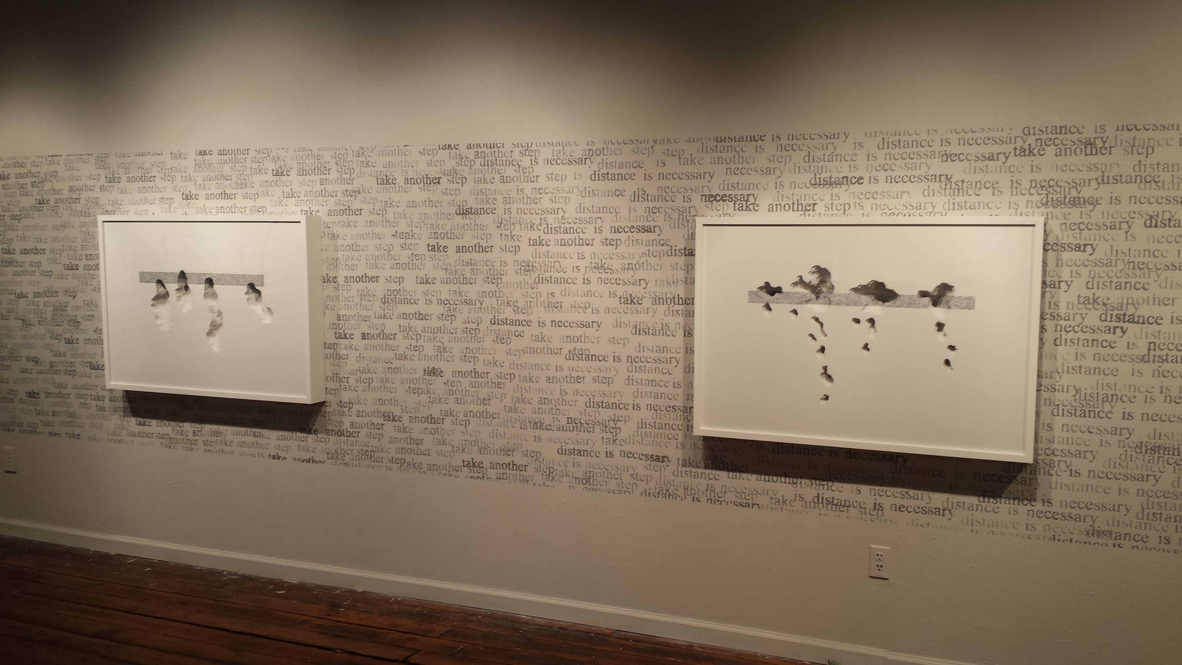
Character Space Scott Hazard Exhibition view at Artspace, Raleigh, North Carolina
Character Space (2017) Scott Hazard Exhibition view at Artspace, Raleigh, North Carolina
from his workshop back into the Piedmont heat: I immediately began to yearn for one of his installations in whose cool I could immerse myself. Character Space remains on display in Gallery 2 at Artspace until 27 January 2018.
The text based constructs I create consist of layers of paper that are carefully torn or cut, spaced apart and aligned to define sculptural voids. Cathartic micro-gardens punctuated with masses of text beckon the viewer to delve in for a brief journey. As the viewer’s gaze enters and traverses the layers of paper in each work, vision becomes tactile, lending an articulated viewing experience and a space for the eyes to linger. The movement and placement of words in and around the composed landscapes and intimately scaled spaces provides for a kinaesthetic reading experience that draws the viewer in for momentary reflection and a temporary departure. The viewer looks ‘at’ and ‘through’ each composition simultaneously.
The precision of Hazard’s “Memory Gardens” and “Text Constructs” must take the concentration required by a colored powder mandala.
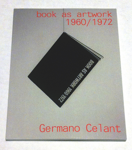
Where to go to compare and contrast the book art in Germano Celant’s pioneering “catalogue” of the Nigel Greenwood Gallery exhibition in London (1972) with that of the last half century?
Being a sort of small and portable catalogue and curator’s explanation for the gallery’s exhibition of ca. 300 works, Celant’s Book as Artwork is arranged chronologically and then alphabetically by artist. Presumably it was organized to match the exhibition’s organization (note the year 1967 in upper left of the photograph below and the distinctive Hidalgo cover, fifth from the left). With no photographs of the works, Book as Artwork gives no easily accessible visual sense of the 300 works in that exhibition. If we had that starting visual touchpoint, it would be easier to “place” the period or individual works in relation to book art from the 80’s onward.
Book as Artwork 1960 – 1972 – Exhibition Nigel Greenwood Gallery B, 1972.
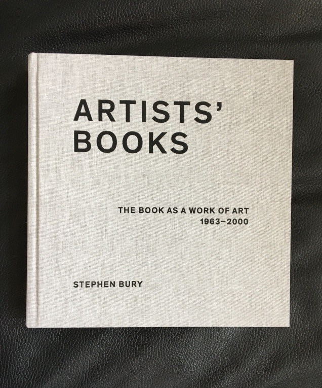
Stephen Bury’s Artists’ Books: The Book as a Work of Art, 1963 – 2000 (2015) includes, by design, only a handful of the artists and works selected for the Celano/Greenwood exhibition.
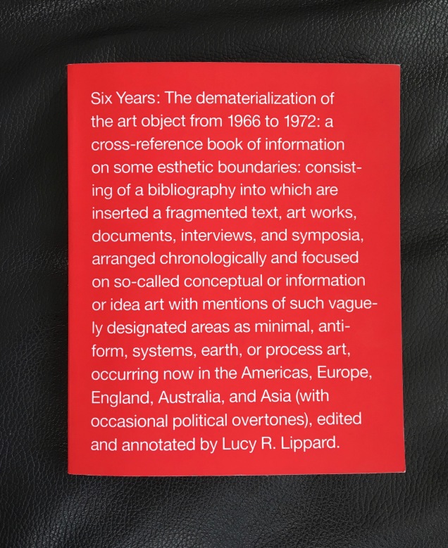
Lucy Lippard’s Six Years: The dematerialization of the art object from 1966 to 1972 (1973, 1997) — a “bibliography into which are inserted a fragmented text, art works, documents, interviews, and symposia, arranged chronologically” — comes as close as one might hope in black-and-white print for a starting visual touchpoint. Lippard’s scope, however, ranges beyond book art, so the number illustrated limits systematic visual comparison and contrast with the book art of the ensuing decades.
Phaidon’s Artists Who Make Books(2017) provides good coverage and bridges the 1960s to the 21st century. The essays and descriptions bring the book art off the page and into the mind’s hands.
Best of all is Lynda Morris’s mini-memoir of her role in organizing the Celant/Greenwood exhibition.
Germano had sent Nigel [Greenwood] a wonderful, arty handwritten letter in pink capitals … on December 22, 1970:
DEAR PUBLISHER I AM PREPARING FOR A NEW INTERNATIONAL MAGAZINE A COMPLETE ANTHOLOGY OF BOOKS MADE DIRECTLY BY ARTISTS.
…Nigel had met Germano and had his telephone number in Genoa. I was sitting beside him when he phoned and proposed Book as Artwork exhibition for September 1972. Germano immediately agreed.
For sources of book art since the close of the Celant/Greenwood exhibition, we are spoilt for choice. Print and digital, image-rich aggregations of book art abound. We can return to the Phaidon and Bury books. We can turn to the well-illustrated print and online publications from the Centre for Fine Print Research at the University of Western England, online library collections such as the MassArt Library or Chicago’s School of the Art Institute, the websites of dealers such as Zucker Art Books displaying their wares, the dozens of websites for recurring book art fairs such as International Artist’s Books Triennial Vilnius (1997 – present) and CODEX International Book Fair (2007 – present) and community sites suchas Artist Books 3.0. In the future, the Getty Research Institute‘s processing of the Steven Leiber Basement archive should also yield a rich source of images of works by the artists selected for the Celant/Greenwood exhibition.
Present-day online access challenges Mallarmé’s dictum: ”Everything in the world exists to end up in a book.” Now it seems:
Everything in the world exists to end up on the web.
As far as that premise holds, this annotation and rearrangement of Celant’s bibliography — a “webliography” — offers an online starting point for connecting the book as artwork 1960/1972 with the book as artwork since. In providing some images of the works and links to images, the webliography offers anyone interested in book art the means to gain a more colored impression of the period’s book art. That the primary impression is still black and white underscores the impact of xerographic technology on artists then as well as that of conceptualism driven by text or photograph. A webliographic approach also offers the opportunity to link the book art of the Celant exhibition with book-oriented Web-art or Net-art such as that of Amaranth Borsuk, Taeyoon Choi, Gunnar Green, Johannes Heldén, Bernhard Hopfengärtner and many others referenced below.
The reorganization here of Celant’s and Morris’s list — by artist alphabetically then chronologically — makes it easier to see the curators’ tendencies in selection as well as the influence of practical factors. The curators’ selection is obviously more Western, less Eastern European and even less Middle Eastern and Asian. Individuals’ prodigality surely played a role in whom and what was included. As Morris’s essay in the Phaidon book reveals, the geographical proximity of works available to be chosen played a role; so, too, the influence of the then-contemporary art network played a role (Atkinson, Beuys, Celant, Dwan,Greenwood, Hansjorg Mayer, Walther König, Maenz, Siegelaub, Sperone and the many other personalities of the Art-Language, Arte Povera, Conceptualist and Fluxus movements); and even the size of suitcases and availability of transport for bringing the artwork into the UK played a role.
Generally the online links for the artists’/authors’ names lead to biographies, either in their official websites, Wikipedia or other news sources. Where an artist/author is listed multiple times, the links vary from instance to instance to provide a wider range of information about the individual and, in some cases (such as Dieter Rot’s), more images. The links behind the publishers’ names go to publishers’ websites or Wikipedia entries about them. The links that follow each entry resolve to images of the work, videos, audio, interviews or essays relevant to the work. For selected entries in Celant’s list, a compare/contrast takes the user to websites or works whose juxtaposition might shed light on the similarities or differences between the item in Celant’s list and book art of the subsequent decades.
The webliography also supports the haptically as well as digitally inclined. The links behind the titles of the works provide information on the nearest library location of the work (although not all titles could be located). Be sure to enter your own location and refresh the results.
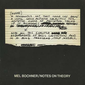
Bochner, Mel. The Singer Notes. New York: Self-published, 1968. [Images] [Compare/contrast Bochner’s notes and drawings resulting from conversations with scientists and engineers at Singer Labs in New Jersey with the Smithsonian Libraries’ online exhibition Science and the Artist’s Book, 1995]
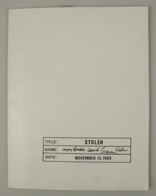
Gregory, Kathe; Landis, Marilyn; Lewis, Russell; Crane, David; Kahn, Scott. Stolen. New York: Colorcraft Lithographers/Dwan Gallery, 1970. [Images] [Compare/contrast with Andrew Savage’s Stolen White Goods, 2006, and then Cristina Garrido’s intervention White Goods, 2011]
Lole, Kevin; Smith, Paul. Handbook on Models. Coventry: Self-published, 1972. [Unable to locate a work of this title in WorldCat, but one with the title The Relativism of Emotion Handbook to the Model and same date of publication is described in Paul Robertson‘s “A Collection of Rare Art+ Language Books and Internal Documents – Many Unknown in Literature”, Gorebridge, Midlothian: Unoriginal Sins/Heart Fine Art, n.d.]
30 x 21cm, 50pp (printed recto only) plus printed card covers. Xerox inner pages as issued. The first and only edition of this theoretical work based on a physical model (electro-shock, photo beams and electronic buzzers) acting as metaphor for analogue, theoretical and representative models. Cover is very minority marked on the front and back cover has a faint diagonal crease else VG++. From the archive of David Rushton who believes only 10 or fewer of this book was published.
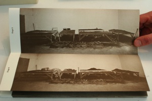
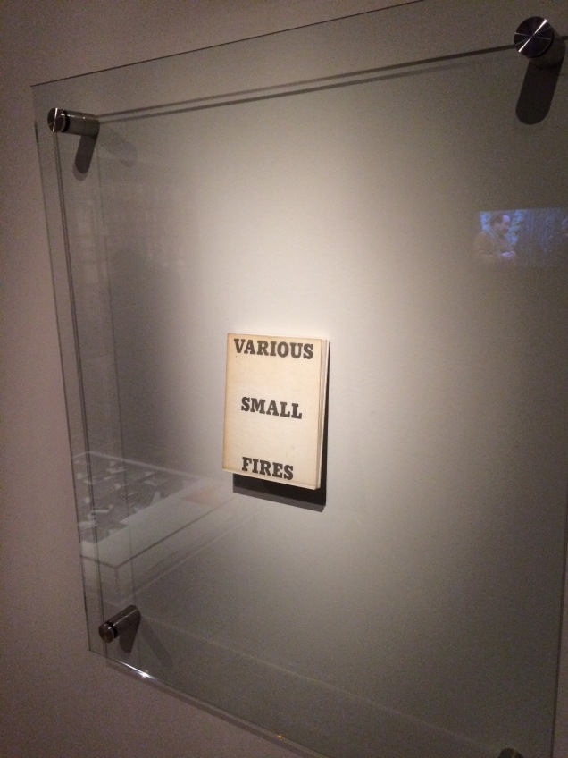
Display of Ed Ruscha’s Various Small Fires and Milk, 1964, at Pliure: La Part du Feu, 2 February – 12 April 2015, Paris. Photo by Robert Bolick. Reflected in the lower left hand corner is the display of Bruce Nauman’s Burning Small Fires; in the upper right corner, the film clip of Truffaut’s 1966 Fahrenheit 451; and in the upper left, Maria Helena Vieira da Silva’s La bibliotheque en feu, 1974.
Pilkington, Philip; Rushton, David; Lole, Kevin; Smith, Paul. Concerning the Paradigm of Art. Zurich: Editions Bischofberger, 1971. [Last author’s name corrected from “Paul” to “Peter”] [From Paul Robertson, “A Collection of Rare Art+ Language Books and Internal Documents – Many Unknown in Literature”, Gorebridge, Midlothian: Unoriginal Sins/Heart Fine Art, n.d.
“30 x 21cm, 16pp (recto only). White card covers – with offset title. A text published by Bischofberger from a theoretical document written by Kevin Lole, Philip Pilkington, David Rushton and Peter Smith (formerly Analytical Art and by this time fully regarded as members of Art & Language) which applied Thomas Kuhn’s theory of paradigm shift to art (the original theory by Kuhn being a view that revolutions in scientific thought only occurred when sufficient contrary evidence to the prevailing orthodoxy had mounted up and the original hypothesis could no longer explain the physical evidence emerging from empirical studies). It is worth noting that at this time Bischofberger bought a great deal of Art + Language material from the group and published other documents by them including some of the group’s rarest publications – storing many of the more three-dimensional works for later resale. Bischofberger did not print the books himself – rather Art and Language arranged design and publication in Coventry (for free using the University’s resources) and David Rushton drove the books over in a camper van to Switzerland (breaking down just on the edge of the city due to running out of petrol and having little money left, Rushton coasted the last mile down hill on an empty tank).
The limitations of these series of books are usually placed at c. 200 but Rushton remembers taking far fewer than that with him and this Analytical Art book was in fact only produced in 50 copies taken to Zurich plus a few retained by the artists in the UK.
That said this is one of ONLY 5 copies which were numbered in roman numerals (this one being III/V) and signed by ALL of the four writers in pencil on the first title page.”]
Pilkington, Philip; Rushton, David. Sample from a Topological Notebook. Coventry: Self-published, 1972. [Video] [From Paul Robertson, “A Collection of Rare Art+ Language Books and Internal Documents – Many Unknown in Literature”, Gorebridge, Midlothian: Unoriginal Sins/Heart Fine Art, n.d.
“30 x 21cm, 28pp carbon copy pages and printed cover. This was one of ONLY four copies made and published by the group – two copies being signed by David Rushton and Peter [sic] Pilkington and created from original typed sheets and two copies remaining unsigned and created (as here) using the carbon copies from the originals. These latter two examples were regarded by the group as artist’s proofs of the book. This is the only copy of this book available for sale anywhere as from the original four prices: one is in Paul Maenz’s archive and another two copies are in the hands of private collectors (who purchased them from ourselves). This copy is signed by David Rushton and Philip Pilkington and has been stamped on the inside front cover with the official Art & Language Stamp and also designated in blue ink “Second Copy”. Fine estate and clearly rare.”]
Magnet / Photo Series / Group 2000 / September 1968 / (4 Phase) / Continuous Photographic Photographs Continuously Photographs Up to 20,000 Shots / Run Time work / 10 years / annual series of 20,000 elements / technique / black and white photography / leafs / 3 M / K 203 3 / each 30 x 40 / constant time setting diaphragm / fixed tilt stand / 1969 / camera used maintains the original value and adds to the artistic market.
Ramsden, Mel. The Black Book. [Unable to find a work under this title in WorldCat]
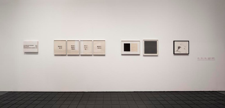
Ramsden, Mel. Abstract Relations. New York: Art-Language, 1968. Edition of 5. [Unable to find a work under this title in WorldCat; the 5 images on the left in this photograph from the Philippe Méaille private collection at MACBA come closest.]
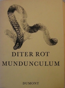
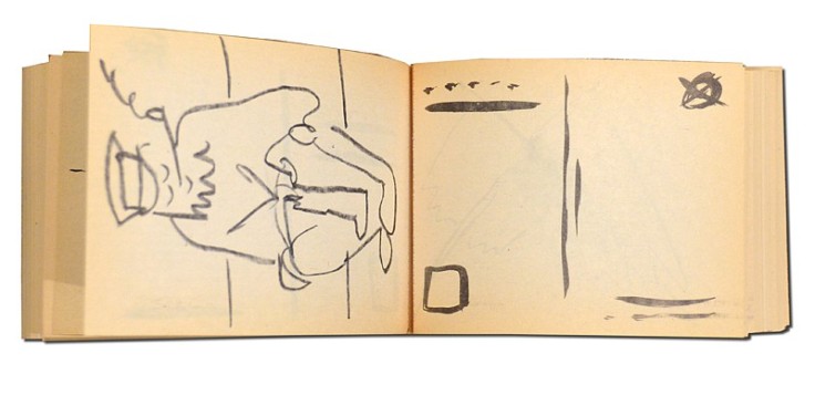
Rot, Dieter. Icelandic Leather. Reykjavik: Self-published, 1970. [Unable to locate by this title; may be referring to Volume 5, Bok 3 of the Collected Works]
Display of Ed Ruscha’s Various Small Fires and Milk, 1964, at Pliure: La Part du Feu, 2 February – 12 April 2015, Paris. Photo by Robert Bolick. Reflected in the lower left hand corner is the display of Bruce Nauman’s Burning Small Fires; in the upper right corner, the film clip of Truffaut’s 1966 Fahrenheit 451; and in the upper left, Maria Helena Vieira da Silva’s La bibliotheque en feu, 1974.


![Image result for art & language: texte zum phänomen kunst und sprache [book]](http://igem.adlibsoft.com/wwwopacx/wwwopac.ashx?command=getcontent&server=images&value=coda%5CAB00318.jpg)