On “The Book” (MIT Press, 2018)

With apologies to the preacher:  Of making many books [on books] there is no end. 

                                                                                                                (Ecclesiastes 12:12)

With the choir of its forebearers, Amaranth Borsuk’s The Book (MIT Press, 2018) sounds an “amen” to that truth. The proliferation of degree programs in book studies covering the history of the book, the book arts and even book art ensures The Book will not be the last. What distinguishes Borsuk’s book are her perspective as an artist and the book’s breadth and depth despite its brevity.

The book has a long history of existential crises. What is a book? Is the end of the book nigh?  For more than a century, those questions have returned again and again. The most recent recurrence stems from the ebook’s threat to dematerialize the book and the online world’s threat to take us into a post-text future. Even before these latest threats, book artists have long lived and worked with their own existential questions, a kind of higher existential calculus, or derivative of, the book’s crises: What is an artist’s book? What is book art?  Stephen Bury, Riva Castleman, Johanna Drucker, Joan Lyons, Stefan Klima, Clive Philpott and many others in the last quarter of the 20th century dwelt on defining and categorizing book art.

Borsuk belongs to a later generation of book artists that has embraced these existential crises and recognized that the book’s existential crises are what make the book a rich medium in which and with which to create art — from bio-art miniature to the biblioclastic human-scale to large-scale installations and performances. Even to the digital.

The Origin of Species (2016)
Dr. Simon Park, Guildford, Surrey
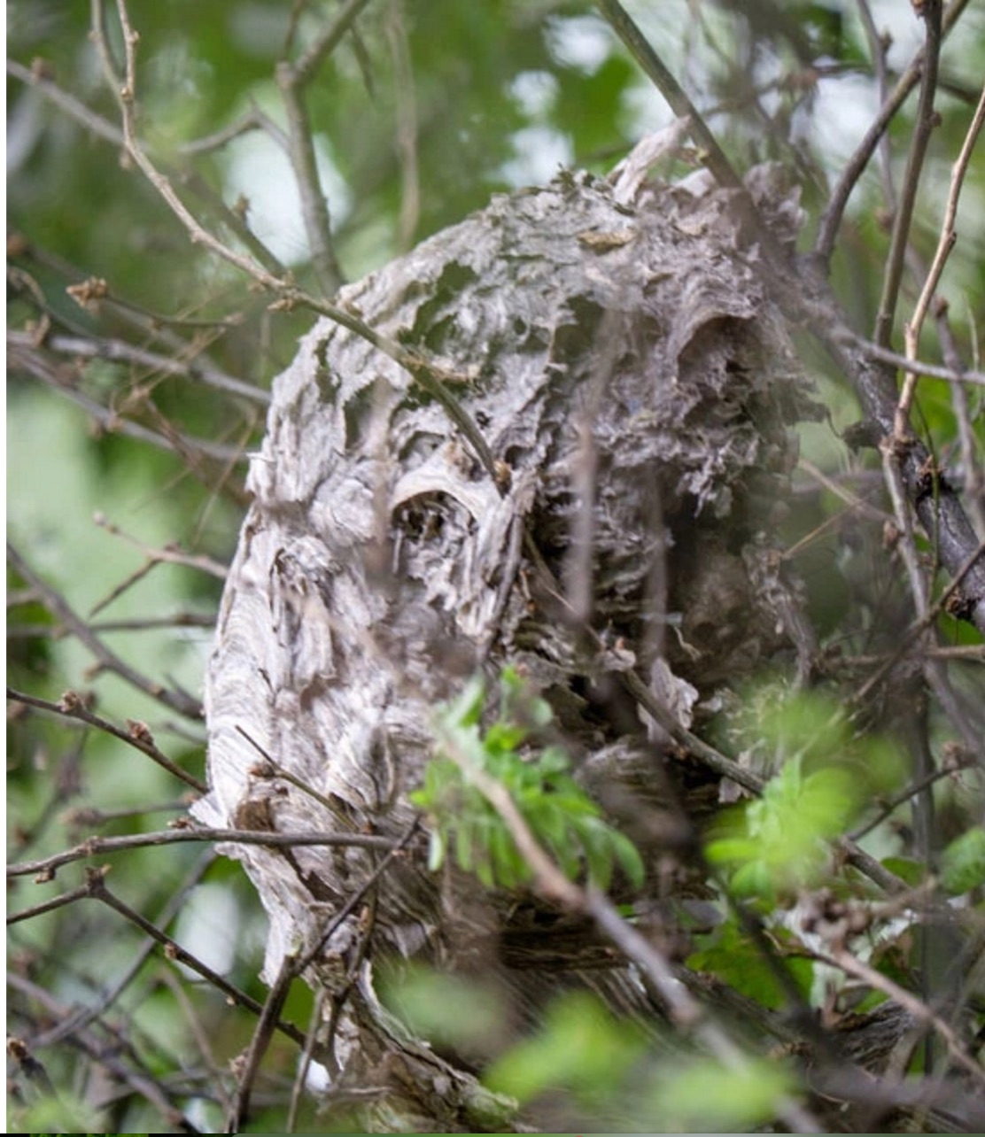
“The small book shown here was grown from and made entirely from bacteria. Not only is the fabric of its pages (GXCELL) produced by bacteria, but the book is also printed and illustrated with naturally pigmented bacteria. ” Posted 27 March 2016. Photo credit: Dr. Simon F. Park
Silenda: Black Sea Book (2015)
Jacqueline Rush Lee
Transformed Peter Green‘s translation of Ovid’s Tristia and the Black Sea Letters
H9.5″ x W12″ x D6.5.” Manipulated Text, Ink, Graphite
Photo credit: Paul Kodama. In Private Collection, NL
Enclosed Content Chatting Away in the Colour Invisibility (2009)
Anouk Kruithof
Reproduced with permission of the artist
Field (2015)
Johannes Heldén
Produced, and premiered, at HUMlab, Umeå University
Reproduced with permission of the artist

Performance artist and academic as well, Borsuk brings that later generational and creative perspective to the existential question — What is the book? — and, with an artist’s perception of her medium of choice, displaces the old companion existential question — Is the end of the book nigh? — with an altogether more interesting one — Where next for the book?

To see where books might be going, we must think of them as objects that have experienced a long history of experimentation and play. Rather than bemoaning the death of books or creating a dichotomy between print and digital media, this guide points to continuities, positioning the book as a changing technology and highlighting the way artists in the twentieth and twenty-first centuries have pushed us to rethink and redefine the term. (pp. xiii-xiv)

In The Book, the future is not far from the physical past. Where once we had text on scrolls, now we scroll through text (albeit more vertically than horizontally). Where once human consciousness changed with the invention of the alphabet and writing, now it may be altering with our reading and writing through networked digital devices. Like the many historians before her, Borsuk starts with cuneiform (those wedge-shaped accounting marks on baked clay), hieroglyphics and the invention of the alphabet to set the scene for the advent of the book and its ongoing physicality:

  • its shape (scroll, accordion, codex)
  • its material (papyrus, vellum, paper, charcoal or mineral-based watercolor and ink)
  • its manufacture (scribing, printing by woodblock and movable type, design and typography, illumination and illustration, folding into pages, methods of binding)
  • its constituent and navigational parts (cover, book block, title page, table of contents, page numbering, index).

But Borsuk reminds us — from Sumer’s clay to Amazon’s Kindle, from Johannes Gutenberg to Project Gutenberg — the book as human artifact exists in a social, political, technological, economic and even ecological context. Who is allowed to make it, how it is transacted, how and where we use it, how we perceive and speak of it — all have affected the physicality of the book object and are reflected in it. 

In the first half of The Book, Borsuk steers us through these interdependencies to a turning point. That turning point is where the pinnacle of the book arts — Beatrice Warde‘s and Jan Tschichold‘s vision of the book as a crystalline container of content — and the book’s commodification combine to cause the book’s physicality to disappear because it is so taken for granted, leaving us with “the book as idea”.

With the perception that books are ideas bestowed on readers by an authorial genius whose activity is purely intellectual, the book’s object status vanished for much of the reading public as we raised a glass to happily consume its contents…. Even though innumerable material elements come together to make the book, these features have been naturalized to such a degree that we now hardly notice them, since we have come to see content as the copyrightable, consumable, marketable aspect of the work. (pp. 106-9)

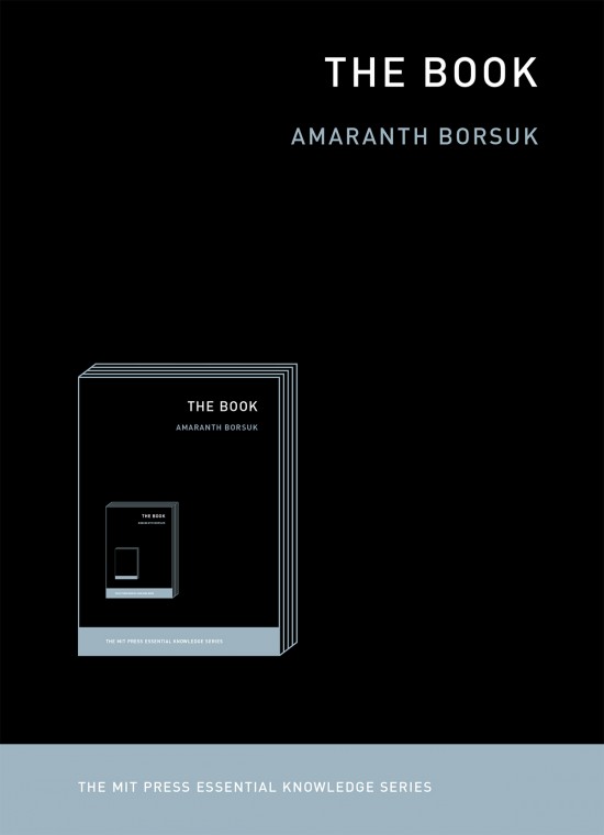
At this turning point — where “the historic relationship between materiality and text is severed” (p. 112) — the second half of The Book introduces book art. It is telling that the longest chapter in the book begins the second half, that it is called “The Book as Idea” and that it comes before any extended engagement with the digital dematerialization of the book. It is a wry pivot: the artistic genius supplants the authorial genius; what the latter takes as invisible background, the former re-makes as self-regarding foreground.  As Borsuk shows and her book’s cover neatly demonstrates, works of book art are inevitably self-referential and self-aware.

As such, works of book art

have much to teach us about the changing nature of the book, in part because they highlight the “idea” by paradoxically drawing attention to the “object” we have come to take for granted. They disrupt our treatment of the book as a transparent container for literary and aesthetic “content” and engage its material form in the work’s meaning. (p. 113)

Rather than offer a chronological history of book art to explore what “artists’ books have to teach us about a path forward for the book”, Borsuk offers “flashpoints” that represent “the energies motivating artwork in book form”(p. 117).  These “flashpoints” are William BlakeStéphane Mallarmé, Ed Ruscha and Ulises Carrión. Following these flashpoints, Borsuk organizes the rest of the chapter into “key themes that recur throughout artists’ books of the twentieth century: spatiotemporal play, animation, recombinant structures, ephemerality, silence, and interactivity” (pp. 146-47).

Oddly, Blake as flashpoint does not illuminate these six particular themes.  Rather Borsuk notes three other recurrent themes or “energies motivating artwork in book form” that Blake and his work represent: centering or re-centering the production processes on the author/artist; using the book as a sociopolitical and visionary platform; and redefining, developing and challenging the relationship between word and image.  

Blake refers to himself as “The Author & Printer W. Blake,” making clear the union of creativity and craft in his work. (p. 121)

Blake’s engagement with the social issues of his day, and his use of book form to respond to child labor, urban squalor, and slavery, established an important trend in both artists’ books and independent publishing—the utility of the book as a means of spreading social justice. (pp. 121, 124)

Blake used his craftsmanship to develop the relationship between word and image (p. 140)

One need not look far among twentieth and twenty-first century book artists for resonance with those themes. That Blakean union of creativity and craft resurfaces in artists such as Ken Campbell (UK), Cathryn Miller (Canada), Pien Rotterdam (Netherlands), Barb Tetenbaum (US) and Xu Bing (China)  — some of them even to the point of carving or setting their own type, making their own paper, pulp printing on it themselves or binding the finished work themselves. Vision and sociopolitical observation have risen up in the works of artists such as Doug Beube (Canada), Julie K. Dodd (UK), Basia Irland (US), Diane Jacobs (US), Anselm Kiefer (Germany) and Chris Ruston (UK). Blake’s redefining the relationship of word (or text) to image often reappears in book artists’ abcedaries and their children’s books such as A Dictionary Story by Sam Winston (UK).  As for emulators of Blake in technical innovation, consider the analogue example of Australian Tim Mosely’s works created with his patented pulp printing process, where the “ink” is actually colored pulp, or the digital example of Borsuk’s work Between Page and Screen, where the pages contain no text—only QR codes that, when scanned with a webcam, activate the text’s appearance on the reader’s browser screen.

For her second flashpoint, Borsuk selects another visionary, Stéphane Mallarmé, who like Blake was reacting to his own perceived Satanic mills draining poetry of its spirituality. Mallarmé’s Satanic mills dispensed rigid columns of newsprint to the masses and bland expanses of poetry and fiction set by Linotype machines in the neo-classical Didot font. With his famous visionary dictum — “everything in the world exists in order to end up as a book” (p. 135) — Mallarmé nudged the book toward pure concept and opened its mystical covers to the Dadaists, Surrealists, Futurists, Vorticists, Lettrists, Conceptualists and biblioclasts. With spatiotemporal play — mixing type sizes and fonts, breaking up the line and even breaking the page — Mallarmé used text to evoke image and, in his view, remake the book as a “spiritual instrument”. His post-humous book-length poem Un coup de Dés jamais n’abolira le Hasard (A Throw of the Dice Will Never Abolish Chance), published in 1897, embodies that vision and continues to cast its flashpoint light across multiple generations of book artists’ efforts. From Marcel Broodthaers in 1969, we have his homage to Un Coup de Dés. From Jérémie Bennequin in 2014, we have his serial “omage” to Broodthaers’ homage. And, most recently, we have the 2015 new bilingual edition A Roll of the Dice by Jeff Clark and Robert Bononno, for which Borsuk provides a perceptive reading.

Where Mallarmé’s flashpoint enlisted his vision alongside the cry “épater le bourgeois” from Baudelaire and other late nineteenth-century poets, Ed Ruscha’s later flashpoint illuminates a democratic counterpoint, a Zen-like vision and a very different way of changing the relationship of text to image. Ruscha’s self-published photobooks were cheap and distributed outside the gallery-controlled channels of art. As Borsuk shows — directly with Ruscha and indirectly with the many book artists influenced by him — the text is restricted to the book’s title, which interacts with a series of deadpan photos and their layout to deliver a wry, tongue-in-cheek work of book art. Ruscha’s spatiotemporal play manifests itself across the accordion book format and out-of-sequence juxtapositions. Ironically Ruscha’s works now command thousands of dollars per copy, and one has more chance of seeing them in an exhibition than in a roadside stop’s rack of newspapers, magazines and mass-market paperbacks.
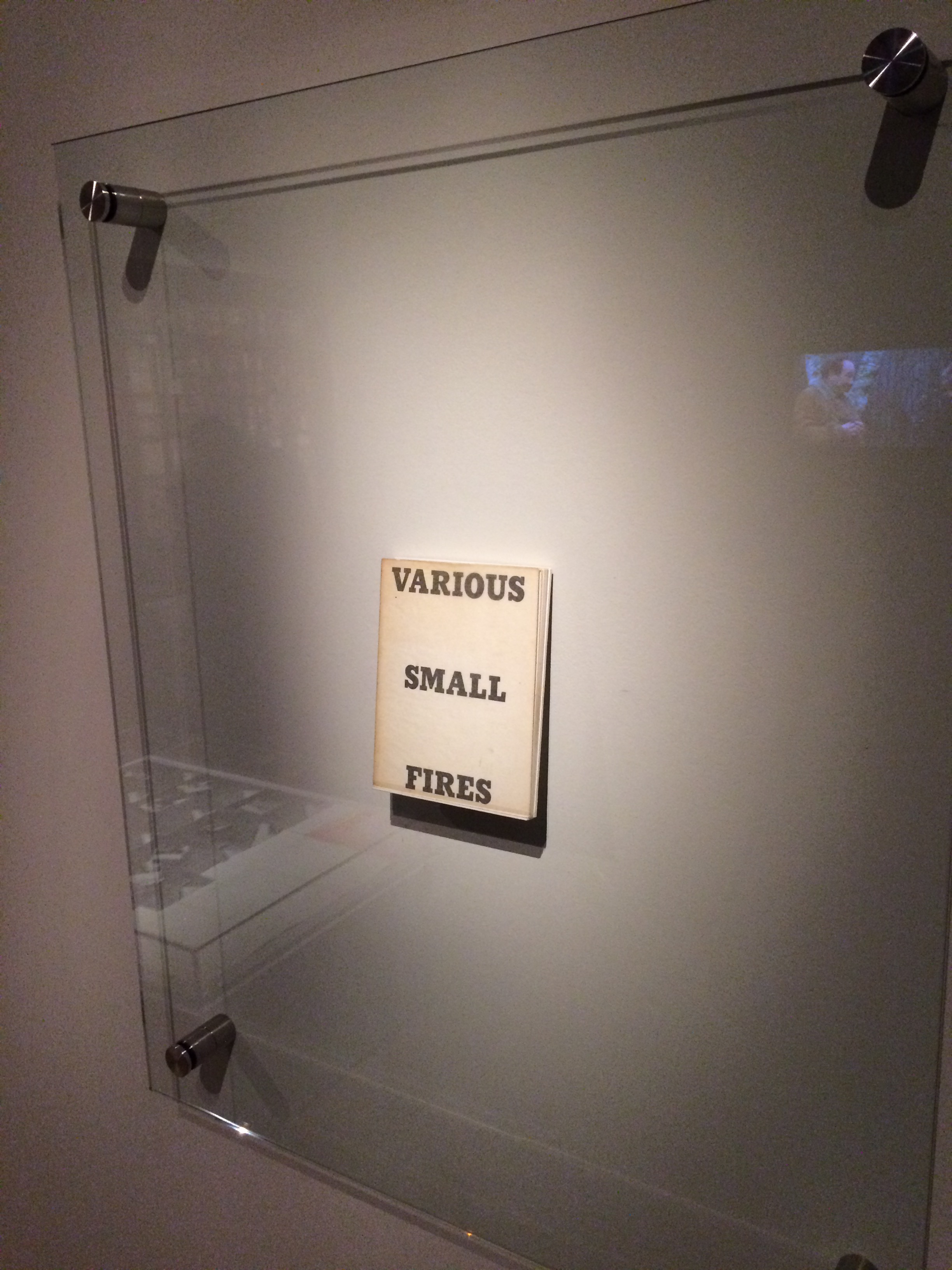
Display of Ruscha’s Various Small Fires and Milk, 1964, at the Gulbenkian’s Pliure: Prologue (la Part du Feu), 2 February – 12 April 2015, Paris. Photo credit: Robert Bolick
Reflected in the upper right corner, the film clip of Truffaut’s 1966 Fahrenheit 451; in the lower left hand corner, Bruce Nauman’s 1968 Burning Small Fires;  and in the upper left, Maria Helena Vieira da Silva’s 1974 La bibliotheque en feu.

Mexico’s Ulises Carrión — polemicist, European bookshop owner, conceptual artist and Borsuk’s fourth choice of flashpoints — is a counter-flashpoint to Ruscha. Where Ruscha reveled in self-publishing commodification, Carrión sneered at the book in its traditional commercial form. Where Ruscha has resisted the label “conceptual artist”, Carrión played the role to the hilt. Where Ruscha’s work has elicited numerous homages (see Various Small Books from MIT Press in 2013) and achieved a high profile, Carrión’s work, much lower in profile, has provided a more compelling range of hooks or influences on which to hang many different manifestations of book art (or bookworks as Carrión preferred). In fact, Borsuk’s six stated key themes or “energies motivating artwork in book form” come from Carrión’s manifestos (pp. 146-47).

The first theme — “spatiotemporal play” — comes from Carrión’s initial definition of the book as a “sequence of spaces”, which Borsuk traces to tunnel books, pop-ups and even large-scale constructs, the latter illustrated by American Alison Knowles‘ inhabitable The Big Book (1968). One more possible future of the book implied by spatiotemporal play manifests itself in Borsuk’s own augmented-reality (AR) works, those of Caitlin Fisher (Canada) and Carla Gannis’ Selfie Drawings (2016), in which portraits on the hardcover book’s pages animate and change when viewed through smartphone or tablet.

Borsuk takes the second theme, that of “animation”, from Carrión’s dictum: “Each of these spaces is perceived at a different moment— a book is also a sequence of moments”. As her several examples illustrate, much book art is cinematic. Borsuk’s exposition of Canadian Michael Snow‘s Cover to Cover (1975) comes closest to reproducing the experience I enjoyed of “watching” that photo bookwork from cover to cover several times at the now closed Corcoran Art Gallery. Borsuk is quick and right to remind that the cinematic future of the book has been with us for a long time, even before the cinema. She bookends her exposition of Snow’s book and  and the text animation of American Emmett WilliamsSweethearts (1967) on one side with Victorian flip-books and on the other with American Bob Brown‘s 1930s The Readies (presumably pronounced “reedies” to follow Brown’s comparison of his scrolling one-line texts with the cinema’s “talkies”).  

A forgotten modernist, Brown declared the obsolescence of the book, predicted a new form of reading and technology to enable it, an optical projector emitting text into the ether and directly into the eyeball. But what does this tell us about the future of the book? Borsuk notes Craig Saper‘s resurrection of Brown’s Roving Eye Press and how he even put together a website that emulates Brown’s reading machineIn her phrase describing the machine’s effect of “turning readers themselves into a kind of machine for making meaning” (p. 168), Borsuk hints at a future of digitally interactive books, which she takes up in the next section and more extensively in the next chapter. At this point, however, the reader could use a hint of practicality and skepticism. Linear-one-word-at-a-time reading, however accelerated, eliminates affordances of the page, ignores graphics and strains against the combination of peripheral vision and rapid eye movement we unconsciously (even atavistically?) deploy as we “read” whatever we see. Although in the next section Borsuk does bring on more likely examples of the book’s future exploitation of its cinematic affordances (manga, graphic novels and children’s books), this section’s treatment of animation misses the chance to cite actual recent successes like Moonbot Studios‘ The Fantastic Flying Books of Mr. Morris Lessmore (2012) and others.

Once into the third theme — “recombinant structure” — it is clear that Borsuk’s chosen Carriónesque themes overlap one another. Like the cinematic, the recombinant structure manifests itself in accordion books. It extends, however, to something more interactive: volvelles (or medieval apps as Erik Kwakkel calls them), interactive pop-ups, harlequinades (flap books) and more.  Borsuk uses Raymond Queneau‘s harlequinade Cent mille milliards de poèmes ( One hundred thousand billion poems, 1961), Dieter Roth‘s slot books and works by Carolee Schneemann to illustrate book art’s celebration of the concept. The fact that Queneau’s book is still easily available on Amazon vouches for book art’s predictive qualities. The example of Marc Saporta’Composition No. 1 (Éditions du Seuil, 1962), “a box of 150 leaves printed on only one side that the reader is instructed to shuffle at the outset”, goes Queneau one better —ironically.  In 2011, Visual Editions reissued Composition No. 1 in print and app forms. Alas, the former is out of print, and the latter is no longer available for download.

Composition No. 1 (2011)
Marc Saporta
Translation by Richard Howard, Introduction by T.L. Uglow, Google Creative Lab, Diagrams by Salvador Plascencia and Designed by Universal Everything Photo credit: Robert Bolick

Borsuk draws her  fourth theme — ephemerality — from Carrión’s dictum: 

I firmly believe that every book that now exists will eventually disappear. And I see here no reason for lamentation. Like any other living organism, books will grow, multiply, change color, and, eventually, die. At the moment, bookworks represent the final phase of this irrevocable process. Libraries, museums, archives are the perfect cemeteries for books. (p. 145)

To illustrate, Borsuk begins with the physical biblioclasts — those who in Doug Beube‘s phrase are “breaking the codex“. They include Beube himself, Bruce Nauman (see above), Brian Dettmer, Cai Guo-Qiang, Marcel DuchampDieter Roth and Xu Bing. While some of these artists reflect a twenty-first century surge of interest in altered books and book sculpture, “facilitated by the overarching notion that the book is an artifact not long for this world” (pp.82-84), others have taken a more generative archaeological approach — erasing or cutting away a book’s words to reveal another. Examples include Tom Phillips‘ A Humument (1966-2014) and Jonathan Safran Foer‘s Tree of Codes (2010). Phillips’ bookwork serves multiple purposes for Borsuk’s arguments.  Not only does it represent the book art of “erasure”, its success across multiple editions, digital formats and presence in art galleries supports her notion of book art’s predictive qualities.

There is a variant on her theme that Borsuk does not illustrate and is worth consideration for her next edition: the self-destructing yet regenerative work of book art. Examples could include American Basia Irland‘s series ICE BOOKS: Ice receding/Books reseeding (2007-), which gives a formidably tangible and new meaning to “publishing as dissemination”; and Canadian Cathryn Miller‘s tail-chasing Recomp (2014); and Argentinian Pequeño Editor‘s Mi Papa Estuvo en la Selva (2015), which after reading can be planted to grow into a jacaranda tree.

Recomp (2014)
Cathryn Miller
Copy of Decomp, Collis and Scott (2013) nailed to a tree. Photo credit: David G. Miller
Recomp (2015)
Photo credit: David G. Miller
Recomp vandalized (2015)
Photo credit: David G. Miller

The last section in this chapter expands on the fifth theme — silence — drawn from Carrión’s statement:

The most beautiful and perfect book in the world is a book with only blank pages, in the same way that the most complete language is that which lies beyond all that the words of a man can say. Every book of the new art is searching after that book of absolute whiteness in the same way that every poem searches for silence.  Ulises Carrión, Second Thoughts (1980), pp. 15-16.

Among her several examples are Pamela Paulsrud‘s Touchstones (2007-10), which look like stones but are books sanded-down into stone-like shapes, and Scott McCarney‘s 1988 Never Read (Opposed to Ever Green), a sculpture composed of stacked library discards that narrows as it ascends.  Paulsrud’s, McCarney’s, Irland’s and Miller’s works are what Borsuk calls “muted objects”, but they speak and signify nevertheless:  

Muted books take on a totemic [metaphoric] significance…. The language of the book as a space of fixity, certainty, and order reminds us that the book has been transmuted into an idea and ideal based on the role it plays in culture…. Defining the book involves consideration for its use as much as its form. (pp. 193-95)

Never Read (Opposed to Ever Green) (1988)
Scott McCarney
Reproduced with permission of the artist
Never Read (Opposed to Ever Green) (1988)
Scott McCarney
Reproduced with permission of the artist
Never Read (Opposed to Ever Green) (1988)
Scott McCarney
Reproduced with permission of the artist

Borsuk is a superb stylist of the sentence and expository structure. The words above, concluding chapter three, launch the reader into Borsuk’s final theme of interactivity and her unifying metaphor: “the book as interface”. Owners of Kindles, buyers from Amazon, perusers of Facebook — we may think we know what’s coming next in The Book and for the book, but Borsuk pushes the reader to contemplate the almost real-time evolutionary change we have seen with ebook devices and apps, audiobooks, the ascension of books to the cloud via Project Gutenberg, the Internet Archive and Google Books, and their descent to Brewster Kahle‘s physical back-up warehouse (to be sited in Canada in light of recent political events) and into flattening ebook sales of late. Chapter 4 is a hard-paced narrative of the book’s digital history from the Memex in Vannevar Bush‘s 1945 classic “As we may think” to T.L. Uglow‘s 100-author blockchain collaboration in 2017, A Universe Explodes from Visual Editions’ series Editions at Play.

Borsuk reminds us:

Our current moment appears to be much like the first centuries of movable type, a cusp. Just as manuscript books persisted into the Gutenberg era, books currently exist in multiple forms simultaneously: as paperbacks, audiobooks, EPUB downloads, and, in rare cases, interactive digital experiences. (p. 244)

Borsuk weaves into this moment of the book’s future a reminder that print affordances such as tactility (or the haptic) and the paratextual (those peripheral elements like page numbers, running heads, ISBNs, etc., that Gary Frost argues “make the book a book”) have been finding fresh ways into the way we read digitally. The touchscreen enables us to read between the lines literally in the novella Pry (2014) by Samantha Gorman and Danny Cannizaro (2014). Breathe (2018) by Kate Pullinger, another work in the Editions at Play series, uses GPS to detect and insert the reader’s location, the time and weather, and when the reader tilts the device or rubs the screen, hidden messages from the story’s (the reader’s?) ghosts appear.

At this point, an earlier passage from The Book should haunt the reader:

Artists’ books continually remind us of the reader’s role in the book by forcing us to reckon with its materiality and, by extension, our own embodiment. Such experiments present a path forward for digital books, which would do well to consider the affordances of their media and the importance of the reader, rather than treating the e-reader as a Warde-ian crystal goblet for the delivery of content. (p. 147)

Borsuk convinces. Art, artifact, concept — wrought by hand and mind, hands and minds — the book is our consensual tool and toy for surviving beyond our DNA. So now what? Metaphor, hints and historical flashpoints may illuminate where we have been, how it shows up in contemporary books and book art and where we may be going with it. In ten or one hundred years though, how will a book publisher become a book publisher? Given the self-publishing capability today’s technology offers, will anyone with a file on a home computer and an internet connection consider himself or herself a book publisher? Borsuk thinks not:

The act of publication — of making public — is central to our cultural definition of the book. Publication might presume some cultural capital: some editorial body has deemed this work worthy of print. It might also presume an audience: a readership clamors for this text. But on a fundamental level, publication presumes the appendage of elements outside the text that help us recognize it as a book, even when published in digital form. (pp. 239-40)

How will future book publishers learn to master the appendage of these elements outside the text (the paratext) that make a book a book “even when published in digital form”? Borsuk’s commentary on the ISBN as one of these elements sheds oblique light on that. She points to the artist Fiona Banner’s uses of the ISBN under her imprint/pseudonym Vanity Press — tattooing one one her lower back, publishing a series Book 1/1 (2009) consisting of sixty-five ISBN’d pieces of mirrored cardstock and then collecting them in a photobook entitled ISBN 978-1-907118-99-9 in order to deposit those one-offs with the British Library as required by the UK’s Legal Deposit Libraries Act. What can a future ebook publisher deduce from this?

That the use of a globally unique identifier (GUID) matters.

The backstory of the transition from ISBN10 to ISBN13 and that of ebooks, ISBNs and Digital Object Identifiers (DOIs) might provide interesting fodder. The notion that the book industry was running out of 10-digit ISBNs was a red herring used to convince industry executives to adopt the more widely used format of unique identifiers overseen by GS1. The real reason for moving to ISBN13 — reduced friction in the supply chain — was too hard to sell. About the same time, some major publishers proposed incorporating the ISBN into the DOI for an industry-standard ebook identifier.  The DOI offered an existing digital, networked infrastructure already being used by most of the world’s scientific, technical and medical journals publishers. It is an offshoot of the Handle System, established by Robert Kahn. Sad to say, few book publishers adopted the DOI for their ebooks; still fewer used the DOI’s application- and network-friendliness to enable their ebooks to take advantage of the network’s digital affordances.

The DOI shares with the ISBN a feature that Borsuk points out as a limitation to more widespread use: it is not free. A significant percentage of ebooks exist without ISBNs, much less DOIs. If a digital GUID is to be used in ways that help us recognize the identified digital object as a book, future book publishers and their providers of a network ecosystem supporting ebooks, linking with the print ecosystem and reducing friction in the supply chain still have wide gaps in commerce and knowledge to close. Perhaps this particular paratextual element is unnecessary for the book’s digital future, but until those gaps are narrowed, the ecosystem for eBooks will remain balkanized by Amazon, Apple, Google, Lulu and the more digitally literate denizen of the print publishing industry. In the meantime, as Borsuk’s examples throughout her book show, there are boundless other print and digital affordances with which publishers, authors, editors, designers, typographers, developers and readers can play as they continue to shape the book.

The Book‘s publication month, June 2018, is auspicious, being the same for the Getty Center’s exhibition “Artists and Their Books/Books and Their Artists“, June 26 – October 28. The Center and MIT Press would do well to have stacks of The Book on hand. The Book will also serve as an excellent introductory textbook for courses on book art or the history of the book. And by virtue of its style and artist’s perspective, Borsuk’s book will appeal to anyone with even a passing interest in this essential technology of civilization and its growing role as a material and focus of art in the twentieth and twenty-first centuries.

Bookmarking Book Art – Scott Hazard

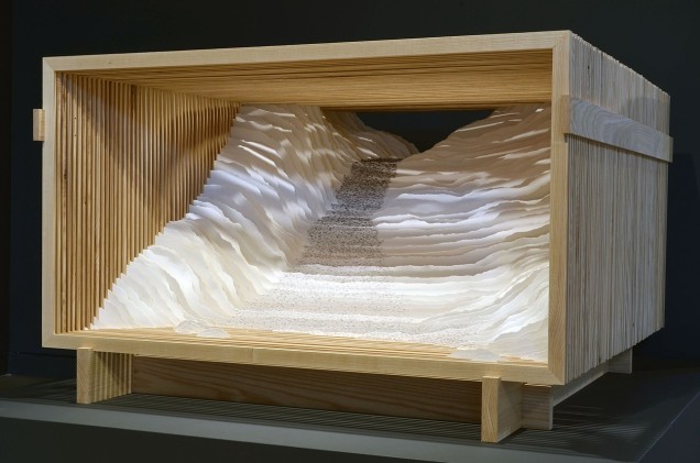
On one hot, humid North Carolina day, I had the pleasure of stepping into Scott Hazard’s workshop behind his home in Raleigh to talk to him about his artwork — in particular,  Endless Sea and Rise, which had caught my attention on his site

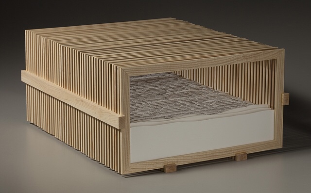
Endless Sea
Scott Hazard
Ash wood, paper, text. 10″ X 18″ X 23″

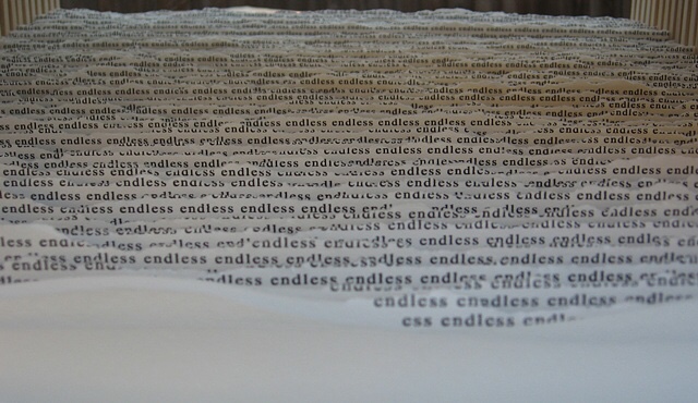
Endless Sea (detail)

Looking at Endless Sea, you might think of Robert Frost’s poem “Neither out far nor in deep”, where the people looking at the sea

… cannot look out far.

They cannot look in deep.
But when was that ever a bar
To any watch they keep?


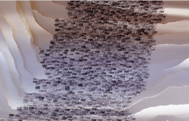
Or looking at Rise, another of what Hazard calls his “text constructs”, and its brilliantly white Canson’s archival paper Edition, you might recall Wallace Stevens’ “Thirteen Ways of Looking at a Blackbird”, where

Among twenty snowy mountains,

The only moving thing

Was the eye of the blackbird.

Rise
Scott Hazard
Ash wood, paper, text. 28″ X 53″ X 55″

Rise (detail)

By making the viewer’s eye move from layer to layer — looking in, through and side to side — Hazard’s work achieves a sense of movement. But somehow, despite or because of that, a sense of stillness takes over. When I noted the Zen-like sense of stillness I felt from the two works, Hazard showed me a photo of the Fushimi-Inari torii, whose influence on his art is clear, and spoke of how the creation of the text constructs — stamping the same word in archival black ink in precisely the right spot on carefully torn sheets of paper, then placing each sheet one behind another in wooden lattice boxes to create landscapes — is Zen-like in itself.

This idea — that the creative process, artistic result and the beholder’s response coincide — flirts with what the last century’s New Critics scorned as the “intentional fallacy” (assessing a work by the creator’s intent). What the New Critics had not experienced was the self-reflexiveness or recursiveness of minimalist, conceptualist, performative, land, and text (or book) artists’ works. By virtue of their fusion of text/image/structure, Endless Sea and Rise are intentionally recursive.

So, here is another statement of intent:  In the context of America’s and the West’s complex, conflicted sense of nature and the wilderness, Hazard says that, where once the aim of gardens seemed to be to wall out wilderness, he finds himself seeking to bring the wilderness into the enclosed. Hazard’s comment reminded me of what the book artist Joan Lyons once said to Cathy Courtney in the late 90s:

Life needs some translation and transformation to become art. I’ve always visualized the point at which personal consciousness encounters the phenomenal world as experiential screen or filter that separates the interior from the exterior, the personal from the public space. It is very much like a garden I once visited with a great lawn and tidy rows of annuals that hovered eight thousand feet on the edge of the Rocky Mountains. The place where garden and wilderness meet is the place where creative work is born and where work exists. (Cathy Courtney, Speaking of Book Art, 1999, p. 52)

In assessing Hazard’s work as “the place where garden and wilderness meet” — or “the place where creative work is born and where work exists” — I am picking up on the artist’s intention as reflected in material aspects of the work and in how the artist/work is manipulating my faculties of perception. To understand better Hazard’s artwork and its effect, I followed up my visit with a series of questions.

BoB: Can you walk me through the process of preparing the structures? What kind of tools? How long does it take?

SH: I use soft maple or ash wood for the bulk of the structures I make. For a piece like Rise or Endless Sea I start with rough cut ash, mill the wood using a small jointer and planer, and then cut the slats for the multiple frames using many passes on a table saw to rip the wood. I then clean these up on the planer, cut miter joints with a chop saw, glue and then sand all sides. The additional wood pieces that hold the individual frames in place are made with ash also – I cut the dados with a dado blade so the frames fit snugly in the dados. The more simple box like frames I make are typically soft maple. These are made with all of the same tools. I have not kept close track of time spent on the production of my work but estimate a piece like Endless Sea might take 30+ hours for the wood elements. The smaller box frames might take 3 to 5 hours each – I typically make these in batches so there is some efficiency built in. Some of the larger boxes or frames for pieces such as Read This Line are fabricated by an excellent furniture maker in Raleigh that I like to work with.


Read This Line
Scott Hazard
Wood, paper, text. 28″ X 43″ X 15″

BoB: And the process of preparing the paper, stamping it, fixing to the structure, etc.?”

SH: After sketching the concept for the work and then drawing the piece to scale, I then cut the multiple sheets of paper and backing/spacing materials to size. After all of the sheets are prepared I create a template for the text if necessary, and then proceed to carefully apply the words to the first sheet. Once the desired form and texture is on the sheet, I sketch the outline of the hole to be torn in the sheet and then carefully tear it. I cut a larger hole in the backing material and insert both into the frame to assess. I then remove the sheet from the frame and trace the outline of the first hole onto the back of the second sheet. I then repeat the process for the second and all remaining sheets, assessing the development of the work to make minor adjustments along the way to completion.

On larger pieces it has taken me over 2 hours per sheet/layer in the composition. On smaller pieces, depending on the complexity of the form and amount of text, it can take anywhere from 20 to 60 minutes per sheet. My most recent pieces have had 25 to 45 layers – a small one might take 20 to 40 hours for the production of the paper sculpture. Time spent on concept, concept development, and installing it in the structure are on top of that and add anywhere from 6 to 20 hours per work.

BoB: Which artists and landscape architects have influenced you – early and later?

SH: Artists who have had a significant influence on my thinking and work include Robert Irwin, Robert Smithson, Nancy Holt, and Vito Acconci. I am a big fan of Acconci’s early poetry/concrete poetry and the architectural/built work he had focused on since the 1980’s. Additional artists that have influenced me include Aldwyth, John Cage, Martin Puryear, Oskar Fischinger and Jackie Winsor. I often refer to the Hudson River School painters and traditional Japanese garden design.

Designers and (landscape) writers that have had impacts on the evolution of my work and understanding of the natural and built worlds include James Wines/SITE, Rudolph Schindler, JB Jackson, Anne Whiston Spurn and Peter Schaudt. I was fortunate to have had the chance to work with Mr. Schaudt as a consultant on a few landscape projects over a span of about 10 years – the sense of restraint in his work grounded in an intuitive and tacit understanding of landscape, as well as his enthusiastic and collaborative demeanor were a big influence.

I had a lot of fantastic instructors in my undergraduate studies, but two professors from that time were very important in opening doors and exposing me to a lot of visual art that was new to me at the time; Terry Hargraves (architecture) and Gary Dwyer (landscape architecture). Both helped me drastically expand my notions of what space and landscape could be, and fostered my interest in the exploration of how materials and ideas can inform and articulate space and landscape.

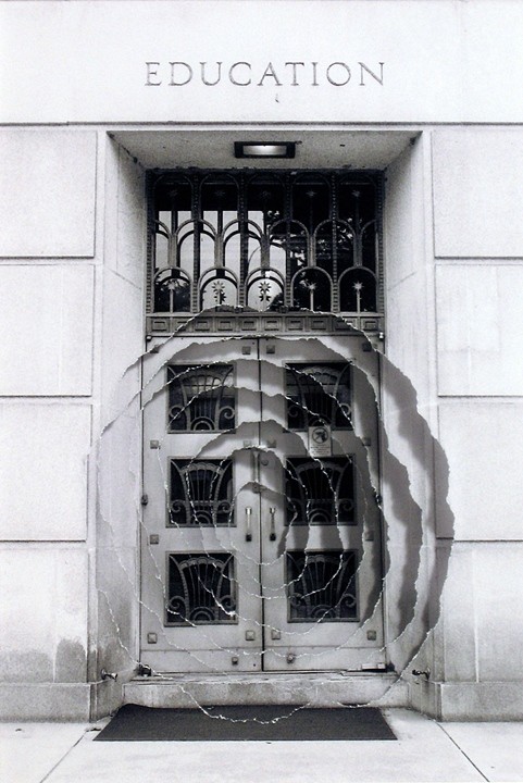
Introjection: Education
Scott Hazard
Sculpture/Photography
5.75″ X 4.5″, 17 3/4″ X 15 3/4″ w/ Frame

BoB: Some of your “photo constructs” — for example, Introjection: Education — echo the very title of the Acconci studio’s 2012 digital animation “WHEN BUILDINGS MELT INTO AIR & THE AIR RE-FORMS INTO BUILDINGS”, but I am curious: How did text come to play the role it plays in your more three-dimensional work?  After all, despite the trompe l’oeil, the photo constructs are two dimensional;  words and letters are creatures of the two-dimensional page or screen; landscape and architecture generally do not feature words and letters — certainly not in the way your paradoxical enclosure of paper landscapes within wooden lattice-work boxes features them. From where did your distinctive use of text come?

SH: With a background in landscape design and construction, I tend to look at the physical built world as a manifestation of ideas. Every building, built landscape, piece of furniture, tool, article of clothing, pencil, etc. exists initially as an idea. Whether the idea is drawn as a rough sketch, explained in detail, or carefully drafted, reviewed and vetted before anything is built – it is providing the direction for the physical realization. Even something like a protected forest or national park, as untouched as it might be, essentially exists the way it is because someone had the idea at some point in time to protect that place. In this sense everything we perceive and experience is a mix of physical reality and information. (We can go deep into a rabbit-hole (or the matrix) on this topic, but I’ll try to keep this brief…)

With this in mind, I am very keen on how the information we absorb from many, many sources, in turn informs how we perceive the world, and to a large extent what we perceive in the world. Text, whether a poem, novel, essay or song lyric, can obviously articulate ideas, and can articulate space as well. In Walden, Thoreau wrote about people being able to read and understand the landscape. Most people don’t have the skill set or temperament in this era in the same way Thoreau might have fashioned his own perceptual skills, but we are still reading our environment, most of us with minds overflowing with stimulus and information.

My aim with my text-based work is to create an experience that allows people to read in space – the content of the text informs how the viewer might perceive the sculptural elements in the piece, and the forms of the piece affect how the text reads also. I am exploring how text can become as much of a material as any of the physical matter incorporated into the work.

BoB: What is the earliest exposure to art that you can recall from childhood and adolescence?

SH: I don’t recall a lot of significant experiences with art in my childhood years – other than what I might have seen in history museums or pop culture, visual art was not really on my radar. In high school I was exposed to a number of forms of art through an excellent humanities course. My exposure to visual art increased significantly in may late teens and early twenties through landscape architecture, architecture and fine art courses I enrolled in. My interest in art really took hold in the last two years of my undergraduate education, and steadily increased from there.

Two installations I experienced around this time had a big impact in solidifying my drive in visual art. One was The eyes of Gutete Emerita by Alfredo Jaar. I can’t forget the visceral effect this piece had on so many people who experienced it. A work of art can’t ever relay the complete magnitude and protracted horror of something like the Rwandan genocide, but Mr. Jaar managed to succinctly and poetically capture a brief but intimate glimpse of one person’s story, while also conveying the immensity of the genocide.

The other piece that I have vivid memories of is “1° 2° 3° 4°,” by Robert Irwin. Installed at the Museum of Contemporary Art in San Diego, Mr. Irwin had three rectangles cut in the windows overlooking the coast. Each hole cut in the windows effectively became an aperture for viewing and tacitly connecting people with the environment, in this case the coastal breeze and sound of the ocean, outside.

BoB: There is a technically unusual chromatic effect in text constructs like Rise, where the intensity of the black ink is modulated in a way that works strikingly with the shadow from one layer of paper to the next. Do you recall what led you to blending the chiaroscuro effects of one material with another?

SH: To heighten the effect of the text flowing and dissipating from the back of the piece to the front, the text at the back and top of the work is much more dense and dark versus the lighter gray and graduates to a much less dense text at the bottom and front. Moving from front to back, layer by layer the density and darkness of the text increases until the paper is nearly solid black at the rear of the piece which is also the darkest part of the work. The interaction of light with the work is paramount and helps reinforce the rhythm found in the multiple layers of paper. I am intent on trying to pull the viewer perceptually into the work to heighten a sense of focus and departure.  The interaction of lighter and darker areas of light on the layers of paper encourages the viewer to track their vision into the space in the work layer by layer.  Ideally this provides both an invitation to delve in and also a sense of mystery.

BoB: You mentioned that you are experimenting with repurposing printed book pages in your constructs. Can you tell me more about that? Will you combine that material with the archival paper or replace the archival paper entirely? What prompted the experimentation?

SH: Yes, this has been an interesting and slightly different strain of work I have been pursuing. I have been interested in experimenting with and developing work with portions of pages from books, periodicals and catalogues for a few years. About a year ago a curator I enjoy meeting with suggested trying the use pages from books in my work so I put some more energy into this body of work. It has been a fascinating,  slight diversion from the ink stamp based text work I have been focused on lately , and the used books I have been collecting over the past couple of years have been great catalysts for new pieces and great sources for words used in my other text based work.

BoB: Are there other materials beckoning for experimentation?

SH: Of course! I am still focused on the many, many possibilities I see in the wood/paper/ink/text based work and how that will evolve, but I would love to work with steel, stone, concrete and other landscape oriented materials at a larger scale.

BoB: You mentioned that, with your text constructs, you seem to be cycling back to fewer layers as in Intermediate and Landscape Meditation or flatter objects like your photo construct Reaching Branch compared to Rise and Endless Sea. What lies behind this return? Technical, conceptual, textural effect, chromatic effect?”

SH: The recent move back to work that is more shallow than the deeper text based work I have been making is focused on conceptual and technical aspects of the work. I love the spaces that can be created in the deeper works like Rise and Endless Sea. I am also very interested in exploring the interplay between the use of text and the forms/voids housed in the physical work.  Using text to help articulate a physical and conceptual space, and shaping forms and space in the work to in turn impact the reading of the text is a very large part of what drives my thinking and energy in developing the text-based work. Making the work more shallow is in many ways very challenging – it forces the composition in each work to be more concise and focused.

BoB: The installation shown on your site must have been even more striking live. Do you have plans for future installations? How does creating the timebound experience of installations compare with creating more permanent sculptures? ”

SH: Thank you for your comments! Yes, I do have plans for future installations but nothing immediate. I am often on the lookout for projects or venues to do an installation. It is  exciting to literally envelop the viewer in a space where passing through the space impacts how the space and work is perceived. As you reference above, I consider each piece I make to ‘function’ and be experienced much like a garden (whether 4 inches wide or 400 feet (or meters) wide they are spaces for exploration, meditation and/or a moment of respite). The text in my work is composed to be read in conjunction with movement – to be read in space. Larger, installation scaled work allows for the physical immersion of the viewer as they pass through the space along with the perceptual immersion that can come from simply viewing a work from a single point in space. This notion brings us back to Japanese gardens, which were often designed to be experienced by passing through them.


Although not an installation, Hazard’s latest exhibition echoes his concluding comment above and takes me back to that moment of stepping

Character Space
Scott Hazard
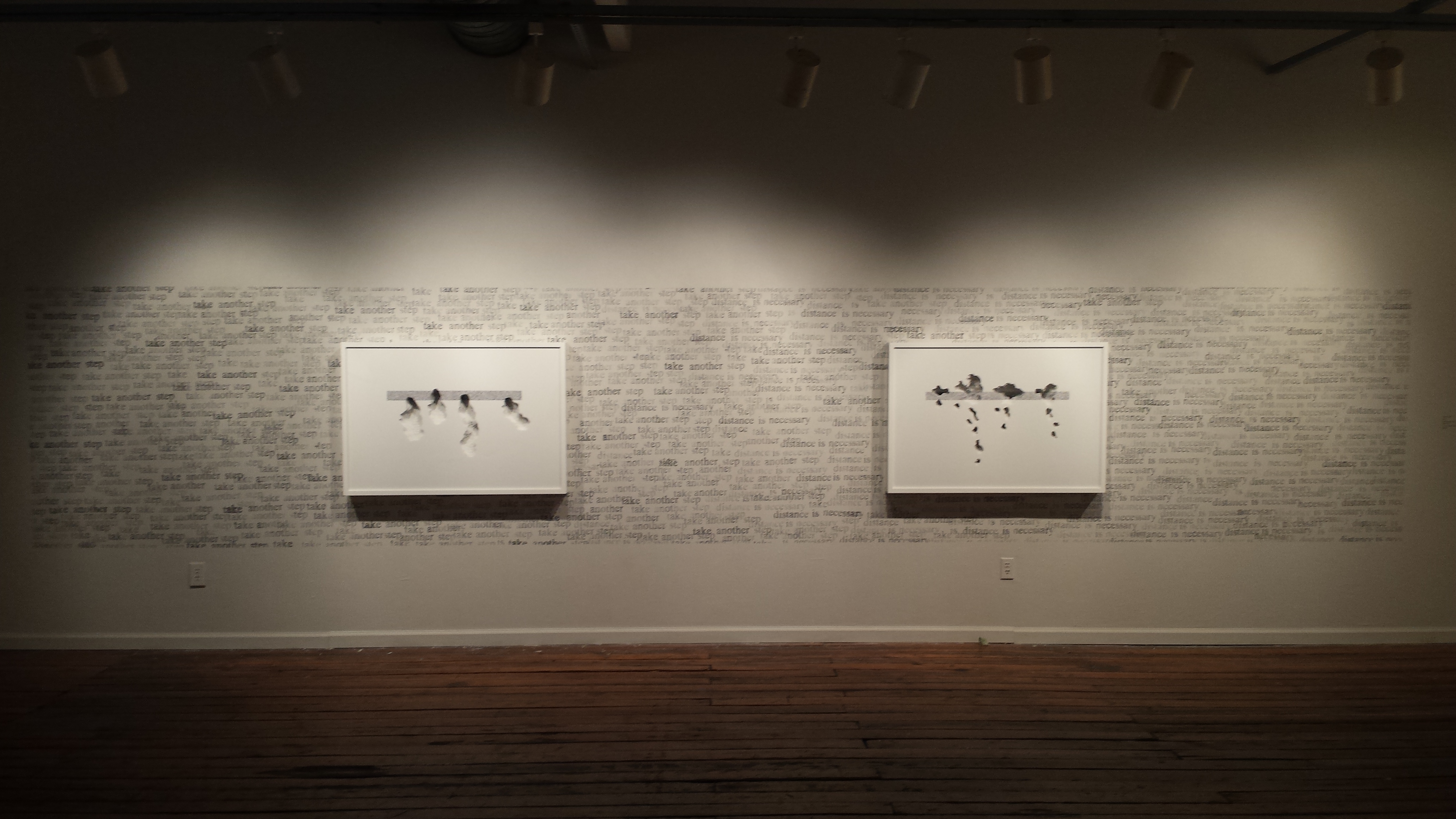
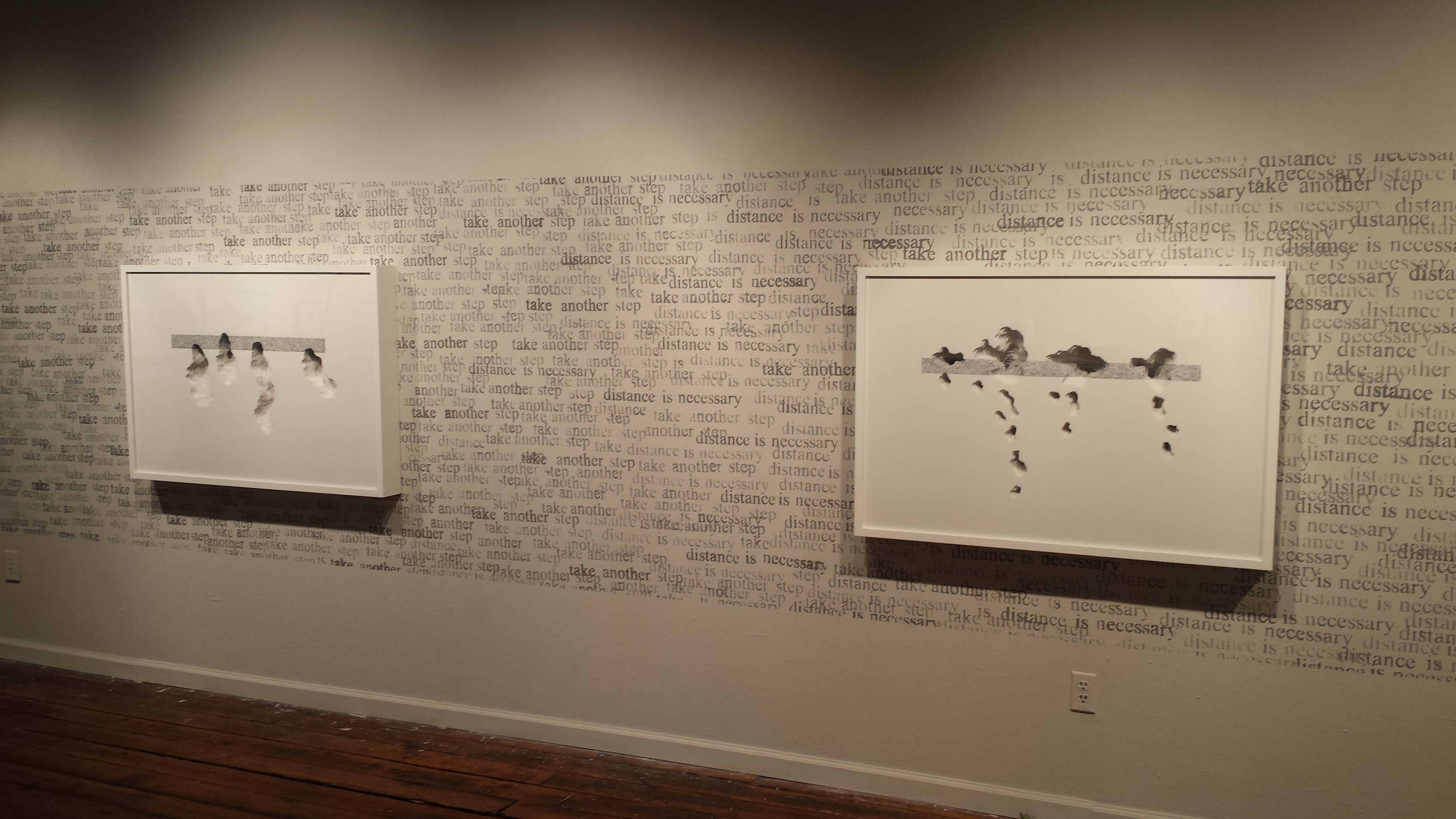
Exhibition view at Artspace, Raleigh, North Carolina

Character Space (2017)
Scott Hazard
Exhibition view at Artspace, Raleigh, North Carolina

from his workshop back into the Piedmont heat: I immediately began to yearn for one of his installations in whose cool I could immerse myself. Character Space remains on display in Gallery 2 at Artspace until 27 January 2018.

Further reading on Scott Hazard and his work:

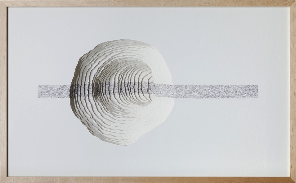
 The text based constructs I create consist of layers of paper that are carefully torn or cut, spaced apart and aligned to define sculptural voids. Cathartic micro-gardens punctuated with masses of text beckon the viewer to delve in for a brief journey. As the viewer’s gaze enters and traverses the layers of paper in each work, vision becomes tactile, lending an articulated viewing experience and a space for the eyes to linger. The movement and placement of words in and around the composed landscapes and intimately scaled spaces provides for a kinaesthetic reading experience that draws the viewer in for momentary reflection and a temporary departure. The viewer looks ‘at’ and ‘through’ each composition simultaneously.

The precision of Hazard’s “Memory Gardens” and “Text Constructs” must take the concentration required by a colored powder mandala.

Bookmarking Book Art – An Online Annotation of “The Cutting Edge of Reading: Artists’ Books”

Renée Riese Hubert and Judd D. Hubert’s The Cutting Edge of Reading: Artists’ Books (Granary Books, 1999) is a signal work of appreciation and analysis of book art.  Nearly twenty years on, it can be read and appreciated itself more vibrantly with a web browser open alongside it.

To facilitate that for others, here follows a linked version of the bibliography in The Cutting Edge of Reading — a “webliography” Because web links do break, multiple, alternative links per entry and permanent links from libraries, repositories and collections have been used wherever possible. These appear in the captions as well as the text entries. Also included are links to videos relating to the works or the artists. At the end of the webliography, links for finding copies of The Cutting Edge (now out of print) are provided.
βΟβσβΟβσβΟβσβΟβσβΟβσβΟβσβΟβσβΟβσβΟβσβΟβσβΟβσβΟβσβΟβσβΟβσβΟβσβΟβσ

Alechinsky, Pierre; Matta, Sebastian; Mansour, Joyce. Le Grand jamais. Paris: Aimé-Maeght Éditions , 1981. [See also video 1, video 2.]

Arnal, André-Pierre. Conviction du contresens. Paris. Self-published, 1994. [See also video.]

Barrett, Virginia. Sometimes Feeling Like Eve. San Francisco: VB Press, 1992.

Blais, Jean-Charles; Artaud, Antonin. Tuguri. Paris: Ric Gadella, ed.; Frank Bordas, Printer, 1996. [See also video.]

Boltanski, Christian. La Maison manquante. Paris: La Hune, 1990. [See also video.]

Boltanski, Christian. Inventory of Objects Belonging to an Inhabitant of Oxford introduced by a preface and followed by some answers to my proposalWestfalicher Kunstverein, 1973. [The entry here corrects and extends the title given in the book’s entry. The exhibition itself, held in different locations, appeared with a different title and at different dates.]

Boltanski, Christian. Sachlich. Wien/Munchen: Gina Kehayoff Verlag, 1995.

Boni, Paolo; Butor, Michel. La Chronique des asteroïdes. Paris: Jacqueline de Champvalins, 1982.

Paolo Boni and Michel Butor
La Chronique des asteroïdes (1982)

Braunstein, Terry. On Wrinkles. Self-published, 1978.

Broaddus, John Eric. France I. Altered book, n.d. [See also video 1video 2, video 3, video 4.]

Broaddus, John Eric. Satyricon. Altered book, 1973.

Broaddus, John Eric. Space Shot. One-of-a-kind book, n.d. Wellesley College Library, Special Collections.

Broaddus, John Eric. Sphinx and the Bird of Paradise. New York: Kaldewey, n.d. [See also video.]

Broaddus, John Eric. Turkestan Chronicle. One-of-a-kind book, n.d. Private collection.

Broel, Elisabeth. Aus dem Liederbuch des Mirza Schaffy. Unikatbuch no. 2. Altered book of Bodenstedt’s, 1992.

Broodthaers, Marcel. Reading Lorelei. Paris: Yvon Lambert, 1975.

Brunner, Helen. Primer of Ritual Elements (Book 1). Washington, D.C.: Offset Works, The Writing Center, Glen Echo, MD, 1992.

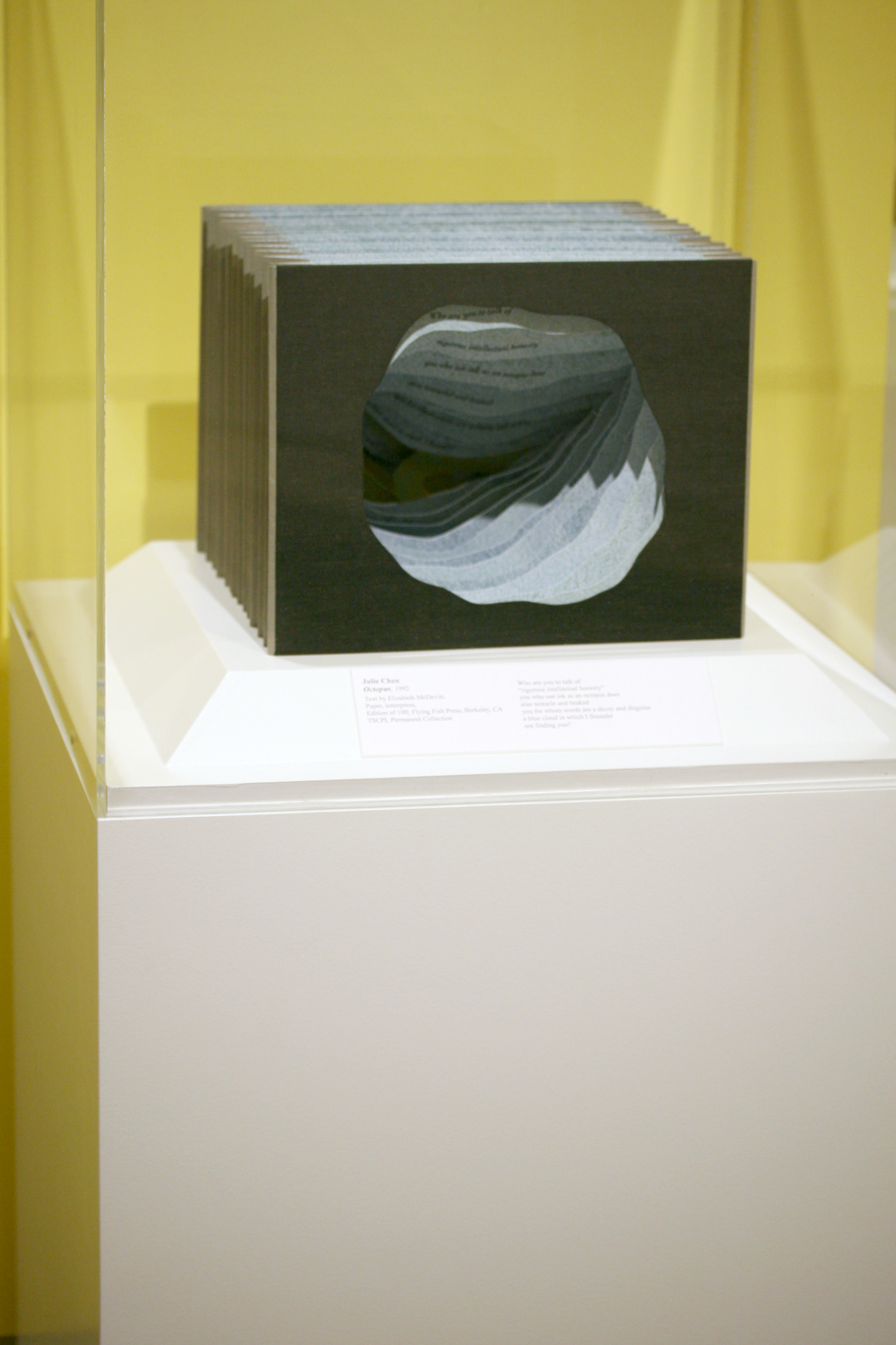
Chen, Julie. Octopus. Berkeley: Flying Fish Press, 1992. [See also video.]

Octopus (1992)
Julie Chen
Poem by Elizabeth McDevitt
Letterpress on paper
13.4 X 10.75 in.

Chopin, Henri. L’Écriture à L’ENDROIT. Limoges: Sixtus Editions, 1993.

Chopin, Henri. Graphèmes en vibrances. Paris: Les Petits Classiques du Grand Pirate, 1990.

Chopin, Henri; Zumthor, Paul. Les Riches heures de l’alphabet. Paris: Les Éditions de la Traversiere, 1995.

Closky, Claude. De A à Z. Paris: n.p., 1991. [Compare with Scott McCarney’s Alphabook 13 (1991).]

Crombie, John; Rimbaud, Arthur. Une illumination. Paris: Kickshaws Press, 1990.

Dautricourt, Joelle. Sentences. Paris: Self-published, 1991.

Delaunay, Sonia; Cendrars, Blaise. La Prose du Transsibérien et de la petite Jehanne de France. Paris: Les Éditions des Hommes Nouveaux, 1913. [Title corrected.]

Dorny, Bertrand; Butor, Michel. Caractères. Paris: Imprimerie Nationale, 1993.

Dorny, Bertrand; Butor, Michel.  Lug à Lucinges. Paris: Self-published, 1993. [Butor added; title corrected.]

Dorny, Bertrand. Supermarché. Paris: Self-published, 1992.  [Butor added.]

Dorny, Bertrand; Deguy, Michel. Composition 7. Paris: Self-published, 1992.

Dorny, Bertrand; Deguy, Michel. Écrire. Self-published, 1992.

Dorny, Bertrand; Deguy, Michel. Éléments pour un Narcisse. Paris: Self-published, 1993.

Dorny, Bertrand; Deguy, Michel. Le Métronome. Paris: Self-published, 1984.

Dorny, Bertrand; Guillevic, Eugène. Si. Nice: Jacques Matarasso, 1986. [First name of Guillevic corrected.]

Dorny, Bertrand; Noel, Bernard. Matière de la nuit. Paris: Self-published, 1990.

Dorny, Bertrand; Smith, William Jay. The Pyramid of the Louvre. Self-published, 1990.

Drucker, Johanna. Narratology. New York: Druckwerk, 1994.

Ely, Timothy; McKenna, Terence. Synesthesia. New York: Granary Books, 1992. [See also video.]

Ely, Timothy. Approach to the Site. New York: Waterstreet Press , 1986. [See also Getty interview; see also video.]

Ely, Timothy. Octagon 3. One-of-a-kind book, 1987. Houghton Library, Harvard University.

Ely, Timothy. Saturnia. One-of-a-kind book, 1995. Private collection.

Ely, Timothy; Kelm, Daniel E. Turning to Face. One-of-a-kind book, 1989. Houghton Library, Harvard University.

Epping, Ed. Abstract Refuse: A Heteronymic Primer. New York: Granary Books, 1995.

Ernst, Max; Eluard, Paul. Les Malheurs des immortels. Paris: Librairie Six, 1922.

Ernst, Max. Une Semaine de bonté. Paris: Pauvert, 1963. [See also video.]

Fahrner, Barbara; Cage, John. Nods. New York: Granary Books, 1991.

Fahrner, Barbara; Schwitters, Kurt. A Flower Like a Raven. Translations by Jerome Rothenberg. New York: Granary Books, 1996.

Finlay, Ian Hamilton. Ocean Stripe Series 3, Wild Hawthorn Press, 1965.

Gerz, Jochen. 2146 Steine: Mahnmal gegen Rassismus. Saarbrucken and Stuttgart: Haje Verlag, 1993. [See also video.]

Gerz, Jochen. Die Beschreibung des Papieres. Darmstadt: Luchterhand, 1973.

Gerz, Jochen. Les Livres de Gandelu.  Liège: Yellow Now, 1976.

Golden, Alisa. They Ran Out. Berkeley: Nevermind the Press, 1991.

Groborne, Robert. Une lecture du Livre des ressemblances [d’] Edmond Jabès. [Xonrupt-Longemer, France]: Æncrages, 1981.

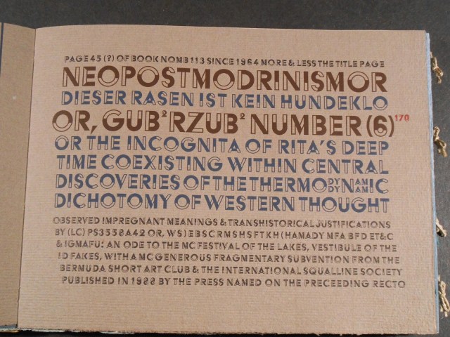
Hamady, Walter. Gabberjab 6. Mount Horeb, WI: The Perishable Press Limited, 1988.

Gabberjab No. 6 (1988)
Walter Hamady

Hamady Walter. Gabberjab 7. Mount Horeb, WI: The Perishable Press Limited, 1997.

King, Ron; Fisher, Roy. Anansi Company. London: Circle Press, 1992. [See also video.]

King, Ron; Fisher, Roy. Bluebeard’s Castle. Guilford, England: Circle Press, 1972. [See also video.]

King, Susan E. Always a Bridesmaid, Never a Bride. Los Angeles: Paradise Press, 1978.

King, Susan E. HomeStead. Los Angeles: The Power of Place, 1990.

King, Susan E. I Spent Summer in Paris. Rochester NY: Paradise Press at Visual Studies Workshop Press, 1984.

King, Susan E.  Salem Witch Trial Memorial. Santa Monica, CA: Paradise Press, 1994.

King, Susan E. Treading the Maze. Rochester, NY: Montage 93: International Festival of the Image, 1993.

King, Susan E. Women and Cars. Rosendale, NY: Paradise Press, 1983. [See also video.]

Koch, Peter; McEvilley, Thomas. Diogenes Defictions. Berkeley: Peter Koch, Printers, 1994.

Kosuth, Joseph. Two Oxford Reading Rooms. London: Book Works, 1994.

Labisse, Félix. Histoire naturelle. Paris: Chavane, 1948.

Histoire naturelle (1948)
Félix Labisse
Histoire naturelle (1948)
Félix Labisse

Lacalmontie, Jean-François. Le Chant de sirènes. Limoges: Sixtus Editions, 1995. [See also video.]

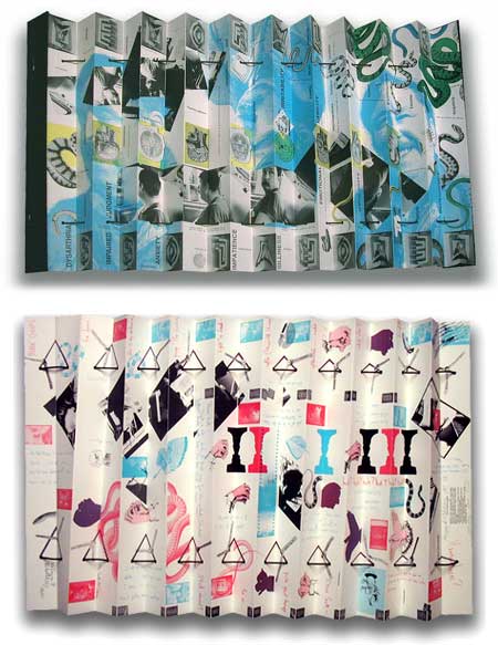
Laxson, Ruth. [H0 + G0]² = It. Atlanta: Nexus Press, 1982. [See also video.]

[H0 + G0]² = It  (1982)
Ruth Laxson

Laxson, Ruth. Measure/Cut/Stitch. Atlanta: Nexus Press, 1987. [See also video.]

Laxson, Ruth. Wheeling. Atlanta: Nexus Press, 1992.

Le Gac, Jean. La Boîte de couleurs. Amiens: Fonds Régional d’Art Contemporain de Picardie, 1995. [See also video at 4’55”.]

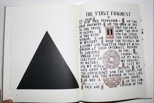
Lehrer, Warren; Bernstein, Dennis. French Fries. Rochester/Purchase: Visual Studies Press, 1984.
French Fries (1984)
Warren Lehrer and Dennis Bernstein

Ligorano, Reese. The Corona Palimpsest. New York: Granary Books, 1996.

Lohr, Helmut. Visual Poetry. Berlin: Galerie Horst Dietrich, 1987.

Visual Poetry (1987)
Helmut Lohr

Lovejoy, Margot. The Book of Plagues. Purchase, NY: SUNY Visual Arts Division, 1994.
Lown, Rebecca. Procrustes’ Bed. Purchase, NY: Center for Editions, 1990.

Lyons, Joan. The Gynecologist. Rochester, NY: Visual Studies Workshop Press, 1989.

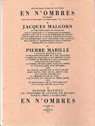
Malgorn, Jacques; Mabille, Pierre. En N’Ombres. Limoges: Sixtus Editions, 1993.
Mallarmé, Stéphane. Un coup de dés jamais n’abolira le hasardCosmopolis, mai, 417-28, 1897.

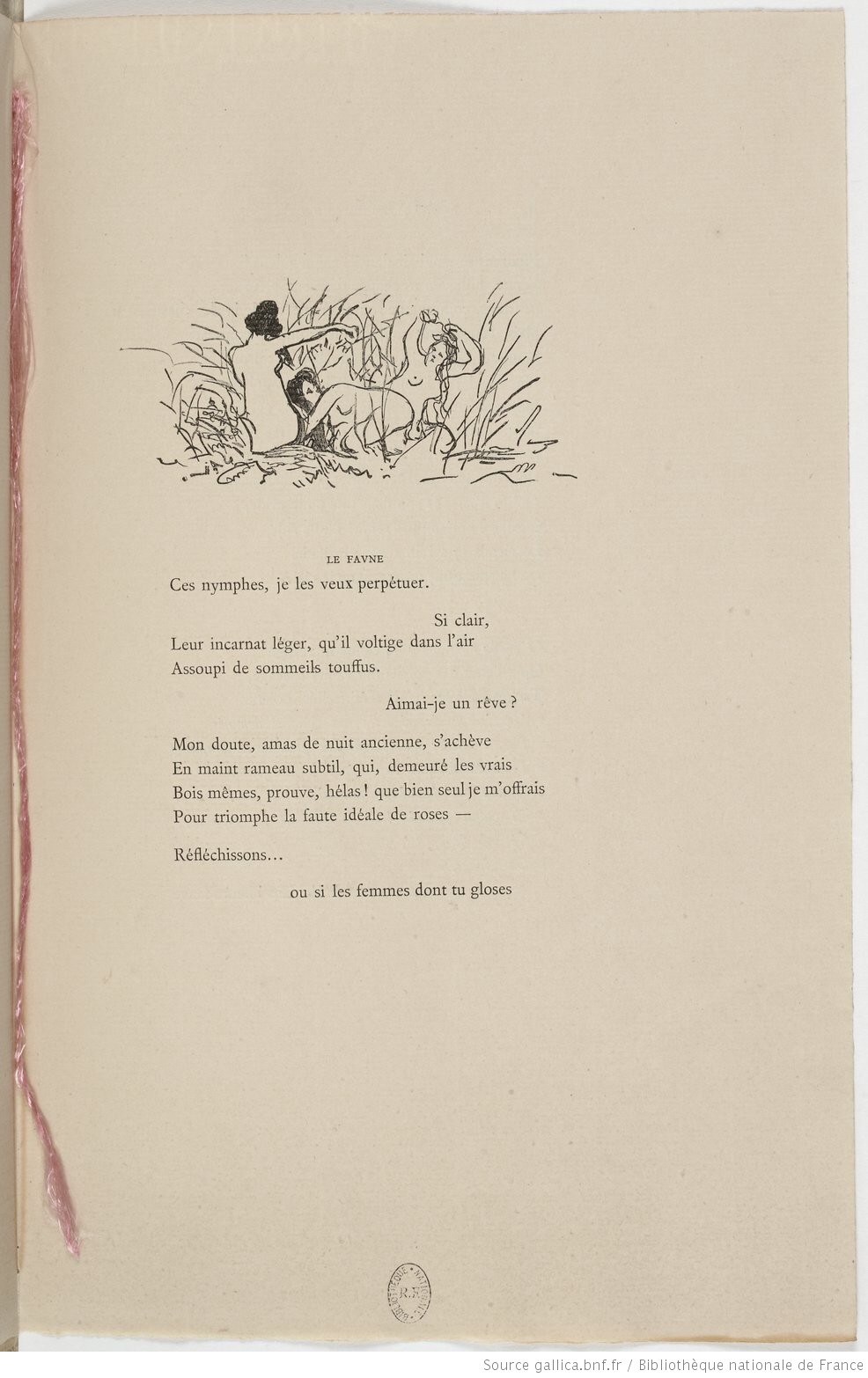
Manet, Edouard; Mallarmé, Stéphane. L’Après-midi d’un faune. Paris: Derenne, 1876.

Martinez, Roberto. Moi Aussi j’aurais peur si je recontrais un ange. 1. La Bataille de Midway. Paris: n.p., 1991.

Martinez, Roberto. Moi Aussi j’aurais peur si je recontrais un ange. 2. L’Anatomie d’un ange. Paris: n.p., 1991.

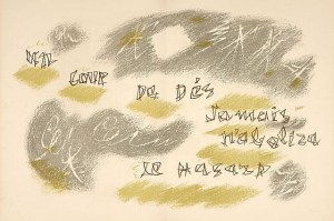
Masson, André; Mallarmé, Stéphane. Un coup de dés jamais n’abolira le hasard. Paris: Amateurs du Livre et de l’Estampe Modernes, 1961.

Un coup de dés jamais n’abolira le hasard (1897; 1961)
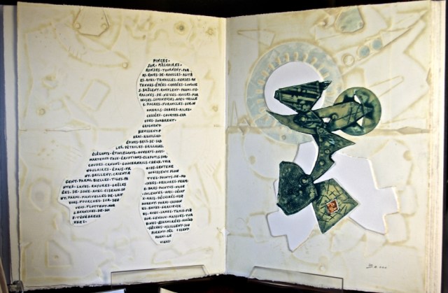
Stéphane Mallarmé; André Masson

Masson, André; Rimbaud, Arthur. Une saison en enfer. Paris: Société de femmes bibliophiles Le Cent Une, 1961.

Matta, Sebastian; Jarry, Alfred. Ubu roi. Paris: Atelier Dupont Visat, 1982.

Matta, Sebastian. Garganta-tua. Florence: Edizioni della Bejuga, 1981.

McCarney, Scott. Diderot/Doubleday/Deconstruction. Rochester, NY: Visual Studies Workshop Press, 1994. [See also video.]

McCarney, Scott. Memory Loss. Rochester, NY: Visual Studies Workshop Press, 1988. [See also video.]

Memory Loss (1988)
Scott McCarney
2 1/2 x 22 in., 40 pp.
offset edition of 500

Meador, Clifton. Anecdote of the Jar. Purchase, NY: SUNY Visual Arts Division, 1989. [See also video.]

Meador, Clifton. The Book of Doom. Barrytown, NY: Zimmerman Multiples, 1984. [See also video.]

Messager, Annette. D’Approche. Paris: Jean-Dominique Carré Archives Librairie, 1995. [See also video at 5’56”.]

Messager, Annette. Mes ouvrages. Arles: Actes Sud, 1989.

Nannucci, Maurizio. Art as Social Environment. Amsterdam: Lugo, 1978.

Nannucci, Maurizio. Provisoire et définitif. Écarts, 1975.

Newell, Peter. Slant Book. New York: Harper Bros., 1910.

Osborn, Kevin. Real Lush. Arlington, VA: Bookworks, 1991.

Osborn, Kevin. Tropos. Arlington, VA: Osbornbook, 1988.

Tropos (1988)
Kevin Osborn

Osborn, Kevin. Wide Open. Arlington, VA: Bookworks, 1984.

Penck, A.R. Analysis. Berlin: Edition Klaus Staeck, 1990.

Phillips, Tom. A Humument. London: Thames & Hudson, 1980.

Polkinhorn, Harry. Summary Dissolution. Port Charlotte, FL: Runaway Spoon Press, 1988.

Reese, Harry. Arplines. Isla Vista, CA: Turkey Press, 1988.

Roth, Dieter. Daily Mirror. Köln: Hansörg Mayer, 1961. [See also video.]

Roth, Dieter. Bok 3C. Stuttgart: Hansörg Mayer, n.d. [See also video.]

Rullier, Jean-Jacques. 10 exemples. Limoges: Sixtus Editions, 1994.

Ruscha, Edward. Twentysix Gasoline Stations. Los Angeles: National Excelsior Press, 1963. [Publisher added; see also video.]

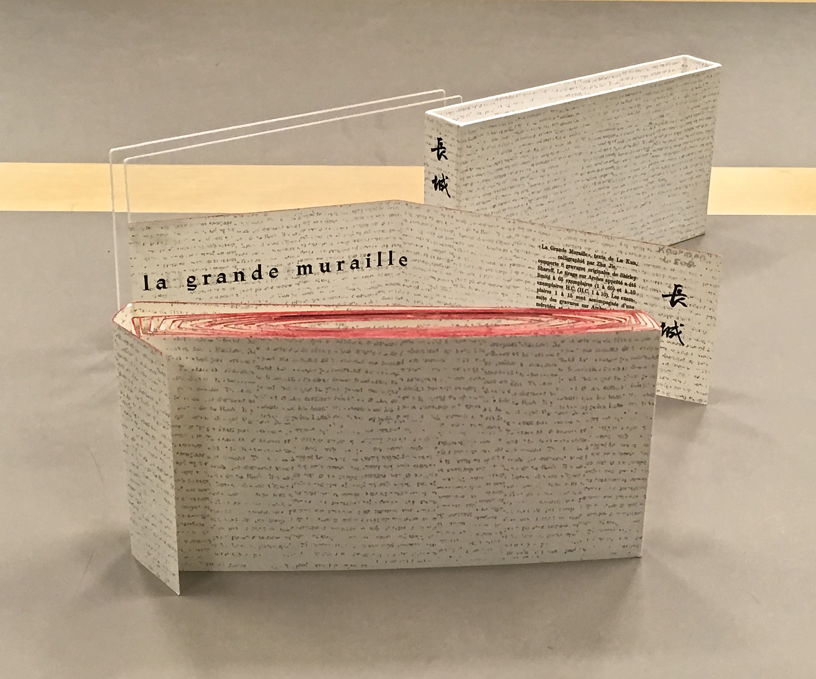
Sharoff, Shirley; Lu Xun. La Grande Muraille/The Great Wall. Paris: Self-published, 1991.

La grande muraille/The Great Wall (1991)
Shirley Sharoff
La grande muraille/The Great Wall (1991)
Shirley Sharoff

Sicilia, Jose Maria; Lux, Thomas. You Are Alone. Paris: Michael Woolworth, 1992.

Sligh, Clarissa. Reading Dick and Jane with Me. Rochester, NY: Visual Studies Workshop Press, 1989. [See also video.]

Sligh, Clarissa. What’s Happening with Momma? Rosendale, NY: Women’s Studio Workshop, 1988.

Smith, Keith. Construct. Rochester, NY: Visual Studies Workshop Press, 1985. [See also video.]

Spector, Buzz. Broodthaers. 1988. Altered book. [See also video links embedded in the artist’s name below.]

Spector, Buzz. Kafka. 1988. Altered book.

Spector, Buzz. Malevich. 1988. Altered book.

Spector, Buzz. A Passage. NY: Granary Books, 1994.

Spector, Buzz. The Picture of Dorian Gray. 1987. Altered book.

Spector, Buzz. Silence. 1989. Altered book.

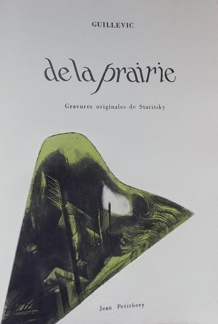
Staritsky, Anna; Albert-Birot, Pierre. La Belle histoire. Veilhes, Tarn: Gaston Puel, 1966.

Staritsky, Anna; Butor, Michel. Allumettes pour un bûcher dans la cour de la vieille Sorbonne. Paris: Self-published, 1975.

Staritsky, Anna; Guillevic, Eugène. De la prairie. Paris: Jean Petithory, 1970.

De la prairie (1970)
Eugene Guillevic (text)
Anna Staritsky (art)

Staritsky, Anna; Iliazd. Un de la brigade. Paris:Atelier Lacourière-Frelaut, 1982. [Publisher identified.]

Staritsky, Anna; Lemaire, Jacques. Le Zotte et la moche. Moulin du Verger de Puymoyen, 1969.

Stokes, Telfer; Douglas, Helen. MIM. Deuchar Mill, Yarrow, Scotland: Weproductions, 1986. [See also video.]

Stokes, Telfer; Douglas, HelenReal Fiction: An Inquiry into the Bookeresque. Rochester, NY: Visual Studies Workshop Press, 1987.

Stokes, Telfer; Douglas, Helen. Spin Off. Deuchar Mill, Yarrow, Scotland: Weproductions, 1985.

Van Horn, Erica. Scraps of an Aborted Collaboration. Docking, Norfolk: Coracle Press, 1994.

Van Horn, Erica. Seven Lady Saintes. New York: Women’s Studio Workshop, 1985. [Publisher identified.]

Van Horn, Erica. Ville aux dames.Vitry-sur-Seine: n.p., 1983. One-of-a-kind. [Title corrected.]

Walker, Anne; Coppel, Georges. Les Formes de l’univers (ou l’univers des formes). Paris: L’Oeil du Griffon, 1995. [Name of publisher corrected.]

Wegewitz, Olaf. Mikrokosmos. Edition Staeck, 1992. [Publisher identified; date reflects publisher’s information; see also video.]

Yvert, Fabienne. Transformation. Marseille: Éditions des Petits Livres. 1995.

Zelevansky, Paul. The Case for the Burial of Ancestors. New York: Zartscarp, Inc. and Visual Studies Workshop Press, 1981.

Zimmermann, Philip. High Tension. Rochester, NY: Visual Studies Workshop Press, 1993. [See also Craft in America video and video of High Tension.]

Zimmermann, Philip. Elektromagnetism. Barrytown, NY: Space Heater Multiples, 1995.

Elektromagnetism (1995)
Philip Zimmerman

Zubeil, Francine. Panique générale. Marseille:  Éditions de l’Observatoire, 1993.

Zweig, Janet. This Book is Extremely Receptive. Cambridge, MA: Pyramid Atlantic, 1989.

βΟβσβΟβσβΟβσβΟβσβΟβσβΟβσβΟβσβΟβσβΟβσβΟβσβΟβσβΟβσβΟβσβΟβσβΟβσβΟβς

The Cutting Edge of Reading: Artists’ Books by Renée Riese Hubert and Judd D. Hubert available:

Amazon

AbeBooks

OCLC WorldCat

%d bloggers like this: