In 1995, the Smithsonian Institute Libraries’ exhibition Science and the Artist’s Book explored “how science can serve as a springboard for artistic creation” and showed how “aspects of creativity … are common to science as well as to art”. The exhibition juxtaposed twenty-five rare books from the Heralds of Science collection at the Dibner Library with twenty-five bookworks commissioned as responses to them. For example,
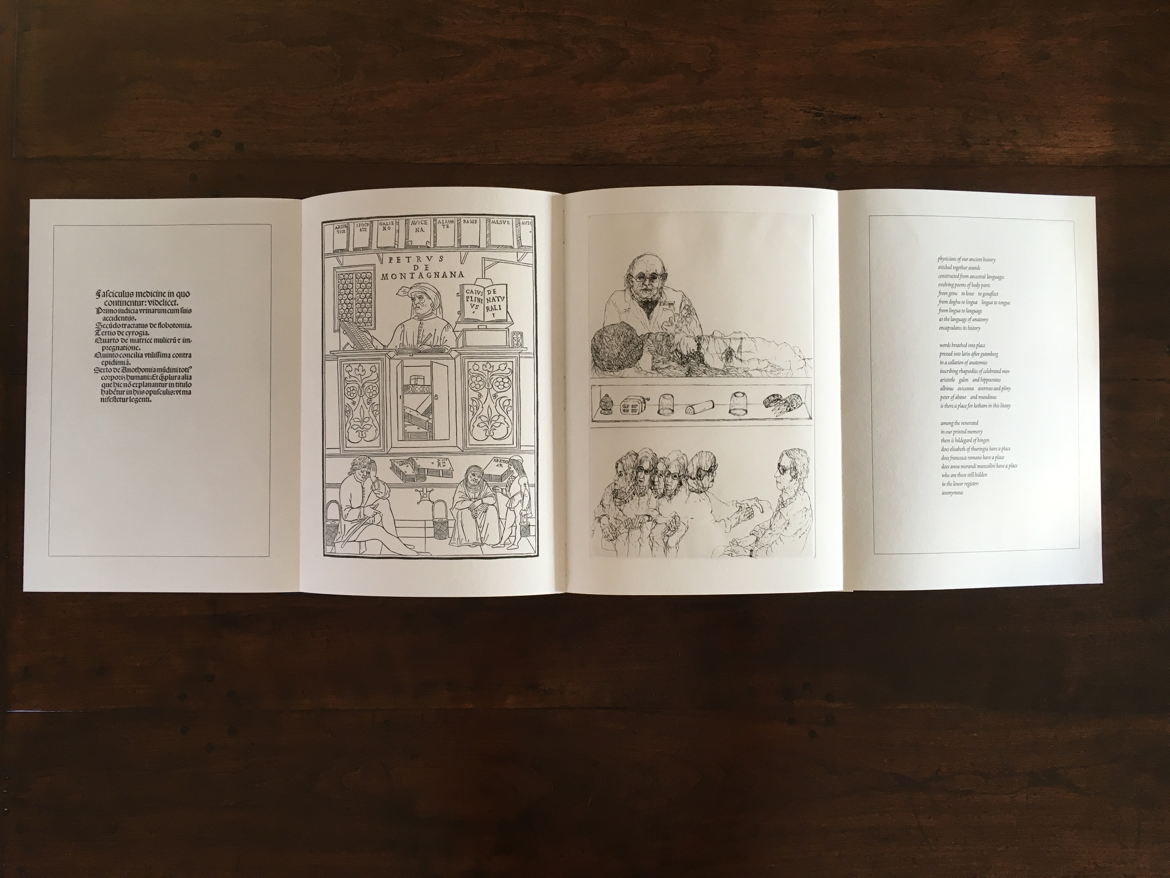
Joyce Cutler-Shaw responded to Johannes de Ketham’s Fasciculus Medicinae (Venice: Impressus per Ioannes [et] Gregorius de Gregorijs fratres, 1495) with The Anatomy Lesson (Middletown, CT: Robin Price, Publisher, 1995);
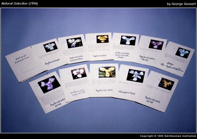
George Gessert responded to Darwin’s On the Origin of Species (London: John Murray, 1859) with Natural Selection (Eugene, OR: self-published, 1994);
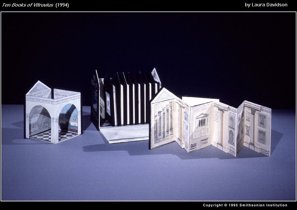
and Laura Davidson responded to Vitruvius Pollio’s’ De Architectura libri Dece [The Ten Books on Architecture] (Como, Italy: Gottardo de Ponte, 1521) with Ten Books of Vitruvius (Boston, MA: self-published, 1994).
As the exhibition demonstrated, the overlay of the dual traditions — those of art and those of the book — on the domains of science creates a rich soil for ingenuity and genius. Since that exhibition, science- and maths-driven book art has yielded harvest after harvest of outstanding book artists. Sarah Bryant is one of them. Bryant won the MCBA Prize in 2011 with Biography (2010) and was a finalist in 2015 with Figure Study (2015).
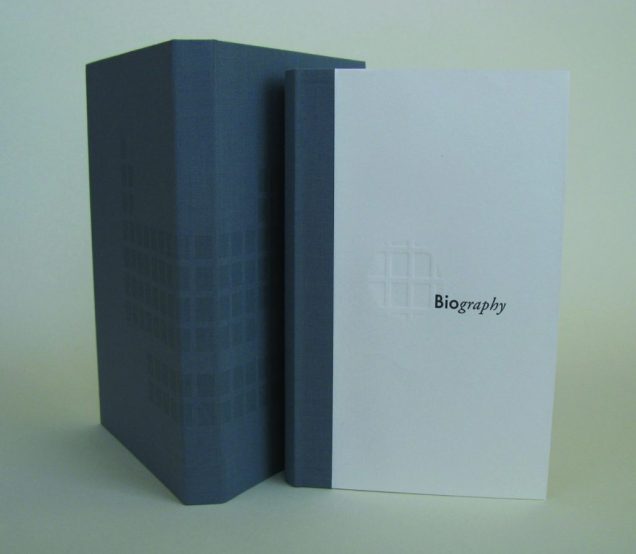
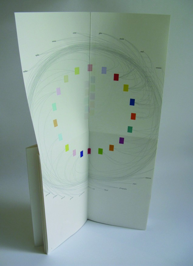
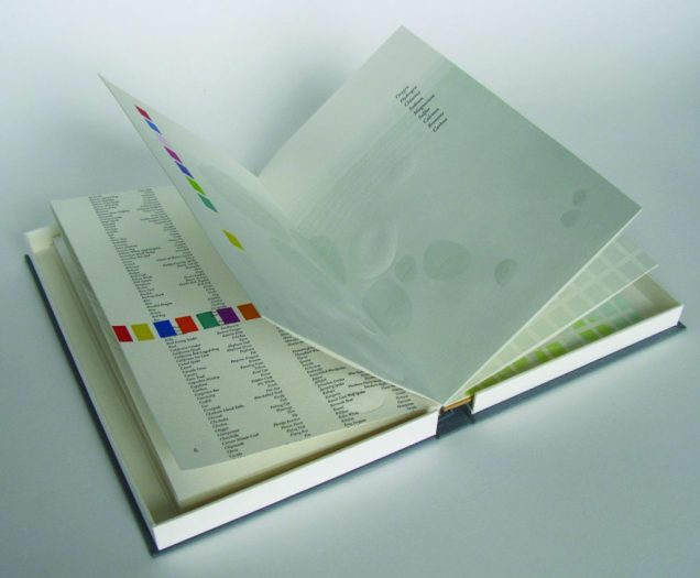
Biography (2010)
Sarah Bryant
“[A]n exploration of the chemical elements in the human body and the roles they play elsewhere in the world”, Biography (2010) is bound as a hard cover drumleaf and enclosed in a clamshell box. It begins with the periodic table and assigns a coloured square to each of the chemical elements found in the human body. Using those coloured squares, the six subsequent diagrams show the presence of the body’s chemical elements in the earth’s crust, man-made weapons, medicines, sea water, etc. The flip-up folio (above right) displays their presence in various man-made tools and building materials. Bryant’s inventive handling of colour, the flip-up folio and blind embossed printing foreshadow developments in her later work.
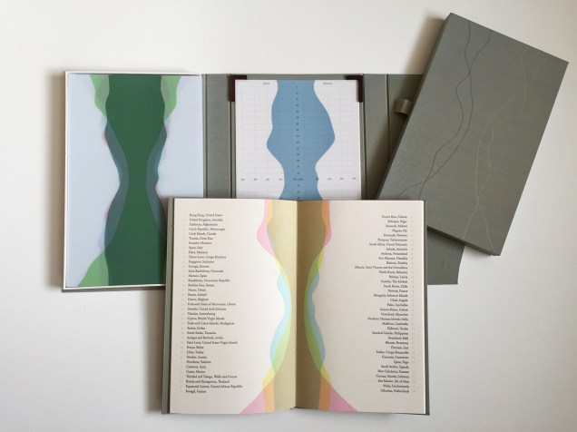
Figure Study (2015)
Sarah Bryant and David Allen
Collaborating with David Allen, a professor at Middlebury College in Vermont, Bryant created Figure Study (2015), a graphical “comparison of population data for every region on earth”. In this work, Bryant takes her handling of shape and colour to a new level.
All 114 of these figures have been printed from linoleum onto drafting film and are housed together alongside a grid. The figures are each numbered and can be interpreted using a booklet containing an alphabetical and numerical index, as well as a short essay by David Allen about our process and the source of the data. The design of the enclosure encourages the viewer to layer the forms to create different combinations of shape and color. This process and the resulting imagery is initially reminiscent of elaborate dresses, paper dolls, and dissection plates, but the source of the data gives a different picture, laying bare the vast and critical differences between the basic equations of life in different parts of the world. 2015 MCBA Prize Finalists
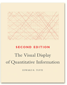
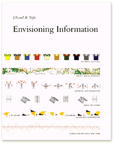
In correspondence with Books On Books, Bryant has noted the influence of Edward R. Tufte. Figure Study particularly may remind the reader/viewer of Tufte’s The Visual Display of Quantitative Information (1983) and Envisioning Information (1990). In his books and lectures, Tufte champions the connection of art and science as well as information display that is interactive, which Bryant’s statement above echoes.
As her two bookworks above and those below associated with the collective Shift_Lab demonstrate, she has the gift of transforming analytical data, diagrammatic imagery , text derived from reference materials as well as personal experience and taking them beyond “visual display” and into art.
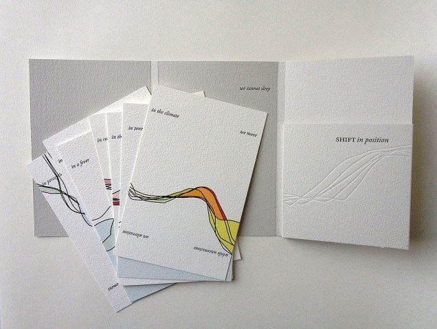
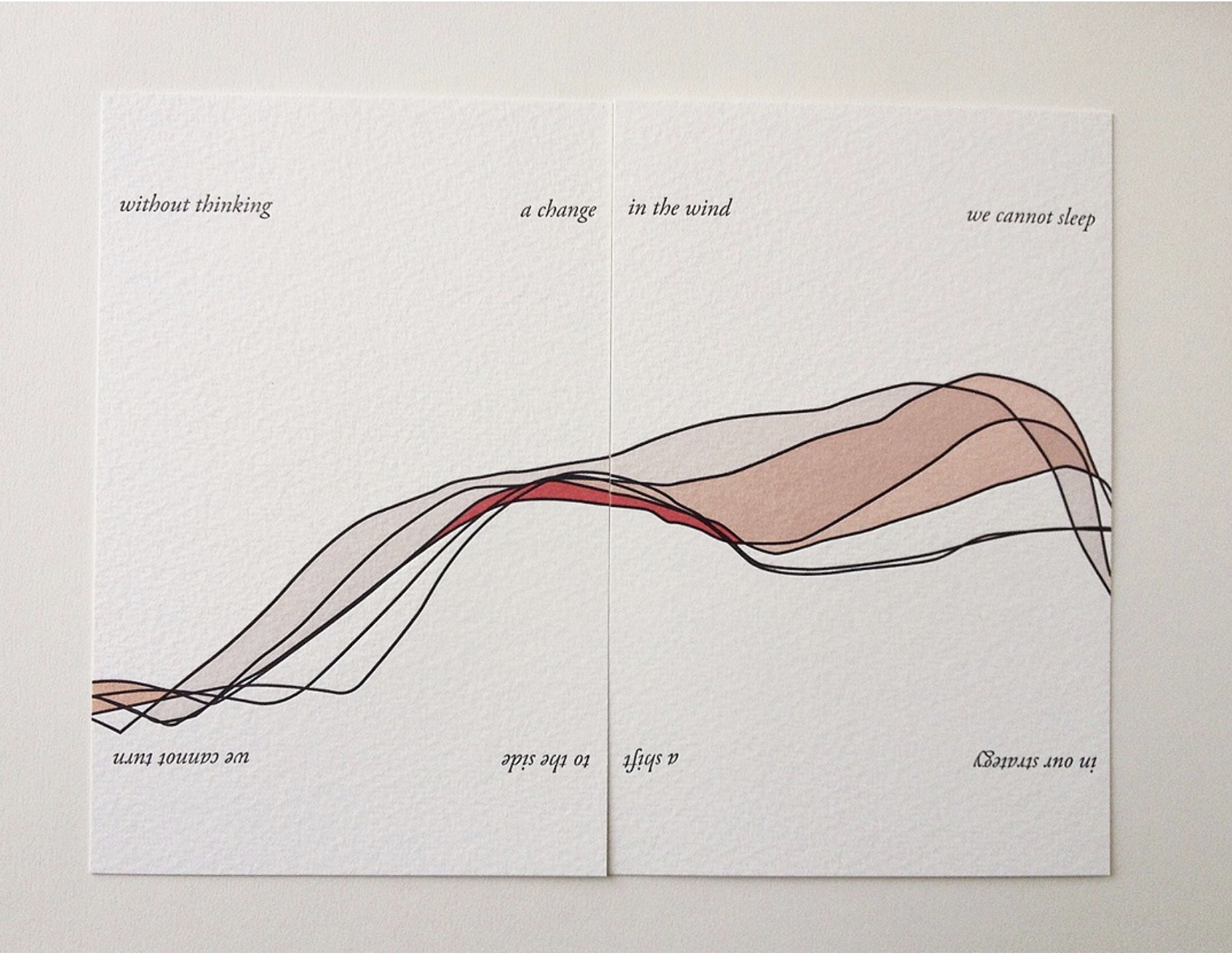
Shift in Position (2014)
Sarah Bryant
In Shift in Position (2014), Bryant draws on her own sleep patterns and movements. Extraordinary how, in Shift in Position, she manipulates the elements of the book to embody the “message” of the work. Note how she plays with layout, in particular, by running text syntactically over the loose folios (“a change/ in the wind” and ensuring the alignment of the graphical image. The work invites the reader/viewer to turn the two folios 180º — like a restless sleeper — to read/see the additional run-on text (“a shift/ to the side”) and the aligned image from another perspective. This use of the material and form draw the reader/viewer into a kind of creative act — negotiating the act of close reading with that of close looking.
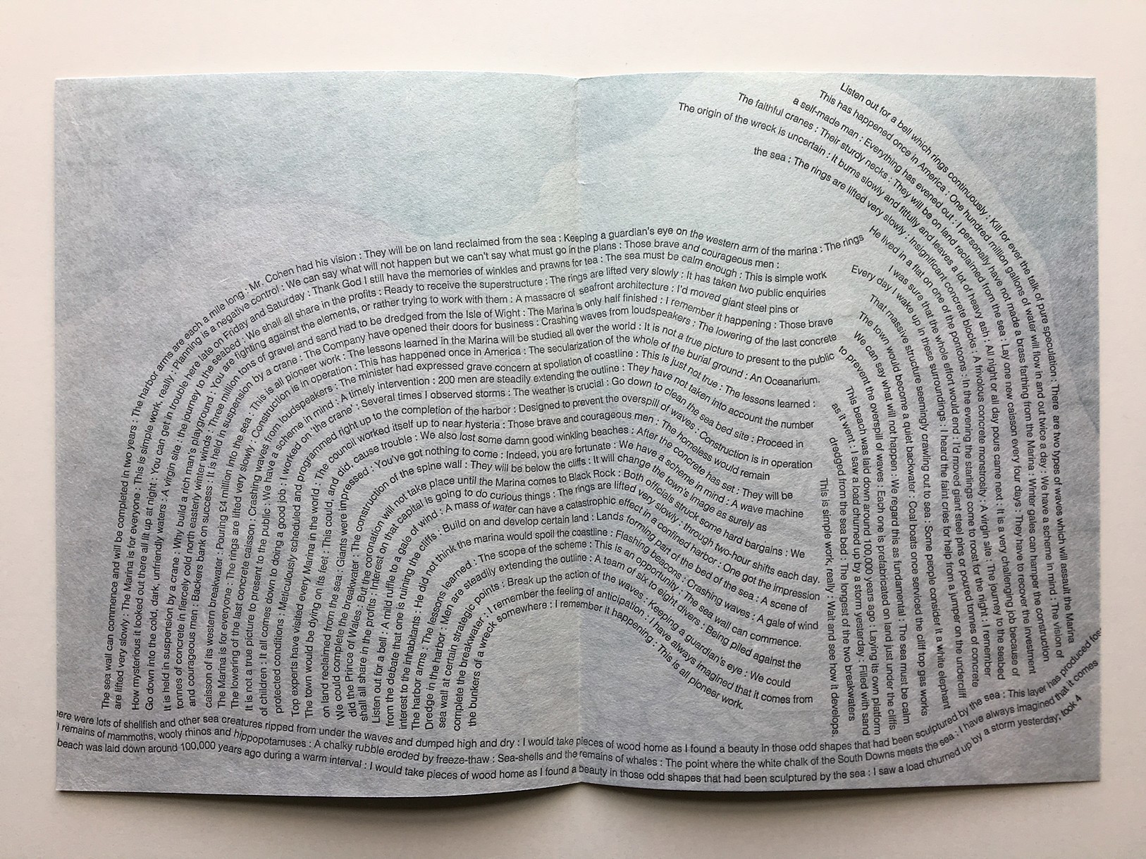
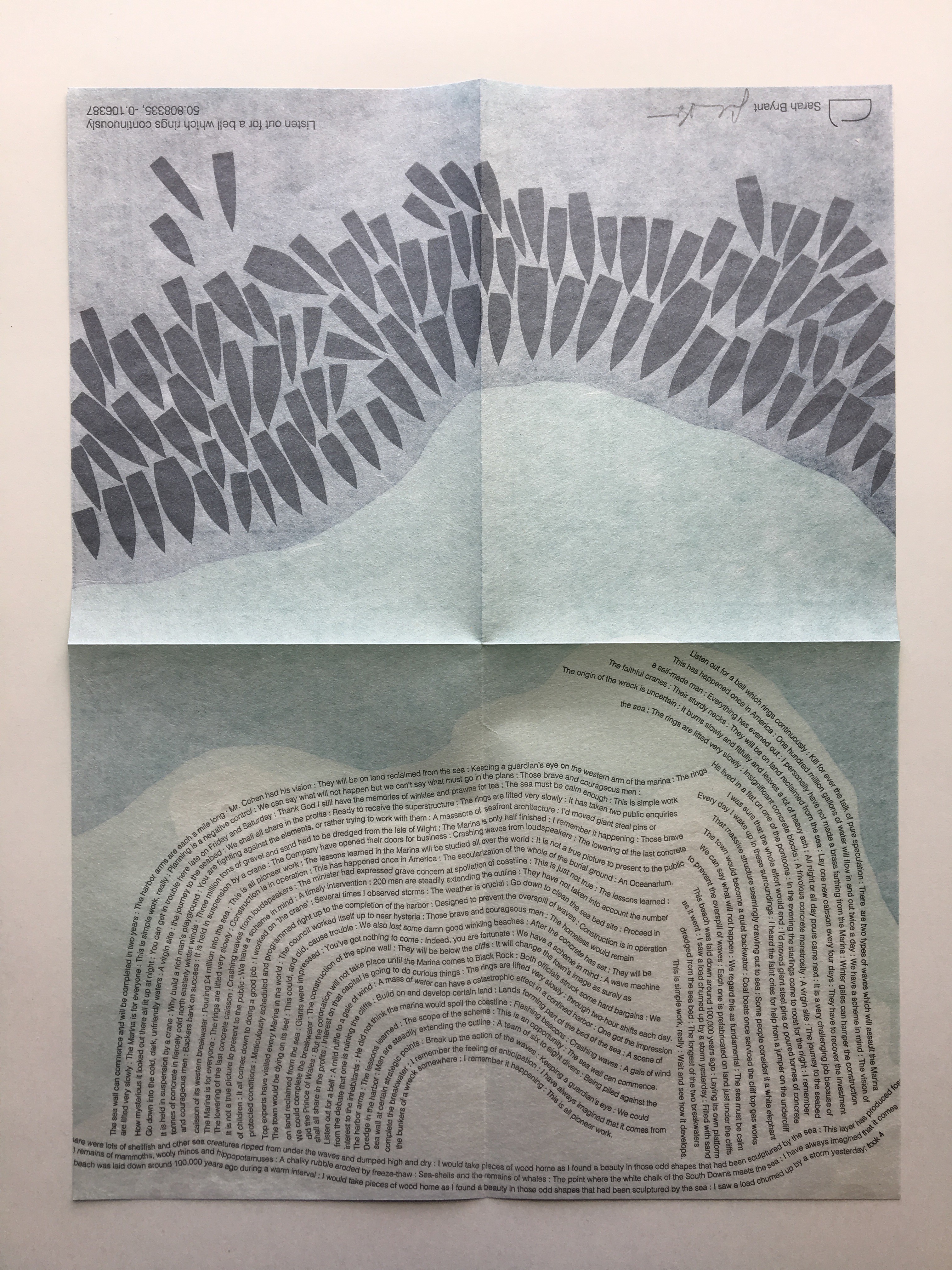
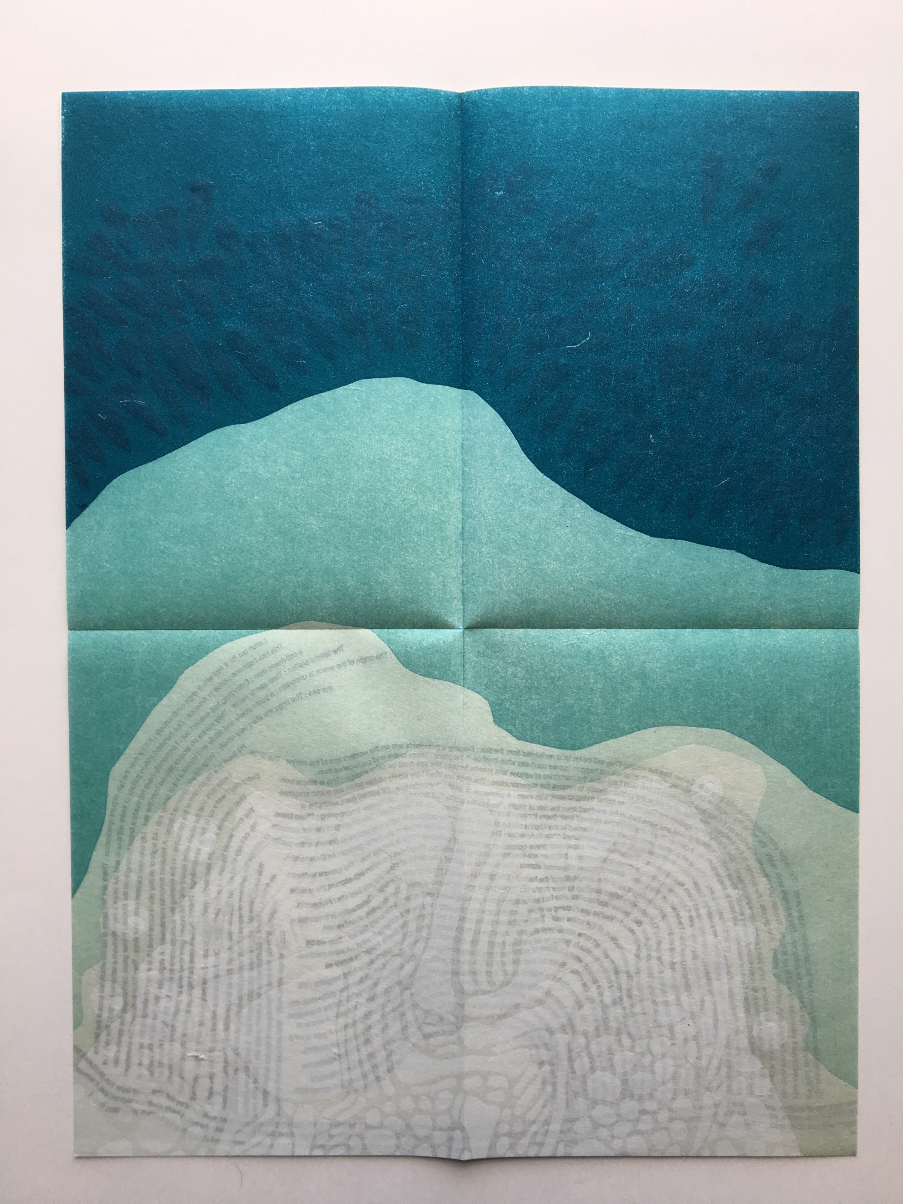
Listen Out for a Bell which Rings Continuously (2015)
Another collective work from Shift_Lab is Trace (2015). Bryant’s contribution is Listen Out for a Bell which Rings Continuously, which draws on sound and coastal mapping. It is based on her residence at the Brighton Marina, “a strange space between land and sea” where she immersed herself “in the quiet rhythm of the place”. In the first image above from Listen Out, it is obvious how the typography mimics the tide’s ebb and flow, perhaps less obvious how the overlapping texts’ rhythm and syntax surge, overlap, peter out. Look even more closely at the two lower images, two sides of the same sheet: note how the colours on the two sides of the sheet register against one another to create the kind of topographical mapping found in marine maps. Beyond that effect, the two pages challenge one’s sense of place in the world. On the left hand side, one is looking down on the boats crowding in on the marina; on the right, one is below the water and looking up at the hulls. To achieve a further infusion of place with the work, the work is even printed using chalk from the surrounding cliffs.
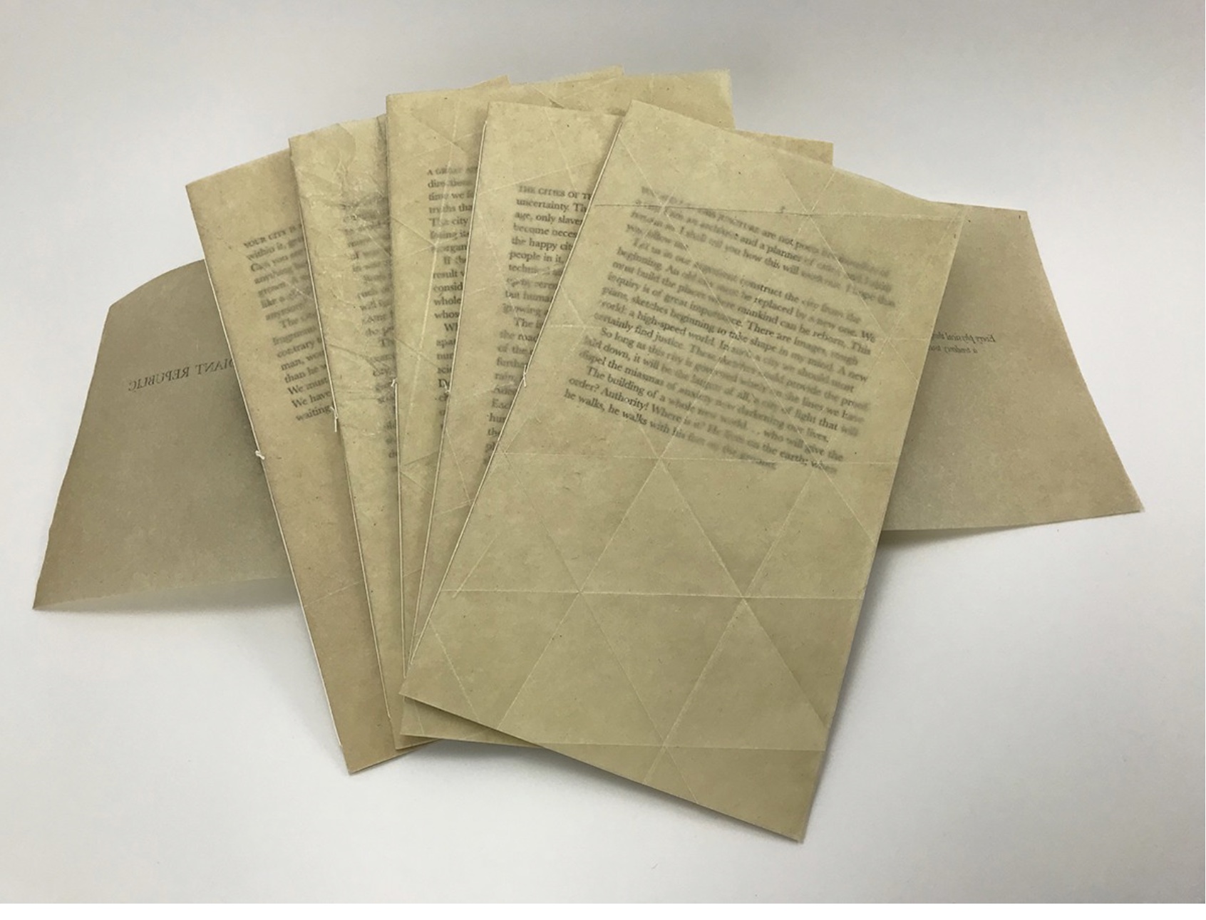
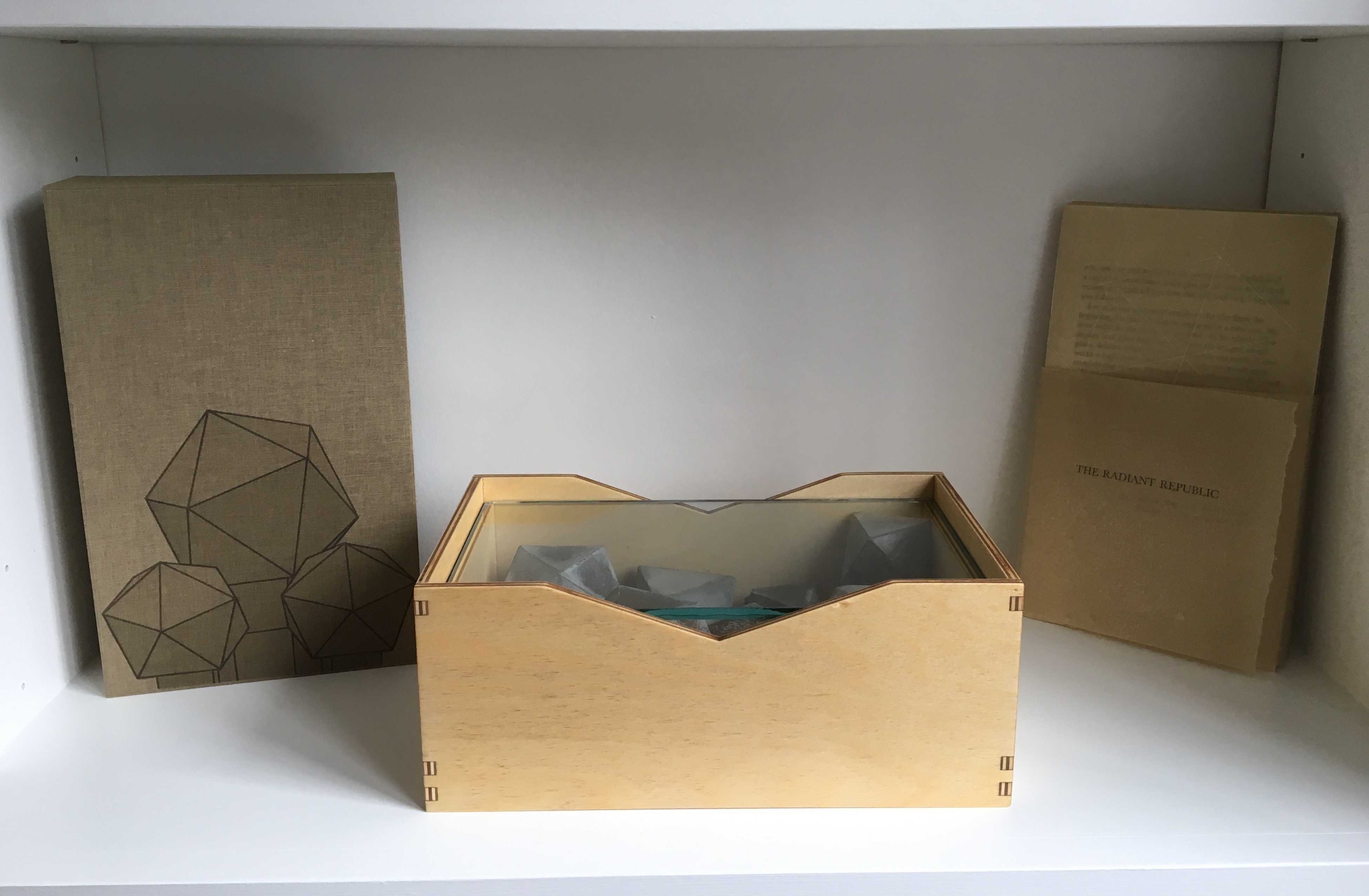
The Radiant Republic (2019) is one of Bryant’s more recent solo works. In her own words:
The Radiant Republic [is] built entirely out of language found in Plato’s Republic and Le Corbusier’s The Radiant City. In these texts, separated by more than two thousand years, Plato and Le Corbusier each describe a city plan designed to provide a framework for morality and ethics. These works are revered, but they are also deeply troubling. In The Radiant Republic, language from Plato and Le Corbusier has been combined to create a narrative in five parts. Big Jump Press/Portfolio/Artist Books/The Radiant Republic
When Bryant writes “combined”, she means it as the work’s title performs it. Paragraphs in each of the five volumes merge sentences from Plato with those of Le Corbusier. In its combination of the titles of Le Corbusier’s and Plato’s works, respectively, The Radiant Republic signals its textual ambition: to merge the two different texts. The disconcerting oracular tone and coherence of the narrative underscore the revered yet troubling nature of the two works, which is reflected in the epigraph to The Radiant Republic:
Every physical thing carries within its deepest layers a tendency towards its own destruction.
— Moshen Mostafavi and David Leatherbarrow, On Weathering: The Life of Buildings in Time (MIT Press, 1993)
But we are getting ahead of ourselves.
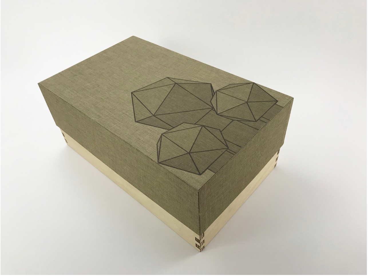
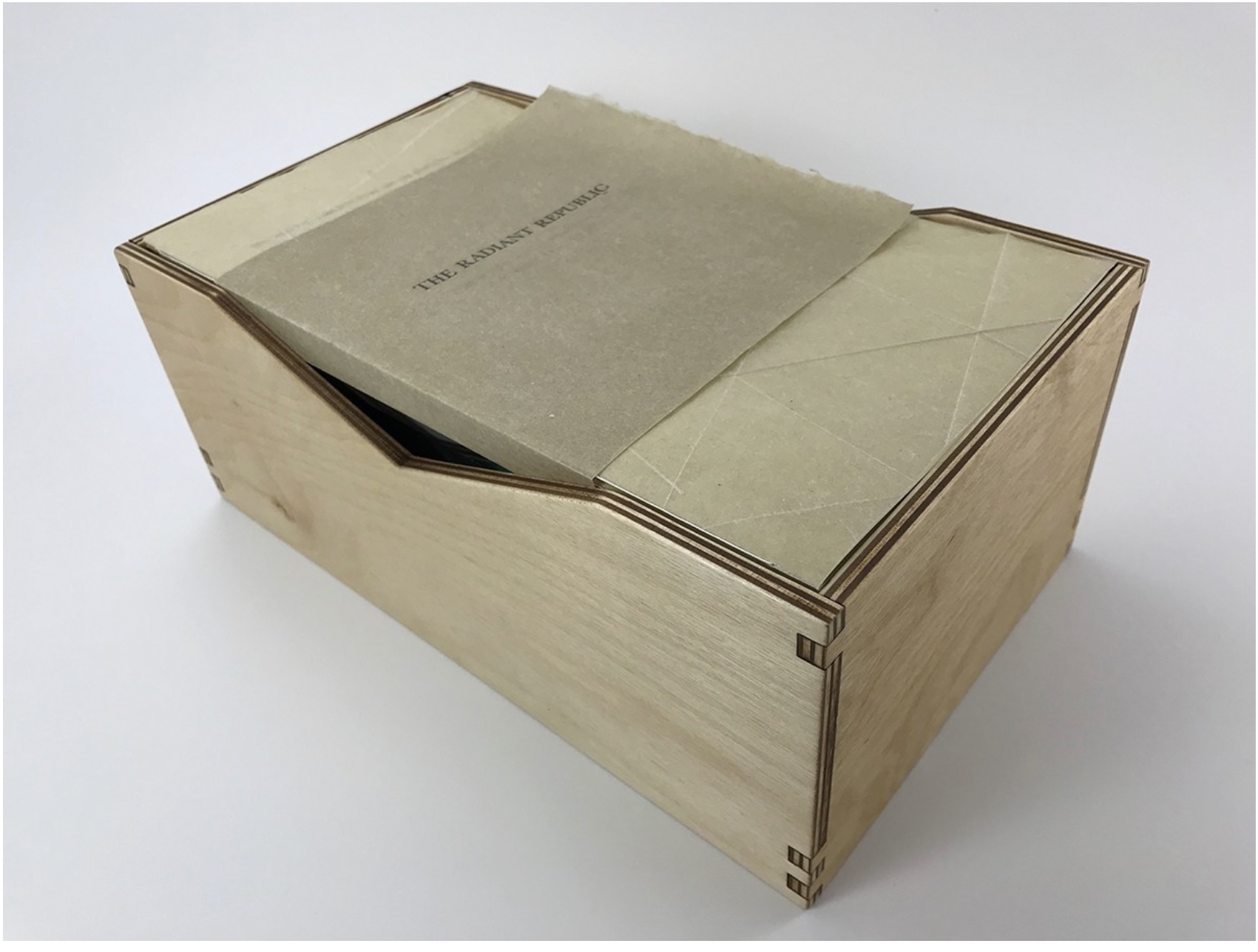
In The Radiant Republic, Bryant uses techniques and materials old and new to her in an aim for new heights of art and depths of thought. The box enclosure itself is the first new technical feature we encounter.
The Radiant Republic (2019)
Sarah Bryant
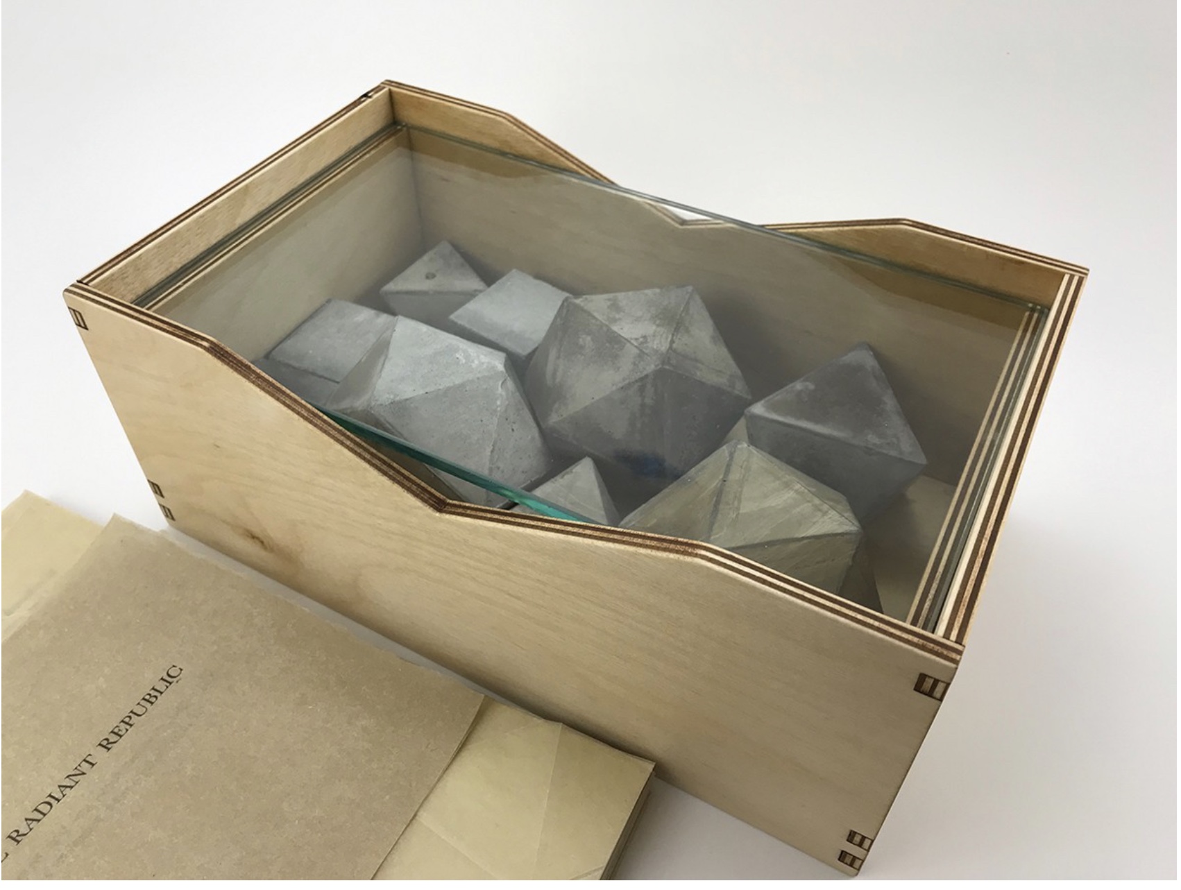
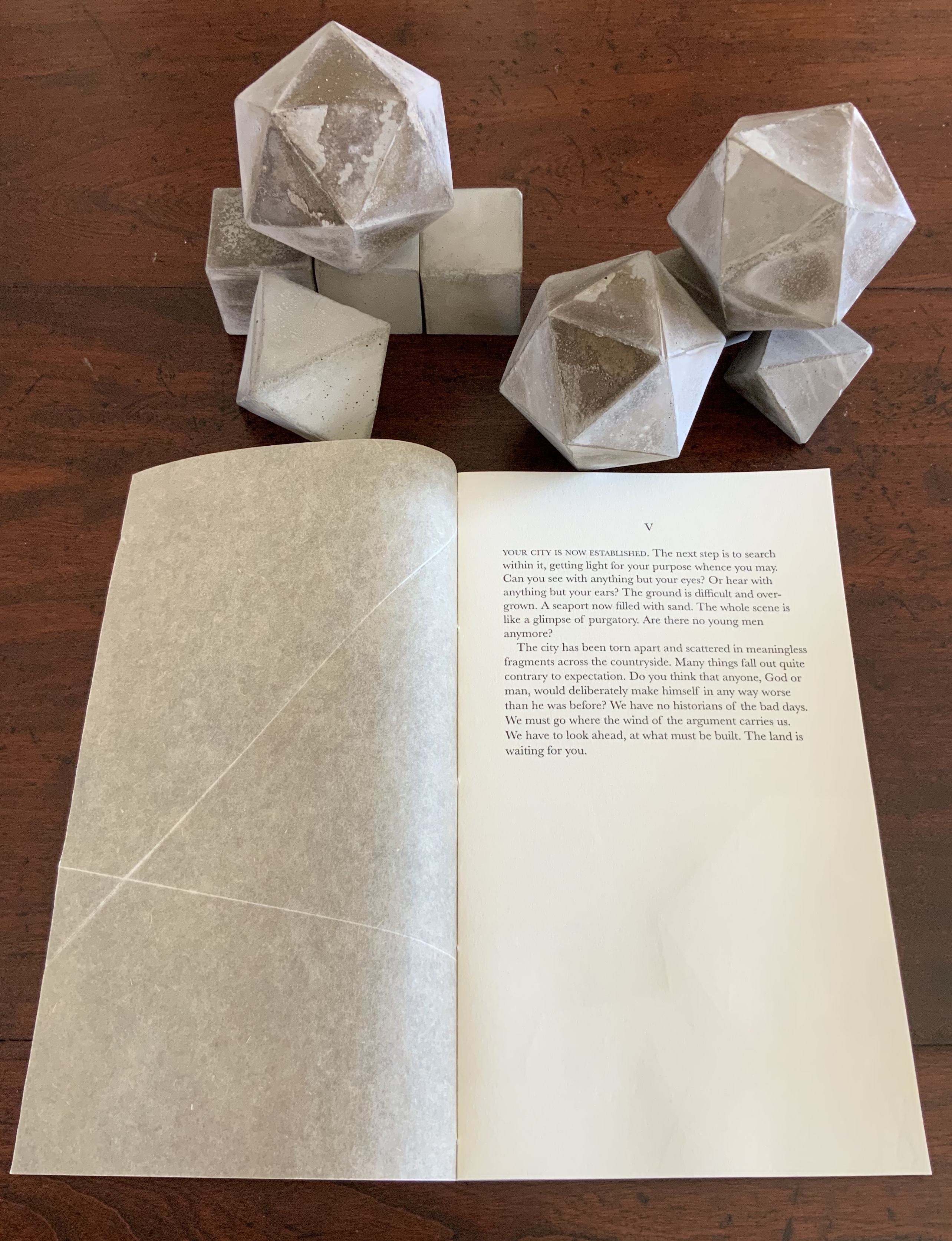
Box, glass, cement blocks, pamphlets. Edition of 50, of which this is #5. Acquired from the artist, 20 February 2019.
Photos: Courtesy of the artist; Books On Books Collection.
Although the collective works comprising Trace are housed in a box, this one is more elaborate in material and media. It is made of laser-cut Baltic Birch plywood, lightly treated with Tung oil. The lid is covered in Dubletta book cloth, which has been printed letterpress with polymer plates and linoleum. Lifting off the cover reveals yet further new materials and techniques. Five pamphlets each consisting of Rives Heavyweight paper sewn to a lightweight cover made of handmade Belgian Flax, produced at the Morgan Conservatory in Cleveland, and held together with a wrapper rest on a sheet of glass.
In several ways, the book component shows the encounter of previous techniques/media with the new. The precise fold work and registration to be found in Biography and Listen Out reappear, as does the meaningful integration of separate parts in Figure Study. Here, it is the geometric fold patterns in the covers echoing the geometric solids. Flax paper is a new element in Bryant’s repertoire.
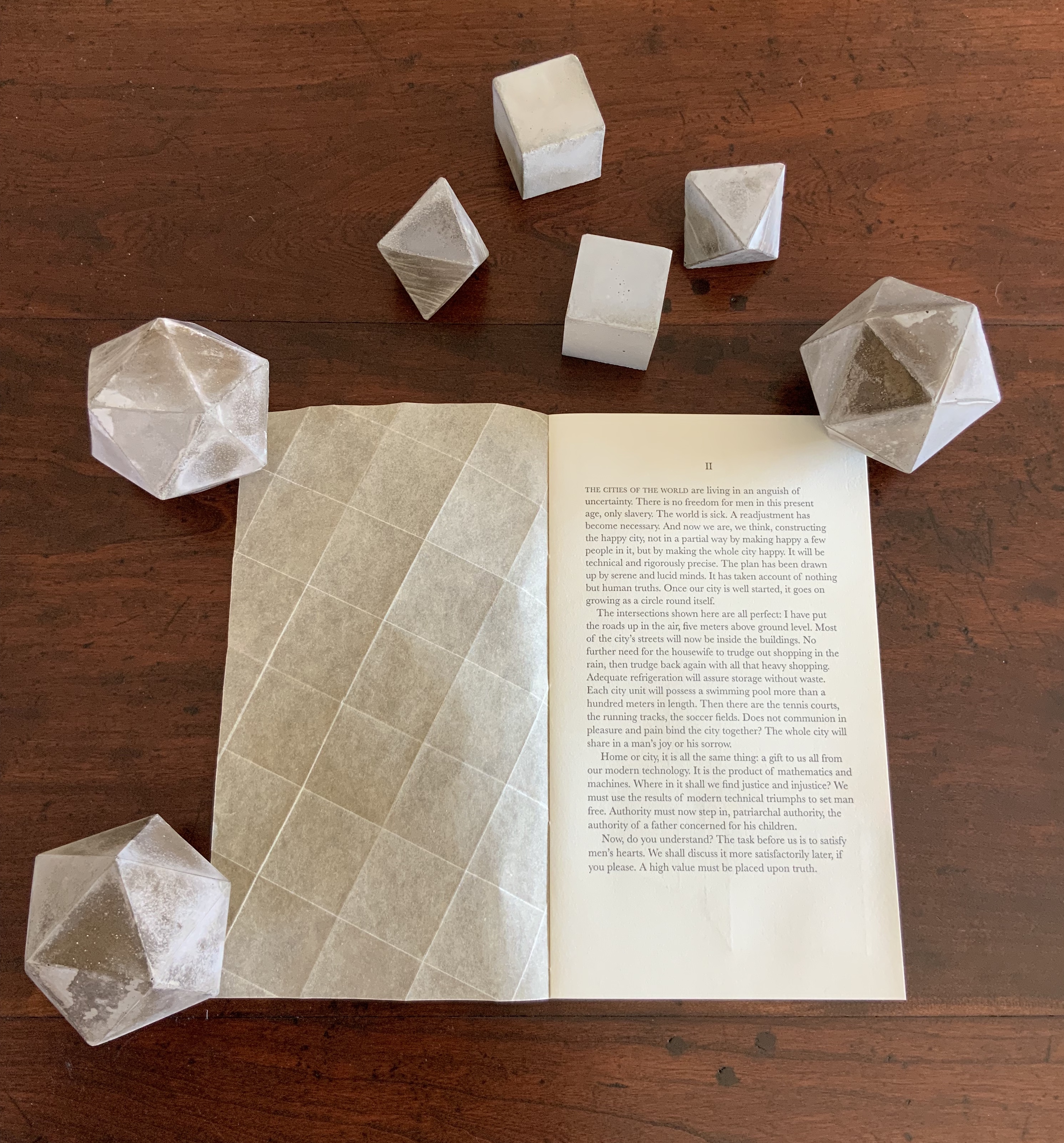
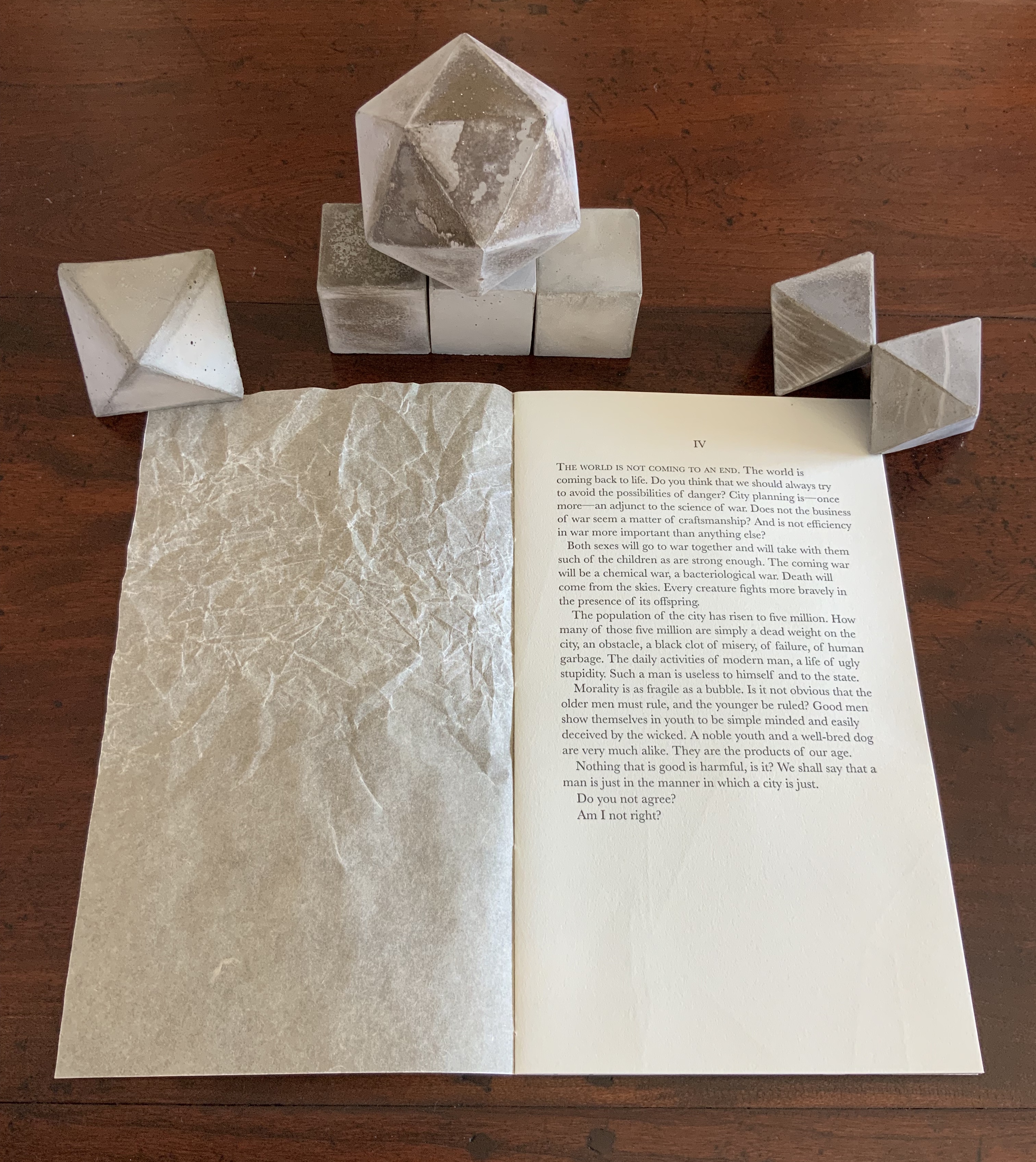
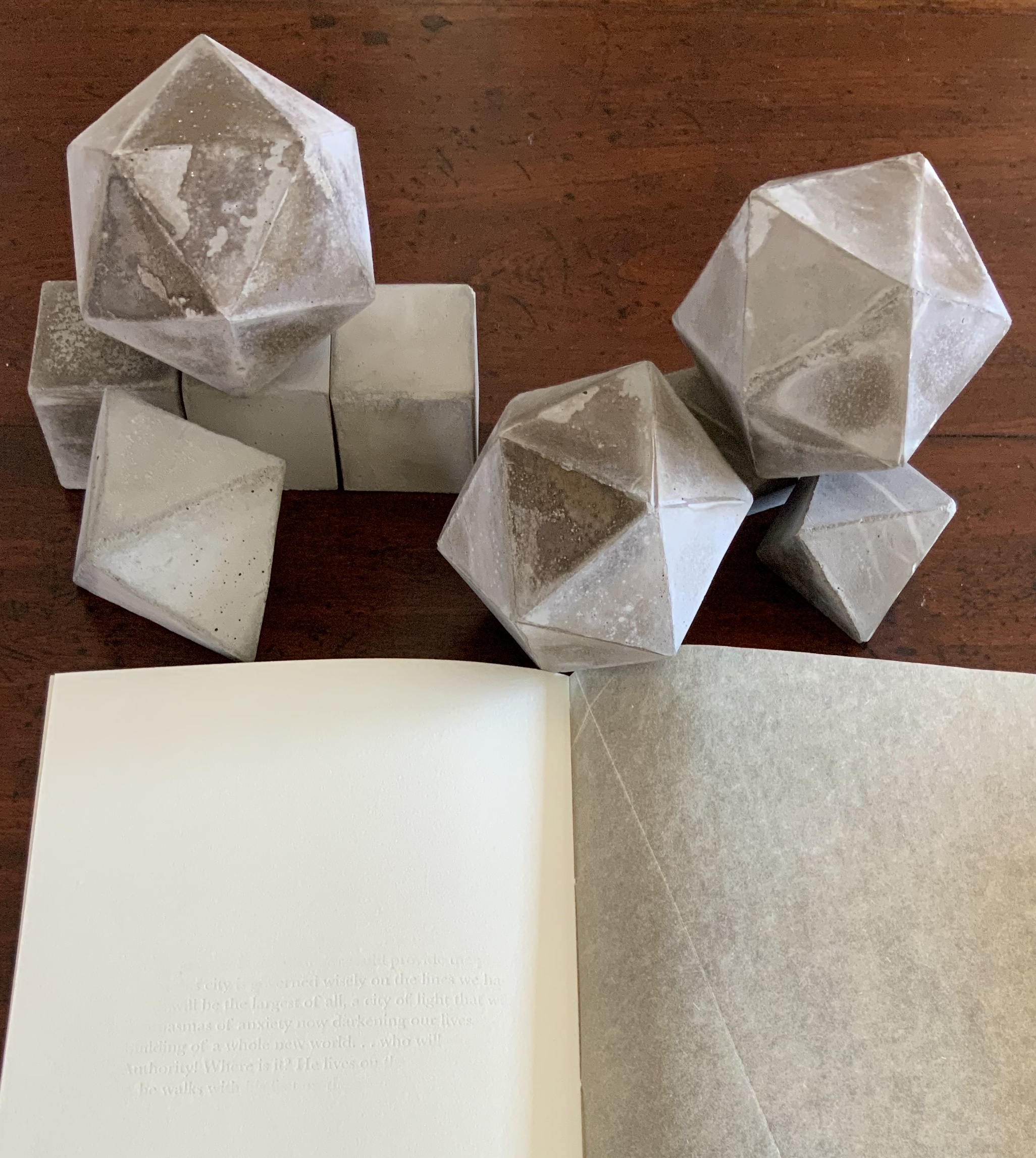
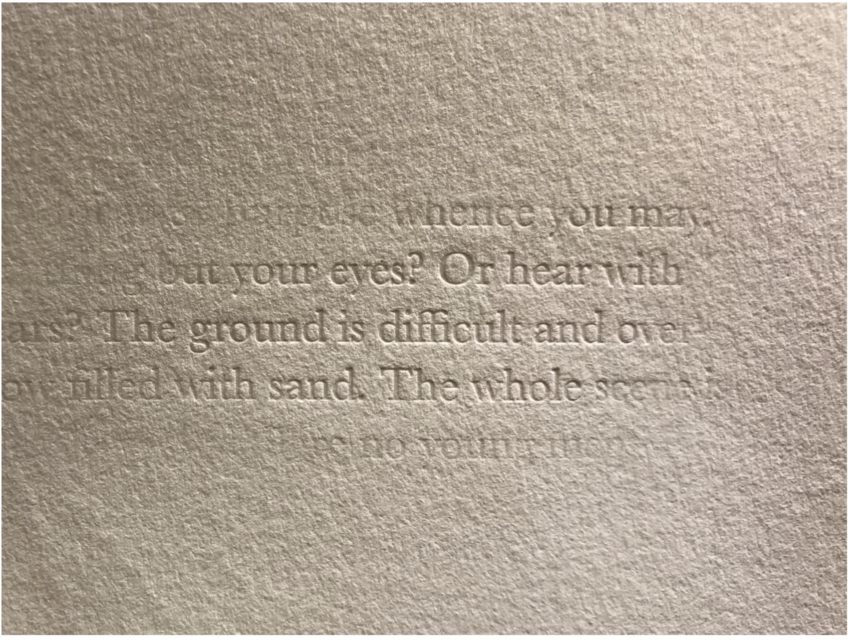
The blind embossed printing from Figure Study moves from the cover there to the interior of the book component here and with substantive, non-decorative intent. Across the five volumes, the embossed text is the same as that printed in ink and always appears on the last folio. But here is the catch: the text that appears comes from the succeeding volume’s inked text, and it appears in fragments. When the last page of the fifth volume appears, the embossed text on its folio’s last page is a fragment of the inked text in the first volume. The fragmentation of the embossed printed version and its variation in depth mime the weathering of structures and ideas.
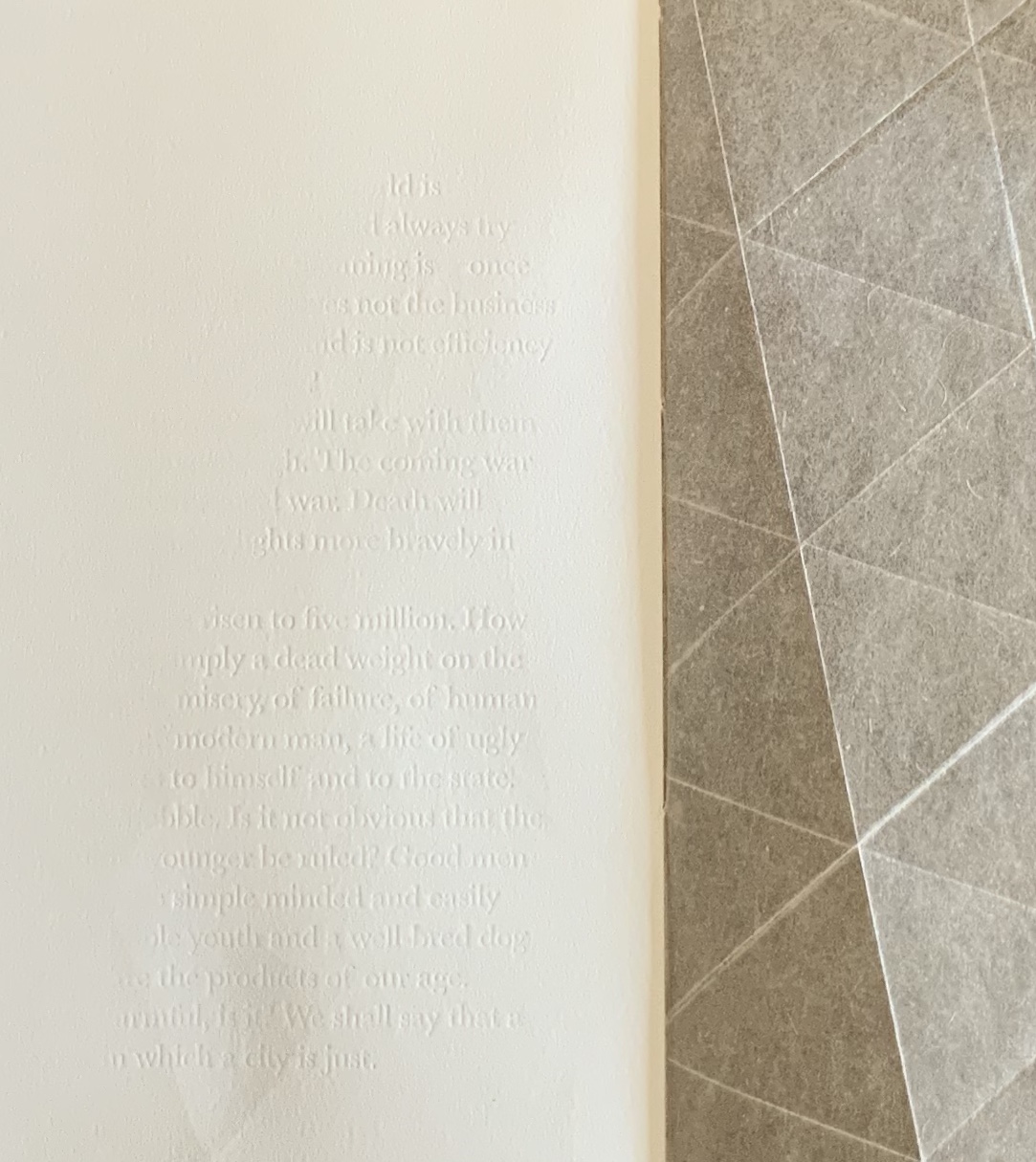
The circular movement and fusion of the past and present are also reflected in the double-page prints centered in each volume. Note how the technique of prints interlocking across folios in Shift in Position replays here in the prints interlocking across the five volumes to assert a narrative thrust but in a landscape with no fixed beginning or end.
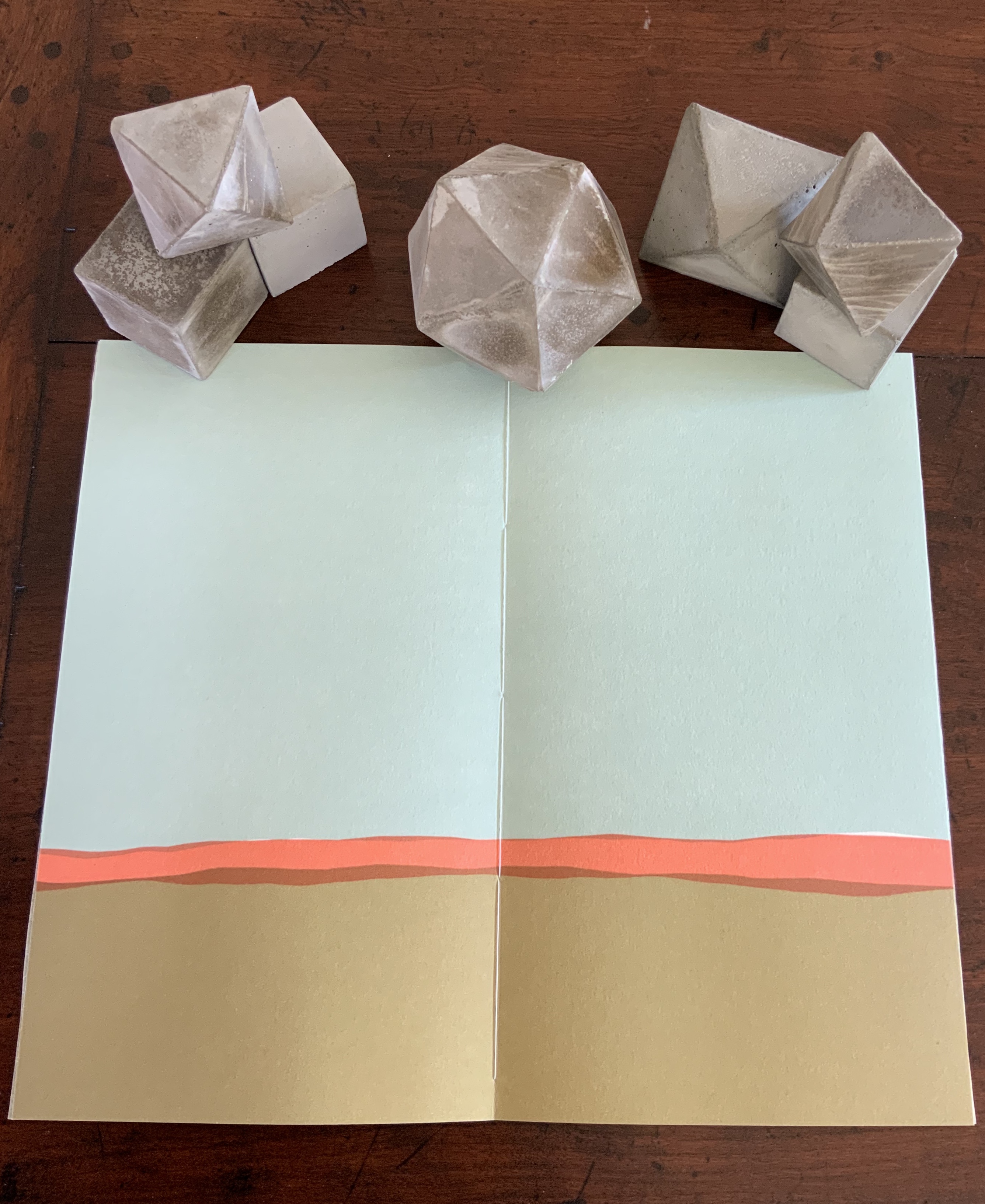
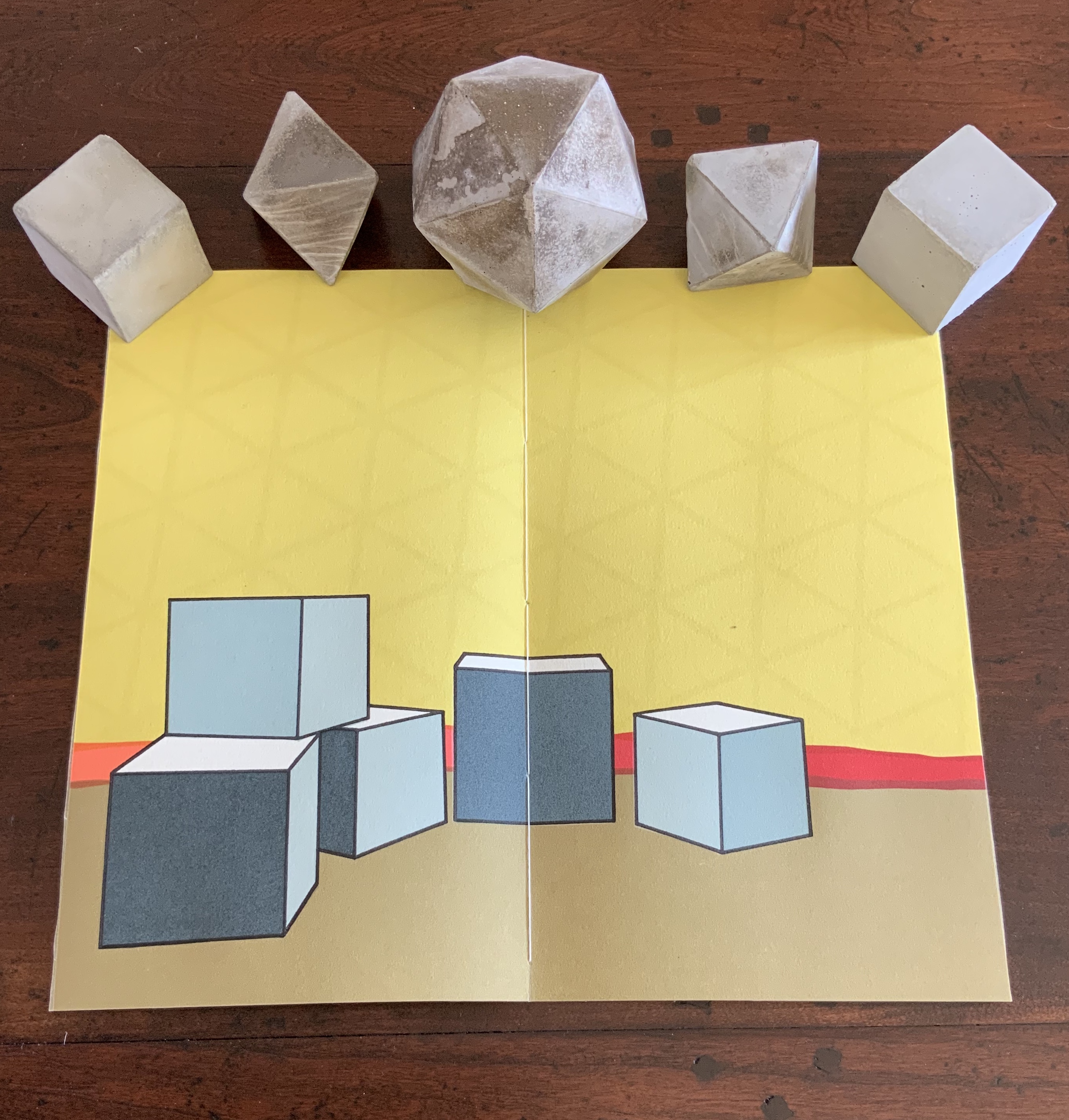
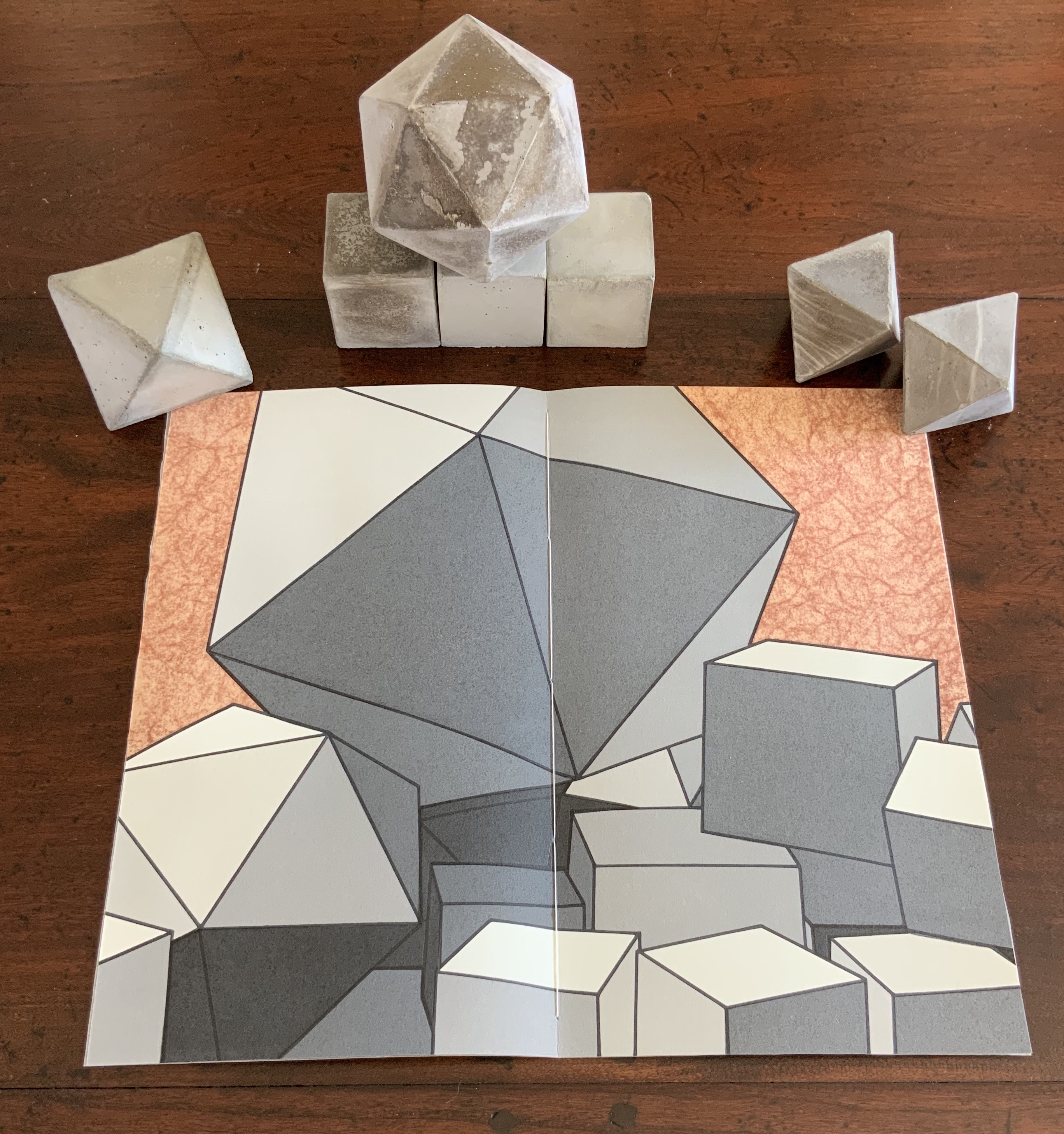

The contrast of materials — cloth, wood, flax paper, Rives paper and concrete — plays out in the concrete solids. Some edges are sharp, others blunted; some surfaces are smooth, others rough. This happens also with the covers to the five volumes according to the absence or presence (and density) of folds and, in one case, of crumpling or no crumpling. It happens in the prints, where the backgrounds include faint images mirroring the structures in the other media. This technique of contrasting materials/media and that of recapitulating the contrast within one or more of the materials/media seems to be a new development in Bryant’s art or, at least, an intensified one.
The multiple materials and techniques and their many-sided interactions pose a pleasurable dilemma for the work’s display. As soon as one is in place, another beckons.

No surprise then that the first pamphlet’s opening words are “You and I at this juncture are not poets but founders of a city”. This self-reflexive invitation to creativity is like that invitation to negotiate reading with looking — an invitation to participate and to recognise our participation as part of the creative act. An increasingly characteristic aspect of book art.
Sarah Bryant runs Big Jump Press, works with the collective Shift_Lab and teaches at the University of Alabama Book Arts Program.
Further Reading
Chen, Julie. 2013. 500 Handmade Books. Volume 2. New York: Lark. P. 146 (Biography).
