Knot theory seems to be having a moment this year. In February 2025, there was the First International On-line Knot Theory Congress. Not to forget the regularly recurring Swiss Knots Conference (held in Geneva in June) and the 11th Sino-Russian Conference on Knot Theory (held in Suzhou, China in June-July). Or the “Danceability of Twisted Virtual Knots” produced by Nancy Scherich and danced by Sol Addison and Lila Snodgrass at the Math-Arts Conference in Eindhoven in July. And then in September the Scientific American and online media picked up two discoveries in knot theory — one by Mark Brittenham and Susan Hermiller and another by Dror Bar-Natan and Roland van der Veen.
Sarah Bryant
Celebrating the 250th Anniversary of Steingruber’s “Architectural Alphabet”
What is it about artists’ books and architecture that they intersect so often? Architectural interiors and exteriors, ideas, themes, styles, landmark dwellings and edifices have found their metaphorical expression and embodiment in book art with such regularity that they make up a genre within the genre. Perhaps it is that, as Victor Hugo expresses it in Nôtre Dame de Paris (1831/1902),
… the human race has two books, two registers, two testaments: masonry and printing; the Bible of stone and the Bible of paper. … The past must be reread upon these pages of marble. This book, written by architecture, must be admired and perused incessantly; but the grandeur of the edifice which printing erects in its turn must not be denied. (Book V, Chapter 2, p. 187)
Or perhaps it is even more fundamental. As Hugo asserts in his posthumous The Alps and the Pyrenees (1890/1895):
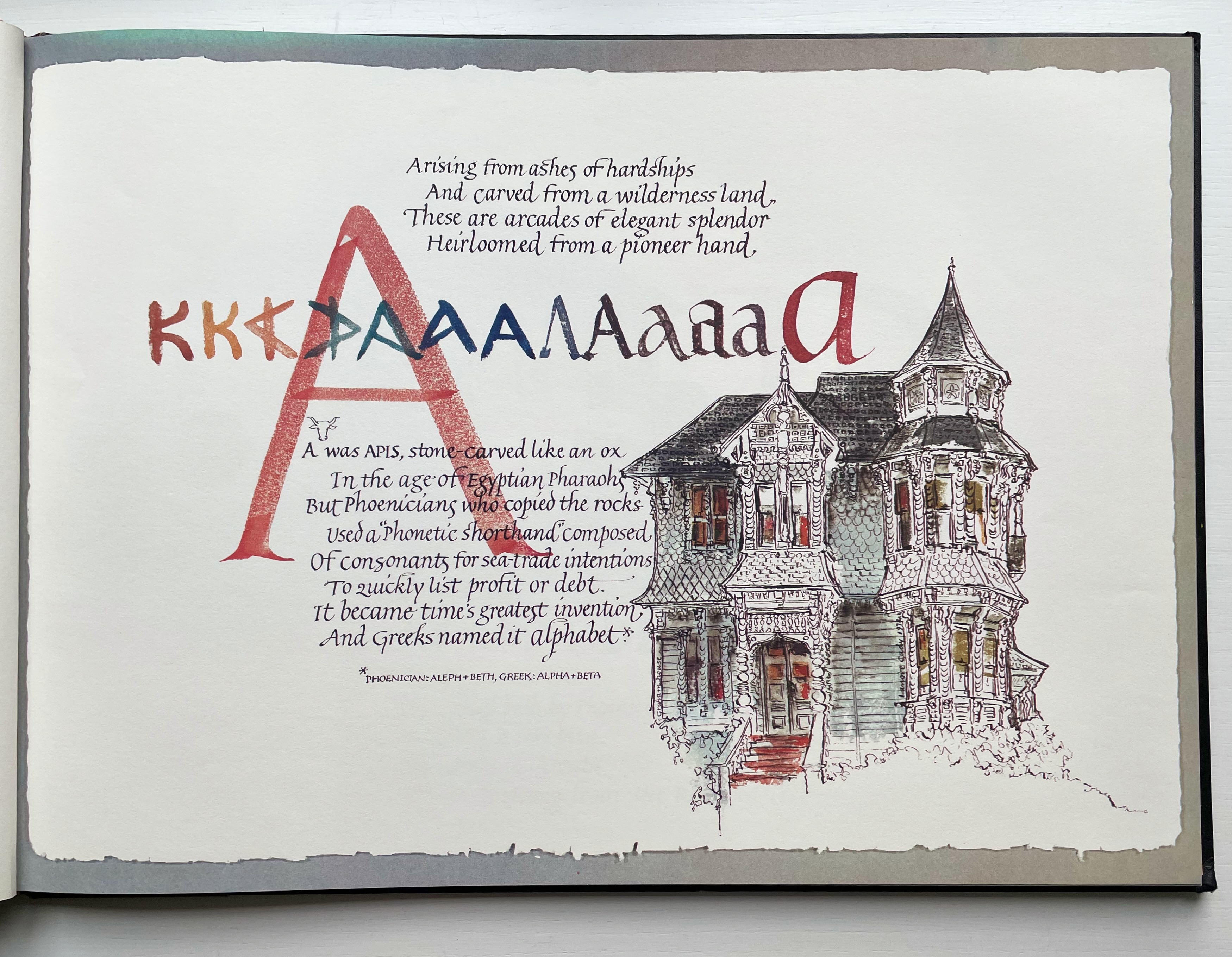
All letters were signs at first, and all signs were images at first…. Human society, the world, man as a whole, is in the alphabet…. A is the roof, the gable with its cross-beam, the arch, arx; … Z is the lightning, it is God. (pp. 64-65)
Beneath the mysticism and pareidolia, Hugo is on to something. Maybe the affinity of books and architecture lies in the origin of the raw material of books — the alphabet — whose second letter comes from a mark signifying shelter or house.
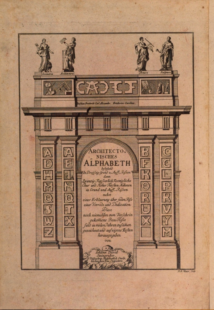
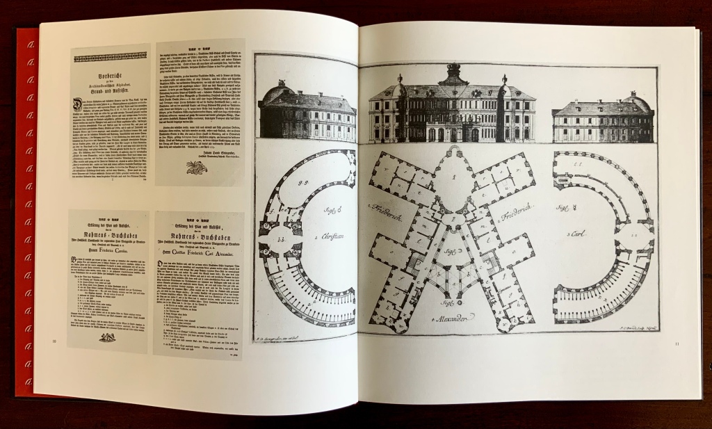
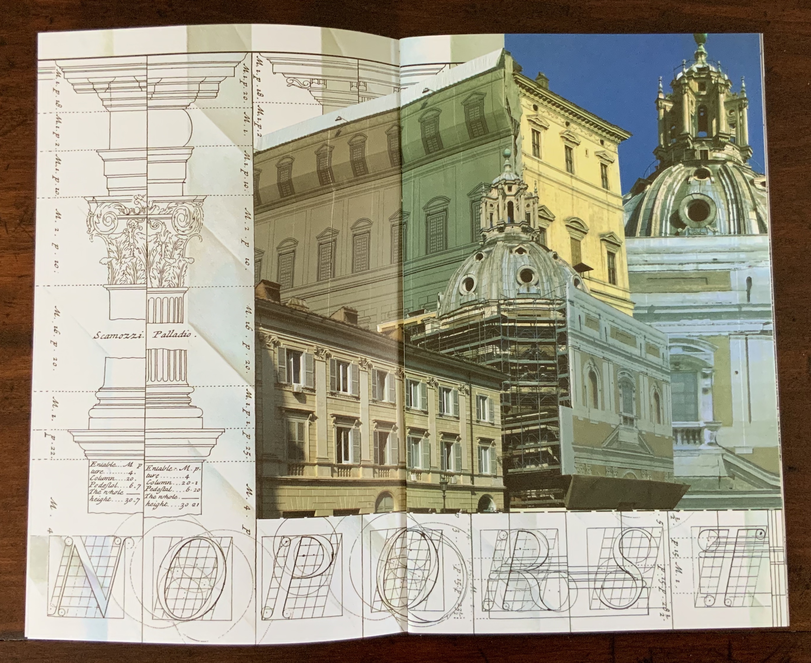
This wondering and wandering about the intersection of architecture and the artist’s book is prompted by the 250th anniversary of the publication of Johann David Steingruber’s Architectonisches Alphabeth(1773). This postcard-famous volume of print folios depicts architectural elevations and plans for residences in the shape of the letters of the alphabet. It is dedicated to Christian Friedrich Carl Alexander, Margrave of Brandenburg-Ansbach, not to be confused with the paying dedicatee of Bach’s Brandenburg Concertos, the Margrave of Brandenburg-Schwedt. By a baroque coincidence, however, the first Brandenburg concertos, the ones composed by Giuseppe Torelli and influencing Bach, are dedicated to the Margrave of Brandenburg-Ansbach, then George Friedrich II, Alexander’s great-uncle who employed Torelli as court composer. Unlike Bach, however, Torelli received no direct payment for his composition. Steingruber too had to be satisfied with his payment as an appointee (court and public surveyor, and later principal architect of the board of works).
Steingruber may have felt he had good reason to be miffed. After all he had published the volume in installments at his own expense and made sure that the Margrave’s monogram (and that of Carolina Frederica, his wife) in building form appeared in the span above the roman arch on the title page. His elevations and plans draw attention to the heating, kitchen, toilet and servants’ arrangements as if conferring with a prospective client ready to commission one of these typographic palaces. Perhaps he was thinking, Who would not want a serif with a view? Or conduct guests on a tour of the bowl, capline, crossbar, stem, stroke and tail of the property? In a flourish that illustrates the intersection of book and architecture, the title page presents the title and subtitle inside an arch and serves double duty as a Table of Contents with thumbnail images of the letter-shaped buildings to come inscribed on the columns.
Munich, Bavarian State Library
To celebrate the Architectural Alphabet‘s 250th anniversary, this online essay/exhibition explores sixteen propositions about the affinity of architecture and artists’ books. Examples supporting each proposition include works from within and without the Books On Books Collection, and each example includes a link or links for additional views of the work. Every effort has been made to provide bibliographical (or webliographical?) links from WorldCat and the Internet Archive. The former will allow the reader to find local libraries that hold a copy of the exhibited work to be viewed in person; the latter will partly address the problem of broken links. Where broken links (or factual errors) do appear, readers are encouraged to alert the curator in the Comments section at the end of the essay/exhibition.
Proposition #1: The affinity of architecture and artists’ books lies in the alphabet.
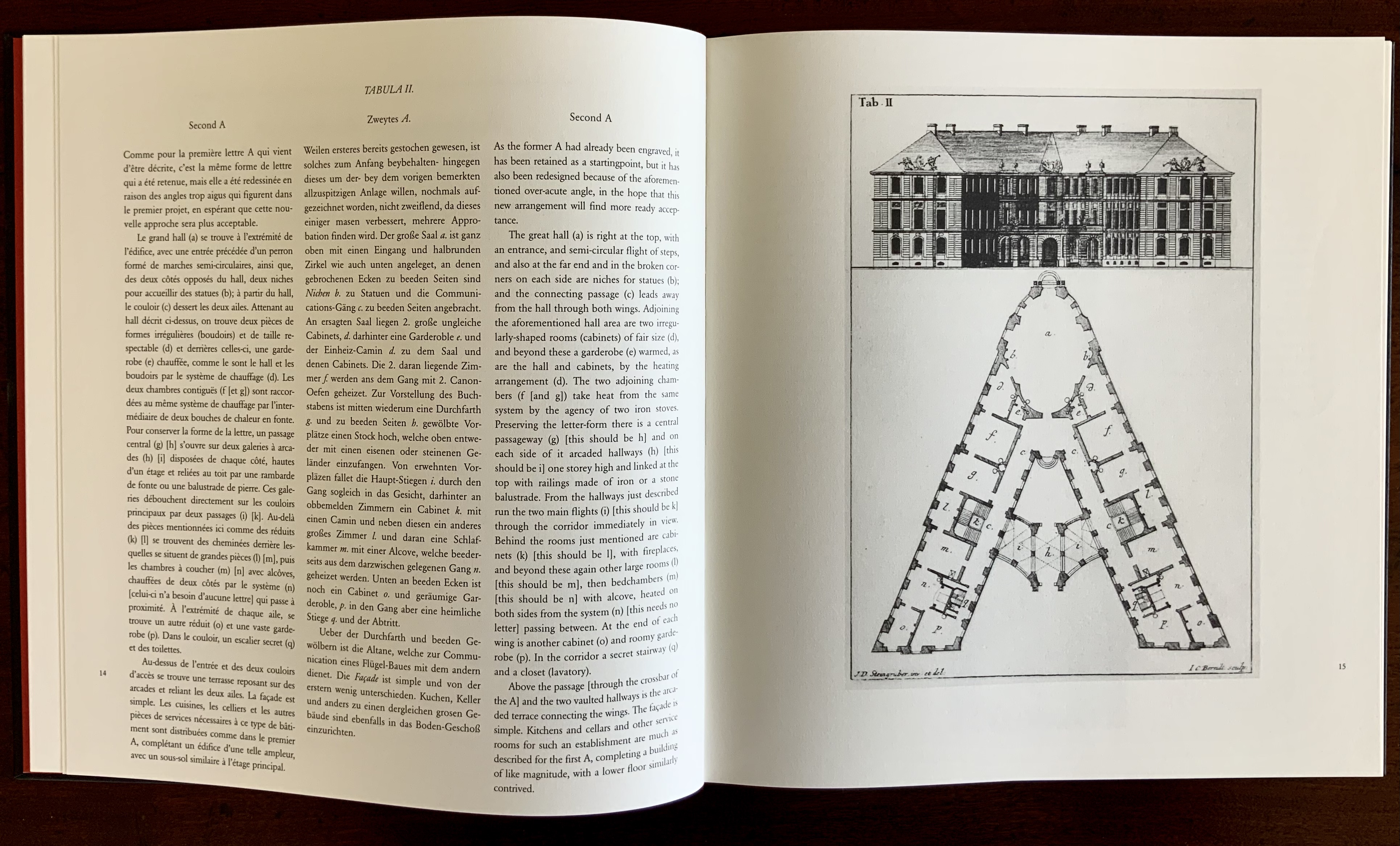
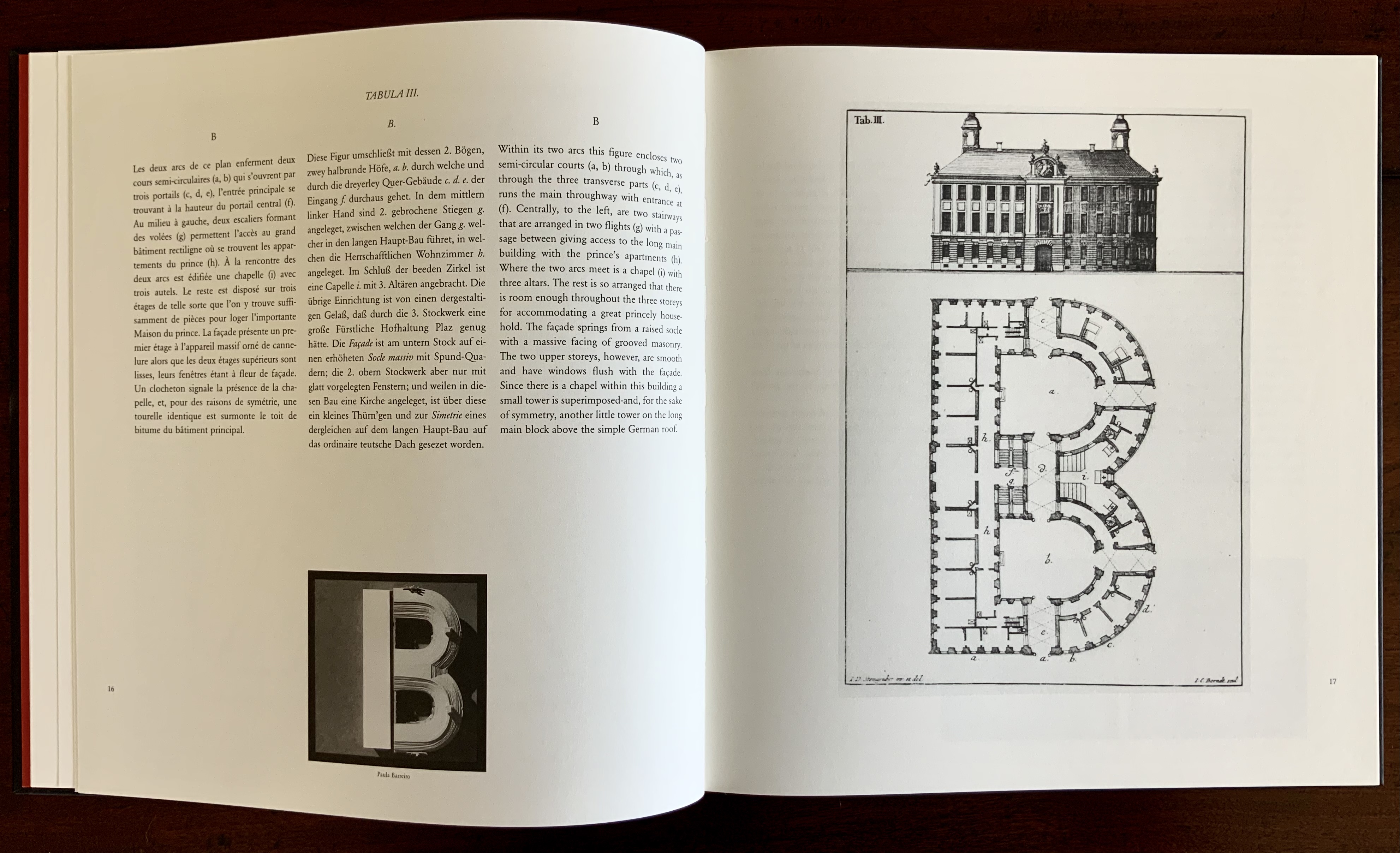
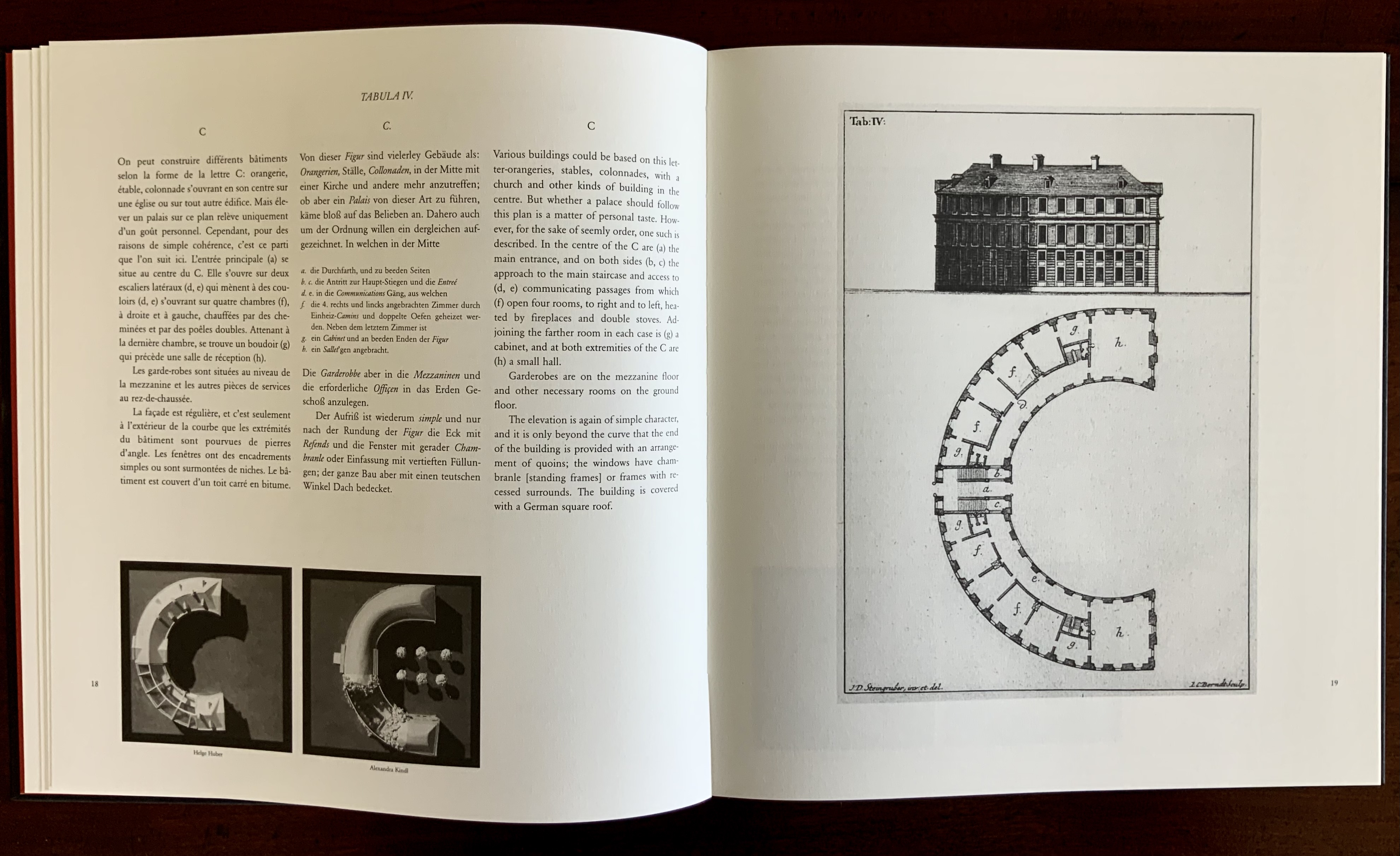
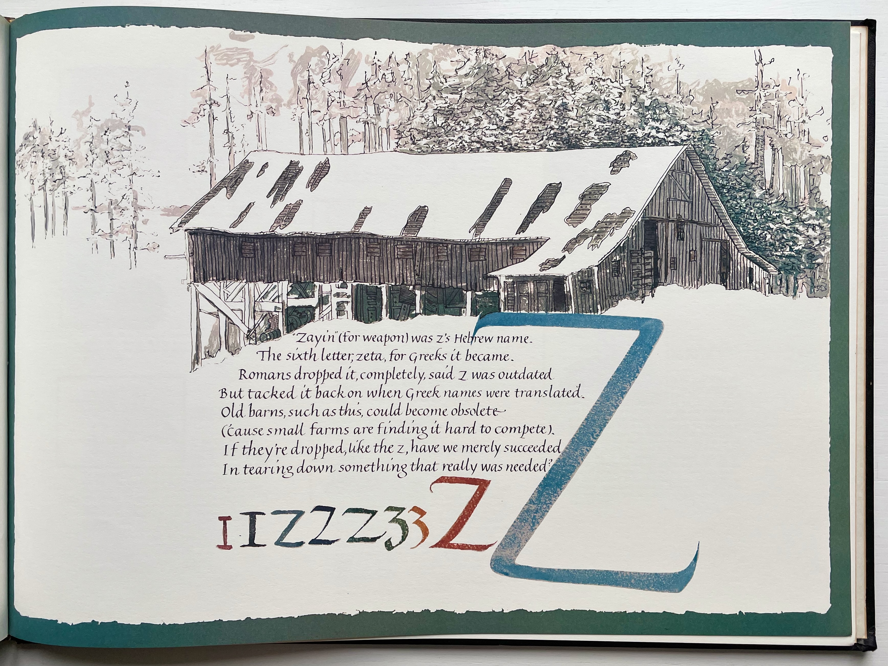
Architectural alphabet (1773/1972)
Johann David Steingruber
Published by Merrion Press.
Architectonisches Alphabeth (1773/1995)
Prepared by Joseph Kiermeier-Debre and Fritz Franz Vogel for Ravensburger Verlag.
Of course the first exhibit would be Steingruber’s Architectural Alphabet, but related works — before and after, published or built — will clamor for admission: Geofroy Tory’s Champ Fleury (1529/1927/1998), Antonio Basoli’s Alfabeto Pittorico (1839/1998), Giovanni Battista de Pian’s Alphabetto Pittoresque (1842), and Daniel Libeskind’s Contemporary Jewish Museum (2000), whose form within the walls of a former power substation is composed of two Hebrew letters — the Yud and the Chet — which make up the word Chai (“Life”).


Left to right: Tory/Rogers, Basoli, Battista de Pian (Photos by Books On Books Collection), Libeskind (The Yud Gallery, Photo by Paul Dyer).
Lanore Cady’s Houses & Letters (1977) is another work supporting the proposition, in this case with calligraphy, watercolor and verse.
Houses & Letters: A Heritage in Architecture & Calligraphy (1977)
Lanore Cady
More than the novel inventions and historical associations above, though, the space within and around a letter, a building and the artist’s book suggests the real root of the affinity. As cultural historian Fiona MacCarthy put it: “‘the Italians knew by instinct what we are slowly grasping, that the meaning of the city is not so much a matter of the buildings as the spaces in between.’” To which John Ryder added: “‘This is exactly how typography works.’” (From David Esslemont’s Inside the Book, 2002). And it is exactly how book art works.
Proposition #2: The affinity of architecture and artists’ books lies in telling stories.
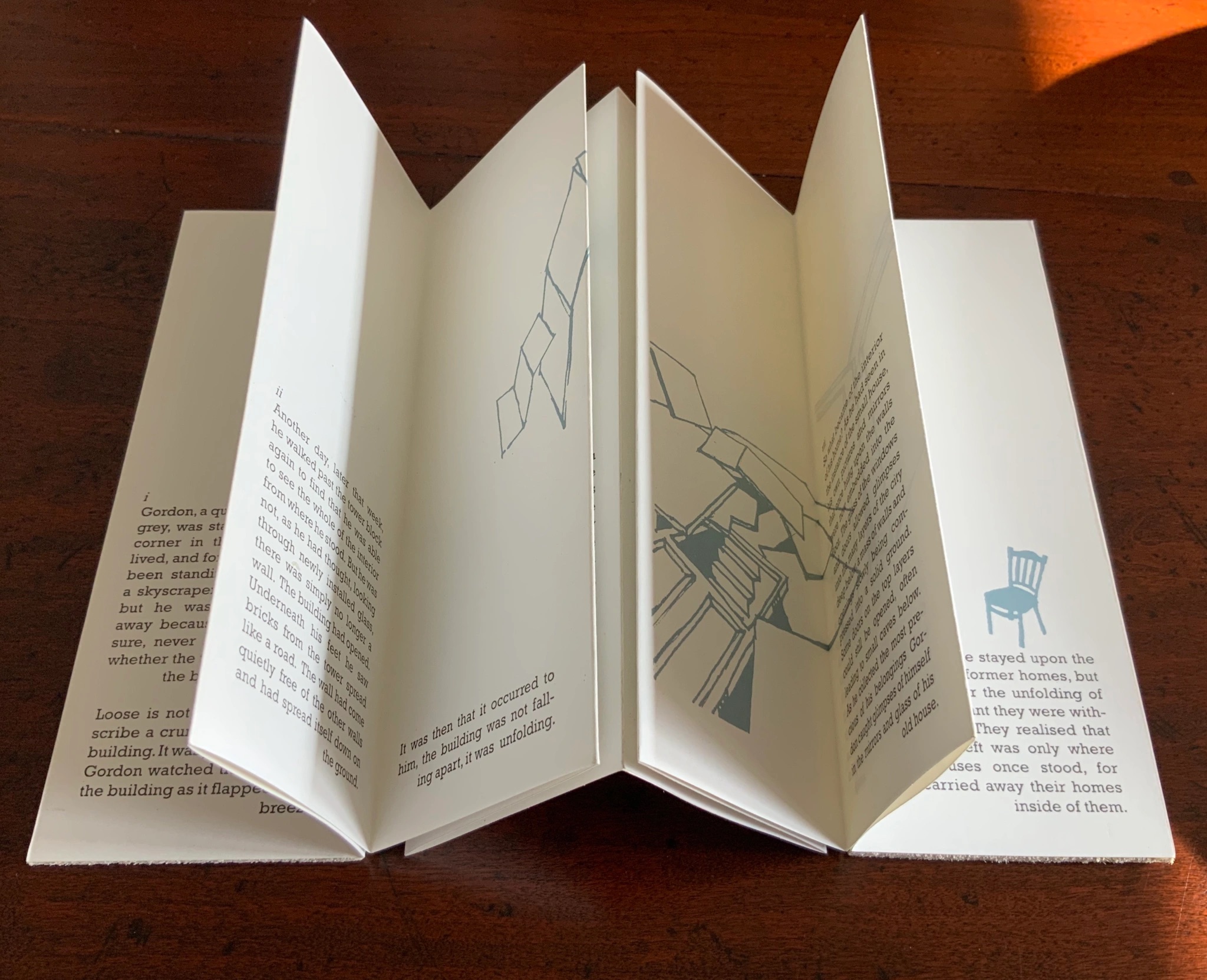
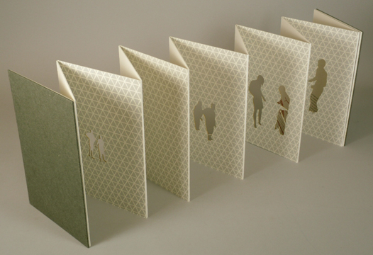
As Daniel Libeskind has said, “For me, a building is a medium to tell a story.” Emily Speed’s Unfolding Architecture (2007) tells the tale of Gordon, a city dweller who witnesses the collapse of public buildings and, ultimately, his own home as the urban fabric begins to unfold around him — a story replicated by the housing’s structure and the book’s accordion fold.

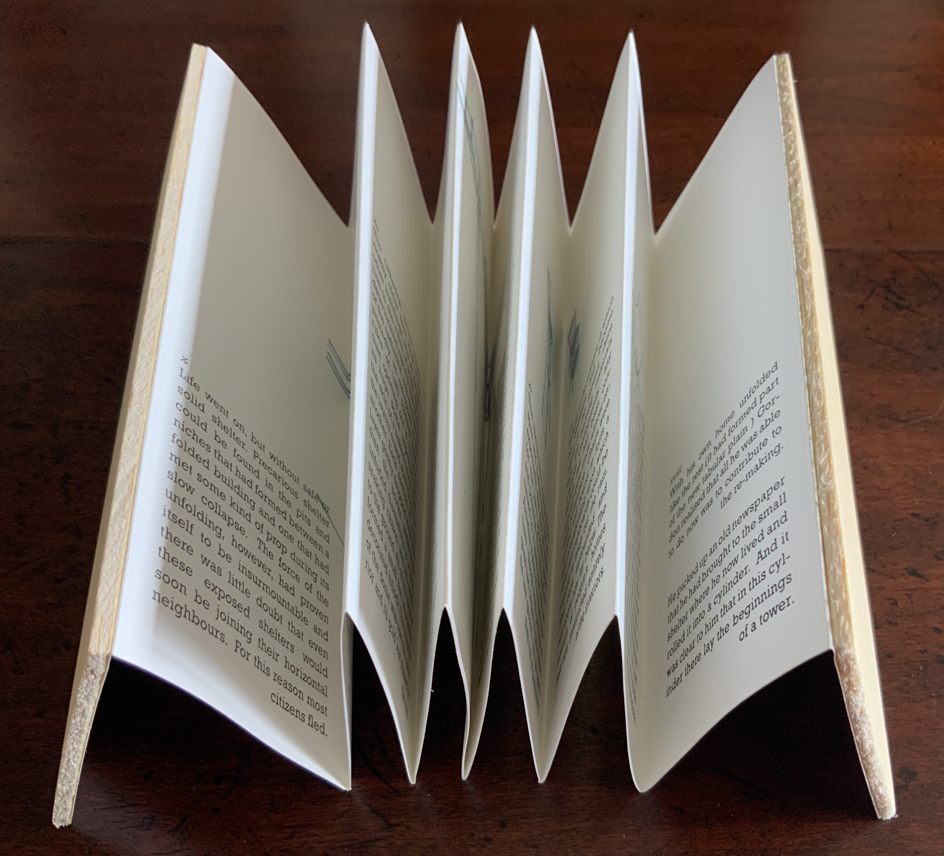
Unfolding Architecture (2007)
Emily Speed
But Ulises Carrión denied that books are about narrative. Instead they are about space and time, which leads to the next proposition.
Proposition #3: The affinity of architecture and artists’ books lies in space and time.
Olafur Eliasson’s Your House (2006) is a laser-cut model of his residence in Copenhagen at a scale of 1:85, which means that each page equates to a 220 mm section of the actual house. In the film Russian Ark (2003), Aleksandr Sokurov made cinematic history with his one continuous shot in 90 minutes, depicting a 17th century time traveller moving through different periods of history as he moves through the rooms of St. Petersburg’s Winter Palace. The film inspired Johan Hybschmann’s Book of Space (2009).
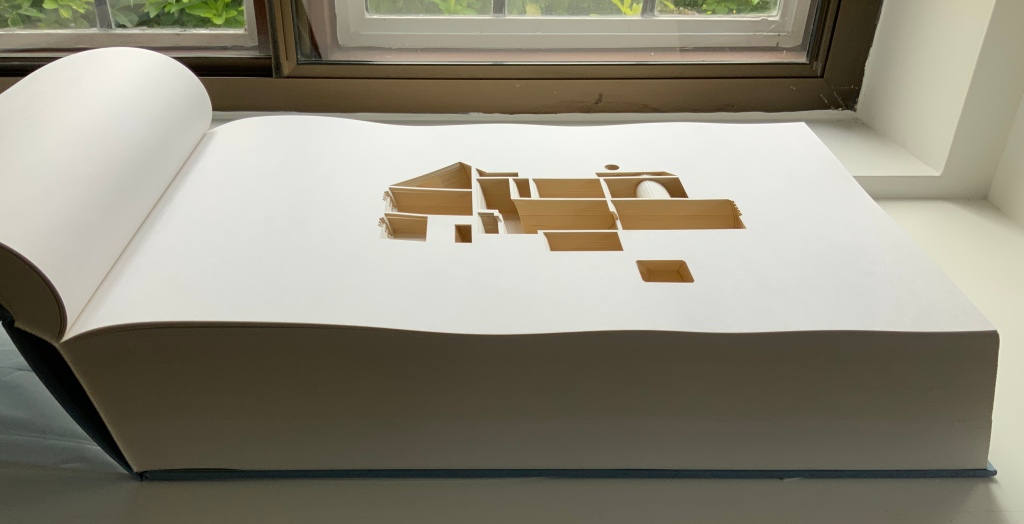
Your House (2006)
Olafur Eliasson
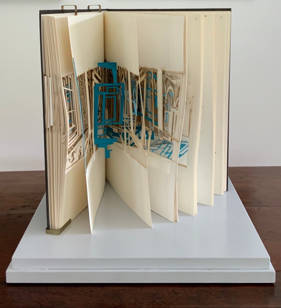
Book of Space (2009)
Johan Hybschmann
How do you read works like this? The size, weight and delicacy of Eliasson’s book and the fragility of Hybschmann’s book and its need for an armature to freeze-frame it defy a simple turning of pages. They must be turned slowly and carefully. Both works heed the task of the arts as posed by architect Juhani Pallasmaa for our age of speed: to defend the comprehensibility of time, its experiential plasticity, tactility and slowness (The Embodied Image, p. 78).
Proposition #4: The affinity of architecture and artists’ books lies in process.
A trained architect and book artist, Marian Macken articulates and illustrates in her book Binding Space why and how the artist’s book can serve as an important tool for design, documentation and critique of architecture. Macken’s perceptive descriptions show how to observe materiality and its functioning and understand how they contribute to the making of art.
Investigating bookness results in the book becoming a highly productive intervening medium with which one can imagine, investigate, analyze, represent and exhibit particular qualities — haptically, and with narrative and ambiguity — of a built environment and the design process. Through the book, we read spatial practice anew (p. 163).
Reading Macken’s book will sharpen the ability of any reader or viewer to appreciate book art, especially her Ise Jingū: Beginning Repeated. Ise Jingū is a Shinto shrine complex in the Mie Prefecture, Japan. “Once every 20 years, since … the seventh century, every fence and building is completely rebuilt on an identical adjoining site, a practice of transposition known as shikinen-zōkan” (Binding Space, p. 101). For Macken, this ritualistic rebuilding poses architecture as performative process rather than as inert object; it “manifests the replication of a beginning, of a process” (p. 100).

Ise Jingū: Beginning Repeated (2011)
Marian Macken
Macken’s artwork consists of 61 loose sheets with a watermarked image within each, the number reflecting the 61 iterations of the shrine up until the making of this work of book art. The watermark is a perspective image based on Yoshio Watanabe’s photograph of the Inner Shrine, taken in 1953 on the occasion of the 59th rebuilding. The contrast of the watermark in kozo and the movement of its placement from one sheet to the next entice reflection on the phenomenon of representation and the architectural process of shikinen-zōkan.
Proposition #5: The affinity of architecture and artists’ books lies in phenomenology.
Architects such as Alfredo Muñoz and his firm ABIBOO, Juhani Pallasmaa and Peter Zumthor are among those often associated with architectural phenomenology, concerned with perception psychology, focused on the primacy of sensory and experiential qualities. Norman Foster and phenomenology are not so often yoked, but 30 St Mary Axe: Diagrid (2009) and 30 St. Mary Axe: Cladding (2009)– Mandy Brannan’s treatments of his iconic London office tower (aka “the Gherkin”) that refocus the perception and experience of it — might prompt reconsideration.
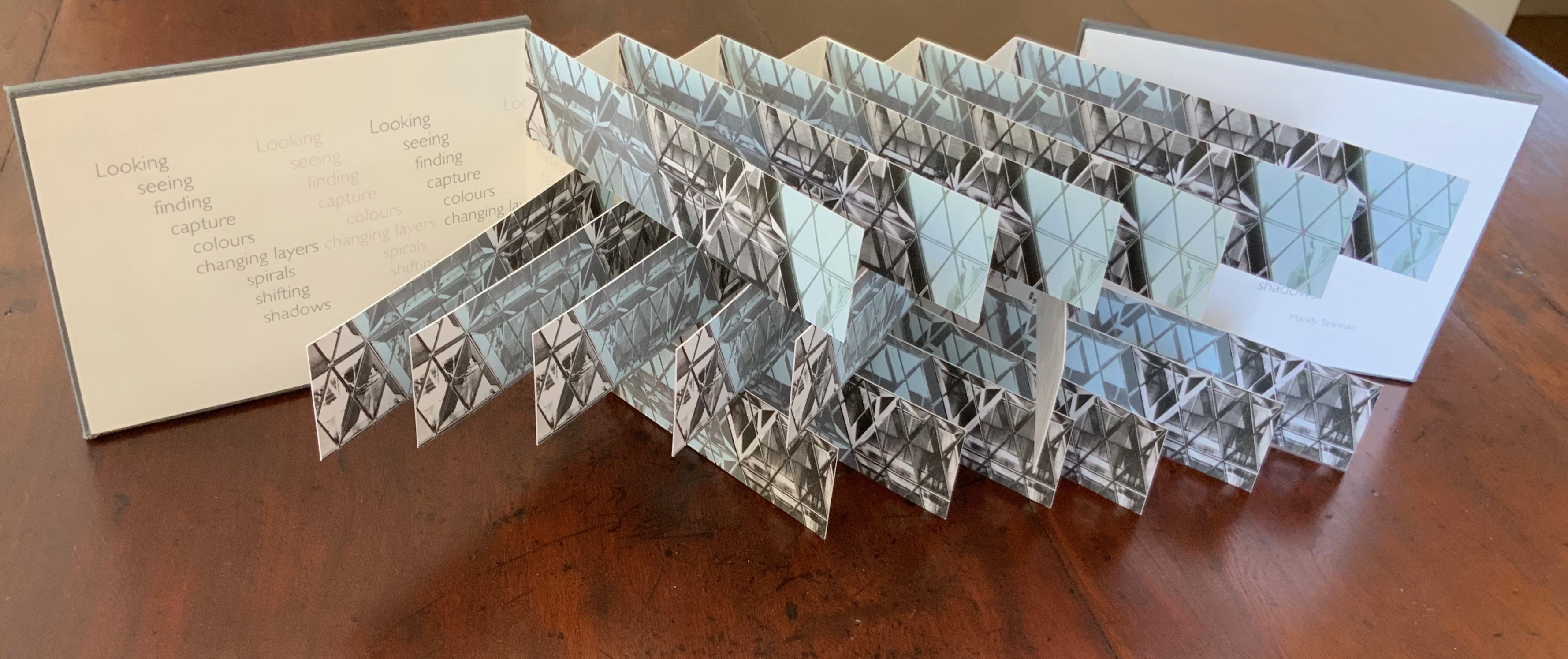
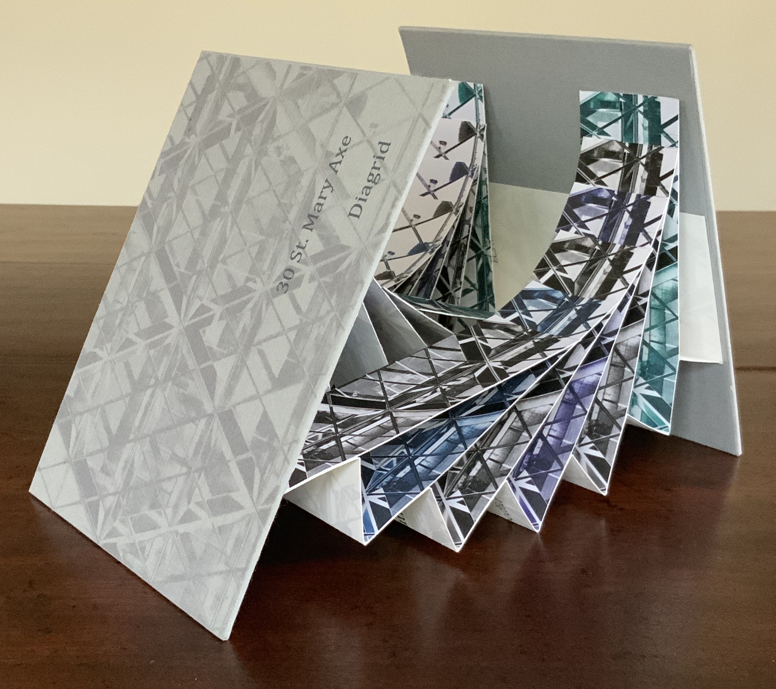
Top: 30 St Mary Axe: Cladding (2009). Bottom: 30 St Mary Axe: Diagrid (2009)
Mandy Brannan
Proposition #6: The affinity of architecture and artists’ books lies in geometry.
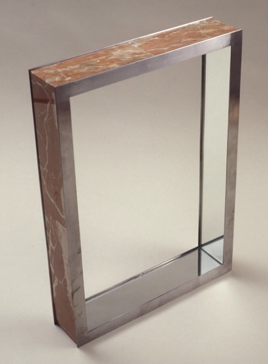
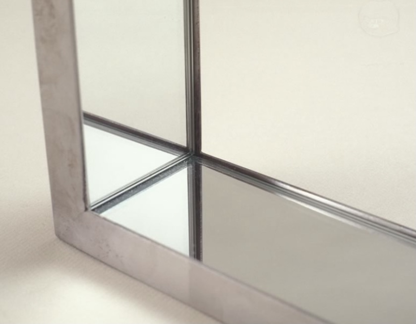
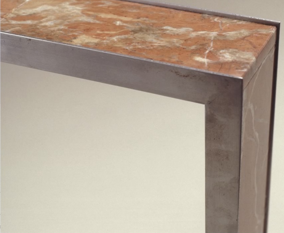
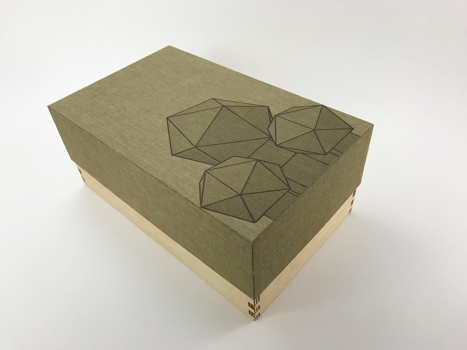
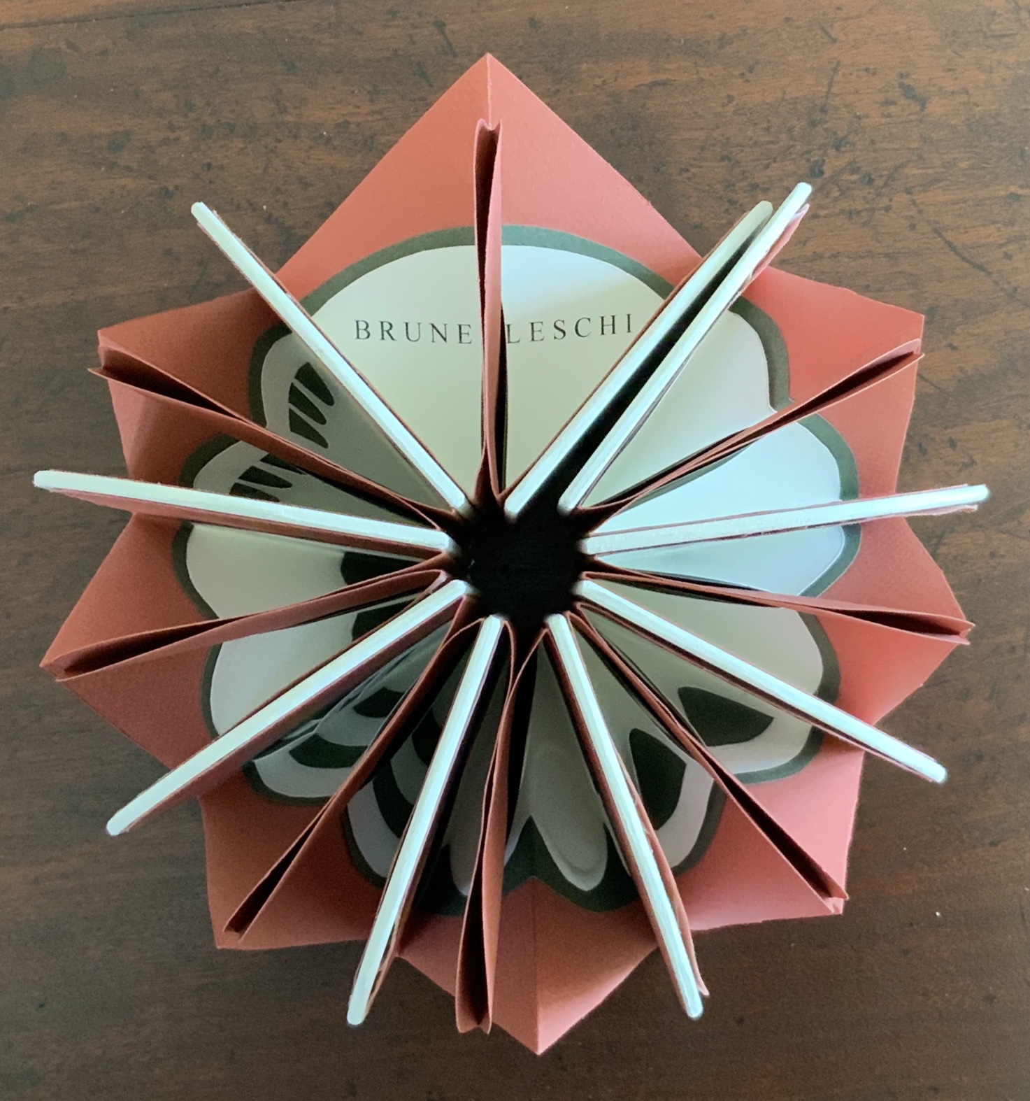
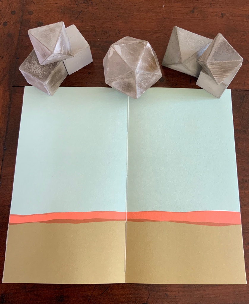
Sarah Bryant’s The Radiant Republic (2019) insightfully integrates Plato’s and Le Corbusier’s texts and ideas. The very physicality of the blond wood, linen cover, glass window, concrete representations of Platonic solids, embossed type and sewn papers could easily be a response to Juhani Pallasmaa’s comment: “The current overemphasis on the intellectual and conceptual dimensions of architecture contributes to the disappearance of its physical, sensual and embodied essence” (The Eyes of the Skin, p. 35).
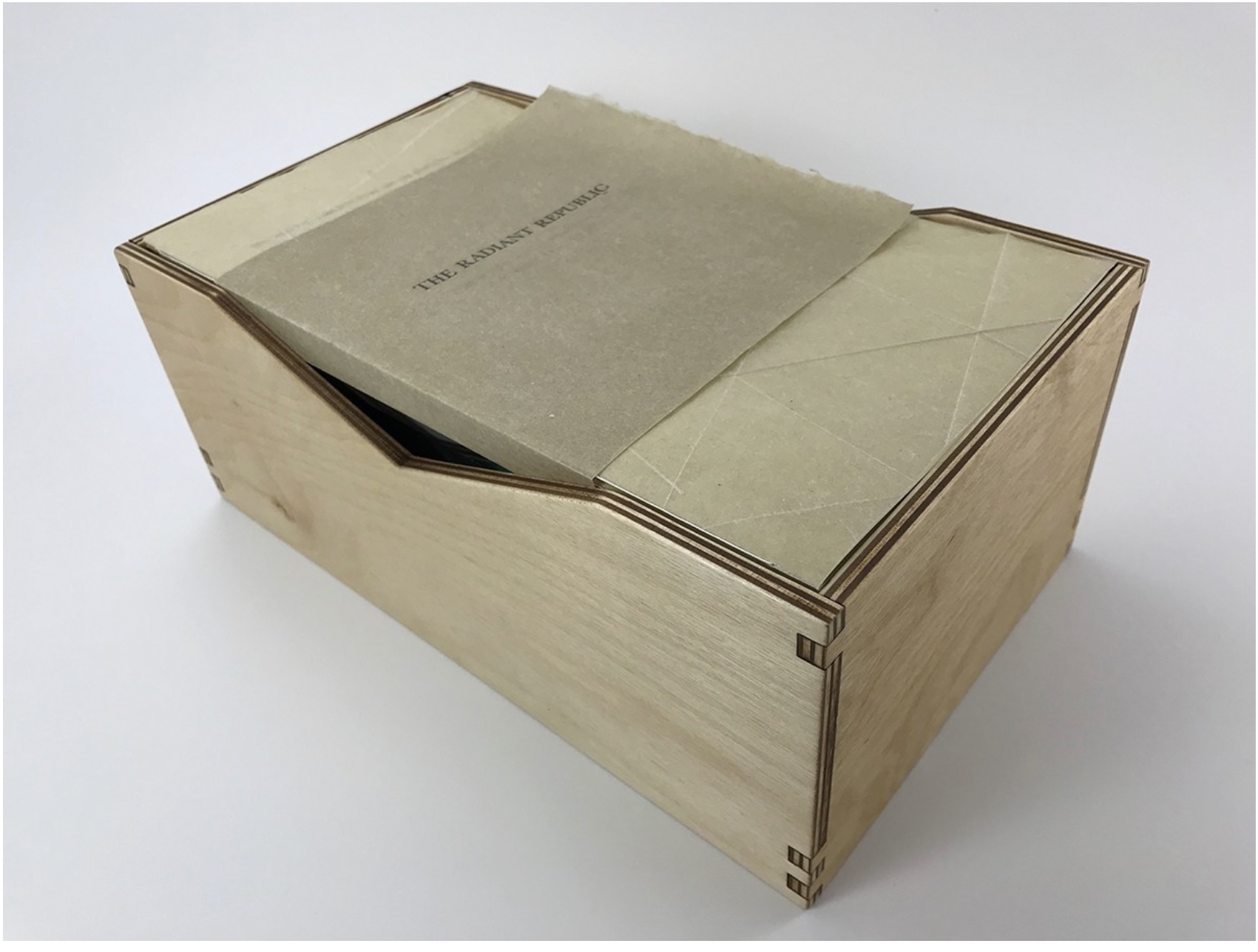
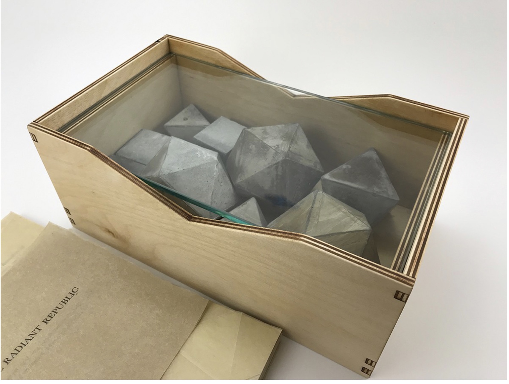

The Radiant Republic (2019)
Sarah Bryant
Proposition #7: The affinity of architecture and artists’ books lies in modelling.
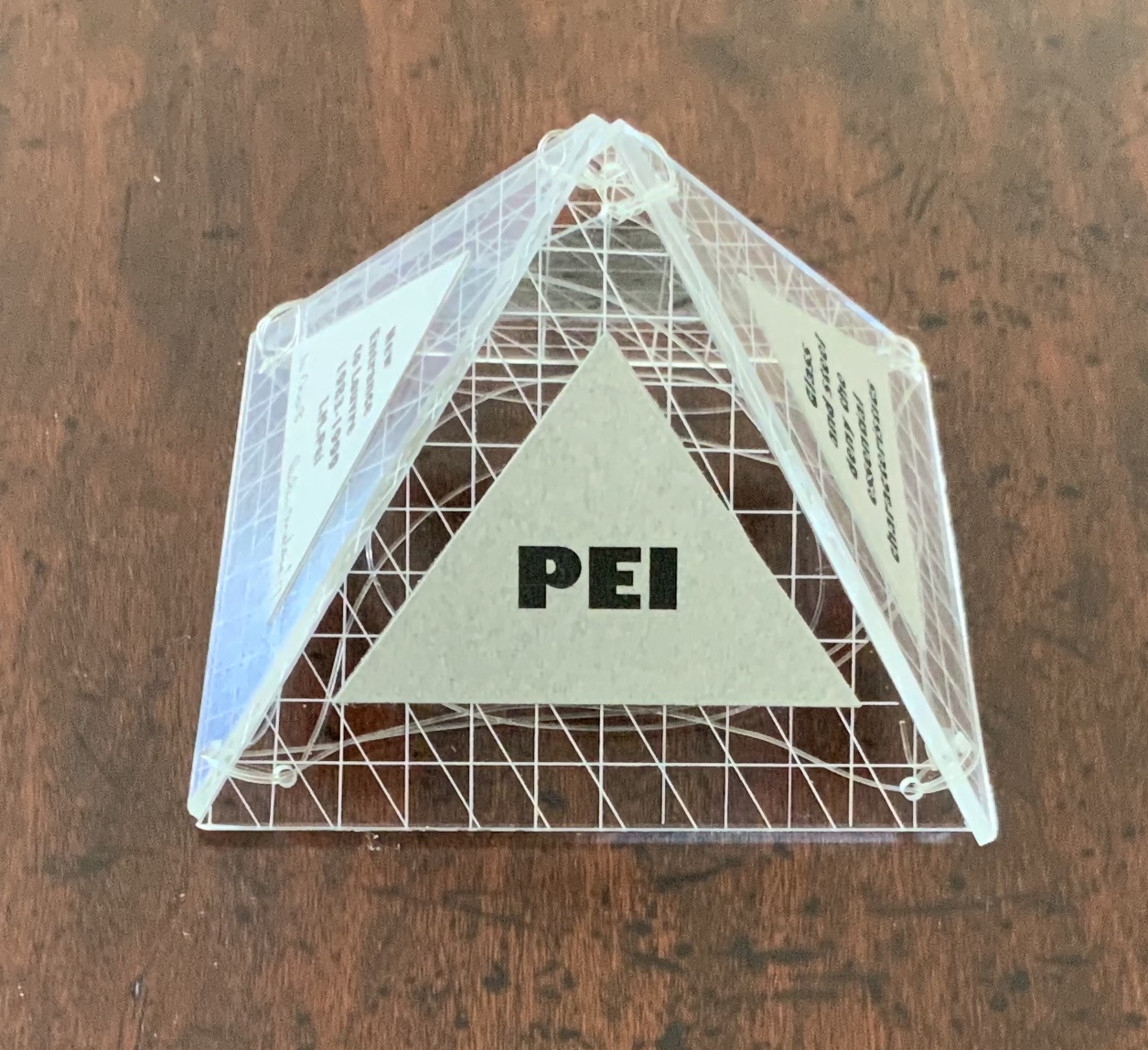
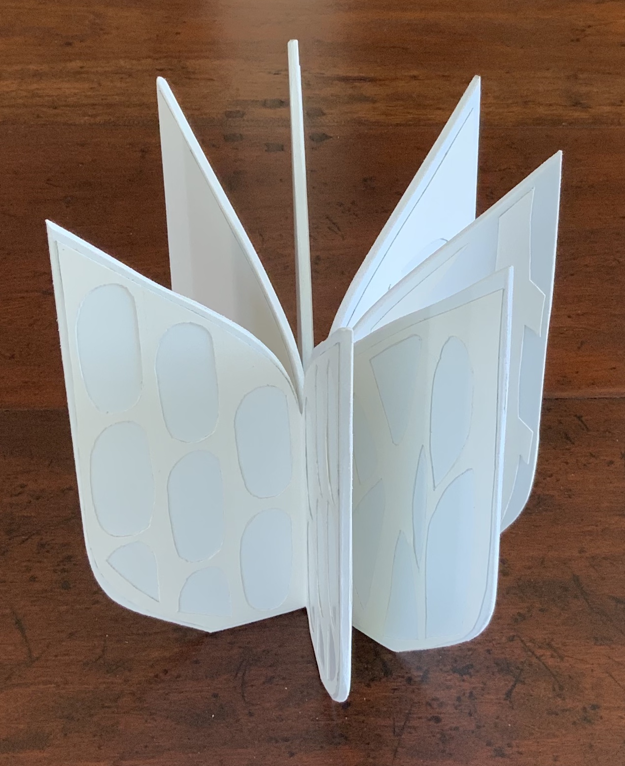
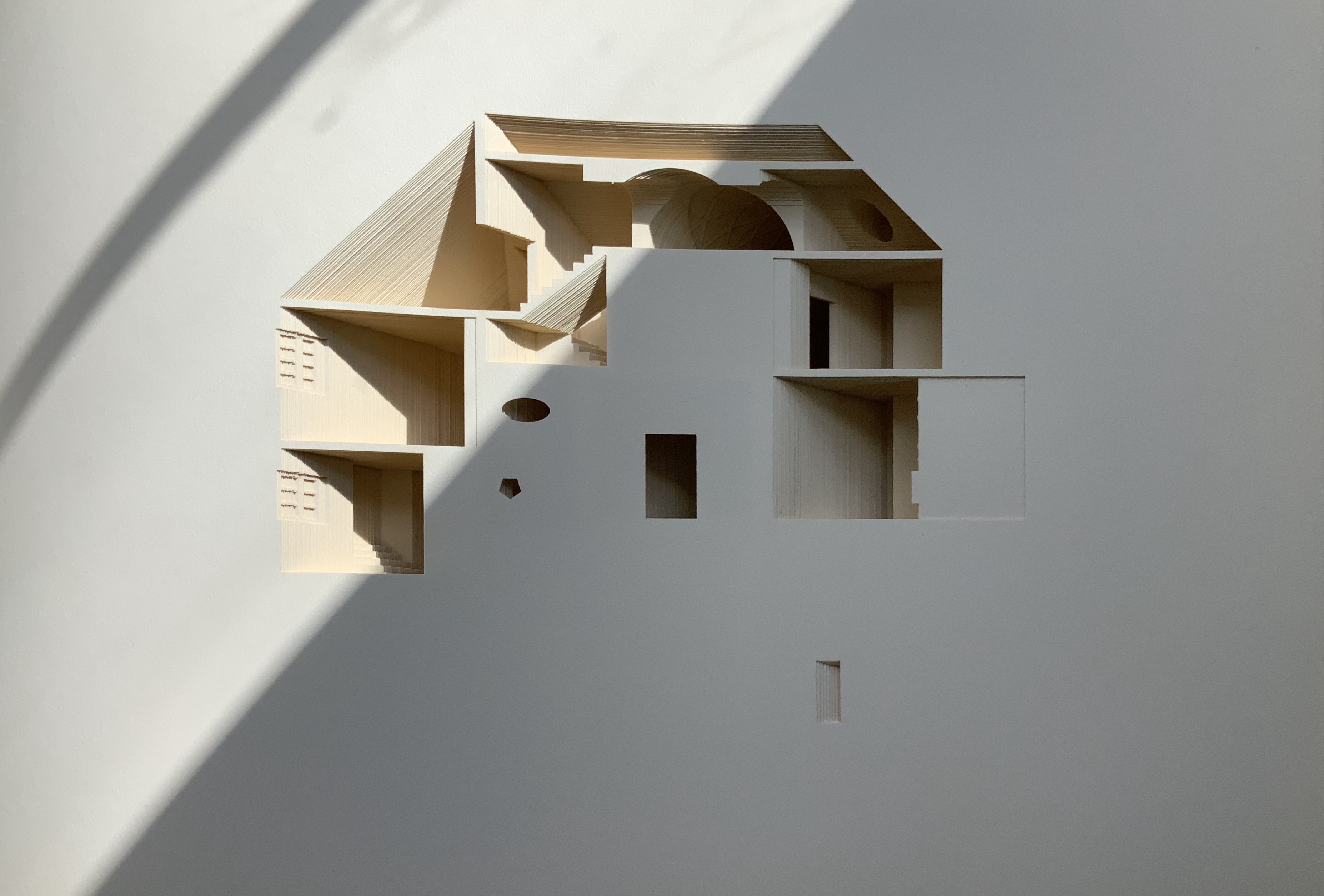
Helen Malone’s Ten Books of Architecture (2017) takes a broad historical and, most important, haptic view of architecture from Vitruvius to Hadid. Each of the ten books is a bookwork that models its architectural subject.


Ten Books of Architecture (2017)
Helen Malone
Proposition #8: The affinity of architecture and artists’ books lies in folding.
At the end of the 20th century, architects like Peter Eisenman, Jeffrey Kipnis and Greg Lynn latched on to computer-aided design and Gilles Deleuze’s Le pli: Leibniz et le baroque (1988) / The Fold: Leibniz and the Baroque (1993). This led to real constructions such as Eisenman’s Rebstock Park in Frankfurt as well as to the seminal books Folding in Architecture (1993), edited by Lynn, and Folding Architecture 92003) by Sophia Vyzoviti.
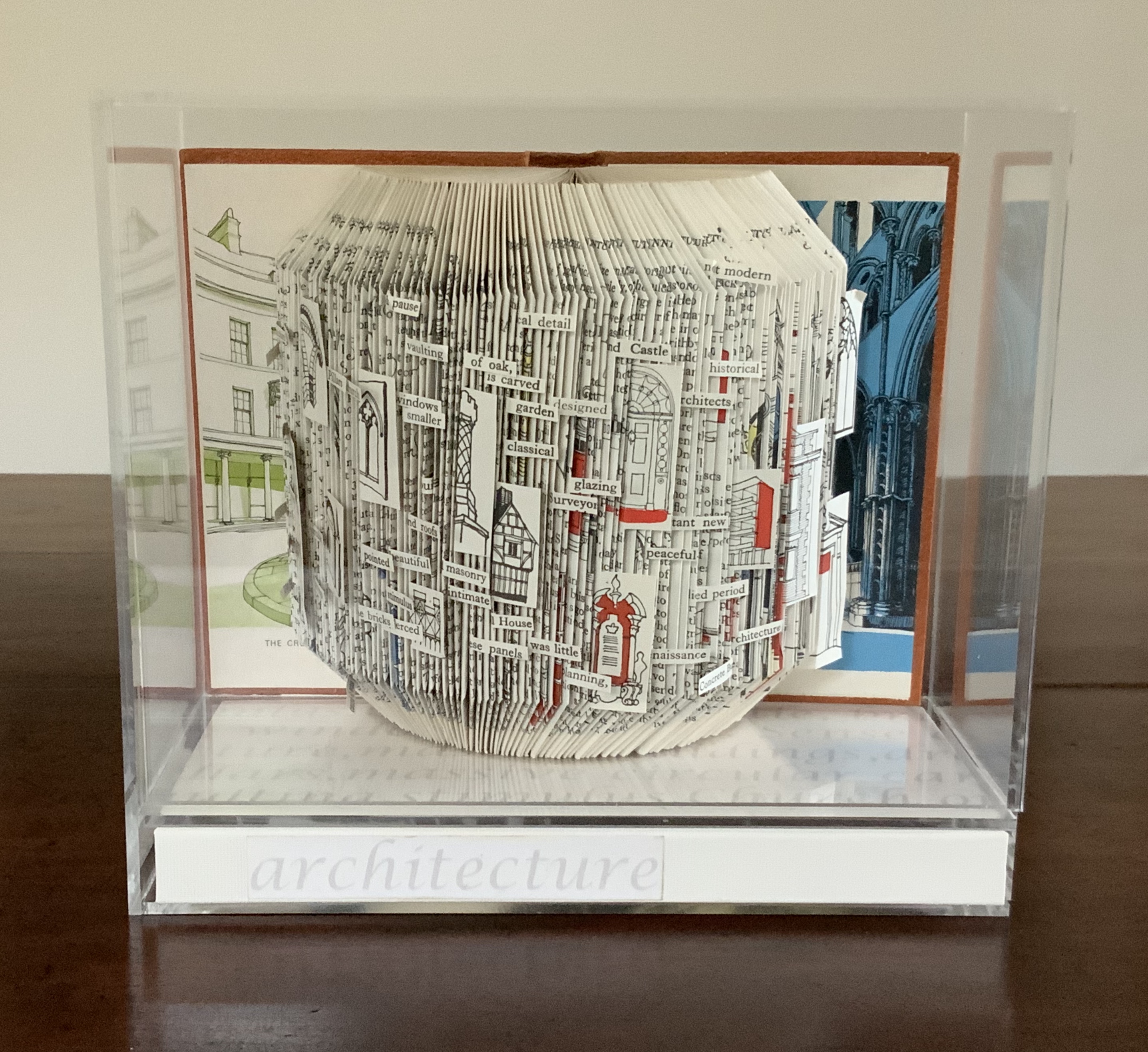
Folded book pages rarely generate a work that rises above mere craft. Heather Hunter’s Observer Series: Architecture (2009) achieves the necessary height. It combines the altered book with an accordion book that incorporates a found poem composed of the words excised and folded outwards from the folded pages of The Observer’s Book of Architecture.

Observer Series: Architecture (2009)
Heather Hunter
Proposition #9: The affinity of architecture and artists’ books lies in light.
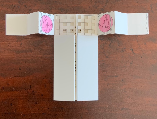
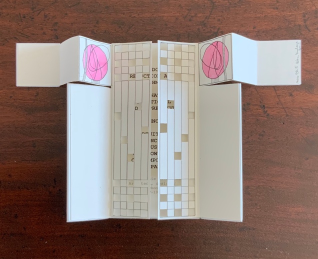
Marlene MacCallum’s Theme and Permutation (2012) is a response to the permutations and variations over time in five houses built to a common plan in Townsite area of Corner Brook, Newfoundland. MacCallum used digital tools to translate the original film source of eight different window images from the houses. A tritone image of a single Townsite window under translucent pages opens the book. As the pages turn, new window images appear and layer over each other, darkening up to the book’s mid-point. In the center spread, two text blocks appear speaking to the history, architectural permutations and economic shifts of the Townsite area. The tonality begins to lighten over the ensuing new combinations of window layers. A third text block of personal narrative is introduced, and a tritone image of one of the Townsite windows in its original condition concludes the work.


Theme and Permutation (2012)
Marlene MacCallum
Proposition #10: The affinity of architecture and artists’ books lies in perspective.
Cees Nagelkerke’s Piranesian Window (1996) resides in the Vedute Foundation’s collection of “spatial manuscripts”, invited works that must conform to the dimensions of the Gutenberg Bible. Piranesian Window‘s form and title capture multiple meanings of vedute (“views”). Views are things seen — which this spatial manuscript is. Views are prospects from which to see — which a window offers. Views are perspectives — for which Giambattista Piranesi’s etchings are famous. Views are thoughts held — which “Piranesian” implies (the work’s title could be that of a manuscript on art history and philosophy). Piranesi’s mid-eighteenth century etchings Vedute di Roma (“Views of Rome”) and Carceri d’invenzione (“Imaginary Prisons”) are the obvious sources of inspiration, but Nagelkerke provides an interview describing the dream source of the work:
– … Please, continue relating your dream …
– I wandered through vast ruins … along wrecked bridges … feeling remarkably at ease.
– How did you find the window in this windowless world?
– When a cool breeze wafted inside, I suddenly saw it. It showed a landscape, within the distance a city. There was complete tranquillity and harmony there, like in a painting by Piero della Francesca … I stood there for some considerable time and I became increasingly saddened, because I discovered that I was looking at something that had vanished forever.
– But how did you manage to take the window?
– I wanted to touch it … as a result, I immediately fell down. The gap left in the wall closed by itself … I picked it up and continued on my way, meeting people who spoke to me saying that I should leave the Carceri. I was taken to a gateway. No one looked at, or said anything about, the window… In the square where I found myself, there was an intense, chaotic commotion. The window still reflected something of the vast space I had left. The exterior showed traces of the wall in which it had been mounted. I looked through it and saw everyday life …
Piranesian Window (1996)
Cees Nagelkerke
Proposition #11: The affinity of architecture and artists’ books lies in archaeology.
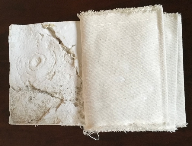
Mill: A journey around Cromford Mill, Derbyshire (2006) by Salt + Shaw (Paul Salt and Susan Shaw) is the result of the artists’ exploration of Cromford Mill in Derbyshire, the first water-powered, cotton-spinning mill developed by Richard Arkwright in 1771. Bound in a cover of recycled wooden library shelves, three plaster cast blocks and seven calico pocket pages containing hidden texts imply the hidden archaeological history to be found. The forensic-like casts are taken from interior surfaces, and the texts walk the reader step by step through each area of the mill.


Proposition #12: The affinity of architecture and artists’ books lies in assemblage and collage.
Based on an architectural installation at the Minnesota College for Art and Design and drawing on her photos of Ayvalik, Amsterdam, Florence, Istanbul, New York City, Rome, San Diego and Venice, Karen Wirth’s Paper Architecture (2017) certainly prompts a revisit to MoMA’s “Cut ’n’ Paste: From Architectural Assemblage to Collage City“, 10 July 2013 – 5 January 2015, to prove this proposition.

Paper Architecture (2017)
Karen Wirth
Proposition #13: The affinity of architecture and artists’ books lies in luxe.
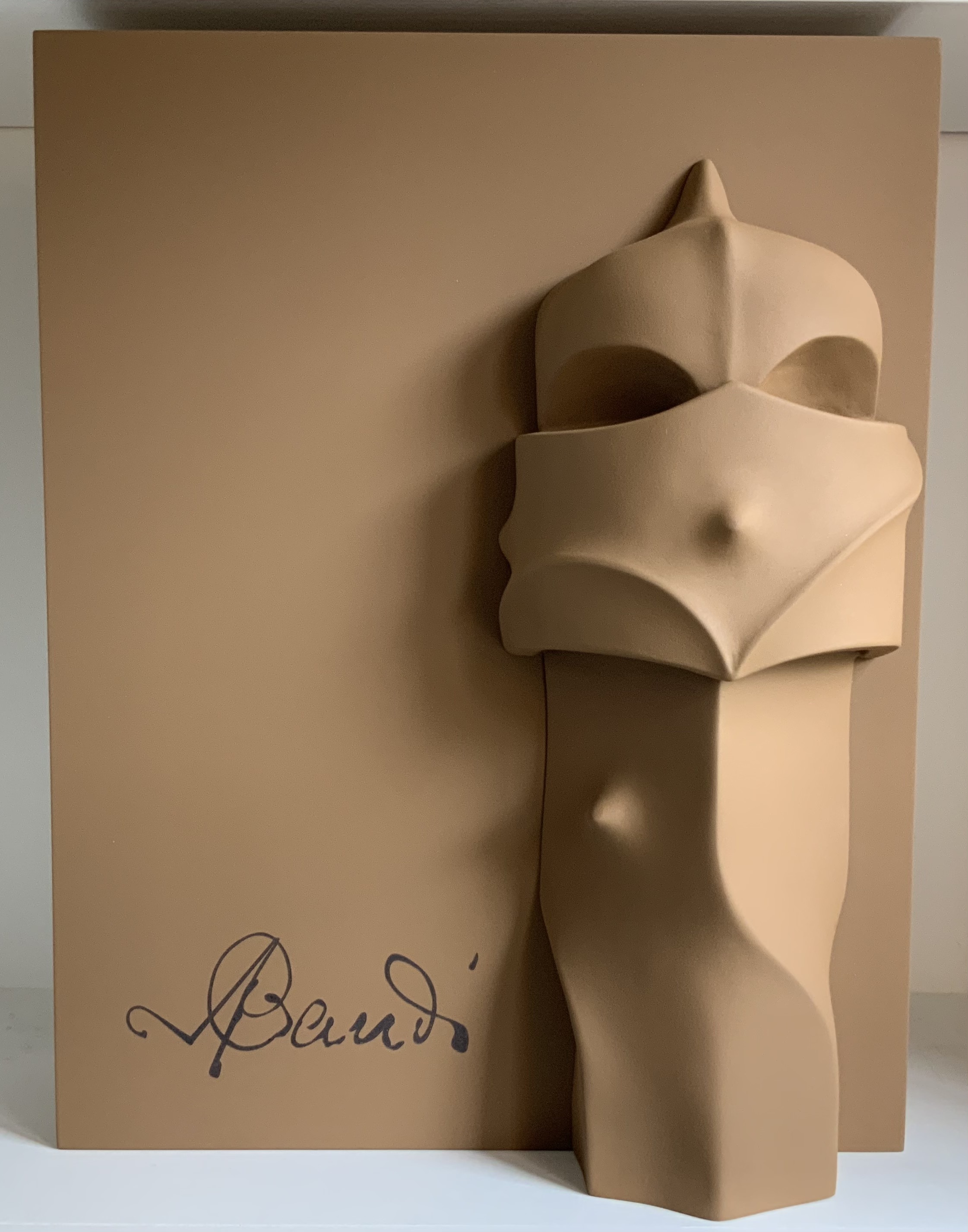
Early theorists, critics and artists of book art expended great effort to exclude livres d’artiste and deluxe productions from the definition of a form of art that struggled to find a name: artist’s book, artists’ books, bookworks, book art, etc. The spectrum from objects of conspicuous consumption to democratic multiples characterizes both architecture and book art. Antoni Gaudí’s architectural efforts easily span that spectrum — from his Casa Milà to his tiles found underfoot in Barcelona’s Passeig de Gràcia. Under the guidance of Juan José Lahuerta (chief curator at the National Museum of Art of Catalonia), the publisher Artika produced Gaudí Up Close (2020), enclosed in a wooden case with marble sculpture finished in paint, cement powder and anti-graffiti varnishes and lined with Naturlinnen fabric.
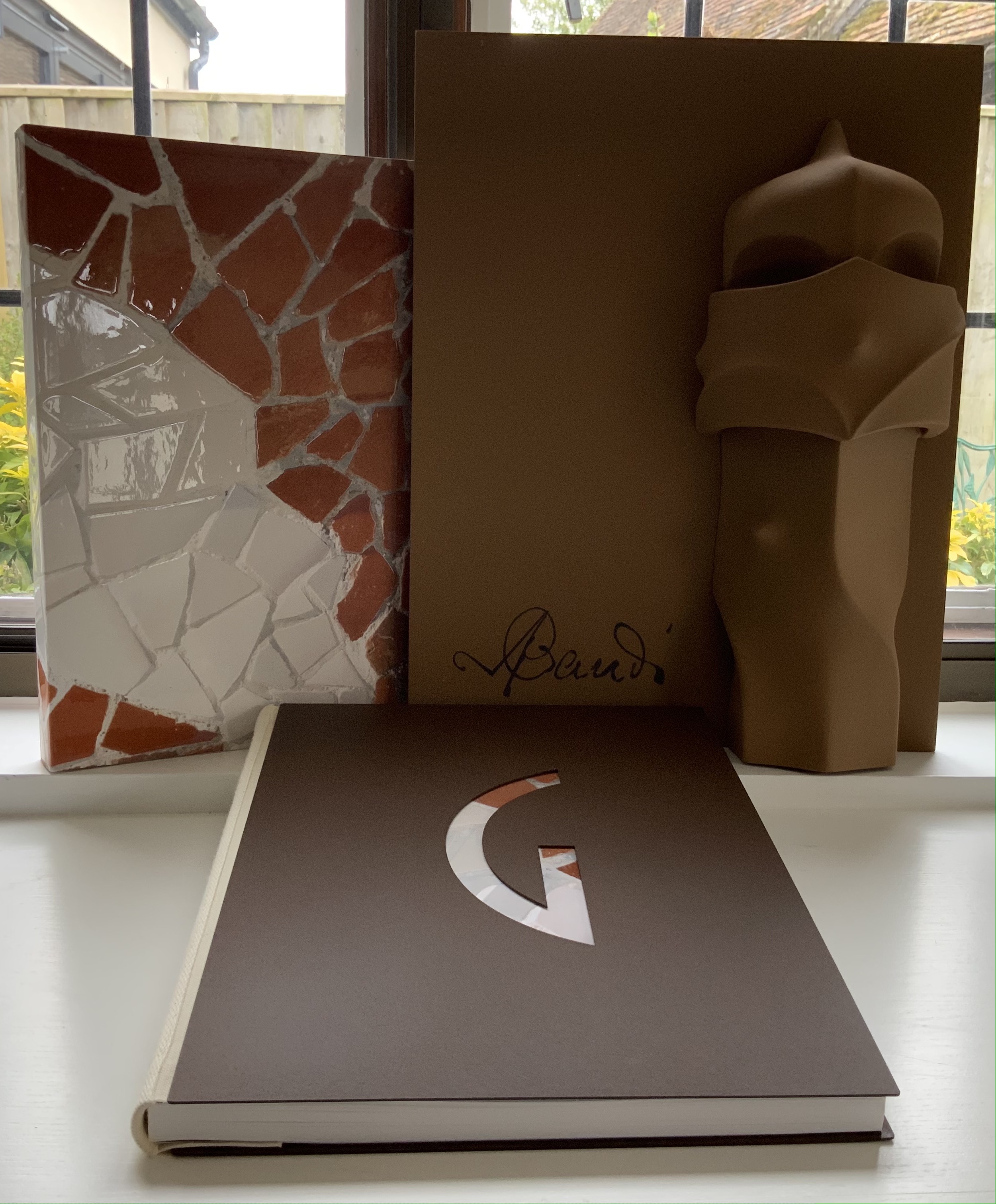
Gaudí Up Close (2020)
Published by Artika.
Photos: Books On Books Collection.
Proposition #14: The affinity of architecture and artists’ books lies in the memorial.
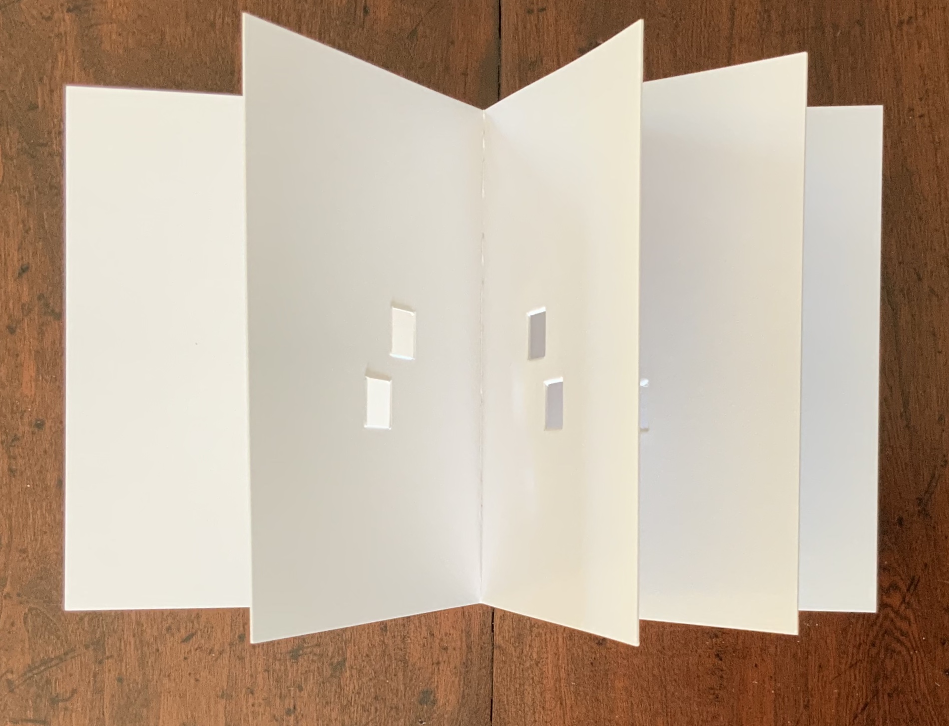
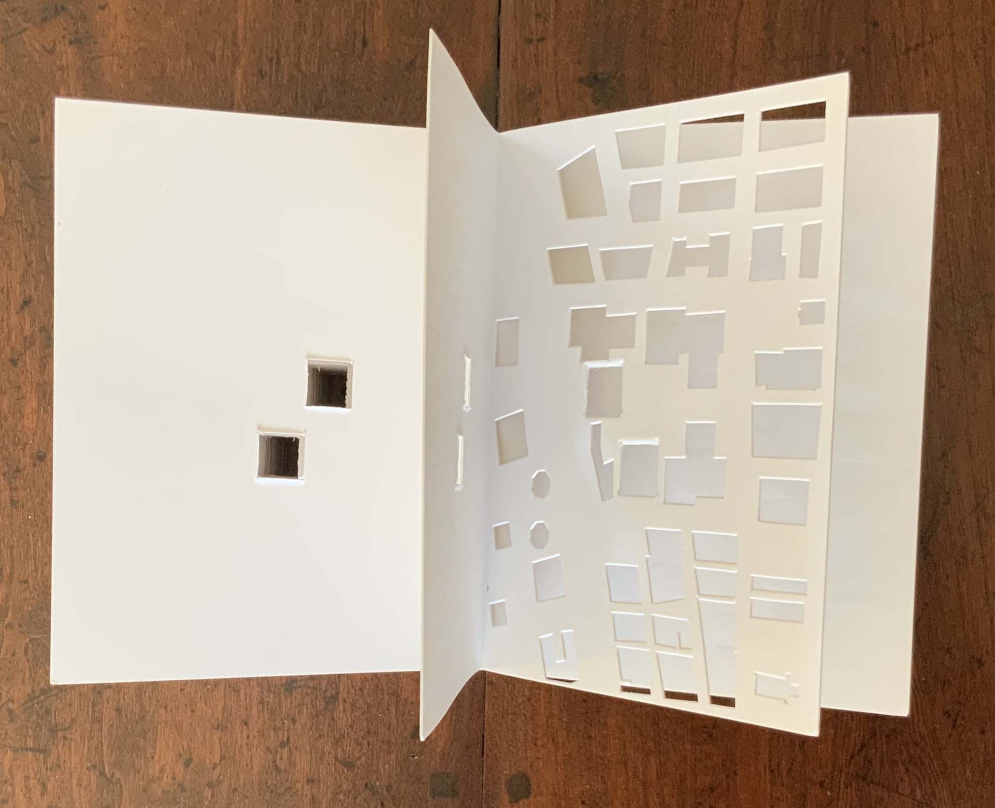
As you turn the corner into Judenplatz in Vienna, Rachel Whiteread’s great cube appears showing only the fore edge of book after book. As you hold J. Meejin Yoon’s small white brick of paper and turn its thick pages, a small pinhole appears on the page. Then two larger square holes emerge, one of which falls over the pinhole. Page after page, the two square holes repeat, creating two small dark wells in the field of white, until on the last page they take their place in the cut-out schematic footprint of the city blocks and buildings surrounding the Twin Towers. Whiteread’s Nameless Library (2000) and Yoon’s Absence (2004) surely underscore this proposition of memorial.
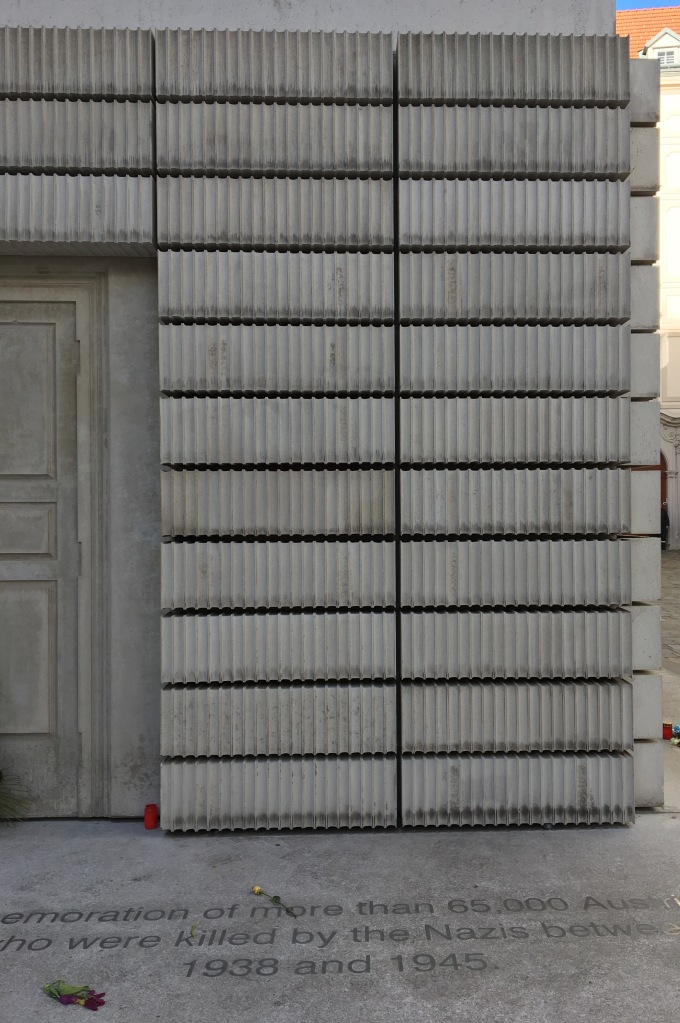
Nameless Library (2000)
Rachel Whiteread
Photo: Books On Books.
Absence (2004)
© J. Meejin Yoon
Proposition #15: The affinity of architecture and artists’ books lies in the sacred.
Jeffrey Morin and Steven Ferlauto’s Sacred Space (2003) is an intimate monument of book art. Made intimate by the content and texture of its book, made more intimate by the viewer’s having to construct the chapel. Made monumental by the echo of typographic history, made more monumental in Galileo Galilei’s echo from its floor: Mathematics is the alphabet with which God has created the universe.
Sacred Space (2003)
Jeffrey Morin and Steven Ferlauto
Proposition #16: The affinity of architecture and artists’ books lies in collaboration.
In Victor Hugo’s Nôtre-Dame de Paris (1831), Archdeacon Claude Frollo points to the book in his hand and then to the cathedral and says, “This will kill that”. It is ironic that Hugo’s book (popularly known now by its English title The Hunchback of Nôtre-Dame) was written in large part to save the then-decaying cathedral (post-Revolution, it served as a warehouse), and it succeeded. It is also ironic that, while the fictional character’s metaphor has a point about the book’s permanence of replicability outlasting the building’s permanence of stone, it misses the collaborative foundations of both.
Created by ten students at Scripps College under the direction of Kitty Maryatt, Arch (2010) reminds us that the creation of a book — even a work of book art — is a collaborative effort.
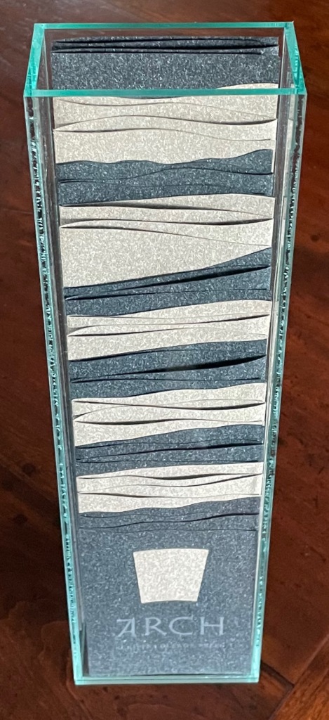
Arch (2010)
Kitty Maryatt, Jenny Karin Morrill, Ali Standish, Alycia Lang, Jennifer Wineke, Mandesha Marcus, Catherine Wang, Kathryn Hunt, Ilse Wogau, Jennifer Cohen, Winnie Ding
Photos: Books On Books Collection
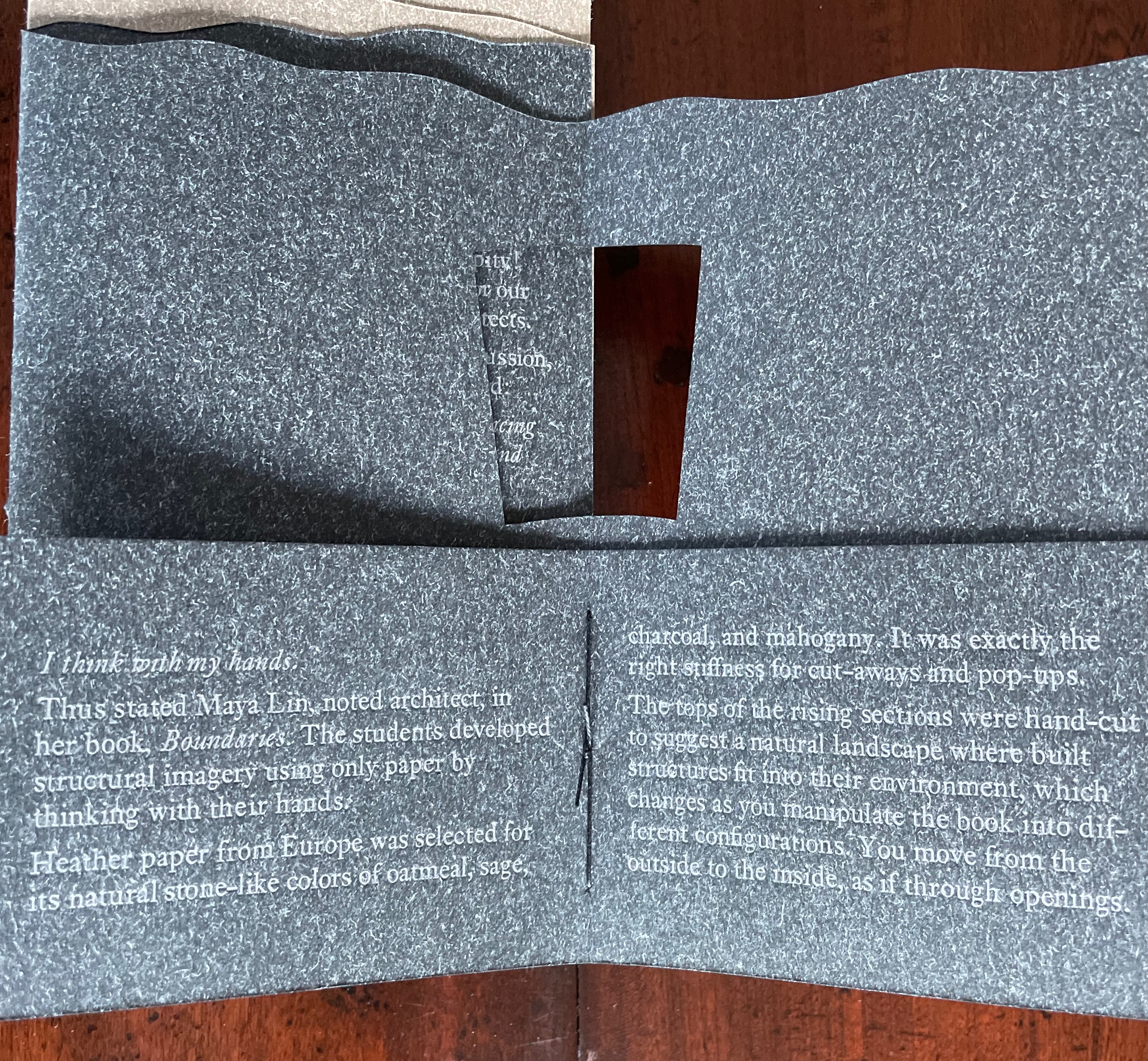
Maryatt’s preface to Arch is entitled “Blueprint” and is brief enough to warrant citing in full:
Books are inherently architectonic. Studying architecture would naturally be profitable to students building their own books.
On January 17, 2010, just days before class was to start, the Los Angeles Times published a fascinating article on contemporary women architects, highlighting a striking building by Jeannie Gang.
Earlier this year, the brand-new President of Scripps College chose The Genius of Women as her inaugural theme. What serendipity! This gave us the perfect inspiration for our artist book: the genius of women architects.
After extensive research and class discussion, a mission statement for the book evolved:
Architecture, like books, is a delicate balancing act between stability and motion, interior and exterior, aesthetic values and structural practicalities.
Books, like building, are fundamentally inhabited spaces. They are incomplete without human interaction.
The first portals were built of post and lintel construction. A curved arch is more difficult: the keystone is needed at the apex to lock the other pieces into position. Building a book is a similarly difficult feat. — Professor Kitty Maryatt


Conclusion: The affinity of architecture and artists’ books lies in our attraction to the beauty of form.
No doubt the proximity of the need for shelter and the need for oral and written language have played some gravitational role of mutual attraction for architecture and books (and latterly artists’ books). But equally, both architecture and artists’ books speak to our attraction to the beauty of form. All of the examples above are re-offered here in support of this proposition. Look at them again.
“Architecture”, “art” and “the book” are all fluid concepts. So it should be no surprise that we arrive at the equally fluid similes: architecture is like book art, book art is like architecture.
An earlier version of this essay appeared in The Blue Notebook, Volume 16 No 2, Spring – Summer 2022.
Further Reading
“Architecture“. 12 November 2018. Bookmarking Book Art.
Carrión, Ulises. 1975. “The New Art of Making Books”. Reprinted in Lyons, Joan. 1993. Artist’s books: A Critical Anthology and Sourcebook. Rochester, NY: Visual Studies Workshop Press.
Côme, Tony. 2018. “The Typotectural Suites“, The Palace of Typographic Masonry. Accessed 5 April 2021.
Esslemont, David. 2002. Inside the Book. Cefn Mawr Newton Powys, Wales: Solmentes Press.
Goldberger, Paul. 2008. Counterpoint: Daniel Libeskind. Basel: Birkhäuser Verlag.
Hugo, Victor, and Jessie Haynes, trans. 1831 (1902). Nôtre Dame de Paris. New York: D. Appleton & Co.
Hugo, Victor, and Nathan Haskell Dole, trans. 1890 (1895). Victor Hugo’s Letters to His Wife and Others (The Alps and the Pyrenees). Boston, MA: Estes and Lauriat.
Lynn, Greg. 2004. Folding in Architecture Rev. ed. Chichester, West Sussex: Wiley-Academy. See for references to Mario Carpo, Gilles Deleuze and Peter Eisenman.
Macken, Marian. 2018. Binding Space: The Book as Spatial Practice. London: Taylor and Francis.
McEwen, Hugh. 12 January 2012. Polyglot Buildings. Issuu. Accessed 13 March 2021.
Niessen, Richard. 2018. The Palace of Typographic Masonry. Leipzig: Spector Books.
Pallasmaa, Juhani. 1996. The Eyes of the Skin. London: Academy Editions.
Pallasmaa, Juhani. 2009. The Thinking Hand. Chichester, UK: Wiley.
Pallasmaa, Juhani. 2011. The Embodied Image. Chichester, UK: Wiley.
Steingruber, Johann David. 1773 (1774). Architectonisches Alphabeth: bestehend in Dreysig … . Schwabach: Johann Gottlieb Mizler.
Tsimourdagkas, Chrysostomos. 2014. Typotecture: Histories, Theories and Digital Futures of Typographic Elements in Architectural Design. Doctoral dissertation, Royal College of Art, London. Accessed 13 March 2021.
Vyzoviti Sophia and BIS Publishers. 2016. Folding Architecture : Spatial Structural and Organizational Diagrams. 14th print ed. Amsterdam: BIS.
Williams, Elizabeth. 1989. “Architects Books: An Investigation in Binding and Building”, The Guild of Book Workers Journal. 27, 2: 21-31.
Bookmarking Book Art – Nicholas Rougeux
Innovative combinations of color and geometry in artists’ books — think of Ursula Hochuli-Gamma’s 26 farbige Buchstaben (1986), Jeffrey Morin & Steven Ferlauto’s Sacred Space (2003), Sarah Bryant’s The Radiant Republic (2019) or Ana Paula Cordeiro’s Body of Evidence (2020) — make for a useful angle on which to focus in appreciating book art.
Nicholas Rougeux shows that it is also a useful inspiration for interactive digital art.
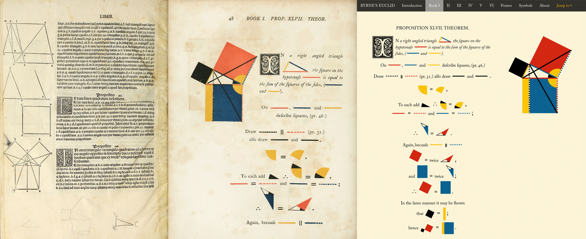
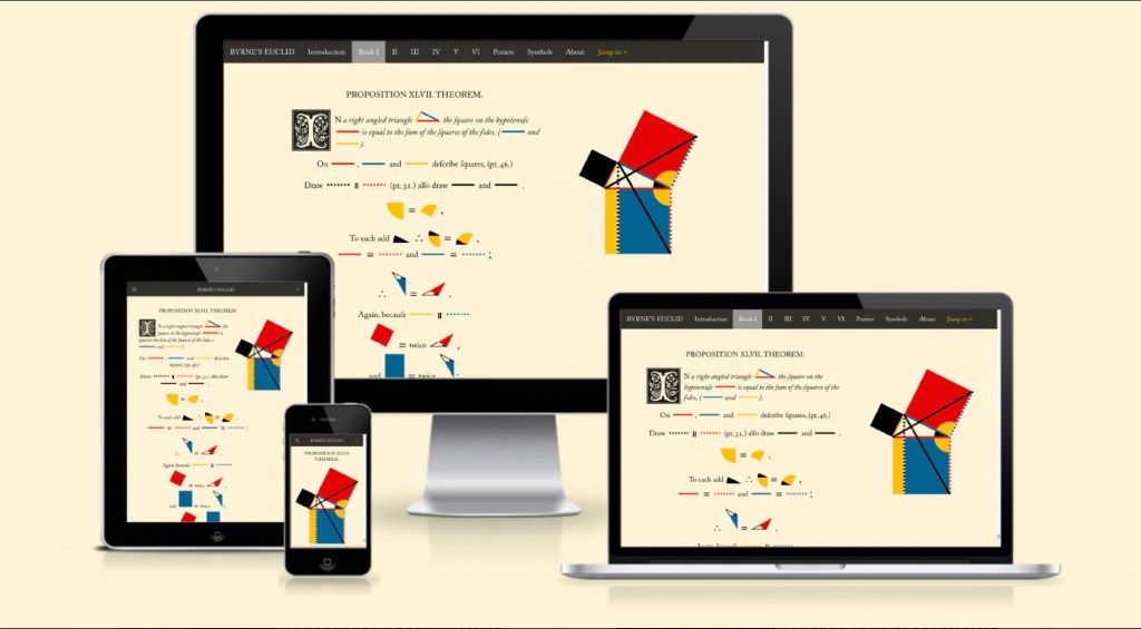
Byrne’s Euclid: The First Six Books of the Elements of Euclid with Coloured Diagrams and Symbols
and
Byrne’s Euclid: The First Six Books of the Elements of Euclid with Coloured Diagrams and Symbols – A reproduction of Oliver Byrne’s celebrated work from 1847 plus interactive diagrams, cross references, and posters designed by Nicholas Rougeux
All images © Nicholas Rougeux
Rougeux describes himself as a “data artist”, and his works might also be considered “found art” given such sources of data as Nicolas Bion’s treatise on mathematical instruments from 1709, Spencer Fullerton Baird’s Iconographic Encyclopædia of Science, Literature, and Art (1852) and John Southward’s A Dictionary of Typography and its Accessory Arts (1875). While the resulting works recall Ben Fry’s and Stefanie Posavec & Greg McInerny’s celebrations of Darwin’s On the Origin of Species, two different and more apropos, even if analogue, points of comparison are Edward R. Tufte’s Envisioning Information (1990) and Francisca Prieto’s Composition No. 1. The connection with Tufte is the more obvious, but Rougeux’s digital manipulation of antique works feels very much like Prieto’s manual folding of them.
Further Reading
Byrne Oliver and William Pickering. 1847. The First Six Books of the Elements of Euclid : In Which Coloured Diagrams and Symbols Are Used Instead of Letters. London: W. Pickering.
Byrne Oliver. 2022. The First Six Books of the Elements of Euclid. Cologne: Taschen.
KSCN. November 2022. “Euklids Elements: Visualization of the Month #5“. Kiel Science Communication Network. Accessed 18 November 2022.
Books On Books Collection – The Poetics of Reason (2020)
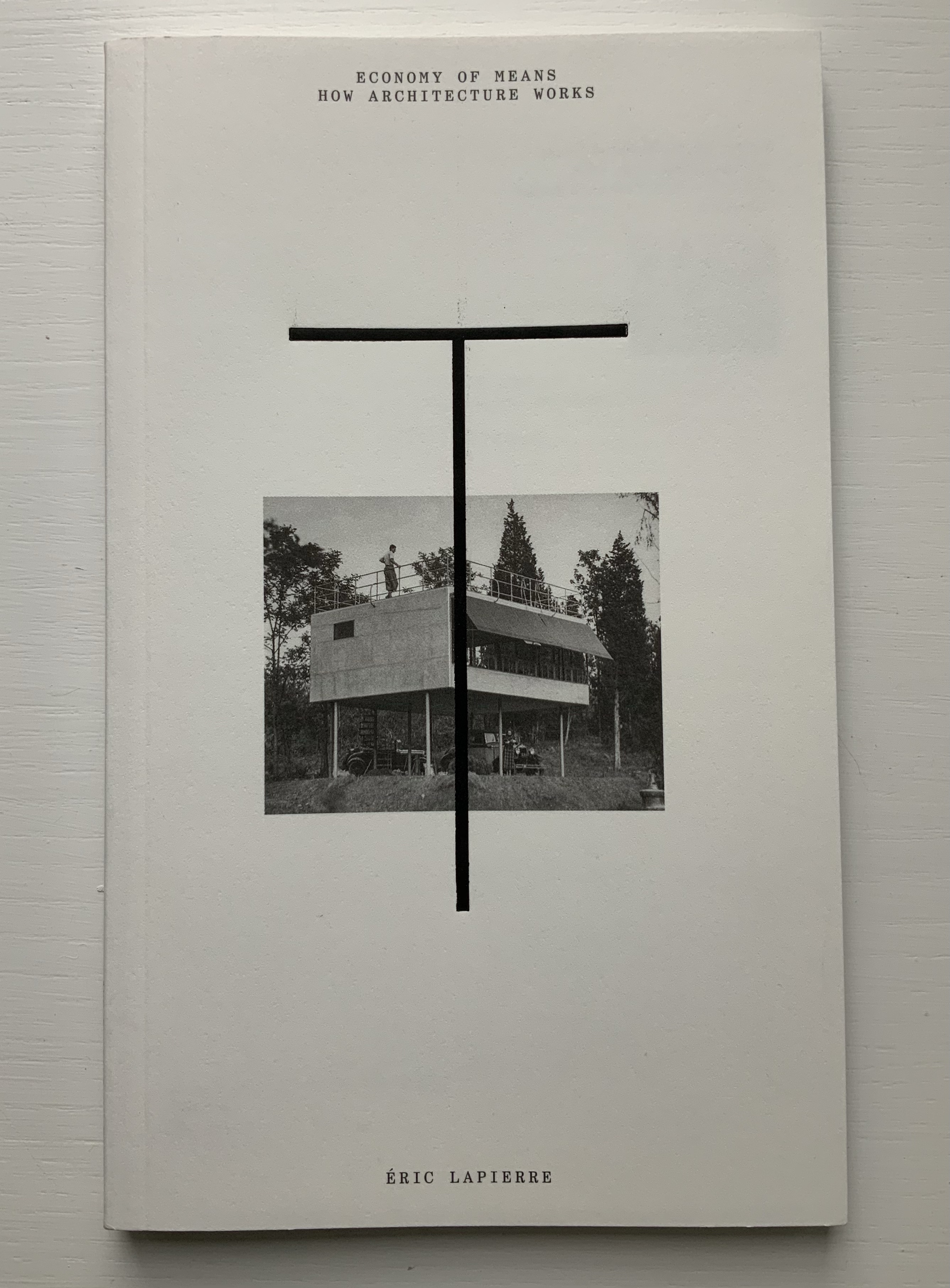
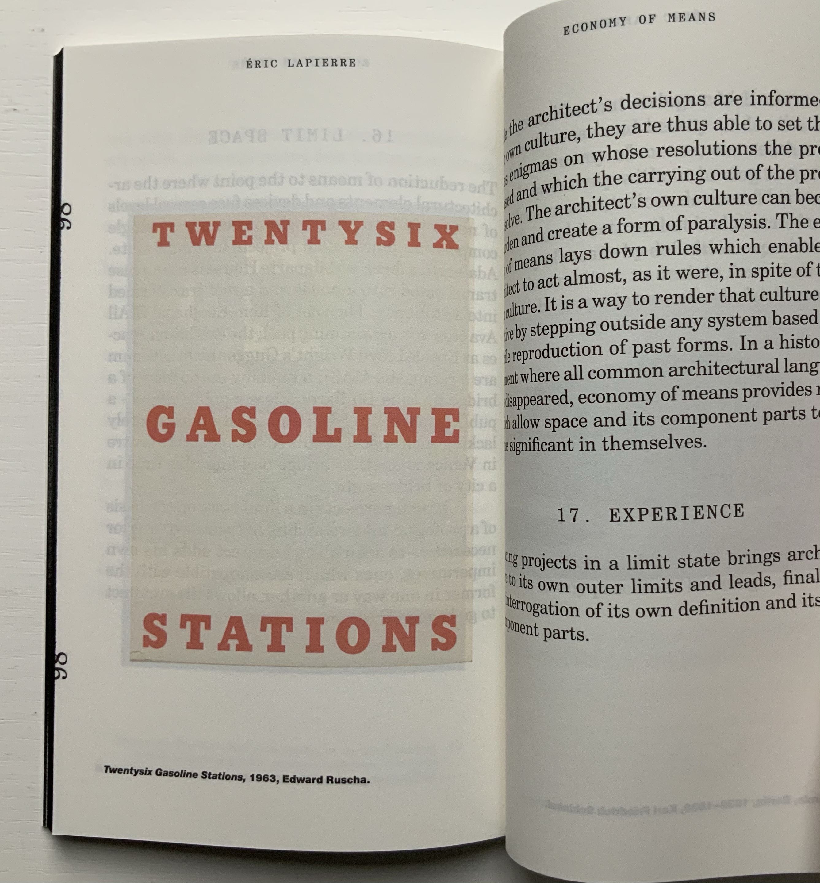
The Poetics of Reason (2020)
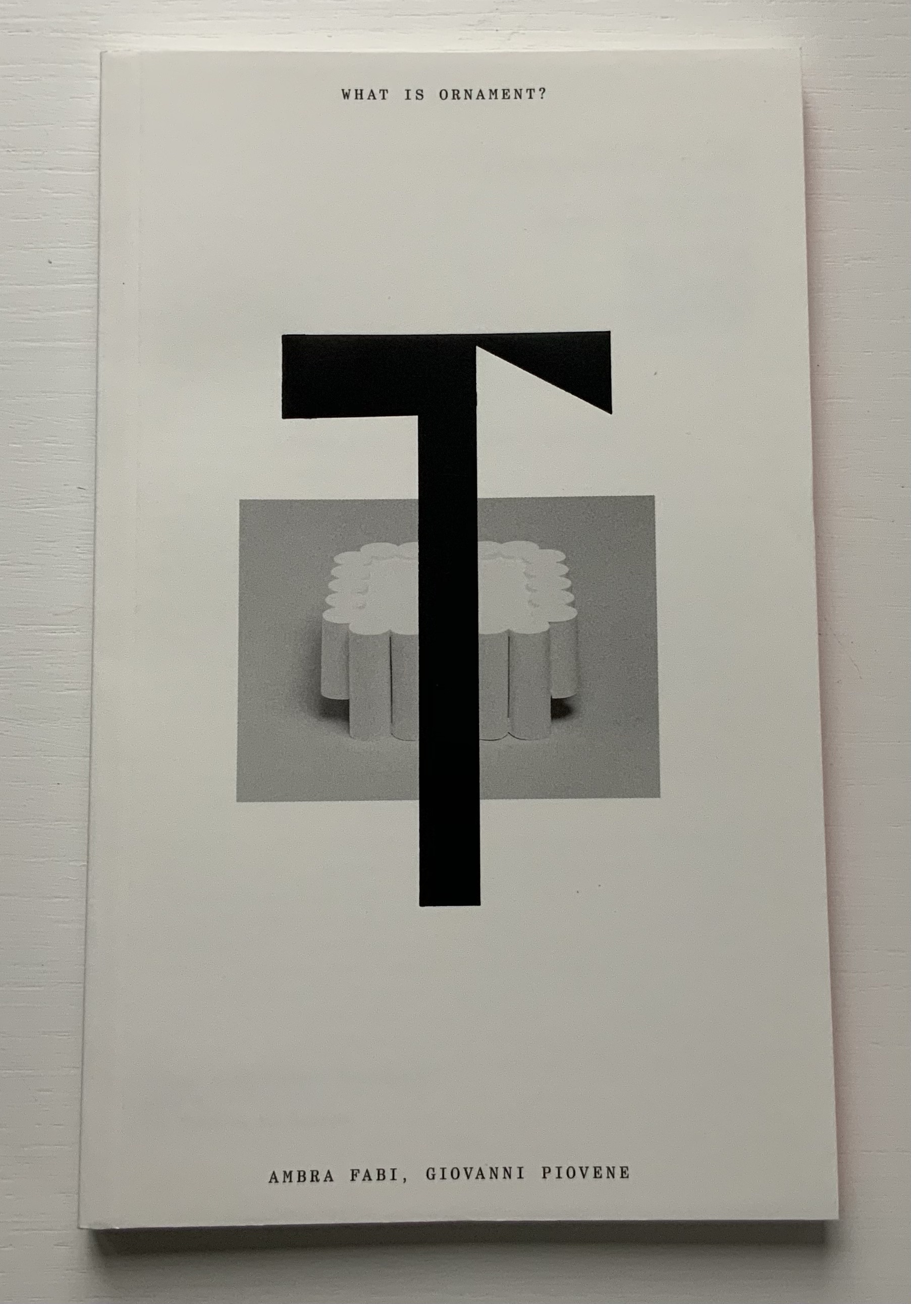
Text: Éric Lapierre, Ambra Fabi and Giovanni Piovene, Mariabruna Fabrizzi and Fosco Lucarelli, Sébastien Marot, and Laurent Esmilaire and Tristan Chadney. Design: Marco Balesteros
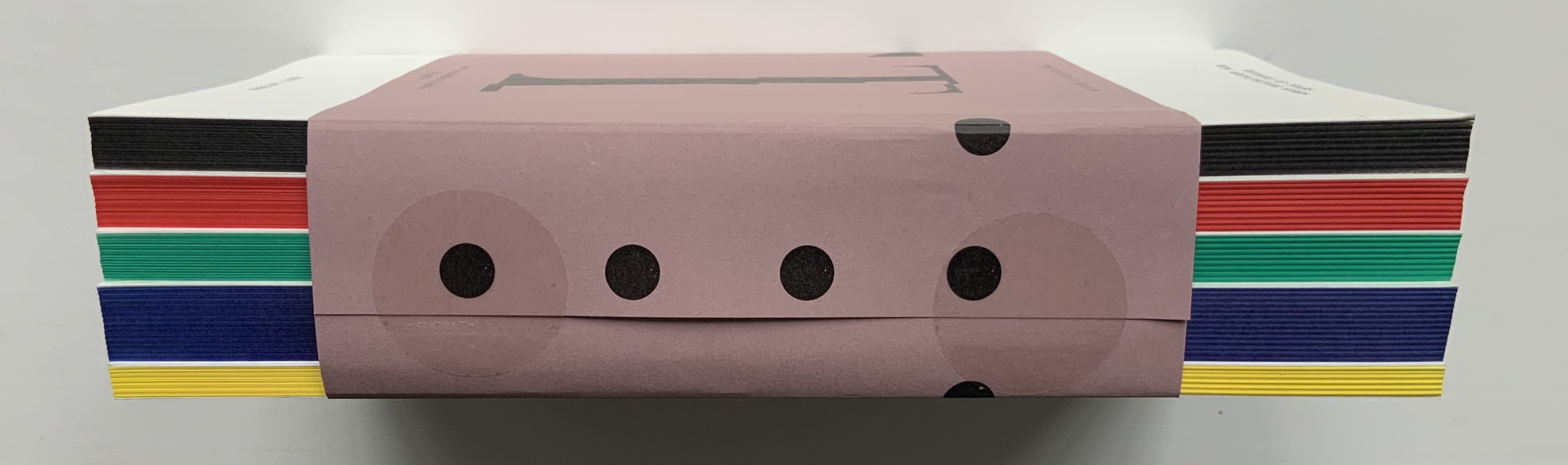
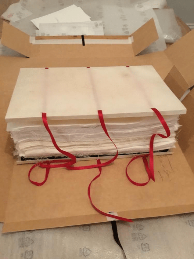
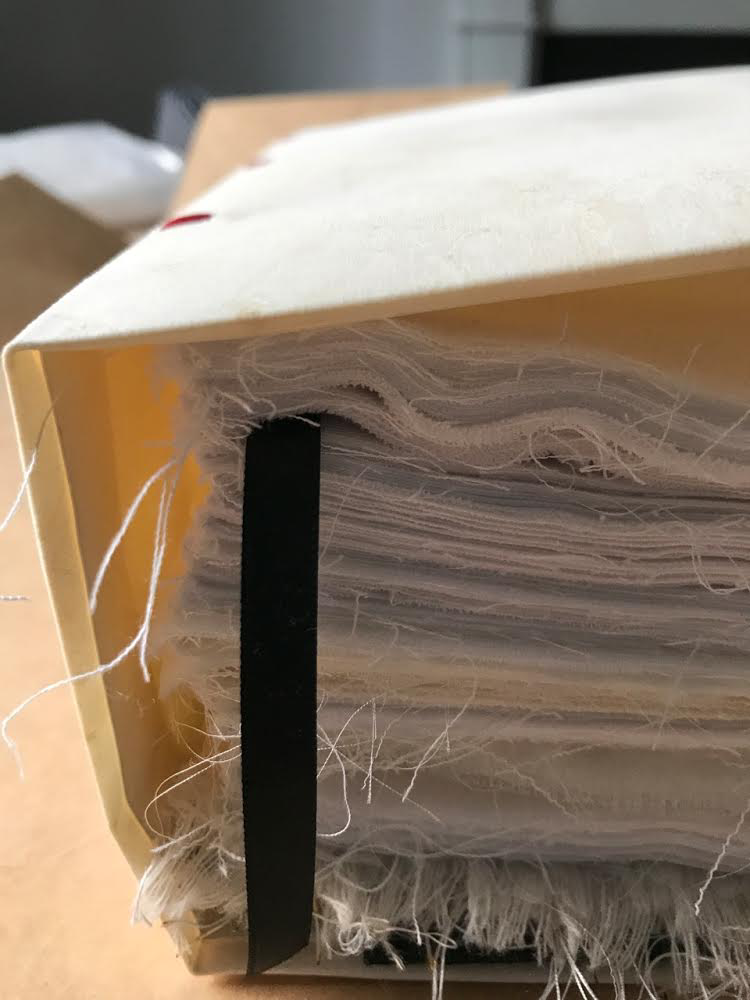
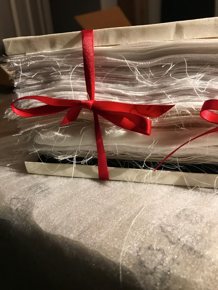
Five-volume set of perfect bound paperbacks in bellyband; laminated display letters on front cover, tinted fore-edges. H212 x W130 mm, 712 pages. Acquired from Small Projects, S.A., 19 February 2020.
Photos of the work: Books On Books Collection.
“The Poetics of Reason” was the title and theme for the fifth Lisbon Architecture Triennale in 2019 (the first was in 2007). Awarded the ADG Laus 2020 Golden Prize in the category of editorial graphic design, this work stands well with Bruno Munari’s three small 1960’s books on the square, circle and triangle, now available in a single volume, and calls to mind several works testifying to the relationship between architecture and book art. In the first of the five volumes, Éric Lapierre even interweaves with his text on architectural rationality illustrations from book artists such as Bernd and Hilla Becher, Sol Lewitt and Ed Ruscha — all without comment, in itself conveying their implicit relevance. His similar display of a page from Stéphane Mallarmé’s Un Coup de Dés Jamais N’Abolira le Hasard — that progenitor of modern and post-modern book art — speaks to the role that space — les blancs, as Mallarmé calls it — plays in these adjacent communities.
136 pages
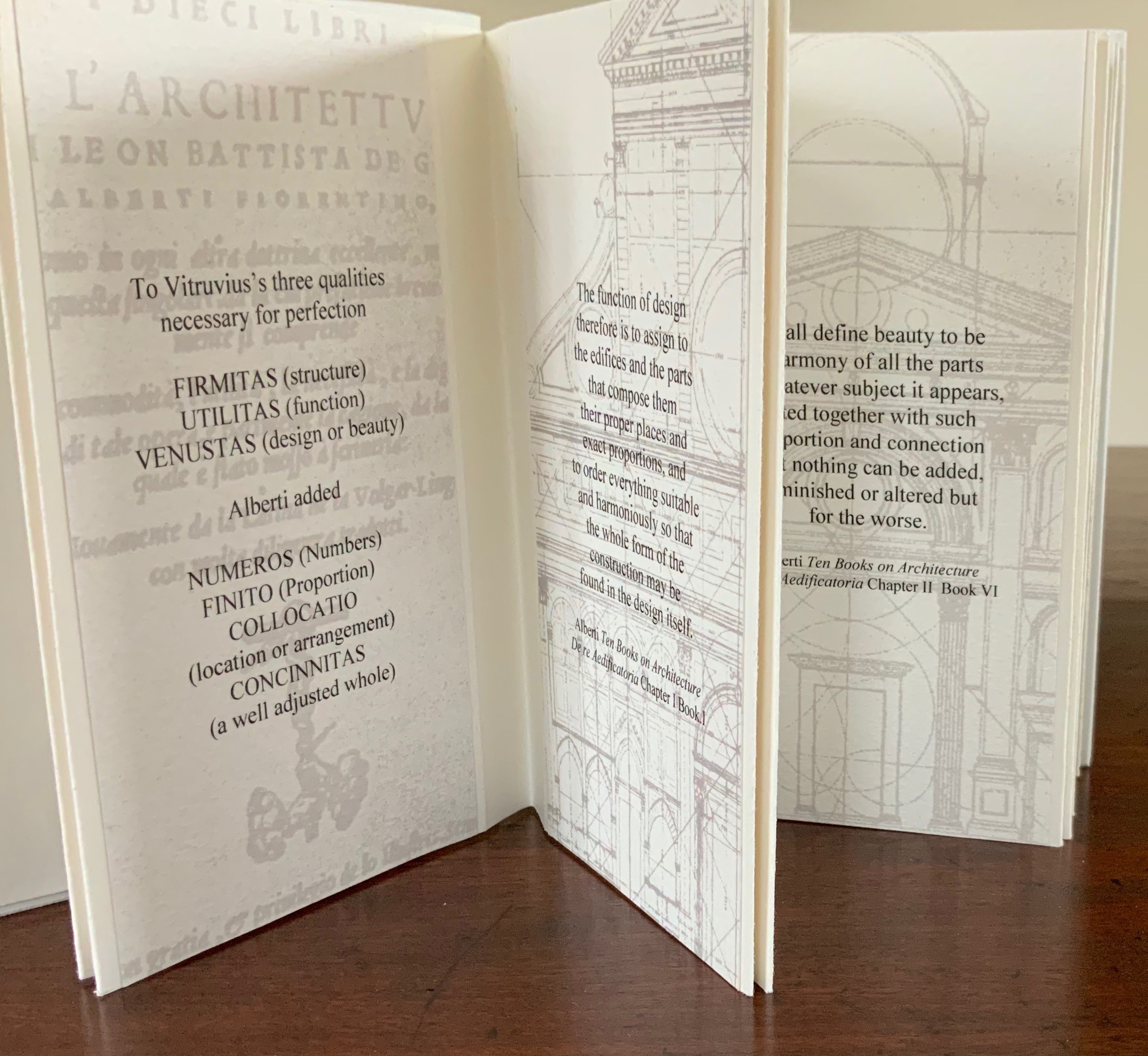
The second volume, by Ambra Fabi and Giovanni Piovene, draws in Leon Battista Alberti, of course, whose columns ornament works by Mari Eckstein Gower, Helen Malone and many other book artists.
136 pages
Drawing on Gaston Bachelard and Juhani Pallasmaa as it does, the third volume, by Mariabruna Fabrizzi and Fosco Lucarelli, calls to mind the work of Olafur Eliasson and Marian Macken here in the Books On Books Collection and elsewhere. Anyone familiar with Richard Niessen’s The Typographic Palace of Masonry will appreciate Fabrizzi and Fosco’s exploration of where architecture, imagination and memory intersect.
136 pages
In the lengthiest of the five volumes, Sébastien Marot takes us into the territory of urban architecture and the anthropocene, also occupied by book artists Sarah Bryant, Emily Speed, Philip Zimmermann and many others.
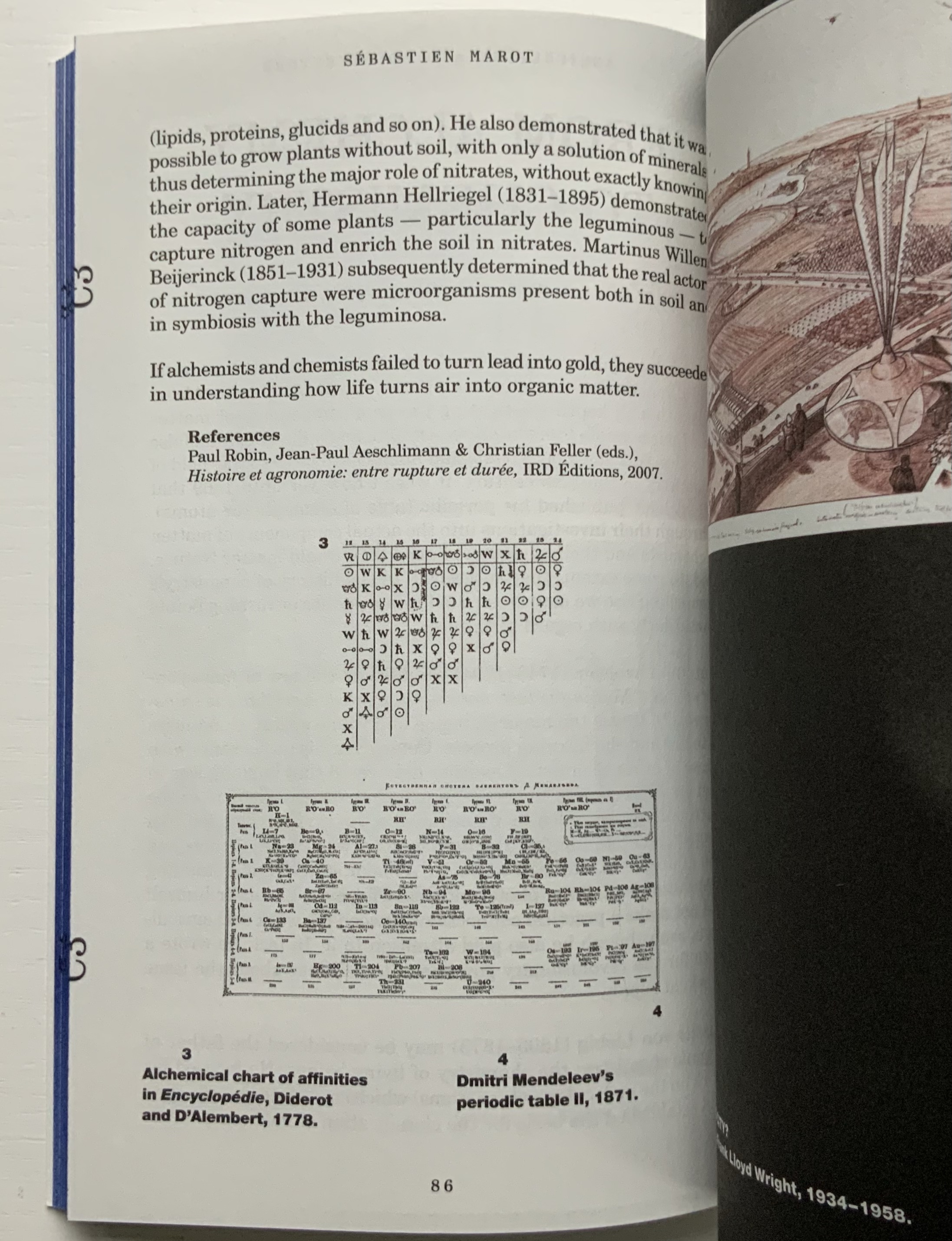
216 pages
The last and shortest volume, put together by Laurent Esmilaire and Tristan Chadney, consists mostly of photos that may remind the viewer of Irma Boom’s Elements of Architecture, with Rem Koolhaas, or Strip, with Kees Christiaanse — especially in conjunction with the tinted fore edges.
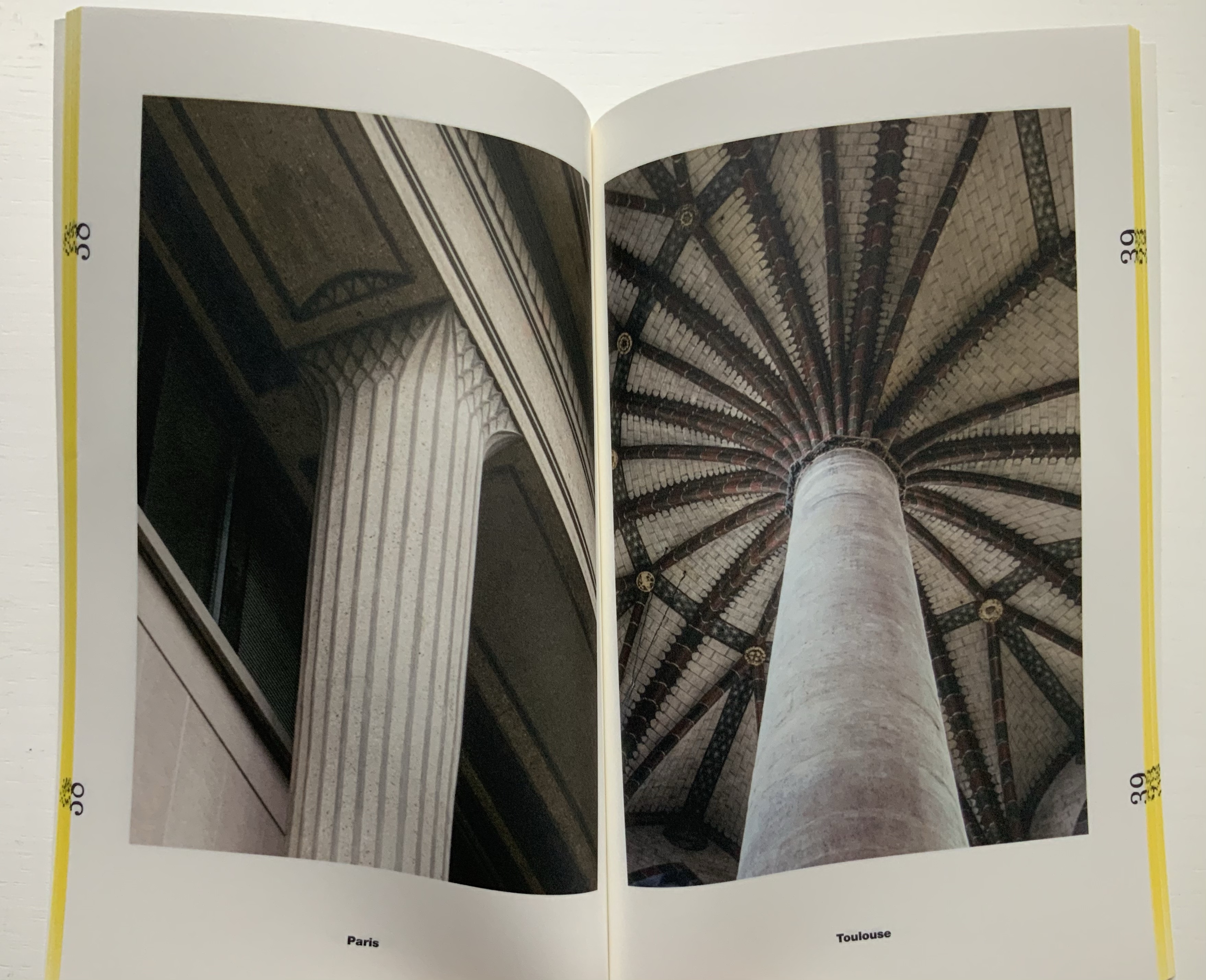
88 pages
Referenced below, Pedro Vada’s review of the Triennale and the five separate sites across which it occurred in Portugal provides more insight into the five volumes themselves. Marco Ballesteros LETRA website provides additional images of the five volumes’ design.
Further Reading
“Architecture“. 12 November 2018. Books On Books Collection.
SOCKS Studio, an extraordinary website run by Fabrizzi and Lucarelli.
Beaumont, Eleanor. 16 January 2019. “Interview with Irma Boom“, The Architectural Review.
Munari, Bruno. 2015. Bruno Munari: Square Circle Triangle. New York: Princeton Architectural Press.
Vada, Pedro. 24 July 2019. “Details about Lisbon Triennale 2019“. ArchDaily. Accessed 17 August 2021.
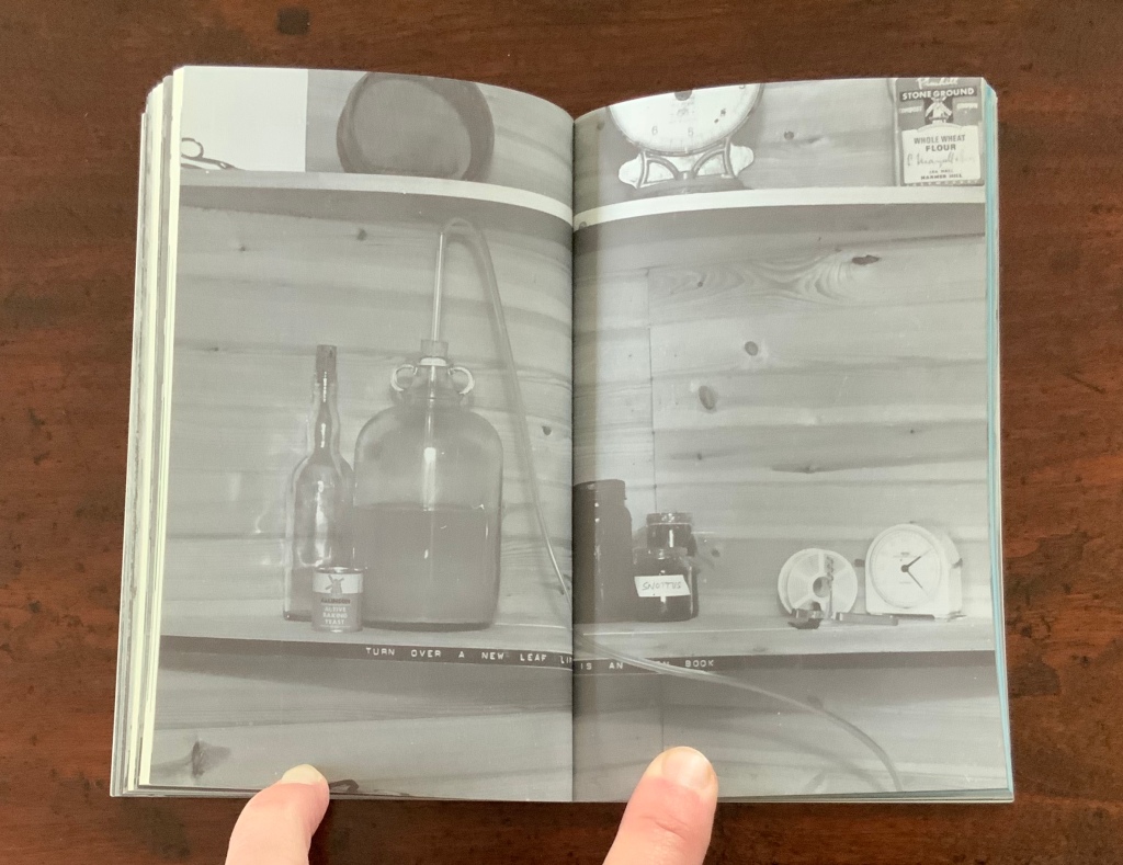
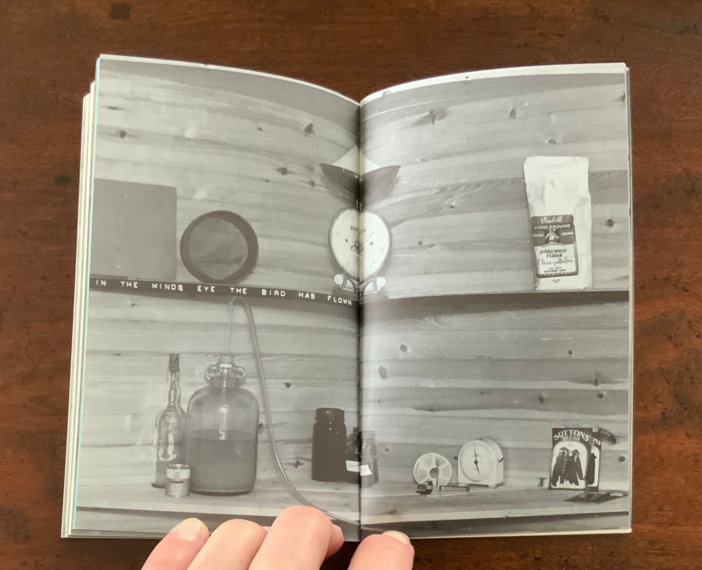
Books On Books Collection – Jaz Graf
Trophic Avulsions (2016)
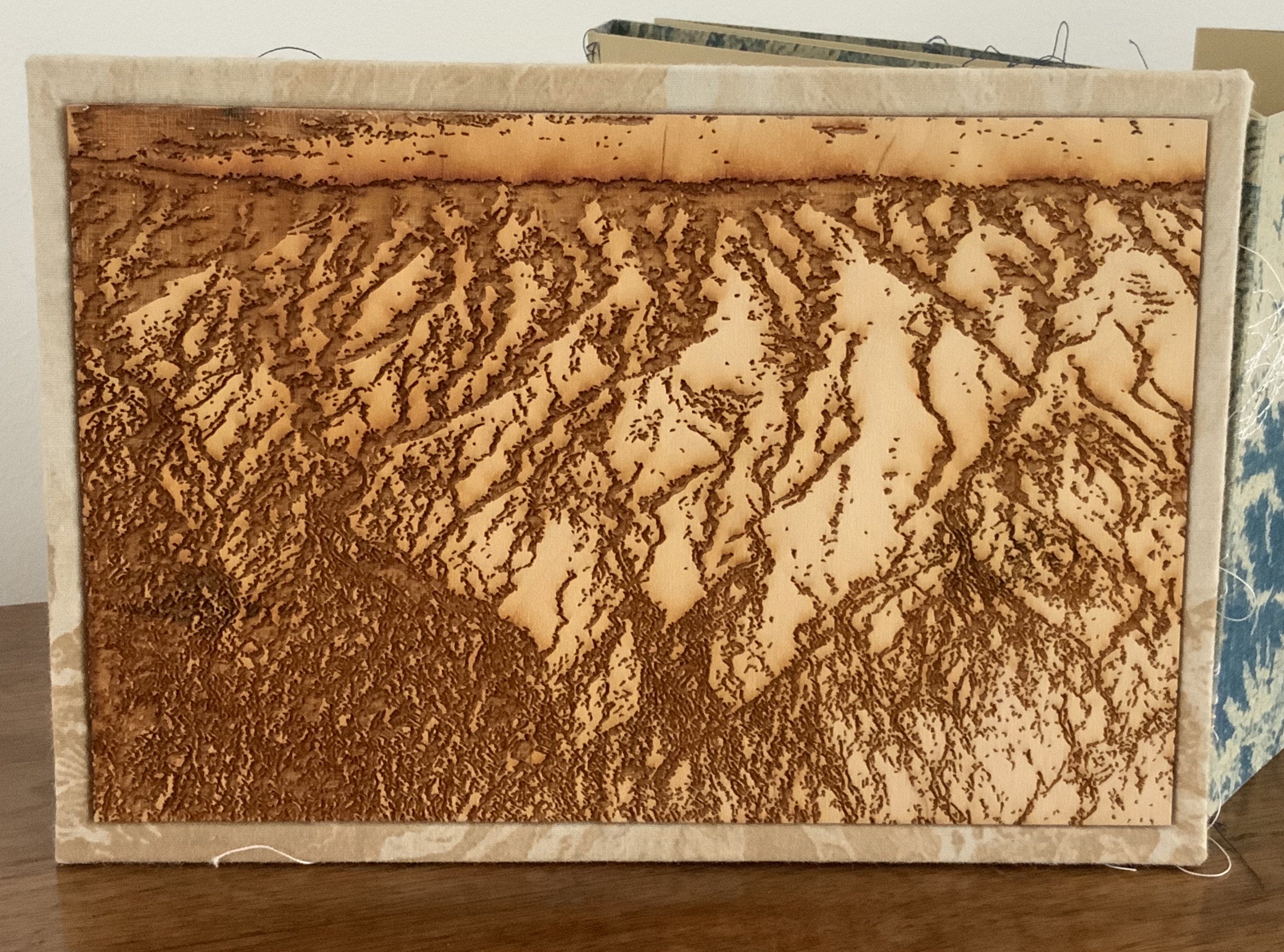
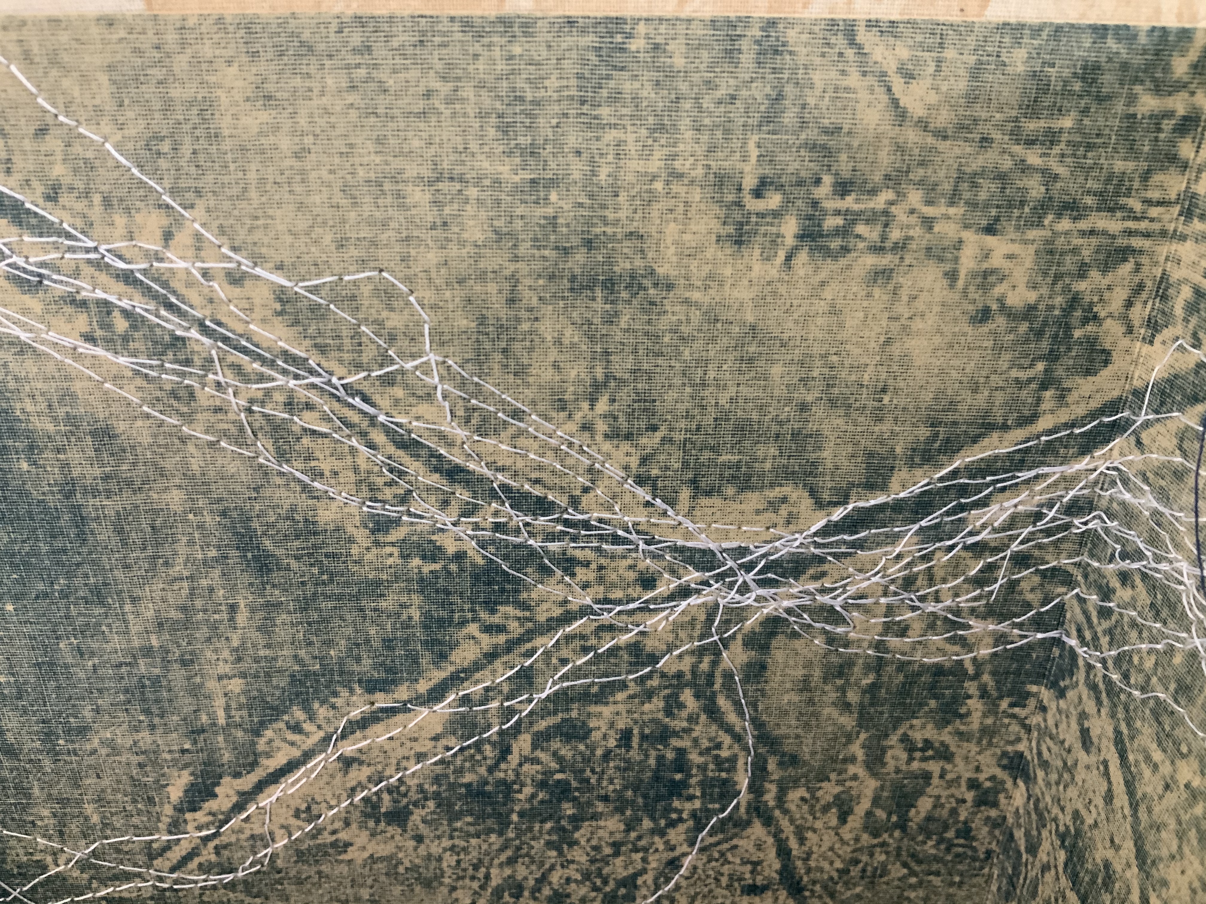
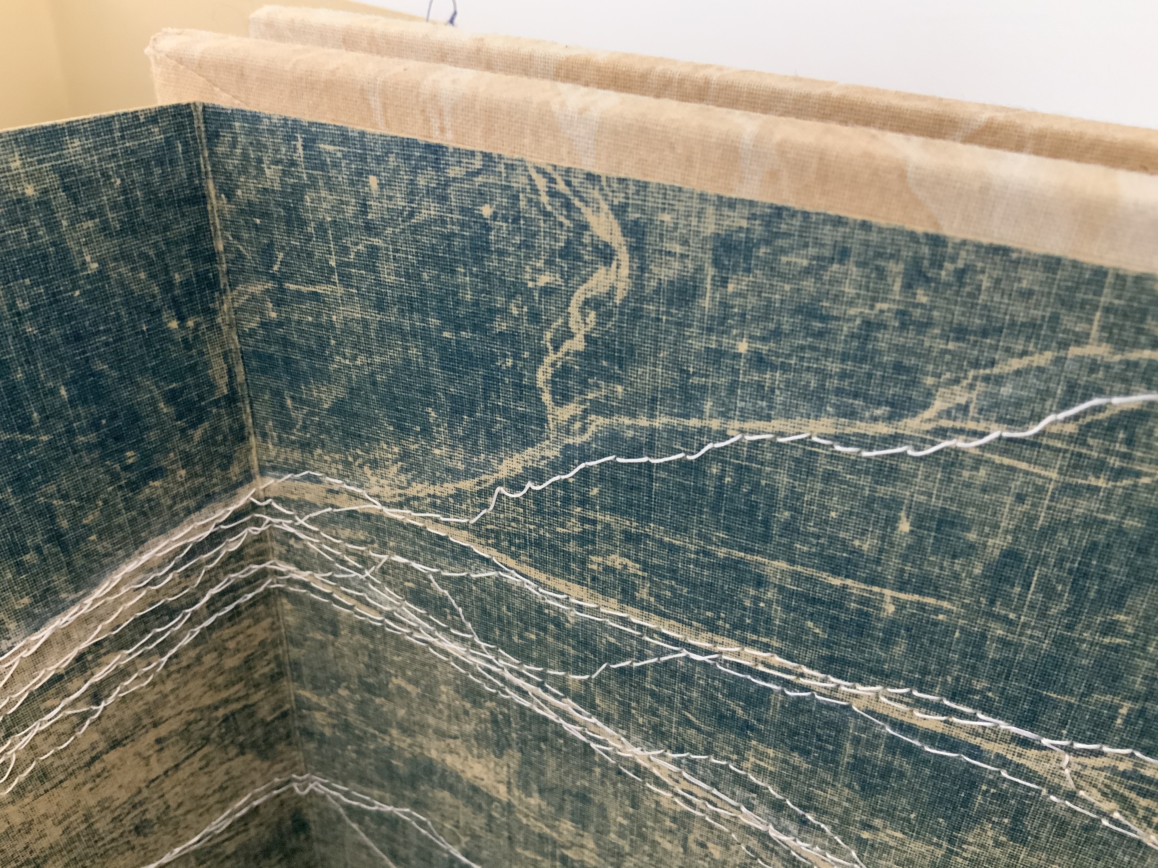
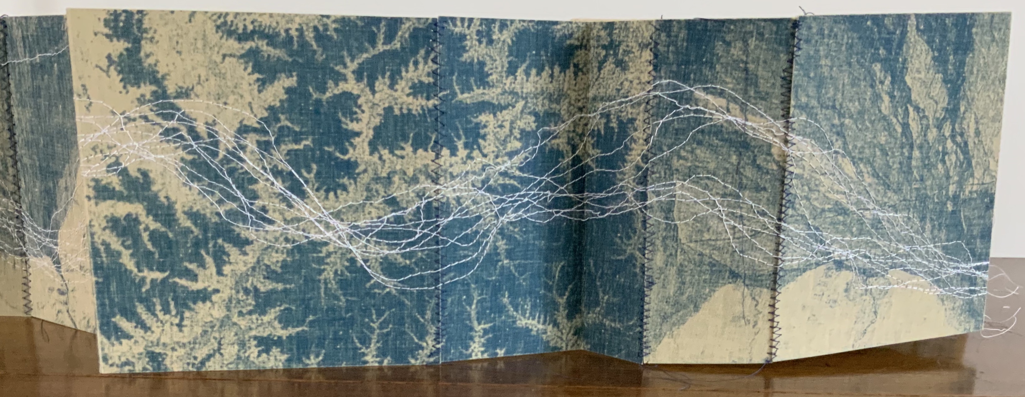
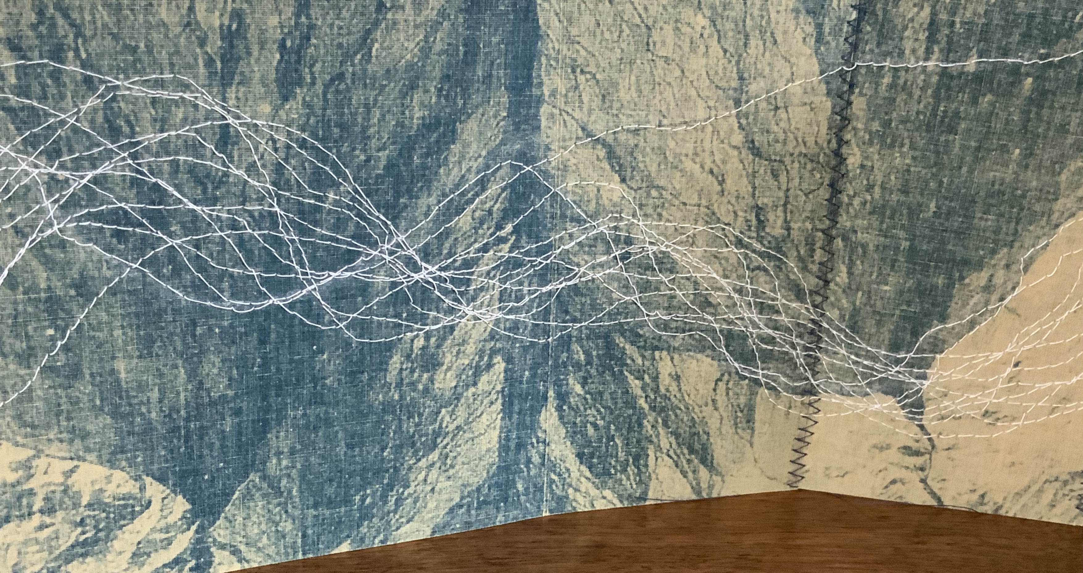
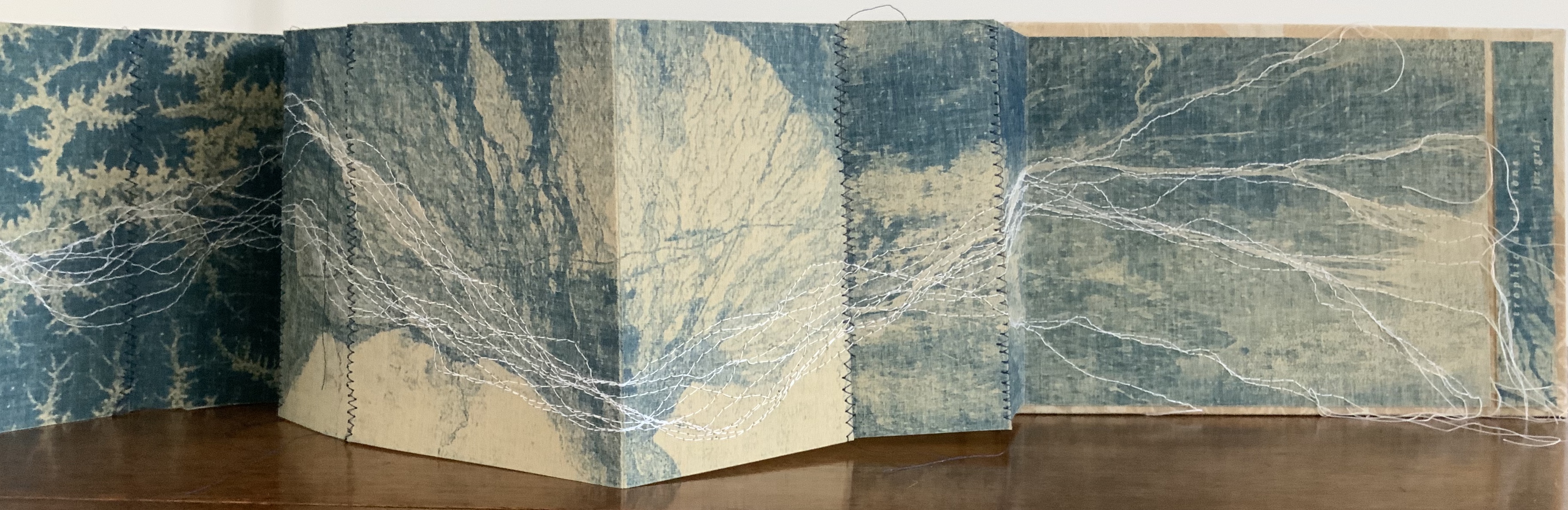
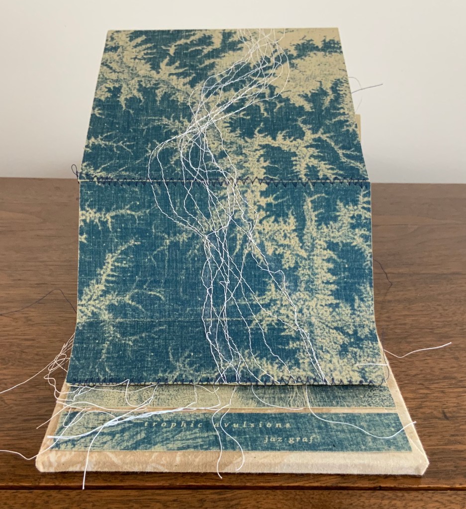
Trophic Avulsions (2016)
Jaz Graf
Cyanotype accordion book with thread drawing, paper lithography and laser engraving on wood. Closed: H6 x W8.5 x D1.0 inches; Open: W80 inches. Unique. Acquired from the artist, 14 March 2018. Photos: Books On Books Collection.
Graf has used satellite photos of various river deltas around the world to create the cyanotype prints in this work. The patterns from which are exposed come from paper litho prints made on fabric. The result is a blurring, softening yet “nearing” of the otherwise sharp, scientific and remote images normally viewed on digital screens or photographic paper. As Graf points out in her description, the word trophic “relates to an ecological concept of the trophic cascade, in which one action leads to another in an ecosystem, implying ideas of interconnectivity.”
That interconnectivity and the impact we have on “the separation of land from one area and its attachment to another”, which is what avulsion means, is implied by the streams of thread meandering across and off the panels of the accordion form from beginning to end. Even though the panels fold to fit within their laser-engraved birch panels, they vary in width, which breaks up the expected regularity of the accordion when it is extended. The engravings show a delta emptying into a desert and are mounted on wood blocks covered in muslin bearing the printed delta image made with paper lithography.
Thread drawing is a technique common to several outstanding works of book art: Jody Alexander’s Felix’s Notebook (2008), Marion Bataille’s Vues/Lues (2018), Dianna Frid’s Reversal (2009), Candace Hicks’ Composition (2009~), Helen Hiebert‘s Nebulae (2017), Shellie Holden’s Maps (2006), Lisa Kokin’s Partial History of Jewish Life in Modern Times (1997), Ines Seidel’s Changed Constitution (2015) and Mireille Vautier‘s Agenda (2001) among others. Graf’s handling of the technique and its combination with cyanotype printing and lithography in the treatment of her theme, though, make it distinctive and original.
The environmental focus of Trophic Avulsions places it in a well-loved tradition in book art. Other works by Graf, such as Mother Water (2018) below, would be comfortably at home in an exhibition with
Biography (2010) by Sarah Bryant, who creatively connects the human body’s elements with those of the periodic table to bear witness to our impact on the environment and vice versa;
the Ice Books series (2007-17) by Basia Irland, who selects local seeds and embeds them as “text” in a block of frozen river water, carved into the shape of a book to be released into the local river where it melts, releasing the seeds;
the Whorl series (2013- ongoing) by Jacqueline Rush Lee, who returns books to their botanical origins by sculpting books and inserting them into the cavity of a tree to allow time, changing weather conditions and insect activity to rewrite them into the shape of a whorl in a tree hollow;
Batterers (1996) by Denise Levertov, Kathryn Lipke and Claire Van Vliet, who combine Levertov’s powerful poem extending a metaphor of abuse to the earth with Lipke’s clay paperwork set into a wooden tray as the base of this sculptural book, whose pages Van Vliet makes unfold into a fiery landscape; or
Silent Spring Revisited (2016) by Chris Ruston, who uses her frequent visits to natural history museums to inspire works that blend science and art that highlight extinction and the interdependence of humans and nature.
If such an exhibition — a twentieth anniversary of Betty Bright’s 1992 “Completing the Circle: Artists’ Books on the Environment”? — were organized, Trophic Avulsions would be available to loan!
Mother Water (2018)
Laser-etched acrylic, cyanotype, porcelain
Dimensions variable (15 panels – each 14”x11”)
The river featured is Thailand’s Chao Praya. Photo: Courtesy of the artist.
Further Viewing
“Artist of the Week“, Jaffe Center for the Book Arts, Florida State University. 5 January 2020.
Bookmarking Book Art – Alicia Bailey and the Artists’ Book Cornucopia
For a decade, Alicia Bailey has played the role of Ceres to book artists and collectors, bringing them the Artists’ Book Cornucopia. And this has been in addition to creating her own bookworks, organizing other exhibitions and running Abecedarian Gallery and Raven Press. Artists’ Book Cornucopia X marks the tenth and last cornucopia but not the end of their impact.
Cornucopia implies abundance and variety, and Alicia Bailey has delivered both. A glance at the ten catalogues finds a consistently high level of participation — always at least thirty artists — and every catalogue has shown a “variety of varieties”. Consider these varieties:


Variety of structures: accordions, boxes, flag books, girdle books, pop-ups, miniatures, portfolios, scrolls, sculpted shapes, wallets, etc. The variations within each type would require a hunt through The Art of the Fold (Kyle and Warchol), Structure of the Visual Book (Smith) and Book Dynamics! (Hutchins) to identify them properly. In ABC X, all of the structures mentioned above are represented. Over the decade, the Artists’ Book Cornucopia have spilled out structural innovations such as Merike van Zanten’s A Soldier of the Second World War (ABC I), Pamela Paulsrud’s Touchstones (ABC II), Cathryn Miller’s Universe: Foundation Trilogy (ABC III), Louisa Boyd’s miniature Stardust (ABC IV), Susan Kapuscinski Gaylord’s Spirit Book #67 (ABC V), Candace Hicks’s Trees of a Feather (ABC VI), Karen Hardy’s Vellicate (ABC VII), Bryan Kring’s Shared Illusion (ABC VIII) and Josh Hockensmith’s After (ABC IX). The abundance of innovations makes a visit to the Abecedarian Gallery site for numerous second-guessings worthwhile.


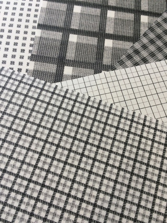
The variety of material used by the artists overwhelms: beads and buttons (Ednie), cactus needles and jute (Reka), cement and glass (Bryant), ceramic and cardstock (Wolken), copper and redwood (Anstruther/Grasso), fishing line and wire (Johnston), fish-skin and mull (Klass), leather and “metal findings” (Melis), magnet and museum board (Burton), palladium and aluminum leaf (Bailey), ribbon and slide viewers (Grimm), silk and sinew (Alpers), thread and tyvek (Asato), window screen and wood (Fleming), zippers and fabric (Melhorn-Boe) and, of course, upcycled books (Anastasiou). Any appreciation of the ingenuity of materials selection and manipulation across the Artists’ Book Cornucopia requires a rewarding read of the descriptions provided in each of the catalogues.


Then there is the variety of techniques: blind deboss (Lawrence), calligraphy (Towers), chromogenic prints (Grimm), collograph (Dokudowicz), cyanotype (Biza), gelatine monoprinting (Powers-Torrey), intaglio (Larson), letterpress (Nakata), linocut (Knudson), photopolymer (Larson), risography (Powers-Torrey), silkscreen (Anastasiou) and woodcut (Lucas). Like the materials used, the techniques employed are almost too many to name, and of course, those named are used by more than the one artist mentioned.


And, of course, a riot of papers: abaca (Welch), Alabama kozo (Sico), Awagami Shin Inbe (Gorham), cotton-abaca (Lucas), Domestic Etch/Lana Laid/Masa/Niddegen (Powers-Torrey), Hahnemühle Ingres mouldmade pastel paper (Ednie), indigo flax (Johnston), Somerset (Moyer) and Thai Momi marbled paper (Towers), which of the varieties used are far too few to mention.


And varied carriers of colour: acrylic (Johnston), crayon and botanically dyed ink (Ednie), digital ink (Reka), gouache (Thrams), milk paint (Anstruther/Grasso), pencil (Fleming), pulp painting (Welch), Sumi and walnut inks (Towers), textile ink (Melhorn-Boe) and watercolour (Ednie,Thrams and Towers), again far more could be mentioned.


Likewise, the variety of shapes and direction is kaleidoscopic: zigzag, circular, globular, vertical, horizontal, square, cuboid and boustrophedon (left to right to left to right, etc.). And that is before any listing of the Platonic shapes in Sarah Bryant’s The Radiant Republic.


The wide variety of themes in ABC X echoes the same breadth across the previous nine catalogues. Here we have architecture (Bryant), botany and discovery (Gower), chronic illness (Wolken), the city (Dokudowicz), environment (Lowdermilk), industrial landscape (Burton), the literary (Bailey), pain (Reka), sexuality (Grimm), travel (Melis), wildlife (Thrams) and #MeToo (Ellis). The named representative artist is just a starting point for each theme, and the themes mentioned are only alphabetical, not exhaustive.


Perhaps the one varietal shortcoming of ABC I-X is that most of the artists participating hail from the US. When another nationality appears in one of the catalogues, it surprises. Over time, “vintners“ from the following countries have shown up: Argentina, Australia, Austria, Brazil, Canada, China, Egypt, France, Greece, Korea, Netherlands, Poland, UK and Venezuela.


The abundance and variety of Alicia Bailey’s Artists’ Book Cornucopia prove one premise and question another from Johanna Drucker’s The Century of Artists’ Books:
If all the elements or activities which contribute to artists’ books as a field are described what emerges is a space made by their intersection, one which is a zone of activity … There are many of these activities: fine printing, independent publishing, the craft tradition of book arts, conceptual art, painting and other traditional arts, politically motivated art activity and activist production, performance of both traditional and experimental varieties, concrete poetry, experimental music, computer and electronic arts, and last but not least, the tradition of the illustrated book, the livre d’artiste. The Century of the Artists’ Books (New York: Granary Books, 2004, new edition), p. 2.
ABC X and its nine sisters shout a resounding “Amen”, but the rich quality and originality of the works displayed whisper “‘the’ century?” At the close of the 21st century’s second decade, Ceres is smiling.
Further Reading, Listening and Viewing
Bailey, Alicia. “‘Narrative Threads’ uses book art to explore stories”, PostIndependent, 3 May 2018. Accessed 2 December 2019.
Bowen, Sara. “Artists, Books and Interviews #2: Alicia Bailey”, Book-Art-Object, 20 November 2011. Accessed 7 November 2019.
Dillard, Julia “Curator Alicia Bailey on the Intimacy of Artists’ Books and Everything You Didn’t Know about Book Arts”, Art Gym Denver, 23 October 2017. Accessed 7 November 2019.
Froyd, Susan. “#45: Alicia Bailey”, Westwood, 19 September 2013. Accessed 7 November 2019.
Isaacs, J. Susan. The Book: A Contemporary View (Wilmington, DE: Delaware Center for the Contemporary Arts, 2011), p. 15.
Leutz, Pamela. “This Time Is: Alicia Bailey”, The Guild of Bookworkers, 25 April 2018. Accessed 7 November 2018.
Wolfson, Zach. “Beyond the Gallery with Alicia Bailey”, Infusion5, 17 April 2014. Accessed 7 November 2019.
“Jim Blaine and His Grandfather’s Ram” – Or How to Enjoy Codex VII

The seventh biennial Codex book fair and symposium in Berkeley and Richmond, California have come to a close. Of what use it is now to explain how to enjoy them, you be the judge. Your first step is to read the story in Mark Twain’s Roughing It of “Jim Blaine and His Grandfather’s Ram”. Being the story of a story — book art being so self-reflexive and all — it is the best way to commence:
Every now and then, in these days, the boys used to tell me I ought to get one Jim Blaine to tell me the stirring story of his grandfather’s old ram—but they always added that I must not mention the matter unless Jim was drunk at the time—just comfortably and sociably drunk.
Not to advise drink before the fair.
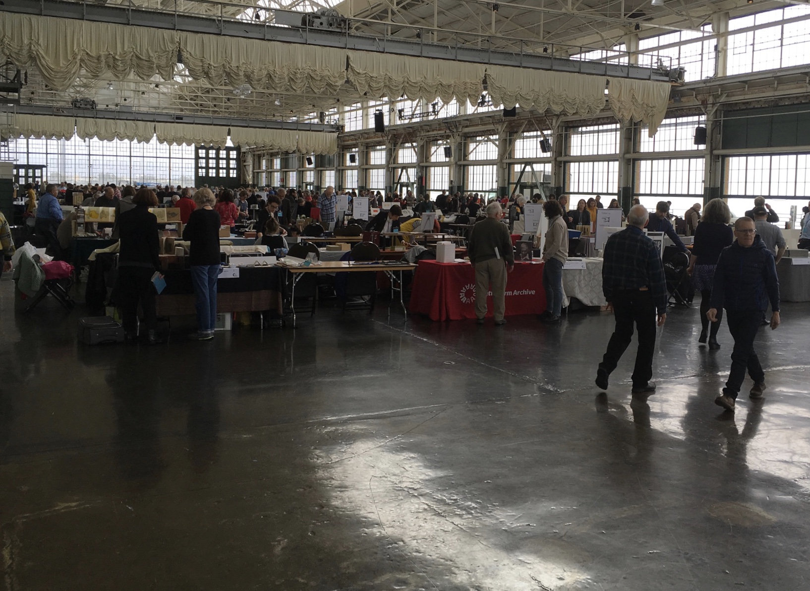
For the start of this Codex, rain and mist hover outside the hangar. The polished concrete floor looks wet but isn’t — so first-time visitors step to avoid slips that won’t really occur. The old-timers though stride from table to table arms wide, bussing each other on the cheek or humping crates around and placing and re-placing their works for the right effect. Arriving early to watch adds a certain enjoyment.
At last, one evening I hurried to his cabin, for I learned that this time his situation was such that … he was tranquilly, serenely, symmetrically drunk—not a hiccup to mar his voice, not a cloud upon his brain thick enough to obscure his memory. As I entered, he was sitting upon an empty powder- keg, with a clay pipe in one hand and the other raised to command silence. … On the pine table stood a candle, and its dim light revealed “the boys” sitting here and there on bunks, candle-boxes, powder-kegs, etc. They said: “Sh—! Don’t speak—he’s going to commence.”
‘I don’t reckon them times will ever come again. There never was a more bullier old ram than what he was. Grandfather fetched him from Illinois—got him of a man by the name of Yates—Bill Yates—maybe you might have heard of him; his father was a deacon—Baptist—and he was a rustler, too; a man had to get up ruther early to get the start of old Thankful Yates; it was him that put the Greens up to jining teams with my grandfather when he moved west.
‘Seth Green was prob’ly the pick of the flock; he married a Wilkerson—Sarah Wilkerson—good cretur, she was—one of the likeliest heifers that was ever raised in old Stoddard, everybody said that knowed her. She could heft a bar’l of flour as easy as I can flirt a flapjack. And spin? Don’t mention it! Independent? Humph! When Sile Hawkins come a browsing around her, she let him know that for all his tin he couldn’t trot in harness alongside of her. You see, Sile Hawkins was—no, it warn’t Sile Hawkins, after all—it was a galoot by the name of Filkins—I disremember his first name; but he was a stump—come into pra’r meeting drunk, one night, hooraying for Nixon, becuz he thought it was a primary …
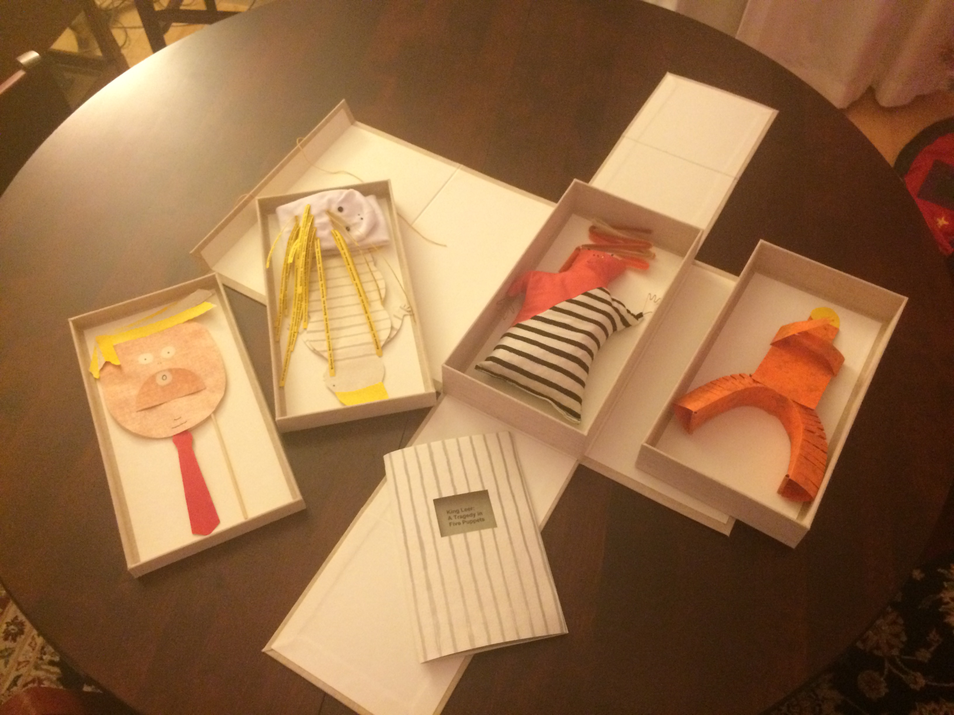
Which reminds me of Emily Martin and her politically biting King Leer —
Emily Martin
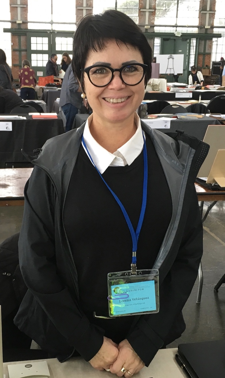
There is plenty more somber work to go around: Lorena Velázquez from Mexico has followed up her powerful Cuarenta y tres with Exit, her hope in our turbulent times;

Barcelona’s Ximena Perez Grobet has 2.10.1968-2018 on display, commemorating the 50th anniversary of the Tlatelolco massacre in Mexico City; Sue Anderson and Gwen Harrison from Australia offer Phantomwise Flew the Black Cockatoo, an indictment of a cruel welfare system; and there is Islam Aly from Egypt with Inception, Bedaya, inspired by stories and journeys of refugees. Book art everywhere wears its heart on its cover.
Still, book artists are a convivial bunch and cheerful in their internationality. On Monday evening, Mary Heebner (Simplemente Maria Press) and her husband photographer Macduff Everton are in the Berkeley City Club’s off-limits members’ room settling down to a bottle of Santa Barbara red, and here come upstate New Yorker Leonard Seastone (Tidelines Press), Anglo-German Caroline Saltzwedel (Hirundo Press), Irishman Jamie Murphy (The Salvage Press) and Geordie David Esslemont (Solmentes Press). Macduff is launched on a tale about running into Queen Elizabeth on her horse-riding visit to Ronald Reagan’s ranch, when David remembers rounding down a path in the Lake District during an art residency to find Prince Charles legging it up the same — by which time Macduff has just returned from his room with a bottle of single malt — which reminds Caroline of a stormy weather hike along Hadrian’s Wall, where Macduff diverts onto a tale of nearly being blown off the same and making his shaky, near-death way back to a bed-and-breakfast for a hot bath and terrible food from the grumpy owners, which launches Leonard onto the story about his local Russian butcher/grocer/refugee who refuses to sell him salad but insists on providing chiropractic services one day and adopts Leonard as his only friend in the US with whom he can have true political debate. Jamie still wants to know why the Russian wouldn’t sell Leonard any salad.
Speaking of greens — Robin Price’s prototype for Witnessing Ecology: the agave plant book again displays that thread of social concern, but this work and Price herself draw attention to another thread of enjoyment to pursue: the recurrence of collaboration among book artists. One artist leads to another.
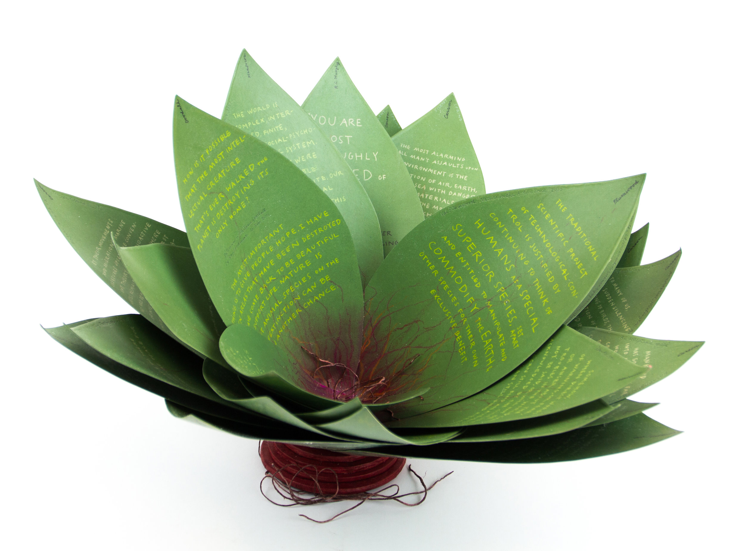
Robin Price
Photo: Mike Rhodes

As with the now-famous The Anatomy Lesson by Joyce Cutler-Shaw, Price has joined forces again with Daniel Kelm on the agave plant book, Kelm also collaborated with Ken Botnick on the long-gestating Diderot Project on display here just a few tables away, Botnick collaborated with the novelist and translator William Gass on A Defense of the Book, who in turn with the photographer Michael Eastman — who lives over in Oakland — created the digital-only book Abstractions Arrive: Having Been There All the Time. Whatever the medium, the book just naturally encourages collaboration — and chance. As Price’s book Counting on Chance implies and as so many book artists echo — as does Jim Blaine —
‘… There ain’t no such a thing as an accident. When my uncle Lem was leaning up agin a scaffolding once, sick, or drunk, or suthin, an Irishman with a hod full of bricks fell on him out of the third story and broke the old man’s back in two places. People said it was an accident. Much accident there was about that. He didn’t know what he was there for, but he was there for a good object. If he hadn’t been there the Irishman would have been killed. Nobody can ever make me believe anything different from that. Uncle Lem’s dog was there. Why didn’t the Irishman fall on the dog? Becuz the dog would a seen him a coming and stood from under. That’s the reason the dog warn’t appinted. A dog can’t be depended on to carry out a special providence. Mark my words it was a put-up thing. Accidents don’t happen, boys. Uncle Lem’s dog—I wish you could a seen that dog. He was a reglar shepherd—or ruther he was part bull and part shepherd—splendid animal; belonged to parson Hagar before Uncle Lem got him.’
Chance, luck or accident — if you are to enjoy this book fair, you need to count on them, not just allow for them. How likely was it that in pursuit of Mary Heebner’s Intimacy: Drawing with light, Drawn from stone, I would be caught up with that crew in the off-limits members’ club?
Mary Heebner
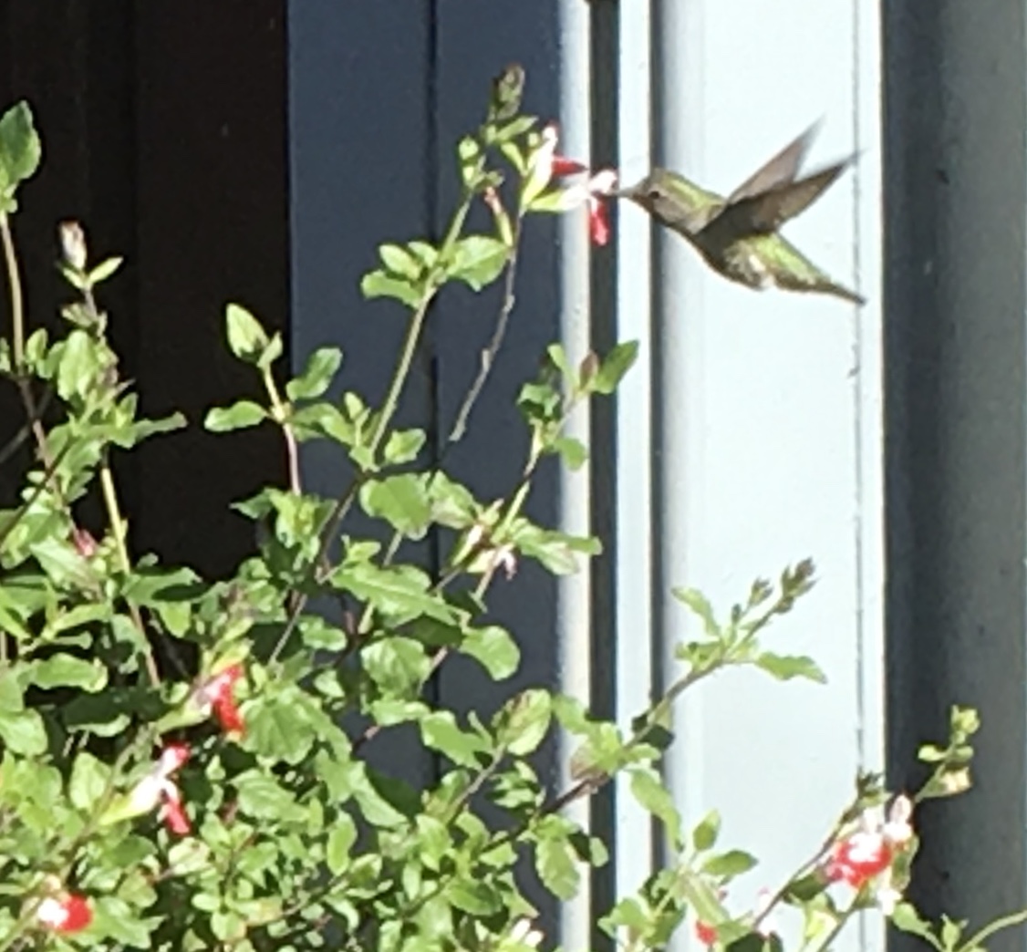
Or if I weren’t staying a good walking distance from the symposium, how would I have come across a hummingbird in the cold of February after being delighted with Sue Leopard’s Hummingbird?
Hagar is a common Nordic name. But how likely was it that Twain would use that particular name in his California mining-camp story and that Codex VII is hosting “Codex Nordica”? Mark my words it was a put-up thing.
That not one of the symposium presenters introducing us to “Codex Nordica” is named Hagar should not be held against the organizers. Their choices — Åse Eg Jørgensen (co-editor of Pist Protta, Denmark’s longest running contemporary artists’ journal), Tatjana Bergelt (multilingual, of German-Russian-Jewish culture and settled in Finland), Thomas Millroth (art historian from Malmö) — are entertaining, informative and good humoured (proof at least for the Danes that they can’t all be Hamlet or Søren Kierkegaard). What they have to say and show speaks to book art’s uncanny rhyming across geographies and times.
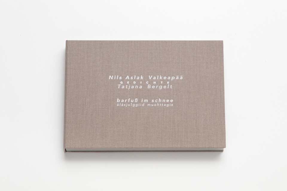
With every issue the outcome of guest editing, artists’ contributions and a mandate to be unlike any previous issue, Pist Protta is a cross between Other Books and So, the collaborative, gallery-challenging venture of Ulises Carrión in the last century, and Brad Freeman’s US-based Journal of Artists’ Books. Printed Matter has faithfully carried every issue of Pist Protta, so there is little excuse to be unaware of it and its liveliness. Fitting for someone who thinks of herself as a collage of cultures, Tatjana Bergelt’s barfuß im Schnee-álásjulggiid muohttagis (“Barefoot in the Snow”) is a photo-collage of old maps, satellite maps, poetic texts, landscapes and portraits of the Sámi, the dwindling inhabitants of the northern parts of Norway, Sweden, Finland and the Murmansk Oblast. It reminds me of UK-based Nancy Campbell’s Vantar/Missing.

Nancy Campbell
Digitally printed on Munken Polar, hand-sewn binding with hand-incised design, edition of 300
Both works delve into the vulnerable and disappearance — be it culture, gender or environment. Vantar‘s cold diptychs recording the mountain snow cover and barely perceptible signs of life in the ghost town Siglufjörður chime with Bergelt’s final slide:

Tatjana Bergelt
Tatjana Bergelt
2 books in linen cassette, edition of 4, in each book 6 poems by Nils Aslak Valkeapää in Sámi, Finnish and German languages, translations P.Sammallahti, C.Schlosser
The bus from the symposium in Berkeley to the fair itself in Richmond is another chance for chance to play its role. One day I’m sitting next to Amanda Degener (Cave Paper), who delights in our common acquaintance with Ioana Stoian and Eric Gjerde; the next, it’s Jeanne Drewes (Library of Congress), who introduces me to Mark Dimunation (Library of Congress), who regales us and the collector Duke Collier with tales of the British artist Ken Campbell. But the terrible thing about chance is that it takes up so much time and, at the same time, shows you what you wish you had more time for.
You could listen for hours to Peter Koch (Peter Koch, Printers) and Don Farnsworth (Magnolia Editions) about their making of Watermark by Joseph Brodsky:

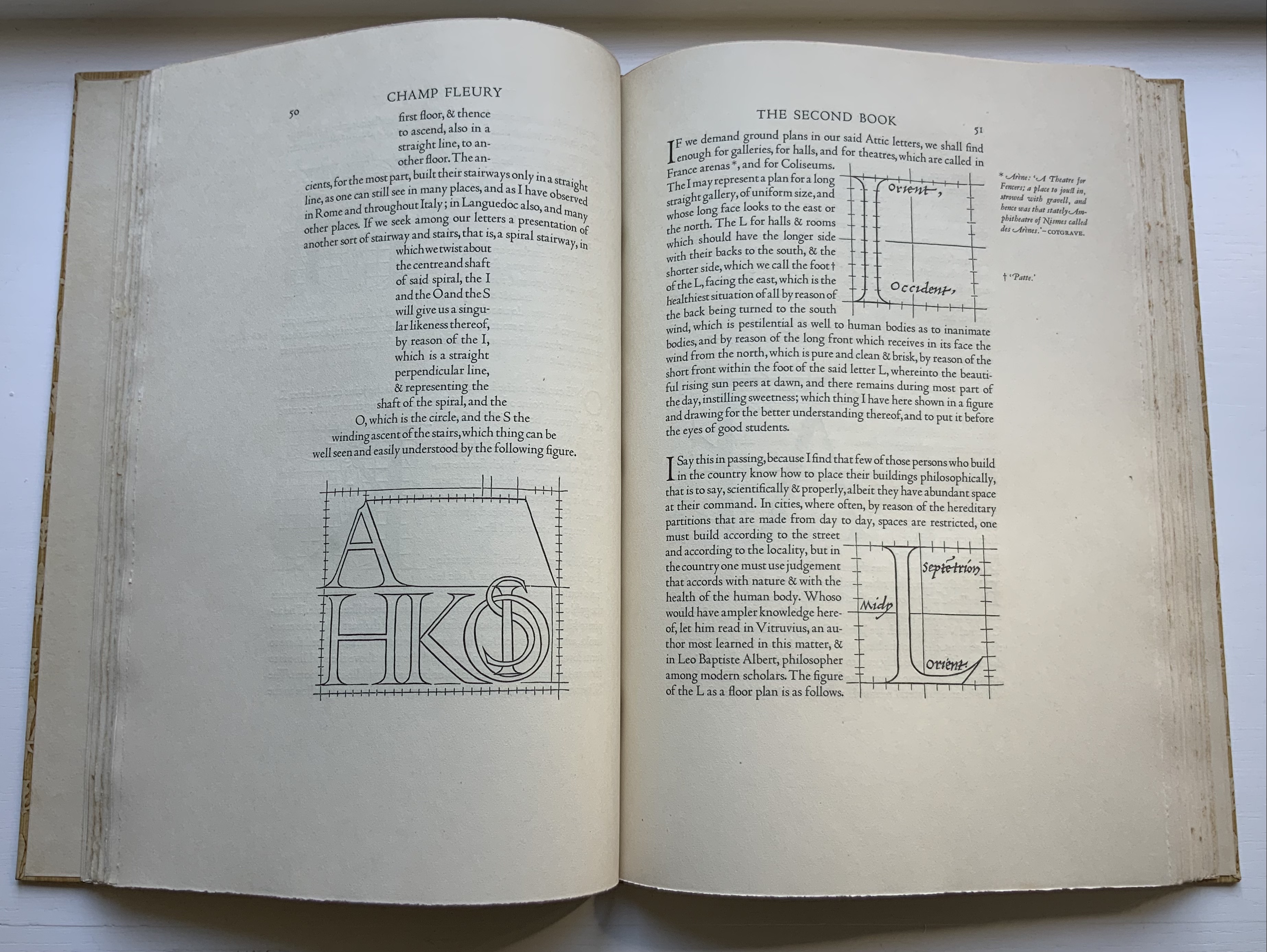
Or to Russell Maret discussing his work Character Traits and Geoffroy Tory’s Champ Fleury: The Art and Science of the Proportion of the Attic or Ancient Roman Letters, According to the Human Body and Face (1529):

Russell Maret
Geoffroy Tory
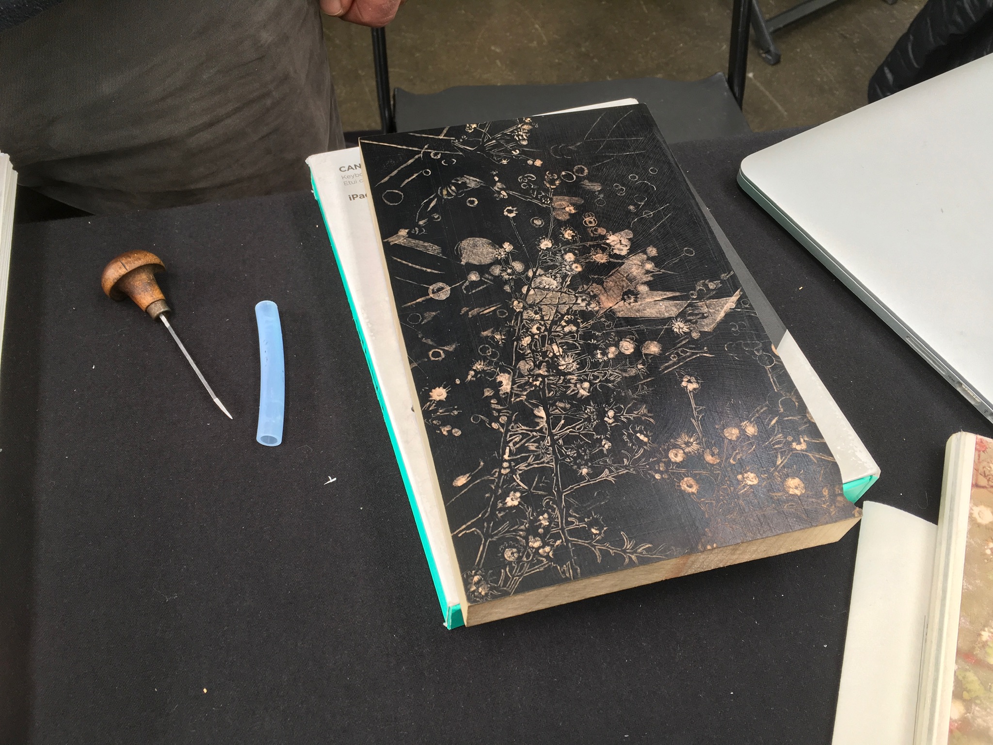
Or to Gaylord Schanilec (Midnight Paper Sales) enjoying his work on a woodblock:
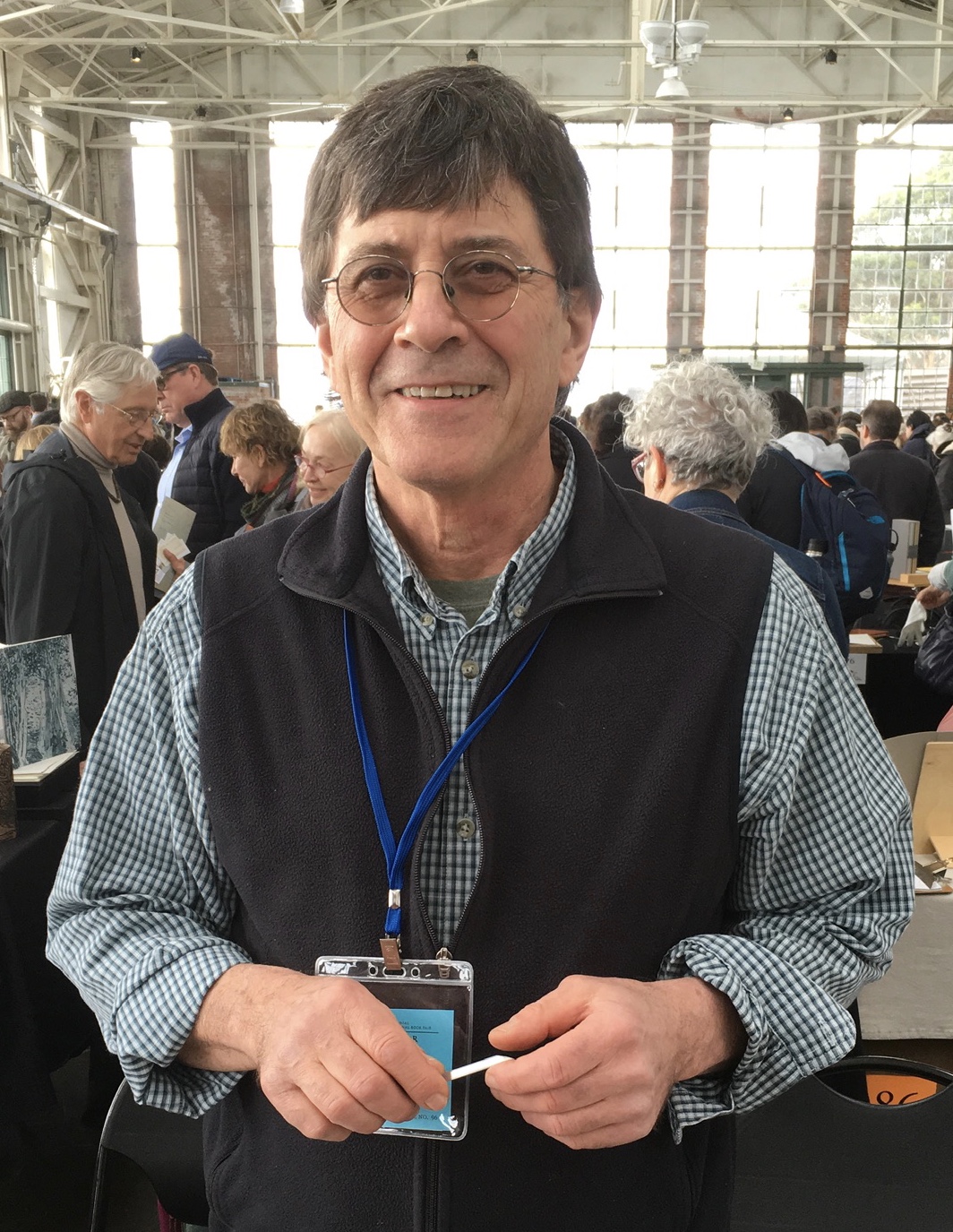
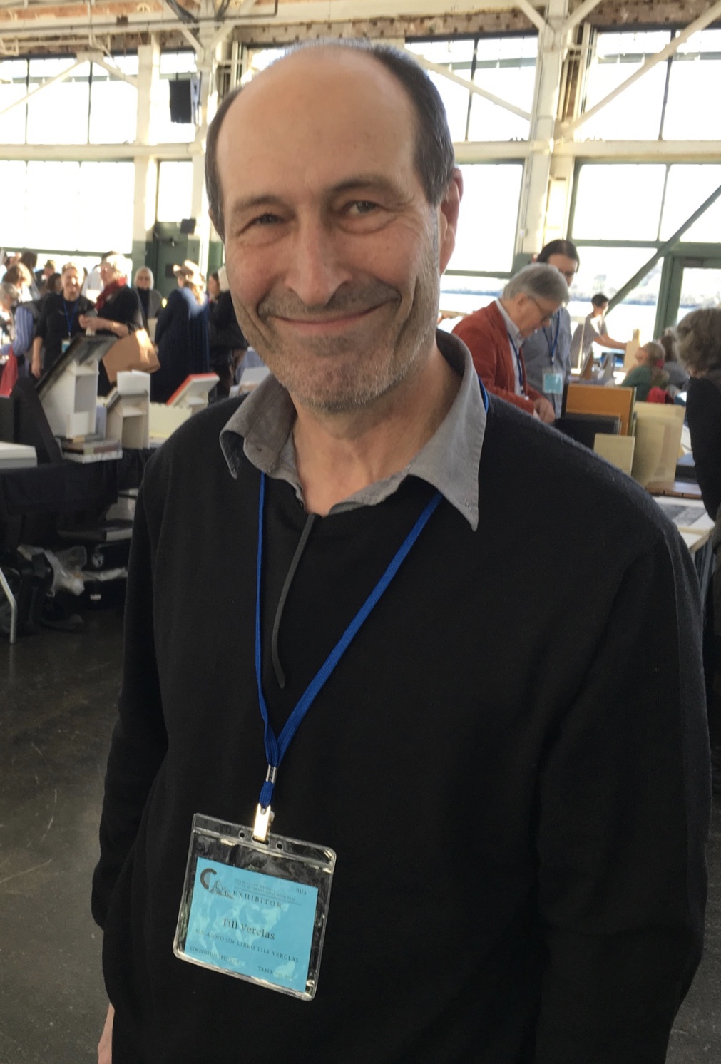
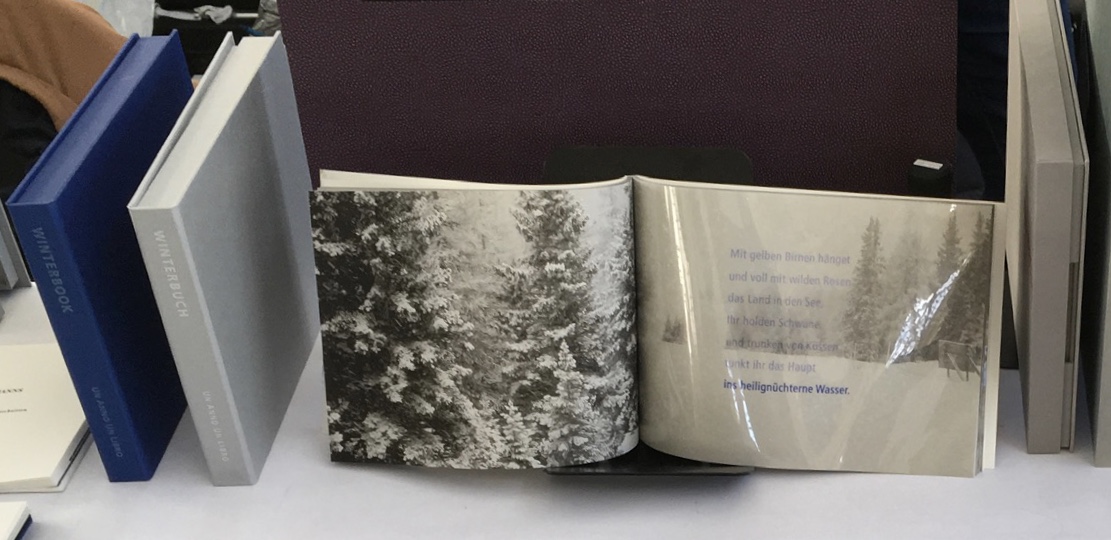
Or to Till Verclas (Un Anno Un Libro) explaining how his children helped achieve the effect of snow falling over Friedrich Hölderlin‘s words in Winterbuch:
Or to Sarah Bryant (Shift-Lab and Big Jump Press) revelling in the set up of The Radiant Republic, the result of her Kickstarter project:
Or to Sam Winston (ARC Editions) sharing his Reading Closed Books, which like Darkness Visible, sprang from his 7 Days performance in a blacked-out studio:
Sam is kind enough to introduce me to his colleagues at ARC Editions (Victoria Bean, Rick Myers and Haein Song). Individually and together, they are forces to watch. Myers’ An Excavation, which I’d had the pleasure to see previously in The Hague, can be partly experienced in these videos, and Song’s fine bindings and artist’s books must be seen. Bean’s symposium talk is on Check, her portfolio of typewriter prints featuring fifty writers, from Oscar Wilde to Joan Didion, and the checks they wore, and on Flag, the follow-up series of artist’s books that takes a writer from Check and uses colour, cloth and typewriter prints to explore an individual work by that writer.
Victoria Bean
Victoria Bean
The red and black ribbons and white linen are drawn from images in Hardy’s Tess of the D’Urbervilles symbolizing Tess and critical events of her life and death.
Victoria Bean
Victoria Bean
Check and Flag illustrate that bright enjoyable thread that shows up again and again at Codex and book art at its prime — the integration of letter, image, material, form, process and subject in a way that self-consciously calls attention to them yet yields a work of art that simply is — on its own terms.
Which, if you have read “Jim Blaine and His Grandfather’s Ram”, ought to remind you that
… Parson Hagar belonged to the Western Reserve Hagars; prime family; his mother was a Watson; one of his sisters married a Wheeler; they settled in Morgan county, and he got nipped by the machinery in a carpet factory and went through in less than a quarter of a minute; his widder bought the piece of carpet that had his remains wove in, and people come a hundred mile to ‘tend the funeral. There was fourteen yards in the piece.
‘She wouldn’t let them roll him up, but planted him just so—full length. The church was middling small where they preached the funeral, and they had to let one end of the coffin stick out of the window. They didn’t bury him—they planted one end, and let him stand up, same as a monument.
With its 222 exhibitors here weaving the threads of book art and the book arts, Codex VII is a monument to enjoy. As for that old ram, you will have to read the story — and prepare for Codex VIII.
Bookmarking Book Art – Architecture
Architecture — be it theory, principles, practices or instances — inspires book art. Lay the book flat; you have a foundation. Open and turn it on its fore-edge; you have a roof beam or arcade. Stand it upright; you have a column or tower. Turn the front cover; you open a door. Put the text and types under a microscope; you have a cityscape. As the examples in this virtual exhibition show, architecture-inspired book art goes beyond these simple analogies.
There are seemingly unrelated texts that help considerably in going there. The Eyes of the Skin (2005) and The Embodied Image (2010) by Juhani Pallasmaa, architect, teacher and critic, are two of them. He writes as if he were an artist preparing an artist’s statement or descriptions of the book art below. The title of his earlier book gives away his alignment with the visual and tactile nature of book art. Pallasmaa’s two books will enrich anyone’s enjoyment of the works shown and mentioned here.
Updates:
Binding Space: The Book as Spatial Practice (2018) by Marian Macken.
Building Books: New England Book Artists’ Guild Exhibition. 30 January – 29 April 2023. USM (University of Southern Maine) Portland.
“Book. Space. House. Space of Movement“. Exhibition curated by Susanne Padberg, 7 May – 26 June 2026. Padberg, Susan (curator). 7 May – 26 June 2026. at Galerie Druck & Buch, Vienna, Austria. Accessed 22 May 2026. “The artist’s book as a three-dimensional space: forming a house, outlining, remembering, mimicking—thinking the human being within space. Between object and narrative, books unfold as architectural structures, as inhabitable thought-spaces, as reflections of individual and collective experience. The exhibition brings together artistic positions that expand the book as a spatial body.”
From the Books On Books Collection
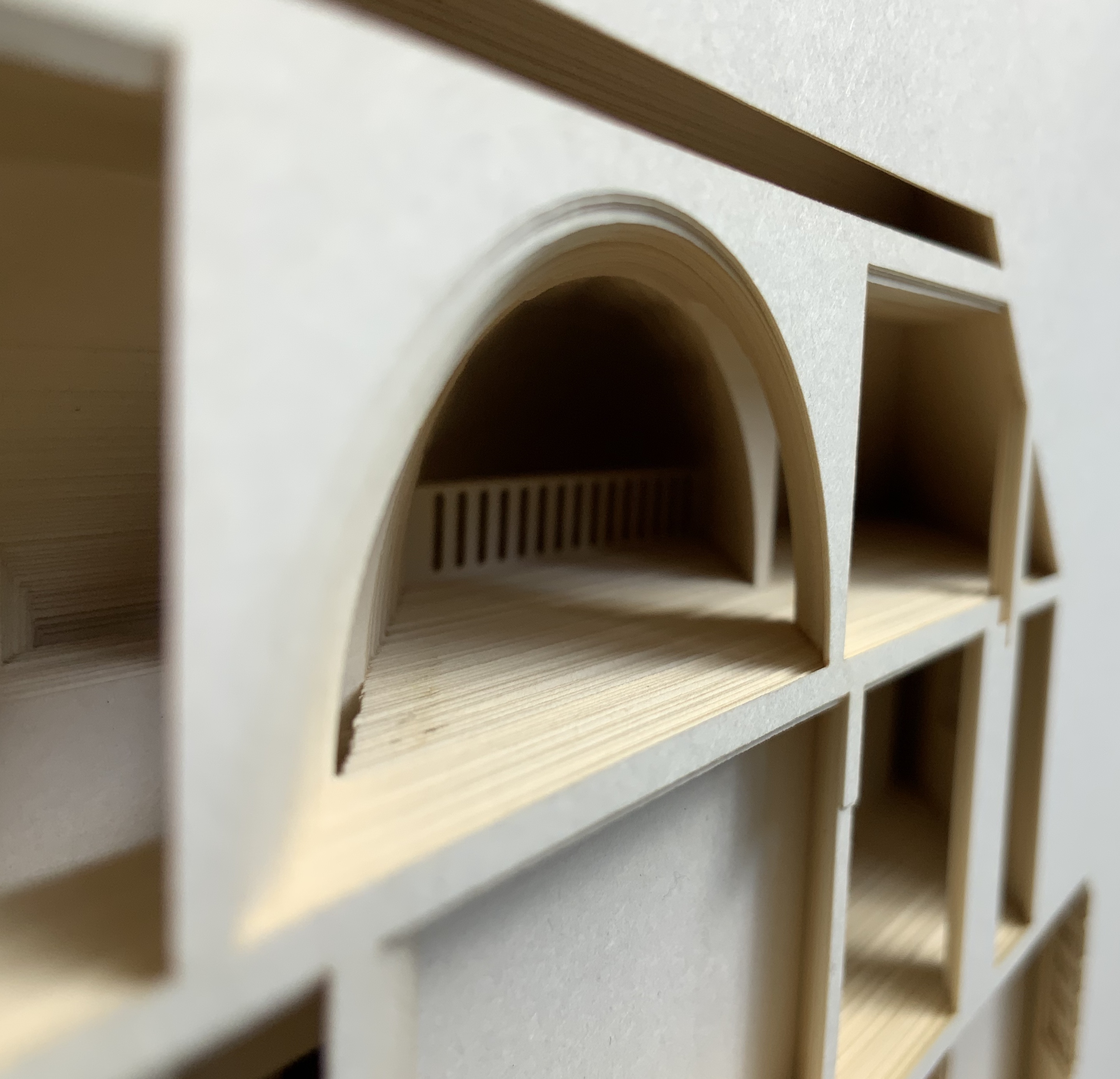
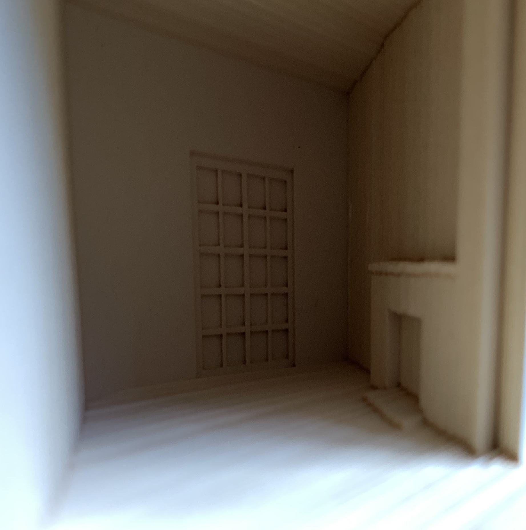
Malone’s Ten Books of Architecture is a good place to start in the collection. Like Pallasmaa, Malone takes a broad historical and, most important, haptic view of architecture from Vitruvius to Hadid. Each of the ten books is a bookwork that exemplifies its subject.
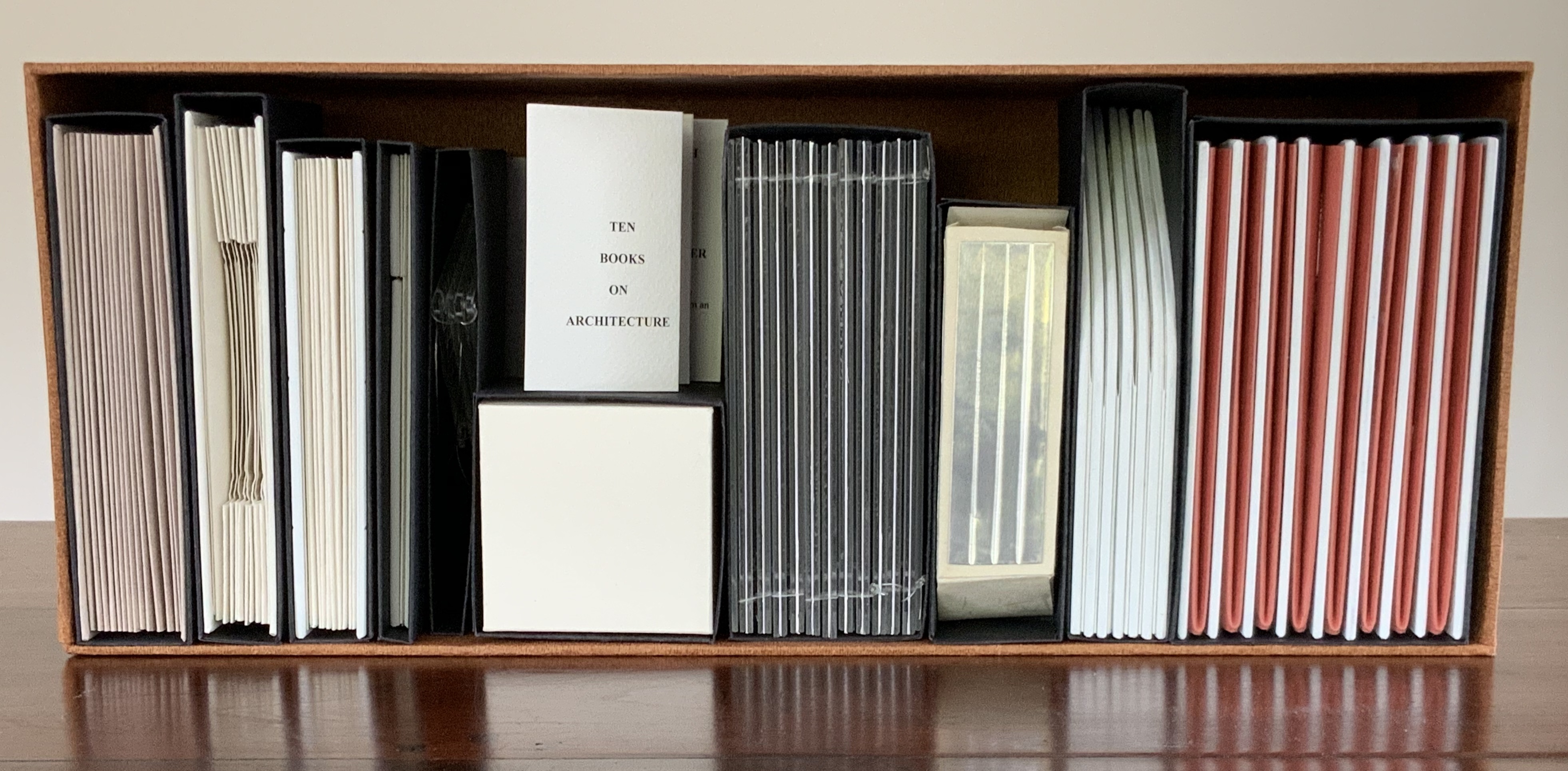
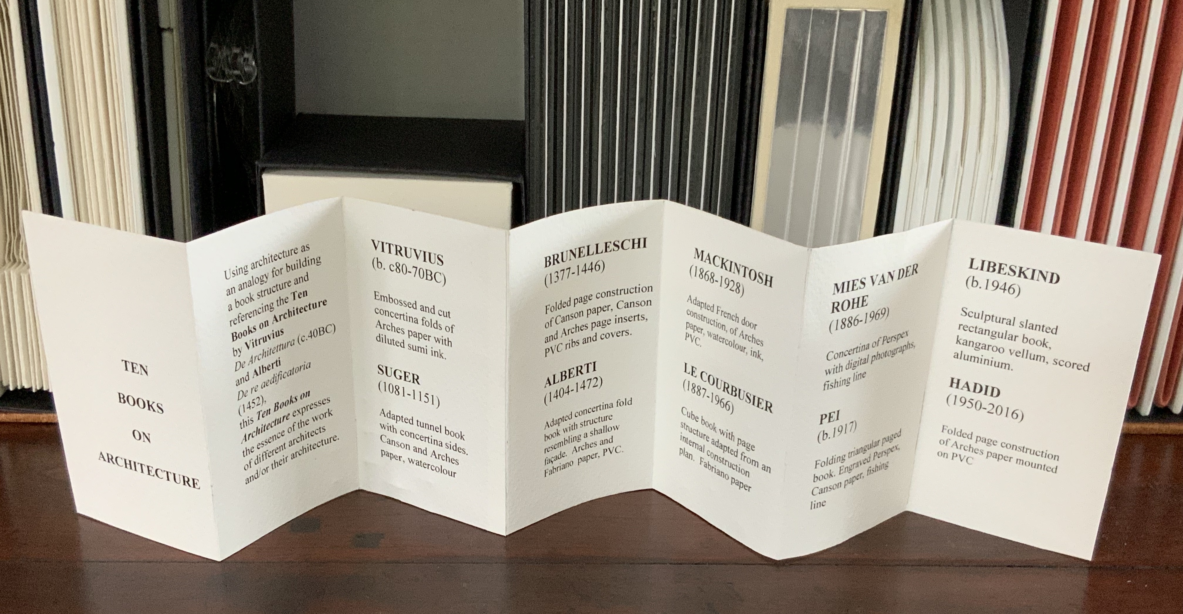
Photos: Books On Books Collection
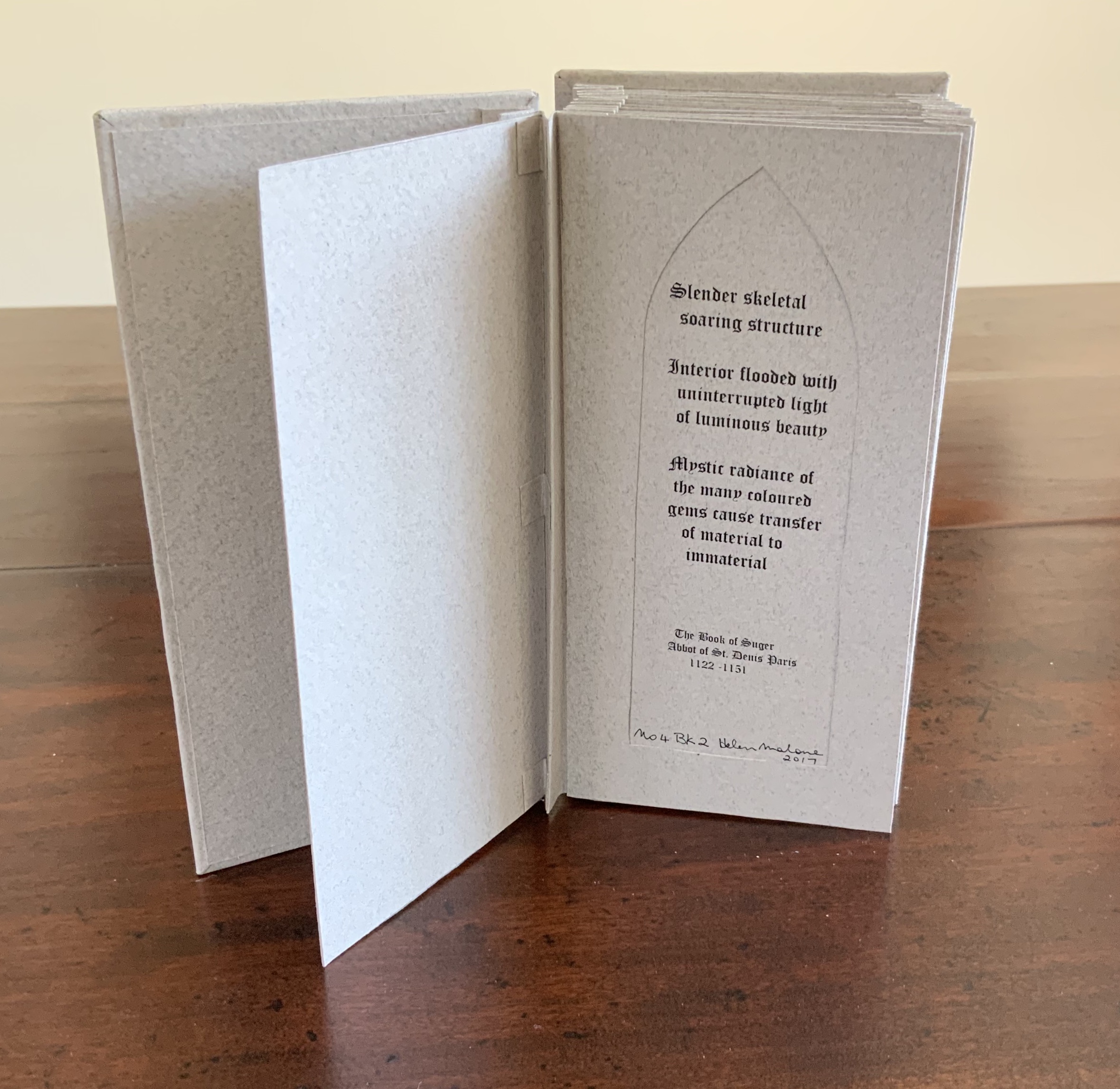
The columns in this accordion book are made by embossing; the marbling effect comes from diluted Sumi ink.
Photo: Books On Books Collection
Adapted tunnel book with accordion sides
Photo: Books On Books Collection
A watercolour at the tunnel’s end to evoke the stained glass clerestory windows in the Basilique Saint-Denis, Paris
Photo: Books On Books Collection
The aspiration to fuse the cosmic and the human, divine and mortal, spiritual and material, combined with the systems of proportion and measure deriving simultaneously from the cosmic order and human figure, gave architectural geometries their meaning and deep sense of spiritual life. The Embodied Image, p. 23.
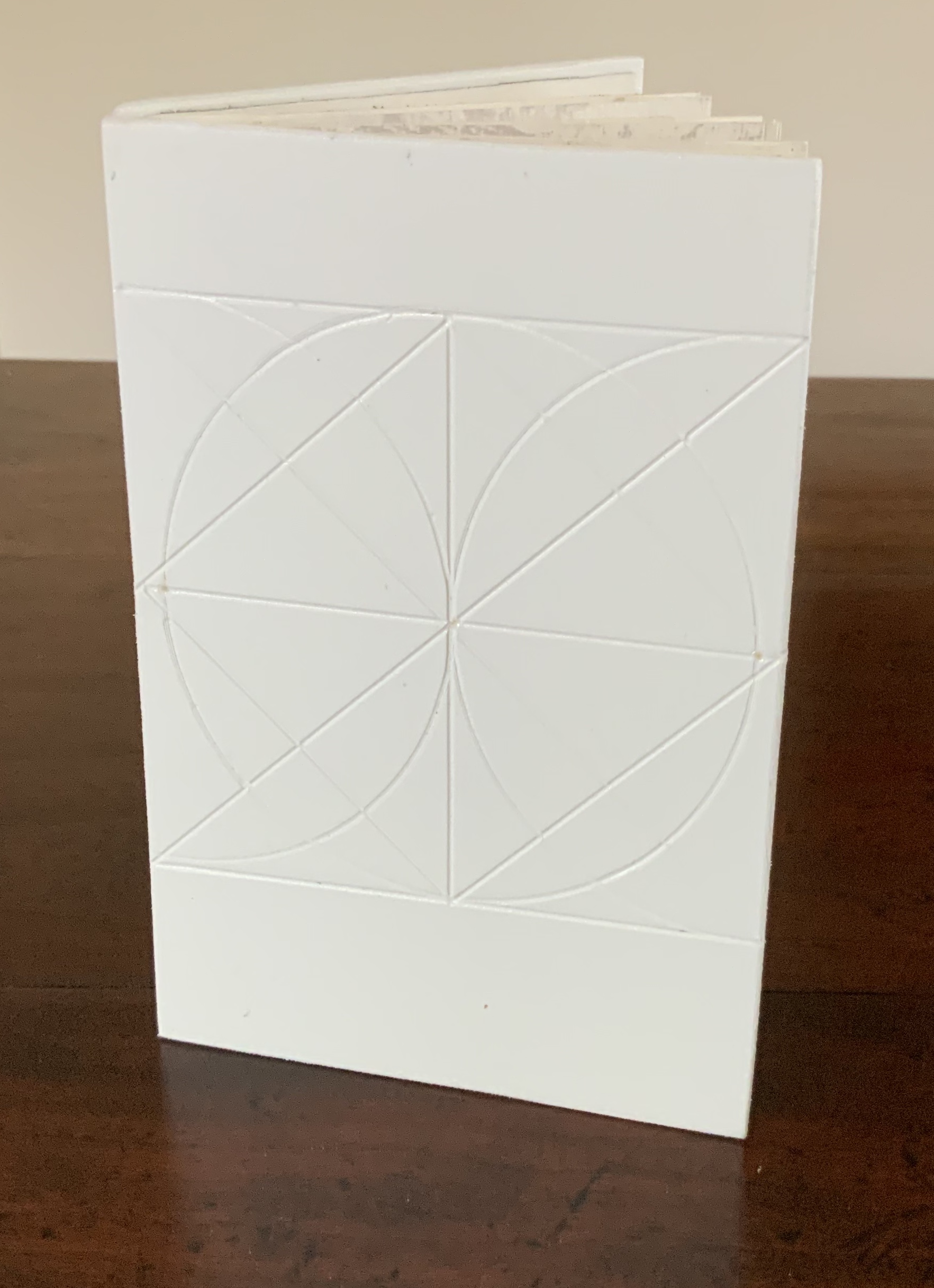

Photo: Books On Books Collection
The texture of this book, its adapted accordion structure and Alberti’s words remind me of Geoffroy Tory’s Champ fleury: The Art and Science of the Proportion of the Attic or Ancient Roman Letters, According to the Human Body and Face (1529) and its argument for finding the ideal shape of the letters in the human form and face. The alphabet as book art’s bones, bricks and beams?
And further apropos the link between the book and architecture, consider the connection that Vasari drew between Gutenberg and Alberti:
In the year 1457 [sic], when the very useful method of printing books was discovered by Johann Gutenberg the German, Leon Batista [sic], working on similar lines, discovered a way of tracing natural perspectives and of effecting the diminution of figures by means of an instrument, and likewise the method of enlarging small things and reproducing them on a greater scale; all ingenious inventions, useful to art and very beautiful. Lives of the Most Eminent Painters, Sculptors and Architects, vol. 1, trans. Gaston Du C. de Vere (London: Medici Society/ Philip Lee Warner, 1912-1914), 494.
Photos: Books On Books Collection
In “An Architectural Confession”, Pallasmaa writes:
One’s most important teacher may have died half a millennium ago; one’s true mentor could well be Filippo Brunelleschi or Piero della Francesca. I believe that every serious artist — at the edge of his/her consciousness — addresses and offers his/her work to a superior colleague for approval. The Eyes of the Skin, p. 82.

“A paradox of enrichment and reduction”
Photo: Books On Books Collection

“New technologies”
Photo: Books On Books Collection
Photo: Books On Books Collection
This curiously textured cube sits perfectly alongside Pallasmaa’s observation: “The basic geometric shapes have their symbolic connotations, but more important than their conventional meanings are their conceptual and visual organising powers” (The Embodied Image, p. 58).
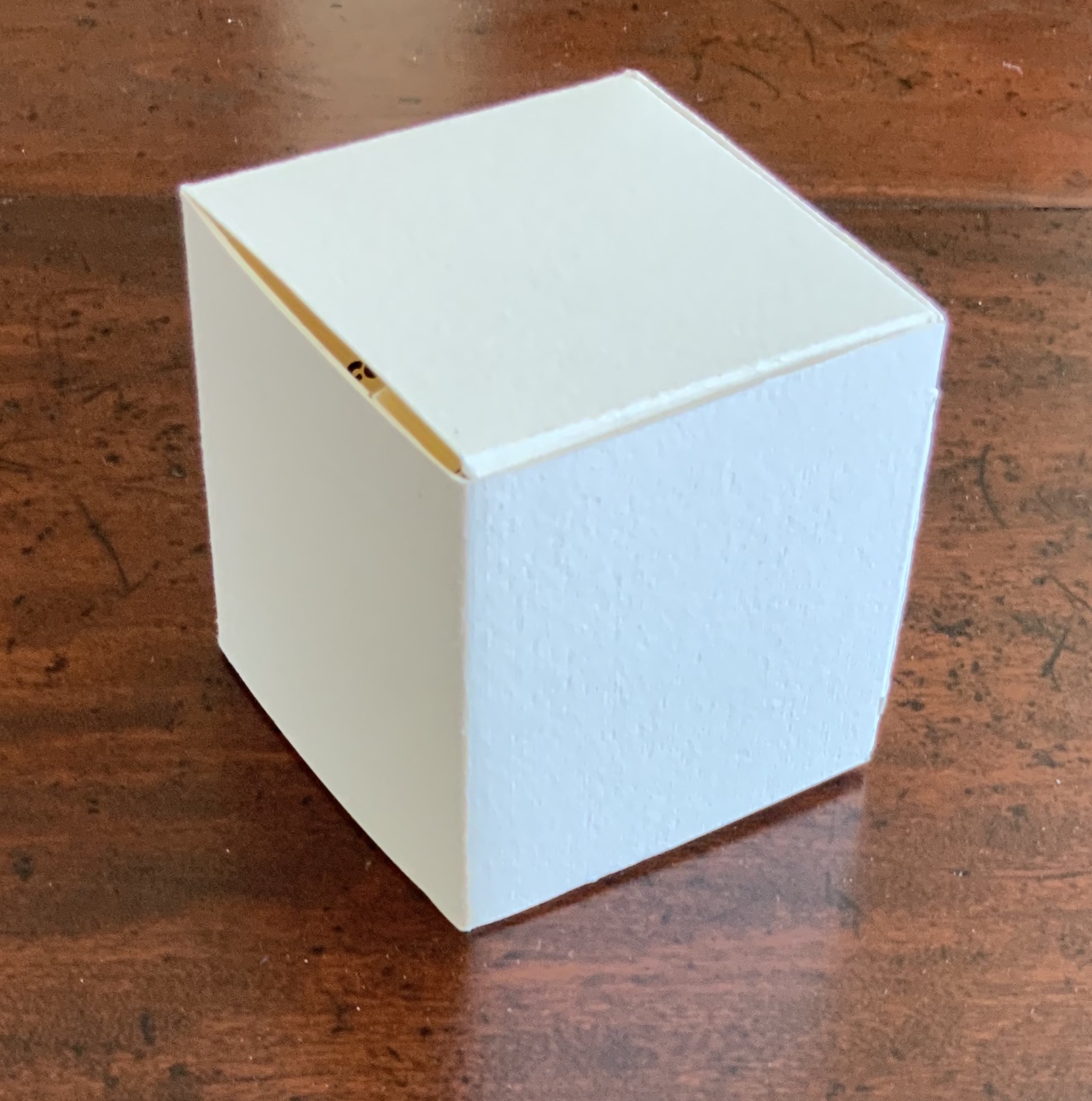
Photo: Books On Books Collection
Photo: Books On Books Collection
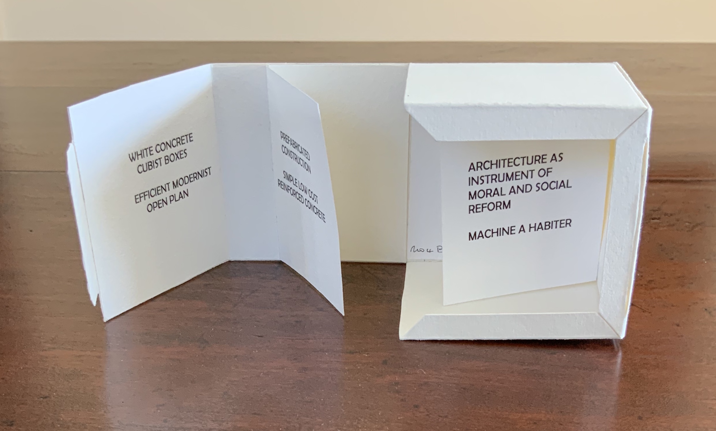
Photo: Books On Books Collection
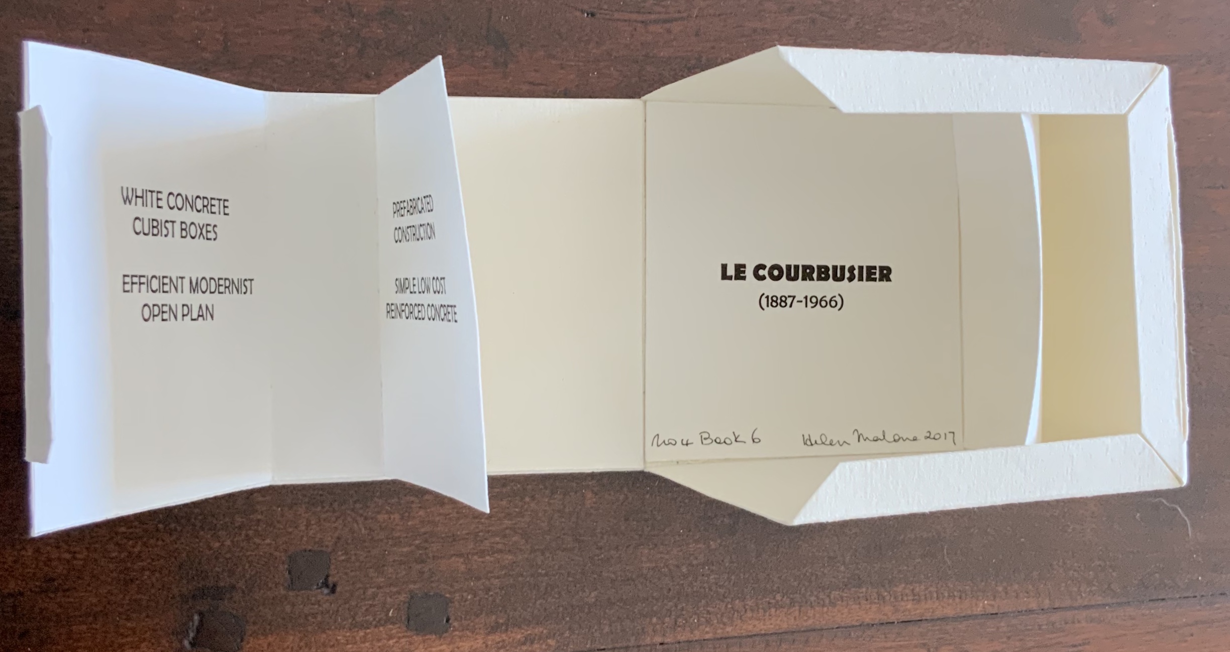
Photo: Books On Books Collection


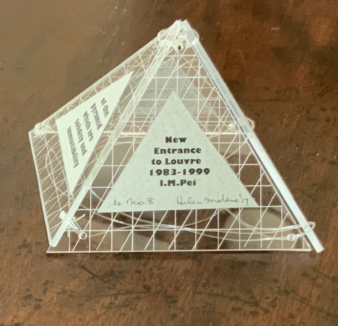
A short trip around this small pyramid as a reminder of the entrances that were always on the far side of museums you visited
Photos: Books On Books Collection
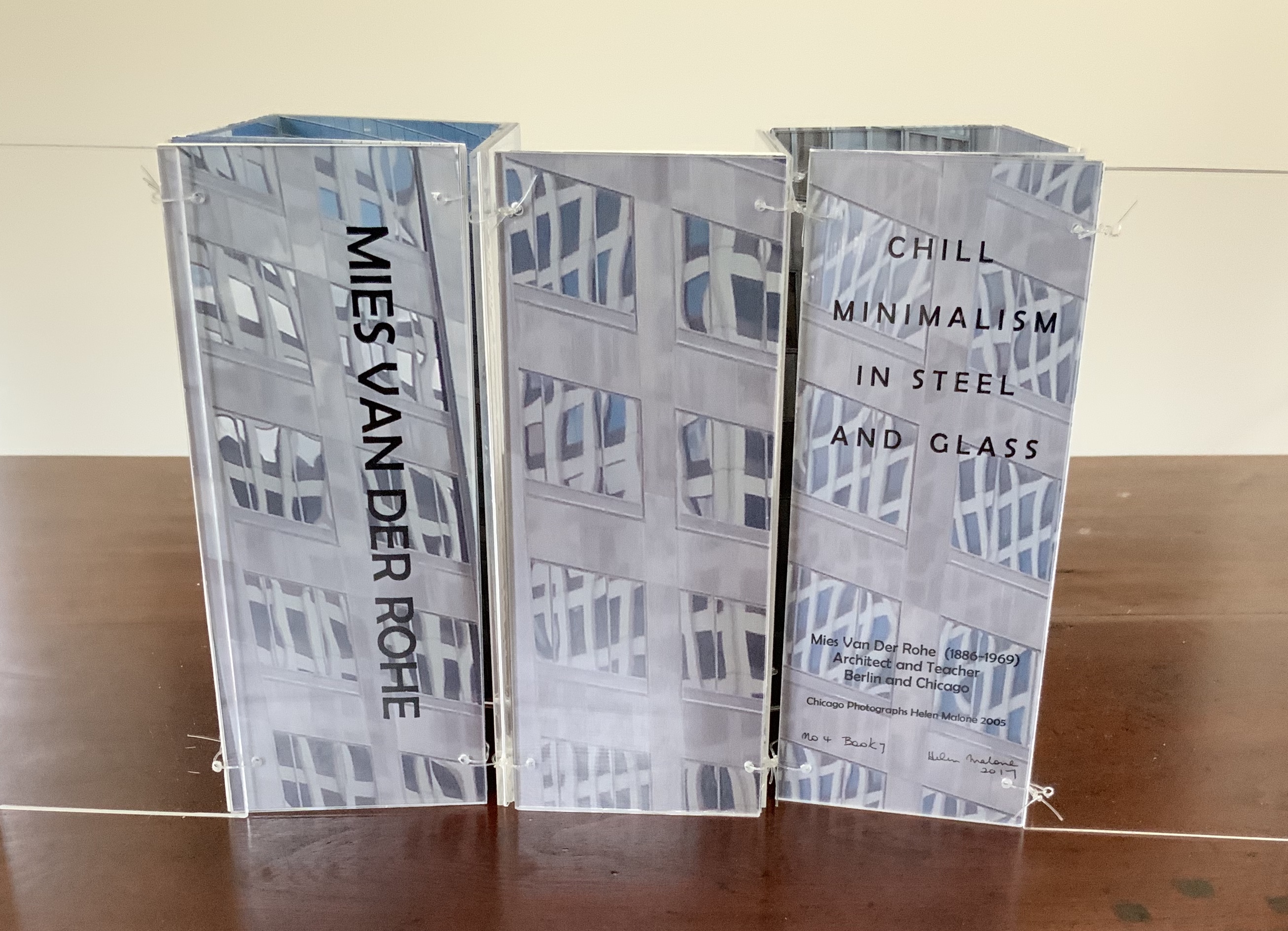
Photo: Books On Books Collection
“Reading” the perspex accordion invites reconfiguring your own hi-rise and skyline.
Photo: Books On Books Collection
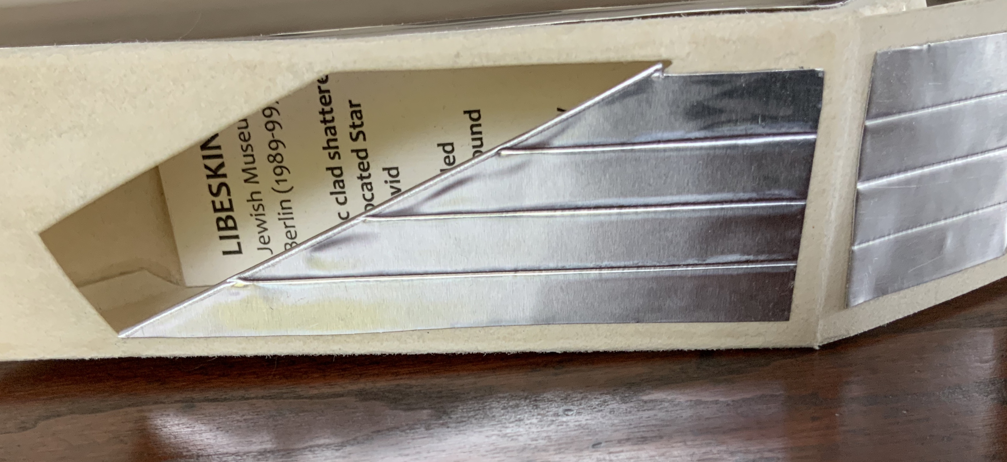
It is no surprise that Pallasmaa has written extensively on Libeskind.
Photo: Books On Books Collection
Photo: Books On Books Collection
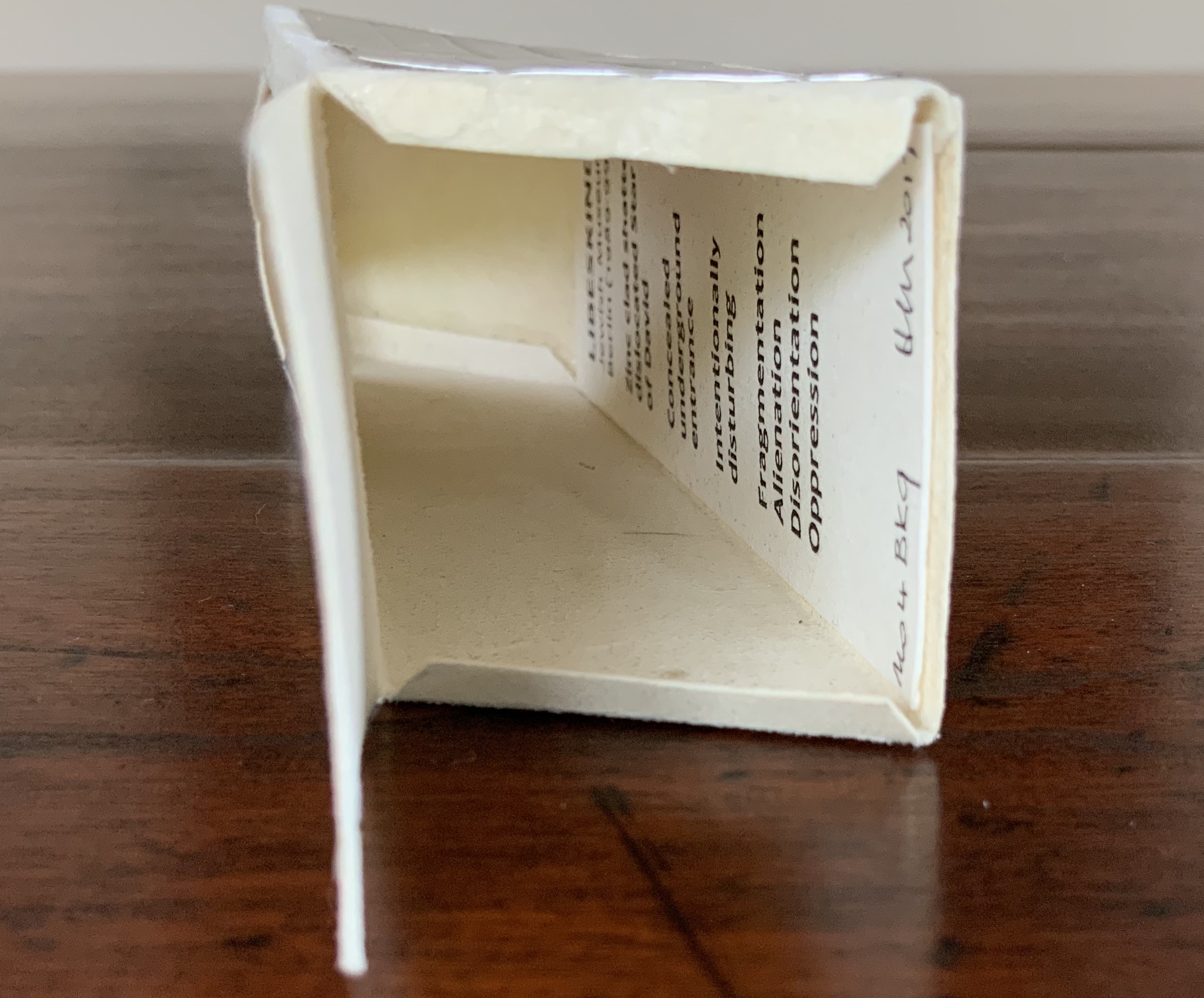
Photo: Books On Books Collection
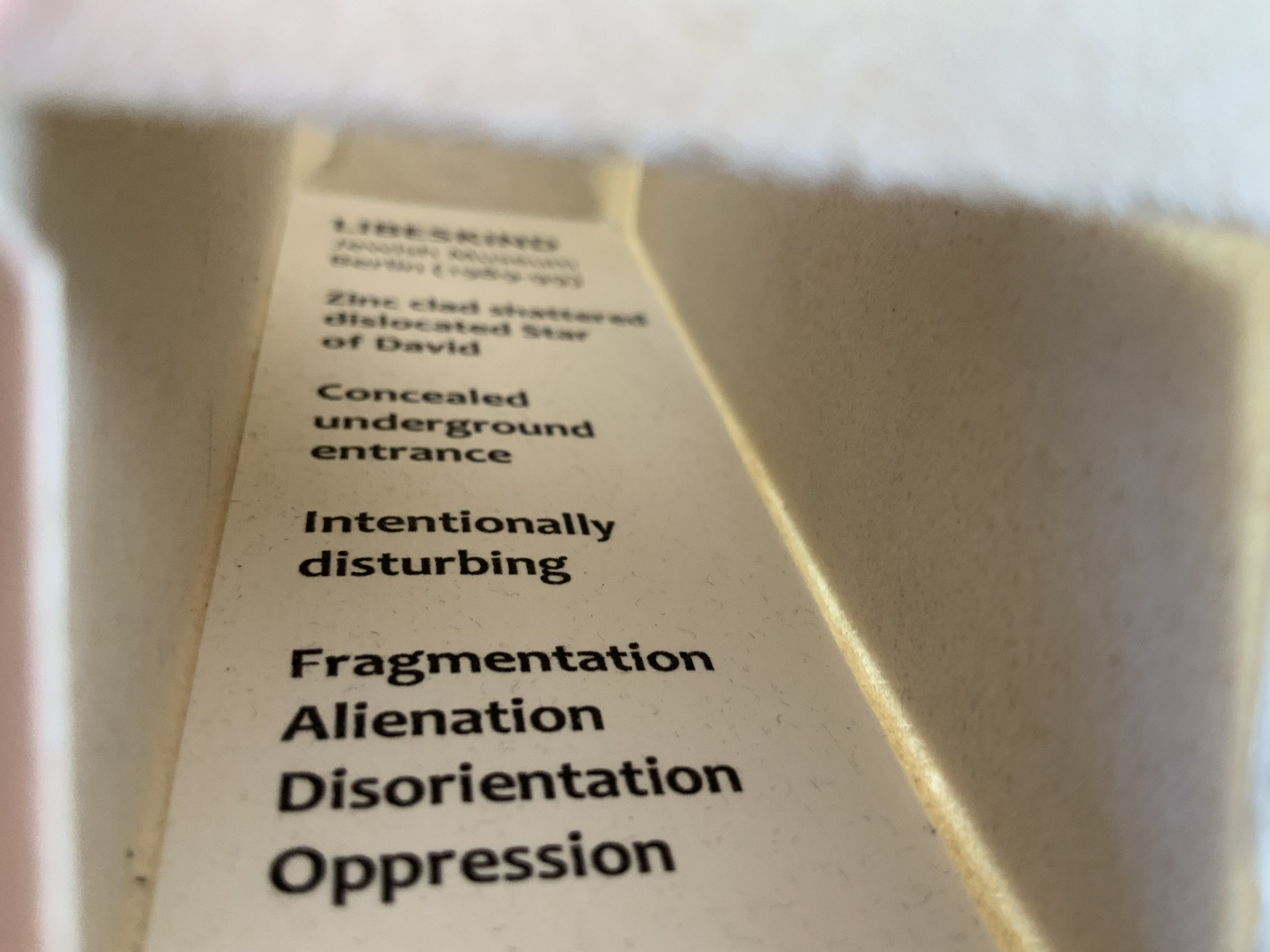
Photo: Books On Books Collection

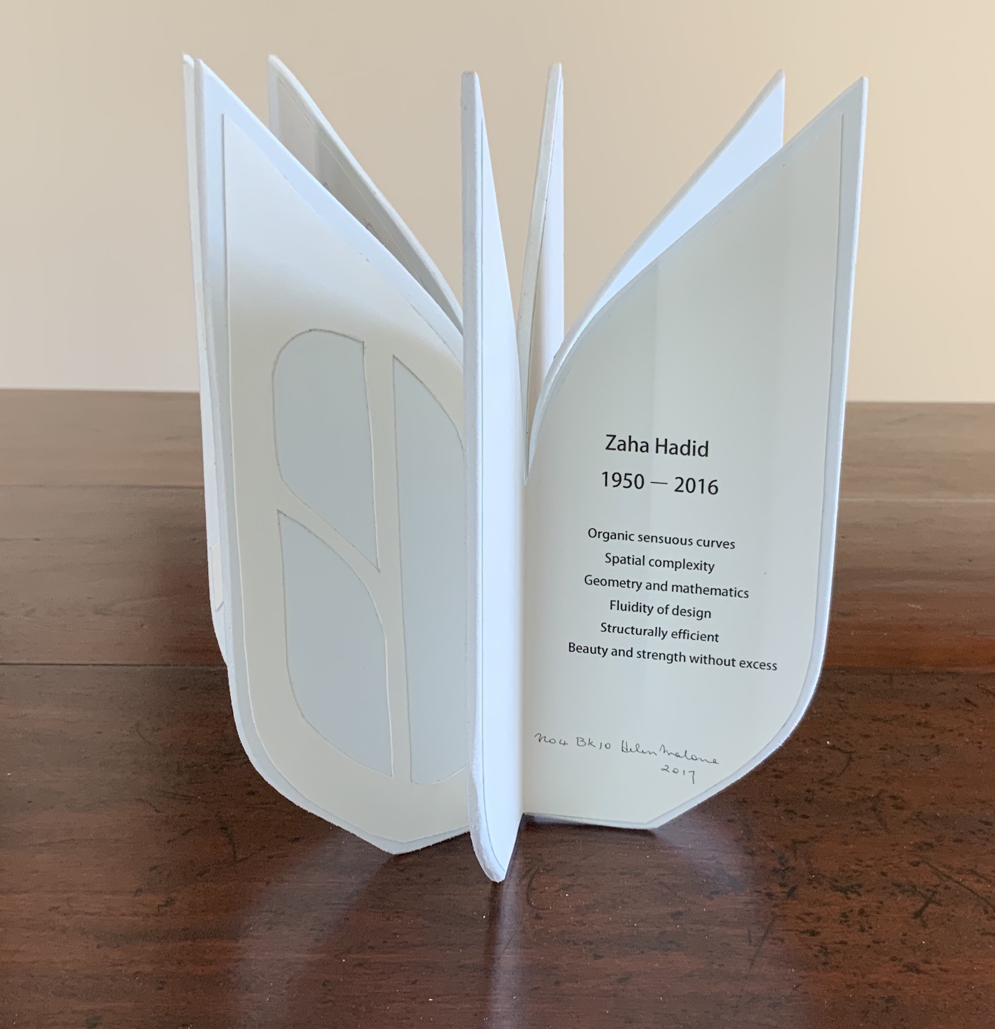
This edition of Malone’s Ten Books is unique in its inclusion of Hadid, who is not mentioned in either of Pallasmaa’s books but whose artistry and turn to the organic and curves of nature certainly fit with their spirit.
Photo: Books On Books Collection
Malone’s Ten Books has a predecessor in Laura Davidson’s contribution to the 1994 Smithsonian show on book art inspired by its collection of rare science books (see section below). Although there is also Karen Wirth’s sculptural take on the Ten Books as well as Ron Keller’s take (see section below) on Palladio’s Fours Books of Architecture, which is Palladio’s take on Vitruvius, I have not found any other Vitruvian-inspired works of book art. (Pointers welcome.)
These two works — 30 St Mary Axe: Diagrid (2009) and 30 St. Mary Axe: Cladding (2009) — are among several architecture-inspired works of book art that Brannan has created. The text in one of those several — Situated — could have come straight from Pallasmaa, Bachelard or Merleau-Ponty:
Being situated is generally considered to be part of being embodied, but it is useful to consider each perspective individually. The situated perspective emphasizes that intelligent behaviour derives from the environment and the agent’s interactions with it.

30 St Mary Axe: Diagrid (2009)
Mandy Brannan
London has nicknamed the building at 30 St. Mary Axe “the Gherkin”.
Photo: Books On Books Collection
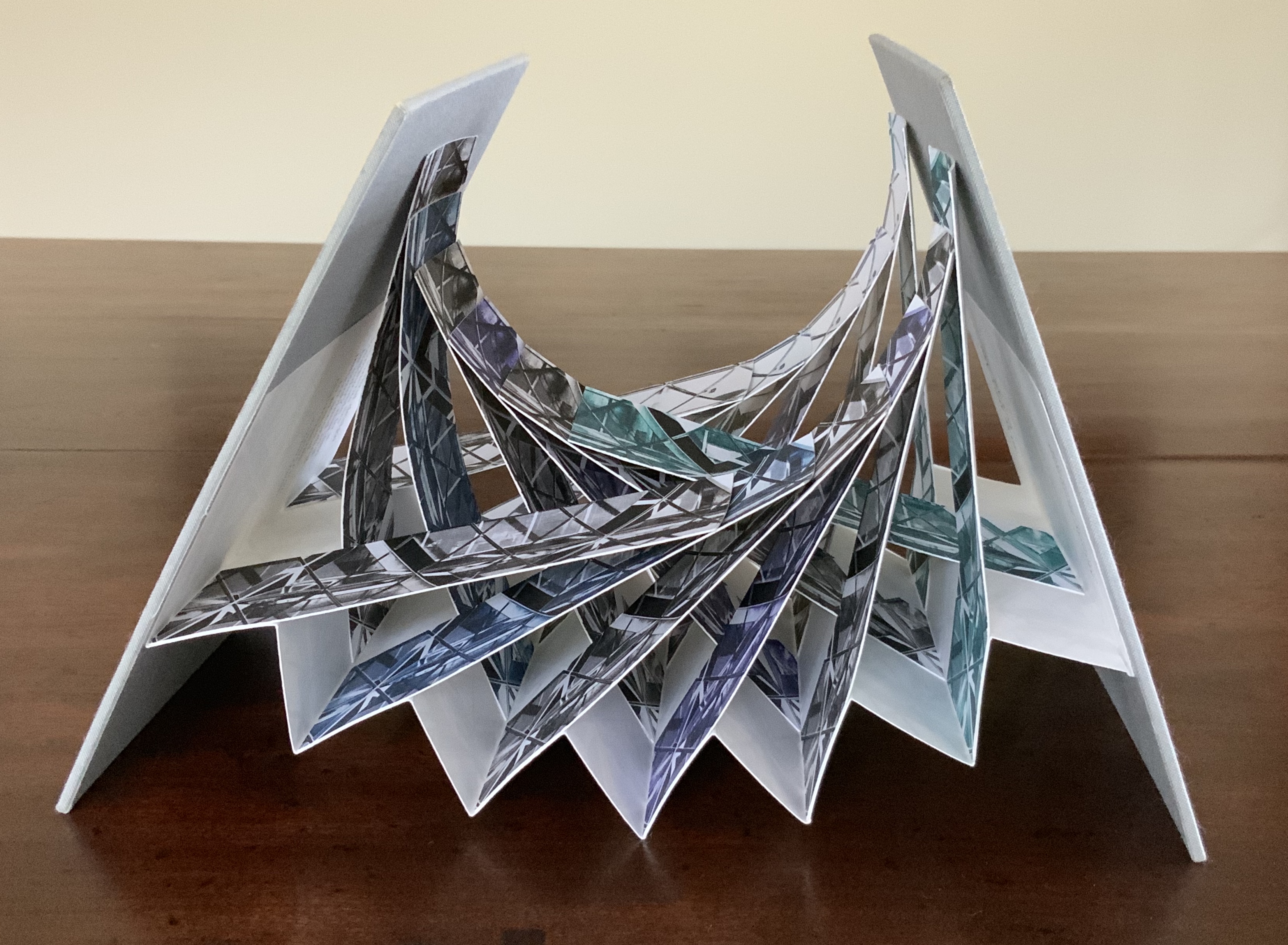
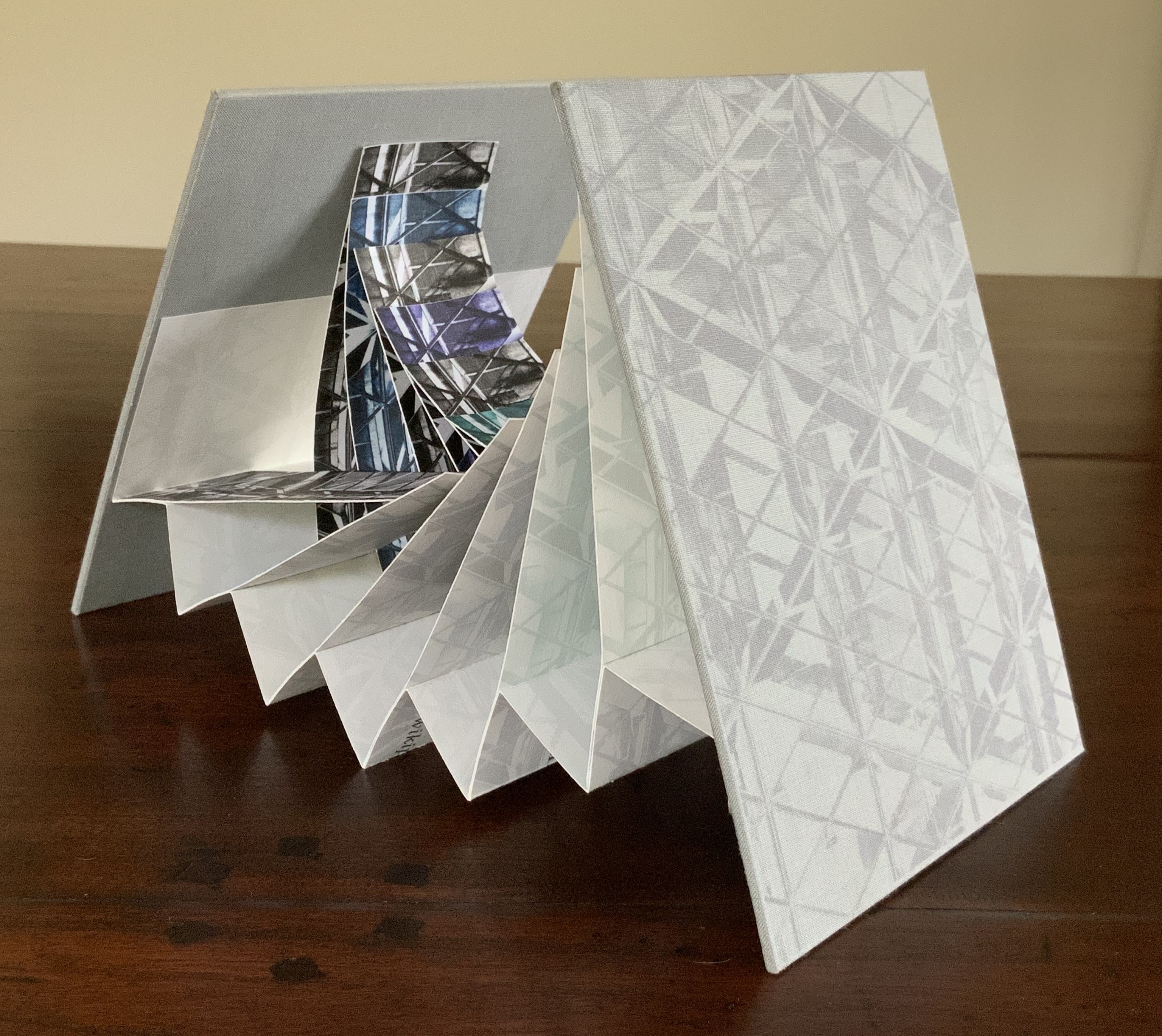
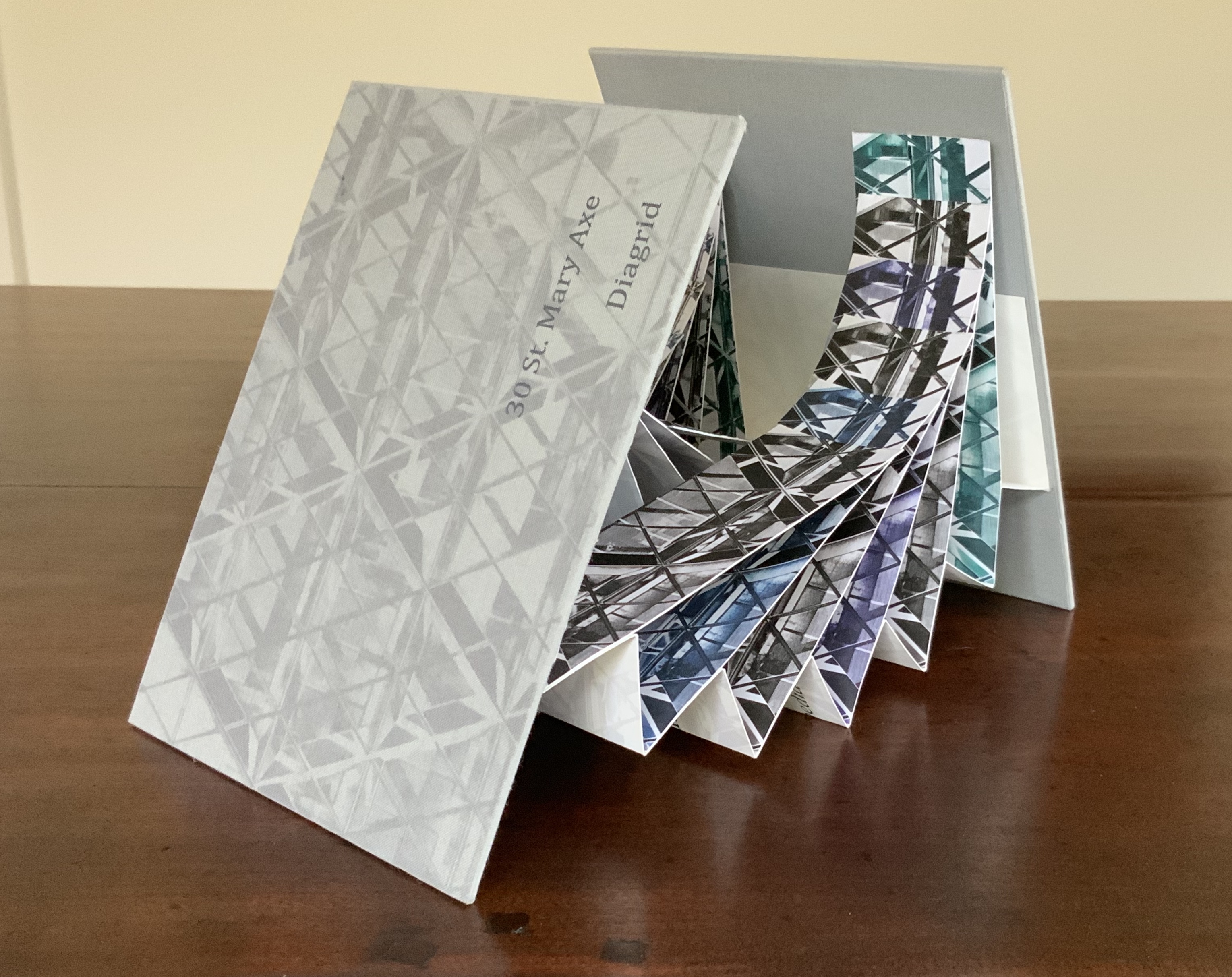
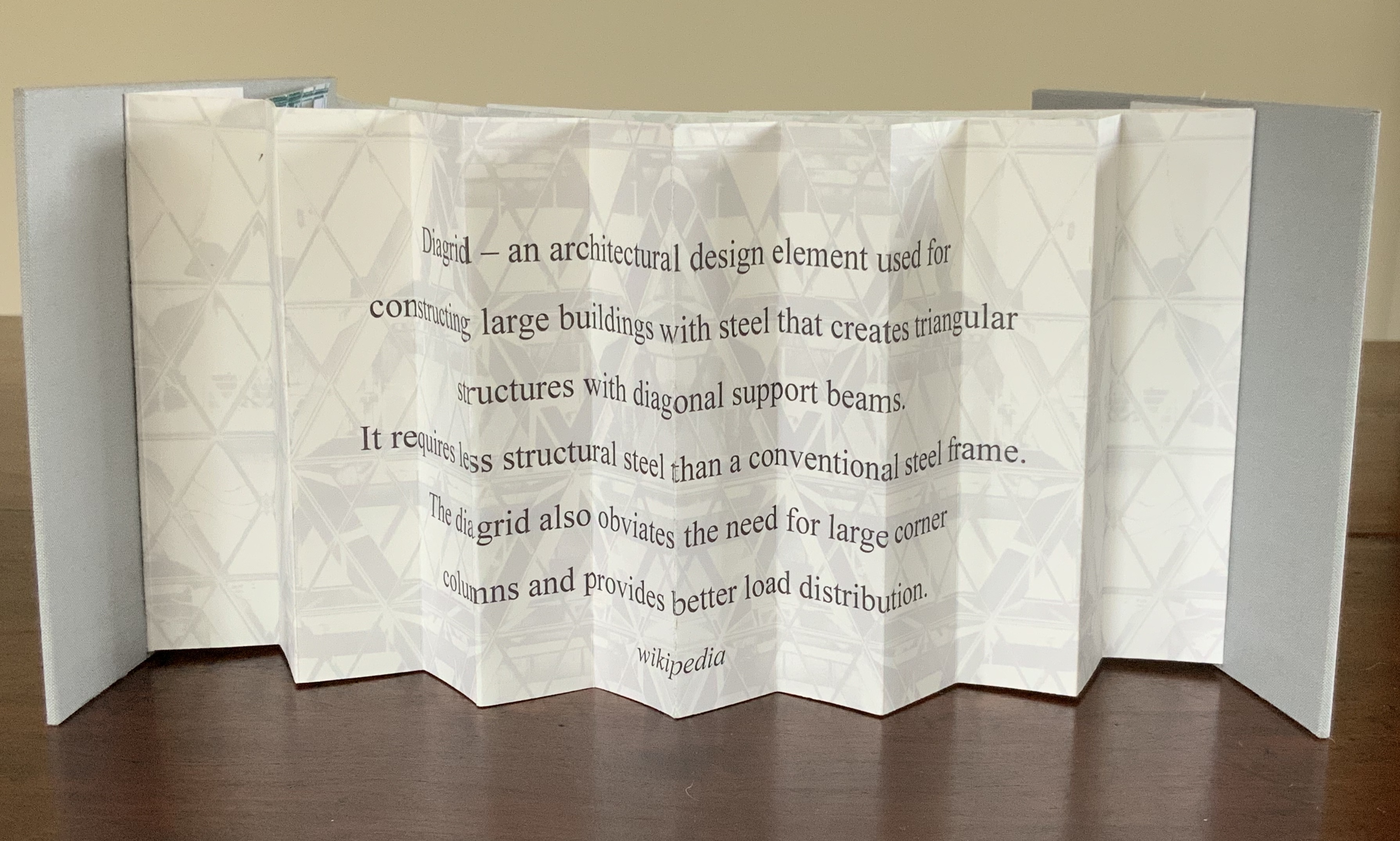
Photo: Books On Books Collection
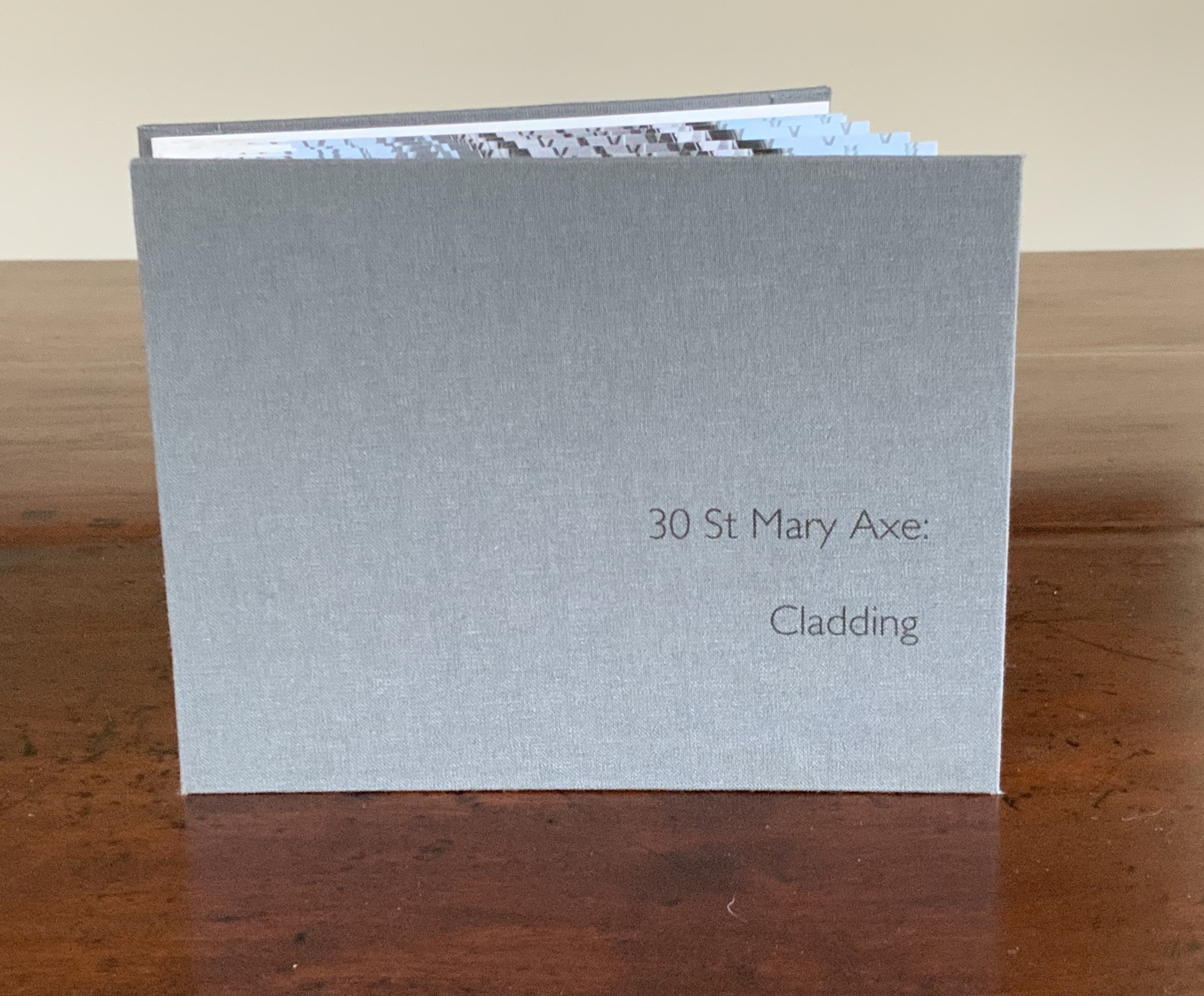
30 St. Mary Axe: Cladding (2009)
Mandy Brannan
Photo: Books On Books Collection
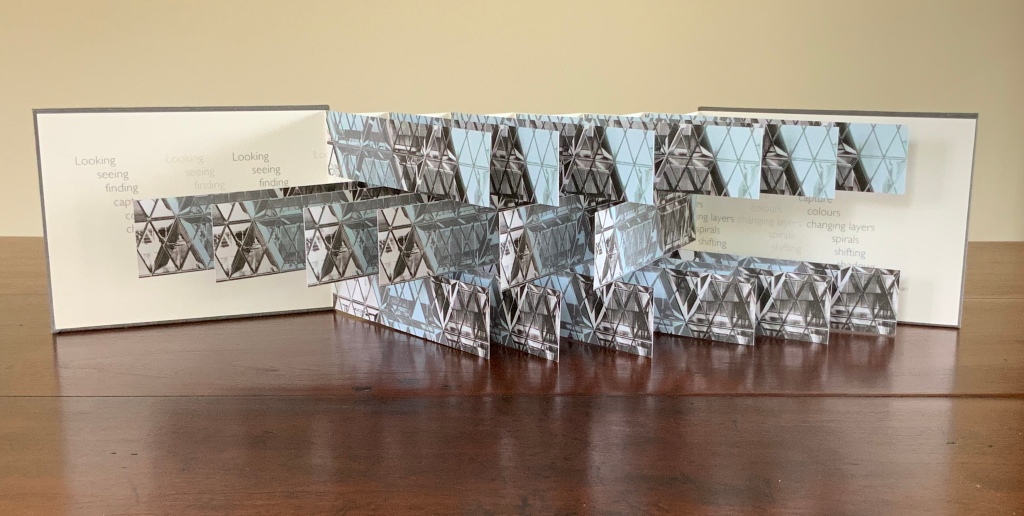
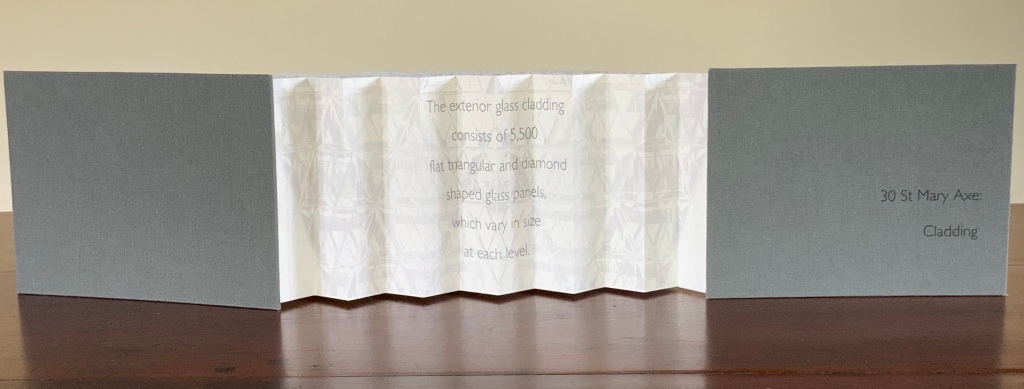
By integration of image, colour and structure, Brannan situates the “Gherkin’s” architecture in your hands.

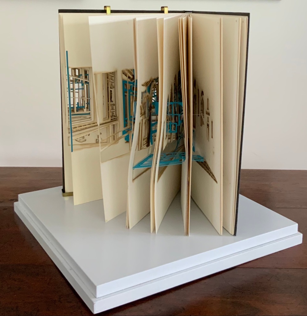
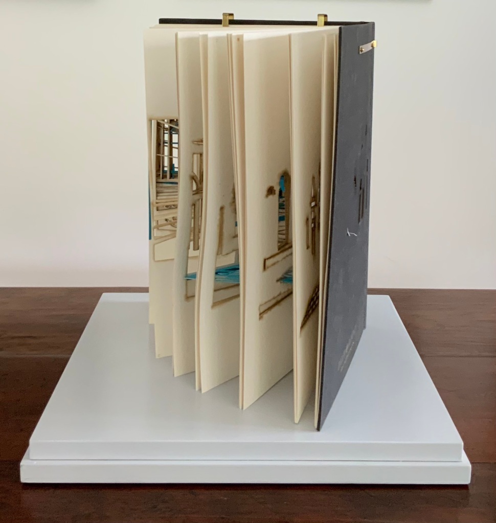
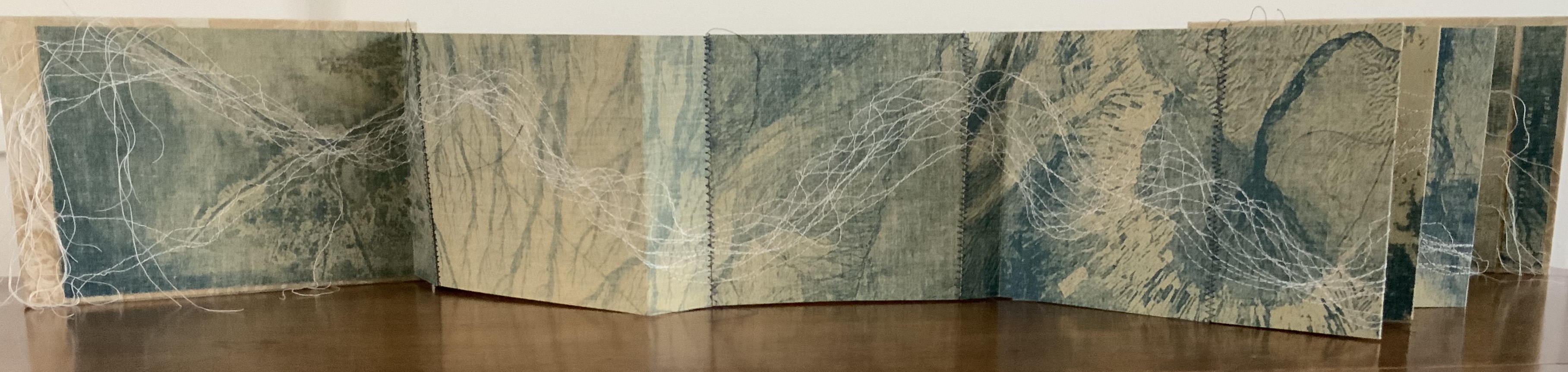
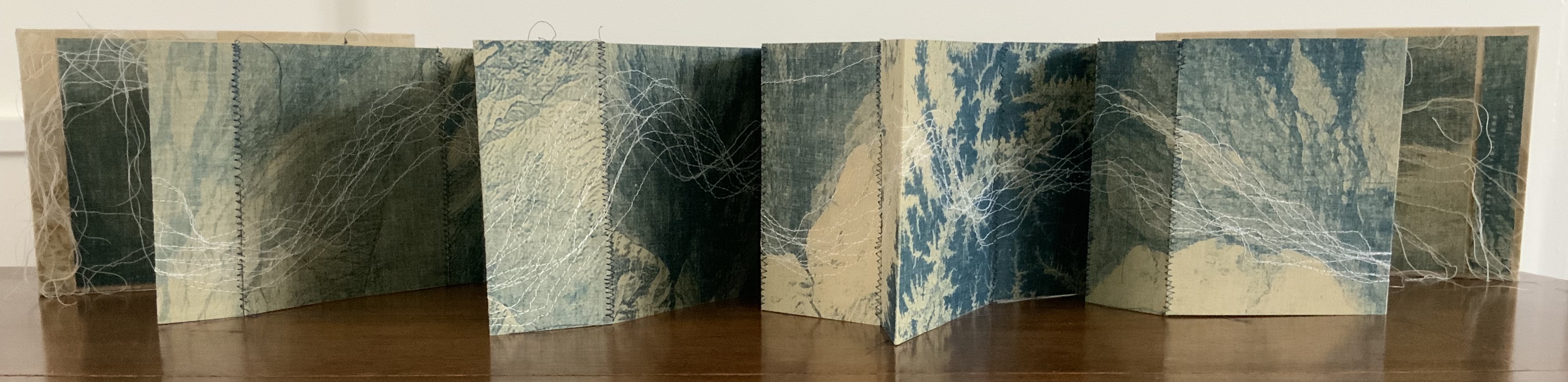
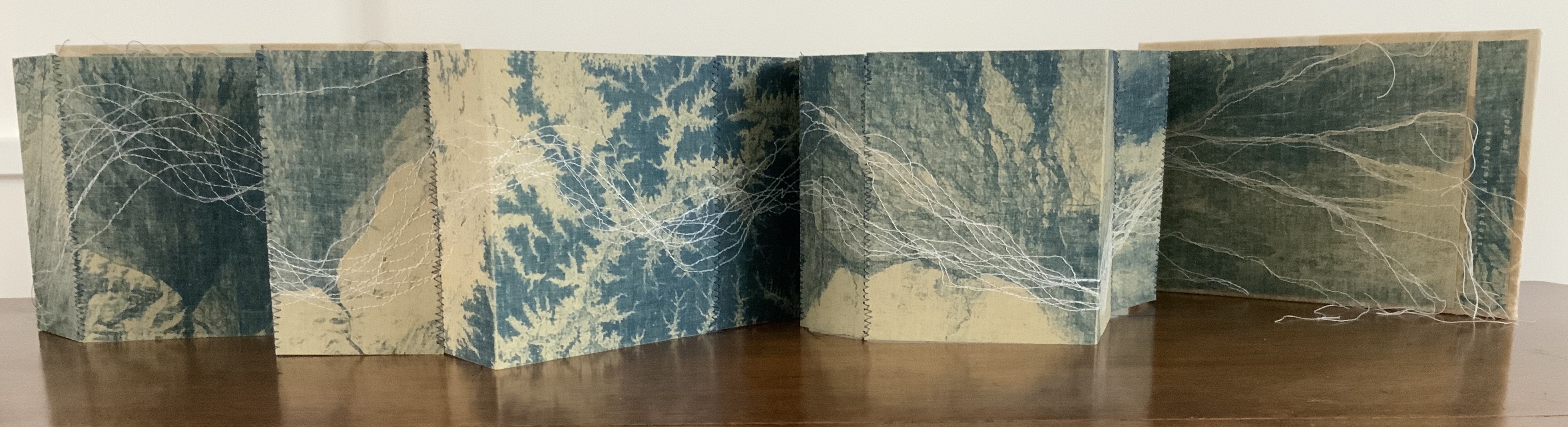
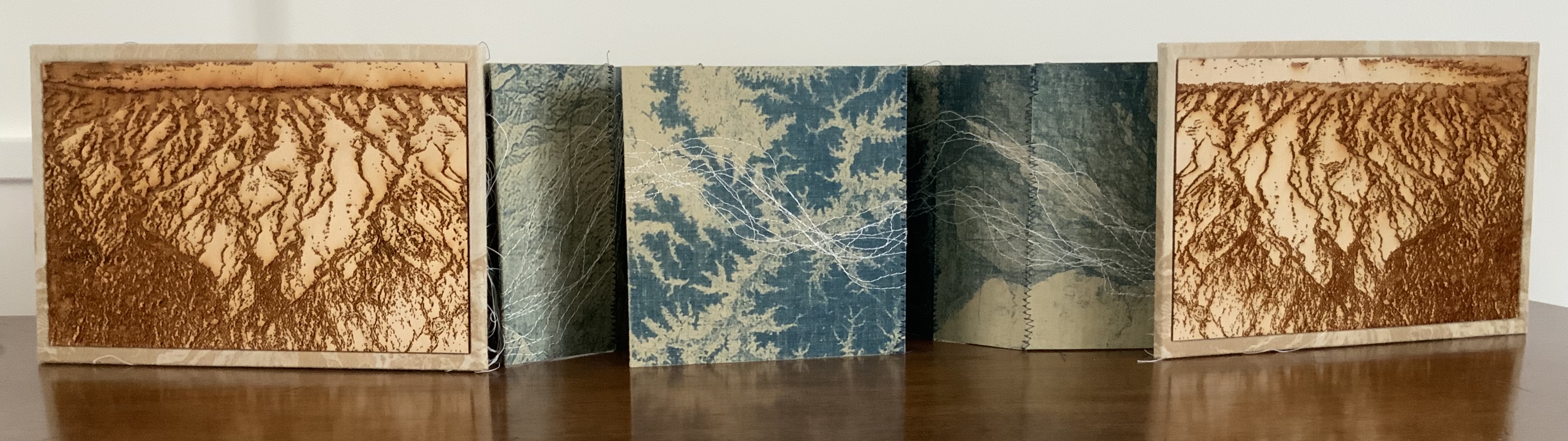
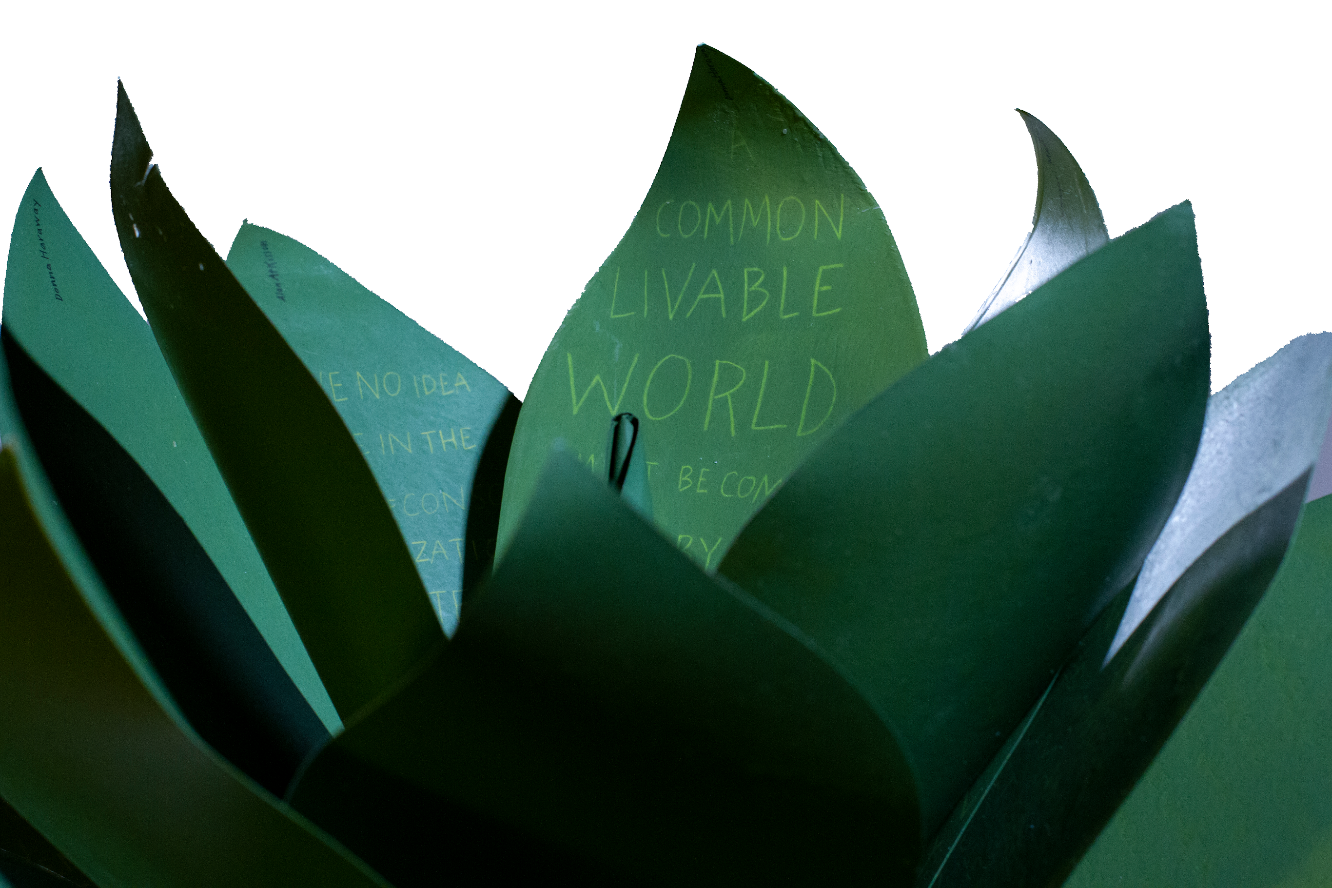
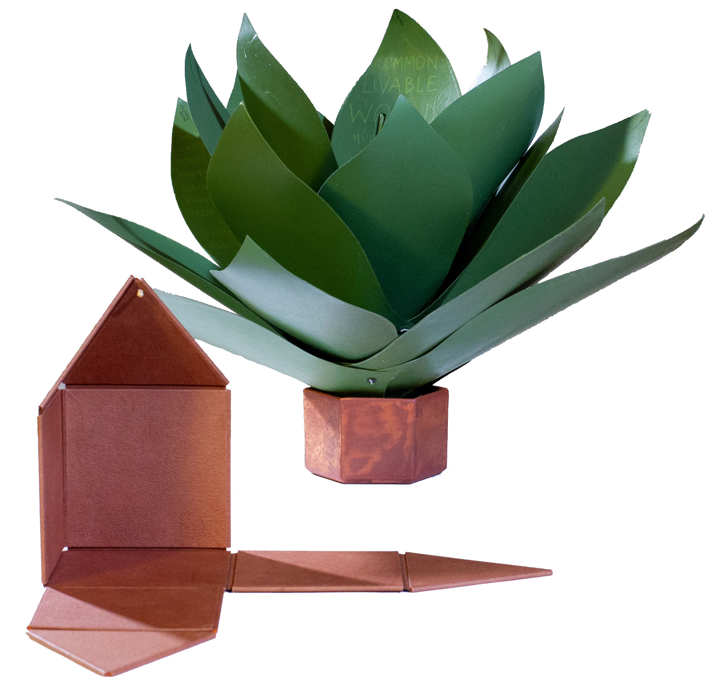
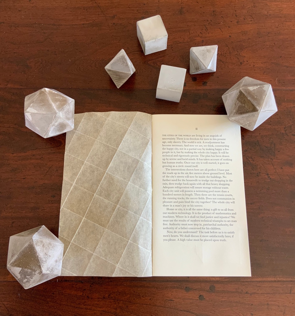
The Radiant Republic (2019)
Sarah Bryant
Photo: Books On Books Collection
In the The Radiant Republic (2019), Sarah Bryant (Big Jump Press) brings together concrete, wood, glass, paper, ink and embossed printing, sewn binding, box container and texts from Plato and Le Corbusier.
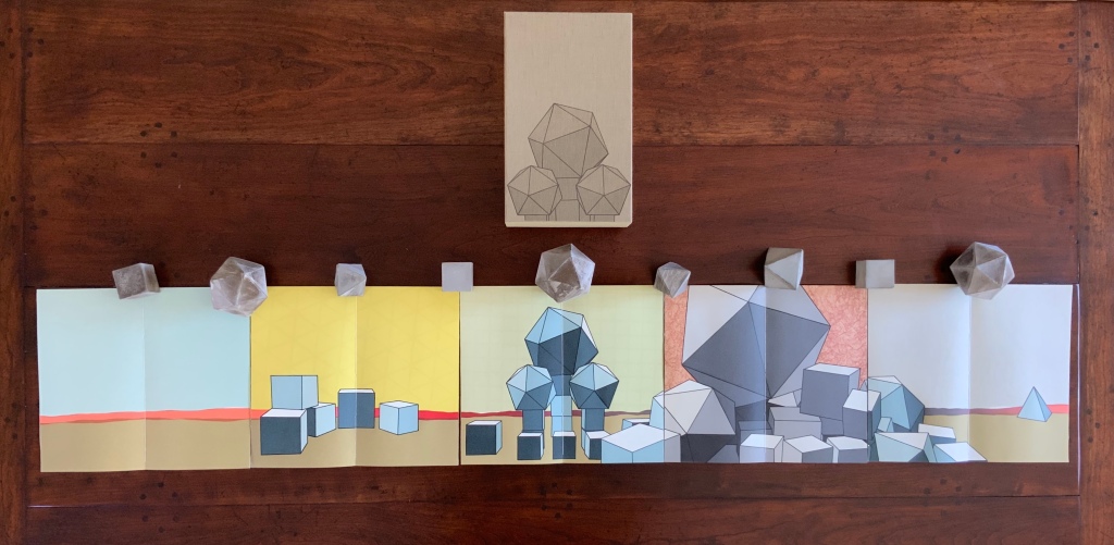
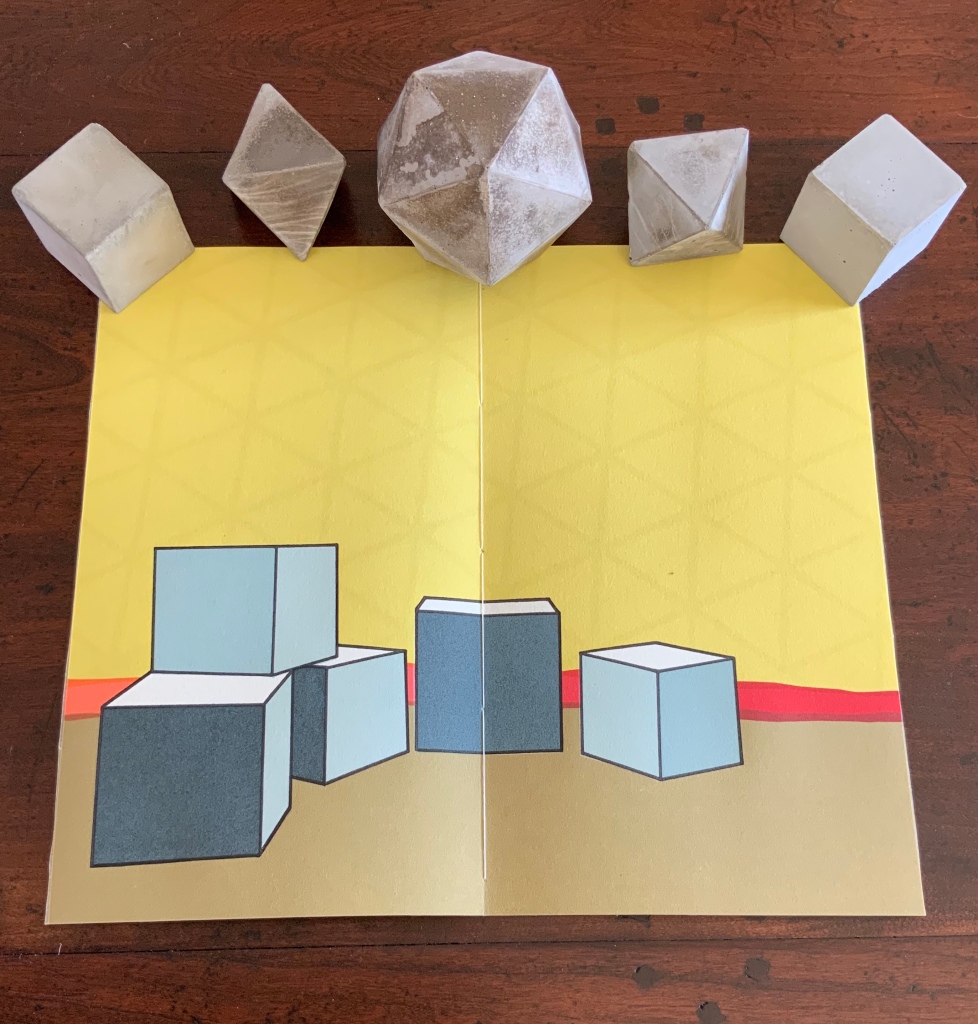

Note the embossed text on the verso. Across the five volumes, the embossed text is the same as that printed in ink, but it runs in fragments backwards from this last page of the last volume to the last page of the first volume.
Photo: Books On Books Collection
Bryant’s insightful integration of Plato’s and Le Corbusier’s texts and ideas and her setting them in the physicality of the blond wood, linen cover, embossed type and sewn papers could easily be a response to Pallasmaa’s comment in The Eyes of the Skin: “The current overemphasis on the intellectual and conceptual dimensions of architecture contributes to the disappearance of its physical, sensual and embodied essence.” (p. 35)
Helen Douglas and Telfer Stokes
Chinese Whispers (1975) is conceptual, visual and spatial narrative that takes the reader into a “game of embedded games”: a game of Chinese Whispers used by the artists to combine the process of making a book with the process of recovering an old cottage, making a corner cupboard, making jam, making ideas and making an exit.
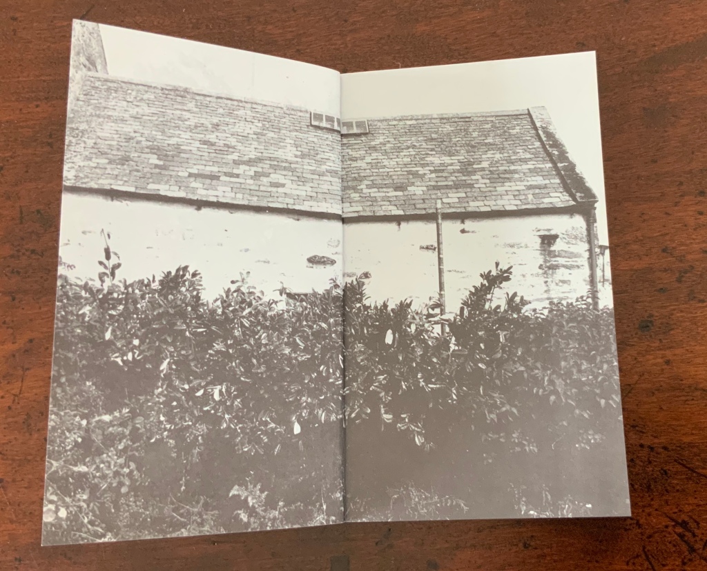
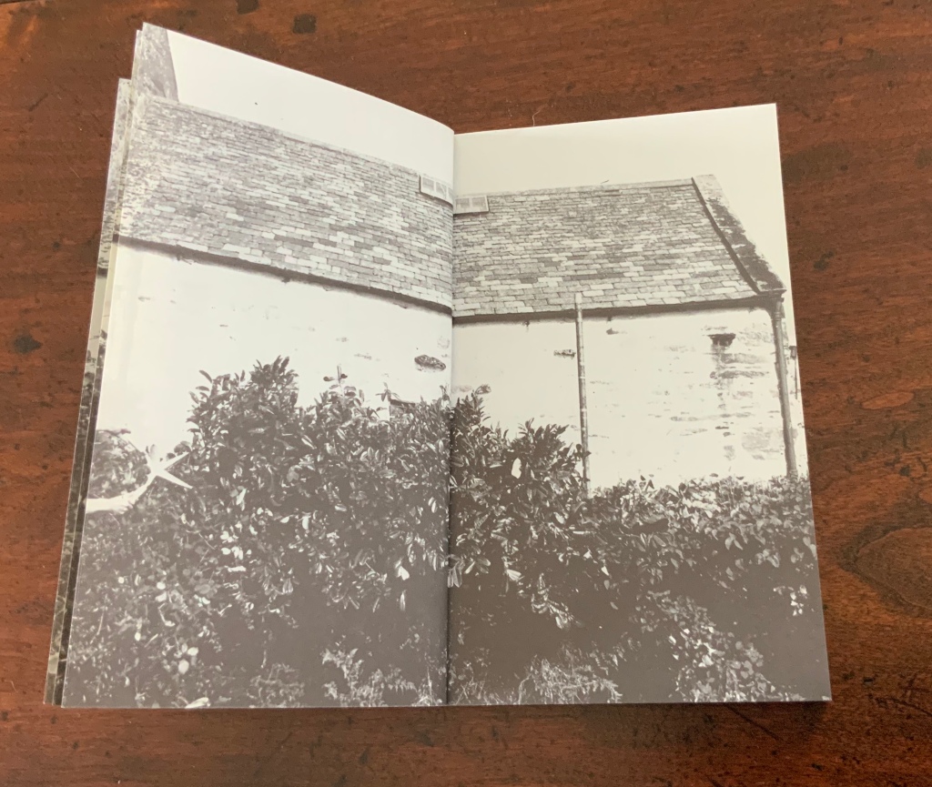
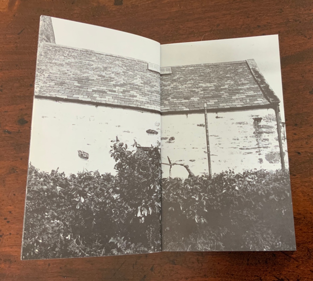
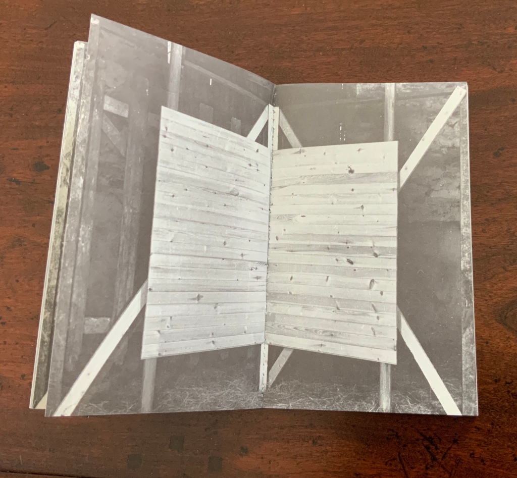
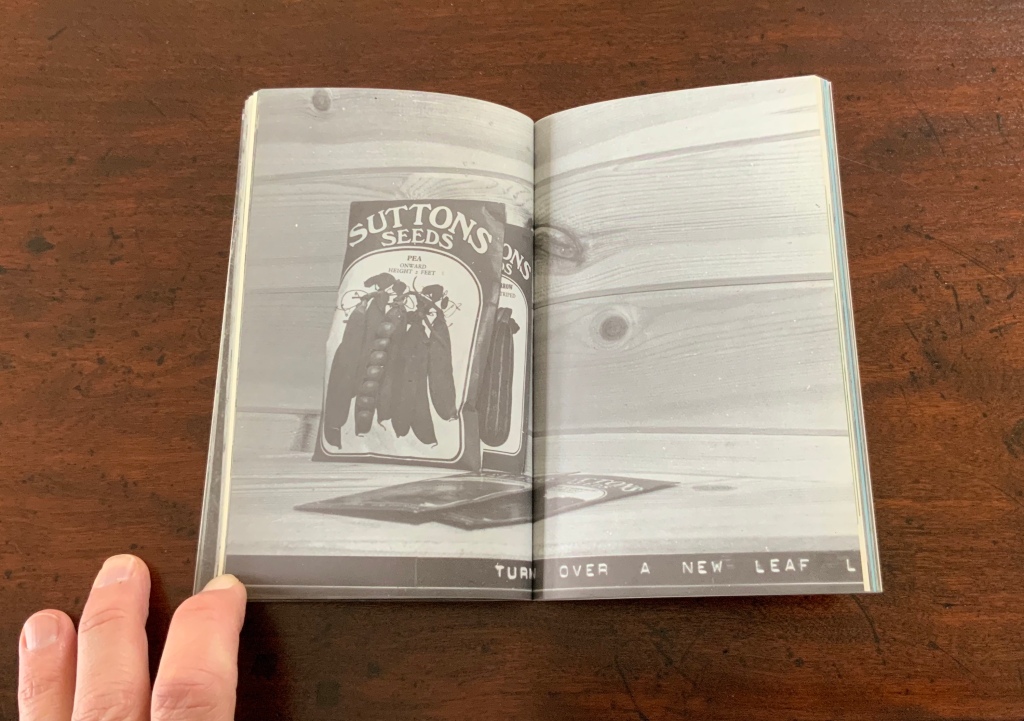
Chinese Whispers (1975)
Helen Douglas and Telfer Stokes
Photo: Books On Books Collection
The selection of images above begins with the front cover’s photo of a patch of grass outside an abandoned farm building and ends with the back cover’s photo of the underside of the patch of grass. In between, the pages take the viewer through the trimmed hedge and the doorway into the room, through the building, the stocking of the shelves, using of the stock and closing of the shed cupboard, and so back to the other side of the patch of grass. As Stokes explained in the Journal of Artist’s Books (Vol. 12, 1999):
We started with the corner cupboard, that was the part that occupied our thinking most, that and the two colour vignettes (as we called them) printed on different stock. But then we started to think backward to what might be before the cupboard’s construction. To the thing before that, and the thing before that, and the thing before that which was cutting of the hedge and before that which was the boot brush which we called the hedgehog- that was where the book started. Then we started to photograph from that point forward, through the book.
The work blends the features of book structure, collage and montage to create something that resonates uncannily with Pallasmaa’s approving citations of Bachelard’s central idea of the hearth and domicile as central to our time-bound “being-in-the-world”.
Your House is a laser-cut model of Olafur Eliasson’s residence in Copenhagen at a scale of 1:85, which means that each page equates to a 220 mm section of the actual house. How do you read a work like this — physically? At the 22″ mark in this video, the pages fall in a cascade like a flipbook, but for the most part, their size, accumulated bulk and weight — and delicacy — defy that handling. As in the video below, they must be turned slowly and carefully. Your House heeds the task of the arts as posed by the architect Juhani Pallasmaa, “in our age of speed, …to defend the comprehensibility of time, its experiential plasticity, tactility and slowness” (The Embodied Image, p. 78).
Your House (2006)
Olafur Eliasson
Folded book pages rarely generate a work that rises above mere craft. Heather Hunter’s Observer Series: Architecture (2009) achieves the necessary height. It combines the altered book with an accordion book that incorporates a found poem composed of the words excised and folded outwards from the folded pages of The Observer’s Book of Architecture.
Observer Series: Architecture (2009)
Heather Hunter
Photo: Books On Books Collection
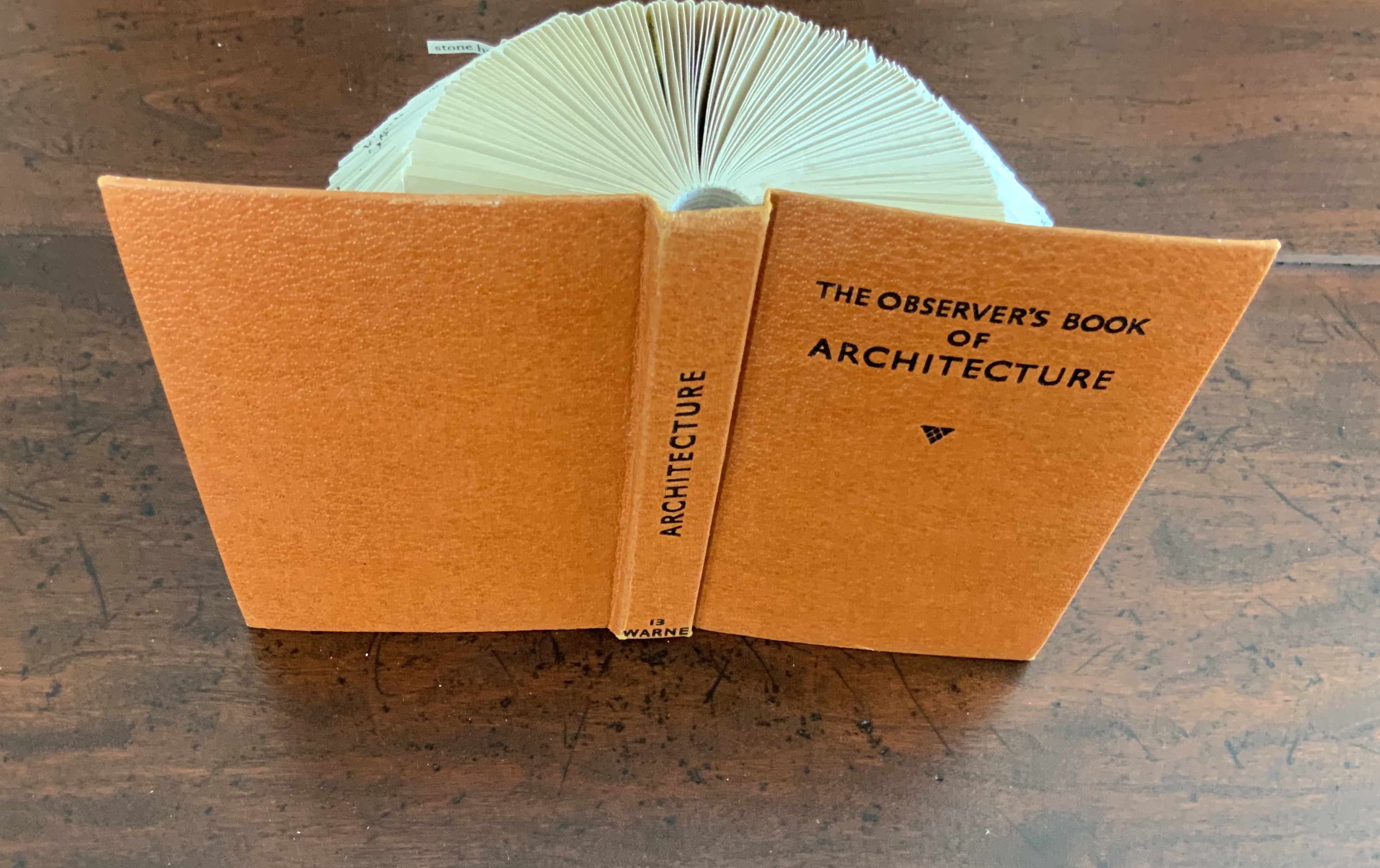
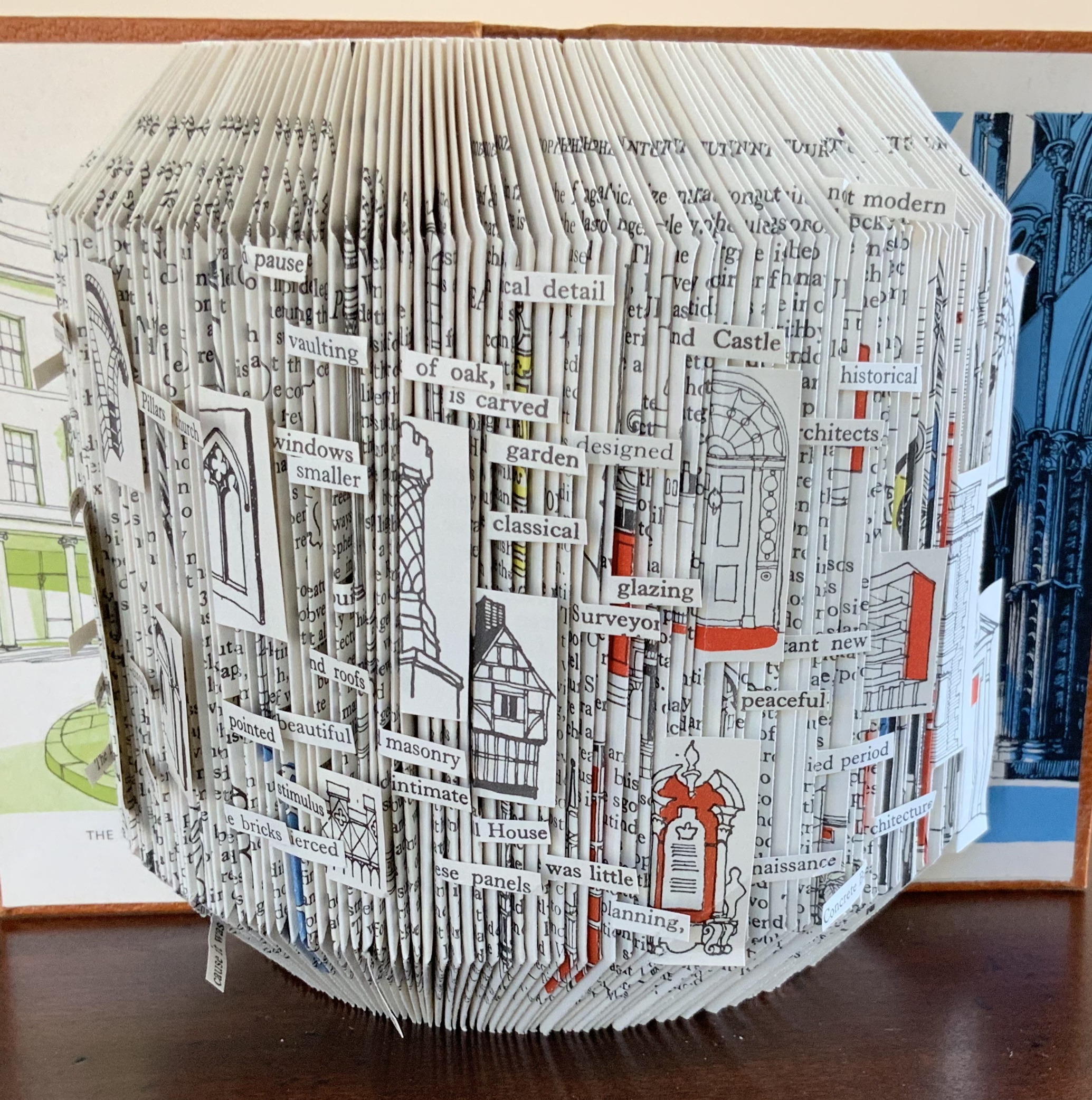
Photo: Books On Books Collection
The very fact of a found poem made of excised words that happen to fall at the folds shaping a column from a book on architecture chimes with the title of Bachelard’s The Poetics of Space.
Chicago Octet (2014) by Marlene MacCallum embodies the collaborative creative approach often taken in architects’ practices. Collaborative working arises almost as frequently in book art. Think of Blaise Cendrars and Sonia Delaunay, Helen Malone and Jack Oudyn, Julie Chen and Clifton Meador, Robin Price and Daniel Kelm. Many more can be added. As described by MacCallum:
From May 19 – 26, 2014 a group of eight gathered at the Columbia College Center for Book and Paper Arts for a final collaborative project. This event was organized by Clifton Meador and myself and included David Morrish, Scott McCarney, and four Grenfell Campus BFA (Visual Arts) grads, Stephen Evans, Maria Mercer, Virginia Mitford, and Meagan Musseau…. The letterpress printing consisted of a word selected by each participant printed on one of Scott’s folded structures. The images were a digital layering of every cityscape photograph that I made and then inkjet printed on top of the letterpress. The final folded structure was designed by Mary Clare Butler. The case was designed and built by Scott McCarney, the front cover embossment was by David Morrish and Clifton Meador.
Chicago Octet (2014)
Marlene MacCallum
Hand bound artist’s book with folded paper structure, letterpress and inkjet printing, 6.5 × 3 × 0.5 inches (closed dimension).
Photo: Books On Books Collection

Photo: Books On Books Collection

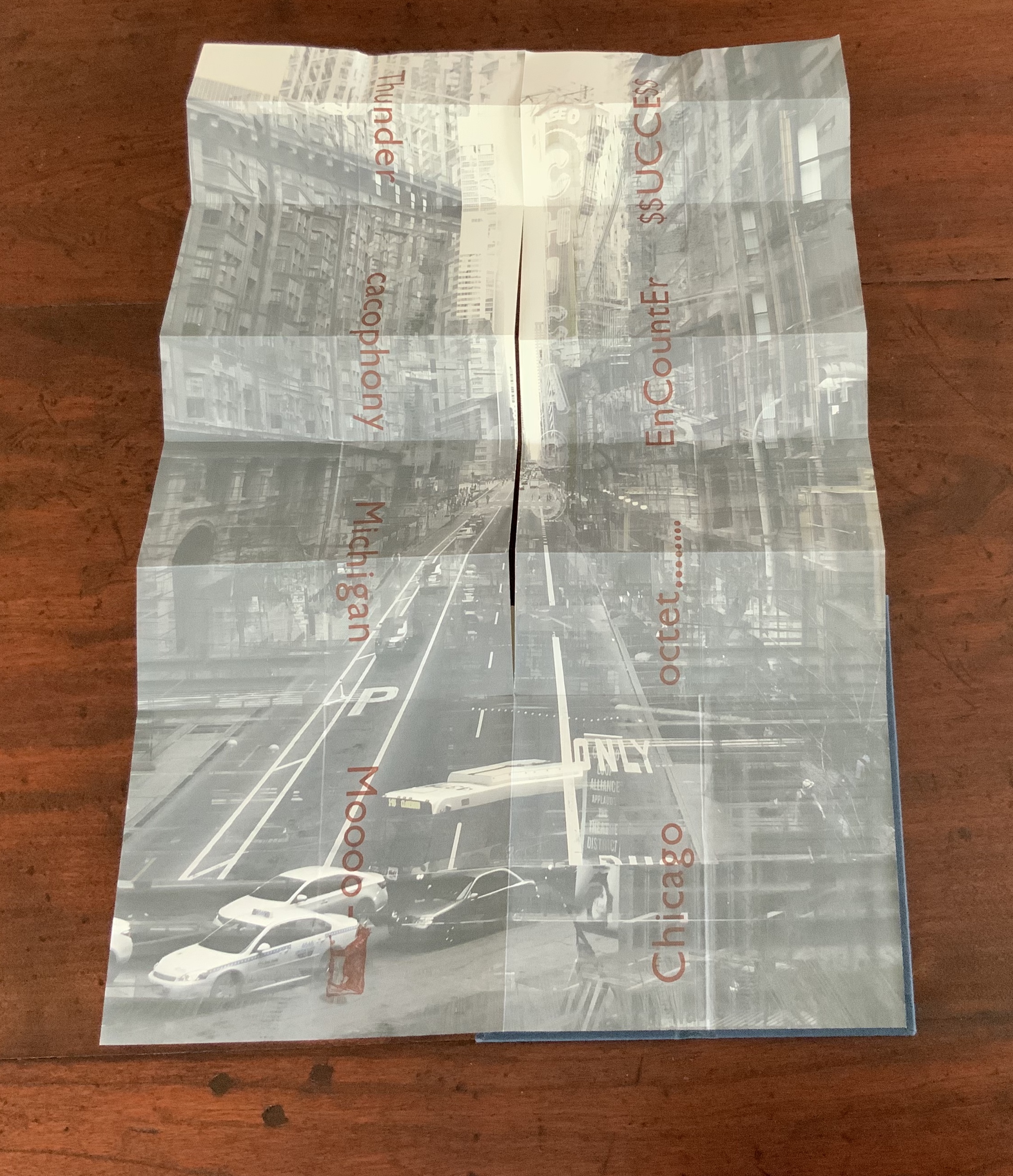
Chicago Octet fully unfolded, 17.5 × 11.5 inches
Photo: Books On Books Collection
Can you hear the traffic and sense the layers of experience? What Pallasmaa writes here of rock art in Africa and Australia reminds me of Chicago Octet (or is it vice versa?): “
At the same time that great works of art make us aware of time and the layering of culture, they halt time in images that are eternally new. … Regardless of the fact that these images may have been painted 50,000 years ago, … we can … hear the excited racket of the hunt. The Embodied Image, p. 109.
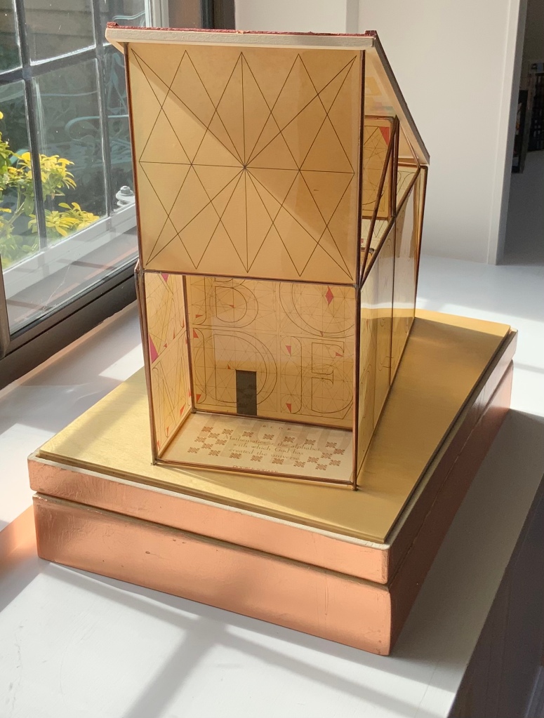
Jeffrey Morin and Steven Ferlauto
Sacred Space (2003) is an intimate monument of book art. Made intimate by the content and texture of its book, made more intimate by the viewer’s having to construct the chapel. Made monumental by the echo of typographic history, made more monumental in Galileo Galilei’s echo from its floor: Mathematics is the alphabet with which God has created the universe.

Sacred Space (2003)
Jeffrey Morin and Steven Ferlauto
Book: Reduction linoleum prints with typographic illustrations using overprinting of letterforms; open spine sewn with brown cord binding; brown cloth-covered boards; title and design on front board; endpapers of handmade paper from Nepal. Book: 6 x 14.25″; 17 leaves.
Chapel kit: Six walls, roof, base. Walls: copper rod skeleton with Okawara rice paper skin covered with a casting resin. Book and kit housed in wooden box. Roof copper-leafed Davey board. Roof forms the tray in which the book rests. Base: Box lid becomes the base for the chapel. Brass holes in the base allow the rods to fit exactly. Print pattern on the base becomes the floor pattern. Box painted with copper leaf. Sculpture base 15.75 x 11.5″, height 12″.
Edition of 35, of which this is #23.
Photo: Books On Books Collection.
Salt + Shaw (Paul Salt and Susan Shaw)
Mill: A journey around Cromford Mill, Derbyshire (2006) is the result of the artists’ exploration of Cromford Mill in Derbyshire, the first water-powered, cotton-spinning mill developed by Richard Arkwright in 1771. Solid, plaster cast blocks are held softly between calico pages containing hidden texts, bound in recycled wooden library shelf covers that indicate there is history to be found within.
Mill: A journey around Cromford Mill, Derbyshire (2006)
Salt + Shaw (Paul Salt and Susan Shaw)
Photo: Books On Books Collection
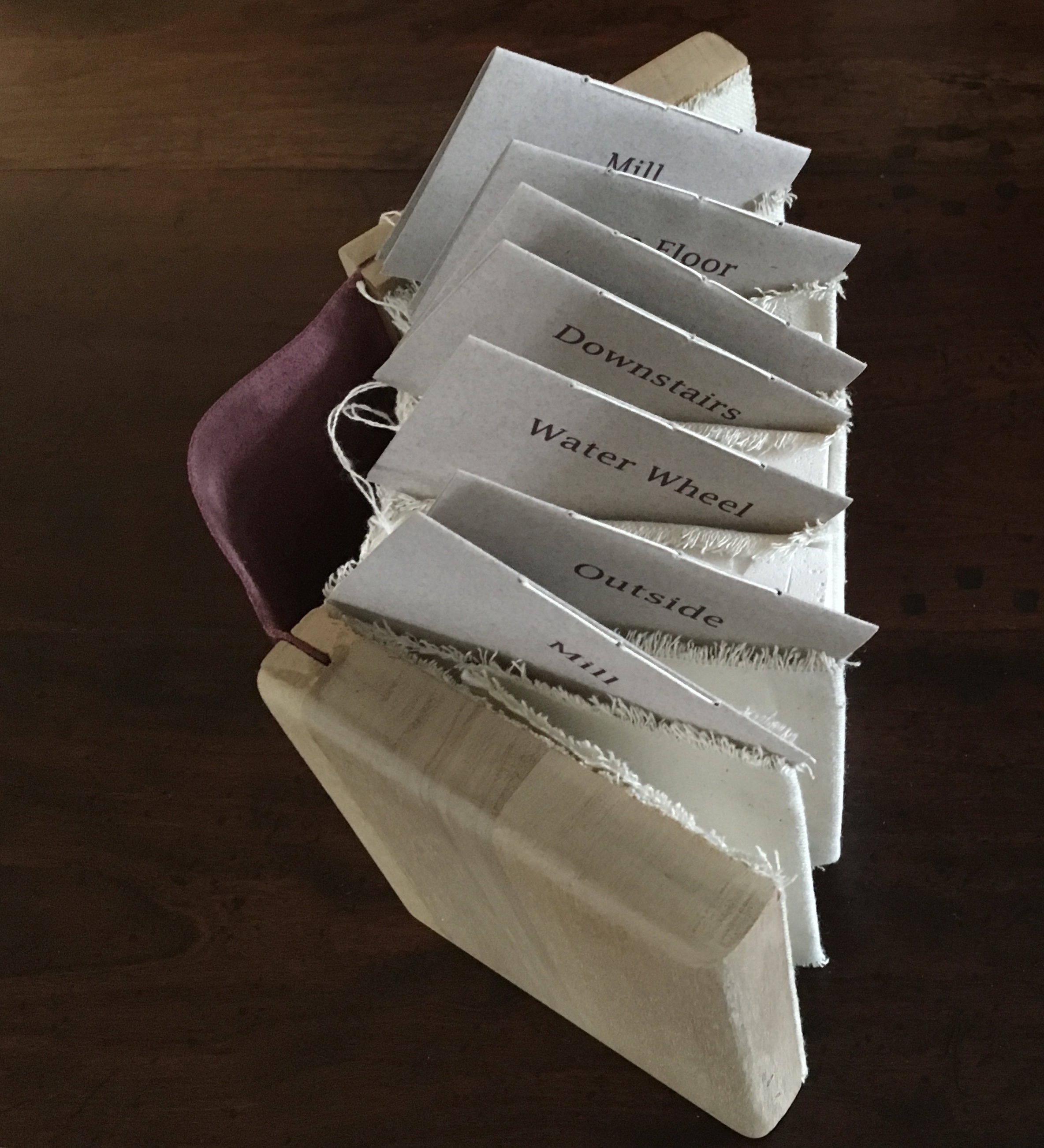
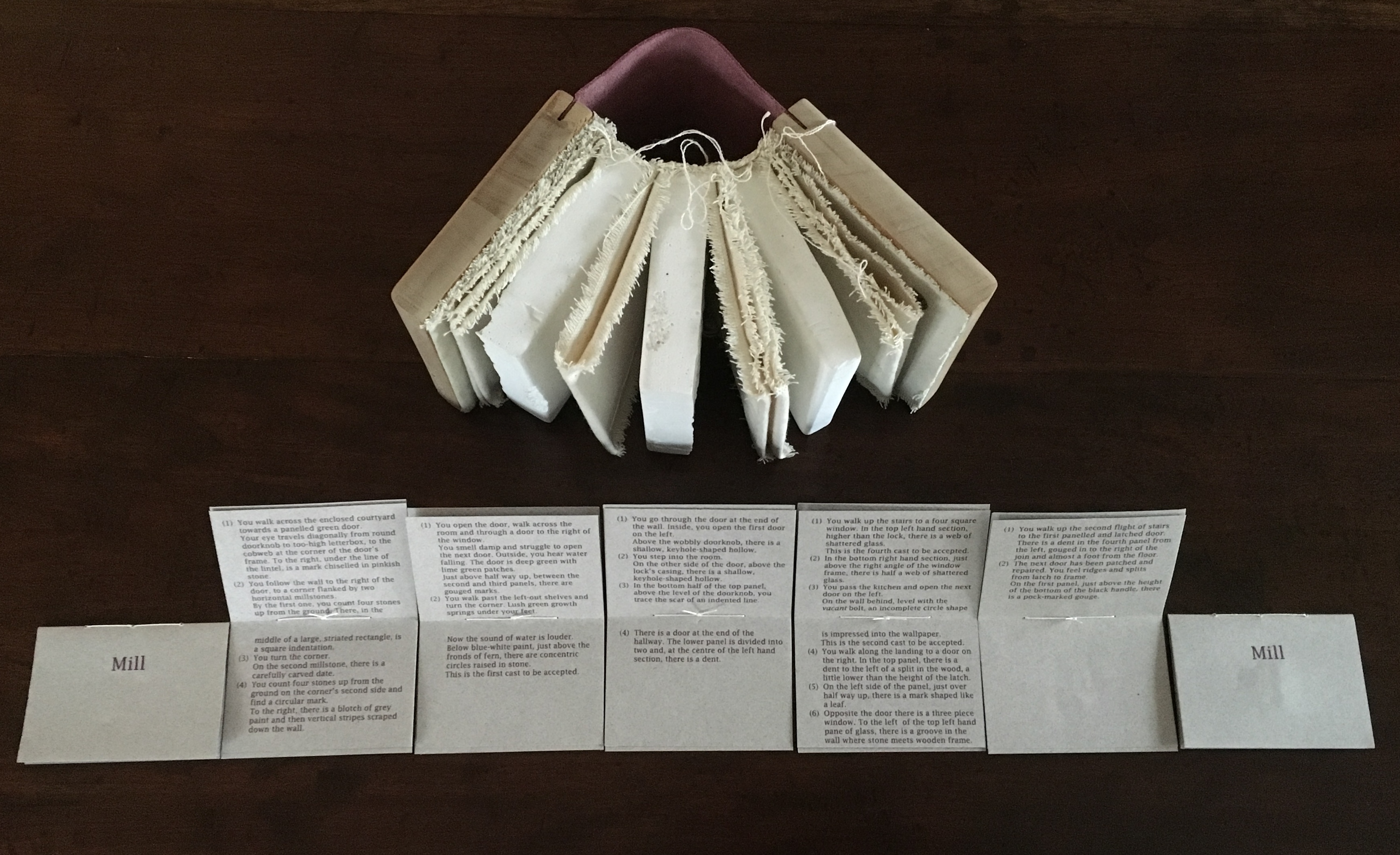
Having Mill is like having the building inside your house.
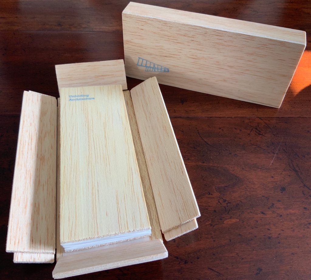
When Emily Speed is not creating architectural costumes for architectural performative art, she creates artist’s books to express her inner edifices. Unfolding Architecture (2007) coheres title, metaphor, narrative, image, technique of silk-screening, letterpress, texture of paper and wood, the workings of the accordion and box enclosure — all — into an artwork about un-cohering.
Unfolding Architecture (2007)
Emily Speed
Double-sided accordion book, attached to balsa wood covers, housed in a hinged, covered box of balsa wood. Book – H190 x W70 x D18 mm (closed), H190 x ~W2280 (open); Box – H203 x W88 x D63 mm; 24 panels, including cover panels. Edition of 90, of which this is #7. Acquired from the artist, 24 October 2020.
Architecture plays more than an inspirational role in Karen Wirth’s portfolio. As mentioned above, she has created her own take on Vitruvius’ Ten Books. She designed the Gail See Staircase at Open Book and the Hiawatha Light Rail Station, both in Minneapolis. The collage work Paper Architecture is based on an architectural installation at the Minnesota Center for Arts Design and draws on Wirth’s photos of Ayvalik, Amsterdam, Florence, Istanbul, New York City, Rome, San Diego and Venice.
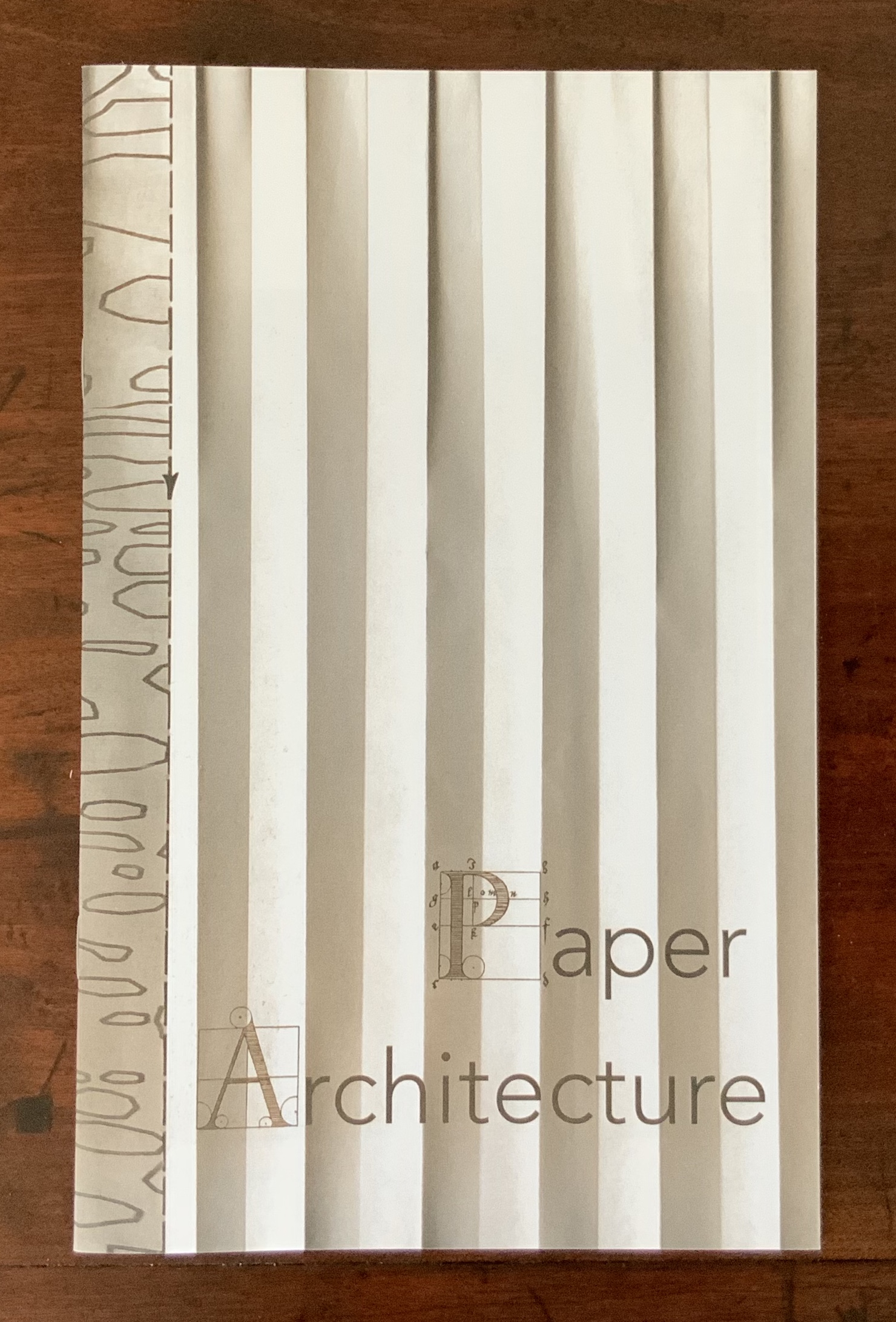
Paper Architecture (2017)
Karen Wirth
Photographs in the book © Karen Wirth
Photo: Books On Books Collection

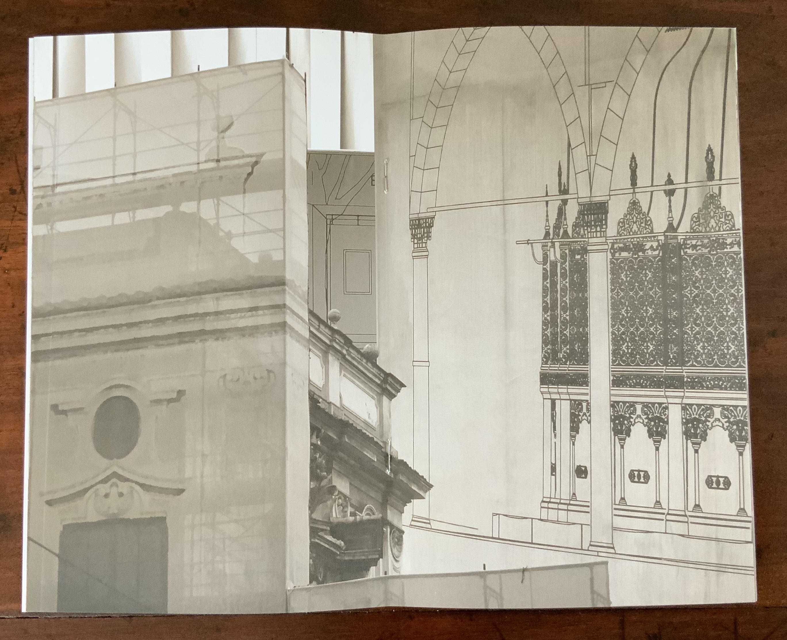

In The Embodied Image, Pallasmaa singles out “the collaged image” as creating “a dense non-linear and associative narrative field through initially unrelated aggregates, as the fragments obtain new roles and significations through the context and dialogue with other image fragments” (pp.71-72). The materially disparate words in the title of Wirth’s work imply the dialogues she creates among paper, designs of letters and architecture, buildings across time and the globe, and photos tinted, four-colour, and black-and-white in palimpsest.
For Wirth’s own comments about the intersection of book art and architecture, see her interview with Betty Bright.
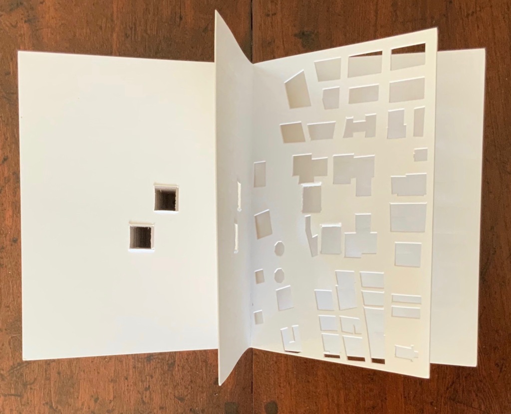
Former professor and head of the Department of Architecture at MIT’s School of Architecture and Planning, Yoon is now Gale and Ira Drukier Dean of the College of Architecture, Art and Planning at Cornell University. She is also cofounder of Höweler + Yoon, a design-driven architecture practice. Absence appears to be her only work of book art so far.
When you hold this small white brick of paper and turn its thick pages, a small pinhole appears on the page. Then two larger square holes emerge, one of which falls over the pinhole. Page after page, the two square holes repeat, creating two small dark wells in the field of white, until on the last page they take their place in the cut-out schematic footprint of the city blocks and buildings surrounding the Twin Towers of New York City. What you hold in your hands at the end is an object of art and book of memorial prayer.
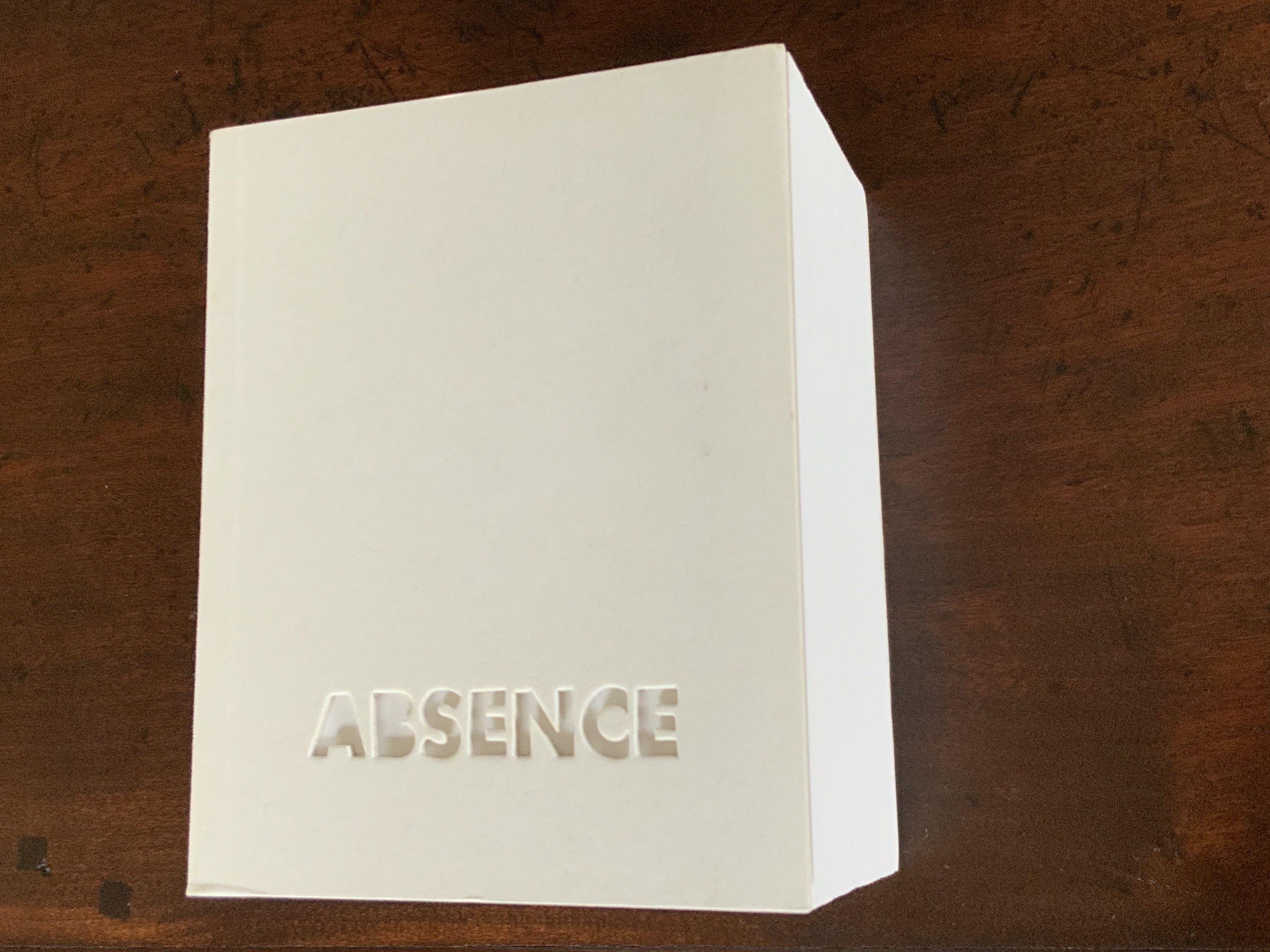
Absence (2003)
J. Meejin Yoon
Photo: Books On Books
Other sites, other works
Twice a semester, the Environmental Design Library at the University of California, Berkeley hosts “Hands On: An Evening with Artists’ Books”. In 2017, one evening’s theme was “Building on the Built”, illustrated by 25 works of book art. Organised by 23 Sandy Gallery in the same year, “BUILT“ was an international juried exhibition featuring 66 artist books by 51 artists examining the relationship between contemporary book art practices and architecture, engineering, landscape and construction.
Arranged alphabetically by artist’s name, this section provides links to works from these two exhibitions as well as other collections, exhibitions, installations and recommendations from the Book-Arts listserv members.
James Allen: The Golden Section (2016), Architectural Graphics (2018)
Architectural Graphics (2018)
James Allen
Photo: Courtesy of the artist
Charlene Asato: Black & White (2013)
Alicia Bailey: Cities & Eyes (2016)
Eleonora Gomez Bas: Home and Back (2021). See “One Body – Two Homes“, an episode of Artist’s Books Unshelved.
Carli Boisjolie: Places of Theirs (2016)
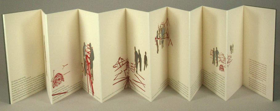
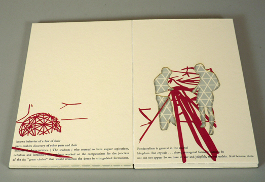
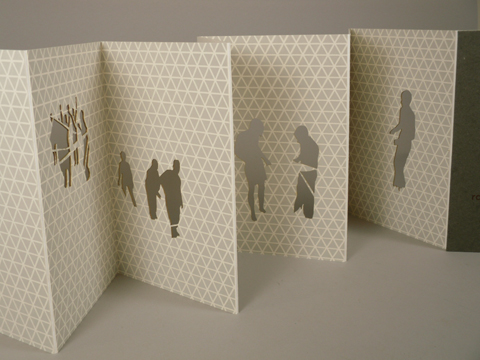
Amy Borezo: Raising the Supine Dome (2010)
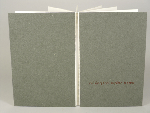
Raising the Supine Dome (2010)
Amy Borezo
Photo: Courtesy of the artist

Inge Bruggeman: A Crisis Ethicist’s Directions for Use: Or How to be at Home in a Residence-cum-Laboratory (2003)
A Crisis Ethicist’s Directions for Use: Or How to be at Home in a Residence-cum-Laboratory (2003)
Inge Bruggeman
Photos: Courtesy of the artist
On her site, Bruggeman writes, “This book/box project is built around excerpts from Architectural Body by Madeline Gins and Arakawa…. incorporates a blueprint of their Bioscleave House as part of the imagery….”. Somewhat like A Clockwork Orange or perhaps more like Heideigger’s tomes, the Gins and Arakawa book is a challenge to the reader’s expectations of diction and syntax.
R D Burton: Structures II (2015)
Carol Chase Bjerke: Homage to Peter Mullin (2014)
Julie Chen and Barb Tetenbaum: Ode to a grand staircase (for four hands) (2011)
Susan Collard: Work in Great Cities (2011); Quixity (2017)
Guylaine Couture: Everyone Needs a Home (2017)
Laura Davidson: Ten Books of Vitruvius (1994), Venice : Piazza San Marco (2010)
Elsi Vassdal Ellis: Here is the church. Here is the Steeple. Here are questions for the people. (2017)
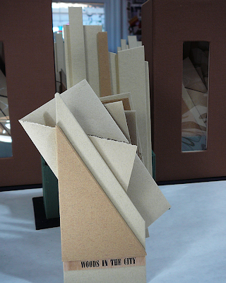
Alisa Golden: Woods in the City (2013)
Woods in the City (2013)
Alisa Golden
Photos: Courtesy of the artist

Christiane Grauert: Folding City (2016)
Karen Hanmer: The model architect: the panic of ’09 (2010)
Hongtao Zhou: Textscape-TONTSEN Eye (2019)

Textspace-TONTSEN Eye (2019)
Hongtao Zhou
Photos: Courtesy of the artist


Johan Hybschmann: Book of Space (2009)
Ronald Keller: Palladio, Andrea (1508-1580): excerpts from the four books on architecture (2008)
Louise Levergneux: Finding Home (2016)
Marlene MacCallum: Townsite House Bookwork (2006). See also Gail Tuttle, The Architectural Uncanny (Newfoundland: Sir Wilfred Grenfell College of Art Gallery, 2007).
Susan Marsh: Building a Home (2022)
Richard Minsky: Model of Buckminster Fuller’s Tetrascroll (1979). See also Polly Lada-Mocarski, Richard Minsky and Peter Seidler, “Book of the Century: Fuller’s Tetrascroll“, Craft Horizons, October 1977 (Vol. 7, No. 35). For one (very helpful) reading of Tetrascroll see Jessica Prinz’s “The ‘Non-Book’: New Dimensions in the Contemporary Artist’s Book” in The Artist’s Book: The Text and its Rivals, a special two-issue volume of Visible Language, Vol. 25, Nos. 2/3, edited by Renée Riese Hubert (Providence, RI: Rhode Island School of Design, 1991), pp. 286-89.
Marta Minujín: El Partenon de Libros (1983)
Howard Munson: The Architects (2018)
Sumi Perera: Building Blocks Book XVII (2017). Further information available at Saatchi Art.
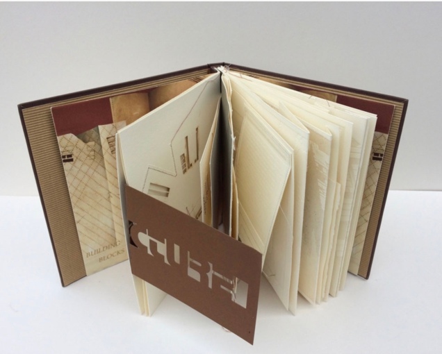
Building Blocks Book XVII (2017)
Sumi Perera
Photos by artist’s permission
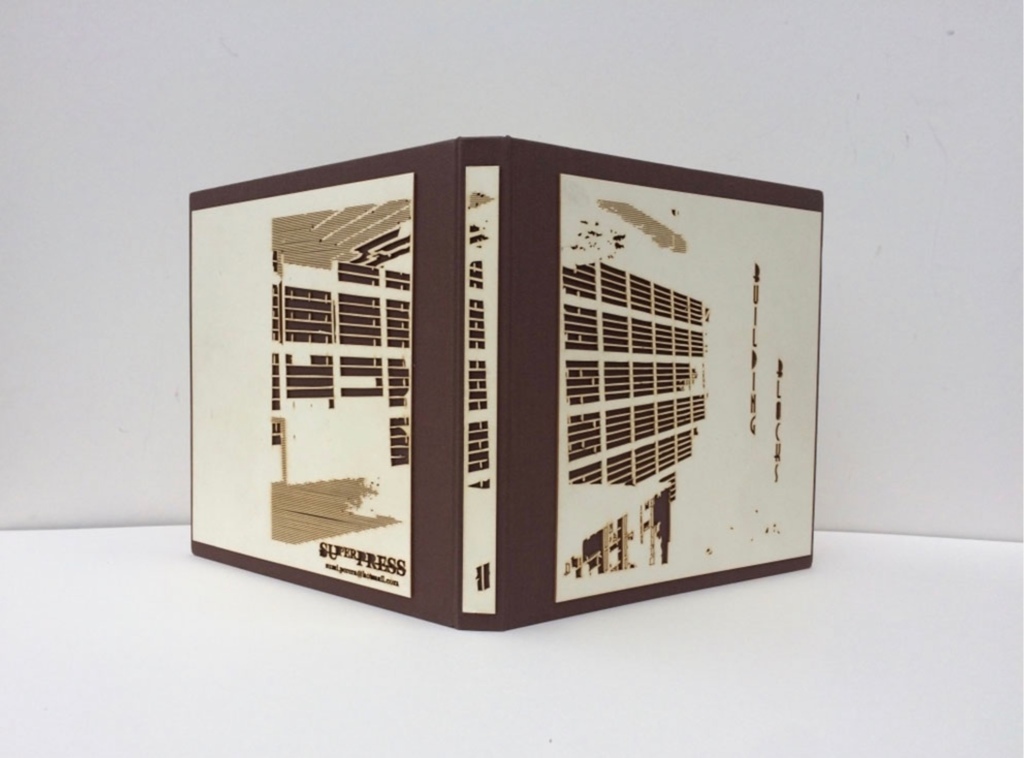
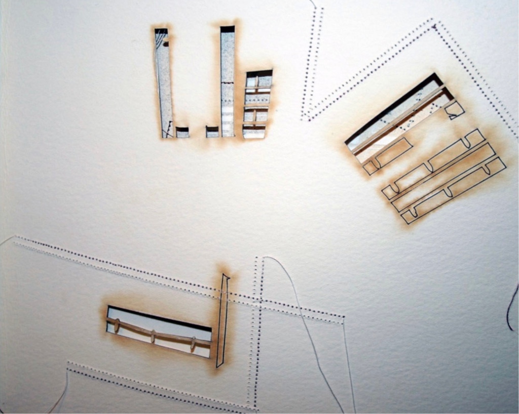
Going against the usual structure of the book, that of a beginning, a middle and an end, Perera provides a space for infinite possibilities and multiple authors, creating “modules that can be re-sequenced and re-aligned to develop variable permutations and encourage participatory involvement, to share the final editorial control with the viewer to transform the ever-evolving work”. These possibilities for variable permutations are no more evident than in her constantly evolving project, Building Blocks Book, and its numerous subsequent iterations including The Negative Space of Architecture and The House That Jack Never Built (2008). Once again we find Perera exploring human interaction, not only with the concepts and her quizzical ideas surrounding architectural and public spaces and how we build between and move within, but also the physical interaction with the artists’ books she produces – the rearrangement and reinsertion of pages which allow the audience and participants new opportunities and pathways to proceed. Through the positive and negative space of the page or the type font, the Underground versus over ground, the artist takes us on journeys that are at once fluid and at other times obstructive. In these cityscapes, the U-turn is as common as the page turn – a necessary rupture in a free-flowing narrative. Chris Taylor, From Book to Book (Leeds: Wild Pansy Press, 2008).
Chris Perry: 210 Ripples (red(tide))
Maria G. Pisano: Tunnel Vision (2004), Hecatombe 9-11 (2007)
Laura Russell: Casa Mila (2006)
Kazumi Seki: Two Homes (2018). See “One Body – Two Homes“, an episode of Artist’s Books Unshelved.
Robbin Ami Silverberg: Home Sweet Home (2006). Artist’s description — “an architectural album of an imaginary middle-class suburban house, … its plans and layout [filled] with the many proverbs I’ve found about women in the home. The book was printed to look like the almost obsolete technique of Diazo printing (blue-printing), but in fact, it is archival inkjet.”
Clarissa Sligh: What’s Happening with Momma? (1988)
Marilyn Stablein: Grids, Lines, Blocks: Basics Tools to Build Linear Habitats (2017)
Barbara Strigel: Visible Cities (2016)
Barb Tetenbaum: Portland/Living (2020).
Nikki Thompson: A Tribute to Alvar Aalto (2008)
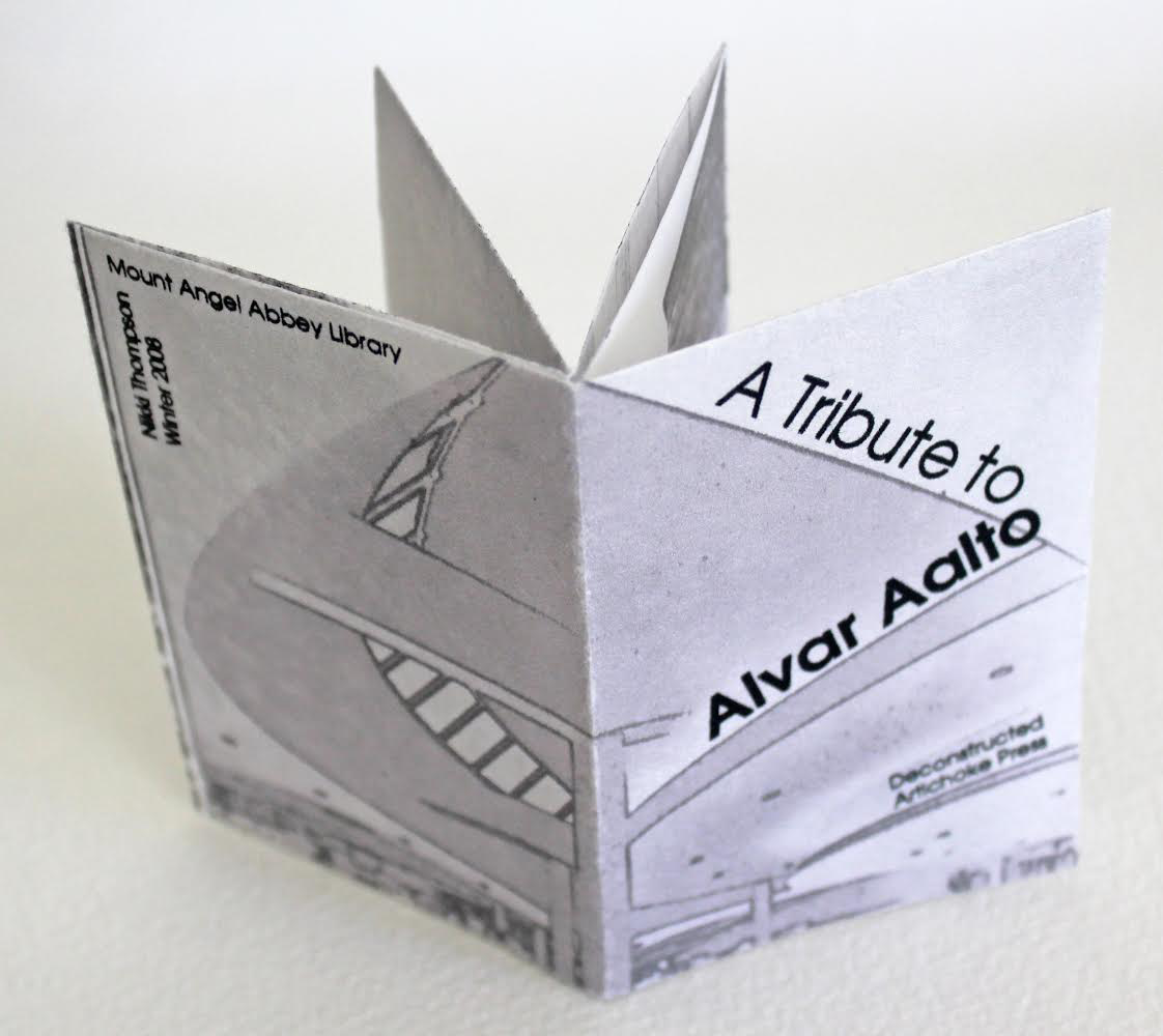
A Tribute to Alvar Aalto (2008)
Nikki Thompson
Photos: Courtesy of the artist
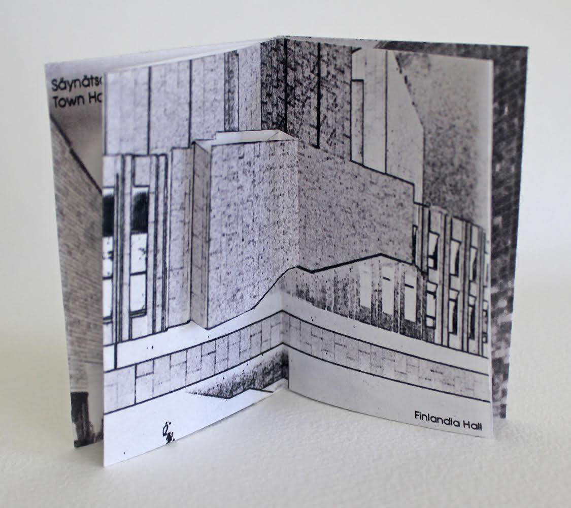
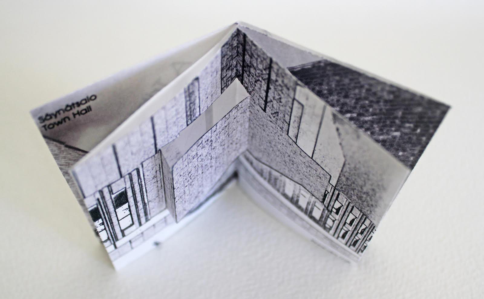

Andrew Topel: Blueprints (2012)
Delia Touché: Home Is Where the Buffalo Used to Be (2023).
Christine Trexel: Building the Universe (2017)
Rachel Whiteread: Nameless Library (2000)
Amanda Watson-Will: The Great Library (2011)
Sara White: A Family Attic (2014), There: an archive of built places (2015) and Riverine (2016)
Thomas Parker Williams: Spiral Dome: Sculptures in Paper and Steel (2016)
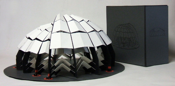
Spiral Dome: Sculptures in Paper and Steel (2016)
Thomas Parker Williams
Photos: Courtesy of the artist
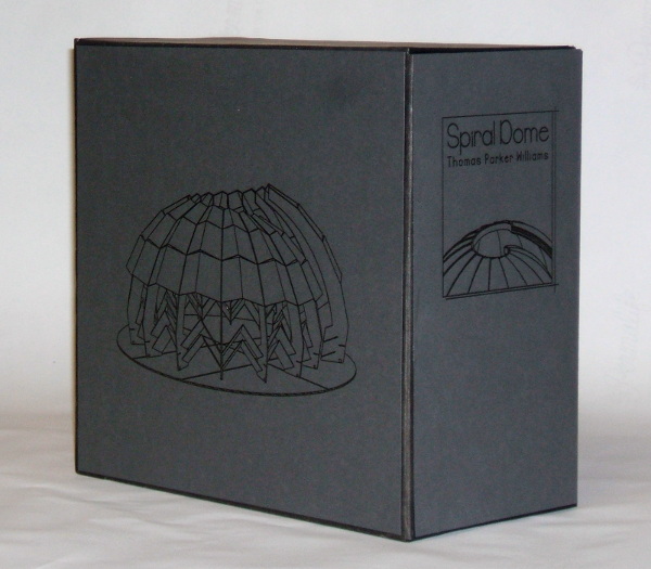
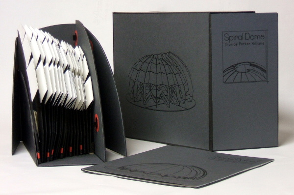
Update: With the addition of Marian Macken’s book Binding Space, mentioned above, comes the Vedute Foundation, a collection of objects/manuscripts by artists/designers/architects created within the constraint that each work has the proportion of the Gutenberg Bible and the relationship of ‘Text’ and ‘Form’ as its subject. For this essay in Books On Books and for the Books On Books Collection’s acquisition of the Merrion edition of Johann David Steingruber’s Architectural Alphabet, the most apropos and favorite work in the Vedute collection is K (1996) by Peter Wilson.
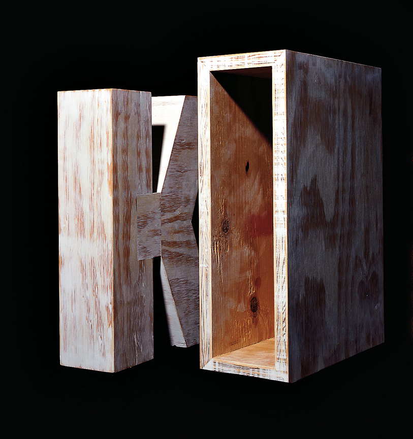

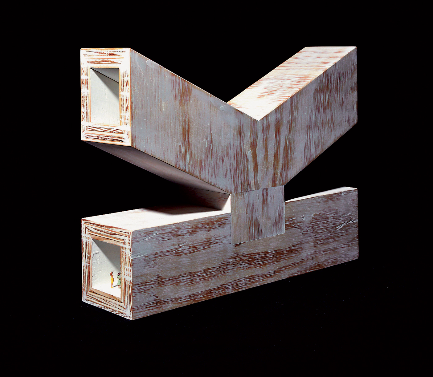
K (1996)
Peter Wilson
“This contribution (a double volume) is based on the letter ‘K’ (an atom of language), materialised within the Gutenberg proportions in sturdy plywood. It is the responsibility of an architect not only to ‘give form’ but also to explore latent interiorities, potential spatialities. Here the ‘K’ interior has its own inherent geometric agenda − a tunnel, a tube, an inverting telescope (apex mirror). Object becomes instrument (a window to the antipodes even), a trigger for multiple ‘K’ vectors (textural and spatial).” Bolles+Wilson
Further Reading
“Celebrating the 250th Anniversary of Steingruber’s Architectural Alphabet“. 1 January 2023. Books On Books.
23 Sandy Gallery. 2017. Built: an international exhibition of contemporary artist books, April 7-May 27, 2017. Portland, Oregon: 23 Sandy Gallery. “… examining the relationship between contemporary book art practices and architecture, engineering, landscape and construction as form, function and structure. Book artists took this opportunity to re-image the ways we as designers, of either books or buildings can inhabit and shape the world around us. Our disciplines have a natural synergy. After all, books and buildings are both kinetic, sequential, structural and time based. BUILT examines the relationship between the built and the book. BUILT features 66 artist books by 51 artists from across the country and as far away as Canada, United Kingdom and Australia.” Publisher’s website.
Sophia Kramer, “Variations of Vitruvius: Four Centuries of Bookbinding and Design”, The Met, 22 August 2018. This essay reviews and illustrates the conservation and rehousing of ninety-five copies of De Architectura libri decem (The Ten Books of Architecture) by Marcus Pollio in the collection of the Department of Drawings and Prints. They are part of a donation of 356 publications from the architect William Gedney Beatty (1869–1941). For book artists, the section on a 1556 edition with double volvelles to display a theater design should be of interest.
Marian Macken, Binding Space: The Book as Spatial Practice (London: Taylor and Francis, 2018). A trained architect and book artist, Macken articulates and illustrates the how and why of the overlap between architecture and book art.
David Sume, The architectural nature of the illustrated books of Iliazd : (Ilia Zdanevich, 1894-1975, University of Montreal, 2019. This dissertation is a reminder that the importance of architecture to book art reaches back to the avant-garde and modernists of the early 20th century — and more important, that its importance may lie beneath the surface.
Elizabeth Williams, “Architects Books: An Investigation in Binding and Building”, The Guild of Book Workers Journal, Volume 27, Number 2, Fall 1989. This essay not only pursues the topic of architecture-inspired book art but turns it on its head. An adjunct professor at the time, Williams set her students the task of reading Ulises Carrión’s The New Art of Making Books (Nicosia: Aegean Editions, 2001) then, after touring a bindery, “to design the studio and dwelling spaces for a hand bookbinder on an urban site in Ann Arbor, Michigan”. But before producing the design, the students were asked “to assemble the pages [of the design brief and project statement] in a way that explored or challenged the concept of binding”. In other words, they had to create bookworks and then, inspired by that, create their building designs. Williams illustrates the essay with photos of the students’ bookworks. [Special thanks to Peter Verheyen for this reference.]
Books On Books Collection – Sarah Bryant
In 1995, the Smithsonian Institute Libraries’ exhibition Science and the Artist’s Book explored “how science can serve as a springboard for artistic creation” and showed how “aspects of creativity … are common to science as well as to art”. The exhibition juxtaposed twenty-five rare books from the Heralds of Science collection at the Dibner Library with twenty-five bookworks commissioned as responses to them. For example,
Joyce Cutler-Shaw responded to Johannes de Ketham’s Fasciculus Medicinae (Venice: Impressus per Ioannes [et] Gregorius de Gregorijs fratres, 1495) with The Anatomy Lesson (Middletown, CT: Robin Price, Publisher, 1995);
George Gessert responded to Darwin’s On the Origin of Species (London: John Murray, 1859) with Natural Selection (Eugene, OR: self-published, 1994);
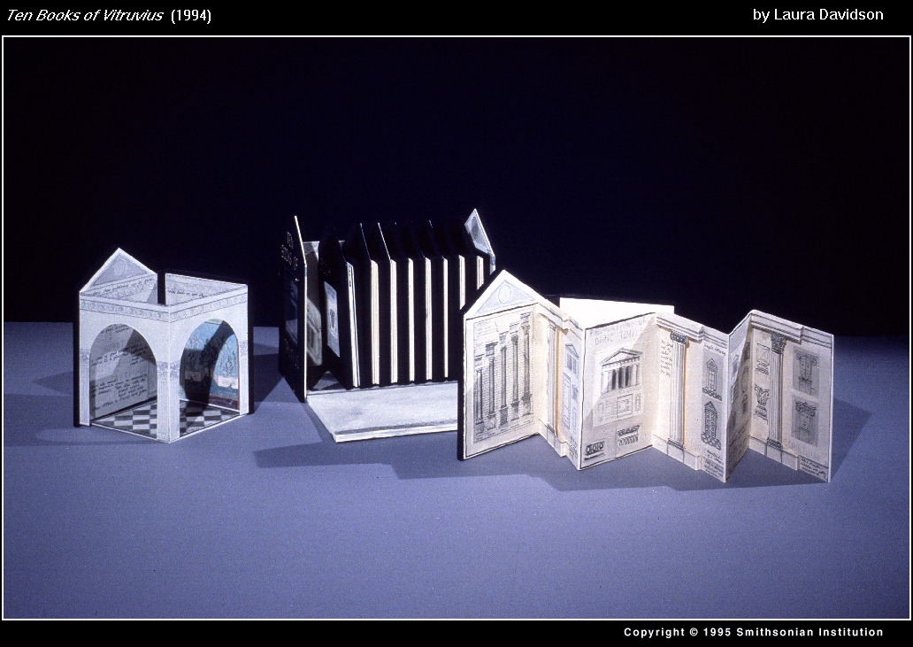
and Laura Davidson responded to Vitruvius Pollio’s’ De Architectura libri Dece [The Ten Books on Architecture] (Como, Italy: Gottardo de Ponte, 1521) with Ten Books of Vitruvius (Boston, MA: self-published, 1994).
As the exhibition demonstrated, the overlay of the dual traditions — those of art and those of the book — on the domains of science creates a rich soil for ingenuity and genius. Since that exhibition, science- and maths-driven book art has yielded harvest after harvest of outstanding book artists. Sarah Bryant is one of them. Bryant won the MCBA Prize in 2011 with Biography (2010) and was a finalist in 2015 with Figure Study (2015).

Biography (2010)
Sarah Bryant
“[A]n exploration of the chemical elements in the human body and the roles they play elsewhere in the world”, Biography (2010) is bound as a hard cover drumleaf and enclosed in a clamshell box. It begins with the periodic table and assigns a coloured square to each of the chemical elements found in the human body. Using those coloured squares, the six subsequent diagrams show the presence of the body’s chemical elements in the earth’s crust, man-made weapons, medicines, sea water, etc. The flip-up folio (above right) displays their presence in various man-made tools and building materials. Bryant’s inventive handling of colour, the flip-up folio and blind embossed printing foreshadow developments in her later work.
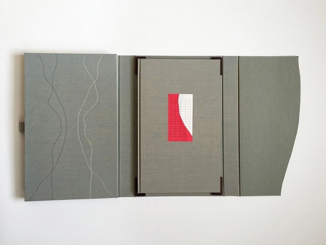
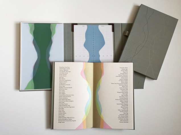
Figure Study (2015)
Sarah Bryant and David Allen
Collaborating with David Allen, a professor at Middlebury College in Vermont, Bryant created Figure Study (2015), a graphical “comparison of population data for every region on earth”. In this work, Bryant takes her handling of shape and colour to a new level.
All 114 of these figures have been printed from linoleum onto drafting film and are housed together alongside a grid. The figures are each numbered and can be interpreted using a booklet containing an alphabetical and numerical index, as well as a short essay by David Allen about our process and the source of the data. The design of the enclosure encourages the viewer to layer the forms to create different combinations of shape and color. This process and the resulting imagery is initially reminiscent of elaborate dresses, paper dolls, and dissection plates, but the source of the data gives a different picture, laying bare the vast and critical differences between the basic equations of life in different parts of the world. 2015 MCBA Prize Finalists
In correspondence with Books On Books, Bryant has noted the influence of Edward R. Tufte. Figure Study particularly may remind the reader/viewer of Tufte’s The Visual Display of Quantitative Information (1983) and Envisioning Information (1990). In his books and lectures, Tufte champions the connection of art and science as well as information display that is interactive, which Bryant’s statement above echoes.
As her two bookworks above and those below associated with the collective Shift_Lab demonstrate, she has the gift of transforming analytical data, diagrammatic imagery , text derived from reference materials as well as personal experience and taking them beyond “visual display” and into art.
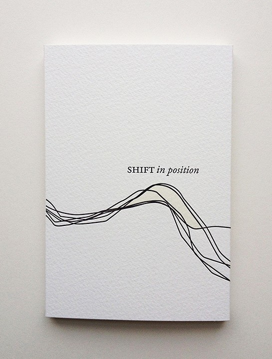
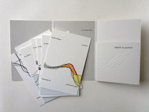
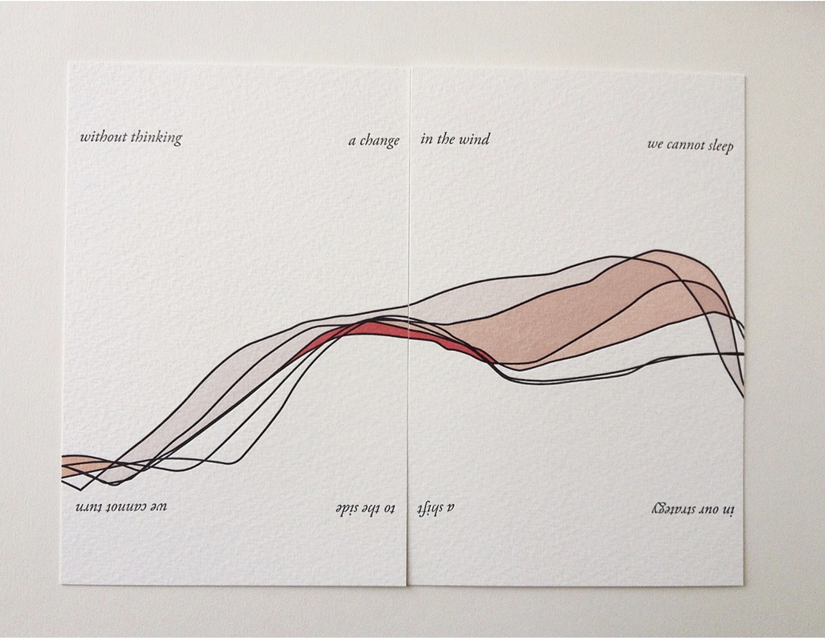
Shift in Position (2014)
Sarah Bryant
In Shift in Position (2014), Bryant draws on her own sleep patterns and movements. Extraordinary how, in Shift in Position, she manipulates the elements of the book to embody the “message” of the work. Note how she plays with layout, in particular, by running text syntactically over the loose folios (“a change/ in the wind” and ensuring the alignment of the graphical image. The work invites the reader/viewer to turn the two folios 180º — like a restless sleeper — to read/see the additional run-on text (“a shift/ to the side”) and the aligned image from another perspective. This use of the material and form draw the reader/viewer into a kind of creative act — negotiating the act of close reading with that of close looking.
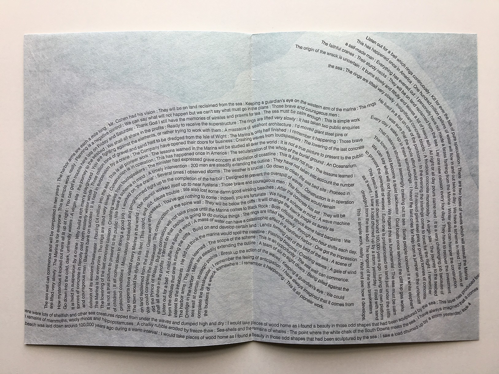
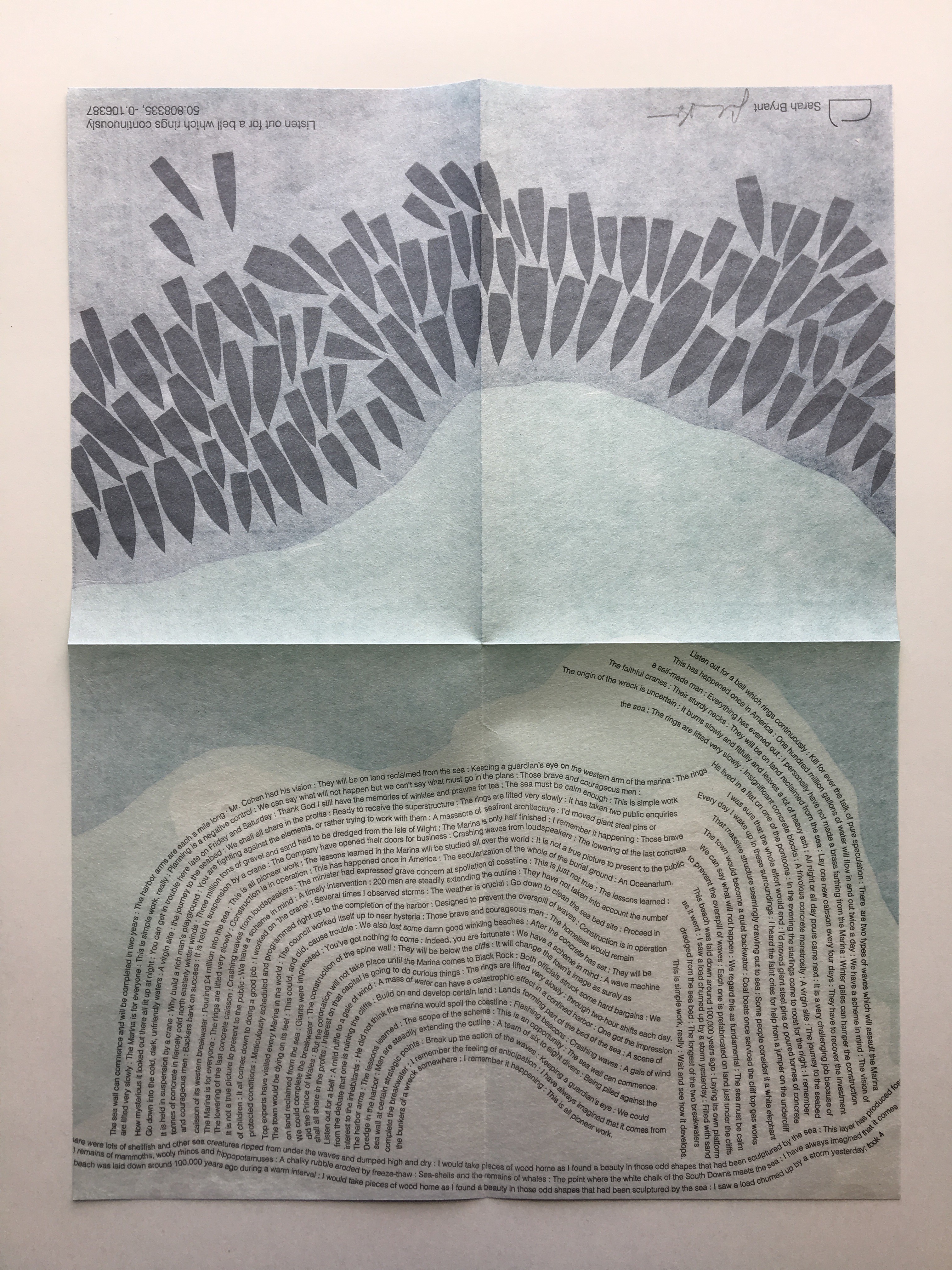
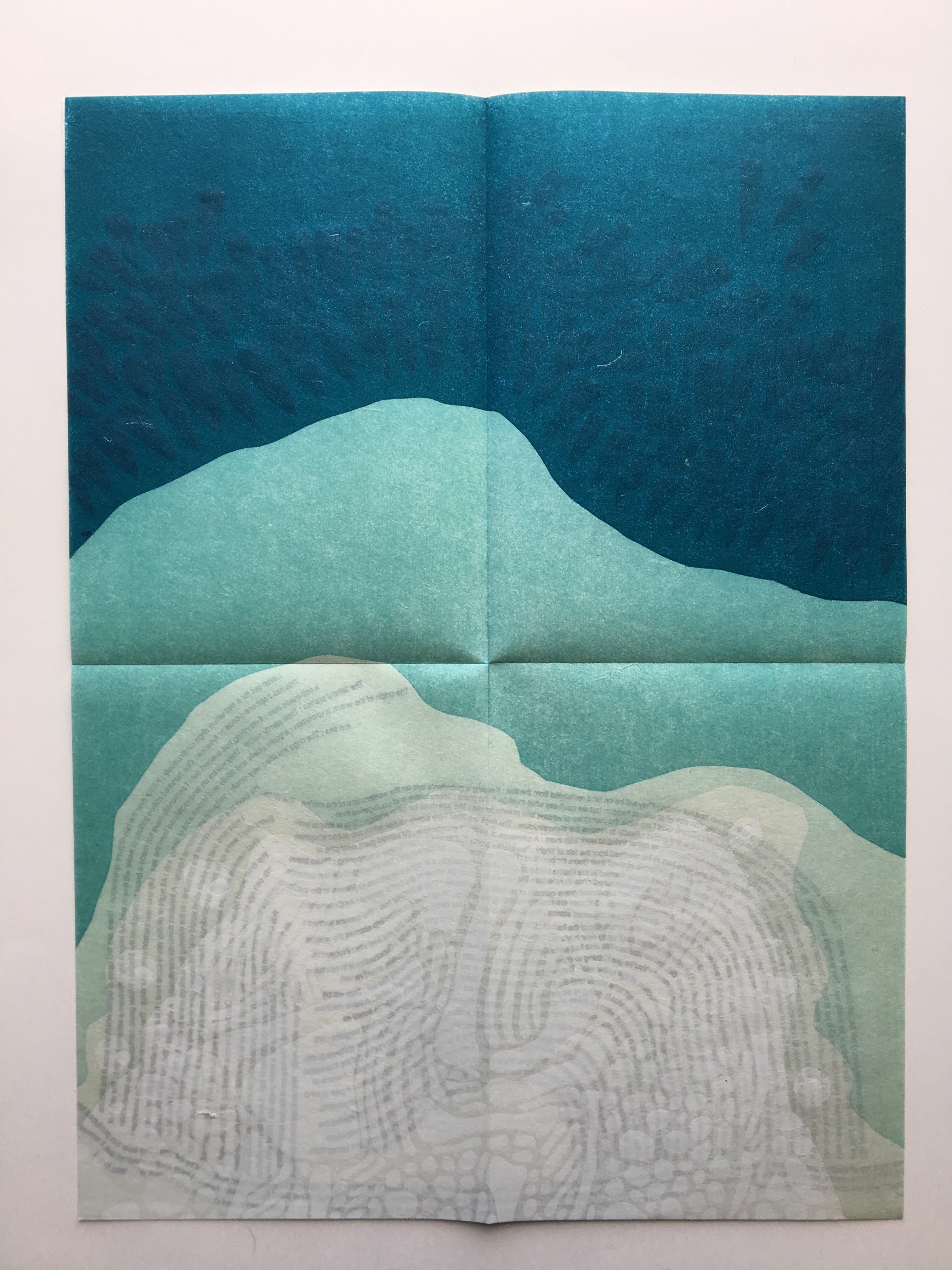
Listen Out for a Bell which Rings Continuously (2015)
Another collective work from Shift_Lab is Trace (2015). Bryant’s contribution is Listen Out for a Bell which Rings Continuously, which draws on sound and coastal mapping. It is based on her residence at the Brighton Marina, “a strange space between land and sea” where she immersed herself “in the quiet rhythm of the place”. In the first image above from Listen Out, it is obvious how the typography mimics the tide’s ebb and flow, perhaps less obvious how the overlapping texts’ rhythm and syntax surge, overlap, peter out. Look even more closely at the two lower images, two sides of the same sheet: note how the colours on the two sides of the sheet register against one another to create the kind of topographical mapping found in marine maps. Beyond that effect, the two pages challenge one’s sense of place in the world. On the left hand side, one is looking down on the boats crowding in on the marina; on the right, one is below the water and looking up at the hulls. To achieve a further infusion of place with the work, the work is even printed using chalk from the surrounding cliffs.
The Radiant Republic (2019) is one of Bryant’s more recent solo works. In her own words:
The Radiant Republic [is] built entirely out of language found in Plato’s Republic and Le Corbusier’s The Radiant City. In these texts, separated by more than two thousand years, Plato and Le Corbusier each describe a city plan designed to provide a framework for morality and ethics. These works are revered, but they are also deeply troubling. In The Radiant Republic, language from Plato and Le Corbusier has been combined to create a narrative in five parts. Big Jump Press/Portfolio/Artist Books/The Radiant Republic
When Bryant writes “combined”, she means it as the work’s title performs it. Paragraphs in each of the five volumes merge sentences from Plato with those of Le Corbusier. In its combination of the titles of Le Corbusier’s and Plato’s works, respectively, The Radiant Republic signals its textual ambition: to merge the two different texts. The disconcerting oracular tone and coherence of the narrative underscore the revered yet troubling nature of the two works, which is reflected in the epigraph to The Radiant Republic:
Every physical thing carries within its deepest layers a tendency towards its own destruction.
— Moshen Mostafavi and David Leatherbarrow, On Weathering: The Life of Buildings in Time (MIT Press, 1993)
But we are getting ahead of ourselves.
In The Radiant Republic, Bryant uses techniques and materials old and new to her in an aim for new heights of art and depths of thought. The box enclosure itself is the first new technical feature we encounter.
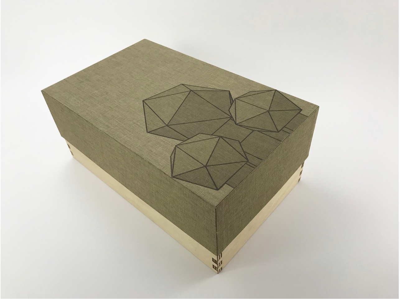
The Radiant Republic (2019)
Sarah Bryant
Box, glass, cement blocks, pamphlets. Edition of 50, of which this is #5. Acquired from the artist, 20 February 2019.
Photos: Courtesy of the artist; Books On Books Collection.
Although the collective works comprising Trace are housed in a box, this one is more elaborate in material and media. It is made of laser-cut Baltic Birch plywood, lightly treated with Tung oil. The lid is covered in Dubletta book cloth, which has been printed letterpress with polymer plates and linoleum. Lifting off the cover reveals yet further new materials and techniques. Five pamphlets each consisting of Rives Heavyweight paper sewn to a lightweight cover made of handmade Belgian Flax, produced at the Morgan Conservatory in Cleveland, and held together with a wrapper rest on a sheet of glass.
In several ways, the book component shows the encounter of previous techniques/media with the new. The precise fold work and registration to be found in Biography and Listen Out reappear, as does the meaningful integration of separate parts in Figure Study. Here, it is the geometric fold patterns in the covers echoing the geometric solids. Flax paper is a new element in Bryant’s repertoire.
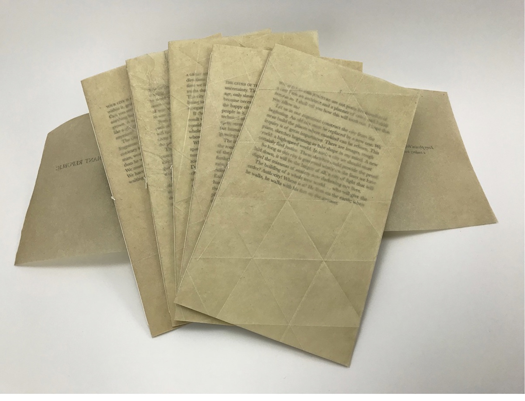
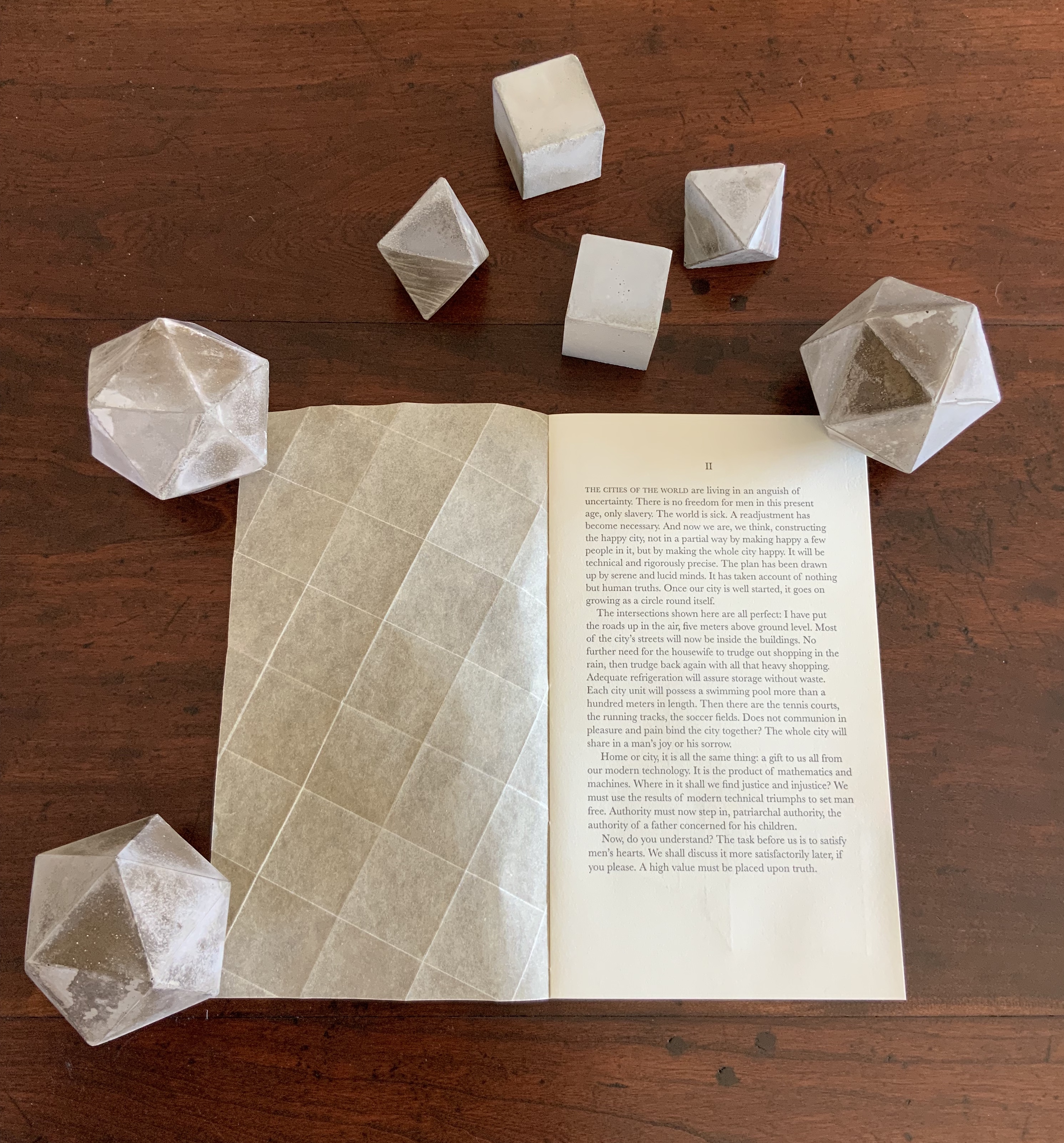
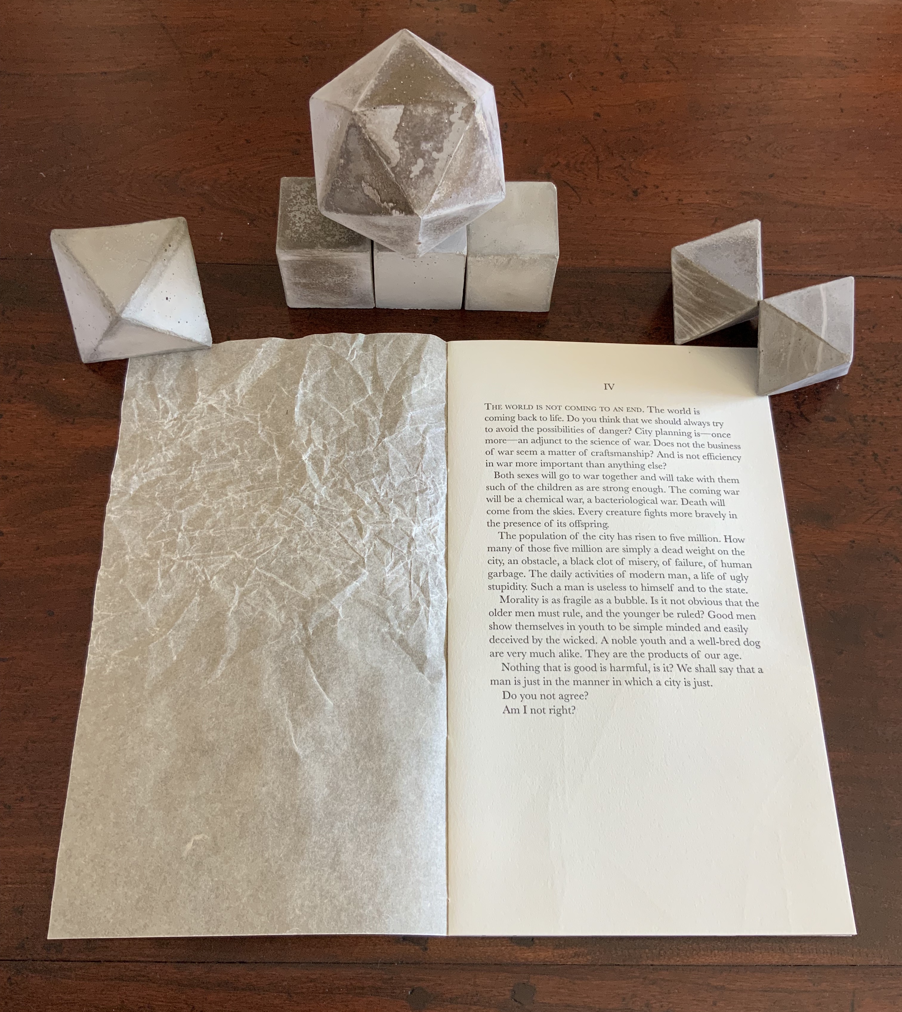
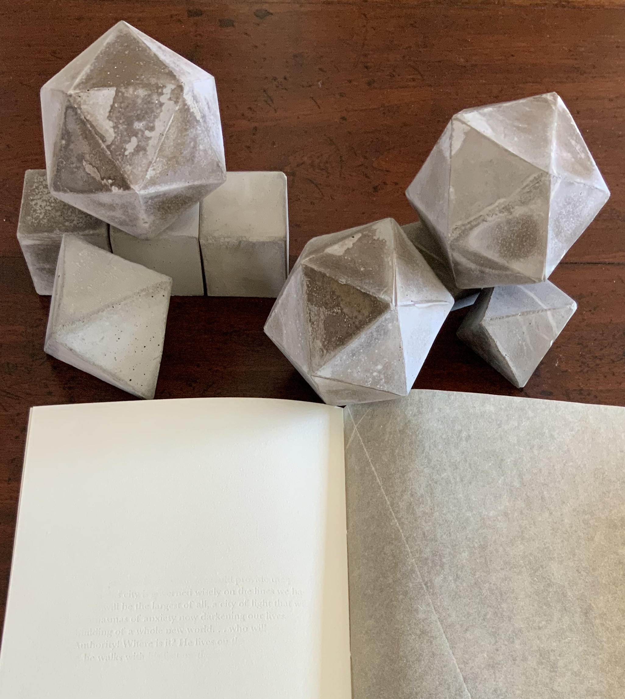
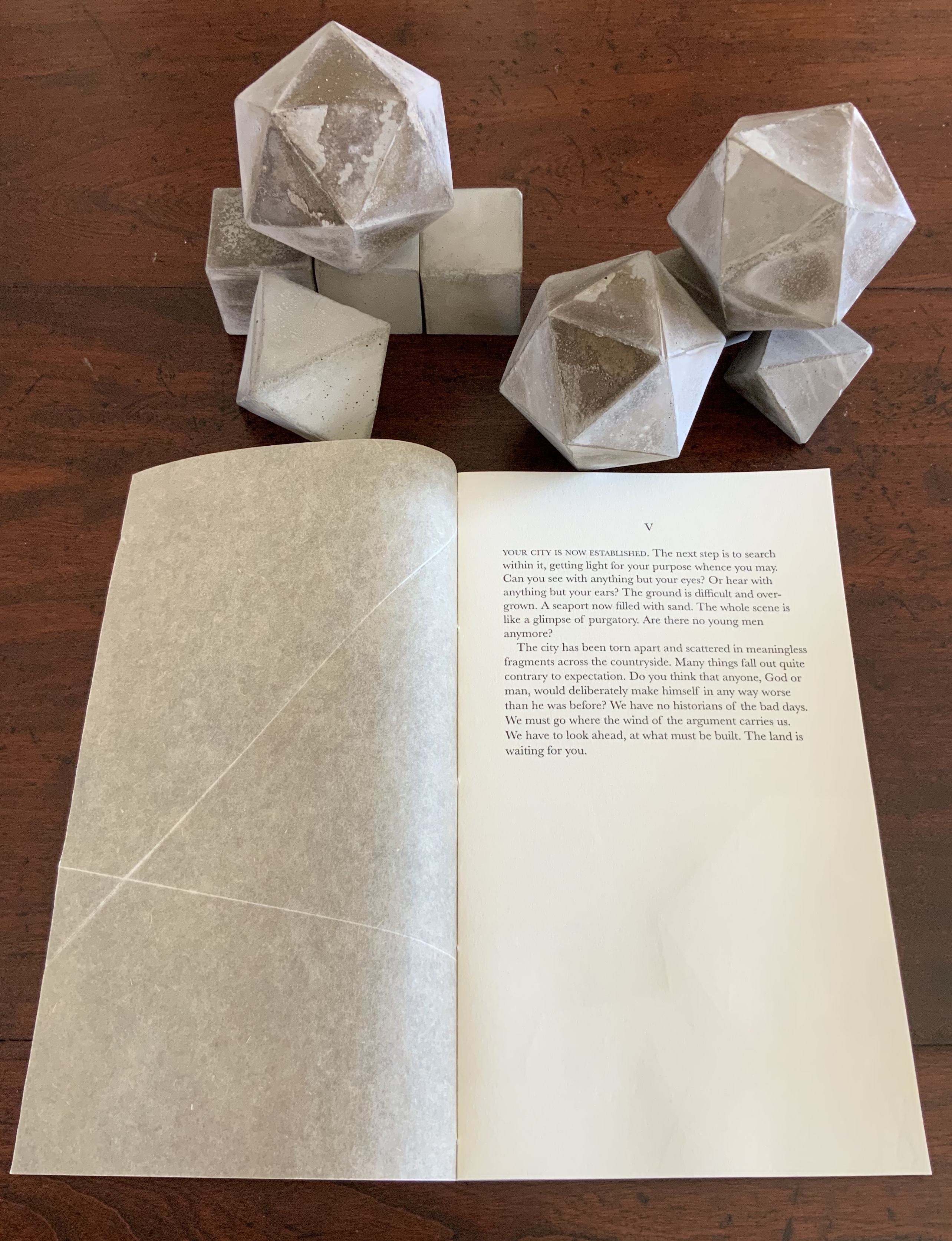
The blind embossed printing from Figure Study moves from the cover there to the interior of the book component here and with substantive, non-decorative intent. Across the five volumes, the embossed text is the same as that printed in ink and always appears on the last folio. But here is the catch: the text that appears comes from the succeeding volume’s inked text, and it appears in fragments. When the last page of the fifth volume appears, the embossed text on its folio’s last page is a fragment of the inked text in the first volume. The fragmentation of the embossed printed version and its variation in depth mime the weathering of structures and ideas.
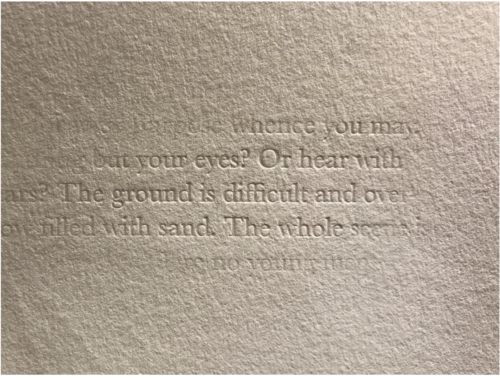
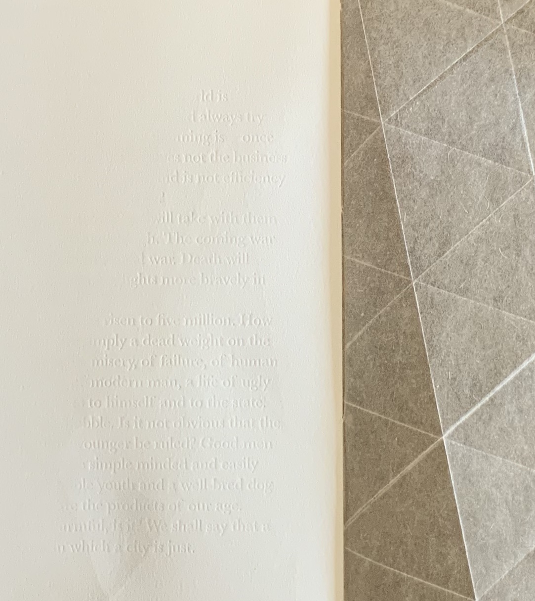
The circular movement and fusion of the past and present are also reflected in the double-page prints centered in each volume. Note how the technique of prints interlocking across folios in Shift in Position replays here in the prints interlocking across the five volumes to assert a narrative thrust but in a landscape with no fixed beginning or end.
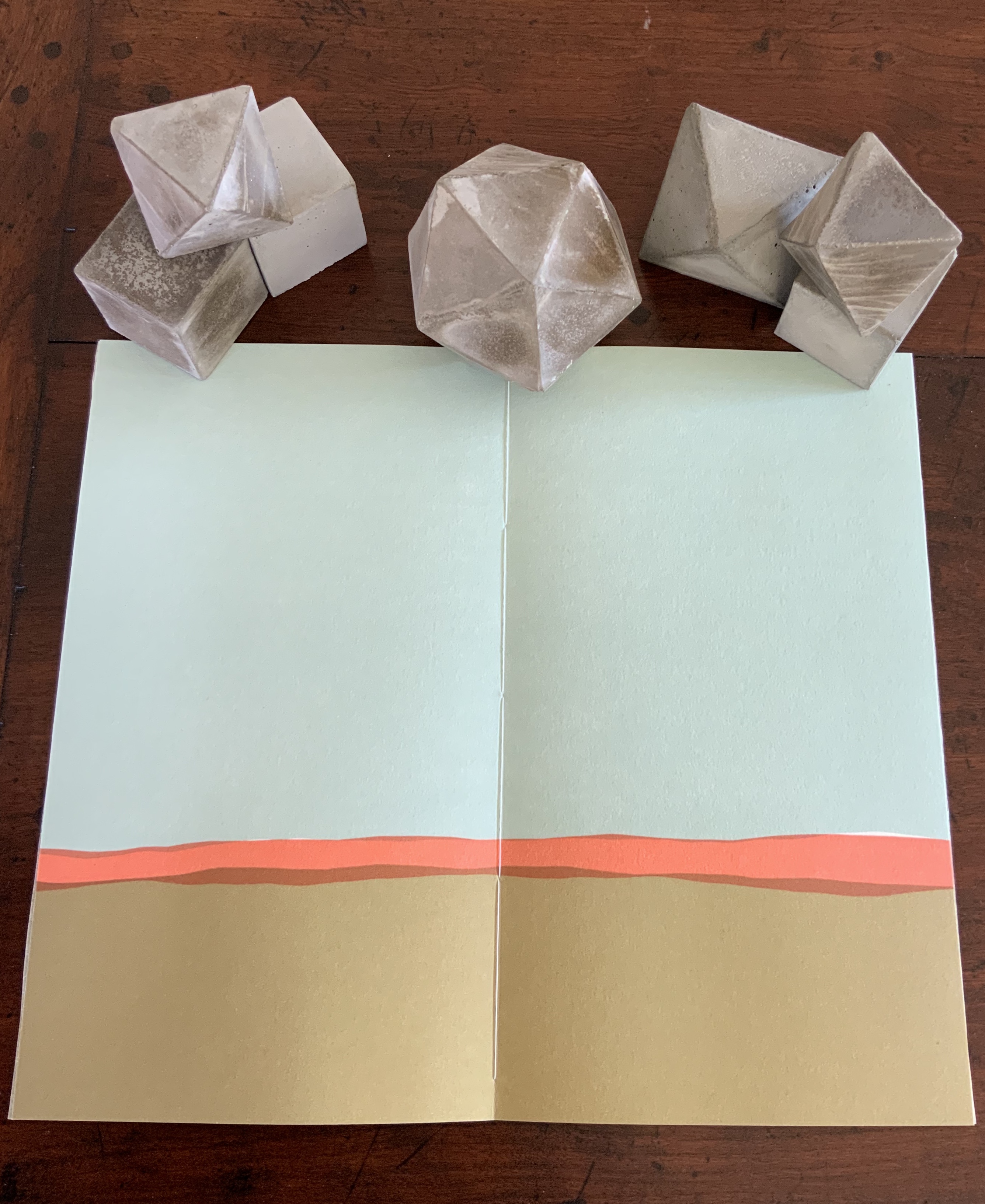
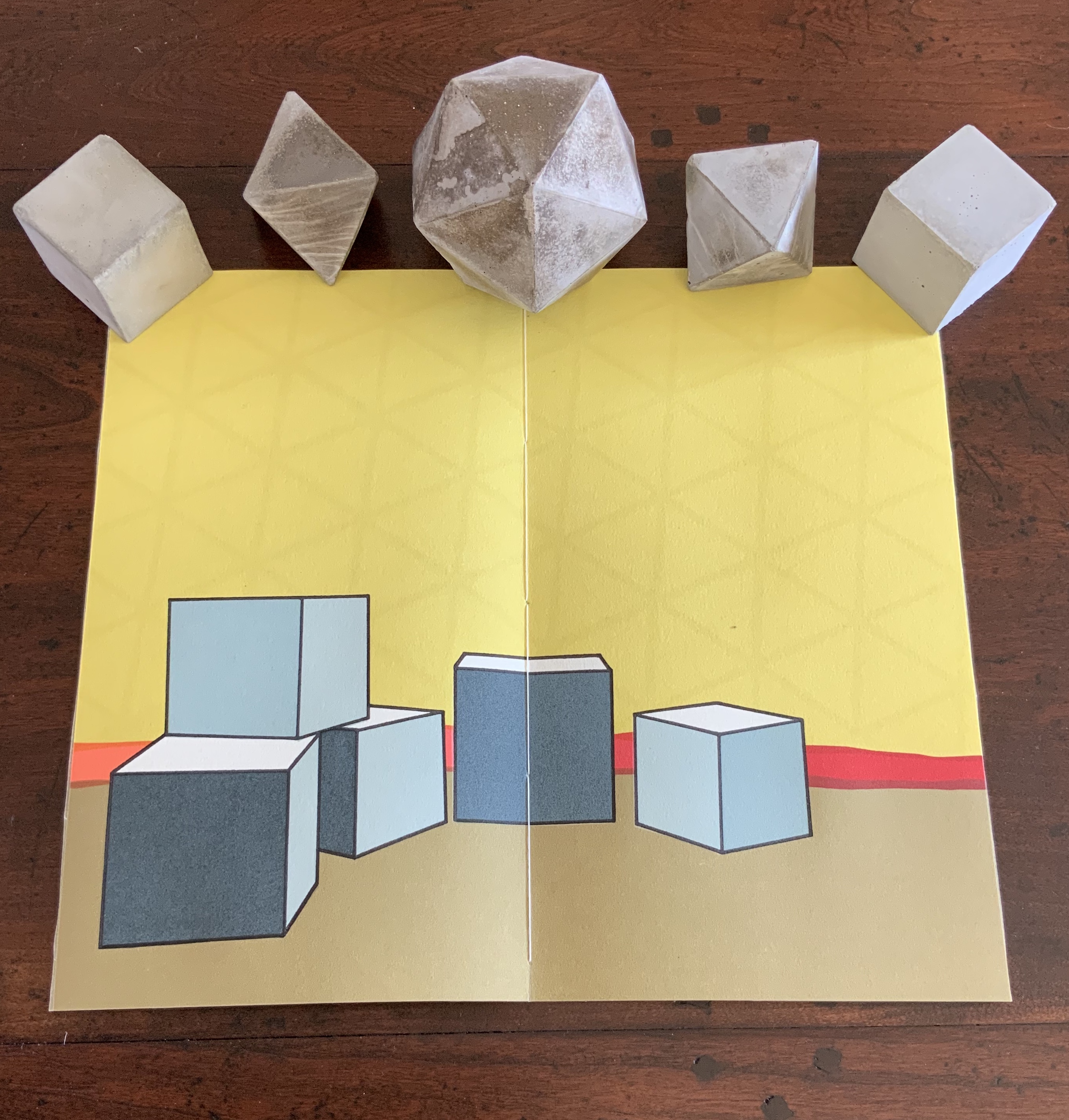
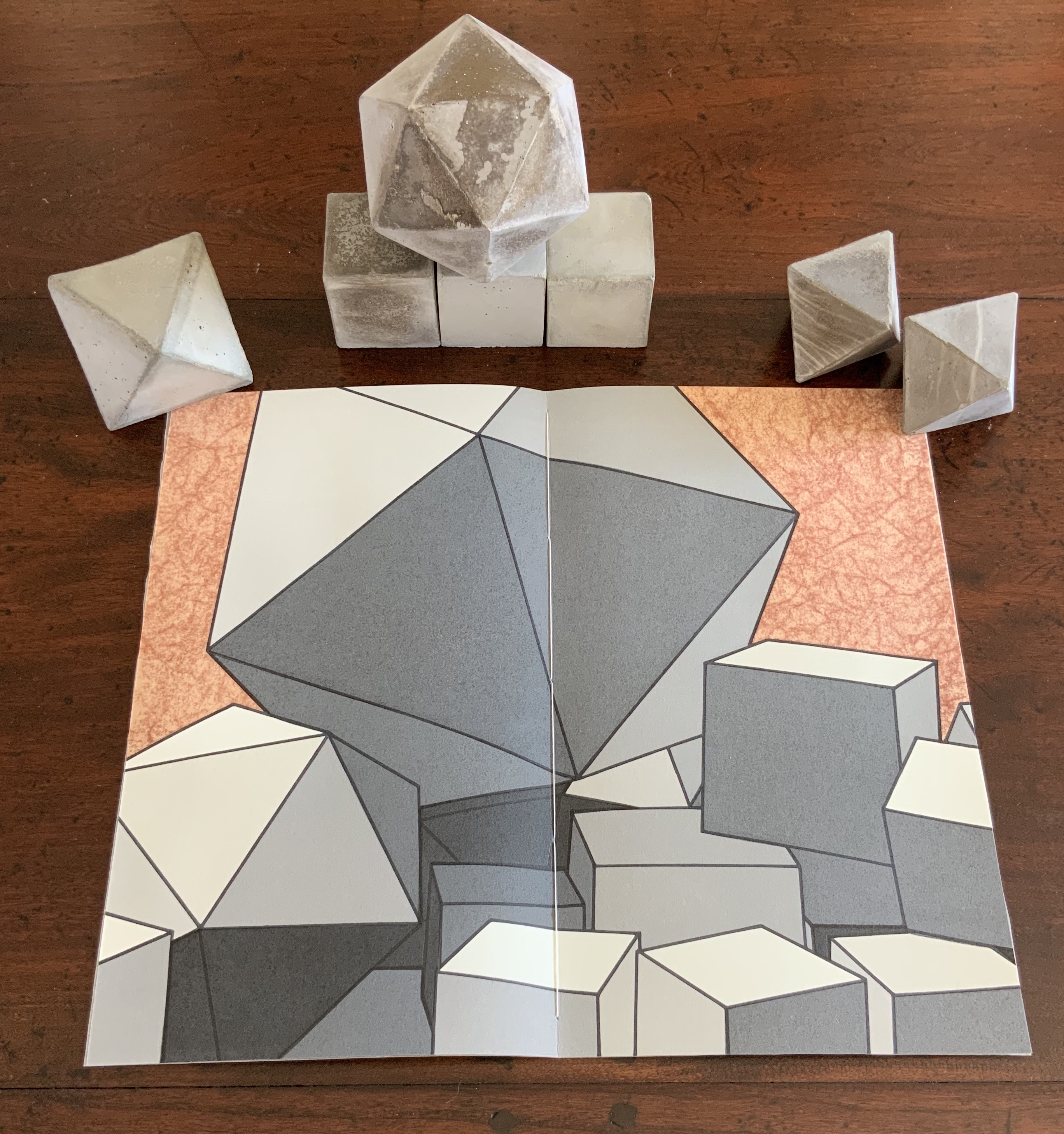
The contrast of materials — cloth, wood, flax paper, Rives paper and concrete — plays out in the concrete solids. Some edges are sharp, others blunted; some surfaces are smooth, others rough. This happens also with the covers to the five volumes according to the absence or presence (and density) of folds and, in one case, of crumpling or no crumpling. It happens in the prints, where the backgrounds include faint images mirroring the structures in the other media. This technique of contrasting materials/media and that of recapitulating the contrast within one or more of the materials/media seems to be a new development in Bryant’s art or, at least, an intensified one.
The multiple materials and techniques and their many-sided interactions pose a pleasurable dilemma for the work’s display. As soon as one is in place, another beckons.
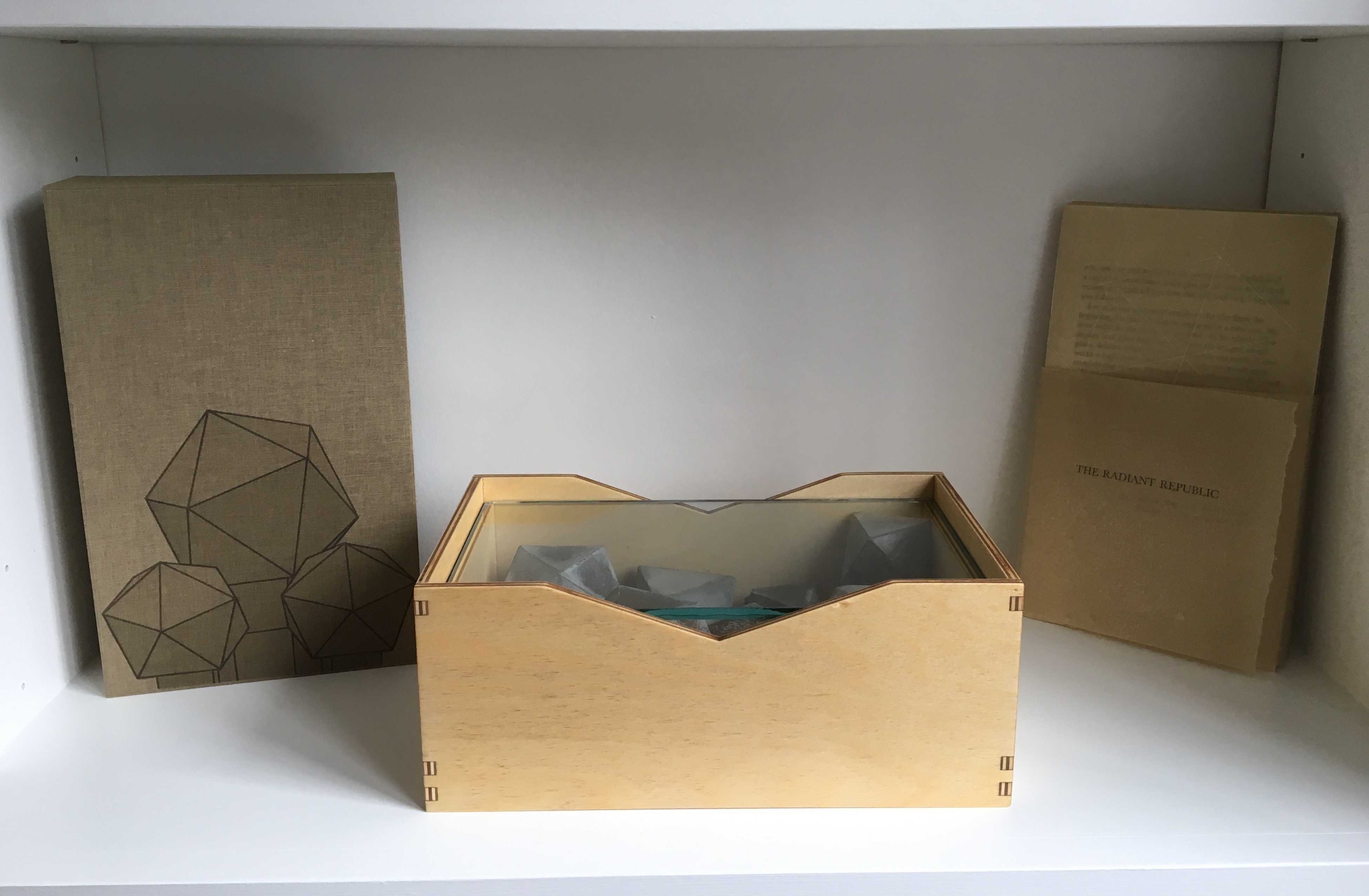
No surprise then that the first pamphlet’s opening words are “You and I at this juncture are not poets but founders of a city”. This self-reflexive invitation to creativity is like that invitation to negotiate reading with looking — an invitation to participate and to recognise our participation as part of the creative act. An increasingly characteristic aspect of book art.
Sarah Bryant runs Big Jump Press, works with the collective Shift_Lab and teaches at the University of Alabama Book Arts Program.
Further Reading
Chen, Julie. 2013. 500 Handmade Books. Volume 2. New York: Lark. P. 146 (Biography).
