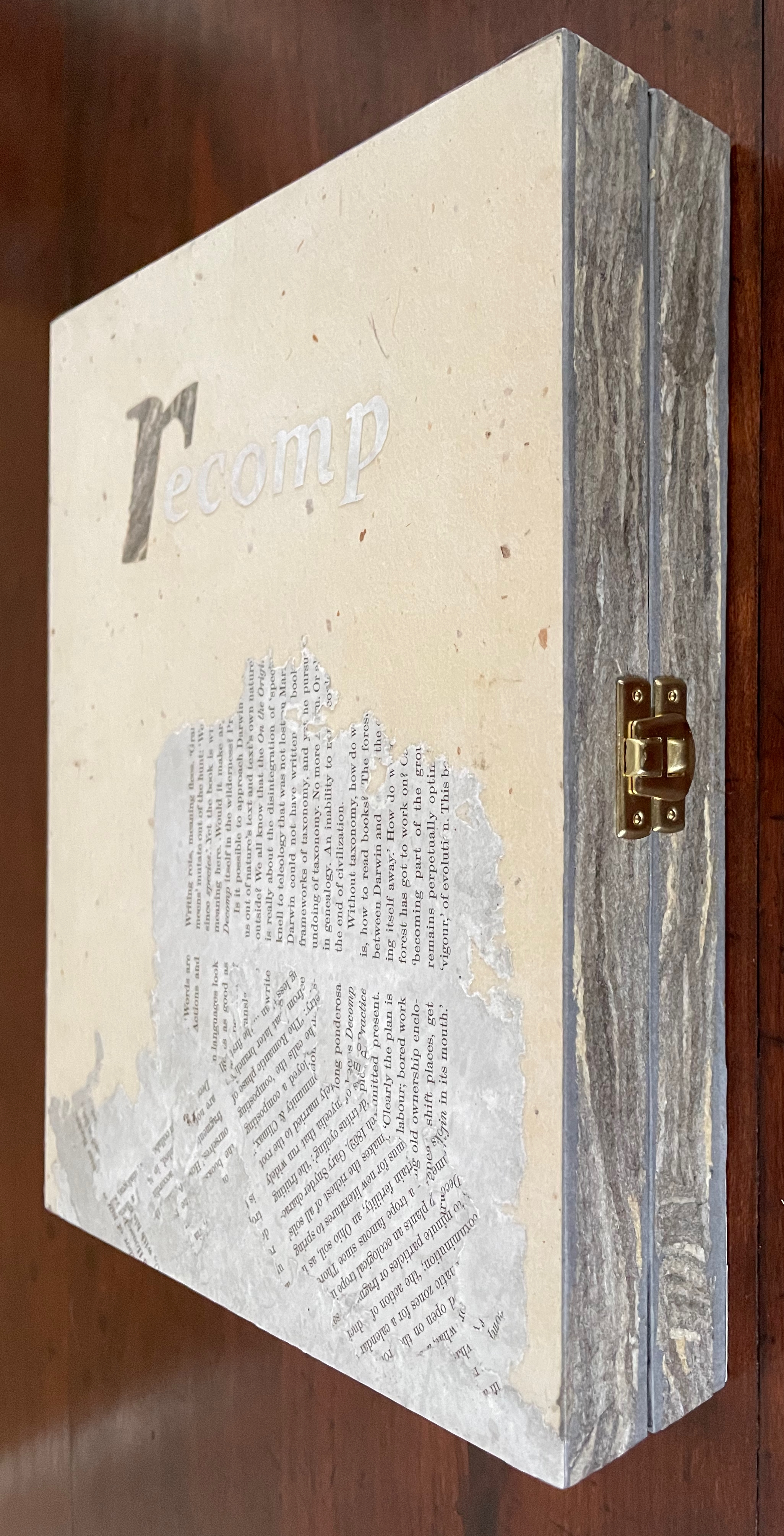
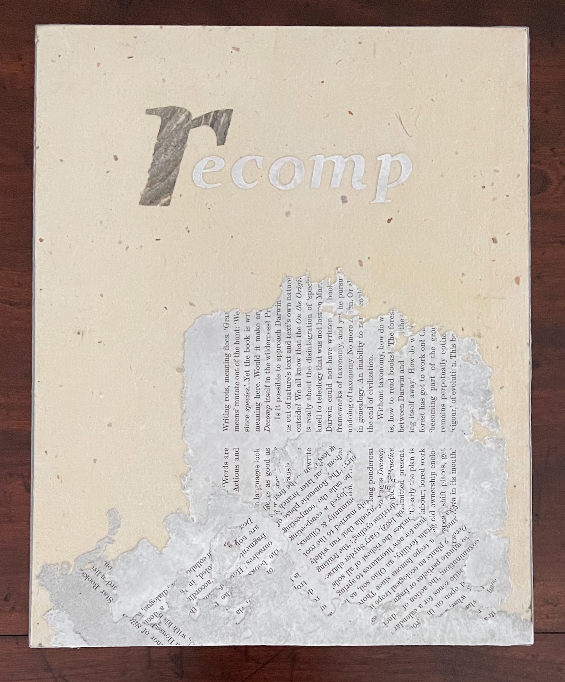
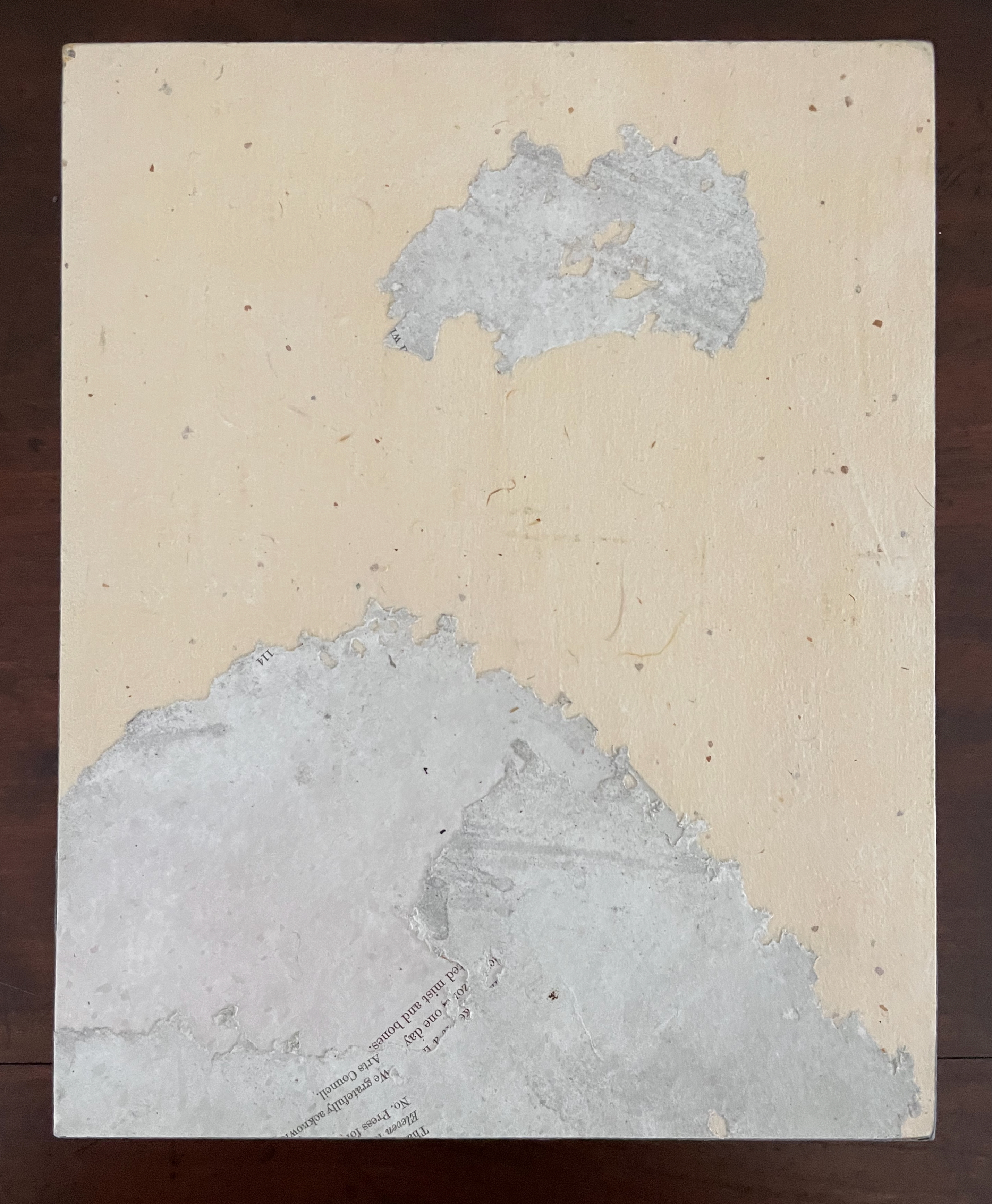
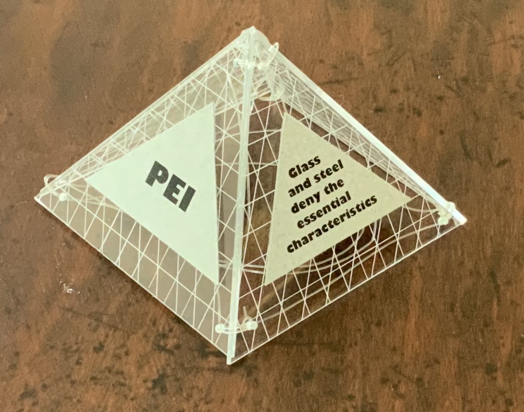
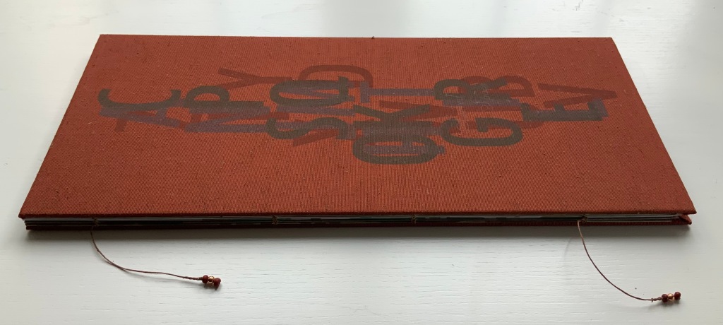
recomp (2013-23) Cathryn Miller Hinged and clasped diptych, housing an altered book, explanatory booklet, and loose colophon. Unique. Acquired from Vamp & Tramp Booksellers, 2025. Photos: Books On Books Collection.
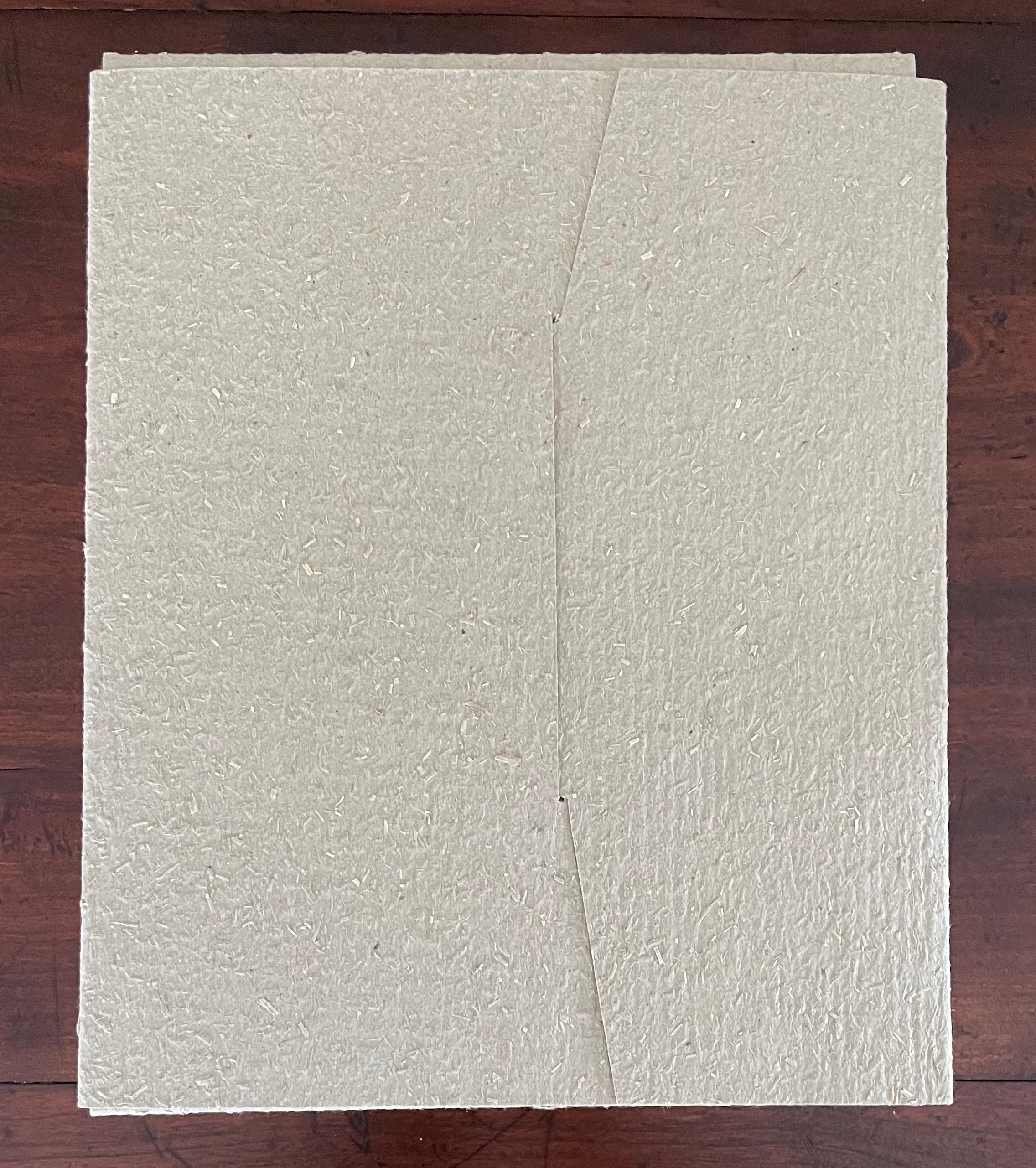
Recomp (2013-2023) is a collaboration with a colony of bald-faced hornets. Having reviewed Stephen Collis and Jordan Scott’s decomp (2013), their artists’ book devised by exposing several copies of Darwin’s On the Origin of Species to the elements, Cathryn Miller followed suit and hung her reviewer’s copy of decomp in a tree. Over time, the wind, rain, and snow sent the book to the forest floor where it fell apart. Hornets had done their part in its decomposition, nibbling away at its edges and weakening the structure. Their conversion of the book into cellulose for their nest was also the start of their artistic partnership with Miller. Eventually the nest, too, became prey to the elements or marauders and fell and broke apart on the ground. Miller and photographer husband David recorded all this and gathered up the book fragments and broken nest.
What is it about artists’ books and architecture that they intersect so often? Architectural interiors and exteriors, ideas, themes, styles, landmark dwellings and edifices have found their metaphorical expression and embodiment in book art with such regularity that they make up a genre within the genre. Perhaps it is that, as Victor Hugo expresses it in Nôtre Dame de Paris (1831/1902),
… the human race has two books, two registers, two testaments: masonry and printing; the Bible of stone and the Bible of paper. … The past must be reread upon these pages of marble. This book, written by architecture, must be admired and perused incessantly; but the grandeur of the edifice which printing erects in its turn must not be denied. (Book V, Chapter 2, p. 187)
Or perhaps it is even more fundamental. As Hugo asserts in his posthumous The Alps and the Pyrenees (1890/1895):
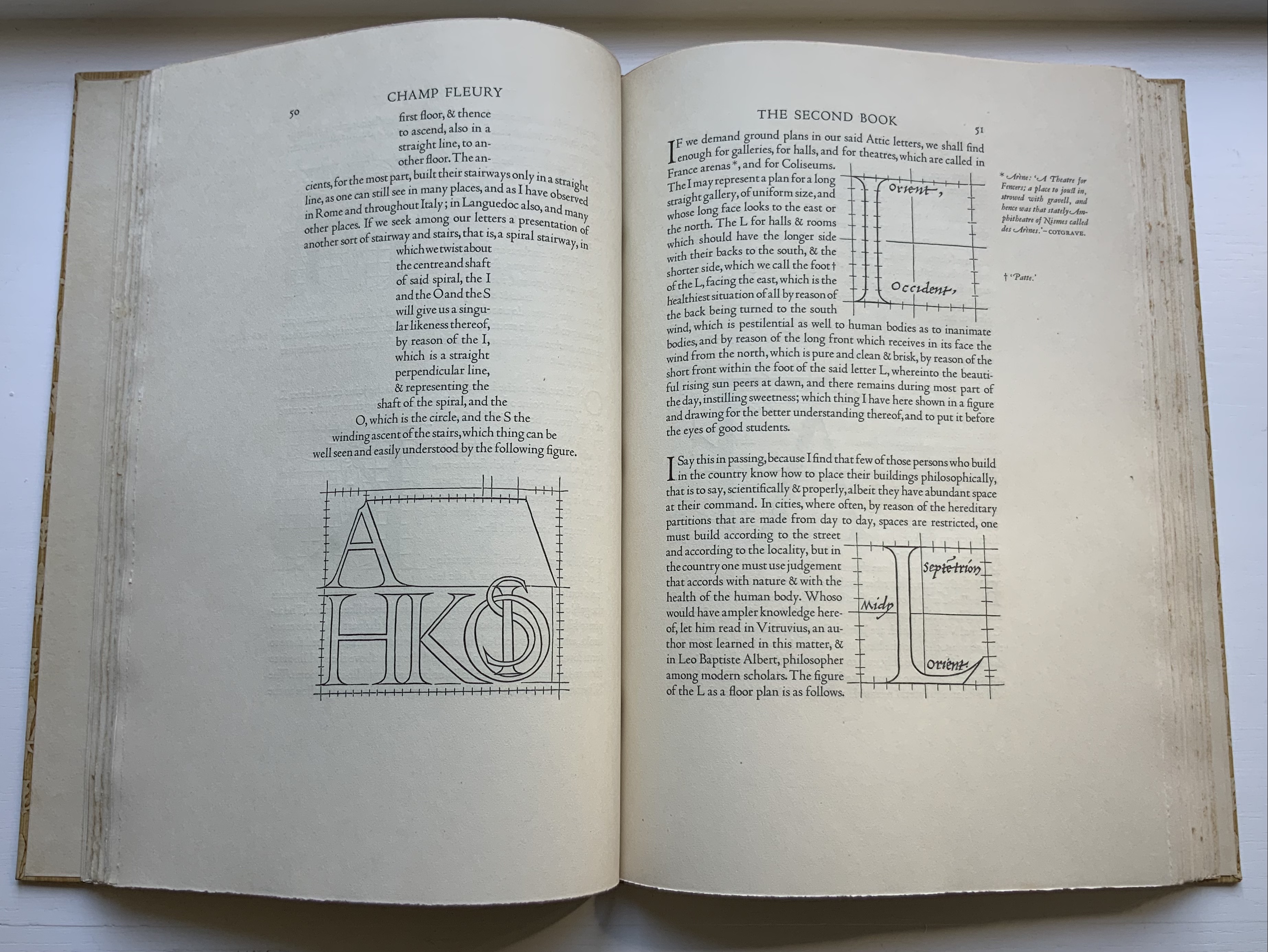
All letters were signs at first, and all signs were images at first…. Human society, the world, man as a whole, is in the alphabet….A is the roof, the gable with its cross-beam, the arch, arx; … Z is the lightning, it is God. (pp. 64-65)
Beneath the mysticism and pareidolia, Hugo is on to something. Maybe the affinity of books and architecture lies in the origin of the raw material of books — the alphabet — whose second letter comes from a mark signifying shelter or house.
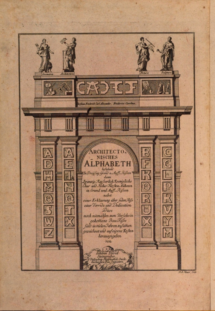
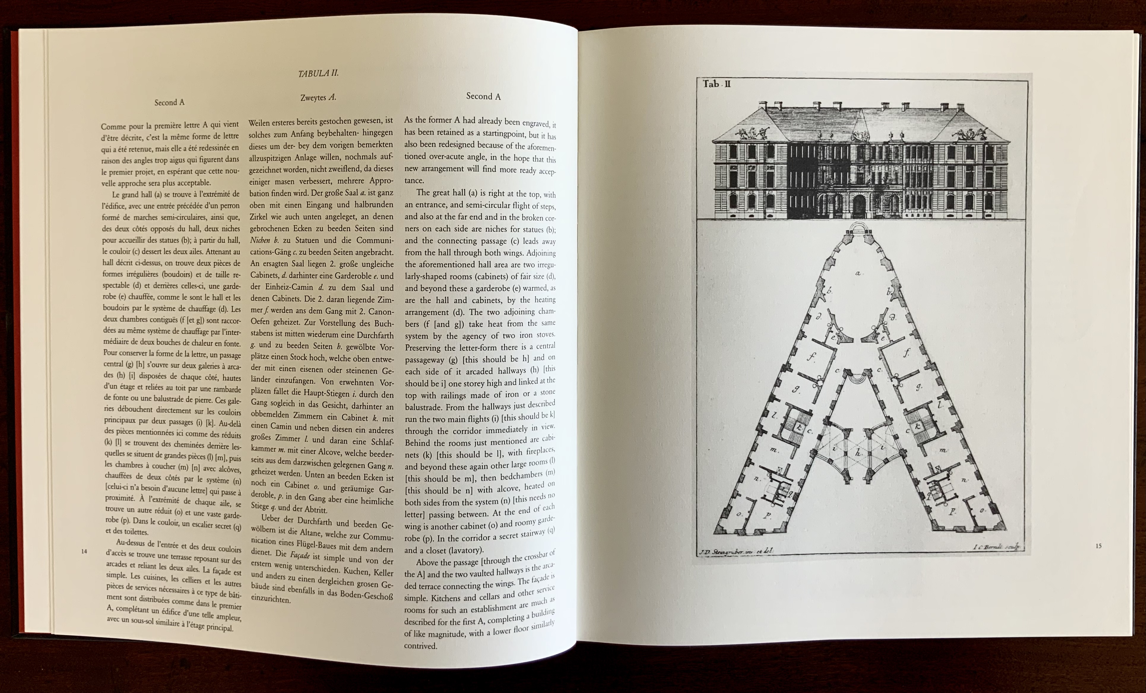
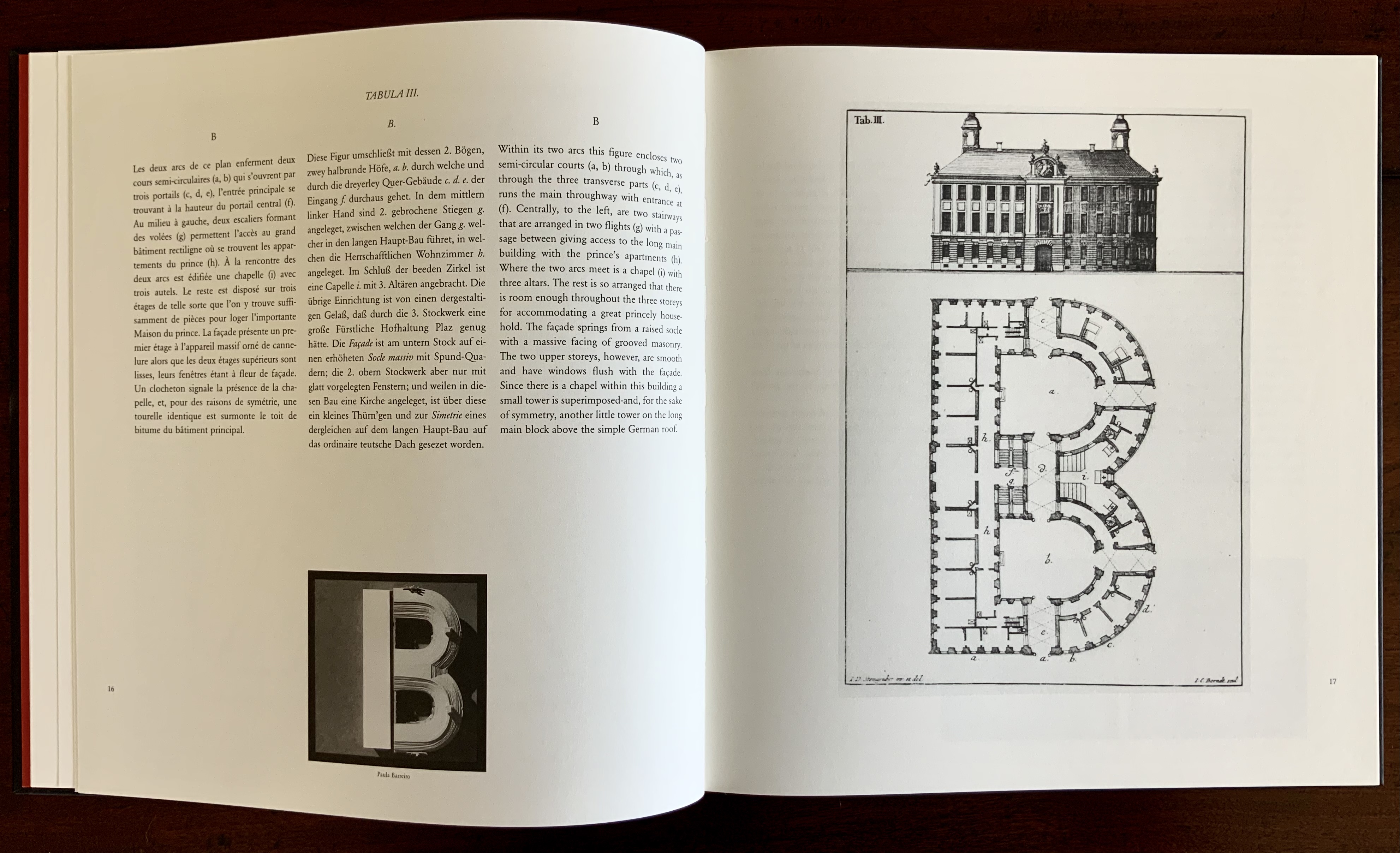
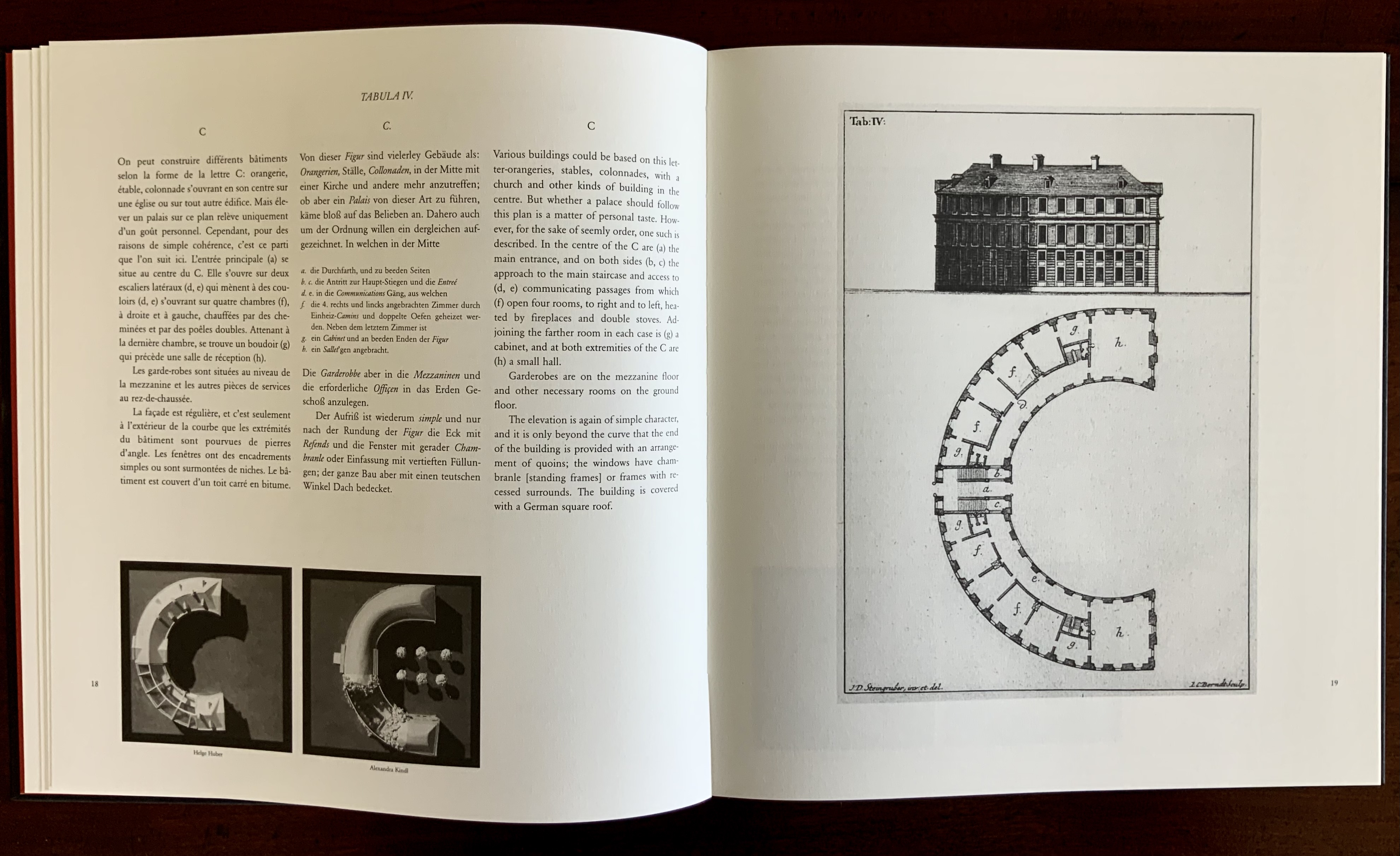
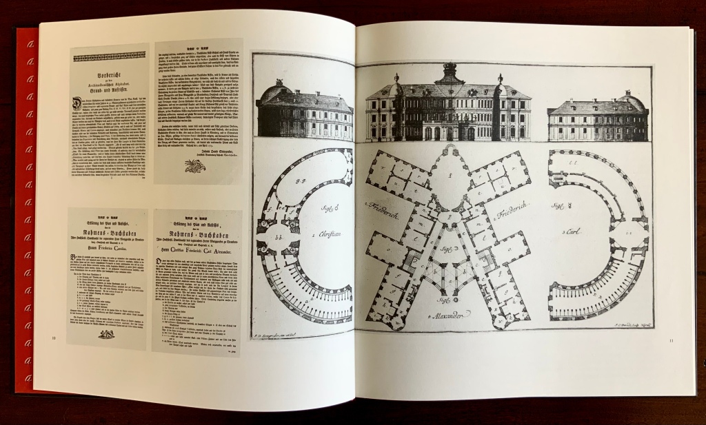
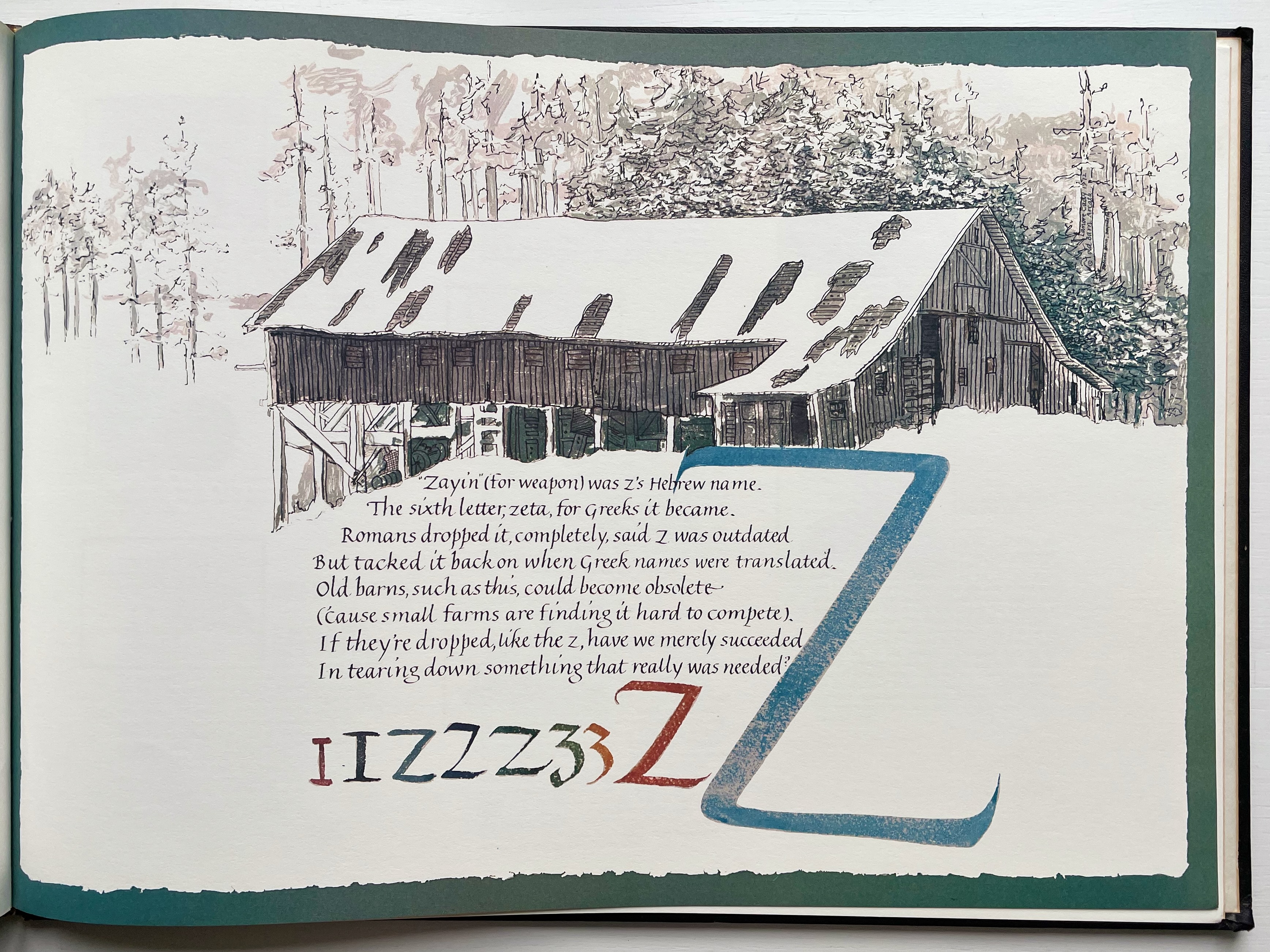
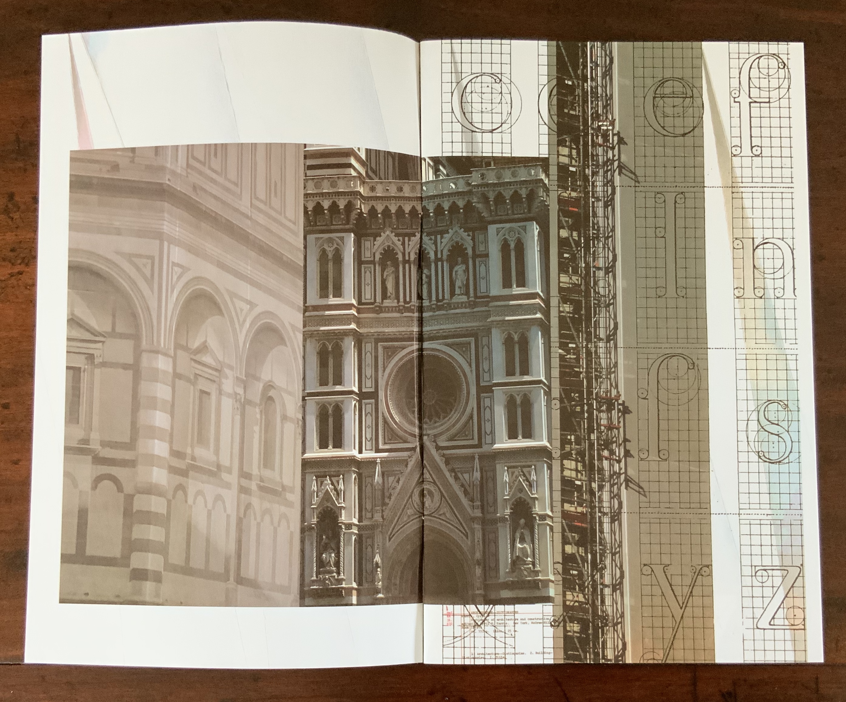
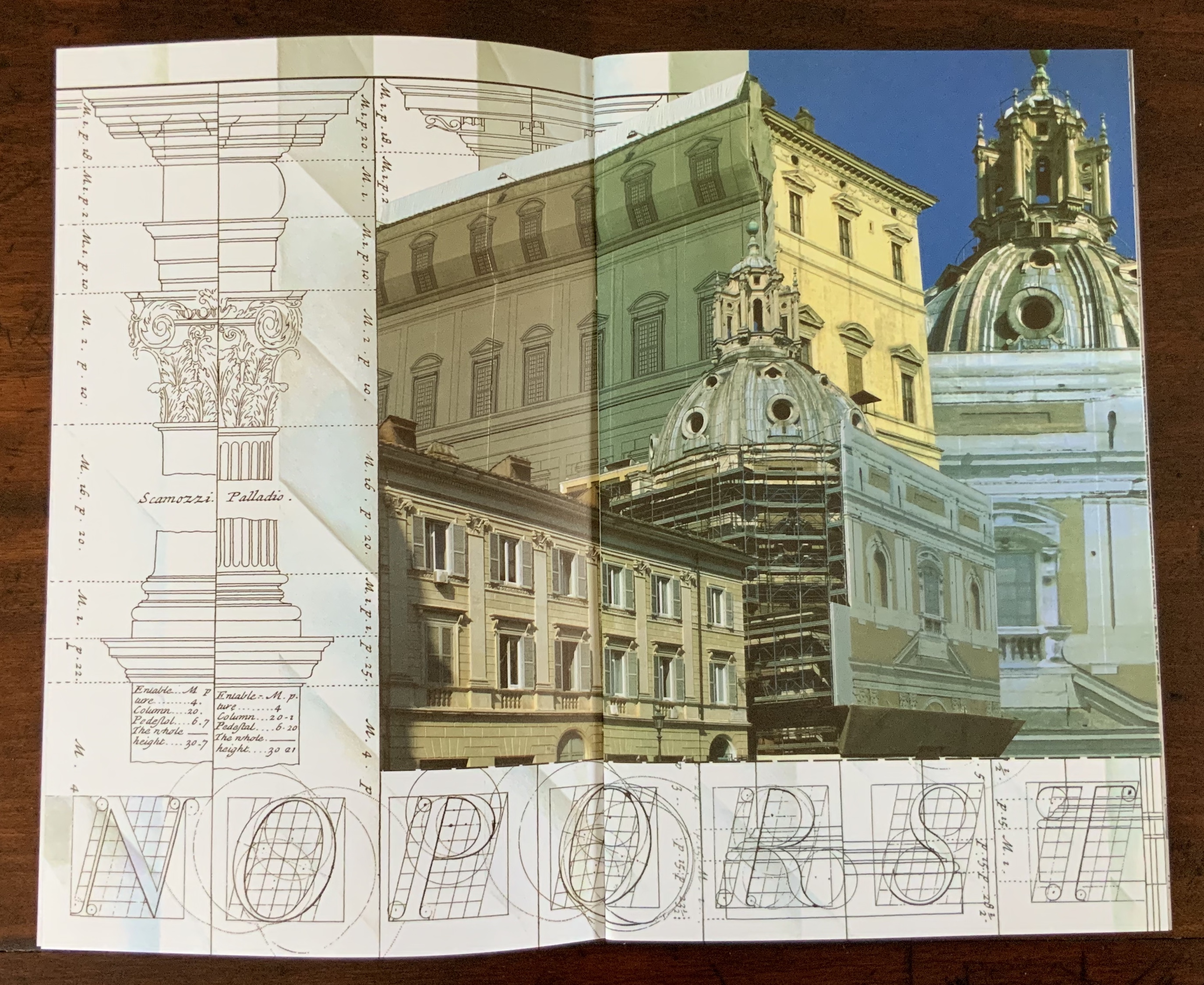
This wondering and wandering about the intersection of architecture and the artist’s book is prompted by the 250th anniversary of the publication of Johann David Steingruber’s Architectonisches Alphabeth(1773). This postcard-famous volume of print folios depicts architectural elevations and plans for residences in the shape of the letters of the alphabet. It is dedicated to Christian Friedrich Carl Alexander, Margrave of Brandenburg-Ansbach, not to be confused with the paying dedicatee of Bach’s Brandenburg Concertos, the Margrave of Brandenburg-Schwedt. By a baroque coincidence, however, the first Brandenburg concertos, the ones composed by Giuseppe Torelli and influencing Bach, are dedicated to the Margrave of Brandenburg-Ansbach, then George Friedrich II, Alexander’s great-uncle who employed Torelli as court composer. Unlike Bach, however, Torelli received no direct payment for his composition. Steingruber too had to be satisfied with his payment as an appointee (court and public surveyor, and later principal architect of the board of works).
Steingruber may have felt he had good reason to be miffed. After all he had published the volume in installments at his own expense and made sure that the Margrave’s monogram (and that of Carolina Frederica, his wife) in building form appeared in the span above the roman arch on the title page. His elevations and plans draw attention to the heating, kitchen, toilet and servants’ arrangements as if conferring with a prospective client ready to commission one of these typographic palaces. Perhaps he was thinking, Who would not want a serif with a view? Or conduct guests on a tour of the bowl, capline, crossbar, stem, stroke and tail of the property? In a flourish that illustrates the intersection of book and architecture, the title page presents the title and subtitle inside an arch and serves double duty as a Table of Contents with thumbnail images of the letter-shaped buildings to come inscribed on the columns.
Munich, Bavarian State Library
To celebrate the Architectural Alphabet‘s 250th anniversary, this online essay/exhibition explores sixteen propositions about the affinity of architecture and artists’ books. Examples supporting each proposition include works from within and without the Books On Books Collection, and each example includes a link or links for additional views of the work. Every effort has been made to provide bibliographical (or webliographical?) links from WorldCat and the Internet Archive. The former will allow the reader to find local libraries that hold a copy of the exhibited work to be viewed in person; the latter will partly address the problem of broken links. Where broken links (or factual errors) do appear, readers are encouraged to alert the curator in the Comments section at the end of the essay/exhibition.
Proposition #1: The affinity of architecture and artists’ books lies in the alphabet.
Architectonisches Alphabeth (1773/1995) Prepared by Joseph Kiermeier-Debre and Fritz Franz Vogel for Ravensburger Verlag.
Of course the first exhibit would be Steingruber’s Architectural Alphabet, but related works — before and after, published or built — will clamor for admission: Geofroy Tory’s Champ Fleury (1529/1927/1998), Antonio Basoli’sAlfabeto Pittorico(1839/1998), Giovanni Battista de Pian’s Alphabetto Pittoresque (1842), and Daniel Libeskind’s Contemporary Jewish Museum (2000), whose form within the walls of a former power substation is composed of two Hebrew letters — the Yud and the Chet — which make up the word Chai (“Life”).
Left to right: Tory/Rogers, Basoli, Battista de Pian (Photos by Books On Books Collection), Libeskind (The Yud Gallery, Photo by Paul Dyer).
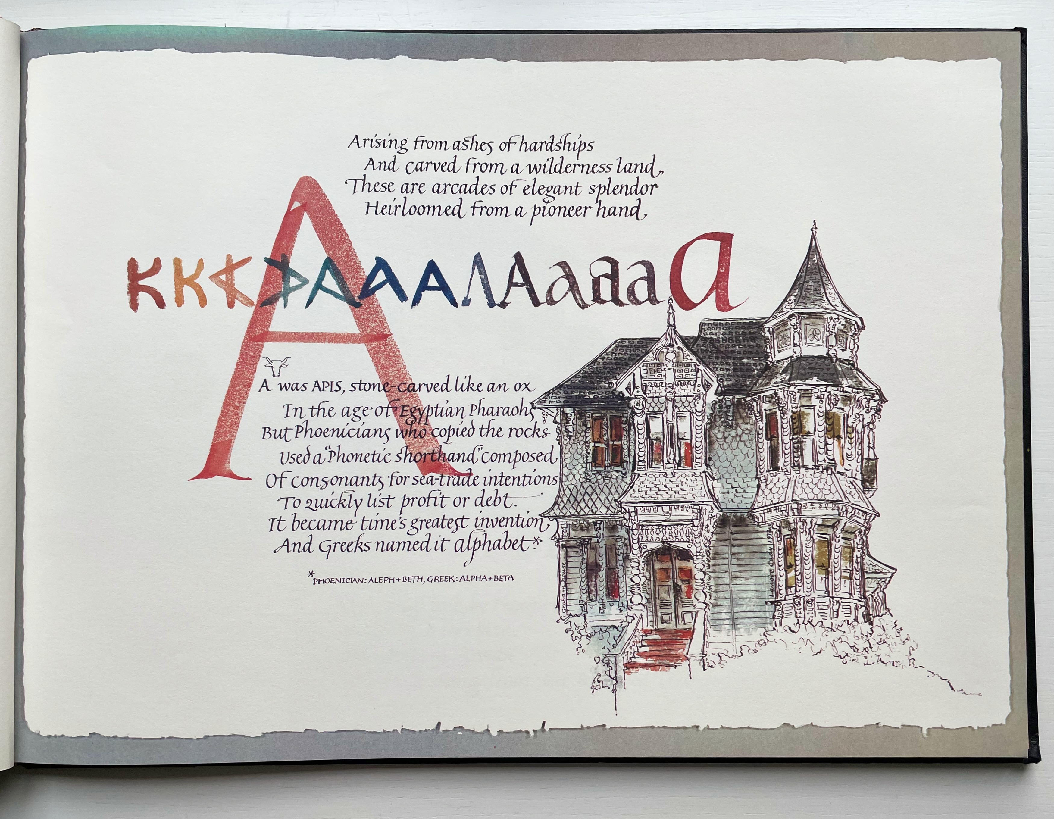
Lanore Cady’s Houses & Letters(1977) is another work supporting the proposition, in this case with calligraphy, watercolor and verse.
More than the novel inventions and historical associations above, though, the space within and around a letter, a building and the artist’s book suggests the real root of the affinity. As cultural historian Fiona MacCarthy put it: “‘the Italians knew by instinct what we are slowly grasping, that the meaning of the city is not so much a matter of the buildings as the spaces in between.’” To which John Ryder added: “‘This is exactly how typography works.’” (From David Esslemont’s Inside the Book, 2002). And it is exactly how book art works.
Proposition #2: The affinity of architecture and artists’ books lies in telling stories.
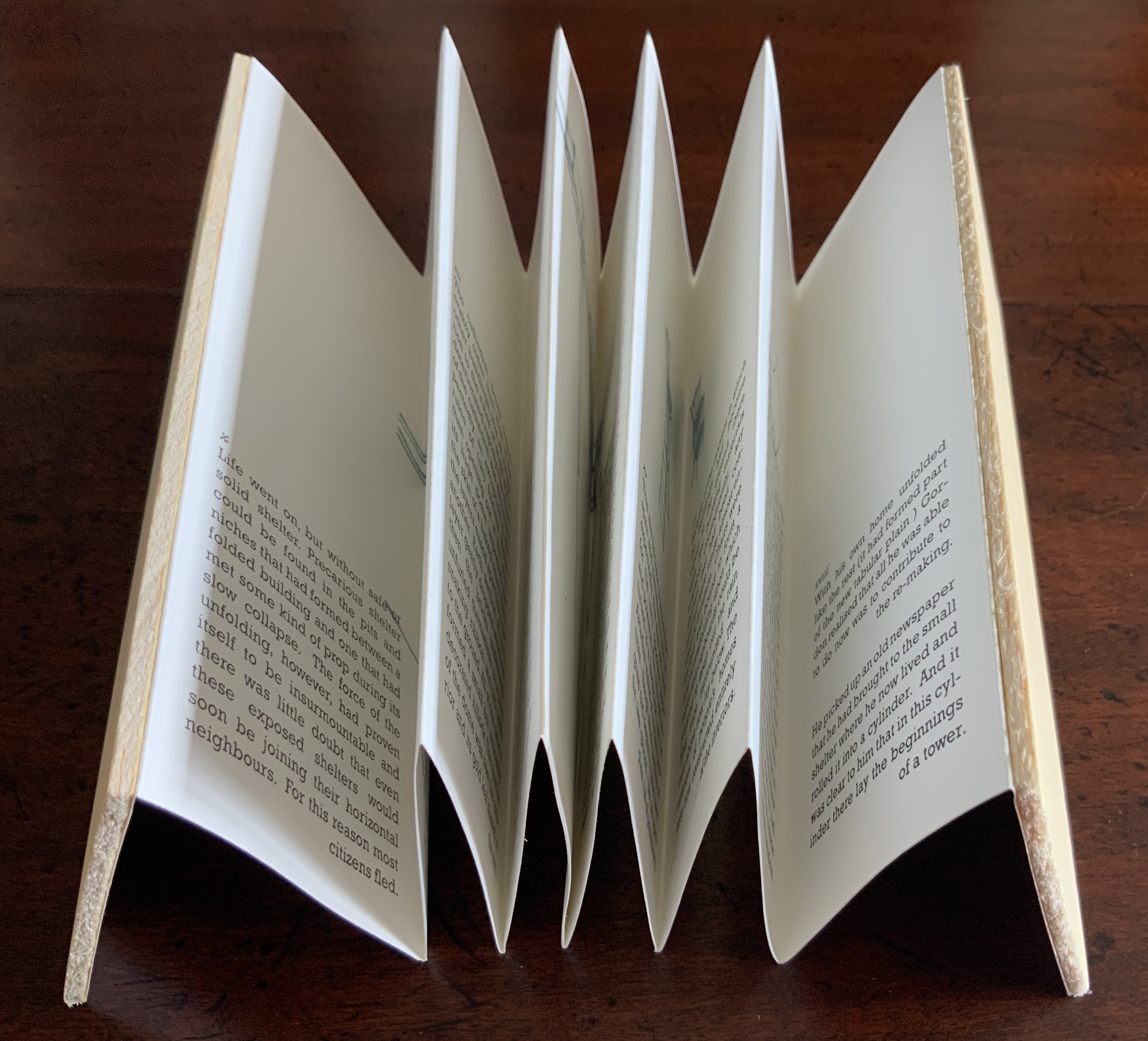
As Daniel Libeskind has said, “For me, a building is a medium to tell a story.” Emily Speed’s Unfolding Architecture (2007) tells the tale of Gordon, a city dweller who witnesses the collapse of public buildings and, ultimately, his own home as the urban fabric begins to unfold around him — a story replicated by the housing’s structure and the book’s accordion fold.
But Ulises Carrión denied that books are about narrative. Instead they are about space and time, which leads to the next proposition.
Proposition #3: The affinity of architecture and artists’ books lies in space and time.
Olafur Eliasson’s Your House (2006) is a laser-cut model of his residence in Copenhagen at a scale of 1:85, which means that each page equates to a 220 mm section of the actual house. In the film Russian Ark (2003), Aleksandr Sokurov made cinematic history with his one continuous shot in 90 minutes, depicting a 17th century time traveller moving through different periods of history as he moves through the rooms of St. Petersburg’s Winter Palace. The film inspired Johan Hybschmann’sBook of Space (2009).
How do you read works like this? The size, weight and delicacy of Eliasson’s book and the fragility of Hybschmann’s book and its need for an armature to freeze-frame it defy a simple turning of pages. They must be turned slowly and carefully. Both works heed the task of the arts as posed by architect Juhani Pallasmaa for our age of speed: to defend the comprehensibility of time, its experiential plasticity, tactility and slowness (The Embodied Image, p. 78).
Proposition #4: The affinity of architecture and artists’ books lies in process.
A trained architect and book artist, Marian Macken articulates and illustrates in her book Binding Space why and how the artist’s book can serve as an important tool for design, documentation and critique of architecture. Macken’s perceptive descriptions show how to observe materiality and its functioning and understand how they contribute to the making of art.
Investigating bookness results in the book becoming a highly productive intervening medium with which one can imagine, investigate, analyze, represent and exhibit particular qualities — haptically, and with narrative and ambiguity — of a built environment and the design process. Through the book, we read spatial practice anew (p. 163).
Reading Macken’s book will sharpen the ability of any reader or viewer to appreciate book art, especially her Ise Jingū: Beginning Repeated. Ise Jingū is a Shinto shrine complex in the Mie Prefecture, Japan. “Once every 20 years, since … the seventh century, every fence and building is completely rebuilt on an identical adjoining site, a practice of transposition known as shikinen-zōkan” (Binding Space, p. 101). For Macken, this ritualistic rebuilding poses architecture as performative process rather than as inert object; it “manifests the replication of a beginning, of a process” (p. 100).
Macken’s artwork consists of 61 loose sheets with a watermarked image within each, the number reflecting the 61 iterations of the shrine up until the making of this work of book art. The watermark is a perspective image based on Yoshio Watanabe’s photograph of the Inner Shrine, taken in 1953 on the occasion of the 59th rebuilding. The contrast of the watermark in kozo and the movement of its placement from one sheet to the next entice reflection on the phenomenon of representation and the architectural process of shikinen-zōkan.
Proposition #5: The affinity of architecture and artists’ books lies in phenomenology.
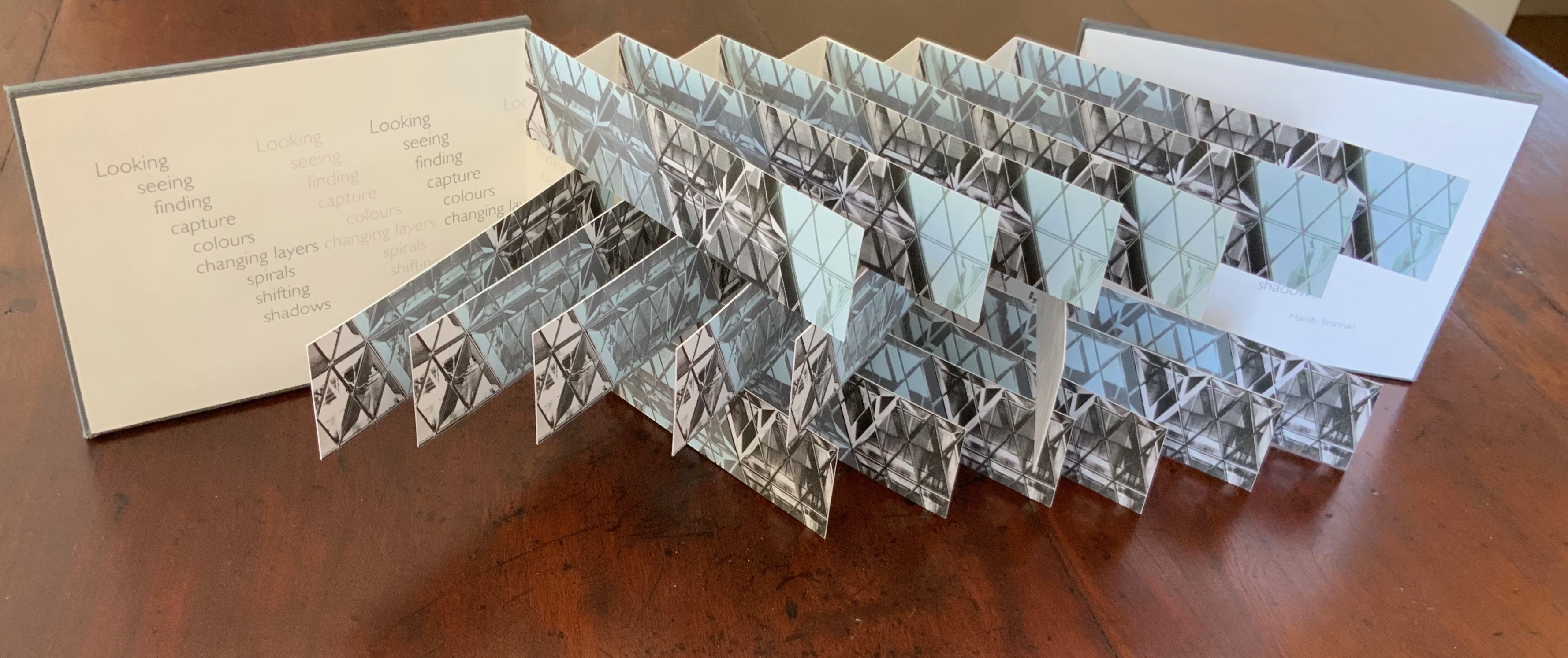
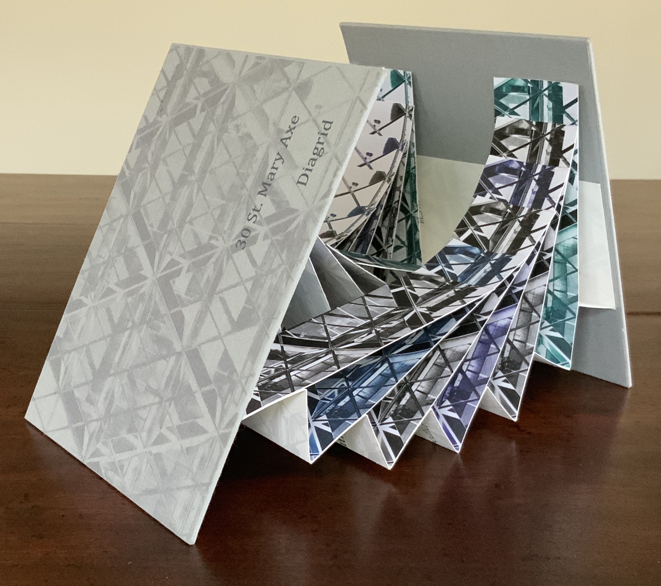
Architects such as Alfredo Muñoz and his firm ABIBOO, Juhani Pallasmaa and Peter Zumthor are among those often associated with architectural phenomenology, concerned with perception psychology, focused on the primacy of sensory and experiential qualities. Norman Foster and phenomenology are not so often yoked, but 30 St Mary Axe: Diagrid (2009) and 30 St. Mary Axe: Cladding(2009)– Mandy Brannan’s treatments of his iconic London office tower (aka “the Gherkin”) that refocus the perception and experience of it — might prompt reconsideration.
Proposition #6: The affinity of architecture and artists’ books lies in geometry.
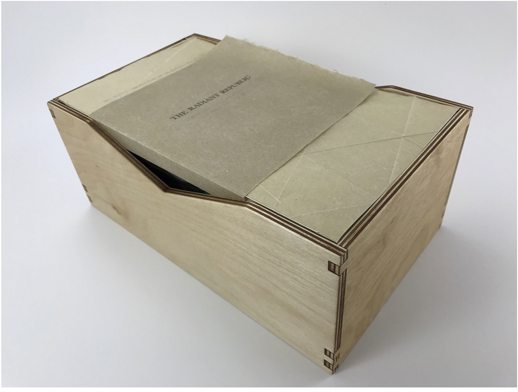
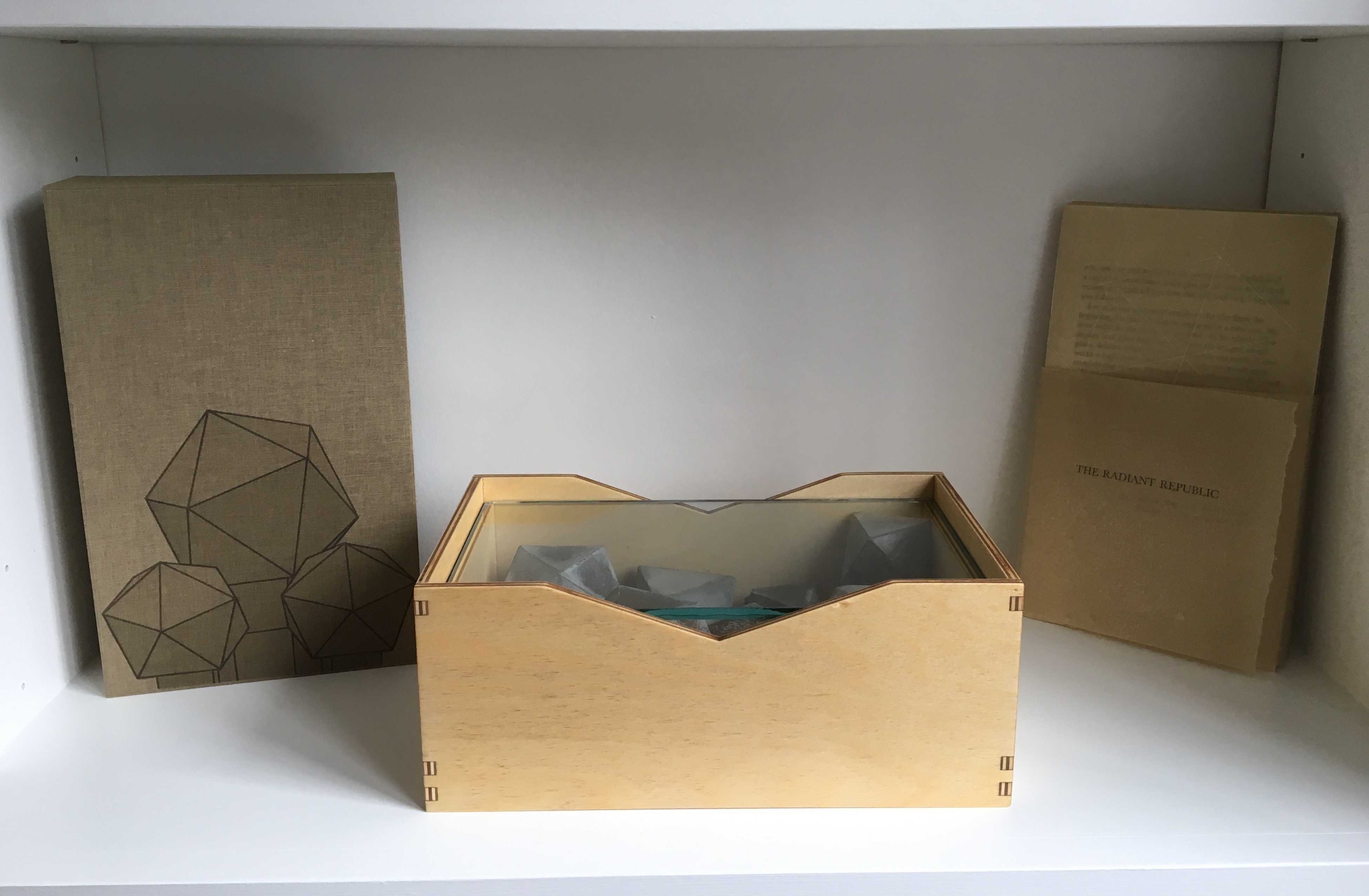
Sarah Bryant’s The Radiant Republic(2019) insightfully integrates Plato’s and Le Corbusier’s texts and ideas. The very physicality of the blond wood, linen cover, glass window, concrete representations of Platonic solids, embossed type and sewn papers could easily be a response to Juhani Pallasmaa’s comment: “The current overemphasis on the intellectual and conceptual dimensions of architecture contributes to the disappearance of its physical, sensual and embodied essence” (The Eyes of the Skin, p. 35).
Proposition #7: The affinity of architecture and artists’ books lies in modelling.
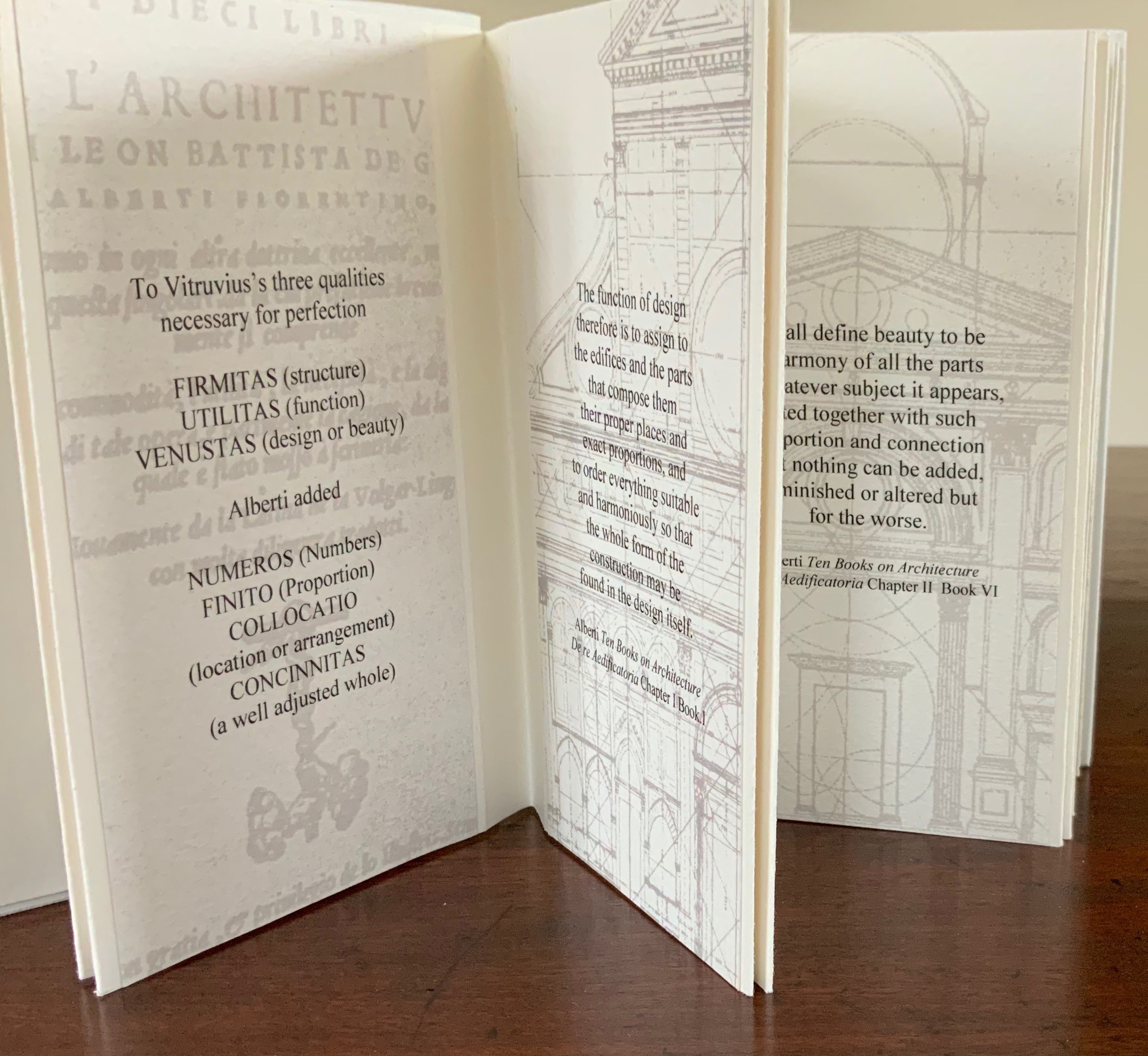
Helen Malone’s Ten Books of Architecture (2017) takes a broad historical and, most important, haptic view of architecture from Vitruvius to Hadid. Each of the ten books is a bookwork that models its architectural subject.
Proposition #8: The affinity of architecture and artists’ books lies in folding.
At the end of the 20th century, architects like Peter Eisenman, Jeffrey Kipnis and Greg Lynn latched on to computer-aided design and Gilles Deleuze’s Le pli: Leibniz et le baroque (1988) / The Fold: Leibniz and the Baroque (1993). This led to real constructions such as Eisenman’s Rebstock Park in Frankfurt as well as to the seminal books Folding in Architecture (1993), edited by Lynn, and Folding Architecture 92003) by Sophia Vyzoviti.
Folded book pages rarely generate a work that rises above mere craft. Heather Hunter’s Observer Series: Architecture(2009) achieves the necessary height. It combines the altered book with an accordion book that incorporates a found poem composed of the words excised and folded outwards from the folded pages of The Observer’s Book of Architecture.
Proposition #9: The affinity of architecture and artists’ books lies in light.
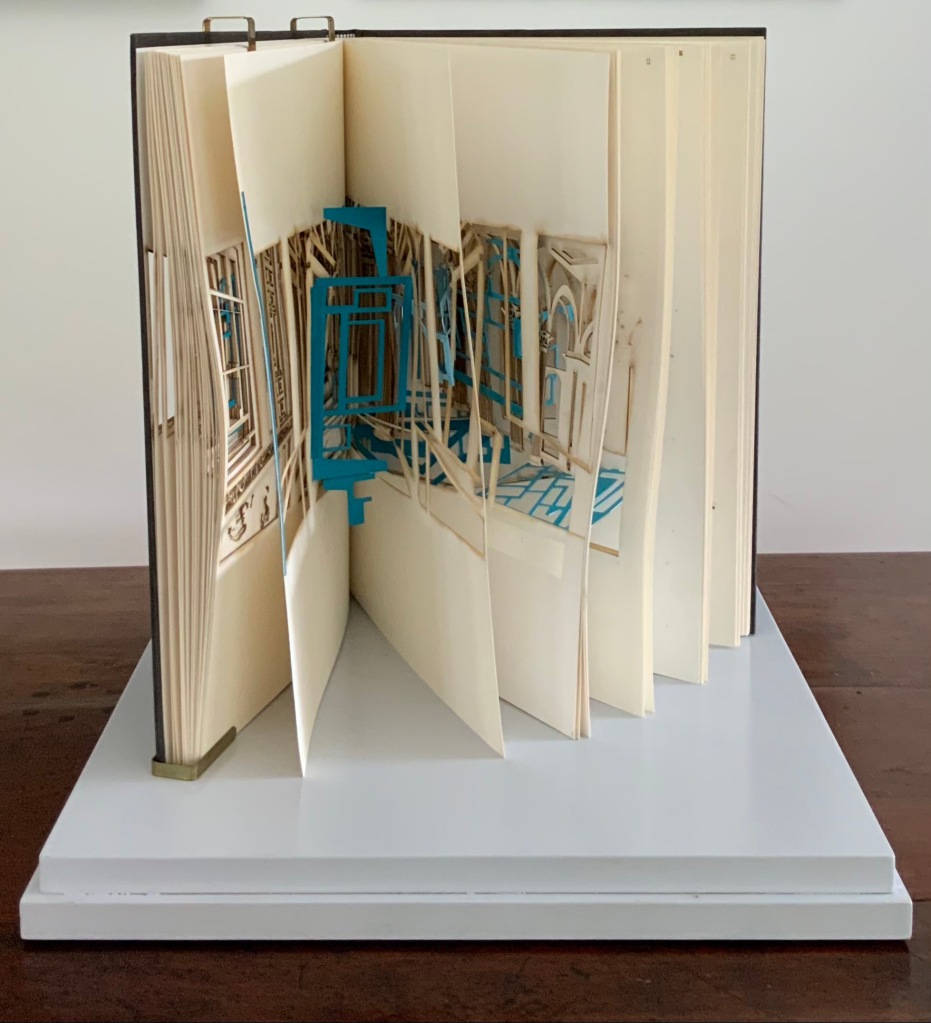
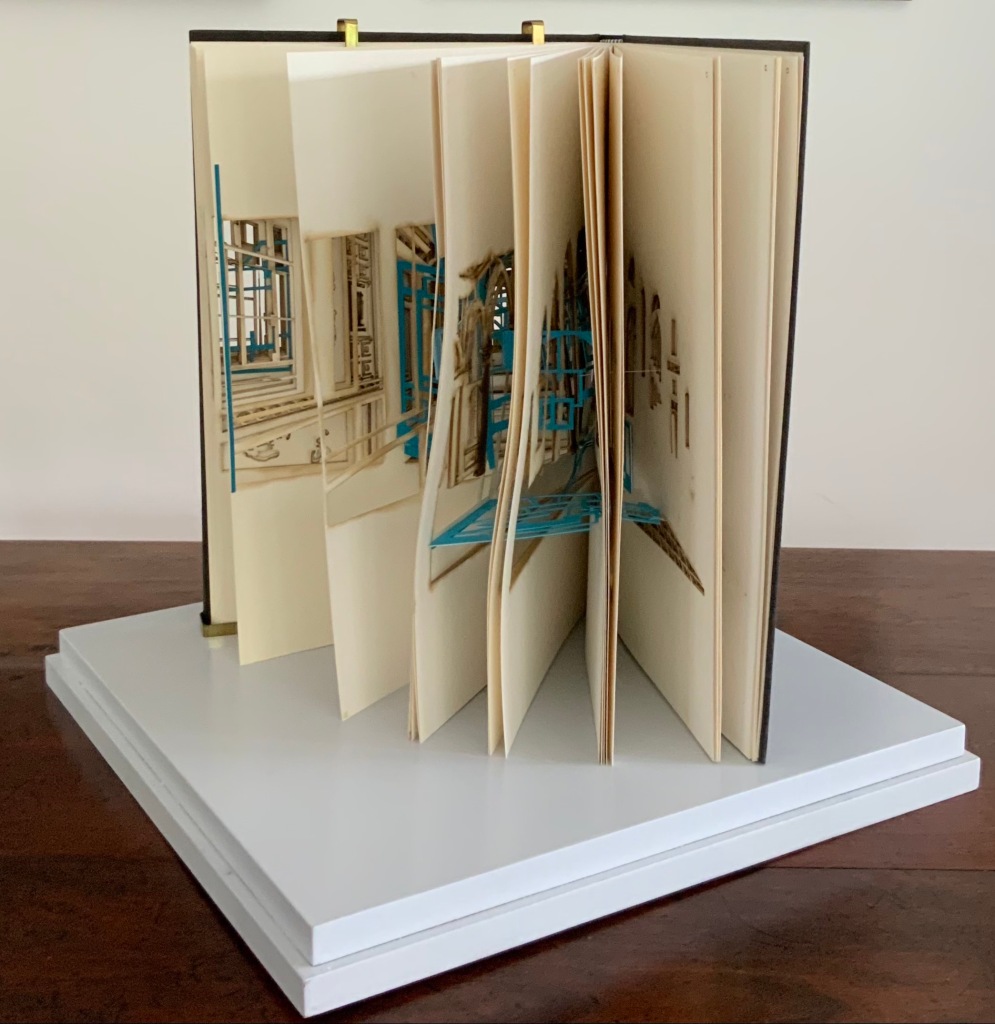
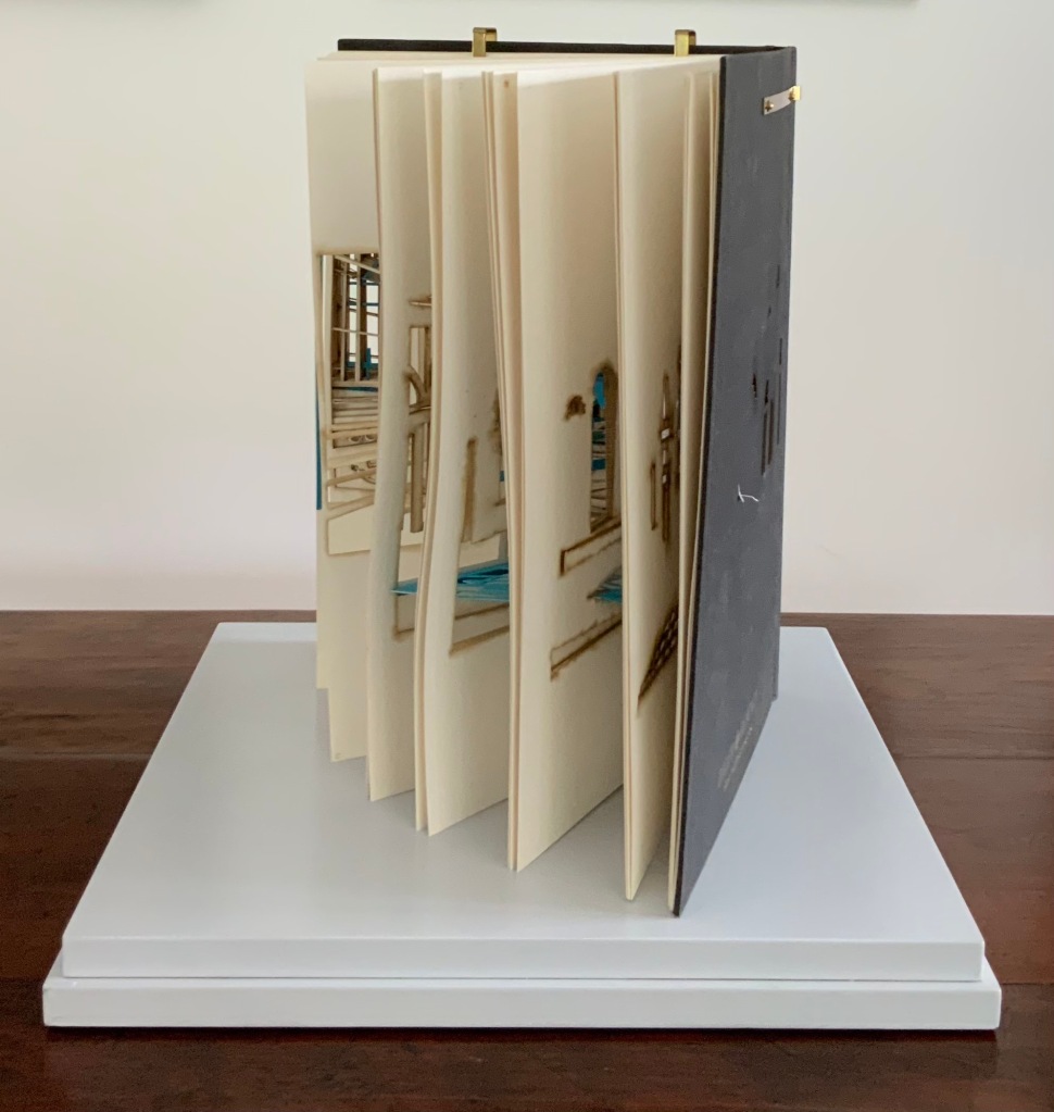
Marlene MacCallum’sTheme and Permutation(2012) is a response to the permutations and variations over time in five houses built to a common plan in Townsite area of Corner Brook, Newfoundland. MacCallum used digital tools to translate the original film source of eight different window images from the houses. A tritone image of a single Townsite window under translucent pages opens the book. As the pages turn, new window images appear and layer over each other, darkening up to the book’s mid-point. In the center spread, two text blocks appear speaking to the history, architectural permutations and economic shifts of the Townsite area. The tonality begins to lighten over the ensuing new combinations of window layers. A third text block of personal narrative is introduced, and a tritone image of one of the Townsite windows in its original condition concludes the work.
Proposition #10: The affinity of architecture and artists’ books lies in perspective.
Cees Nagelkerke’s Piranesian Window (1996) resides in the Vedute Foundation’s collection of “spatial manuscripts”, invited works that must conform to the dimensions of the Gutenberg Bible. Piranesian Window‘s form and title capture multiple meanings of vedute (“views”). Views are things seen — which this spatial manuscript is. Views are prospects from which to see — which a window offers. Views are perspectives — for which Giambattista Piranesi’s etchings are famous. Views are thoughts held — which “Piranesian” implies (the work’s title could be that of a manuscript on art history and philosophy). Piranesi’s mid-eighteenth century etchings Vedute di Roma(“Views of Rome”) and Carceri d’invenzione (“Imaginary Prisons”) are the obvious sources of inspiration, but Nagelkerke provides an interview describing the dream source of the work:
– … Please, continue relating your dream … – I wandered through vast ruins … along wrecked bridges … feeling remarkably at ease. – How did you find the window in this windowless world? – When a cool breeze wafted inside, I suddenly saw it. It showed a landscape, within the distance a city. There was complete tranquillity and harmony there, like in a painting by Piero della Francesca … I stood there for some considerable time and I became increasingly saddened, because I discovered that I was looking at something that had vanished forever. – But how did you manage to take the window? – I wanted to touch it … as a result, I immediately fell down. The gap left in the wall closed by itself … I picked it up and continued on my way, meeting people who spoke to me saying that I should leave the Carceri. I was taken to a gateway. No one looked at, or said anything about, the window… In the square where I found myself, there was an intense, chaotic commotion. The window still reflected something of the vast space I had left. The exterior showed traces of the wall in which it had been mounted. I looked through it and saw everyday life …
Proposition #11: The affinity of architecture and artists’ books lies in archaeology.
Mill: A journey around Cromford Mill, Derbyshire (2006) by Salt + Shaw (Paul Salt and Susan Shaw) is the result of the artists’ exploration of Cromford Mill in Derbyshire, the first water-powered, cotton-spinning mill developed by Richard Arkwright in 1771. Bound in a cover of recycled wooden library shelves, three plaster cast blocks and seven calico pocket pages containing hidden texts imply the hidden archaeological history to be found. The forensic-like casts are taken from interior surfaces, and the texts walk the reader step by step through each area of the mill.
Proposition #12: The affinity of architecture and artists’ books lies in assemblage and collage.
Based on an architectural installation at the Minnesota College for Art and Design and drawing on her photos of Ayvalik, Amsterdam, Florence, Istanbul, New York City, Rome, San Diego and Venice, Karen Wirth’sPaper Architecture (2017) certainly prompts a revisit to MoMA’s “Cut ’n’ Paste: From Architectural Assemblage to Collage City“, 10 July 2013 – 5 January 2015, to prove this proposition.
Proposition #13: The affinity of architecture and artists’ books lies in luxe.
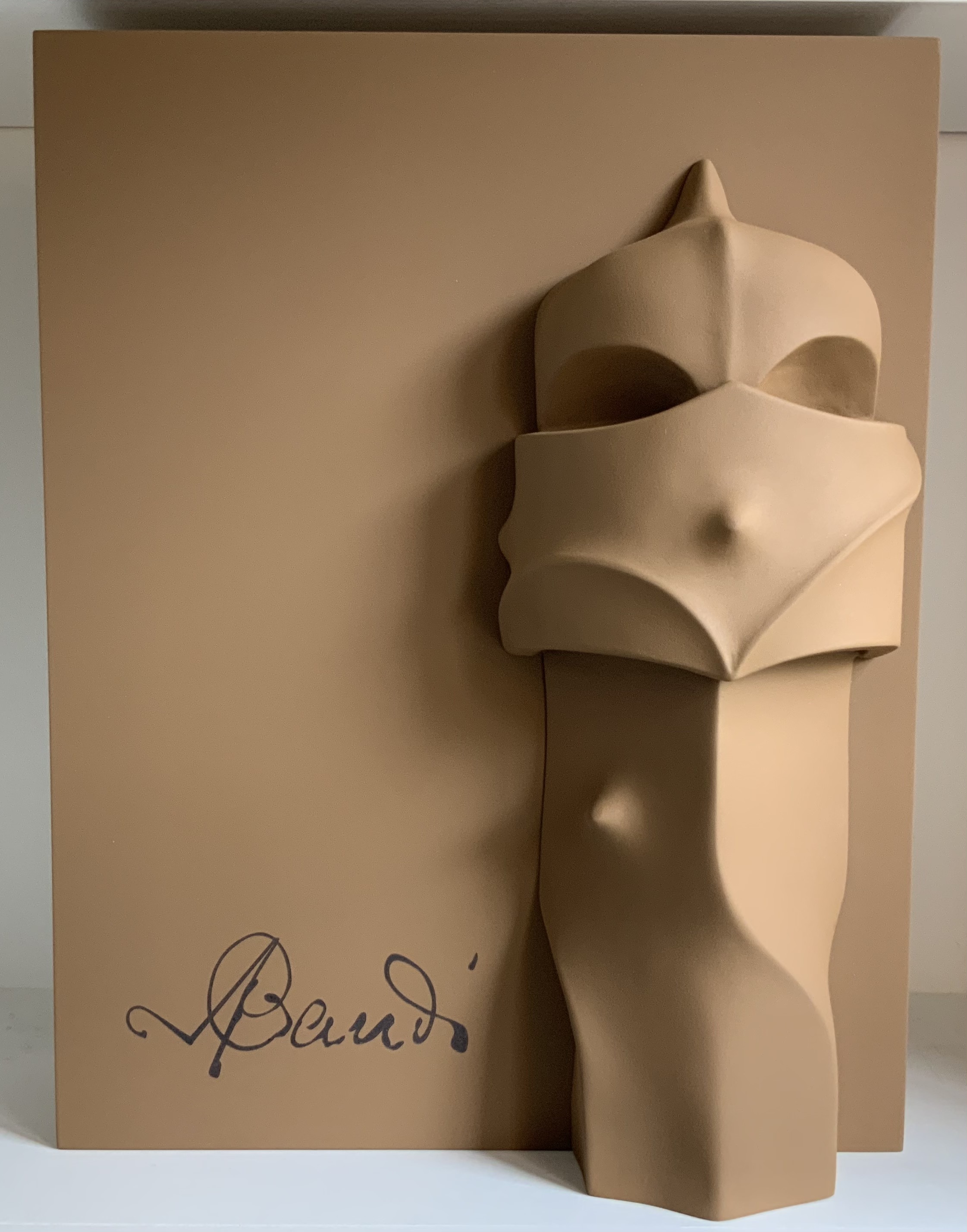
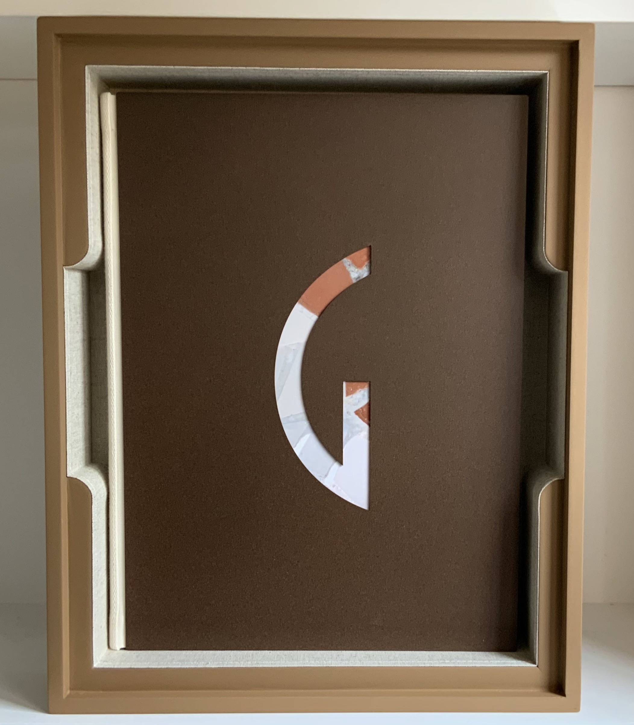
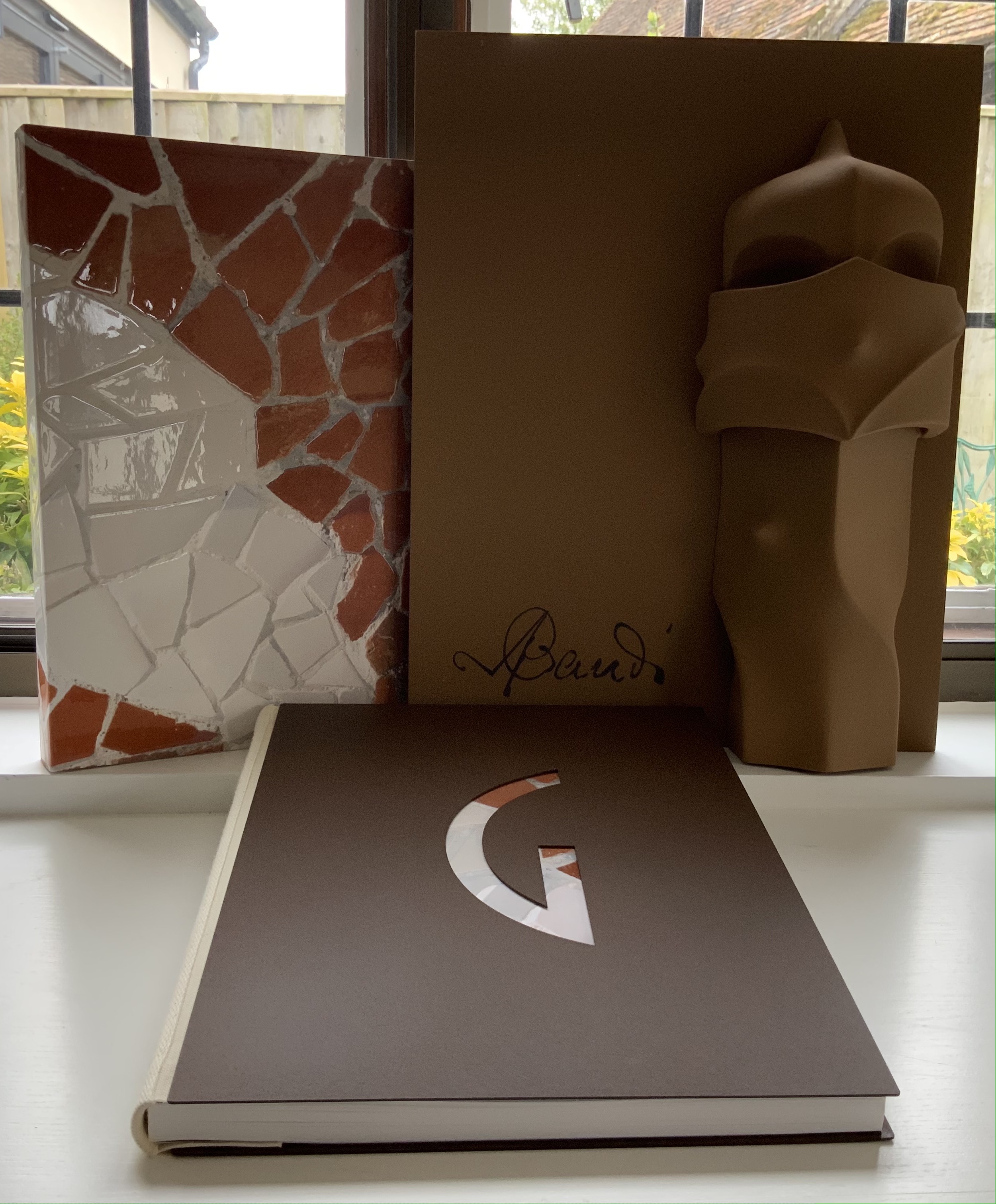
Early theorists, critics and artists of book art expended great effort to exclude livres d’artiste and deluxe productions from the definition of a form of art that struggled to find a name: artist’s book, artists’ books, bookworks, book art, etc. The spectrum from objects of conspicuous consumption to democratic multiples characterizes both architecture and book art. Antoni Gaudí’s architectural efforts easily span that spectrum — from his Casa Milà to his tiles found underfoot in Barcelona’s Passeig de Gràcia. Under the guidance of Juan José Lahuerta (chief curator at the National Museum of Art of Catalonia), the publisher Artika produced Gaudí Up Close(2020), enclosed in a wooden case with marble sculpture finished in paint, cement powder and anti-graffiti varnishes and lined with Naturlinnen fabric.
Gaudí Up Close(2020) Published by Artika. Photos: Books On Books Collection.
Proposition #14: The affinity of architecture and artists’ books lies in the memorial.
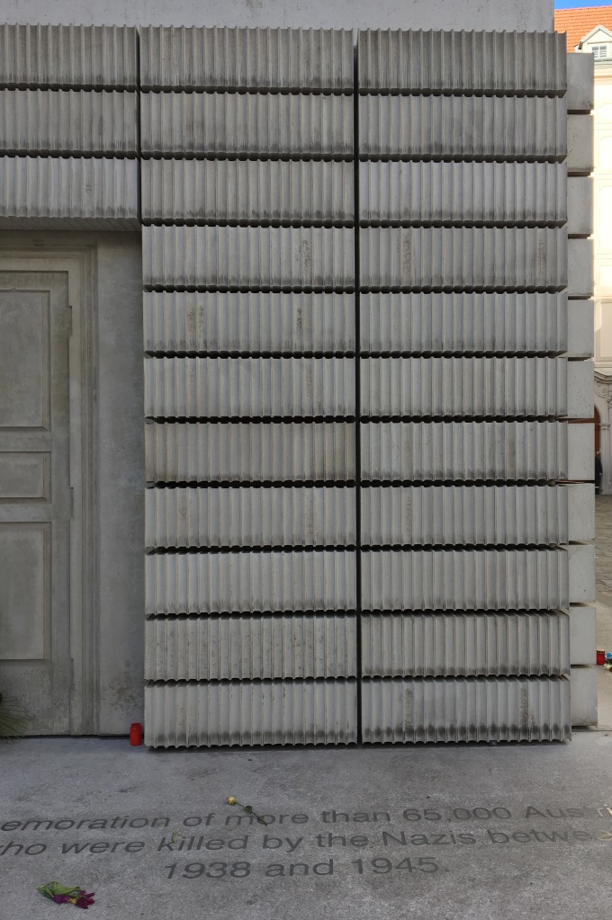
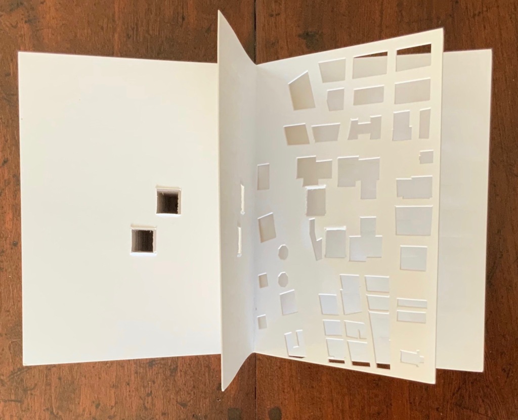
As you turn the corner into Judenplatz in Vienna, Rachel Whiteread’s great cube appears showing only the fore edge of book after book. As you hold J. Meejin Yoon’s small white brick of paper and turn its thick pages, a small pinhole appears on the page. Then two larger square holes emerge, one of which falls over the pinhole. Page after page, the two square holes repeat, creating two small dark wells in the field of white, until on the last page they take their place in the cut-out schematic footprint of the city blocks and buildings surrounding the Twin Towers. Whiteread’sNameless Library (2000) and Yoon’sAbsence (2004) surely underscore this proposition of memorial.
Proposition #15: The affinity of architecture and artists’ books lies in the sacred.
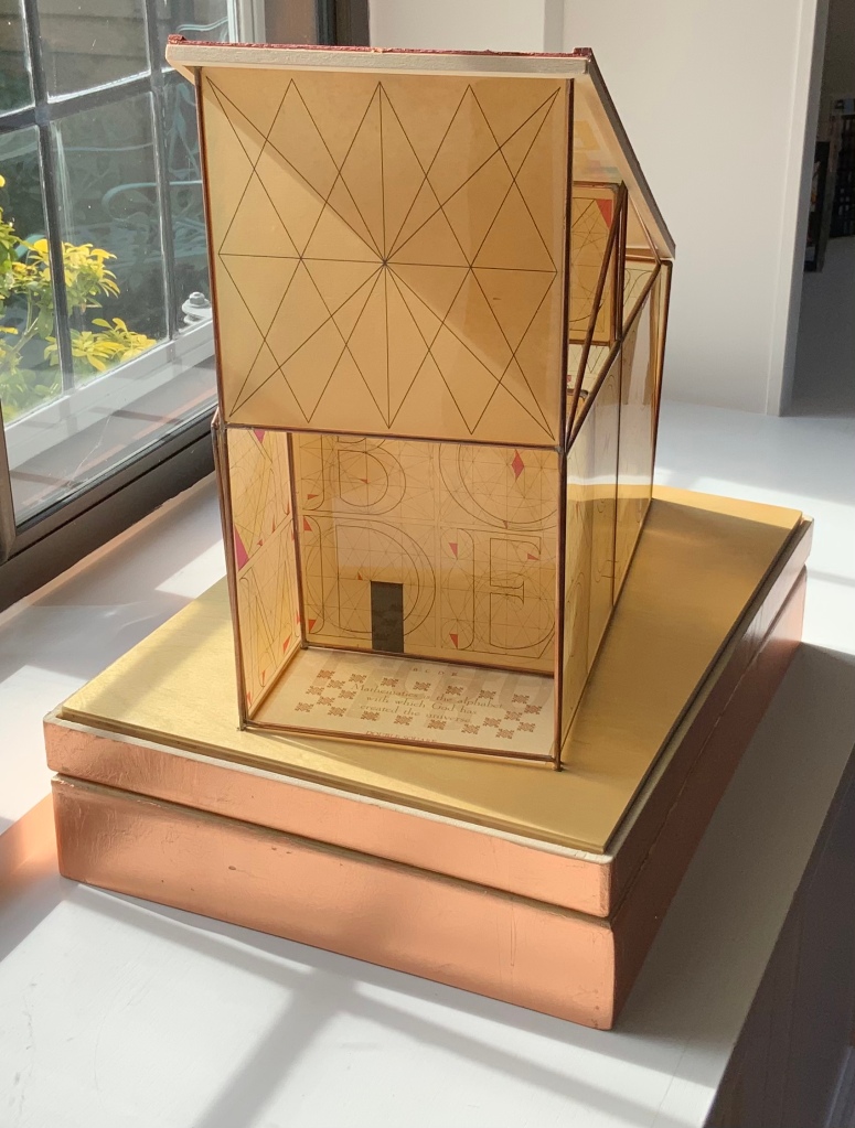
Jeffrey Morin and Steven Ferlauto’s Sacred Space (2003) is an intimate monument of book art. Made intimate by the content and texture of its book, made more intimate by the viewer’s having to construct the chapel. Made monumental by the echo of typographic history, made more monumental in Galileo Galilei’s echo from its floor: Mathematics is the alphabet with which God has created the universe.
Proposition #16: The affinity of architecture and artists’ books lies in collaboration.
In Victor Hugo’s Nôtre-Dame de Paris (1831), Archdeacon Claude Frollo points to the book in his hand and then to the cathedral and says, “This will kill that”. It is ironic that Hugo’s book (popularly known now by its English title The Hunchback of Nôtre-Dame) was written in large part to save the then-decaying cathedral (post-Revolution, it served as a warehouse), and it succeeded. It is also ironic that, while the fictional character’s metaphor has a point about the book’s permanence of replicability outlasting the building’s permanence of stone, it misses the collaborative foundations of both.
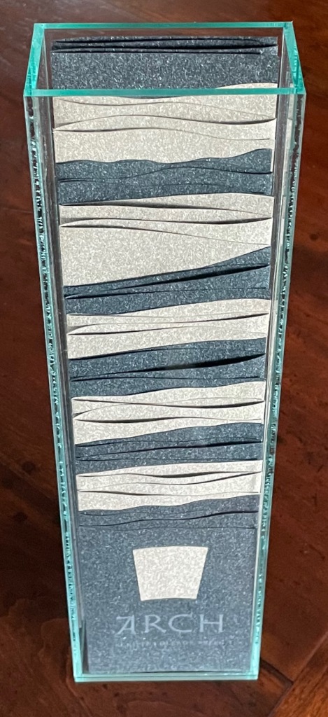
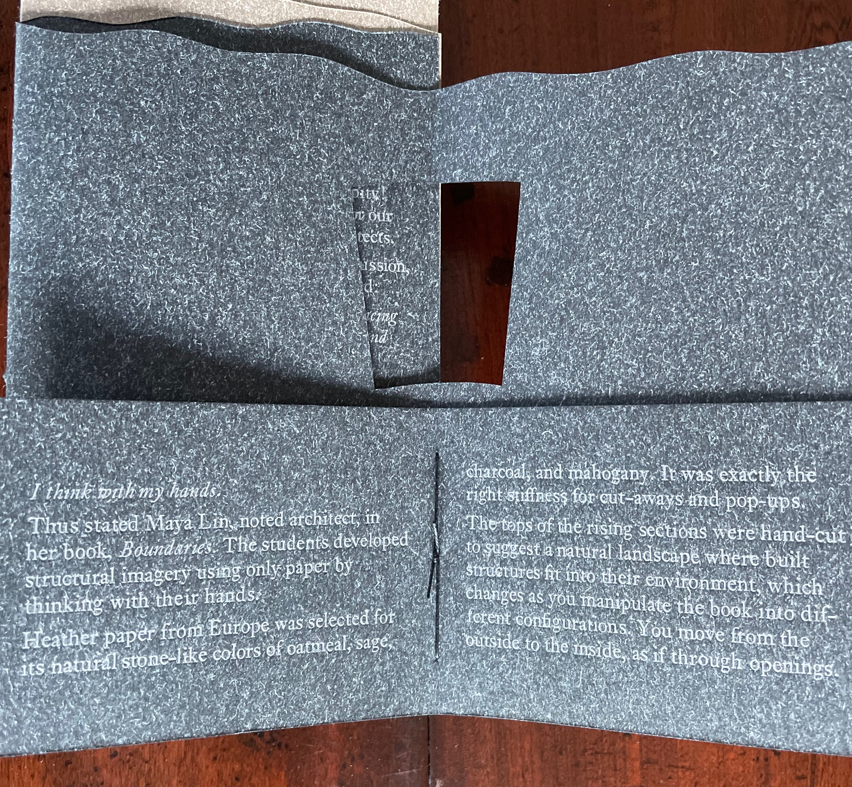
Created by ten students at Scripps College under the direction of Kitty Maryatt, Arch (2010) reminds us that the creation of a book — even a work of book art — is a collaborative effort.
Arch (2010) Kitty Maryatt, Jenny Karin Morrill, Ali Standish, Alycia Lang, Jennifer Wineke, Mandesha Marcus, Catherine Wang, Kathryn Hunt, Ilse Wogau, Jennifer Cohen, Winnie Ding Photos: Books On Books Collection
Maryatt’s preface to Arch is entitled “Blueprint” and is brief enough to warrant citing in full:
Books are inherently architectonic. Studying architecture would naturally be profitable to students building their own books.
On January 17, 2010, just days before class was to start, the Los Angeles Times published a fascinating article on contemporary women architects, highlighting a striking building by Jeannie Gang.
Earlier this year, the brand-new President of Scripps College chose The Genius of Women as her inaugural theme. What serendipity! This gave us the perfect inspiration for our artist book: the genius of women architects.
After extensive research and class discussion, a mission statement for the book evolved:
Architecture, like books, is a delicate balancing act between stability and motion, interior and exterior, aesthetic values and structural practicalities.
Books, like building, are fundamentally inhabited spaces. They are incomplete without human interaction.
The first portals were built of post and lintel construction. A curved arch is more difficult: the keystone is needed at the apex to lock the other pieces into position. Building a book is a similarly difficult feat. — Professor Kitty Maryatt
Conclusion: The affinity of architecture and artists’ books lies in our attraction to the beauty of form.
No doubt the proximity of the need for shelter and the need for oral and written language have played some gravitational role of mutual attraction for architecture and books (and latterly artists’ books). But equally, both architecture and artists’ books speak to our attraction to the beauty of form. All of the examples above are re-offered here in support of this proposition. Look at them again.
“Architecture”, “art” and “the book” are all fluid concepts. So it should be no surprise that we arrive at the equally fluid similes: architecture is like book art, book art is like architecture.
An earlier version of this essay appeared in The Blue Notebook, Volume 16 No 2, Spring – Summer 2022.
Further Reading
“Architecture“. 12 November 2018. Bookmarking Book Art.
Lynn, Greg. 2004. Folding in Architecture Rev. ed. Chichester, West Sussex: Wiley-Academy. See for references to Mario Carpo, Gilles Deleuze and Peter Eisenman.
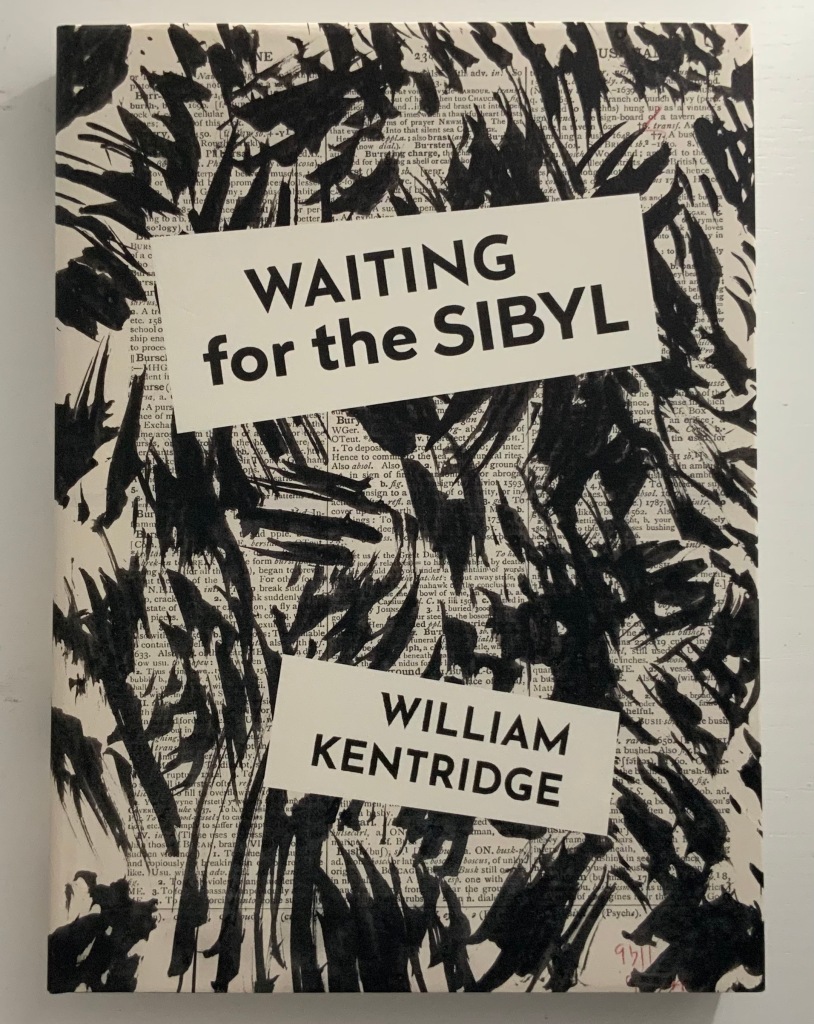
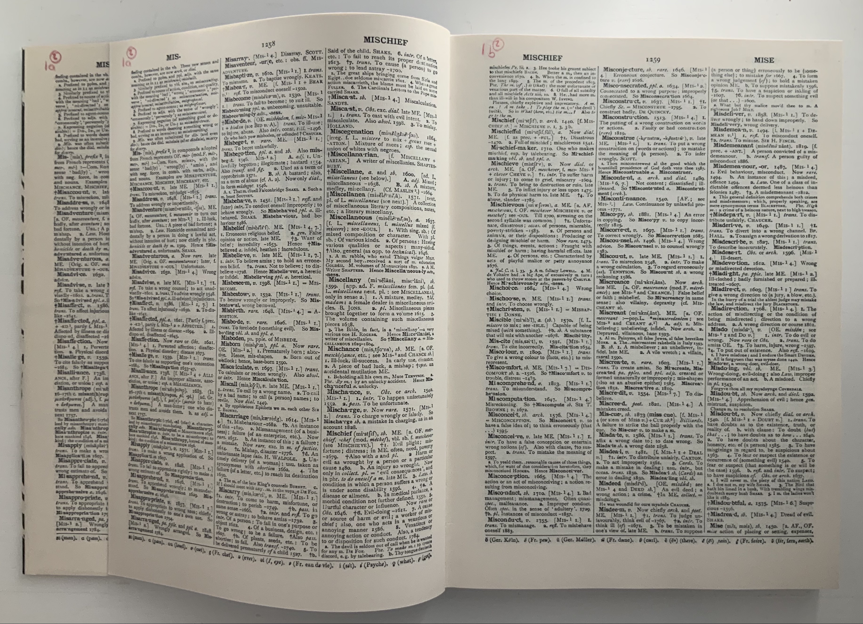
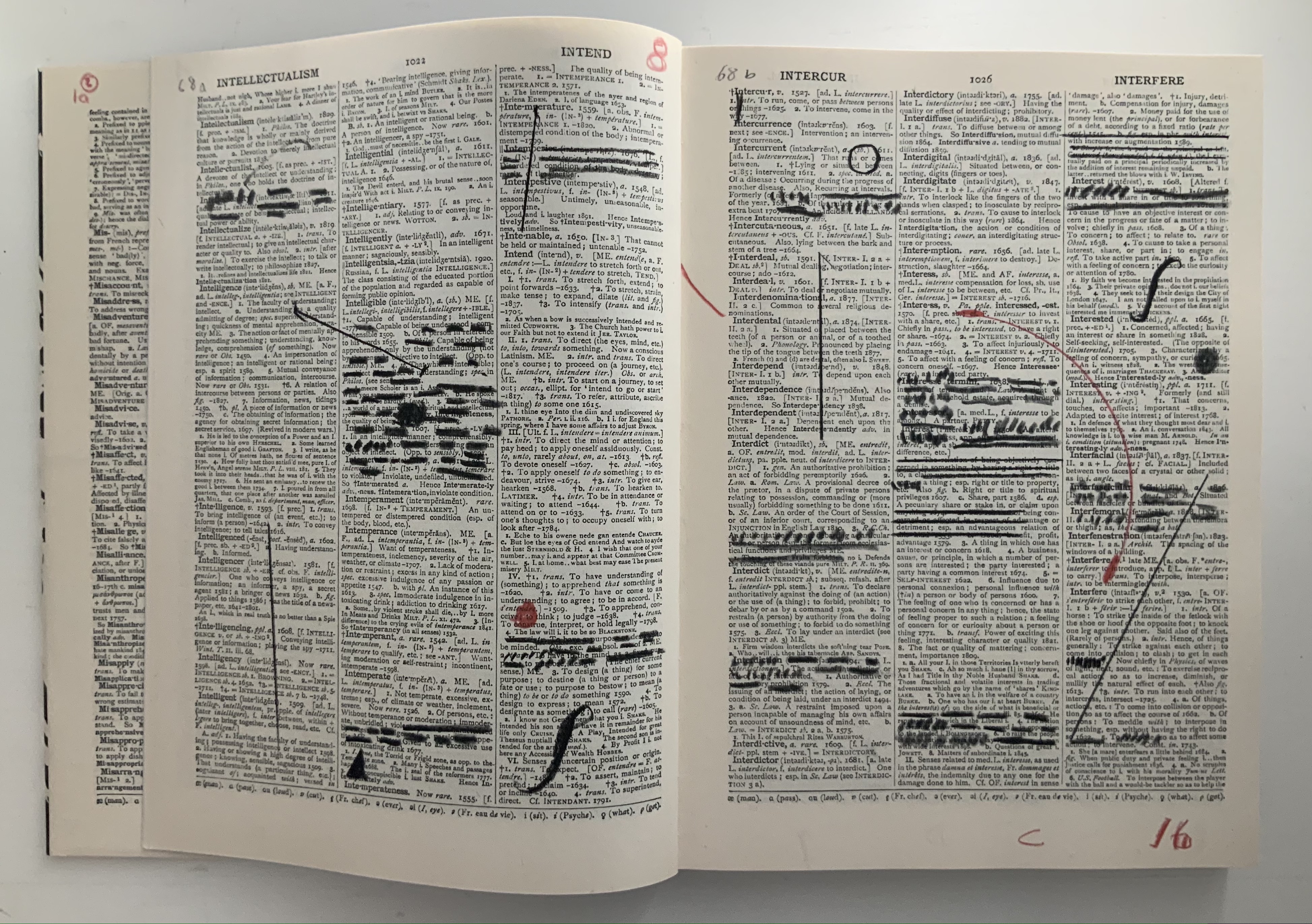
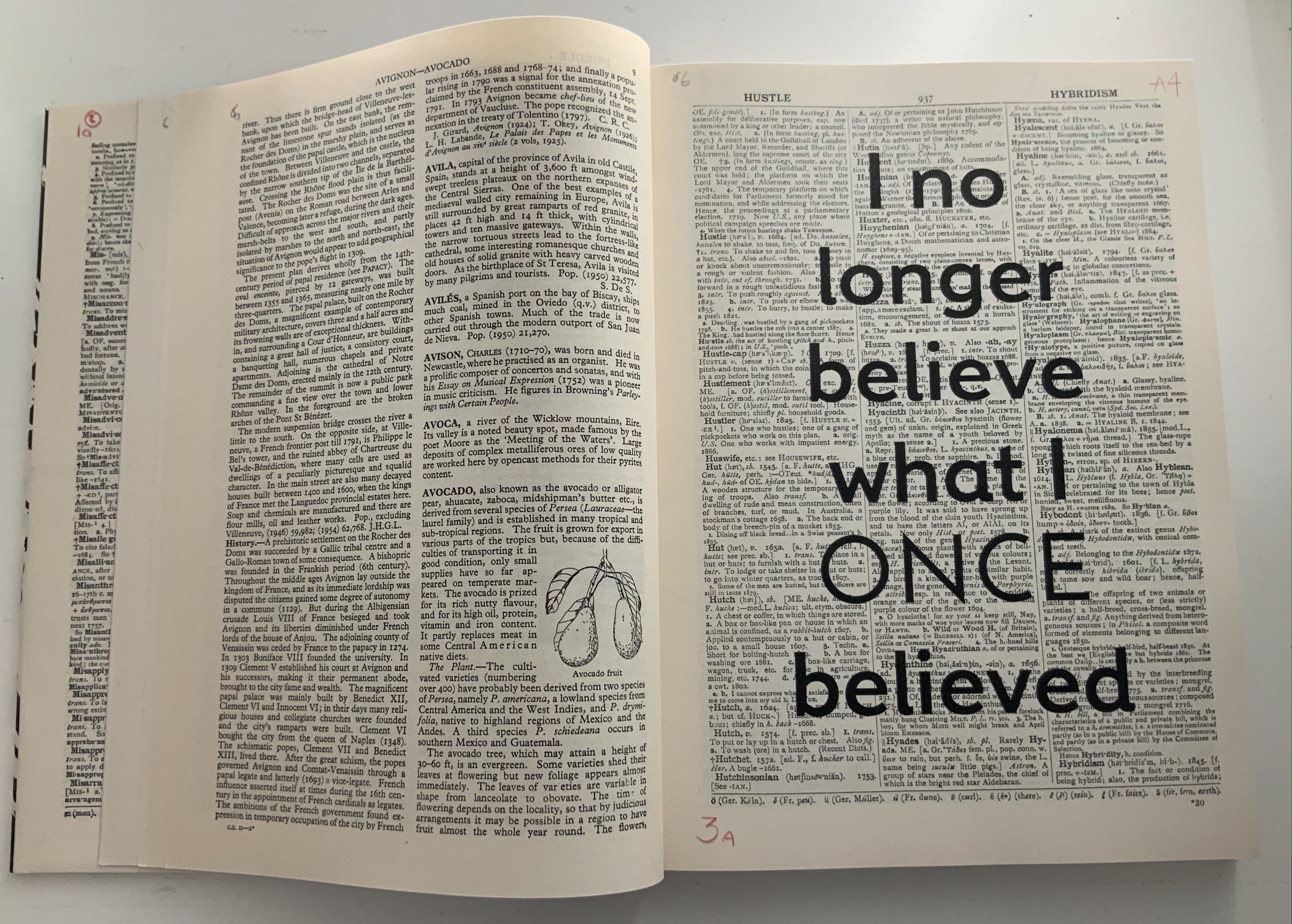
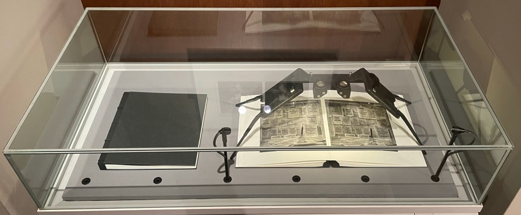
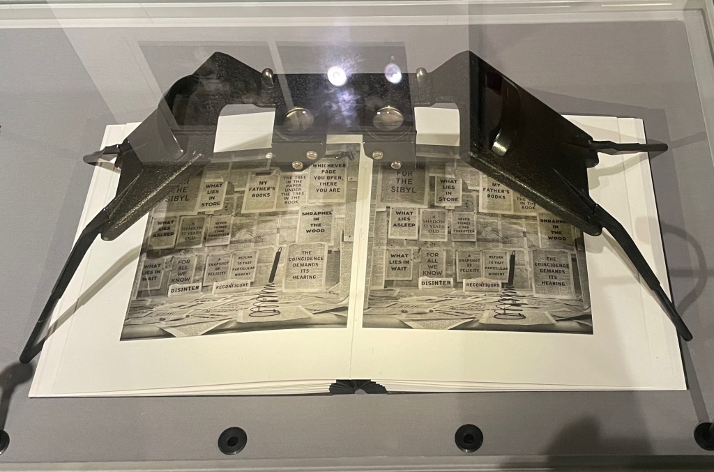
Waiting for the Sibyl (2020) William Kentridge Casebound and dustjacketed. H275 x W200 mm, 360 unnumbered pages. Acquired from Blackwells, 1 July 2021. Photos of the work: Books On Books Collection. Displayed with permission of the artist and the Marian Goodman Gallery.
Like the ancient Greek playwrights, William Kentridge begins his chamber opera’s retelling of the Cumaean Sibyl’s myth in medias res — in this case, in the middle of the dictionary at the letter M. Redactions and marks build and build across the dictionary pages, a visual prelude like a musical one. Then they suddenly disappear, leaving the “stage” to unmarked pages from the letter A, a thunderclap announcement in all caps bold and then an explanatory statement slightly reduced in volume with a lighter type face and uppercase with lowercase letters. What is going on?
Because performance of the opera was curtailed by the pandemic beginning in 2019/2020, we have only a few short clips from a trailer and filmed rehearsals to guess at how a live performance might have unfolded: this short clip posted by Teatro dell’Opera di Roma, this one from Quaternaire, this one from The Red Bridge Project and this version posted by the Centre for the Less Good Idea. A description from the Théâtres de la Ville de Luxembourg tells us that the performance consists of a series of six short scenes. From the Red Bridge Project, coordinating the commission, we have Kentridge’s description of four of them:
A scene in the waiting room for the Sibyl. A scene about which is the right decision and which is the wrong one. How do you know which is the chair that will collapse when you sit on it and which is the chair that will support you? Is the plane that you’re rushing to catch the one that will crash or do you relax and not catch that plane and take the next one − and in fact that is the one that crashes?
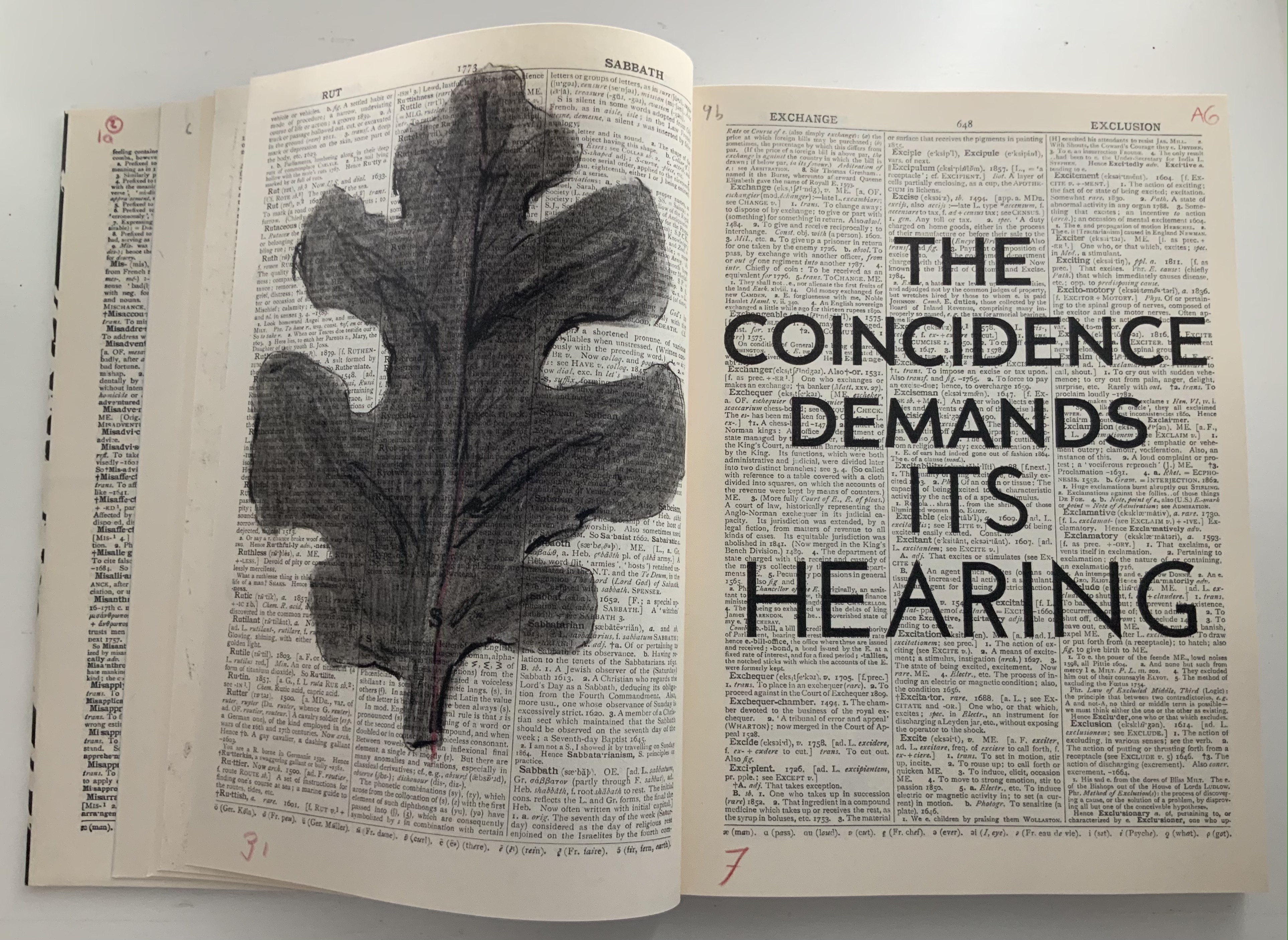
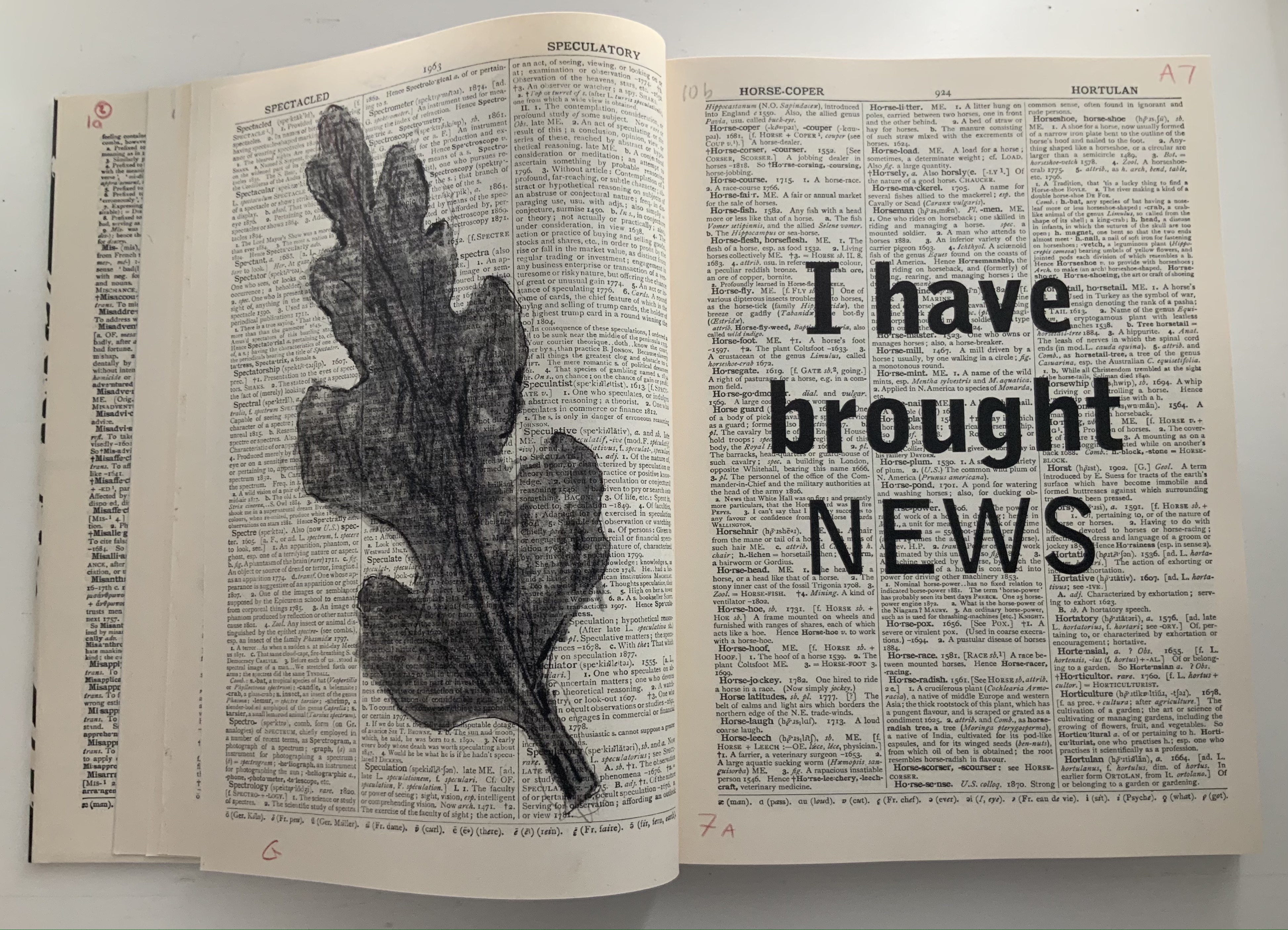
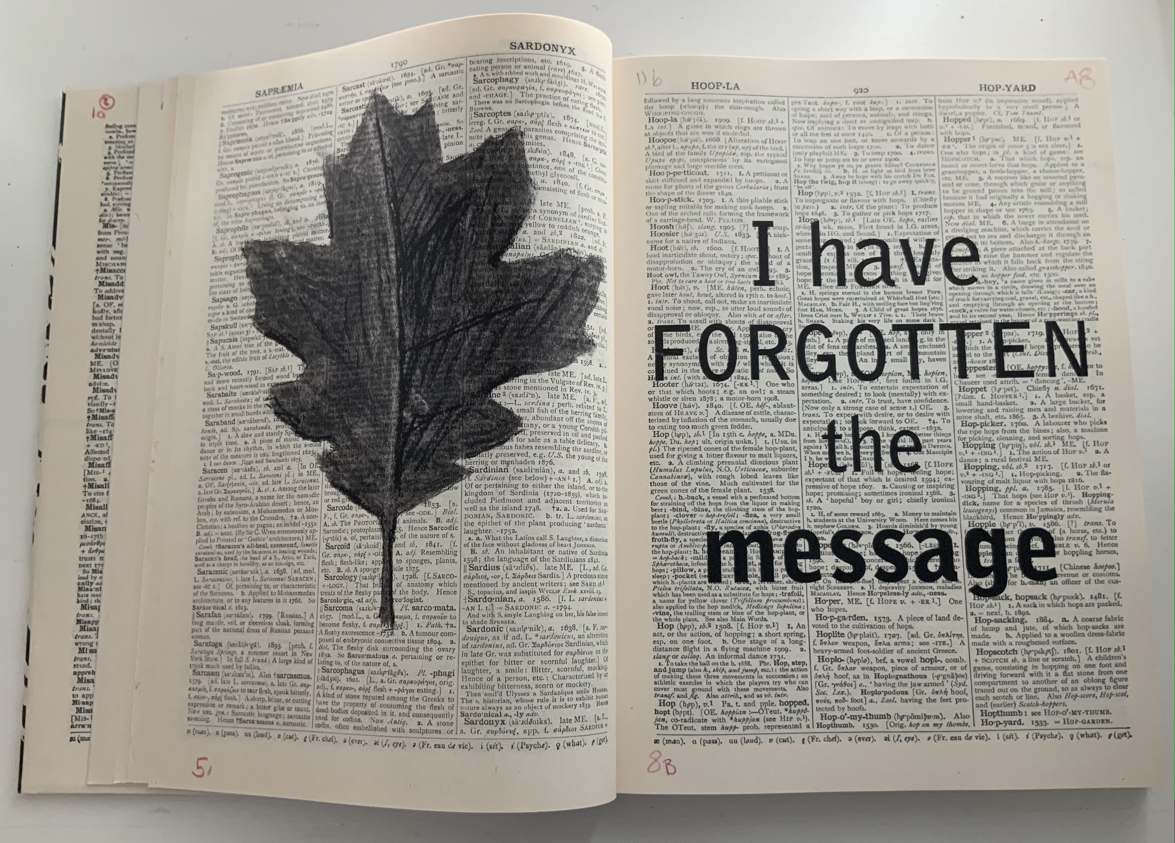
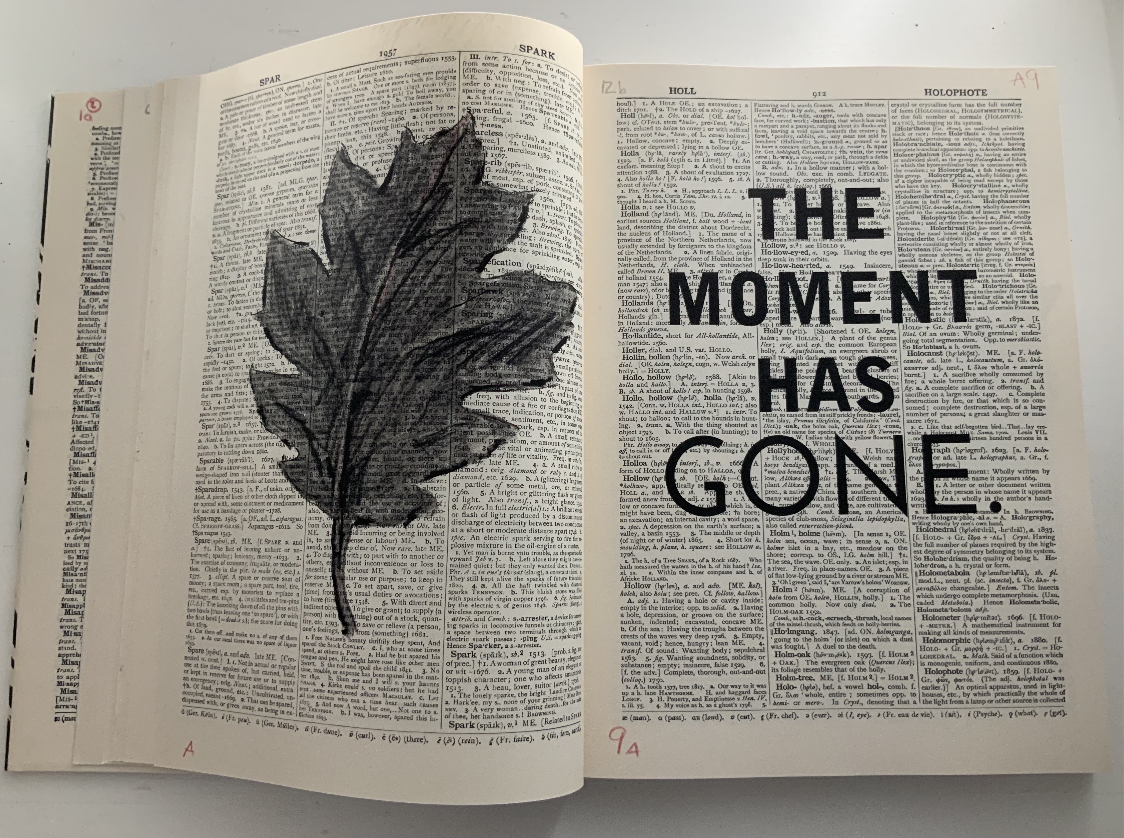
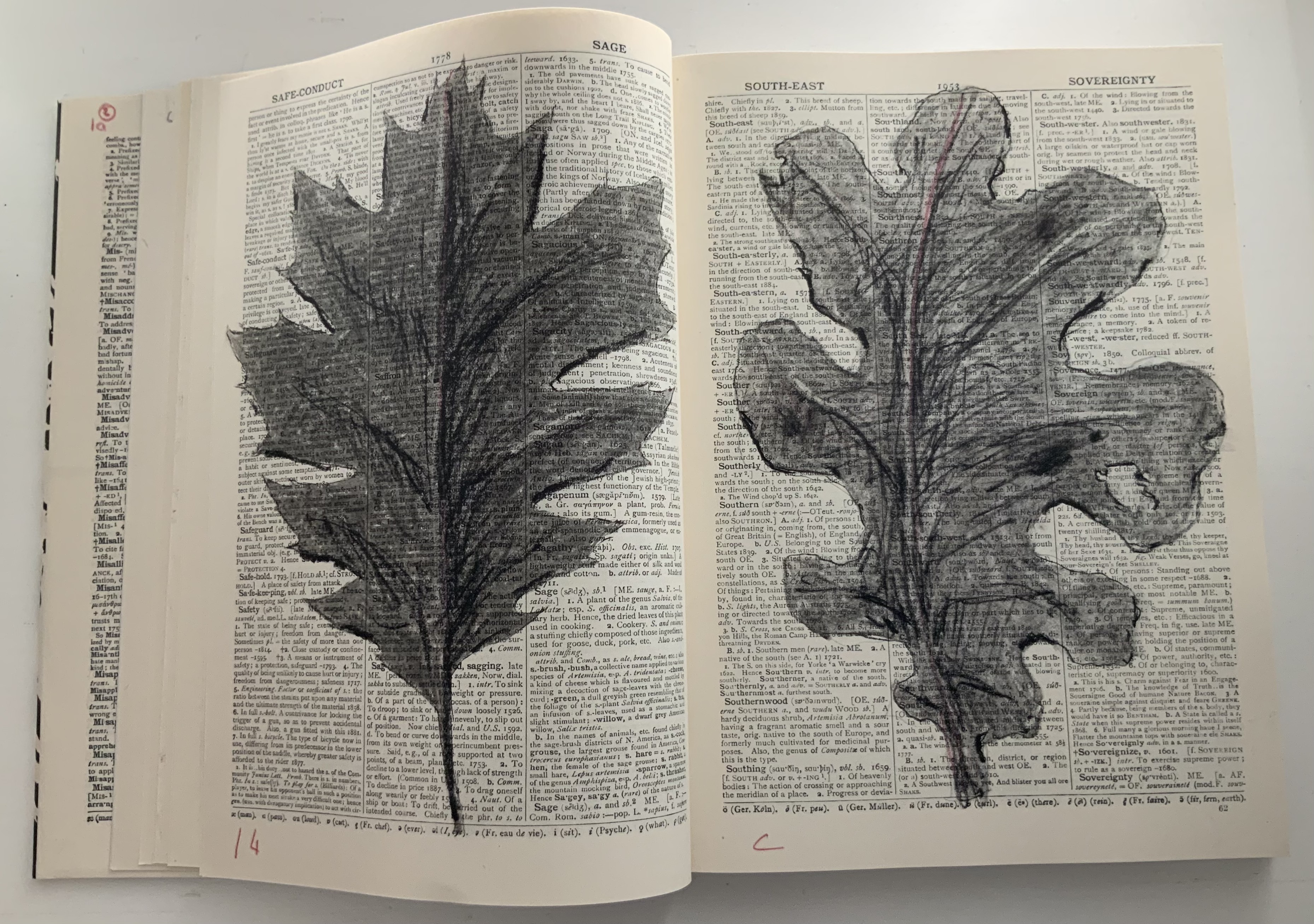
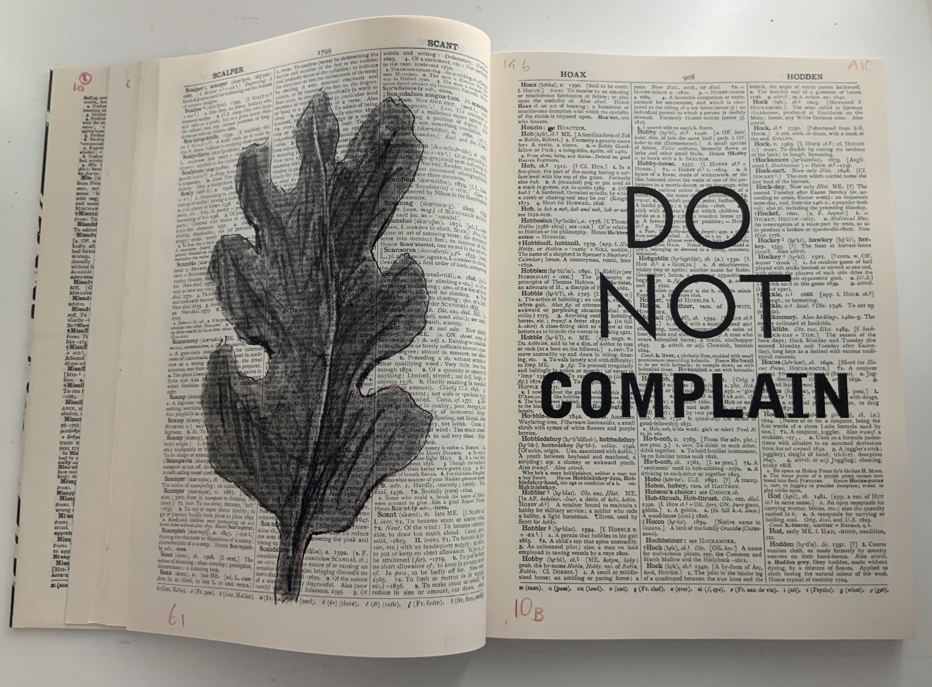
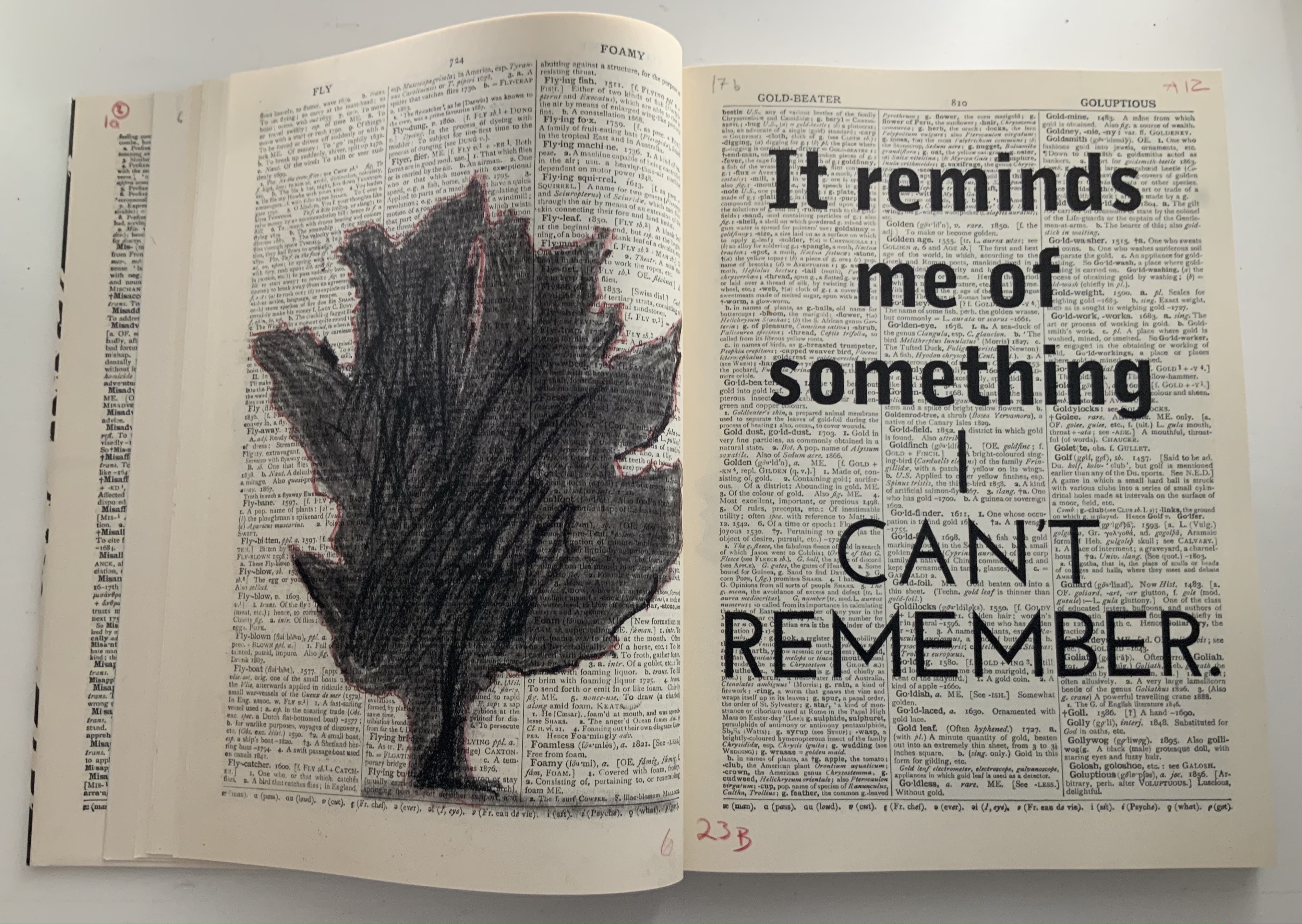
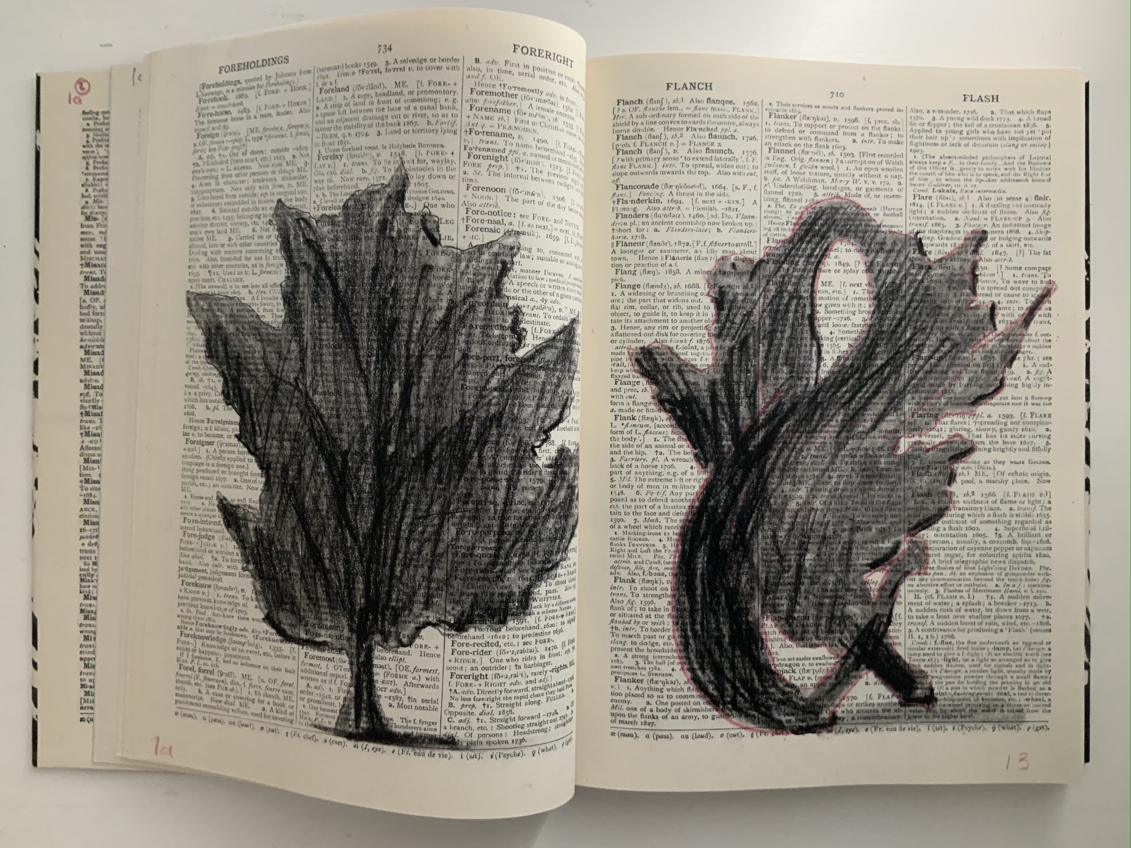
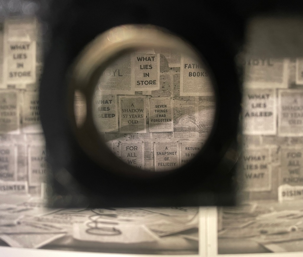
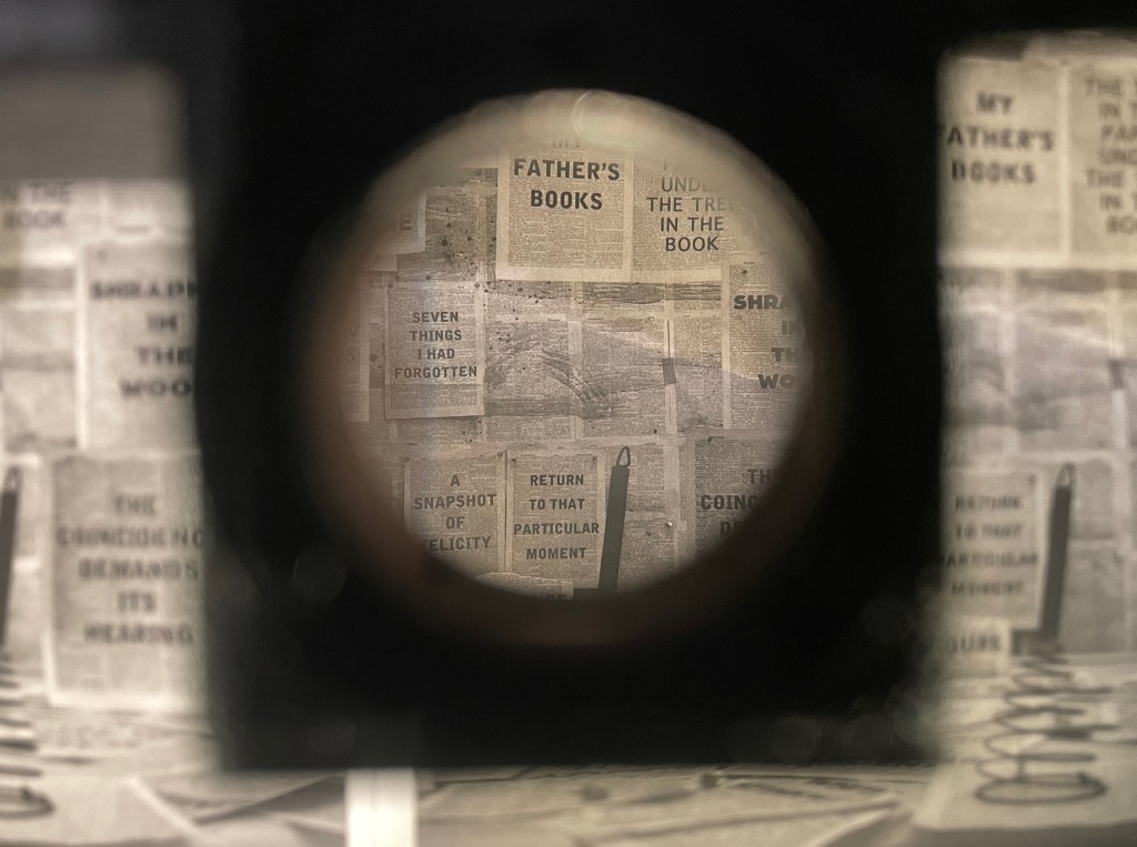
Judging from the videos and description, it is presumptuous to declare that the book and opera begin in medias res. Almost anywhere in the out-of-order pages or chaotic rehearsal scenes of performers snatching at and reacting to the scattered leaves of books, typescript and so on is the middle. But if the left-to-right reading convention of the Western codex prevails, the text to be sung continues to rumble along in the codex after the thunderous proclamations. The chorus or speaker seems to falter, admitting to having forgotten the message and losing the moment of its delivery. All the while, the libretto is being joined on the left by gradually forming images of leaves (a maple and an oak), an allusion to the leaves on which the Cumaean Sibyl would write the predictions of fate she had sung but which would be scattered and whirled by the wind before the supplicant could claim his or her rightful leaf.
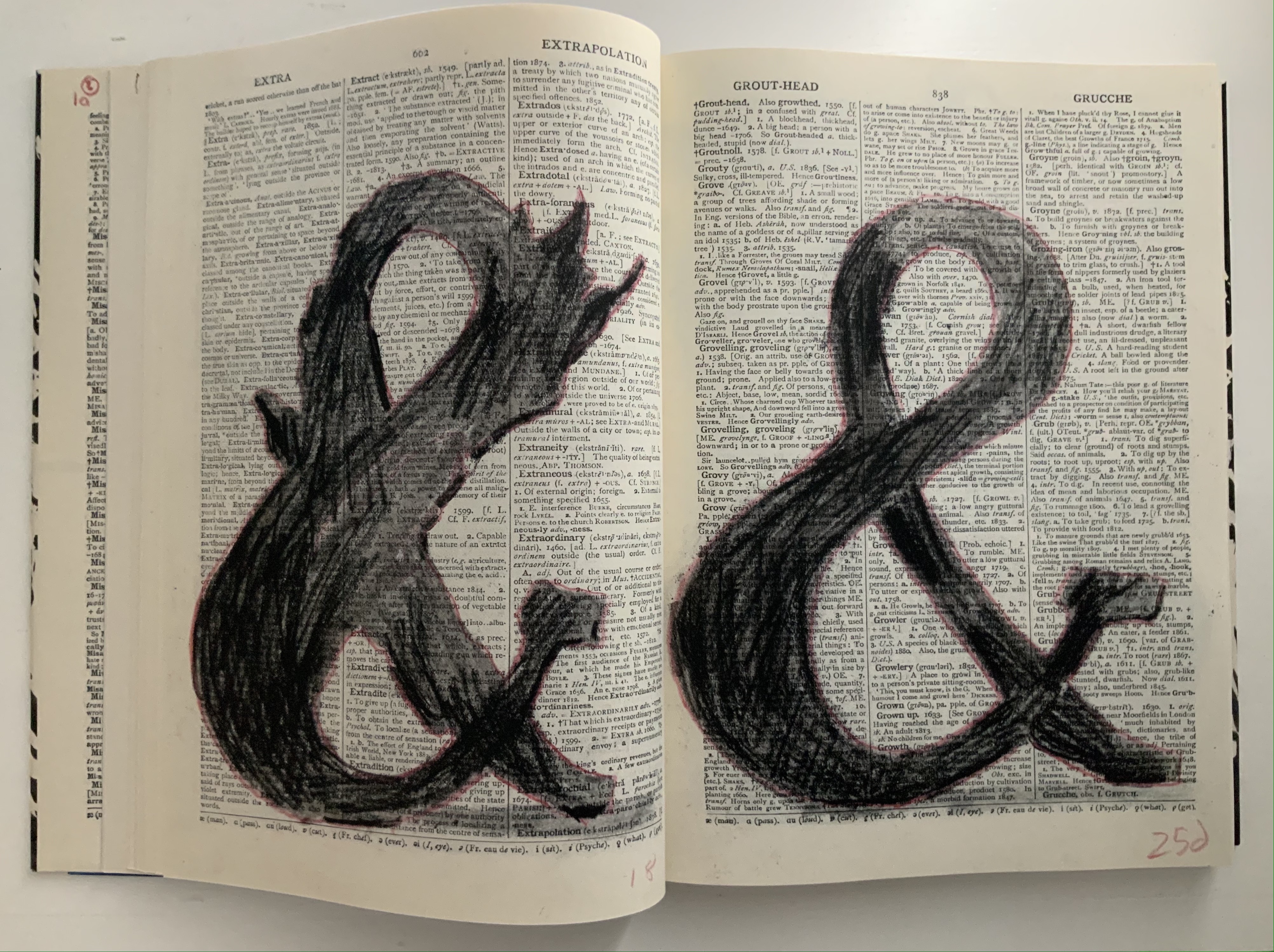
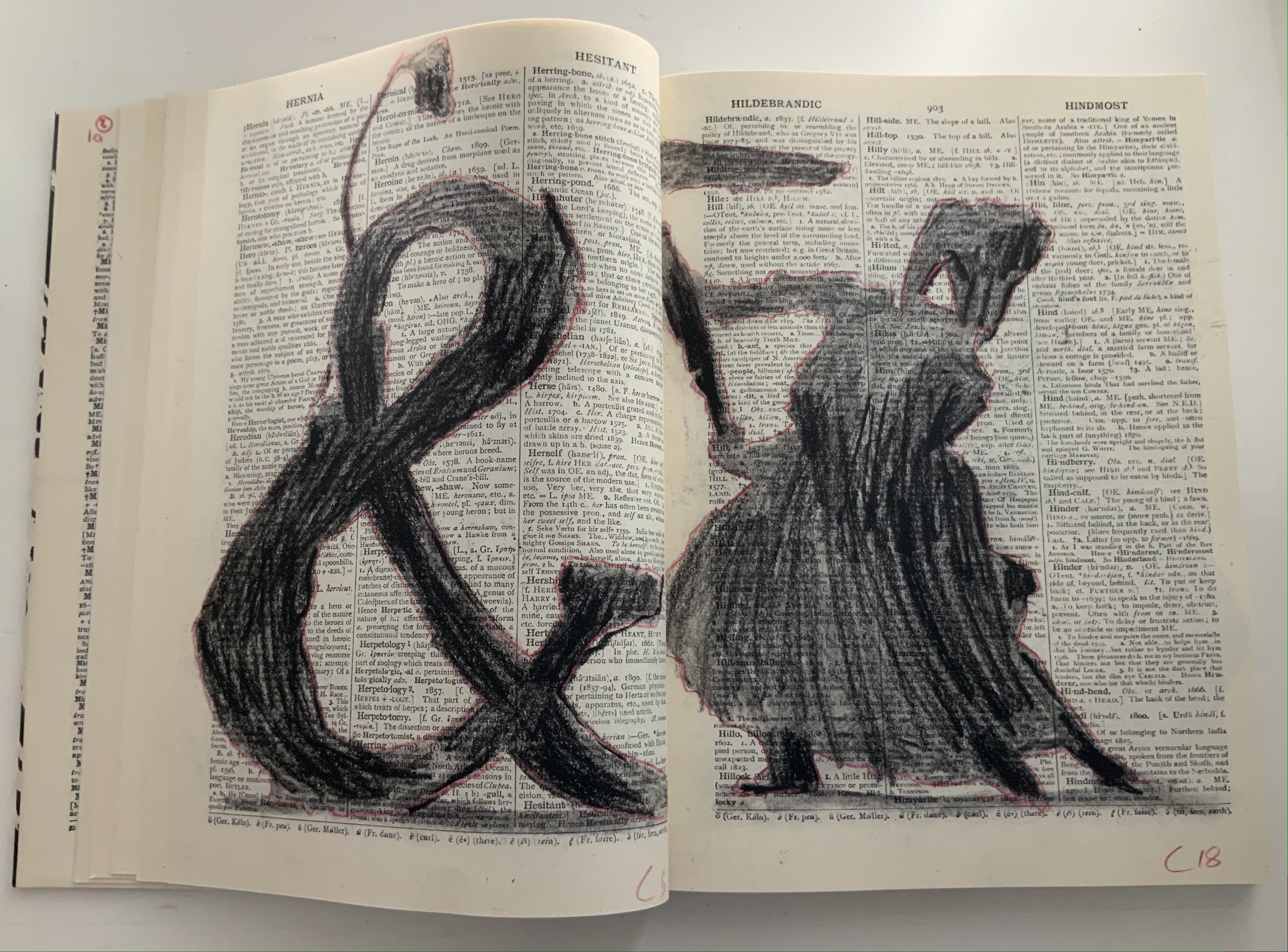
As occurs in Kentridge’s other bookworks, these gradual formations draw on the flip-book tradition, introducing that other recurrent media in his work — film — as well as performing an echo of the projections in the to-be performed opera. As the leaves assert themselves, the speaker’s confidence returns in all caps, a larger face and some bold. And while the speaker quickly recedes into lowercase and a lighter typeface, only able of being reminded “of something I can’t remember”, a leaf begins to metamorphose into a tree, an ampersand and then a dancer. Metamorphosis is that mythical translation of one being or object into another. Metaphor is that figure of speech that uses one object to remind us of another. “Etc., etc.” is what we say when we can’t remember or be bothered to complete a statement or series of examples. What Kentridge offers here is unquestionably not mixed metaphor but rather metaphor-mosis.
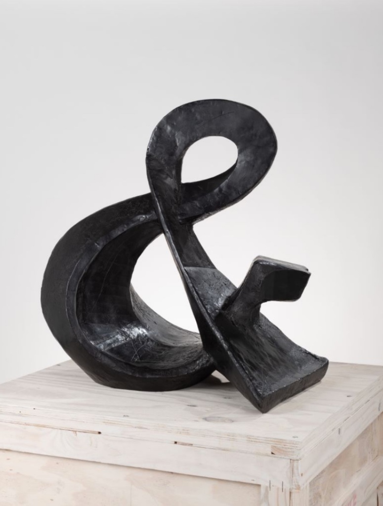
The metamorphosing ampersand recalls an illustrative example from another of Kentridge’s favored media — sculpture. As Kentridge puts it:
The turning sculptures I’ve made in the past have all been ones which have one moment of coherence, when the different components of the sculpture align. From one viewpoint they turn into a coffee pot, a tree, a typewriter, an opera singer. And then, as the sculpture turns, the elements fragment into chaos. — from The Red Bridge Project site, accessed 21 July 2021.
Ampersand (2017) William Kentridge Bronze, 85 x 82 x 54 cm, 87 kg Courtesy the artist and Goodman Gallery
Even though there is a speaker/singer for the libretto, the dancer has the central role in the opera. Performed by Teresa Phuti Mojela, the dancer casts her shadow over the projected pages and seems to “dance” the prophecies. Kentridge notes in the book’s afterword that he has added images of her to stand in for her projected shadows. As this sequence in the codex shows, the dancer/Teresa Phuti Mojela is the Sibyl.
In addition to containing the libretto, serving as part of the setting for the actual performance, presenting the central player and the Sibyl’s transformation into her, demonstrating the dancer’s performance (when flipped like a flip-book) and exemplifying the key props (prophecies on leaves), the codex also reflects the collaborative creative effort that Kentridge extols in describing the opera’s preparation:
… when we had our first workshop in Johannesburg, in which we brought together the singers, the pianist, a dancer to be the Sibyl, costume designer, set designer, videographer, the editor of the animations I’ve been drawing, we discovered very quickly that the magic of the piece was in the live performance of the music. At this point the project became possible to do only if we could have these singers on stage.
As the book’s last page notes, creative collaboration among Kentridge and Anne McIlleron (editors), Oliver Barstow (designer), Alex Feenstra (lithographer) and robstolk® (lithographer and printer) is what has made this work of art possible.
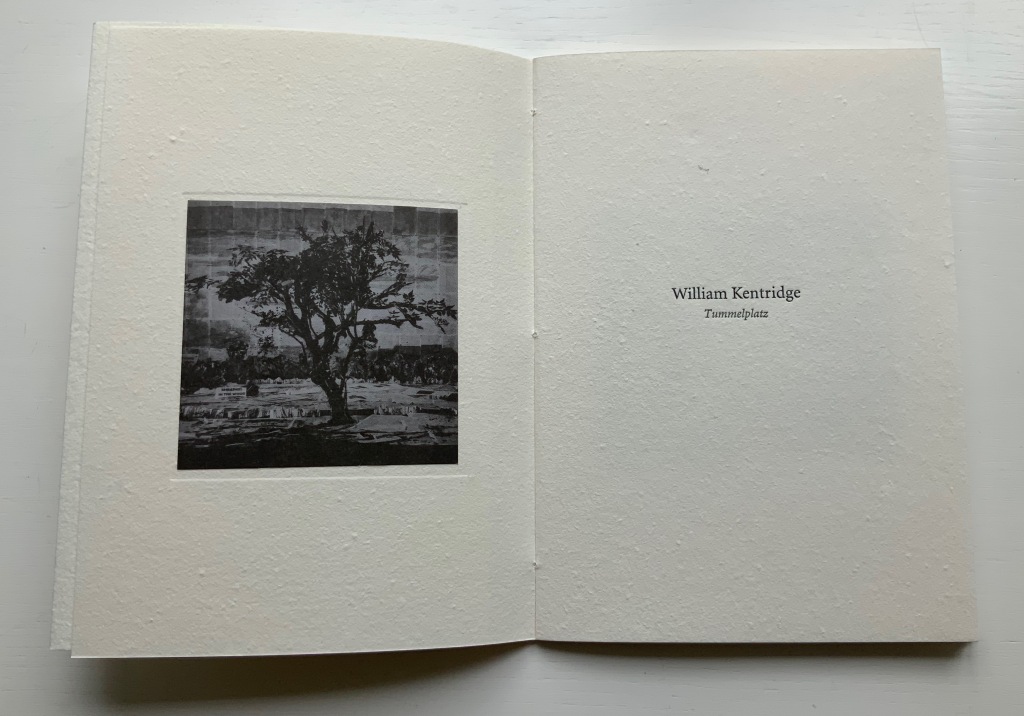
Tummelplatz (2016)
Tummelplatz (2016) William Kentridge Papercased sewn booklet. H214 x W152 mm, 16 pages. Acquired from Lady Elena Ochoa Foster, 28 June 2022, “Sensational Books” exhibition at the Bodleian Libraries. Photos of the work: Books On Books Collection.
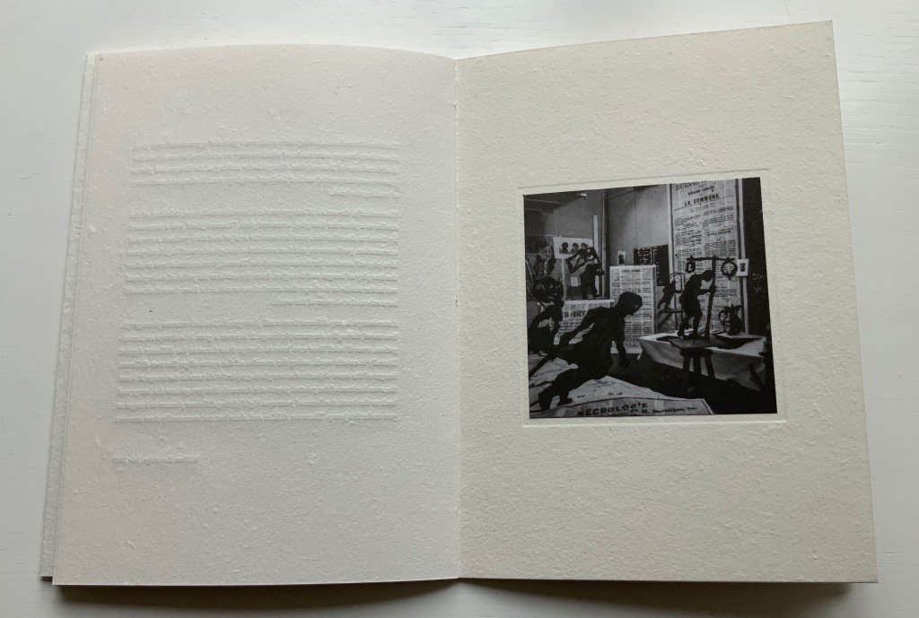
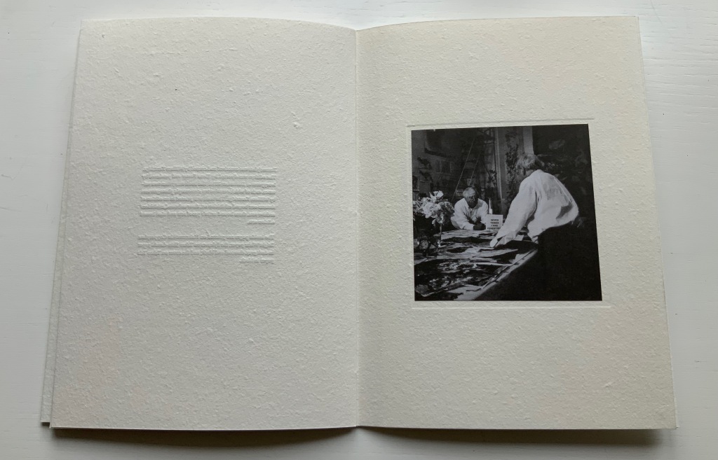
In Tummelplatz the booklet created for the Ivorypress exhibition of the larger eponymous work, William Kentridge explains that tummelplatz is Freud’s term for the space between analysts and their patients. But its literal translation is “playground”, which might be the perfect word for William Kentridge’s studio. The studio is the actual setting for the series stereoscopic photographs reproduced as photogravure images in the double volume of Tummelplatz. With the artist’s charcoal drawings of a landscape background pinned to the walls and others cut out as foreground figures and fixed into position, the studio was transformed into a sort of diorama in which the artist himself posed. A stereoscopic viewing device in fixed position over the volume invites the reader/viewer to join Kentridge in his playground.
These are images that have to be read, not scanned like flat photos. The eyes’ focus has to jump from layer to layer, element to element. In the exhibition “Sensational Books”, Tummelplatz is set up within a glass case, so only one scene is available for viewing and reading, and the distance imposed by the extra layer of glass makes the sensation hard to appreciate. Nevertheless, there is enough of it to set the reader/viewer to wondering whether the technique, the effect of the photogravure and this three-dimensional precursor to virtual reality have transformed him or her into the patient and the work of art itself into the analyst. Or whether it’s just a playdate with William Kentridge in his playground.
Showcased at “Sensational Books” exhibition, Weston Library, Oxford University. Photo: Books On Books, 8 July 2022.
Showcased at “Sensational Books” exhibition, Weston Library, Oxford University. Photo: Books On Books, 8 July 2022.
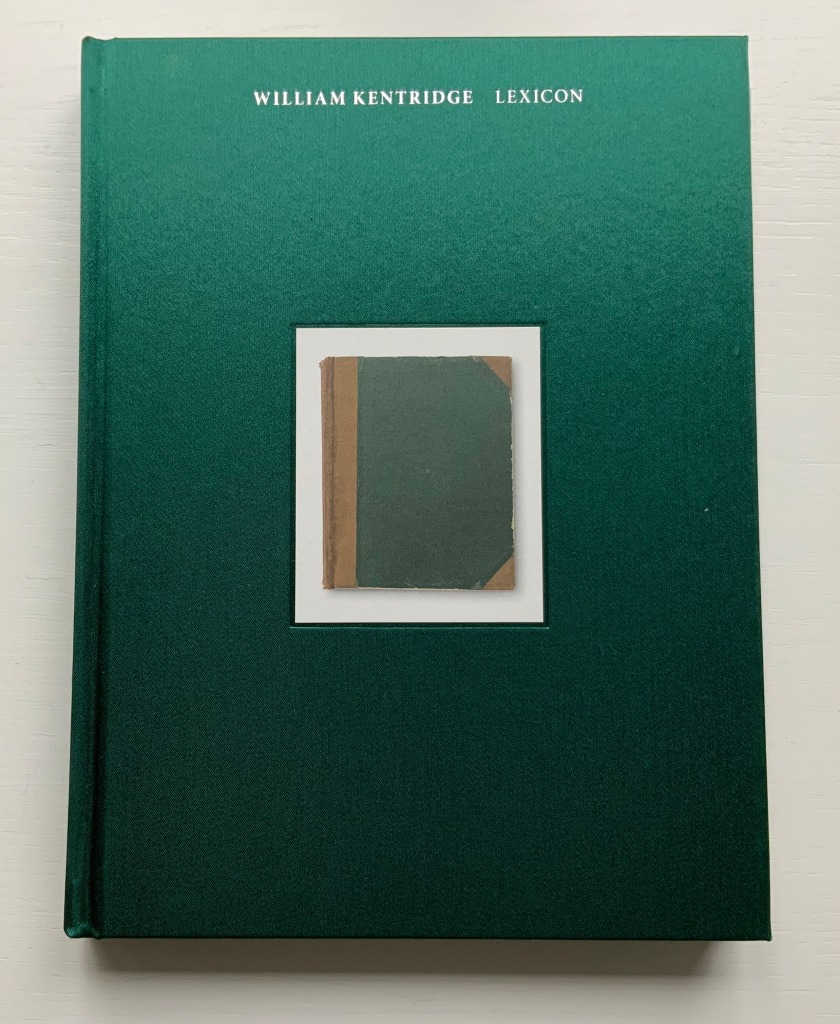
William Kentridge : Lexicon (2011)
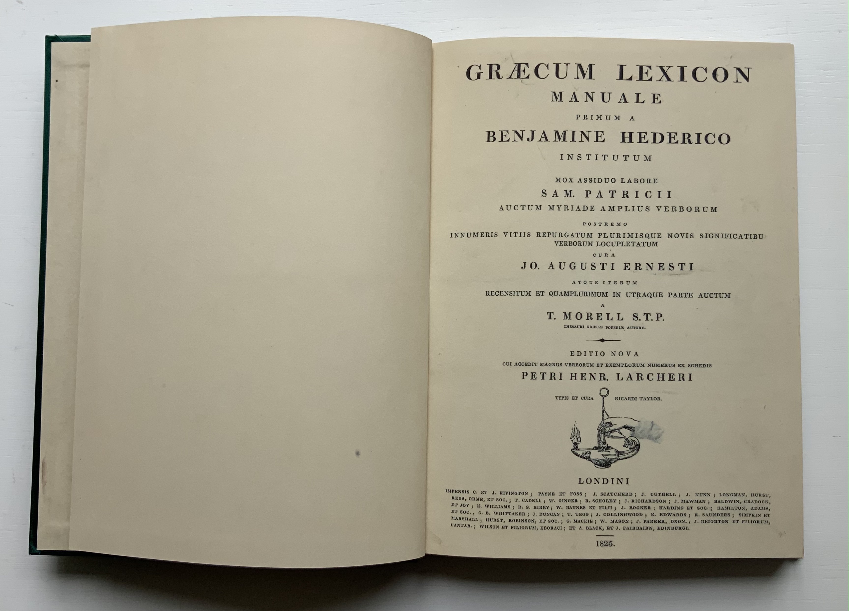
William Kentridge : Lexicon (2011) William Kentridge Cloth boards, sewn bound. H234 x W177 mm, 160 pages. Acquired from Specific Object, 2 May 2021. Photos of the book: Books On Books Collection. Permission courtesy the artist and Goodman Gallery.
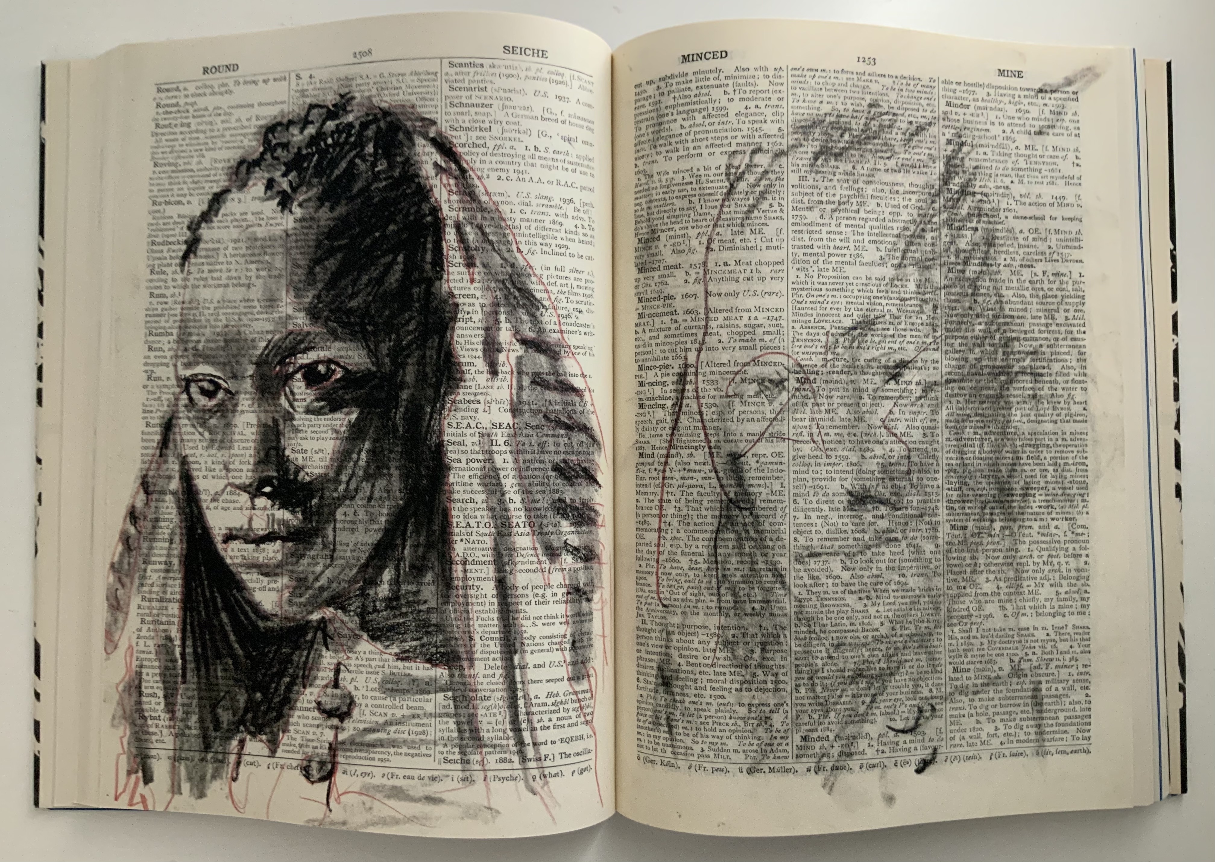
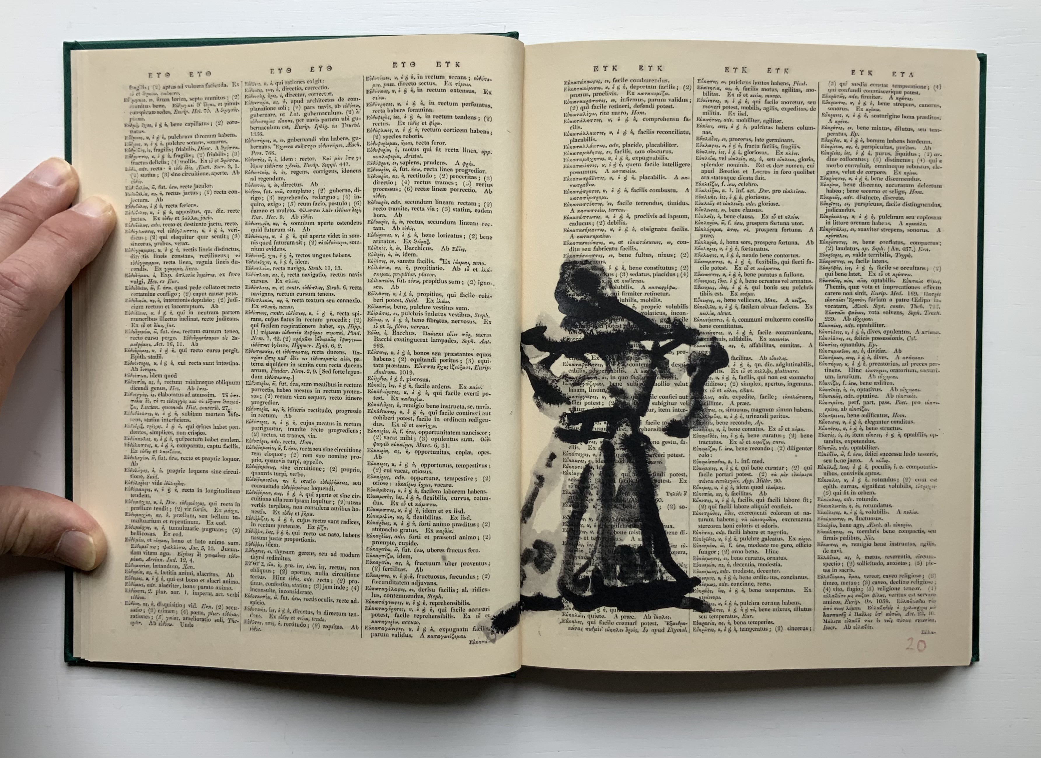
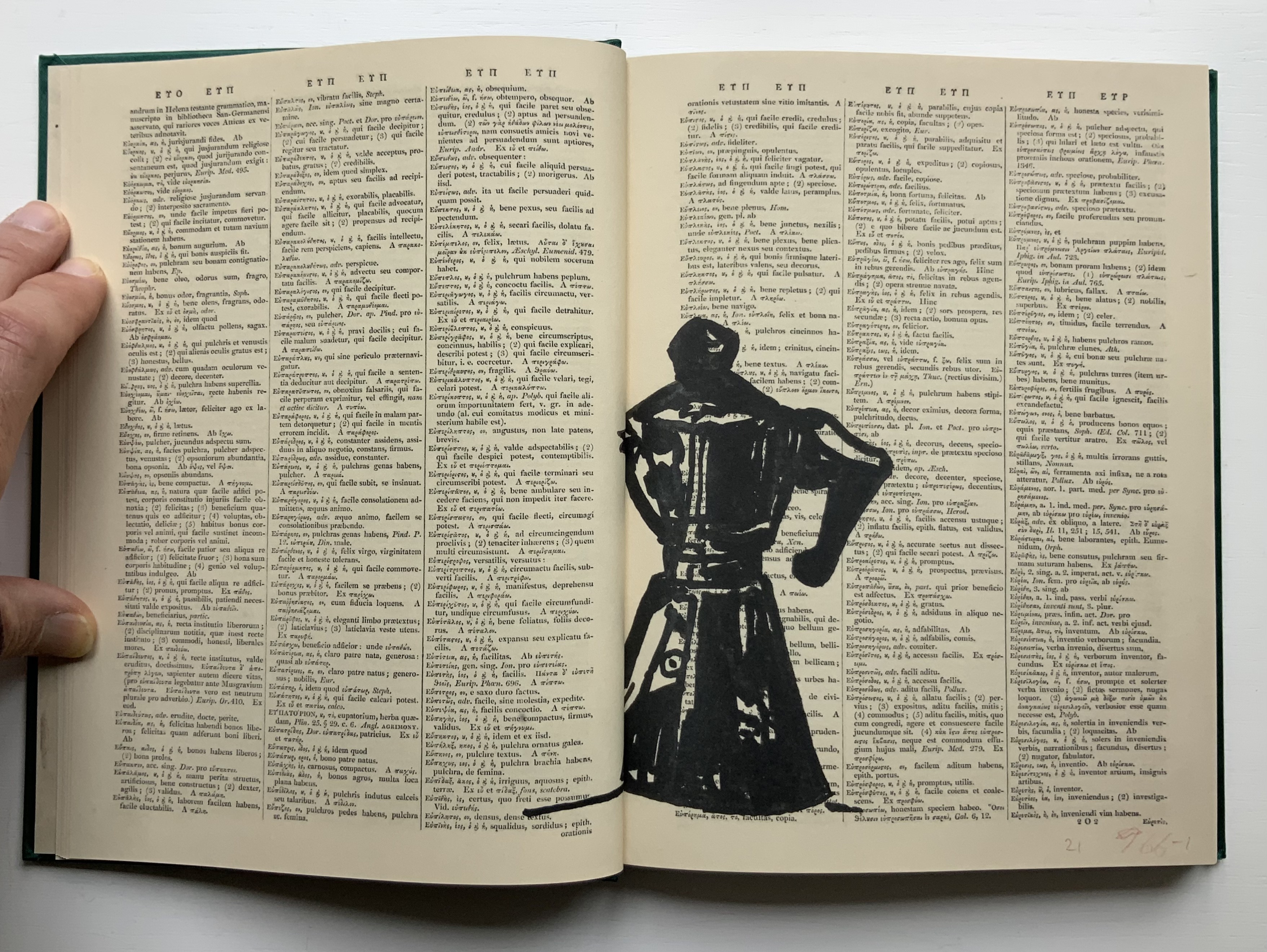
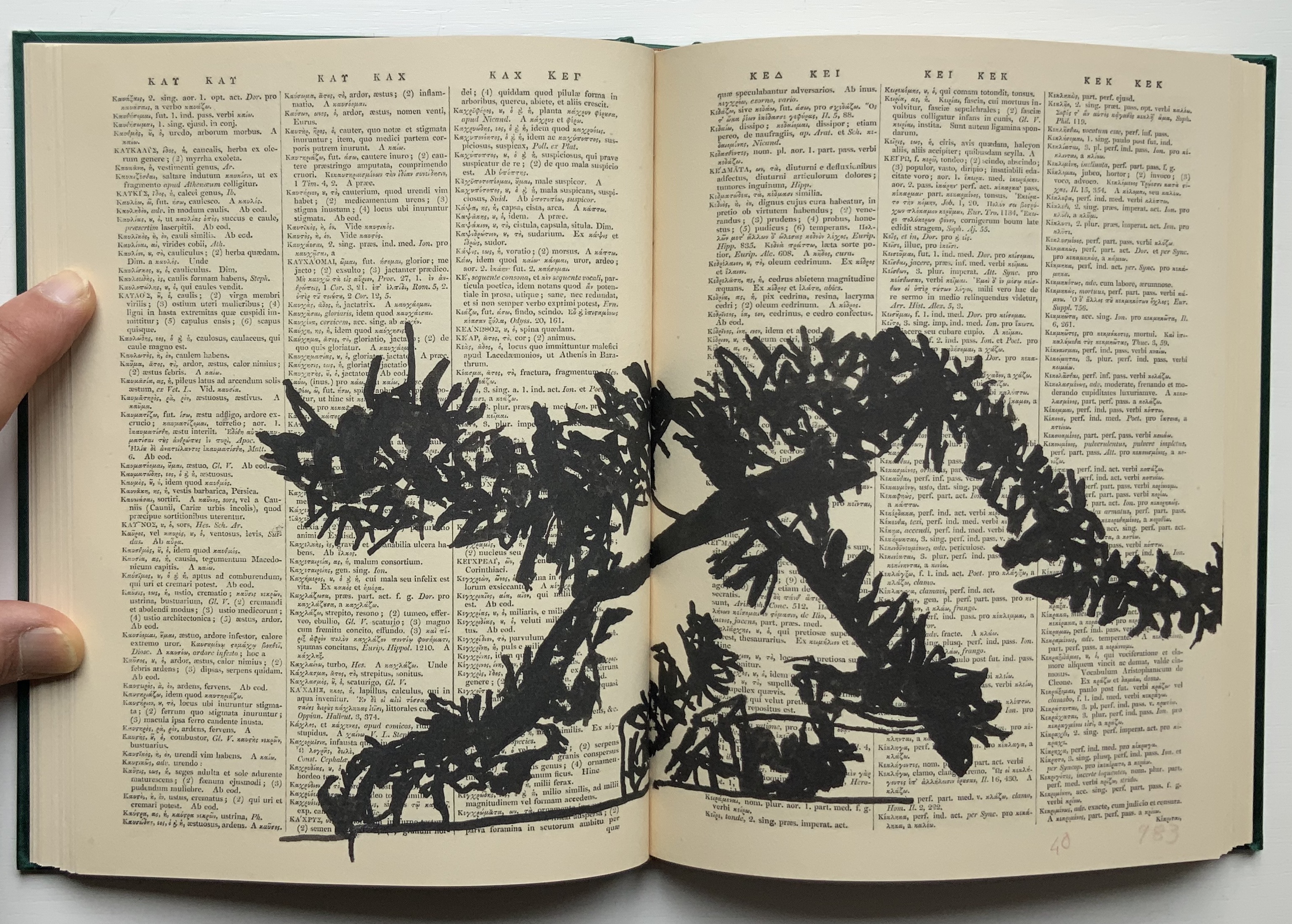
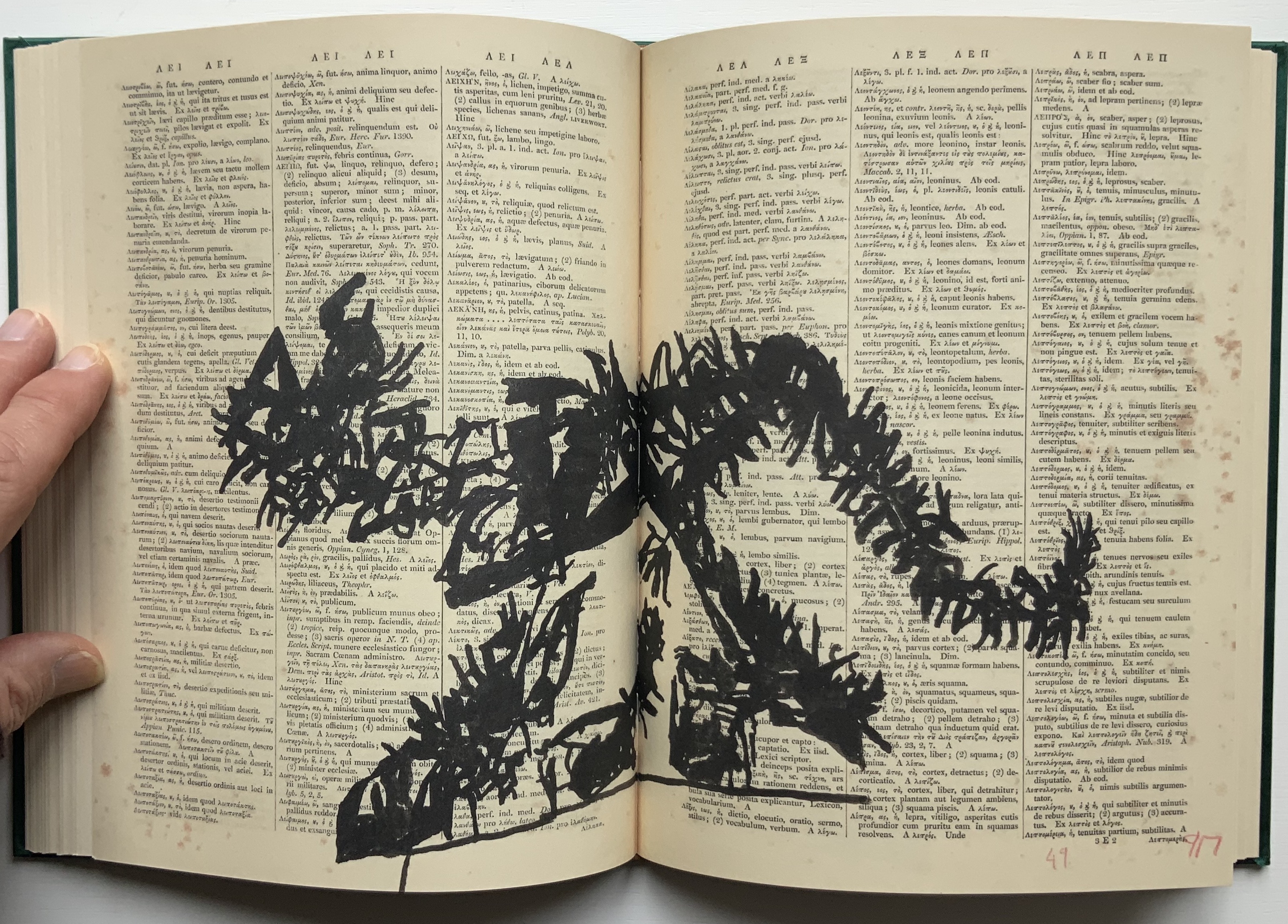
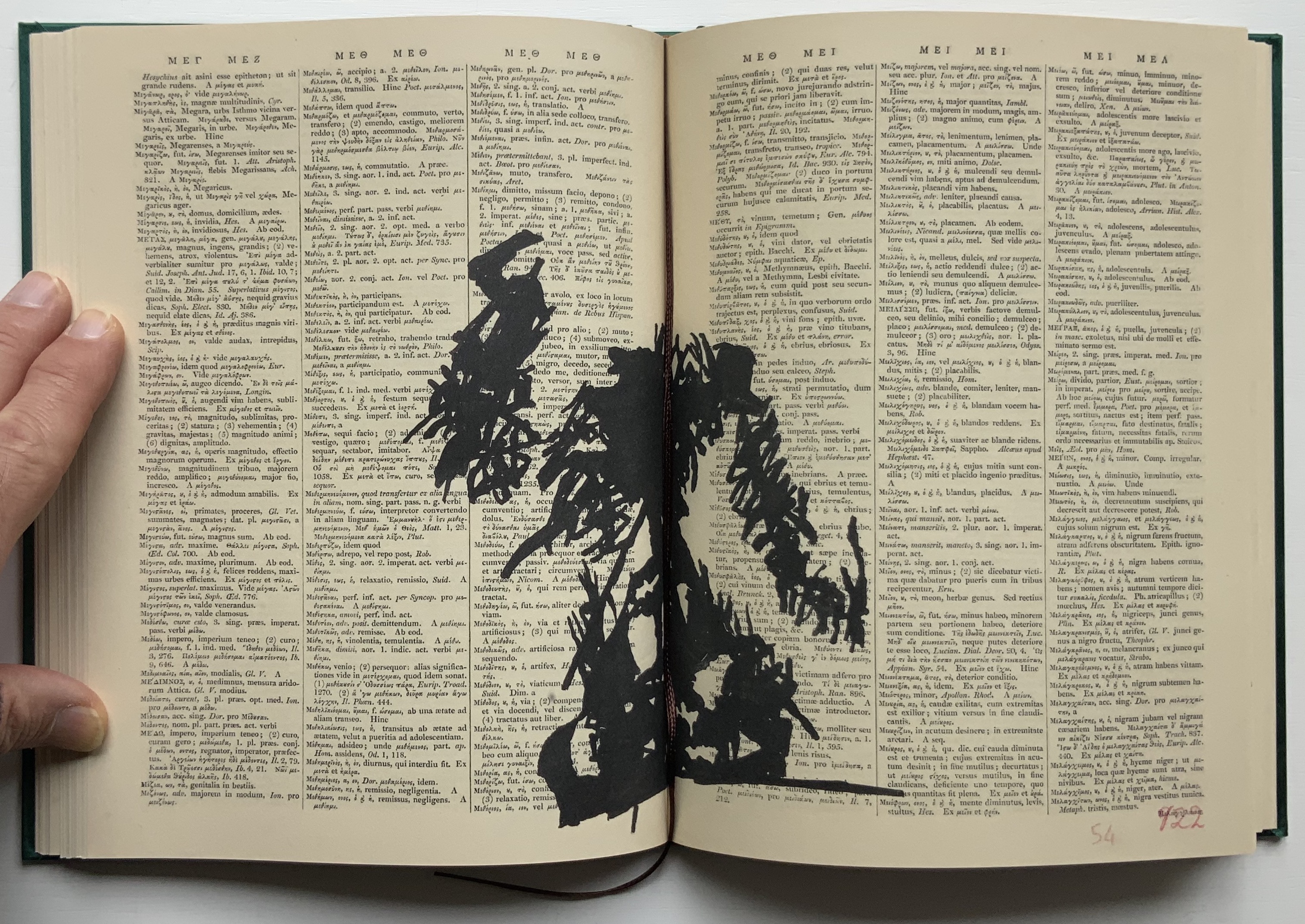
The first work by Kentridge I ever saw displayed was 2nd Hand Reading (2014) at the Museum Meermanno (The House of the Book) in The Hague. The exhibition was called The Art of Reading and had been curated by Paul van Capelleveen. Curator at the Dutch national library and advisor to the Meermanno, he felt strongly that the challenges of artist books cannot be understood “under glass” and insisted that each work be touchable. So under his supervision, I was able to flip through 2nd Hand Reading and also watch the projected animation of stop-motion images across the pages being flipped. While the forward motion of the animation offers a narrative, its substrate — pages of the Shorter Oxford English dictionary on historical principles — contradicts any notion of logical beginning, middle and end: the drawn-upon pages are not in the original’s paginated or alphabetical order.
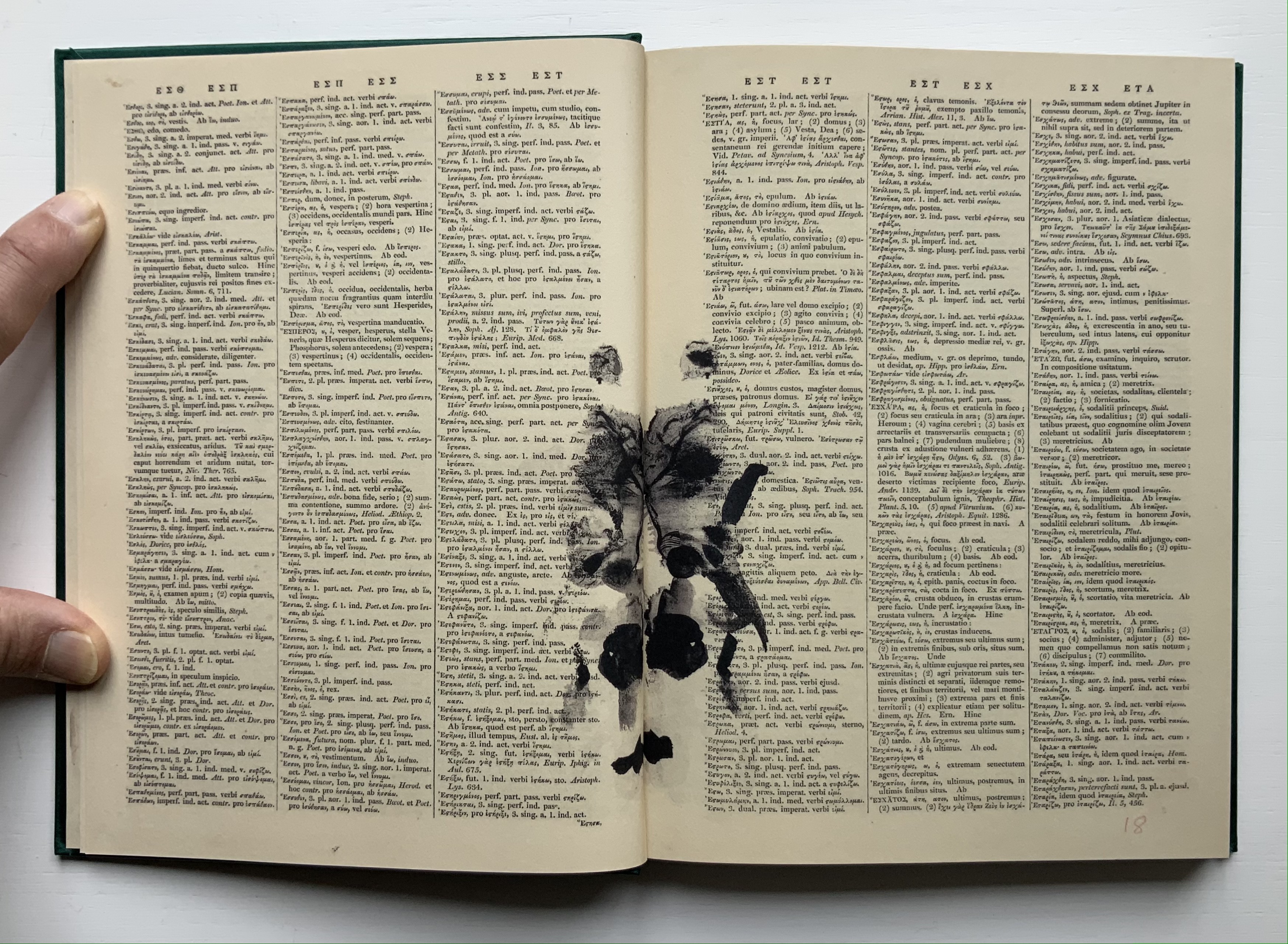
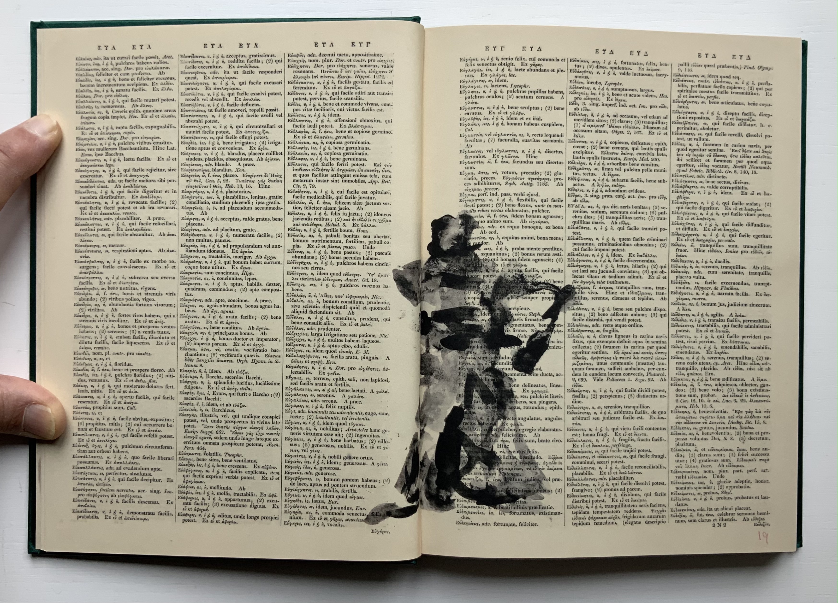
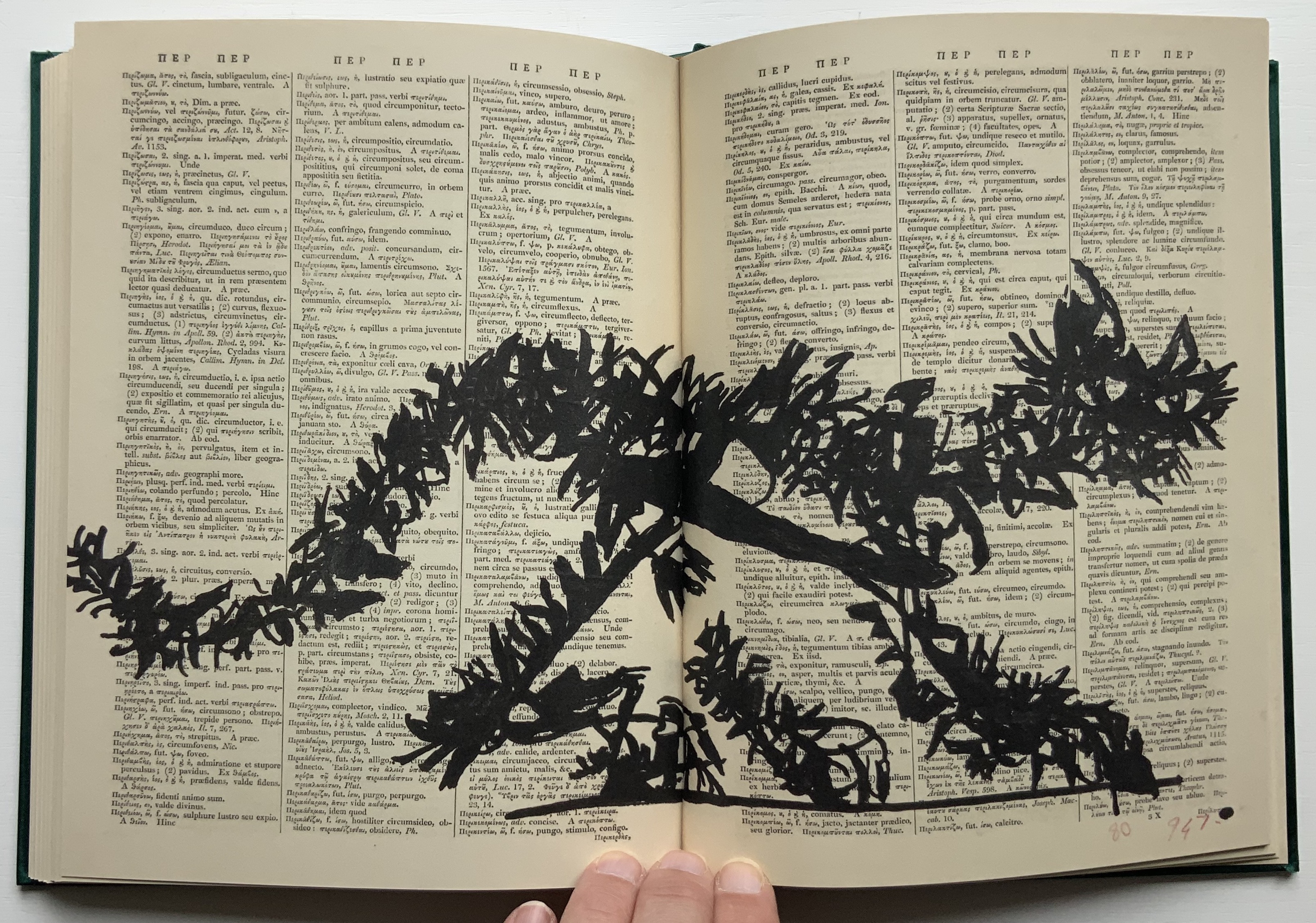
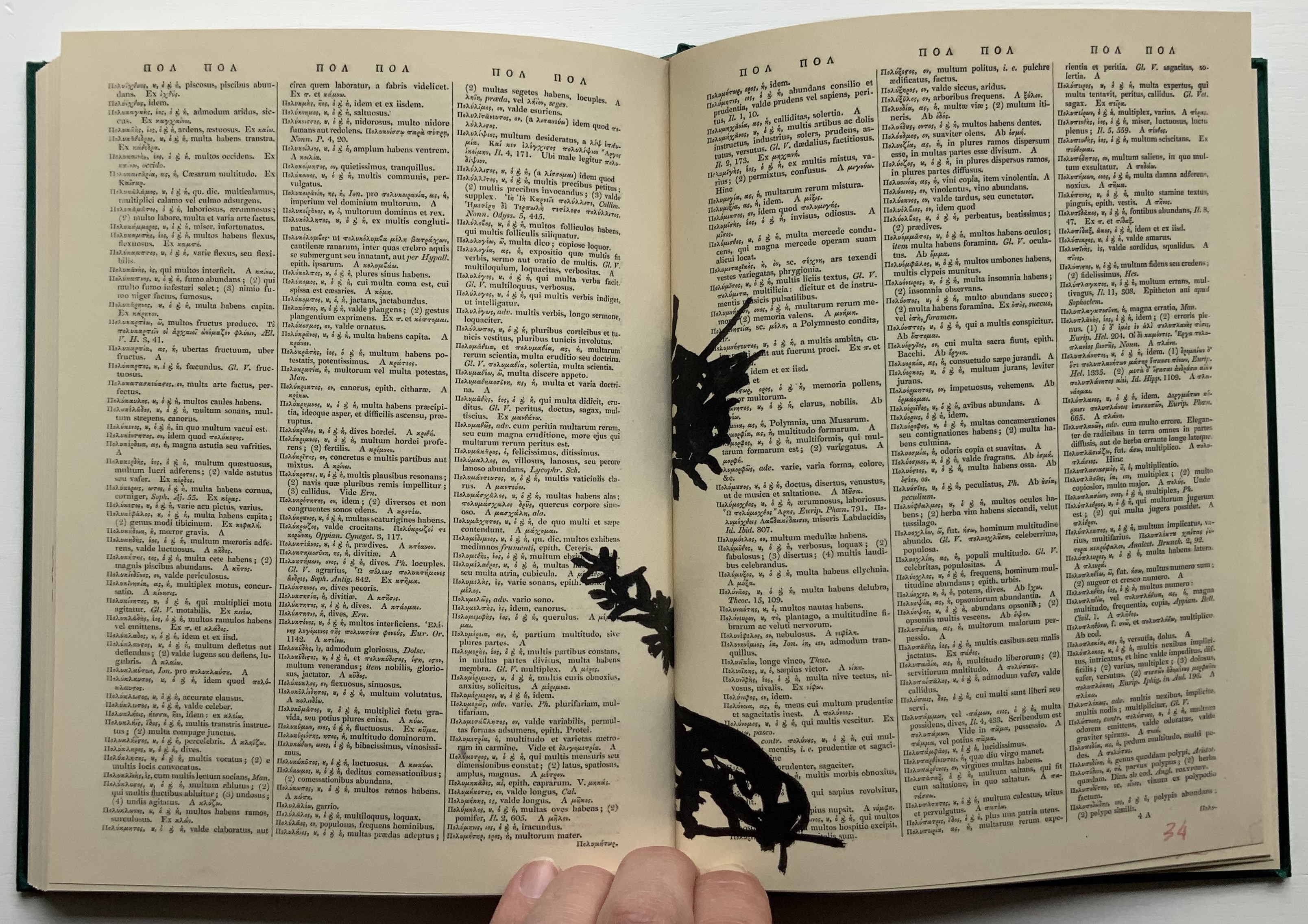
Compared to 2nd Hand Reading‘s 800 pages, Lexicon at 160 pages provides a small reminder of the experience. Bound in a green satin-sheen cloth, Lexicon begins as a facsimile edition of an antiquarian Latin-Greek dictionary. The dictionary’s browned pages and antique languages perform the role of drawing surface or projection screen for a flip-book metamorphosis. In scrawly black ink drawings, an Italian coffee pot emerges from the gutter and starts to tilt and turn.
Gradually the pot changes into a black cat, striding from right to left. Not the direction in which Western reading and narratives usually proceed. In its transformation and movements, the cat seems to pivot on itself as it turns and strides across the Latin and Greek like Rilke’s panther behind its bars until it turns back into a coffee pot. Or does it?
That drawing in the center certainly looks like the coffee pot, but as the pages turn, the cat returns to stride from left to right, expanding then shrinking until it is swallowed by the gutter.
The reference to Rilke’s panther is actually Kentridge’s, made ex post facto in the next book in the Collection.
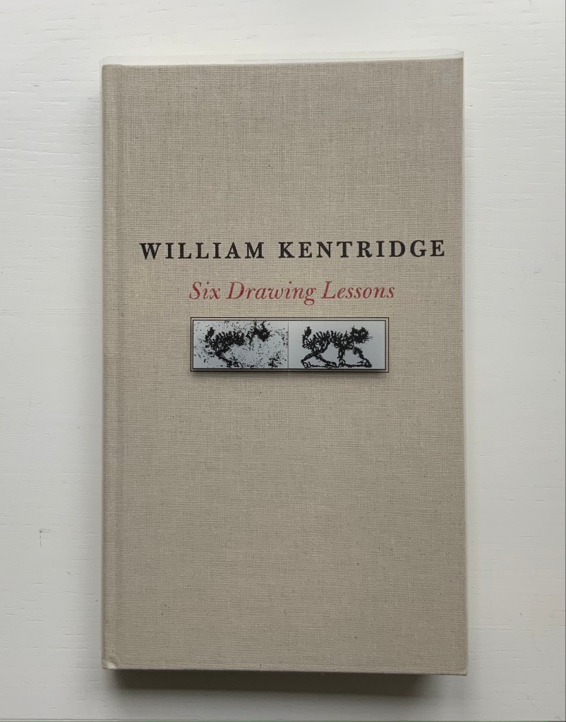
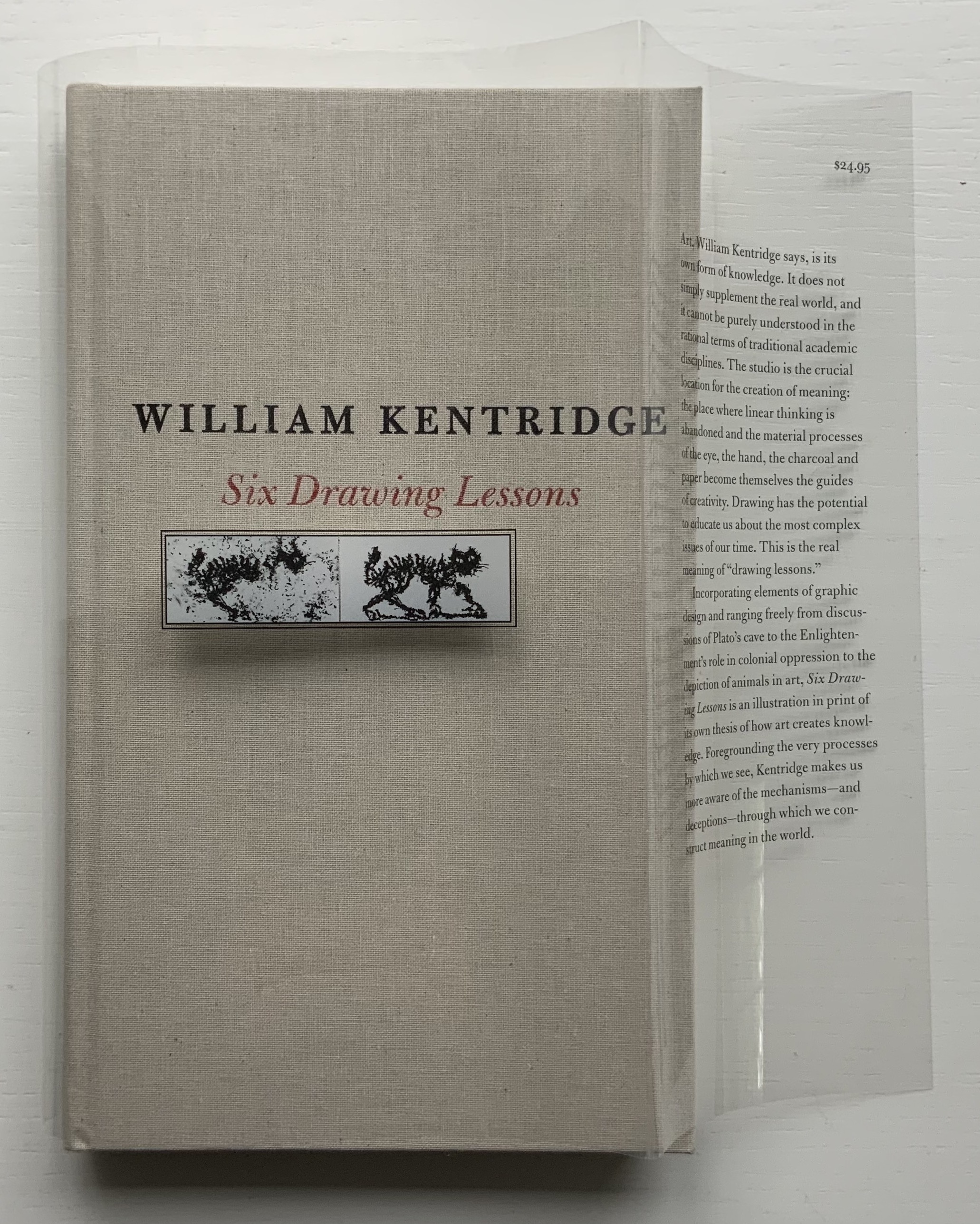
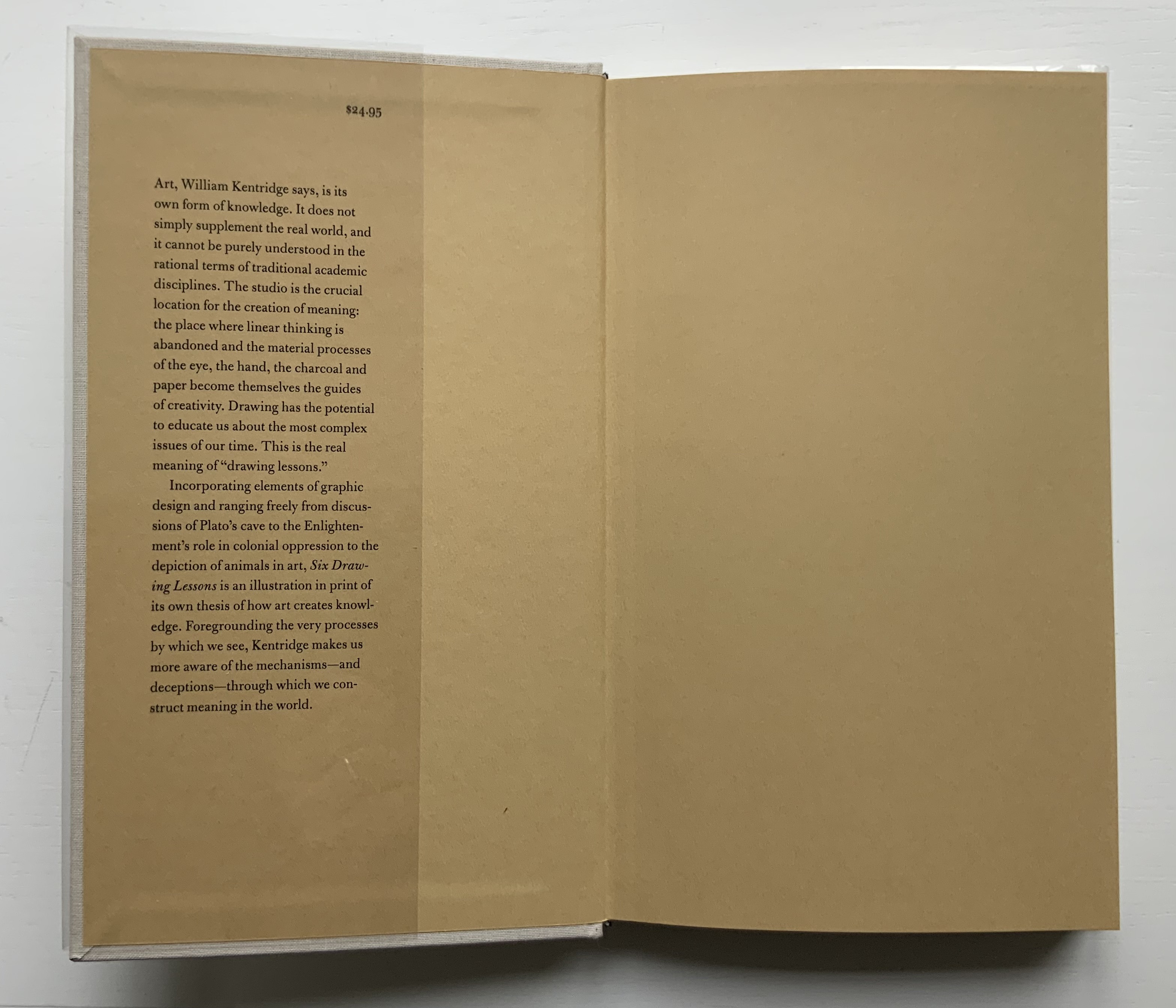
Six Drawing Lessons (2014)
Six Drawing Lessons(2014) William Kentridge Cloth boards, sewn bound. H x W mm, 208 pages. Acquired from Amazon, 23 March 2019. Photos of the book: Books On Books Collection. Permission courtesy of the artist and Goodman Gallery.
You rarely see a clear dustjacket. Of course, if it has type printed on it, you can see it. Still, it is rare, and in this case — in light of Kentridge’s film artistry — transparently ingenious.
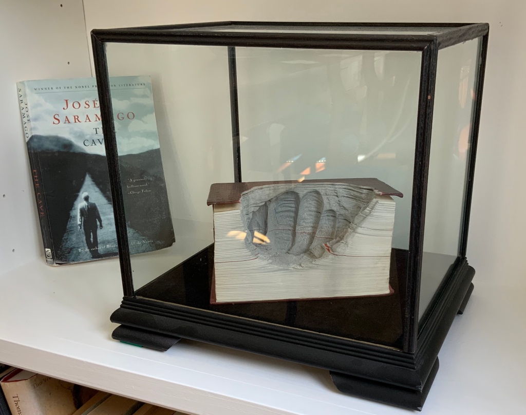
The six lessons — Kentridge’s Charles Eliot Norton Lectures delivered at Harvard — begin with an extended riff on Plato’s allegory of the cave. Variations on the riff recur throughout — applied to film projected from behind the audience, to a stage design of The Magic Flute as the bellows of a tripod camera, to transformations and metamorphoses and to the mining caves under Johannesburg. Kentridge’s interpretation of Plato’s cave reminds me of José Saramago’s interpretation in A Caverna (2014) and Guy Laramée’s homage to A Caverna. All three address “the great cloud of unknowing“, a kind of knowing by not knowing — but without God.
A Caverna (2012) Guy Laramée Portuguese-Spanish dictionary carved. Wood and velvet plinth, wood-framed glass cover. H260 x W276 x D226 mm Acquired from William Baczek Fine Arts, 12 September 2017.
What’s remarkable is how Kentridge brings so many variations, seeming tangents and media in the lectures into coherence. Or perhaps not so remarkable given that he manages it across his body of work and the multiple media in which he works. In breadth of stuff and raw material to hand and in his head, Kentridge himself identifies Picasso’s studio practices and work as an influence. Although not mentioned, Anselm Kiefer’s works such as Das Lied von der Zeder – Für Paul Célan (“The song of the cedar – for Paul Célan”, 2005) and his studio at La Ribaute, near Barjac in France, come to mind in these lectures. Likewise another artist called to mind is Xu Bing, especially his Landscape/Landscript (2013) and massive junk assemblage Phoenix (2008-15) among other works. Both Kiefer and Xu use the book as a medium with which to fuse language or text with the visual. All three artists confront similarly dark, raw cultural inheritances. Kentridge’s lectures, especially Lessons Two and Three, make plain his apartheid inheritance and its presence in his art.
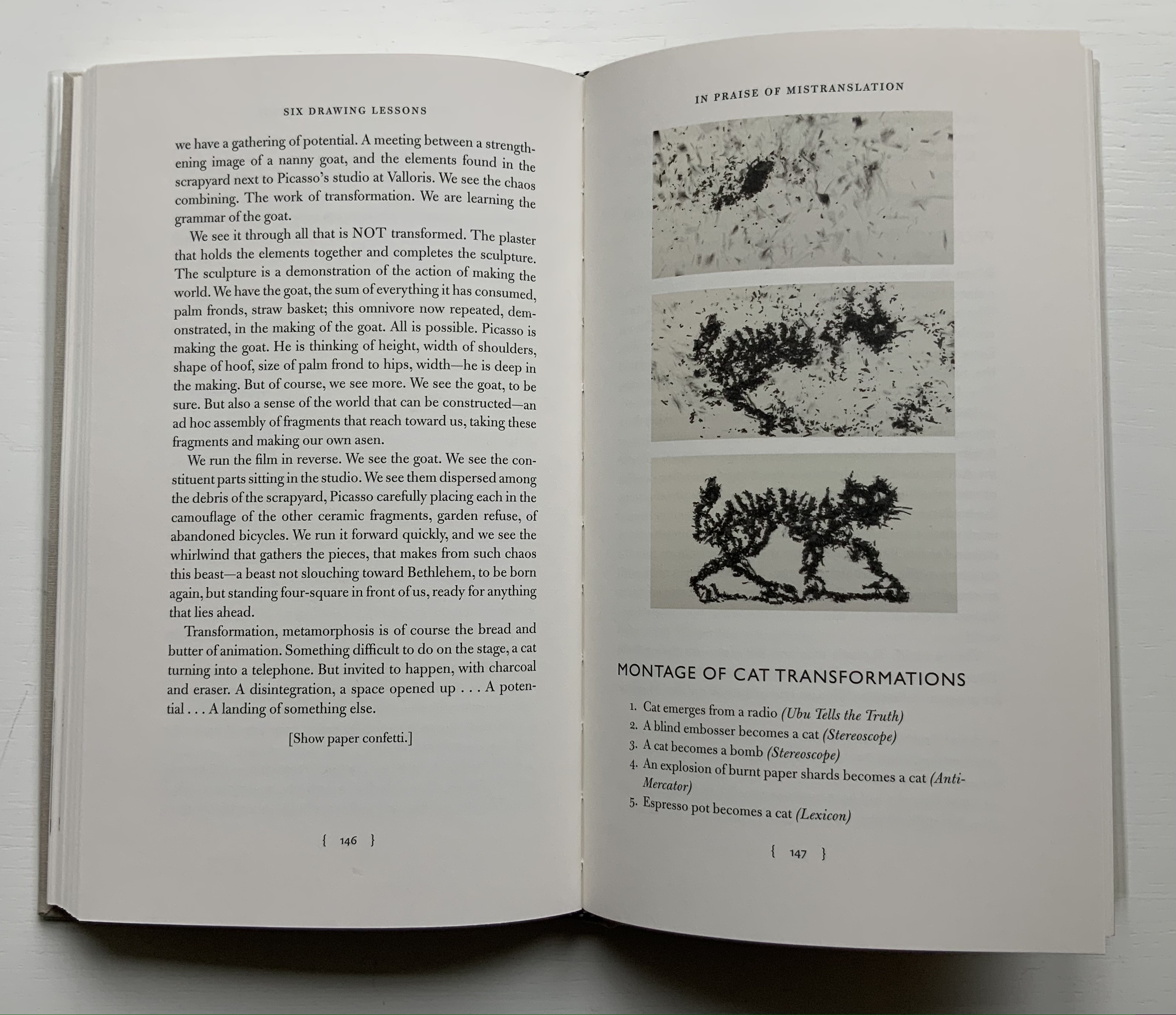
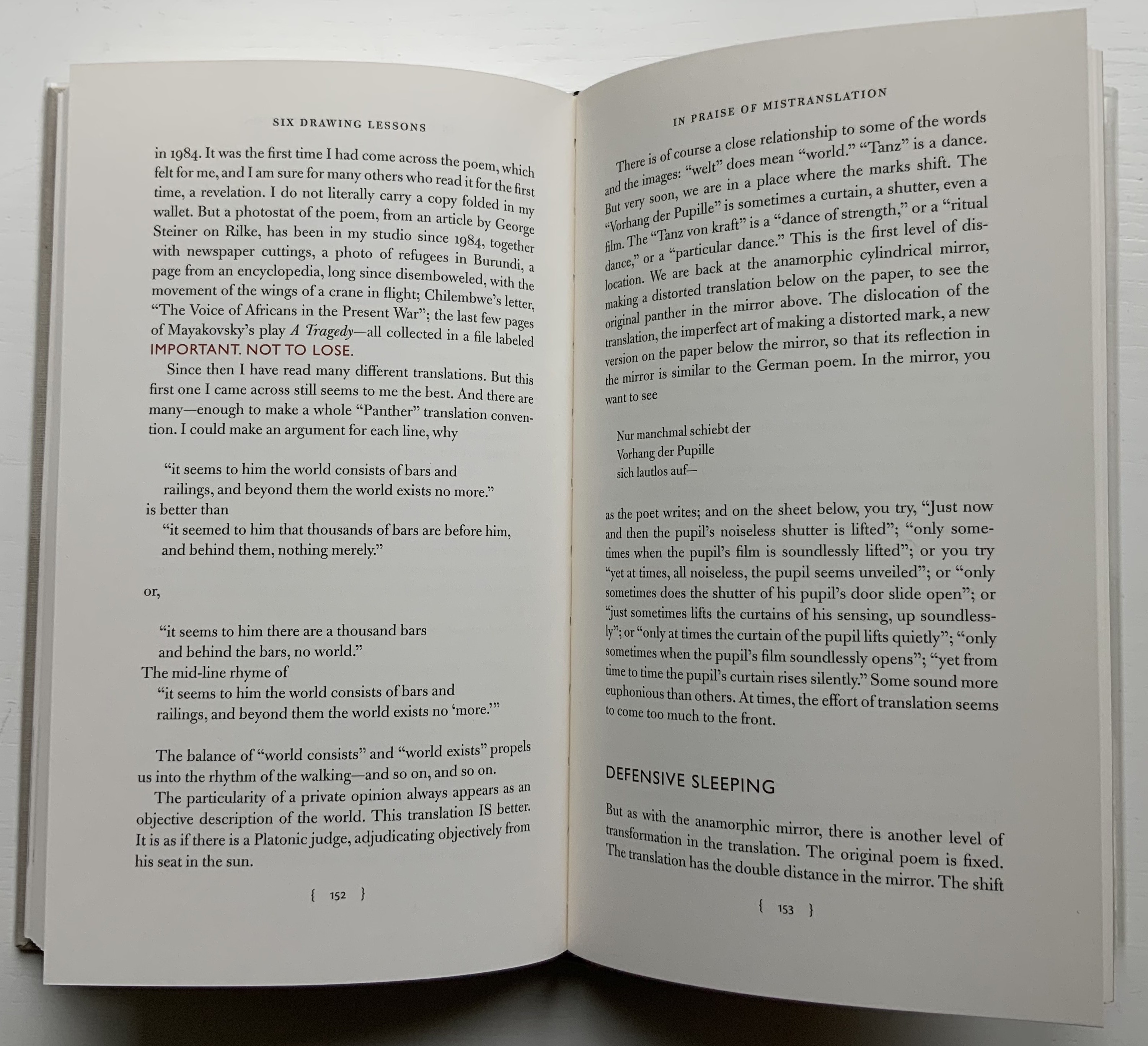
Circling back to the book as artistic medium, the fifth and sixth lessons provide an important insight that underscores Kentridge’s artistry there. “Lesson Five: In Praise of Mistranslation” reproduces Rilke’s “Der Panther” and Richard Exner’s translation of it in full. In that same lesson, Kentridge presents us with a montage of the feline transformations and names the works from which they come, one of them of course being Lexicon.
Before going back to Lexicon for the cat, the reader/viewer would do well to wait for Kentridge to expand in the sixth lesson on the lines describing the panther’s walk around his cage as “a dance of strength round a centre where a mighty will was put to sleep”. He writes:
There is no avoiding it. …it is the circle in the studio, the endless walking around the studio, … Again here we go back to Rilke’s panther, and the radical insufficiency, the radical gap in the center. There has to be some gap, some lack, which provokes people to spend 20 years, 30 years, making drawings, leaving traces of themselves. It has to do with the need to see oneself in other people’s looking at what you have made.
With that, remember the cat — metamorphosing from the Italian coffee pot that slips from Lexicon‘s gutter, prowling from right to left, turning back into the coffee pot, striding from left to right and then being sucked into the center. Can you ever look the same way at the gutter of a book?
Kentridge, William. 2012. Six Drawing Lessons, Charles Eliot Norton Lectures, Harvard University. Six videos from the Mahindra Humanities Center, posted 14-15 January 2020. Lesson 1, Lesson 2, Lesson 3, Lesson 4, Lesson 5, Lesson 6. Accessed between 1 April 2019 and 21 July 2021.
Krauss, Rosalind E. 2017. William Kentridge. Cambridge, Mass: MIT Press.
Mudam Luxembourg. 11 – 12 Jun 2021. “Sibyl“. Announcement. Accessed 22 July 2021. “Waiting for the Sibyl, co-commissioned by the Théâtres de la Ville de Luxembourg, Teatro dell’Opera di Roma and Dramaten – Stockholm and created in collaboration with choral director and dancer Nhlanhla Mahlangu and composer Kyle Shepherd, unfolds in a series of six short scenes, …”
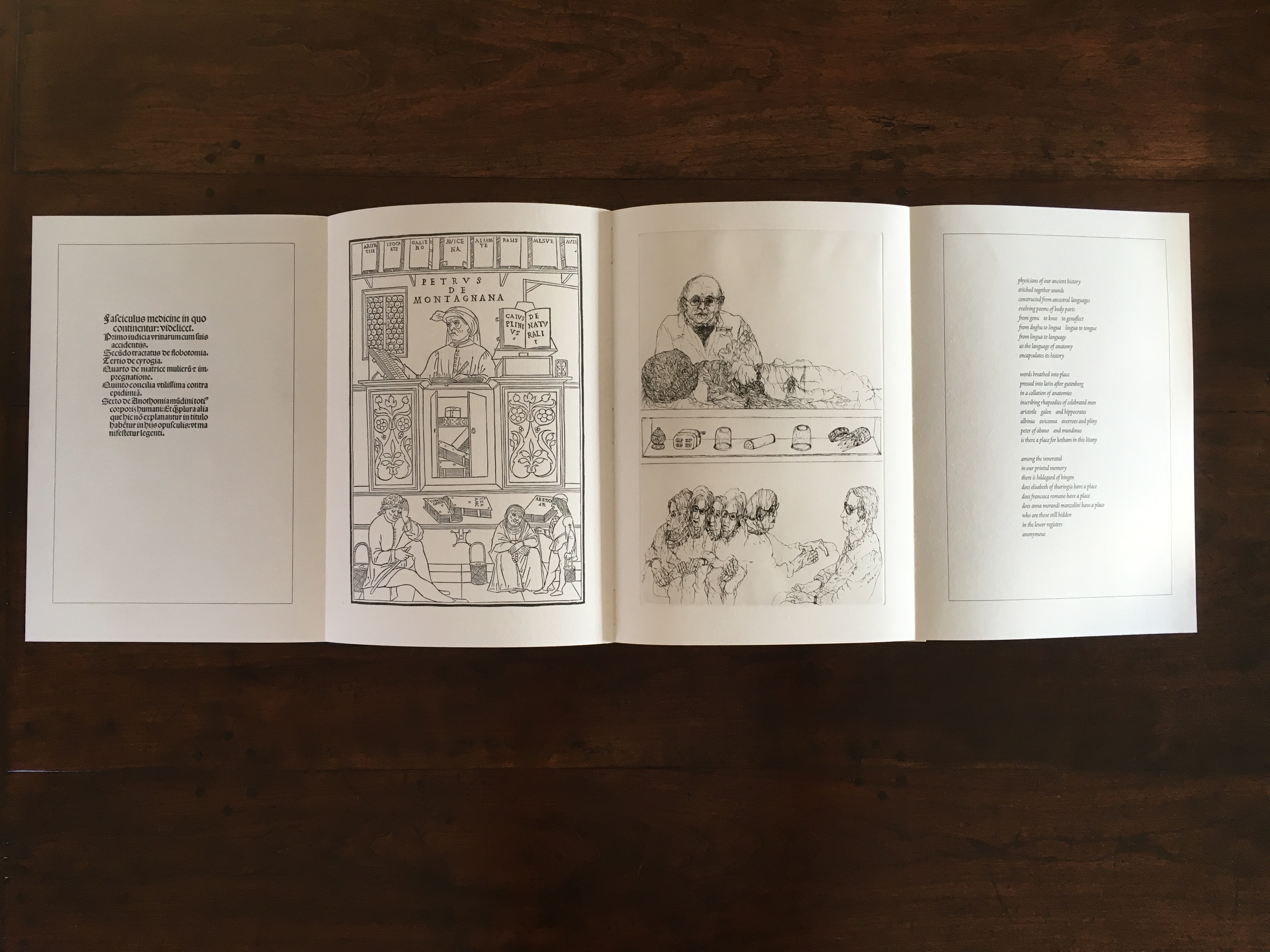
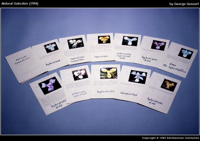
In 1995, the Smithsonian Institute Libraries’ exhibition Science and the Artist’s Book explored “how science can serve as a springboard for artistic creation” and showed how “aspects of creativity … are common to science as well as to art”. The exhibition juxtaposed twenty-five rare books from the Heralds of Science collection at the Dibner Library with twenty-five bookworks commissioned as responses to them. For example,
Joyce Cutler-Shaw responded to Johannes de Ketham’s Fasciculus Medicinae (Venice: Impressus per Ioannes [et] Gregorius de Gregorijs fratres, 1495) with The Anatomy Lesson (Middletown, CT: Robin Price, Publisher, 1995);
George Gessert responded to Darwin’s On the Origin of Species (London: John Murray, 1859) with Natural Selection (Eugene, OR: self-published, 1994);
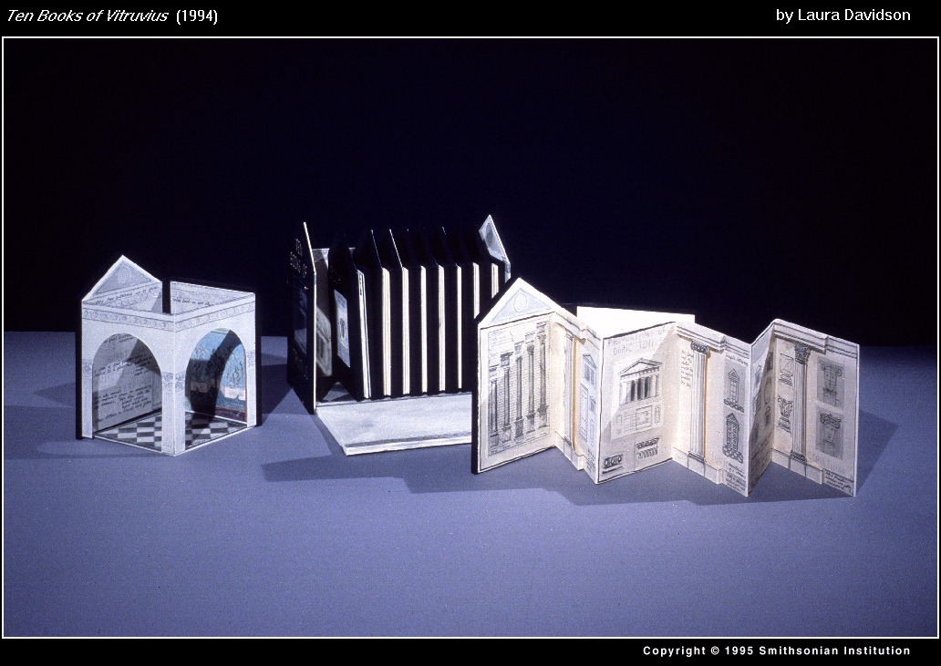
and Laura Davidson responded to Vitruvius Pollio’s’ De Architectura libri Dece [The Ten Books on Architecture] (Como, Italy: Gottardo de Ponte, 1521) with Ten Books of Vitruvius (Boston, MA: self-published, 1994).
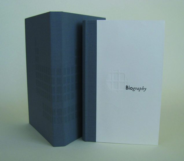
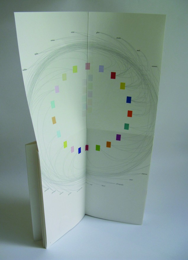
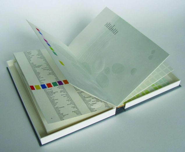
As the exhibition demonstrated, the overlay of the dual traditions — those of art and those of the book — on the domains of science creates a rich soil for ingenuity and genius. Since that exhibition, science- and maths-driven book art has yielded harvest after harvest of outstanding book artists. Sarah Bryant is one of them. Bryant won the MCBA Prize in 2011 with Biography (2010) and was a finalist in 2015 with Figure Study (2015).
“[A]n exploration of the chemical elements in the human body and the roles they play elsewhere in the world”, Biography (2010) is bound as a hard cover drumleaf and enclosed in a clamshell box. It begins with the periodic table and assigns a coloured square to each of the chemical elements found in the human body. Using those coloured squares, the six subsequent diagrams show the presence of the body’s chemical elements in the earth’s crust, man-made weapons, medicines, sea water, etc. The flip-up folio (above right) displays their presence in various man-made tools and building materials. Bryant’s inventive handling of colour, the flip-up folio and blind embossed printing foreshadow developments in her later work.
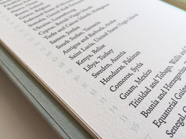
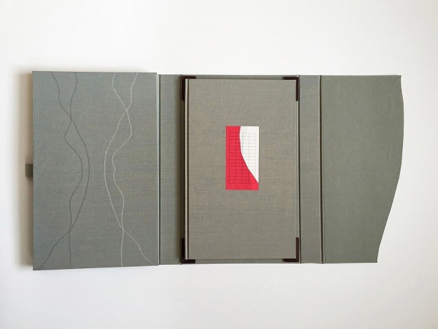
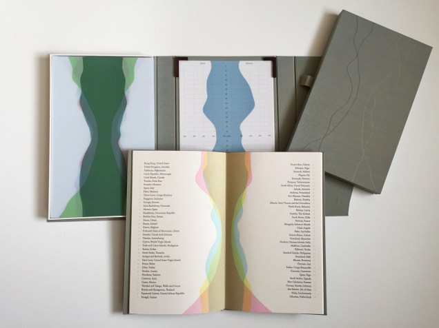
Collaborating with David Allen, a professor at Middlebury College in Vermont, Bryant created Figure Study (2015), a graphical “comparison of population data for every region on earth”. In this work, Bryant takes her handling of shape and colour to a new level.
All 114 of these figures have been printed from linoleum onto drafting film and are housed together alongside a grid. The figures are each numbered and can be interpreted using a booklet containing an alphabetical and numerical index, as well as a short essay by David Allen about our process and the source of the data. The design of the enclosure encourages the viewer to layer the forms to create different combinations of shape and color. This process and the resulting imagery is initially reminiscent of elaborate dresses, paper dolls, and dissection plates, but the source of the data gives a different picture, laying bare the vast and critical differences between the basic equations of life in different parts of the world.2015 MCBA Prize Finalists
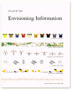
In correspondence with Books On Books, Bryant has noted the influence of Edward R. Tufte. Figure Study particularly may remind the reader/viewer of Tufte’s The Visual Display of Quantitative Information (1983) and Envisioning Information (1990). In his books and lectures, Tufte champions the connection of art and science as well as information display that is interactive, which Bryant’s statement above echoes.
As her two bookworks above and those below associated with the collective Shift_Lab demonstrate, she has the gift of transforming analytical data, diagrammatic imagery , text derived from reference materials as well as personal experience and taking them beyond “visual display” and into art.
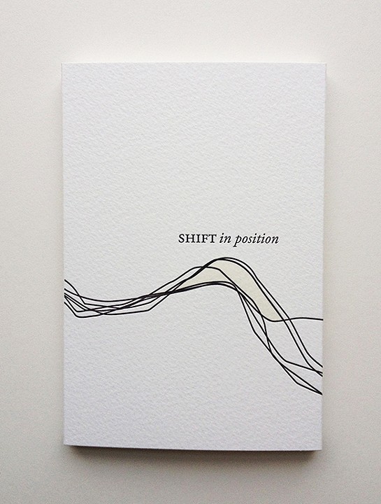
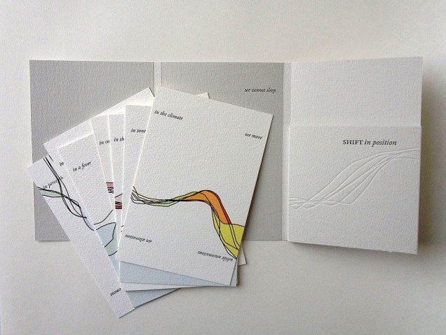
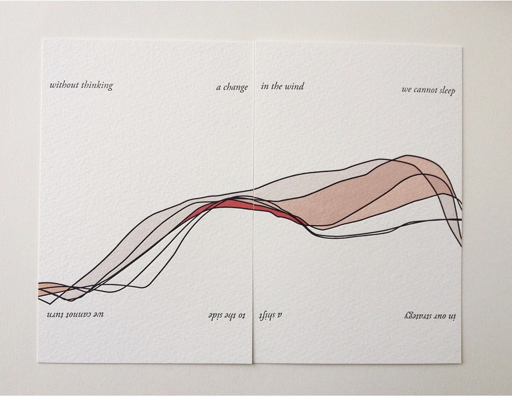
In Shift in Position (2014), Bryant draws on her own sleep patterns and movements. Extraordinary how, in Shift in Position, she manipulates the elements of the book to embody the “message” of the work. Note how she plays with layout, in particular, by running text syntactically over the loose folios (“a change/ in the wind” and ensuring the alignment of the graphical image. The work invites the reader/viewer to turn the two folios 180º — like a restless sleeper — to read/see the additional run-on text (“a shift/ to the side”) and the aligned image from another perspective. This use of the material and form draw the reader/viewer into a kind of creative act — negotiating the act of close reading with that of close looking.
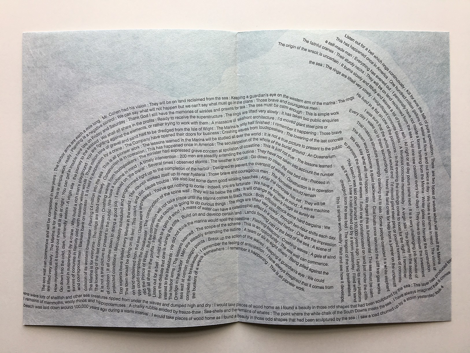
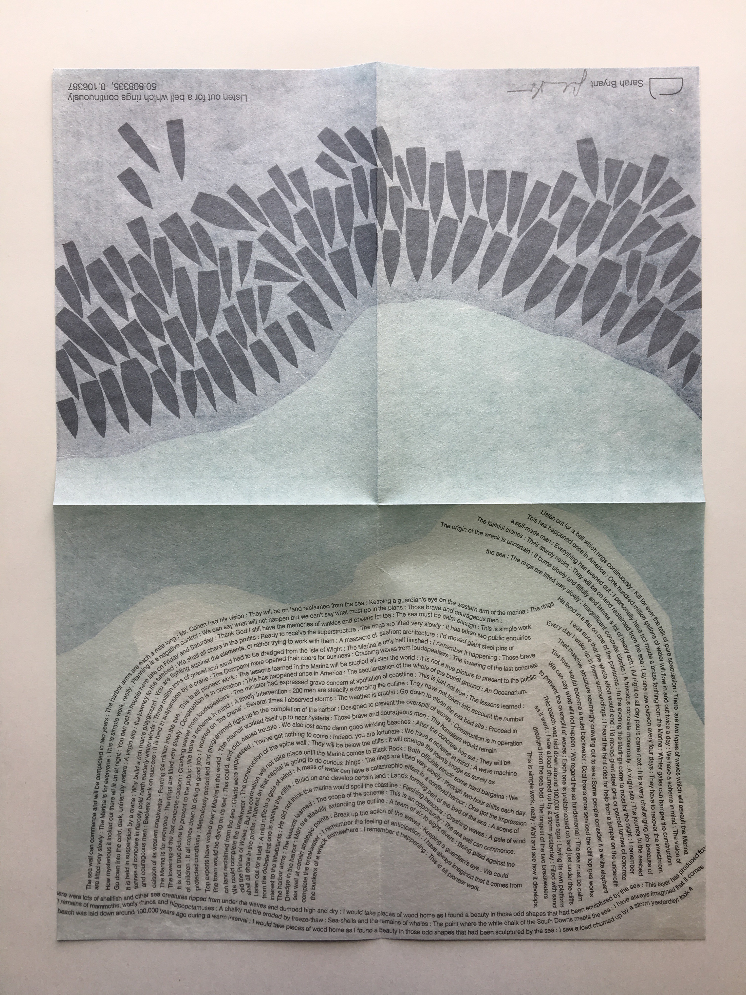
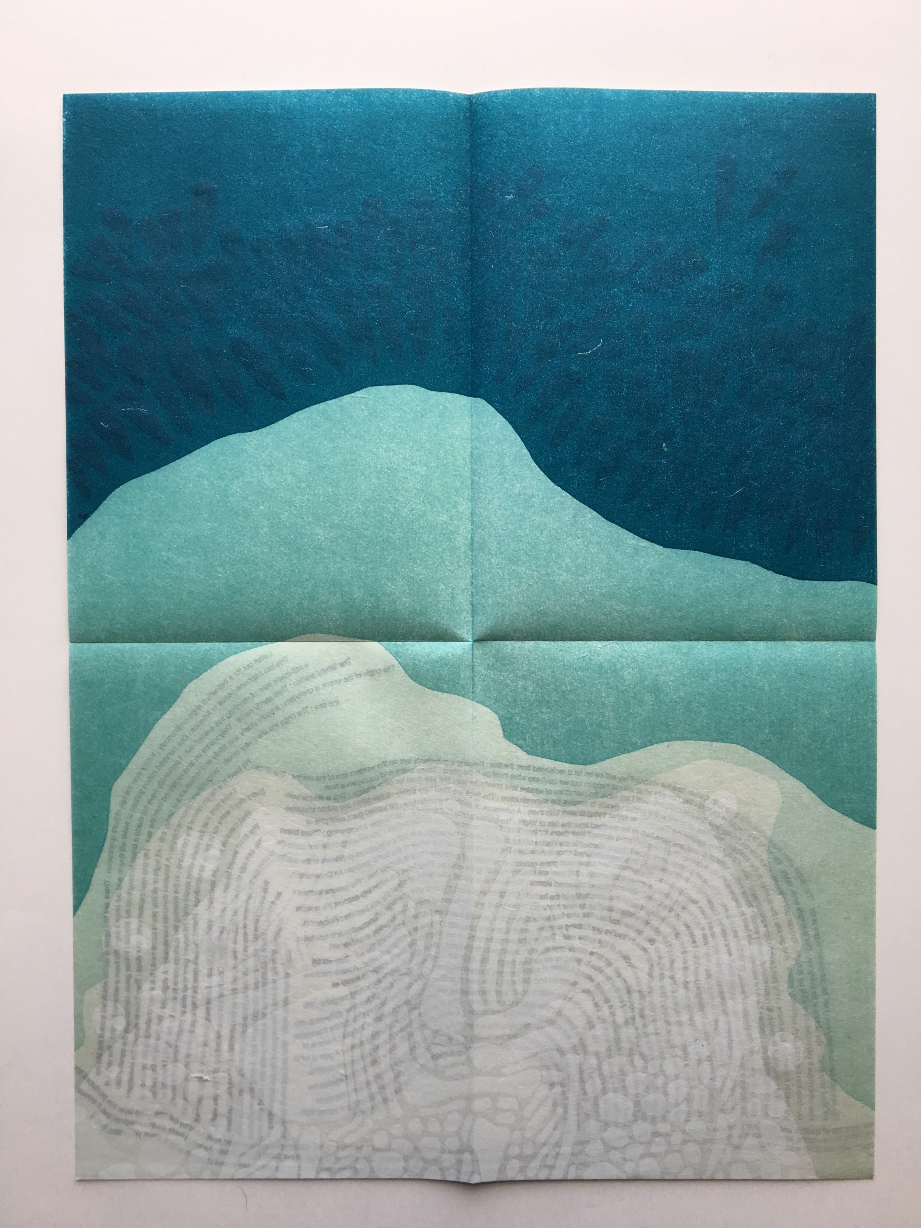
Another collective work from Shift_Lab is Trace (2015). Bryant’s contribution is Listen Out for a Bell which Rings Continuously, which draws on sound and coastal mapping. It is based on her residence at the Brighton Marina, “a strange space between land and sea” where she immersed herself “in the quiet rhythm of the place”. In the first image above from Listen Out, it is obvious how the typography mimics the tide’s ebb and flow, perhaps less obvious how the overlapping texts’ rhythm and syntax surge, overlap, peter out. Look even more closely at the two lower images, two sides of the same sheet: note how the colours on the two sides of the sheet register against one another to create the kind of topographical mapping found in marine maps. Beyond that effect, the two pages challenge one’s sense of place in the world. On the left hand side, one is looking down on the boats crowding in on the marina; on the right, one is below the water and looking up at the hulls. To achieve a further infusion of place with the work, the work is even printed using chalk from the surrounding cliffs.
The Radiant Republic(2019) is one of Bryant’s more recent solo works. In her own words:
The Radiant Republic[is] built entirely out of language found in Plato’s Republic and Le Corbusier’s The Radiant City. In these texts, separated by more than two thousand years, Plato and Le Corbusier each describe a city plan designed to provide a framework for morality and ethics. These works are revered, but they are also deeply troubling. In The Radiant Republic, language from Plato and Le Corbusier has been combined to create a narrative in five parts.Big Jump Press/Portfolio/Artist Books/The Radiant Republic
When Bryant writes “combined”, she means it as the work’s title performs it. Paragraphs in each of the five volumes merge sentences from Plato with those of Le Corbusier. In its combination of the titles of Le Corbusier’s and Plato’s works, respectively, The Radiant Republic signals its textual ambition: to merge the two different texts. The disconcerting oracular tone and coherence of the narrative underscore the revered yet troubling nature of the two works, which is reflected in the epigraph to The Radiant Republic:
Every physical thing carries within its deepest layers a tendency towards its own destruction.
— Moshen Mostafavi and David Leatherbarrow, On Weathering: The Life of Buildings in Time (MIT Press, 1993)
But we are getting ahead of ourselves.
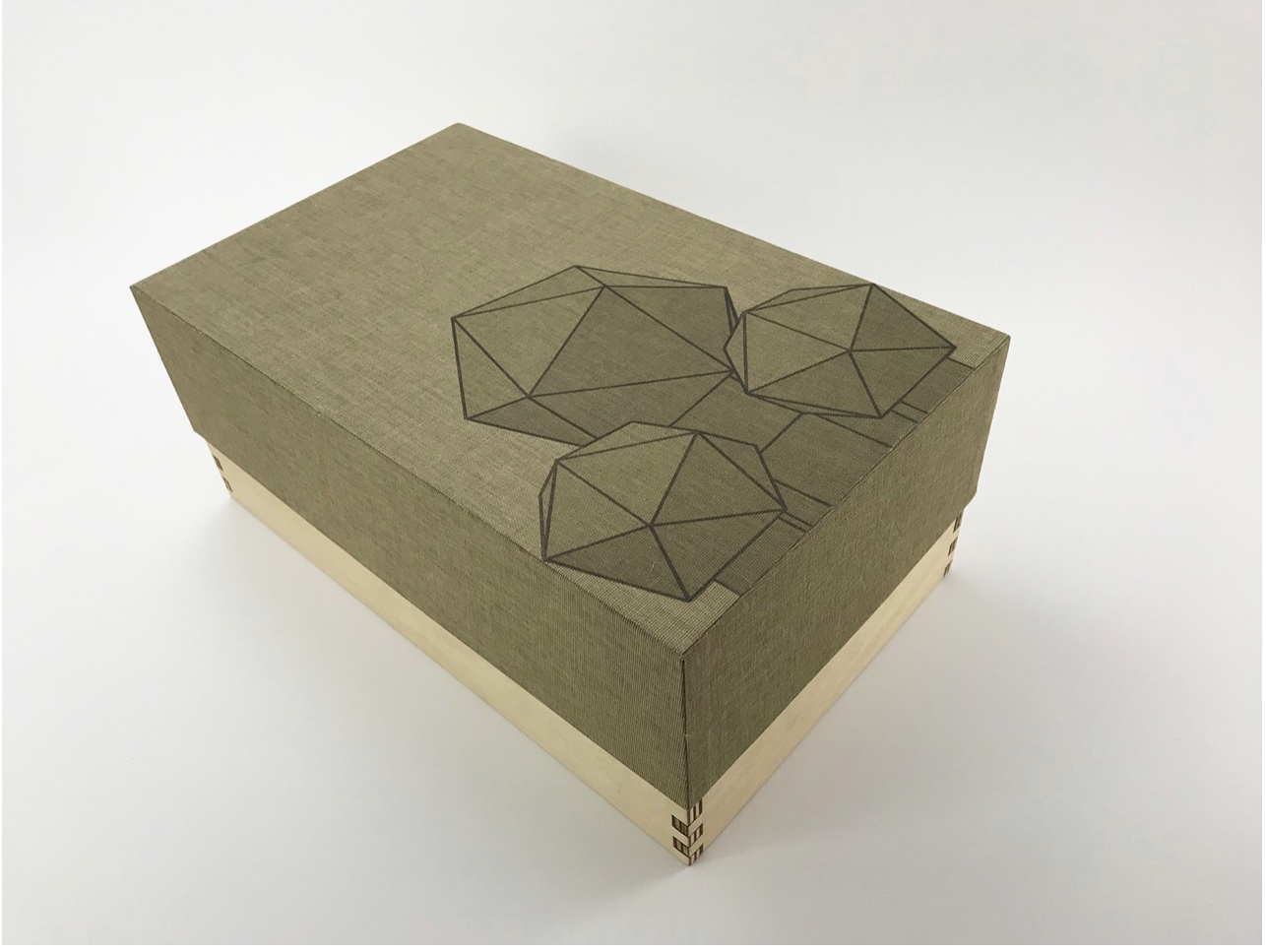
In The Radiant Republic, Bryant uses techniques and materials old and new to her in an aim for new heights of art and depths of thought. The box enclosure itself is the first new technical feature we encounter.
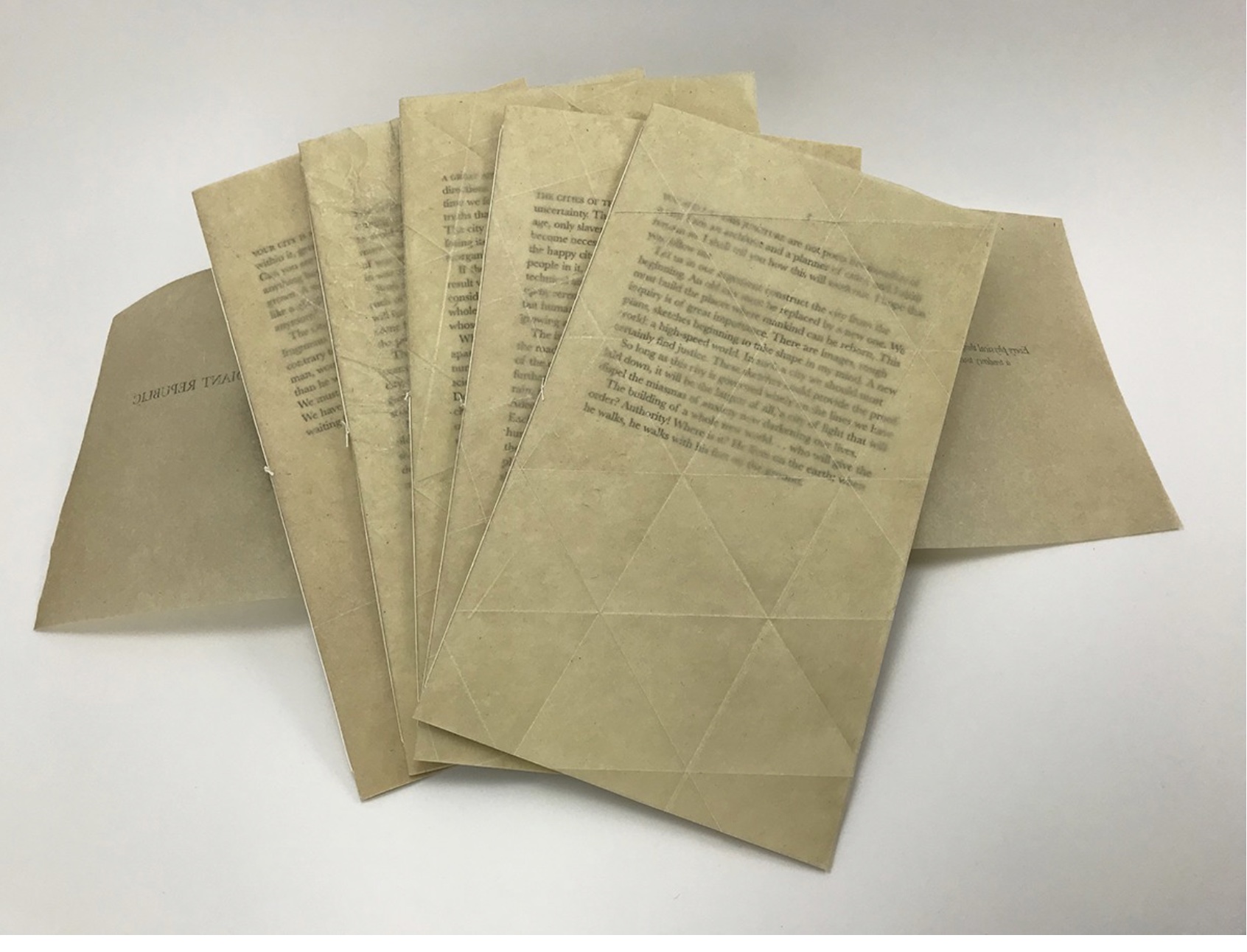
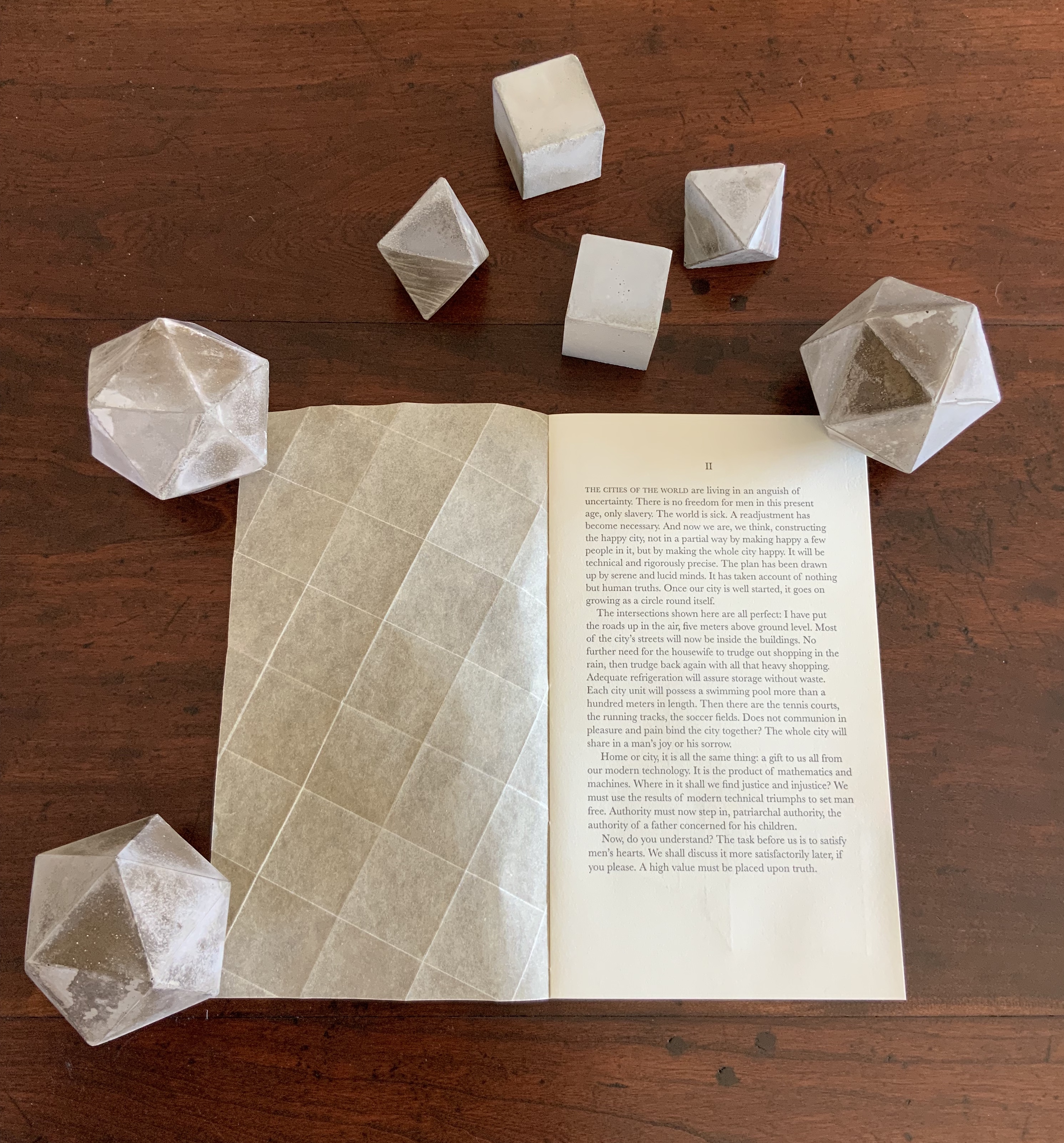
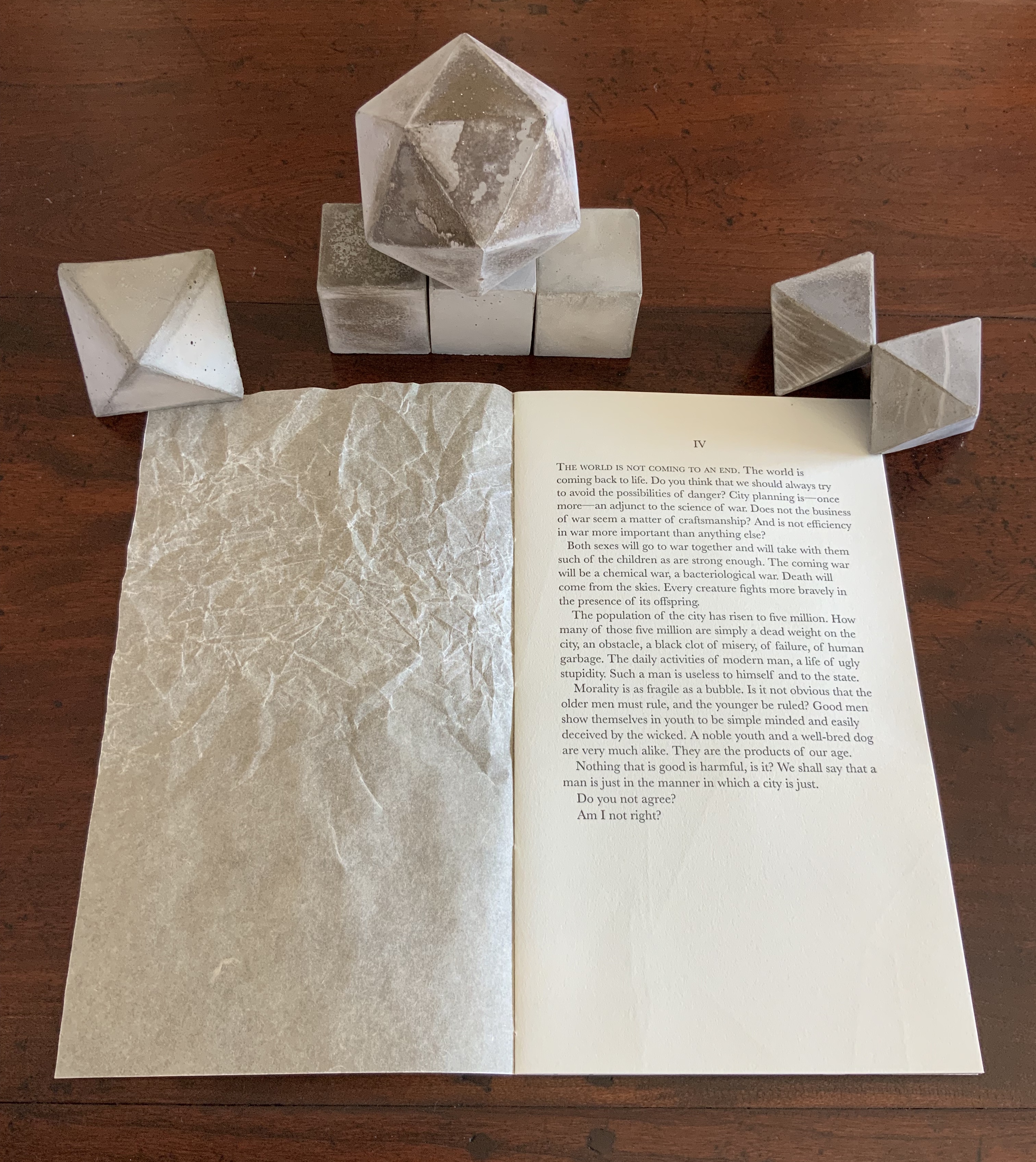
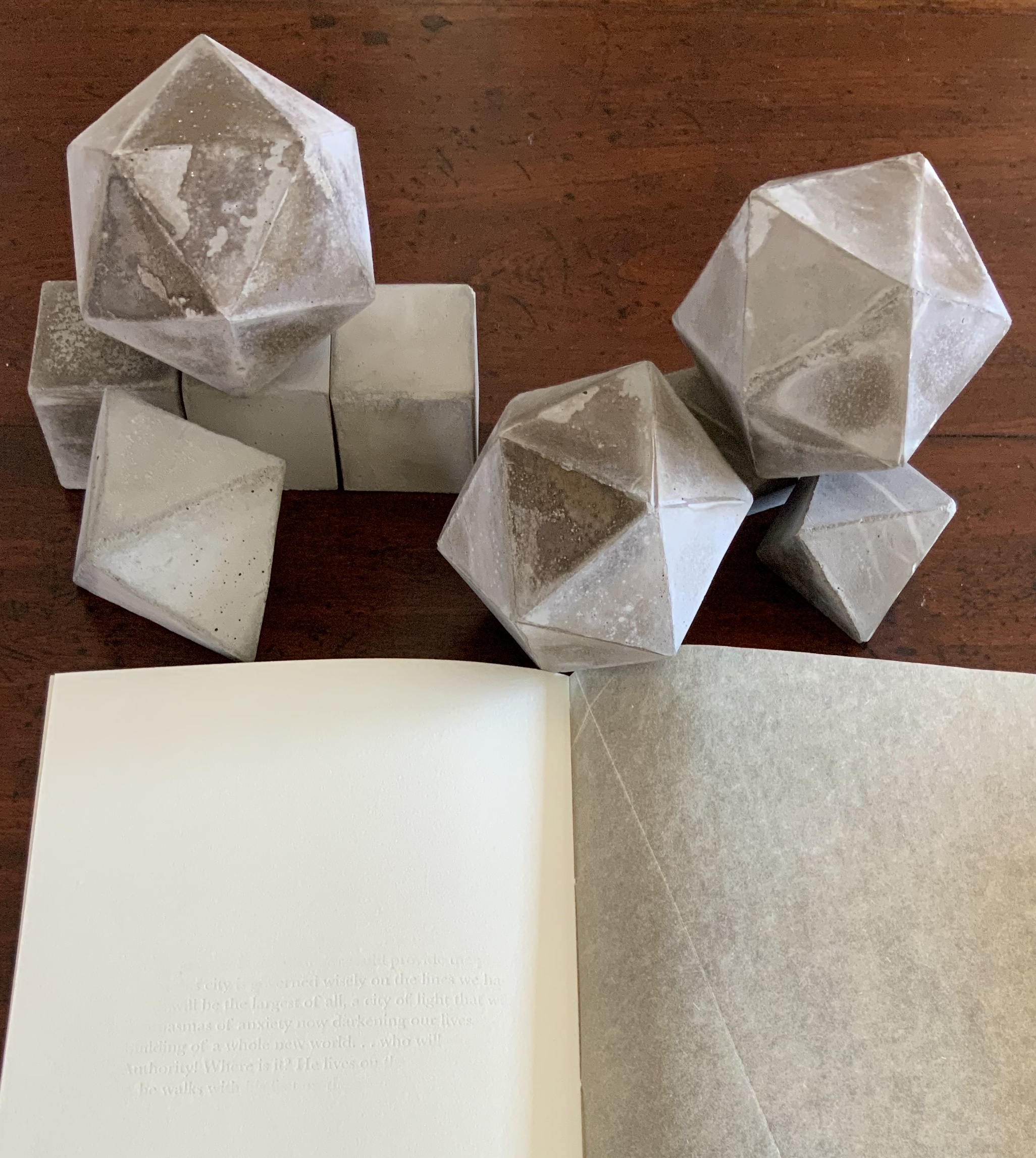
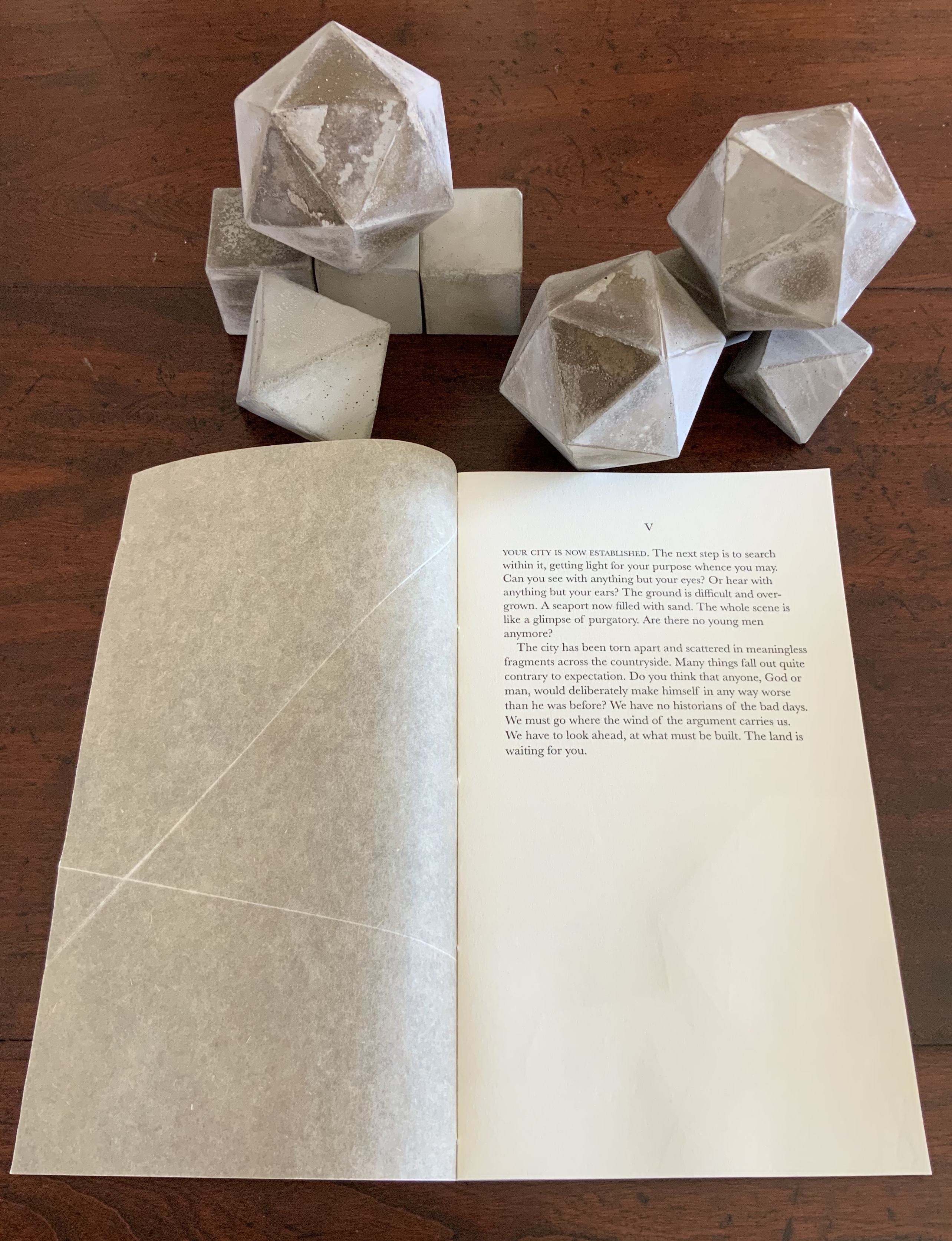
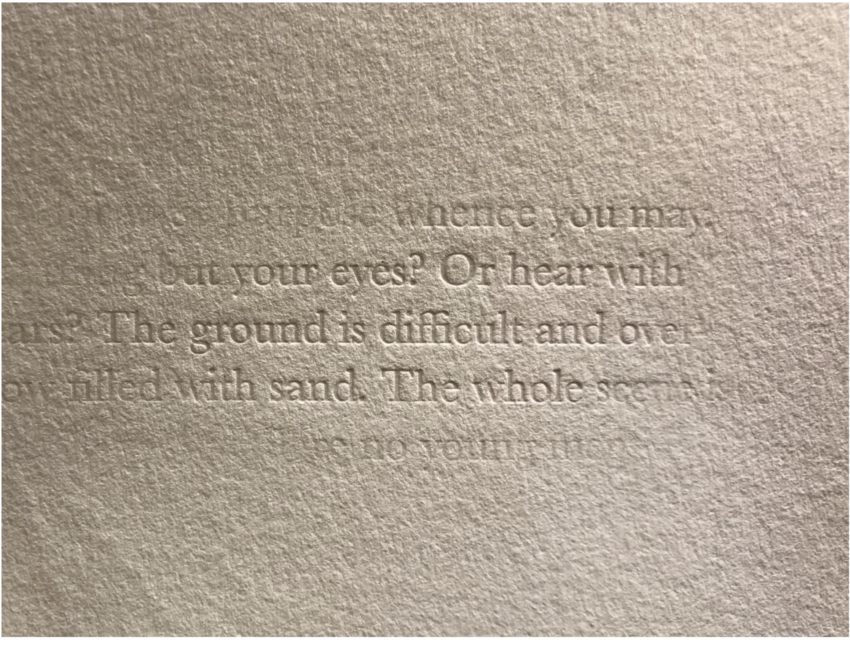
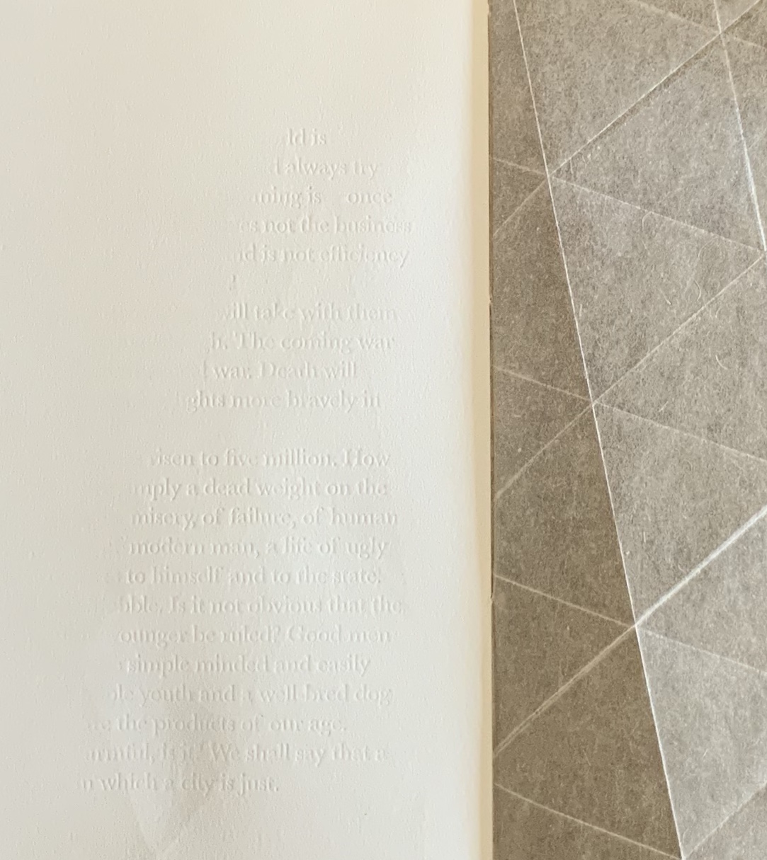
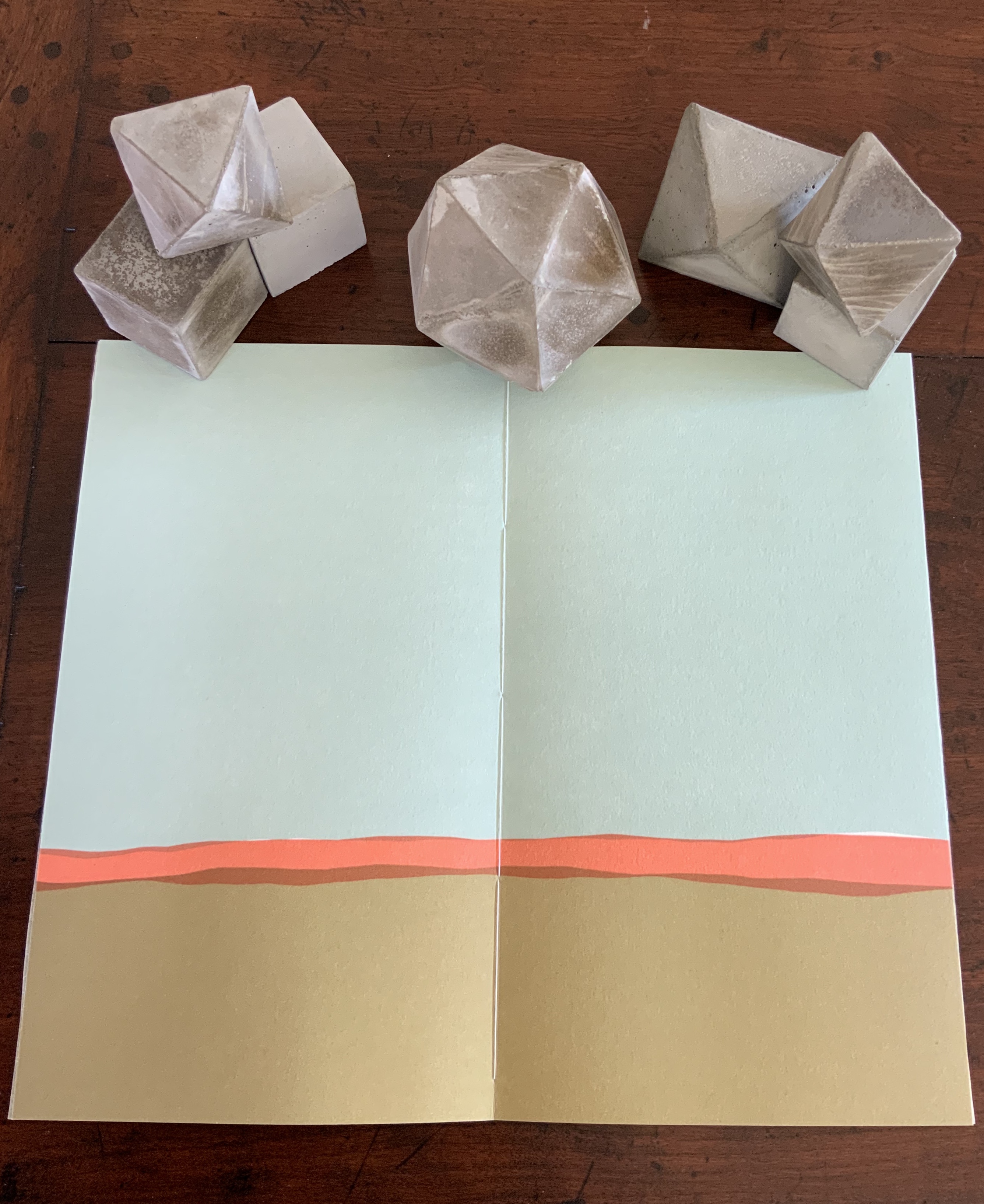
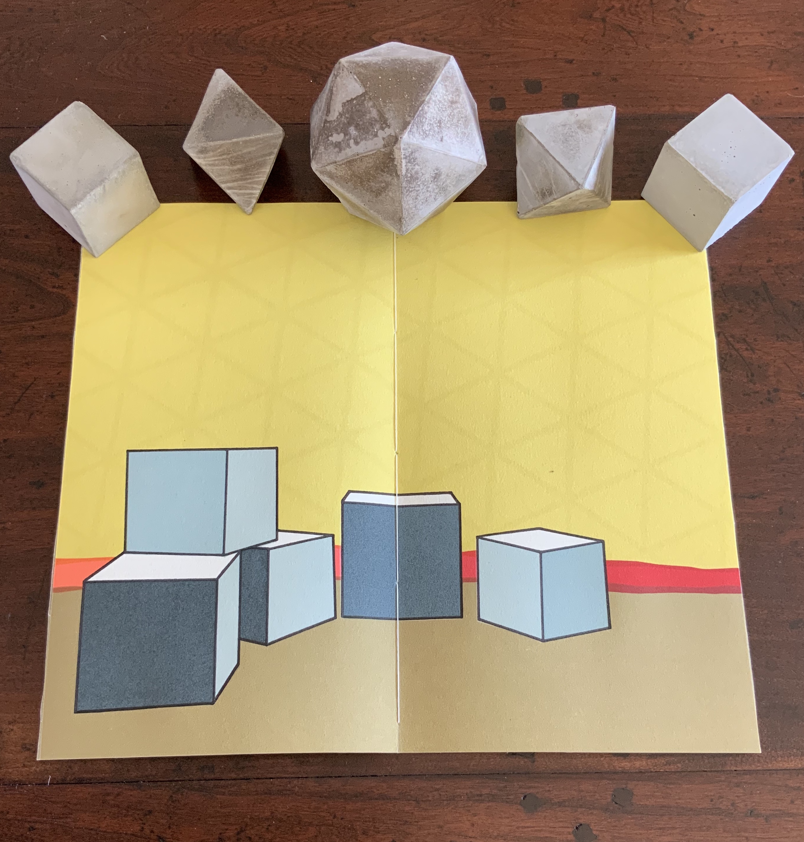
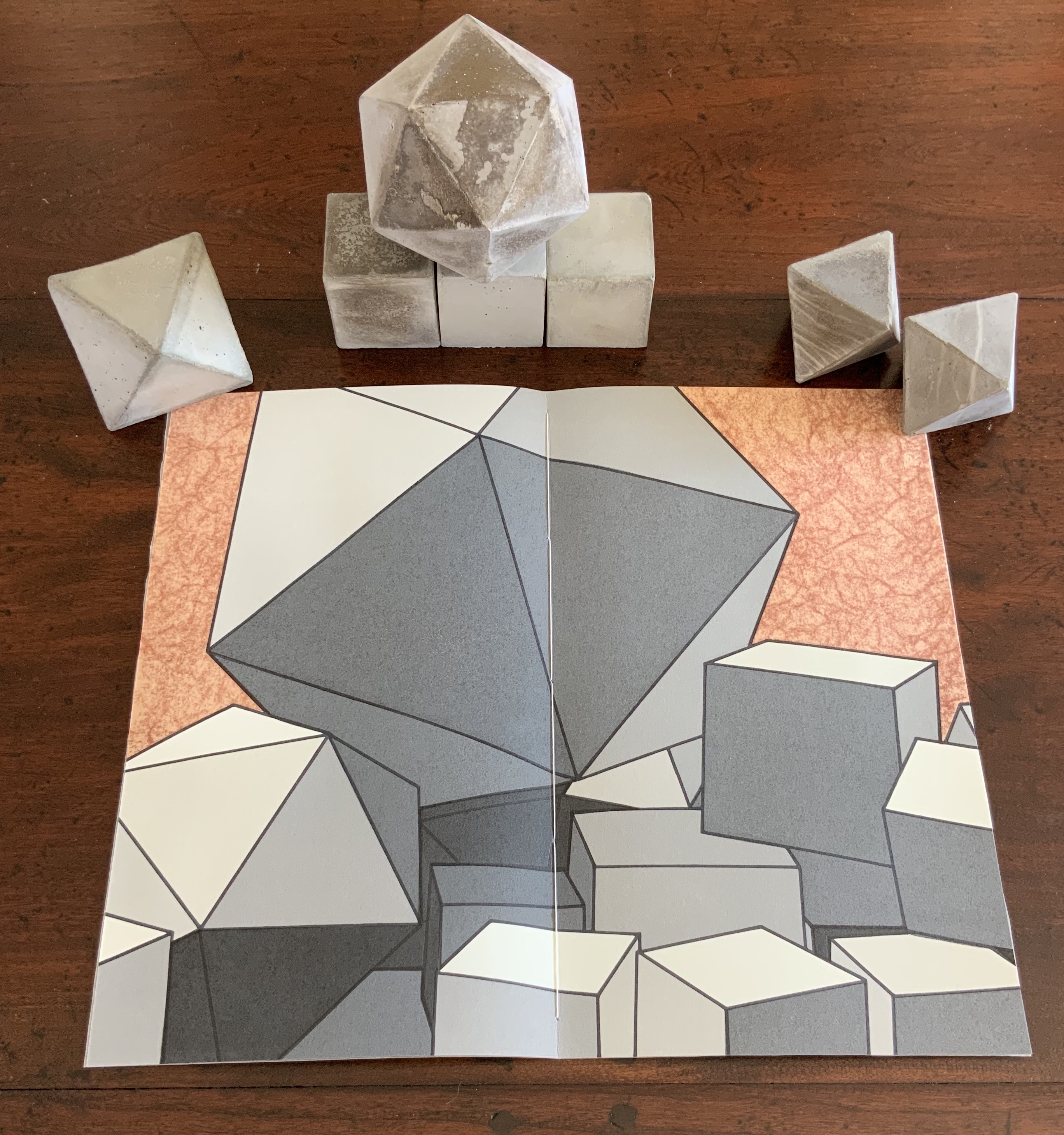
The Radiant Republic (2019) Sarah Bryant Box, glass, cement blocks, pamphlets. Edition of 50, of which this is #5. Acquired from the artist, 20 February 2019. Photos: Courtesy of the artist; Books On Books Collection.
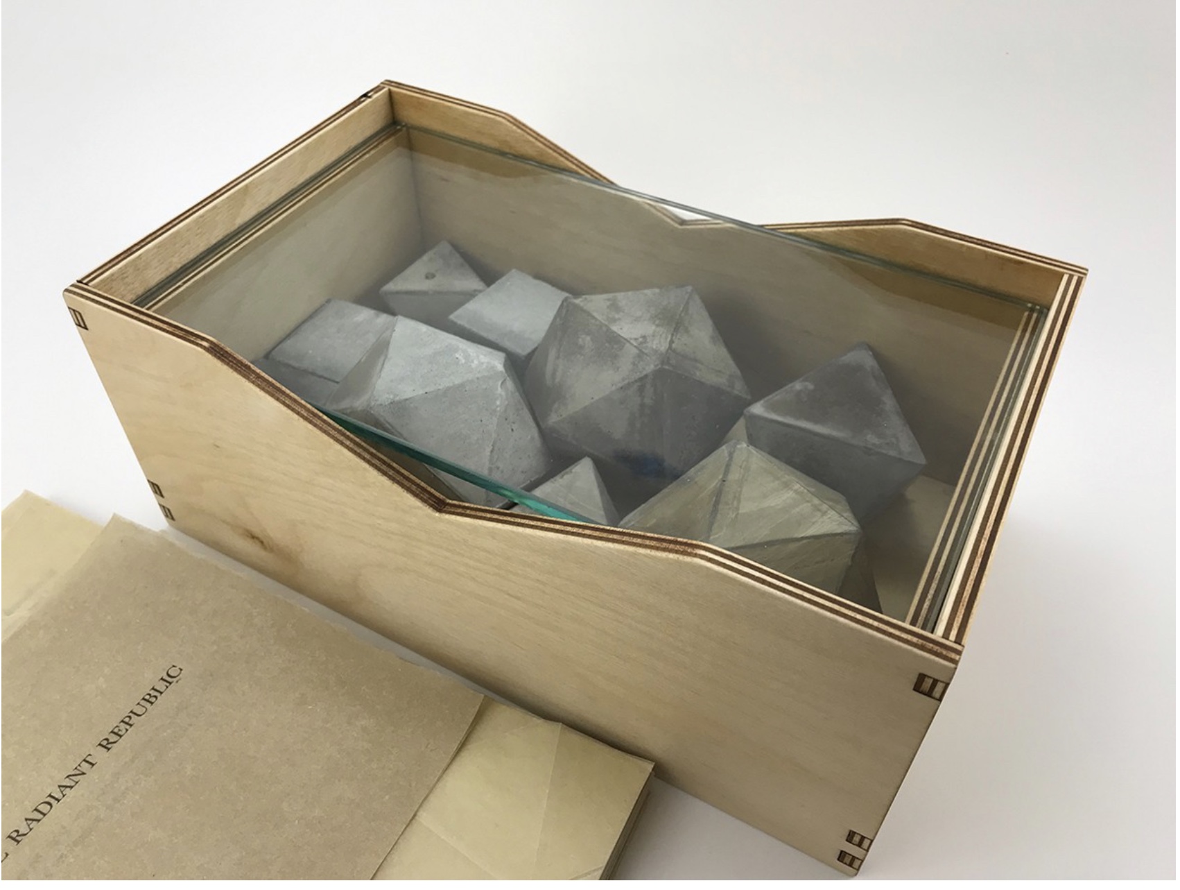
Although the collective works comprising Trace are housed in a box, this one is more elaborate in material and media. It is made of laser-cut Baltic Birch plywood, lightly treated with Tung oil. The lid is covered in Dubletta book cloth, which has been printed letterpress with polymer plates and linoleum. Lifting off the cover reveals yet further new materials and techniques. Five pamphlets each consisting of Rives Heavyweight paper sewn to a lightweight cover made of handmade Belgian Flax, produced at the Morgan Conservatory in Cleveland, and held together with a wrapper rest on a sheet of glass.
In several ways, the book component shows the encounter of previous techniques/media with the new. The precise fold work and registration to be found in Biography and Listen Out reappear, as does the meaningful integration of separate parts in Figure Study. Here, it is the geometric fold patterns in the covers echoing the geometric solids. Flax paper is a new element in Bryant’s repertoire.
The blind embossed printing from Figure Study moves from the cover there to the interior of the book component here and with substantive, non-decorative intent. Across the five volumes, the embossed text is the same as that printed in ink and always appears on the last folio. But here is the catch: the text that appears comes from the succeeding volume’s inked text, and it appears in fragments. When the last page of the fifth volume appears, the embossed text on its folio’s last page is a fragment of the inked text in the first volume. The fragmentation of the embossed printed version and its variation in depth mime the weathering of structures and ideas.
The circular movement and fusion of the past and present are also reflected in the double-page prints centered in each volume. Note how the technique of prints interlocking across folios in Shift in Position replays here in the prints interlocking across the five volumes to assert a narrative thrust but in a landscape with no fixed beginning or end.
The contrast of materials — cloth, wood, flax paper, Rives paper and concrete — plays out in the concrete solids. Some edges are sharp, others blunted; some surfaces are smooth, others rough. This happens also with the covers to the five volumes according to the absence or presence (and density) of folds and, in one case, of crumpling or no crumpling. It happens in the prints, where the backgrounds include faint images mirroring the structures in the other media. This technique of contrasting materials/media and that of recapitulating the contrast within one or more of the materials/media seems to be a new development in Bryant’s art or, at least, an intensified one.
The multiple materials and techniques and their many-sided interactions pose a pleasurable dilemma for the work’s display. As soon as one is in place, another beckons.
No surprise then that the first pamphlet’s opening words are “You and I at this juncture are not poets but founders of a city”. This self-reflexive invitation to creativity is like that invitation to negotiate reading with looking — an invitation to participate and to recognise our participation as part of the creative act. An increasingly characteristic aspect of book art.