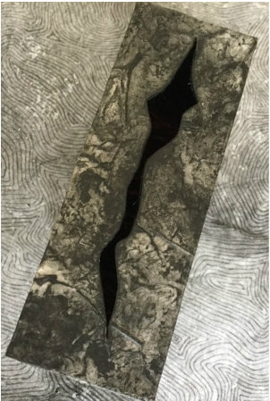
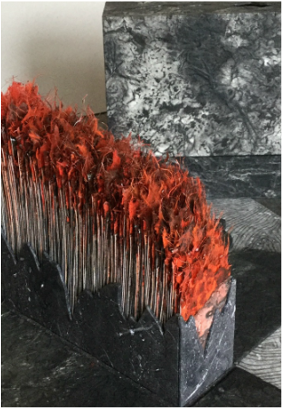
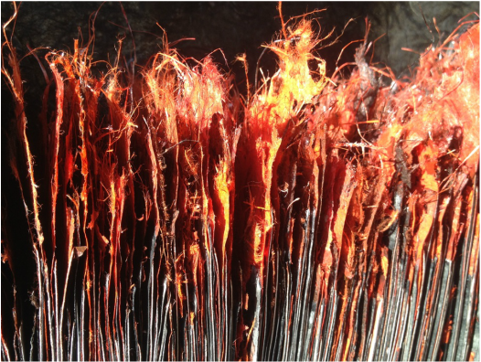
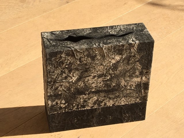
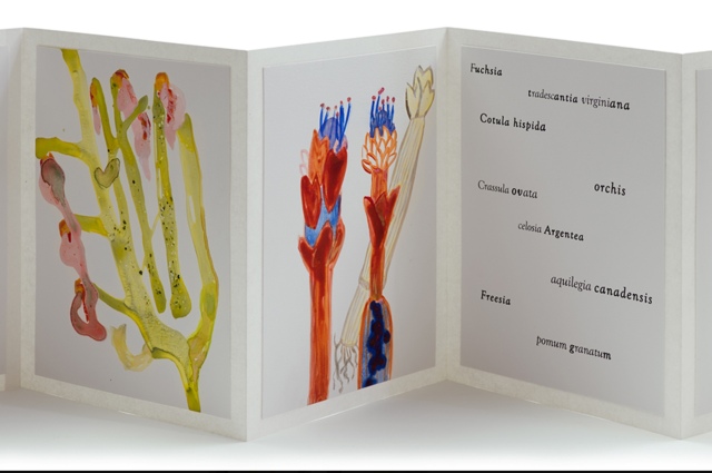
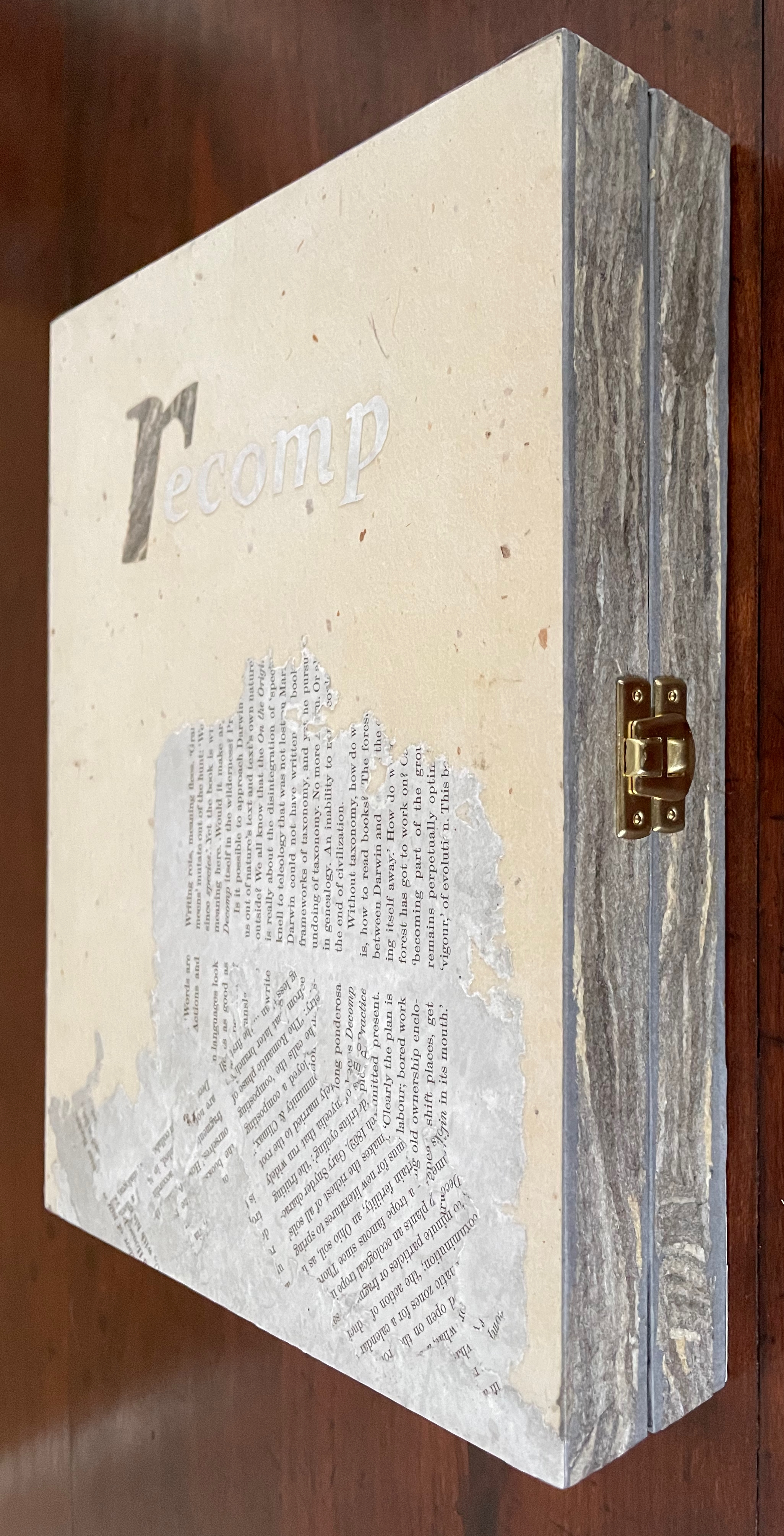
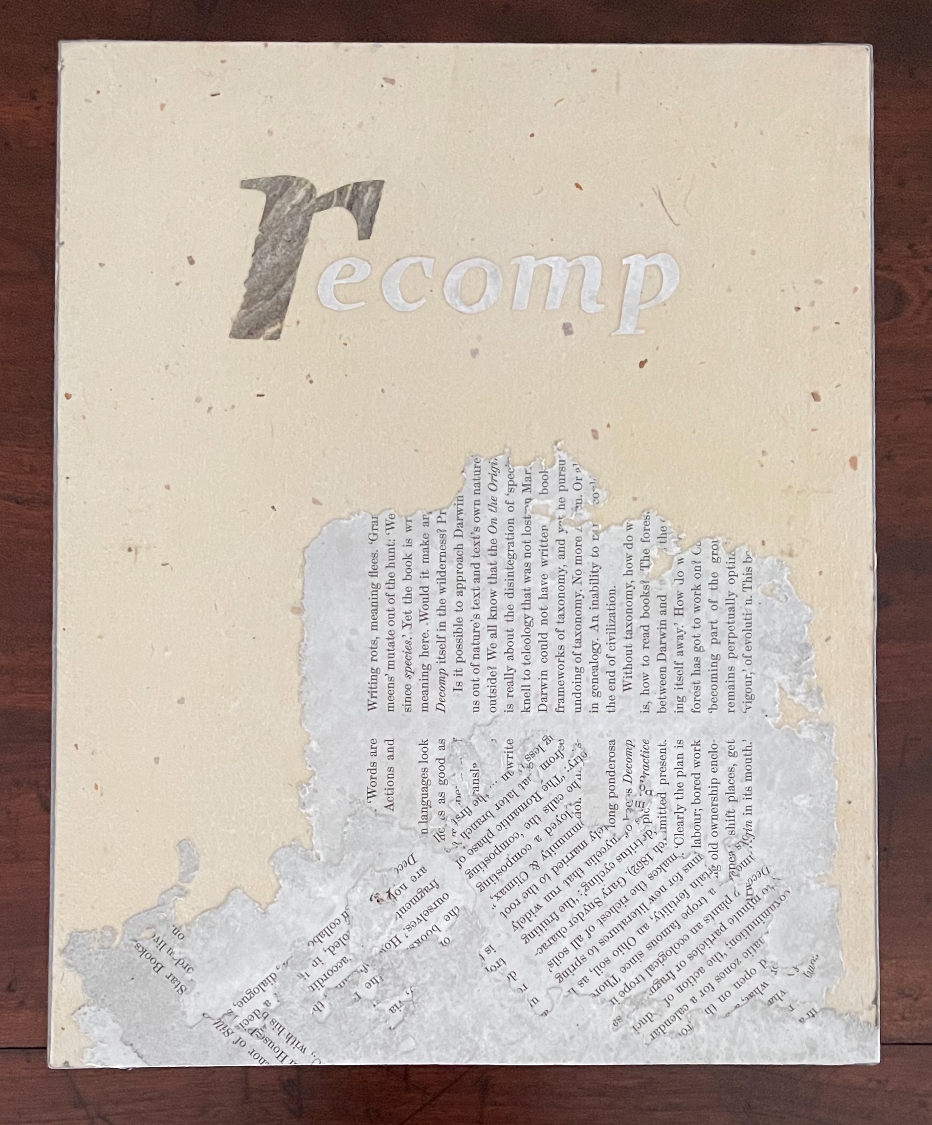
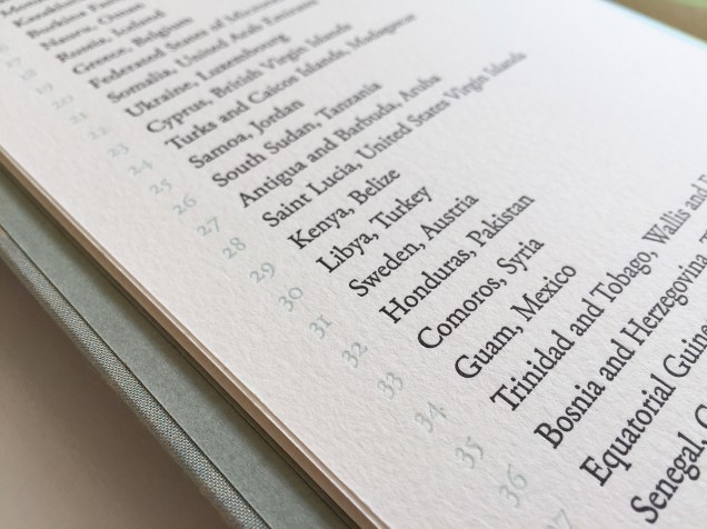
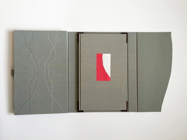
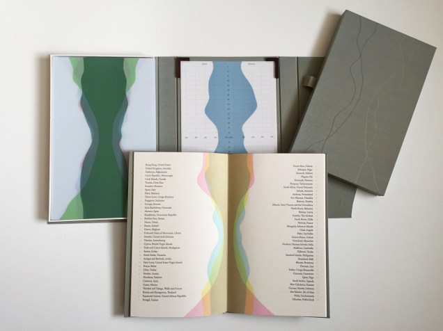
recomp (2013-23) Cathryn Miller Hinged and clasped diptych, housing an altered book, explanatory booklet, and loose colophon. Unique. Acquired from Vamp & Tramp Booksellers, 2025. Photos: Books On Books Collection.
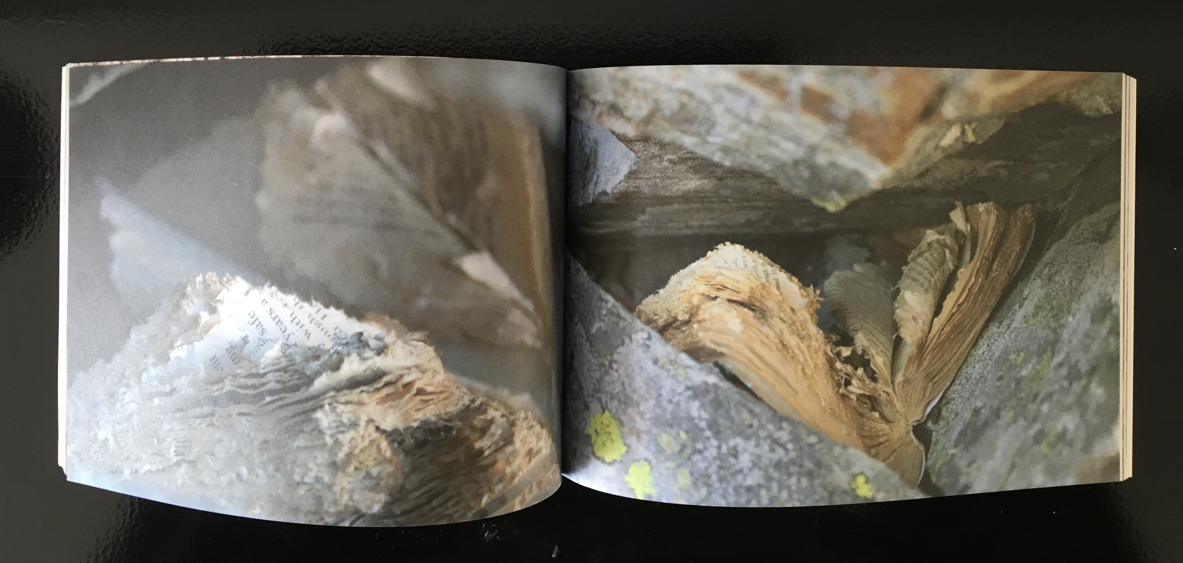
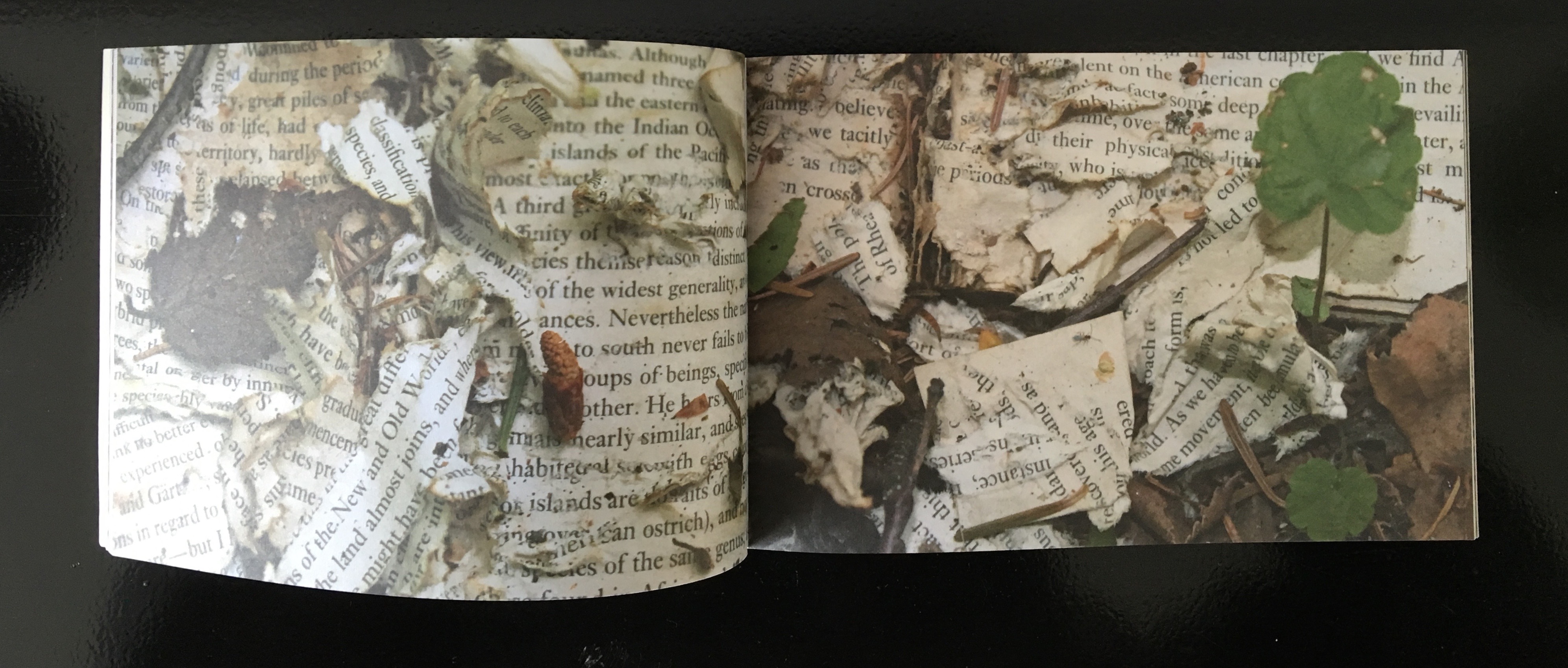
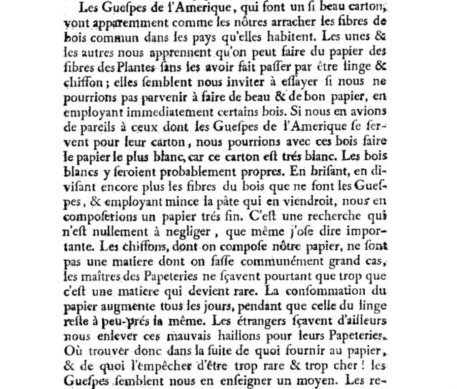
Recomp (2013-2023) is a collaboration with a colony of bald-faced hornets. Having reviewed Stephen Collis and Jordan Scott’s decomp (2013), their artists’ book devised by exposing several copies of Darwin’s On the Origin of Species to the elements, Cathryn Miller followed suit and hung her reviewer’s copy of decomp in a tree. Over time, the wind, rain, and snow sent the book to the forest floor where it fell apart. Hornets had done their part in its decomposition, nibbling away at its edges and weakening the structure. Their conversion of the book into cellulose for their nest was also the start of their artistic partnership with Miller. Eventually the nest, too, became prey to the elements or marauders and fell and broke apart on the ground. Miller and photographer husband David recorded all this and gathered up the book fragments and broken nest.
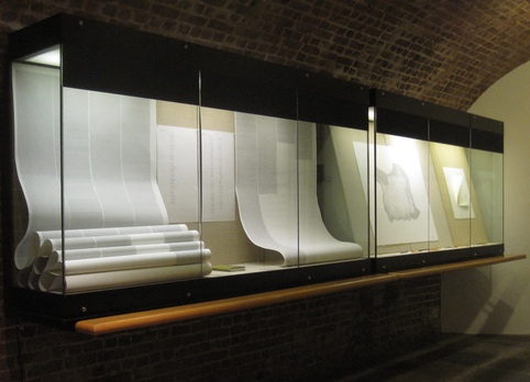
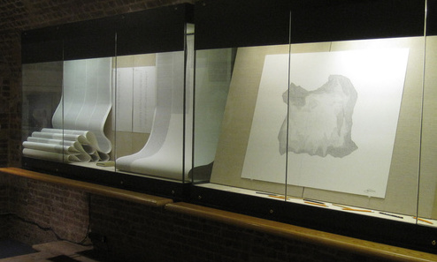
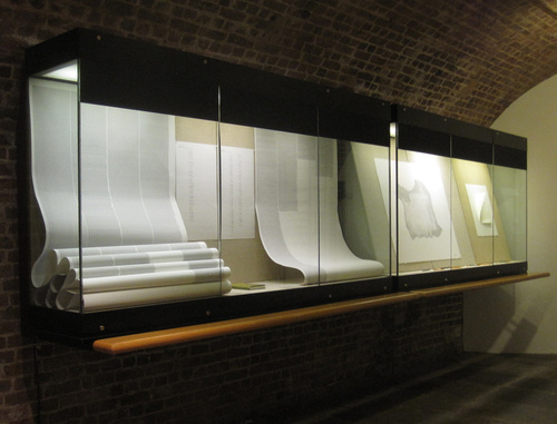
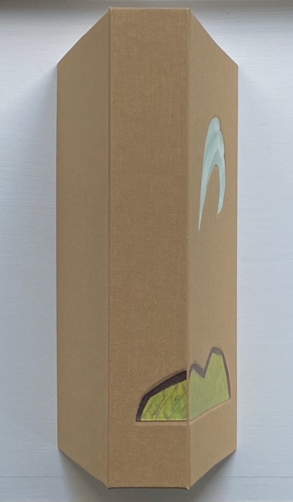
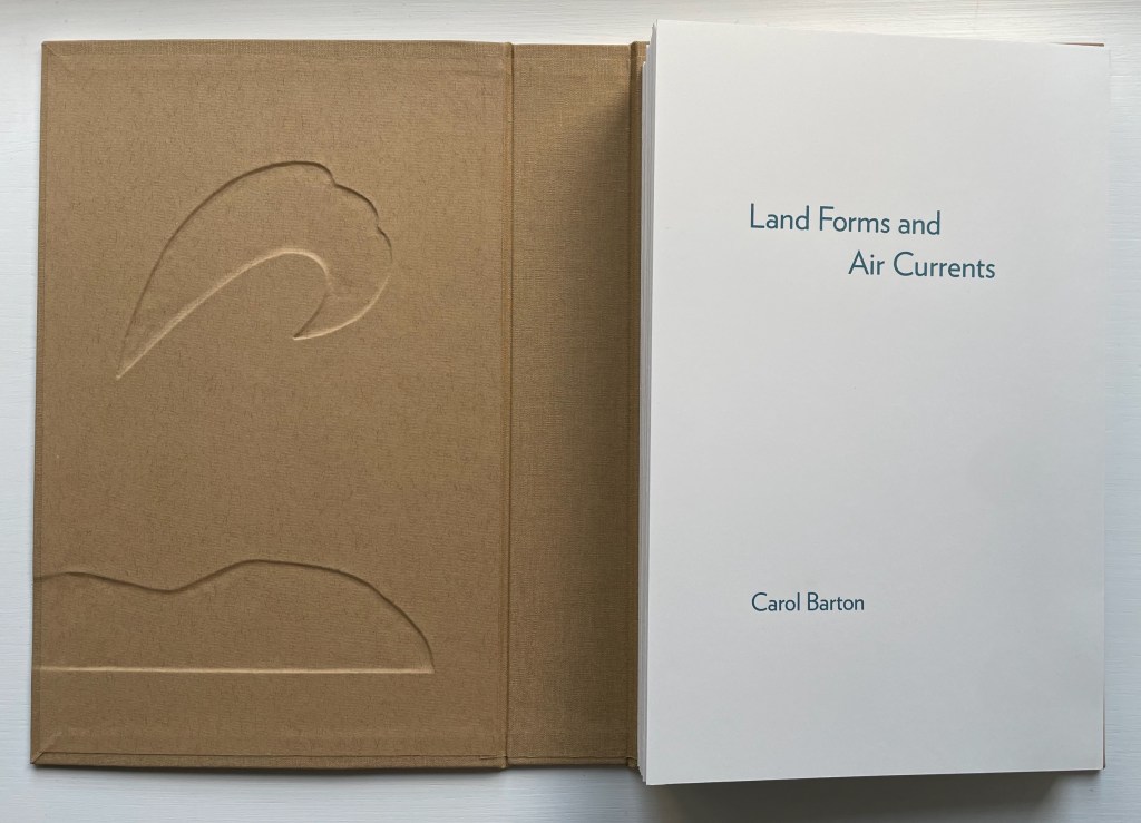
Land Forms and Air Currents (2014) Carol Barton Leporello (with 11 pop-ups) fixed to inside cover of case, cloth over board, debossed with fitted, pastedown artwork on front cover and spine. Cover: H292 x W192 x D50 mm. Leporello: H275 x W175 mm. 37 panels. Edition of 25, of which this is #21. Acquired from the artist, 27 October 2023. Photos: Books On Books Collection. Displayed with artist’s permission.
Carol Barton’s reputation for paper-engineering, supported by her well-received multi-volume The Pocket Paper Engineer, should not overshadow appreciation of her talents with watercolor and words. With its poems of free verse, scanned watercolors and pop-up structures all by the same author/artist, Land Forms and Air Currents (2014) qualifies as a champion of the Blakean tradition in artists’ books.
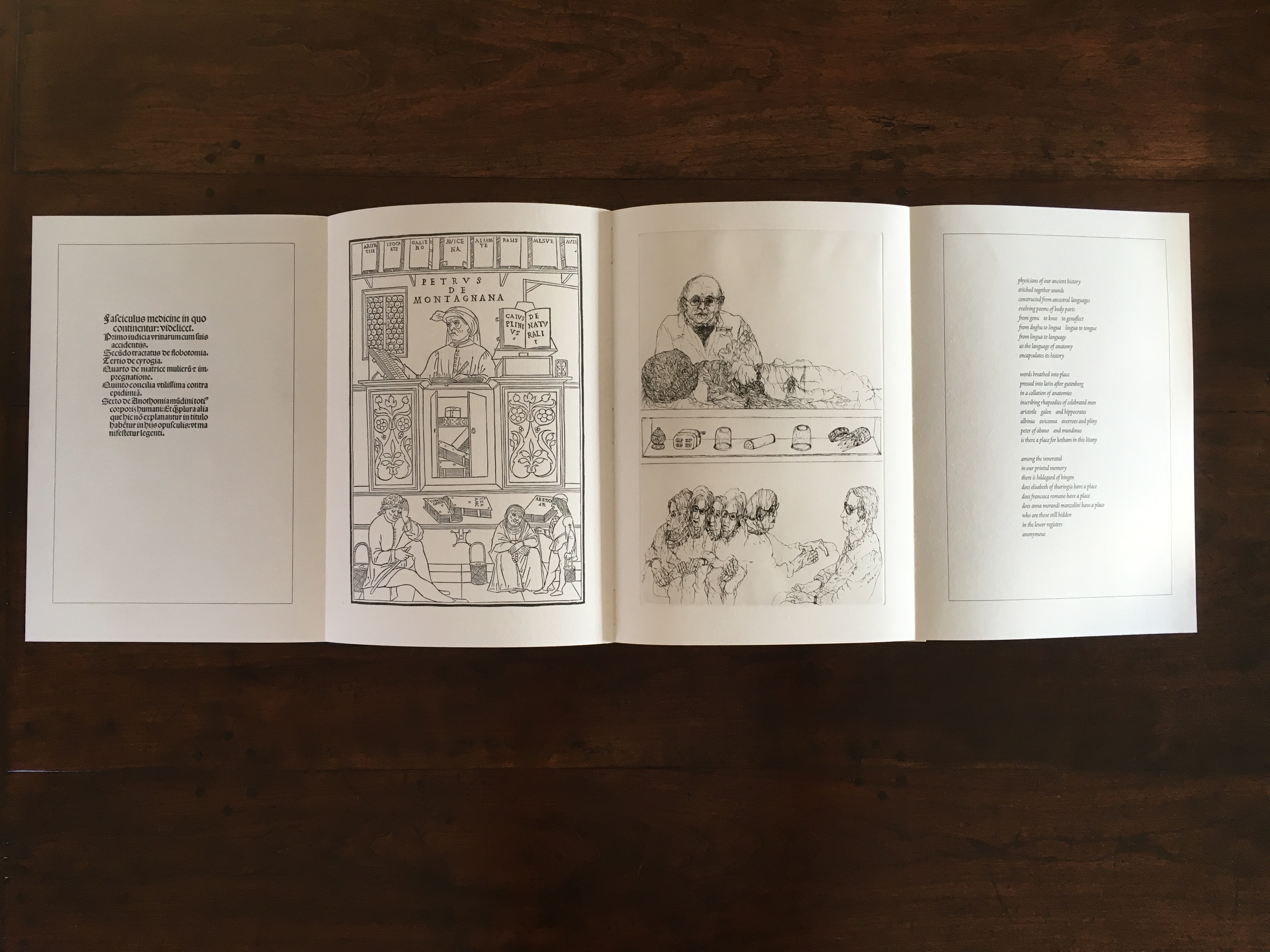
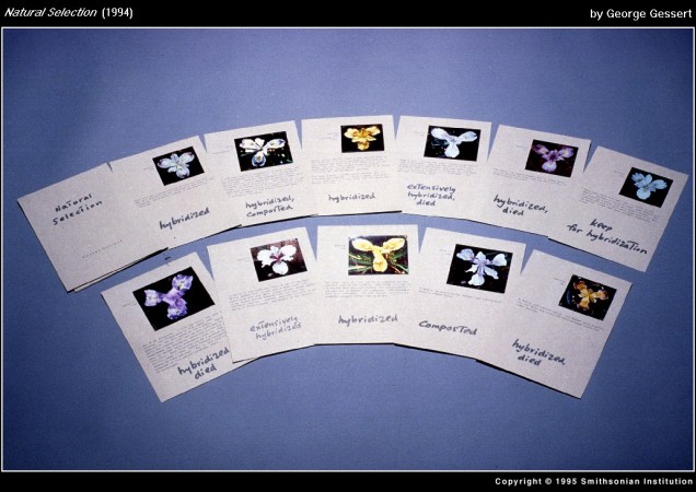
In 1995, the Smithsonian Institute Libraries’ exhibition Science and the Artist’s Book explored “how science can serve as a springboard for artistic creation” and showed how “aspects of creativity … are common to science as well as to art”. The exhibition juxtaposed twenty-five rare books from the Heralds of Science collection at the Dibner Library with twenty-five bookworks commissioned as responses to them. For example,
Joyce Cutler-Shaw responded to Johannes de Ketham’s Fasciculus Medicinae (Venice: Impressus per Ioannes [et] Gregorius de Gregorijs fratres, 1495) with The Anatomy Lesson (Middletown, CT: Robin Price, Publisher, 1995);
George Gessert responded to Darwin’s On the Origin of Species (London: John Murray, 1859) with Natural Selection (Eugene, OR: self-published, 1994);
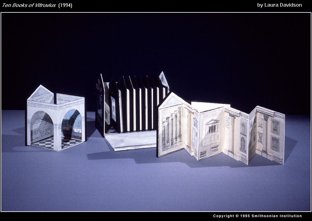
and Laura Davidson responded to Vitruvius Pollio’s’ De Architectura libri Dece [The Ten Books on Architecture] (Como, Italy: Gottardo de Ponte, 1521) with Ten Books of Vitruvius (Boston, MA: self-published, 1994).
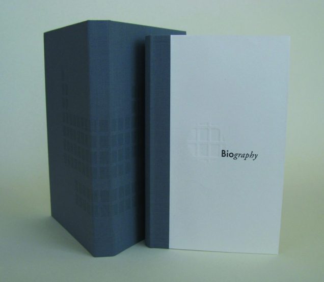
As the exhibition demonstrated, the overlay of the dual traditions — those of art and those of the book — on the domains of science creates a rich soil for ingenuity and genius. Since that exhibition, science- and maths-driven book art has yielded harvest after harvest of outstanding book artists. Sarah Bryant is one of them. Bryant won the MCBA Prize in 2011 with Biography (2010) and was a finalist in 2015 with Figure Study (2015).
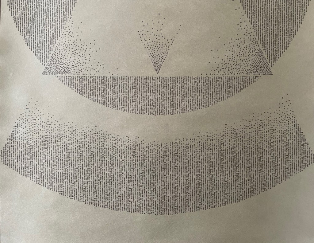
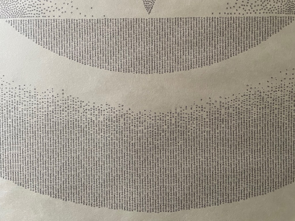
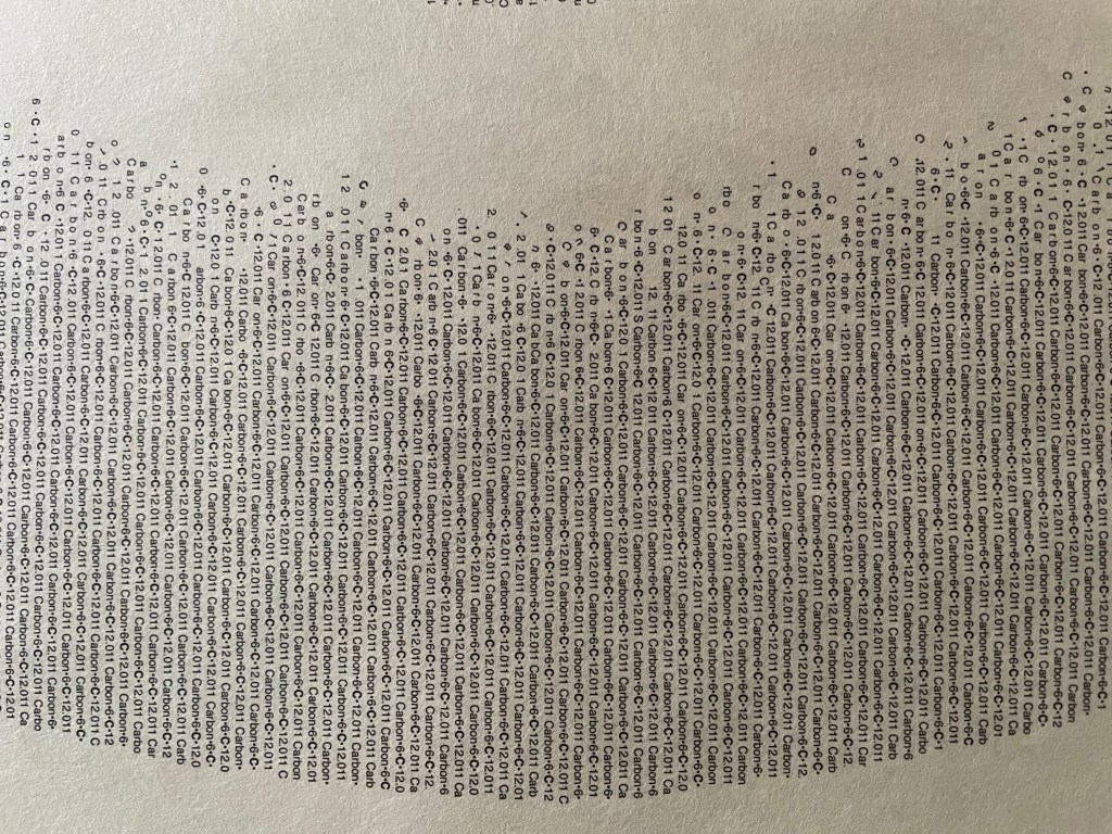
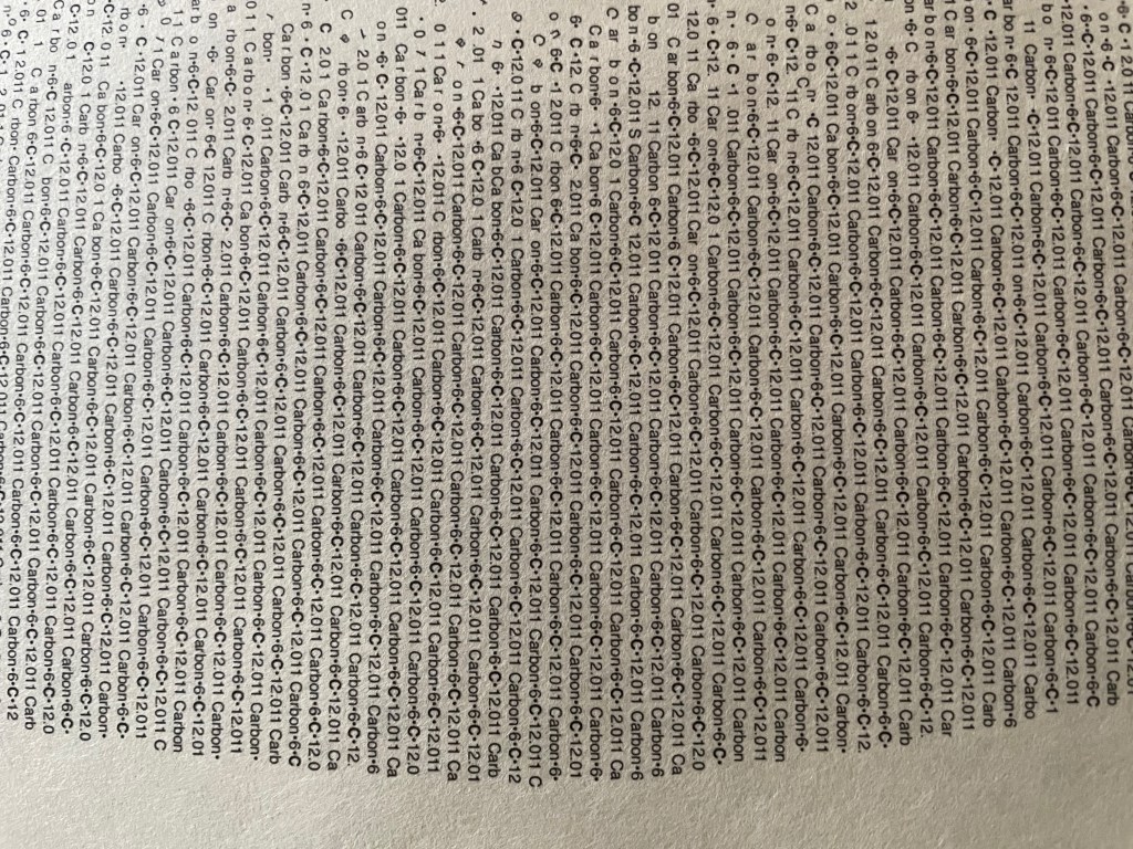
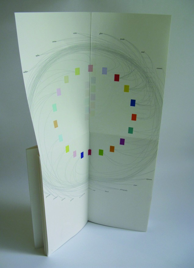
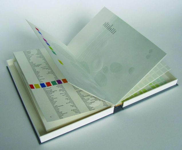
“[A]n exploration of the chemical elements in the human body and the roles they play elsewhere in the world”, Biography (2010) is bound as a hard cover drumleaf and enclosed in a clamshell box. It begins with the periodic table and assigns a coloured square to each of the chemical elements found in the human body. Using those coloured squares, the six subsequent diagrams show the presence of the body’s chemical elements in the earth’s crust, man-made weapons, medicines, sea water, etc. The flip-up folio (above right) displays their presence in various man-made tools and building materials. Bryant’s inventive handling of colour, the flip-up folio and blind embossed printing foreshadow developments in her later work.
Collaborating with David Allen, a professor at Middlebury College in Vermont, Bryant created Figure Study (2015), a graphical “comparison of population data for every region on earth”. In this work, Bryant takes her handling of shape and colour to a new level.
All 114 of these figures have been printed from linoleum onto drafting film and are housed together alongside a grid. The figures are each numbered and can be interpreted using a booklet containing an alphabetical and numerical index, as well as a short essay by David Allen about our process and the source of the data. The design of the enclosure encourages the viewer to layer the forms to create different combinations of shape and color. This process and the resulting imagery is initially reminiscent of elaborate dresses, paper dolls, and dissection plates, but the source of the data gives a different picture, laying bare the vast and critical differences between the basic equations of life in different parts of the world.2015 MCBA Prize Finalists
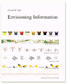
In correspondence with Books On Books, Bryant has noted the influence of Edward R. Tufte. Figure Study particularly may remind the reader/viewer of Tufte’s The Visual Display of Quantitative Information (1983) and Envisioning Information (1990). In his books and lectures, Tufte champions the connection of art and science as well as information display that is interactive, which Bryant’s statement above echoes.
As her two bookworks above and those below associated with the collective Shift_Lab demonstrate, she has the gift of transforming analytical data, diagrammatic imagery , text derived from reference materials as well as personal experience and taking them beyond “visual display” and into art.
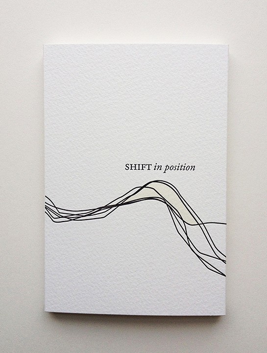
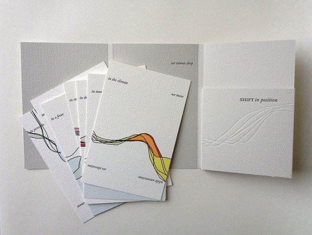
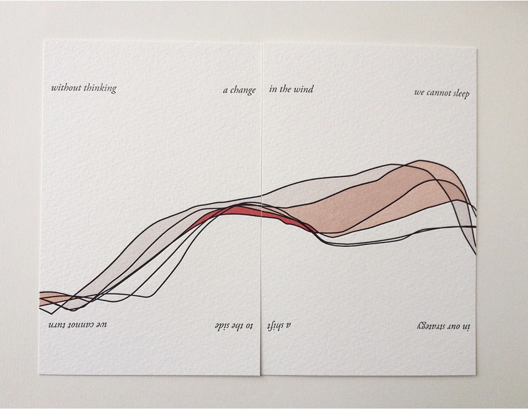
In Shift in Position (2014), Bryant draws on her own sleep patterns and movements. Extraordinary how, in Shift in Position, she manipulates the elements of the book to embody the “message” of the work. Note how she plays with layout, in particular, by running text syntactically over the loose folios (“a change/ in the wind” and ensuring the alignment of the graphical image. The work invites the reader/viewer to turn the two folios 180º — like a restless sleeper — to read/see the additional run-on text (“a shift/ to the side”) and the aligned image from another perspective. This use of the material and form draw the reader/viewer into a kind of creative act — negotiating the act of close reading with that of close looking.
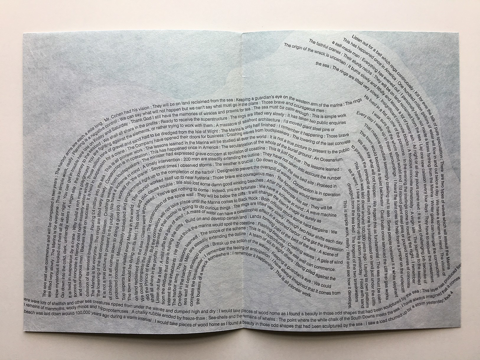
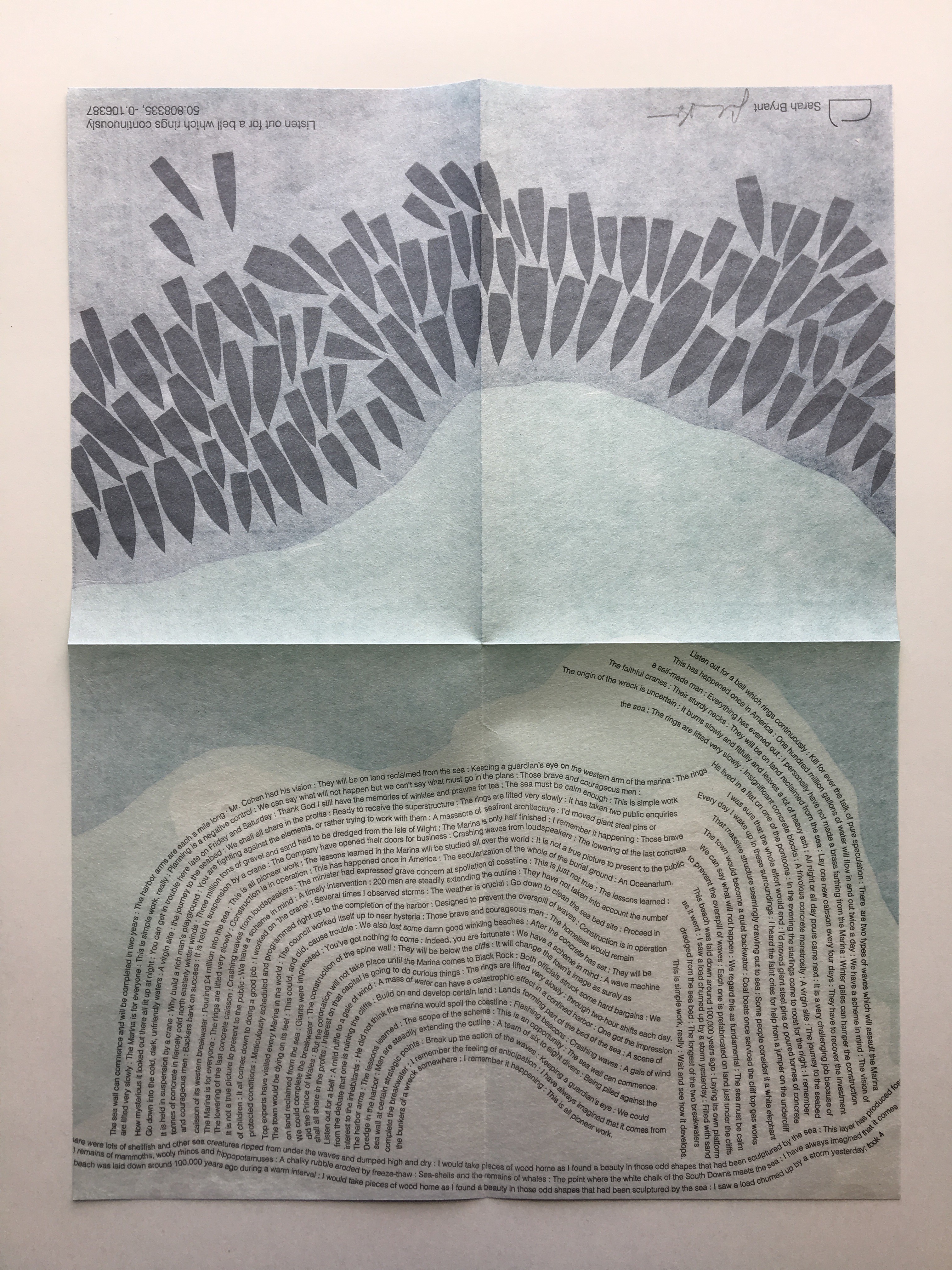
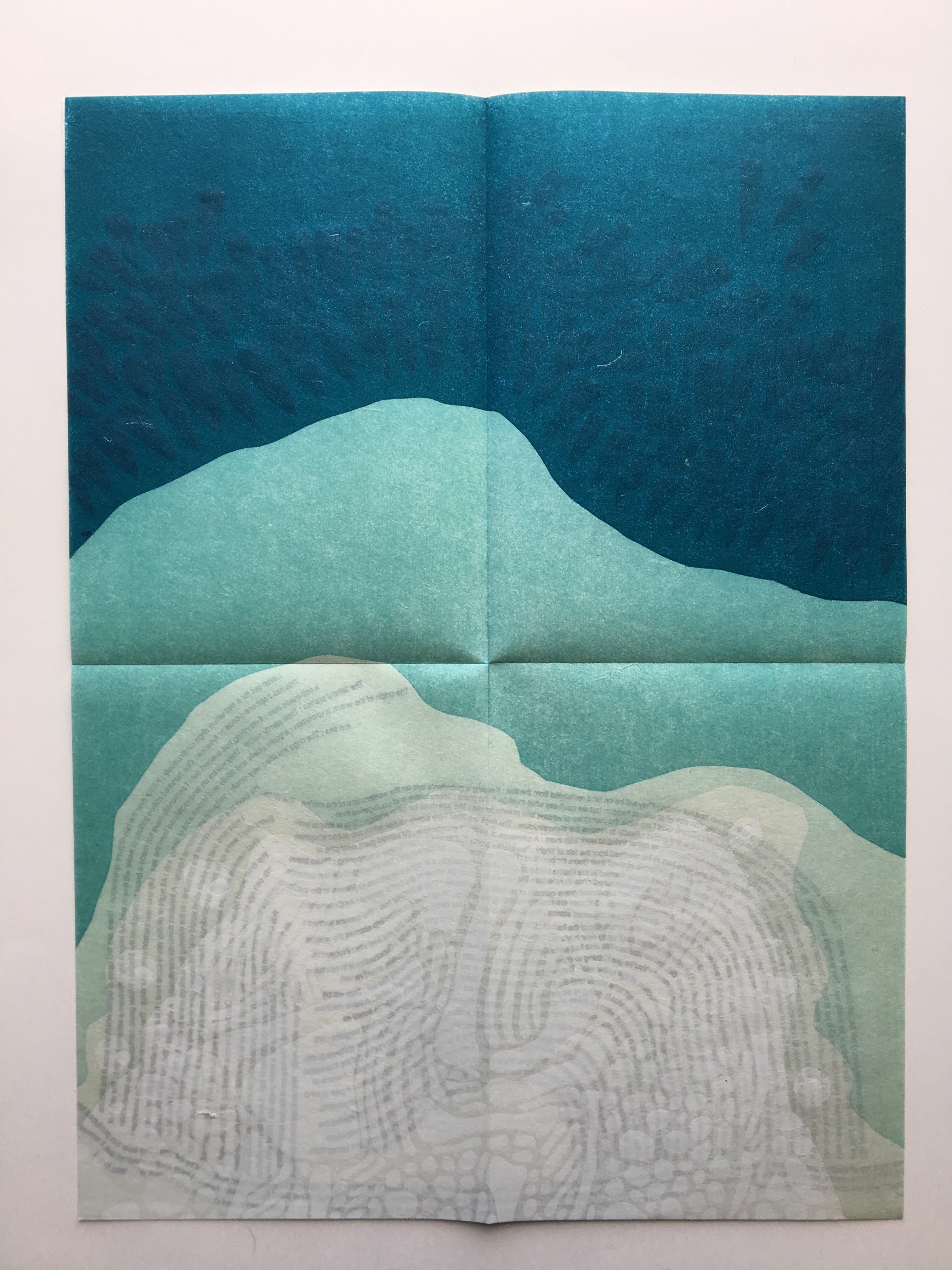
Another collective work from Shift_Lab is Trace (2015). Bryant’s contribution is Listen Out for a Bell which Rings Continuously, which draws on sound and coastal mapping. It is based on her residence at the Brighton Marina, “a strange space between land and sea” where she immersed herself “in the quiet rhythm of the place”. In the first image above from Listen Out, it is obvious how the typography mimics the tide’s ebb and flow, perhaps less obvious how the overlapping texts’ rhythm and syntax surge, overlap, peter out. Look even more closely at the two lower images, two sides of the same sheet: note how the colours on the two sides of the sheet register against one another to create the kind of topographical mapping found in marine maps. Beyond that effect, the two pages challenge one’s sense of place in the world. On the left hand side, one is looking down on the boats crowding in on the marina; on the right, one is below the water and looking up at the hulls. To achieve a further infusion of place with the work, the work is even printed using chalk from the surrounding cliffs.
The Radiant Republic(2019) is one of Bryant’s more recent solo works. In her own words:
The Radiant Republic[is] built entirely out of language found in Plato’s Republic and Le Corbusier’s The Radiant City. In these texts, separated by more than two thousand years, Plato and Le Corbusier each describe a city plan designed to provide a framework for morality and ethics. These works are revered, but they are also deeply troubling. In The Radiant Republic, language from Plato and Le Corbusier has been combined to create a narrative in five parts.Big Jump Press/Portfolio/Artist Books/The Radiant Republic
When Bryant writes “combined”, she means it as the work’s title performs it. Paragraphs in each of the five volumes merge sentences from Plato with those of Le Corbusier. In its combination of the titles of Le Corbusier’s and Plato’s works, respectively, The Radiant Republic signals its textual ambition: to merge the two different texts. The disconcerting oracular tone and coherence of the narrative underscore the revered yet troubling nature of the two works, which is reflected in the epigraph to The Radiant Republic:
Every physical thing carries within its deepest layers a tendency towards its own destruction.
— Moshen Mostafavi and David Leatherbarrow, On Weathering: The Life of Buildings in Time (MIT Press, 1993)
But we are getting ahead of ourselves.
In The Radiant Republic, Bryant uses techniques and materials old and new to her in an aim for new heights of art and depths of thought. The box enclosure itself is the first new technical feature we encounter.
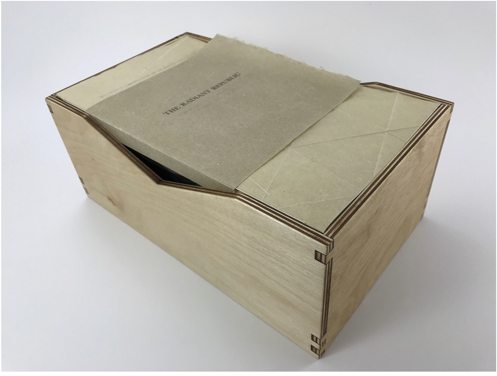
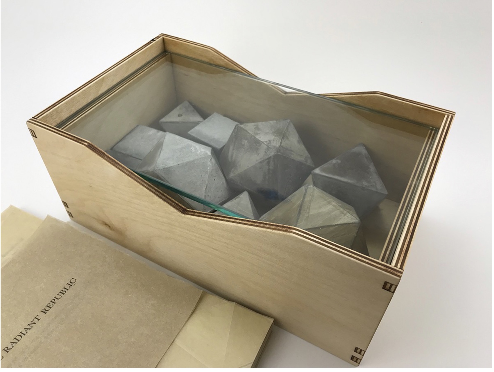
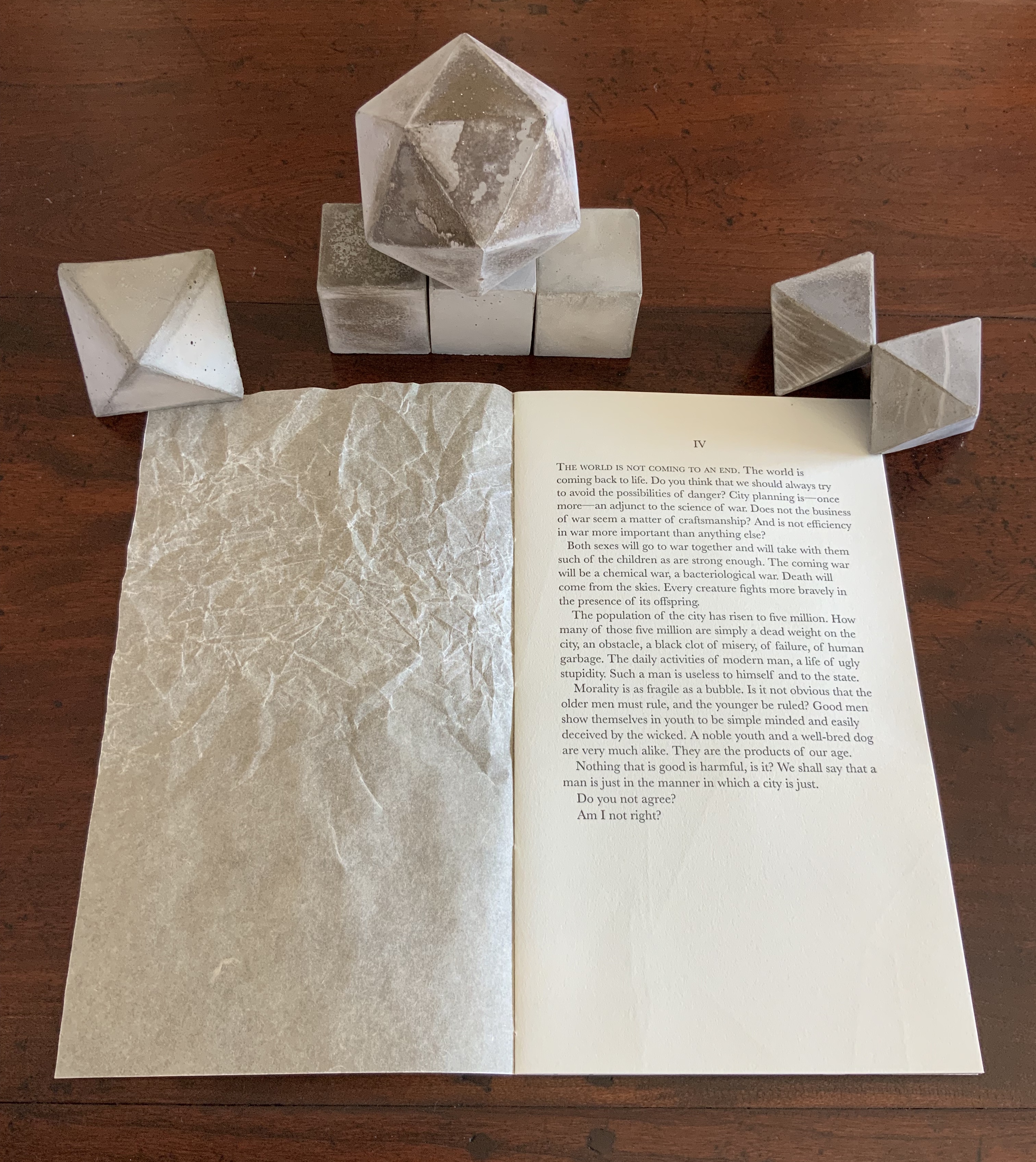
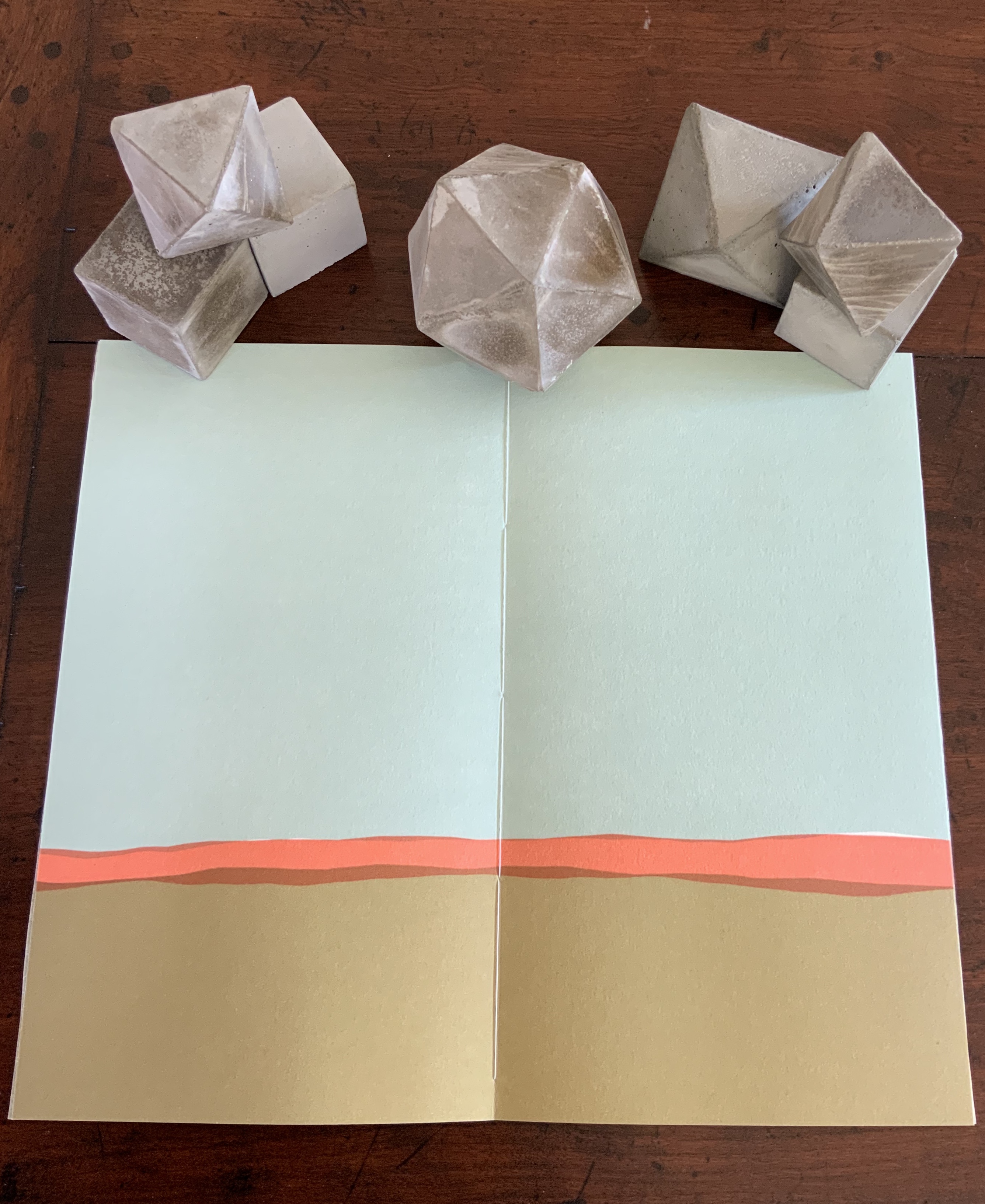
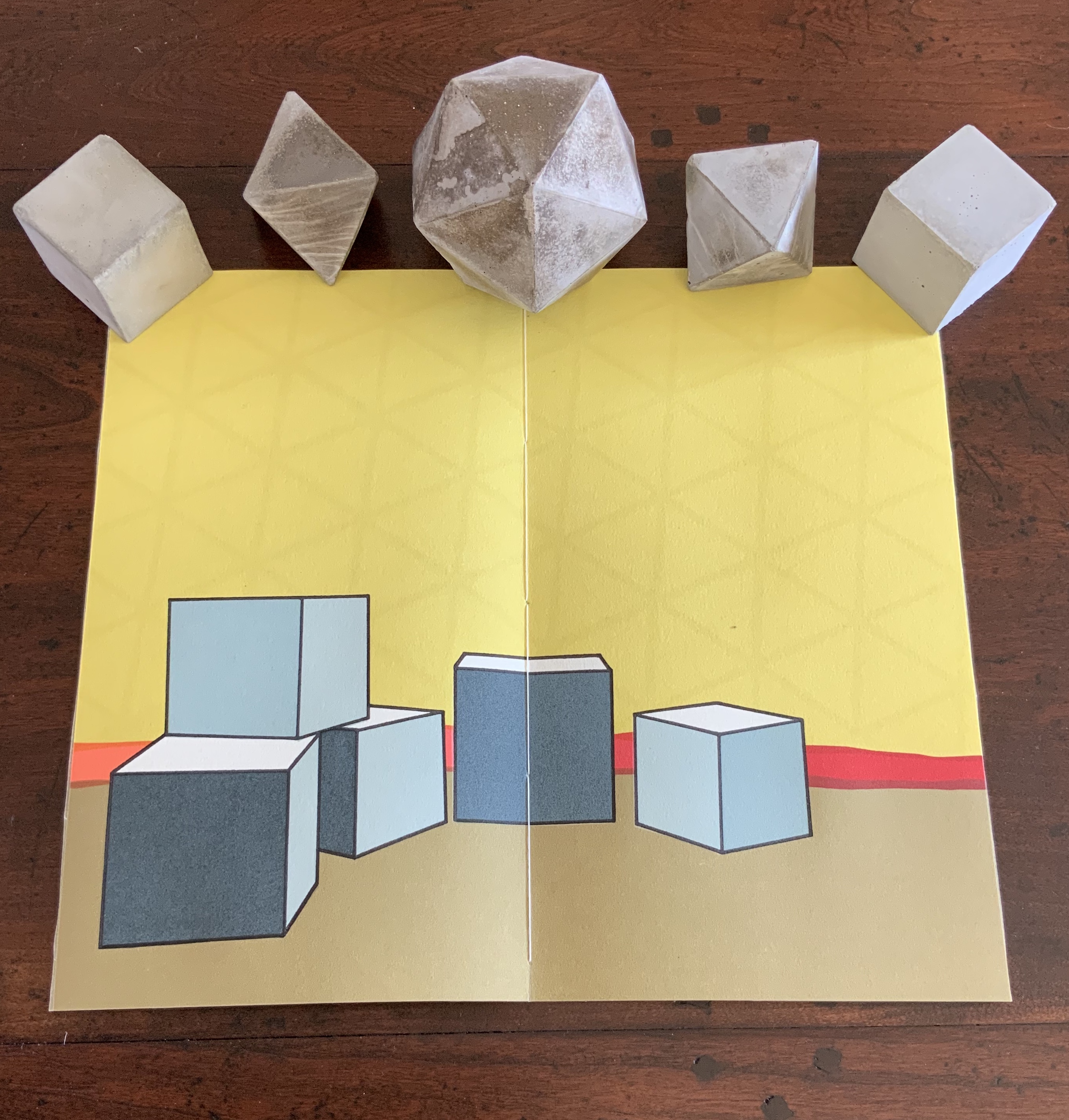
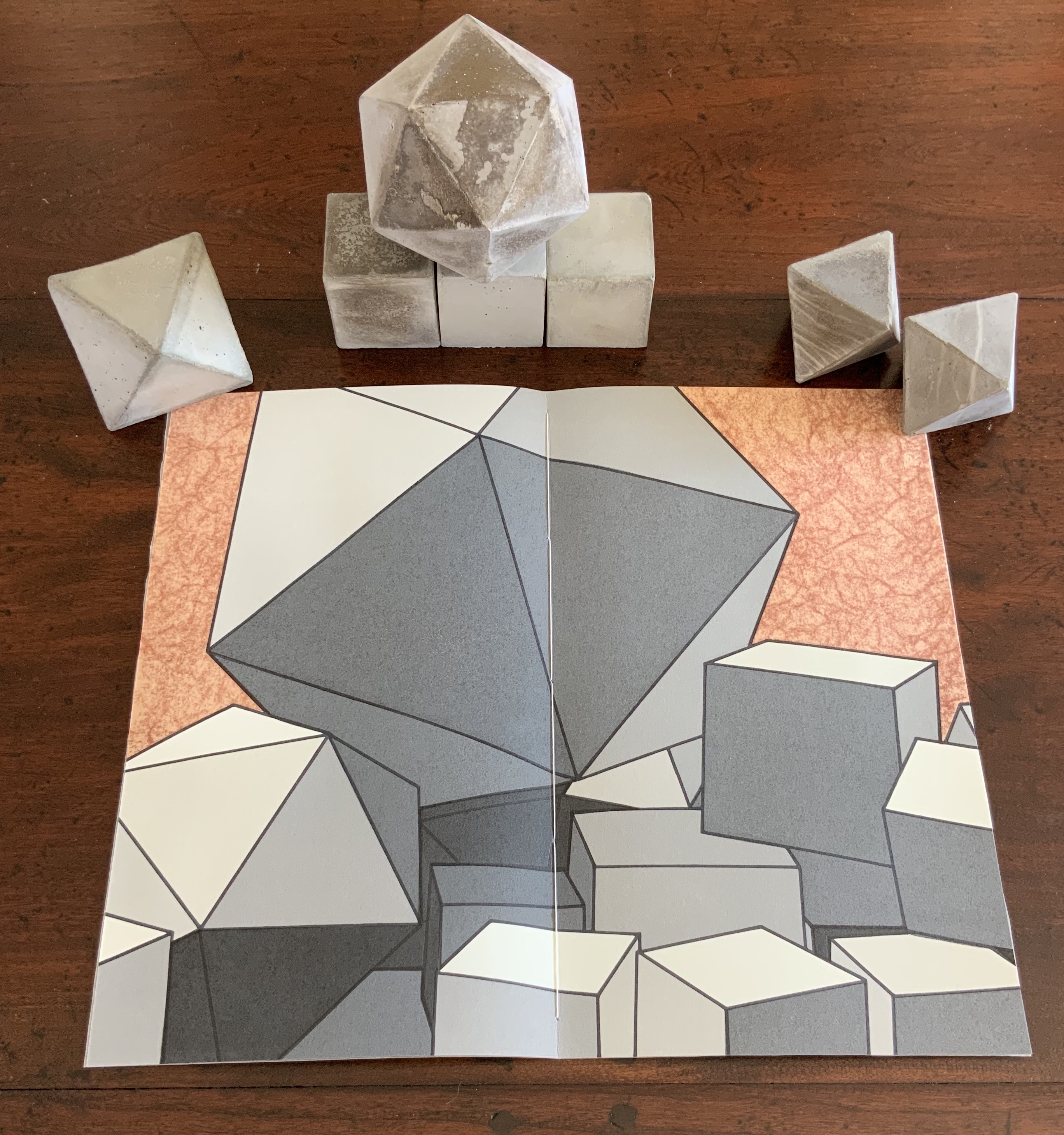
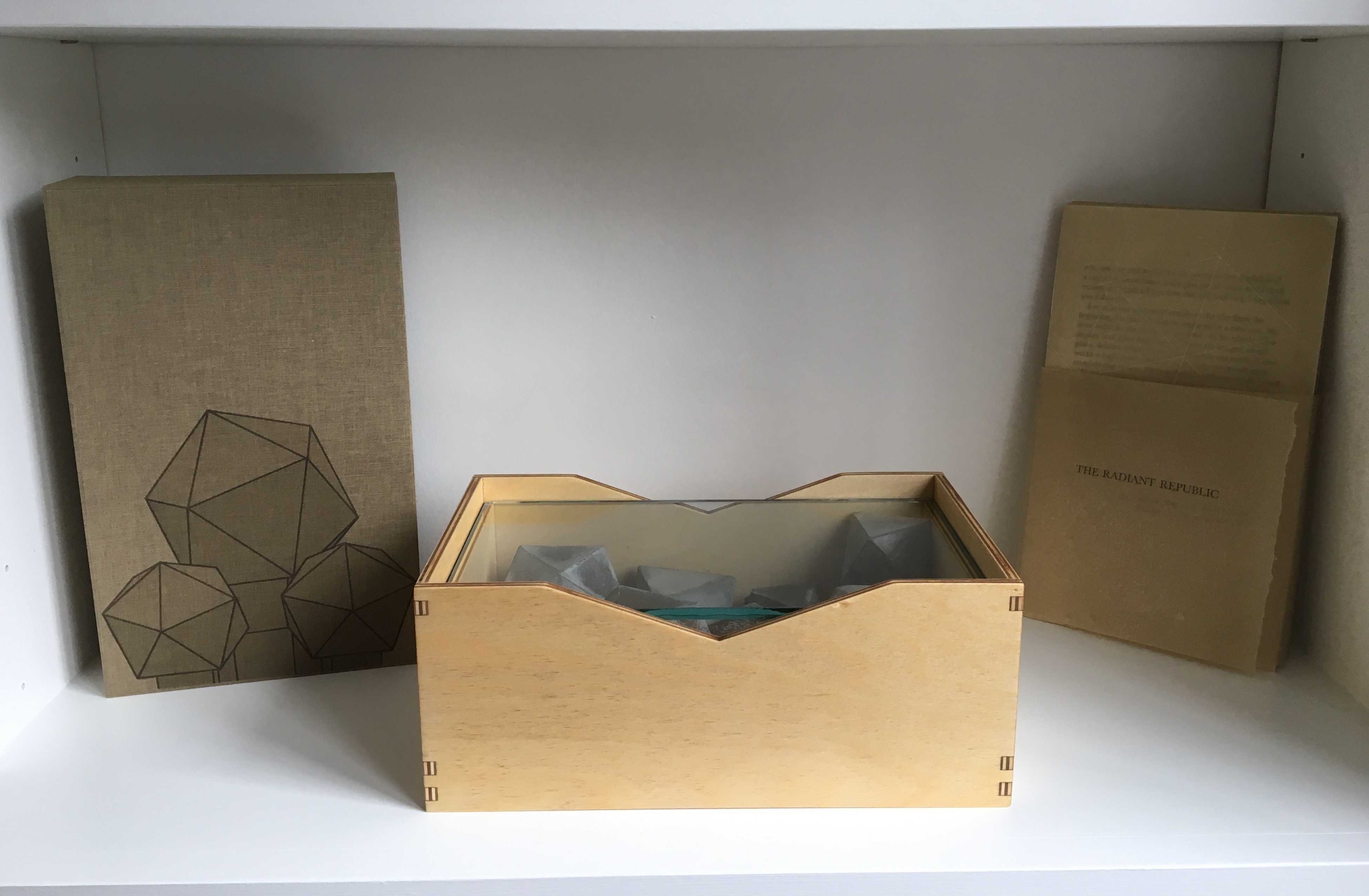
The Radiant Republic (2019) Sarah Bryant Box, glass, cement blocks, pamphlets. Edition of 50, of which this is #5. Acquired from the artist, 20 February 2019. Photos: Courtesy of the artist; Books On Books Collection.
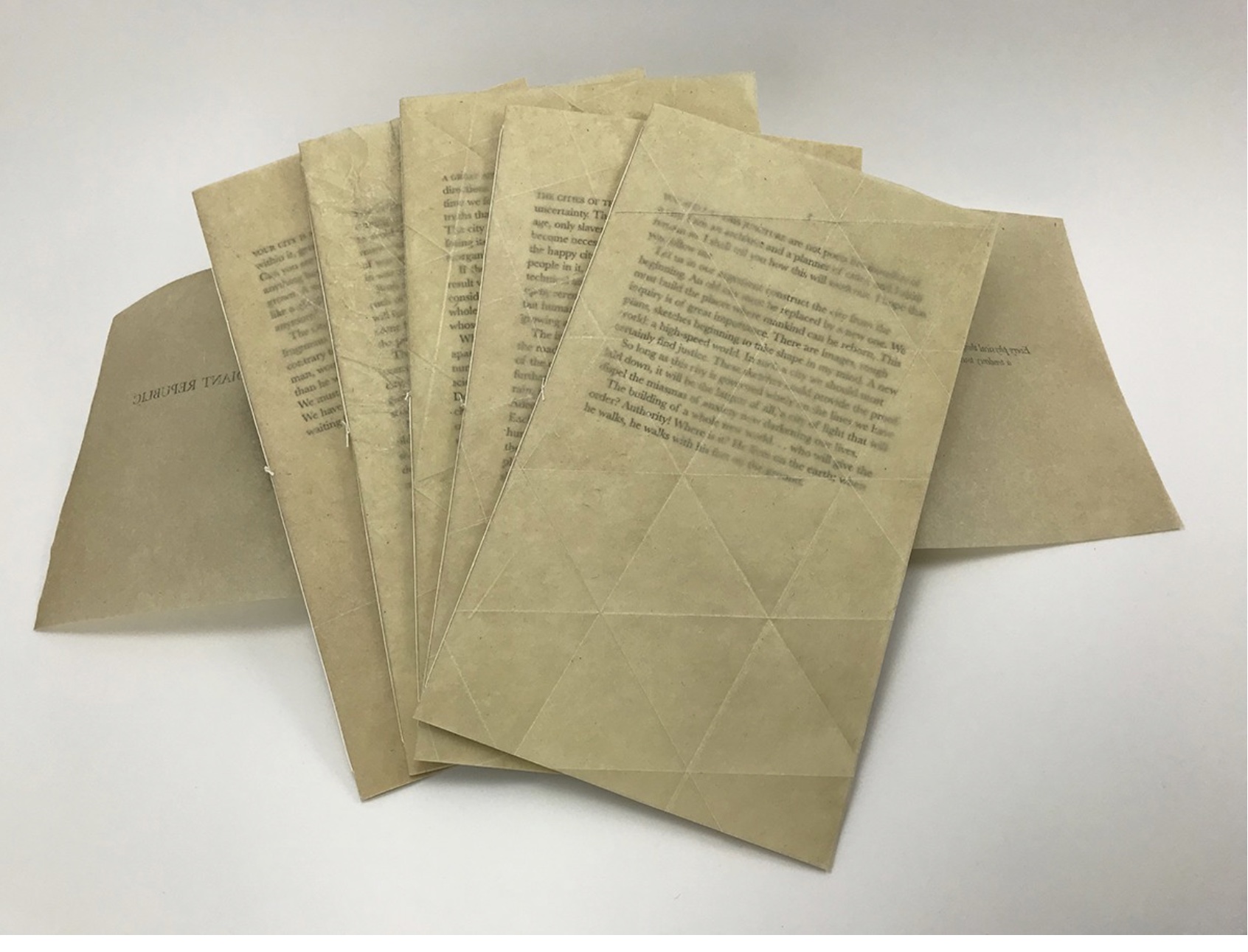
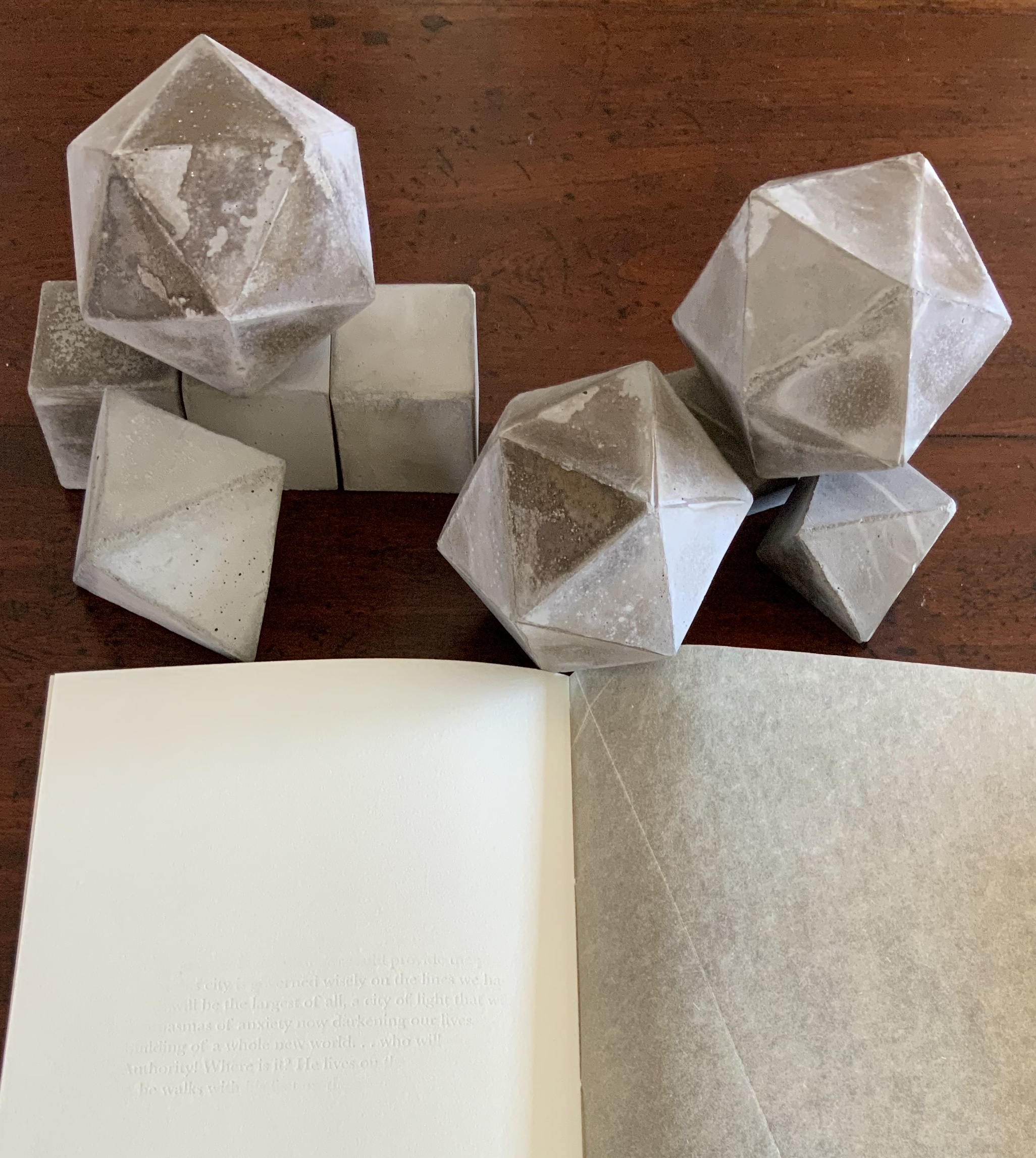
Although the collective works comprising Trace are housed in a box, this one is more elaborate in material and media. It is made of laser-cut Baltic Birch plywood, lightly treated with Tung oil. The lid is covered in Dubletta book cloth, which has been printed letterpress with polymer plates and linoleum. Lifting off the cover reveals yet further new materials and techniques. Five pamphlets each consisting of Rives Heavyweight paper sewn to a lightweight cover made of handmade Belgian Flax, produced at the Morgan Conservatory in Cleveland, and held together with a wrapper rest on a sheet of glass.
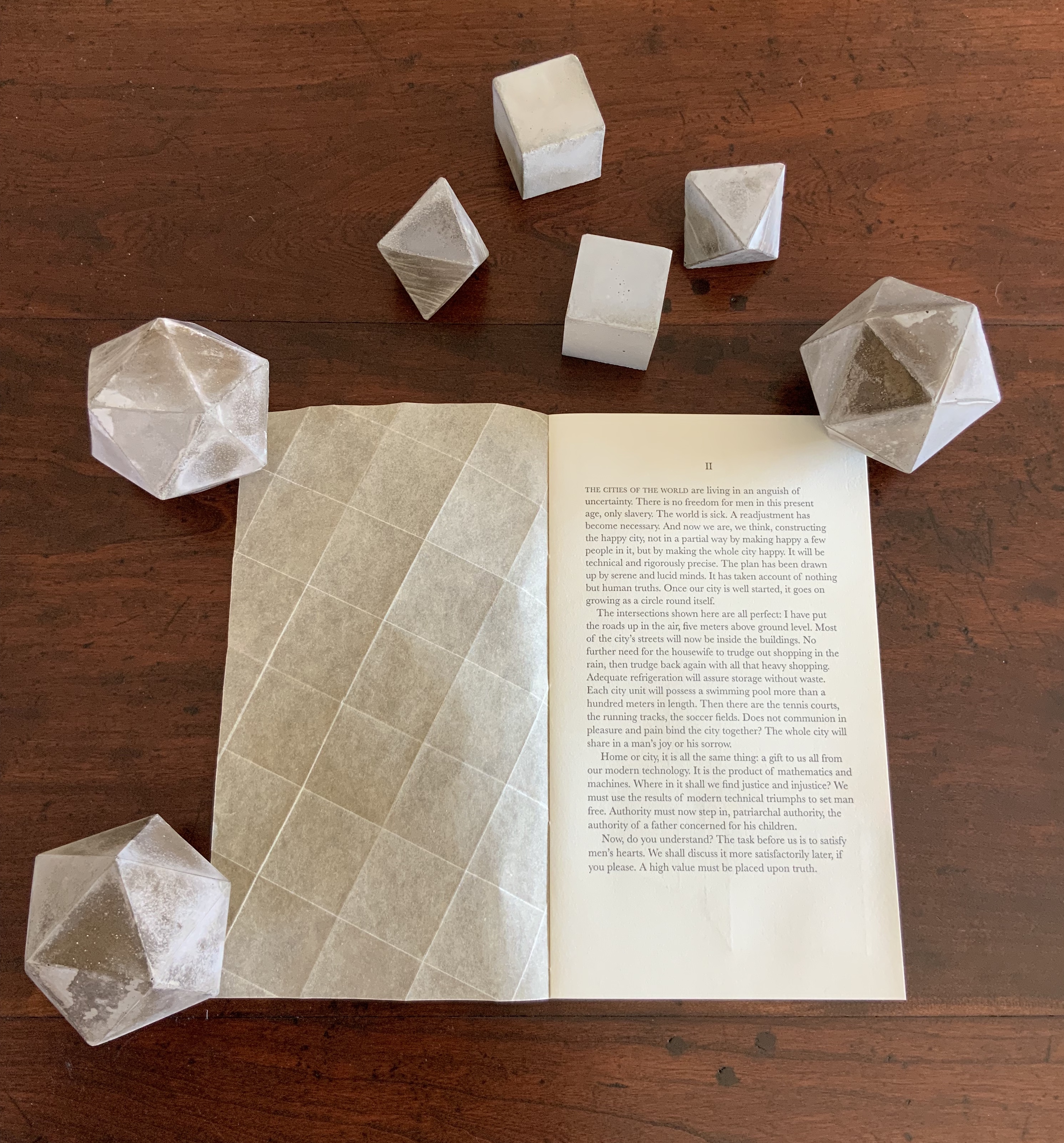
In several ways, the book component shows the encounter of previous techniques/media with the new. The precise fold work and registration to be found in Biography and Listen Out reappear, as does the meaningful integration of separate parts in Figure Study. Here, it is the geometric fold patterns in the covers echoing the geometric solids. Flax paper is a new element in Bryant’s repertoire.
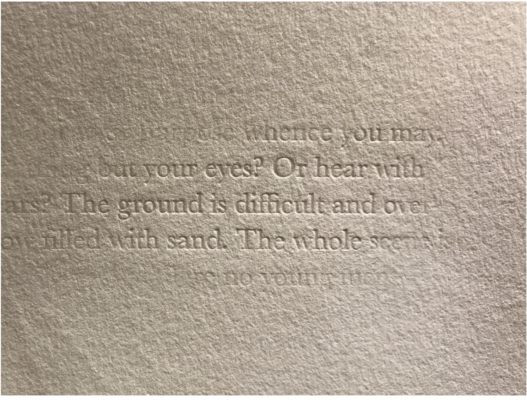
The blind embossed printing from Figure Study moves from the cover there to the interior of the book component here and with substantive, non-decorative intent. Across the five volumes, the embossed text is the same as that printed in ink and always appears on the last folio. But here is the catch: the text that appears comes from the succeeding volume’s inked text, and it appears in fragments. When the last page of the fifth volume appears, the embossed text on its folio’s last page is a fragment of the inked text in the first volume. The fragmentation of the embossed printed version and its variation in depth mime the weathering of structures and ideas.
The circular movement and fusion of the past and present are also reflected in the double-page prints centered in each volume. Note how the technique of prints interlocking across folios in Shift in Position replays here in the prints interlocking across the five volumes to assert a narrative thrust but in a landscape with no fixed beginning or end.
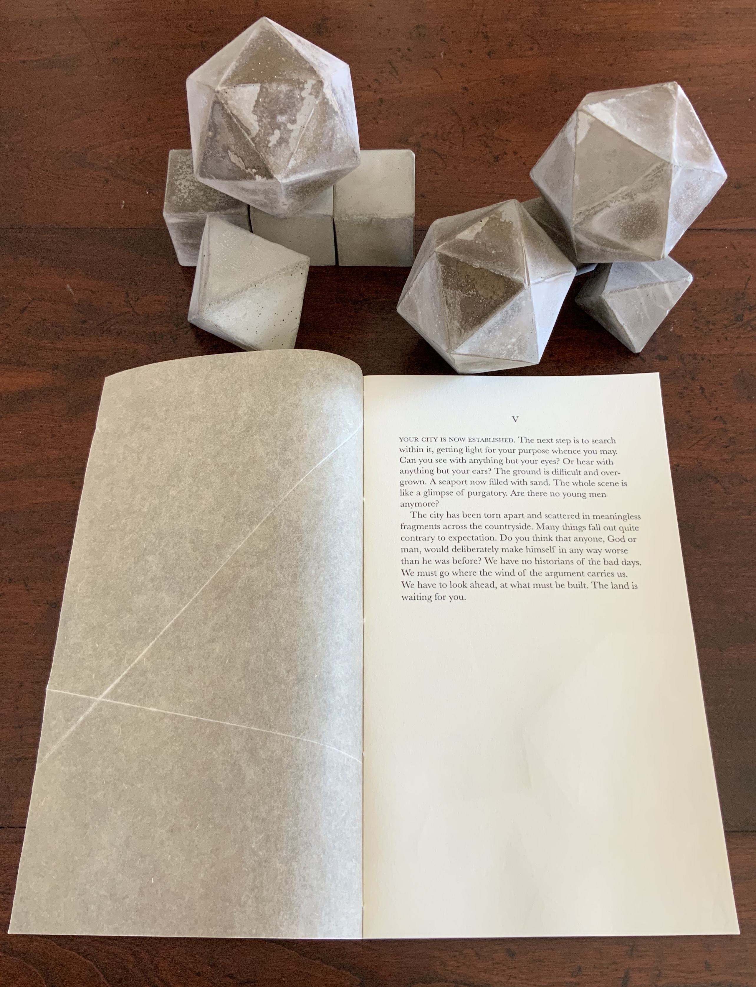
The contrast of materials — cloth, wood, flax paper, Rives paper and concrete — plays out in the concrete solids. Some edges are sharp, others blunted; some surfaces are smooth, others rough. This happens also with the covers to the five volumes according to the absence or presence (and density) of folds and, in one case, of crumpling or no crumpling. It happens in the prints, where the backgrounds include faint images mirroring the structures in the other media. This technique of contrasting materials/media and that of recapitulating the contrast within one or more of the materials/media seems to be a new development in Bryant’s art or, at least, an intensified one.
The multiple materials and techniques and their many-sided interactions pose a pleasurable dilemma for the work’s display. As soon as one is in place, another beckons.
No surprise then that the first pamphlet’s opening words are “You and I at this juncture are not poets but founders of a city”. This self-reflexive invitation to creativity is like that invitation to negotiate reading with looking — an invitation to participate and to recognise our participation as part of the creative act. An increasingly characteristic aspect of book art.
Ruston’s art celebrates the natural world and human spirit, inviting viewers “to follow, to unravel secrets, and to pay close attention to the world around them”.
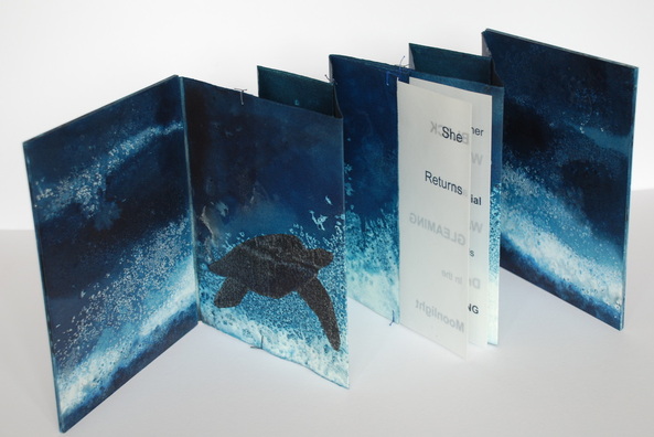
Chris Ruston She Returns (2011) 23.5cm x 18.5cm, Edition of 2
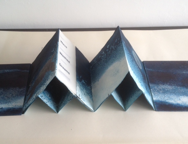
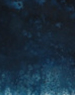
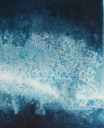
Part of a series called Ocean Blue, the book She Returns uses a double concertina fold and ink on Fabriano watercolor paper to invite us to follow the image of a leatherback turtle making its way through the deep, which fluctuates between the depth of blue-black and the shallows of blue-white. The text reads
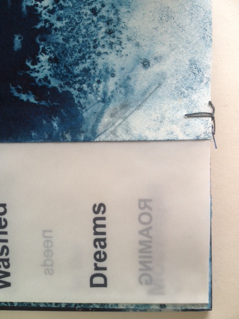
SheReturns BLACK and GLEAMING
in the Moonlight
her Primordial needs Roaming WaveWashedDreams.
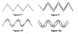
Originating from the Tang dynasty (A.D. 618-908) in China as the Orihon, the concertina fold is also called the accordion fold and sometimes the leporello*. For “She Returns”, Ruston employs a variant of the binding approach in Figure 9. It is
from Hedi Kyle, “Orihon’s Triumph: Origin and Adaptations of the Concertina Fold”, The Ampersand, Vol. 3, No. 2, December 1982.
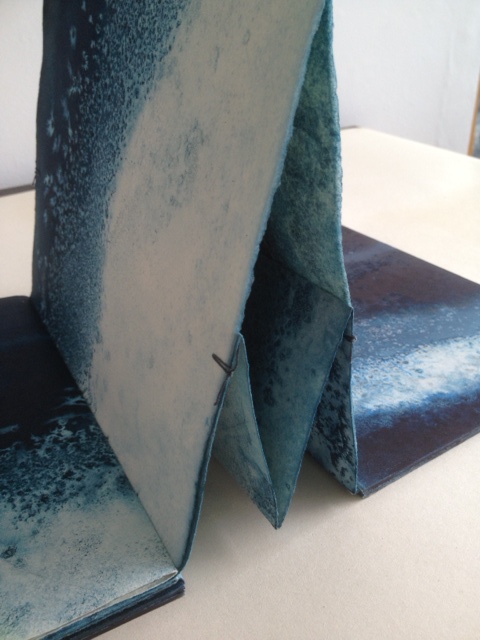
essentially two pages folded together into a concertina fold, but in origami terms, the “mountain” fold of one page is inverted to a “valley” fold, which creates “small boxes” between the pages when the concertina is opened as seen below. The single signature of transparent paper with text is sewn into the centre page. It is bound by a simple stitch top and bottom of each fold.
Painted board covers were then attached.”The stitches at the top and bottom of the page work well as it allows some small movement of the two concertina folds. As I saturate it with water and ink it needs to be a bit more robust but this means it can be bulky when put together.”
Binding detail of She Returns
Binding detail of She Returns
Binding detail of She Returns
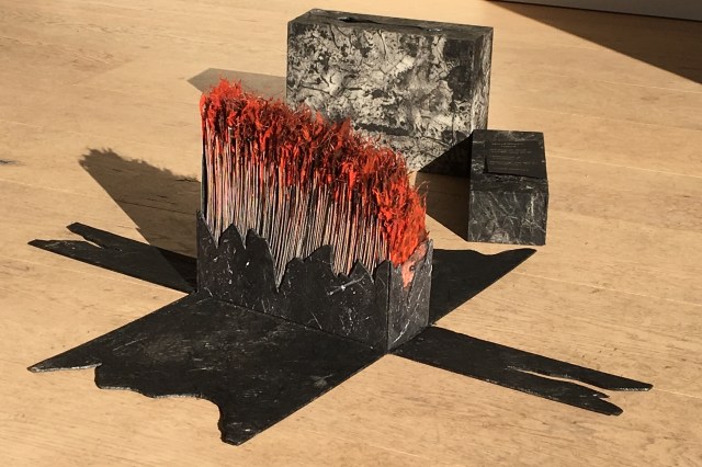
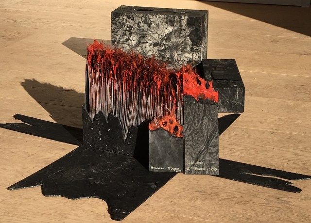
The Holuhraun lava field, on 4 September 2014, during the 2014 eruption
The Bárðarbunga volcano in Holuhraun, Iceland, is active. From August 2014 to February 2015, it erupted for 181 days.
Lava fountains of the fissure eruption in Holuhraun on 13th September 2014 around 21:20.
Ruston responded to that natural event with the work Holuhraun, 2014-2015.
Ruston’s Holuhraun reflects that duality of nature’s destructive creation and creative destruction. The sides of the box falling away mimic the volcano’s production of new land. But the work is more subtle than that; it implicates the viewers in that duality. In taking apart the closed object, we “create” or, at least, reveal another object of art.
Ice is the countervailing passion in Ruston’s art.
What a sight to wake up to on a cold winter’s morning – a blanket of thick frost over everything. Armed with camera, and a thick warm coat, I couldn’t resist taking a detour on my way to the studio. The air was still, the grasses and branches coated with ice crystals, all bathed in a soft gentle light. I spent a pleasant hour surrounded by the gentle rustle of ice crystals softly falling to the ground. (12/12/2012)
In response to her natural surroundings, as well as powerful films such as James Balog’s Chasing Ice (PBS, Nova, 2102) and installations like Olafur Eliasson’s Your Waste of Time (MoMA, New York, 2013), Ruston created Are We Listening?, a work of small pieces of handmade paper into which random text is incorporated and overlaid with transparent paper. Human time and earth time, destruction and creation, recurrently emerge as central themes in Ruston’s art whether touched by fire or ice.
Chris Ruston Are We Listening? (2013) Handmade paper, ink, transparent paper 15cm x 10cm
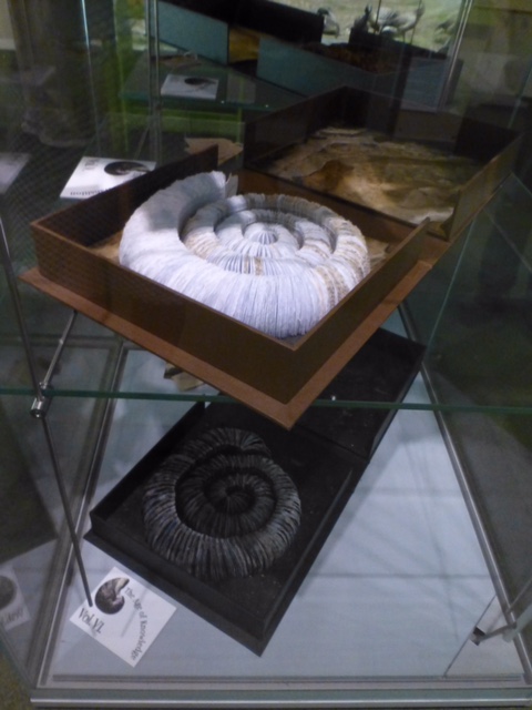
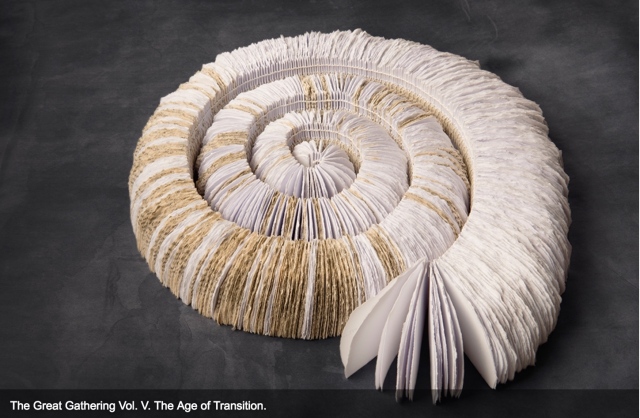
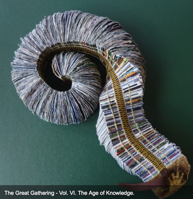
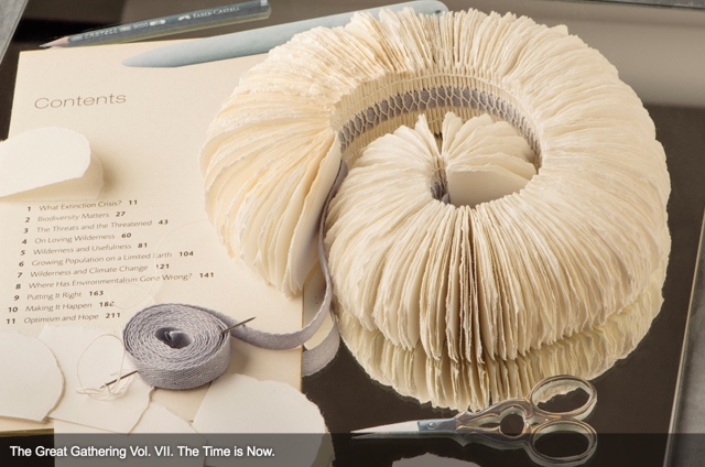
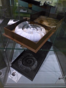
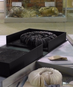
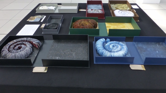
In capturing these themes, The Great Gathering (2015) may be Ruston’s masterpiece — so far — in making visible how the world touches us, and how we touch the world. In this work, she has drawn her inspiration from ammonite fossils on display in the Sedgwick Museum of Earth Sciences, Cambridge, and the Colchester Natural History Museum. The Great Gathering first appeared as an installation at the Colchester Natural History Museum, which is housed fittingly — especially for this work — in a deconsecrated church.
The Great Gathering, Seven books, seven moments in time (2015) Natural History Museum, Colchester, Essex, England Photo credit: Chris Ruston
Chris Ruston The Great Gathering, Seven books, seven moments in time (2015) On display at Turn the Page, Norwich, England, May 2016 Photo credit: Chris Ruston
Ruston writes:
Using the ammonites spiral shape as a starting point, these books represent the unfolding story of evolution. The humble ammonite is an abundant index fossil, easily recognised, and a regular feature in museum collections. Often associated with journeys, symbolically these particular fossils are believed to have absorbed the knowledge of the Universe from across the centuries.
Science and art are the presiding geniuses over many works of book art.
In The sciences of the artificial (1969), Herbert Simon emphasized: “The natural sciences are concerned with the way things are” and engineering, with the way things ought to be to attain goals. Like the scientist, the artist, too, is concerned with the way things are. They are the raw material with which the artist works or to which he or she responds. But like the engineer or the designer, the artist is concerned with the way things ought to be to make visible “the way things are”:
The Great Gathering (2016) Chris Ruston Photo credit: Chris Matthews
how a solander box ought to be constructed to operate with the work and, in enclosing it, be “the work”;
The Great Gathering (2016) Chris Ruston Photo credit: Chris Matthews
what materials (photos from the Hubble telescope) ought to be used to reflect a moment in time;
The Great Gathering (2016) Chris Ruston Photo credit: Chris Matthews
how thread, tape and stitch ought to be to hold together a spine that will flex and spiral into the shape of a fossil;
The Great Gathering (2016) Chris Ruston Photo credit: Chris Matthews
how the color of the material ought to be juxtaposed with the material’s altered shape to carry meaning;
The Great Gathering (2016) Chris Ruston Photo credit: Chris Matthews
how the shift from content to blankness ought to be juxtaposed with the material’s altered shape to carry meaning;
The Great Gathering (2016) Chris Ruston Photo credit: Chris Matthews
how the selection and alteration of text ought to be made to show the fixity and flux of knowledge and ourselves;
The Great Gathering (2016) Chris Ruston Photo credit: Chris Matthews
and how our reflection in the mirror in Volume VII under the maker’s tools and the made thing ought to implicate us — a theme echoed above by Holuhraun, 2014-2015 — in an ongoing process of making and remaking.
For her next invitation to the viewer to follow, unravel secrets and attend closely, Ruston is returning to the ocean.
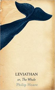
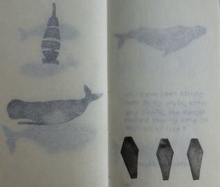
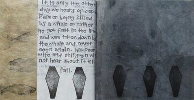
Inspired by Philip Hoare’s Leviathan and his fascination with Melville’s Moby Dick, Ruston recently began research into whales and whaling logs for her next work. Like evolution, here is a subject of grandeur, expanse and time, even fire and ice. The sketchbook pages below tantalize. How will the artist, this time, make visible how the world touches us?
*In Mozart’s opera Don Giovanni, the main character’s manservant is Leporello, who, when singing the Catalogue Aria, produces a book that endlessly unfolds the list of Don Giovanni’s conquests.
It is interesting to contemplate an entangled bank, clothed with many plants of many kinds, with birds singing on the bushes, with various insects flitting about, and with worms crawling through the damp earth, and to reflect that these elaborately constructed forms, so different from each other, and dependent on each other in so complex a manner, have all been produced by laws acting around us…. There is grandeur in this view of life, with its several powers, having been originally breathed into a few forms or into one; and that, whilst this planet has gone cycling on according to the fixed law of gravity, from so simple a beginning endless forms most beautiful and most wonderful have been, and are being, evolved.
– On the Origin of Species, 1869, the final paragraph.
In disparate “entangled banks” and micro-climates around the world, book artists and Charles Darwin have evolved a symbiotic relationship. By date and place, here are some bookmarks on that evolution.
1995, Washington, D.C., USA
Carol Barton and Diane Shaw organized the exhibition “Science and the Artist’s Book” for the Smithsonian Institution Libraries and the Washington Project for the Arts. Barton and Shaw invited book artists to respond to works in the Heralds of Science collection in the Smithsonian’s Dibner Library. Among twenty-one other pairings, George Gessert was invited to respond to Charles Robert Darwin’s On the Origin of Species by Means of Natural Selection, London, 1859.
Gessert’s response wasNatural Selection(1994), an artist’s book consisting of computer-printed handwriting and Cibachrome prints of the results of Gessert’s own experiments in hybridizing irises. Citing Darwin’s description of the breeding of pigeons for their ornamental characteristics, Gessert contends “that Darwin also recognized aesthetics as an evolutionary factor”. Since the 1980s, Gessert’s work and writings have focused on the way human aesthetics can affect evolution and the aesthetic, ethical and social implications. His work and that of artists/theorists such as Suzanne Anker, Eduardo Kac, Marta De Menezes, the Harrisons and Sonya Rapoport have constituted the bio art and eco art movements. A collection of his essays appeared as Green Light: Toward an Art of Evolution in the Leonardo Book Series, published by The MIT Press in 2010.
Emma Lloyd Evolution Triptych (2004) Part 1 – 10 x 7.5 x 1, Part 2 – 12 x 9 x 2, Part 3 – 8.5 x 6.5 x 1
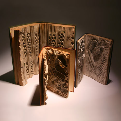
Inspired by Darwin’s The Descent of Man, Part I, and cell structures in biology texts, Emma Lloyd‘s Evolution Triptych sparks thoughts of fossils, woodcarved altarpieces or the tooled cover of the St Cuthbert Gospel, the code of life embedded in DNA structure and the code of information embedded in the codex.
The artistic technique here – carving the book as artifact – is prevalent in book art; see the work of Doug Beube, Brian Dettmer and Guy Laramée, for example. Lloyd’s treatment of the Darwin volume is the only one of its type in this collection of bookmarks. Given the influence of On the Origin of Species, though, it would be unusual if other “book surgeons” have not been similarly inspired by it.
2009, London, UK
Storyteller and book artist Sam Winston set about categorizing the words in On the Origin of Species and poet Ruth Padel’s Darwin, A Life in Poems (Chatto & Windus, 2009). He sorted them by nouns, verbs, adjectives and “other”. As Winston puts it, he “wanted to present a visual map of how a scientist and a poet use language – a look at how much each author used real world names (Nouns) and more abstract terminology (Verb, Adjective and Other) in their writings.”
To do that, he categorized the 153,535 words in On the Origin – a dot with a 4H pencil for the 50,567 words categorized as “Other”, a 2H pencil for the 38,266 categorized as “Noun”, an HB pencil for the 26,435 categorized as “Verb” and a 4B pencil for the 38,266 categorized as “Adjective”. The result – Darwin, a series of visual “frequency poems” on display at Le Gun Studio in London – is a book altered through the DNA-like pattern of its own words into a completely “other” scroll and into a topographical map of itself – guided by the artist’s hand and mind.
Sam Winston Darwin (2009)
Right view. Sam Winston, Darwin (2009) Le Gun Studio, 19 Warburton Road, London, E8 3RT, UK
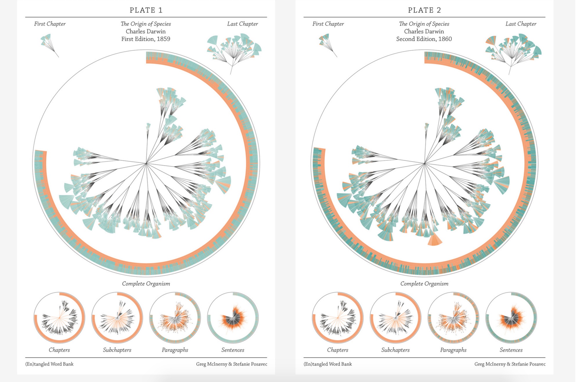
In the same sesquicentennial year, in the same city, Stefanie Posavec collaborated with Greg McInerny to issue (En)tangled Word Bank, a series of diagrams, each representing an edition of On the Origin of Species, and the work’s title alluding to Darwin’s “entangled bank” passage presented above.The pressed-dandelion-shaped chapters and subchapters are divided into paragraph ‘leaves’ with wedge-shaped ‘leaflets’ representing their sentences.
The sentences forming the ‘leaflets’ of the organism are of orange, senescent tones when they will be deleted in following editions. The green, growth tones are applied to those sentences that have life in the following edition. The tone of each colour is determined by its age, in editions, to that point. Through these differences in colouration the simplicity in structure in the early stages of the organism’s life develops into a complex form, showing when the structures developed to its changing environment. Around the organisms the textual code is provided, showing the changes in the size of the organism, and where the senescence and growth is derived in that code. A series of re-arrangements of the organism focus on changes at each level of organisation.
This is “structural infographic” as art.
Stefanie Posavec and Greg McInerny for Microsoft Research, Cambridge (En)tangled Word Bank (2009)
2009, Boston, MA, USA
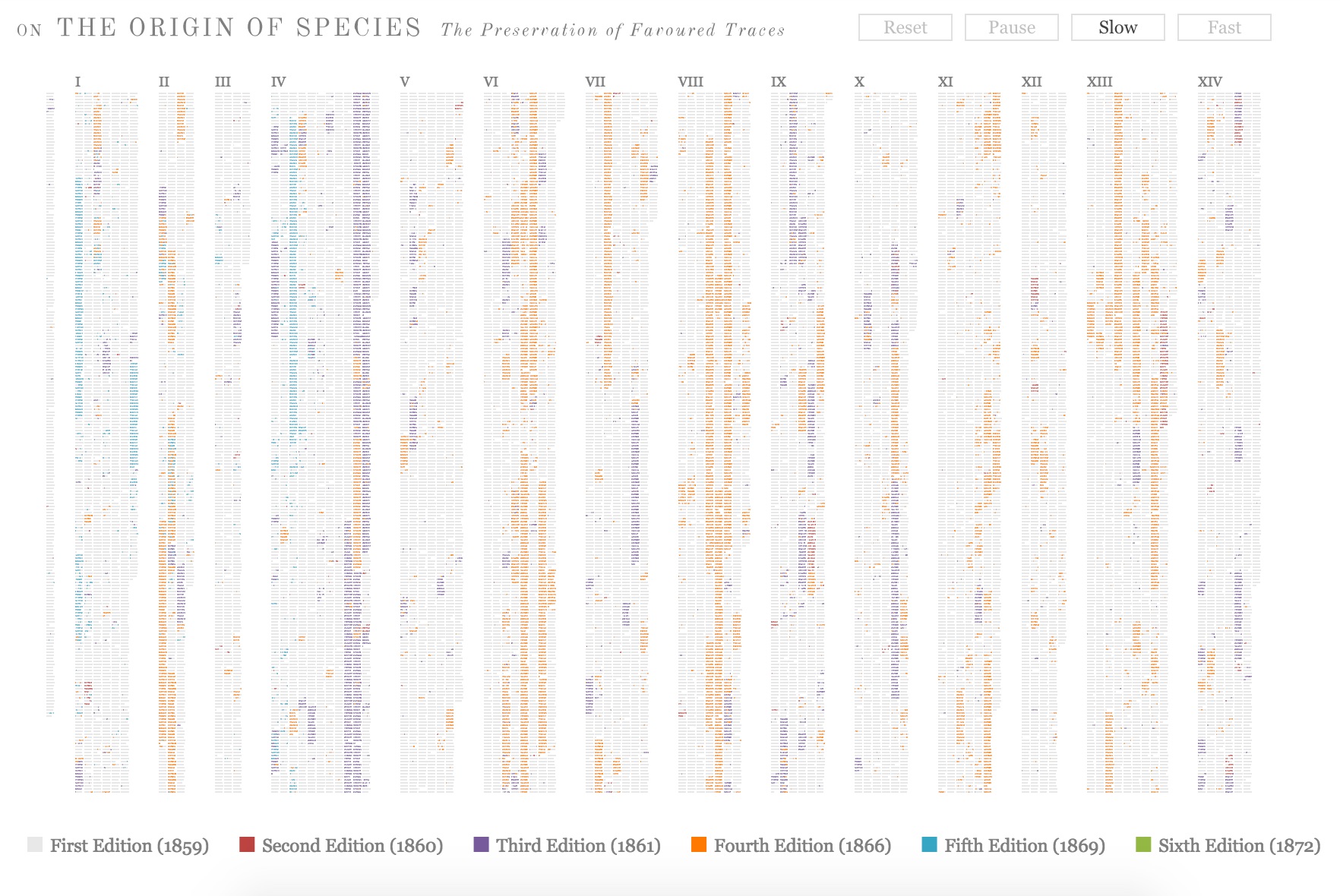
Across the Atlantic, Ben Fry, author of Visualizing Data (O’Reilly, 2007), created a similar work of art called The Preservation of Favoured Traces. Fry color-coded each word of Darwin’s final text by the edition in which it first appeared and used the data to build an interactive display at fathom.com demonstrating the changes at the macro level and word-by-word. Fry went on to produce a poster version and print-on-demand book version.
Ben Fry The Preservation of Favoured Traces (2009)
2009, Vancouver, Canada
Three thousand miles away that summer, Canadian poets Stephen Collis and Jordan Scott placed multiple copies of On the Origin of Species in various outdoor locations “not … to put the natural into the text, [but] … to put the text out into the natural world and see what happens to it” (p. 2). After a year, Collis and Scott photographed the results in situ and collected and used the some of the still decipherable words as found text for their volume Decomp (Coach House Press, 2013).
Former science teacher and now botanical artist and bookmaker, Kelly Houle embarked on a 10-year plan to create an illuminated and scribed copy of the first edition of On the Origin. Where medieval scribes and rubricators had abbots to preside over them and their book art, Houle has University of Chicago Professor Emeritus Jerry A. Coyne and several other academics. As she notes about her process, the past techniques have also yielded to present concerns:
Kelly M. Houle The Illuminated Origin (2009 – ) Watercolor, gouache, interference watercolor, gold foil, shell gold on Fabriano Artistico, 22 x 30 inches
Today many artists still practice the tradition of illumination using medieval and renaissance-era materials and techniques. While many of these have stood the test of time, there are more earth-friendly materials than those used in the past….
Detail of frontispiece Courtesy of the artist
The Illuminated Origin of Species will be written on hot-pressed Fabriano Artistico paper made in Italy. It is the best paper in the world for both calligraphy and botanical art. These are extremely smooth, beautiful, and durable papers. They are chlorine-free, acid-free, and 100% cotton. No animal by-products are used in the sizing. Combined with Winsor and Newton watercolors and gouache, this paper will be perfect for the demands of The Illuminated Origin.
Detail of frontispiece Courtesy of the artist
To mimic the play of light on various shiny and iridescent surfaces in nature, I am using 23k gold foil, shell gold, and interference watercolors, which contain small flecks of mica to produce an iridescent effect. These metals will distinguish The Illuminated Origin as a truly “illuminated” manuscript. — Kelly M. Houle, “The Making of a Modern Illuminated Manuscript“
Houle aims to complete her work in 2019,On the Origin‘s 160th anniversary.
2009, Farnham, Surrey, UK
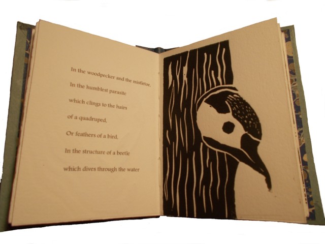
Between its hardback covers lined in marbled papers, Angela Thames’ Darwin’s Poetic Words has distilled the often liturgical, poetic passages of On the Origin of Species.
Angela Thames Darwin’s Poetic Words (2009) Hardbound, 12 pages, 12 x 8 cm, 8 linocuts, Somerset paper
Between 2009 and 2013, Thames created four more artist’s books besides Darwin’s Poetic Words, based on excerpts from On the Origin of Species. In this focus and technique, Thames takes and interprets portions rather than the whole of the source as do Houle, Collis and Scott, Fry, McInerny and Posavec, Winston, and Lloyd in their differing ways.
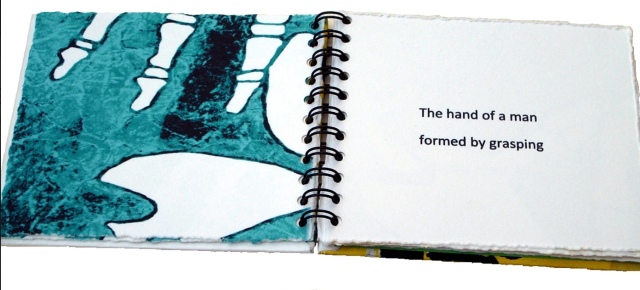
Angela Thames Evident Evolution (2009-13) Collagraph images of bone structures and text, 8 pages, Silkscreen covers, Spiral bound edition
Angela Thames A Grain in the Balance (2009-13) Collagraph images with rubber-stamped text, 8x10cm, 15 pages, Somerset beige paper
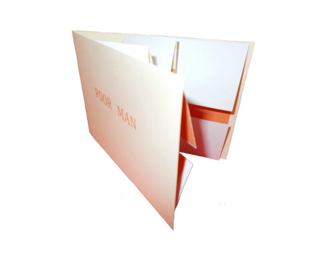
Angela Thames Poor Man (2009-13) Folded card with pop up flower, Words spoken by his gardener, Silkscreen, wood-stamped text, Open edition
Poor Man (2009-13) is the only exhibit in this survey that demonstrates the pop-up technique in book artistry, but as evolutionary biology and fossil-hunting have shown, who knows what undiscovered forms are out there.
2012, New York, NY, USA
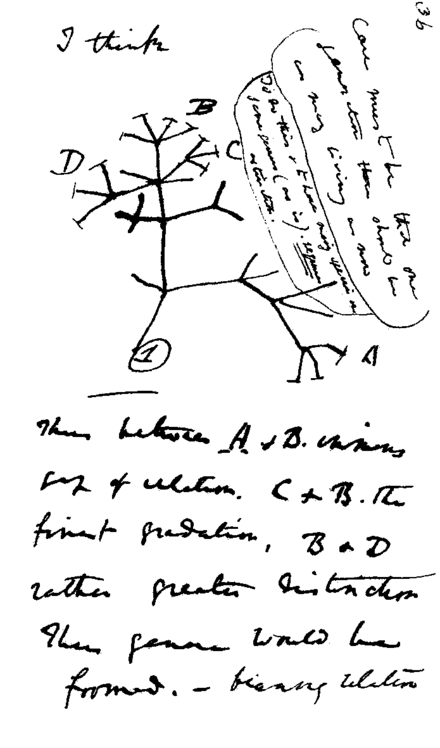
Following in their tradition since 1984, Tim Rollins and K.O.S. (“Kids of Survival”) seized on Darwin’s “Tree of Life” diagram
Darwin’s notebook sketch of an evolutionary tree. Charles Robert Darwin, Transmutation of Species, 1837
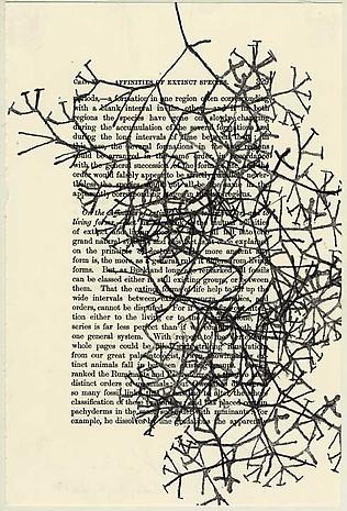
and “jammed” to produce a series of paintings and preliminary works in ink and watercolor on pages of the book to create ON THE ORIGIN OF SPECIES (after Darwin). Eighteen students, aged 13 to 16, worked with Rollins on the preliminary studies, one of which appears below, that preceded the 2013 exhibition of paintings at the Lehmann Maupin Gallery.
Tim Rollins and K.O.S. Studies for ON THE ORIGIN OF SPECIES (after Darwin) (2014) Ink and watercolor on book page, 22.9 x 15.2 cm Photo credit: Lehmann Maupin Gallery
The large-scale paintings consist of almost all of the 360 pages of On the Origin fixed to canvas and ink-stamped over and over with the “Tree of Life” image, which had been cut into 60 handstamps. Rollins described the concept of the works in an interview for Brooklyn Rail:
The whole book is 360 pages but we don’t ever want to be literal so it’s not all of the pages. They’re there to inspire. It’s like an opera. The libretto inspires the music. You can watch an opera in a language you don’t know, without reading. It’s the same with our work. It’s about a visual correspondence with the text. The work is not about something. That’s why you can’t get hung up on interpretation. That’s a big issue, especially with so much politically engaged art. We want to create a situation, learning machines, so everyone is learning in the process of making and then hopefully the audience will be inspired too. Maybe they will pick up Darwin or continue with the idea. These are catalysts for action.
In a video interview with ArtNet, Rollins also refers to the K.O.S. jamming process -reading aloud from the book in a studio setting, discussing it with students and seeking inspiration from the text – not as a school lesson or classroom exercise but as a kind of séance, an assertion that touches the essence of “reverse ekphrasis” in book art. Rather than the literary work or book capturing the spirit of a work of art, the work of art captures the spirit of the book.
2013/14, Oxford, OH, USA
At the University of Puget Sound (2013) and Center for Book Art in New York (2014), Diane Stemper exhibited her Darwin-inspired book art that explores “the intersection between the natural world, daily living, science and the collective and individual experience of landscape”.
Diane Stemper Universal Sample (2014) Edition of 4, Intaglio and letterpress on Arches
Diane Stemper Universal Sample (2014) Edition of 4, Intaglio and letterpress on Arches
Diane Stemper Universal Sample (2014) Edition of 4, Intaglio and letterpress on Arches
Hand bound, printed and produced in her Plat 21 Studio, in Oxford, her Galapagos Map (2013), Darwin’s Atlantic Sea (2014) and Universal Sample (2014), these works have an eerie physical presence. At the Center for Book Art, I have seen and, with the kind permission of Alex Campos, the curator there, touched the works. The intaglio printing and richly textured creamy paper still communicate themselves even across the digital divide.
2014, Amsterdam, The Netherlands, and London, UK
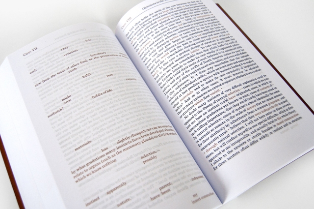
Simon Phillipson completed a variorum edition of On the Origin of Species, in which every verso page is the evolved or amended text and the recto page is the final text from the the Sixth edition.
Charles Robert Darwin, On the Origin of Species, variorum edition designed by Simon Phillipson, 2014. Printed in the Netherlands on special 60gsm bible paper and finished with a special metallic bronze ink
The verso pages are completely printed in a special metallic bronze ink. The recto is printed in a combination of black and bronze ink. The bronze highlighted words in the recto correspond to the evolving or amending text in the verso. Very reminiscent of, but distinct from, Ben Fry’s The Preservation of Favoured Traces (see above).
2014, Minneapolis, MN
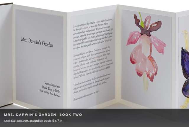
Vesna Kittelson, Mrs. Darwin’s Garden, Book Two (2014) Accordion book, 9 x 7 in
Vesna Kittelson is an American-Croatian artist based in Minneapolis. Her résumé cites public collections ranging from Tate Britain and Minnesota Museum of American Art to Cafesjian Center for the Arts in Armenia and the Modern Museum of Art in Croatia. In 2009, she spent time at Churchill College, Cambridge University, where she learned about the life and marriage of Charles Darwin and Emma Wedgwood. Subsequently she created four artist books titled Mrs. Darwin’s Garden depicting primitive-seeming plants imagined as flora that Darwin might have seen from the deck of the Beagle. The names of the plants are made-up Latin names or variations on those of contemporary plants.
Vesna Kittelson, Mrs. Darwin’s Garden, Book Two, 2014 Accordion book, 9 x 7 in
These abstract images are imagined plants for Mrs. Darwin’s garden. They are illustrations of named floral specimens that never existed in reality. In Mrs. Darwin’s Garden they are presented as if they correspond to data derived from Darwin’s experimentation in his greenhouse. In this book I replaced the 19th C methods of botanical drawing with pouring paints to incorporate the contemporary notion of valuing an accident, followed by drawing with brushes and pencils to gain control and give the images a place and time in the 21st C.
2014, Grasswood, Saskatchewan, Canada
Jonathan Skinner (Warwick University) wrote in his preface to Decomp (see above):
Writing rots, meaning flees. … Yet the book is written to locate (some) meaning here. Would it make any difference to leave Decomp itself in the wilderness? Probably not.
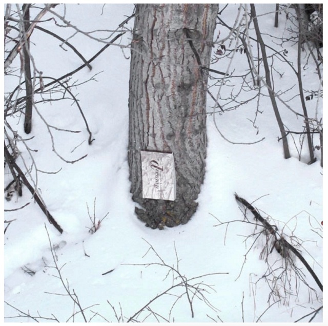
Book artist, papermaker and co-founder with her husband David Miller of Byopia Press, Cathryn Miller reviewed Decomp in 2013. If not prompted by Skinner’s preface, Miller must have felt how appropriately evolutionary it would be to attempt to replicate the Decomp experiment by substituting the result of that experiment for the subject of the replicating experiment. Thus, in January 2014, Miller nailed to a tree “a book based on letting brand new copies of On the Origin of Species rot in various locations”.
Cathryn Miller Recomp (2014) Copy of Decomp, Collis and Scott (2013) nailed to a tree Photo credit: David G. Miller
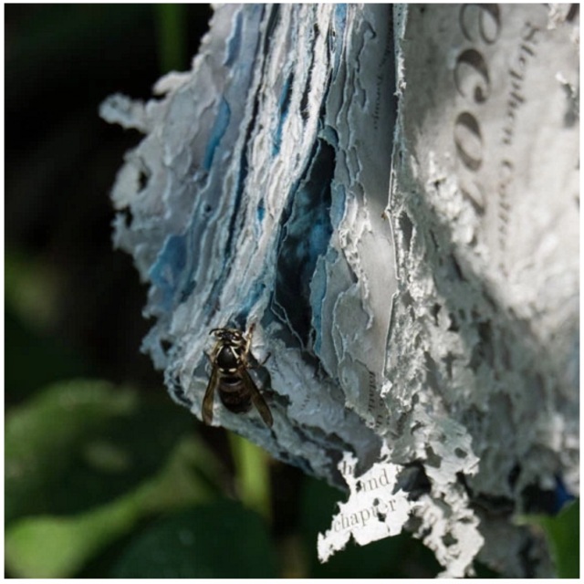
For over twenty months, Miller monitored and husband David photographed the book’s weathering. That, however, was not the transformation that would result in an altered book and possibly a work of book art. Nature had some ironic appropriateness in store for Miller, Skinner, Collis, Scott and all of us. The blown pages were visited by Bald-faced Hornets, who digested them á la John Latham and his students but regurgitated them as cellulose with which to build a large nest.
Cathryn Miller Recomp (2015) Photo credit: David G. Miller
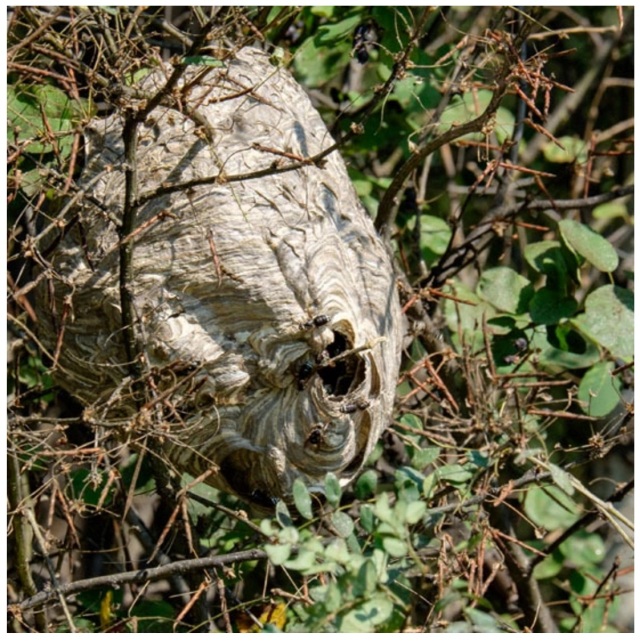
Cathryn Miller and Bald-faced Hornets Recomp (2015) Nest composed of pages from Decomp, Collis and Scott (2013) Photo credit: David G. Miller
In the context of book art, the nest offers a curiously serendipitous digression. In 1719, the French naturalist René Antoine Ferchault de Réaumur published an essay to the Royal Academy of Sciences on the natural history of wasps. In the passage below, he hypothesizes how their natural papermaking industry could be adopted by man.
In 2015, Miller presented the results as Recomp in her blog at Byopia Press. In September that year, however, critics (raccoons, the artist thinks) visited the work and deconstructed it.
Recomp vandalized, 2015 Photo credit: David G. Miller
Might this prove that, to paraphrase the last paragraph of On the Origin, “by laws acting around us…. from the war of nature, from famine and death, the most exalted object which we are capable of conceiving, namely, the production of the higher animals [and their art], directly follows”? If so, that makes raccoons and critics equal laws of nature.
2015, Umeå, Sweden
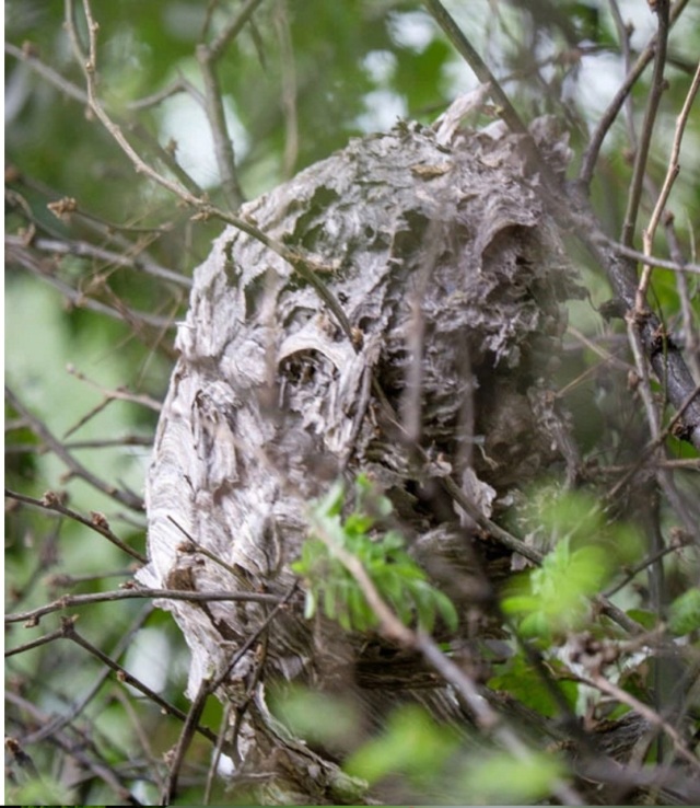
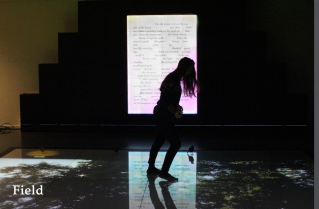
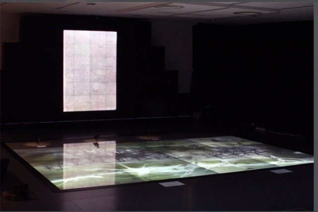
Johannes Heldén’s work Field is book, visual art and installation all in one. Heldén’s is perhaps the darkest variant on Darwin’s theme here.
It consists of interactive landscape animations on a floor touchscreen of 20 sqm,
Johannes Heldén Field (2015) Produced, and premiered, at HUMlab, Umeå University
a series of sculptural mutations of the Eurasian Jackdaw*,
Johannes Heldén Field (2015) Produced, and premiered, at HUMlab, Umeå University
an ever-changing soundscape and an interactive screen wall with a text responding to the changing DNA of the bird
Johannes Heldén Field (2015) Produced, and premiered, at HUMlab, Umeå University
– as the ”code” of todays species is slowly lost, so is the code and context of language. The gaps in the text correspond to the shift in the DNA sequence, prose turns into dark poetry, connections and meaning changing for each iteration.
Johannes Heldén Field (2015) Produced, and premiered, at HUMlab, Umeå University
Johannes Heldén Field (2015) Produced, and premiered, at HUMlab, Umeå University
All these pieces are connected: as you explore the landscape and trigger the glowing touch points with your body, time is rapidly speeding up (clouds move over the scene, trees wither away, a flood is coming), one by one the four bird sculptures in the installation will be ”activated” with light and sound, spiraling the species further down into mutations. At the end of the piece, no lights remain in the landscape, the sound is immense, all mutations have occurred, the last poetry dissolves into entropy. Then all fades to black.
Since Darwin’s theory encompassed extinction, perhaps Heldén’s vision is not so much a variant on Darwin as it is a pessimistic appreciation and warning about the impact of our interaction with the entangled bank.
2016, Guildford, Surrey, UK
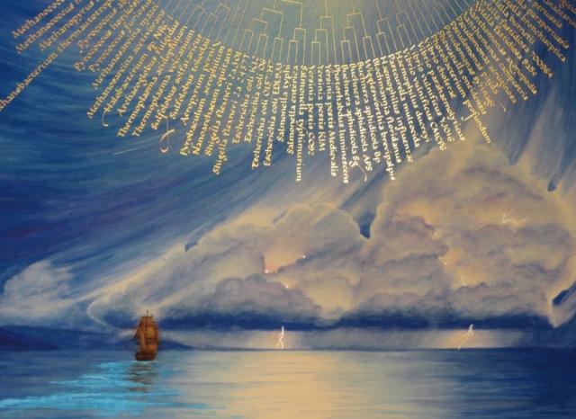
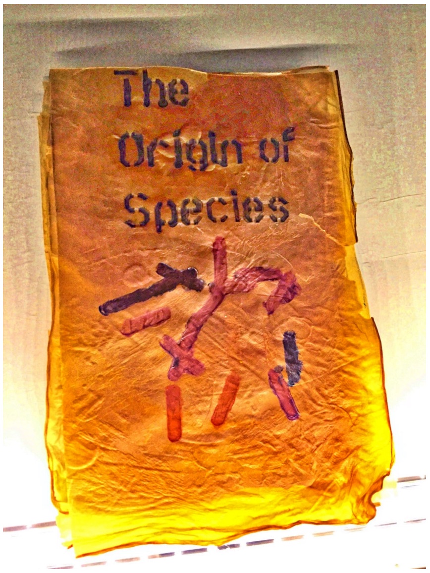
Cathryn Miller’s “bio-book-art” and that of Collis and Scott stand at the collaboration end of the bio art spectrum, where the artist yields considerable control to nature in the creative process. At the coordination end of the spectrum – closer to domestication of species – stands Dr. Simon F. Park’s bio-book-art – The Origin of Species – perhaps “the first book to be grown and produced using just bacteria”. Presented at the Edinburgh International Science Festival, the small book has pages made of bacterial cellulose, produced by the bacterium Gluconoacetobacter xylinus (GXCELL). Its cover is even printed with naturally pigmented bacteria.
Dr. Simon F Park The Origin of Species “The small book shown here was grown from and made entirely from bacteria. Not only is the fabric of its pages (GXCELL) produced by bacteria, but the book is also printed and illustrated with naturally pigmented bacteria. ” Posted 27 March 2016 Photo credit: Dr. Simon F. Park
Although Park’s science-driven process for paper manufacturing and printing echoes the speculations of French naturalist René Antoine Ferchault de Réaumur (see above), it seems to have much in common with the painstaking craft of handmade paper and hand letterpress printing. The first sheet of Park’s micro-organically grown paper took a little under two weeks to be generated and stencilled with his bacterial ink.
2016, Colchester, Essex, UK
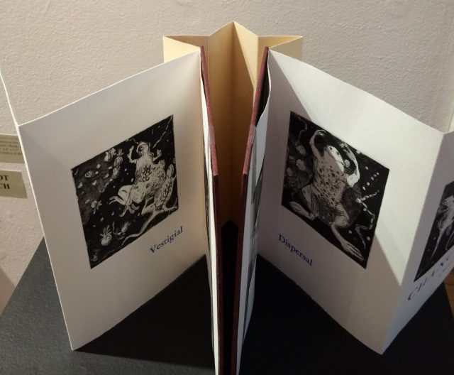
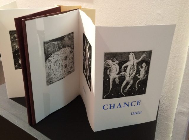
It seems chronologically backwards to move from bio-book-art’s live media to Chris Ruston’s ammonites of The Great Gathering. As should be evident by now, however, the evolution of the symbiotic relationship between book artists and Darwin has been anything but a straight line. It has curved, circled and recursed.
Tim Rollins + K.O.S may have had their séance 30-50 feet away from Darwin’s lodgings in Edinburgh, but Chris Ruston brought her Darwin-inspired book art to an even more fitting venue: a church converted into Colchester’s Natural History Museum.
Natural History Museum Colchester, Essex, England Photo credit: Chris Ruston
As the artist comments at her site:
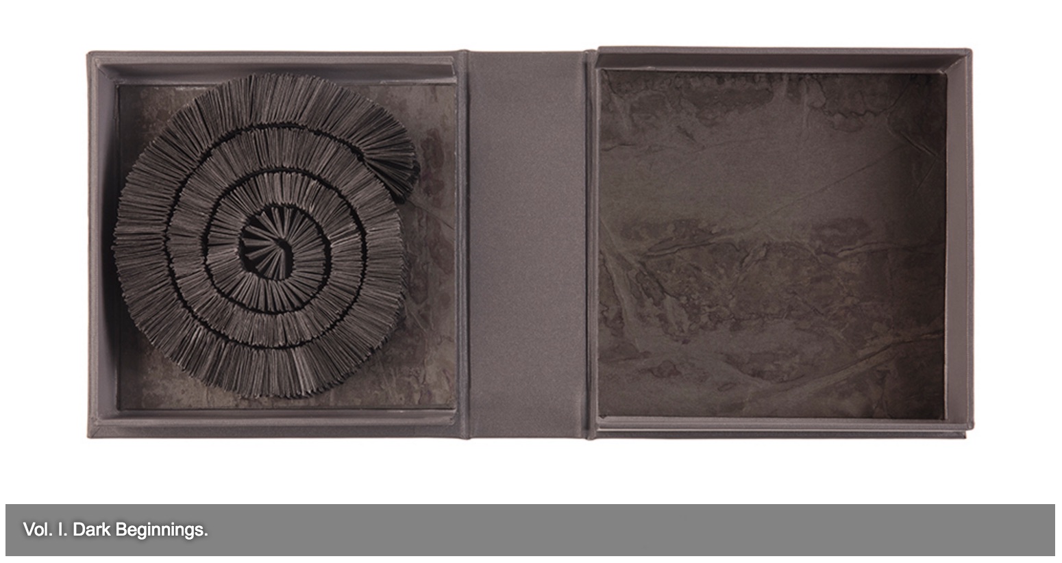
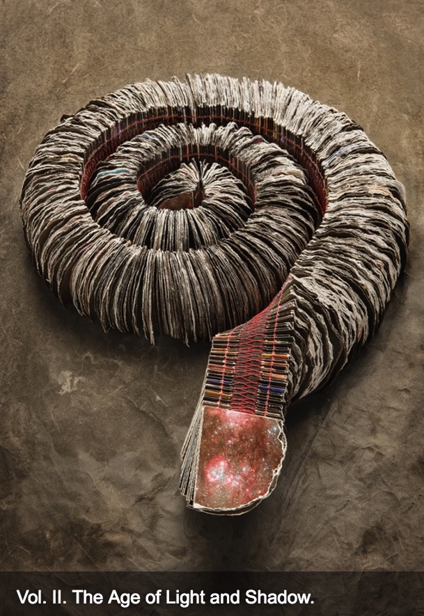
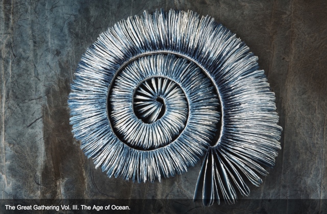
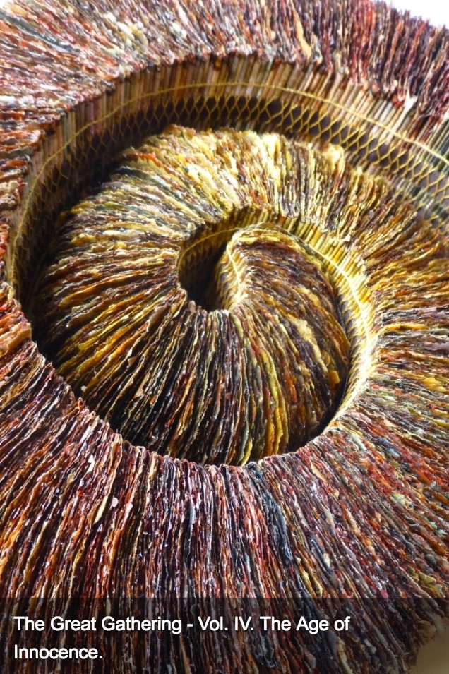
The Great Gathering refers to our continued exploration of where we have come from, and where we are going. Combined the seven volumes tell an amazing story spanning 650 million years. Sculptural in form, each book reflects a moment of this journey. From black holes and dark beginnings, through ocean and sediment layers, Darwin’s On the Origin of Species, and recycled National Geographic magazines the work charts the inevitability of change.
View of exhibition of The Great Gathering Natural History Museum, Colchester Photo credit: Chris Ruston
They are a response to visiting Museum collections, in particular the Natural History Museum, Colchester and the Sedgwick Museum of Earth Sciences Cambridge. Fossils have enabled us to unlock the story of our Origins – from the largest creatures to the smallest organisms. The 19th century saw an explosion of knowledge and understanding, culminating in Darwin’s publication of On the Origin of Species. By piecing together the riddle of the fossil record, Darwin and his contemporaries began asking revolutionary and challenging questions, the results of which are still felt today.
View of exhibition of The Great Gathering Natural History Museum Photo credit: Chris Ruston
Science and art are the presiding geniuses over The Great Gathering. In The sciences of the artificial (1969), Herbert Simon emphasized: “The natural sciences are concerned with the way things are” and engineering, with the way things ought to be to attain goals. Like the scientist, the artist, too, is concerned with the way things are. They are the raw material with which the artist works or to which he or she responds. But like the engineer or the designer, the artist is concerned with the way things ought to be:
Chris Ruston The Great Gathering, 2016 Photo credit: Chris Matthews
how a solander box ought to be constructed to operate with the work and, in enclosing it, be “the work”;
Chris Ruston The Great Gathering (2016) Photo credit: Chris Matthews
what materials (photos from the Hubble telescope) ought to be used to reflect a moment in time;
Chris Ruston The Great Gathering (2016) Photo credit: Chris Matthews
how thread, tape and stitch ought to be to hold together a spine that will flex and spiral into the shape of a fossil;
Chris Ruston The Great Gathering (2016) Photo credit: Chris Matthews
how the color of the material ought to be juxtaposed with the material’s altered shape to carry meaning;
Chris Ruston The Great Gathering (2016) Photo credit: Chris Matthews
how the shift from content to blankness ought to be juxtaposed with the material’s altered shape to carry meaning;
Chris Ruston The Great Gathering (2016) Photo credit: Chris Matthews
how the selection and alteration of text ought to be made to show the fixity and flux of knowledge and ourselves;
Chris Ruston The Great Gathering (2016) Photo credit: Chris Matthews
and how our reflection in the mirror in Volume VII under the maker’s tools and the made thing ought to implicate us — the viewer here and now – in an ongoing process of making and remaking.
On display at “Turn the Page”, Norwich, England (2016) Photo credit: Chris Ruston
If you have come this far with these bookmarks on the evolution of book artists’ symbiosis with Darwin, note that today and every 12th of February is Darwin Day, marking international celebrations of the birth of Charles Darwin and his contributions to science. From today’s engagements and all those to come with the concepts of On the Origin of Species and (I hope) with these bookmarks, perhaps new discoveries and new creations of book art will emerge.
Update
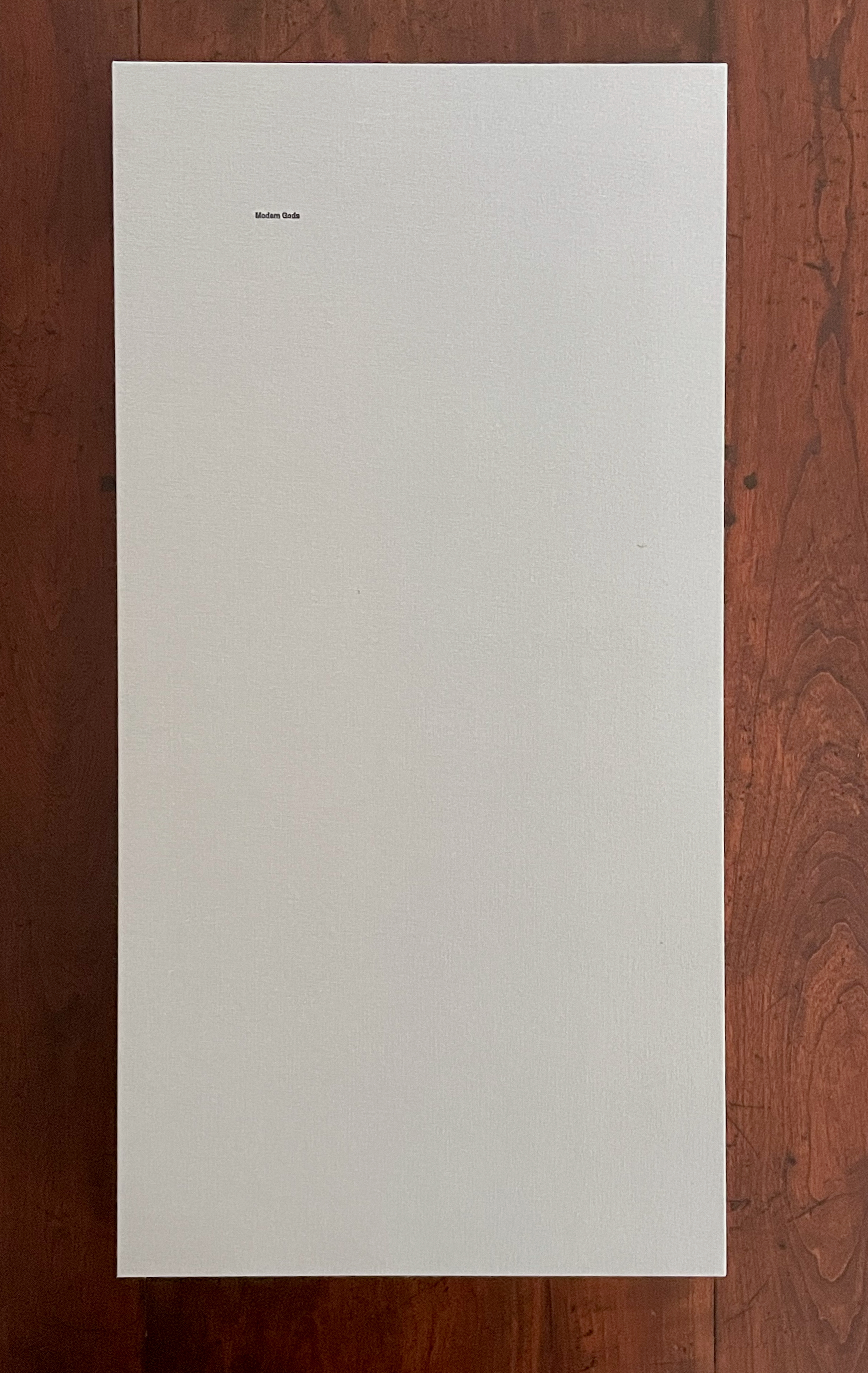
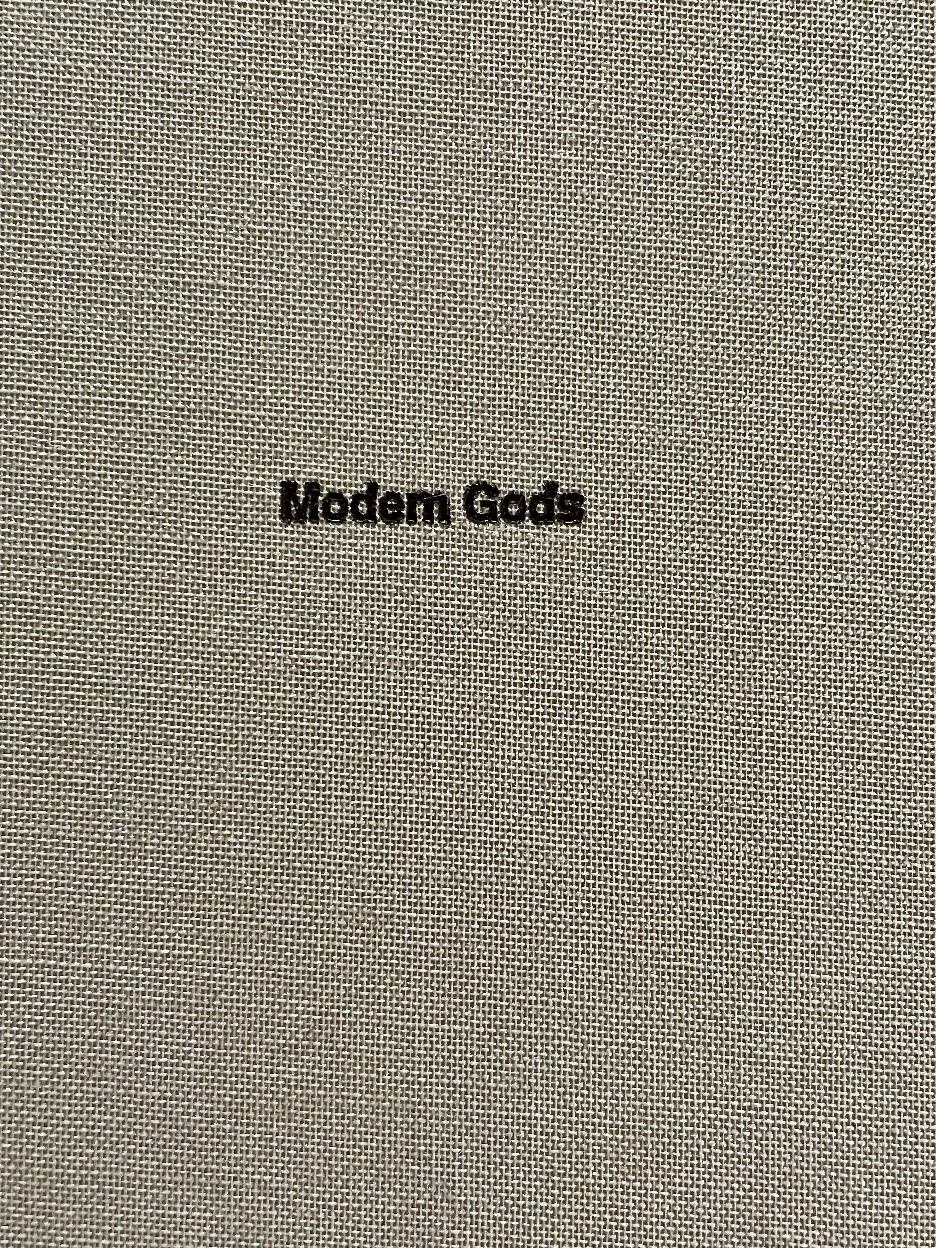
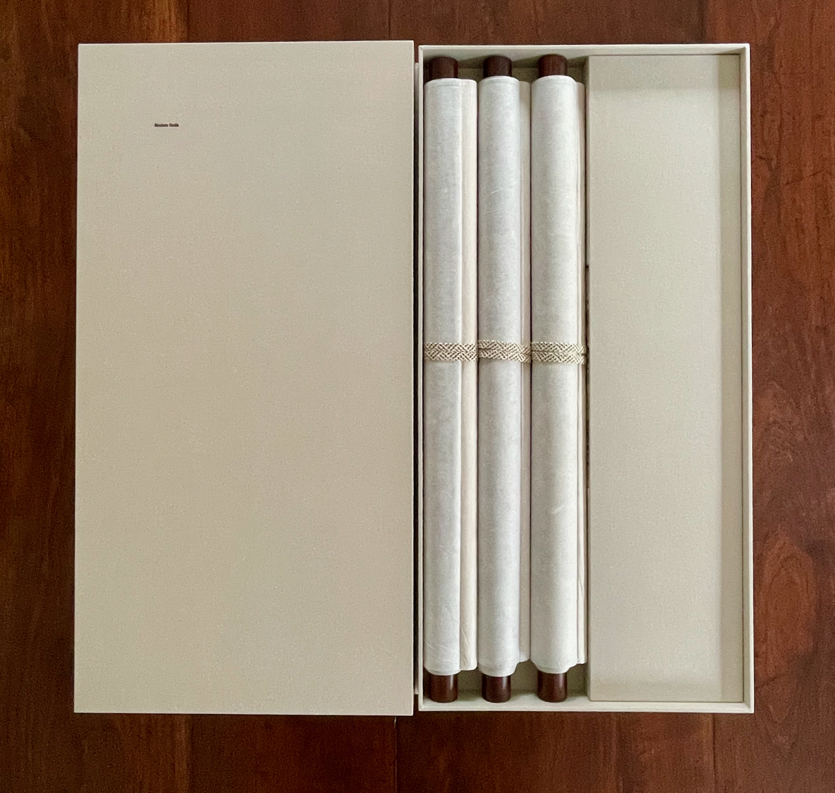
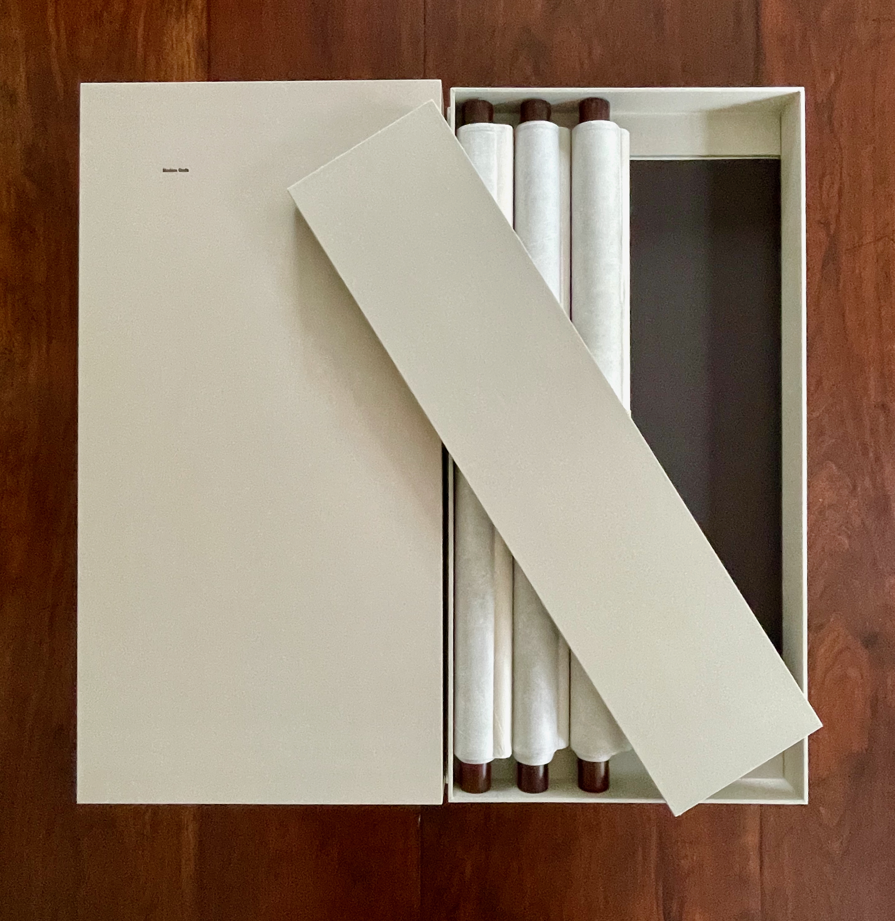
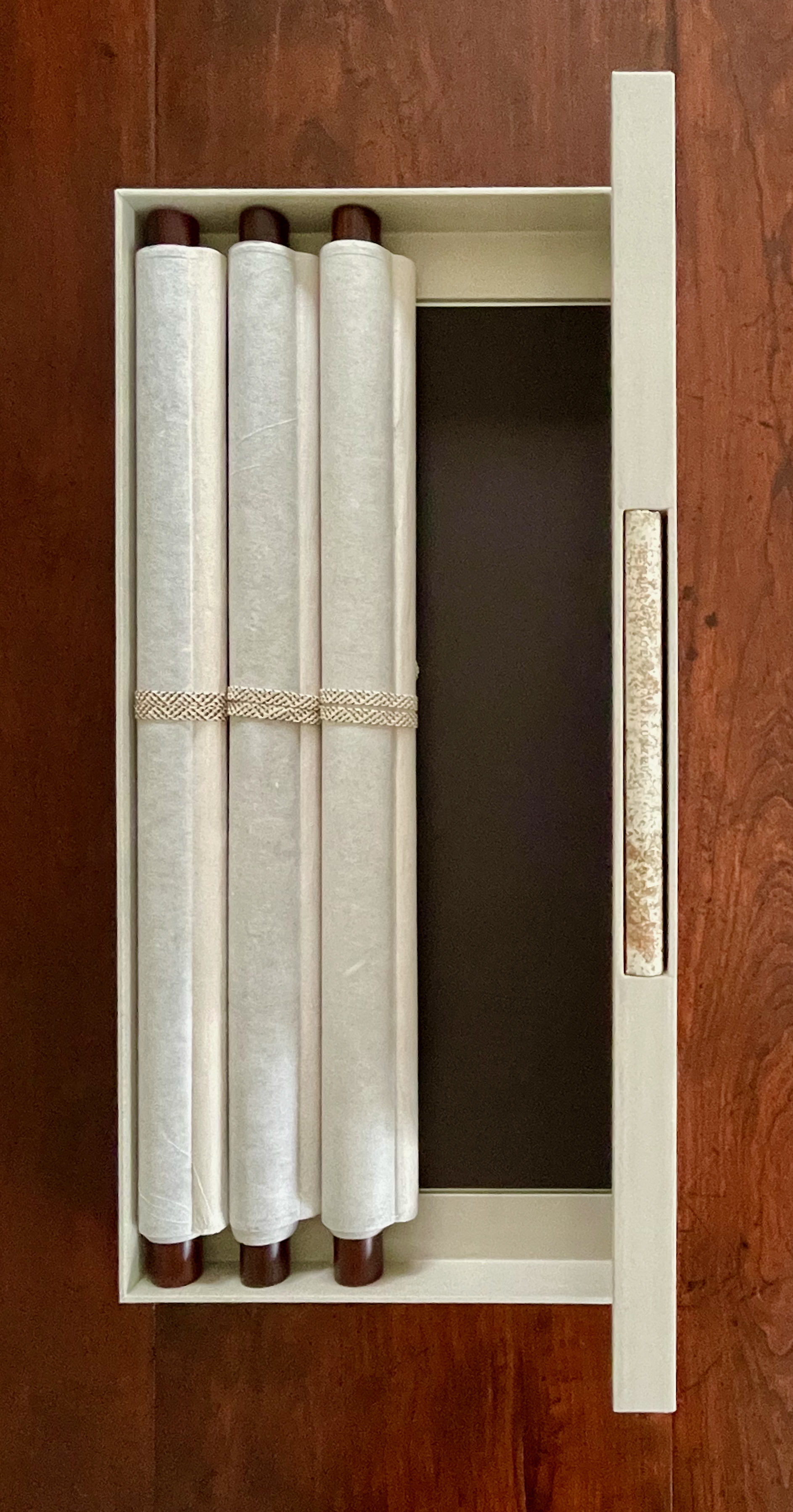
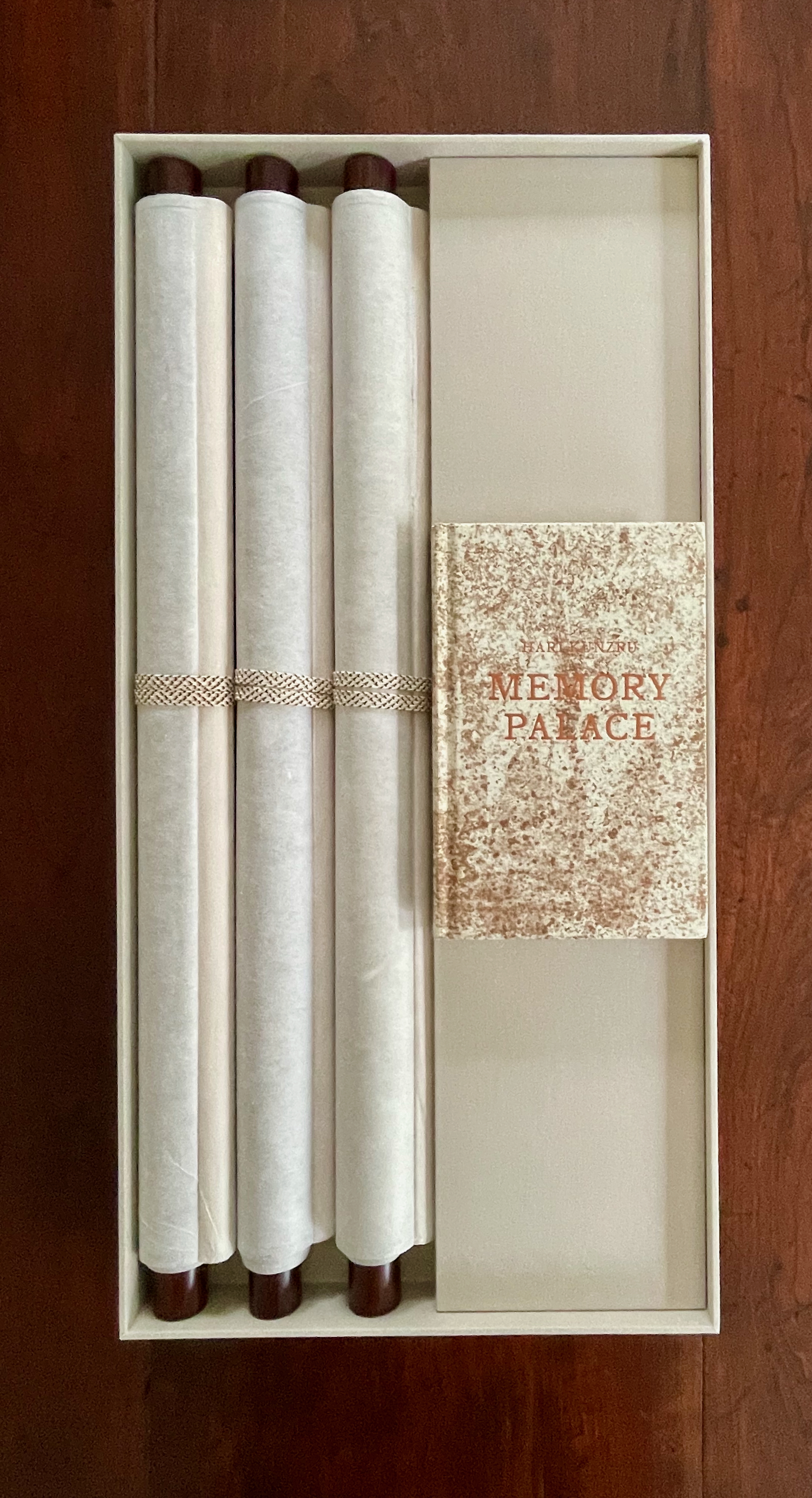
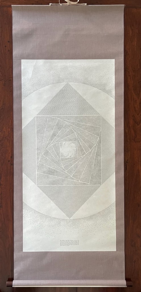
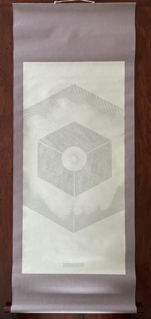
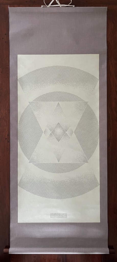
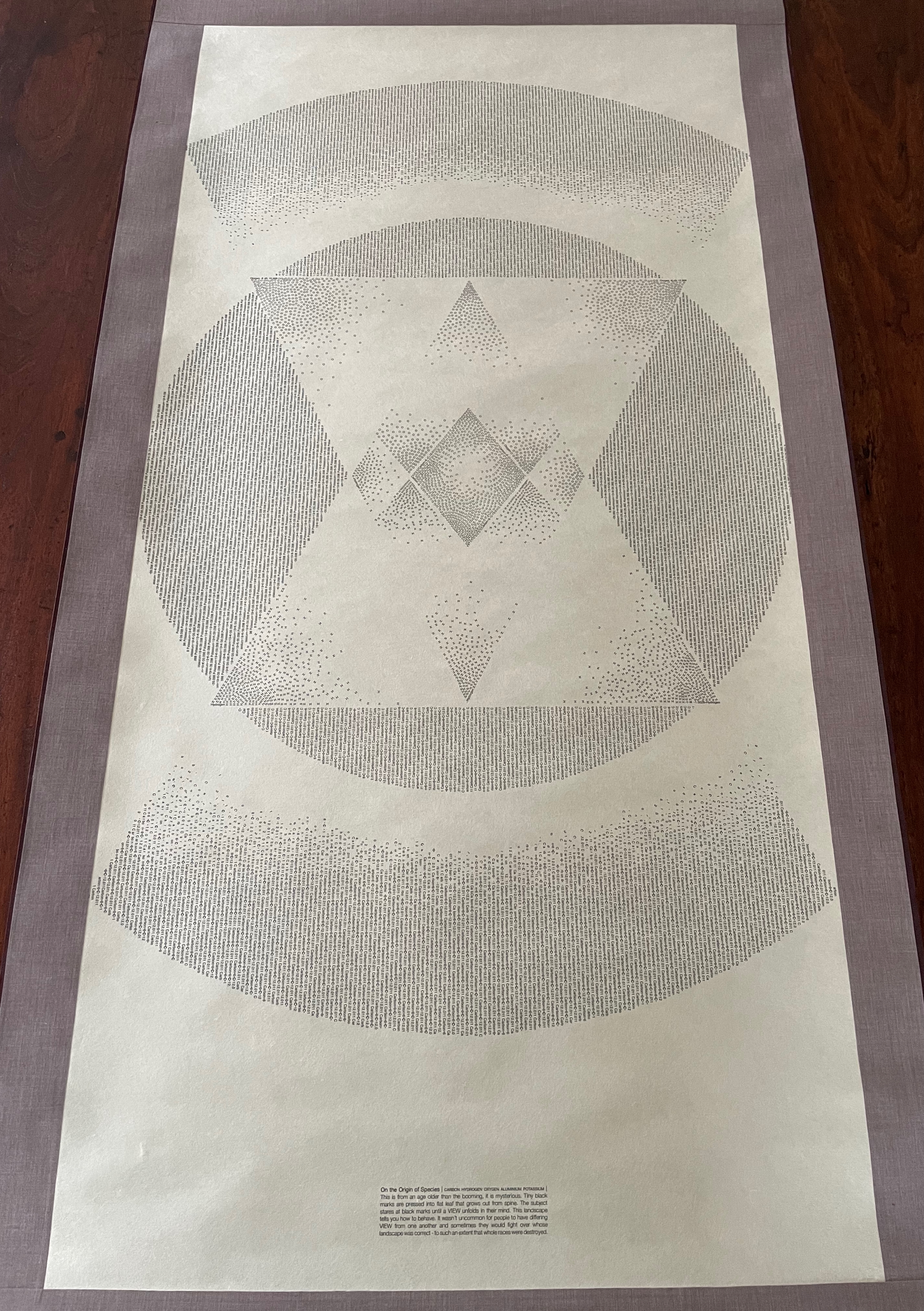
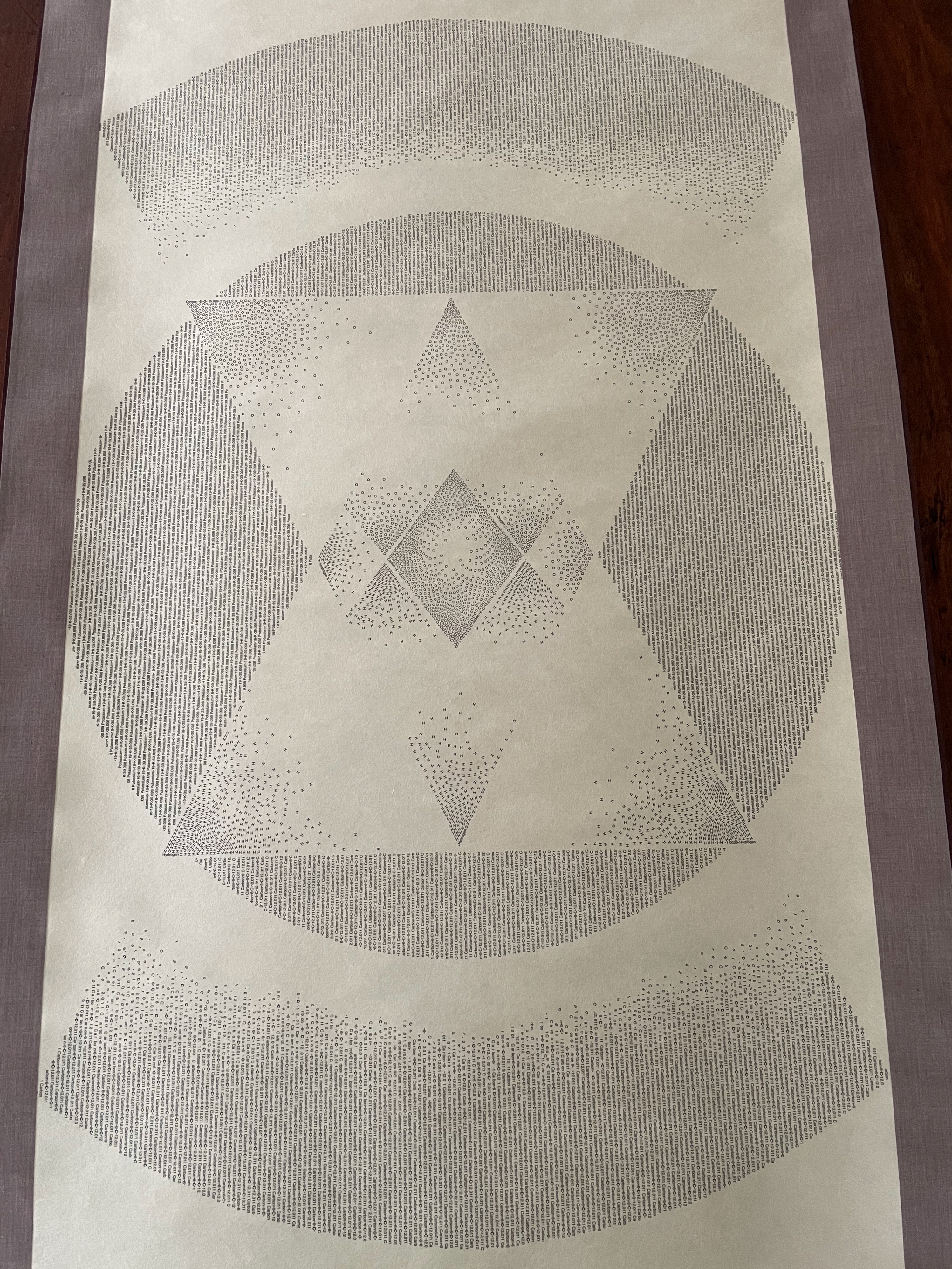
Sam Winston Modern Gods (2013) Photo: Books On Books Collection
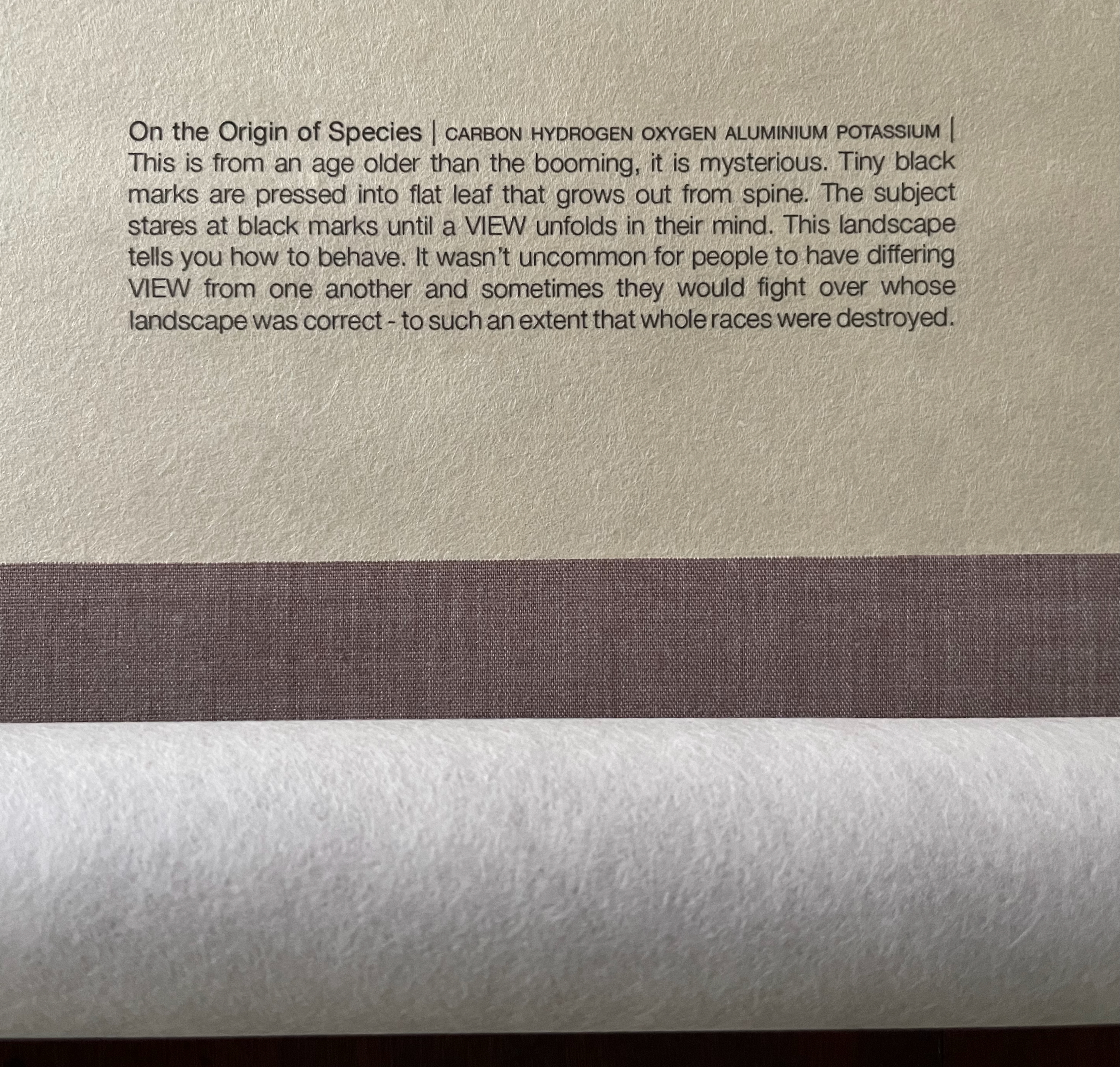
Modern Gods follows on from Winston’s Darwin (2009) and consists of three “sacred” scrolls, each bearing a mandala formed by the names and symbols in type of the chemical elements that compose the modern god the scroll represents: the Rolex President watch, the pay-as-you-go SIM card, and Darwin’s On the Origin of Species.
Modern Gods is partially an example of inverse ekphrasis — where a visual artwork aims to re-present something already presented by a written text. Not the same thing as an illustrated book or livre d’artiste.
Rolex, SIM, On the Origin of Species
Like the works displayed above, Winston’s third scroll offers an example of visual and textual representation of Darwin’s On the Origin of Species, which adds to the unusually lengthy list of works inspired by Darwin’s book. (Perhaps no surprise, but the Memory Palace project also commissioned Stephanie Posavec, whose earlier work also appears above).
Modern Gods was commissioned by Victoria & Albert Publishing as a response to a new piece of fiction it had commissioned from novelist Hari Kunzru along with 19 other visual works in response. As the V&A curators put it, Kunzru’s Memory Palace (2013) and the original commissions from the 20 graphic designers and illustrators would form the basis of an “exhibition that can be read. … [to explore] what happens when a story leaves the pages of a book and enters the gallery space.” Modern Gods stands on its own as an extraordinary fusion of type, word, image, material, and structure.
Presented here is an ongoing exploration of Charles Darwin’s ‘On the Origin of Species’ and Ruth Padel’s ‘Darwin, A Life In Poems’.
I initially separated the text of these two books into nouns verbs, adjectives & other. I wanted to present a visual map of how a scientist and a poet use language – a look at how much each author used real world names (Nouns) and more abstract terminology (Verb, Adjective and Other) in their writings.
By determining the frequency of each part of speech and generating pointillist-like dots with different pencil lead weights assigned to each part of speech, Winston also creates what he calls “Frequency Poems.”
“Origin Drawing” by Sam Winston
A similar result is achieved by categorizing all the words from “Romeo & Juliet” under the headings solace, passion and rage and then creating a collage for each heading with the actual words. Here from the artist’s site is the collage “Solace”:
“Solace” by Sam Winston
Winston’s work wrestles with paradoxical “divides” and “unions” — the divide and union of science and poetry, those of categories and the whole, those of non-linear (patterned) and linear (narrative) meaning, that of the word as perceived object and semantic signal.
In technique and process, Winston’s work also implies a divide and union of the print and digital. It is no surprise then that Victoria Bean and Chris McCabe included Winston in The New Concrete: Visual Poetry in the 21st Century, an illustrated overview of artists and poets working at the intersection of visual art and literature. As if to underline Bean’s and McCabe’s wisdom, Winston and Oliver Jeffers published the charming and innovative A Child of Books shortly afterwards. Winston’s creativity is equally at home with the trade book, installations of book art and finely crafted unique works.
An exploration of semantics or an effective re-structuring of what typography and words REALLY are, whatever the case, Sam Winston’s work is breathtaking. A visual explorer of language, the London-based artist and educator has spent his working life examining the way we approach all manner of literary artifacts. Always engaging his audience with words in a visually stunning manner, Winston started writing stories and selling artist books through London’s Institute of Contemporary Arts and …
Winston’s experiments came from looking at the structures of different types of literature: from storybooks to bus timetables: “The way you navigate a timetable is very different to the way you read a short story” he comments. “I wanted to take these different types of visual navigation and introduce them to each other: a timetable re-ordering all the words from beauty and the beast, or a newspaper report on Snow White.” By imposing the visual rules of one style of writing to a different system of organizing language, Winston has created a visually arresting and verbally intriguing piece.” Paula Carson, Graphic Poetry. June 2005
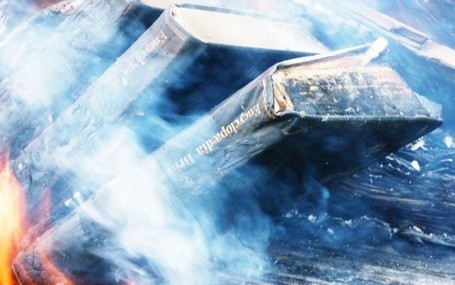
Julian Baggini (Aeon) has posted a thoughtful piece on the need for an important cultural artifact to evolve — not just in its codex form but in its very essence — the encyclopedia. One reader/viewer (there’s a video as well) commented:
Which is worse? Burning books because they are now available in an electronic format? Or not having any physical books to burn, unless you steal them from a museum or collector?
Hold that thought (an “argument by false dichotomy”) and go to Baggini’s concluding paragraph:
I can’t help but mourn the passing of my set of Britannicas, but I do not mourn the passing of the institution. Encyclopædias have passed their use-by-date as fitting symbols for the esteem in which we hold culture and learning. The world is changing, and books, magazines and education have to change with it. Nostalgia for obsolete publications serves us only if we use it to remind us of the things we really value, and want to take forward into our own new world.
What if, though, the things we value and want to take forward into our new world are caught up in the “affordances” of such tangible institutions as the encyclopedia. Maryanne Wolf hits this chord hard in Proust and the Squidwhen she worries about the effect of the Google universe on the nature of her children’s ability to read:
Reading is a neuronally and intellectually circuitous act, enriched as much by the unpredictable indirections of a reader’s inferences and thoughts as by the direct message from the eye to the text. … Will the constructive component at the heart of reading begin to change and potentially atrophy as we shift to computer-presented text, in which massive amounts of information appear instantaneously? … is there either sufficient time or sufficient motivation to process the information more inferentially, analytically and critically? … Or does the potential added information from hyperlinked text contribute to the development of the child’s thinking? …
I stray with these questions. But indeed we stray often when we read. Far from being negative, this associative dimension is part of the generative quality at the heart of reading. … Charles Darwin saw in creation a similar principle, … ‘From so simple a beginning, endless forms most beautiful and most wonderful have been, and are being evolved.’ So it is with written language. Biologically and intellectually, reading allows the species to go ‘beyond the information given’ to create endless thoughts most beautiful and wonderful. We must not lose this essential quality in our present moment of historical transition to new ways of acquiring, processing and comprehending information. (pp. 16-17)
To go back to Baggini’s troubled reader/viewer, we will not burn books because we have them electronically. As our different types of books evolve, some we will have electronically only and some we will have both in print and electronically. We already have many digitised rare books and manuscripts in libraries, museums and collectors’ holdings. Most people’s exposure to those works can only be electronic, and the more this is the case, the less the need to steal them. But also the greater the need to understand and innovate to address the loss of tactility and the proprioceptive experience of “curling up with a good book.” In alluding to Jerome Bruner’s collection of essays Beyond the Information Given, Wolf is reminding us (linking us?) to Bruner’s apt observation that Lev Vygotsky, the famous Soviet developmental psychologist, “was fond of an epigram from Bacon, “Nec manus, nisi intellectus, sibi permissus, multum valent” (Neither hand nor intellect left each to itself is worth much)” (247). Perhaps neither print nor digital left each to itself is sufficient.


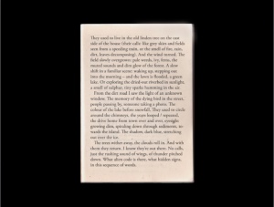
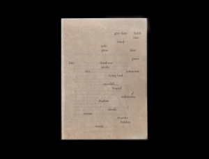
 She Returns