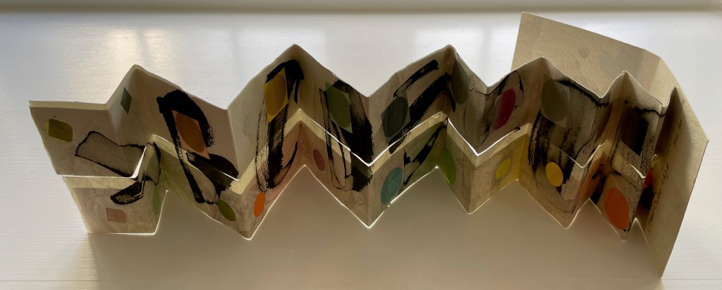
Patterned Alphabet (2013)
Patterned Alphabet (2013)
Annie Cicale
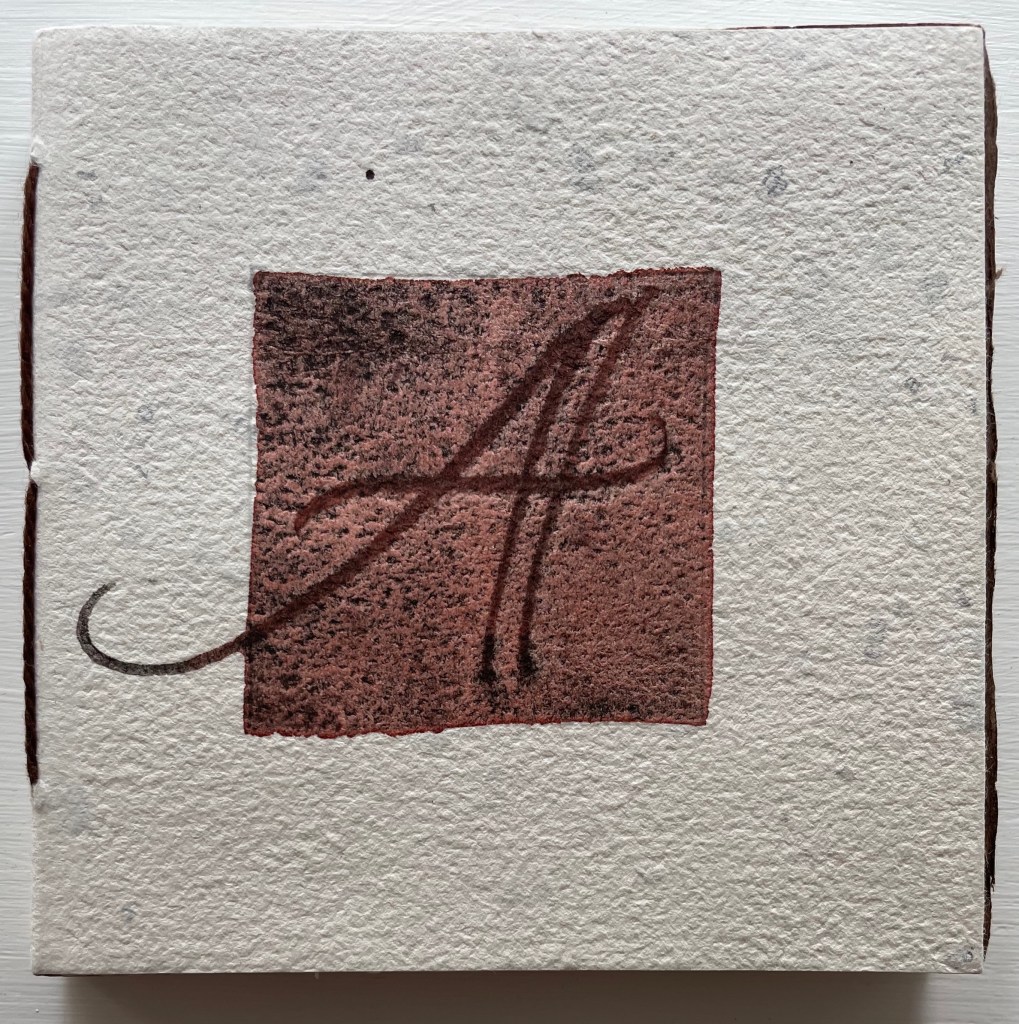
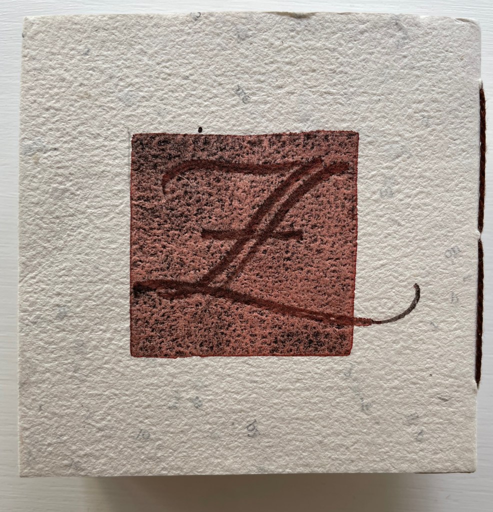
Sewn, casebound leporello. H104 x W104 mm. 34 panels. Edition of 41, of which this 26. Artist 4 July 2023.
Photos: Books On Books Collection.
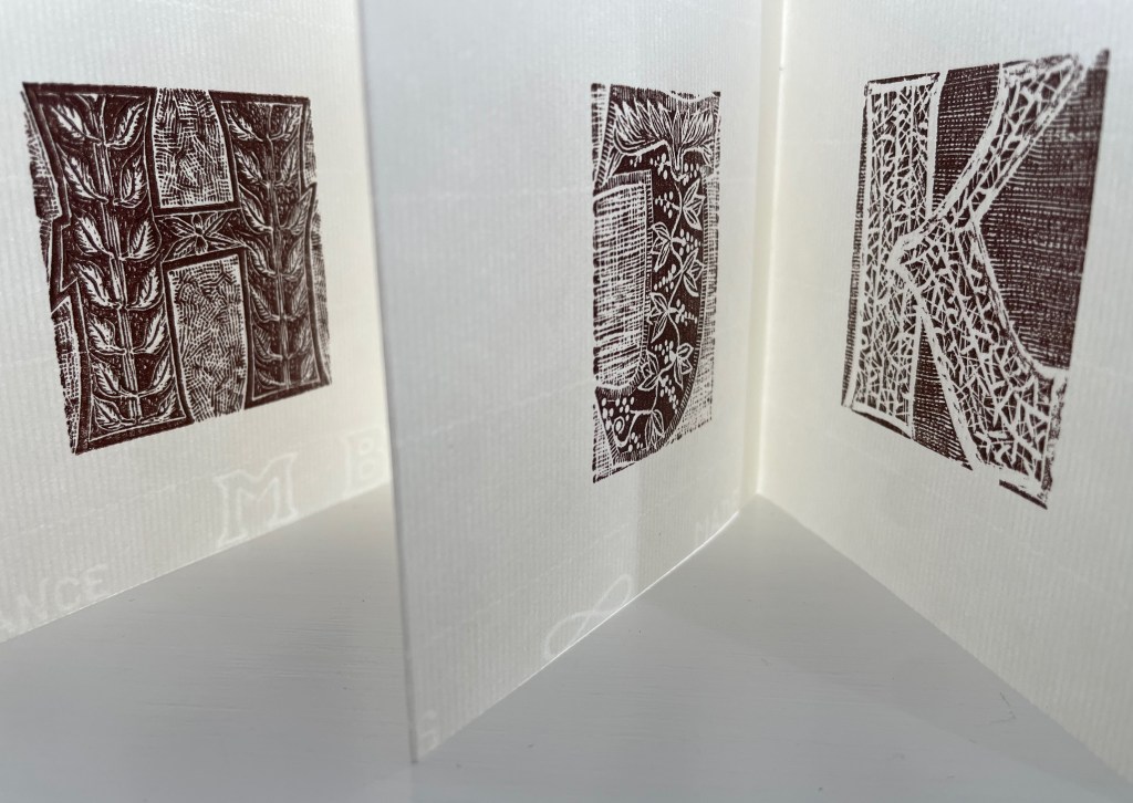
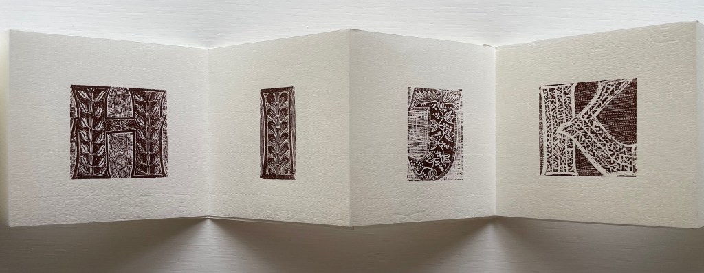
Patterned Alphabet could well have been entitled Textured Alphabet. The number of different textures almost equals that of the patterns. It is the textures’ interaction with each other as well as with the patterns that particularly appeals. The cover, appropriately made of Cave Paper’s Alphabet Heavyweight, initiates the interplay. While the calligraphic style and patterned background of the copperplate engravings of A and Z do not vary, the textures around and beneath them multiply, mirror and contrast. The surface of the Cave Alphabet paper echoes that of the copperplate’s stippled background. The softness of the thick cotton string, binding the cover, contrasts with the roughness of the paper.
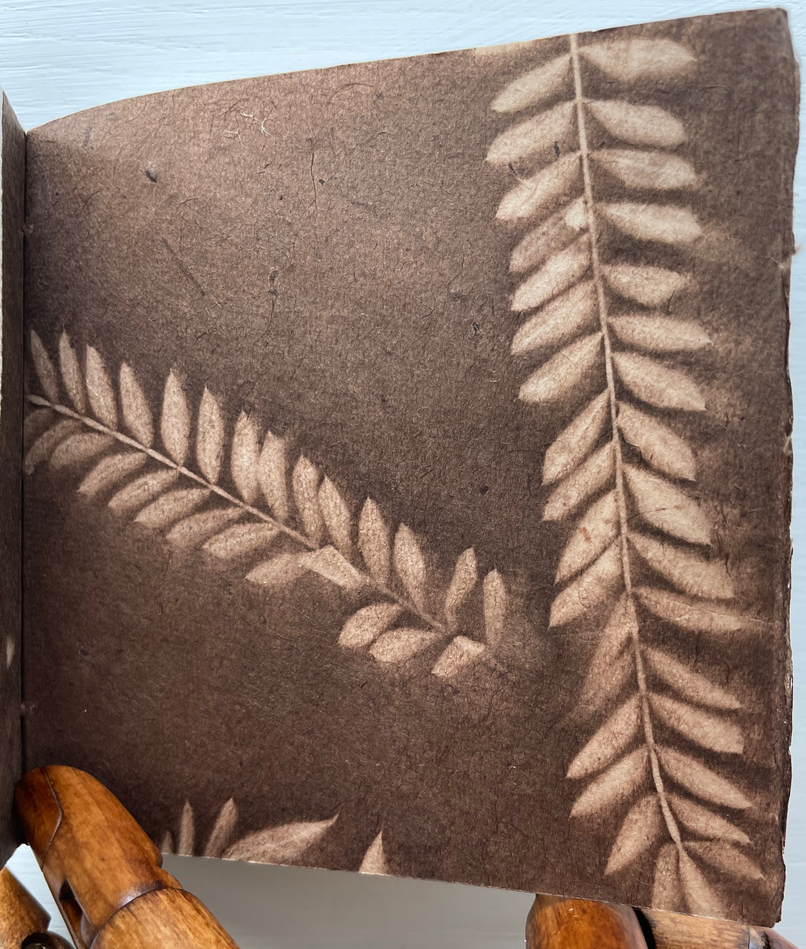
Before coming to the leporello, hand and eye are slowed by another texture. Like the self-referential Cave Alphabet paper cover, the flyleaf refers to itself with a leaf print. It contrasts with the cover, however, in its lightness, surface and color. While that dance of contrasting textures goes on, the flyleaf’s embedded image strikes up its own contrast with the relief technique and letters on the covers.
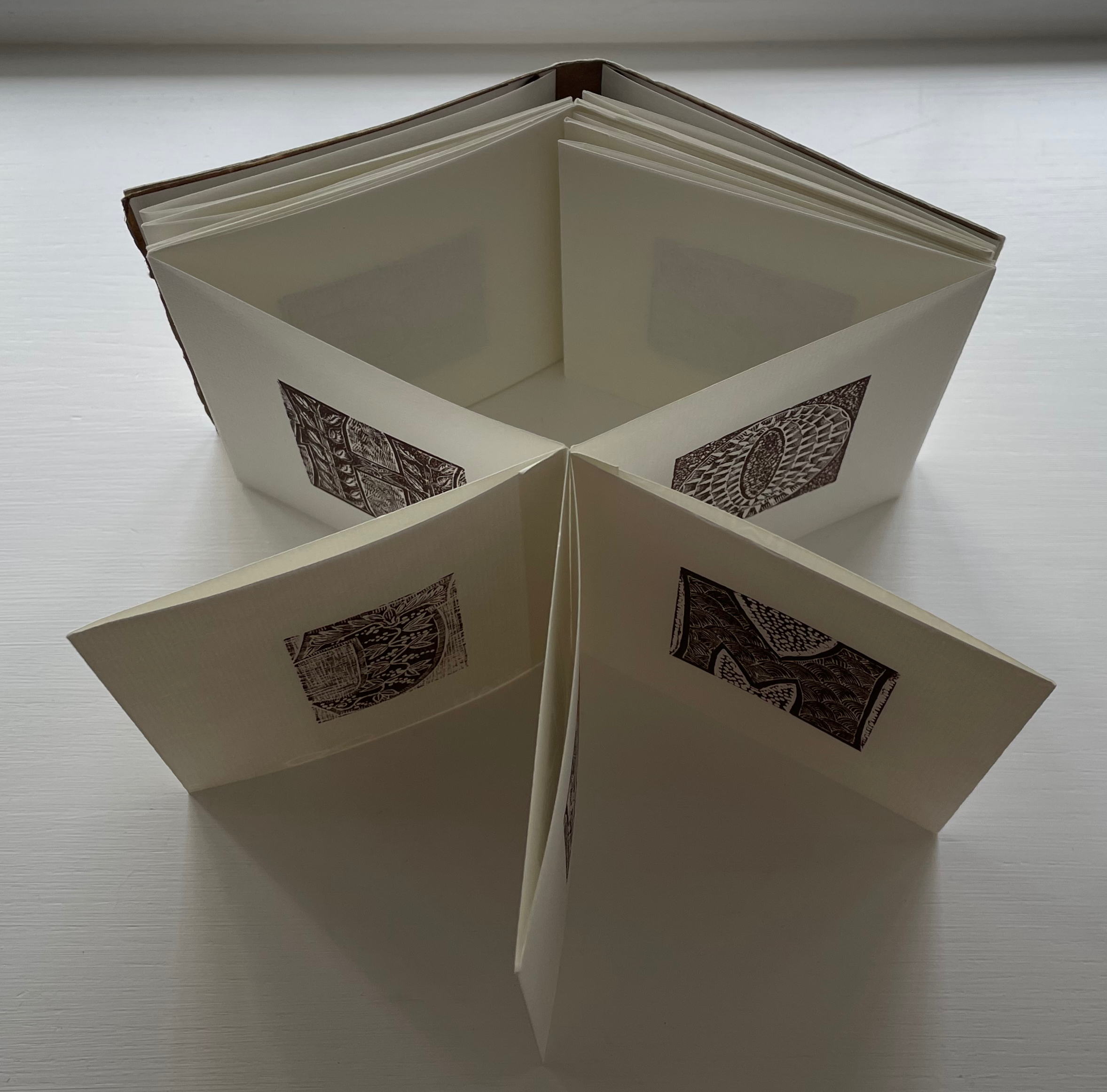
When the leporello comes on stage, the print pattern and paper texture exchange the roles they played at the beginning. Before, the print pattern held the stillpoint around which the cover, binding string, flyleaf and copperplate danced. Now, the smoother laid texture of the Ingres d’Arches paper becomes the stillpoint. Its weight, surface and color — very different from those of the cover and flyleaf — serve that constancy well. For each letterform (including the ampersand), different patterns make up the anatomy and background, which adds quite a number of dancers around the stillpoint.
The printing technique for all those dancers — Resingrave engraving — contributes to their variety of pattern. Invented by Richard Woodman, Resingrave is a synthetic substitute for boxwood. It consists of a thin layer of resin atop a block of MDF wood and, since the ’90s, was famously used by Barry Moser (e.g., the Pennyroyal Caxton Bible). More than lino or blocks for woodcuts, it allows for the thin lines necessary for close and fine patterns. Standing the leporello against the light offers a chance to enjoy the interaction of the “texture” of those patterns with the texture of the paper.
Like Moser, Cicale has engaged with watercolors as well as prints and embraced the abstract as well as the figurative, as can be seen in the next work.
Detritus No. 30 (2020)
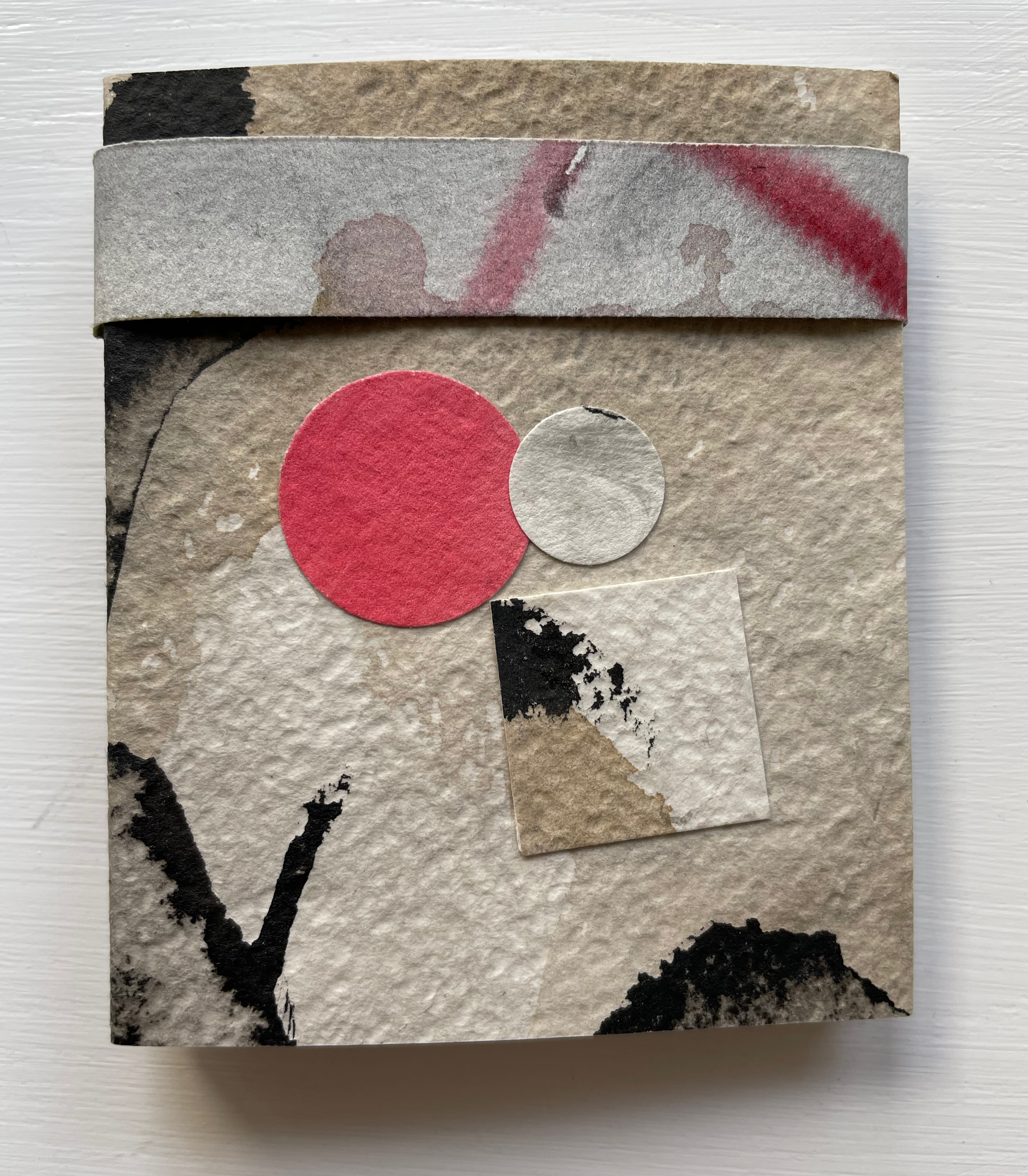
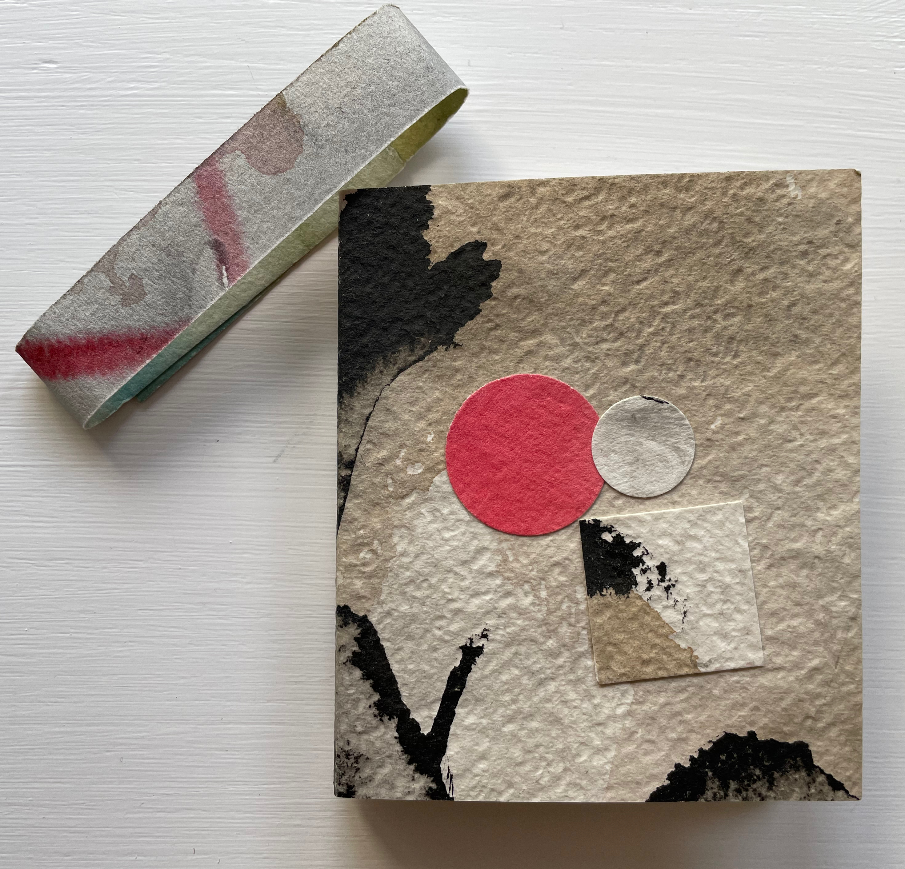
Detritus No. 30: Floppy Alphabet, Brush Alphabet (2020)
Annie Cicale
Modified leporello, pasted to paper cover, bellyband closure. Closed: H95 x W80; Open: W750. 12 panels. Acquired from the artist, 4 July 2023.
Photos: Books On Books Collection.
Here, Cicale has compiled and collaged cast off letters, ornaments and marks from completed works to create a modified double-sided leporello bound in painted and inked watercolor paper, held together with a belly band. The leporello’s two modifications are its variation in panel size and the cut across the mountain folds. Except for a reversal on the first panel, the upper row’s panels bear square cutouts, and the lower row’s bear circular ones. Although constant in shape and distribution, the recurrent squares and circles vary in their color and size, highlighting the variation in size of panels. With their constant black and gray, the ink-brushed letters A-H contrast with the variance of color and size of the circles and squares.
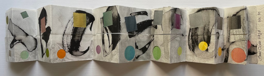
On the reverse side of the leporello, the circles and squares exchange position. They are, in fact, circular and square patches, black and white on this side of the leporello and colored on the other, supplying the color to the other side’s square and circular cutouts. The circular patches are generally consistent in size, as are the square patches, which contrasts with the varied sizes of the cutouts on the other side. The reverse side of the leporello is more muted, and with its black and white patches, it seems more abstract, but is it? Letters themselves are abstract, which may the tongue-in-cheek point of the underlying patches.
Experiment No. 2 (2023)
Experiment No. 2: Step by Step (2023)
Annie Cicale
Pamphlet stitch book. H185 x W 130 mm. Seven folios of varying trim size and papers, one set of four folios gathered and sewn to upper fold of spine, one set of three folios gathered and sewn to lower fold of spine. Acquired from the artist, 4 July 2023.
Photos: Books On Books Collection. Displayed with permission.
Cicale continues her dance of contrasts and similarities with Experiment No. 2 (2023). Here are some of her comments on process and material:
Teaching watercolor for many years has allowed me to try many exuberant techniques, using good rag paper and a wide gamut of colors, shapes and techniques.… An alphabet written on another sheet of paper has been collaged on these pages. I’ve used walnut ink, watercolor and iridescent pigments, which create an interesting series of contrasts as you move through the book.
Another experimental aspect of this pamphlet stitch book is the gathering of the folios into two separate gathers and the variation in size of the folios. The exterior image of the spine above and its interior below show the attachment of the gatherings to the right and left folds of the spine. Two pamphlets in one.
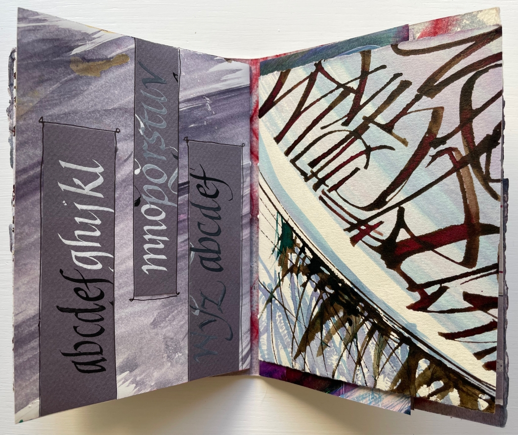
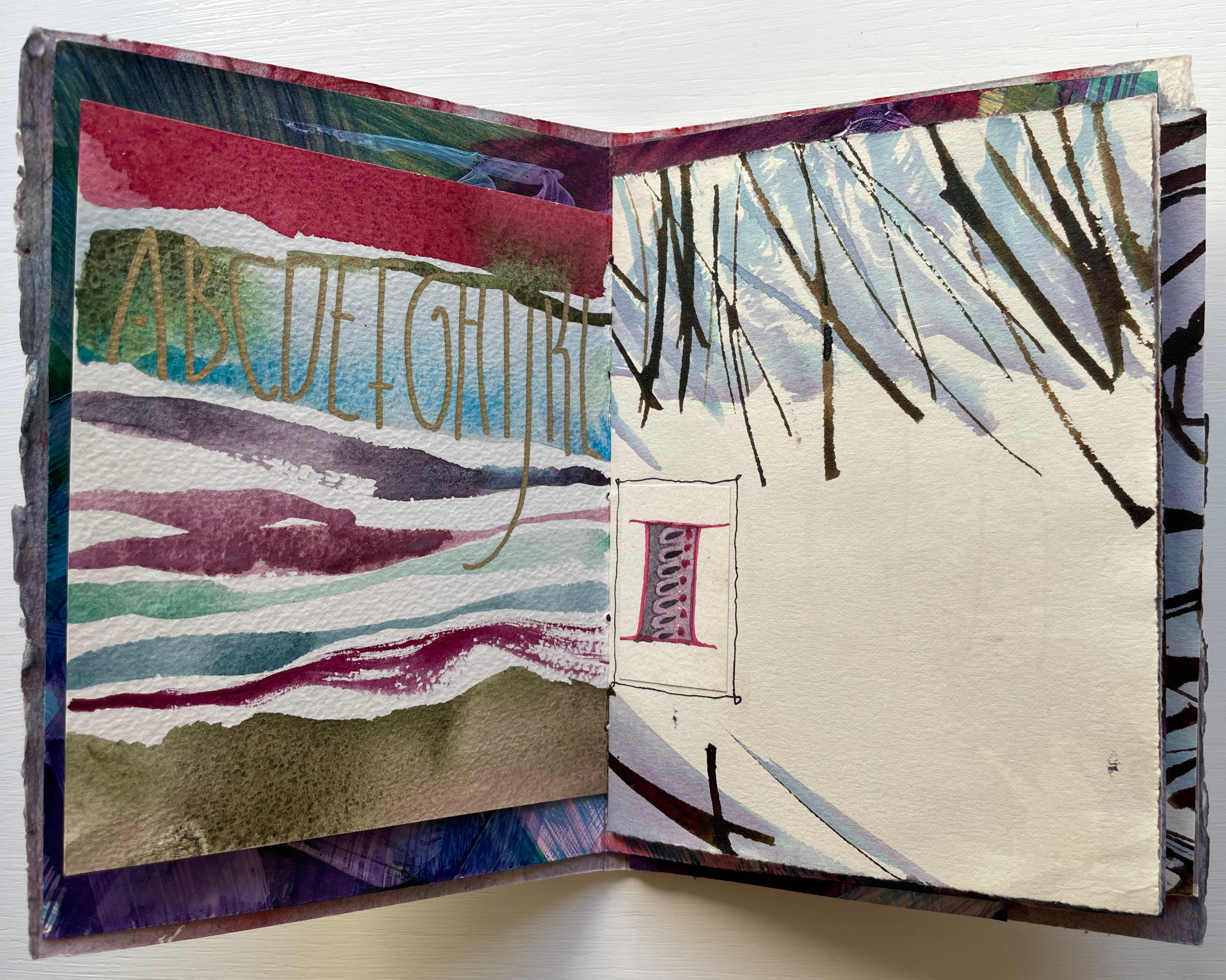
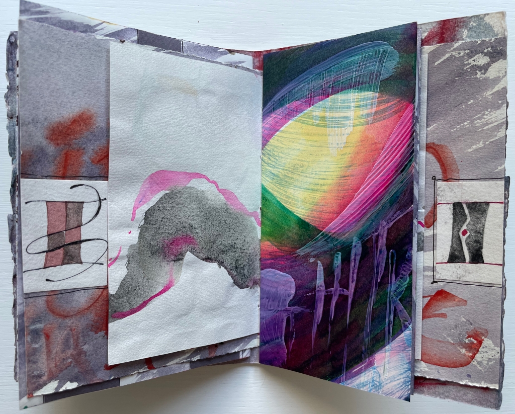
The first gathering’s title-bearing folio measures H176 x W246 mm when spread out fully. On its title-bearing page, there is one of the collage elements that Cicale mentions; three others appear on the other half, which is the final page of the first gathering.
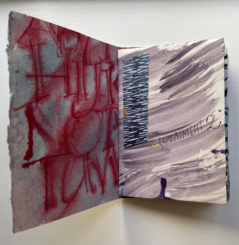
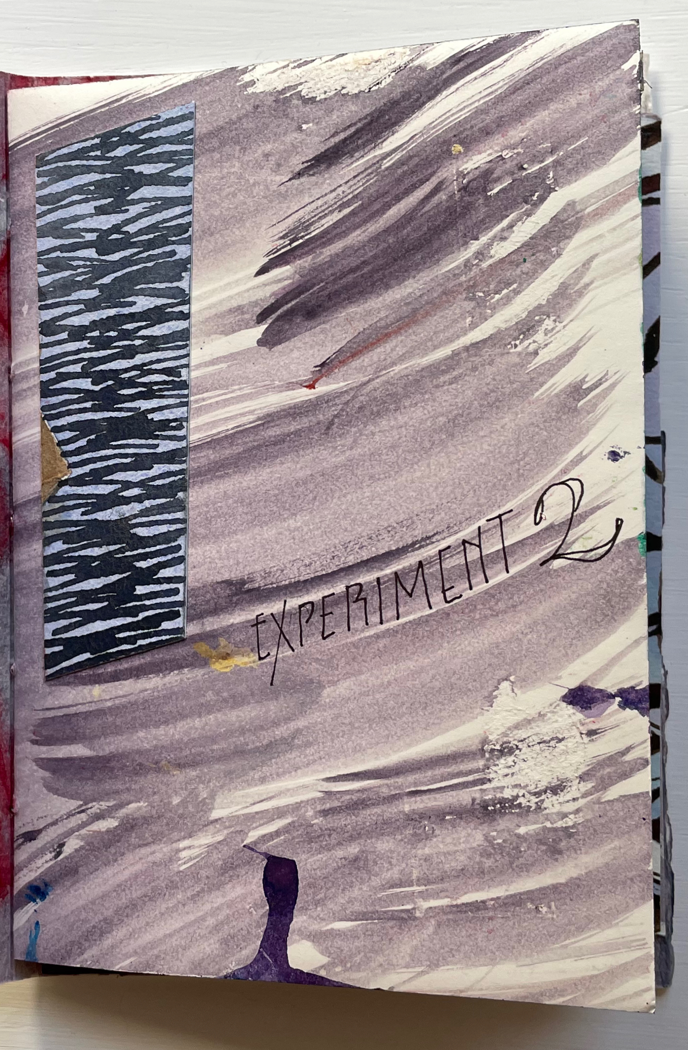
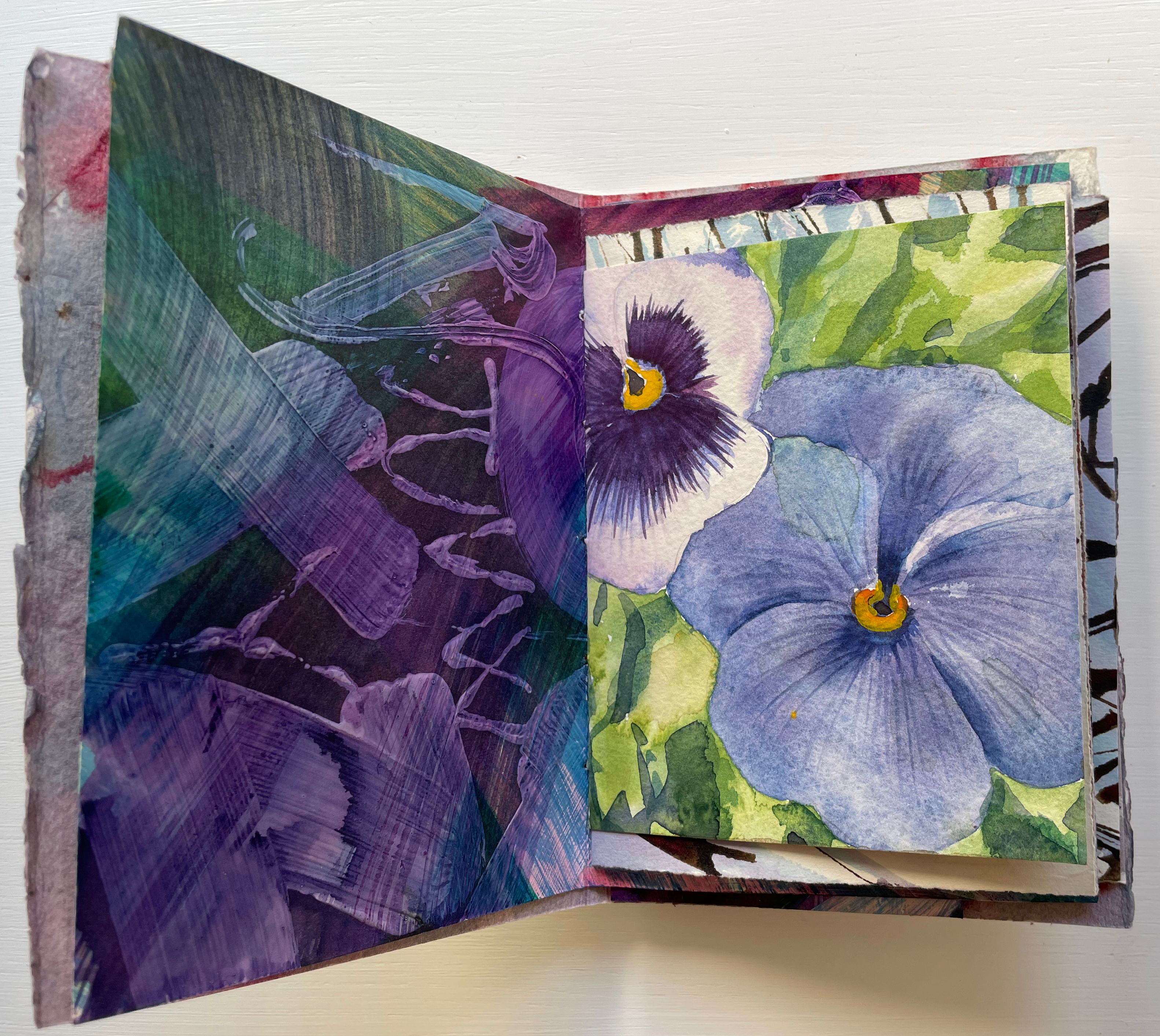
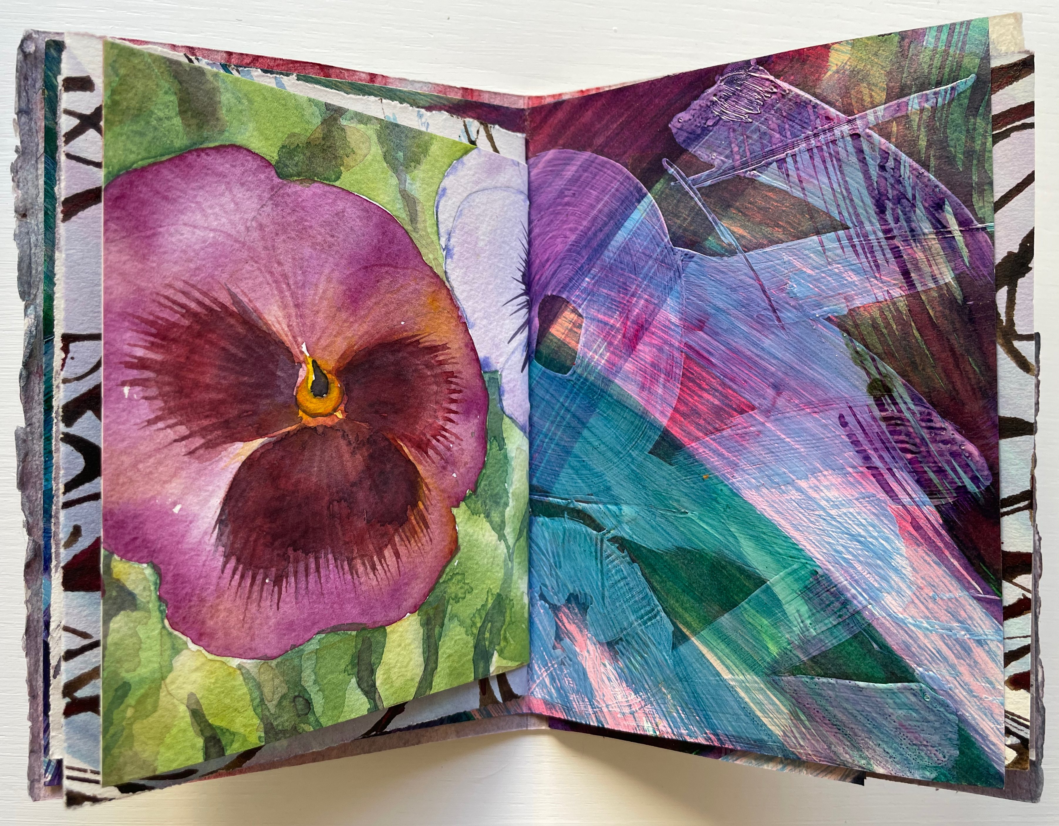
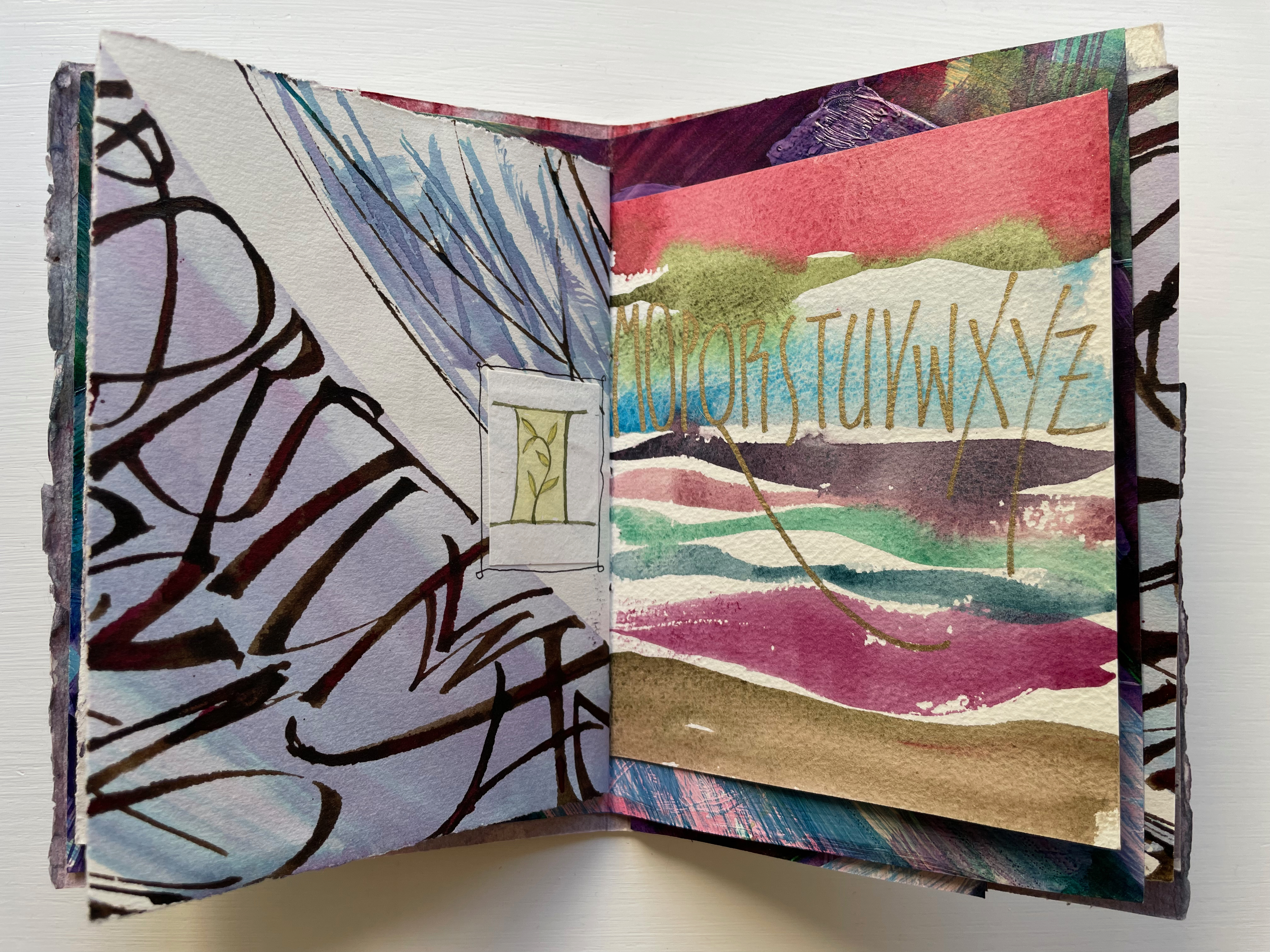
Of course, the full images on either side of the title-bearing folio cannot be seen all at once because of the intervening, contrasting and differently sized folded folios. It’s those different sizes and contrasts that somehow urge the reader/viewer to jump forward then back not only to see those full images for every folio but also to enjoy the magic of the contrasts and similarities. Two of the more effective spreads prompting this jumping forward and backward are these below. On the reverse side of the title-bearing folio is a colorful impasto painting of letters, some in sequence, some overlapping.

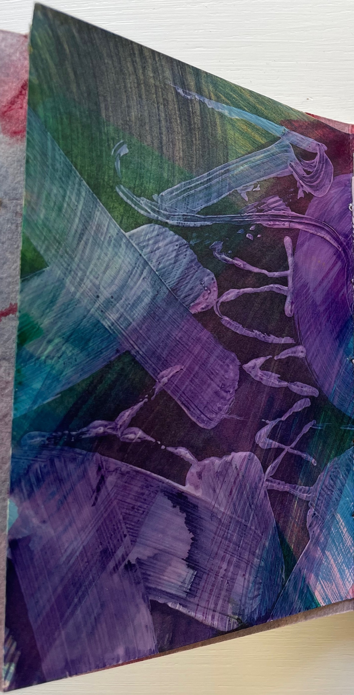
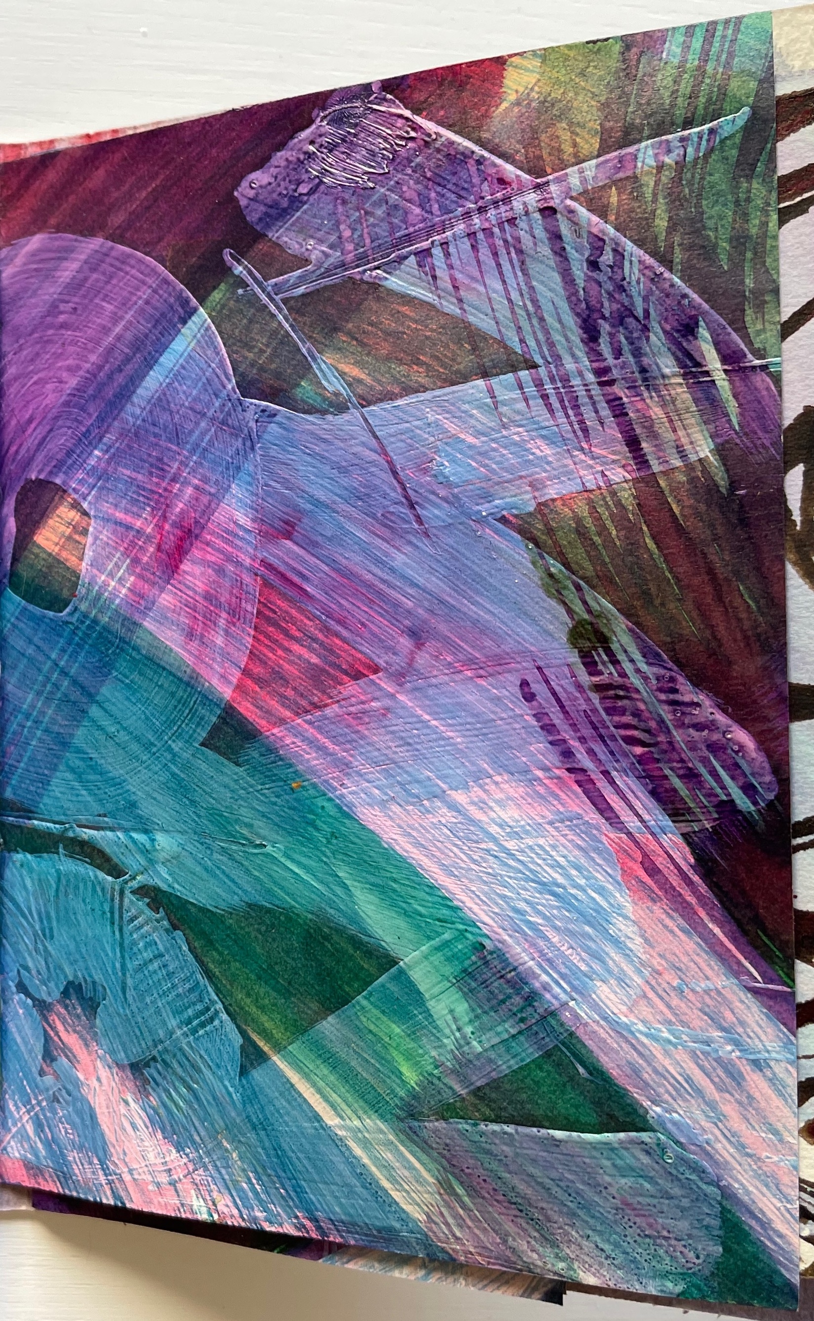
Perhaps it’s the impasto of the verso page that prompts the jump forward to find its recto mate, but once there, the mirrored colors of the pansy and letters surely prompt a jump back to enjoy again the different colors mirrored before.
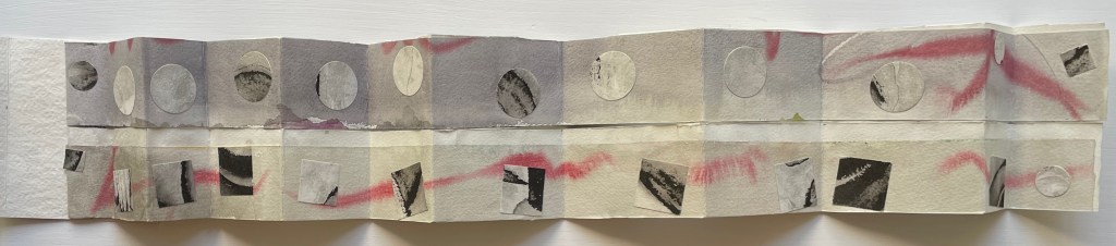
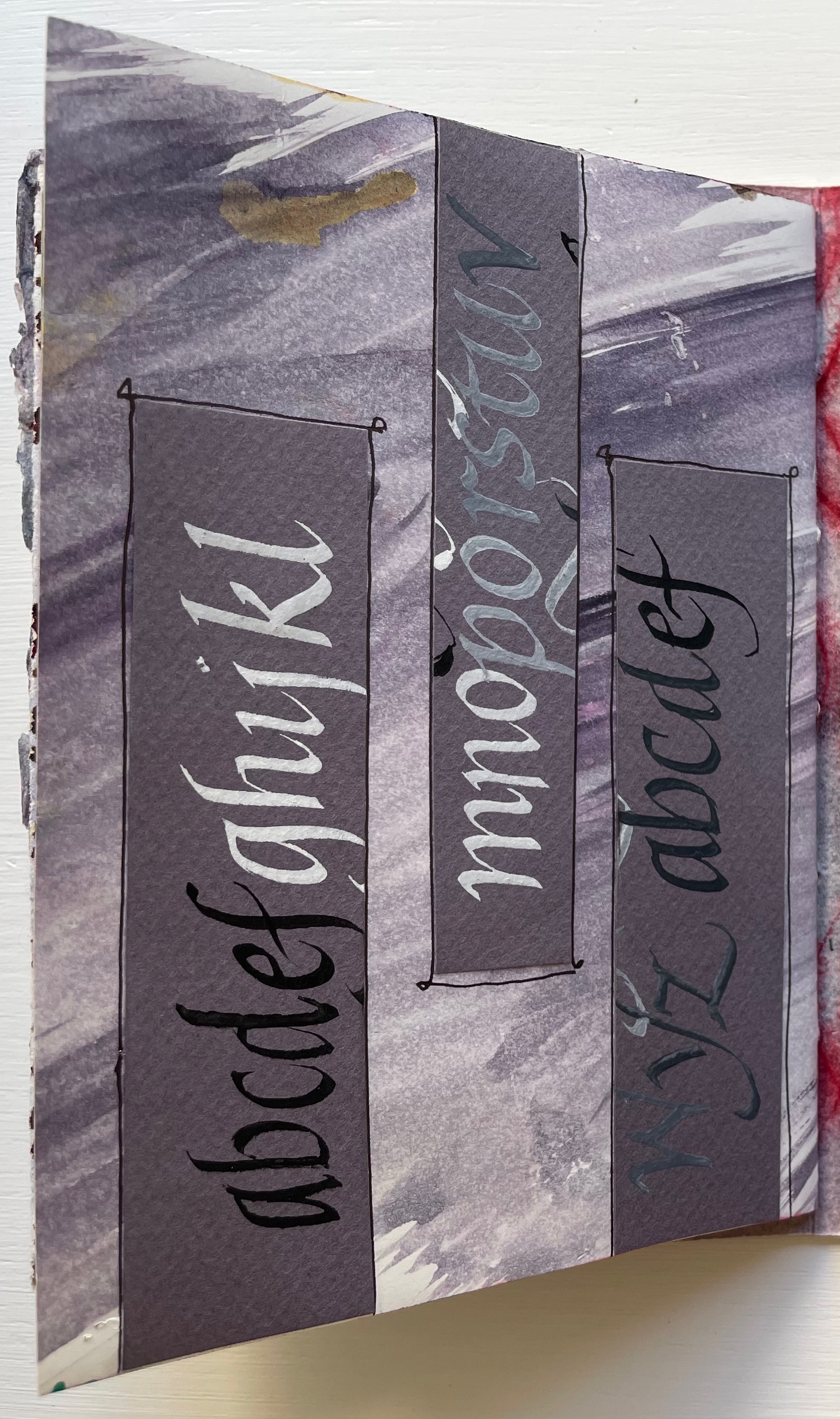
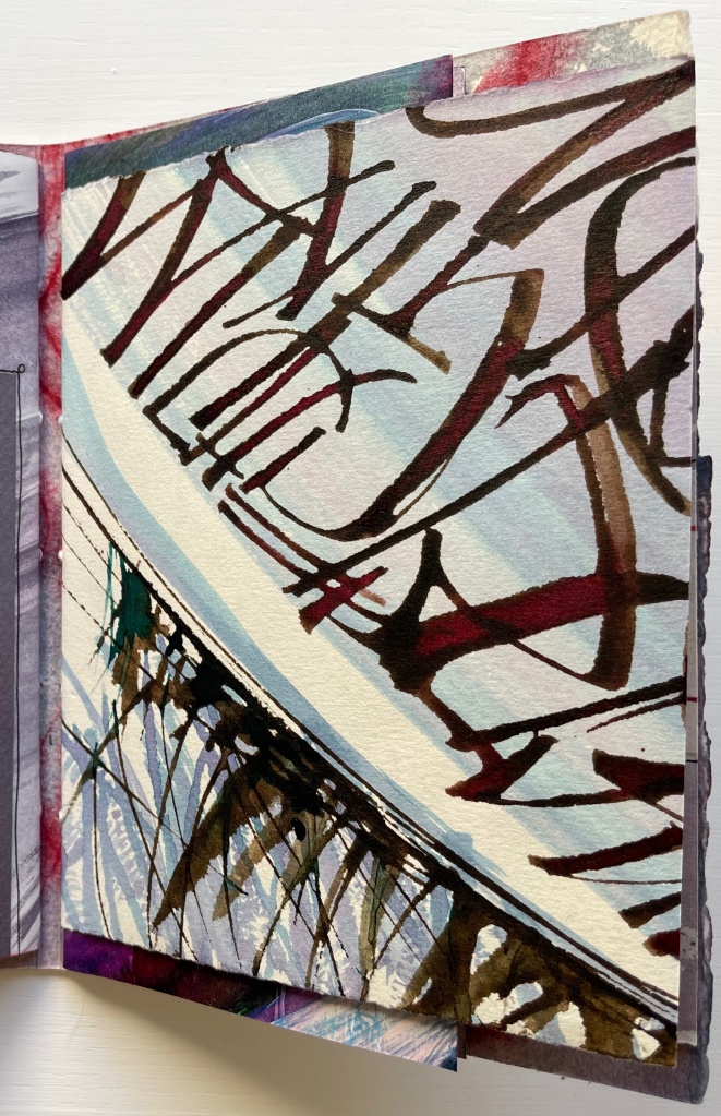
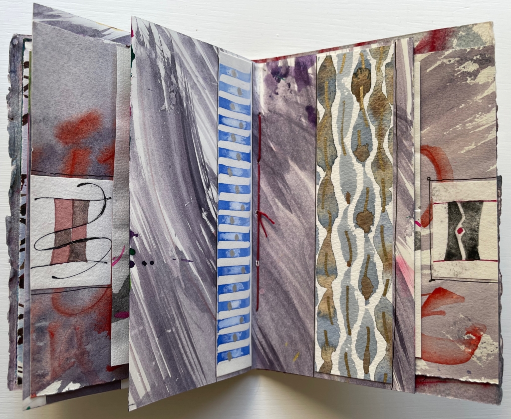
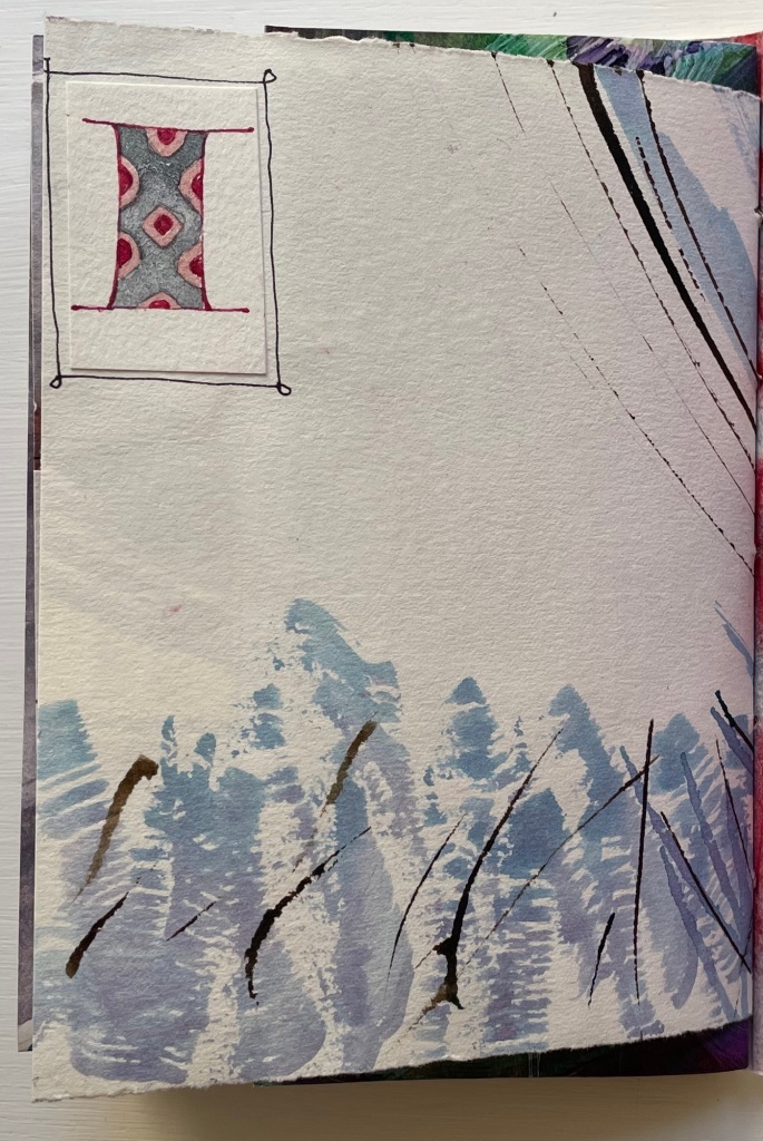
Below, the truncated alphabet prompts the leap forward to find its other half, and the contrasting wintry calligraphy facing M through Z sends us back to its other half to puzzle over those collaged thumbnail letter I’s.
Mind that all of this has occurred in just the first gathering.
The second gathering has fewer folios and perhaps fewer prompts to jump forward and back, but there is at least one prompt to jump back to the first gathering. The first page of the second gathering recalls from the first gathering the folio of wintry calligraphy — the one above with the two puzzling thumbnail letter I’s.
Curiously, the second gathering has several more of those thumbnail letter I’s than the first gathering has. In fact, due to the narrowness of the inner folios, the collaged thumbnails are also more constantly present to the eye. In general, the thumbnails and narrow inner folios make the second gathering more about the collage effect and strong contrasts across the differently sized pages and less about jumping forward and back.
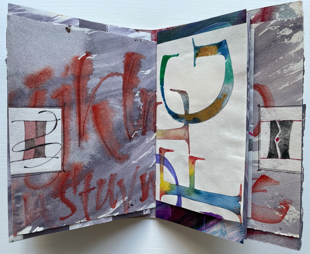
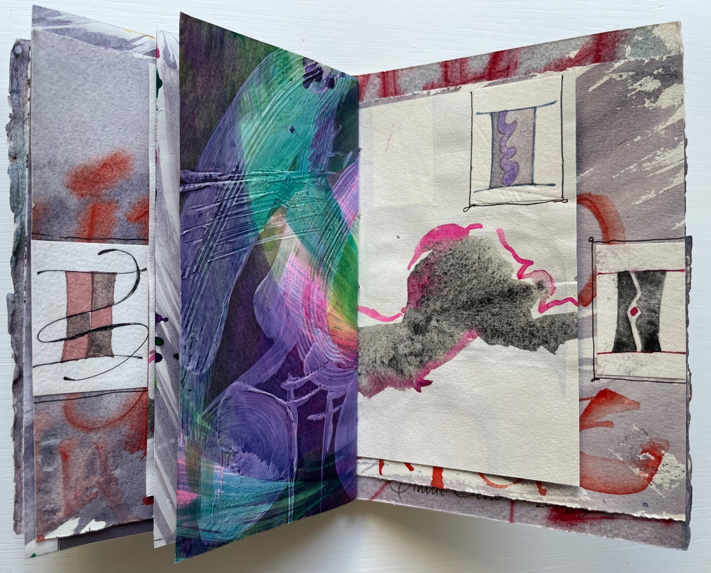
When we reach the final page of the second gathering, there sits the thumbnail, almost as if it were the illuminated initial of “Incipit” — except, of course, this is the end.
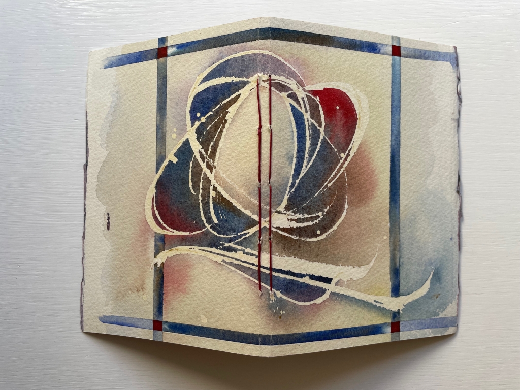
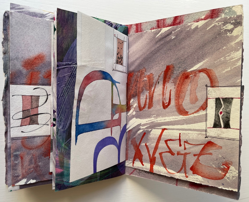
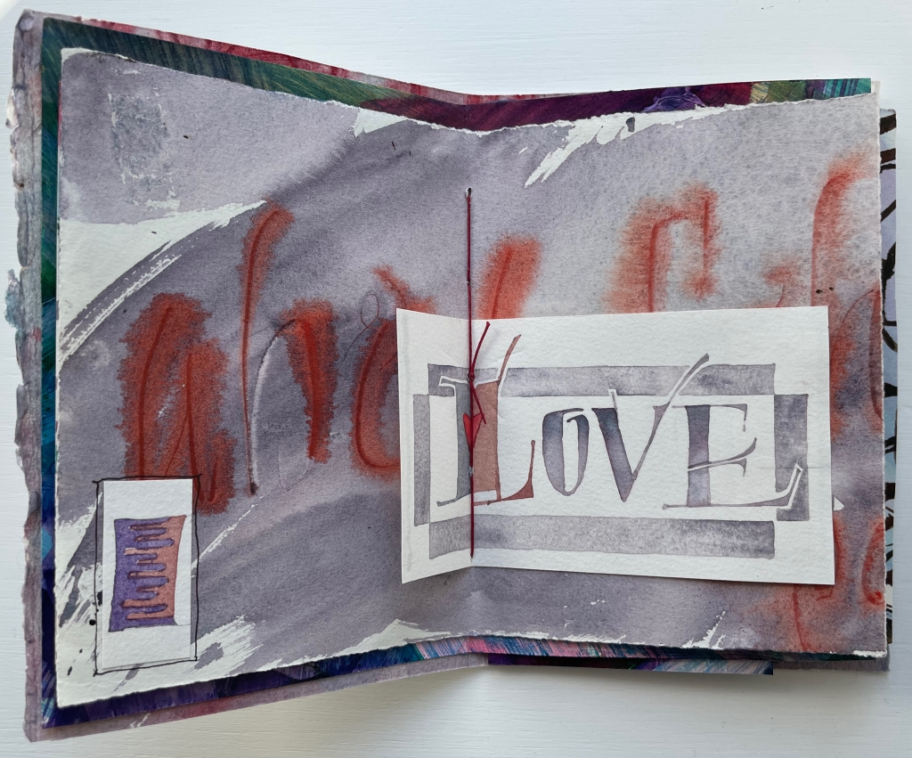
Tantalizing and enchanting as those thumbnail letter I’s are, they also draw attention to the experiment’s one jarring folio. It appears in the center of the first gathering and is quirkily the only off-center folio in the whole book. It is also the folio that, with an explicit message, forecloses the surrounding incipience. With that twee red heart beneath the red thread, out the window goes the structural and material subtlety so enjoyable in the rest of the book.
Further Reading
“Abecedaries I (in progress)“. Books On Books Collection.
“Alphabets Alive! – Calligraphy & Design“. 19 July 2023. Books On Books.
Chen, Julie. 2013. 500 Handmade Books. Volume 2. New York: Lark. Pp. 54 (Grow), 279 (Free Play).

One thought on “Books On Books Collection – Annie Cicale”