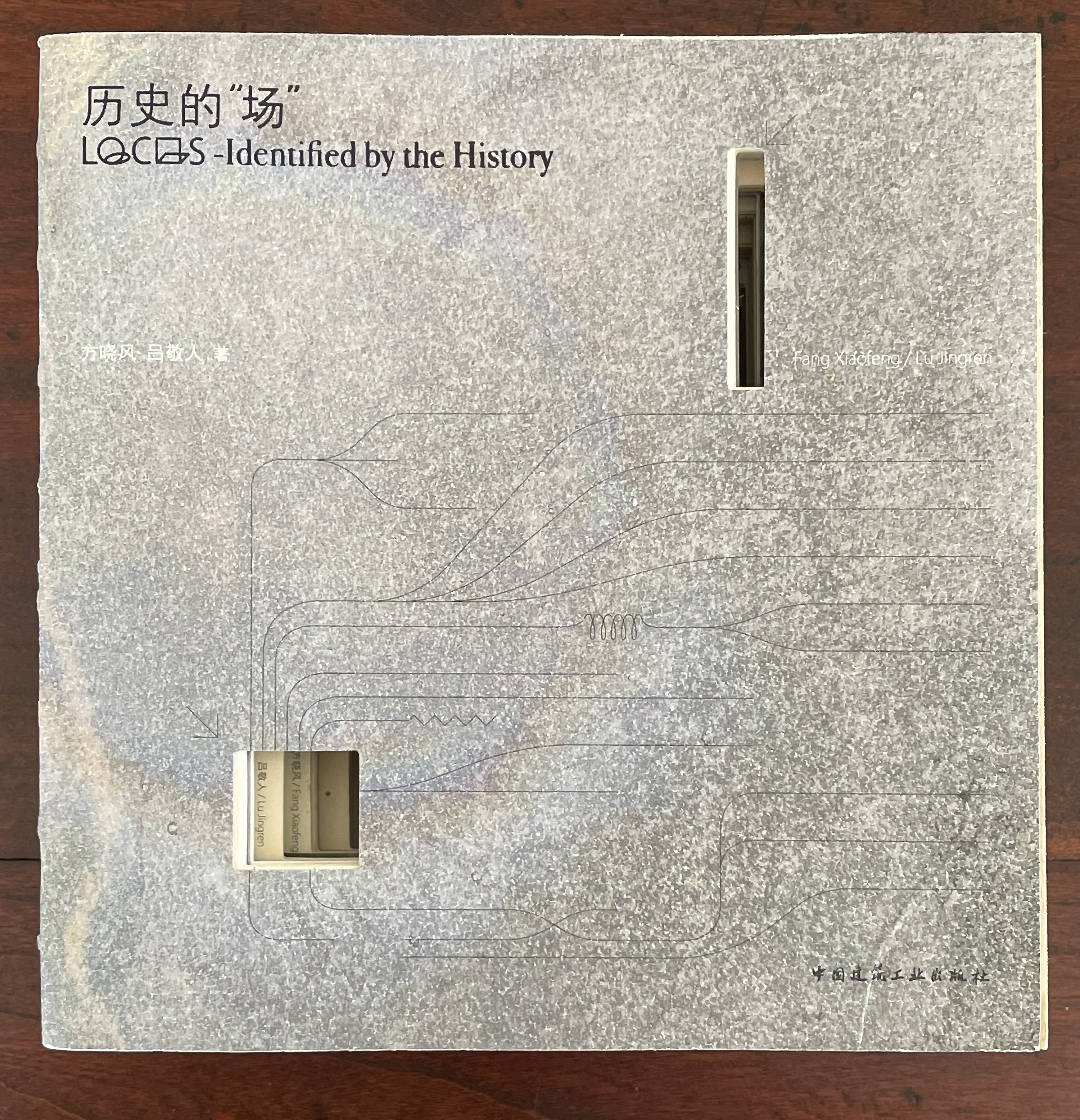
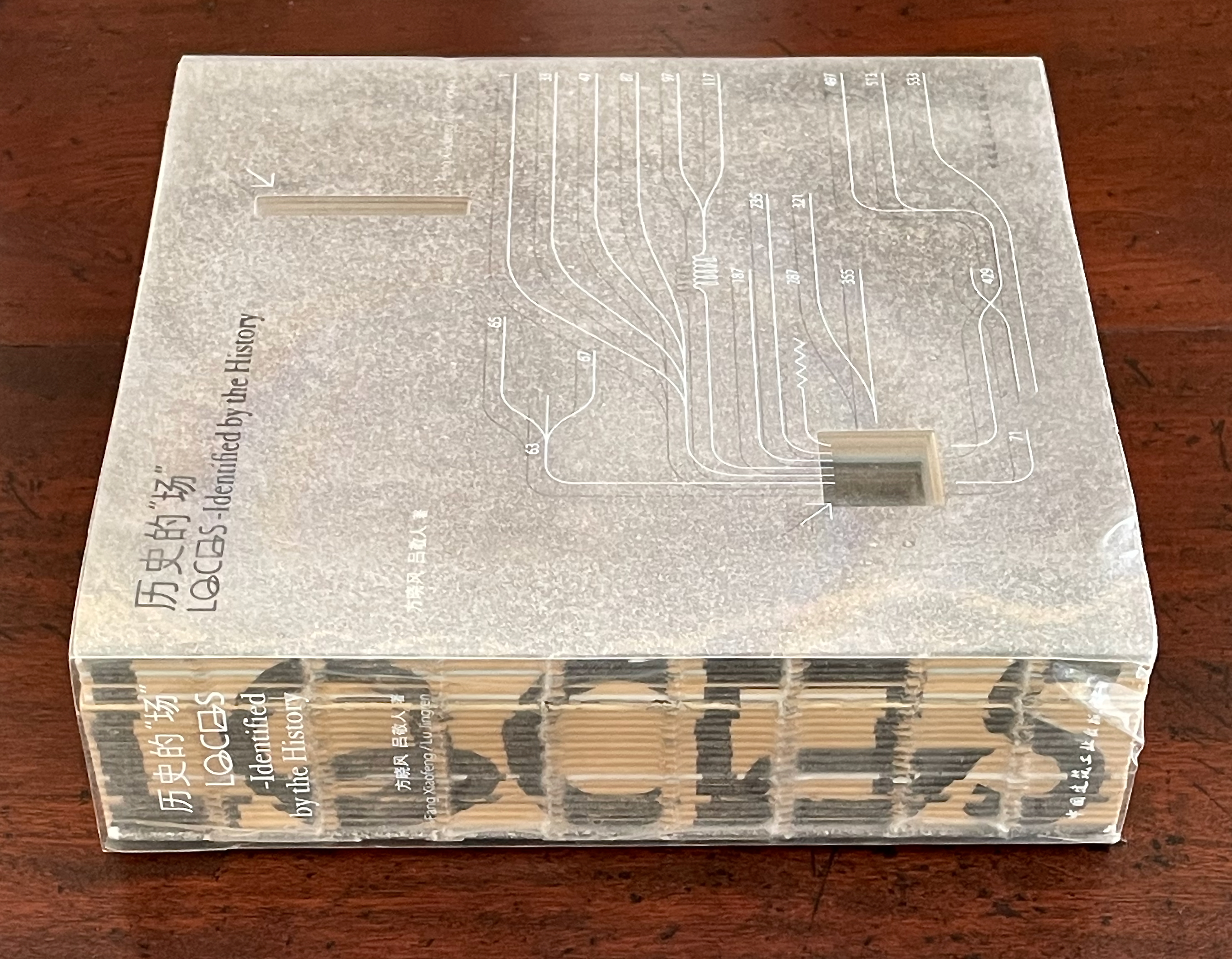
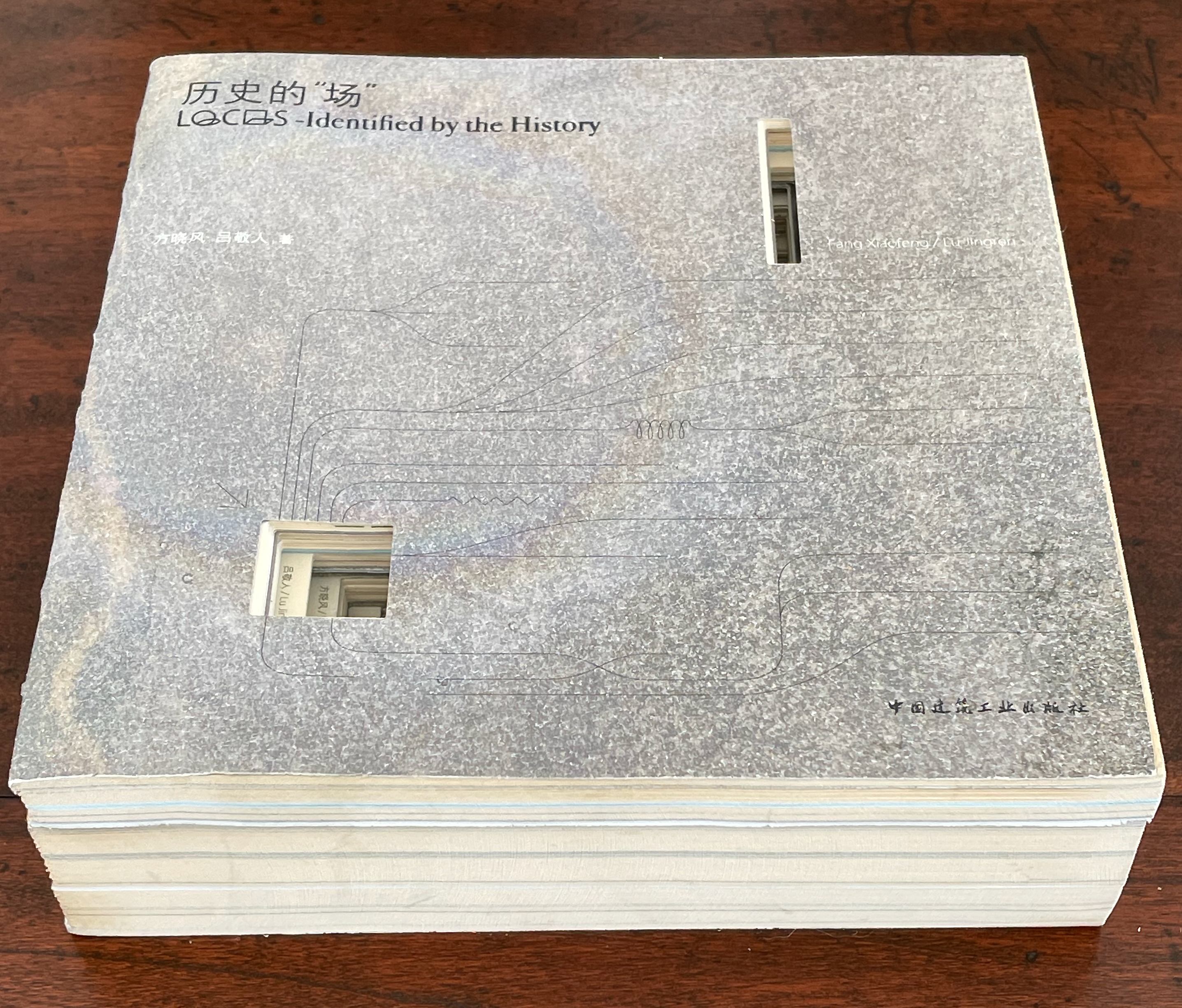
历史的”场 (Locus: Identified by the History) (2016) 方晓风 (Fang Xiaofeng) and 呂敬人 (Lu Jingren) Beijing Shi: Zhongguo jian zhu gong ye chu ban she.
Co-authored by architecture scholar Fang Xiaofeng and book designer Lu Jingren, Locus: Identified by the History (2016) springs from the Book – Architecture Project (书 – 筑 / Shu – Zhu Project), conceived by Lu Jingren, Fumihiko Maki (Japan), and Yi Ki-Ung (South Korea). The project initiated a multi-year series of exhibitions/forums called “Book – Architecture: Dialogues Between Architects and Book Designers” (2011-19) across all three countries. Locus was published on the occasion of the second exhibition/forum in 2016.
Locus pursues two overlapping lines of thought. The first and primary one rests on Lu’s design philosophy that a book is a built environment, a habitat for text and images to be engaged by readers and all five of their senses. Its layout, pacing, structure, and their interconnectedness with each other and the book’s materials mirror the architect’s design of rooms, hallways, stairs, windows, doors, thresholds, and their interconnectedness with each other and their materials. Likewise as habitats, they each have exteriors, are designed to occupy a locus in time and space, and relate to a world outside. In Lu’s philosophy, the design mechanics involve four pillars: binding + layout + editorial + information visualization. Successful execution results in an immersive spatial object (habitat) that triggers the reader’s visual, tactile, auditory, olfactory, and gustatory systems simultaneously.
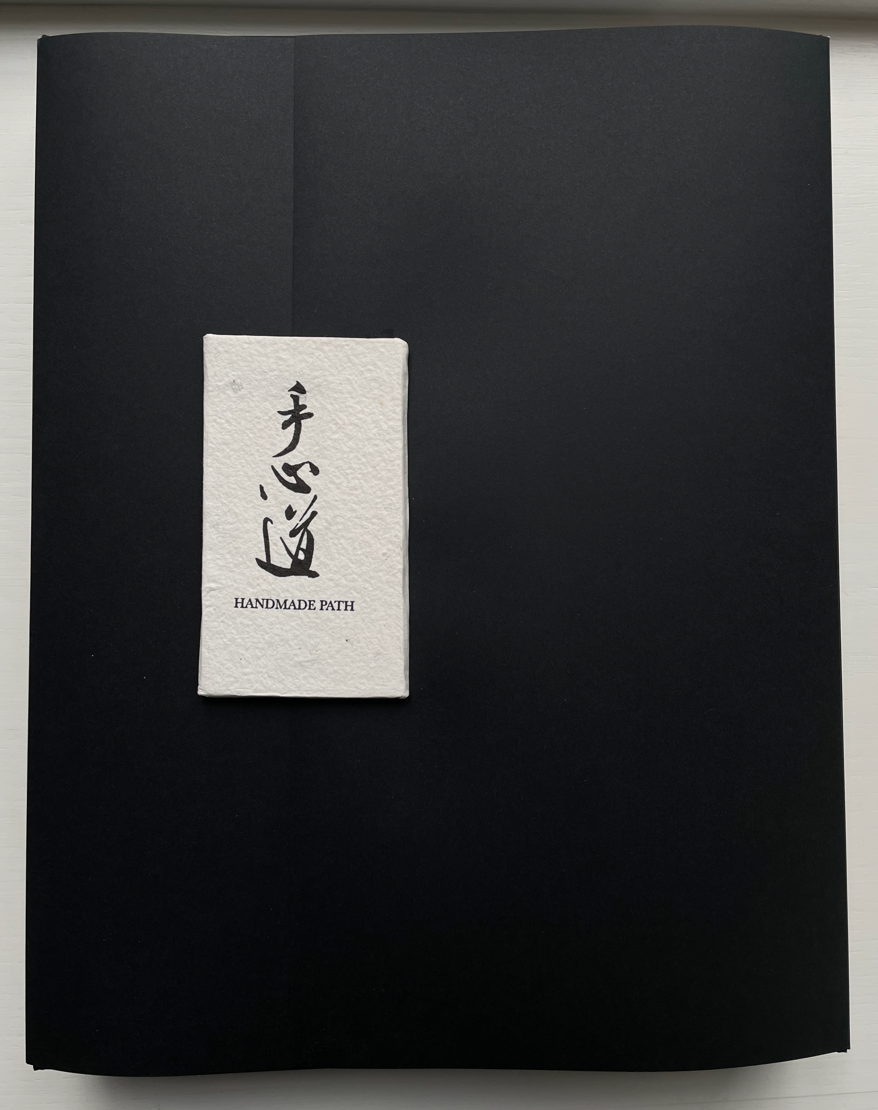
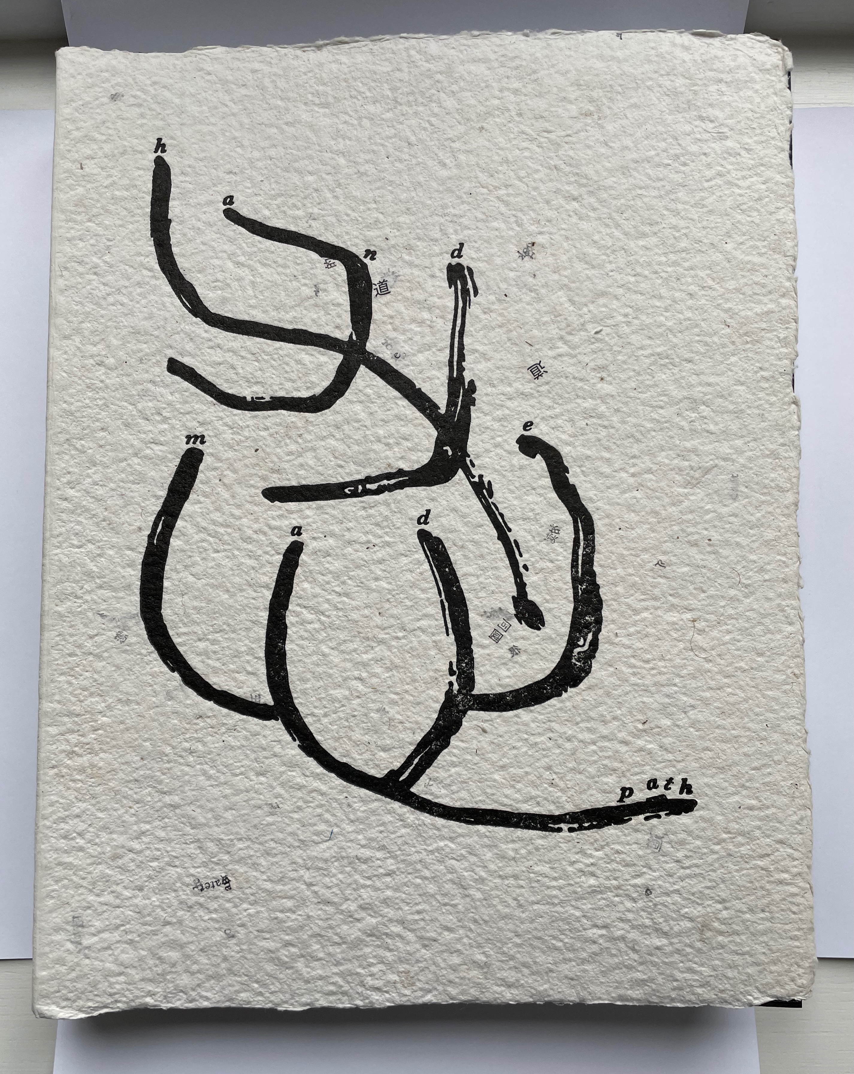
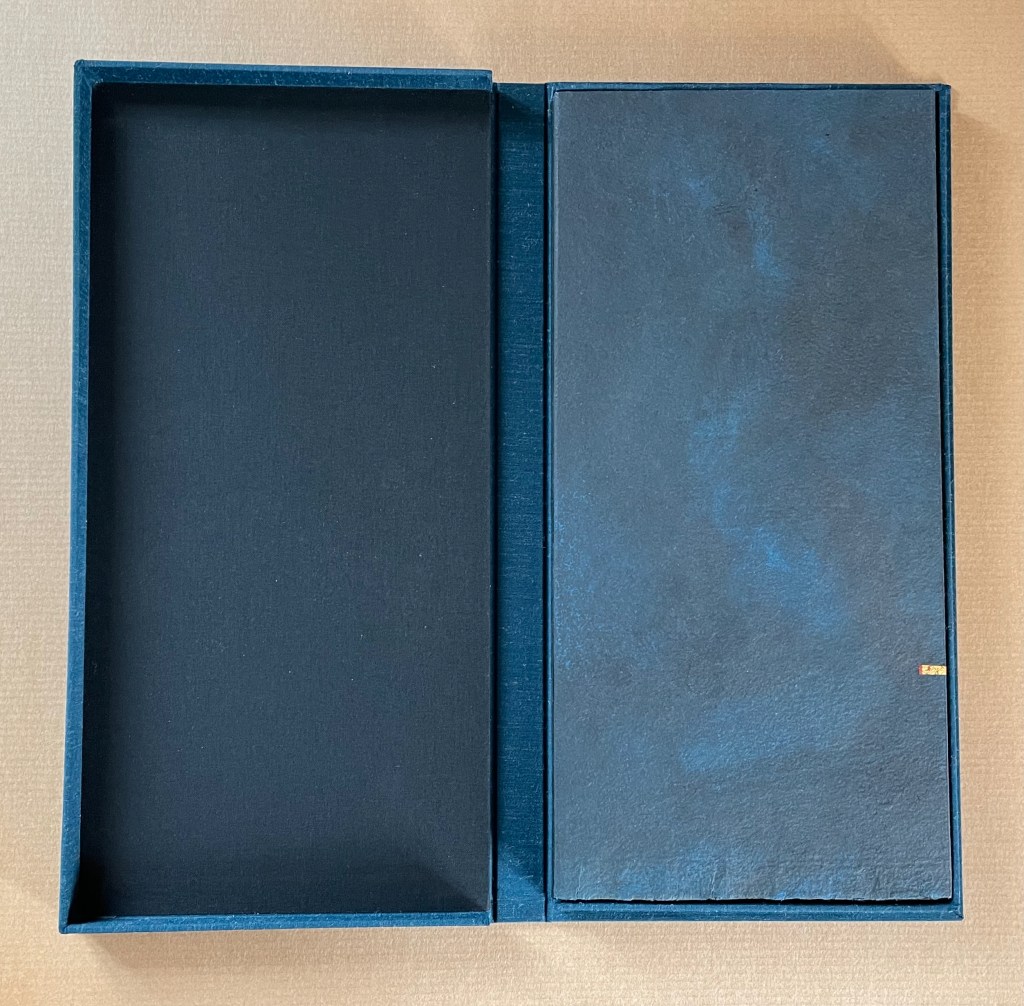
Handmade Path (2021) Lu Jingren, Amanda Degener, and Peng Wu Black-inked card wrapper with magnetic closure. Handbound, handsewn, handmade paper cover book. H285 x W220 x D40 mm. 268pages. Edition of 350, of which this is #152. Acquired from Amanda Degener, 5 December 2022. Photos: Books On Books.
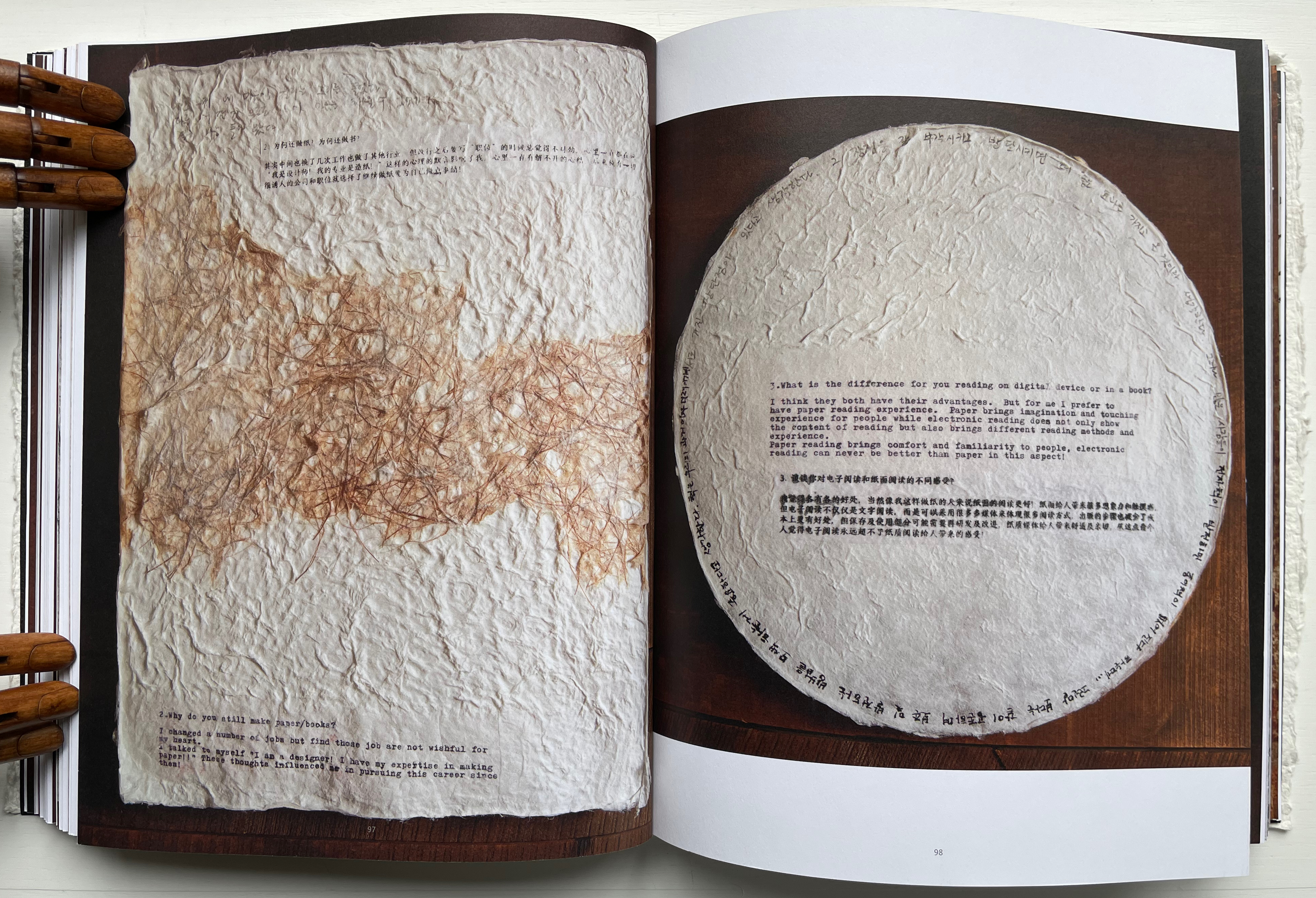
Handmade Path presents 57 artists of paper and book who responded to 6 questions circulated by the editors. The editors asked the artists to provide handwritten replies to the questions as well as images of both their work and of their hands.
How did you begin your practice?
Why do you still make paper / books?
What is the difference for you reading on digital device or in a book?
In what way do you understand the 5 senses of paper/book: vision, touch, hearing, smelling, tasting?
Share with us some moments; eitherbreakthroughs or break downs in your work?
What is your next dream project?
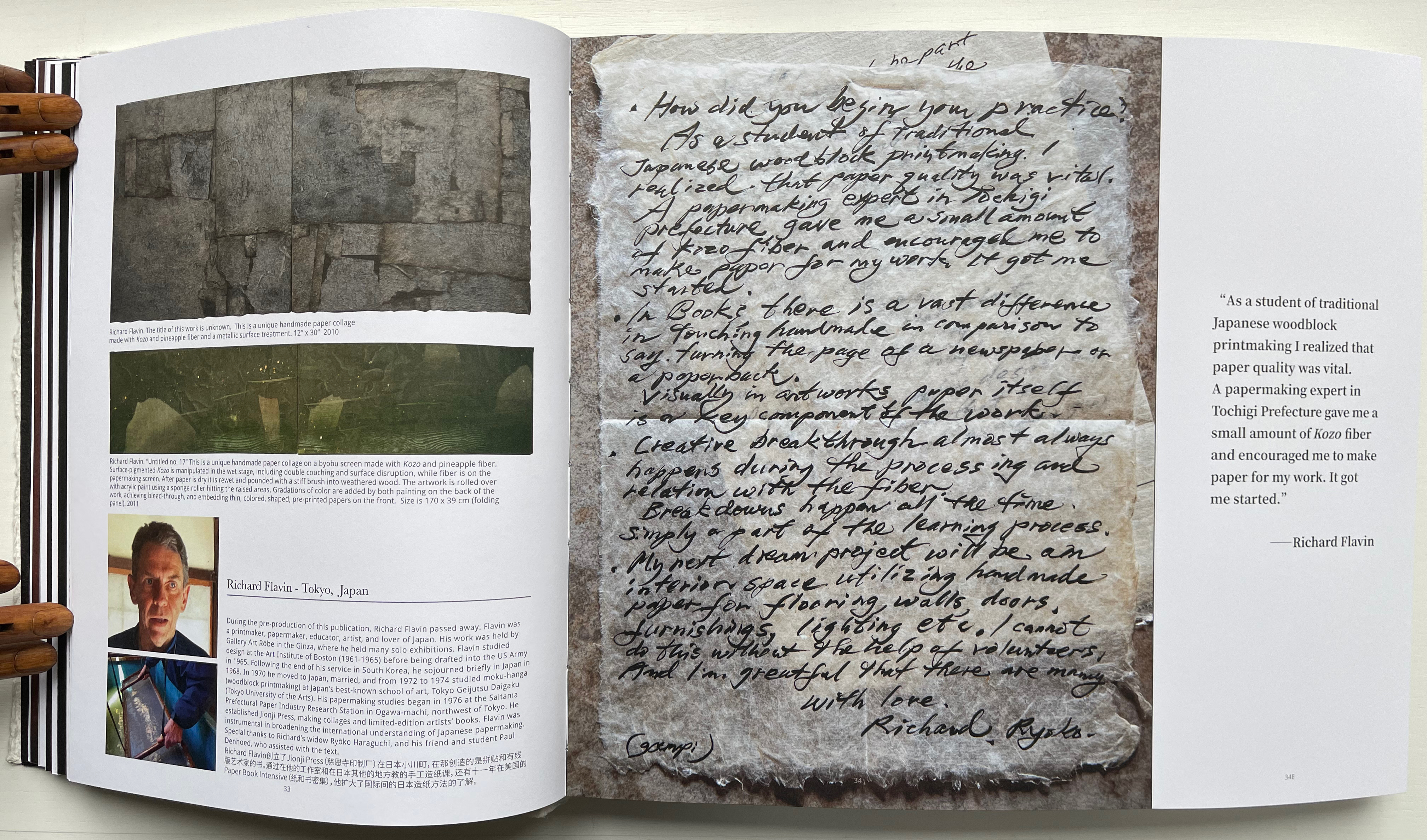
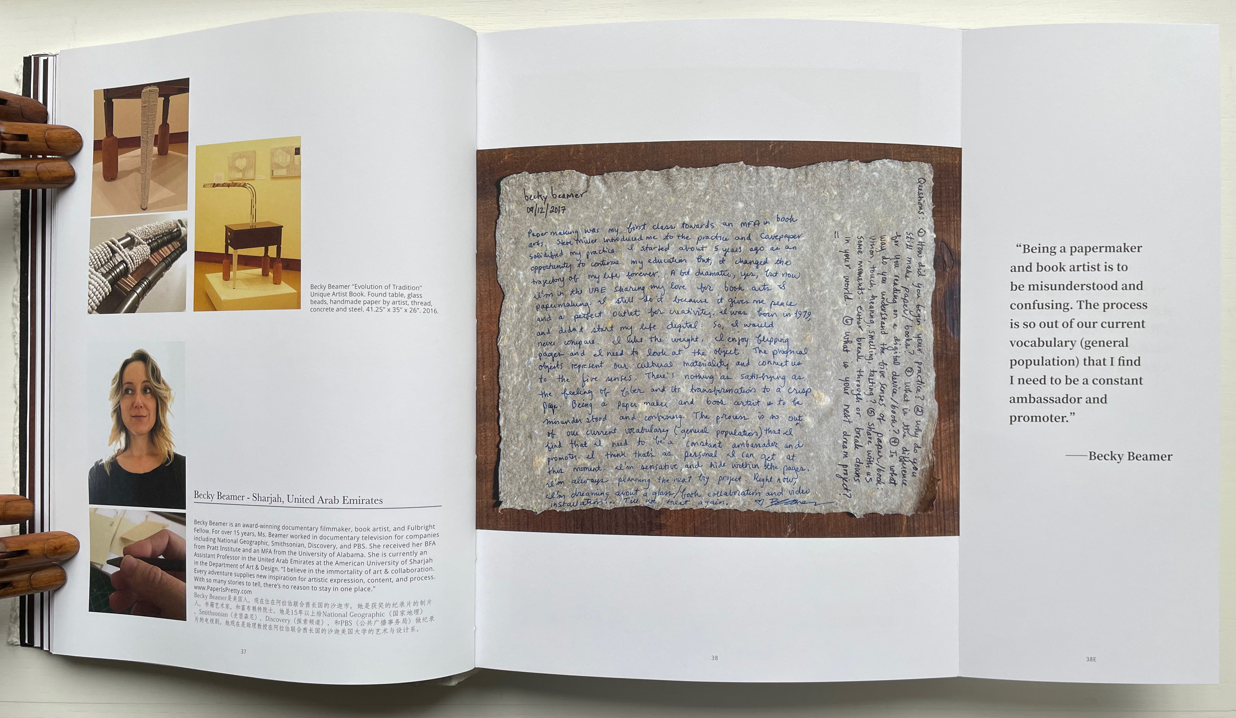
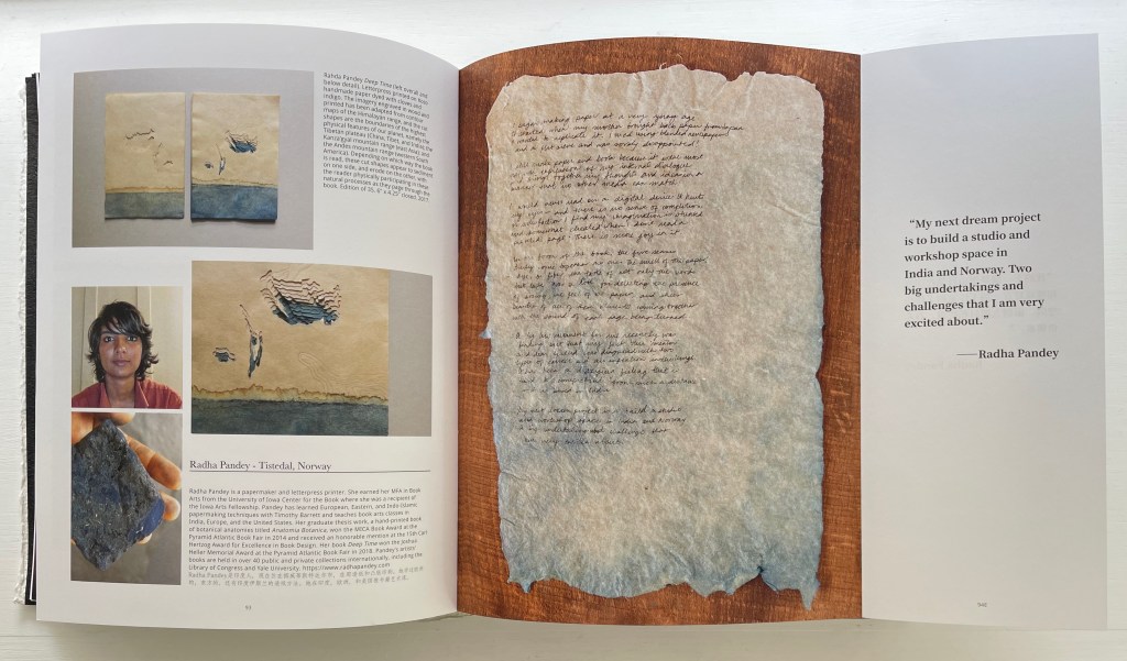
Not all of the respondents replied in handwriting, but many sent their replies on material that reflected their work. The late Richard Flavin’s contribution arrived on gampi paper. Becky Beamer inked her reply on a gray handmade sheet. Radha Pandey’s came on indigo tinted handmade paper.
Richard Flavin
Becky Beamer
Radha Pandey
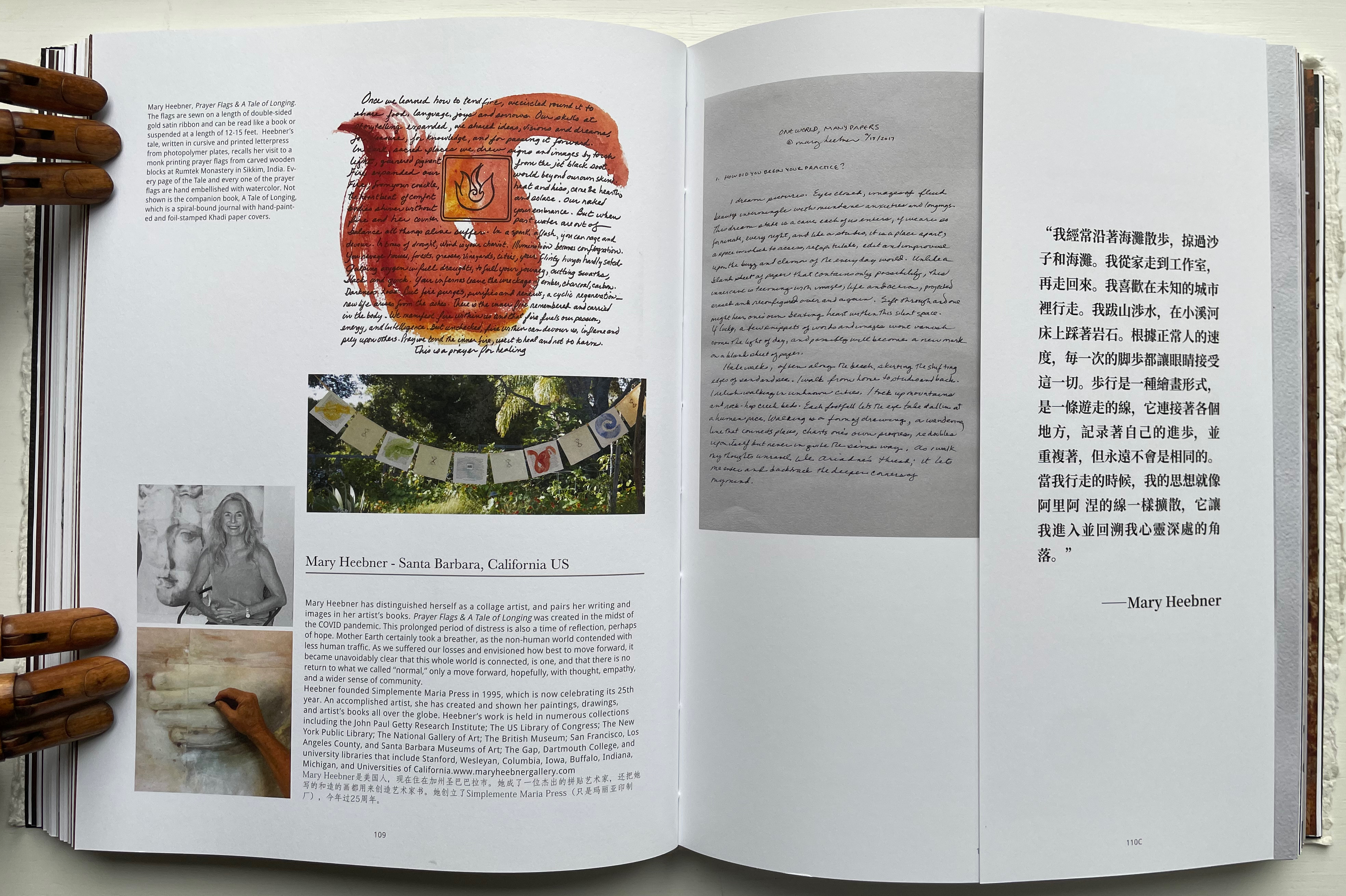
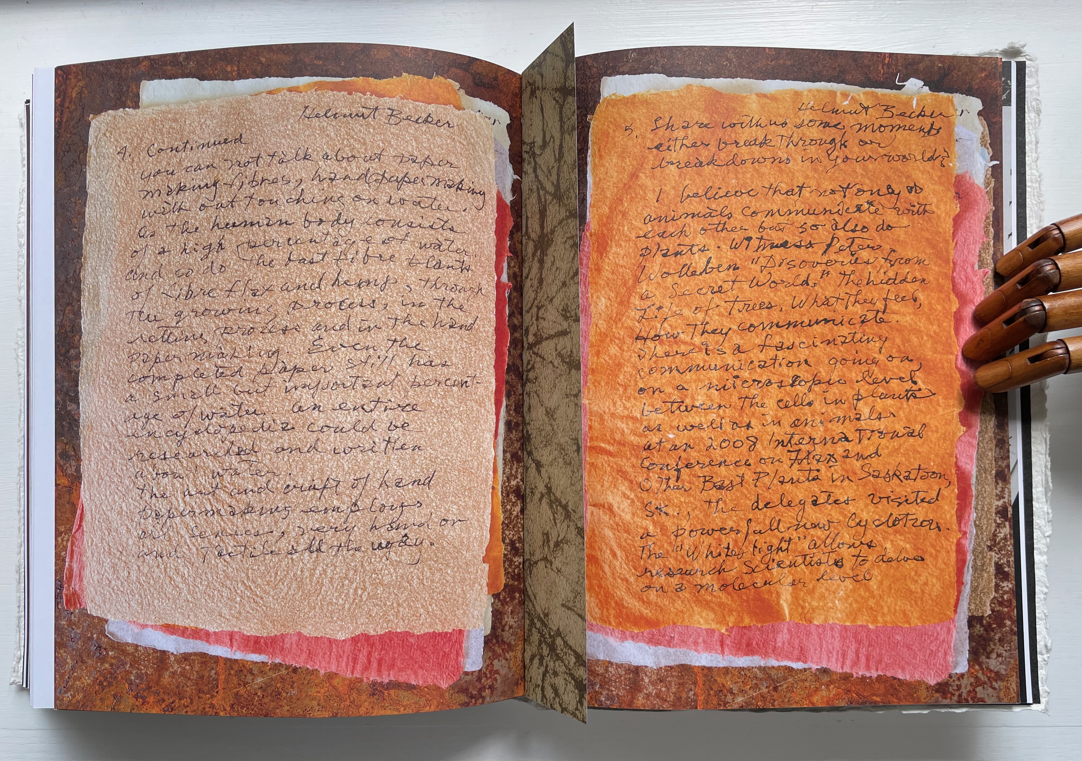
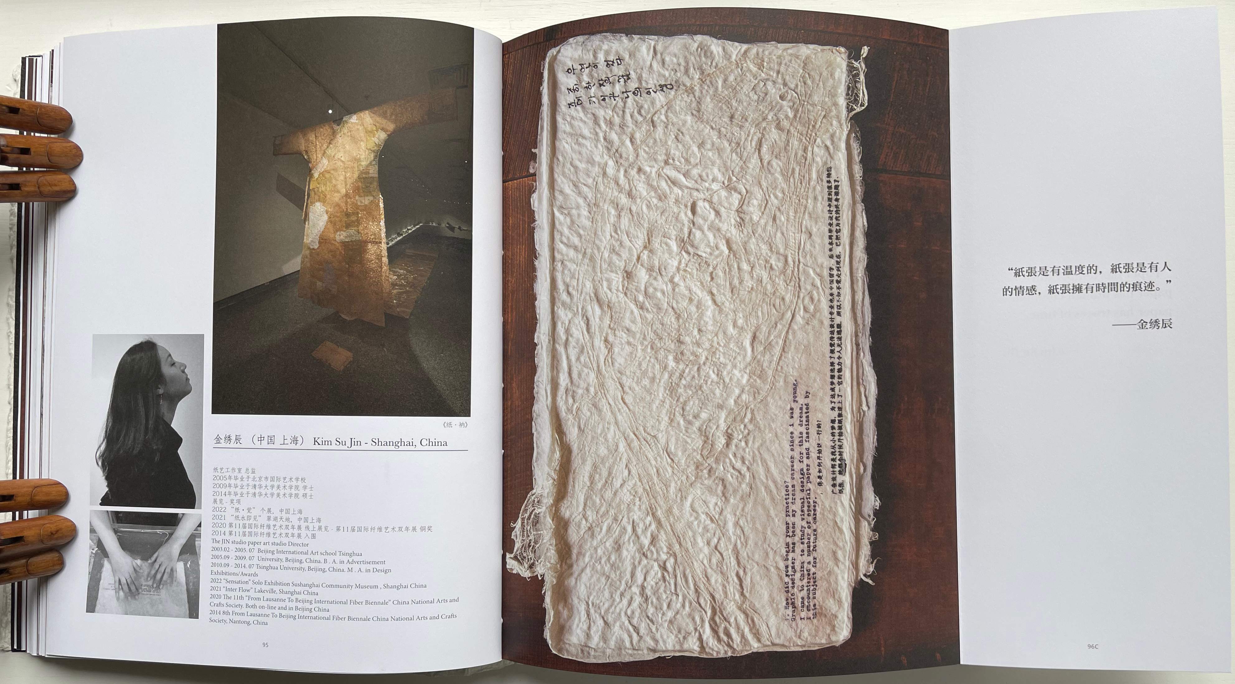
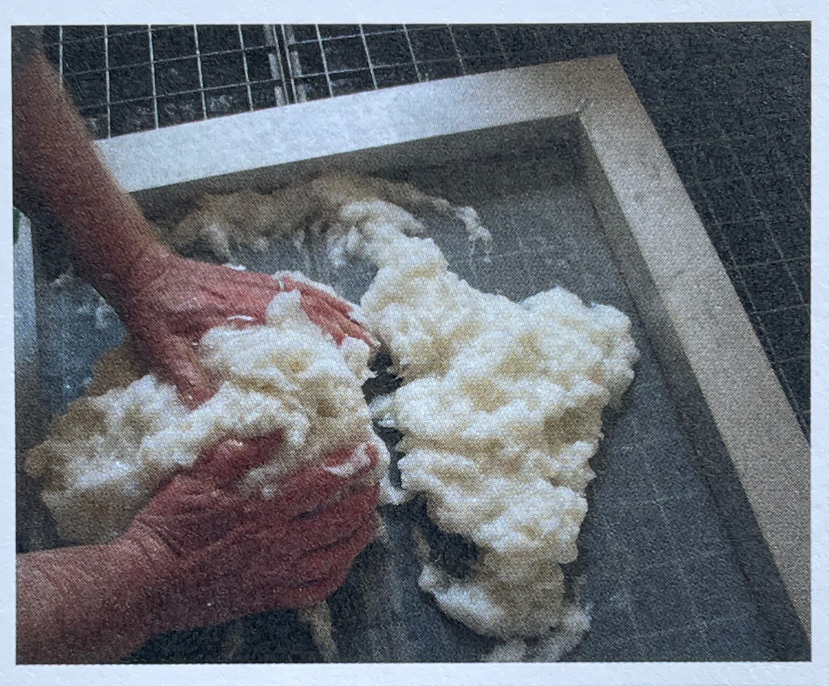
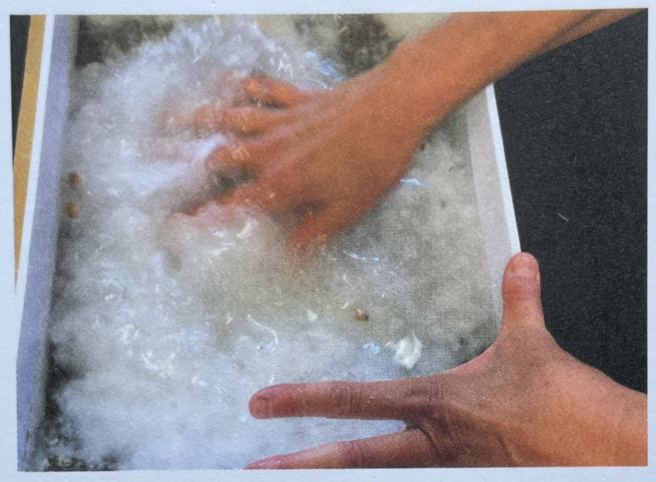
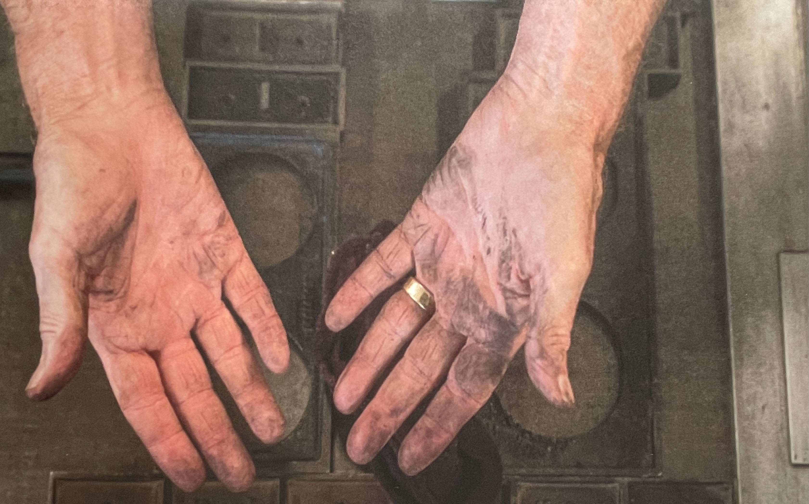
Jack Mader photographed these contributions in ways that render them visually haptic. It places that fourth question — “In what way do you understand the 5 senses of paper / book: vision, touch, hearing, smelling, tasting?” — at the core of the book. You’d swear you can feel the velvet texture of Mary Heebner’s 11 pages. Or the roughness of Helmut Becker’s colored handmade sheets or of Su Jin Kim’s white sculptural responses. The request for images of the artists’ hands naturally added to this sensory effect. There’s the glutinous wetness of pulp between the fingers of Jean Michel Letellier and Helen Hiebert and the imagined smell of the ink on George Roberts’ hands.
Mary Heebner
Helmut Becker
Kim Su Jin
Left: Jean Michel Letellier’s hands. Right: Helen Hiebert’s hands.
George Roberts’ hands.
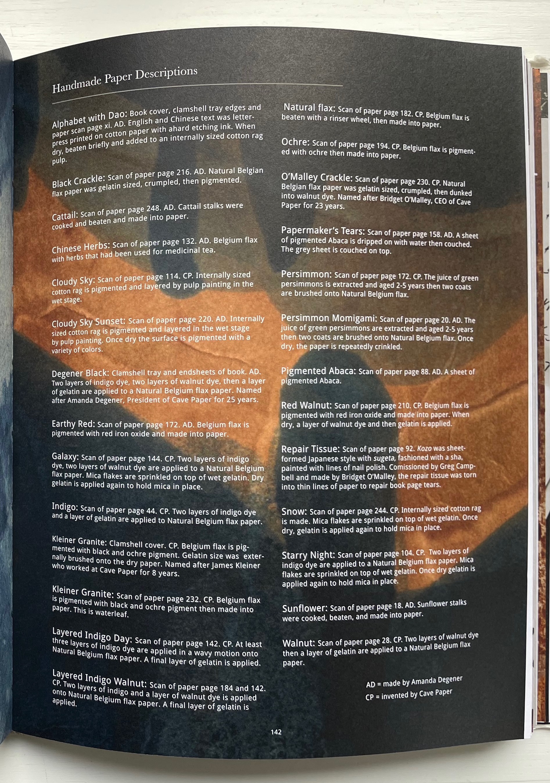
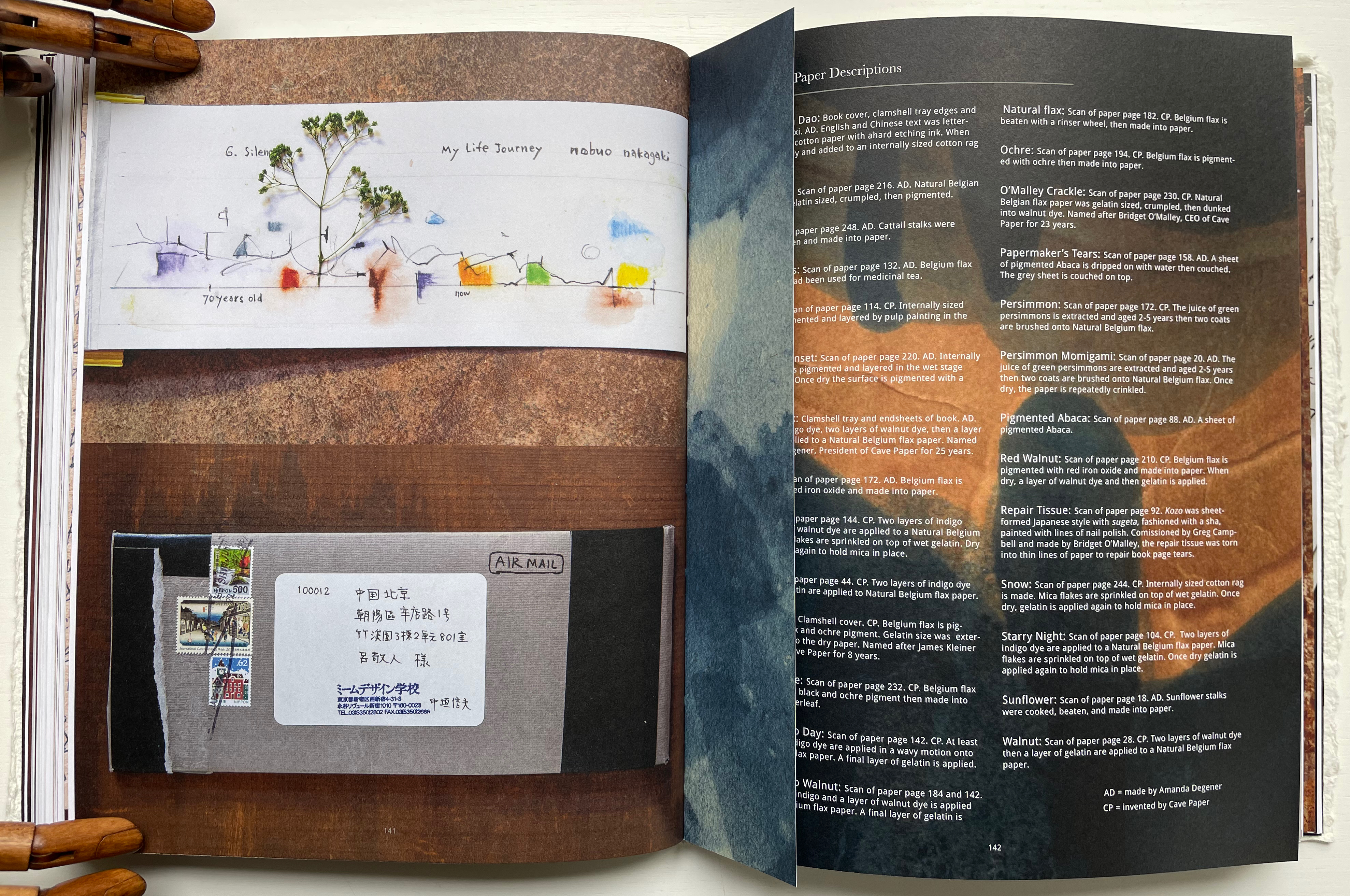
Throughout the book are truncated pages that act almost like bookmarks. Only midway through do we learn that they bear scanned images of handmade paper from Amanda Degener and Cave Paper. Degener provides an index describing the handmade papers, which oddly appears at page 142. Not only does it function as an index, it delivers information expected in a colophon. It even describes the paper used for the book’s cover, endpapers, and the clamshell tray. But nevermind, it’s all part of diving into the artists’ process and practice.
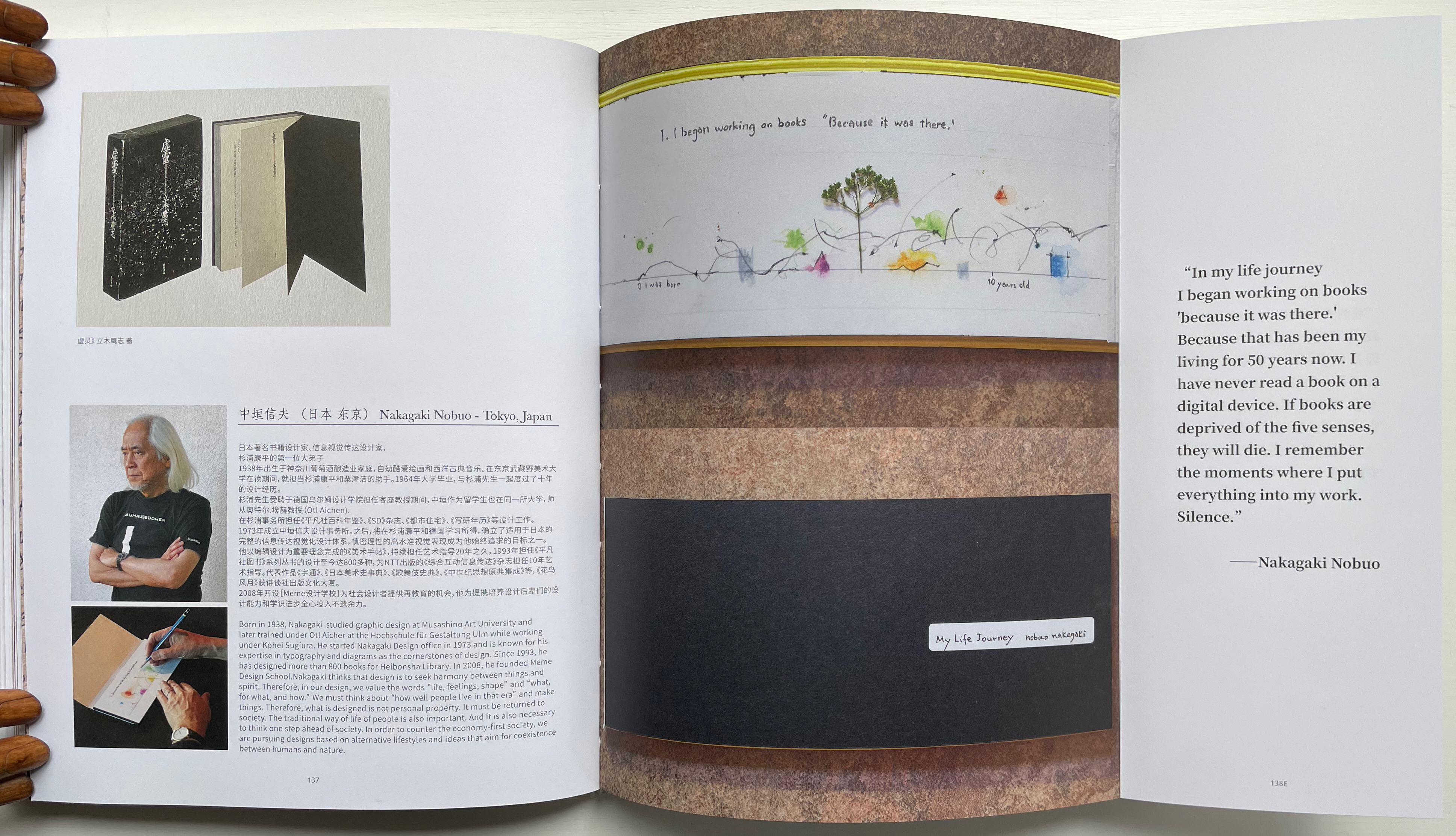
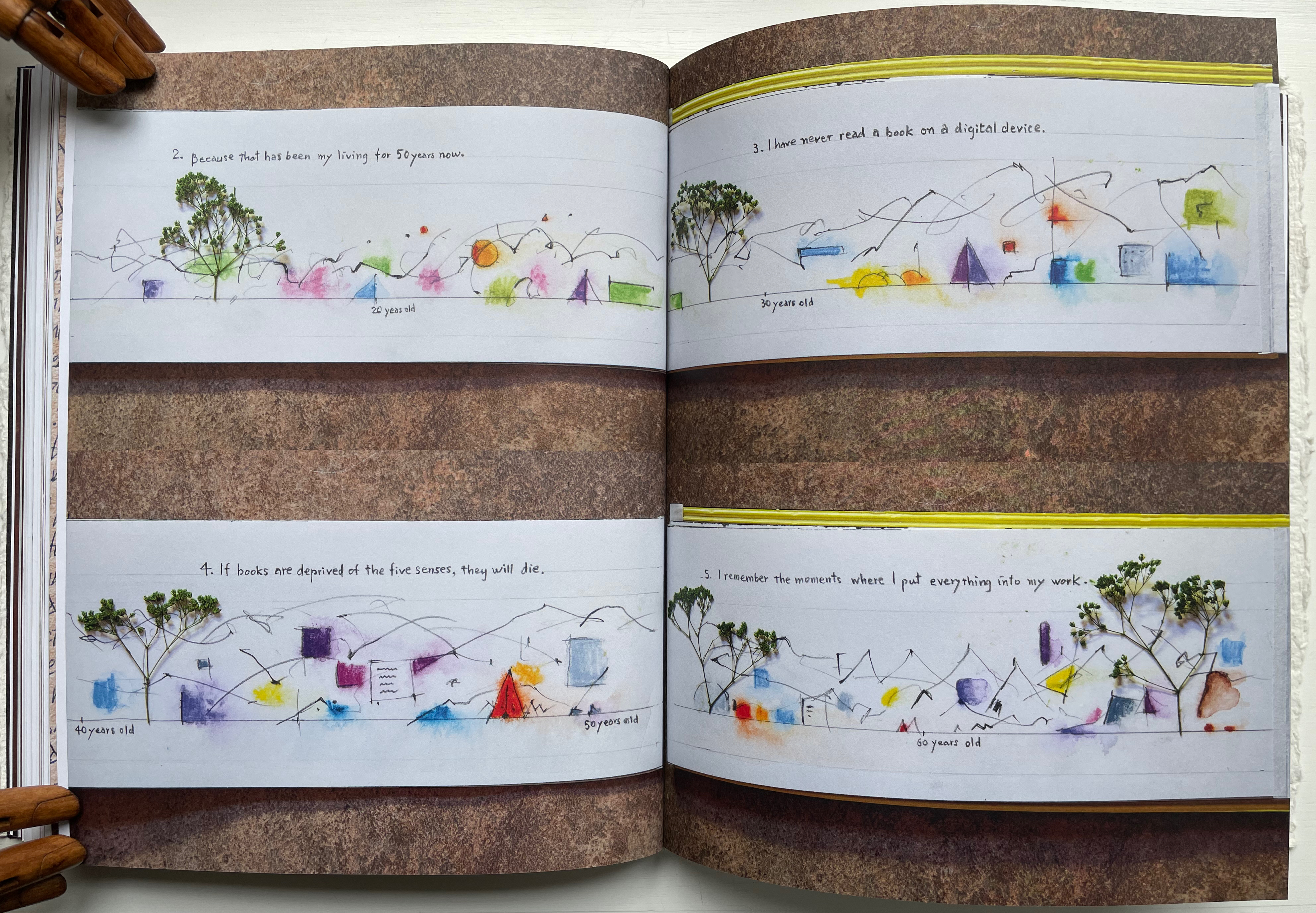
Quite appropriately this midway index appears just after the entry for Nakagaki Nabuo, whose response to the opening question “How did you begin your practice?” comes in the form of an autobiographical handmade artist’s book. In the pages presenting his book, we see the artist, his hands at work on the book, and Mader’s precise photography of the book and its airmail envelope, followed by the bookmark-like stub with its image of Cave Paper’s Layered Indigo Day paper.
Nakagaki Nabuo and his hands at work.
Nakagaki’s My Life Journey
Verso: Nakagaki’s answer to question 6: “What is your next dream project?” Recto: “Handmade Paper Descriptions” index/colophon.
In their preface, the editors write:
Although reading is a private activity we are not alone; we are cooperating with the book, bringing it into ourselves. Reading is not only about transplanting ourselves to the beyond, but we modify ourselves to see the world differently. Our vision or purpose for Handmade Path is for you to participate in this collaboration.
Just holding Handmade Path and constantly feeling its Alphabet Dao cover, navigating its foldouts alternating Chinese with English according to the contributor, being tempted to lift a contributor’s sheet of paper from the photos, hearing the snap and creak of sewn pages turning, and absorbing the contributors’ testaments, we cannot help but be drawn into participating with the book. In doing so, we learn that, as Paulette Myers-Rich puts it, “Paper is not a substrate — it is story” (p. 197).
Hamady, Walter; Samuel Haatoum; and Hermann Zapf. 1982. Papermaking by Hand : A Book of Suspicions. Perry Township, Dane County, Wisconsin, USA: Perishable Press Limited.
Thomas, Peter, and Donna Thomas. 1999. Paper from Plants. Santa Cruz, Calif: Verf. You can find images of this and others by the artists online in the Special Collections website of the University of Wisconsin-Milwaukee Libraries.
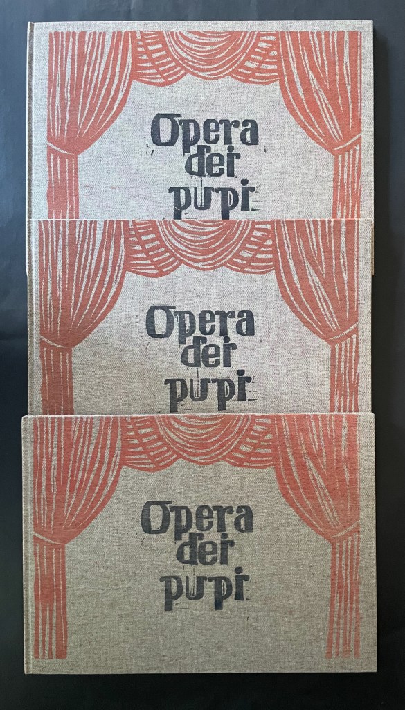
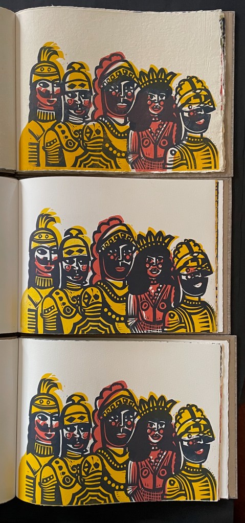
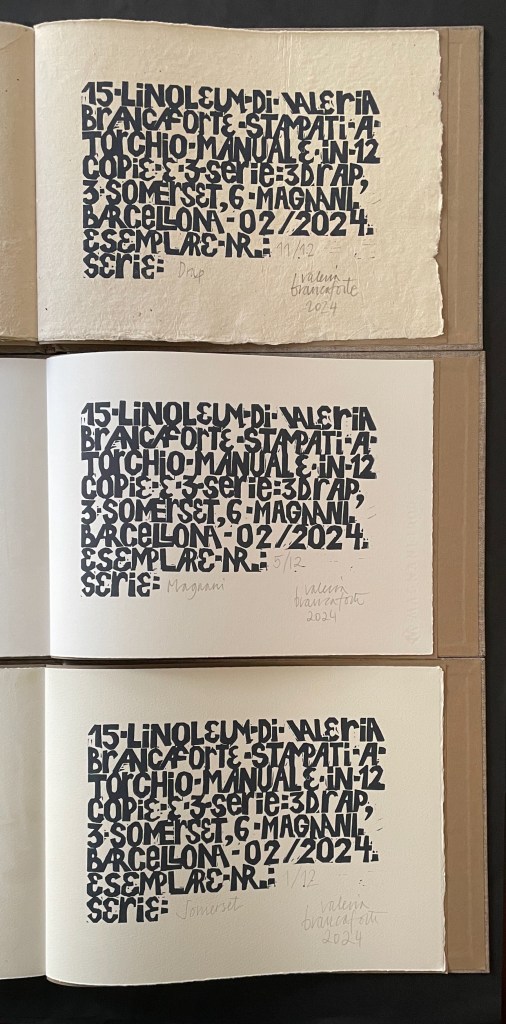
Opera dei Pupi (2024) Valeria Brancaforte Casebound hardback, cloth over boards, print on front cover. Plain brown doublures. Three variants based on trim and paper. A: H272 x W368 mm; Drap, Catalan hand-made paper. B: H261 x W360 mm; Italian Magnani Incisione. C: H265 x W362 mm; Somerset Velvet White 250gsm. [20] pages with 14 prints. Each in an edition of 12, of which A is #11, B is #5, and C is #1. Acquired from the artist, 14 November 2025 and 7 February 2026. Photos: Books On Books Collection. Displayed with permission of the artist.
Puppets and marionettes have figured in more than a few artists’ books. Ron King and Roy Fisher’s The Left-handed Punch (1986) and Anansi Company (1992) are perhaps the best known. Others include Ann Kresge’s Shadow Play (1998), Antonio Nocera’s La Valigia di Pinocchio (2015), Emily Martin’s Funny Peculiar Funny Ha Ha (2017), Hormazd Narielwalla’s Paper Dolls(2018) Erminia De Luca’s Now it’s up to you (2023), and Rachel Simmons’ Dream of the Golden Empress (2023). Valeria Brancaforte’s recent addition to the cavalcade brings to it a new cultural tradition and a welcome chance to compare how variation in paper can play into appreciation of an artist’s book.
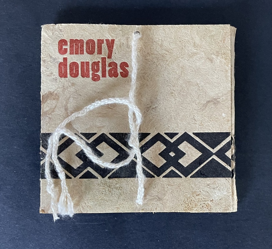
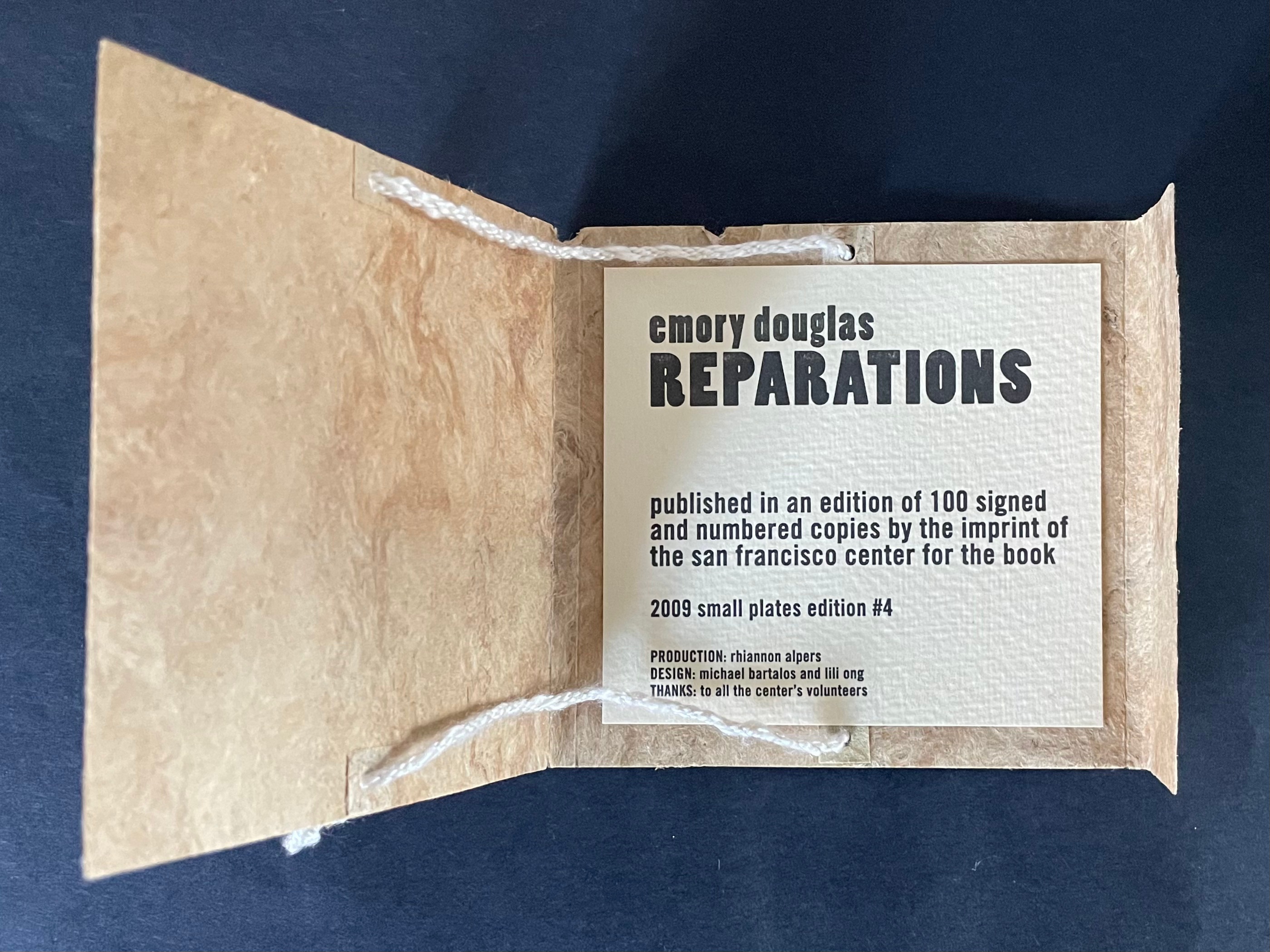
Reparations (2010) Emory Douglas Cover enclosing leporello. Cover: H102 x W105 mm. Leporello: H89 x W95 mm (closed); W380 mm (open). [4] panels.Edition of 100, of which this is #45. Acquired from the San Francisco Center for the Book, 30 June 2025. Photos: Books On Books Collection. Displayed with permission of the publisher.
“Emory Douglas is renowned for his iconic representations of the Black Panther Party through his work as the Party’s Minister of Culture. For decades, he communicated the power and charisma of the movement through his compelling straightforward graphic style. … The imagery for this edition was initially a painting by Mr. Douglas’ which was then translated into a 2 color, letterpress graphic. The pages of the book are a one-sided, accordion fold piece. The folded cover is made of Amate bark with hand-spun hemp and silk thread and letterpress printed in 2 colors with interior colophon page attached””–San Francisco Center for the Book
Bookmorph n. (bōk+μoρφ): a portmanteau word referring to casebound books which have been modified; an emergent branch of sculpture in which textual content is often downgraded; treatments include chewing, cutting, drilling, entombing, pulping, ripping, shooting (with a firearm), siliconising, etc; any codex fundamentally altered or warped by an artist; a site of entropic processes designed to return pages to cellulose fibre, and/or the creation of a fungal landscape; a bibliographic montrosity.Michael Hampton, arts writer, May 2025
The curators’ choice of title and epigram for this exhibition is somewhat daring. Although they have included plenty of bibliographical montrosities that fit Hampton’s definition, there are plenty of bibliographical beauties, too — even among the “monstrosities”. A strong attraction of this exhibition is that it presents so many recent works from Greek book artists. Even more attractive is its hands-on display of most of the works.
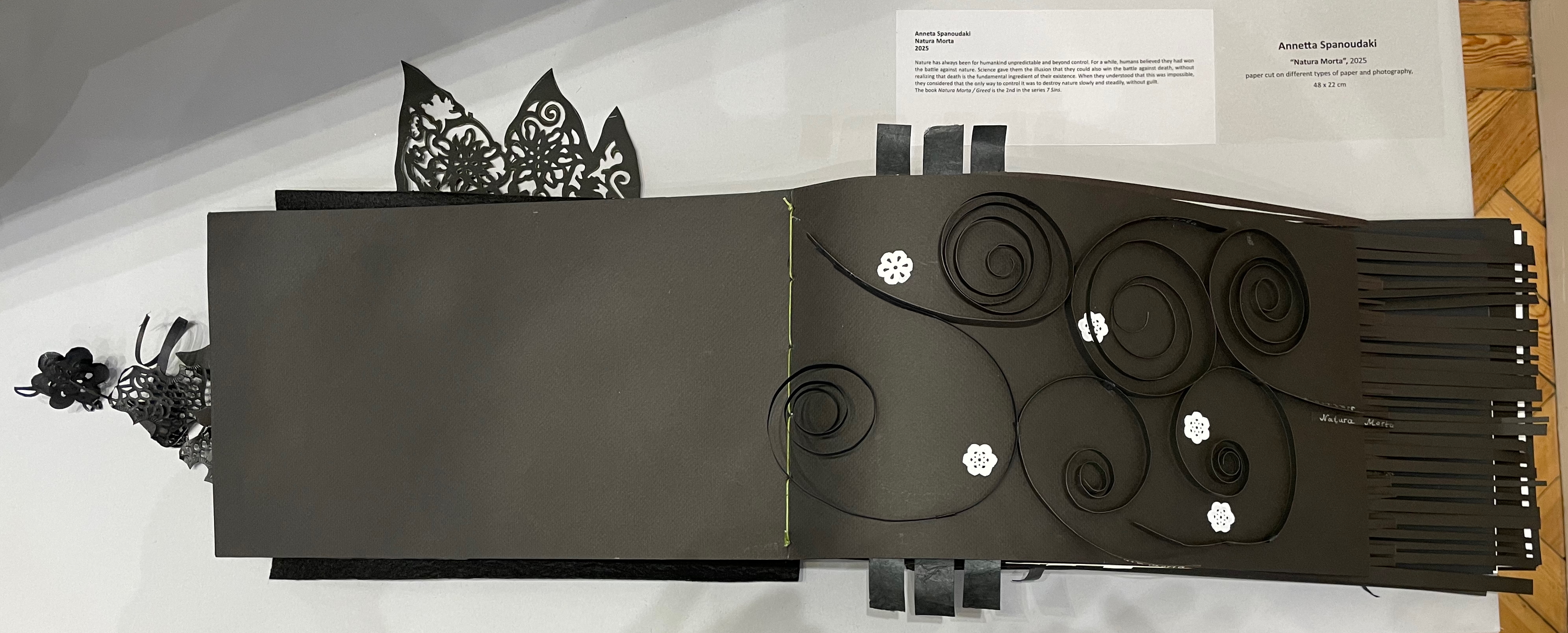
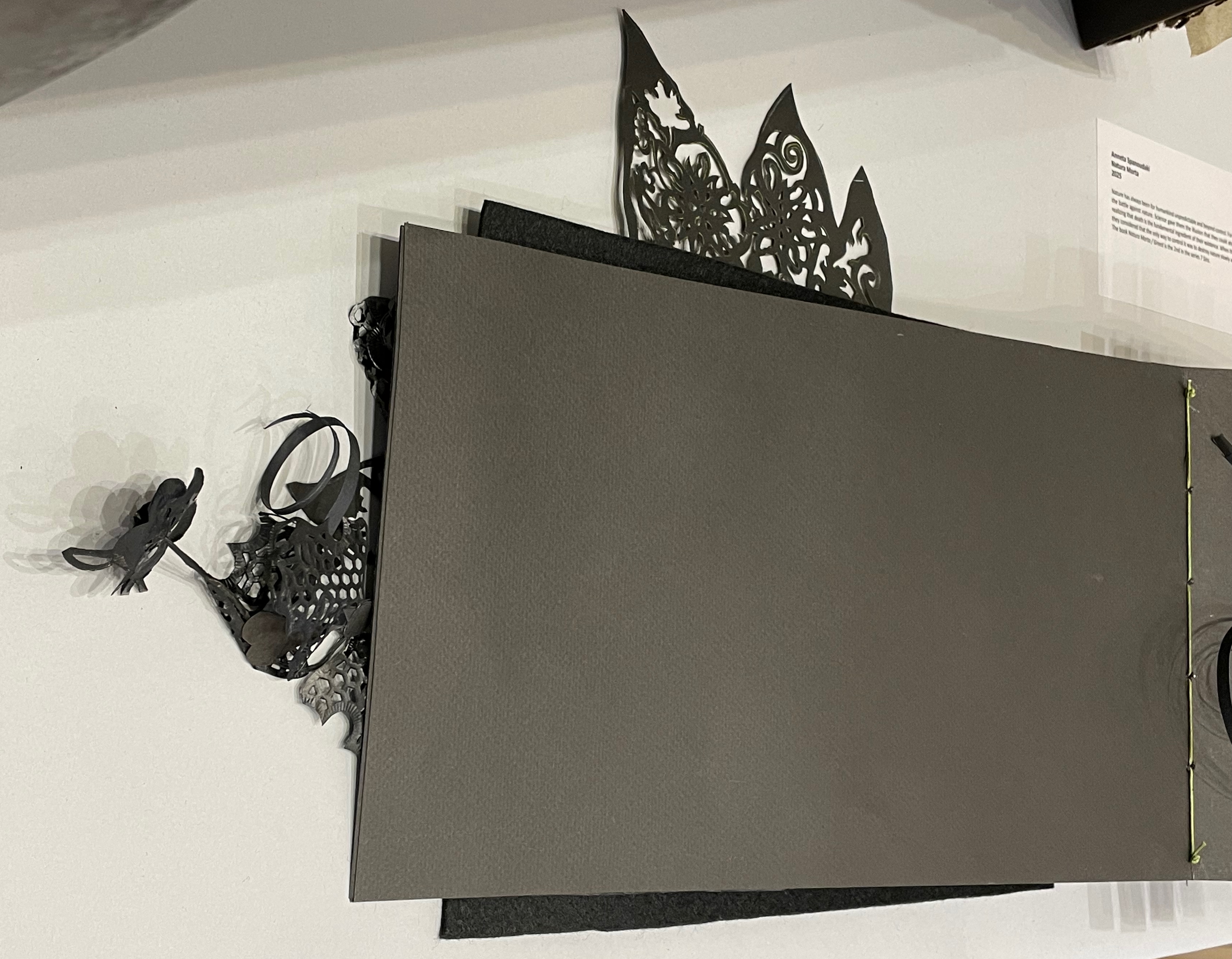
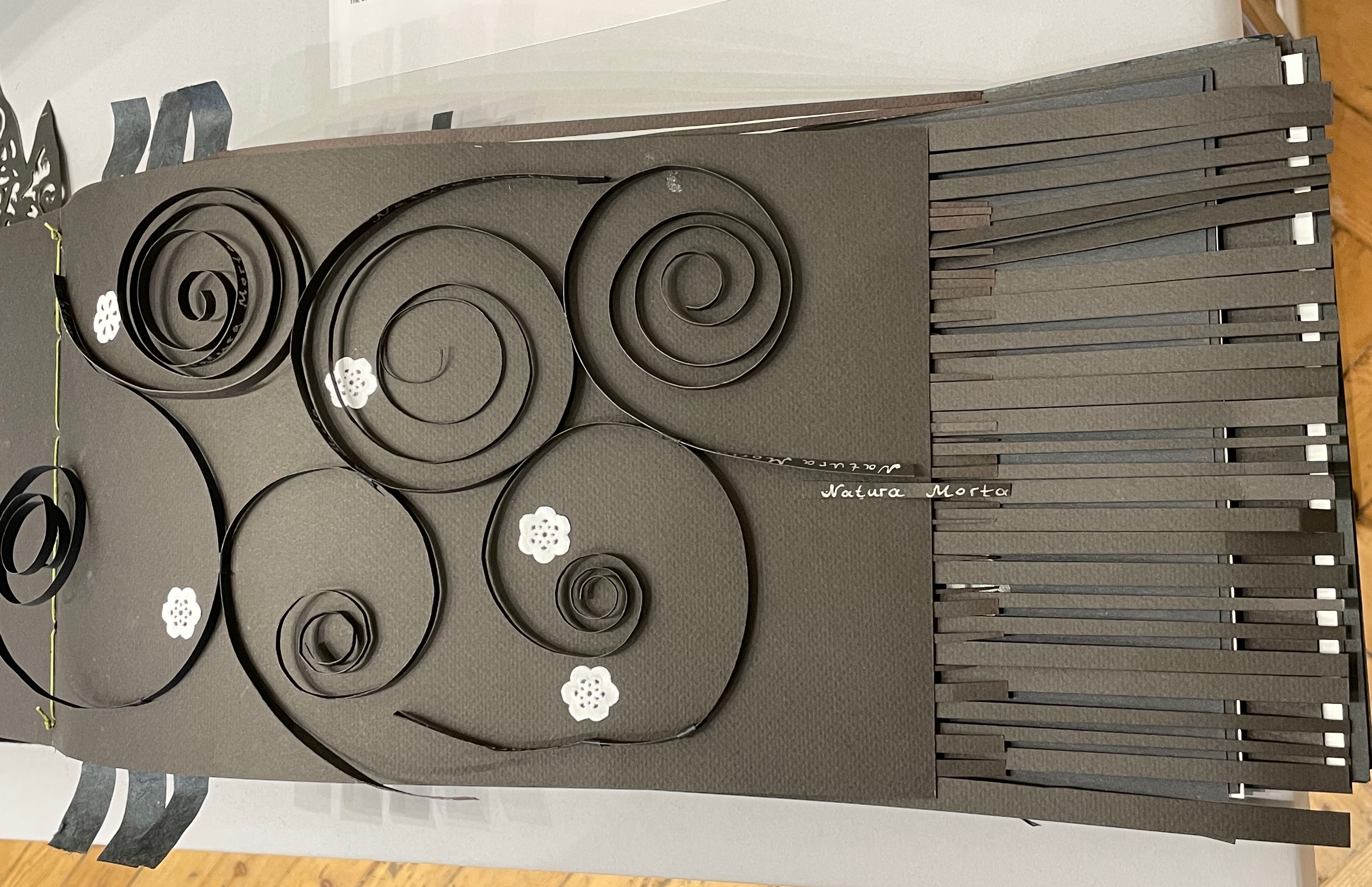
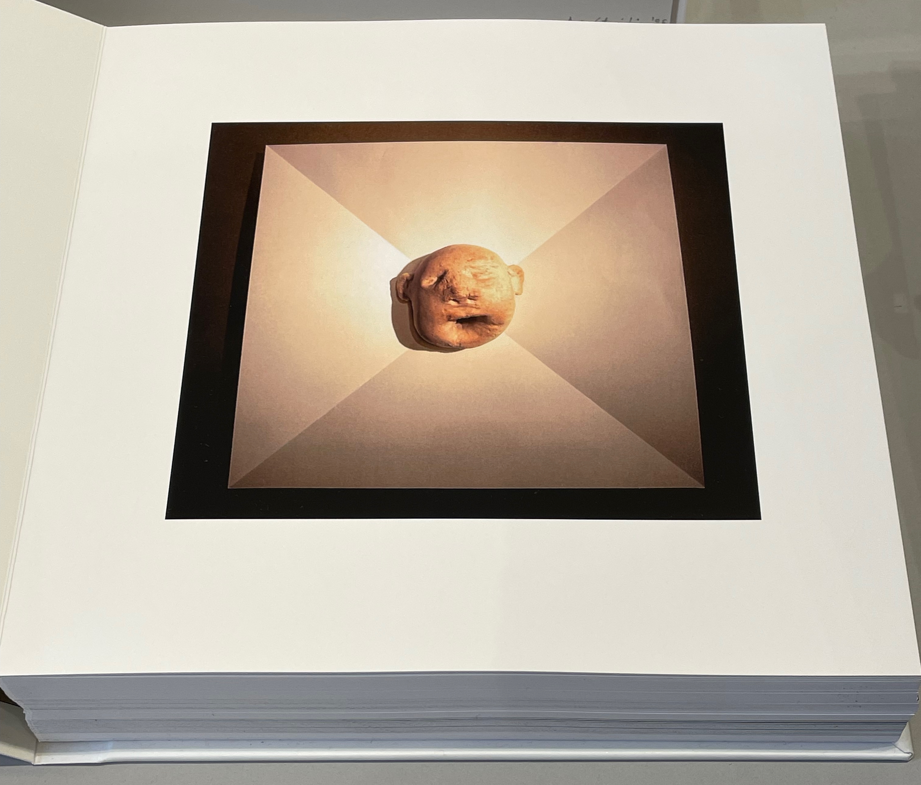
Anneta Spanoudaki’s Natura Morta (2025) is a striking case in point:
Natura Morta (2025) Anneta Spanoudaki Paper cut on different types of paper and photography. 480 × 220 mm. Photos: Books On Books.
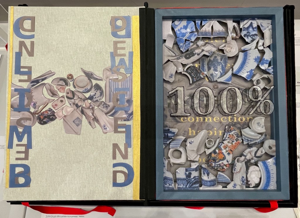
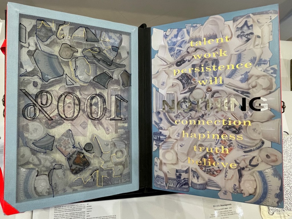
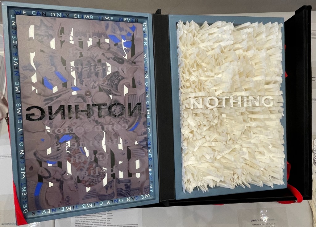
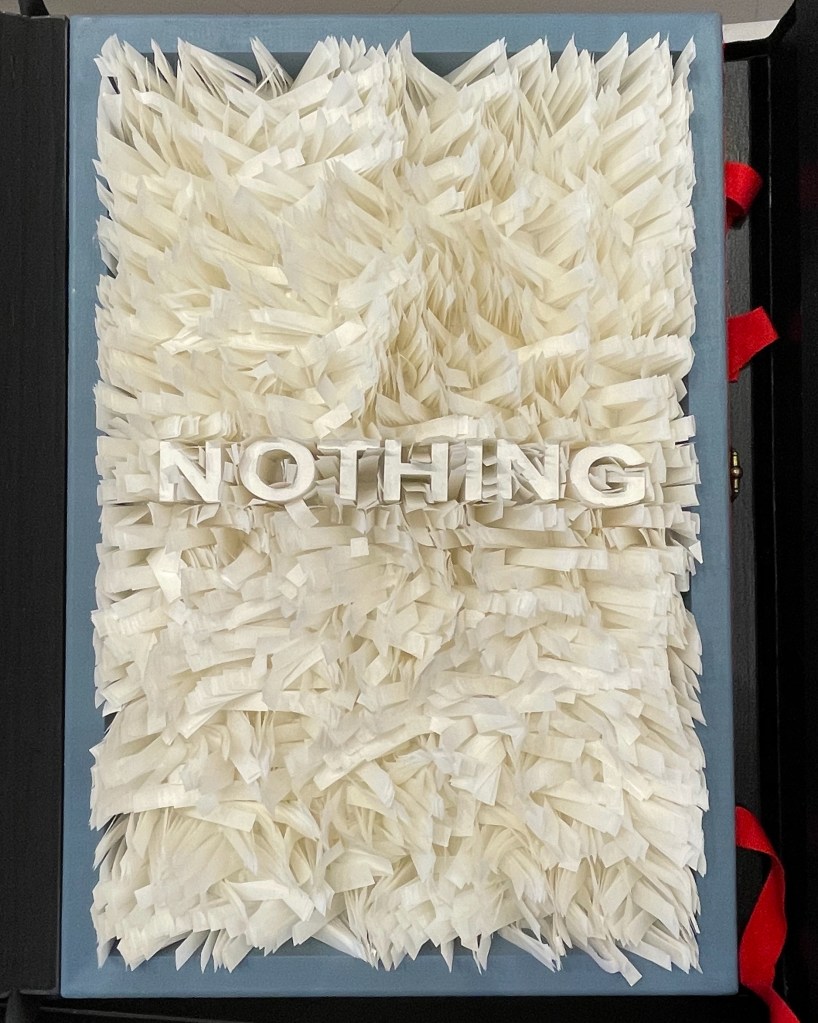
Another case in point is Dimitris Skourogiannis’ 100% An Artist’s Bible (2025). To be turned, its large “leaves” require metal rings on the fore-edge.
100% An Artist’s Bible (2025) Dimitris Skourogiannis Japanese paper, cardboard, wood, fragments of porcelain objects, print, metal rings, acrylic pains, fabris, tulle, and metallic threads. 500 x 350 x 140 mm. Photos: Books On Books.
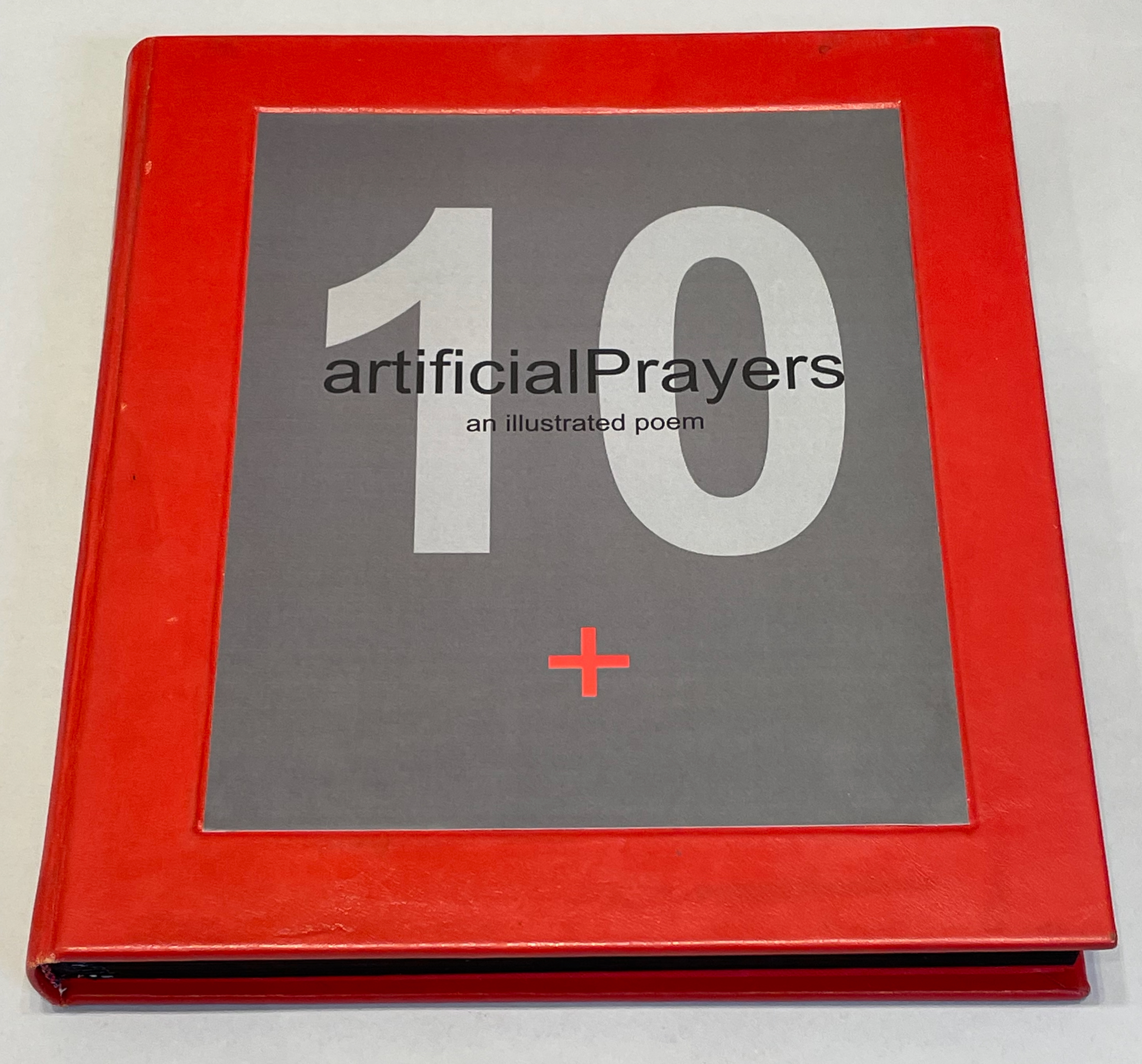
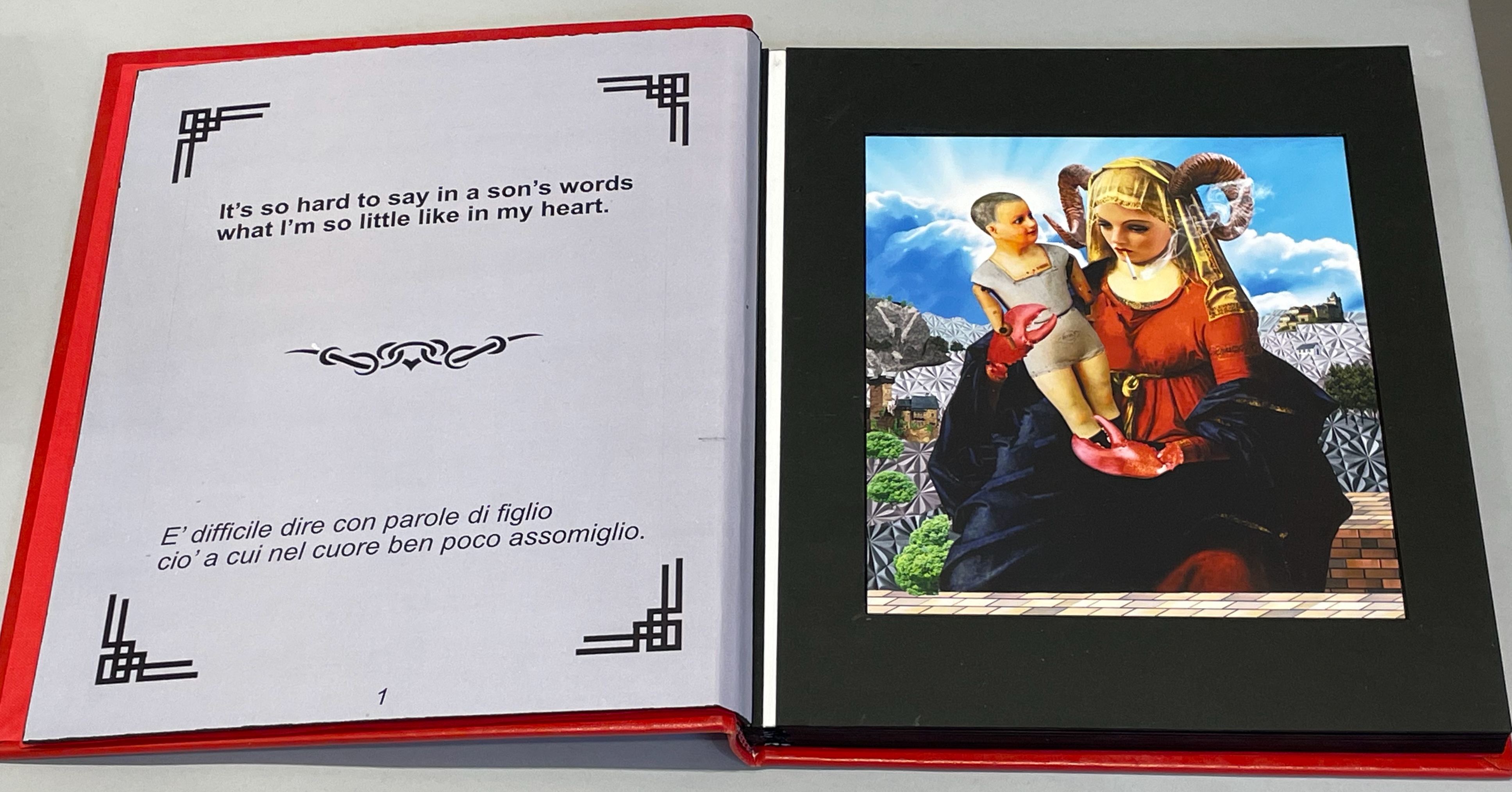
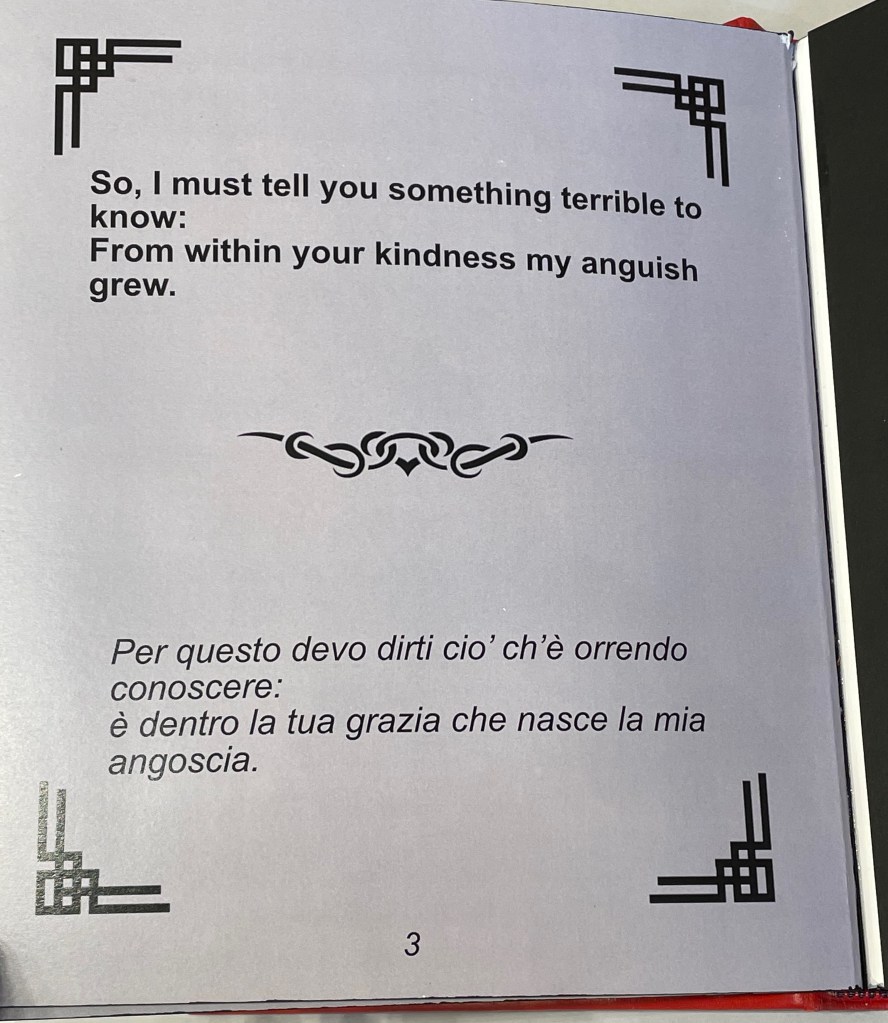
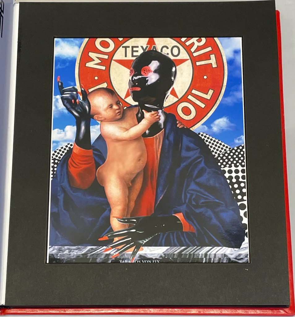
Thick leaves seemed to be the order of the day. On heavy black card, Thodoros Brouskomatis’ 10 Artificial Prayers (2025) presents surreal collages challenging the theme of “Madonna and Child” and couplets from Pier Paolo Pasolini’s “supplica a mia madre”.
10 Artificial Prayers(2025) Thodoros Brouskomatis Printed digital artworks on photographic paper, cardboard, and leather. 300 x 250 mm. Photos: Books On Books.
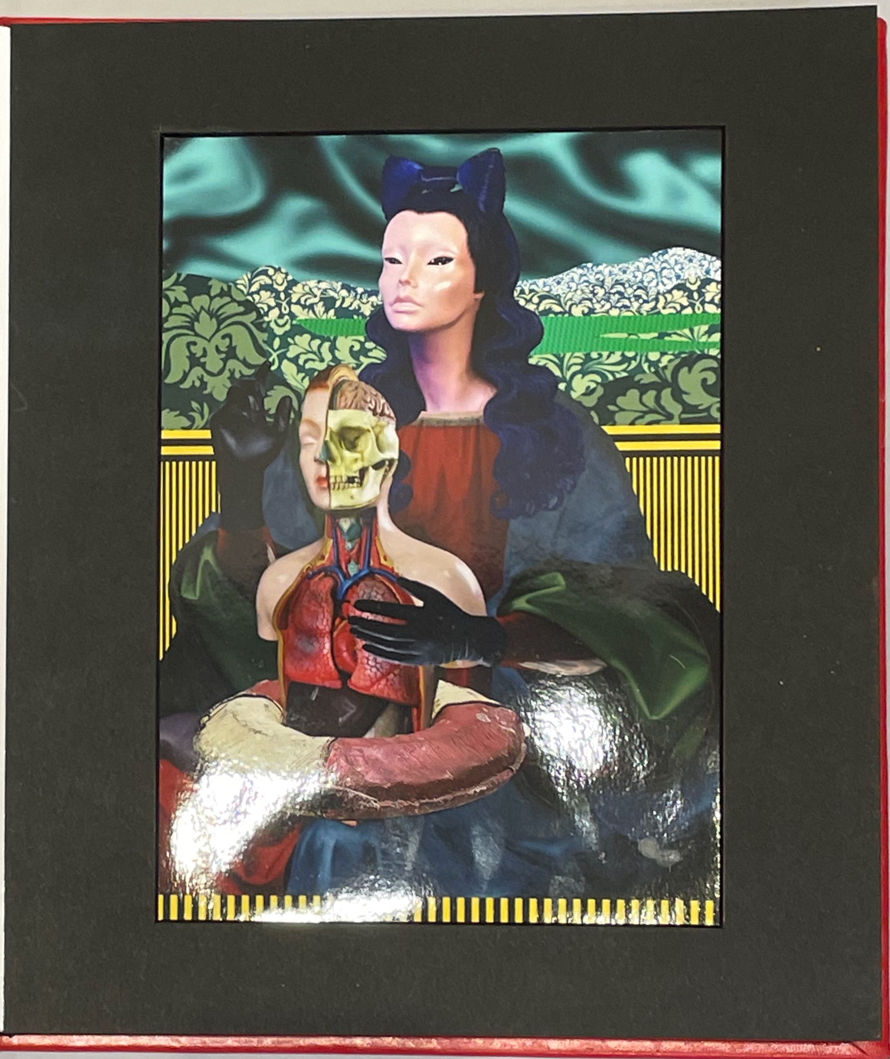
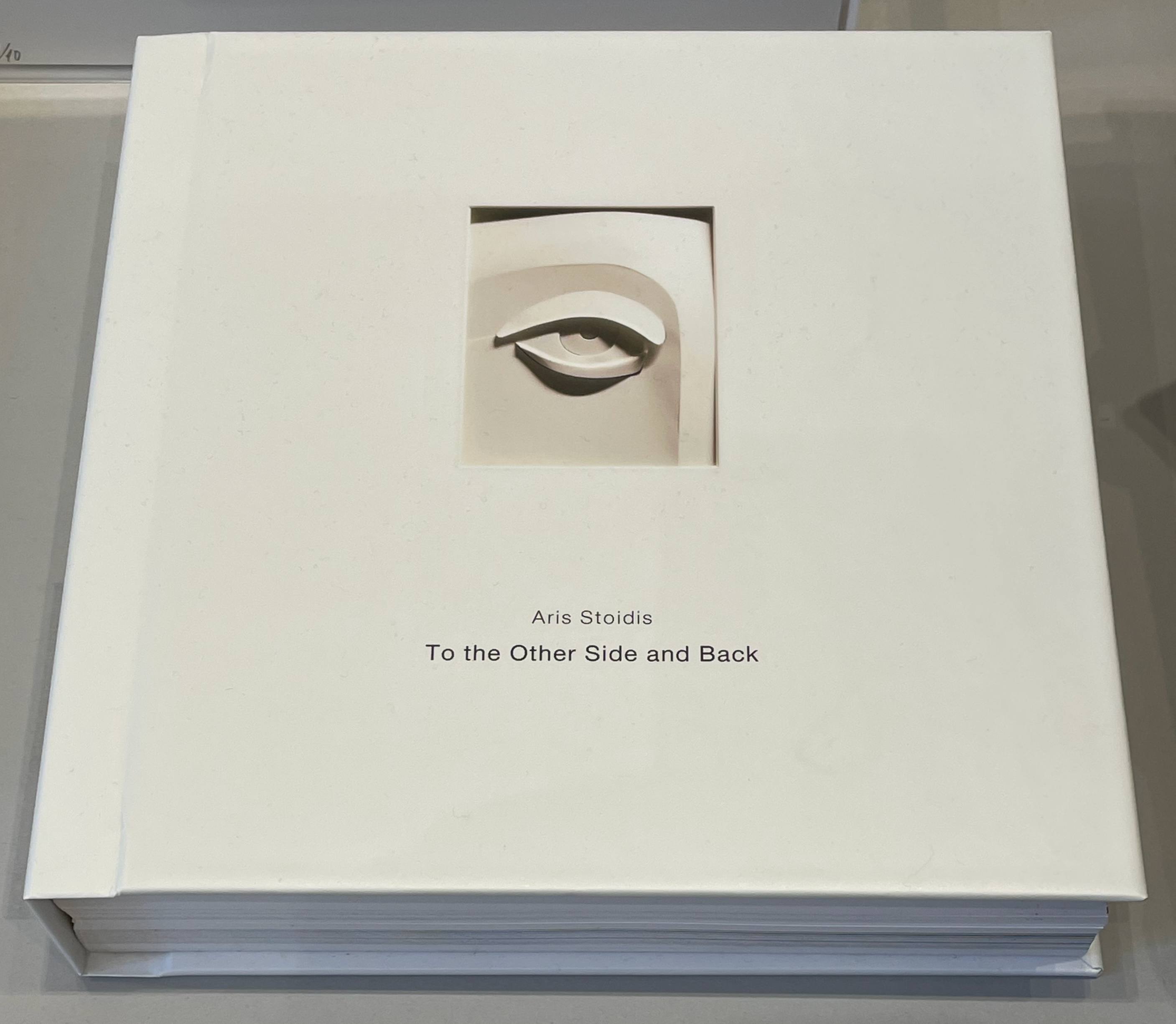
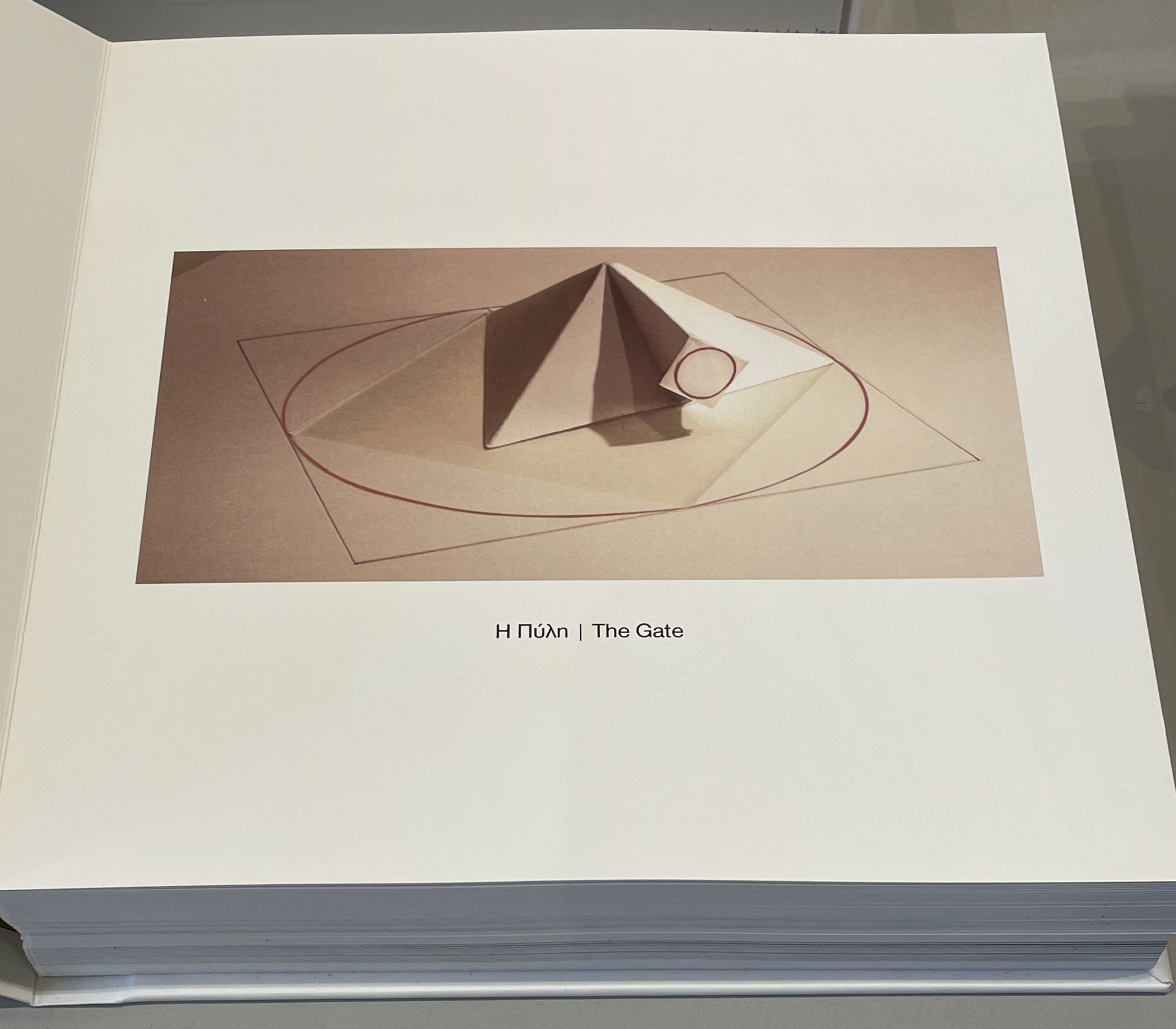
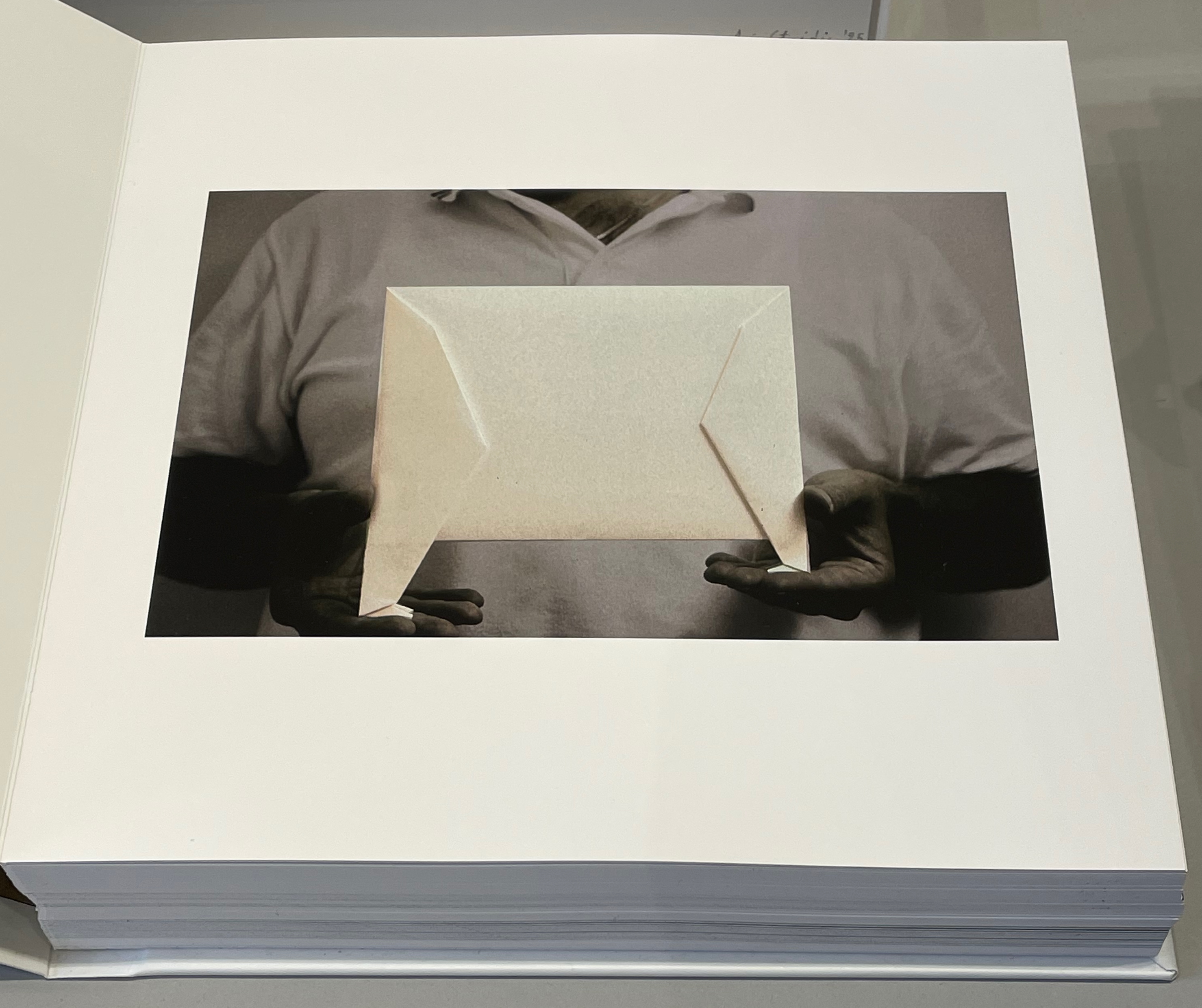
On slightly thinner card, Aris Stoidis’ To the other side and back (2025) carries a sculptural image on every page. The work straddles the borders of sculpture, photobook, and artist’s book. Stoidis writes, “Ever since my first pieces, I have been “receiving” images that I’ve materialized without really comprehending them myself. They simply exerted an inexplicable power on me.” The book comes in a plexiglas box with a papercut sculpture (not pictured here).
To the other side and back (2025) Aris Stoidis Photographic prints on card. 270 x 270 x 20 mm. Photos: Books On Books.
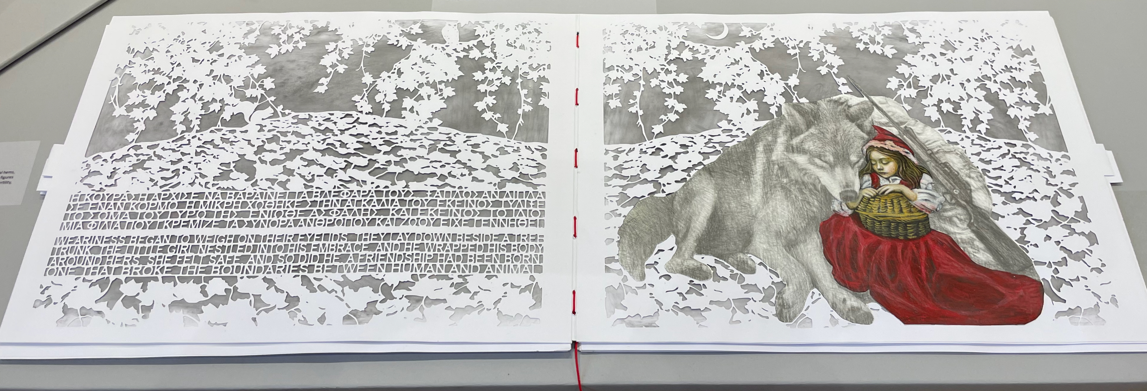
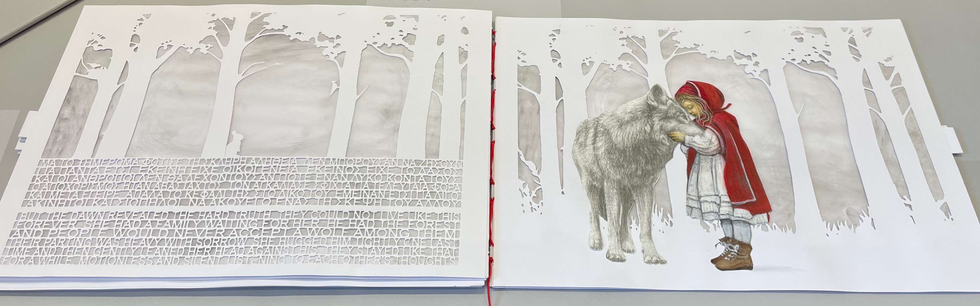
On still thinner leaves, Ismini Bonatsou’s Little Red Riding Hood (2025) nevertheless projects striking depth with its montage of papercut pages, acrylics, and pencil. Just as striking is the contemporary reversioning of the fairy tale.
Little Red Riding Hood (2025) Ismini Bonatsou Acrylics, pencil, and papercuts. 450 x 300 mm. Photos: Books On Books.
Given that the portmanteau term “bookmorph” comes from Michael Hampton, it seems appropriate that he has two works on display. Although one of them is under glass, 12 Chairs (bookmorph) (2012), the other is not. RAGE PEN by Hampton and David Blackmore is the UK contingent’s only work produced in 2025. Others from the UK contingent include Sarah Bodman, BOOKEND, Jonathan Callan, Joe Devlin, Stephen Emmerson, SJ Fowler, Rowena Hughes, and the Inscription Journal editors (Gill Partington, Simon Morris, Adam Smyth). RAGE PEN is also particularly appropriate because it requires a ruler to separate its perforated fore-edges. The exhibition provides one along with multiple pairs of white gloves. Really hands-on.
The participating Greek artists also include Eleni Angelou, Nikos Arvanitis, Rania Bellou, Maria Bourbou, Natassa Chelioti-Naga, Ioanna Delfino, Anna Dimitriou, Antonia Iroidou, Eleni Kastrinogianni, Peggy Kliafa, Alexia Kokkinou, Georgia Kotretsos, Nikos Kryonidis, Vasiliki Lefkaditi, Eleni Maragaki, Kyriaki Mavrogeorgi, Despina Meimaroglou, Christina Mitrentse, Fiona Mouzakitis, Kiki Perivolari, Stamatis Schizakis, Ifigeneia Sdoukou, Christina Sgouromiti, Danai Simou, Nectarios Stamatopoulos, Despina Stavrou, Evangelos Tasios, Yannis Tzortzis, and Leonie Yagdjoglou.
Congratulations and thanks to the curators — Christina Mitrentse, Fiona Mouzakitis, and Despina Stavrou — for bringing together this selection of outstanding works.
The Hellenic Centre opens at 11:00 and closes at 17:00, Tueday through Friday, so the chances to visit by the 28th of November are limited. The brief catalogue that documents the exhibition and these few photos cannot substitute for tactile engagement with the works on display. An hour and a half passed in a flicker.
First, the back-dating. This comes from the delightfully annoying or annoyingly delightful belated discovery of Erik Kwakkel’s 2015 entry on the history of the horn-book “Book on a Stick” in Medievalbooks. Delightful and annoying to find the truly earliest appearance of a horn-book right under my nose in the Bodleian Libraries but too late to include it in the Alphabets Alive! exhibition at the Bodleian in 2023.
Andrew White Tuer’s History of the Horn-Book (1897) came close with its dating of the horn-book’s first appearance as 1450, but as Kwakkel writes:
The image shows Christ being brought to school by his mother. He is bringing his “textbook” to class: a hornbook, which dangles from his wrist by a string, just like many of the later specimens did … Quite intriguingly, we are shown a real medieval snapshot of how children carried their hornbook to and at school. More importantly, it shows that the hornbook was indeed a medieval invention….While no actual hornbooks appear to survive from the medieval period, these visual representations show that educating young children was also the driving force behind the production of hornbooks in the age before print.
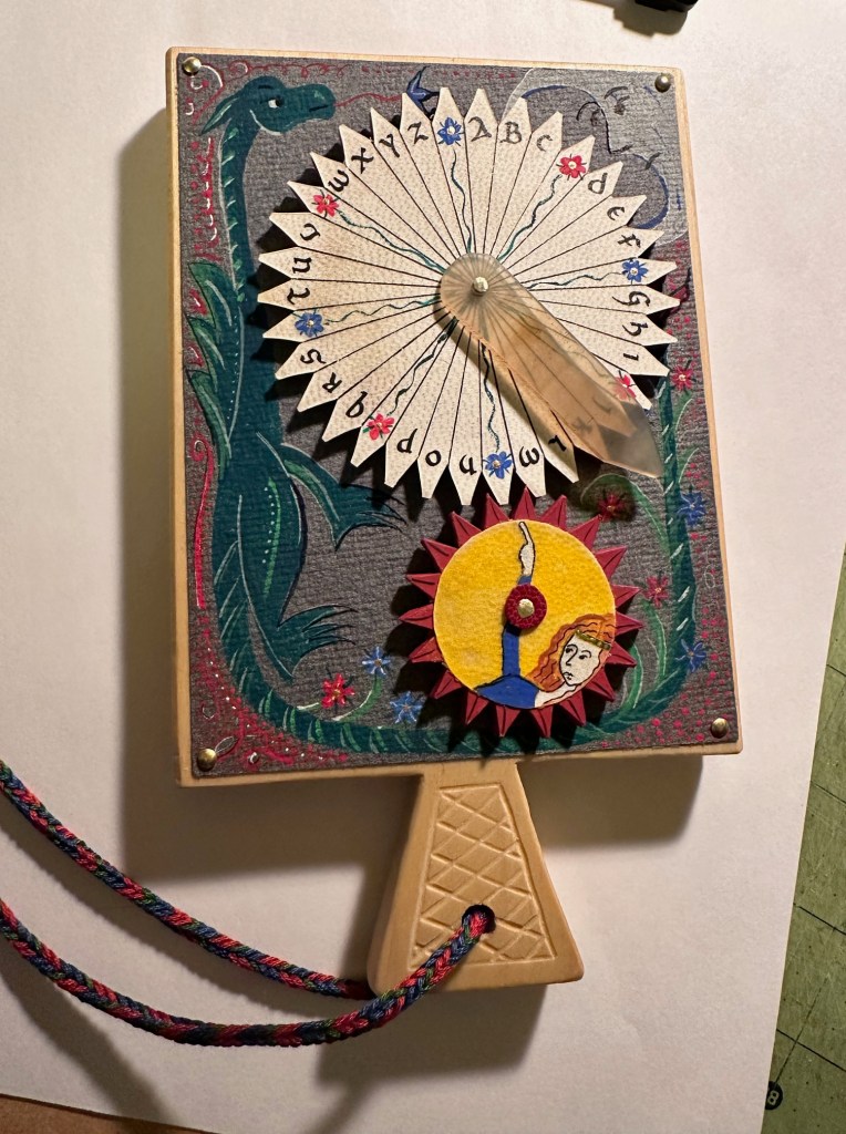
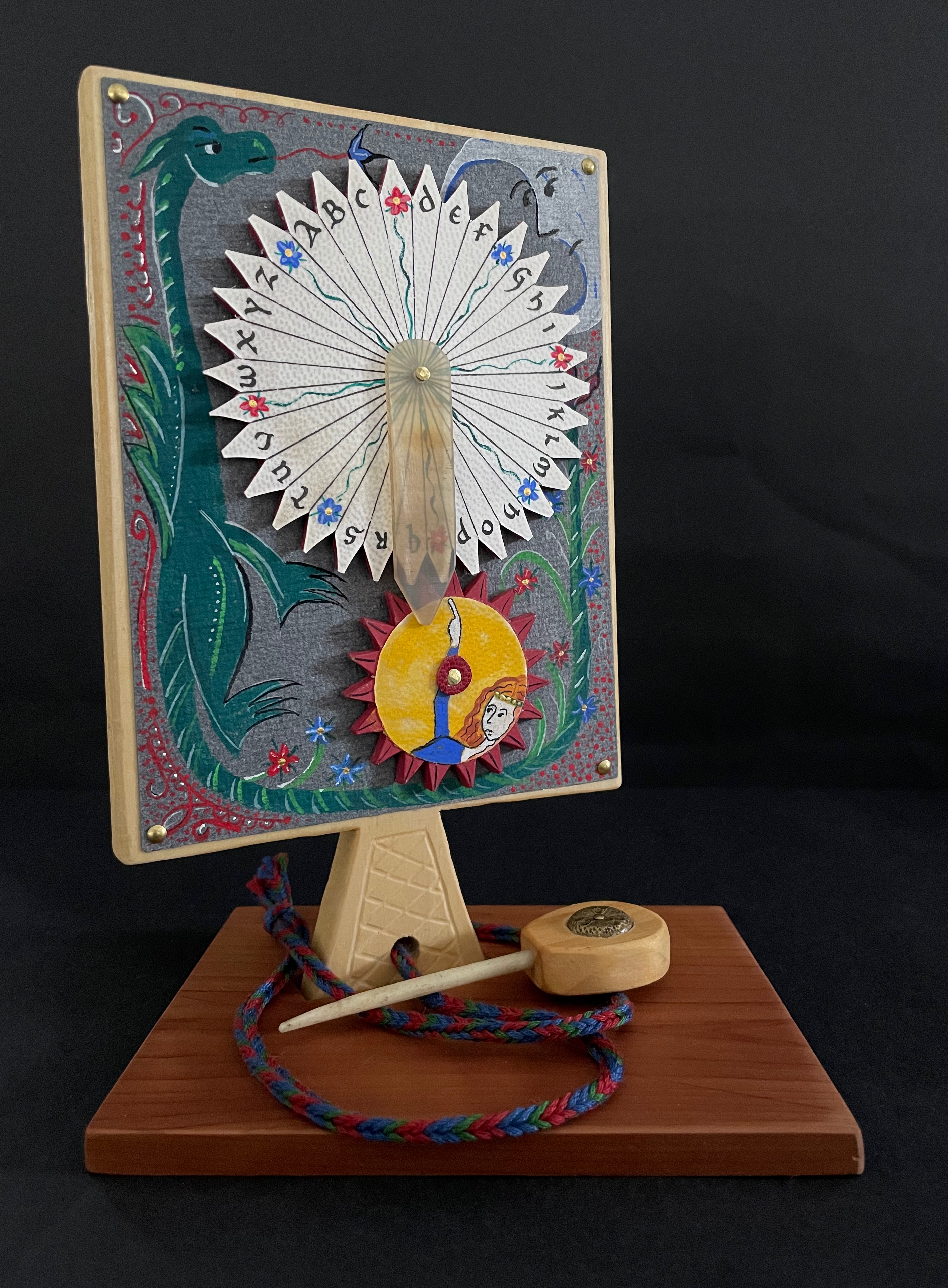
And for the updating, here is Ashley Thayer’s Mechanical Horn-book (2025) just arrived in the Books On Books Collection.
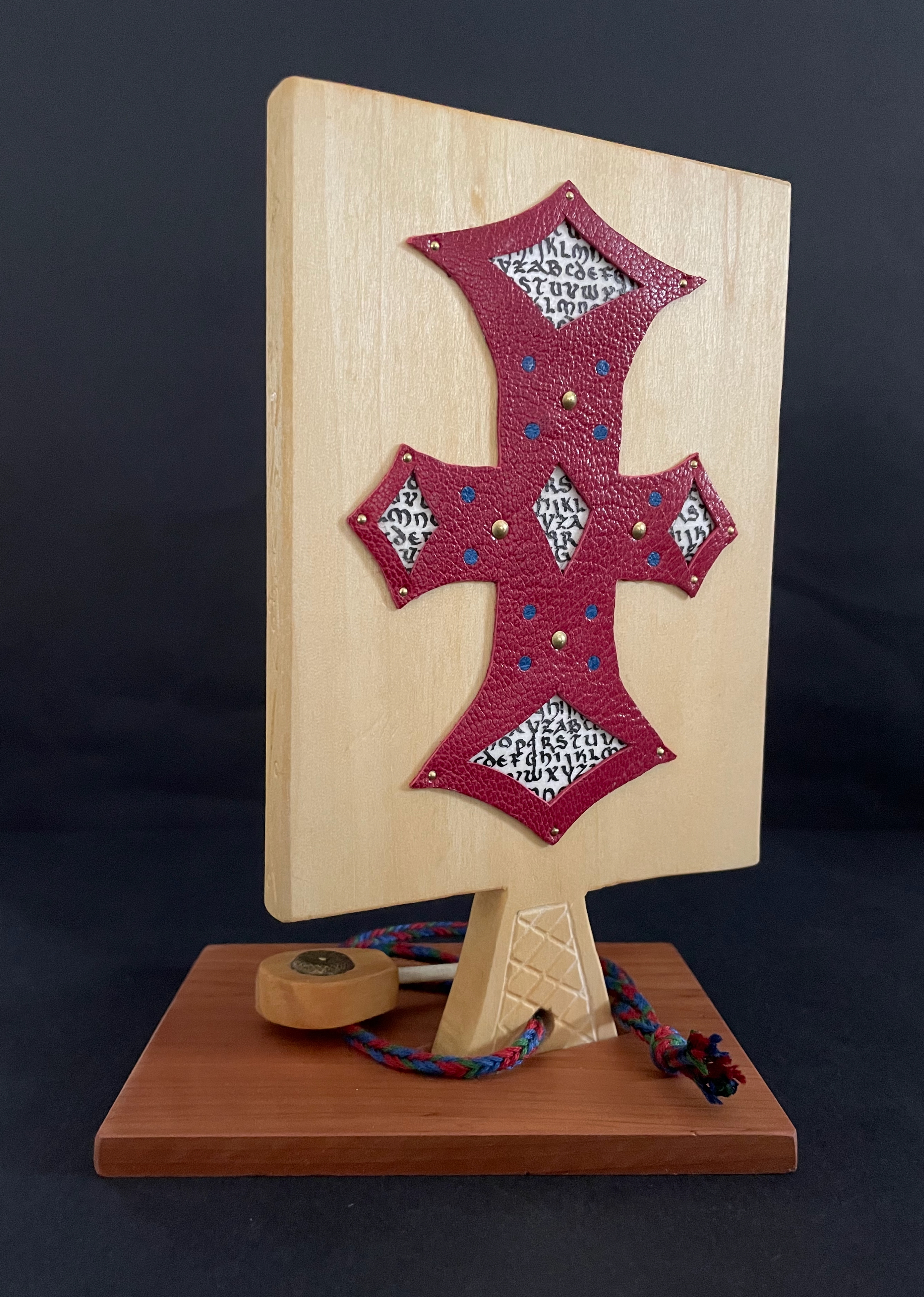
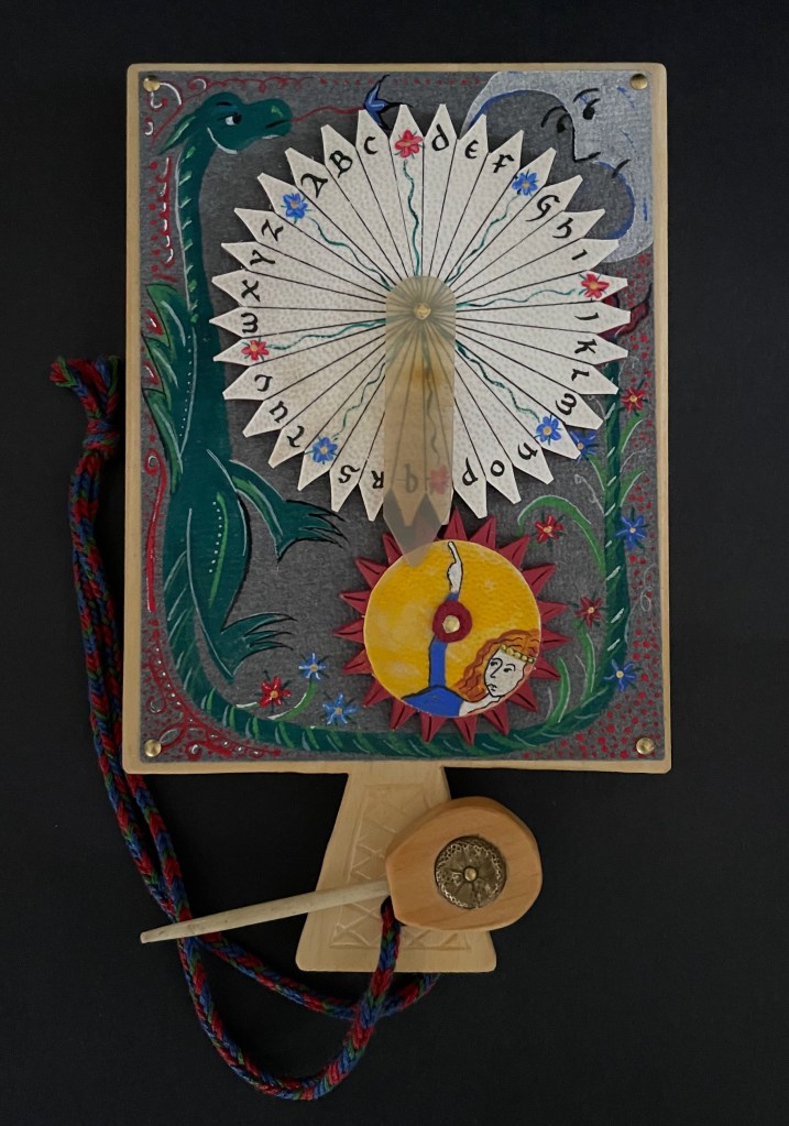
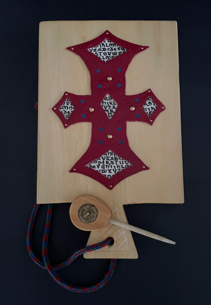
Mechanical Horn-book (2025) Ashley Rose Thayer Horn-book. On stand: H192 x W160 mm. Off stand: H192 x W115 mm. Unique. Acquired from the artist, 17 October 2025. Photos: Courtesy of the artist. Books On Books Collection.
The paddle is made of pine wood, the gears of vellum-covered bookboard, the spinning “arm” of authentic cow horn, and the wrist loop of embroidery thread by a medieval finger loop braiding technique. On dark grey-blue Khadi paper, Thayer has painted a border of the moon, a berried floral garland, and a wyvern, the heraldic emblem associated with Wessex, the Anglo-Saxon kingdom from which Alfred the Great emerged in the 9th century. On the reverse, a cross of cut red leather with five inserts of calligraphed vellum alluding to Christ’s five wounds reflects the horn-book tradition of combining religion with learning the alphabet. It also makes this horn-book reflective of Alfred’s Anglo-Saxon and Christian background.
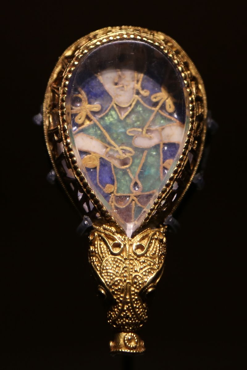
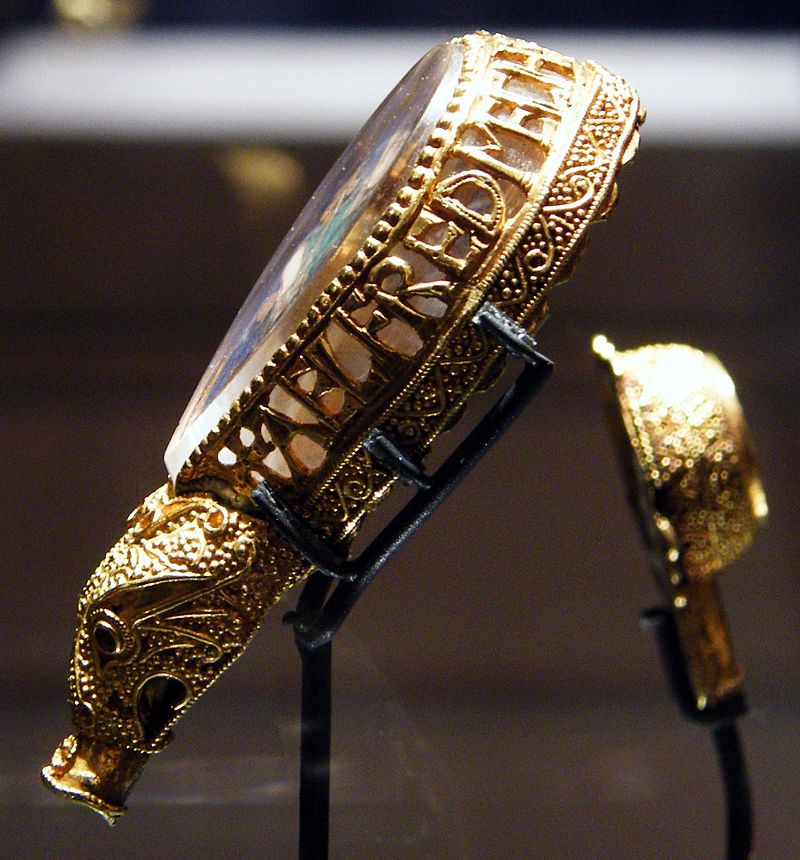
The pointer, called an aestel in Old English, is made from poplar wood, an antique button, and antique bone. Its inclusion isn’t simply functional. Appearing alongside the Wessex wyvern, it points to that famous aestel on display at the Ashmolean in Oxford: the Alfred Jewel.
The Alfred Jewel, Ashmolean Museum, Oxford. Photo taken from the front by Geni CC BY-SA 4.0. Photo taken from the side by Richard M Buck CC BY SA 3.0.
If there’s ever an Alphabets Alive! redivivus, Erik Kwakkel and Ashley Thayer have provided the pointers to the other treasures in Oxford that should be included.
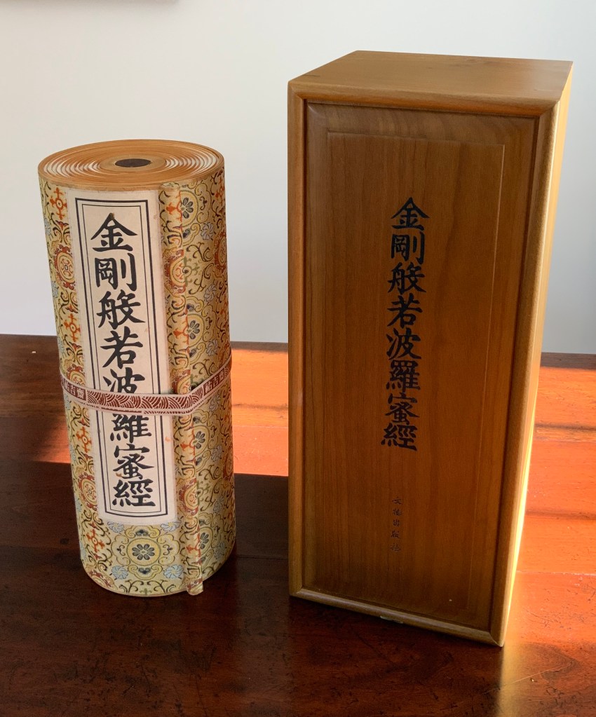
Diamond Sutra in 32 zhuan (seal) fonts (2017) Zhang Xiaodong Scroll in dragon scale binding. 152 x 382 x 160 mm. Edition of 300, of which this #197. Acquired from Sin Sin Fine Arts (Hong Kong), 31 October 2019. Photos: Books On Books Collection.
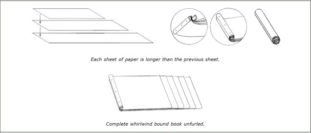
In 1900, in China’s Dunhuang province, the Diamond Sutra (868 CE), the world’s earliest complete and dated printed book, was discovered in a cave along with 40,000 scrolls. One of those other scrolls — Or.8210/S.6349 — was possibly just as important for the book arts as the Diamond Sutra was for the history of printing. Like the Diamond Sutra, Or.8210/S.6349 resides in the British Library and is “the only known example of whirlwind binding in the Stein collection of the British Library” (Chinnery). The structure is also known as dragon scale binding, although distinctions between the two have been debated (Song). It came into use in the late Tang dynasty (618-907 CE) then fell away in the face of the easier to handle butterfly and wrapped-back bindings. Besides Or.8210/S.6349, there are few surviving examples of original whirlwind or dragon scale bindings.
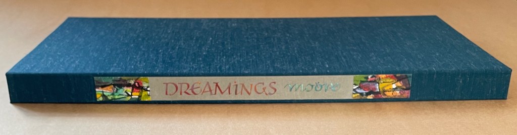
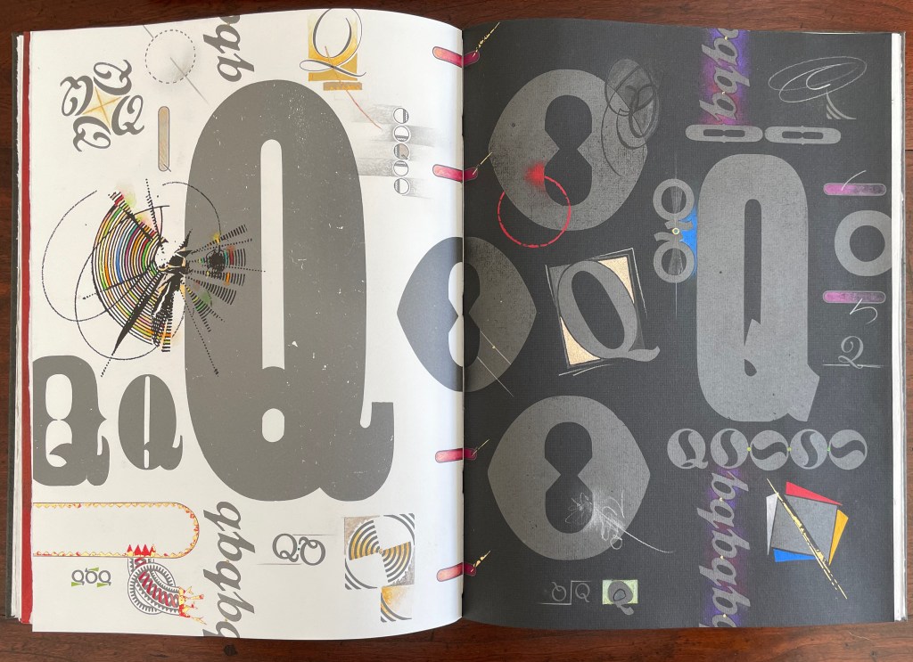
Dreamings (2023) Suzanne Moore Artist’s manuscript. Softcover, handsewn. Cloth-covered box with handwritten and painted title pastedown on the spine. H368 x W178 mm. 17 pages. A unique edition. Acquired from the artist, 15 April 2024. Photos: Books On Books Collection and artist.
Dreamings (2023) follows the artist’s Question Series, begun in 2008 considering questions of life and art while exploring the letter Q – “that quirky letter of distinct design” as Moore calls it. Other works in the series include:
Thirteen Questions (2008), drawn from Pablo Neruda’s The Book of Questions (1991) [Libro de las preguntas (1974)], unknown location.*
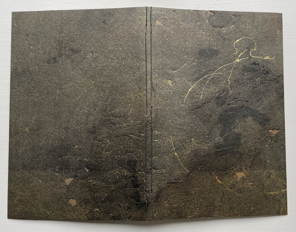
Amorous Embrace (2023) Suzanne Moore and Titus Lucretius Carus (trans. A.E. Stallings) Artist’s manuscript, stub bound to stone cover, tinted thread, gold leaf, kozo, paste paper. H220 x W148 mm. 12 pages. Unique. Acquired from the artist, 5 February 2024. Photos: Books On Books Collection.
Sometime in the first century BCE, the Roman poet Lucretius wrote the didactic epic De rerum natura (The Nature of Things). It celebrates the atomistic physics and philosophy that Epicurus and his followers recorded two hundred plus years before in thirty-seven volumes. Imagine the determination to press that Greek vision of the world from atoms to the cosmos into six volumes of Latin poetry. We’ll have to await further papyrology applied to the cinders of the Herculaneum library of scrolls and hope that it reveals more scraps of the Greek’s Περὶ φύσεως (On Nature). Only then will we know whether Lucretius based his poem directly on them.
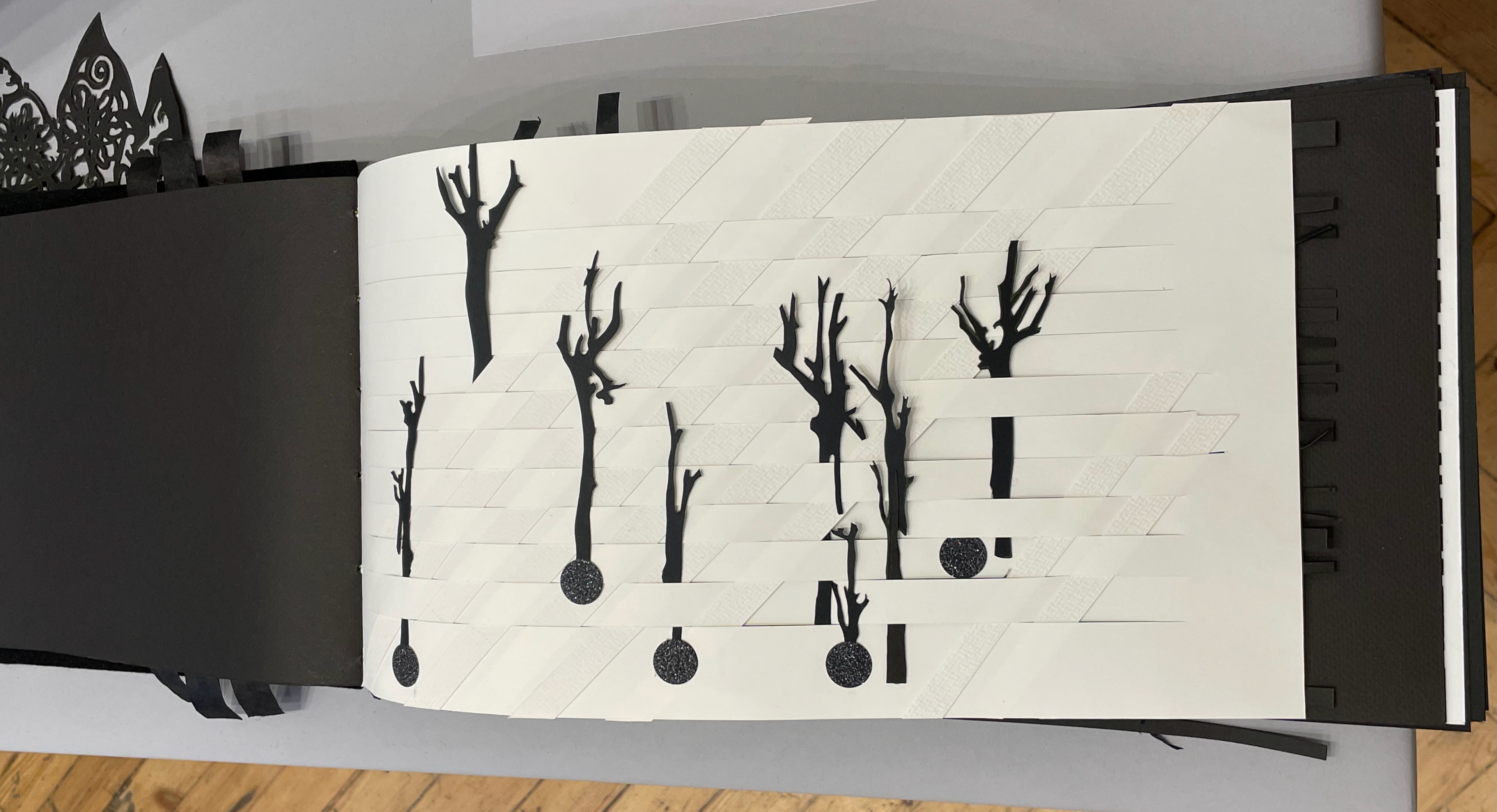
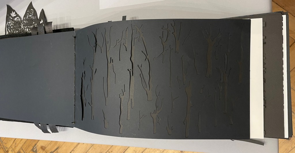
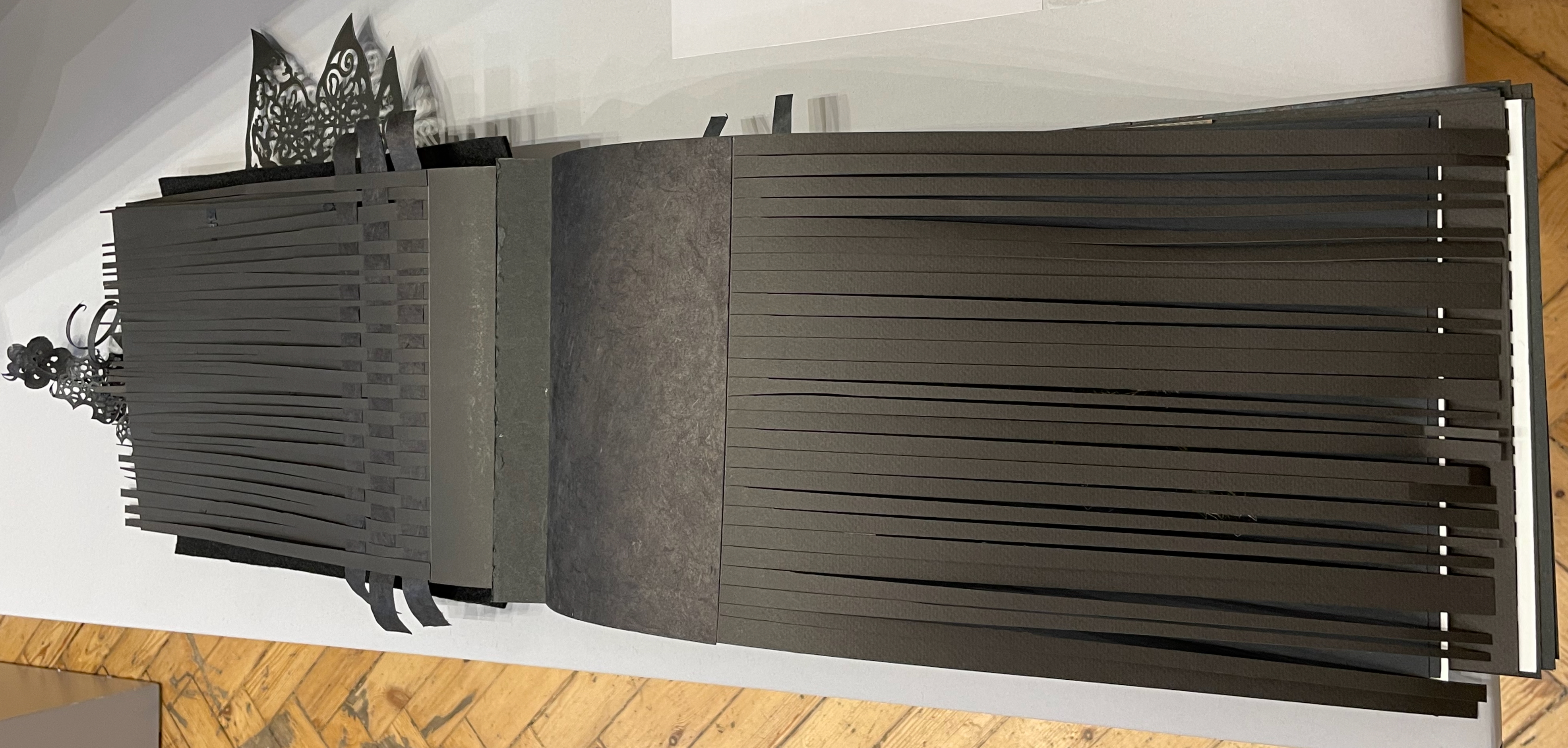
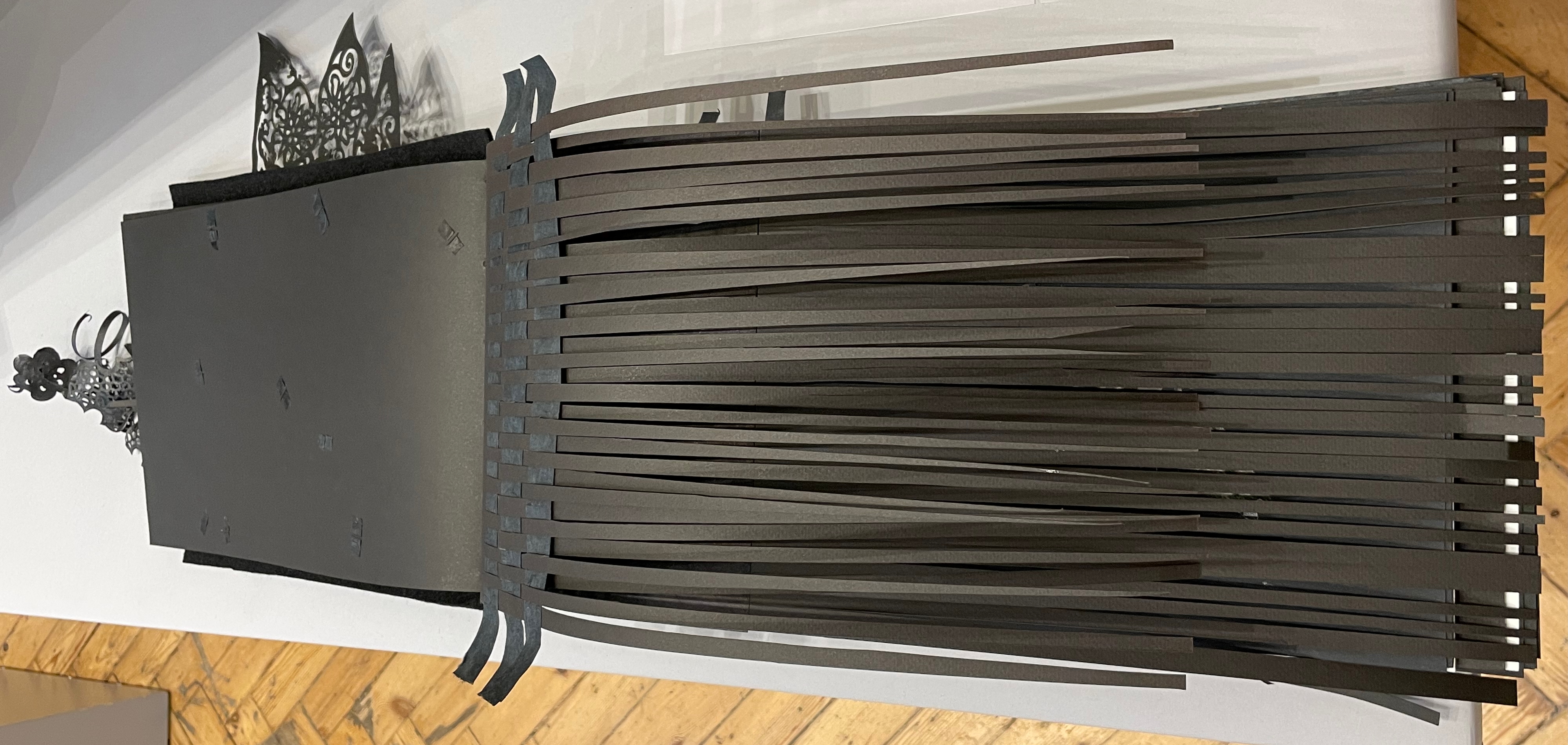
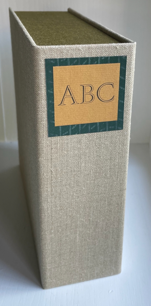
ABC of Bugs and Plants in a Northern Garden (2012)
ABC of Bugs and Plants in a Northern Garden(2012) Judy Fairclough Sgantas and Claire Van Vliet Clamshell box, softcover, open spine, paper-tab-sewn binding. Box: H188 x W192 x D65 mm. Book: H167 x W171 x D35 mm. 27 f&gs, 1 folded pastedown at end. Edition of 120, of which this is #45. Acquired from Vamp & Tramp, 15 September 2023. Photos: Books On Books Collection. Displayed with artists’ permission.