Un coup de dés jamais n’abolira le hasard (1914/2012)
Un coup de dés jamais n’abolira le hasard (1914/2012)
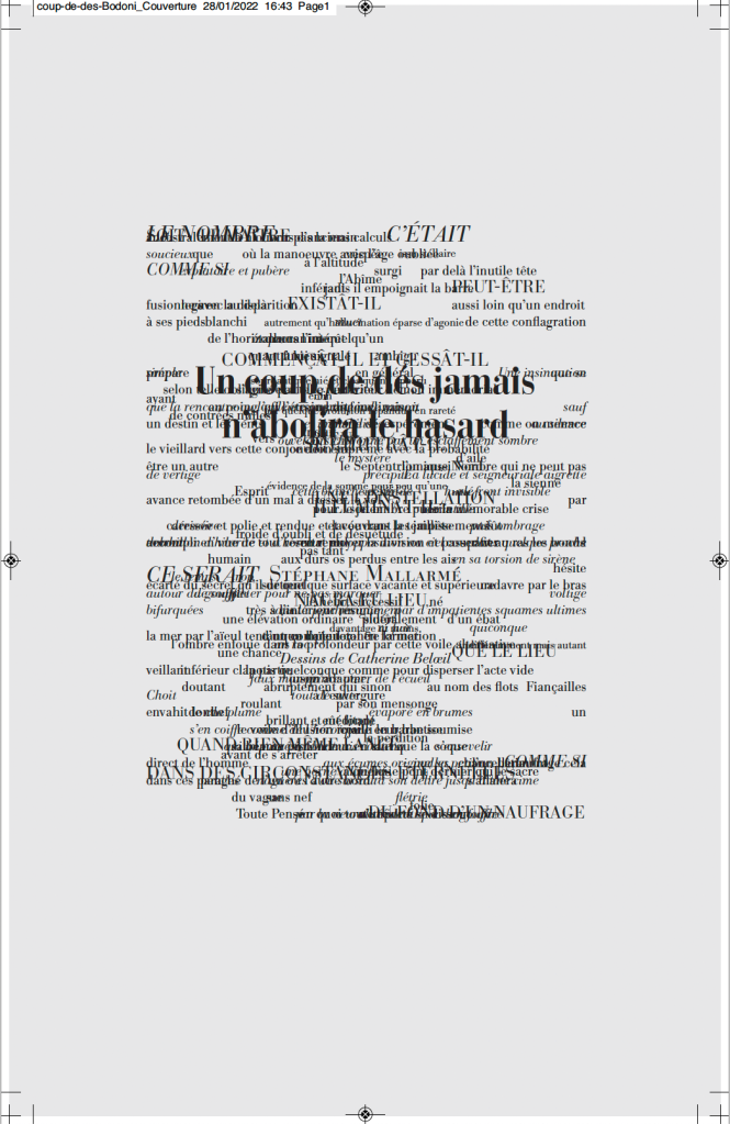
Stéphane Mallarmé (text), Alain Hurtig (design), Catherine Belœil (art)
Online and downloadable files for printing at L’Outil Typographique. Creative Commons (BY-NC-SA). Accessed 28 January 2022.
Screenshots: Books On Books Collection. Displayed with permission of Alain Hurtig.
Much has been made of Mallarmé’s precision or preciosity in the marked-up proofs of the deluxe edition of Un Coup de Dés. Also, as many scholars, hommageurs and facsimilists have attested, a suitable substitute for the Firmin-Didot typeface that the poet specified for the deluxe has been hard to find. Master typographer Alain Hurtig, however, puts “suitable substitute” into perspective with his essay “À propos du Coup de dés de Stéphane Mallarmé“. The essay offers single pages and double-page spreads set in Bodoni Antiqua (Berthold), Legato, Clifford and the Hoefler & Frère-Jones digital revival of Didot.
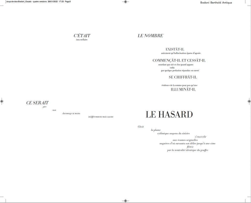
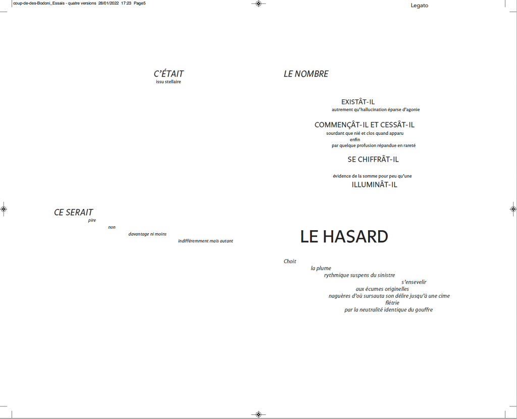
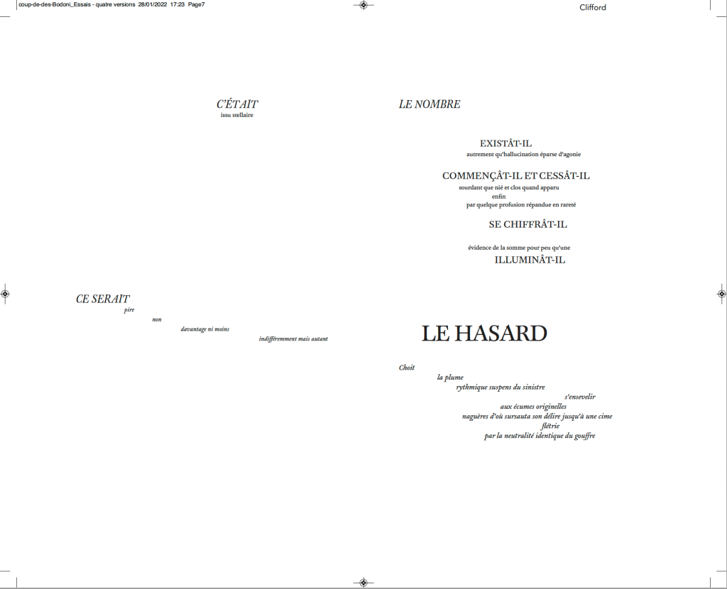
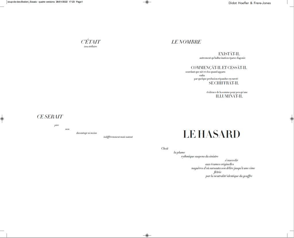
Clockwise from the upper left: Bodoni Antiqua (Berthold), Legato, Clifford and Didot.
It seems unlikely that Mallarmé pored over the Didot firm’s type books to choose the Firmin-Didot face, but there is nothing precious about specifying a typeface. Different faces have different personalities. Hurtig enables us to see rather than imagine the effect of choosing the business-card-like Legato — not that that would have been a choice for Mallarmé. Nor would the Clifford, although a plausible (if squat) choice with its contrasting thin and thick strokes. The opportunity for the most extensive comparison comes with Hurtig’s two complete settings of the poem — one in Bodoni Antiqua (Berthold), the other in HFJ Didot. Below, for comparison, is the poem’s central double-page spread — the COMME SI … COMME SI verses.
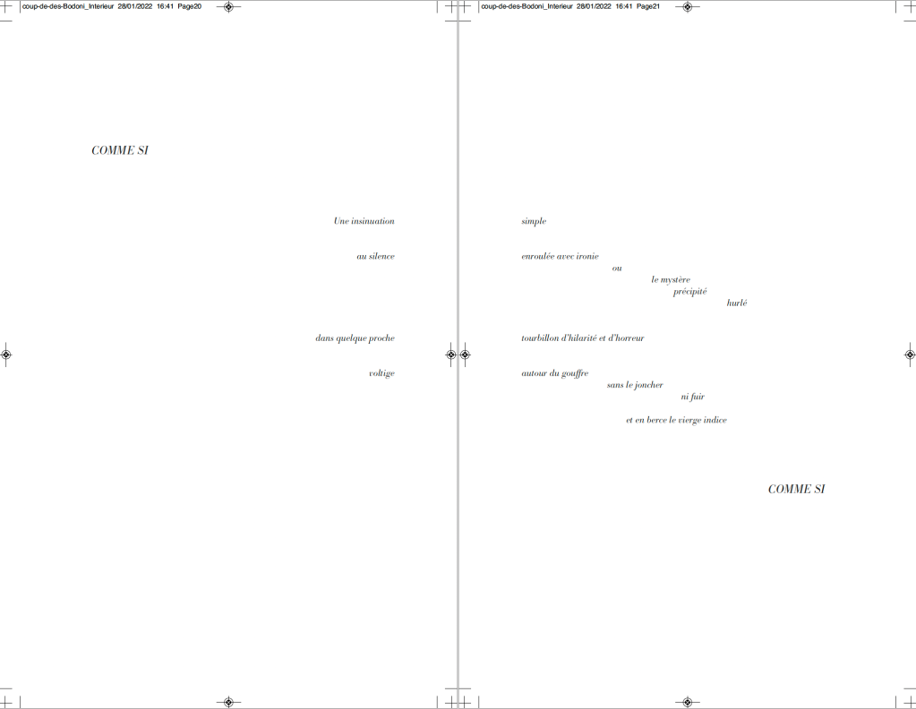
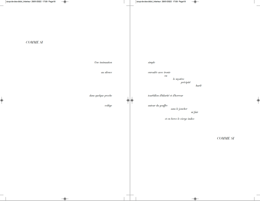
Above: Bodoni Antiqua (Berthold). Below: Hoefler & Frère-Jones Didot.
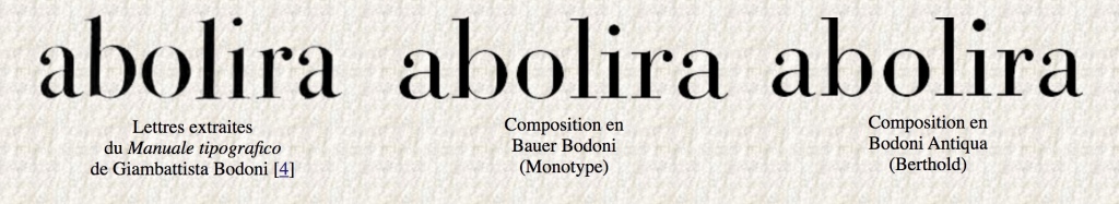
Of these two revival faces — Bodoni Antiqua (Berthold) and HFJ Didot — Hurtig himself prefers Bodoni. Bodoni is one of the more attractive alternatives for facsimilists. Neil Crawford chose it for the edition created with Ian Tyson, as did Gary Young for his edition with D.J. Waldie. Hurtig even provides a comparative view of three versions of Bodoni:
Hurtig’s explanations of deciding the trim size and adjusting the size of fonts and spacing fascinate. Likewise his choice of Bodoni because it
s’imposait avec élégance, il rythmait les phrases en les faisant incroyablement vibrer et remplissait de sa grâce les immenses blancs de la double page — ces espaces que, selon Mallarmé, “il n’est pas moins beau de composer que les vers” [Hurtig, 2012]
[imposed itself with elegance, it gave rhythm to the sentences by making them vibrate incredibly and filled with its grace the immense blanks of the double page — these spaces which, according to Mallarmé, “it is no less beautiful to compose than the verse”.]
My vote, however, would be for the HFJ Didot. It has a more upright, steelier and brighter aspect, fittingly constellatory. In other online comments, Hurtig points out, however, that the HFJ Didot is not the Firmin-Didot of Mallarmé:
Le didot d’Hoefler n’est évidemment pas celui choisi par Mallarmé, et pour cause : un siècle les sépare — et Hoefler a, dans son dessin, évidemment tenu compte des conditions modernes de composition et d’impression : au plomb, son travail ne tiendrait probablement pas une seconde, et moins encore sur les papiers utilisés à l’époque. [Hurtig, 2018]
[Hoefler’s Didot is obviously not the one chosen by Mallarmé, and for good reason : a century separates them – and Hoefler has, in his design, obviously taken into account modern conditions of composition and printing: with lead, his work would probably not hold for a second, and even less so on the papers used at the time.]
While carefully experimenting with the choice of faces, Hurtig has no qualms about jettisoning Odile Redon from his edition. He does not like the Redon prints et en plus il est mort (“and besides he’s dead”). Combined with his finer typographic points, Hurtig’s substitution of prints he commissioned from Catherine Belœil heeds the call to which facsimilists and hommageurs such as Jean Lecoultre, Alessandro Zanella and Jacques Vernière, Honorine Tepfer, Robert Bononno and Jeff Clark, Virgile Legrand and Hervé Di Rosa, and Sam Sampson have also responded: to look afresh and even radically at Un Coup de Dés.
Further Reading
“Bodoni’s Bicentennial“. 14 December 2013. Books On Books Bookmark.
“Robert Bononno and Jeff Clark“. 26 October 2020. Books On Books Collection.
“Hervé Di Rosa“. 20 April 2022. Books On Books Collection.
“Jean Lecoultre“. 28 March 2022. Books On Books Collection.
“Sam Sampson“. 17 April 2022. Books On Books Collection.
“Honorine Tepfer“. 7 April 2022. Books On Books Collection.
“Jacques Vernière“. 9 February 2022. Books On Books Collection.
Arnar, Anna Sigrídur. 2011. The book as instrument: Stéphane Mallarmé, the artist’s book, and the transformation of print culture. Chicago: The University of Chicago Press. Pp. 231-35, 348n.
Cohn, Robert Greer. 1967. Mallarme’s masterwork: new findings. The Hague: Mouton.
Hurtig, Alain. 28 March 2012. “À propos du Coup de dés de Stéphane Mallarmé“. L’Outil Typographique. Accessed 25 January 2022.
Hurtig, Alain. 11 July 2018. “Remarques typographiques“, responding to Laurent Bloch’s “Le Poème de Stéphane Mallarmé: Un coup de dés jamais n’abolira le hasard. Son exégèse et sa typographie”, posted 11 July 2018, modified 29 September 2020. Accessed 26 January 2022.


