Jessica Berenbeim, a University Lecturer at the Faculty of English and a Fellow of Jesus College, has selected works from the Books On Books Collection for this exhibition. With the assistance of Justine Provino, a doctoral student at Cambridge, Berenbeim has arranged the works to effect a certain conversation. As she writes,
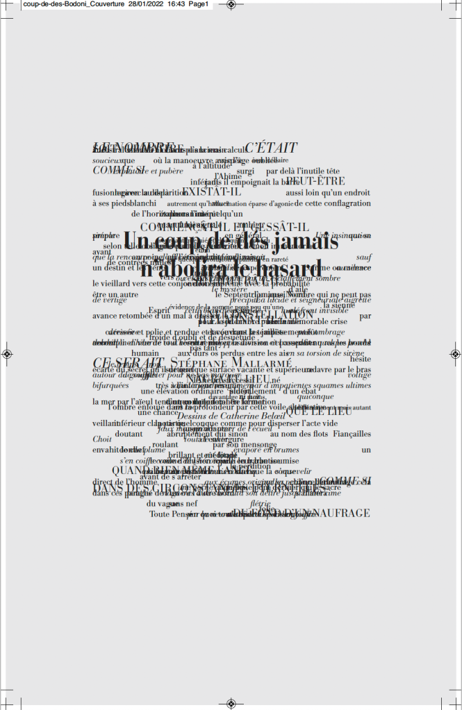
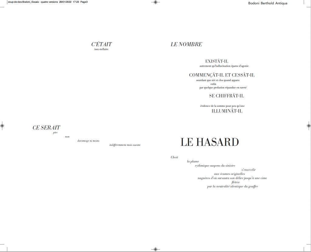
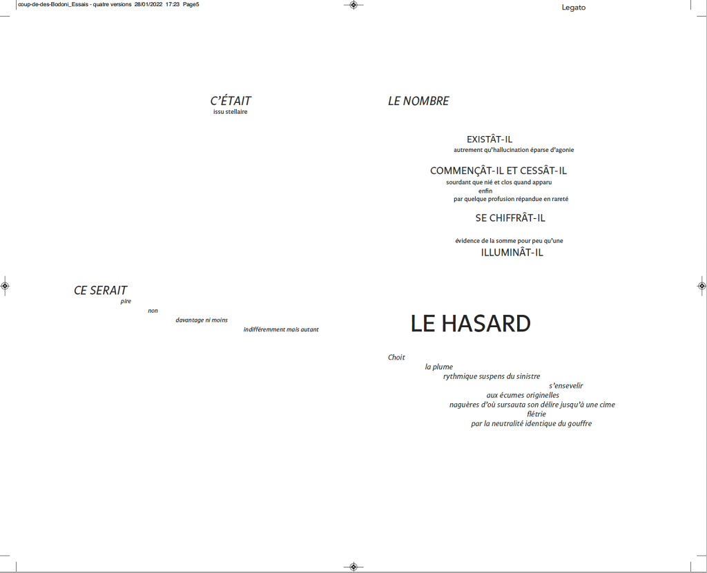
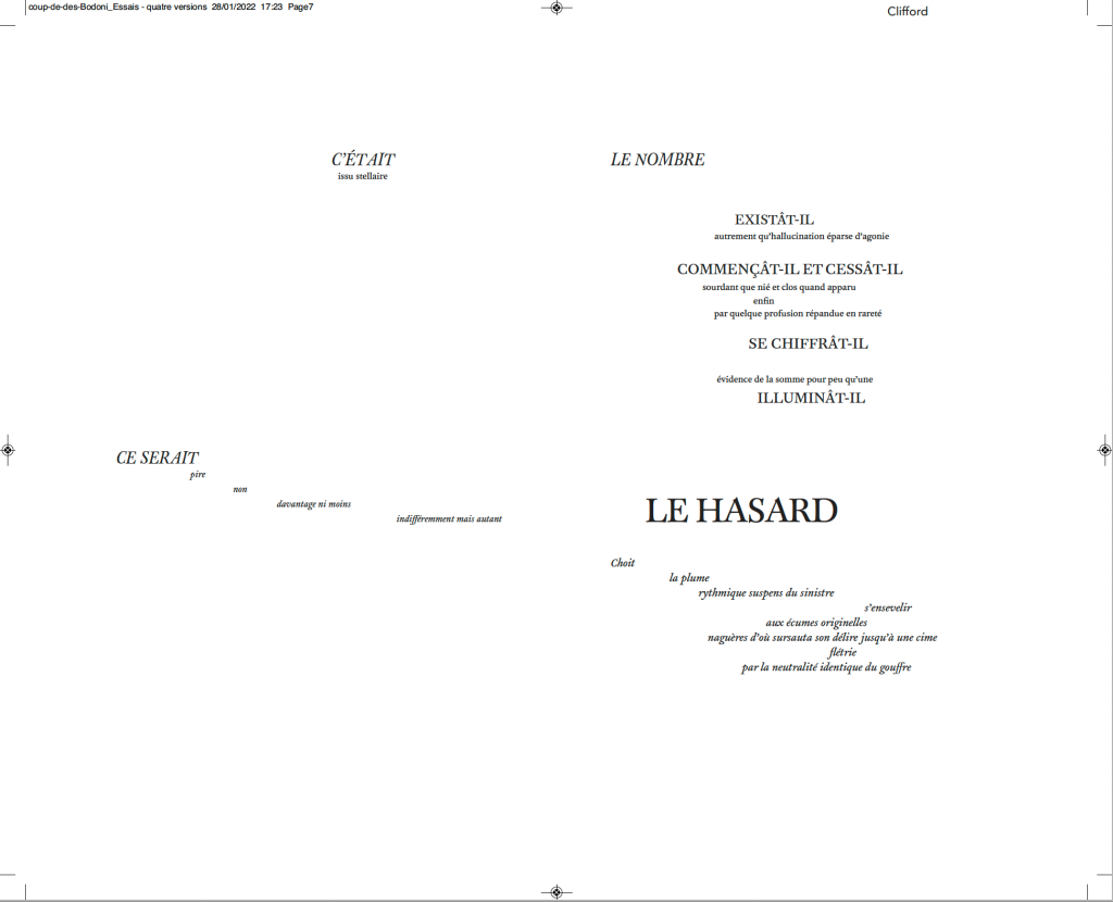
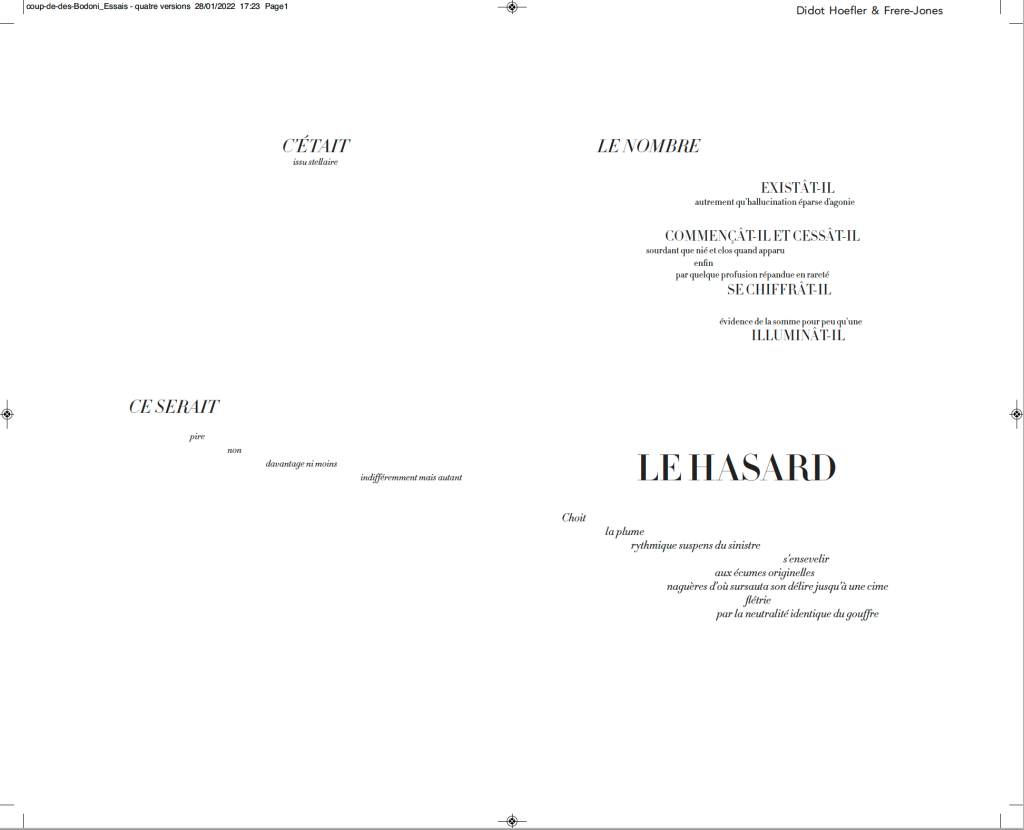
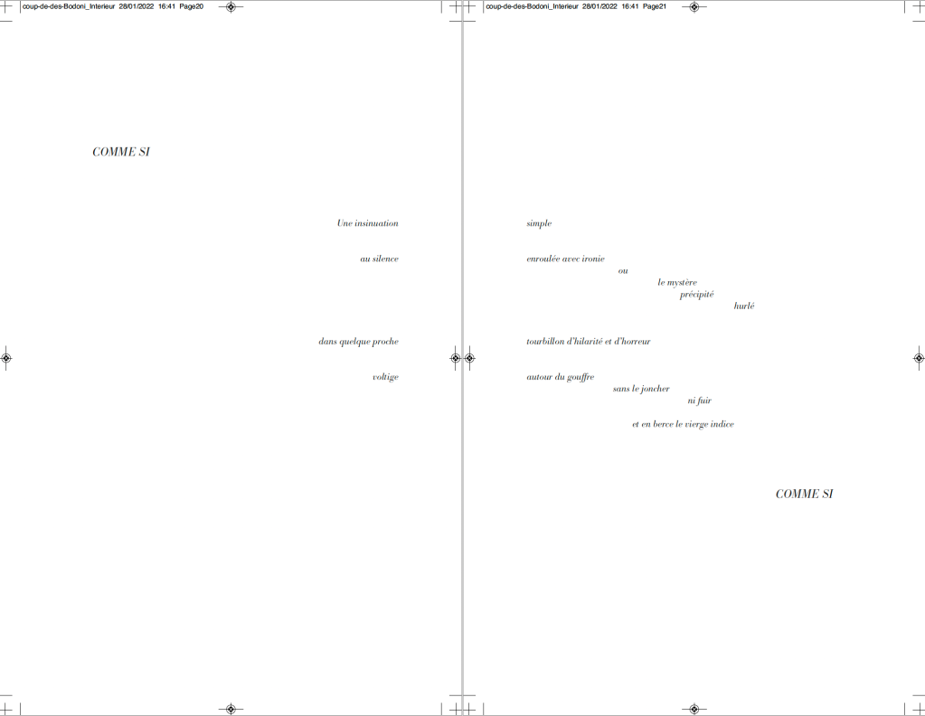
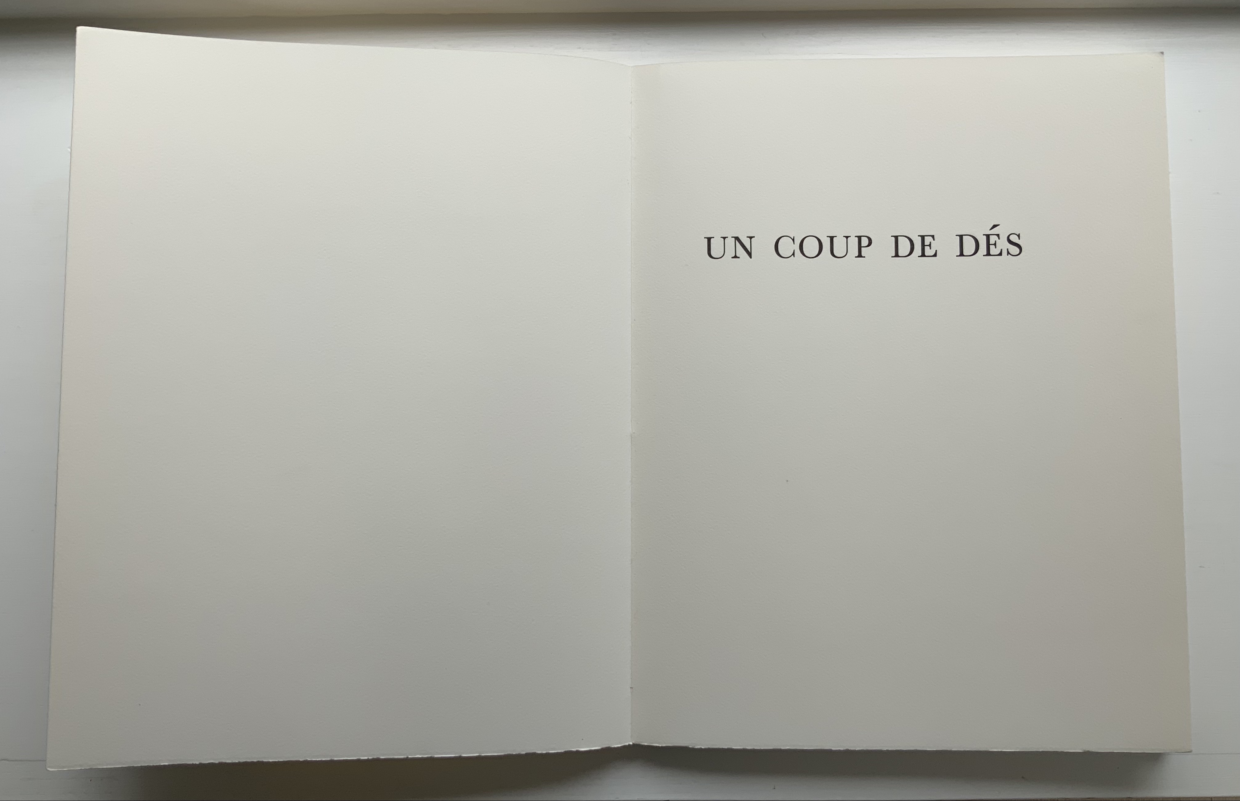
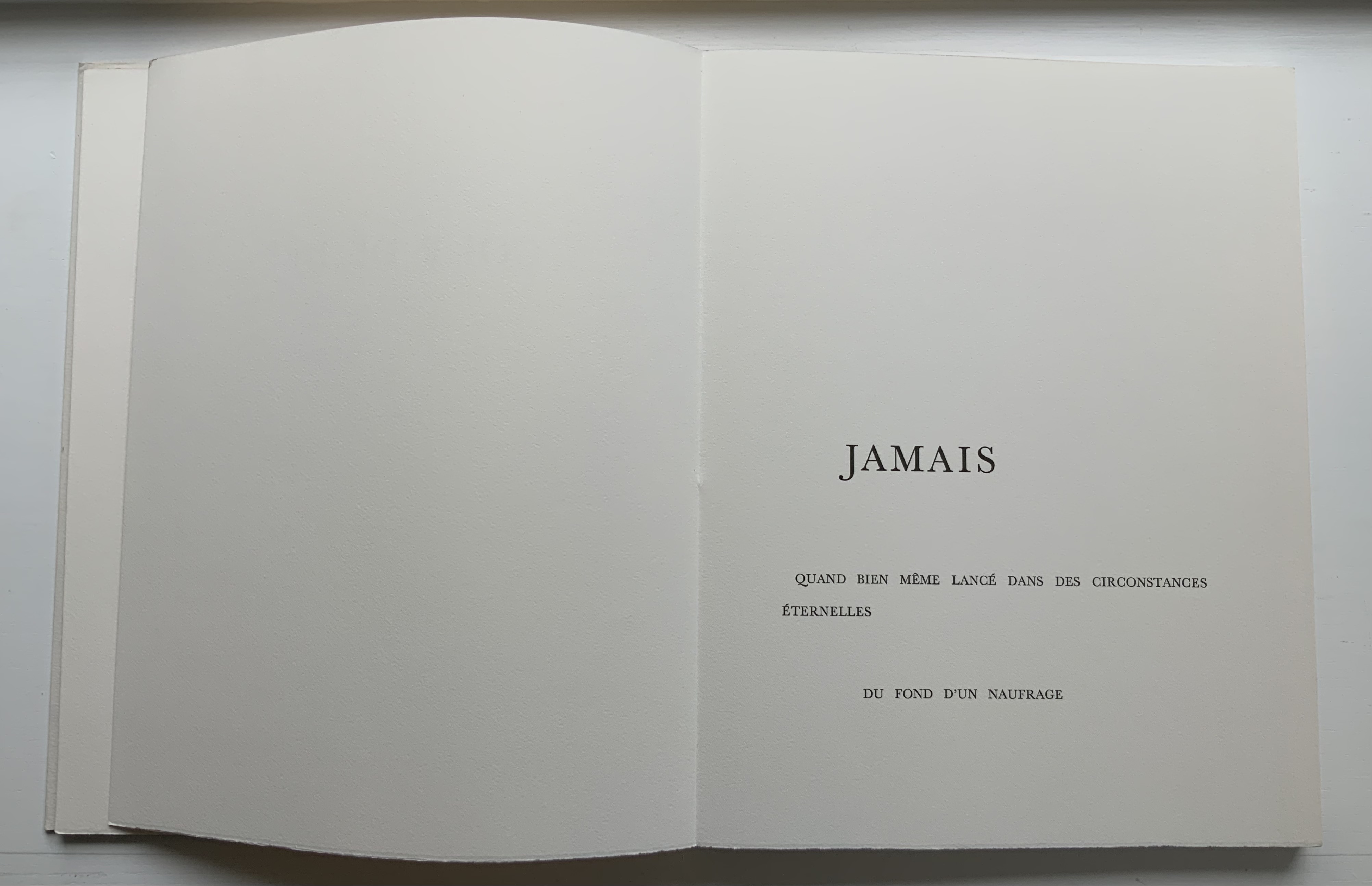
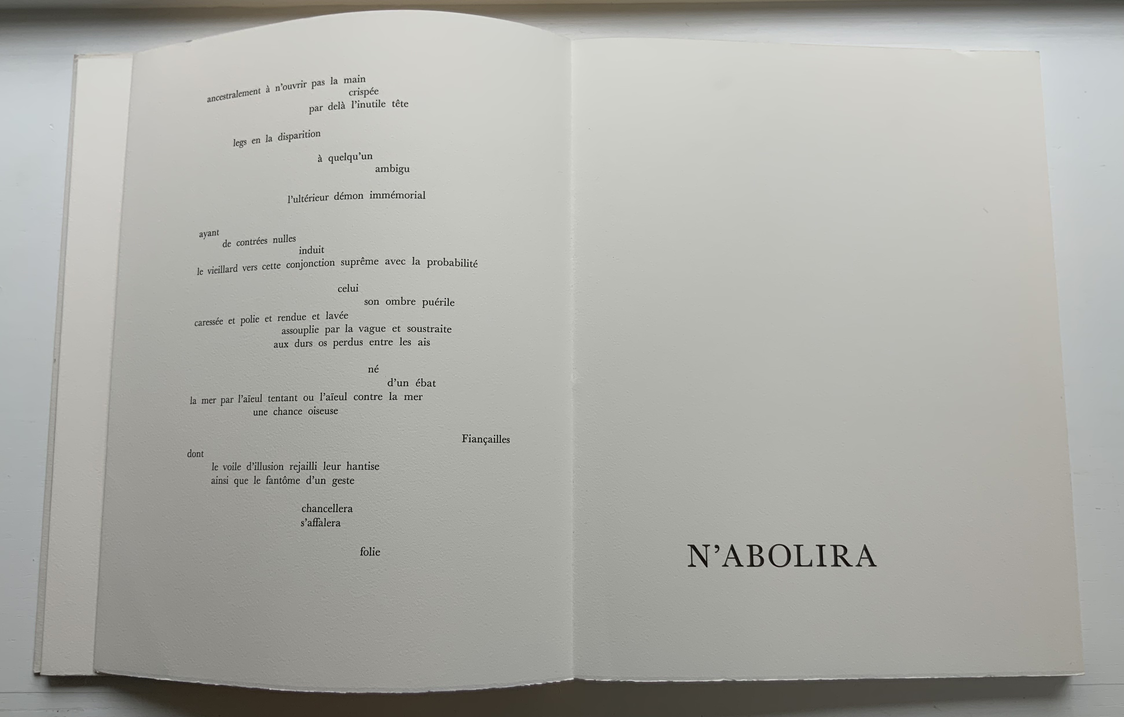
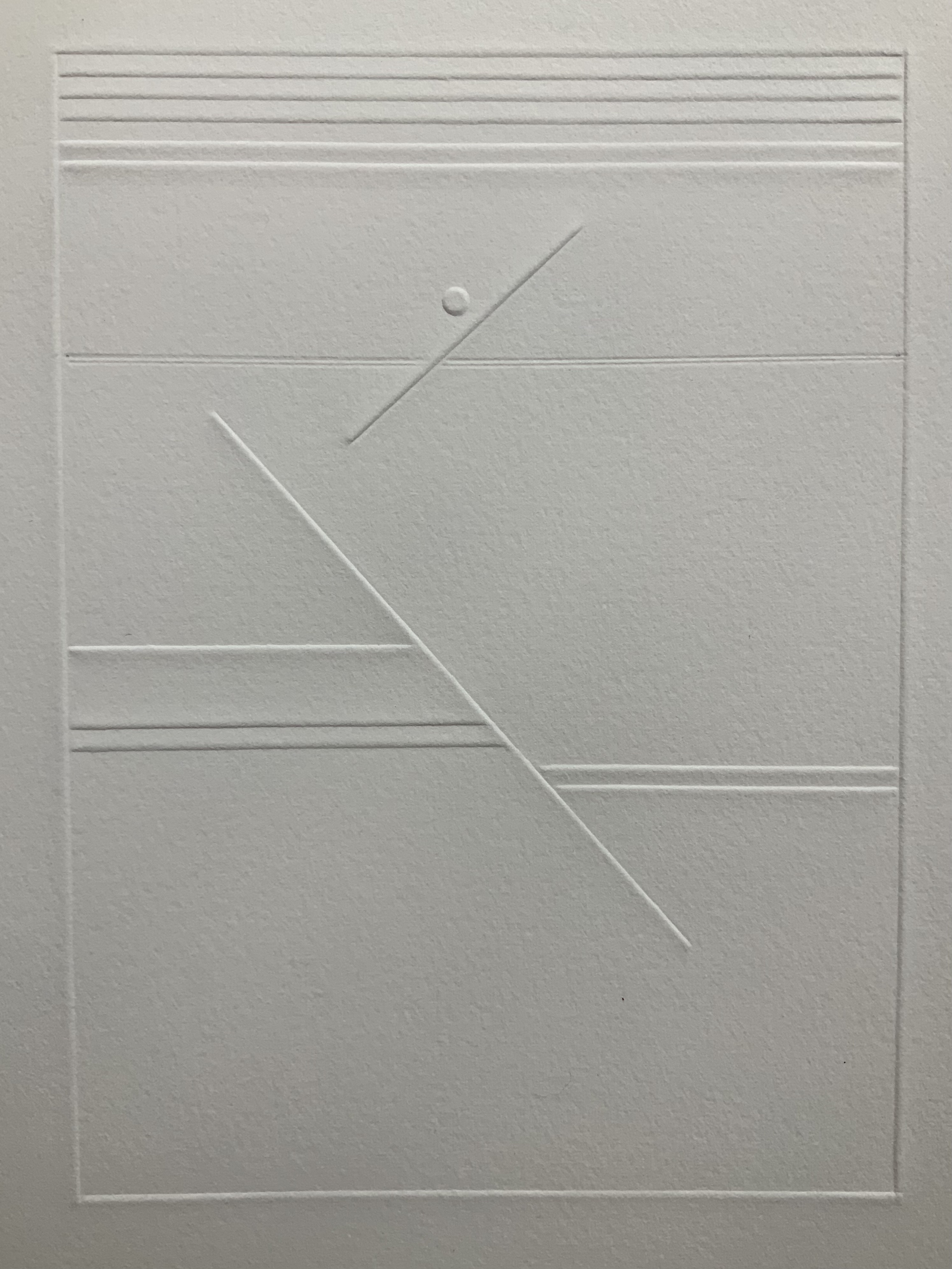
Artists’ experiments with books and letters have taken many forms, some of which look more like books than others. This exhibition of book art, and book-inspired art, opens a view of one of its most intriguing stories: the tradition of reflections, riffs, and responses to one seminal work, Stéphane Mallarmé’s A Roll of the Dice Never Will Abolish Chance (Un Coup de dés jamais n’abolira le hasard). Mallarmé’s experimental work celebrates its 125th anniversary in May 2022, when this exhibition opens. The particular objects on display here, and on view at the screening events, play on two central ideas inspired by this work: chance and visible language. The works in the exhibition are in effect a conversation about the intersection of those themes. What part does chance have to play in the way language is depicted on (or off) the page, and how might accidents of language determine how it looks? How does meaning settle throughout the forms of letters, words, lines, pages, and books, as well as in what the words say?
The exhibition and screenings include works by Jérémie Bennequin, Isabella Checcaglini & Mohammed Bennis, Robert Filliou, Ernest Fraenkel, Rodney Graham, ‘Estelle J.’, Michel Lorand, André Masson, Reinhold Nasshan, Michalis Pichler, Man Ray, Mitsou Ronat & Tibor Papp, and Honorine Tepfer.
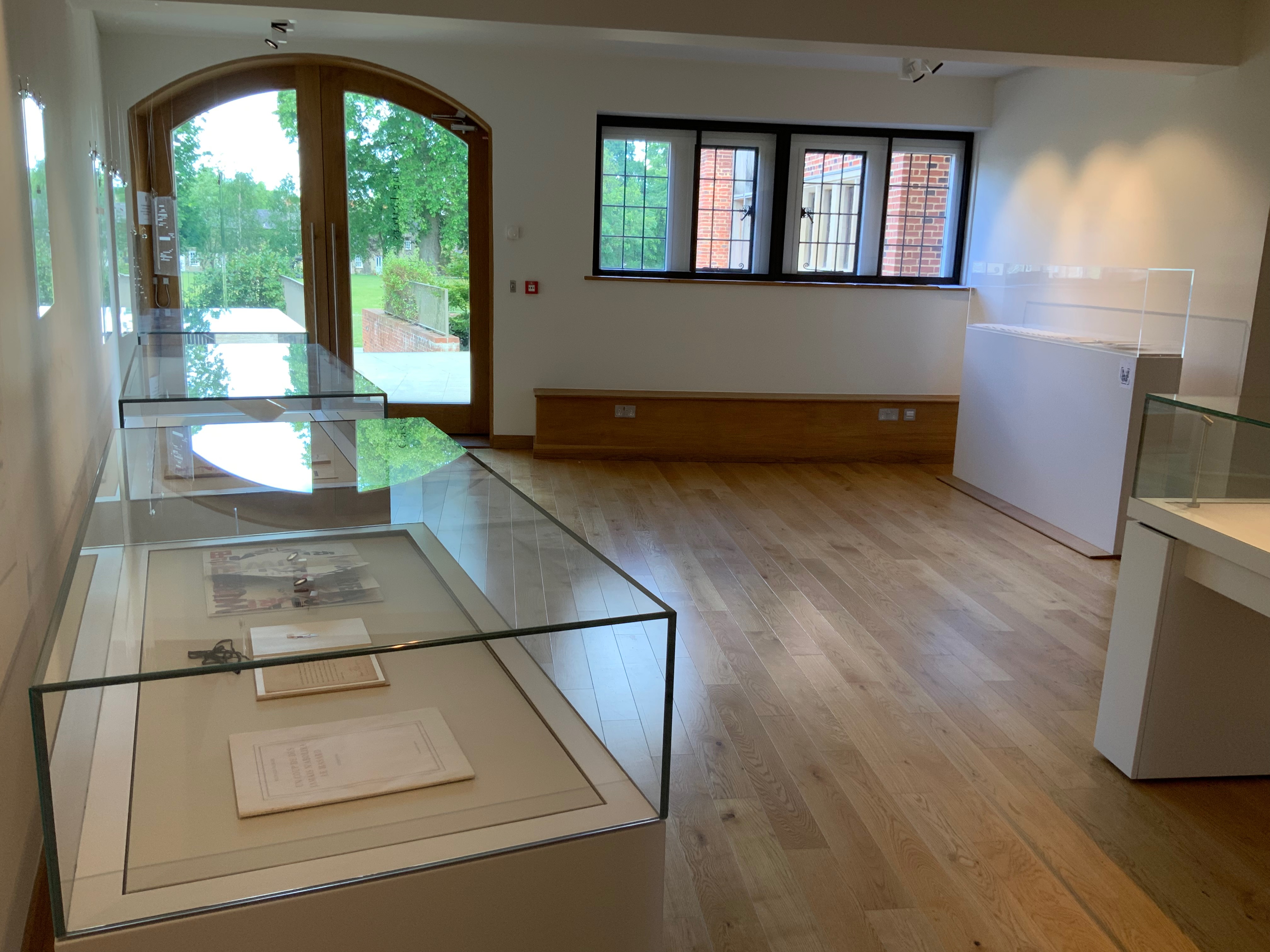
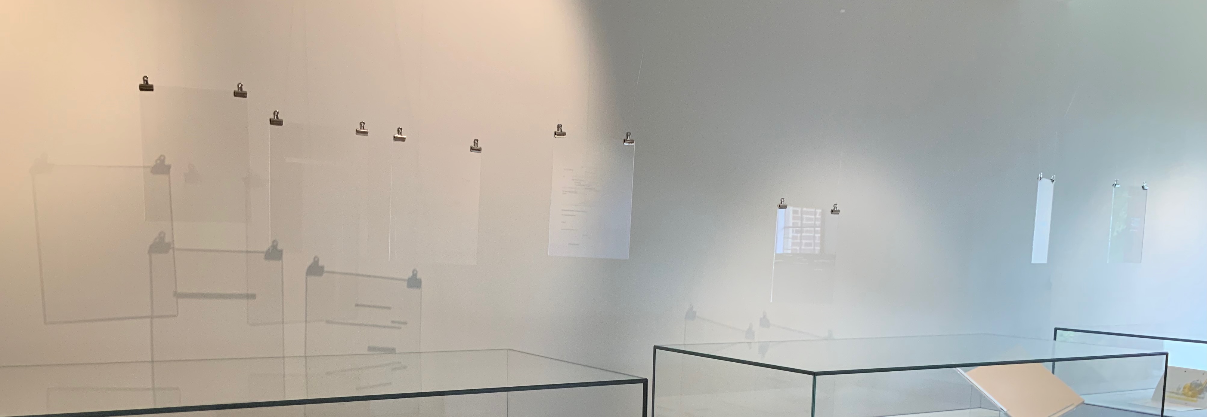
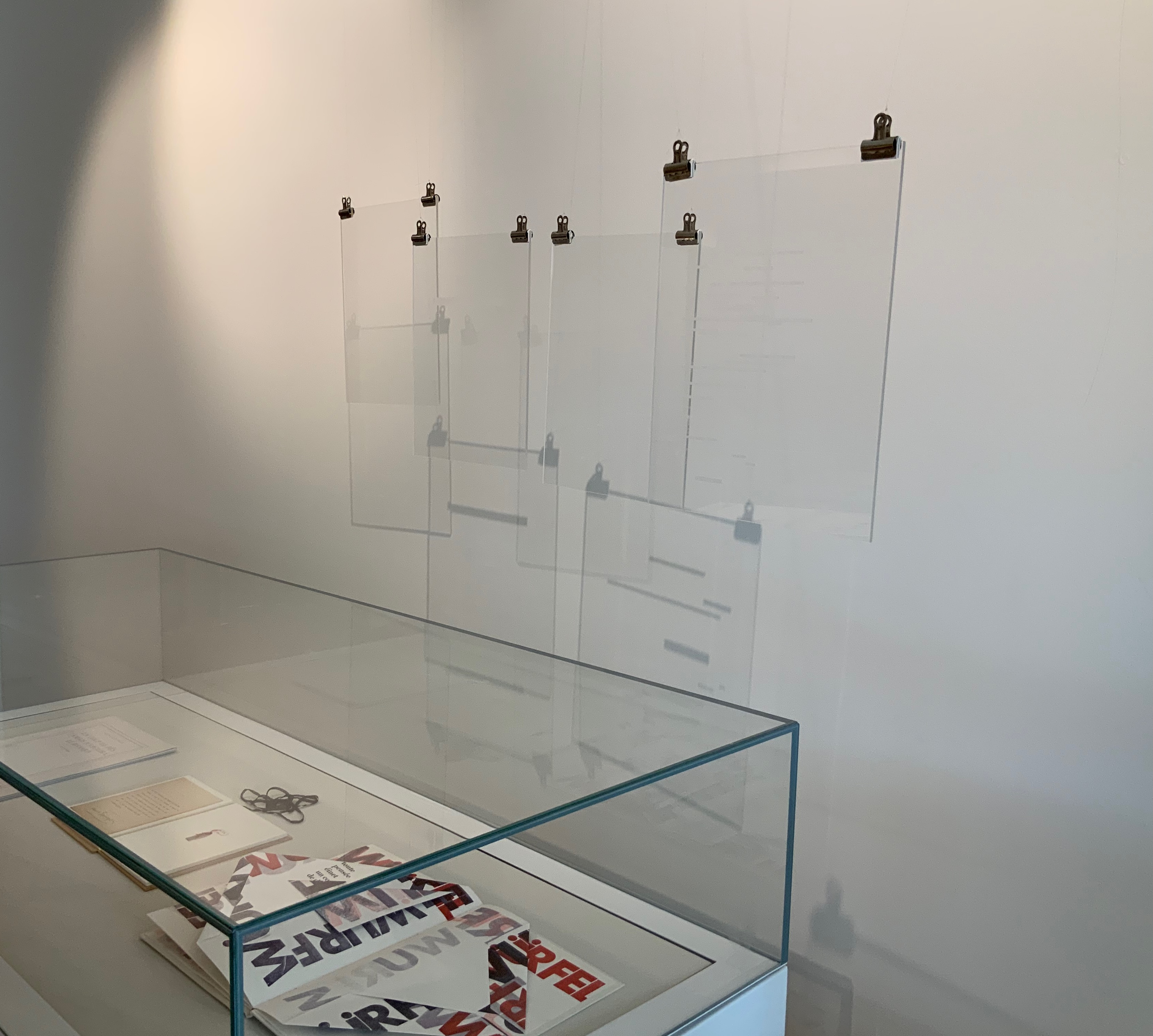
Berenbeim and Provino have suspended seven plates from Pichler‘s homage to hang over the cases containing works by Bennequin, Nasshan, Lorand, Tepfer and Estelle J.. and quietly cast shadows to pun with those works and the exhibition’s title.

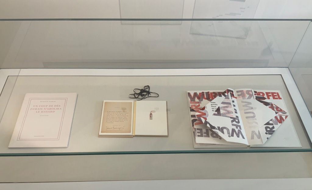
L-R: Michalis Pichler, Un Coup de Dés Jamais N’Abolira le Hasard: Sculpture (2008); Jérémie Bennequin, Le Hasard N’Abolira Jamais Un Coup de Dés (Changes of Music) (2020); Reinhold Nasshan, Würfelwurf: fragmentarische Annäherung an Stéphan Mallarmé (1992). 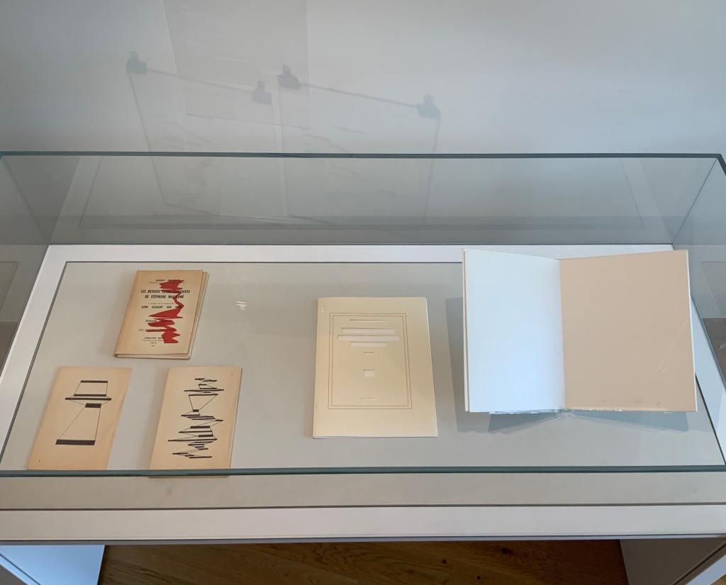
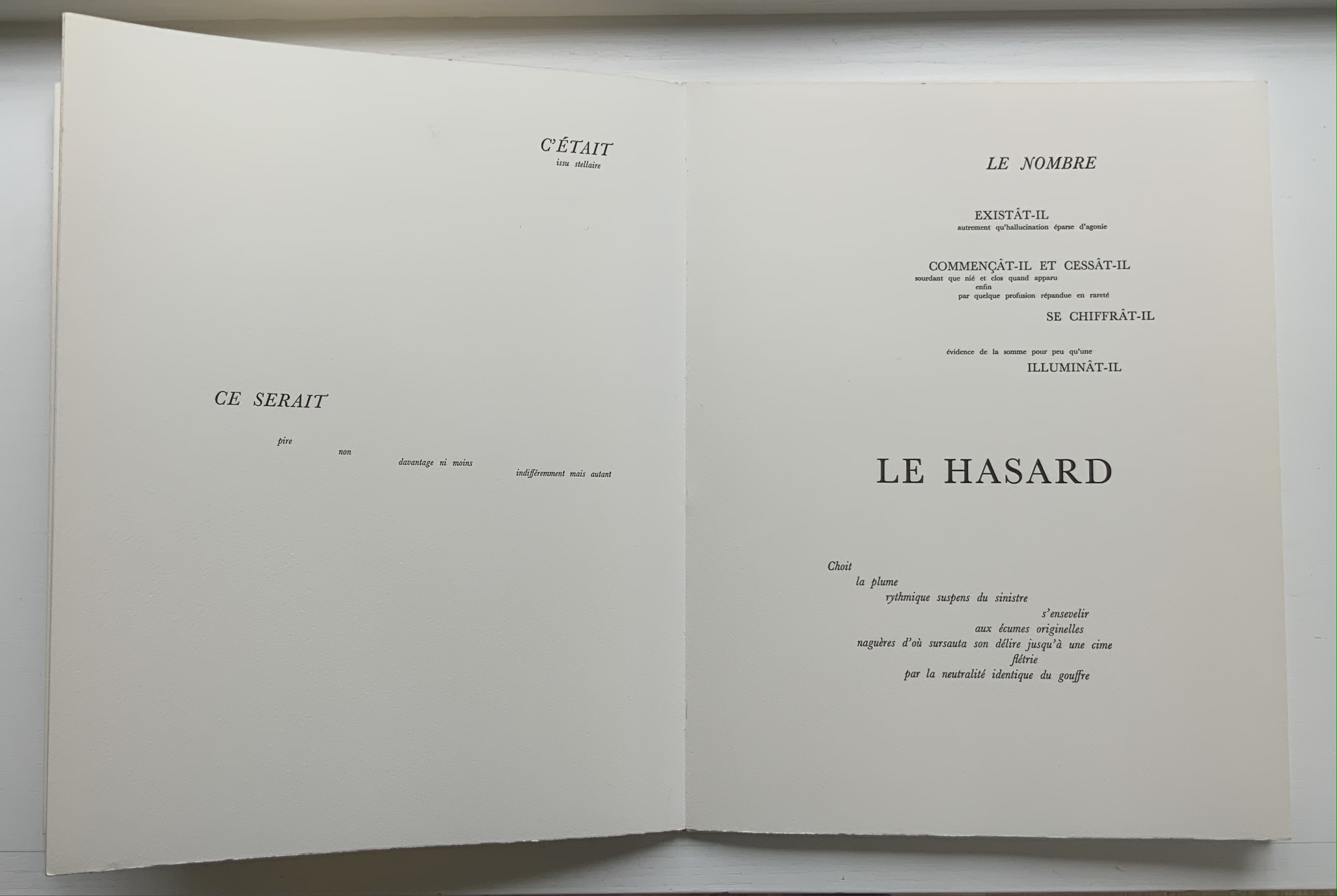
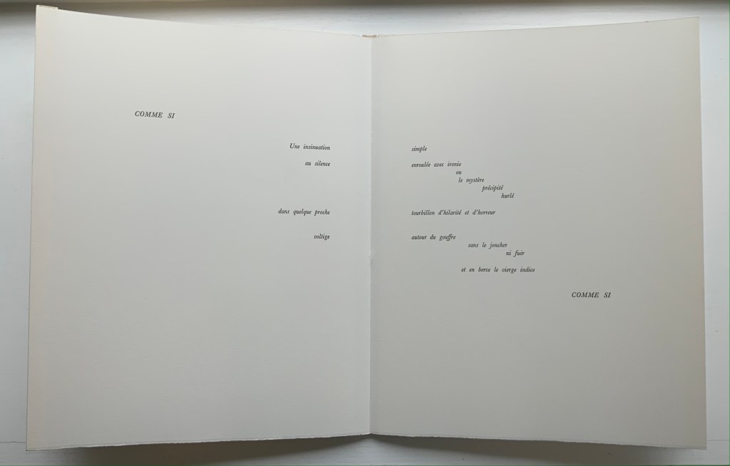
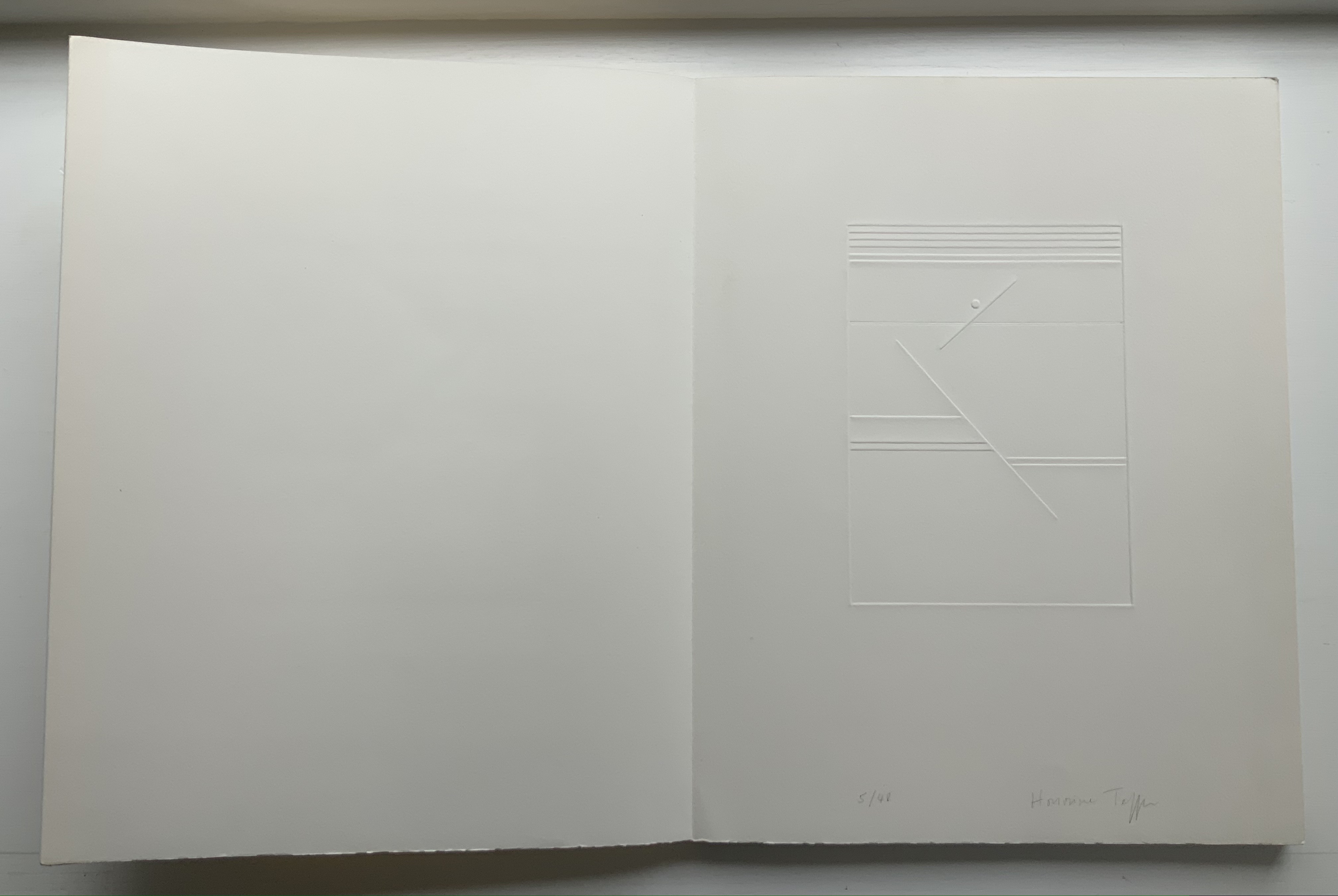
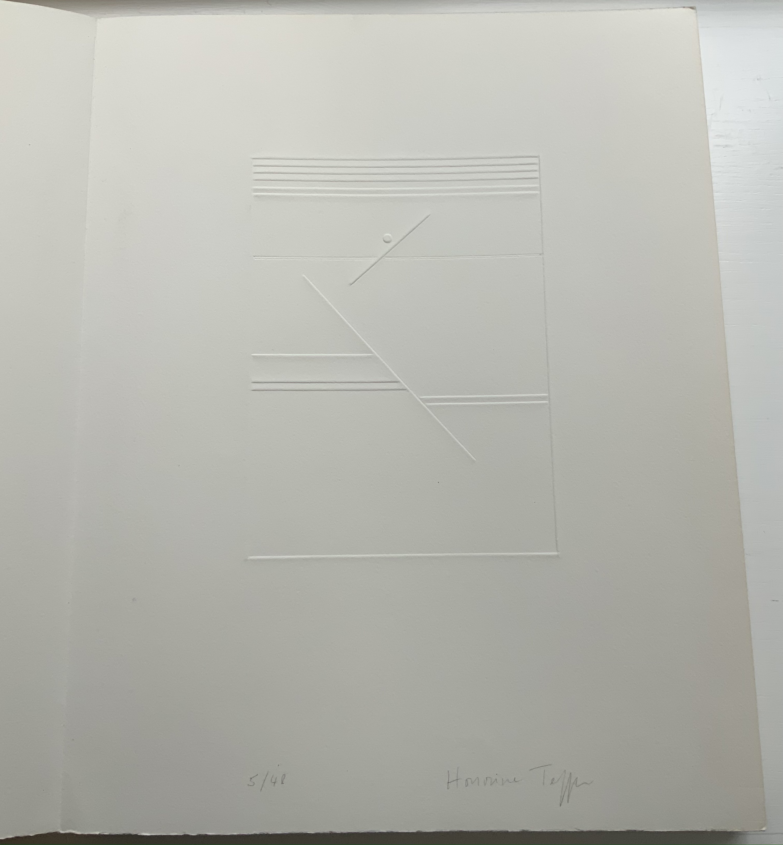
L-R: Ernest Fraenkel, Les Dessins Trans-conscients de Stéphane Mallarmé, à propos de la Typographie de Un Coup de Dés (1960); Michel Lorand, Après Un Coup de Dés (2015); Honorine Tepfer, Un Coup de Dés Jamais N’Abolira le Hasard: Poème (1989) 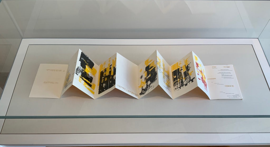
Estelle J., STÉPHANE MALLARMÉ: Un coup de dés n’abolira le hasard (ND)
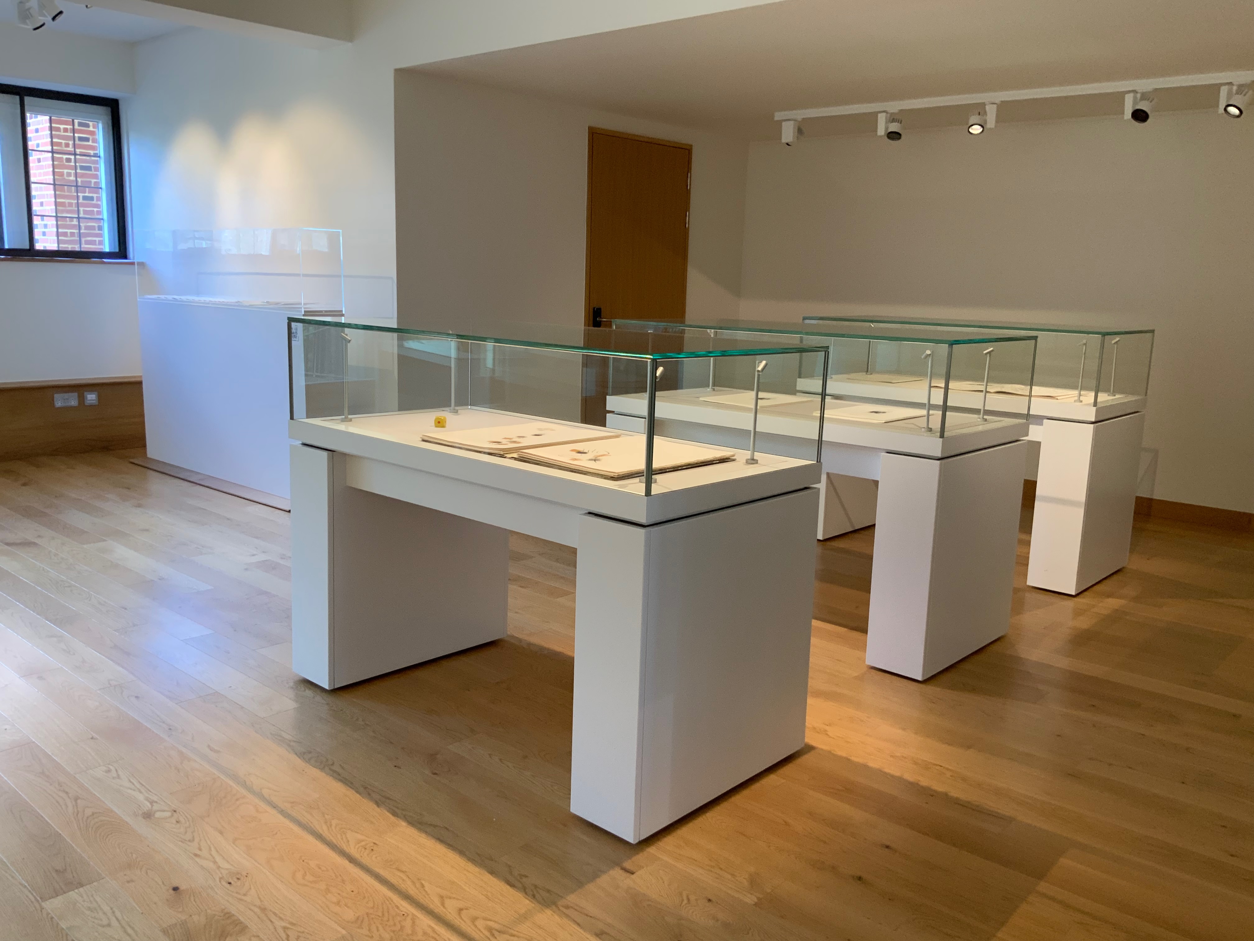
Three other cases across from those above present a conversation of dice between Masson and Filliou, then a French and Arabic conversation between Checcaglini and Bennis, and then Tibor Papp and Rodney Graham joking with one another.
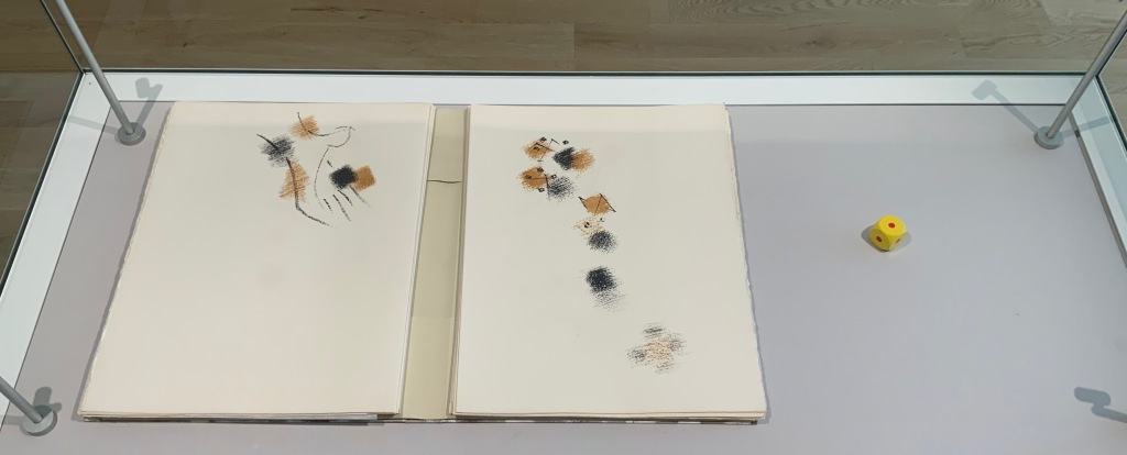
L-R: André Masson, Poéme: Un Coup de Dés Jamais N’Abolira le Hasard by Stéphane Mallarmé (1961); Robert Filliou, Eins. Un. One. (1984) 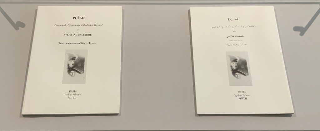
L-R: Isabella Checcaglini, POÉME: Un coup de Dés jamais n’abolira le Hasard (2007); Mohammed Bennis, صلة وصل مع قصيدة ” رمية نرد أبدا لن تبطل الزهر” /Ṣilat waṣl maʻa qaṣīdat Ramyat nard abadan lan tubṭila al-zahr (2007) 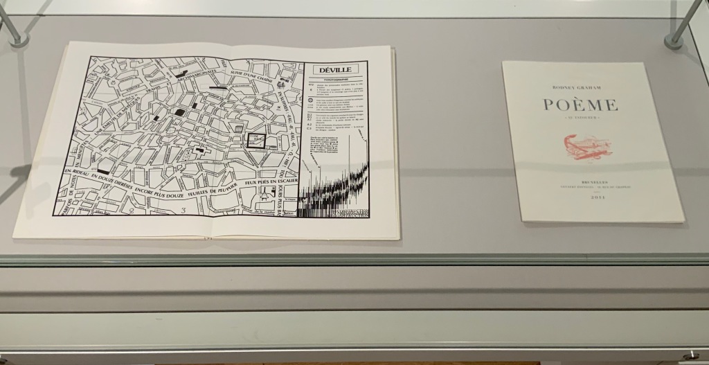
L-R: Tibor Papp, Déville in Mitsou Ronat & Tibor Papp, eds., Poème: Un coup de Dés jamais n’abolira le Hasard par Stéphane Mallarmé (1980; )Rodney Graham, Poème : “Au Tatoueur” (2011)
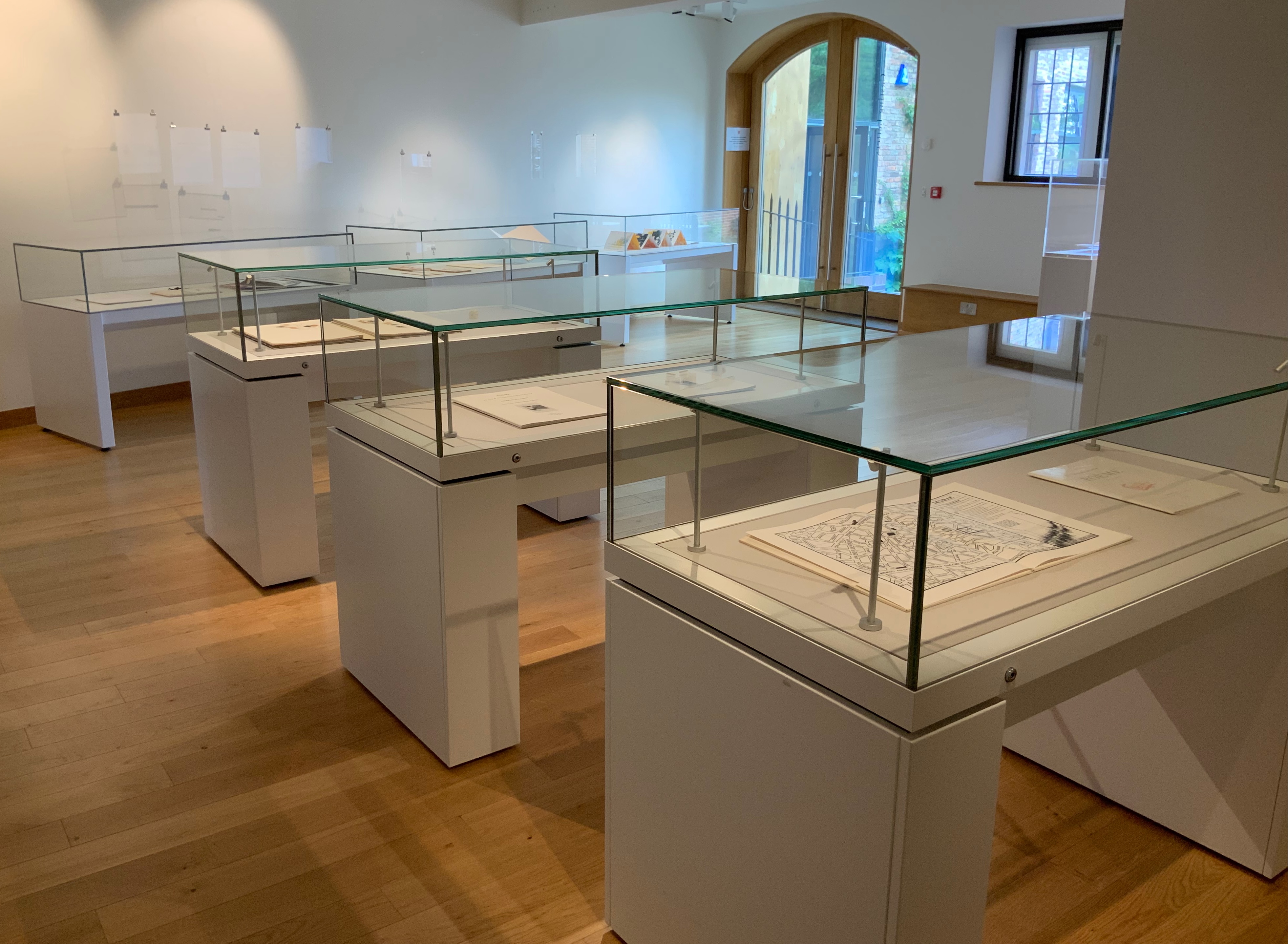
In a display case seemingly made for his particular work, the result of Bennequin’s long-distance performances of erasure with his colleague and publisher Antoine Lefebvre calls across the room to all the other works of chance and visible language.
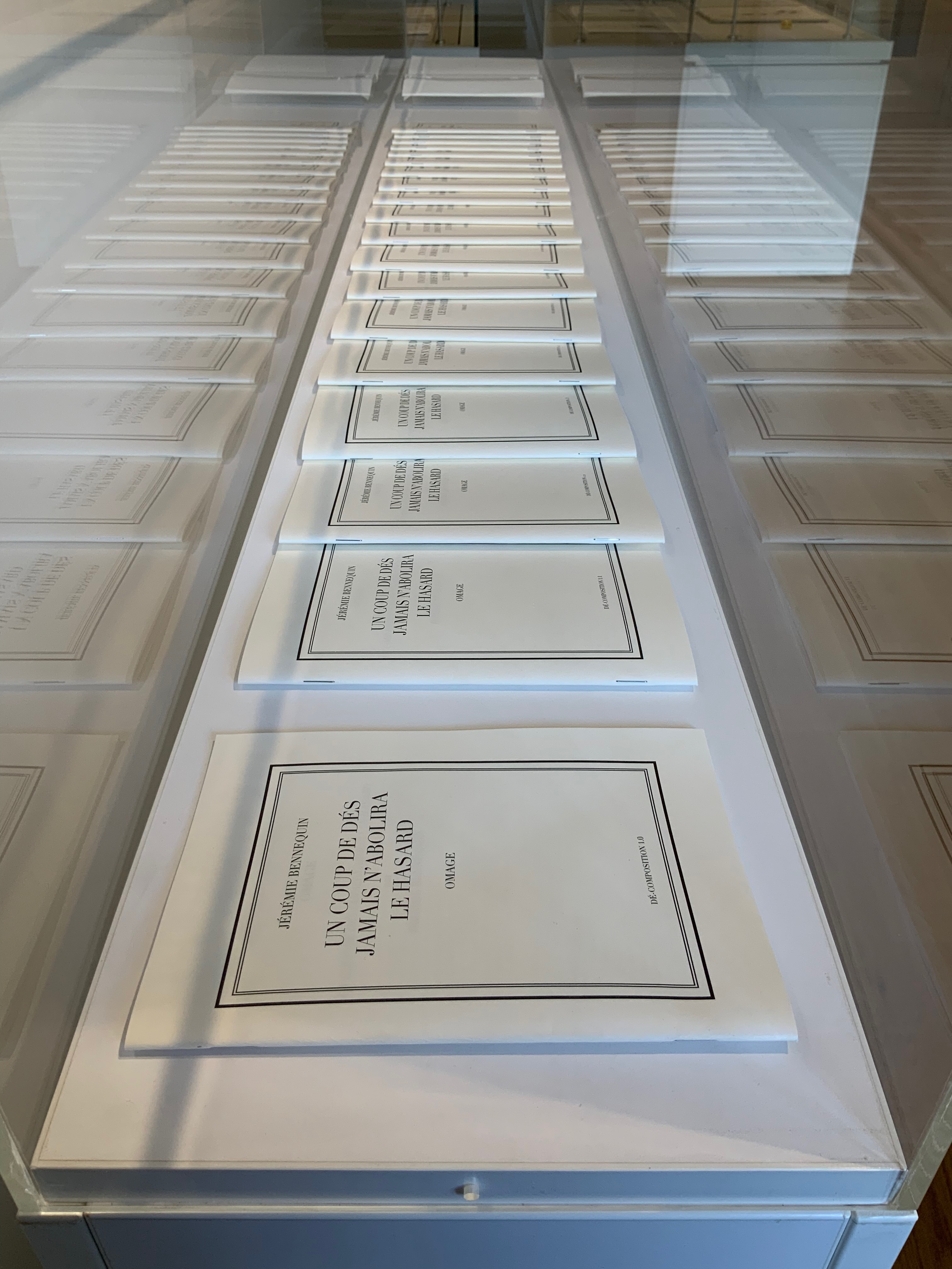
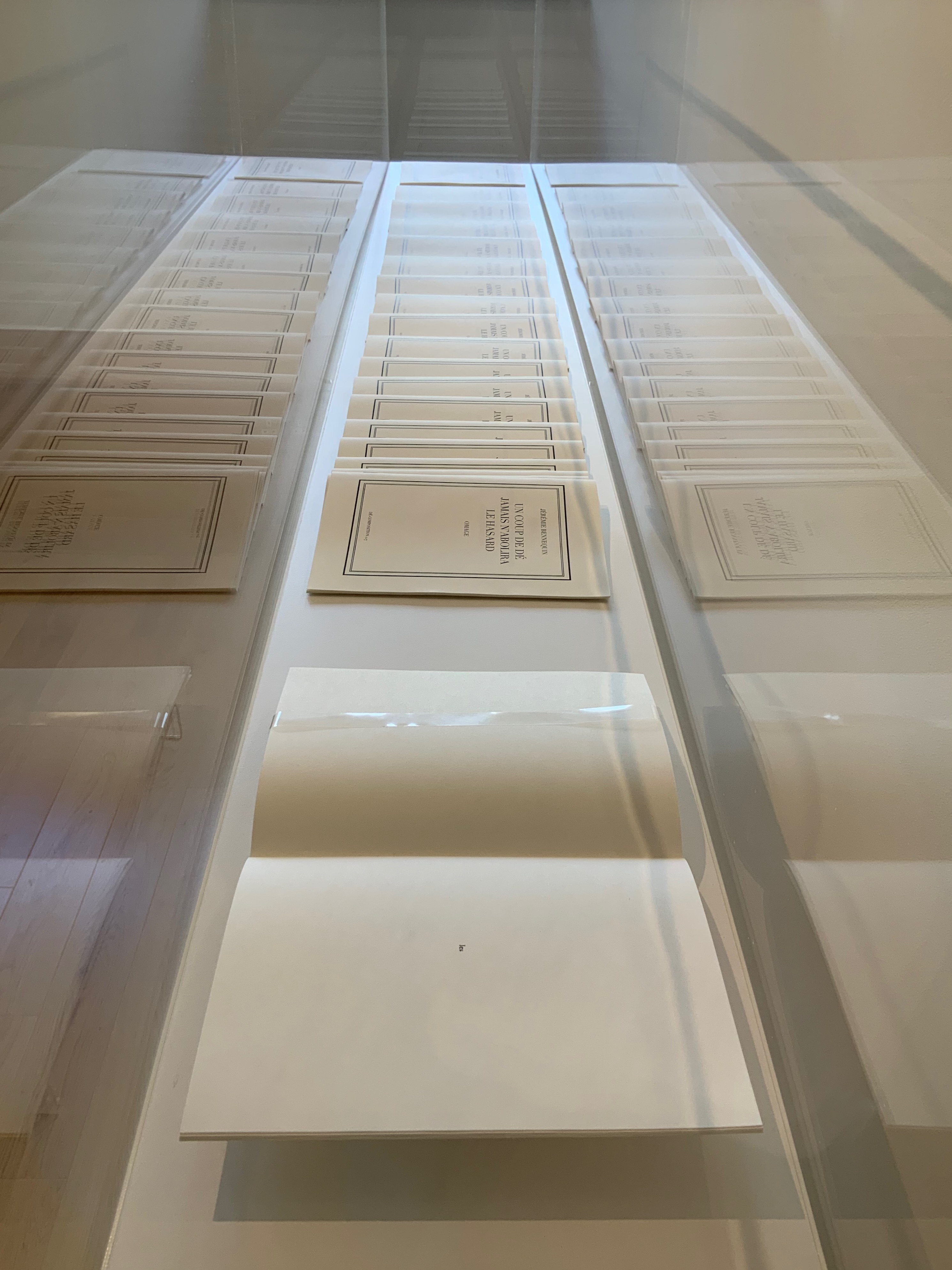
Jérémie Bennequin, Un Coup de Dés jamais n’abolira le Hasard, Dé-composition (2009-2013)
With the sun streaming into West Court Gallery, the only things missing from the buzz of these conversations were perhaps canapés, champagne and name tags to celebrate the 125th anniversary of this strange poem’s publication.
Further Reading
“Un Coup de Dés Jamais N’Abolira l’Appropriation” — An Online Exhibition. 1 May 2022. Books On Books Collection.