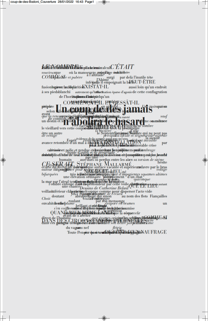
Un coup de dés jamais n’abolira le hasard (1914/2012)
Un coup de dés jamais n’abolira le hasard(1914/2012) Stéphane Mallarmé (text), Alain Hurtig (design), Catherine Belœil (art) Online and downloadable files for printing at L’Outil Typographique. Creative Commons (BY-NC-SA). Accessed 28 January 2022. Screenshots: Books On Books Collection. Displayed with permission of Alain Hurtig.
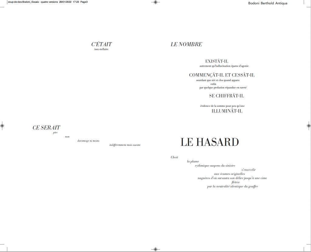
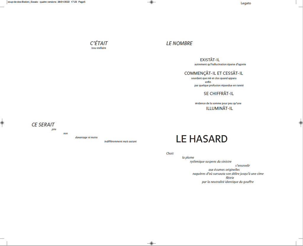
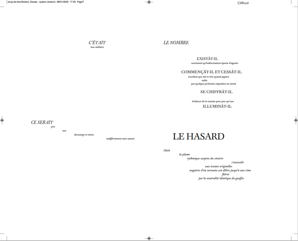
Much has been made of Mallarmé’s precision or preciosity in the marked-up proofs of the deluxe edition of Un Coup de Dés. Also, as many scholars, hommageurs and facsimilists have attested, a suitable substitute for the Firmin-Didot typeface that the poet specified for the deluxe has been hard to find. Master typographer Alain Hurtig, however, puts “suitable substitute” into perspective with his essay “À propos du Coup de dés de Stéphane Mallarmé“. The essay offers single pages and double-page spreads set in Bodoni Antiqua (Berthold), Legato, Clifford and the Hoefler & Frère-Jones digital revival of Didot.
Clockwise from the upper left: Bodoni Antiqua (Berthold), Legato, Clifford and Didot.
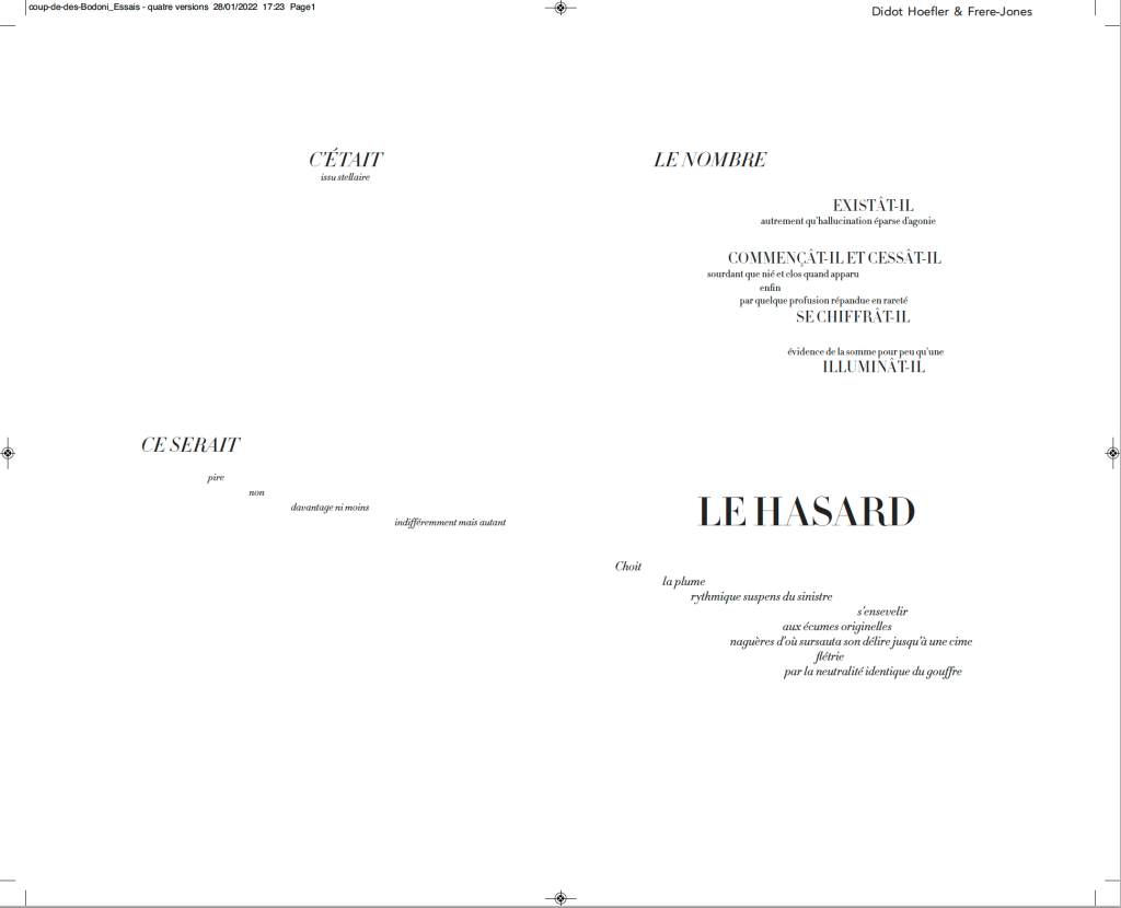
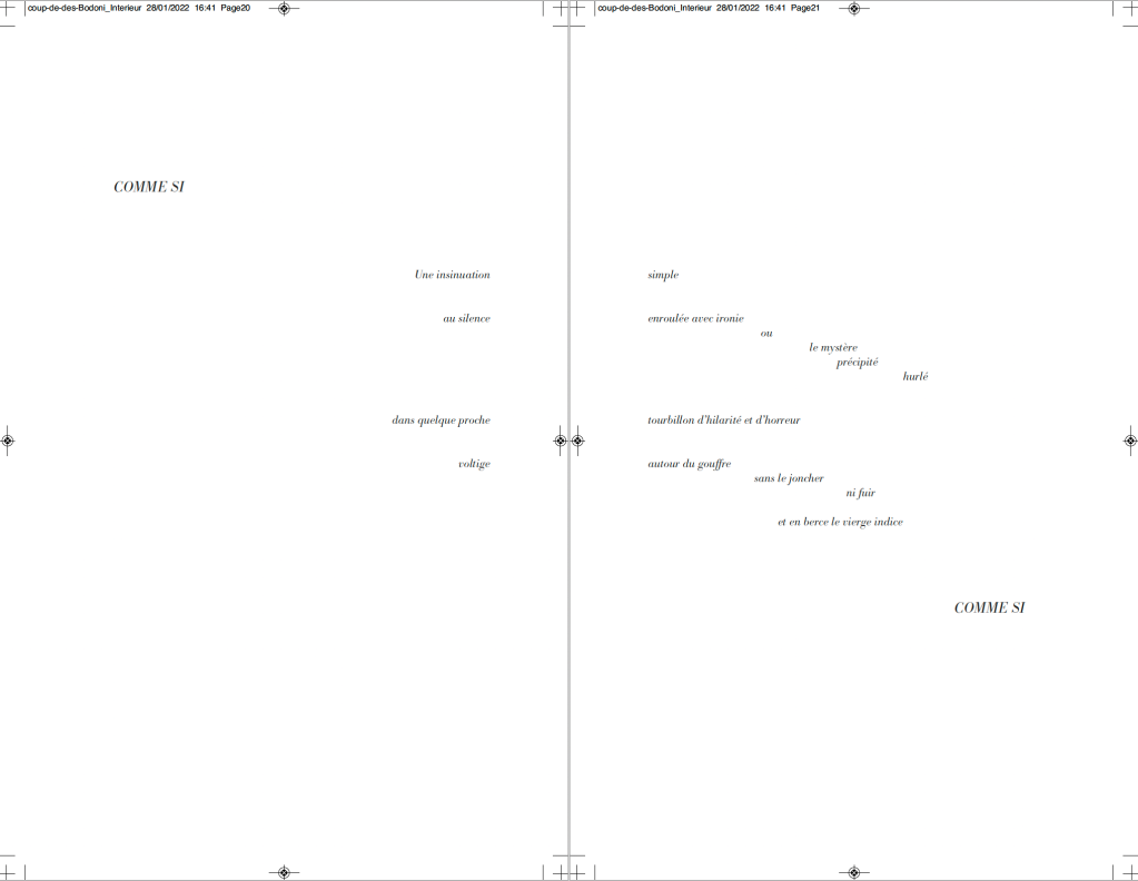
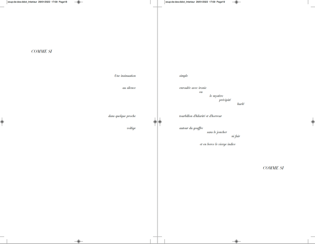
It seems unlikely that Mallarmé pored over the Didot firm’s type books to choose the Firmin-Didot face, but there is nothing precious about specifying a typeface. Different faces have different personalities. Hurtig enables us to see rather than imagine the effect of choosing the business-card-like Legato — not that that would have been a choice for Mallarmé. Nor would the Clifford, although a plausible (if squat) choice with its contrasting thin and thick strokes. The opportunity for the most extensive comparison comes with Hurtig’s two complete settings of the poem — one in Bodoni Antiqua (Berthold), the other in HFJ Didot. Below, for comparison, is the poem’s central double-page spread — the COMME SI … COMME SI verses.
Above: Bodoni Antiqua (Berthold). Below: Hoefler & Frère-Jones Didot.
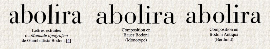
Of these two revival faces — Bodoni Antiqua (Berthold) and HFJ Didot — Hurtig himself prefers Bodoni. Bodoni is one of the more attractive alternatives for facsimilists. Neil Crawford chose it for the edition created with Ian Tyson, as did Gary Young for his edition with D.J. Waldie. Hurtig even provides a comparative view of three versions of Bodoni:
Hurtig’s explanations of deciding the trim size and adjusting the size of fonts and spacing fascinate. Likewise his choice of Bodoni because it
s’imposait avec élégance, il rythmait les phrases en les faisant incroyablement vibrer et remplissait de sa grâce les immenses blancs de la double page — ces espaces que, selon Mallarmé, “il n’est pas moins beau de composer que les vers” [Hurtig, 2012]
[imposed itself with elegance, it gave rhythm to the sentences by making them vibrate incredibly and filled with its grace the immense blanks of the double page — these spaces which, according to Mallarmé, “it is no less beautiful to compose than the verse”.]
My vote, however, would be for the HFJ Didot. It has a more upright, steelier and brighter aspect, fittingly constellatory. In other online comments, Hurtig points out, however, that the HFJ Didot is not the Firmin-Didot of Mallarmé:
Le didot d’Hoefler n’est évidemment pas celui choisi par Mallarmé, et pour cause : un siècle les sépare — et Hoefler a, dans son dessin, évidemment tenu compte des conditions modernes de composition et d’impression : au plomb, son travail ne tiendrait probablement pas une seconde, et moins encore sur les papiers utilisés à l’époque. [Hurtig, 2018]
[Hoefler’s Didot is obviously not the one chosen by Mallarmé, and for good reason : a century separates them – and Hoefler has, in his design, obviously taken into account modern conditions of composition and printing: with lead, his work would probably not hold for a second, and even less so on the papers used at the time.]
While carefully experimenting with the choice of faces, Hurtig has no qualms about jettisoning Odile Redon from his edition. He does not like the Redon prints et en plus il est mort (“and besides he’s dead”). Combined with his finer typographic points, Hurtig’s substitution of prints he commissioned from Catherine Belœil heeds the call to which facsimilists and hommageurs such as Jean Lecoultre, Alessandro Zanella and Jacques Vernière, Honorine Tepfer, Robert Bononno and Jeff Clark, Virgile Legrand and Hervé Di Rosa, and Sam Sampson have also responded: to look afresh and even radically at Un Coup de Dés.
Hurtig, Alain. 11 July 2018. “Remarques typographiques“, responding to Laurent Bloch’s “Le Poème de Stéphane Mallarmé: Un coup de dés jamais n’abolira le hasard. Son exégèse et sa typographie”, posted 11 July 2018, modified 29 September 2020. Accessed 26 January 2022.
In the Books On Books Collection, there are livres d’artiste of Un Coup de Dés in French, English and German — even Arabic. Edizioni Ampersand brings an Italian edition into the fold. Alessandro Zanella founded Edizioni Ampersand in the early 1980s in Verona, and its second publication was UN COLPO DI DADI. Zanella had beenintrigued by the revolutionary typographic layout of the poem and borrowed a first edition copy from Leo Lionni, the children’s book author and illustrator. Presumably for the future flexibility of his printing house, Zanella purchased a set of Caslon type rather than Bodoni in which to set the poem.
The 1914 edition of the poem has no title page laid out as a double-page spread. Why the title is split into four lines for the French and five for the Italian is not clear. The French layout gives a more expected left to right reading across the spread, whereas the Italian jumps back and forth (perhaps more in keeping with Mallarmé’s syntax later in the poem). Otherwise, as seen in the pairing of the “Comme si … comme si/ come se … come se” spreads, Zanella follows the 1914 edition’s layout.
The French printer/artist Jacques Vernière may have destined himself to contribute the artwork to UN COLPO DI DADI. He had introduced Zanella to American expatriate printer Richard-Gabriel Rummonds, proprietor of The Plain Wrapper Press, then also in Verona. Some years after working with Rummonds, Zanella struck out on his own and established Edizioni Ampersand. Whether by research or intuition, Zanella
Although not following Mallarmé’s choice of typeface, Zanella did follow Ambroise Vollard’s instinct that a livre d’artiste edition would sell better than a text-only edition. He also followed Mallarmé’s concern that Vollard should not let the prints and paper used for them detract from the visual impact of the text. Zanella separates Vernière’s wood engravings from the text, placing two after the French version and two after the Italian version of Mallarmé’s preface. Their evocation of the storm, shipwreck, waves and the abyss is unmistakable, as is the folio cover’s image of foam on the surface of waves.
Spread of French preface and image; spread of Italian preface and image.
Close-up of images after the prefaces.
Spread with second image in the French section; spread with second image in the Italian section.
Close-up of second images in the French and Italian sections, respectively.
The watermark in the handmade paper seems extraneous: Veronica’s Veil, the relic capturing Christ’s image, might have interested the otherwise non-religious author of Herodiade, but its bearing on this poem is unclear. A mermaid or siren would have been more suitable. But such a subtle discrepancy or missed opportunity does not sway the balance of text, image, ink and paper that Zanella has achieved here.
Logo of Edizioni Ampersand
Further Reading
Nicolini, Chiara. Summer 2012. “Lines in the Ampersand“, Illustration. Accessed 5 February 2022.
Shaw, Paul. “Alessandro Zanella: In Memoriam“, Special Collections, Marriott Library, University of Utah. Accessed 5 February 2022.
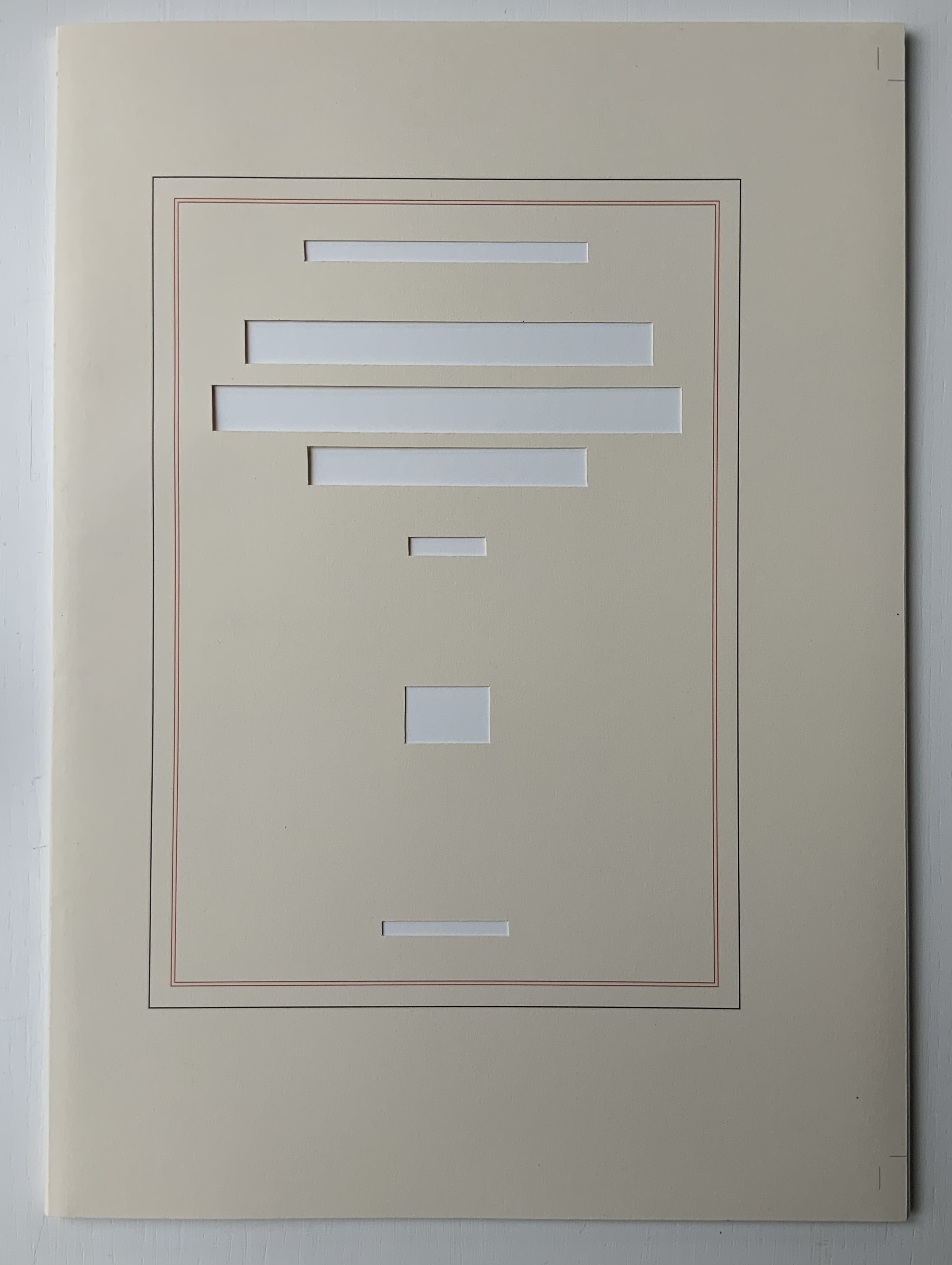
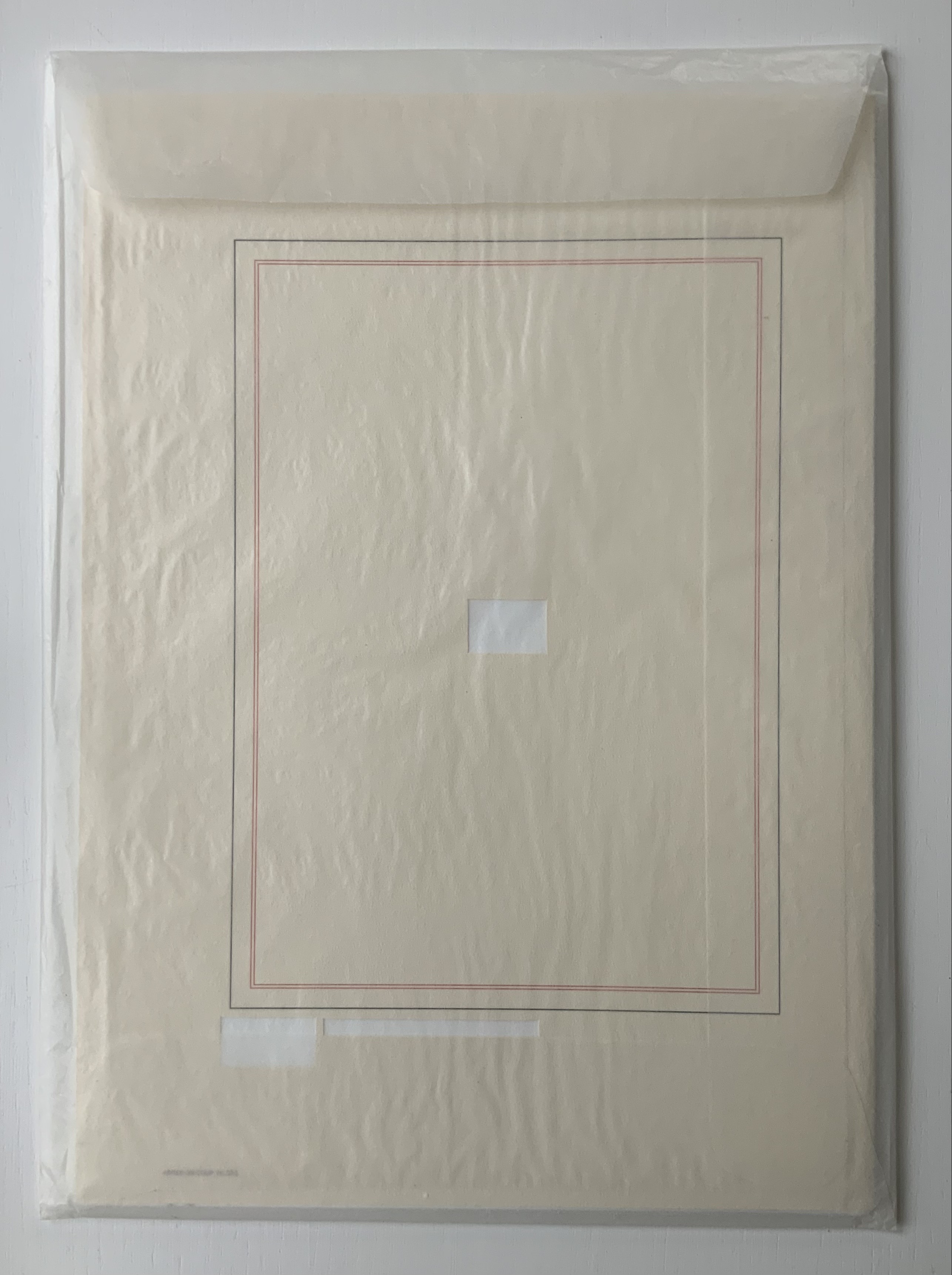
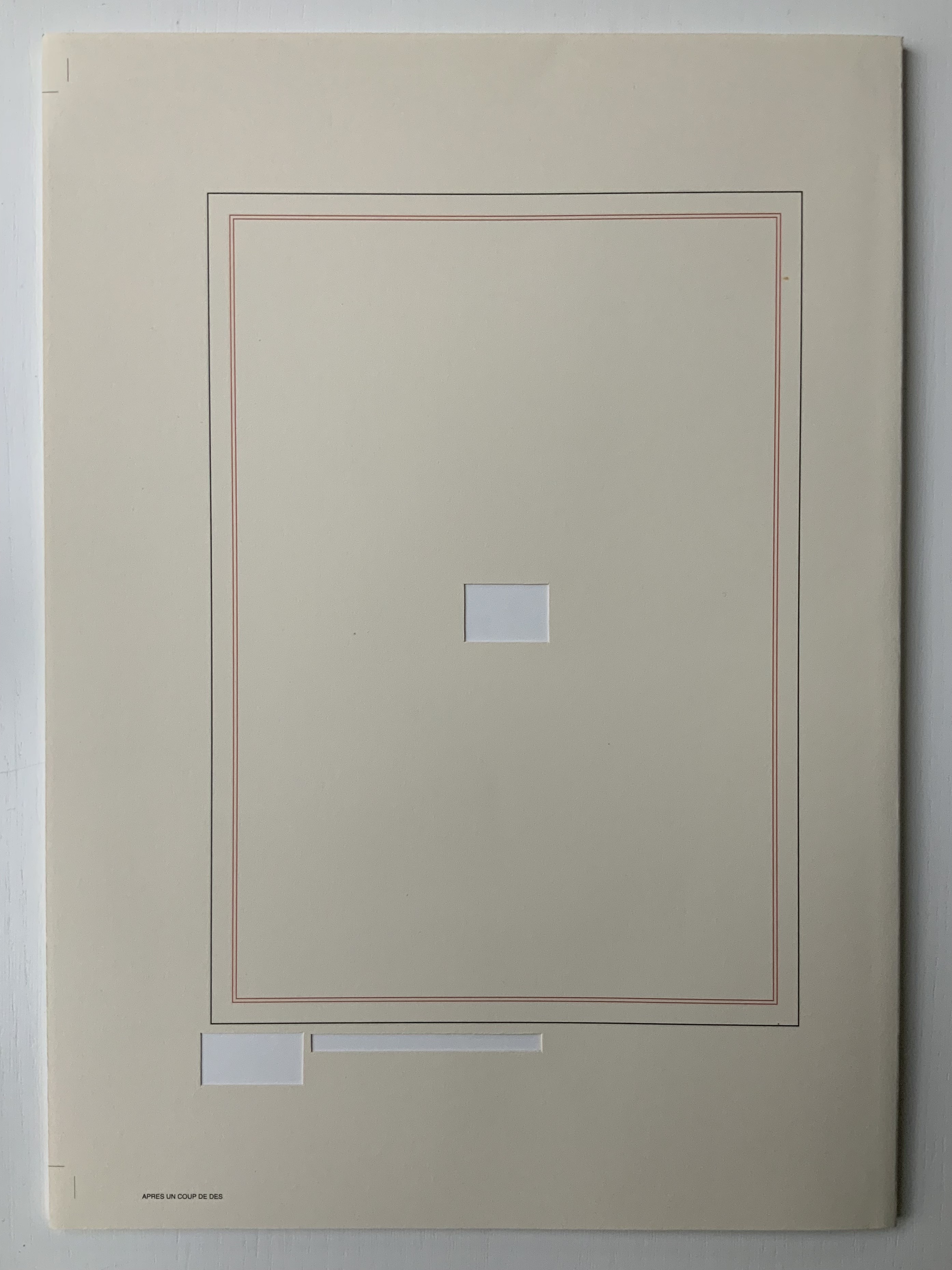
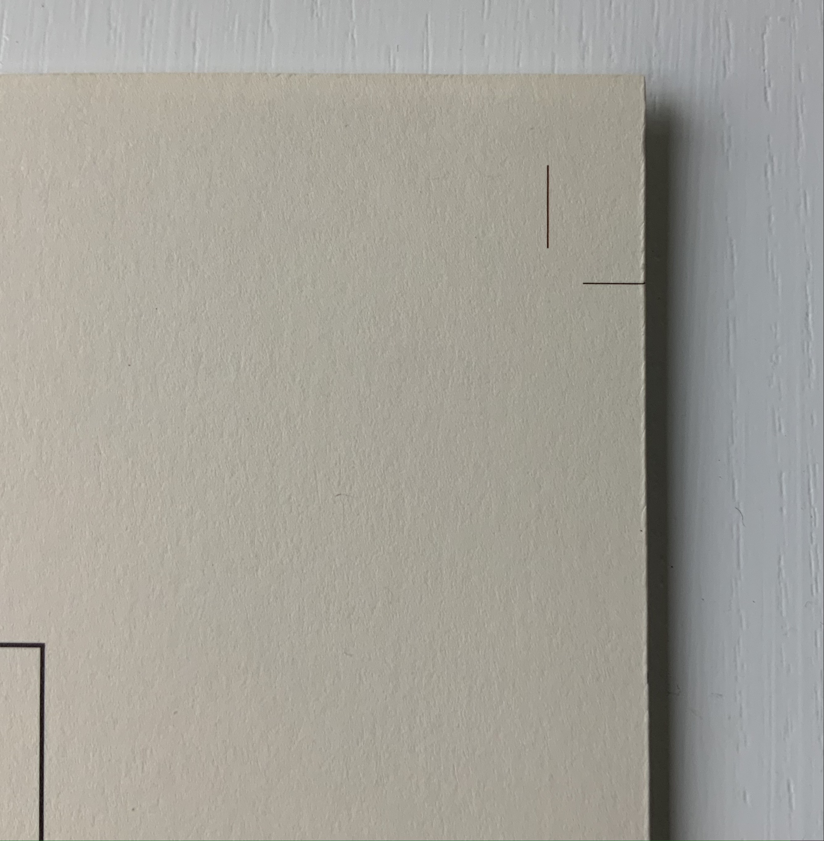
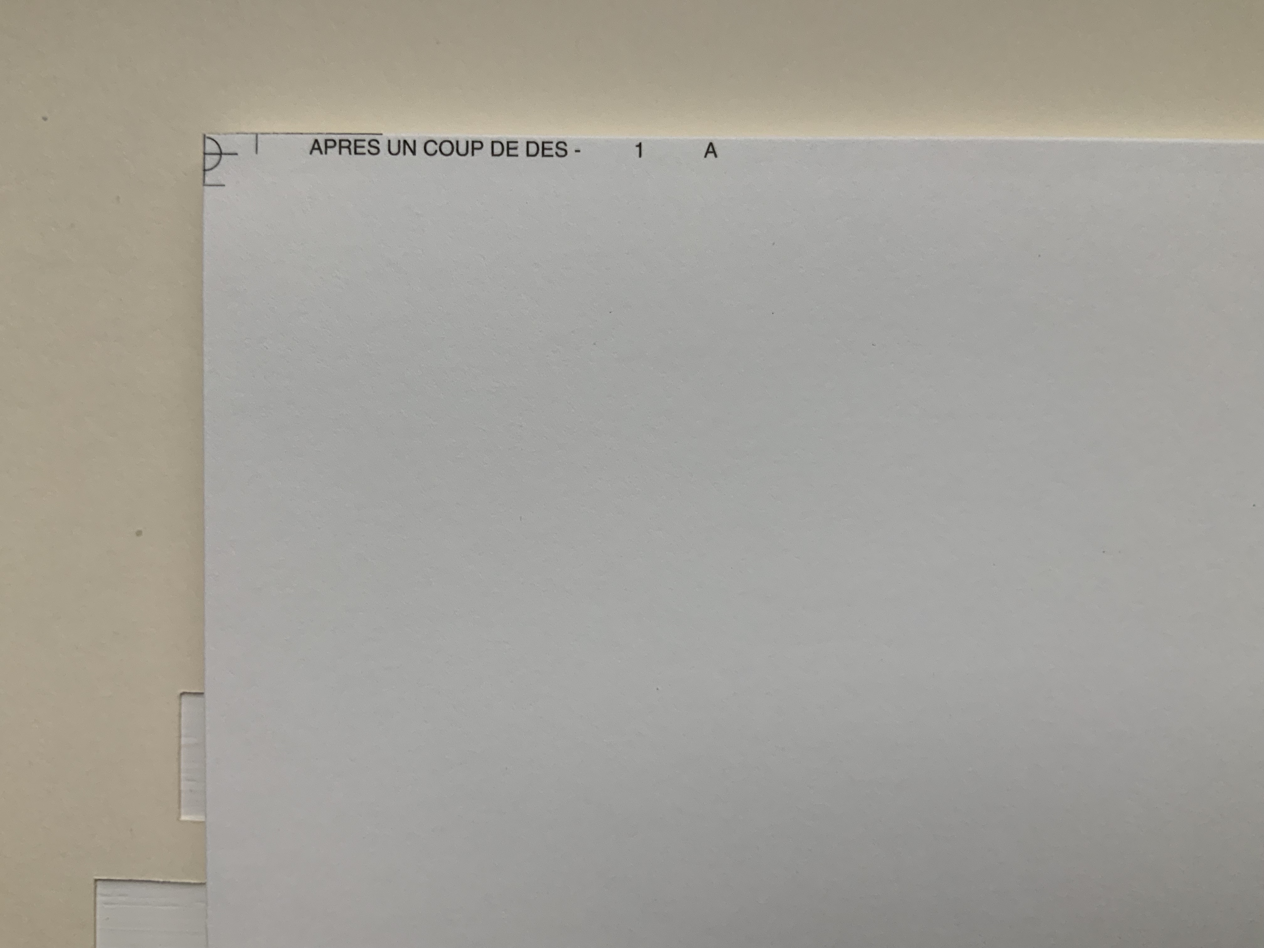
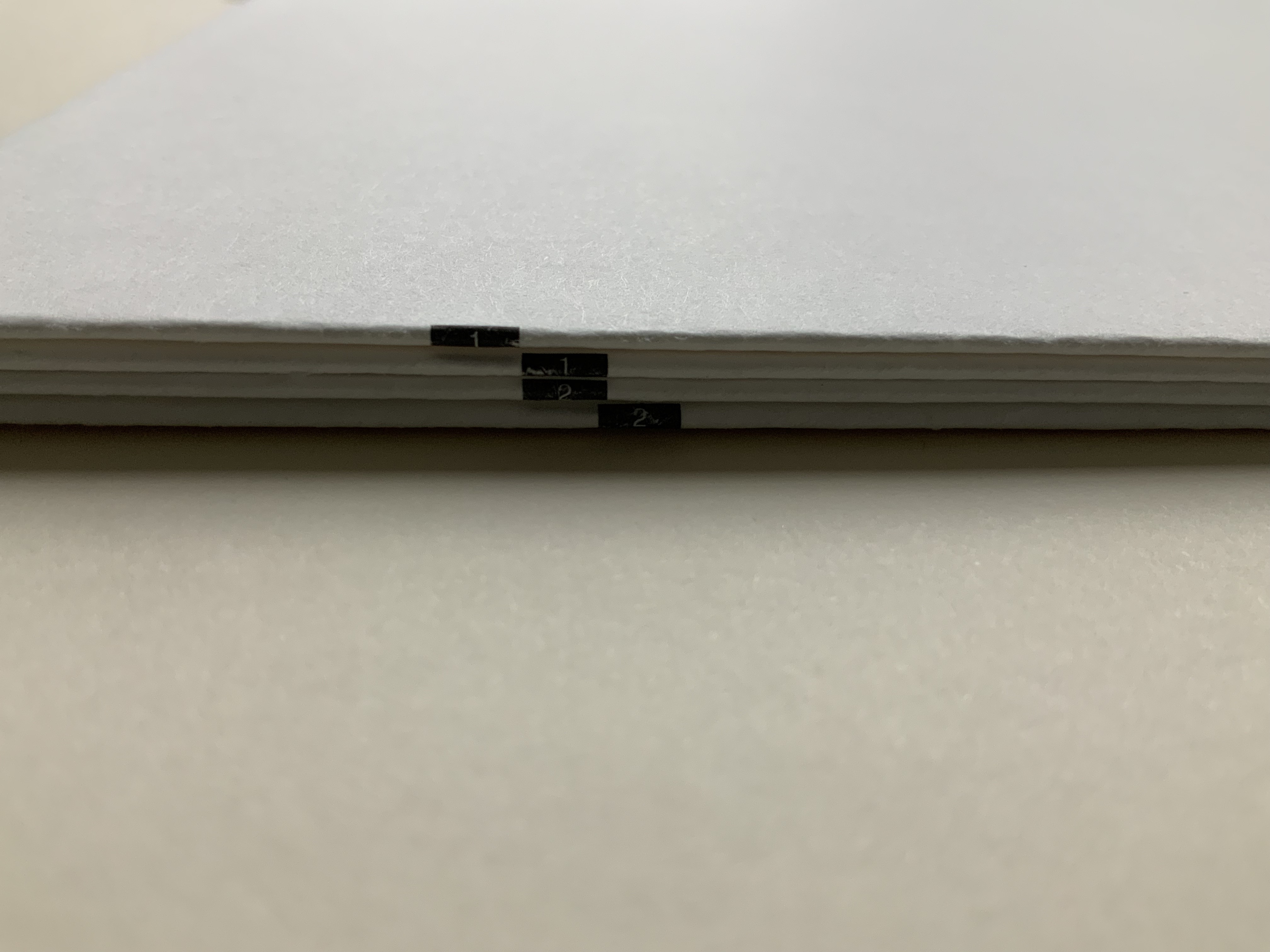
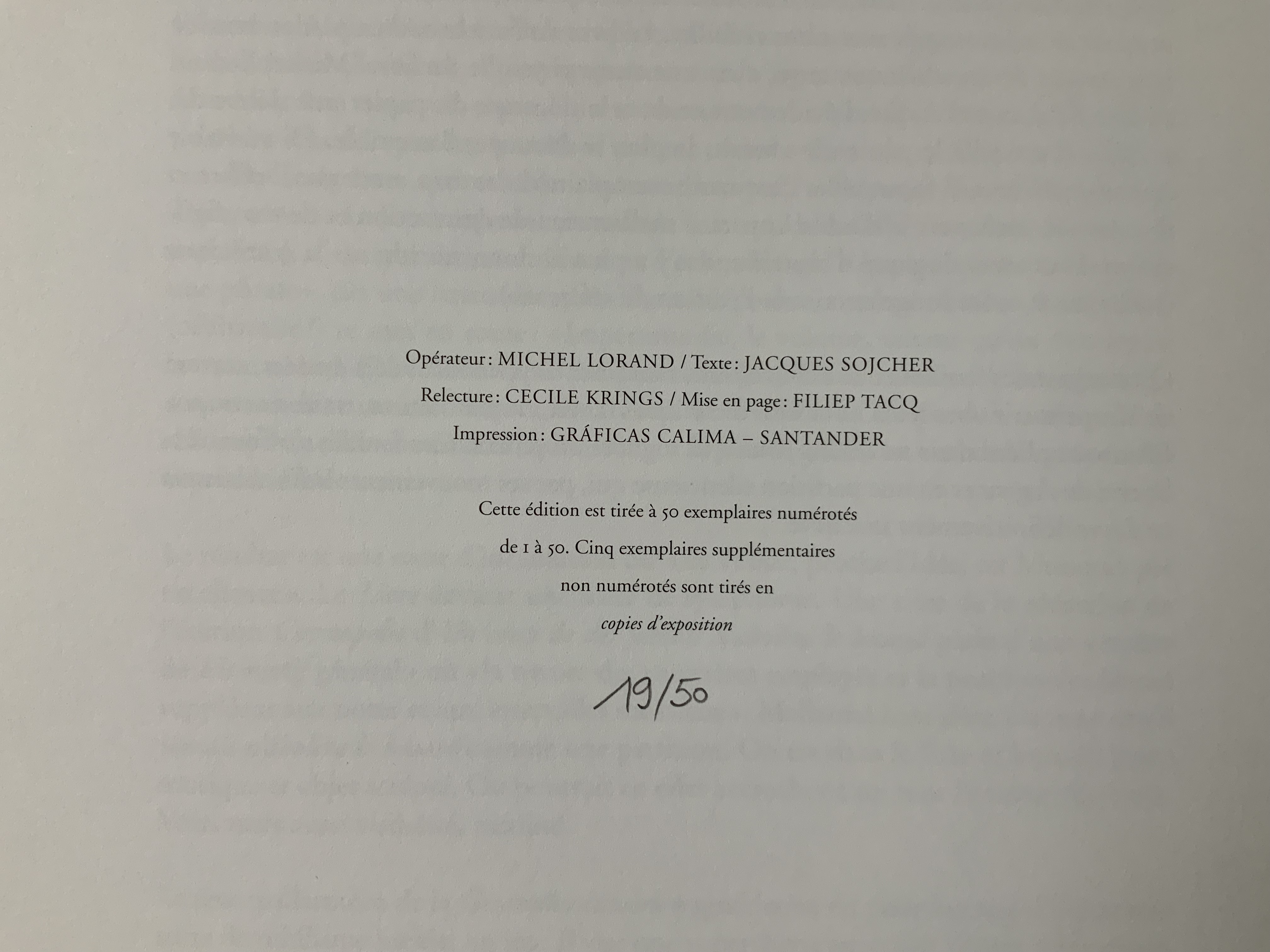
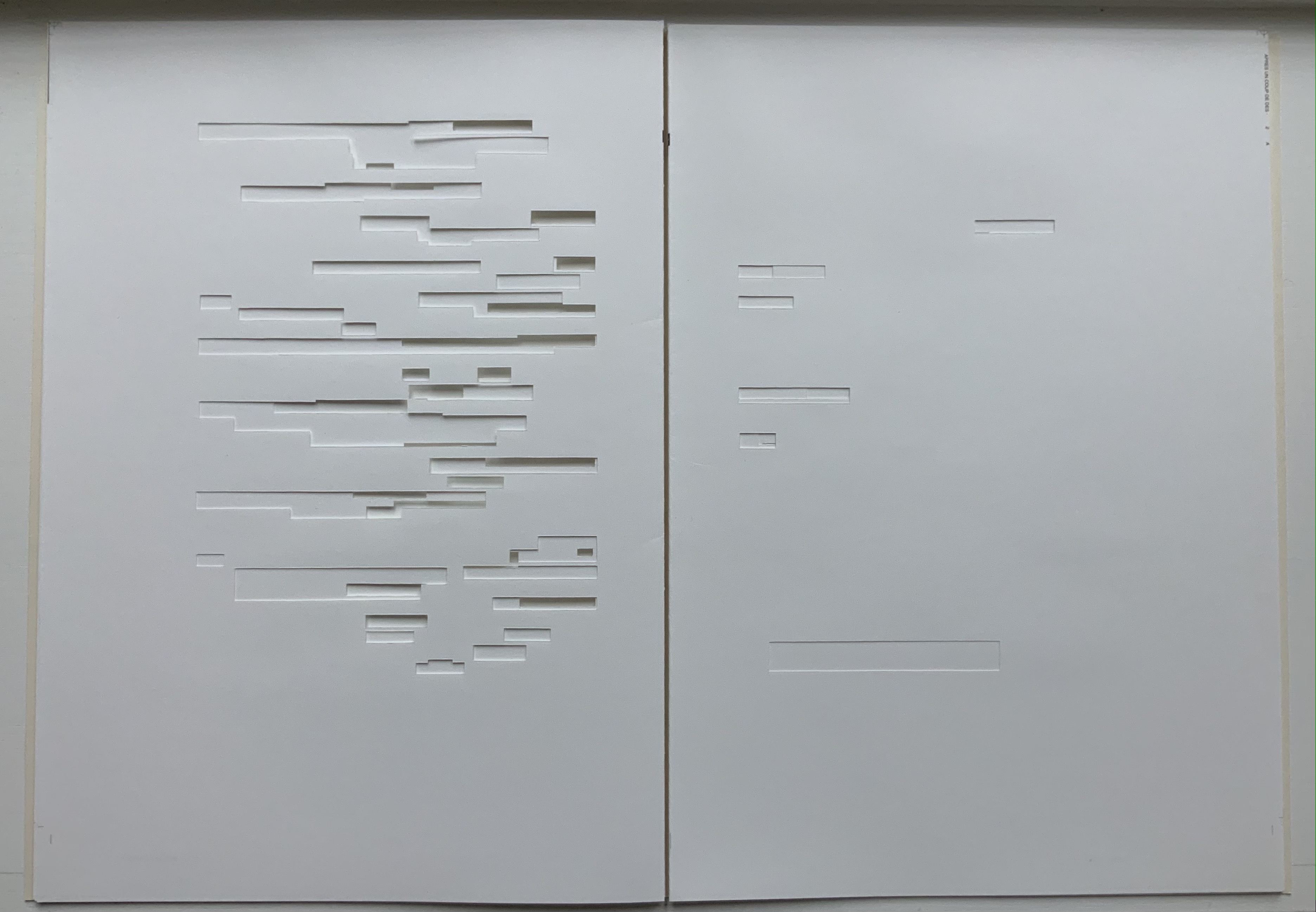
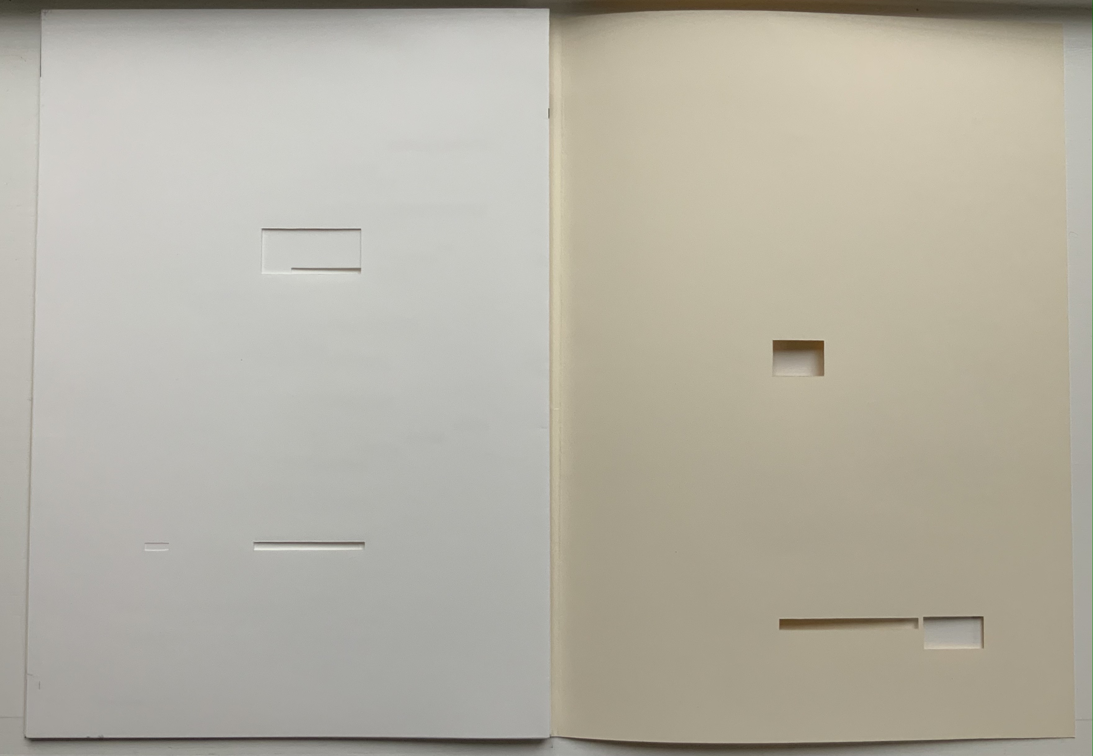
Après Un Coup de Dés (2015) Michel Lorand Cover and gatherings, untrimmed and unbound, in glassine envelope. Cover: H362 x W260; gatherings: H362 x W256 mm; 32 unnumbered pages. Edition of 50, of which this is #19. Acquired from the artist, 22 October 2021. Photos: Books On Books Collection. Displayed with the artist’s permission.
Since the 1960s when Ernest Fraenkel, Mario Diacono and Marcel Broodthaers blotted out the text of Mallarmé’s poem Un Coup de Dés Jamais N’Abolira le Hasard (1897) to create their works of homage, numerous others have expanded on the technique: substituting images of sonograms (Sammy Engramer, 2009) or algorithmically generated abstractions (Eric Zboya, 2018, and Benjamin Lord, 2019), or excising the text (Michalis Pichler, 2008, and Cerith Wyn Evans, 2008) or algorithmically erasing it (Jérémie Bennequin, 2009) — just to name a few.
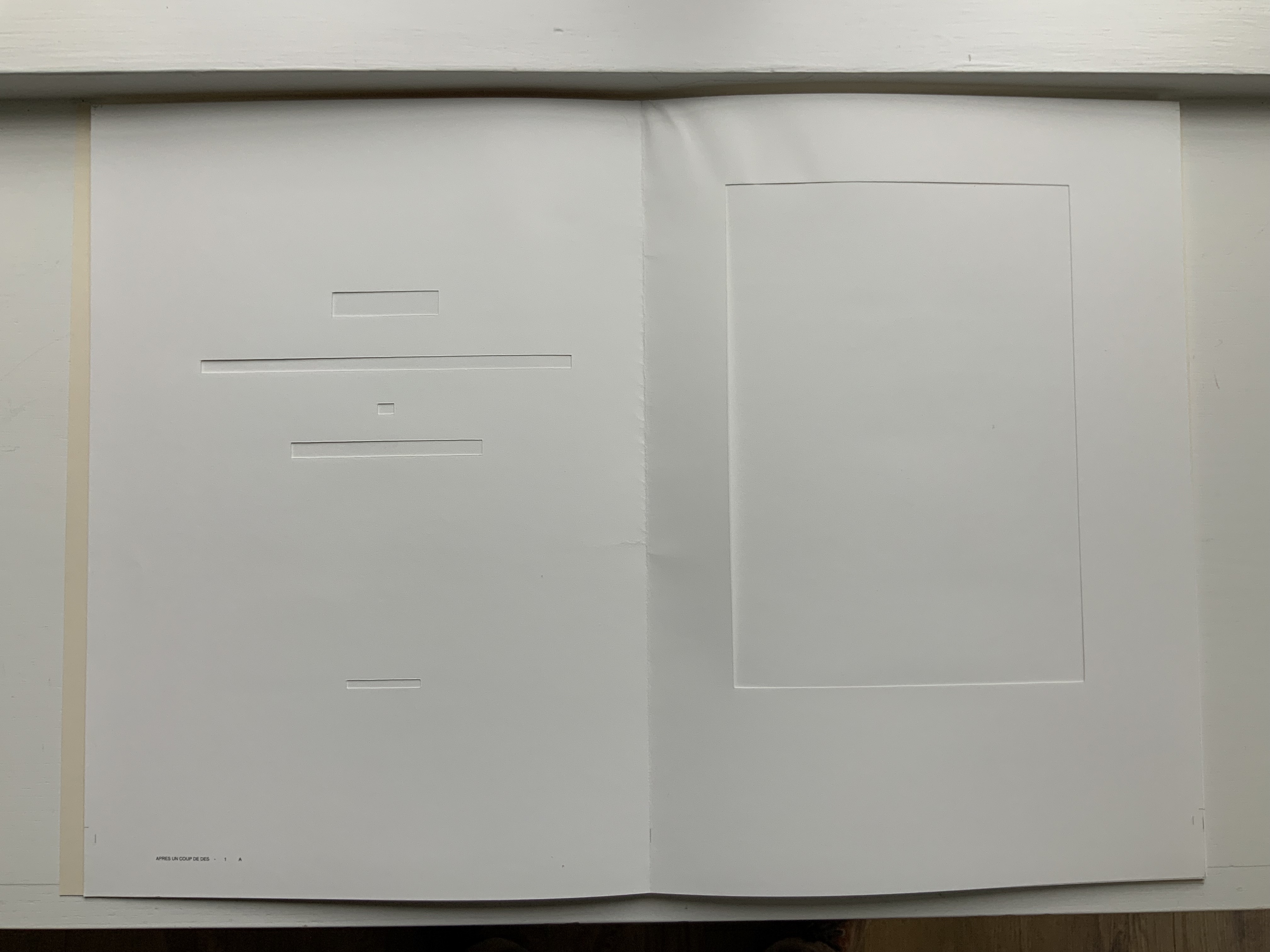
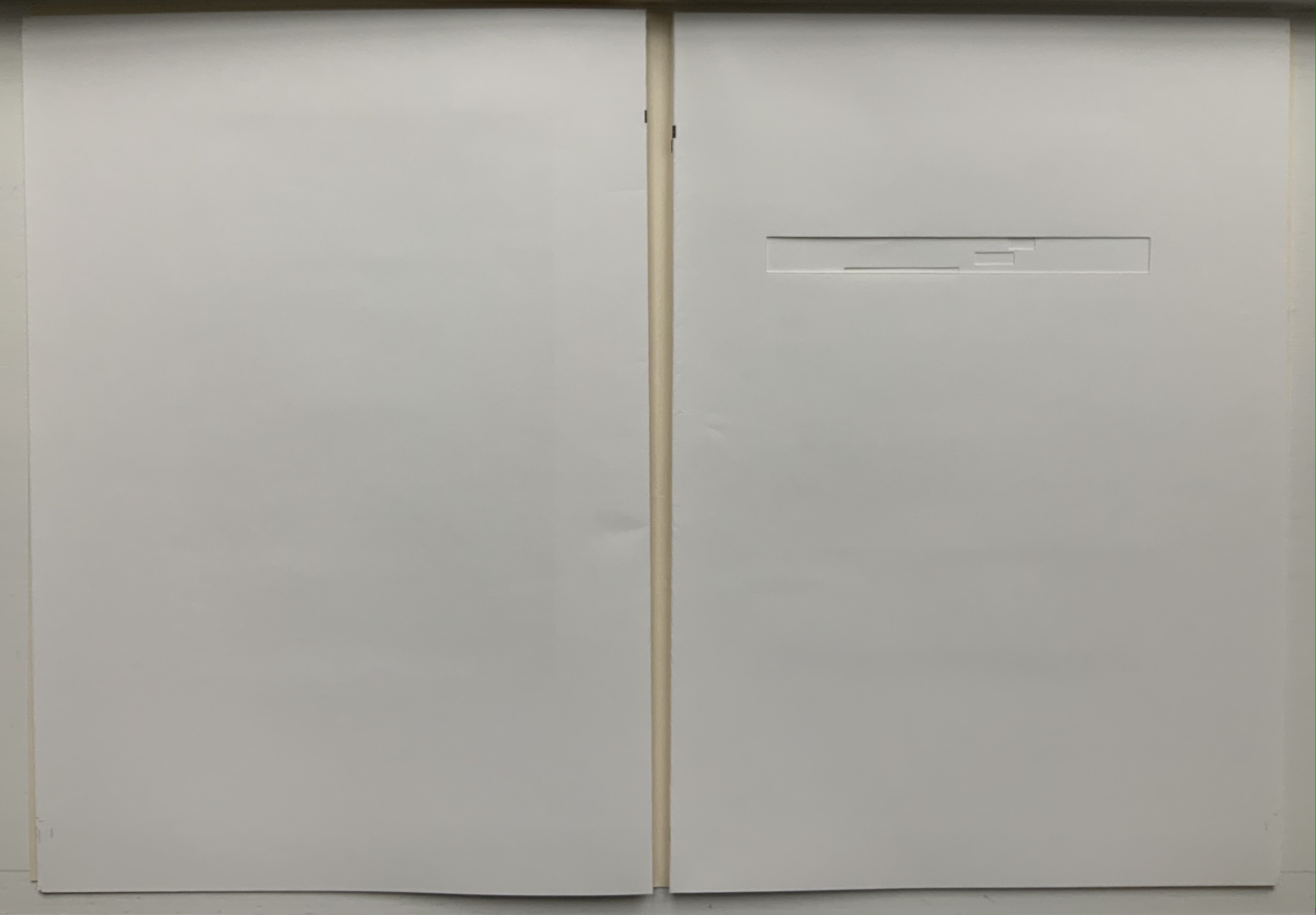
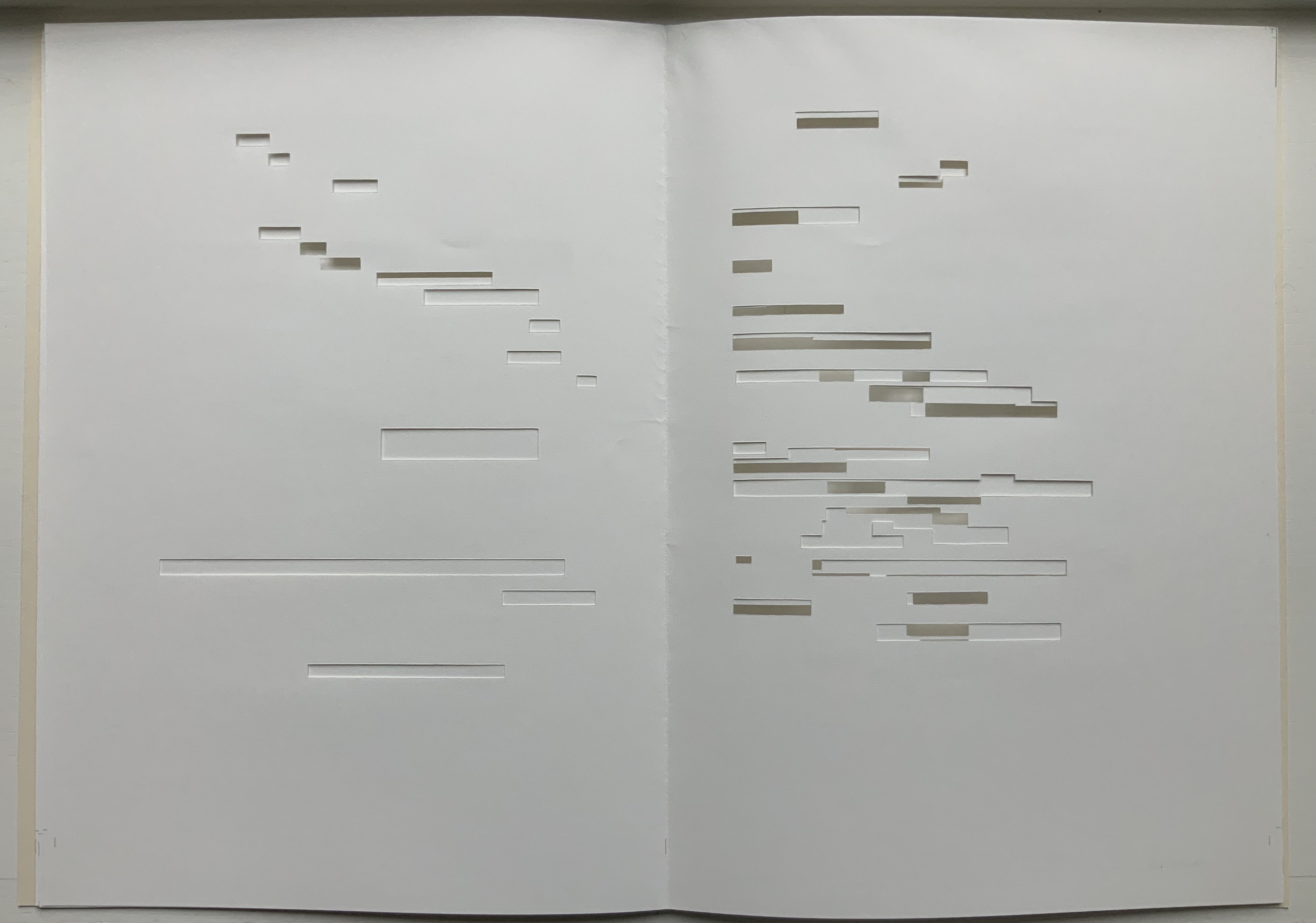
In Après Un Coup de Dés (2015), the only printed marks are the cover’s traditional black and red borders and the printer’s registration and gathering marks on the sheets. Wherever else Mallarmé’s text would have been printed has been excised. In reply to a question about the process involved, Lorand explains that he had asked the designer Filiep Tacq to create a layout that would cover in black exactly the blocks of text as it appears in the current Gallimard book edition of Mallarmé’s poem, including the front and back covers (correspondence with the artist, 1 November 2021). Lorand took a scalpel to the offset printed sheets, removed the blackened blocks, folded the sheets by hand into the four gatherings, assembled them in the correct order and laid them untrimmed and loose inside the cover. Each of fifty copies was placed inside its own handmade glassine envelope along with a flyer including introductory text by Jacques Sojcher (emeritus professor, University of Brussels) and the colophon for the work. It is a book that is not-yet a book.
Lorand’s and all of these other works of homage give us inverse ekphrasis. They are the visual, tactile and conceptual works of art that come after Mallarmé’s text. We are more used to ekphrasis where the object, painting or sculpture comes before the text — like Achilles’ shield before Homer’s description, or the Grecian urn before Keats’ ode, or Brueghel’s Fall of Icarus before Auden’s Musée des Beaux Arts. Homer, Keats and Auden vie with the art of the crafted object to put that object (and more) in front of us with words. With the inverse, the crafted objects vie without the words to put Mallarmé’s poem (and more — and sometimes less!) in front of us.
Many of the hommageurs hint at the “and more” with a subtitle to Un Coup de Dés Jamais N’Abolira le Hasard. With Broodthaers, it is Image; with Pichler, Sculpture; with Engramer, Onde (Wave as in soundwave); and with Bennequin, Omage (as in hommage with the “h” and “m” missing). With Lorand, there is no subtitle. Instead, we have the word après prefacing the truncated title of the poem. But, “after” Mallarmé’s poem, what is Lorand proposing? An homage in the form of something that restates, reproduces the poem but without the words? An homage in the form of something else presented in the manner of Un Coup de Dés but without the words? Or something else that simply occurs after the poem’s roll of the dice? As it turns out, all that and more.
Paul Valèry was probably the first of Mallarmé’s circle to see and hear Un Coup de Dés. His reaction picks out one of the themes that make up Lorand’s “and more”:
It seemed to me that I was looking at the form and pattern of a thought, placed for the first time in a finite space. Here space itself truly spoke, dreamed, and gave birth to temporal forms. Expectancy, doubt, concentration, all were visible things. With my own eye I could see silences that had assumed bodily shapes. Inappreciable instants became clearly visible: the fraction of a second during which an idea flashes into being and dies away; atoms of time that serve as the germs of infinite consequences lasting through psychological centuries — at last these appeared as beings, each surrounded with a palpable emptiness…. there in the same void with them, like some new form of matter arranged in systems or masses or trailing lines, coexisted the Word! — Paul Valéry, Collected Works of Paul Valery, Volume 8: Leonardo, Poe, Mallarmé (1972).
Lorand writes:
My <<Après un Coup de Dés>> introduces a corpus of approaches to what might be “the movement” that constitutes speech: “A language that speaks” as Martin Heidegger calls it (Unterwegs zur Sprache, Verlag Günther Jeske, Pfullingen, FRG, 1959).
How can we think, how can we imagine this movement within language itself? What path to take to allow us to experience this movement, the one that constitutes the word itself. This word is sound. The object of all my work is the identification of what could be the image of this movement, of this word. This exploration attempts to approach the nature of this movement: a word beyond language when the latter is silent. (Correspondence with the artist, 1 November 2021.)
Like his others, Heidegger’s On the Way to Language is a dense book; more than the others, it is poetical, an invitation to experience language. In it is a series of lectures entitled “The Nature of Language” in which Heidegger uses two poems, one by Stefan George and one by Gottfried Benn, to question language about its nature. Although George’s poem is the one that Heidegger deeply explicates, Benn’s is the one that, echoing Valèry, sheds the most light on Lorand’s Après Un Coup de Dés — especially with its last two lines.
A Word
A word, a phrase –: from cyphers rise Life recognized, a sudden sense, The sun stands still, mute are the skies, And compacts it, stark and dense.
A word — a gleam, a light, a spark, A thrust of flames, a stellar trace — And then again — immense — the dark Round world and I in empty space.
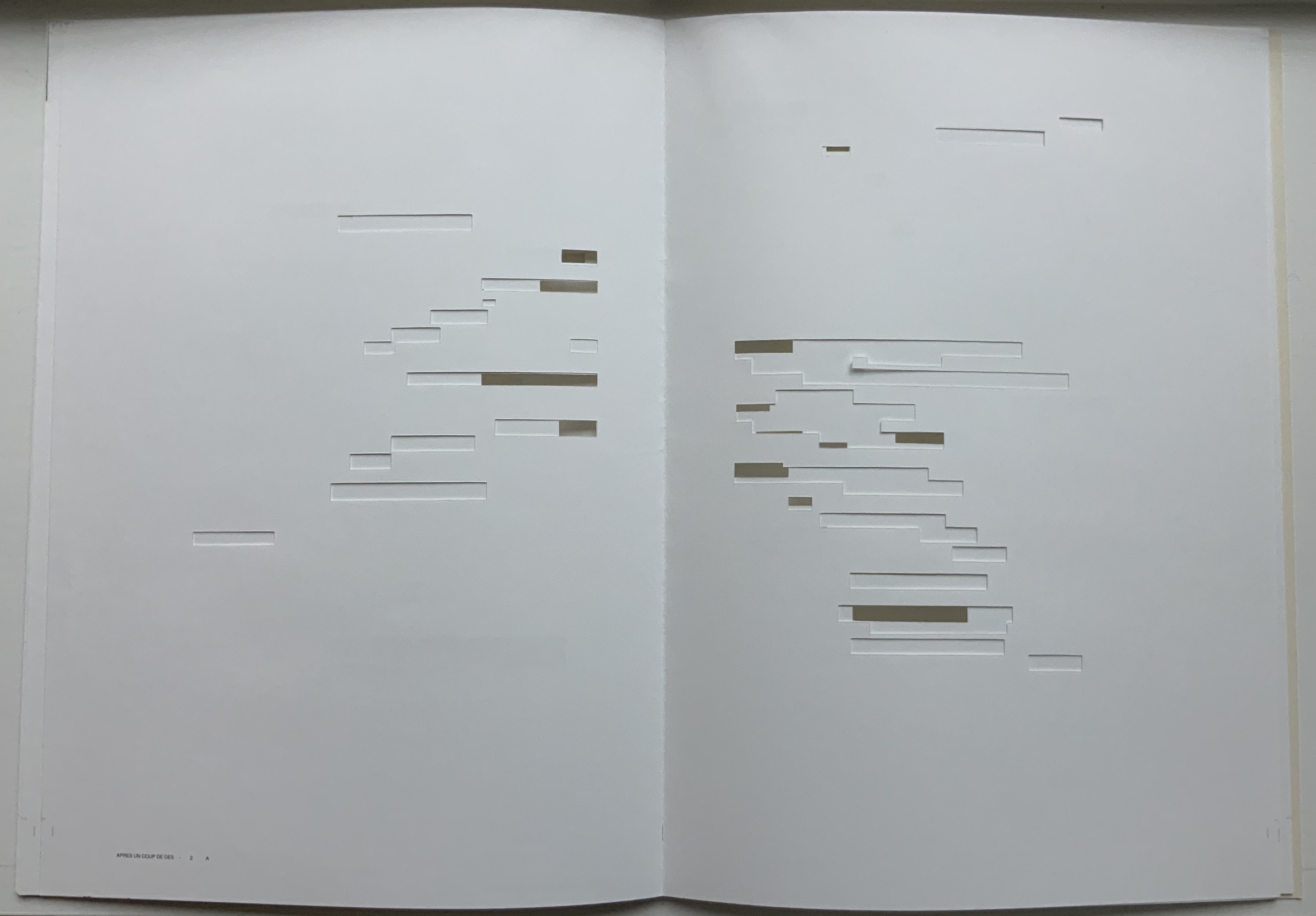
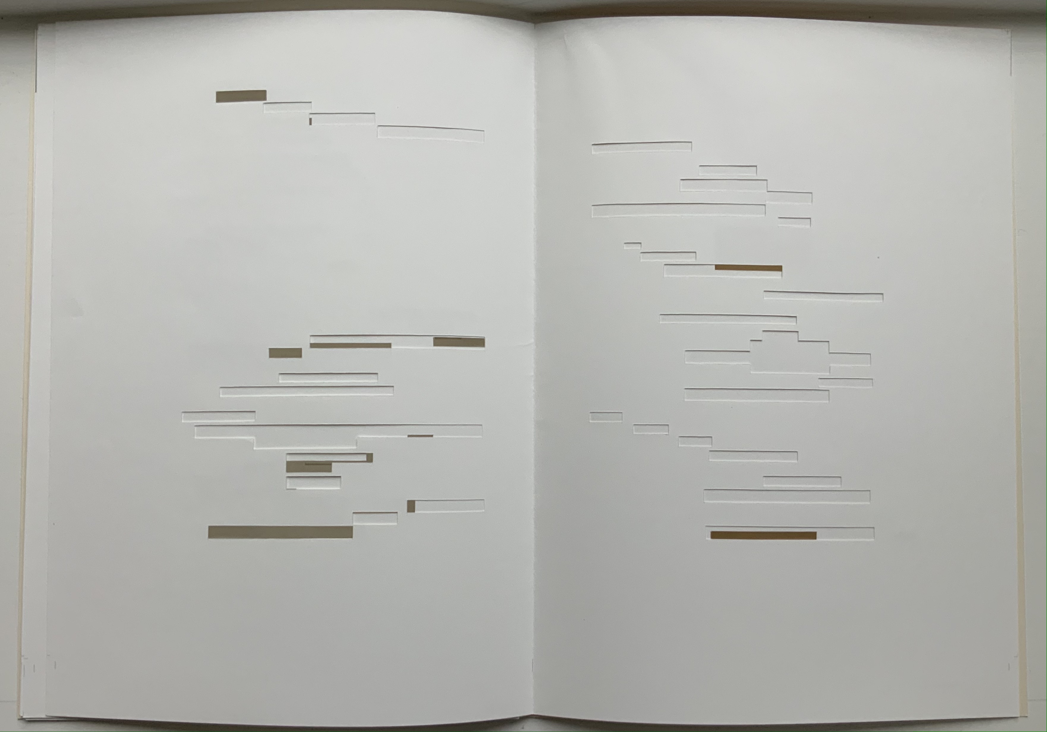
Après Un Coup de Dés seems to be a wordless invitation to experience language. But in a sense, Mallarmé’s words have not disappeared, not entirely. Their shapes — embodied in the voids — move silently and rhythmically across the unfolded sheets; in the gatherings, they cascade over one another much as they do syntactically and typographically in print. And even though the text is not before (in front of) us, Lorand’s artwork delivers a wordless experience of a key paradox of language with which Mallarmé sought to imbue his poem: the language of the void or abyss — the void or abyss of language. One of the ways in which the poem presents this self-enveloping paradox is that it begins and ends with the words un coup de dés, the act that can never abolish chance and the act that all thought emits. Similarly, Après un Coup de Dés displays the presence of language by displaying the absence of language, or les blancs defined by and defining empty space.
Mallarmé’s invitation in Un Coup de Dés, however, beckons us to a slightly different concept of language than that articulated by Heidegger. For Mallarmé, chance plays a prominent role in what Heidegger would call the “neighborhood of poetry and thought”. But chance, hazard or a roll of the dice plays a much less prominent role for Heidegger, and in Lorand’s work of art, with its registration and gathering marks and glassine enclosure, there seems little allusion to it — perhaps naturally so since Lorand’s work comes after the dice have been rolled.
Even though it comes after Mallarmé’s completed poem and after the Gallimard book edition, Après presents as an unfinished work, a book not yet trimmed and bound, which reflects not only Mallarmé’s unfinished realization of the poem as a book but also his unfinished life’s pursuit: le Livre, the thing in which everything in the world would end up — the thing that, by virtue of a spacious mobility of typographic layout and the interplay of its elements, would be “the total expansion of the letter”. Lorand’s attention and manual precision in excising the blackened blocks where the text would otherwise appear evoke Mallarmé’s attention to the minute details of typeface, size and font shown in his handwritten mark-up of the proofs for the book edition he was planning before he died.
Après also comes after the efforts of Broodthaers and Pichler, both of whom organized exhibitions for their works of homage. In fact, Pichler paid homage to Broodthaers by naming his exhibition “Pichler: Exposition Littéraire autour de Mallarmé” (Milan, December 2016) after “Broodthaers: Exposition littéraire autour de Mallarmé” (Antwerp, December 1969). Pichler’s exhibition was also daring in its exposure of the works to the visitors.
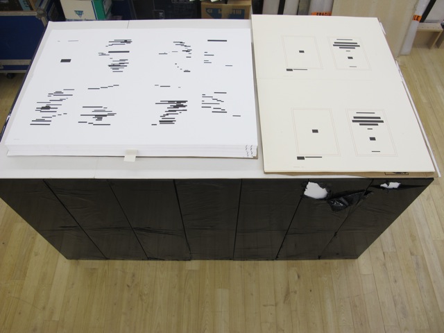
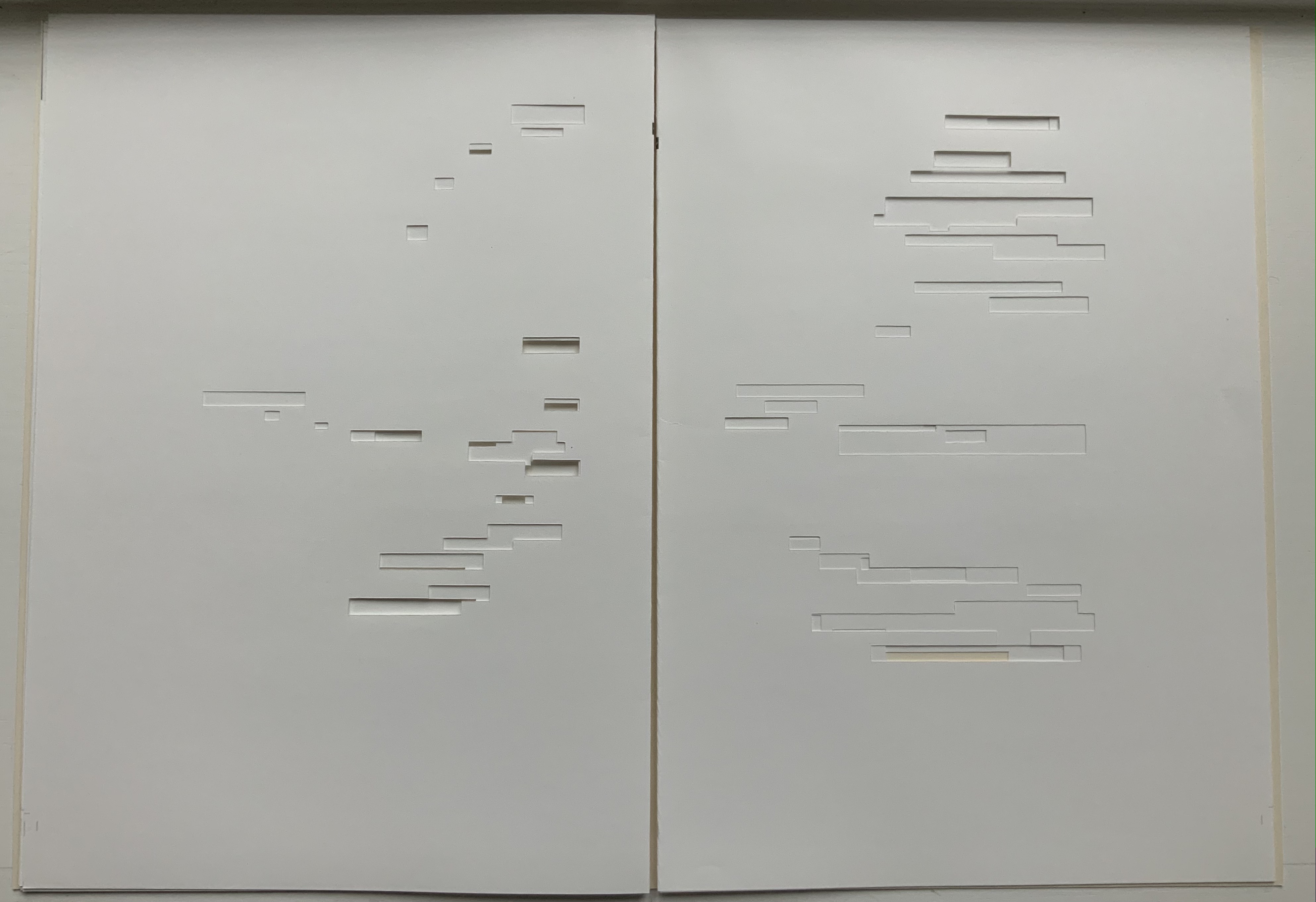
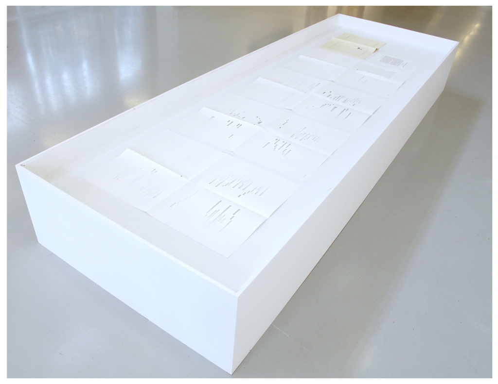
In the 2018 display of Après Un Coup de Dés, the previously gathered but now unfolded sheets and cover lie side by side under glass. Often this is cause for complaint about the distanced display of artist books. In the case of Après Un Coup de Dés, the distance effectively draws point-blank attention to what the privileged reader gradually discovers in handling the work. The unprivileged reader may have to imagine the making, unmaking and remaking of the book but, confronted with the gestalt of the undone gatherings and their registration marks, that reader immediately sees/witnesses the void defined by a void.
Après Un Coup de Dés in the group exhibition Reading Hand Writing Bodies at Les Abattoirs de Bomel, Centre d’art de Namur, Belgium, 8 February – 11 March 2018. Photo: Courtesy of the artist.
In relation to Broodthaer’s Image and Pichler’s Sculpture, Après comes both before and after. The positioning of the words après, image and sculpture vis à vis the poem’s title has been noted already. Of all three visual, tactile and conceptual works, Lorand’s stands as the chronologically “after” yet unfinished “before” to Broodthaers’ and Pichler’s finished works. In yet another “afterness” to Mallarmé’s poem, Lorand likens Après to a silent score of music or a piano roll (correspondence with the artist, 1 November 2021). This echoes — if that is not too perverse a verb — Mallarmé’s reference to “score” in his preface to Un Coup de Dés. In premonitory, if not coincidental, irony, Lorand’s piano-roll-like 2015 work precedes a work that Michalis Pichler created for his 2016 Milan exhibition: a piano roll playable on a foot-pumped pianola and entitled Un Coup de Dés Jamais N’Abolira le Hasard: Musique (see video above).
The interplay of its philosophical roots with its mechanically produced print and its manual cuts makes Lorand’s AprèsUn Coup de Dés one of the more challenging works of homage to Mallarmé’s poem. To “hear” it side by side with the others in the Books On Books Collection (see below) is rewarding.
Further Reading
“Derek Beaulieu“. Books On Books Collection. 19 June 2020.
“Eric Zboya“. Books On Books Collection. 01 June 2020.
Heidegger, Martin, and Peter D. Hertz, trans. 1959/2009. On the Way to Language. San Francisco: HarperOne. Reprint. “No matter how we put our questions to language about its nature, first of all it is needful that language vouchsafe itself to us. If it does, the nature of language becomes the grant of its essential being, that is, the being of language becomes the language of being” (p. 72).