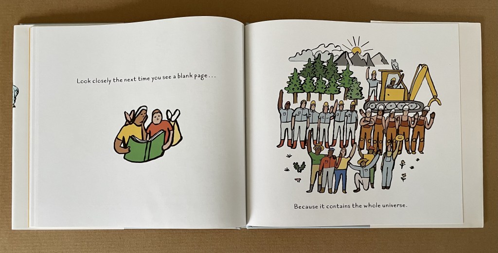
The most beautiful and perfect book in the world is a book with only blank pages, in the same way that the most complete language is that which lies beyond all that the words of a man can say. Every book of the new art is searching after that book of absolute whiteness, in the same way that every poem searches for silence. — Ulises Carrión: “The New Art of Making Books” Kontexts no. 6-7, 1975.
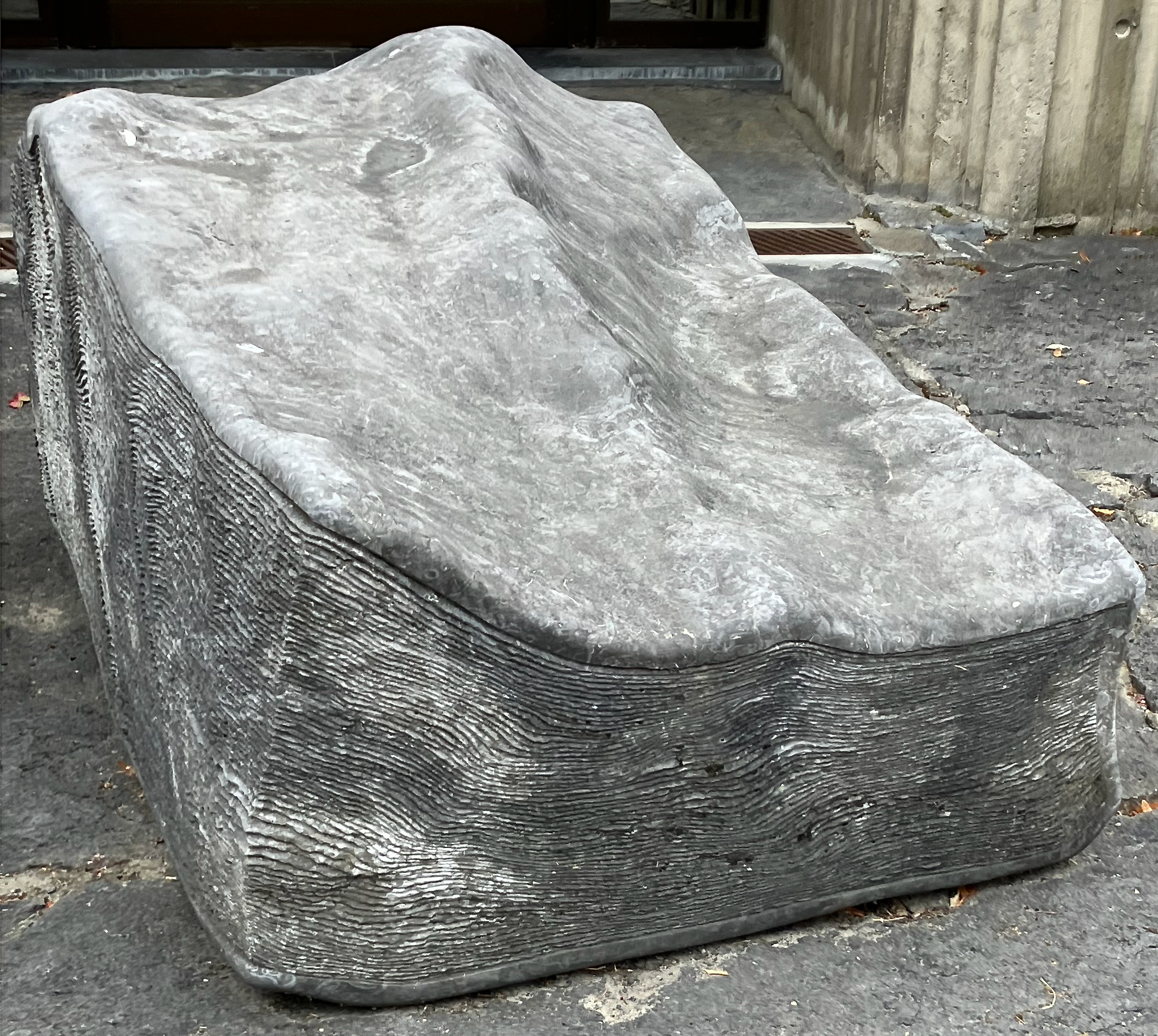
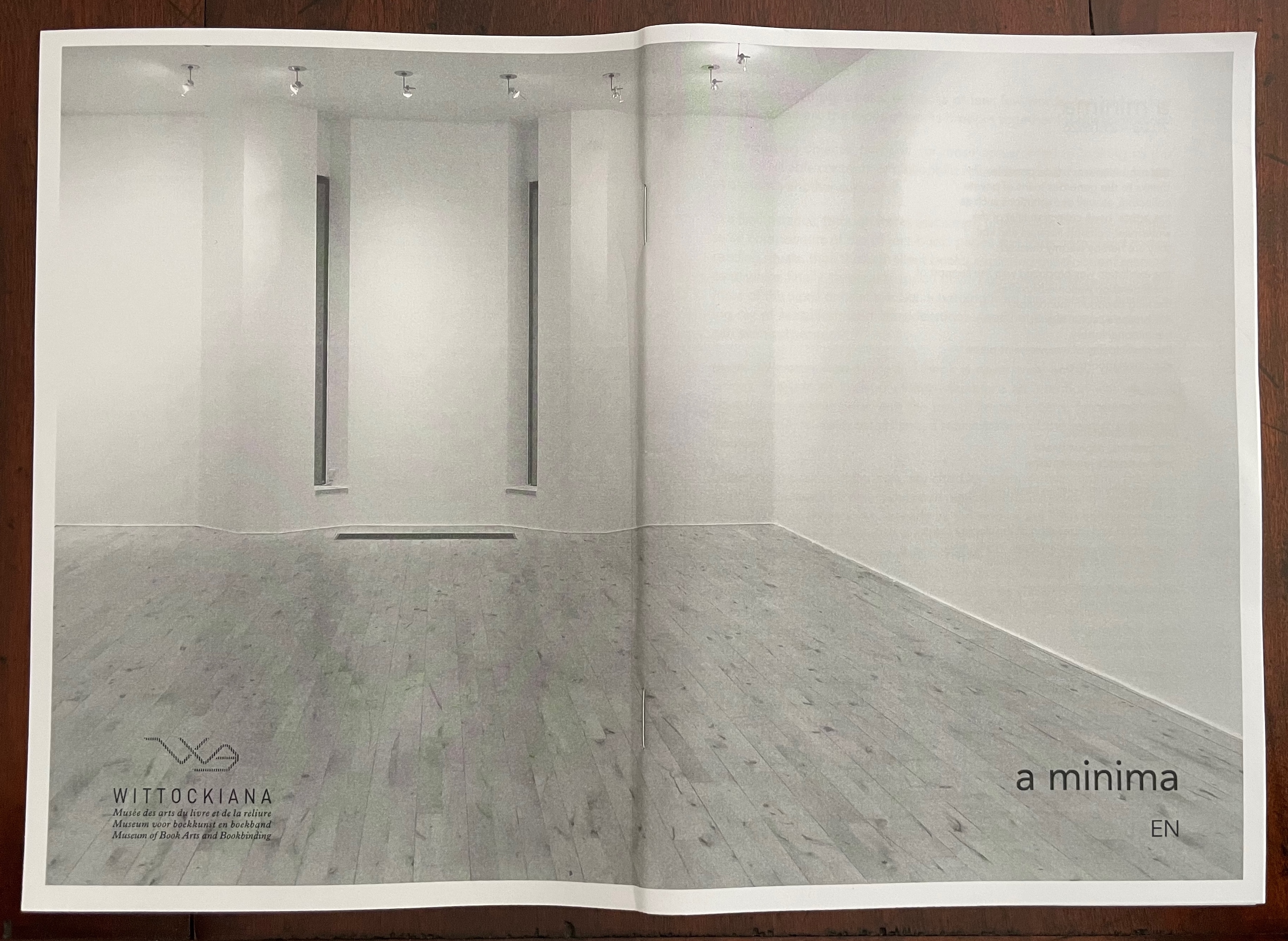
At the entrance to The Wittockiana. Back and front cover of the a minima catalogue.
If, as I did, you missed Moritz Küng‘s exhibition Blank. Raw. Illegible… Artists’ Books as Statements, 1960-2022 at the Leopold-Hoesch-Museum in Düren, Germany, in 2023, Didier Decoux‘s a minima presents an equally well-thought-out gathering of artists’ books that stretches out over 150 years (1876 – 2026). With 4 spacious rooms, 25 vitrines, 2 videos, and over 180 works, a minima requires several hours at a minimum to peruse and enjoy. Information on getting there is available here.
The comments and links below are in no way a substitute for visiting this exhibition, and keep in mind that Wittockiana also has permanent displays of presses, rare fonts, and books that should not be missed.
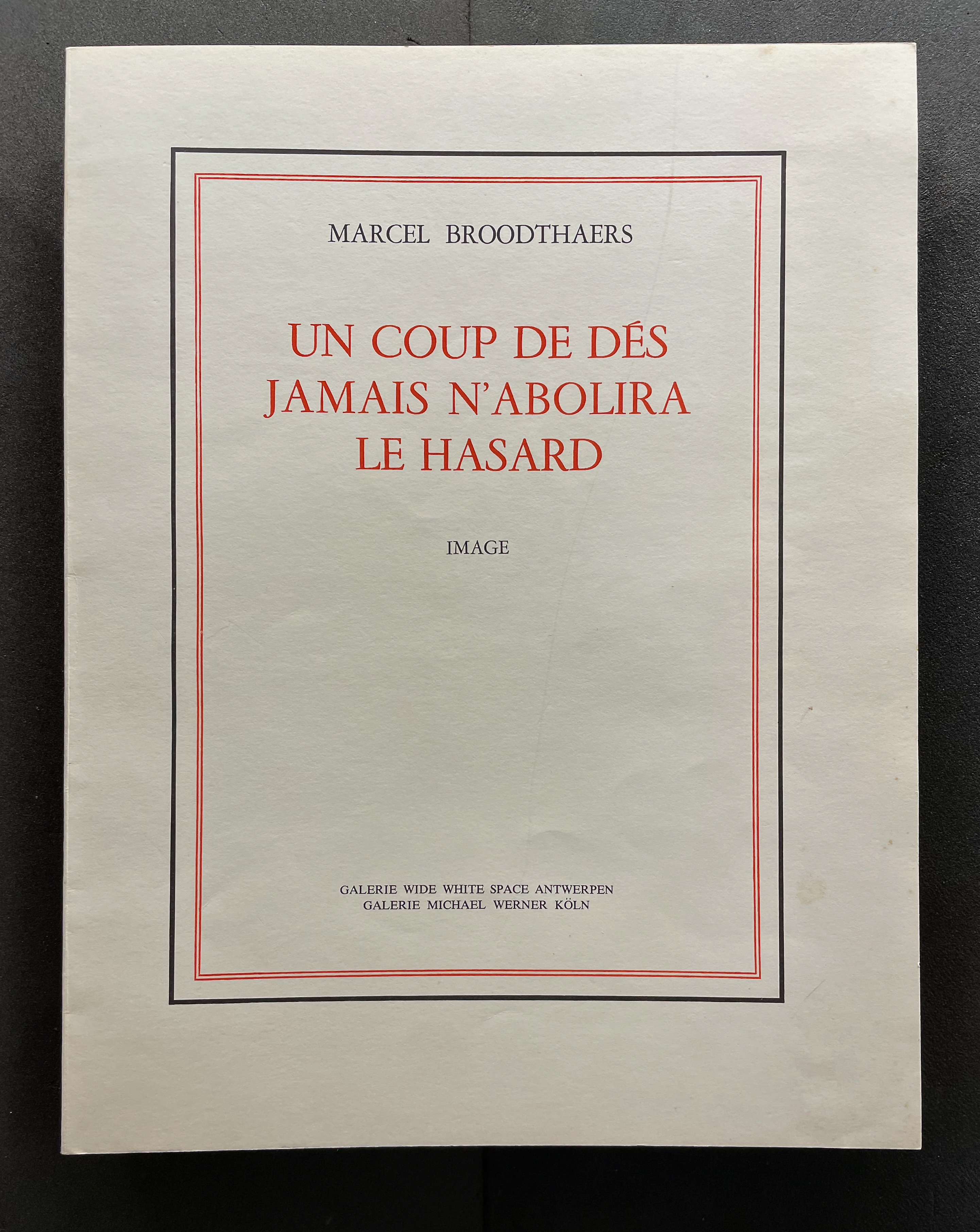
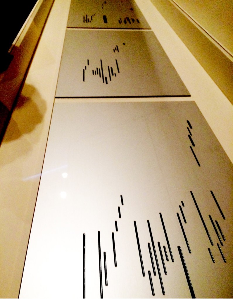
The story goes that in 1945 or 1946 René Magritte gave Marcel Broodthaers a copy of Mallarmé’s poem Un Coup de Dés Jamais N’Abolira le Hasard: Poème (1914). Twenty-three or twenty-four years later, Broodthaers organized an exhibition in homage to the poem. Entitled Exposition littéraire autour de Mallarmé: Marcel Broodthaers à la Deblioudebliou/S (“Literary exhibition around Mallarmé at the Deblioudebliou/S”), it presented three versions of an appropriation of the poem. The three versions consist of ten copies numbered I-X on anodized aluminum, ninety copies numbered 1-90 on transparent mechanographic paper (the original edition), and three hundred copies on opaque paper (the catalogue edition).
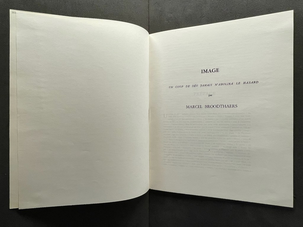
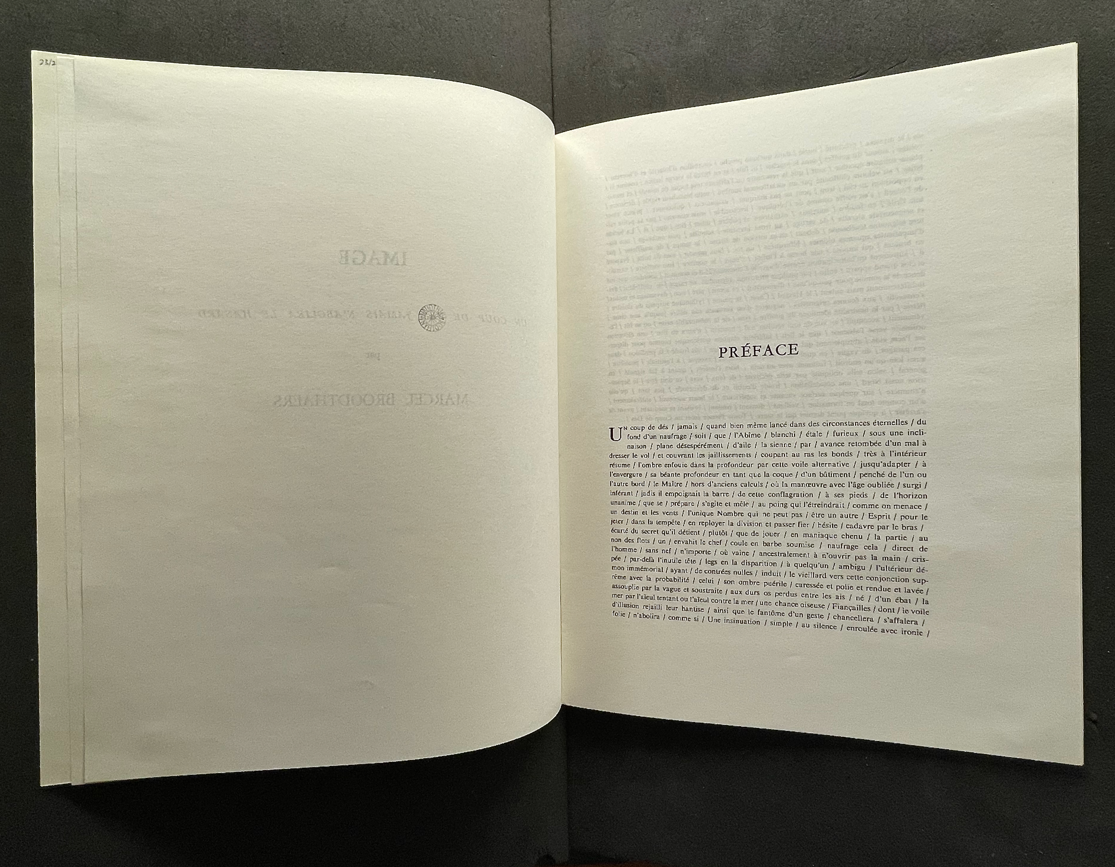
On Broodthaers’ cover, the word Image occupies the same space as Poème on the cover of the 1914 edition arranged by Mallarmé’s son-in-law. On the title page, however, Image comes first and in type larger than the poem’s title beneath it. The poem’s title is even smaller that Broodthaers’ name. Already this promises to be a bold appropriation of Mallarmé’s poem.
When the poem first appeared in the May 1897 issue of Cosmopolis, Mallarmé reluctantly provided a preface at the editors’ request. So reluctant was he that the preface urges readers not to read it. Broodthaers obliges. He displaces all of Mallarmé’s dismissive text with the poem’s entirety in a justified block of type with the line breaks indicated by slashes. Until the colophon, that will be the only legible text to appear in this homage.
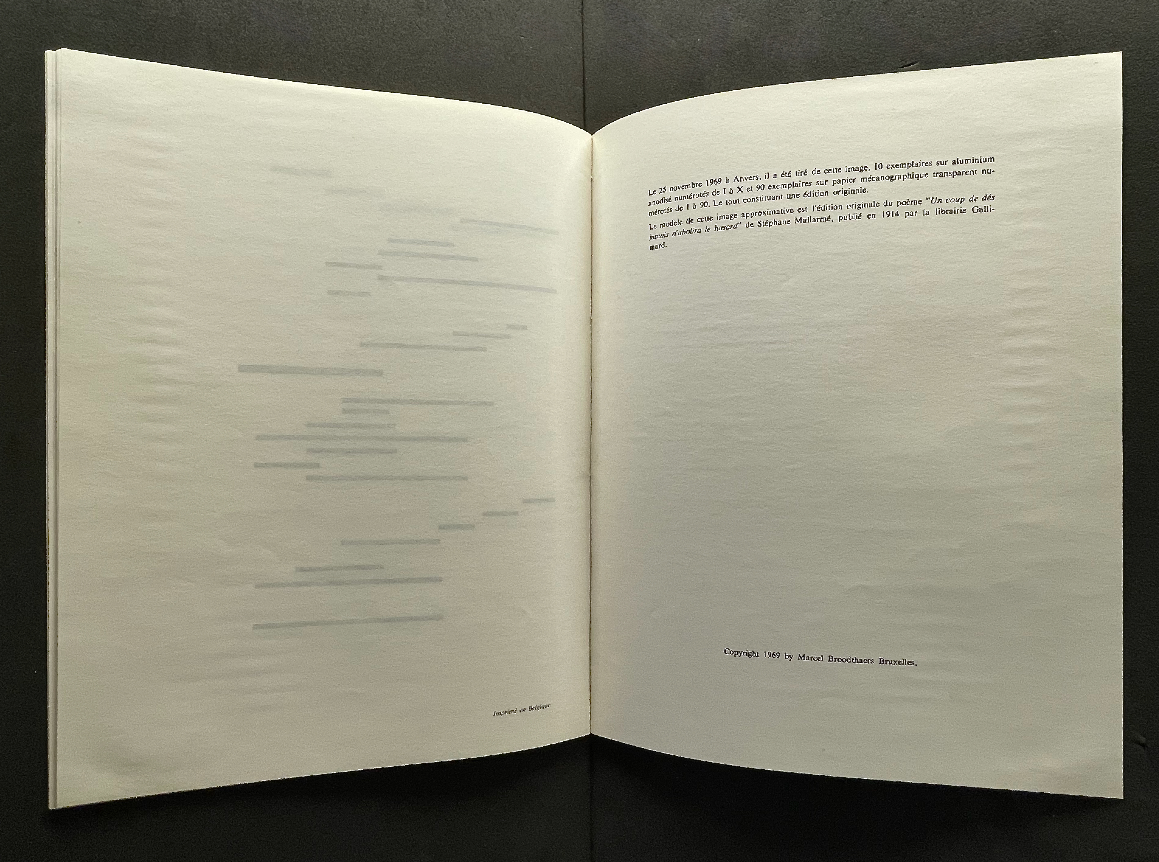
“Le modèle de cette image approximative est l’édition originale du poème ‘Un coup de dés jamais n’abolira le hasard’ de Stéphane Mallarmé, publié en 1914 par la librairie Gallimard.” Books On Books Collection.
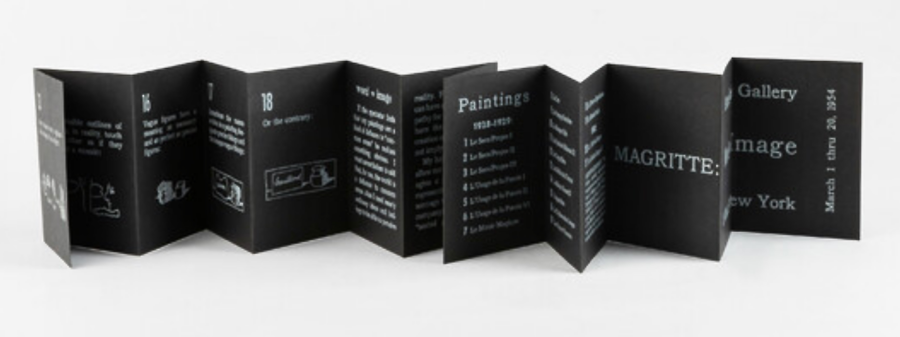
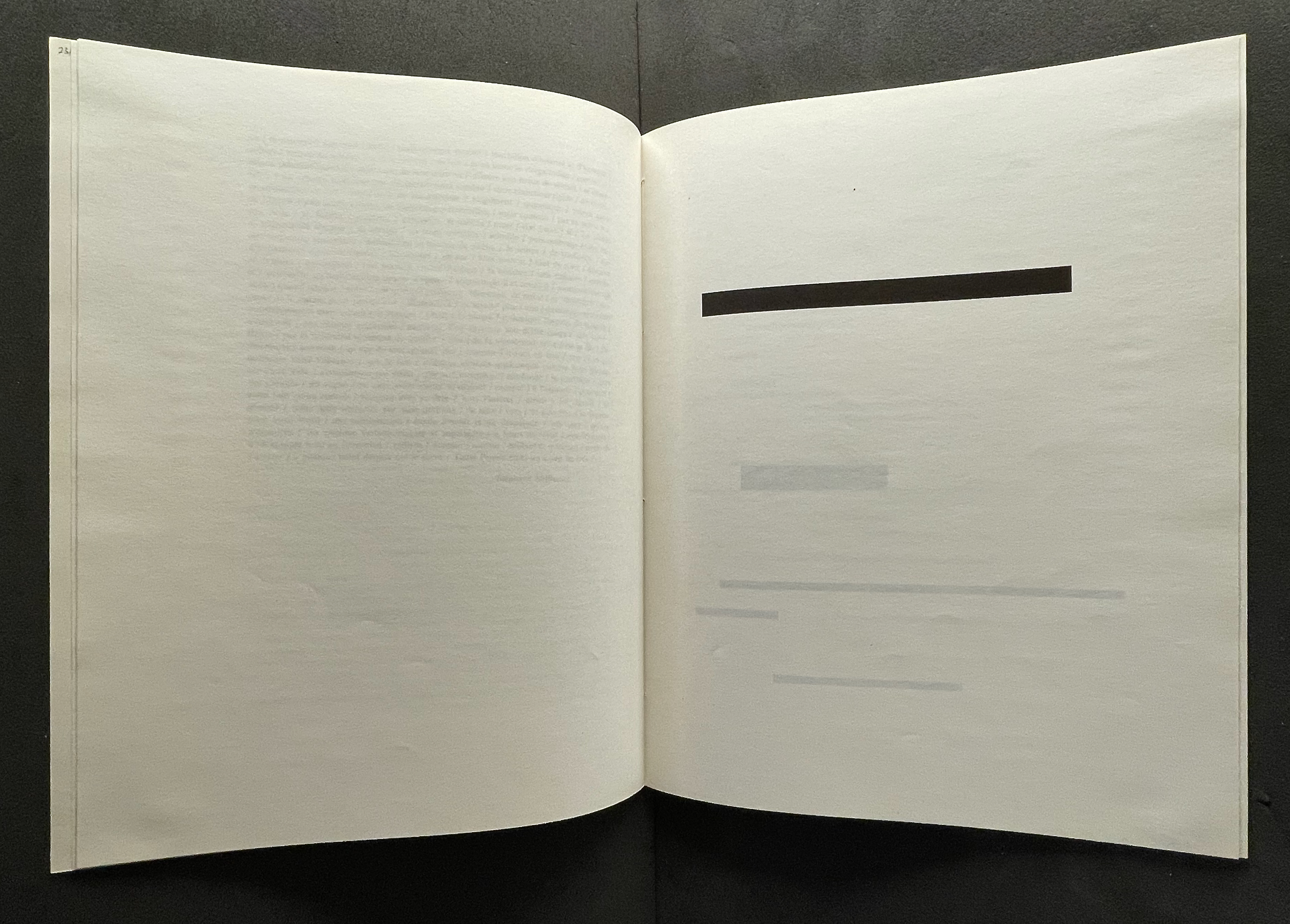
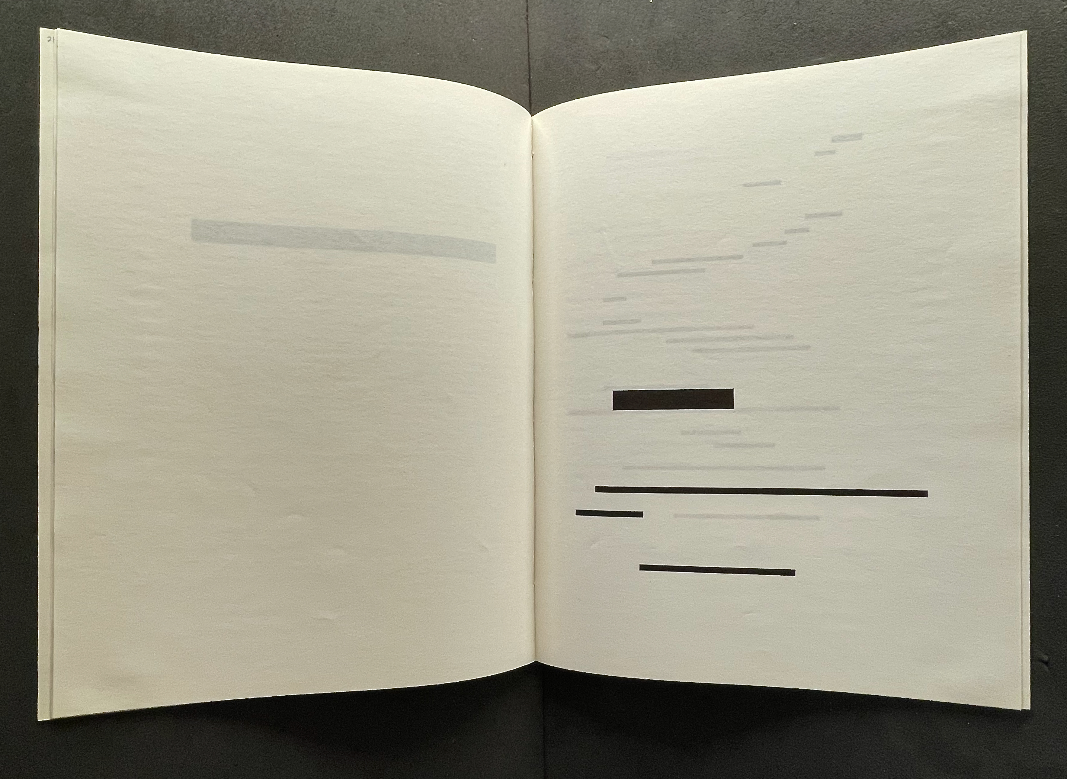
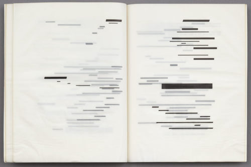
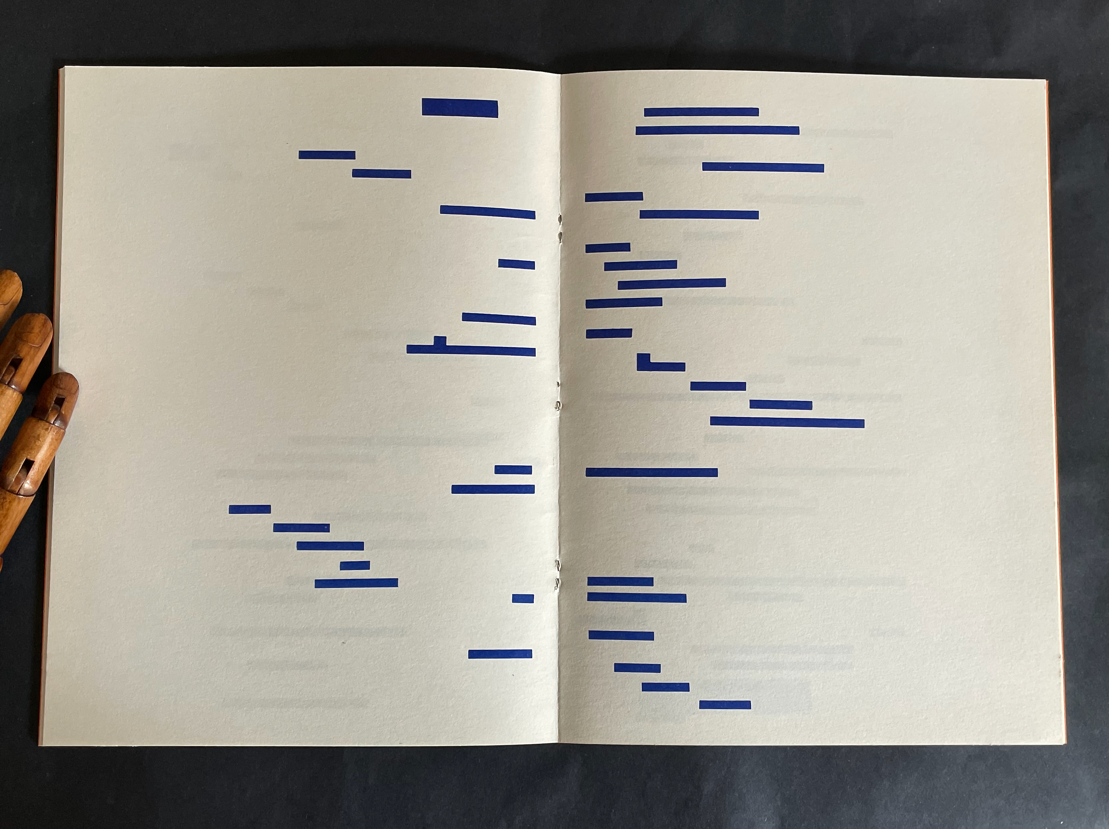
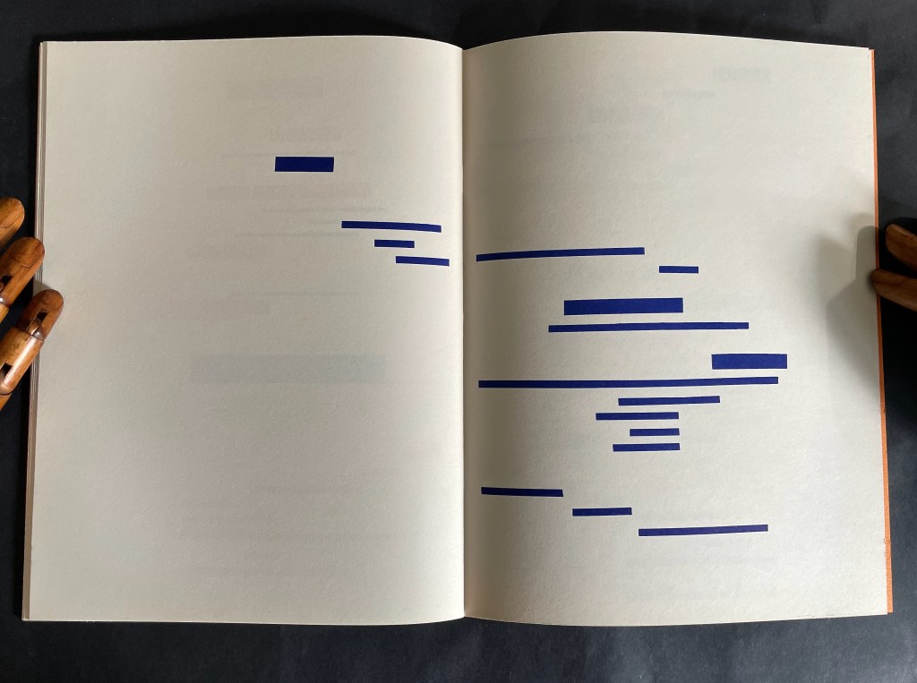
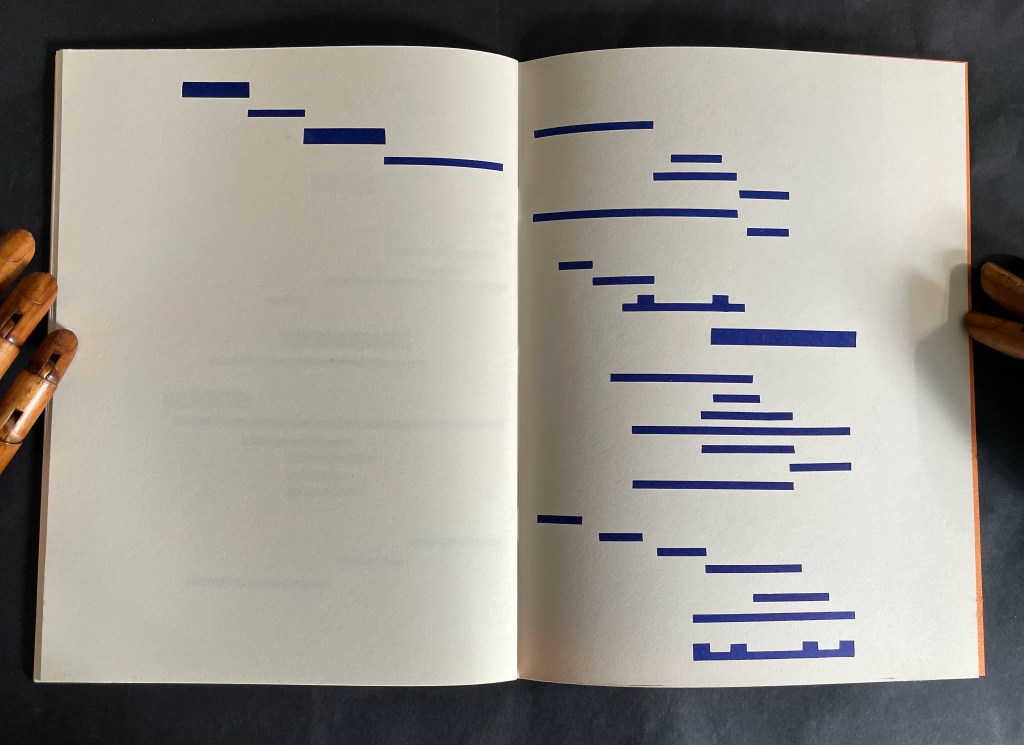
Between these two islands of text, Broodthaers offers his “image” of the poem: printer’s leading of the same dimensions as the types in the original edition of the poem. The image is the homage. In light of Magritte’s poster-essay “Les mots et les images” (1929) and its translation and appearance as an accordion-formatted catalogue for the Sidney Janis Gallery’s Magritte show in 1954, Broodthaers could equally have been paying homage to Magritte.
Top: Printer’s leading redacts “UN COUP DE DÉS”. Bottom: The leading redacts “JAMAIS” and the next three lines, which were set in smaller type. Books On Books Collection.
The other two versions were materially even more striking, and with the rest of the elements in play in the Wide White Space Gallery, Broodthaers made an innovative advance for post-Surrealism.
Top: the anodized aluminum edition; image courtesy of Charles Bernstein. Bottom: the translucent edition; image courtesy of MACBA.
As visitors to Broodthaers’ 1969 show perused the three editions, a tape recording of Broodthaers’ reading the poem played in the background. Broodthaers’ Image was not the only homage for Un Coup de Dés on display. Three hanging black shirts, allegedly taken from the Dallas Police Department, bore the full text of the poem transcribed in thin white chalk. With its floor painted black (the poem’s abyss?) and the works on display, the installation at the Wide White Space was also not Broodthaers’ first curation as art.
In 1968, Broodthaers established Le Musée d’art moderne, Département des aigles [The Museum of Modern Art, Department of Eagles]. Through 1972, museum shows occurred in various locations: his Brussels studio, the Städtischer Kunsthalle and a basement room at Burgplatz 12 both in Düsseldorf, at documenta 5 in Kassel, the A379089 alternative art center in Antwerp, and Galerie Michael Werner in Cologne. A 1968 manuscript in the Musées royaux des beaux-arts de Belgique in Brussels shows sketches of works of homage to Mallarmé that Broodthaers assigned to his museum’s “Literary Section”.
Broodthaers’ multimedia homage would provoke dozens of artists to create works of double-, triple- even quintuple-homage over the following decades into the new century. Among the most prolific of hommageurs, Michalis Pichler mounted Pichler: Exposition Littéraire autour de Mallarmé” in Milan in 2016. There he displayed many of those works of homage alongside his own. Later in 2024 at the Center for Book Art in New York, Pichler formalized Broodthaers’ concept of curation as art form in a show and book entitled Coup de dés (Collection) Books and Ideas after Mallarmé. Two years before, Galerie Michael Werner hosted an exhibition entitled “Footprints of a collector: Reiner Speck. Mallarmé, Broodthaers et les autres” (2 May – 23 July 2022). In addition to outstanding copies of the Image works, the curator Sabine Schiffer and Reiner Speck included Garniture Symbolique (1975), a blue-tinted glossy photo strip with nine photos on glossy paper, showing excerpts and phrases from the poem. Also included was a painting entitled Un coup de dés jamais quand bien même… (oil, gold paint, felt pen on canvas) from 1969, which is owned by Speck and, according to his afterword in the catalogue, has appeared in every exhibition of Broodthaers’ work since. For anyone looking for a description of Broodthaers’ 1969 exhibition, Sam Sackeroff ‘s “Literary Exhibitions” in the Speck catalogue is the gold standard.
The following collections offer more images of Image:
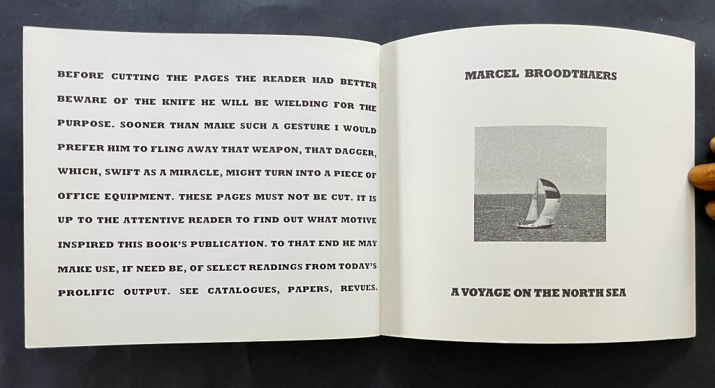
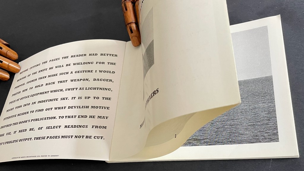
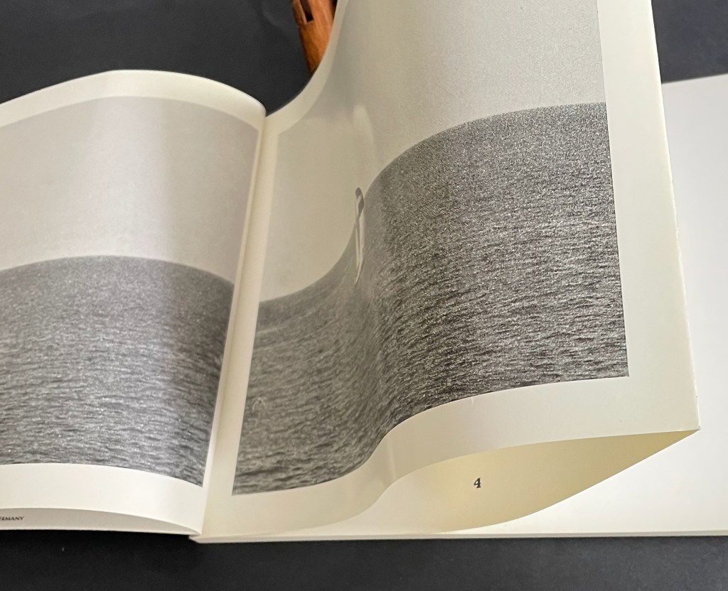
A Voyage on the North Sea (1974) Marcel Broodthaers Paperback (English version), Chinese wrapped-back binding. H148 x W178 mm. 38 pages. Edition of 1000. Acquired from Marcus Campbell Art Books, 9 October 2024. Photos: Books On Books Collection.
That over-elaborate and arch admonition to the reader on the inside cover doubles its mystery when it reappears on the last page of the book. If the warning has been ignored the first time, the reader knows that cutting the fore edge folds reveals the page numbers inside, but does its reappearance at the end prompt some doubt and regret? There’s no going back.
Last page and inside back cover.
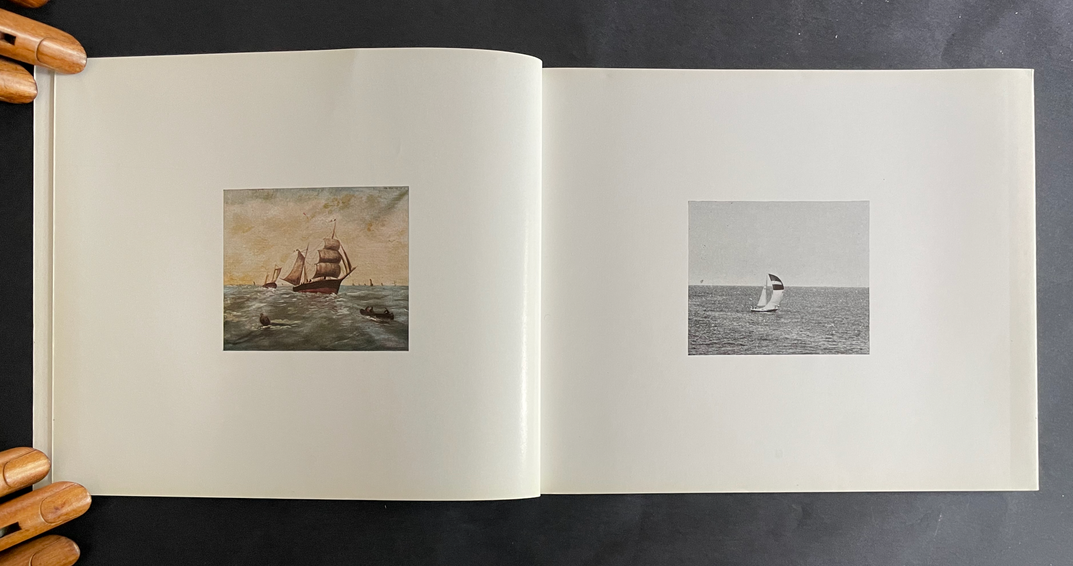
Alongside a 16mm film with the same title, the book premiered at the headquarters of the Petersburg Press, Portobello Road, London on 28 January 1974. In addition to the 1000 copies, Petersburg Press produced a numbered edition of 100 copies, signed by the artist, and distributed in a box with a copy of the film. Although developed together, the film preceded the book in 1973 and was originally entitled Analyse d’une Peinture. The painting in question is one found by Broodthaers at a Parisian flea market. To produce the film, Broodthaers added his own photographs of yachts at sea in the port of Ostend to stills of the painting and its details. With simple cuts and juxtapositions divided into “Page 1”, “Page 2”, etc., the film proceeds more like a book than a cinematic narrative, but there is no “booby-trap” in the film comparable to the prefatory warning once the book was prepared. The flea-market painting was also placed on display at the premiere.
To celebrate the peculiarity of the anniversaries of the artist’s birth (28 January 1924), the artist’s death (28 January 1976), and the book-film’s debut screening (28 January 1974), David Platzker organized his Specific Object exhibition Marcel Broodthaers : A Voyage on the North Sea on 28 January 2009. Platzker’s description provides just the right preface to the film and conclusion to this Books On Books Collection entry:
The subject of the exhibition focuses on Marcel Broodthaers’ film and book, both titled A Voyage on the North Sea which were distributed together as part and parcel of the same publishing plot. The ostensibly related subject of both book and film consists mutually of 19th and 20th century nautical images including: 1. photographic reproductions and details of an amateur’s 19th century painting of a fleet of fishing ships and 2. photographs of a contemporary sailboat. Bringing together film, books, ephemera, drawing, and the artist’s original maquette for the book, this specific exhibition sets out to map the local coordinates of A Voyage on the North Sea’s maiden launch on January 28, 1974 at the London offices of Petersburg Press. …
Referring a contemporary audience to the original screening context of Broodthaers’ book-film—itself very much like a reading lesson–this exhibition asks how a contemporary audience might begin to unpack the particular dialectics, obtuse poetics, and critical cargo of Broodthaers’ confounding enterprise. “It is up to the attentive reader,” Broodthaers writes in the preface of the book, “to find out what devilish motive inspired this book’s publication.”
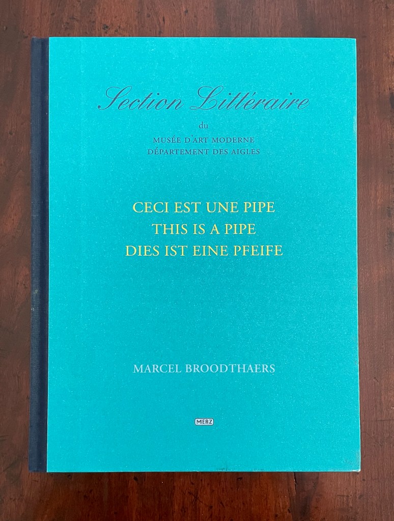
Ceci est une Pipe / This is a Pipe / Dies ist eine Pfeife (2001 )
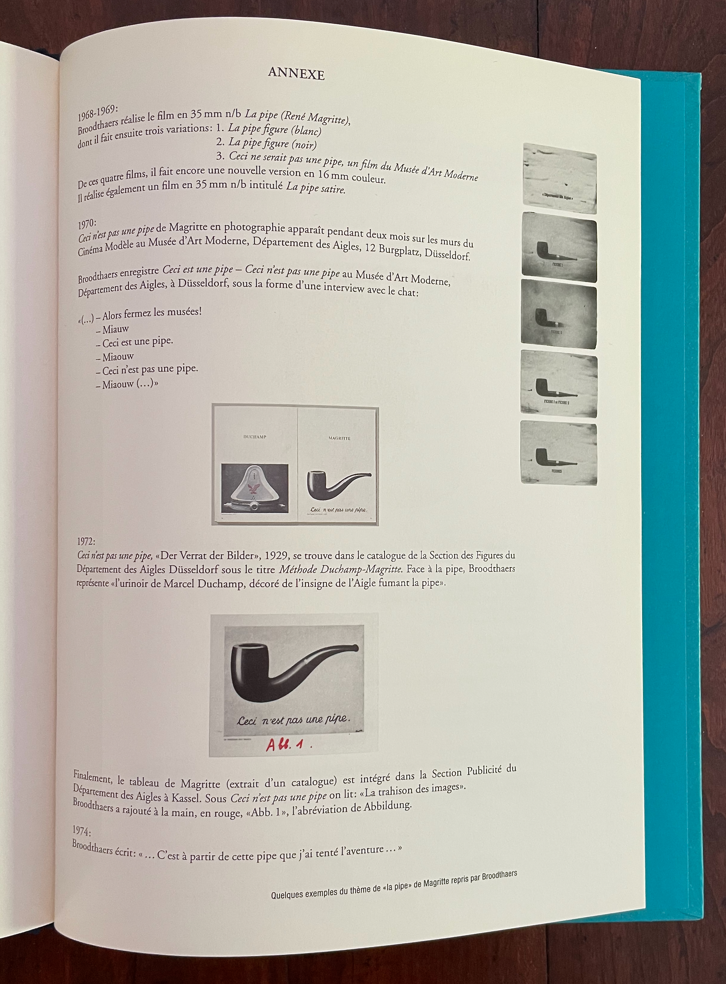
In 1972, Broodthaers renounced this project, initiated in 1969-1970. He did not want to associate his name or that of his Musée d’Art Moderne, Département des Aigles with it. Almost thirty years later, leaving aside the renunciation, Maria Gilissen Broodthaers and Reiner Borgemeister issued this volume that documents what can be gleaned from the archives. Honoring Broodthaers’ original aim to issue a work in French, English, and German, the volume is presented that way — except for an appendix that does not appear in English or German.
Here is an English version:
1968-1969: Broodthaers made the 50 mm black-and-white film n/b La pipe (René Magritte), from which he subsequently created three variations:
1. La pipe (white) 2. La pipe (black) 3. This Would Not Be a Pipe, a film from the Musée d’Art Moderne From these four films, he created yet another version in 16 mm color. He also made a 35 mm black-and-white film n/b titled La pipe satire.
1972: Broodthaers registered This Is a Pipe—This Is Not a Pipe at the Musée d’Art Moderne, Département des Aigles, in Düsseldorf, in the form of an interview with a cat:
“(…)—Then close the museums!
Meow
This is a pipe.
Meow
This is not a pipe.
Meow”
Finally, Magritte’s painting (taken from a catalog) is included in the Advertising Section of the Department of Eagles in Kassel. Under “This Is Not a Pipe,” we read: “The Betrayal of Images.” Broodthaers added “Abb. I” by hand in red, the abbreviation for Abbildung.
1974: Broodthaers wrote: “… It was with this pipe that I embarked on the adventure …”
Not only by Magritte’s exploration of image and text in his art but by giving Broodthaers a copy of Mallarmé’s Un Coup de Dés, Magritte exerted a great influence. Broodthaers’ realized works responding to that poem would suffice alone as evidence. Michel Foucault’s essay Ceci n’est pas une pipe (1968) expounding on his interpretation of Magritte’s Trahison des images as an unraveled calligramme apparently irked Broodthaers and became the likely seed for his idea to enroll Magritte’s pipe in the Musée d’Art Moderne, Département des Aigles along with asides on Foucault’s comments. If realized, the idea would have been a tribute that Magritte, who died in 1967, would likely have enjoyed.
In the end, though, Broodthaers was bothered over “useless text and reflections” from [André] Blavier (a fellow Belgian avant gardiste) and his own “ridiculous” interventions as well as dissatisfied with the prospective layout, so he abandoned the project. So what to make of Ceci est une pipe?
As an artist’s “unrealized” and abandoned conceptualization resurrected in an explanation of what the realized work might have been, it offers interesting insight into the concept of a concept. But it is not a pipe.
Foucault, Michel, and J. A. Harkness (trans.). 1983. This Is Not a Pipe. 25th anniversary ed. Berkeley, Calif.: University of California Press. The essay “Ceci n’est pas une pipe” appeared in Les Cahiers du chemin (no. 2), 1968.
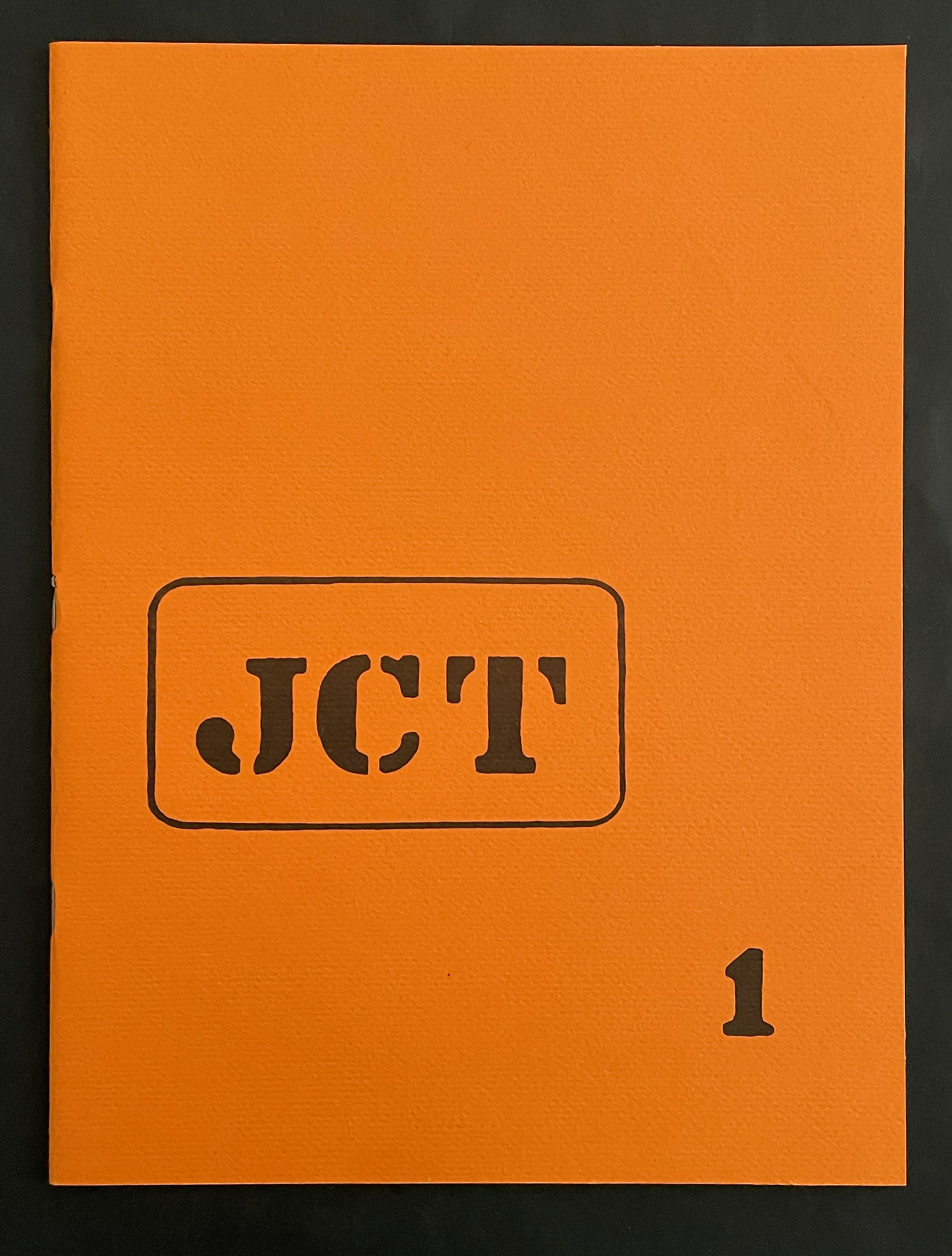
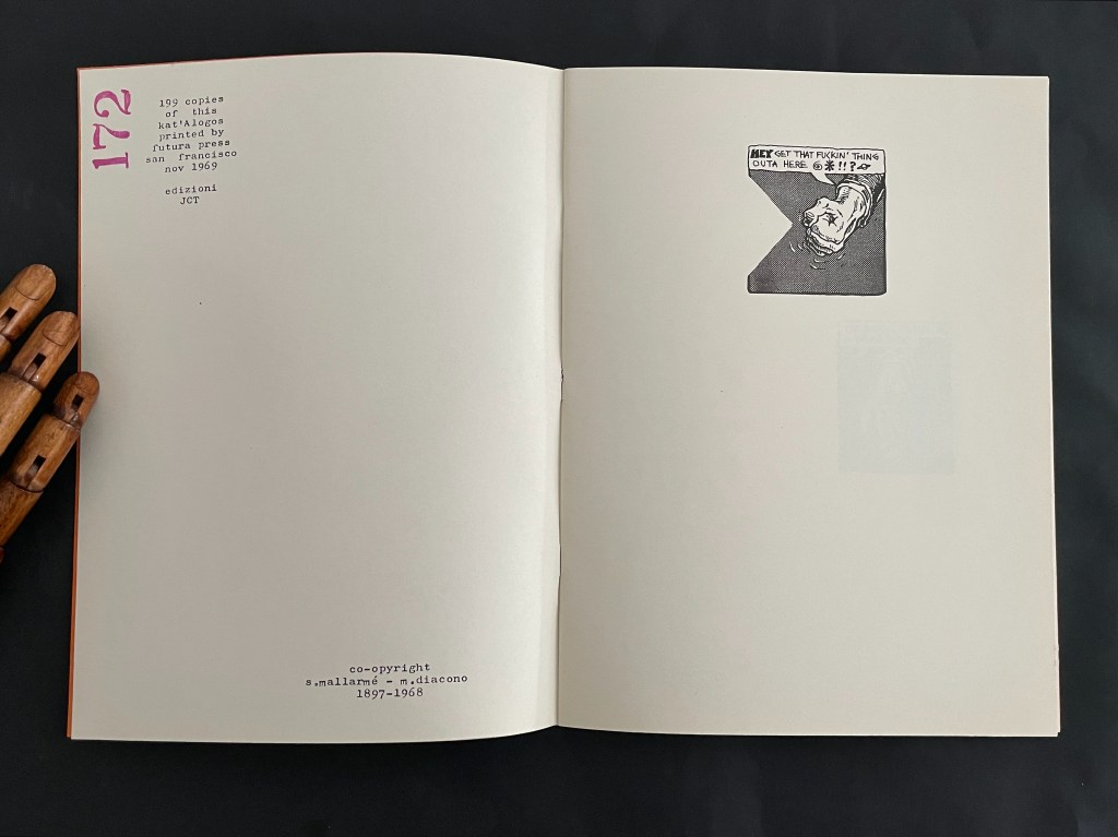
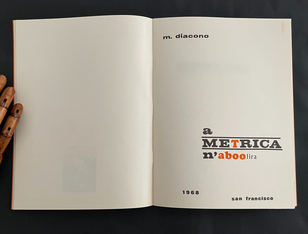
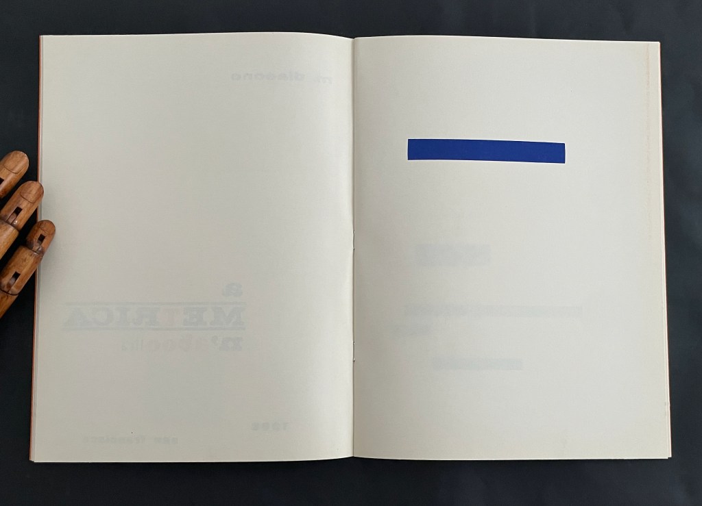
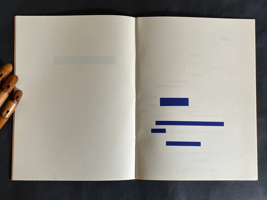
a METRICA n’aboolira JCT 1 (1968) Mario Diacono Booklet, saddle-stitched, staples. H259 x W190 mm. [32] pages. Edition of 199, of which this is #172. Acquired from Ars Libri Ltd, 18 February 2026. Photos: Arengario and Books On Books Collection. Displayed with permission of the artist.
From Ars Libri Ltd. description:
Mario Diacono relates that the manuscript of a METRICA n’aboolira was made in 1968 as a unique work, with no plans for its future publication. His idea to issue it as a limited edition artist’s book (and equally, as the first number of his review “JCT”) arose in the late summer of 1969, following a stay in New York, where he was in contact with Vito Acconci, Joseph Kosuth, and members of Art & Language. On his return to California in September, Diacono delivered the manuscript to the San Francisco printer, Futura Press, including with it a colophon which was dated November 1969, based on the expectation that the edition would take two months to complete.
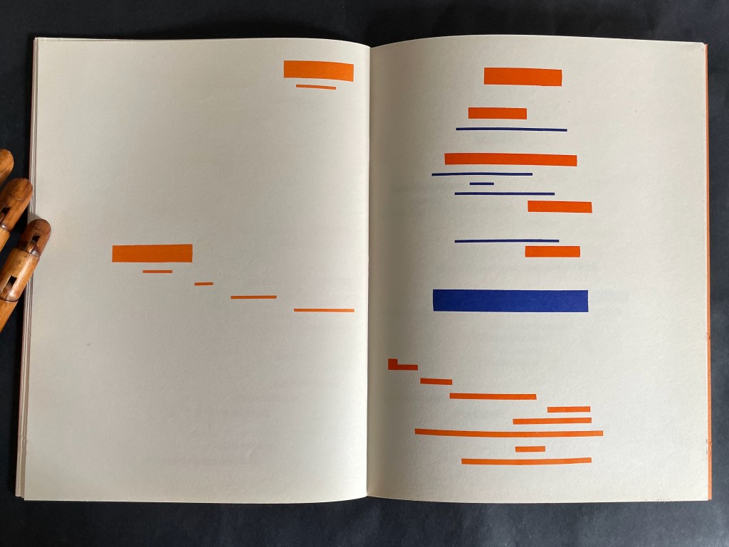
With the colophon offering 1968 or 1969, the title page picks 1968 and presents that as the date of publication. The date only matters in determining who came first with the idea of replacing Mallarmé’s text with solid blocks: Diacono or Marcel Broodthaers, whose three versions of Un Coup de Dés Jamais N’Abolira le Hasard: Image (on translucent paper, solid paper, and anodized aluminum) were published by Wide White Space in 1969.
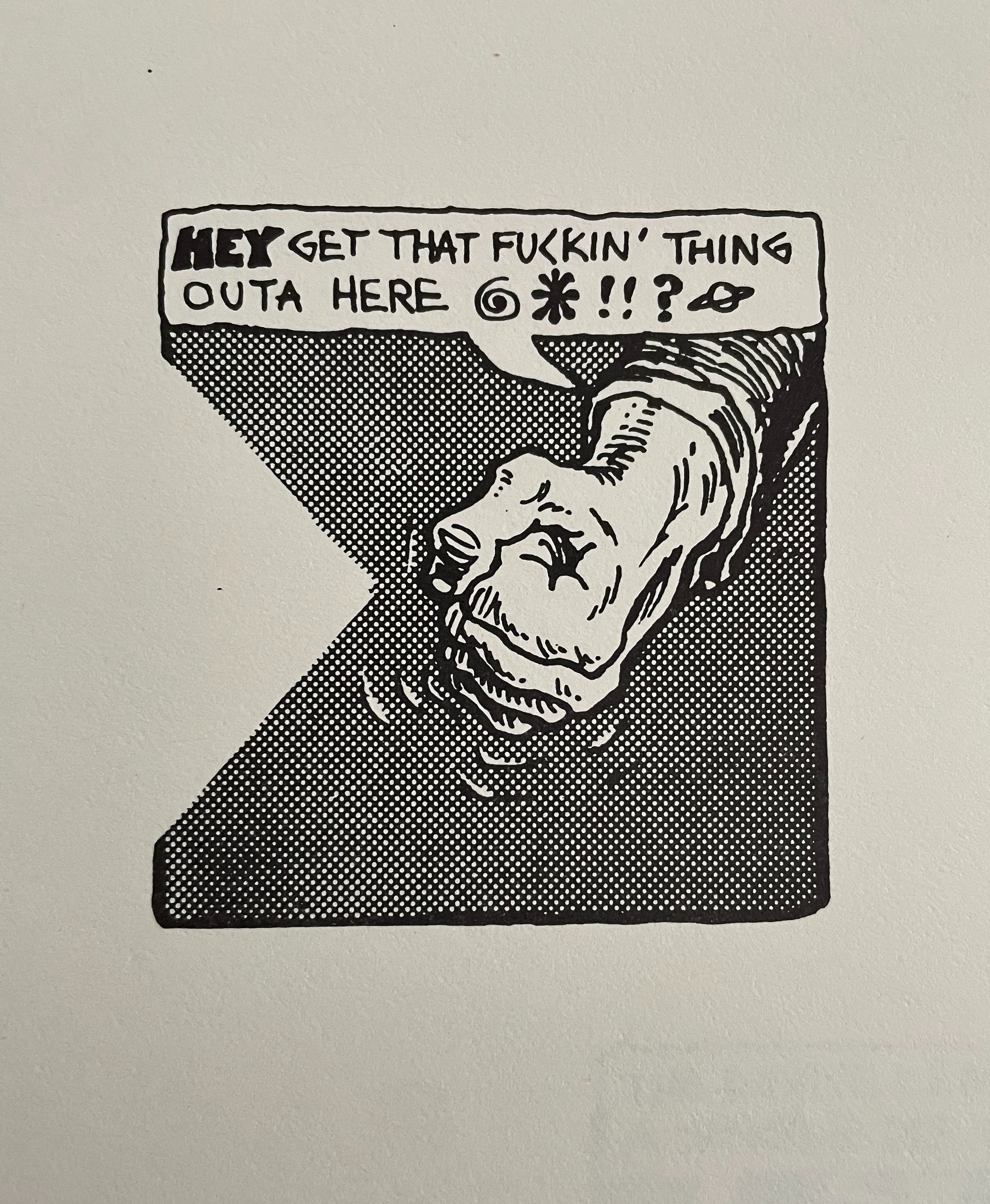
Besides being first out of the gate with an “homage by redaction” of Un Coup de Dés, Mario Diacono is perhaps the first hommageur to give a sociopolitical cast to the effort. In an interview in Ursula, Diacono comments
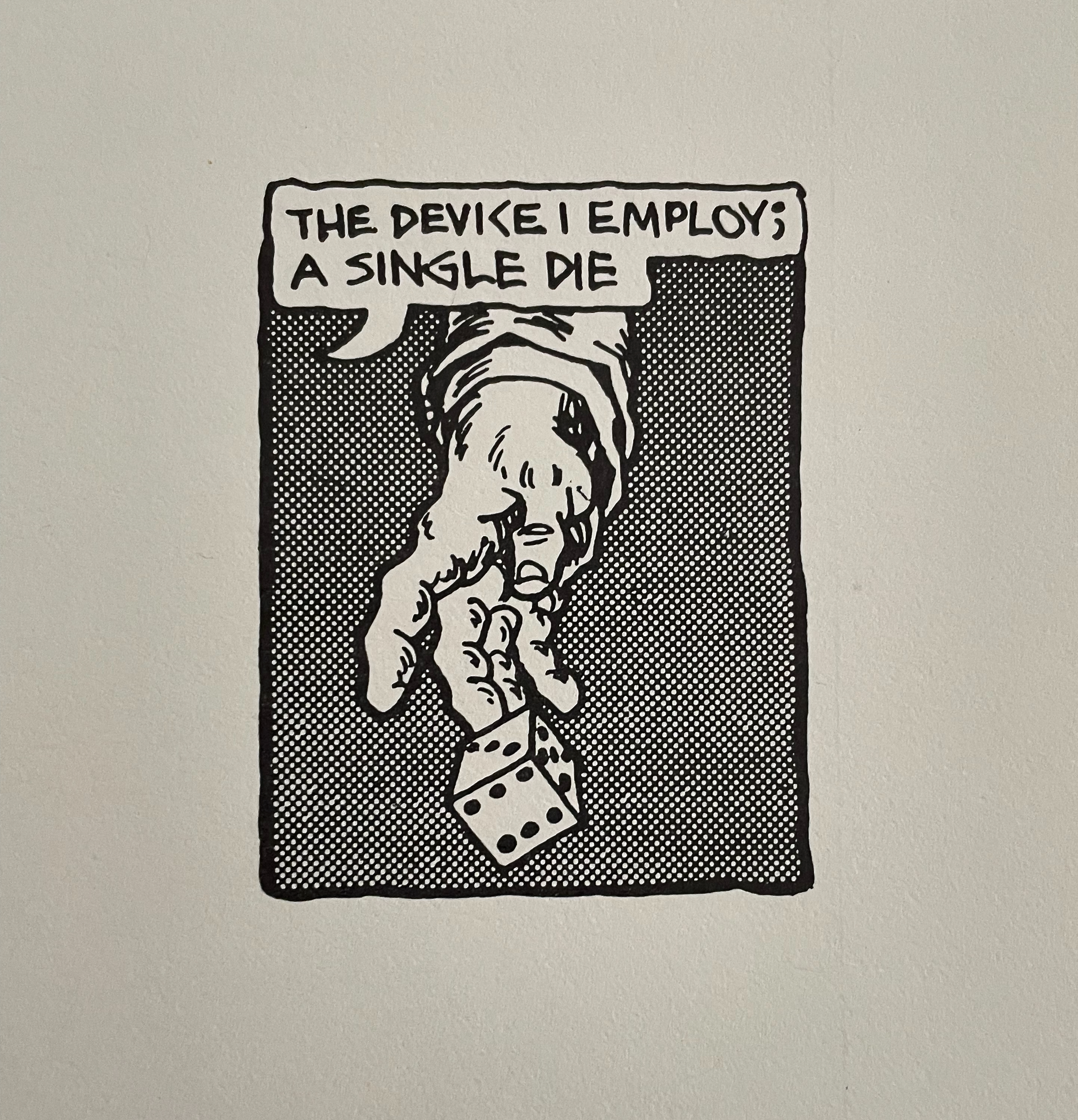
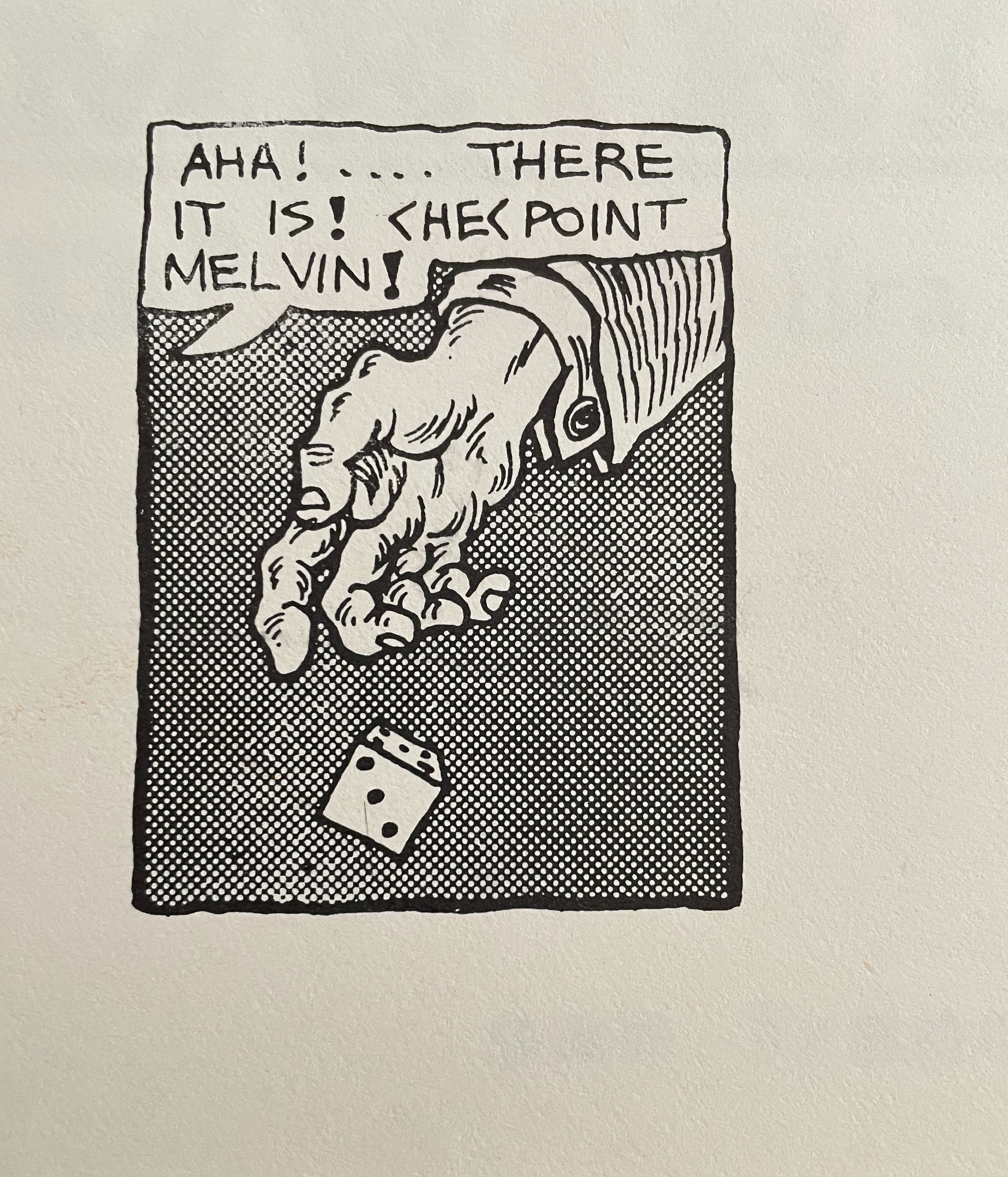
1968 was a year in which many things were abolished, or felt tempted to be abolished. Language was one of them, at least the traditional language of poetry, but also the language of ‘bourgeois/capitalist’ society. Berkeley is also present in the book through the reproduction of three frames from a cartoon in a local magazine, which functions as a kind of preface. The title alternates not only colors, black and orange, but also uppercase and lowercase letters. The wordplay in essence says: the absence of metrics, of language, will not abolish poetry. Neither will the American taboos.(Nickas, 2019).
Those comments align with the element of “pop” art and the underground comic in this homage.
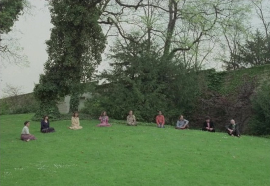
Later in the 1970s, Danièle Huillet and Jean-Marie Straub would pick up the thread of social critique by staging and filming a choral reading of the poem on the lawn of the Père Lachaise cemetery,
where there are the great memorials of the concentration camps: Ravensbrück, Auschwitz… it is in the corner of the cemetery where you can guess something about the city. Under this hill are buried the last members of the Paris Commune, who were shot in that same place. – Jean-Marie Straub
These three connected volumes explore graphic transpositioning from oral speeches to a visual representation. Though a new way to read/experience the speeches–to visualize their patterns–you can [still] not tell the truth from fiction. You can not tell what you are reading. “In the 3-part, 4 Speeches/Coup de Des, the images of audio waves are the same—but one purports to be a group of speeches by Bush 43 ; another, a group by Tony Blair; and the last—the real thing—is an unidentified man reading Mallarme’s “Un Coup de Dés Jamais N’Abolira Le Hasard”, that modern masterwork that launched a thousand artists’ books. The concept is trenchantly funny; the books are beautifully executed. [from the preface to Didier’s Manifesto by Tim Young]
Like Huillet, Straub and Mutel, Diacono is trying to balance his socio-political drive with the visual and historical homage to Un Coup de Dés. Huillet/Straub’s performative vocalization delivers its message only through the visual of its location. Mutel delivers his message by muting the poem with its sonographic visualization and sleight-of-hand substitution for political speeches. a METRICA n’aboolira delivers its message by balancing the textual and the visual, reminding us that Mallarmé wanted Un Coup de Dés to be looked at as well as read.
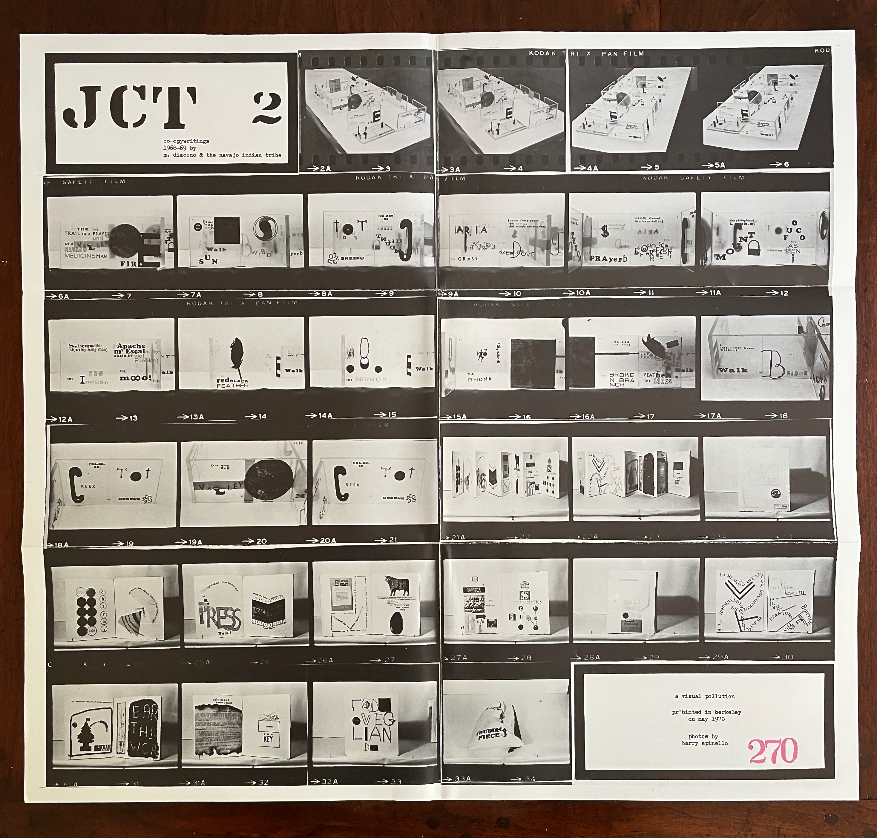
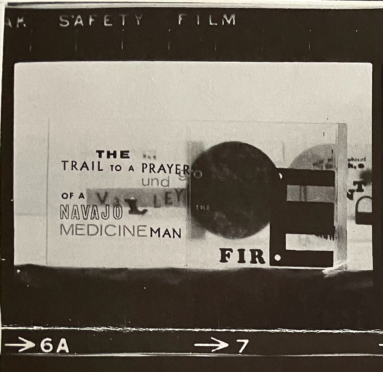
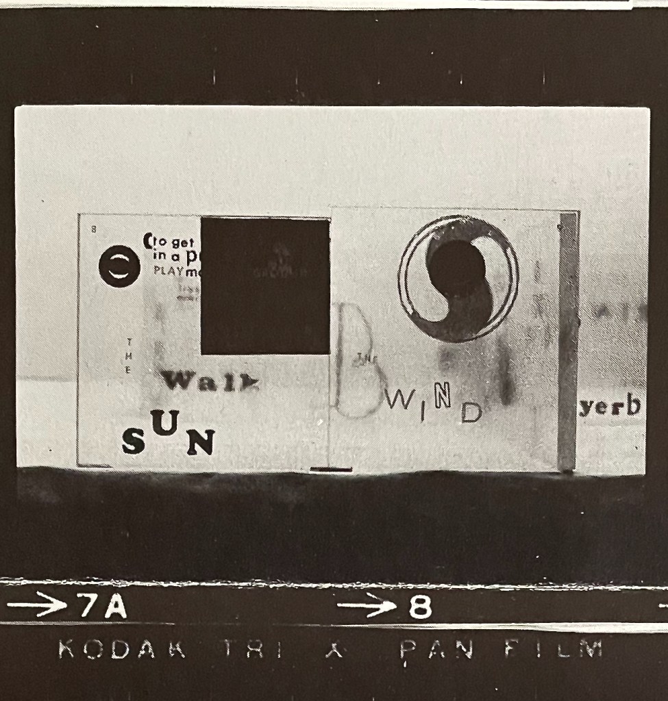
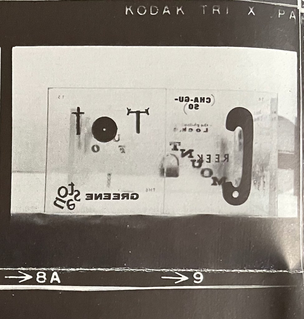
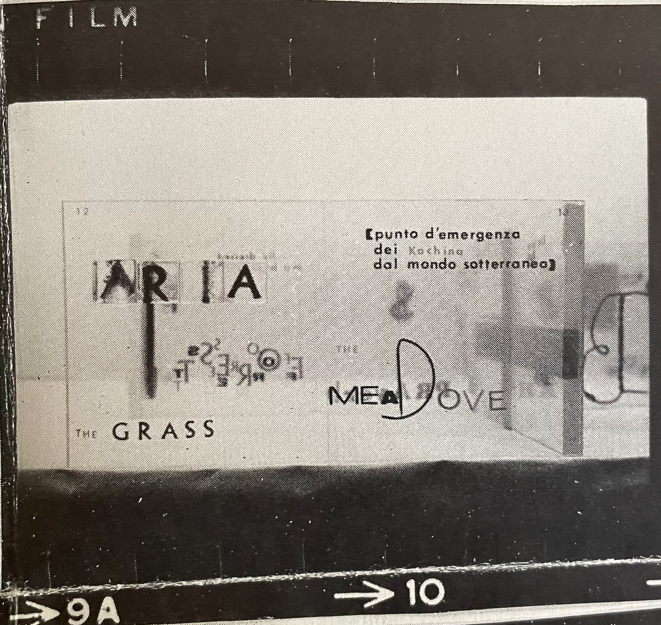
a visual pollution (1970) JCT 2 Mario Diacono & the Navajo Indian Tribe with photos by Barry Spinello Broadside, illustrated with 32 photographs in six strips. H157 x W254 mm (closed), H472 x W503 mm (open). #270. Acquired from Ars Libri Ltd, 18 February 2026. Photos: Books On Books Collection.
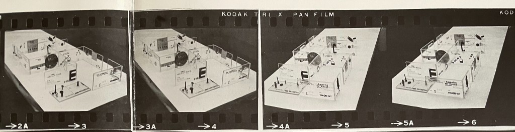
A broadside of books, or a photographic record of a display of three works of book art and some print works? On its surface, a visual pollution is a single sheet of paper displaying strips of Kodak film with frame numbers (2A to 34) appearing along the foot of the roll of film. The first four frames show photos of clear acetate blocks forming the Navajo ancestral emblem called the “Whirling Log” (tsil no’oli). On each block, double-page spreads have been printed containing phrases as text and images. In the fifteen frames that follow the first four, Diacono and Spinello give us close-ups of the acetate panels/pages. Page numbers can be seen in each spread’s upper left and right corners. The next eleven frames, starting with 21A/22, show two leporellos (one has eight panels, the other seven) with close-ups of the panels. The last two frames show two printed cards (or one double-sided one) in portrait and landscape orientations.
The first four frames, the arrangement of acetate blocks in the shape of the Navajo emblem “Whirling Log” (tsil no’oli). The Navajo Nation disavowed the totem in 1940 after its appropriation as the Nazi swastika.
In JCT 1, Diacono designated the work as “co-opywritings” of himself and Mallarmé. In JCT 2, the Navajo Indian tribes “join” Diacono. “Co-opywriting” is the perfect neologism to describe Diacono’s self-aware act of appropriation. There is no collaboration here; he has co-opted the French poet and the indigenous Americans. As an Italian and recent immigrant to the US, did his self-awareness extend to knowing that he was appropriating a disavowed emblem? “After the symbol was co-opted by the Nazi Party in Germany in 1920, the Navajo, Hopi, Apache, and Tohono O’odham tribes prohibited their communities’ use of the whirling logs motif by way of a 1940 intertribal proclamation. In the past few decades, Navajo people have begun to feature the motif in their weavings once again.” (Millicent Rogers Museum)
While it is nonsensical and inappropriate to assign authorship in this case to a tribe, the work’s title, the use of the tribal emblem, and the nature of the word mash-ups like (“U.S.A.lly dressed in a baby dollar“, “PRAyerb“, or “r’Apachem’EscalactionAGAIN,STviet Pueblos) suggest that something other than appropriation is at play. It is far from the offensive “playing Indian” in which the Italian artist Eliseo Mattiacci engaged (Salza). Diacono’s art seems to spring from an anti-establishment and counter-culture base. His assault on words as “visual pollution” and the need to mash them up into “object-oriented writing” (Martini) may or may not have appealed to the Diné-speaking people and the Red Power Movement of the 60s and 70s. But there is no denying Diacono’s critical enthusiasm and energetic claims of solidarity.
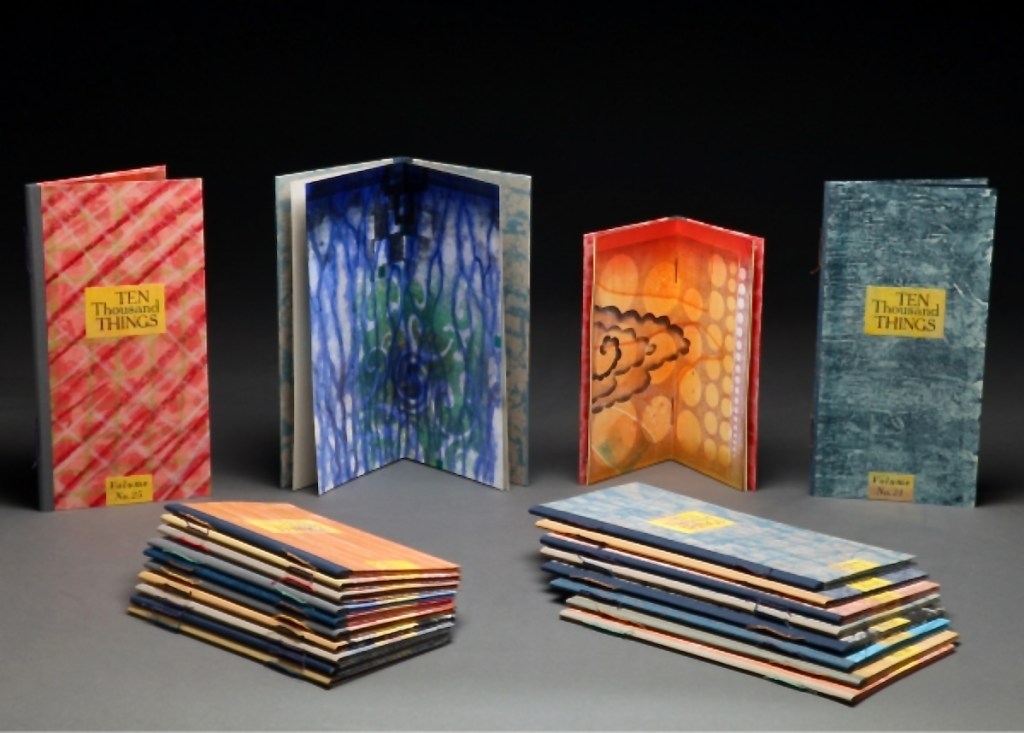
While Stéphane Mallarmé and his Un Coup de Dés may be the front runner among contenders for the title of literary patron saint of the artist’s book, Jorge Luis Borges and Italo Calvino appear in a tie for a distant but respectable second. Each have inspired some striking works. In her series Ten Thousand Things, Karen Kunc has boosted both Borges’ and Calvino’s chances and nudged Calvino’s with an additional homage in leporello format.
The series title of Ten Thousand Things springs from Chapter 42 of the Tao Te Ching:
The Tao begot one. One begot two. Two begot three. And three begot the ten thousand things. The ten thousand things carry yin and embrace yang. They achieve harmony by combining these forces.
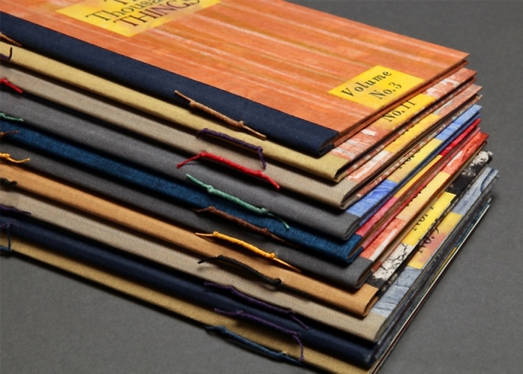
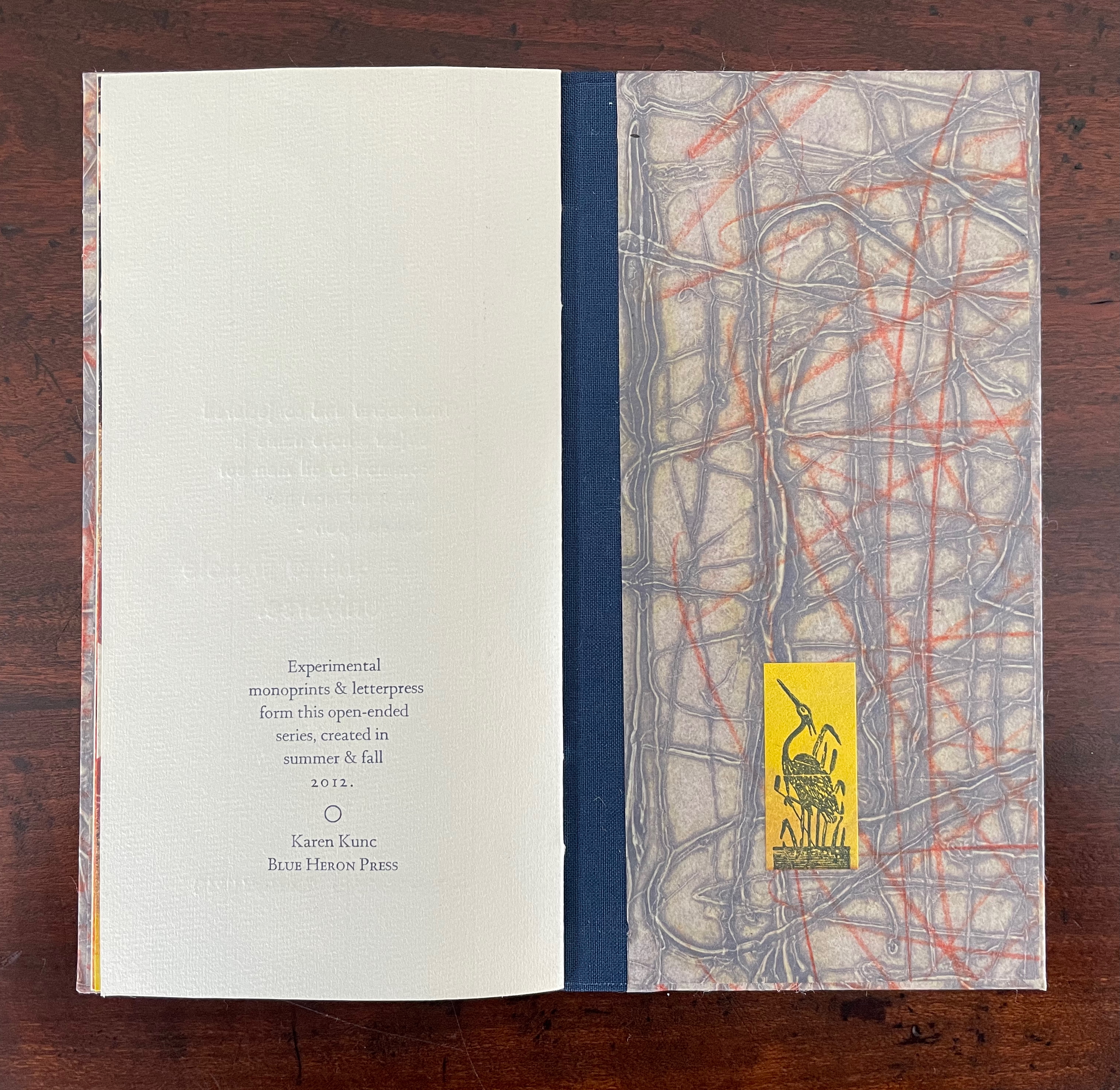
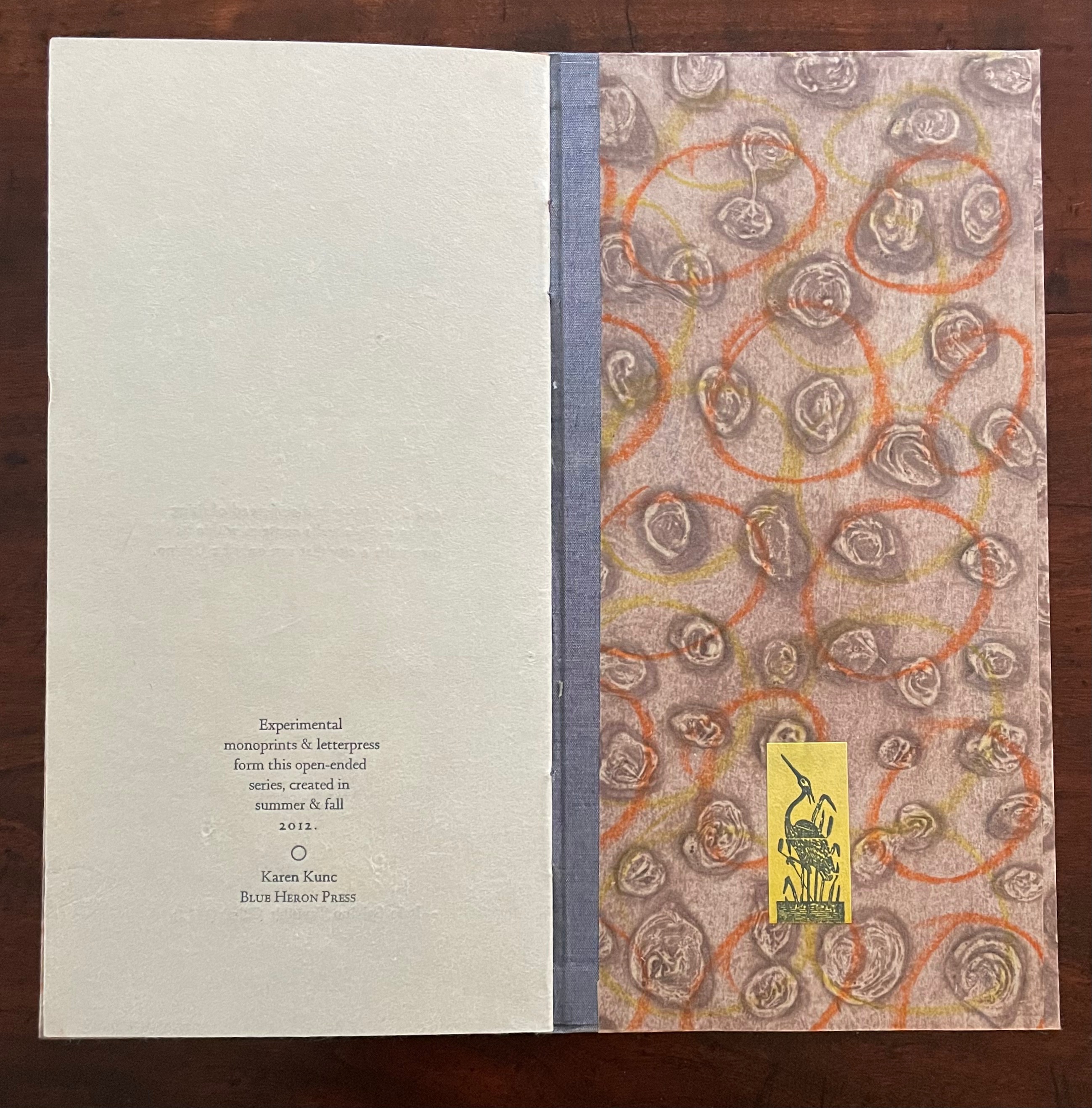
The series consists of 74 books in two sizes as the monoprints were made in two sizes of papers. The papers varied. Most of the works are on Torinoko, a Japanese paper that Kunc found to work well with waterbased Akua Intaglio inks. Some are on Arches 88 paper, a waterleaf she found also very absorbent for the Akua inks. Many of the prints have some handcoloring with ink or liquid acrylic. A few prints as well as all of the covers were made on Japanese Nishinouchi paper, a kozo fiber paper, which she has used extensively for her large woodcut prints. Printing is from collagraph plates on an etching press, with hand coloring and waxing afterwards.
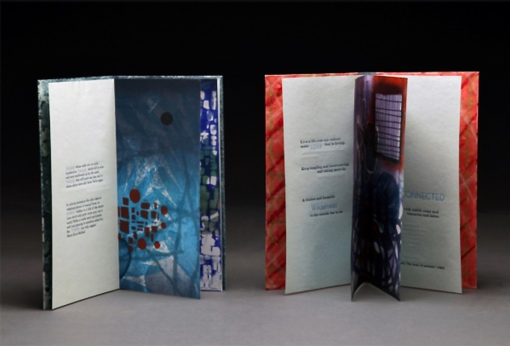
Kunc chose excerpts from the works of five poets/authors and responded to each with several different monoprints not as illustrations of the text but as evocations prompted and to prompt. In addition to Borges and Calvino, she selected from Guillaume Apollinaire, Annie Dillard, and Marge Piercy. Kunc handset the metal type and letterpress printed several sheets of each text on different papers for variety with the monoprints. In each book, the text-bearing sheet folds around the sheet that bears two monoprints, one on each side.
The Tate Museum remarks that “The beauty of monoprinting lies in its spontaneity and its allowance for combinations of printmaking, painting and drawing media.” Kunc’s series extends that allowance to combinations with the elements of the book.
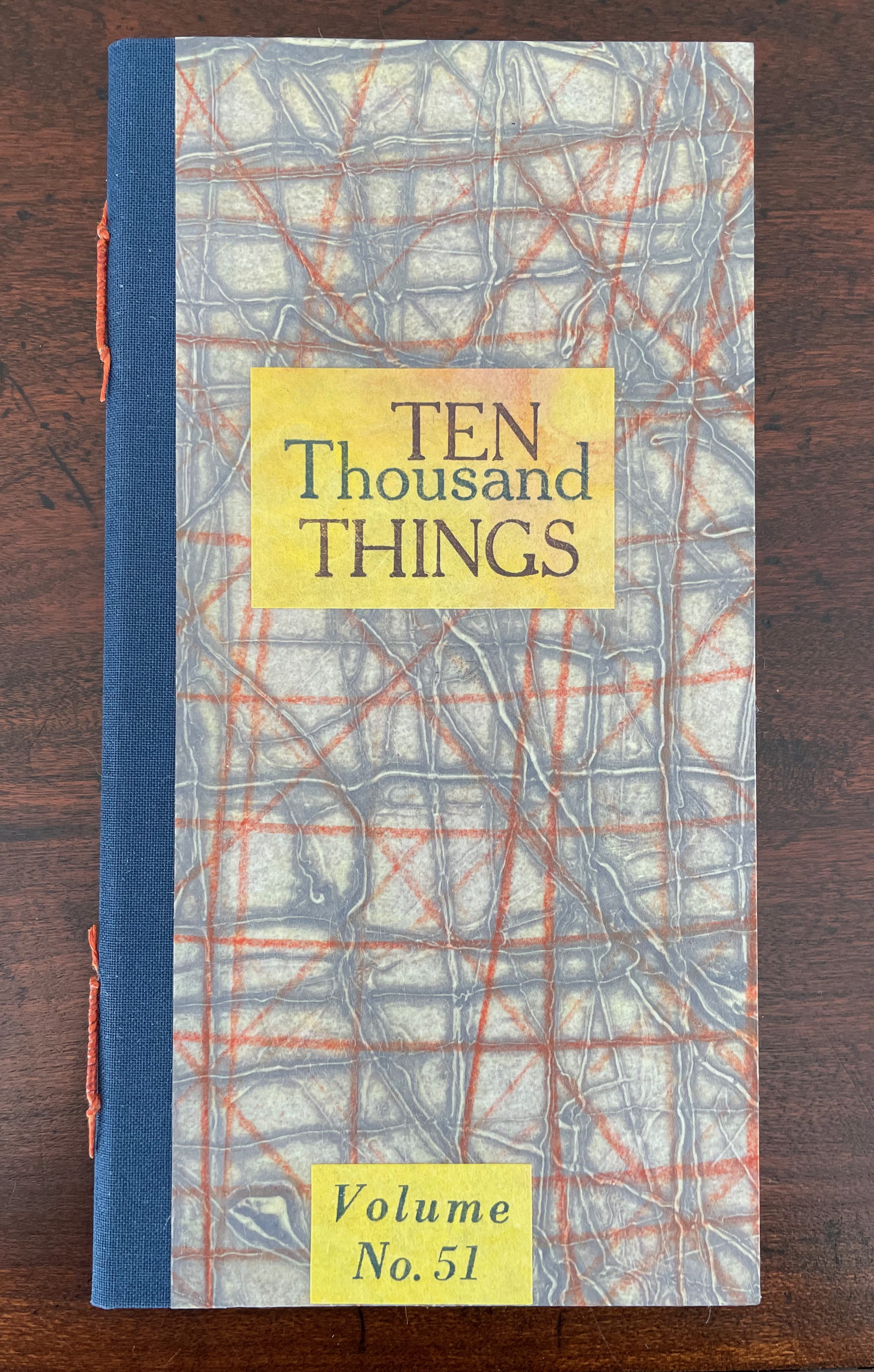
Ten Thousand Things, No. 51 (2012)
Ten Thousand Things, No. 51 (2012) Karen Kunc Single-signature booklet containing a recto and verso monoprint created by pressure printing, pochoir, and mixed media, with letterpress text. H205 x W110 mm. [8] pages. From a set of 75. Acquired from the artist, 9 February 2026. Photos: Books On Books Collection.
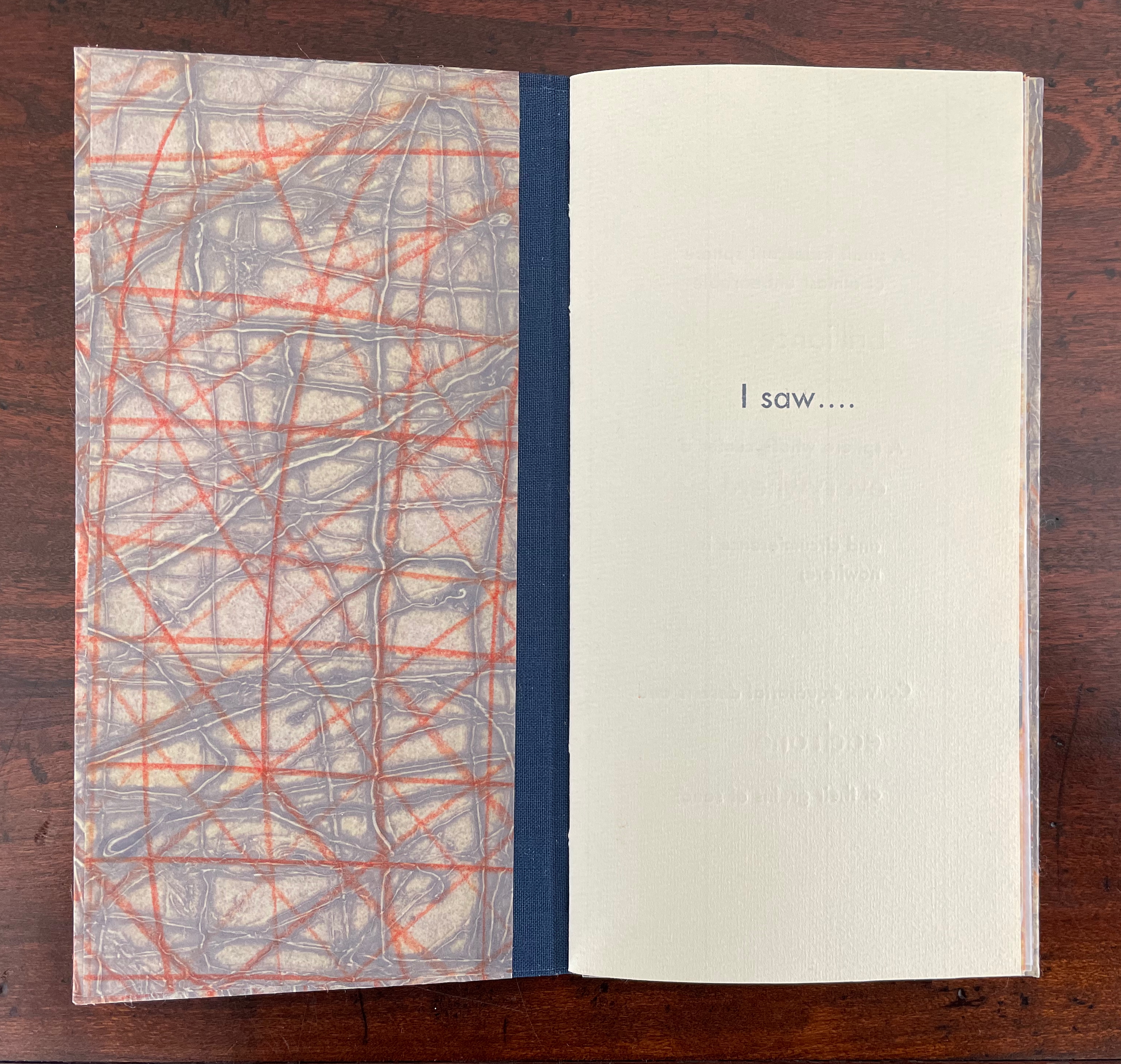
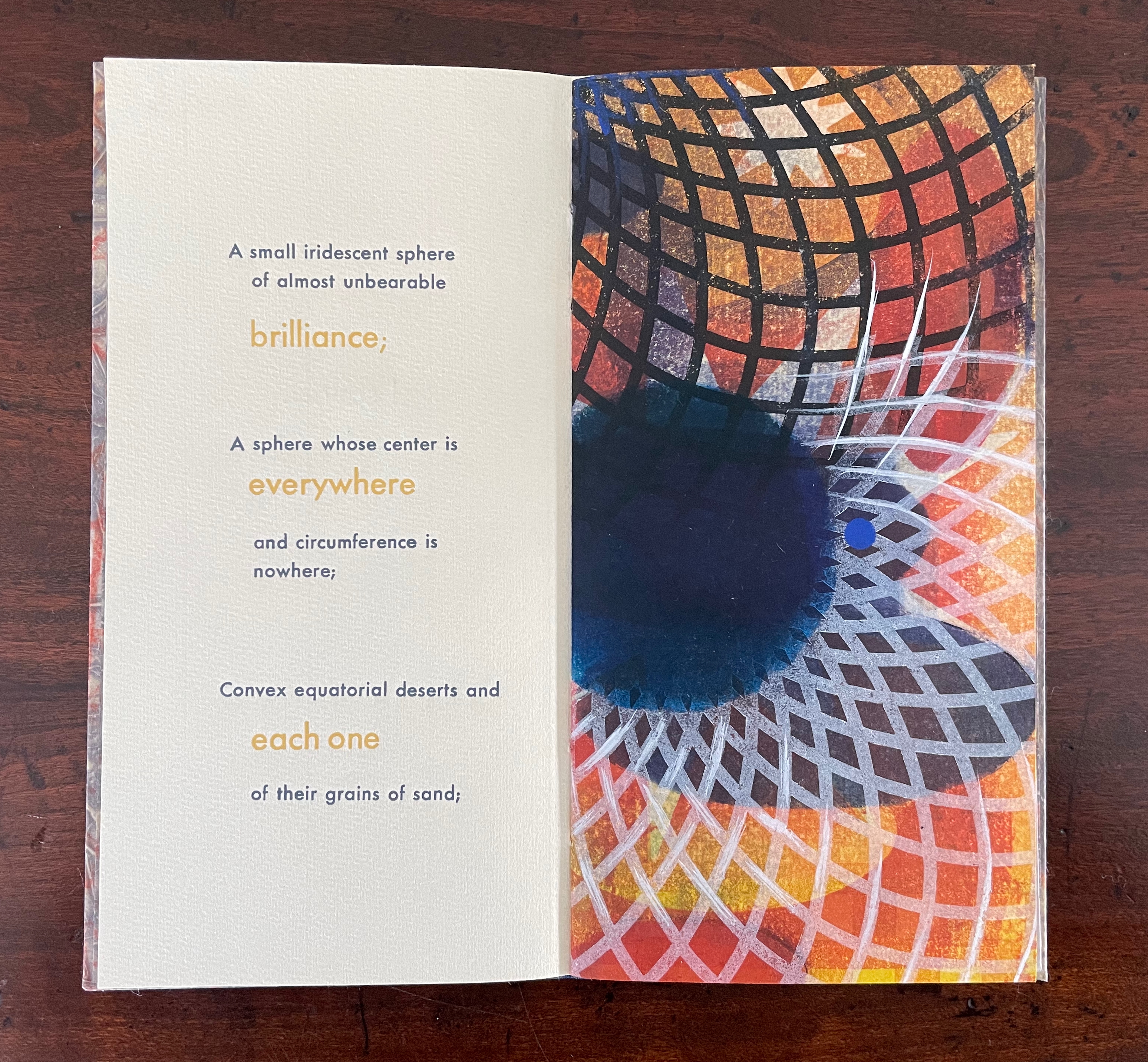
From Borges’ 1945 short story “The Aleph“, No. 51 in Kunc’s Ten Thousand Things series extracts four descriptions of the object or phenomenon Borges the narrator sees in the basement of his intolerable acquaintance Carlos Argentino Daneri:
I saw a small iridescent sphere of almost unbearable brilliance[;]
a sphere whose center is everywhere and circumference is nowhere;
convex equatorial deserts and each one of their grains of sand;
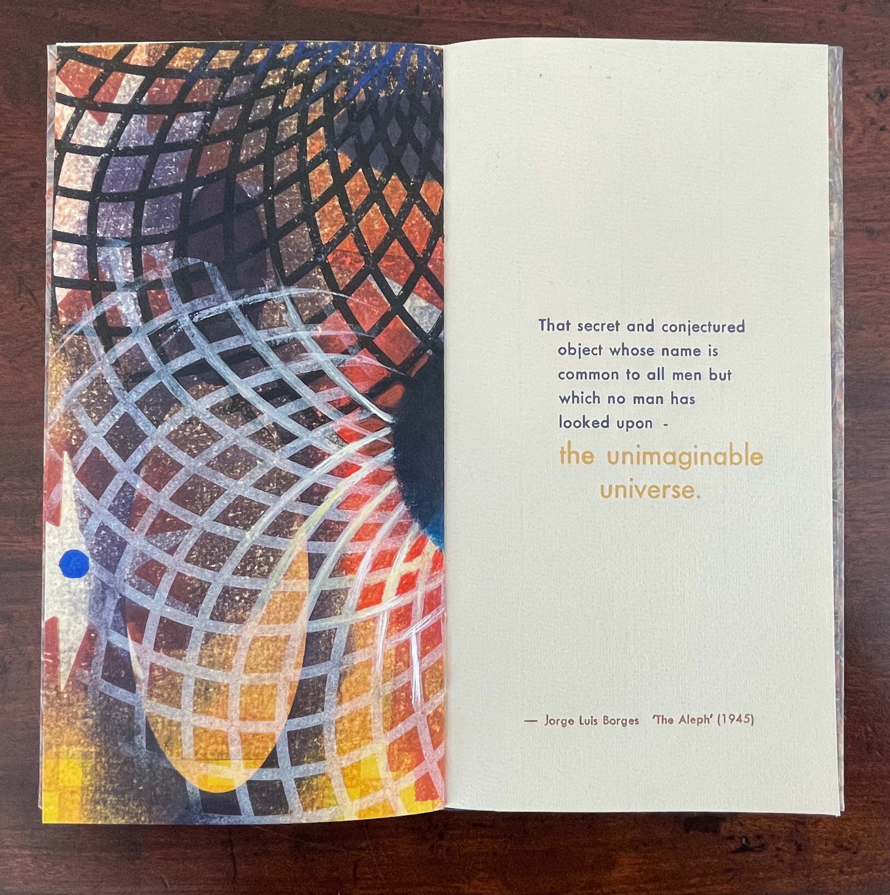
that secret and conjectured object whose name is common to all men but which no man has looked upon — the unimaginable universe.
With a deft touch, Kunc has selected and slightly altered the more abstract of Borges’ long Whitmanic observations (in the first, she inserts an ellipsis and substitutes a semicolon for a full stop; for the second and third, the order of appearance is changed). Borges prefaces his catalogue of what he sees with a caveat about the inadequacy of words to depict the concept of multum in parvo [“much in little”]:
All language is a set of symbols whose use among its speakers assumes a shared past. How, then, can I translate into words the limitless Aleph, which my floundering mind can scarcely encompass? Mystics, faced with the same problem, fall back on symbols: to signify the godhead, one Persian speaks of a bird that somehow is all birds; Alanus de Insulis, of a sphere whose center is everywhere and circumference is nowhere; Ezekiel, of a four-faced angel who at one and the same time moves east and west, north and south. (Not in vain do I recall these inconceivable analogies; they bear some relation to the Aleph.) Perhaps the gods might grant me a similar metaphor, but then this account would become contaminated by literature, by fiction. Really, what I want to do is impossible, for any listing of an endless series is doomed to be infinitesimal. In that single gigantic instant I saw millions of acts both delightful and awful; not one of them occupied the same point in space, without overlapping or transparency. What my eyes beheld was simultaneous, but what I shall now write down will be successive, because language is successive.
In light of the snide literary sniping and rivalry that forms the background to “The Aleph”, Borges may be forgiven for omitting William Blake’s spectacular translation of “the limitless Aleph”:
To see a World in a Grain of Sand,/ And a Heaven in a Wild Flower,/ Hold Infinity in the palm of your hand,/ And Eternity in an hour. (Auguries of Innocence, 1803).
It might have brought Borges’ descriptive and narrative enterprise to an harrumphing halt. We would then not have had this particular instance of Karen Kunc’s taking up the challenge of rendering in an artist’s book Borges’ verbal description of the Aleph. What image could resonate with or reflect his words and reflect the impossibility he describes? How might the arrangement of pages enhance/diminish it? How might the act of turning a page reflect or obscure it?
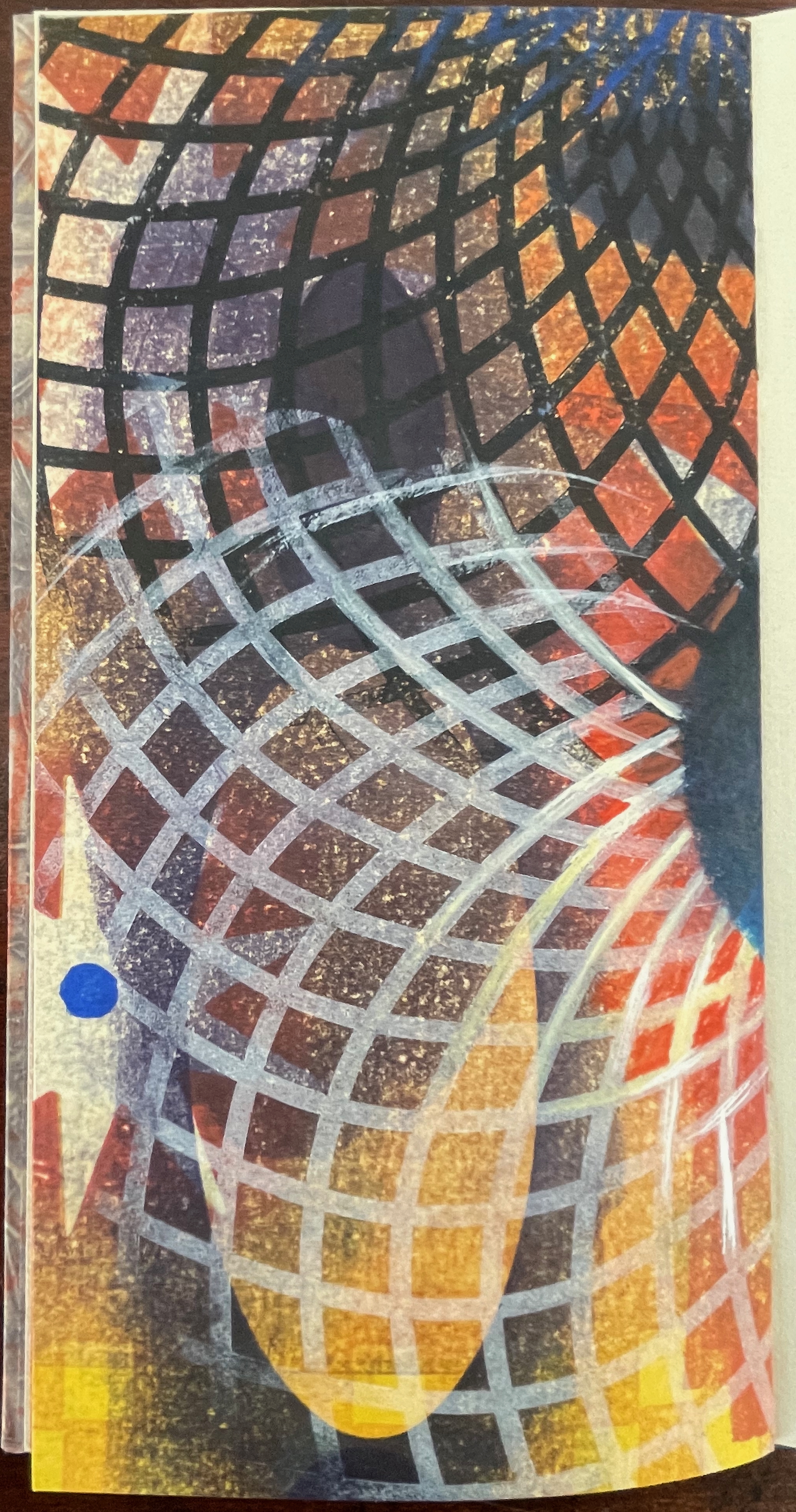
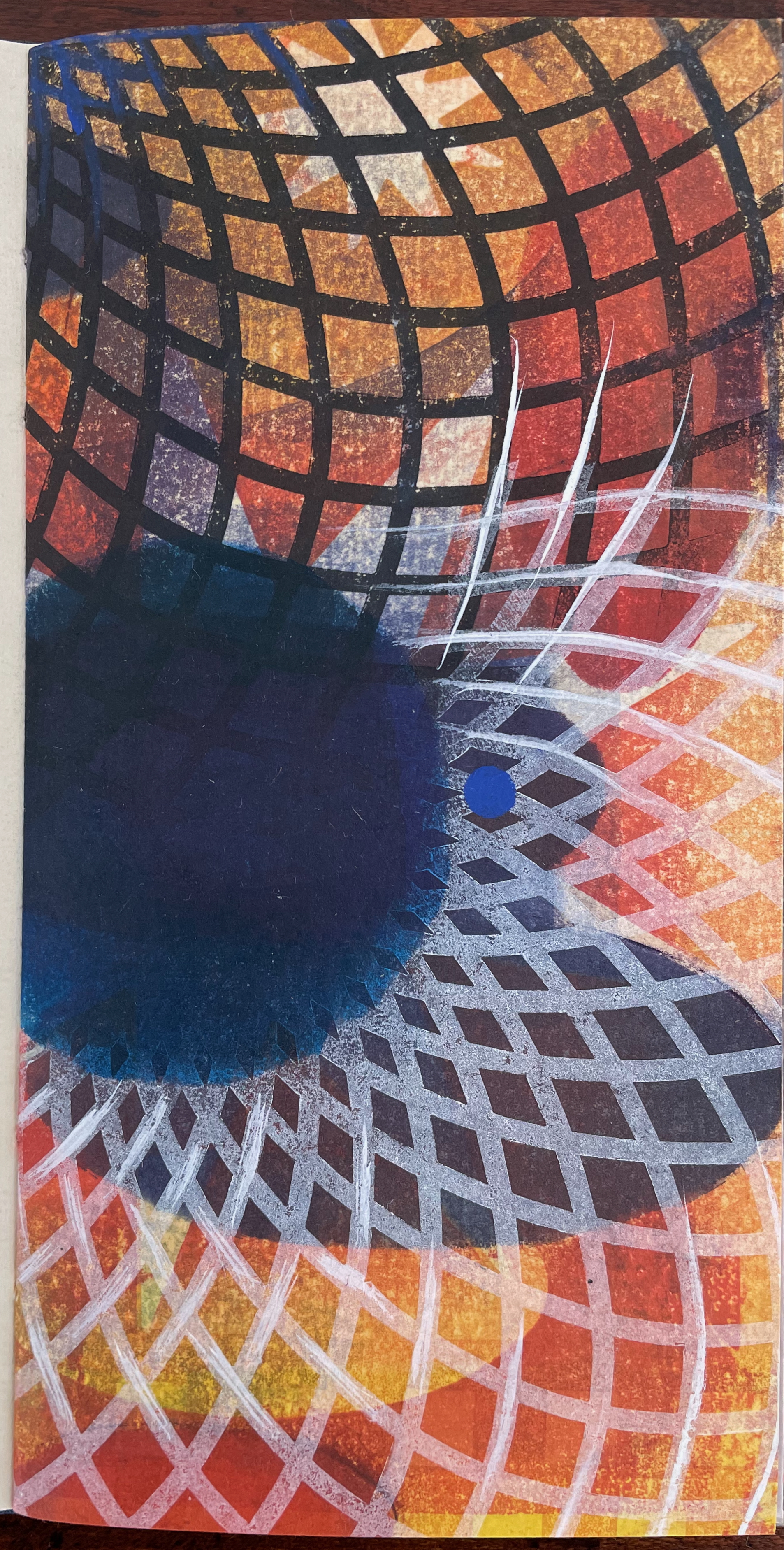
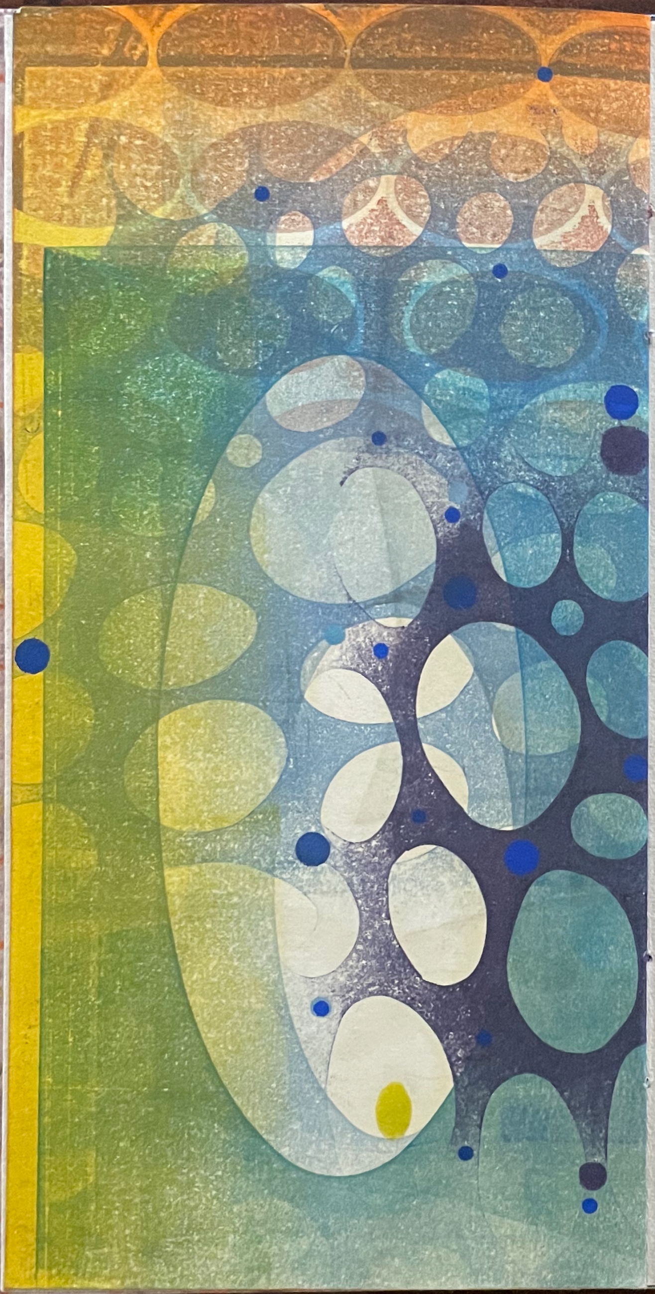
The vibrant circle of deep blue is only two dimensional, but perhaps the abstractions behind the dark convex grid suggest the three dimensionality of the story’s sphere. Perhaps the more brilliant but smaller blue circle beside the larger one conveys the multum in parvo concept in the style of medieval narration differentiating multiple points in time with images of different size in the same plane. Perhaps the full-page bleed of the image even suggests that paradoxically the image extends from the page yet encompasses the page. Likewise might the sheet’s fold that truncates the circle and the dark and light grids imply continuity coexisting with discontinuity? Does the dark blue grid that curves over the orange and burnt umber colors imply the “convex equatorial deserts”?
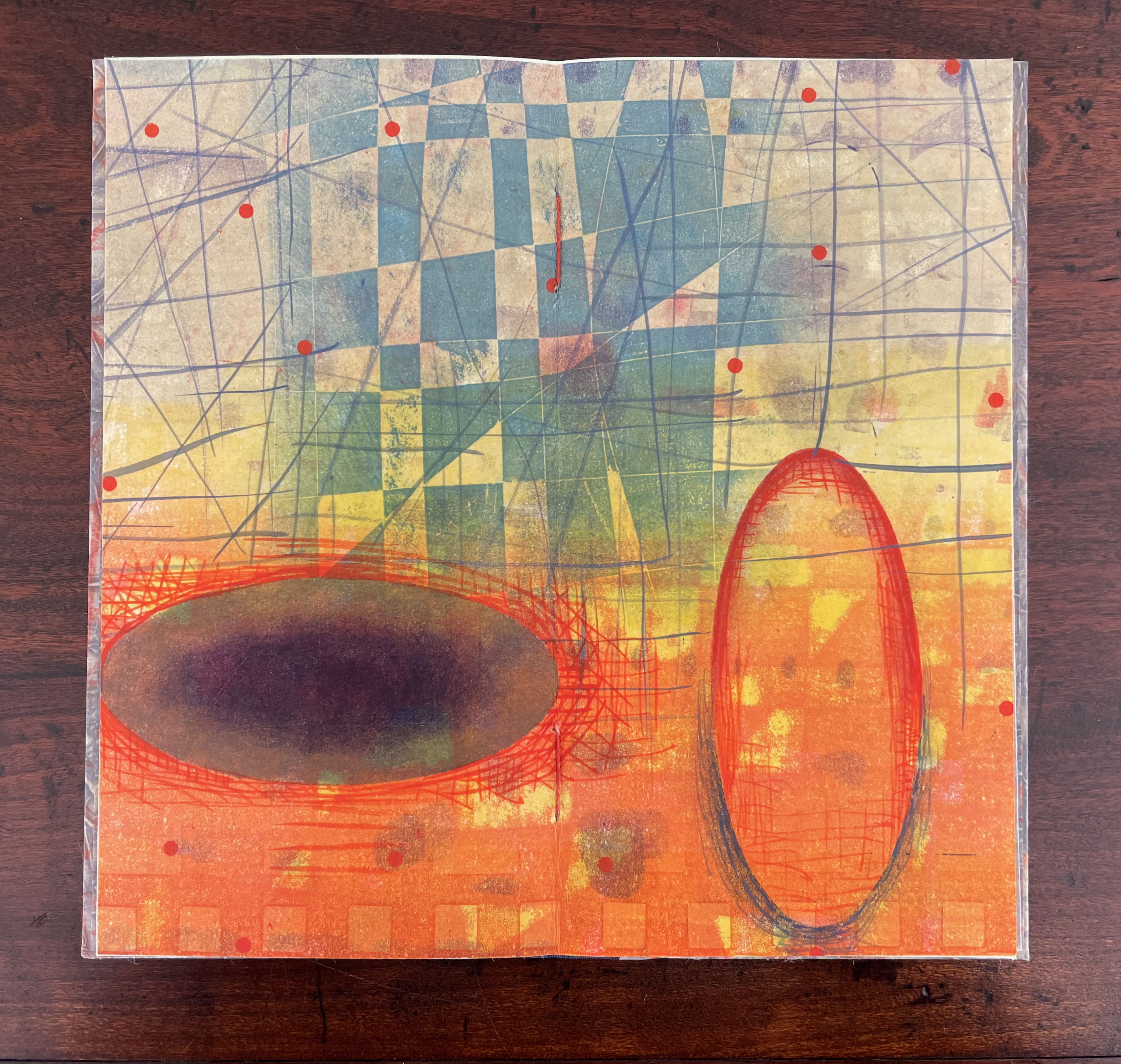
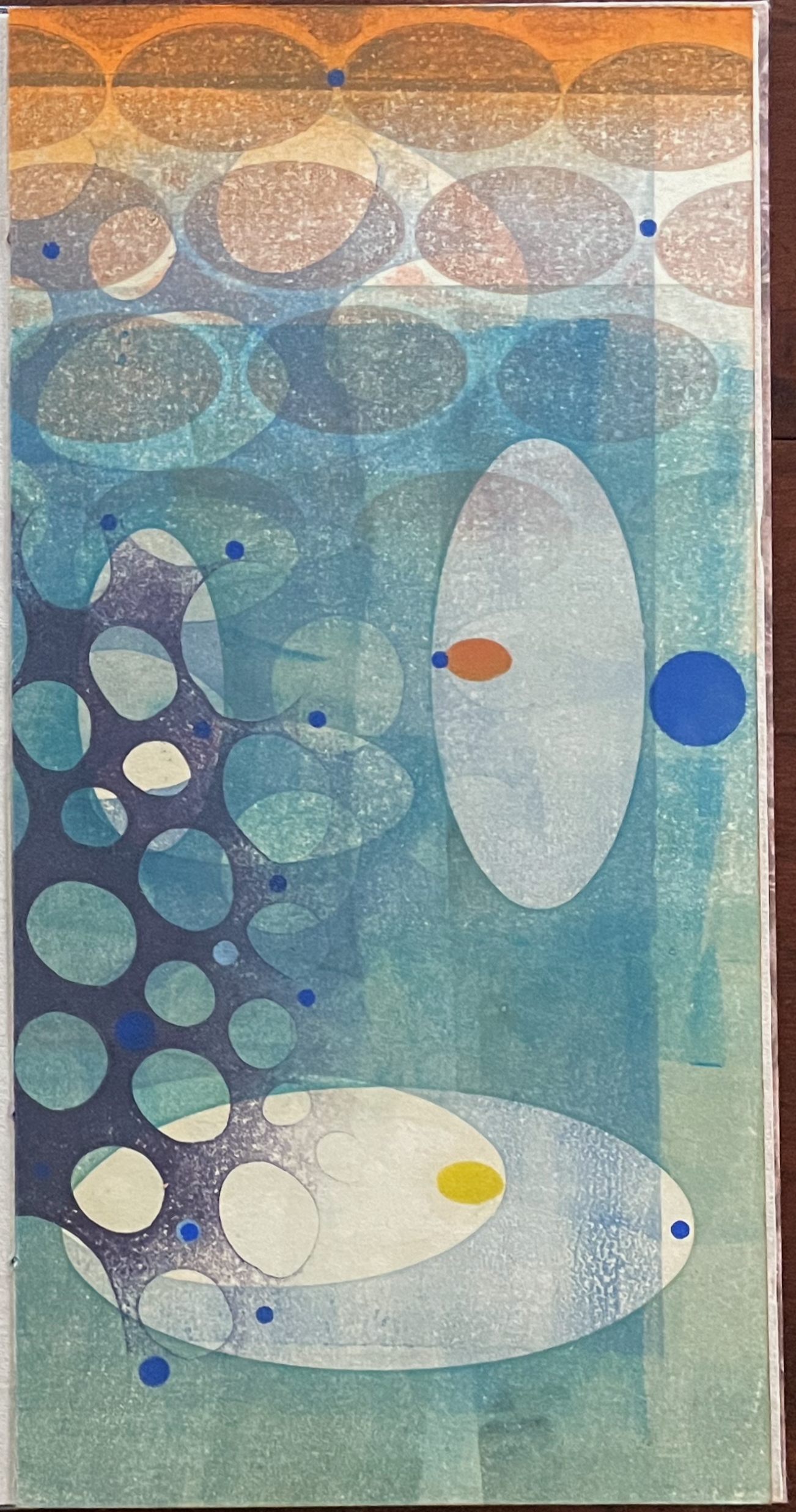
Turning from that half view of the monoprint, we have the full view of the monoprint on the other side of the sheet. An angular and checkered blue background hovers over two ellipsoid figures in an orange foreground. Is the background network with its numerous small red dots a version of Indra’s net, that cosmological metaphor of an infinite net with a jewel at each juncture reflecting and being reflected by every other? The dark ellipsoid seems to quiver surrounded by crosshatching. Is it in motion toward the upright orange ellipsoid? Is this a moment in time and space?
The other half of the monoprint with the dark blue circle comes into view with the last double page spread. If we could see all at once the monoprint with the dark blue circle, the juxtaposition of spheres and ellipses would stand out more.
The white stars behind the grid stand out a bit more, and the small bright circles seem more clearly positioned on curving white orbital tracks. Is it an allusion to planetary and constellatory movement, bring a universe within this small book? Without photographic manipulation, we have to open our minds to imagine it. As Carlos replies when Borges worries that it will be too dark in the cellar to see the Aleph, ““Truth cannot penetrate a closed mind. If all places in the universe are in the Aleph, then all stars, all lamps, all sources of light are in it, too.”
Of course, this photographic manipulation is a cheat and overlooks that Kunc has combined the half-views of one side of the monoprint with the full view on the other side to reflect the challenge of embodying a simultaneous phenomenon with successive phenomena.
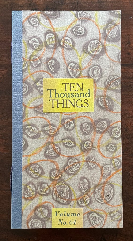
Ten Thousand Things, No. 64 (2012)
Ten Thousand Things, No. 64 (2012) Karen Kunc Single-signature booklet containing a recto and verso monoprint created by pressure printing, pochoir, and mixed media, and a letterpress text on various papers.H250 x W125 mm. [8] pages. From a set of 75. Acquired from the artist, 9 February 2026. Photos: Books On Books Collection.
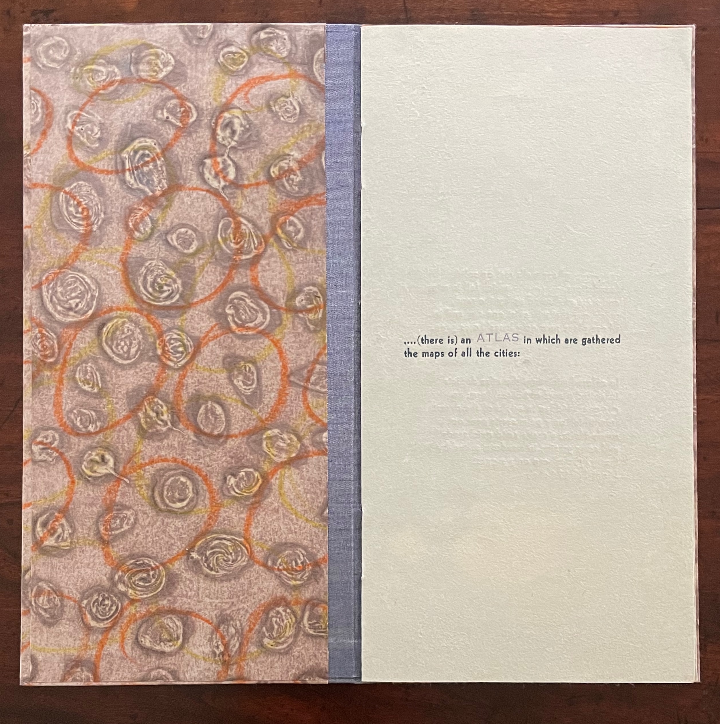
Of the 74 books in the Ten Thousand Things series, 11 of them pay homage to Italo Calvino’s Invisible Cities (1972/74). The book’s premise is that Kublai Khan sent Marco Polo out into the empire to visit the Khan’s cities and return with close descriptions. In nine parts, each prefaced and closed with a philosophical dialogue between the Khan and Polo, the traveller describes fifty-five cities — all of them imaginary. While most works of homage to Invisible Cities select one or more of these fictitious 55 cities on which to focus, Kunc chooses more general text from the preface to Part 9. This is the text used in all 11 of the works of homage to Calvino:
…. (there is) an ATLAS in which are gathered the maps of all the cities:
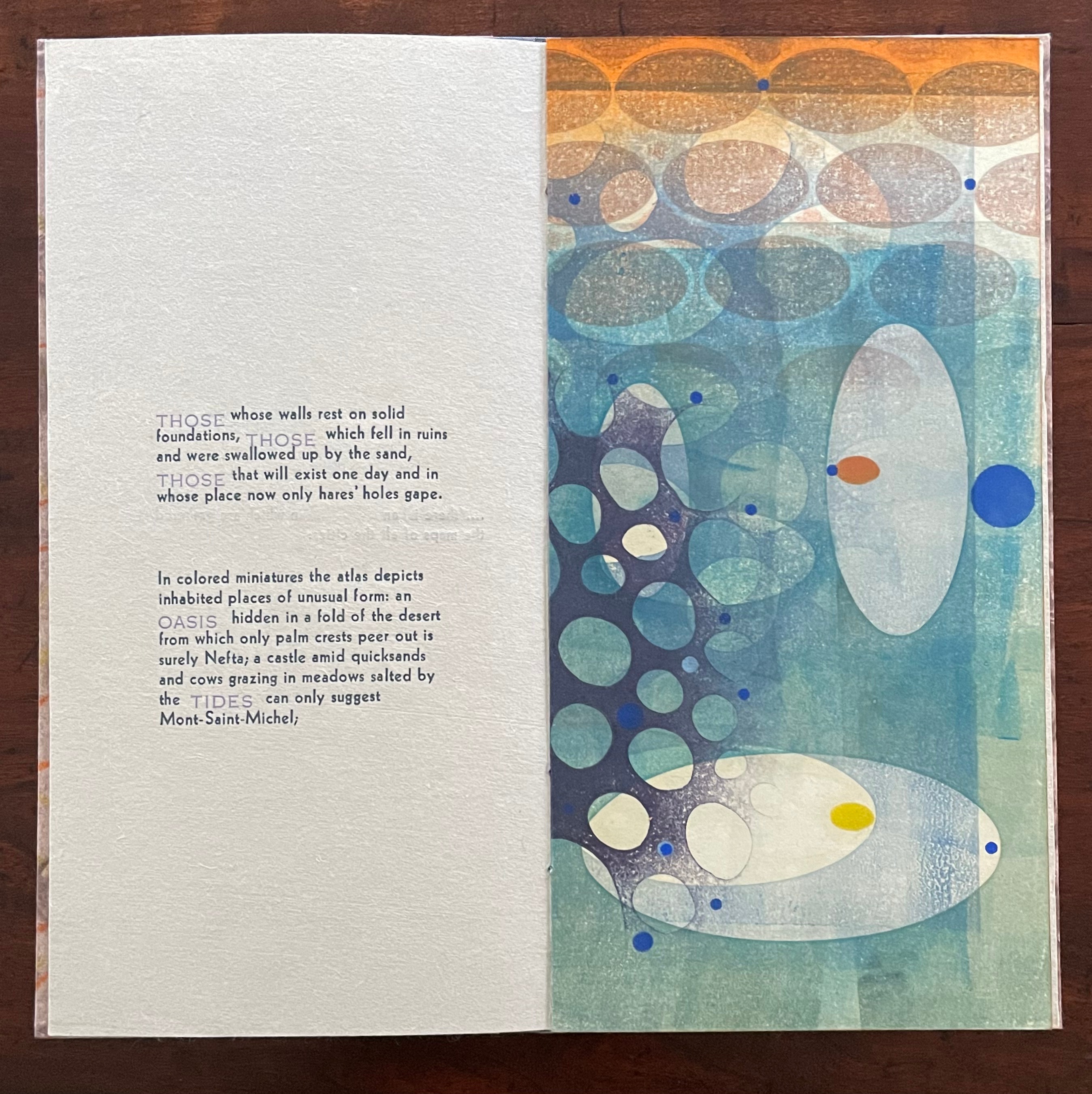
THOSE whose walls rest on solid foundations, THOSE which fell in ruins and were swallowed up by the sand, THOSE that will exist one day and in whose place now only hares’ holes gape.
In colored miniatures the atlas depicts inhabited places of unusual form: an OASIS hidden in a fold of the desert from which only palm crests peer out is surely Nefta; a castle amid quicksands and cows grazing in meadows salted by the TIDES can only suggest Mont-Saint-Michel;
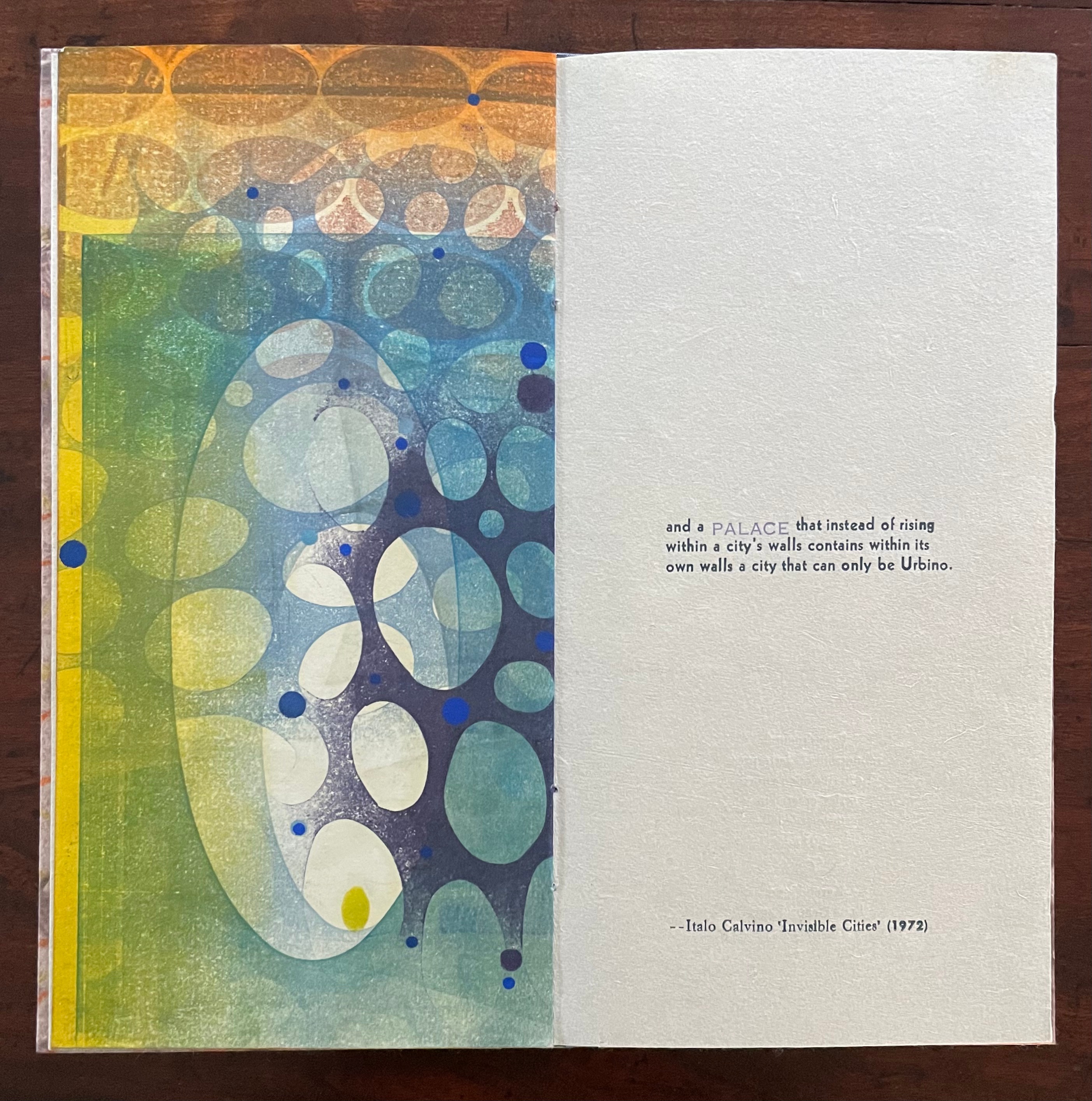
and a PALACE that instead of rising within a city’s walls contains within its own walls a city that can only be Urbino.
With certain words appearing in all caps in a lighter weight and lighter color than the surrounding text, the excerpts have a different texture from those in No. 51. The all caps words rise above or fall below the line of type.
As with No. 51, only one side of the double-sided monoprint is viewable as a whole; the other side is viewable in halves. In No. 64’s first half-view, the shapes and colors have a submerged quality that echoes the now sinking or subsiding type of “THOSE”, “OASIS”, and “TIDES”:
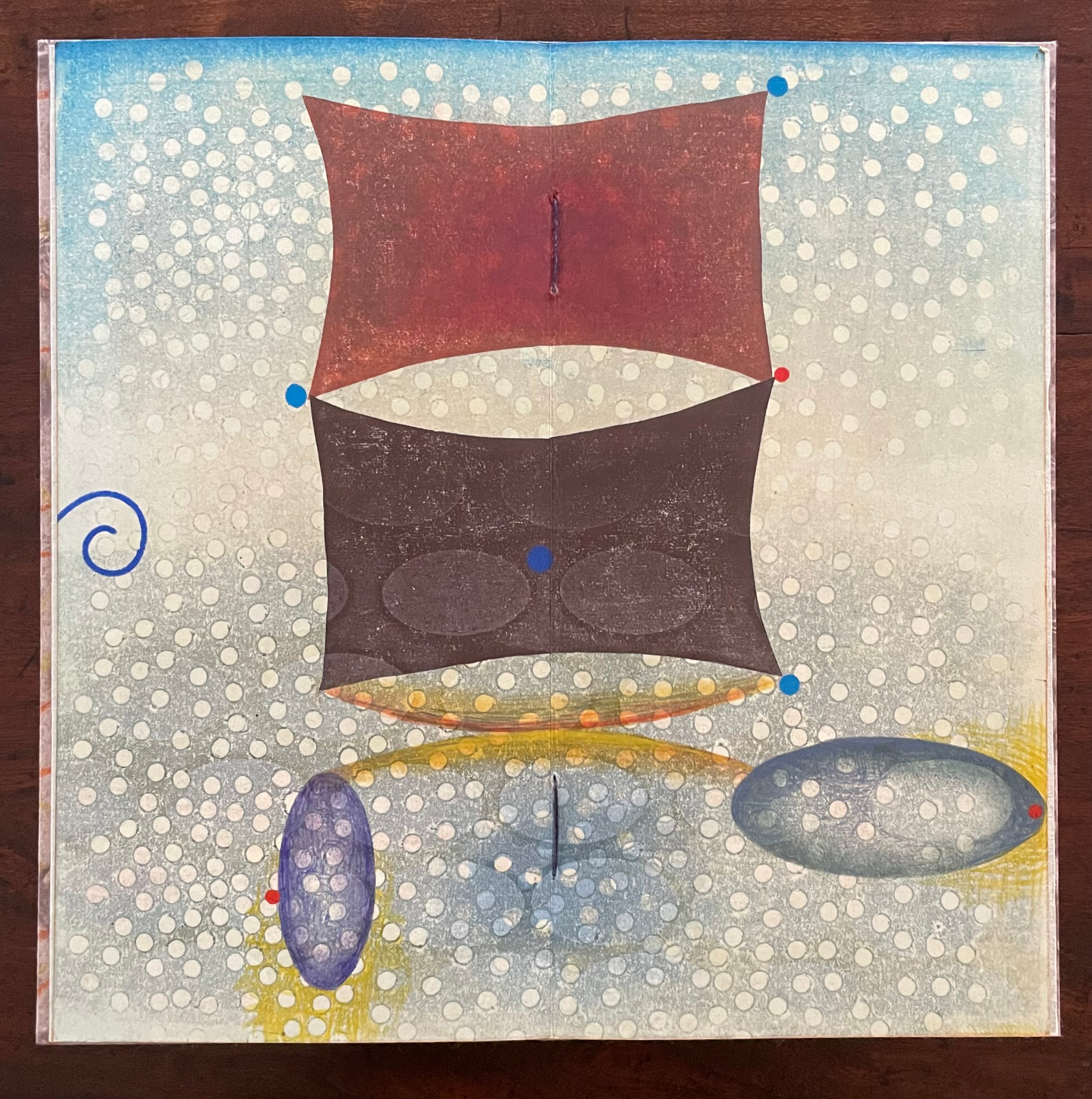
As the most prominent feature of the full-view monoprint, perhaps the two rectangular sail-like shapes recall the Chinese emperor and Venetian traveler. Or perhaps they allude to the remnants of a tower poking above the sands. The ellipsoidal shapes might be the “hares’ holes” mentioned above. The seemingly non-allusive flurry of white dots across the spread behave strangely. They lie in the background in the upper two thirds of the spread but then shift into the foreground in the lower third. The four bright blue dots may have migrated from the first half-view, but the trio of red dots are new participants. The presence of both contributes to an urge to flip back and forth between the first half-view and this full view.
The second half-view faces text that again displays all caps letters that sink below the line: “PALACE”, but more notably, the palace does not sit within a city but a city sits within the palace, “a city that can only be Urbino”. So, a real city within a fictive palace.
We can perform the photographic cheat to bring the two halves of the monoprint together, but as with No. 51, we overlook the deliberate hiding of the whole within the halves — like the paradoxical fictive palace that holds a real city (Urbino).
Type Cities (2018)
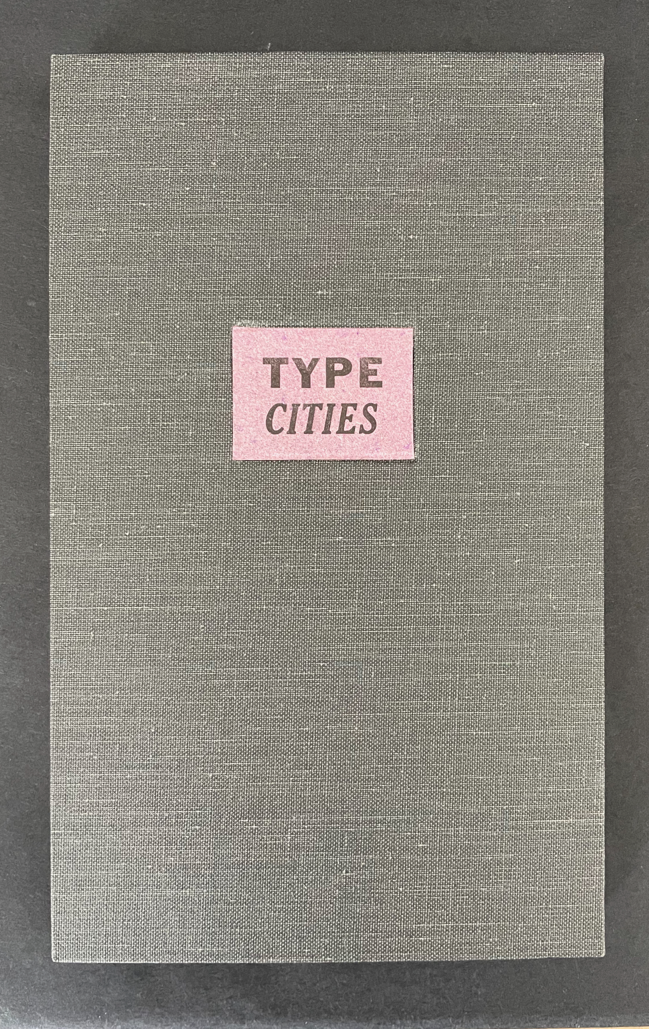
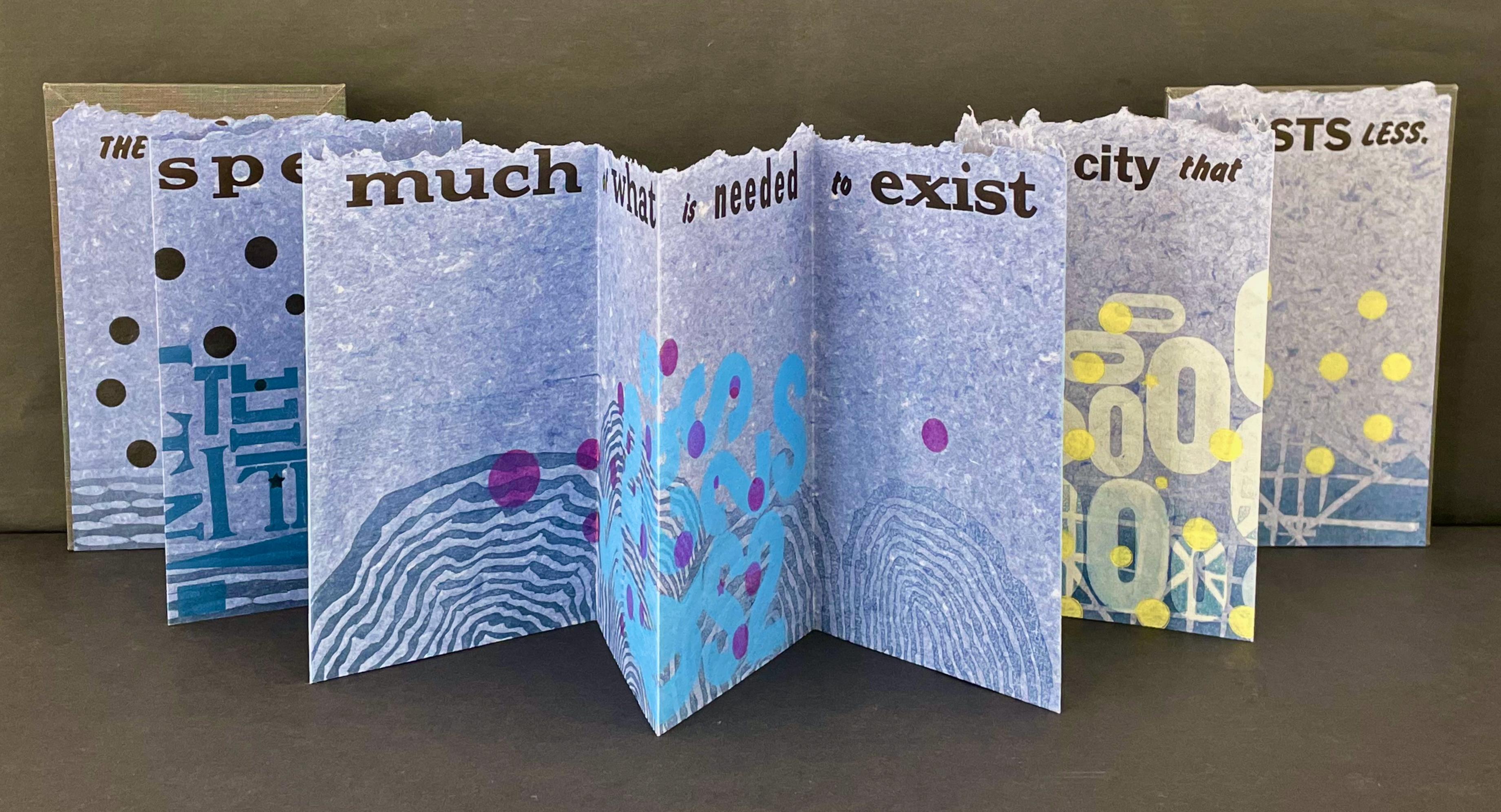
Type Cities (2018) Karen Kunc Leporello. H190 x W114 mm closed, extends to 1346 mm. [12] panels. Edition of 8, of which this is #2. Acquired from the artist, 25 March 2026. Photos: Books On Books Collection.
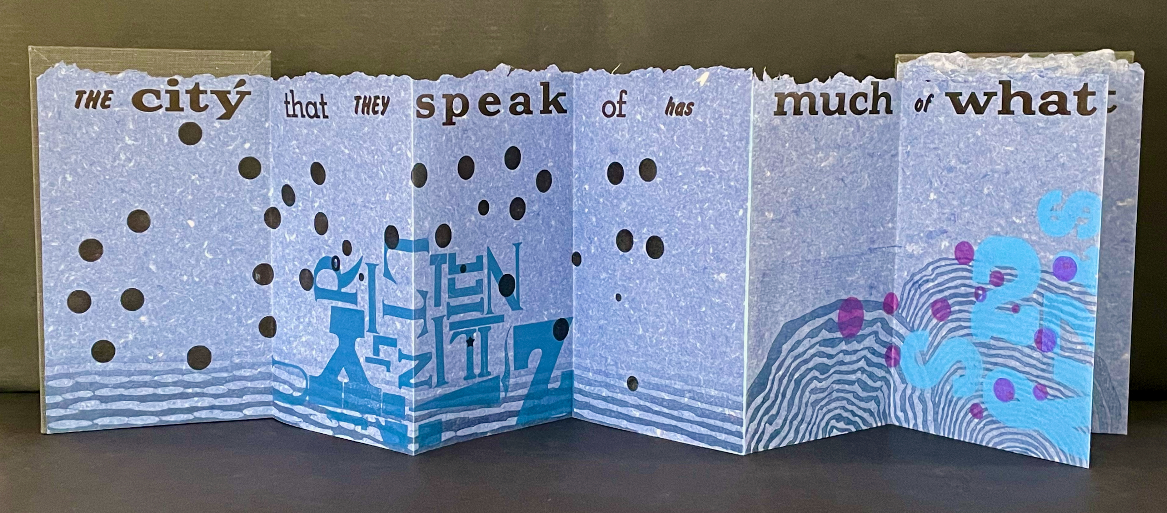
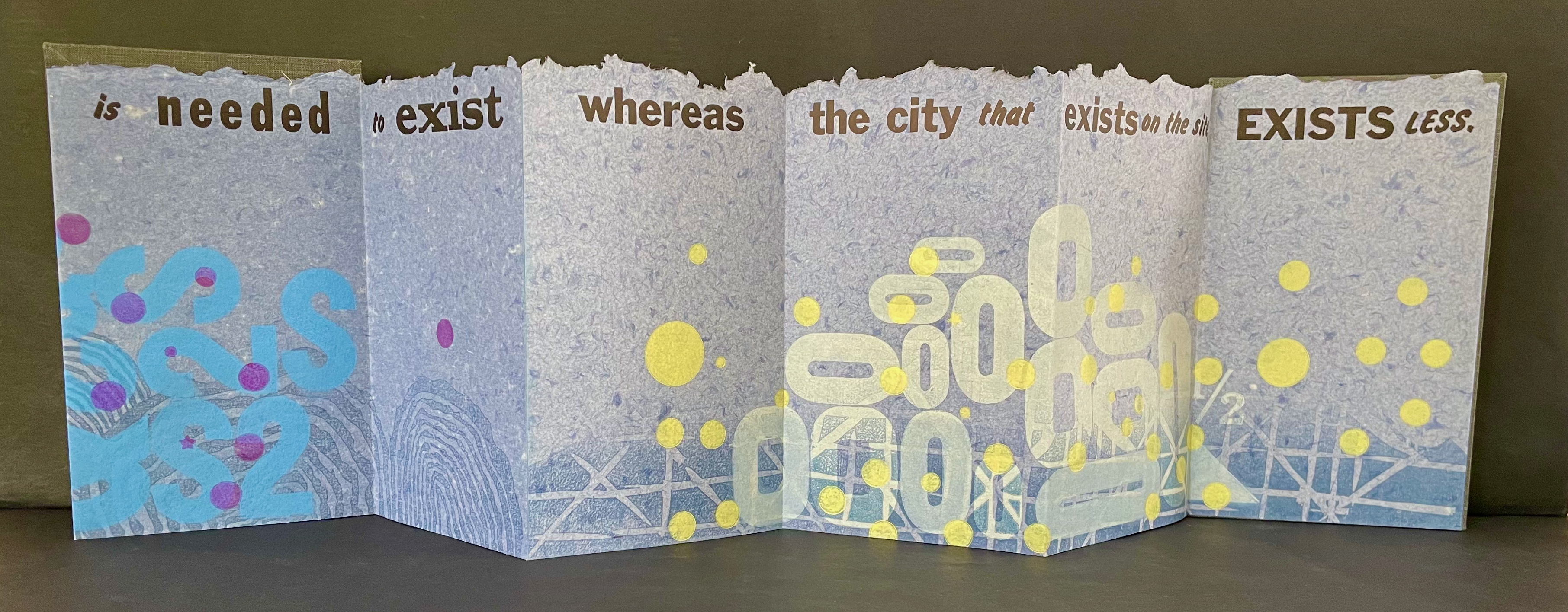
Like most other homages to Invisible Cities, Karen Kunc’s Type Cities (2018) focuses on one of the fictitious cities; in this case, Aglaura. As with Ten Thousand Things, she uses an excerpt:
The city that they speak of has much of what is needed to exist whereas the city that exists on the site, exists less.
That is cryptic. Just as the paradoxical characterizes the general cities in No.64, so it is for the particular city of Aglaura here:
So if I wished to describe Aglaura to you, sticking to what I personally saw and experienced, I should have to tell you that it is a colorless city, without character, planted there at random. But this would not be true either: at certain hours, in certain places along the street, you see opening before you the hint of something unmistakable, rare, perhaps magnificent; you would like to say what it is, but everything previously said of Aglaura imprisons your words and obliges you to repeat them than say. Therefore, the inhabitants still believe they live in an Aglaura which grows only with the name Aglaura and they do not notice the Aglaura that grows on the ground.
For Ten Thousand Things, the single-fold double-sided monoprint provided Kunc a surprisingly flexible tool with which to capture the paradoxical in two very different texts. This time she chooses the accordion structure. Also, as the title Type Cities suggests, she chooses type as an additional tool to capture what Marco Polo describes as Aglaura’s “enduring assortment of qualities”. Across the twelve panels of the leporello, Kunc lays out the text of her chosen excerpt in multiple faces and fonts:
Also across the twelve panels, the color change of black dots to purple, violet, and then yellow echoes the shift from the colorless city to something else “at certain hours, in certain places along the street”.
The “much of what is needed to exist” manifests at the bottom edge as wood type letters in dark blue floating along a river (?), then as Ss, 2s, and $s floating over a pond (?), and then yields to the less of zeroes scattered over a grid. The contrast of much and less even extends vertically to the handmade paper with its messily torn upper edge opposed to its neatly trimmed lower edge. It also extends horizontally to the paper as its tint shifts gradually from a deep blue to a light gray. These photographs do not do justice to the painted and stamped elements or texture of Type Cities.
Further Reading
Laozi. 2011. Tao Te Ching = Dao de Jing. Translated by Gia-fu Feng, Jane English, and Toinette Lippe. Third Vintage books edition. New York: Vintage Books, a division of Random House, Inc.
Works of homage to Jorge Luis Borges
Louise Grimshaw’s Ethereal Worlds(2017) celebrates “The Library of Babel” with hexagonally shaped pages of prints rotating on a central post.
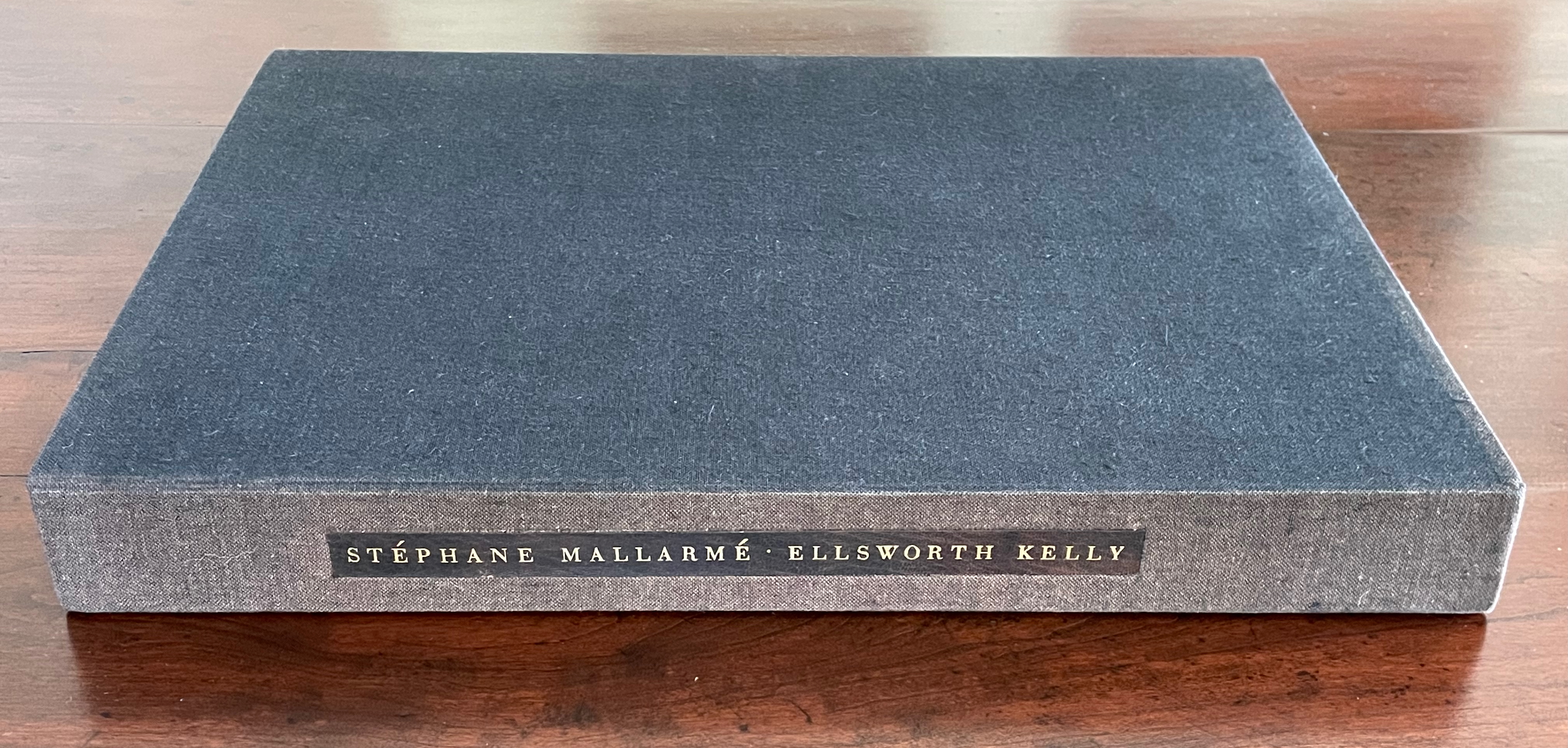
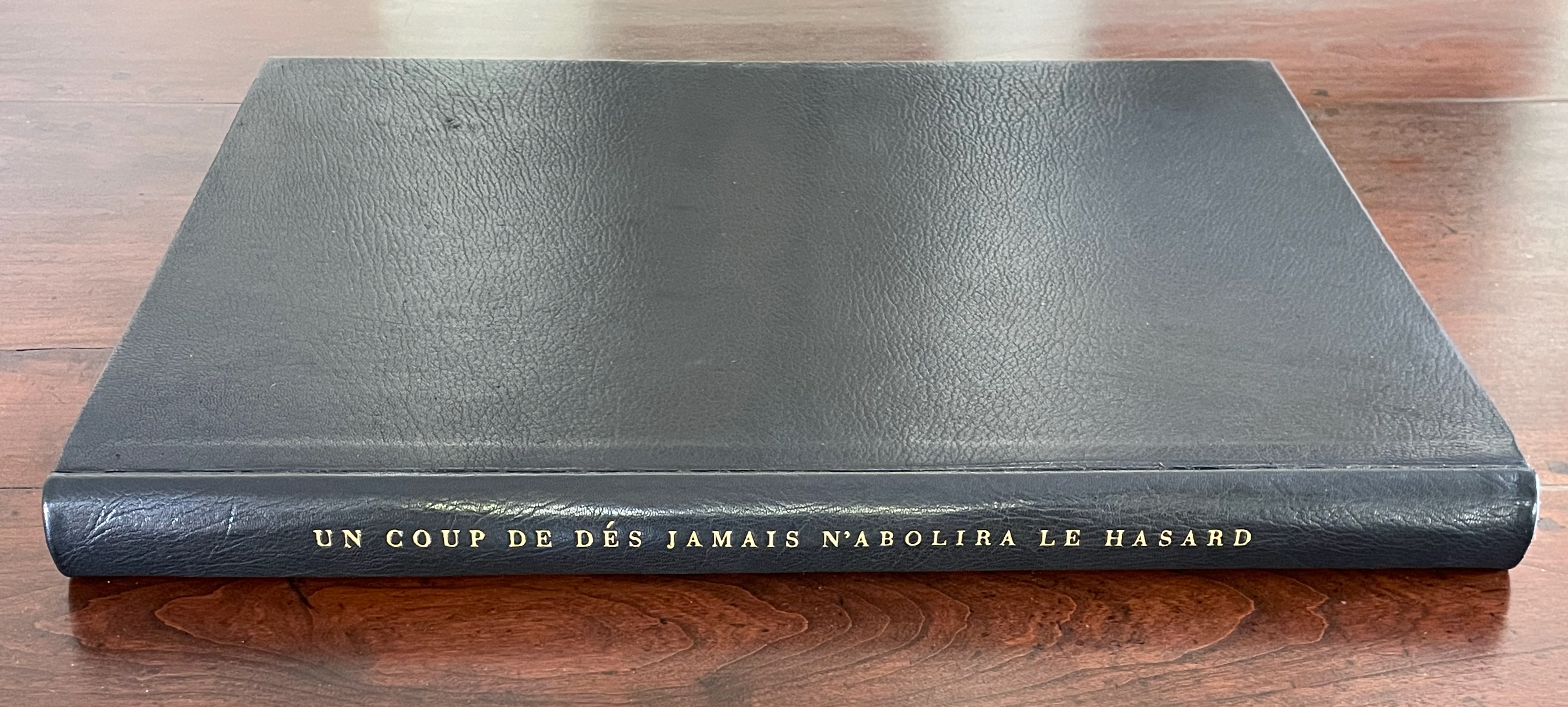
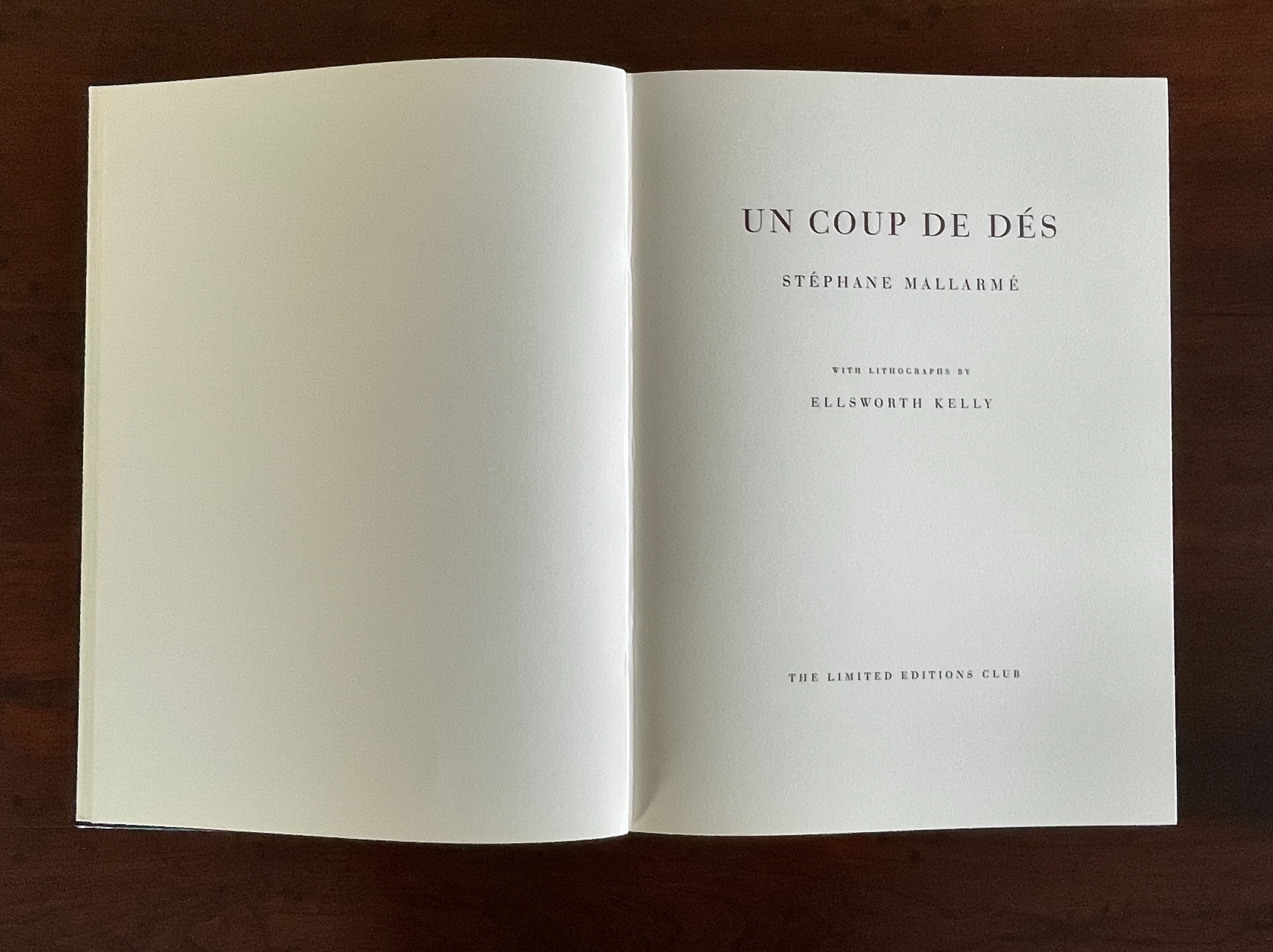
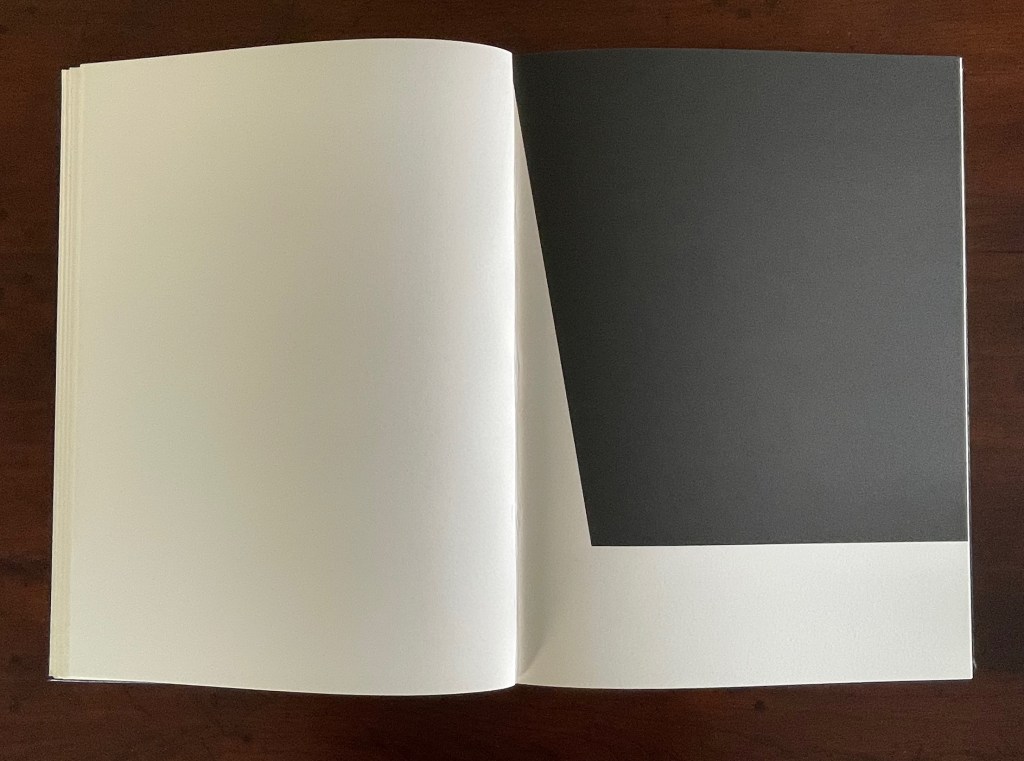
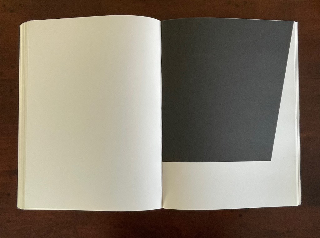
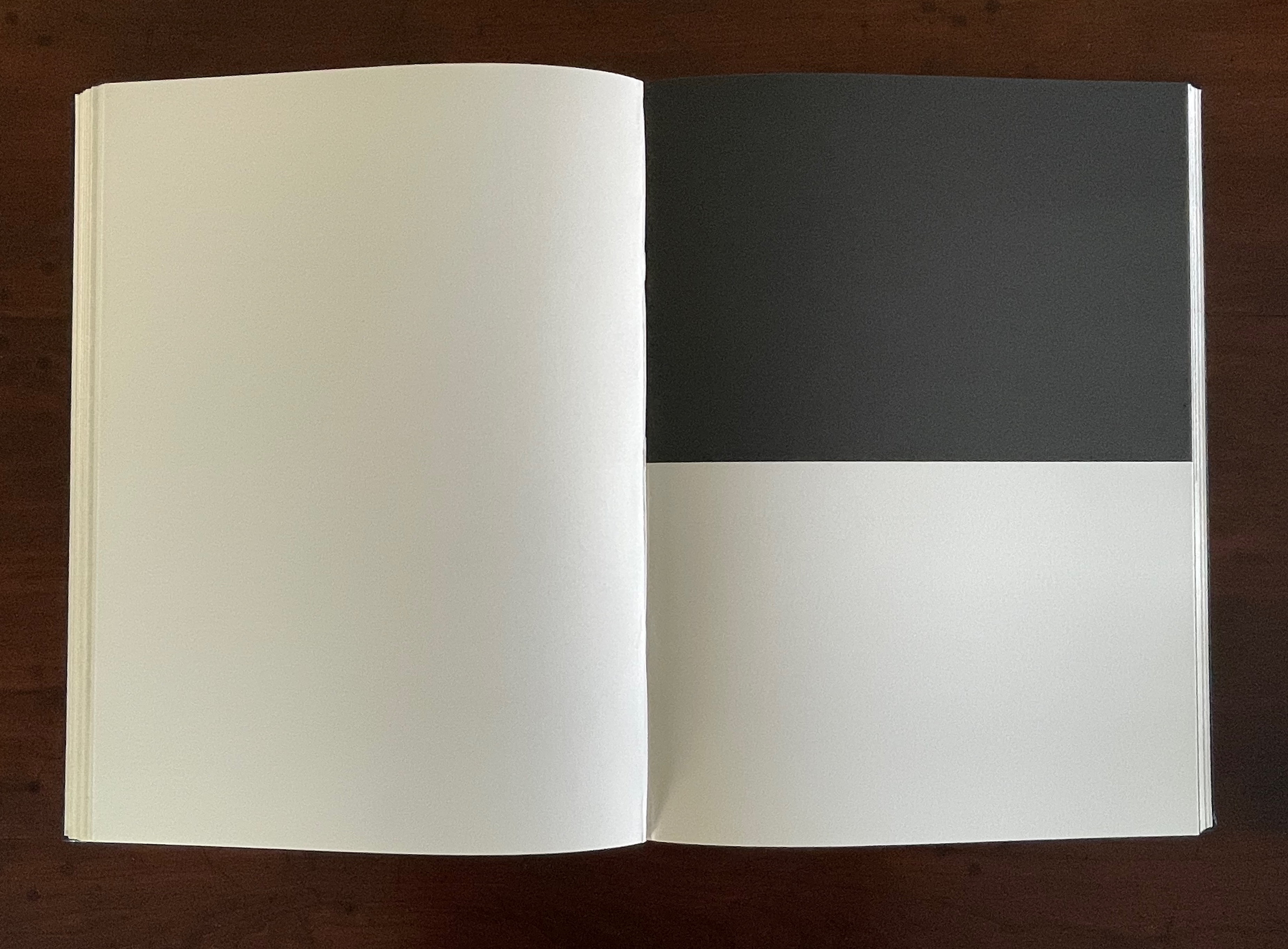
Un Coup de Dés Jamais N’Abolira le Hasard (1992) Ellsworth Kelly and Stéphane Mallarmé Hardback, case bound in full black morocco, spine gilt-lettered. 17 x 12 1/2 in Edition of 300, of which this is #204. Acquired at Swann Auctions, 24 October 2024. Photos: Books On Books Collection. Permission to display, courtesy of Limited Editions.
Is Ellsworth Kelly’s homage to Stéphane Mallarmé’s Un Coup de Dés Jamais N’Abolira Le Hasard an illustrated book, a livre d’artiste, or an artist’s book? It certainly resonates with and intensifies the poem’s design and imagery, but without being a spread-for-spread illustration. It is akin to the tributes paid by André Masson (1961), Jean Lecoultre (1975), Ian Tyson & Neil Crawford (1985), Jacques Vernière (1987), Christiane Vielle (1989), Ofer Lellouche (1997), Robert Bononno & Jeff Clark (2015), and Eric Zboya (2018). Some of these kindred spirits like Masson, Vielle, and Bononno & Clark intersperse artwork within the poem that evoke if not illustrate the setting and action of the sea and shipwreck. Some, like Masson, Lecoultre, Vernière, and Lellouche display images that have less to do with the poem’s imagery. Some, like Tyson & Crawford and Zboya, show more interest in capturing the poem’s numerological esotericism (LE NOMBRE). More than the others, though, Kelly builds on Mallarmé’s double-page spread principle and its structural importance for the poem.
The double-page spread is the chief design structure in Mallarmé’s poem and is essential to its workings. We know this from the differences in layouts between its first publication in Cosmopolis in 1897, its marked-up proofs Mallarmé left behind after his death, and his son-in-law’s effort with Gallimard in 1913 to reflect the poet’s plan. Just before his death, Mallarmé had been working on the volume with Ambroise Vollard, who had commissioned etchings from Odilon Redon to bring it to the status and price of the livre d’artiste, a genre he was shaping. Mallarmé was amenable to this as long as the etchings were grouped at the end of the book. He did not want the artwork to distract the reader from his careful arrangement of the text on and across eleven double-page spreads.
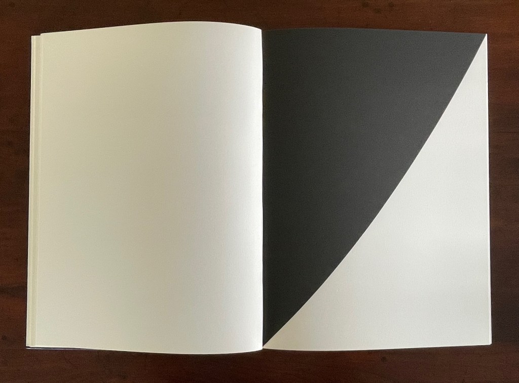
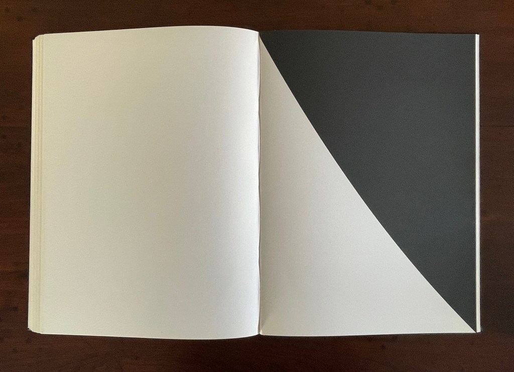
The fact of Ellsworth Kelly’s eleven lithographs aligns with Mallarmé’s plan for eleven double-page spreads of text, but the interweaving of the two sets of spreads runs contrary to Mallarmé’s wishes. To follow the poet’s wishes, Kelly and the book designer hired for The Limited Editions Club’s production could have been grouped at the end of the book, but they didn’t. To double down on the contravention, they added a blank double-page spread after each of the eleven spreads of text and after each of the eleven spreads of lithographs. Someone also decided to begin and end the volume with sets of four blank flyleaves. This is not mere padding to justify a deluxe price. The effect signals and enhances the importance of the double-page spread for Mallarmé’s poem. It underlines the importance of what Mallarmé called “les blancs”. More than underline it, those punctuations of blank space after each spread of text and then after each spread of image add a pace to the sequence and place an additional demand on the memory as it juggles Mallarmé’s interweaving of text in its different sizes, styles, and position across the double-page spread. The lithographs’ nature, their pattern, and their spatial relationship to everything in the book’s structure match Mallarmé’s architectural plans far more than Vollard’s impresario interventions.
Abstract as they are, Kelly’s lithographs subtly mirror the structure and content of Mallarmé’s poem. Just as Mallarmé’s first sentence begins and his last sentence ends with “un coup de dés”, Kelly reverses the image in his first lithograph to make the image in his last.
Just as inversions are recurrent in the poem, so they recur in Kelly’s lithographs.
The poem’s spread beginning and ending COMME SI [“AS IF“] is central to the poem physically and thematically. The sixth of the eleven spreads, it is the only one showing this spatial, syntactic, and typographic pattern. Likewise, Kelly’s sixth lithograph splits its page equally. No other lithograph depicts this equilibrium.
Kelly created a separate portfolio of four lithographs: The Mallarmé Suite. This work is meant to be displayed on a wall and arranged precisely according to Kelly ‘s instructions. Despite the four shapes’ replication from the book, the portfolio stands quite apart in its introduction of color and positioning of the shapes (see Bonfitto’s essay). Its mere conjunction with the book does not imbue it with what happens in the book, and that underscores the fact that Kelly’s eleven black-and-white lithographs are not in mere conjunction with Mallarmé’s poem. The reader/viewer can imagine billowing sails, overwhelming waves, or tilting masts in the lithographs, but what matters is how Kelly makes his distinctive shapes play with one another and all the book’s double-page spreads to mirror how Mallarmé makes his words, typography, and double-page spreads play with one another. If self-reflexiveness is one of the key markers for distinguishing an artist’s book from a livre d’artiste, we have here a self-reflexive poem and a self-reflexive visual artwork punctuated by blanks within the canvas of the book structure to create a self-reflexive artist’s book.
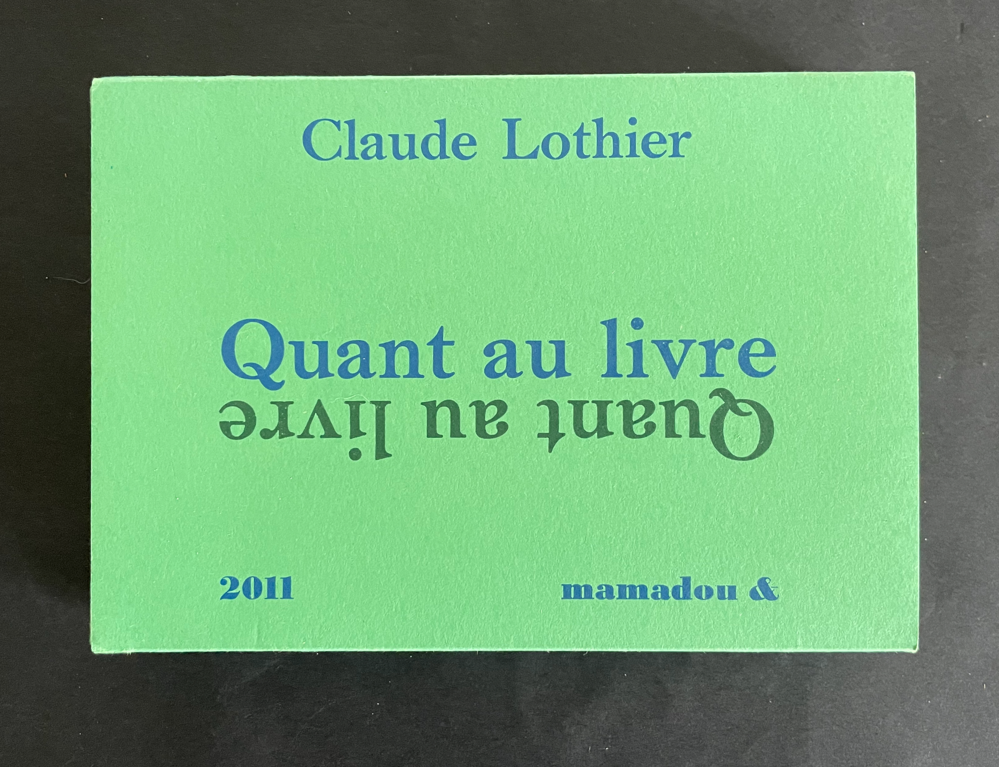
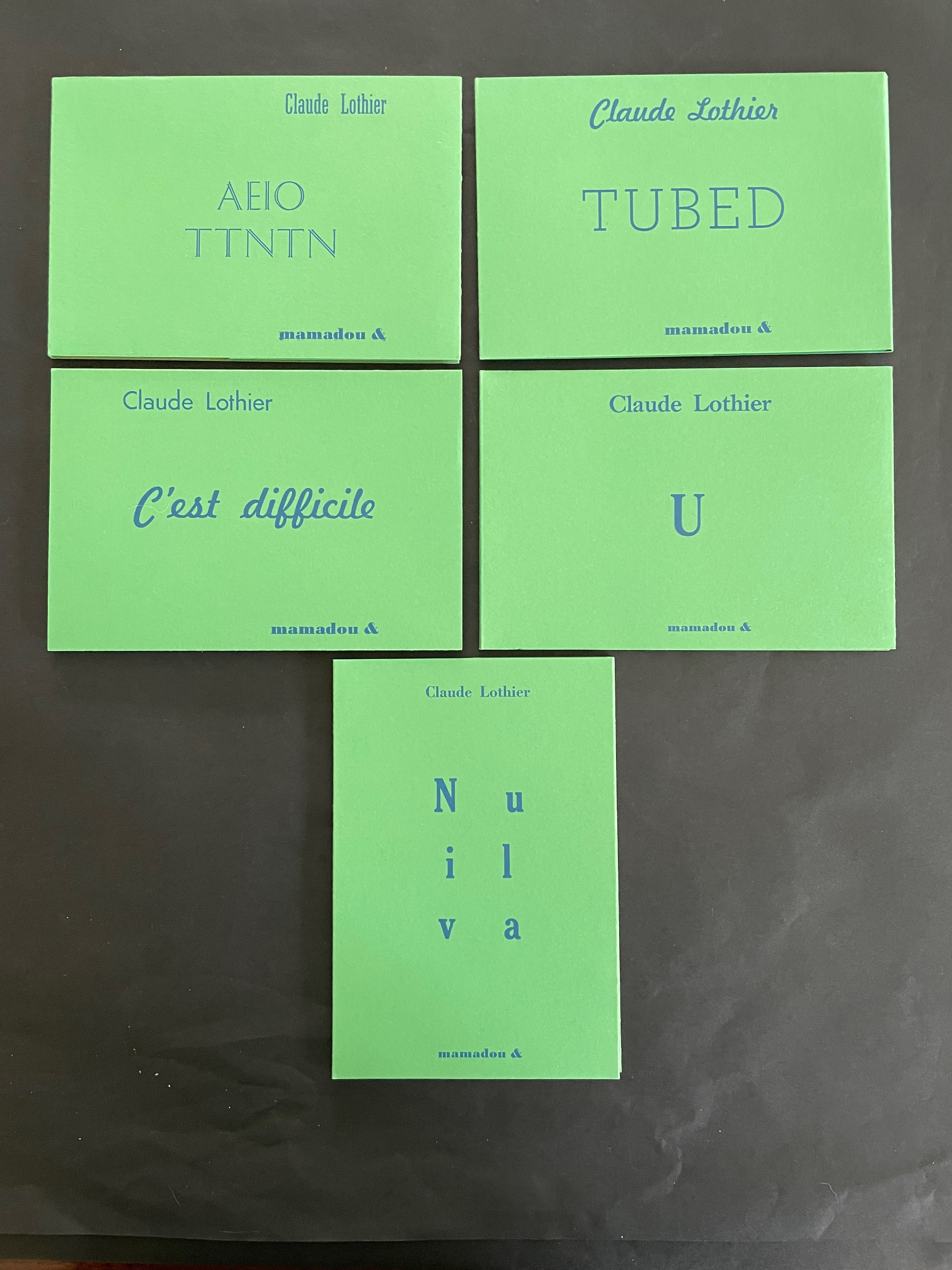
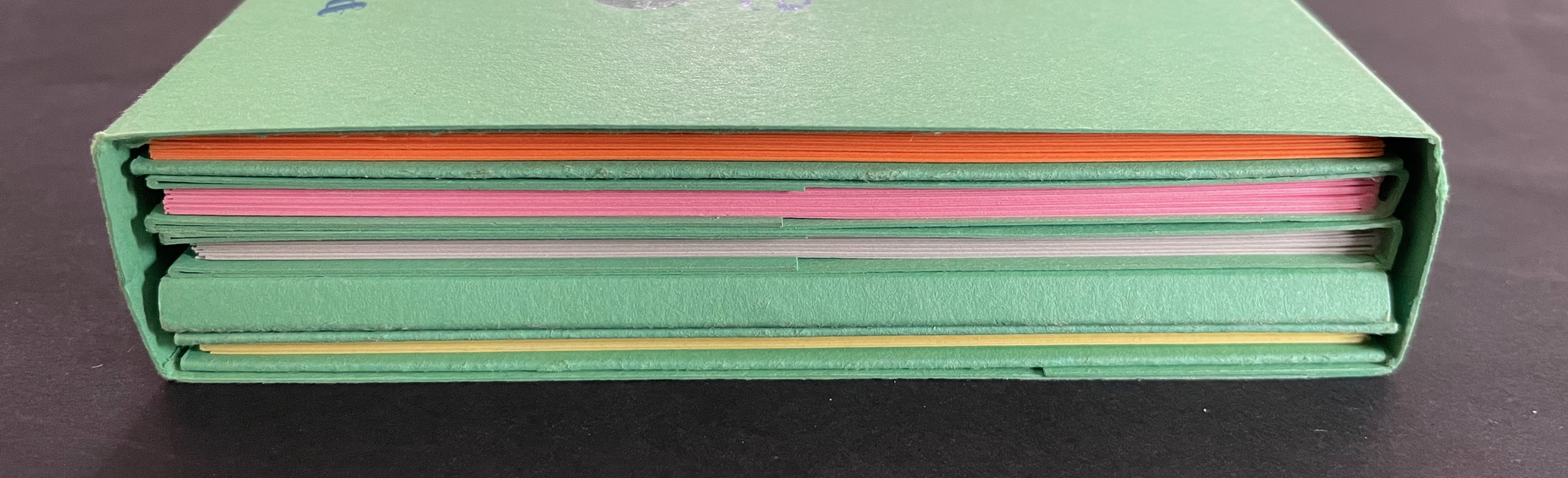
Quant au Livre(2011) Claude Lothier Slipcase around five cased and glued softcover booklets. Slipcase: H110 x W158 x D25 mm. AEIO TTNTN: H108 x W157 mm. Niv ula: H157 x W108 mm. C’est difficile: H108 x W157 mm. TUBED/NIF: H108 x W157 mm. U: H108 x W157 mm. [28] pages each except for TUBED/NIF, which has [20], and U, which has [24]. Edition of 200. Acquired from Biblio-Net, 16 October 2025. Photos: Books On Books Collection
In English, the phrase quant au livre would be “as for the book” or “concerning the book”. What is lost in translation is the phrase’s association with Stéphane Mallarmé’s volume of essays Divagations (1897) in which one section was entitled Quant au Livre. It included the essay “Le Livre, Instrument Spirituel”, which delivered the proclamation “tout, au monde, existe pour aboutir à un livre” (“everything in the world exists to end up in a book”). It was the proclamation scholars seized on to give artists’ books their metaphysical underpinning. If it swallows up everything in the world, What is a book? Many book artists have simply bypassed the discussion and jumped in with works of art that challenge how we read, how we make sense of a book, how we make sense of what a book is. Claude Lothier is one of those book artists.
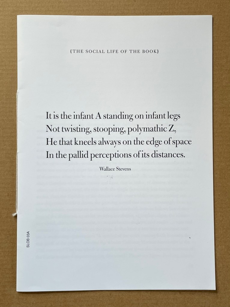
Infant A (2012) Louis Lüthi Thread-stitched signature. H225 x W160 16 pages. Edition of 1000. Acquired from Torpedo Books, 8 January 2024. Photos: Books On Books Collection
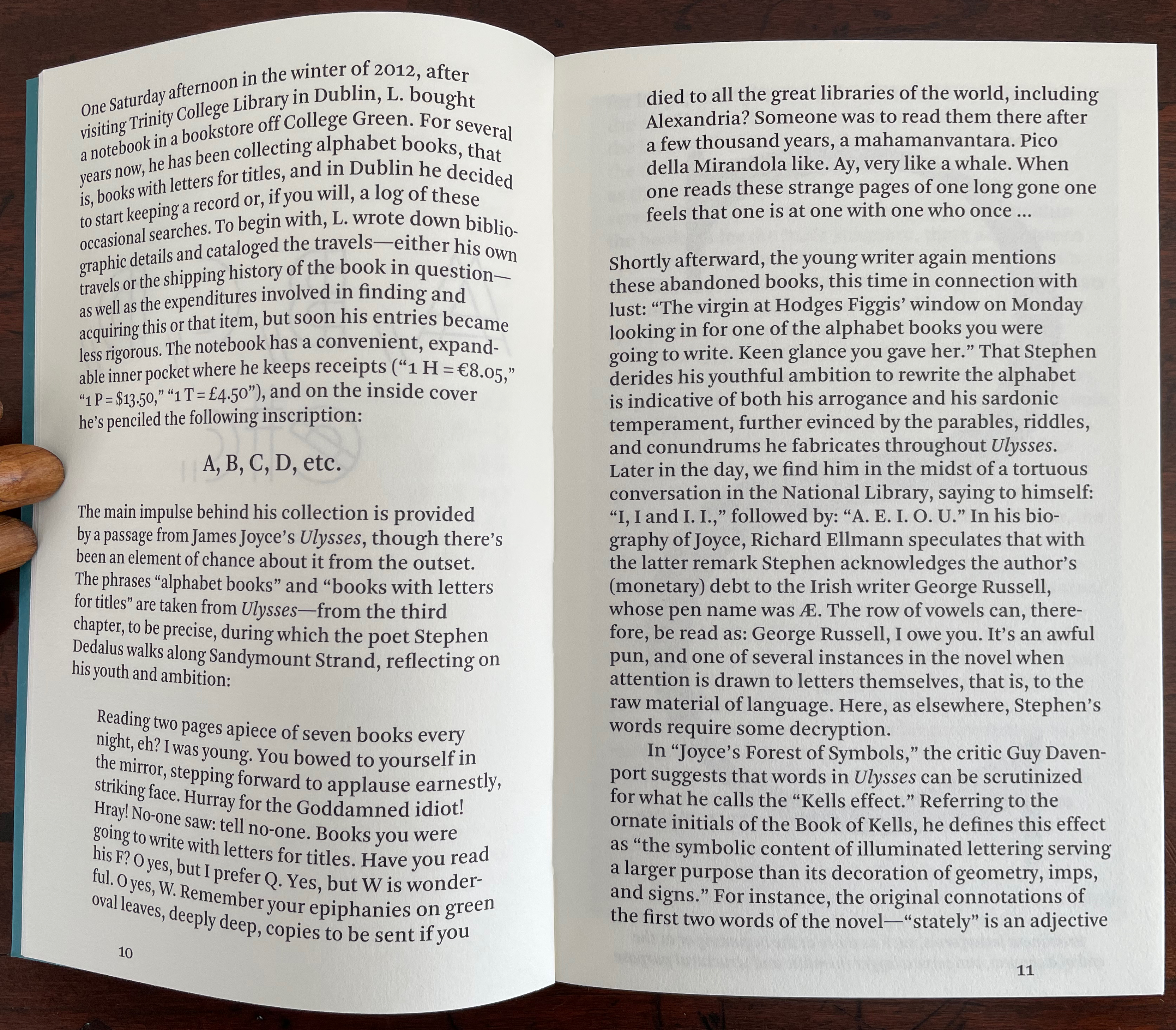
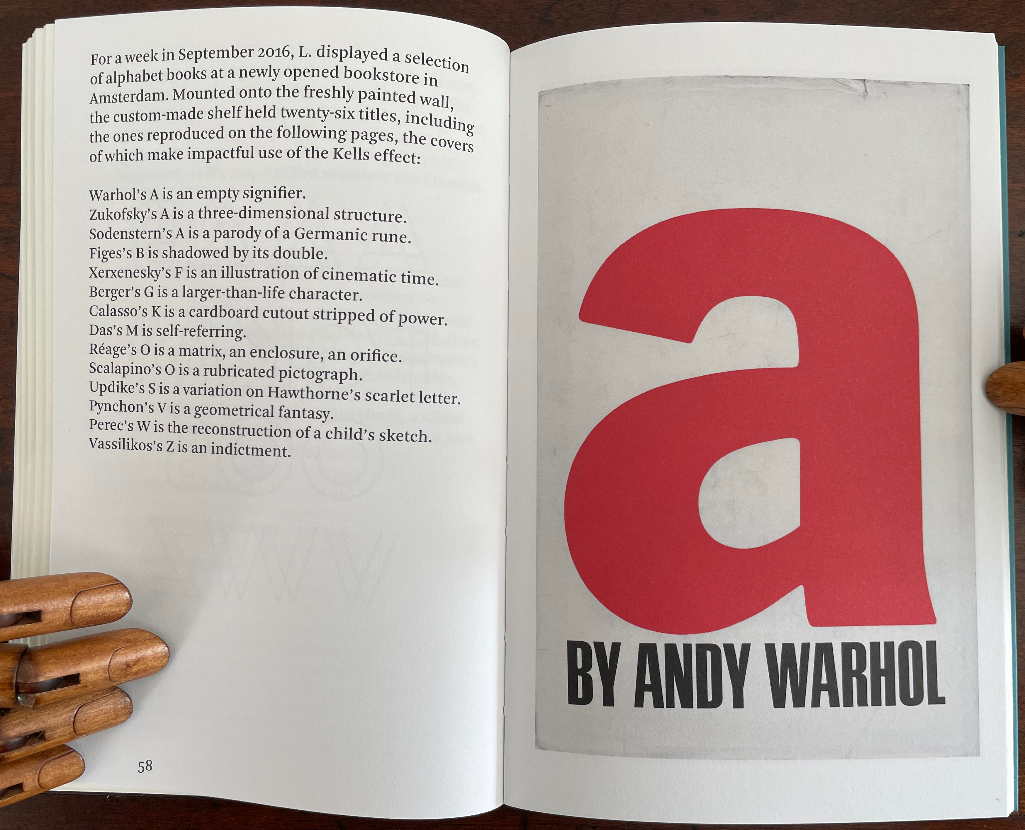
Infant A is part of a collection of essays commissioned by castillo/corrales and published by Paraguay Press under the series title The Social Life of the Book. Lüthi’s contribution fits the Books On Books Collection on several scores. First is the epigram’s invocation of the alphabet, which echoes the collection’s concentration of alphabet-related artists’ books and children’s books. See Alphabets Alive! Second is the epigram’s source: Wallace Stevens, whose poetry has inspired Ximena Pérez Grobet’s Words (2016). Would that other book artists be so inspired. Third is the narrator’s fictional conversation with Ulises Carrión in a celebration of all things A-related, in particular Andy Warhol’s novel a: a novel (1968), which finds analogues in Warren Lehrer’s A Life in Books: The Rise and Fall of Bleu Mobley (2013) and Derek Beaulieu’s a, A Novel by Andy Warhol (2017) (entry in progress). Fifth is how the dialogue reminds me of Suzanne Moore’s A Musings (2015).
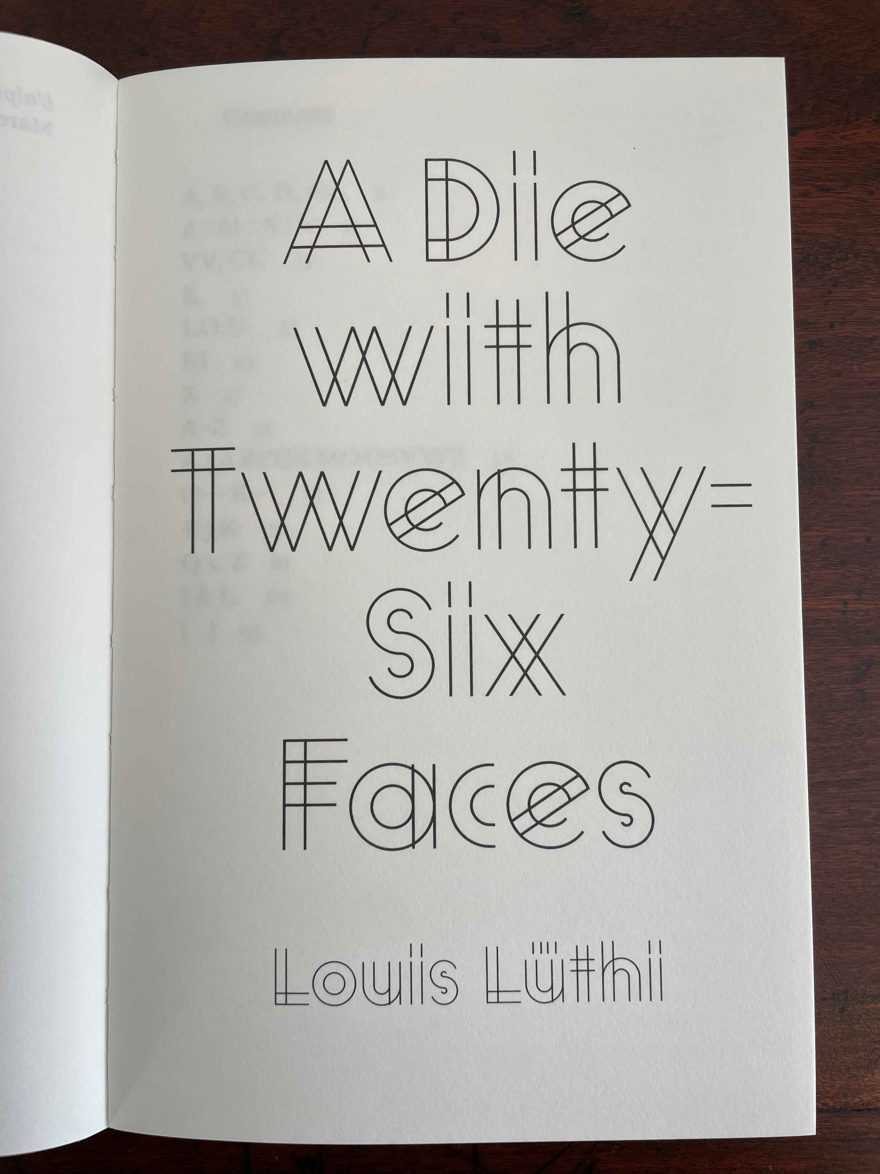
A Die With Twenty-six Faces (2019)
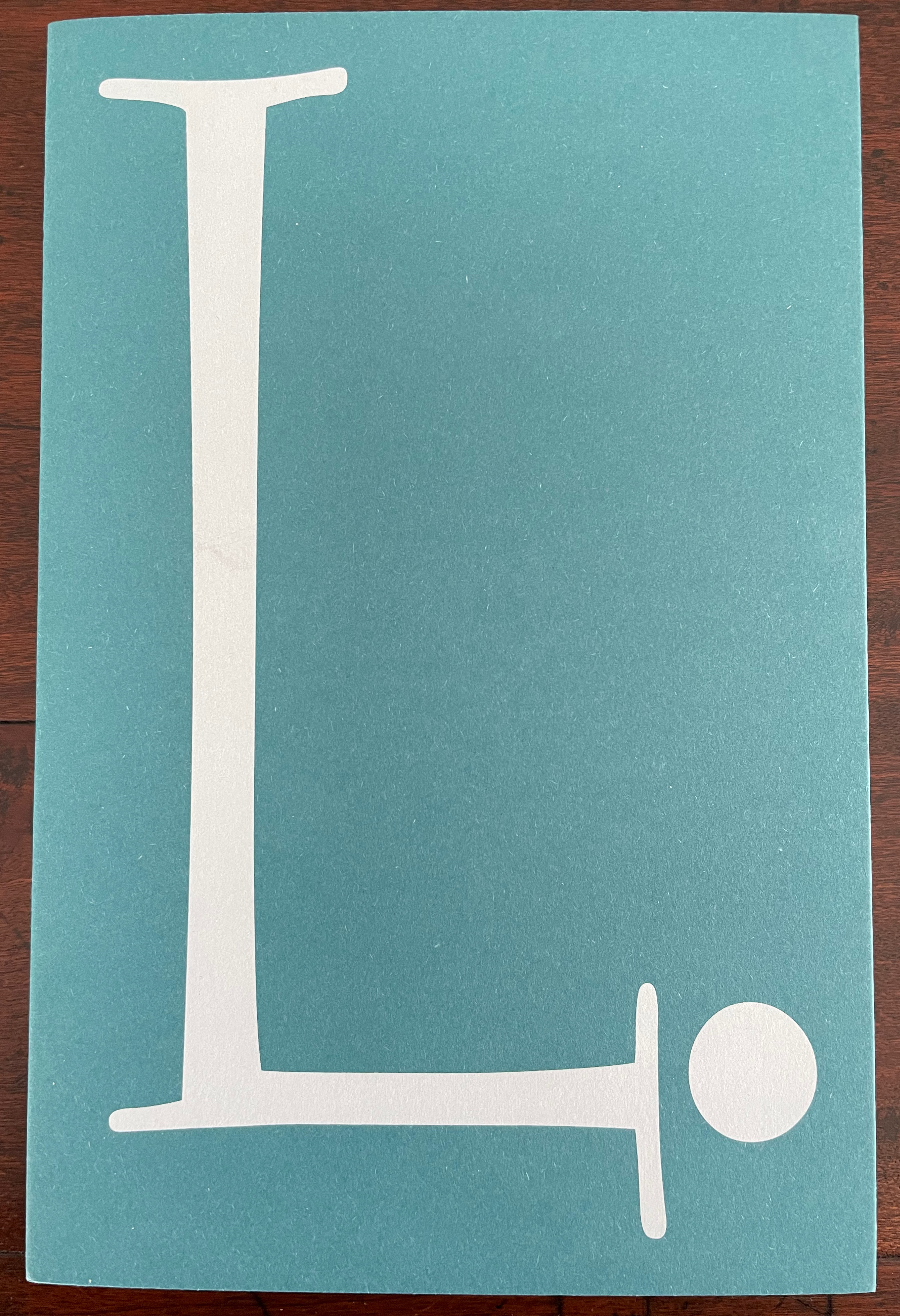
A Die With Twenty-six Faces(2019) Louis Lüthi Paperback. H200 x W130 mm. 104 pages. Acquired from Amazon, 18 September 2022. Photos: Books On Books Collection
Walter Benjamin’ unpacking of his library has a lot to answer for. Not only do we have Buzz Spector‘s take on it in 1995, but Jo Steffens’ Unpacking trilogy of photos of architects’, artists’ and writers’ bookshelves, Alberto Manguel’s elegiac Packing My Library (2018), and here is Louis Lüthi’s.
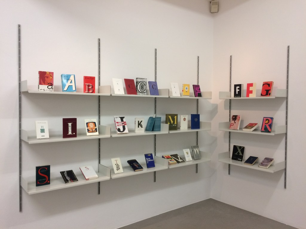
Publisher’s website: In A Die with Twenty-Six Faces, the author — let’s call him L. — guides the reader through his collection of alphabet books, that is, books with letters for titles. Some of these titles are well known: Andy Warhol’s “a,” Louis Zukofsky’s “A”, Georges Perec’s W. Others are obscure, perhaps even imaginary: Zach Sodenstern’s A, Arnold Skemer’s C and D. Tracing connections between these books, L. elaborates on what the critic Guy Davenport has called the “Kells effect”: “the symbolic content of illuminated lettering serving a larger purpose than its decoration of geometry, imps, and signs.”
The title stirs thoughts of Marcel Broodthaers’ oracular statement in 1974 “I see new horizons approaching me and the hope of another alphabet”. An alphabet that unrolls across the twenty-six faces of a die would certainly qualify as another alphabet. Broodthaers and the die also stir thoughts of Stéphane Mallarmé’s Un Coup de DésJamais N’Abolira le Hasard to which Broodthaers paid repeated homage. Throwing a twenty-six-sided die would certainly no more abolish chance than would a roll of Mallarmé’s six-sided die. Lüthi’s game, however, has little to do with chance unless we count his luck in finding the works to build his library of single-letter-entitled books. Even less to do with luck if some of the library is fictitious, a likelihood that the “publisher’s” statement suggests. Lüthi’s die is loaded!
A selection of Lüthi’s “alphabet” books on display. Courtesy of the author. Photo: Gesellschaft für Aktuelle Kunst Bremen
On the Self-Reflexive Page II (2021)
On the Self-Reflexive PageII(2021) Louis Lüthi Paperback. H200 x W130 mm. 304 pages. Acquired from Idea Books, 18 September 2022. Photos: Books On Books Collection.
This is a peculiar book in its order and nature. After two variant half-title pages, it begins with a section entitled “Black Pages”. Only on flipping through the volume can we find the remaining front matter — just after page 208. There’s another half-title and then the Table of Contents. Reproducing the marbled page from Laurence Sterne’s The Life and Opinions of Tristram Shandy, Gentleman (1759–1767), the book’s cover gives a clue to this peculiarity. Sure enough, Lüthi spells it out later in the section entitled “On Drawing Pages”.
So much in Tristram Shandy is presented out of order: a second dedication comes not after the first but on page 27, the preface is not at the beginning of the novel but in chapter 20 of volume three, and chapters 18 and 19 of volume nine come not after chapter 17 but are inserted after chapter 25. In a similar act of transposition, we find a marbled page in volume three, even though hand marbling is customarily used to decorate covers and endpapers. As Viktor Shklovsky observed, “It is precisely the unusual order of even common, traditional elements that is characteristic of Sterne.” (p. 240)
This one paragraph confers on Lüthi’s entire book the very self-reflexivity that it explores across a range of literature and artists’ books. Reflecting the custom to which it refers, On The Self-Reflexive Page II carries Sterne’s marbled pages on its front and back covers. In the text before his marbled leaf, Sterne refers to it as the “(motly emblem of my work!)“. Lüthi has taken that exclamation to heart (and cover) as if it were advice in creating this hybrid, motley work of his own: “part artist’s book and part essay, part literary excavation and part typographical miscellany” as he calls it in his middle-of-the-book Foreword.
Lüthi’s work is just one in the Books on Books collection of several inspired by Tristram Shandy. There is Erica Van Horn’s Born in Clonmel (2011), Simon Morris’ Do or DIY (2012), Abra Ancliffe’s The Secret Astronomy of Tristram Shandy (2015), and Shandy Hall‘s The Black Page Catalogue (2010), Emblem of My Work (2013), Paint Her To Your Own Mind (2018) and The Flourish of Liberty (2019). Outside the collection, there is Brian Dettmer’s Tristram Shandy (2004), commissioned by Shandy Hall’s Laurence Sterne Trust, and also Sean Silver’s Shandean online venture called The Motley Emblem (2022~) celebrating Sterne’s marbled leaf and the analytical chemistry of marbling. The latter may become a book, even an artist’s books to add to the tally. In The Century of Artists’ Books, Johanna Drucker draws attention to Sterne’s novel twice as an example of self-reflexivity or self-interrogation, but in 1994 and 2004, Sterne did not rise to the same level of precursor to book artists as William Blake or Stéphane Mallarmé in Drucker’s view. With these later works of book art inspired by Uncle Toby’s nephew in the bag, a dozen or so more might nudge Sterne up the scale.
In the meantime, anyone interested in artists’ books could fruitfully apply to the medium Sterne’s exhortation to his own readers:
Read, read, read, read, my unlearned reader! read, — or by the knowledge of the great faint Paraleipomenon — I tell you before-hand, you had better throw down the book at once; for without much reading , by which your reverence knows, I mean much knowledge, you will no more be able to penetrate the moral of the next marbled page (motly emblem of my work!) than the world with all its sagacity has been able to unraval the many opinions, transactions and truths which still lie mystically hid under the dark veil of the black one.
Artists’ books are to be read, handled and digested, not stored away in the archives.
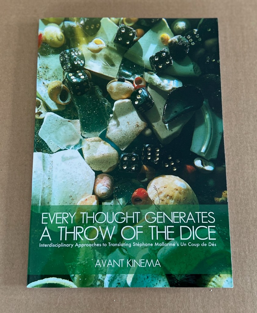
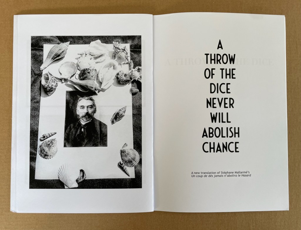
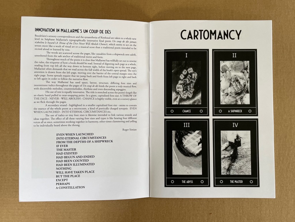
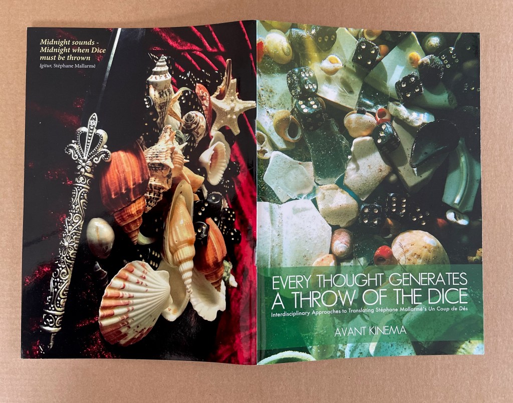
Sarahjane Swan & Roger Simian (the strangely named duo behind Avant Kinema) were responding to an invitation from the AHRC-funded project Imprints of the New Modernist Editing in 2019, which would have resulted in an exhibition at Shandy Hall, home of the Laurence Sterne Trust, but the Covid-19 pandemic intervened. Their response consisted of “visual artworks, photography, poetry, fiction and Tarot style card designs featuring ‘twelve virgin symbols extracted from Un coup de dés‘” (Swan & Simian, “Introduction”). This booklet captures those works and concludes with a new translation of the poem.
The subtitle characterizes the works as an interdisciplinary approach to translating the poem, but Dick Higgins’ term “intermedial” might be a more apt description.
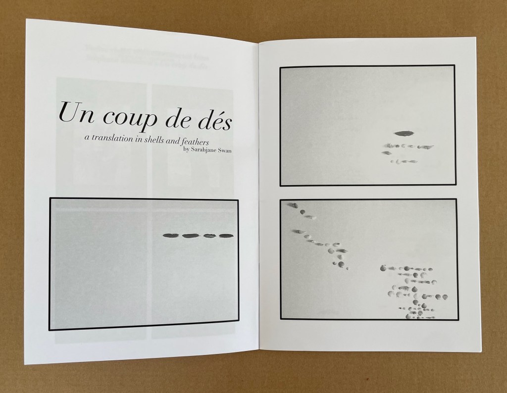
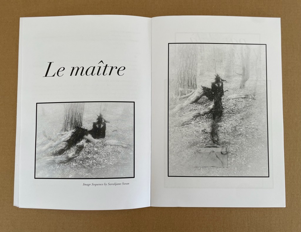
Swan’s substitution of feathers and shells for Mallarmé’s words, Broodthaers’ redactions and Pichler’s excisions brings a new form of materiality to Un Coup de Dés. It recalls the similar playfulness of other artists such as Clotilde Olyff with the alphabet.
From an image sequence by Swan, the artists pull together a set of Tarot-like cards to introduce a new angle on the poem’s invocation of chance.
Avant Kinema’s homage is a collage or assemblage of different media distilled in this booklet. The preempted installation might have echoed that of Marine Hugonnier’s The Bedside Book Project (2006-07).
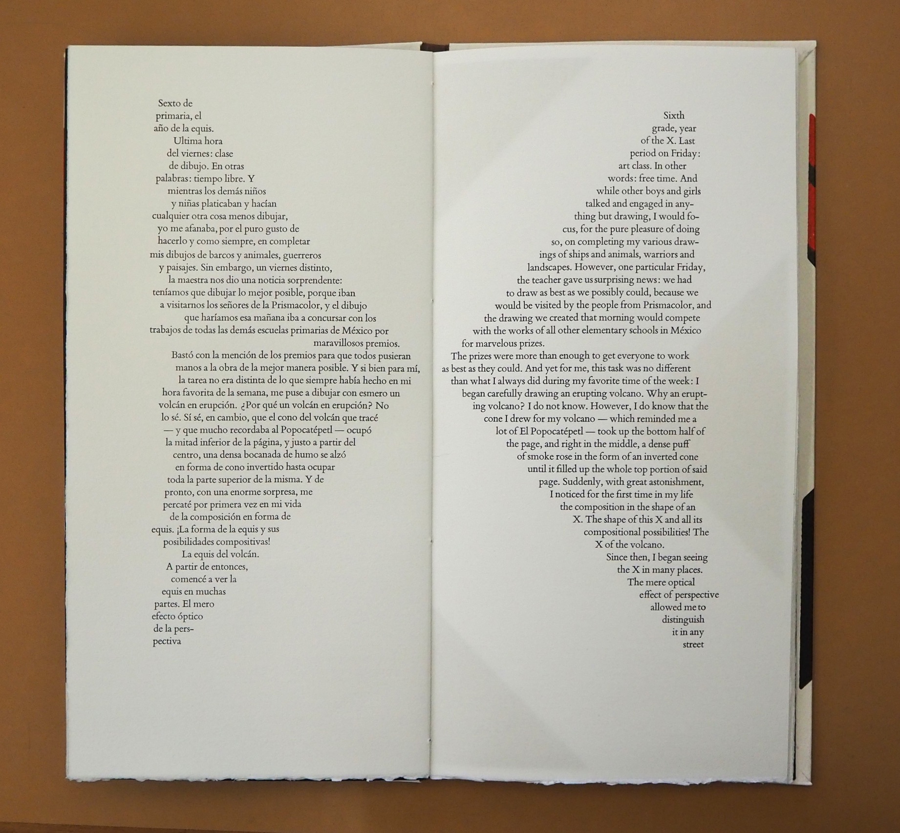
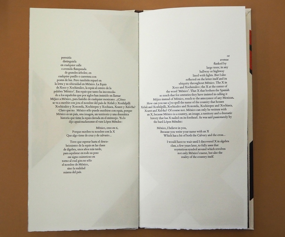
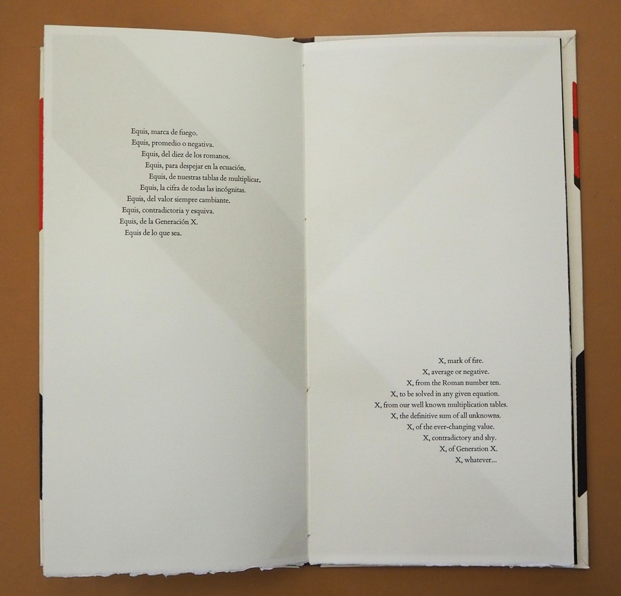
In this ode to the letter X, Mexico and language itself, Alberto Blanco and Nacho Gallardo Larrea brilliantly show how the artist’s book can translate word and image from one to the other and back and, at the same time, soar over the challenge of translating poetry.
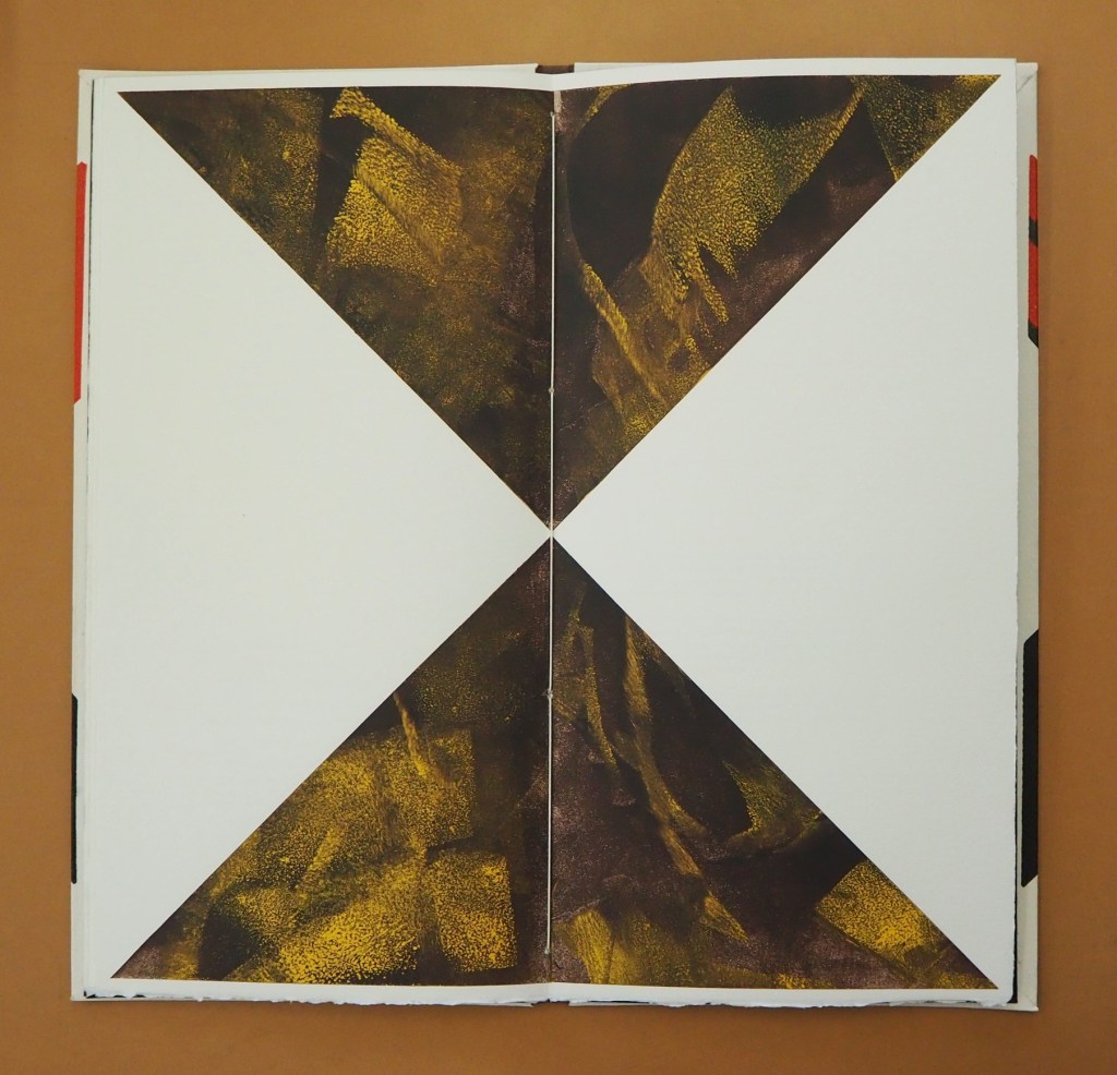
The Spanish and English versions of Blanco’s text shape, and are shaped by, the bilateral symmetry of the letter X and the codex form of the book. Spanish on the left, English on the right: the imposition of type and the ghostly images of the X play with one another. The two texts delight in the crossover between similarity and difference, knowingly in the white space at the exact center of the X in the double-page spread below. How better to use the notion that, for all letterforms, space counts as much as line?
Sometimes the language on one side completes a thought or expression before the language on the other side can do so, a natural phenomenon in translation in which one language needs fewer or more words than the other. See above, for example, the passages beginning “La equis del volcán” and “X of the volcano” that do not quite align in the legs of the X. The Spanish sentence trails off in a fragment to be completed on the following verso page, but the English sentence is already half way there on the recto page above.
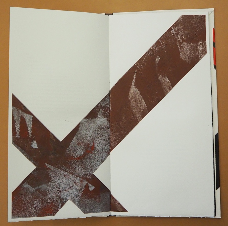
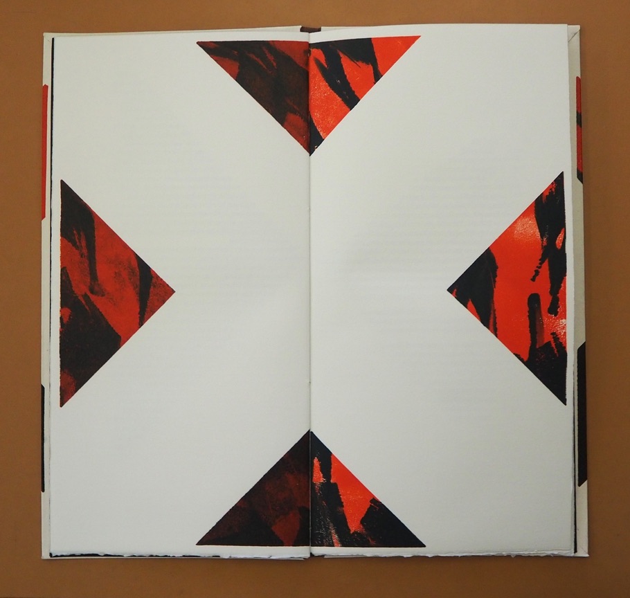
As the shaped poem continues in the pages below, and the number of words in one language exceeds those on the other creating lines asymmetrical to one another, the poet and artist use the X shape in whole and parts and the diametrical placement of text in the last double-page spread to reflect the crossing dance of similarity and difference, asymmetry and symmetry, that they find in X across languages, generations and country.
Interpersed between the pages of text, the late El Nacho’s monotypes make color, shape and space play with one another to mirror — not merely illustrate — the thrust of the language. If ever there were a collaborative work that distinguishes the artist’s book from a livre d’artiste, this is it. Alberto Blanco has also created solo artist’s books, which enjoyed an exhibition at the Athenaeum Music & Arts Library, La Jolla, California, February 19-March 26, 2011. Stylistically they are distinct from The Book of Equis, which underscores its collaborative originality.
Colophon: “The Book of Equis was designed and printed in Intagrafía, located in San Jose del Cabo under the direction of Peter Rutledge Koch, with monotypes created by El Nacho. Printed under the supervision of Lenin Andujo Fajardo by Ivonne Rivas.”
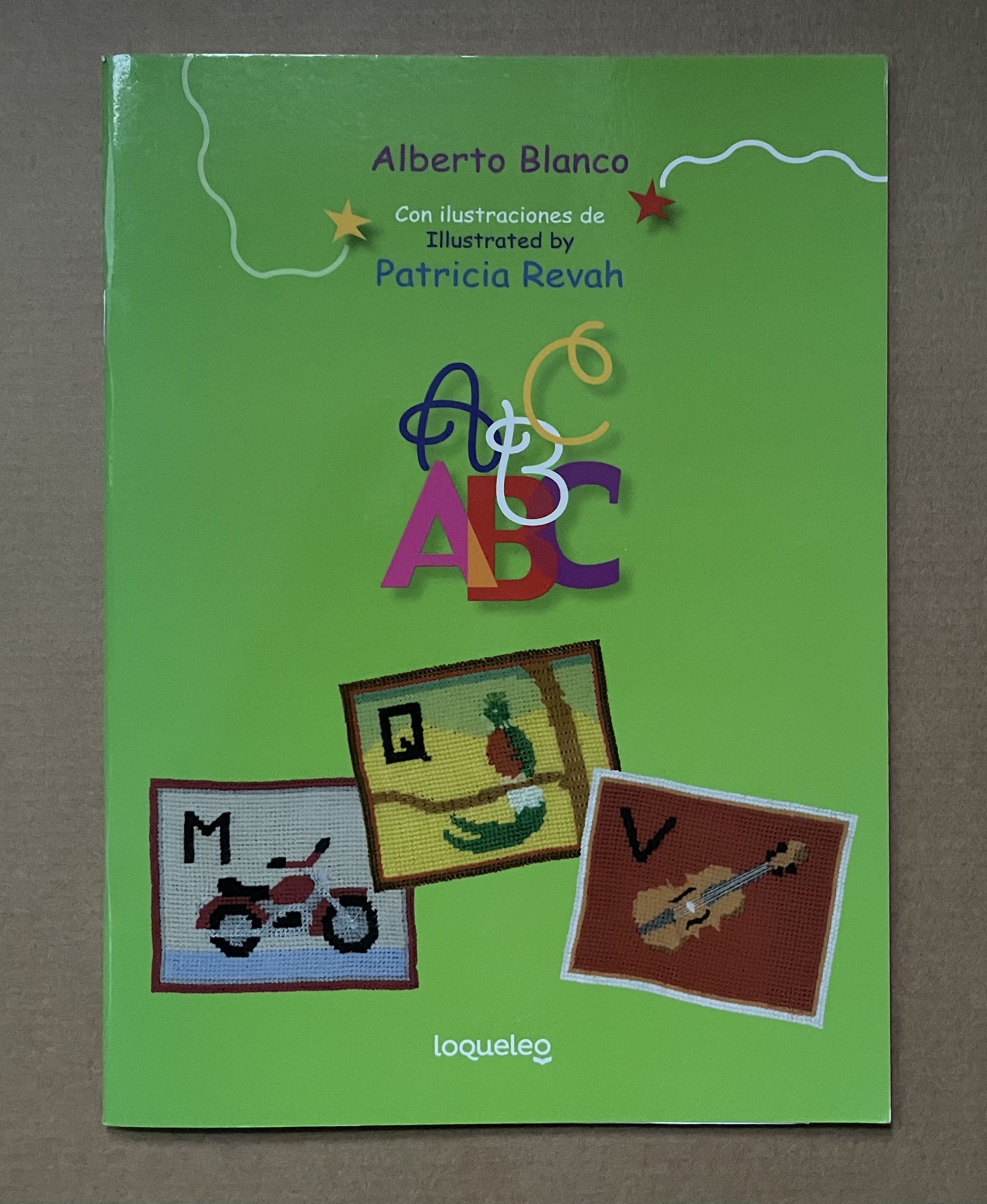
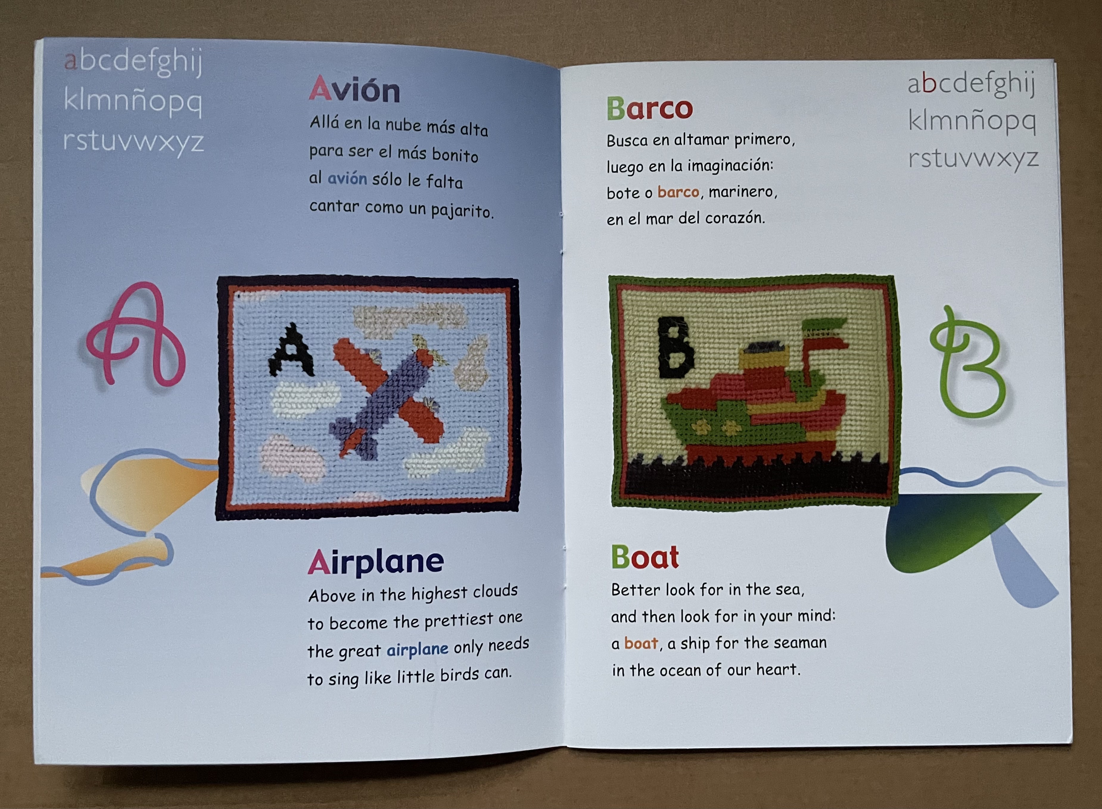
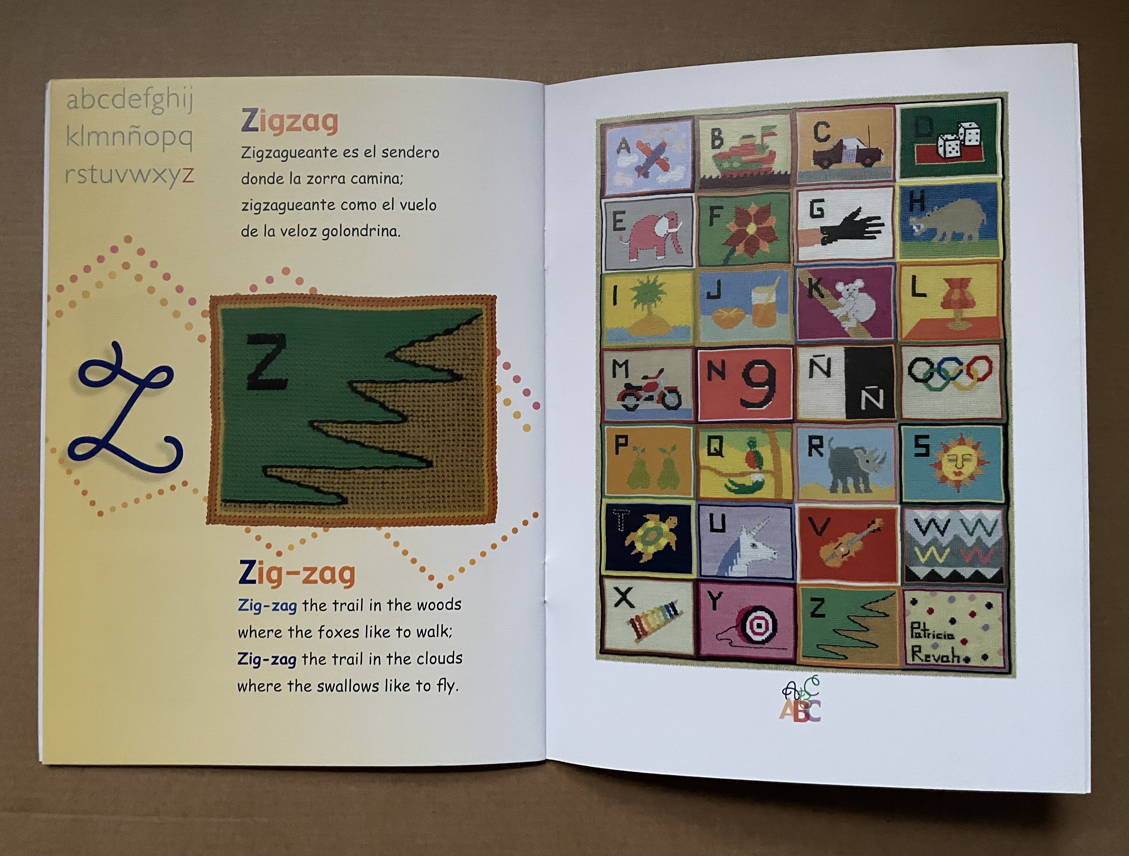
Rhyming poetry often raises the already high bar to translation. The literal English translations that follow Alberto Blanco’s charming abab Spanish poems do not attempt to substitute suitable rhymes. The textile art in this abecedary, however, wraps a comforting quilt around the challenge of translating poetry in a way that appeals to children.
Who would think it possible to introduce children to the ideas of Stéphane Mallarmé? Alberto Blanco for one, albeit without mentioning the French poet.
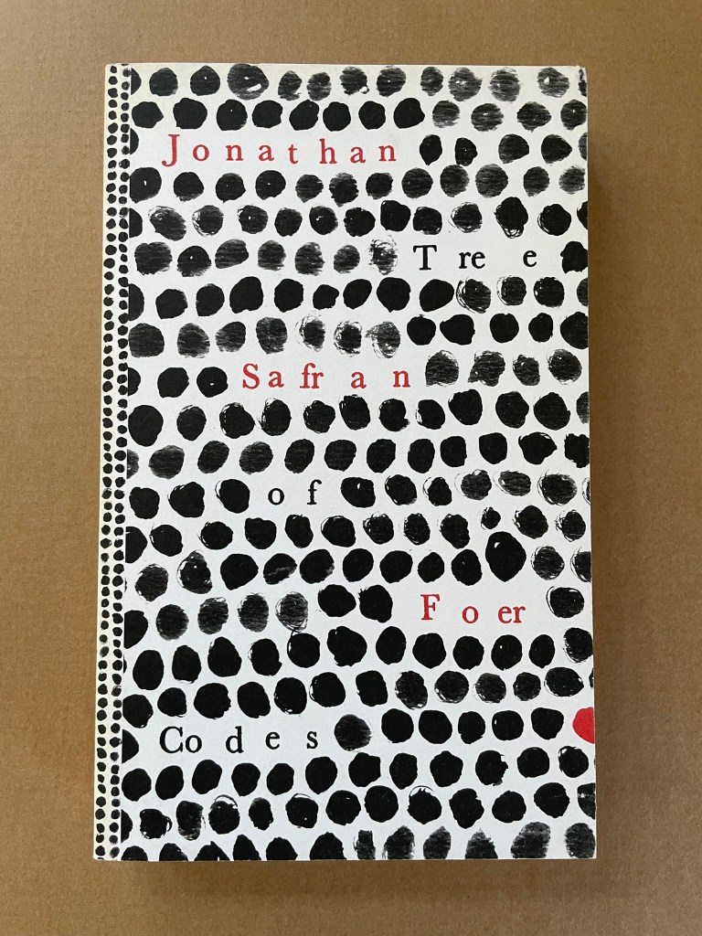
Tree of Codes (2010) Jonathan Safran Foer Perfect bound paperback of die-cut pages. H220 x W135 mm. 284 pages. Acquired from Visual Editions, 30 January 2014. Photos: Books On Books Collection.
The artist’s book “tradition” of excising words from the page goes back at least to Marcel Broodthaers’ and Mario Diacono’s renderings of Un Coup de Dés Jamais N’Abolira le Hasard by Stéphane Mallarmé. Jonathan Safran Foer’s Tree of Codes (2010) takes that tradition to the more complex plane that Tom Phillips reached with A Humument (1980-2016). In the hands of Foer and his publisher Visual Editions, the treatment becomes simultaneously more personal and mechanical. The more personal aspect is best expressed in Foer’s afterword (see below). The mechanical aspect is the use of die cutting for production and the reader’s use of a blank sheet to enable reading the text left over from Bruno Schulz’s The Street of Crocodiles (1934, trans. 1963) that forms the new narrative of Tree of Codes.