STÉPHANE MALLARMÉ, UN COUP DE DÉS JAMAIS N’ABOLIRA LE HASARD: POÈME (1975)
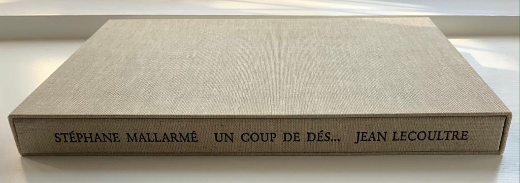
STÉPHANE MALLARMÉ, UN COUP DE DÉS JAMAIS N’ABOLIRA LE HASARD: POÈME (1975)
Jean Lecoultre
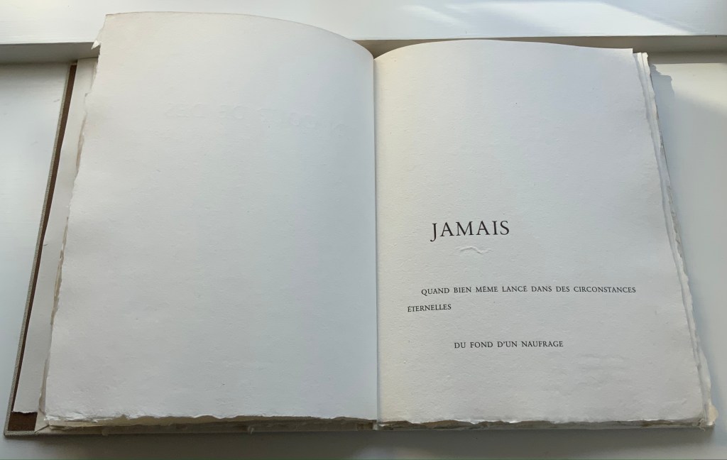
Double canvas slipcase/folder enclosing a folded-paperbound book. Slipcase: 340 x 260 mm; Book: 330 x 250 mm, 62 pages inclusive of the 5 foldouts. Edition of 115, of which this is #78.
Acquired from OH 7e Ciel, 10 March 2022.
Photos: Books On Books Collection. Displayed with permission of Jean Lecoultre
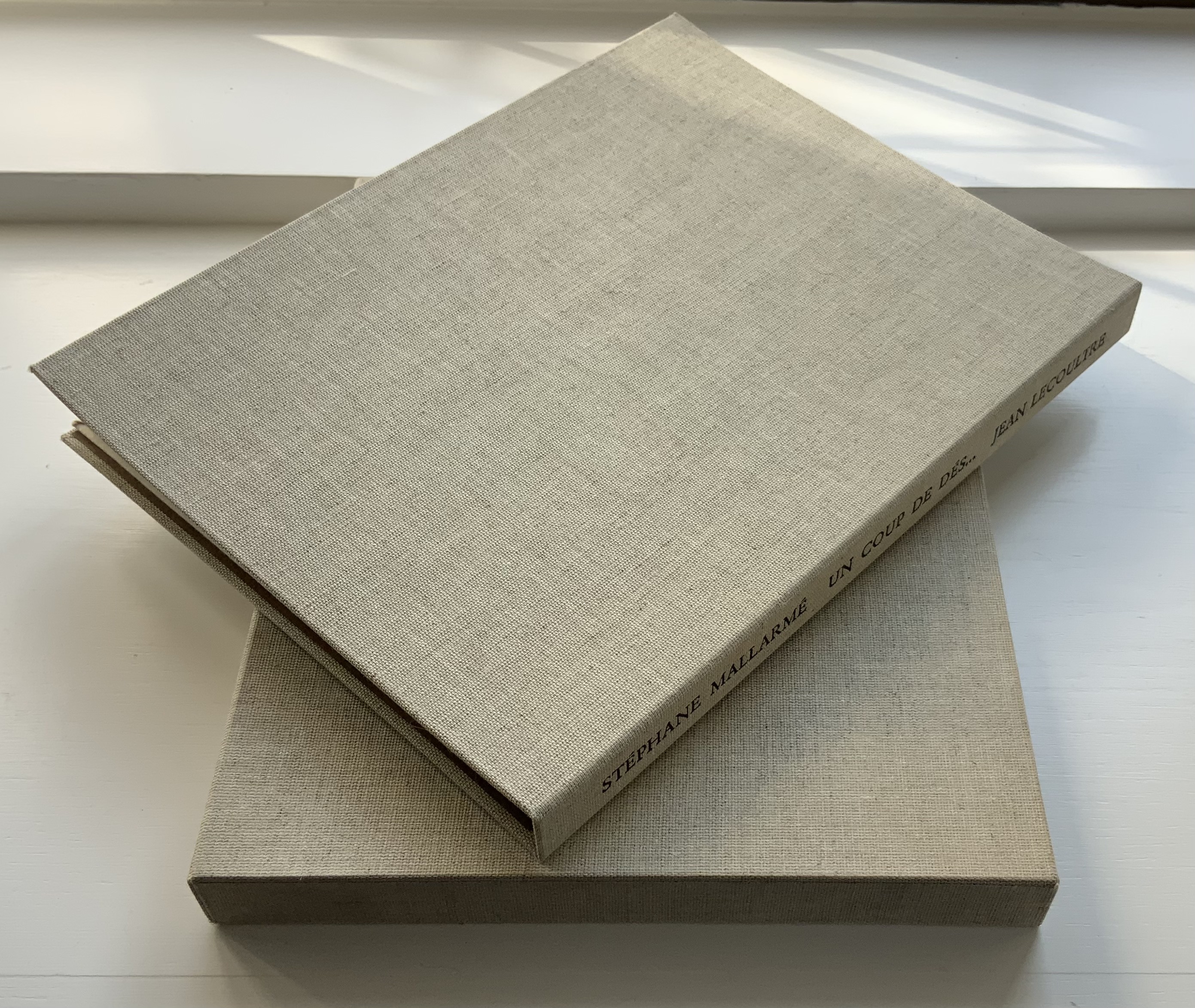
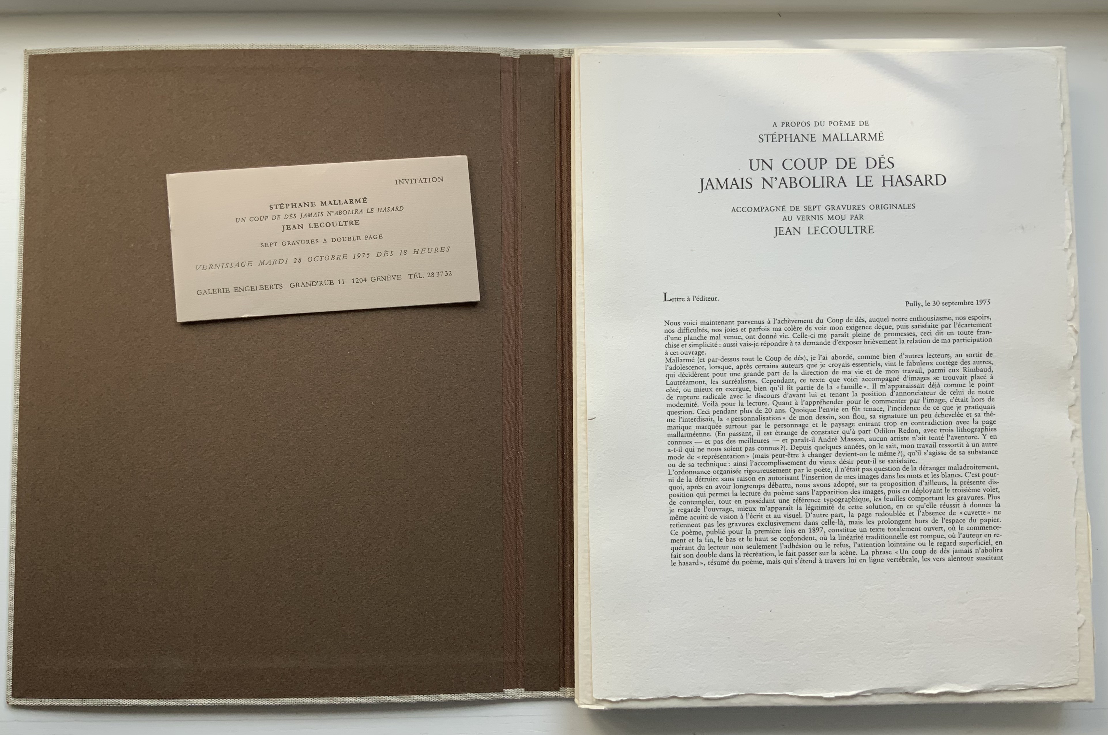

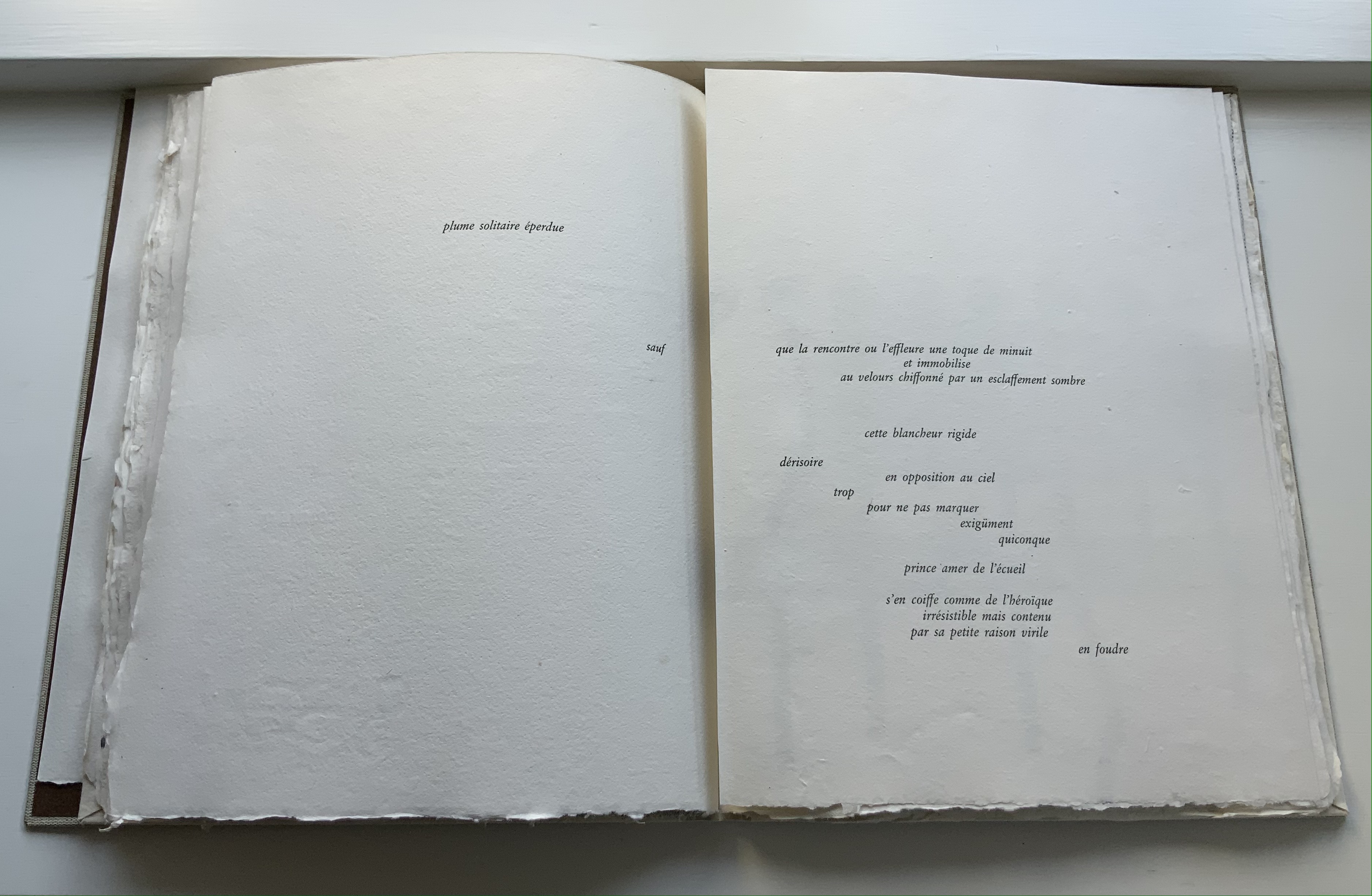
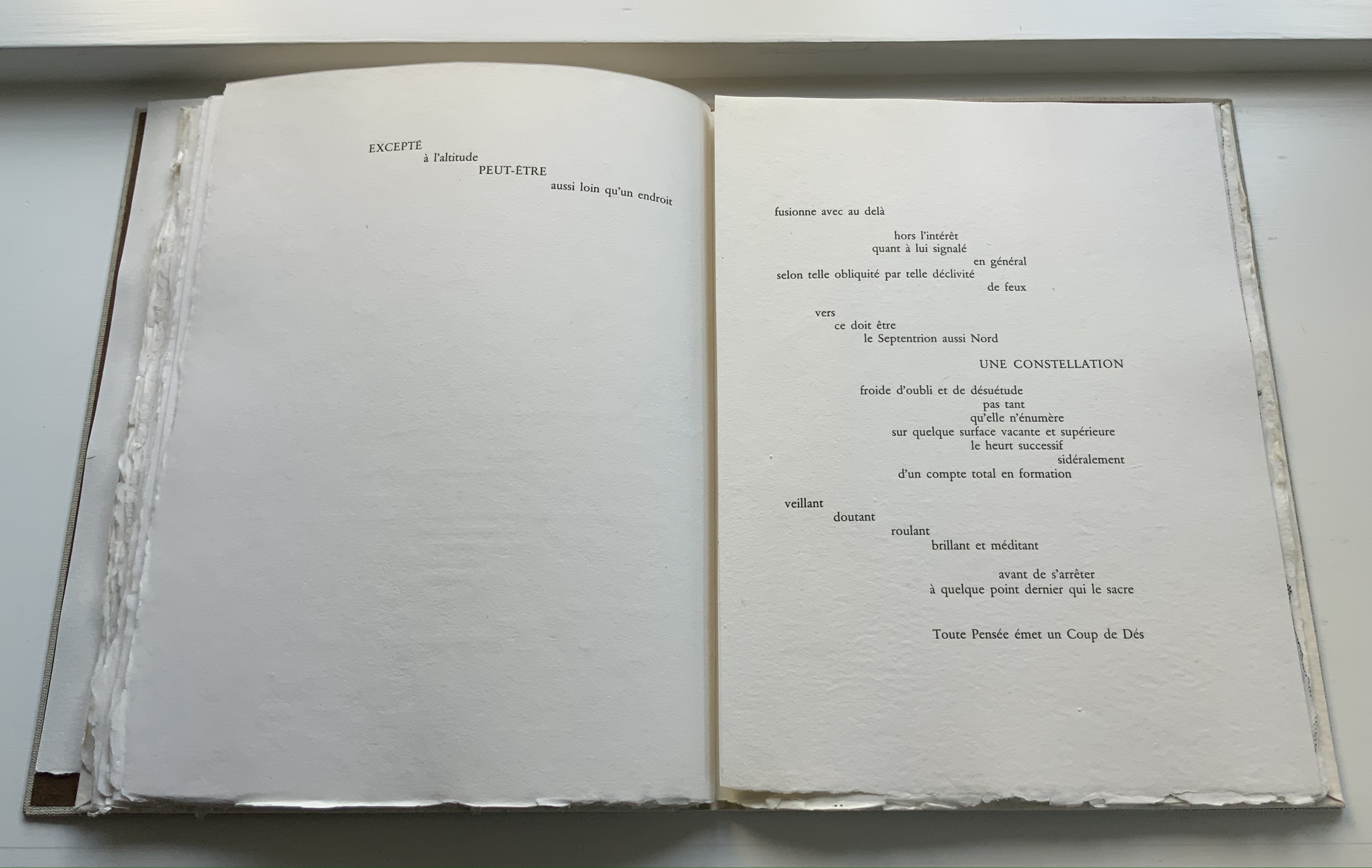
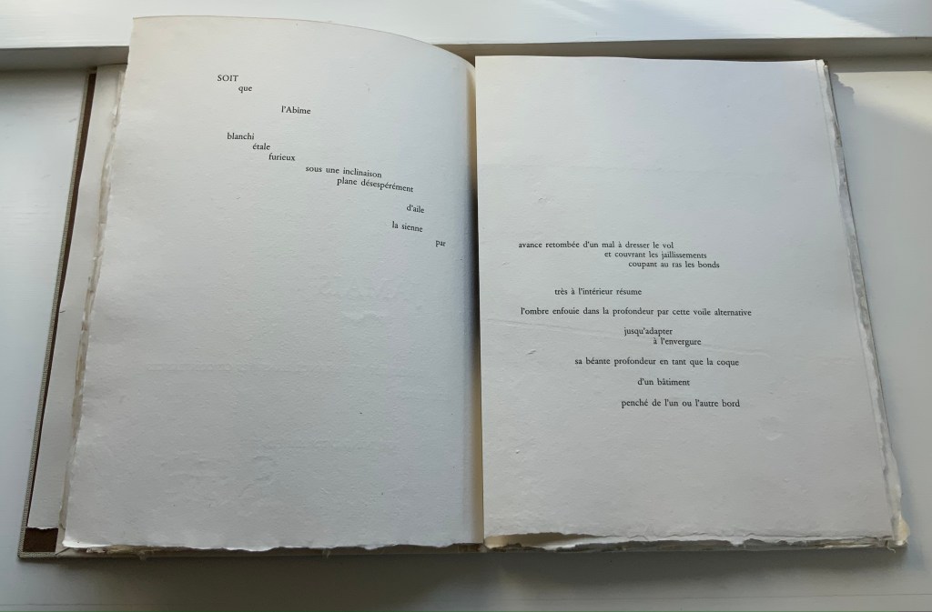
Among the many distinguishing features of Jean Lecoultre’s homage to Stéphane Mallarmé’s poem, three of the most striking are the typeface, the paper and the images. In deliberate ways, each differs from the deluxe edition that Ambroise Vollard and Mallarmé planned after the poem first appeared in 1897.
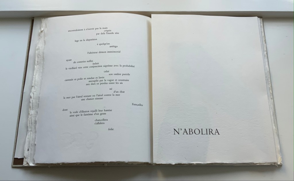
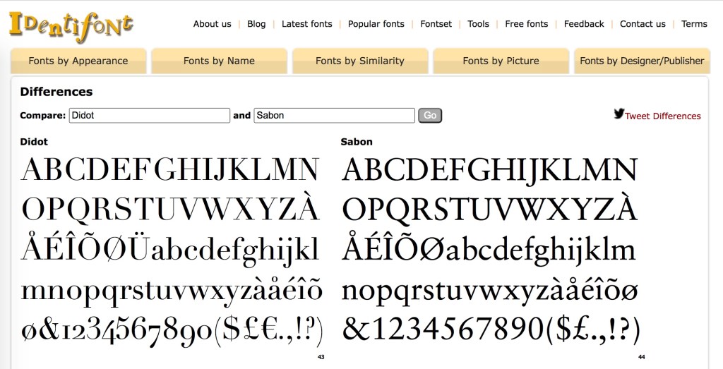
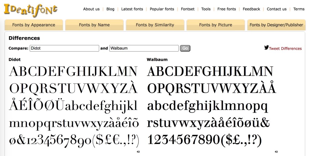
Sabon is the typeface, designed by Jan Tschichold in 1964 under commission from Walter Cunz of Stempel. The Linotype, Monotype and Stempel foundries released it jointly in 1967, which makes its use only eight years later a little bit daring. Only a “little bit” because anything more modern (say, Garamond) would have been preferable to Mallarmé rather than the Elzevir chosen by NRF when it published the 1914 edition. Lecoultre and the publisher Galerie Edwin Engelberts followed the 1914 layout but, thank goodness, not the typeface. Sabon’s thin and thick strokes do not contrast as much as those of Didot, and it does not have the same verticality. Although rooted in Garamond, Sabon comes closer than Garamond to the narrowness of Didot. Walbaum might have been a still closer option, but with its more substantial thin strokes, Sabon has to have been a more suitable choice for the handmade paper in this work.
Screenshots of adaptations: Didot © Apple; Sabon © Adobe, Linotype and ™Monotype; Garamond © Microsoft; Walbaum © Linotype and Monotype; comparisons made possible by Identifont.
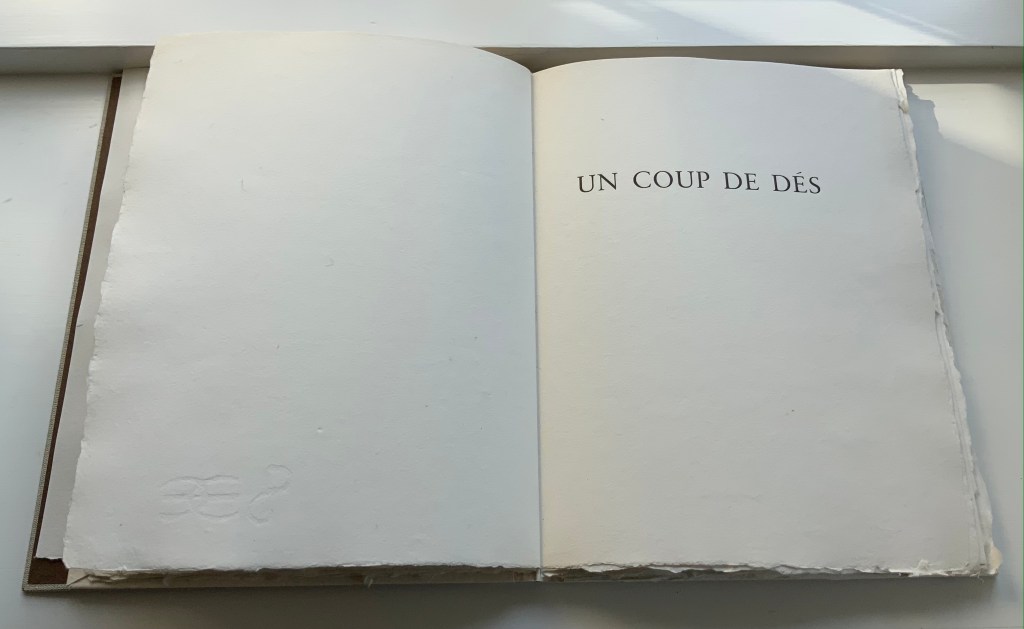
Georges Duchêne (1926-2012) (Moulin de Larroque and Moulin de Pombié) fabricated the paper (vélin de cuve) especially for the project. The paper bears Duchêne’s watermark as well as a rough “tooth” (surface texture that grips the ink) and uneven deckled edges. With his semantic and typographic innovation, Mallarmé intended to draw attention to les blancs (the spaces around the lines, phrases and single words). With its smoothness interrupted by bumps, its simultaneous softnesss and stiffness, the paper draws the eye and touch even more to the space around the verses.
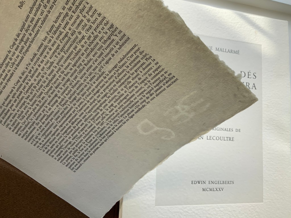
The surface must have presented a challenge for the technique of “soft varnish” etching used by Lecoultre. Crown Point Press defines it this way:
A process that involves applying a beeswax ground made soft by the addition of tallow or petroleum jelly evenly over a heated plate with a brayer. After the plate has cooled, the artist draws on paper laid over it. The soft wax comes off on the back of the paper exactly where the artist has pressed, exposing the metal in the pattern of the grain of the paper. More pressure in drawing removes more wax and produces a darker line after the plate has been bitten. In general, soft ground lines look like lines made by the drawing instrument, usually a pencil or crayon. Soft ground can also be used to take a direct impression of any flexible material—a fingerprint, a leaf, a piece of cloth, for example.
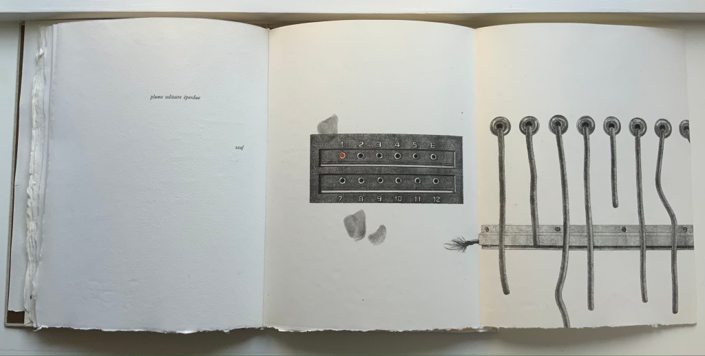
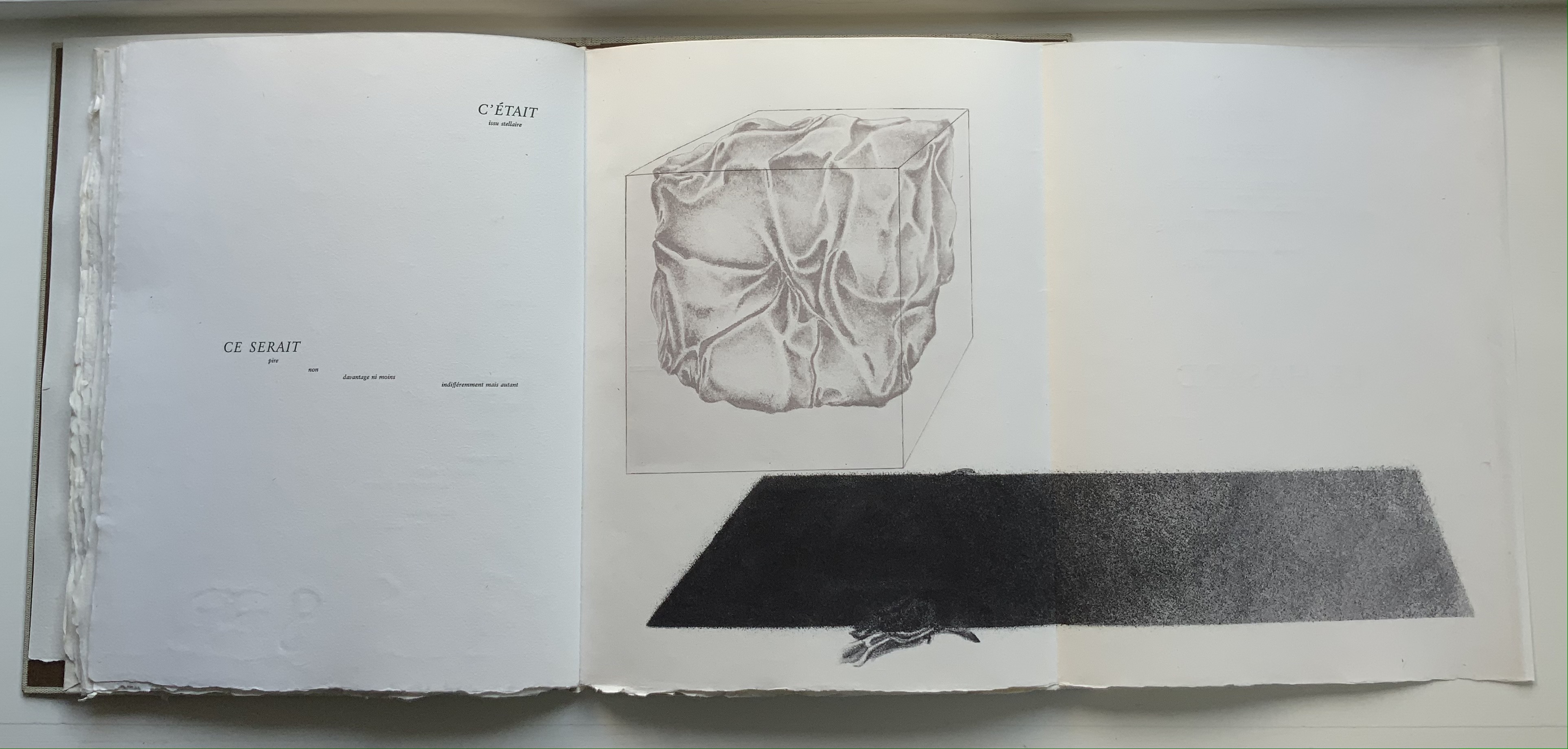
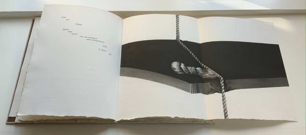
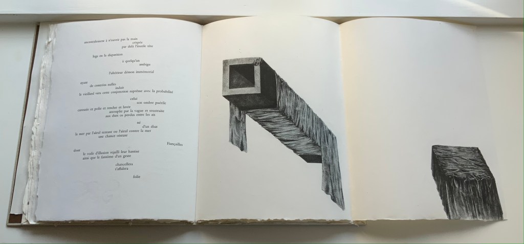
The technique resonates metaphorically with Mallarmé’s dictum peindre non la chose mais l’effet qu’elle produit (“to depict not the object but the effect the object produces”). The technique allows Lecoultre to depict the fine details of easily identifiable objects (a stone, fingerprints, a rope and more) and less easily identifiable ones (a blurred wall and windows, a pair of draped rectangular columns being sliced by a cheese-cutter-like cable and so on). Identifiable or not, the objects yield to the effects their juxtaposition, layering and blurring produce.
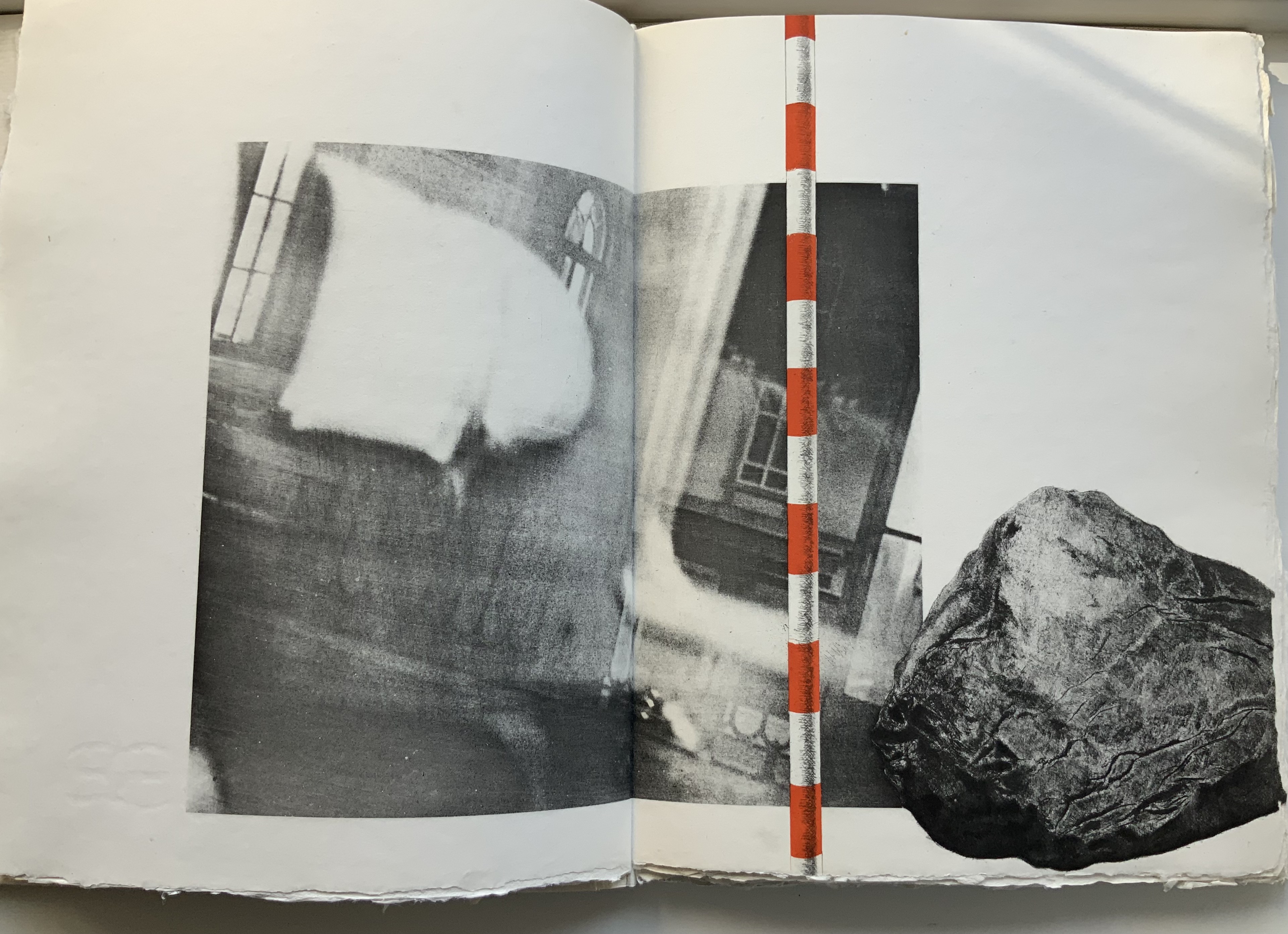
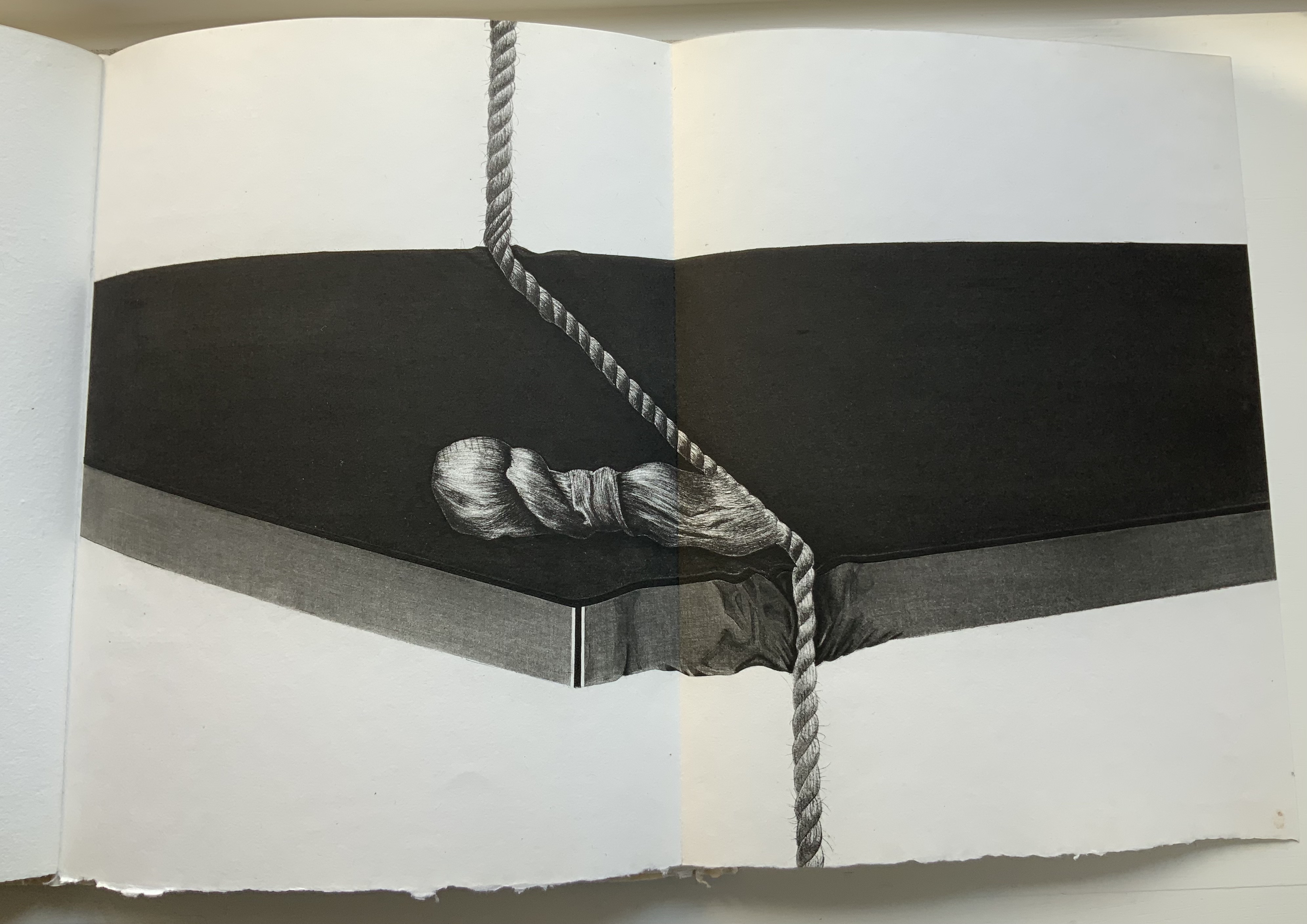
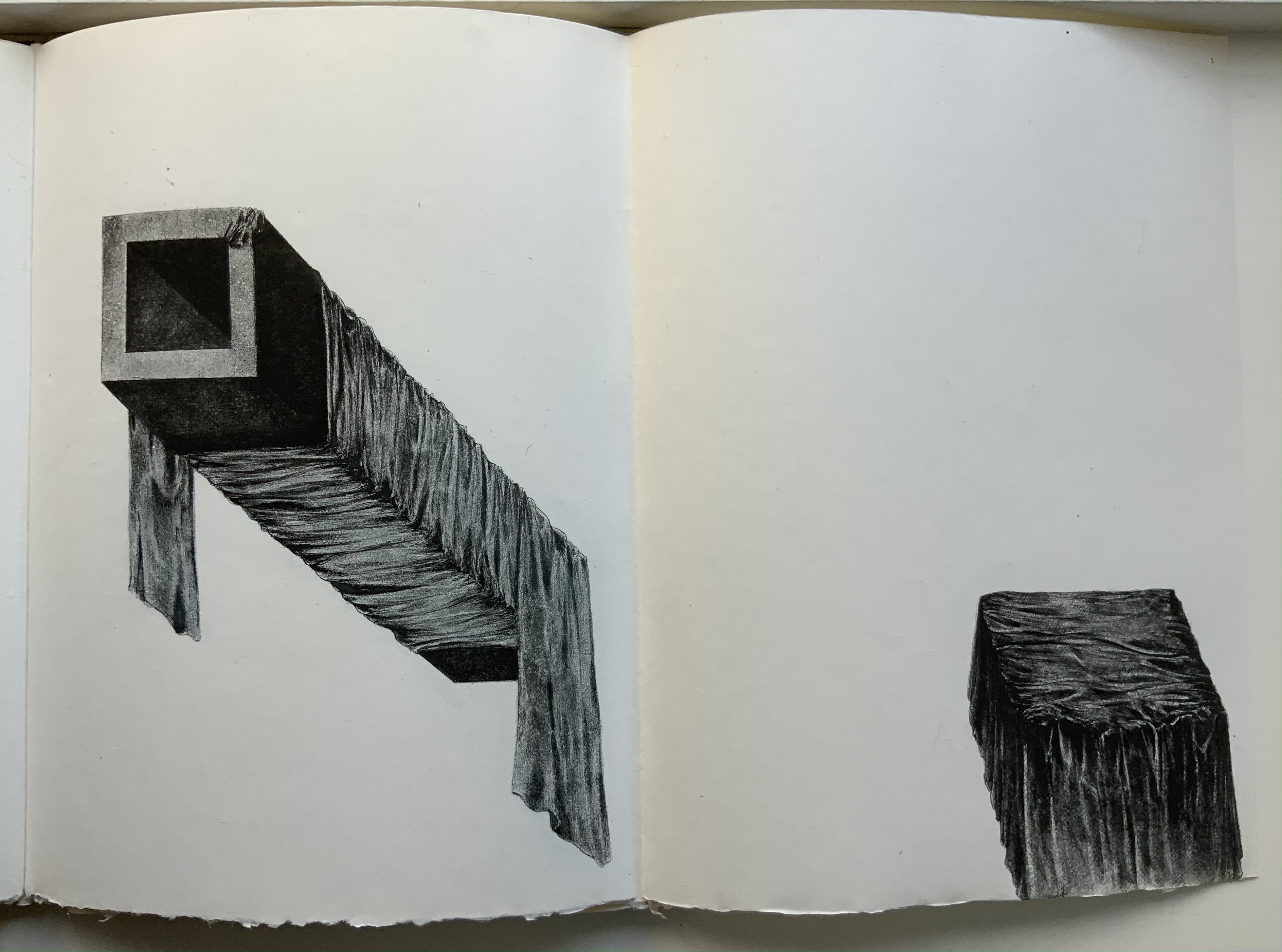
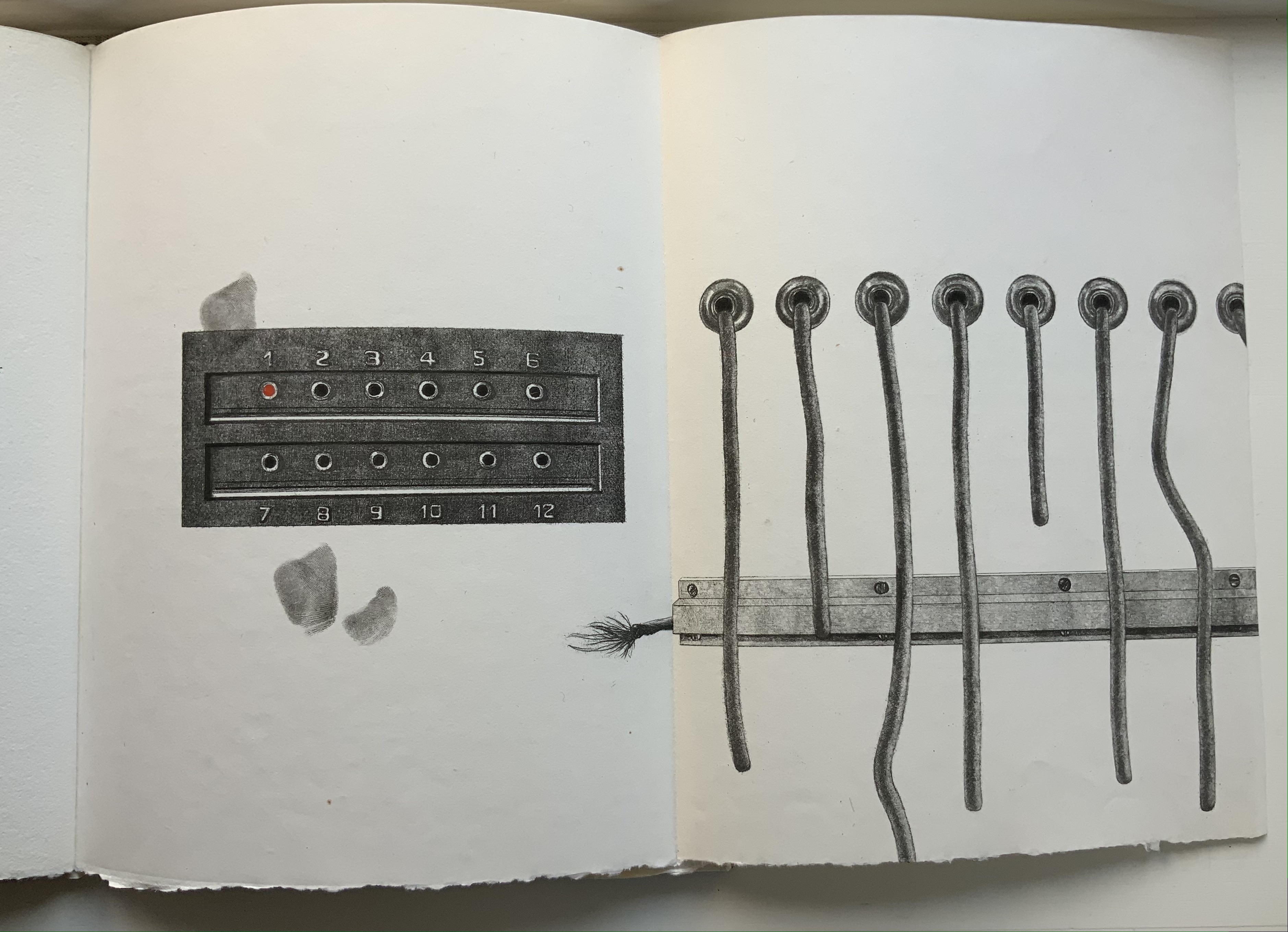
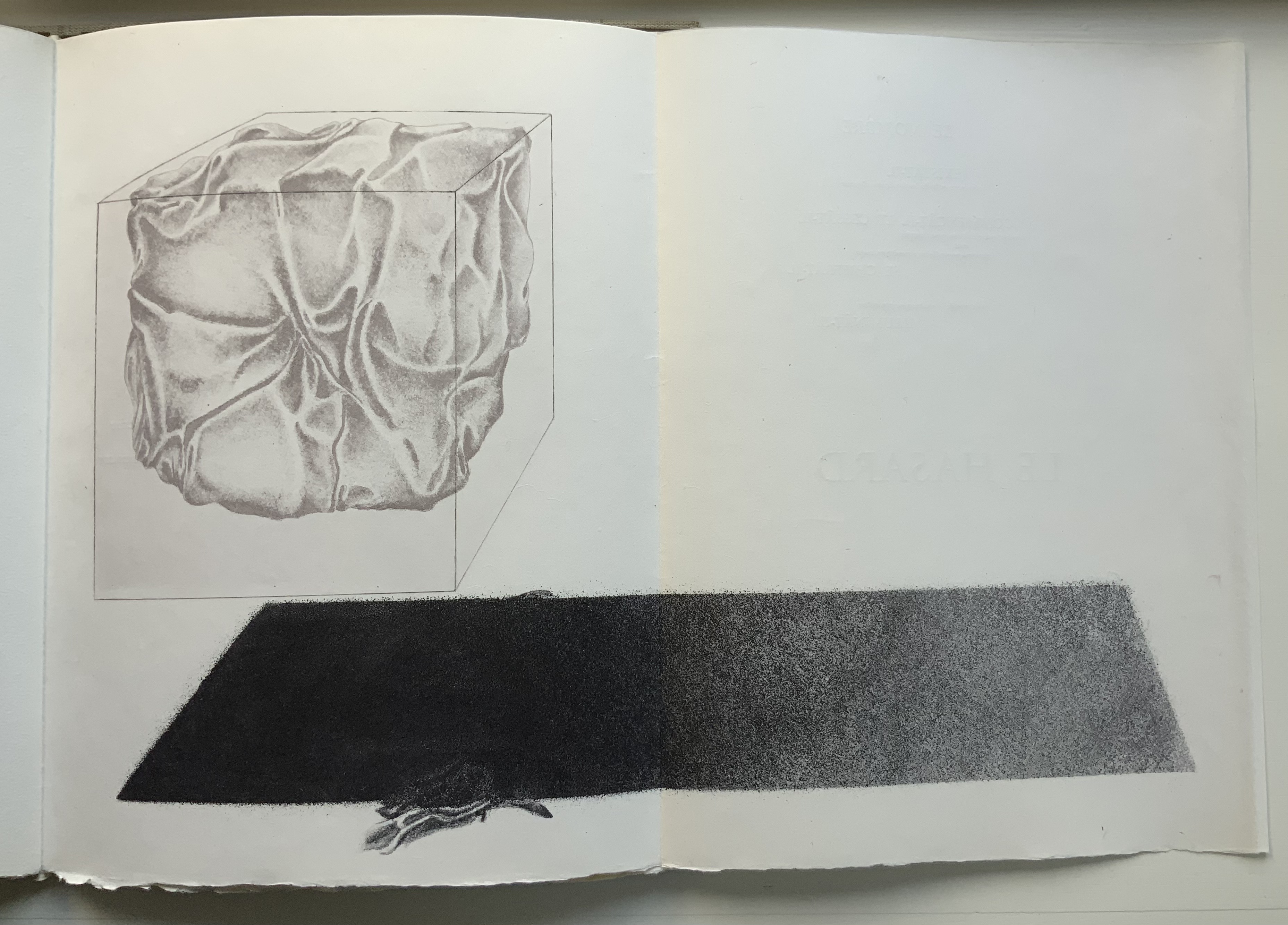
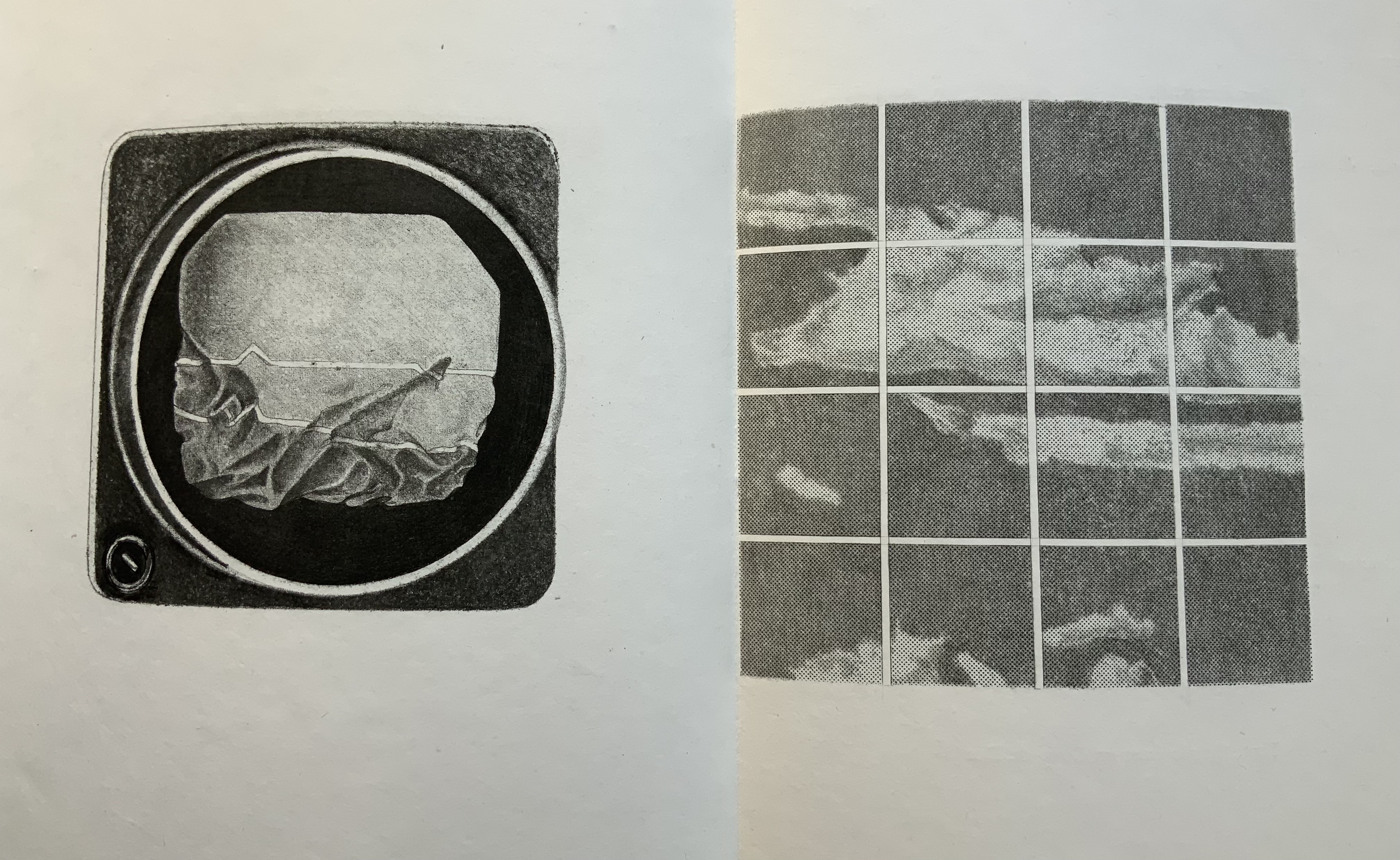
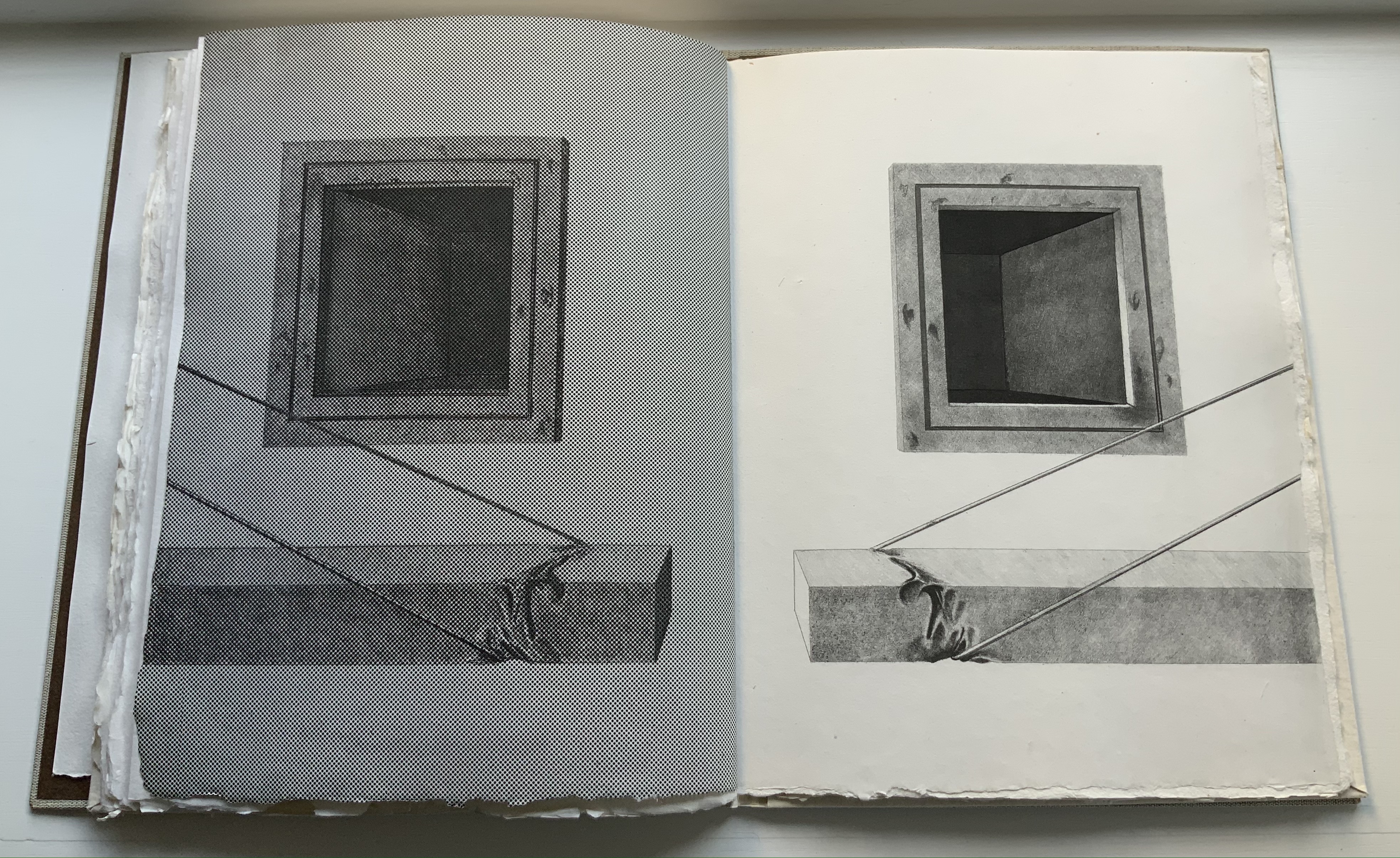
Lecoultre is also Mallarméan in his mastery of the technique. In an invitation booklet included with the book, Pietro Sarto, who pulled the prints, points out that, due to its delicacy, the soft varnish technique is most often associated with spontaneity and the chance effect. In Lecoultre’s case, Sarto makes the startling revelation that, for some of the images, the plates went through thirteen states. Thirteen chances for precision to be marred. Lecoultre even extends his chance-taking to the paper in pursuit of effect: note how the image of the rock bleeds across the deckle edge. The strange juxtaposition of objects and the way some objects seem to float on the page (or fall off it) — these also mirror Mallarmé’s arrangement of words and lines among les blancs of the pages, the precision of his images and the suggestiveness of his metaphors.
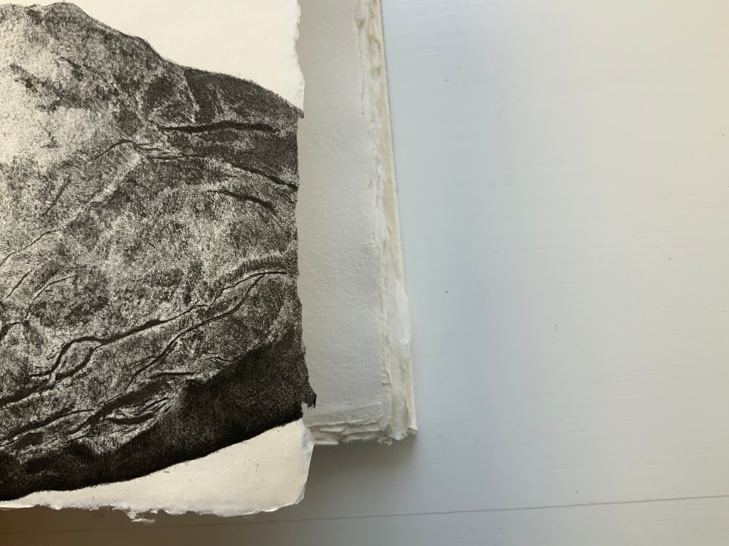
Finally Lecoultre and his publisher strike out in a novel direction with the number and placement of the prints. Unlike Mallarmé/Vollard’s plan to segregate the poem from Odile Redon’s three to four images, Lecoultre integrates his seven with the poem. This entails “bookending” the poem with two double-page spreads, each taken up entirely by a print: one spread before the half-title and one after the final page of the poem. For the remaining five prints to appear on double-page spreads, the publisher urged the use of five foldout pages. This solution, which Lecoultre approvingly embraced, simultaneously challenges and celebrates Mallarmé’s unit of the double-page spread.




Further Reading and Viewing
Jean Lecoultre: l’oeil à vif : peintures & dessins, estampes. Genève: La Dogana ; Vevey: Fondation William Cuendet & Atelier de Saint-Prex, 2021.
Baldwin, Andrew. “Soft Ground Part 1” and “Part 2“. Trefeglwys Print Studio, Wales. Videos accessed 26 March 2022.
Carr-Pringle, Sam. 18 July 2018. “The Softground Etching Process“. Crown Point Press. Video accessed 26 March 2022.
Cheyrou, Françoise. 25 March 2015. “Georges Duchêne, Maître Papetier, Pionnier du Papier d’Art“. Esprit de Pays. Accessed 24 March 2022.
Johansen-Ellis, Mariann. 24 January 2012. “Basic Softground Etching“. Denmark. Video accessed 26 March 2022.
McNeil, Paul. 2017. The Visual History of Type. London: Laurence King. Pp 48-49 (Garamond), 106-07 (Walbaum), 90-91 (Didot), 378-79 (Sabon).
Monotype. ND. “Sabon“. MyFonts.com. Accessed 26 March 2022.
Truszkowski, Robert. 7 September 2020. “Soft Ground pencil drawing“. University of Regina. Video accessed 26 March 2022.

Hello!
Yesterday, Jean Lecoultre told me about your article (https://books-on-books.com/2022/03/28/books-on-books-collection-jean-lecoultre/) and suggested to send you a pdf of the book about Edwin Engelberts, we just published (http://www.editionsnotari.ch/collections/hors-collections/les-livres-dartistes-dedwin-engelberts.html). His “Coup de dé” is also analysed in our book, by one of the curators from Lausanne’s University.
Please let me know 🙂
Luca Notari
EDITIONS NOTARI
LikeLike
Dear Luca Notari – I would very much like to see the pdf. The section on Mallarmé will certainly be of interest. I hope you saw the Speck Collection exhibition at the Michael Werner Gallery in July. I could not, but Sabine sent great information about it. Regards, Robert
LikeLike
robert.bolick@gmail.com
LikeLike