Alphabet City (2009) Scott Teplin Bolted folio. H270 x W360 mm. [29] pages. Edition of 26, of which this is L. Acquired from the artist, April 2023. Photos: Books On Books Collection and Courtesy of the artist.
Scott Teplin’s Alphabet City follows in the long line of building designs based on alphabetical foundations. Perhaps first was John Thorpe (1565–1655?), an English architect, who drew up a property based on his initials. Thomas Gobert (1625-90), a French architect, produced Traitté d’Architecture dedié à Louis XIV, a manuscript whose building plans spelled out “LOVIS LE GRAND”. Anton Glonner (1723–1801) designed a Jesuit church and college around the monogram “IHS”. More famous is Johann David Steingruber (1702-87) and his Architectonisches Alphabeth (1773).
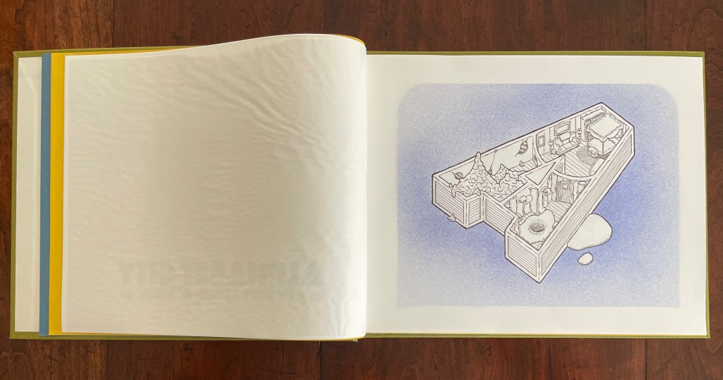
Teplin committed twenty years to his task (Steingruber committed ten) and came to it more from the school of graphic design than the school of architecture. While we might expect bewigged 18th century servants and lords to ride up in carriages to Steingruber’s A to Z, we would not be surprised to find characters from R. Crumb or Mad Magazine inhabiting Teplin’s alphabet-shaped houses, gaming arcades, strange laboratories, ice cream parlors, power plants, and other bizarre edifices. Some houses have no entries or exits. Some have doorless bedrooms. Others have rooms filled with oozing substances or piles of dirt. Some have outdoor swimming pools inside. One, seeming to float on a grass-colored sea, has a boat funnel inside, capped with a life ring, and rooms with deckchairs and portholes. Whimsical and bizarre free association drives Alphabet City.
Although the binding of Alphabet City is intended to facilitate removal and mounting of individual folios, it recalls Fortunato Depero’s “bolted book” and, by extension, the “startle” factor intended by Futurism, Surrealism, Dadaism, and all the -isms of that period. From original drawings in pen & ink to scanned images etched to magnesium plates and printed on Zerkall vellum, then airbrushed with Winsor & Newton and Holbein watercolors and pencilled with matching Prismacolor pencils, Alphabet City leans more toward a fine press livre d’artiste than an artist’s book. The foil-stamped Asahi bookcloth cover with its yellow Moriki endsheets would not be out of place at Arion Books or Three Star Books.
Architectural alphabet (1773/1972) Johann David Steingruber Casebound, sewn, headbands. H356 x W260 mm, 112 pages, including 33 facsimile prints. Published by Merrion Press, London. Edition of 425, of which this is #9. Acquired from Chevin Books, 24 July 2020. Photos: Books On Books Collection.
Several professional and academic architects and designers as well as academics from other disciplines have delved into the intersection of the alphabet and architecture. A few of them have also noted the intersection’s expansion to include artist books and fine press works. Since Johann David Steingruber’s effort in the 18th century, it has become quite a busy intersection.
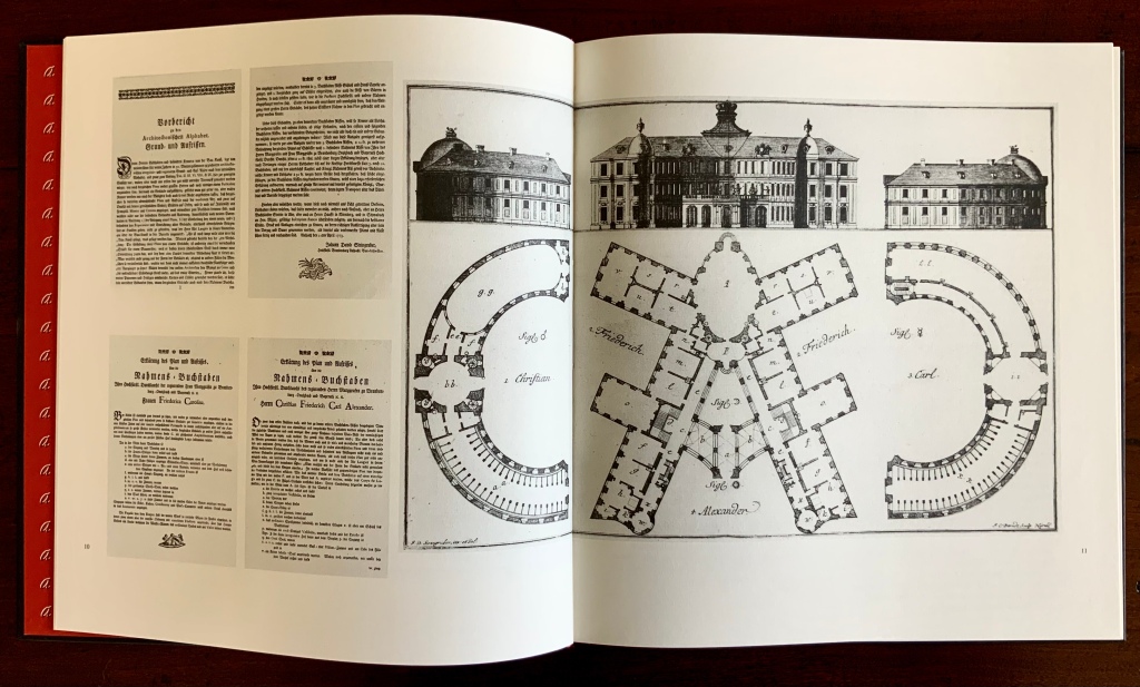
Originally published in installments at Steingruber’s own expense, the volume opens with its gloriously long title in an “arch of contents”, the columns inscribed with thumbnail images of the letter buildings to come. Although the title page lists 1773 as the publication date, the last installment came in March 1774. In his lifetime, Steingruber published three other works, illustrated and described toward the end of this facsimile, but Architectonisches Alphabeth became his most famous — “postcard” famous.
Architectonisches Alphabeth: bestehend aus dreyßig Rissen wovon Jeder Buchstab nach seiner kenntlichen Anlage auf eine ansehnliche und geräumige Fürstliche Wohnung, dann auf alle Religionen, Schloß-Capellen und ein Buchstab gänzlich zu einen Closter, übrigens aber der mehreste Theil nach teutscher Landes-Art mit Einheiz-Stätte auf Oefen und nur theils mit Camins eingerichtet, wobey auch Nach den mehrest irregulairen Grund-Anlagen vielerley Arten der Haupt- und Neben-Stiegen vorgefallen, dergleichen sonsten in Architectonischen Rissen nicht gefunden werden, zu welchen auch Die Façaden mit merklich abwechslender Architectur aufgezogen sind.
Steingruber dedicated his Architectural Alphabet to Christian Friedrich Carl Alexander, Margrave of Brandenburg-Ansbach, and his first wife Frederica Carolina, not to be confused with the paying dedicatee of Bach’s Brandenburg Concertos, the Margrave of Brandenburg-Schwedt. By a baroque coincidence, however, the first Brandenburg concertos, the ones composed by Giuseppe Torelli but not really influencing Bach, were dedicated to the Margrave of Brandenburg-Ansbach, then George Friedrich II, Alexander’s great-uncle who employed Torelli as court composer. Like Torelli, Steingruber too had to be satisfied with his payment as an appointee — court and public surveyor, and later principal architect of the board of works — even though he went to the trouble of making sure that his employers’ monograms and their associated buildings appeared in the span above the roman arch.
Steingruber seemed unaware of other building designs from alphabetical foundations. This facsimile’s editor gently and genially fills in the missing context. John Thorpe (1565–1655?), an English architect, drew up a property based on his initials. Thomas Gobert (1625-90), a French architect, produced Traitté d’Architecture dedié à Louis XIV, a manuscript whose building plans spelled out “LOVIS LE GRAND”. Anton Glonner (1723–1801) designed a Jesuit church and college around the monogram “IHS”.
There was not much chance of these letter-shaped edifices’ being built. Nevertheless, Steingruber adds matter-of-fact descriptions to his elevations and plans, calling out heating, kitchen, toilet and servants’ arrangements as if conferring with a prospective client ready to commission one of these typographic palaces. Who would not want a serif with a view? Or conduct guests on a tour of the bowl, capline, crossbar, stem, stroke and tail of the property?
The main text appears to be set in Van Dijck (before Robin Nicholas’ revision between 1982 and 1989) and printed on a cream laid paper. The special earmarks of Van Dijck — the sloped apex of the A, the stepped center strokes of the W, the non-lining numerals and especially the downward stroke at the top of the 5 , the tilted lower bowl of the g, etc., identifiable in Morison’s A Tally of Types and Rookledge’s Classic International Type Finder — all seem to be present.
The laid paper is not only tactilely pleasant, it visually supports the clarity of the facsimile prints. Their sharpness outdoes what is achieved even with the zoom function applied to the freely available digital version, which can be seen in the interactive comparison below.
Kiermeier-Debre and Vogel edition (1995)
Architectonisches Alphabeth (1773/1995) Johann David Steingruber Facsimile edition prepared by Joseph Kiermeier-Debre and Fritz Franz Vogel. H356 x W260 mm, 80 pages. Acquired from Antiquariat Terrahe & Oswald, 14 March 2021.
In smaller dimensions, this edition does not present the prints in their full size. Partially making up for the deficit is the Munken Pure paper’s brightness, against which the Garamond Berthold typeface and photolithography work well. Also, the book includes French, German and English text as well as illustrations that broaden the context to the present. Alongside Steingruber’s elevations and plans, Kiermeier-Debre and Vogel have included several birds-eye views of inventive roofing of 20th-century architectural models inspired by Steingruber’s plans.
Christian Friedrich Carl Alexander’s monogram buildings reduced alongside reductions of Steingruber’s original foreword and explanations of Federica Carolina’s and Alexander’s buildings.
Not satisfied with some of his efforts, Steingruber offered second options; here, for the letter A, and later, for the letters M, Q, R and X.
Verso: Paula Barreiro’s roofing design for Steingruber’s letter B.
Verso: Helge Huber’s and Alexandra Krull’s roofing designs for Steingruber’s letter C.
In another instance of positioning Steingruber’s book in the history of alphabetic architecture (or architectural alphabets), the editors include a complete set of small reproductions of Thomas Gobert’s designs and elevations spelling out “LOVIS LE GRAND” from his manuscript mentioned above. Although created a century before, his drawings do not seem as stylistically distant from Steingruber’s as those of the 20th-century rooftop drafts do. Driving home their point that “the design of alphabetical buildings must not be based slavishly on a Baroque roman type or a classicist roman version”, the editors conclude by drawing attention to Takenobu Igarashi‘s 20th-century sculptural celebrations of the alphabet in aluminum, concrete, wood, chrome and gold.
Photo: Mike Sullivan, “Igarashi Alphabets“, Typetoken, 25 November 2013. Accessed 26 March 2021. Displayed with permission of the reviewer.
In print and online as well, new original and secondary works have continued to busy the intersection of the alphabet, architecture and artist books. Richard Niessen’s The Palace of Typographic Masonry (2018) and Sergio Polano’s “Architectural Abecedari” (2019) are two recent examples. And, as if to confirm the busying of the intersection, we have Takenobu Igarashi: A to Z (2020) in print and making up for the scarcity of Igarashi Alphabets (1987).