Untitled (2015)
Ivon Illmer
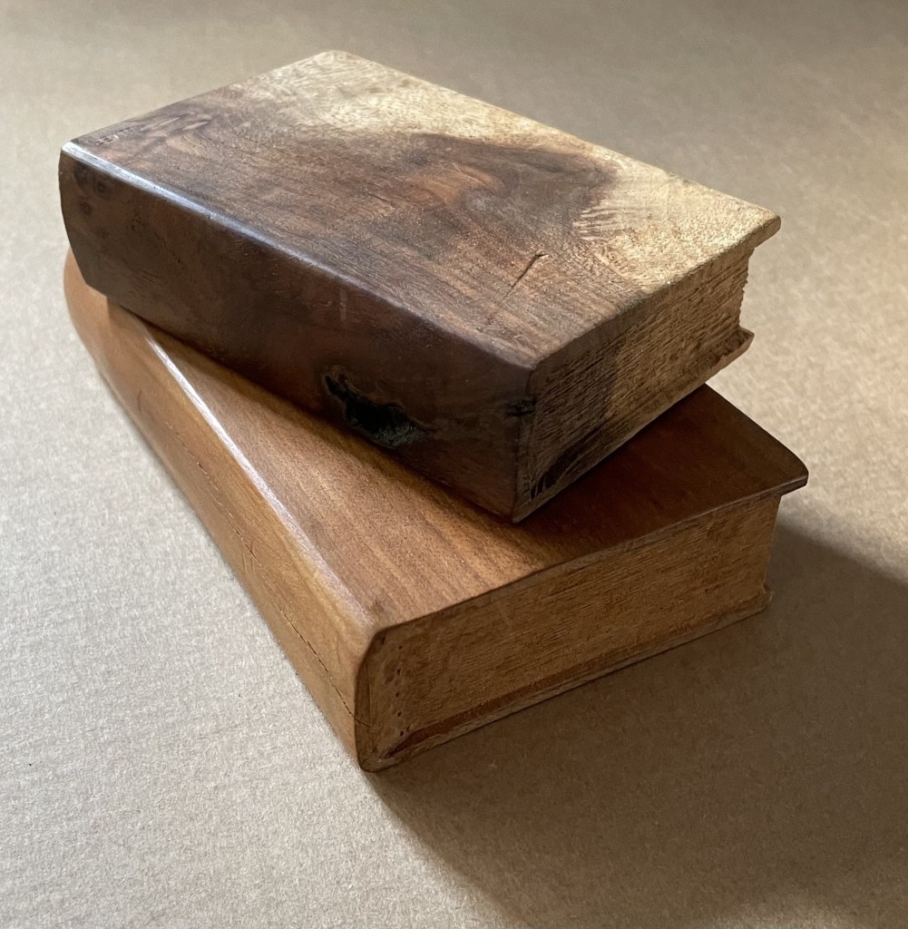
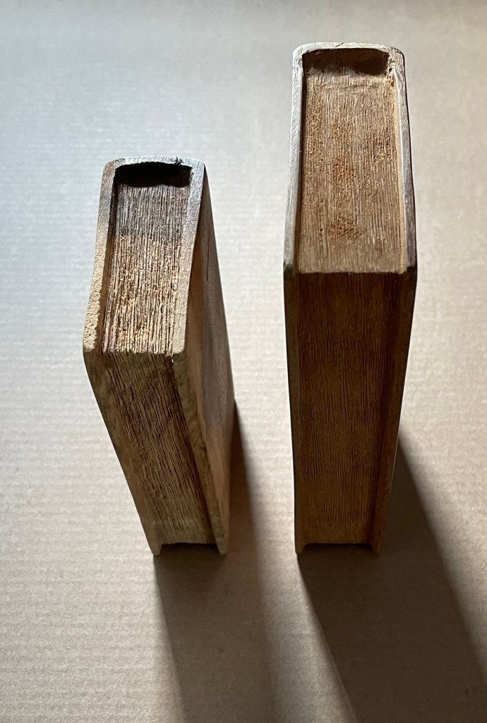
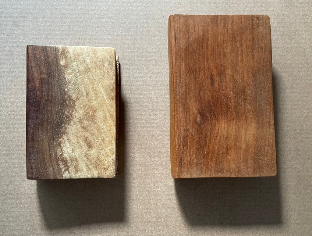
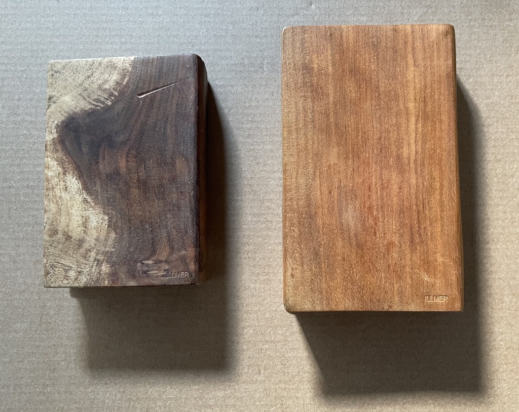
Book-shaped wood sculpture. Top: Almond wood, H100 x W65 x D27 mm.Bottom: Poplar wood, H123 x W78 x D27 mm. Unique. Acquired from the artist, 10 October 2014.
Photos: Books On Books.
From Ivon Illmer’s website: Books preserve history and stories. Each book has its own individual story. This ranges from loving treatment to neglect to ostracism and even burning. The arc almost inevitably stretches from the fate of the book to the fate of man. Everyone should let their imagination run wild when touching the book sculptures and invent their own story for each book. Touching is important, the haptic experience flatters the sense of touch. You “grasp” the beauty of the wood. Imagining the book sculptures in the raw piece of wood is the art. Each piece is unique in shape, structure and grain. Accessed 14 October 2024.
Illmer categorizes his work as “book sculpture / book art”. The carvings from various woods primarily celebrate the shape and tactility of the closed codex. The similitude of the exterior, right down to the fore, top and bottom edges, belies the inaccessibility of the interior.

Untitled

If simply entitled Unreadable Book or A Closed Book, these works would lead us down a narrow path of interpretation. Another easy path of interpretation could be etymological. The derivation of the word book from the Old German Buche (meaning “beech”) is a debatable assumption. Still, it’s widely accepted enough to start us down the path that, since the paper of traditional books is made from wood, so, Illmer’s carved codices just represent another way of using wood to make a book. He could have entitled them Buchmaterial, which in English also captures the same pun between the book’s content and its material. In his self-published catalogue, however, Illmer is explicit that his use of “untitled” is totemic:
… each of my books represents every book published so far. That’s why none of them has a title, and that’s why none of them is based on a real book.
Illmer leaves it to the imagination of the viewer to determine whether and how his works “interrogate” the nature of the book.
Presenting physically inaccessible books is fairly common among wood carvers, sculptors, and painters. A closed or open book appears in the hands of countless saints and Madonnas and carries with it various iconological interpretations, depending on the bearer. From the St. Servatius Cathedral Treasury in Maastricht, here’s a library of letters, scrolls and books in the hands of the Holy Kinship.

Heilige Maagschap (c.1470 )
Westphalian School
And from Lisbon’s National Museum of Antique Art, here’s a Madonna and Child with book, which seems to underscore the interpretation in Christian art that an open book in connection with Mary indicates the fulfillment of the promise.
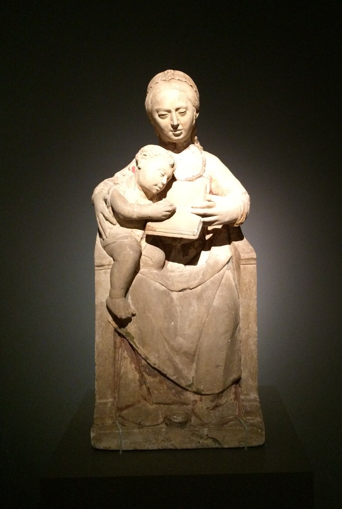


Madonna and Child (c. 1540-1550), Unknown sculptor, Museu Nacional de Arte Antiga, Lisbonne, Inv 1182 Esc. Photos: Books On Books Collection, 2015, at “Pliure. Prologue (la part du feu)”, Fondation Calouste-Gulbenkian, Paris.
The fifteenth-century Van Lymborch, or Limbourg, brothers of Les Très Riches Heures du Duc de Berry fame, however, may be the first to have created an inaccessible book for the sheer pleasure of trompe-l’oeil and trompe-le-main. They made it from a block of wood, decorated its exterior to look like a sumptuous illuminated manuscript, and gave it to their patron as a New Year’s day joke. Another two centuries later in Venice, Francesco Pianta the Younger carved shelves of inaccessible wooden books for the Chapter Room in the Scuola Grande di San Rocco (1657-75). Arranged as if recently consulted and replaced on their shelves, the books provide the studious background for inconographic and allegorical sculptural figures of “Curiosity”, “Wrath”, “Melancholy”, and others. The influence of this particular fantasy has persisted in Venice and found an enthusiastic expansionist in Livio de Marchi, whose project entitled House of Books, begun in 1990, boasted three residential-sized installations by 2025. From the spine- and cover-clad exterior walls, to the carved splayed book for a roof, to the furnishings — everything is made from wood and has a bookish allusion in its shape or function, including the pen-shaped chimney and a pencil-picket fence. The more prolific joker, however, may be Alain Stanké, whose wood sculptures suggest there is no bookish pun he would not carve.
While facetiousness and jokery also characterize the path taken by conceptual book artists by making an inaccessible book the material of the artwork, there is now an edge. Marcel Broodthaers encased his previously published books of poetry in plaster to create Pense-Bête (1964), an elaborate farewell to literary aims. Following Broodthaers, Wolf Vostell purportedly encased his paper-based booklet Betonierungen (“Concretifications”) in a 40 x 28 x 6cm slab of concrete shaped like a book (Frengel et al.), not a farewell but rather an embodied manifesto. Vostell’s Betonbuch (1971) allows for both the interpretive paths of inaccessibility and punning on the book’s material. (Further trickery may be involved; radiographic examinations are inconclusive on whether there really is a booklet embedded in there; see White, below.) Despite, or because of, its title, Barton Lidice Beneš’ inaccessible Untitled (1973) plays differently with titular punning: Beneš has almost obliterated the titles of the condensed books from the spines of his sealed Reader’s Digest Condensed Books series. Jacqueline Rush Lee’s The First Cut (2015) soaks, rolls, and dries the three volumes of the Loeb translation of Ovid’s Metamorphoses into a single firewood-like chunk; its inaccessibility and title join in a punning allusion to the transformation of Daphne and others into trees or plants to escape the grasp of the gods. Lorenzo Perrone’s inaccessible Kintsugi (2018) casts yet a different titular pun by applying “repair” lines of gold glue to a presumably unbreakable and pristinely white plastered book.
Moritz Küng’s exhibition catalogue Blank. Raw. Illegible … : Artists’ Books as Statements (1960-2022) devotes one of its fifteen thematic sections to inaccessible books, including Vostell’s Betonbuch. Among the ten works included, five of them introduce puns unlike those mentioned so far. They pun on a structural or material feature of “the book”. Timm Ulrich’s Dem Leser den Rücken zukehrend (1970/76) is an hermetically sealed book dummy, whose only text is the title (“Turning your back on the reader”) appearing on the spine of the book. Richard Olson’s Perfect Bind (1978), David C. Stairs’ Boundless (1983), and Nicolas Geiser’s Le non-livre (2006) are each bound on all four sides. Les Coleman’s Glue (2002) qualifies as a fifth inaccessible book with a book-material-referring title, although it does have an accessible table of contents to let you know the different types of glue used to make the different sections of the book inaccessible.
Like art and its history in general, book art is not linear. The point of Anthony Caro’s sculptures that include inaccessible books is not “the book” as it is with the conceptualists. His works carry more directive titles and nudge the viewer’s interpretation away from the inaccessibility and toward the subject the books illustrate or support. His minimalist Book of Eden (1999) is a pulp paper sculpture and lithograph. Its title clarifies, or is clarified by, the two outline images evoking the Adam and Eve myth: an apple and buttocks. Another example is Stave (2013), entitled after his death. The title comes from the source of the work’s inspiration: “a reproduction of an illustrated musical score that Caro had chanced upon inside a catalogue for an Italian exhibition about Duccio” (Sooke). Given Caro’s aims at associating his sculptures with music (see, for example, his Concerto series), Stave is probably not far from the mark and provides a very different example of the title’s directing the viewer’s interpretation. The sculpture may present an inaccessible book, but the suggestions of stave lines and musical notations rise in metal above the open pages. Likewise, Book of Eden‘s lithograph is the minimalist distillation from the blank white paper-pulp book under it.
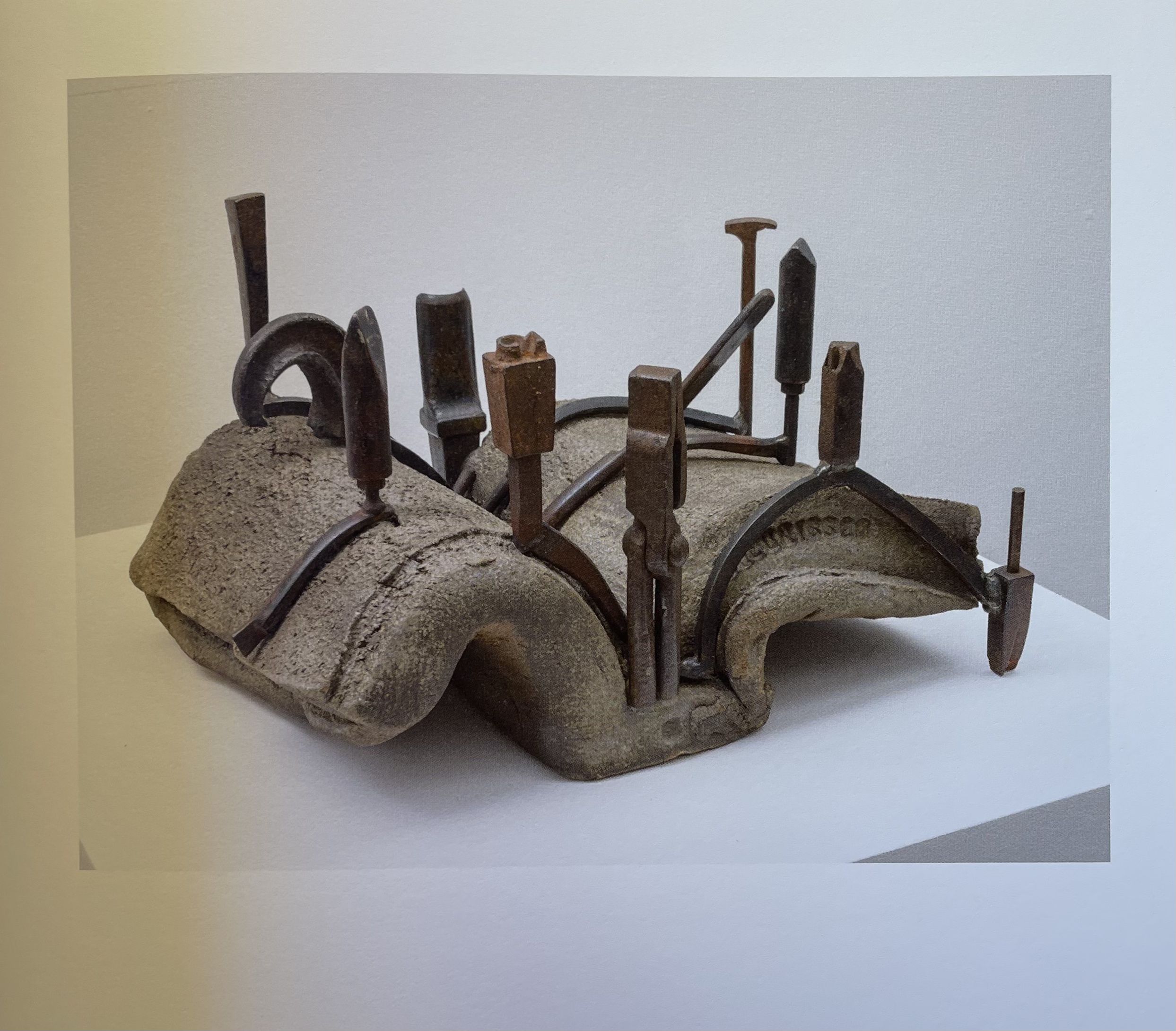
Stave (2013) stoneware and steel, 46 × 28 × 50 cm.
From Anthony Caro : Bronze and Book Sculptures : 5 April – 24 June 2016. London: Annely Juda Fine Art, 2016.
Anselm Kiefer’s book art is a whirlwind of the above uses of inaccessible books, allusive titles, and the untitled. The several works of his like Das Buch (1979-85) that have an inaccessible lead book hanging against an acrylic-on-canvas background make for interesting pairings with Caro’s Book of Eden. Where Caro backgrounds his blank inaccessible Bible beneath his minimalist lithograph and allusive title, Kiefer foregrounds his books. As he writes in L’Alchimie du Livre (2015):
In the beginning was the word. But in my work, first there were the books made of lead. And those books are interesting in that they are impossible to read, they are too heavy, the lead lets nothing get through, it’s a complete concealment… Lead books are perfect paradoxes then. You can neither thumb through them nor read them, and you will never know what’s inside. (Minssieux-Chamonard, 237).
Kiefer’s Mesopotamia – The High Priestess (1985-89) with its 196 lead volumes ranged across two open book cases contrasts with Francesco Pianta’s loosely shelved, allusive but decorative wooden books in Venice. The work is not background to adjacent artwork or surroundings. Neither is Kiefer’s title an indirect pun allusively signaling after something more like those of other book artists. It is indeed allusive but to something that stands apart from the form and material of the artwork. The distance makes the viewer work backwards from the inaccessibility, the volume, and distressed appearance to connect with the title. When Kiefer uses “untitled” as a title, he often adds explanatory words in brackets after it, as in Untitled (Constellation Book) (2004). Although made of lead, this work, however, is not inaccessible. Its nearly 5.5-foot pages stand open to be read “in the round”.
Johanna Drucker is one of the few writers about artists’ books who has commented at any length on Kiefer’s artist’s books:
Anselm Kiefer’s large-scale books made of heavy dull grey lead, laid open on stands designed to hold their outsized form and ponderous weight absorb the viewer into their profound depths, rather than offering themselves for communication. Such works become affective pieces rather than textual vehicles or message bearing forms, their physical, tactile presence takes the iconic and cultural resonance of book forms and plays it out through an extenuated spectrum of propositions — “what if” this were a book and a book were this, what then? Books of bread, marble, granite, soap and dried leaves pressed with flowers delicate and impossible to manipulate without destroying them. Books of lost objects, found texts, destroyed titles, remade photographs — all gaining some value by using the book form, insisting on its familiar structure as a frame to the otherwise elusive meaning of these constructions. …. (Drucker, 114-15.)
Which brings us back to Illmer’s more totemic works. Each work celebrates the grain and flaws of its material by using the book form. It could do so with a different form (beads, animals, geometric shapes, etc.), but Illmer chose the book. Although an inaccessible book, the object gains s0me value by this choice. And with the totemic title of Untitled, each work demonstrates that title matters as much as material and shape. Untitled offers the viewer’s eyes and hands the challenge that all inert totems offer: to invest its shape, grain, colors, and markings with meaning. But where do such works sit in our appreciation of artists’ books and book art? What are the distinctions between them and those of Kiefer, Caro, Coleman, Geiser, Stairs, Olson, Ulrich, Perrone, Lee, Beneš, Vostell, and Broodthaers? Keep looking and, wherever possible, touching.
Further Reading
Drucker, Johanna. 2004. The Century of Artists’ Books [Second edition] ed. New York City: Granary Books. Others who have commented at some length on Kiefer’s books as artist’s books include Zdenek Felix, “The Readability of the World” (1991); Buzz Spector, “Anselm Kiefer’s Bookworks” in Art Forum in 1987 (reprinted in The Book Maker’s Desire); Elizabeth Long in The Journal of Artists’ Books 21 (2007), and Garrett Stewart in Critical Inquiry (spring 2010).
Dubansky, Mindell, and Miriam Schaer. 2016. Blooks : The Art of Books That Aren’t : Book Objects from the Collection of Mindell Dubansky. New York: Grolier Club.
Frengel, Elizabeth, Patti Gibbons, Maria Kokkori, and Ann Lindsey. 2022. “Wolf Vostell’s Betonbuch [Concrete Book]: Materials and Meanings“. Presentation at 2022 ARLIS/NA Conference. Chicago, IL.]
Illmer, Ivon.2013. Buch-Skulpturen. Osnabruck: Self-published.
Küng, Moritz (ed.). 2023. Blank. Raw. Illegible … : Artists’ Books as Statements (1960-2022). Köln: Verlag der Buchhandlung Walther und Franz König.
Minssieux-Chamonard, Marie (ed.). 2015. Anselm Kiefer : L’alchimie du Livre : [Exposition, Bibliothèque Nationale de France, Paris, 20 Octobre 2015-7 Février 2016]. Paris: Bibliothèque nationale de France : Éditions du Regard.
Salvadeo, Dario Michele. n.d. “Francesco Pianta at the Scuola Grande di San Rocco“. Giuseppe Biretti. Milan: Giuseppe Biretti. Accessed 13 December 2025.
Sooke, Alistair. 2016. Anthony Caro: Bronze and Book Sculptures. London: Annely Juda Fine Art.
White, April. 22 September 2022. “Can Science Solve the Mystery of the Concrete Book? When a sledgehammer isn’t really an option“. Atlas Obscura. Accessed 15 December 2025.
