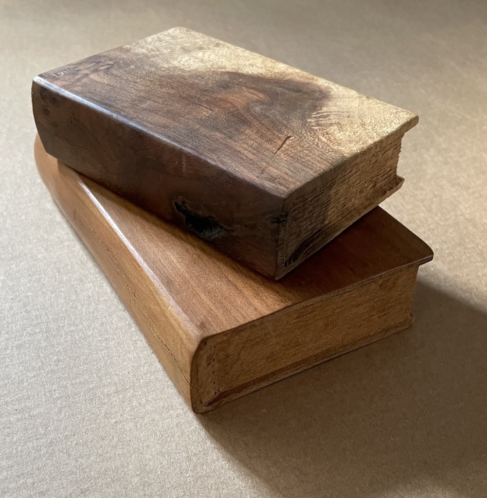
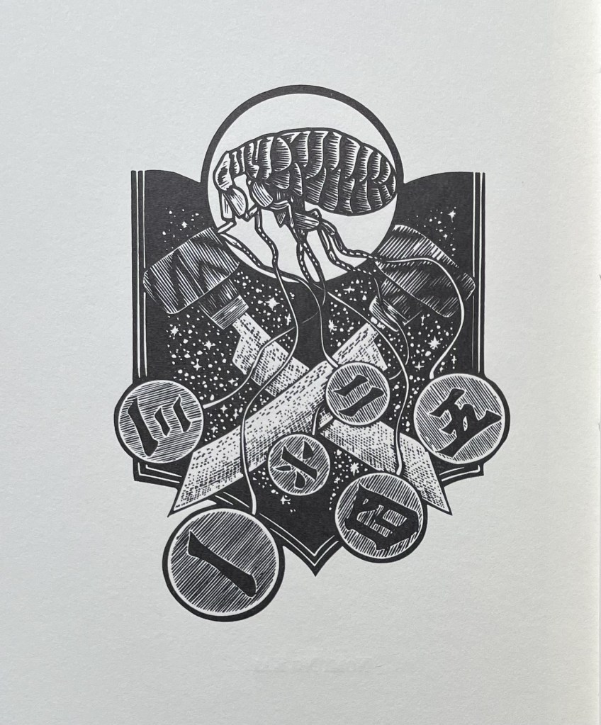
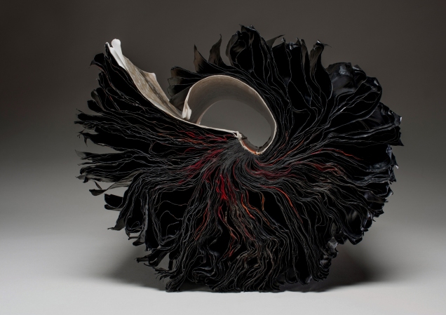
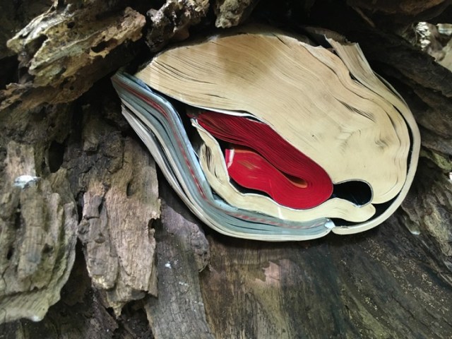
Silent Book, vol. 11 (2023) Ryuta Iida Altered book, camphor tree stump, and glue. H210 × W170 × D190 mm. Unique. Acquired from Fragile Books (Tokyo), 20 August 2024. Photos: Above, courtesy of Fragile Books; below, Books On Books Collection.
The cover, door, table of contents, numbering, text, and endnotes are all filled with a series of information. I thought to stop and crystallize all the functions of the “book,” … I decided to crystallize it. It took the time to go through the hands of people, the old book that finally reached me, sealed on a pedestal, it is now ripe for its next role. (Artist’s statement)
“Crystallized” is not the first word that comes to mind when viewing and handling this eleventh in Ryuta Iida’s series Silent Book. Perhaps it does for the angled planes of the cut block of camphor wood, but for the coverless codex, folded, draped, moulded, carved, and sculpted come closer. Two names that might not spring to mind (but should) are Giambologna (Jean Boulogne) and Gian Lorenzo Bernini. Like them, Iida offers us more than a single or primary vantage point from which to appreciate his work. Like Giambologna’s Abduction of a Sabine Woman (Loggia dei Lanzi, Florence) or Bernini’s Apollo and Daphne (Galleria Borghese, Rome) Silent Book must be circled and viewed in the round. The nine images below show the work turned right to left in stages.
Untitled(2015) Ivon Illmer Book-shaped wood sculpture. Top: Almond wood, H100 x W65 x D27 mm.Bottom: Poplar wood, H123 x W78 x D27 mm. Unique. Acquired from the artist, 10 October 2014. Photos: Books On Books.
From Ivon Illmer’s website: Books preserve history and stories. Each book has its own individual story. This ranges from loving treatment to neglect to ostracism and even burning. The arc almost inevitably stretches from the fate of the book to the fate of man. Everyone should let their imagination run wild when touching the book sculptures and invent their own story for each book. Touching is important, the haptic experience flatters the sense of touch. You “grasp” the beauty of the wood. Imagining the book sculptures in the raw piece of wood is the art. Each piece is unique in shape, structure and grain. Accessed 14 October 2024.
Illmer categorizes his work as “book sculpture / book art”. The carvings from various woods primarily celebrate the shape and tactility of the closed codex. The similitude of the exterior, right down to the fore, top and bottom edges, belies the inaccessibility of the interior.
Altered books as artists’ books present a seemingly endless variety.
Some may be the conversion of old books into just-legible new ones as in A Humument redacted with ink, paint, excision, and collage by Tom Phillips, Tree of Codes mechanically excised by Jonathan Safran Foer, or The Eaten Heart scalpeled into existence by Carolyn Thompson. They give us a new work to read page by page extracted page by page from the earlier work, which remains more or less (mainly less) present in our hands.
Others like Marcel Broodthaers’ page-by-page redactions of Mallarmé’s Un Coup de Dés by ink in one case and excision in another or Michalis Pichler’s similar reformatting and excision of the same poem in clear acrylic or Jérémie Bennequin’s page-by-page erasures of Proust’s Remembrance of Things Past give us artists’ books that make the altered books illegible but still accessible page by page.
Other altered books as artists’ books are mainly one-off spatial objects that can be taken in in one go — not necessarily in just a glance but in the look or gaze given to a sculpture or painting. The ground up and encased works in Literaturwurst by Dieter Roth. The sealed, painted, nailed, and “hairied” works of Barton Lidice Beneš. The torn works of Buzz Spector. The sandblasted works of Guy Laramée. The glued and carved works of Brian Dettmer. The bullet-hole-ridden Point Blank by Kendell Geers. The pun-packed moebius-sculpted Red Infinity #4 by Doug Beube. They give us artists’ books that make the altered books illegible and inaccessible as books.
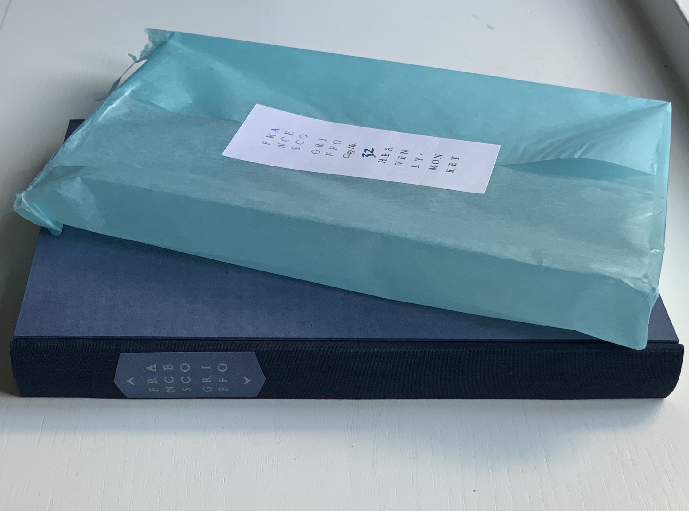
Francesco Griffo da Bologna: Fragments and Glimpses (2020)
Francesco Griffo da Bologna: Fragments and Glimpses (2020) Rollin Milroy H234 x W159 mm, 114 pages. Edition of 50, of which this is #32. Acquired from Heavenly Monkey, 4 November 2020. Photos: Books On Books Collection.
Several collections of Aldine volumes made themselves known around 2015, the 500th anniversary of the death of Aldus Manutius. Several have digitized their collections to make them more accessible. By gathering these fragments and glimpses of the hand behind the roman, Greek, Hebrew and italic typefaces designed and cut in late 15th-century and early 16th century Venice for those volumes, Heavenly Monkey (founded and run by Rollin Milroy) has followed a different path. A collector himself and artist of the book, Milroy has created this work to bring himself and the reader closer to Francesco Griffo da Bologna and the historical and contemporary hunt to identify him and appreciate his typographic accomplishment.
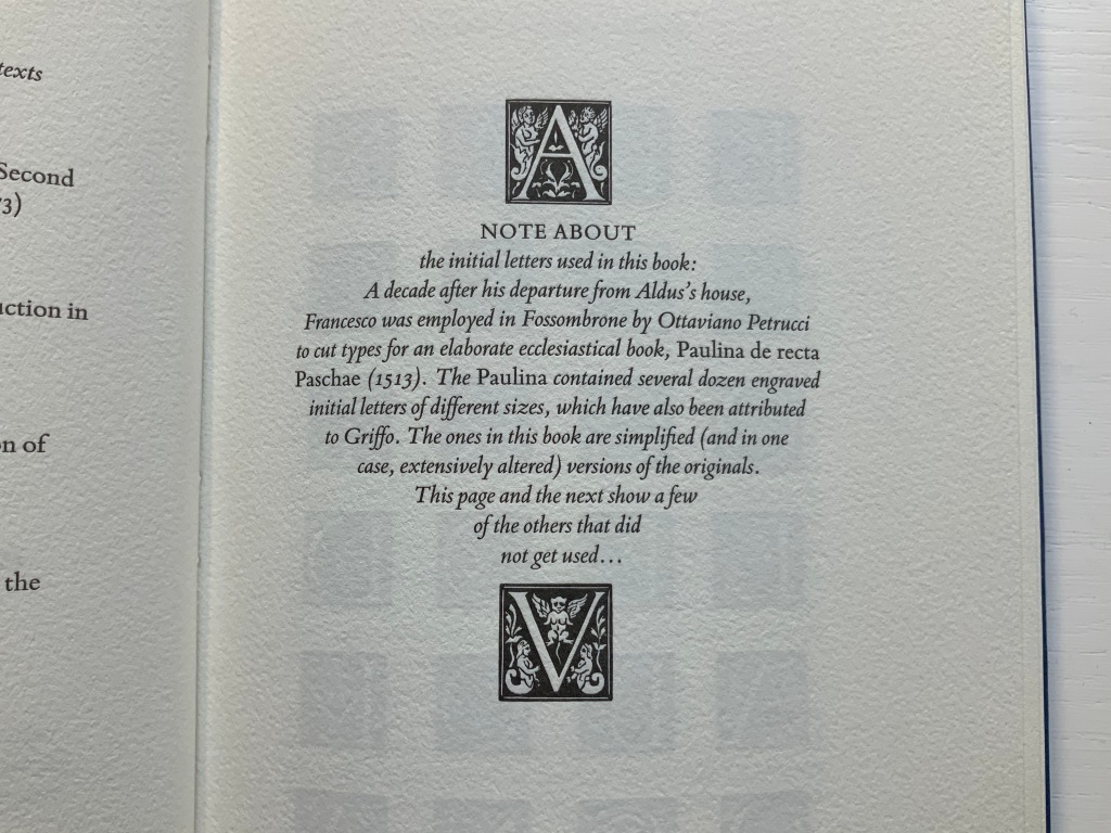
He presents a letterpress work in the modern version of the Bembo typeface cut by Griffo for the Aldine printing of Pietro Bembo’s tract De Aetna (1495), whence the typeface gained its name. In another step closer to Griffo, not only does Heavenly Monkey use simplified versions of initial letters attributed to Griffo, he offers up a note and display page that include those letters not used in the text (see below).
Note that distortion of the letters is due to photography of the curved page.
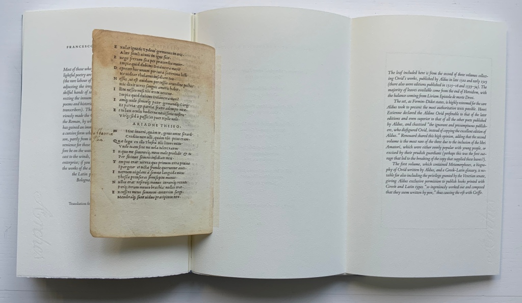
Physically true to its title, the book consists — except for the frontmatter, backmatter and brief explanatory text — of fragments: extracts from secondary sources and an actual leaf from the Aldine edition of Ovid’s Heroidum Epistolae set in Griffo’s first italic type. The leaf comes from the second of the three-volume Aldine Ovid, which over time was subject to prudish excision of racier parts, which Heavenly Monkey speculates may have led to the break-up of the copy used here to supply the leaf included. Some historians and collectors may question the inclusion of the leaf. Others as well as artists of the book will thrill to it as an act of preservation, appropriation, dissemination and homage.
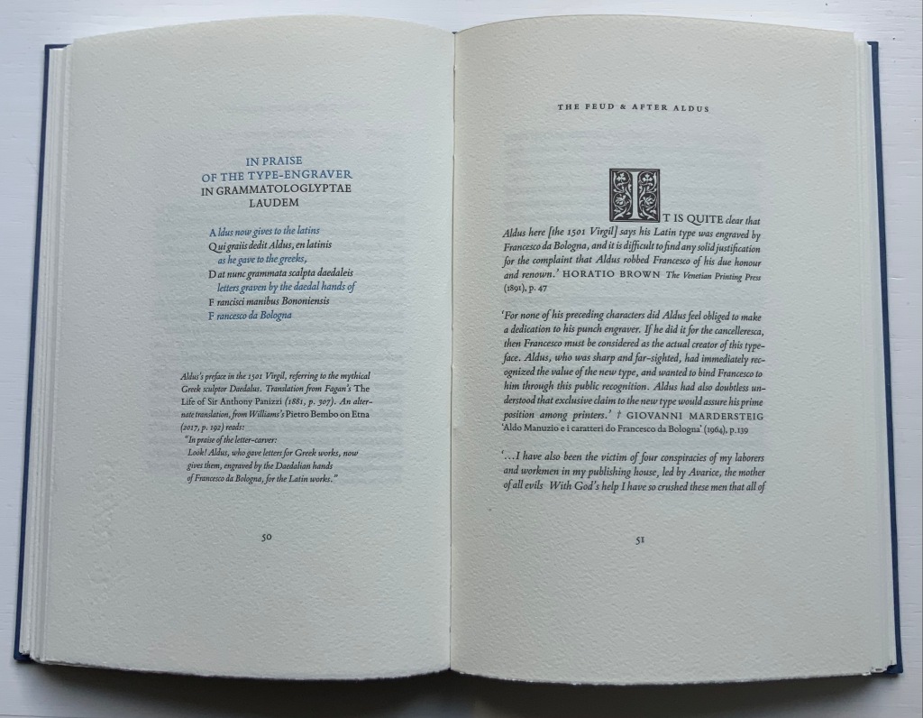
The book’s prologue is an English summary of a passage from Giuseppe Fumagalli’s 1905 lexicon of Italian typography that sets out and settles the 19th century debate about the identity of Griffo, a confusion that would resurface for the legendary typographer Stanley Morison in 1923. With a narrative technique similar to an epistolary novel, Milroy lays out extracts from histories of printing, prefaces to reprints of Aldine works, biographies of the historians in the debate, the Fine Arts Quarterly Review and bibliographical journal articles to tell the story of “which Francesco was he?” The same technique lays out the development and differing opinions in reception of Griffo’s cutting of the roman, Greek, Hebrew and italic types. While following the stories of those faces, the reader walks through a hall of illustrious historians and typographers — Nicolas Barker, Joseph Blumenthal, Philip Meggs, Giovanni Mardersteig, Stanley Morison again, Alfred Pollard, David Pottinger, Daniel B. Updike and many others. The next set of extracts explores the feud that led Griffo to leave Aldus Manutius and Venice to set up on his own in Fossombrone.
The next set of extracts attests to Griffo’s typographic legacy, and then comes the tipped-in foldout that protects the leaf taken from the Aldine Ovid, followed by the listing of Griffo’s six works published on his own, documented in F.J. Norton’s Italian Printers 1501-1520.
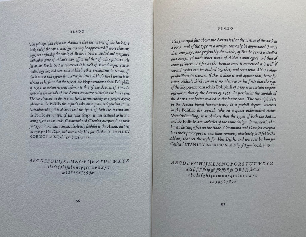
An important contribution comes in Appendices I-IV with Emma Mandley’s translations of key passages from books, letters and documents of the main protagonists in the debate over Francesco da Bologna’s identity: Antonio Panizzi, Giacomo Manzoni, Adamo Rossi and Emilio Orioli. Lovers of type specimens and the style of Stanley Morison will welcome the samples of the modern versions of the roman fonts for Poliphilus and Bembo and the italic fonts for Blado and Bembo. In a grace note, Heavenly Monkey includes samples for the italic and roman fonts of Mardersteig’s Dante, which Robert Bringhurst opined “has more of Griffo’s spirit than any other face now commercially available” (The Elements of Typographic Style, 1996, p. 213)”.
Dante is the typeface Heavenly Monkey wanted initially to use but, on deciding that the main text would be set in italic, declined it. The Dante samples offer the reader the chance to compare and contrast it with the other faces and weigh Bringhurst’s opinion and Heavenly Monkey’s choice.
Like many fine press editions, Francesco Griffo da Bologna treads the boundary of the artist’s book or the work of book art. It certainly resonates with different works in the Books On Books Collection:
The leaf from the Aldine Ovid chimes with Jacqueline Rush Lee‘s sculptural interpretation of Ovid’s Metamorphoses and Ian Hamilton Findlay’s The Errata of Ovid.
Milroy’s “scrapbook” protrayal of Griffo and contemporaries will remind some of Russell Maret‘s typographic adventure in Hungry Dutch.
Anything to do with Venice brings to mind Peter Koch‘s edition of Joseph Brodsky’s love letter to Venice Watermark and Bodil Rosenberg‘s sculptural evocation of that city in Canal Grande.
But overall, Griffo‘s bibliographic historical nature resonates far more with that of another of Milroy’s works in the collection: About Agrippa.
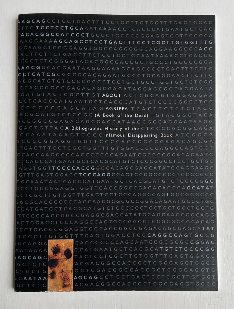
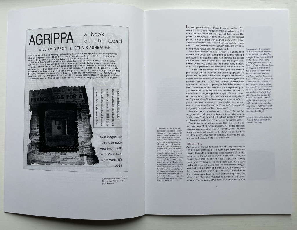
In the Bodleian Libraries Rare Books Collection is a yellowed, oatmeal-colored remnant of a linen casebound thing holding leaves of paper, some sharply trimmed, some with deckled edges, various colored single-sided prints tipped in between and amongst the folded and gathered leaves, a square hollowed out of a final gathering of inseparable leaves and sealed with a lining of gritty silver-gray paste. And burned onto its cover is this:
William Gibson and Dennis Ashbaugh’s Agrippa (A Book of the Dead) (1992) is as wrapped in mystery and mystique as Griffo’s identity. For the collection, Milroy’s two books play the roles of historical bookends: each addresses works from the second phases of a technological shift in the history of the book. Griffo and Manutius mark the beginning of the post-Gutenberg and post-incunabula phase of book publishing. Gibson, Ashbaugh and their publisher Kevin Begos mark the beginning of the post-Apple I phase of digital publishing. Aldine books are rare; Agrippa is even rarer, designedly so. Gibson’s titular poem is on a floppy-disk embedded in a book (H16 x W11 inches). The disk was programmed to self-erase as it was played.
Milroy provides a valuable and attractive resource covering the inception, the production, pricing, dissemination/performance and reception of Agrippa. Like Griffo, About Agrippa brings the reader closer to the principals, the mystique and importance of the work. Both books deserve an audience of students of book art and book arts as well as collectors. Here’s hoping that any library with a strong collection of fine press books and artist books will acquire them.
An Anticipated History (2015)
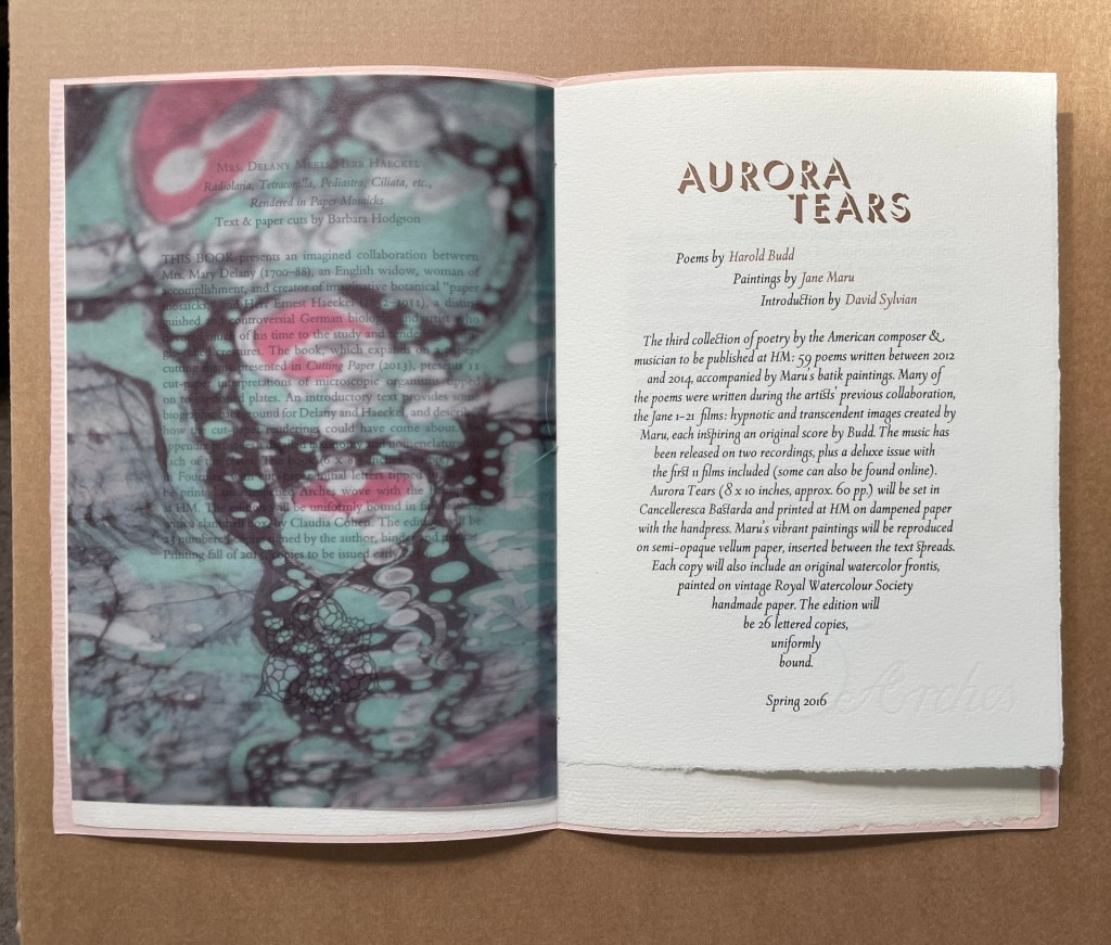
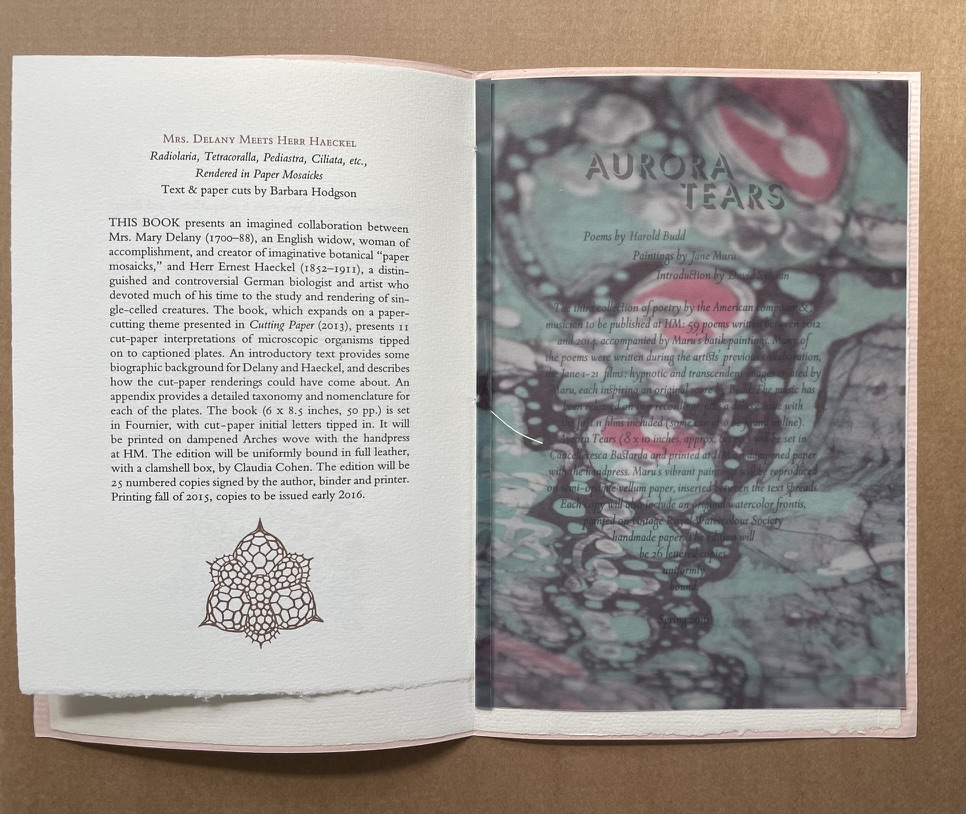
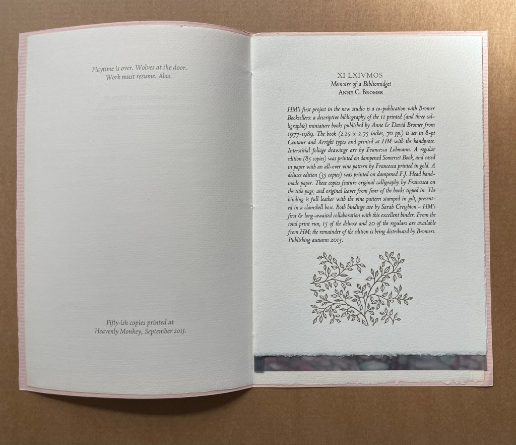
An Anticipated History (2015) Rollin Milroy Eight pages sewn into peach-colored watermarked Italia Fabriano cover. One sheet, Arches. Semi-opaque vellum cut-paper with Jane Maru painting tipped in. H243 x W163 mm. [8] pages. Edition of “fifty-ish copies” Acquired from Peter Keisogloff Rare Books, Inc. (Brecksville, OH U.S.A.) 3 December 2018. Photos: Books On Books Collection.
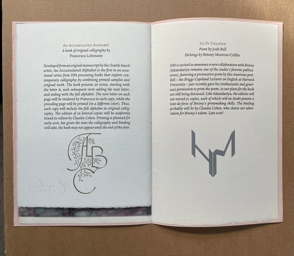
A catalogue of five titles forthcoming from Heavenly Monkey Press.
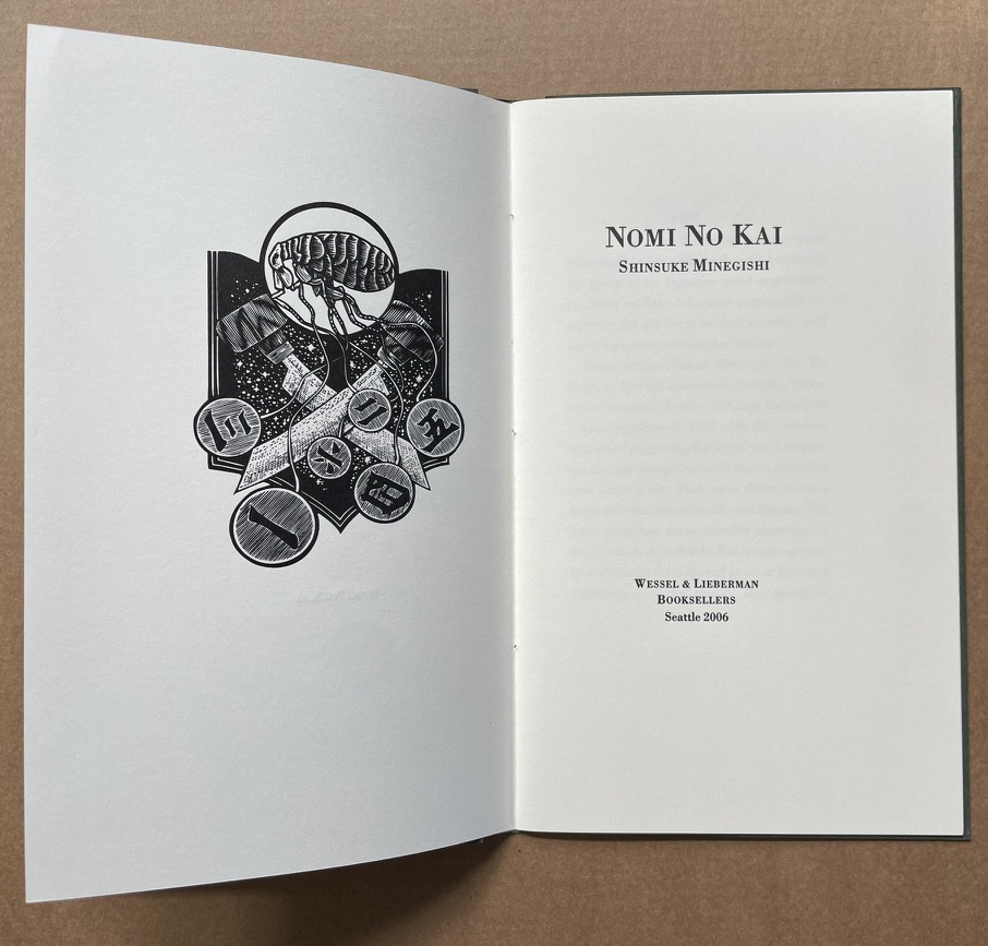
Nomi no Kai (2006)
Nomi no Kai(2006) Shinsuke Minegishi. Pamphlet sewn in a wrap of Reg Lissel’s handmade paper. H215 x W130 mm. [12] pages. Edition of 100, of which this is #98. Acquired from Charles Seluzicki Fine & Rare Books, 3 December 2018. Photos: Books On Books Collection.
An homage to six Japanese wood engravers — the Nomi no Kai: Takao Hiwazaki, Sho Kidokoro, Hitoshi Karasawa, Susumu Yamamoto, Masahiro Kurtis & Keisei Kobayashi. Set in Bodoni and printed letterpress from polymer plates by David Clifford at Black Stone Press. Designed and assembled at Heavenly Monkey studio.
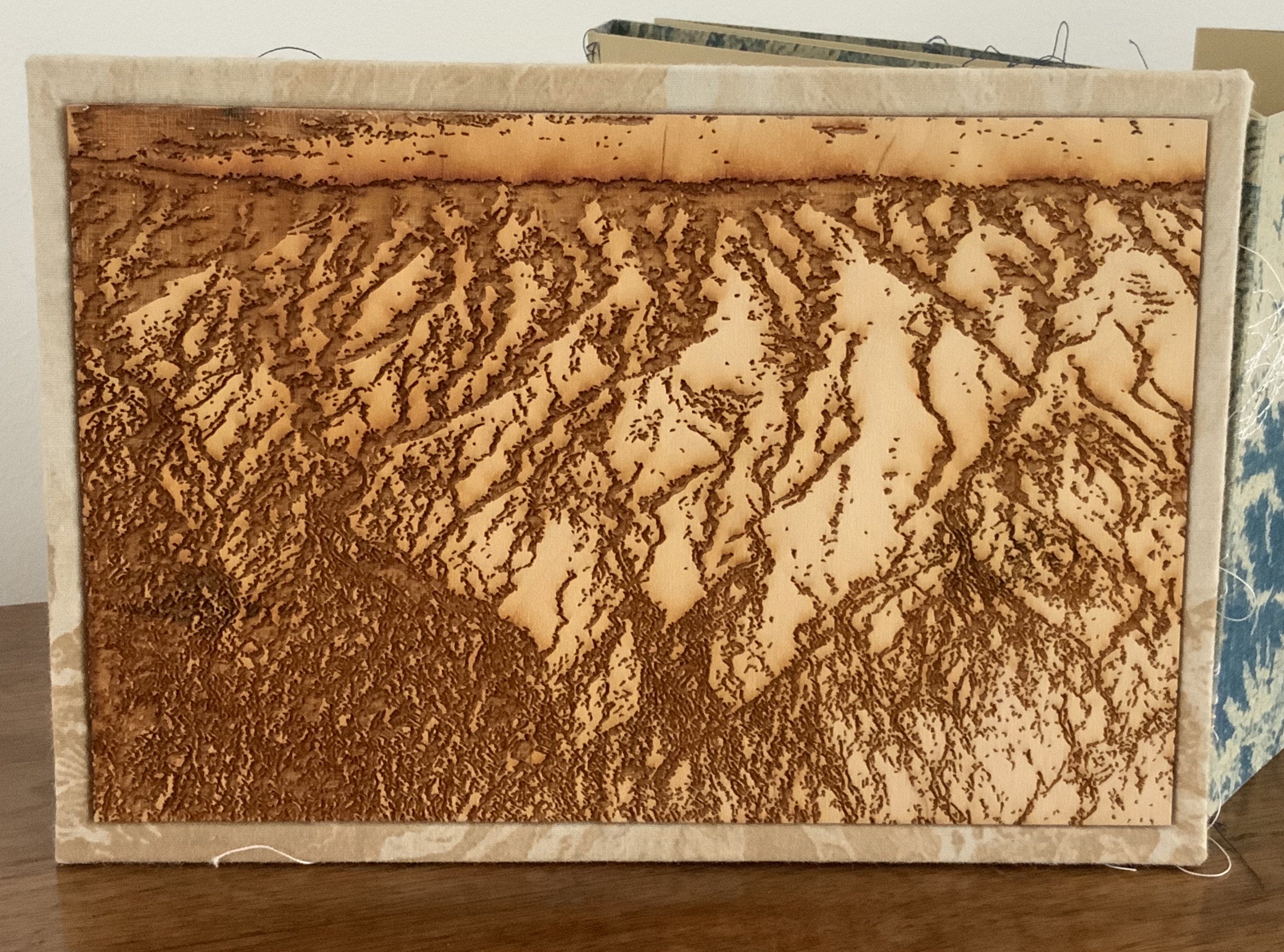
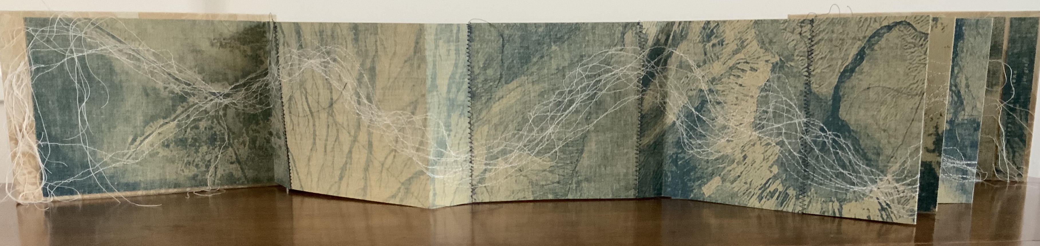
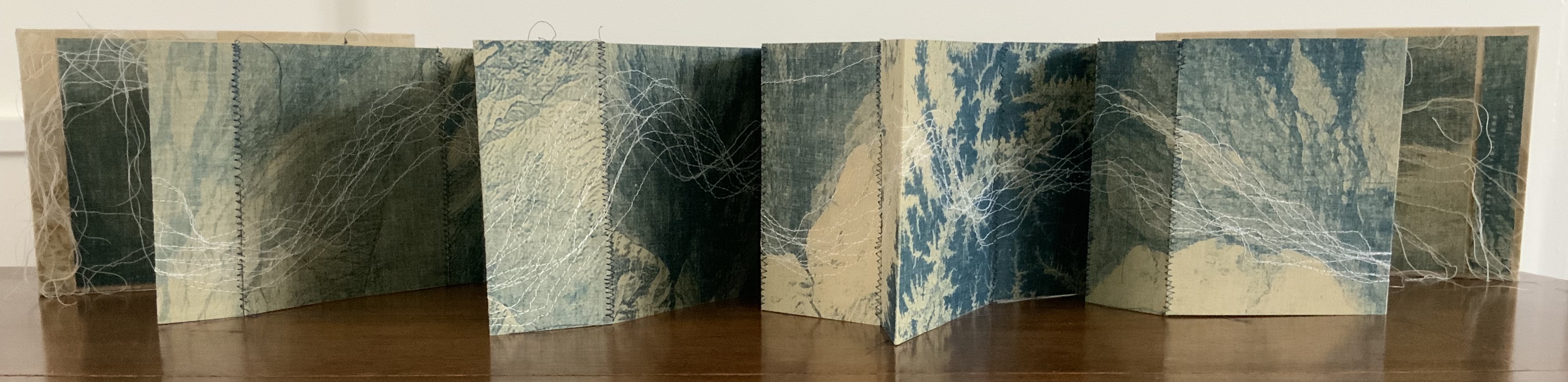
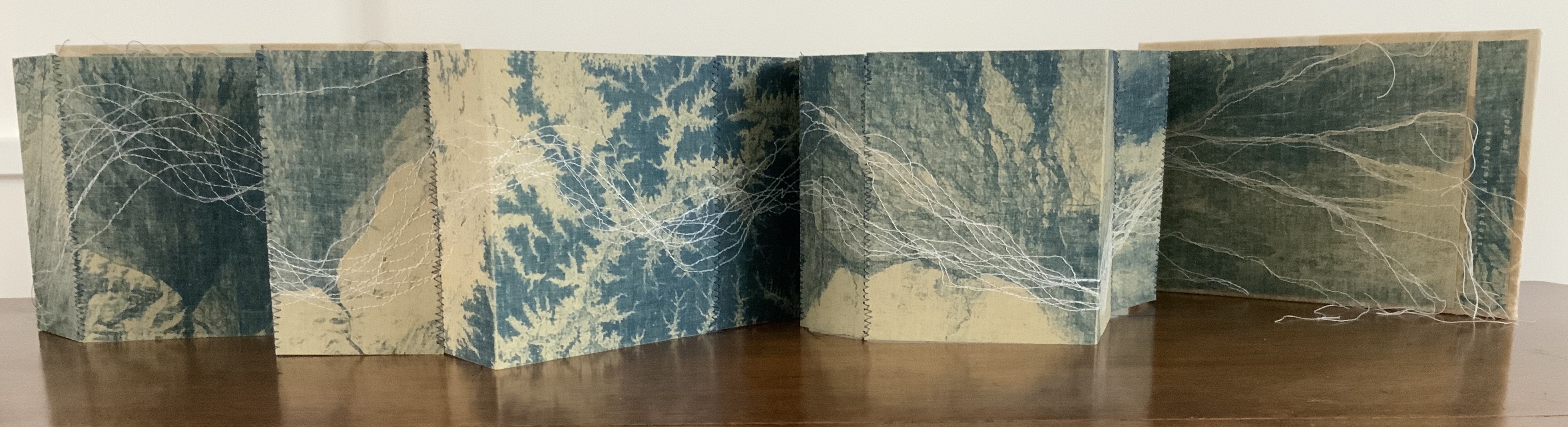
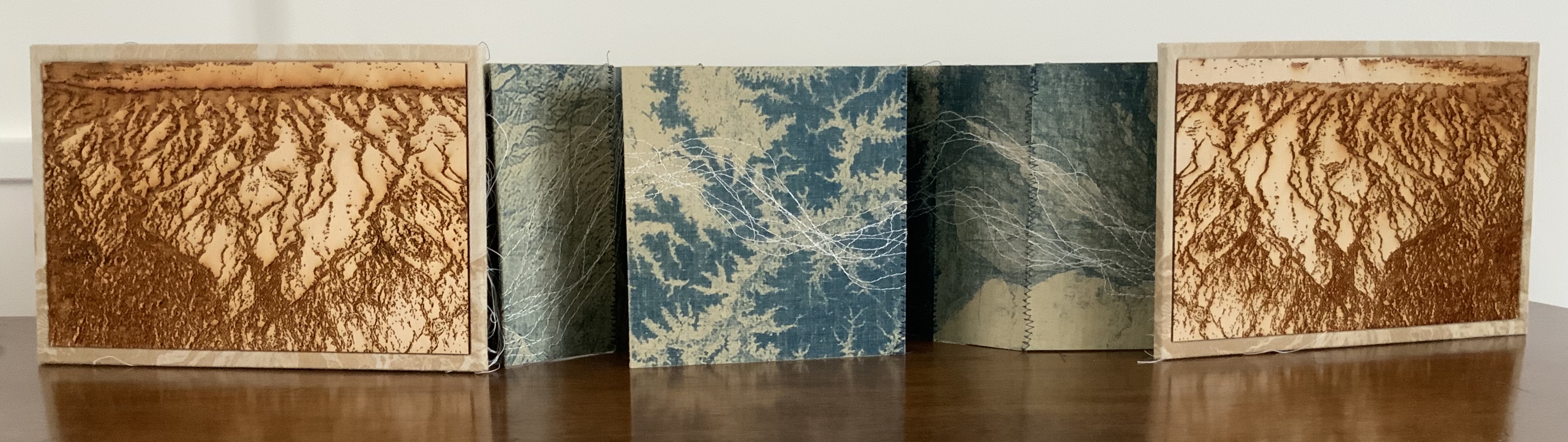
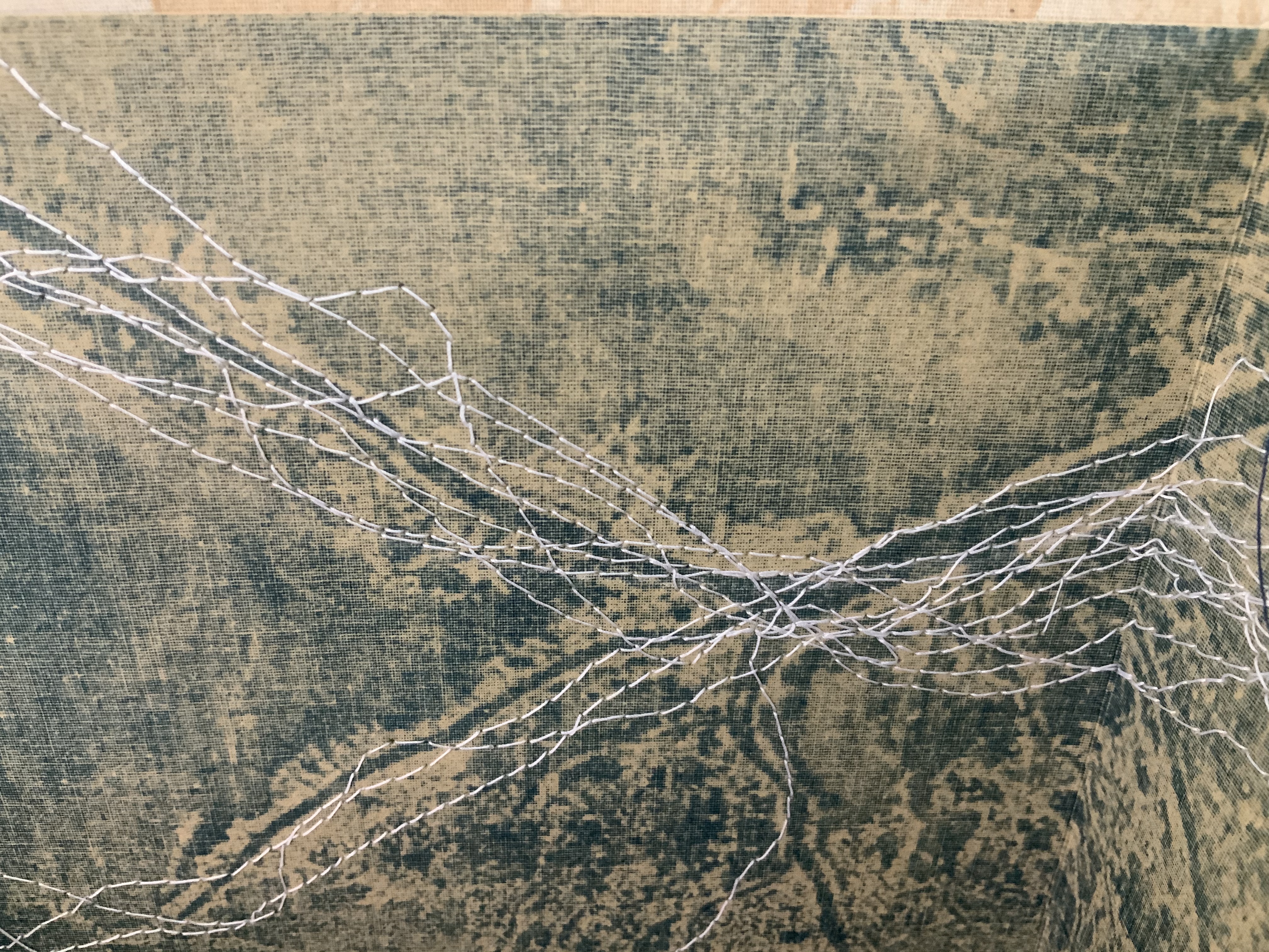
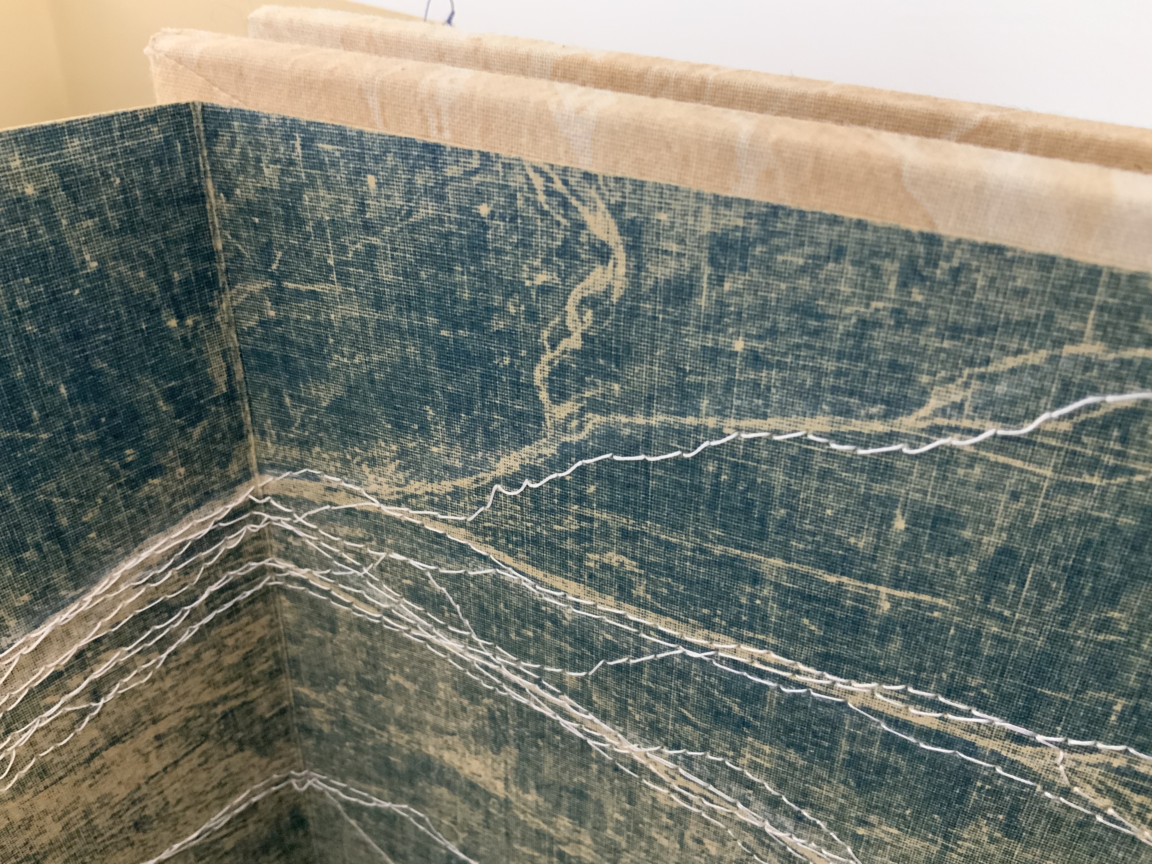
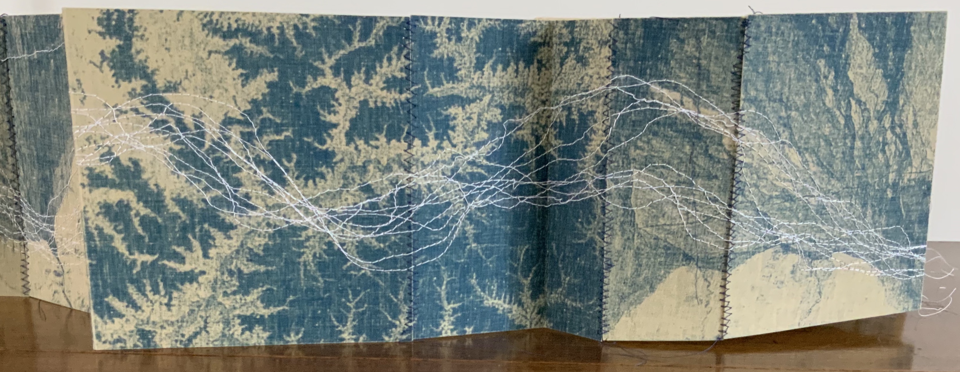
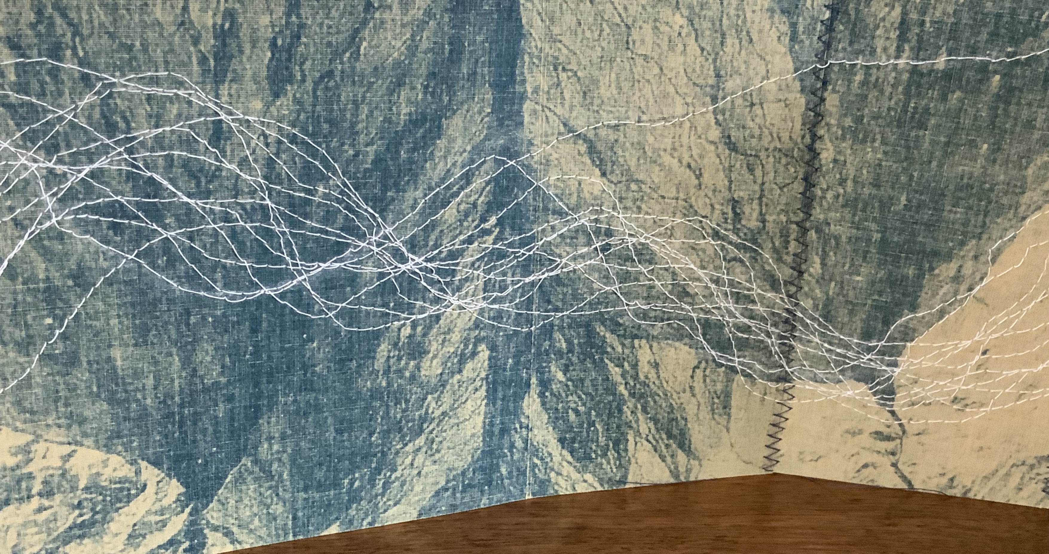
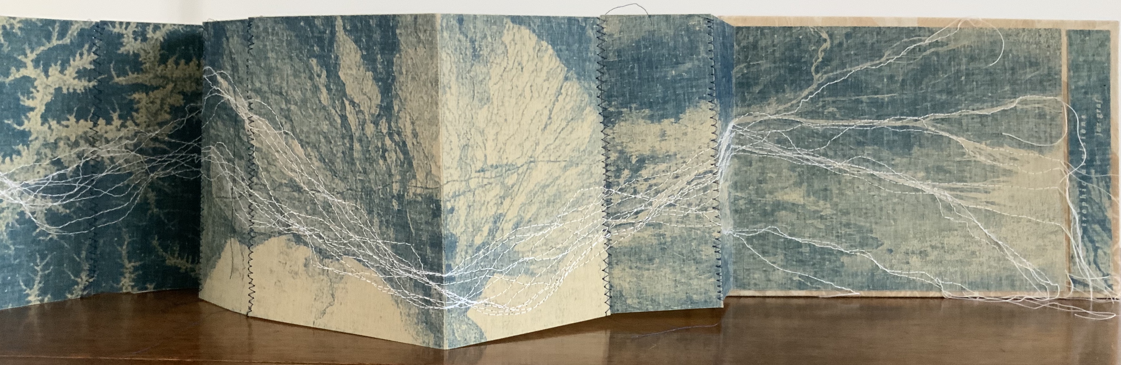
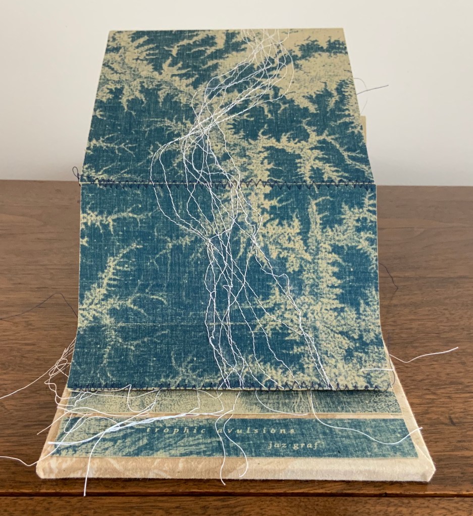
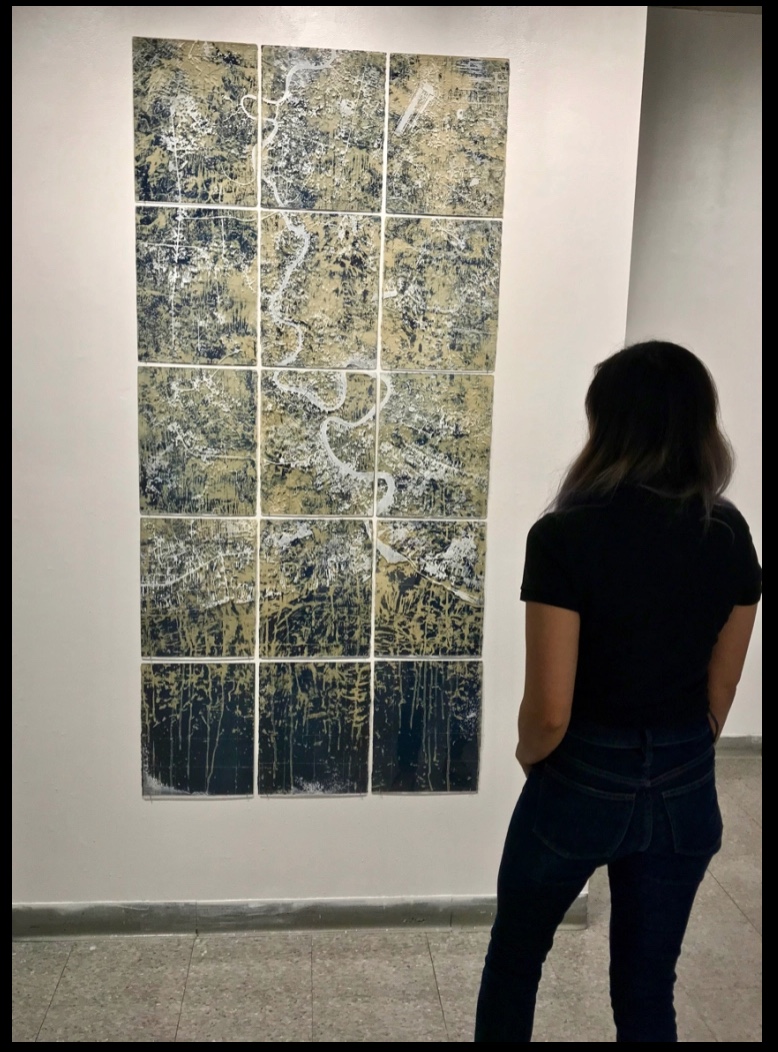
Trophic Avulsions (2016) Jaz Graf Cyanotype accordion book with thread drawing, paper lithography and laser engraving on wood. Closed: H6 x W8.5 x D1.0 inches; Open: W80 inches. Unique. Acquired from the artist, 14 March 2018. Photos: Books On Books Collection.
Graf has used satellite photos of various river deltas around the world to create the cyanotype prints in this work. The patterns from which are exposed come from paper litho prints made on fabric. The result is a blurring, softening yet “nearing” of the otherwise sharp, scientific and remote images normally viewed on digital screens or photographic paper. As Graf points out in her description, the word trophic “relates to an ecological concept of the trophic cascade, in which one action leads to another in an ecosystem, implying ideas of interconnectivity.”
That interconnectivity and the impact we have on “the separation of land from one area and its attachment to another”, which is what avulsion means, is implied by the streams of thread meandering across and off the panels of the accordion form from beginning to end. Even though the panels fold to fit within their laser-engraved birch panels, they vary in width, which breaks up the expected regularity of the accordion when it is extended. The engravings show a delta emptying into a desert and are mounted on wood blocks covered in muslin bearing the printed delta image made with paper lithography.
Thread drawing is a technique common to several outstanding works of book art: Jody Alexander’s Felix’s Notebook (2008), Marion Bataille’s Vues/Lues (2018), Dianna Frid’s Reversal (2009), Candace Hicks’ Composition (2009~), Helen Hiebert‘s Nebulae (2017), Shellie Holden’s Maps (2006), Lisa Kokin’s Partial History of Jewish Life in Modern Times (1997), Ines Seidel’s Changed Constitution (2015) and Mireille Vautier‘s Agenda (2001) among others. Graf’s handling of the technique and its combination with cyanotype printing and lithography in the treatment of her theme, though, make it distinctive and original.
The environmental focus of Trophic Avulsions places it in a well-loved tradition in book art. Other works by Graf, such as Mother Water (2018) below, would be comfortably at home in an exhibition with
Biography (2010) by Sarah Bryant, who creatively connects the human body’s elements with those of the periodic table to bear witness to our impact on the environment and vice versa;
the Ice Books series (2007-17) by Basia Irland, who selects local seeds and embeds them as “text” in a block of frozen river water, carved into the shape of a book to be released into the local river where it melts, releasing the seeds;
the Whorl series (2013- ongoing) by Jacqueline Rush Lee, who returns books to their botanical origins by sculpting books and inserting them into the cavity of a tree to allow time, changing weather conditions and insect activity to rewrite them into the shape of a whorl in a tree hollow;
Batterers (1996) by Denise Levertov, Kathryn Lipke and Claire Van Vliet, who combine Levertov’s powerful poem extending a metaphor of abuse to the earth with Lipke’s clay paperwork set into a wooden tray as the base of this sculptural book, whose pages Van Vliet makes unfold into a fiery landscape; or
Silent Spring Revisited (2016) by Chris Ruston, who uses her frequent visits to natural history museums to inspire works that blend science and art that highlight extinction and the interdependence of humans and nature.
If such an exhibition — a twentieth anniversary of Betty Bright’s 1992 “Completing the Circle: Artists’ Books on the Environment”? — were organized, Trophic Avulsions would be available to loan!
Mother Water (2018) Laser-etched acrylic, cyanotype, porcelain Dimensions variable (15 panels – each 14”x11”) The river featured is Thailand’s Chao Praya. Photo: Courtesy of the artist.
Further Viewing
“Artist of the Week“, Jaffe Center for the Book Arts, Florida State University. 5 January 2020.
This collection note is a reminder of how comparison and contrast can lead to understanding how particular works evoke pleasure, thought and appreciation.
The First Cut (2015)
Ovid’s Metamorphoses has lent inspiration to poems, paintings, sculptures and even cinema — why not book art?
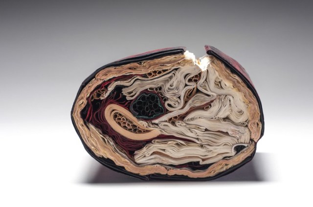
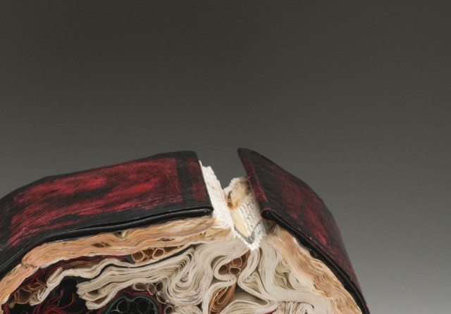
The First Cut (2015) Transformed Harvard Loeb Library Translation of Ovid’s Metamorphoses H7.75″ x W5.5″ x D6.5″ Photos: Books On Books
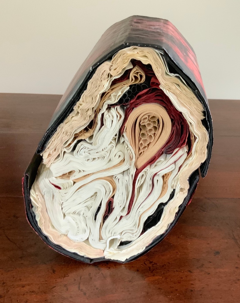
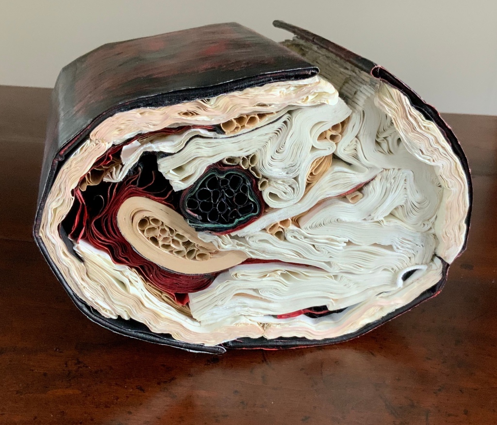
Lee’s The First Cut transforms the two Harvard Loeb volumes into what appears to be a block cross-cut from a tree with red and black bark, split down one side showing the inner bark and flesh. The metaphoric metamorphosis of book back to tree alludes to the transformation of Daphne, Myrrha and others into trees but that is only one of many changes to which The First Cut leads the eye and mind.
Looked at on edge, the object shows the might-have-been-expected concentric tree rings transformed into a variety of quills, folds and warped signatures. Some inked black, some red; some a bleached white, some an aged beige. The numerous shapes in the cross-sectional view are changing and press on other changing shapes. Likewise in Metamorphoses there are manifold transformations of humans: not only into trees but flowers, birds, stones and more as well.
There is also something uterine or endoscopic in the cross-sectional view. There is plenty of sexual activity between humans and the gods in different forms in Ovid’s poem. A tree serves as Adonis’ womb, and Ovid often provides agonizing descriptions of limbs and organs undergoing their change. Among so many metamorphoses, which is “the first cut”?
Silenda (2015)
Silenda (2015) Transformed Peter Green Translation of Ovid’s The Poems of Exile: Tristia and the Black Sea Letters Manipulated Text, Ink, Graphite. H9.5″ x W12″ x D6.5.” Photos: Paul Kodama
The Latin word “silenda” means “secret”, which evokes the still unknown offense that led to Ovid’s exile by Emperor Augustus in 8CE to Tomis (now Constanţa, Romania) where Ovid wrote his poems of exile. The ink-blacked pages evoke both the hiddenness of the secret and the black despair into which Ovid sank.
Silenda strongly resembles another of Lee’s works: Nous [There’s No Why Here] (2014), an altered philosophy book. The Greek word “nous’ means “the faculty of intellectual apprehension and of intuitive thought”, especially as it applies to a grasp of first principles. The subtitle to Nous and the opaque ink-blacked pages work more broadly, bluntly and ironically with the identity of that work’s raw material than is the case with Silenda.
Nous [There’s No Why Here] (2014) Jacqueline Rush Lee Photo: Paul Kodama
How do we weigh one work against the other? On the basis of the identity of the raw material? On the basis of the title? (What if both were “untitled”?) On the basis of execution? On the basis of how well the source material, the title and the execution combine and how they “work” with the visual impact of the object created?
The questions aren’t restricted to these two works, this artist or book art. Consider the numerous instances of “incised and excised” books. The term is used here for works such as Brian Dettmer’s Eye Surgery (2005) or A Sentimental Journey #1 (2018), where the artist has cut through the front cover, down through the pages, and left sentences and images in meaningful relief. Many other artists have produced similar works, but Dettmer’s combination of technique and the object’s close alignment with its source book set the bar for this kind of art. His individual works invite that closer look at their similarities and reward the look with differences to enjoy.
To return then to Lee. Her works (The First Cut, Silenda and previous ones similar to them) also have set a bar for this variety of book art. They invite a closer and comparative look. Within her own body of work, her series invite this. Silenda is part of the Inked series, whose output compares and contrasts productively with that of the series Ex Libris. The process Lee used for the latter series whereby “books and periodicals were fired in controlled kiln environments with no clay or slip addition” resulted in “fragile, bloom-like forms or skeletal remains, while others were coral-like, calcified forms with covers that were shell-like in feel with text, cover titles, and book cover colors present in their new, warped state”.
Ex Libris: Endoskeleton (1998) Jacqueline Rush Lee Fired book in kiln (Biology book) H7 x W15 x D17 inches
The results from the two series’ different techniques are clearly night and day. Beyond similarities of shape, there is another similarity that unites the works across the two series — the practice of ekphrasis, or rather reverse ekphrasis. Ekphrasis generally refers to literary efforts to depict a work of art: Auden describing Breughel’s Icarus or Jarrell describing Donatello’s David. In the process, the poems go beyond mere description or allusion; they stand on their own. Reversing this, Lee (and Dettmer) take physical instances of literary works and create art that depends on the literature from which they are actually made, and they stand on their own.
But if the viewer is not or cannot be aware of the identity of source material, is the work a lesser work for that? Without some awareness of the biblical stories, images and symbols to which a religious work of art alludes, the experience of the work seems certainly lesser. But does that apply to these ekphrastic works (reverse or otherwise)? Does the more slightly subtle way that the title of Silenda works with its source than Nous works with its source give an added edge to Silenda?
Dettmer and Lee provide offer another basis by which to appreciate their works: that of innovative variation of technique and form. Dettmer’s move from the relief effect of Eye Surgery to three-dimensional carving of single and multiple volumes (for example, Tristram Shandy, 2014) shows such innovation. Such innovativeness enhances our appreciation and preferences across his works and those of other “book surgeons”. Likewise a visit to Lee’s site will prove that the breadth of her innovation is even wider than the impressive evidence of The First Cut, Silenda, Nous and Endoskeleton.
With apologies to the preacher: Of making many books [on books] there is no end.
(Ecclesiastes 12:12)
With the choir of its forebearers, Amaranth Borsuk’s The Book (MIT Press, 2018) sounds an “amen” to that truth. The proliferation of degree programs in book studies covering the history of the book, the book arts and even book art ensures The Book will not be the last. What distinguishes Borsuk’s book are her perspective as an artist and the book’s breadth and depth despite its brevity.
The book has a long history of existential crises. What is a book? Is the end of the book nigh? For more than a century, those questions have returned again and again. The most recent recurrence stems from the ebook’s threat to dematerialize the book and the online world’s threat to take us into a post-text future. Even before these latest threats, book artists have long lived and worked with their own existential questions, a kind of higher existential calculus, or derivative of, the book’s crises: What is an artist’s book? What is book art? Stephen Bury, Riva Castleman, Johanna Drucker, Joan Lyons, Stefan Klima, Clive Philpott and many others in the last quarter of the 20th century dwelt on defining and categorizing book art.
Borsuk belongs to a later generation of book artists that has embraced these existential crises and recognized that the book’s existential crises are what make the book a rich medium in which and with which to create art — from bio-art miniature to the biblioclastic human-scale to large-scale installations and performances. Even to the digital.
The Origin of Species (2016) Dr. Simon Park, Guildford, Surrey “The small book shown here was grown from and made entirely from bacteria. Not only is the fabric of its pages (GXCELL) produced by bacteria, but the book is also printed and illustrated with naturally pigmented bacteria. ” Posted 27 March 2016. Photo credit: Dr. Simon F. Park
Silenda: Black Sea Book (2015) Jacqueline Rush Lee Transformed Peter Green‘s translation of Ovid’s Tristia and the Black Sea Letters H9.5″ x W12″ x D6.5.” Manipulated Text, Ink, Graphite Photo credit: Paul Kodama. In Private Collection, NL
Field (2015) Johannes Heldén Produced, and premiered, at HUMlab, Umeå University Reproduced with permission of the artist
Performance artist and academic as well, Borsuk brings that later generational and creative perspective to the existential question — What is the book? — and, with an artist’s perception of her medium of choice, displaces the old companion existential question — Is the end of the book nigh? — with an altogether more interesting one — Where next for the book?
To see where books might be going, we must think of them as objects that have experienced a long history of experimentation and play. Rather than bemoaning the death of books or creating a dichotomy between print and digital media, this guide points to continuities, positioning the book as a changing technology and highlighting the way artists in the twentieth and twenty-first centuries have pushed us to rethink and redefine the term. (pp. xiii-xiv)
In The Book, the future is not far from the physical past. Where once we had text on scrolls, now we scroll through text (albeit more vertically than horizontally). Where once human consciousness changed with the invention of the alphabet and writing, now it may be altering with our reading and writing through networked digital devices. Like the many historians before her, Borsuk starts with cuneiform (those wedge-shaped accounting marks on baked clay), hieroglyphics and the invention of the alphabet to set the scene for the advent of the book and its ongoing physicality:
its shape (scroll, accordion, codex)
its material (papyrus, vellum, paper, charcoal or mineral-based watercolor and ink)
its manufacture (scribing, printing by woodblock and movable type, design and typography, illumination and illustration, folding into pages, methods of binding)
its constituent and navigational parts (cover, book block, title page, table of contents, page numbering, index).
But Borsuk reminds us — from Sumer’s clay to Amazon’s Kindle, from Johannes Gutenberg to Project Gutenberg — the book as human artifact exists in a social, political, technological, economic and even ecological context. Who is allowed to make it, how it is transacted, how and where we use it, how we perceive and speak of it — all have affected the physicality of the book object and are reflected in it.
In the first half of The Book, Borsuk steers us through these interdependencies to a turning point. That turning point is where the pinnacle of the book arts — Beatrice Warde‘s and Jan Tschichold‘s vision of the book as a crystalline container of content — and the book’s commodification combine to cause the book’s physicality to disappear because it is so taken for granted, leaving us with “the book as idea”.
With the perception that books are ideas bestowed on readers by an authorial genius whose activity is purely intellectual, the book’s object status vanished for much of the reading public as we raised a glass to happily consume its contents…. Even though innumerable material elements come together to make the book, these features have been naturalized to such a degree that we now hardly notice them, since we have come to see content as the copyrightable, consumable, marketable aspect of the work. (pp. 106-9)
At this turning point — where “the historic relationship between materiality and text is severed” (p. 112) — the second half of The Book introduces book art. It is telling that the longest chapter in the book begins the second half, that it is called “The Book as Idea” and that it comes before any extended engagement with the digital dematerialization of the book. It is a wry pivot: the artistic genius supplants the authorial genius; what the latter takes as invisible background, the former re-makes as self-regarding foreground. As Borsuk shows and her book’s cover neatly demonstrates, works of book art are inevitably self-referential and self-aware.
As such, works of book art
have much to teach us about the changing nature of the book, in part because they highlight the “idea” by paradoxically drawing attention to the “object” we have come to take for granted. They disrupt our treatment of the book as a transparent container for literary and aesthetic “content” and engage its material form in the work’s meaning. (p. 113)
Rather than offer a chronological history of book art to explore what “artists’ books have to teach us about a path forward for the book”, Borsuk offers “flashpoints” that represent “the energies motivating artwork in book form”(p. 117). These “flashpoints” are William Blake, Stéphane Mallarmé, Ed Ruscha and Ulises Carrión. Following these flashpoints, Borsuk organizes the rest of the chapter into “key themes that recur throughout artists’ books of the twentieth century: spatiotemporal play, animation, recombinant structures, ephemerality, silence, and interactivity” (pp. 146-47).
Oddly, Blake as flashpoint does not illuminate these six particular themes. Rather Borsuk notes three other recurrent themes or “energies motivating artwork in book form” that Blake and his work represent: centering or re-centering the production processes on the author/artist; using the book as a sociopolitical and visionary platform; and redefining, developing and challenging the relationship between word and image.
Blake refers to himself as “The Author & Printer W. Blake,” making clear the union of creativity and craft in his work. (p. 121)
Blake’s engagement with the social issues of his day, and his use of book form to respond to child labor, urban squalor, and slavery, established an important trend in both artists’ books and independent publishing—the utility of the book as a means of spreading social justice. (pp. 121, 124)
Blake used his craftsmanship to develop the relationship between word and image (p. 140)
One need not look far among twentieth and twenty-first century book artists for resonance with those themes. That Blakean union of creativity and craft resurfaces in artists such as Ken Campbell (UK), Cathryn Miller (Canada), Pien Rotterdam (Netherlands), Barb Tetenbaum (US) and Xu Bing (China) — some of them even to the point of carving or setting their own type, making their own paper, pulp printing on it themselves or binding the finished work themselves. Vision and sociopolitical observation have risen up in the works of artists such as Doug Beube (Canada), Julie K. Dodd (UK), Basia Irland (US), Diane Jacobs (US), Anselm Kiefer (Germany) and Chris Ruston (UK). Blake’s redefining the relationship of word (or text) to image often reappears book artists’ abecedariesand their children’s books such as A Dictionary Storyby Sam Winston (UK).As for emulators of Blake in technical innovation, consider the analogue example of Australian Tim Mosely’s works created with his patented pulp printing process, where the “ink” is actually colored pulp, or the digital example of Borsuk’s work Between Page and Screen, where the pages contain no text—only QR codes that, when scanned with a webcam, activate the text’s appearance on the reader’s browser screen.
For her second flashpoint, Borsuk selects another visionary, Stéphane Mallarmé, who like Blake was reacting to his own perceived Satanic mills draining poetry of its spirituality. Mallarmé’s Satanic mills dispensed rigid columns of newsprint to the masses and bland expanses of poetry and fiction set by Linotype machines in the neo-classical Didot font. With his famous visionary dictum — “everything in the world exists in order to end up as a book” (p. 135) — Mallarmé nudged the book toward pure concept and opened its mystical covers to the Dadaists, Surrealists, Futurists, Vorticists, Lettrists, Conceptualists and biblioclasts. With spatiotemporal play — mixing type sizes and fonts, breaking up the line and even breaking the page — Mallarmé used text to evoke image and, in his view, remake the book as a “spiritual instrument”. His post-humous book-length poem Un coup de Dés jamais n’abolira le Hasard (A Throw of the Dice Will Never Abolish Chance), published in 1897, embodies that vision and continues to cast its flashpoint light across multiple generations of book artists’ efforts. From Marcel Broodthaers in 1969, we have his homage to Un Coup de Dés. From Jérémie Bennequin in 2014, we have his serial “omage” to Broodthaers’ homage. And, most recently, we have the 2015 new bilingual edition A Roll of the Dice by Jeff Clark and Robert Bononno, for which Borsuk provides a perceptive reading.
Where Mallarmé’s flashpoint enlisted his vision alongside the cry “épater le bourgeois” from Baudelaire and other late nineteenth-century poets, Ed Ruscha’s later flashpoint illuminates a democratic counterpoint, a Zen-like vision and a very different way of changing the relationship of text to image. Ruscha’s self-published photobooks were cheap and distributed outside the gallery-controlled channels of art. As Borsuk shows — directly with Ruscha and indirectly with the many book artists influenced by him — the text is restricted to the book’s title, which interacts with a series of deadpan photos and their layout to deliver a wry, tongue-in-cheek work of book art. Ruscha’s spatiotemporal play manifests itself across the accordion book format and out-of-sequence juxtapositions. Ironically Ruscha’s works now command thousands of dollars per copy, and one has more chance of seeing them in an exhibition than in a roadside stop’s rack of newspapers, magazines and mass-market paperbacks.
Mexico’s Ulises Carrión — polemicist, European bookshop owner, conceptual artist and Borsuk’s fourth choice of flashpoints — is a counter-flashpoint to Ruscha. Where Ruscha reveled in self-publishing commodification, Carrión sneered at the book in its traditional commercial form. Where Ruscha has resisted the label “conceptual artist”, Carrión played the role to the hilt. Where Ruscha’s work has elicited numerous homages (see Various Small Books from MIT Press in 2013) and achieved a high profile, Carrión’s work, much lower in profile, has provided a more compelling range of hooks or influences on which to hang many different manifestations of book art (or bookworks as Carrión preferred). In fact, Borsuk’s six stated key themes or “energies motivating artwork in book form” come from Carrión’s manifestos (pp. 146-47).
The first theme — “spatiotemporal play” — comes from Carrión’s initial definition of the book as a “sequence of spaces”, which Borsuk traces to tunnel books, pop-ups and even large-scale constructs, the latter illustrated by American Alison Knowles‘ inhabitable The Big Book (1968). One more possible future of the book implied by spatiotemporal play manifests itself in Borsuk’s own augmented-reality (AR) works, those of Caitlin Fisher (Canada) and Carla Gannis’ Selfie Drawings (2016), in which portraits on the hardcover book’s pages animate and change when viewed through smartphone or tablet.
Borsuk takes the second theme, that of “animation”, from Carrión’s dictum: “Each of these spaces is perceived at a different moment— a book is also a sequence of moments”. As her several examples illustrate, much book art is cinematic. Borsuk’s exposition of Canadian Michael Snow‘s Cover to Cover (1975) comes closest to reproducing the experience I enjoyed of “watching” that photo bookwork from cover to cover several times at the now closed Corcoran Art Gallery. Borsuk is quick and right to remind that the cinematic future of the book has been with us for a long time, even before the cinema. She bookends her exposition of Snow’s book and the text animation of American Emmett Williams‘ Sweethearts (1967) on one side with Victorian flip-books and on the other with American Bob Brown‘s 1930s The Readies (presumably pronounced “reedies” to follow Brown’s comparison of his scrolling one-line texts with the cinema’s “talkies”).
A forgotten modernist, Brown declared the obsolescence of the book, predicted a new form of reading and technology to enable it, an optical projector emitting text into the ether and directly into the eyeball. But what does this tell us about the future of the book? Borsuk notes Craig Saper‘s resurrection of Brown’s Roving Eye Press and how he even put together a website that emulates Brown’s reading machine. In her phrase describing the machine’s effect of “turning readers themselves into a kind of machine for making meaning” (p. 168), Borsuk hints at a future of digitally interactive books, which she takes up in the next section and more extensively in the next chapter. At this point, however, the reader could use a hint of practicality and skepticism. Linear-one-word-at-a-time reading, however accelerated, eliminates affordances of the page, ignores graphics and strains against the combination of peripheral vision and rapid eye movement we unconsciously (even atavistically?) deploy as we “read” whatever we see. Although in the next section Borsuk does bring on more likely examples of the book’s future exploitation of its cinematic affordances (manga, graphic novels and children’s books), this section’s treatment of animation misses the chance to cite actual recent successes like Moonbot Studios‘ The Fantastic Flying Books of Mr. Morris Lessmore (2012) and others.
Once into the third theme — “recombinant structure” — it is clear that Borsuk’s chosen Carriónesque themes overlap one another. Like the cinematic, the recombinant structure manifests itself in accordion books. It extends, however, to something more interactive: volvelles (or medieval apps as Erik Kwakkel calls them), interactive pop-ups, harlequinades (flap books) and more. Borsuk uses Raymond Queneau‘s harlequinade Cent mille milliards de poèmes ( One hundred thousand billion poems, 1961), Dieter Roth‘s slot books and works by Carolee Schneemann to illustrate book art’s celebration of the concept. The fact that Queneau’s book is still easily available on Amazon vouches for book art’s predictive qualities. The example of Marc Saporta’s Composition No.1 (Éditions du Seuil, 1962), “a box of 150 leaves printed on only one side that the reader is instructed to shuffle at the outset”, goes Queneau one better —ironically. In 2011, Visual Editions reissued Composition No. 1 in print and app forms. Alas, the former is out of print, and the latter is no longer available for download (although a video of it is available here).
Composition No. 1 (2011) Marc Saporta Translation by Richard Howard, Introduction by T.L. Uglow, Google Creative Lab, Diagrams by Salvador Plascencia and Designed by Universal Everything Photo credit: Books On Books
Borsuk draws her fourth theme — ephemerality — from Carrión’s dictum:
I firmly believe that every book that now exists will eventually disappear. And I see here no reason for lamentation. Like any other living organism, books will grow, multiply, change color, and, eventually, die. At the moment, bookworks represent the final phase of this irrevocable process. Libraries, museums, archives are the perfect cemeteries for books. (p. 145)
To illustrate, Borsuk begins with the physical biblioclasts — those who in Doug Beube‘s phrase are “breaking the codex“. They include Beube himself, Bruce Nauman (see above), Brian Dettmer, Cai Guo-Qiang, Marcel Duchamp, Dieter Roth and Xu Bing. While some of these artists reflect a twenty-first century surge of interest in altered books and book sculpture, “facilitated by the overarching notion that the book is an artifact not long for this world” (pp.82-84), others have taken a more generative archaeological approach — erasing or cutting away a book’s words to reveal another. Examples include Tom Phillips‘ A Humument (1966-2014) and Jonathan Safran Foer‘s Tree of Codes(2010). Phillips’ bookwork serves multiple purposes for Borsuk’s arguments. Not only does it represent the book art of “erasure”, its success across multiple editions, digital formats and presence in art galleries supports her notion of book art’s predictive qualities.
There is a variant on her theme that Borsuk does not illustrate and is worth consideration for her next edition: the self-destructing yet regenerative work of book art. Examples could include American Basia Irland‘s series ICE BOOKS: Ice receding/Books reseeding (2007-), which gives a formidably tangible and new meaning to “publishing as dissemination”; and Canadian Cathryn Miller‘s tail-chasing Recomp (2014); and Argentinian Pequeño Editor‘sMi Papa Estuvo en la Selva (2015), which after reading can be planted to grow into a jacaranda tree.
Recomp (2014) Cathryn Miller Copy of Decomp, Collis and Scott (2013) nailed to a tree. Photo credit: David G. Miller
Recomp (2015) Photo credit: David G. Miller
Recomp vandalized (2015) Photo credit: David G. Miller
The last section in this chapter expands on the fifth theme — silence — drawn from Carrión’s statement:
The most beautiful and perfect book in the world is a book with only blank pages, in the same way that the most complete language is that which lies beyond all that the words of a man can say. Every book of the new art is searching after that book of absolute whiteness in the same way that every poem searches for silence. Ulises Carrión, Second Thoughts (1980), pp. 15-16.
Among her several examples are Pamela Paulsrud‘s Touchstones (2007-10), which look like stones but are books sanded-down into stone-like shapes, and Scott McCarney‘s 1988 Never Read(Opposed to Ever Green), a sculpture composed of stacked library discards that narrows as it ascends. Paulsrud’s, McCarney’s, Irland’s and Miller’s works are what Borsuk calls “muted objects”, but they speak and signify nevertheless:
Muted books take on a totemic [metaphoric] significance…. The language of the book as a space of fixity, certainty, and order reminds us that the book has been transmuted into an idea and ideal based on the role it plays in culture…. Defining the book involves consideration for its use as much as its form. (pp. 193-95)
Never Read (Opposed to Ever Green) (1988) Scott McCarney Reproduced with permission of the artist
Never Read (Opposed to Ever Green) (1988) Scott McCarney Reproduced with permission of the artist
Never Read (Opposed to Ever Green) (1988) Scott McCarney Reproduced with permission of the artist
Borsuk is a superb stylist of the sentence and expository structure. The words above, concluding chapter three, launch the reader into Borsuk’s final theme of interactivity and her unifying metaphor: “the book as interface”. Owners of Kindles, buyers from Amazon, perusers of Facebook — we may think we know what’s coming next in The Book and for the book, but Borsuk pushes the reader to contemplate the almost real-time evolutionary change we have seen with ebook devices and apps, audiobooks, the ascension of books to the cloud via Project Gutenberg, the Internet Archive and Google Books, and their descent to Brewster Kahle‘s physical back-up warehouse (to be sited in Canada in light of recent political events) and into flattening ebook sales of late. Chapter 4 is a hard-paced narrative of the book’s digital history from the Memex in Vannevar Bush‘s 1945 classic “As we may think” to T.L. Uglow‘s 100-author blockchain collaboration in 2017, A Universe Explodes from Visual Editions’ series Editions at Play.
Borsuk reminds us:
Our current moment appears to be much like the first centuries of movable type, a cusp. Just as manuscript books persisted into the Gutenberg era, books currently exist in multiple forms simultaneously: as paperbacks, audiobooks, EPUB downloads, and, in rare cases, interactive digital experiences. (p. 244)
Borsuk weaves into this moment of the book’s future a reminder that print affordances such as tactility (or the haptic) and the paratextual (those peripheral elements like page numbers, running heads, ISBNs, etc., that Gary Frost argues “make the book a book”) have been finding fresh ways into the way we read digitally. The touchscreen enables us to read between the lines literally in the novella Pry (2014) by Samantha Gorman and Danny Cannizaro (2014). Breathe (2018) by Kate Pullinger, another work in the Editions at Play series, uses GPS to detect and insert the reader’s location, the time and weather, and when the reader tilts the device or rubs the screen, hidden messages from the story’s (the reader’s?) ghosts appear.
At this point, an earlier passage from The Book should haunt the reader:
Artists’ books continually remind us of the reader’s role in the book by forcing us to reckon with its materiality and, by extension, our own embodiment. Such experiments present a path forward for digital books, which would do well to consider the affordances of their media and the importance of the reader, rather than treating the e-reader as a Warde-ian crystal goblet for the delivery of content. (p. 147)
Borsuk convinces. Art, artifact, concept — wrought by hand and mind, hands and minds — the book is our consensual tool and toy for surviving beyond our DNA. So now what? Metaphor, hints and historical flashpoints may illuminate where we have been, how it shows up in contemporary books and book art and where we may be going with it. In ten or one hundred years though, how will a book publisher become a book publisher? Given the self-publishing capability today’s technology offers, will anyone with a file on a home computer and an internet connection consider himself or herself a book publisher? Borsuk thinks not:
The act of publication — of making public — is central to our cultural definition of the book. Publication might presume some cultural capital: some editorial body has deemed this work worthy of print. It might also presume an audience: a readership clamors for this text. But on a fundamental level, publication presumes the appendage of elements outside the text that help us recognize it as a book, even when published in digital form. (pp. 239-40)
How will future book publishers learn to master the appendage of these elements outside the text (the paratext) that make a book a book “even when published in digital form”? Borsuk’s commentary on the ISBN as one of these elements sheds oblique light on that. She points to the artist Fiona Banner’s uses of the ISBN under her imprint/pseudonym Vanity Press — tattooing one on her lower back, publishing a series Book 1/1(2009) consisting of sixty-five ISBN’d pieces of mirrored cardstock and then collecting them in a photobook entitled ISBN 978-1-907118-99-9 in order to deposit those one-offs with the British Library as required by the UK’s Legal Deposit Libraries Act. What can a future ebook publisher deduce from this?
That the use of a globally unique identifier (GUID) matters.
The backstory of the transition from ISBN10 to ISBN13 and that of ebooks, ISBNs and Digital Object Identifiers (DOIs) might provide interesting fodder. The notion that the book industry was running out of 10-digit ISBNs was a red herring used to convince industry executives to adopt the more widely used format of unique identifiers overseen by GS1. The real reason for moving to ISBN13 — reduced friction in the supply chain — was too hard to sell. About the same time, some major publishers proposed incorporating the ISBN into the DOI for an industry-standard ebook identifier. The DOI offered an existing digital, networked infrastructure already being used by most of the world’s scientific, technical and medical journals publishers. It is an offshoot of the Handle System, established by Robert Kahn. Sad to say, few book publishers adopted the DOI for their ebooks; still fewer used the DOI’s application- and network-friendliness to enable their ebooks to take advantage of the network’s digital affordances.
The DOI shares with the ISBN a feature that Borsuk points out as a limitation to more widespread use: it is not free. A significant percentage of ebooks exist without ISBNs, much less DOIs. If a digital GUID is to be used in ways that help us recognize the identified digital object as a book, future book publishers and their providers of a network ecosystem supporting ebooks, linking with the print ecosystem and reducing friction in the supply chain still have wide gaps in commerce and knowledge to close. Perhaps this particular paratextual element is unnecessary for the book’s digital future, but until those gaps are narrowed, the ecosystem for eBooks will remain balkanized by Amazon, Apple, Google, Lulu and the more digitally literate denizen of the print publishing industry. In the meantime, as Borsuk’s examples throughout her book show, there are boundless other print and digital affordances with which publishers, authors, editors, designers, typographers, developers and readers can play as they continue to shape the book.
The Book‘s publication month, June 2018, is auspicious, being the same for the Getty Center’s exhibition “Artists and Their Books/Books and Their Artists“, June 26 – October 28. The Center and MIT Press would do well to have stacks of The Book on hand. The Book will also serve as an excellent introductory textbook for courses on book art or the history of the book. And by virtue of its style and artist’s perspective, Borsuk’s book will appeal to anyone with even a passing interest in this essential technology of civilization and its growing role as a material and focus of art in the twentieth and twenty-first centuries.
At the end of a year when we have been reminded that creative works of merit can often issue from the dungheap, The Guardian reports that Rome’s city council has decided to revoke the 8 AD exile of Publius Ovidius Naso. Ovid whiled away his time in the backwater of the Black Sea composing the Tristia and The Black Sea Letters, respectivelybewailing in couplets his condition and pleading with the recipients of his letters to intervene with the emperor.
We don’t know what “carmen et error” (poem and mistake) caused Augustus to banish Ovid. But should the city council have focused on the works rather than the man? Does great art justify “rehabilitation”? Who knows.
At least the news prompts a new look at Jacqueline Rush Lee‘s transformation of the Tristia and Black Sea Letters.
Silenda (Black Sea Book). 2015 (Sister of Nous) Transformed Peter Green Translation of Ovid’s “Tristia and the Black Sea Letters.” H9.5″ x W12″ x D6.5.” Manipulated Text, Ink, Graphite Photo: Paul Kodama In Private Collection, NL
The First Cut, 2015 Transformed Harvard Loeb Library Translation of Ovid’s Metamorphoses H7.75″ x W5.5″ x D6.5″ Photo: Paul Kodama In Private Collection, NL
By its compressed and sealed form, reticulation and shifting colors, The First Cut evokes Ovid’s epic poem about “bodies which have been transformed into shapes of different kinds.” The words and stories of the three Loeb Library volumes are locked away beneath the bent covers in the penetrating and embracing furls and whorls of the pages. Much like the human cries and feelings of the subjects transformed into mute trees and senseless stones in Ovid’s tales of the awful and the tender, the terrifying and beautiful, the violent and loving.
The end-on image looks like a cross section of a tree, appropriate for the work material’s etymology: Old English bōc, Dutch boek, German Buch, and Gothic bōka. Highly appropriate, in fact, as the artist whimsically devised this form of sculpture as
The First Cut, 2015 Transformed Harvard Loeb Library Translation of Ovid’s Metamorphoses H7.75″ x W5.5″ x D6.5″ Photo: Paul Kodama In Private Collection, NL
a result of an ongoing series of work started in 2013 in which [she] inserted a sculptural book form into the cavity of a tree to simulate a whorl in a tree hollow. What was initially an artistic, whimsical gesture became one where conditions were set in action, and consequently, over time the books returned to their botanical origins and were gradually subsumed by nature. The books changed state; at first “painted’ by a natural patina of mold in which the colours mutated and muted over time. The forms then became petrified and wood-like, with traces of their former texts still present, but like cultural artifacts: positing how time, changing weather conditions, and insect activity would finally affect the narrative of the original work. As iconic vessels of culture, knowledge, and classification systems, WHORL resonates as an imprint on how we leave our mark on nature, and how nature eventually leaves its mark on us a larger, comprehensive system at work.
In the following commissioned work — based on Ovid’s Tristia — the artist has applied the technique from her 2007 inked series “… when [she] was also working with the sculptural and expressive qualities of paint and sumi-e ink. Referencing page layering, and the earlier faded ink fore edges of [her] Volumes series..this work invokes the meditative through the act of applying ink and obliterating meaning to create new meaning.”
Silenda (Black Sea Book), 2015 (Sister of Nous) Transformed Peter Green Translation of Ovid’s Tristia and the Black Sea Letters H9.5″ x W12″ x D6.5.” Manipulated Text, Ink, Graphite Photo: Paul Kodama In Private Collection, NL
The Tristia consists of letters and meditations that Ovid sent to Rome from Tomis on the Black Sea Coast, where the Emperor Augustus had exiled him for what Ovid mysteriously calls his carmen et error (poem and mistake). Silenda is from the Latin for “mysteries” and “that which must be kept silent.” The ink-saturated and unfurled pages of Silenda echo the poet’s black despair, the barrenness of exile, and the scarlet edging echoes his bleeding heart.
The sister work referred to in the caption is shown below.
Nous (There’s no why Here), 2014 Manipulated Philosophy Book, Ink, Graphite Reason & Responsibility: Readings in Some Basic Problems of Philosophy, Fourteenth Edition. Feinberg & Shafer-Landau H34.5 x W30.5 x D23cm Photo Paul Kodama
In informal usage, nous means common sense or practical intelligence; in its more formal philosophical usage (from the Greek), it means the mind, intellect or intuitive apprehension. The artist’s alliance of title, technique and material here enriches the work but also presents the viewer of Nous and Silenda with questioning insight into book art.
Since the technique has blacked out the volume’s essays on central issues in metaphysics, epistemology, philosophy of religion, philosophy of mind, and ethics, as well as debates over the value of philosophy and the meaning of life, of course there is “no why Here”. Rush Lee is an exceptionally witty artist, so I wonder whether the pun also arises from the absence of a section on Aesthetics in the Feinberg anthology.
But that’s not the main query that Nous and Silenda taken together prompt. Both works are so similar in appearance that they could be mistaken for one another. For book art in which the innovative technique yields such similarity of works, how should we react to pieces where meaningful distinction is implicit in such differences in the material used that can only be known from labels that may or may not accompany the works? If we were to switch the labels of these two works, would we “mis-appreciate” them?
I think we would. Despite the close technical similarities of these two works, my reaction to each is enriched by knowing those differences and matching the choice of title of the work to the material used. That is a lesson I would apply even to works titled “Untitled” — the lesson really being to look harder, even beyond the “why”.
Jacqueline has been working with books for fifteen years and is recognized for working with the book form. Her artworks are featured in blogs, magazines, books and international press. Selected bibliography include: BOOK ART: Iconic Sculptures and Installations Made from Books; PAPERCRAFT: Design and Art with Paper and PLAYING WITH BOOKS: The Art of Up cycling, Deconstructing, and Reimagining the Book. Jacqueline’s work will also be featured in Art Made from Books, Chronicle Press, 2013 by Laura Heyenga. … She exhibits her artwork nationally and internationally and her work is in private and public collections, including the Allan Chasanoff Book Under Pressure Collection, NY.
The Chasanoff collection connects Lee with Doug Beube, whose work has been noted here. Beube was the curator of the Chasanoff Collection from 1993 to 2011. In his interview with Judith Hoffberg in Umbrella, Vol 25, No 3-4 (2002), he comments on the purposes of Allan Chasanoff, a book artist in his own right, in putting together the collection The Book Under Pressure:
There are a number of ideas that meets Allan’s criteria in acquiring work, of which I’ll try to convey a couple. The first is; the problem of the book to perpetuate information is inefficient, it’s an obsolete technology due to the advent of the computer. Another premise is; at the latter part of the 20th century the book is being used for purposes other than its utilitarian design. Allan has been working extensively with computers and digital imaging since 1985 and understands that the book is as “an outdated modality”, he’s fond of saying. He’s not interested in the book decaying or in its destruction, nor is he referring to the content of books, artist’s books, production costs, mass appeal or where they get exhibited. His interest is in the book as an antiquated technology.
Lee’s process of kiln firing to transform individual books, as with the dictionary above, strikes a harmonious chord. The kiln does not reduce the book to ash but rather petrifies it. Another way of exploring “the book under pressure.” Lee’s and Beube’s work are brought together again by Paul Forte at the Hera Gallery for an exhibition entitled Transformed Volumes.
Paul Forte has assembled a display of his own bookworks and those of Doug Beube, Claire Dannenbaum, Donna Ruff, Jacqueline Rush Lee and Irwin Susskind for the Hera Gallery, Wakefield, RI, June 15 to July 13.
“Liber Dermis (Skin Book),” Paul Forte, 2008 Medical illustrations (human skin cross section) on sealed medical book, mounted on wood, 17 1/2 x 12 1/2 x 3/4 inches
Douglas Glover’s Numéro Cinq provides an excellent venue for Forte’s introduction to this exhibition and additional photographs of items with artists’ statements. If you cannot go to Rhode Island, visit Numéro Cinq.
Photograph of Hera Gallery’s exterior (Photo credit: Wikipedia)