I want the physicality of the book to create a physical message through the hands and the eyes that makes the reader more susceptible to the text.
Claire Van Vliet, “Thoughts on Bookmaking“, Poets House, 10 October 2019.
Inscription: the Journal of Material Text – Theory, Practice, History, Issue 1 on Beginnings (2020)

Inscription: the Journal of Material Text – Theory, Practice, History Issue 1 on Beginnings (2020)
Edited by Gill Partington, Adam Smyth and Simon Morris
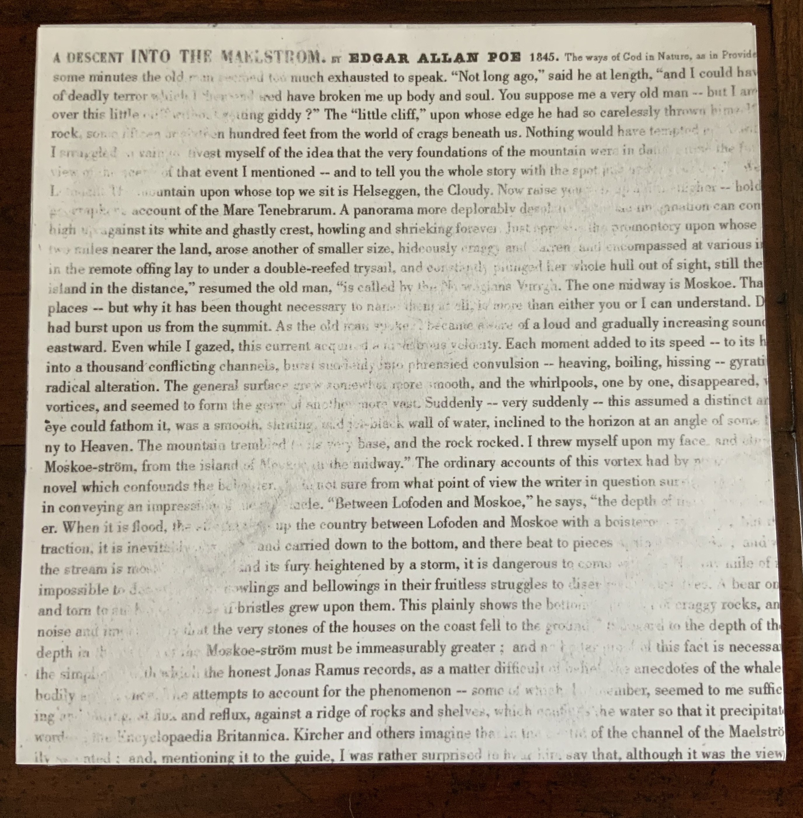
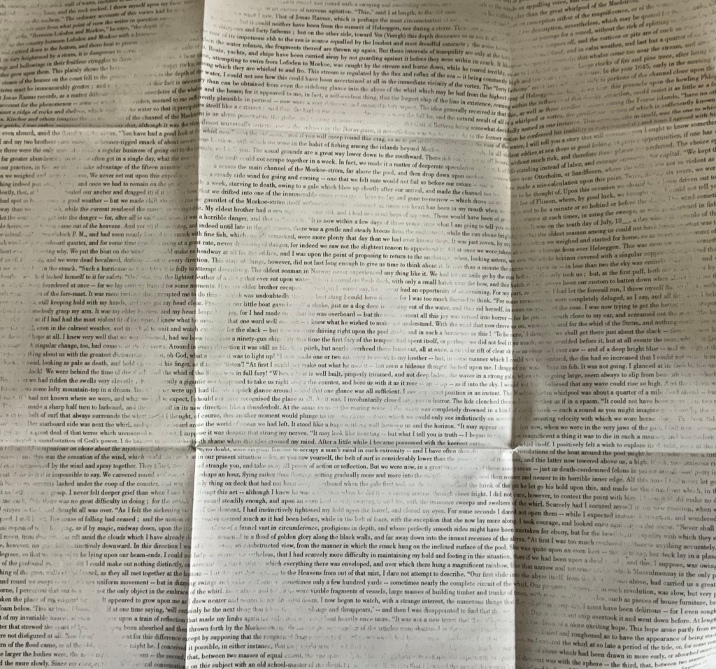
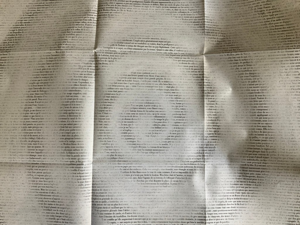
Dos-à-dos (flipped), perfect bound softcover, H314 x W314 mm, 132 pages (including the end pages left intentionally blank); fold-out double-sided print of Jérémie Bennequin’s erasure of Edgar Allen Poe’s “A Descent into the Maelstrom”, H940 x W940 mm; saddle-stitched chapbook of Craig Dworkin’s “Clock”, held in a mock 45 RPM record sleeve, H180 x W180 mm; vinyl LP recording of Sean Ashton’s novel Living in a Land, H314 x W314 mm; Acquired from Information as Material, 10 October 2020.
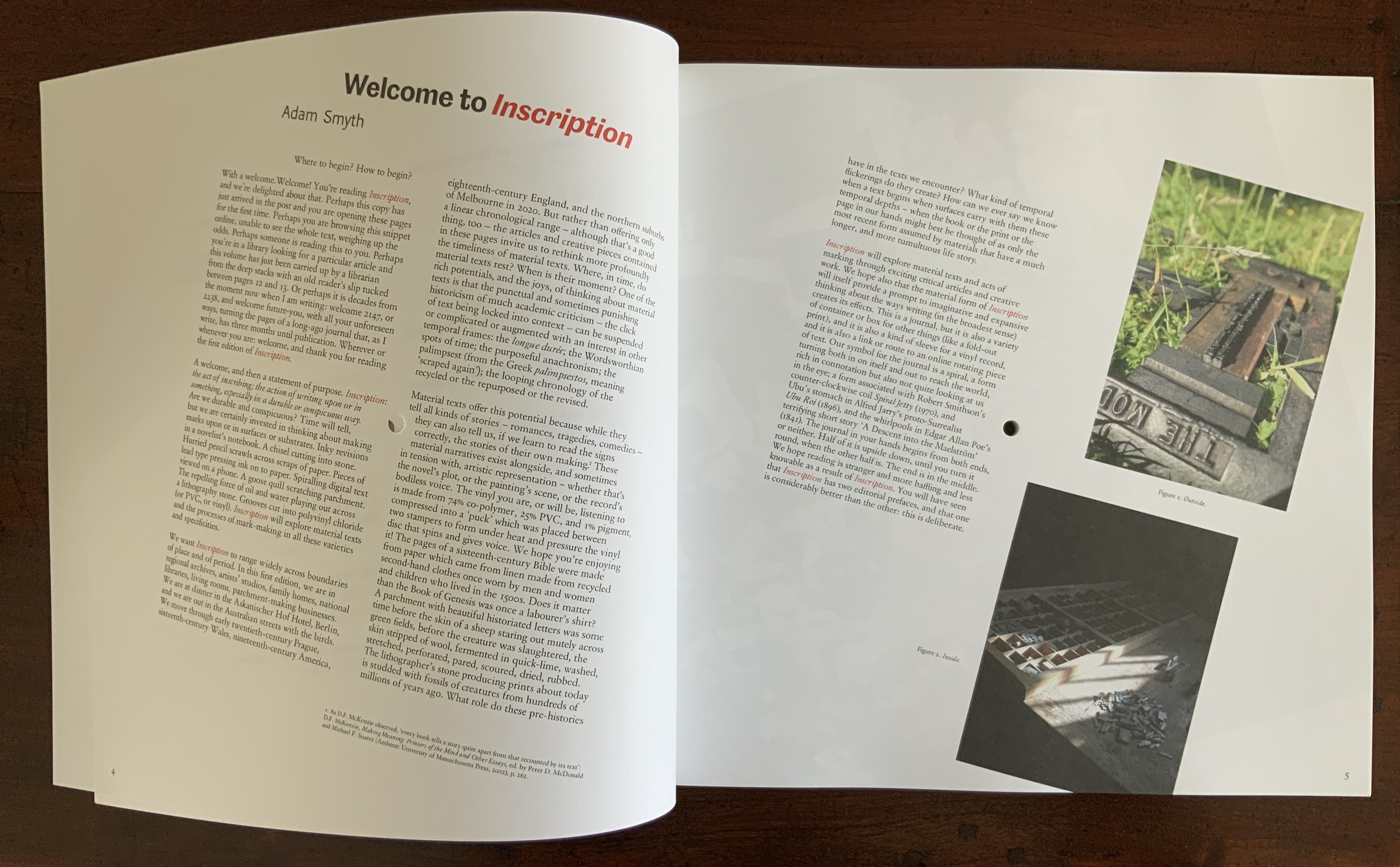
In its design, typography, format and media components, the first issue of Inscription: the Journal of Material Text – Theory, Practice, History embodies its domain. So much so that this metaphorical box of artifacts stands as a contribution to the study of material texts as much as any of the journal’s inaugural articles.
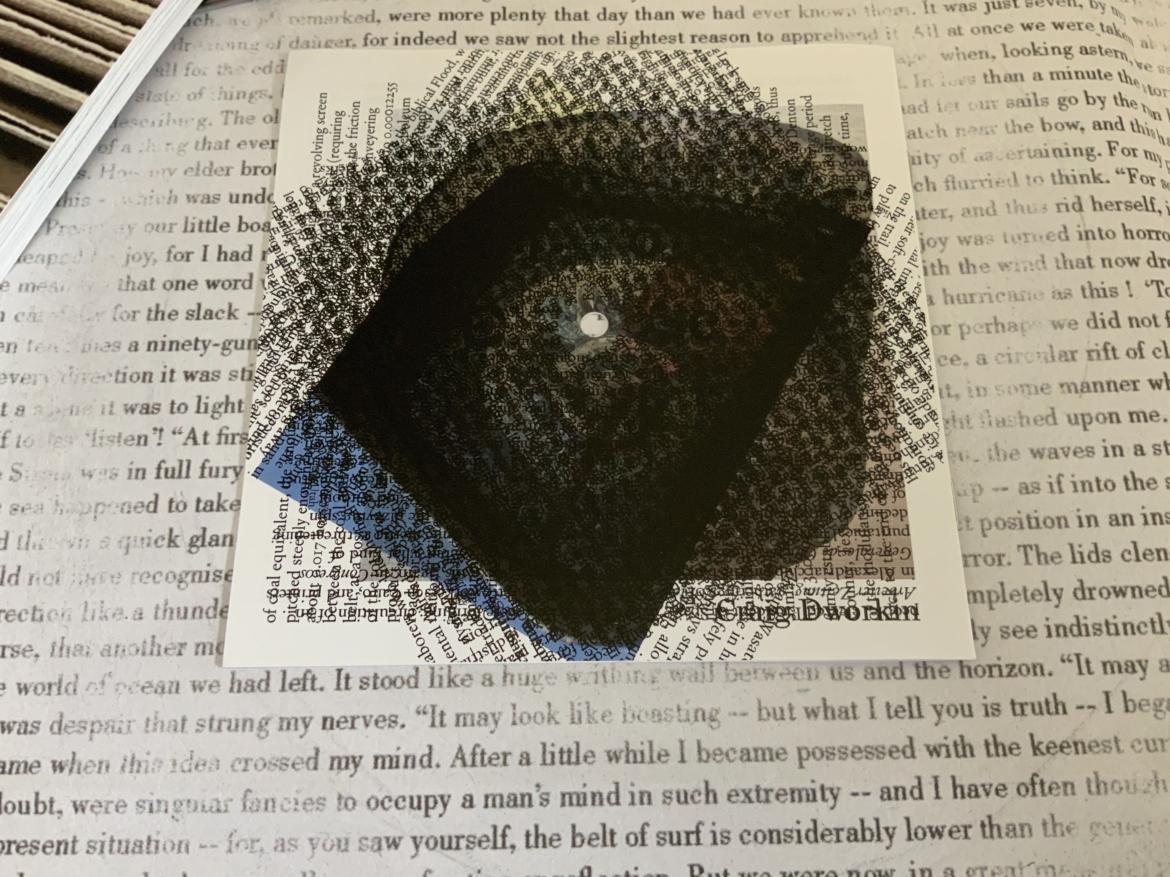
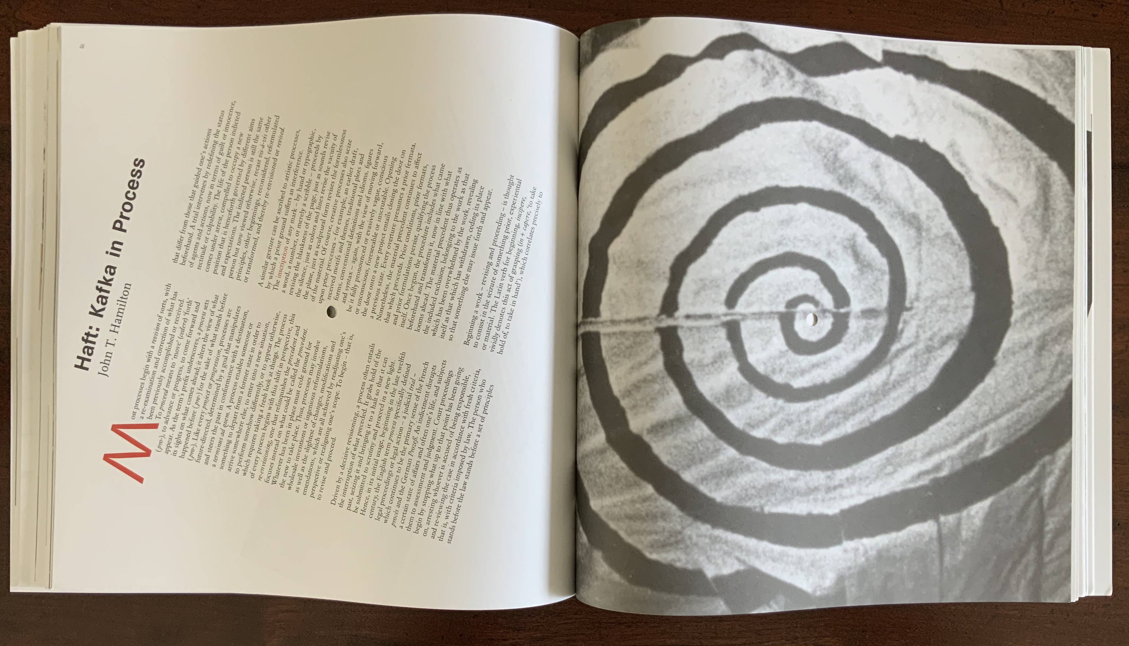
Jérémie Bennequin’s double-sided, bilingual print of his erasure of Poe’s “A Descent into the Maelstrom” recalls the palimpsest — a longstanding topic of material text study. Also, by standing in for Poe’s swirling maelstrom, the print’s image of spiralling erasure raises the domain’s recurrent theme of text-and-image interaction as well as that of the self-reflexiveness of such art. Using the book or text as physical material with which to create a work is central to book art as is the self-referencing that arises.
Bennequin’s choice of text also alludes to his other work. The short story’s themes of abyss, shipwreck and nothingness occur prominently in Poe-loving Mallarmé’s Un Coup de Dés Jamais N’Abolira le Hasard, the 19th century poem that made us modern and launched (is still launching) scores of artists’ books paying material and conceptual homage. Bennequin is one of those artists.†
The print’s spiral erasure on a background of text serves as one of several voices in this journal issue’s intermedial†† harmony (or cacophony). The spiral reappears in Craig Dworkin’s meditation that scales up a pocket watch’s clock spring to the size of Robert Smithson’s Spiral Jetty (1980). Dworkin finds the spiral in the fossil of a Holocene fish that swam over the bed that became the jetty. He “materializes” the watch’s minutes against the geological and evolutionary time frames of the formation of the Great Salt Lake and the fossil. On the back cover of the chapbook, its entire text is repeated in a spiral of text blocks. The chapbook slips back into its 45 RPM-size sleeve to echo the spiralling inscription of sound in vinyl grooves that actually occurs on the LP recording of Sean Ashton’s novel Living in a Land.

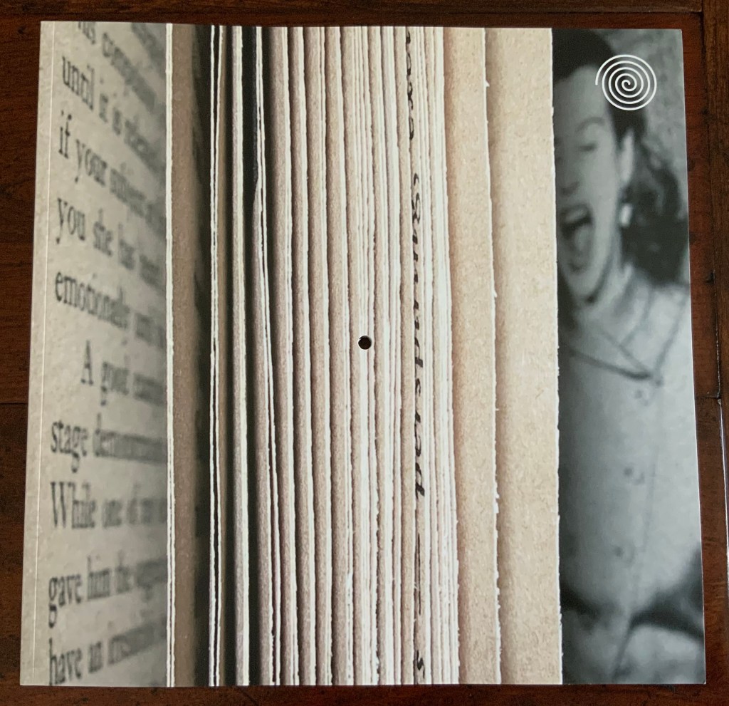
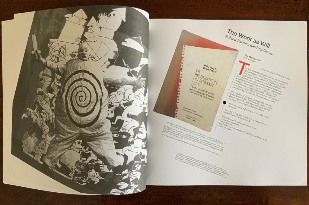
After Bennequin’s print, Dworkin’s meditation and Ashton’s LP, the journal itself appears, sporting the spiral as a logo on its trompe l’oeil cover. Not only drawn from Smithson’s Spiral Jetty, the logo draws from the stage costumes of Alfred Jarry’s Ubu Roi, which recur throughout the journal’s pages reminding us of drama as another medium in which the materiality of the text matters. In its own physical manifestation, the journal wears the materiality of the text on its sleeve and in its pages. The pages themselves spiral around a hole drilled through the center of the issue, echoing the sculptural extremity of inscribing, the book art technique of excising and the concept of nothingness central to many artists of inscription such as Robert Barry and Carl Andre, as this exchange shows:
RB: There is something about void and emptiness which I am personally very concerned with. I guess I can’t get it out of my system. Just emptiness. Nothing seems to me the most potent thing in the world.
CA: I would say a thing is a hole in a thing it is not. — Arts Magazine 47 (1972): 46
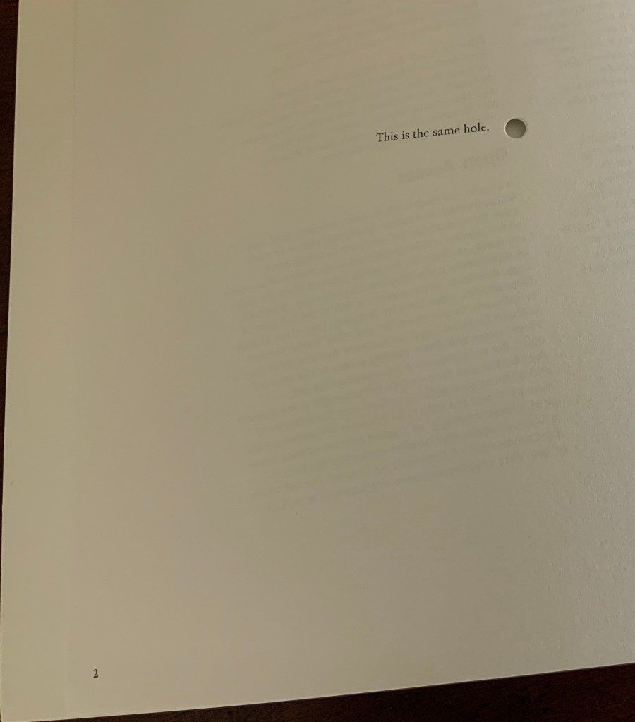
On its two page 2’s (a result of the dos-à-dos or back to back binding), Incription offers its own Magrittean take on holes:

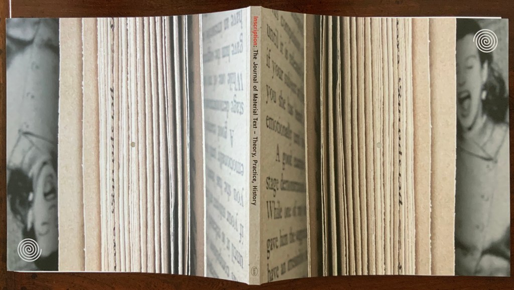
In dos-à-dos binding, two codices are bound back to back in a Z form. So usually there are two fore-edges, two spines, and both codices have the same vertical orientation.
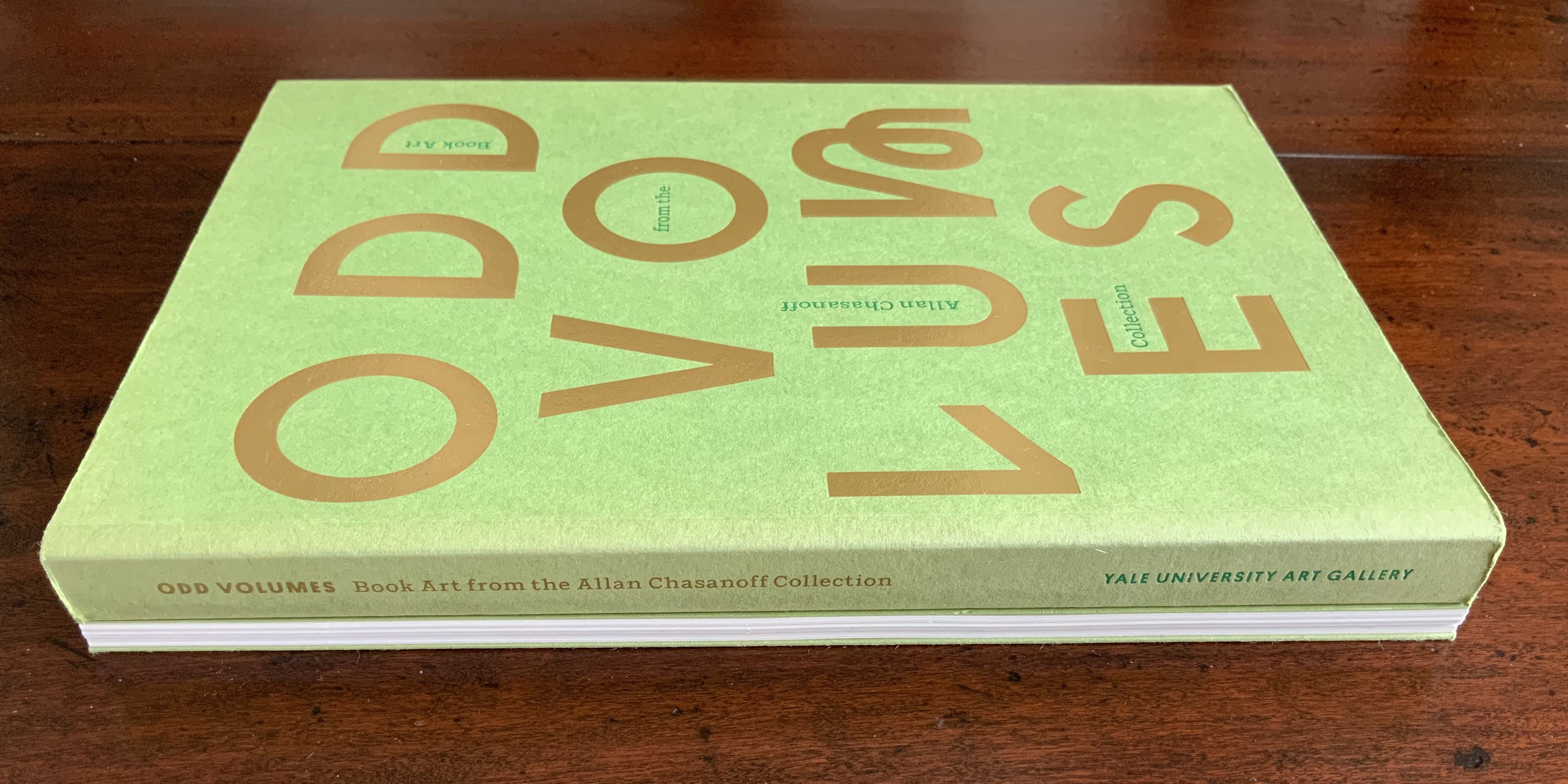
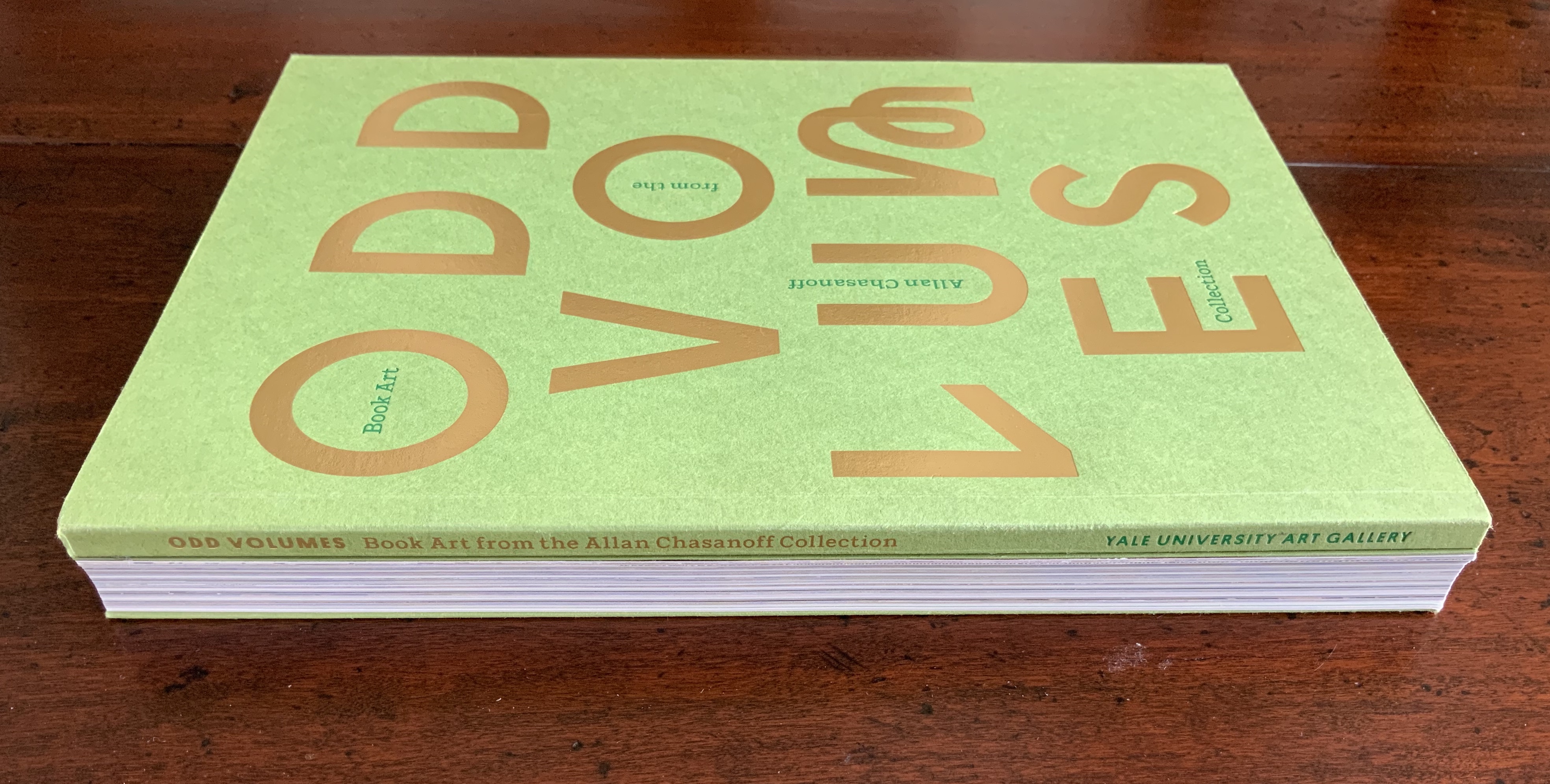

Example of traditional dos-à-dos binding: Odd Volumes: Book Art from the Allan Chasanoff Collection (2014). Photos: Books On Books Collection.
Inscription is bound dos-à-dos, but with only one fore-edge and one spine. Materially emphasizing the theme of inward spiralling, Inscription‘s two halves are upside down to one another. Their vertical orientations differ as can be seen in the following photo of the two front covers splayed away from the spine. The cover designer has obviously joined the fun by creating two fore-edges with the trompe l’oeil and “two” spines, one downward reading in the English style and, when flipped, one upward reading in the European style. Of course, therefore, there are two Tables of Content in opposite orders and two editorial prefaces, of which “one is considerably better: this is deliberate”. (Tongue-in-cheek humor seems to reside in the DNA of material text studies — and especially in book art.)


Two Tables of Content — naturally in reverse order for the dos-à-dos bound volume.
With the page layout spiralling from each end of the issue toward the spiral-set colophon placed in the center (usually part of the endmatter), we have spirals inscribed within spirals.

Left (or is it right?): the drilled hole centered on Ubu Roi‘s omphalic costume. Right (or is it left?): the spiral-set colophon.


Across the issue, the text block rotates like a vinyl record around the central hole.
By the time the colophon is reached, the reader/viewer’s head may be spinning, which could make it easier to read the colophon — wherein it is revealed that the book has been set in twenty different versions of Garamond type in a sequence such that the first letter of a line comes from the first version of Garamond, the second letter from the second version and so on, with the sequence starting anew with the next line. More spirals within spirals.
The materiality of this inaugural issue demonstrates how Inscription‘s focus “is not just on the meanings and uses of the codex book, but also the nature of writing surfaces (papery or otherwise), and the processes of mark-making in the widest possible sense”, as the editors put it. The care and creativity with which this first issue has been put together offer raw material with which to “take the study of material texts in new directions”. Mark-making by erasure, printing, juxtaposing, drilling, vinyl inscription, land erosion, evolution, land art, stage costumes, choice of type, page layout, binding, sleeving — all this even before we come to the articles themselves (see the photos of the Table of Contents above)!
For academics, book artists, printmakers, poets, and artists – and every permutation of roles, subsidiary roles and sub-subs of role — Inscription is rich, exuberant, eye-opening and eye-twisting, and eminently collectible as a work of art in its own right. Which is why it is in the Books On Books Collection.
† For Bennequin’s homage to Un Coup de Dés, see “Jérémie Bennequin“, Books On Books Collection, 11 April 2020.
†† “Intermedial” is taken from Trevor Stark’s Total Expansion of the Letter: Avant-Garde Art and Language after Mallarmé (2020), p.9. It refers to “the zone of indeterminacy between mediums, social practices, and temporalities” into which Mallarmé’s question “Does something like Letters exist?” threw the poet and avant-gardists. The question is ultimately a phenomenological one, which the study of material text inherently addresses.
A similar, related neologism — “intermediation” — was adopted from Samuel Taylor Coleridge in 1965 by the language-, book-, and publishing-artist Dick Higgins in “Intermedia“, republished in Leonardo, Volume 34, Number 1, February 2001, pp. 49-54. It is not the same thing as intermediality or mixed media. As Higgins expressed it, “Many fine works are being done in mixed media: paintings which incorporate poems within their visual fields, for instance. But one knows which is which. In intermedia, on the other hand, the visual element (painting) is fused conceptually with the words.”, p. 52. It can be argued that works of intermedia are one way in which artists address intermediality.
Further Reading
“Inscription 2“. 29 May 2022. Books On Books Collection.
