Altered books as artists’ books present a seemingly endless variety.
Some may be the conversion of old books into just-legible new ones as in A Humument redacted with ink, paint, excision, and collage by Tom Phillips, Tree of Codes mechanically excised by Jonathan Safran Foer, or The Eaten Heart scalpeled into existence by Carolyn Thompson. They give us a new work to read page by page extracted page by page from the earlier work, which remains more or less (mainly less) present in our hands.
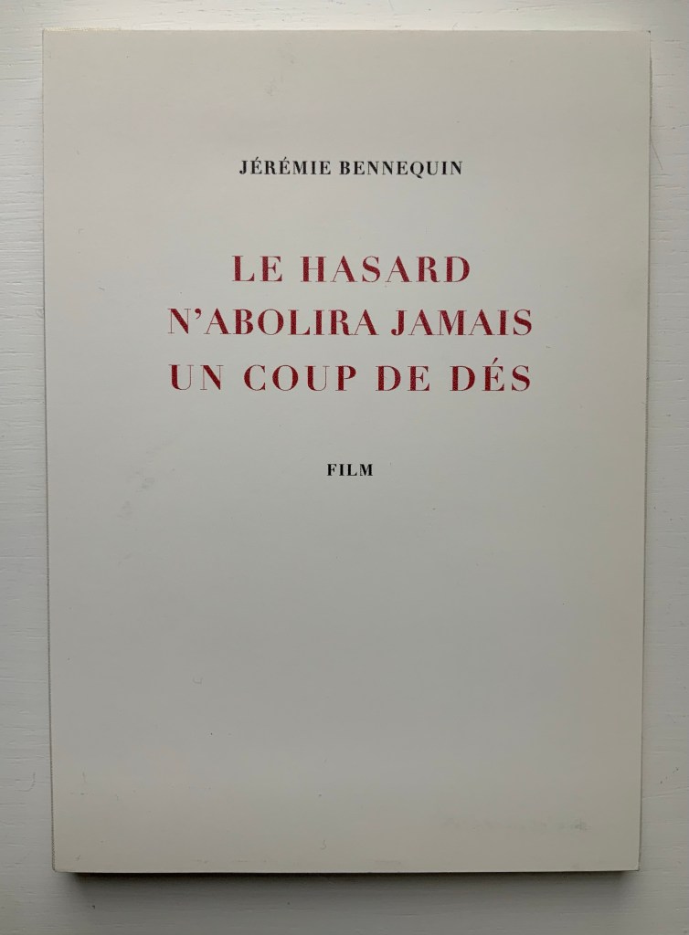
Others like Marcel Broodthaers’ page-by-page redactions of Mallarmé’s Un Coup de Dés by ink in one case and excision in another or Michalis Pichler’s similar reformatting and excision of the same poem in clear acrylic or Jérémie Bennequin’s page-by-page erasures of Proust’s Remembrance of Things Past give us artists’ books that make the altered books illegible but still accessible page by page.
Other altered books as artists’ books are mainly one-off spatial objects that can be taken in in one go — not necessarily in just a glance but in the look or gaze given to a sculpture or painting. The ground up and encased works in Literaturwurst by Dieter Roth. The sealed, painted, nailed, and “hairied” works of Barton Lidice Beneš. The torn works of Buzz Spector. The sandblasted works of Guy Laramée. The glued and carved works of Brian Dettmer. The bullet-hole-ridden Point Blank by Kendell Geers. The pun-packed moebius-sculpted Red Infinity #4 by Doug Beube. They give us artists’ books that make the altered books illegible and inaccessible as books.
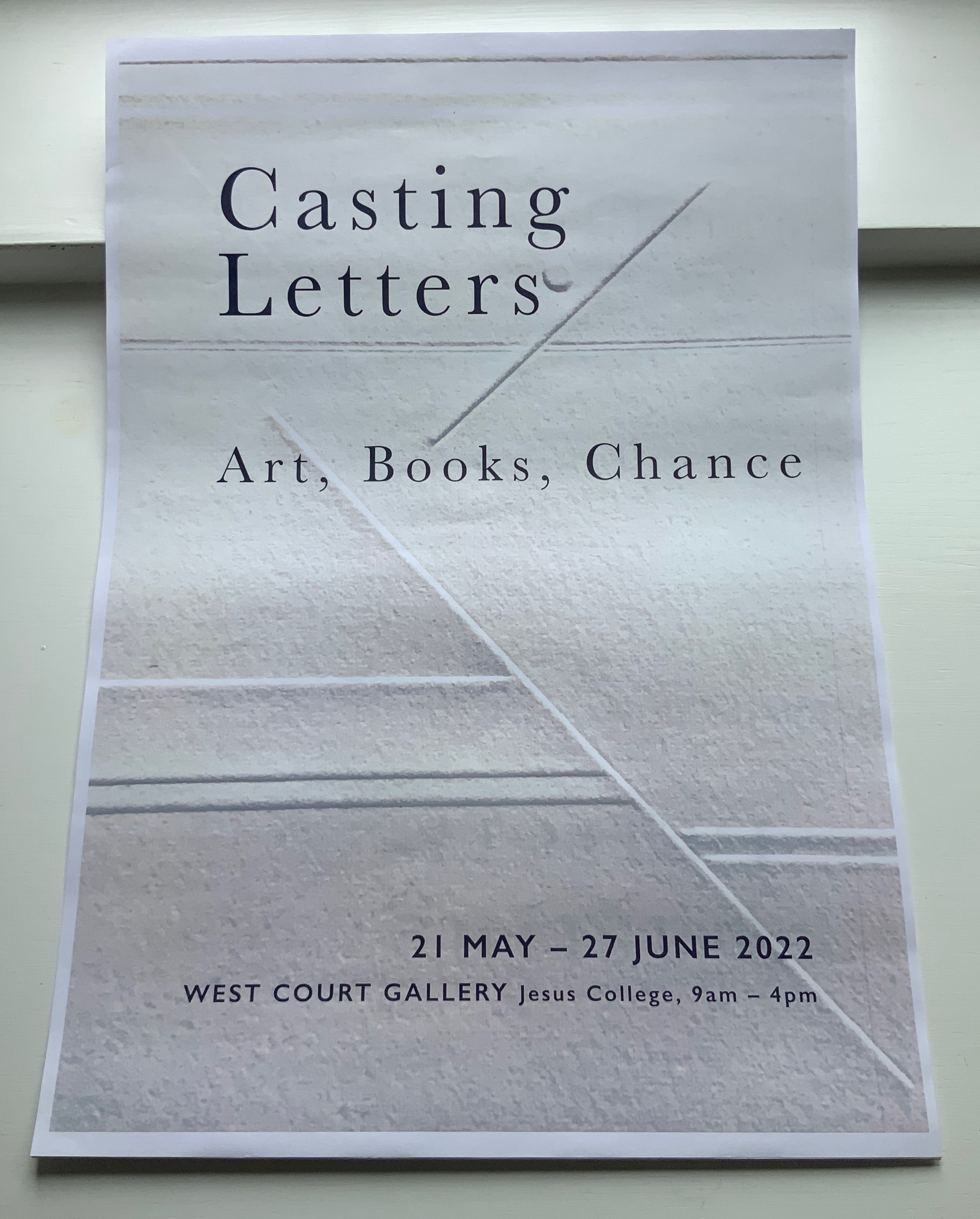
Inscription: The Journal of Material Text, Issue 5 (2025)
Although Theodore Roethke had a woman in mind when he wrote “The shapes a bright container can contain!”, the phrase readily comes to mind for this issue of Inscription once you’re past the difficult-to-open-up cardboard packaging. Not that you should rip through and discard it. The clues to proceed patiently are the label “recto” on one edge of the box and the page cut from a book and pasted on the box’s top. Is “recto” some sort of “this side up” label? If so, it seems topsy-turvy. Recto (or right-hand) pages are usually have odd-numbered, but the pasted-down book page is numbered 20. Wait a second; those random colored rectangles have been printed over the book page as if meant to draw attention to the “gridness” of the apartment blocks. Maybe this box is meant to be preserved and framed (after all, Toulouse-Lautrec drew on cardboard).
Why should an obscure poem like Stéphane Mallarmé’s groundbreaking Un Coup de Dés Jamais N’Abolira le Hasard: Poème (1897) have become the cornerstone of an art-industrial complex of literary, critical and artistic responses ranging from essays, books, edited collections, countless editions, and appropriations in the form of fine press livres d’artiste, book art and sculptures, films and theater, ballets and fado, musical compositions, digital programs and installations, and even pavement art?
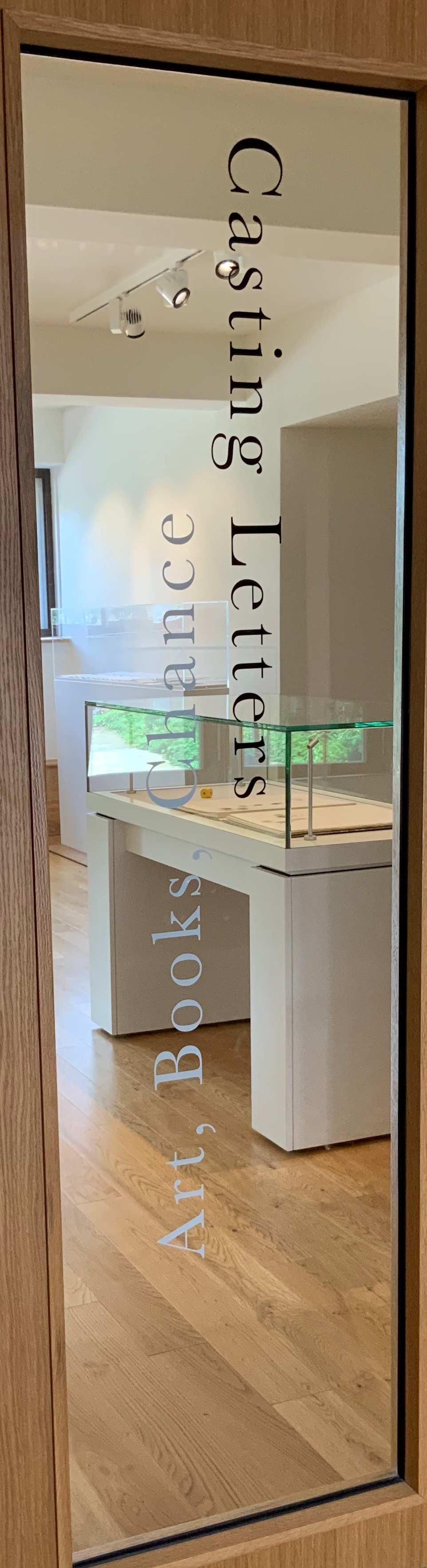
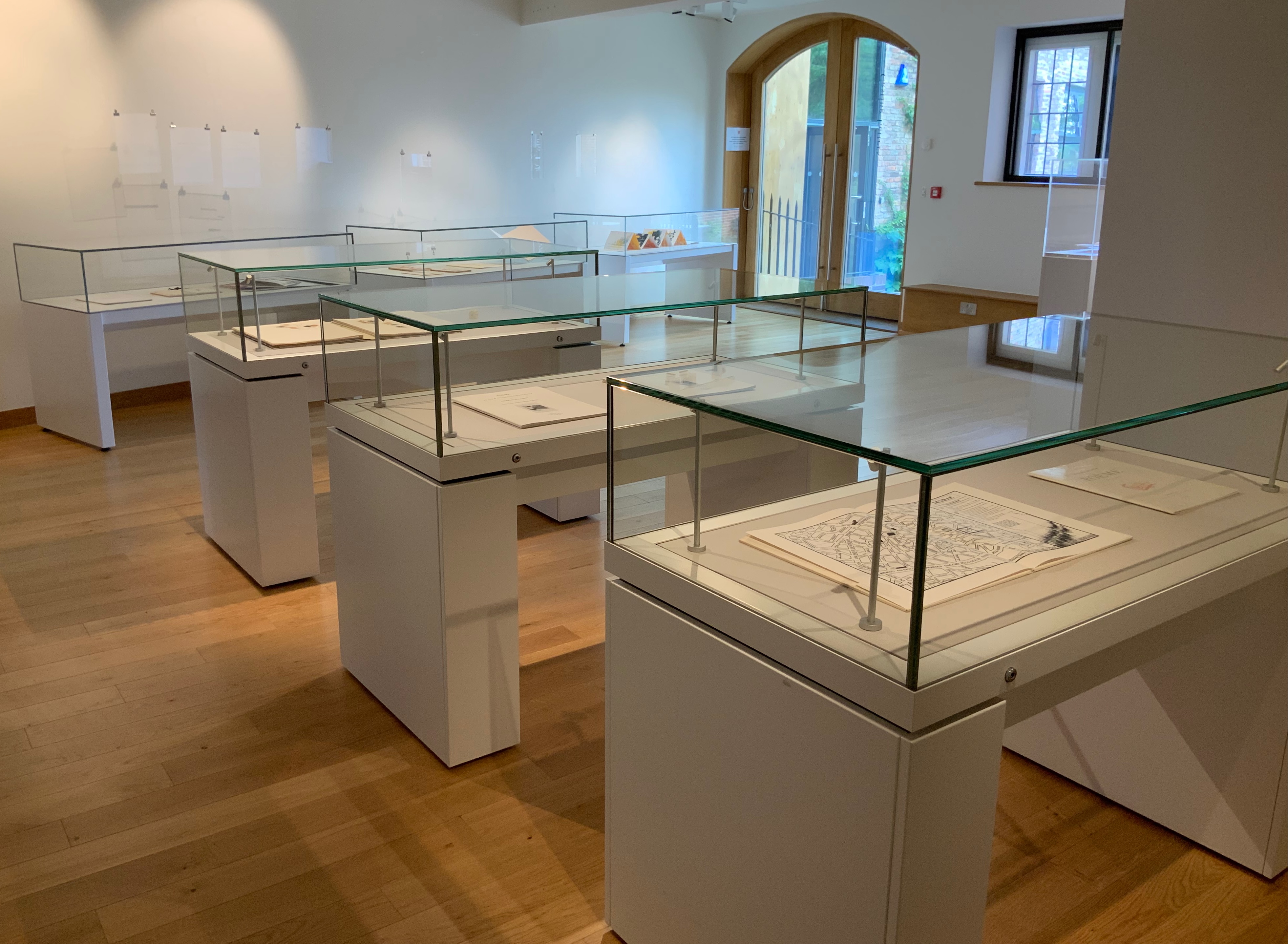
Jessica Berenbeim, a University Lecturer at the Faculty of English and a Fellow of Jesus College, has selected works from the Books On Books Collection for this exhibition. With the assistance of Justine Provino, a doctoral student at Cambridge, Berenbeim has arranged the works to effect a certain conversation. As she writes,
Artists’ experiments with books and letters have taken many forms, some of which look more like books than others. This exhibition of book art, and book-inspired art, opens a view of one of its most intriguing stories: the tradition of reflections, riffs, and responses to one seminal work, Stéphane Mallarmé’s A Roll of the Dice Never Will Abolish Chance (Un Coup de dés jamais n’abolira le hasard). Mallarmé’s experimental work celebrates its 125th anniversary in May 2022, when this exhibition opens. The particular objects on display here, and on view at the screening events, play on two central ideas inspired by this work: chance and visible language. The works in the exhibition are in effect a conversation about the intersection of those themes. What part does chance have to play in the way language is depicted on (or off) the page, and how might accidents of language determine how it looks? How does meaning settle throughout the forms of letters, words, lines, pages, and books, as well as in what the words say?
The exhibition and screenings include works by Jérémie Bennequin, Isabella Checcaglini & Mohammed Bennis, Robert Filliou, Ernest Fraenkel, Rodney Graham, ‘Estelle J.’, Michel Lorand, André Masson, Reinhold Nasshan, Michalis Pichler, Man Ray, Mitsou Ronat & Tibor Papp, and Honorine Tepfer.
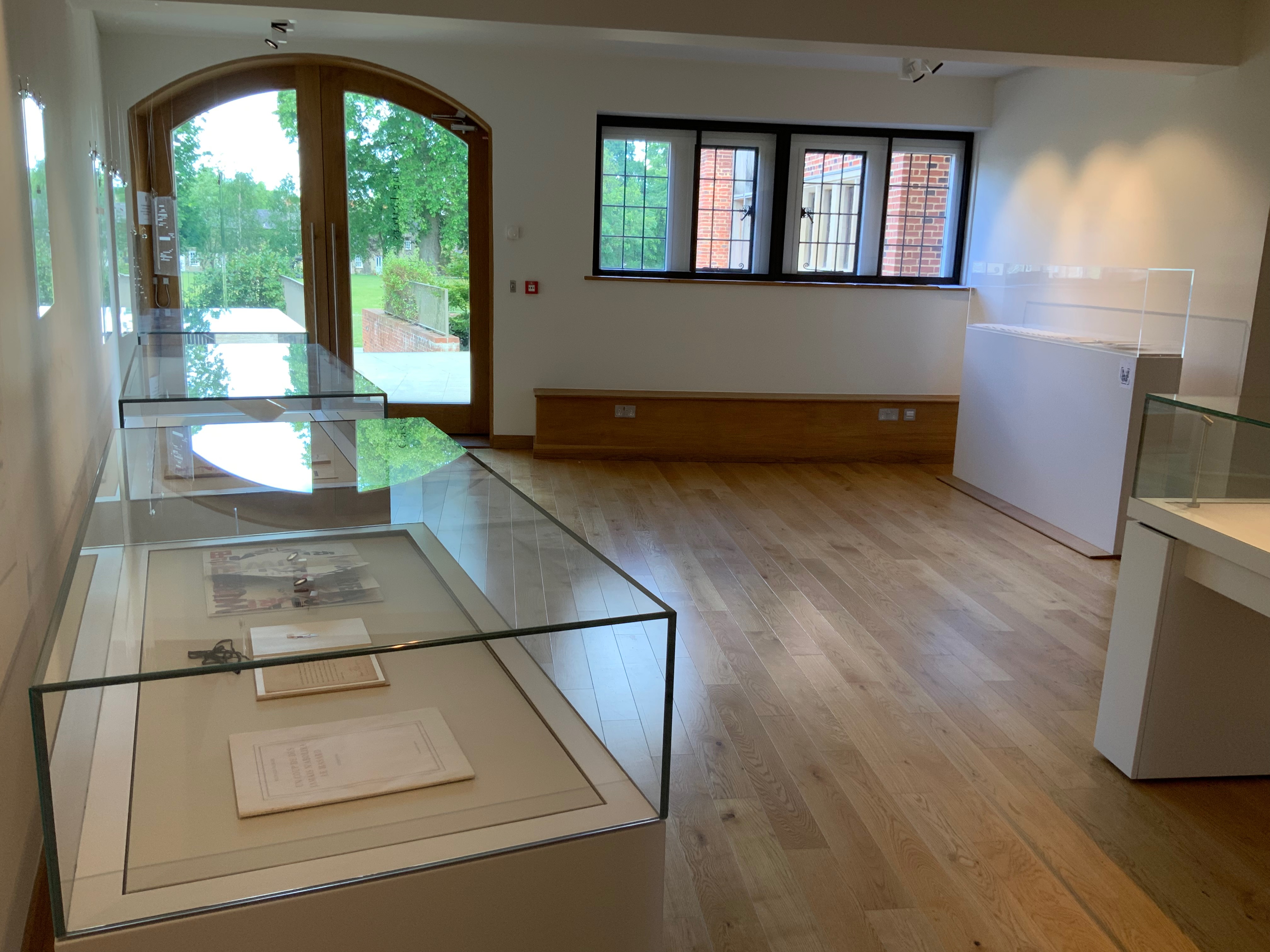
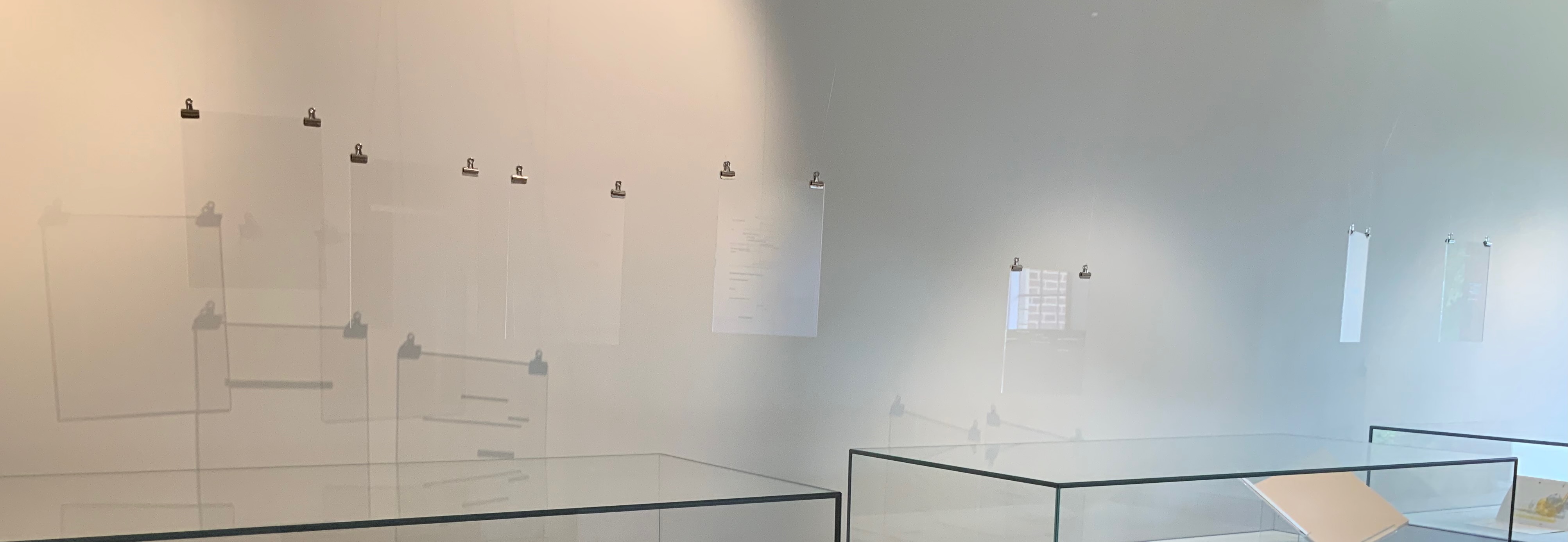
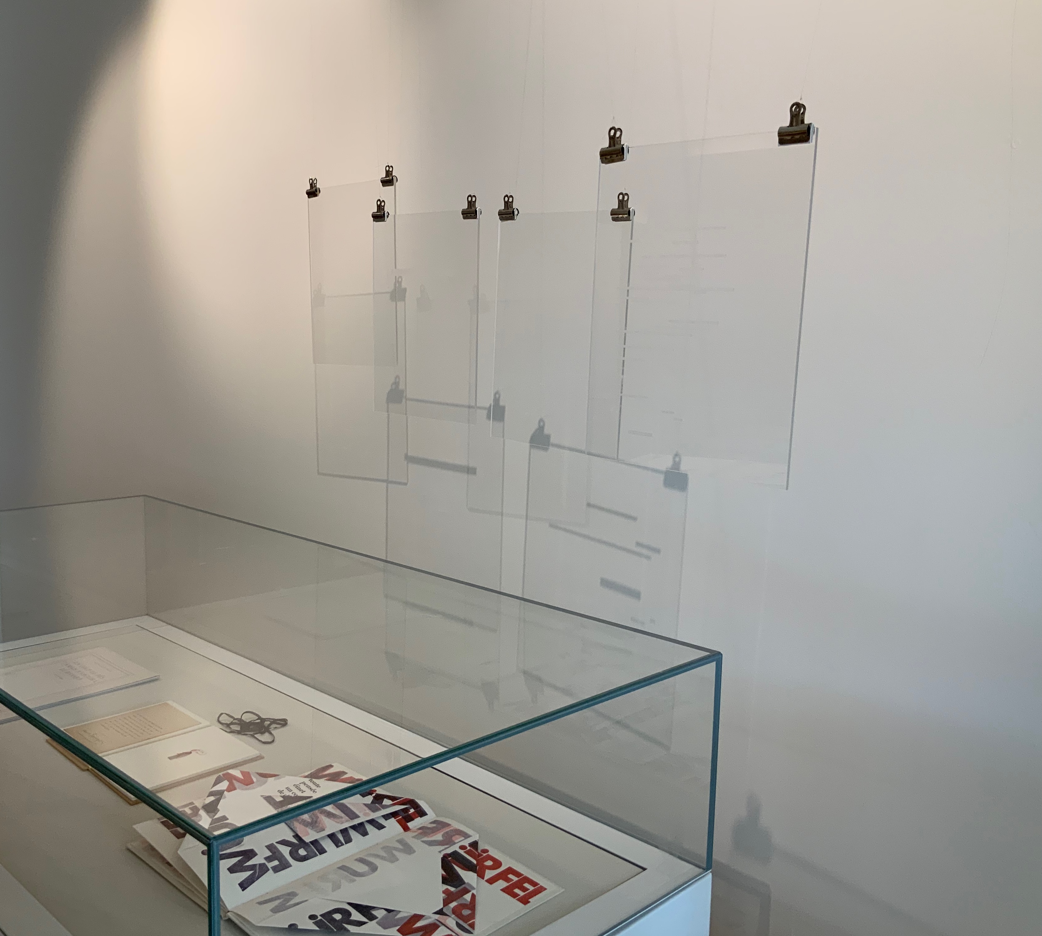
Berenbeim and Provino have suspended seven plates from Pichler‘s homage to hang over the cases containing works by Bennequin, Nasshan, Lorand, Tepfer and Estelle J.. and quietly cast shadows to pun with those works and the exhibition’s title.
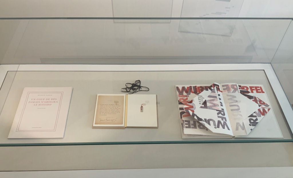
L-R: Michalis Pichler, Un Coup de Dés Jamais N’Abolira le Hasard: Sculpture (2008); Jérémie Bennequin, Le Hasard N’Abolira Jamais Un Coup de Dés (Changes of Music) (2020); Reinhold Nasshan, Würfelwurf: fragmentarische Annäherung an Stéphan Mallarmé (1992).
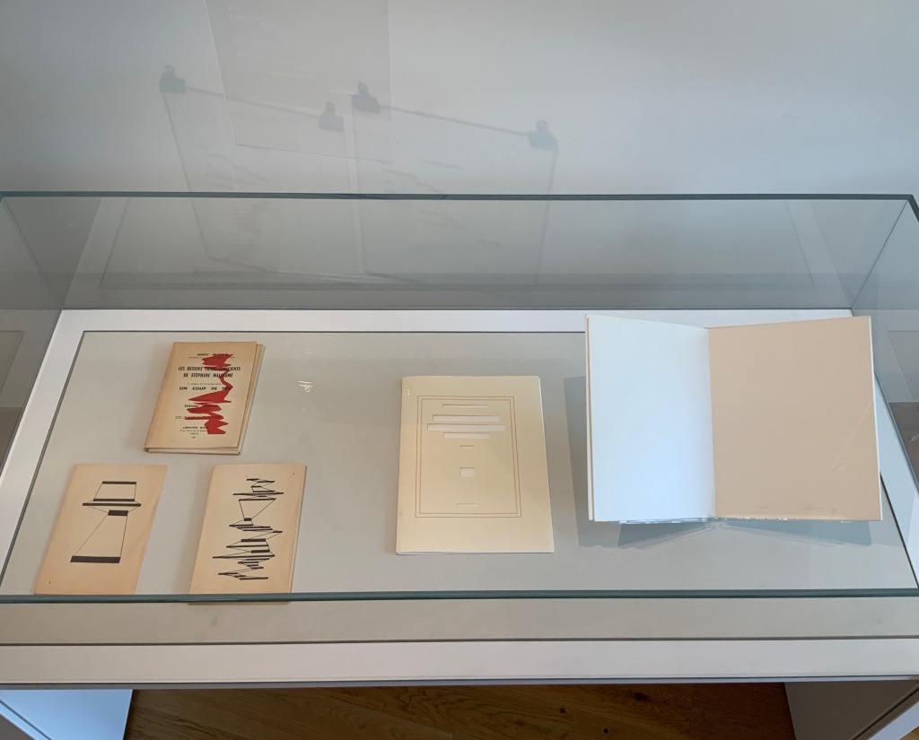
L-R: Ernest Fraenkel, Les Dessins Trans-conscients de Stéphane Mallarmé, à propos de la Typographie de Un Coup de Dés (1960); Michel Lorand, Après Un Coup de Dés (2015); Honorine Tepfer, Un Coup de Dés Jamais N’Abolira le Hasard: Poème (1989)
Estelle J., STÉPHANE MALLARMÉ: Un coup de dés n’abolira le hasard (ND)
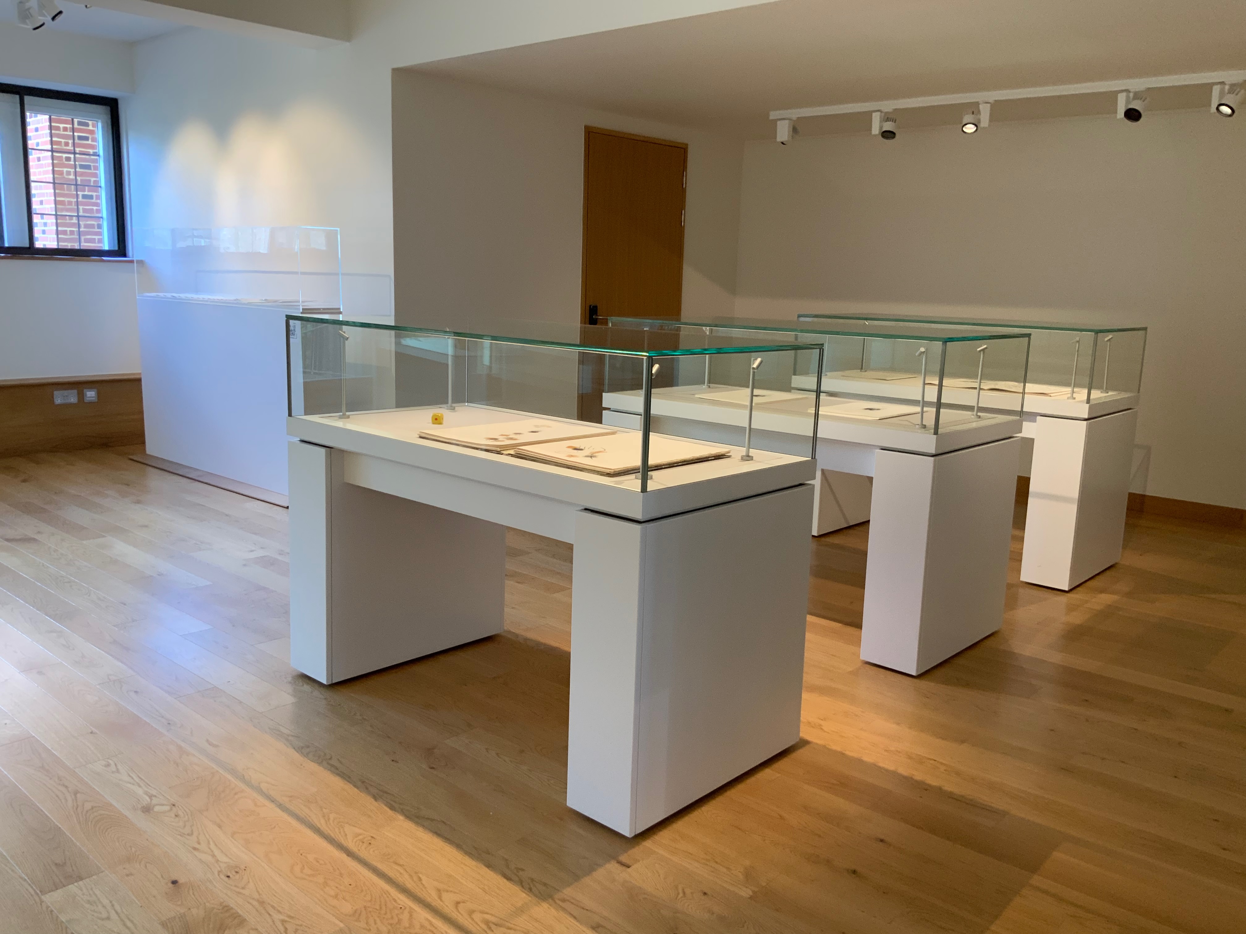
Three other cases across from those above present a conversation of dice between Masson and Filliou, then a French and Arabic conversation between Checcaglini and Bennis, and then Tibor Papp and Rodney Graham joking with one another.
L-R: André Masson, Poéme: Un Coup de Dés Jamais N’Abolira le Hasard by Stéphane Mallarmé (1961); Robert Filliou, Eins. Un. One. (1984)
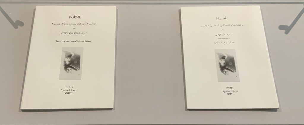
L-R: Isabella Checcaglini, POÉME: Un coup de Dés jamais n’abolira le Hasard (2007); Mohammed Bennis, صلة وصل مع قصيدة ” رمية نرد أبدا لن تبطل الزهر” /Ṣilat waṣl maʻa qaṣīdat Ramyat nard abadan lan tubṭila al-zahr (2007)
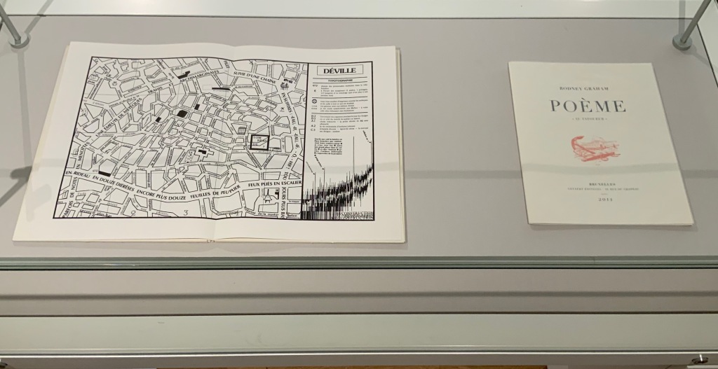
L-R: Tibor Papp, Déville in Mitsou Ronat & Tibor Papp, eds., Poème: Un coup de Dés jamais n’abolira le Hasard par Stéphane Mallarmé (1980; )Rodney Graham, Poème : “Au Tatoueur” (2011)
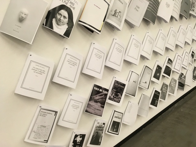
In a display case seemingly made for his particular work, the result of Bennequin’s long-distance performances of erasure with his colleague and publisher Antoine Lefebvre calls across the room to all the other works of chance and visible language.
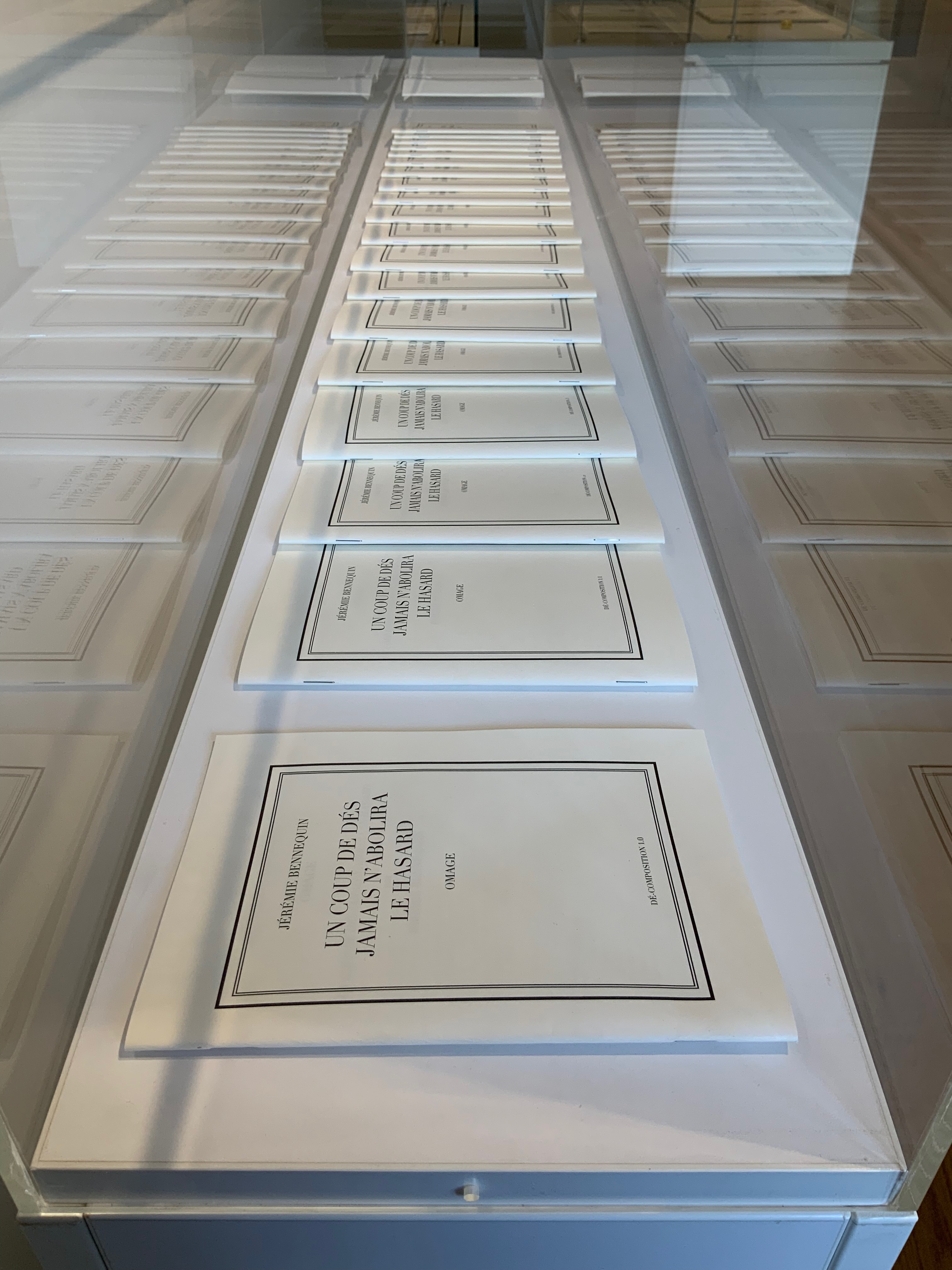
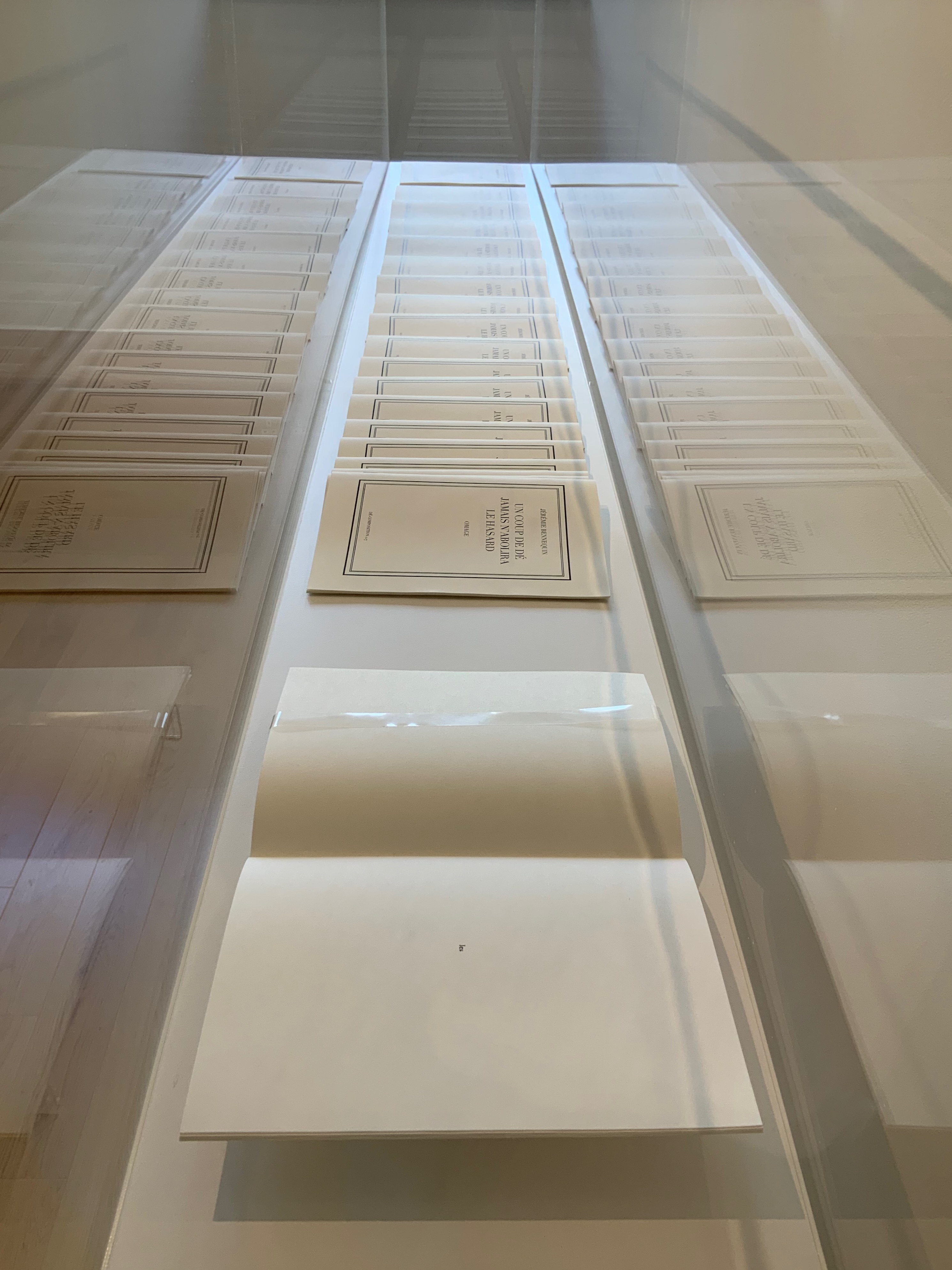
Jérémie Bennequin, Un Coup de Dés jamais n’abolira le Hasard, Dé-composition (2009-2013)
With the sun streaming into West Court Gallery, the only things missing from the buzz of these conversations were perhaps canapés, champagne and name tags to celebrate the 125th anniversary of this strange poem’s publication.
Bernadette O’Toole follows in a long line of distinguished “serial hommageurs”: Ian Wallace, Jérémie Bennequin, Marcel Broodthaers, Kathy Bruce, Marine Hugonnier, Jorge Méndez Blake, Alastair Noble, Michalis Pichler, Raffaella della Olga and Joëlle Tuerlinckx. Like many of them, she extends her work across multiple media. Like all of them, she is driven by the metaphysics and motifs expressed in Un Coup de Dés.
Variant Sail (2015); As If (2016)
Variant Sail (2015) and As If(2016) Bernadette O’Toole Presentation box. H240 x W172 mm. Acquired from the artist, 1 April 2022. Photos: Books On Books Collection. Displayed with permission of the artist.
Bernadette O’Toole’s two small booklets first appeared in Sharon Kivland’s MA Bibliothèque and are now out of print. The presentation case in which they arrived conveys her recurrent practice or technique of recontextualizing. A copy or copies from an edition may be re-presented so as to create a new work or works. Variant Sail and As If constitute a case in point.
Variant Sail (2015)
Variant Sail (2015) Bernadette O’Toole Booklet, two-staple saddle-stitch. H190 x W130 mm, 24 pages. Edition of 25, of which this is #6. Photos: Courtesy of Bernadette O’Toole. Books On Books Collection. Displayed with permission of artist.
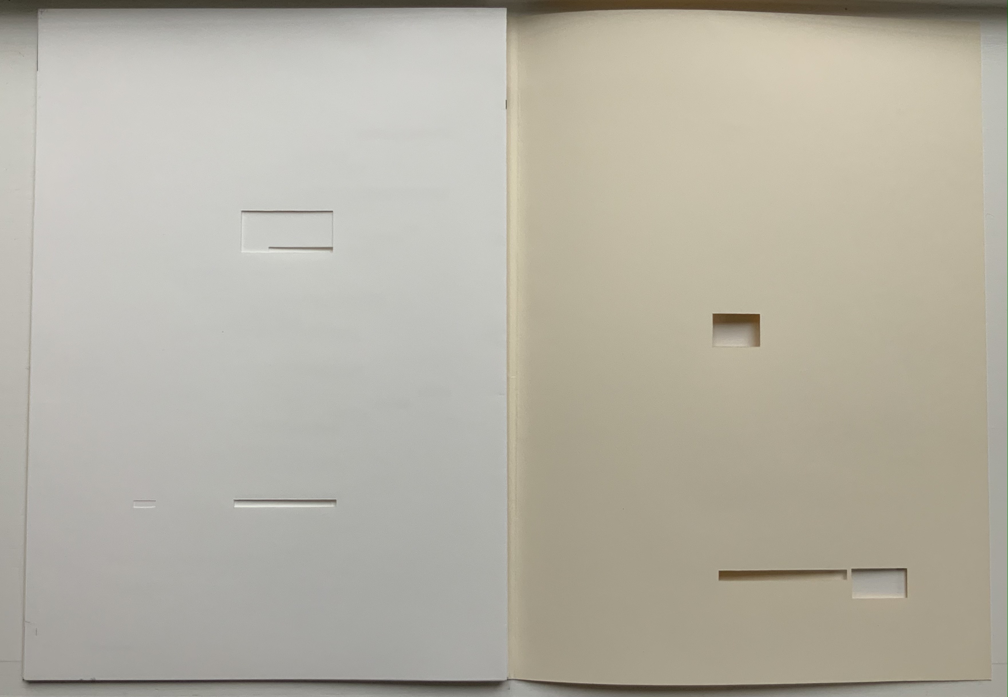
The booklet Variant Sail contains reproductions of twelve digital prints (H38 x W57 cm). The prints were created by scanning and digitally manipulating each of the double-page spreads of Un Coup de Dés in Photoshop, producing twelve variants with each one foregrounding the gutter in a different way. The manipulation has made Mallarmé’s text faintly detectable but indecipherable and rendered the double-page spreads as entire blancs — variants, as it were, of the white spaces (les blancs) to which Mallarmé refers in his poem’s preface.
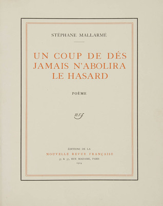
[From the NRF/Gallimard 1914 edition]
The ‘blanks’ indeed take on importance, at first glance; the versification demands them, as a surrounding silence, to the extent that a fragment, lyrical or of a few beats, occupies, in its midst, a third of the space of paper: I do not transgress the measure, only disperse it. The paper intervenes each time as an image, of itself, ends or begins once more, accepting a succession of others, and, since, as ever, it does nothing, of regular sonorous lines or verse – rather prismatic subdivisions of the Idea, the instant they appear, and as long as they last, in some precise intellectual performance, that is in variable positions, nearer to or further from the implicit guiding thread, because of the verisimilitude the text imposes.
From Mallarmé’s marked-up proofs for his planned deluxe edition, we know that he viewed the double-page spread, not the single page, as the poem’s primary structural unit. Each of O’Toole’s blank double-page spreads can be seen as a voile alternative (“variant sail”), a phrase appearing on the NRF/Gallimard edition’s second double-page spread. With a different foregrounding of the gutter in each of her double-page spreads, O’Toole underscores both the variance within her Variant Sail and the important constancy of the double-page spread in the poem to which she is paying homage.
A bit more esoterically, the double-page spread suggests the quantity 2, an allusion to the result of thrown dice, their two faces up. It may also allude to the poem’s revolutionary versification, challenging French poetry’s Alexandrine, the traditional measure of 12 syllables usually divided into two hemistichs. It seem no accident that O’Toole has chosen a pattern of two-word titles for her booklets.
As If (2016)
As If (2016) Bernadette O’Toole Booklet, two-staple saddle stitch. H205 x W140 mm, 16 pages. Edition of 25, of which this is #6. Photo: Courtesy of Bernadette O’Toole; Books On Books Collection. Displayed with permission of artist.
The prints for Variant Sail in turn inspired paintings (same dimensions) that are reproduced in the second booklet As If, which takes its two-word title from the poem’s central double-page spread, the one beginning and ending COMME SI (“as if”). Mallarmé’s words are no longer detectable. What is detectable instead is each brushstroke on the painted surfaces. It is as if the work As If appropriates the work Variant Sail, just as Variant Sail appropriates Un Coup de Dés.
“Appropriation” may not be the right characterization. Re-contextualizing, re-purposing or re-cycling perhaps. Consider where O’Toole goes next with these two other works not in the Books On Books Collection at the moment.
Variant Sail II (2016)
For Variant Sail (II), O’Toole incorporates an inventive sculptural work that she calls a “gesture”. In a black presentation box, a translation of Un Coup de Dés rests beside a small painted gesture, oil on plaster. Here is her description of the process by which a gesture is created:
The process of making the work involved tracing my brush-stroke into a bed of clay, pushing into the surface which proved resistant at first. Plaster was poured into the indent, casting the absent gesture [brush-mark]. Once the form had set, I separated it from the bed of clay and took hold of the object. The absent gesture [brush-mark] had become embodied. The form was simultaneously liberated from the mould, and from the limitation of the painting surface. It was cast out, recalling the Japanese practice known as, ‘flung-ink’, which Norman Bryson observes is ‘thrown’ as one throws dice. — [Interview with Josie Jenkins, 22 November 2020]
Variant Sail II has appropriated, re-cycled, re-purposed or re-contextualized the works Variant SailandAs If in several ways — by transforming the surface brushstroke into a three-dimensional object, by juxtaposing those two works (through the gesture) with the translation
A Rare State (2018)
A Rare State consists of 12 booklets (H38 x W57 cm), each with its own cover and title. Each encloses 12 loose interchangeable folios. Each captures images from different performative readings (by the artist) of Un Coup de Dés or fromanimated patterns of marks and numbers appearing and disappearing. Some of the patterns occupy the positions of Mallarmé’s text on his double-page spreads. Others appear in sequences of 1-6 within a square or diamond suggesting the face of a die.
A Rare State expands on the idea of a numerical or mathematical principle at play — be it 1-6 on the face of a die, the 12 syllables of the Alexandrine that the poem explodes, the 2 of the double-page spread, or the 4 triangles constituting the face of a die across the double-page spread. This expansion is also an expansion of O’Toole’s technique of appropriation, re-cycling, re-purposing or re-contextualizing to create new artwork. It is as if her every thought emits a throw of the dice.
Cohn, Robert G. 1966. Mallarme’s Masterwork: New Findings. The Hague: Mouton. Contains the photographs that inspired Neil Crawford’s typographic translation.
Cohn, Robert Greer. 1965.Toward the poems of Mallarmé. Berkeley: University of California Press. See in particular for his analysis of the relationship between Un Coup de Dé and the sonnet À la Nue Accablante Tu (pp. 229-36).
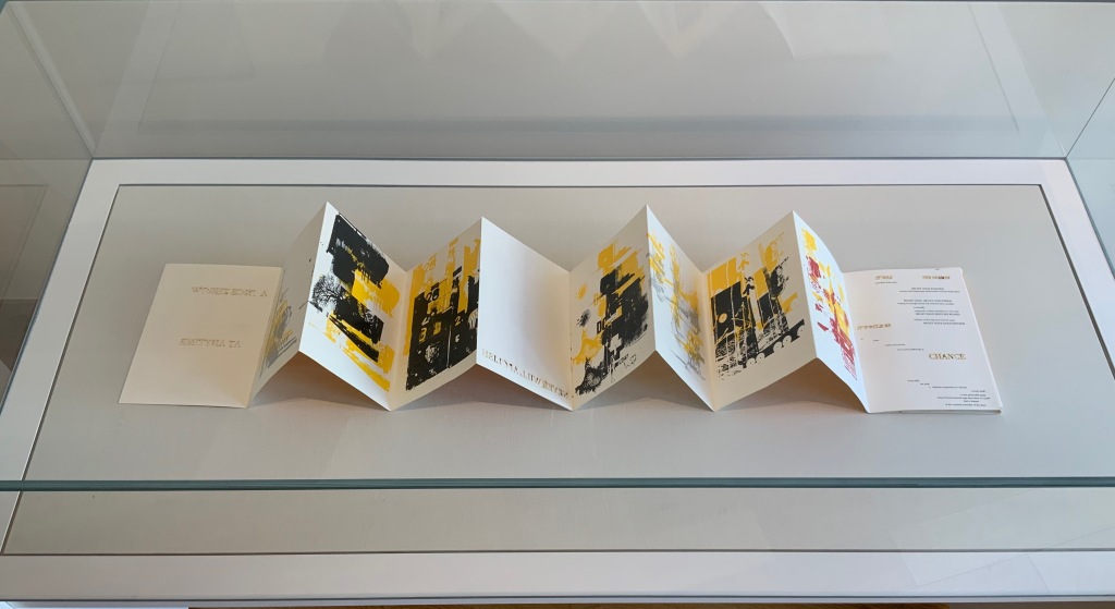
STÉPHANE MALLARMÉ: Un coup de dés jamais n’abolira le hasard (ND)
STÉPHANE MALLARMÉ: Un coup de dés n’abolira le hasard (ND) Estelle J. Self-covering accordion format with three tipped-in pages. H245 x 185 mm closed, 2100 mm open. Twenty-four panels and flap-insert for closing. Edition of 6 variations, of which this #6. Acquired from Studio Montespecchio, 22 February 2022. Photos: Books On Books Collection.
Little information has emerged about this artist or her work that arrived in a shipment from a dealer based in Italy. He seemed to recall that she was young and at a table of her own at an exhibition in … was it Barcelona or Madrid? There is only the artist’s signature at the end of the work and an indication that it is the sixth of six copies. The dealer remembers that each of the six varied due to their handmade nature.
With its three tipped-in pages inside a double-sided accordion structure, with their mix of laser-cut and printed text, with the bright collage of abstract and figurative images (screen printed?), the work speaks for itself. But where in the collection does this work belong? First and foremost, it belongs among the many works of homage to Stéphane Mallarmé’s Un Coup de Dés Jamais N’Abolira le Hasard such as those by Christopher Brennan or Benjamin Lord.
The cover gives the poem’s title in French, but the abridged text is in English, some of it laser-cut and some printed, all on tipped-in pages. The unhappy translation comes from the Oxford University Press’ World Classics. The cuts place it among the “works of homage by redaction”, for example, those by Jérémie Bennequin or Michel Lorand. As the burnt edges suggest, it comes chronologically after the adoption of laser cutting in artists’ books, which has growing representation in the collection, for example, in works by Jaz Graf or Islam Aly. In its combination of letter and geometric shapes, the work falls between Scott McCarney and Aaron Cohick.
A collage of abstract and figurative images, letters and numbers rolls across both sides of the accordion, structurally recollecting the works of Helen Douglas or Sibyl Rubottom and Jim Machacek.
The paper is a heavy card, susceptible to fine cuts and sturdy enough to hold them.Colors of black, yellow, orange, silver and red cover the inner side, while those on the outer side adhere to an orange-gold-yellow palette. Its bright colors place it among the bursts of color from Shirley Sharoff and Andrew Morrison.
Perhaps the mystery artist will stumble across this entry, have a view on where it belongs and share some of its background, technique, process and materials — and what the other five versions look like.
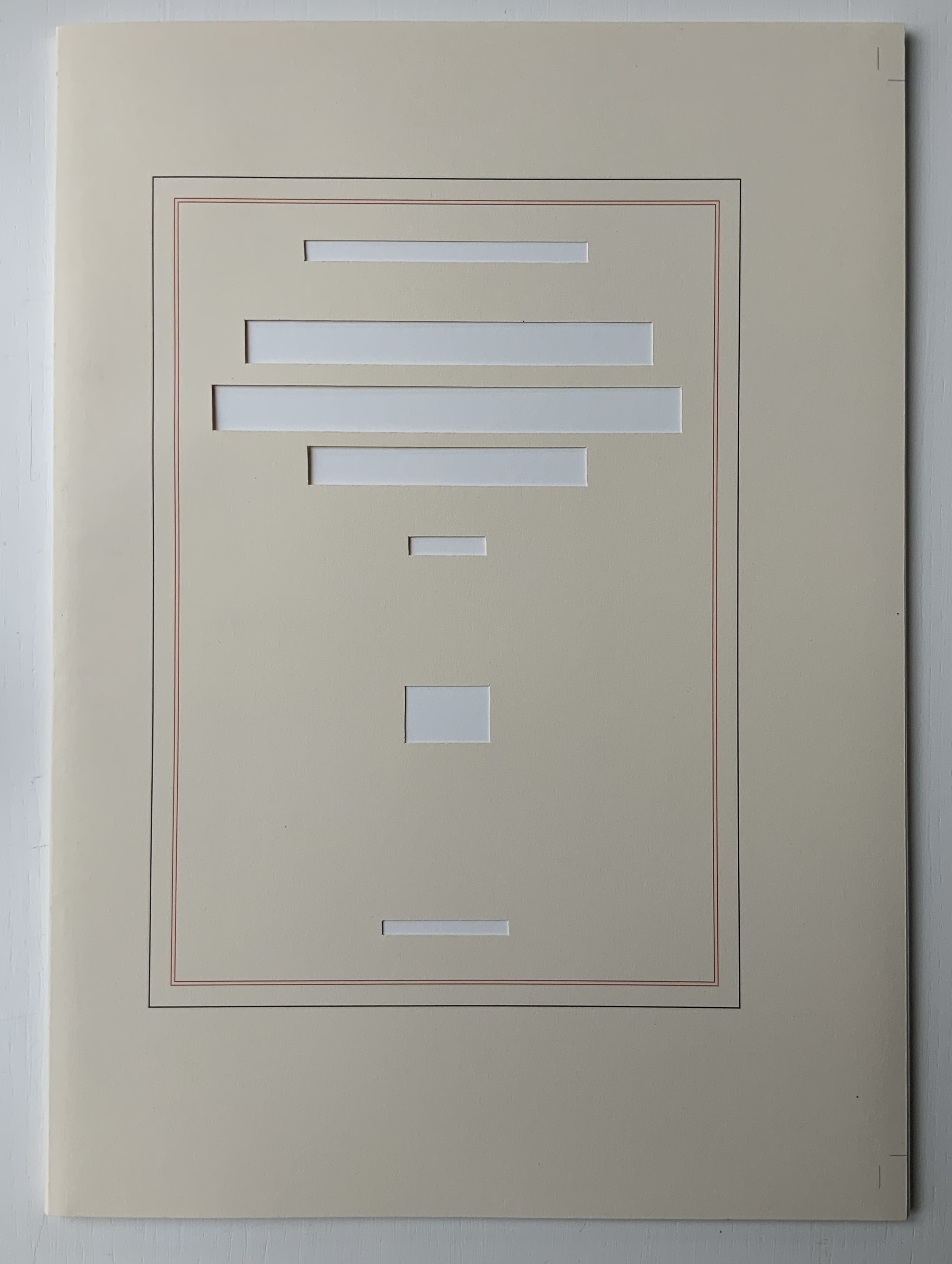
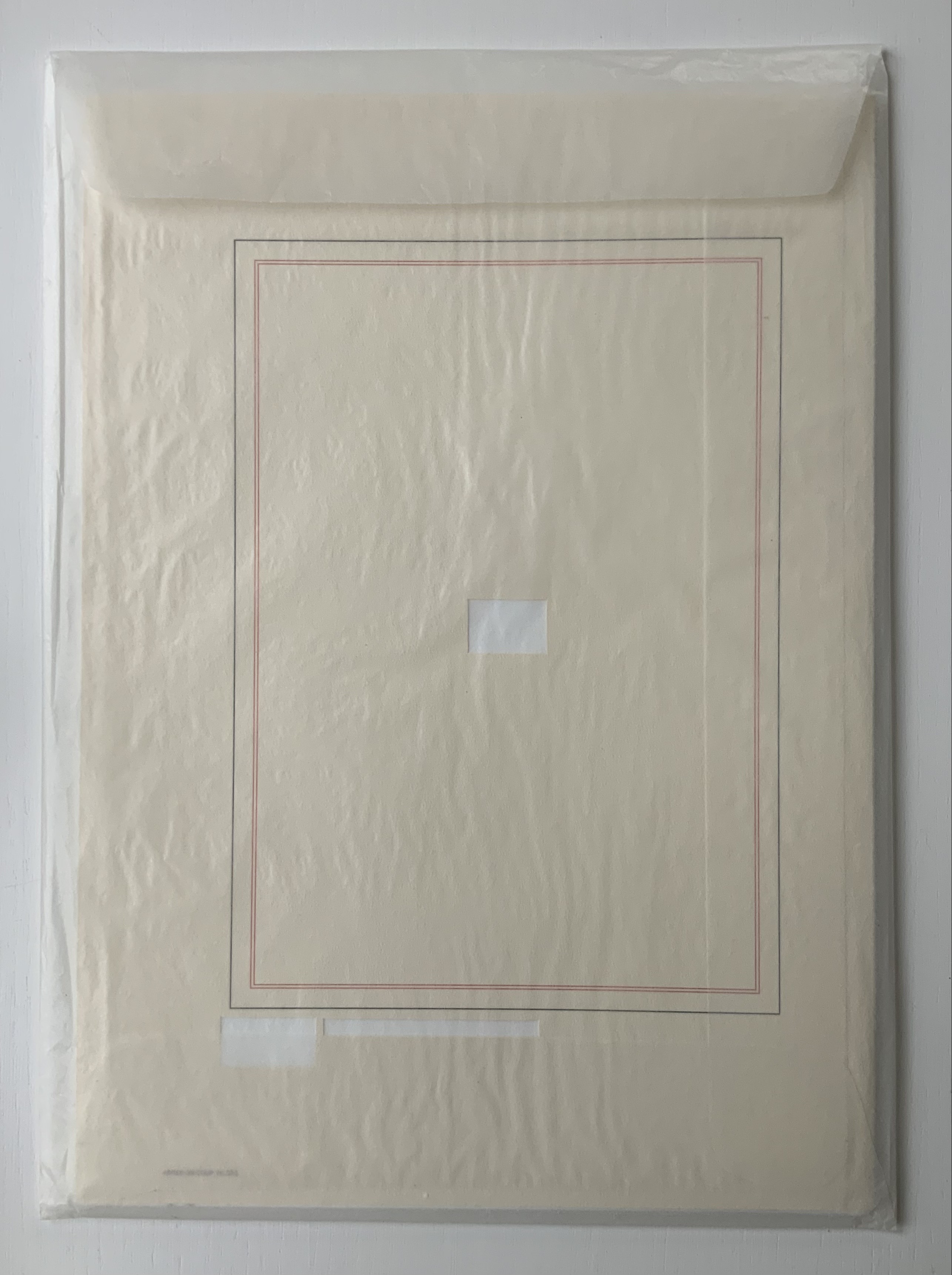
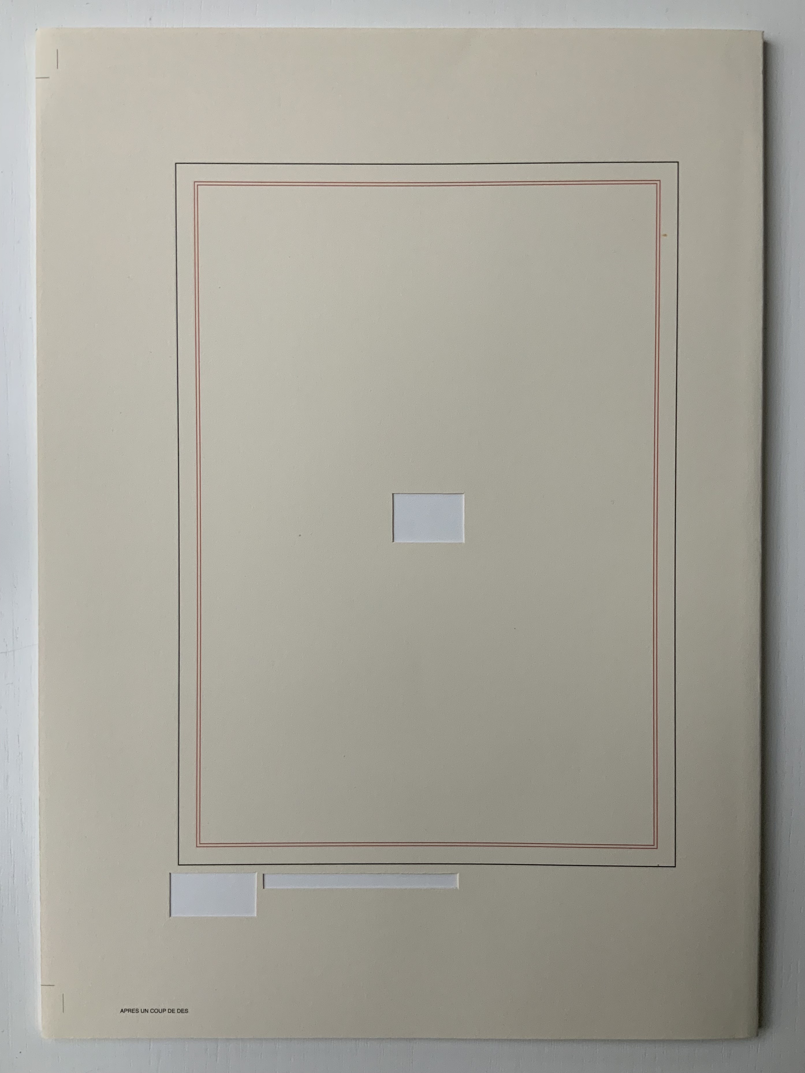
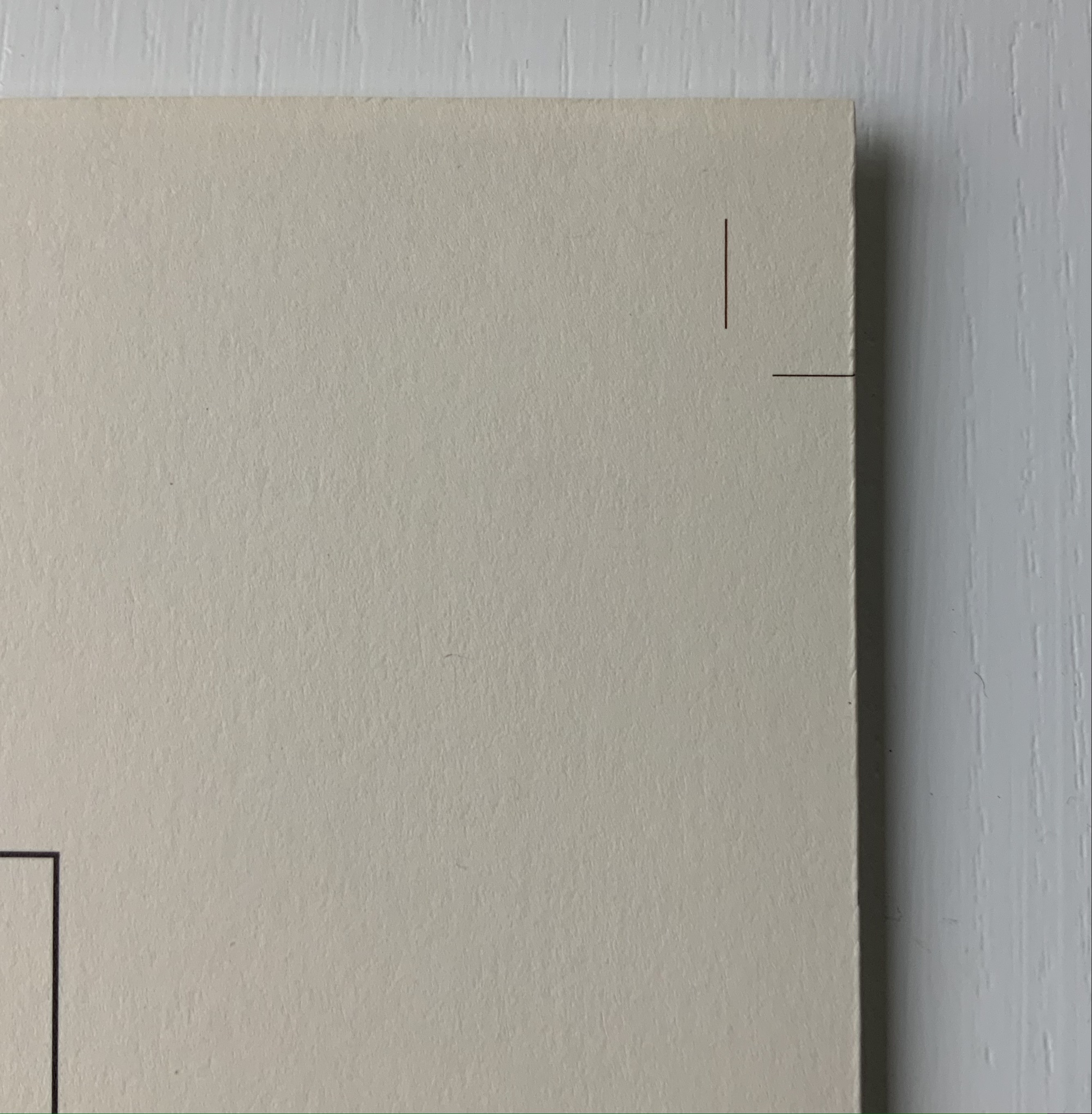
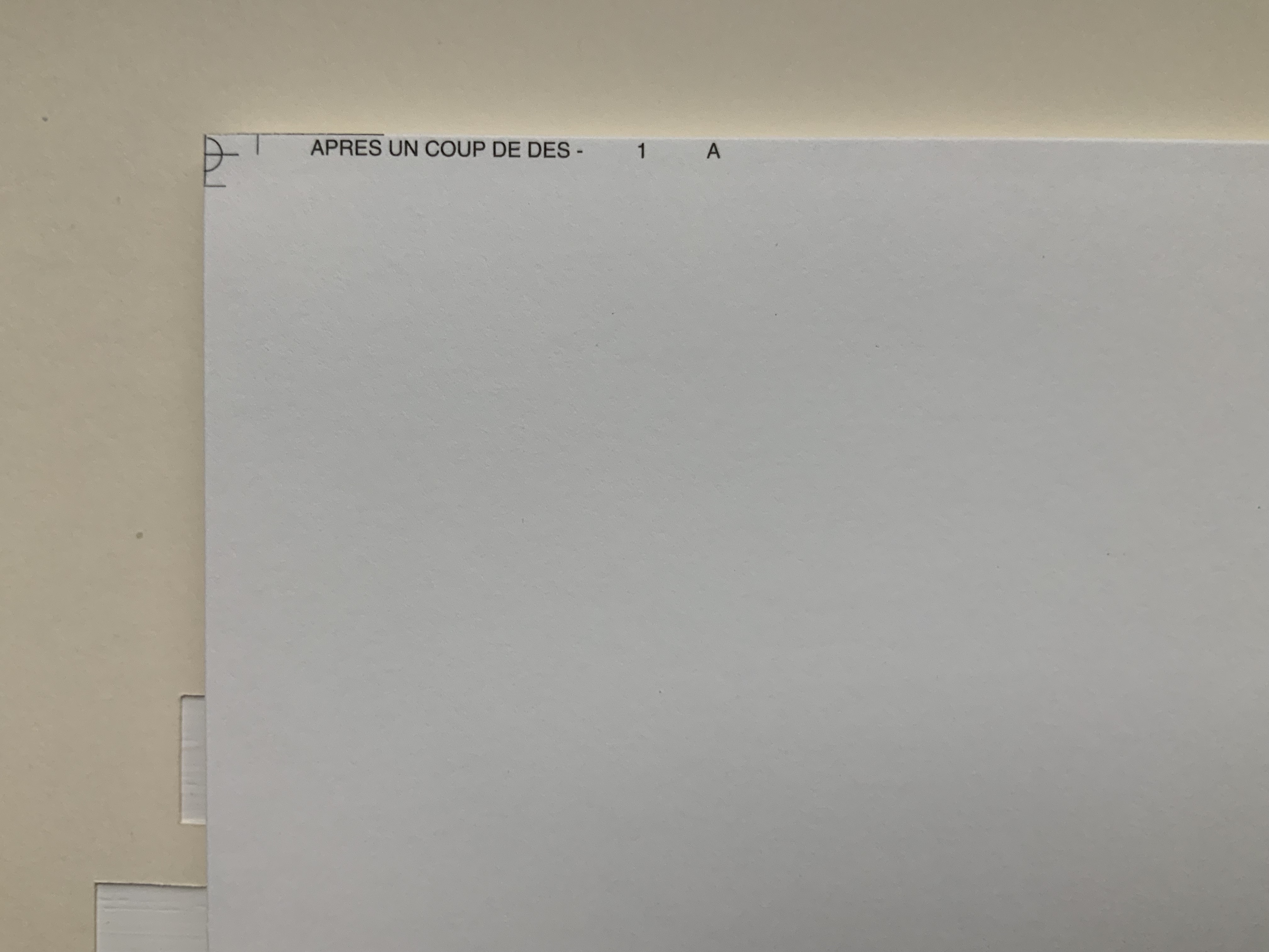
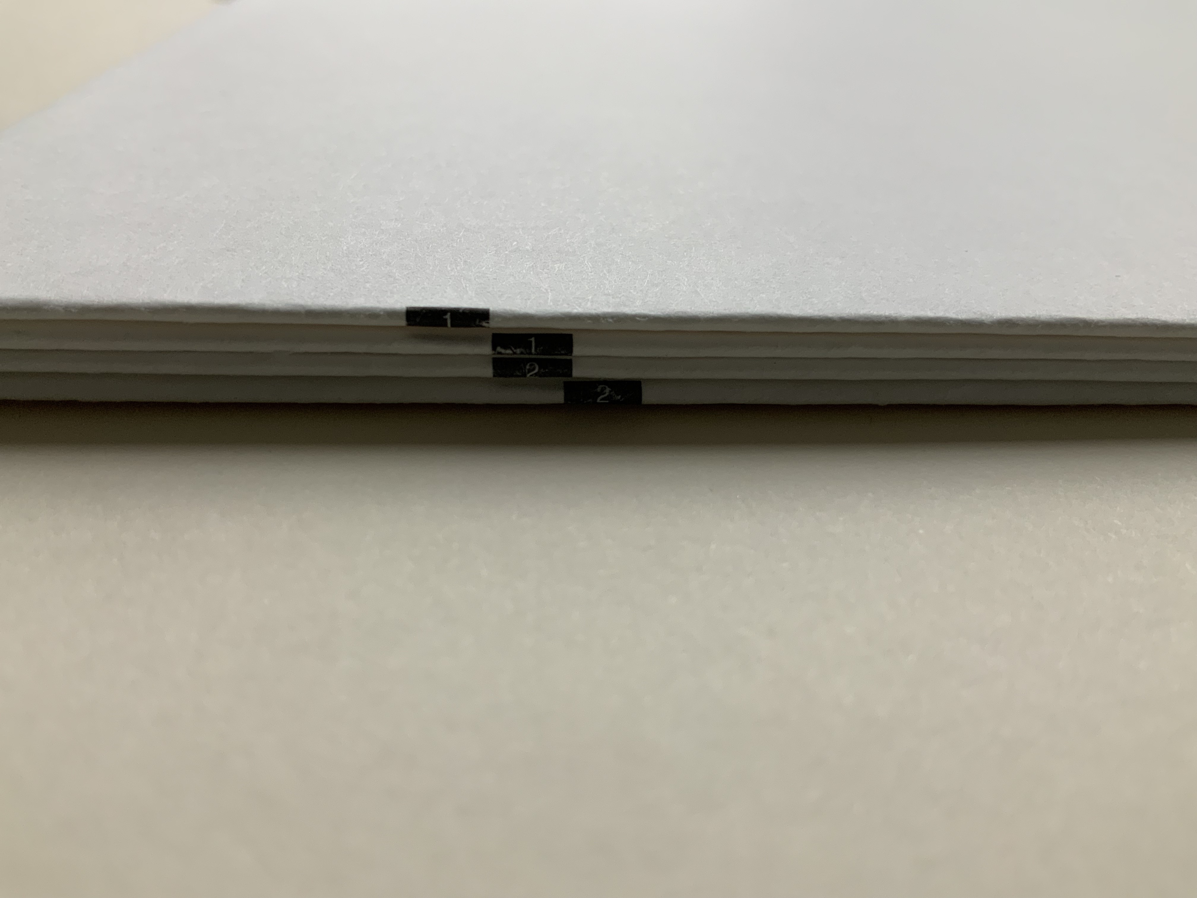
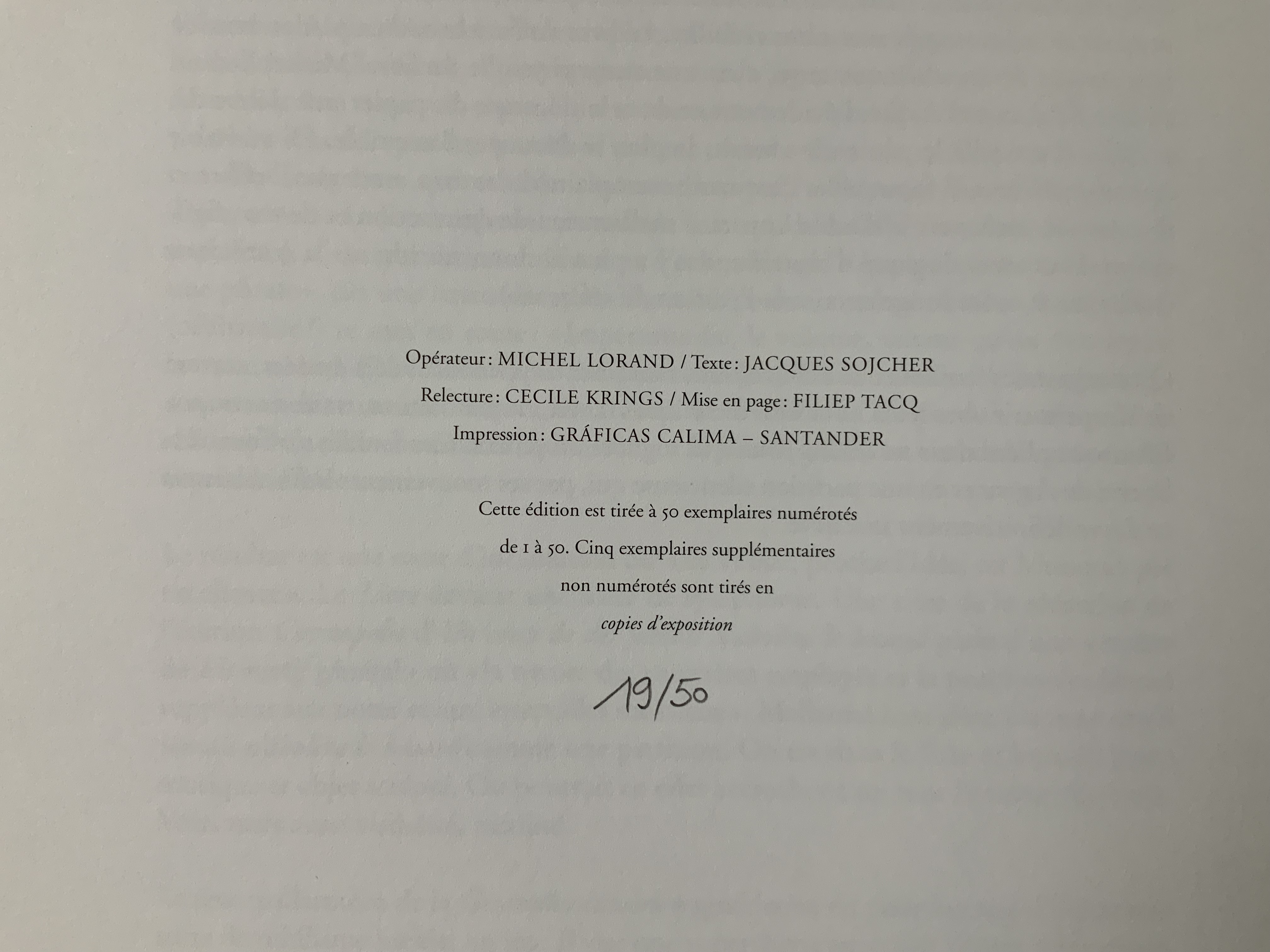
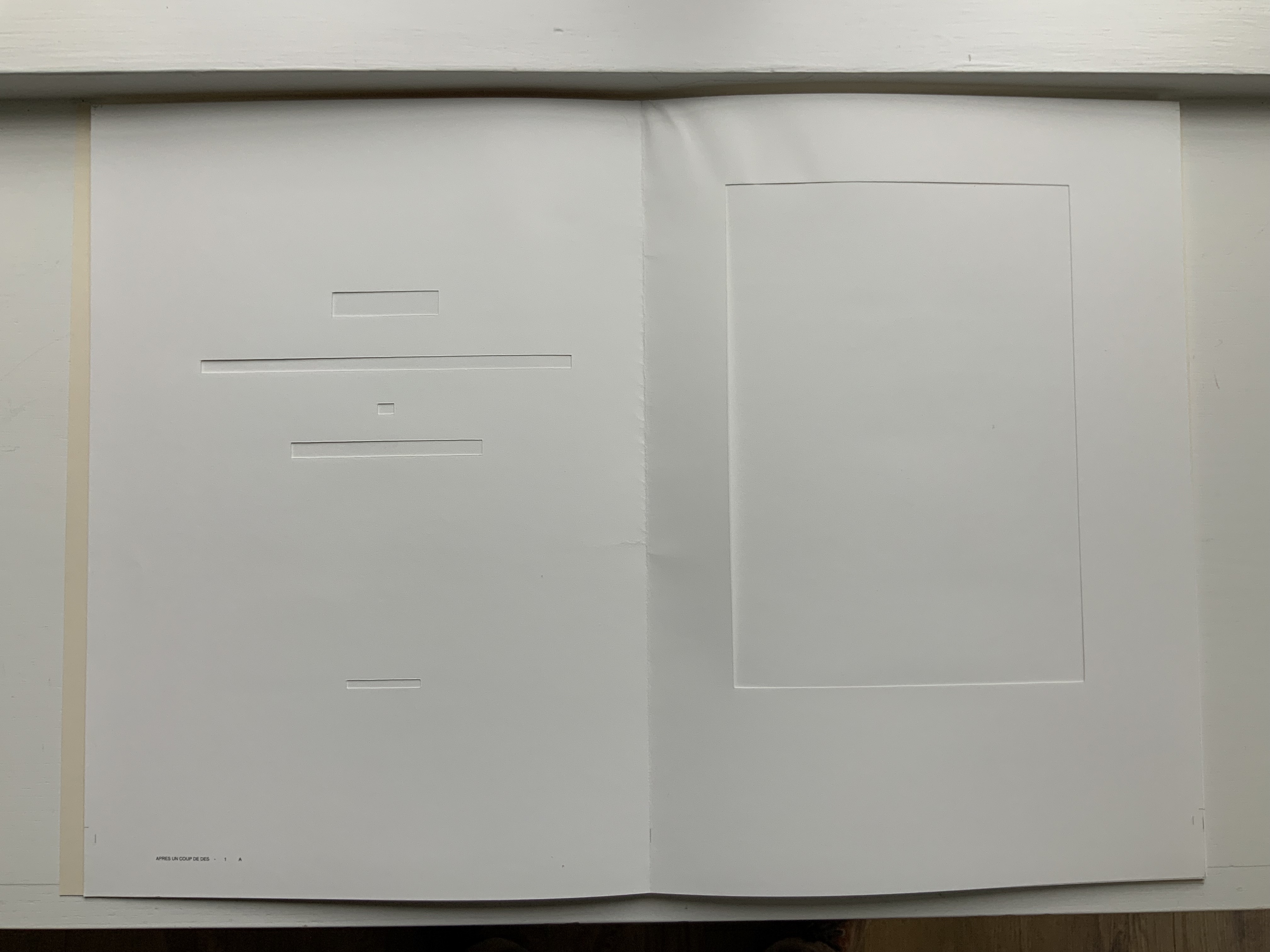
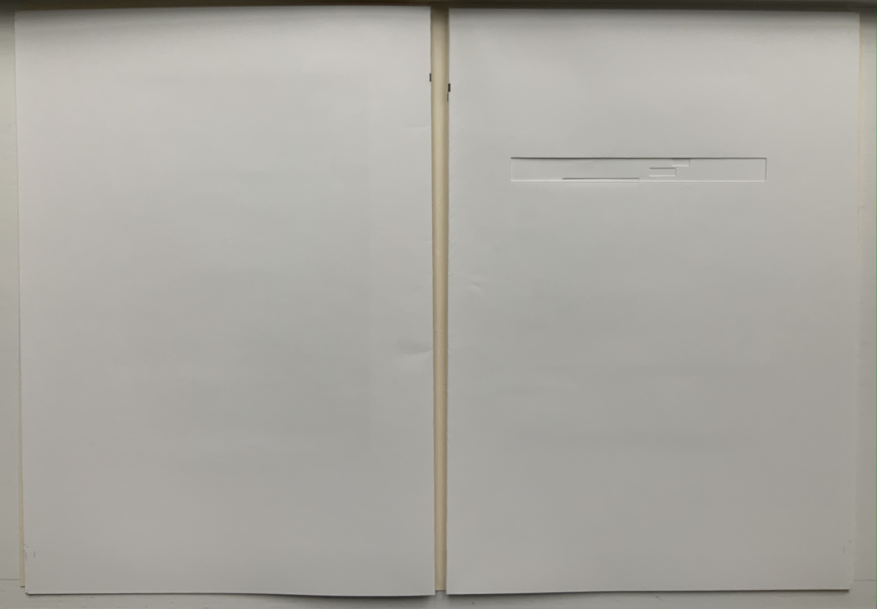
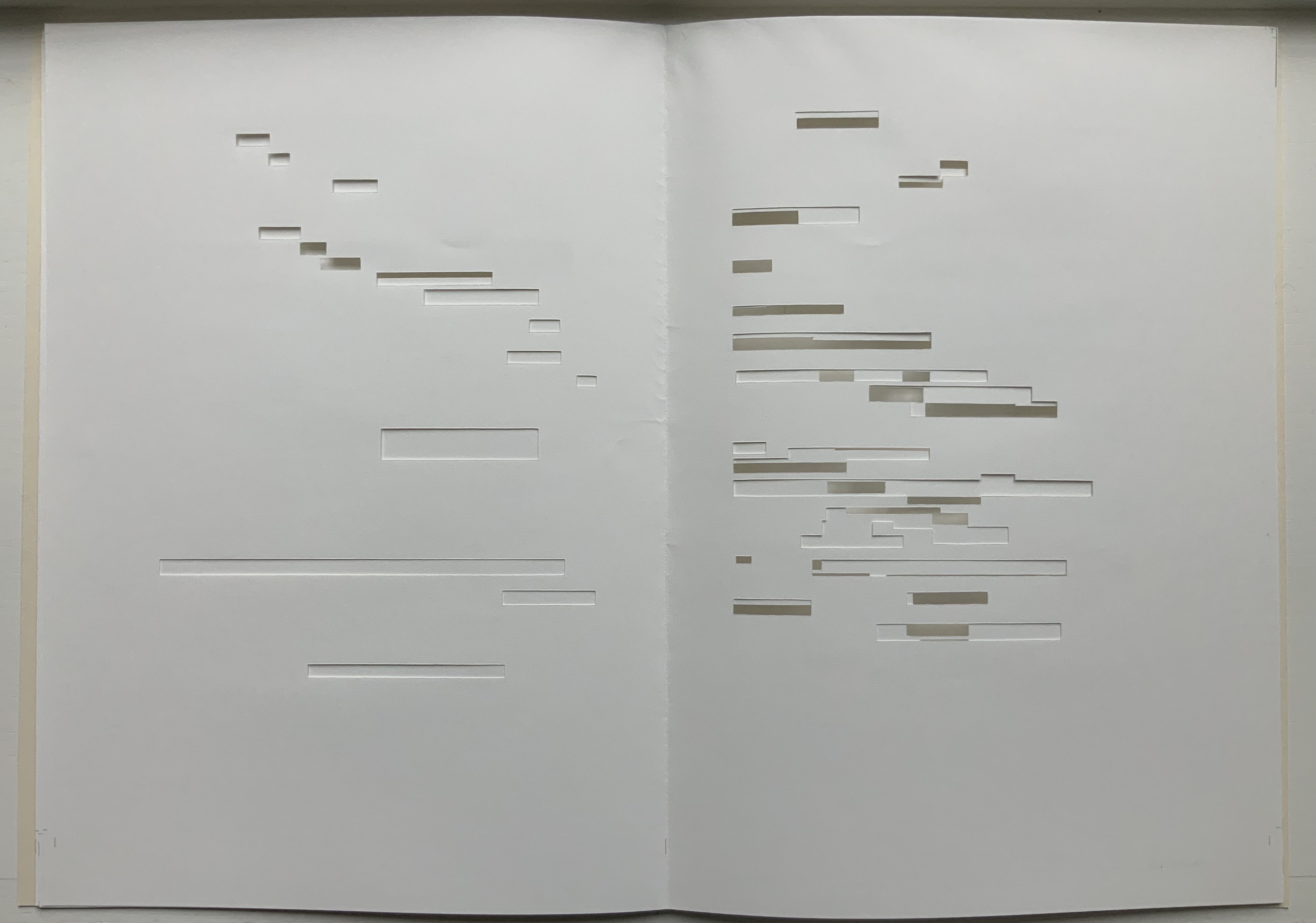
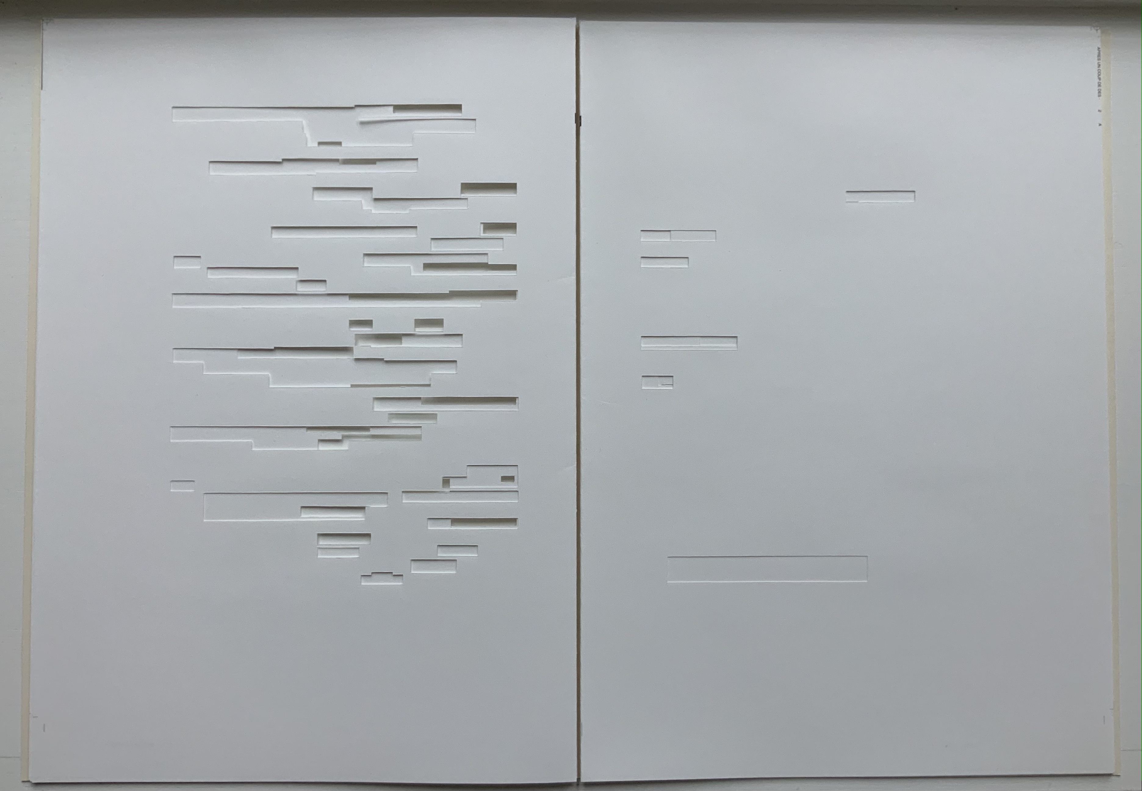
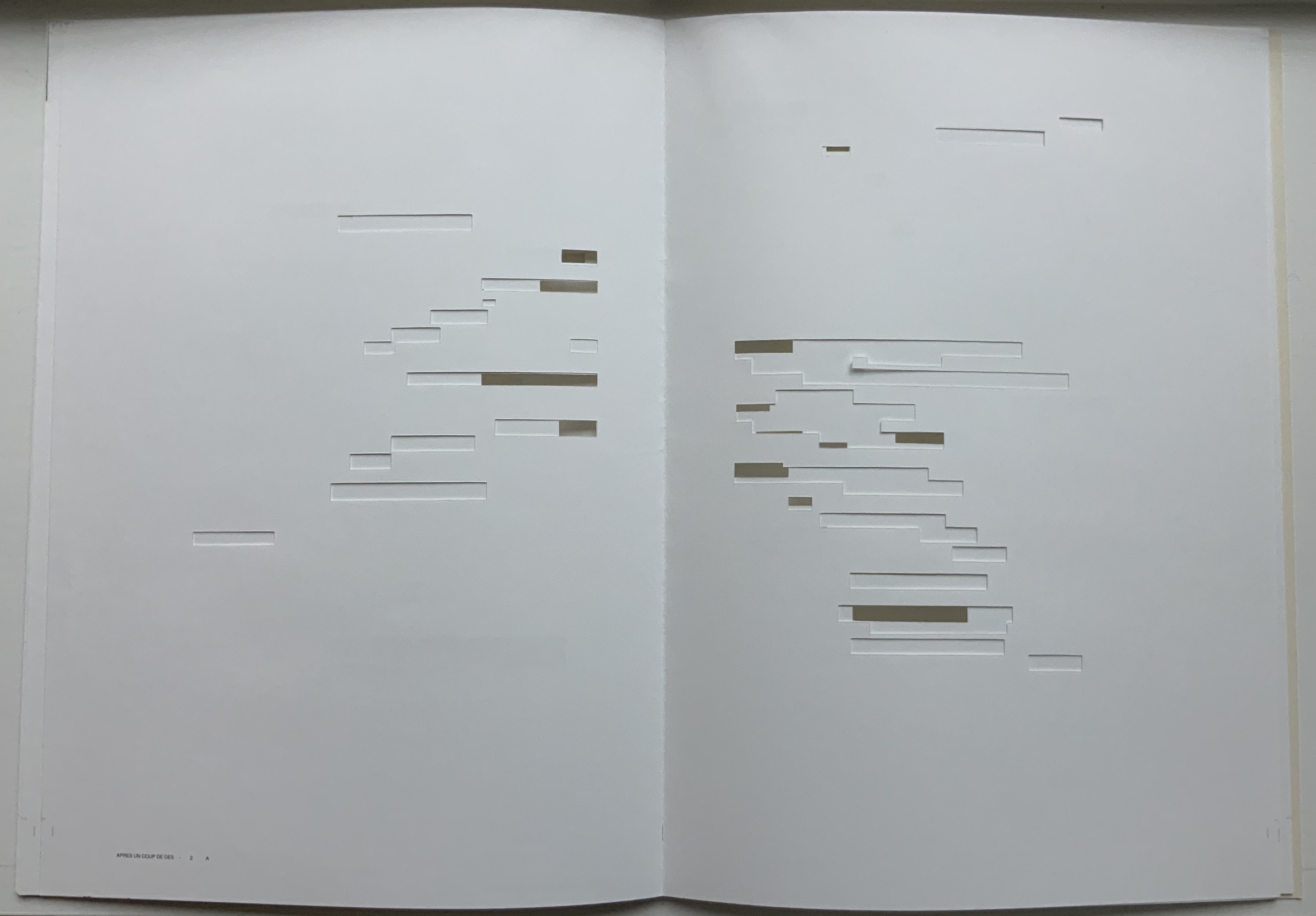
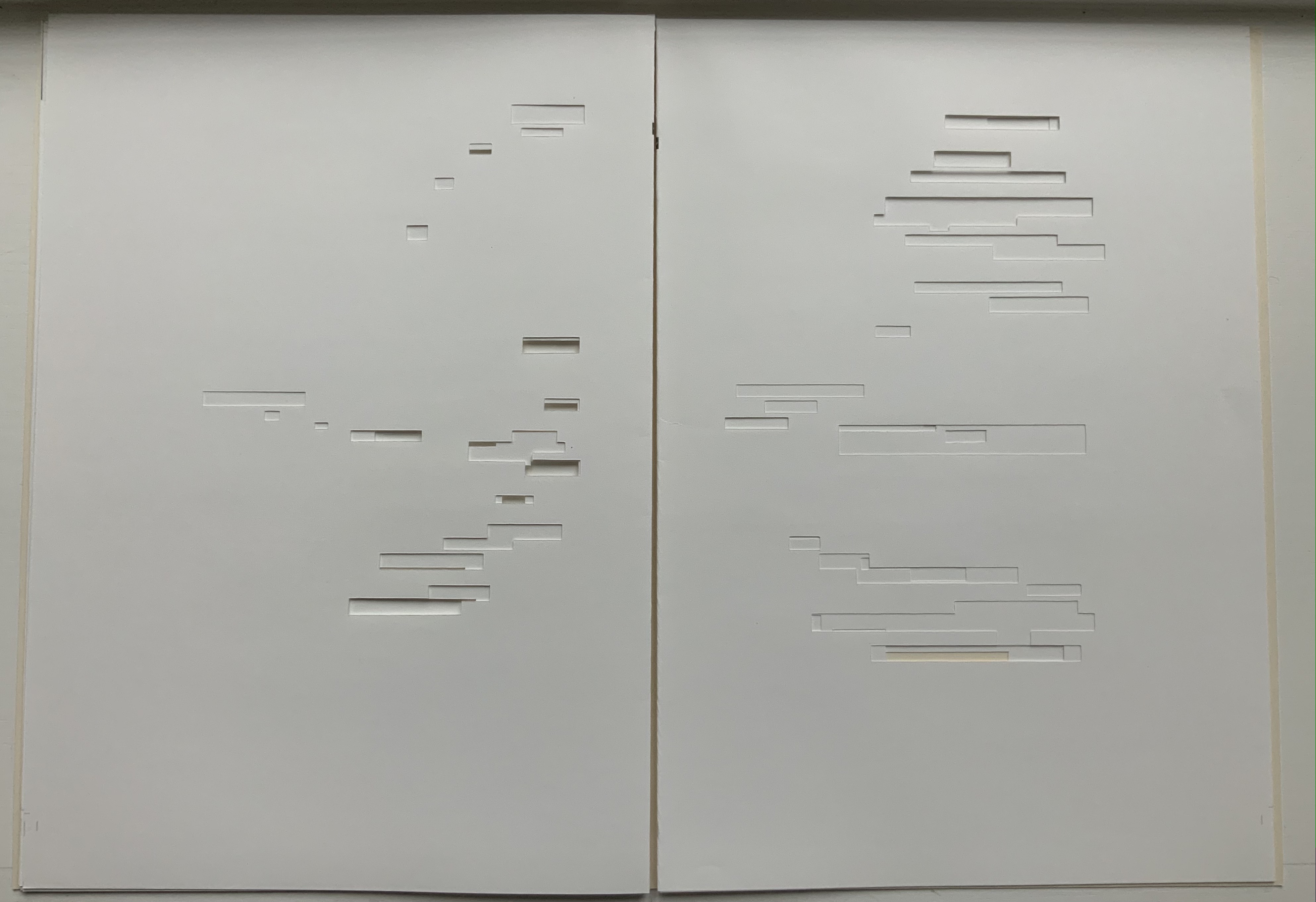
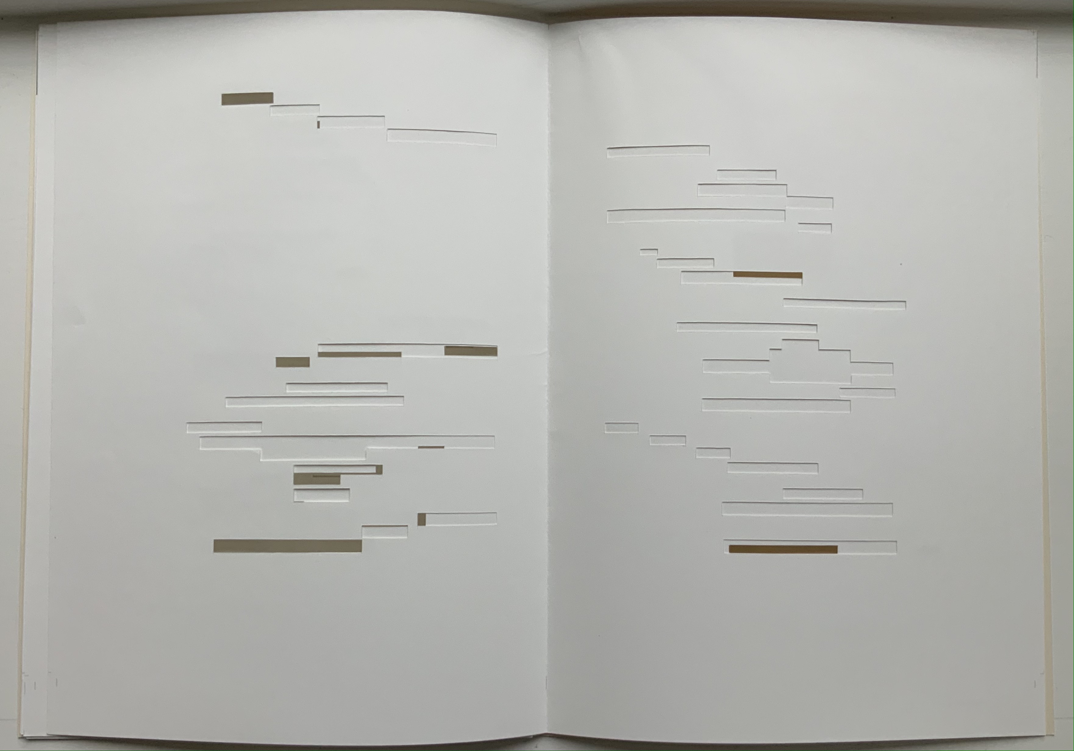
Après Un Coup de Dés (2015) Michel Lorand Cover and gatherings, untrimmed and unbound, in glassine envelope. Cover: H362 x W260; gatherings: H362 x W256 mm; 32 unnumbered pages. Edition of 50, of which this is #19. Acquired from the artist, 22 October 2021. Photos: Books On Books Collection. Displayed with the artist’s permission.
Since the 1960s when Ernest Fraenkel, Mario Diacono and Marcel Broodthaers blotted out the text of Mallarmé’s poem Un Coup de Dés Jamais N’Abolira le Hasard (1897) to create their works of homage, numerous others have expanded on the technique: substituting images of sonograms (Sammy Engramer, 2009) or algorithmically generated abstractions (Eric Zboya, 2018, and Benjamin Lord, 2019), or excising the text (Michalis Pichler, 2008, and Cerith Wyn Evans, 2008) or algorithmically erasing it (Jérémie Bennequin, 2009) — just to name a few.
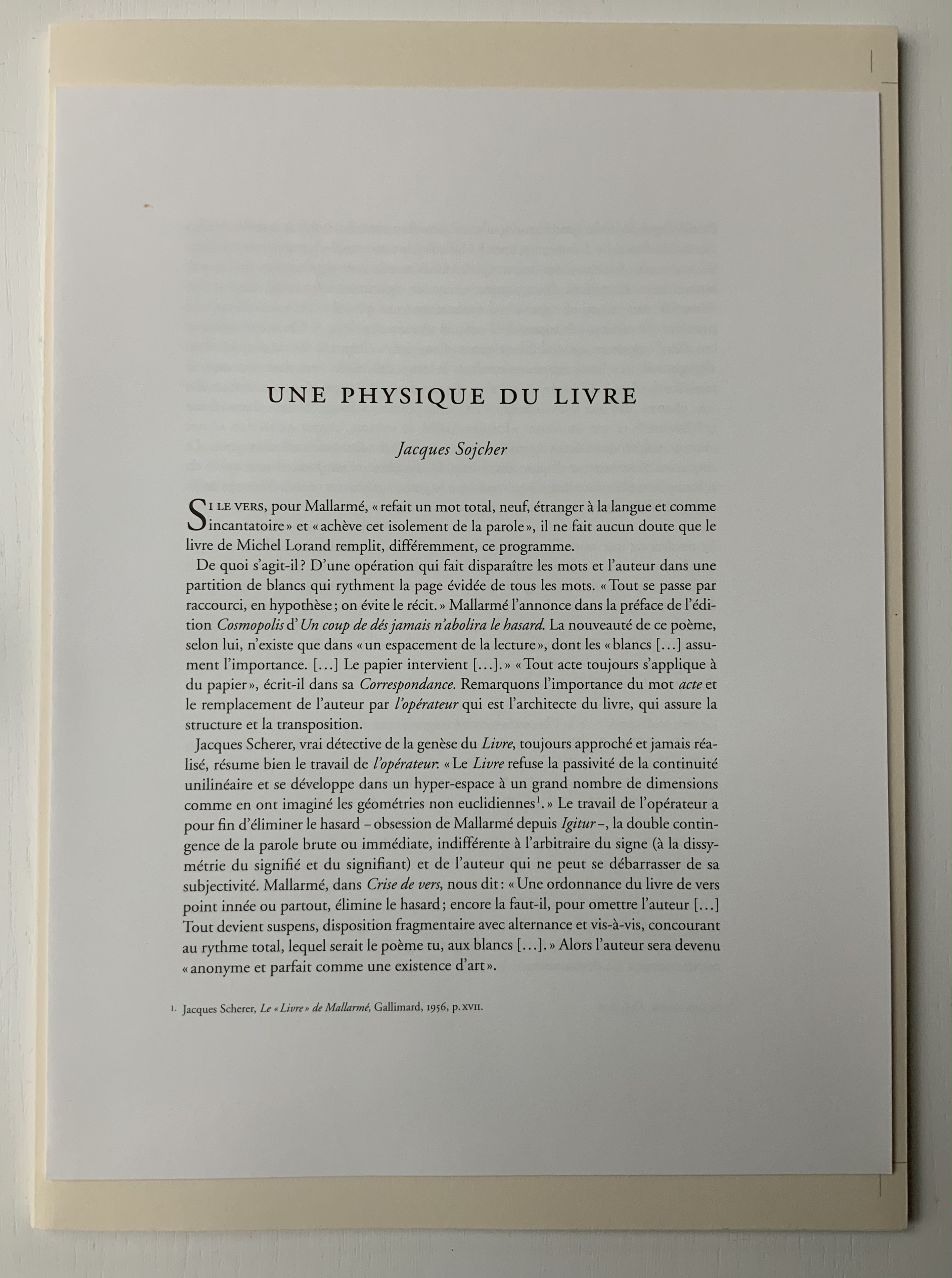
In Après Un Coup de Dés (2015), the only printed marks are the cover’s traditional black and red borders and the printer’s registration and gathering marks on the sheets. Wherever else Mallarmé’s text would have been printed has been excised. In reply to a question about the process involved, Lorand explains that he had asked the designer Filiep Tacq to create a layout that would cover in black exactly the blocks of text as it appears in the current Gallimard book edition of Mallarmé’s poem, including the front and back covers (correspondence with the artist, 1 November 2021). Lorand took a scalpel to the offset printed sheets, removed the blackened blocks, folded the sheets by hand into the four gatherings, assembled them in the correct order and laid them untrimmed and loose inside the cover. Each of fifty copies was placed inside its own handmade glassine envelope along with a flyer including introductory text by Jacques Sojcher (emeritus professor, University of Brussels) and the colophon for the work. It is a book that is not-yet a book.
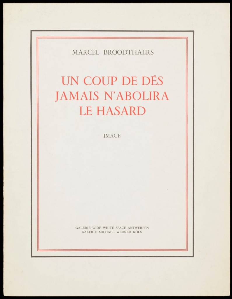
Lorand’s and all of these other works of homage give us inverse ekphrasis. They are the visual, tactile and conceptual works of art that come after Mallarmé’s text. We are more used to ekphrasis where the object, painting or sculpture comes before the text — like Achilles’ shield before Homer’s description, or the Grecian urn before Keats’ ode, or Brueghel’s Fall of Icarus before Auden’s Musée des Beaux Arts. Homer, Keats and Auden vie with the art of the crafted object to put that object (and more) in front of us with words. With the inverse, the crafted objects vie without the words to put Mallarmé’s poem (and more — and sometimes less!) in front of us.
Many of the hommageurs hint at the “and more” with a subtitle to Un Coup de Dés Jamais N’Abolira le Hasard. With Broodthaers, it is Image; with Pichler, Sculpture; with Engramer, Onde (Wave as in soundwave); and with Bennequin, Omage (as in hommage with the “h” and “m” missing). With Lorand, there is no subtitle. Instead, we have the word après prefacing the truncated title of the poem. But, “after” Mallarmé’s poem, what is Lorand proposing? An homage in the form of something that restates, reproduces the poem but without the words? An homage in the form of something else presented in the manner of Un Coup de Dés but without the words? Or something else that simply occurs after the poem’s roll of the dice? As it turns out, all that and more.
Paul Valèry was probably the first of Mallarmé’s circle to see and hear Un Coup de Dés. His reaction picks out one of the themes that make up Lorand’s “and more”:
It seemed to me that I was looking at the form and pattern of a thought, placed for the first time in a finite space. Here space itself truly spoke, dreamed, and gave birth to temporal forms. Expectancy, doubt, concentration, all were visible things. With my own eye I could see silences that had assumed bodily shapes. Inappreciable instants became clearly visible: the fraction of a second during which an idea flashes into being and dies away; atoms of time that serve as the germs of infinite consequences lasting through psychological centuries — at last these appeared as beings, each surrounded with a palpable emptiness…. there in the same void with them, like some new form of matter arranged in systems or masses or trailing lines, coexisted the Word! — Paul Valéry, Collected Works of Paul Valery, Volume 8: Leonardo, Poe, Mallarmé (1972).
Lorand writes:
My <<Après un Coup de Dés>> introduces a corpus of approaches to what might be “the movement” that constitutes speech: “A language that speaks” as Martin Heidegger calls it (Unterwegs zur Sprache, Verlag Günther Jeske, Pfullingen, FRG, 1959).
How can we think, how can we imagine this movement within language itself? What path to take to allow us to experience this movement, the one that constitutes the word itself. This word is sound. The object of all my work is the identification of what could be the image of this movement, of this word. This exploration attempts to approach the nature of this movement: a word beyond language when the latter is silent. (Correspondence with the artist, 1 November 2021.)
Like his others, Heidegger’s On the Way to Language is a dense book; more than the others, it is poetical, an invitation to experience language. In it is a series of lectures entitled “The Nature of Language” in which Heidegger uses two poems, one by Stefan George and one by Gottfried Benn, to question language about its nature. Although George’s poem is the one that Heidegger deeply explicates, Benn’s is the one that, echoing Valèry, sheds the most light on Lorand’s Après Un Coup de Dés — especially with its last two lines.
A Word
A word, a phrase –: from cyphers rise Life recognized, a sudden sense, The sun stands still, mute are the skies, And compacts it, stark and dense.
A word — a gleam, a light, a spark, A thrust of flames, a stellar trace — And then again — immense — the dark Round world and I in empty space.
Après Un Coup de Dés seems to be a wordless invitation to experience language. But in a sense, Mallarmé’s words have not disappeared, not entirely. Their shapes — embodied in the voids — move silently and rhythmically across the unfolded sheets; in the gatherings, they cascade over one another much as they do syntactically and typographically in print. And even though the text is not before (in front of) us, Lorand’s artwork delivers a wordless experience of a key paradox of language with which Mallarmé sought to imbue his poem: the language of the void or abyss — the void or abyss of language. One of the ways in which the poem presents this self-enveloping paradox is that it begins and ends with the words un coup de dés, the act that can never abolish chance and the act that all thought emits. Similarly, Après un Coup de Dés displays the presence of language by displaying the absence of language, or les blancs defined by and defining empty space.
Mallarmé’s invitation in Un Coup de Dés, however, beckons us to a slightly different concept of language than that articulated by Heidegger. For Mallarmé, chance plays a prominent role in what Heidegger would call the “neighborhood of poetry and thought”. But chance, hazard or a roll of the dice plays a much less prominent role for Heidegger, and in Lorand’s work of art, with its registration and gathering marks and glassine enclosure, there seems little allusion to it — perhaps naturally so since Lorand’s work comes after the dice have been rolled.
Even though it comes after Mallarmé’s completed poem and after the Gallimard book edition, Après presents as an unfinished work, a book not yet trimmed and bound, which reflects not only Mallarmé’s unfinished realization of the poem as a book but also his unfinished life’s pursuit: le Livre, the thing in which everything in the world would end up — the thing that, by virtue of a spacious mobility of typographic layout and the interplay of its elements, would be “the total expansion of the letter”. Lorand’s attention and manual precision in excising the blackened blocks where the text would otherwise appear evoke Mallarmé’s attention to the minute details of typeface, size and font shown in his handwritten mark-up of the proofs for the book edition he was planning before he died.
Après also comes after the efforts of Broodthaers and Pichler, both of whom organized exhibitions for their works of homage. In fact, Pichler paid homage to Broodthaers by naming his exhibition “Pichler: Exposition Littéraire autour de Mallarmé” (Milan, December 2016) after “Broodthaers: Exposition littéraire autour de Mallarmé” (Antwerp, December 1969). Pichler’s exhibition was also daring in its exposure of the works to the visitors.
In the 2018 display of Après Un Coup de Dés, the previously gathered but now unfolded sheets and cover lie side by side under glass. Often this is cause for complaint about the distanced display of artist books. In the case of Après Un Coup de Dés, the distance effectively draws point-blank attention to what the privileged reader gradually discovers in handling the work. The unprivileged reader may have to imagine the making, unmaking and remaking of the book but, confronted with the gestalt of the undone gatherings and their registration marks, that reader immediately sees/witnesses the void defined by a void.
Après Un Coup de Dés in the group exhibition Reading Hand Writing Bodies at Les Abattoirs de Bomel, Centre d’art de Namur, Belgium, 8 February – 11 March 2018. Photo: Courtesy of the artist.
In relation to Broodthaer’s Image and Pichler’s Sculpture, Après comes both before and after. The positioning of the words après, image and sculpture vis à vis the poem’s title has been noted already. Of all three visual, tactile and conceptual works, Lorand’s stands as the chronologically “after” yet unfinished “before” to Broodthaers’ and Pichler’s finished works. In yet another “afterness” to Mallarmé’s poem, Lorand likens Après to a silent score of music or a piano roll (correspondence with the artist, 1 November 2021). This echoes — if that is not too perverse a verb — Mallarmé’s reference to “score” in his preface to Un Coup de Dés. In premonitory, if not coincidental, irony, Lorand’s piano-roll-like 2015 work precedes a work that Michalis Pichler created for his 2016 Milan exhibition: a piano roll playable on a foot-pumped pianola and entitled Un Coup de Dés Jamais N’Abolira le Hasard: Musique (see video above).
The interplay of its philosophical roots with its mechanically produced print and its manual cuts makes Lorand’s AprèsUn Coup de Dés one of the more challenging works of homage to Mallarmé’s poem. To “hear” it side by side with the others in the Books On Books Collection (see below) is rewarding.
Further Reading
“Derek Beaulieu“. Books On Books Collection. 19 June 2020.
“Eric Zboya“. Books On Books Collection. 01 June 2020.
Heidegger, Martin, and Peter D. Hertz, trans. 1959/2009. On the Way to Language. San Francisco: HarperOne. Reprint. “No matter how we put our questions to language about its nature, first of all it is needful that language vouchsafe itself to us. If it does, the nature of language becomes the grant of its essential being, that is, the being of language becomes the language of being” (p. 72).
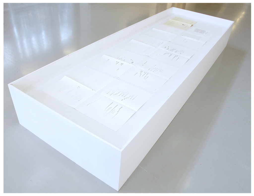
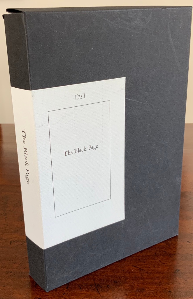
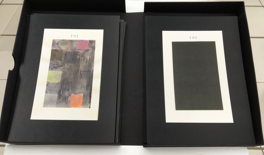
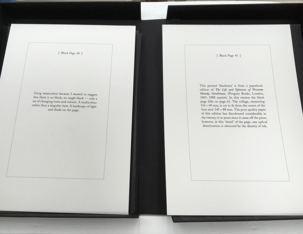
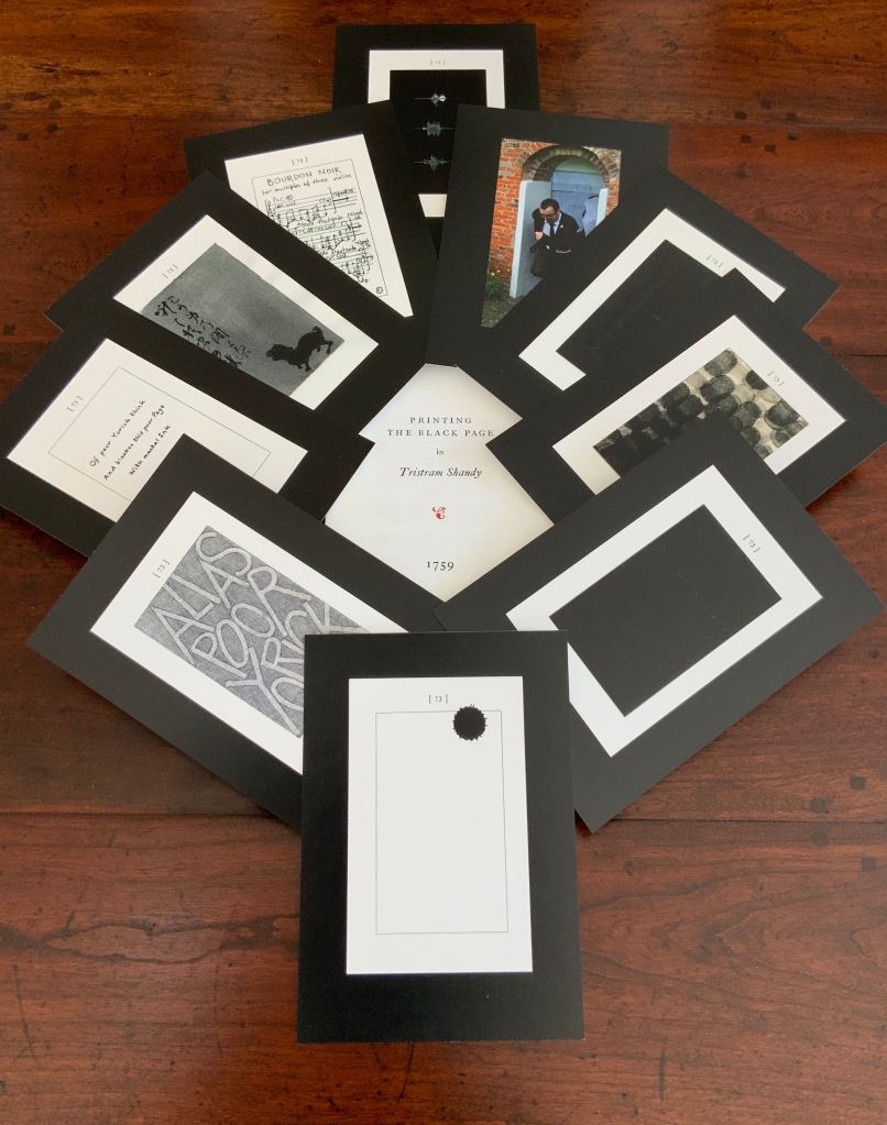
The Black Page Catalogue(2010) Coxwold, UK: Printed by Graham Moss (Incline Press) for The Laurence Sterne Trust. Contains 73 numbered leaves in a matte black card box (H235 x W168 mm). The leaves are glossy cards (210 x 148 mm) on which contributed texts and illustrations (chiefly colour) are printed; the reverse of each provides the contributor’s comments on the text or illustration and the “page” number. Also enclosed are a single-sheet folded pamphlet (“Printing the Black Page” by Graham Moss, Incline Press) and two cards, one of which is the invitation to the exhibition inspired by the ‘black page’, p. 73 of the first edition of The Life and Opinions of Tristram Shandy, Gentleman, held at Shandy Hall, Coxwold, North Yorkshire, 5 Sept.-31 Oct. 2009, and the other, sealed in an envelope, being the index of the contributors and their page numbers. Edition of 73. Acquired from the Trust. Photos: Books On Books Collection.
Collectors come up with the most ingenious reasons for acquiring things. In this case — along with astrological, numerological and other rational rationale — Rebecca Romney’s reminder that The Life and Opinions of Tristram Shandy, Gentleman is one of the earlier instances of book art led inevitably to my acquiring Shandy Hall’s The Black Page Catalogue. But it took time.
Several months after enjoying the Romney essay, I met Brian Dettmer in February 2015 by happenstance at a book art exhibition in New Haven, CT. As we chatted about past inspirations of book art, Tristram Shandy came up, so he told me of an upcoming event called “Turn the Page” in Norwich, UK, where I could more easily see some of his work — and one in particular having to do with Tristram Shandy. So in May 2015, I went.
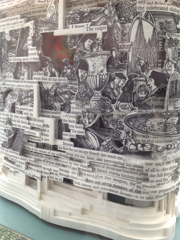
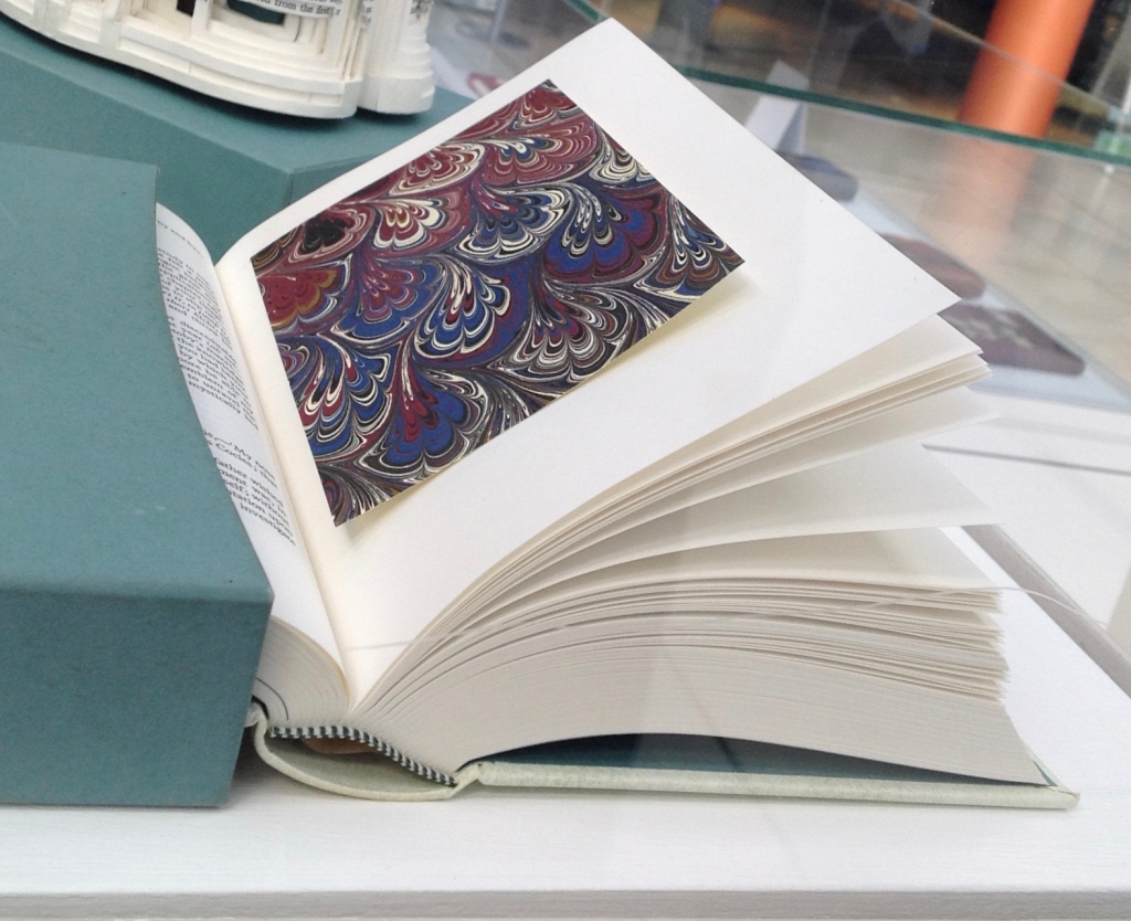
Tristram Shandy (2014) Brian Dettmer Carved and varnished, two copies of the 2005 Folio Society edition of Tristram Shandy. H230 x W190 mm Commissioned by The Laurence Sterne Trust, Coxwold, UK. Photos: Books On Books Collection.
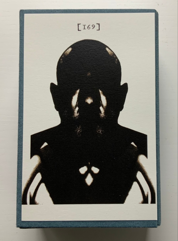
The marbled page, an “emblem of my work”, p. 169. The Life and Opinions of Tristram Shandy, Gentleman (1759) by Laurence Sterne Illustrated with wood engravings by John Lawrence. Set in ‘Monotype’ Plantin, printed by Cambridge University Press on Caxton Wove Paper. New York: Folio Society, 2005.
So a year passed. Another visit to “Turn the Page” was made. And as I was leaving, lo, a sign and small display came unto me:
Only a negligent collector would ignore such clear signs.
Parson-Yoricks-to-be can select their own favorites here.
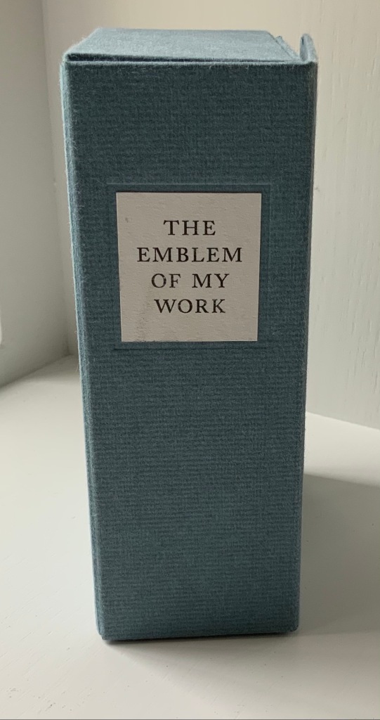
Emblem of My Work (2013)
Emblem of My Work (2013) Coxwold, UK: The Laurence Sterne Trust. Consists of a 24-page booklet and 170 numbered cards in a hinged blue paper-covered box (H160 x W105 x D60 mm. The leaves of this catalogue are bright white cards (152 x 92 mm) on which the artwork is printed; the reverse of each provides the “page” number and the contributor’s comments on the art. The booklet provides alphabetical and numerically ordered indexes listing the contributors and their page numbers. Edition of 225, of which this is #79. Acquired from Shandy Hall, 1 October 2019. Photos: Books On Books Collection.
Volume III of Sterne’s work was the first to be handled by a publisher. Presumably the famous success of the first two self-published volumes helps to explain James Dodsley’s agreement to printing copies in which each page 169 and each page 170 showed uniquely marbled squares. Images from an original copy held at the British Library can be seen here. As Patrick Wildgust, director of Shandy Hall, explains in the booklet:
The central section of p. 169 was laid upon the marbled mixture in order that a coloured impression could be taken as cleanly as possible. This was left to dry and then reverse-folded so the other side of the paper could also receive its marbled impression. This side of the paper became page [170]. As a result, the marbled page in every copy of Vol. III is different — each impression being a unique handmade image. In the text opposite on p. 168, Sterne tells the reader that the marbled page is the “motly emblem of my work” — the page communicating visually that his work is endlessly variable, endlessly open to chance.
Two favorites — one for page [169], one for [170] — artists with other works in the Books On Books Collection. Left: Ken Campbell. Right: Eric Zboya.
Paint Her To Your Own Mind (2018) Coxwold, UK: The Laurence Sterne Trust. Contains 147 numbered leaves in a brown paper-covered box (174 x 124 mm). The leaves are bright white cards (145 x 105 mm) on which contributed texts and illustrations (chiefly colour) are printed; the reverse of each provides the contributor’s comments on the text or illustration and the “page” number. Also enclosed are a “title page” and “index leaf” listing the contributors and their page numbers. Edition of 200. Acquired from Shady Hall, 6 June 2018. Photos: Books On Books Collection.
Page 147 of Sterne’s sixth volume of Tristram Shandy is blank. On the preceding page, he metaphorically throws up his hands over any attempt to describe the most beautiful woman who has ever existed and exhorts the reader: “To conceive this right, —call for pen and ink—here’s paper ready to your hand, —Sit down, Sir, paint her to your own mind—as like your mistress as you can—as unlike your wife as your conscience will let you—‘tis all one to me—please your own fancy in it.” So, accordingly, Shandy Hall invited 147 artists/writers/composers to follow Sterne’s instruction to fill the blank page 147. From the 9th through 30th of September 2016, their efforts were displayed in the Shandy Hall Gallery, Coxwold, York.
The curious reader can choose his or her own favorites here.
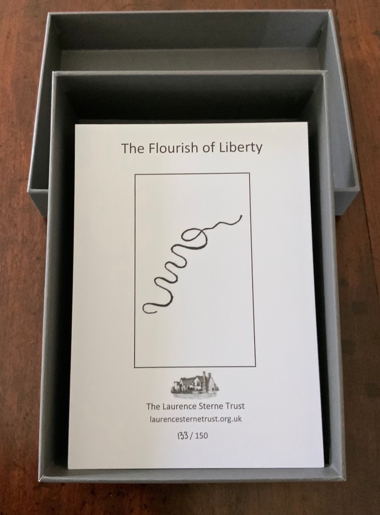
The Flourish of Liberty (2019)
In Volume IX on p. 17, the reader reads Corporal Trim’s advice to Uncle Toby, who stands at the Widow Wadman’s threshold about to propose marriage:
Nothing, continued the Corporal, can be so sad as confinement for life — or so sweet, an’ please your honour, as liberty. Nothing, Trim — said my Uncle Toby, musing — Whil’st a man is free — cried the corporal, giving a flourish with his stick thus —
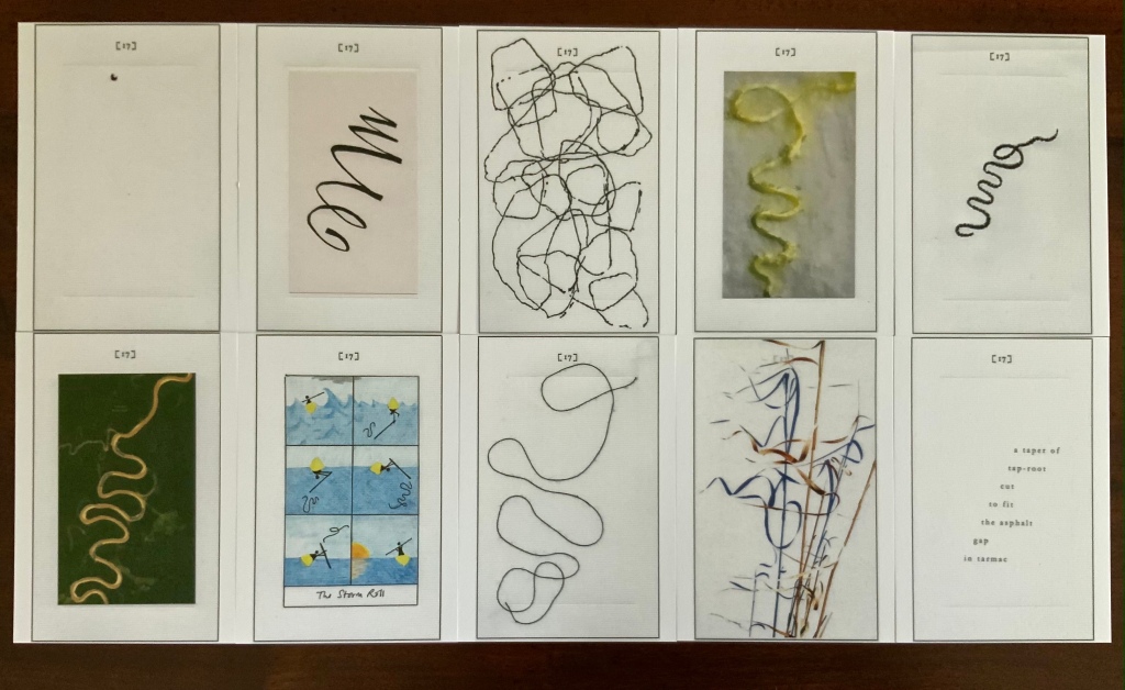
The Flourish of Liberty (2019) Coxwold, UK: The Laurence Sterne Trust. Contains 103 numbered leaves in a gray paper-covered box (174 x 124 mm). The leaves are bright white cards (148 x 105 mm) on which contributed texts and illustrations (black and white, several in colour) are printed; the reverse of each provides the contributor’s comments on the text or illustration and the “page” number. Also enclosed are a “title page” and “index leaf” listing the contributors and their page numbers. Edition of 150, of which this is #133. Acquired from Shandy Hall, 26 October 2020. Photos: Books On Books Collection.
The rest of Corporal Trim’s flourishes flourish here.
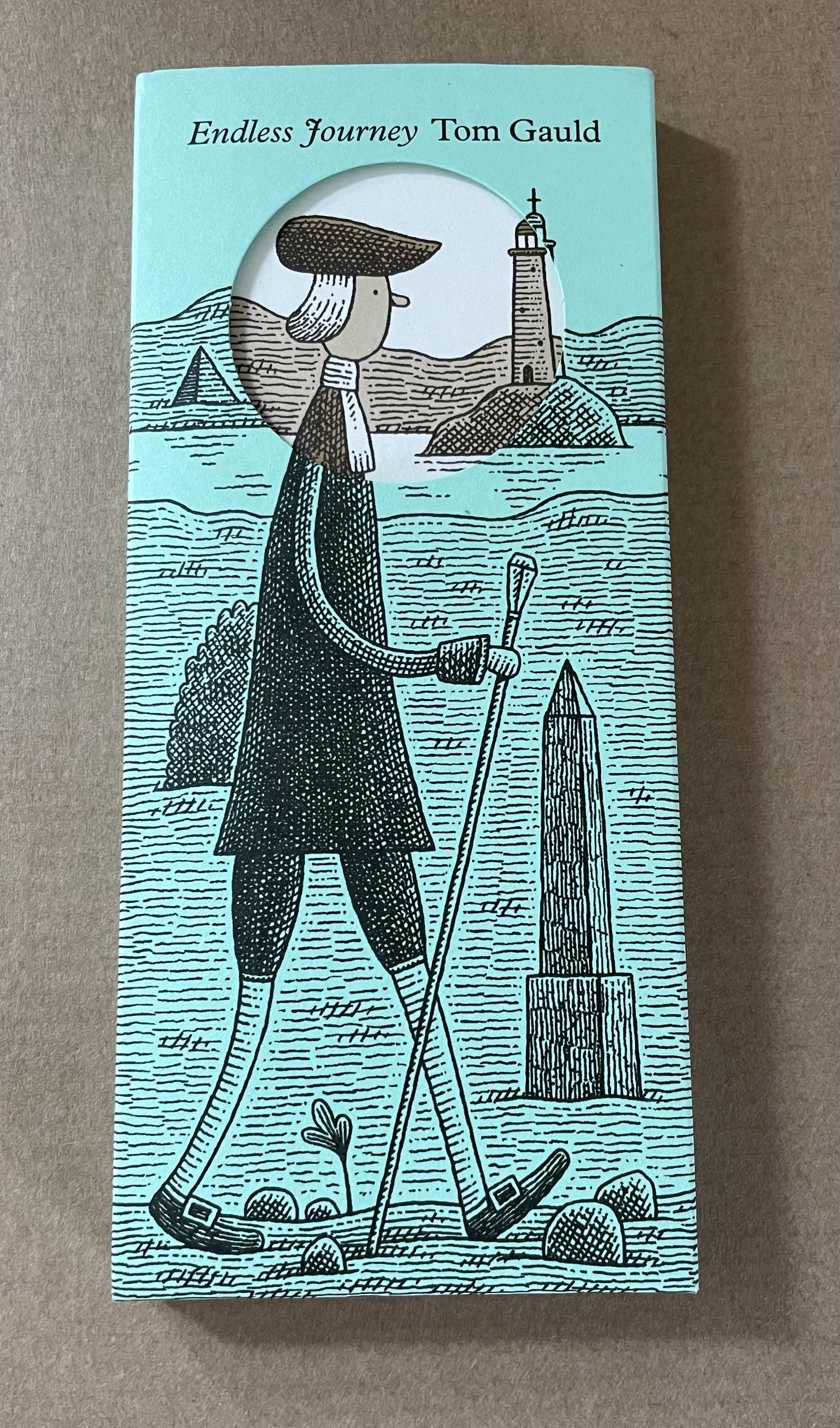
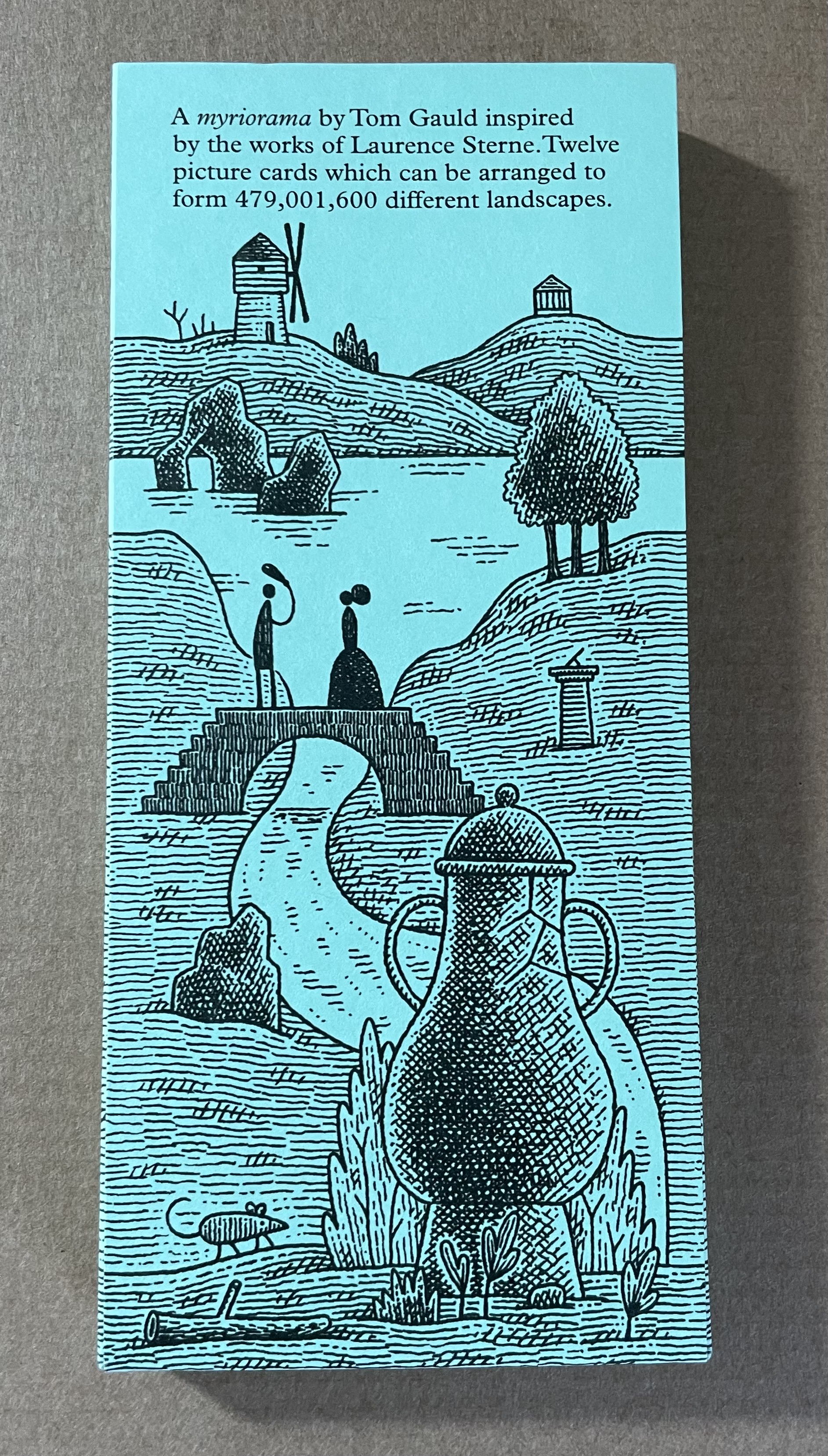
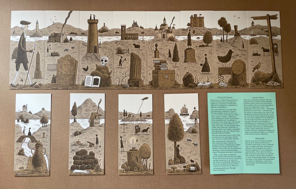
Endless Journey (2015)
Endless Journey (2015) Tom Gauld Printed slipcase, twelve cards, leaflet. H165 x W73 mm. Acquired from the Laurence Sterne Trust. Photos: Books On Books Collection.
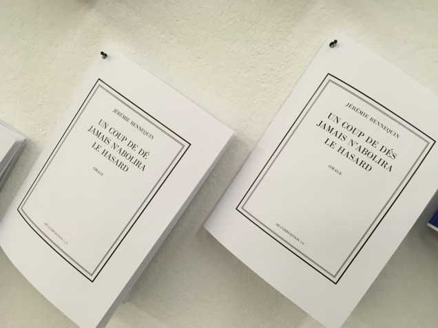
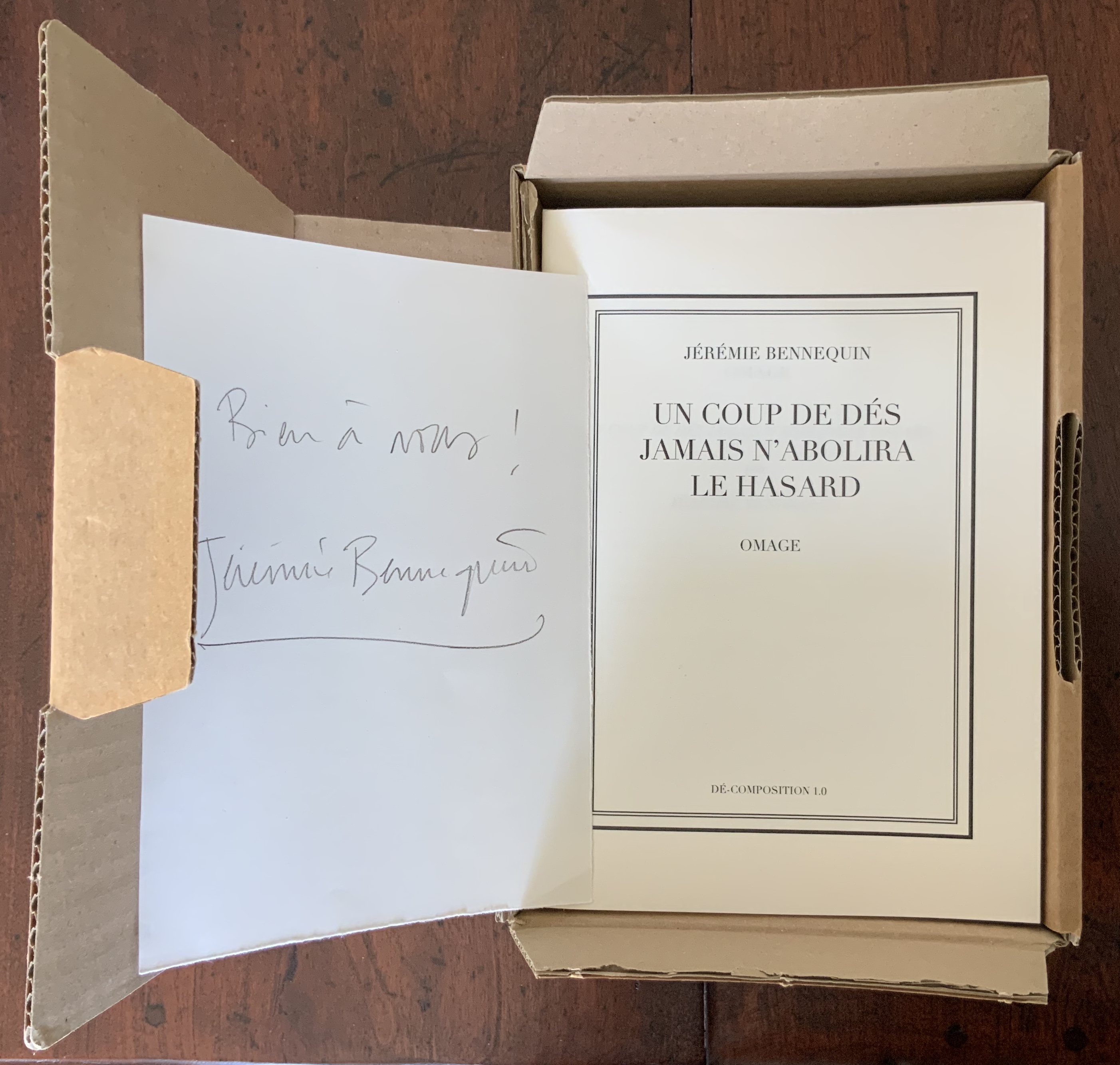
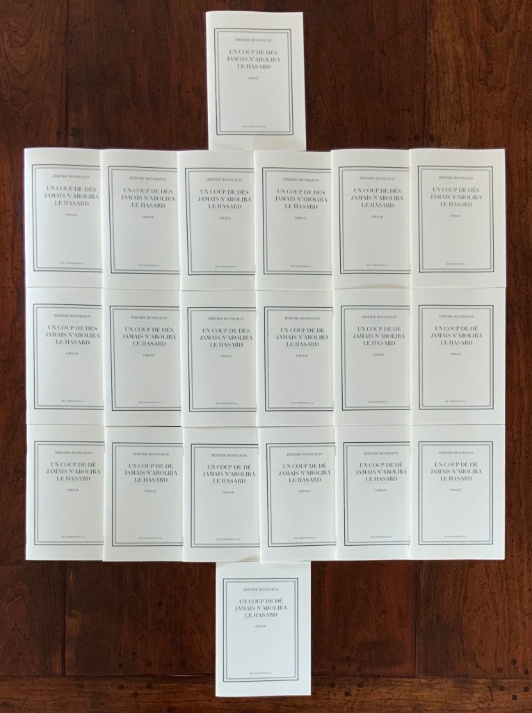
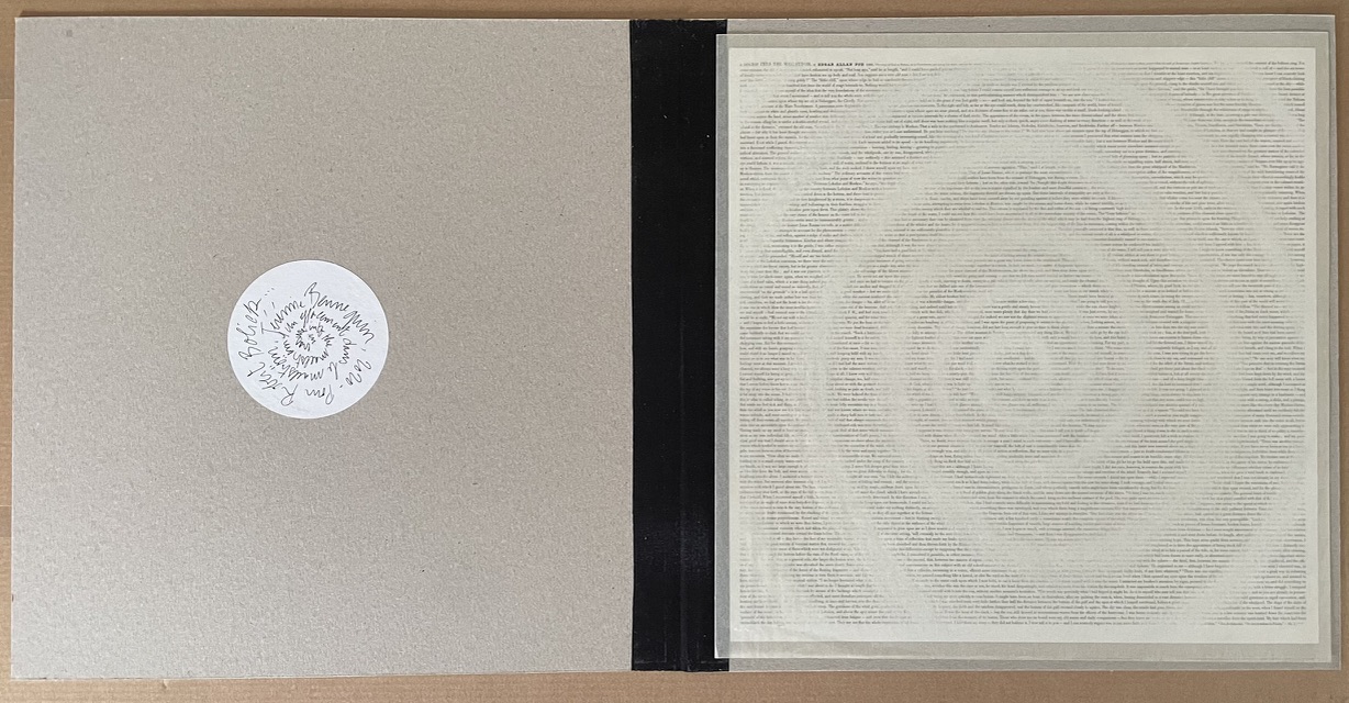
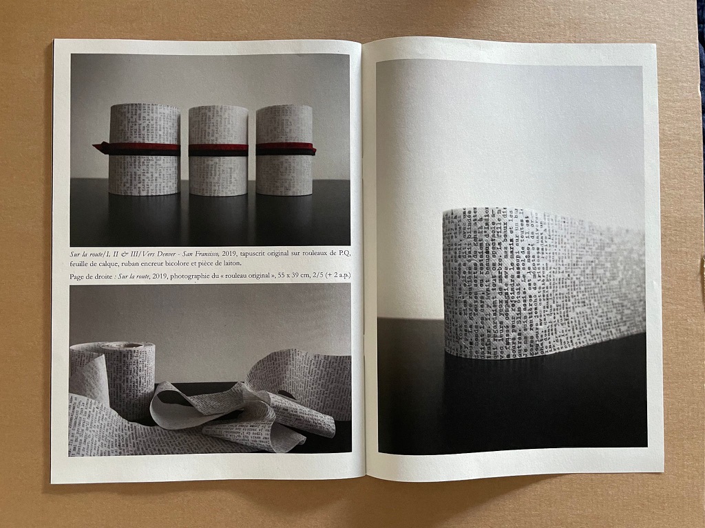
Un Coup de Dés jamais n’abolira le Hasard, Dé-composition (2009-2013)
In “Publishing as an Artistic Toolbox“, an exhibition in Vienna in 2018, Antoine Lefebvre displayed several rows of works from La Bibliothèque Fantastique. They were pinned to the wall at the rear of the exhibition space. One work and one only made up the third row from the bottom: Jérémie Bennequin’s hommage to Mallarmé’s Un Coup de Dés, clearly not singular and missing its “h” and “m”. An exhibition hall is a difficult setting in which to explore a multi-volume work of book art much less answer the questions “Why omage?” and “Why the hyphenation of “décomposition” at the foot of all twenty covers?”
Away from the exhibition and onto Bennequin’s and Lefebvre’s websites, the intrigue only grew with the knowledge that nineteen of those twenty booklets are the results of algorithmically dice-driven live performances of erasing the text from Mallarmé’s poem. With several works of homage to Un Coup de Dés in the Books On Books Collection, Bennequin’s omage composed with a single dé seemed an essential addition.
Booklet 1.0, which reproduces Mallarmé’s complete poem in its 1897 format, also contains a preface to Bennequin’s multi-volume boxed work. Arguing in the preface that Un Coup de Dés does not abolish chance but rather enhances, elevates, ennobles it, Bennequin poses the questions that initiate his homage. The first is:
“Or, le hasard peut-il abolir Un Coup de Dés?” (So, can chance abolish Un Coup de Dés?)
Bennequin argues that, being an artist of the eraser, he is well-suited to erasing or abolishing Mallarmé’s work, and that rolling the die to direct his act of erasure or abolition is fitting. But then comes his second crucial question:
… comment définir au juste, dans le détail, la cible de chaque coup? (how to define in detail the target of each throw?)
After considering such targets as the letter, the word, the page, the double-page spread, Bennequin settles on the syllable for reasons reflecting Mallarmé’s own theories of poetry and music. Booklet 1.0 represents the starting point, with the next volume 1.1 being the outcome of the end of a live performance on 23 October 2009, which involved Bennequin decomposing Mallarmé’s poem by repeatedly rolling a die then locating, vocalising and erasing the syllable corresponding to the number rolled. This occurred on computer screen in real time. With each of the subsequent eighteen performances, the starting point was the state arrived at in the preceding booklet; 1.2 began with 1.1, 1.3 with 1.2 and so on. By the last performance, very little — but something — of Un Coup de Dés was left. So Bennequin has the answer to his first question. As he puts it in the last sentence of his preface: Le hasard jamais n’abolira Un Coup de Dés (Chance will never abolish Un Coup de Dés).
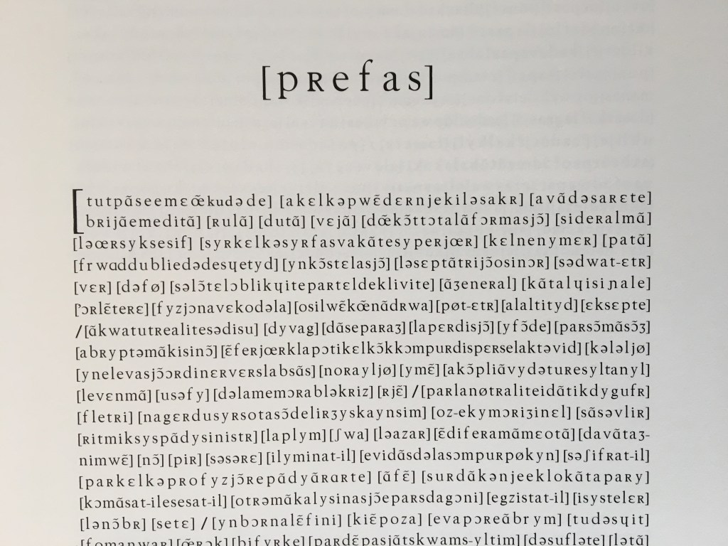
To answer those awkward questions asked in the exhibition hall: First, the removal of “h” and “m” from hommage to create omage is a visual clue to the work’s destructive/creative process — the dice-driven algorithm’s targeting and erasure of phonemes. Second, the isolation of “dé” in the hyphenation of décomposition puns self-reflexively — as book art so often does — on the singular of dés, underscoring the means of Bennequin’s paradoxical decomposition/composition. No matter how this work is displayed or examined, it puts before us a visual constellation of fragments of sound. But, having completed the performances leading to this particular self-reflexive constellation, Bennequin produced another self-reflexive work, an homage within an homage.
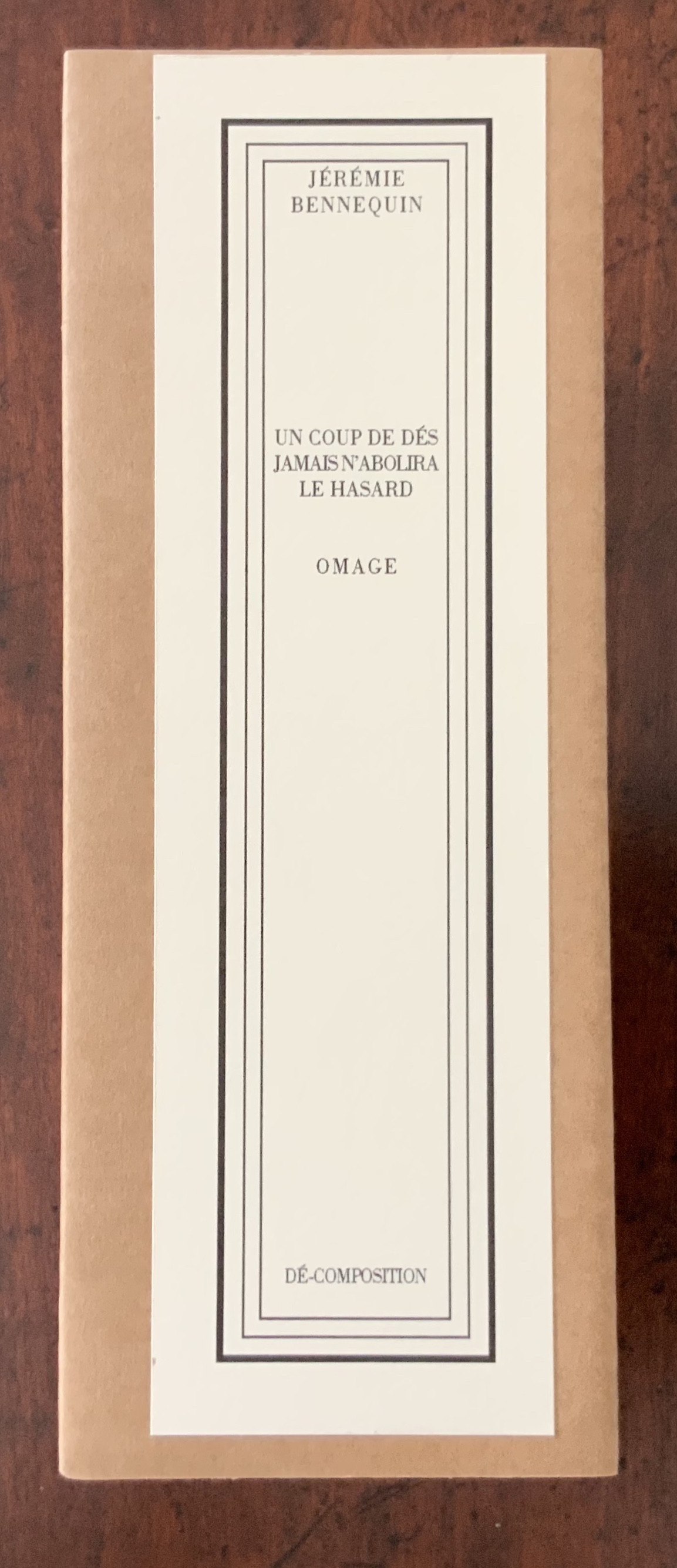
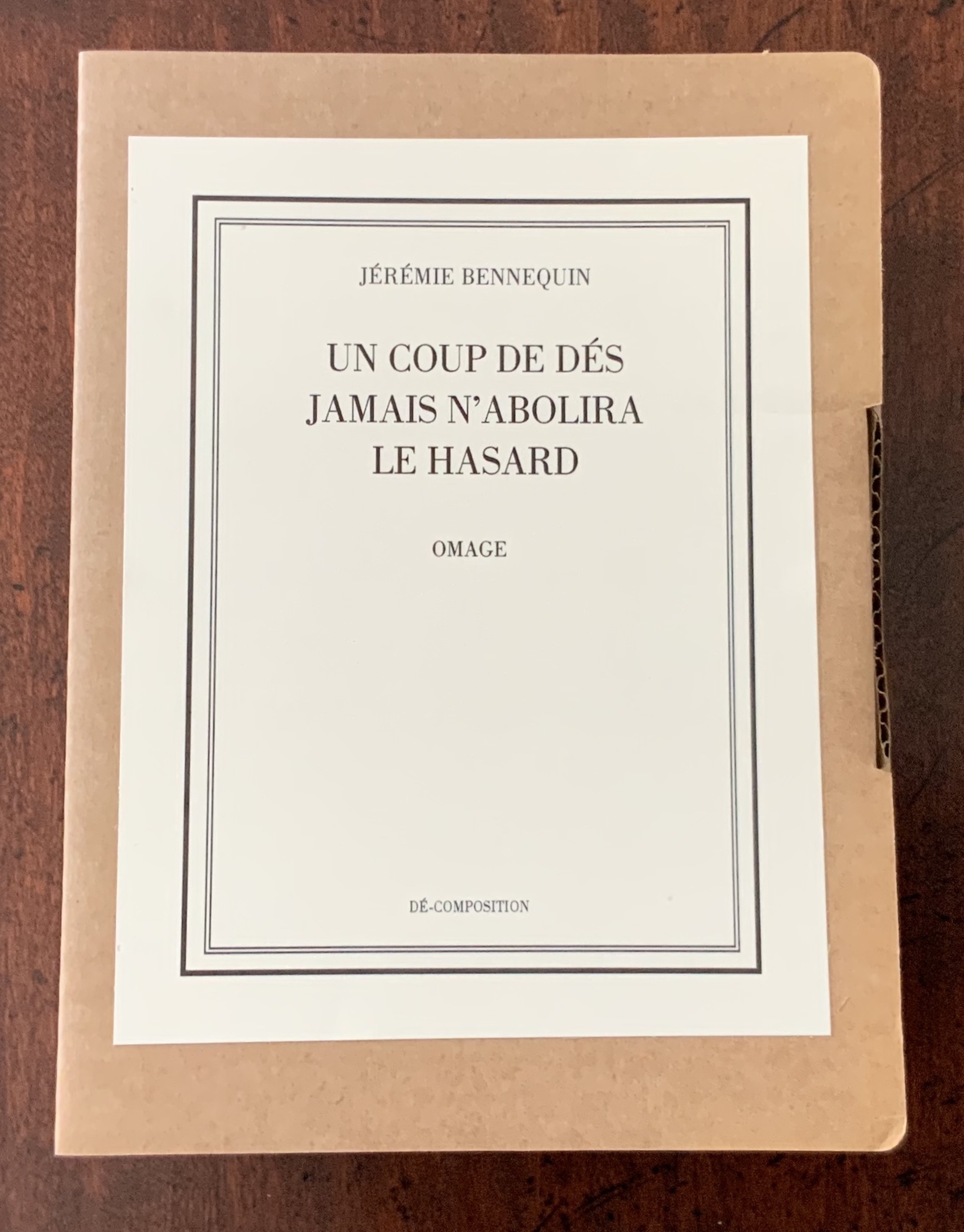
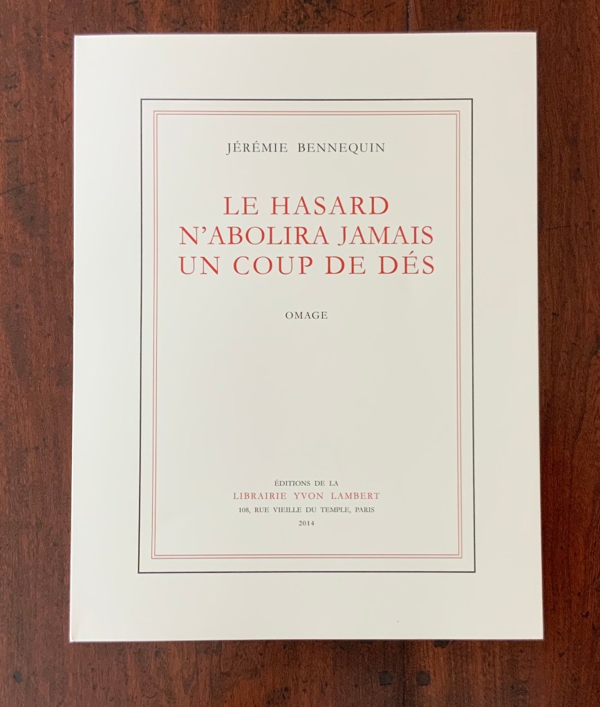
Le Hasard n’abolira jamais un Coup de Dés, Omage (2014)
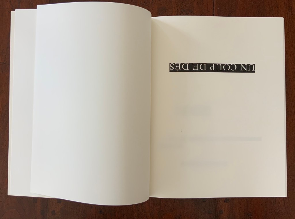
Le Hasardn’abolira jamais un Coup de Dés replicates in size, colour and appearance the 1914 edition Un Coup de Dés jamais n’abolira le Hasard. The main textual difference — the inversion of the title — announces the work as an homage to Mallarmé. But a smaller textual difference — the replacement of Poème with Omage — subtly announces another homage: to Broodthaers’ 1969 homage to Mallarmé. Broodthaers had replaced the word Poème on the 1914 edition’s cover with the word Image.
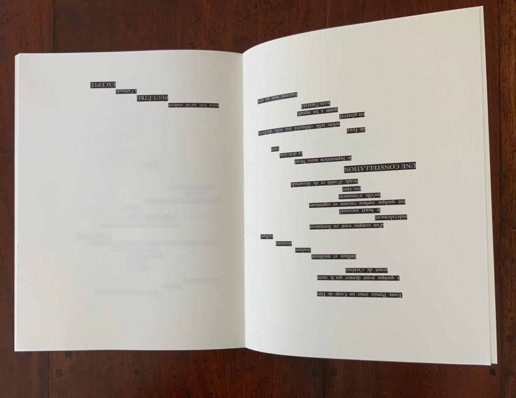
But it is Le Hasard‘s preface that unequivocally announces its homage to Broodthaers’ homage. Broodthaers had printed all the text of Un Coup de Dés as a “Préface” within a left- and right-justified block of text, and he omitted Mallarmé’s own preface. He then went on to blot out Mallarmé’s verses and their carefully placed typographical rendering with strips of black, shaped with equal care.
Bennequin returns the favour of Broodthaers’ transformative gestures at least twice over. Like Broodthaers’ opening block of text, Bennequin’s includes all the text of Mallarmé’s poem but renders it in phonetic symbols. Even the word Préface is replaced with [pRefas]. The square brackets in Bennequin’s block of text surround the verse units that Broodthaers went on to blot out. In further gestures of lèse-majesté to Broodthaers and Mallarmé, Bennequin adds his own explanatory “Note” in place of Mallarmé’s note, the one omitted by Broodthaers. Furthermore, signalling an inversion to come, Bennequin inverts the order of words in Broodthaers’ block of text. The last line of verse in Mallarmé’s poem and in Broodthaers’ block of text is “Toute Pensée émet un Coup de Dés” (All thought issues a throw of the dice). The first verse in Bennequin’s square of text is [tutpãseemɛœ̃kudəde].
The “inversion to come” lies in the subsequent pages where Bennequin inverts Mallarmé’s words and lets them peek out in white from behind Broodthaers’ black strips. He “un-erases” Broodthaers’ erasure. He uses white on black to re-emphasize the black on white abstraction created by Broodthaers. But that inversion is more than meets the eye.
In his preface to Dé-composition, Bennequin has already shown us an exact inversion of Mallarmé’s title: “Le hasard jamais n’abolira Un Coup de Dés”. Moving jamais to its grammatically correct position, Le Hasard’s inversion of the title is deft artistic lèse-majesté. It proclaims the bookwork as allusive to but distinct from Dé-composition and its preface — and distinct from the two targets of homage. As “omage” to Mallarmé, Le Hasard does not abolish Un Coup de Dés; it pulls it back from obliteration albeit by inversion. As “Omage” to Broodthaers, Le Hasard does not abolish the “Image”; it re-establishes the link between the black-imaged “musical” score and the sounds of the text — again albeit by inversion and also phonetic symbols.
Allusive, self-allusive, creative and subversive through inversion — Le Hasard is a new constellation born from that encounter with the twin stars preceding it.
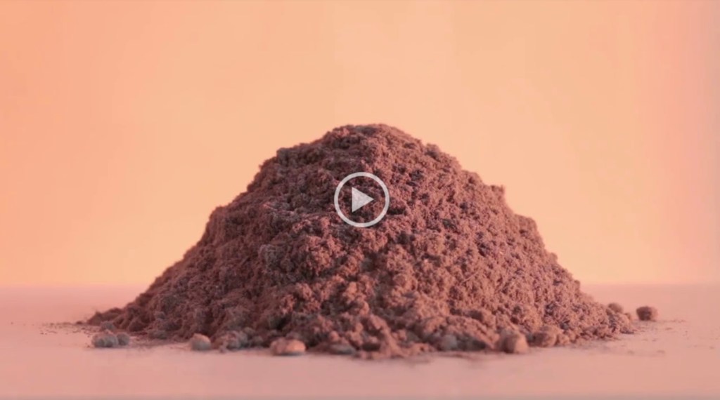
Sur un rêve de John Cage… les rayons roses d’un jour qui se lève colorent doucement un Mo(n)t de poussière… (2020)
Erasure is Bennequin’s paintbrush, sculpting tool and pen. Before his “omages” to Mallarmé and Broodthaers, Bennequin created “Ommage” (a play on gomme, the French for eraser) by rubbing out the words on each page of the seven volumes of Proust’s À la recherche du temps perdu. From this effort, he issues artist books in limited editions. But nothing goes to waste — not the eraser dust, not the worn erasers, not the activity, not even the sound.
Mo(n)ts et Tom(b)es is the display of small mountains of erased words (ink, paper and rubber) alongside the ruined tomes from which they came. Sur un rêve de John Cage … takes this work to another level. Bennequin has filmed a gradualpassage of light over one such small mountain of erased words and timed it to coincide with a performance of Cage’s Dream (1948). In its visual effect, it could also be an homage to Cézanne’s Mont Saint Victoire series or Monet’s paintings of Rouen Cathedral. In its fusion of light, sound, material and thought, it takes us from the whimsy of omage and ommage to meditation.
Le Hasard N’Abolira Jamais Un Coup de Dés(Changes of Music) (2020)
Le Hasard N’Abolira Jamais Un Coup de Dés(Changes of Music) (2020) Jérémie Bennequin Film (4 minutes, 33 seconds) recorded on USB drive, embedded in cloth-tape-bound foam boards. H210 x W150 mm. Edition of 6, of which this is #2. Photos: Books on Books Collection, displayed with permission of the artist.
The film records dice being thrown against the open pages of Bennequin’s 2014 OMAGE (see above). Continuing with his technique of homage within homage, Bennequin’s Le Hasard N’Abolira Jamais Un Coup de Dés(Changes of Music): Film) reverses John Cage’s 1951 Music of Changes not only in its title but also in its recorded notes. The object in the Books on Books Collection fixes all these reversals on a USB drive. The reader can view and listen to it here and compare the recording with Cage’s original here.
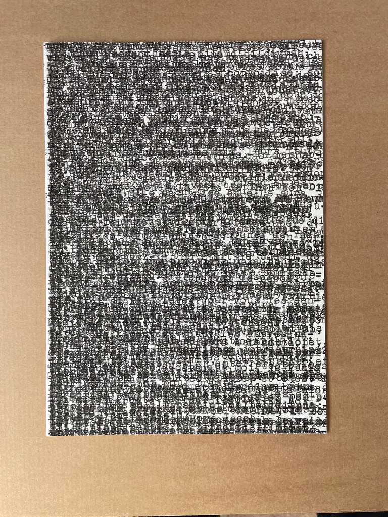
Descent (2020)
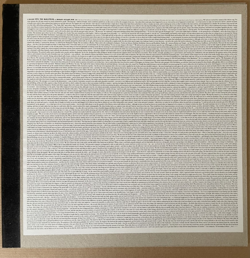
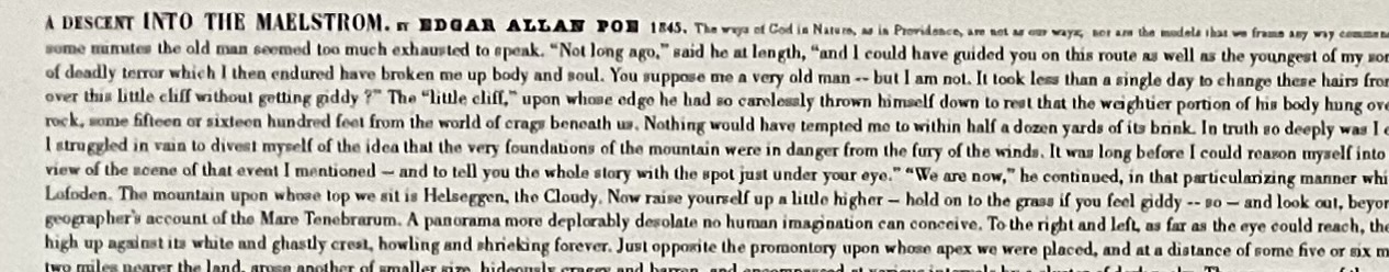
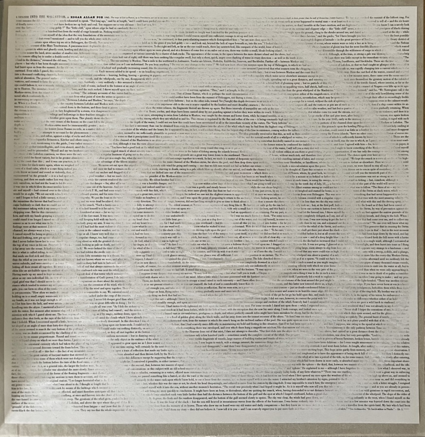
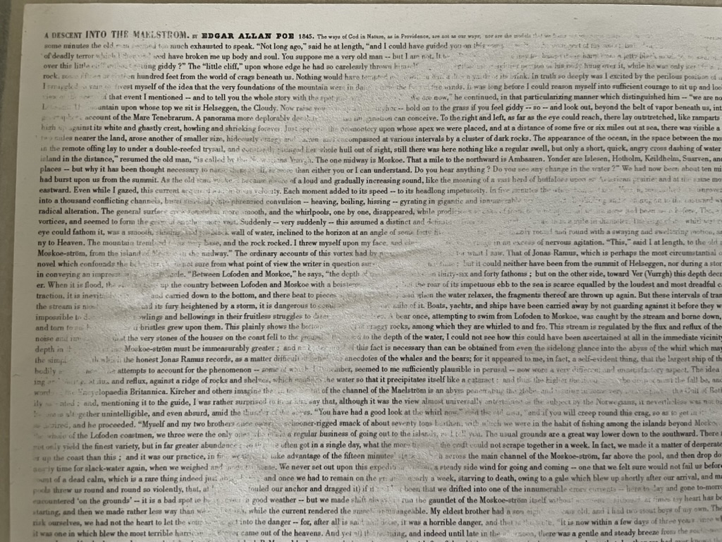
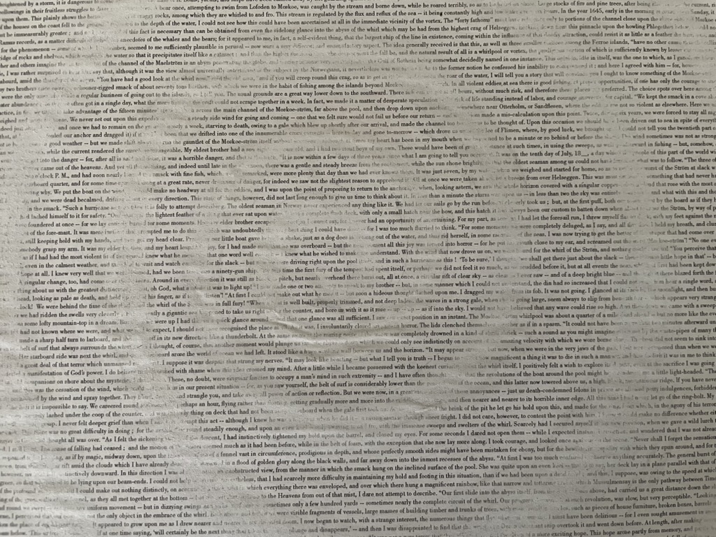
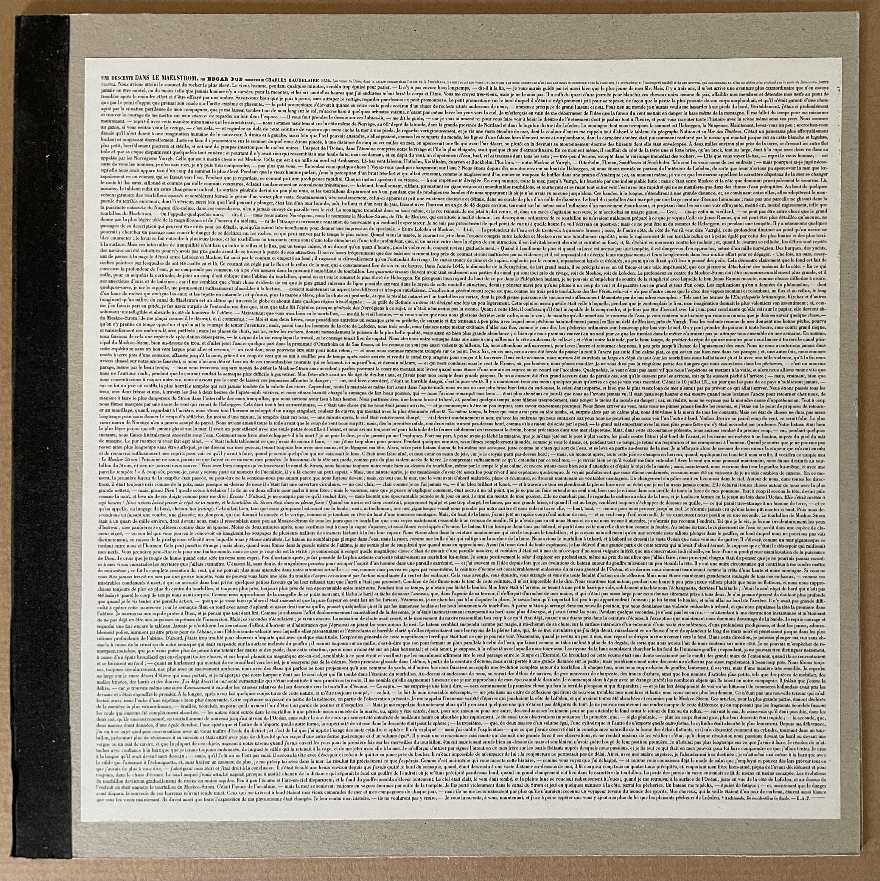
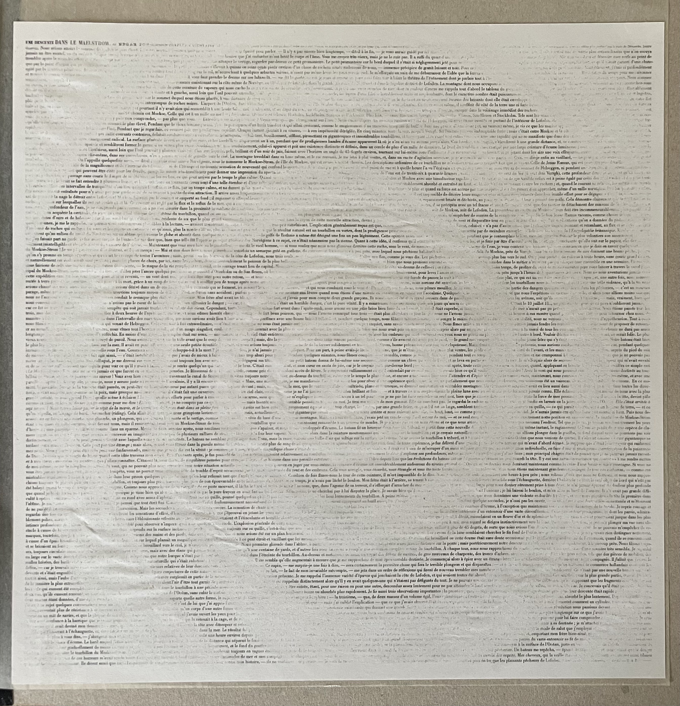
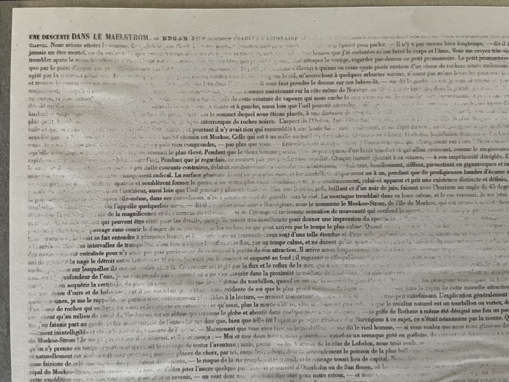
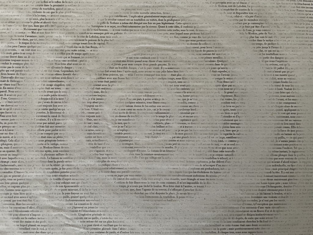
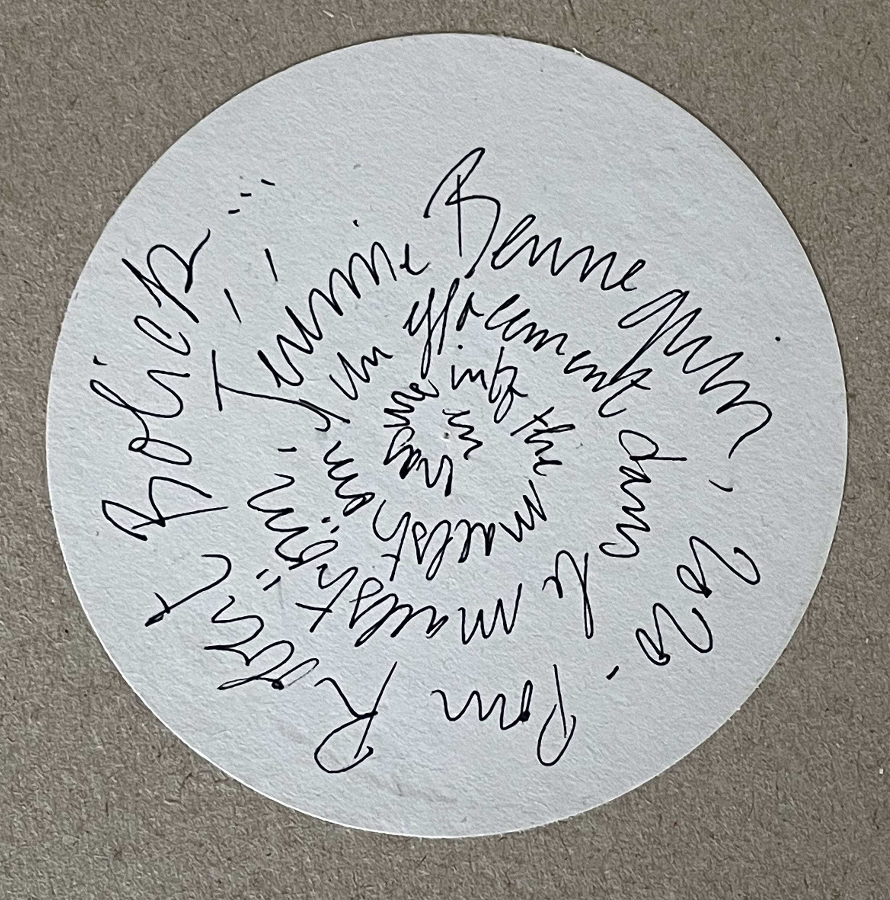
Descent 2021 Jérémie Bennequin (text by Edgar Allan Poe) Cardboard portfolio with pastedown prints on both covers, enclosing a double-sided print with spiraling erasure. Portfolio: 330 x 330 mm. Prints: H300 x W295 mm. Acquired from Jérémie Bennequin, 1 May 2021. Photos: Books On Books Collection.
As early as 1988, the idea of reprinting an entire literary work onto a single sheet and silhouetting some relevant art found its way into commercial posters with the One Page Book Company, then Spineless Classics and, later, Litographs. No surprise then that the innovative journal Inscription chose to include an oversized poster version of Bennequin’s fine print in its inaugural 2020 issue. Bennequin’s treatment of Edgar Allan Poe’s short story “A Descent into the Maelstrom” is an oblique homage to Mallarmé, who would have found Poe’s vertiginous tale of an abyss resonant with the images that appear in Un Coup de Dés.
Erased English side of the print.
Beginning the descent into the erasure.
The center of the abyss or maelstrom.
The French side of the print.
Exhibition Catalogues
Further Reading
“Inscription 1“. 15 October 2020. Books On Books Collection.
Bennequin, Jérémie. “Lecture”. Leeds Beckett University, 25 February 2016. Accessed 10 April 2020.
Briers, David. “Reading as Art”, Art Monthly, October 2016, pp. 25-26.
Mœglin-Delcroix, Anne. “De l’appropriation artistique d’œuvres littéraires dans le livre d’artiste: entre destruction et incorporation” in Annette Gilbert (ed.), Wiederaufgelegt. Zur Appropriation von Texten und Büchern in Büchern (Bielefeld : transcript, 2012) p. 233-264).
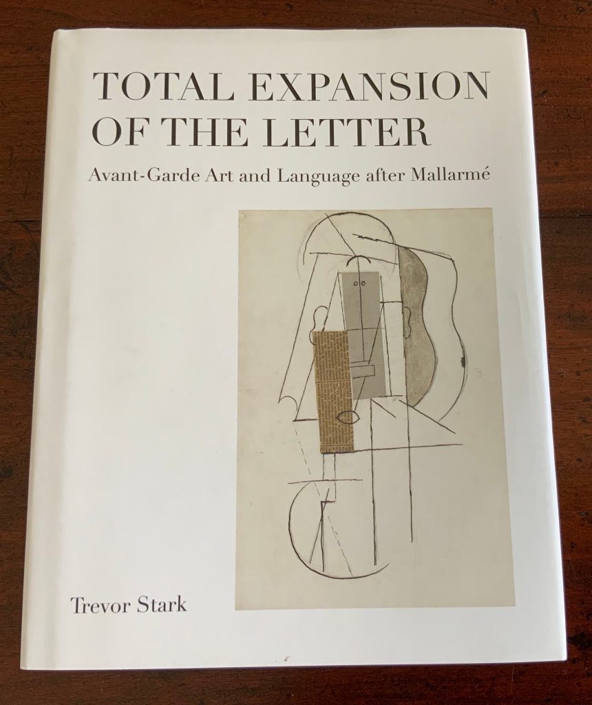
The 125th anniversary of the publication of Stéphane Mallarmé’s Un Coup de DésJamais N’Abolira le Hasard (1897) approaches, and Trevor Stark’s book is a welcome harbinger. Its title comes from Mallarmé’s essay/poem “The Book, Intellectual Instrument”:
The book, total expansion of the letter, should derive from it directly a spacious mobility, and by correspondences institute a play of elements that confirms the fiction (p. 6).
Often with Mallarmé, context is all (not to mention translation in the face of elliptical syntax!) — context is wrapped in self-enshrouded context. His seemingly cryptic sentence above becomes clearer only when the precedent to the word “it” (elle) is understood as la composition typographique from the essay/poem’s preceding paragraph, extolling the alphabet, language and typography.
Un miracle prime ce bienfait, au sens haut ou les mots, originellement, se réduisent à l’emploi, doué d’infinité jusqu’à sacrer une langue, des quelque vingt lettres — leur devenir, tout y rentre pour tantôt sourdre, principe — approchant d’un rite la composition typographique. (my emphasis)
So, the sentence is a proscription for what “the book” should get from typographic composition. Metaphorically (fictionally), the book is a total expansion of the typeset letter, or mark. As such, it should derive from the “near rite of typographic composition” a spaciousness and mobility and a play among elements that confirms the metaphor that it is a “total expansion of the letter”. Still a bit cryptic, but after all, this is what Mallarmé calls a “critical poem”, and the sentence is hardly more cryptic than the opening pronouncement: “everything in the world exists to end up in a book”.
It is a good choice of title for Stark’s endeavor. “Total expansion of the letter” juggles Mallarmé’s “heroic” vision for the book with the material world of metal type, idea with ink, the sacred with the profane. In painting, sculpture, music, dance, theater and film, the avant-gardists certainly brought together intellectuality and physicality forcefully. Stark shows that, in doing so, they also consciously and unconsciously raided Mallarmé’s open larder of skepticism about language and communication. The letter (or any mark of signifying, for that matter), scraps of newspaper, musical scores, dance notation, dresses and costumes (or lack thereof), wanted posters, financial bonds, and much more became ready objects for avant-garde art but only on the condition of their “becoming dysfunctional and incommunicative” (p. 7). Stark wants to know why.
Mallarmé’s skepticism about language and communication is Stark’s touchstone throughout: that language has an “ineradicable degree of chance built into” it; that there is inherently a suspension — a temporal gap, blank, void, lacuna, an “unfinished” state — between the sign’s expressed materiality and its meaning; and that, therefore, every act of communication as a historical and aesthetic phenomenon is like an anonymous, “impersonified” throw of the dice, “tossed into eternal circumstances’” (p.29). Applying that touchstone, he crosses the borders insightfully time and again “between the nineteenth and twentieth centuries, between dance, music, and letters, and between art history, the philosophy of language, politics, and poetics” (p. 30). Never reductive, he explores the continuities and variations between Mallarmé’s achievements and those of Paul Cezanne, Pablo Picasso, Georges Braque, Francis Picabia, Tristan Tzara, Hugo Ball, F.T. Marinetti, Marcel Duchamp, the Laban school of dance and others of the avant-garde. As he offers a reciprocal interpretation of Mallarmé and of avant-garde art, individual poems, paintings, collages, performances of dance and theater yield new clarities and sharpened expression of received assessments.
Consider Stark’s comparative reading/viewing of Mallarmé’s “Sonnet en X” (1887) and Picasso’s The Dressing Table (1910). Across eight pages of text and photographs of art, Stark helps the reader to follow Mallarmé’s “quest for a word that literally means nothing, ptyx, a word produced by the frolic of language”, a signifier that “attains a materiality and an opacity, allowing the poem to display a linguistic Void, to raise it from the latent to the patent.” The materiality to which Stark draws our attention is twofold: the bright rhymes (-yx, -ix, -ixe) that almost single-handedly drive the invention of the word ptyx and the mirror on the credenza in the poem that captures the empty room, its window and the constellation Ursa Major showing through it. Across the same pages, Stark conducts the viewer through Picasso’s painting — again a mirror, the surface of a dressing table, the drawer from which a key protrudes, a drawer handle, a glass with the long handle of a toothbrush and its bristles poking out, but all scattered into planes of reflection and refraction, their shapes “mutually implicated to the point of structural ambiguity”. Then, he draws them together: “In Mallarmé and Picasso, representation destroyed the object in order to proclaim its own mute materiality and, thereby, regain continuity with the world by becoming simply one more thing within it”(pp. 101-108).
In pursuing these reciprocal readings of Mallarmé and his avant-garde descendants, Stark keeps a bright light on the “between” — between an object and its reflection, between a word’s or sound’s utterance and its meaning, the blanks between words, the blanks between brushstrokes or those between them and the boundary of the painting, between the cosmic and domestic, between one media and another when brought together in a work, between the individualism of subjective imagination and impersonal modes of production, between author/artist and word/image and reader/viewer. His term for these spaces is intermedial. In her endorsement of Stark’s book, Julia Robinson (New York University) calls his neologism “luminous”. The term refers to “the zone of indeterminacy between mediums, social practices, and temporalities” into which Mallarmé found himself outwardly propelled even as he inwardly sought “absolute language”.
Looking back on the avant-gardists and his own contemporaries, Dick Higgins — the late twentieth century language-, book-, and publishing-artist — rejuvenated Samuel Taylor Coleridge’s term intermediation, a neologism similar and related to intermedial. It is not the same thing as intermediality or mixed media. As Higgins expressed it, “Many fine works are being done in mixed media: paintings which incorporate poems within their visual fields, for instance. But one knows which is which. In intermedia, on the other hand, the visual element (painting) is fused conceptually with the words” (p. 52). It can be argued that works of intermedia are one way in which artists address intermediality — that zone of indeterminacy.
The argument is ultimately a phenomenological one, a perspective that Stark embraces. When he applies the ideas of Edmund Husserl, Martin Heidegger, Maurice Merleau-Ponty, Theodor Adorno, Maurice Blanchot and others to Mallarmé’s poems and the artistic expressions of his “descendants”, both the philosophers and the artists become more accessible. Consider this passage summarizing Maurice Blanchot’s account of the history and function of language and its four stages:
The first was that of an Adamic or nomenclaturist model of language, which conceived words as names for the objects of the world. The second, dominant from Plato to Descartes, was the idealist model in which language constituted the link between sensible reality and the eternal realm of the Idea, and thus the guarantee of our ‘entrance into the intelligible world.’ [fn 223] Third, the ‘expressionist model’ of Hegel and Leibniz considered language itself the embodiment of what is sayable, thinkable, and possible at any given historical juncture, serving, therefore, as the medium of the progress of Spirit. Finally, illustrated with a quote from Valèry, the fourth stage was the ‘dialectical function of discourse,’ in which language regained an ‘essential power of constestation’ in the negativity of modern literature:
‘Literature seeks to revoke from language the properties that give linguistic signification, that make language appear as an affirmation of universality and intelligibility. But it doesn’t arrive at this goal (if it does arrive at this goal) by destroying language or through contempt of its rules. It wants to render language to what it believes to be its veritable destiny, which is to communicate silence through words and to express liberty through rules, which is to say to evoke language itself as destroyed by the circumstances that make it what it is.’ [fn 224] (pp. 110-11)
Clearly that passage links back to the touchstone of Mallarmé’s skepticism about language and communication. The strength of the touchstone is that it can also be fruitfully applied to the numerous works of homage to Mallarmé from contemporary book artists such as Jérémie Bennequin, Michael Maranda, Michalis Pichler, Eric Zboya and many others. Likewise it can used to shed light on the “material text” approach to understanding book art. A case in point is the first issue of Inscription: the Journal of Material Text – Theory, Practice, History, a work of book art in its own right.
Consider the hole drilled through the center of the journal. Does it not echo Stark’s reminder of Braque’s citing Mallarmé’s utterance: “‘The point of departure is the void'” (p. 88)? Consider the journal’s spatial challenge to the act of reading (a dos-à-dos binding, a text block that rotates around that hole). Does that not echo this passage from Total Expansion of the Letter?
But what remains after the ‘suspension’ of the represented object and the objectification of the means of representation? For Mallarmé, the ‘residuum’ was the act of reading itself, conceived not as a process of cognitive reconstruction, but instead as a gamble on the very possibility of forging meaning out of opacity and contingency of linguistic matter. As Mallarmé wrote in ‘The Mystery of Letters’
‘To read —
That practice —
To lean, according to the page, on the blank, whose innocence inaugurates it, forgetting even the title that would speak too loud: and when, in a hinge [brisure], the most minor and disseminated, chance is conquered word by word, unfailingly the blank returns, gratuitous earlier but certain now, concluding that there is nothing beyond it [rien au-delà] and authenticating the silence –‘” (pp. 108-109).
Not since Anna Sigrídur Arnar’s The Book as Instrument: Stéphane Mallarmé, the Artist’s Book and the Transformation of Print Culture (2011) has there been as useful a tool for appreciating Mallarmé, art and artist’s books as Trevor Stark’s Total Expansion of the Letter. On the eve of the 125th anniversary of Un Coup de Dés, it will be interesting to see whether Stark and others extend his work to art and book art after the avant-garde.
Higgins, Dick, and Hannah Higgins. “Intermedia“, republished in Leonardo, Volume 34, Number 1, February 2001, pp. 49-54.
McCombie, Elizabeth. Mallarmé and Debussy: Unheard Music, Unseen Text (Oxford: Oxford University Press, 2004). It would have been interesting to see how Stark would relate his exploration with McCombie’s exploration of Mallarmé’s views on poetry and music.