Books On Books Collection – Inscription: The Journal of Material Text, Issue 6 (Tears)

Inscription: The Journal of Material Text, Issue 6 (2026)
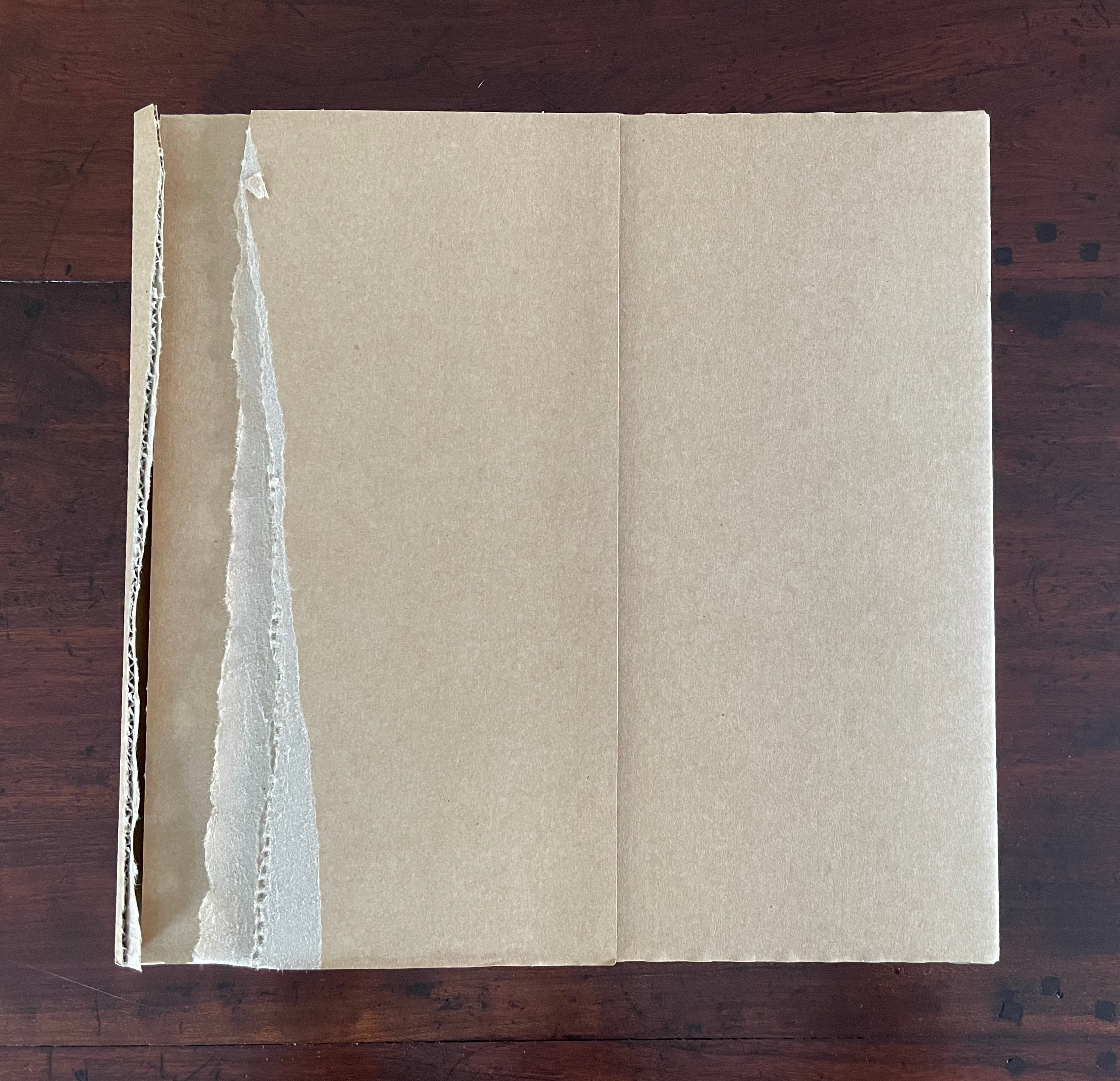
An open cardboard box with one side slightly torn, resting on a wooden surface.

The first tear.

Front and back covers: from Abigail Reynolds’ Universal Now series, collages of time and space. Photos: Books On Books Collection.

Inscription: The Journal of Material Text, Issue 6 (2026)
Simon Morris, Gill Partington and Adam Smyth (eds.)
Cased perfect bound paperback, printed paper cover. 313 x 313 mm. 168 pages. ISSN: 2634-7210. Acquired from Information as Material, 22 June 2026.
Photos: Books On Books Collection.

Book art always pushes at the edges. Whatever meets at the edges is book art’s business. Negative space and positive space. Letter stroke and counter. Margins and the gutter. Justified and unjustified. Legible and illegible. Bound and unbound. Art and craft. Unique and multiple. Self and other. Destruction and creation. Life and death.

Inscription 6 is about cuts and tears, mostly tears — creating edges. “Tears” is also a heteronym, a word whose meaning changes with the change of the sound of the vowel but whose spelling remains the same. We can have tears [/tɛ(ə)rz/ tairz] as in “torn parts or places, or rips asunder”. Or we can have tears [/tɪ(ə)rz/] as in “teardrops, or weeps”. Or, with art, we might paradoxically have both simultaneously as we shall see in this issue’s first contributed essay. Also, with art, we might find that tearing — creating edges — paradoxically binds what it divides.

But first, as subscribers have come to expect, Inscription 6 opens with a surprise. Buzz Spector invites us to join in his artistic practice of tearing things up.
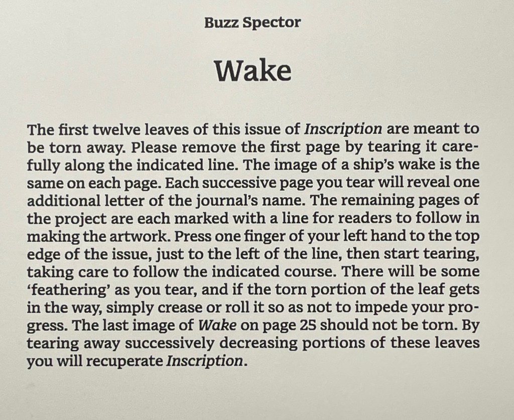
Instructions for tearing away the first twelve leaves of the journal 'Inscription,' emphasizing the image of a ship's wake and the process of revealing letters in the journal's name.

The artist says that he is asked all the time how he stands the tedium, to which he replies it is a meditative state he is sorry to see end. He is right. Once the initial unease over tearing pages from the issue subsides, a certain satisfaction ensues.
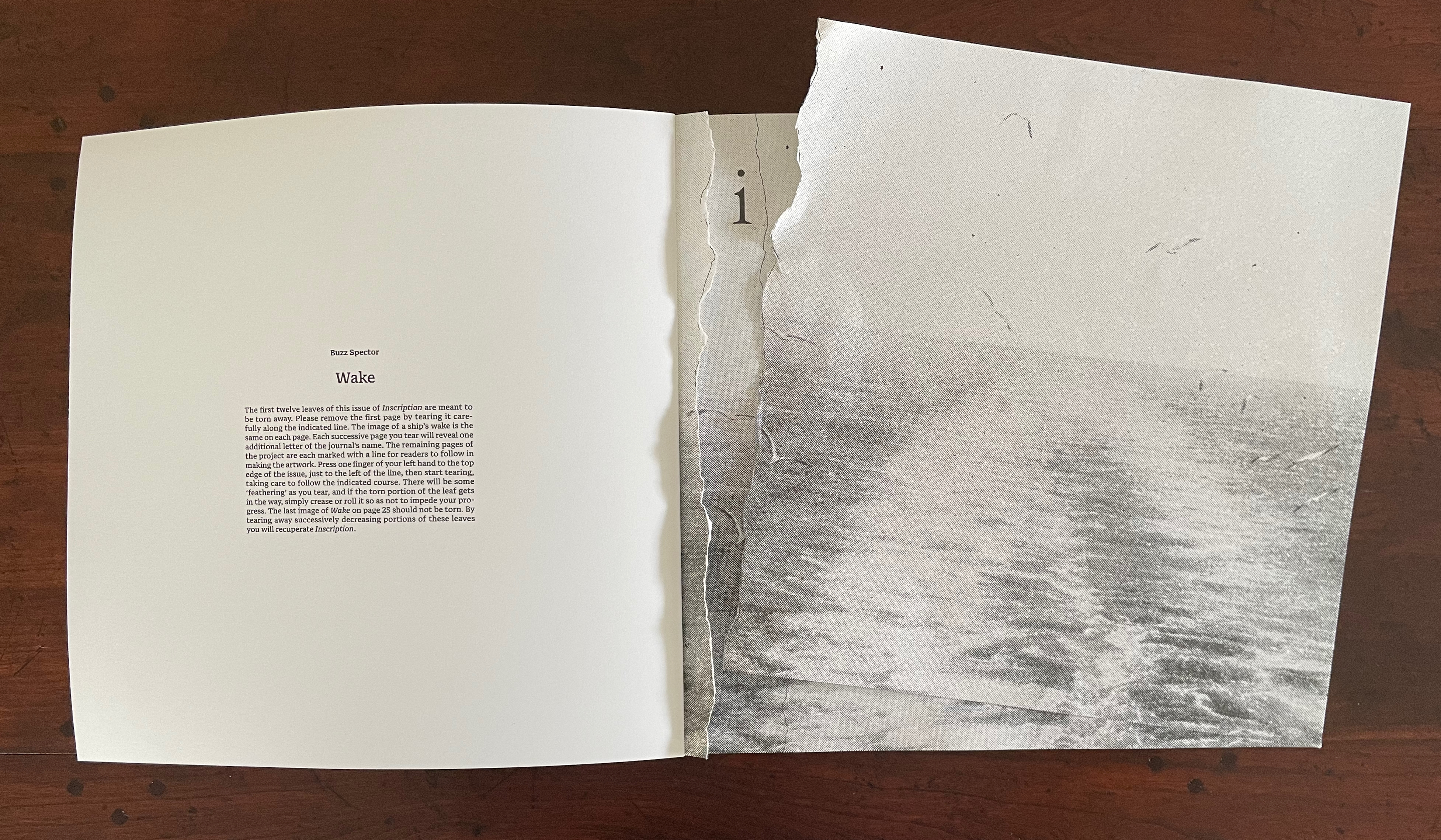
An open book featuring a page titled 'Wake' by Buzz Spector, with a partially torn edge revealing a black and white image of water. The left page includes explanatory text about the book's design.

The “second” tear. (See further above for the first.)

The result is the wake’s image restored in a composition of torn strips still bound to the book.
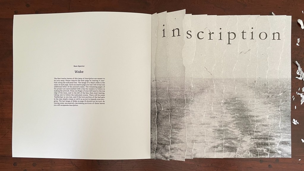
An open book spread with a faded image of water on one page and text titled 'Wake' by Buzz Specter on the opposite page.

Rather than surrendering themselves to the bin, the removed strips beg to be reassembled for a wake on the other side of the gutter in keeping with the creative productivity of turning the singular into the plural.
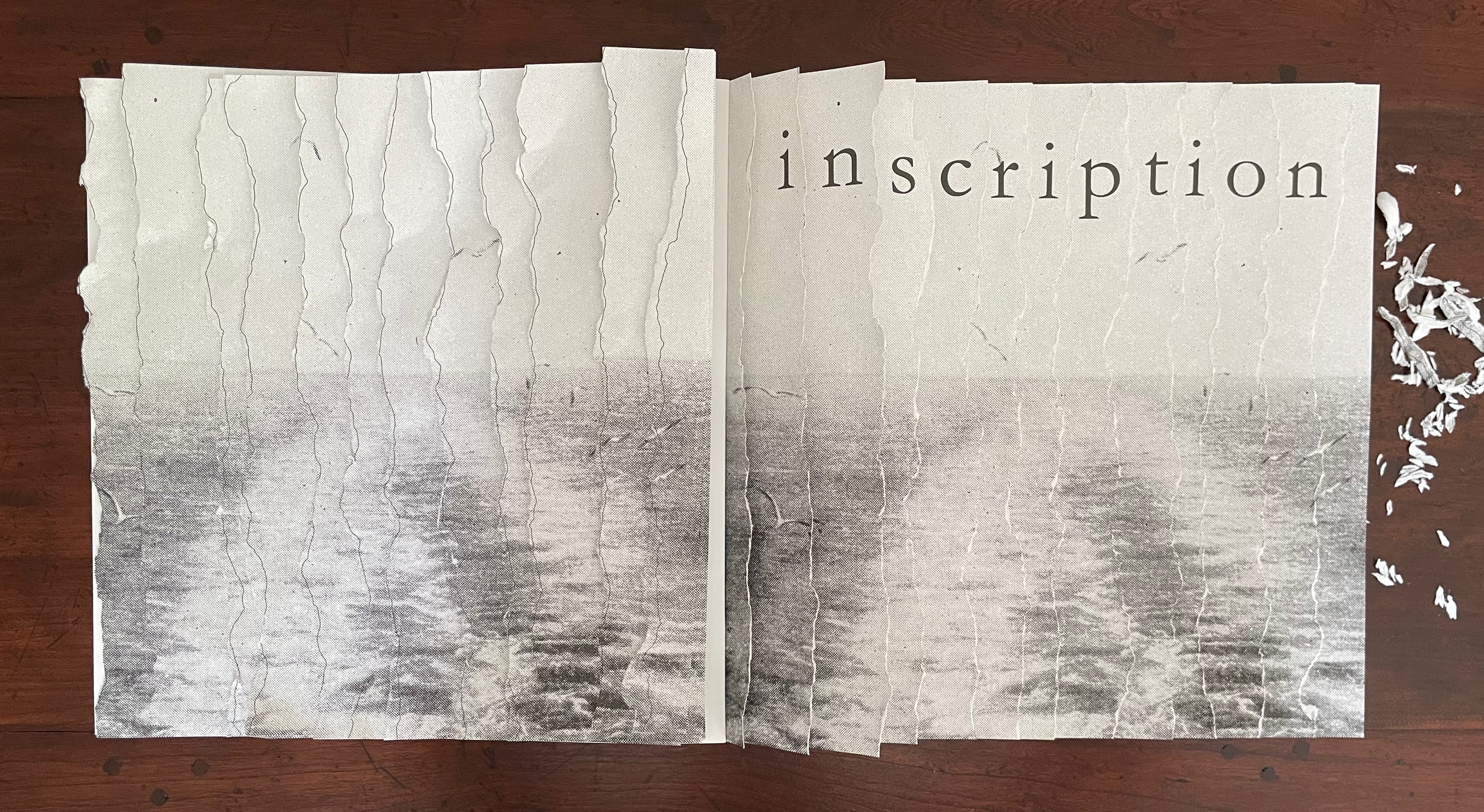
An open book with a textured, faded image of water on the pages, featuring the word 'inscription' elegantly displayed across the top.

Left: the Spector-esque result. Right: the removed strips rearranged.

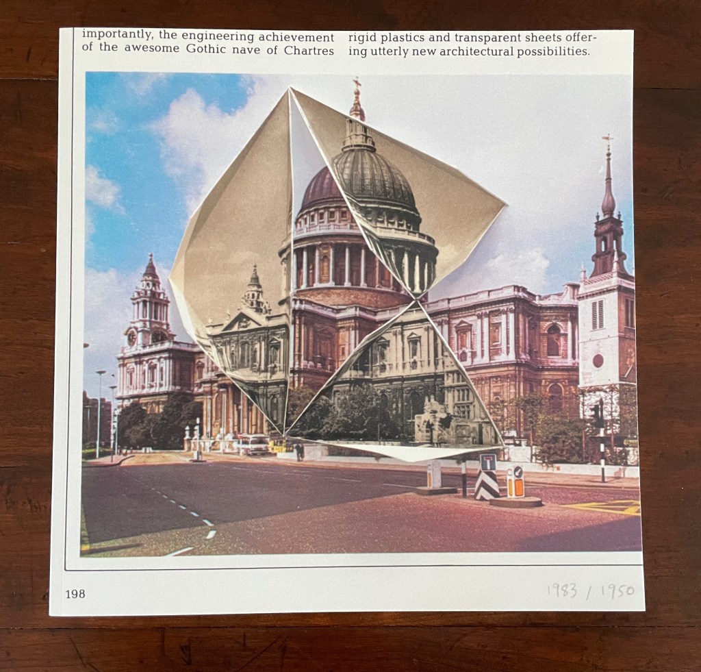
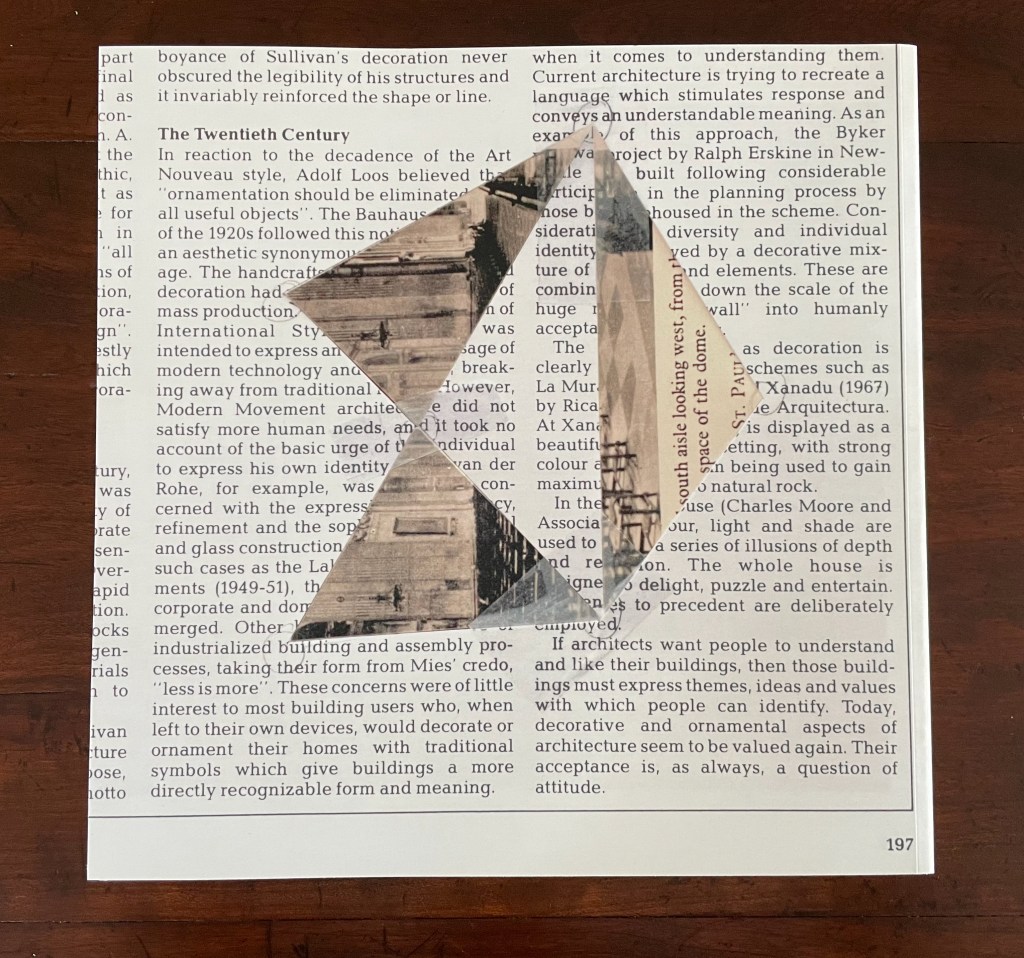
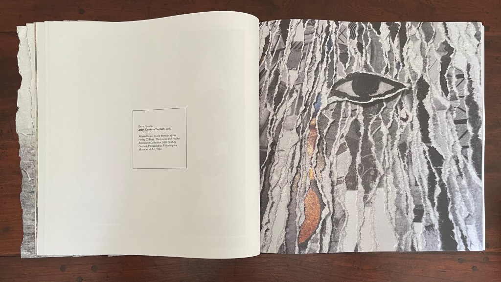
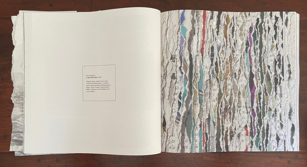
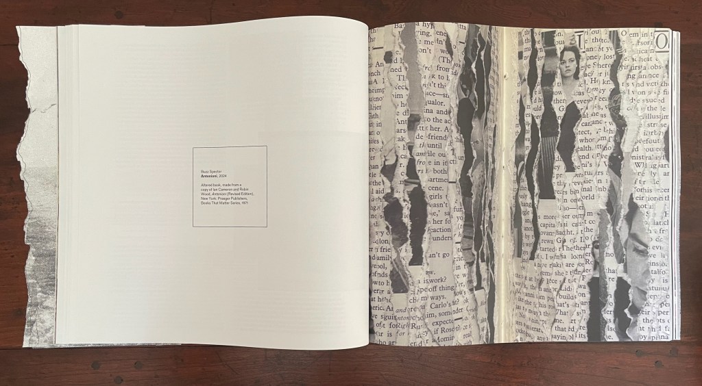
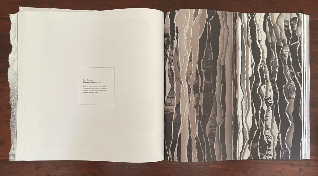
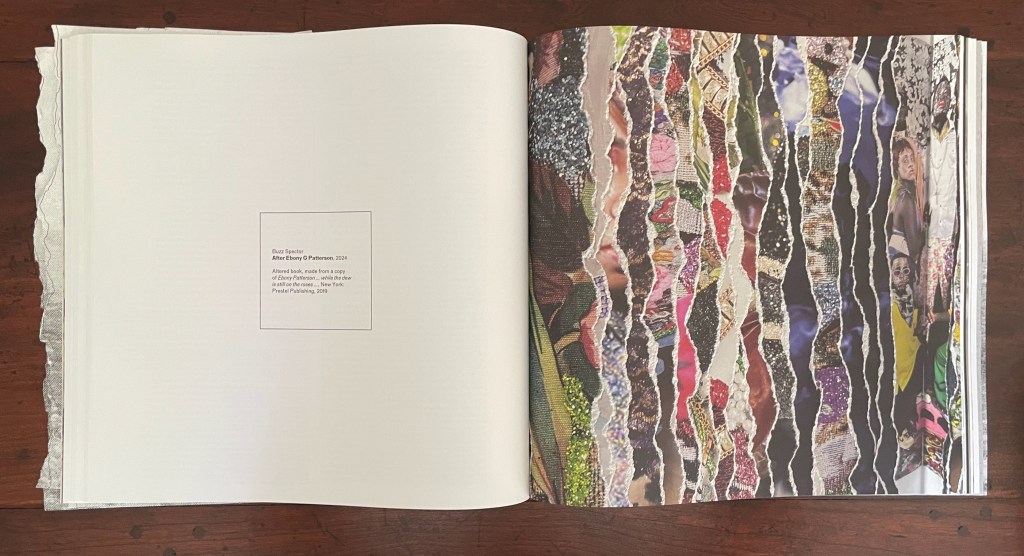
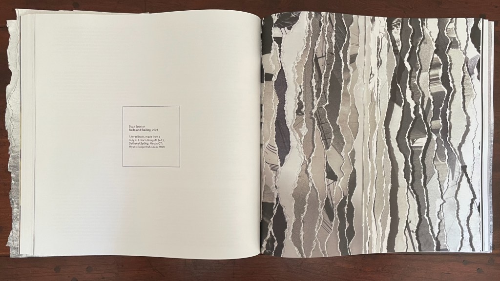
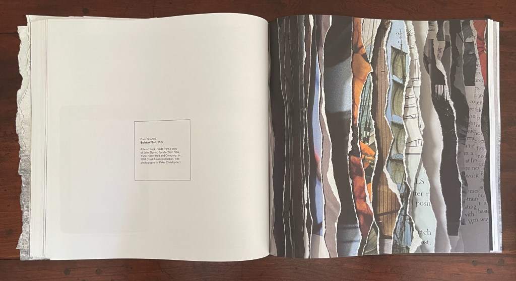
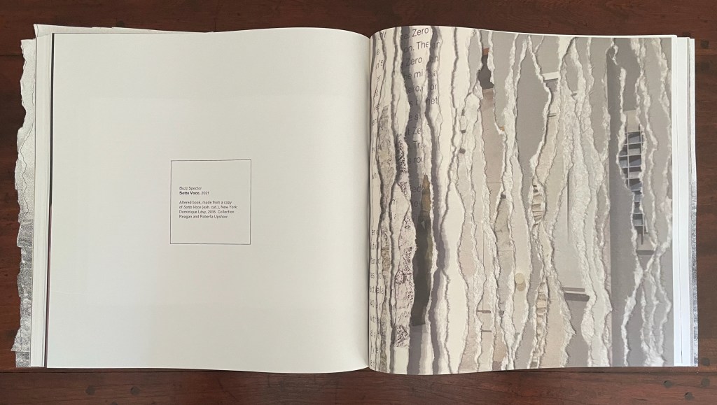
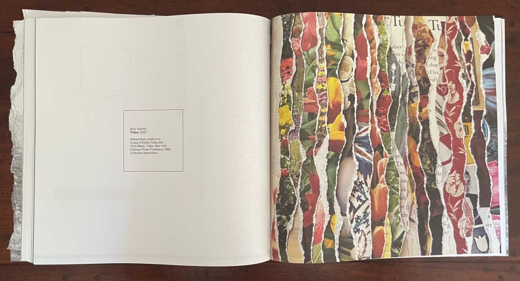
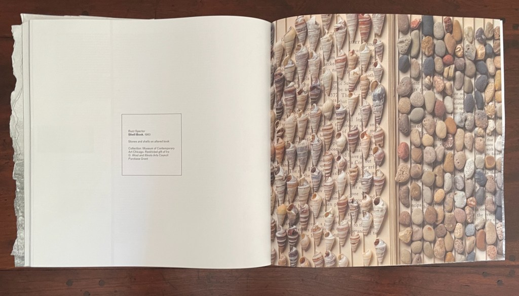
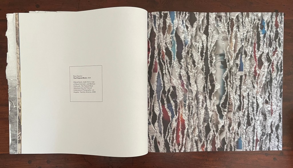
Buzz Spector is the star of this issue. Images from fourteen of his works divide the main sections and each contribution from one another. Works of torn edges create edges or boundaries between the issue’s contents. A stroke of genius from the issue’s editorial and design team. The range of Spector’s sources also draws attention to other boundaries inherent in the body of his work and the issue’s theme: the border between high and low in art, East and West, and Art and Nature. After the 12-page exercise, we have the altered Chinese translation of the self-help book Ego is the Enemy by Ryan Holiday; before the colophon, we have an array of shells and stones on an unidentified altered book, a sculpture held in the Museum of Contemporary Art Chicago. In between, there are alterations of catalogues of Ansel Adams’ photos and the Polaroid Collection, an academic study of Antonioni’s films, a foundational Italian volume on ancient and Renaissance glassmaking, a gardening book, and sailing photobooks.

Open altered book titled 'Ego' by Buzz Spector, showcasing crumpled pages with Chinese text on the right and a blank left page with publication details.
A spread from an art book featuring a collection of sea shells on the left and various smooth stones on the right, with text seeping in between, highlighting a unique artistic display.

The altered sailing photobooks recall Spector’s North Sea (for M.B.) (1990), his homage to Marcel Broodthaers’ A Voyage on the North Sea (1974) in which Broodthaers juxtaposes a 19th century amateur painting of a tall-masted ship with his own photographs of a sailing ship. Tellingly for this issue of Inscription as well as the thrust of Spector’s homage, Broodthaers opens A Voyage with an elaborate warning not to cut the uncut pages of the book.
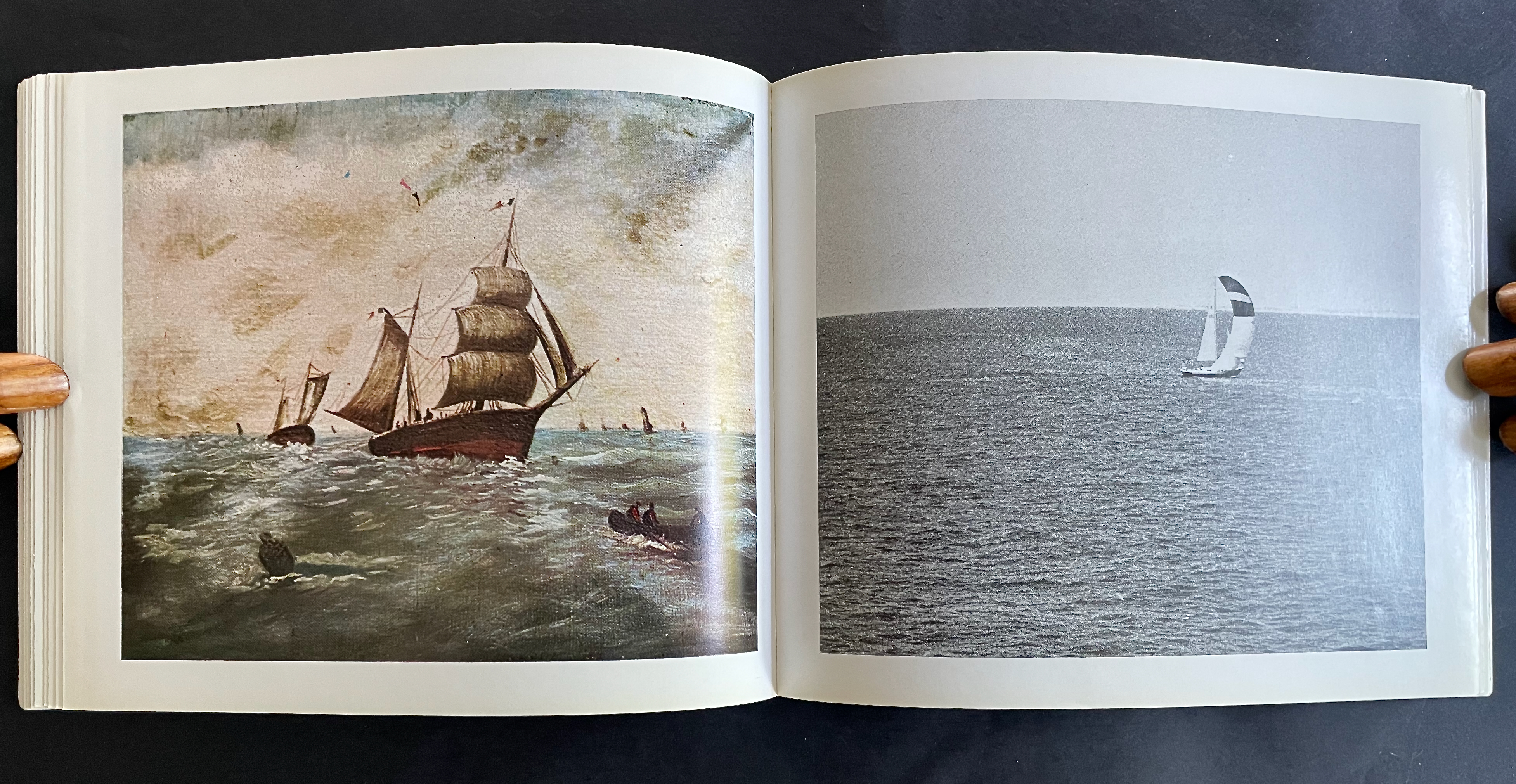
From A Voyage on the North Sea (1974) by Marcel Broodthaers. Photos: Books On Books Collection.

Spector’s homage is a work 10 feet long and presented on a table appropriately jutting out from the wall like a pier. The eleven “waves” of torn pages placed in a row on top of the steel shelf come from eleven copies of the Walker Art Center’s 1987 catalogue for Broodthaers’s first U.S. retrospective. Spector had all the pages in each copy painted with white gesso before tearing the pages. He saved the excised “wedges” and bound them at the fore edges. Because the gesso does not completely obscure the text and images from the catalogues, viewers who come close to the work can see slivers of some of Broodthaers’ works along with the word fragments typical of Spector’s altered books.
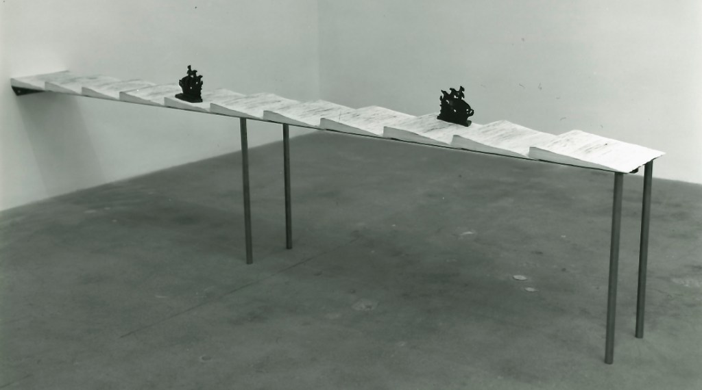
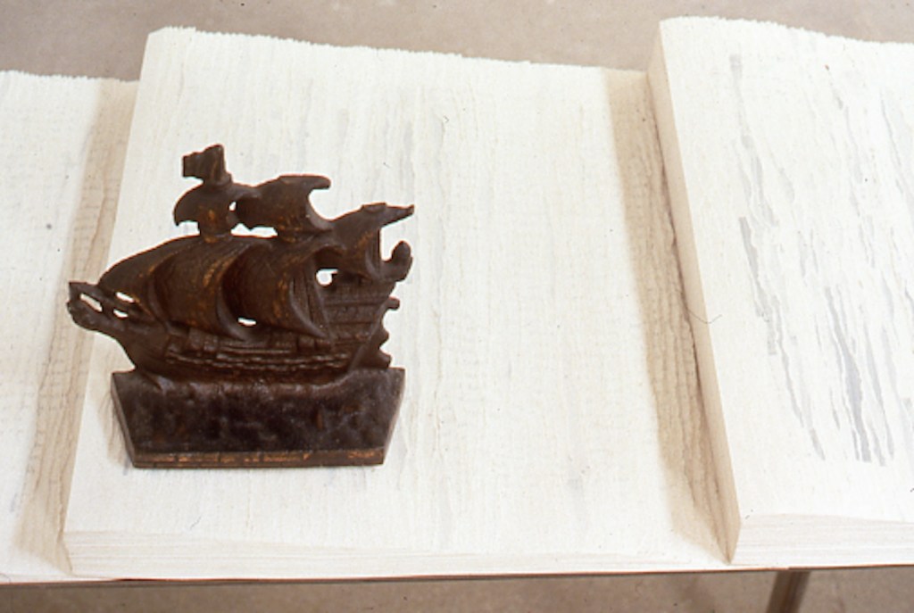
North Sea (for M.B.) (1990) by Buzz Spector

The echoes of Spector’s appropriation from the great appropriator (recall Broodthaers’ 1969 appropriation of Mallarmé’s poem in Image: Un Coup de Dés Jamais N’Abolira le Hasard) bring another set of boundaries into view: the space between originality and appropriation and the space between the auratic artwork and its mechanical reproduction raised in Walter Benjamin’s The Work of Art in the Age of Mechanical Reproduction (1936).

Across its 10 sections and 11 loose inserts, the sixth issue of Inscription takes the lead from Spector’s works and explores all these binaries and the cut or torn edges between them. As usual with Inscription, it isn’t all book art. There are prints, a vinyl record, bookmarks, postcards, installations, libraries, typography, a syllabary, and even moth-repellent cedarwood blocks, and its sources range from the London Missionary Society hospitals in early 20th century China, to an installation of Leonard and Virginia Woolf’s library shelves (at Washingon State University of all places), and to J.L. Carr’s home in Kettering. The eclecticism is a challenge to coherence as much as the number of contributors is a challenge to adherence to the theme. Complete success would be an issue that is an artwork of collage in itself.

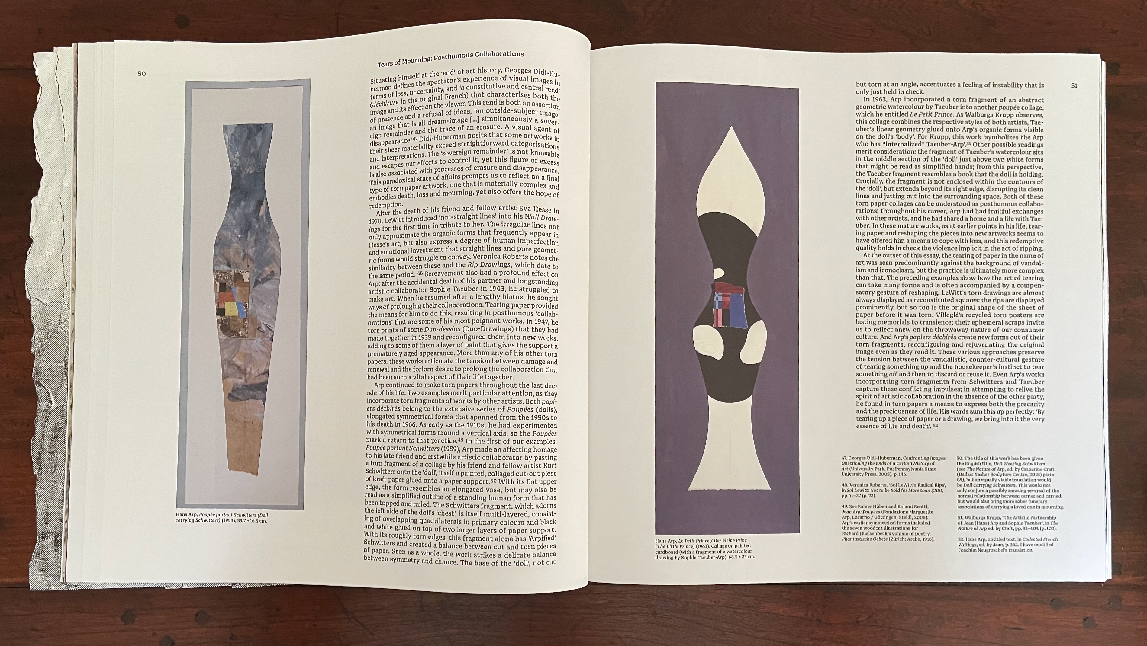
Collage is naturally where the first contributor’s article begins. “What does it mean to make art out of torn-up paper?” Eric Robertson uses Hans (Jean) Arp’s déchirés (torn pages), Raymon Hains’ and Jacques Villeglé’s torn posters, and Sol Lewitt’s “rip drawings” to take us beyond categorizing such works as vandalism, desecration, or iconoclasm.
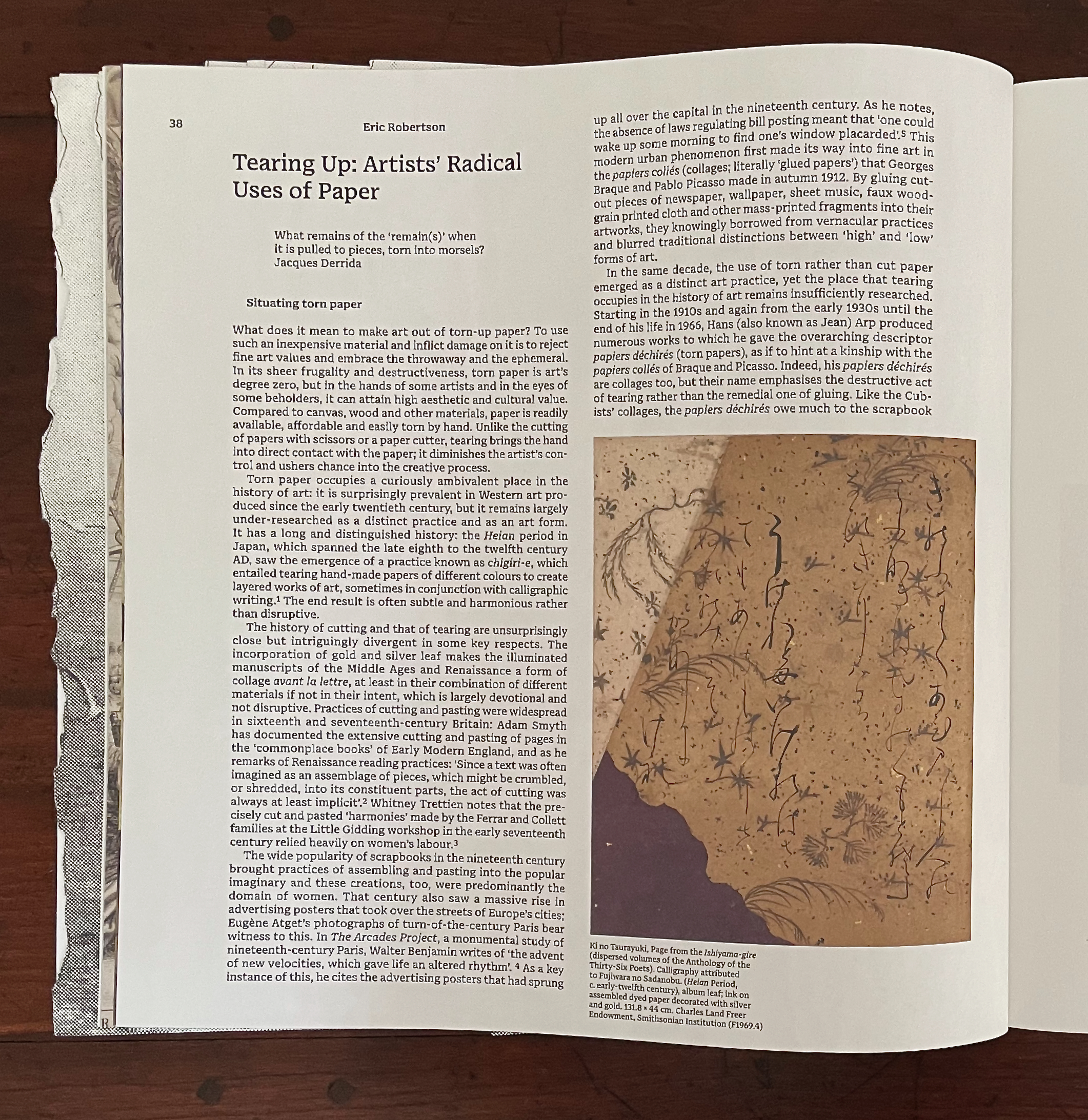
An open book page featuring an article titled 'Tearing Up: Artists' Radical Uses of Paper' by Eric Robertson. The left side contains text discussing the use of torn paper in art, while the right side features an image of an artwork with intricate calligraphy and designs on aged paper, highlighting the aesthetic of torn paper.
An open book page featuring two artistic works by Hans Arp, one resembling a slender figure with a geometric pattern and the other an abstract, torn form. Surrounding text discusses themes of loss and artistic collaboration in relation to the pieces.

By discussing Arp’s posthumous collaborations with friend Kurt Schwitters and partner Sophie Taeuber under the heading “Tears of Mourning”, Robertson bridges the dual meanings of the heteronym and well prepares the ground for his moving quotation of Arp in conclusion: “By tearing up a piece of paper or a drawing, we bring into it the very essence of life and death”.

YuHao Chen‘s “Table of Phonetic Wounds” aims to make metaphorical connections among a host of pairings: surgical incision/skin, site of operation/cause for operation, the initial/final phoneme structure from the Wang-Peill Mandarin Syllabary, Western colonial intervention/China-the-sick-man-0f Asia, literacy/illiteracy, non-Christian/Christian, etc. Successful surgery equals achievement of literacy, healing equals conversion, etc., by which we should be convinced of causality (or not).

The justification running through the center of the article’s paragraphs offers a visual metaphor for all these binaries. Even the gap between the initial and final phonemes in the Mandarin Syllabary recalls the gap between the consonants of “tears”. It is a space in which something meaningful happens.
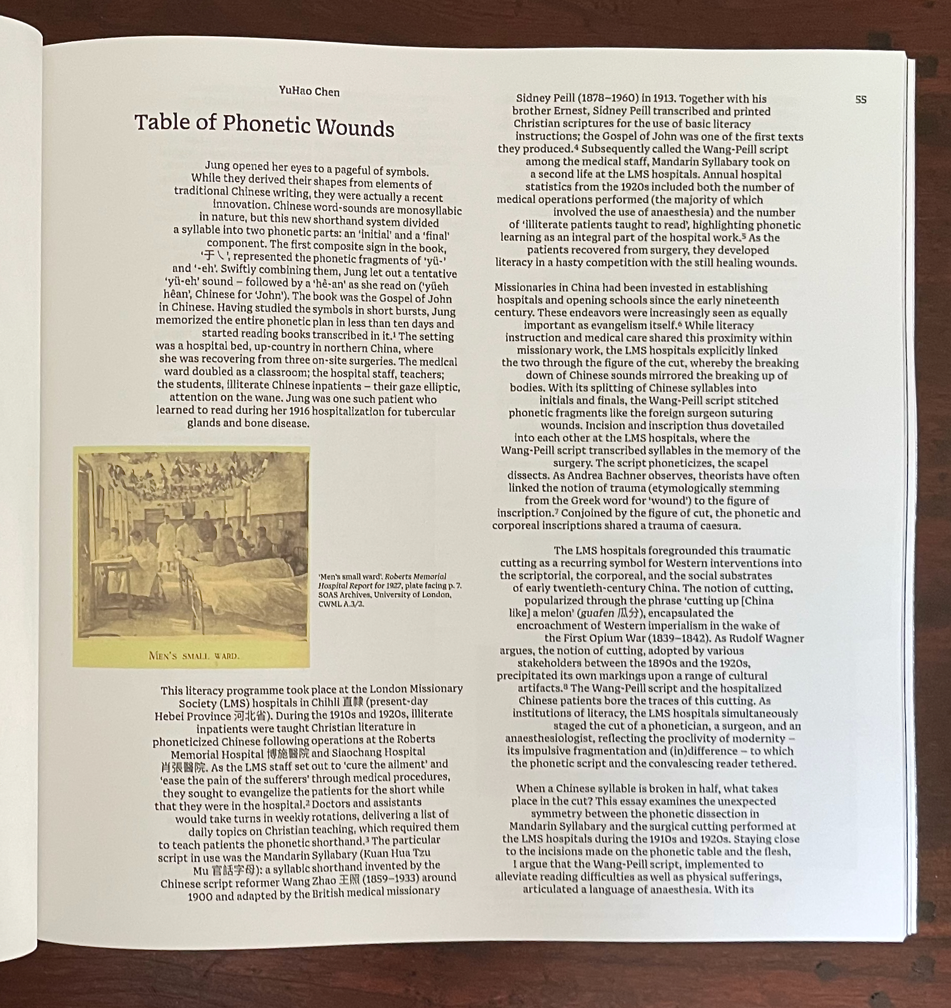
An academic page discussing the history of phonetic wounds and literacy programs at the London Missionary Society hospitals in early 20th century China, featuring a historical image captioned 'Men's small ward.'

Reanna Brooks‘ “Cut and Paste: Virginia Woolf’s Bookcraft” provides a good case for looking carefully at the border between craft and art. Brooks finds a depth in Woolf’s bookbinding that should prompt us to ask more often, When do the book arts and book art overlap to create a new work of art?

A page from a book featuring images of a bookshelf with various books, some rebound with distinctive patterns and materials, alongside text discussing Virginia Woolf's bookcraft.

Sally O’Reilly‘s “Birth, Accident and Death: A Narratological Probing of Die-Cut Holes” would not have been out of place in Inscription No. 2 on “holes”. Its presence here demonstrates the extension of the theme of tearing to include cutting and holes. Removal by tearing or cutting may overlap, but the techniques are sharply different in their results as we saw with Arp’s “Doll carrying Schwitters” and “Le Petit Prince”. The differences here point to the messiness of giving birth contrasted with the tidiness of the neatly designed and pocketable guide for midwives that shows the growing diameter of the cervix stage by stage through a die-cut hole.
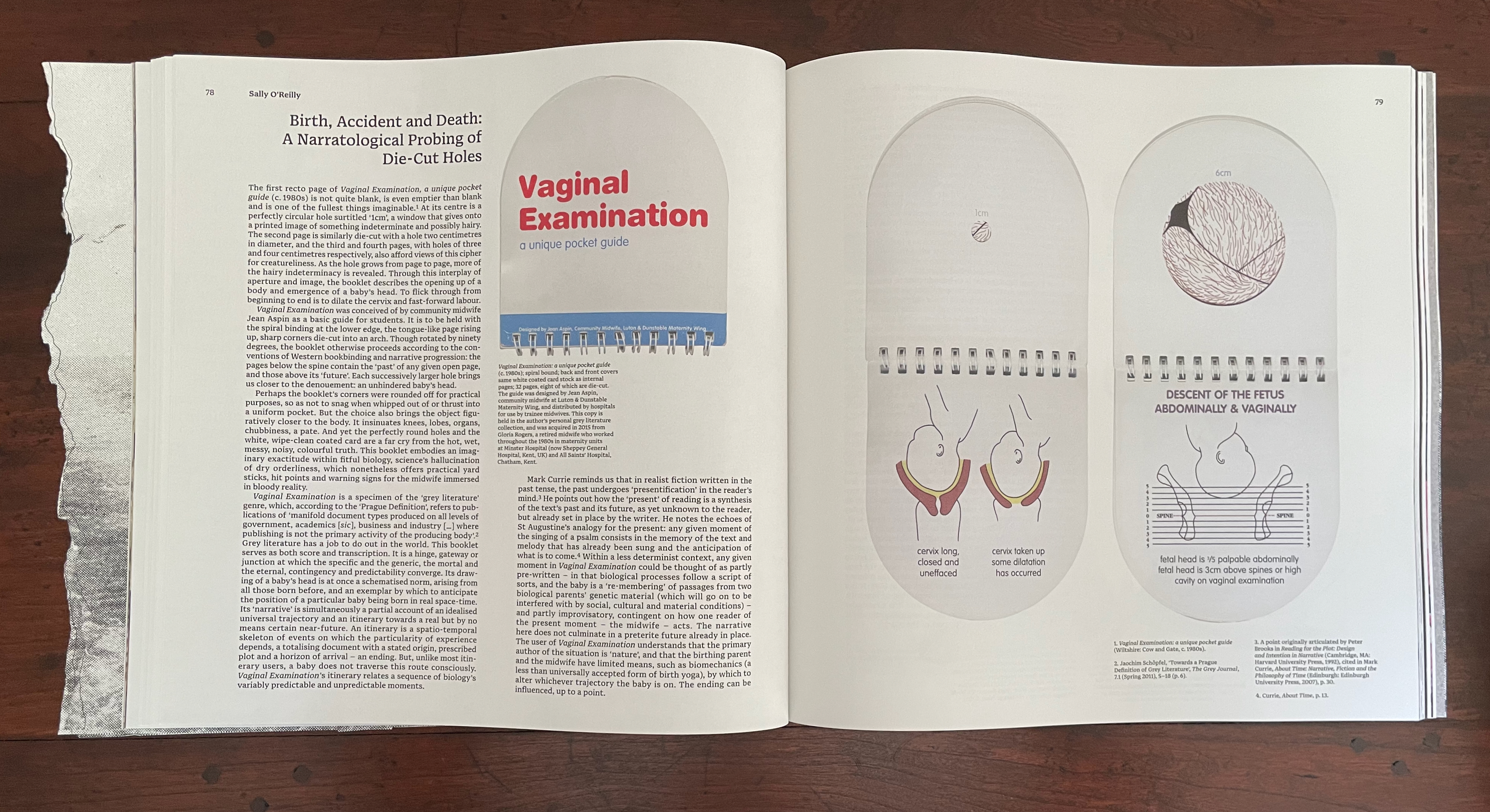
An open book page featuring text and illustrations about a unique pocket guide titled 'Vaginal Examination,' detailing topics related to birth and maternal health. The left side includes an excerpt from the guide, while the right side displays diagrams related to fetal descent and vaginal examination.

The following juxtaposition of Lucio Fontana‘s Spatial Concept “Waiting” and Bas Jan Ader‘s I’m too sad to tell you draws attention to the heteronym “tears”. It is set off in its own section, knowingly bracketed by Spector’s Displacement after Lawrence Weiner (2024) — conceptual artist — and After Ansel Adams (2024) — photographer. It is a meaningful curatorial gesture meant to be on a par with, say, Robertson’s effective bridging of the heteronymic meanings under the heading “Tears of Mourning”.
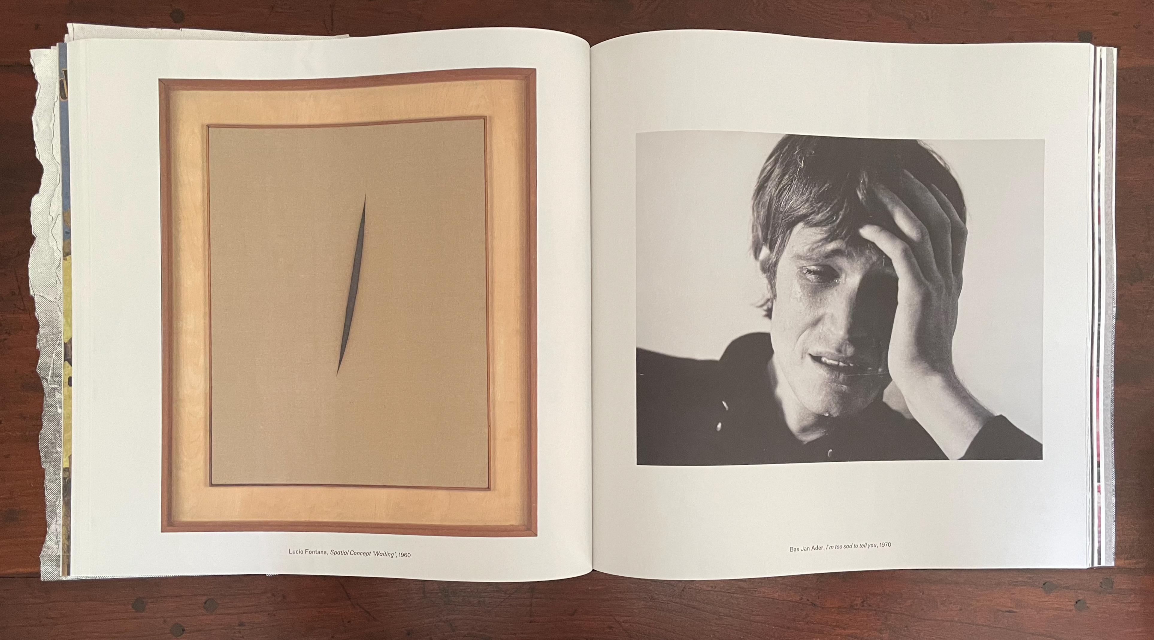
An open book displaying two artworks: on the left, a piece titled 'Spatial Concept Waiting' by Lucio Fontana featuring a slit on a beige canvas, framed in wood; on the right, a black-and-white photograph by Bas Jan Ader titled 'I'm too sad to tell you' depicting a man with a distressed expression, holding his head.

Tear: N1 A torn part or place; V1 To pull or split apart. Tear: N2 A secretion of the lachrymal gland; V2 To weep.

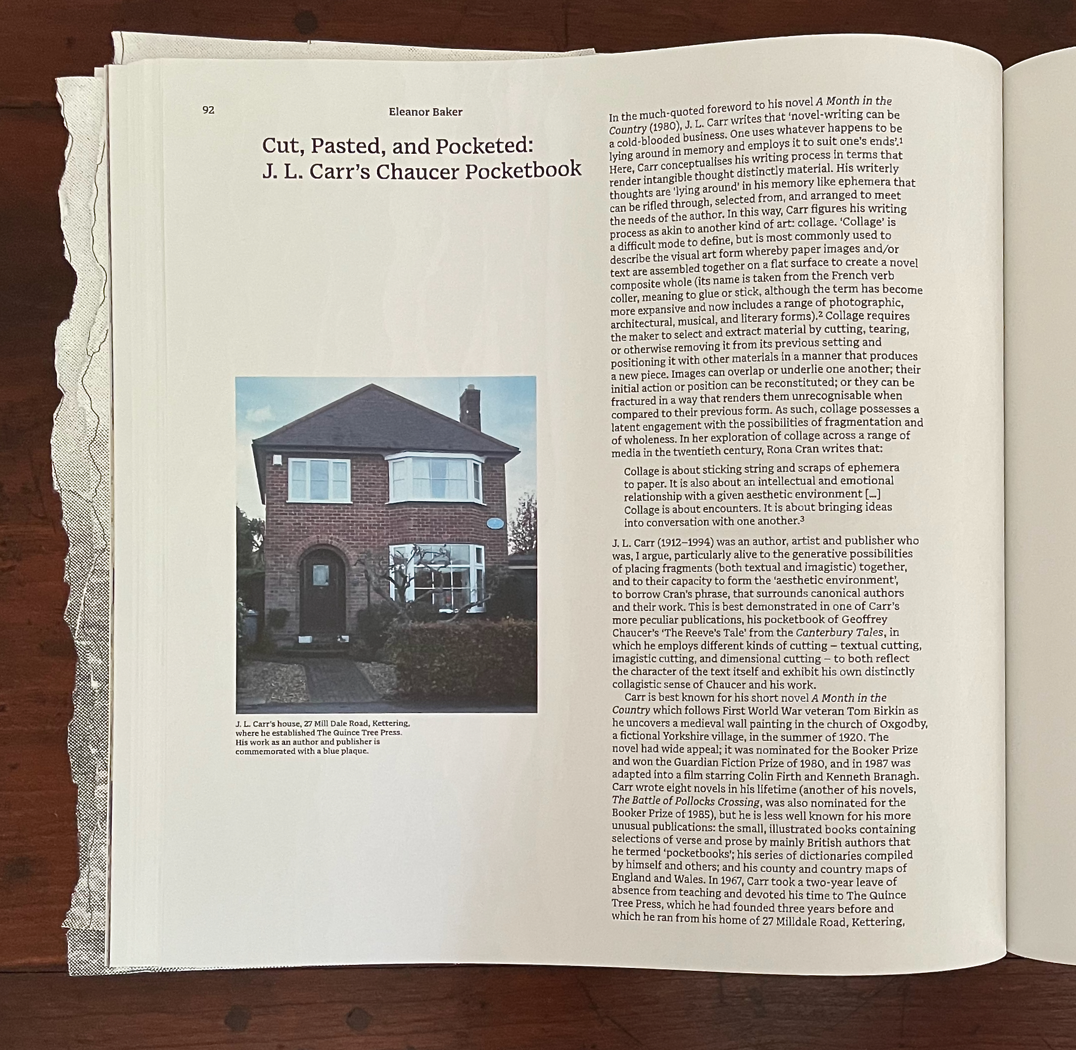
Eleanor Baker‘s “Cut, Paste, and Pocketed” explores J.L. Carr’s 1066 and All That treatment of Chaucer’s “The Reeve’s Tale”. While Carr would surely have been familiar with Sellar and Yeatman’s 1930 comic book history, Baker pegs Carr’s approach as a form of collage rather than comic strip. As we’ll see later with Angela Szczepaniak’s contribution, the two can be combined to drive a narrative forward. In Carr’s case, as Baker points out, the pocketbook approach and cheeky fragments of collage combine to deliver a comically modern sense of Chaucer’s world and an inventive match to the fragmentary nature of “The Reeve’s Tale”.
Using knives and punches, A T Kabe Wilson removes every tenth word in Graham Greene’s The Tenth Man and replaces it with a synonym or as near a proxy as he can manage to challenge the notion of copyright. The resulting pages are arranged to make up an installation where visitors can read the entire set of altered pages. There is no edition of Copywrong. It turns Walter Benjamin on his head: “The Unique Work of Art Produced from Two Copies of a Mechanical Reproduction”.

To bring this relevant work within the bounds of Inscription, the editors provide images of Wilson at work and rely on Dennis Duncan (University College of London) to elicit from Wilson where the work’s strange status places it in relationship to artists’ books and other visual art.
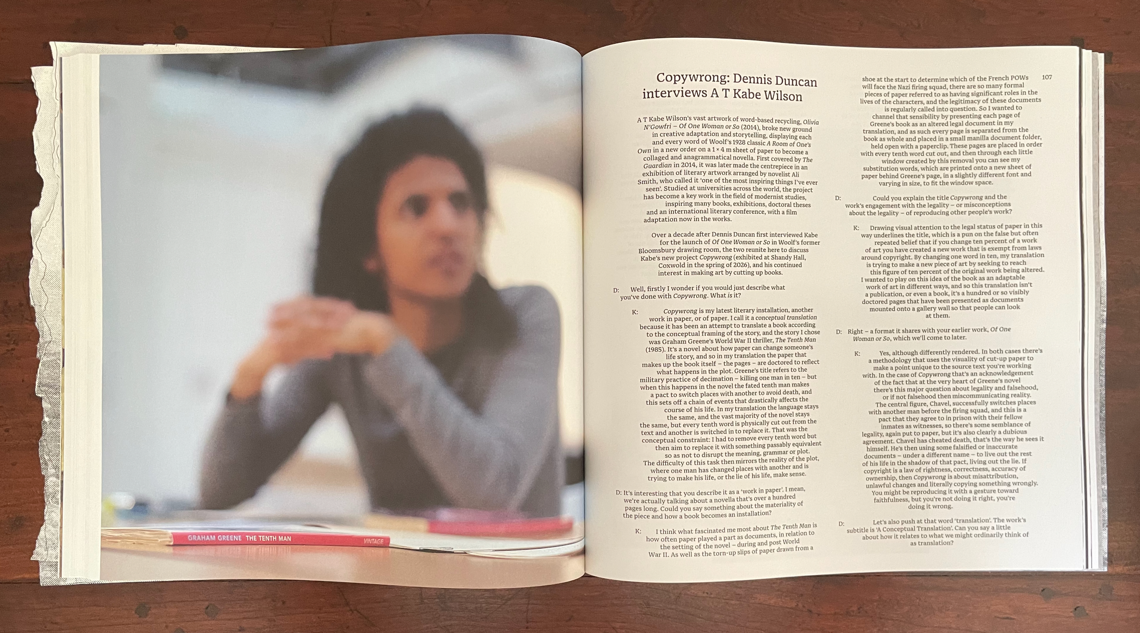
Kabe Wilson’s choice of every tenth word takes its impetus from the book’s story of collective punishment in wartime (“choose ten from among your number to be executed”). But it also turns on its head the common fallacy that ten percent of a work can be reproduced without violating copyright: hence the title Copywrong. In Greene’s novel, when the rich tenth man contracts with a poor man to trade places and switch identities in exchange for the rich man’s inheritance, a whole vein of copywrongs reveals itself for mining. Wilson sees his creative destruction of the novel as a form of translation and betrayal of the original. While challenging us to think where the line between book and not-book lies, and even to think of its sheets of paper as 3D objects, Copywrong becomes a way of asking where the line between original and copy, legal and illegal, and life and death lies.
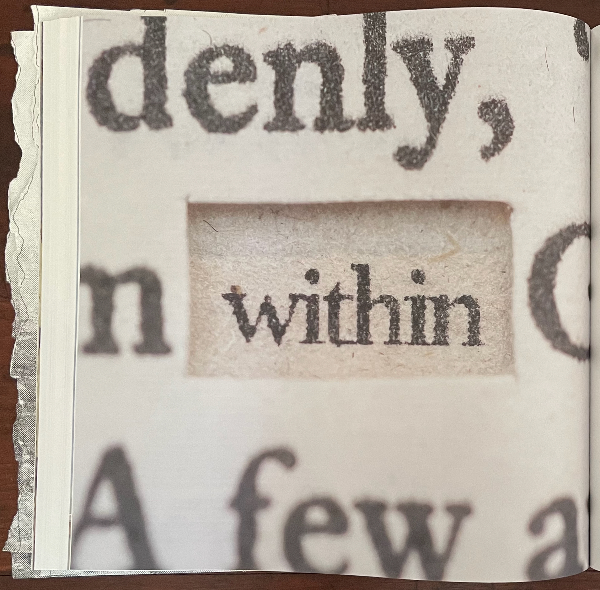
Close-up of a book page featuring the word 'within' highlighted among other printed text.

The next contribution is Fraser Muggeridge‘s “Cuts and Tears as Justified and Unjustified Typesetting”. While the article gives an informative sketch of the history and development of the straight and ragged edges of print, its argument that unjustified typesetting is “torn typography” does not convince. An unjustified line does not begin with a justified line from which spacing is torn or cut. A justified setting may give a page the visual effect of having been evenly cut down the right, and a ragged right setting may give the visual effect of a tear down the right side, but whether they contribute to a work’s artistic meaning — not just an aesthetic effect on readability — needs convincing examples. With Apollinaire and his calligrammes, Stefan Themerson and his “internal vertical justification”, and Christian Bök’s Diamonds, Muggeridge make a good start. Most of the other variations on justified, unjustified, and mixed, however, are far cries from, say, Mallarmé’s breaks of the line and play with page layout in Un Coup de Dés Jamais N’Abolira le Hasard or from the meaningful typographical tearing and cutting that the avant-gardistes of the early 20th century perpetrated.

A page from a book titled 'Cuts and Tears as Justified and Unjustified Typesetting: From Bayer to the Kindle' by Fraser Muggeridge. The page contains a detailed discussion on typography, justified and unjustified typesetting, and mentions Herbert Bayer's work. The layout features various paragraphs, illustrations, and examples related to typographical practices.

It’s odd, especially as the Fraser Muggeridge Studio designs Inscription, that the article does not mention the center justification used in several of the issue’s other articles. Their paragraphs decline to show off those even edges of justified-left and justified-right typesetting. Instead, they go for a ragged left and ragged right with a book-mimicking gutter of justified left and right in their center. When proofreaders were more a feature in typesetting houses, they not only had to catch “typos” but also to watch for “rivers in the type”, those breaks between words in one line that aligned with breaks in the next several lines to create a white rivulet of space trickling down the page and distracting the reader from the sense of the sentences. In Chen’s article, the “river” is a medial surgical cut. In Duncan’s interview with Wilson, the clear gutter in the middle of the paragraphs offers a sharp contrast with the uncomfortable binaries that Copywrong bids us to engage. Kudos to Fraser Muggeridge and studio.

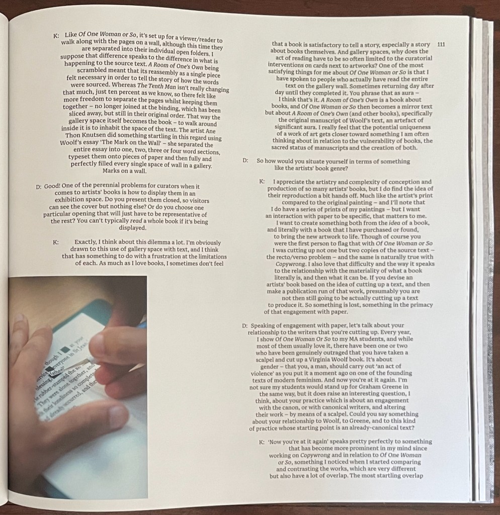
Left: from Chen’s article. Right: from Wilson-Duncan interview.

The next contribution — from the Leuven-based artists collective Rosetta, formed by Eva Moulaert, Anneleen Masschelein, and Willem Styfhals — continues with the topic of typesetting. Their starting point is those awkward phenomena of typesetting — widows and orphans. They are not deliberate renderings or loppings of words from a following or preceding sentence to be left stranded at the bottom or top of a page, respectively. But there they are. Are they tears or cuts, these weepy, abandoned strings of anthropomorphized type that are cause for tears among proofreaders, typesetters, and designers? No, they are cause for the fevered ponderings of the narrator in a book whose photographed pages make up this contribution.
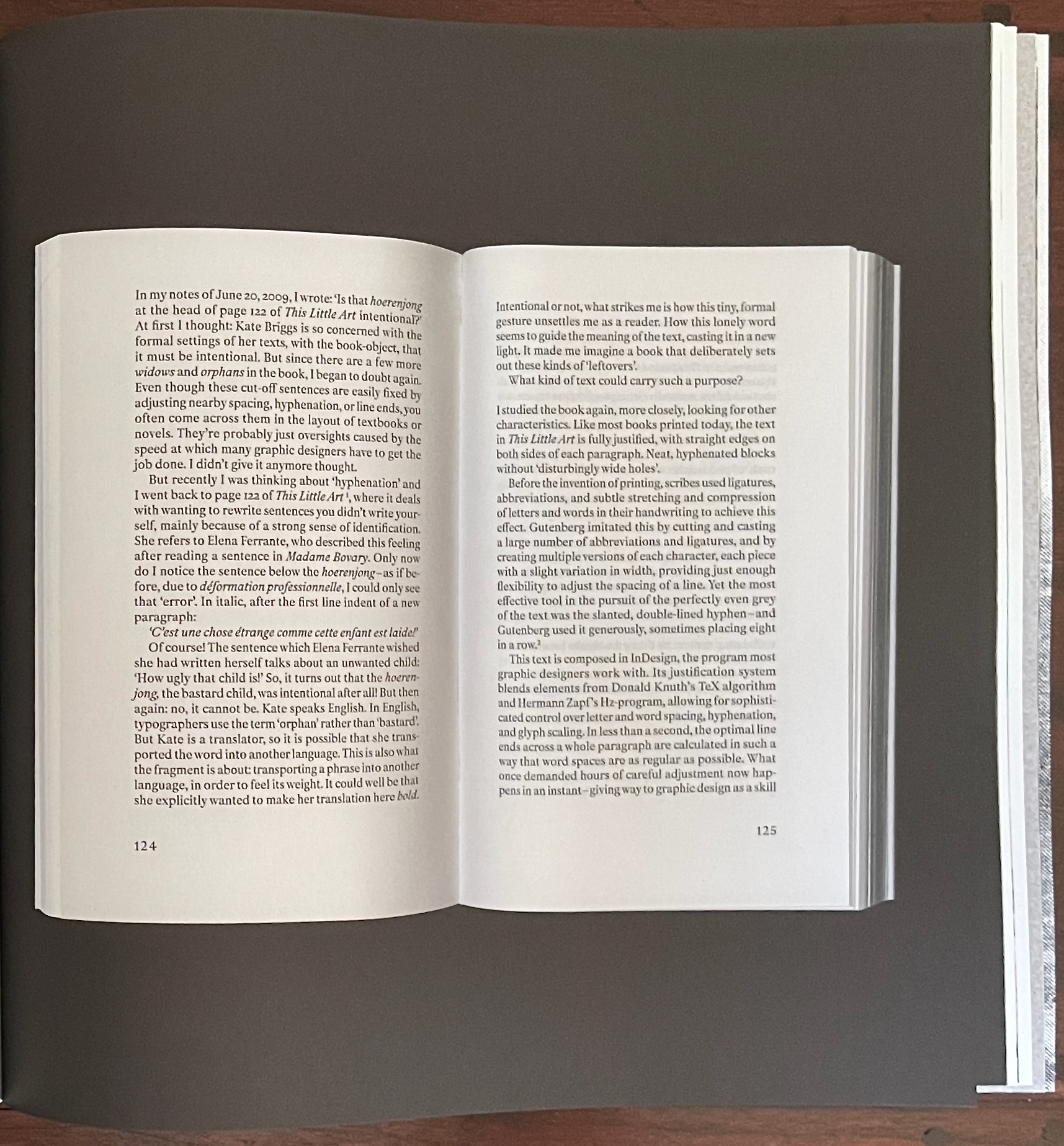
A close-up view of an open book's pages, discussing graphic design principles related to typography and formatting, with visible text and page numbers 124 and 125.

No widows or orphans here.

This set of photographed double-page spreads (excised?) has plenty of widows and orphans. Even though they are likely deliberate, what is the point of them? And whose disembodied hand is that that keeps appearing, disappearing, and reappearing to hold the book facing out?

An open book on a wooden surface, showing text on two pages. A hand is positioned on the left page, partially obscured, reaching toward the text.

Orphan and widow.

The narrator winds “their” way through references to Gutenberg, Donald Knuth, Herman Zapf, Jean-François Lyotard, Martin Heidegger, Roland Barthes, Robert Bringhurst, Ellen Lupton, Frank Kermode, Amitav Ghosh, and half a dozen others to come to “a” point — an obsession with hyphenation. And the point of that? Why naturally for the narrator’s compound, hyphenated selves — Ro-set-ta — to hand over the pen to Rosetta, the widow at the end of “page 139”.

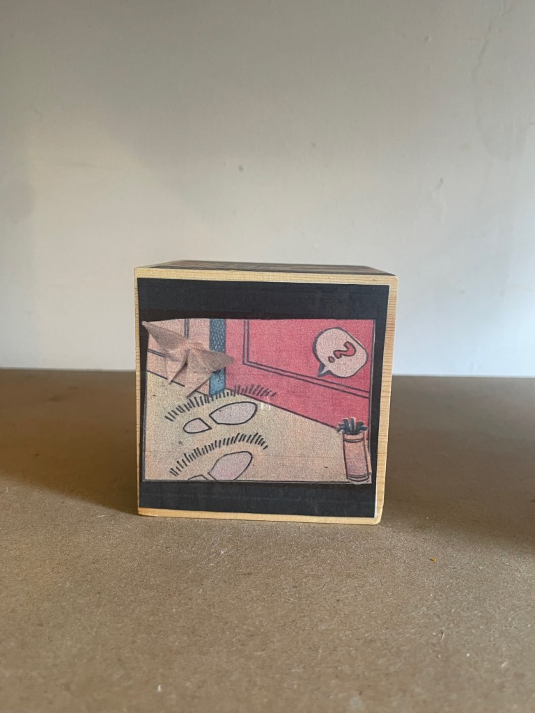
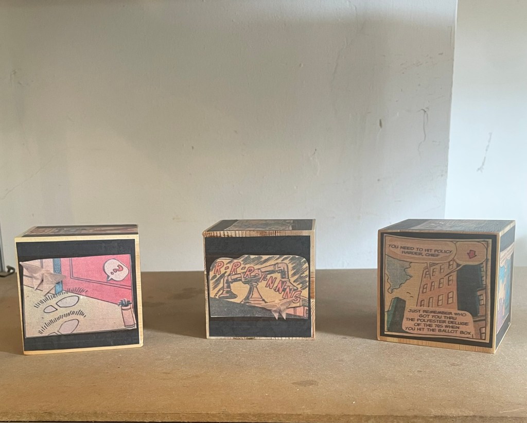
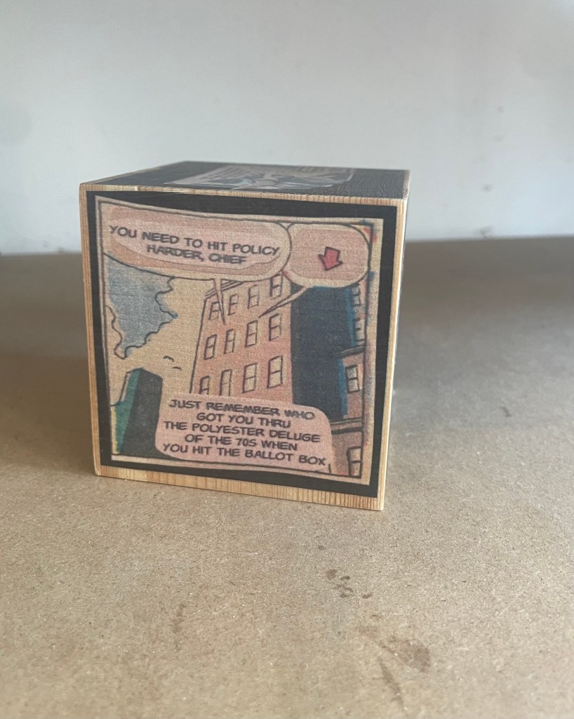
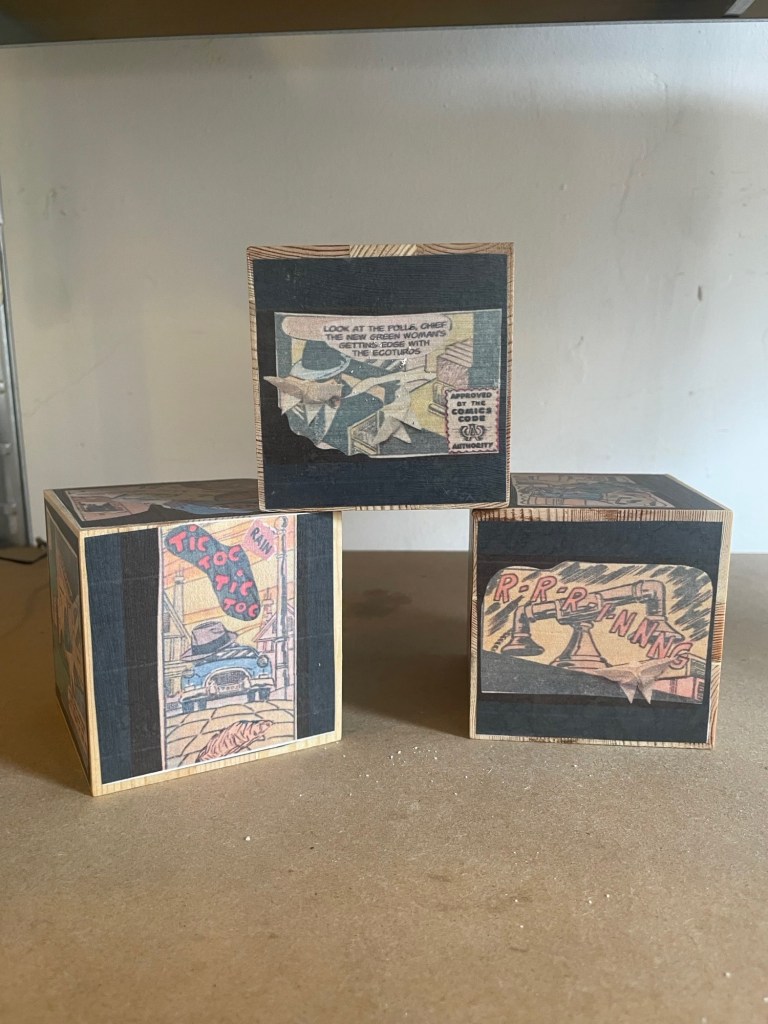
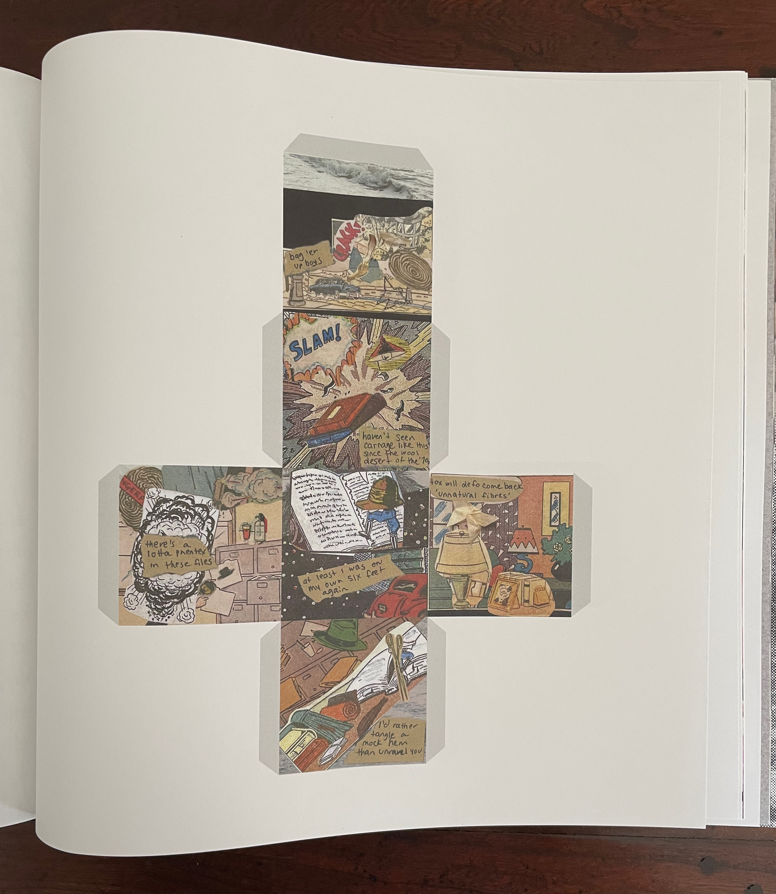
“The Extinctions Bureau” is a brilliant article with which to end this issue of Inscription. It offers readers a chance to wield scissors or papercutters if they are ready not to heed Broodthaers’ admonition above. It is also a clever conceptual extension of Will Eisner’s 1985 concept of “sequential art” that aimed to establish comics as a legitimate literary genre. Angela Szczepaniak first teases us with the narrative premise of a clothing moth-turned-detective on the trail of the Nylon Killer. If that is not hilarious enough, she posits conversion of the 2D linear narrative into a 3D existence around moth-repellent cedarwood. (She has created the blocks for exhibition display, but that’s not the point of the contribution.) Whether the blocks are more cruel to the detective or readers who now have to get their heads and hands around the idea of a “polysequential” story is a fine point. Readers who take up the challenge of cutting out the templates and folding them into cubes will have their own view.

By cutting and tearing the images for her collages from pulp comics, Szczepaniak rings all the bells of Inscription 6’s theme and reminds us of its subtitle: The Journal of Material Text.
A visually striking illustration featuring a collage of diverse images and text, arranged in a cross-like pattern, showcasing themes of nature, literature, and personal reflections.

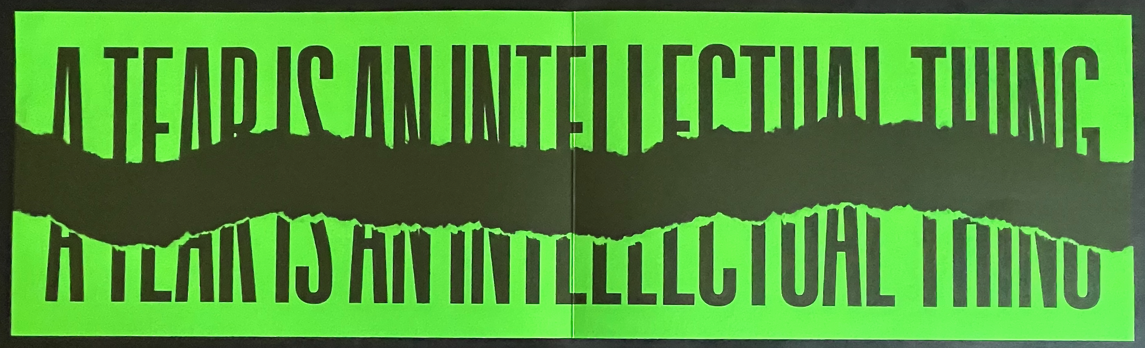
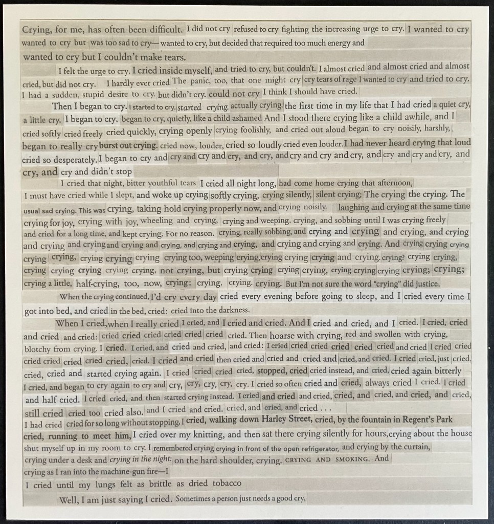
Reminiscent of Aspen, Fluxus, The Journal of Artists’ Books, and the deluxe editions of Parenthesis, Inscription‘s artwork inserts contribute to the sense of the issue as an exhibition, a wunderkammer, a performance. No 33 LP this time; instead there is appropriately a cutdown 45-rpm record, albeit no instructions on “ripping” tracks from it to make up our own playlists. Putting together a thematically coherent journal is tricky. The artworks underscore and strengthen the issue’s theme of tearing and cutting. Two examples: Nick Thurston’s print Rips and Floods (2026) and Carolyn Thompson’s Tearjerker (2026) cover all the thematic notes of tearing, cutting, and weeping.

Thurston’s title for his print ensures that we don’t miss the heteronymic “tear”, which the visually torn phrase “A tear is an intellectual thing” might cause us to do. For those not well-versed in William Blake, a helpful note on page 160 identifies the phrase’s source as “The Grey Monk“. The editors mention Thurston’s truncation of Blake’s line, but leave it to us to supply the pun that it has been ripped from the poem. Blake’s preceding lines rule out the heteronymic meaning; for him, it’s the “Widow’s tear” that is ” an intellectual thing”. What makes Thurston’s print a strong work of art is how the tearing from the poem brings with it other key elements of the poem. For Blake, the Widow’s tears have more power than war to free the world from fear of the “Purple Tyrant”. In 2026, Thurston’s print reminds us that intellectual things — [/tɪ(ə)rz/] and [/tɛ(ə)rz/] — may have more power than Tangerine or Religious Tyrants.
A split image featuring bold text that reads 'A TEAR IS AN INTELLECTUAL THING' in black on a bright green background.

Rips and Floods (2026), Nick Thurston

For her print, Carolyn Thompson excises words “from 30 works of literary fiction she has read since” 2016 to compose a sob story that well sums up the effects of Brexit (and the US election).
A printed page filled with text discussing the author's experiences and emotions related to crying, highlighting the difficulty and complexity of expressing emotions.

Tearjerker (2026) Carolyn Thompson

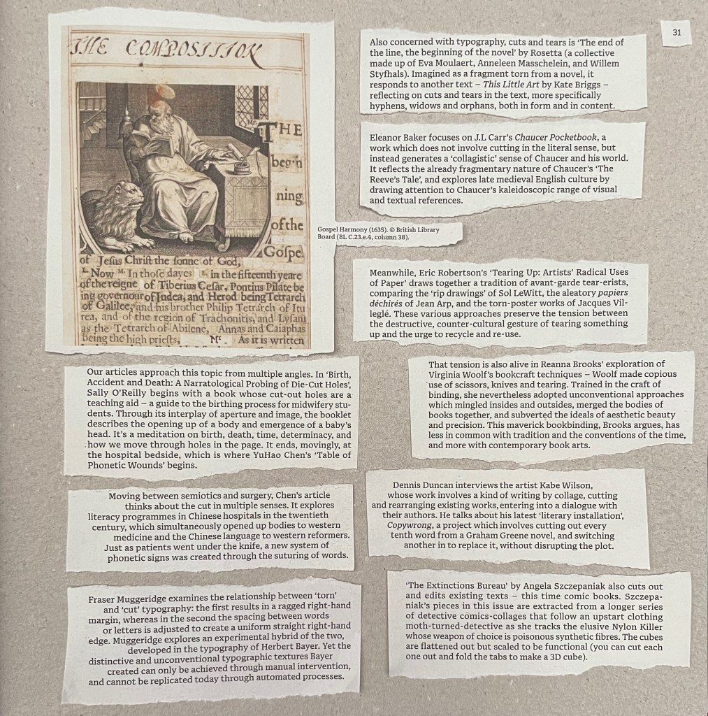
Pages 154-61 list the twenty-one artists/performers alphabetically with descriptions of their editions. Self-reflexively and in keeping with the issue’s theme, page 161 shows a blanked version of the torn segments from page 31 on which Partington and Smyth provide their introduction to the authors’ and artists’ contributions. (This blanked version is curious. If page 161 were showing the blank sides of the slips of paper, the four slips on the left would be flipped and on the right. Since one of the editors has let slip in correspondence that the theme of Issue 7 will be “blanks”, might this be an Easter egg?)
In homage to the journal and its edition contributors, below is a collage of the eleven loose inserts.
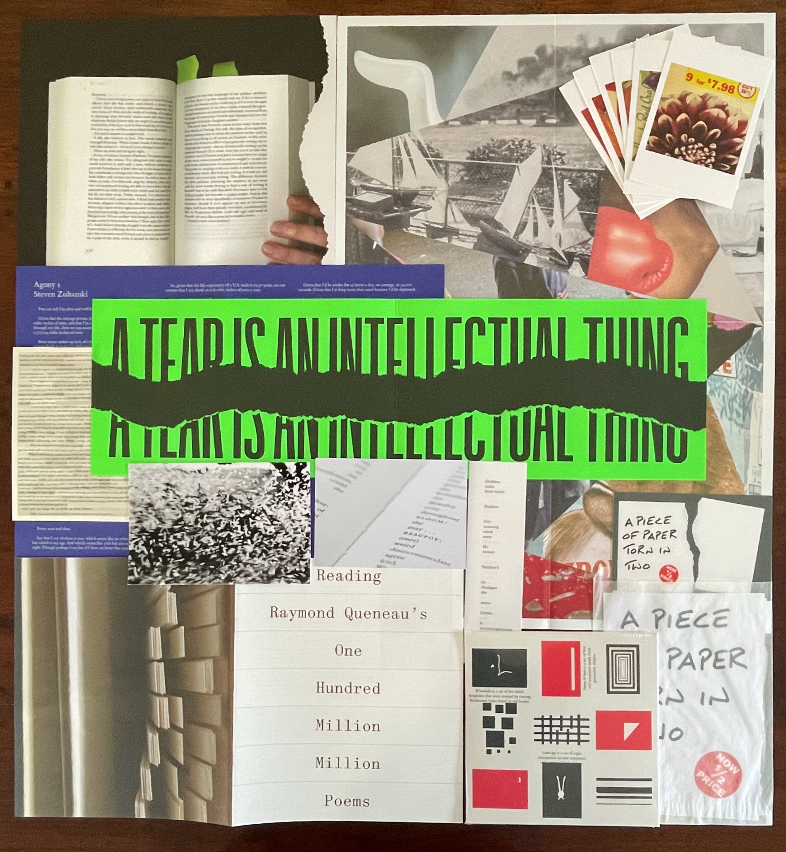
A collage featuring various images, text, and printed materials, including a book, torn paper with the phrase 'A tear is an intellectual thing', colorful graphics, and a layout of poems. The composition is layered with diverse textures and designs.

Contributors: Bas Jan Ader, Erica Baum, David Beech, David Bellingham, Stephen Emmerson, Lucio Fontana, Queneau Reading Group (Joe Gilmore, Simon Morris, Tom Rodgers, and Patrick Wildgust), Jo Hamill, Simon Morris, Abigail Reynolds, Rosetta (Eva Moulaert, Anneleen Masschelein, and Willem Styfhals), Buzz Spector, Carolyn Thompson, Nick Thurston, and Steven Zultanski. As noted at the beginning, Buzz Spector’s contributions appear in the issue’s pages as do Bas Jan Ader’s and Lucio Fontana’s photographs, while Abigail Reynolds’ art appears on the cover. All the other works are inserts.

The wunderkammer nature of Inscription will send insatiable readers in search of more examples of creative destruction. To that end, here are a handful from the Books On Books Collection. If you can only find time for two, make it Eleonora Cumer’s Circoscrivere lo spazio No. 3 [Circumscribing space] (2021) and Cercare nella memoria [Searching Memory] (2021). They are her most sophisticated metaphoric works in the collection. They offer a circumvention of circumscription, which is another way of thinking about tears and the material text.

Islam Aly“. 13 January 2020. Books On Books Collection. See 28 Letters (2013).

Doug Beube“. 21 April 2020. Books On Books Collection. See Empty Talk (2016), Red Infinity #4 (2017), and Breaking the Codex (2011).

Lizzie Brewer“. 4 July 2023. Books On Books Collection. See Babel (2019).

Eleonora Cumer“. 6 September 2019. Books On Books Collection. See l’attesa/ l’attente (2010), visioni urbane/ visions urbane (2015), contaminazione (2015), Circoscrivere lo spazio No. 3 (2021), Cercare nella memoria (2021)

The First Seven Books of the Rijswijk Paper Biennial“. 10 October 2019. Books On Books Collection. See Tijdloos papier = Timeless paper (2002).

Jonathan Safran Foer“. 8 November 2024. Books On Books Collection. See Tree of Codes (2010).

Jo Hamill“. 23 June 2026. Books On Books Collection. See Gutter Words (2019).

Julie Johnstone“. 4 June 2020. Books On Books Collection. See a book of tears (2006) and Point of View: skyline tideline (2012).

Katsumi Komagata (I)“. 22 March 2020. Books On Books Collection. See A Cloud (2007) and Moon Phase (2019).

Katsumi Komagata (II). 16 August 2024. Books On Books Collection. See Piece of Mind (2022), one of his last limited edition works.

Masoumeh Mohtadi“. 5 February 2021. Books On Books Collection. See Blindness (2020).

Timothy Mosely“. 23 August 2024. Books On Books Collection. See The Book of Tears (2014).

Julien Nédélec“. 19 June 2025. Books On Books Collection. See Titrer (2012).

Bruno Riboulot and Marjon Mudde“. 4 June 2023. Books On Books Collection. See ABC d’Air (2005).

Jenny Smith“. 31 July 2017. Books On Books Collection. See Untitled (2006), Book of Beads (2008), and Little Black Book (2009).

Carolyn Thompson“. 19 December 2023. Books On Books Collection. See The Eaten Heart (2013).

Further Reading

Inscription 1“. 15 October 2020; “Inscription 2“. 29 May 2022; “Inscription 3“. 21 February 2024; “Inscription 4“. 21 February 2024; “Inscription 5“. Books On Books Collection.

Eisner, Will. 2008. Comics and Sequential Art : Principles and Practices from the Legendary Cartoonist. New York: W.W. Norton.

Metzger, Gustav. 1965. Auto-Destructive Art; Metzger at AA. [London]: [Destruction/Creation].

Spieker, Sven, ed. 2017. Destruction. London, Cambridge, Massachusetts: Whitechapel Gallery ; The MIT Press.

Toigo, Linda. 7 April 2013. ““Destroy, and you create”: an Auto-Destructive History lesson for Jack Hroswith”. Lindo Toigo website. Accessed 25 May 2018.
Books On Books Collection – Inscription: The Journal of Material Text, Issue 5 (Containers)

Inscription: The Journal of Material Text, Issue 5 (2025)

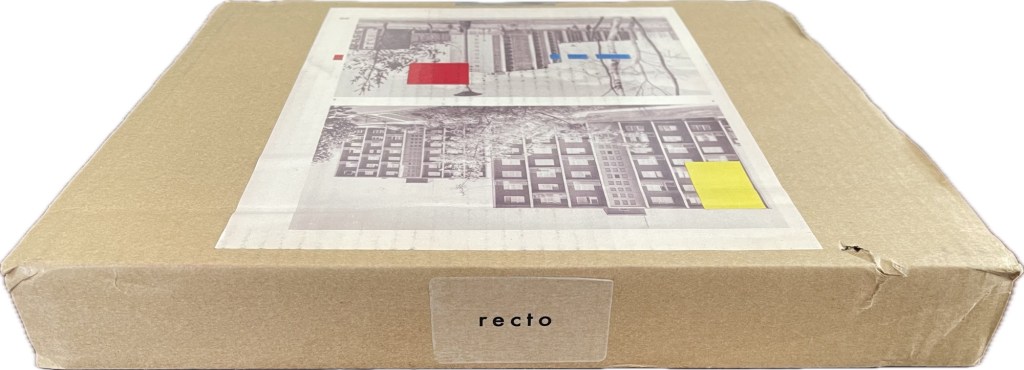
Although Theodore Roethke had a woman in mind when he wrote “The shapes a bright container can contain!”, the phrase readily comes to mind for this issue of Inscription once you’re past the difficult-to-open-up cardboard packaging. Not that you should rip through and discard it. The clues to proceed patiently are the label “recto” on one edge of the box and the page cut from a book and pasted on the box’s top. Is “recto” some sort of “this side up” label? If so, it seems topsy-turvy. Recto (or right-hand) pages are usually have odd-numbered, but the pasted-down book page is numbered 20. Wait a second; those random colored rectangles have been printed over the book page as if meant to draw attention to the “gridness” of the apartment blocks. Maybe this box is meant to be preserved and framed (after all, Toulouse-Lautrec drew on cardboard).

Continue reading

Books On Books Collection – Louis Lüthi

Infant A (2012)

Infant A (2012)
Louis Lüthi
Thread-stitched signature. H225 x W160 16 pages. Edition of 1000. Acquired from Torpedo Books, 8 January 2024.
Photos: Books On Books Collection

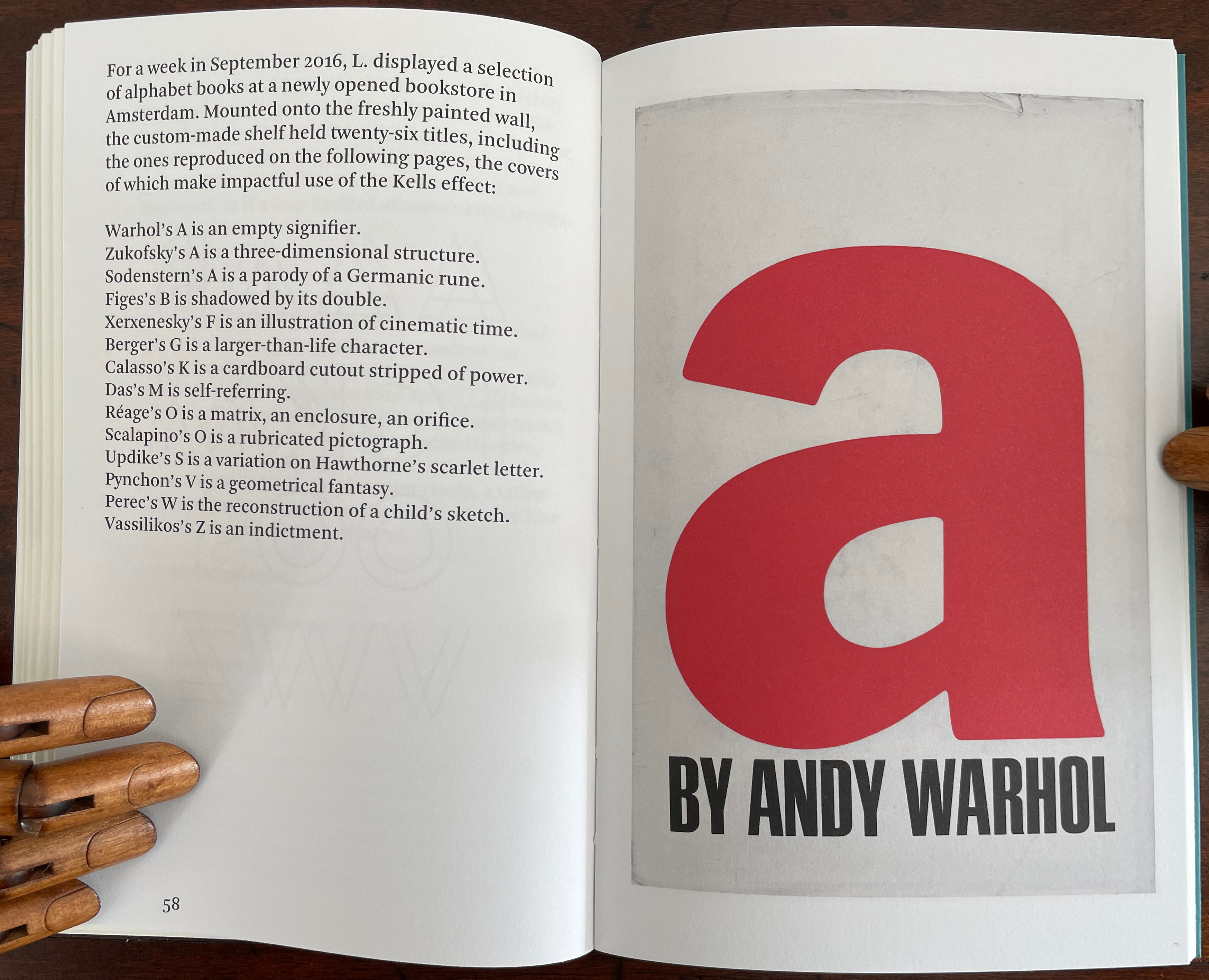
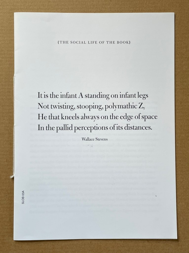
Infant A is part of a collection of essays commissioned by castillo/corrales and published by Paraguay Press under the series title The Social Life of the Book. Lüthi’s contribution fits the Books On Books Collection on several scores. First is the epigram’s invocation of the alphabet, which echoes the collection’s concentration of alphabet-related artists’ books and children’s books. See Alphabets Alive! Second is the epigram’s source: Wallace Stevens, whose poetry has inspired Ximena Pérez Grobet’s Words (2016). Would that other book artists be so inspired. Third is the narrator’s fictional conversation with Ulises Carrión in a celebration of all things A-related, in particular Andy Warhol’s novel a: a novel (1968), which finds analogues in Warren Lehrer’s A Life in Books: The Rise and Fall of Bleu Mobley (2013) and Derek Beaulieu’s a, A Novel by Andy Warhol (2017) (entry in progress). Fifth is how the dialogue reminds me of Suzanne Moore’s A Musings (2015).

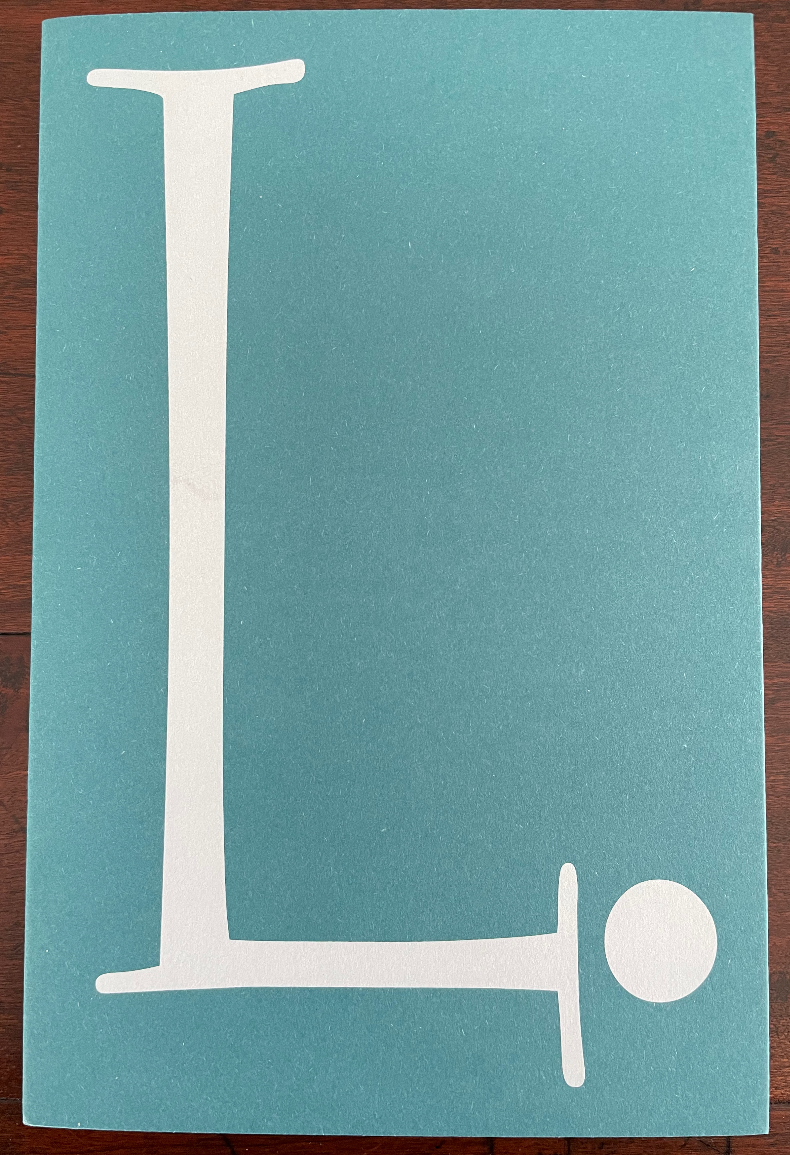
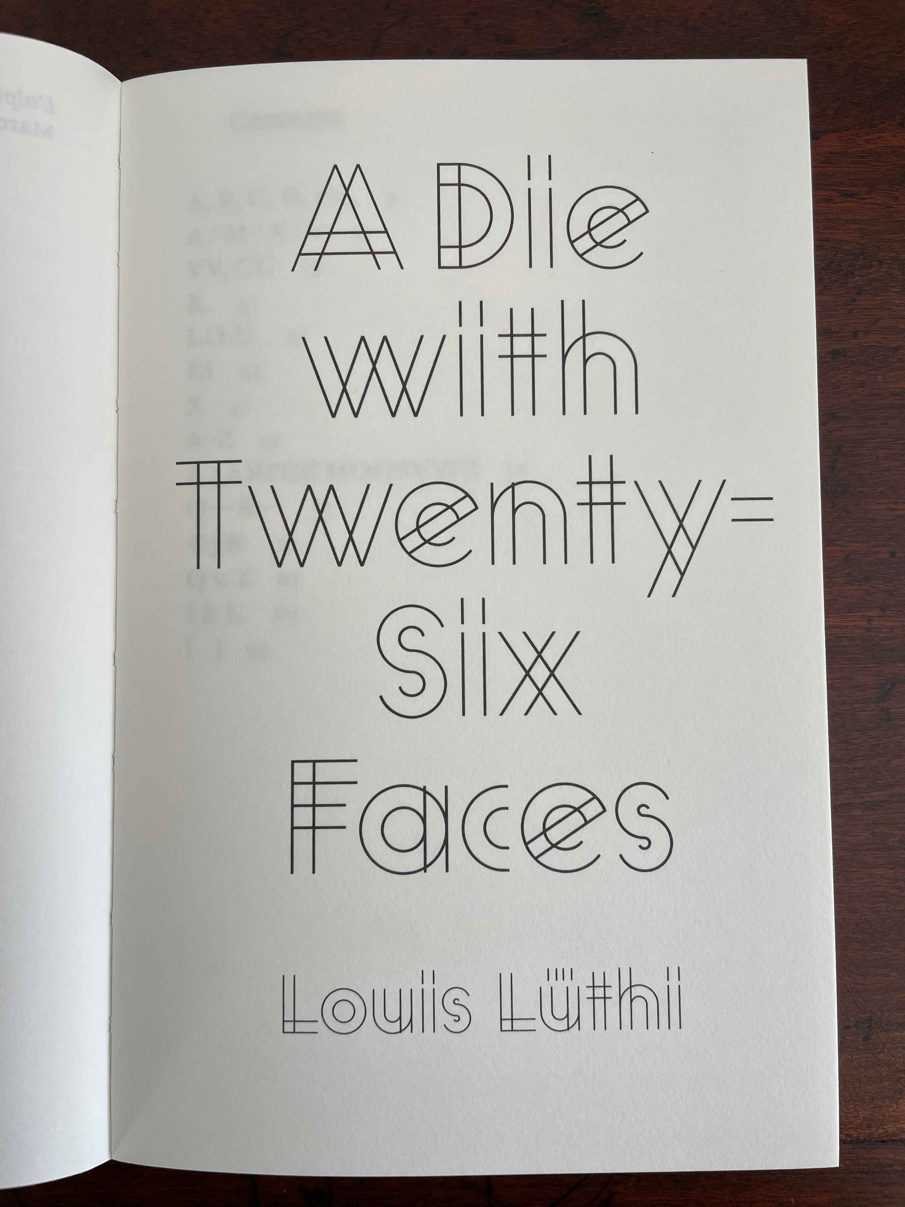
A Die With Twenty-six Faces (2019)

A Die With Twenty-six Faces (2019)
Louis Lüthi
Paperback. H200 x W130 mm. 104 pages. Acquired from Amazon, 18 September 2022.
Photos: Books On Books Collection

Walter Benjamin’ unpacking of his library has a lot to answer for. Not only do we have Buzz Spector‘s take on it in 1995, but Jo Steffens’ Unpacking trilogy of photos of architects’, artists’ and writers’ bookshelves, Alberto Manguel’s elegiac Packing My Library (2018), and here is Louis Lüthi’s.

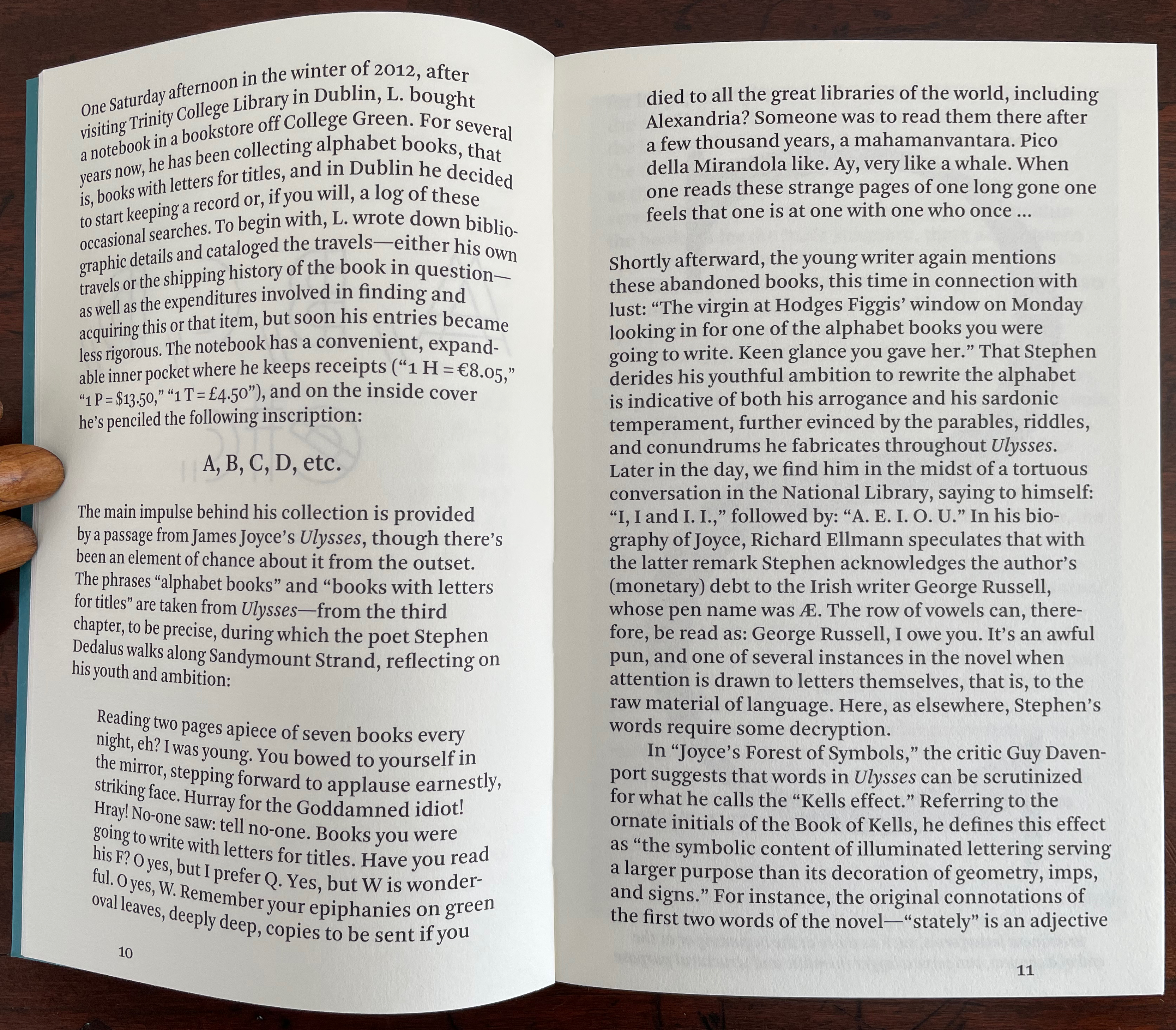
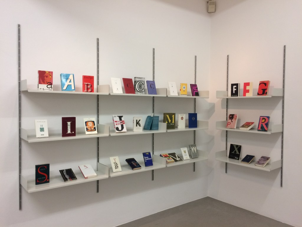
Publisher’s website: In A Die with Twenty-Six Faces, the author — let’s call him L. — guides the reader through his collection of alphabet books, that is, books with letters for titles. Some of these titles are well known: Andy Warhol’s “a,” Louis Zukofsky’s “A”, Georges Perec’s W. Others are obscure, perhaps even imaginary: Zach Sodenstern’s A, Arnold Skemer’s C and D. Tracing connections between these books, L. elaborates on what the critic Guy Davenport has called the “Kells effect”: “the symbolic content of illuminated lettering serving a larger purpose than its decoration of geometry, imps, and signs.”

The title stirs thoughts of Marcel Broodthaers’ oracular statement in 1974 “I see new horizons approaching me and the hope of another alphabet”. An alphabet that unrolls across the twenty-six faces of a die would certainly qualify as another alphabet. Broodthaers and the die also stir thoughts of Stéphane Mallarmé’s Un Coup de Dés Jamais N’Abolira le Hasard to which Broodthaers paid repeated homage. Throwing a twenty-six-sided die would certainly no more abolish chance than would a roll of Mallarmé’s six-sided die. Lüthi’s game, however, has little to do with chance unless we count his luck in finding the works to build his library of single-letter-entitled books. Even less to do with luck if some of the library is fictitious, a likelihood that the “publisher’s” statement suggests. Lüthi’s die is loaded!

A selection of Lüthi’s “alphabet” books on display. Courtesy of the author.
Photo: Gesellschaft für Aktuelle Kunst Bremen

On the Self-Reflexive Page II (2021)

On the Self-Reflexive Page II (2021)
Louis Lüthi
Paperback. H200 x W130 mm. 304 pages. Acquired from Idea Books, 18 September 2022.
Photos: Books On Books Collection.

This is a peculiar book in its order and nature. After two variant half-title pages, it begins with a section entitled “Black Pages”. Only on flipping through the volume can we find the remaining front matter — just after page 208. There’s another half-title and then the Table of Contents. Reproducing the marbled page from Laurence Sterne’s The Life and Opinions of Tristram Shandy, Gentleman (1759–1767), the book’s cover gives a clue to this peculiarity. Sure enough, Lüthi spells it out later in the section entitled “On Drawing Pages”.

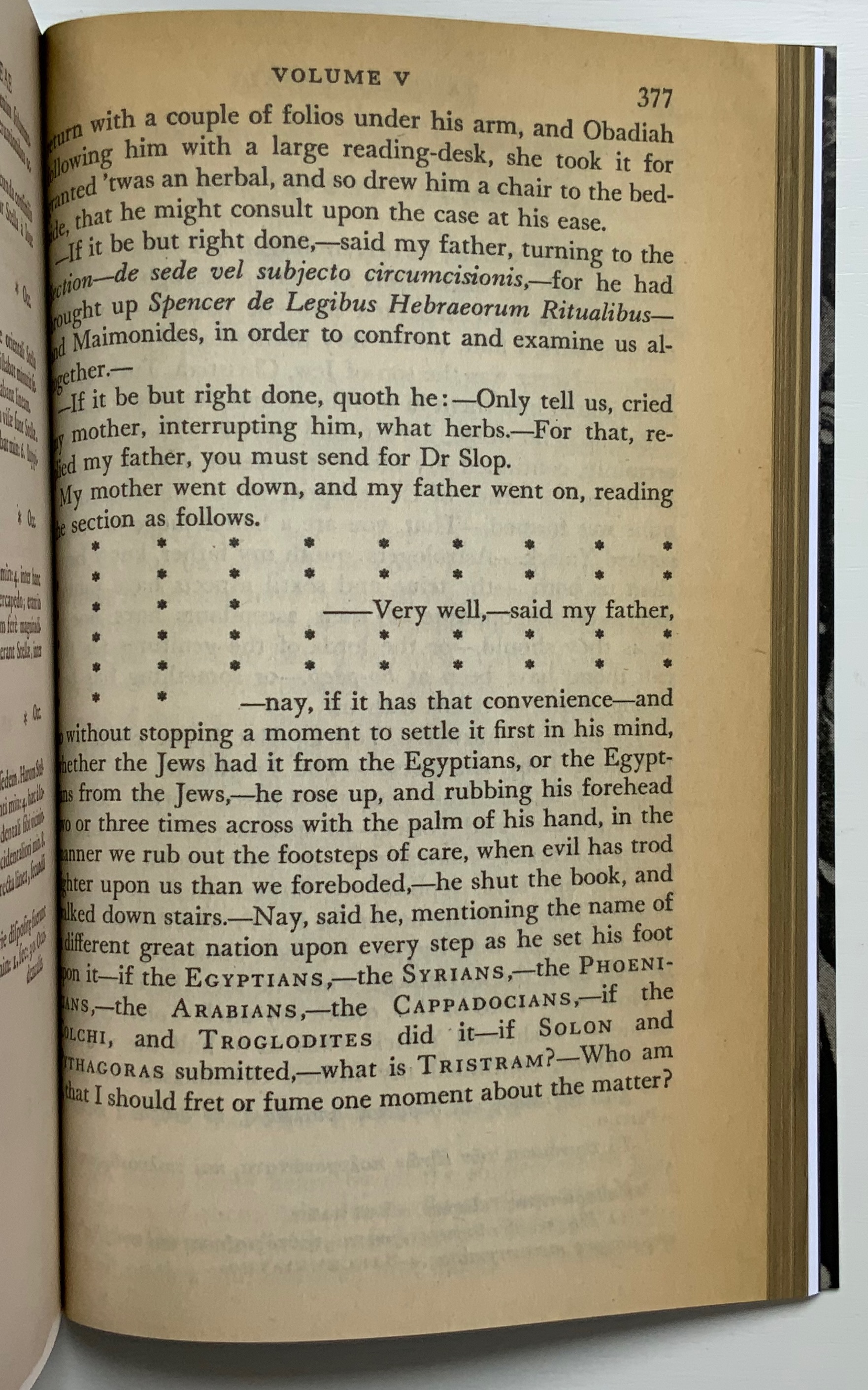
So much in Tristram Shandy is presented out of order: a second dedication comes not after the first but on page 27, the preface is not at the beginning of the novel but in chapter 20 of volume three, and chapters 18 and 19 of volume nine come not after chapter 17 but are inserted after chapter 25. In a similar act of transposition, we find a marbled page in volume three, even though hand marbling is customarily used to decorate covers and endpapers. As Viktor Shklovsky observed, “It is precisely the unusual order of even common, traditional elements that is characteristic of Sterne.” (p. 240)

This one paragraph confers on Lüthi’s entire book the very self-reflexivity that it explores across a range of literature and artists’ books. Reflecting the custom to which it refers, On The Self-Reflexive Page II carries Sterne’s marbled pages on its front and back covers. In the text before his marbled leaf, Sterne refers to it as the “(motly emblem of my work!)“. Lüthi has taken that exclamation to heart (and cover) as if it were advice in creating this hybrid, motley work of his own: “part artist’s book and part essay, part literary excavation and part typographical miscellany” as he calls it in his middle-of-the-book Foreword.

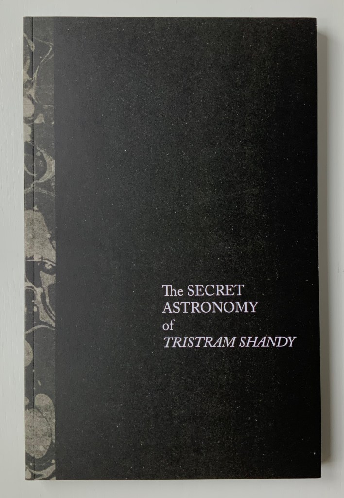
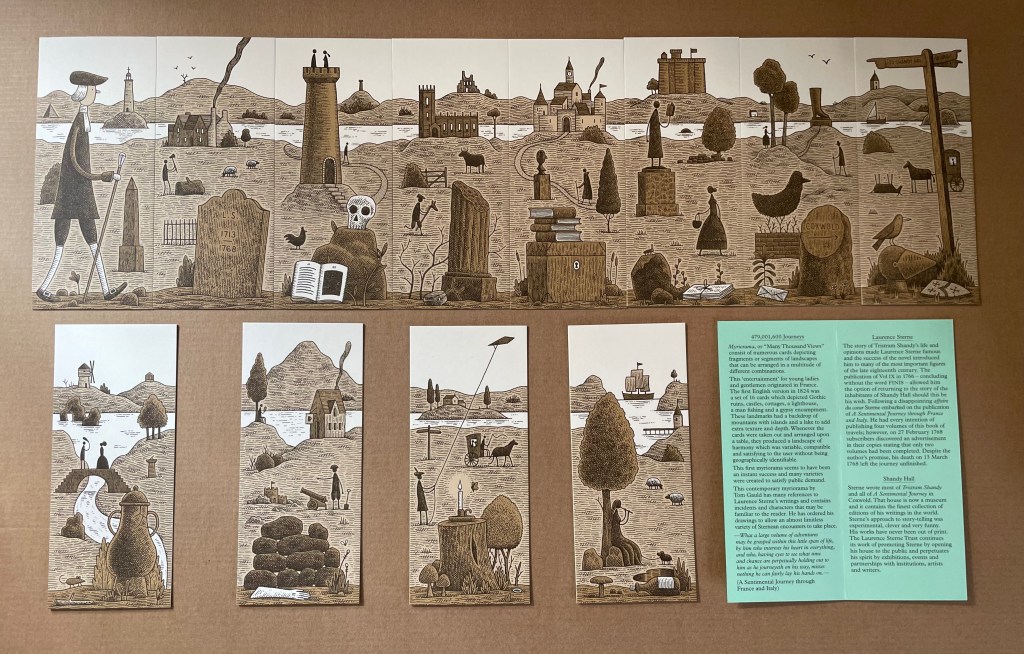
Lüthi’s work is just one in the Books on Books collection of several inspired by Tristram Shandy. There is Erica Van Horn’s Born in Clonmel (2011), Simon Morris’ Do or DIY (2012), Abra Ancliffe’s The Secret Astronomy of Tristram Shandy (2015), and Shandy Hall‘s The Black Page Catalogue (2010), Emblem of My Work (2013), Paint Her To Your Own Mind (2018) and The Flourish of Liberty (2019). Outside the collection, there is Brian Dettmer’s Tristram Shandy (2004), commissioned by Shandy Hall’s Laurence Sterne Trust, and also Sean Silver’s Shandean online venture called The Motley Emblem (2022~) celebrating Sterne’s marbled leaf and the analytical chemistry of marbling. The latter may become a book, even an artist’s books to add to the tally. In The Century of Artists’ Books, Johanna Drucker draws attention to Sterne’s novel twice as an example of self-reflexivity or self-interrogation, but in 1994 and 2004, Sterne did not rise to the same level of precursor to book artists as William Blake or Stéphane Mallarmé in Drucker’s view. With these later works of book art inspired by Uncle Toby’s nephew in the bag, a dozen or so more might nudge Sterne up the scale.

In the meantime, anyone interested in artists’ books could fruitfully apply to the medium Sterne’s exhortation to his own readers:

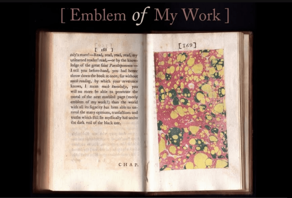
Read, read, read, read, my unlearned reader! read, — or by the knowledge of the great faint Paraleipomenon — I tell you before-hand, you had better throw down the book at once; for without much reading , by which your reverence knows, I mean much knowledge, you will no more be able to penetrate the moral of the next marbled page (motly emblem of my work!) than the world with all its sagacity has been able to unraval the many opinions, transactions and truths which still lie mystically hid under the dark veil of the black one.

Artists’ books are to be read, handled and digested, not stored away in the archives.

Further Reading

The First Seven Books of the Papier Biënnale Rijswijk“. 10 October 2019. Books On Books Collection.

Maureen Richardson“. 28 September 2019. Books On Books Collection.

Silver, Sean. 2022~. The Motley Emblem. Rutgers: Rutgers University. A website that celebrates Sterne, paper marbling and much more related to them.

Books On Books Collection – Inscription: The Journal of Material Text, Issue 4 on Touch

Inscription: The Journal of Material Text, Issue 4 on Touch
Simon Morris, Gill Partington and Adam Smyth (eds.)
Cased perfect bound paperback, printed paper cover. 313 x 313 mm. 120 pages. ISSN: 2634-7210. Acquired from Information as Material, 29 November 2023.
Photos: Books On Books Collection.

Different readers will come to different conclusions on whether Inscription #4 dedicated to the subject of touch evokes the level of tactility in Melville’s famous Chapter 94 “A Squeeze of the Hand”. But all can agree that they share a certain seminality. Like Herman Melville with his preliminaries to Moby Dick, the editors of Inscription lead their fourth issue with definitions and choice quotations on the subject of “touch”, as much a Leviathan subject as that of Melville’s novel. Where Melville merged scholarly apparatus with narrative fiction to create a novel literary work, Simon Morris, Gill Partington and Adam Smyth have merged photography, poetry, augmented reality and audio with academic and critical essays to create a novel form of scholarship.

Continue reading

Books On Books Collection – Inscription: The Journal of Material Text, Issue 3 on Folds

Now here’s a rare thing — a journal issue that requires a video to show the reader h0w to open it.

Continue reading

Books On Books Collection – Abra Ancliffe (I)

Personal Libraries Library (Winter 2009-10 to Spring/Summer 2021)

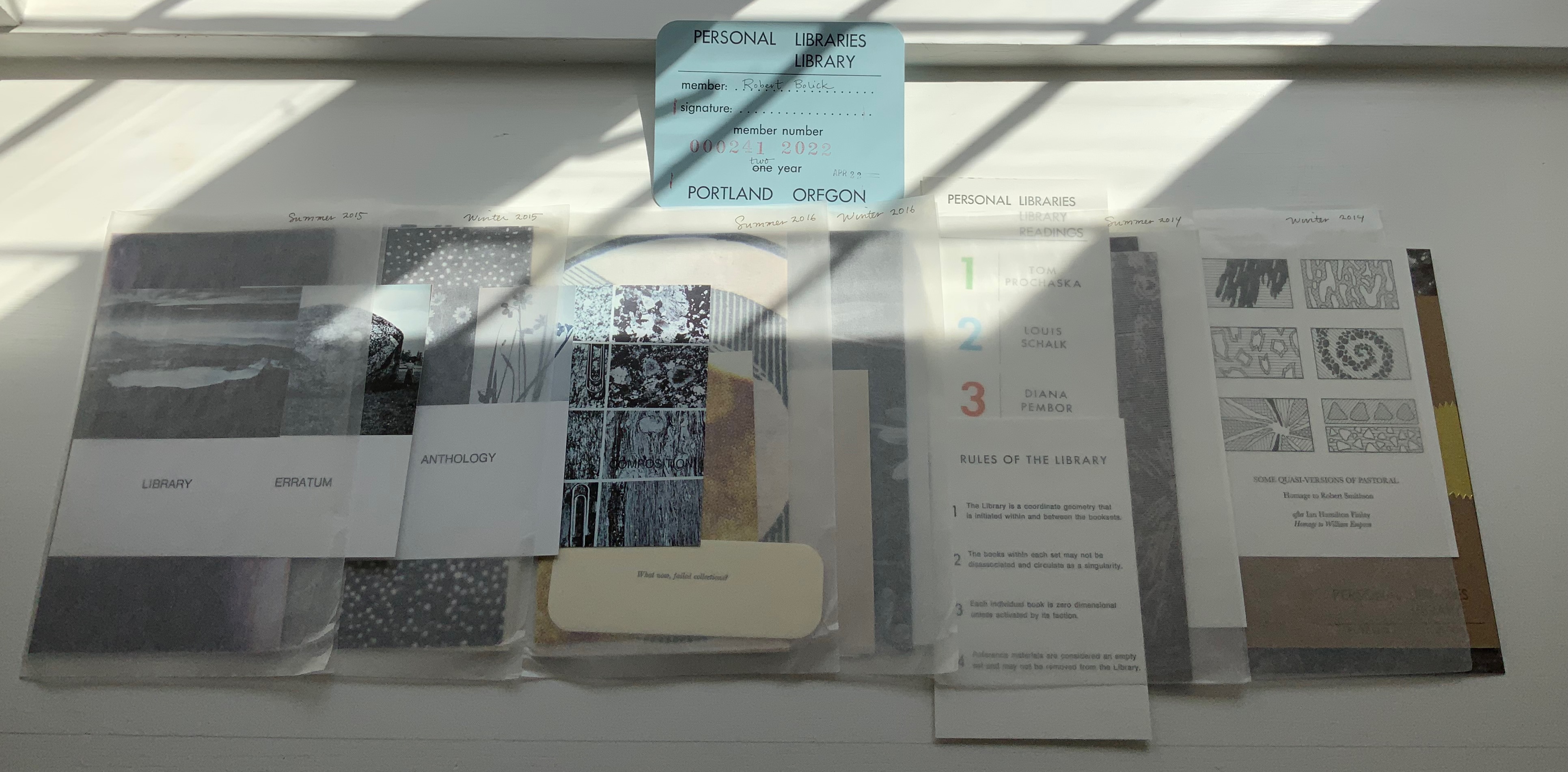
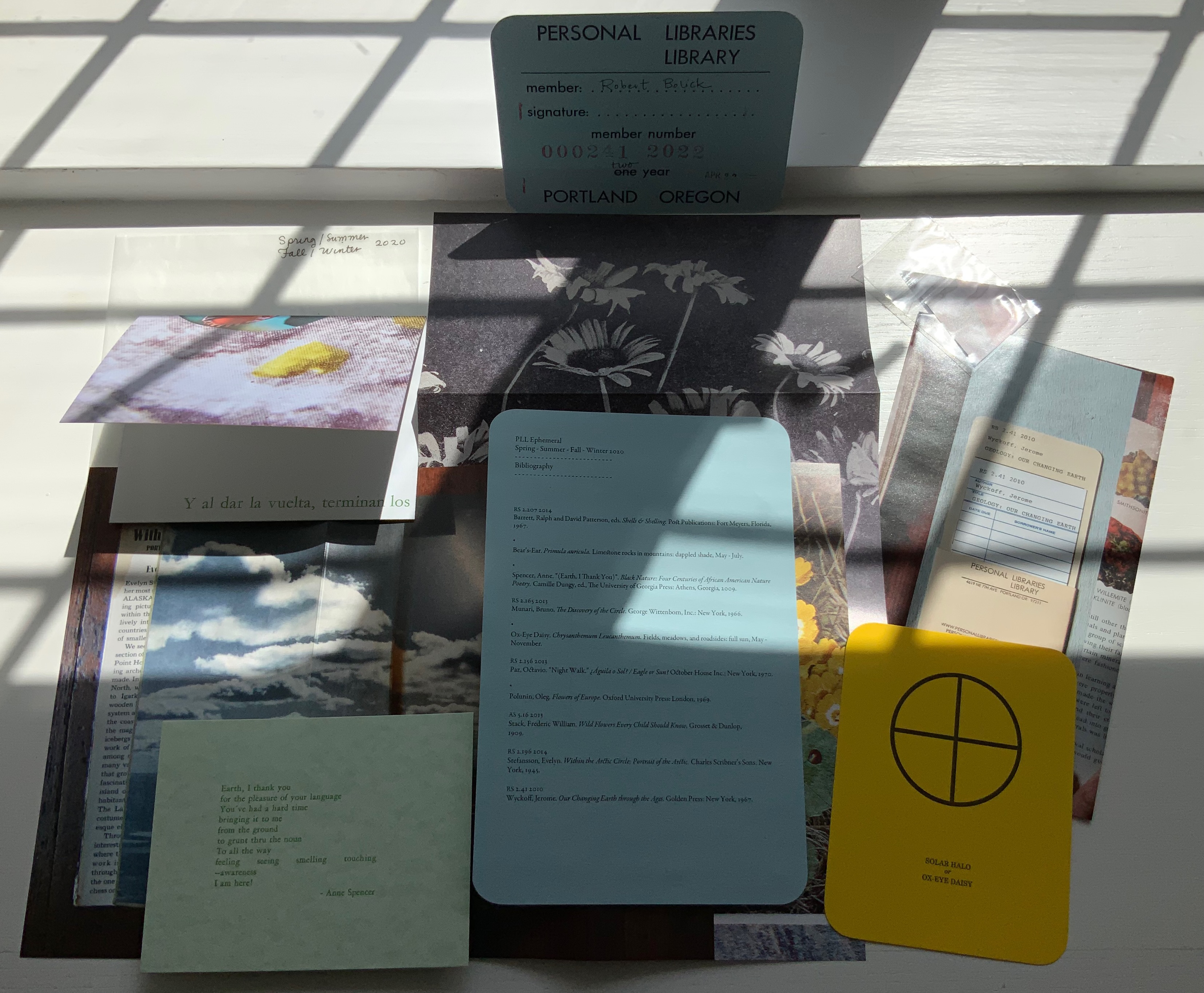
Imagine belonging to a library composed of selected personal libraries and housed on another continent. Imagine that the Librarian who selects those personal libraries and hunts down copies of the works (preferably the same editions) needed to recreate those libraries completely is also constantly harvesting them for cross-references and delivers the discoveries to you in the form of ephemera. It exists. I have a library card for it.

Personal Libraries Library (2009 to present)
Abra Ancliffe
Various forms. Acquired from the artist, 11 April 2022.
Photos: Books On Books Collection.

Since 2009, Abra Ancliffe has been replicating and making art from the personal libraries of

Maria Mitchell (1818-1889), Massachusetts astronomer, educator, suffragist and librarian
Robert Smithson (1938-1973), New Jersey-born land artist, sculptor and art theorist
Jorge Luis Borges (1899-1986), Argentinian writer of fiction, poetry and essays
Italo Calvino (1923-1985), Cuban-Italian writer of fiction, poetry and essays
Anne B. Spencer (1882-1975), Virginia-based member of the Harlem Renaissance circle, poet, civil rights activist, teacher and librarian [added in early 2014]

Each personal library has a catalogue derived from our Librarian’s research and consultation with foundations associated with each of the owners. Each library has its wish list of works needed to complete the holdings; and a Reference Library Catalogue for background on each of the owners has been added. But why these particular personal libraries? Was there a rule?

The library itself has rules (courtesy of our Librarian’s fellow artist Larissa Hammond):

1 The Library is a coordinate geometry that is initiated within and between the booksets.
2 The books within each set may not be disassociated and circulate as a singularity.
3 Each individual book is zero dimensional unless activated by its faction.
4 Reference materials are considered an empty set and may not be removed from the Library.

Given such rules, it is no surprise that our Librarian has included Borges. The fabulist of “The Library of Babel” once held the job of first assistant in a Buenos Aires municipal library and reportedly remarked “if I were asked to name the chief event in my life, I should say my father’s library” and “I always imagined Paradise to be some kind of a library”. Also, given such rules and the inclusion of Borges, could the Cuban-Italian Italo Calvino, a member of the Oulipo movement, be far behind?

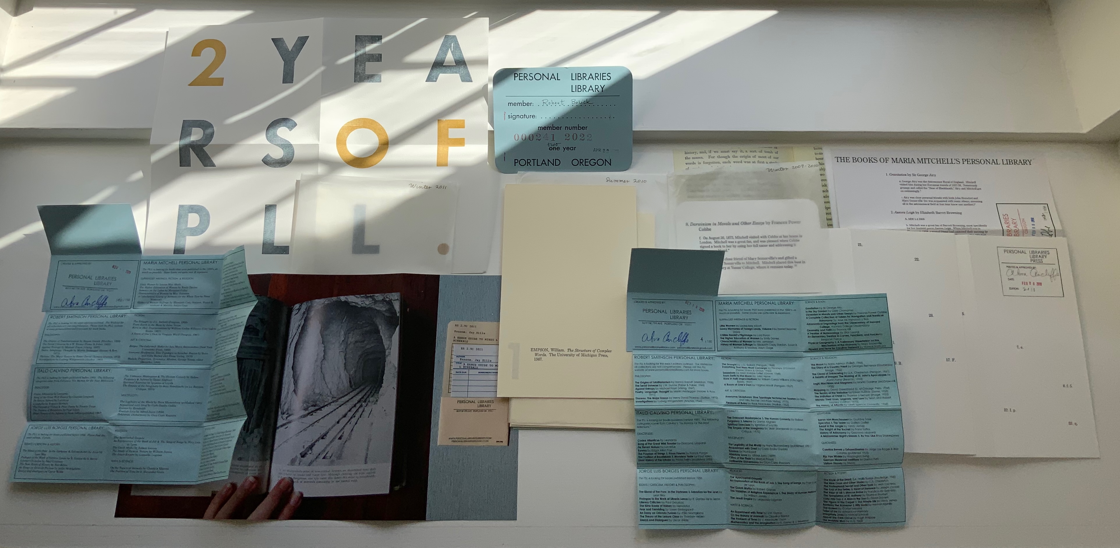
Maria Mitchell’s personal library was the seed or germinating star of the PLL in the winter of 2009-2010 (see the item in the upper right corner of the photo above). Flowers and constellations are two elements in the coordinate geometry that our Librarian finds “within and between the booksets”.

Another link between the libraries are the books common to more than one library. For instance, Ralph Waldo Emerson’s Essays appears in Maria Mitchell’s and Robert Smithson’s libraries. Perhaps there is a sort of transcendentalism driving the library! How appropriate that the first book from Mitchell’s library acquired and the first in the PLL was Ralph Waldo Emerson’s Essays.

By virtue of these collage-like connections that our Librarian draws in the periodic issues of ephemera, a book published at a later date may seem to belong equally to an earlier owner. Perhaps, as in the collages into which the ephemera can fall, “one book may hide another” to paraphrase Kenneth Koch. The issues of ephemera arrive like challenges to Robert Smithson’s notion of site and non-site works of art. They are works that depend and do not depend on their site. They arrive so similar and so different, regular enough but sporadic enough, that they are like “Miss Mitchell’s comet” — non-periodic (until it appears again).

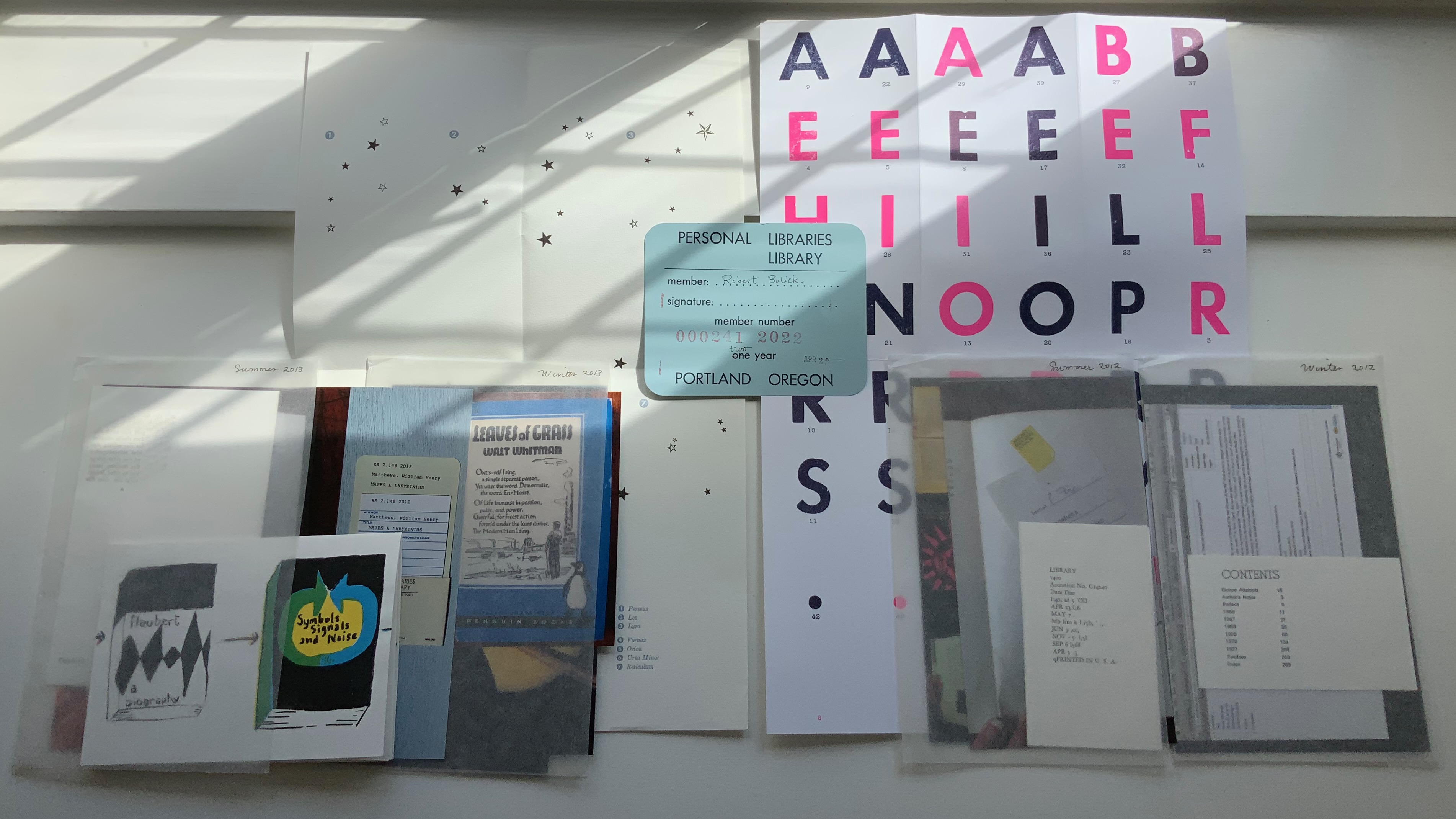
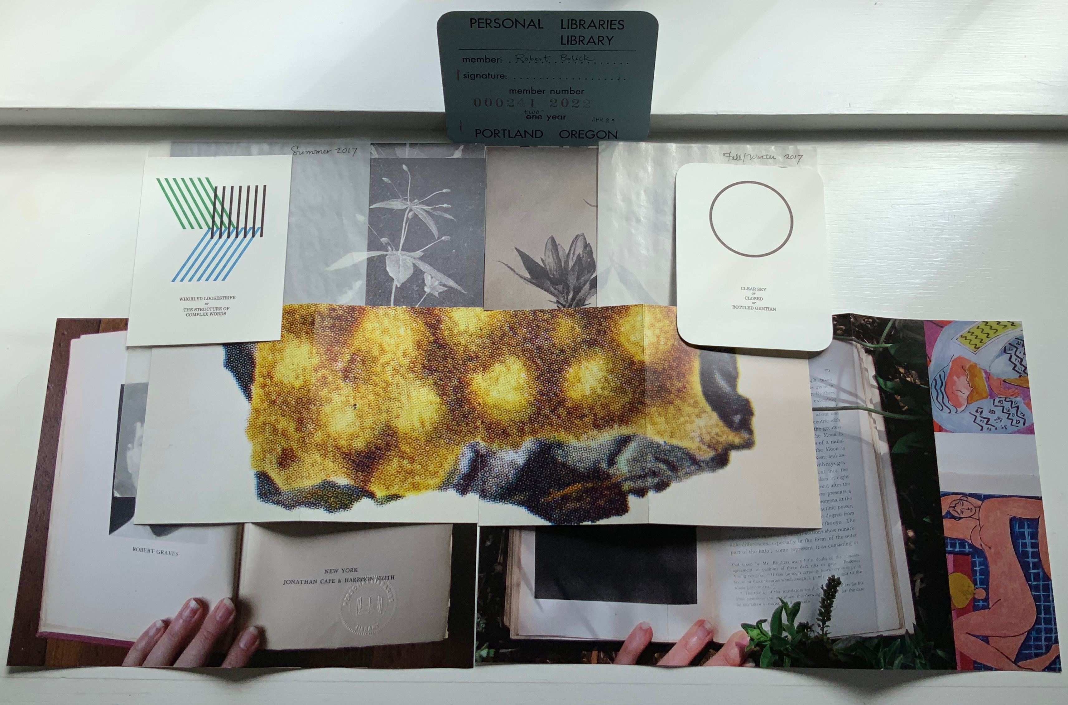
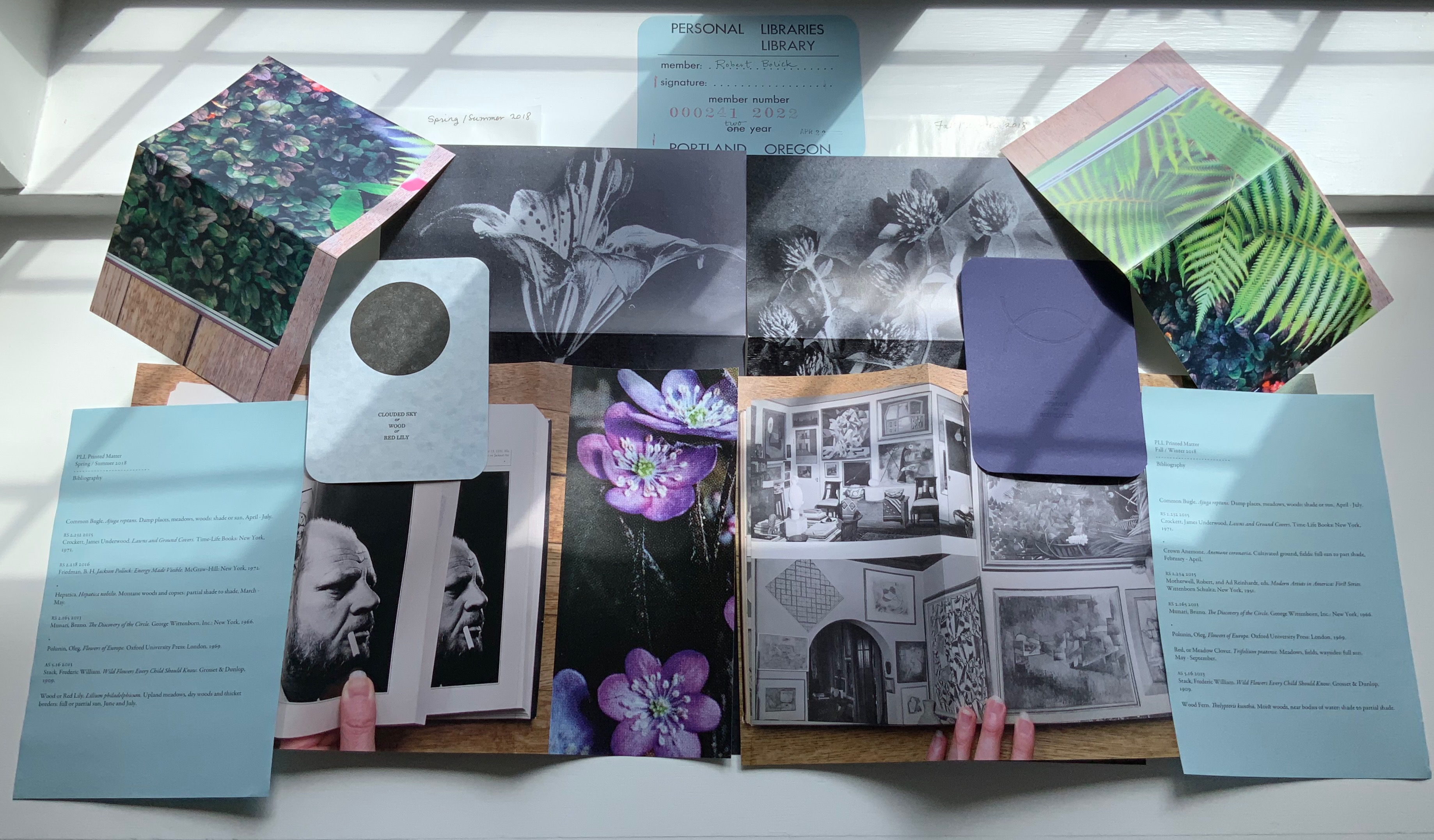
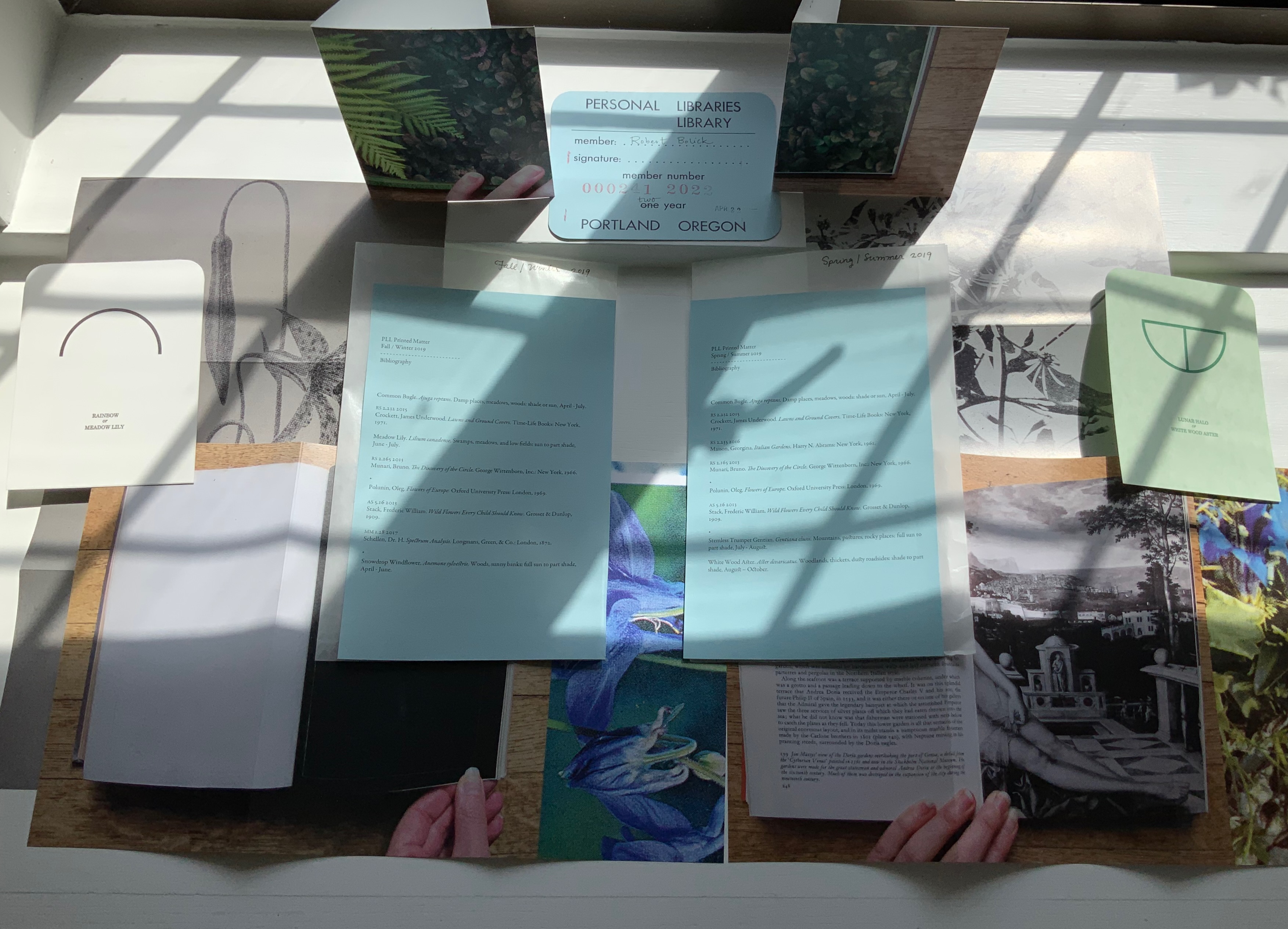
PLL Ephemeral Issues.
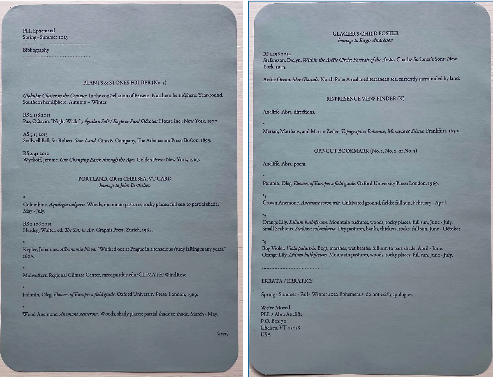
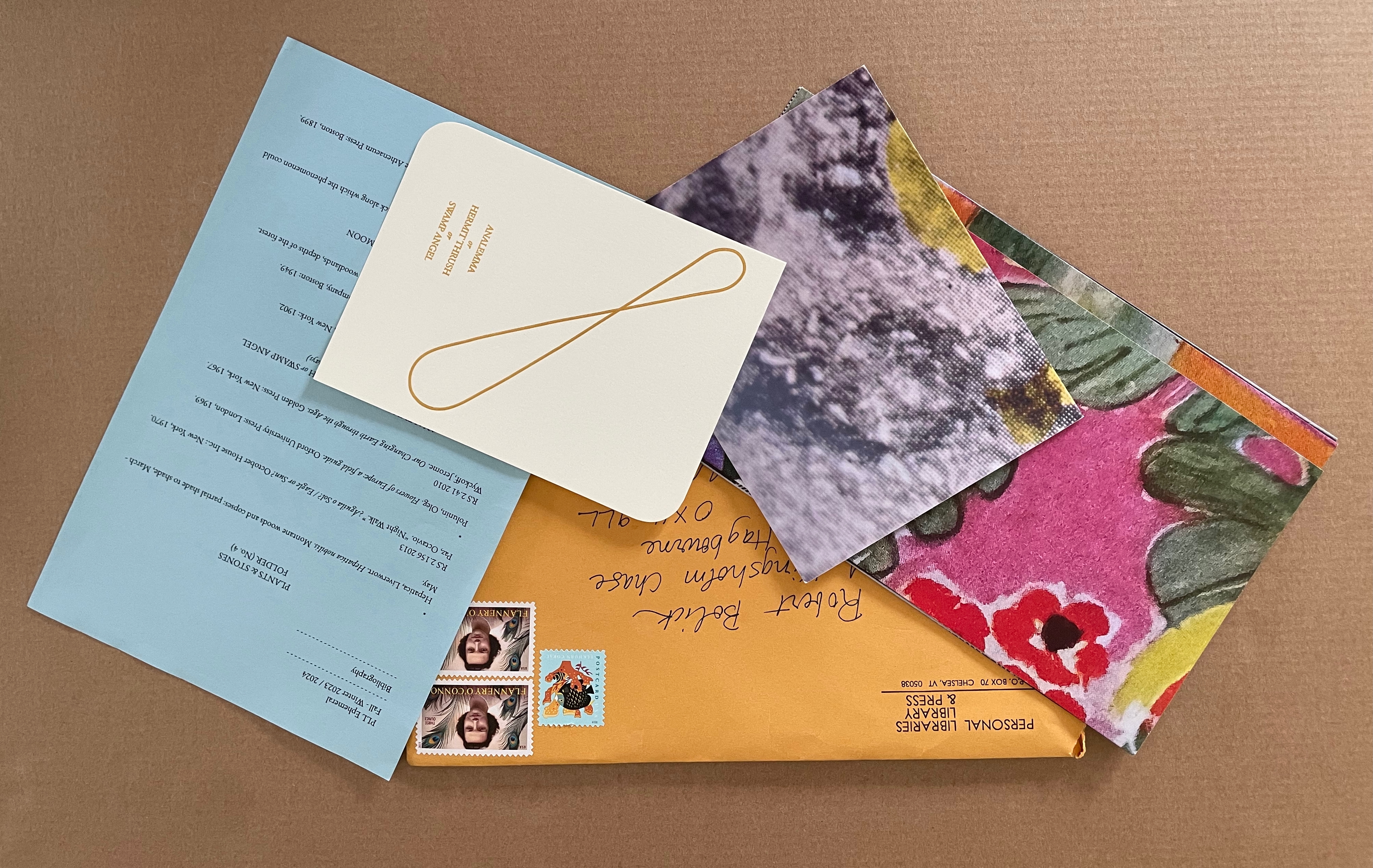
Top down and left to right: 1) PLL 2011 Winter, PLL 2010 Summer, PLL 2009-10 Winter. 2) PLL 2013 Summer/Winter, PLL 2012 Summer/Winter. 3) PLL 2016 to 2014. 4) PLL 2017 Summer/Winter. 5) PLL 2018 Spring/Summer, Fall/Winter. 6) PLL 2019 Spring/Summer, Fall/Winter. 7) PLL 2020 Spring/Summer, Fall/Winter. 8) PLL 2021 Spring – Summer. 9) PLL 2023 Spring-Summer 10) PLL 2023-2024 Fall Winter.

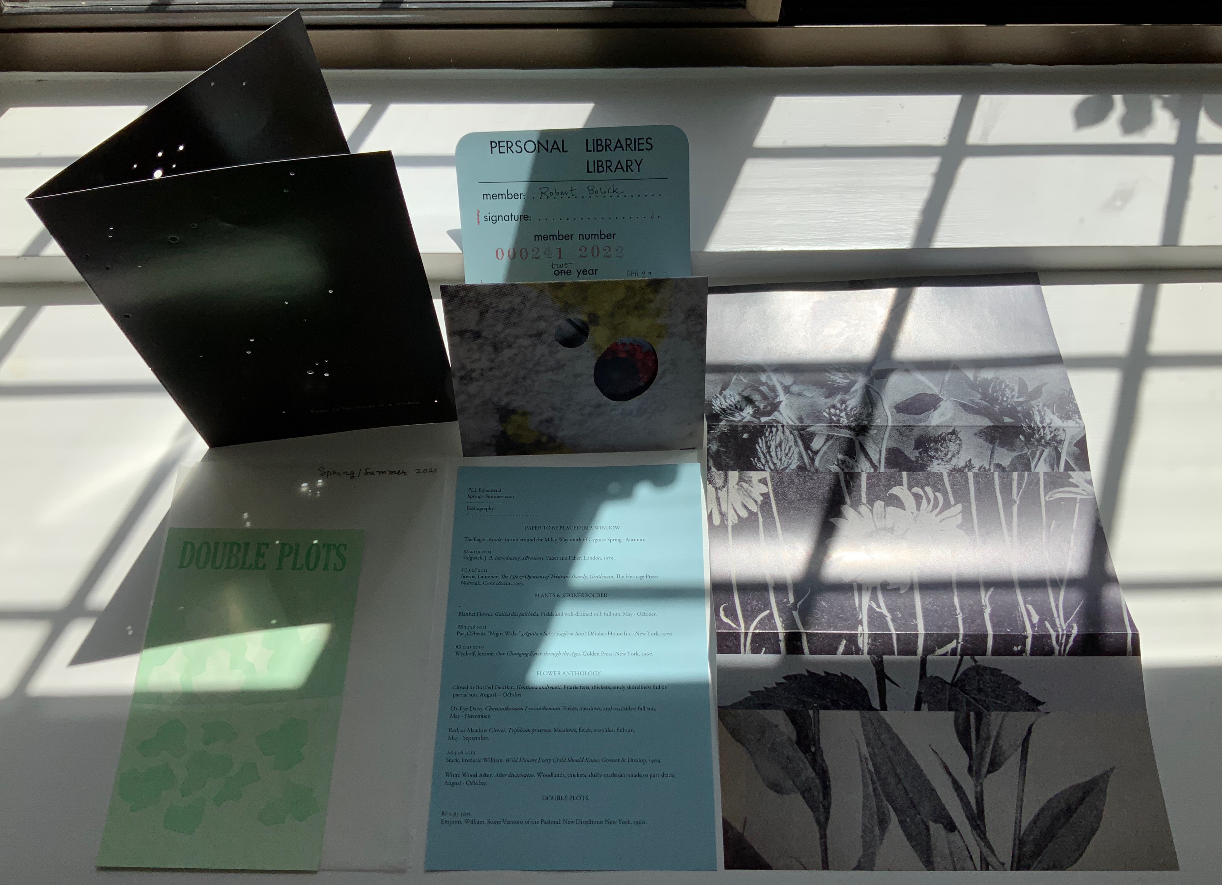
The ephemera themselves represent “collaborations” among the personal libraries — courtesy of our Librarian’s reading of the Library’s “coordinate geometry”, of course. For the Spring/Summer 2021 issue, the first piece of ephemera listed on the blue manifest (its Bibliography) is “Paper to be Placed in a Window” (see the upper left-hand corner of the photo immediately above). Glossy black on both sides, the single folded sheet displays an astronomical photo with holes of different size punched to let light light up the constellation.

According to the manifest or Bibliography, the work connects the constellation Aguila (Eagle) “in and around the Milky Way south of Cygnus” with J.B. Sedgwick’s Introducing Astronomy from Smithson’s library and with Laurence Sterne’s The Life & Opinions of Tristram Shandy, Gentleman from Calvino’s. The connection with Sedgwick is obvious. The connection with Sterne’s novel may be obvious to readers familiar with its “black page”, or will be to readers here who proceed to the entry for the next of Abra Ancliffe’s works in the Books On Books Collection.

The Secret Astronomy of Tristram Shandy (2015)

The Secret Astronomy of Tristram Shandy (2015)
Abra Ancliffe
Paperback. H175 x W273 mm, unpaginated. Edition of 100. Acquired from the artist, 11 April 2022.
Photos: Books On Books Collection.

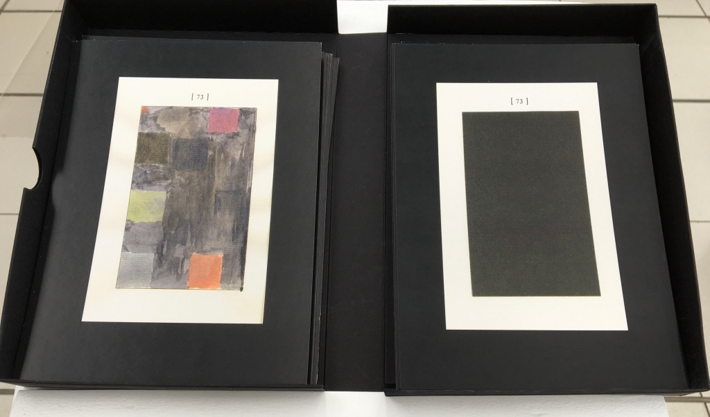
It is no surprise that Ancliffe’s work of book-art-cum-academic-treatise is part of the Laurence Sterne Trust Foundation’s permanent collection. Like Shandy Hall’s own The Black Page Catalogue (2010), The Secret Astronomy extrapolates and celebrates page 73 with the same whimsy and seriousness that the 73 writers and artists invited to make their own Black Page exercised. In its own self-publishing status, it also underscores like Simon Morris’s manifesto Do or DIY (2012) the same status of Sterne’s work as a forerunner to the self-published, self-referential works of book art of the mid- to late 20th century. It is Ancliffe’s elevation of the self-reflexive academic treatise to art status that secures The Secret Astronomy its position in the Books On Books Collection.

L-R: Shandy Hall, The Black Page Catalogue (2010); Simon Morris, Do or DIY (2012).

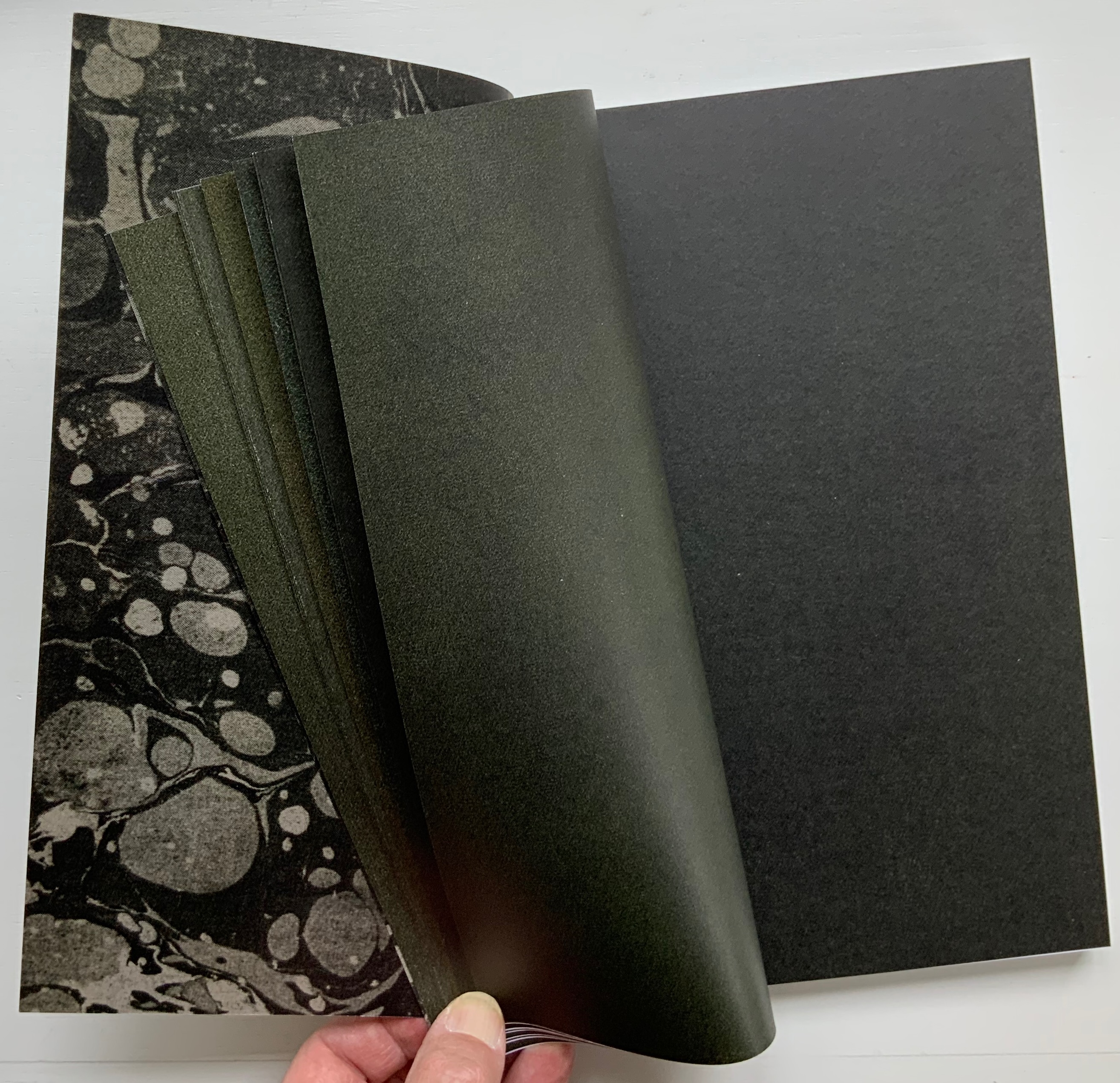
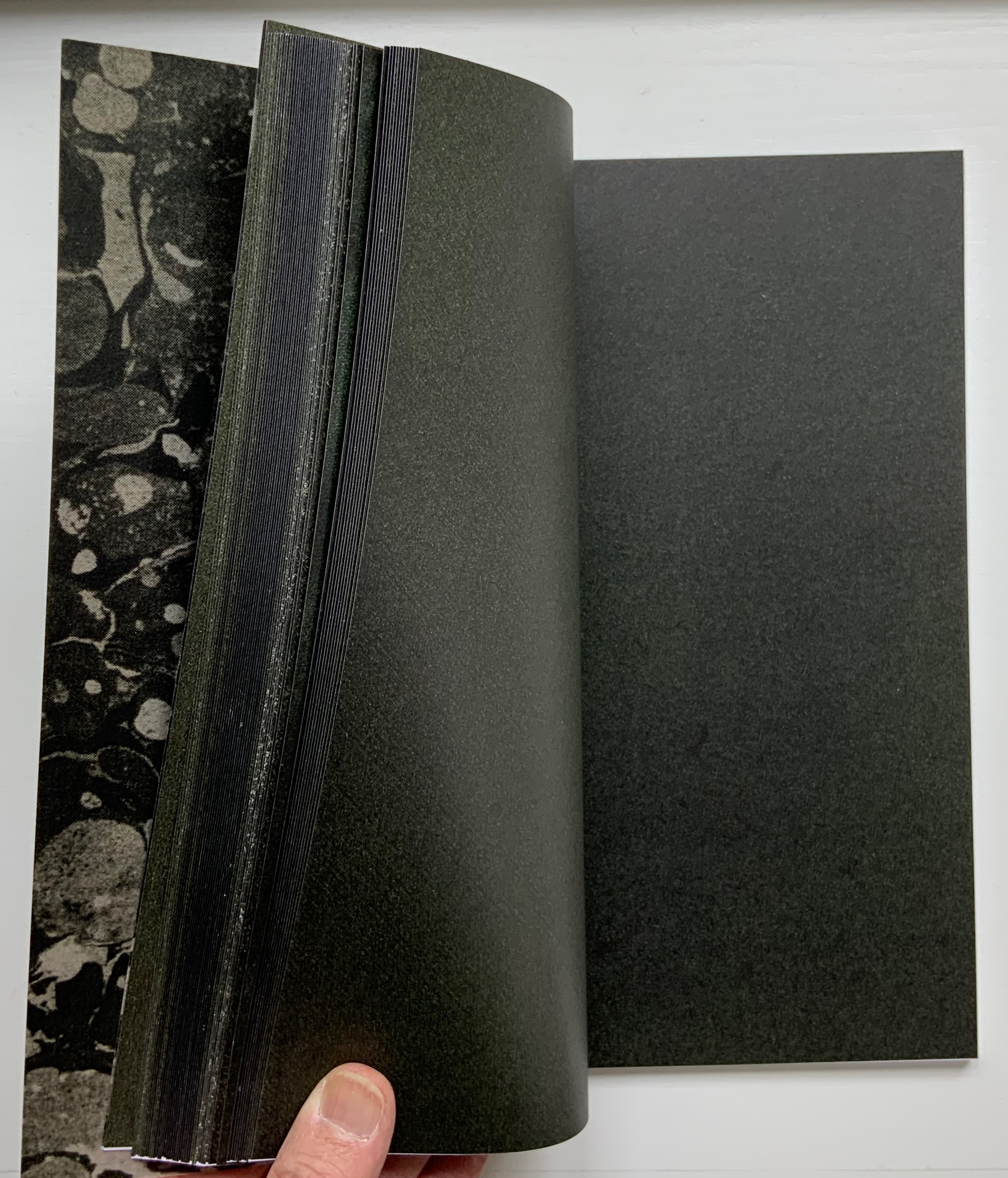
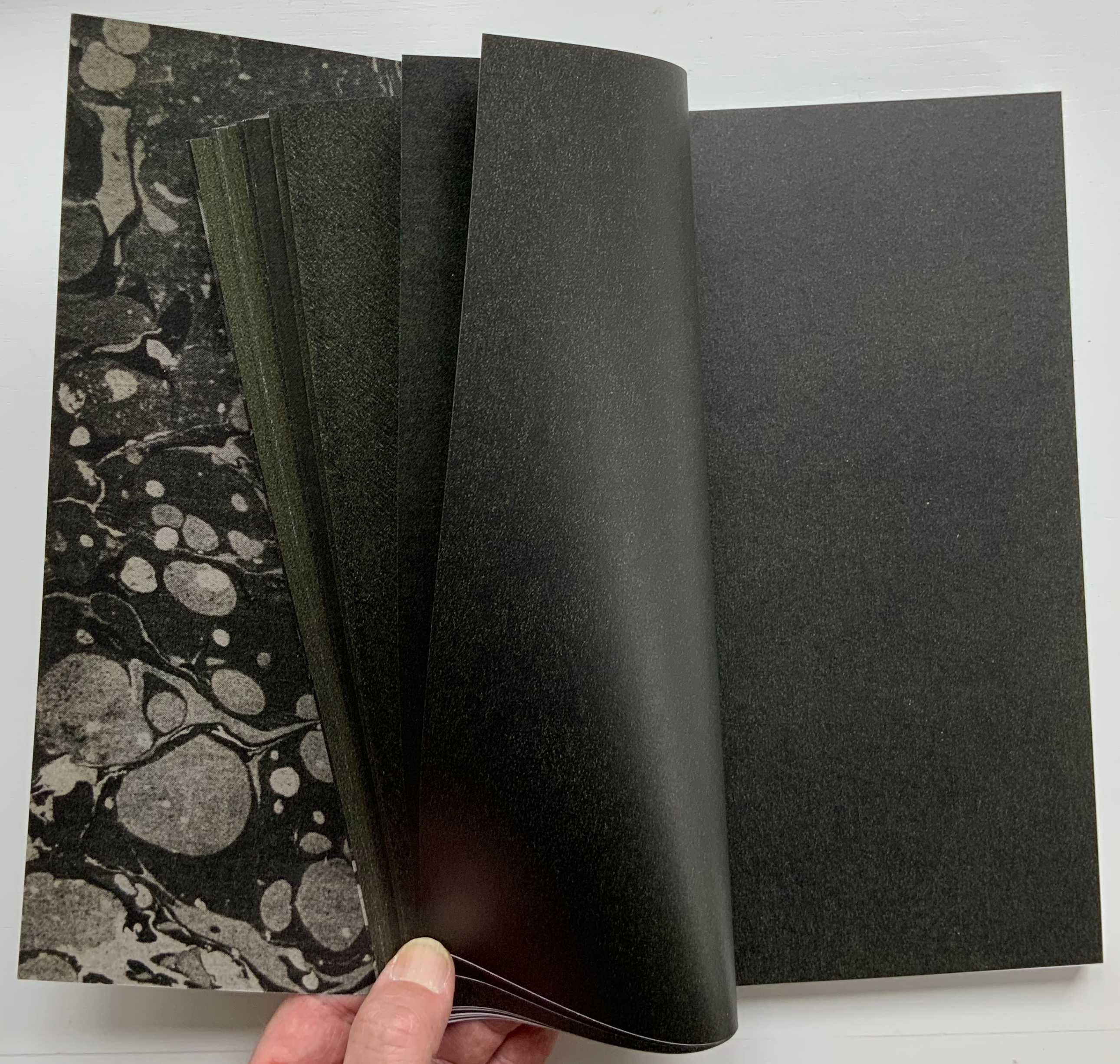
The rectangle of black appearing on page 173 in the first edition of Sterne’s novel faces the brief announcement of Parson Yorick’s death on page 172: “Alas, poor Yorick”. Taking off on the concept of academe’s variorum edition, Ancliffe has reproduced the black pages from more than one hundred editions of Sterne’s novel. What is a singularity in the novel becomes a contemplation of a regularity that reveals a material irregularity since the 1759 edition. Densities of ink have varied, oxidation occurred, spots from lint and fingerprints accumulated — even show-throughs from the next chapter’s text — so that the eye begins to read the accumulated pages for astronomical images — Tristram’s and Sterne’s secret astronomy. (The temptation to Grangerize this work by slipping into it Ancliffe’s ephemera “Paper to be Placed in a Window” is strong.) Ancliffe urges forward her case for the discovery of a secret astronomy with a series of appendices, one of which draws attention to Sterne’s use of the asterisk in the novel and proposes one of its hidden kabbalistic meanings in an equation: if star = *, and Sterne = star, then Sterne = *. There is even the dutiful source appendix listing all of the editions from which black pages have been gathered.

Pages 169-70 of the first edition of Tristram Shandy account for another famous singular, regular irregularity — the marbled page, which Tristram calls “the motly emblem of my work”. Ancliffe’s black, brown and gray marbled spine and inside covers make for an apt, ironic and artistic stroke — a reminder of the element of chance that is so characteristic of Sterne’s narrative project, of The Secret Astronomy, and of the ephemera arising from the Personal Libraries Library.

From Shandy Hall’s Emblem of My Work blog, accessed 18 September 2019.

This entry continues with three other works by Ancliffe. To continue reading, click here.

Further Reading

Abra Ancliffe (II)“. 31 May 2026. Books On Books Collection.

Shandy Hall“. 1 January 2021. Books On Books Collection.

Jorge Luis Borges“, last edited on 8 May 2022. Wikipedia. Accessed 15 May 2022.

Italo Calvino“, last edited 20 April 2022. Wikipedia. Accessed 15 May 2022.

Maria Mitchell“, last edited 8 March 2022. Wikipedia. Accessed 15 May 2022.

Robert Smithson“, last edited 14 May 2022. Wikipedia. Accessed 15 May 2022.

Anne B. Spencer“, last edited 25 April 2022. Wikipedia. Accessed 15 May 2022.

Baldwin, Kate, Denise Bookwalter, Sarah Bryant, Macy Chadwick and Tricia Treacy. 2021.REF. Another work that finds its art in libraries.

Davis, Brian. 1 May 2024. “Part One: The Rise of Multimodal Book-Archives“. Book Art Theory. Starkville, MS: College Book Arts Association. Explores “archival poetics”, finding art by harvesting archives and libraries.

Davis, Brian. 15 May 2024. “Part Two: Warren Lehrer’s Life in Books“. Book Art Theory. Starkville, MS: College Book Arts Association.

Grimm, Tracy, and Adriana Harmeyer. 2023. “Special Collections as Muse: The Use of Rare Books and Archives to Inspire Creative Works“. West Virginia University Faculty & Staff Scholarship.

Morris, Robert. 1962. Card File. A neo-Dadaist instance of “archival poetics”?

Starr, Tyler. 2017. Identification of Cars Participating in Klan Rally at Montgomery Alabama, March 21, 1965. Another example of “archival poetics”.

Books On Books Collection – Inscription 2 on Holes

Inscription: The Journal of Material Text – Theory, Practice, History, Issue 2 on Holes (2021)
Simon Morris, Gill Partington and Adam Smyth (eds.)
Perfect bound softcover, H314 x W314 mm, 180 pages. Editions included: Fiona Banner (aka Vanity Press), Full Stop, front & back covers; Kendell Geers, Stripped Bare, end papers; Carolyn Thompson, The Beast in Me, H1180 x W1180 mm; Erica Baum, Piano Rolls, H120 x W120 closed, W960 mm open; Harold Offeh, Crystal Mouths, H210 x W105 closed, W480 mm open; David Bellingham, Cigar Burn Apertures, H210 x W105 mm; Miranda July, Bookmark, H302 x W54 mm; Christian Bök, Supermassive, LP. Acquired from Information as Material, 10 October 2021.
Photos of the issue: Books On Books Collection.

How materially perverse is it that the second issue of Inscription is devoted to “the hole”, yet it is the first issue that actually has a hole in it? The first issue of Inscription did set a seriously playful — or playfully serious — tone, and the second issue does not fail to maintain it. The second issue continues the dos-à-dos binding but with only the front and back covers as the external giveaway. In the middle of this single-spine paperback, pages 1-90 meet an inverted pages 90-1 in the middle, which prompts the reader to turn the open book 180° and flip back to page 1. From either direction, the reader meets the traditional backmatter of a journal in the middle.

Inverted cover and center of Inscription (2021).

Such reversals of expectation call for a countervalent design element to avoid too much confusion. In this issue, that element consists of constant earth-tone backgrounds framing constant black-on-white text boxes (square holes?) for each article. Even within these constants, reversals of expectation play out. The backgrounds are drawn from 14 different sources, ranging from laid paper samples, parchment, pulp and brown boards to a slice of Emmental cheese (sorry, Gromit, no Wensleydale), and the layouts for each square hole differ, being taken from 16 other journals such as The Criterion, The Egoist and National Geographic.

List of backgrounds used throughout the issue.

List of publications whose layouts are used throughout the issue.

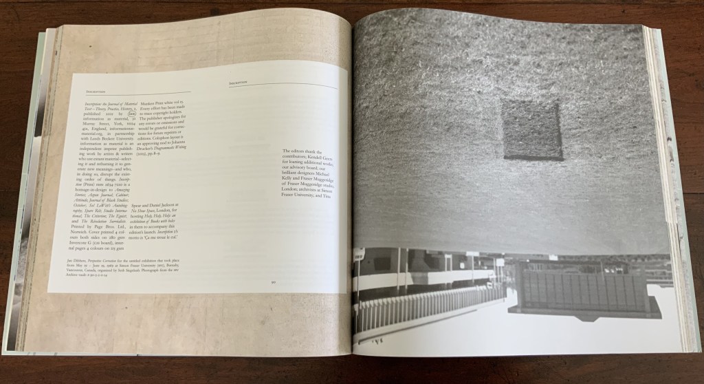
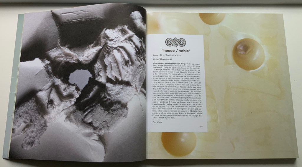
The Emmental cheese background around the opening of Marcinkowski’s essay; Hybrid wove/laid paper made for James Watt & Co around the opening of Lüthi’s essay.

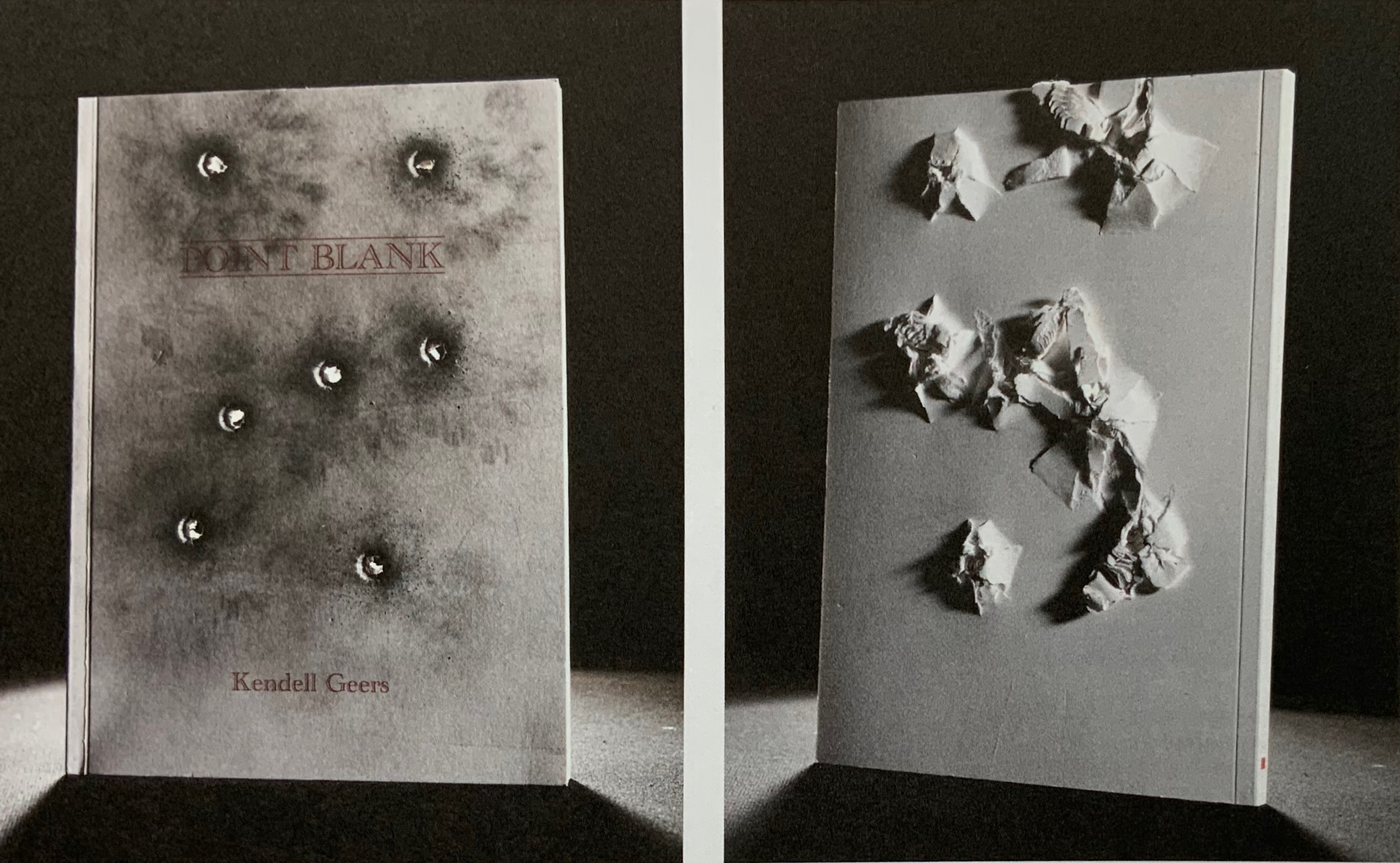
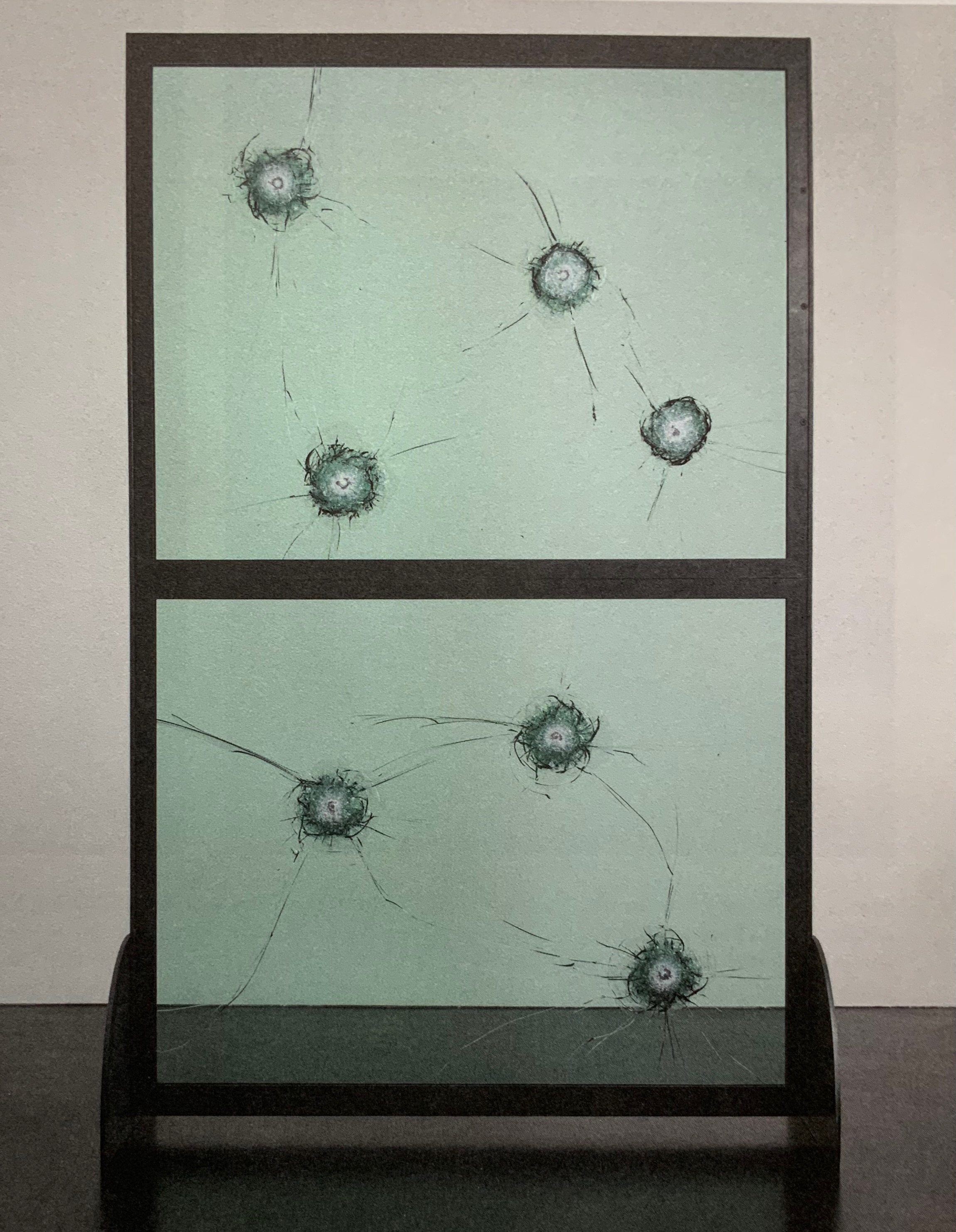
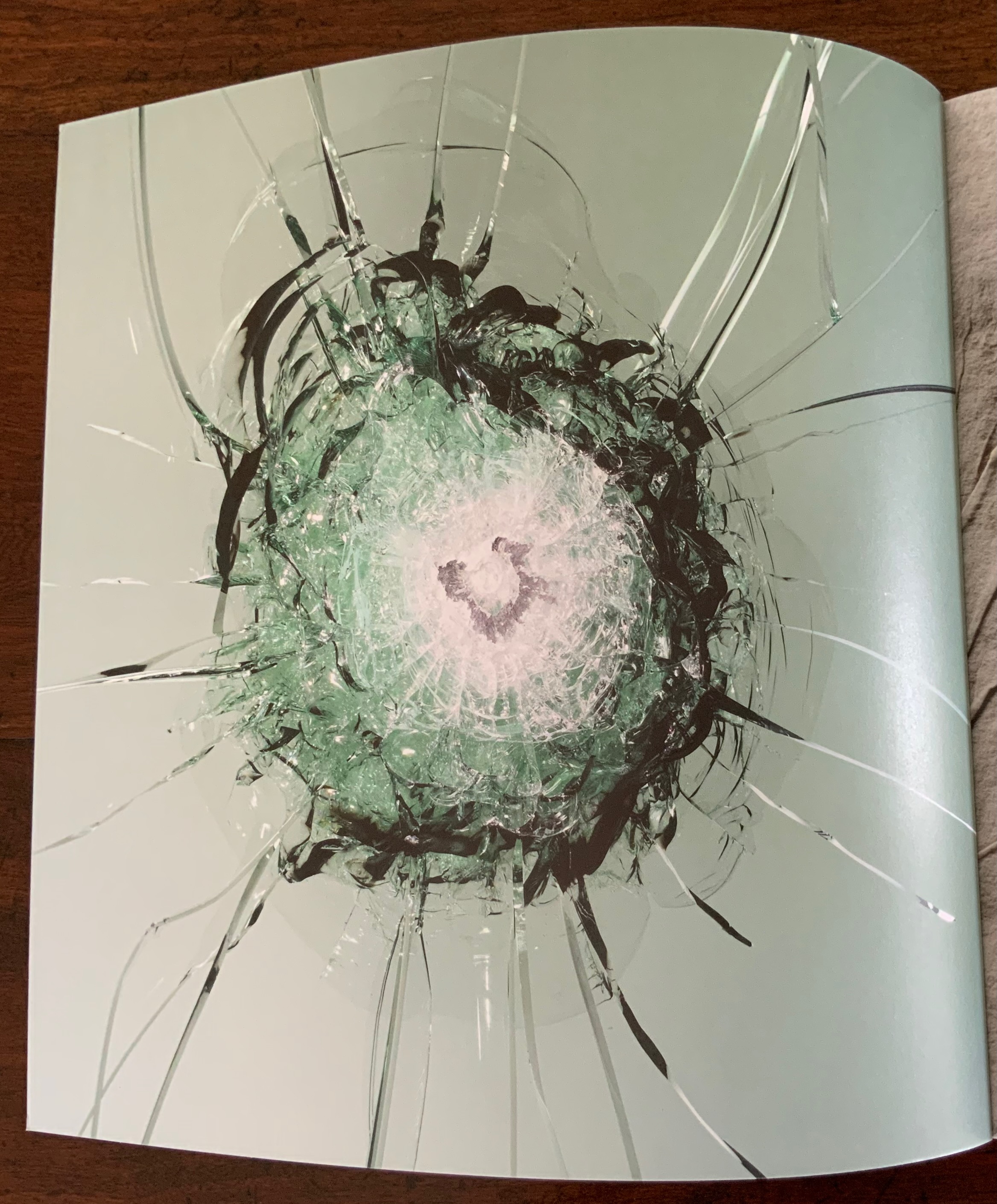
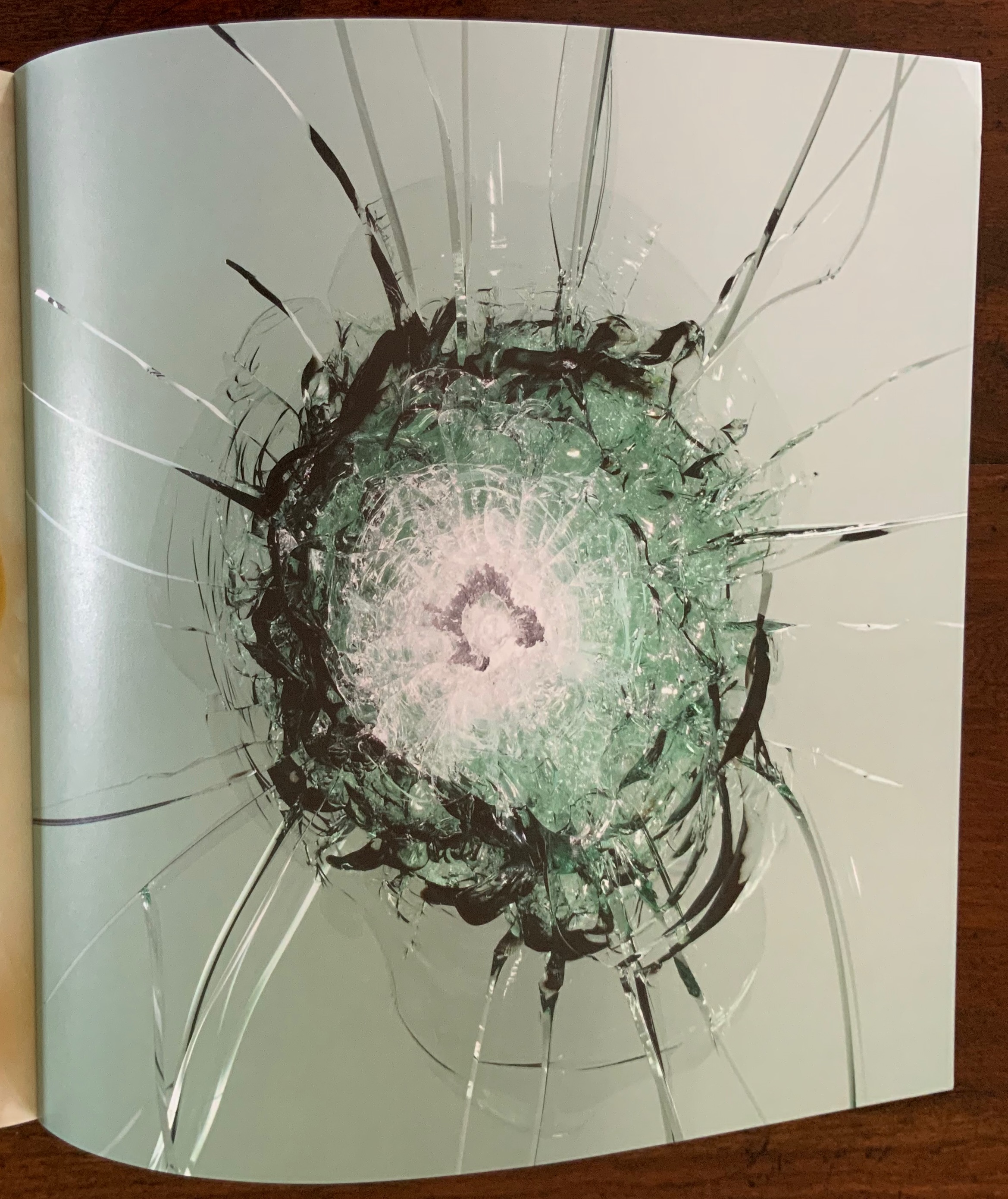
There is an even more recurrent “bass” line in this issue. It comes from the South African artist Kendell Geers, interviewed by the Editors. Even this bass line plays with variable perspective. Marking the start of most articles is a sheet bearing on recto and verso pages the image of a bullet hole (entry then exit) taken from Geers’ work Point Blank (2004). Bullet holes in glass — from Geers’ Stripped Bare (2009) — punctuate inversely the inside covers, bringing two symmetric/asymmetric openings to this topsy turvy production.

Kendell Geers, Point Blank (2004), front and back covers; Stripped Bare (2009; inside covers of Inscription (2021).

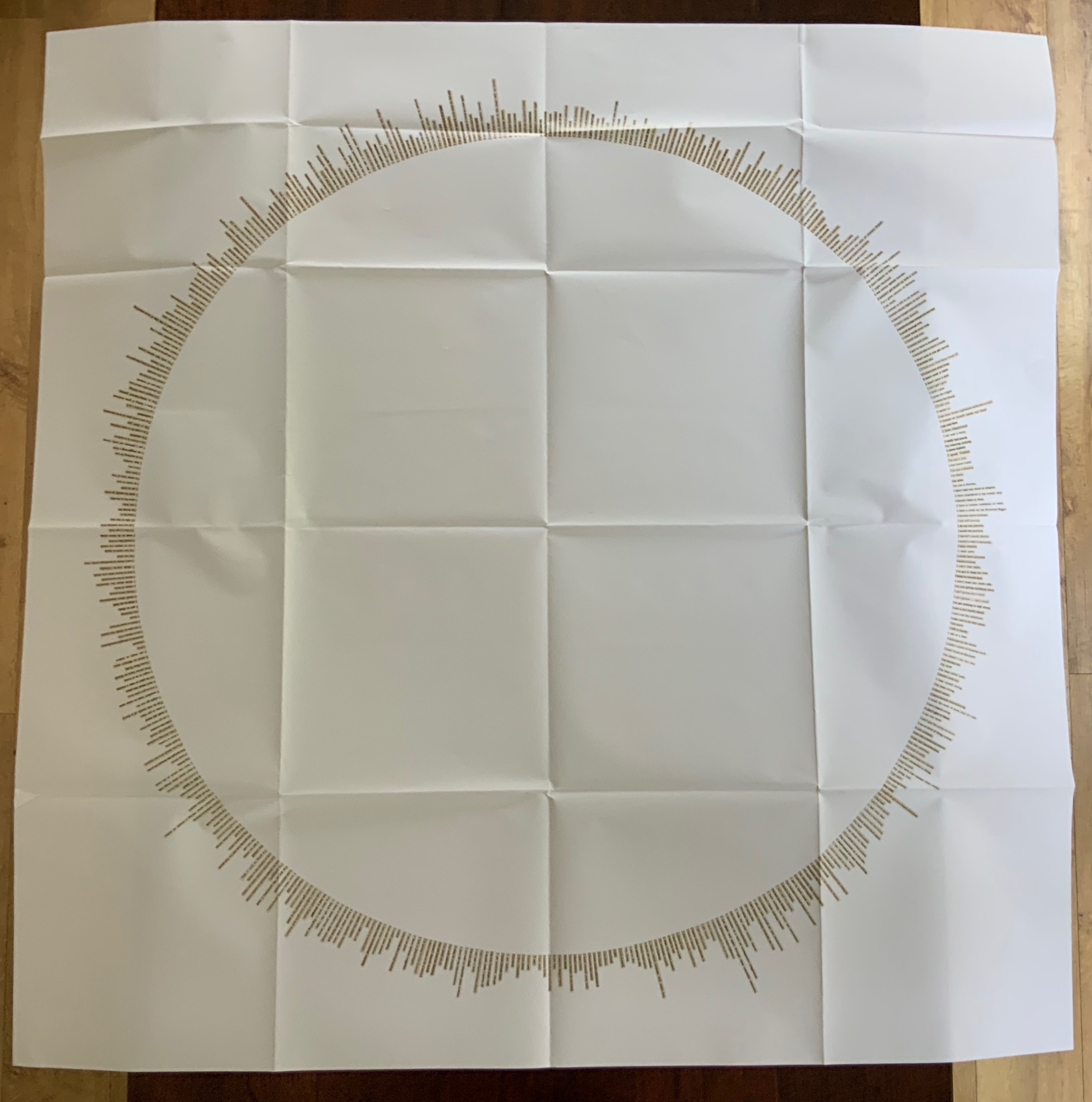
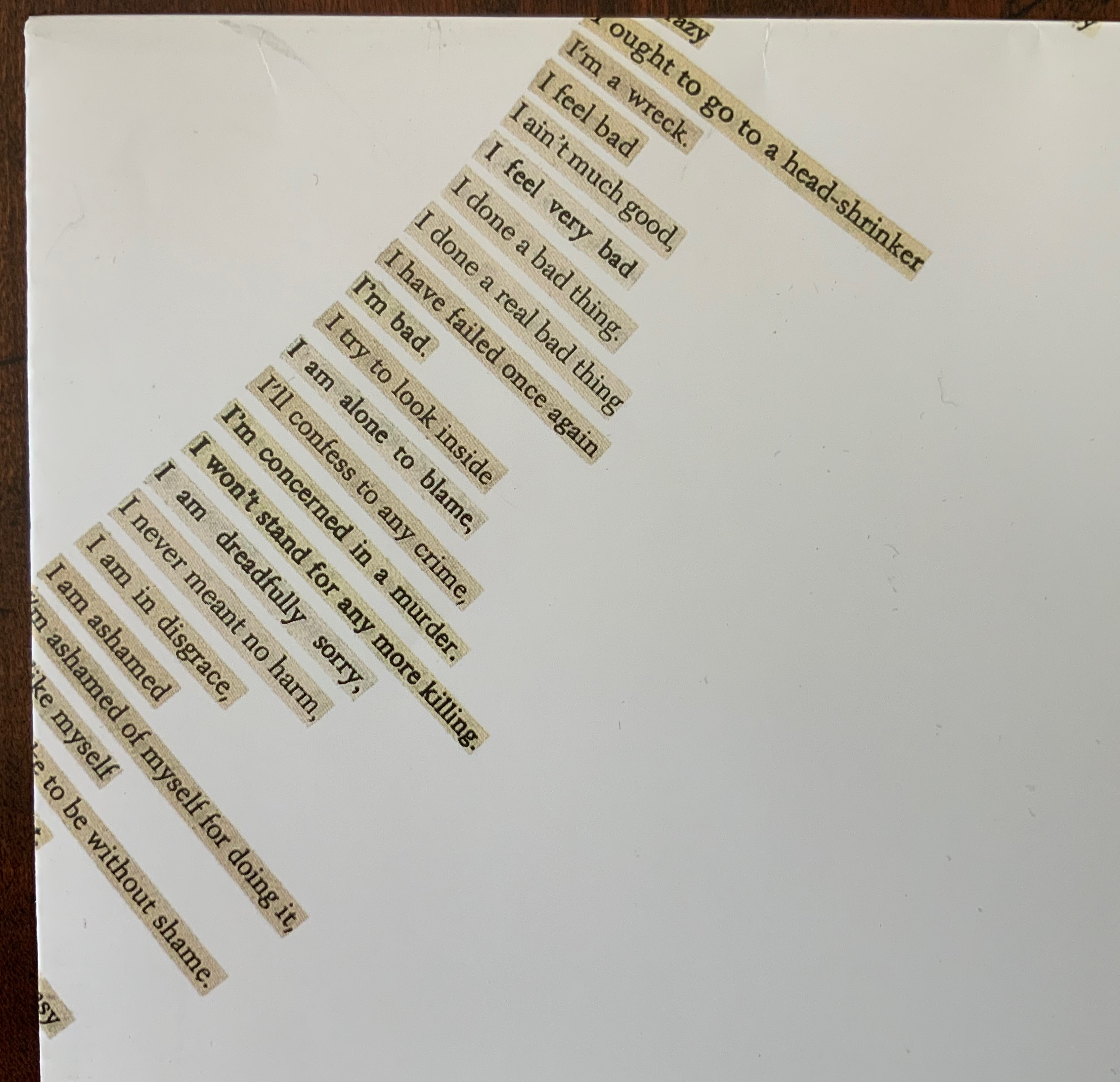
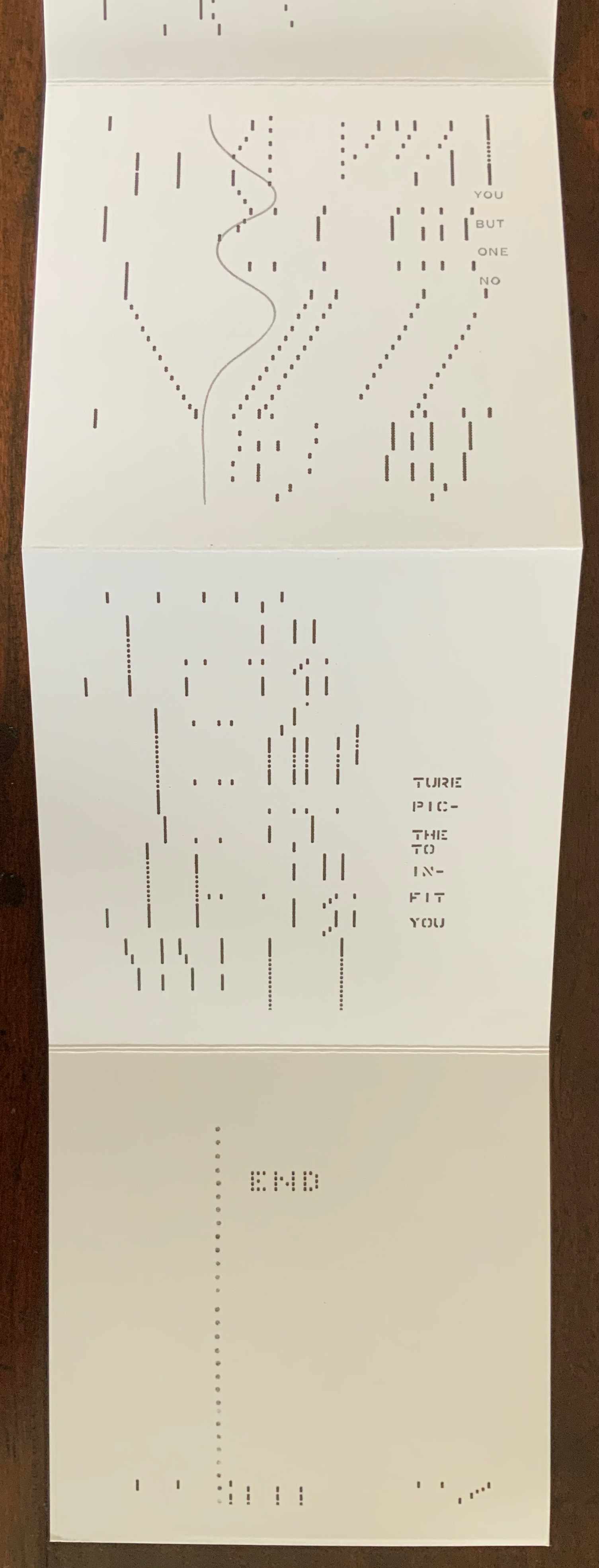
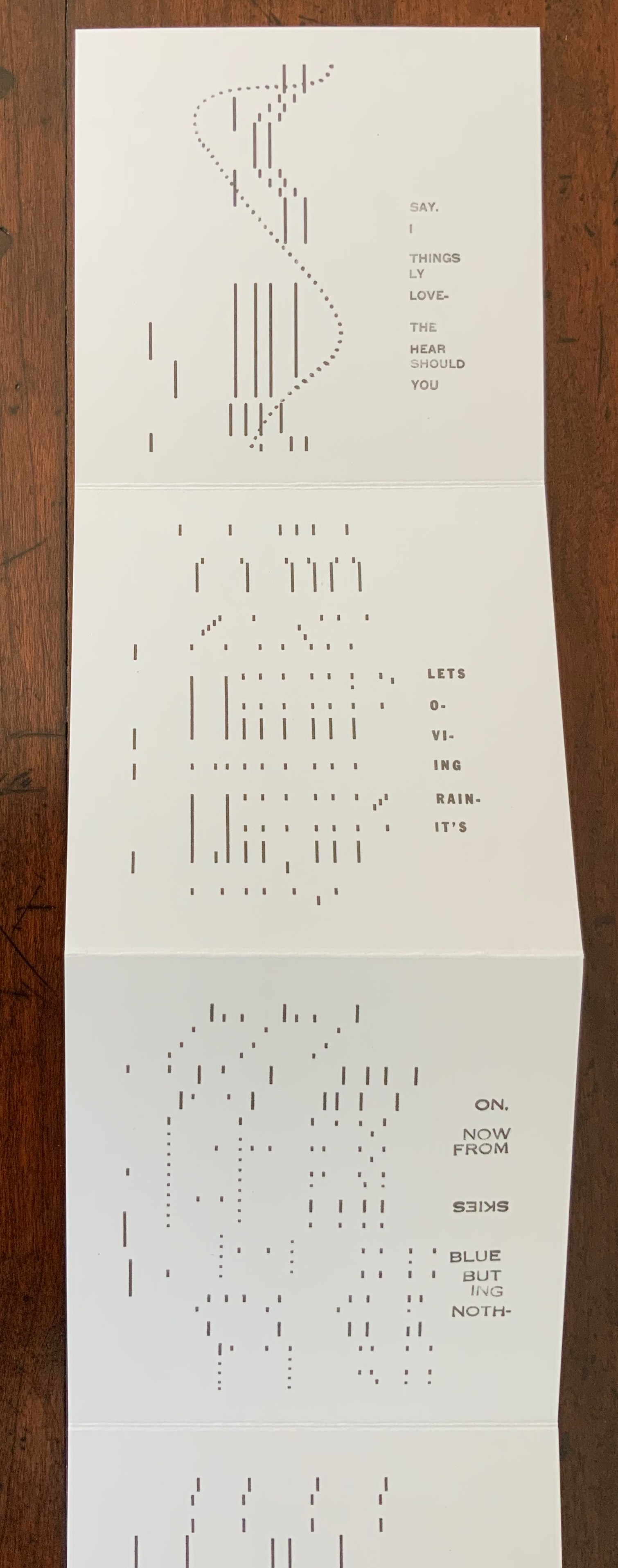
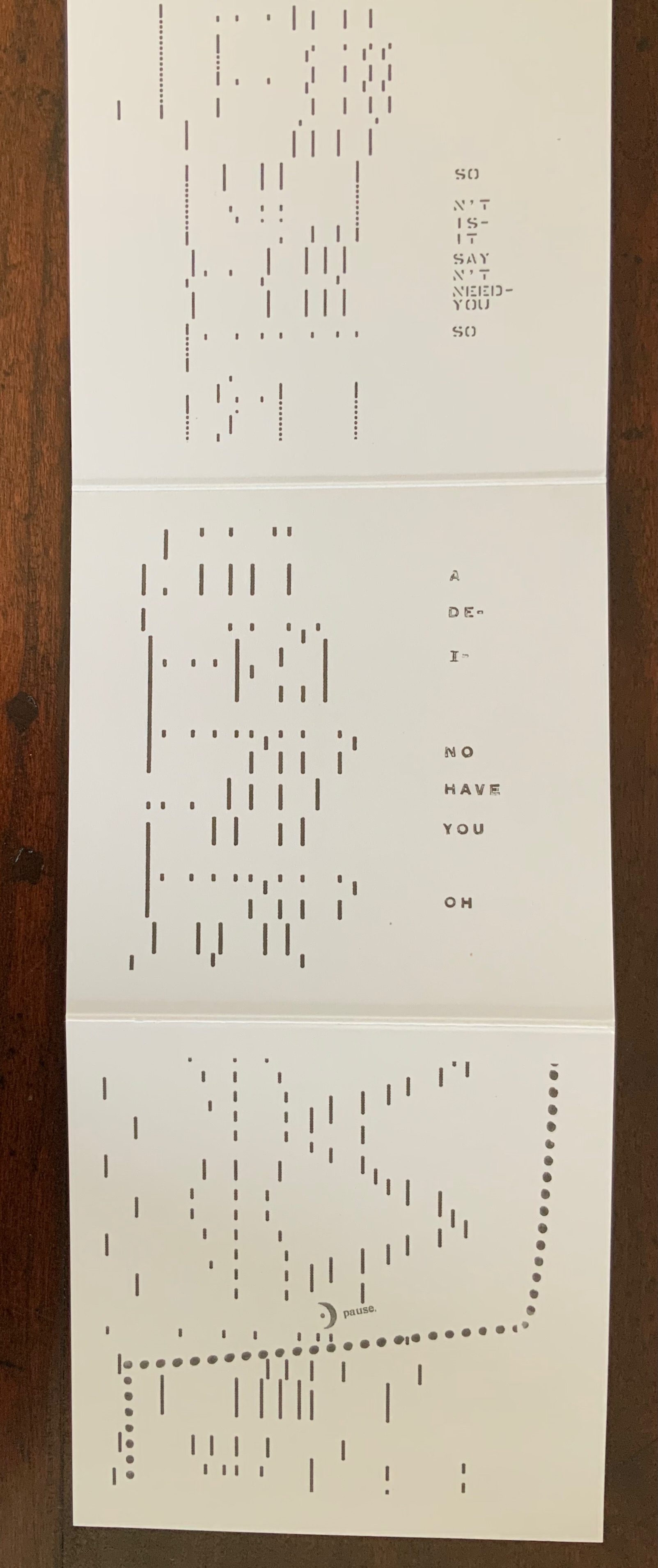
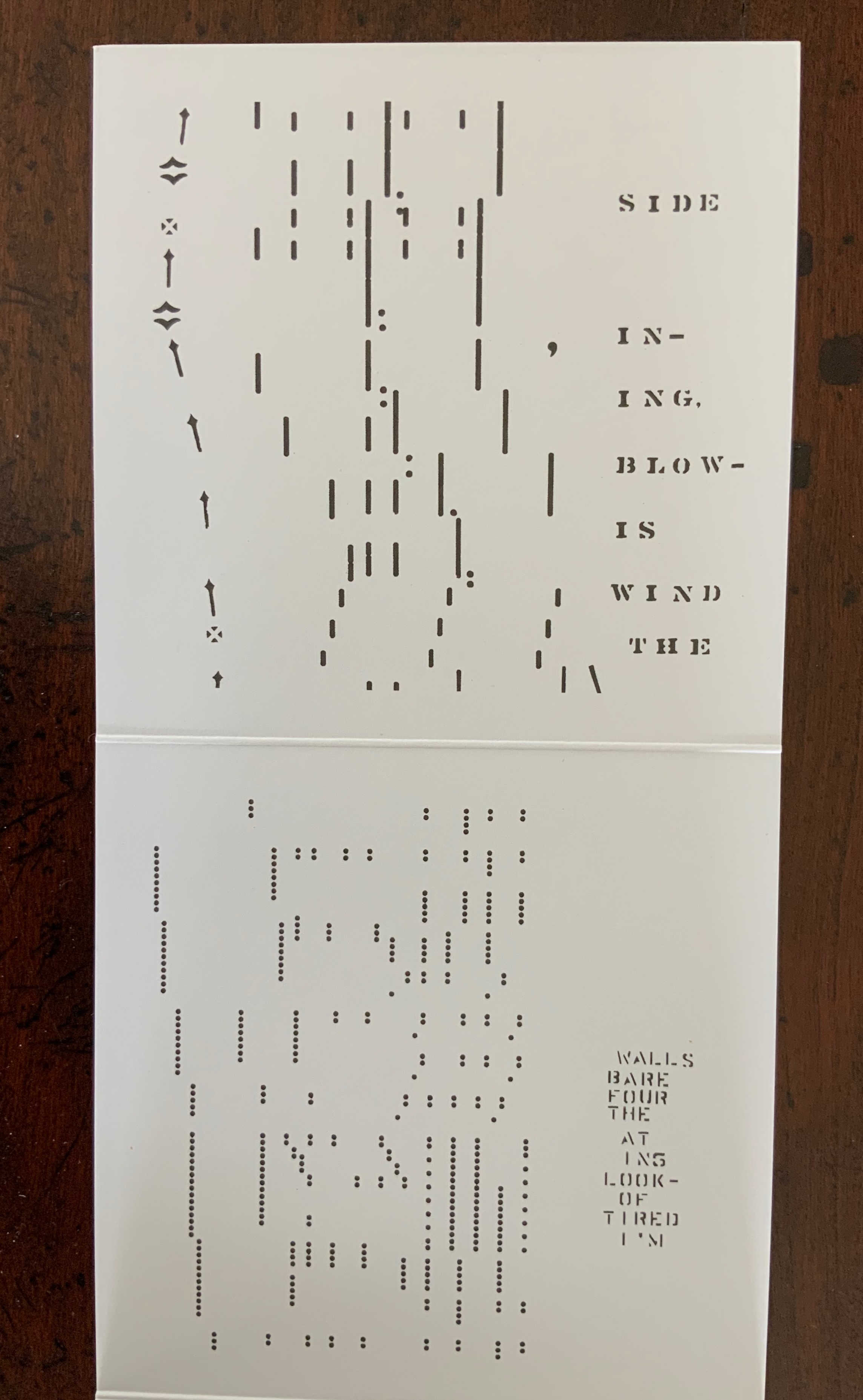
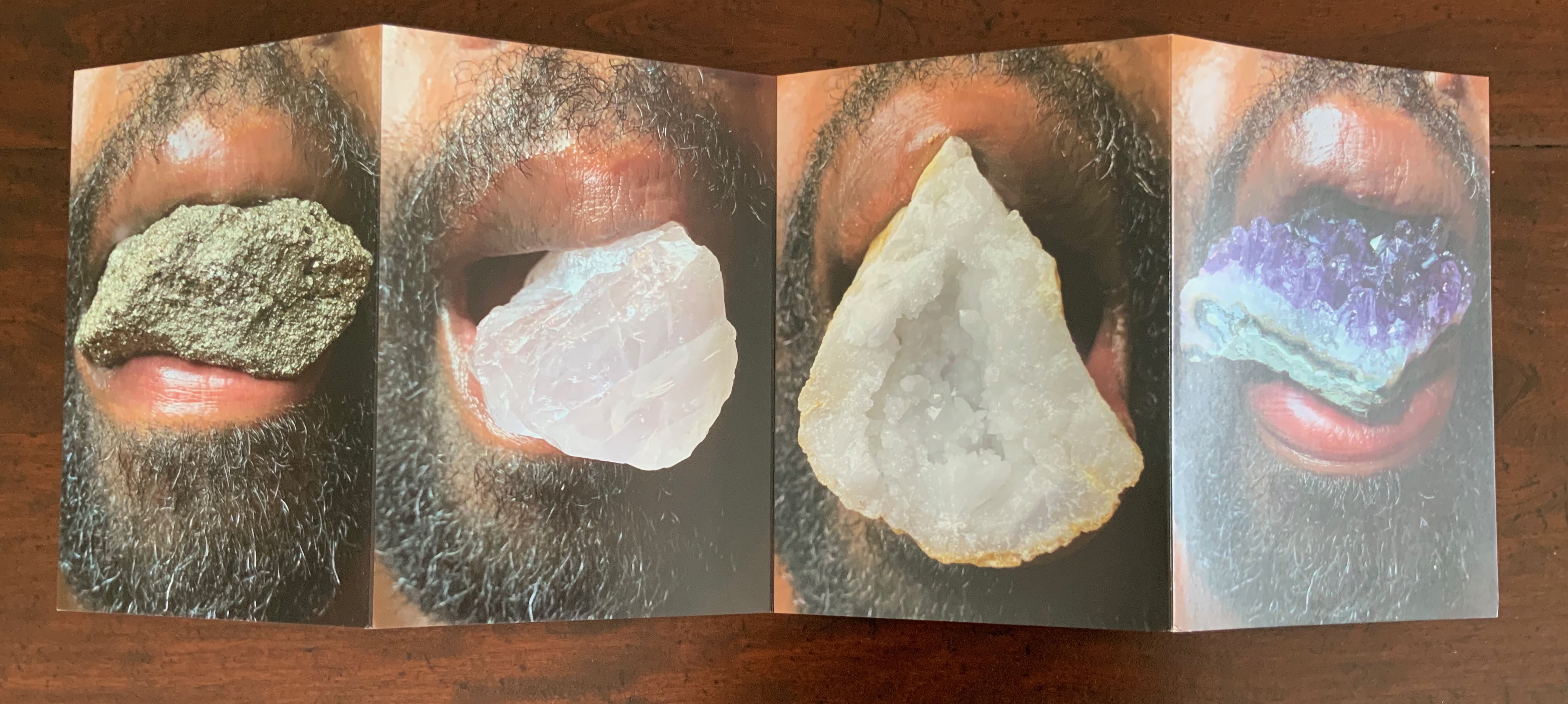
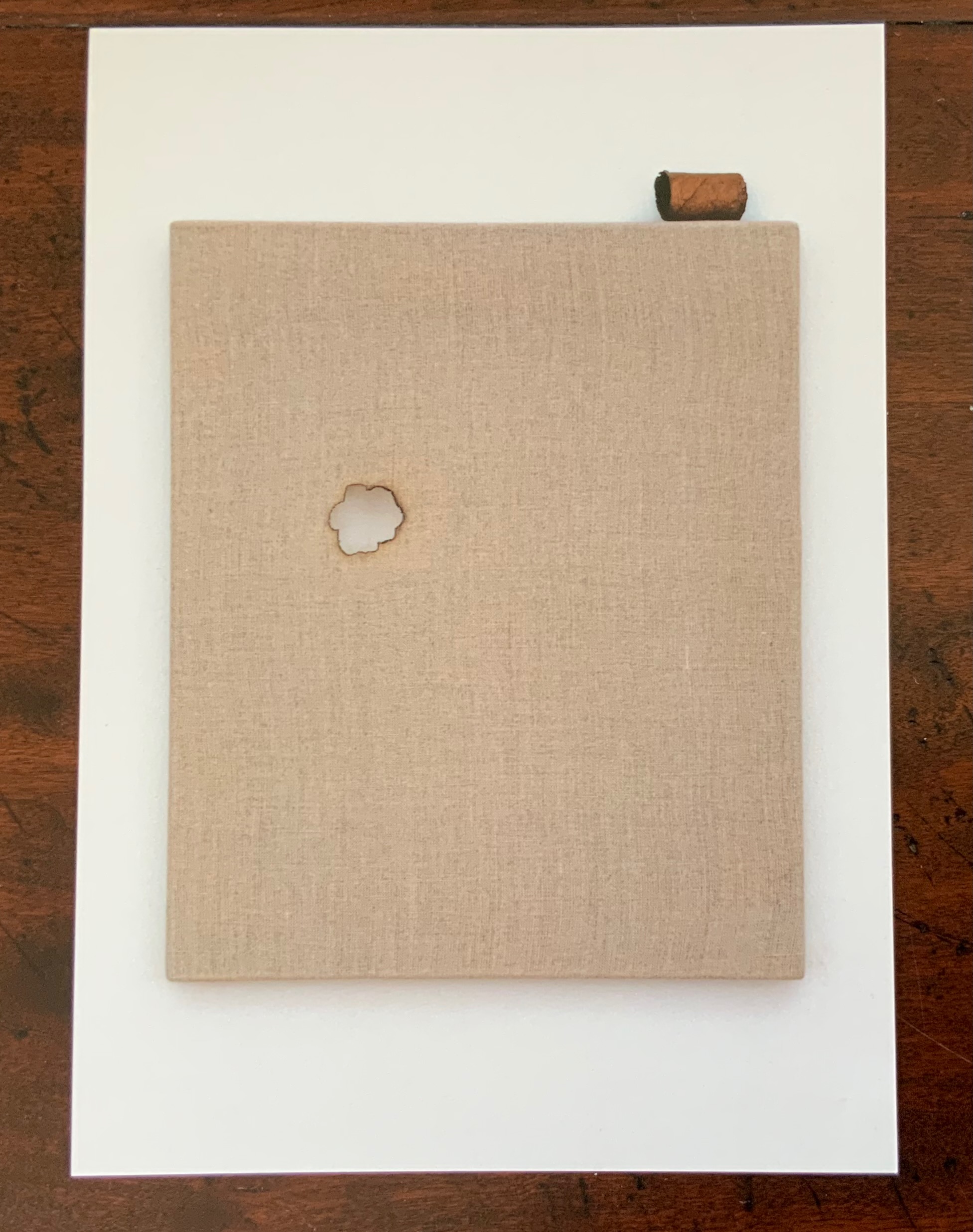
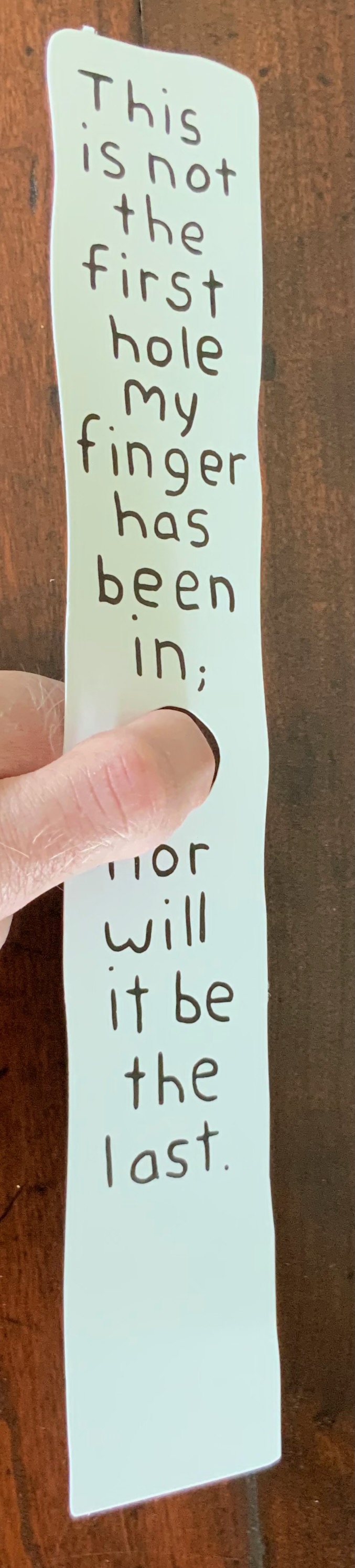
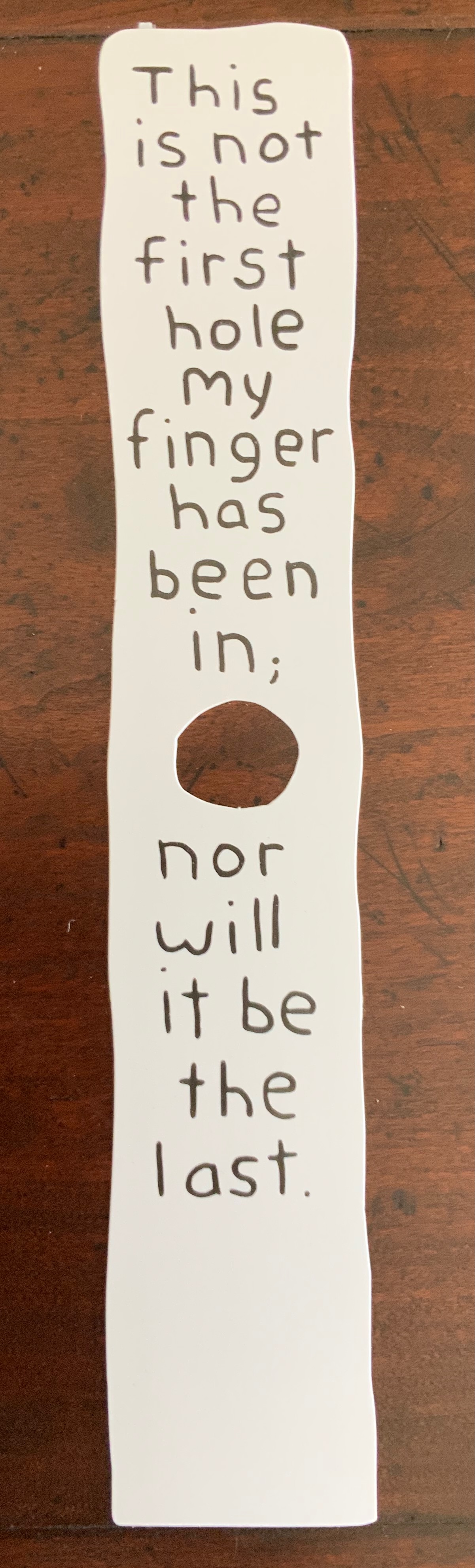
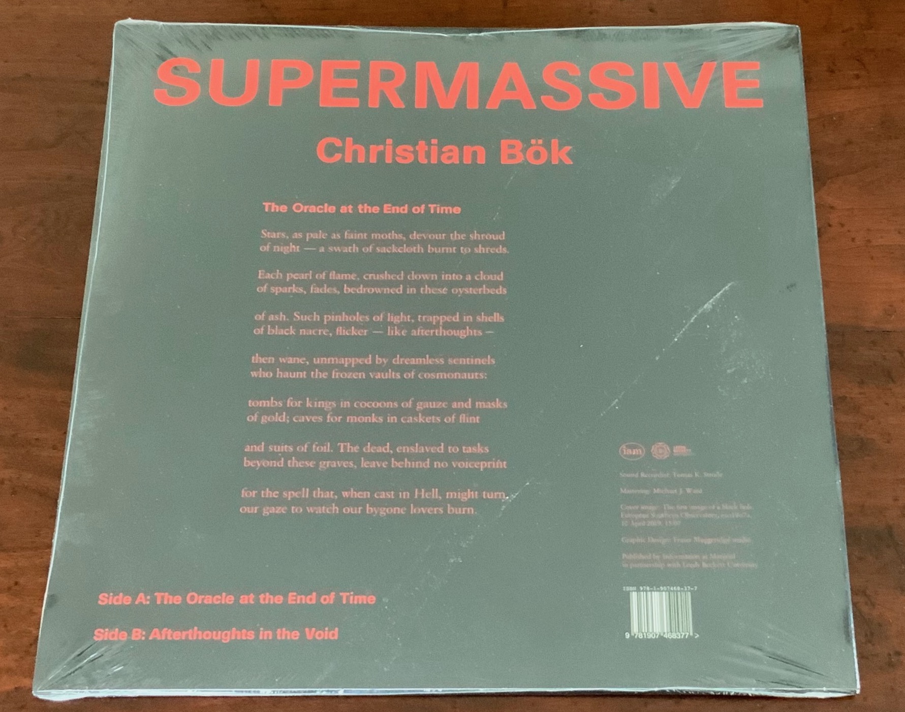
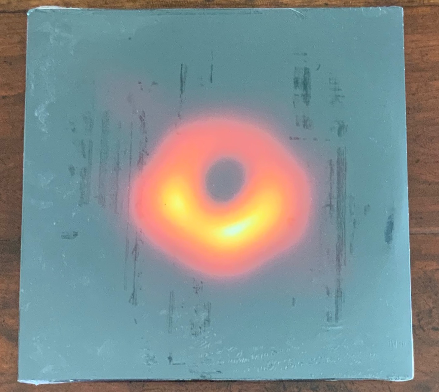
Long-time admirers of the 1960s-70s multimedia magazine Aspen, the editors have continued their practice of including unbound elements. In this issue, they have included Carolyn Thompson’s enormous poster The Beast in Me, whose sentences and part-sentences beginning with “I” have been cut from eight different novels and pasted down to form the hole seen below. Also included are Erica Baum’s Piano Rolls, Harold Offeh’s Crystal Mouths, David Bellingham’s Cigar Burn Apertures, Miranda July’s, Bookmark and Christian Bök’s Supermassive LP.

Carolyn Thompson, The Beast in Me, H1180 x W1180 mm. Photo: Ricky Adam. Photos of the work: Books On Books Collection.

Erica Baum, Piano Rolls, H120 x W120 closed, W960 mm open. Photos of the work: Books On Books Collection.

Harold Offeh, Crystal Mouths, H210 x W105 closed, W480 mm open; David Bellingham, Cigar Burn Apertures, H210 x W105 mm; Miranda July, Bookmark, H302 x W54 mm; Christian Bök, Supermassive, LP. Photos of the works: Books On Books Collection.

Like the famous combined Aspen issue Nos.5/6 — an homage to Stéphane Mallarmé — Inscription manages to pull off an eclectic unity with the essays included, which unlike Aspen was accomplished after a double-blind review process. Inscription‘s editors have turned on its head Robert Frost’s dismissive characterization of free verse as playing tennis without a net; they are playing doubles with a net and blindfolded and have created a work of art. This issue’s entries range from Paul Reynold’s erudite and whimsical definitions of all sorts of holes; the scholarly detective work on the holes that bind (pin holes and punch holes by Craig Robertson and Deirdre Lynch and filing holes by Heather Wolfe); James Mission’s tracking the crafts of scribe, typesetter and coder in representing lacunae, gaps or holes in the text; Louis Lüthi’s puncturing juxtaposition of W. Somerset Maugham’s 1948 abridgment of Moby-Dick, Orion Books’ 2007 Moby-Dick in Half the Time and Damion Searls’ 2009 riposte ; or The Whale; to Fiona Banner’s photo-essay on her hole-creating Full Stop‘s, granite sculptures of full stops (periods) created from the Peanuts , Klang and Orator typefaces, two of which were dropped into the marine protected area of Dogger Bank to put a sure stop to industrial fishing there. Here is the table of contents:

Michael Marcinkowski — “house / table”
Galina Oustinova-Stjepanovíc — “Reading the Hole on the Last Address Memorial Plaques in Moscow”
Fiona Banner — “Full Stop intervention with Greenpeace”
Simon Morris — “Perspective Correction”
Dianna Frid, Carla Nappi and Ian Truelove — “Wormholes, The Cascabel Butterfly and an AR collaboration”
Aleksandra Kaminska and Julian De Maeyer — “The Perfect Cut: Talking with Myriam Dion”
Paul Reynolds — “A Glossary of Holes”
Louis Lüthi — “A Snow Hill in the Air”
James Mission — “Signifying Nothing: Follow a Hole Through Three Text Technologies”
Editors — “An Interview with Kendell Geers”
Heather Wolfe — “On Curating Filing Holes”
Craig Robertson and Deirdre Lynch — “Pinning and Punching: A Provisional History of Holes, Paper, and Books”

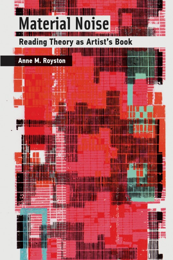
Inscription continues to provide one of the liveliest examples of what Anne M. Royston calls “artistic arguments (my emphasis), a term that indicates theory that pushes back against the expectations of the theory or criticism genre, specifically by employing signification that exceeds the semantics of printed text”.

Further Reading

“Inscription: the Journal of Material Text”, Issue 1. 15 October 2020. Books On Books Collection.

Royston, Anne M. 2019. Material Noise: Reading Theory as Artist’s Book. MIT Press.

Books On Books Collection – Shandy Hall

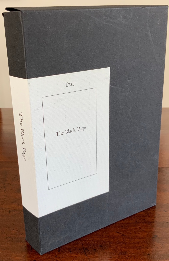
The Black Page Catalogue (2010)

The Black Page Catalogue (2010)
Coxwold, UK: Printed by Graham Moss (Incline Press) for The Laurence Sterne Trust.
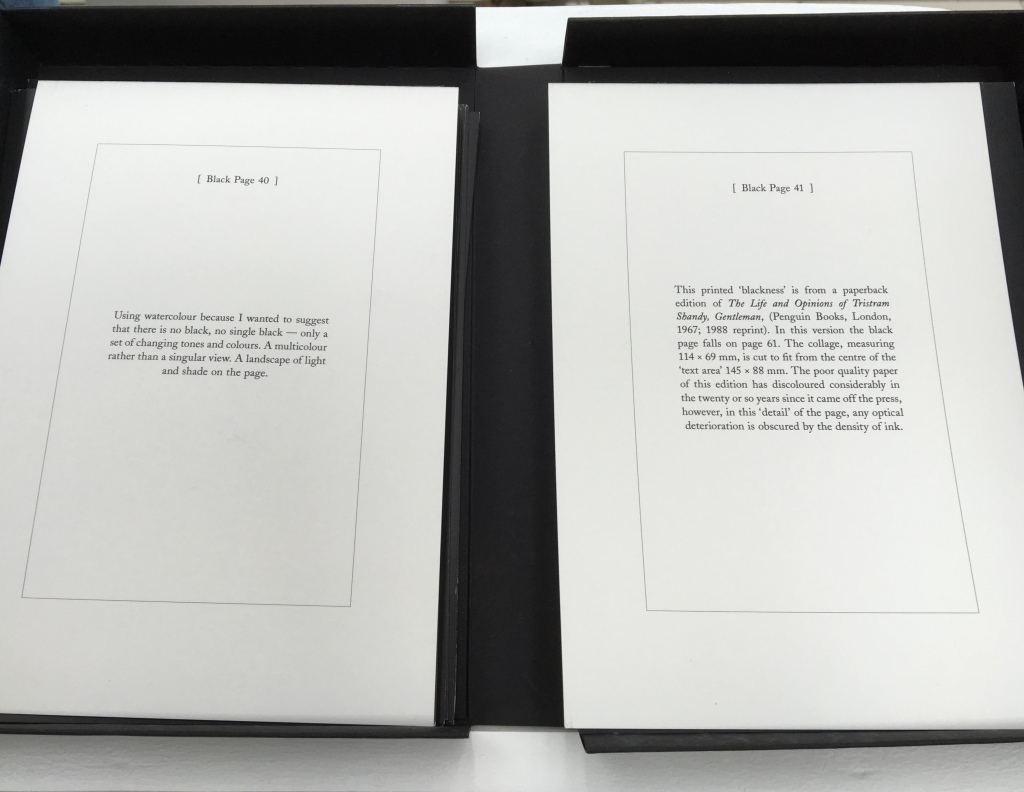
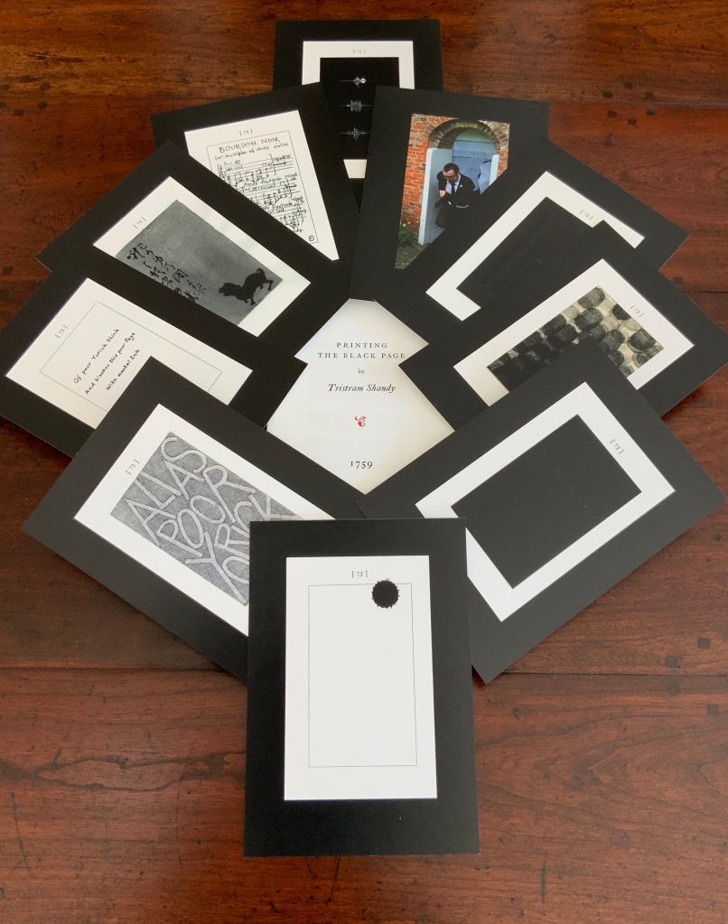
Contains 73 numbered leaves in a matte black card box (H235 x W168 mm). The leaves are glossy cards (210 x 148 mm) on which contributed texts and illustrations (chiefly colour) are printed; the reverse of each provides the contributor’s comments on the text or illustration and the “page” number. Also enclosed are a single-sheet folded pamphlet (“Printing the Black Page” by Graham Moss, Incline Press) and two cards, one of which is the invitation to the exhibition inspired by the ‘black page’, p. 73 of the first edition of The Life and Opinions of Tristram Shandy, Gentleman, held at Shandy Hall, Coxwold, North Yorkshire, 5 Sept.-31 Oct. 2009, and the other, sealed in an envelope, being the index of the contributors and their page numbers. Edition of 73. Acquired from the Trust. Photos: Books On Books Collection.

Collectors come up with the most ingenious reasons for acquiring things. In this case — along with astrological, numerological and other rational rationale — Rebecca Romney’s reminder that The Life and Opinions of Tristram Shandy, Gentleman is one of the earlier instances of book art led inevitably to my acquiring Shandy Hall’s The Black Page Catalogue. But it took time.

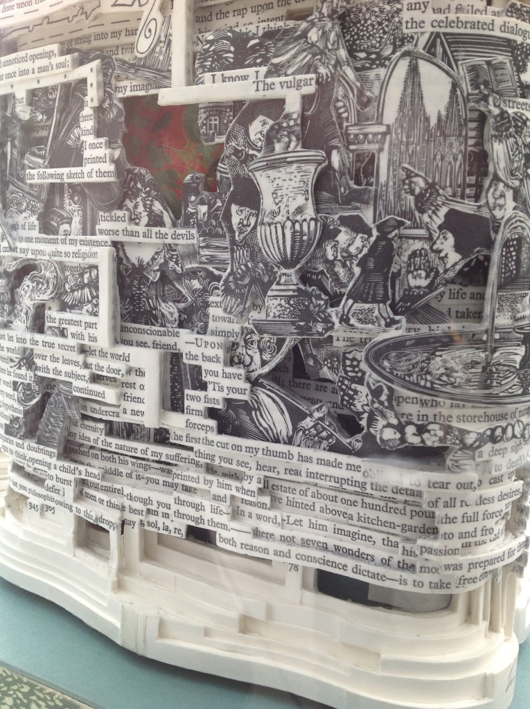
Several months after enjoying the Romney essay, I met Brian Dettmer in February 2015 by happenstance at a book art exhibition in New Haven, CT. As we chatted about past inspirations of book art, Tristram Shandy came up, so he told me of an upcoming event called “Turn the Page” in Norwich, UK, where I could more easily see some of his work — and one in particular having to do with Tristram Shandy. So in May 2015, I went.

Tristram Shandy (2014)
Brian Dettmer
Carved and varnished, two copies of the 2005 Folio Society edition of Tristram Shandy.
H230 x W190 mm
Commissioned by The Laurence Sterne Trust, Coxwold, UK. Photos: Books On Books Collection.

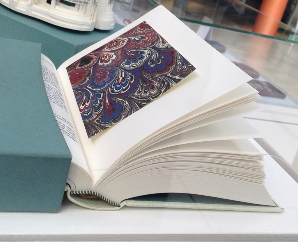
The marbled page, an “emblem of my work”, p. 169.
The Life and Opinions of Tristram Shandy, Gentleman (1759) by Laurence Sterne
Illustrated with wood engravings by John Lawrence.  Set in ‘Monotype’ Plantin, printed by Cambridge University Press on Caxton Wove Paper.
New York: Folio Society, 2005.

So a year passed. Another visit to “Turn the Page” was made. And as I was leaving, lo, a sign and small display came unto me:

Only a negligent collector would ignore such clear signs.

Ten favourites because 10 = 7 + 3.
Clockwise from the top: Craig Vear, Simon Morris, Tom Phillips, Colin See-Paynton, Coracle Press, Scott Myles, Helen Douglas, Graham Swift, Yasunao Tone, Harrison Birtwistle.

Parson-Yoricks-to-be can select their own favorites here.

Emblem of My Work (2013)

Emblem of My Work (2013)
Coxwold, UK: The Laurence Sterne Trust.
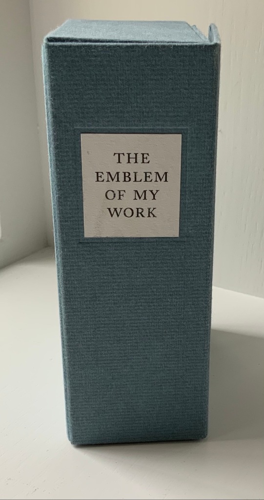
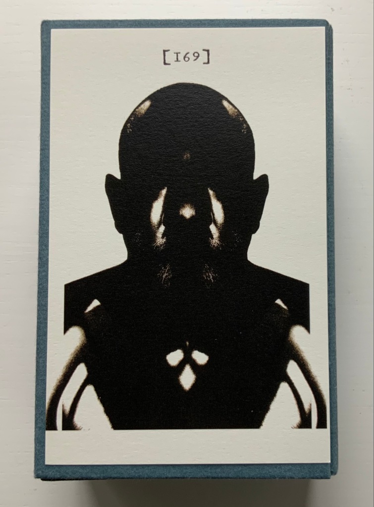
Consists of a 24-page booklet and 170 numbered cards in a hinged blue paper-covered box (H160 x W105 x D60 mm. The leaves of this catalogue are bright white cards (152 x 92 mm) on which the artwork is printed; the reverse of each provides the “page” number and the contributor’s comments on the art. The booklet provides alphabetical and numerically ordered indexes listing the contributors and their page numbers. Edition of 225, of which this is #79. Acquired from Shandy Hall, 1 October 2019. Photos: Books On Books Collection.

Volume III of Sterne’s work was the first to be handled by a publisher. Presumably the famous success of the first two self-published volumes helps to explain James Dodsley’s agreement to printing copies in which each page 169 and each page 170 showed uniquely marbled squares. Images from an original copy held at the British Library can be seen here. As Patrick Wildgust, director of Shandy Hall, explains in the booklet:

The central section of p. 169 was laid upon the marbled mixture in order that a coloured impression could be taken as cleanly as possible. This was left to dry and then reverse-folded so the other side of the paper could also receive its marbled impression. This side of the paper became page [170]. As a result, the marbled page in every copy of Vol. III is different — each impression being a unique handmade image. In the text opposite on p. 168, Sterne tells the reader that the marbled page is the “motly emblem of my work” — the page communicating visually that his work is endlessly variable, endlessly open to chance.

Two favorites — one for page [169], one for [170] — artists with other works in the Books On Books Collection. Left: Ken Campbell. Right: Eric Zboya.

All of the motley crew can be viewed here.

Paint Her To Your Own Mind (2018)

Paint Her To Your Own Mind (2018)
Coxwold, UK: The Laurence Sterne Trust.
Contains 147 numbered leaves in a brown paper-covered box (174 x 124 mm). The leaves are bright white cards (145 x 105 mm) on which contributed texts and illustrations (chiefly colour) are printed; the reverse of each provides the contributor’s comments on the text or illustration and the “page” number. Also enclosed are a “title page” and “index leaf” listing the contributors and their page numbers. Edition of 200. Acquired from Shady Hall, 6 June 2018. Photos: Books On Books Collection.

Page 147 of Sterne’s sixth volume of Tristram Shandy is blank. On the preceding page, he metaphorically throws up his hands over any attempt to describe the most beautiful woman who has ever existed and exhorts the reader: “To conceive this right, —call for pen and ink—here’s paper ready to your hand, —Sit down, Sir, paint her to your own mind—as like your mistress as you can—as unlike your wife as your conscience will let you—‘tis all one to me—please your own fancy in it.” So, accordingly, Shandy Hall invited 147 artists/writers/composers to follow Sterne’s instruction to fill the blank page 147. From the 9th through 30th of September 2016, their efforts were displayed in the Shandy Hall Gallery, Coxwold, York.

Twelve favourites because 12 = 1 + 4 + 7.
Clockwise from the top: Christian Bök, Simon Morris, Colin Sackett, Nancy Campbell, Colin See-Paynton, Derek Beaulieu, Erica Van Horn, Simon Cutts, Jérémie Bennequin, Helen Douglas, Brian Dettmer, Chris McCabe.

The curious reader can choose his or her own favorites here.

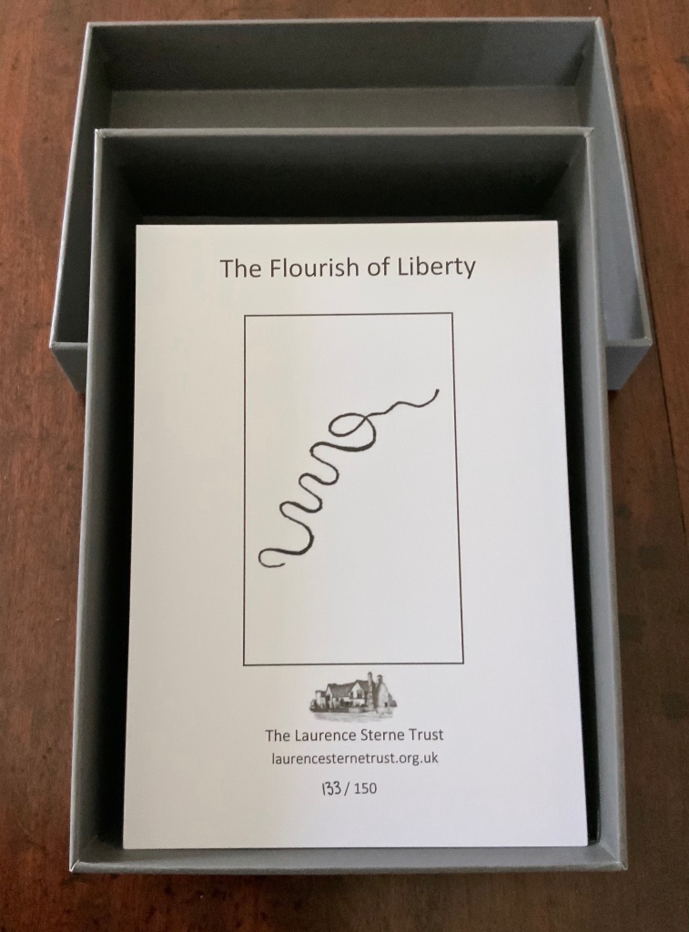
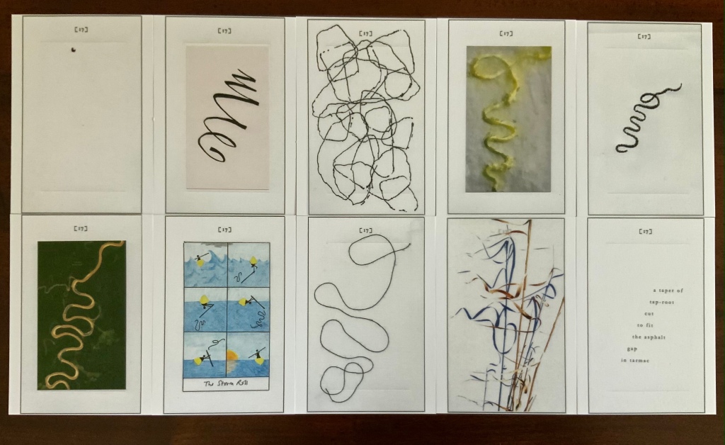
The Flourish of Liberty (2019)

In Volume IX on p. 17, the reader reads Corporal Trim’s advice to Uncle Toby, who stands at the Widow Wadman’s threshold about to propose marriage:

Nothing, continued the Corporal, can be so sad as confinement for life — or so sweet, an’ please your honour, as liberty. Nothing, Trim — said my Uncle Toby, musing — Whil’st a man is free — cried the corporal, giving a flourish with his stick thus —

The Flourish of Liberty (2019)
Coxwold, UK: The Laurence Sterne Trust.
Contains 103 numbered leaves in a gray paper-covered box (174 x 124 mm). The leaves are bright white cards (148 x 105 mm) on which contributed texts and illustrations (black and white, several in colour) are printed; the reverse of each provides the contributor’s comments on the text or illustration and the “page” number. Also enclosed are a “title page” and “index leaf” listing the contributors and their page numbers. Edition of 150, of which this is #133. Acquired from Shandy Hall, 26 October 2020. Photos: Books On Books Collection.

Clockwise from the top: Nick Thurston and Sarah Auld, Erica Van Horn, Derek Beaulieu, Simon Morris, Francesca Capone, Simon Cutts, Helen Douglas, Jérémie Bennequin, Nancy Campbell, Craig Dworkin

The rest of Corporal Trim’s flourishes flourish here.

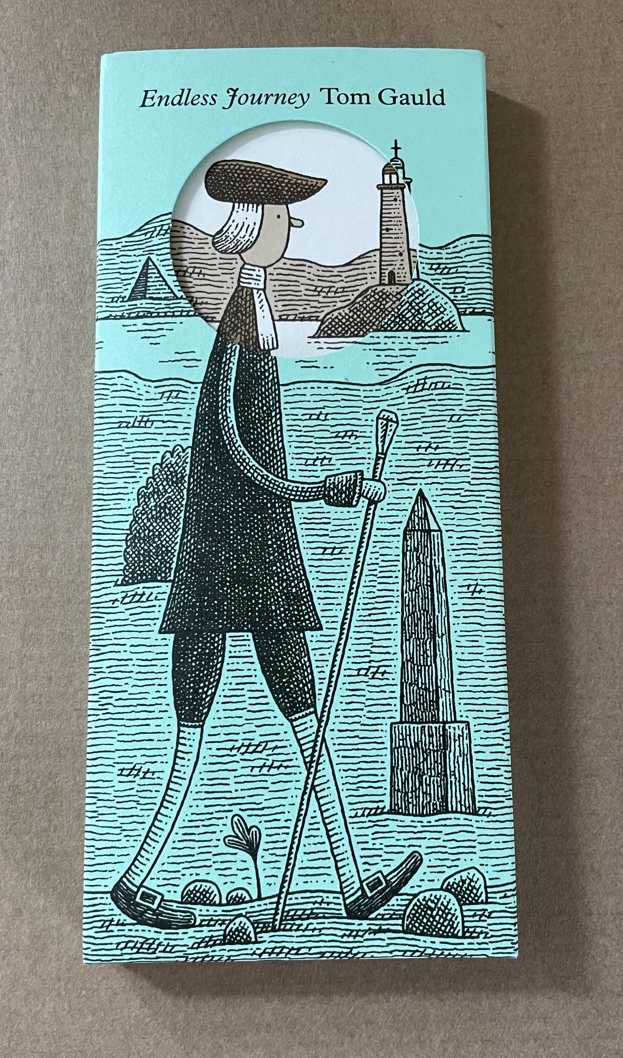
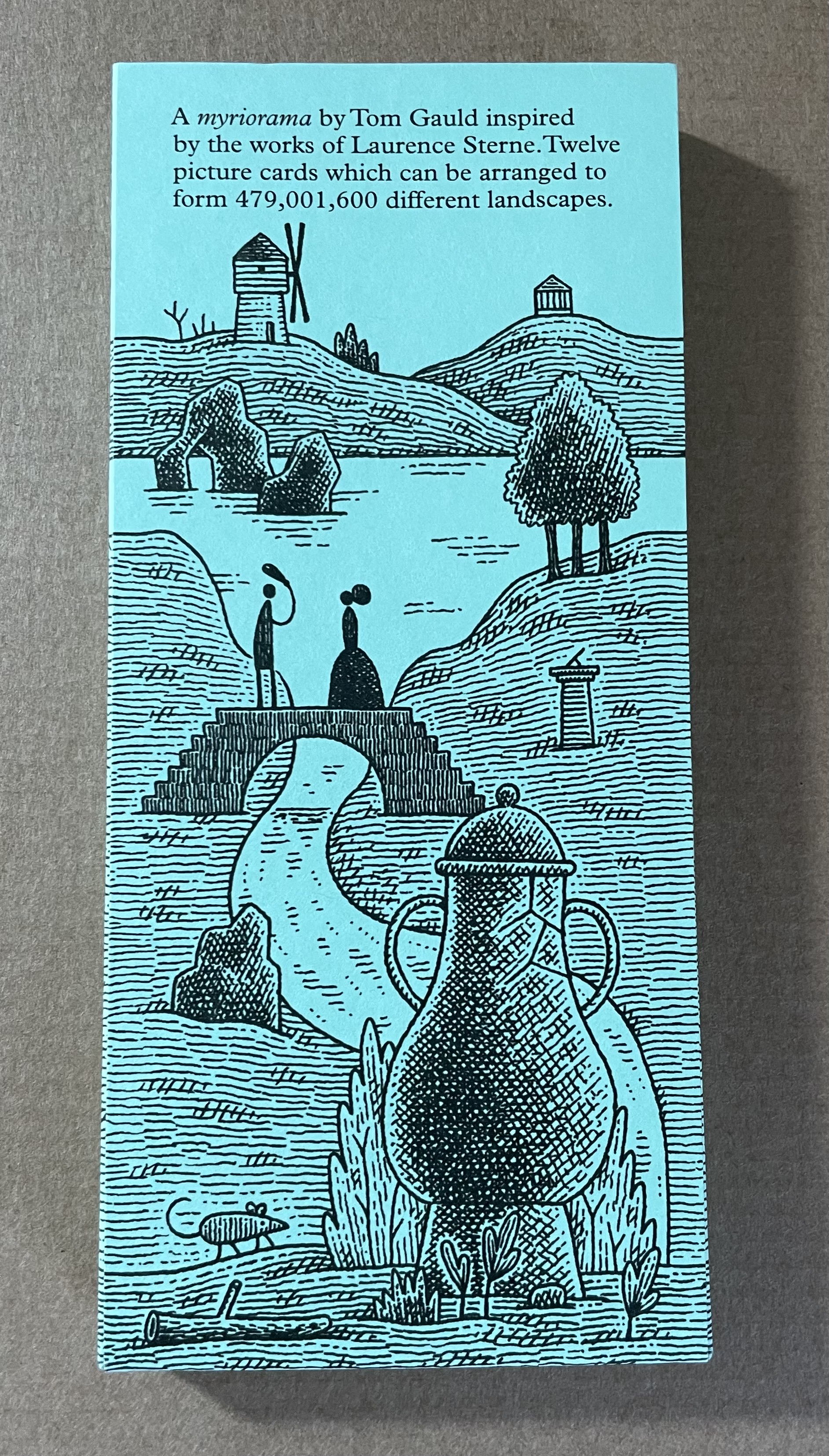
Endless Journey (2015)

Endless Journey (2015)
Tom Gauld
Printed slipcase, twelve cards, leaflet. H165 x W73 mm. Acquired from the Laurence Sterne Trust.
Photos: Books On Books Collection.

Further Reading

Ancliffe, Abra. The Secret Astronomy of Tristram Shandy (Portland, OR: self-published, 2015).

Drucker, Johanna. The Century of Artists’ Books (New York: Granary Books, 1995), pp. 33 and 162.

Lazda, Gayle. “A lot of Shandy”, London Review Bookshop, 14 January 2016. Accessed 18 September 2019.

Mullan, John. “The ‘stuff’ of Tristram Shandy”, British Library, 21 June 2018. Accessed 18 September 2019.

A Practice for Everyday Life. “The Life and Opinions of Tristram Shandy, Gentleman”, Reading Design, 2011. Accessed 18 September 2019.

Romney, Rebecca. “Sterne’s Tristram Shandy and Materials as Meaning“, 15 July 2014. Accessed 23 August 2014.

Schiff, Karen L. 1998. “The Look of the Book : Visual Elements in the Experience of Reading from Tristram Shandy to Contemporary Artists’ Books.” Dissertation.

“Material Noise: Reading Theory as Artist’s Book”, Anne M. Royston (MIT Press, 2019): Review

As its subtitle suggests, Material Noise explores how the material aspects of works of criticism and media studies such as Le Da Costa encyclopedique, Jacques Derrida’s Glas, Avital Ronell’s The Telephone Book and Mark C. Taylor’s Hiding matter to understanding them — just as if those works were artist books. For the reader interested in book art, the artist book or whatever one might like to call that art, Material Noise might be better read back to front. The works of book art that Anne Royston explores in Material Noise — Mark C. Taylor’s Le Réal, Las Vegas, NV, Shelley Jackson’s Skin, Johanna Drucker’s Stochastic Poetics and Susan Howe’s and R.H. Quaytman’s Tom Tit Tot — come at the end of the book.

The order though is reassuring. Otherwise we might end with criticism, media theory and critical theory becoming the foreground, the works of art simply background, lost in theoretical translation. A case of Barthes for Barthes’ sake? It is fitting that the very material approach to engaging with book art — even with its most conceptual of instances — should be applied to critics and theorists to explicate their works, only then to conclude by showcasing works of art whose mastery of the material may be said to put the more academic works in the aesthetic shade.

Royston selects the journal — Convolution, founded in 2011 by Paul Stephens — to emblematize her starting point: “a blend of art and criticism that considers its material form at every step” and delivers “a materially immersive reading experience” (pp. 1-3). If her publication had occurred in the future, she could have selected Inscription, founded in 2020 by Adam Smyth, Gill Partington and Simon Morris to serve as an open closing point. But that would have spoiled the reassurance of concluding with the art.

As is the wont of theorists (social, literary and otherwise), she proposes a new term, or tool, with which to build her case: “artistic arguments (my emphasis), a term that indicates theory that pushes back against the expectations of the theory or criticism genre, specifically by employing signification that exceeds the semantics of printed text”. Leaving it to the academics to unpack that proposition professionally and evaluate its application, this casual observer suggests that it is analogous to “upward inflection” but without the implied lack of confidence. With a lack of confidence, it would be the declarative sentence that hedges its bet with that annoying, habitual rising tone that turns it into a question.

Royston does not hedge her bets. Her observations about Le Da Costa encyclopedique and its self-conscious, self-referential heterogeneous play with the material forms of the reference work, newspaper and the forms within them — columns, typographical signals (hyphenation), etc. — are assured. Her surfacing of “noise” as a concept and phenomenon key to the shape and message of Le Da Costa, Derrida’s Glas and Ronell’s The Telephone Book is equally assured in each case. Likewise, how — across those three works — she slips among the ideas of “noise” to “formlessness” to “white spaces” to end up on the “surface” of Taylor’s Hiding, his associated multimedia The Réal, Las Vegas, NV and then Jackson’s Skin project.

Royston’s true avatar must be the ilex. In the Taylor/Jackson chapter, she effortlessly moves from Taylor’s university press book then to his electronic artist book and then to Jackson’s embodied/disembodied story literally tattooed word by word on 2,095 volunteers (thereafter called “words”). Royston does it so well that it almost enacts an artistic argument proving her thesis that we should read theory in the way we read artist books.

But collecting theories may not be as satisfying as building real or fantasy collections of art. Being introduced to Taylor’s The Réal, Las Vegas, NV (1997) with its slot machine screen offers the chance to add it alongside Marcel Broodthaers’ Monte Carlo Bond (1924) and Muriel Cooper’s designed Learning from Las Vegas (1972) by Robert Venturi. If you happen across one of Jackson’s “words” in the tattooed flesh from Skin, you can forego a kidnapping charge by turning to Paul Emmanuel’s The Lost Men Project (2006). Crestfallen that no aluminum-covered version of Drucker’s Stochastic Poetics (2012) is easily available? Download the Ubu edition. Also unable to find a copy of Howe’s and Quaytman’s Tom Tit Tot (2014)? Place its link at the Museum of Modern Art Library Council alongside the Meermanno Museum’s for its “Reading as Art” exhibition.

Royston’s book provides collector and critic with an entire toolkit enabling them to encounter the “materially immersive reading experience” and perceive how it is really the “materially engaged reading experience”. Highly recommended.

Books On Books Collection – Simon Morris

Reading as Art (2016)

Reading as Art (2016)
Simon Morris, ed.
Perfect bound paperback. H297 x W210 mm. Acquired from Information as Material, 22 August 2020. Photo: Books On Books Collection. Displayed with permission of the publisher.

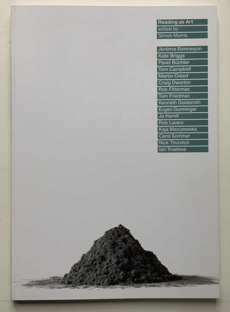
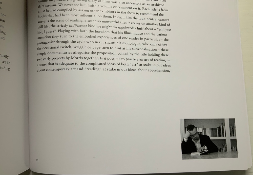
Simon Morris and Books On Books crossed paths at the opening of an exhibition at the Meermanno Museum in The Hague. The exhibition was called “The Art of Reading“, and he gave a talk on his performative work Reading as Art (2004), a compiled-stills film of him reading and turning the pages of a book. (Not at all like watching paint dry or grass grow, if you are unkindly thinking so.) Reading as Art (the volume) provides a taste of Reading as Art (the performance) with black-and-white frames from the film appearing at the bottom right-hand corner of nearly every page: just run your thumb down the fore edge and let the pages flip to see the “action”.

Details from Reading as Art (the book). Photos: Books On Books Collection. Displayed with permission of the publisher.

That feature of this one volume speaks volumes about Simon Morris as an artist. The idea of “reading as art” is not far off “publishing as art”. Morris’s collaborative publishing operation Information as Material has employed nearly every tool in the “Publishing as Artistic Toolbox“, as the 2018 exhibition in Vienna was called: documented performances, polemics, apps, free downloadable PDFs, prints and broadsides, and a journal Inscription, whose first issue is a sculptural bookwork and comes with a vinyl LP record, poster and chapbook.

Do or DIY (2012)

Do or DIY (Information as Material, 2012)
Craig Dworkin, Simon Morris and Nick Thurston
Booklet, saddle-stitched. H137 x W104 mm, 24 pages. Acquired from Cornerhouse Publications, 31 October 2020. Photos: Books On Books Collection. Displayed with permission of the publisher.

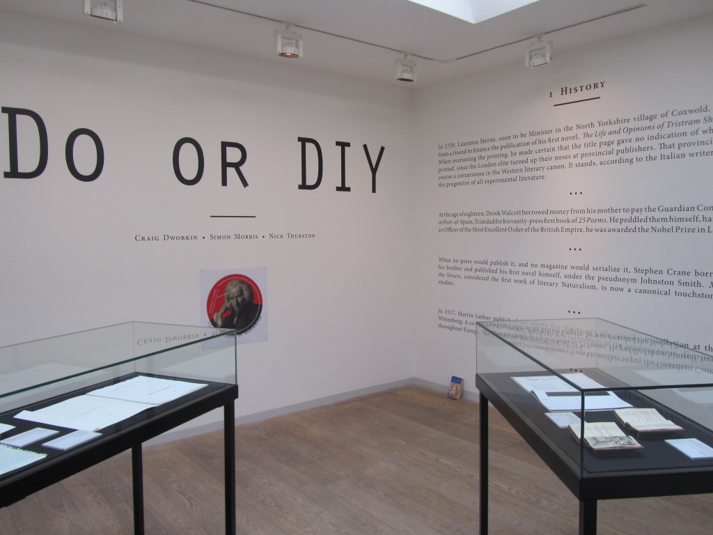
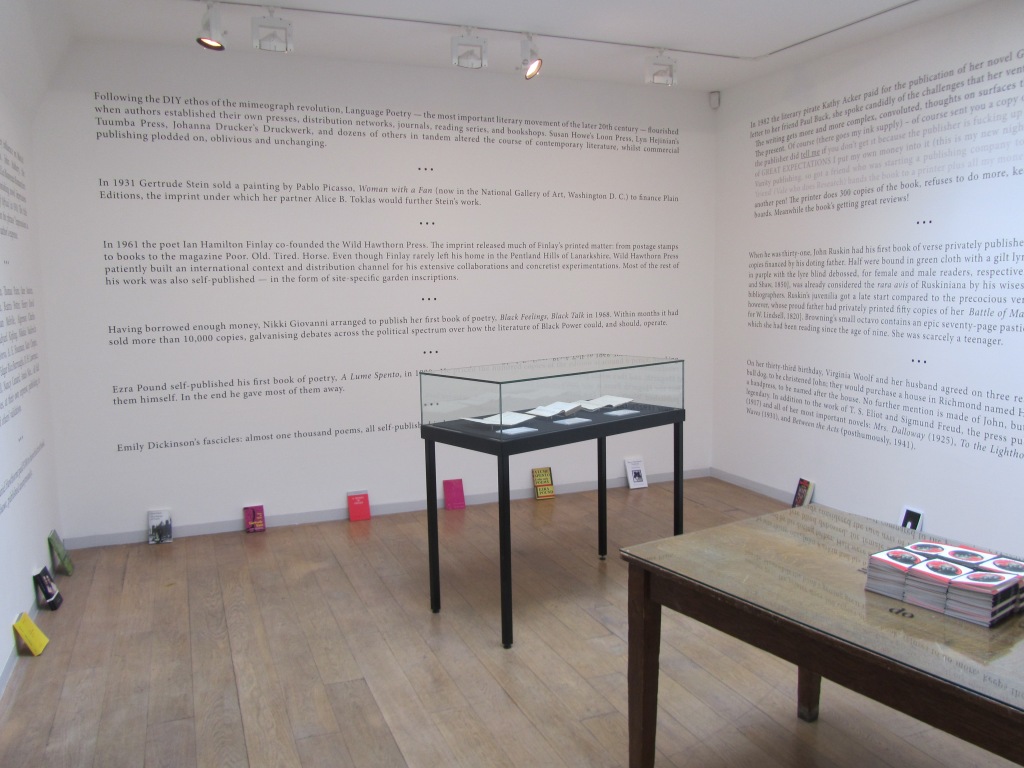
It is strange that this polemic does not mention William Blake among literary history’s do-it-yourselfers. Although their primary message of “don’t wait for a commercial publisher” is for wordsmiths, the authors include the book artist Johanna Drucker among their hortatory examples as well as The Life and Opinions of Tristram Shandy, which can lay a plausible claim to being the first work of modern book art, even before Blake’s “artist’s books”. The authors themselves have even played their parts in book art. So why no nod to the world of book art and its past and current contributions to Do or DIY?

In the 1960s and 70s, book artists’ democratic multiples aimed to sidestep the galleries, museums and art industry. Whether chicken or egg, photocopying and cheap printing brought forth or hatched Siegelaub’s The Xerox Book, Ruscha’s Royal Road Test and many more fair fowl. By century’s end and into the 21st, book artists were still doing it themselves, but the democratic multiple ceded quite a bit of territory to limited editions and unique works. Toward the 20th century’s end, desktop publishing and digital publishing, however, offered up a different, much larger target — the super-concentrated publishing industry — for a much larger cadre of creators — wordsmiths. Perhaps that bit-torrent caught up the authors on this occasion.

Still, the occasion itself — an exhibition that saw the polemic printed on indoor walls and on outside posters — must have appealed to the book art community. Book art makes us read differently, and that clearly happened with this exhibition.

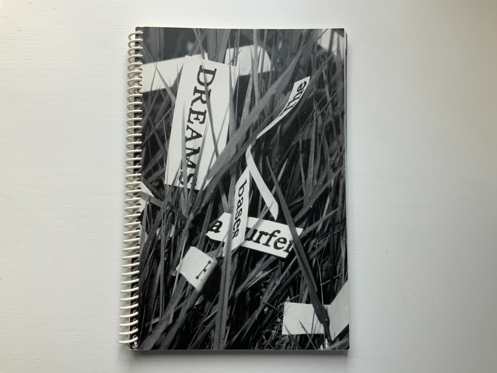
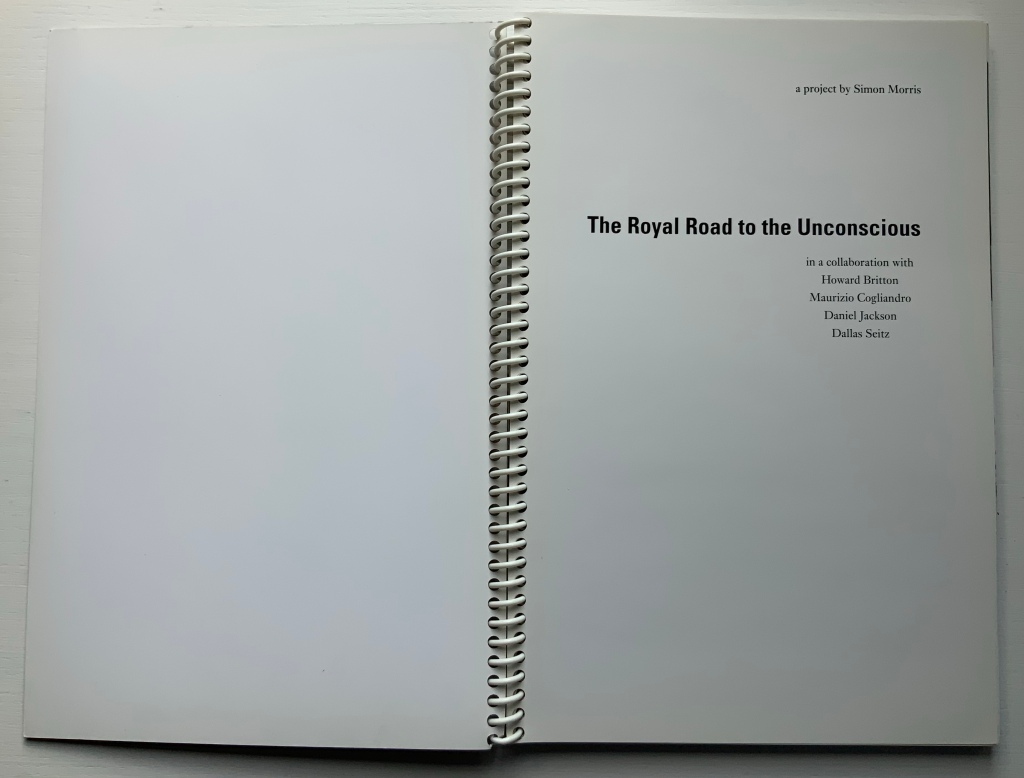
Royal Road to the Unconscious (2004)

Royal Road to the Unconscious (2004)
Simon Morris
Spiral bound paperback. H240 x W160 mm, 80 pages. Acquired from Johan Deumens, 10 October 2020. Photos: Books On Books.

This is the book of the movie. Or the book of the movie “made by the book” of the movie. Or…. Better let the artist explain:

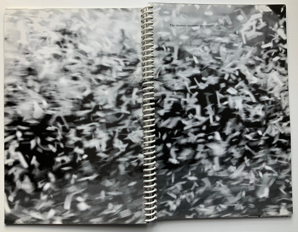
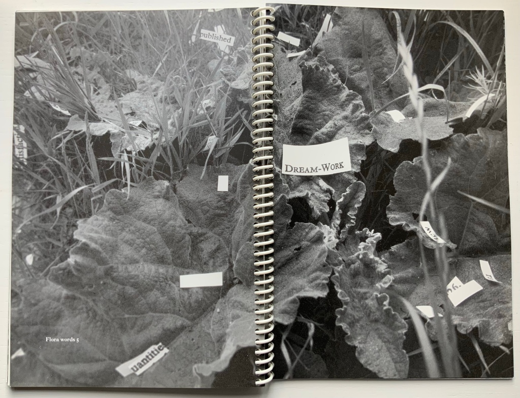
Utilising Ed Ruscha’s book Royal Road Test as a readymade set of instructions, seventy-eight students cut out every single word from Sigmund Freud’s Interpretation of Dreams. On Sunday, June 1st, 2003, the artist, Simon Morris (thrower) threw the words out of the window of a Renault Clio Sport on Redbridge Road, Crossways, Dorset, travelling at a speed of 90mph, approximately 122 miles southwest of Freud’s psychoanalytical couch in London. The action freed the words from the structural unity of Freud’s text as it subjected them to an ‘aleatory moment’ – a seemingly random act of utter madness.

Daniel Jackson (filmmaker), Maurizio Cogliandro (photographer) and Dallas Seitz (photographer) documented the action as 222,704 words erupted from the window of the car. They also recorded the stream of words strewn along the side of the road. Dr. Howard Britton, a psychoanalyst (driver), directed them to any slippages or eruptions of the Real that occurred in the reconfigured text. The poetic act of liberating Freud’s text allows us to engage with what Jacques Lacan called the register of the Real. The concept of the Real is far removed from anything that we conventionally attribute to reality. It is the experience of a world without language. If language names, it is all that escapes the name – an encounter beyond images and words.

Conceptual art can do one’s head in. So, in the meantime, enjoy the aleatory moment.

Further Reading

The Art of Reading in a ‘Post-Text Future‘”, Bookmarking Book Art, 21 February 2018.
Bright, Betty. No Longer Innocent: Book Art in America 1960-1980 (New York: Granary Books, 2005).

Hubert, Renée Riese, and Judd David Hubert. The Cutting Edge of Reading: Artists’ Books (New York: Granary Books, 1999). Annotated here.

Mitchell, Beverly. “Q & A with conceptual writer and professor, Simon Morris“, Blog of the Hamon Arts Library, 22 February 2019. Accessed 2 December 2020. Good coverage of The Royal Road to the Unconscious as well as the exhibition “Reading as Art”.

Partington, Gill, Adam Smyth and Simon Morris, eds. Inscription: the Journal of Material Text – Theory, Practice, History October 2020.

Wisniewski, K.A. “Reading as Art: A Micro-Review“, The Projector, 19 September 2017. Accessed 2 December 2020.

Worth, Zara. “Reading as Art: Review“, This is Tomorrow: Contemporary Art Magazine, 25 November 2016. Accessed 2 December 2020.