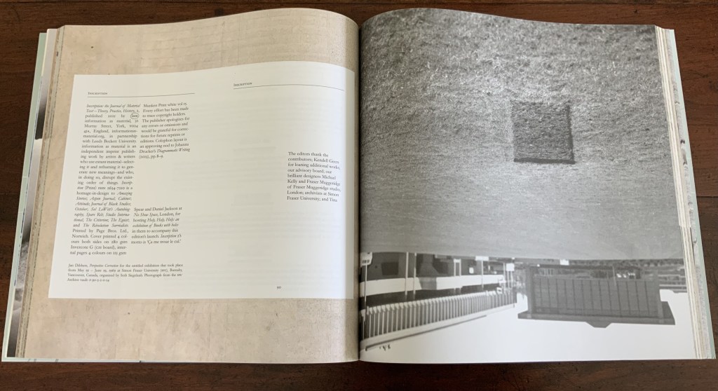
Inscription: The Journal of Material Text, Issue 5 (2025)
Although Theodore Roethke had a woman in mind when he wrote “The shapes a bright container can contain!”, the phrase readily comes to mind for this issue of Inscription once you’re past the difficult-to-open-up cardboard packaging. Not that you should rip through and discard it. The clues to proceed patiently are the label “recto” on one edge of the box and the page cut from a book and pasted on the box’s top. Is “recto” some sort of “this side up” label? If so, it seems topsy-turvy. Recto (or right-hand) pages are usually have odd-numbered, but the pasted-down book page is numbered 20. Wait a second; those random colored rectangles have been printed over the book page as if meant to draw attention to the “gridness” of the apartment blocks. Maybe this box is meant to be preserved and framed (after all, Toulouse-Lautrec drew on cardboard).
Inscription: The Journal of Material Text, Issue 4 on Touch Simon Morris, Gill Partington and Adam Smyth (eds.) Cased perfect bound paperback, printed paper cover. 313 x 313 mm. 120 pages. ISSN: 2634-7210. Acquired from Information as Material, 29 November 2023. Photos: Books On Books Collection.
Different readers will come to different conclusions on whether Inscription #4 dedicated to the subject of touch evokes the level of tactility in Melville’s famous Chapter 94 “A Squeeze of the Hand”. But all can agree that they share a certain seminality. Like Herman Melville with his preliminaries to Moby Dick, the editors of Inscription lead their fourth issue with definitions and choice quotations on the subject of “touch”, as much a Leviathan subject as that of Melville’s novel. Where Melville merged scholarly apparatus with narrative fiction to create a novel literary work, Simon Morris, Gill Partington and Adam Smyth have merged photography, poetry, augmented reality and audio with academic and critical essays to create a novel form of scholarship.
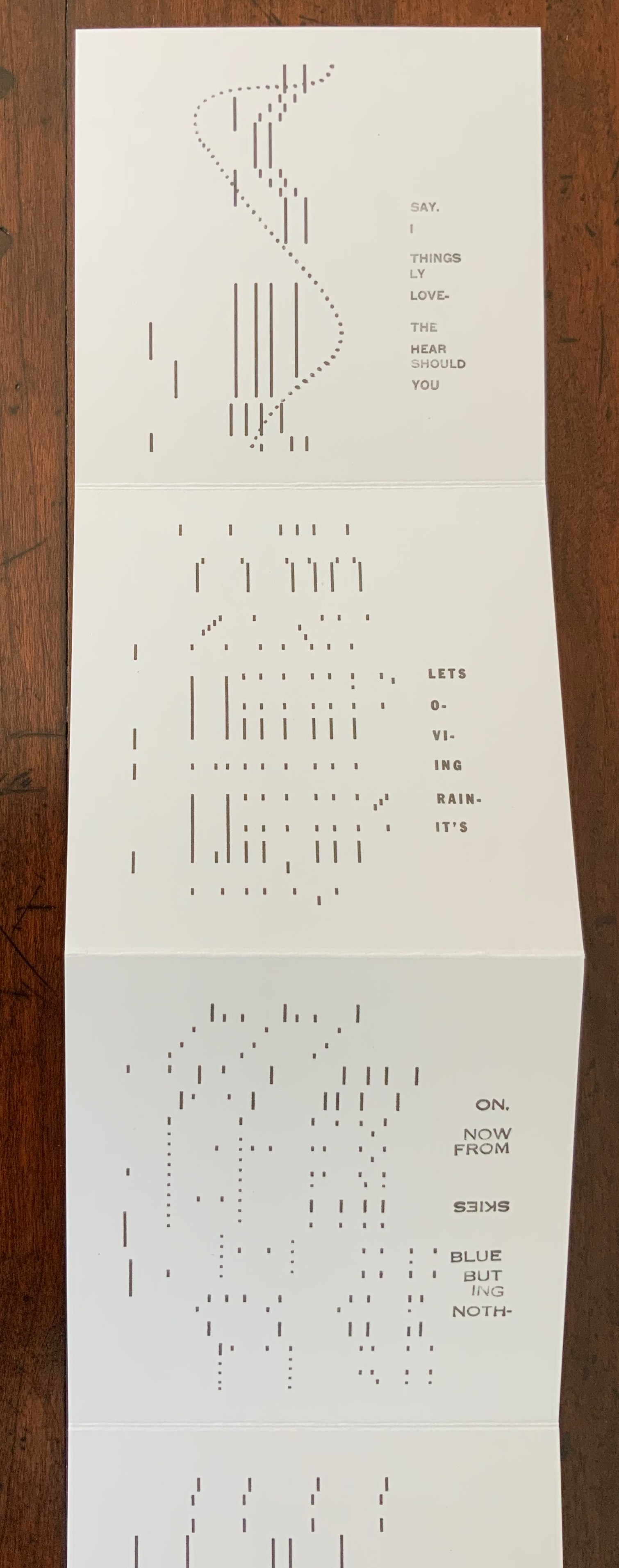
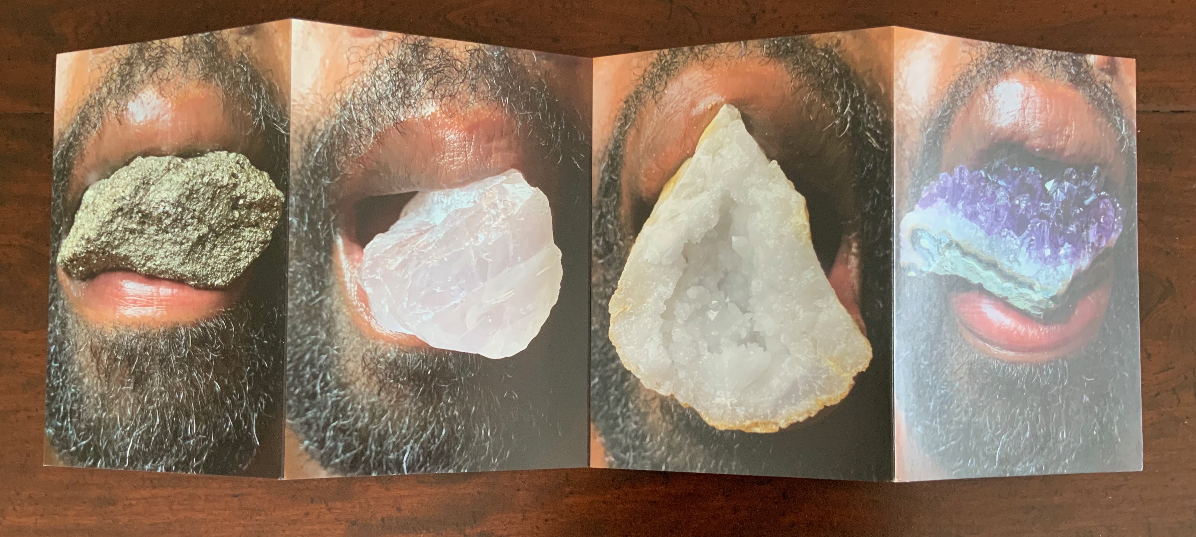
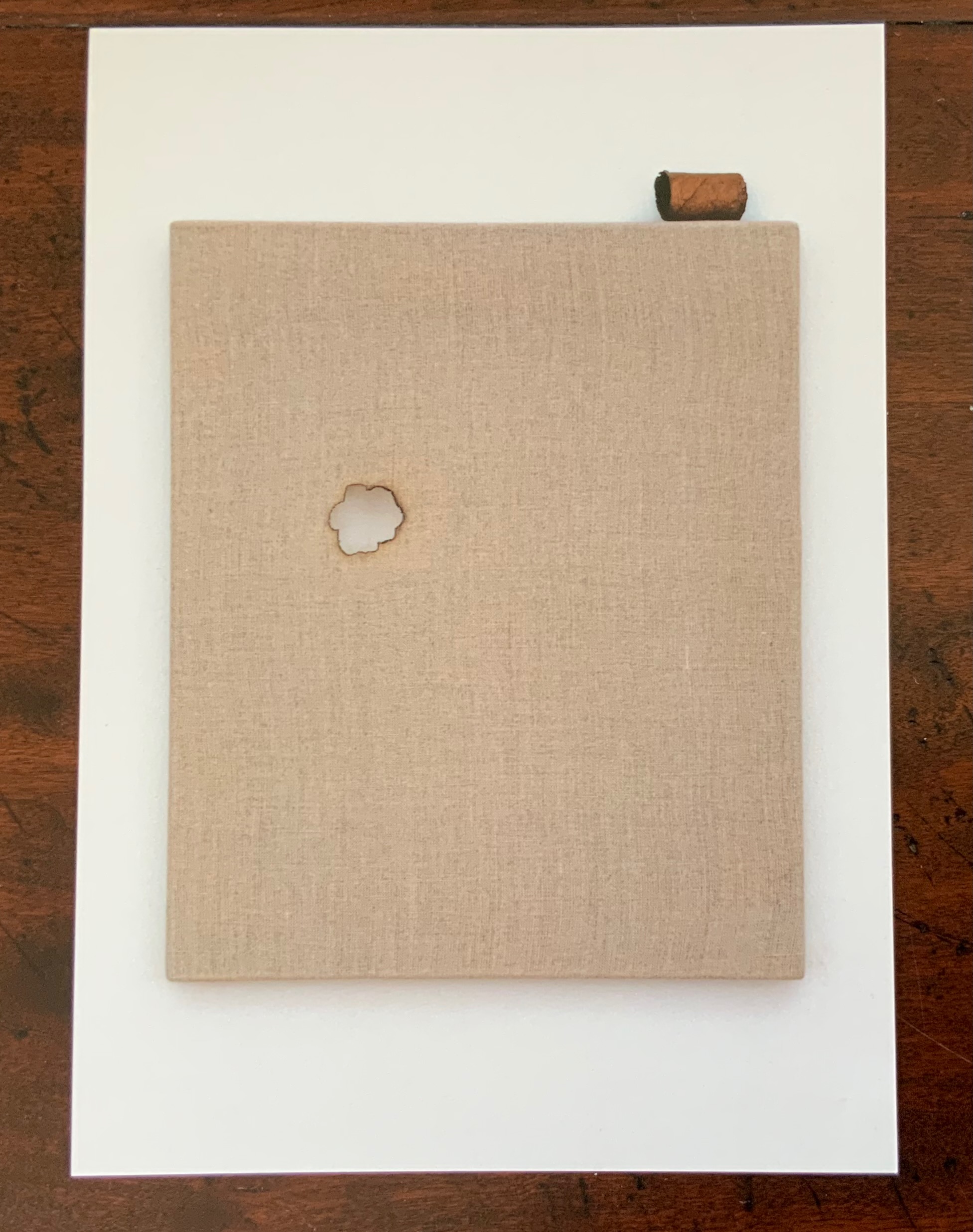
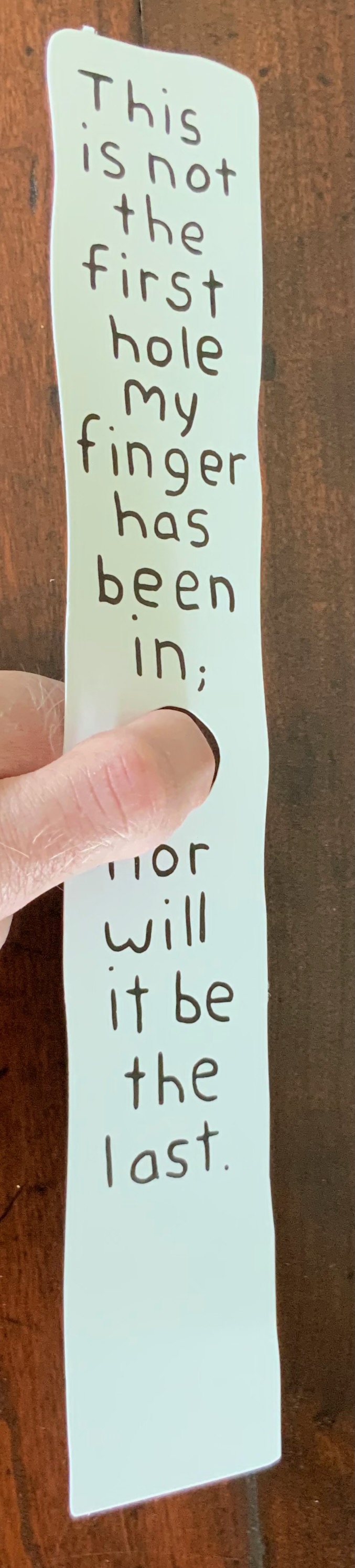
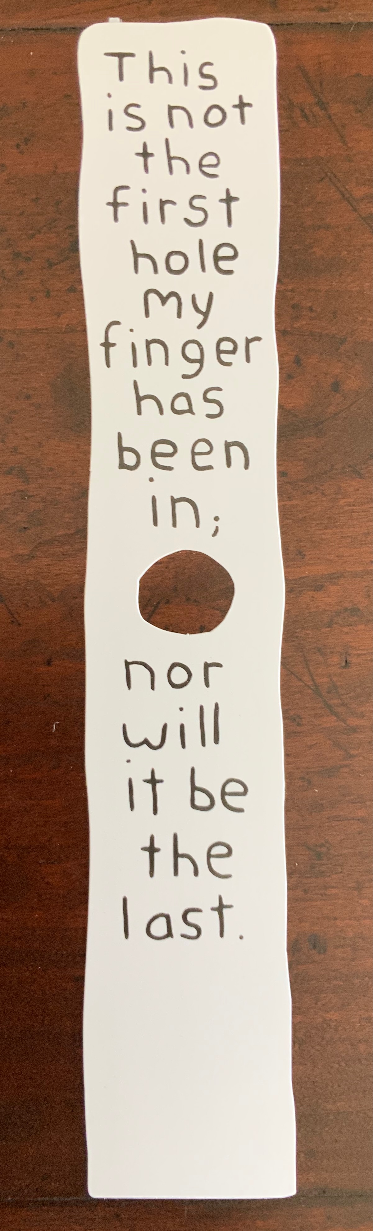
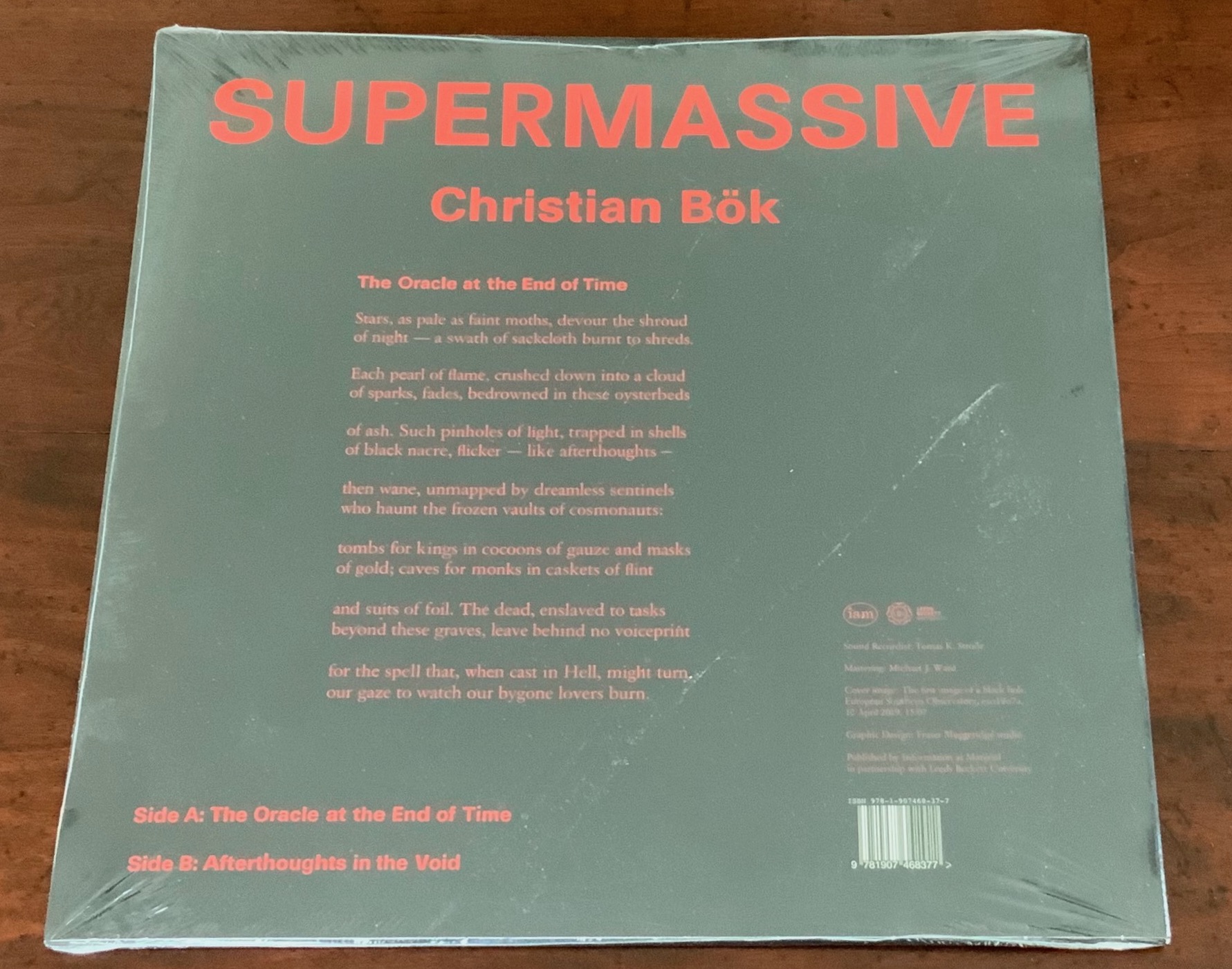
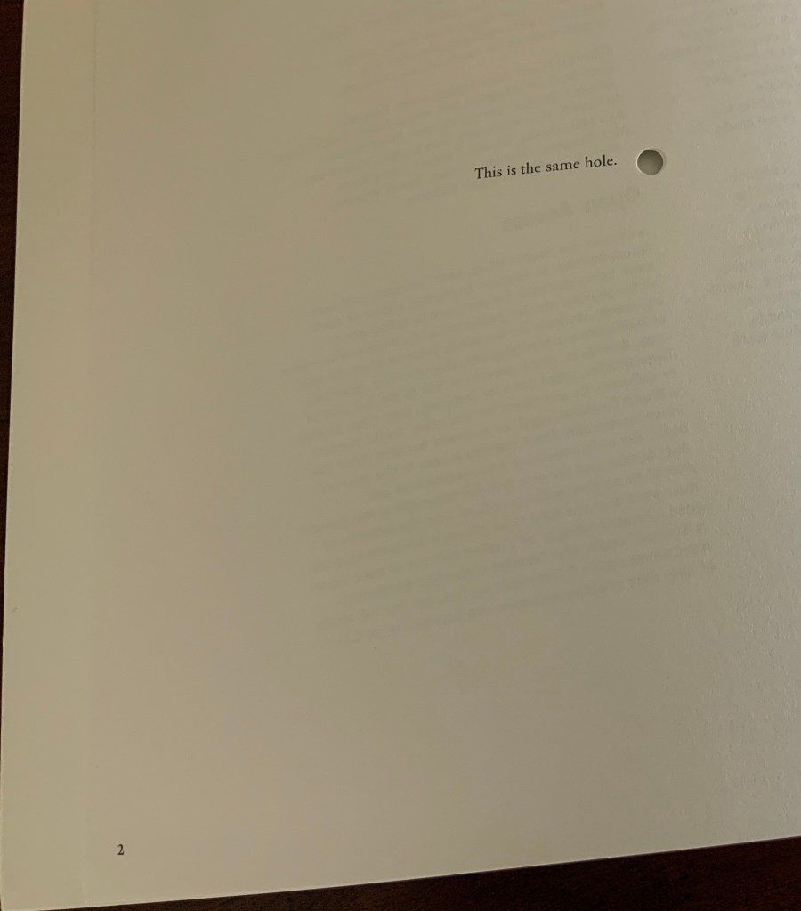
Inscription: The Journal of Material Text – Theory, Practice, History, Issue 2 on Holes (2021) Simon Morris, Gill Partington and Adam Smyth (eds.) Perfect bound softcover, H314 x W314 mm, 180 pages. Editions included: Fiona Banner (aka Vanity Press), Full Stop, front & back covers; Kendell Geers, Stripped Bare, end papers; Carolyn Thompson, The Beast in Me, H1180 x W1180 mm; Erica Baum, Piano Rolls, H120 x W120 closed, W960 mm open; Harold Offeh, Crystal Mouths, H210 x W105 closed, W480 mm open; David Bellingham, Cigar Burn Apertures, H210 x W105 mm; Miranda July, Bookmark, H302 x W54 mm; Christian Bök, Supermassive, LP. Acquired from Information as Material, 10 October 2021. Photos of the issue: Books On Books Collection.
How materially perverse is it that the second issue of Inscription is devoted to “the hole”, yet it is the first issue that actually has a hole in it? The first issue of Inscription did set a seriously playful — or playfully serious — tone, and the second issue does not fail to maintain it. The second issue continues the dos-à-dos binding but with only the front and back covers as the external giveaway. In the middle of this single-spine paperback, pages 1-90 meet an inverted pages 90-1 in the middle, which prompts the reader to turn the open book 180° and flip back to page 1. From either direction, the reader meets the traditional backmatter of a journal in the middle.
Inverted cover and center of Inscription (2021).
Such reversals of expectation call for a countervalent design element to avoid too much confusion. In this issue, that element consists of constant earth-tone backgrounds framing constant black-on-white text boxes (square holes?) for each article. Even within these constants, reversals of expectation play out. The backgrounds are drawn from 14 different sources, ranging from laid paper samples, parchment, pulp and brown boards to a slice of Emmental cheese (sorry, Gromit, no Wensleydale), and the layouts for each square hole differ, being taken from 16 other journals such as The Criterion, The Egoist and National Geographic.
List of backgrounds used throughout the issue.
List of publications whose layouts are used throughout the issue.
The Emmental cheese background around the opening of Marcinkowski’s essay; Hybrid wove/laid paper made for James Watt & Co around the opening of Lüthi’s essay.
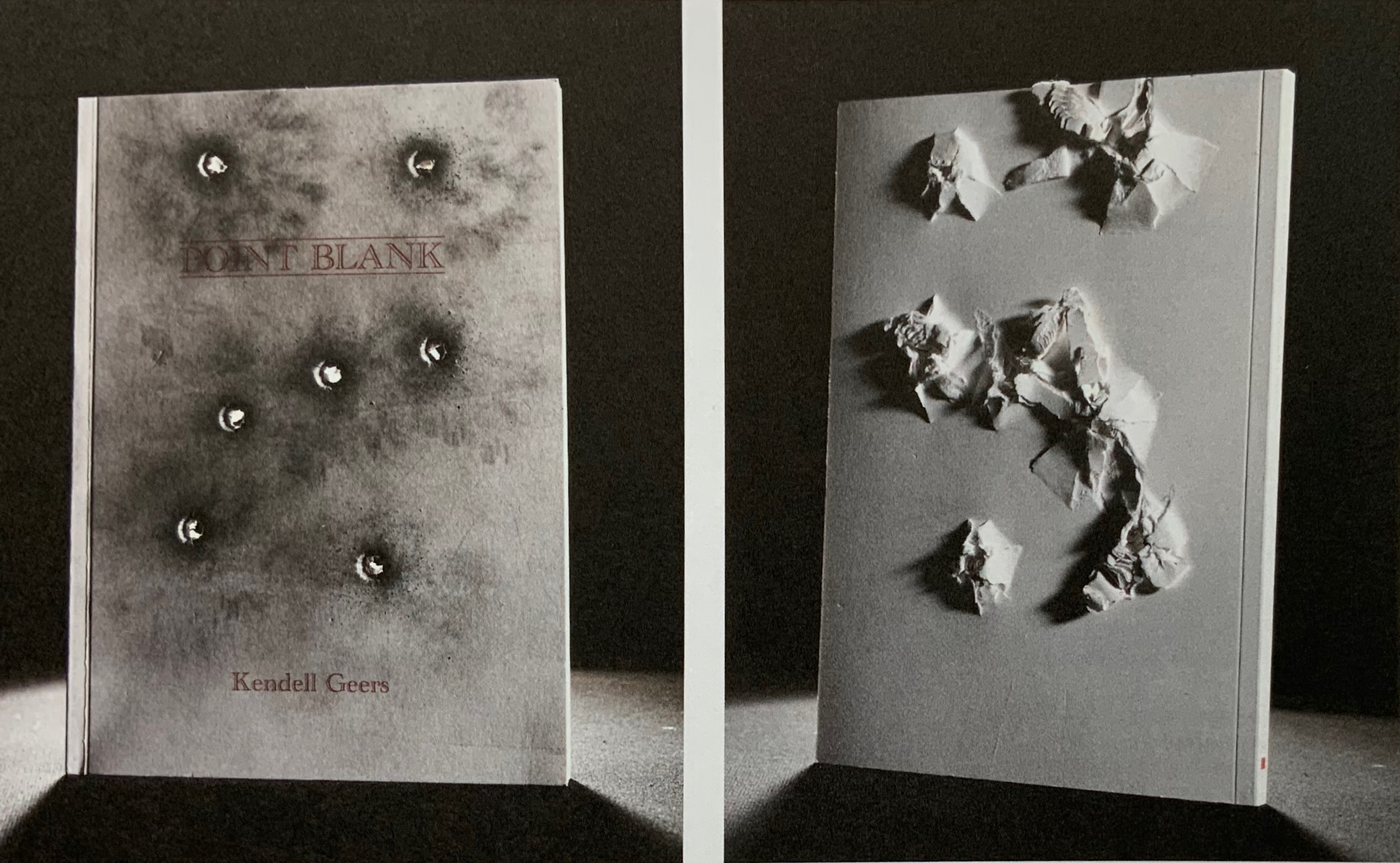
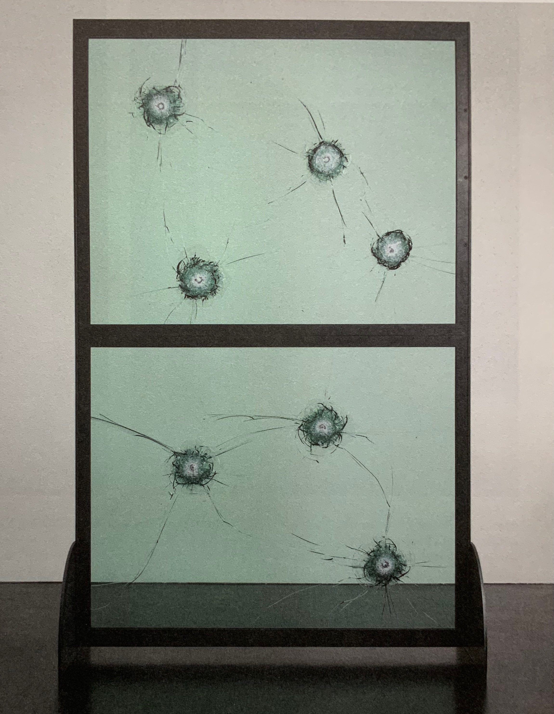
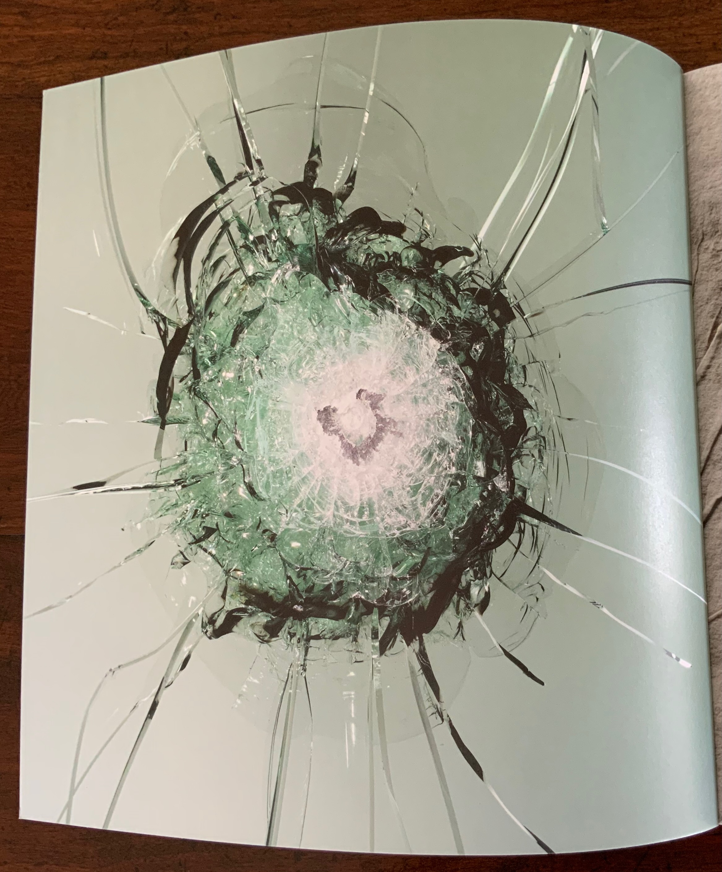
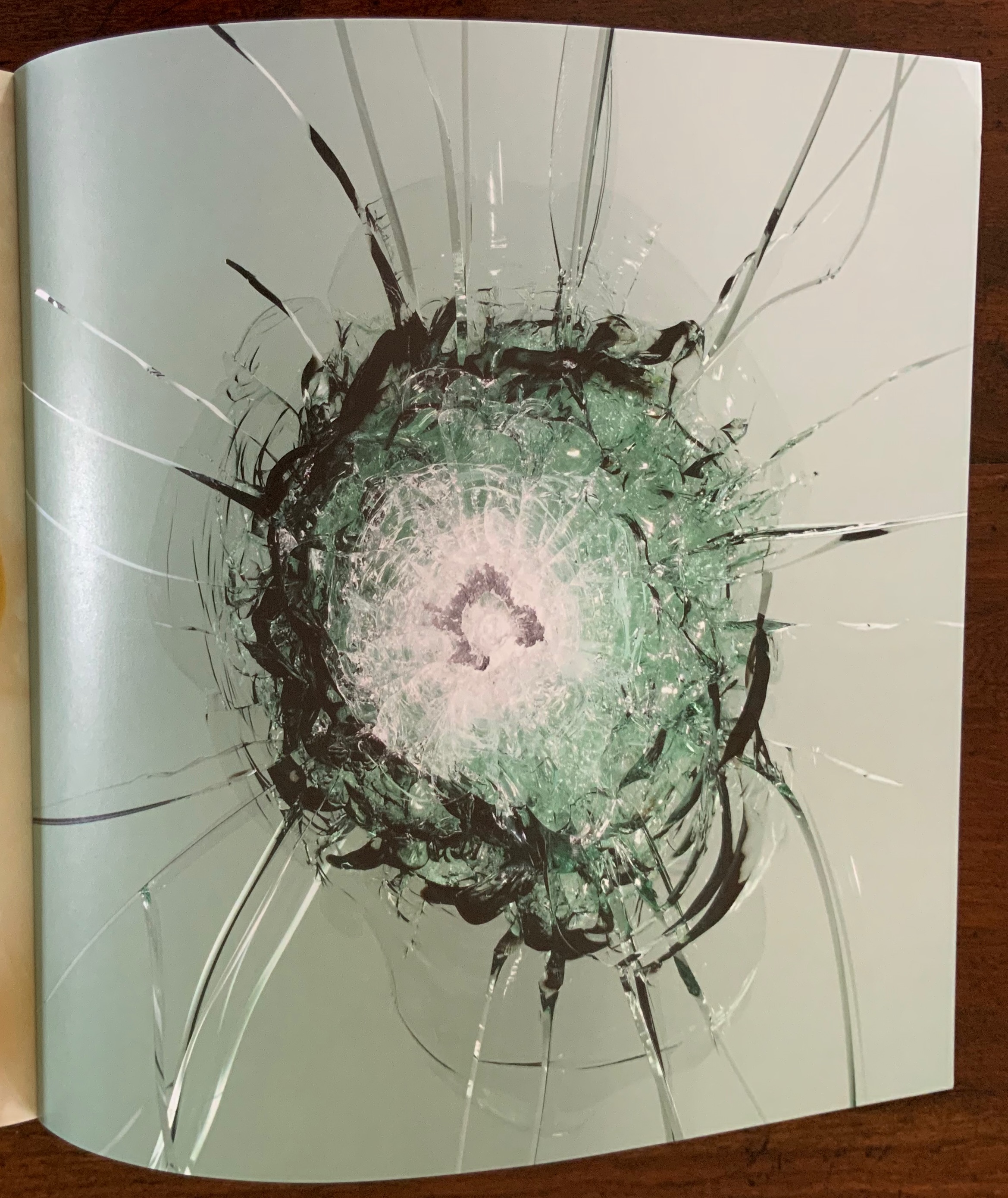
There is an even more recurrent “bass” line in this issue. It comes from the South African artist Kendell Geers, interviewed by the Editors. Even this bass line plays with variable perspective. Marking the start of most articles is a sheet bearing on recto and verso pages the image of a bullet hole (entry then exit) taken from Geers’ work Point Blank (2004). Bullet holes in glass — from Geers’ Stripped Bare (2009) — punctuate inversely the inside covers, bringing two symmetric/asymmetric openings to this topsy turvy production.
Kendell Geers, Point Blank (2004), front and back covers; Stripped Bare (2009; inside covers of Inscription (2021).
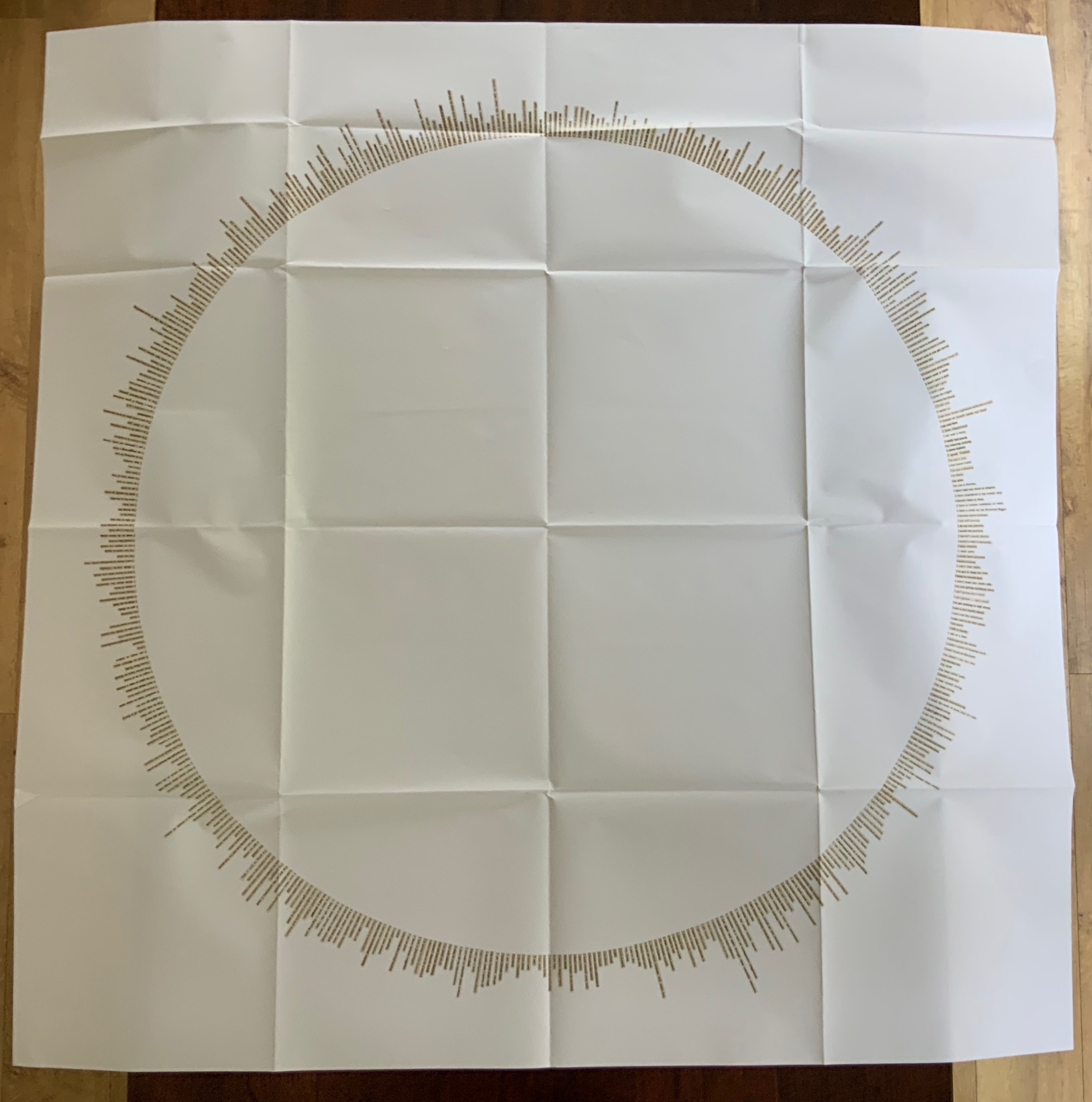
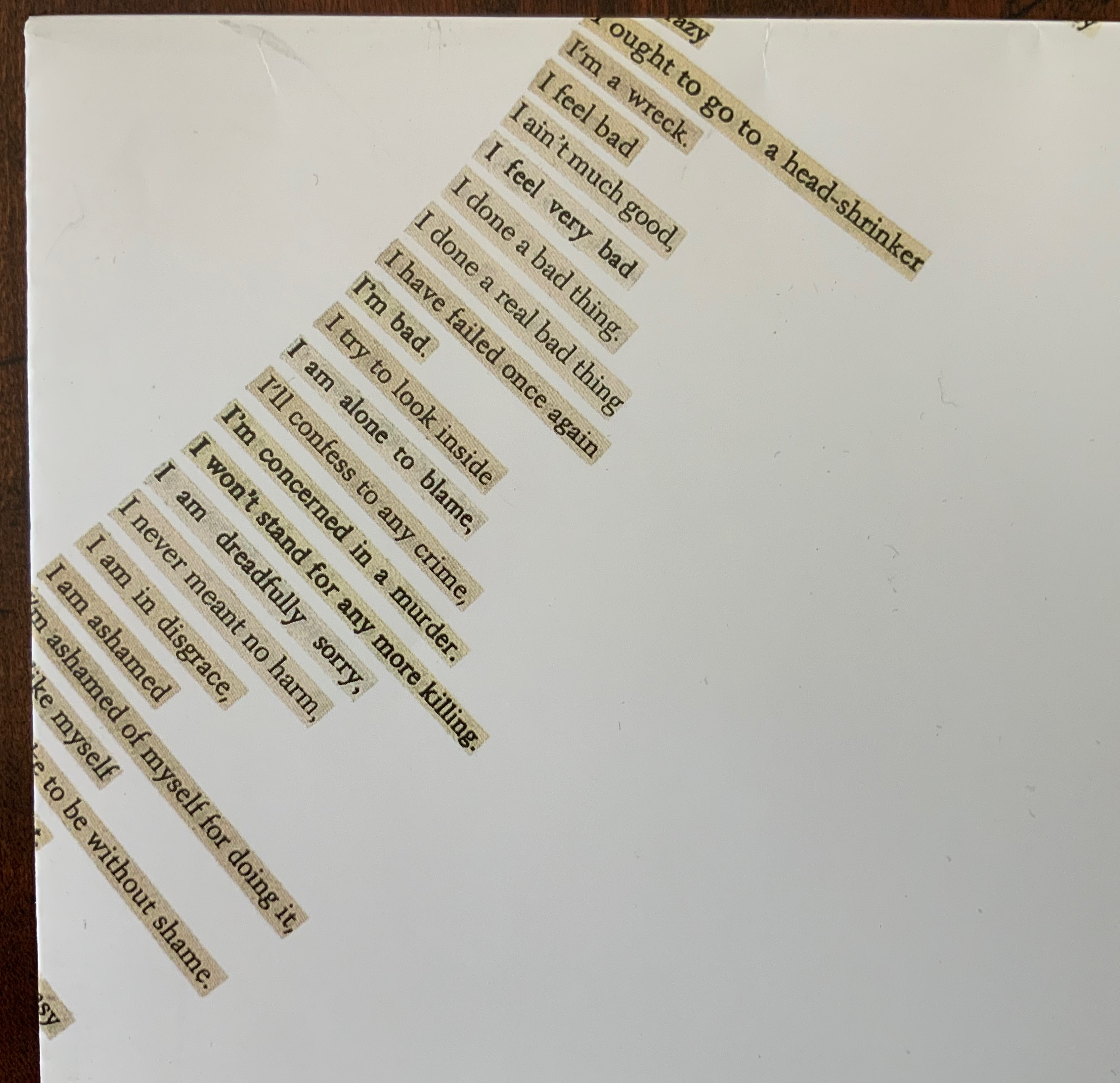
Long-time admirers of the 1960s-70s multimedia magazine Aspen, the editors have continued their practice of including unbound elements. In this issue, they have included Carolyn Thompson’s enormous poster The Beast in Me, whose sentences and part-sentences beginning with “I” have been cut from eight different novels and pasted down to form the hole seen below. Also included are Erica Baum’s Piano Rolls, Harold Offeh’s Crystal Mouths, David Bellingham’s Cigar Burn Apertures, Miranda July’s, Bookmark and Christian Bök’s Supermassive LP.
Carolyn Thompson, The Beast in Me, H1180 x W1180 mm. Photo: Ricky Adam. Photos of the work: Books On Books Collection.
Erica Baum, Piano Rolls, H120 x W120 closed, W960 mm open. Photos of the work: Books On Books Collection.
Harold Offeh, Crystal Mouths, H210 x W105 closed, W480 mm open; David Bellingham, Cigar Burn Apertures, H210 x W105 mm; Miranda July, Bookmark, H302 x W54 mm; Christian Bök, Supermassive, LP. Photos of the works: Books On Books Collection.
Like the famous combined Aspen issue Nos.5/6 — an homage to Stéphane Mallarmé — Inscription manages to pull off an eclectic unity with the essays included, which unlike Aspen was accomplished after a double-blind review process. Inscription‘s editors have turned on its head Robert Frost’s dismissive characterization of free verse as playing tennis without a net; they are playing doubles with a net and blindfolded and have created a work of art. This issue’s entries range from Paul Reynold’s erudite and whimsical definitions of all sorts of holes; the scholarly detective work on the holes that bind (pin holes and punch holes by Craig Robertson and Deirdre Lynch and filing holes by Heather Wolfe); James Mission’s tracking the crafts of scribe, typesetter and coder in representing lacunae, gaps or holes in the text; Louis Lüthi’s puncturing juxtaposition of W. Somerset Maugham’s 1948 abridgment of Moby-Dick, Orion Books’ 2007 Moby-Dick in Half the Time and Damion Searls’ 2009 riposte ; or The Whale; to Fiona Banner’s photo-essay on her hole-creating Full Stop‘s, granite sculptures of full stops (periods) created from the Peanuts , Klang and Orator typefaces, two of which were dropped into the marine protected area of Dogger Bank to put a sure stop to industrial fishing there. Here is the table of contents:
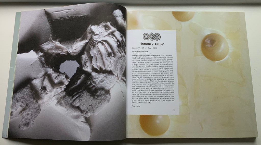
Michael Marcinkowski — “house / table” Galina Oustinova-Stjepanovíc — “Reading the Hole on the Last Address Memorial Plaques in Moscow” Fiona Banner — “Full Stop intervention with Greenpeace” Simon Morris — “Perspective Correction” Dianna Frid, Carla Nappi and Ian Truelove — “Wormholes, The Cascabel Butterfly and an AR collaboration” Aleksandra Kaminska and Julian De Maeyer — “The Perfect Cut: Talking with Myriam Dion” Paul Reynolds — “A Glossary of Holes” Louis Lüthi — “A Snow Hill in the Air” James Mission — “Signifying Nothing: Follow a Hole Through Three Text Technologies” Editors — “An Interview with Kendell Geers” Heather Wolfe — “On Curating Filing Holes” Craig Robertson and Deirdre Lynch — “Pinning and Punching: A Provisional History of Holes, Paper, and Books”
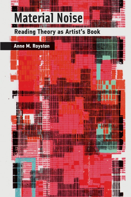
Inscription continues to provide one of the liveliest examples of what Anne M. Royston calls “artistic arguments (my emphasis), a term that indicates theory that pushes back against the expectations of the theory or criticism genre, specifically by employing signification that exceeds the semantics of printed text”.
As its subtitle suggests, Material Noise explores how the material aspects of works of criticism and media studies such as Le Da Costa encyclopedique, Jacques Derrida’s Glas, Avital Ronell’s The Telephone Book and Mark C. Taylor’s Hiding matter to understanding them — just as if those works were artist books. For the reader interested in book art, the artist book or whatever one might like to call that art, Material Noise might be better read back to front. The works of book art that Anne Royston explores in Material Noise — Mark C. Taylor’s Le Réal, Las Vegas, NV, Shelley Jackson’s Skin, Johanna Drucker’s Stochastic Poetics and Susan Howe’s and R.H. Quaytman’s Tom Tit Tot — come at the end of the book.
The order though is reassuring. Otherwise we might end with criticism, media theory and critical theory becoming the foreground, the works of art simply background, lost in theoretical translation. A case of Barthes for Barthes’ sake? It is fitting that the very material approach to engaging with book art — even with its most conceptual of instances — should be applied to critics and theorists to explicate their works, only then to conclude by showcasing works of art whose mastery of the material may be said to put the more academic works in the aesthetic shade.
Royston selects the journal — Convolution, founded in 2011 by Paul Stephens — to emblematize her starting point: “a blend of art and criticism that considers its material form at every step” and delivers “a materially immersive reading experience” (pp. 1-3). If her publication had occurred in the future, she could have selected Inscription, founded in 2020 by Adam Smyth, Gill Partington and Simon Morris to serve as an open closing point. But that would have spoiled the reassurance of concluding with the art.
As is the wont of theorists (social, literary and otherwise), she proposes a new term, or tool, with which to build her case: “artistic arguments (my emphasis), a term that indicates theory that pushes back against the expectations of the theory or criticism genre, specifically by employing signification that exceeds the semantics of printed text”. Leaving it to the academics to unpack that proposition professionally and evaluate its application, this casual observer suggests that it is analogous to “upward inflection” but without the implied lack of confidence. With a lack of confidence, it would be the declarative sentence that hedges its bet with that annoying, habitual rising tone that turns it into a question.
Royston does not hedge her bets. Her observations about Le Da Costa encyclopedique and its self-conscious, self-referential heterogeneous play with the material forms of the reference work, newspaper and the forms within them — columns, typographical signals (hyphenation), etc. — are assured. Her surfacing of “noise” as a concept and phenomenon key to the shape and message of Le Da Costa, Derrida’s Glas and Ronell’s The Telephone Book is equally assured in each case. Likewise, how — across those three works — she slips among the ideas of “noise” to “formlessness” to “white spaces” to end up on the “surface” of Taylor’s Hiding, his associated multimedia The Réal, Las Vegas, NV and then Jackson’s Skin project.
Royston’s true avatar must be the ilex. In the Taylor/Jackson chapter, she effortlessly moves from Taylor’s university press book then to his electronic artist book and then to Jackson’s embodied/disembodied story literally tattooed word by word on 2,095 volunteers (thereafter called “words”). Royston does it so well that it almost enacts an artistic argument proving her thesis that we should read theory in the way we read artist books.
But collecting theories may not be as satisfying as building real or fantasy collections of art. Being introduced to Taylor’s The Réal, Las Vegas, NV (1997) with its slot machine screen offers the chance to add it alongside Marcel Broodthaers’ Monte Carlo Bond (1924) and Muriel Cooper’s designed Learning from Las Vegas (1972) by Robert Venturi. If you happen across one of Jackson’s “words” in the tattooed flesh from Skin, you can forego a kidnapping charge by turning to Paul Emmanuel’s The Lost Men Project (2006). Crestfallen that no aluminum-covered version of Drucker’s Stochastic Poetics (2012) is easily available? Download the Ubu edition. Also unable to find a copy of Howe’s and Quaytman’s Tom Tit Tot (2014)? Place its link at the Museum of Modern Art Library Council alongside the Meermanno Museum’s for its “Reading as Art” exhibition.
Royston’s book provides collector and critic with an entire toolkit enabling them to encounter the “materially immersive reading experience” and perceive how it is really the “materially engaged reading experience”. Highly recommended.
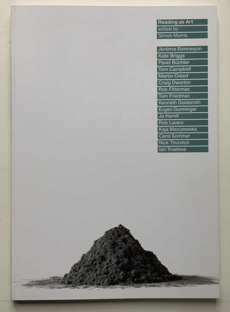
Reading as Art (2016) Simon Morris, ed. Perfect bound paperback. H297 x W210 mm. Acquired from Information as Material, 22 August 2020. Photo: Books On Books Collection. Displayed with permission of the publisher.
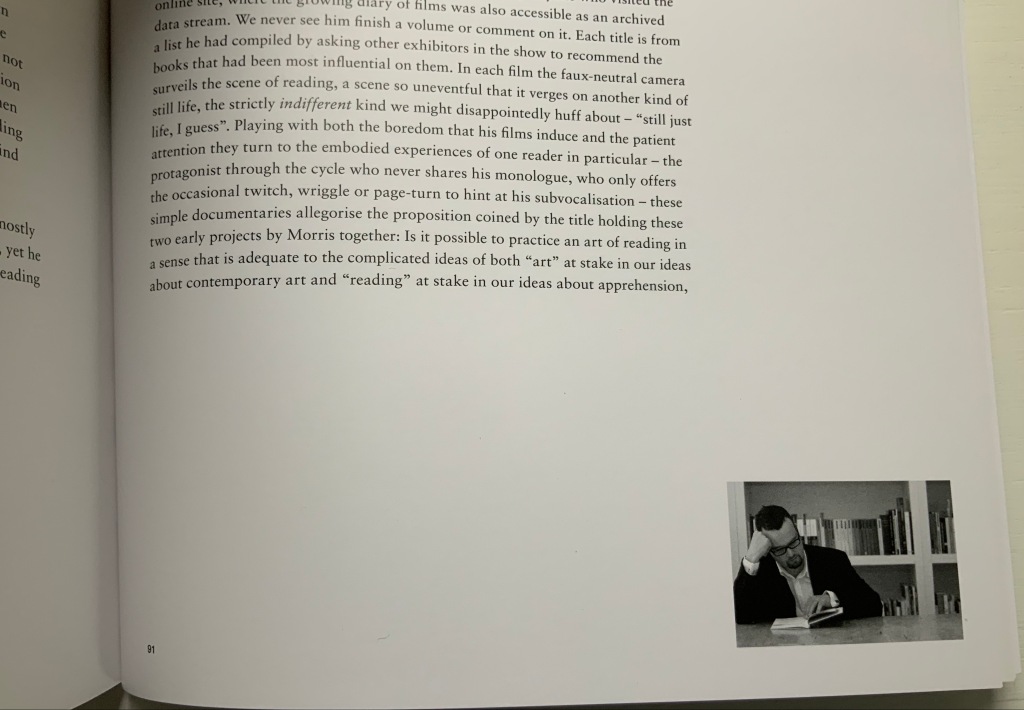
Simon Morris and Books On Books crossed paths at the opening of an exhibition at the Meermanno Museum in The Hague. The exhibition was called “The Art of Reading“, and he gave a talk on his performative work Reading as Art (2004), a compiled-stills film of him reading and turning the pages of a book. (Not at all like watching paint dry or grass grow, if you are unkindly thinking so.) Reading as Art (the volume) provides a taste of Reading as Art (the performance) with black-and-white frames from the film appearing at the bottom right-hand corner of nearly every page: just run your thumb down the fore edge and let the pages flip to see the “action”.
Details from Reading as Art (the book). Photos: Books On Books Collection. Displayed with permission of the publisher.
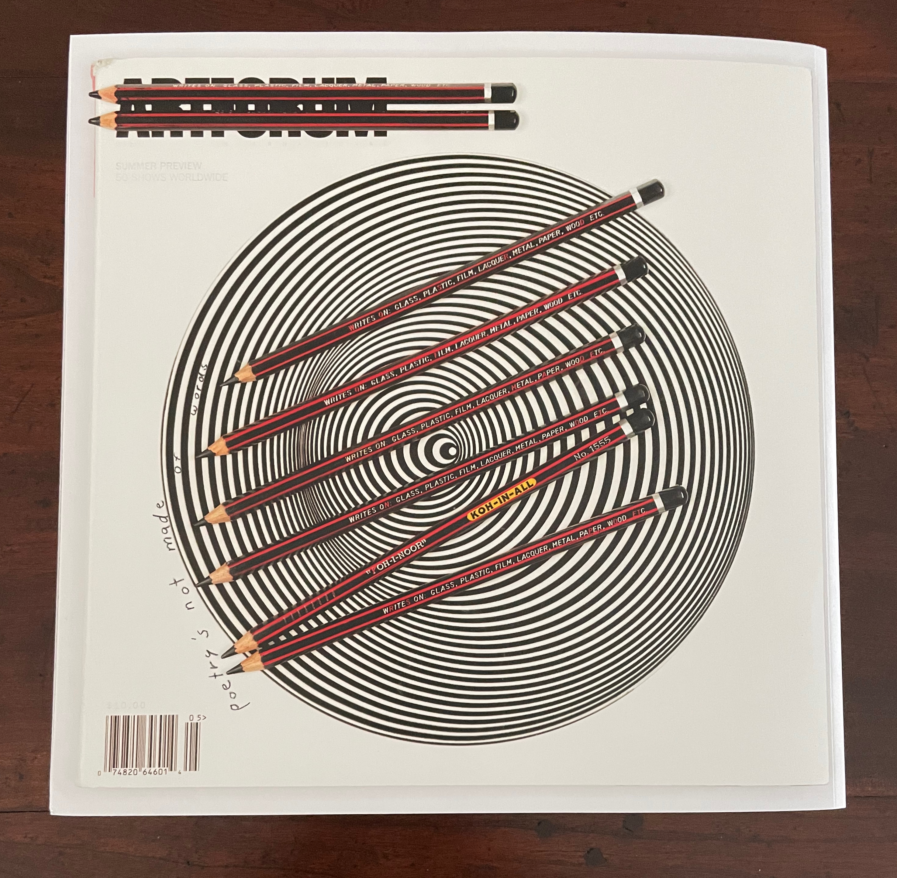
That feature of this one volume speaks volumes about Simon Morris as an artist. The idea of “reading as art” is not far off “publishing as art”. Morris’s collaborative publishing operation Information as Material has employed nearly every tool in the “Publishing as Artistic Toolbox“, as the 2018 exhibition in Vienna was called: documented performances, polemics, apps, free downloadable PDFs, prints and broadsides, and a journal Inscription, whose first issue is a sculptural bookwork and comes with a vinyl LP record, poster and chapbook.
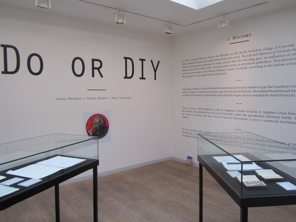
It is strange that this polemic does not mention William Blake among literary history’s do-it-yourselfers. Although their primary message of “don’t wait for a commercial publisher” is for wordsmiths, the authors include the book artist Johanna Drucker among their hortatory examples as well as The Life and Opinions of Tristram Shandy, which can lay a plausible claim to being the first work of modern book art, even before Blake’s “artist’s books”. The authors themselves have even played their parts in book art. So why no nod to the world of book art and its past and current contributions to Do or DIY?
In the 1960s and 70s, book artists’ democratic multiples aimed to sidestep the galleries, museums and art industry. Whether chicken or egg, photocopying and cheap printing brought forth or hatched Siegelaub’s The Xerox Book, Ruscha’s Royal Road Test and many more fair fowl. By century’s end and into the 21st, book artists were still doing it themselves, but the democratic multiple ceded quite a bit of territory to limited editions and unique works. Toward the 20th century’s end, desktop publishing and digital publishing, however, offered up a different, much larger target — the super-concentrated publishing industry — for a much larger cadre of creators — wordsmiths. Perhaps that bit-torrent caught up the authors on this occasion.
Still, the occasion itself — an exhibition that saw the polemic printed on indoor walls and on outside posters — must have appealed to the book art community. Book art makes us read differently, and that clearly happened with this exhibition.
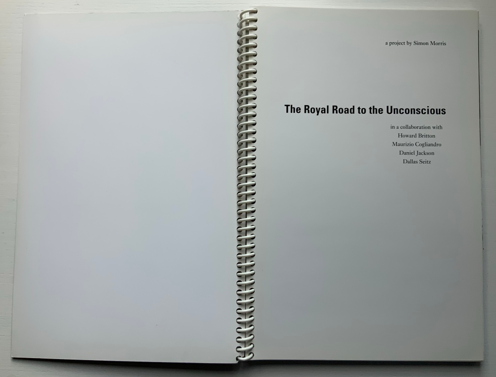
Royal Road to the Unconscious (2004)
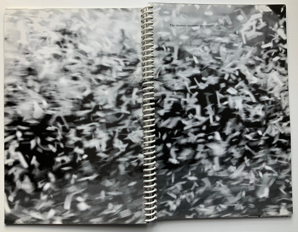
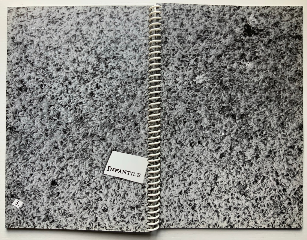
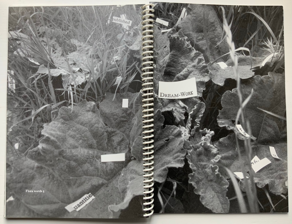
Royal Road to the Unconscious (2004) Simon Morris Spiral bound paperback. H240 x W160 mm, 80 pages. Acquired from Johan Deumens, 10 October 2020. Photos: Books On Books.
This is the book of the movie. Or the book of the movie “made by the book” of the movie. Or…. Better let the artist explain:
Utilising Ed Ruscha’s book Royal Road Test as a readymade set of instructions, seventy-eight students cut out every single word from Sigmund Freud’s Interpretation of Dreams. On Sunday, June 1st, 2003, the artist, Simon Morris (thrower) threw the words out of the window of a Renault Clio Sport on Redbridge Road, Crossways, Dorset, travelling at a speed of 90mph, approximately 122 miles southwest of Freud’s psychoanalytical couch in London. The action freed the words from the structural unity of Freud’s text as it subjected them to an ‘aleatory moment’ – a seemingly random act of utter madness.
Daniel Jackson (filmmaker), Maurizio Cogliandro (photographer) and Dallas Seitz (photographer) documented the action as 222,704 words erupted from the window of the car. They also recorded the stream of words strewn along the side of the road. Dr. Howard Britton, a psychoanalyst (driver), directed them to any slippages or eruptions of the Real that occurred in the reconfigured text. The poetic act of liberating Freud’s text allows us to engage with what Jacques Lacan called the register of the Real. The concept of the Real is far removed from anything that we conventionally attribute to reality. It is the experience of a world without language. If language names, it is all that escapes the name – an encounter beyond images and words.
Conceptual art can do one’s head in. So, in the meantime, enjoy the aleatory moment.
Mitchell, Beverly. “Q & A with conceptual writer and professor, Simon Morris“, Blog of the Hamon Arts Library, 22 February 2019. Accessed 2 December 2020. Good coverage of The Royal Road to the Unconscious as well as the exhibition “Reading as Art”.
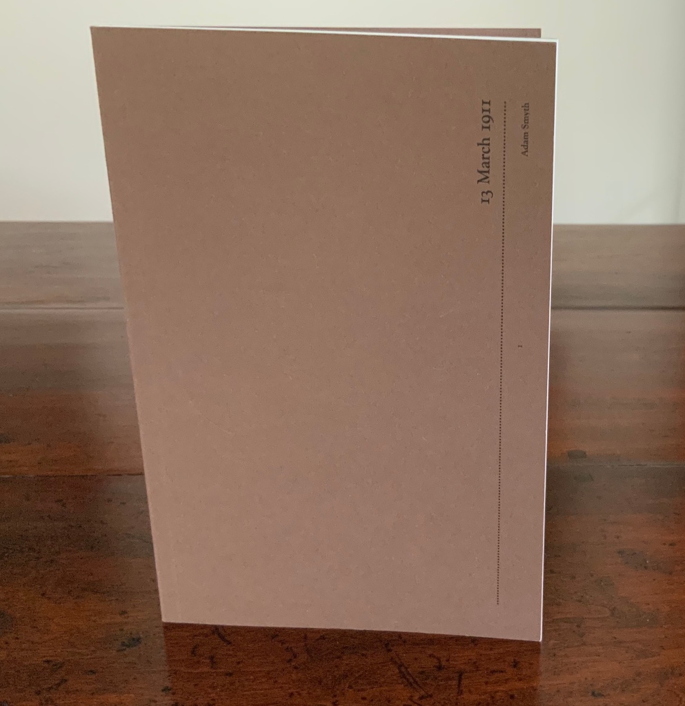
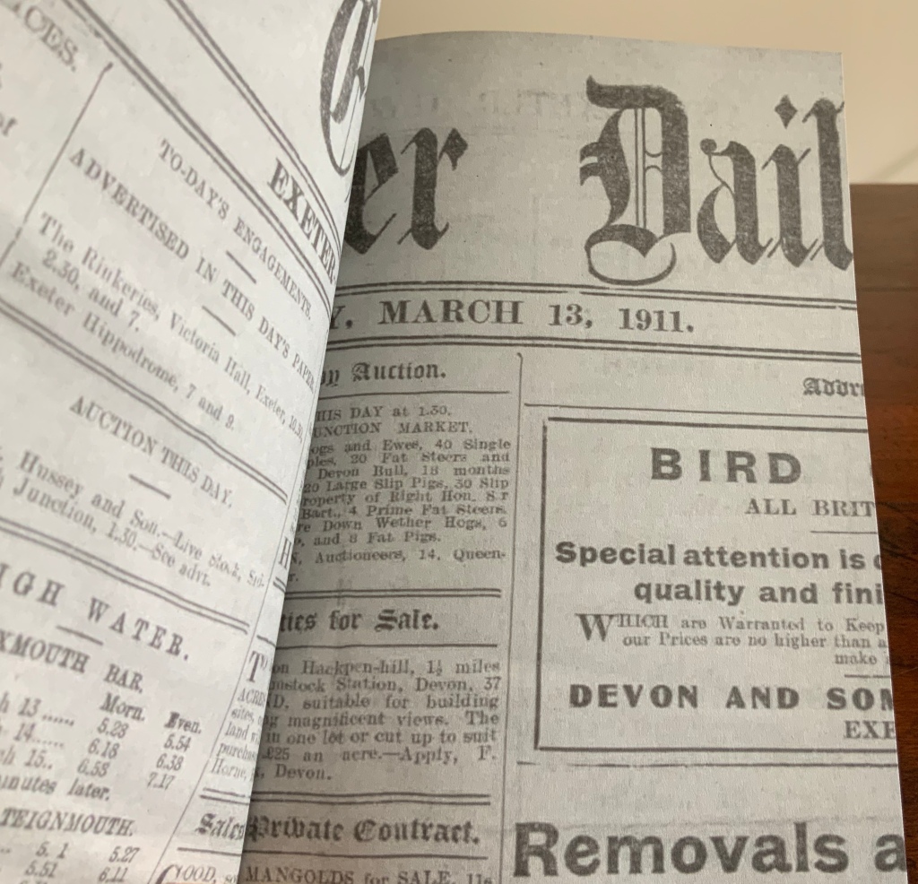
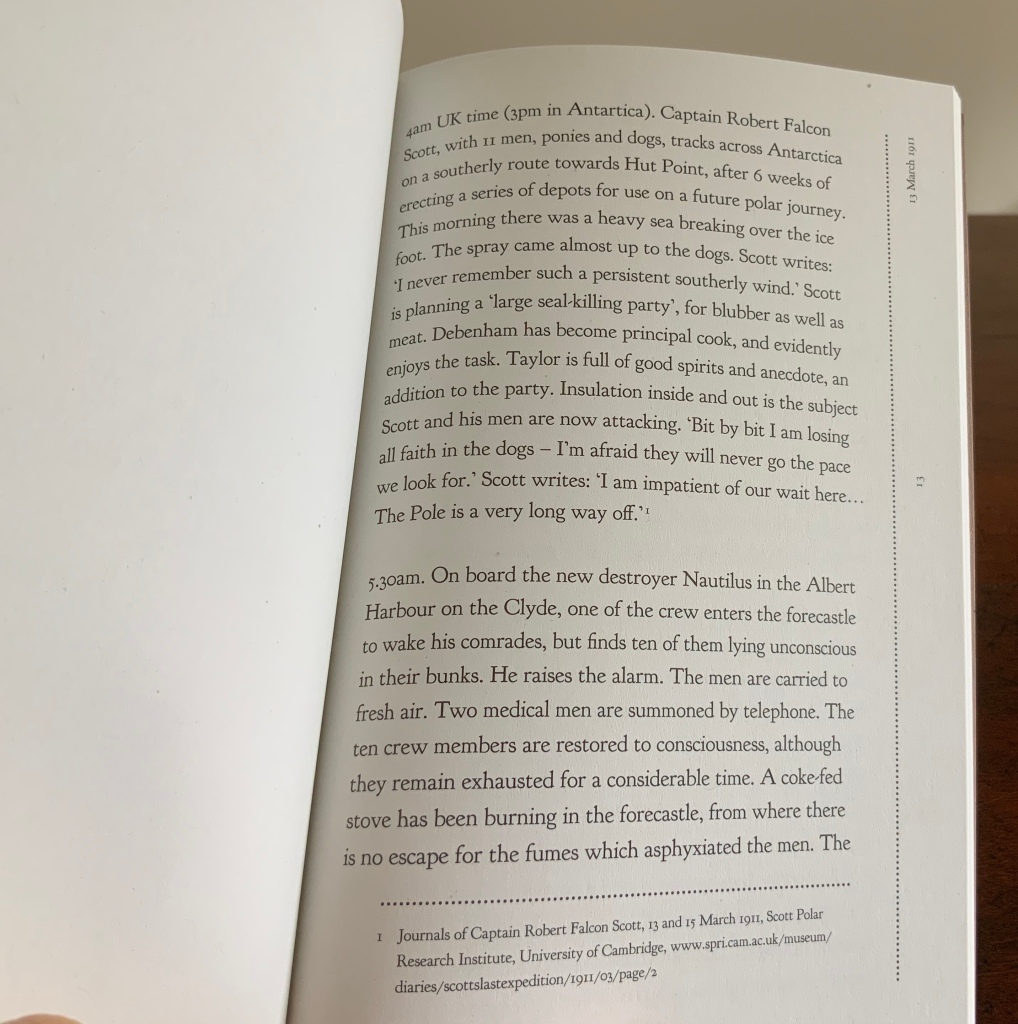
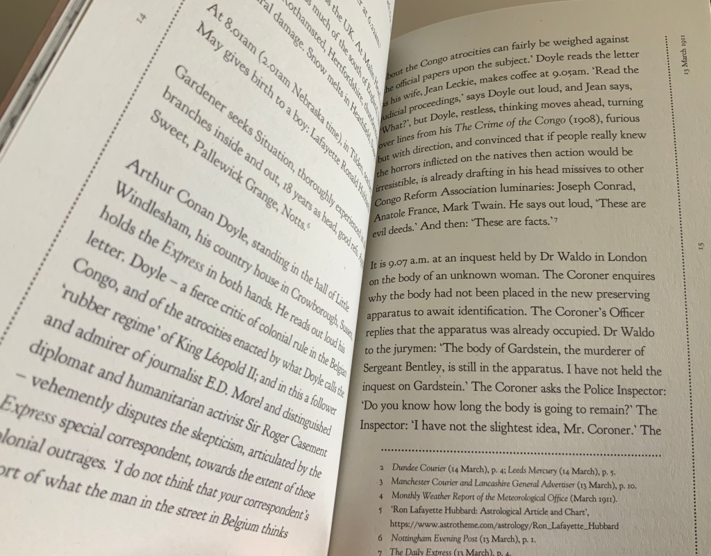
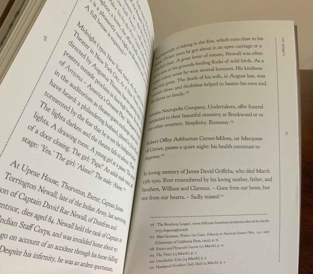
13 March 1911(2019) Adam Smyth Perfect bound paperback. H175x W115 mm, 64 pages. Edition of 500. Acquired from Information as Material, 10 October 2020.
Although unremarkable in its production values, 13 March 1911 enters the collection as a brilliant composite with roots in OuLiPo, Grangerism and the collage technique, Walter Benjamin’s Illuminations and The Arcades Project and Stéphane Mallarmé’s “The Book, Spiritual Instrument”. The date is the birth date of Smyth’s grandfather, and it is what confronts us in a photographic detail of a newspaper masthead.
From OuLiPo, Smyth takes the rule of constraint to guide his creation. The constraint is that the content presented must refer to events occurring on 13 March 1911 and in chronological order. Added to the constraint are citability of each source, which often takes Smyth to the Internet and Wayback Machine. Although focused on a single day in time, the writer, book and reader fly back and forth as if tethered together in a time machine composed of print and digital reference material.
Strictly with Grangerism, there should be a previously published book into and onto which the reader/actor inserts, pastes and attaches clippings relevant to the book in hand. Instead of a book in hand, Smyth has a date in hand to which the clippings accrue. And in keeping with this non-material target for Grangerizing, Smyth’s collage technique eschews visual and physical overlapping, rather it lies more in overlapping different types of sources of “data”: newspaper articles, classified ads, advertisements, Captain Scott’s journal, weather reports, obituaries, theater reviews and much more.
In a sort of reversal of Benjamin’s unpacking his library, Smyth packs snippets from history into this one book that turns on his grandfather’s birth date. It is not that Smyth can recreate him with all these snippets, or that the reader can ever know the man from those snippets — anymore than a reader of every single book in Benjamin’s library could recreate Benjamin or know him from doing so.
Like Benjamin in Arcades, Smyth is a collector of fragments by which he tries to make the past present. But Smyth’s time machine is also richly multi-dimensional — especially in its being digitally and print powered. What Smyth gives himself and the reader is an extended moment of recognizing the wide-flung welter around any of us at any time and the wryness, despair, amusement, inspiration and poignancy of trying to define, find and memorialize others (however close) or ourselves by that welter — however retrievable or citable the elements of it.
Finally, Smyth gives us one day’s proof of Mallarmé’s dictum: “everything in the world exists to end up in a book”. And so it ends up in the Books On Books Collection.
Further Browsing
Information as Material (Smyth’s 13 March 1911 is a publication with IAM, which offers works from authors such as Derek Beaulieu, Francesca Capone, Craig Dworkin, Andrew Dodds, Sharon Kivland, Simon Morris and Nick Thurston).
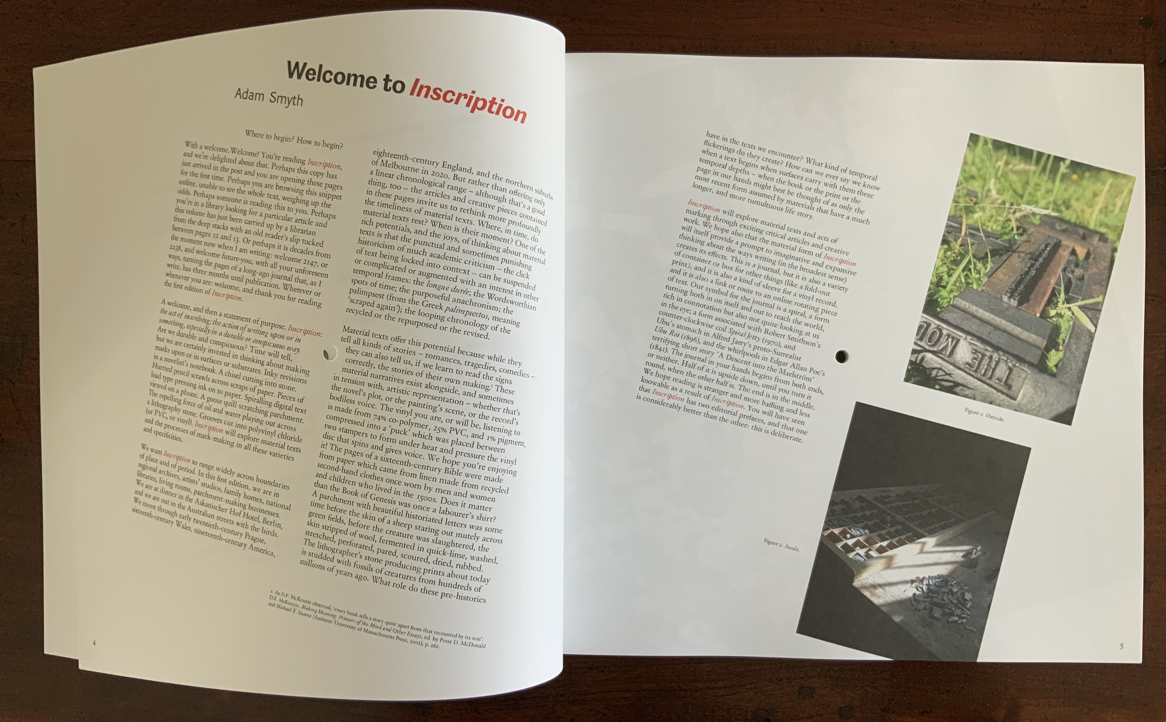
Inscription: the Journal of Material Text – Theory, Practice, History, Issue 1 on Beginnings (2020)
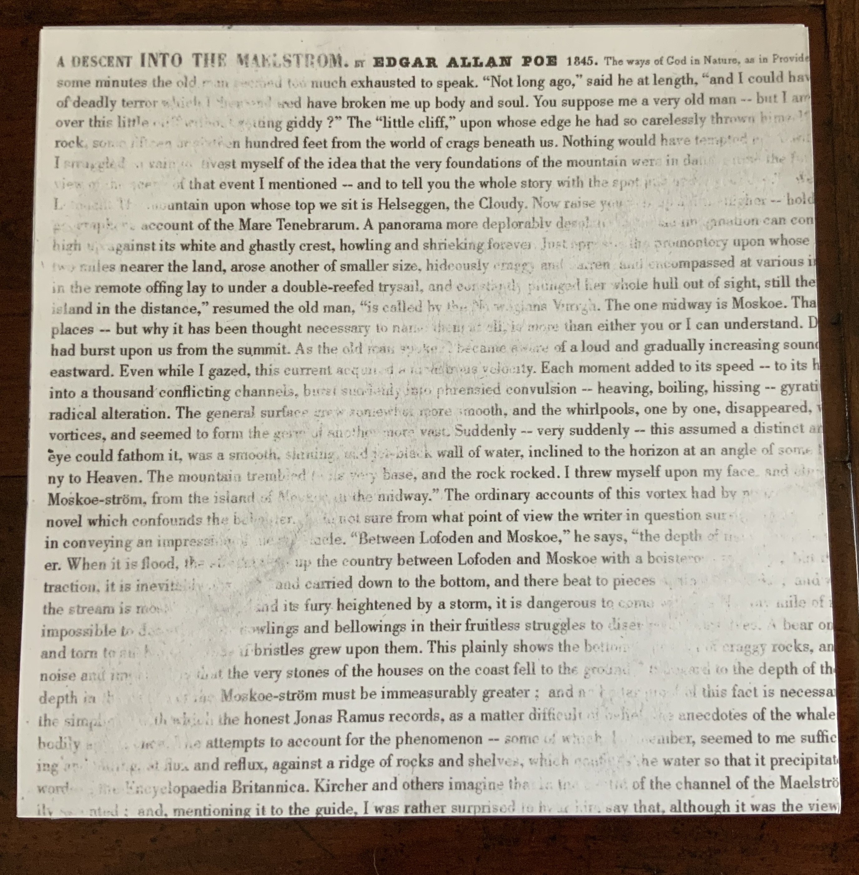
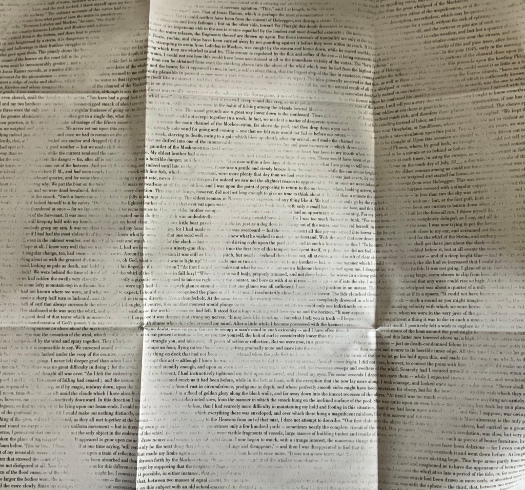
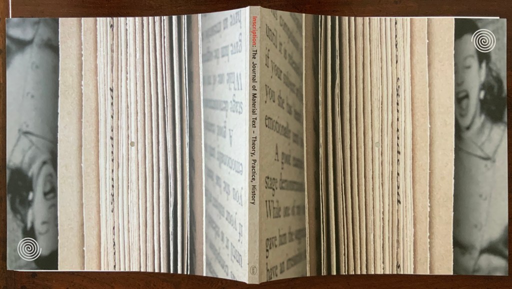
Inscription: the Journal of Material Text – Theory, Practice, History Issue 1 on Beginnings (2020) Edited by Gill Partington, Adam Smyth and Simon Morris Dos-à-dos (flipped), perfect bound softcover, H314 x W314 mm, 132 pages (including the end pages left intentionally blank); fold-out double-sided print of Jérémie Bennequin’s erasure of Edgar Allen Poe’s “A Descent into the Maelstrom”, H940 x W940 mm; saddle-stitched chapbook of Craig Dworkin’s “Clock”, held in a mock 45 RPM record sleeve, H180 x W180 mm; vinyl LP recording of Sean Ashton’s novel Living in a Land, H314 x W314 mm; Acquired from Information as Material, 10 October 2020.
In its design, typography, format and media components, the first issue of Inscription: the Journal of Material Text – Theory, Practice, History embodies its domain. So much so that this metaphorical box of artifacts stands as a contribution to the study of material texts as much as any of the journal’s inaugural articles.
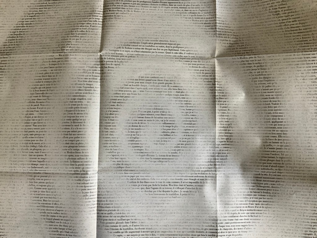
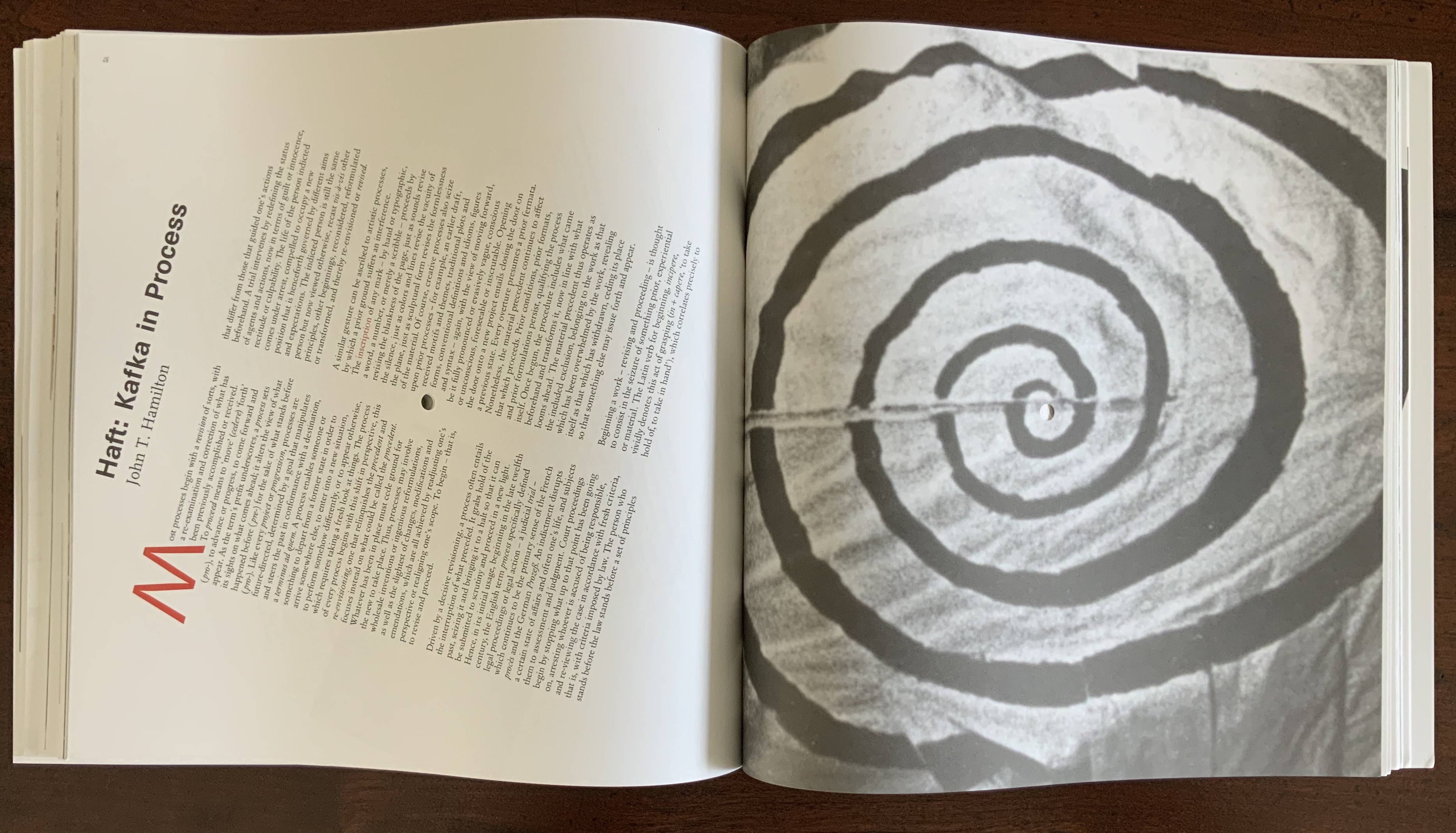
Jérémie Bennequin’s double-sided, bilingual print of his erasure of Poe’s “A Descent into the Maelstrom” recalls the palimpsest — a longstanding topic of material text study. Also, by standing in for Poe’s swirling maelstrom, the print’s image of spiralling erasure raises the domain’s recurrent theme of text-and-image interaction as well as that of the self-reflexiveness of such art. Using the book or text as physical material with which to create a work is central to book art as is the self-referencing that arises.
Bennequin’s choice of text also alludes to his other work. The short story’s themes of abyss, shipwreck and nothingness occur prominently in Poe-loving Mallarmé’s Un Coup de Dés Jamais N’Abolira le Hasard, the 19th century poem that made us modern and launched (is still launching) scores of artists’ books paying material and conceptual homage. Bennequin is one of those artists.†
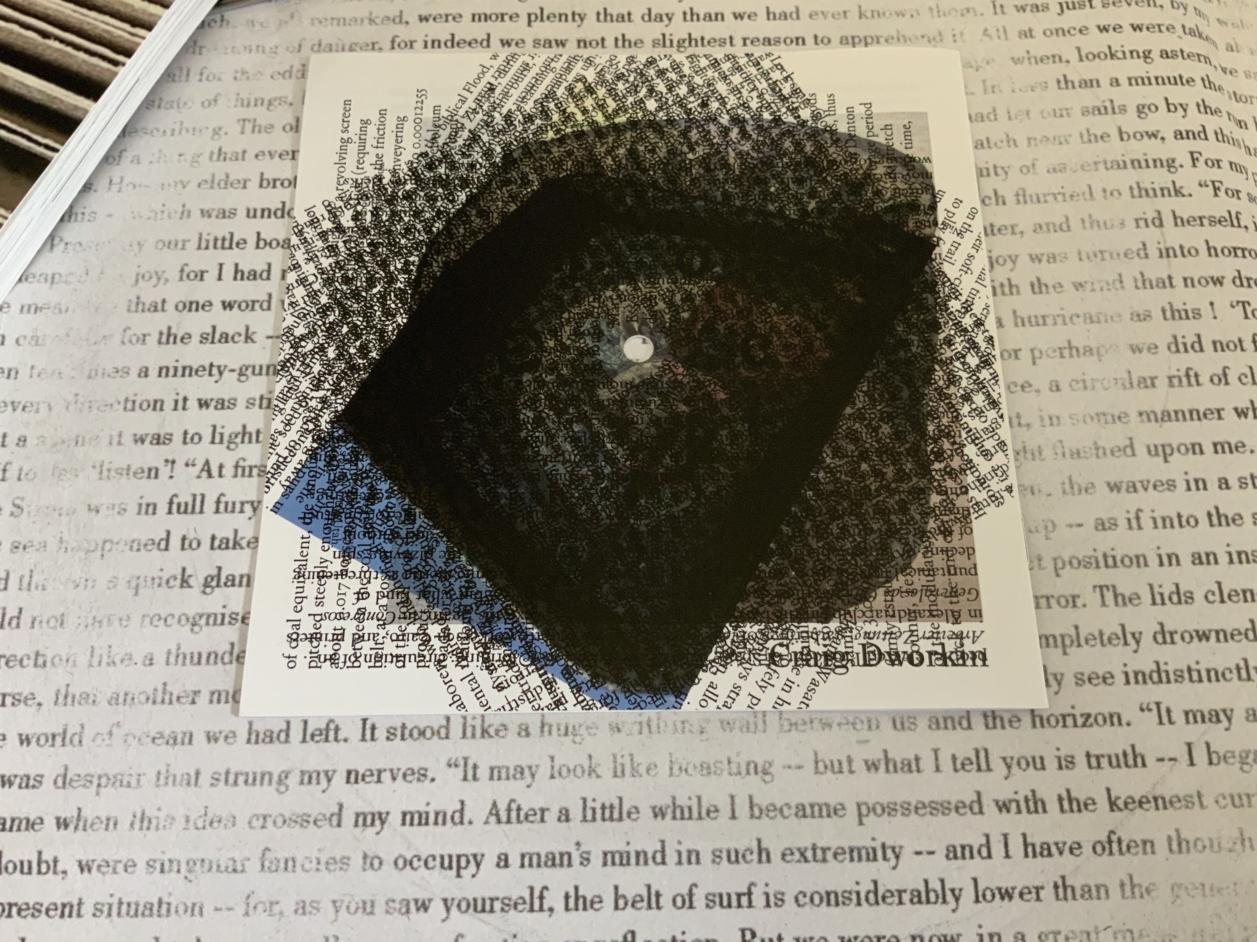
The print’s spiral erasure on a background of text serves as one of several voices in this journal issue’s intermedial†† harmony (or cacophony). The spiral reappears in Craig Dworkin’s meditation that scales up a pocket watch’s clock spring to the size of Robert Smithson’s Spiral Jetty (1980). Dworkin finds the spiral in the fossil of a Holocene fish that swam over the bed that became the jetty. He “materializes” the watch’s minutes against the geological and evolutionary time frames of the formation of the Great Salt Lake and the fossil. On the back cover of the chapbook, its entire text is repeated in a spiral of text blocks. The chapbook slips back into its 45 RPM-size sleeve to echo the spiralling inscription of sound in vinyl grooves that actually occurs on the LP recording of Sean Ashton’s novel Living in a Land.
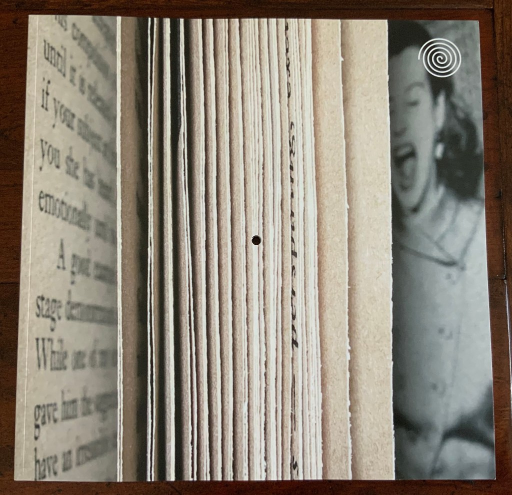
After Bennequin’s print, Dworkin’s meditation and Ashton’s LP, the journal itself appears, sporting the spiral as a logo on its trompe l’oeil cover. Not only drawn from Smithson’s Spiral Jetty, the logo draws from the stage costumes of Alfred Jarry’s Ubu Roi, which recur throughout the journal’s pages reminding us of drama as another medium in which the materiality of the text matters. In its own physical manifestation, the journal wears the materiality of the text on its sleeve and in its pages. The pages themselves spiral around a hole drilled through the center of the issue, echoing the sculptural extremity of inscribing, the book art technique of excising and the concept of nothingness central to many artists of inscription such as Robert Barry and Carl Andre, as this exchange shows:
RB: There is something about void and emptiness which I am personally very concerned with. I guess I can’t get it out of my system. Just emptiness. Nothing seems to me the most potent thing in the world.
CA: I would say a thing is a hole in a thing it is not. — Arts Magazine 47 (1972): 46
On its two page 2’s (a result of the dos-à-dos or back to back binding), Incription offers its own Magrittean take on holes:
In dos-à-dos binding, two codices are bound back to back in a Z form. So usually there are two fore-edges, two spines, and both codices have the same vertical orientation.
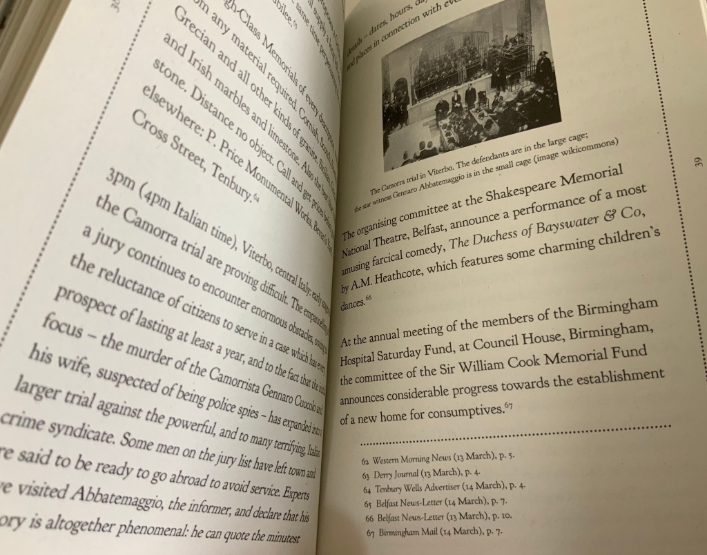
Inscription is bound dos-à-dos, but with only one fore-edge and one spine. Materially emphasizing the theme of inward spiralling, Inscription‘s two halves are upside down to one another. Their vertical orientations differ as can be seen in the following photo of the two front covers splayed away from the spine. The cover designer has obviously joined the fun by creating two fore-edges with the trompe l’oeil and “two” spines, one downward reading in the English style and, when flipped, one upward reading in the European style. Of course, therefore, there are two Tables of Content in opposite orders and two editorial prefaces, of which “one is considerably better: this is deliberate”. (Tongue-in-cheek humor seems to reside in the DNA of material text studies — and especially in book art.)
Two Tables of Content — naturally in reverse order for the dos-à-dos bound volume.
With the page layout spiralling from each end of the issue toward the spiral-set colophon placed in the center (usually part of the endmatter), we have spirals inscribed within spirals.
Left (or is it right?): the drilled hole centered on Ubu Roi‘s omphalic costume. Right (or is it left?): the spiral-set colophon.
Across the issue, the text block rotates like a vinyl record around the central hole.
By the time the colophon is reached, the reader/viewer’s head may be spinning, which could make it easier to read the colophon — wherein it is revealed that the book has been set in twenty different versions of Garamond type in a sequence such that the first letter of a line comes from the first version of Garamond, the second letter from the second version and so on, with the sequence starting anew with the next line. More spirals within spirals.
The materiality of this inaugural issue demonstrates how Inscription‘s focus “is not just on the meanings and uses of the codex book, but also the nature of writing surfaces (papery or otherwise), and the processes of mark-making in the widest possible sense”, as the editors put it. The care and creativity with which this first issue has been put together offer raw material with which to “take the study of material texts in new directions”. Mark-making by erasure, printing, juxtaposing, drilling, vinyl inscription, land erosion, evolution, land art, stage costumes, choice of type, page layout, binding, sleeving — all this even before we come to the articles themselves (see the photos of the Table of Contents above)!
For academics, book artists, printmakers, poets, and artists – and every permutation of roles, subsidiary roles and sub-subs of role — Inscription is rich, exuberant, eye-opening and eye-twisting, and eminently collectible as a work of art in its own right. Which is why it is in the Books On Books Collection.
† For Bennequin’s homage to Un Coup de Dés, see “Jérémie Bennequin“, Books On Books Collection, 11 April 2020.
†† “Intermedial” is taken from Trevor Stark’s Total Expansion of the Letter: Avant-Garde Art and Language after Mallarmé (2020), p.9. It refers to “the zone of indeterminacy between mediums, social practices, and temporalities” into which Mallarmé’s question “Does something like Letters exist?” threw the poet and avant-gardists. The question is ultimately a phenomenological one, which the study of material text inherently addresses.
A similar, related neologism — “intermediation” — was adopted from Samuel Taylor Coleridge in 1965 by the language-, book-, and publishing-artist Dick Higgins in “Intermedia“, republished in Leonardo, Volume 34, Number 1, February 2001, pp. 49-54. It is not the same thing as intermediality or mixed media. As Higgins expressed it, “Many fine works are being done in mixed media: paintings which incorporate poems within their visual fields, for instance. But one knows which is which. In intermedia, on the other hand, the visual element (painting) is fused conceptually with the words.”, p. 52. It can be argued that works of intermedia are one way in which artists address intermediality.
Further Reading
“Inscription 2“. 29 May 2022. Books On Books Collection.