Alphabetique: 26 Characteristic Fictions (2014)
Alphabetique: 26 Characteristic Fictions (2014)
Molly Peacock & Kara Kosaka
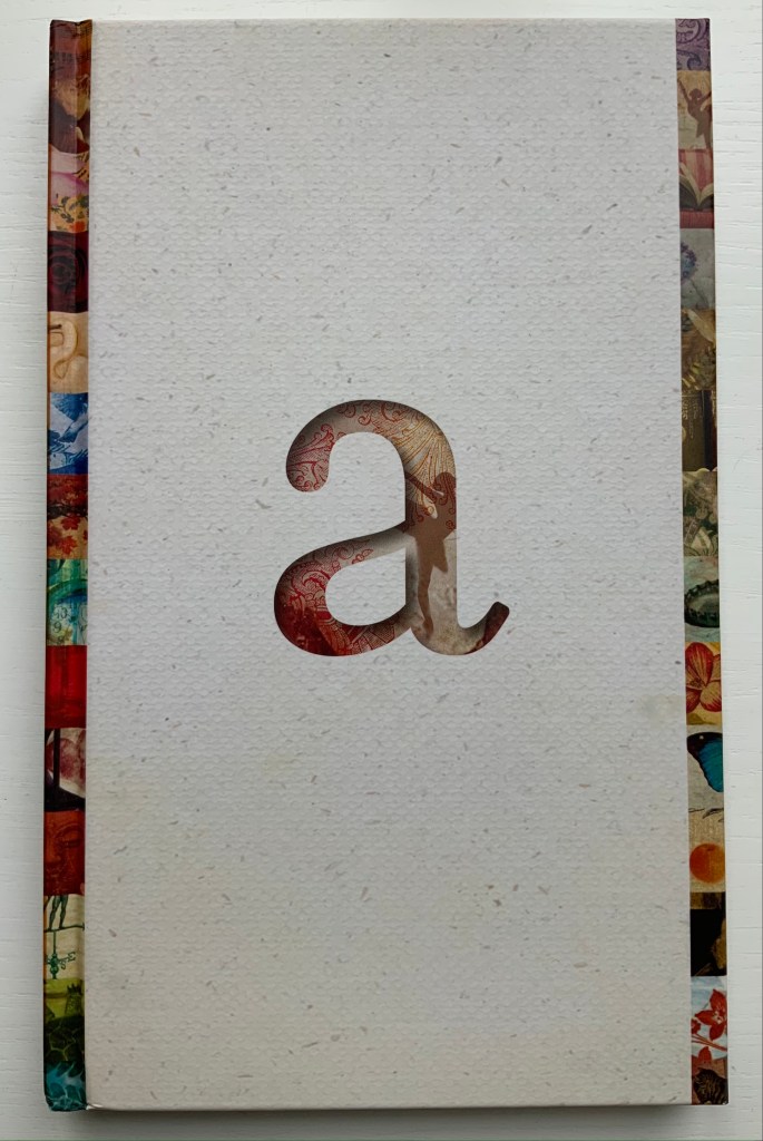
Casebound with headband and collaged endpapers. H236 x W146 mm, 158 pages. Acquired from The Book Depository, 6 August 2021.
Photos of the work: Books On Books Collection.
Given the intent spelled out in its specimen below, Frank Heine’s “Tribute” should add to the fabulistic atmosphere of Peacock’s fictions played out by her 26 characters each named after a letter in the alphabet. Despite the book’s colophon extolling the typeface, there is something about it, however, that does not quite work for Alphabetique.
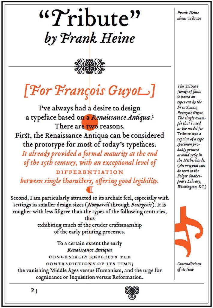
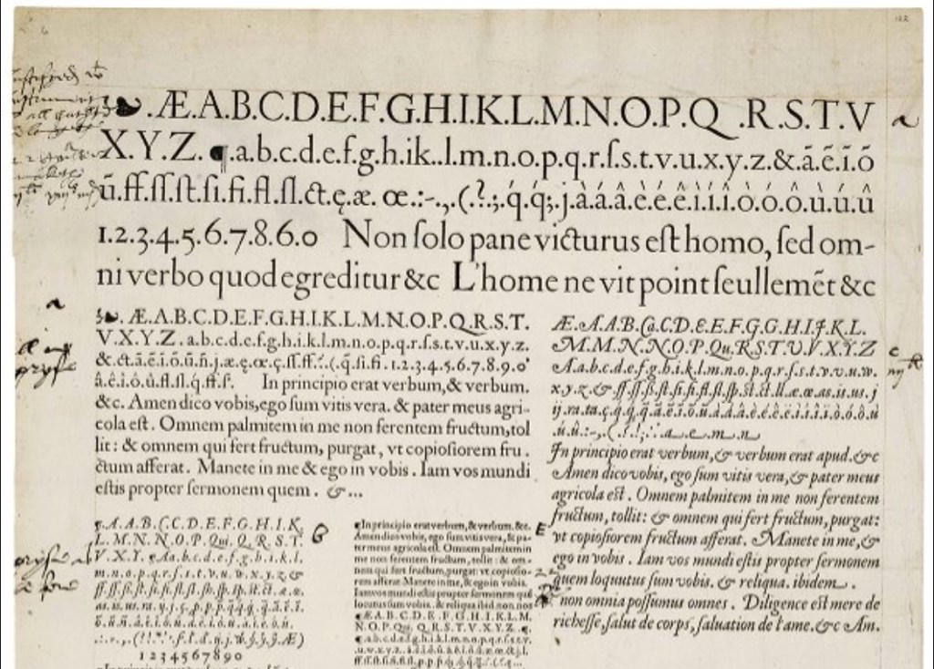
Tribute (2003), Frank Heine, Emigré Fonts; Type specimen sheet attributed to François Guyot (1565), Luna: Folger Digital Image Collection.
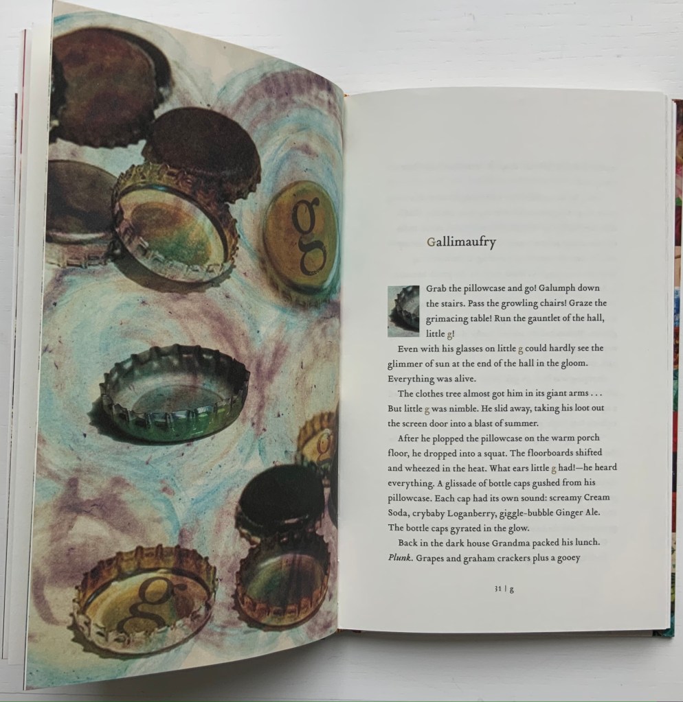
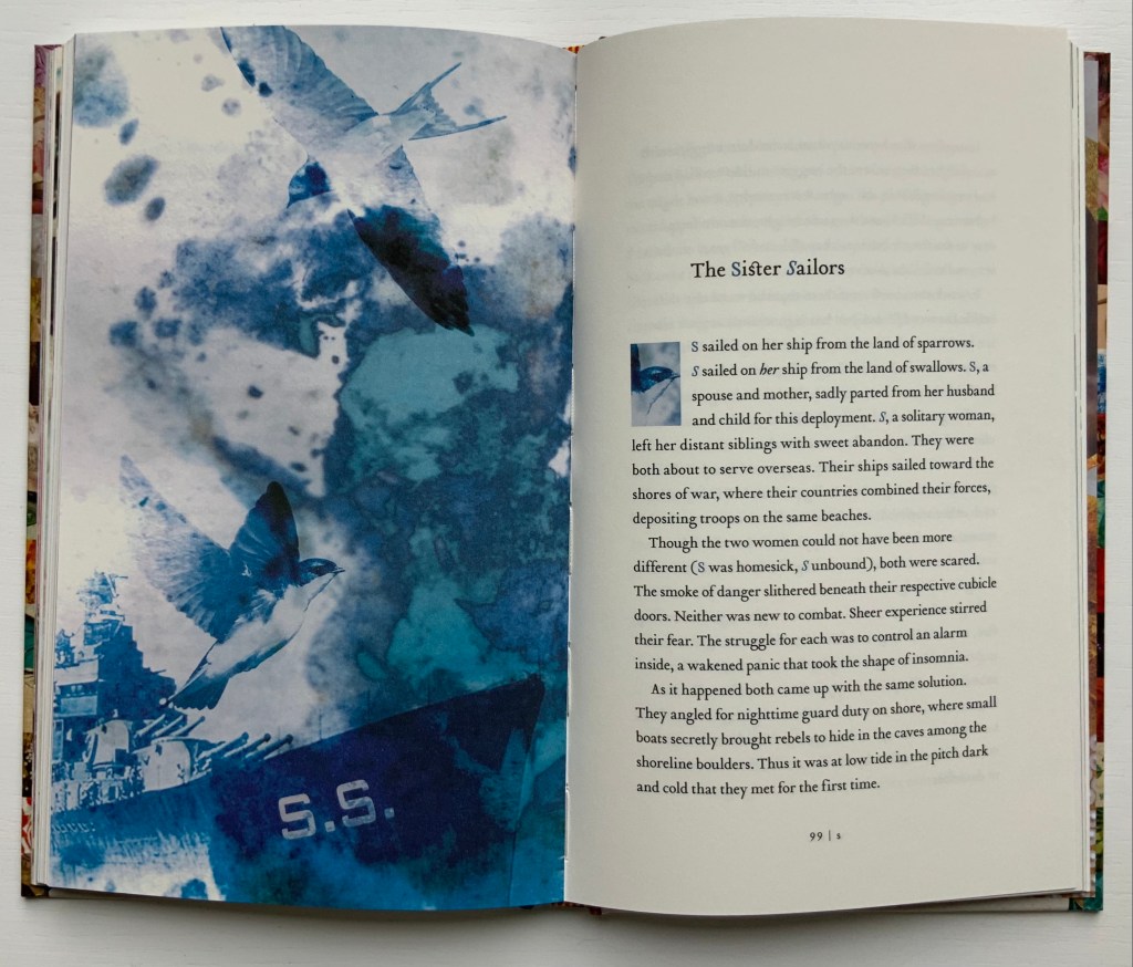
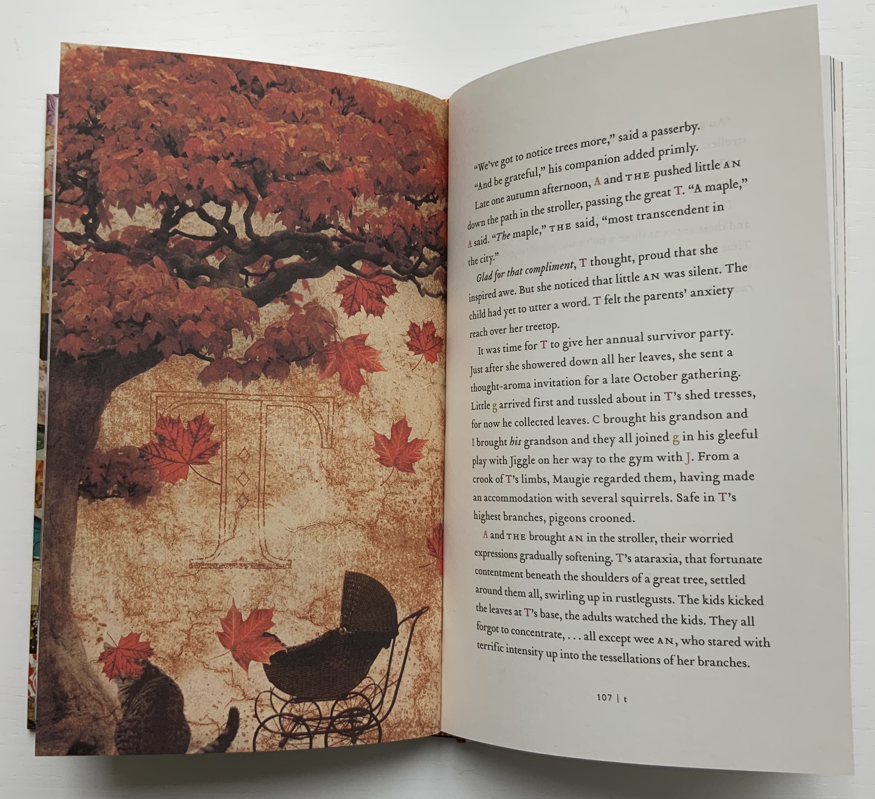
For example, its capital G squats like an un-Guyot-esque toad in the seventh chapter, and the capital Q lacks Guyot’s swordlike swash so appropriate to the tale of Q, master of the quilloned thorn knife who rises to the position of Royal Flower Keeper. Nevertheless, the choices of font (lowercase and smallcaps for the children, uppercase for the grown-ups, roman for the married sister and italic for the single) and the use of color for each character’s name ring true throughout the narrative. Like the layout and choice of font, Kara Kosaka’s collages fuse with the narrative and, unlike the typeface, deliver the atmosphere the fictions deserve.
When the character T appears (a maple tree), characters from the other vignettes show up, including the offspring of the articles A and THE, but this coalescence is only a feint toward an ensemble tale. The stories of U-Y return to standalone status, making the twenty-sixth chapter a surprise gathering of all the letters, albeit not in their characters of the preceding twenty-five fictions.
What happens to Z, the zoologist, is perhaps the most original of all the fictions. Any hint beyond the choice of font in that preceding sentence would spoil the surprise for the book artist with a mastery of letterpress, access to an extensive collection of typefaces and the readiness to be inspired.
Further Reading
Richardson, Charles Scott. 2009. The end of the alphabet. London: Portobello Books.
Winston, Sam. 2006. A dictionary story. London: Circle Press. This is an example of design and art delivering just deserts to the text.
