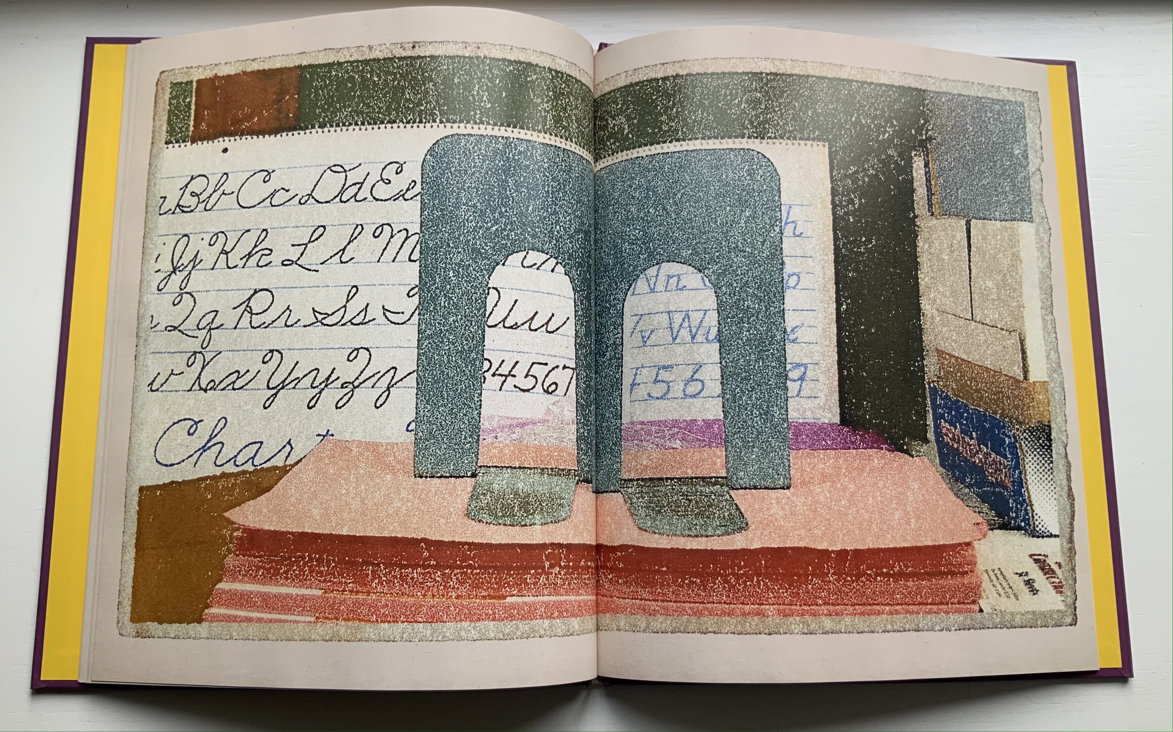
Alphabet City (1995)

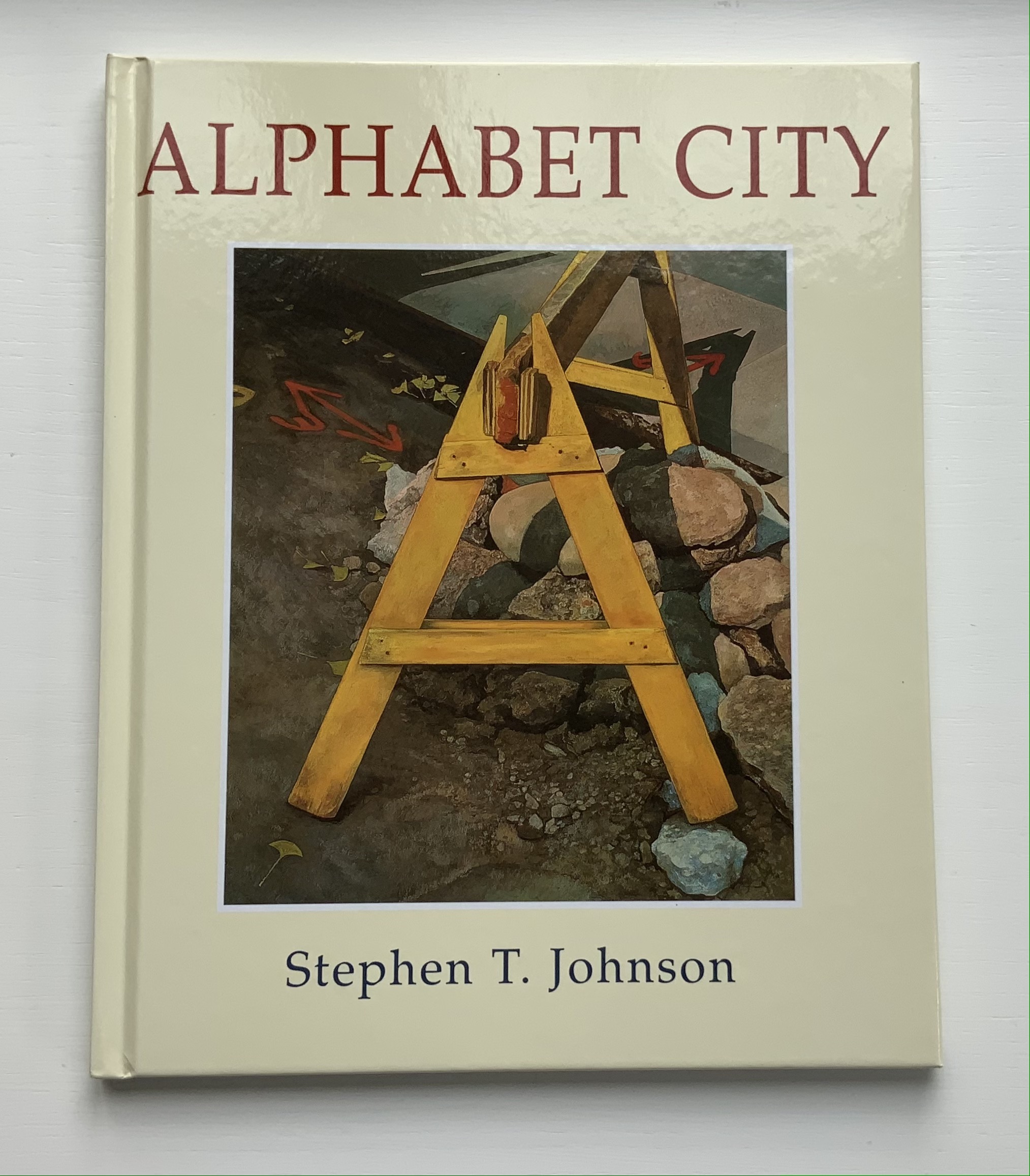
Alphabet City (1995)
Stephen T. Johnson
Casebound, sewn and glued. H276 x W226 mm, 32 pages. Acquired from Blackwell’s, 17 August 2021.
Photos of the book: Books On Books Collection.
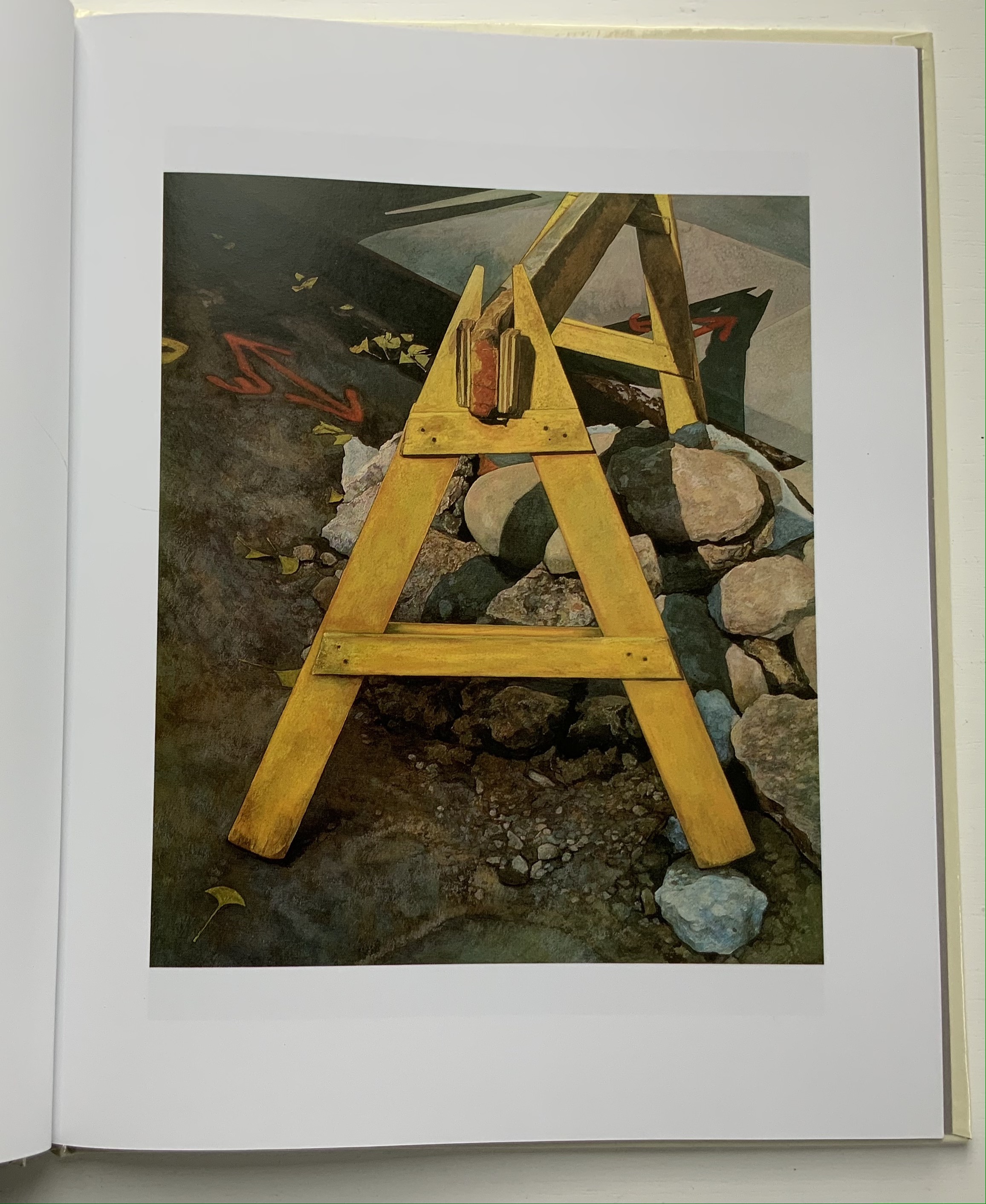
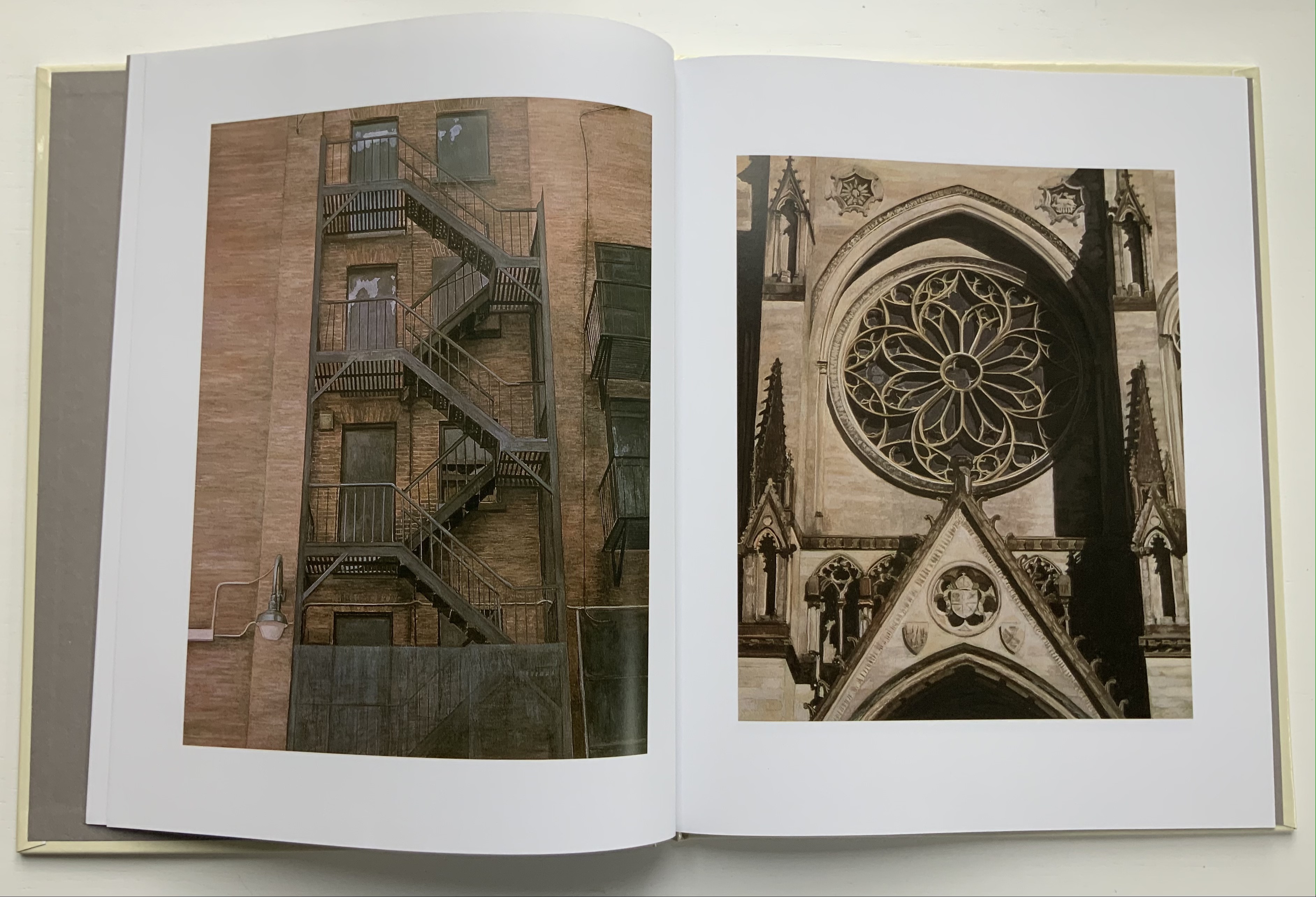
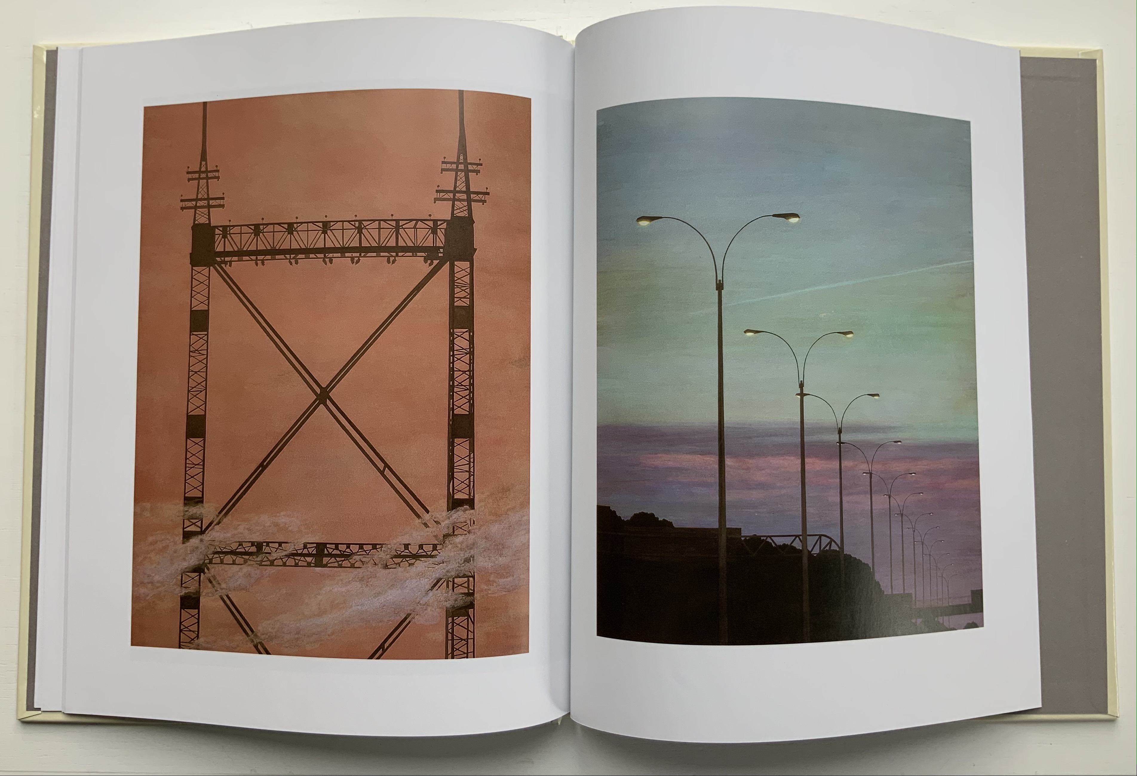
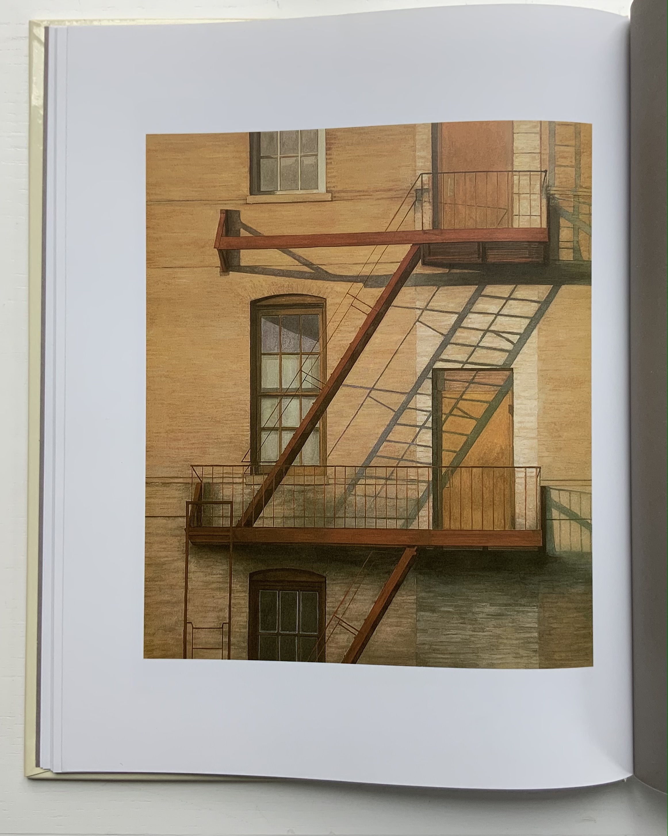
A Caldecott Honor Book and New York Times Best Illustrated Book in 1995, Alphabet City goes beyond the alphabet letters as found objects, a sub-genre documented by Steven Heller and Gail Anderson in The Typographic Universe (2014). Johnson transforms his found capital letters with pastels, watercolor, gouache and charcoal into photo-realistic pictures in varying but similar sizes; for example, 26.5 x 22.5 inches for the A and 25.25 x 21.5 inches for the Z. These appeared in an inaugural exhibition in 1997 at the Katonah Museum of Art in New York. Johnson’s works are held in numerous permanent collections (mostly in the US) and private ones (mainly US-based but increasingly Europe as well), but they are closely tied to his children’s books: Alphabet School (2015) and A is for Art (see below). Most impressive is how he lifts the alphabet book from ordinary trade status to artist book.
Along with Robert Cottingham, Johnson established the photo-realistic alphabet as its own sub-genre, which has been explored by other artists such as Stephen Magsig in The Urban Alphabet: Paintings from Postcards from Detroit and Simon Jennings in Outdoor Types: An Urban Alphabet (2010)
A is for Art (2008)
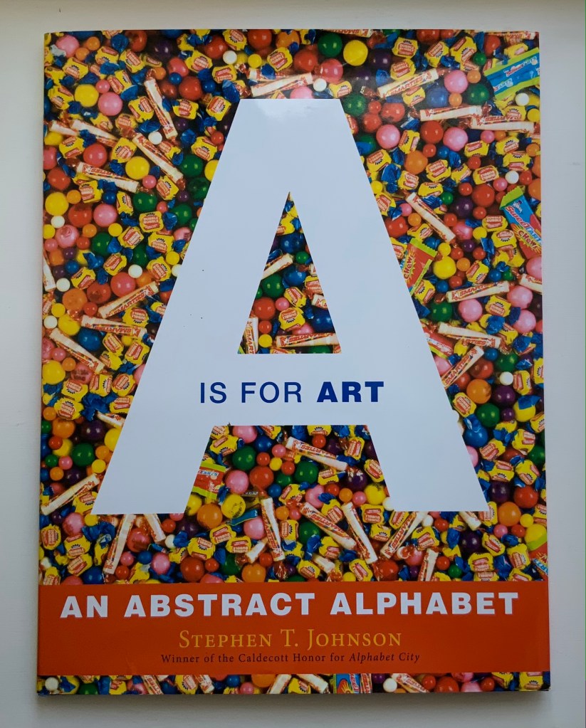
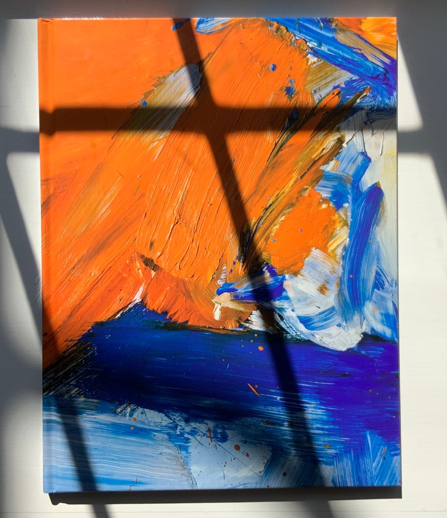
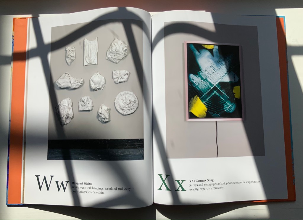
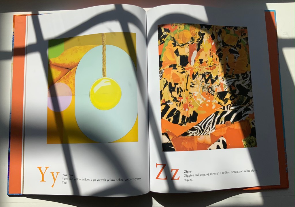
A is for Art: An Abstract Alphabet (2008)
Stephen T. Johnson
Perfect bound in case with doublures. H310 x 235 mm, 40 pages. Acquired from Amazon E.U., 4 September 2021.
Photos of the book: Books On Books Collection.
In his review in American Art, Philip Nel coins an apt name for Johnson’s art — “alphabet expressionism” — which, on closer examination of texture and technique, applies also to Alphabet City. Go back and look at the foreground of the letter A in Alphabet City.
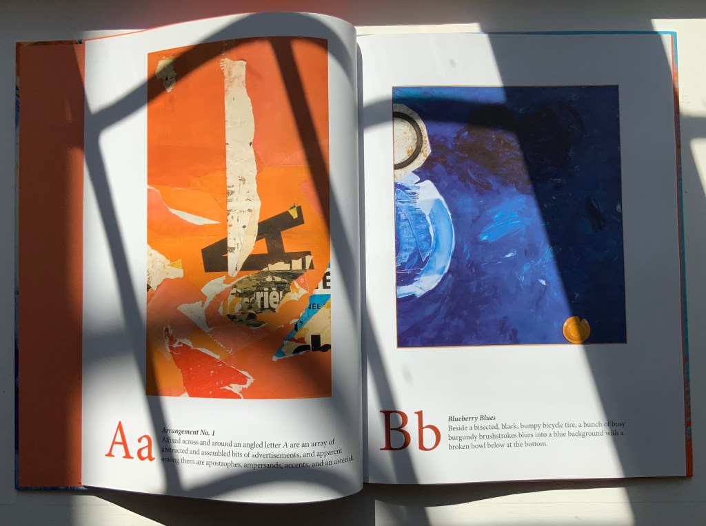
A is for Art: An Abstract Alphabet has the feel of Moussorgski’s Pictures at an Exhibition. Although each movement “depicts” a different painting, the composer’s style comes through; although each letter alludes to different artists (for example, but not complete for each letter: A – François Dufrêne, Kurt Schwitters; B- Jim Dine, Willem de Kooning , C- Arman, Félix Gonzáles-Torres; D- Udomsak Krisanamis; W- Man Ray; X- Robert Rauschenberg; Y- Tom Wesselman, Robert Indiana; Z- Beatrice Mandelman, Mimmo Rotella), the artist’s vision comes through. To pull that off requires considerable versatility. Several of the images in A is for Art derive from sculptures and large-scale installations. Take a look, too, at his triptych of mosaics in the City Center Public Library of Lenexa, Kansas.
Also a New York Times Best Illustrated Book of the Year, A is for Art demonstrates two subgenres of alphabet books: the hidden and alliterative alphabet. An interesting, perhaps intentional, effect — even more so when the letters are difficult to find — is to make the viewer linger over the image longer than the museum goer’s average of less than 30 seconds per object. The ingenuity of Johnson’s alliterative sentences is almost as engaging as the images; even so, its main effect directs the eye back to the images. Here is the text for the letter A:
A a
Arrangement No. 1
Affixed across and around an angled letter A are an array of abstracted and assembled bits of advertisements, and apparent among them are apostrophes, ampersands, accents, and an asterisk.
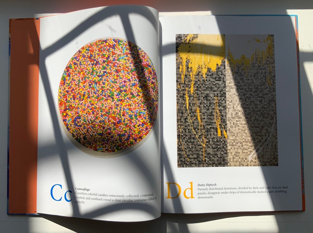
If you spend only 13 minutes in this book (30 seconds per letter), you are missing out.
Music and numbers have also piqued Johnson’s creative curiosity, but another of his series works leads in a more intriguing, roundabout way back to A is for Art: the Kana Card series. On a trip through Japan, the artist acquired a set of Japanese flashcards for learning Katagana and Hiragana. Each 2 x 3 inch card becomes a canvas for paint and collage.
Alphabet School (2015)
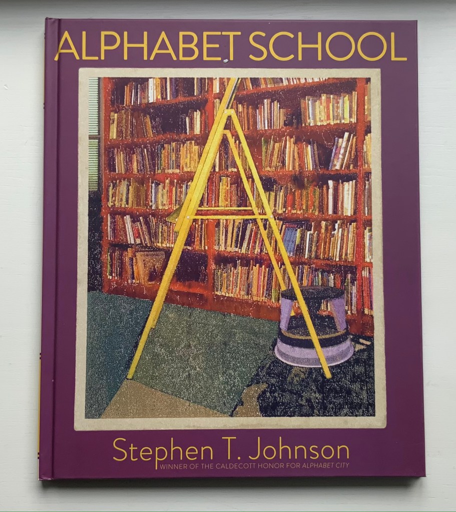
Alphabet School (2015)
Stephen T. Johnson
Hardback. H286 x W236 mm, 32 pages. Acquired from Book Depository, 5 November 2021.
Photos of the book: Books On Books Collection.
Using monoprints on paper with digital enhancements, Johnson shifts technique yet again here. The photorealism yields to a graininess, but as with Alphabet City, the effect of making the reader look not just at the images but also at his or her environment remains.
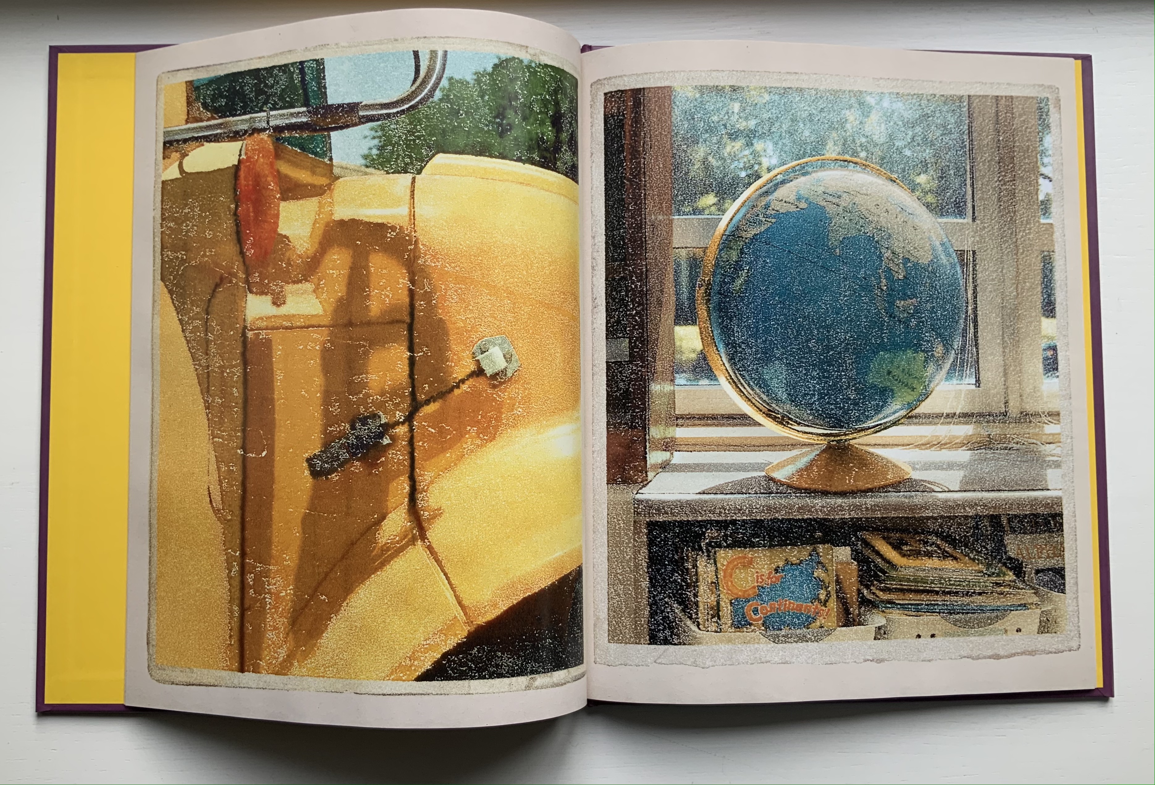
Some letters are contrived (two bookends posed for the letter M). Most of the scenes, however, deliver an authentic sense of found letters (the C in the support of the globe atlas). Johnson has raised the bar on the hidden-letter theme, common in the genre of alphabet books, by several notches.
Further Reading
“Abecedaries I (in progress)“. 31 March 2020. Books On Books Collection.
“Robert Cottingham“. Books On Books Collection.
“Paul Cox“. Books On Books Collection.
“Steven Heller and Gail Anderson“. 8 May 2021. Books On Books Collection.
Mackey, Bonnie, and Hedy Schiller Watson. 2017. Alphabet books: the K-12 educators’ power tool. Santa Barbara, CA: Libraries Unlimited.
Nel, Philip. 2008. “The Fall and Rise of Children’s Literature.” American Art 22, no. 1: 23–27.
“A Is for Art: Stephen T. Johnson’s Abstract Alphabet“. 31 August 2010. Nine Kinds of Pie.
Zerkin, Becca. 9 November 2008. “Alphabet City.” The New York Times Book Review. The review actually covers A is for Art.
