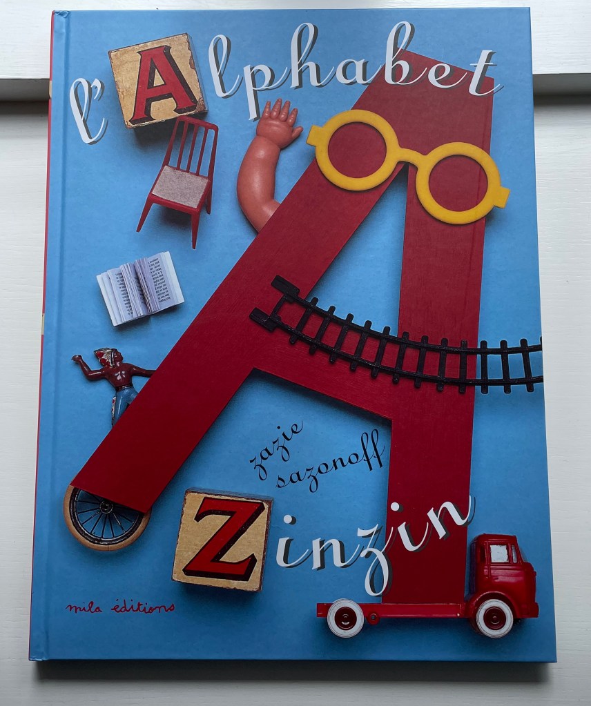
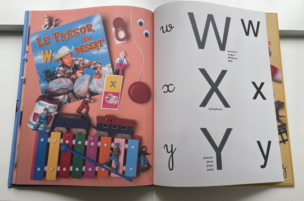
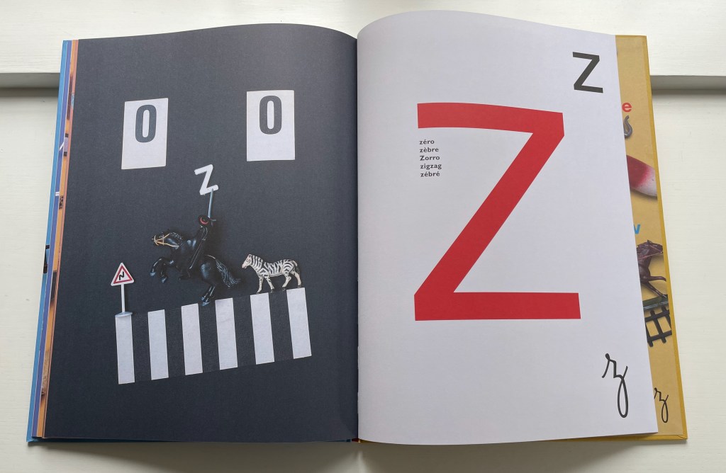
L’Alphabet Zinzin (2011) Zazie Sazonoff Casebound, paper over board. H370 x W280 mm. 52 unnumbered pages. Acquired from Amazon, 31 January 2022. Photos: Books On Books Collection. Displayed with permission of Nathalie Sazonoff.
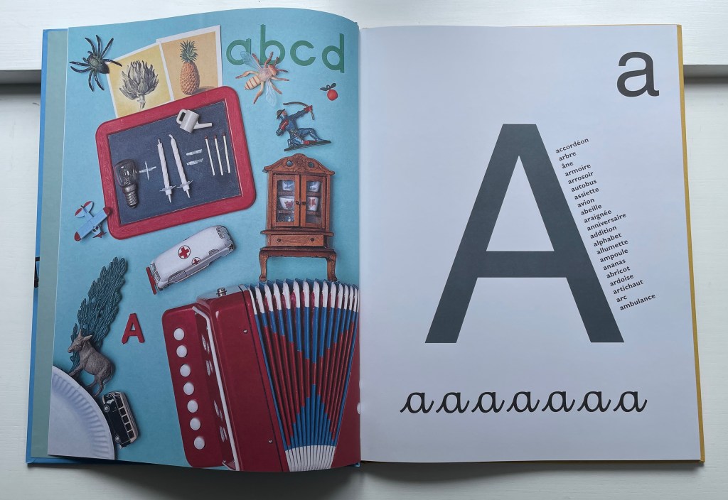
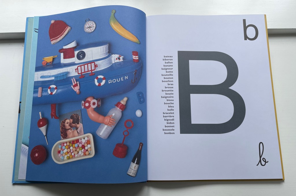
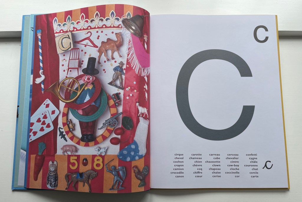
Zazie Sazonoff describes herself as a metteur en scène d’objets. Like mise en scène, it is an expression that is difficult to translate. It is easier to point at her works and say, “There, that’s what a metteur en scène d’objets does”. With its arrangement of toys from the 1960s, ’70s and ’80s on the verso page, L’Alphabet Zinzin presents uppercase, lowercase and lowercase cursive letters on the recto pages and a variety of words beginning with the relevant letter. Zinzin means crazy or zany. As part of France’s National Education’s literature reference list for cycle 1, L’Alphabet Zinzin‘s zaniness must engage the imaginations of its young audience.
“Zany” was a frequent fallback for the letter Z in English abecedaries of the 18th and 19th centuries, but this is a whole zany alphabet that should engage the imaginations of an older audience, too. There seems to be something more going on: Flick the pages back and forth quickly and you might think you are catching the objects moving into place. Are there activities or untold stories behind the scenes?
On Sazonoff’s website, you can find under Projets two works that suggest influences from Man Ray, Luis Buñuel and film noir: Rêve: livre animé and Têtes à queue: roman graphique, but the titles and recurrence of paper pop-ups show the continued grounding of her art in the book form. Petites Curiosités, under the section Art, suggest the influence of Joseph Cornell, perhaps the founding genius of the mise-en-scène in assemblage of found objects. With these works as context, L’Alphabet Zinzin teeters on the cusp of becoming an artist’s book. It certainly compares favorably with Peter Blake’s ABC (2009) and Leslie Haines’ Animal Abecedary(2018).
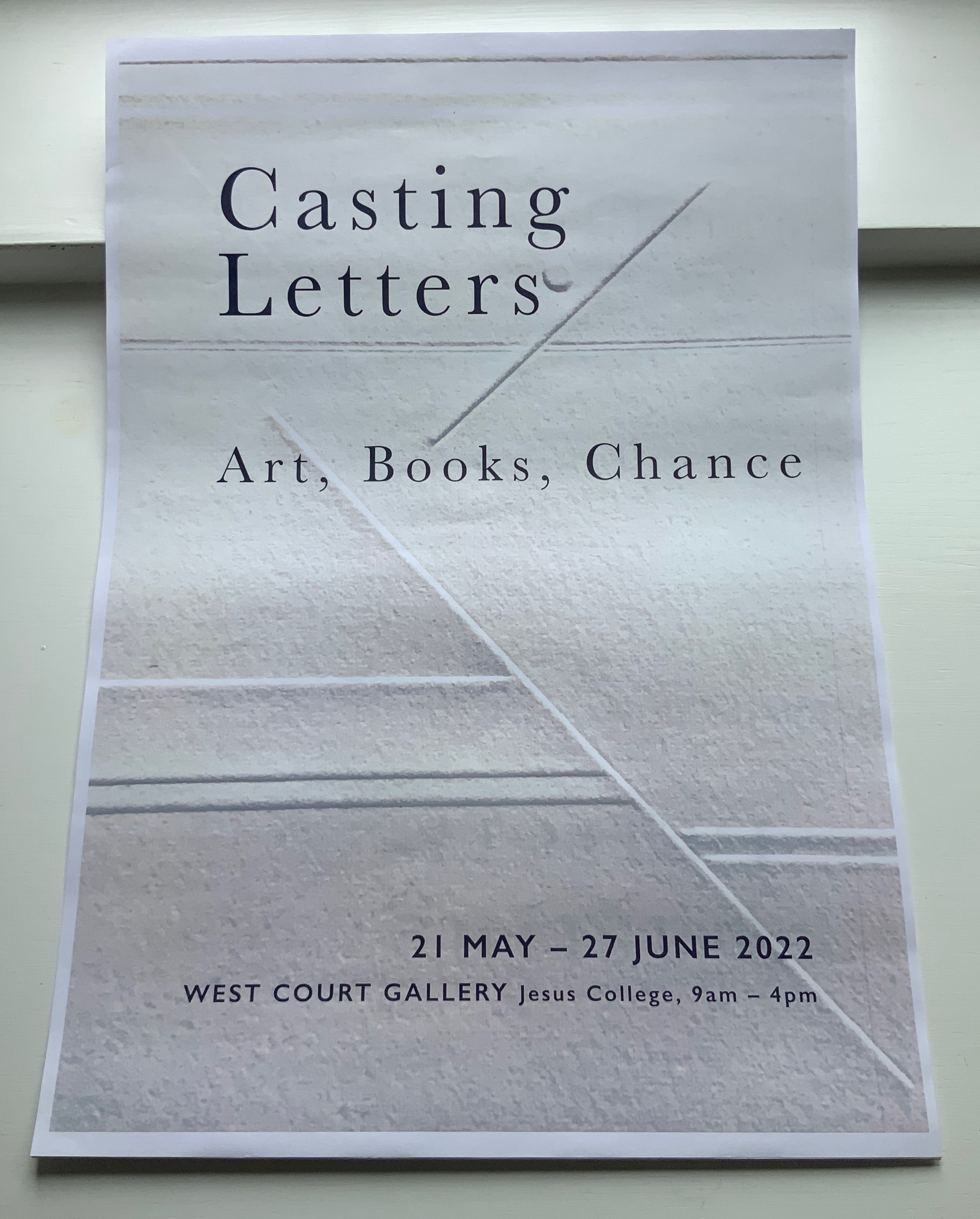
Jessica Berenbeim, a University Lecturer at the Faculty of English and a Fellow of Jesus College, has selected works from the Books On Books Collection for this exhibition. With the assistance of Justine Provino, a doctoral student at Cambridge, Berenbeim has arranged the works to effect a certain conversation. As she writes,
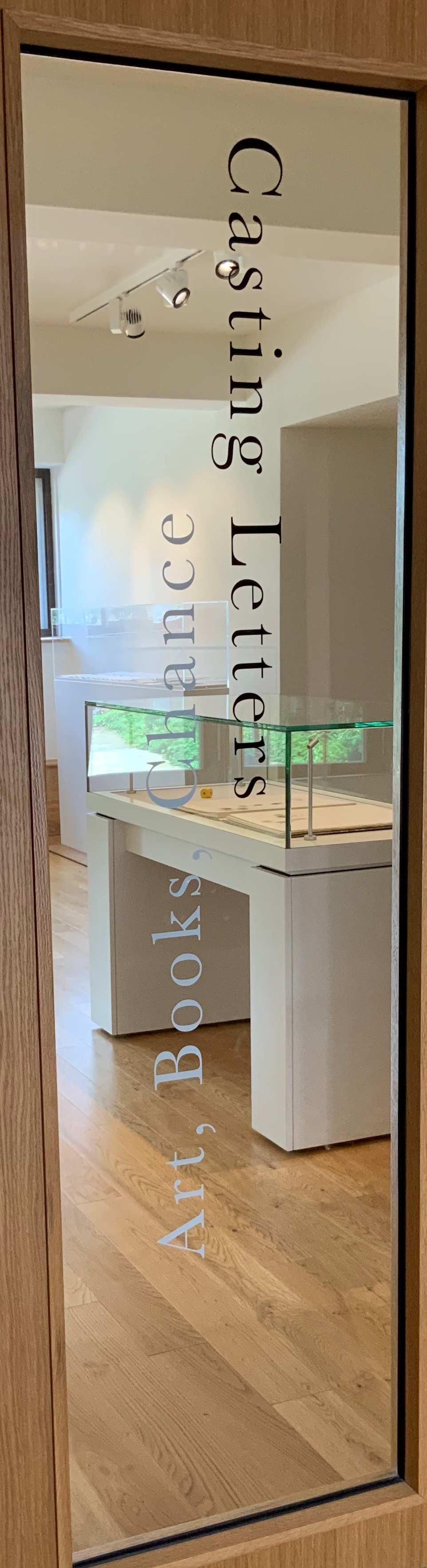
Artists’ experiments with books and letters have taken many forms, some of which look more like books than others. This exhibition of book art, and book-inspired art, opens a view of one of its most intriguing stories: the tradition of reflections, riffs, and responses to one seminal work, Stéphane Mallarmé’s A Roll of the Dice Never Will Abolish Chance (Un Coup de dés jamais n’abolira le hasard). Mallarmé’s experimental work celebrates its 125th anniversary in May 2022, when this exhibition opens. The particular objects on display here, and on view at the screening events, play on two central ideas inspired by this work: chance and visible language. The works in the exhibition are in effect a conversation about the intersection of those themes. What part does chance have to play in the way language is depicted on (or off) the page, and how might accidents of language determine how it looks? How does meaning settle throughout the forms of letters, words, lines, pages, and books, as well as in what the words say?
The exhibition and screenings include works by Jérémie Bennequin, Isabella Checcaglini & Mohammed Bennis, Robert Filliou, Ernest Fraenkel, Rodney Graham, ‘Estelle J.’, Michel Lorand, André Masson, Reinhold Nasshan, Michalis Pichler, Man Ray, Mitsou Ronat & Tibor Papp, and Honorine Tepfer.
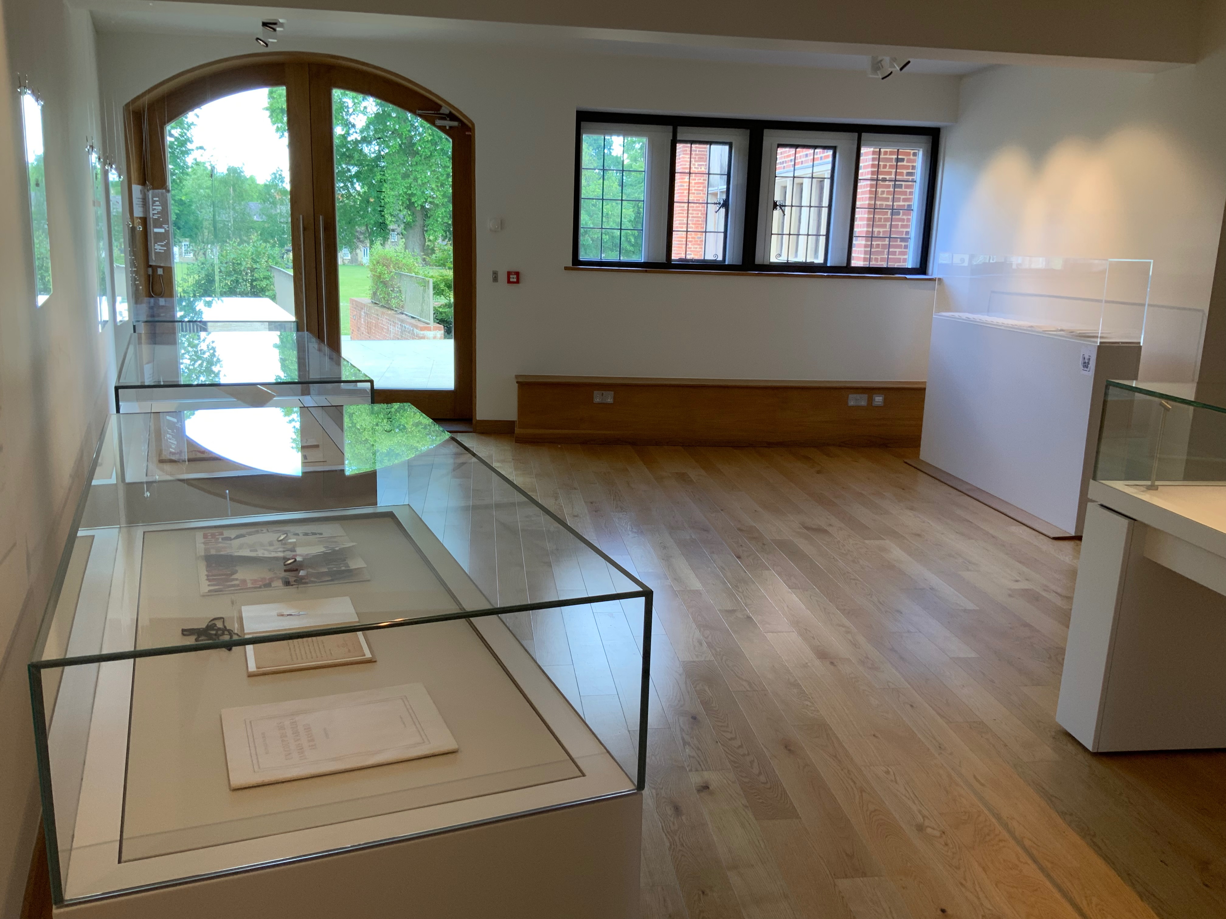
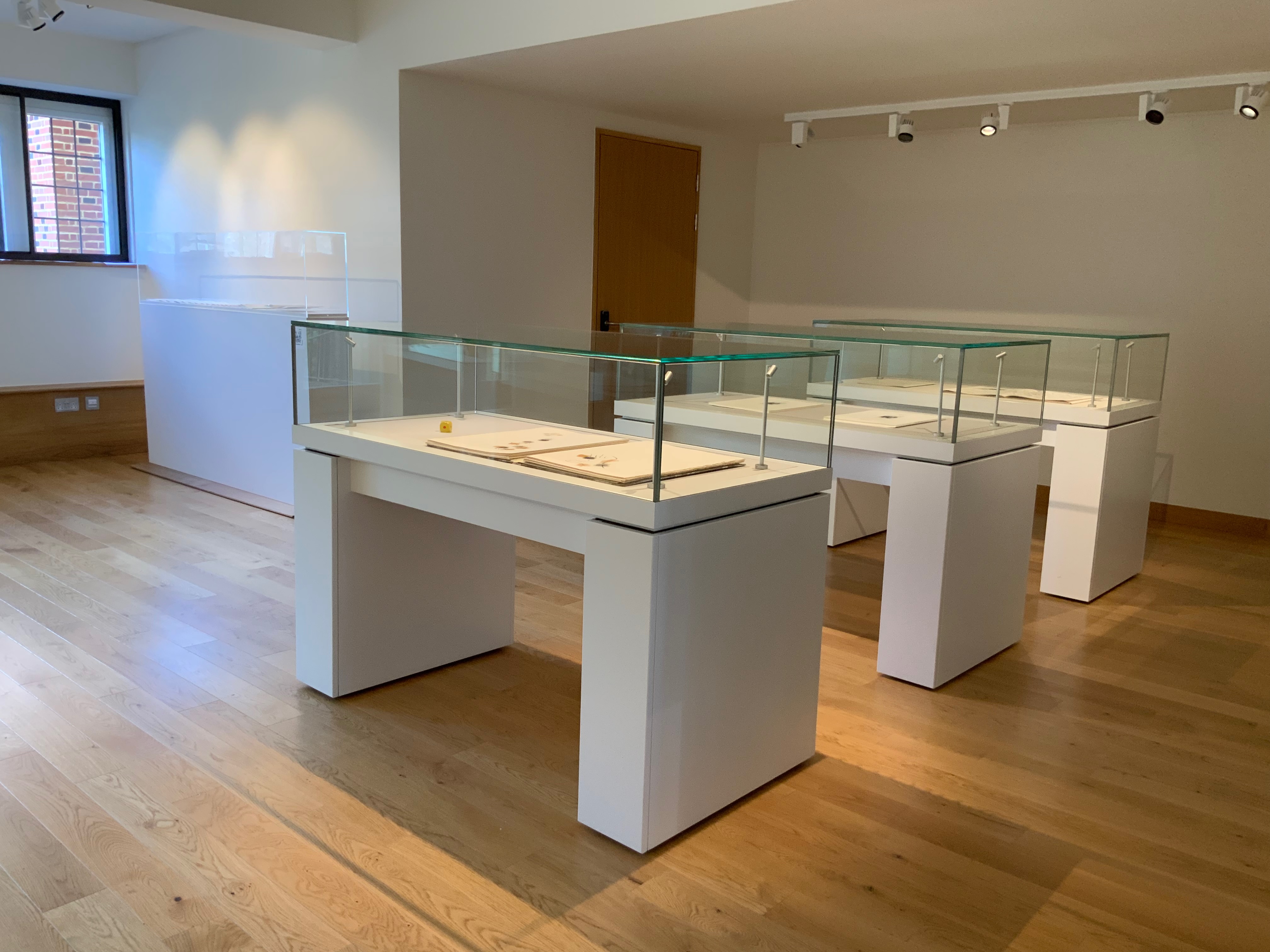
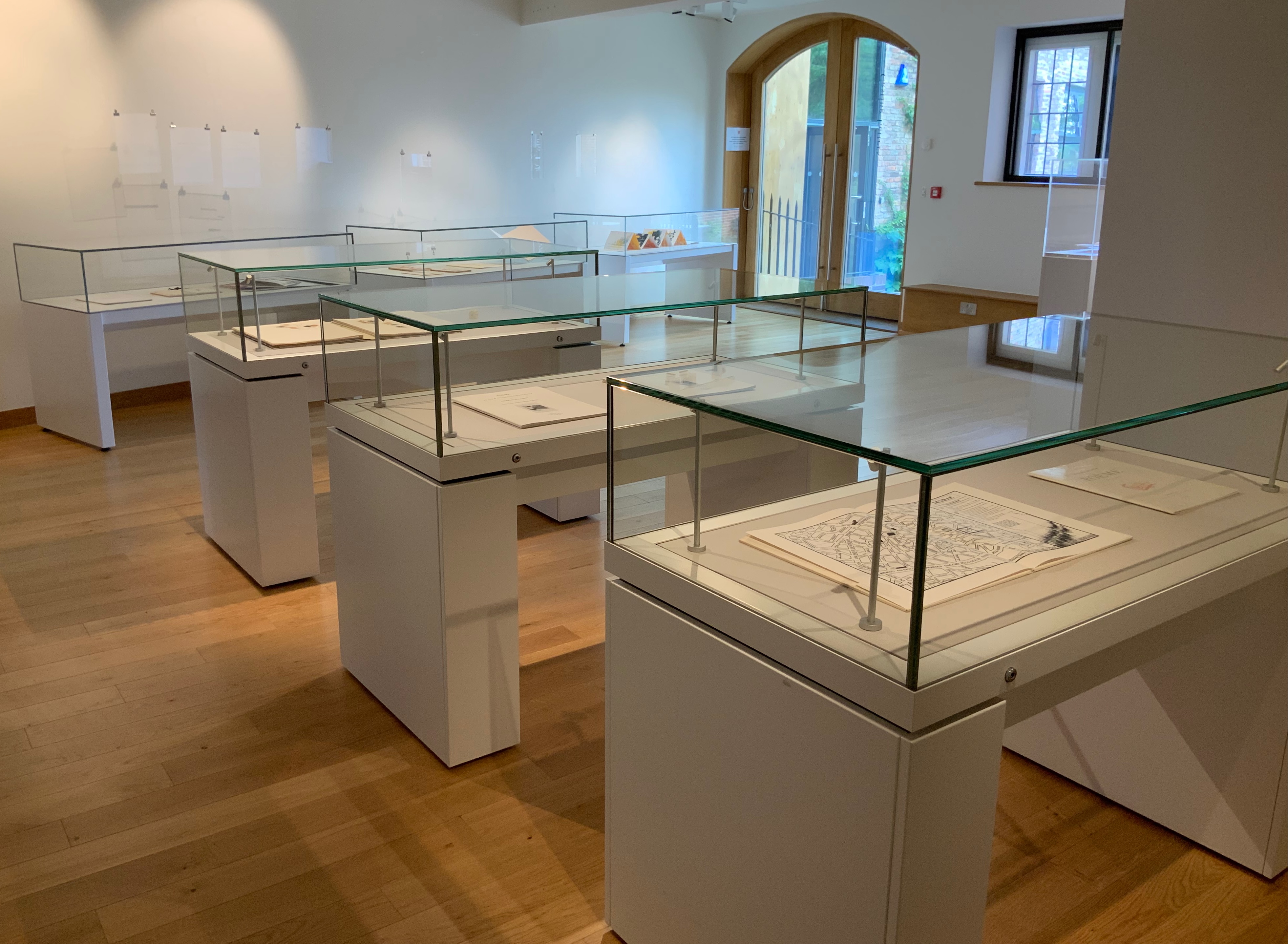
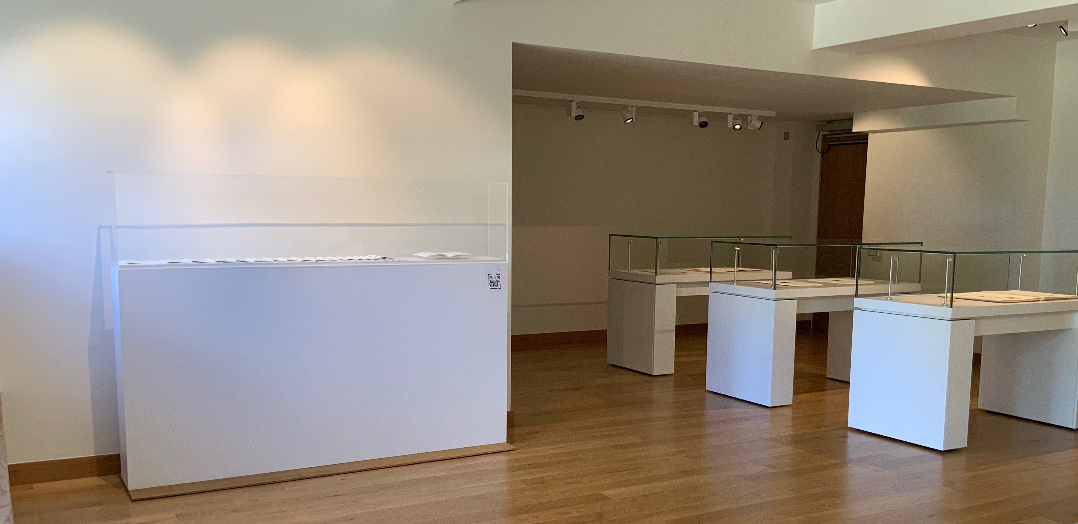
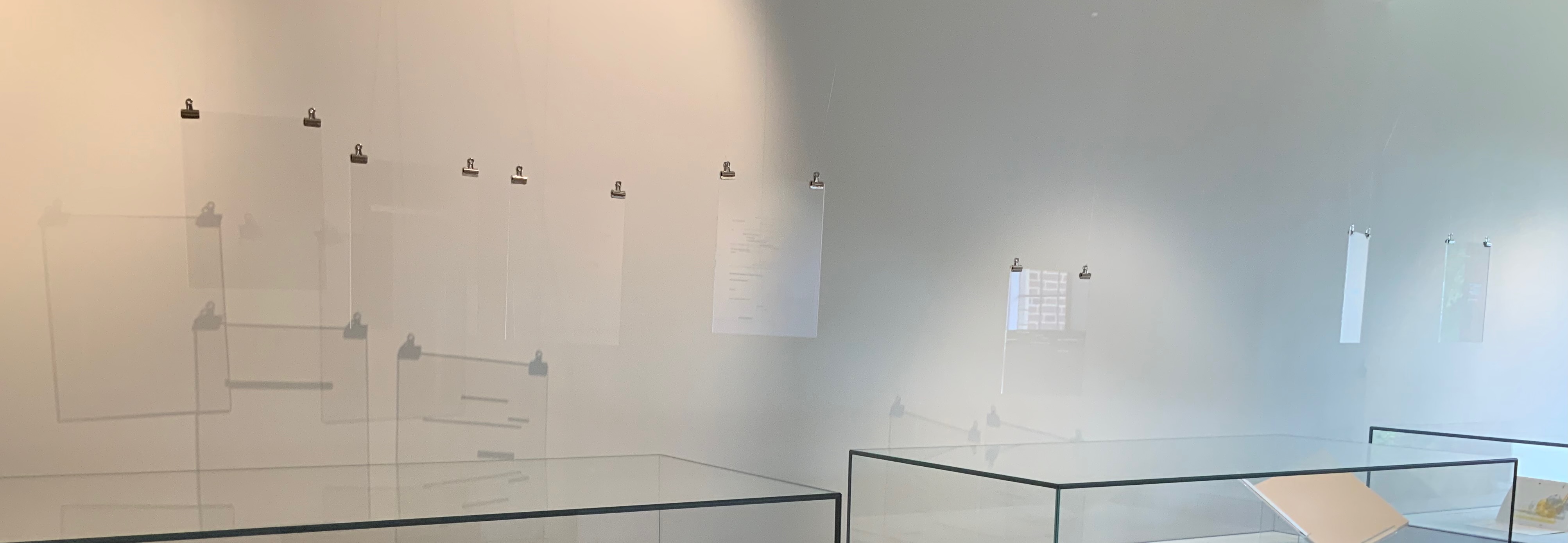
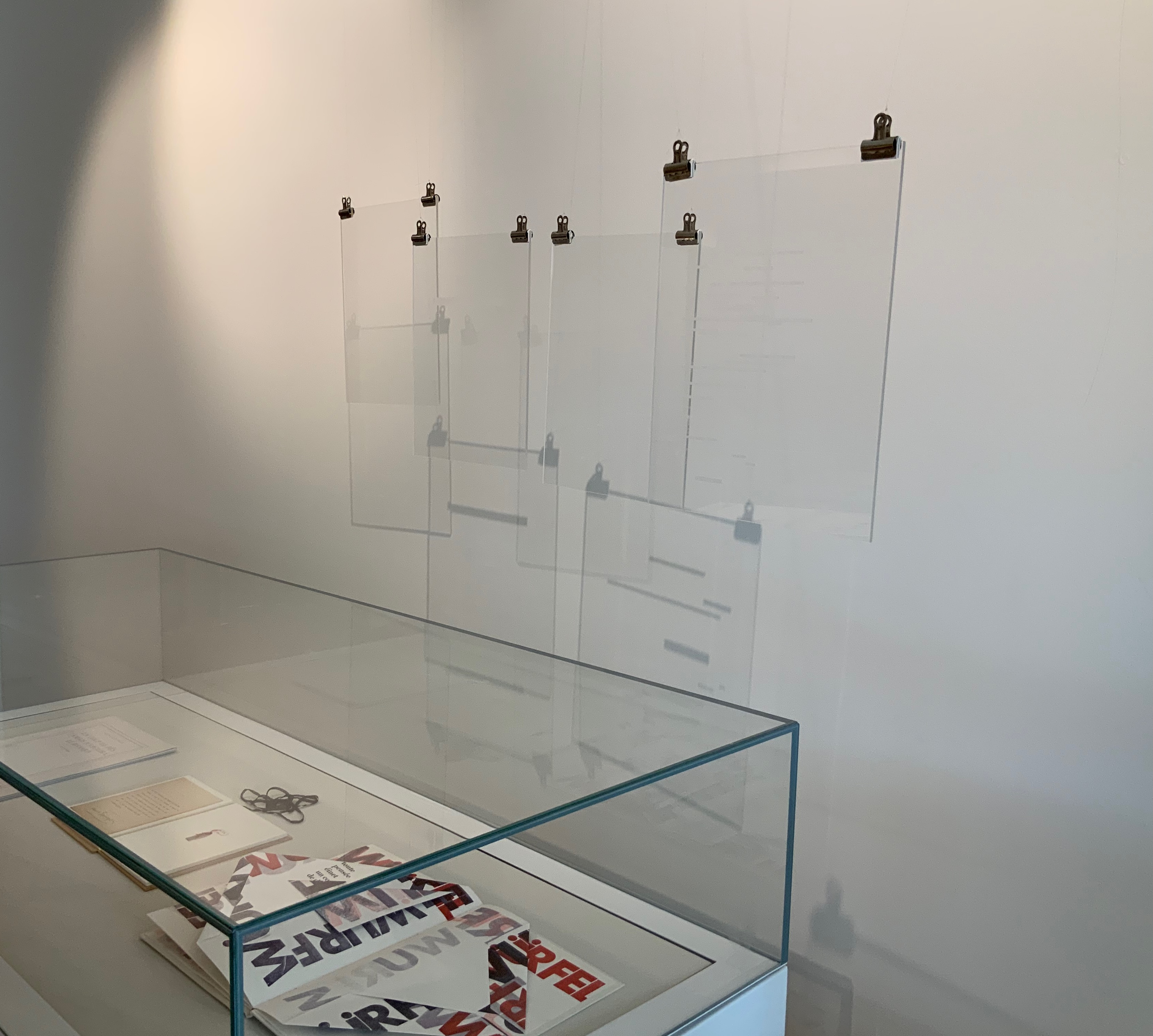
Berenbeim and Provino have suspended seven plates from Pichler‘s homage to hang over the cases containing works by Bennequin, Nasshan, Lorand, Tepfer and Estelle J.. and quietly cast shadows to pun with those works and the exhibition’s title.
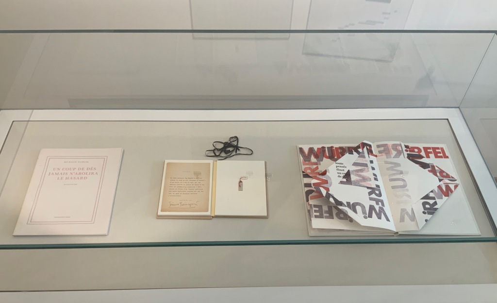
L-R: Michalis Pichler, Un Coup de Dés Jamais N’Abolira le Hasard: Sculpture (2008); Jérémie Bennequin, Le Hasard N’Abolira Jamais Un Coup de Dés (Changes of Music) (2020); Reinhold Nasshan, Würfelwurf: fragmentarische Annäherung an Stéphan Mallarmé (1992).
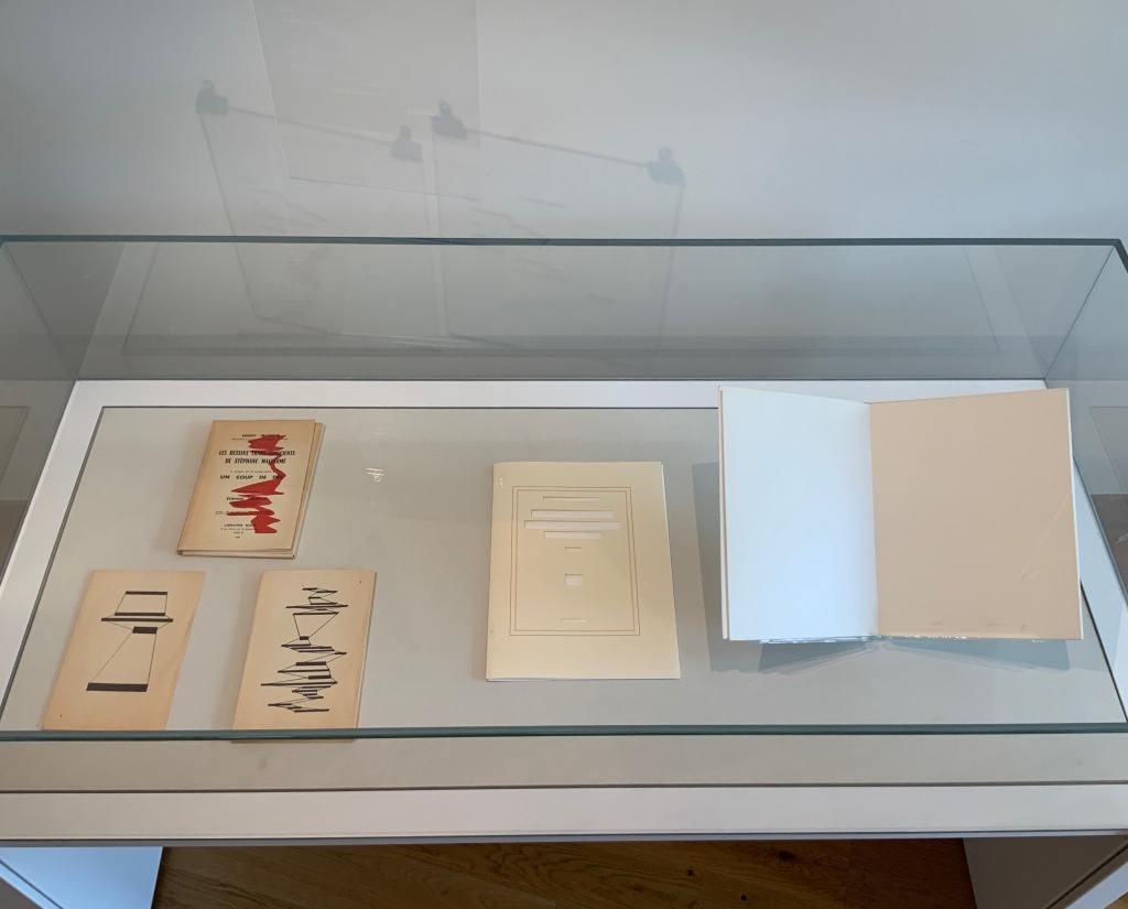
L-R: Ernest Fraenkel, Les Dessins Trans-conscients de Stéphane Mallarmé, à propos de la Typographie de Un Coup de Dés (1960); Michel Lorand, Après Un Coup de Dés (2015); Honorine Tepfer, Un Coup de Dés Jamais N’Abolira le Hasard: Poème (1989)
Estelle J., STÉPHANE MALLARMÉ: Un coup de dés n’abolira le hasard (ND)
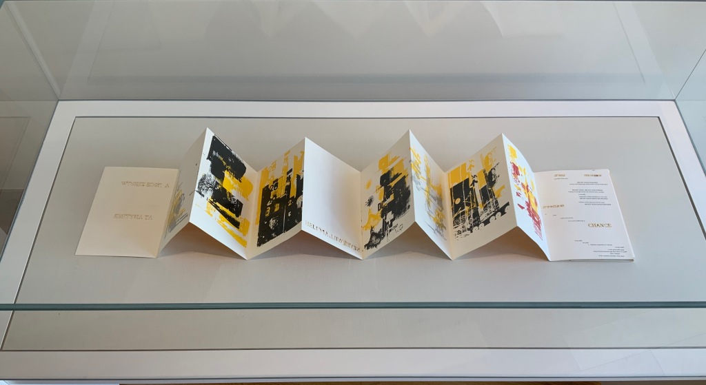
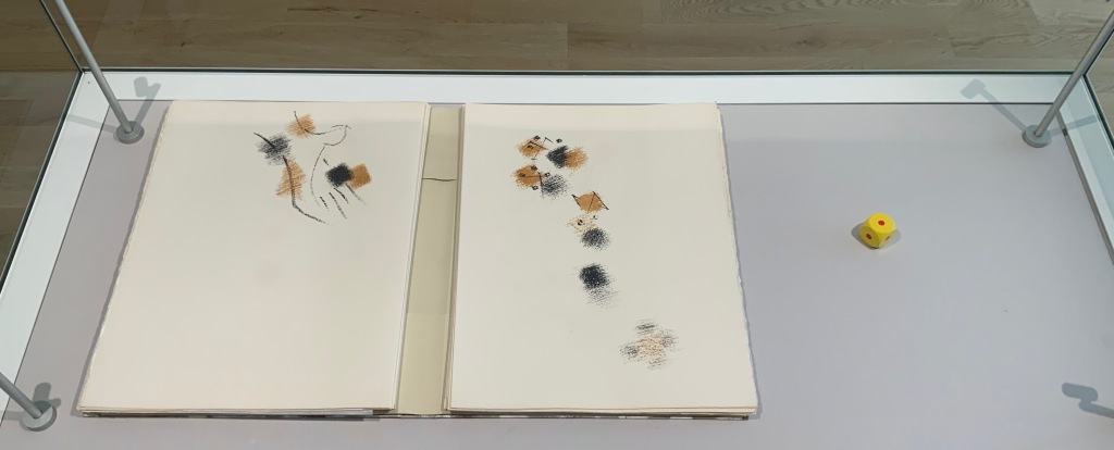
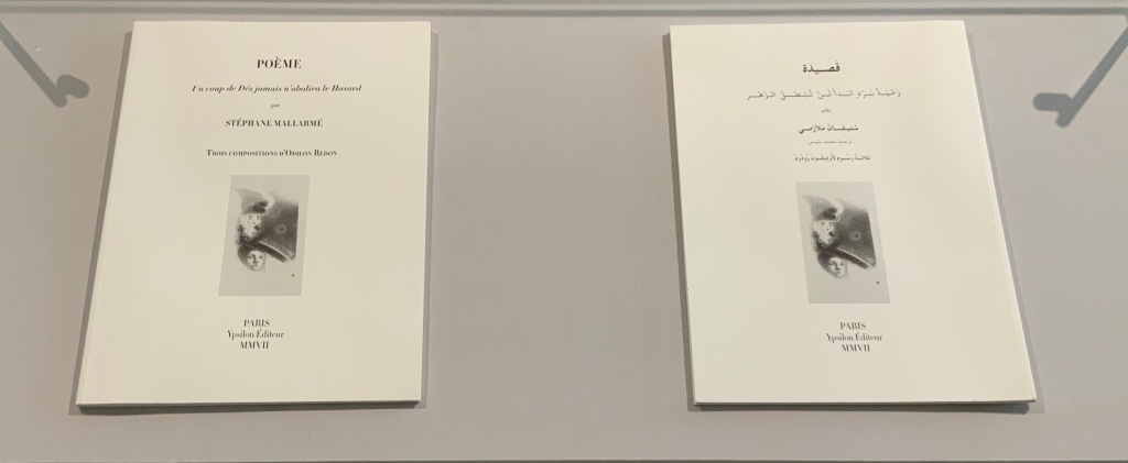
Three other cases across from those above present a conversation of dice between Masson and Filliou, then a French and Arabic conversation between Checcaglini and Bennis, and then Tibor Papp and Rodney Graham joking with one another.
L-R: André Masson, Poéme: Un Coup de Dés Jamais N’Abolira le Hasard by Stéphane Mallarmé (1961); Robert Filliou, Eins. Un. One. (1984)
L-R: Isabella Checcaglini, POÉME: Un coup de Dés jamais n’abolira le Hasard (2007); Mohammed Bennis, صلة وصل مع قصيدة ” رمية نرد أبدا لن تبطل الزهر” /Ṣilat waṣl maʻa qaṣīdat Ramyat nard abadan lan tubṭila al-zahr (2007)
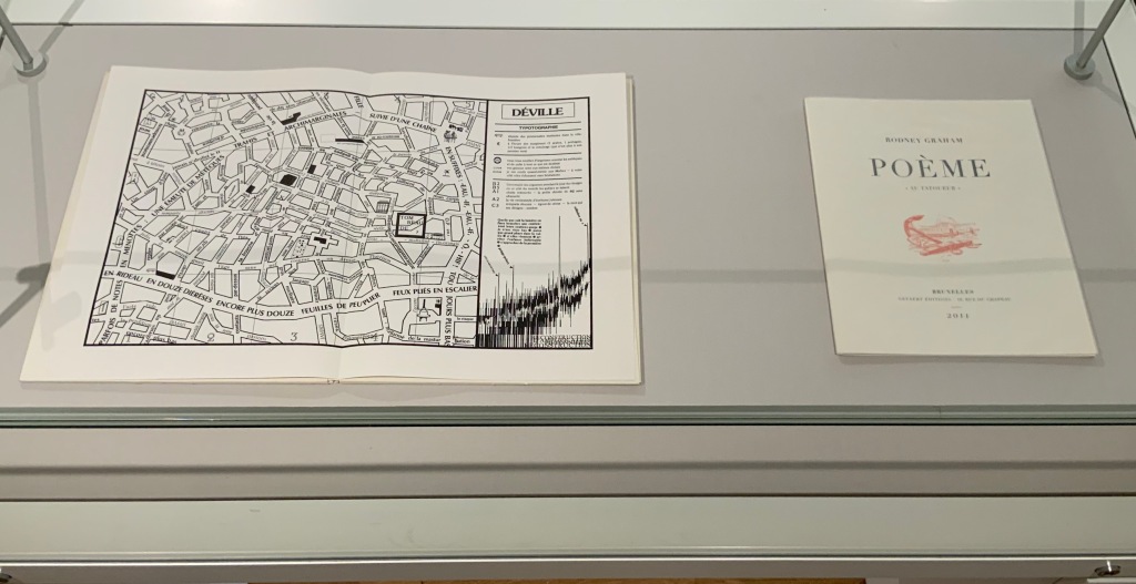
L-R: Tibor Papp, Déville in Mitsou Ronat & Tibor Papp, eds., Poème: Un coup de Dés jamais n’abolira le Hasard par Stéphane Mallarmé (1980; )Rodney Graham, Poème : “Au Tatoueur” (2011)
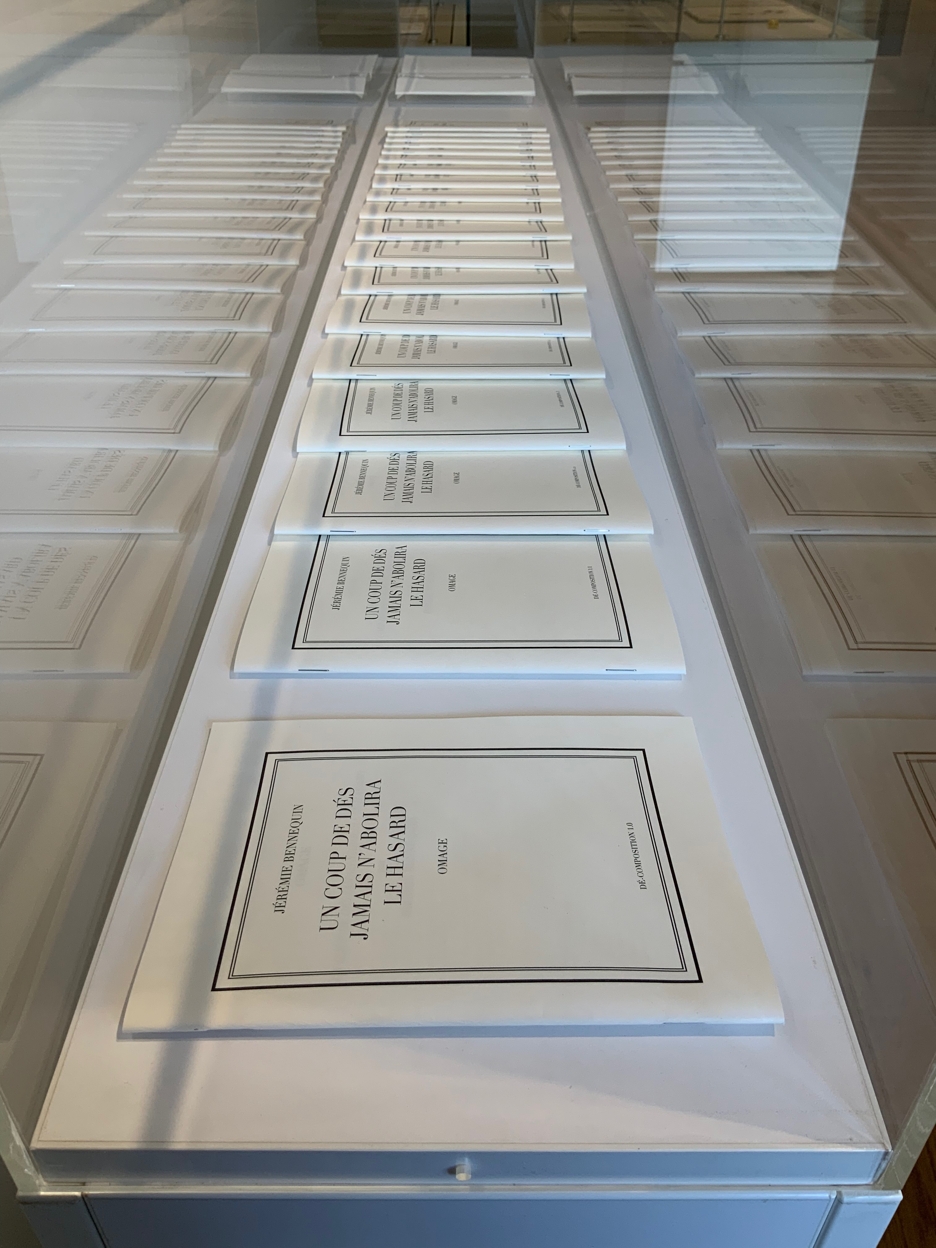
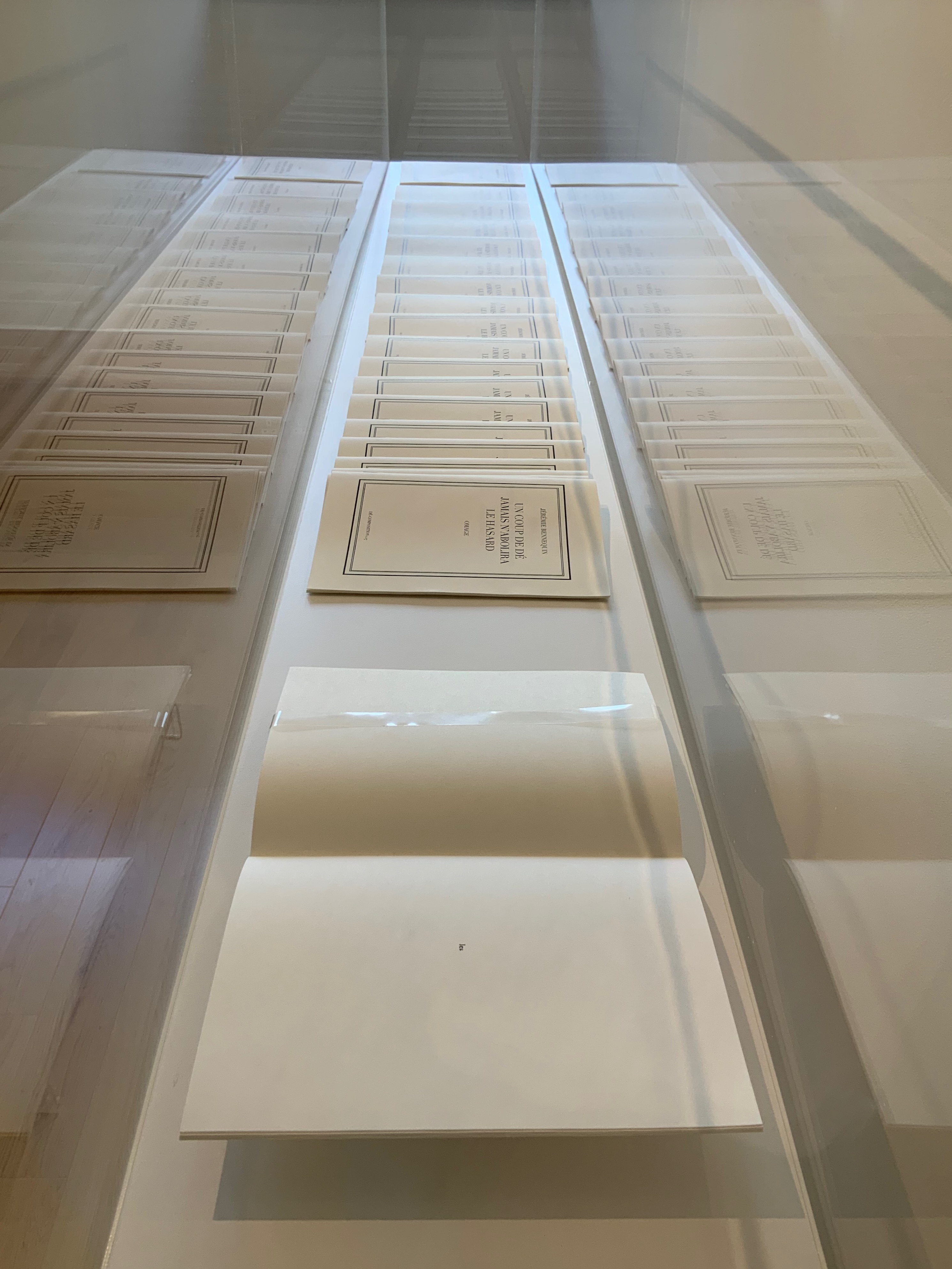
In a display case seemingly made for his particular work, the result of Bennequin’s long-distance performances of erasure with his colleague and publisher Antoine Lefebvre calls across the room to all the other works of chance and visible language.
Jérémie Bennequin, Un Coup de Dés jamais n’abolira le Hasard, Dé-composition (2009-2013)
With the sun streaming into West Court Gallery, the only things missing from the buzz of these conversations were perhaps canapés, champagne and name tags to celebrate the 125th anniversary of this strange poem’s publication.
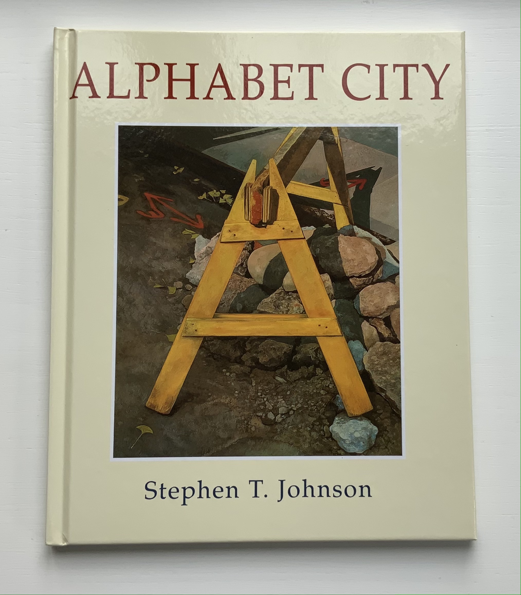
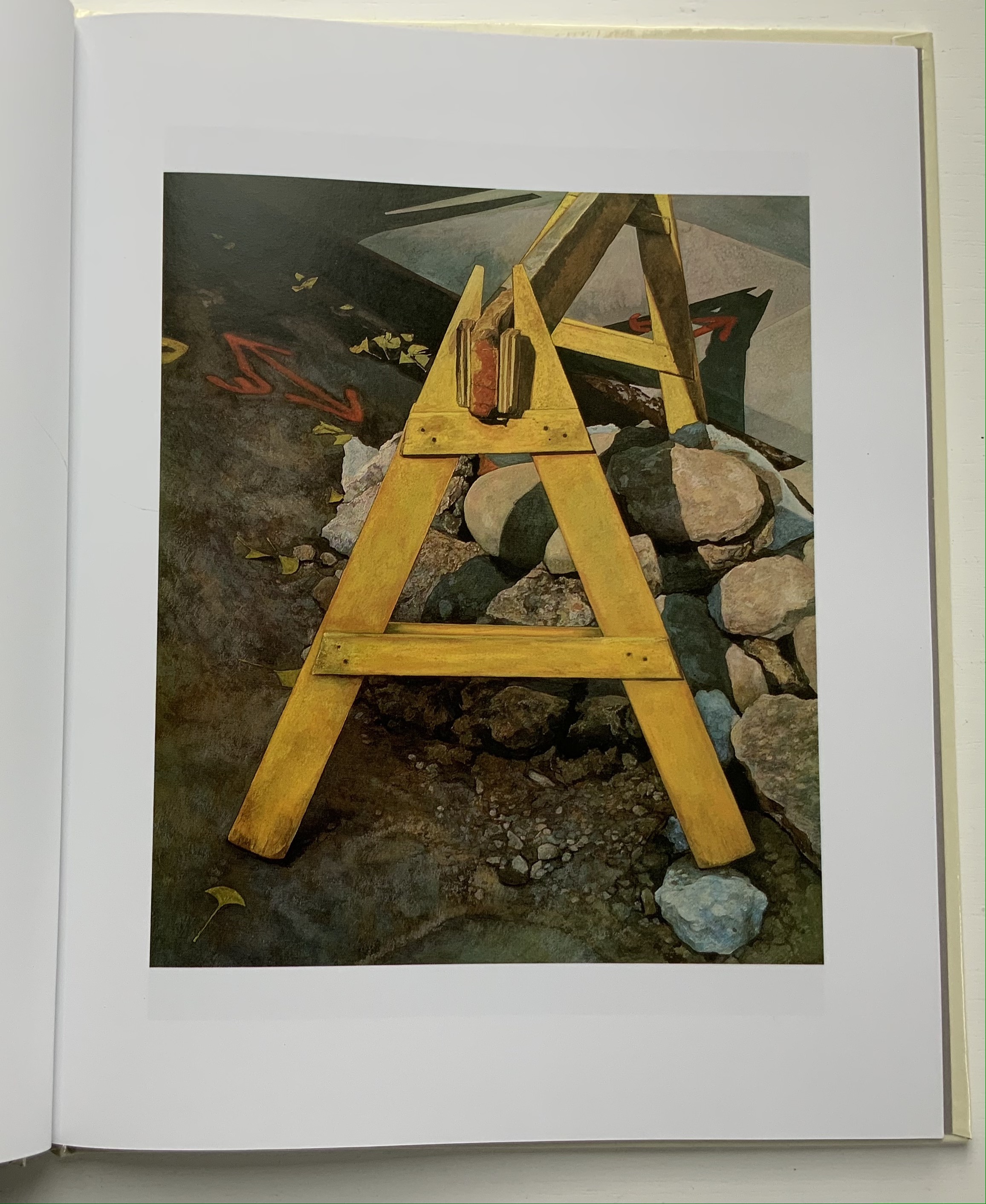
Alphabet City(1995) Stephen T. Johnson Casebound, sewn and glued. H276 x W226 mm, 32 pages. Acquired from Blackwell’s, 17 August 2021. Photos of the book: Books On Books Collection.
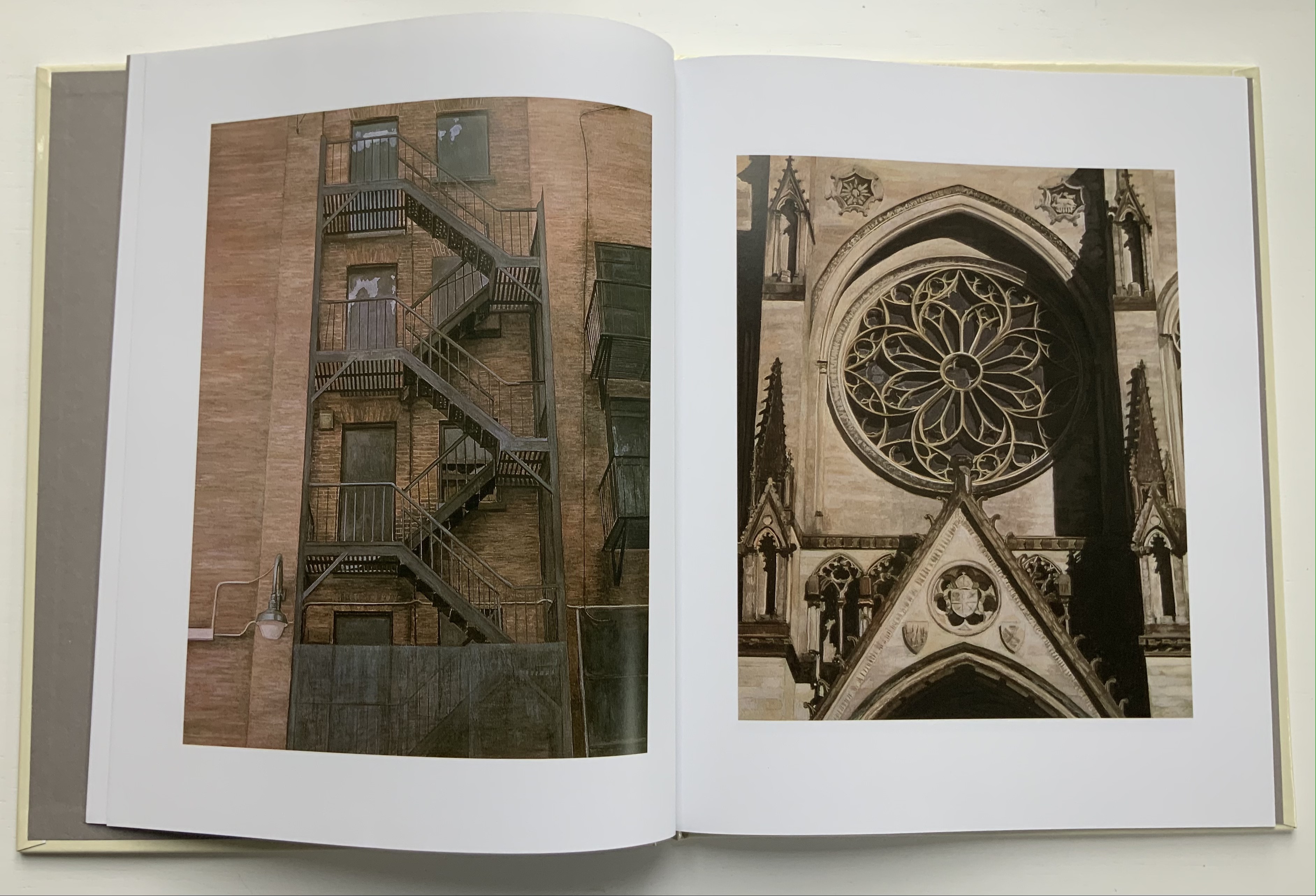
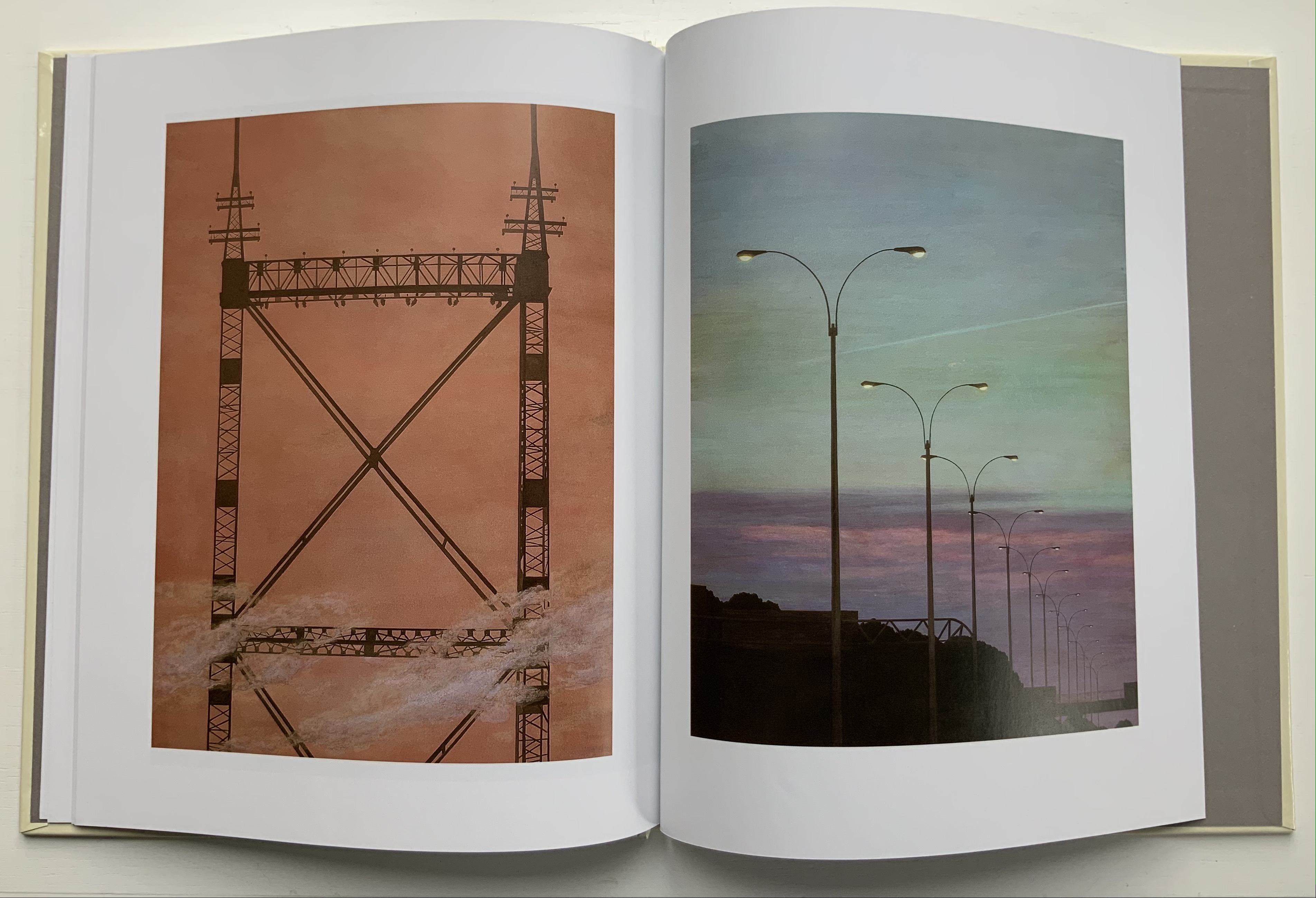
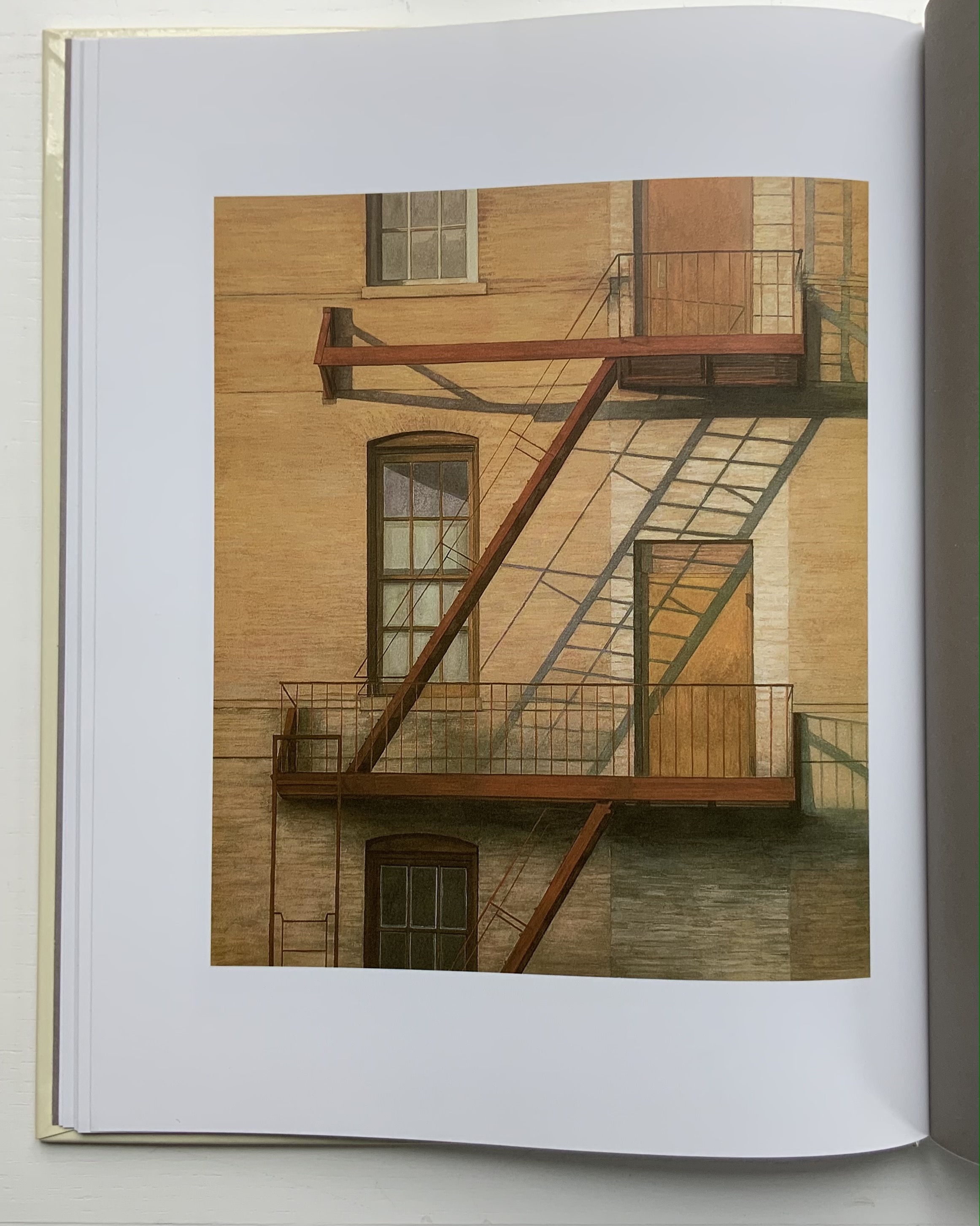
A Caldecott Honor Book and New York Times Best Illustrated Book in 1995, Alphabet City goes beyond the alphabet letters as found objects, a sub-genre documented by Steven Heller and Gail Anderson inThe Typographic Universe (2014). Johnson transforms his found capital letters with pastels, watercolor, gouache and charcoal into photo-realistic pictures in varying but similar sizes; for example, 26.5 x 22.5 inches for the A and 25.25 x 21.5 inches for the Z. These appeared in an inaugural exhibition in 1997 at the Katonah Museum of Art in New York. Johnson’s works are held in numerous permanent collections (mostly in the US) and private ones (mainly US-based but increasingly Europe as well), but they are closely tied to his children’s books: Alphabet School (2015) and A is for Art (see below). Most impressive is how he lifts the alphabet book from ordinary trade status to artist book.
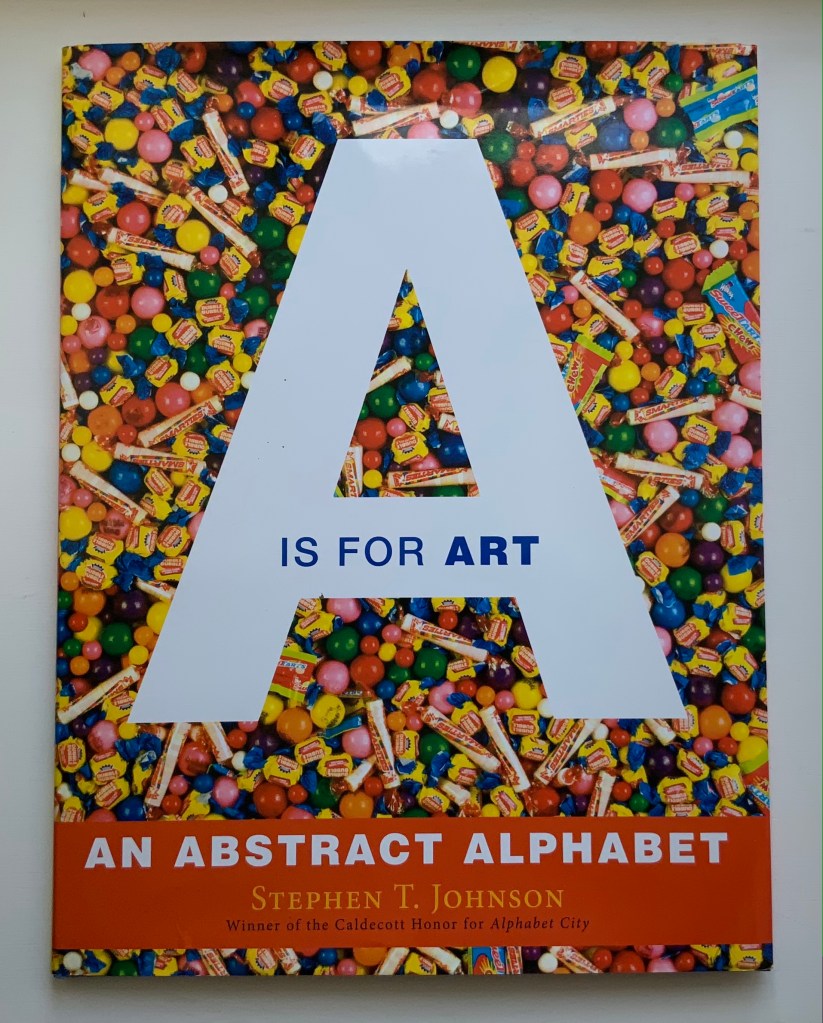
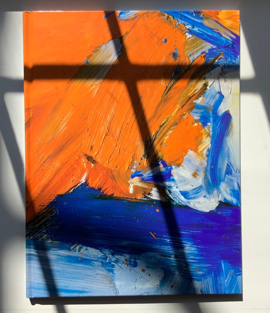
A is for Art: An Abstract Alphabet(2008) Stephen T. Johnson Perfect bound in case with doublures. H310 x 235 mm, 40 pages. Acquired from Amazon E.U., 4 September 2021. Photos of the book: Books On Books Collection.
In his review in American Art, Philip Nel coins an apt name for Johnson’s art — “alphabet expressionism” — which, on closer examination of texture and technique, applies also to Alphabet City. Go back and look at the foreground of the letter A in Alphabet City.
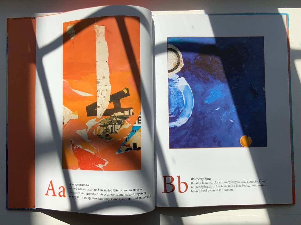
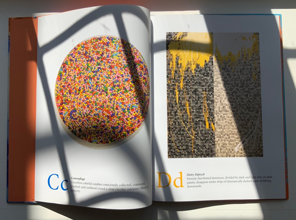
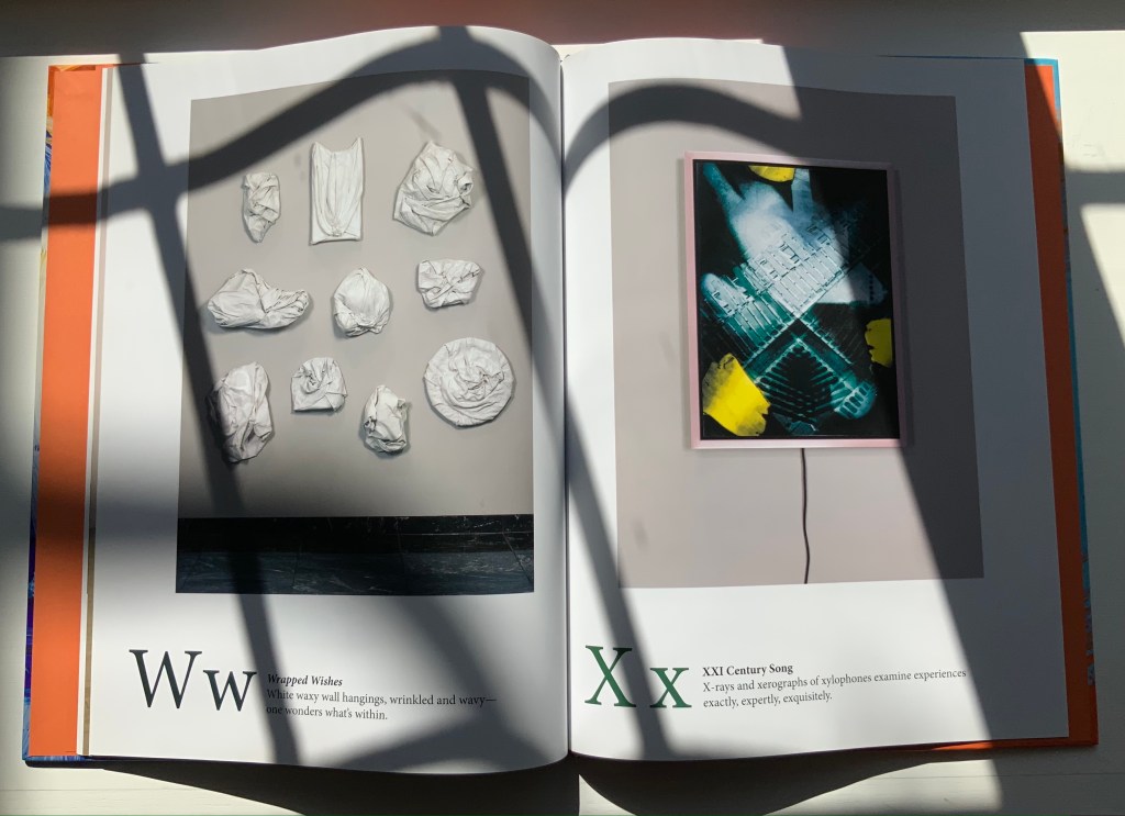
Also a New York Times Best Illustrated Book of the Year, A is for Art demonstrates two subgenres of alphabet books: the hidden and alliterative alphabet. An interesting, perhaps intentional, effect — even more so when the letters are difficult to find — is to make the viewer linger over the image longer than the museum goer’s average of less than 30 seconds per object. The ingenuity of Johnson’s alliterative sentences is almost as engaging as the images; even so, its main effect directs the eye back to the images. Here is the text for the letter A:
A a Arrangement No. 1 Affixed across and around an angled letter A are an array of abstracted and assembled bits of advertisements, and apparent among them are apostrophes, ampersands, accents, and an asterisk.
If you spend only 13 minutes in this book (30 seconds per letter), you are missing out.
Music and numbers have also piqued Johnson’s creative curiosity, but another of his series works leads in a more intriguing, roundabout way back to A is for Art: the Kana Card series. On a trip through Japan, the artist acquired a set of Japanese flashcards for learning Katagana and Hiragana. Each 2 x 3 inch card becomes a canvas for paint and collage.
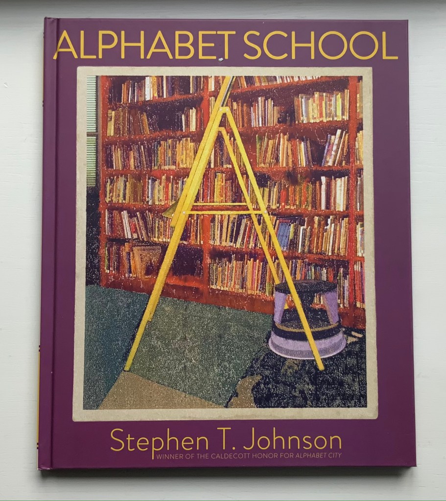
Alphabet School (2015)
Alphabet School (2015) Stephen T. Johnson Hardback. H286 x W236 mm, 32 pages. Acquired from Book Depository, 5 November 2021. Photos of the book: Books On Books Collection.
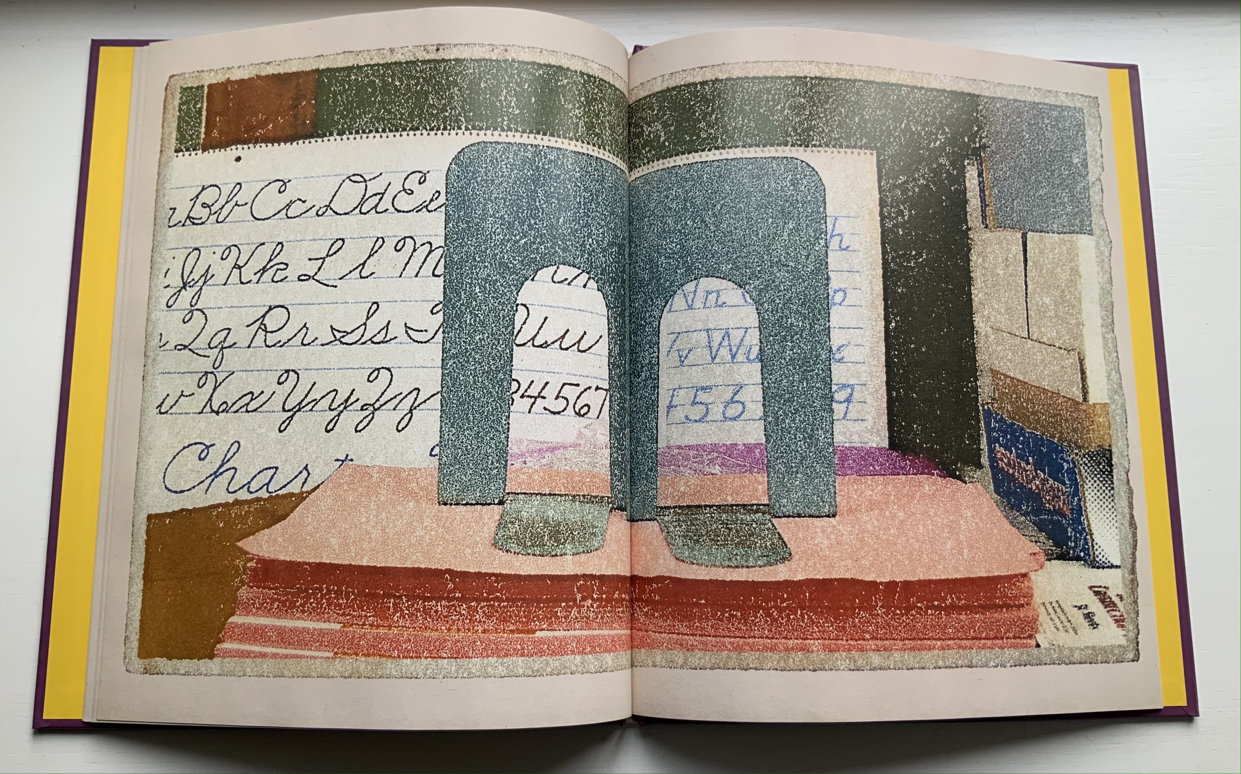
Using monoprints on paper with digital enhancements, Johnson shifts technique yet again here. The photorealism yields to a graininess, but as with Alphabet City, the effect of making the reader look not just at the images but also at his or her environment remains.
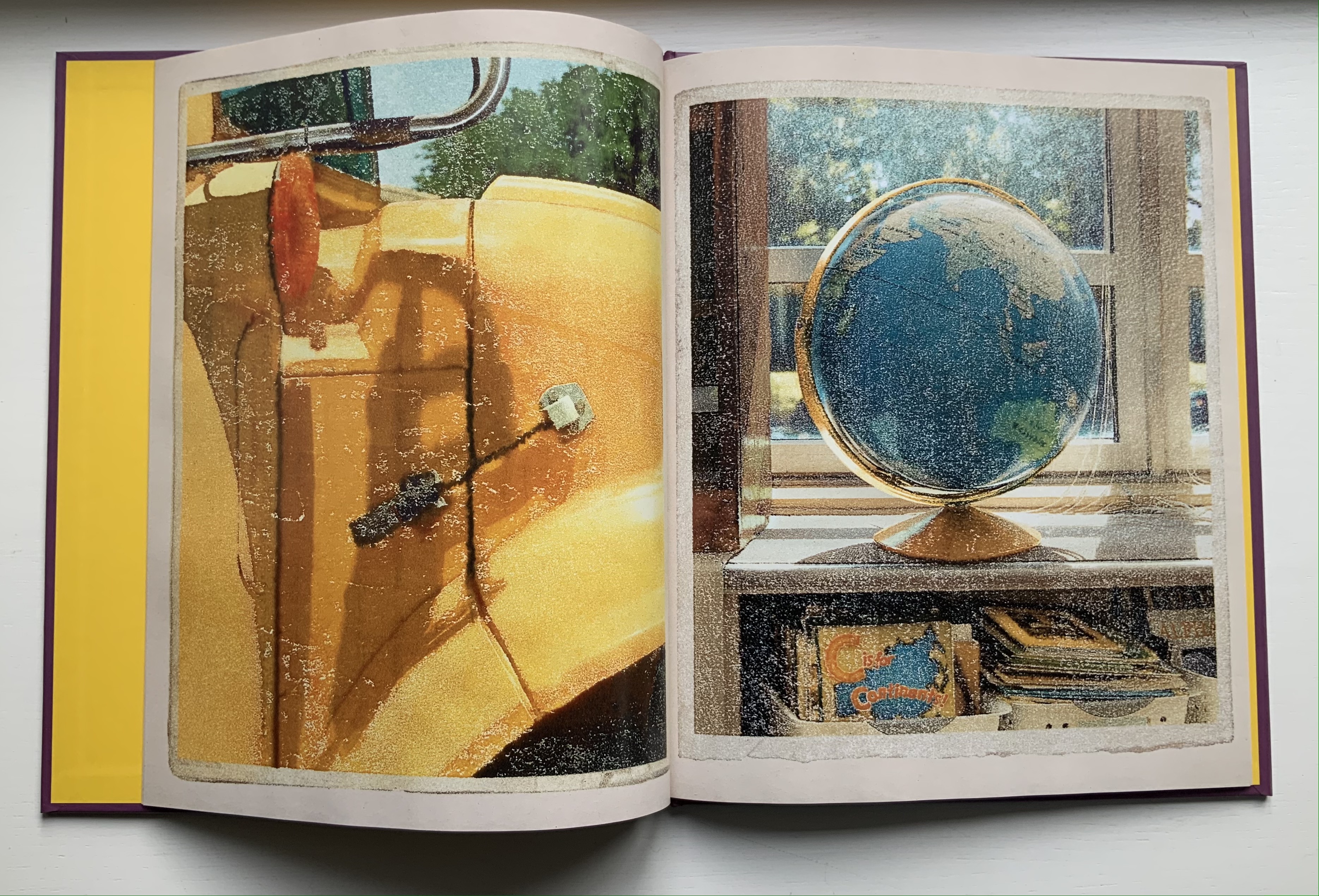
Some letters are contrived (two bookends posed for the letter M). Most of the scenes, however, deliver an authentic sense of found letters (the C in the support of the globe atlas). Johnson has raised the bar on the hidden-letter theme, common in the genre of alphabet books, by several notches.
Ernest Fraenkel should have left it at visually mapping Un Coup de Dés and offered it up as simply an artistic response to the poem. Even if it is a mapping of the condensed single-paged Cosmopolis (1897) version of the poem, think of the various renderings in handset chapbook form printed on letterpress or as lithographs, or etchings on glass, or even sculptures. It could have been the “Prometheus bound” to the “Prometheus unbound” of those who paid homage by appropriating the more expansive double-page spread book version (1914) that Mallarmé intended. Instead, it lies tucked away with 44 pages del’explication. Professor David W. Seaman (Georgia Southern University), who has engaged with Fraenkel’s analysis, puts it well:
It must be said in [Fraenkel’s] defense that the idea is tempting: to make wordless patterns of the pages of the poem in order to see the ideogrammatic shapes more clearly. In addition, Fraenkel has contributed some worthwhile insights into the use of space and text in the poem, … However, there are three major objections to his project. First, he used, for most of his research, the text of the Cosmopolis edition of the poem, an edition which nearly everyone agrees is far from the author’s intentions, especially insofar as the ideograms are concerned; the preface to that edition gives ample warning of this. … / The second objection is that Fraenkel strays too far from the text, preferring to keep in mind a general idea of the meaning of the poem, and then go off according to the feelings the designs give him. … In fact, sometimes Fraenkel recommends turning the design on its side or upside-down to see what image may present itself! / The third objection is that these designs are then used more or less like Rohrschach ink blots. (Seaman, pp. 142-43)
In his nine sets of single-sided uncut sheets, Fraenkel offers seven different diagrammatic approaches to the poem as it appeared in Cosmopolis, whose editors could not allow the poem’s lines to cross over the gutter to the next page as Mallarmé imagined the layout. The opening pages of Fraenkel’s seven approaches are laid out below in sunlight and paired with the textual opening page.
Seven different diagrammatic renderings. The one at the lower right shows Fraenkel’s sideways view.
The first rendering (above, upper left) is closest to what Mario Diacono and Marcel Broodthaers would create later in the decade.
Left: a METRICA n’aboolira (1968) by Mario Diacono (1968). Right: Image: Un coup de dés jamais n’abolira le hasard (1969) by Marcel Broodthaers (1969).
Fraenkel’s nine sets of sheets break down into eight of 8 pages and one of 4 pages. Below is the first set opened out.
The first set of eight pages
Compared with Diacono’s, Broodthaers’ and all the other works of homage to date, Fraenkel’s renderings retain a distinction and suggest other new directions not yet taken physically or digitally. Given the sculptural interpretations by Geraldo de Barros, Jorge Méndez Blake and Kathy Bruce, doesn’t Fraenkel’s first rendering call for a three-dimensional cantilevered homage constructed of slabs of blackened flotsam connected with brushed steel rods?
Given the video created by Giulio Maffei transforming the 1914 book version into Broodthaers’ and the digital legerdemain of Karen ann Donnachie and Andy Simionato and Tayyib Yavuz, why not an animated digital transformation of the Cosmopolis version into the 1914 book version?
And Professor Jed Rasula (University of Georgia), who has also explored Fraenkel’s work, suggests yet another medium:
“Fraenkel’s sixty-eight seismographic and astral diagrams (or “stylizations”) practice a truly graphic mode of literary analysis. It was Fraenkel’s conviction that “a plastic text rests hidden in the extra-conscious layers of the poet, paralleling the verbal text of the poem” (9). … In their accentuation of the visual character of Un Coup de dés, Fraenkel’s designs are like watching a movie with the sound turned off, forced to rely on gesture rather than dialogue in order to follow the action.”
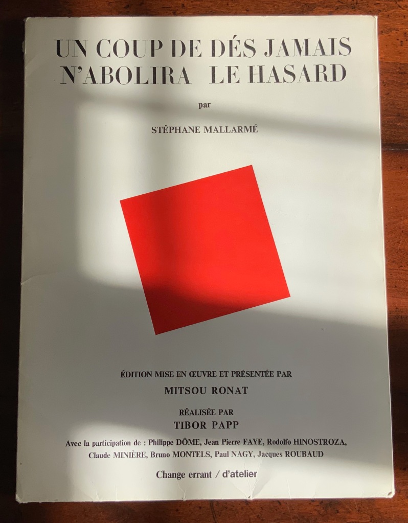
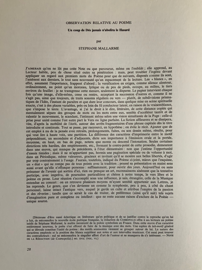
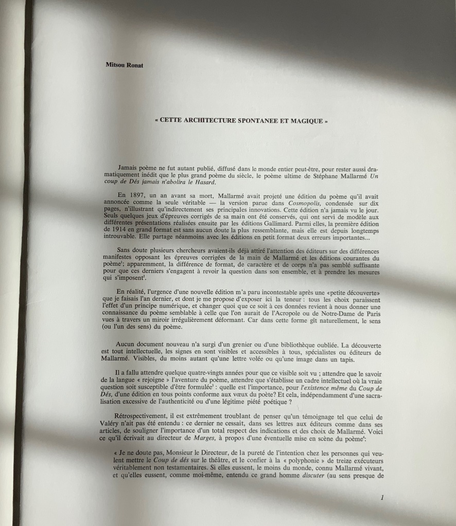
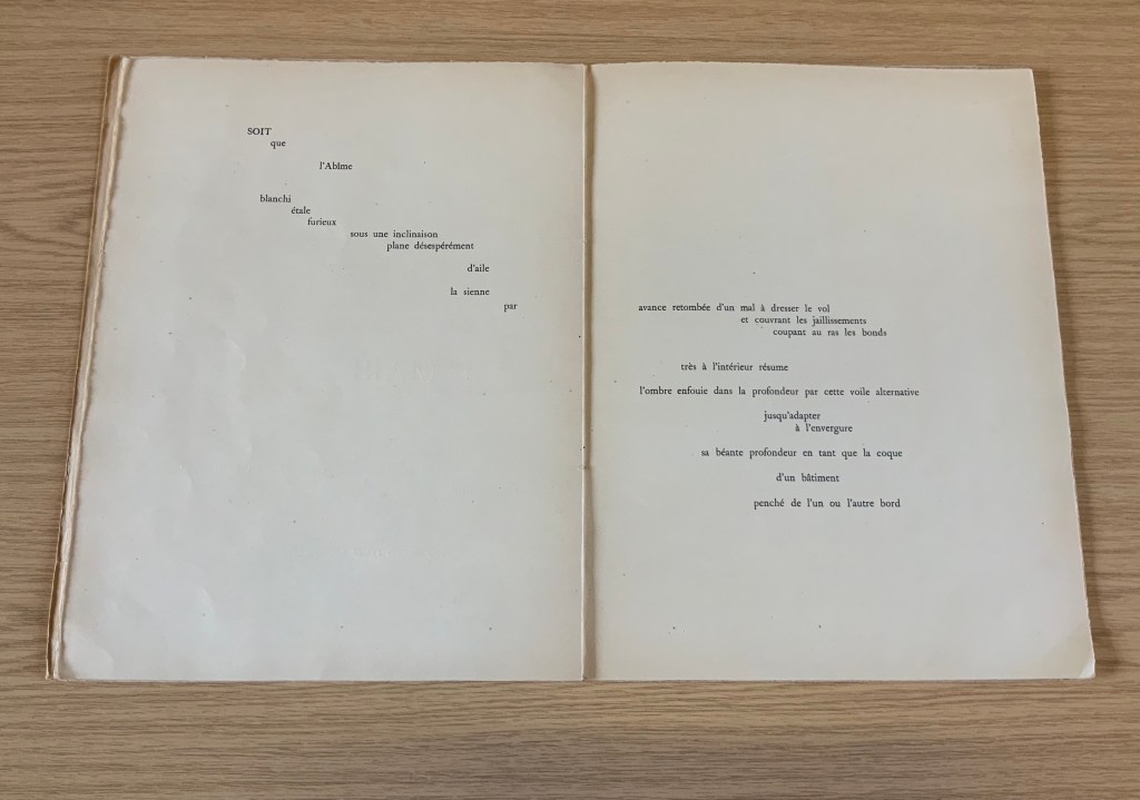
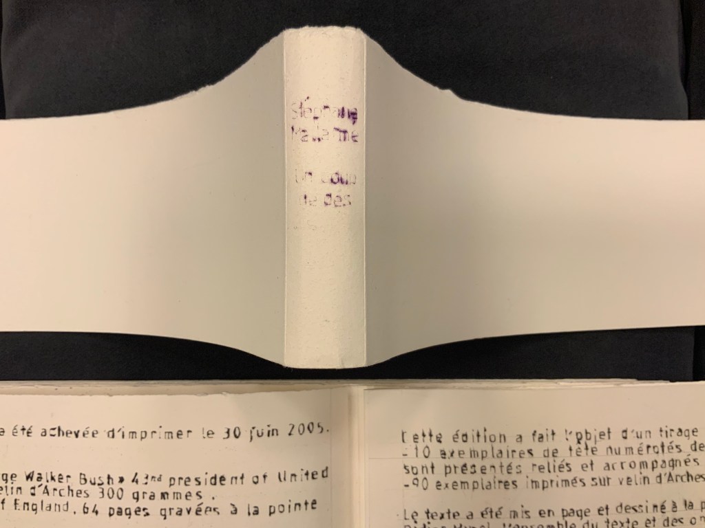
Poème: Un coup de Dés jamais n’abolira le Hasard par Stéphane Mallarmé (1980) Édition Mise en Oeuvre et Présentée par Mitsou Ronat, Réalisée par Tibor Papp. Two sets of folded & gathered folios, enclosed in a portfolio with four flaps; Portfolio: H380 x W285 mm; Folios: H380 x W285 mm; Poème, 24 pages, including the cover; “Le Genre …”, 28 pages, not including cover. Acquired from Latour Infernal, 28 May 2020. Photos: Books On Books Collection.
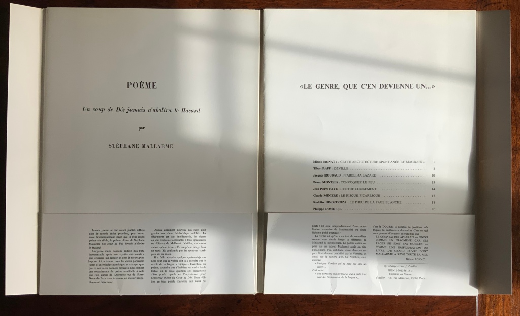
Described as an “éditionmise en oeuvre“, the Ronat/Papp 1980 publication of Un Coup de Dés is indeed as much a “production” as any theatrical or cinematic mise en scéne. Equally apropos or more so, the phrase calls to mind the French for page layout: mise-en-page. The layout of the work certainly calls attention to itself as much as to the page. While it represents an effort to reflect Mallarmé’s “true” intentions for the page layout of Un Coup de Dés, the Ronat/Papp production delivers the poem in a set of loose F&Gs (folded and gathered folios), paired with another set of F&Gs (artwork, poems and essays) and enclosed in a portfolio.
The first effort to follow Mallarmé’s intention as intimated in his corrected proofs of the abandoned Ambroise Vollard version was the 1914 NRF edition, which also called attention to itself with its oversized format, but it was sewn and bound into its paper cover as usual. Its lay-flat binding eased reading the lines of verse that run across the book’s gutter.
By unbinding that space that usually sinks into the gutter, Ronat and Papp retain the readability across the gutter but introduce an interesting instability. The unitary view of the double-page spread that Mallarmé intended falls prey to physical chance. Lines across pages can fall out of alignment as folios slip up or down. If the folios scatter, the reordering of the unnumbered pages relies on the guidance of the typography and memory. Oddly this forces a more hands-on engagement with the poem. No other edition intended for reading the poem feels as physical. The page and double-page spreads are felt.
Although also not bound, the order of the artwork, poems and essays in the right-hand set of F&Gs is traditionally fixed with pagination, as the front of its self-covering folio shows. More important is the cover title: “Le genre, que c’en devienne un …” (“the genre, that it becomes one …”). Those words begin the final sentence in the reproduction of Mallarmé’s reluctant note from the poem’s first publication. Cramped into the magazine Cosmopolis, the poem’s layout was still startling enough to the editors to require a preface from Mallarmé. Facetiously and seriously, his note explains how to read the poem. In varied ways, the F&Gs’ content also seriously and facetiously demonstrates how to read the poem. And starting and ending with Mallarmé’s words, the portfolio’s second half reflects the circularity of the poem it faces, which starts and ends with the words un coup de dés. An édition mise en oeuvre indeed.
So forget the debate over who was first to display the poem in the true form as Mallarmé intended. The second portfolio is proclaiming then proving by examples that Un Coup de Dés is a genre.
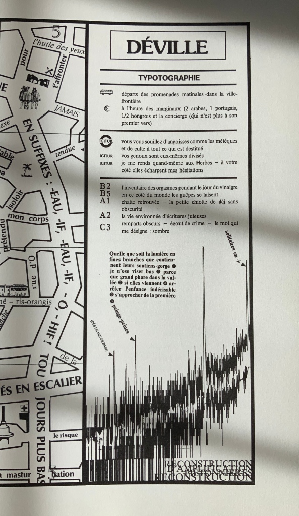
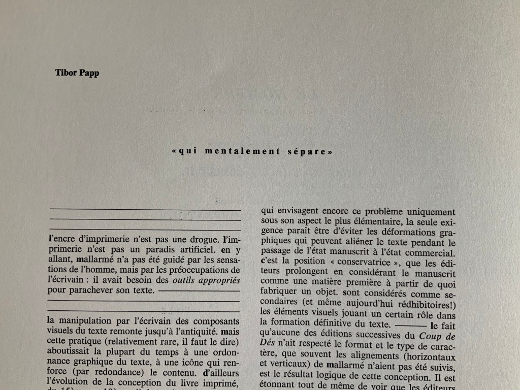
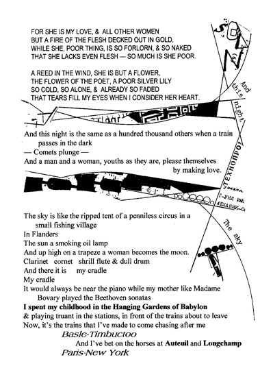
Mitsou Ronat‘s introduction sets the poem’s publishing history in context and explains this edition’s claim to reflect Mallarmé’s wishes for the poem’s presentation. In doing so, she puts forward her hypothesis that le Nombre (“the Number”) mysteriously posed in the poem is 12, the syllable count of each line in the French alexandrine couplet and ties this revelation to the page and double-page spread as units of meaning, culminating in the 24 pages of which the mise en oeuvre consists. Tibor Papp follows with his map of Déville (“Dice-town”). Overlapping inscriptions along the crisscrossing streets remind us of the sometimes overlooked humor in the Mallarmé industry. One street is labelled Saint-Mallarmé de la masturbation. Off one boulevard are the remparts des alexandrins (“battlements of the Alexandrines”), complete with a WC for passers-by. There is even a Métro stop named for Mallarmé’s Igitur, thematic predecessor to Un Coup de Dés. Another recalls the political cast of the times: premières allusions à la lutte des marginaux oubliées (“first allusions to the struggle of the forgotten marginalized”). But most important is the map as map, a poster, a sub-genre of the genre Un coup de Dés and forerunner to future works such as that by Aurélie Noury. In his essay near the end of the F&Gs, Papp asserts that Mallarmé was not preoccupied with print and typography for its haptic properties, rather he was simply seeking the tools appropriate to complete his text. This is Papp’s departure point for discussing the aims of Le Groupe d’atelier, which he founded with Paul Nagy and Philippe Dôme in 1972:
Pour l’écrivain, donc, d’aujourd’hui, l’attitude de mallarmé scrutant les caractères des affiches, travaillant ses épreuves par collage, déplaçant ses mots d’un millimétre, est une attitude parfaitement normale et logique, en même temps que son poème constitue un classique du genre.
Pour nous, l’écrivain assume son rôle jusqu’à la materialité de son texte.
“For today’s writer, then, the Mallarméan scrutiny of type display, working on his proofs by collage, moving his words by one millimeter, is perfectly normal and logical behavior, at the same time that his poem constitutes a classic of the genre.
For us, the writer’s role entails the materiality of the text.”
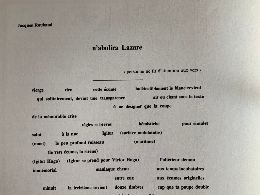
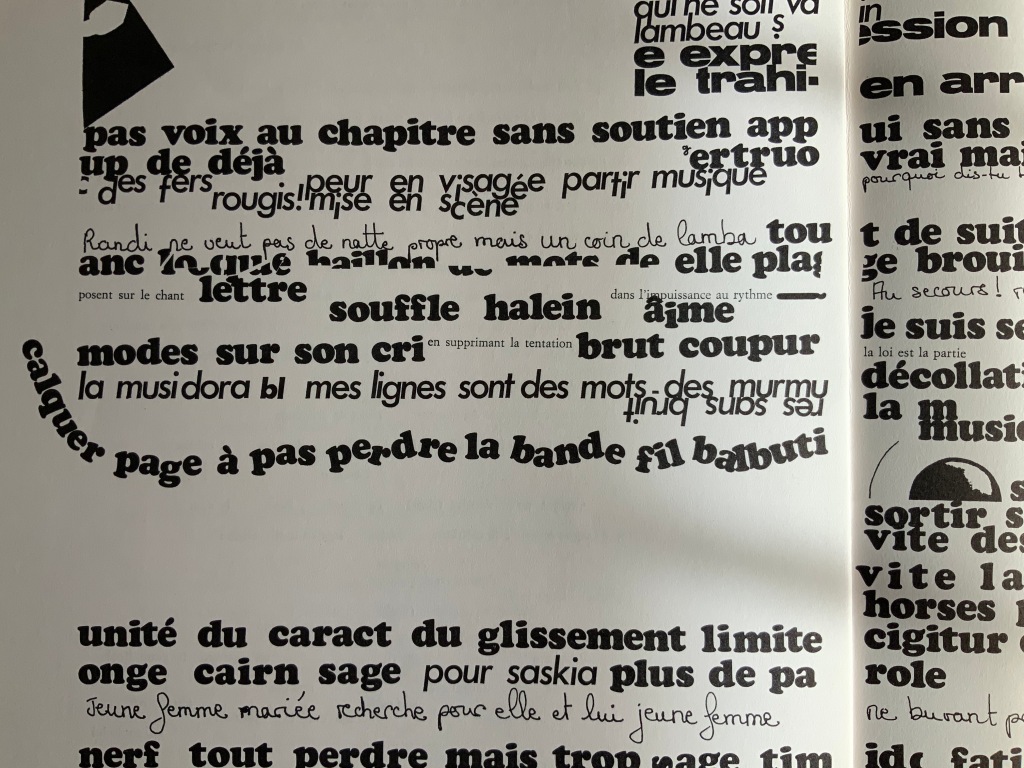
The remaining contributors traverse the ranges of the academic and artistic, the tongue-in-cheek and the serious, that Ronat and Papp establish. A more textual affair, “n’abolira Lazare” by Jacques Roubaud, a member of the OuLiPo movement, delivers an homage to Mallarmé replete with numerical and linguistic puns, appropriate to a professor of mathematics and literature, and a translator of Lewis Carroll. Bruno Montels‘ “Convoquer le peu” displays his signature combination of handwriting and typographic experimentation.
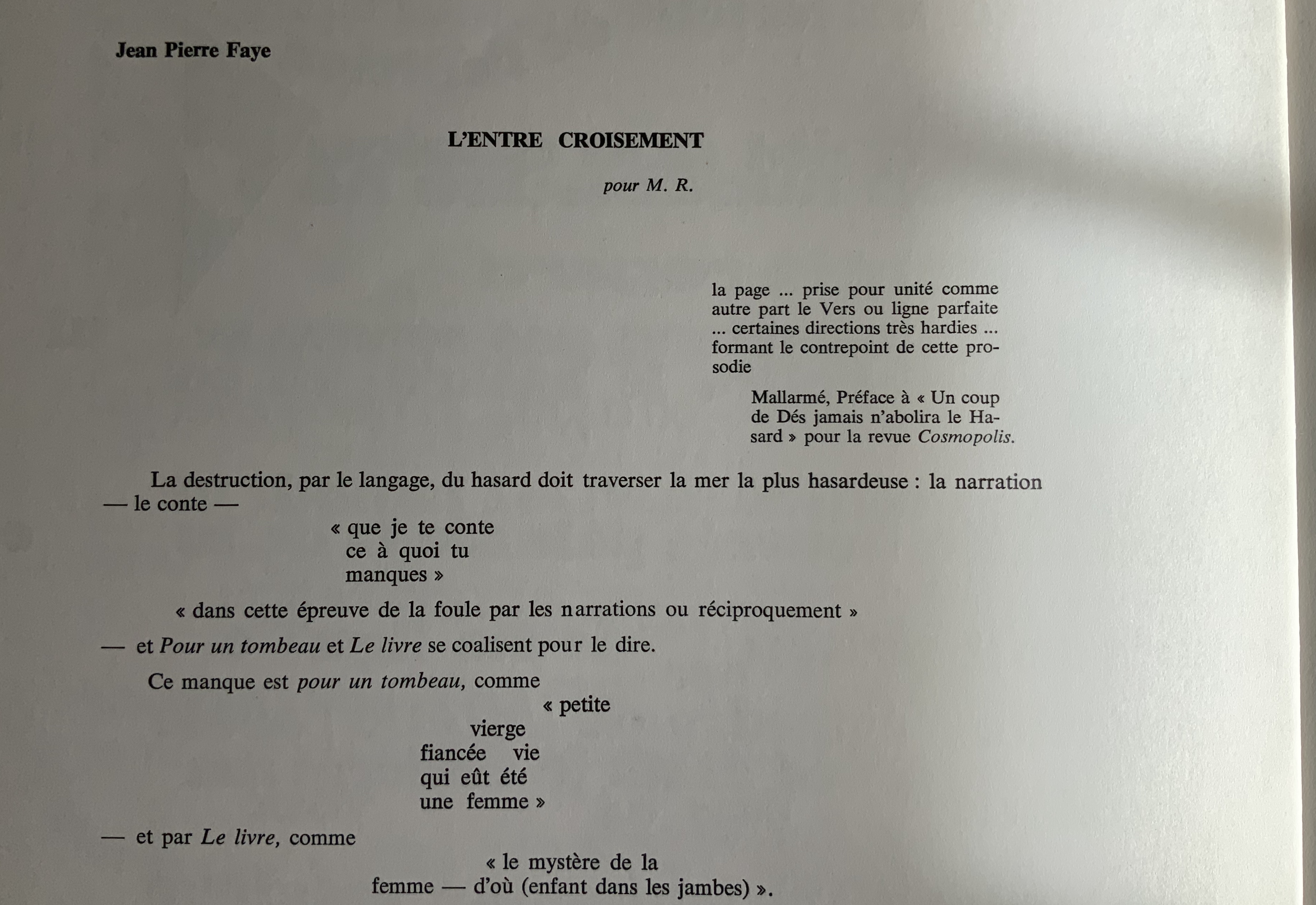
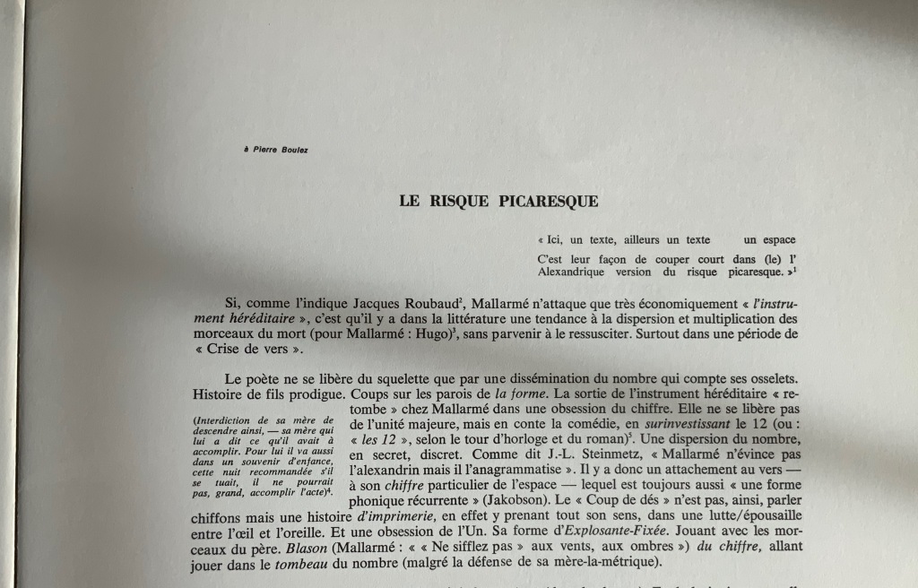
“L’Entre croisement” by Jean Pierre Faye (a visual linguistic pun, “threshold” and “intersection”) reads like notes for an academic lecture but in a free-verse layout. The poet/essayist Claude Minière‘s “Le Risque Picaresque” foreshadows(?) his essay Un Coup de Dés (Tinbad, 2019), which proposes Pascal’s wager and Pensées as a predecessor to Mallarmé.
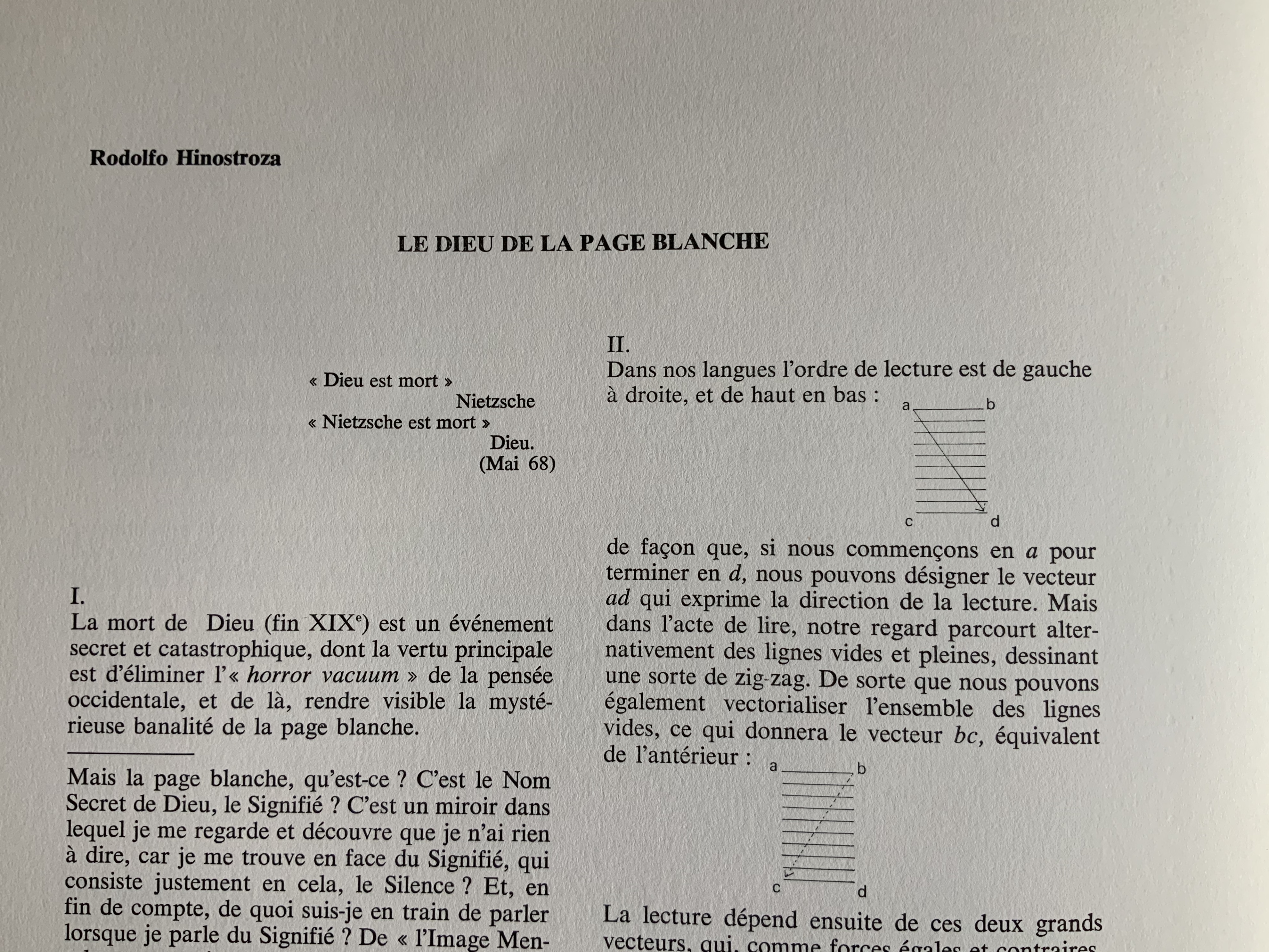
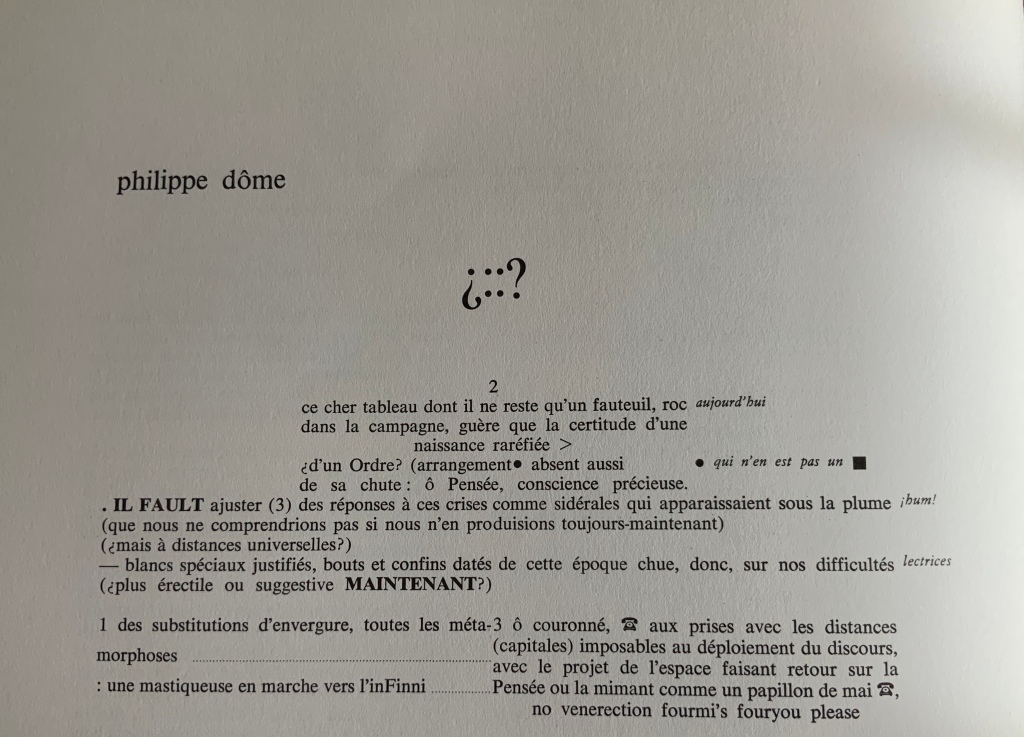
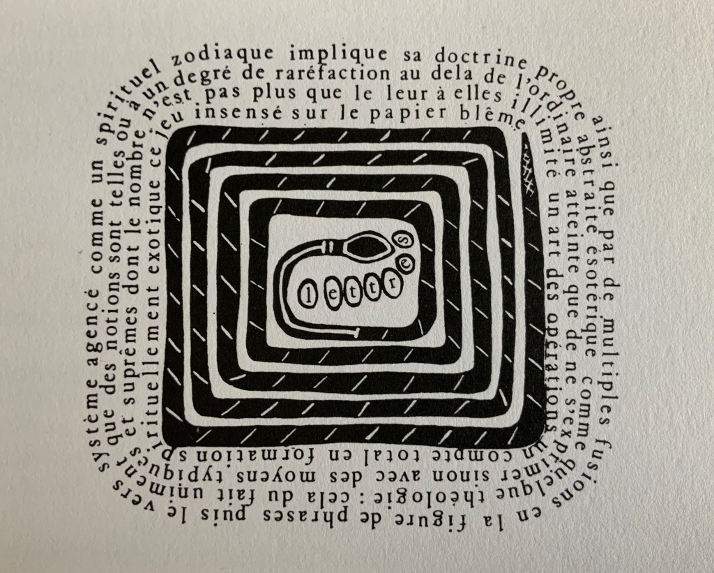
Peruvian poet and writer Rodolfo Hinostroza‘s “Le Dieu de la Page Blanche” (“The God of the Blank Page”) delivers a diagrammatic exploration of the placement of verses on the page in Un coup de Dés, reminiscent of but less abstruse than Ernest Fraenkel’s Rohrschach-like exposition. Philippe Dôme draws on his time as a French and Spanish teacher in London to put together pages of a multilingual study workbook for the reader of Un Coup de Dés. Clearly a lover of puns, he entitles his workbook with Spanish interrogatory marks around the face of a die, the 4 constructed with two colons.
Perhaps the most striking of the visual homages, Paul Nagy‘s contribution is a descendant of Un Coup de Dés by conscious or unconscious way of the earlier typographic and graphic gymnastics of Dada, Marinetti, Iliazd, Gomringer, the Brazilian Noigrandes movement and Fluxus.
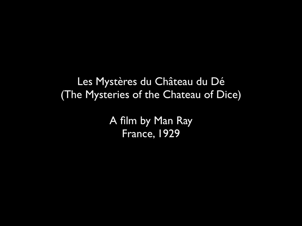
In its unbound folios approach to the poem and juxtaposition of it with artistic interpretations of the poem, the Ronat/Papp production marked a pivot for future treatments of Un coup de Dés. Over the decades after it, three new editions — also aimed at reflecting the Master’s wishes — appeared as did dozens of inventive academic and artistic responses to Un Coup de Dés. The three explorations of the “true” edition (in French) are Michel Pierson‘s (2002), Françoise Morel‘s (2007) and Ypsilon Éditeur‘s (2008). Though the artworks paying homage since 1980 are too numerous to list for this entry, note that Books On Books is preparing a virtual 125th anniversary celebration for 2022 that will display images and links for all the homage paid since 1897 that it has uncovered — from Man Ray’s Les Mystères du Château de Dé (1929) to Sylvain Moore’s Troisième Coup de Dés (2019).
It was 1913. Stravinsky’s ballet “The Rite of Spring” debuted. The Cubists, Constructivists, Suprematists, Futurists all bound onto the art scene, many of them showcased in the Armory Show in New York that year. The Nouvelle revue française (NRF) attempted the first book form of Stéphane Mallarmé’s Un Coup de Dés Jamais N’Abolira le Hasard, which revived that 1897 typographic disruption of the page and prepared the ground for dozens of works of book art since. And Blaise Cendrars and Sonia Delaunay-Terk announced and published what they called le premier livre simultané. It was La Prose du Transsibérien et de la petite Jehanne de France.
From the Bodleian Library collection Photos: Books On Books
From the National Art Library, Victoria & Albert Photo: Books On Books
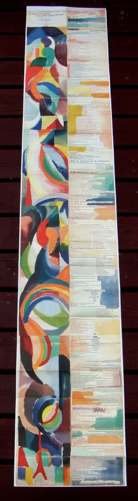
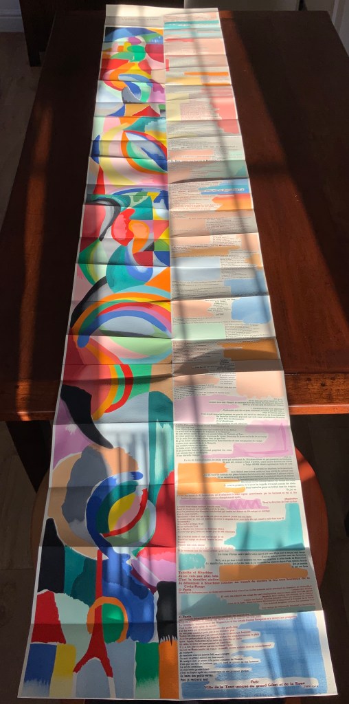
Like Mallarmé, Cendrars disrupts the page with multiple typefaces (thirty distinct ones in his case) and scattered placement of lines and stanzas. But La Prose presents an even more physical and structural disruption of the page and book than Un Coup de Dés. Unlike the latter, La Prose unfolds — twice — in an accordion format to over two metres in length or rather height since the text descends on the right and ends alongside the interlinked images of the Eiffel Tower and a Ferris wheel at the foot of the accordion. Cendrars and Delaunay had aimed to produce 150 copies of La Prose because, placed end to end, that would have equalled the Eiffel Tower’s height.
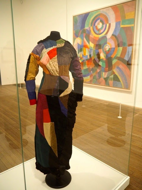
More than this monumental, sculptural, typographic and physical disruption of page and book, La Prose presents a temporal disruption. By le premier livre simultané, Cendrars meant a simultaneity of the verbal and visual — the way that text and image appear all at once — en un éclair. Early Bohemian that he was, Cendrars was co-opting a fair bit of artistic and literary theorising by the Cubists, Futurists and others. Most important and of the moment was his co-opting of Robert and Sonia Delaunay’s colour theory of simultanéisme. The “couleurs simultanées de Mme Delaunay-Terk” had also appeared in her 1913 robe simultanée and paintings. Building on a French scientist’s exposition on how perception of colours changes depending on the colours around them, the Delaunays claimed that rhythmic, musical and spatial synaesthetic elements were also at play. Sonia Delaunay asserted that the artwork produced for La Prose was not in response to reading the poem but hearing it from Cendrars. (Listen to it for yourself here.)
In presenting the adolescent Cendrars travelling physically eastward on the Transsibérien, travelling mentally to Flanders-Basle-Timbuctoo-Auteuil-Longchamps-Paris-New York while still registering the landscape outside, seeing the maimed and wounded returning from the front of the Russo-Japanese war, conversing with a prostitute named after Joan of Arc, doubting himself as a poet, and so on until a sudden transposition back to Paris, the process poem juxtaposes the sacred and profane, past/present/future, stationary and dynamic, national and international in outlook and locale. In short, simultaneously. In a format that is bound and unbound, the poem mirrors the swirling, interacting shapes and colours beside and in which it moves — and vice versa.
However more disruptive of the page and book La Prose may have been, it did not inspire the profusion of direct re-interpretations (or appropriations) that Un Coup de Dés prompted from artists such as Jérémie Bennequin, Ellsworth Kelly, Man Ray, Didier Mutel, Michel Pichler, Eric Zboya and dozens of others.
Not until 2001 did a re-versioning of La Prose appear. Tony Baker and Alan Halsey published an English translation and codex re-formatting. Its black on white imagery is reminiscent of the Russian Futurists, the type is monochromatic, and the typefaces, fonts and weights vary but not as much as in La Prose.
Baker and Halsey note in their colophon:
So far as we’re aware no translation of the poem into English has ever been attempted to give a sense of Cendrars and Delaunay’s original conception, not the least reason for which may have been the difficulty until recently of seeing the first edition, even in reproduction. — Prose of the Trans-Siberian and of the Little Jeanne de France (Sheffield: West House Books, 2001)
A well-founded lament — at least for the book art community. Not until 2000 had there been a reduced-scale reproduction of La Prose. It appeared in Granary Books’ A Book of the Book by Jerome Rothenberg and Steven Clay across a four-page foldout in the embrace of Ron Padgett’s English translation. Only in 2008 was there a full-scale, full-colour offset facsimile, produced by Yale University Press with an appended translation. It is now out of print.
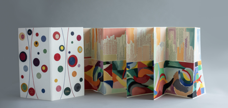
With her work La Prose du Transsibérien Re-creation (2019), Kitty Maryatt has changed all that. With this deuxième livre simultané, she has more than caught the echo of Cendrars/Delaunay’s original and its arrival. As scholar, artist and veritable impresaria, she has reinvigorated the book art/arts community with the legacy of La Prose.
Her blogspot documents the research and production with rich details about sourcing the type, learning about stencil-cutting from Atelier Coloris (one of the few remaining businesses devoted to pochoir), determining the recipes for the ink colours, testing papers (Zerkall Crème, Biblio, and Rives HW), creating a census of the existing 1913/14 originals and their locations — all that and more, including the use of bacon fat and a wine bottle filled with lead shot. She also organized a documentary by Rosylyn Rhee: “The Pochoir Re-creation of La Prose du Transsibérien”. It brings the importance of the original and this re-creation to life in the expressions and voices of prominent collectors, librarians and scholars, artists, rare book dealers and the project’s funders.
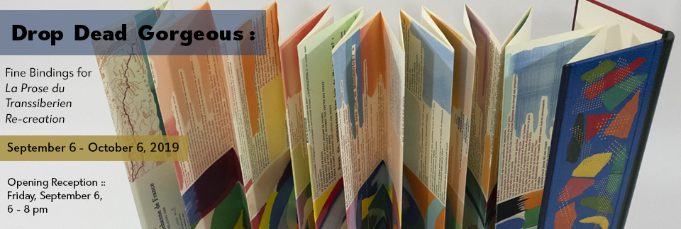
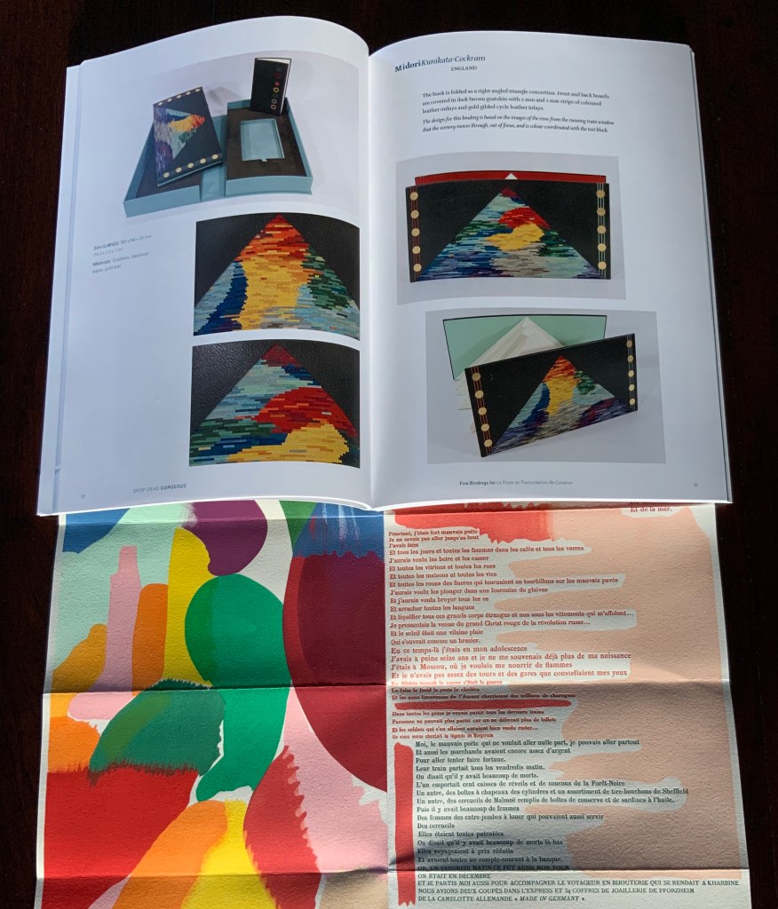
In addition, Maryatt has been either a contributor to, or the motivating force behind, several symposia and exhibitions such as “Paris 1913: Reinventing the Artist’s Book” (at the Legion of Honor Museum in San Francisco, 2018) and “Drop Dead Gorgeous”. The latter is a travelling exhibition resulting from invitations to twenty-four book artists and designer bookbinders to design and create bound copies of La Prose du Transsibérien Re-creation. For the San Francisco venue, Maryatt prepared a workshop on traditional French pochoir and provided text for the exhibition catalogue (available from the online store of the San Francisco Center for Books).
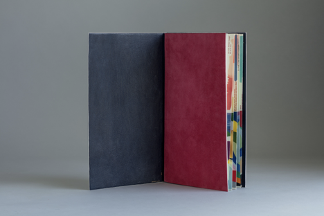
Monique Lallier’s fine binding of La Prose du Transsibérien Re-creation Photos: Courtesy of Monique Lallier
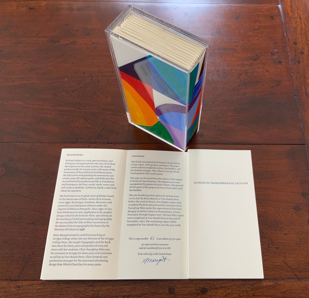
The pinnacle of Maryatt’s efforts, of course, is the standard and deluxe editions of La Prose. Both editions consist of 4 pages, glued together to create the tall single page. For the standard edition, the page is folded into 21 sections and loosely placed in a painted vellum cover with a booklet describing the project and production. An acrylic slipcase houses the covered bundle.
The standard edition Slipcase: H195 x W108 x D45 mm. Wrapper: H182 x W97 x D35 mm. Leporello: H81 x W95 mm (closed). H1954 x W160 mm (open). Booklet: H81 x W94 mm (closed), W1055 mm (open). Photo: Books On Books
Photo: Books On Books
Photos: Books On Books
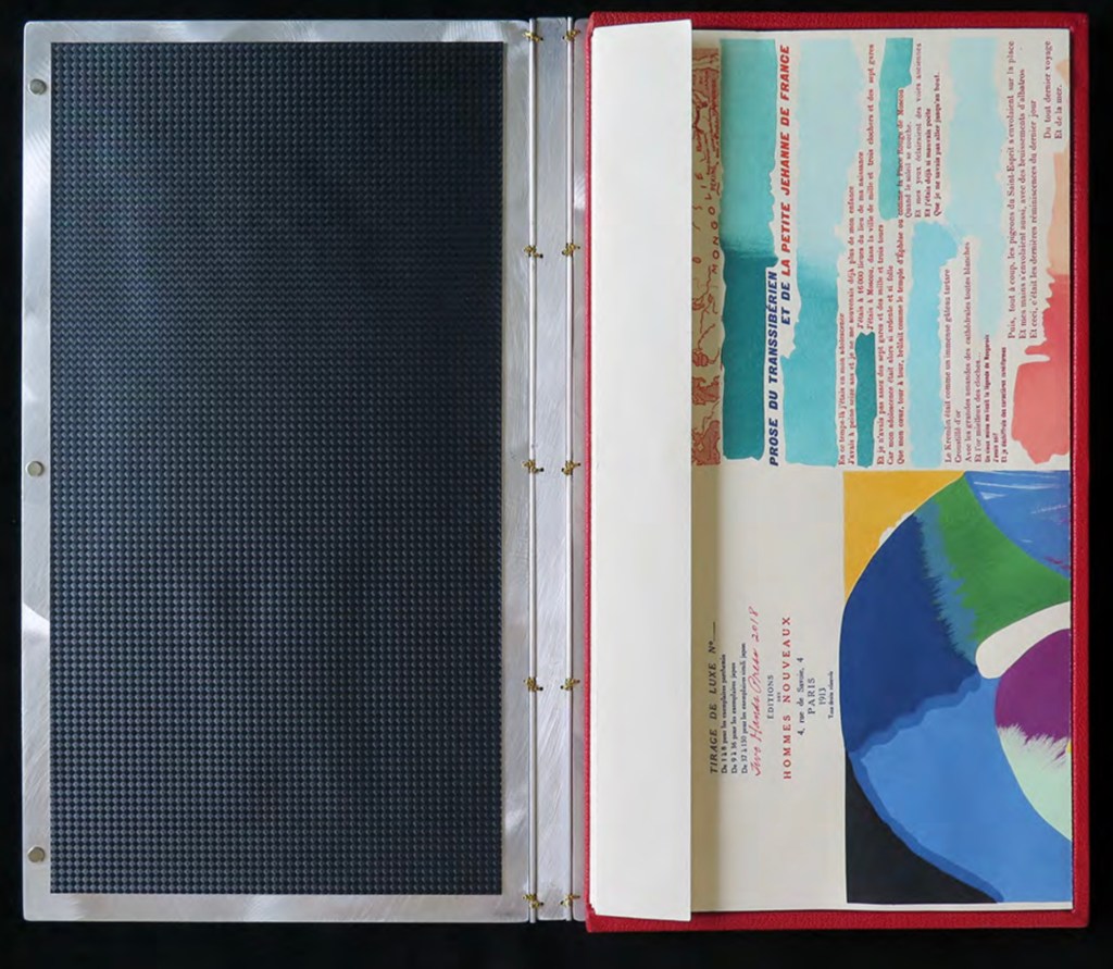
For the deluxe edition, the single page is left double-wide, accordion-folded double-tall between aluminum covers and housed in a clamshell box. A separate case holds the painted vellum cover, colour cards, Sonia’s visual vocabulary, 27 progressives for page one, 5 pochoir plates with tracing paper and registration system, the booklet with introduction and colophon, and the list of 30 typefaces Cendrars used. A large clamshell box houses this separate case and the boxed book. The colour cards include the recipe for mixing the gouache, and Sonia’s visual vocabulary shows the numbered steps of operations. The progressives for page one show the steps for doing the pochoir stencils and handwork.
The deluxe edition Photos: Courtesy of Kitty Maryatt
Any institution with a focus on book art or the graphic arts should seek out the standard edition of La Prose du Transsibérien Re-creation. Any institution with a focus on teaching and practice in those domains should seek out the deluxe edition. As indefatigable as Cendrars and as productive as Delaunay, Kitty Maryatt has provided the basis of master classes for generations. Now it is up to the book art community to respond as it has to Un Coup de Dés.
A shorter version of this essay appears in Parenthesis 39, Fall Issue, 2020.
Further Reading
Ashton, Doré. “On Blaise Cendrars. . . But I Digress.” Raritan 31, no. 2 (2011): 1-42,164. An entertaining extended anecdote sketching Cendrars and his milieu.
Gage, John. Colour and Meaning : Art, Science and Symbolism(Berkeley, CA: University of California Press, 1999). Despite her works’ better quality and representation of simultanéisme, Gage focuses on Robert and mentions Sonia only in passing or footnotes. (Telling that the Tate chose Sonia not Robert for a retrospective in 2015.) Nevertheless, there are passages that place her work in context.
P.198: Chevreul’s “privileging of the harmony of complementaries was essentially in the context of ‘painting in flat tints’, a method developed largely in the decorative arts, but which was increasingly integrated into many branches of French painting in the second half of the nineteenth century …”.
P.254 “When, probably early in 1912, Delaunay wrote to Kandinsky outlining his theories, he had shifted to a rather different approach, claiming: ‘the laws I discovered … are based on researches into the transparency of colour, that can be compared with musical tones. This has obliged me to discover the movement of colours.’ …
P.256 [Delaunay’s] Essay on Light, which was composed in the summer of 1912, attributed the movement of colours less to transparency than to the qualities of hue: ‘Movement is given by the relationship of unequal measures, of contrasts of colours among themselves which constitute Reality. The reality has depth (we see as far as the stars), and thus becomes rhythmic Simultaneity.’”
P.257 “For Chevreul in 1839 such painting [in flat tints] had only a decorative, accessory function, but the Delaunays did not feel the distinction, and Sonia had recently been experimenting with flat colours in appliqué textiles and in bookbindings decorated with collage.”
Maryatt, Kitty. “A Bookmaker’s Analysis of Blaise Cendrar’s and Sonia Delaunay’s La Prose du Transsibérien et de la Petite Jehanne de France”, The Quarterly Newsletter(Fall 2016), The Book Club of California. Online version available here.
Maryatt, Kitty. Interview with Steve Miller, Book Arts Podcasts, School of Library Information and Sciences, University of Alabama, 13 January 2006.
Rothenberg, Jerome; Clay, Steven. A Book of the Book: Some Works & Projections about the Book & Writing (New York City: Granary Books, 2000). Contains an excerpt from Perloff’s book above, Ron Padgett’s translation of La Prose and a four-page foldout showing a full-color photo-reduction of the 1913 original.
Shingler, Katherine. “Visual-verbal encounters in Cendrars and Delaunay‘s La Prose du Transsibérien“, e-France: an on-line Journal of French Studies, Vol. 3, 2012, pp. 1-28. Accessed 15 November 2019. Along with Perloff’s book, this is the best explication of the work and its lineage with Mallarmé’s Un Coup de Dés.
Woodall, Stephen. “La Prose du Transsibérien et de la Petite Jehanne de France”, Insights from the de Young and Legion of Honor (San Francisco: Fine Arts Museums of San Francisco, 2020. A spectacular website presenting the original work in its context and its influences on subsequent book art. The work can be viewed panel by panel, and its overall structure is presented in an animation of its unfolding and refolding.
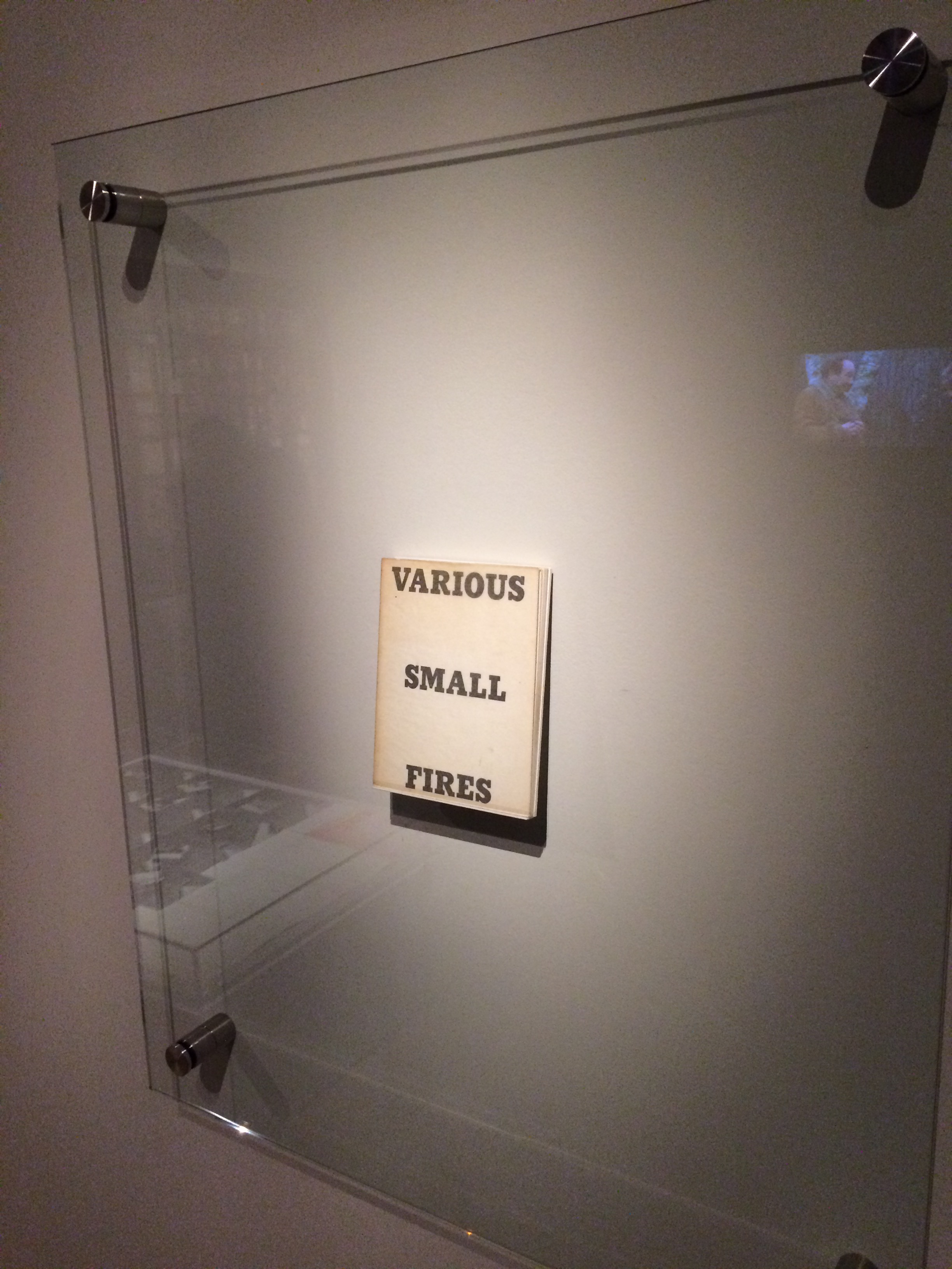
Display of Ed Ruscha’s Various Small Fires and Milk, 1964 Pliure: La Part du Feu, 2 February – 12 April 2015, Paris, Fondation Calouste-Gulbenkian. Photo by Robert Bolick, 11 April 2015. Reflected in the lower left hand corner is the display of Bruce Nauman’s Burning Small Fires, 1968; in the upper right corner, the film clip of Truffaut’s 1966 Fahrenheit 451; and in the upper left, Maria Helena Vieira da Silva’s La bibliotheque en feu, 1974.
The Studio Bibliografico Giorgio Maffei specializes in original texts and book art by twentieth century visual and literary avant-garde artists such Baldessari, Lewitt, Munari, Man Ray, Ruscha and Warhol among others. Recently the owner’s son – Giulio Maffei – “started making film as a side activity” and introduced a series of short animations “to put on the social networks and reach new potential customers”. An anonymous pair of hands displays a variety of the books and book art in stock.
But Giulio’s videos are not always the straightforward marketing effort intended. They provide an experience of book art or artists’ books that most of us will never hold or touch. And that may be Maffei’s point in his series “Le Vite dei Libri” (The Lives of Books) in which these usually glassed-off works are playfully handled, gently made fun of and still honored.
Some of the videos are derivative artworks in their own right in the same vein as Bruce Nauman’s Burning Small Fires, 1968. Nauman poked fun at Ed Ruscha’s Various Small Fires and Milk, 1964, by composing a book of photos recording the burning of a copy of Various Small Fires. Maffei’s Nauman-esque handling of Various Small Fires and Milk involves flash paper or its Photoshop equivalent. His celebration of Ruscha’s The Sunset Strip is still more endearing with its soundtrack and toy convertible. His cheeky animations of the pop-ups in Warhol’s Index (Book) and the ironically daring destruction of Papa Maffei’s copy of Some/Thing No.3 are even better. In the latter, the plastering of a Banksy-like mural with Warhol’s “Bomb Hanoi” stickers torn from the perforated cover is a sharp-edged example of the arch, reflective commentaries throughout Maffei’s videos.
Most of the films’ credits pay typographical homage to the work at hand, which is a nice self-deprecating and affectionate touch. At my last viewing, there were twenty-two works in the Lives series. They are listed below, but once you reach one on YouTube, the others follow. Giulio Maffei has also created a longer video catalogue for his father’s enterprise: Tra Libro e Oggetto (Between Book and Object). The Maffeis are a knowing team. The catalog title can be read as the beginning of a statement displayed on the cover.
BETWEEN BOOK AND OBJECT
The artists’ book, the multiple and the object
become an artwork
A statement that refers not only to the works in the catalog but to the video catalog itself and to the elder Maffei’s lifework of collecting, selling and writing about book art.