Altered books as artists’ books present a seemingly endless variety.
Some may be the conversion of old books into just-legible new ones as in A Humument redacted with ink, paint, excision, and collage by Tom Phillips, Tree of Codes mechanically excised by Jonathan Safran Foer, or The Eaten Heart scalpeled into existence by Carolyn Thompson. They give us a new work to read page by page extracted page by page from the earlier work, which remains more or less (mainly less) present in our hands.
Others like Marcel Broodthaers’ page-by-page redactions of Mallarmé’s Un Coup de Dés by ink in one case and excision in another or Michalis Pichler’s similar reformatting and excision of the same poem in clear acrylic or Jérémie Bennequin’s page-by-page erasures of Proust’s Remembrance of Things Past give us artists’ books that make the altered books illegible but still accessible page by page.
Other altered books as artists’ books are mainly one-off spatial objects that can be taken in in one go — not necessarily in just a glance but in the look or gaze given to a sculpture or painting. The ground up and encased works in Literaturwurst by Dieter Roth. The sealed, painted, nailed, and “hairied” works of Barton Lidice Beneš. The torn works of Buzz Spector. The sandblasted works of Guy Laramée. The glued and carved works of Brian Dettmer. The bullet-hole-ridden Point Blank by Kendell Geers. The pun-packed moebius-sculpted Red Infinity #4 by Doug Beube. They give us artists’ books that make the altered books illegible and inaccessible as books.
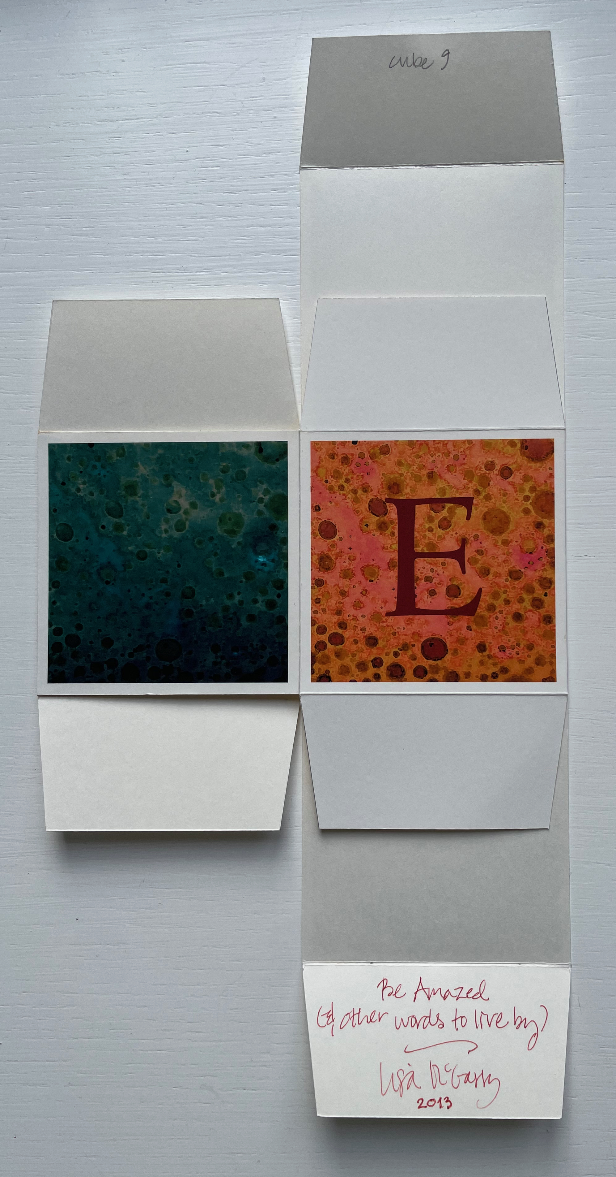
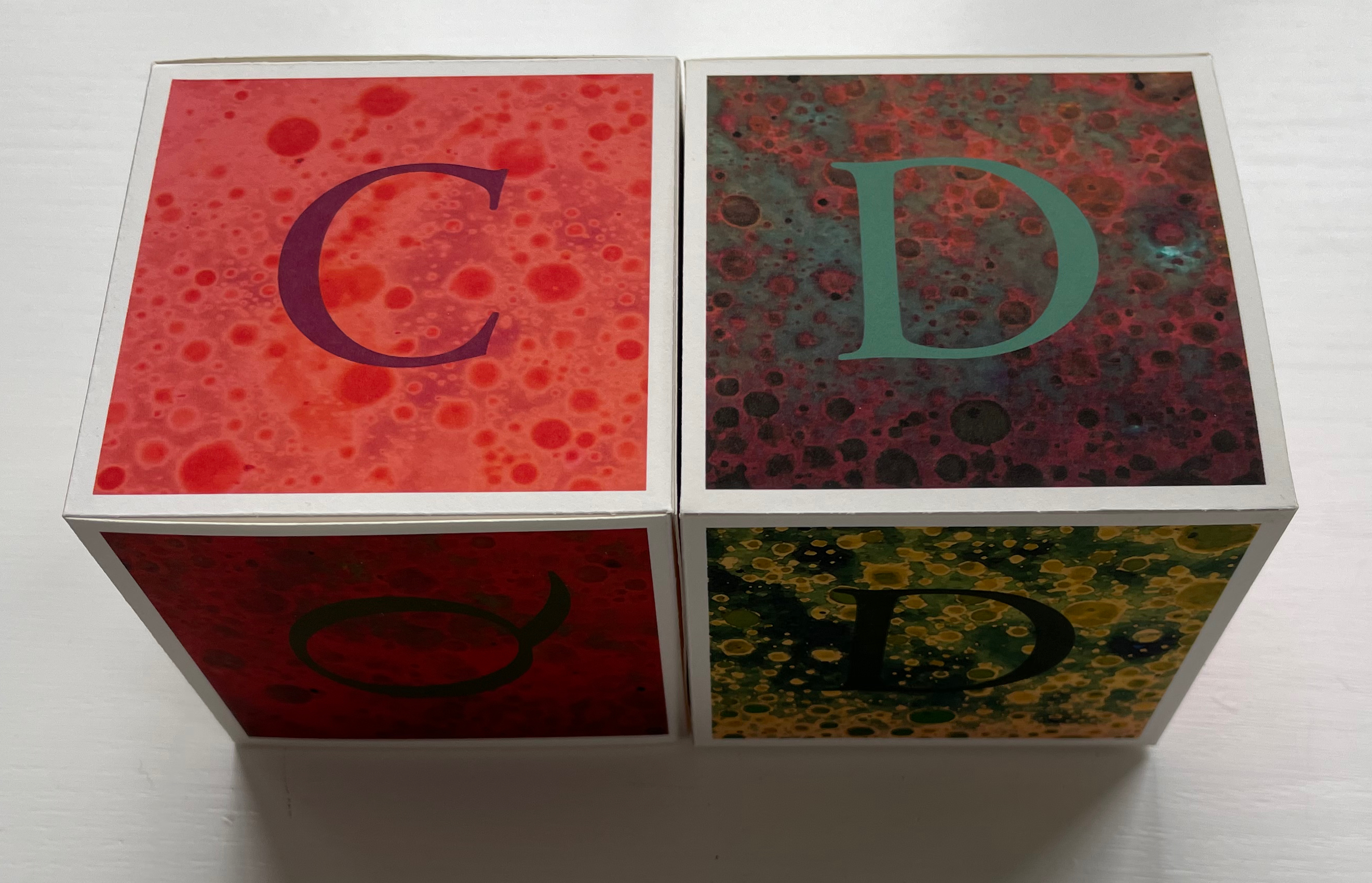
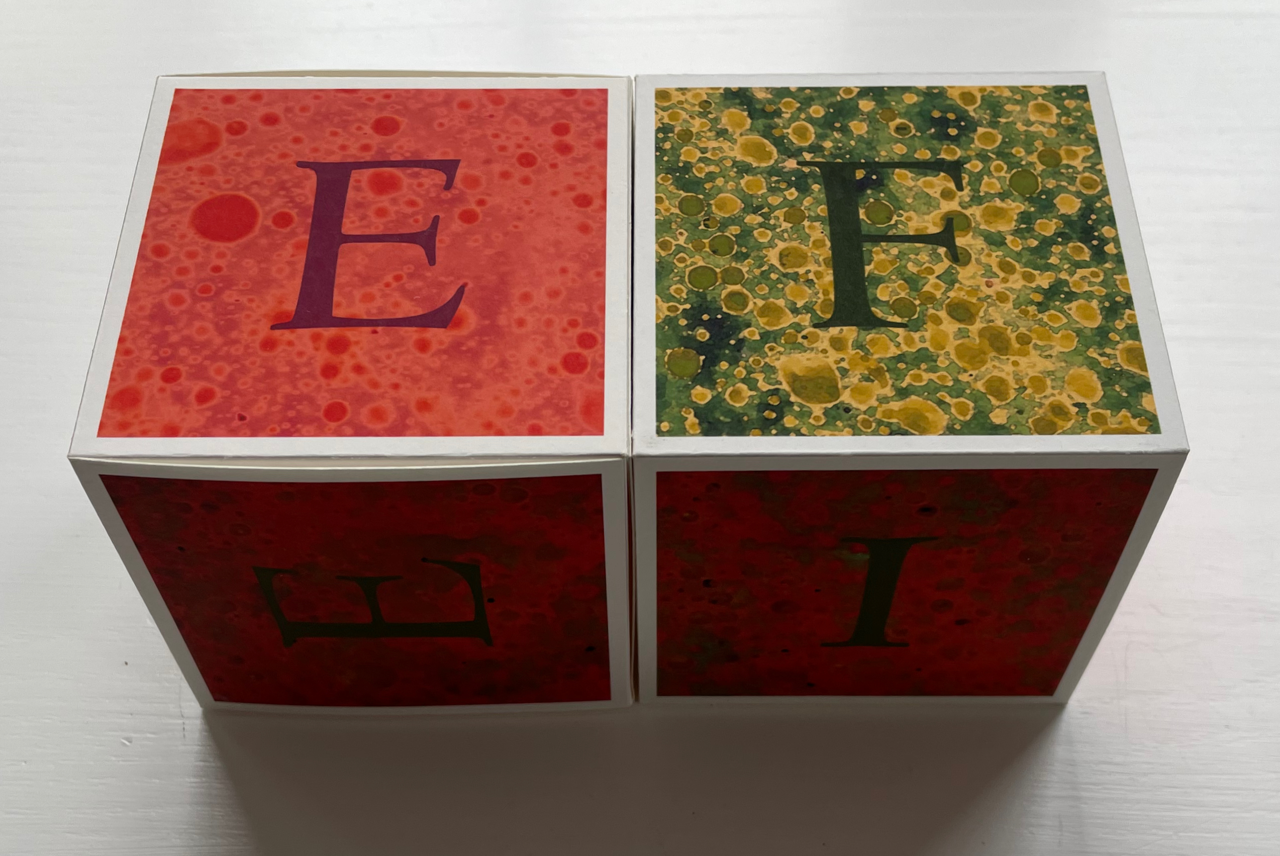
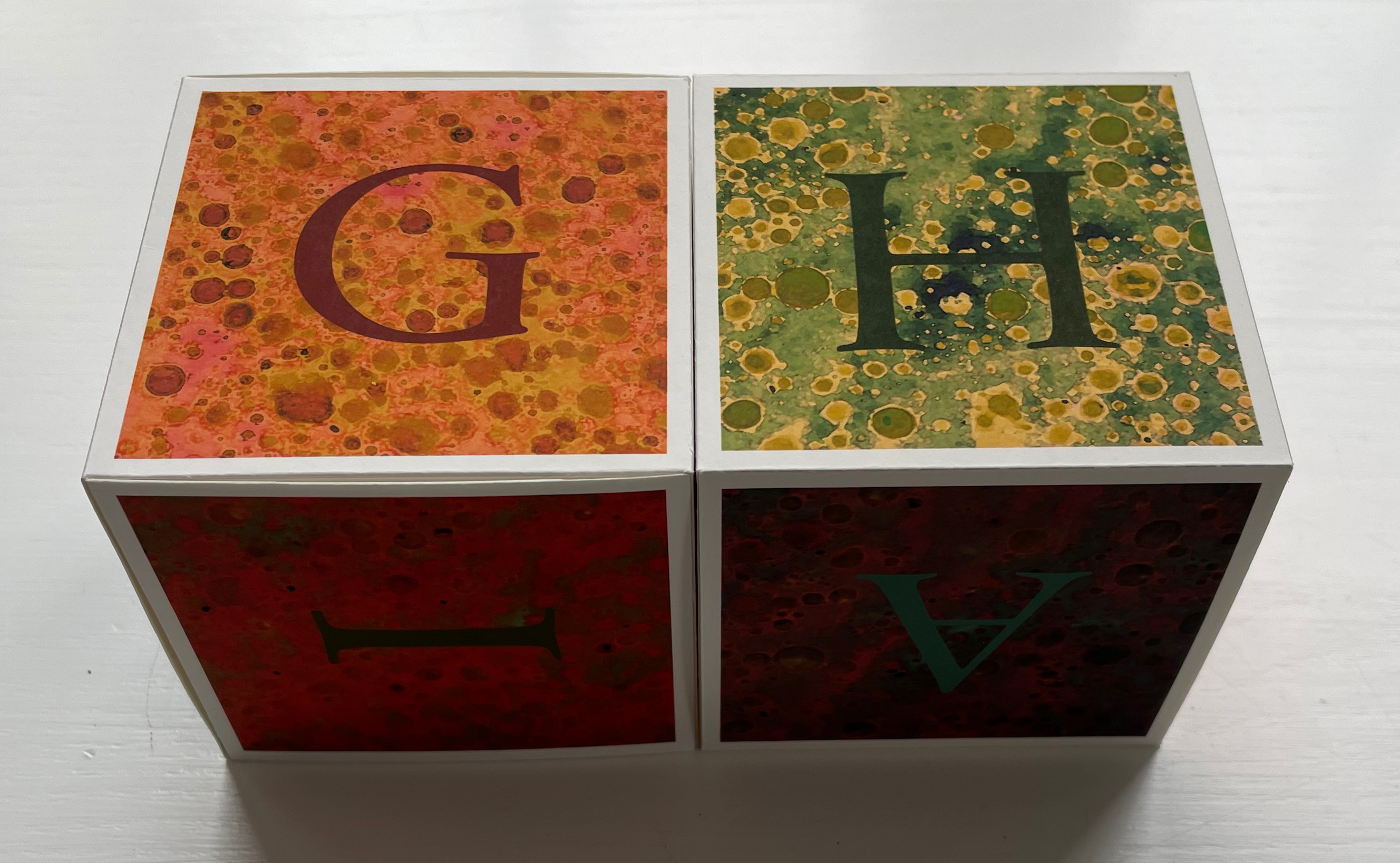
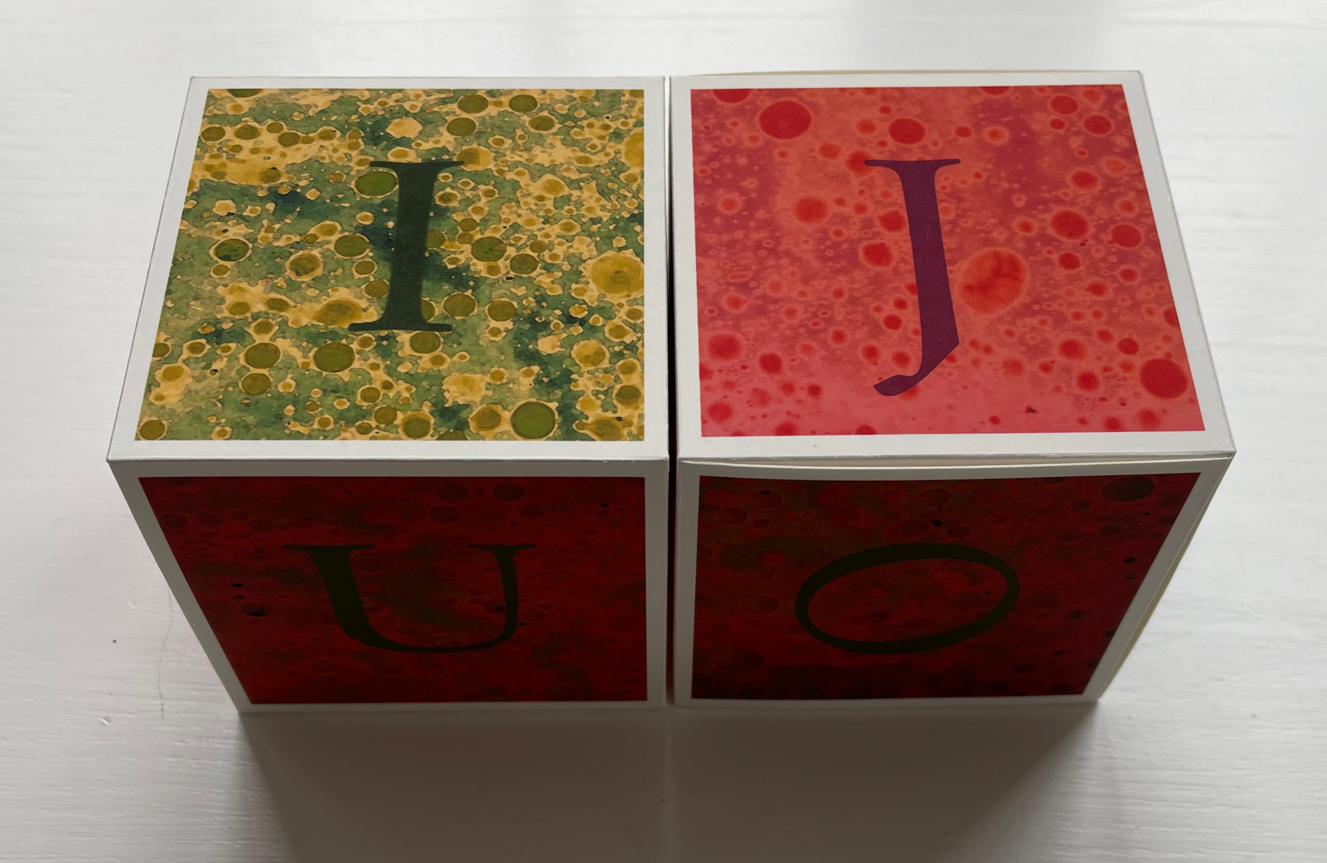
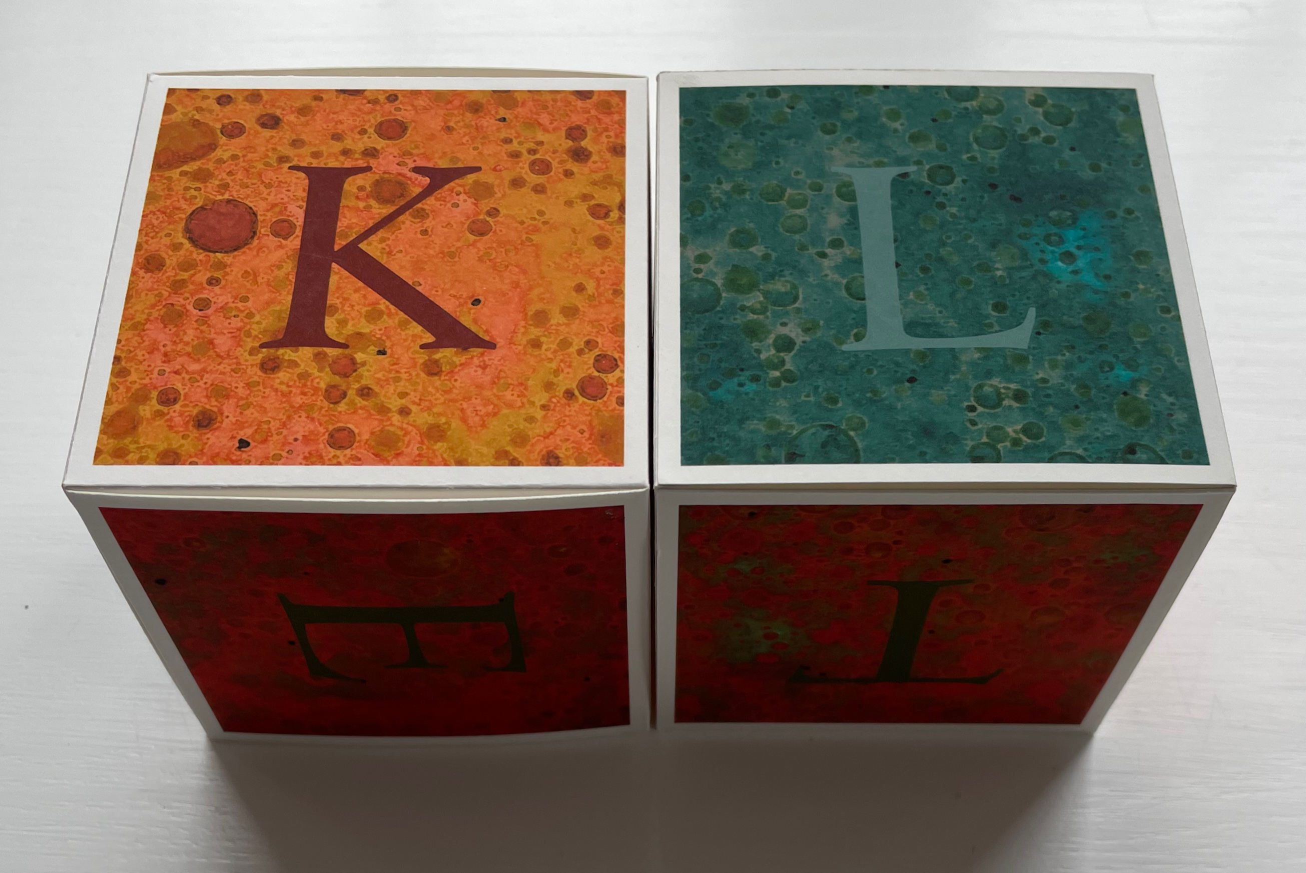
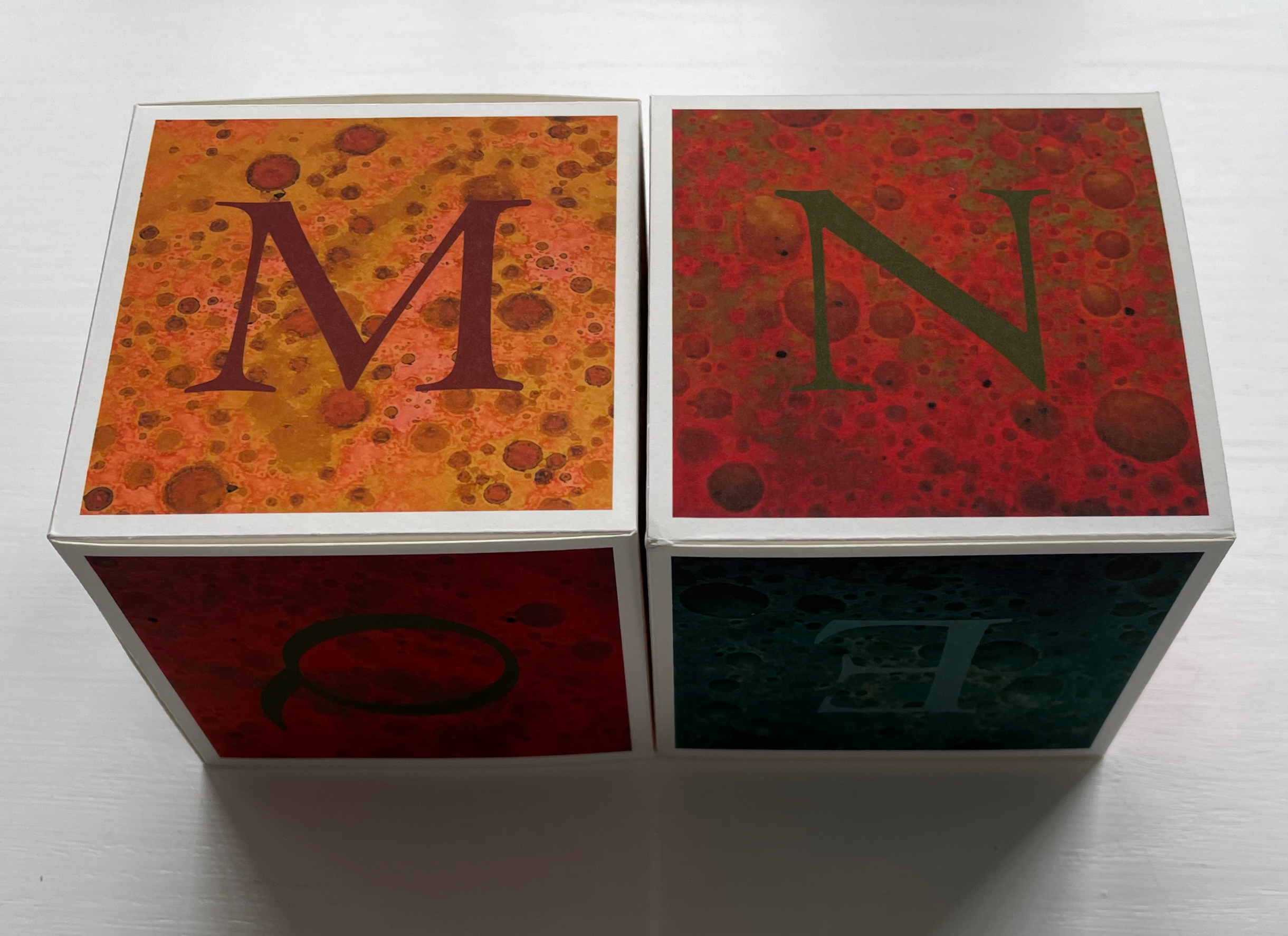
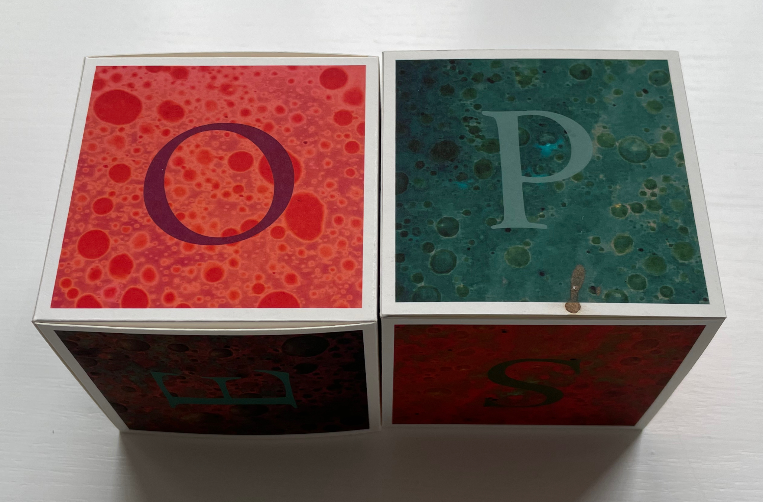
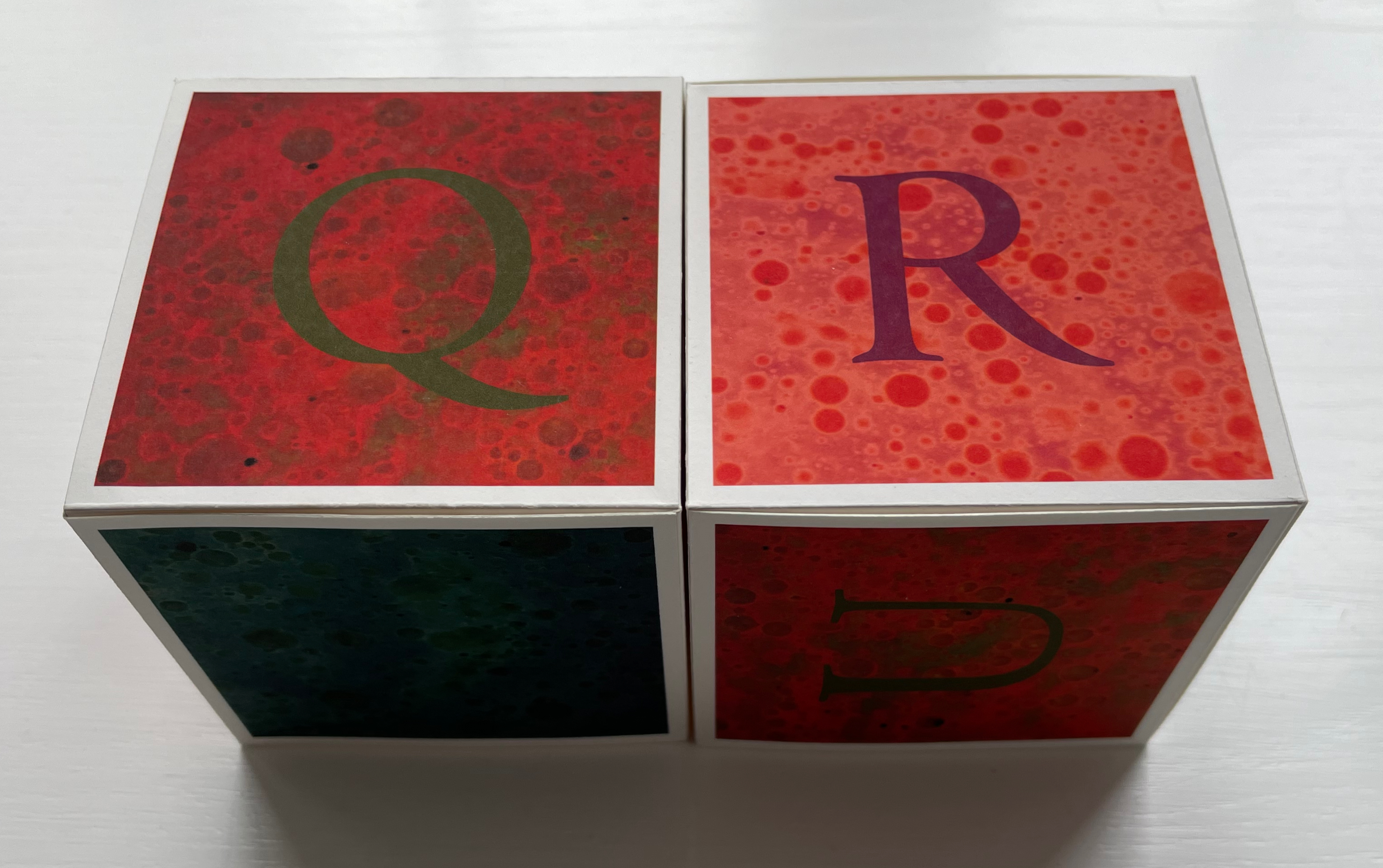
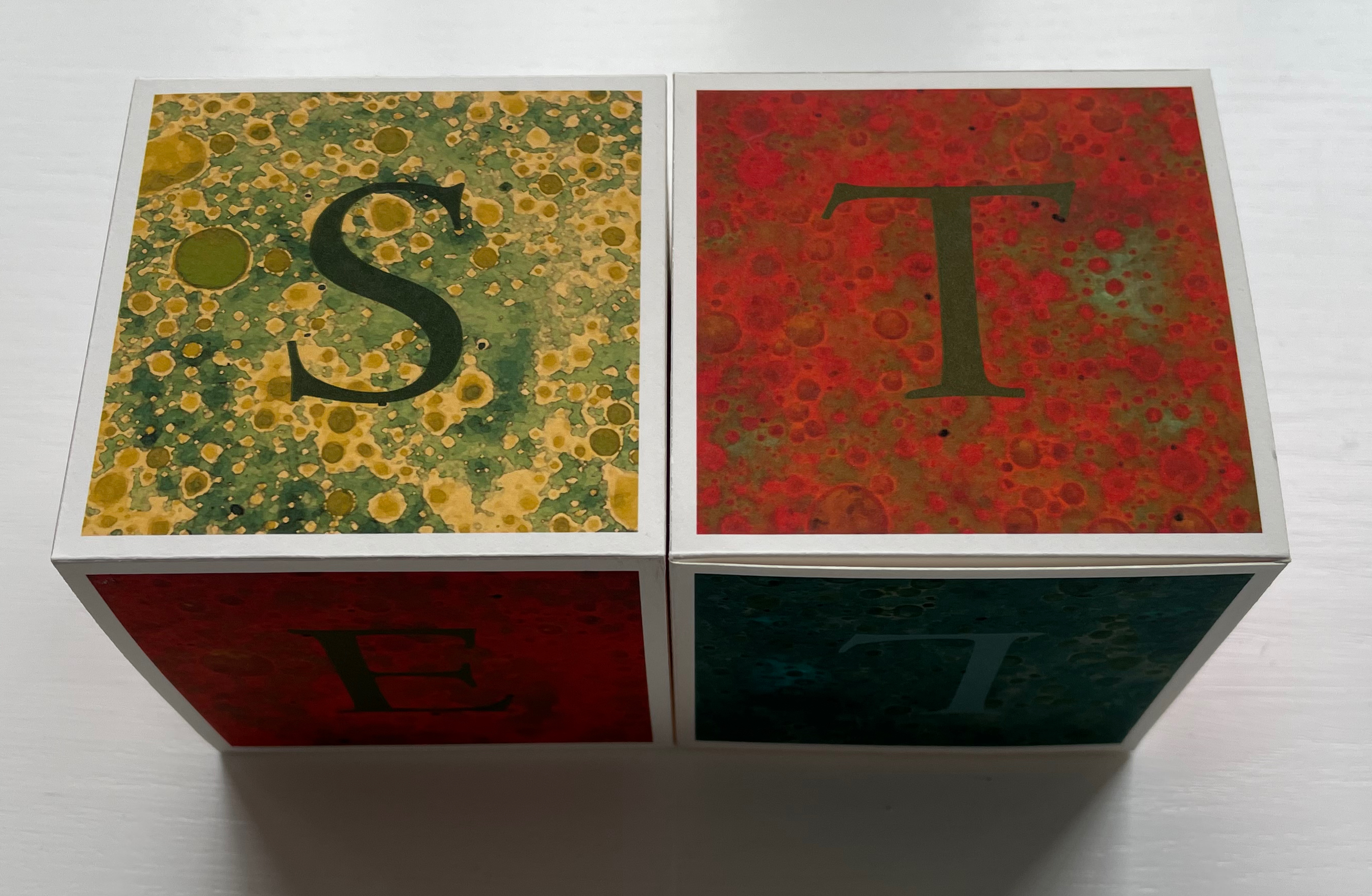
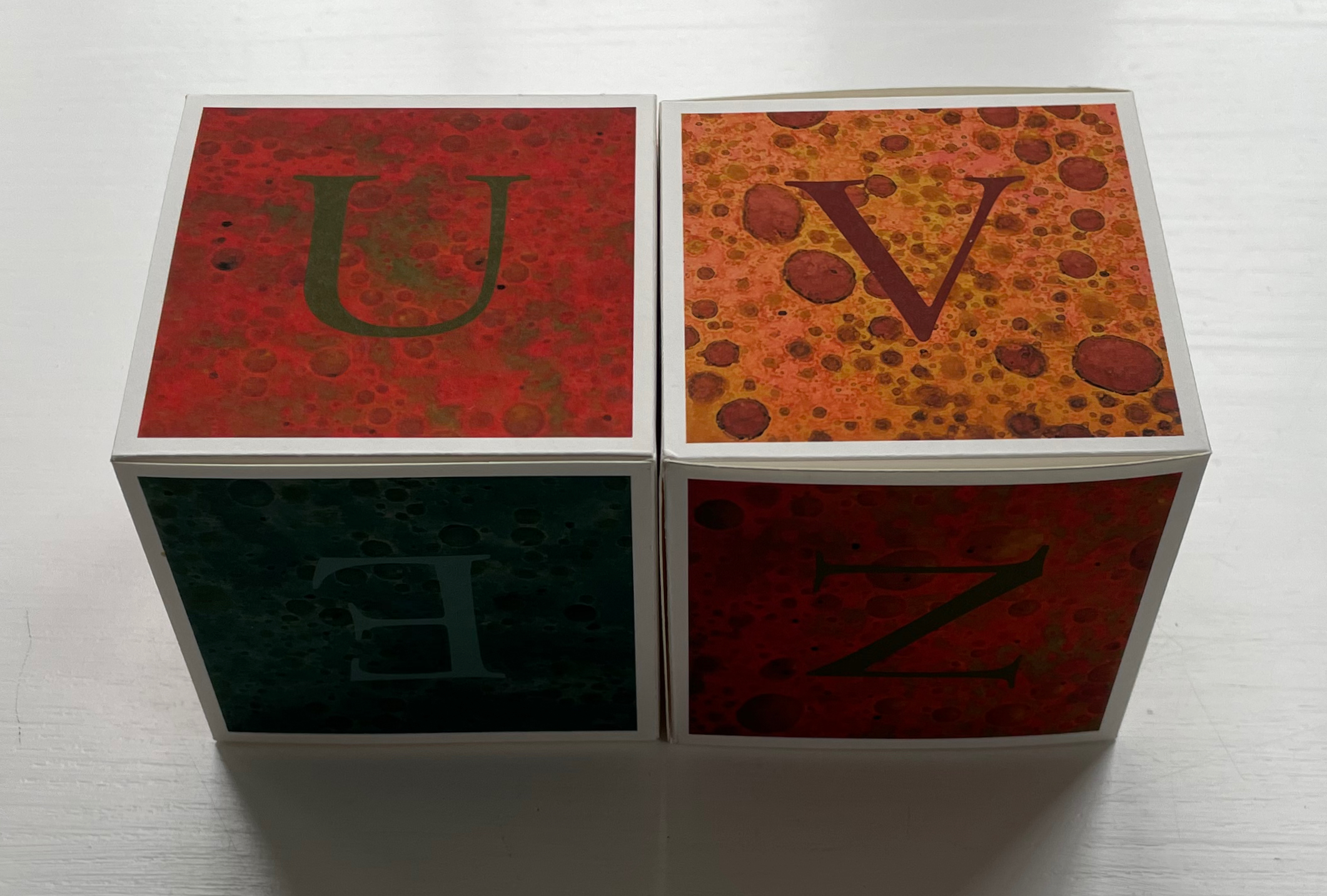
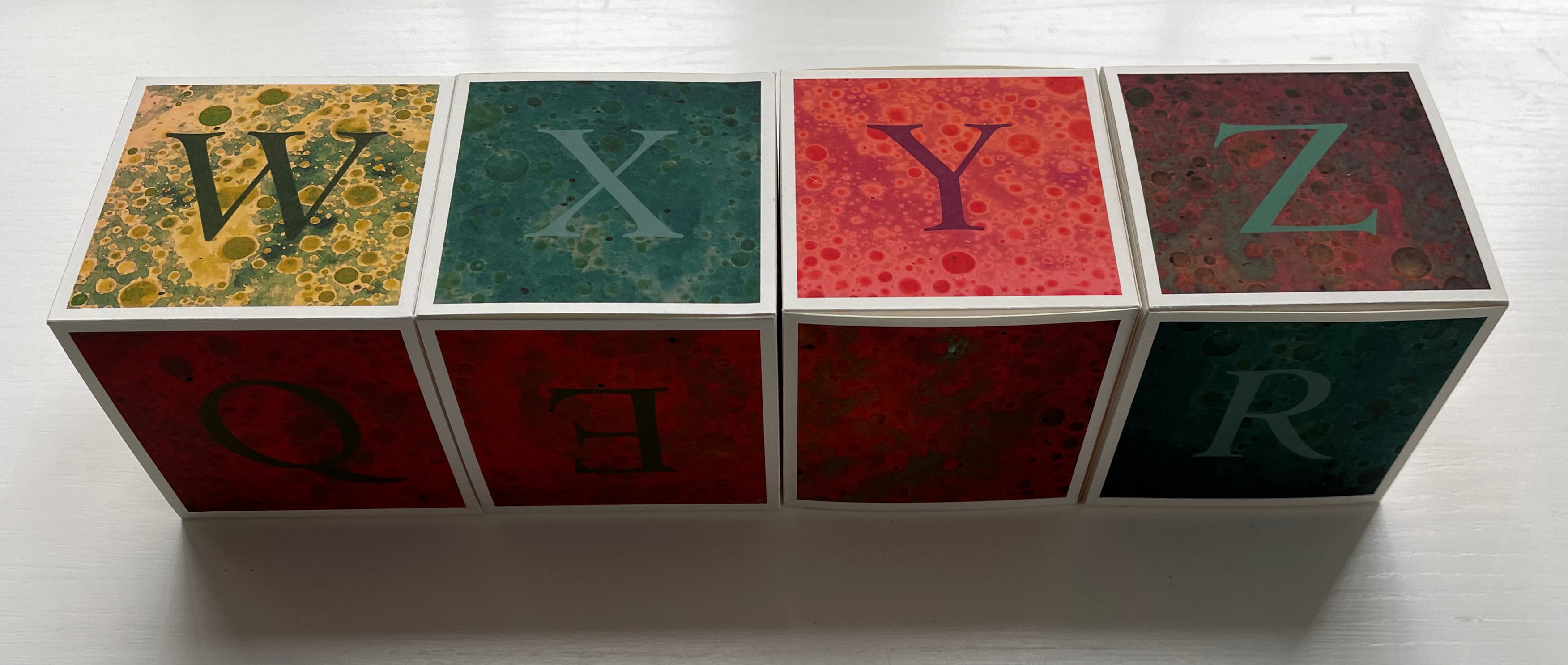
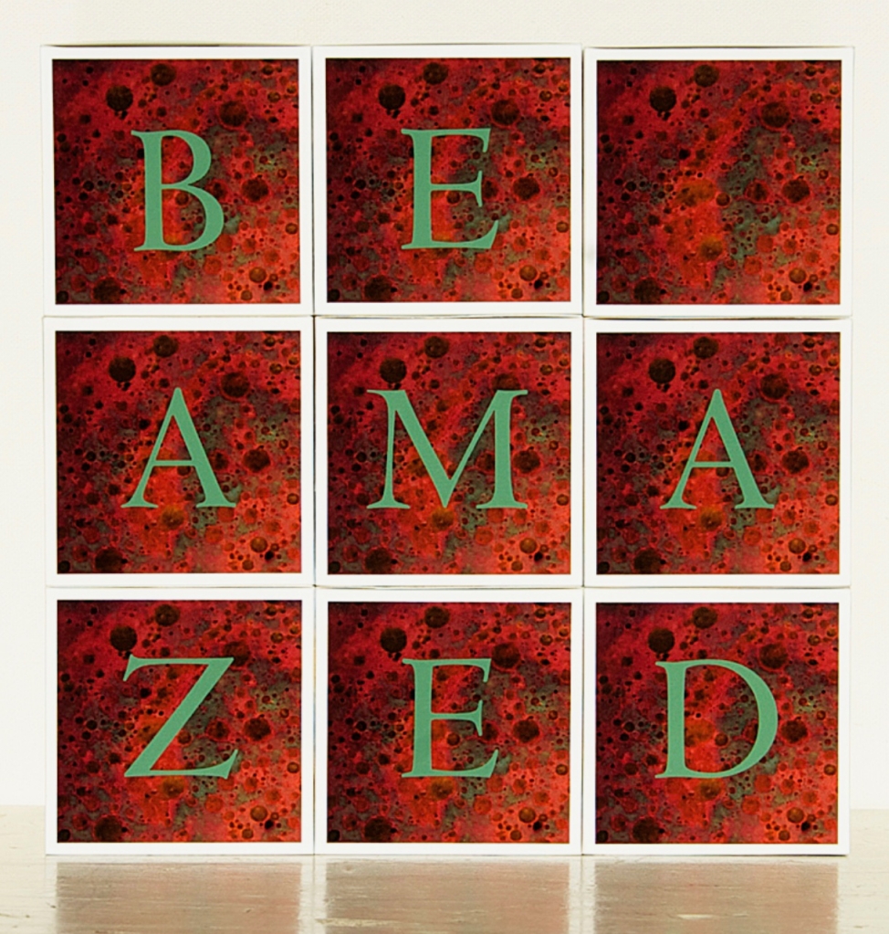
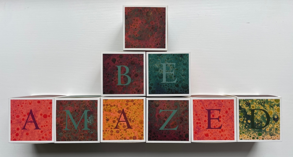
Be Amazed (and other words to live by) (2013) Lisa McGarry Nine cards cut and glued to be formed into cubes. 70 mm. Acquired from the artist, 18 February 2023. Photos: Books On Books Collection and courtesy of the artist.
A frequent activity in book art is the thematic challenge. In 2010 from her studio in Maleny, Queensland, Australia, Fiona Dempster initiated an annual global challenge to calligraphers to create a letter a week reflecting a particular set theme. The challenge ran through 2014 and generated not only outstanding works of calligraphy but artists’ books and installations as well. Here are the rules and theme for 2012:
Welcome to A Letter a Week 2012, a project that began in 2010 and is primarily about having fun, experimenting and having a regular, small project to focus on each week.
The aim is simply to:
Write/create a letter a week
Creating 52 letters
Which must form 2 x alphabets (that is not 52 x the letter ‘A’)
By the end of 2012
The main rule is that the letter must be presented on a piece of material measuring 7cm x 7cm
– this helps keep a sense of uniformity amongst the pieces which helps with exhibition coherence.
The other criterion for 2012 is that ONE alphabet has to meet the criteria of “Going dotty – polka dots and pixels”
– that means the alphabet uses dots or circles in some form, but is still presented on the square. It could mean dotted letters, dotted backgrounds, pixelated letters, nail heads into timber or letters within circles or…your imagination can have fun going dotty.
Each alphabet must be turned into a final piece which could be used for possible publication or exhibition.
– that is, you must put all the letters together into a final piece of art.
Apparently, Lisa McGarry’s studio and kitchen in Florence, Italy, enjoy a certain overlap, which led to her inspiration in answer to the dotty part of the challenge. In her own words:
As I was making polenta one day, the formation of circles when oil was added to the water caught my attention. I quickly photographed the pan of spotted water with the idea of indulging in some play time with Photoshop. By using the “Selective Color” sliders, I was able to introduce some vibrant colors into the rather bland photograph. I further varied the colors, and ended up with a whole rainbow of “dotty” designs.
Dotty as the source of the image (or its result) may be, the effect is more of marbling than of boiling polenta. More stone than water. Of course, since Trajan’s Column and before, stone and alphabet go together in Italy. But for the challenge, what arrangement of letters, how many cubes? A minimum of five cubes (30 sides) would be needed for all the letters. Two simple sets of children’s alphabet blocks would then meet the basic requirement. But what about that phrase “still presented on the square” so open to multiple interpretations? Five cubes together would not make up a square, but nine cubes stacked 3×3 would.
Next I spent some time considering words of nine letters or less, with the idea that the letters of the various color could form a word. Each letter of the alphabet is included at least once, for a complete “alphabet,” though there are multiples of several letters. I wanted to include each letter of the alphabet at least once, for a complete ‘alphabet’. Despite the flexibility gained from the availability of 54 faces, finding words that used all of the letters was much more difficult than I expected (perhaps because I limited myself to words that I associated with living a creative life).
Many words had to be eliminated because their letters were too ‘common’. After filling several journal pages with various letter/word combos, I got out the Scrabble tiles (which were immensely helpful).
These are the words I chose:
be amazed explore question make/give create joy wish/find
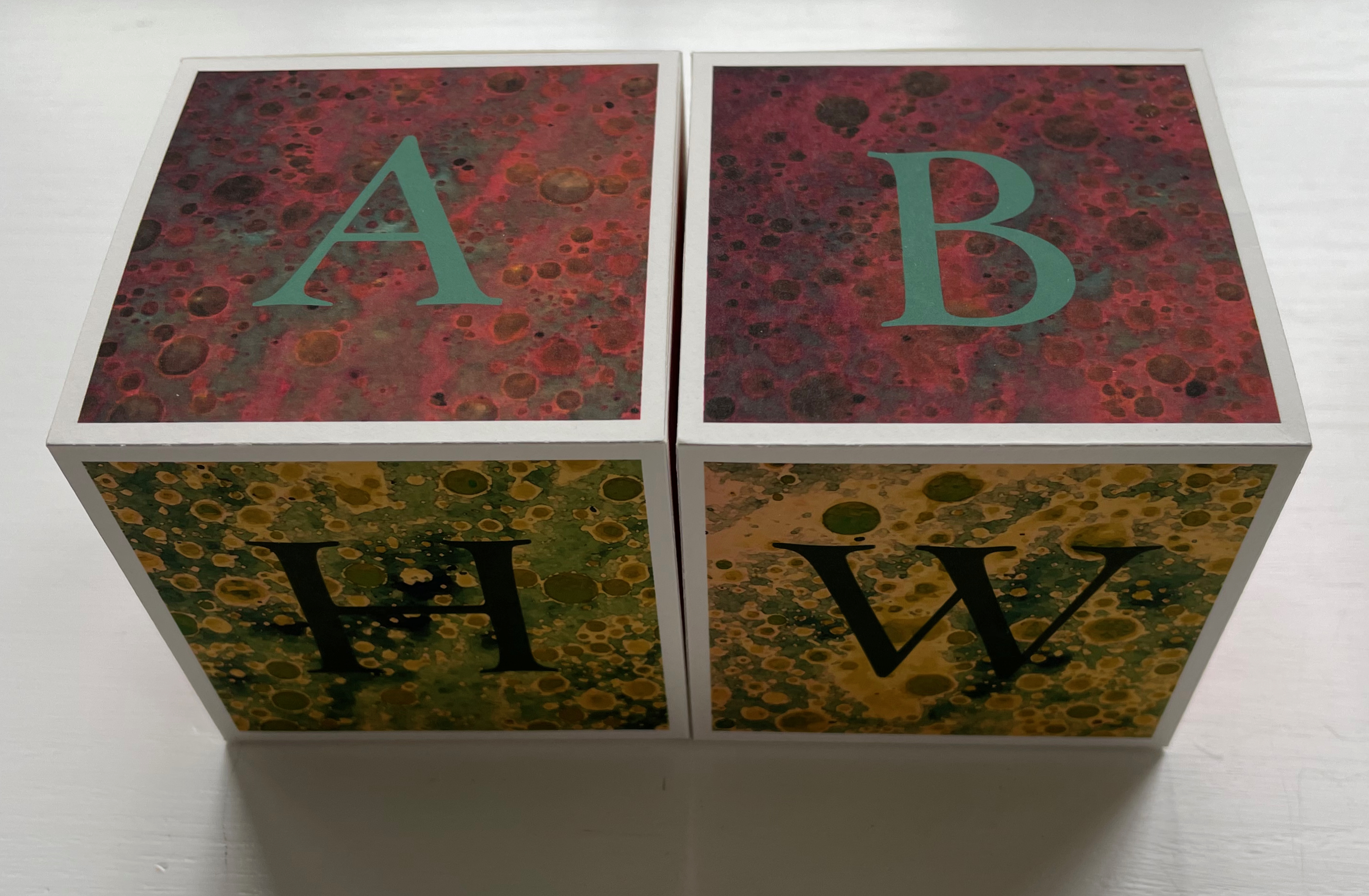
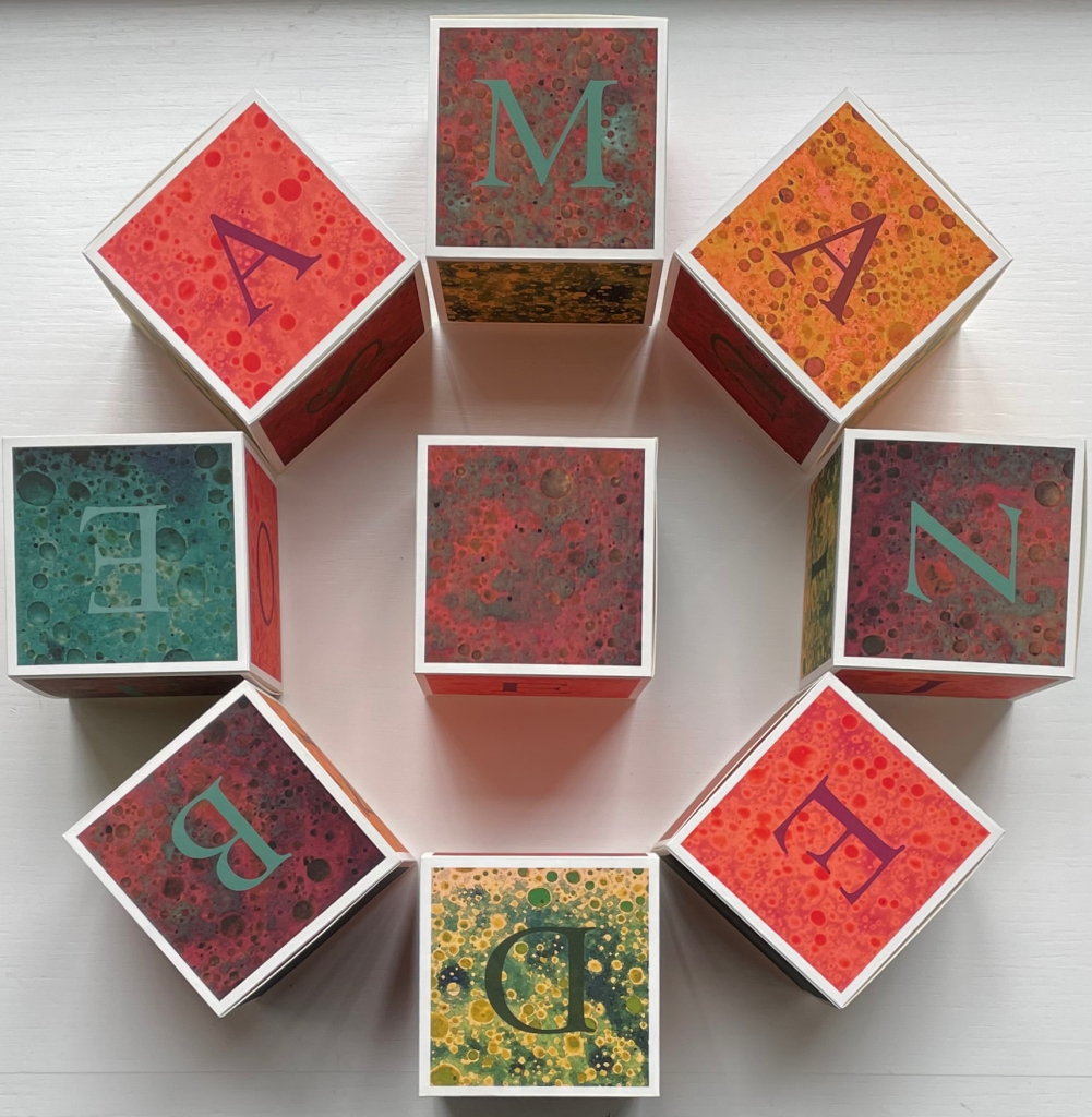
After the flatpack of cubes arrived and had been constructed, the pleasure of letting them tumble from hand to hand and inspecting each panel had to yield to documenting them for the collection. The alphabetic order asserted itself over a grouping by colors. Failing to sort itself into the rhythm of the ABC song (certain pairs of letters appear on one block only), it slowly became obvious that the blocks would need to be paired for their photos (although WXYZ managed to slip by).
To spell out and display the words for those six words/phrases required letterless faces with just the right color on some of the cubes, which is apparent in the artist’s presentation of the first phrase: BE AMAZED.
Alternative displays (collector’s prerogative, of course) are possible. To see the unified color presentation for the other five words/phrases, the Books On Books Collection visitor should go to the artist’s site and be to prepared to …
Be Amazed was not McGarry’s only response to Fiona Dempster’s “A Letter a Week (ALaW)” challenge.
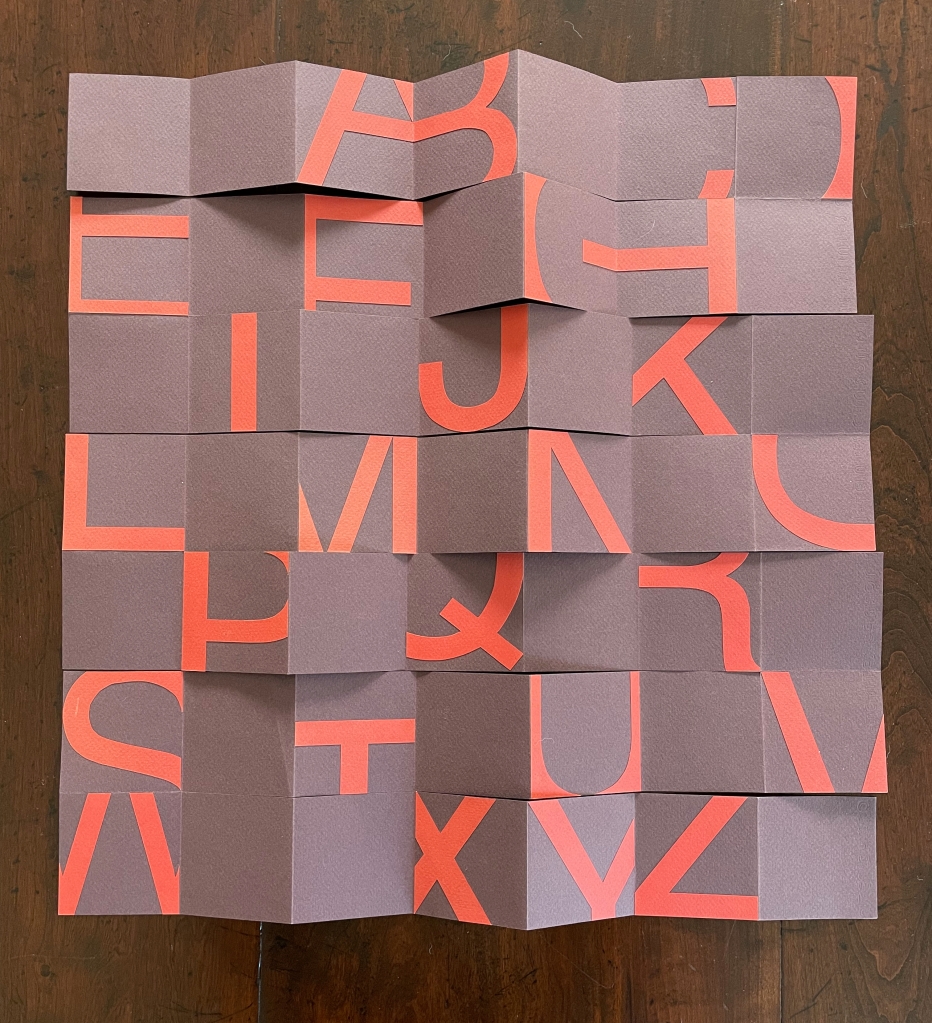
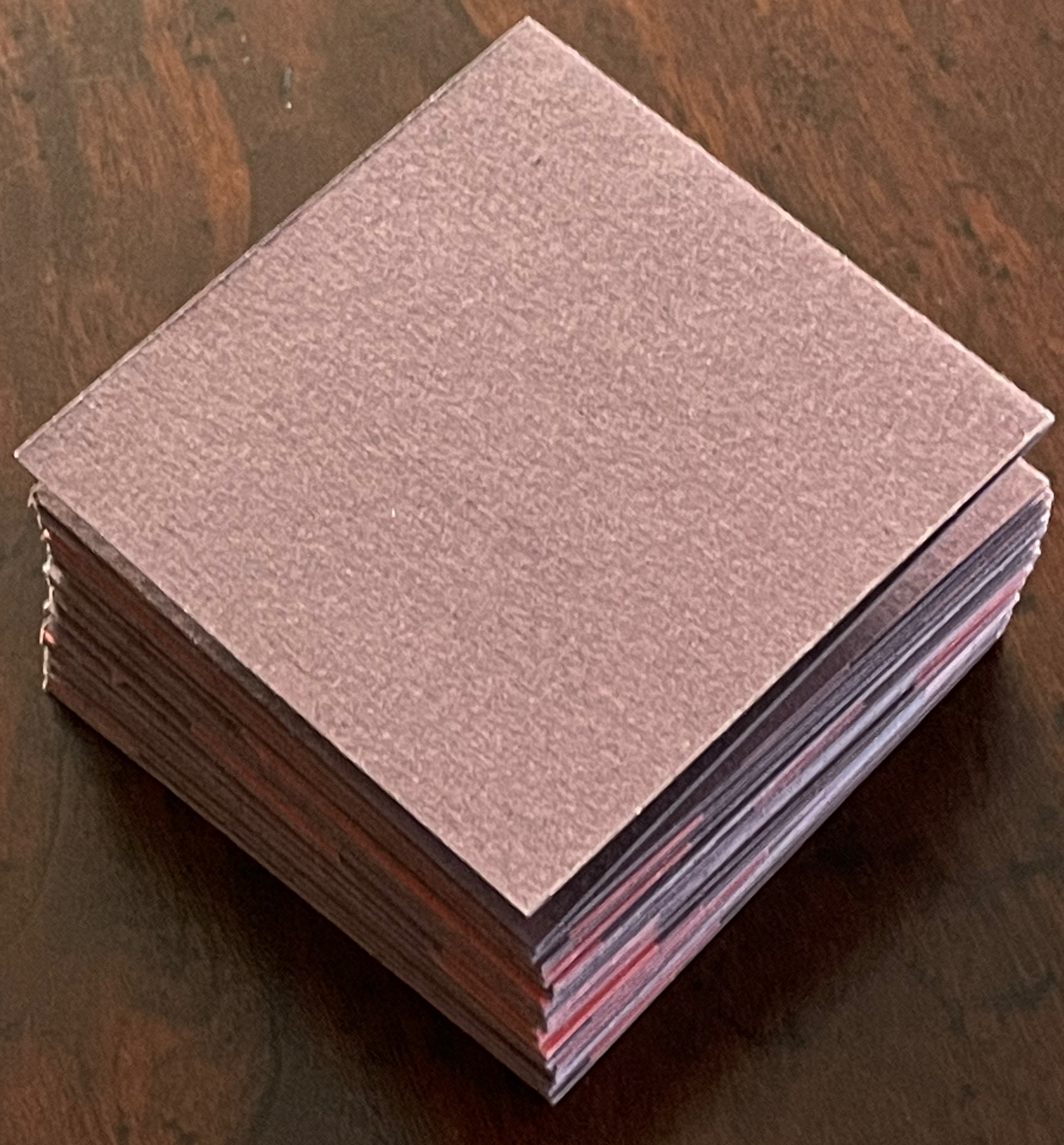
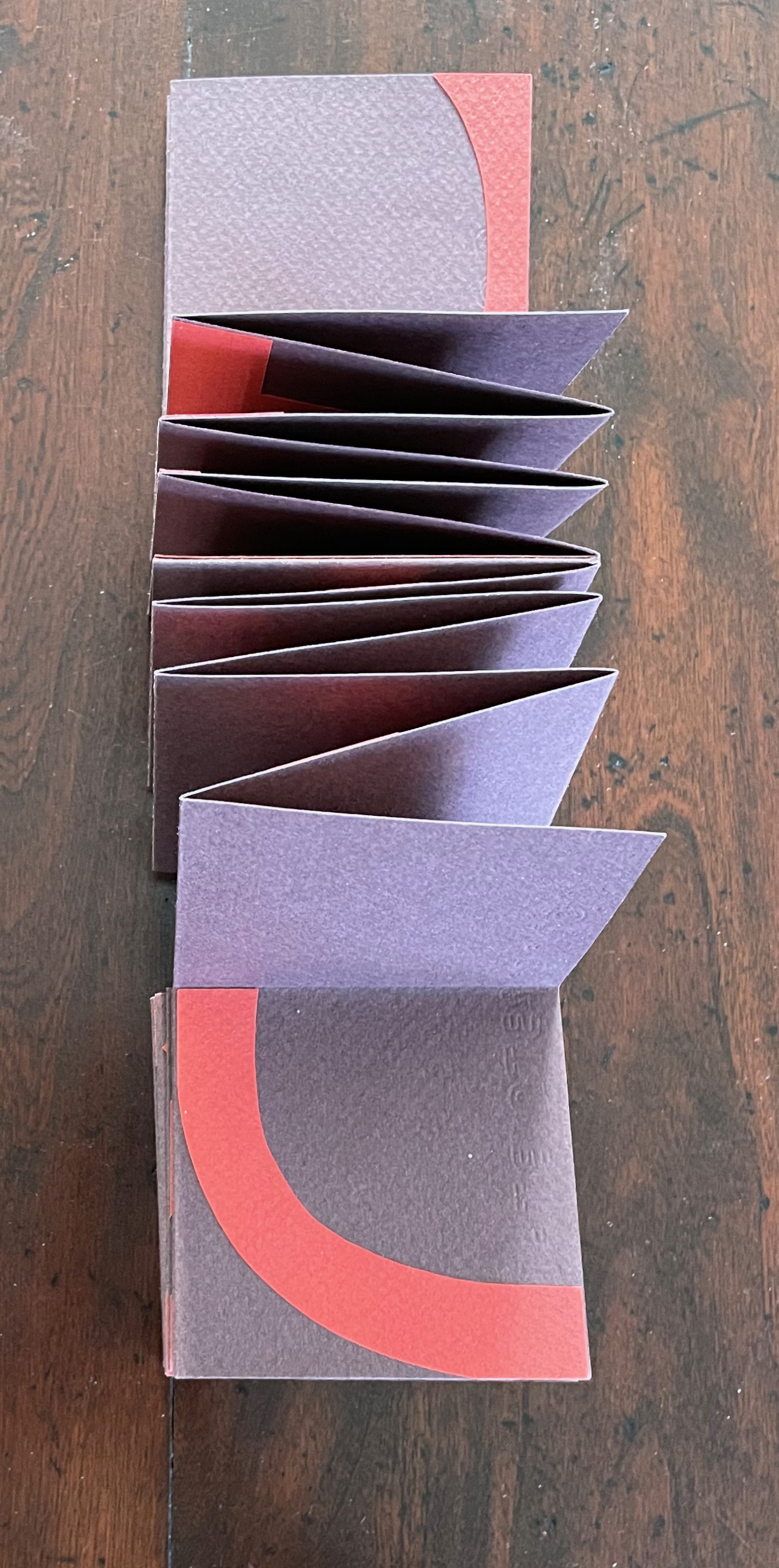
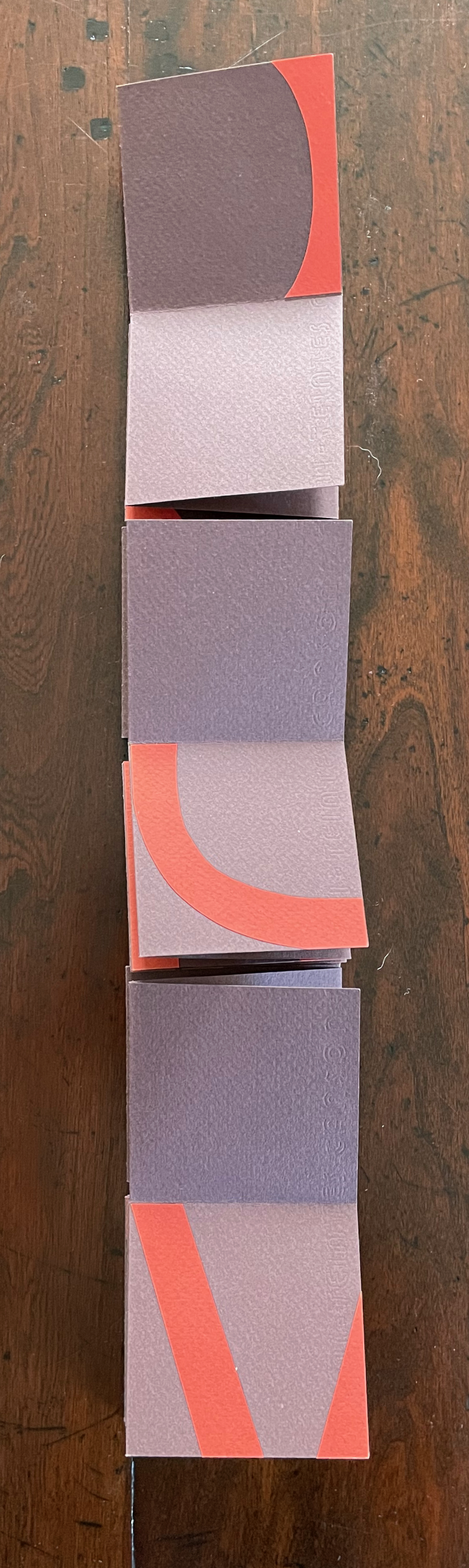
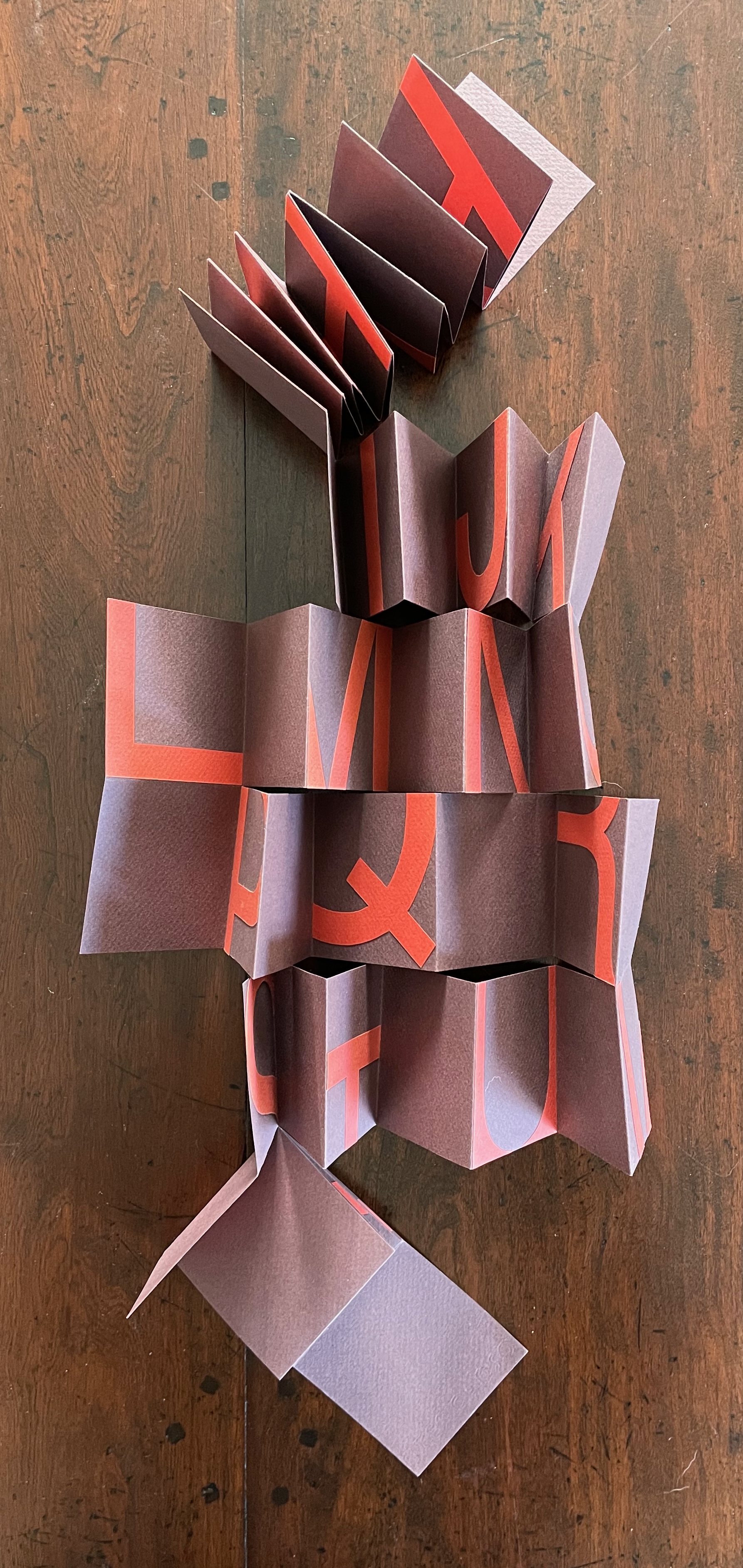
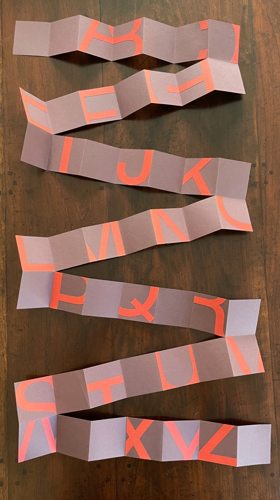
Twenty-six/Fragments (2012)
Twenty-six/Fragments (2012) Lisa McGarry Single sheet, collage, meander cut and fold. Closed: 70 x 70 x D15 mm. Open: 490 x 490 mm. Acquired from the artist, 20 March 2023. Photos: Books On Books Collection.
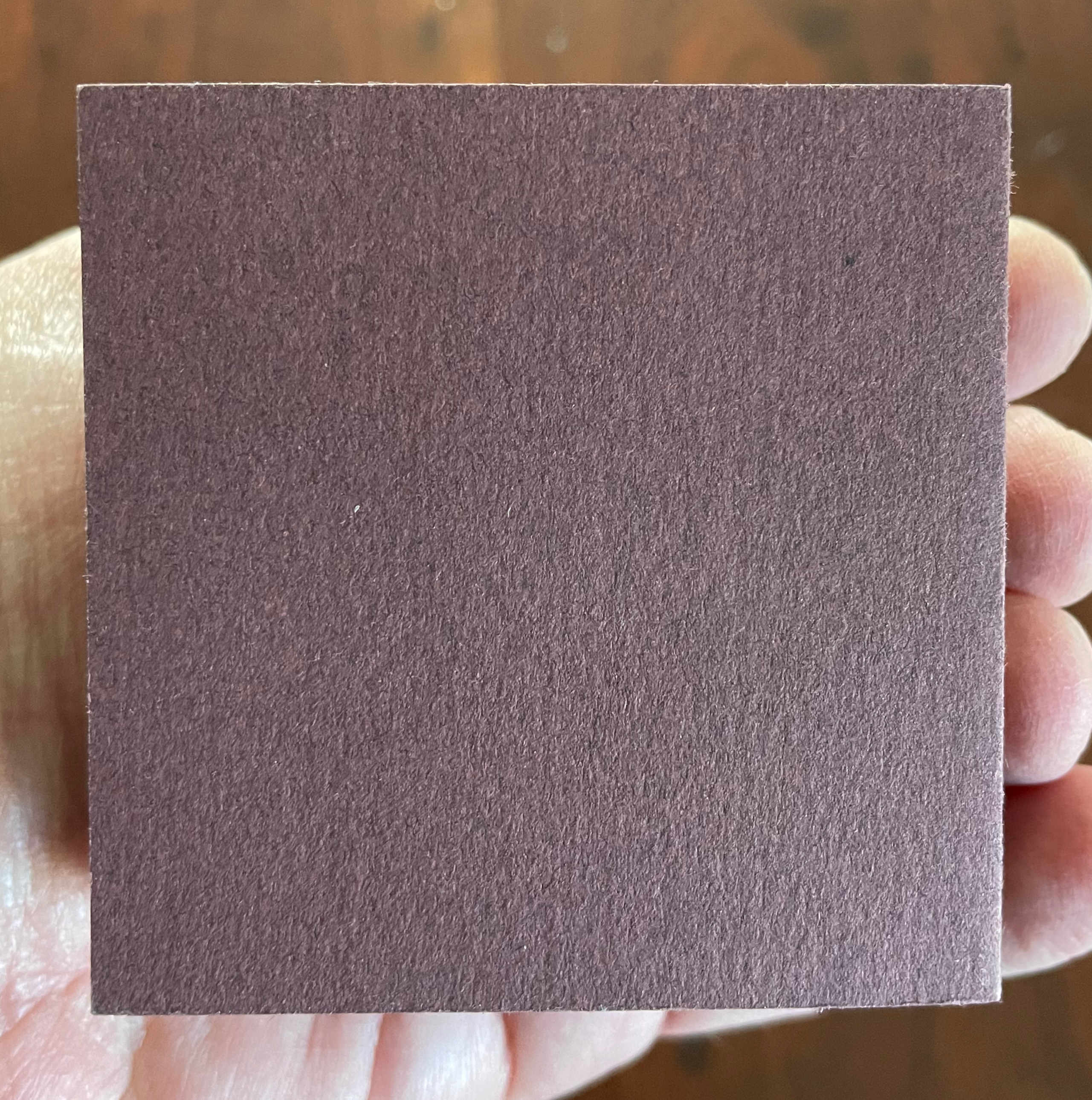
Why not? Eyes, hands and mind cannot help but wander. Twenty-six/Fragmentsis a “meander” book. Against a 7 x 7 cm, purple-brown, creased and cut background, its tomato red shapes (inspired by the documentary Helvetica) take irregular but alphabetic steps that lead any viewer’s hands to fold, unfold and fold, shape and reshape the work to extract its signals and enjoyment over and over. The font size of 450 yields the right combination of abstraction vs figure. The texture of the 160 gsm Canson Mi-Teintes paper gives a firm tactility that contrasts with the plum color’s fluctuation between purple and brown. A simple but complex work of art.
In these additions to the Collection, Carol DuBosch joins the art of calligraphy and the art of the fold at the hip. The subtlety and fineness in her execution of both reward multiple viewings from multiple angles and repeated manipulation.
Rainbow Alphabet Snowflake (2013)
Rainbow Alphabet Snowflake (2013) Carol DuBosch Star book enclosed in flap purse. H4”x W5.5”x .D75” closed, W8.5” diameter open. Edition of 20, of which this is #1. Acquired from the artist, 17 November 2022. Photos: Books On Books Collection. Displayed with artist’s permission.
A frequent activity in book art is the thematic challenge. In 2010 from her studio in Maleny, Queensland, Australia, Fiona Dempster initiated an annual global challenge to calligraphers to create a letter a week. The challenge ran through 2014 and generated not only outstanding works of calligraphy but artists’ books as well. Two of these works came from Carol DuBosch.
Standing at the check-out counter of my art supply shop, I found myself gazing at a cabinet filled with bright color note cards and envelopes. I decided to take home a handful and try to make a book I had just become familiar with: Snowflake Book. I realized that the colorful notecards would be perfect for the pages of a Snowflake Book. And indeed, they were! Each module page of this book is made from two of the folded notecards. I simply added another fold to one of them and cut out the rectangle window. I printed six of my alphabet designs on acetate transparencies and attached them to view in the windows. The book opens fully to form a star-shape. The front & back cover attach using hidden strong magnets. — Carol DuBosch, 16 November 2022, Correspondence with Books On Books.
No two snowflakes are alike, yet they are all snowflakes. Taking her cue from this, DuBosch offers up five distinctive alphabets in her star-cum-snowflake book structure and, in one view, goes twenty-six better with a distinctive style for each letter.
Video: Courtesy of Carol DuBosch
Following in the tradition of so many artists, DuBosch creates and teaches. This next work neatly exemplifies that, reveals some of the techniques by which she achieves the subtlety in her work, and demonstrates her mastery of each.
Alphabet of Calligraphic Tricks (2014)
Alphabet of Calligraphic Tricks (2014) Carol DuBosch Double-sided leporello. H4” x W4” x D0.75” closed, W4’8” open. Unique. Acquire from the artist, 17 November 2022. Photos: Books On Books Collection. Displayed with artist’s permission.
I made this collection of techniques to share with students in class. It is compact and easy to transport and set up as a display in classes. Each page is a Gothic majuscule rendered with specified materials or tools. The caption outlines the process. The book was a project for A Letter A Week in 2014, administered by Fiona Dempster in Australia. Each participant organized a project incorporating letters and posted each week. I was able to complete two different alphabet books during the year. The binding style is a Leporello, a form of Concertina fold books. The entire book is created by overlapping pieces of cardstock folded in half. This method of binding creates a sturdy book that opens for display on both sides easily. — Carol DuBosch, 16 November 2022, Correspondence with Books On Books.
DuBosch’s concluding comment above highlights an abiding concern with what the structure of a work contributes to function. A similar function is achieved in the next very different structure that Hedi Kyle has labeled as “Interlocking Loops” and DuBosch calls a “gallery structure”.
Embossed Alphabet Gallery (2019)
Embossed Alphabet Gallery (2019) Carol DuBosch Gallery structure combining leporello, flag and star book forms. H6.25”x W1.25”x D.5” closed, W9” open for display. Edition of 15, of which this #1. Acquired from the artist, 17 November 2022. Photos: Books On Books Collection. Displayed with artist’s permission.
This book was made as an edition for a book-exchange. I wanted to use the Gallery structure and chose the alphabet as the subject. I used an embossing stencil I had made thirty years ago for the letters. I found parent sheets of the linen textured card stock, and it was excellent for the folding and embossing. I’ve always enjoyed the quote about the mystic art of writing by William Massey and was delighted to find a place for it in this structure. — Carol DuBosch, 16 November 2022, Correspondence with Books On Books.
The many ways of displaying this sculpture and its gallery of letters might cause the viewer to miss how they counterpoint the end of the quotation from William Massey’s The Origin and Progress of Letters (1763). The effect recalls the gray-white of Greek and Roman sculpture, many of which originally were painted.
DuBosch, Carol. 2020. The Calligraphic Coronavirus Chronicles Book. Portland: Carol DuBosch. Posted on YouTube by The Oregon Food Bank, 18 November 2020. Accessed 1 November 2022.