I think that the root of the wind is water (2016)

I think that the root of the wind is water (2016)
Susan Lowdermilk
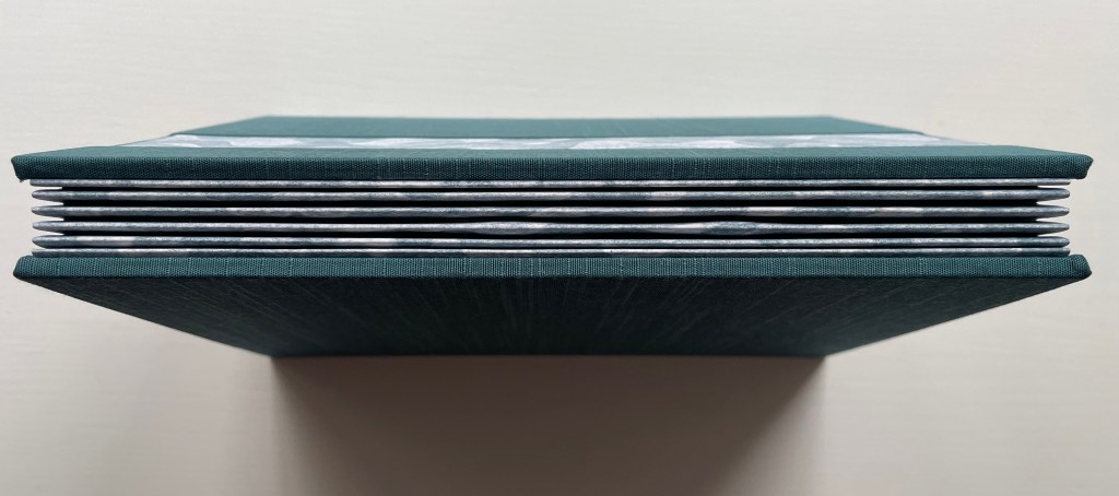
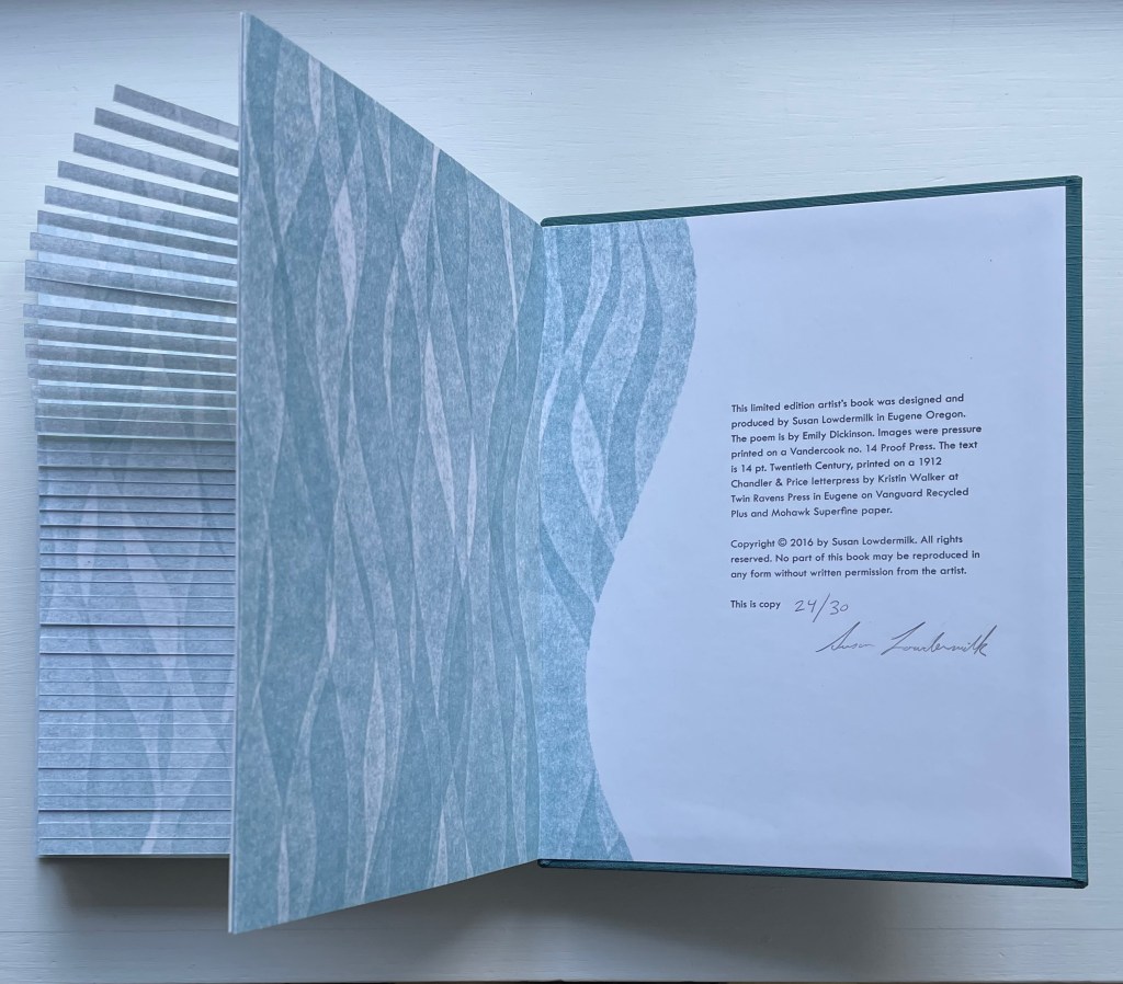
Hardback with open spine, Asahi cloth over board, debossed front cover with fitted, pastedown artwork, around folded structure with cut-outs, pop-ups and pastedowns. H236 x W182 x D20 mm. 14 pages. Edition of 30, of which this is #24. Acquired from the Abecedarian Gallery, 5 October 2023.
Photos: Books On Books Collection. Displayed with the artist’s permission.
Some book art illustrates a poem. Some converses with it. And some, like this one by Susan Lowdermilk, enact the poem.
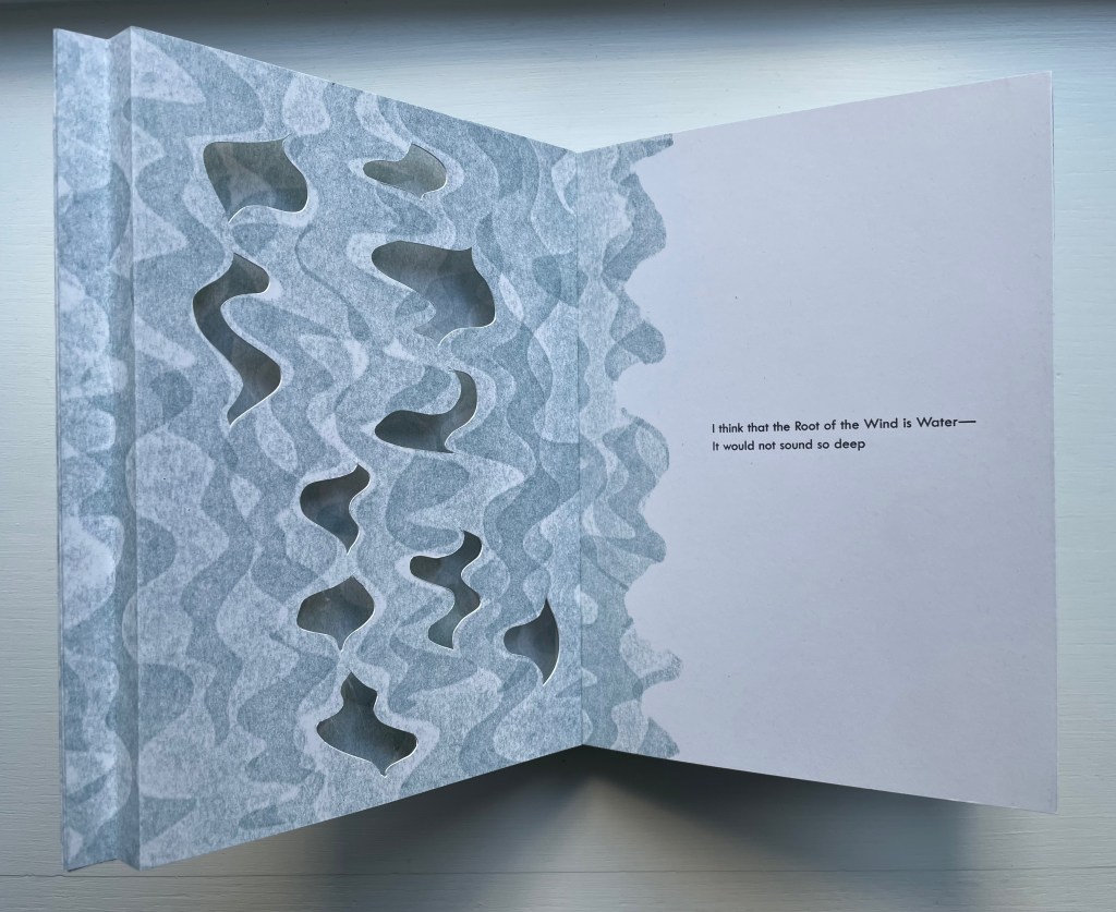
I think that the Root of the Wind is Water—
It would not sound so deep
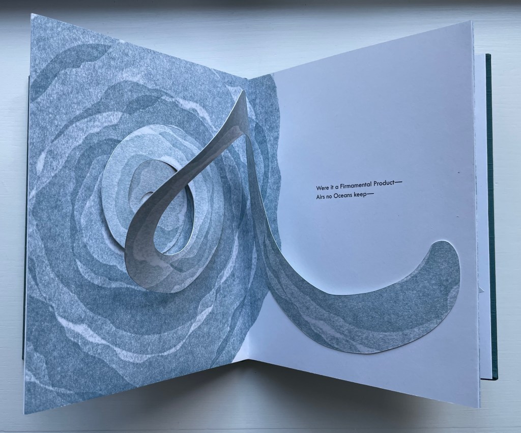
Were it a Firmamental Product—
Airs no Oceans keep—
Mediterranean intonations—
To a Current’s Ear—
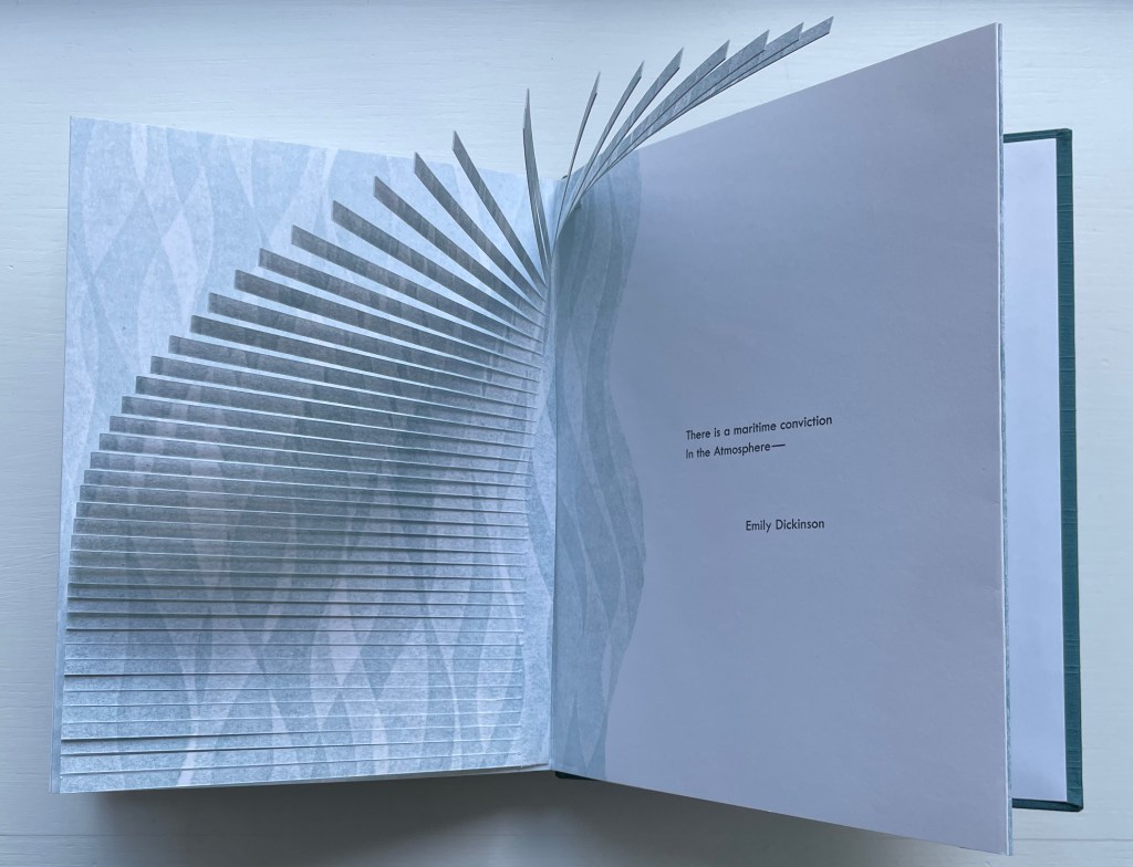
There is a maritime conviction
In the Atmosphere—
#1302, Emily Dickinson. 1960. Complete poems [1st ed.]. T. H. Johnson (ed.). New Y0rk: Little Brown.
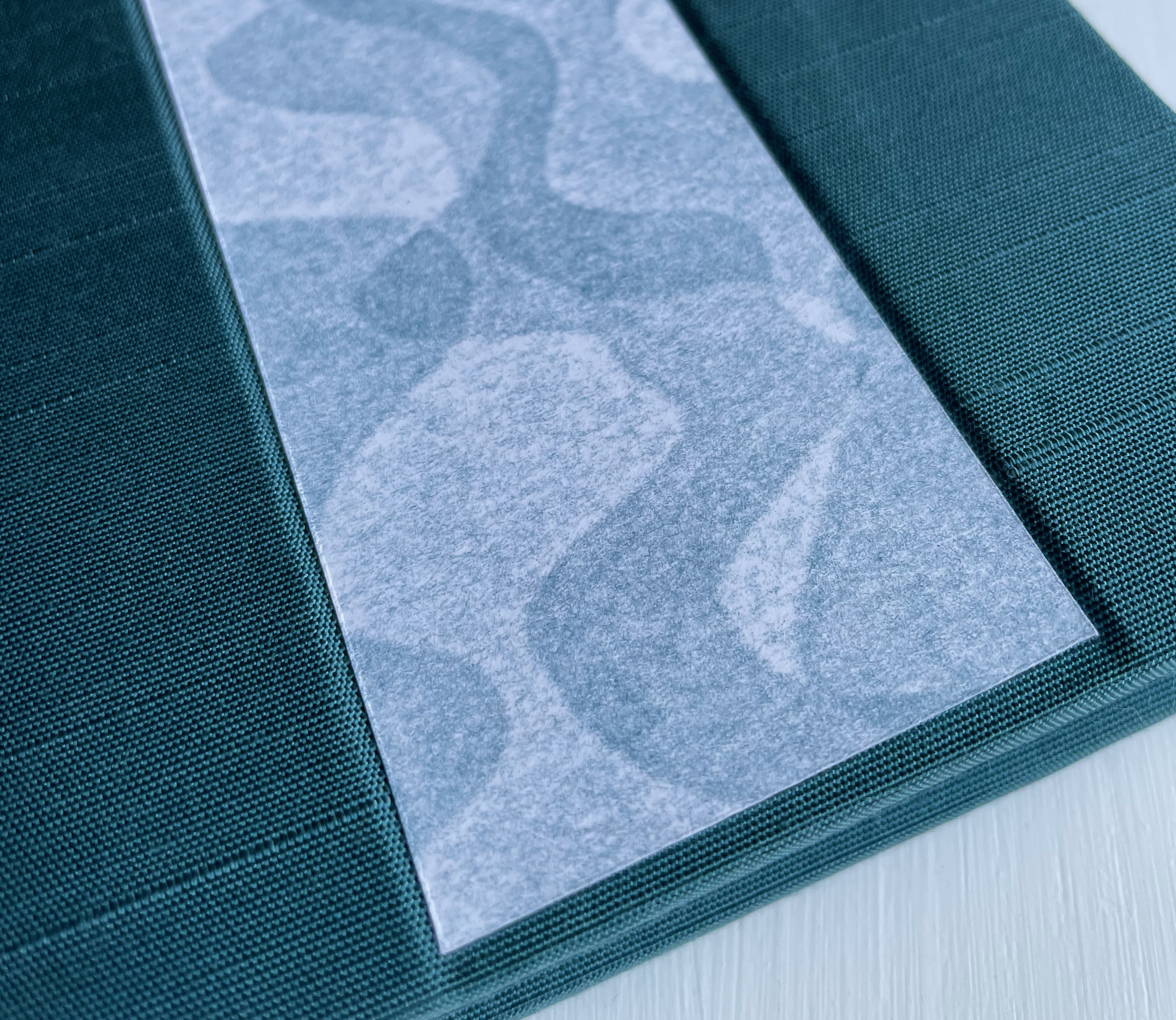
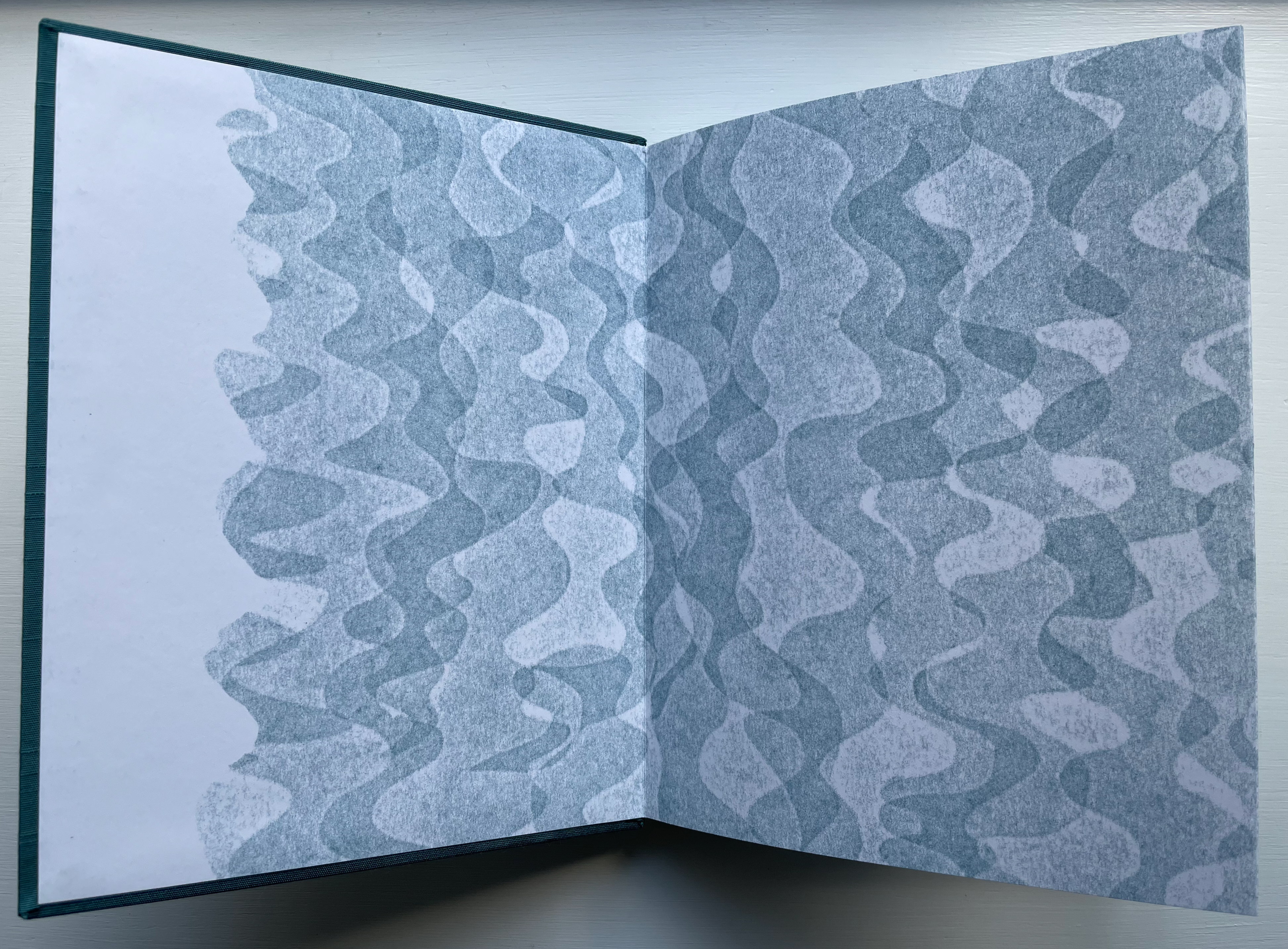
As she frequently does, Dickinson announces her core metaphor in the poem’s first line and goes on to develop and confirm or justify it in the lines that follow. As book artist, Lowdermilk has a slight advantage over the poet in being able to use the binding and printing to express herself even before the first line arrives. Before that first breath of air is taken, the Asahi book cloth’s color and the pressure print blue-gray pattern, which peeks from the exposed spine, is embedded on the front cover and flows over the doublure, evoke water, the sea and the maritime.
With the pop-up that follows, breathing the air above the page, Lowdermilk even manages to steal a march on the first half of the poet’s “Root of the Wind” metaphor. As the airy engineering is done with the paper printed with the watery pattern, enhanced by a reflective sheet of acetate beneath, it physically performs Dickinson’s entwining of wind and water. All that before and as the poem’s first two lines appear — and it just gets better with every turn of the page.
Because the blue-gray pattern plays so significant a role in this work, I asked the artist how the pressure print process works, especially in yielding the tonality of pattern.
I learned the pressure print technique at the Minneapolis Center for Book Arts while I was on a residency there in 2015. It is more akin to a rubbing that is created using light pressure on the letterpress than a relief print from something like wood or linoleum. Here is a brief description and a video. A plate in the bed of a cylinder press is inked. A low profile image (like paper cutouts for example) is placed onto the cylinder with the paper on top. The light pressure of the press touches the paper on top of the low profile image, giving a soft impression (like a rubbing) on the paper.The ink never touches the plate itself, just the plate’s pressure through the paper. If the pressure is too much, then the non image areas of the paper get printed. So, ink layer, thickness of the image plate, thickness of the paper, and height of the inked base plate have to be just right. … I used sheets of sticky backed mailing labels for my plates. As I layered them the highest points got the most pressure and were darkest, the two lower levels of the image plates had less pressure and therefore lighter. … I like the pressure print process for this project because the softness of the images really suited the mood and feeling of the poem for me. (Correspondence, 14 January 2024)
Lowdermilk and Dickinson are at one as they move from the first two lines of the poem to the next two. Dickinson has split the sentence into two lines and knows that, after a line break, the reader’s eye swims back to the beginning of the previous line to fish out the sense of the sentence: “It would not sound so deep/ Were it a Firmamental Product”. After the line break and page turn, Lowdermilk gives us a water spout — “a Firmamental Product” — and knows that pop ups always bring out the child in the reader — turning the pages back and forth to see the action again and again — so back we go for the fun and the sense. Lowdermilk’s waterspout also puns on top of Dickinson’s pun on “Airs”; the waterspout, too, is an air the ocean won’t keep.
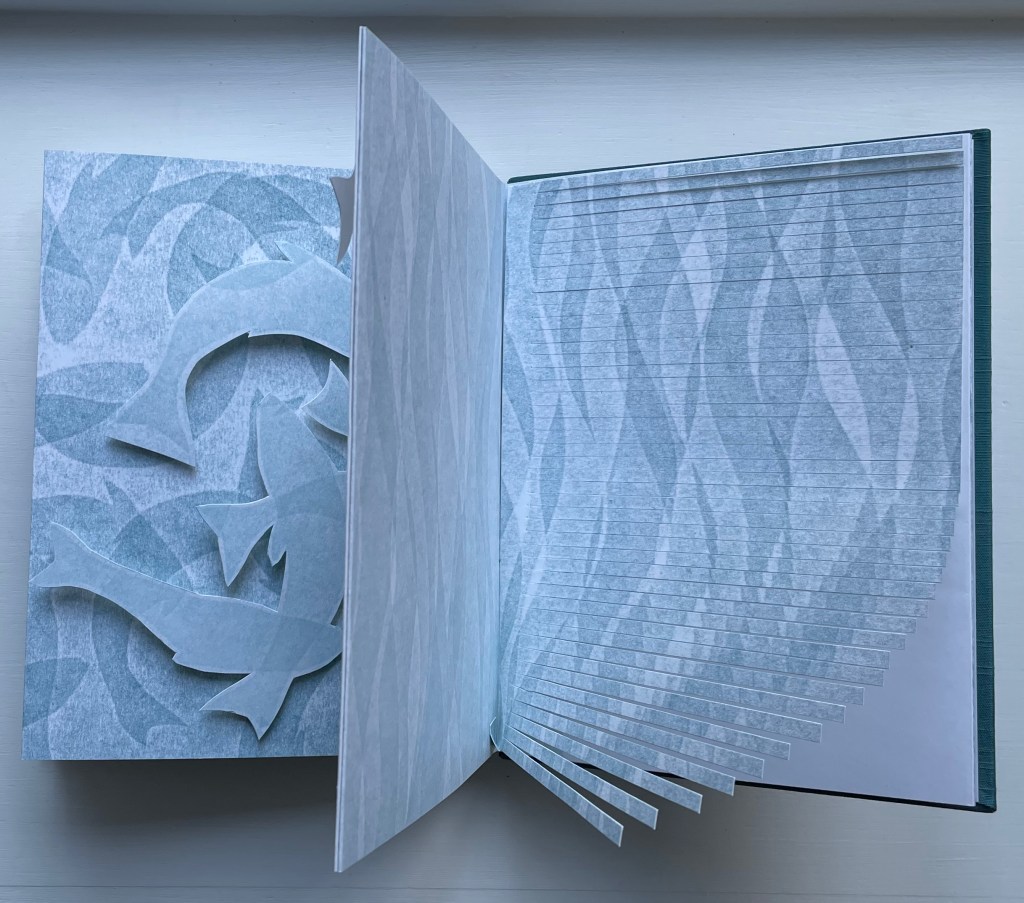
The shoal of fish leaping off the page is Lowdermilk’s addition, prompted no doubt by Dickinson’s “Oceans”, “Mediterranean intonations” and “maritime conviction”, although the shapes of the fish seem a bit ear-like, echoing the “Current’s Ear”.

With the next turn, the images of currents, waterspouts and fish give way to that of seaweed that undulates from the bottom of the finely horizontally sliced page, placing Dickinson’s “Root of the Wind” in the deep.
As those narrow maritime strips bend up and to the left into the atmosphere above the page, they reveal and enact Dickinson’s final lines.
There are many fine illustrated books and artists’ books that pay homage to Emily Dickinson. Many of the latter achieve that inversion of ekphrasis so frequent in book art where the visual or sculptural work of art responds to and re-presents the poem. The best of them achieve a oneness. Susan Lowdermilk’s does just that.
Further Reading and Viewing
“Inverse Ekphrasis“. 16 June 2022. Books On Books Collection.
“Barbara Tetenbaum“.15 January 2021. Books On Books Collection. See in particular Diagram of Wind: architectural book with poem by Michael Donaghy (2015).
“Claire Van Vliet“. 3 July 2022. Books On Books Collection. See in particular Batterers (1996).
Chen, Julie. 2013. 500 Handmade Books. Volume 2. New York: Lark. Pp. 57 (“A Ritual to Read to Each Other” by William Stafford), 129 (Power Play).
Jury, David, and Peter Rutledge Koch (eds.) 2013. Book Art Object 2 : Second Catalogue of the Codex Foundation Biennial International Book Exhibition and Symposium, Berkeley, 2011. Berkeley, CA; Stanford, CA: Codex Foundation; Stanford University Libraries. P. 420 (Eadem mutata regurgo).
Lowdermilk, Susan. 13 March 2020. “Susan Lowdermilk Book 1“. Press and Fold: Contemporary Book Arts. Exhibition, March-April 2020. Firehouse Art Center, Longmont, CA. Video.
