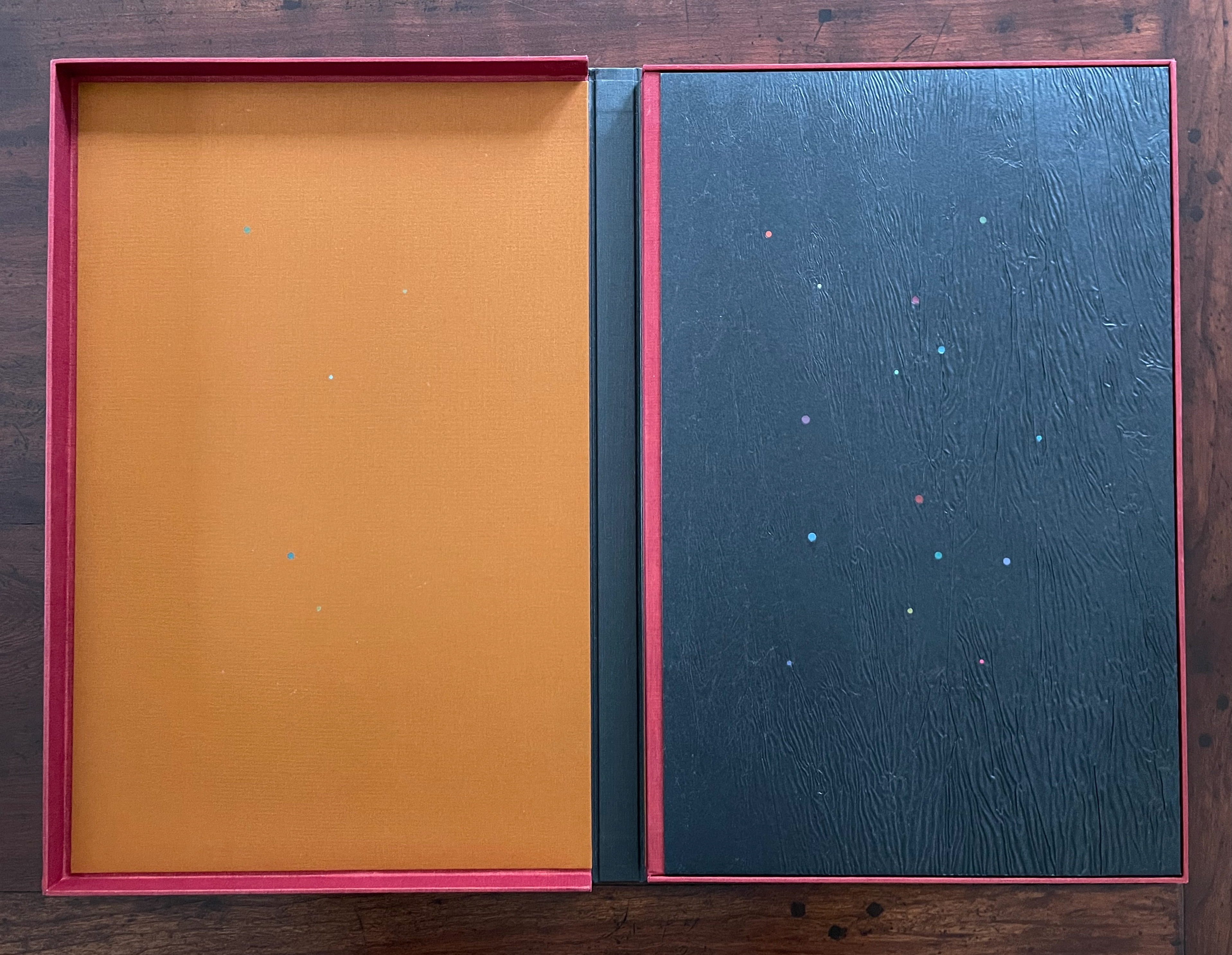
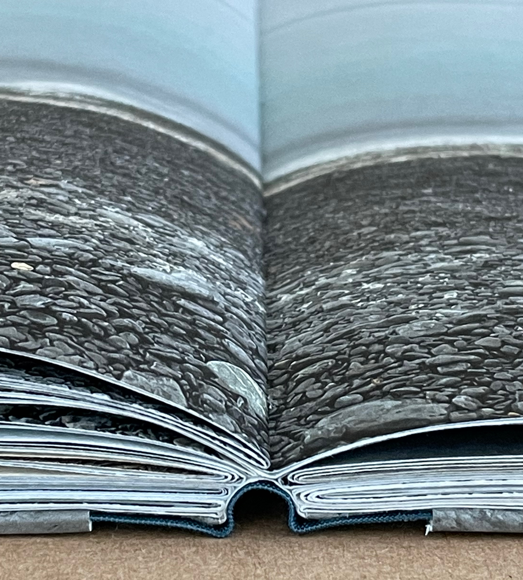
In Visible Cities (2012) Jean-Pierre Hébert, Harry and Sandra Liddell Reese Custom-made box enclosing sewn board binding with cloth spine, treated abaca/cotton paper with painted inlays, pastedowns with drawings, valley-fold folios of Niyodo Natural paper printed on Epson Stylus Pro 4800. Box: H442 x W290 mm. Book: H424 x W276 mm. [46] pages. Edition of 73, of which this is #48. Acquired from the Reeses, 9 February 2026. Photos: Books On Books Collection. Displayed with permission of Claire Hébert and the Reeses.
More than a few artists have been drawn to Italo Calvino’s Invisible Cities (1972/74). Its attraction is not hard to understand. Calvino supposes a series of conversations between Marco Polo and Kublai Khan about cities across the Khan’s empire that he has not visited but Marco Polo has and which he describes for the Khan. The premise, however, is paradoxical: the fifty-five cities Marco Polo describes do not exist. Calvino’s sensuous and surrealistic prose and combinatorial arrangement of the conversations and descriptions create a book that is simultaneously inwardly and outwardly reflective. Simple but complex. Realistic but fantastical. Concrete but conceptual. A work ripe for homage and inspiration.
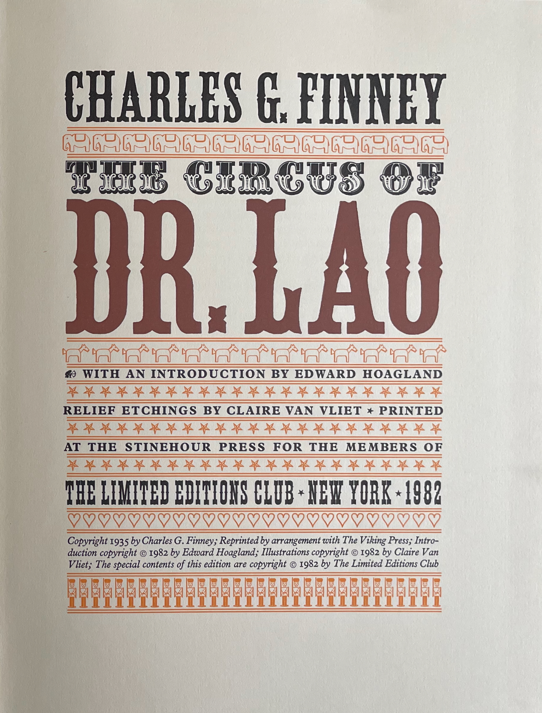
The Circus of Dr. Lao (1982) Charles G. Finney (text) Claire Van Vliet (design and illustration) Hardback, cased in cotton cloth over boards, head and tail bands, sewn. H x W mm. 9 1/4 x 12 inches 140 pages. Edition of 2000, of which this is #996. Acquired from BlueMamaBooks, 9 February 2025. Photos: Books On Books Collection.
If you have read Nathaniel West’s The Day of the Locust (1939) or Flannery O’Connor’s A Good Man Is Hard to Find (1955), Charles Finney’s novella illustrated by Claire Van Vliet will seem only marginally disturbing. If you have seen Tod Browning’s Freaks (1932), it will seem more than tame. Somewhere in between is the appropriate trigger warning for The Circus of Dr. Lao (1982).
Finney drops Dr. Lao’s circus of P.T. Barnum-esque carnival sideshows, a bestiary of distorted mythological creatures and exaggerated stereotypes, into the Arizona backwater of Abalone. The denizen of Abalone and their reactions — from gullibility, lubricious fascination, racist hazing, and violence to shrugs and a smug return to unexceptional normality — are the targets of Finney’s fevered satire. Van Vliet mirrors the range with her illustrations printed from original relief etchings and her selection of contrasting Plantin and Victoria display types.
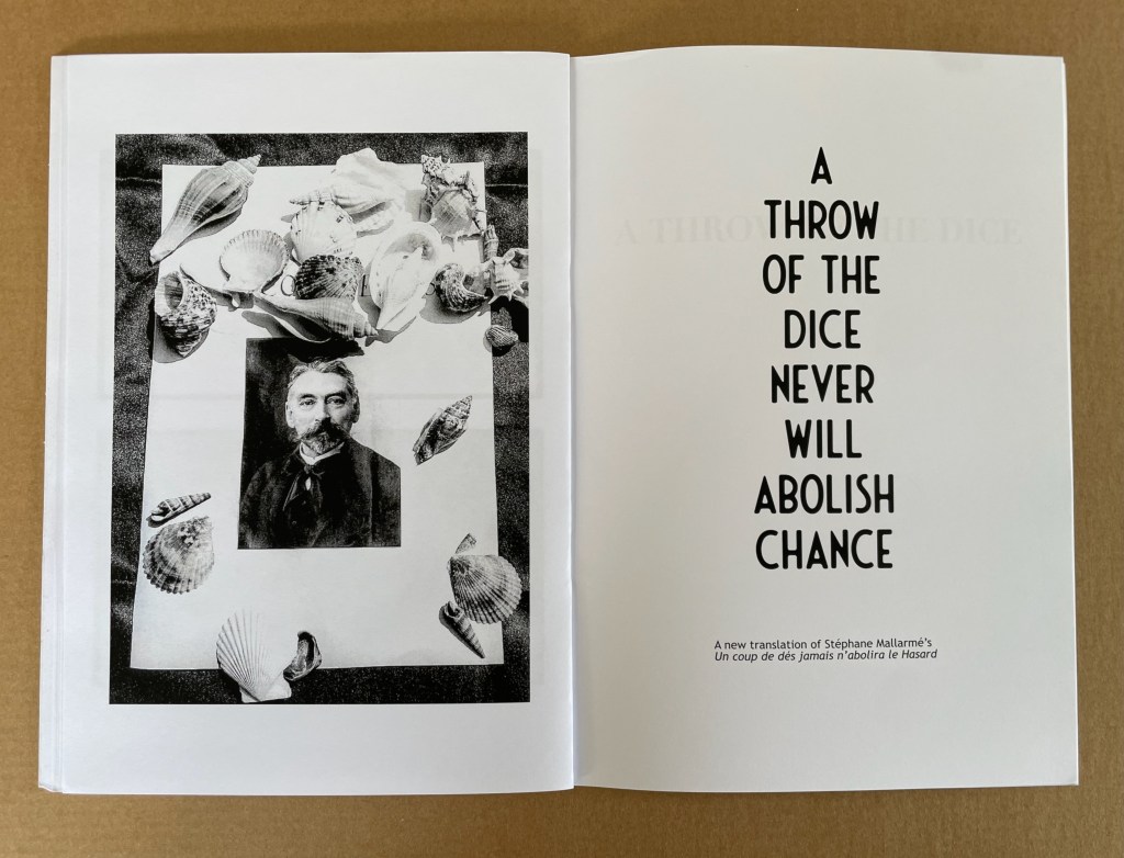
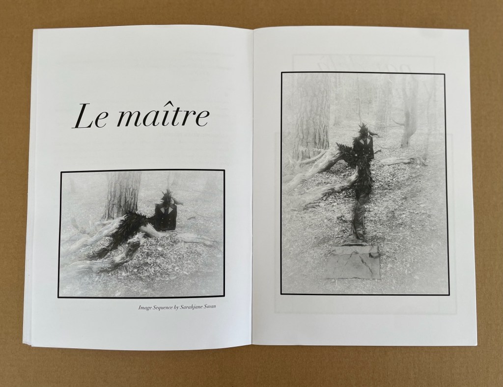
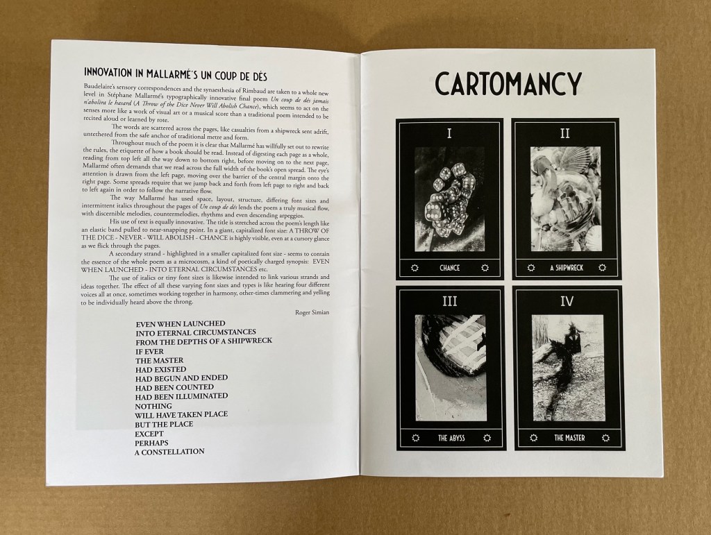
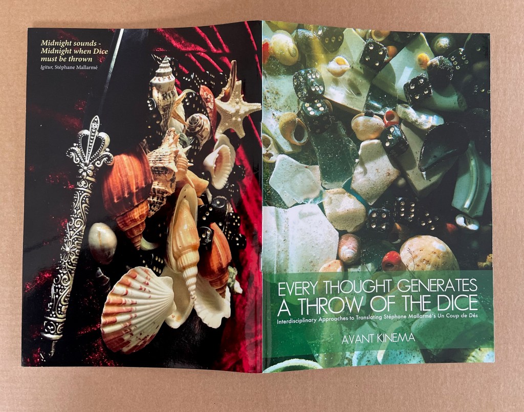
Sarahjane Swan & Roger Simian (the strangely named duo behind Avant Kinema) were responding to an invitation from the AHRC-funded project Imprints of the New Modernist Editing in 2019, which would have resulted in an exhibition at Shandy Hall, home of the Laurence Sterne Trust, but the Covid-19 pandemic intervened. Their response consisted of “visual artworks, photography, poetry, fiction and Tarot style card designs featuring ‘twelve virgin symbols extracted from Un coup de dés‘” (Swan & Simian, “Introduction”). This booklet captures those works and concludes with a new translation of the poem.
The subtitle characterizes the works as an interdisciplinary approach to translating the poem, but Dick Higgins’ term “intermedial” might be a more apt description.
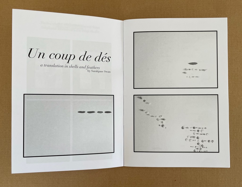
Swan’s substitution of feathers and shells for Mallarmé’s words, Broodthaers’ redactions and Pichler’s excisions brings a new form of materiality to Un Coup de Dés. It recalls the similar playfulness of other artists such as Clotilde Olyff with the alphabet.
From an image sequence by Swan, the artists pull together a set of Tarot-like cards to introduce a new angle on the poem’s invocation of chance.
Avant Kinema’s homage is a collage or assemblage of different media distilled in this booklet. The preempted installation might have echoed that of Marine Hugonnier’s The Bedside Book Project (2006-07).
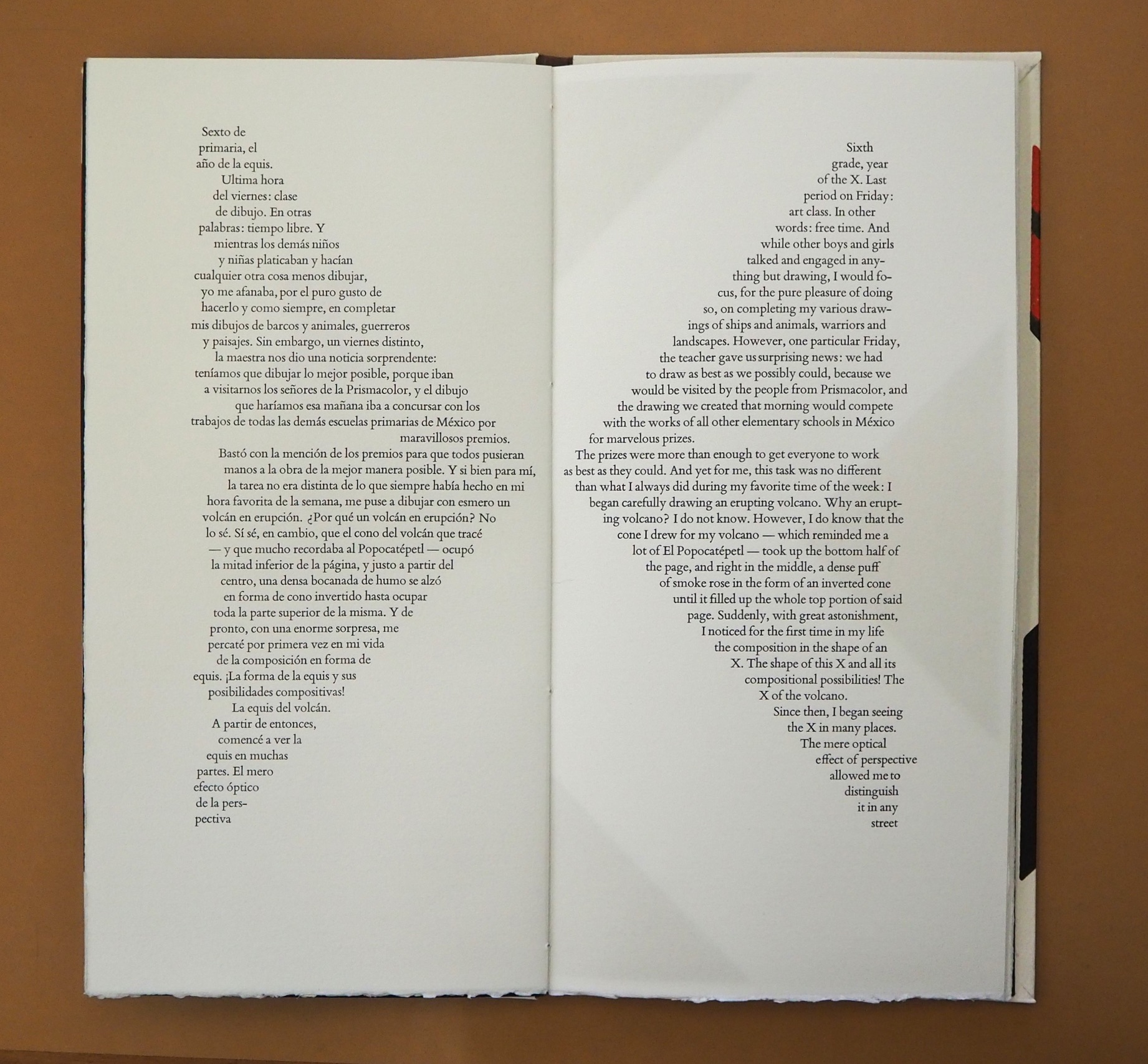
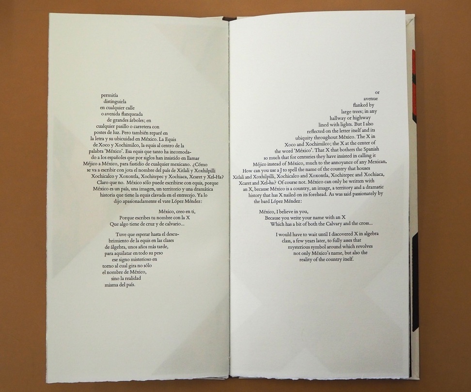
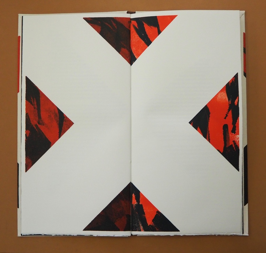
In this ode to the letter X, Mexico and language itself, Alberto Blanco and Nacho Gallardo Larrea brilliantly show how the artist’s book can translate word and image from one to the other and back and, at the same time, soar over the challenge of translating poetry.
The Spanish and English versions of Blanco’s text shape, and are shaped by, the bilateral symmetry of the letter X and the codex form of the book. Spanish on the left, English on the right: the imposition of type and the ghostly images of the X play with one another. The two texts delight in the crossover between similarity and difference, knowingly in the white space at the exact center of the X in the double-page spread below. How better to use the notion that, for all letterforms, space counts as much as line?
Sometimes the language on one side completes a thought or expression before the language on the other side can do so, a natural phenomenon in translation in which one language needs fewer or more words than the other. See above, for example, the passages beginning “La equis del volcán” and “X of the volcano” that do not quite align in the legs of the X. The Spanish sentence trails off in a fragment to be completed on the following verso page, but the English sentence is already half way there on the recto page above.
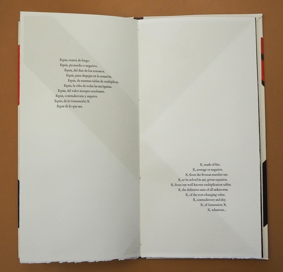
As the shaped poem continues in the pages below, and the number of words in one language exceeds those on the other creating lines asymmetrical to one another, the poet and artist use the X shape in whole and parts and the diametrical placement of text in the last double-page spread to reflect the crossing dance of similarity and difference, asymmetry and symmetry, that they find in X across languages, generations and country.
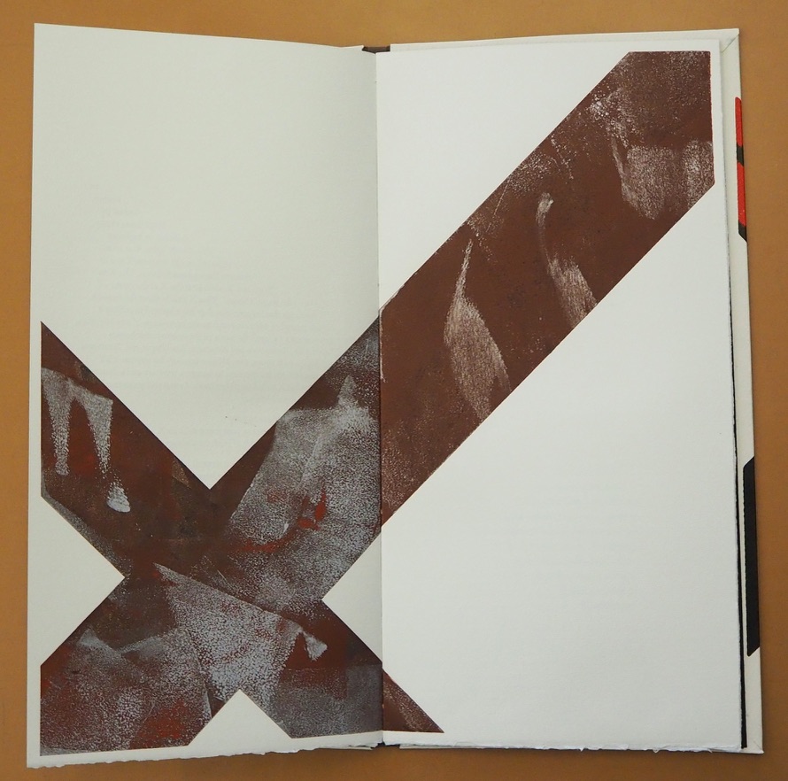
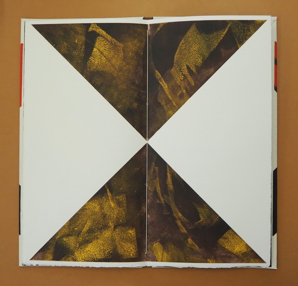
Interpersed between the pages of text, the late El Nacho’s monotypes make color, shape and space play with one another to mirror — not merely illustrate — the thrust of the language. If ever there were a collaborative work that distinguishes the artist’s book from a livre d’artiste, this is it. Alberto Blanco has also created solo artist’s books, which enjoyed an exhibition at the Athenaeum Music & Arts Library, La Jolla, California, February 19-March 26, 2011. Stylistically they are distinct from The Book of Equis, which underscores its collaborative originality.
Colophon: “The Book of Equis was designed and printed in Intagrafía, located in San Jose del Cabo under the direction of Peter Rutledge Koch, with monotypes created by El Nacho. Printed under the supervision of Lenin Andujo Fajardo by Ivonne Rivas.”
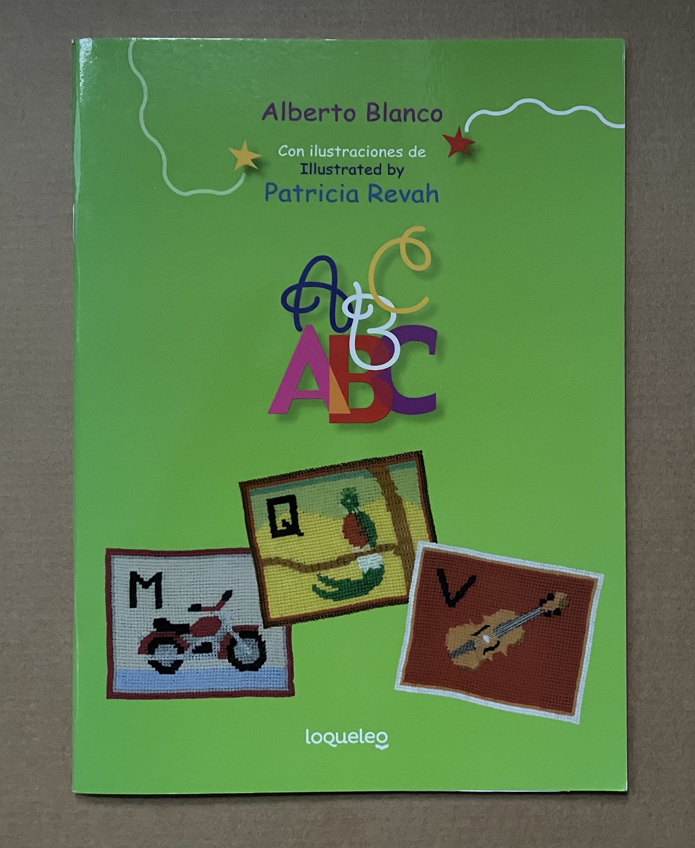
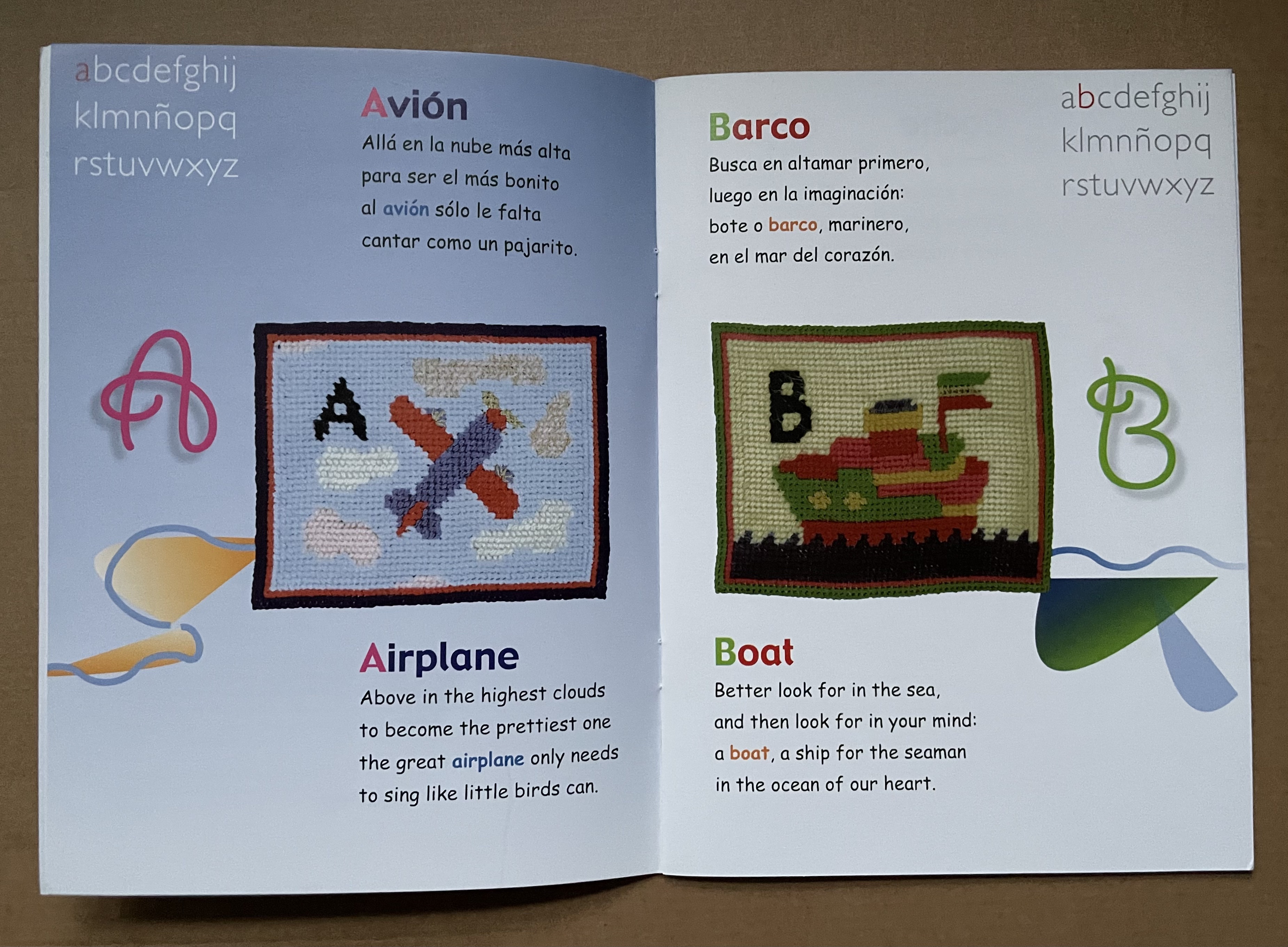
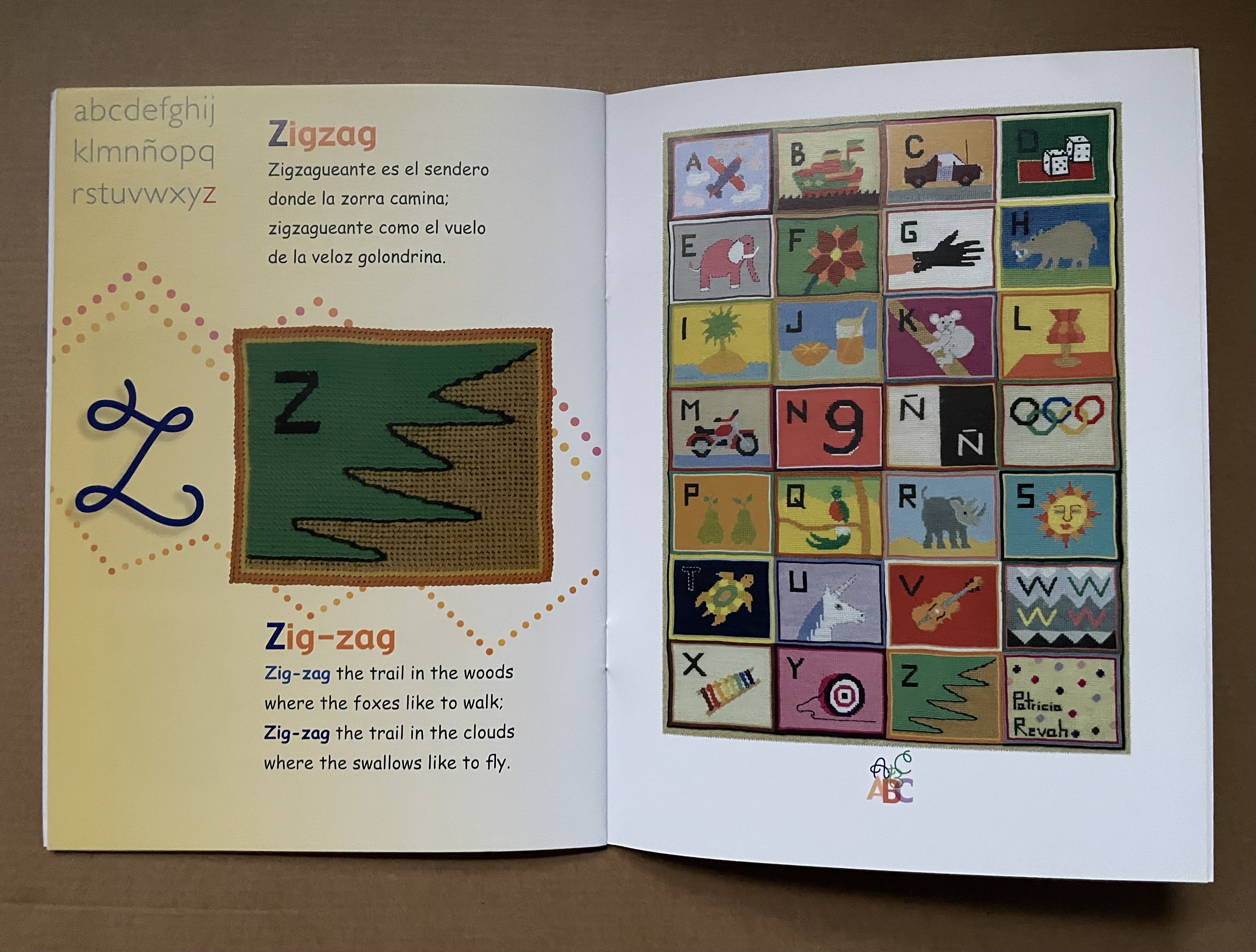
Rhyming poetry often raises the already high bar to translation. The literal English translations that follow Alberto Blanco’s charming abab Spanish poems do not attempt to substitute suitable rhymes. The textile art in this abecedary, however, wraps a comforting quilt around the challenge of translating poetry in a way that appeals to children.
Who would think it possible to introduce children to the ideas of Stéphane Mallarmé? Alberto Blanco for one, albeit without mentioning the French poet.
Marlene MacCallum’s latest artist’s books remind me of Claude Monet’s two series of paintings of the Rouen Cathedral’s façade and a field of haystacks. The series were influenced by Japanese ukiyo-e prints (“pictures of the floating world”). Rather than changing vantage points on Mt. Fuji, Monet used one perspective on one façade and sought to capture the instants of light and atmosphere on its surface at several different hours of the day. He rendered his vision of them with thick layers of paint, brushstrokes, and colors. MacCallum, too, has chosen a fixed-viewpoint: in her case, of Lake Ontario. She, too, follows different hours and, also, different seasons as Monet did with his haystacks. She, however, renders her vision with an intricate verbal-visual dance of metaphor, book structure, registration, photographic filters, print technique and paper.
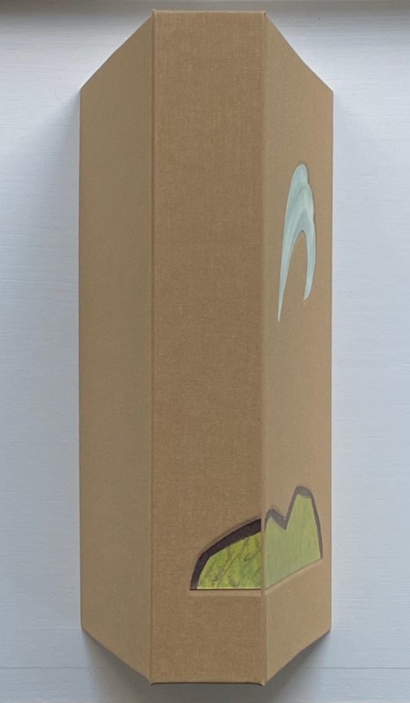
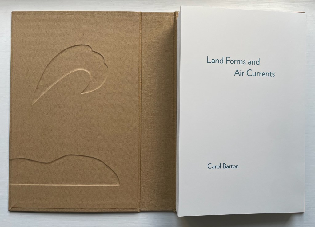
Land Forms and Air Currents (2014) Carol Barton Leporello (with 11 pop-ups) fixed to inside cover of case, cloth over board, debossed with fitted, pastedown artwork on front cover and spine. Cover: H292 x W192 x D50 mm. Leporello: H275 x W175 mm. 37 panels. Edition of 25, of which this is #21. Acquired from the artist, 27 October 2023. Photos: Books On Books Collection. Displayed with artist’s permission.
Carol Barton’s reputation for paper-engineering, supported by her well-received multi-volume The Pocket Paper Engineer, should not overshadow appreciation of her talents with watercolor and words. With its poems of free verse, scanned watercolors and pop-up structures all by the same author/artist, Land Forms and Air Currents (2014) qualifies as a champion of the Blakean tradition in artists’ books.
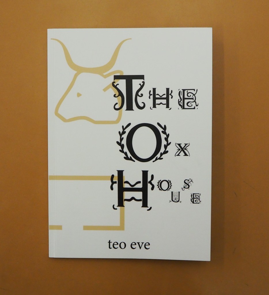
The Ox House(2022) Teo Eve Perfect-bound paperback. H210 x W148 mm. 68 pages. Acquired from Penteract Press, 6 August 2022. Photos: Emilia Osztafi.* Displayed with permission of the publisher.
A love letter to the letters of the alphabet, Teo Eve’s debut collection The Ox House contains an eclectic array of constraint-based poems, innovative forms, and concrete & visual works. At once homage to the intricate hieroglyphs used in Ancient Egypt & the beautifully illuminated capital forms of Medieval manuscripts, and an exploration into the possibilities of new ways of playing with letters’ shapes & sounds, The Ox House harks back to a time when words were magic, and language was new. — Publisher’s description.
I think that the root of the wind is water (2016) Susan Lowdermilk Hardback with open spine, Asahi cloth over board, debossed front cover with fitted, pastedown artwork, around folded structure with cut-outs, pop-ups and pastedowns. H236 x W182 x D20 mm. 14 pages. Edition of 30, of which this is #24. Acquired from the Abecedarian Gallery, 5 October 2023. Photos: Books On Books Collection. Displayed with the artist’s permission.
Some book art illustrates a poem. Some converses with it. And some, like this one by Susan Lowdermilk, enact the poem.
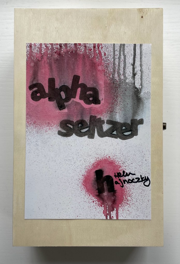
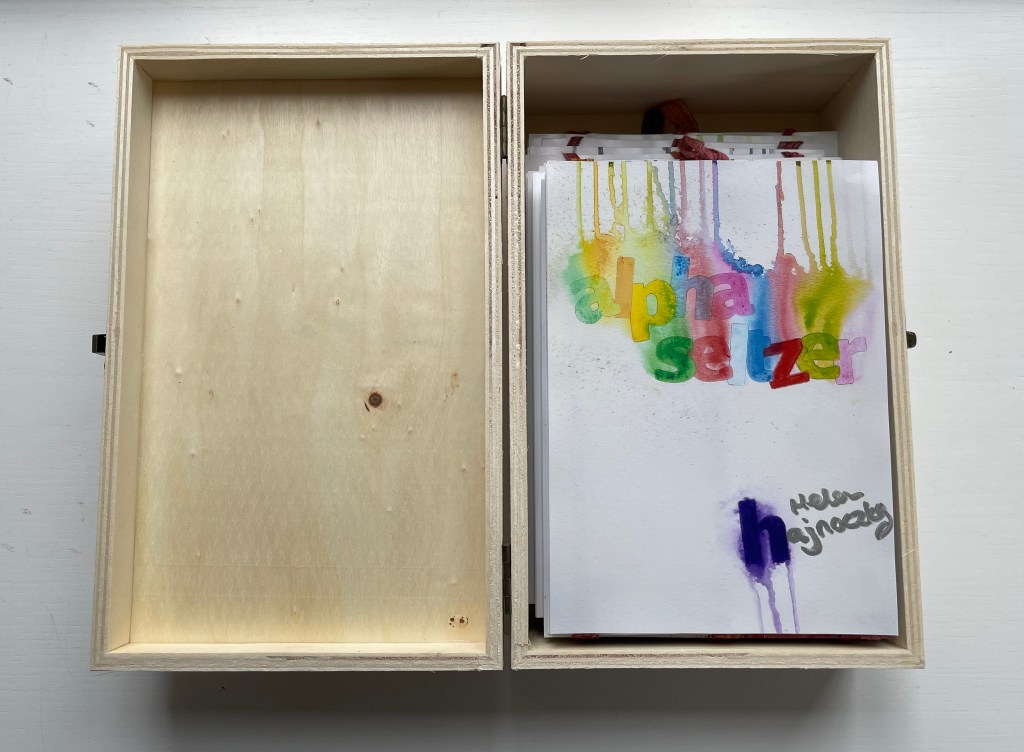
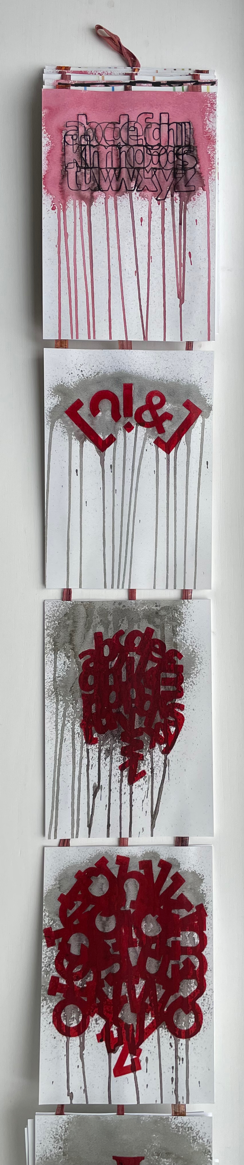
alpha seltzer (2023) Helen Hajnoczky Canada balsa wood, hinged and clasped box, double-sided accordion structure attached to multicolored ribbons for vertical display. Box: H240 x W155 x D80 mm. Leporello panel: H178 x W126 mm. Open: 1041 cm. 56 panels. Acquired from the artist, 10 April 2023. Photos: Books On Books Collection.
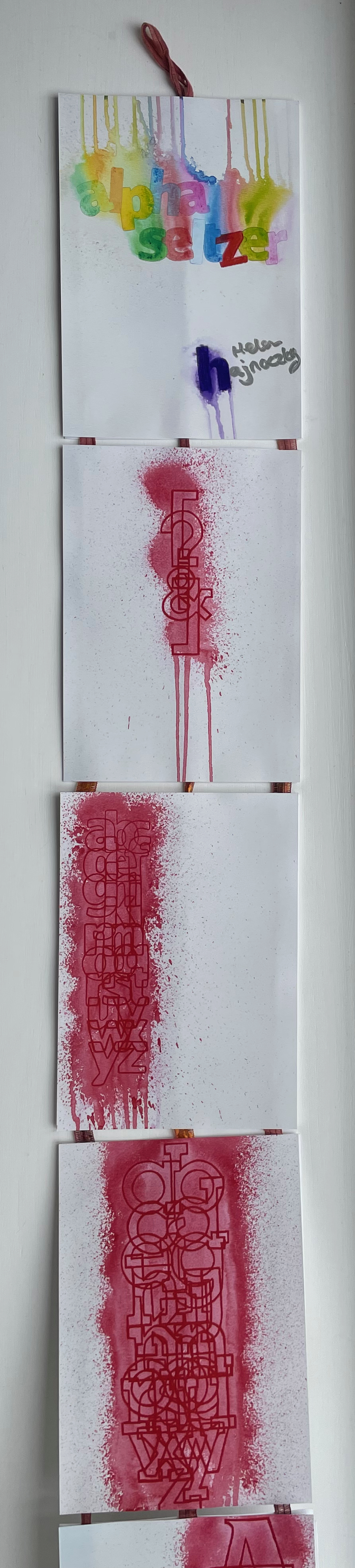
Letters and punctuation marks fall and rise and tumble in alpha seltzer like so many tablets of Alka-Seltzer. With her use of color, technique and orientation of the images, Hajnoczky holds to and takes the concept far beyond a one-trick visual metaphor. Anyone who has observed those dissolving heart-burn relief tablets closely will recognize how the colorless effervescing bubbles spin off each tablet in upwards and downwards directions. So, on the box cover’s title plate and on the first panel, colored drips surrounded by spatters rise from the title and fall from the artist’s name.
But what is it that the characters are dissolving in, and what are they dissolving into? Of course it’s just paper, but the Kodak Moment matte photo paper has a glossy shine suggesting a solution of water. As the accordion emerges from the box, a spattered and dripping red column made of overlapping characters (brackets, question mark, exclamation mark and ampersand) appears on the first panel; then with a shift to the left, the red column widens into one made of all the lowercase letters of the alphabet; then shifting back to the center, the column widens and comes closer; and then shifting to the right, it becomes a column of all the uppercase vowels overlapping. What is going on?
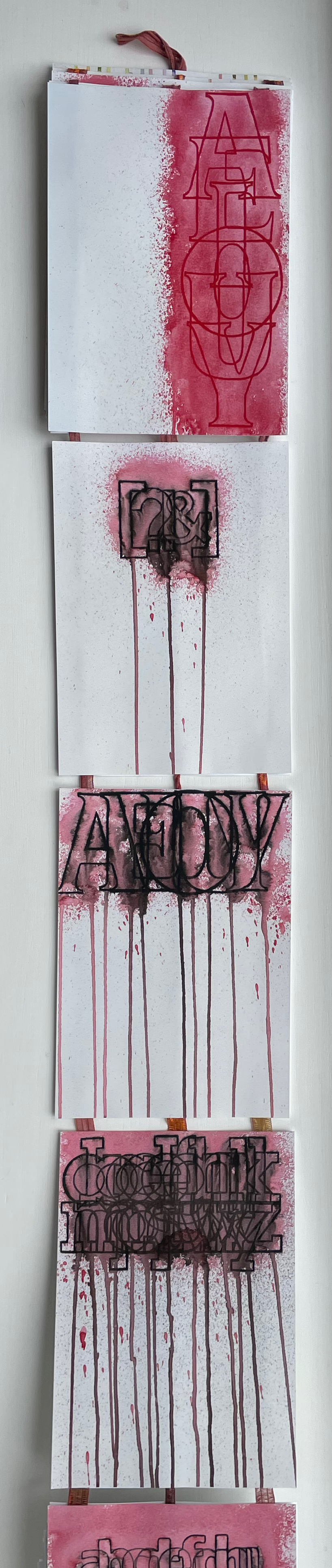
Now, the originally vertical column of brackets, question mark, exclamation point and ampersand goes horizontal and black, dripping pink and gray into the next panel of horizontal uppercase vowels in black, dripping gray, pink and black into a horizontal jumble of lowercase letters.
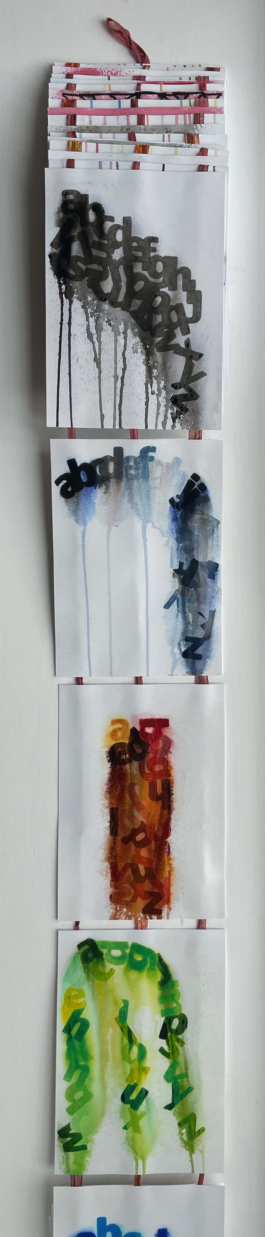
Then the characters bend into a deep red curve spattered and dripping in gray, eventually morphing into a ball of red vowels. Beneath that, the palette goes entirely black and gray, and the characters begin to angle down the panel into a heap of letters sliding downwards from right to left across the panel and squeezed at the bottom …
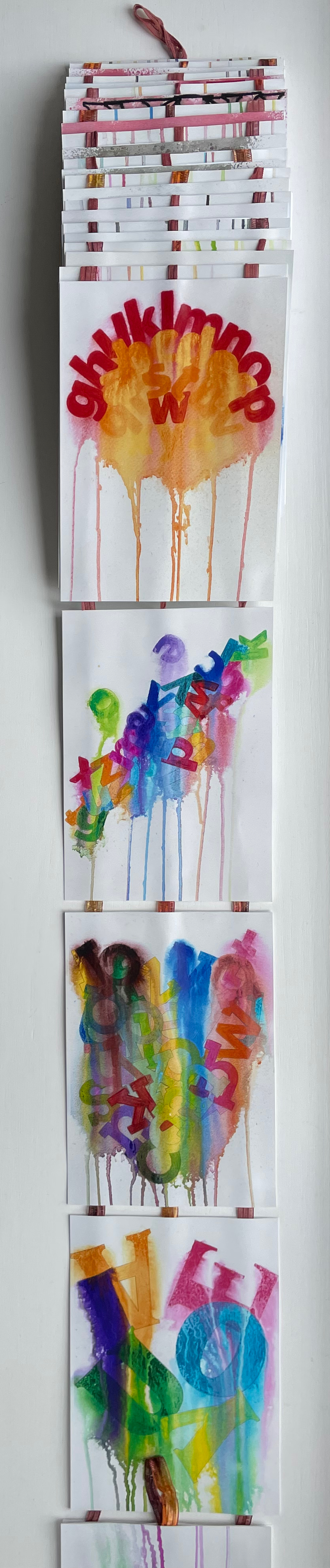
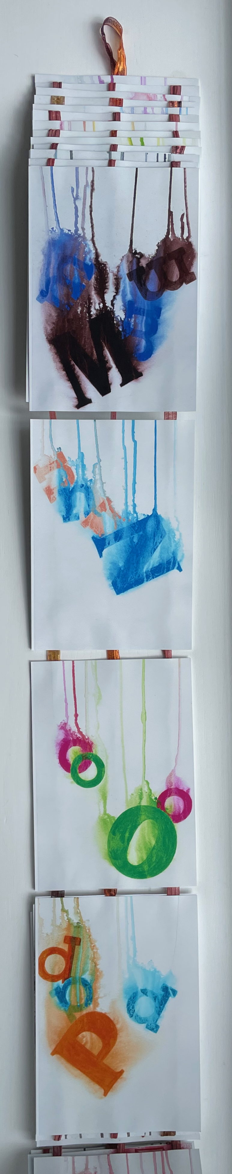
… until they have to cascade down from left to right, which is when a riot of color breaks out. At the end of the accordion, you realize there’s another loop; which side is up, which is down?
On the other side of the accordion, the riot of colors continues, but each panel presents a single-color uppercase letter that seems to be dissolving like an Alka-Seltzer tablet into multicolor lowercase versions of itself.
With layout, color, technique and metaphor, Hajnockzky has coaxed an element of abstraction from the alphabet that differs from the semiotic abstraction by which letters have come to be what they are. But in the end, it’s not a confusion from which relief is wanted. Rather it’s one in which to fall, be immersed and enjoy. And to have a laugh at the expense of the Dr. Miles Medicine Company of Elkhart, Indiana and its subsequent owner Bayer AG for missing a marketing trick for Alka-Seltzer tablets.
Magyarázni (2016)
Magyarázni (2016) Helen Hajnoczky Perfect bound paperback. H210 x W140 mm. 104 pages. Acquired from the author, 14 December 2021. Photos: Books On Books Collection.
With all its diacritics and dipthongs, if there is an alphabet song in Hungarian, it must be operatic in length. It is fortunate, though, that it is as long as it is; otherwise we would have fewer poems in this volume by Helen Hajnoczky.
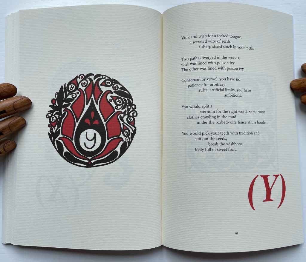
Hajnoczky is second-generation Hungarian-Canadian. These poems use the two languages to reflect on her dual roots of culture and the roots of memory. And for both, what better vehicle than an alphabet book. Even though there are 44 letters in Hungarian compared to 26 in English, Hajnoczky is a greedy poet, and taking her title literally — Magyarázni means “make it Hungarian” — she includes poems for the letters Q, W, X and Y even though Hungarian has no need of the phonemes behind them except for borrowed words.
Hajnoczky does not shy away from growing up in the English-language poetic tradition. In the poem below, she appropriates Robert Frost’s “The Road Not Taken”, turning and twisting its metaphor into one for her experience of growing up with two languages, making the letter Y and Robert Frost Hungarian.
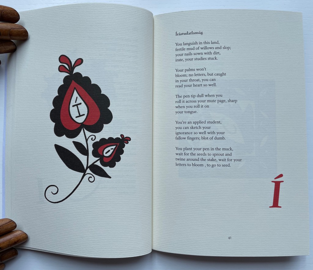
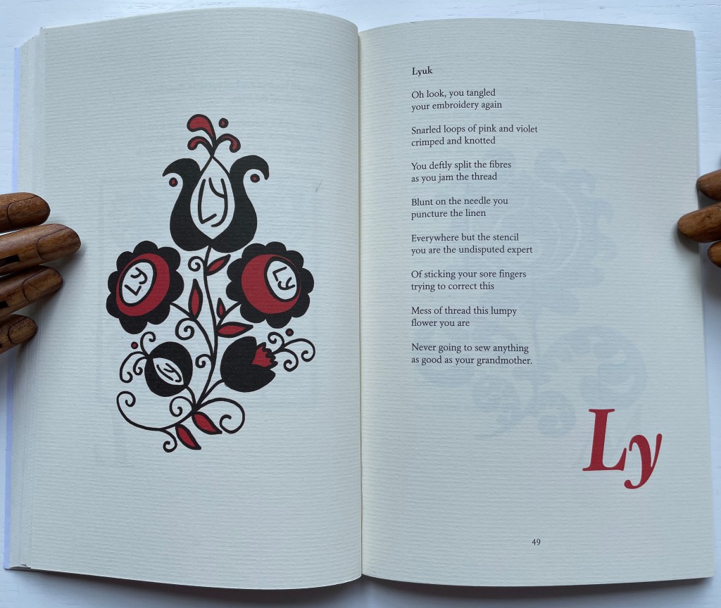
Some of the poems might remind readers of Seamus Heaney. For the letter í (for Írástudatlanság/”ignorance, illiteracy”), Hajnoczky delves into the metaphor of the pen in a way that surely would have brought a smile to Heaney as a nod to his “Digging”; or he might have heard an echo of “Clearances” in Lyuk/”hole”) for the dipthong Ly when she hears a relative commenting on her needle-wielding: “you are/ Never going to sew anything/ as good as your grandmother”.
Hajnoczky calls the images facing the text “visual poems”. To create them, she has drawn from a difficult-to-find spiral bound book put together by Péter Czink and Lorraine Weideman. As with Alphaseltzer, the results are visually striking. Coach House Books has nicely complemented the images and type with vegetable-based ink and Zephyr Antique Laid paper.