The Circus of Dr. Lao (1982)
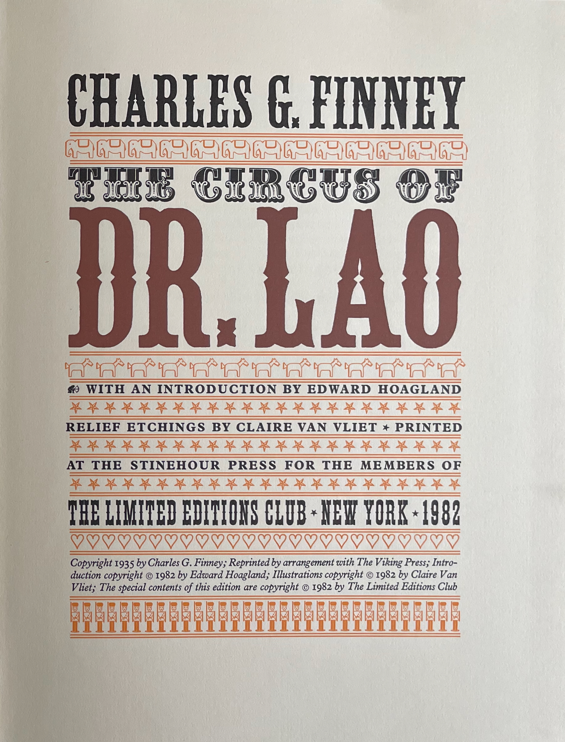
The Circus of Dr. Lao (1982)
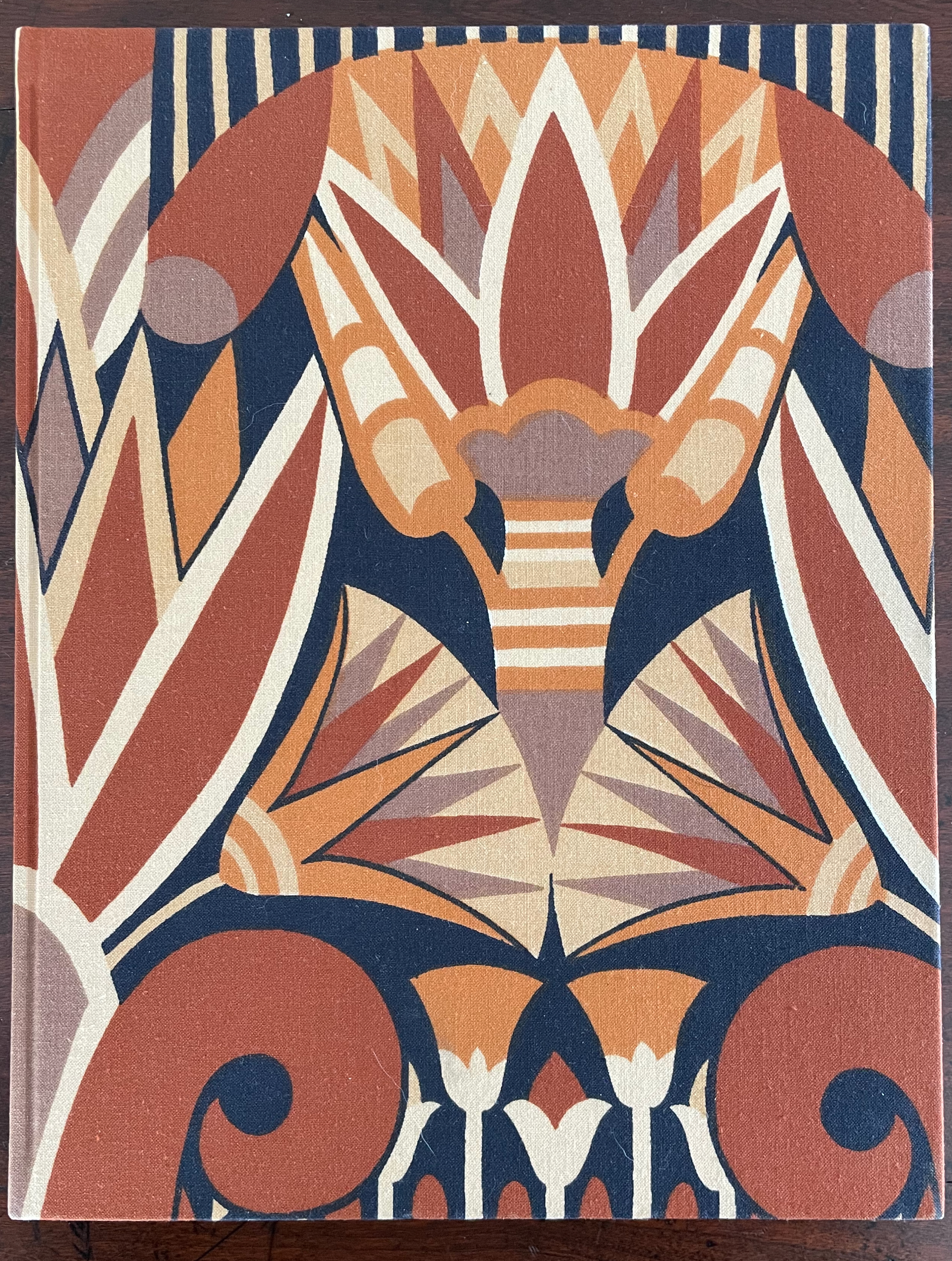
Charles G. Finney (text) Claire Van Vliet (design and illustration)
Hardback, cased in cotton cloth over boards, head and tail bands, sewn. H x W mm. 9 1/4 x 12 inches 140 pages. Edition of 2000, of which this is #996. Acquired from BlueMamaBooks, 9 February 2025.
Photos: Books On Books Collection.
If you have read Nathaniel West’s The Day of the Locust (1939) or Flannery O’Connor’s A Good Man Is Hard to Find (1955), Charles Finney’s novella illustrated by Claire Van Vliet will seem only marginally disturbing. If you have seen Tod Browning’s Freaks (1932), it will seem more than tame. Somewhere in between is the appropriate trigger warning for The Circus of Dr. Lao (1982).
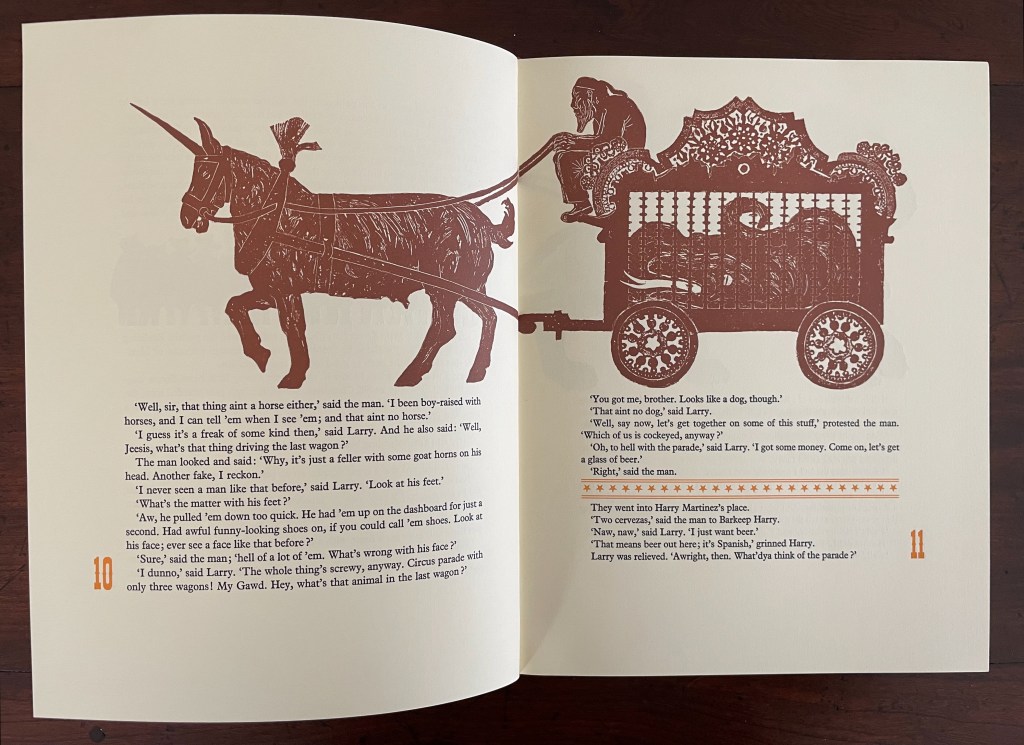
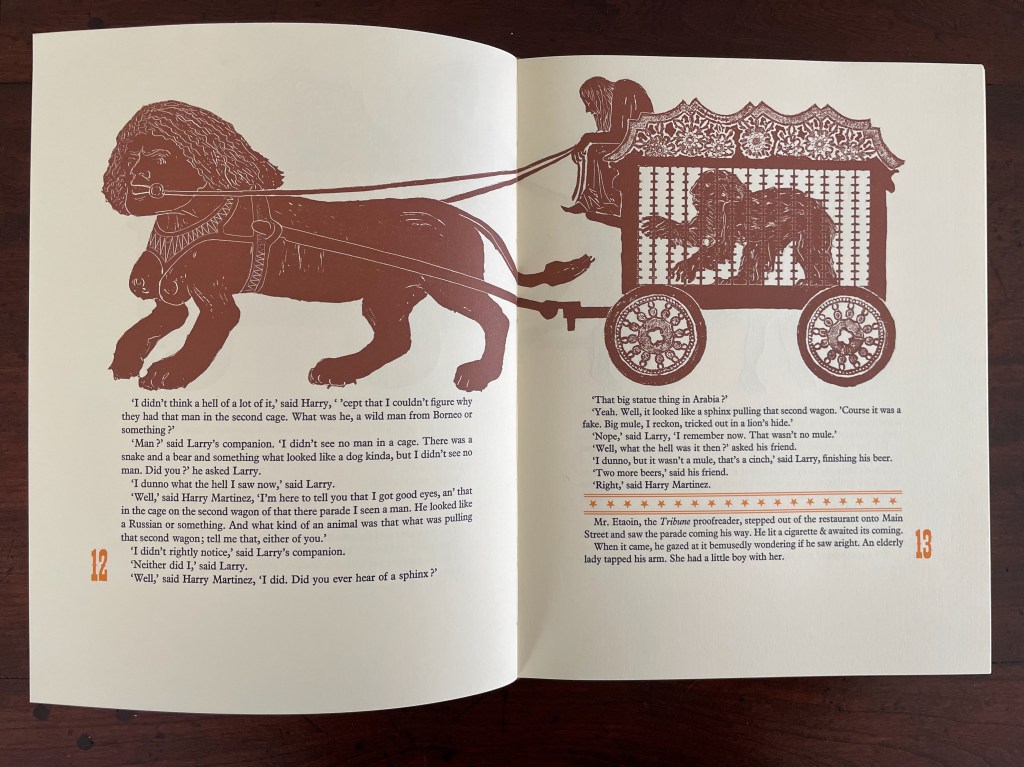
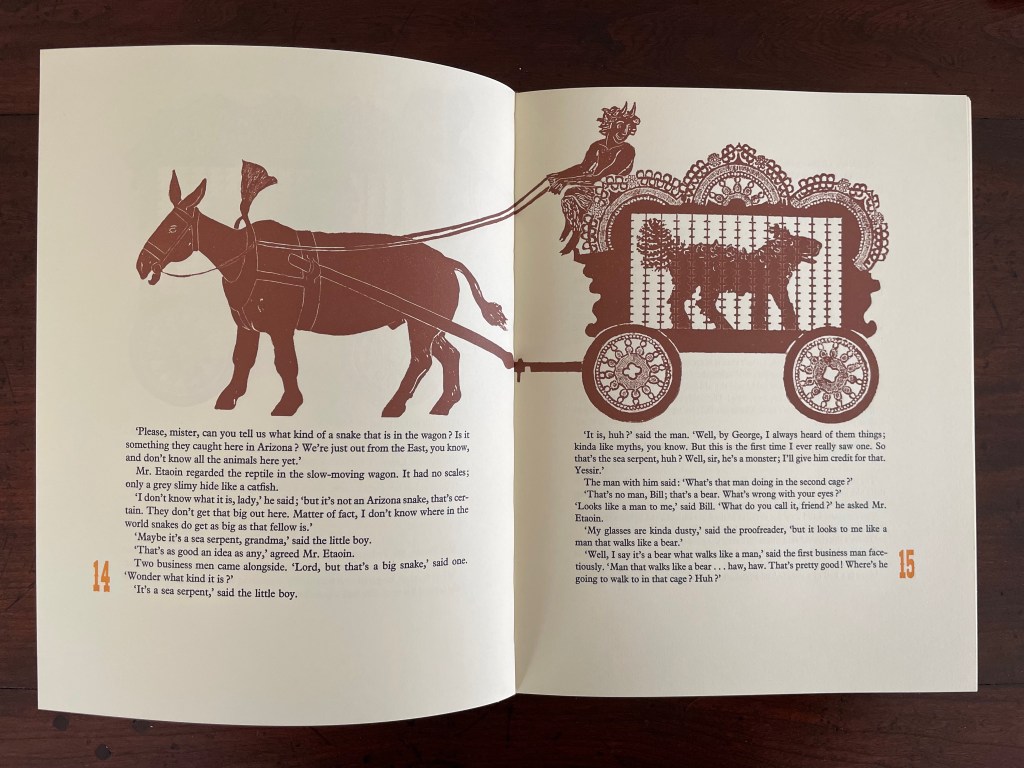
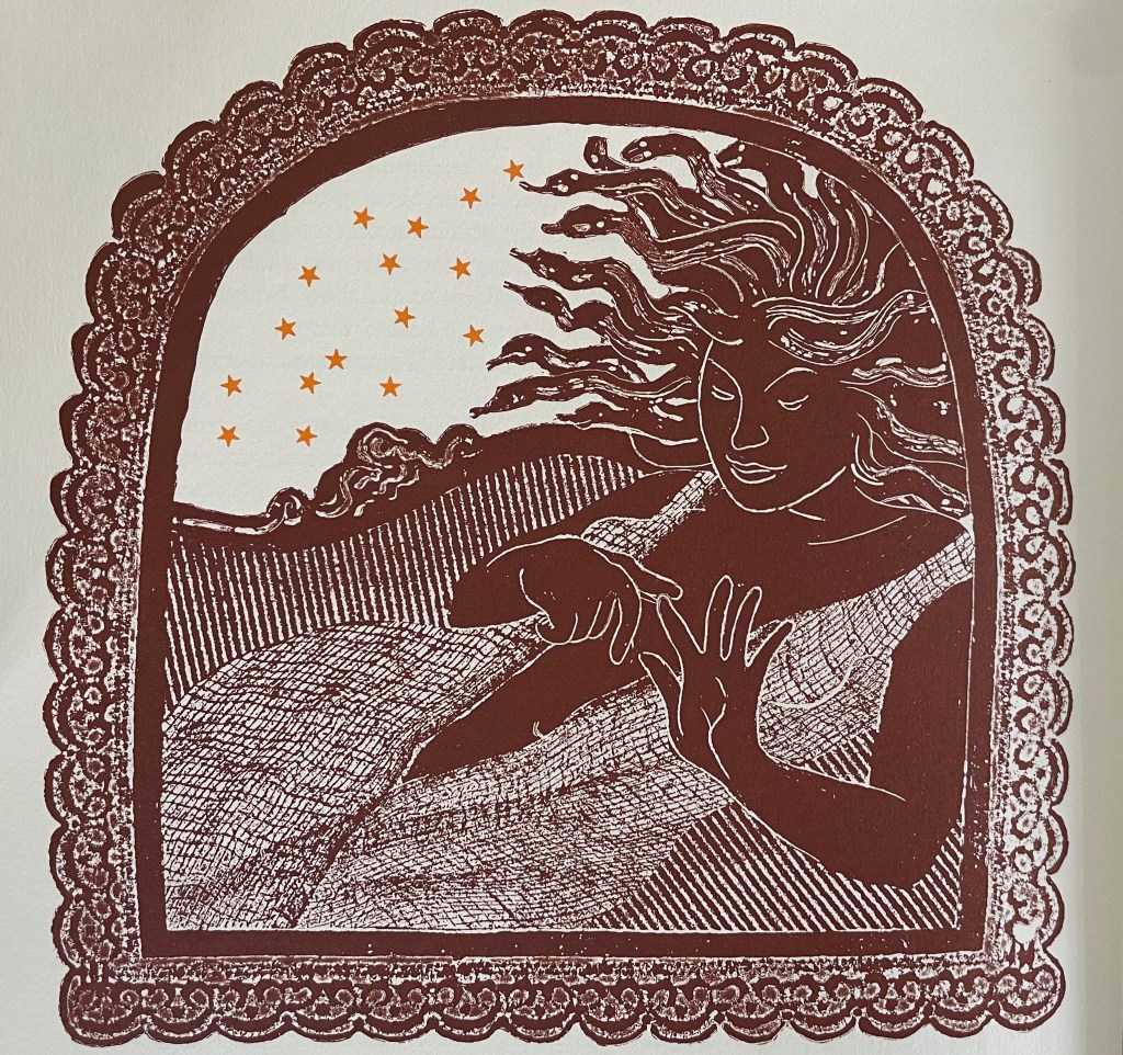
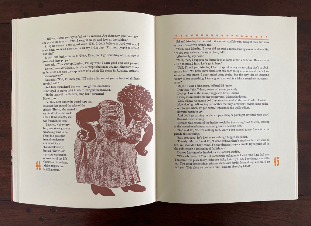
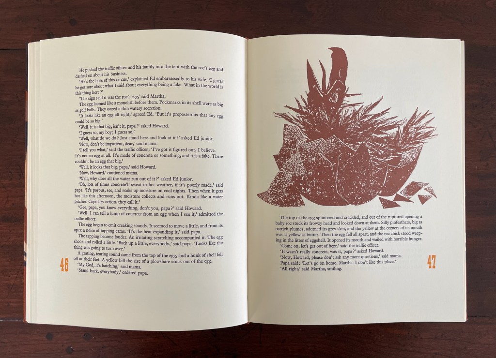
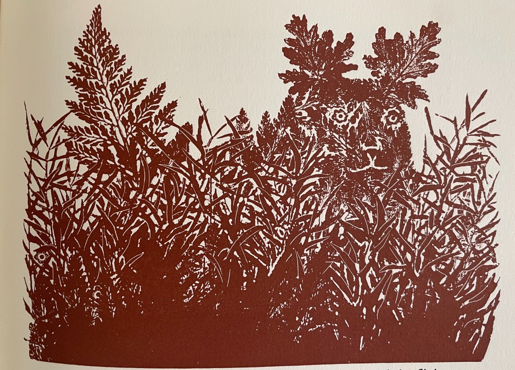
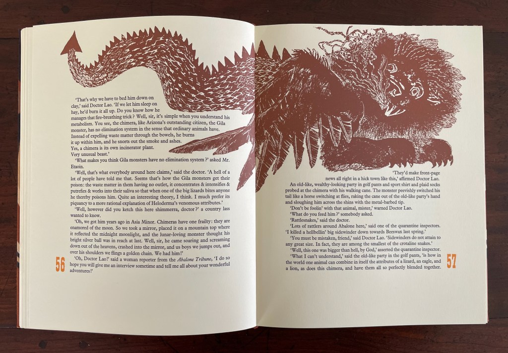
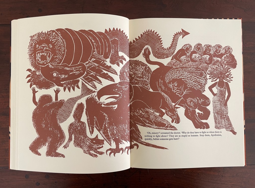
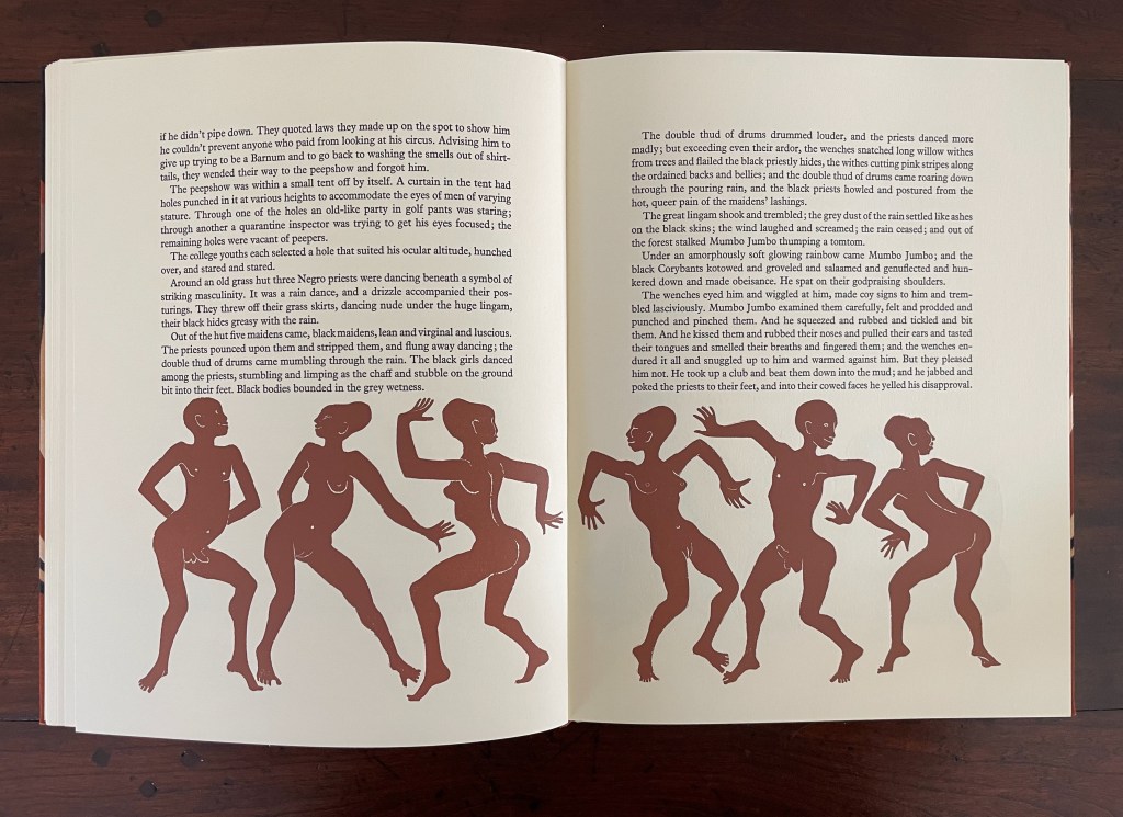
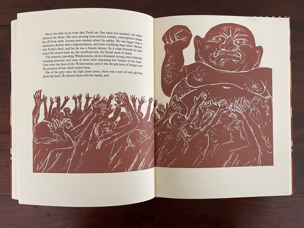
Finney drops Dr. Lao’s circus of P.T. Barnum-esque carnival sideshows, a bestiary of distorted mythological creatures and exaggerated stereotypes, into the Arizona backwater of Abalone. The denizen of Abalone and their reactions — from gullibility, lubricious fascination, racist hazing, and violence to shrugs and a smug return to unexceptional normality — are the targets of Finney’s fevered satire. Van Vliet mirrors the range with her illustrations printed from original relief etchings and her selection of contrasting Plantin and Victoria display types.
Separately from the Limited Editions Club’s run of 2000, there was a Janus Press edition of 150 deckle-edged copies with pochoir illustrations.
Finney, C. G., “The circus of Doctor Lao.,” Grolier Club Exhibitions, accessed May 7, 2025, https://grolierclub.omeka.net/items/show/130.
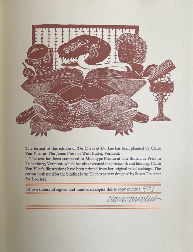
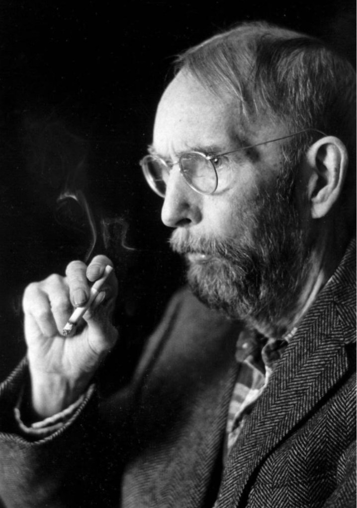
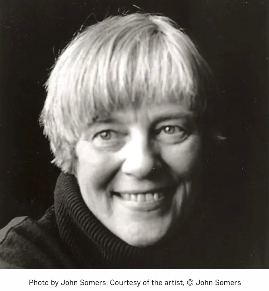
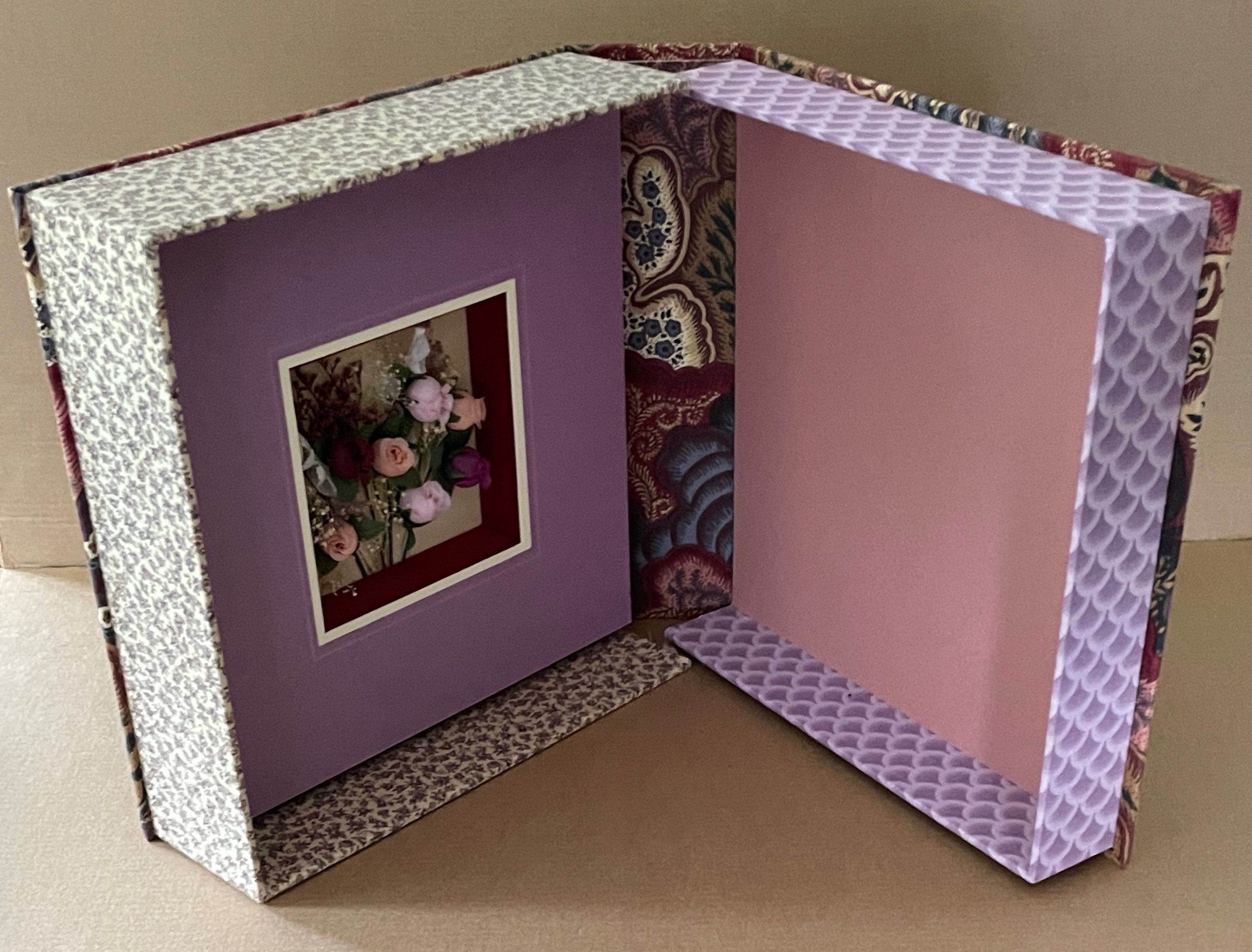
The circus closes with an almost Grand Guignol act, after which “into the dust and the sunshine the people of Abalone went homewards or wherever else they were going”. But the book does not end there. A tongue-in-cheek catalogue, billed as an “explanation of the obvious which must be read to be appreciated”, is Finney’s parting shot, followed by Van Vliet’s (perhaps allegorically) illustrated colophon. On the left, the bespectacled scribe might be taken for the novella’s Mr. Etaion, proofreader of the circus’ ad appearing in Abalone’s Tribune. But take a closer look. Except for the curly hair, the smiling image on the right resembles Van Vliet herself, her hand on the book resting on a pedestal. If it is her, then the figure on the right may be her drawing of Charles G. Finney. Between them, one of Finney’s inventions, a sea serpent turns a book’s pages with its tongue. That book rests on the back of another of Finney’s inventions, a two-headed turtle, while Van Vliet looks on, drawing inspiration from the pages of Finney’s book. The screen in the scene’s background might be a mould and deckle papermaking frame, emblematic of another of Van Vliet’s talents.
Both the Limited Editions Club production and the Janus Press edition represent Van Vliet’s early engagement with the fine press tradition of livres d’artiste. The choices of Barcham Green paper, monotype, and the Thebes design on cotton cloth are one set of fine press hallmarks. Another is the meticulous alignment of prints across double-page spreads. Van Vliet’s choice of Finney’s award-winning novella provided the literary half of the equation, and her etchings and pochoir work completed the artiste half.
Praise Basted In (1995)
Praise Basted In (1995)
Margaret Kaufman and Claire Van Vliet
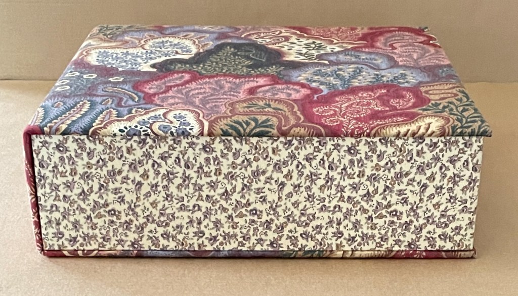
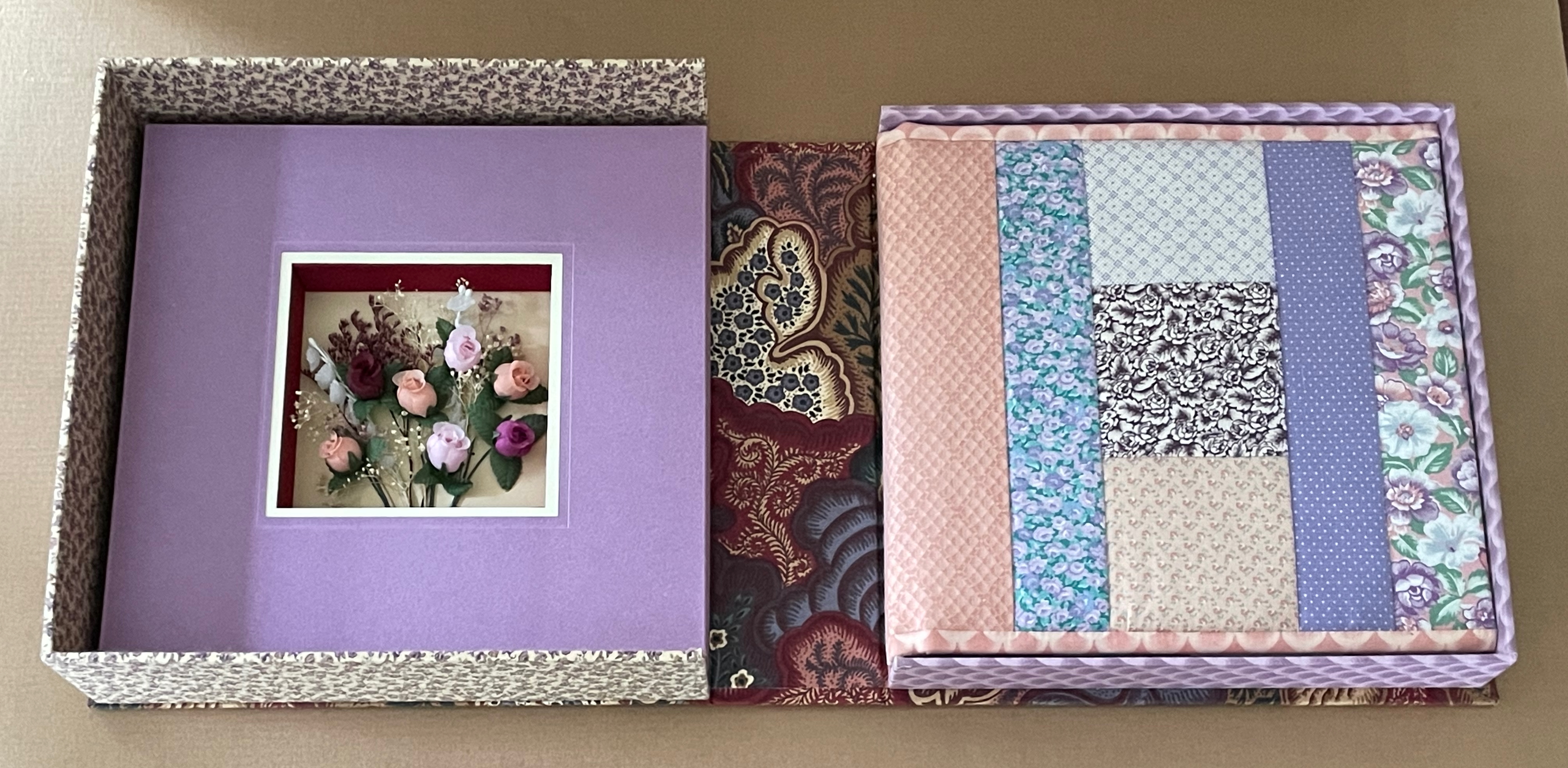
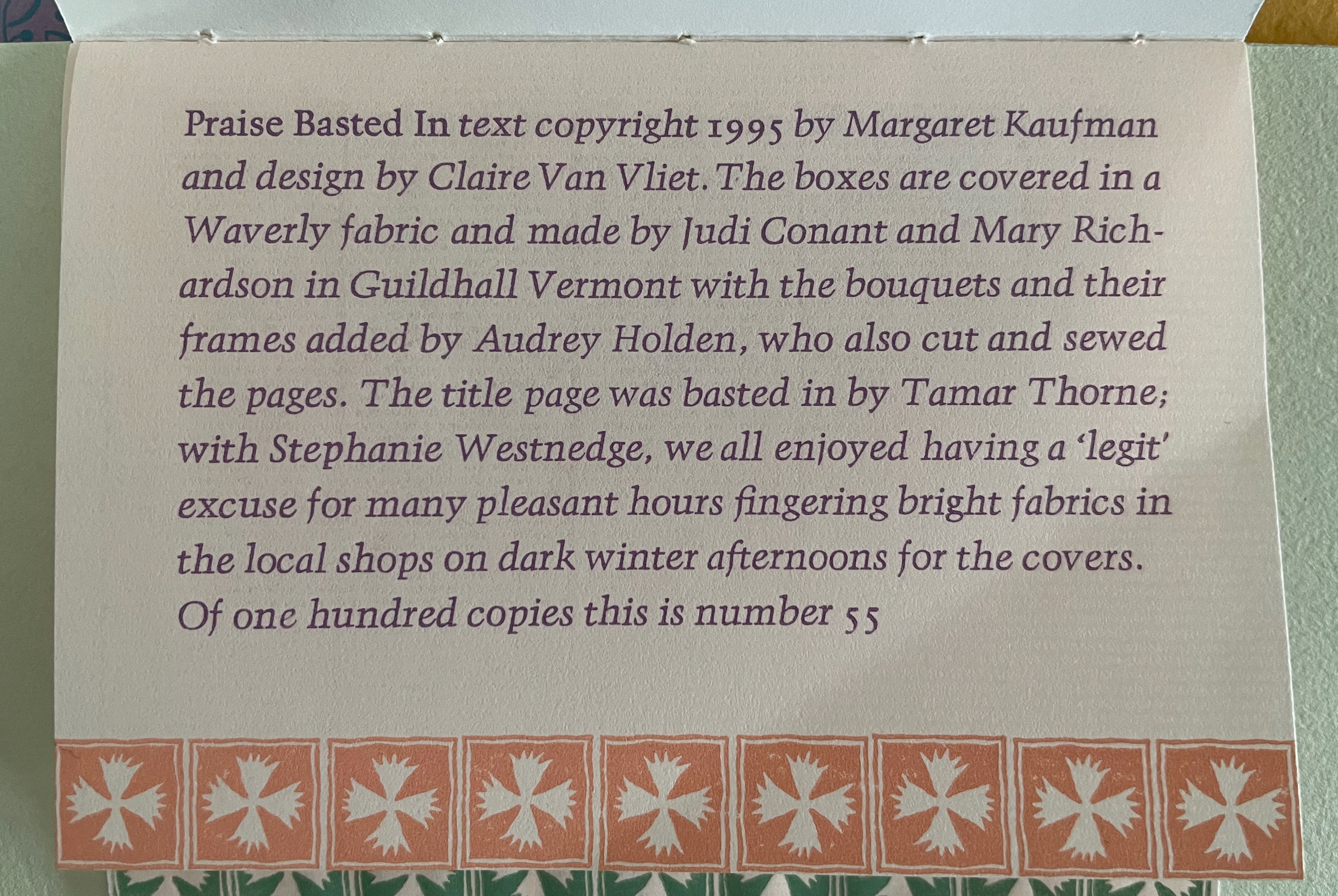
Clamshell box covered in Waverley fabric, containing a fabric flower arrangement set in the box lid and a quilt-bound book of multiple papers with scanned greeting cards addressed to the fictional Aunt Sallie by their makers. Box: H255 x W252 x D75 mm. Book:H232 x W235 mm. [16] pages. Edition of 100, of which this is #55. Acquired from Sophie Schneideman Rare Books 25 January 2025.
Photos: Books On Books Collection.
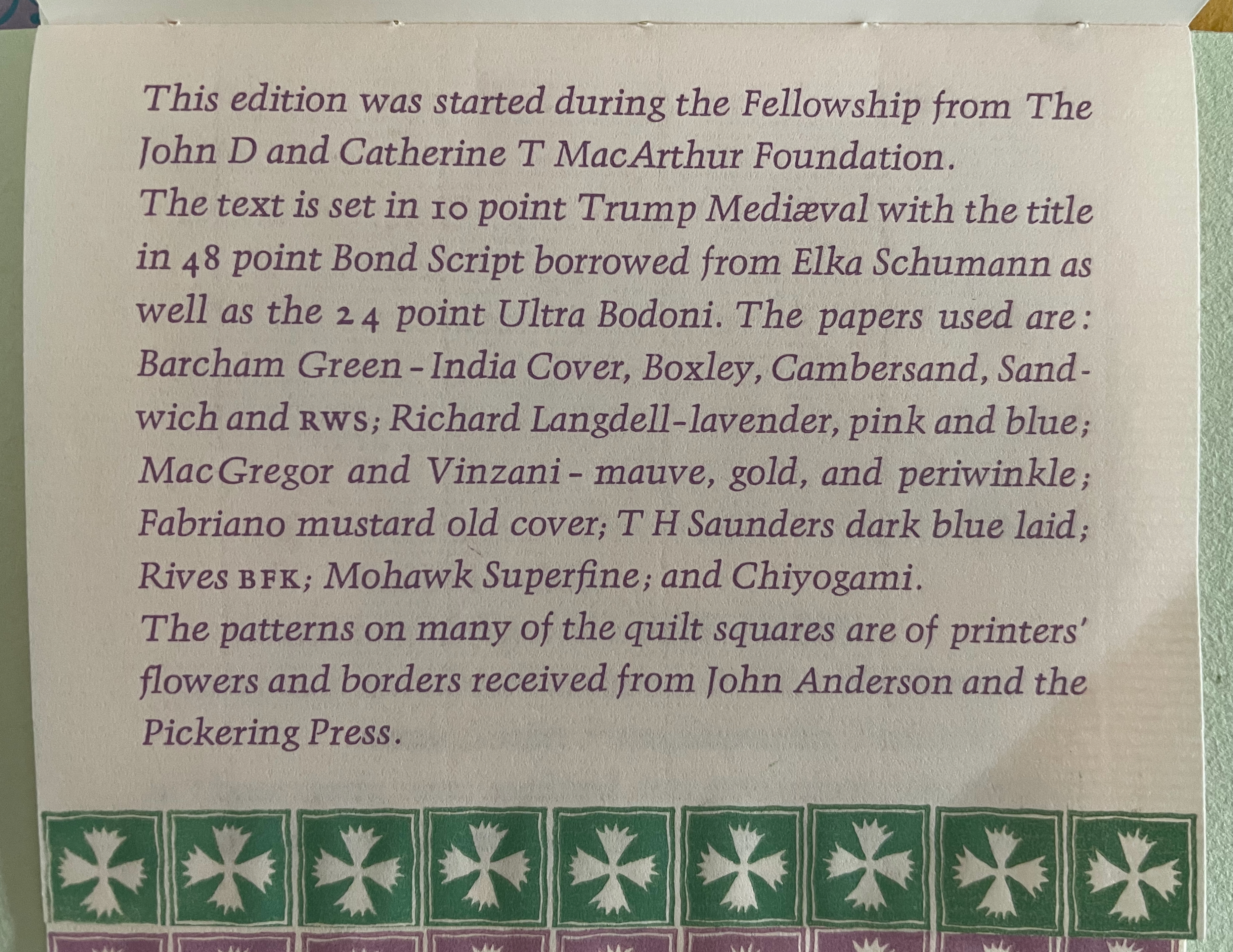
In his book for the Boston Athenaeum’s exhibition The Art of Paper : Claire van Vliet and the Janus Press : Papermaking Collaborations, John Buchtel rightly invokes the well-directed quilting bee as an apt metaphor for all of Claire Van Vliet’s collaborative Janus Press book productions. Praise Basted In (1995) enacts and embodies that comparison directly. Buchtel calls it a “quilting-bee-in-book-form”. Metaphors, photographs, and display cases, however, can go only so far in conveying the work’s performative achievement. Hie yourself to one of the libraries or museums behind this link and insist that it bring out its copy. Nothing less will scratch the itch to feel the snug fit of its clamshell box, the pillowiness of the covers, the airiness of the stiff cut-and-folded pages turning, or the different surfaces of the papers — Barcham Green (India Cover), Boxley, Cambersand, Sandwich and rws; Richard Langdell (lavender, pink and blue); MacGregor and Vinzani (mauve, gold, and periwinkle); Fabriano (mustard old cover); T H Saunders (dark blue laid); Rives BFK; Mohawk Superfine; and Chiyogami.
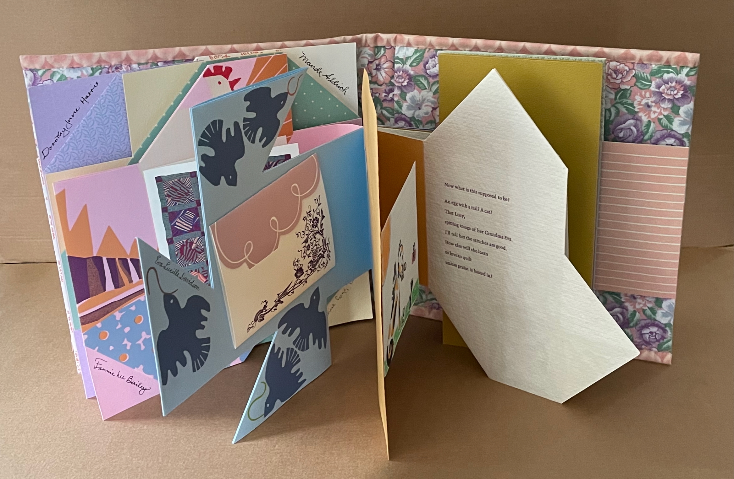
Praise Basted In follows on from Kaufman and Van Vliet’s earlier collaboration Aunt Sallie’s Lament (1988), which is based on Kaufman’s poem muttered by a Southern spinster quilter as she recalls a love lost and other aspects of her life. Now on her birthday, Aunt Sallie receives quilting squares and cards from sisters, nieces, great-nieces and friends and speaks her mind about them and the memories they prompt.
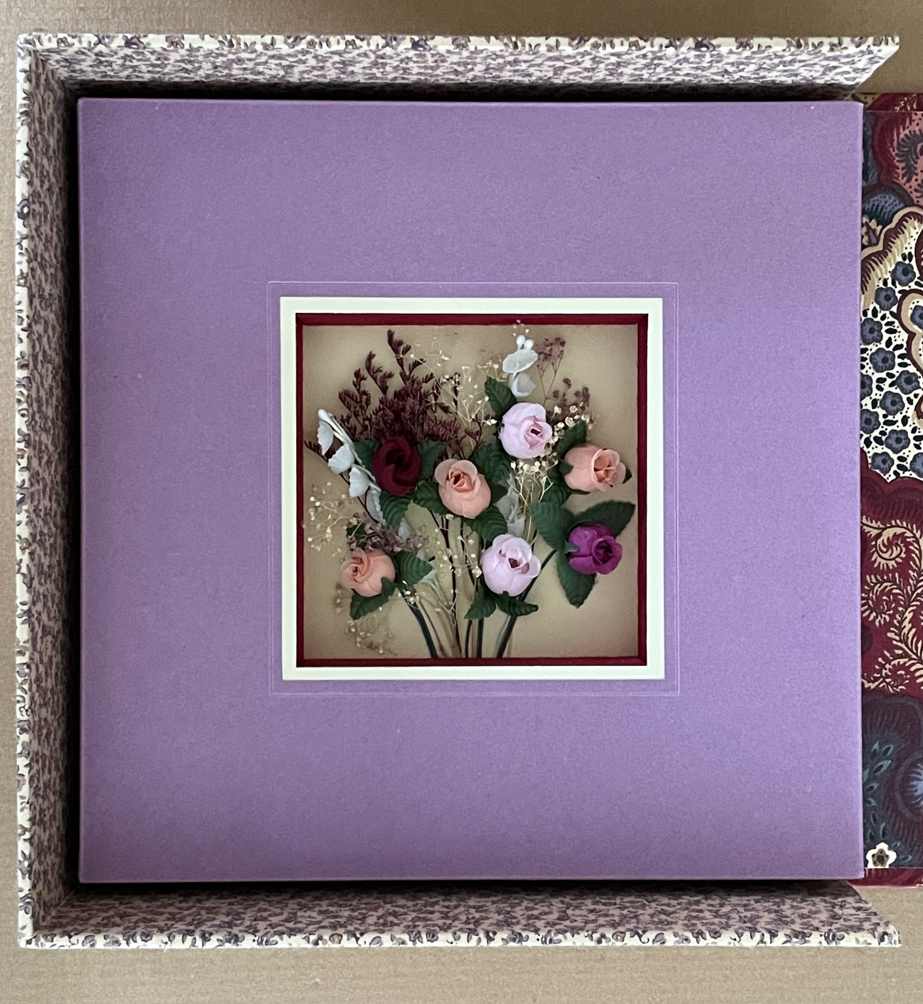
Did you hear the fabric’s shush when the clamshell box opened? The lavender-framed fabric bouquet under clear plastic embedded in the top half of the box will remind you of the privilege it is to be able to pick up the book it faces.
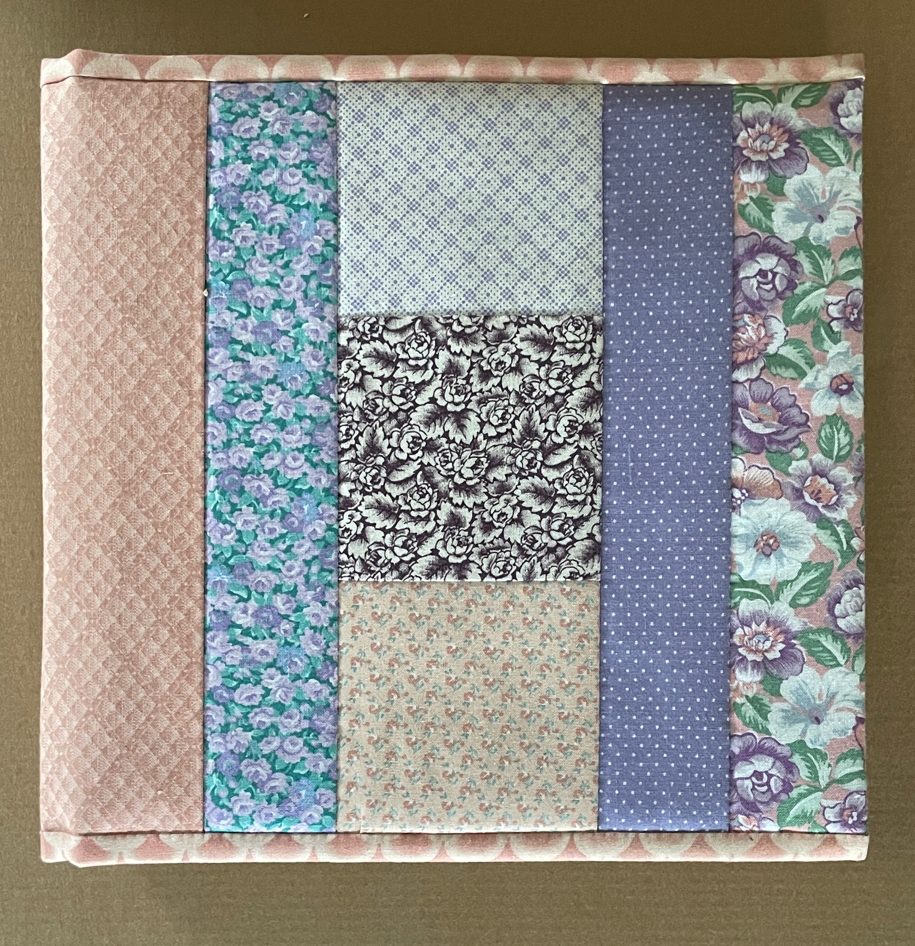
The flexible front and back cover boards are slipped under eleven different fabrics stitched together. The variability of color in the border and spine fabrics is due solely to the photography here.
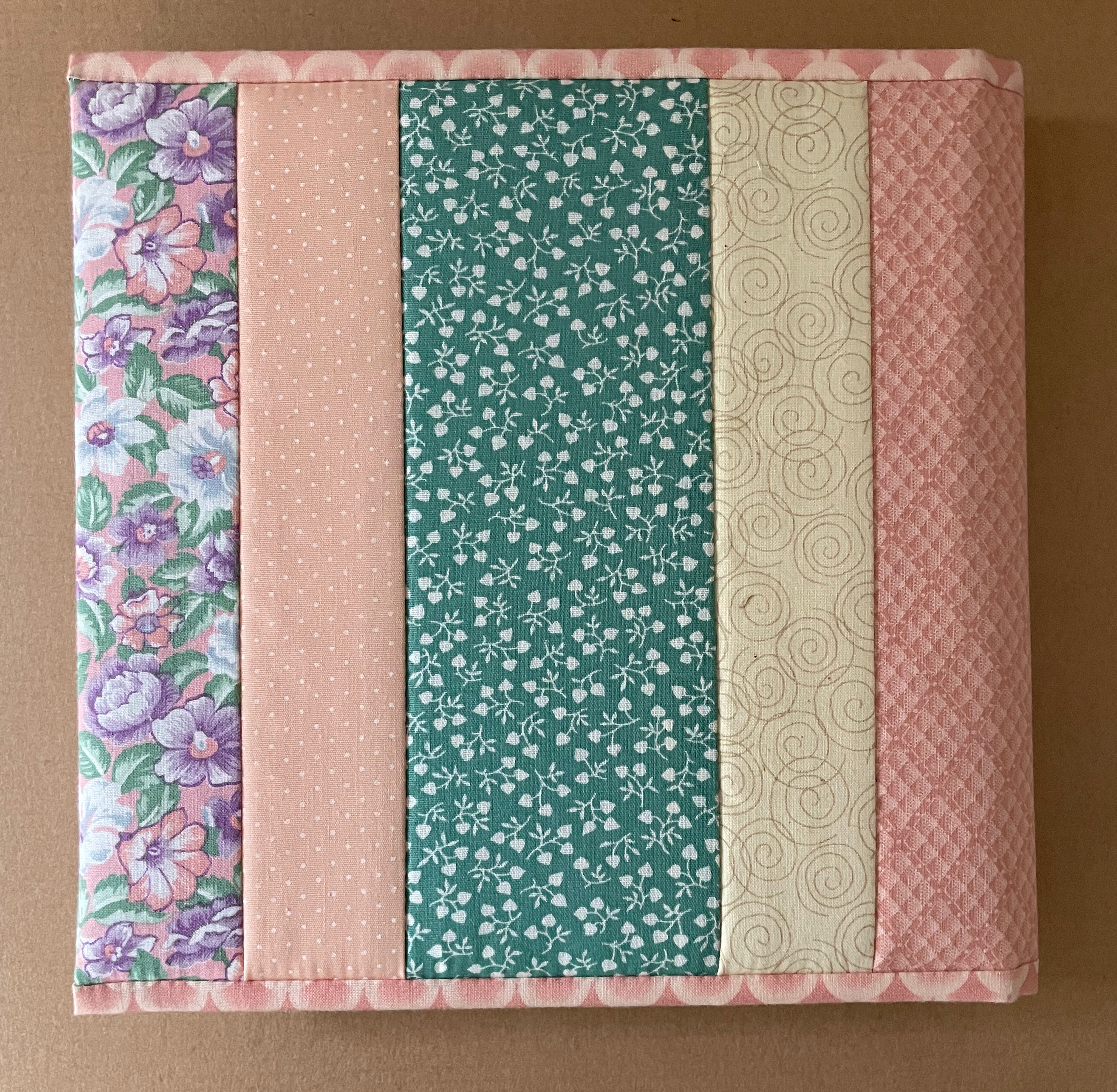
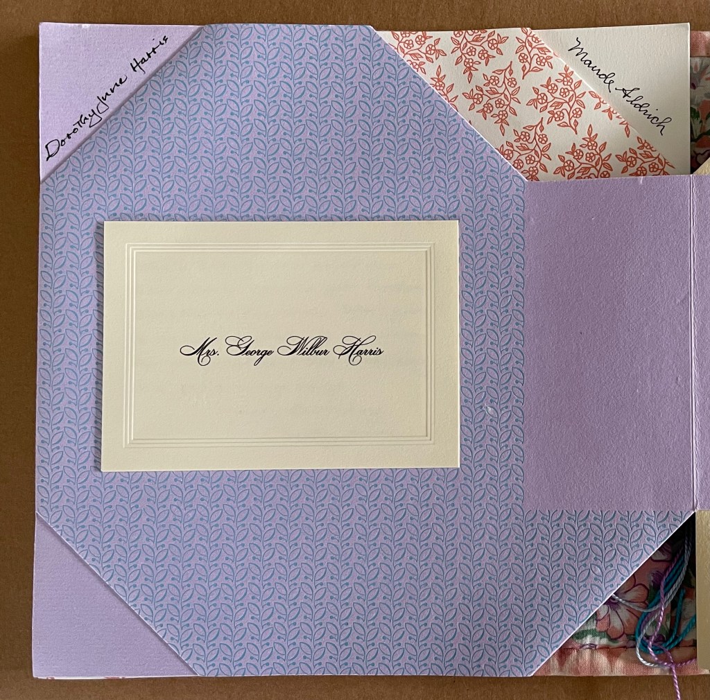
Front and back covers.
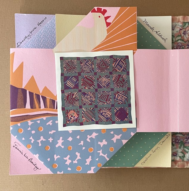
The cutdown “doublure” bears the basted half-title that, when turned, reveals the full title page. The folio bearing the names of the author and press performs several other functions.
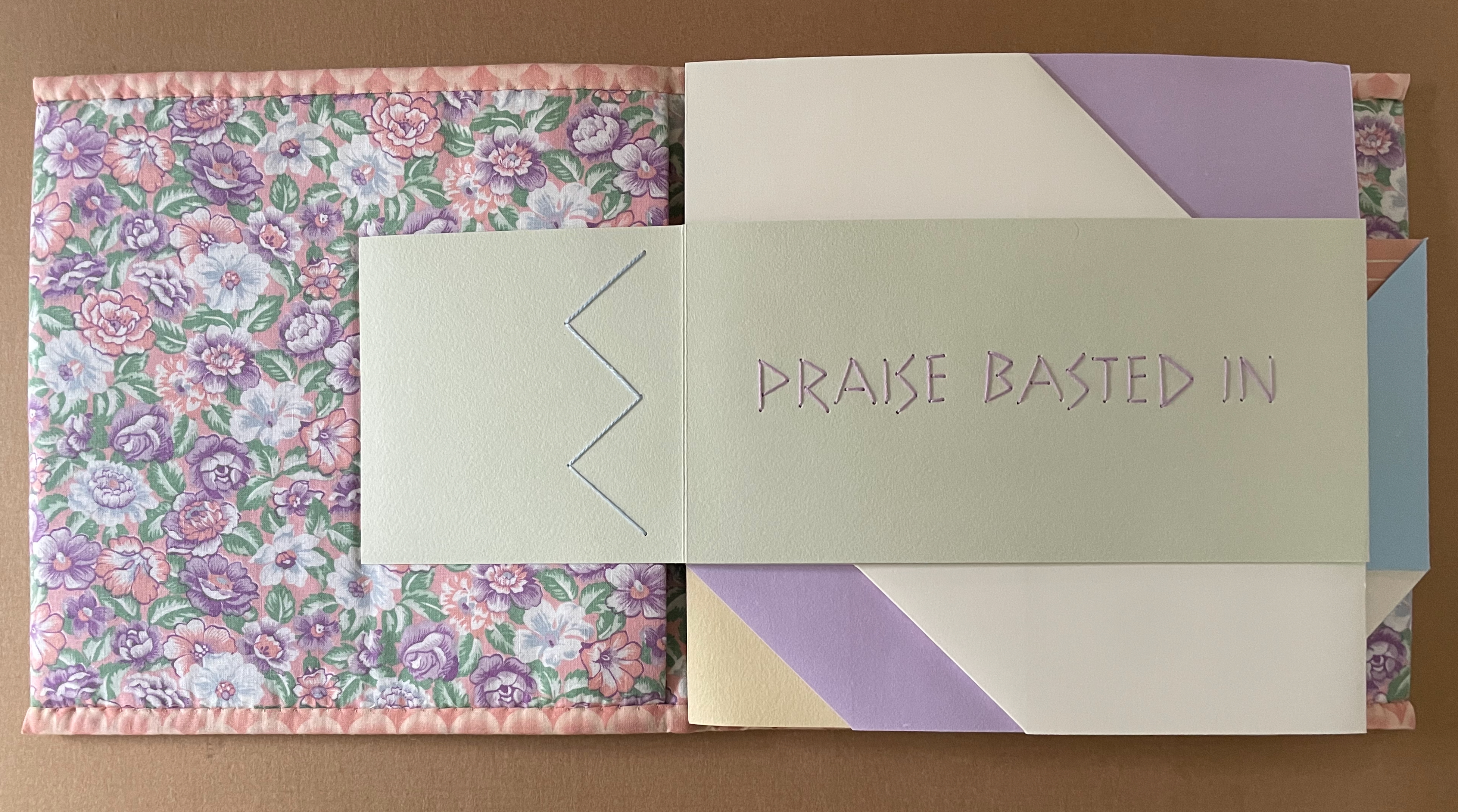
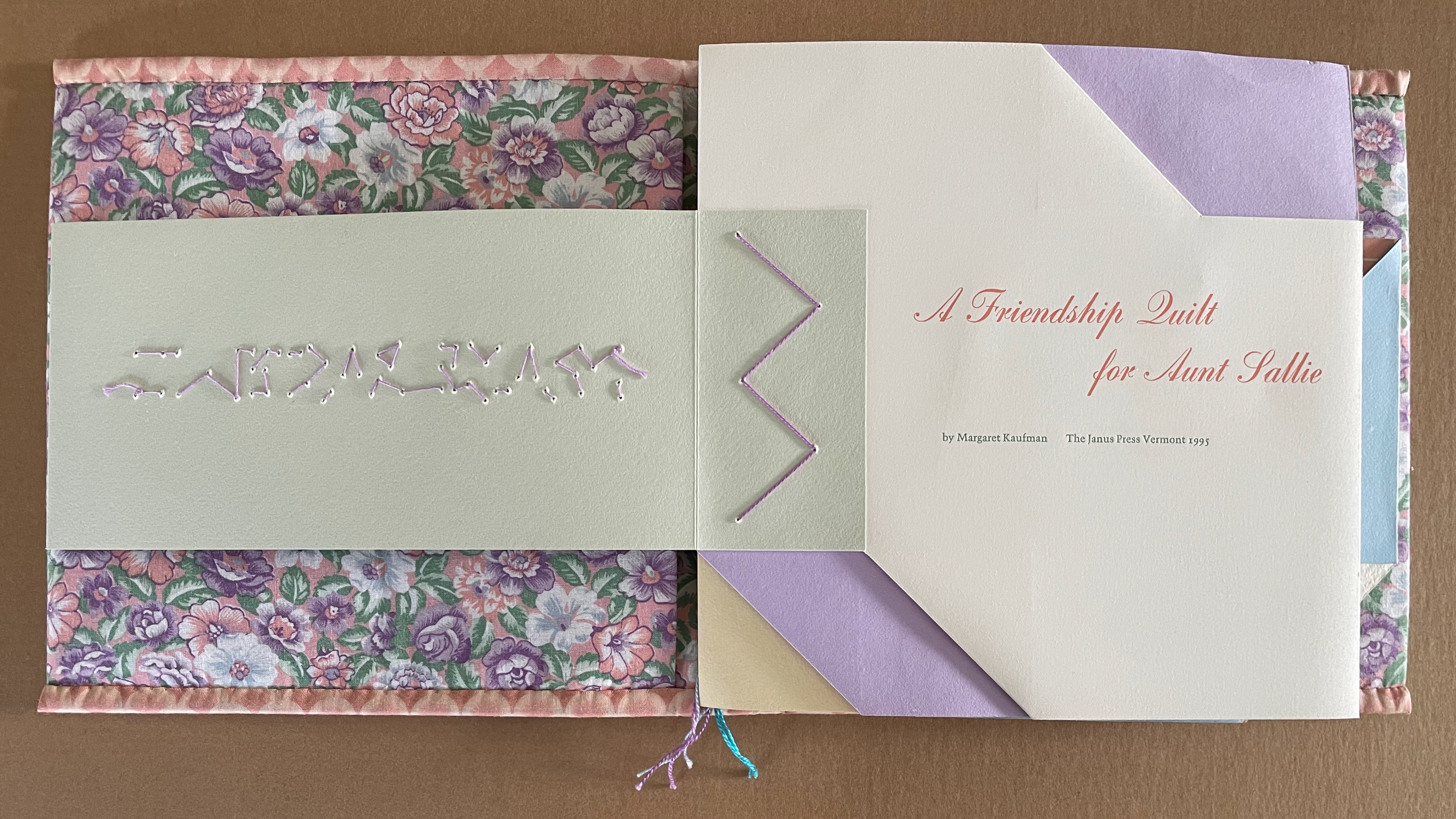
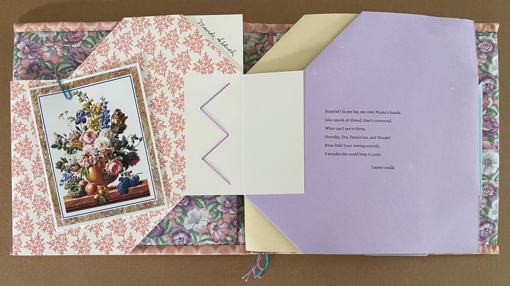
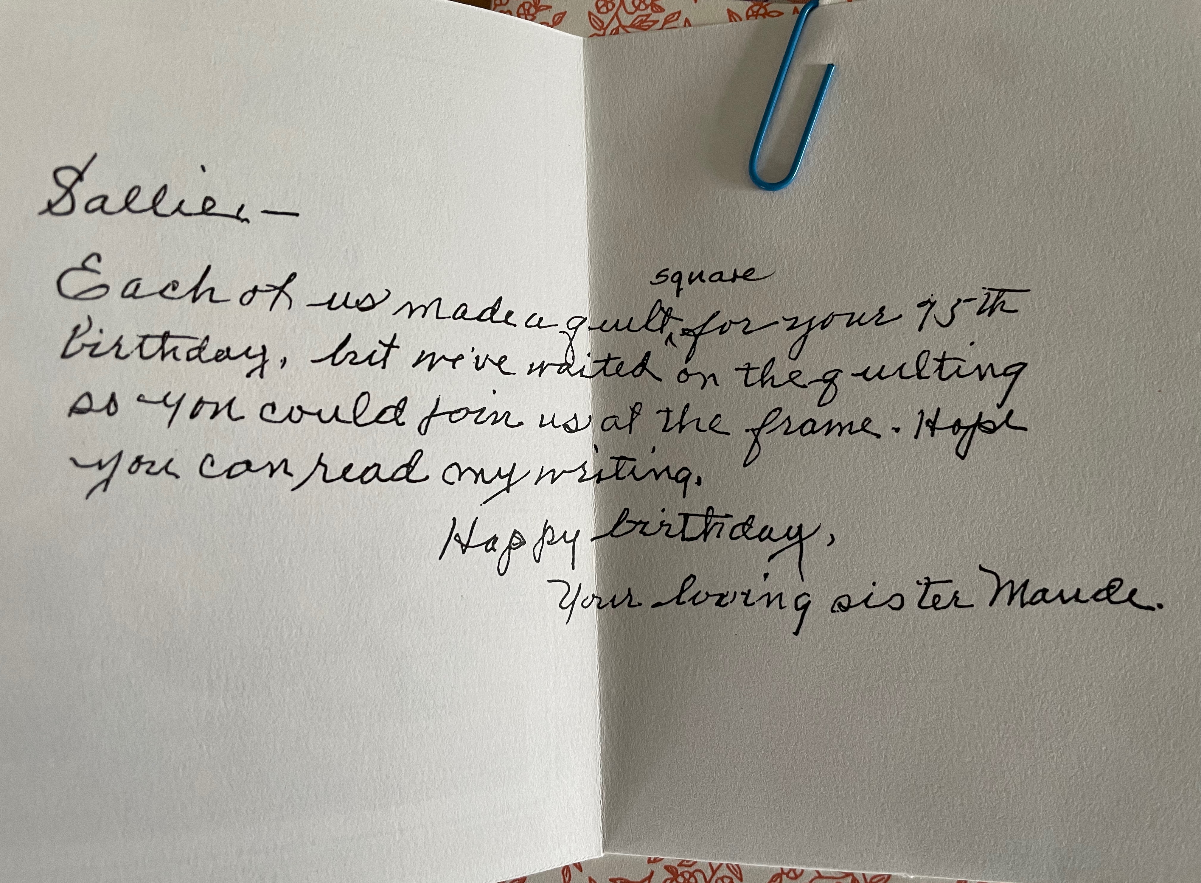
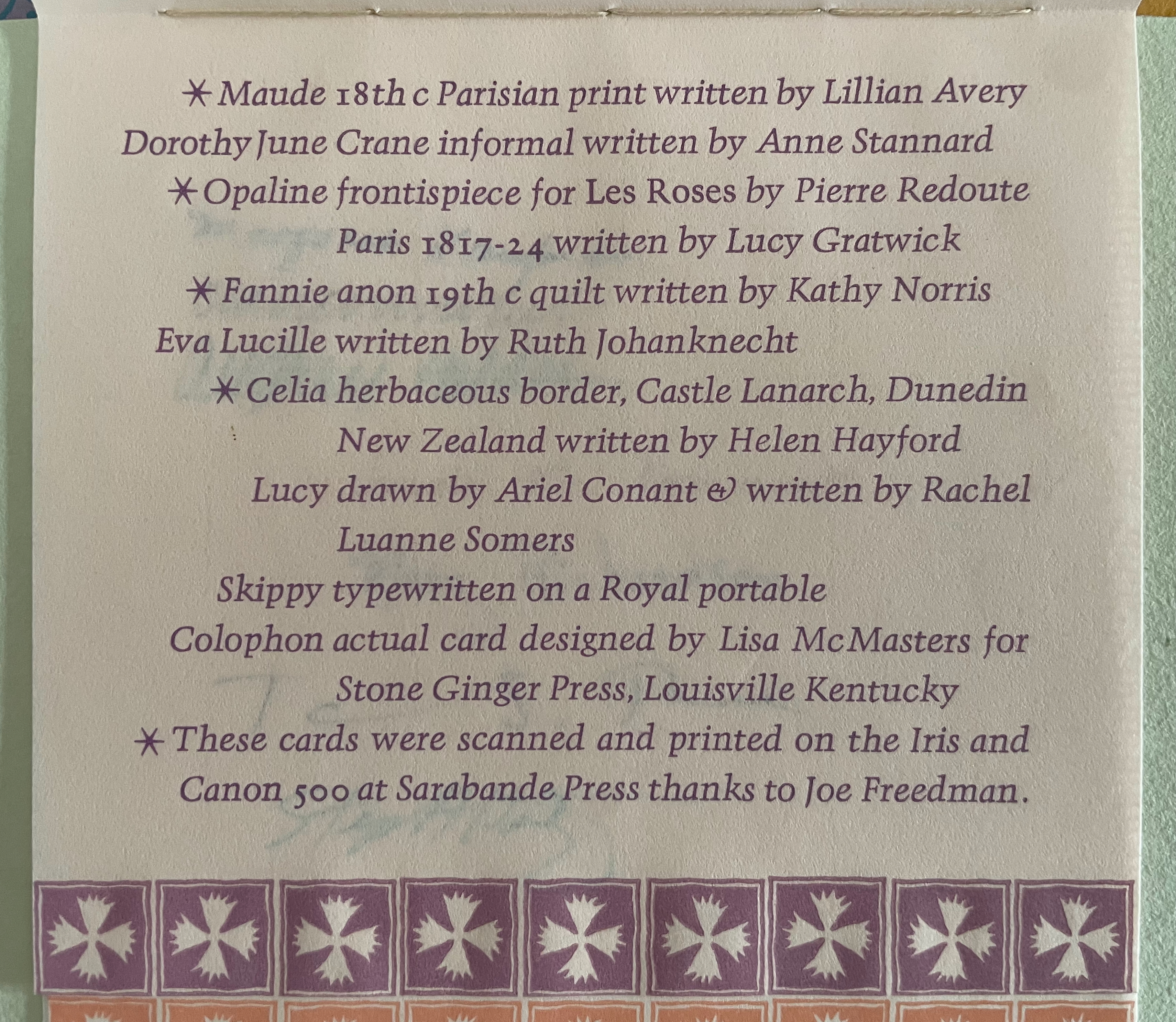
The folio is actually an oblong sheet with the full title and a floral pattern printed only on one side, then cut and folded to take the shape you see above on the right. The only marking on the reverse side of this sheet is Maude Aldrich’s signature, which the cut-and-fold of the folio reveals when the page turns.
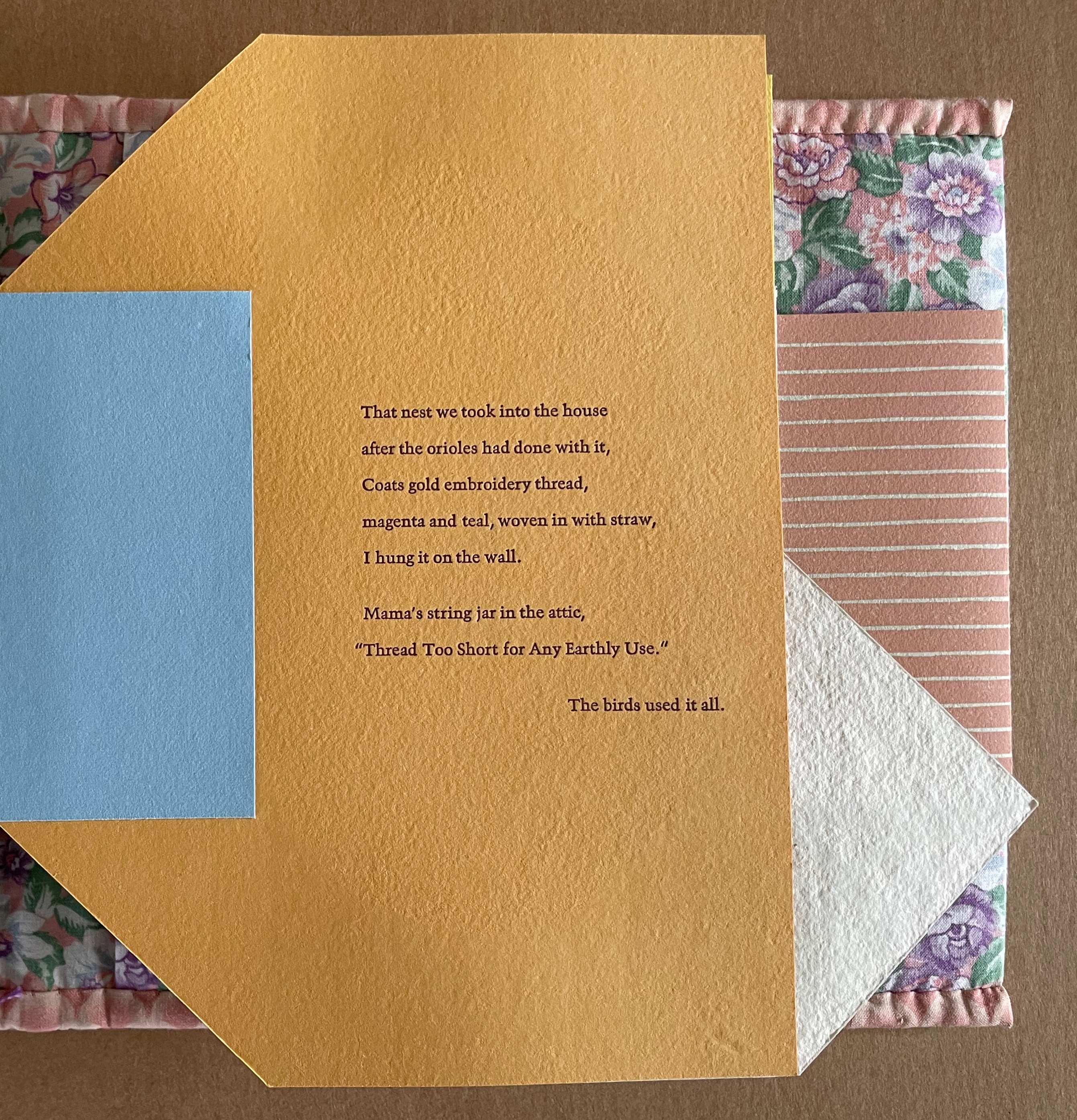
Maude (Aunt Sallie’s sister) has contributed a birthday card, closed with paper clip and glued to the floral-patterned verso side below of this first folio. Usually the loose edges of a Chinese folded folio are captured in a stab-binding at the spine, but this wrapped-back folio is cut and folded to leave to a tab to which the next folio is attached, where Aunt Sallie’s voice appears on the Richard Langdell lavender stock.
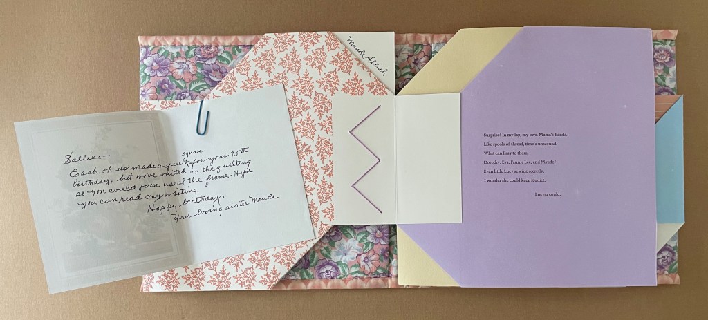
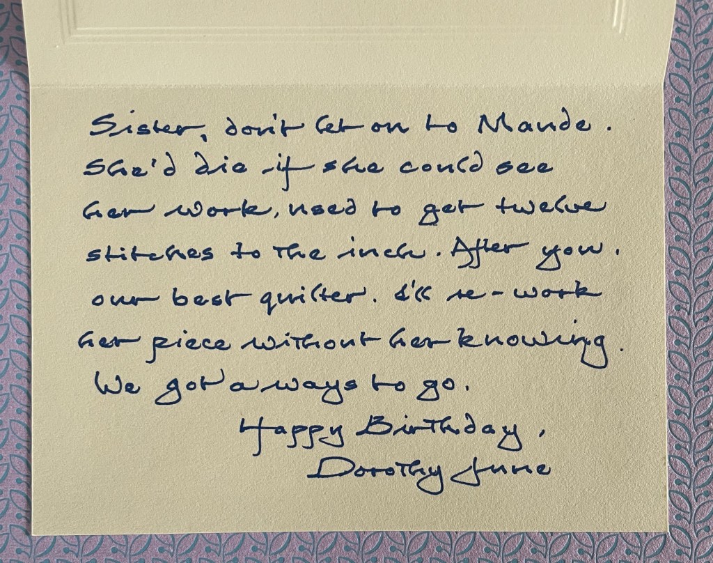
Sister Dorothy Lyne’s contribution appears next on the verso of the folio, which has been printed with a different pattern as would be expected in a friendship quilt. Dorothy Lyne uses her married calling card for her birthday greeting. It is printed on an engraved “informal” from Crane, the kind that Van Vliet recalls her mother had (correspondence). Naturally the cut and fold of this sheet differ from Maude’s. Dorothy Lyne’s signature is revealed in a corner adjacent to Maude’s, much as if they were sitting side by side around the work at hand. Again, the folio’s tab attaches to the next folio, where Aunt Sallie’s voice reappears to comment on the tone and content of Dorothy Lyne’s card. Spinster Aunt Sallie’s snappish response, given Dorothy Lyne’s waving her own married status under her nose, is restrained.
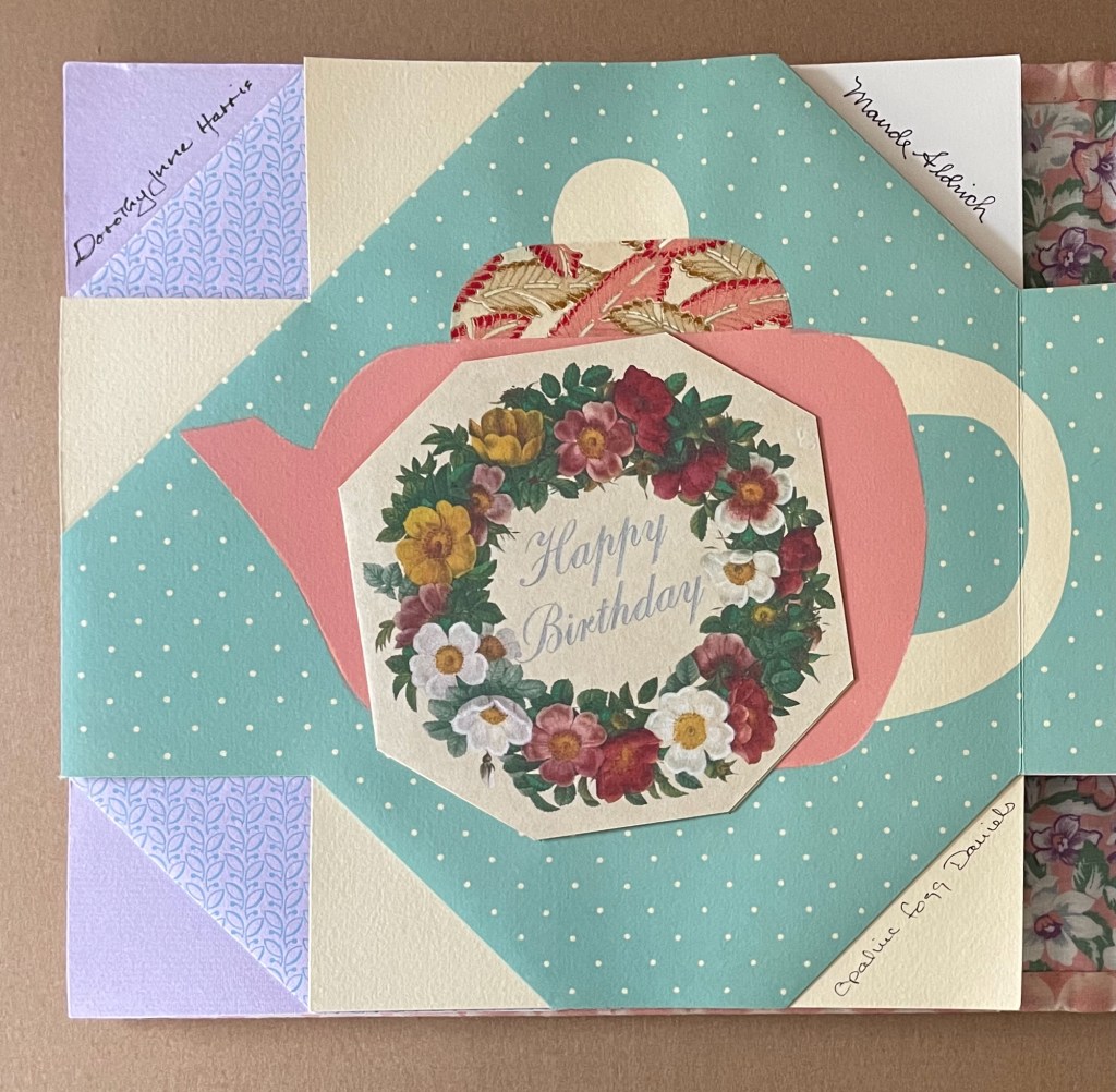
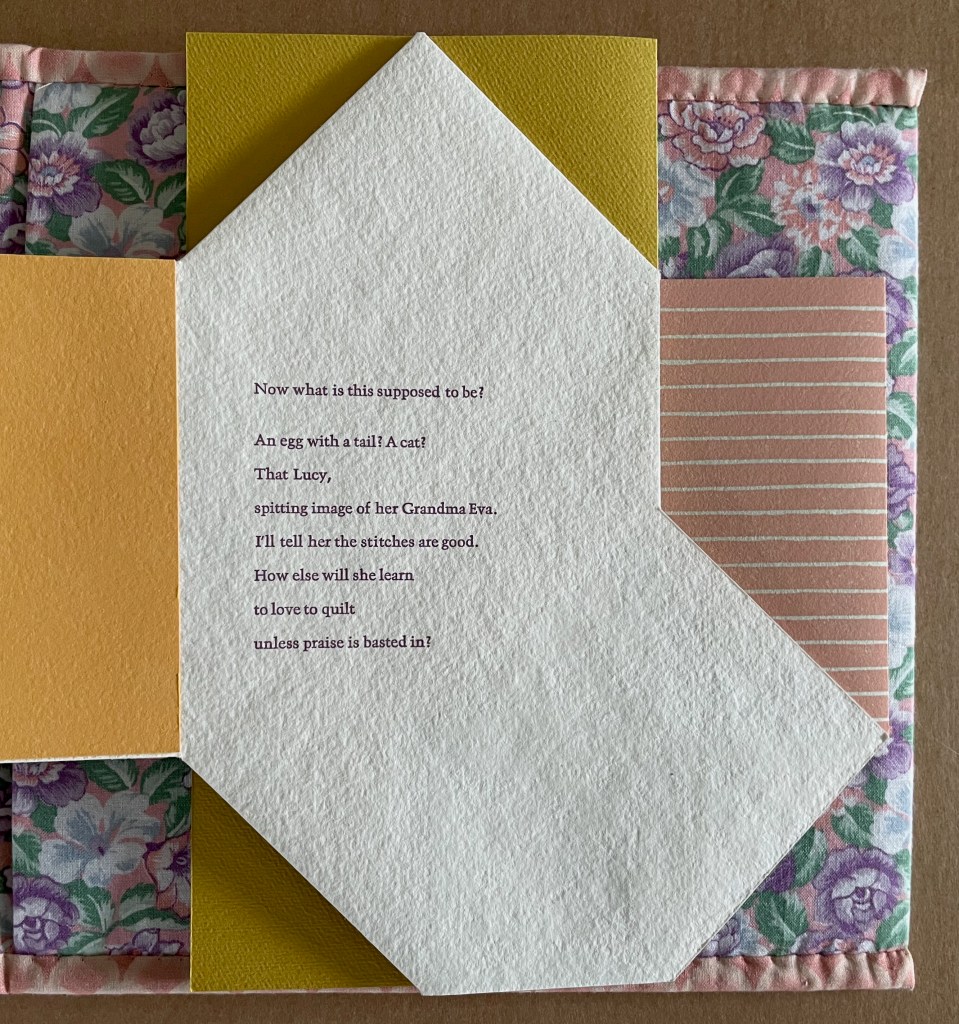
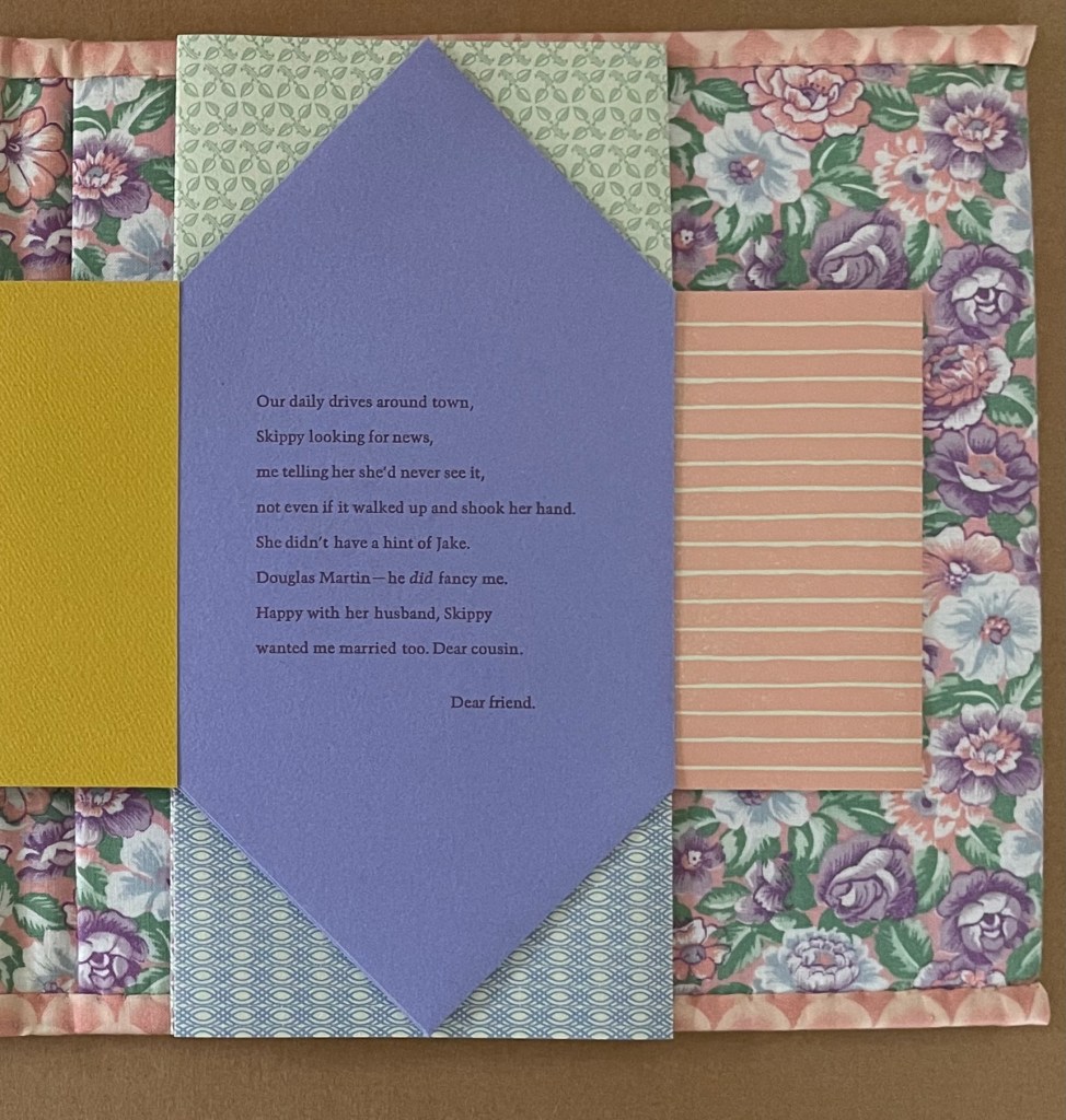
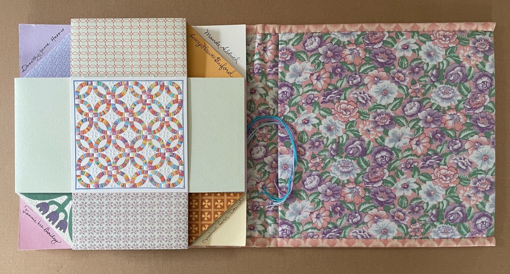
Opaline Fogg Daniels contributes a collaged teapot reinforcing the tab that leads to Fannie Lee Bailey’s square with the rooster “that flew away”, to niece Eva’s bluebird square, to great-niece Lucy Hawes Buford’s basket of calico kittens, to old friend Celia Fogg’s card reminiscing about a shared garden fence, to Aunt Sallie’s oldest friend Eliza “Skippy” Skipworth’s typed note from her desk at the local newspaper promising to announce “this grand occasion”, and finally to the view of the participants’ signatures, all visible due to Van Vliet’s masterful design.
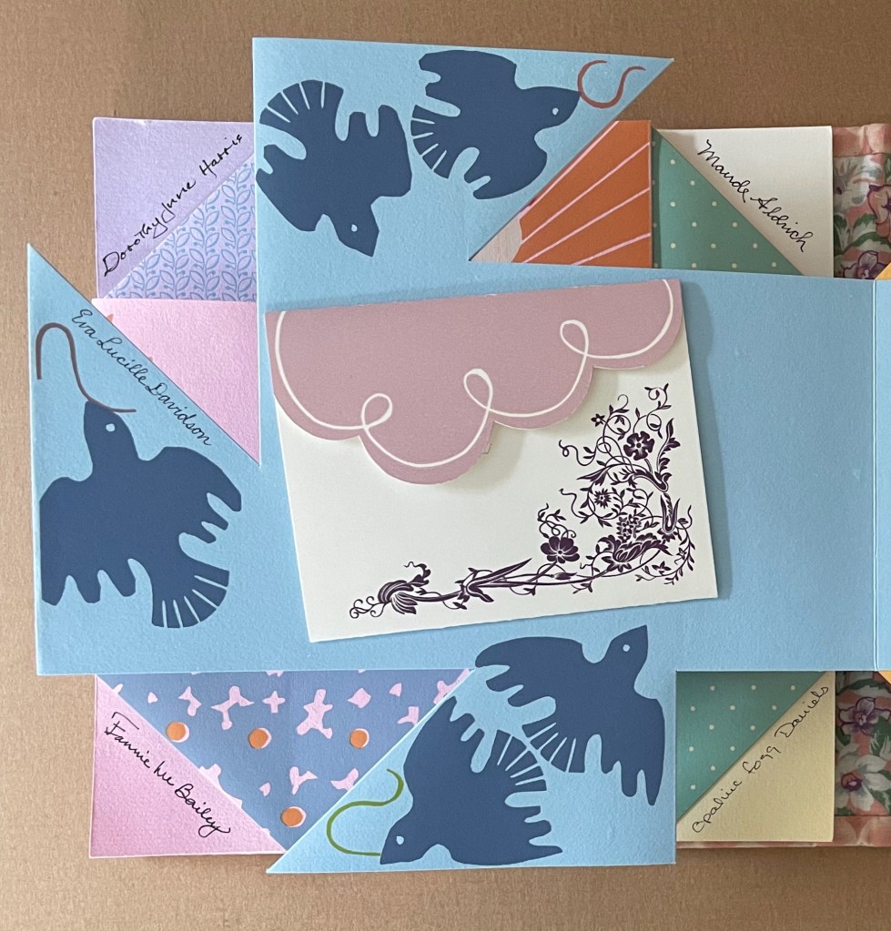
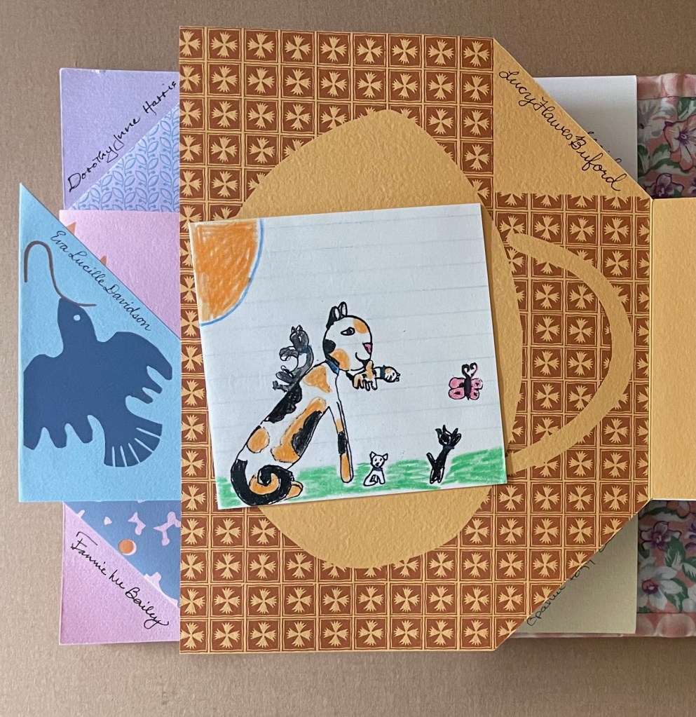
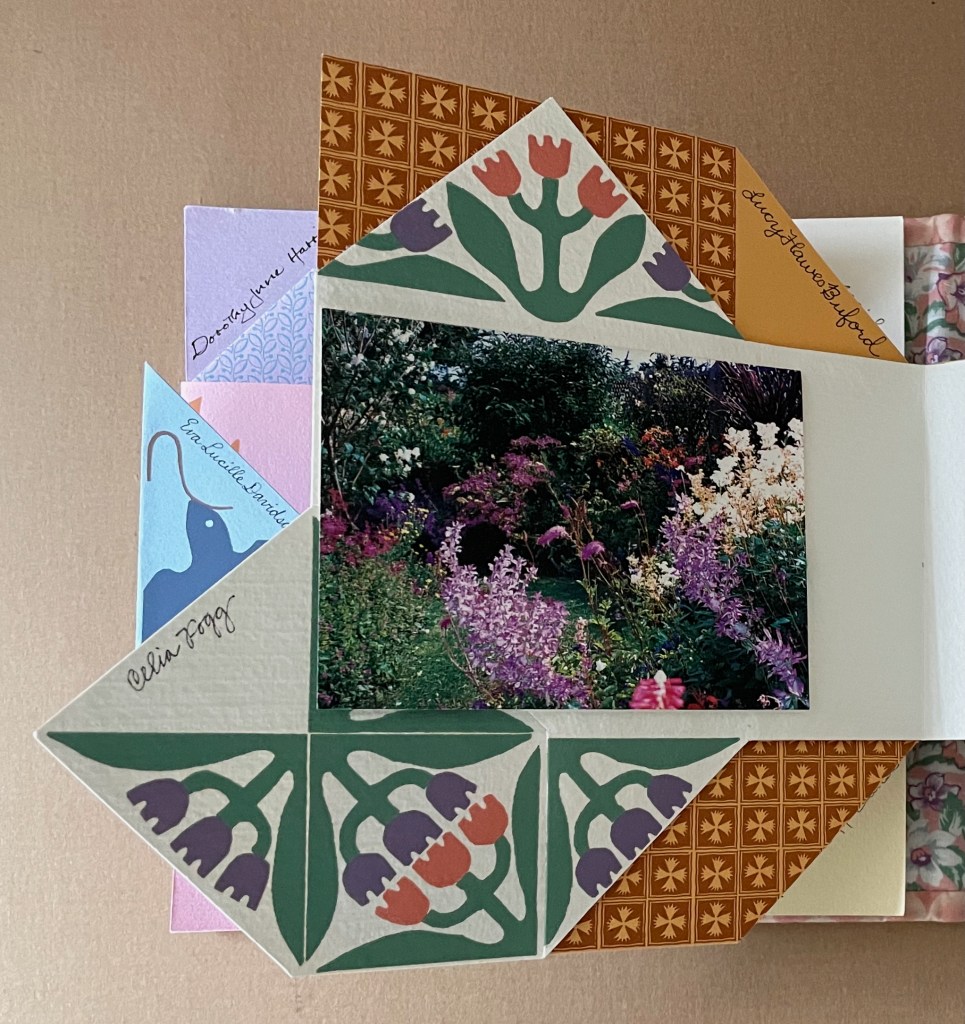
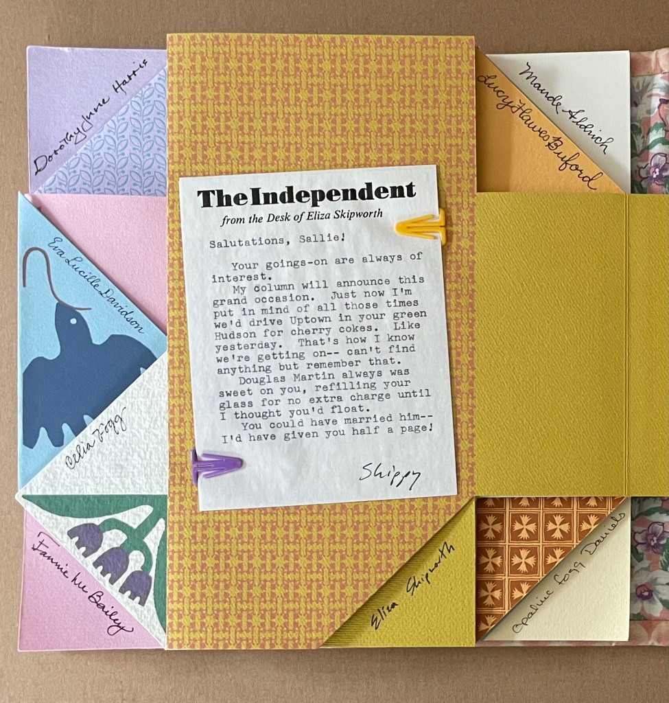
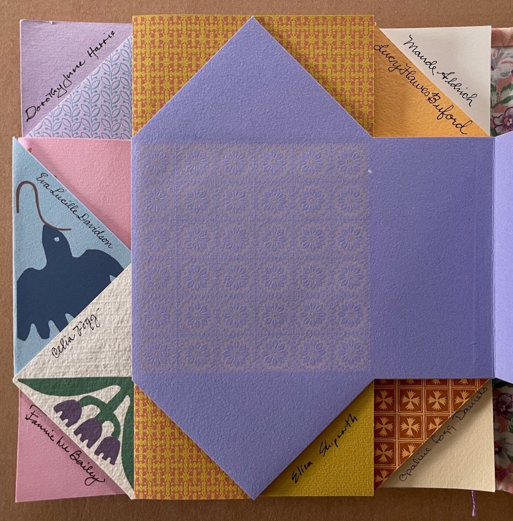
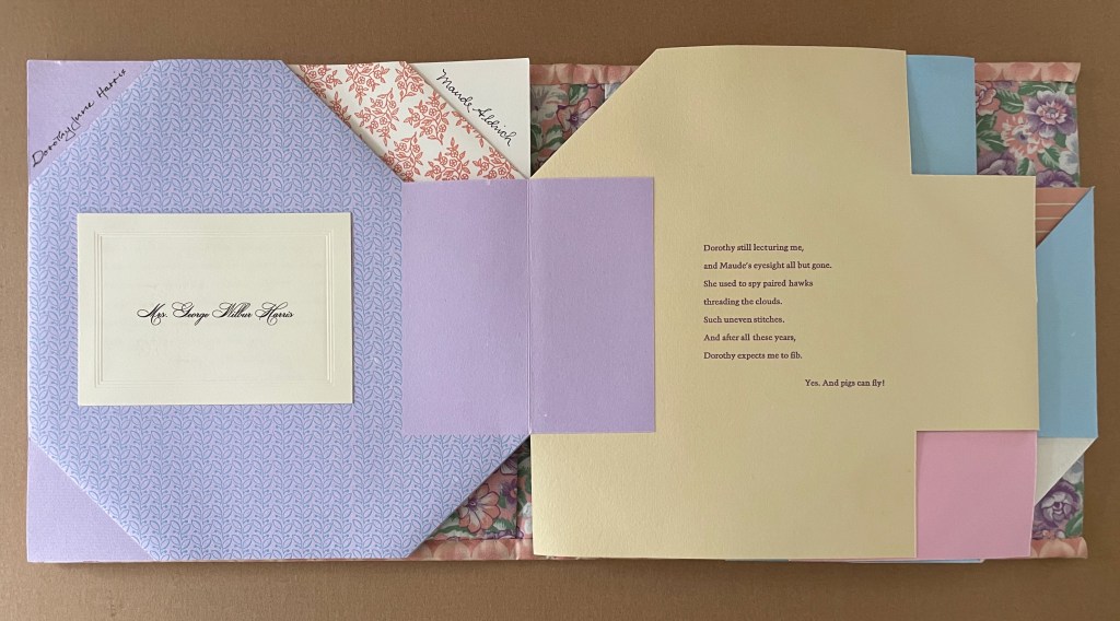
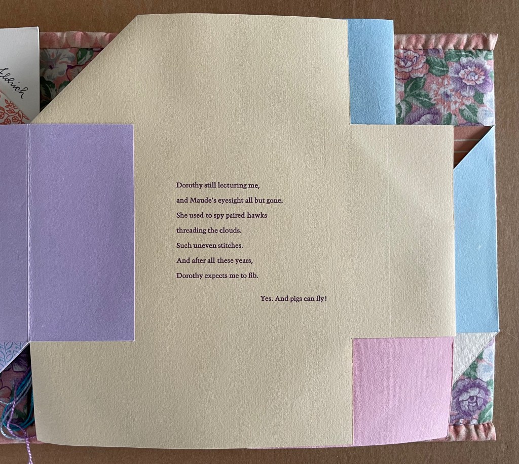
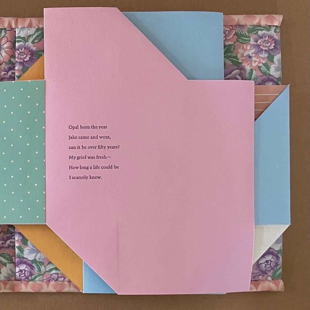
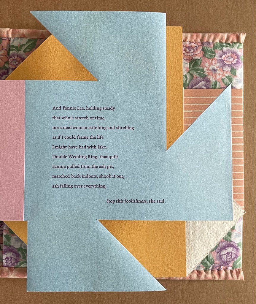
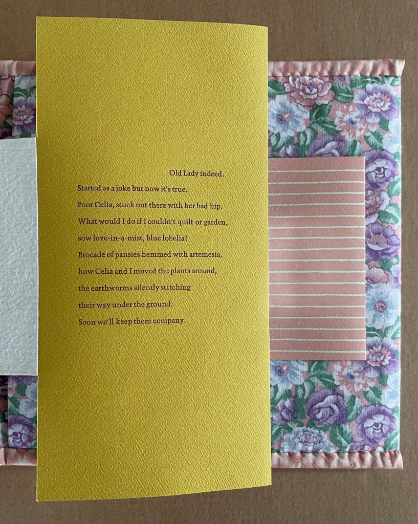
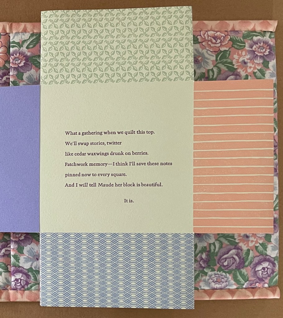
Across from each contribution, as with Maude’s and Dorothy Lyne’s squares, Aunt Sallie’s voice appears, commenting on how Opaline was born the year Aunt Sallie lost her Jake, how Fannie Lee helped her with the grief, how the threads Eva remembers made their way into birds’ nests, how Lucy will only learn to love quilting if some “praise is basted in”, how she and old friend Celia will soon enough join the worms’ stitching under ground, and how newshound Skippy never had a clue about the loss of Jake.
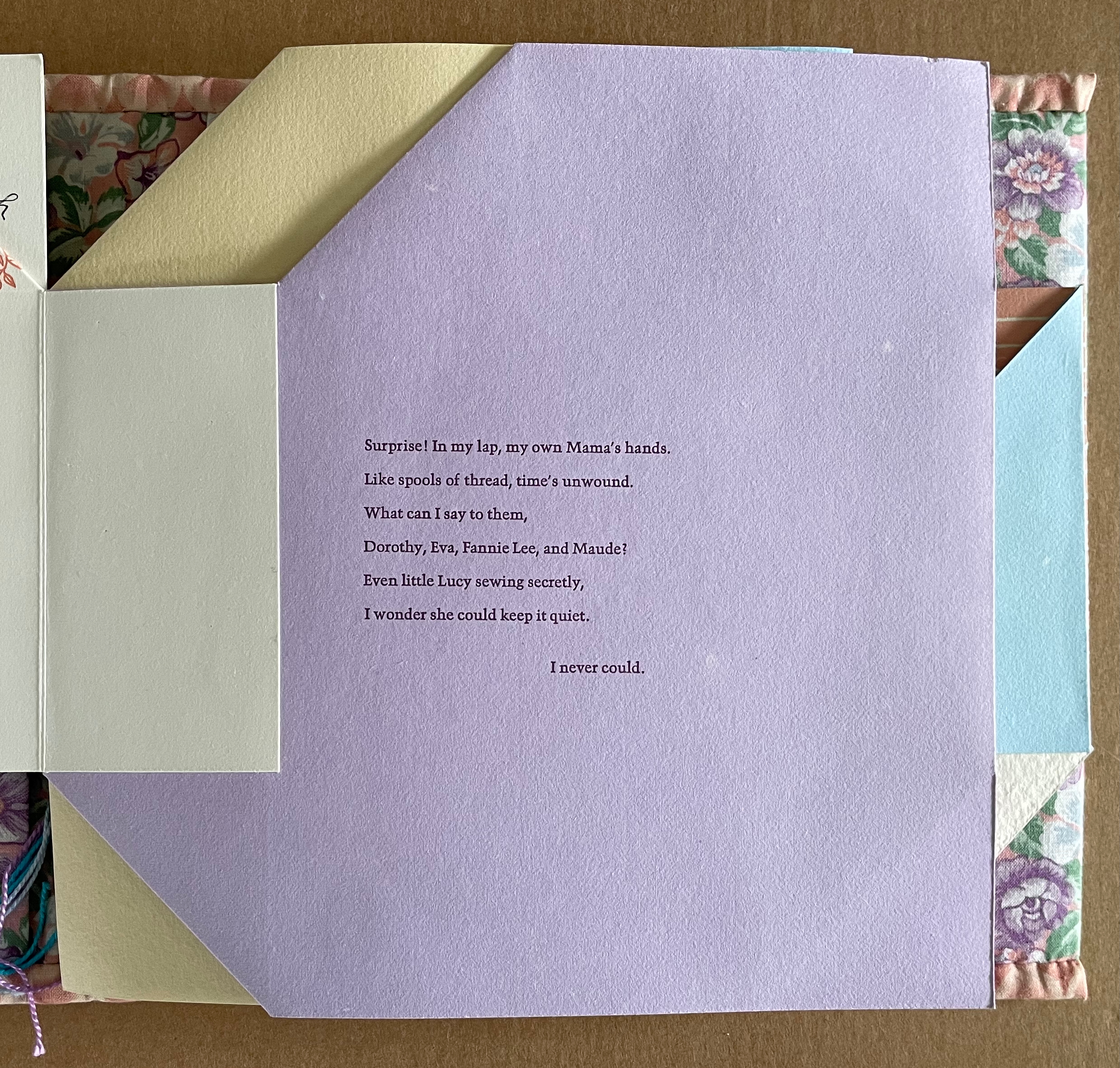
Across from the view of all the participants’ signatures, Aunt Sallie’s last stanza brings all the patchwork memories full circle to Maude’s contribution.
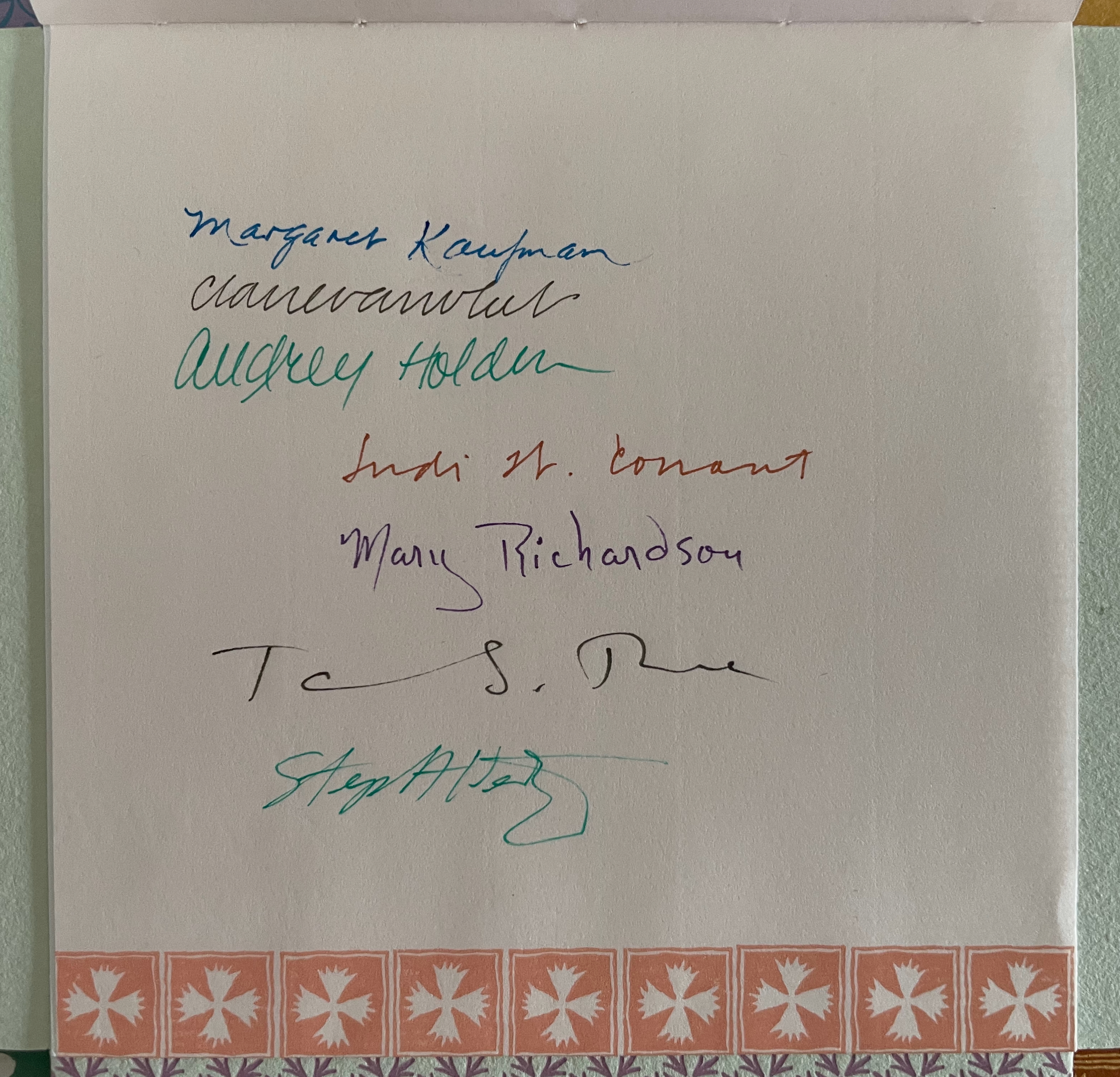
After the poem’s close, the colophon presents one more design flourish. The central square lifts up to reveal four sheets of information. At least 18 individuals, including Van Vliet, had a hand in Praise Basted In — truly a “quilting bee in book form”. In awarding Van Vliet a fellowship, the MacArthur Foundation stimulated a work of collective genius.
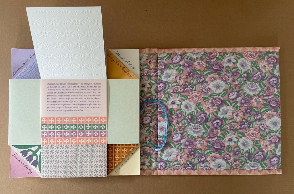
Colophon
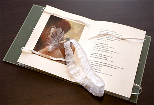
(Compound Frame) Seven Poems by Emily Dickinson (1998)
(Compound Frame) Seven Poems by Emily Dickinson (1998)
Susan Johanknecht, Elizabeth Steiner and Claire Van Vliet
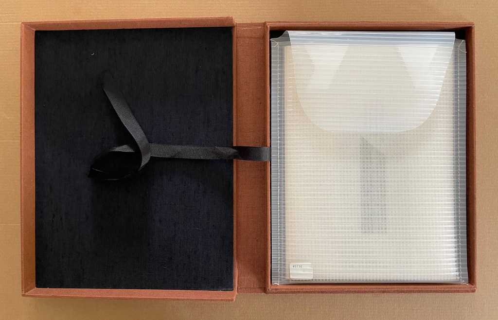
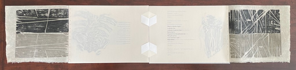
Leather spine and cloth Solander box, enclosing striated polyethylene envelope containing book with clear plastic needlepoint grids for covers; Tyvek, Rowlux bees-eye, and kozo papers; bound with a non-adhesive back-stitch designed by Elizabeth Steiner. Box: H320 x W255 mm. Envelope: H288 x W285 mm. Book: H194 x W267 mm. [12] folios. Edition of 120, of which this is #40. Acquired from James S. Jaffe, 7 February 2025.
Photos: Books On Books Collection.
(Compound Frame) Seven Poems by Emily Dickinson (1998) occupies a curious middle ground between the livre d’artiste of The Circus of Dr. Lao and the “concerto grosso” artists’ book of Praise Basted In. Like The Circus, (Compound Frame) adds visual art to text from an author of the past. Unlike The Circus and Praise Basted In, which include complete textual works (Finney’s and Kaufman’s), (Compound Frame) works with a selection of Dickinson’s poems. Far more than The Circus but far less than Praise Basted In, (Compound Frame) is a collaboration.
Susan Johanknecht of Gefn Press selected and ordered Dickinson’s poems, and Elizabeth Steiner provided the backstitching solution. With Johanknecht’s three pairs of relief prints, hand burnished on Kozo paper at the Gefn Press, and her three linocuts printed on UV Columns paper by Van Vliet at the Janus Press, where the text was handset in 12pt Berthold Walbaum and letterpress printed, (Compound Frame) is more a transatlantic copublication, unlike either The Circus and Praise Basted In.
A selection of just seven poems from nearly two thousand implies careful deliberation. Their reordering implies it as well. Two of Dickinson’s recurrent and related themes and beliefs — the intertwined natures of the finite and infinite and the intertwined natures of the body and soul — seem to have driven the selection of the seven poems.
With Dickinsonian slant and restraint, Johanknecht includes and omits an eighth poem by using only a phrase from it for the book’s title. Significantly, the poem not printed — 264 (A Weight with Needles on the pounds) — is also the only one that uses a sewing metaphor to which the artists allude with the book’s needlepoint-frame covers, backstitched hinging, and image of straight pins. Curiously, poem 264 does not have the phrase “Compound Frame” in parenthesis as Johanknecht does in the title, but more on that later.
To follow Johanknecht’s selection and ordering, here are the seven poems, leading with the “missing” eighth, and their numbers from Thomas H. Johnson’s complete edition.
264
A Weight with Needles on the pounds—
To push, and pierce, besides—
That if the Flesh resist the Heft—
The puncture—coolly tries —
That not a pore be overlooked
Of all this Compound Frame—
As manifold for Anguish—
As Species—be—for name—
1341
Unto the Whole—how add?
Has “All” a further realm—
Or Utmost an Ulterior?
Oh, Subsidy of Balm!
578
The Body grows without —
The more convenient way —
That if the Spirit — like to hide
Its Temple stands, alway,
Ajar — secure — inviting —
It never did betray
The Soul that asked its shelter
In solemn honesty
1431
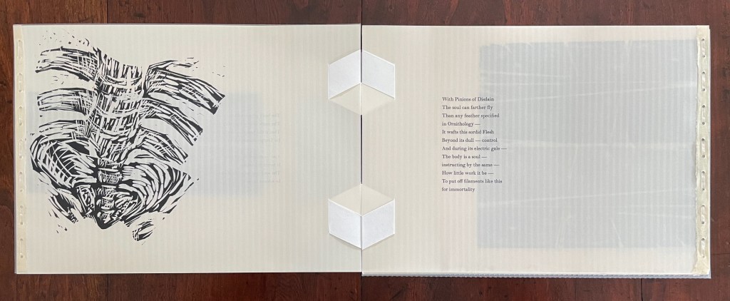
With Pinions of Disdain
The soul can farther fly
Than any feather specified
in Ornithology —
It wafts this sordid Flesh
Beyond its dull — control
And during its electric gale —
The body is a soul —
instructing by the same —
How little work it be —
To put off filaments like this
for immortality.
1695
There is a solitude of space
A solitude of sea
A solitude of death, but these
Society shall be
Compared with that profounder site
That polar privacy
A soul admitted to itself —
Finite infinity.
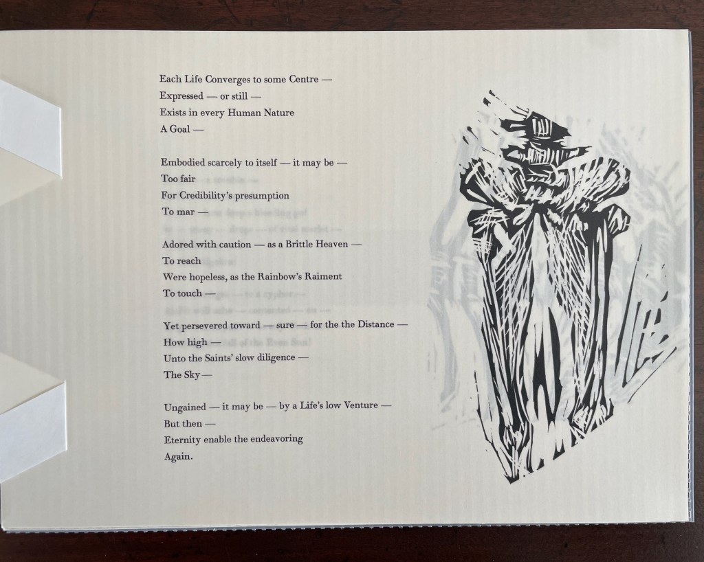
680
Each Life converges to some Centre—
Expressed — or still —
Exists in every Human Nature
A Goal —
Embodied scarcely to itself — it may be —
Too fair
For Credibility’s presumption
To mar —
Adored with caution — as a Brittle Heaven —
To reach
Were hopeless, as the Rainbow’s Raiment
To touch —
Yet persevered toward — surer — for the Distance —
How high —
Unto the Saints’ slow diligence —
The Sky —
Ungained — it may be — in a Life’s low Venture —
But then —
Eternity enable the endeavoring
Again.
269
Bound a Trouble –
and lives will bear it!
Circumscription – enables Woe –
Still to anticipate – Were not limit –
Who were sufficient to Misery?
State it the Ages – to a cipher –
And it will ache contented on –
Sing at its pain, as any Workman –
Notching the fall of the even Sun –
695
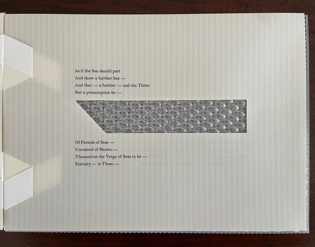
As if the Sea should part
And show a further Sea —
And that — a further — and the Three
But a presumption be —
Of Periods of Seas —
Unvisited of Shores —
Themselves the Verge of Seas to be —
Eternity — is Those —
In the phrase “Compound Frame” from poem 264, Dickinson captures her view of a paradoxical relationship of body and soul, and she probes it expressly in 578 (The body grows without) and 1431 (The body is a soul). The artists capture half of that phrase with their choice of material for the book’s cover. Of course, the needlepoint-frame also captures the sewing and stitching metaphor of the unprinted poem. In keeping with this Dickinsonian slant and restraint, only one of the printed poems hints at the sewing metaphor, as we will see later.
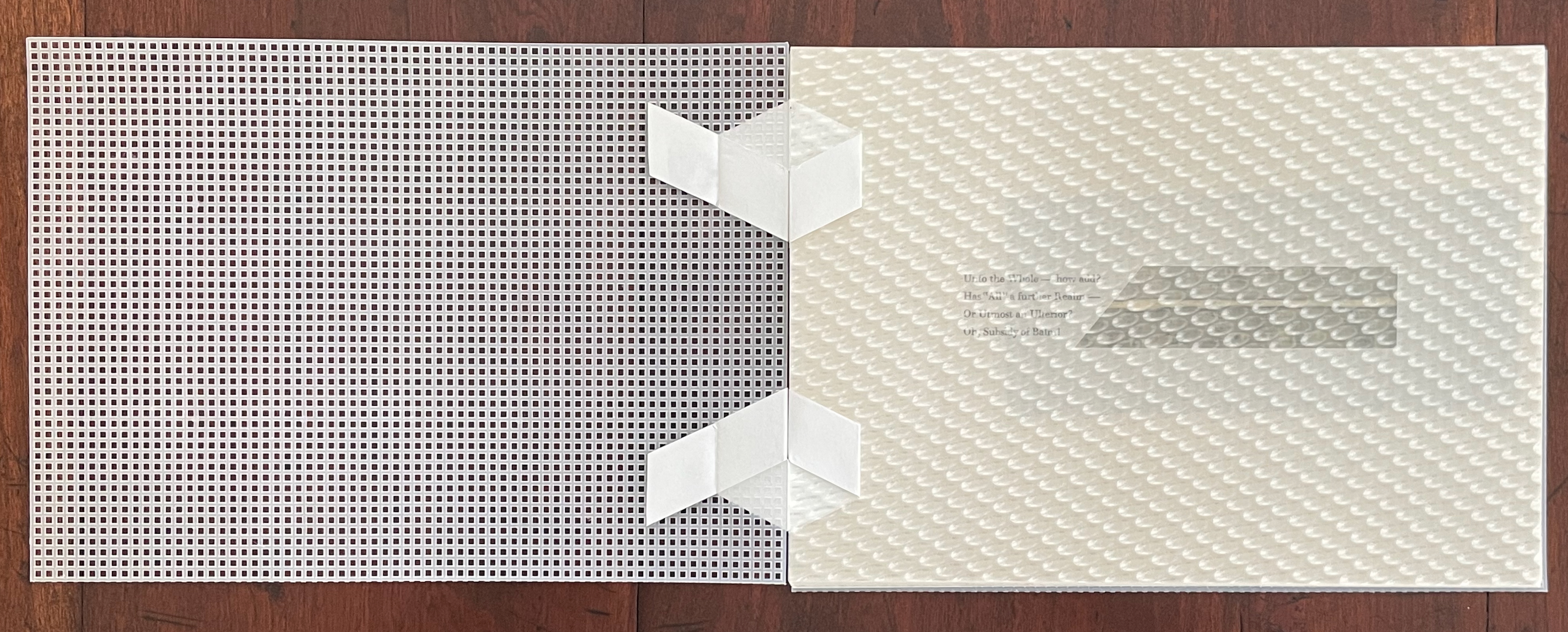
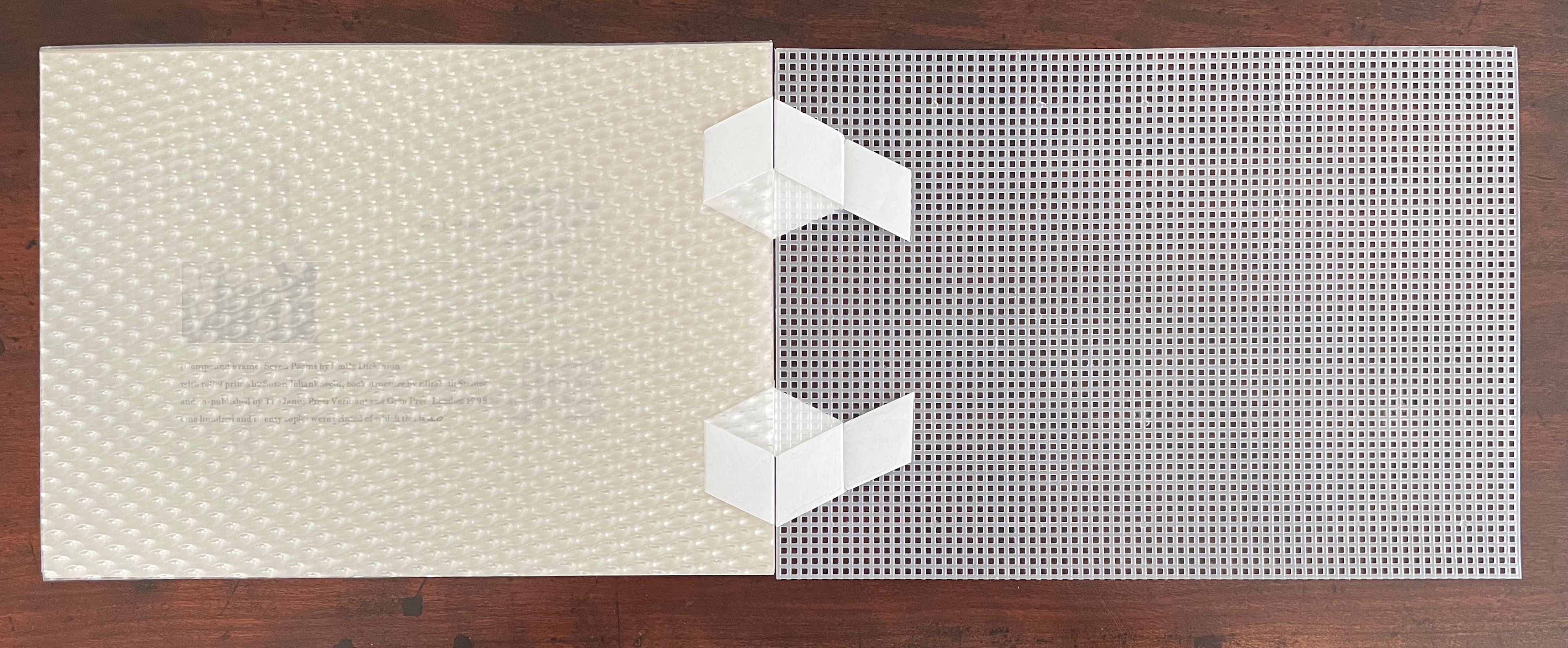
Needlepoint frame covers
When the cover turns, the other half of the phrase “Compound Frame” springs to mind. The artists’ choice of bee’s-eye clear Rowlux for the book’s first selected poem (1341) not only captures the “compound” half of the phrase but the paradox as well. The compound-eye optical illusion — what is printed on the surface seeming to be below, or in, the sheet — plays into the spiritual struggle that comes with believing both that “The body grows without” and “The body is a soul”.
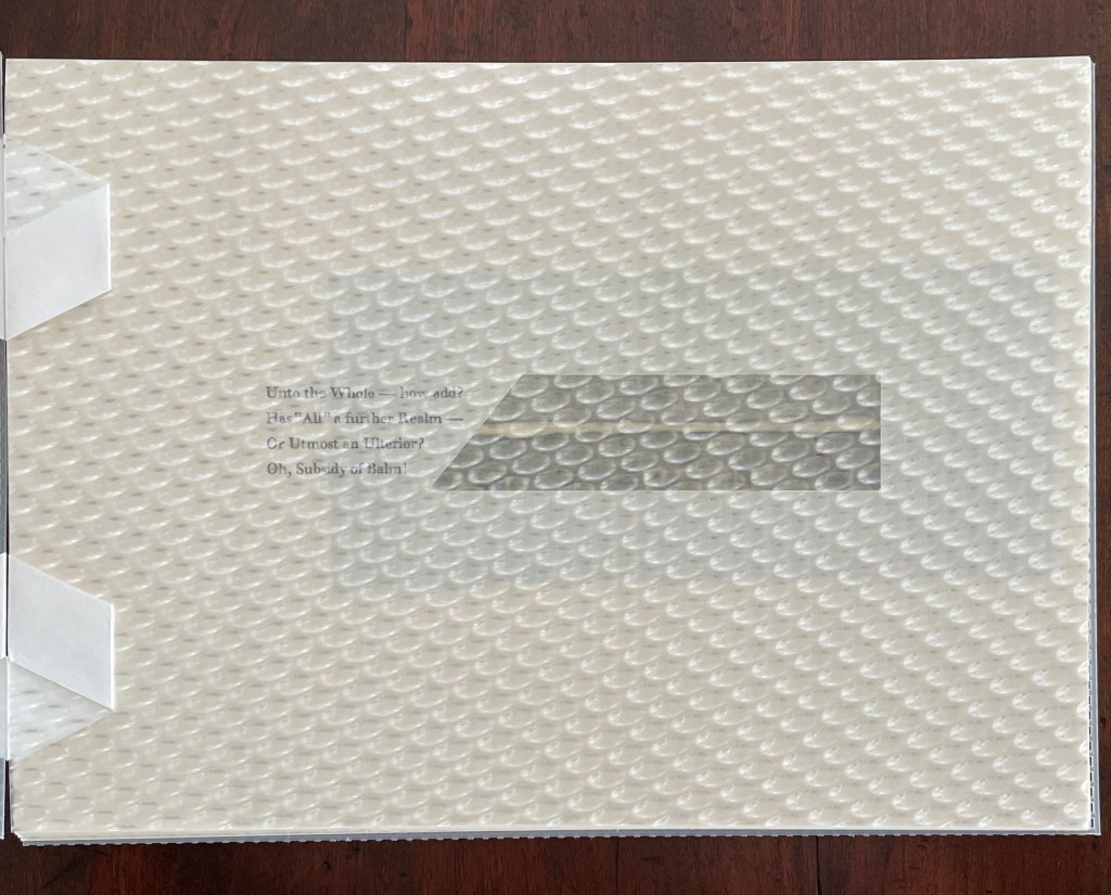
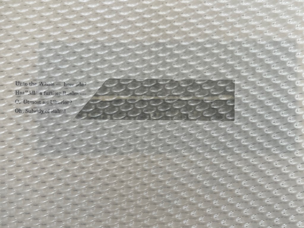
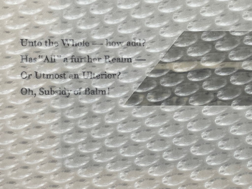
The short poem selected for the bee’s-eye folio — “Unto the Whole—how add?” — expresses another paradoxical duality that mirrors that of the body/soul: the relationship of the finite to the infinite. These two paradoxes weave in and out among the selected poems, but as we shall see, the artists use prints, material and structure to keep them both in sight.
When the bee’s-eye folio turns, the first pair of relief prints on translucent paper comes into view, seen from its reverse side. When that leaf turns to the right on its backstitched edge, the figurativeness of the prints becomes clearer. The impressions present rows of straight pins and a zipper hammered into strips of wood. Notice that the two rows are the same image, simply rotated 18oº from one another. As with Dickinson’s body and soul, what seems distinct, one from another, can be the same if viewed from a different angle, or if the body is described with words associated with the soul and vice versa.
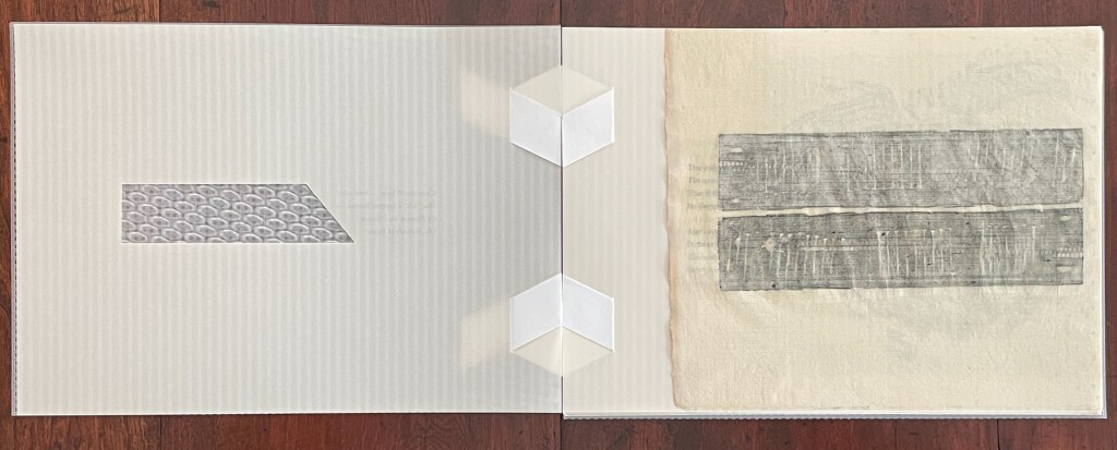
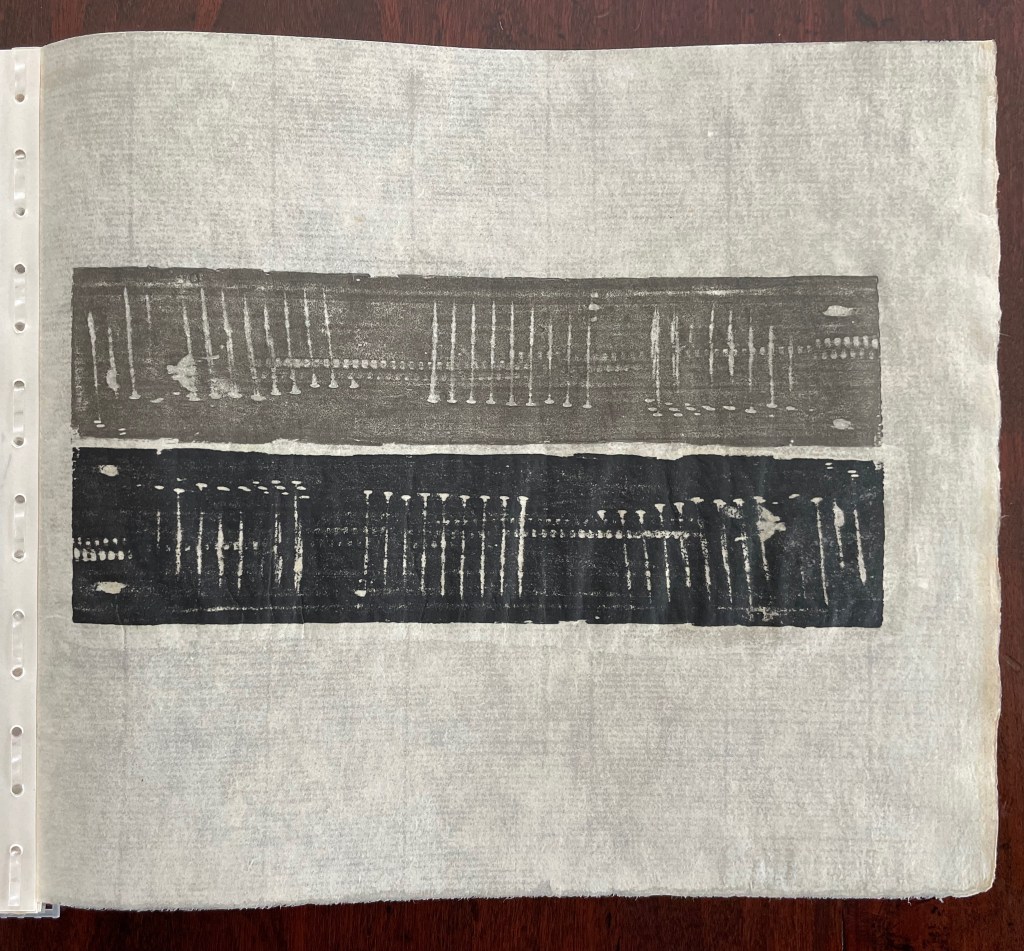
Rotate the lower row of straight pins 18oº counterclockwise, and it will match the upper row.
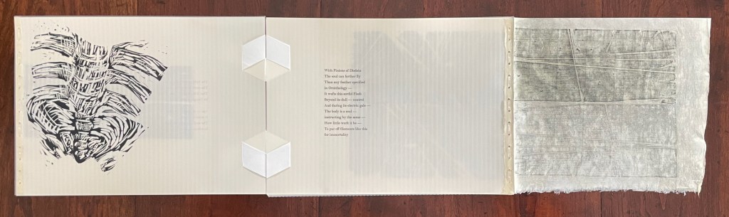
With the leaf of pins turned to the right, a triptych has appeared with another figurative image and a body/soul poem in the center. If there were any doubt that the artists mean for us to take the reverse view of the prints into account, the verse’s echo of the gauzy looking woodcut of ribs and spine dispels it.
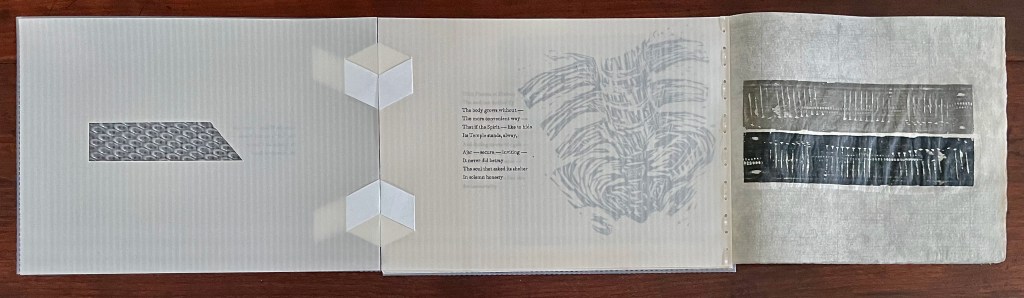
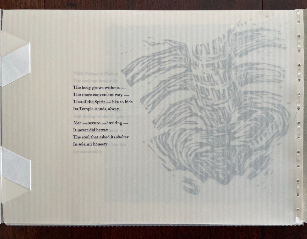
To progress to the inked side of that woodcut, we fold the pins folio back and turn the joined folios to the left. Now we have a diptych pairing an inked side image with an inked side poem and drawing attention to the revealed backstitched edges and the paper-woven hinges of the binding.
The abstract image underlying the poem is on the inked side of the folio underneath the poem’s page. If we turn the folio out, we have a triptych with the inked side woodcut on the left, the poem in the center, and the reverse side of the abstract image on the right.
There is no one right way to read or leaf through (Compound Frame), any more than there is one right way to interpret a Dickinson poem, but with the attention the artists call to the reverse side of the prints and the alternation of diptych-triptych-diptych-triptych so far, this sequence of reading the book makes for a satisfying approach. With the right hand image tucked back and the backstitched folios turned, we have yet another diptych, this time with two reverse side images across from one another.
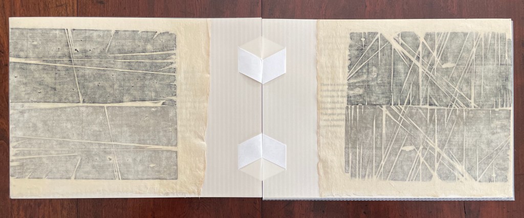
As with the pins/zipper relief prints, the top and bottom halves are rotated 18oº from one another. These relief prints also have something (perhaps unfairly) hidden in common with the pins and zipper prints. They are made from leftover kitchen floorboards, echoing the domesticity of the sewing metaphor. Those figurative images contrasting with these abstract images also hint at the finite/infinity paradox encountered in the first poem. If there is any doubt, the opening of the diptych wings into the following quadriptych view dispels it. Notice how the abstract floorboard prints on the left and right embrace the figurative body images glimpsed in the two center panels. And notice the last line of the poem.
The quadriptych forms the center of the book. There are three printed poems before it and three after. With the closing of the quadriptych, the backstitching stops. There is a shift.
With the exception of the last page, all the printed images depict the skeleton. The word “body” does not appear in any of the final three poems, although “Embodied” and “bleeding” hint at it. The finite/infinity paradox and the nature of eternity have moved to the fore. In fact, that is the sole concern in the last poem.
Like the poem’s opening line, the print shows the center of the skeleton.
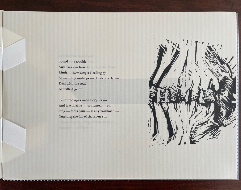
The word “body” may not appear, but like the print, “bleeding”, “ache” and “pain” invoke it.
For the last poem, a cutout turns the underlying bee’s-eye Rowlux into an abstract image, and the artists chime and rhyme the book’s first and last selected poems. The compound-eye abstraction seems to mark their awareness that the finite/infinity paradox dominates the last poem. Perhaps here also is the source of Johanknecht’s parenthesis in the title (Compound Frame). Those bubbles in the Rowlux look like rows of parens joined up, and what a happy happenstance that the poem brackets the image!
Further Reading
“Claire Van Vliet (I). 3 July 2022. Books On Books Collection.
Buchtel, John (ed.). 2024. The Art of Paper : Claire van Vliet and the Janus Press : Papermaking Collaborations. Boston, MA: Boston Athenaeum. pp. 27ff.
LSU Libraries. 10 December 2013. “How good—to be alive!” Happy Birthday Emily Dickinson“. News & Notes. Louisiana State University Libraries. Displays Jen Bervin’s The Dickinson Composites (Granary Books, 2010) is an interpretation of the mysterious punctuation markings in Dickinson’s manuscripts, which have been left out of many editions of her works and are the subject of much editorial debate. “The first time I saw the manuscript punctuation markings,” Bervin writes, “I thought they looked like electron clouds in and around the poems.” Bervin was so struck by the marks that she reproduced them on a large quilt “to visually reassert the vital presence of the omitted marks, to raise questions about them.”
Kornfeld, Susan. 17 July 2012. “A Weight with Needles on the pounds —“. The Prowling Bee (The Dickinson Blog Project).
______________. 8 April 2013. “The Body grows without —“. The Prowling Bee (The Dickinson Blog Project).
______________. 28 May 2024. “As if the Sea should part“. The Prowling Bee (The Dickinson Blog Project).
