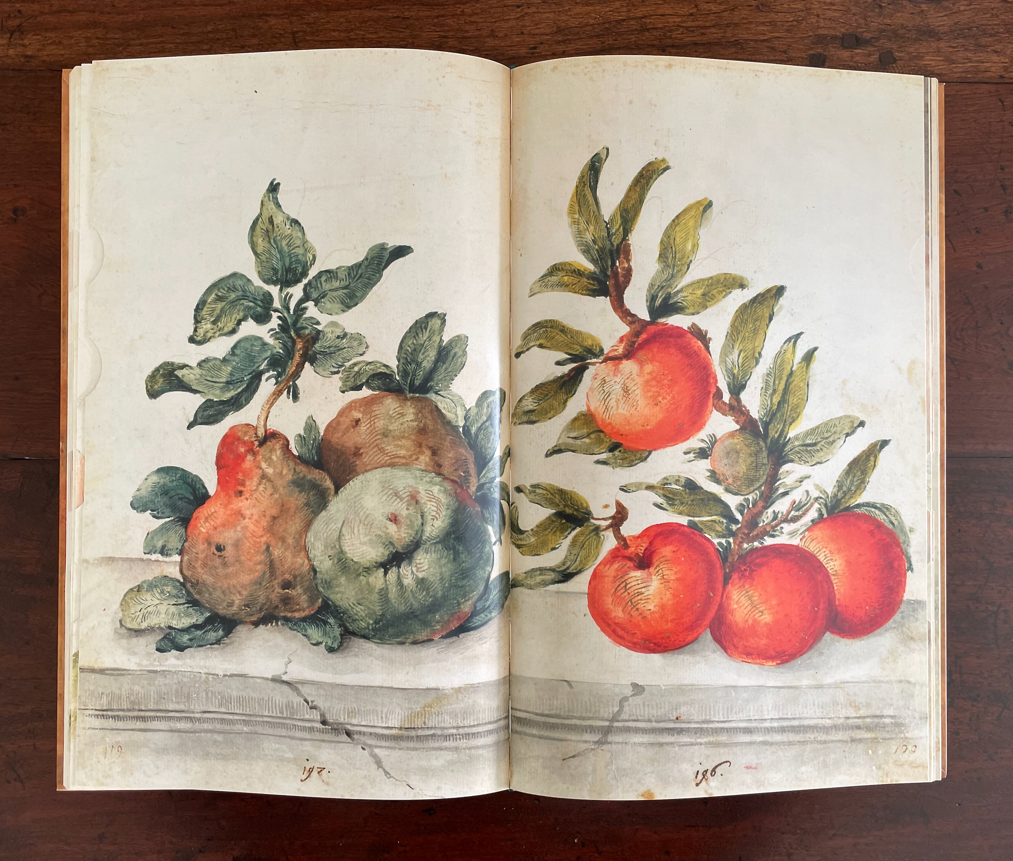
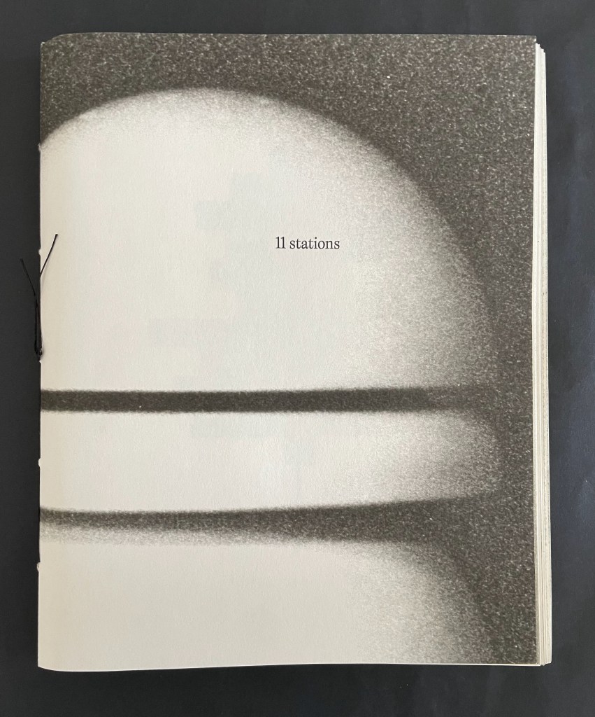
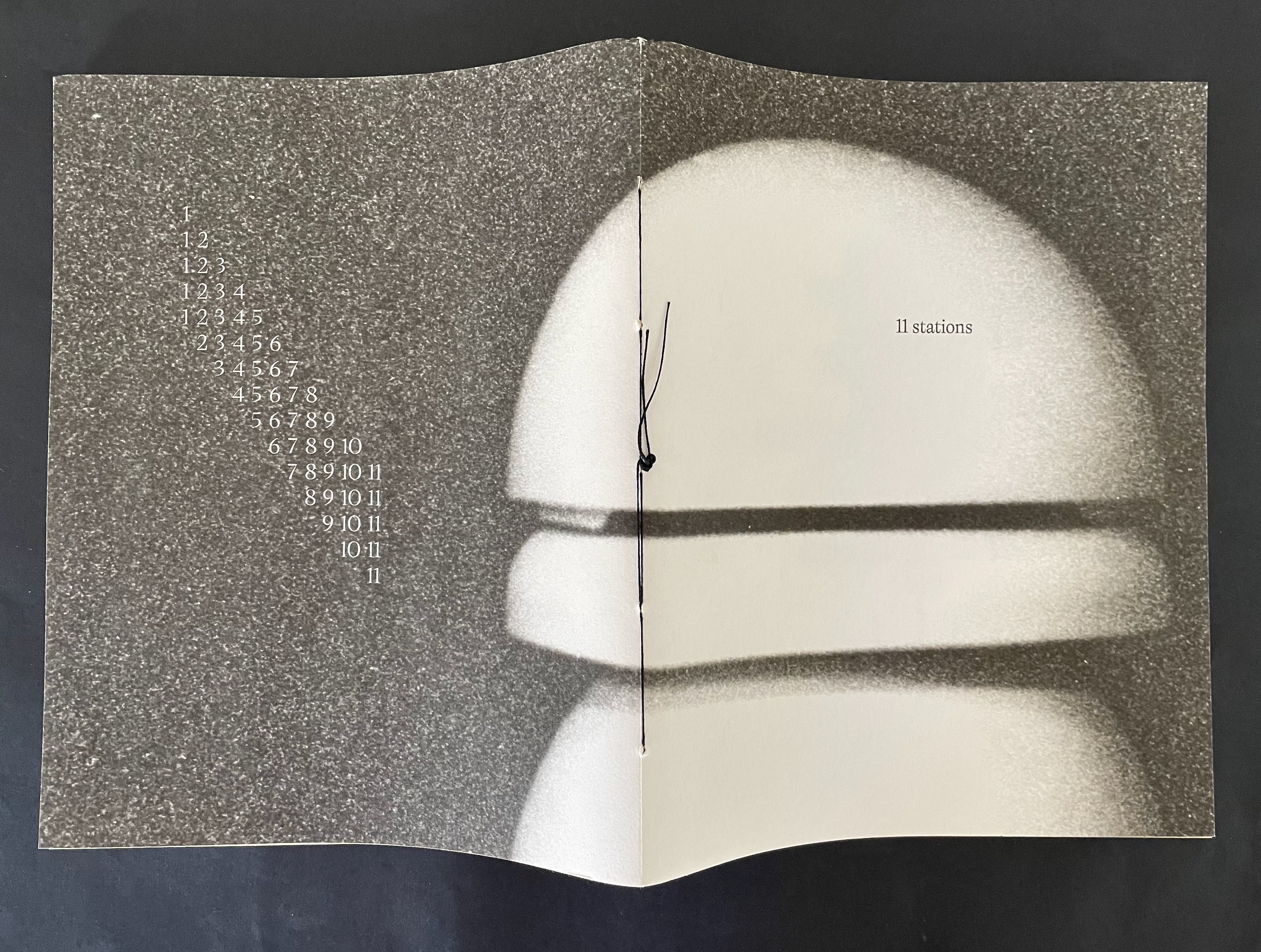
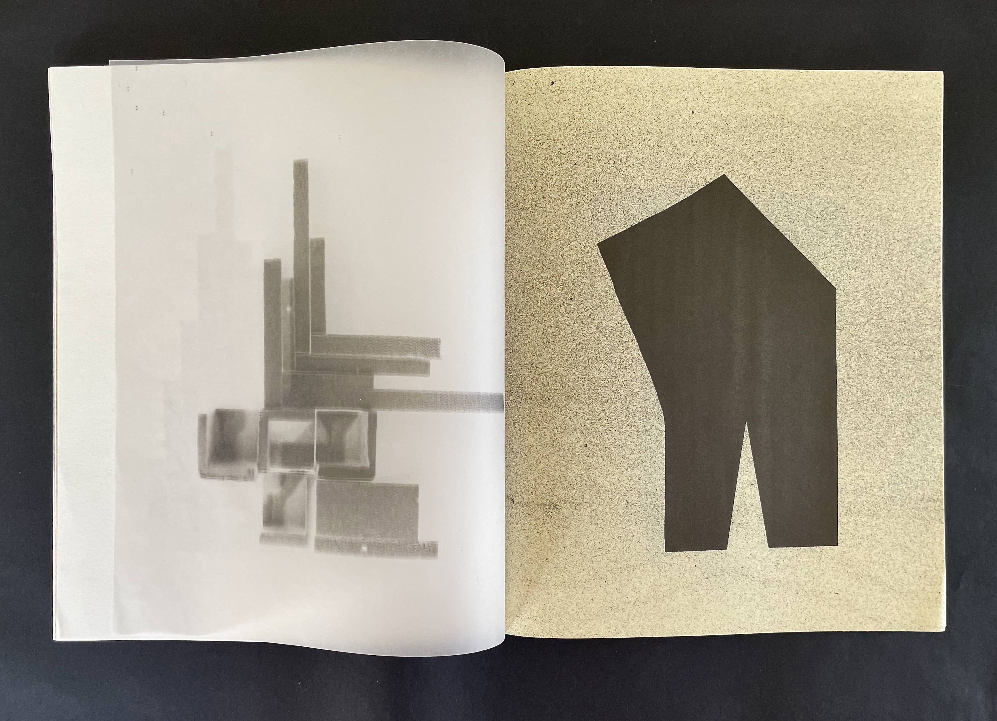
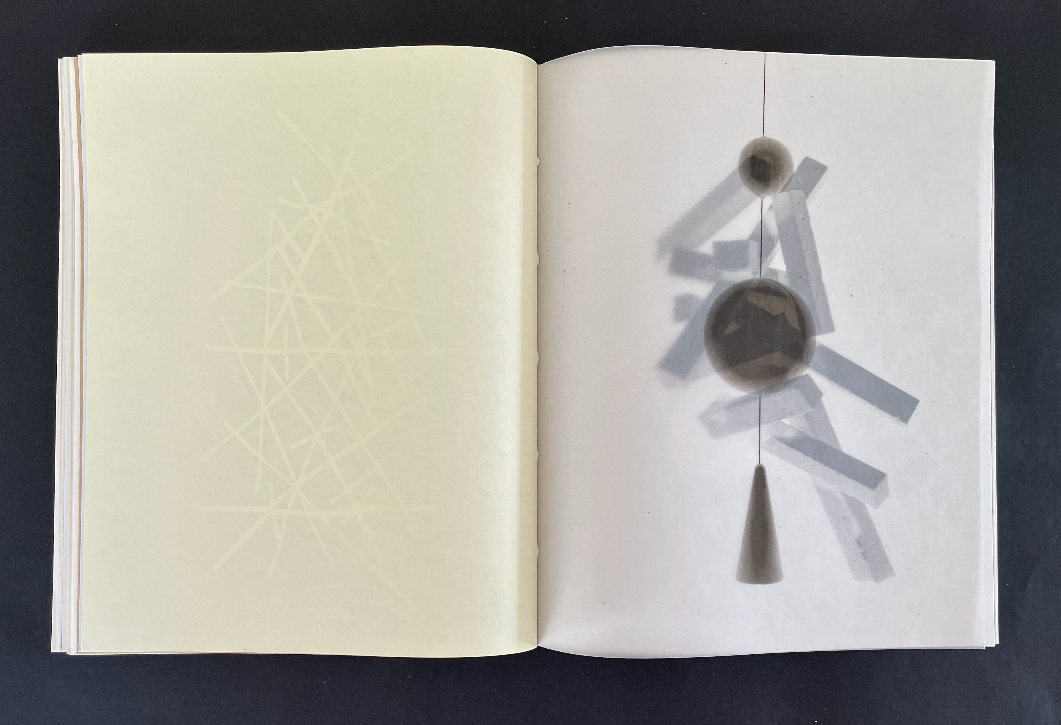
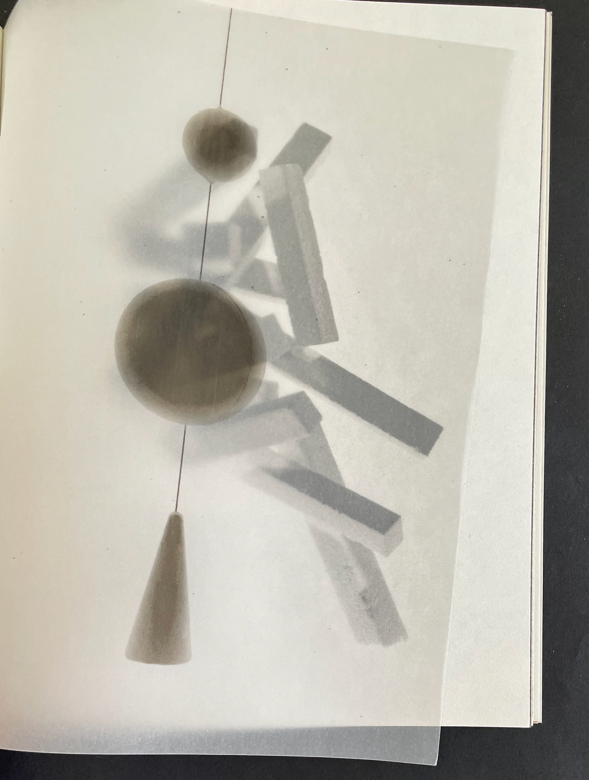
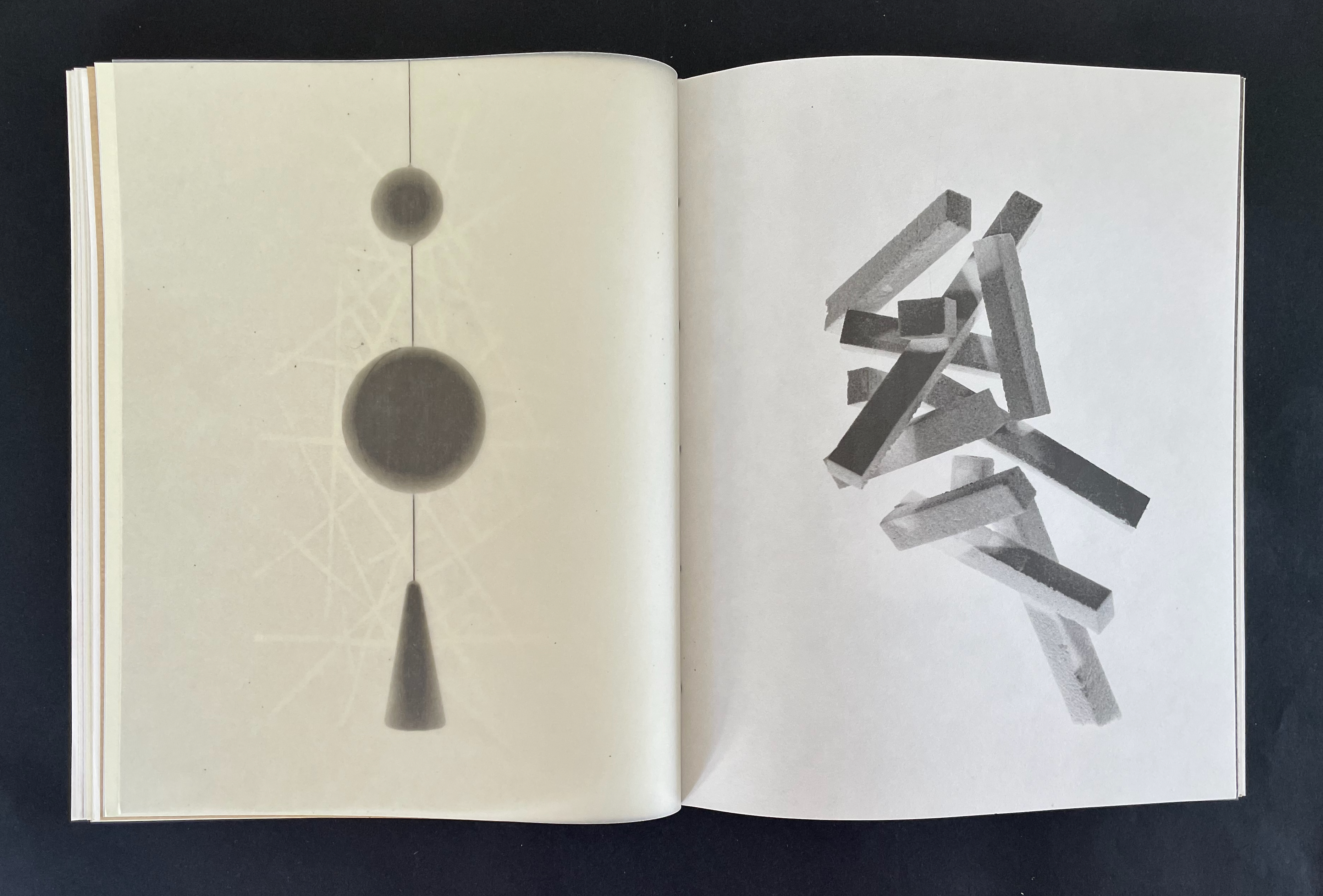
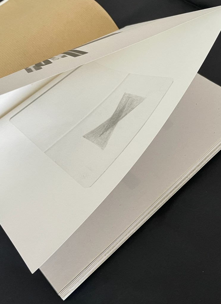
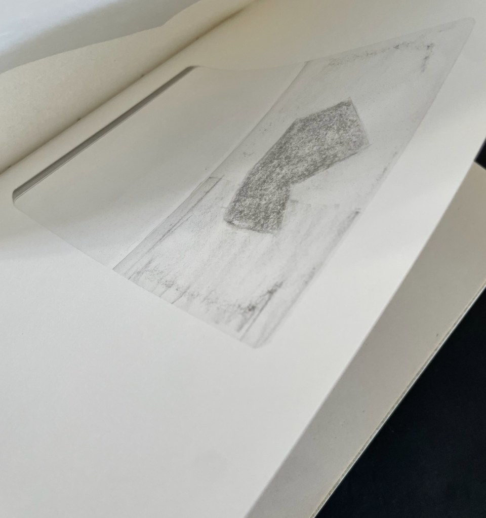
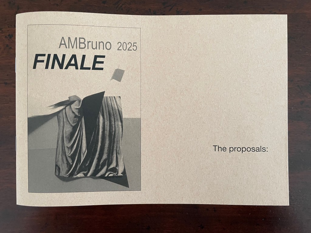
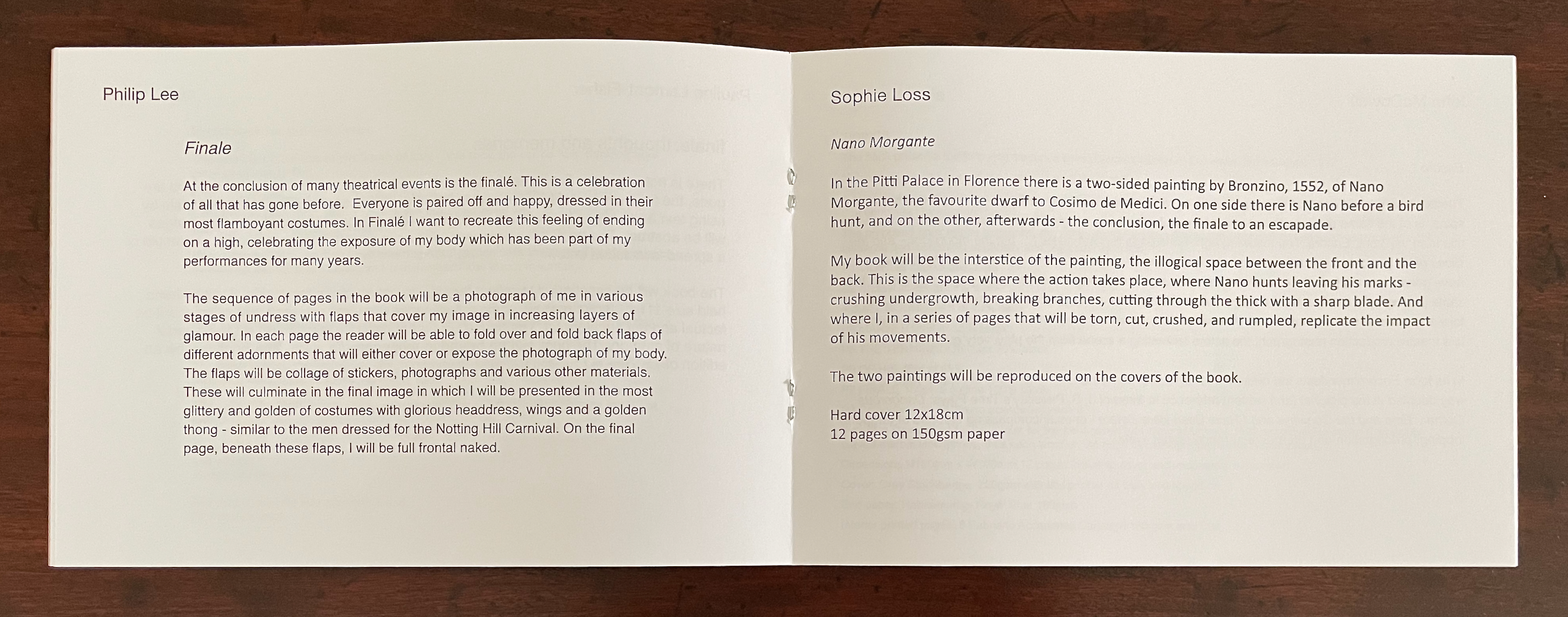
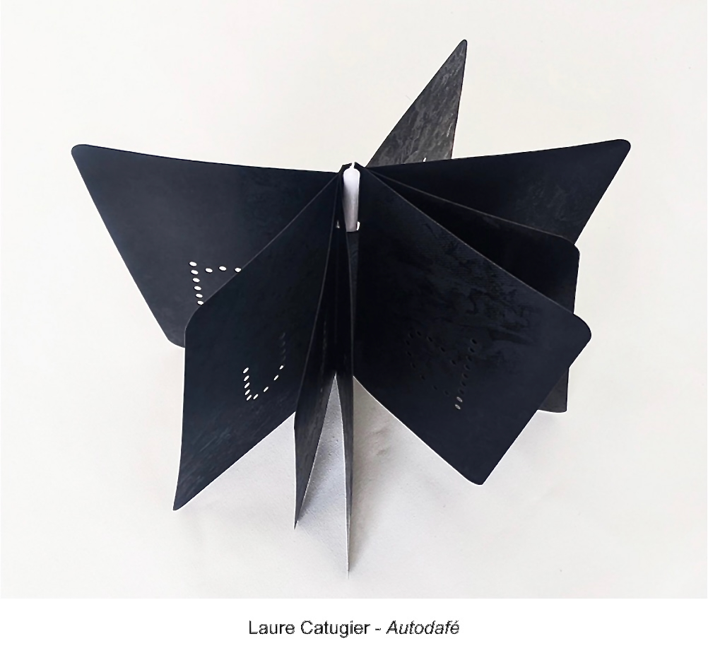
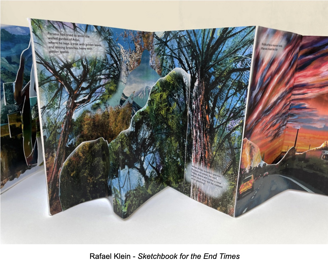
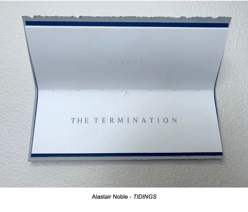
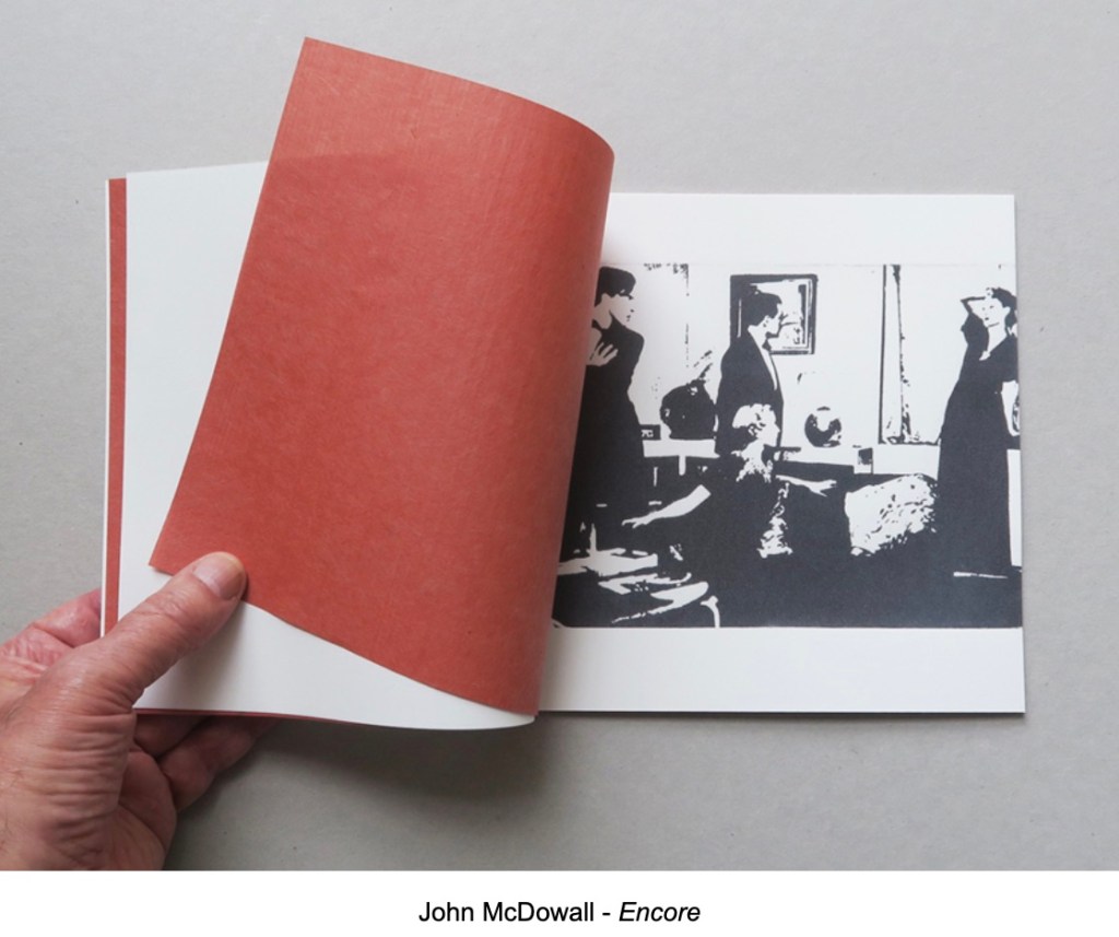
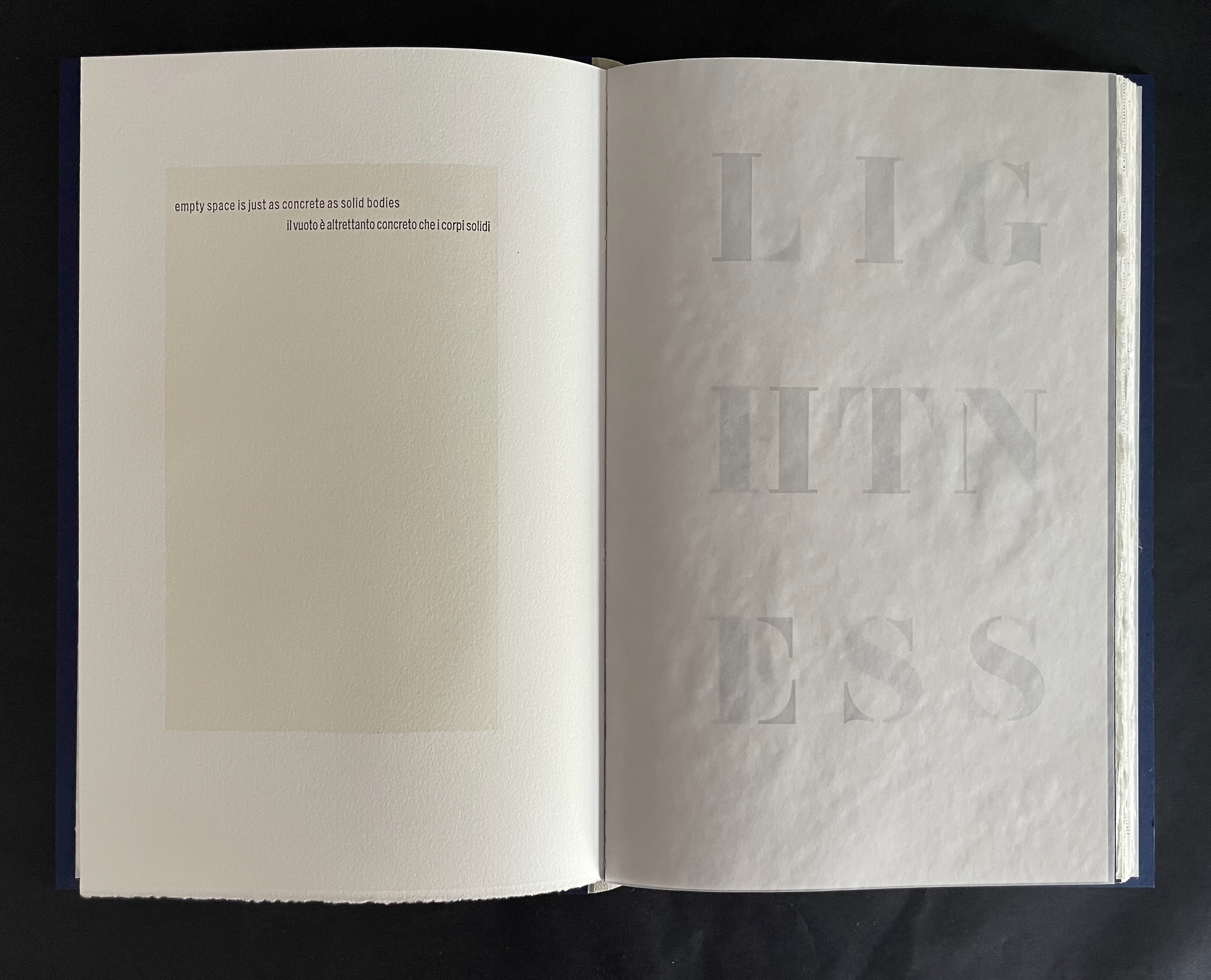
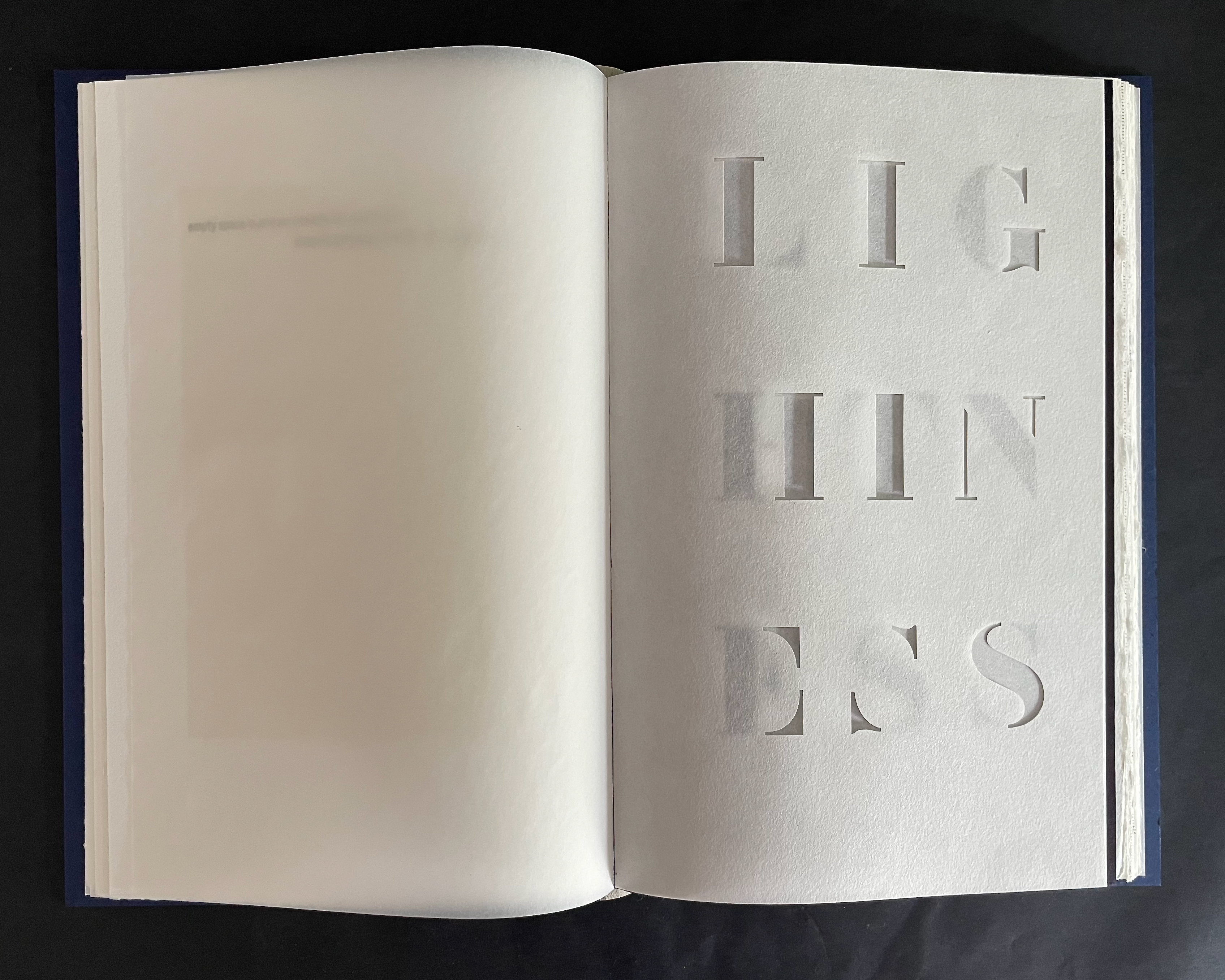
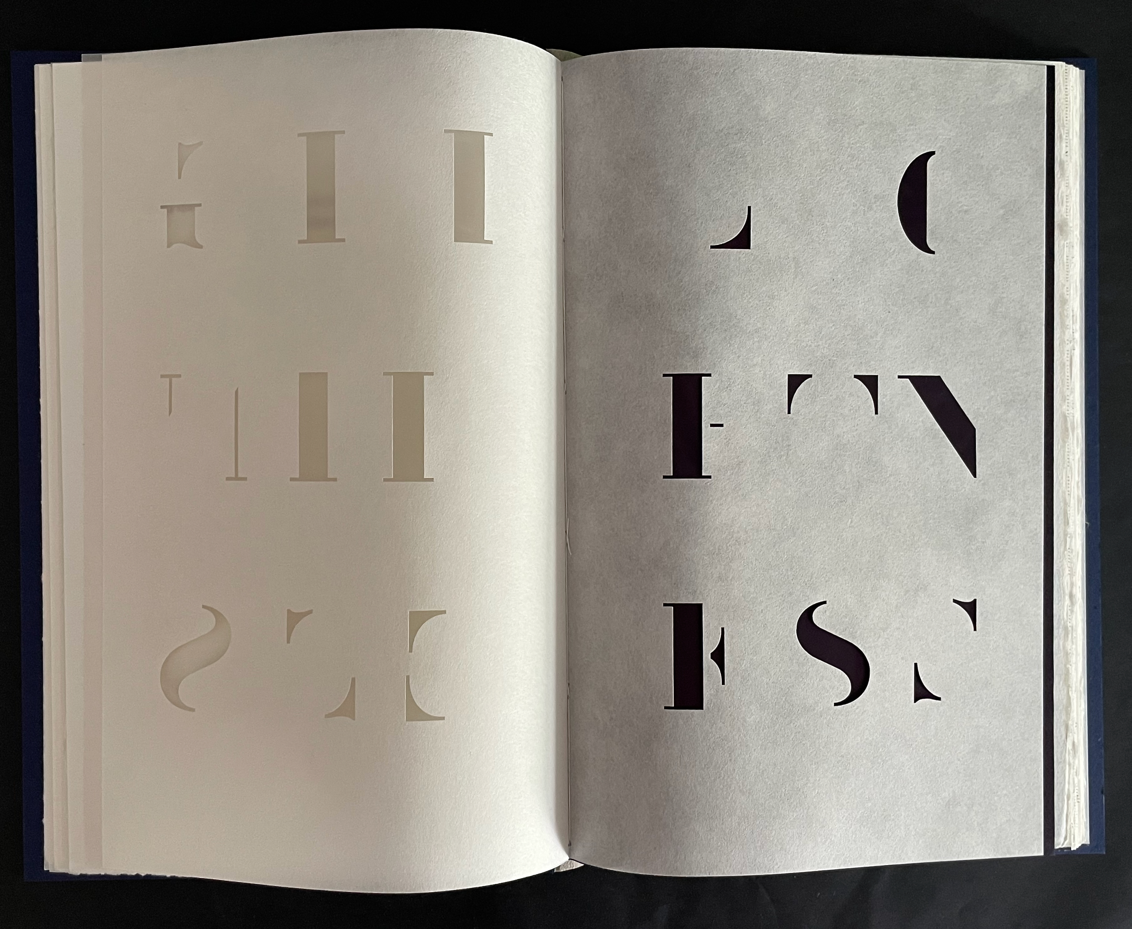
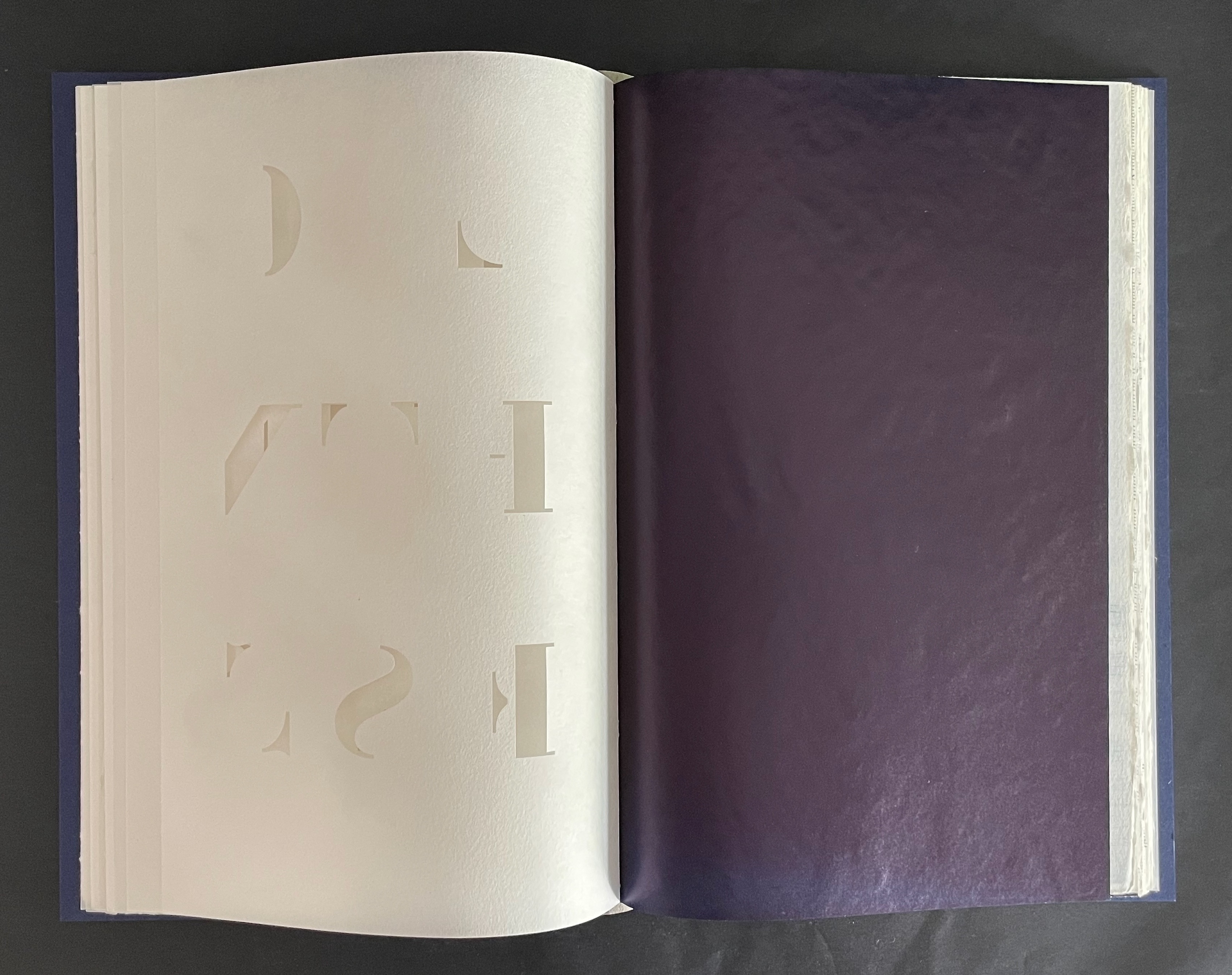
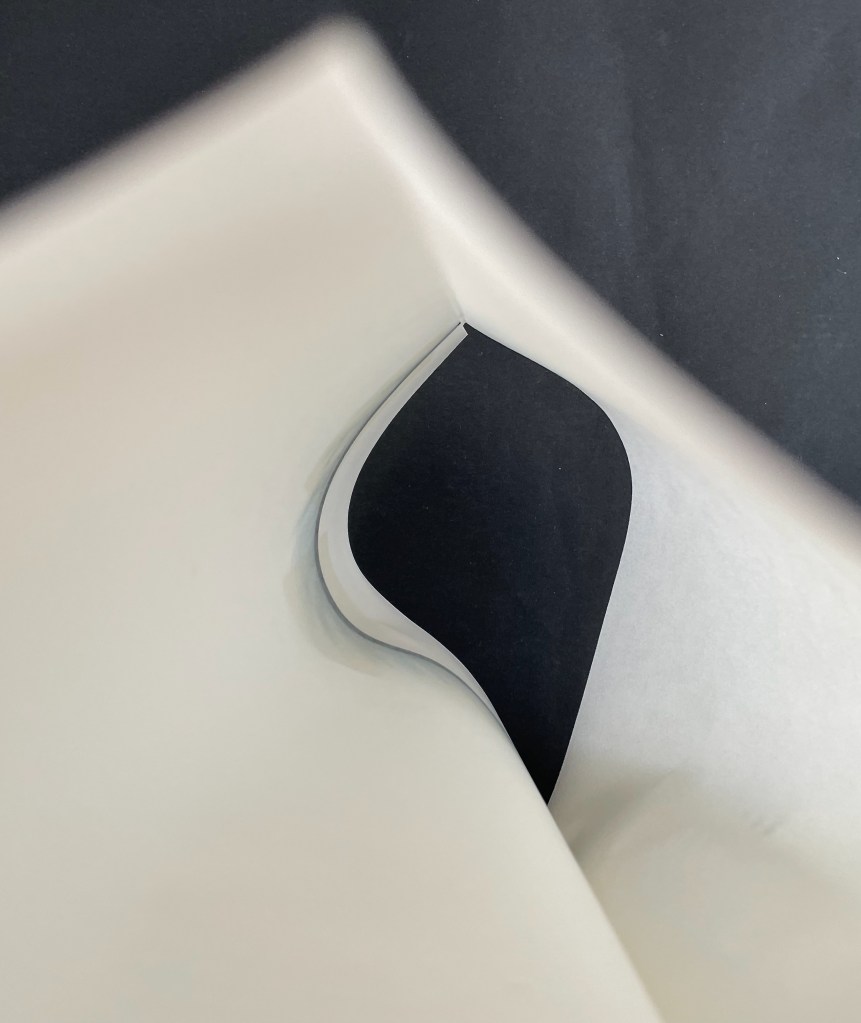
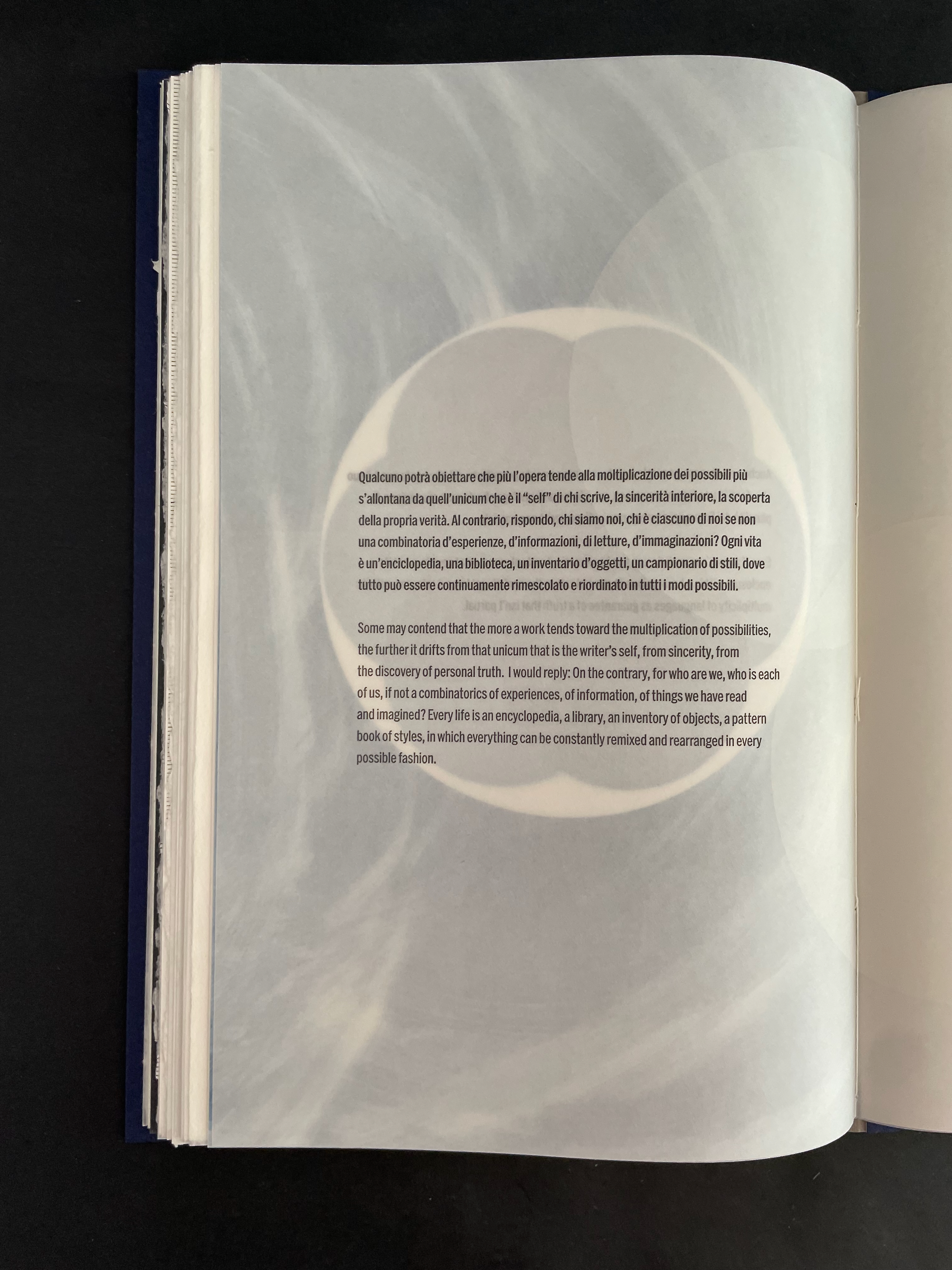
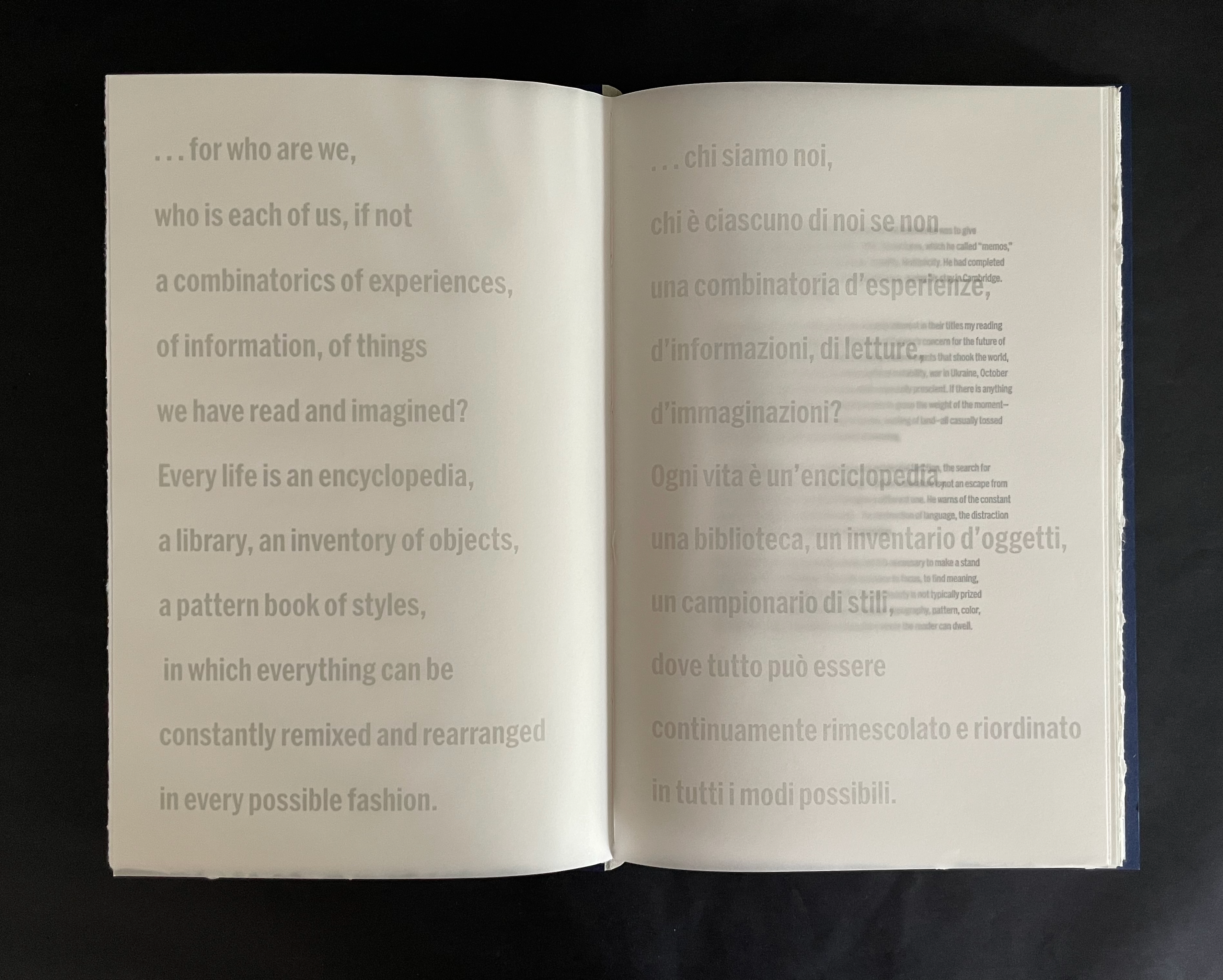
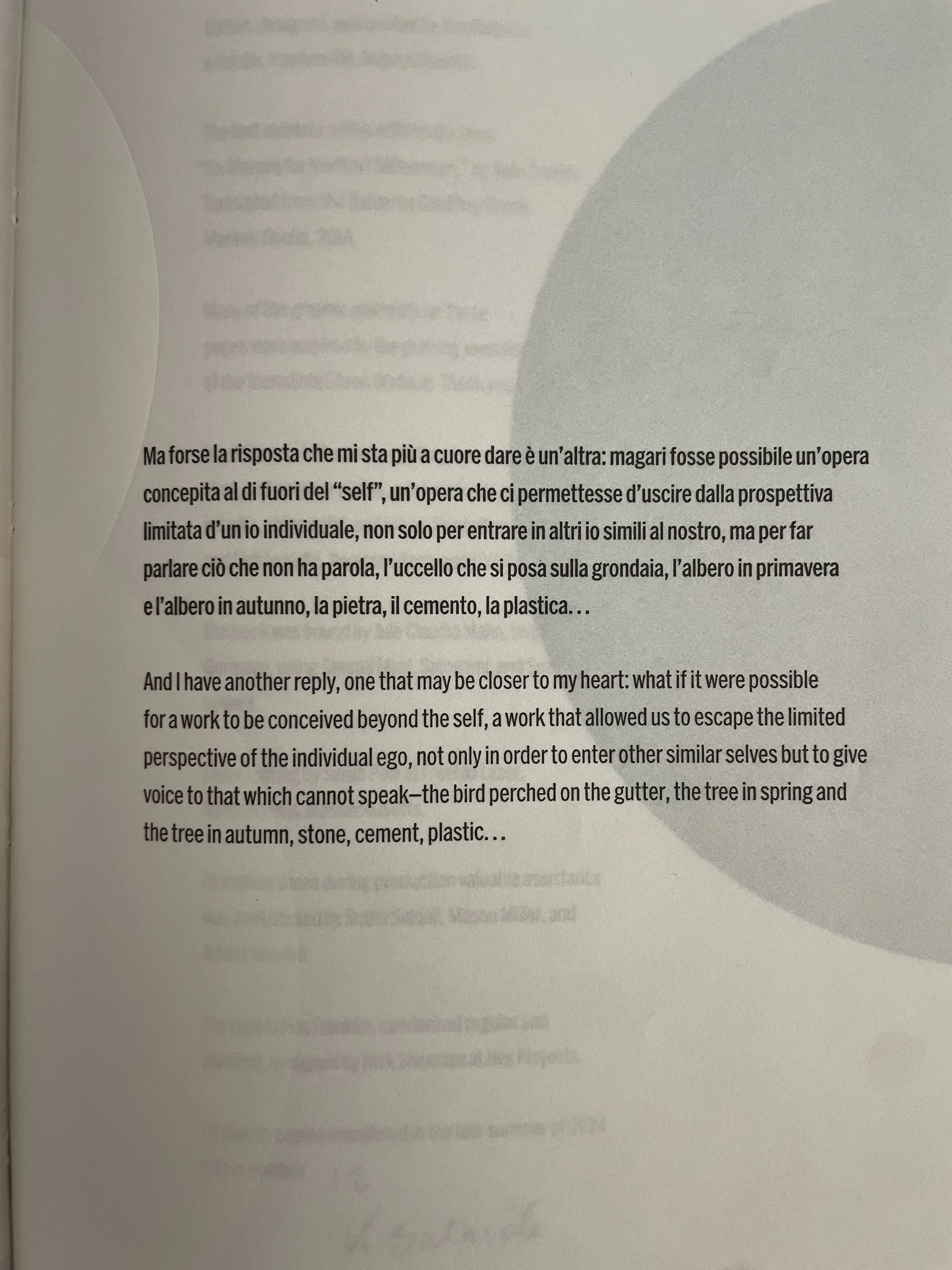
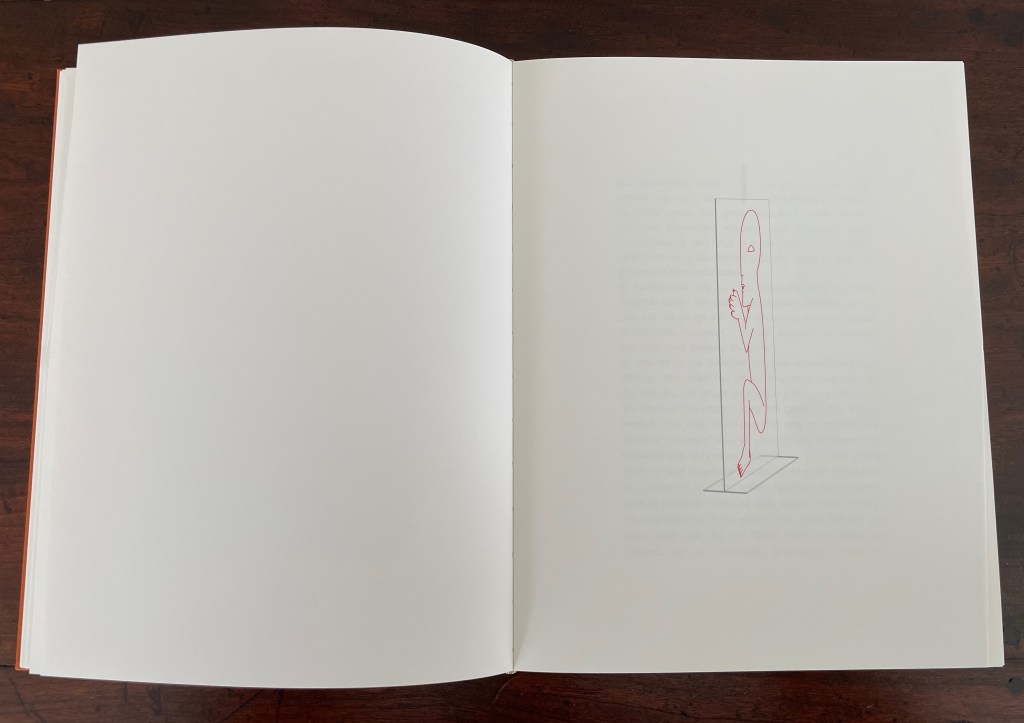
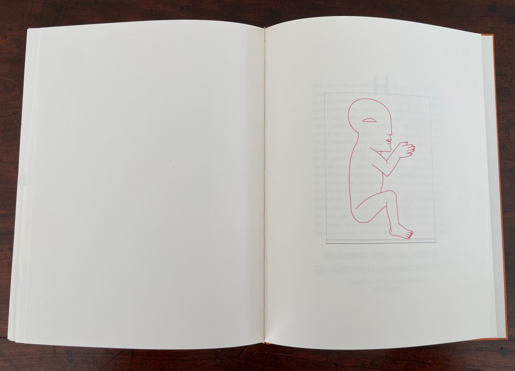
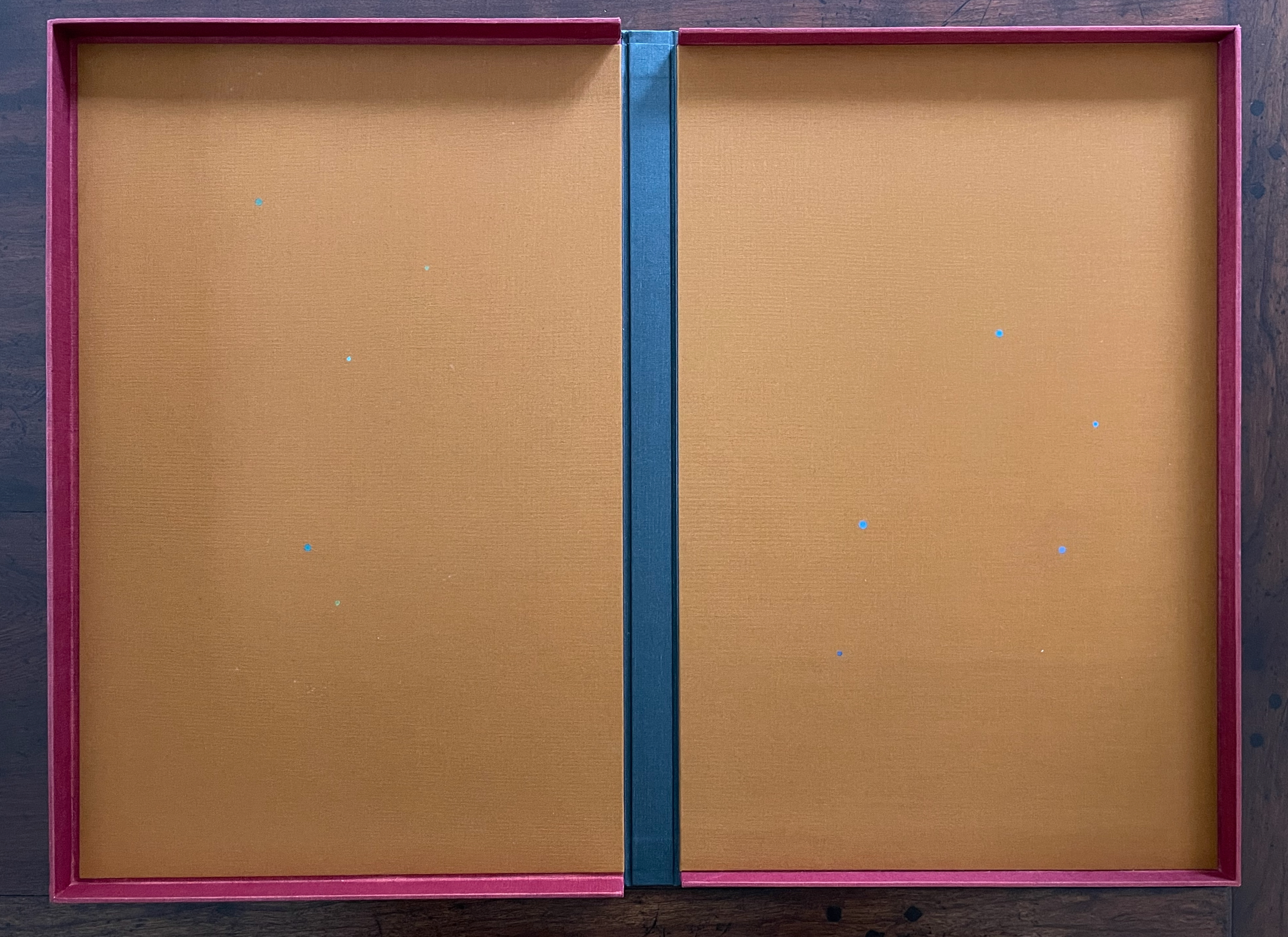
The most beautiful and perfect book in the world is a book with only blank pages, in the same way that the most complete language is that which lies beyond all that the words of a man can say. Every book of the new art is searching after that book of absolute whiteness, in the same way that every poem searches for silence. — Ulises Carrión: “The New Art of Making Books” Kontexts no. 6-7, 1975.
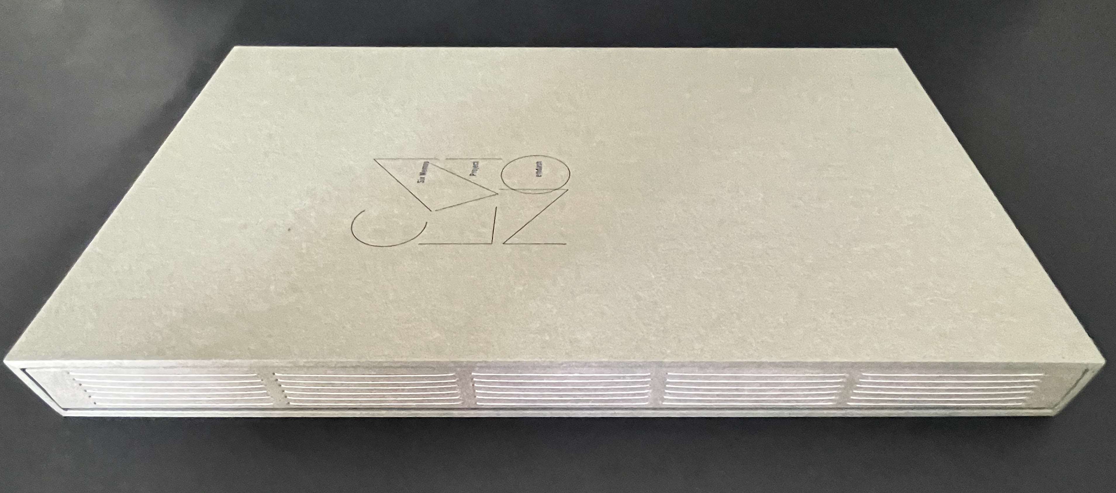
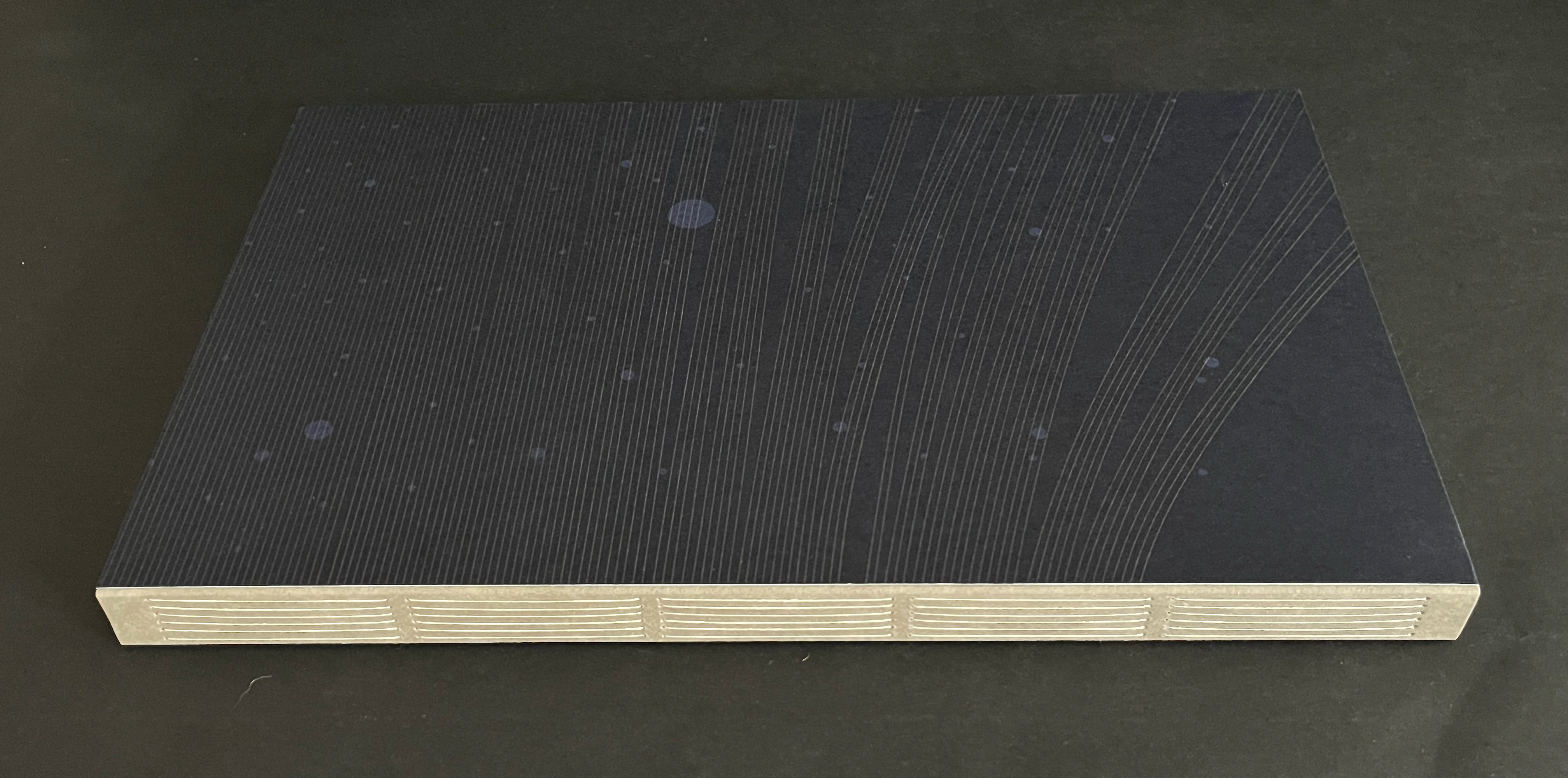
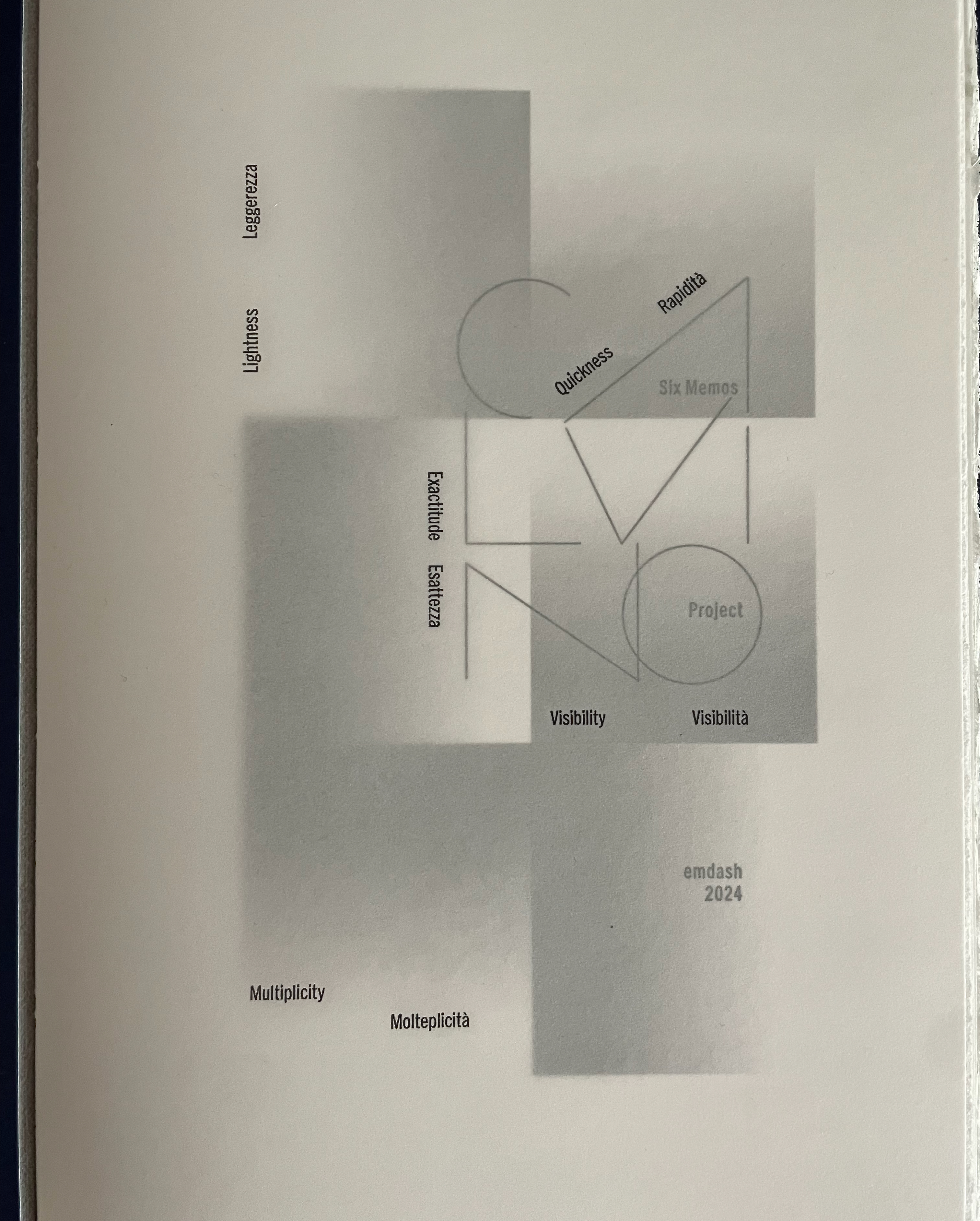
At the entrance to The Wittockiana. Back and front cover of the a minima catalogue.
If, as I did, you missed Moritz Küng‘s exhibition Blank. Raw. Illegible… Artists’ Books as Statements, 1960-2022 at the Leopold-Hoesch-Museum in Düren, Germany, in 2023, Didier Decoux‘s a minima presents an equally well-thought-out gathering of artists’ books that stretches out over 150 years (1876 – 2026). With 4 spacious rooms, 25 vitrines, 2 videos, and over 180 works, a minima requires several hours at a minimum to peruse and enjoy. Information on getting there is available here.
The comments and links below are in no way a substitute for visiting this exhibition, and keep in mind that Wittockiana also has permanent displays of presses, rare fonts, and books that should not be missed.
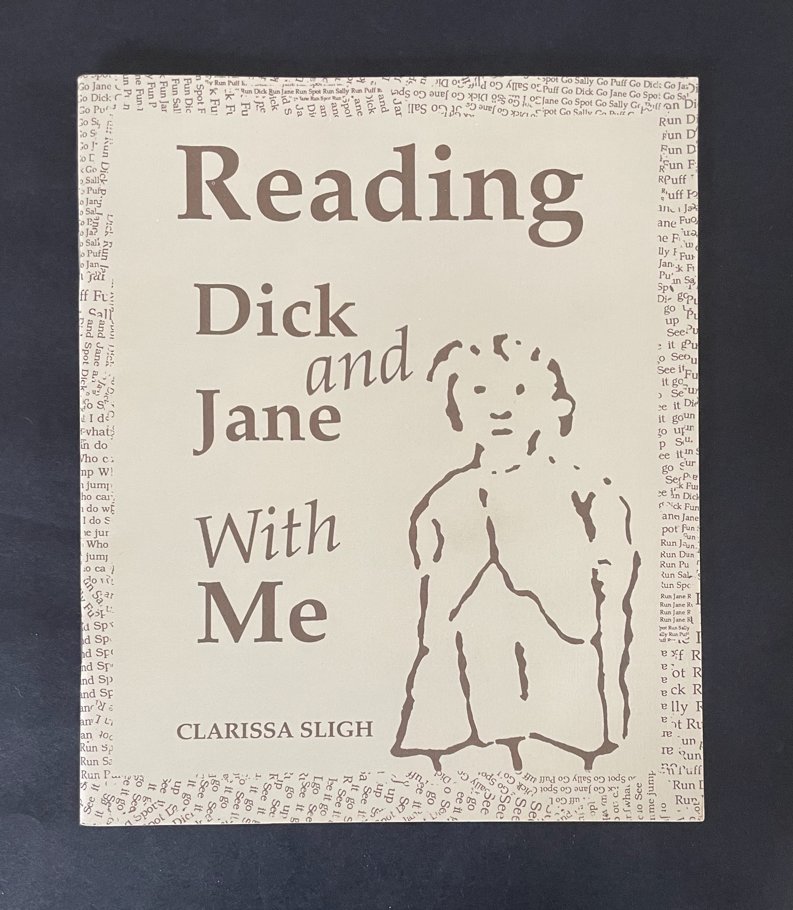
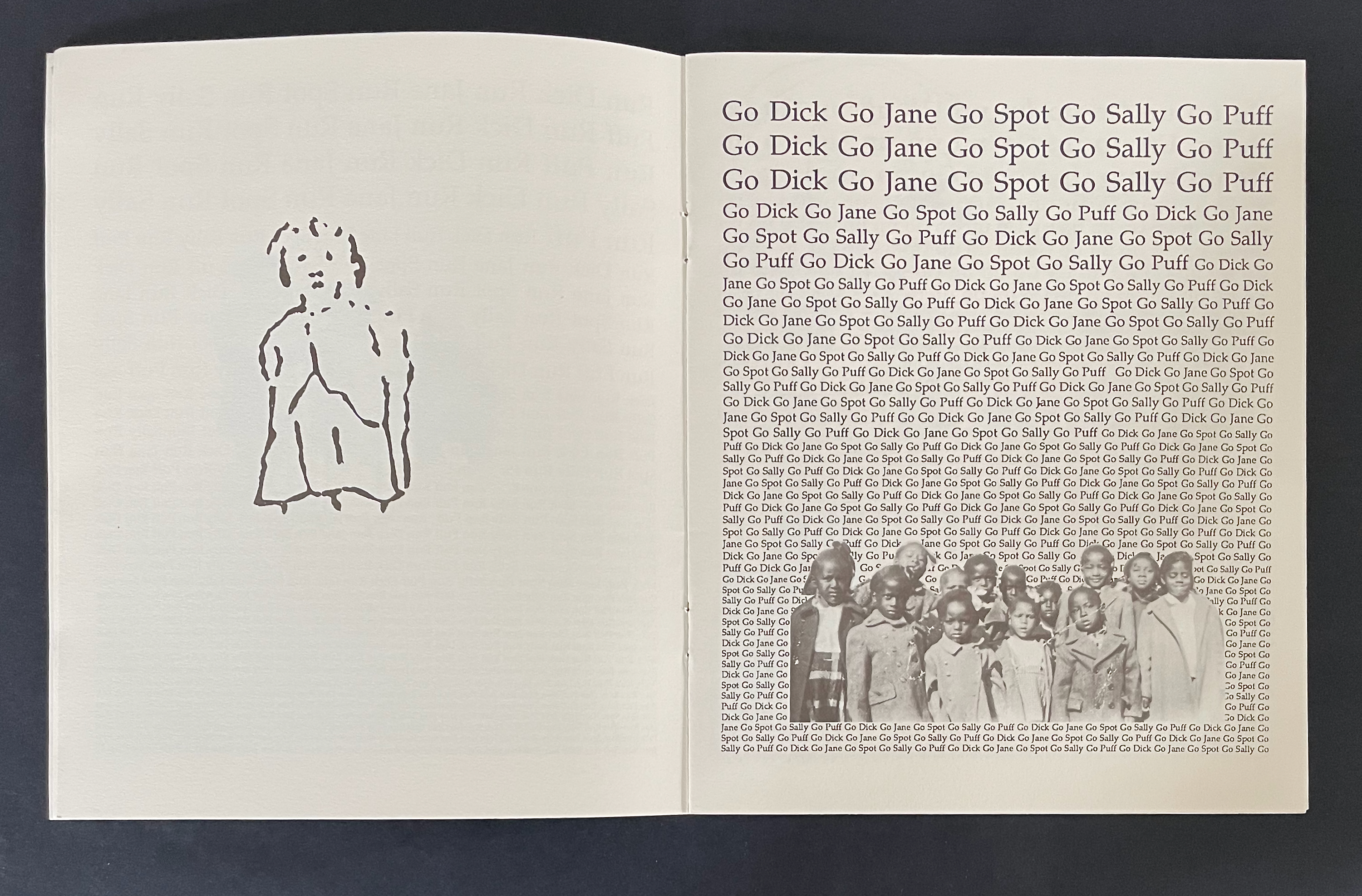
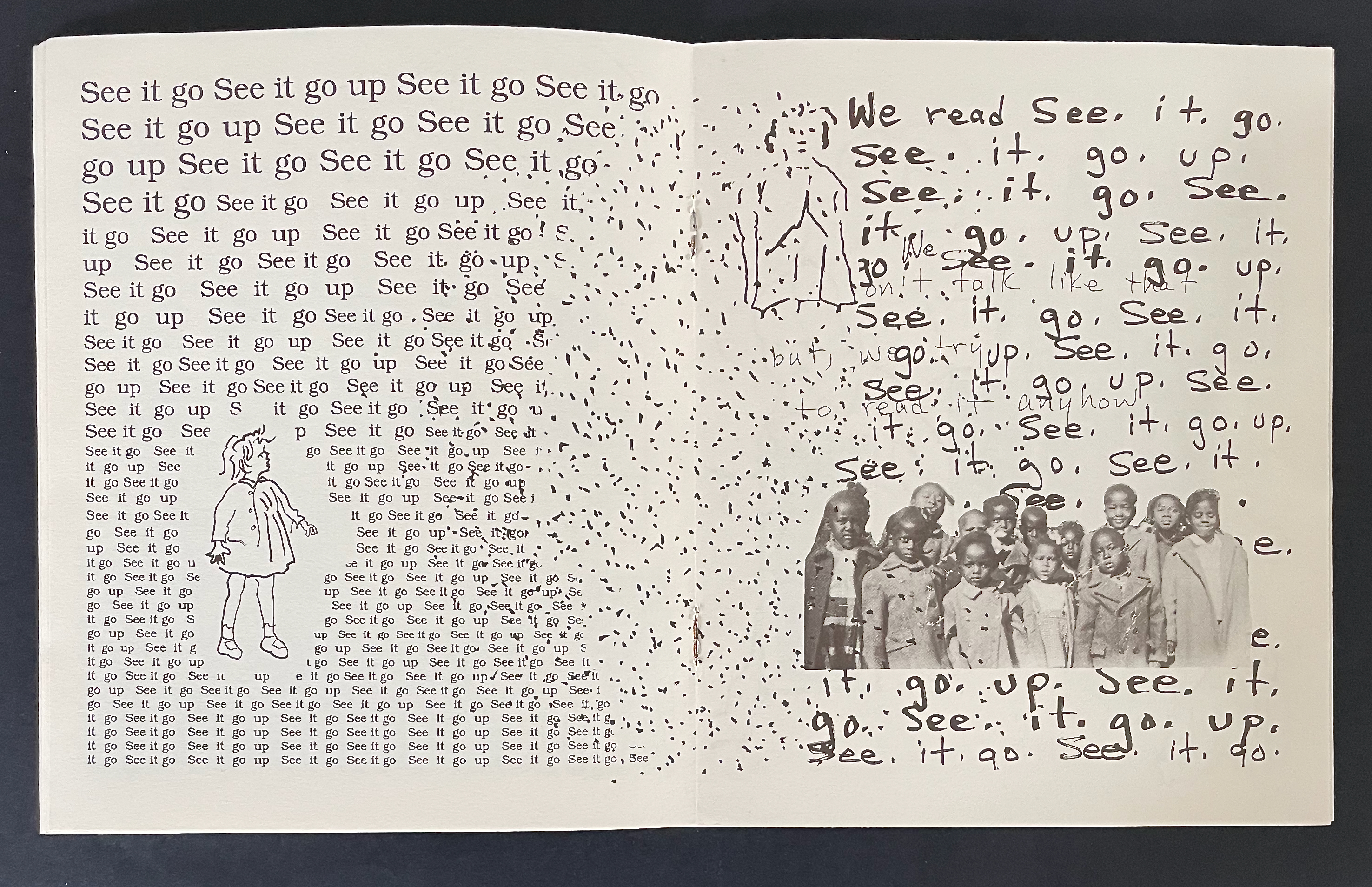
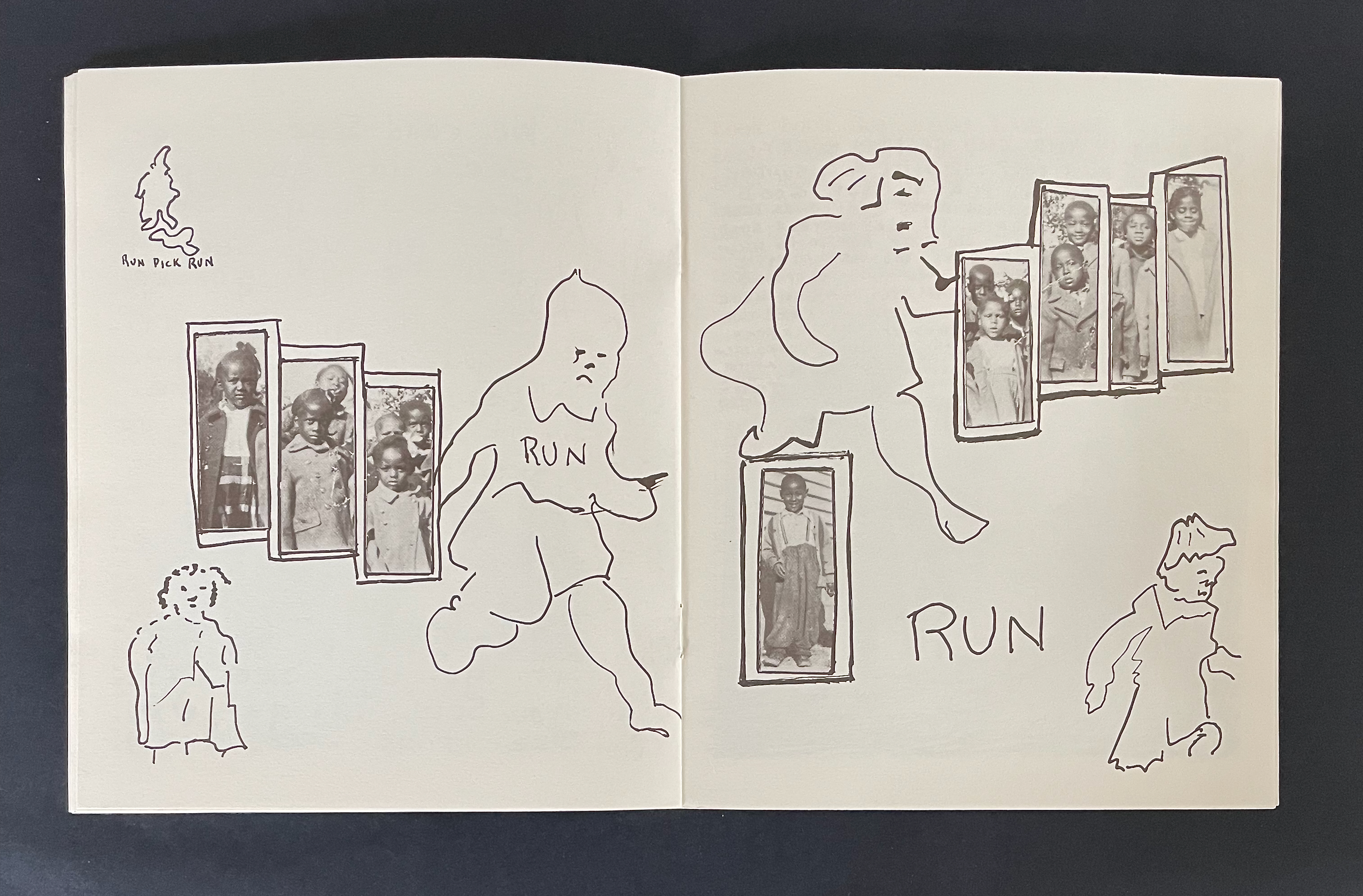
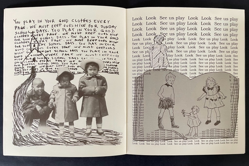
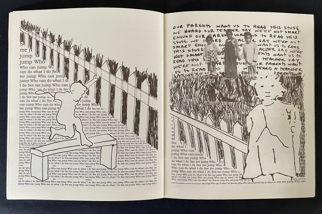
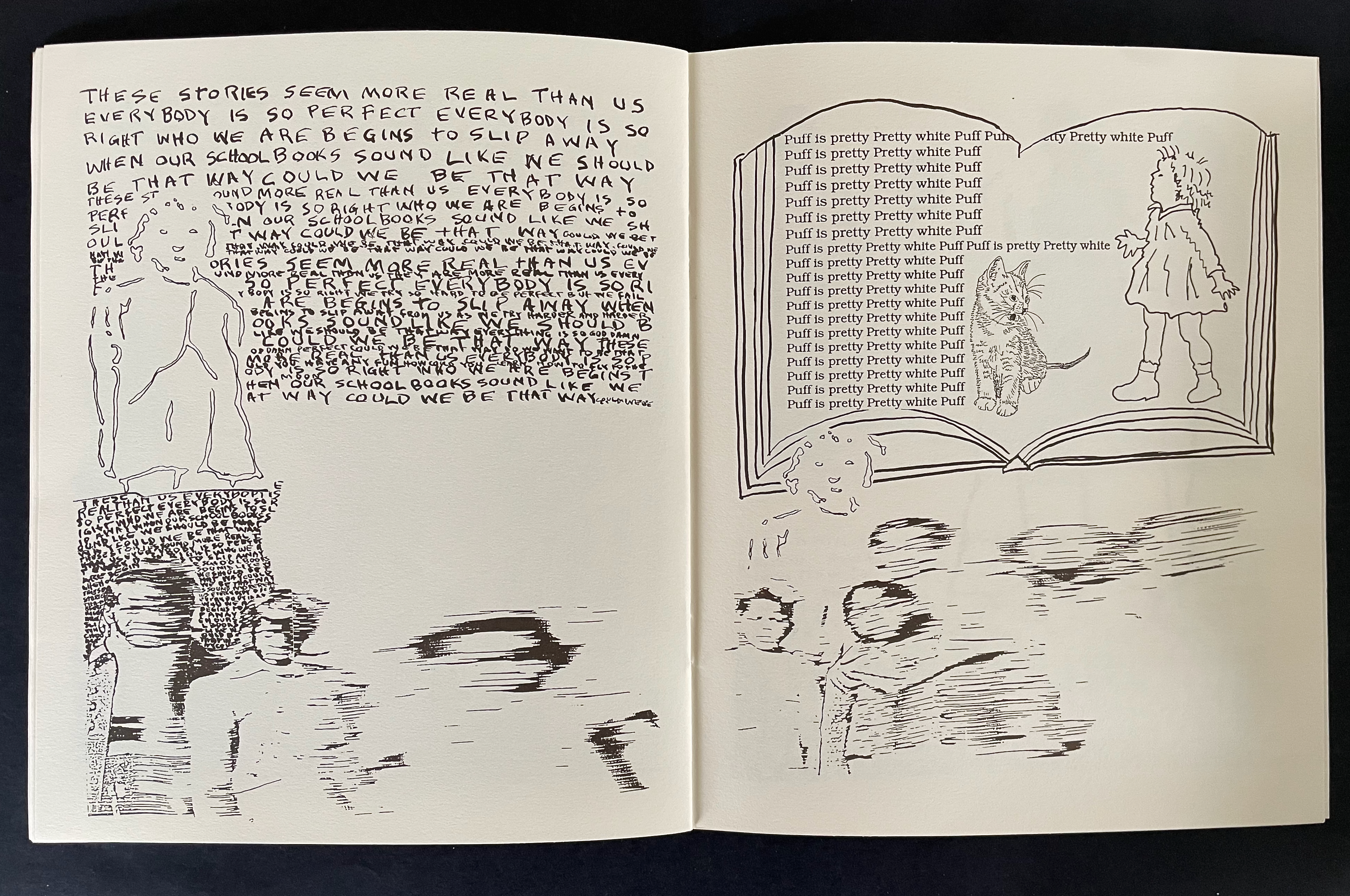
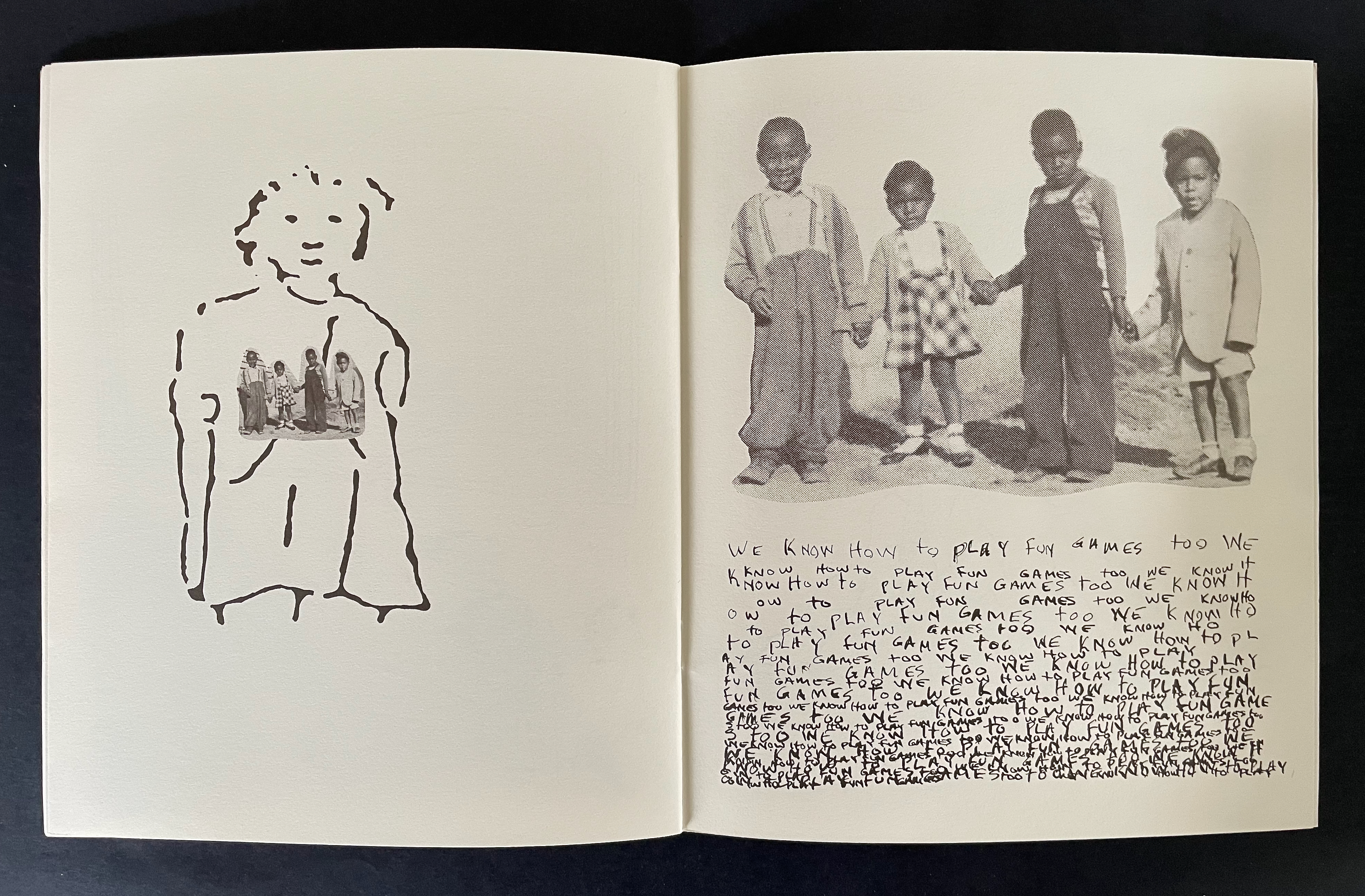
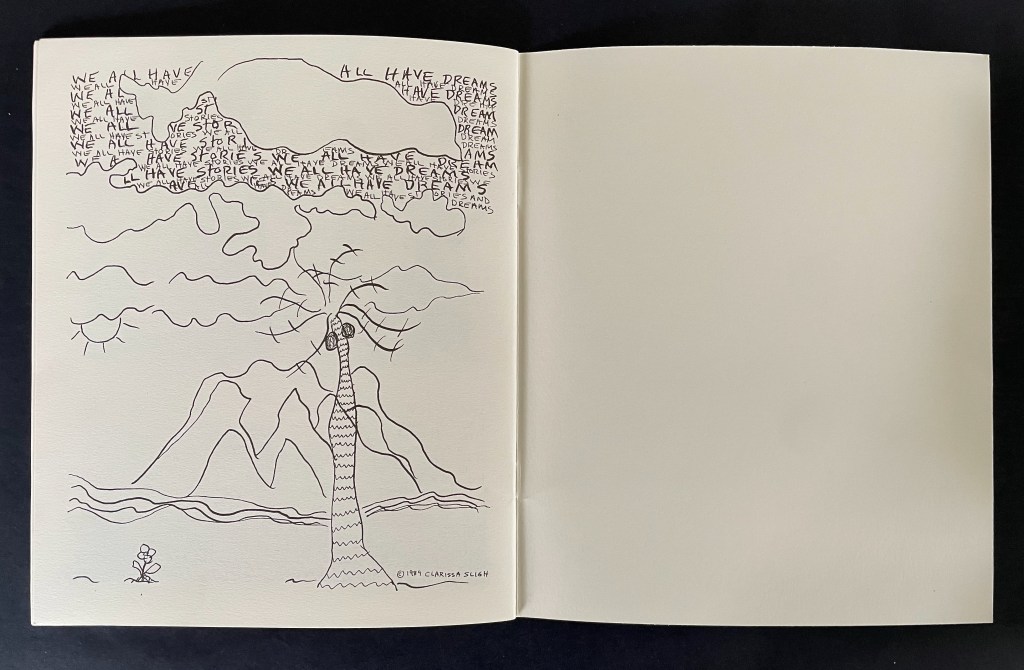
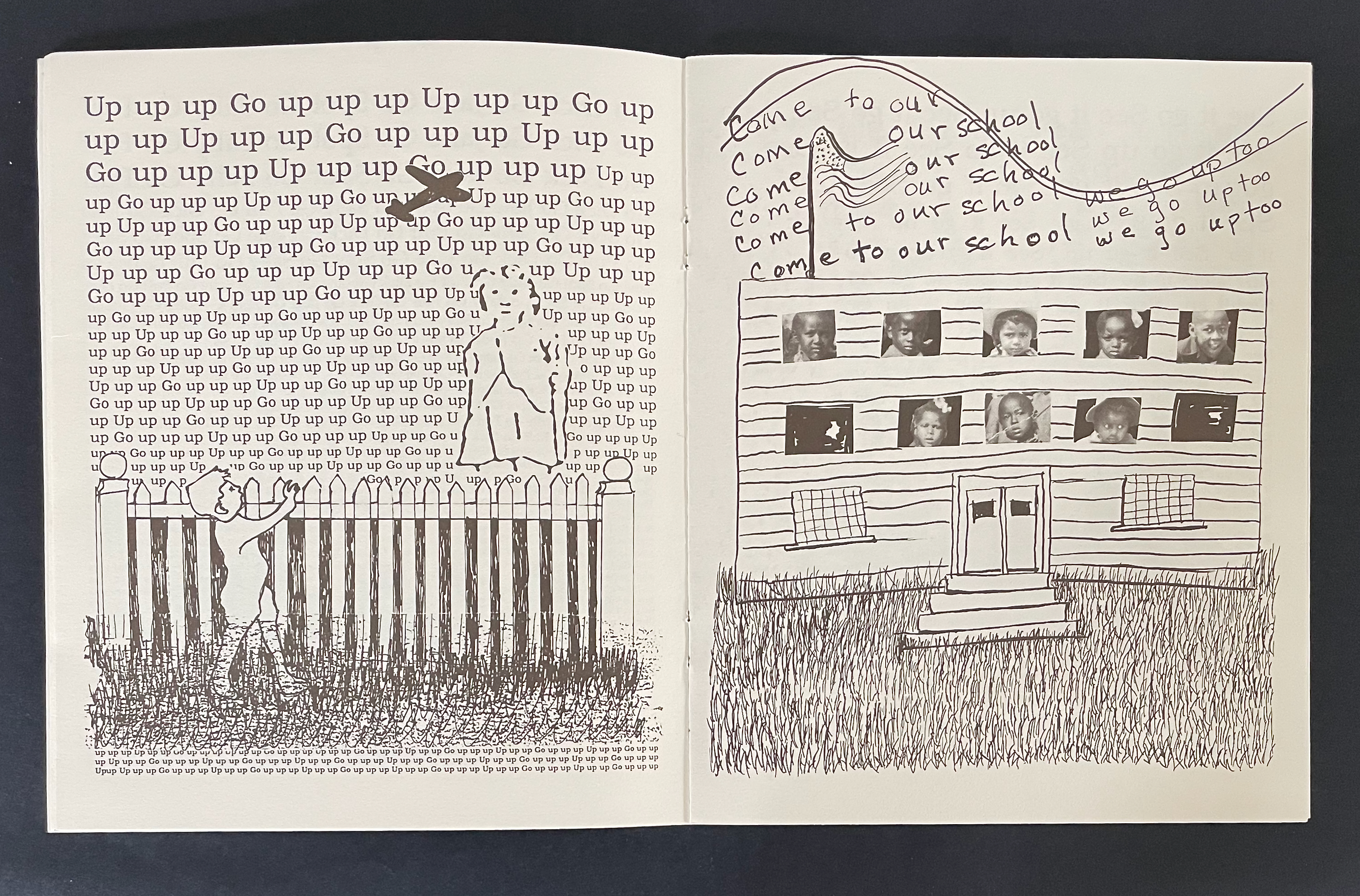
Reading Dick and Jane with Me (1989) Clarissa Sligh Saddle-stitched booklet, staples. H212 x W177 mm. [24] pages. Acquired from Marta Zlotnick, 6 October 2025. Photos: Books On Books Collection.
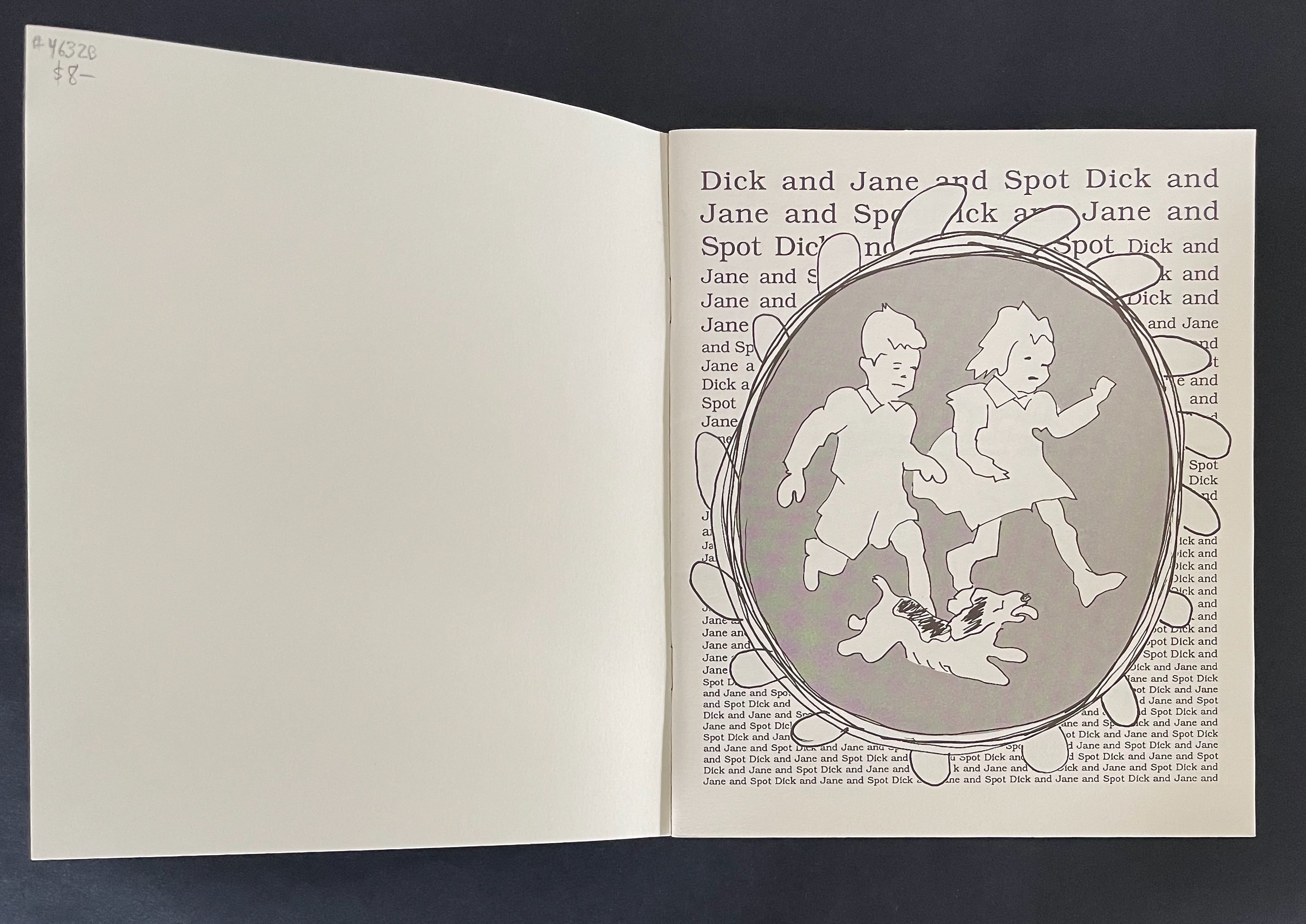
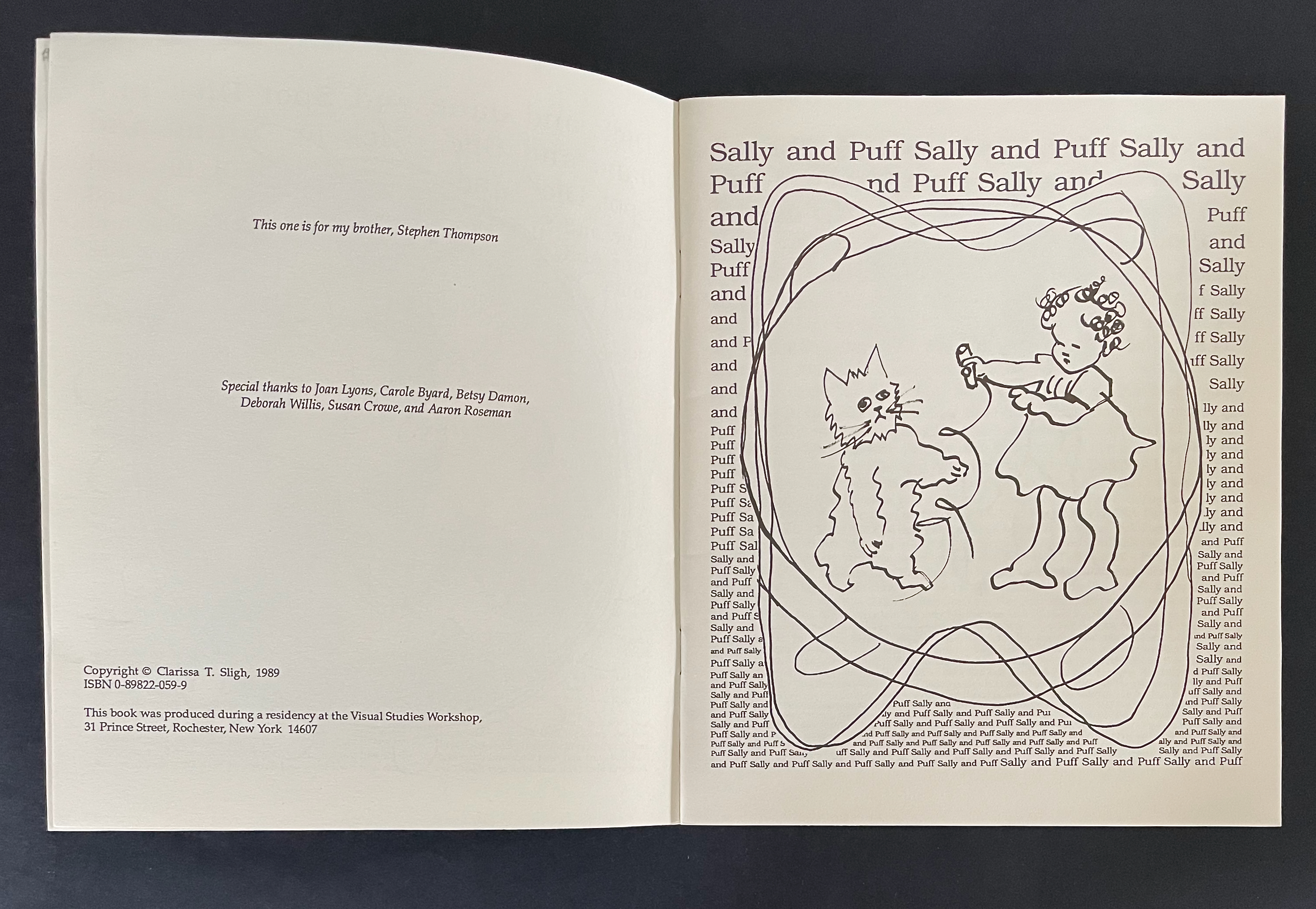
This is a painful artist’s book. In the repetitive style of the 1950s “Dick and Jane” beginning readers’ book, the child in the artist carries on a one-way conversation with children from those books. Dick, Jane, and Sally are white and upper middle class. They live in a suburban setting with their dog Spot and cat Puff, and the text of their lives is interpersed with “Fun”, “Fun”, “Fun”. They run and play, and tell the reader to “Look Look See us play”. Dick demands, “See me jump” and asks, “Who can jump Who can do what I do”. Sally insists on how pretty and white Puff is.
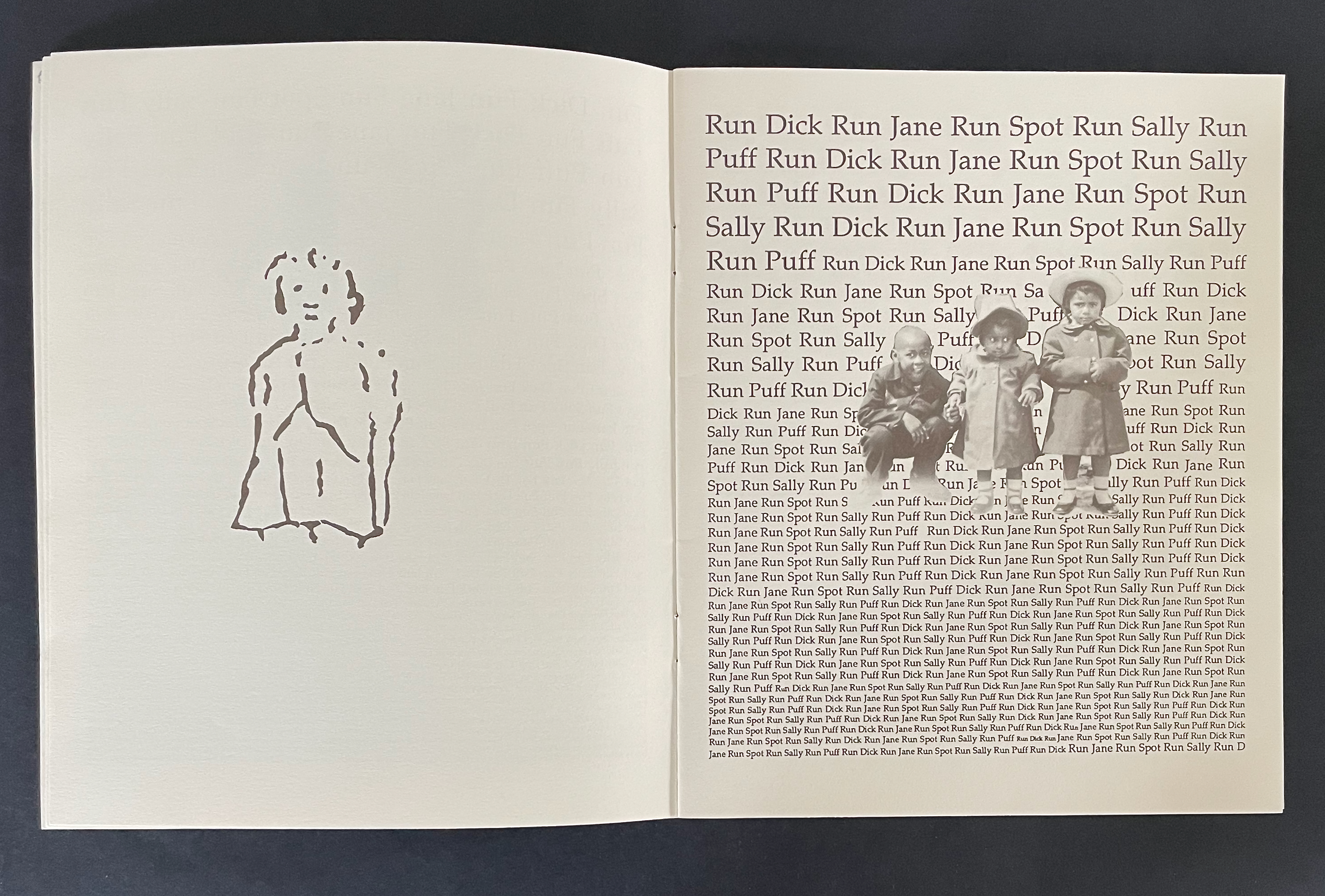
Alongside her redrawn versions of Dick, Jane, Sally, and their pets, the artist sketches in a cartoon self portrait and pastes in old photos of herself, siblings, and friends. For the first few pages, these images respond mutely to the “Dick and Jane” repetitions.
Facing the page below where a white picket fence separates the artist from Dick, she and her friends respond in a scrawled script (in contrast to Dick’s typeset exhortations to “Go up up up”). They invite Dick and the reader to “come to our school” where they “go up too”.
In the next spread, surrounded by imperatives to “See it go” and “See it go up”, Sally frowns and appears troubled by the encroachment of scrawls over the gutter and into her typeset page. On the facing recto page, the artist and friends stutter as they read the typeset lines: “We read See. it. go. see. it. go. up.” Maybe Sally is troubled by the words between the lines:
Between the lines: “We don’t talk like that but we try to read it anyhow”.
At this point, when the artist and her friends read “Run Dick Run”, the book takes a darker turn for us the readers — if we are reading with the child artist. Dick and Sally run across the double-page spread. Even though they are more roughly sketched than before and even though Dick wears a Ku Klux Klan hood, we know it is them. As the scrawled imperative RUN RUN RUN grows across the spread to its largest size, Dick’s mask slips aside. If you the reader are white, and if you understand that the scrawled (not typeset) command is in the artist’s voice, and if you are reading with the child who stands self-portrayed in the lower left hand corner and with the children in the photographs, maybe now you see what they see between the lines in Dick and Jane’s world.
From here on, the child artist addresses Dick and Jane (white society) more directly. She signals her “encroachment” by taking over the verso page with all of her scrawl and places Dick, Jane, and Sally within the drawn pages of their book in the foreground of the recto page. For the first time, her self-portrait is shaded as she stands in the background of the shaded Dick and Jane book.
As she explains how she and her friends differ from Dick and Jane (not likely to be listening, embedded as they are in their book), the child artist’s voice is soft but insistent in its “Dick and Jane” style repetition. For the first time, her self-portrait appears larger than the white child, and she is on the same side of the picket fence.
In the next spread, the impact of these “Dick and Jane” stories on her and her friends is spelled out and drawn to heartbreaking effect. Sally and “Pretty white Puff” stand in sharply drawn and typeset contrast to the erasure, the slipping away, of the self-portrait and the photograph. Even the book you hold in your hands and its hand scrawled text are smearing away in the lower left corner.
The artist’s voice is soft but, like the “Dick and Jane” style, insistent. In text and image, the message is heartfelt.
Reading Dick and Jane with Me also had an exhibition life, which Sligh describes on her website:
These cyanotype prints, 40 x 30 inches, 1990-2013, originated from artwork made for my artist’s book Reading Dick and Jane With Me while in residency at Visual Studies Workshop in 1989. The size of the original collage and the book page was about 8 ½ x 7 inches. During that residency at VSW, before the days of Photoshop, I learned to shoot the artwork onto film, strip and spot the films and make metal plates for the offset press printing of the book.
With the encouragement of Joan Lyons, the VSW Press director, I also used the large process camera to shoot and develop large negatives from the artwork. After returning home, I built a large light table, contact printed the negatives and processed them in my bathtub. The prints are sent to various exhibition sites. Viewers draw and mark on the prints in response to my image and text narratives. This process is done repeatedly until the prints are fully covered with marks and sketches left by the public.
The process continues. — Sligh website, accessed 17 July 2026.
As of this writing — in the time of Jim Crow 2.0, brutalization of children of color, and vicious beliefs in replacement theory and empathy as sin — Reading Dick and Jane With Me continues to insist — Read Dick. Read Jane. Read Sally. Read.
Further Reading
“Tia Blassingame”. 17 August 2020. Books On Books Collection.
Gabor, Nora. 18 February 2021. “Black History and Experiences through Book Arts“. The Full Text: News about library resources and services. Chicago, IL: DePaul University. Accessed 22 January 2024.
Gleek, Charlie. 2019. “Centuries of Black Artists’ Books“. Presented at “Black Bibliographia: Print/Culture/Art” conference at the Center for Material Culture Studies, University of Delaware, 27 April 2019, pp. 7-8. Accessed 20 July 2020.
Sligh, Clarissa. 1 July 2006. Interview with Steve Miller, Book Arts Podcasts, School of Library Information and Sciences, University of Alabama. Accessed 20 July 2020.
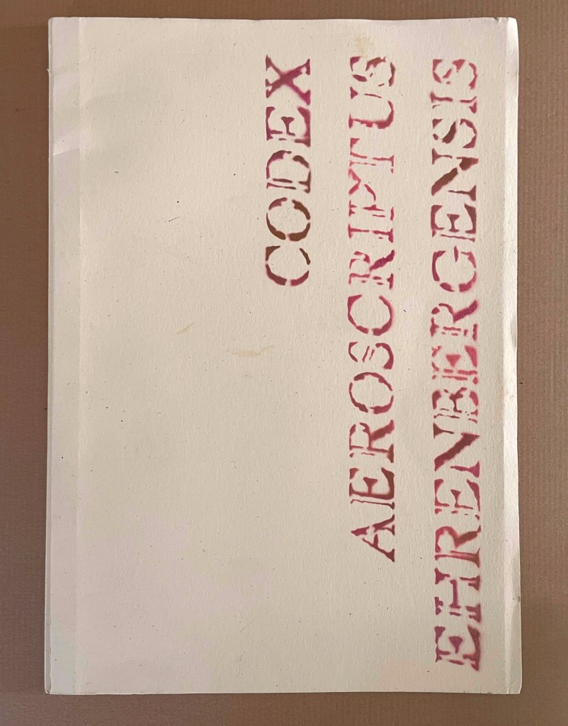
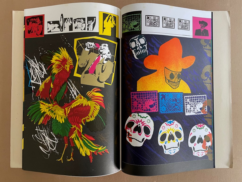
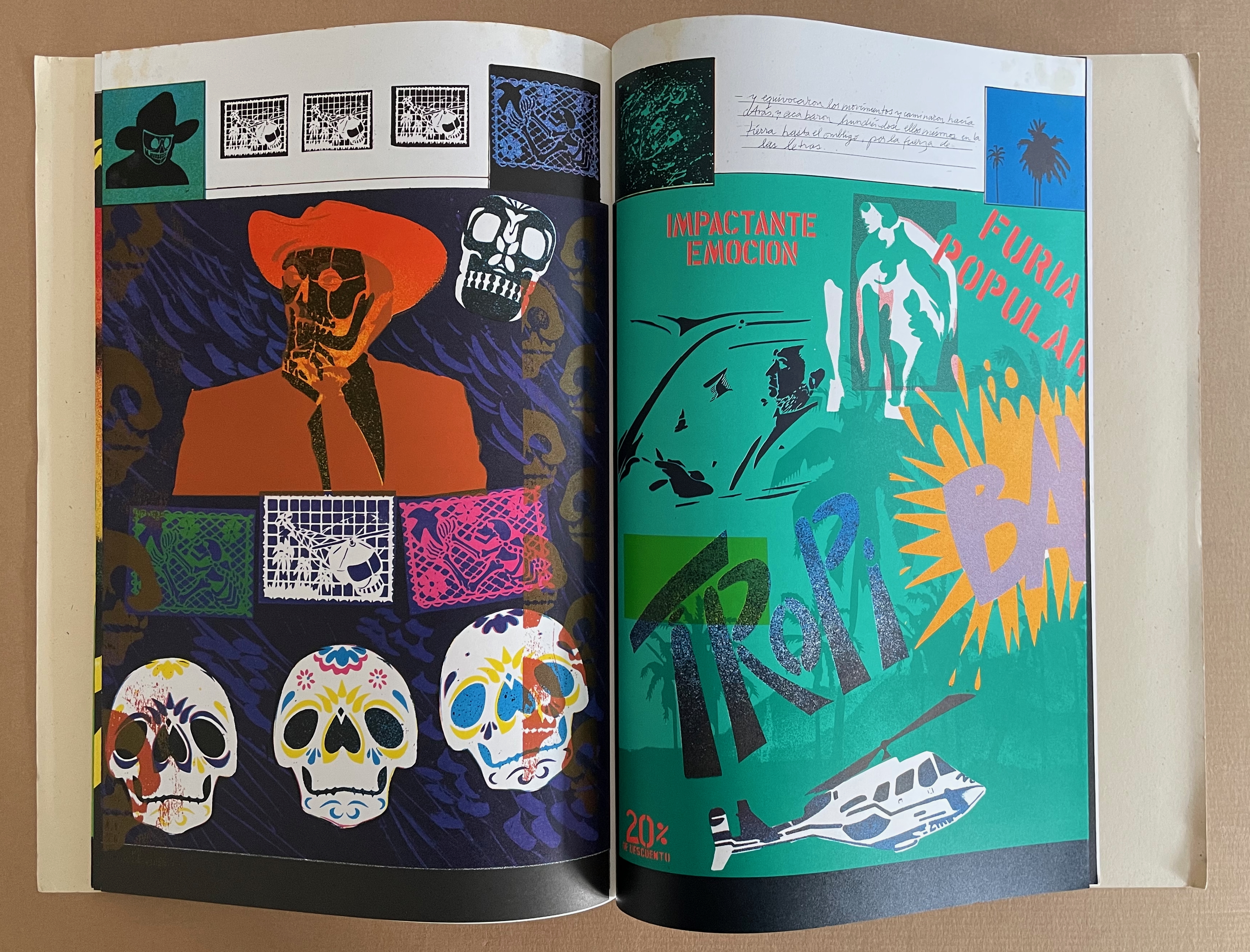
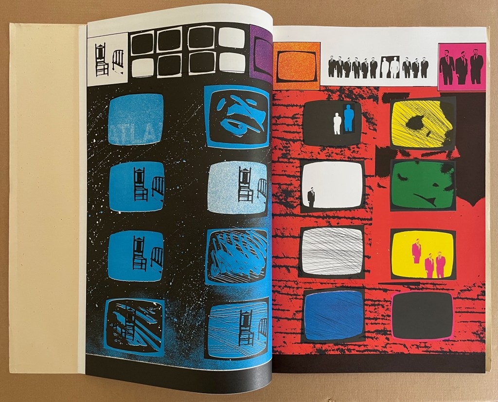
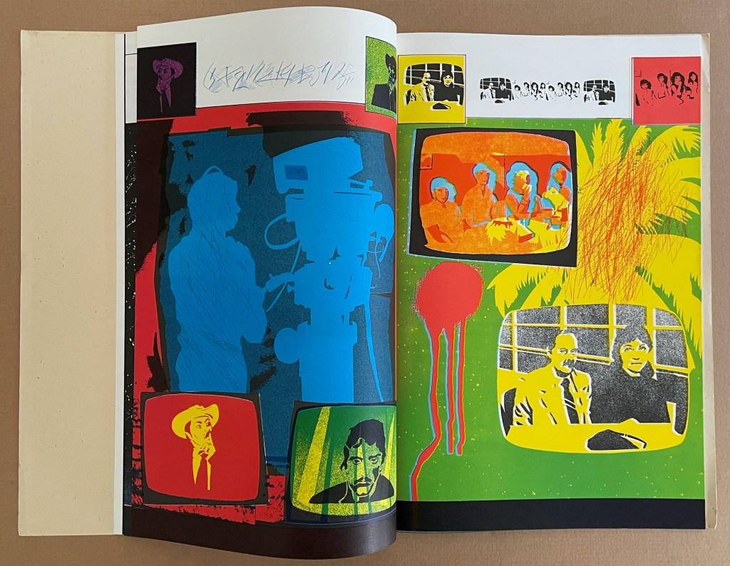
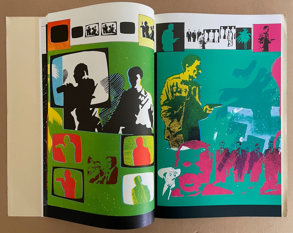
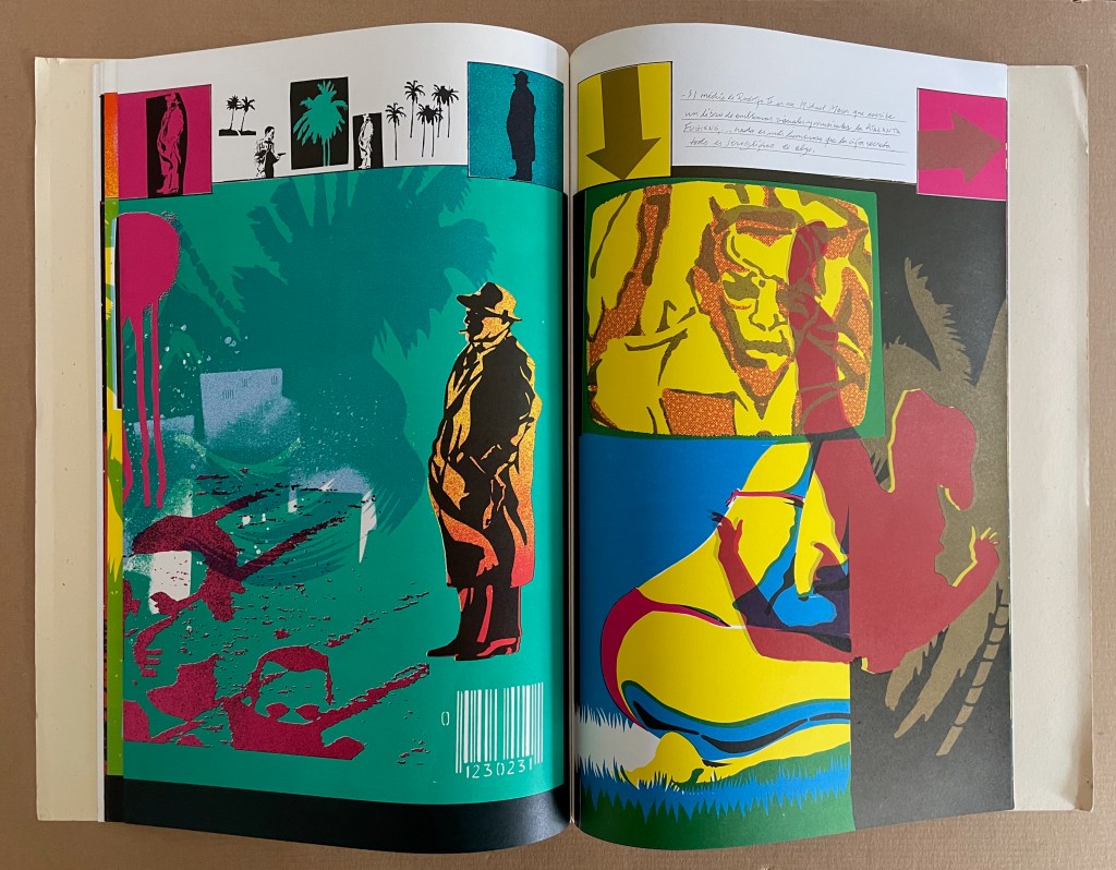
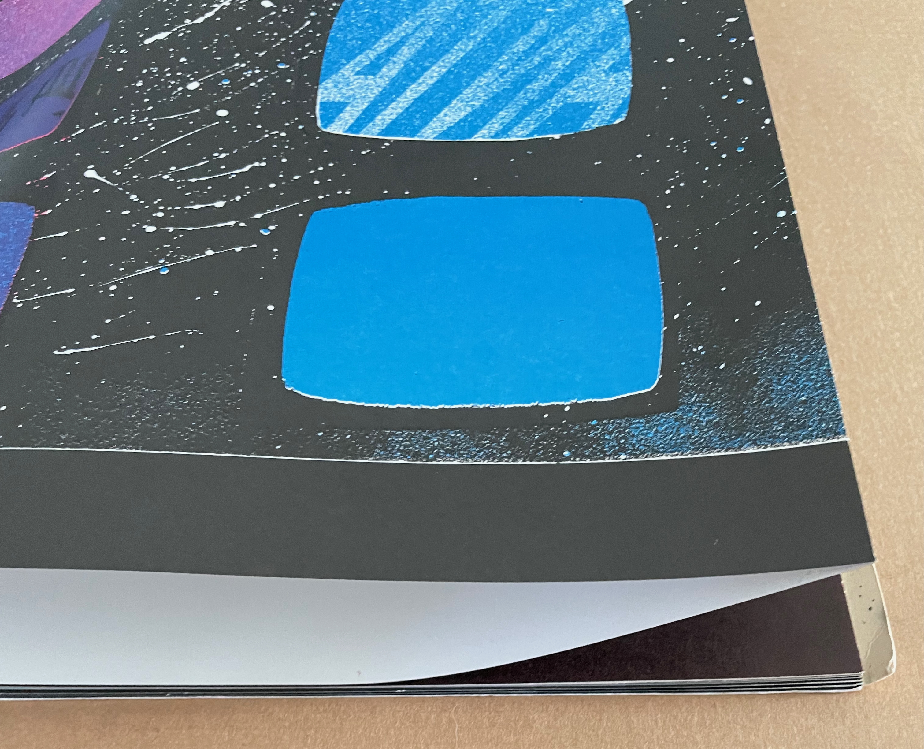
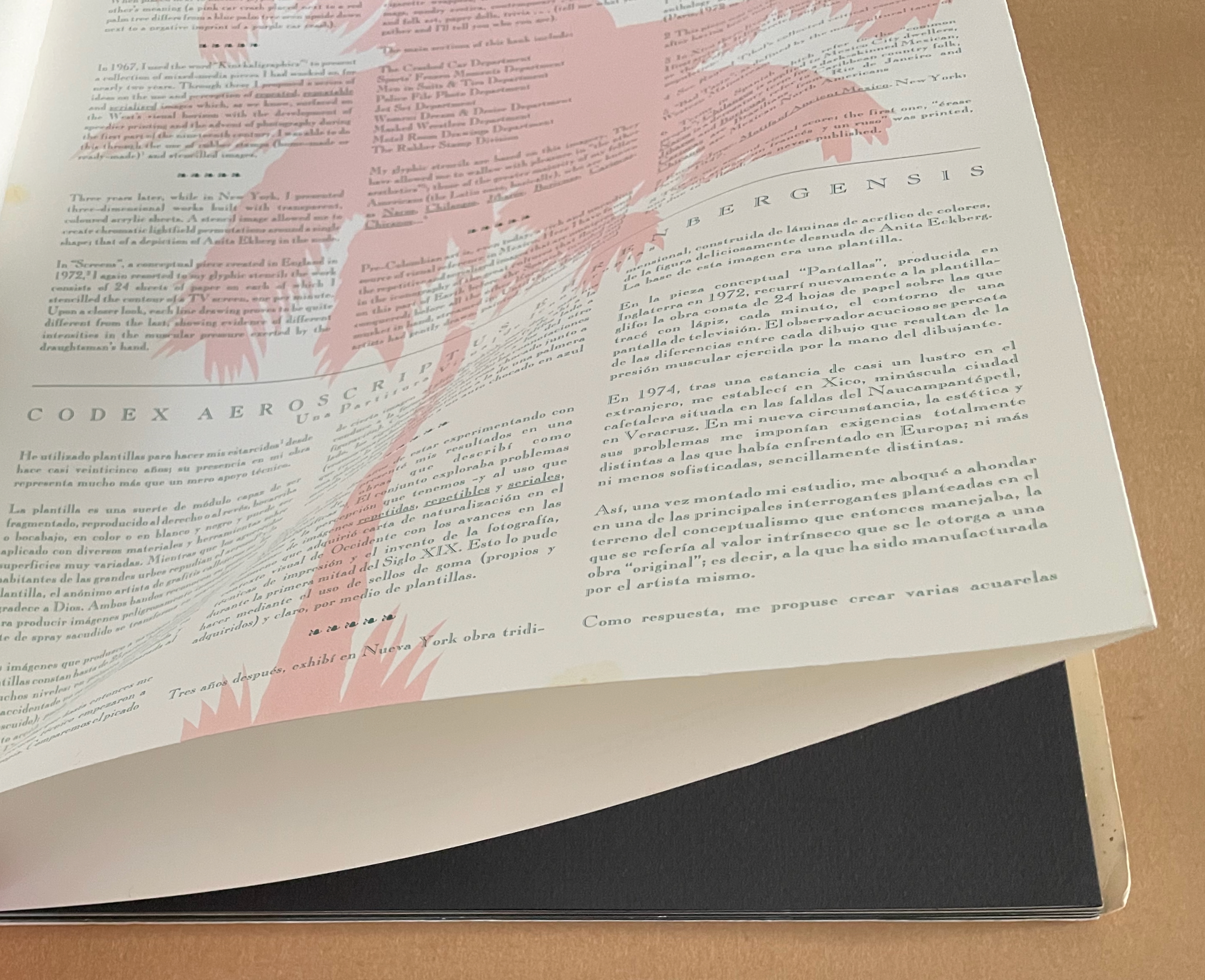
Codex Aeroscriptus Ehrenbergensis: A Visual Score of Iconotropisms (1990) Felipe Ehrenberg Casebound stiff cover, fly leaves around bifolios (fore-edge folded folios). H420 x W295 mm. 20 pages (10 bifolios, 9 with prints, 1 for title page and copyright page).Edition of 500. Acquired from Monograph Werks, 17 January 2024. Photos: Books On Books Collection.
In his introduction, Felipe Ehrenberg variously recommends that we read Codex Aeroscriptus Ehrenbergensis “like a detective novel” for its “various clues that you may unravel the wondrous and dramatic events surrounding the life of this artist, another witness to the end of a century” or “as a musical score, perhaps to be composed by someone wishing to recreate the background music of our daily histories” or a “formulation of hieroglyphs”. The book’s subtitle succinctly rolls up these metaphors: “a visual score of iconotropisms”.
Stephen Perkins calls it “a mini-retrospective of his explorations in this medium” — stencils.
This work came out of a residency Ehrenberg completed at Atlanta’s Nexus Press. The images for the works came from what he called his Visual Information Bank which was a box with all sorts of ephemera that he would dip into for images for his stencils. In contrast to the frenetic energy of the stencils, the inside of the publication has a bucolic and calm feeling that is mirrored in the original stencil work Ehrenberg created across the front pages of each book. (Perkins, 2024)
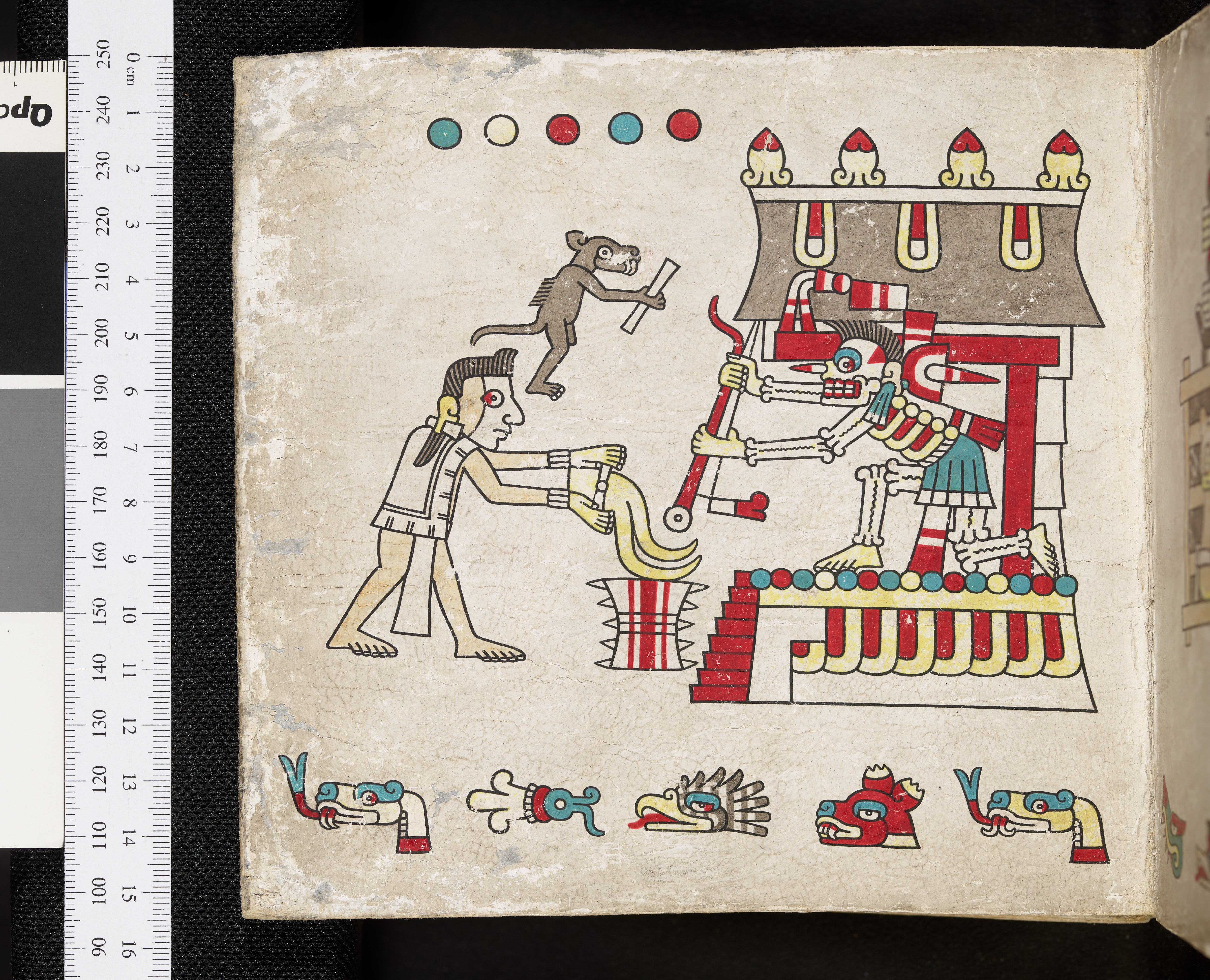
The accordion, concertina, or leporello structure adopted by so many 20th and 21st century book artists has its Aztec analogue called a screenfold format. Ellen Baird and Cristián Roa-de-la-Carrera included Codex Aeroscriptus Ehrenbergensis in the Newberry Library’s 2006-07 exhibition “The Aztecs and the Making of Colonial Mexico”.
… Aztec heritage has become a vital component of Mexican and Mexican-American identity, influencing the work of many contemporary writers, artists, and scholars. The inherent flexibility of traditional indigenous creativity facilitates combination with contemporary artistic practices. Traditional screenfold books are layered with contemporary collage and print techniques, and indigenous images are juxtaposed with colonial scenes and pop icons. Contemporary Mexican and Mexican-American artists use traditional Aztec images and techniques to explore both contemporary life and Mexican cultural heritage. The screenfold format is an emblem of ancient Mesoamerican culture, and has become charged with historical and political meaning. Contemporary artists combine this format with humorous and provocative imagery to explore the cultural and political dynamics of preconquest identity, the colonization of Mexico and current relations between Mexico, Europe, and the United States. (Baird and Roa-de-la-Carrera, 2006)
Ehrenberg’s title is dipped in sarcasm. Most of the barely surviving screenfold Mesoamerican works reside in Anglo-European institutions under names like Codex Borbonicus at the Bibliothèque de l’Assemblée Nationale in Paris, Codex Borgianusat the Vatican, and Codex Mictlan at the Bodleian Libraries in Oxford. Ehrenberg’s modern version reflects their pictorial style and even the layout of their repetitive serialized images. But in doing so, his images speak to the continuing impact of colonialism.
Still, Ehrenberg’s book art went beyond any reductive anti-colonial message. His “Visual Information Bank”, as he called it, held a wealth of contemporary cultural iconography. Its main sections included:
The Crashed Car Department Sports’ Frozen Moments Department Men in Suits & Ties Department Police File Photo Department Jet Set Department Women: Dream & Desire Department Masked Wrestlers Department Motel Room Drawings Department The Rubber Stamp Division
And he drew on this — especially from the televisual world — to create his glyphic stencils and rubber stamps.
The leporello edition of Codex Aeroscriptus Ehrenbergensis is rare, but fortunately the wrap-back bound edition shown in this entry is a little less so. The wrap-back format is a traditional Chinese/Japanese book format. Takako Saito, who joined Ehrenberg at Beau Geste Press in 1973, may have been an influence in this regard, but as she left in 1975, an influence from others at Nexus in Atlanta, GA, where Ehrenberg completed this work, seems more likely.
The double-sided leporello edition of Codex Aeroscriptus Ehrenbergensis is not a folded continuous sheet. Viewable on Stephen Perkins’ site, it appears to have been formed from the codex edition’s double-page spreads glued together at the fore edge. Ehrenberg’s residency at Atlanta’s Nexus Press would have overlapped with Clifton Meador’s presence, and Meador’s works frequently use the wrap-back format.
Reed, Marcia. 2022. “Codex Espangliensis: From Columbus to the Border Patrol“, in Materialia Lumina : Contemporary Artists’ Books from the CODEX International Book Fair. Edited by Elizabeth Fischbach and Nann Parrett. Berkeley, California: The Codex Foundation.
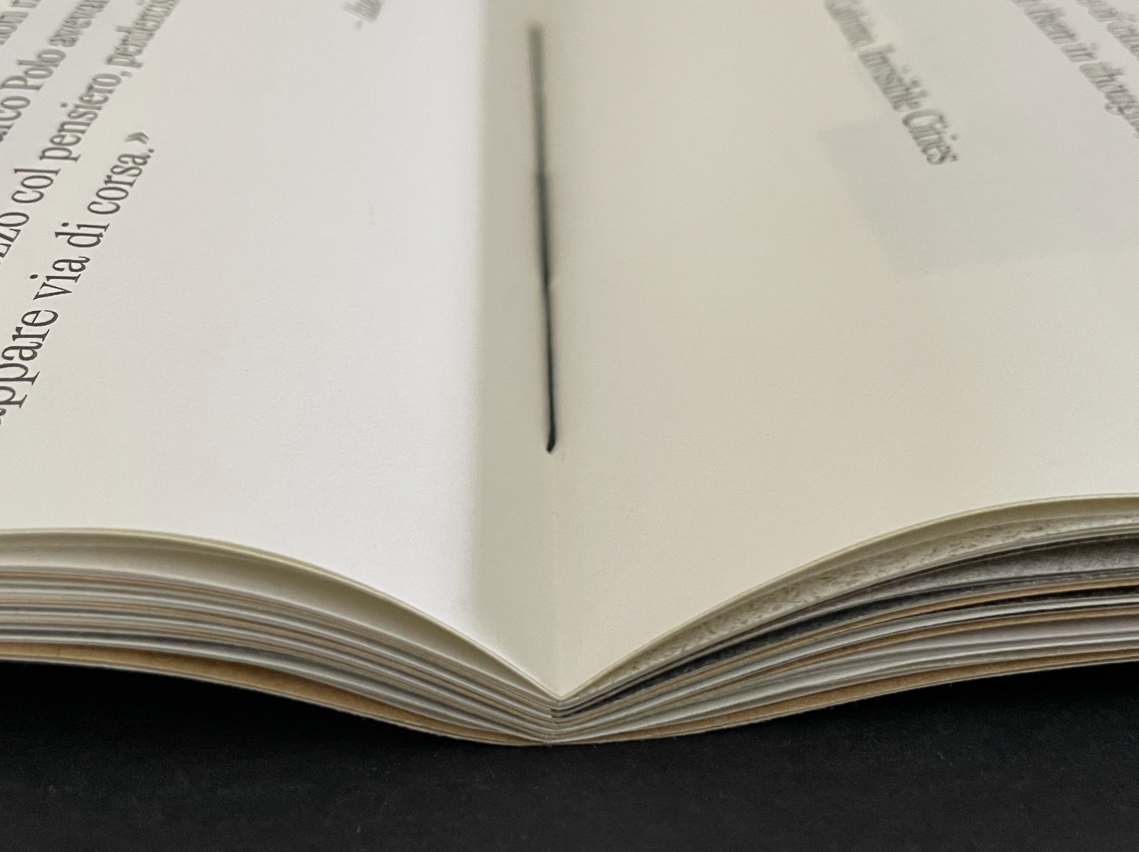
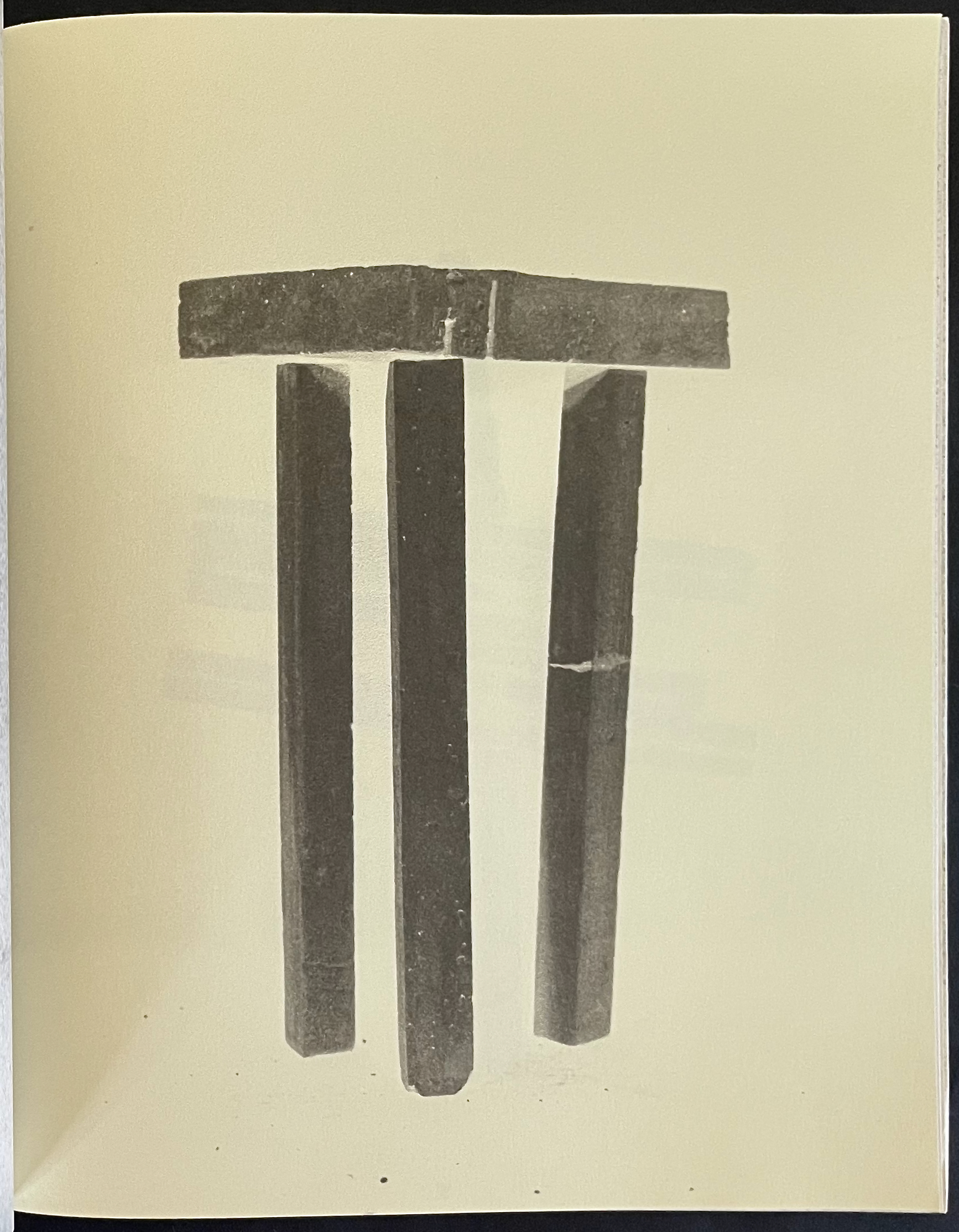
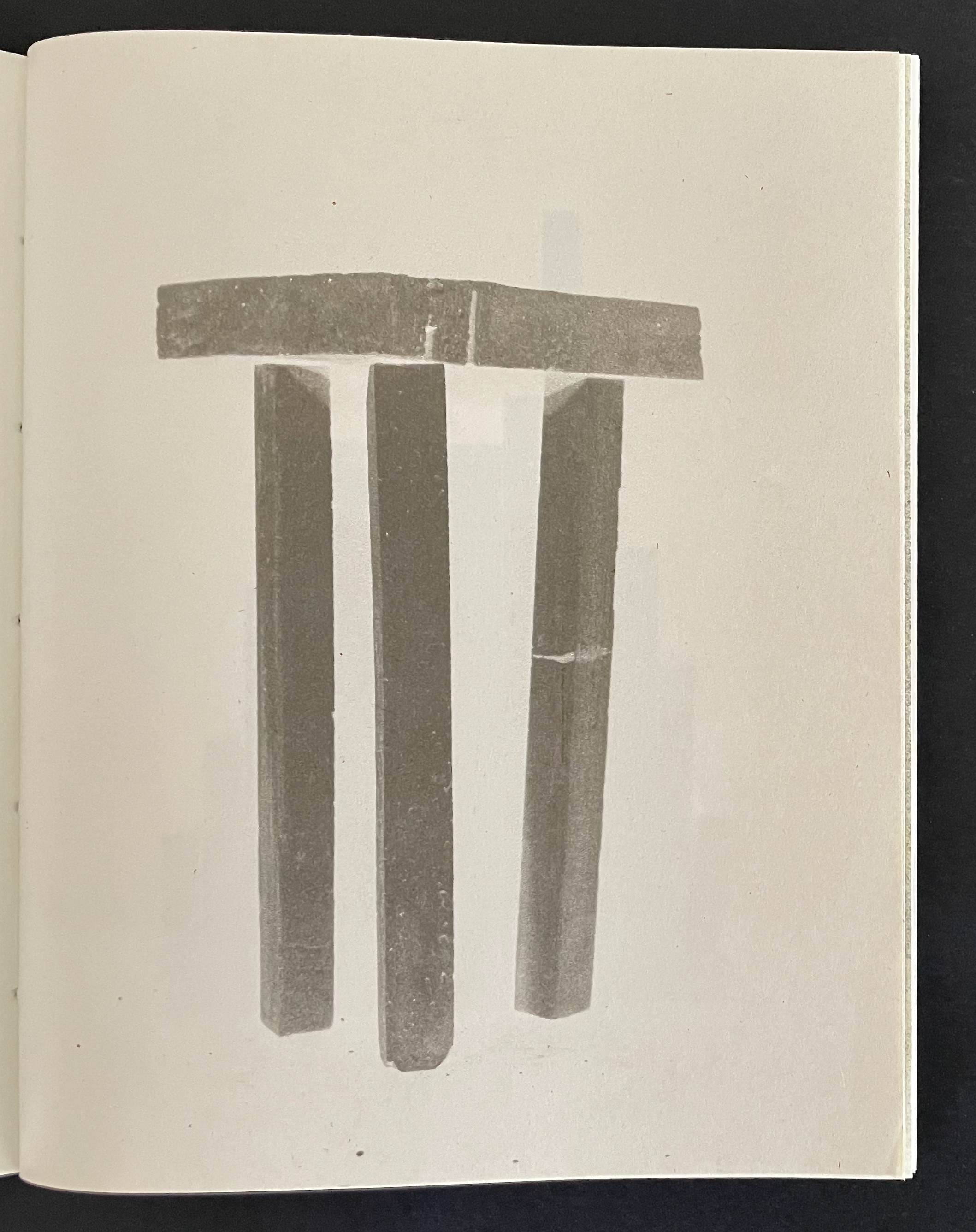
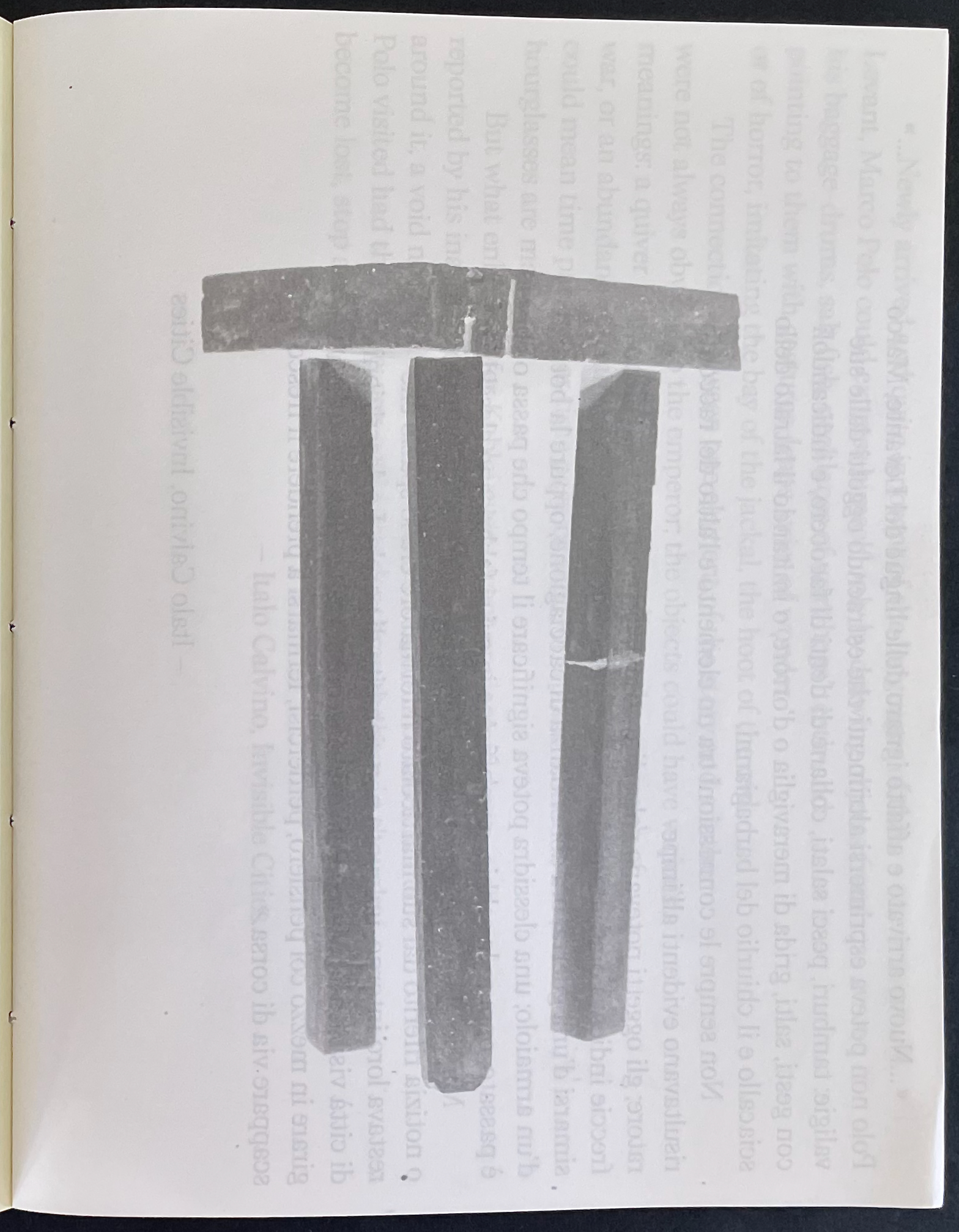
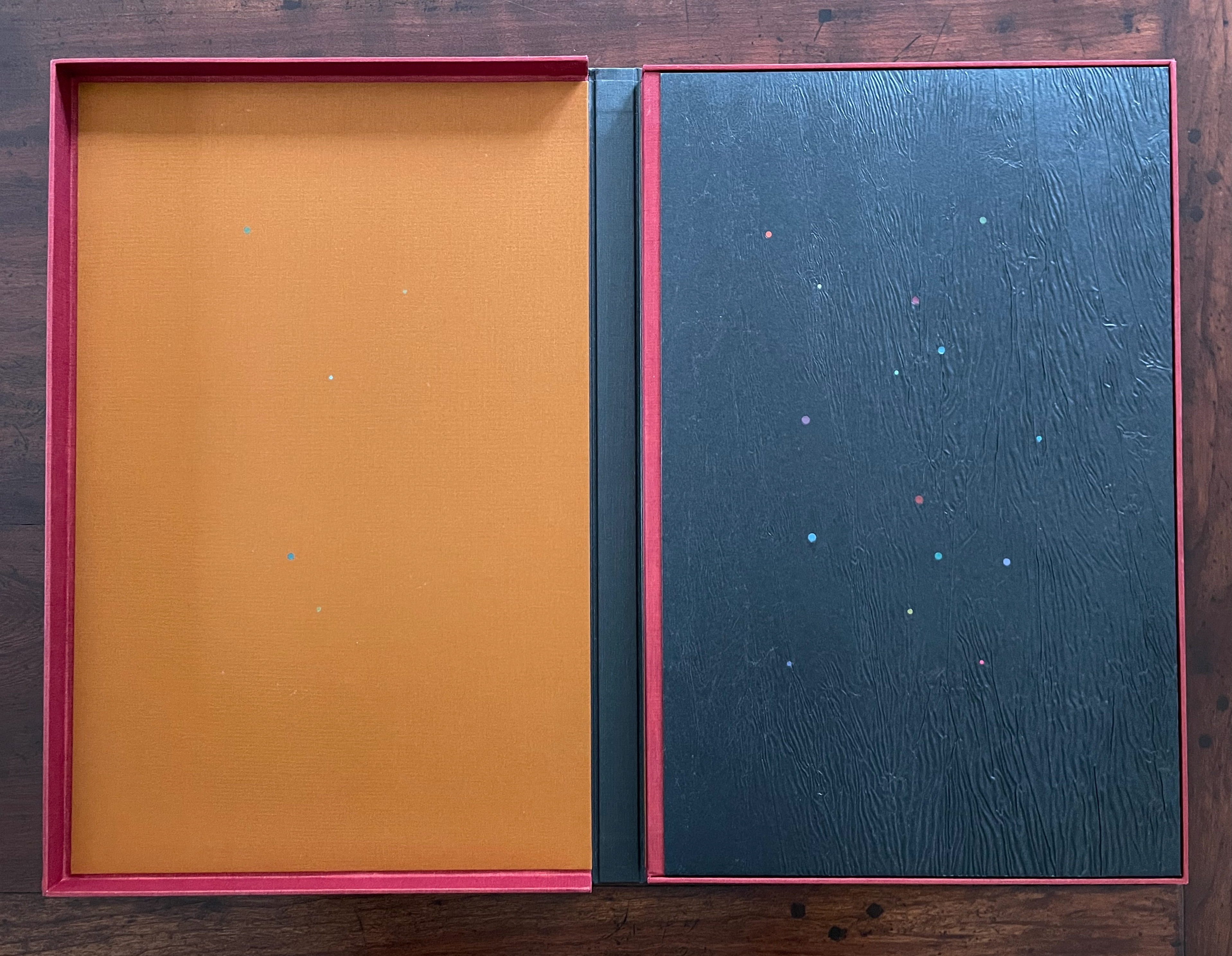
In Visible Cities (2012) Jean-Pierre Hébert, Harry and Sandra Liddell Reese Custom-made box enclosing sewn board binding with cloth spine, treated abaca/cotton paper with painted inlays, pastedowns with drawings, valley-fold folios of Niyodo Natural paper printed on Epson Stylus Pro 4800. Box: H442 x W290 mm. Book: H424 x W276 mm. [46] pages. Edition of 73, of which this is #48. Acquired from the Reeses, 9 February 2026. Photos: Books On Books Collection. Displayed with permission of Claire Hébert and the Reeses.
More than a few artists have been drawn to Italo Calvino’s Invisible Cities (1972/74). Its attraction is not hard to understand. Calvino supposes a series of conversations between Marco Polo and Kublai Khan about cities across the Khan’s empire that he has not visited but Marco Polo has and which he describes for the Khan. The premise, however, is paradoxical: the fifty-five cities Marco Polo describes do not exist. Calvino’s sensuous and surrealistic prose and combinatorial arrangement of the conversations and descriptions create a book that is simultaneously inwardly and outwardly reflective. Simple but complex. Realistic but fantastical. Concrete but conceptual. A work ripe for homage and inspiration.
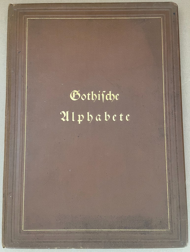
Gotische Alphabete (1897) Jaro Springer Casebound hardcover in leather with cover title and cover illustration in gold and blind embossing. H415 x W300 mm. 1 sheet, 8 pages, 3 sheets, 39 plates. Acquired from Antiquariat Braun, 14 November 2024. Photos: Books On Books Collection.
Every history of letters or script begins with a scrawl. Someone somewhere at some time made a mark tied to an object tied to a sound — A is for Ox — and some others in the same place and time accepted that this handmade mark or shape could conjure up that object in the mind. Perhaps it seemed magical, perhaps it seemed mundane as they imagined that somehow meaning and reality inhered in that shape or sound, the connection just waiting to be discovered.
Regardless, the shapes of characters and their relationship to the sound or meaning they represent is arbitrary, a prehistorical and historical function of social convention, a collective making by individuals. Jaro Springer’s art historical specimen book reminds us of the fantastical visual elaborations to which 15th-16th century artists’ hands would put those “shapes for sounds” we call the alphabet.
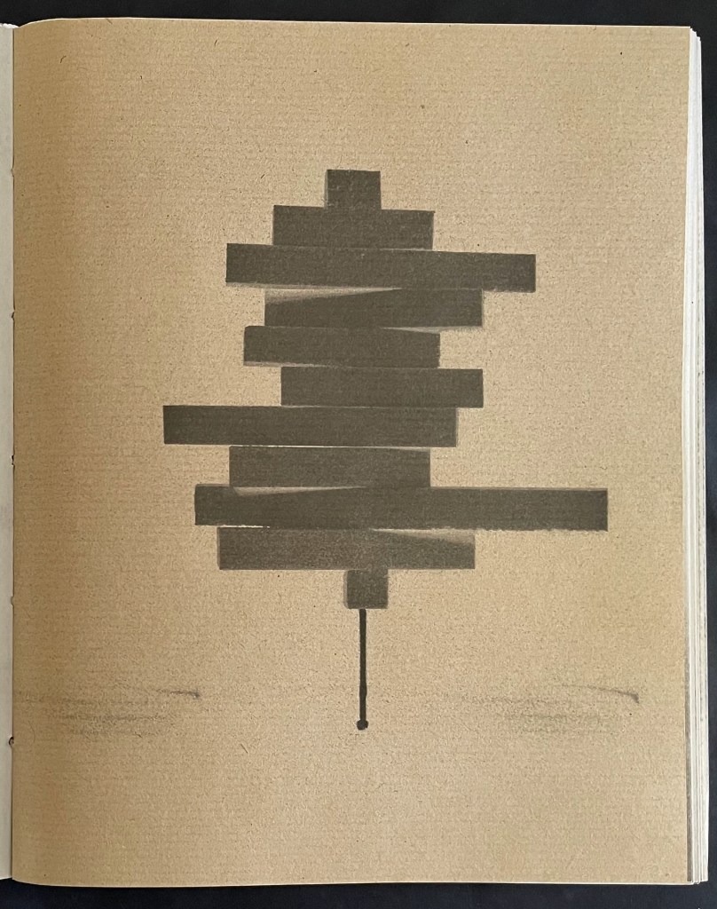
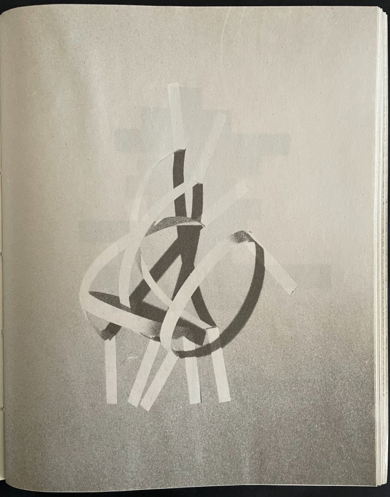
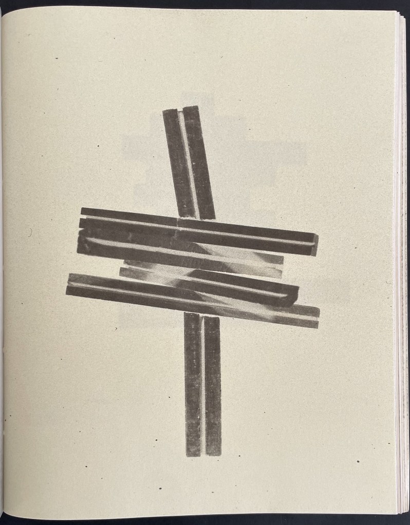
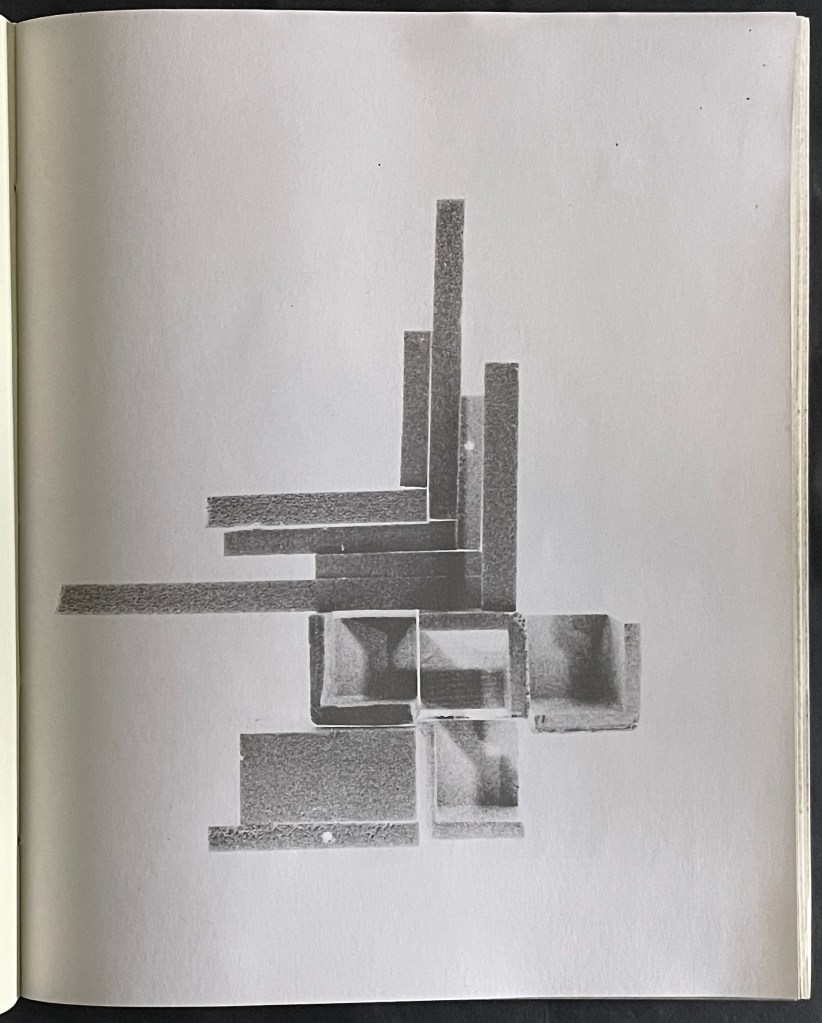
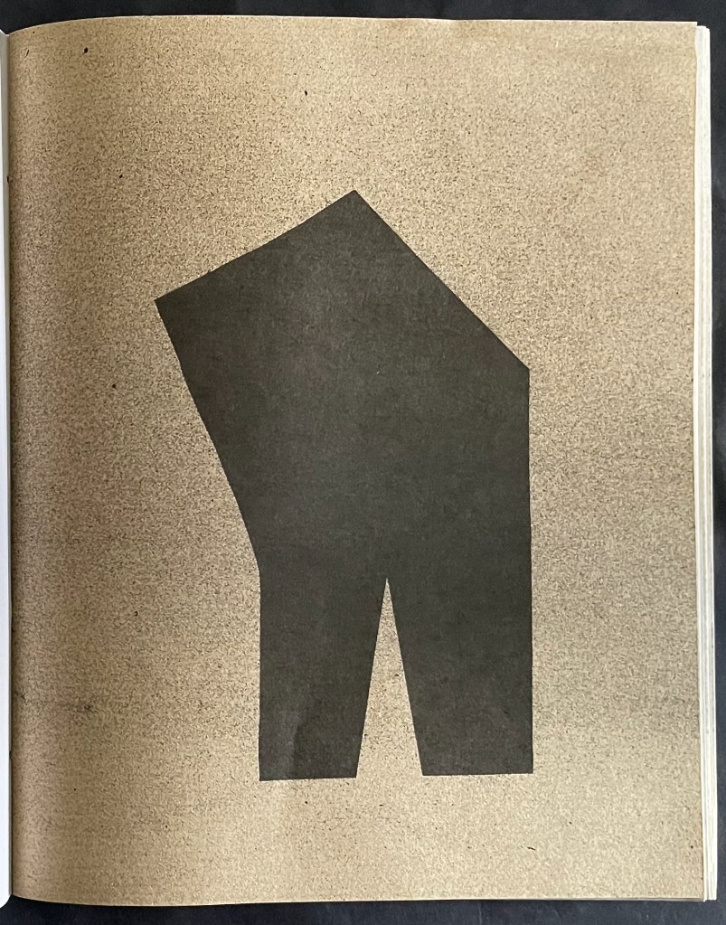
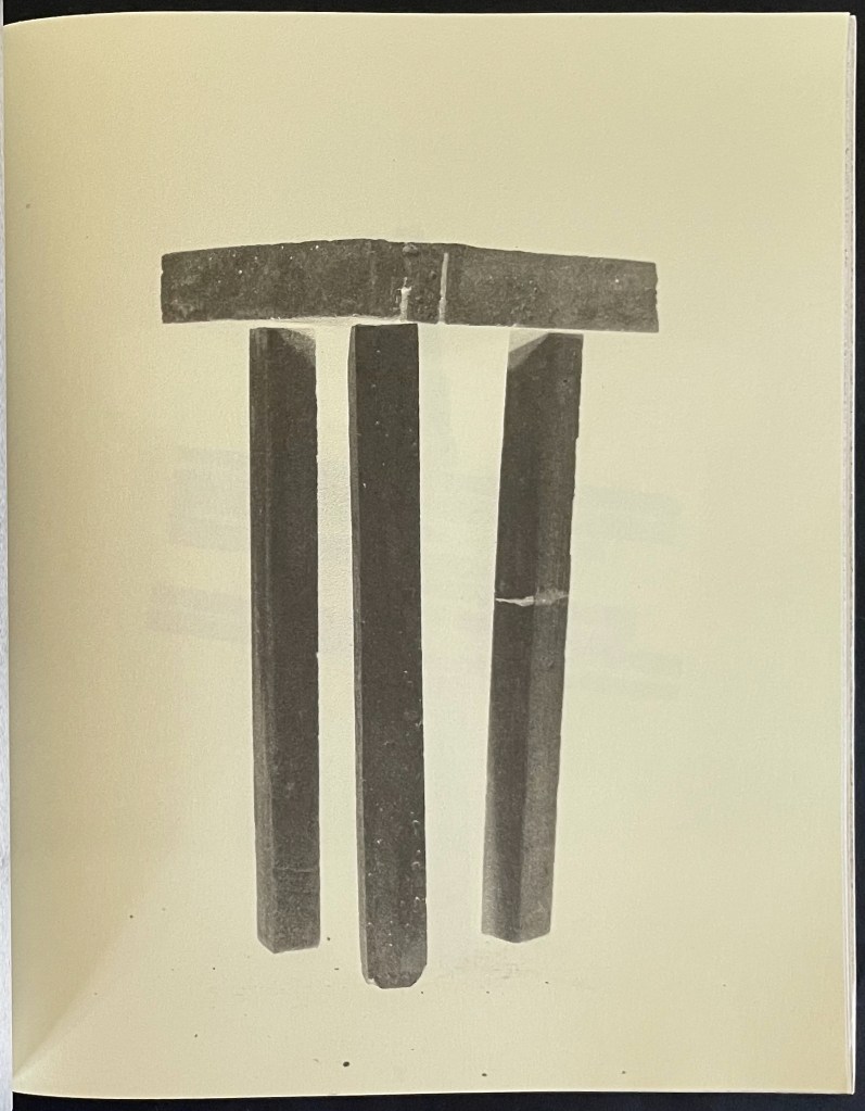
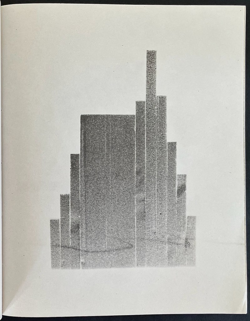
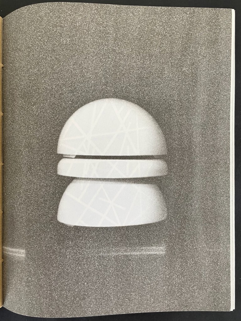
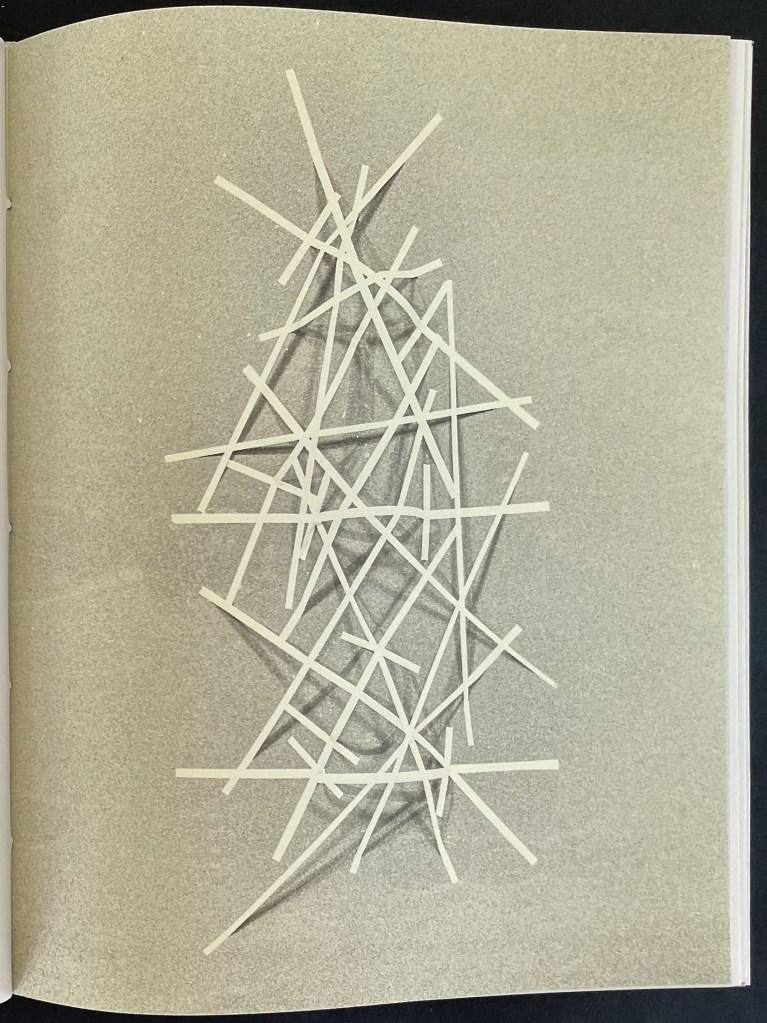
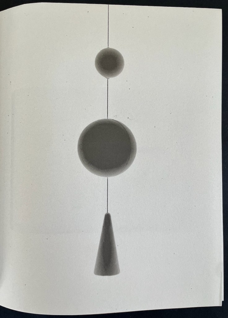
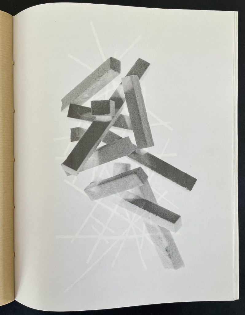
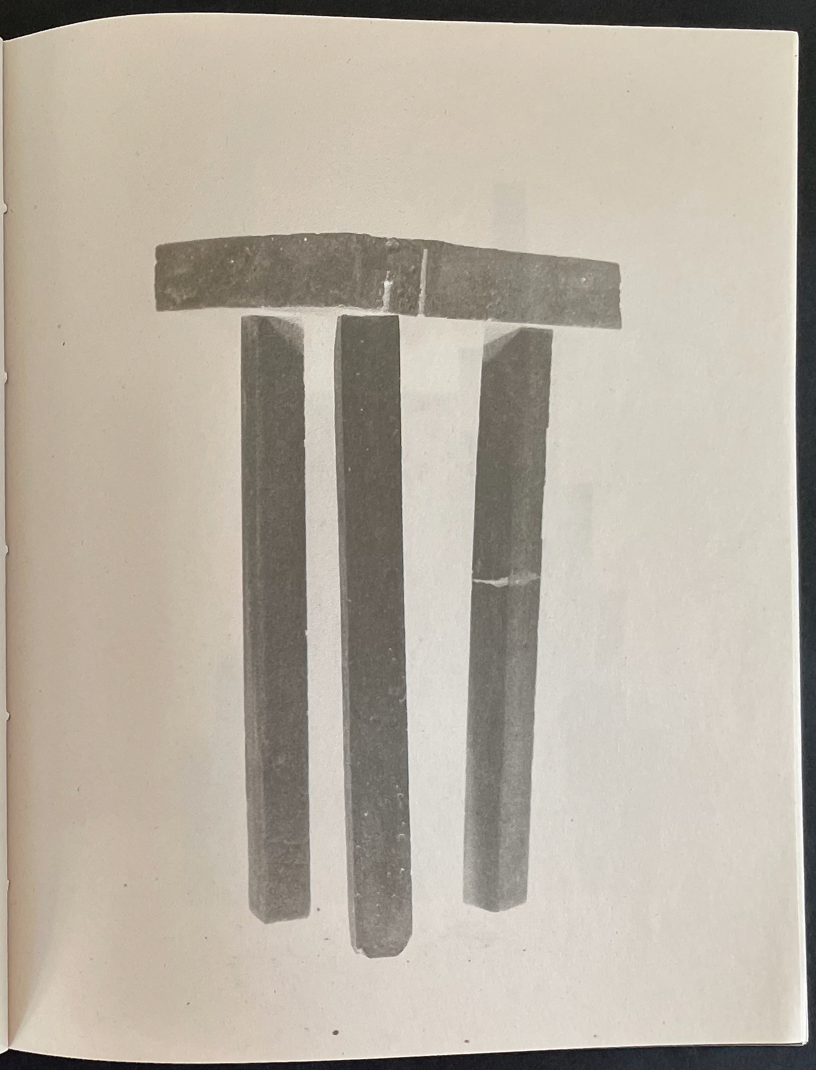
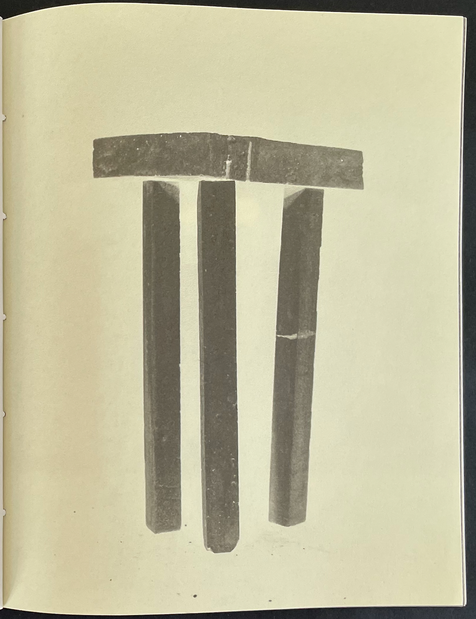
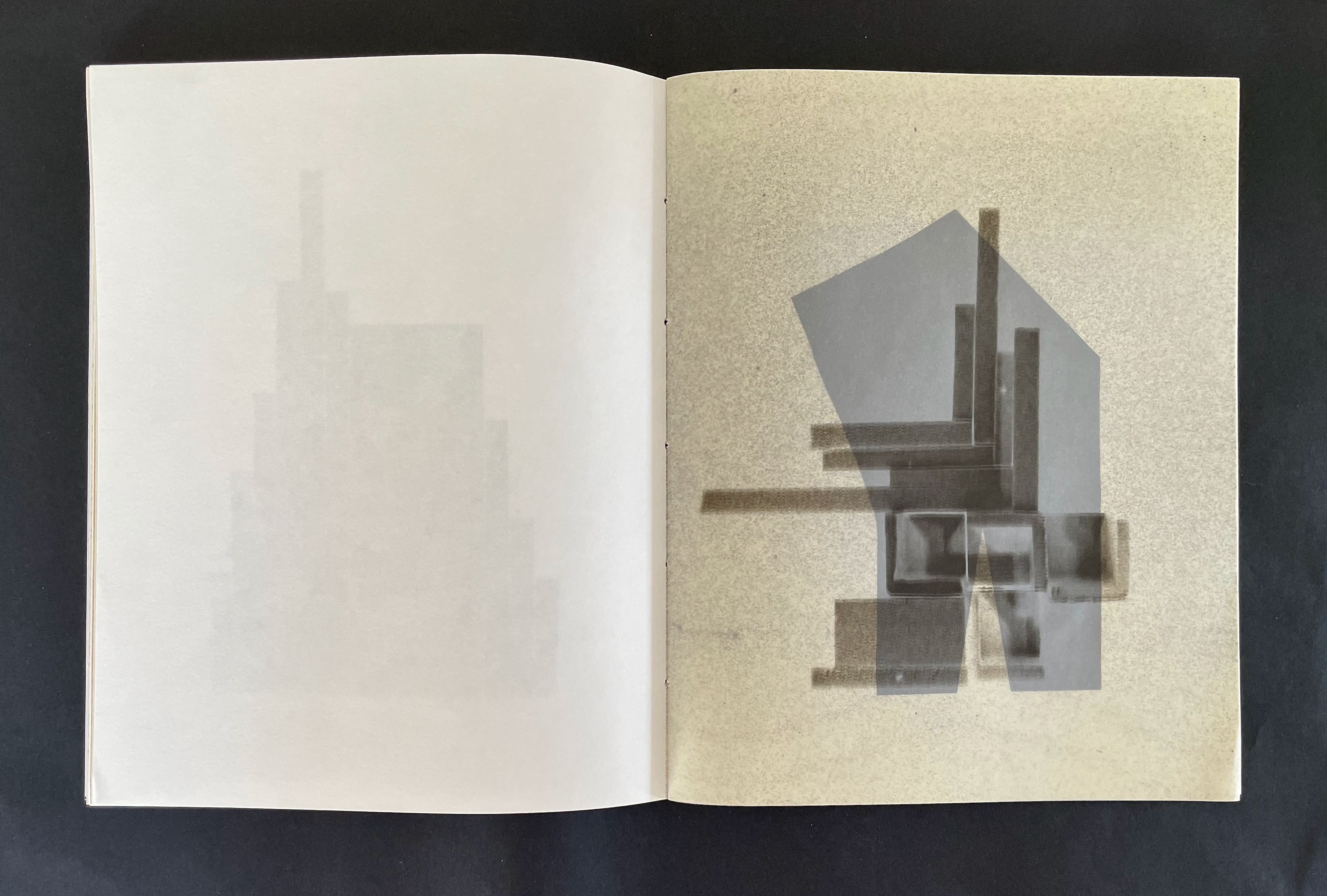
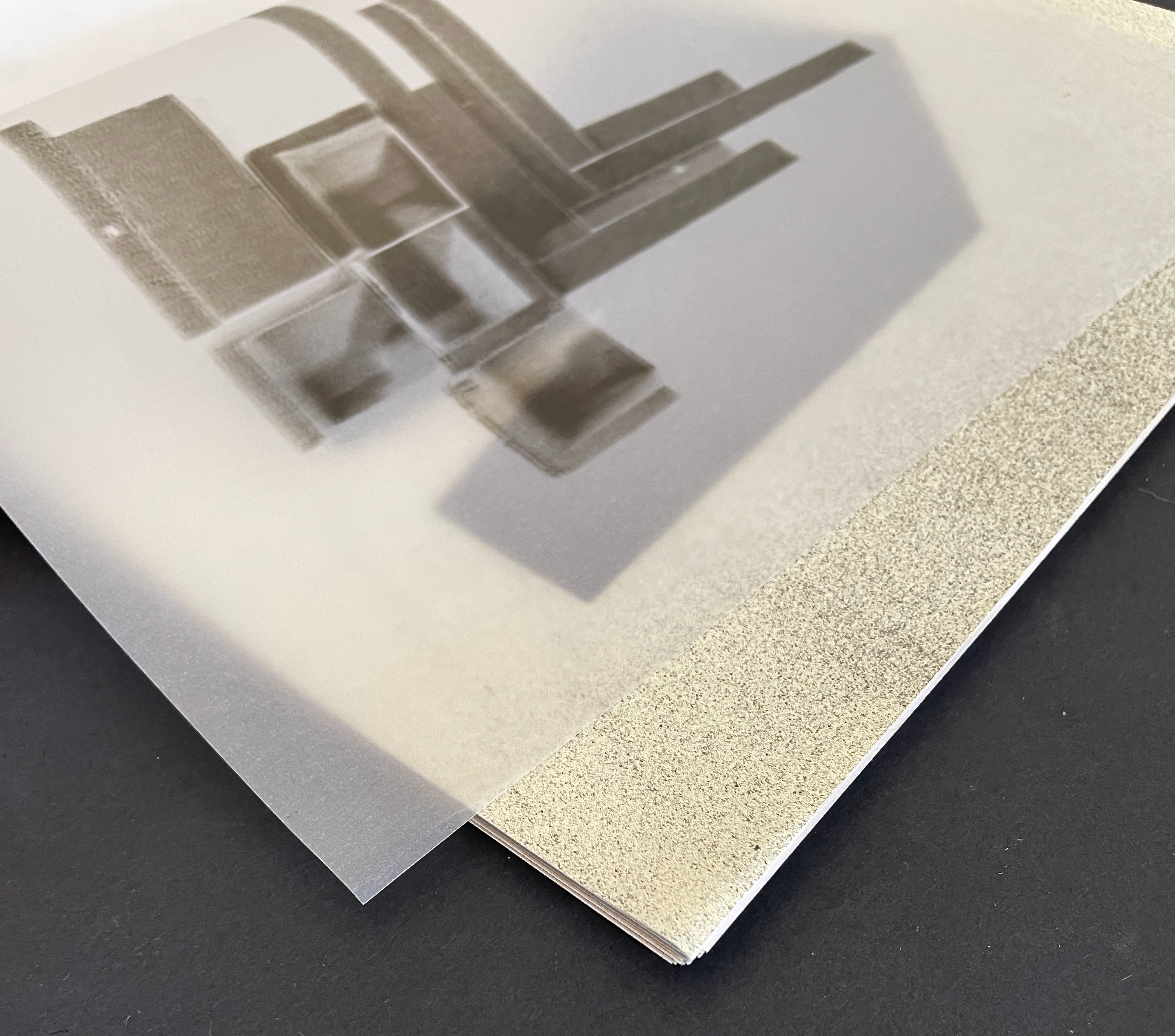
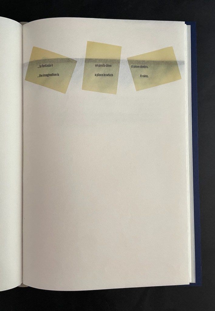
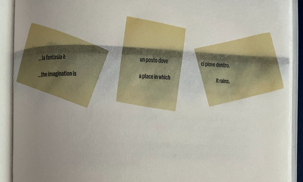
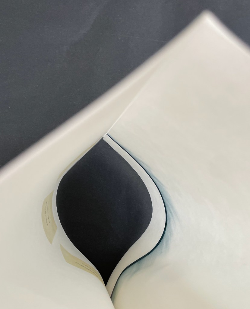
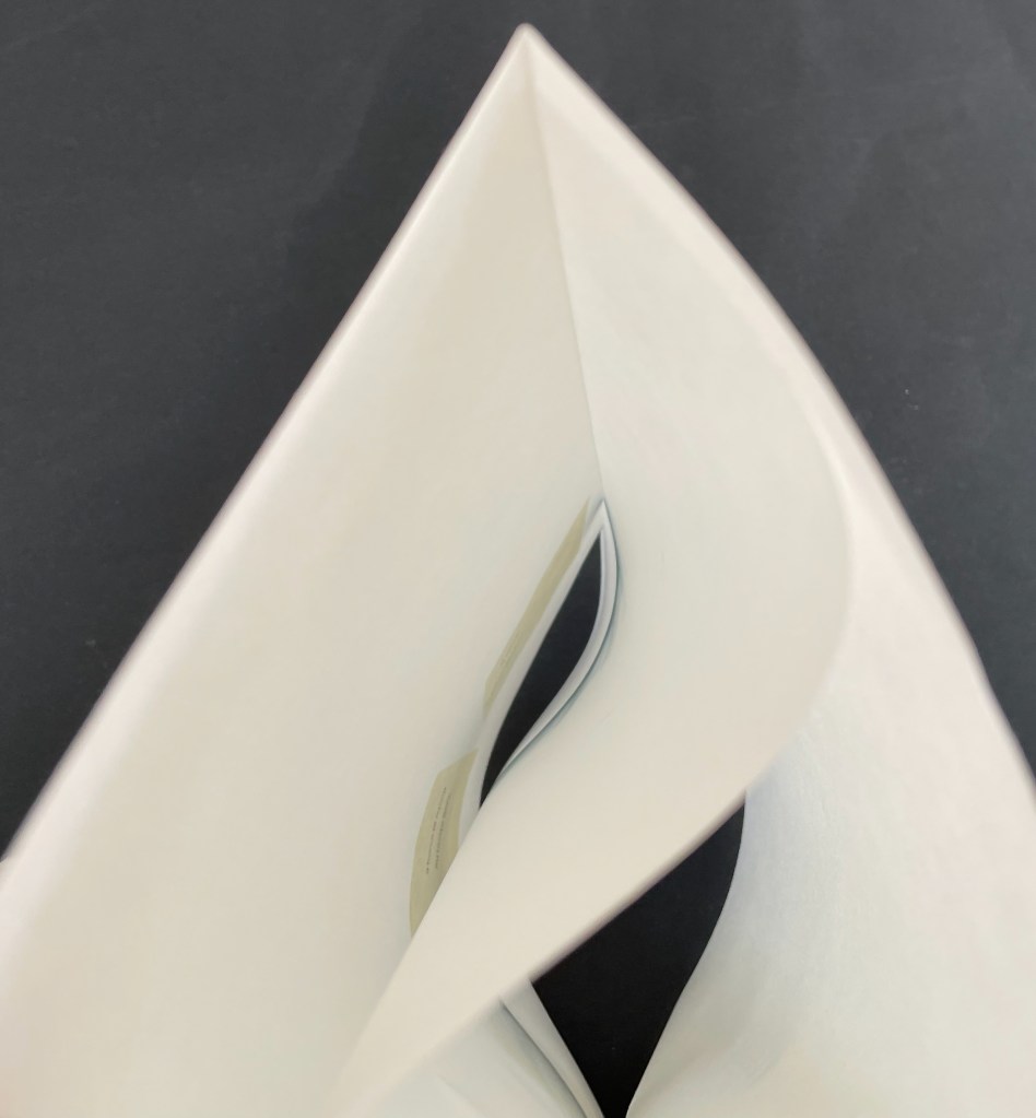
A Never-Ending Stone (2025) Laure Catugier Open spine, dos-à-dos with grey bookbinding board. 210 x H260 x 210 mm. 104 pages. Edition of 250. Acquired from einBuch.haus, 3 December 2025. Photos: Books On Books Collection.
A Never-Ending Stone is Laure Catugier’s first monographic catalog. Her skill with collage, alignment, shadows, materials, and the book format transform it into an artist’s book very much driven by her fascination with architecture and especially the architectural theories and practice of Oskar and Zofia Hansen. The Hansens eclectically embraced “human-scale” architecture, “environment art”, and what they called the “open form” structure, using space and time as its key elements. The Hansens also proposed that the architect should not be the all-knowing expert but should partner with clients as co-authors of their space, respecting how their interior and outside activities and relations with one another defined them and their space. Though somewhat a forerunner to User-Centered Design, Open Form radically aimed at structures that would evolve with interaction with the user and, as they unfolded, also align with nature.
Reparations (2010) Emory Douglas Cover enclosing leporello. Cover: H102 x W105 mm. Leporello: H89 x W95 mm (closed); W380 mm (open). [4] panels.Edition of 100, of which this is #45. Acquired from the San Francisco Center for the Book, 30 June 2025. Photos: Books On Books Collection. Displayed with permission of the publisher.
“Emory Douglas is renowned for his iconic representations of the Black Panther Party through his work as the Party’s Minister of Culture. For decades, he communicated the power and charisma of the movement through his compelling straightforward graphic style. … The imagery for this edition was initially a painting by Mr. Douglas’ which was then translated into a 2 color, letterpress graphic. The pages of the book are a one-sided, accordion fold piece. The folded cover is made of Amate bark with hand-spun hemp and silk thread and letterpress printed in 2 colors with interior colophon page attached””–San Francisco Center for the Book
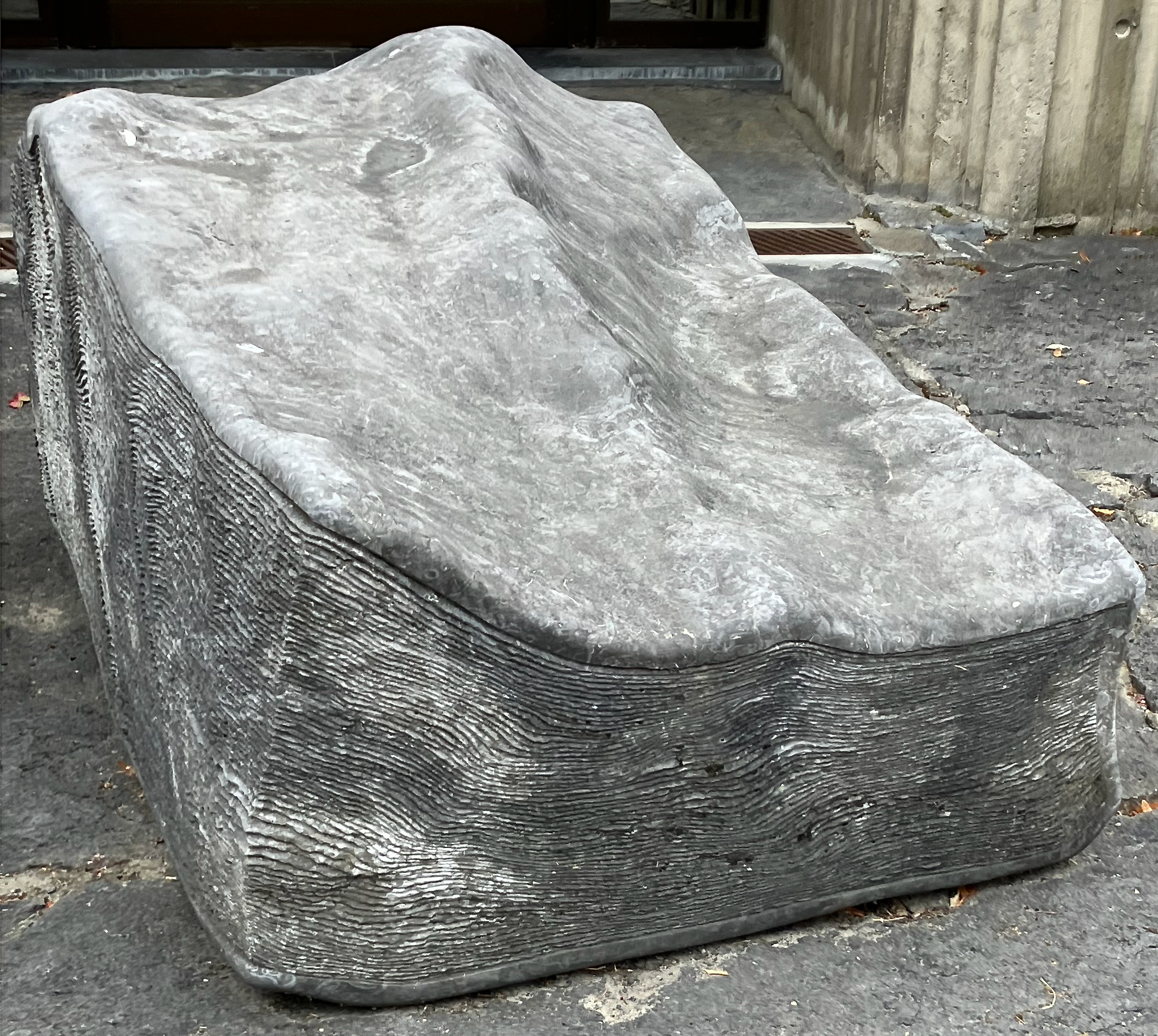
This is not a stone (2017) Sunkyung Cho Exposed spine binding with cross weave filament tape, board-covered. 170 x 170 mm. Acquired from SpazioB**K, 6 April 2025. Photos: Books On Books Collection.
Just as you think this will be another two-dimensional riff on René Magritte’s The Treachery of Images (aka Ceci n’est pas une pipe), the Chinese fold title page turns to reveal a cutout well with a stone at the bottom.
The hunt for Erica Van Horn’s Seven Lady Saintes has been long, but at last, in a glass case in Conway Hall at the Small Publishers Fair in London this year, there it was. Van Horn and Simon Cutts (co-founders of Coracle Press) have been a regular feature of the Small Publishers Fair since its first occurrence in 2002 at Royal Festival Hall.
Conway Hall, owned by the charity Conway Hall Ethical Society, first opened in 1929 and is named after Moncure Daniel Conway (1832-1907), an anti-slavery advocate and biographer of Thomas Paine. It has hosted the Fair since its second outing in 2003. In 2025, it had a cameo appearance in the spy drama series Slow Horses as the unlikely host for an ultra-right mayoral candidate’s campaign event. The setting provided the kind of sardonic humorous dig that Van Horn would appreciate (if she were a regular television viewer).
With stained-glass colors, Seven Lady Saintes splashes its own brand of sardonic humor across a stiff-card leporello produced in 1985 at the Women’s Studio Workshop Print Center in Rosendale, New York.
Seven Lady Saintes (1985)
Seven Lady Saintes (1985) Erica Van Horn Clear plastic-coated white-thread envelope, self-covered leporello, watercolor paper. Envelope: H270 x W215 mm. Leporello: H250 x W205 mm (closed), W3040 mm (open). 16 panels, including covers. Edition of 90, artist’s proof. Acquired from the artist 1 November 2025. Photos: Books On Books Collection.
Van Horn uses a sophisticated child-like style of text and image to laugh slyly, wryly, and grimly at religion and patriarchy. Her summaries parody the descriptions in the handouts usually available in museums, convents, and churches or in the flood of hagiographies long on the market. The sophisticated-naivete of the drawing in Seven Lady Saintes appears in other works such as La ville aux dames (1983) and With or Without (2010). If the story of her plan for a series of four children’s books had turned out differently from the account in Scraps of an Aborted Collaboration (1994), we would have even more evidence of the influence of children’s books on many artists’ books that the Huberts propose in The Cutting Edge of Reading (1999).
Martha, patron sainte of cooks and housewives
Agatha, patron against fire and diseases of the breast
Fina, patron sainte of San Gemignano
Reparata, formerly patron sainte of Florence
Lucy, patron sainte of Syracuse and diseases of the eye
Ursula, patron sainte of teachers and young girls
Cecilia, patron sainte of music and musicians
Walking the Portes (2025)
Walking the Portes: Winters in Paris 2014-2019 (2025) Simon Cutts and Erica Van Horn Casebound, book cloth over boards, blind stamped and inked spine, photo pastedown in recess on front cover, plain doublures. H182 x W132 mm. 216 pages. Edition of 300. Acquired from Books about Art, 15 September 2025. Photos: Books On Books Collection.
In the early 2000s, a series of hardbacks appeared called “Writer and the City”. John Banville covered Prague; Peter Carey, Sydney; Justin Cartwright, Oxford; Ruy Castro, Rio de Janeiro; David Leavitt, Florence; and Edmund White, Paris. White’s was the first, and it set the tone with its content and title: The Flâneur: A Stroll Through the Paradoxes of Paris. An enterprising paperback publisher might be enticed to reissue them and, allowing for a Parisian double-dip, to add Walking the Portes. Besides, I prefer Simon and Erica’s Paris to Edmund White’s, and Walking the Portes pairs better with Anne Moeglin-Delcroix’s Ambulo Ergo Sum (2015) anyway.
It is Simon’s plan to ride out to each of the entrances to Paris (the portes) and walk back to the apartment in the Marais. When it turns out that instead of twenty-one portes there are thirty-nine, Erica firmly responds accordingly:
In introducing Ambulo Ergo Sum, her extended essay on Hamish Fulton, Richard Long, and herman de vries, Moeglin-Delcroix writes:
The analysis of some artists’ books … should make it possible to show how the emphasis has been progressively placed no longer on landscape but on the search for the best means, differing according to the various artists, of rendering an experience in the strongest sense of the word: a lived experience of the world, a personal practice, that is to say, a deliberate way of being inthe world rather than before it. The walking body is the touchstone of this, because walking compels one to supersede the limits of a purely visual experience of nature to become the experience of the whole artist, with his body, in nature. (p. 6)
Whether Walking the Portes is an artists’ book or not, it does what Moeglin-Delcroix describes. It renders these artists’ lived experiences of Paris and their deliberate way of being in the world together.
Bates, Julie. 2023. “Erica Van Horn’s creative exercises“. Irish Studies Review, 31(1), 139–158. Interviewed Van Horn at the 2025 Small Publishers Fair, Conway Hall, London.
Bookmorph n. (bōk+μoρφ): a portmanteau word referring to casebound books which have been modified; an emergent branch of sculpture in which textual content is often downgraded; treatments include chewing, cutting, drilling, entombing, pulping, ripping, shooting (with a firearm), siliconising, etc; any codex fundamentally altered or warped by an artist; a site of entropic processes designed to return pages to cellulose fibre, and/or the creation of a fungal landscape; a bibliographic montrosity.Michael Hampton, arts writer, May 2025
The curators’ choice of title and epigram for this exhibition is somewhat daring. Although they have included plenty of bibliographical montrosities that fit Hampton’s definition, there are plenty of bibliographical beauties, too — even among the “monstrosities”. A strong attraction of this exhibition is that it presents so many recent works from Greek book artists. Even more attractive is its hands-on display of most of the works.
Anneta Spanoudaki’s Natura Morta (2025) is a striking case in point:
Natura Morta (2025) Anneta Spanoudaki Paper cut on different types of paper and photography. 480 × 220 mm. Photos: Books On Books.
Another case in point is Dimitris Skourogiannis’ 100% An Artist’s Bible (2025). To be turned, its large “leaves” require metal rings on the fore-edge.
100% An Artist’s Bible (2025) Dimitris Skourogiannis Japanese paper, cardboard, wood, fragments of porcelain objects, print, metal rings, acrylic pains, fabris, tulle, and metallic threads. 500 x 350 x 140 mm. Photos: Books On Books.
Thick leaves seemed to be the order of the day. On heavy black card, Thodoros Brouskomatis’ 10 Artificial Prayers (2025) presents surreal collages challenging the theme of “Madonna and Child” and couplets from Pier Paolo Pasolini’s “supplica a mia madre”.
10 Artificial Prayers(2025) Thodoros Brouskomatis Printed digital artworks on photographic paper, cardboard, and leather. 300 x 250 mm. Photos: Books On Books.
On slightly thinner card, Aris Stoidis’ To the other side and back (2025) carries a sculptural image on every page. The work straddles the borders of sculpture, photobook, and artist’s book. Stoidis writes, “Ever since my first pieces, I have been “receiving” images that I’ve materialized without really comprehending them myself. They simply exerted an inexplicable power on me.” The book comes in a plexiglas box with a papercut sculpture (not pictured here).
To the other side and back (2025) Aris Stoidis Photographic prints on card. 270 x 270 x 20 mm. Photos: Books On Books.
On still thinner leaves, Ismini Bonatsou’s Little Red Riding Hood (2025) nevertheless projects striking depth with its montage of papercut pages, acrylics, and pencil. Just as striking is the contemporary reversioning of the fairy tale.
Little Red Riding Hood (2025) Ismini Bonatsou Acrylics, pencil, and papercuts. 450 x 300 mm. Photos: Books On Books.
Given that the portmanteau term “bookmorph” comes from Michael Hampton, it seems appropriate that he has two works on display. Although one of them is under glass, 12 Chairs (bookmorph) (2012), the other is not. RAGE PEN by Hampton and David Blackmore is the UK contingent’s only work produced in 2025. Others from the UK contingent include Sarah Bodman, BOOKEND, Jonathan Callan, Joe Devlin, Stephen Emmerson, SJ Fowler, Rowena Hughes, and the Inscription Journal editors (Gill Partington, Simon Morris, Adam Smyth). RAGE PEN is also particularly appropriate because it requires a ruler to separate its perforated fore-edges. The exhibition provides one along with multiple pairs of white gloves. Really hands-on.
The participating Greek artists also include Eleni Angelou, Nikos Arvanitis, Rania Bellou, Maria Bourbou, Natassa Chelioti-Naga, Ioanna Delfino, Anna Dimitriou, Antonia Iroidou, Eleni Kastrinogianni, Peggy Kliafa, Alexia Kokkinou, Georgia Kotretsos, Nikos Kryonidis, Vasiliki Lefkaditi, Eleni Maragaki, Kyriaki Mavrogeorgi, Despina Meimaroglou, Christina Mitrentse, Fiona Mouzakitis, Kiki Perivolari, Stamatis Schizakis, Ifigeneia Sdoukou, Christina Sgouromiti, Danai Simou, Nectarios Stamatopoulos, Despina Stavrou, Evangelos Tasios, Yannis Tzortzis, and Leonie Yagdjoglou.
Congratulations and thanks to the curators — Christina Mitrentse, Fiona Mouzakitis, and Despina Stavrou — for bringing together this selection of outstanding works.
The Hellenic Centre opens at 11:00 and closes at 17:00, Tueday through Friday, so the chances to visit by the 28th of November are limited. The brief catalogue that documents the exhibition and these few photos cannot substitute for tactile engagement with the works on display. An hour and a half passed in a flicker.