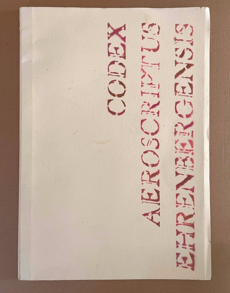
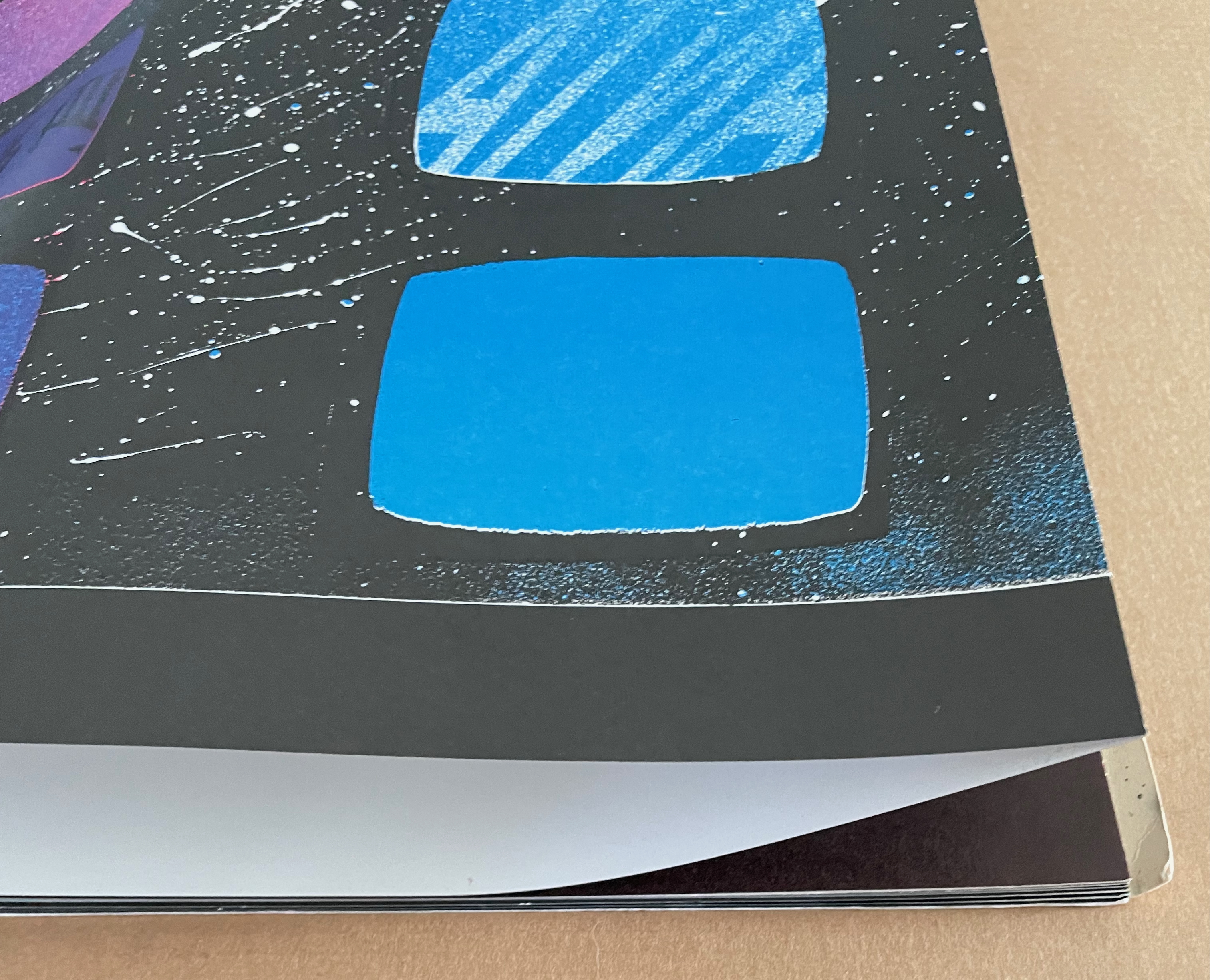
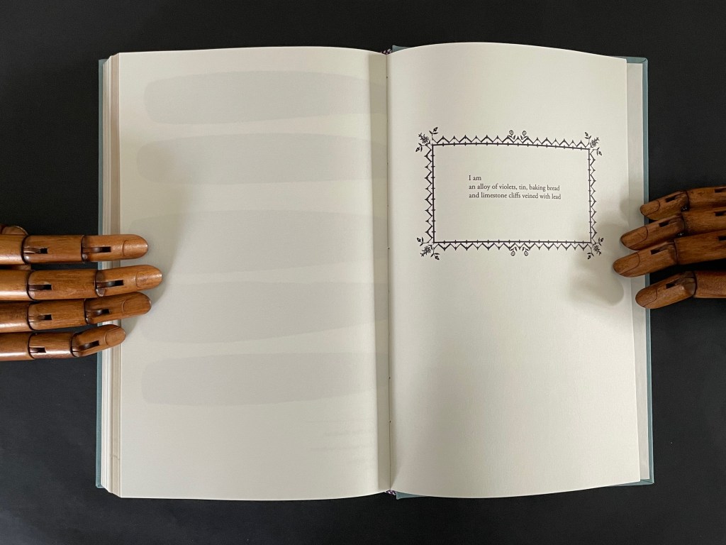
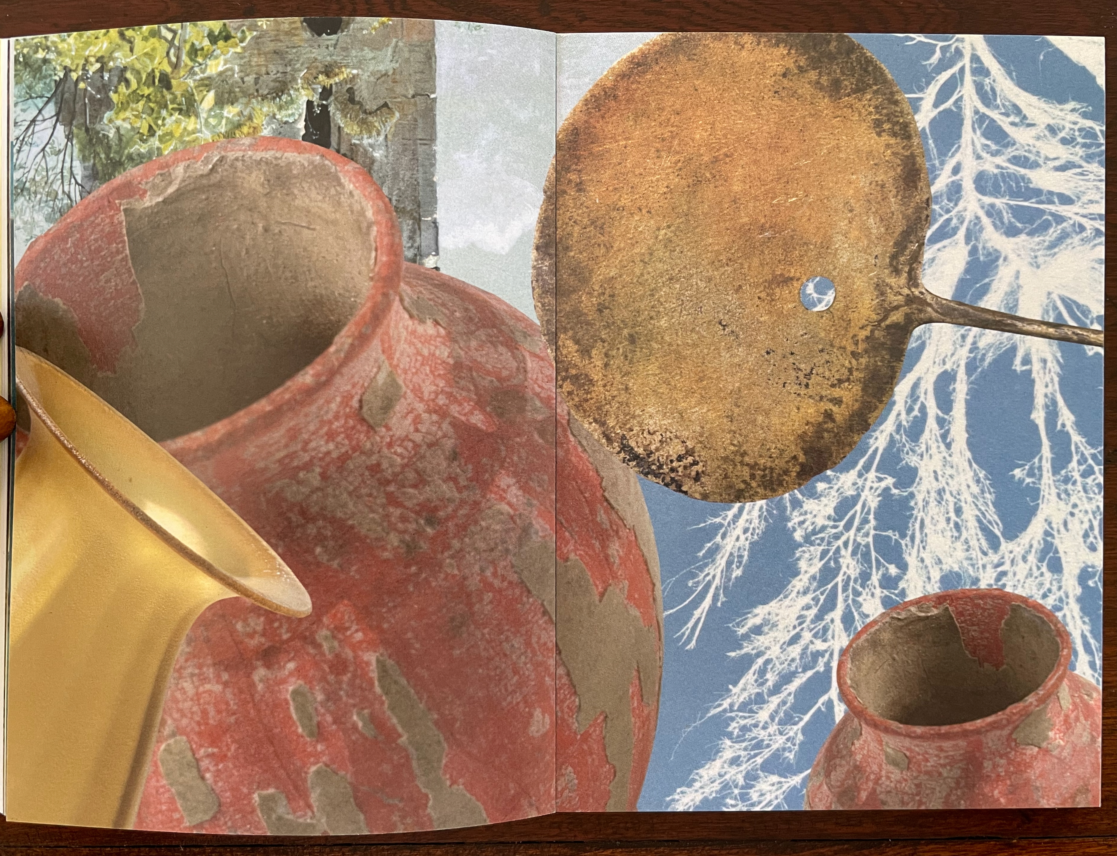
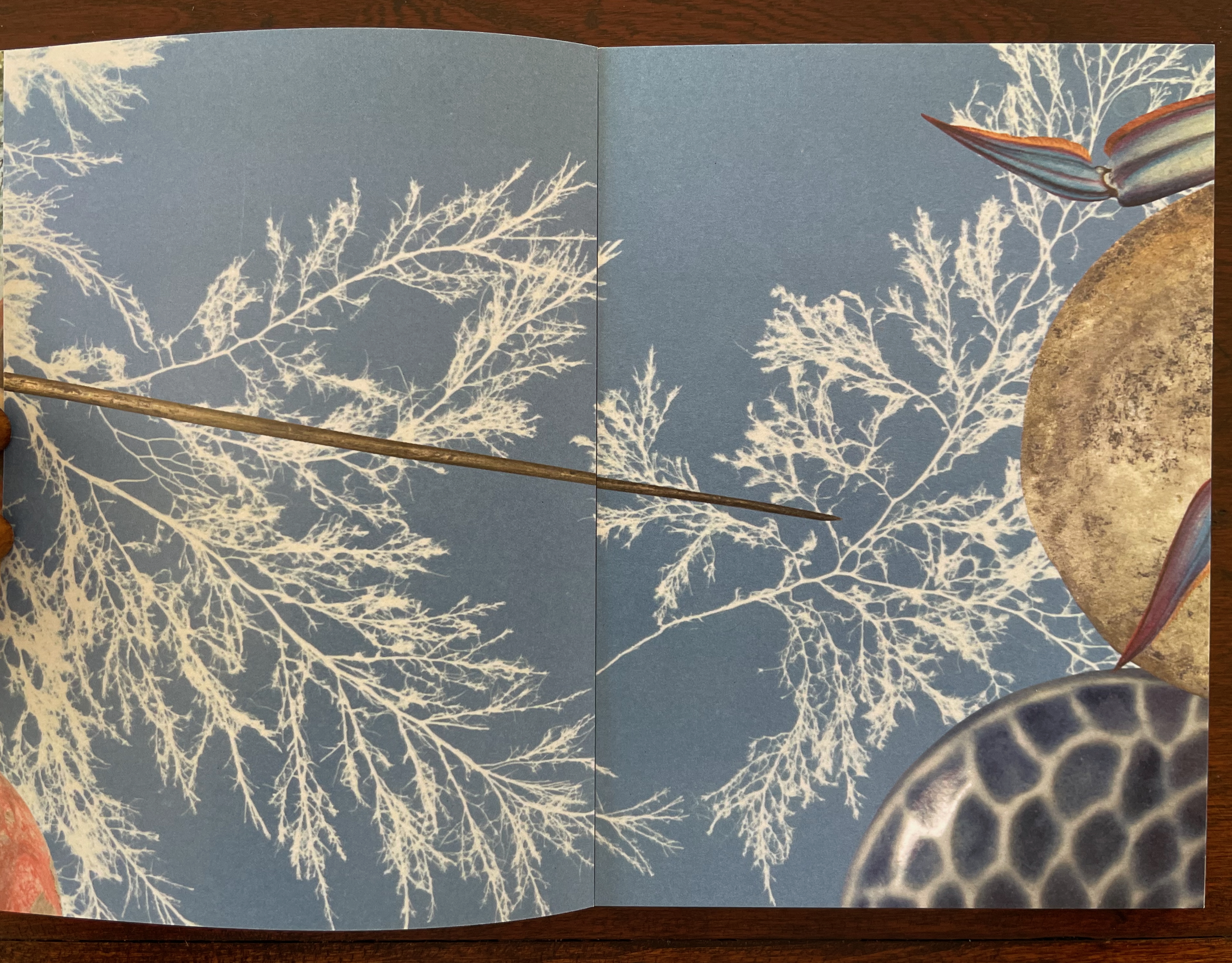
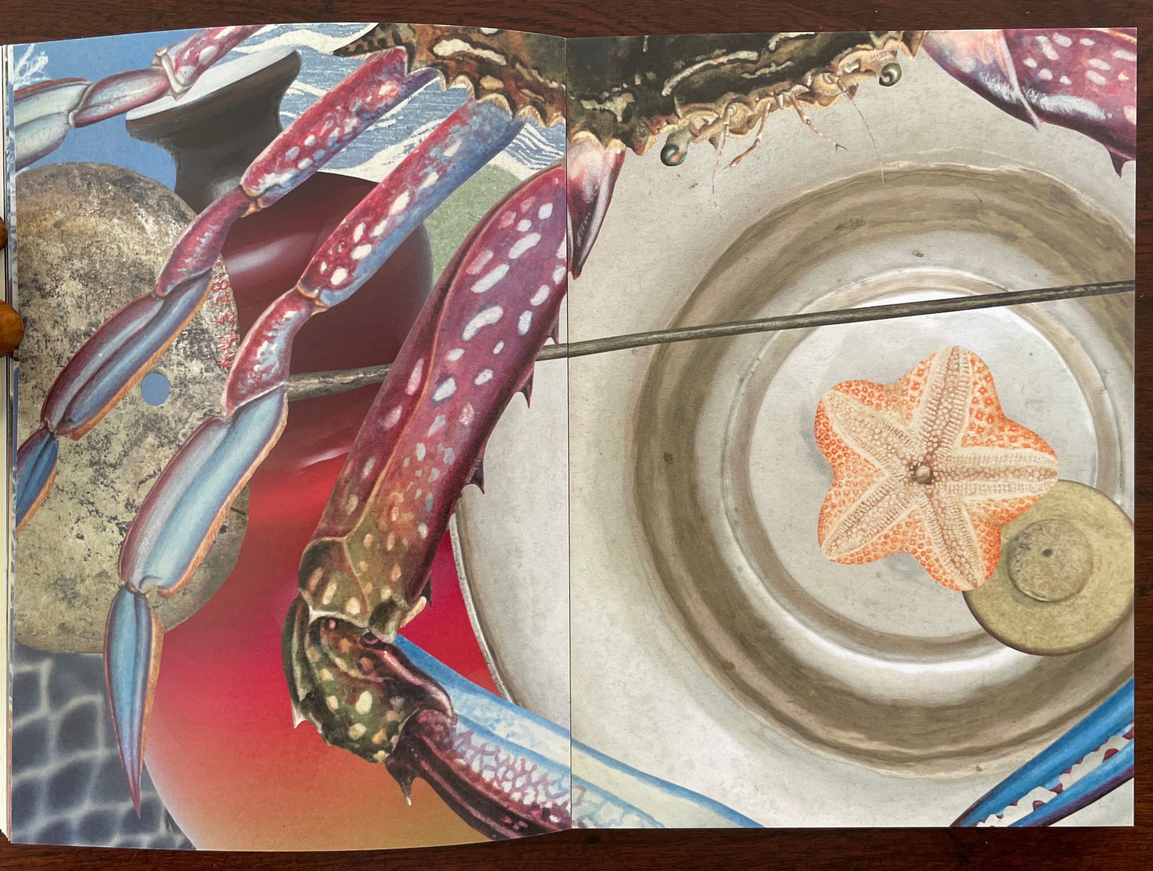
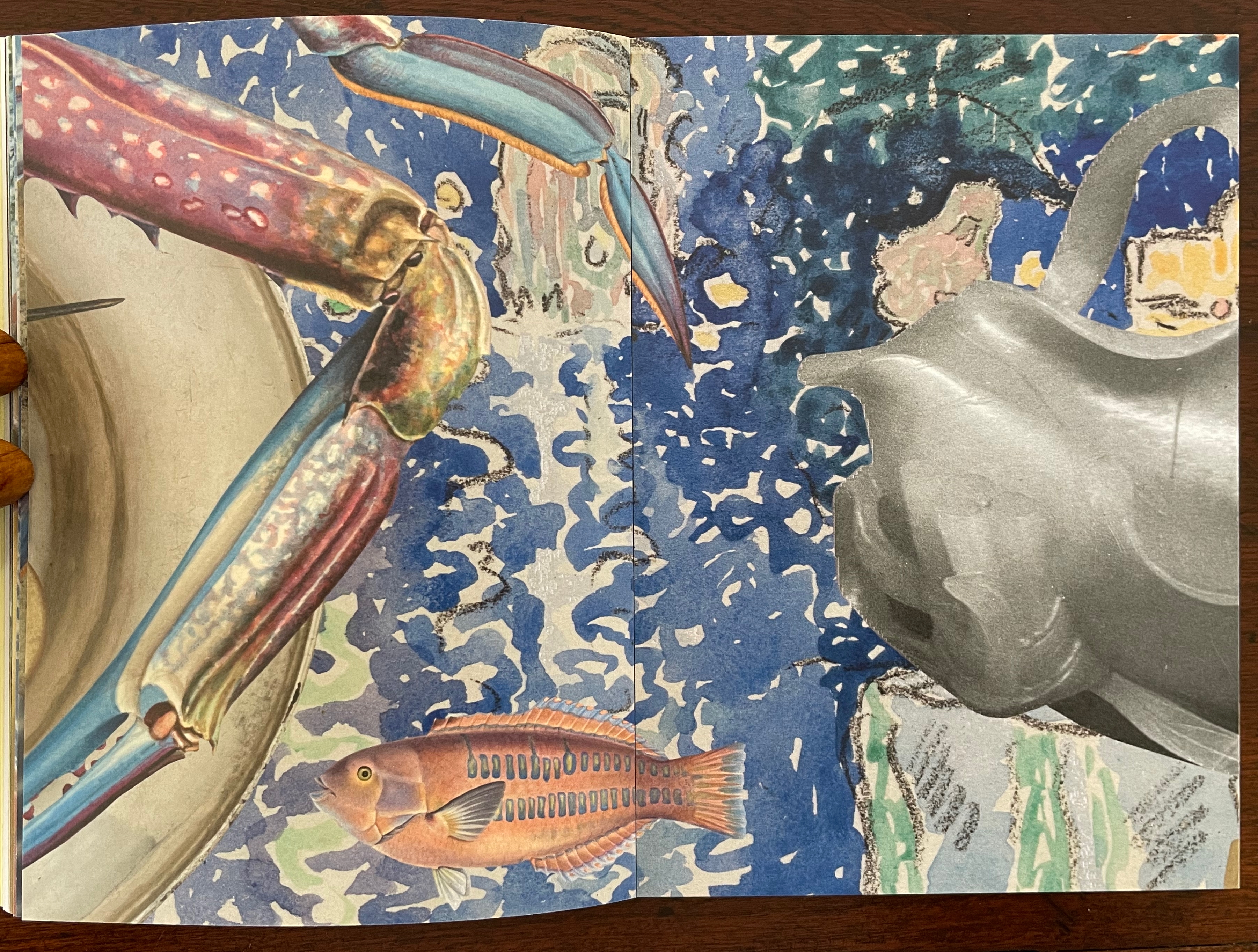
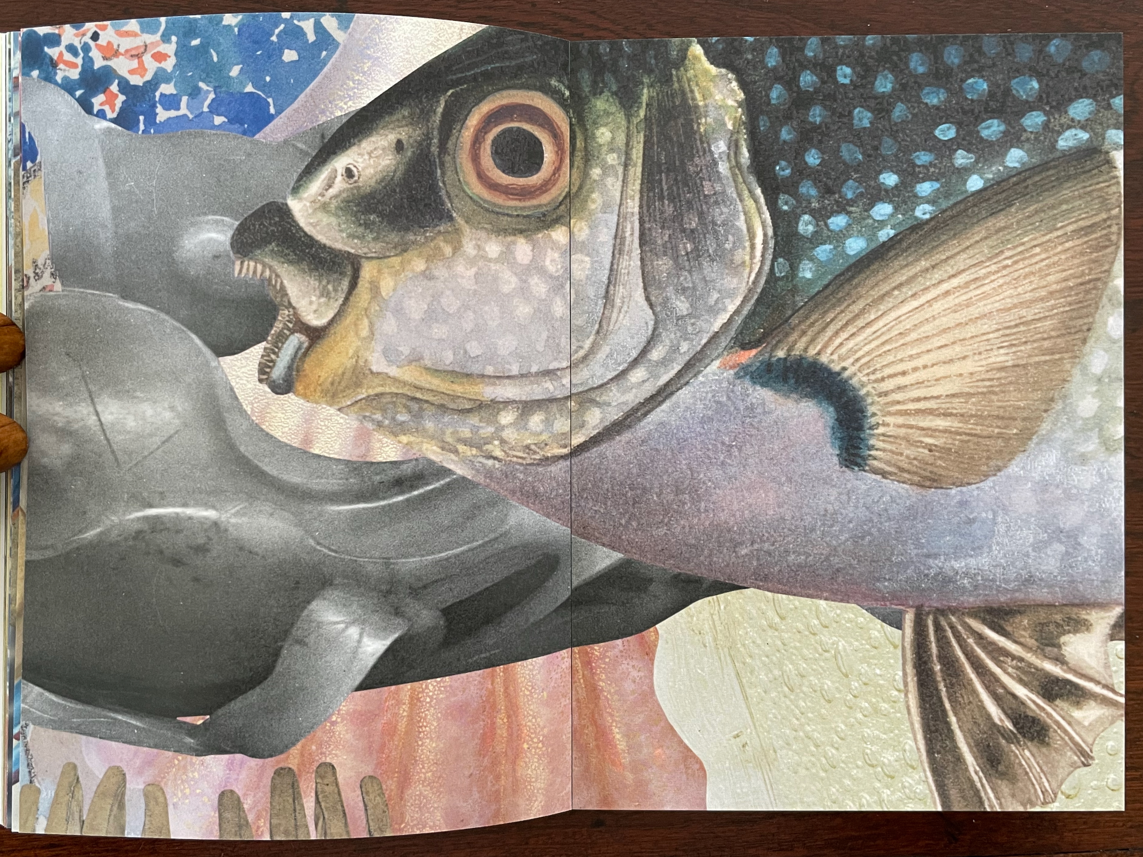
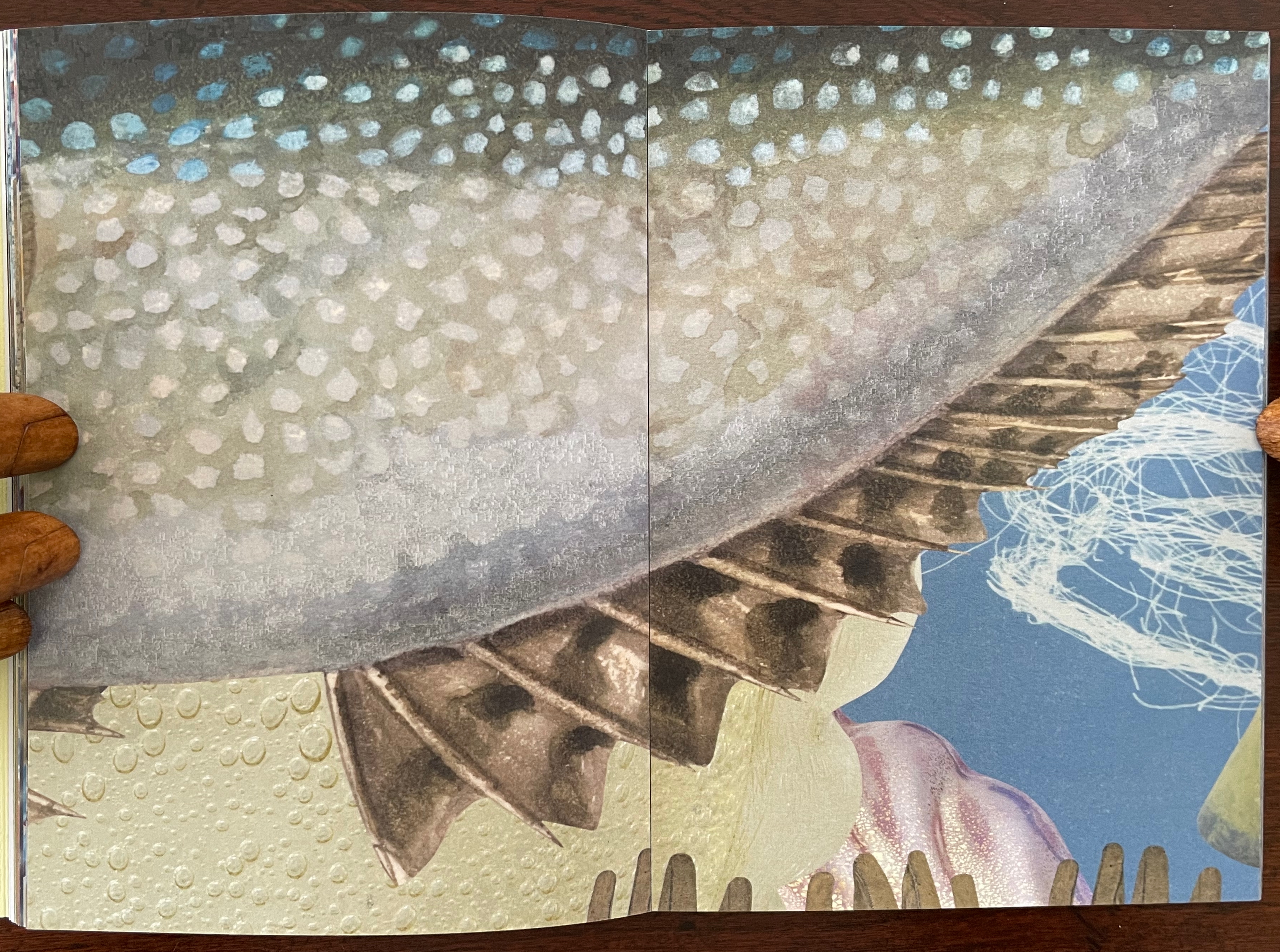
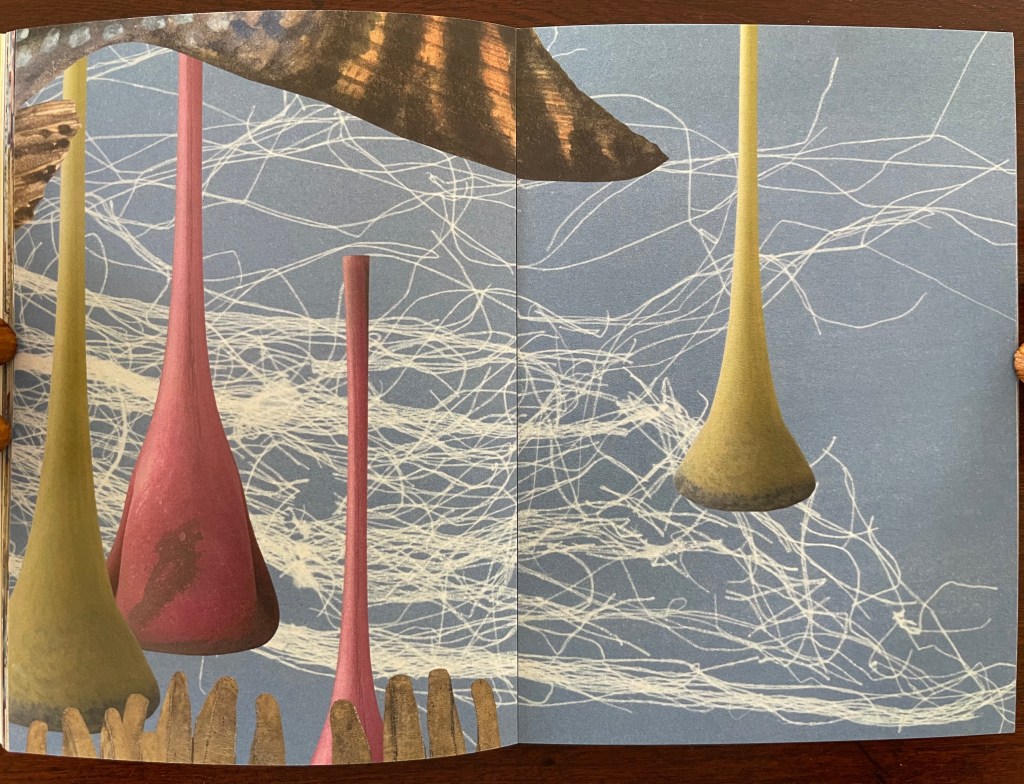
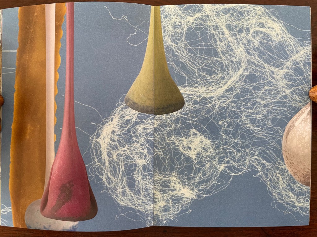
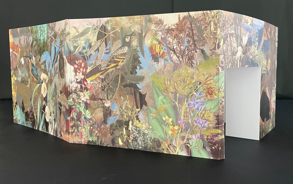
Codex Aeroscriptus Ehrenbergensis: A Visual Score of Iconotropisms (1990) Felipe Ehrenberg Casebound stiff cover, fly leaves around bifolios (fore-edge folded folios). H420 x W295 mm. 20 pages (10 bifolios, 9 with prints, 1 for title page and copyright page).Edition of 500. Acquired from Monograph Werks, 17 January 2024. Photos: Books On Books Collection.
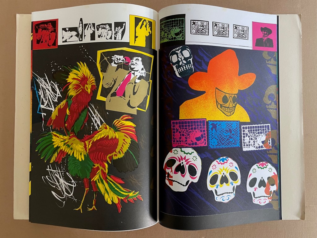
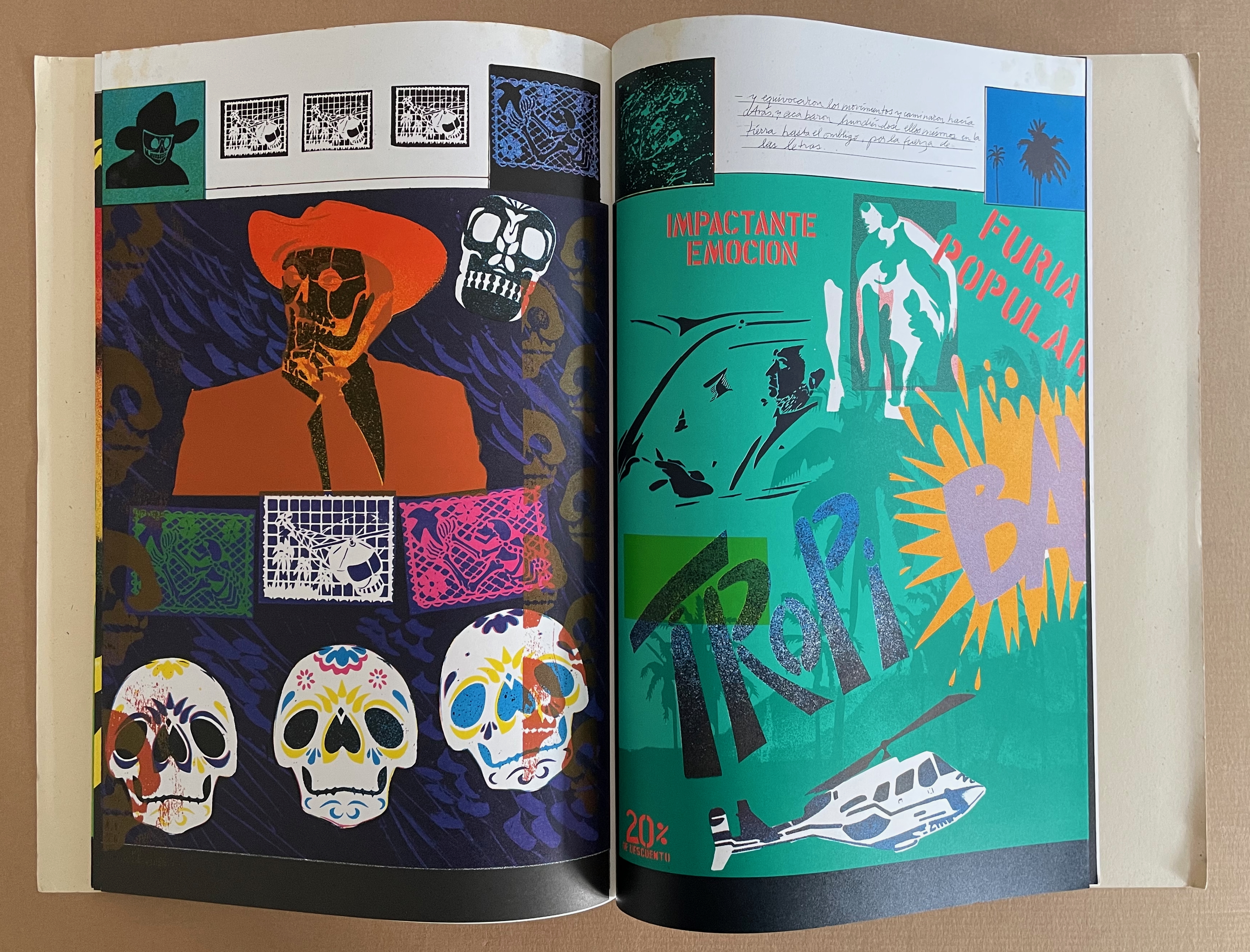
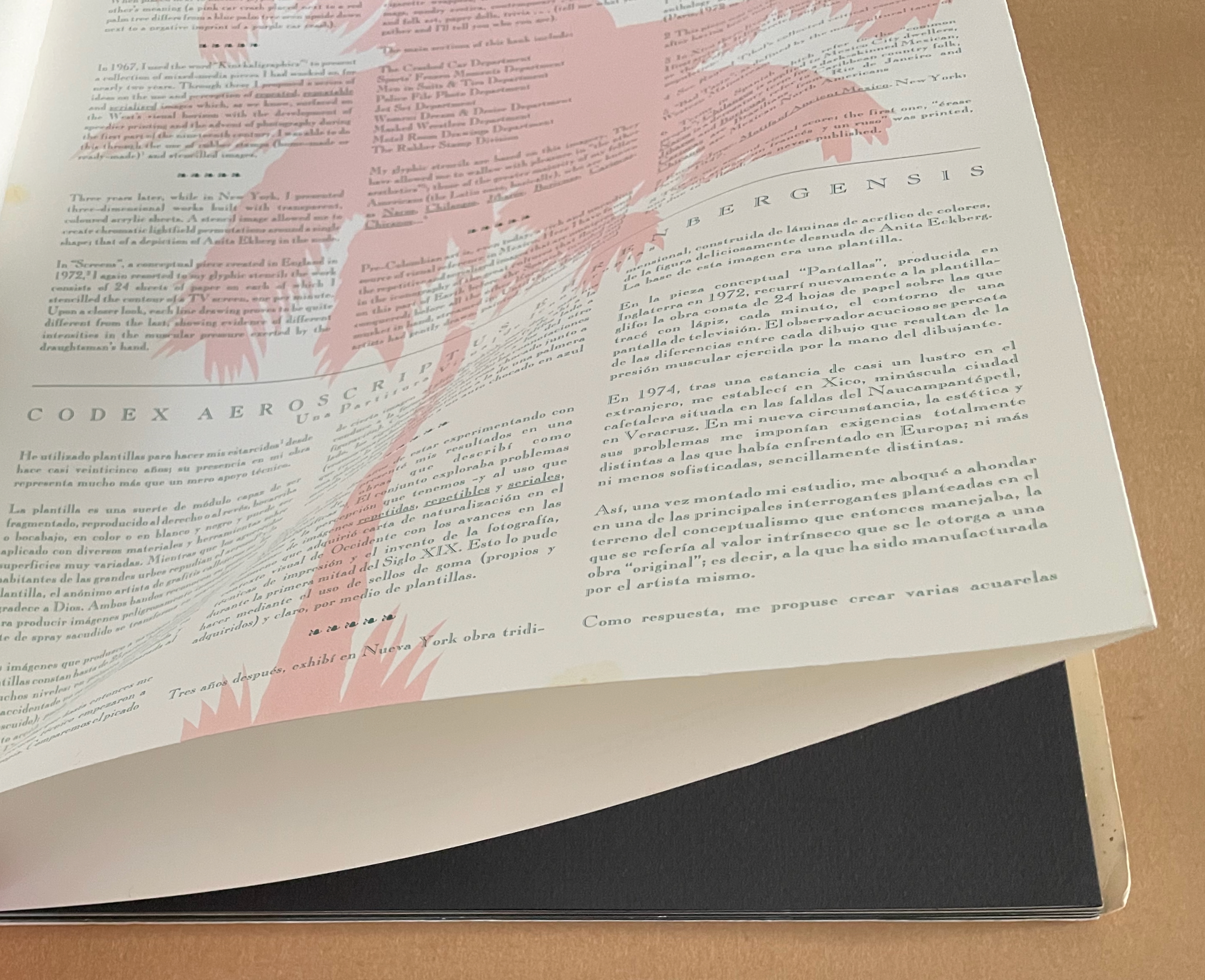
In his introduction, Felipe Ehrenberg variously recommends that we read Codex Aeroscriptus Ehrenbergensis “like a detective novel” for its “various clues that you may unravel the wondrous and dramatic events surrounding the life of this artist, another witness to the end of a century” or “as a musical score, perhaps to be composed by someone wishing to recreate the background music of our daily histories” or a “formulation of hieroglyphs”. The book’s subtitle succinctly rolls up these metaphors: “a visual score of iconotropisms”.
Stephen Perkins calls it “a mini-retrospective of his explorations in this medium” — stencils.
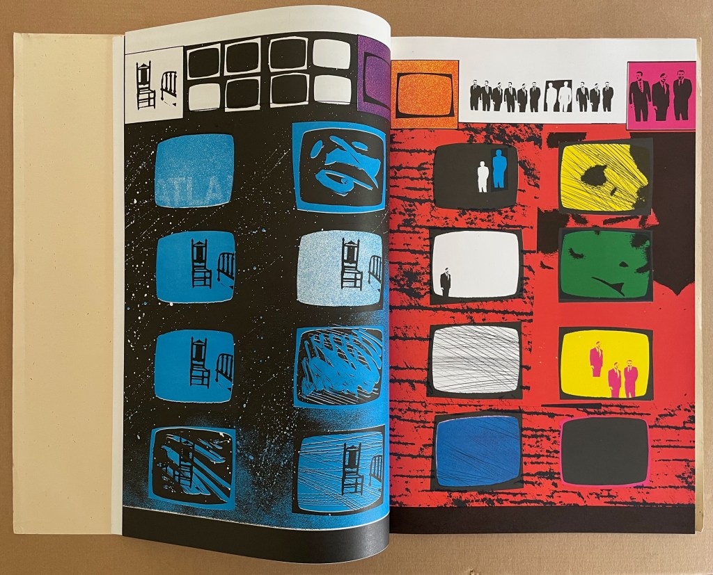
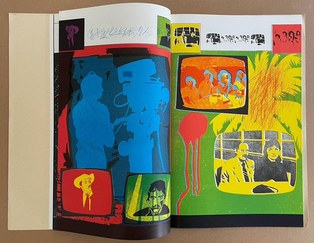
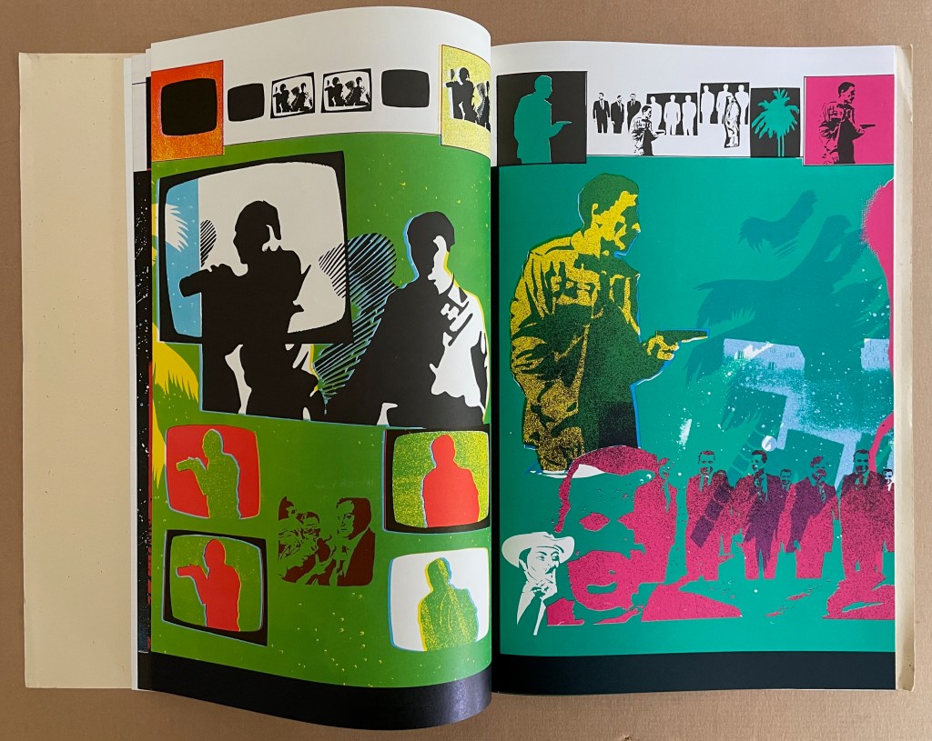
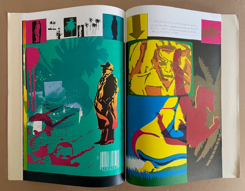
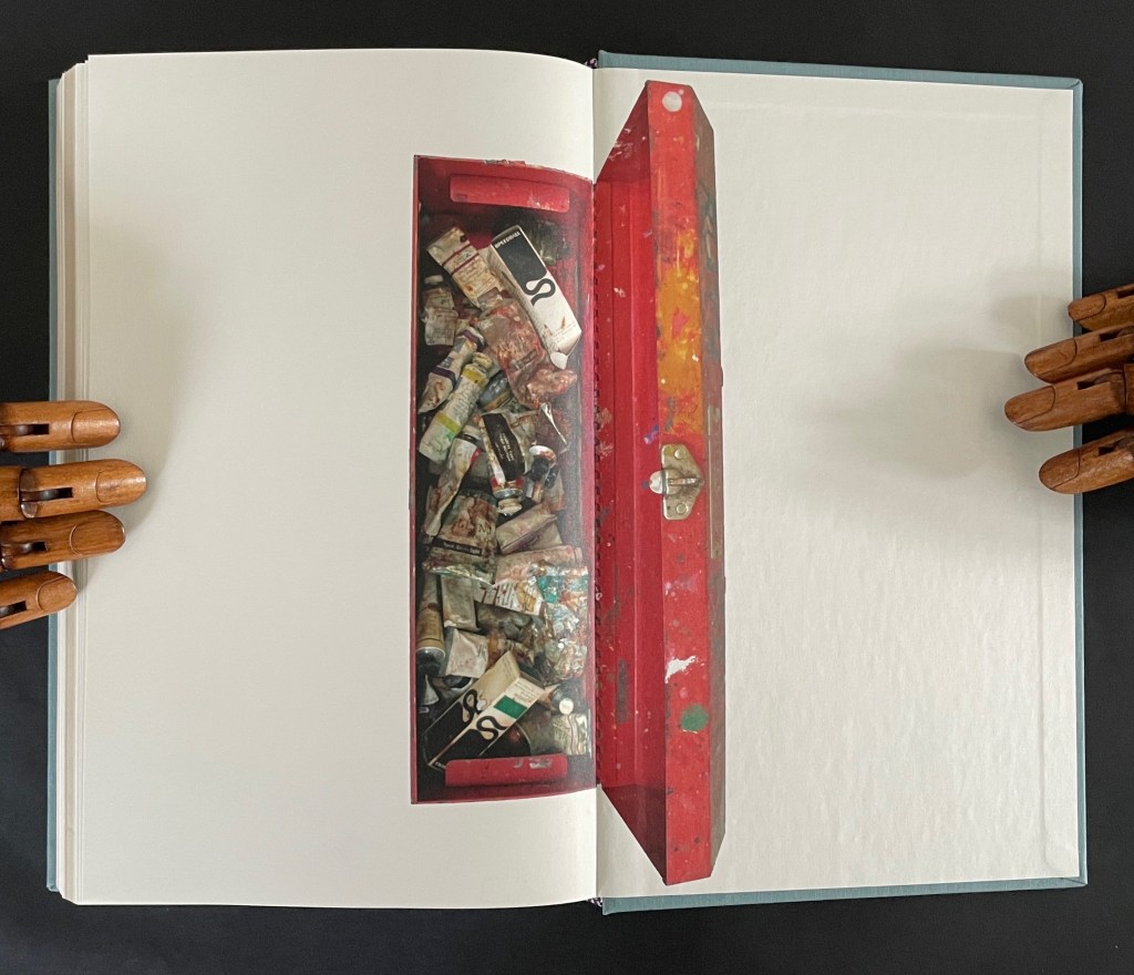
This work came out of a residency Ehrenberg completed at Atlanta’s Nexus Press. The images for the works came from what he called his Visual Information Bank which was a box with all sorts of ephemera that he would dip into for images for his stencils. In contrast to the frenetic energy of the stencils, the inside of the publication has a bucolic and calm feeling that is mirrored in the original stencil work Ehrenberg created across the front pages of each book. (Perkins, 2024)
The accordion, concertina, or leporello structure adopted by so many 20th and 21st century book artists has its Aztec analogue called a screenfold format. Ellen Baird and Cristián Roa-de-la-Carrera included Codex Aeroscriptus Ehrenbergensis in the Newberry Library’s 2006-07 exhibition “The Aztecs and the Making of Colonial Mexico”.
… Aztec heritage has become a vital component of Mexican and Mexican-American identity, influencing the work of many contemporary writers, artists, and scholars. The inherent flexibility of traditional indigenous creativity facilitates combination with contemporary artistic practices. Traditional screenfold books are layered with contemporary collage and print techniques, and indigenous images are juxtaposed with colonial scenes and pop icons. Contemporary Mexican and Mexican-American artists use traditional Aztec images and techniques to explore both contemporary life and Mexican cultural heritage. The screenfold format is an emblem of ancient Mesoamerican culture, and has become charged with historical and political meaning. Contemporary artists combine this format with humorous and provocative imagery to explore the cultural and political dynamics of preconquest identity, the colonization of Mexico and current relations between Mexico, Europe, and the United States. (Baird and Roa-de-la-Carrera, 2006)
Ehrenberg’s title is dipped in sarcasm. Most of the barely surviving screenfold Mesoamerican works reside in Anglo-European institutions under names like Codex Borbonicus at the Bibliothèque de l’Assemblée Nationale in Paris, Codex Borgianusat the Vatican, and Codex Mictlan at the Bodleian Libraries in Oxford. Ehrenberg’s modern version reflects their pictorial style and even the layout of their repetitive serialized images. But in doing so, his images speak to the continuing impact of colonialism.
Still, Ehrenberg’s book art went beyond any reductive anti-colonial message. His “Visual Information Bank”, as he called it, held a wealth of contemporary cultural iconography. Its main sections included:
The Crashed Car Department Sports’ Frozen Moments Department Men in Suits & Ties Department Police File Photo Department Jet Set Department Women: Dream & Desire Department Masked Wrestlers Department Motel Room Drawings Department The Rubber Stamp Division
And he drew on this — especially from the televisual world — to create his glyphic stencils and rubber stamps.
The leporello edition of Codex Aeroscriptus Ehrenbergensis is rare, but fortunately the wrap-back bound edition shown in this entry is a little less so. The wrap-back format is a traditional Chinese/Japanese book format. Takako Saito, who joined Ehrenberg at Beau Geste Press in 1973, may have been an influence in this regard, but as she left in 1975, an influence from others at Nexus in Atlanta, GA, where Ehrenberg completed this work, seems more likely.
The double-sided leporello edition of Codex Aeroscriptus Ehrenbergensis is not a folded continuous sheet. Viewable on Stephen Perkins’ site, it appears to have been formed from the codex edition’s double-page spreads glued together at the fore edge. Ehrenberg’s residency at Atlanta’s Nexus Press would have overlapped with Clifton Meador’s presence, and Meador’s works frequently use the wrap-back format.
Reed, Marcia. 2022. “Codex Espangliensis: From Columbus to the Border Patrol“, in Materialia Lumina : Contemporary Artists’ Books from the CODEX International Book Fair. Edited by Elizabeth Fischbach and Nann Parrett. Berkeley, California: The Codex Foundation.
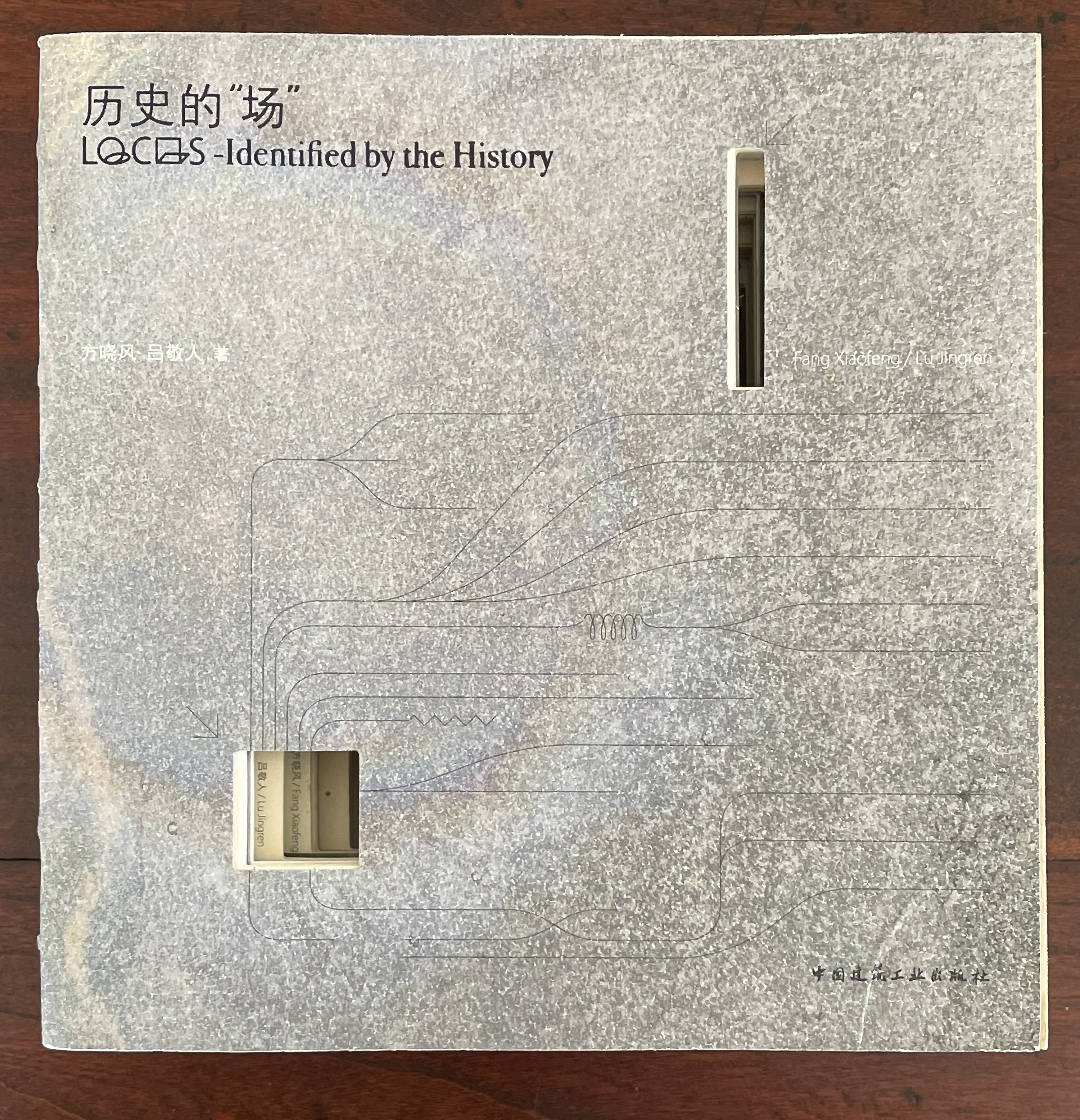
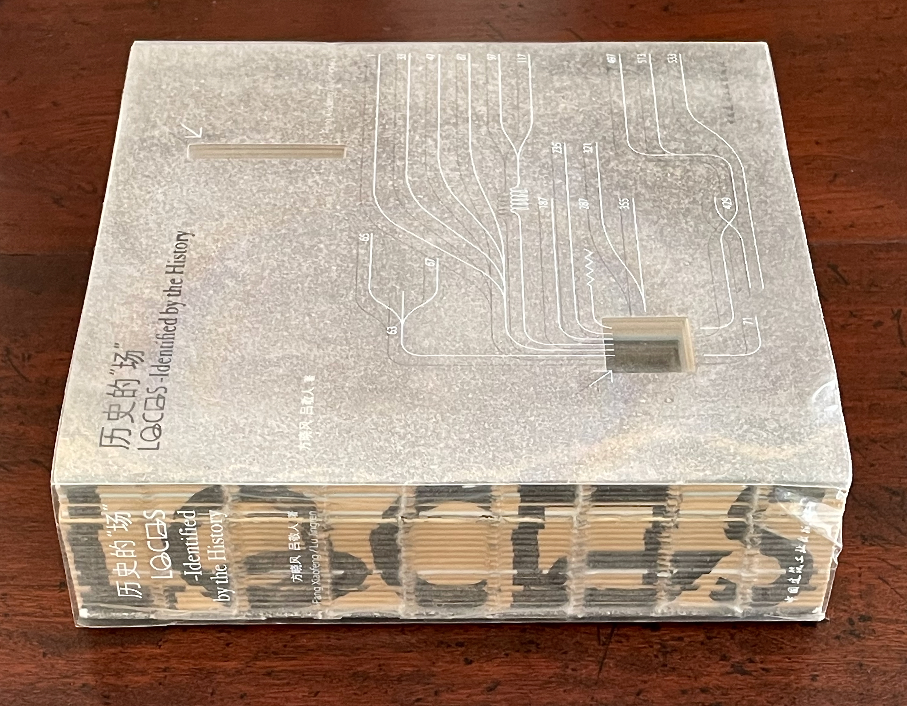
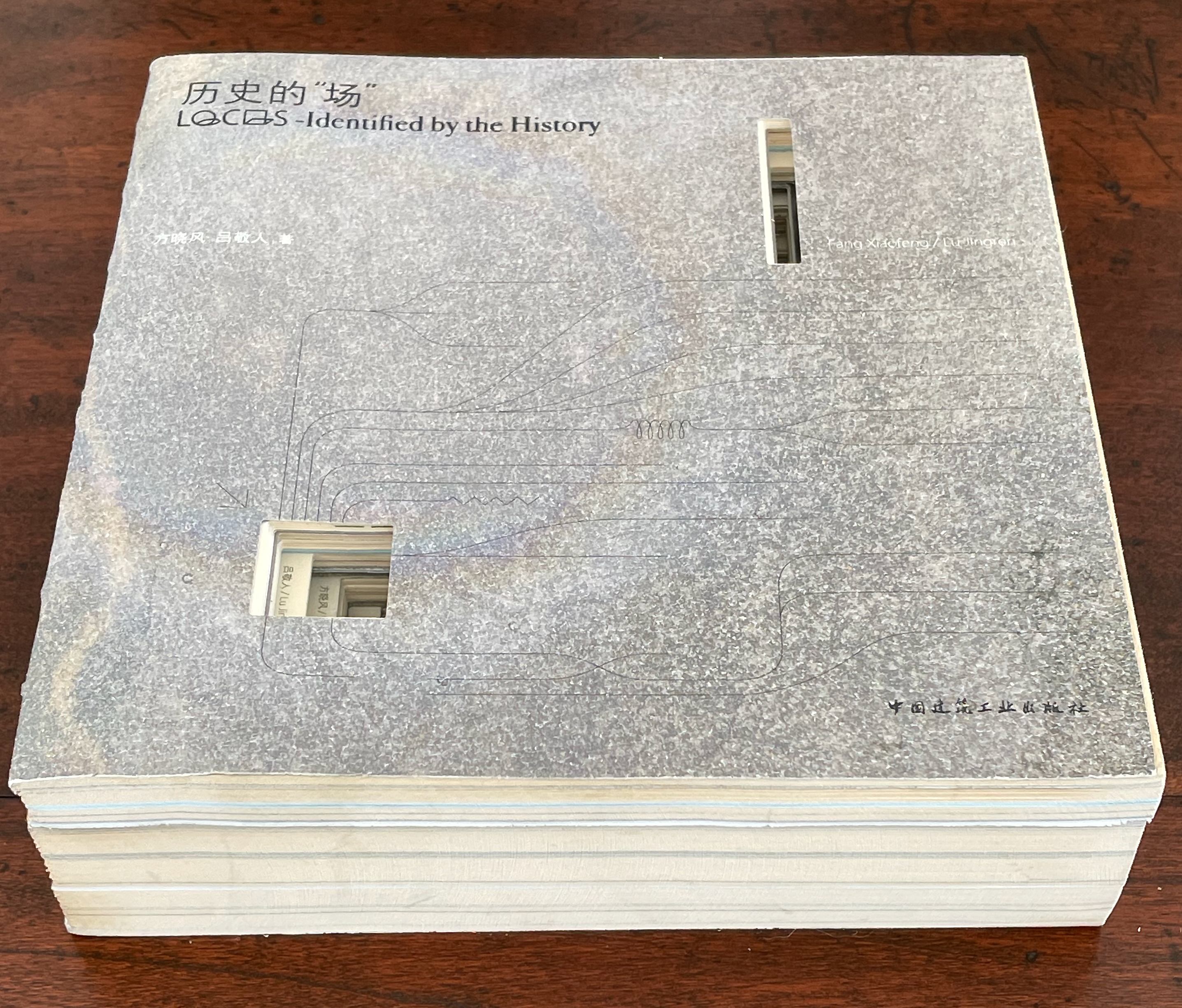
历史的”场 (Locus: Identified by the History) (2016) 方晓风 (Fang Xiaofeng) and 呂敬人 (Lu Jingren) Beijing Shi: Zhongguo jian zhu gong ye chu ban she.
Co-authored by architecture scholar Fang Xiaofeng and book designer Lu Jingren, Locus: Identified by the History (2016) springs from the Book – Architecture Project (书 – 筑 / Shu – Zhu Project), conceived by Lu Jingren, Fumihiko Maki (Japan), and Yi Ki-Ung (South Korea). The project initiated a multi-year series of exhibitions/forums called “Book – Architecture: Dialogues Between Architects and Book Designers” (2011-19) across all three countries. Locus was published on the occasion of the second exhibition/forum in 2016.
Locus pursues two overlapping lines of thought. The first and primary one rests on Lu’s design philosophy that a book is a built environment, a habitat for text and images to be engaged by readers and all five of their senses. Its layout, pacing, structure, and their interconnectedness with each other and the book’s materials mirror the architect’s design of rooms, hallways, stairs, windows, doors, thresholds, and their interconnectedness with each other and their materials. Likewise as habitats, they each have exteriors, are designed to occupy a locus in time and space, and relate to a world outside. In Lu’s philosophy, the design mechanics involve four pillars: binding + layout + editorial + information visualization. Successful execution results in an immersive spatial object (habitat) that triggers the reader’s visual, tactile, auditory, olfactory, and gustatory systems simultaneously.
This entry is preceded by “Abra Ancliffe (I)“, which describes the Personal Libraries Library (Winter 2009-10 to Spring/Summer 2021) and The Secret Astronomy of Tristram Shandy (2015).
The constellatory asterisks in The Secret Astronomy of Tristram Shandy also evoke those flowers that our Personal Libraries Library (PLL) Artist/Librarian “picks” from the PLL and, later, Oleg Polunin’s Flowers of Europe: A Field Guide (1969) to include in the periodic issues of ephemera. Perhaps this confluence of stars and flowers created a predisposition in our Artist/Librarian that drew her to Johannes Kepler’s Astronomia Nova (1609). Unlike Sterne’s novel, which was part of Calvino’s personal library, Astronomia Nova lies outside the five personal collections. Of course, since Maria Mitchell was an astronomer, the works in her personal library refer to Kepler, and similarly, Robert Smithson had multiple books about astronomy, even Arthur Koestler’s Watershed: A Biography of Johannes Kepler. Still, Kepler’s “New Astronomy, Based upon Causes, or Celestial Physics, Treated by Means of Commentaries on the Motions of the Star Mars, from the Observations of Tycho Brahe, Gent.“, to give it its full and translated name, appears in Ancliffe’s heavens and garden like a new galaxy or specimen.
Astronomia Nova provided and further refined the mathematical and observational proofs of the Copernican planetary model of heliocentrism first laid out in De revolutionibus orbium coelestium [On the Revolutions of the Celestial Spheres] (1543). A little over 400 years later, our Ancliffe noticed in Kepler’s watershed publication something previously unobserved, something peculiarly geocentric about its heliocentric model.
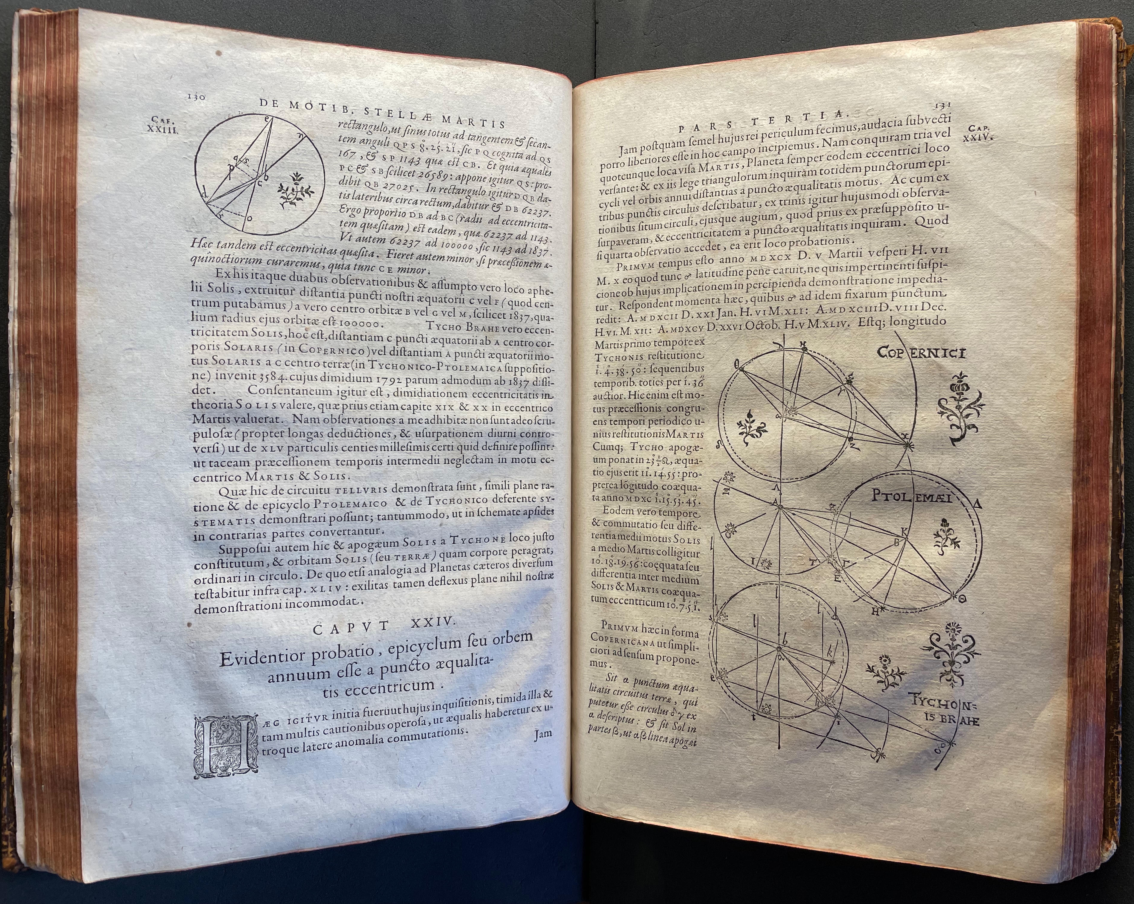
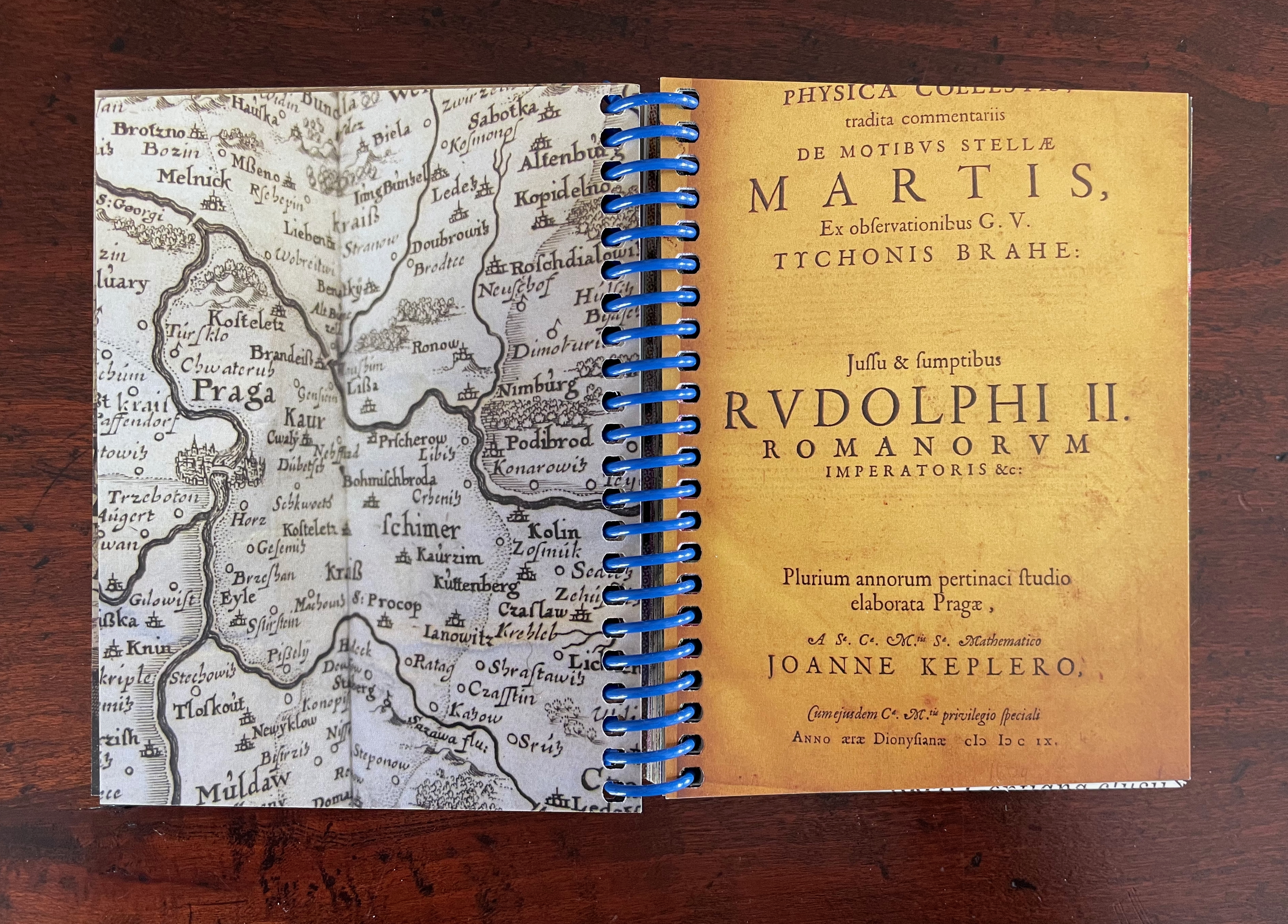
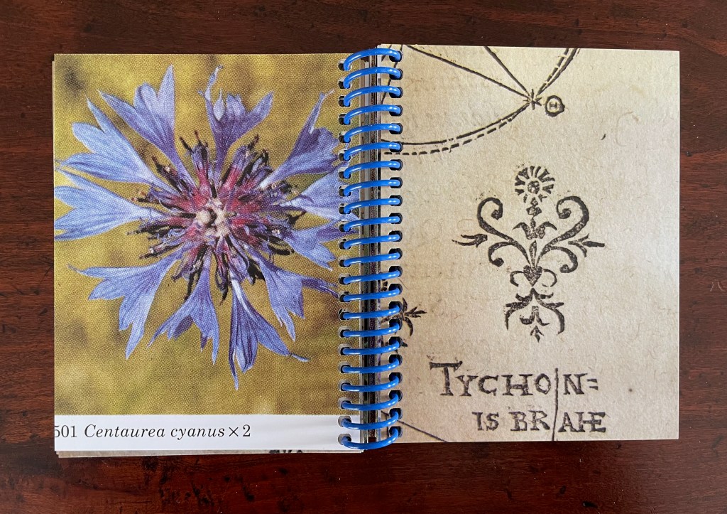
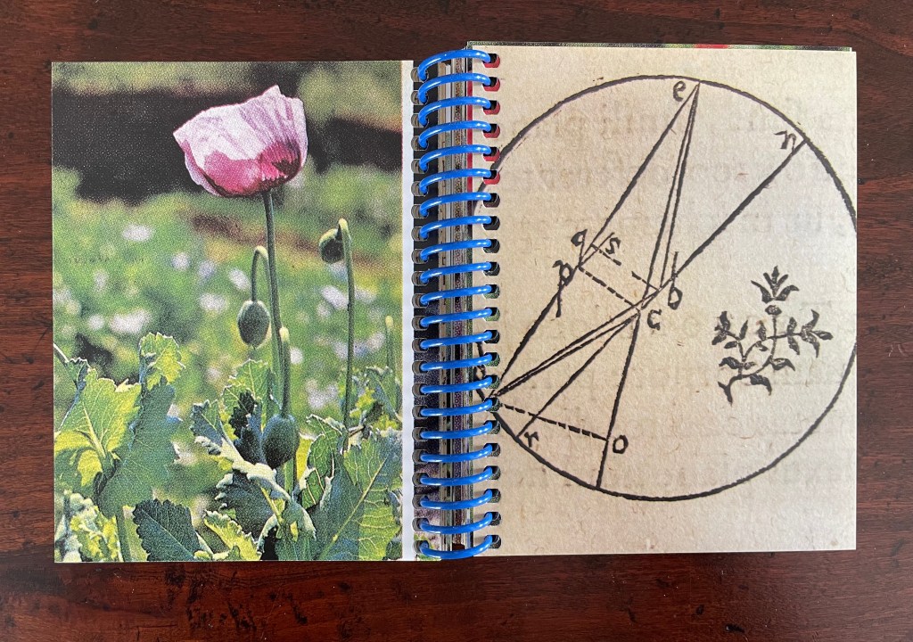
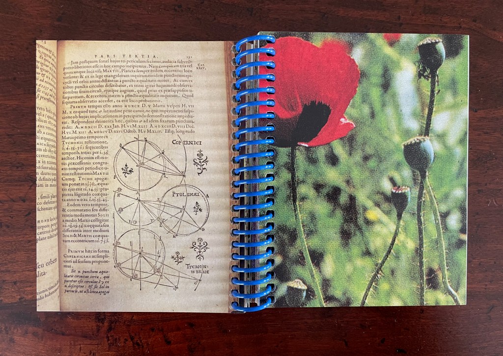
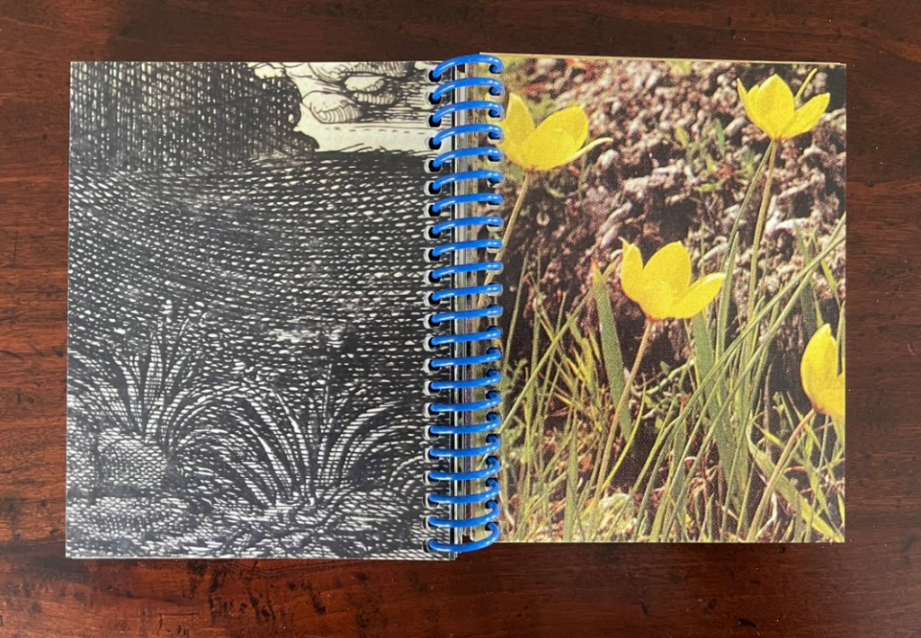
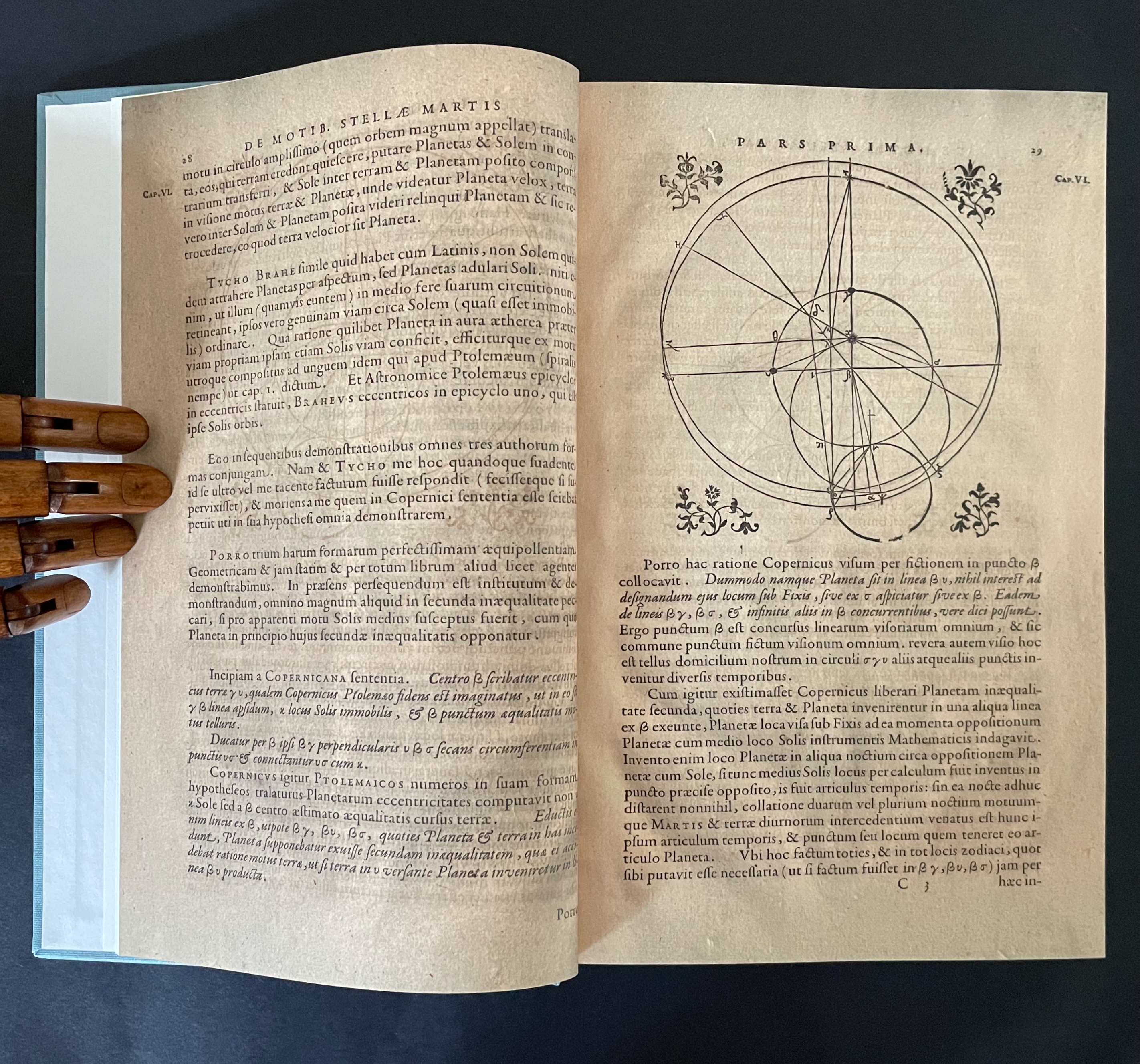
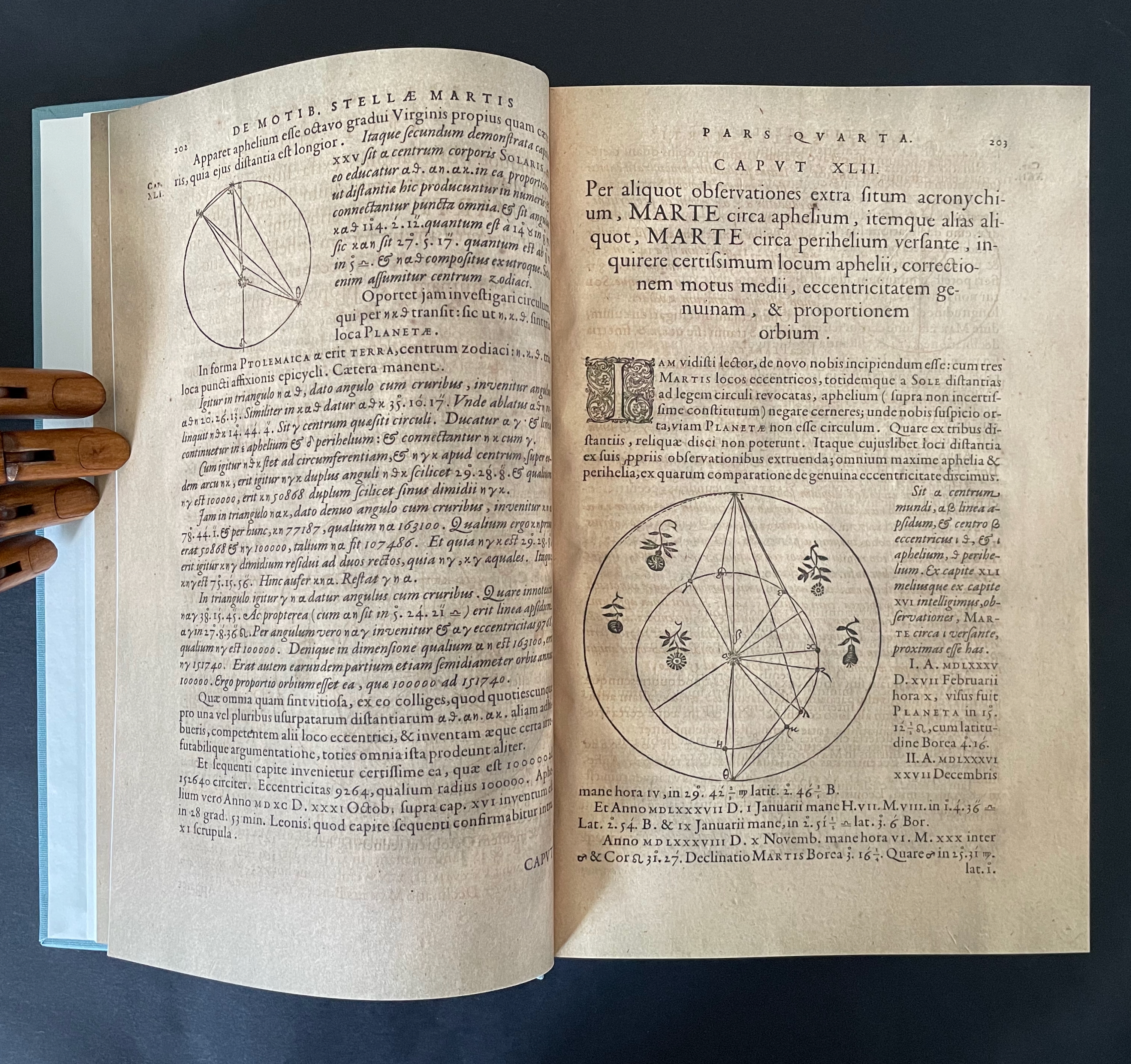
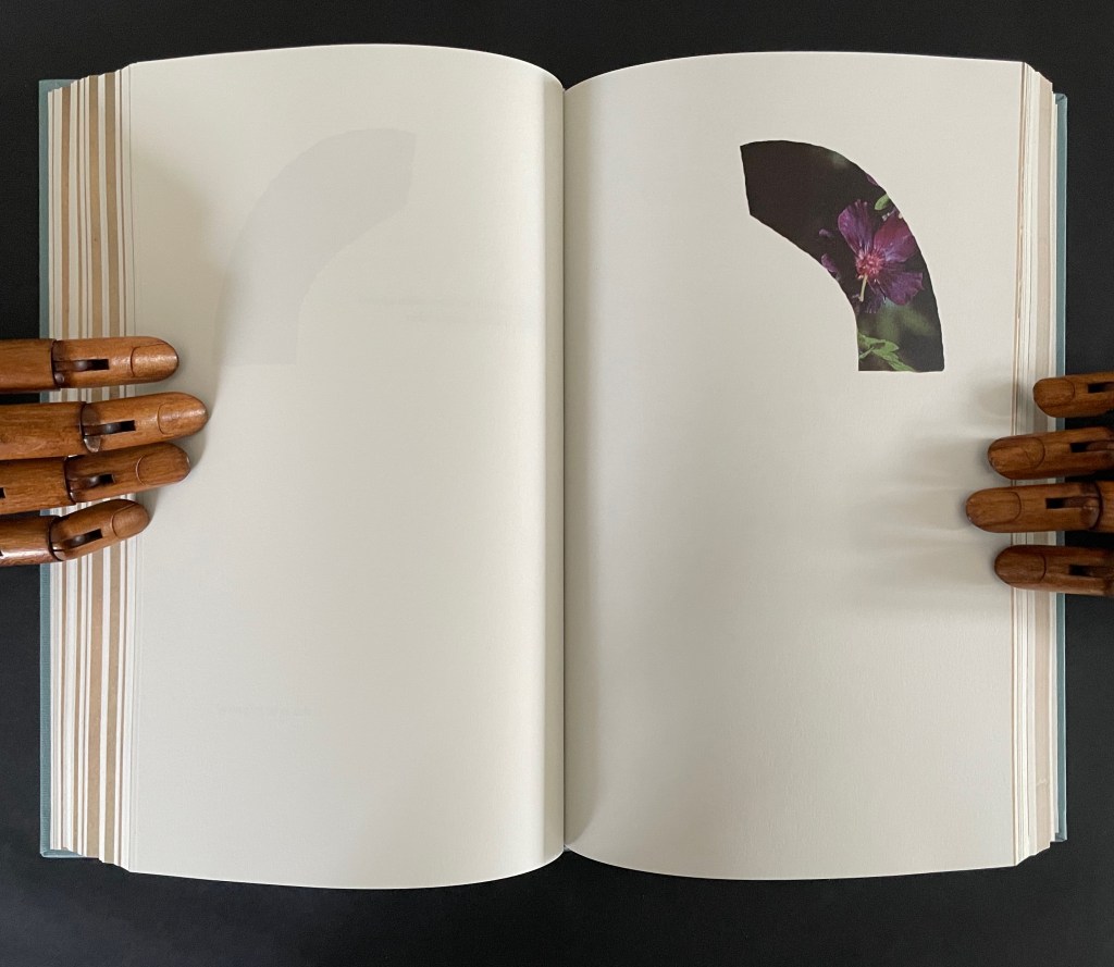
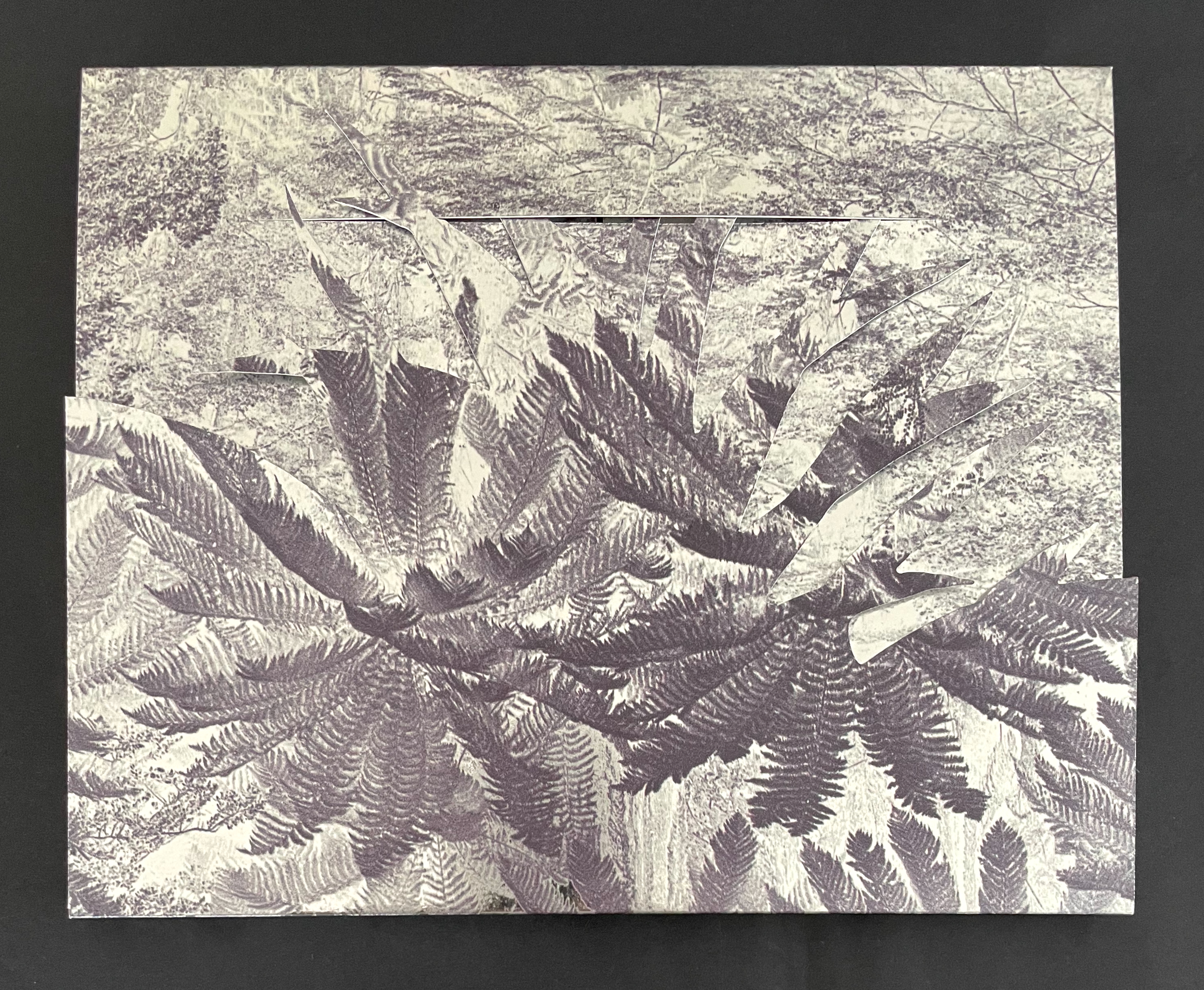
There is no florilegium or guide to these woodcut flowers, but there they are, sprinkled throughout Johannes Kepler’s 650-page investigation of Mars’ orbit, tracked by the observations of his mentor Tycho Brahe, Emperor Rudolph II’s imperial astronomer.
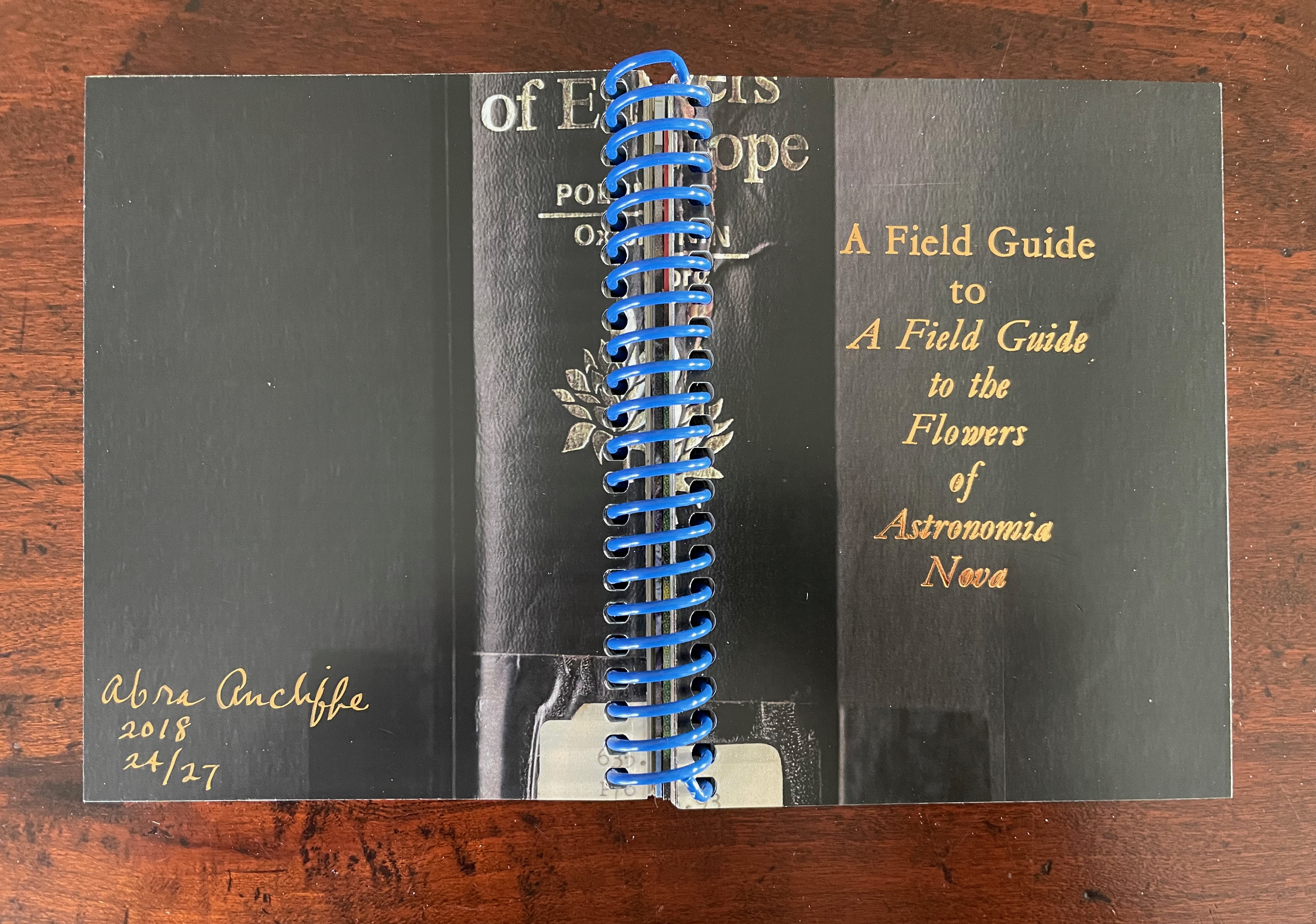
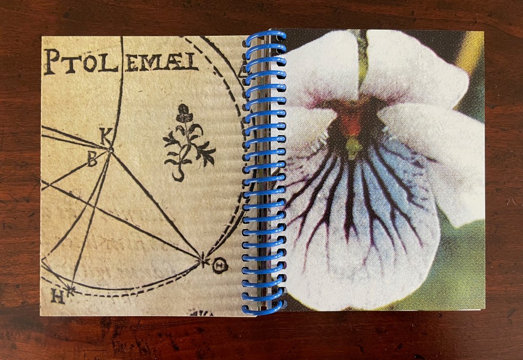
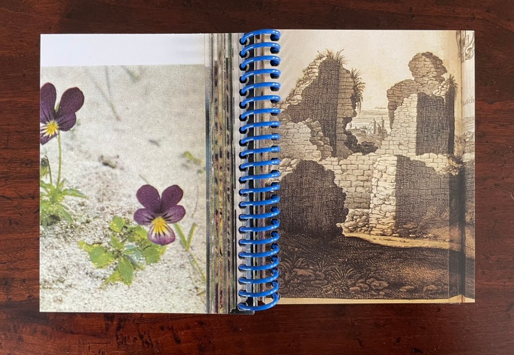
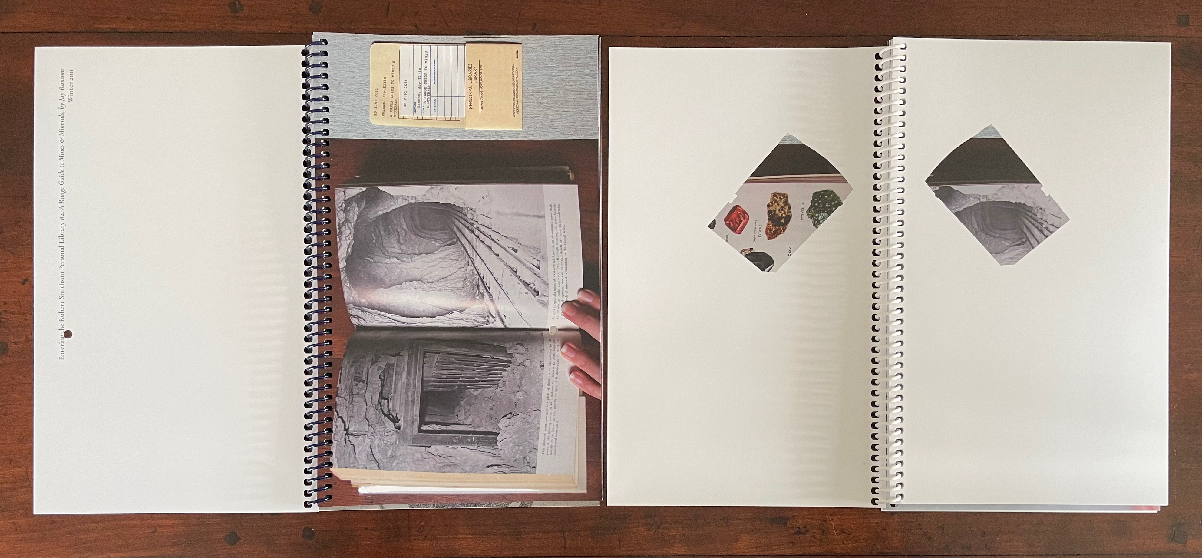
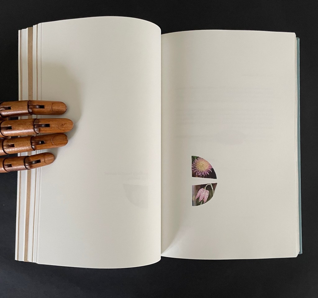
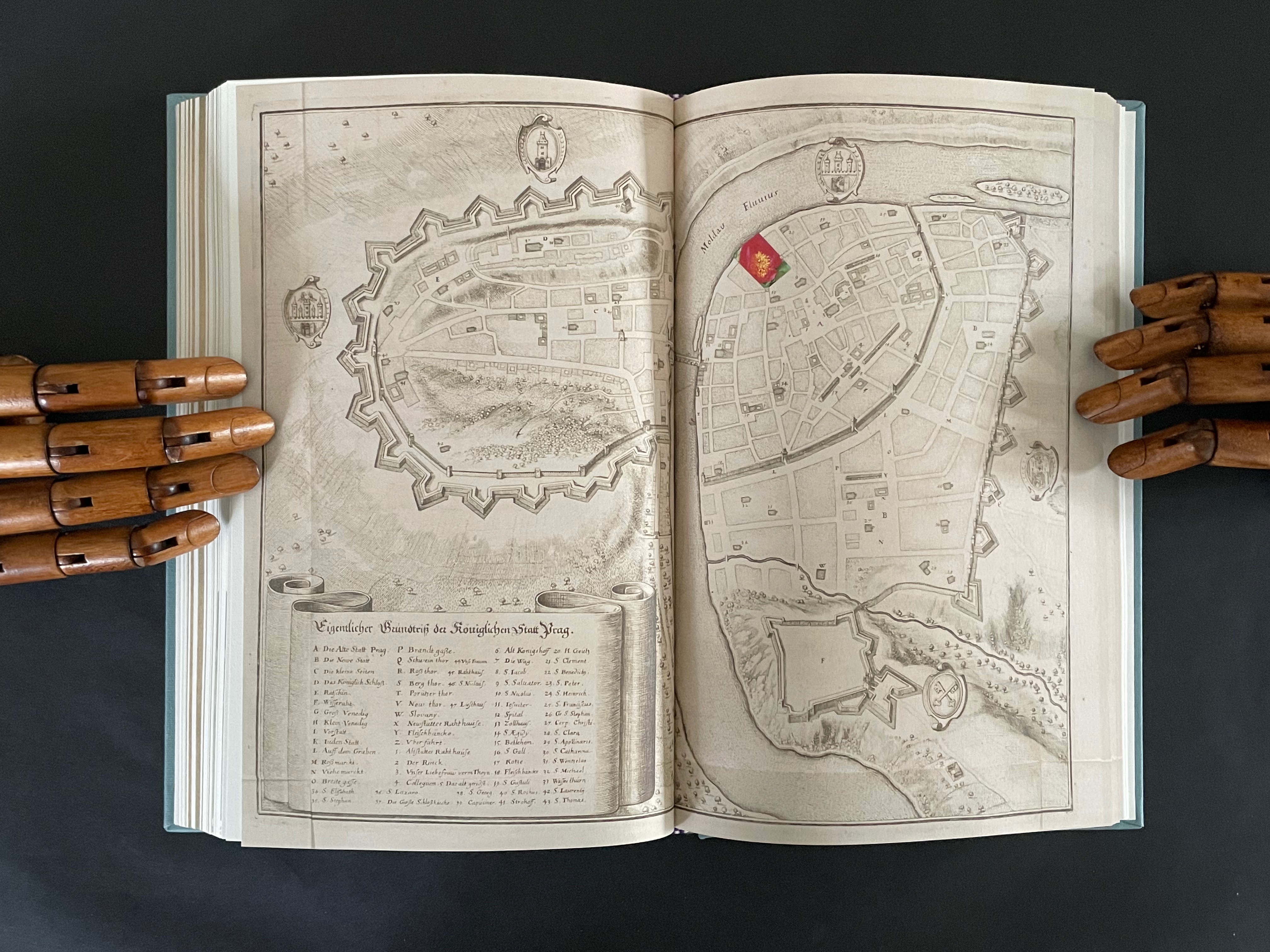
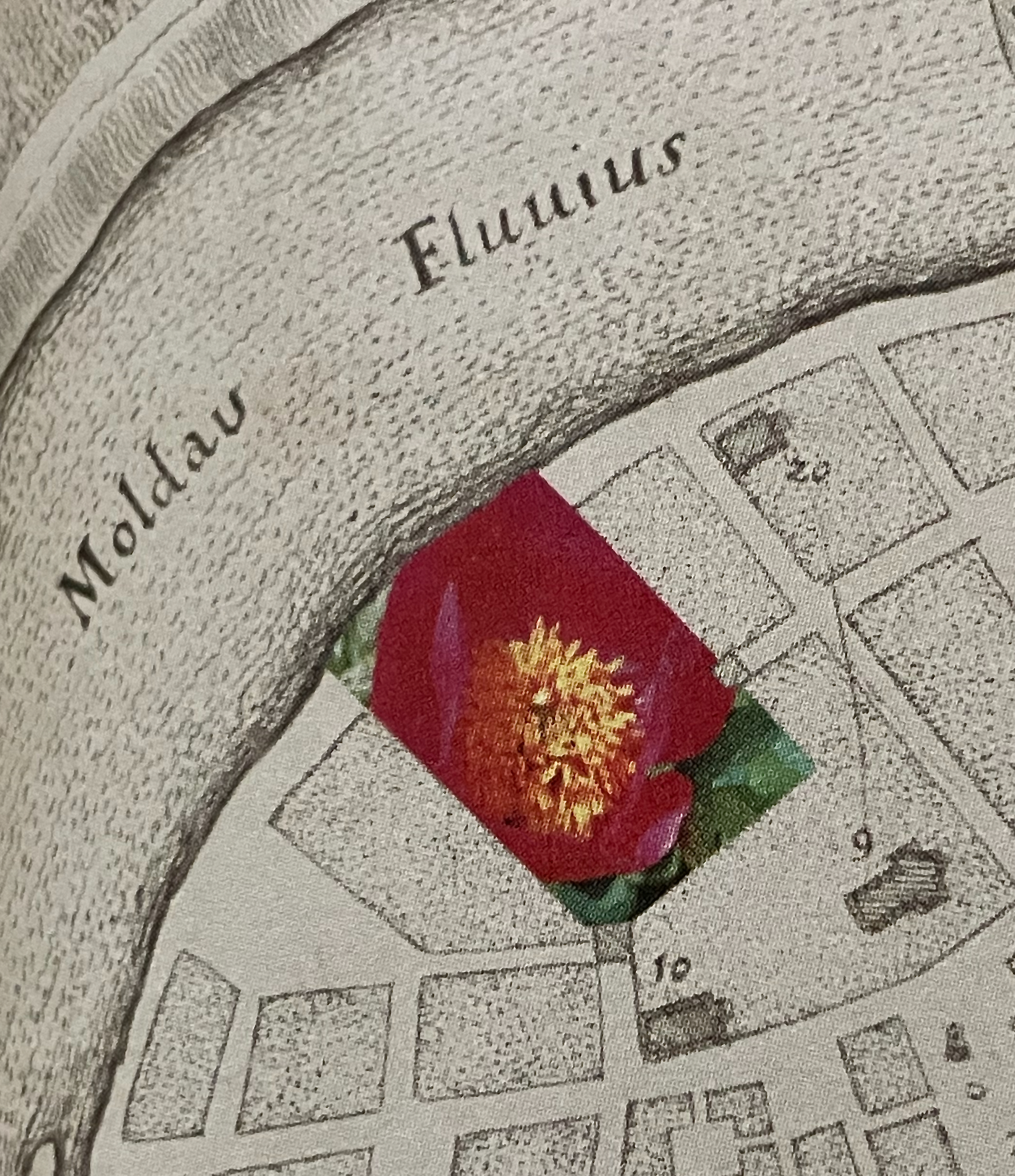
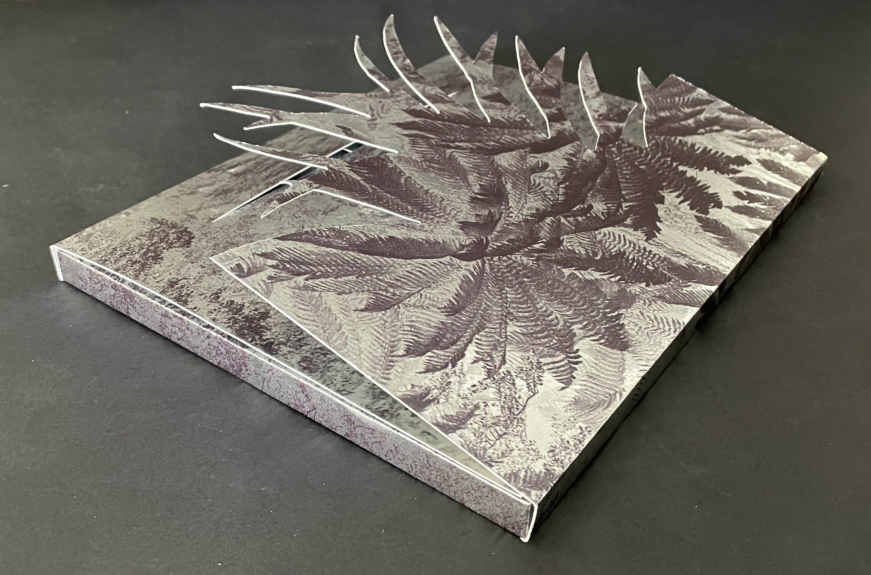
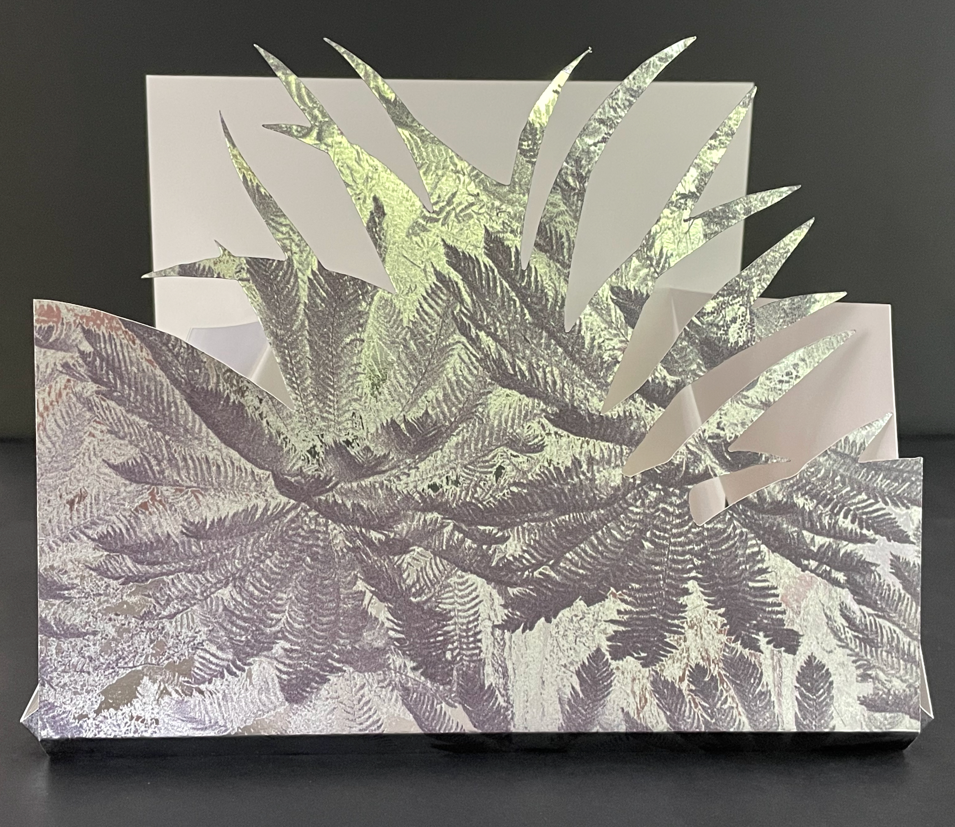
On one level, Ancliffe’s spiral bound handbook is the field guide to these flowers. Its photos of flowers , harvested from Pulinin’s Flowers of Europe, offer candidates for the historical real-life counterparts to the ornamental woodcuts. The handbook’s title, however, indicates another level: that of “a field guide to ‘a field guide’ “. But of what could such a meta-guide consist? In Ancliffe’s case, it is the artist’s book, the work before us that addresses the fields of vision and perspectives embedded in Kepler’s work, the engraver’s woodcuts, and the book artist’s work itself. The first three opening spreads of A Field Guide to “A Field Guide to the Flowers of ‘Astronomia nova‘ ” stake out the environment of the “field guide to a field guide” as well as the zooming-in approach it takes.
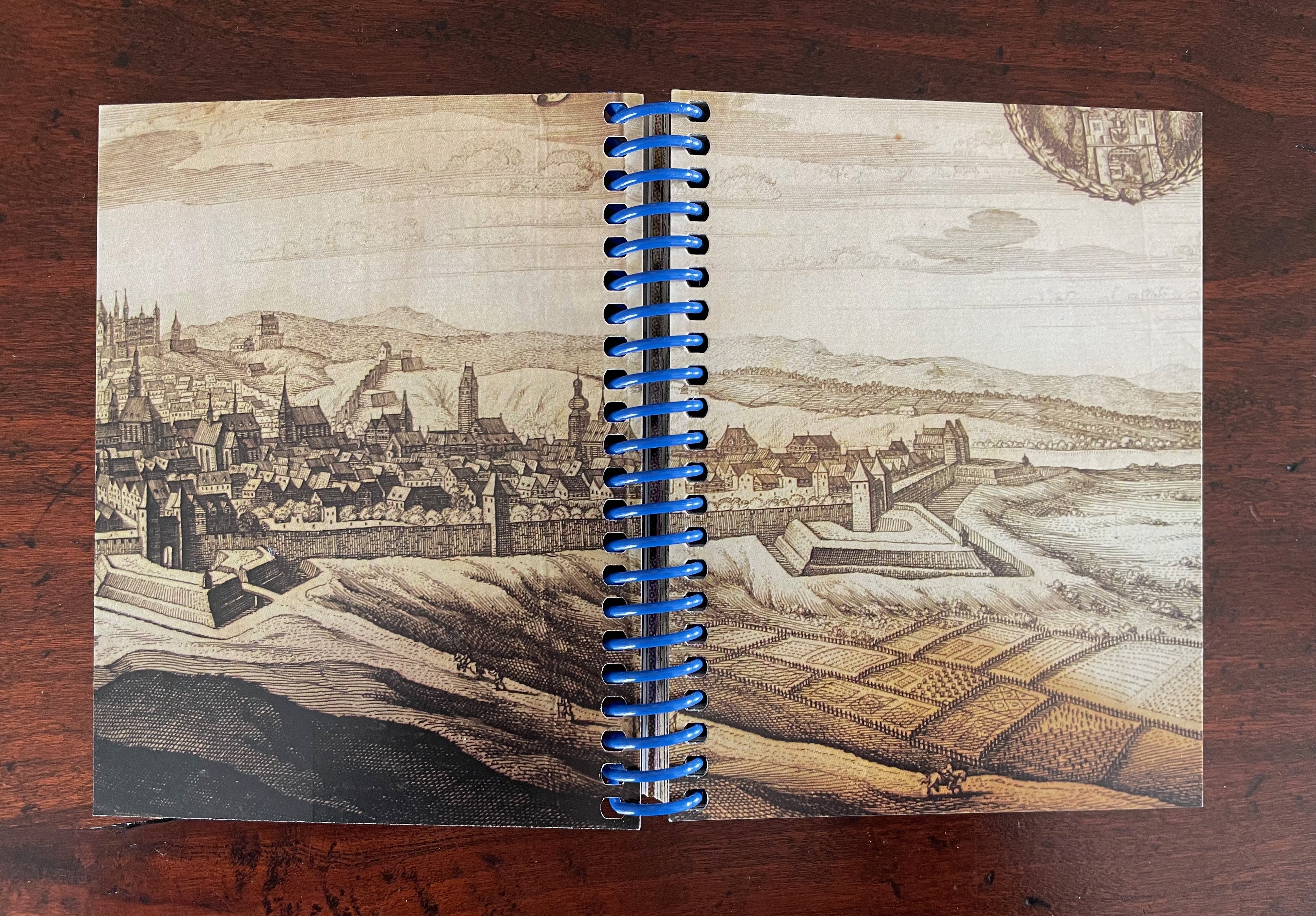
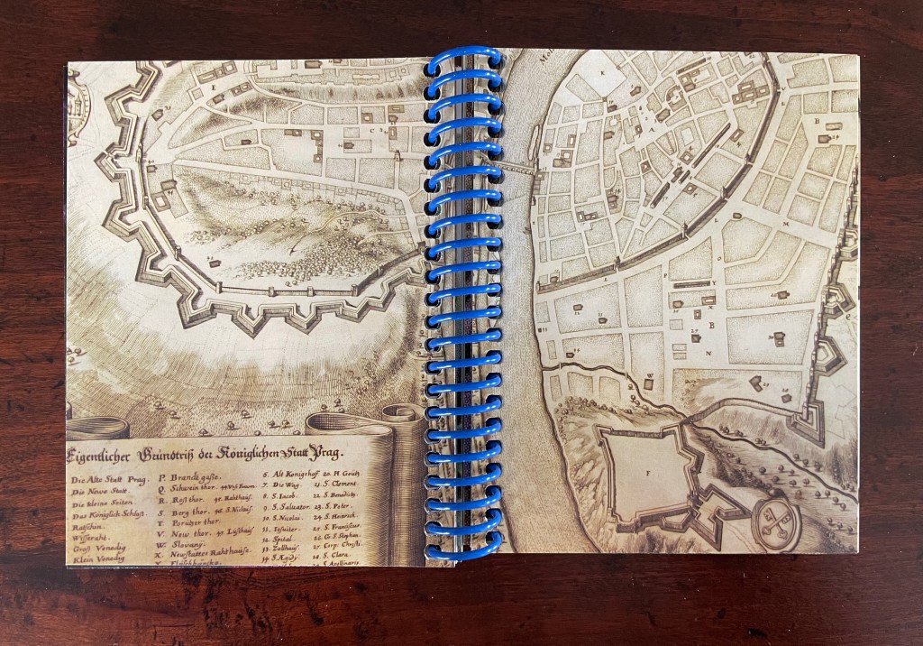
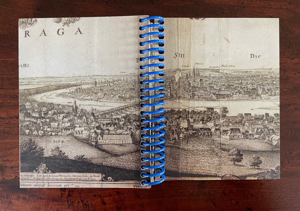
First three opening spreads: cityscape of Prague; map of Prague’s location and fragment of Astronomia Nova‘s title page; cropped page of AN showing ornamental flowers alongside cropped blown-up photo of the flower.
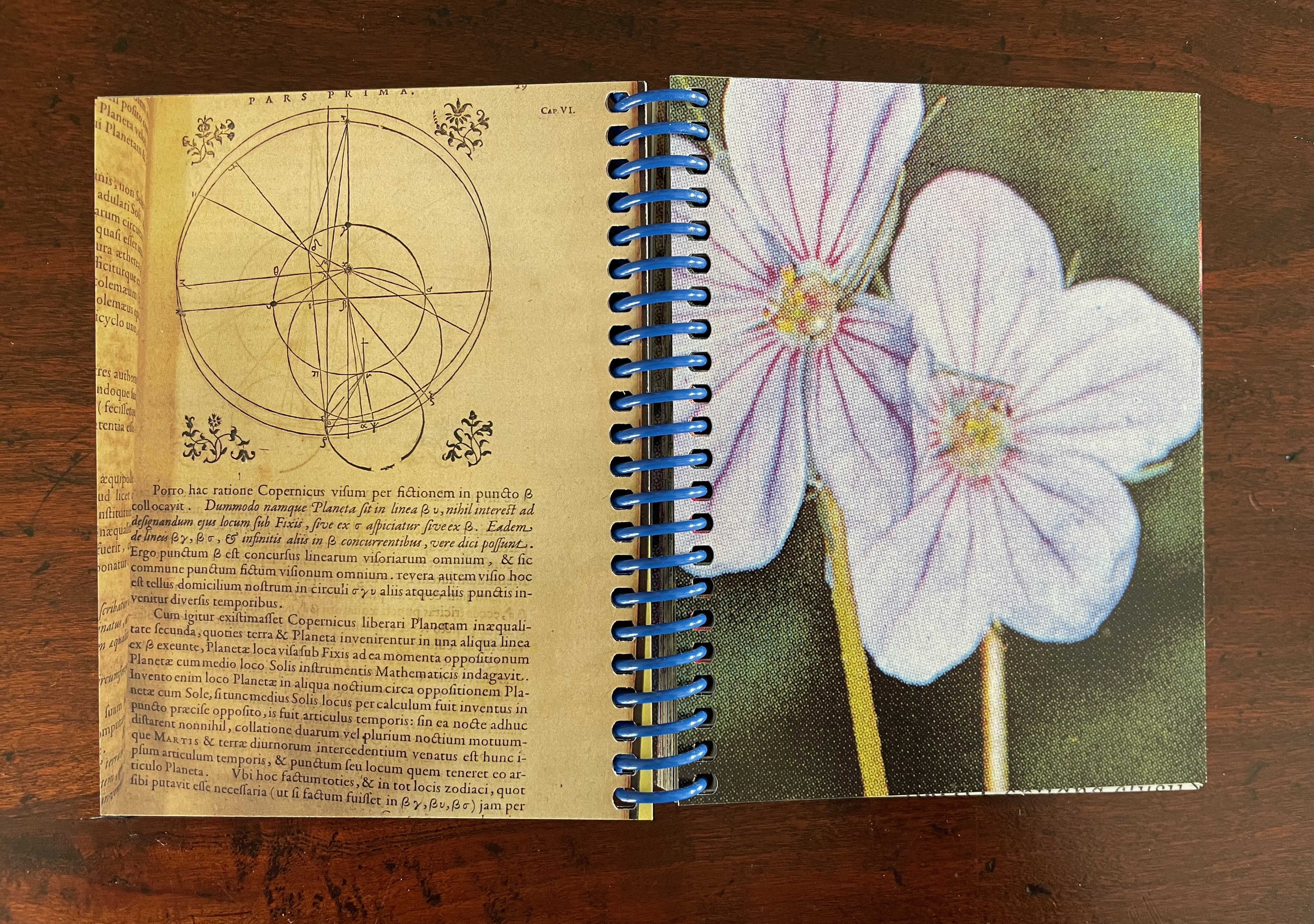
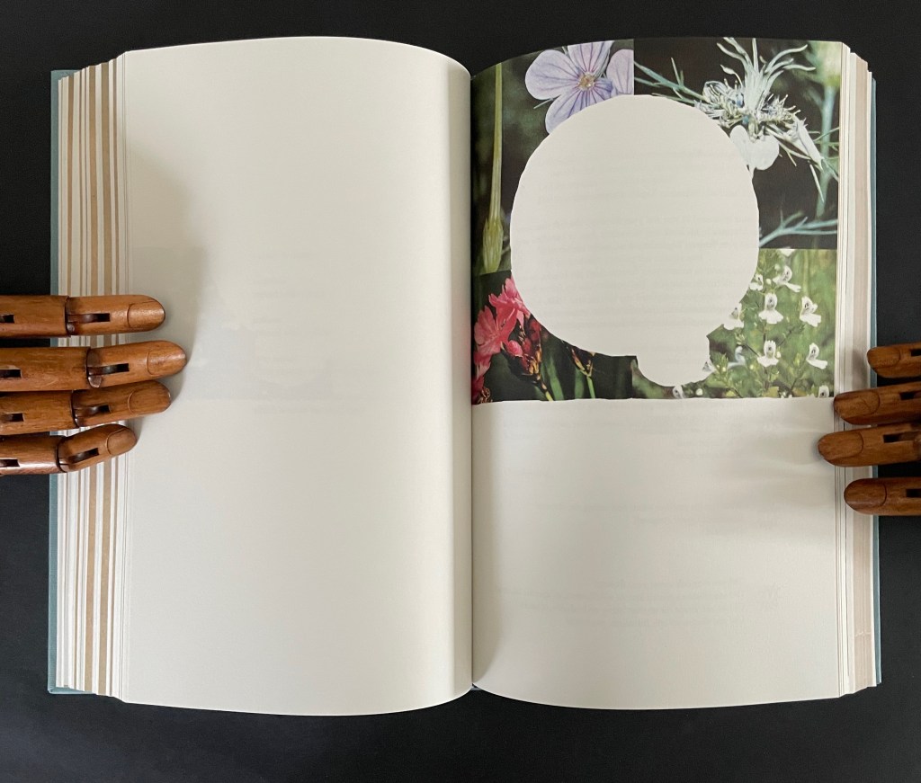
The field of vision hops from the cityscape of Prague to a geographical map, then to the cropped title page of Astronomia Nova, then to a detail of the Copernican model bracketed by ornamental flowers, and finally to a cropped blown-up image of one of those flowers from Polunin. The next two spreads that follow those first three underline the field guide’s zooming in across time and space.
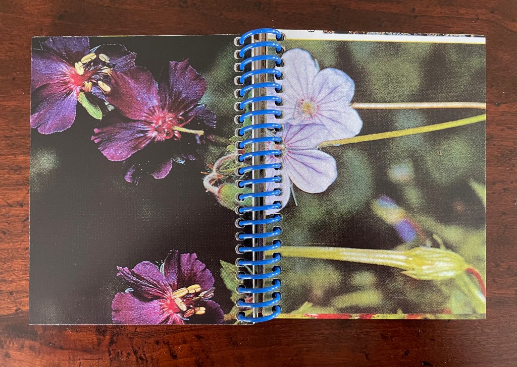
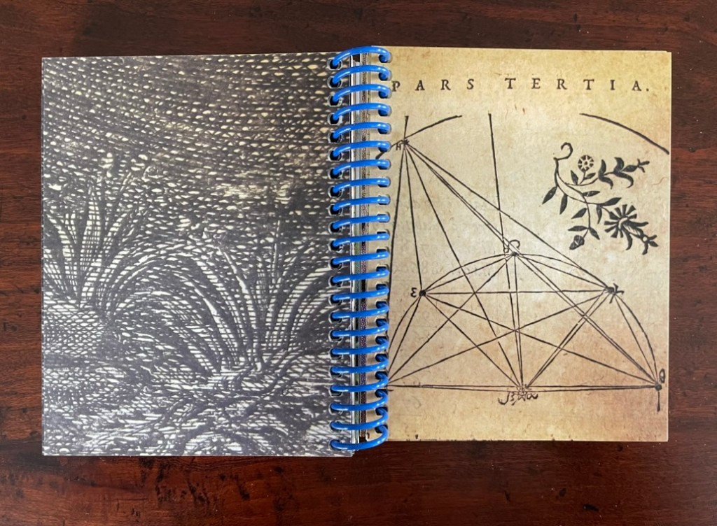
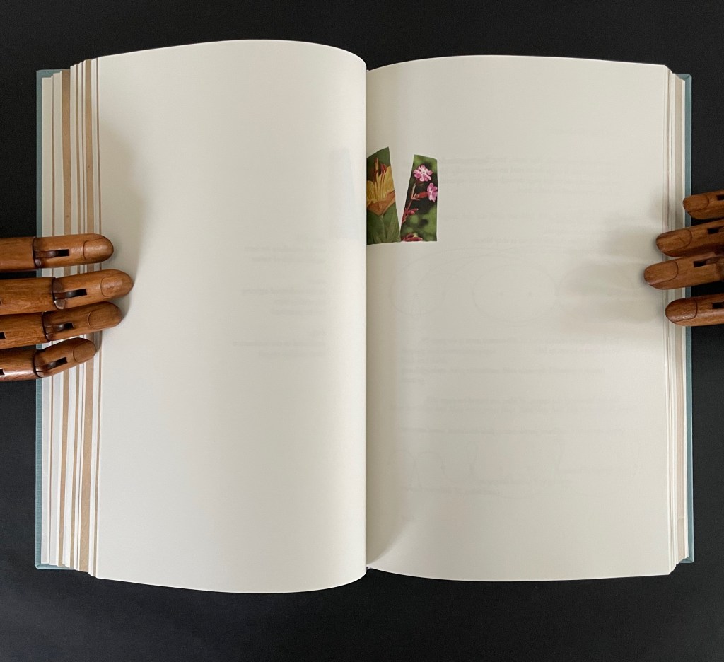
The fourth and fifth spreads: close-ups of the ornamental woodcut flowers and live photos; from the 17th century to the 21st.
Later spreads showing similar zoomed-in images highlight that we have actually hopped from the second century (Ptolemy) to the seventeenth (Tycho Brahe) to the twentieth (Polunin).
Zoomed-in images of woodcut flowers and live flowers; from Claudius Ptolemy (2d century) to Tycho Brahe (17th century) to Polunin (20th century).
Planetary diagrams, celestial maps, mathematical models, descriptive text, woodcuts and engravings are all at several representational removes from one another and from actual planetary movements over time. Likewise, the woodcutter’s ornaments had their corresponding actual flowers in the gardens and meadows of Prague. The closeness in appearance between the woodcuts and photos argues that Kepler’s artist was drawing and cutting from real-life observation. And yet the photos lie at historical and medial removes that question their correspondence. Like Kepler’s and Brahe’s mathematical and textual models of planetary movements, the artist’s book’s photos are speculative models of the flowers Kepler’s woodcut artist would have observed in Prague at the turn of the 17th century.
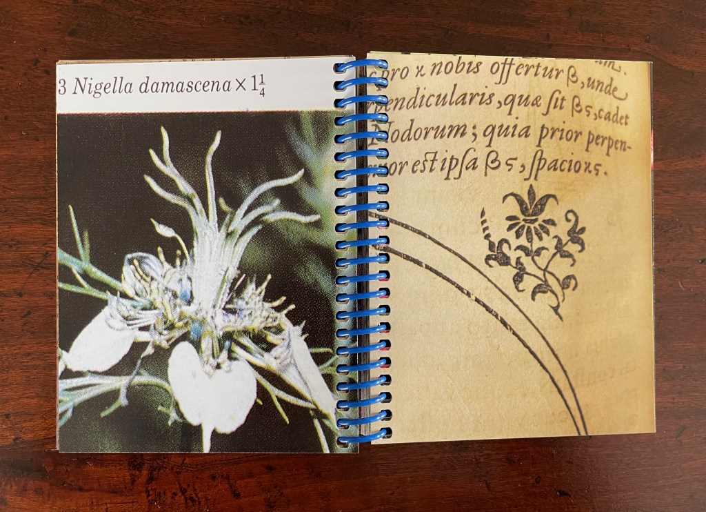
The field guide’s movement across media — engraving, printing, woodcut, photography, casebound book, and spiral bound book — is underscored by Ancliffe’s variation and sequencing of spreads. Just as we start to assume an alternating verso/recto rhythm of print/image then image/print, Ancliffe interrupts the flow with a double-page spread of print/print.
There is also interruption within the interruption: the double-page spread of text is an English translation whereas so far the text has been in Latin. Is the translation’s appearance a reminder that the various media are means of translating the observed?
Other interruptions consist of image/image spreads followed by text/text spreads. The juxtaposition seems to suggest an abstract affinity of shapes, as if the side-by-side flowers hint at an abstract shape of the map spread, and the side-by-side maps hint at an abstract shape of the flower spread.
If that seems an interpretive stretch, consider the following sequence that draws comparisons between flower photo and cityscape detail, between zoomed-in cityscape detail and flower photo, and between zoomed-in cityscape detail and ornamental woodcut detail.
Note the sequence — photo/engraving; engraving/photo; and engraving/woodcut — drawing attention to translation from medium to medium.
If we step back to take in the whole of the artist’s book and note the changing rhythms and punctuations across the spreads, it is hard not to conclude that this artist’s book as field guide is teaching us how to read the environment it has created.
Opening and closing landscape spreads.
Ancliffe’s next work in her astronomy series extends her aim of teaching us how to read her artist’s books.
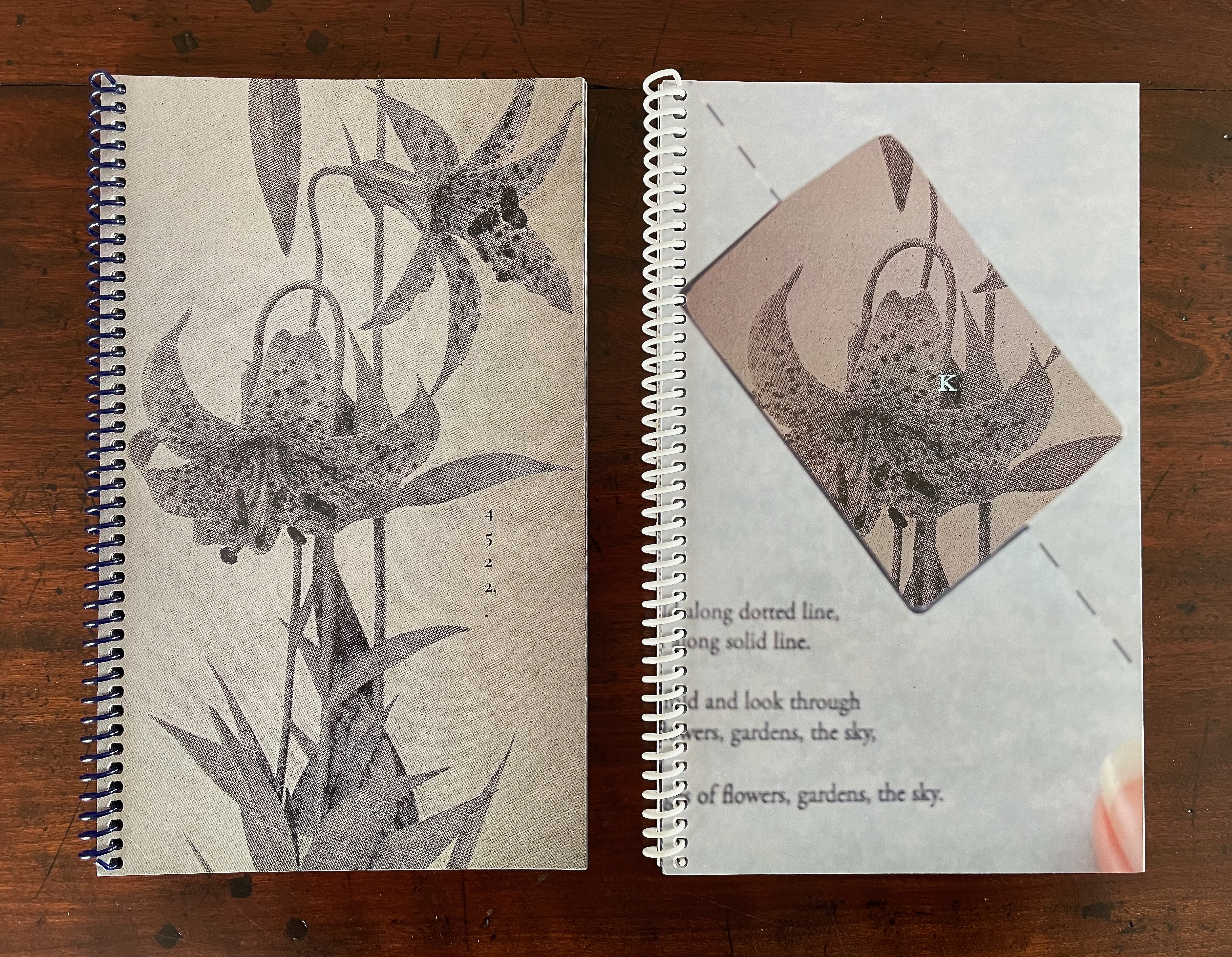
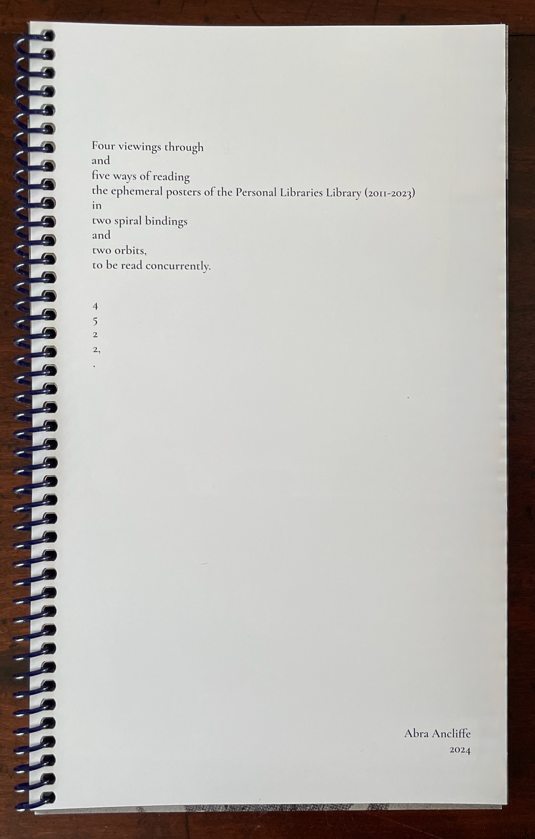
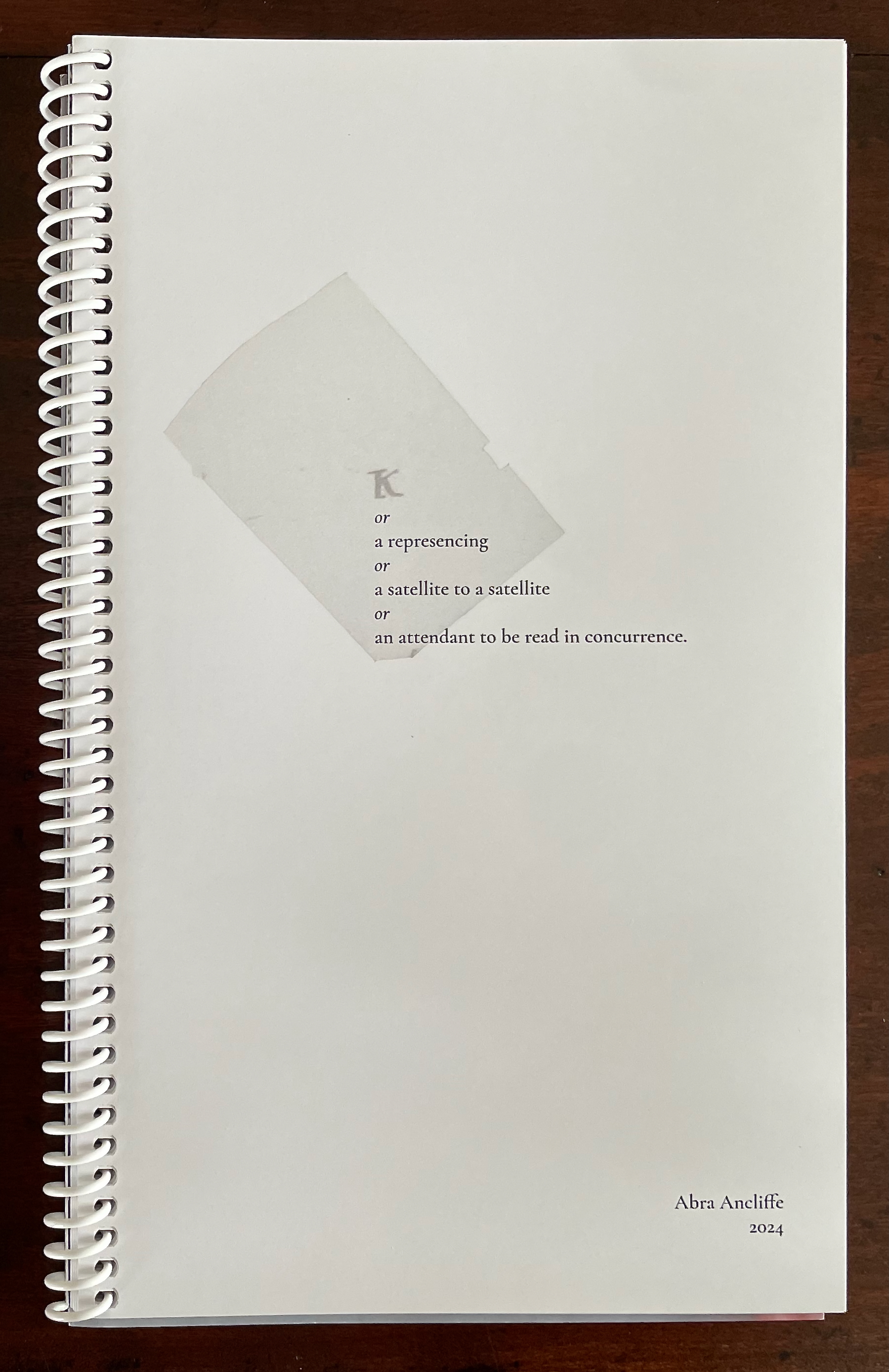
4522,. + K (companion volumes, to be read concurrently) (2024)
The cryptic title of this dual-volume work signals that we have some detecting to perform in order to read it. In fact, we have to read the companion volumes concurrently to perform our detective work. More teaching us how to read. The volumes’ respective title pages shed some light on the cryptic titles, but only a little. As the first volume’s title page spells out the vertically arranged numerical title 4522,., we learn at least that it has its roots in Ancliffe’s Personal Libraries Library series.
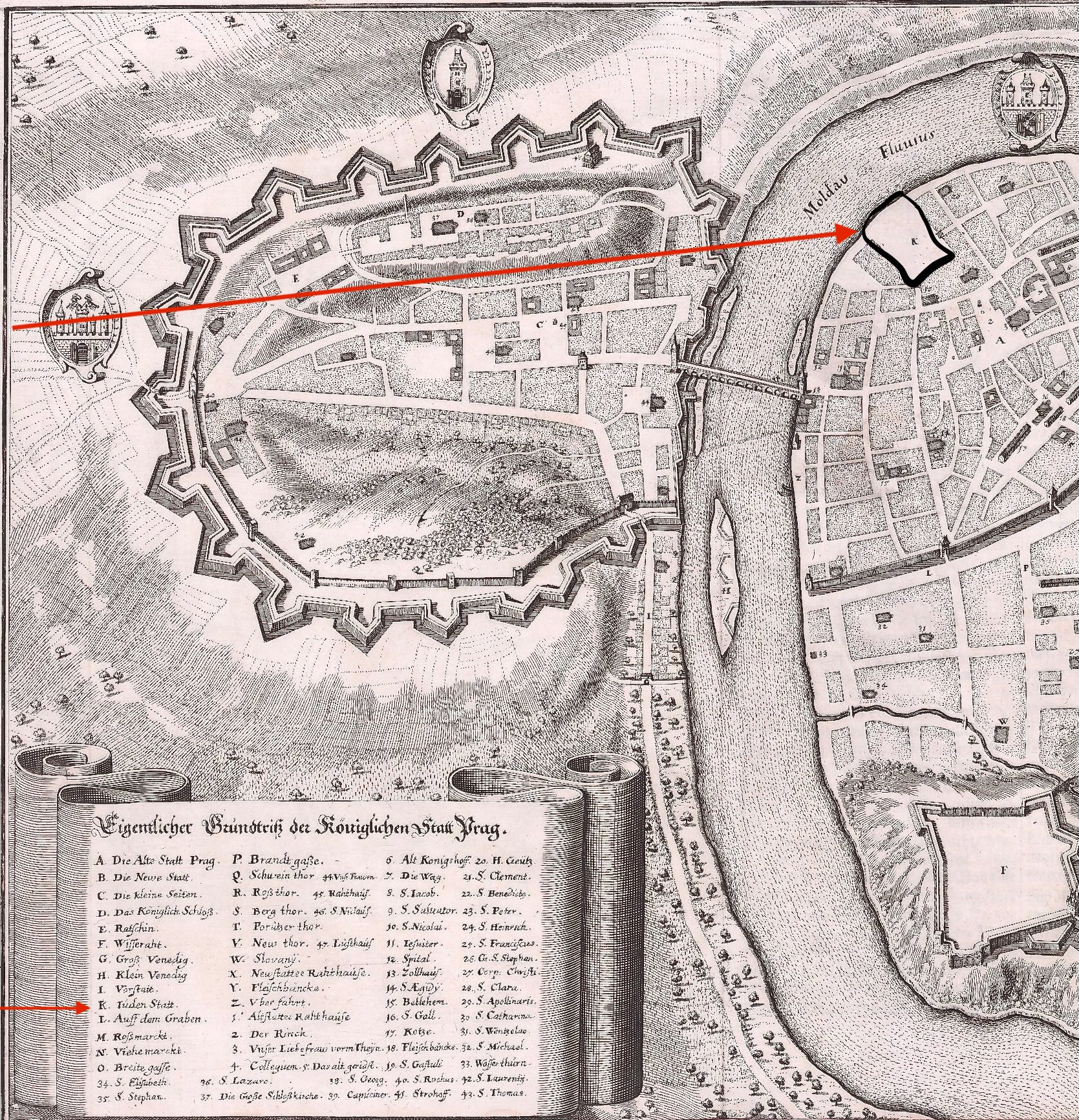
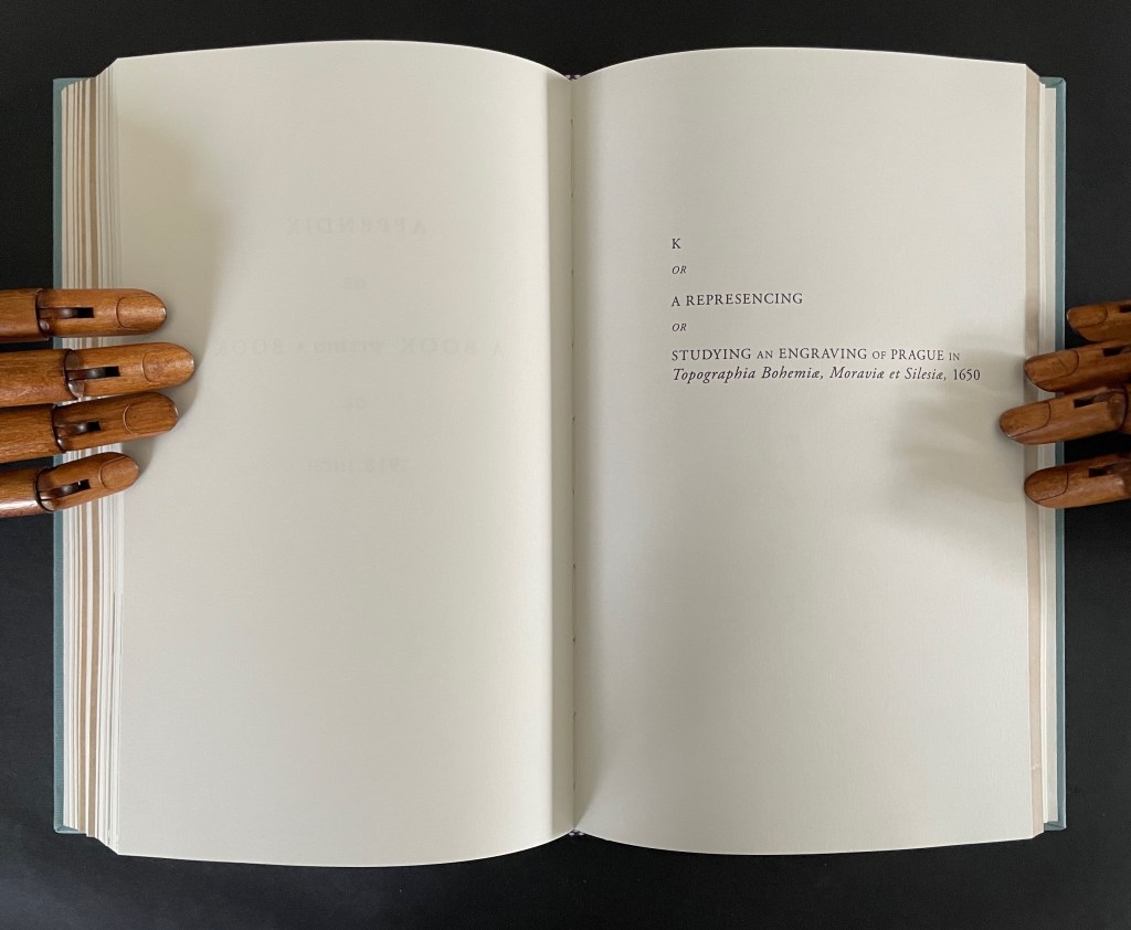
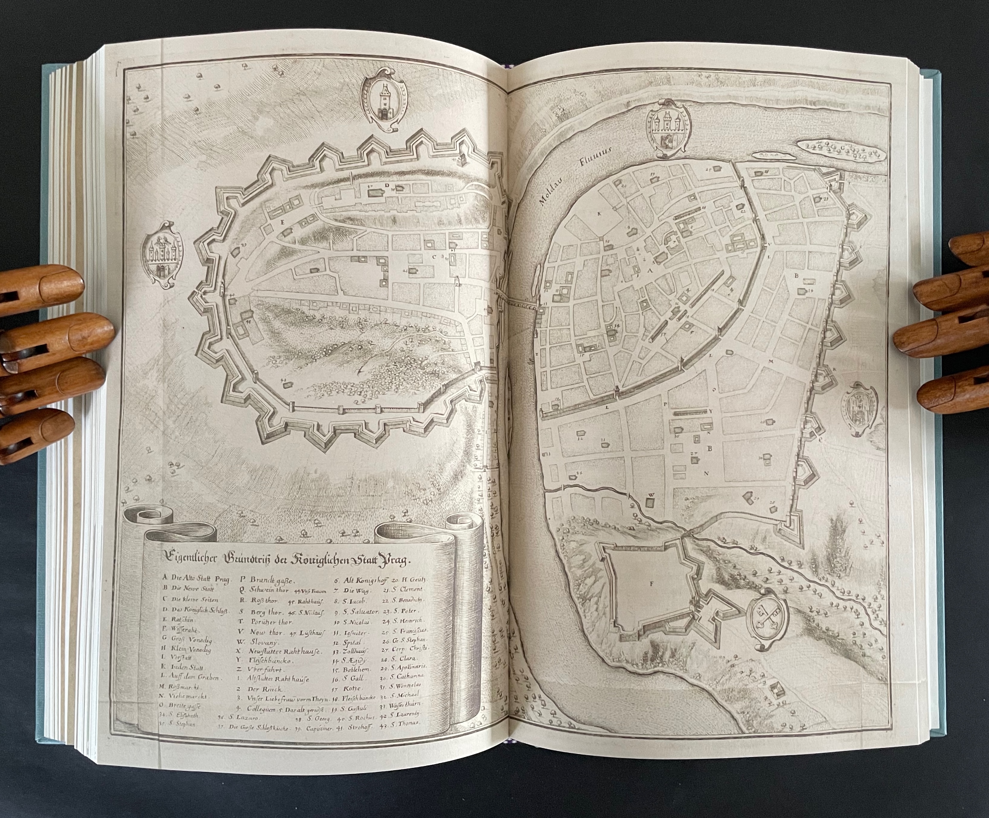
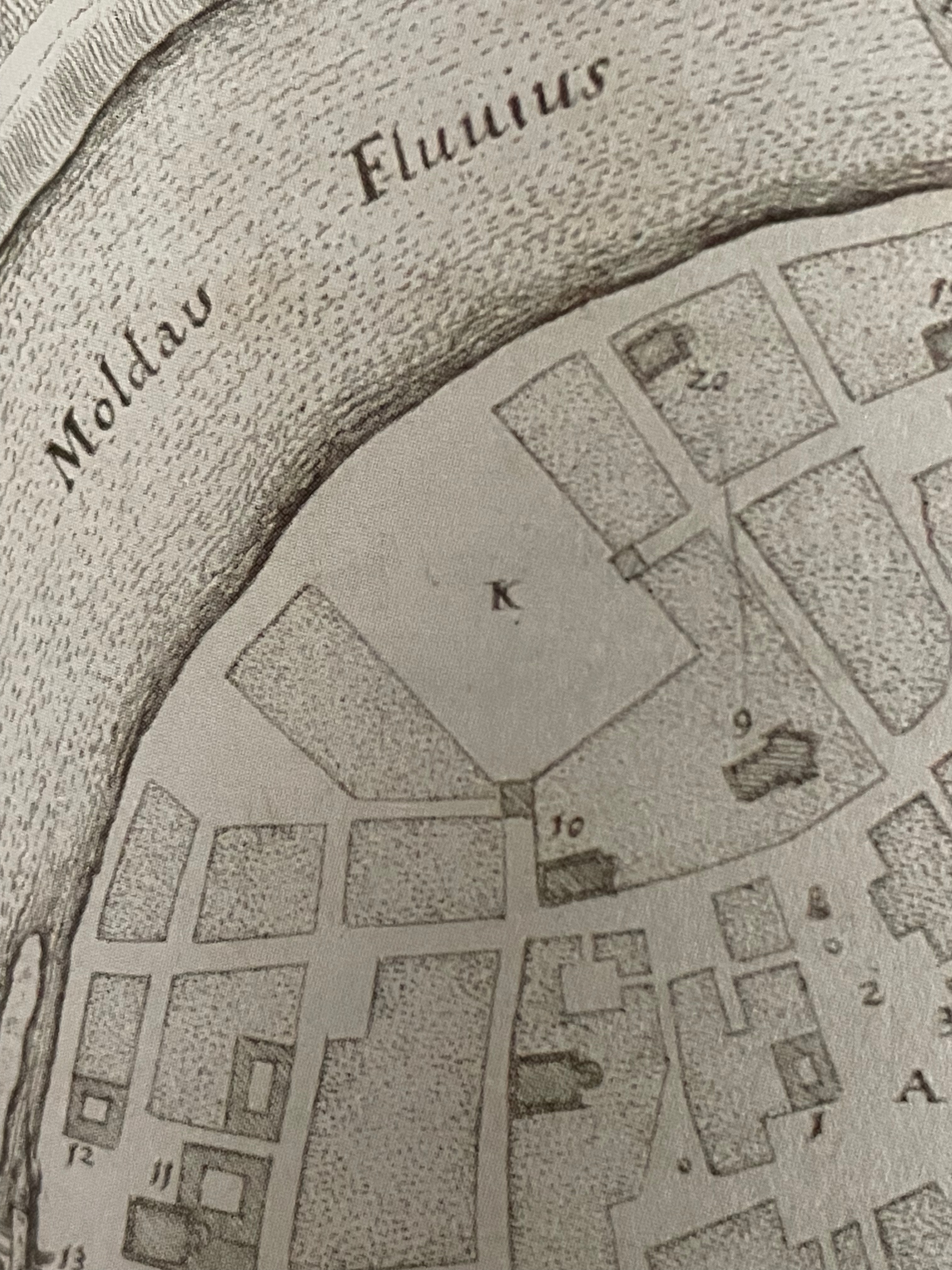
The title page of the second volume presents the title K inside a shaded irregularly shaped rectangle extracted from a map of Prague (1650) by Matthaus Merian and Martin Zeiller (which we can track through the last entry in K‘s bibliography). The letter K comes from the key to that map, which tells us that it marks the Jewish quarter of the city. It’s a “nice-to-know” detail but not essential for appreciating how to read the second volume.
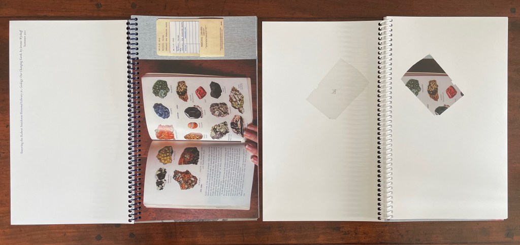
The title page tells us that K is “a represencing” or “a satellite to a satellite” or “an attendant to be read in concurrence”. We already know about the concurrence from the first volume’s title page. As for “satellite to a satellite”, we can see that K is a satellite to 4522,., which makes 4522,. a satellite to something. But to what? More on that in a minute. As for “a represencing”, the volumes’ covers (above) give us a hint. Notice how the irregular rectangle on K‘s cover re-presents or represences a snippet of the floral poster image shown on the cover of 4522,. That is the recurrent pattern between the two volumes:
From the poster image shown in 4522,. on the left, a snippet is taken and displayed within the map segment in K on the right.
Just with the covers and two title pages, we have detected two of the “Four viewings through … the ephemeral posters of the Personal Libraries Library (2011-2023)”:
The PLL posters viewed in 3/4 scale (as seen in 4522,.)
Snippets of the posters viewed through the map segment (as seen in K).
The third “viewing through” has a physical and literal form. In 4522,. a hole is punched in the recto pages where the poster images are displayed. Through that hole in one poster, the poster underneath can be viewed. In K, when a recto page turns t0 the left, its poster snippet reappears on the verso but in reverse as if we were looking through the other side of stained glass window.
With both volumes’ recto pages having been turned, we can see the punched hole on the verso of 4522,., a new poster image on its recto page, the mirror image of the three minerals from K‘s preceding recto page, and the new poster image’s snippet in K’s new recto page.
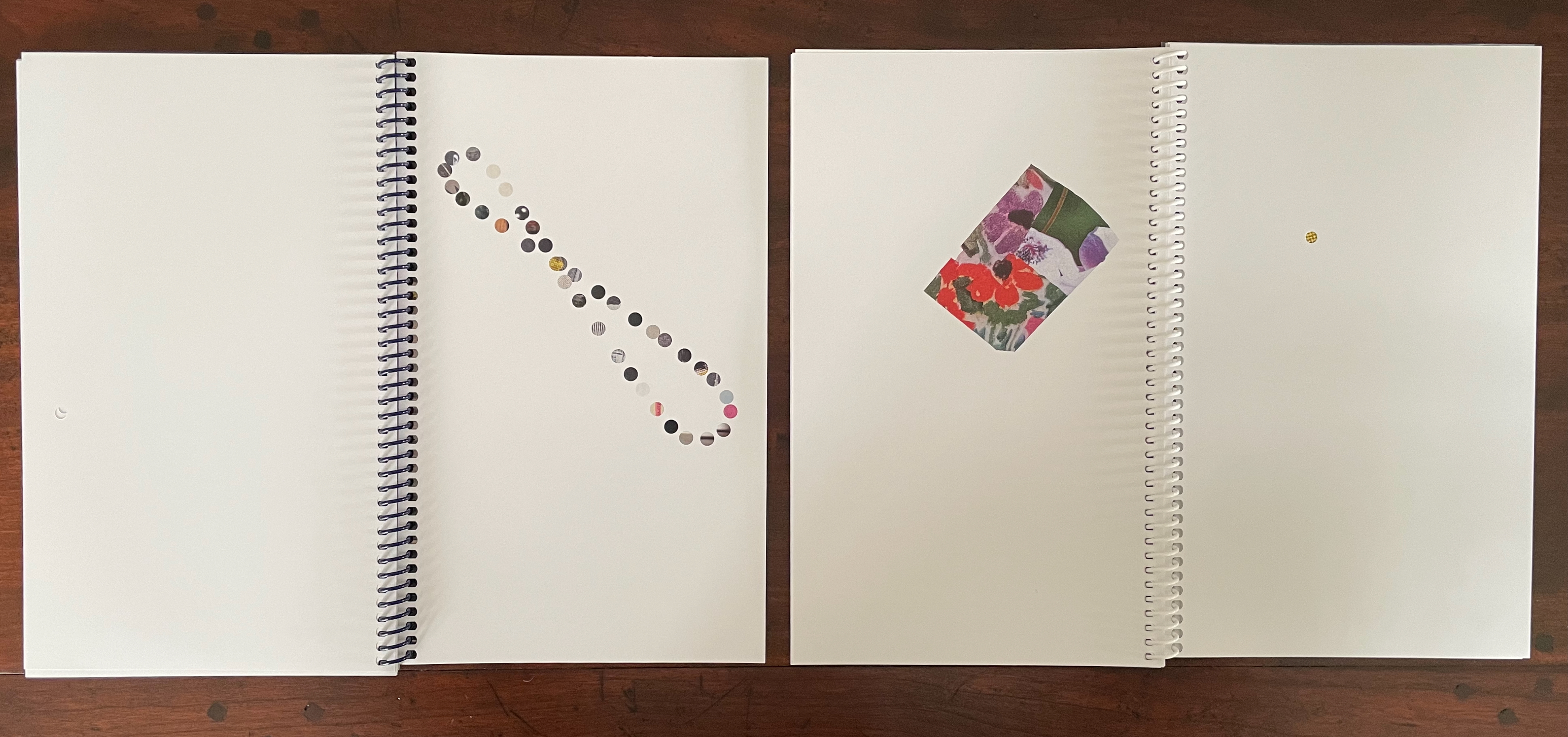
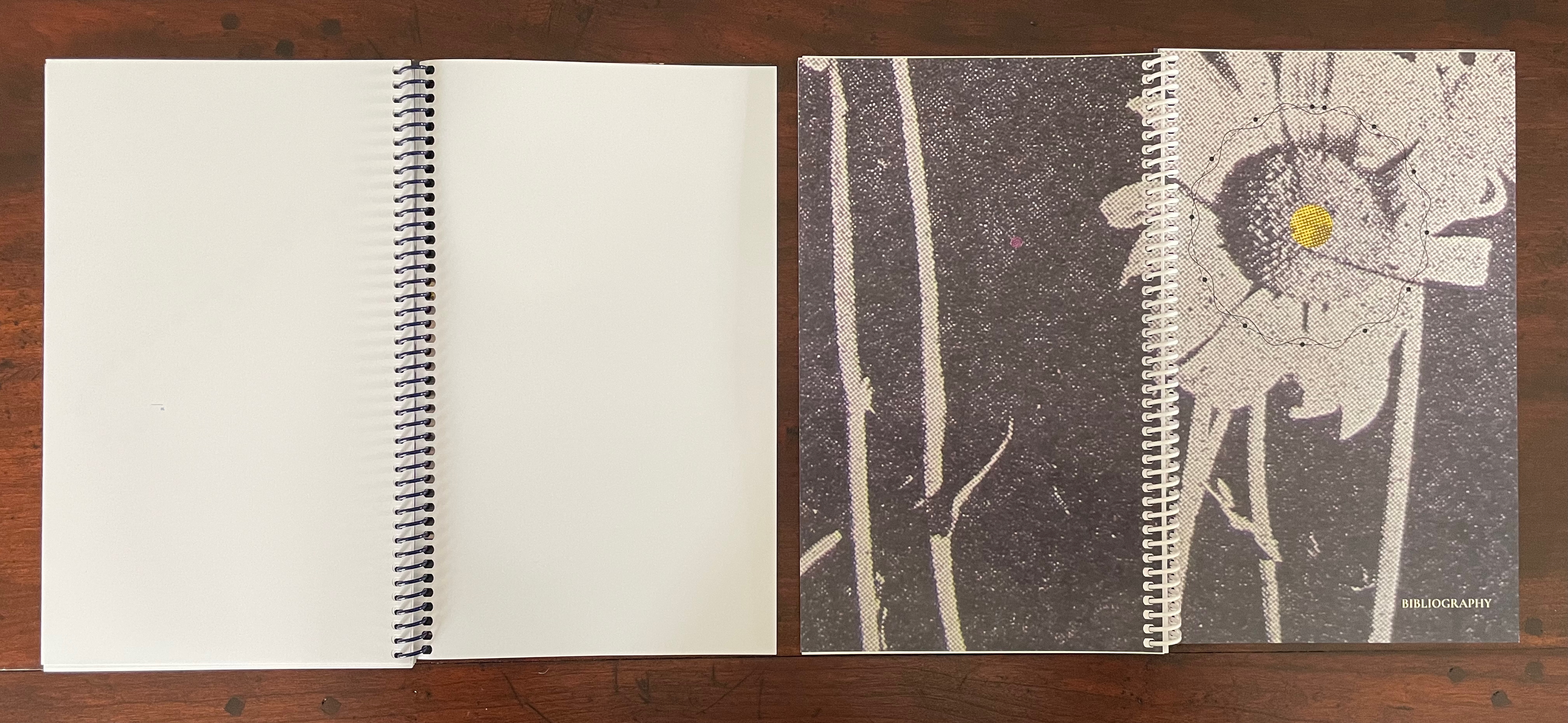
In this third “viewing through”, there is also a clue to what 4522,. is a satellite of. The small hole punched in each leaf of 4522,. seems to meander in its position from leaf to leaf. Actually it tracks a very specific shape: an analemma — a tilted, figure-8-like form. An analemma is the visual representation of the data recorded in ephemerides (tables of star positions at fixed times). In 1627, Kepler published his Rudolphine Tables, which became the new standard for accuracy of this data. If we were to point a camera skyward from a fixed location at the same angle and take multiple photos at the same time of day throughout the year, the sun’s position would form that figure across all the exposures. This is because the earth tilts on its axis as it orbits the sun and moves along an ellipse rather than a circle. So, the placement of punched holes in 4522,. embodies this projection of our orbit around the sun, and if we miss the point, the following near-to-last double-page spreads from 4522,. and K drive it home.
On the left, 4522,. shows the analemma diagram composed of the tiny views of the PLL posters’ images viewable through the holes in the book’s preceding pages. On the far right, K recapitulates the punched hole from 4522,. and wittily drives home the star/flower coordinates by positioning the hole over the center of the flower on the next spread, which doubles the wit with a black-and-white spread save for the strategically placed spot of yellow in the moon-gray center of the flower. The PLL posters’ images “light up” the recto pages of 4522,., and K reflects those images. In other words, K is the lunar satellite to 4522,., which is the terrestrial satellite orbiting the sun (the PLL project). These are the “two orbits” from the title page of 4522,.
The fourth “viewing through” comes into play with the Bibliography at the end of K. Although we had recourse to it to lead us to the map of Prague, a closer look reminds us of the PLL posters and the personal libraries from which they emerge.
So of course, the “five ways of reading” signaled on the title page of 4522,. refer to the five personal libraries from which the posters are composed.
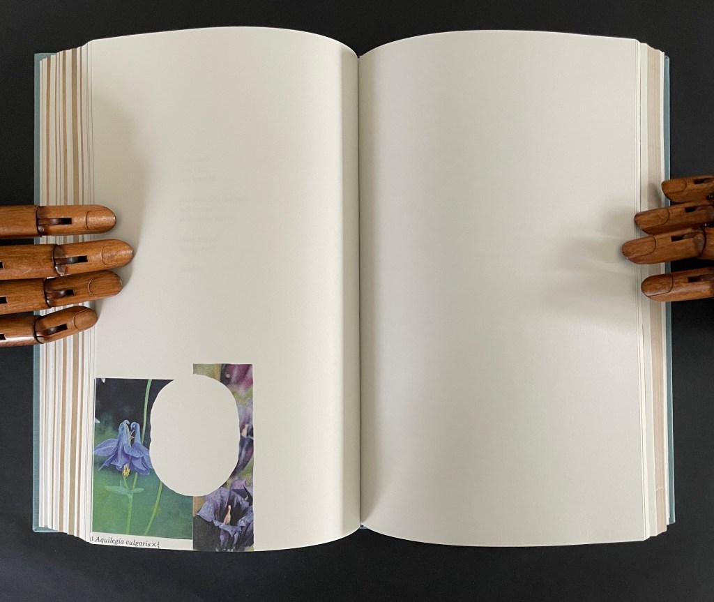
This extraordinary part-autobiographical, part-biographical, part-bibliographical artist’s book brings Abra Ancliffe’s twin obsessions with astronomy and botany to their highest pitch of unity so far. Ancliffe has built it with an extended epistolary poem, collaged images from Polunin’s Flowers of Europe, and photos of the map of Prague (1650) by Merian and Zeiller, pages from Kepler’s Astronomia Nova (1609), and family memorabilia.
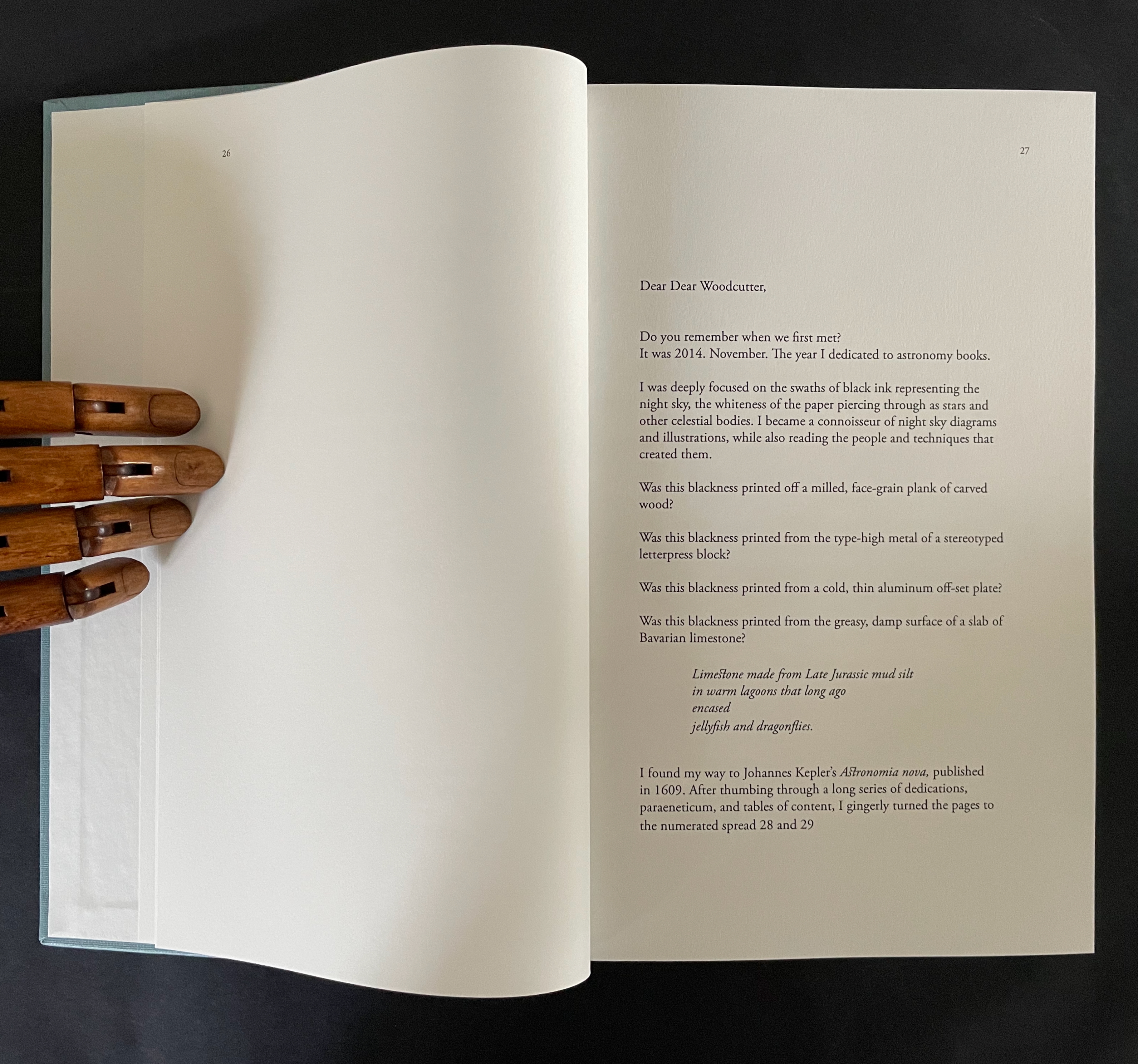
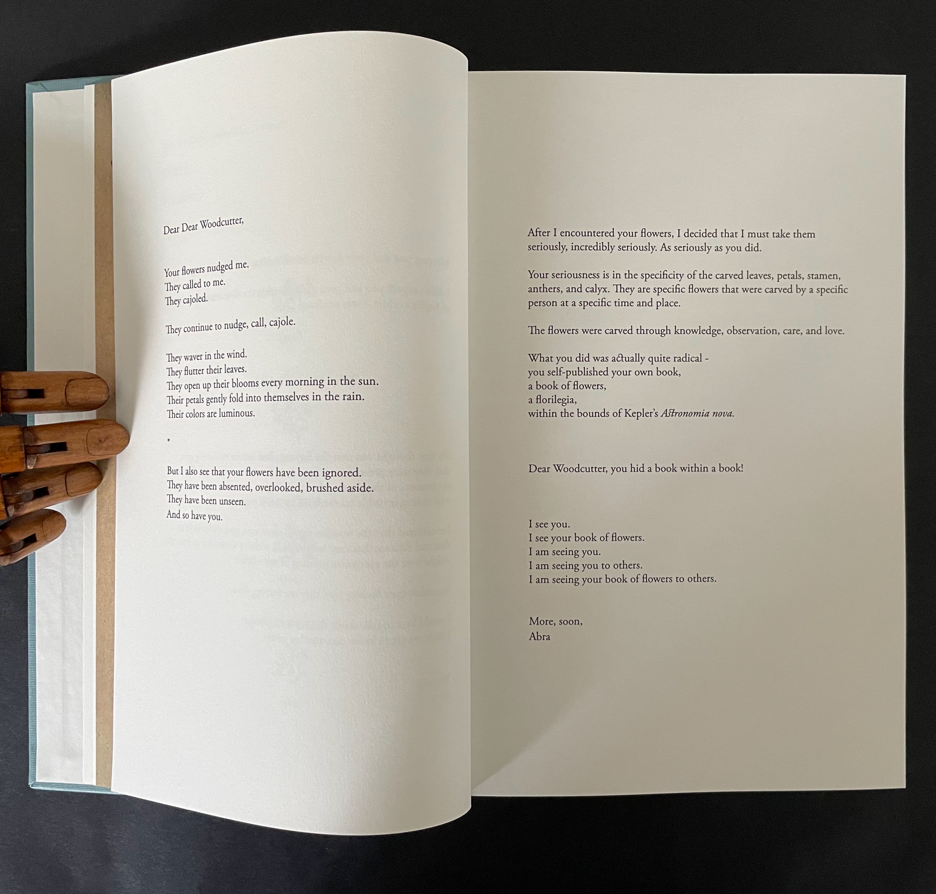
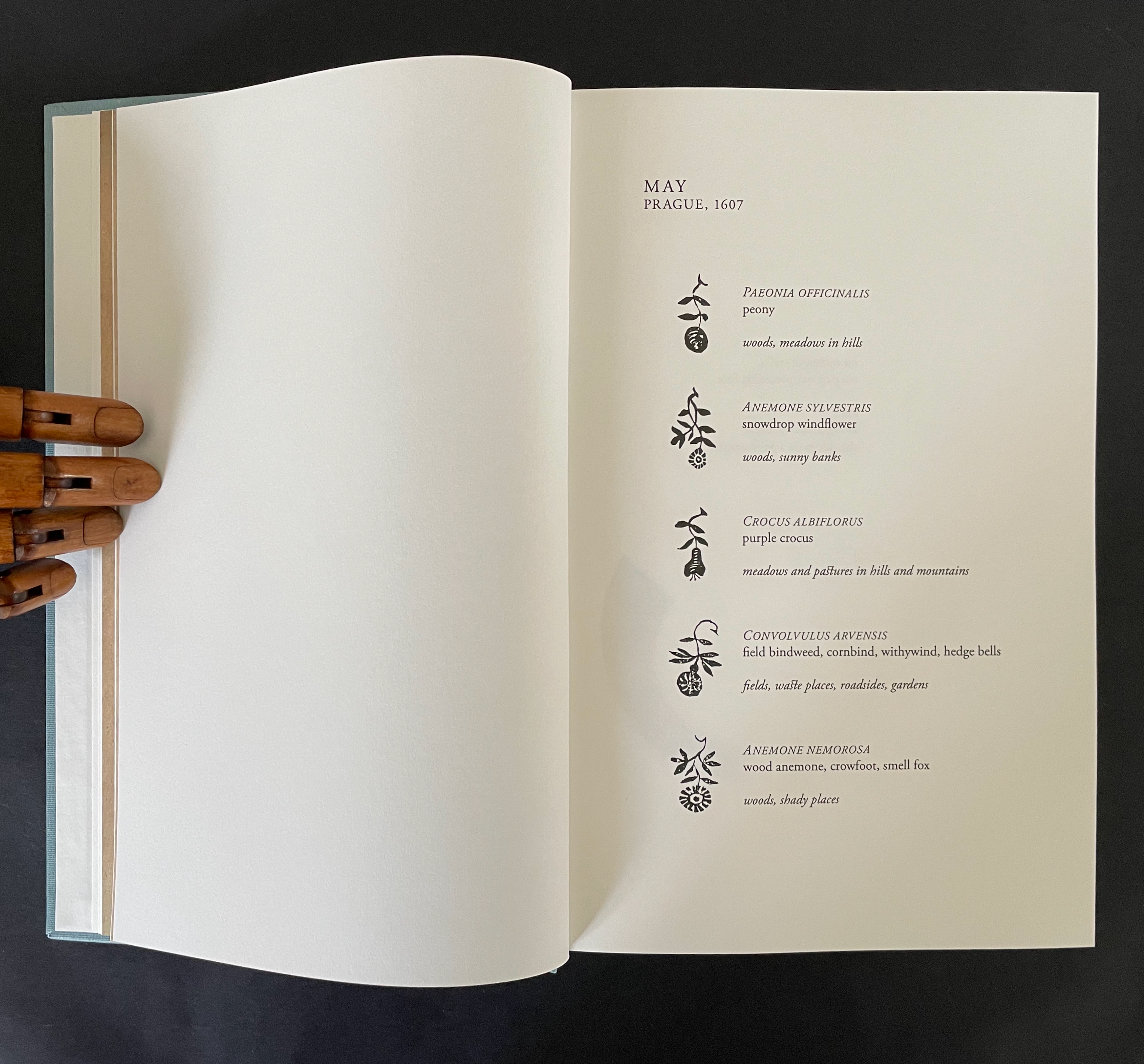
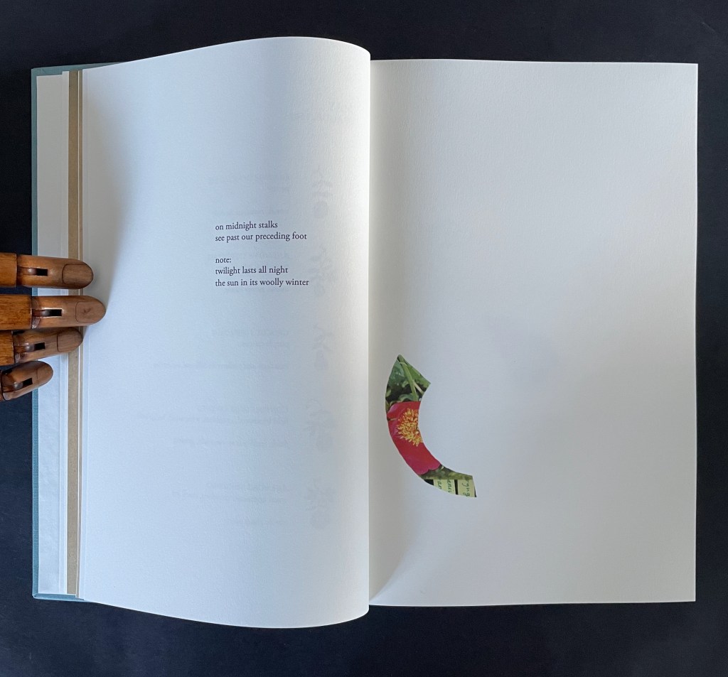
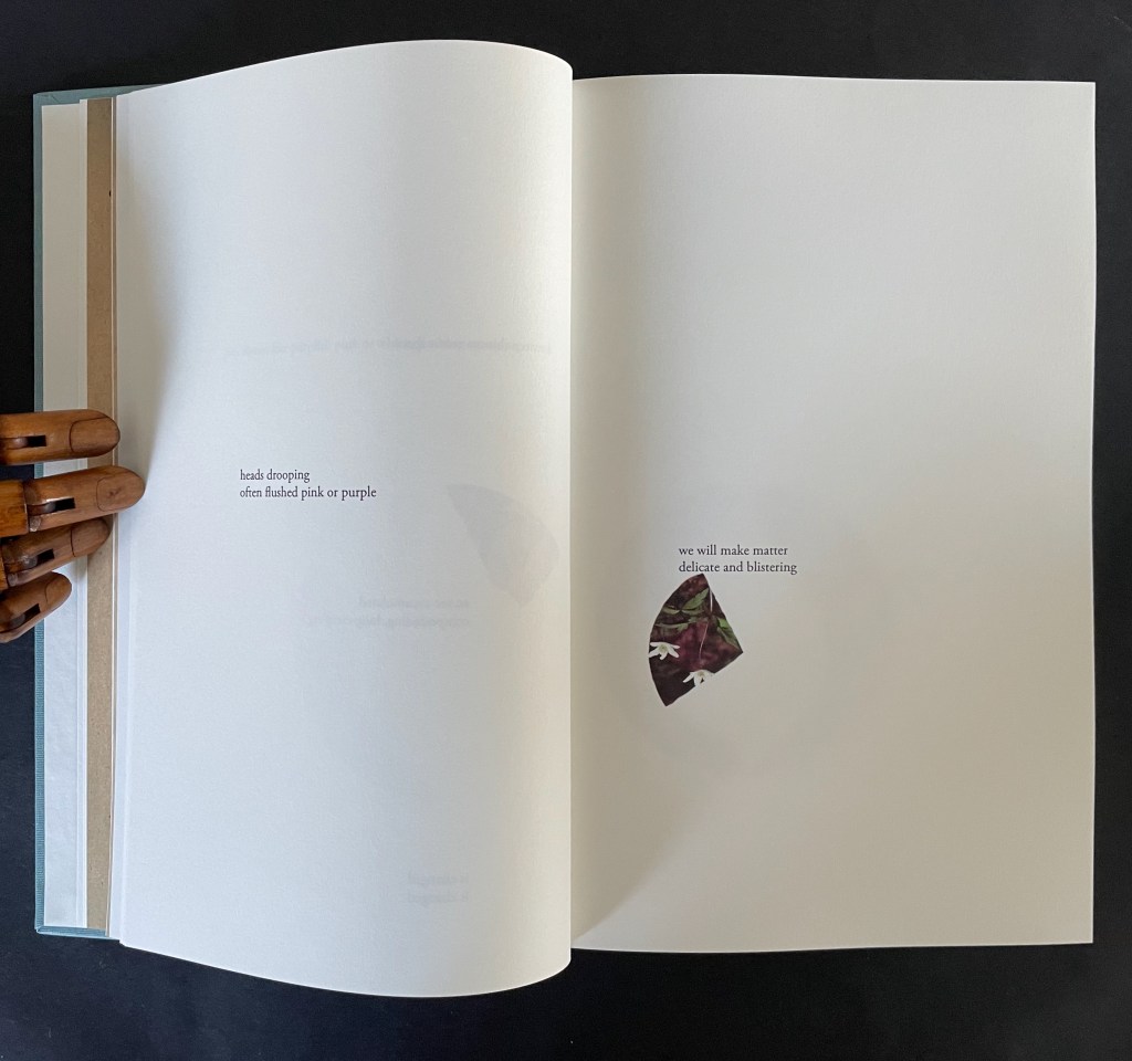
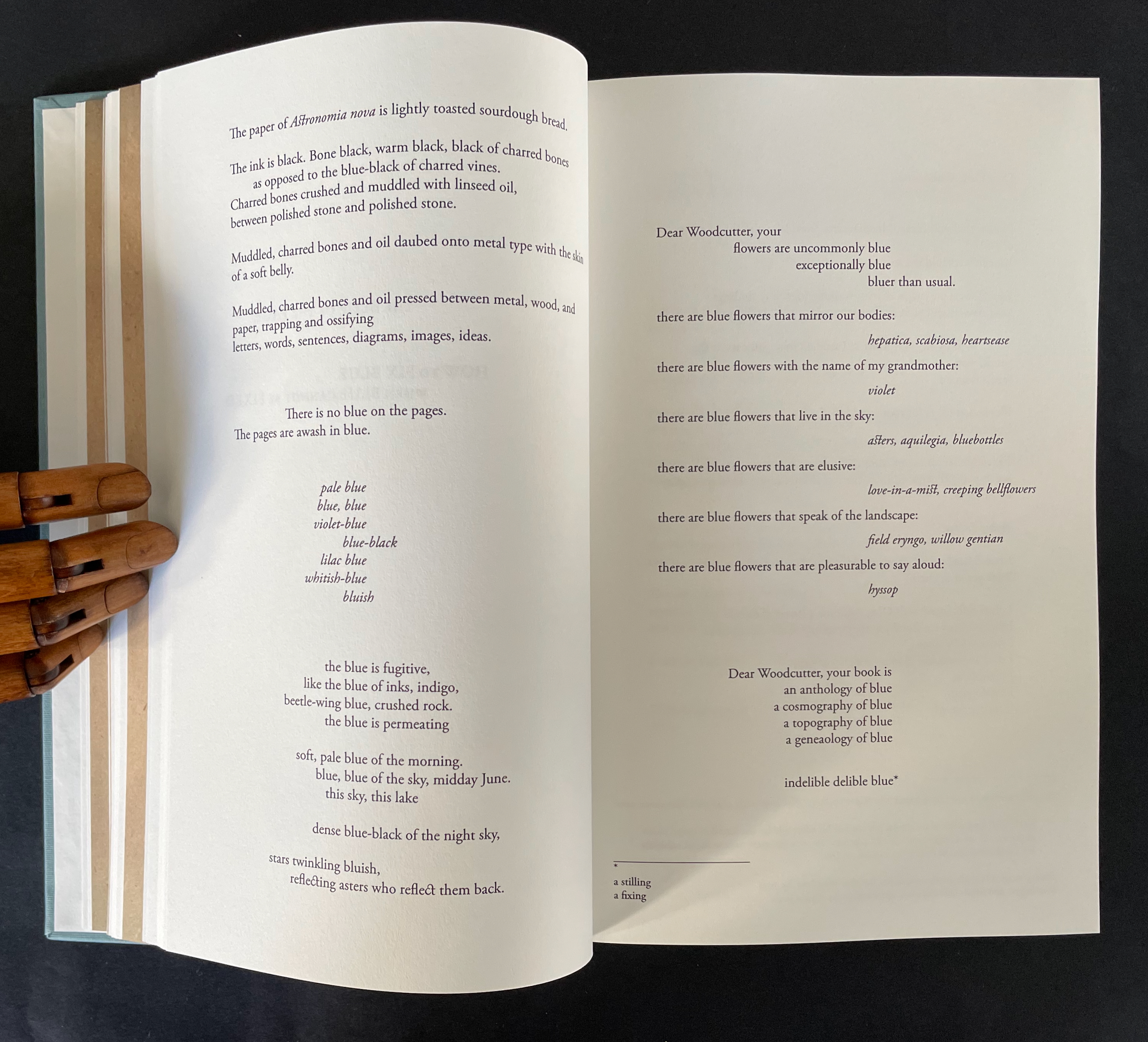
The poem addresses “Dear Dear Woodcutter”, the unknown artist who decorated Kepler’s orbital diagrams with flowers. Ancliffe’s observation of the flowers stands out when you consider that the still standard Collected Works (1938) omitted the flower images. Trying to identify the woodcutter, Ancliffe tracked down the sole reference to his existence and even visited William Donahue, Astronomia Nova‘s translator, in New Mexico to discuss the mystery. More impressively, she identified the woodcut flowers, their scientific names, and various common names, and their local habitats in and around Prague. From their unexplained presence, Ancliffe launches lyric observations on flowers (their colors, parts, and growth), astronomy, ink, paper, type, woodcutting, bookmaking, the idea of the book, and the interconnectedness of it all.
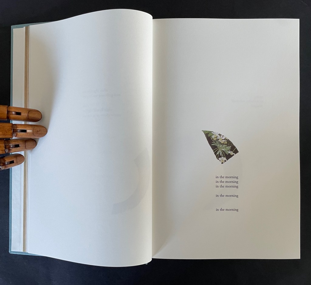
The book opens with Ancliffe’s first letter to “Dear Woodcutter”. It includes a facsimile double-page spread from Astronomia Nova , pages 28-29, showing where she first saw his woodcut flowers. From the start, Ancliffe signals how tightly woven she feels this autobiographical, biographical, bibliographical artist’s book will be. Instead of being numbered 2 and 3, her pages leading to the facsimile spread are numbered 26 and 27. So, at that moment of turning from “page 27” to page 28, the 21st century work strangely becomes part of the 17th century work as the book artist reaches back through time and craft. The letter’s tone blends fondness and fascination with matter-of-fact yet evocative observations about ink, printing methods, and the geology underlying lithography.
The intensity of her reaction to the woodcutter’s flowers and her absorption in her subject and craft translates into an affinity with the woodcutter that has Ancliffe addressing him in the present. This is poetic license and invention. In the act of addressing him, she is addressing us, her readers/viewers. If we are in any doubt of this, the second letter concludes with at a pitch that eliminates it and leaves us with a clear assertion of what she intends:
I see you. I see your book of flowers. I am seeing you. I am seeing you to others. I am seeing your book of flowers to others.
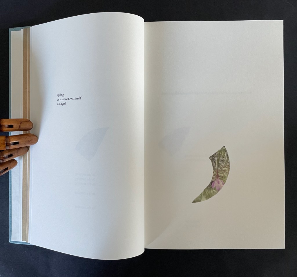
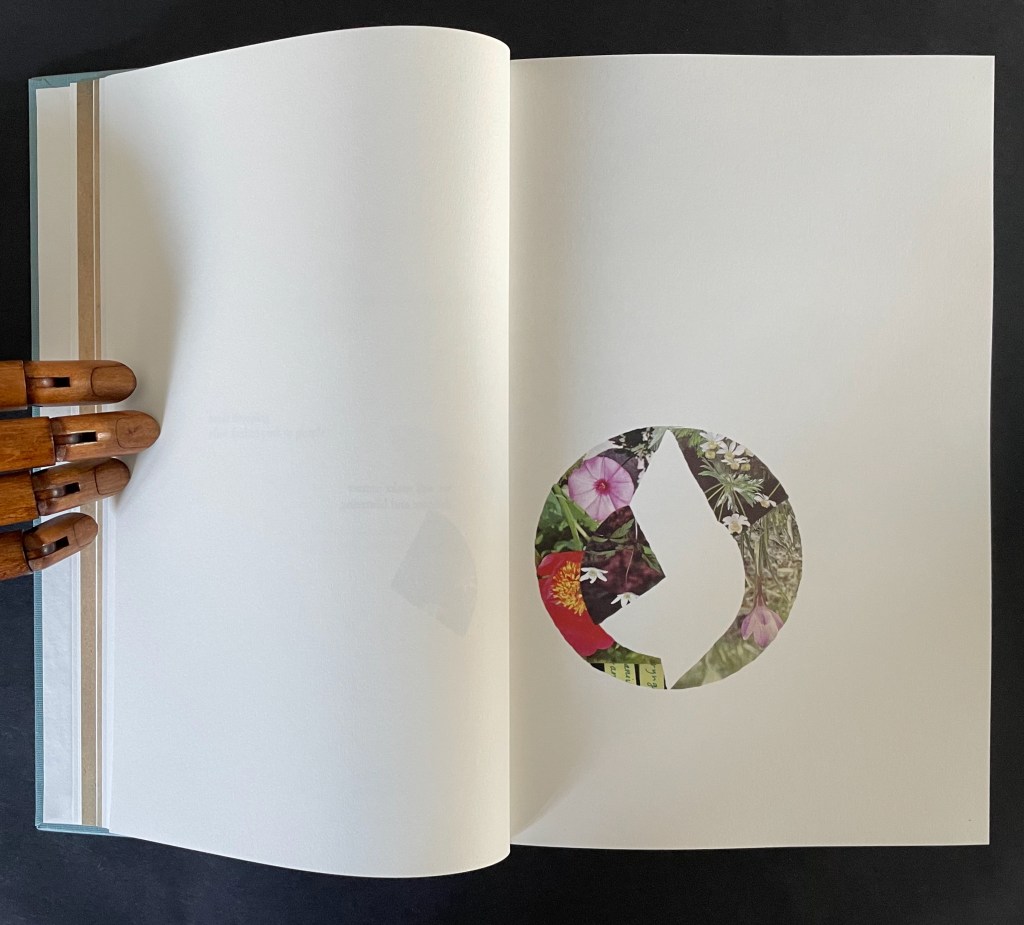
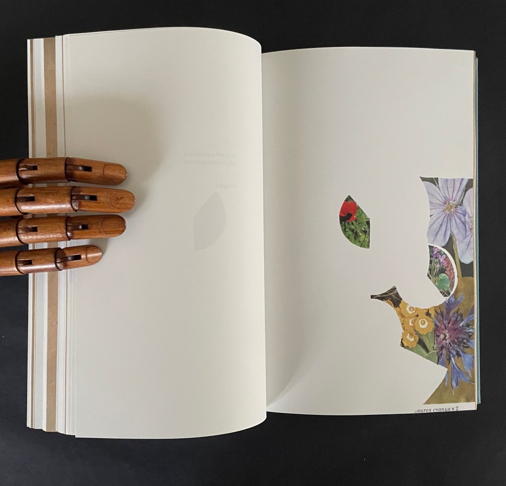
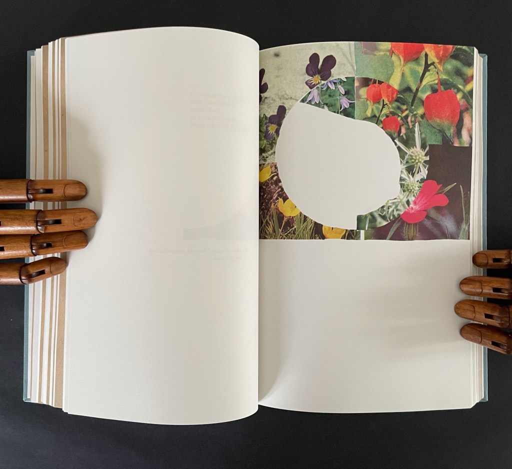
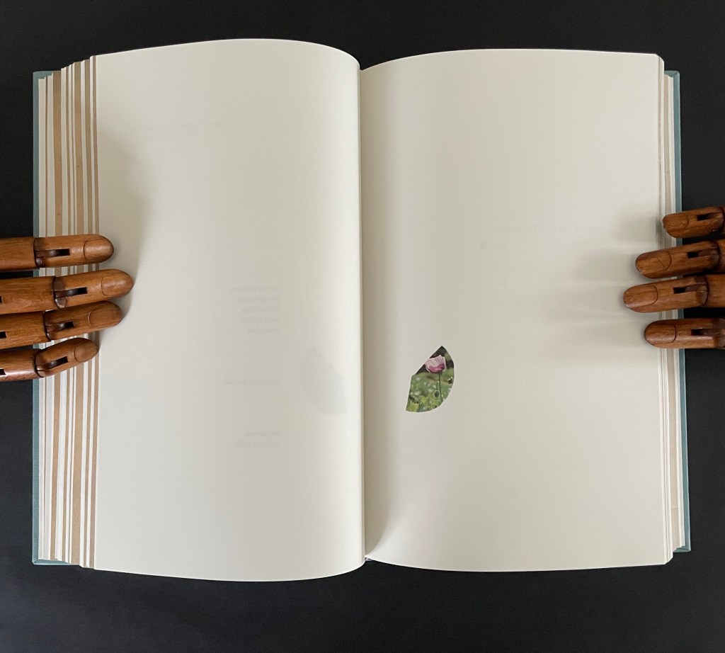
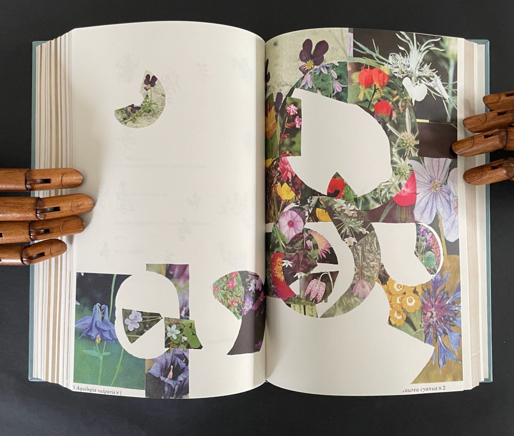
After this introductory section, Ancliffe lays out a recurrent marker of the book’s structure: a facsimile spread followed by a page reproducing a selection of woodcut flowers. There are twelve such markers.
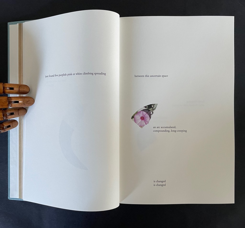
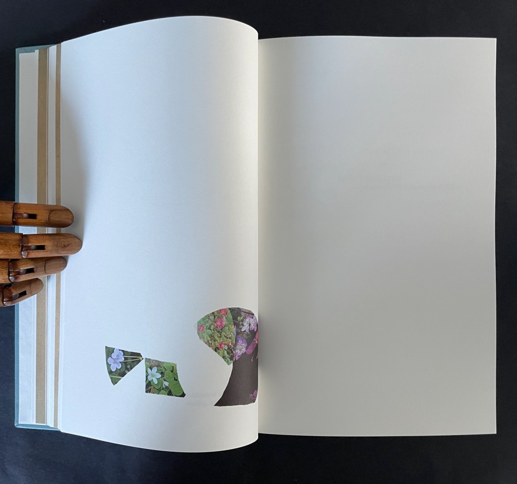
After each of them, the poem continues, accompanied by brightly colored jigsaw-like cutouts from photos of flowers Ancliffe has matched to the woodcuts. In each section, a jigsaw puzzle piece appears, then another and so on until the section ends with a page of accumulated pieces. Below is the section that follows the marker above. The accumulation (or gathering) page brings together the five preceding pieces.
There are 12 gathering pages, and they are all brought together in a closing double-page display.
Twelve “gathering pages”.
The closing accumulation page, a gathering of gathering pages.
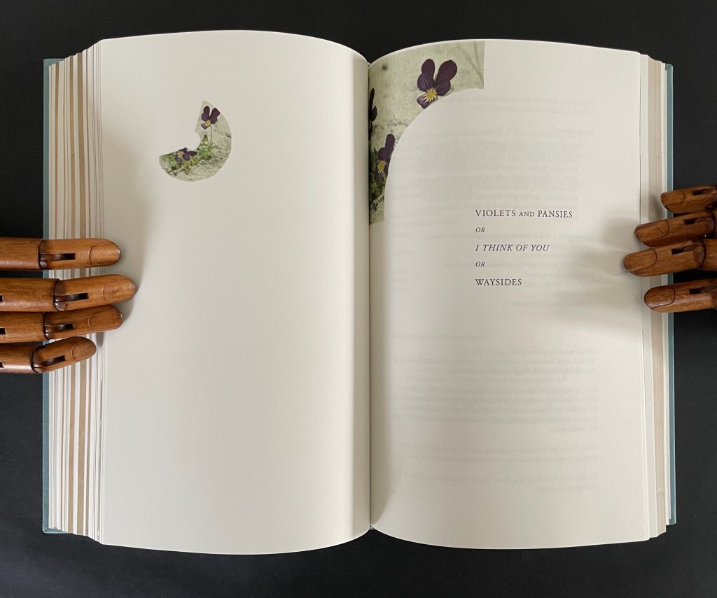
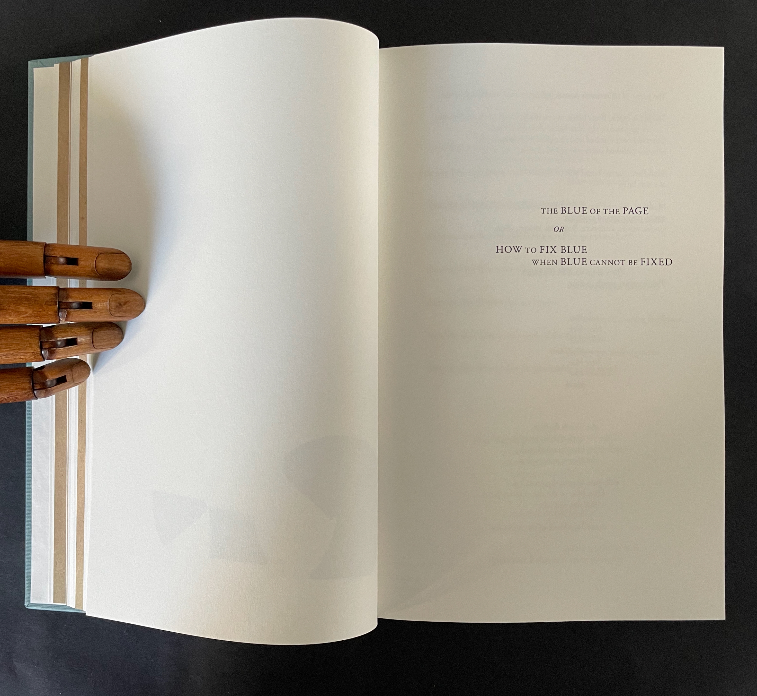
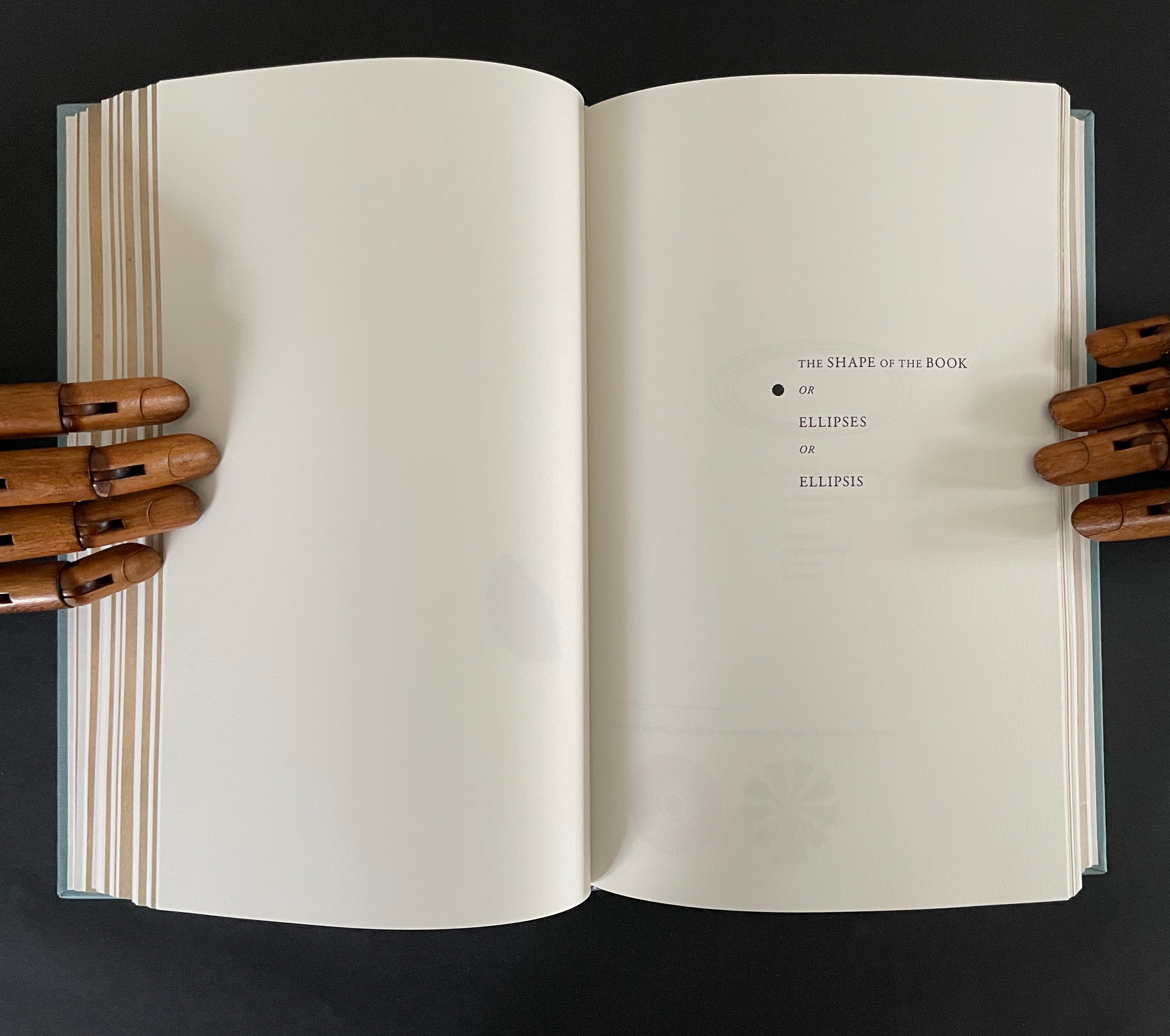
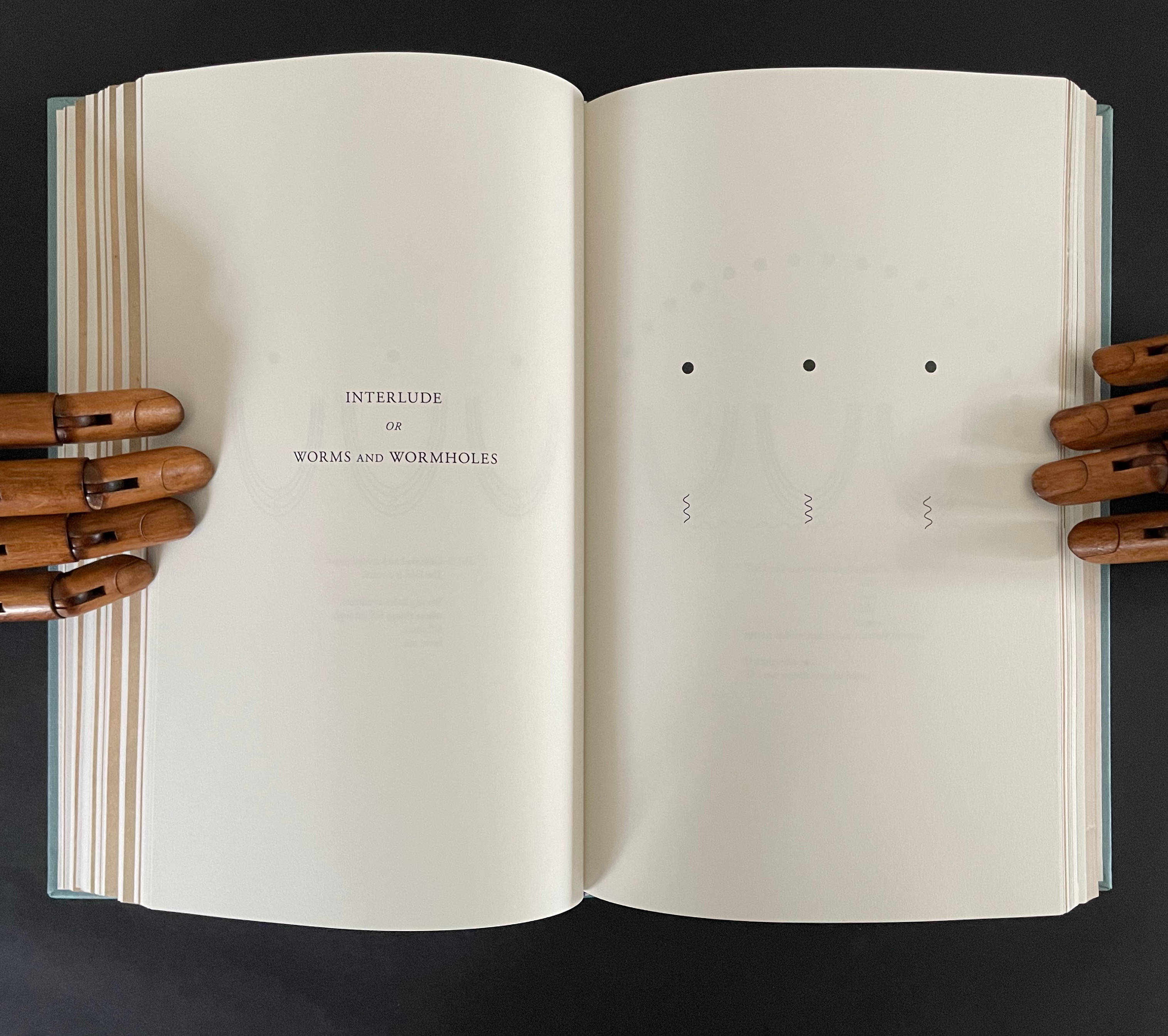
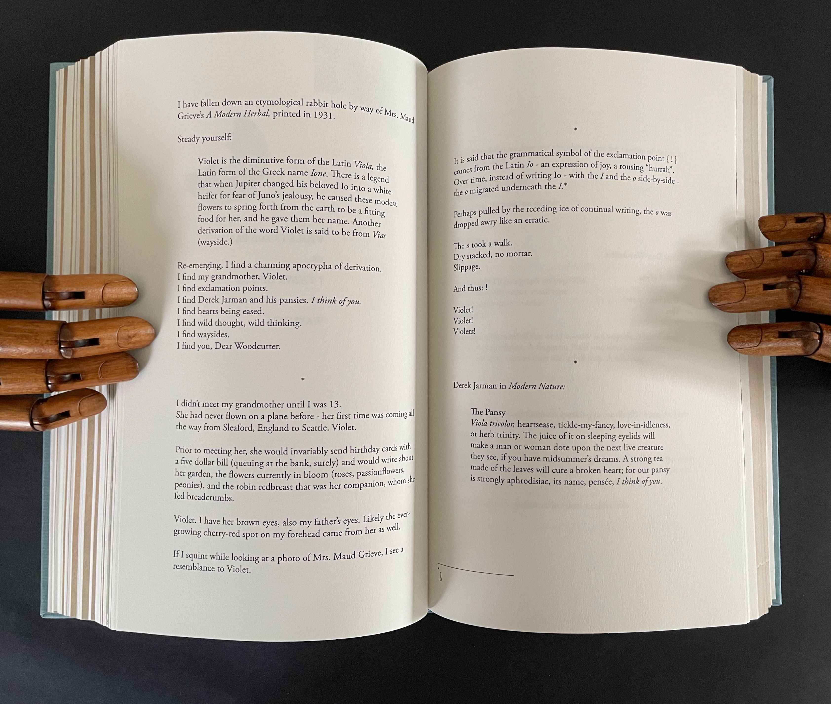
There are also four labelled subsections or interludes that appear out of the blue.
The first entitled “The Blue of the Page or How to fix Blue when Blue cannot be Fixed” addresses the color of the paper, ink, and flowers, what Ancliffe can see and cannot see but perceives (color of paper), knows (ink), imagines (flowers), metaphorizes, finds, and names.
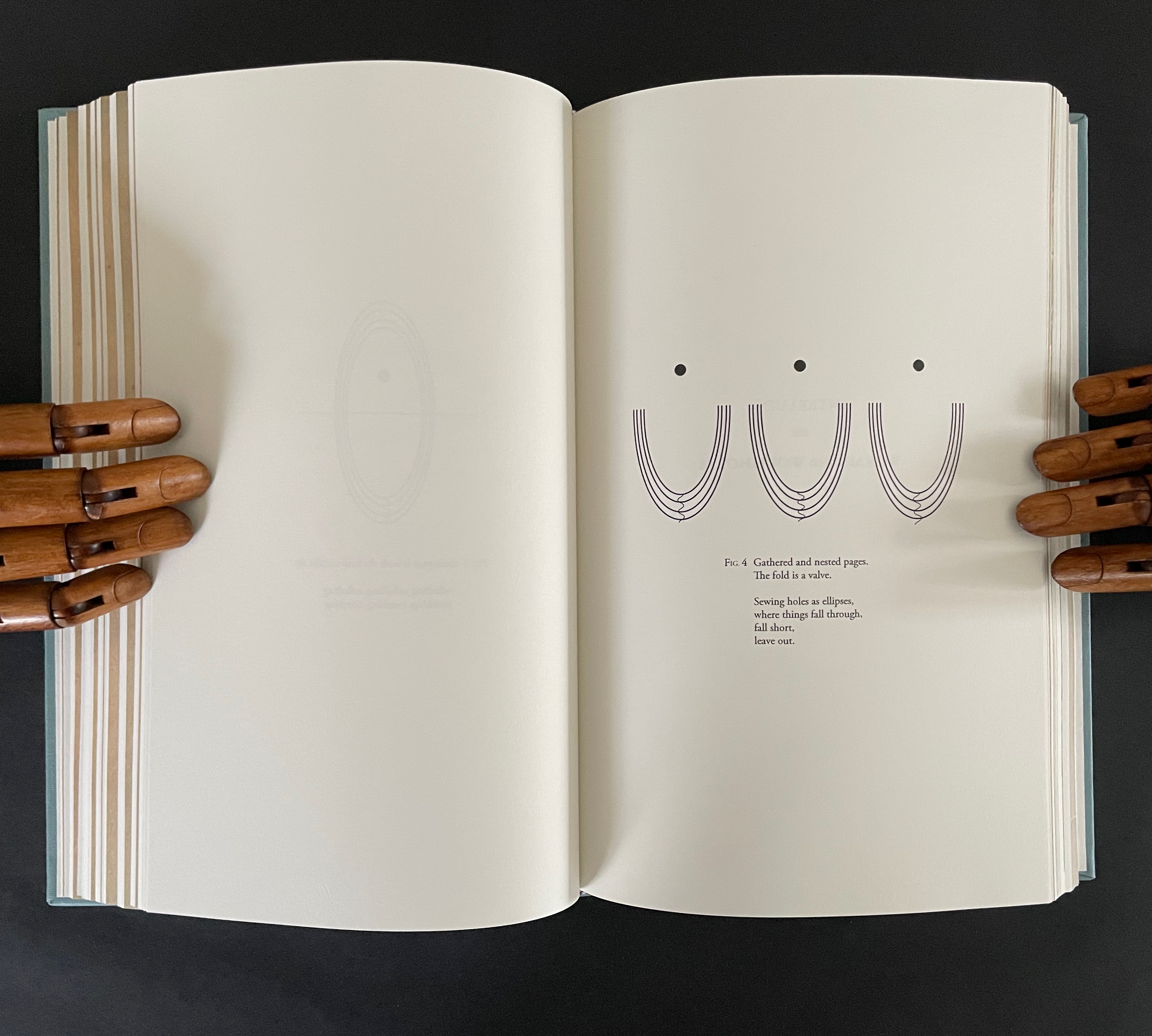
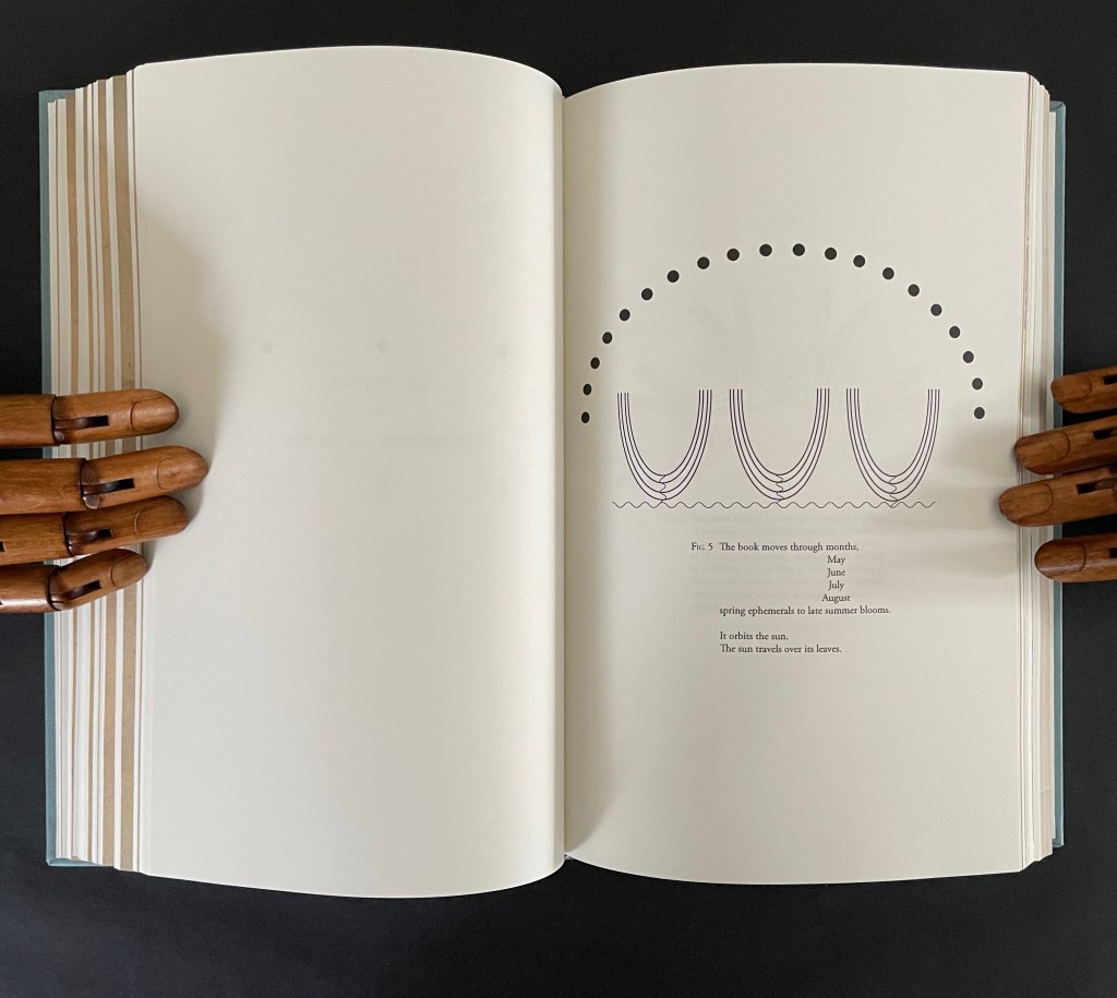
The second entitled “The Shape of the Book or Ellipses or Ellipsis” draws metaphorical, etymological, and visual links between books and orbits (ellipses) and sewing holes (ellipsis).
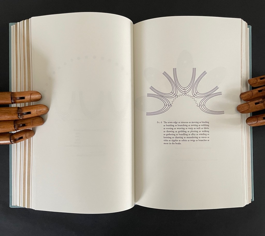
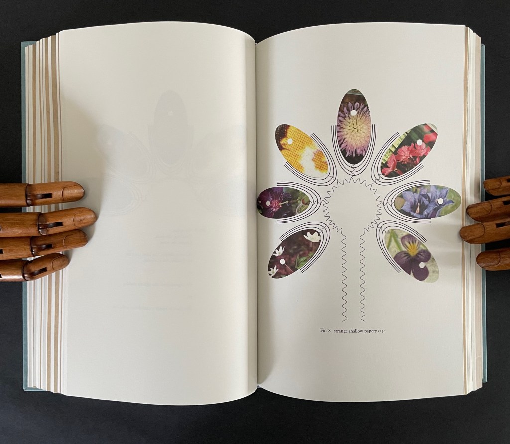
The third interlude “Interlude or Worms and Wormholes” develops an extended metaphor of the book’s sewn edge as a sinuous gathering together of nature, type production, planetary charts, and seasonal movements. It also makes another extended metaphor of the book spine as the most interconnected point of organization and confusion, the orbital point closest to the sun, and the shapes of a shallow papery cup, sewn folds, and flowers.
The fourth interlude is “Violets and Pansies or I Think of You or Waysides” plays on Paul Klee’s observation that “A line is a dot that went for a walk”. In Ancliffe’s case the line begins with the dot of the etymology of “violet” that leads both to the Jupiter/Io myth and Ancliffe’s grandmother’s name, that links Io to the origin of the exclamation point, which Ancliffe appends to grandmother Violet and the flowers, that jumps to Derek Jarman’s etymological linking of the common names violet/pansy/heart’s ease to the French “pensée” and thus to “I think of you”, that leads to wild pensée (wild thought), which leads back to the dubious etymology of via leading to violet and thereby “wayside”, which leads to thinking of you (woodcutter) and the flowers found by the waysides.
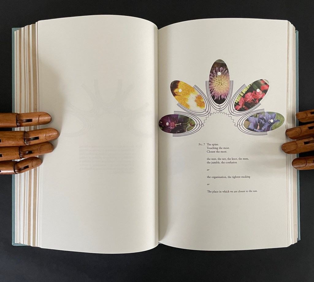
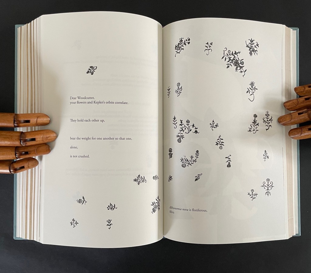
What links these subsections is their use of the elements of book production to support Ancliffe’s theme of interconnectedness. At the start of the book, she wonders whether the purpose of the woodcut flowers is that of bearing type, an insertion to prevent the weight of the press from breaking the finer woodcut lines of the orbits. Now, as the final gathering of gatherings approaches, she returns to that notion. Notice below how the layout of text and flowers on the left and the layout of the collage on the right mimic one another, which echoes Ancliffe’s observation
your flowers and Kepler’s orbits correlate.
They hold each other up,
bear the weight for one another so that one,
alone,
is not crushed.
But for Ancliffe, a mutual bearing up is not the whole story of the interconnectedness she is pursuing in Astronomia Nova Florilegia or A Strange Shallow Papery Cup or .888 inch. For her, interconnectedness (correlation) is historical, metaphorical, etymological, rhetorical, seasonal, geographical, typographical, material, and personal. She sees in the woodcutter’s Prague flowers a florilegium (“you hid a book within a book!”) and a purpose — “I am seeing your book of flowers to others” — for which she chooses the medium of the artist’s book. Because this medium is so frequently recursive or self-reflexive, it is well-suited to a book hidden within a book. Like a planetary system, an artist’s book often has multiple orbits and multiple points of orbit. As noted in the interludes, any element of “the book” and its production can play a role — punctuation, words and wordplay, ink and its color, type and typesetting, images and carving, paper, sewing holes, thread, and so on.
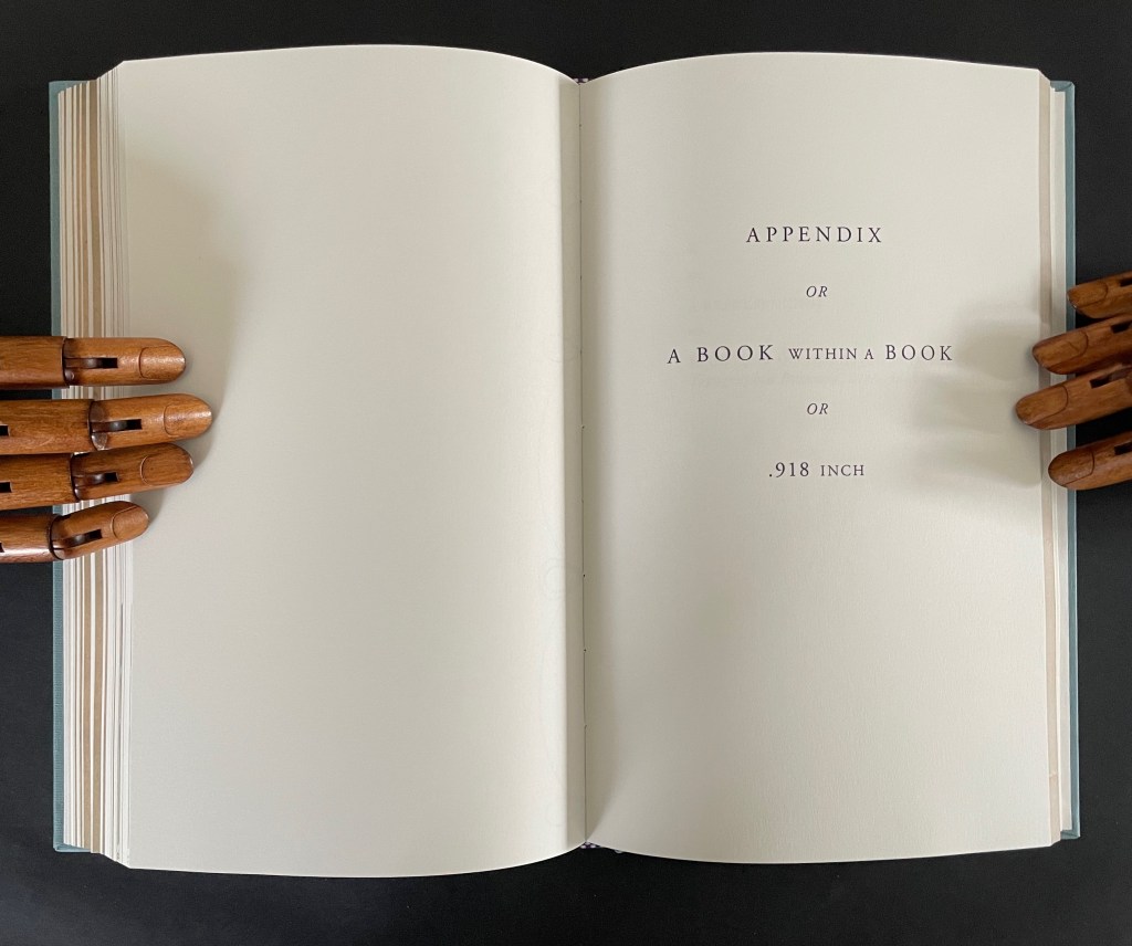
In a final honor to Dear Woodcutter and personalizing capstone, Ancliffe adds two appendixes: “the first, Appendix or A Book within a Book or .918 inch”, and the second, “K or a Represencing or Studying an Engraving of Prague in Topographia Bohemiae, Moraviae et Silesiae, 1650″.
In the first appendix, Ancliffe introduces the map of Prague, familiar from the two earlier artist’s books and then points us to K, the Jewish quarter, by filling it with a thumbnail flower. This is her book within a book: 37 flowers laid within the Jewish quarter of Prague 1650. Their color re-presences the absence surrounding the K in the map.
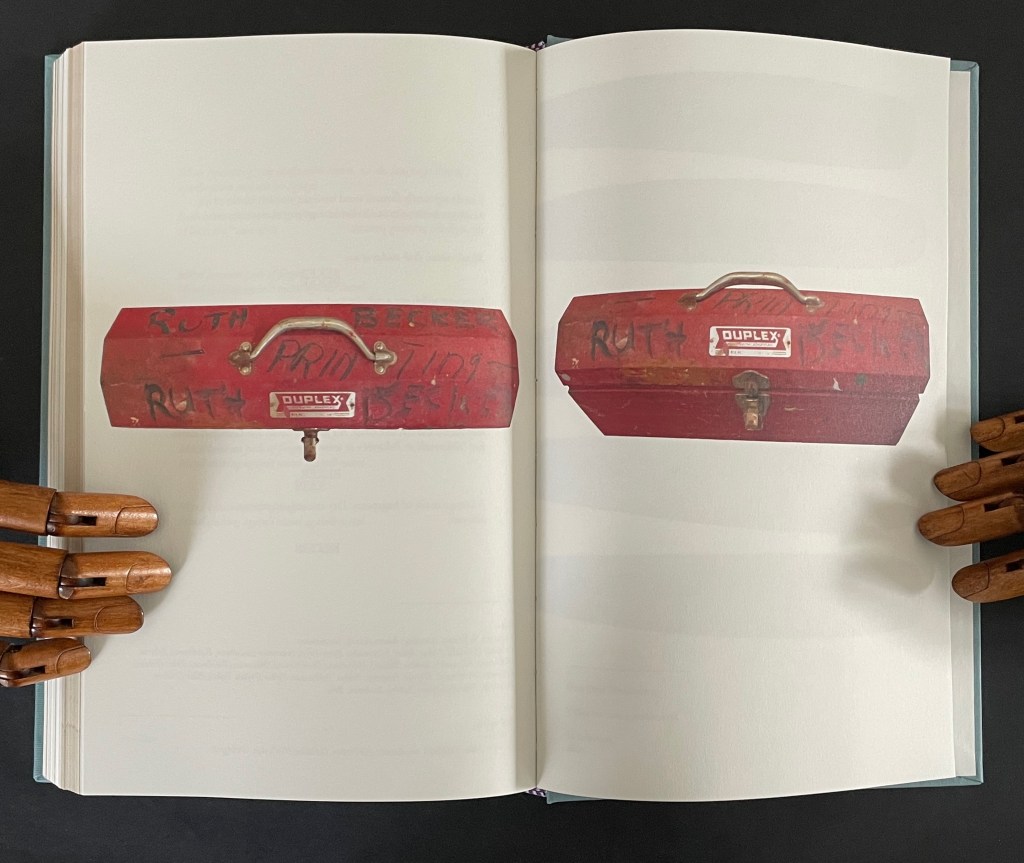
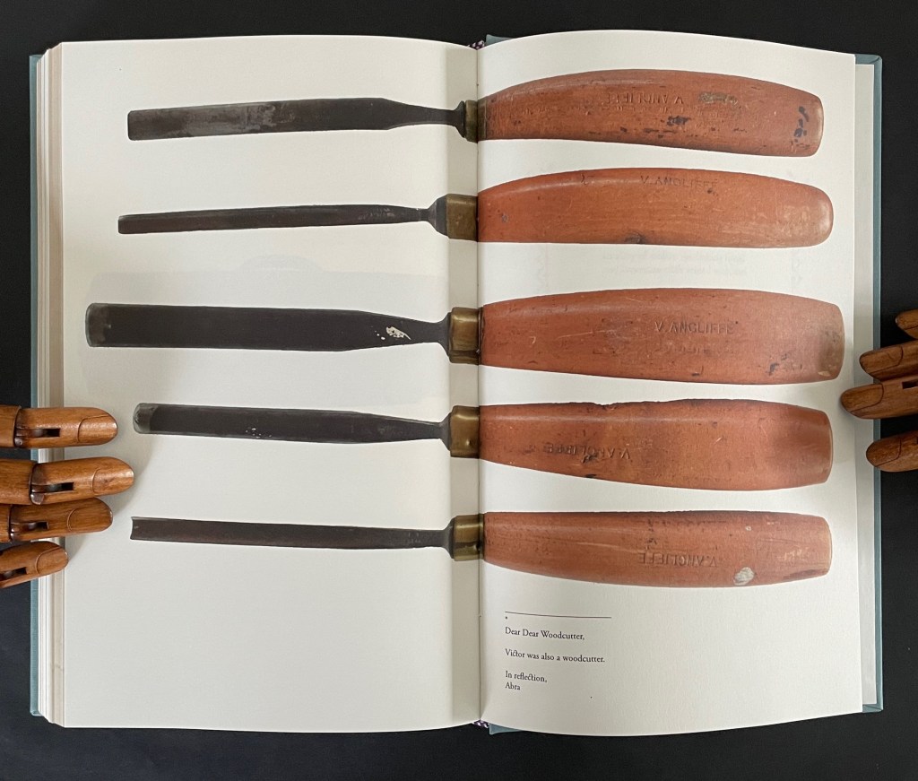
In the second appendix, Ancliffe begins with the materiality of type and setting it — how it’s made, how it feels, what it looks like — in particular for the letter K and her maternal grandmother’s married last name set in type. Again, it is an element of the book that provides the metaphor that pulls “what connects” into the orbit of Ancliffe’s artist’s book. Absence evokes presence; presence evokes absence. The absence around the carved upside down and reversed metallic strokes defines K as much as does the ink transferred from them. Likewise the presence of her grandfather Victor’s and grandmother Ruth’s metal and messy tools evokes their absence, and it is their impression on the artist that defines their presence in her,
which brings us to the autobiographical closing statement framed by Dear Woodcutter’s flowers.
Abra Ancliffe has created a body of works that, as Brian Davis puts it, “not only exploit the material and expressive possibilities of the book as object, they function as physical sites for compiling and organizing heterogeneous collections of textual artifacts for narrative and other expressive purposes”. As aesthetic objects, they demand more than a glance in an exhibition or flick-through at a book fair. They richly repay the greater attention.
Further Reading
“J. J. Abrams & Doug Dorst“. 12 December 2024. Books On Books Collection. Another example of what Davis calls a “book-archive”.
“Helen M. Brunner“. 15 April 2026. Books On Books Collection. Further example of the “book -rchive” artist’s book.
“Gracia Haby & Louise Jennison“. 28 May 2026. Books On Books Collection. Intensely colorful artists’ books exemplifying the notion of “book-archives”.
“Michael Hampton“. 8 May 2026. Books On Books Collection. Hampton’s notion of parabibliography has an affinity with Brian Davis’ notion of archival poetics. In particular, see 410/411 (2025.
Davis, Brian. 1 May 2024. “Part One: The Rise of Multimodal Book-Archives“. Book Art Theory. Starkville, MS: College Book Arts Association. Explores “archival poetics”, finding art by harvesting archives and libraries.
Gracia Haby and Louise Jennison are exuberant archival eco-artists whose palette embraces the digital collections of the Metropolitan Museum of Art, New York Public Library, Rijksmuseum, State Library of New South Wales, State Library Victoria, and more. Their preferred media are paper, the artist’s book, and installations; their preferred technique, collage.
Dip and Bob (2021)
Dip and Bob (2021) Gracia Haby & Louise Jennison Casebound, softcover with five-panel irregular trim wraparound card. H149 x W110 mm. [72] pages. Edition of 50. Acquired from the artists, 21 February 2026. Photos: Books On Books Collection.
Like other works in the collection, Dip and Bob (2021) teases connections between the media of watercolor, artist’s book, performance, and installation. The cover is an original watercolor cover on Fabriano Artistico 300 gsm paper.
The 72 pages of prints on Impact 100% Recycled Uncoated 150gsm derives from a 620 cm long digital collage. Created for the 2021 NGV Melbourne Art Book Fair, its performance element was twofold. First, as the artists explain, the collage was made “in place of a swim”, the local pool being too busy. Second, toward the end of the making, several copies were bound live before the Book Fair attendees. Its installation element, however, is the greatest tease. There is and was no installation of the 620 cm long collage work. It rests in your hands, and you experience it by turning the pages, then turning them back, then turning them forward — like laps in the pool. Or if you happen to photograph the double-page spreads, you can jump out of the pool and look down on them joined end to end.
Their introduction, however, will lure you back into the collage, which is
Underwater, kind of. Yes. Dive in.
Don’t forget to hold your breath. …
Search the collection. Sift the collection. “Water”, Return key.
Invert a forest. A daguerreotype of poplars stretching across the plate could be bands of seaweed. …
A crab from a trade card. Not for the skillet. Zoom in, Moonfish.
The Young Saint John the Baptist hair tendrils ca. 1480–82, repurposed. Papyrus fragment with lines from Homer’s Odyssey, ca. 285–250 B.C., for kelp bands.
Haby and Jennison wear their eco-hearts on their sleeves and admit, or rather assert, “For us, above all, it is not the medium that is always of greatest import, but the message”, which is
Our only chance of a healthy, safe, joyous, and sustainable future is to return to being reciprocal with nature so nature can continue to look after us.
Stand up and fight for the oceans and the waterways.
And yet it is their long-held breath as they create their underwater collage and your breath caught as you paddle forwards and backwards over fore edges and through the collection of human and natural art that will most hold you.
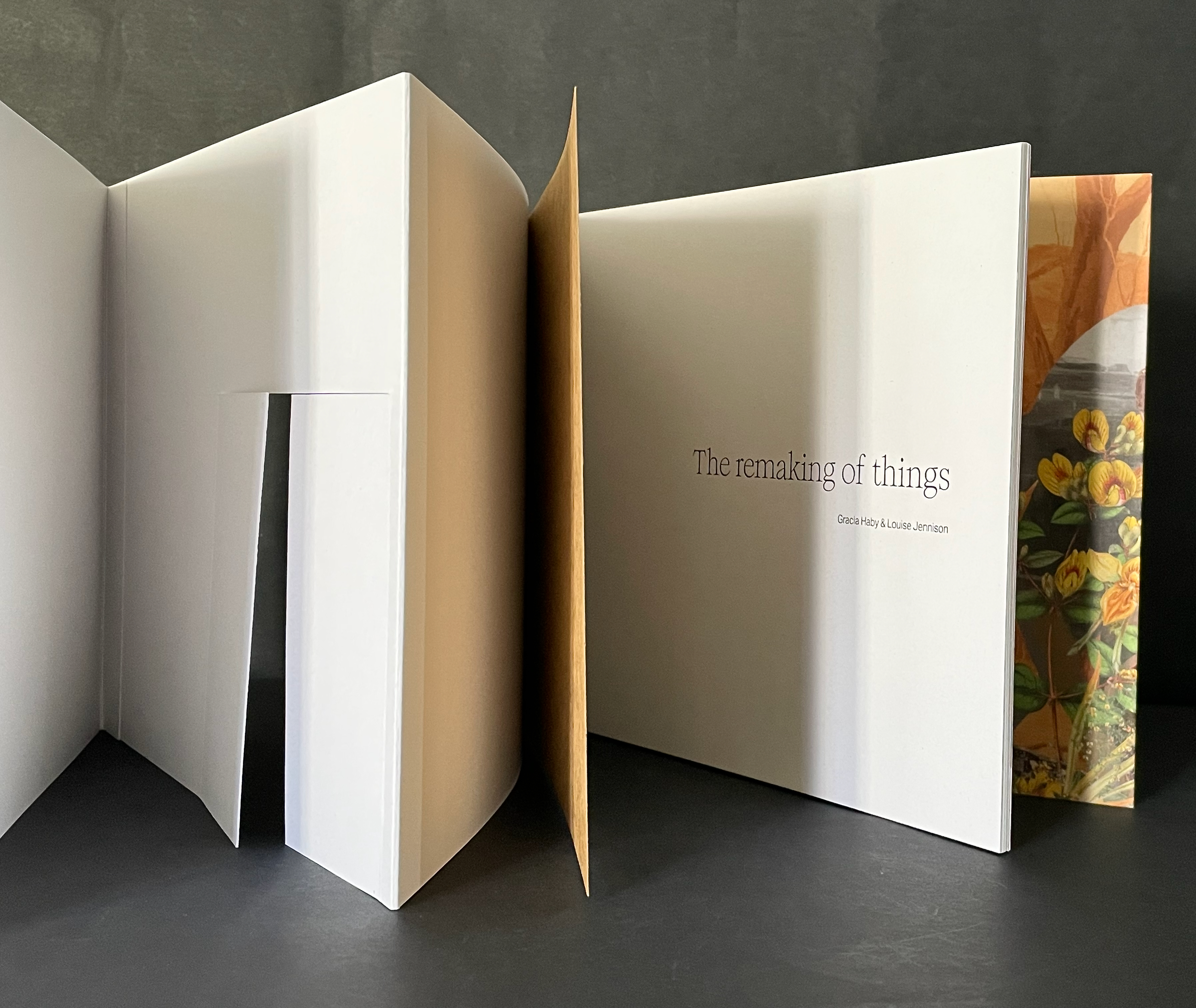
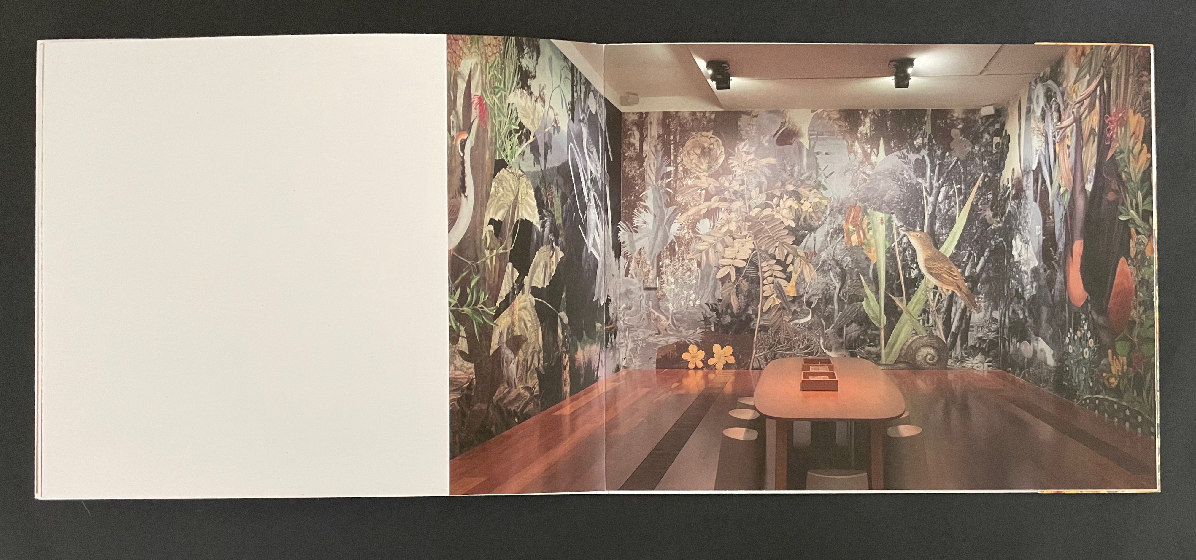
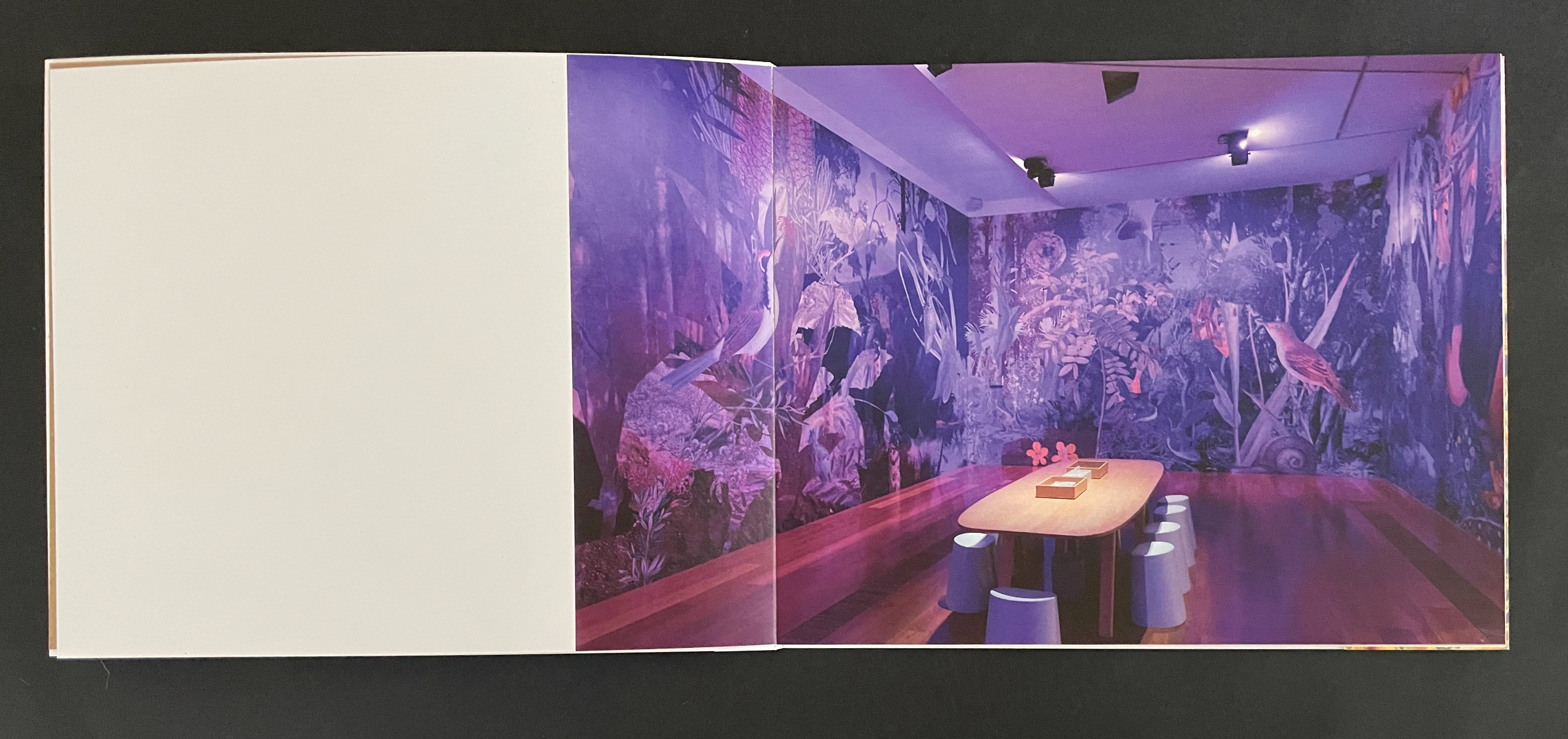
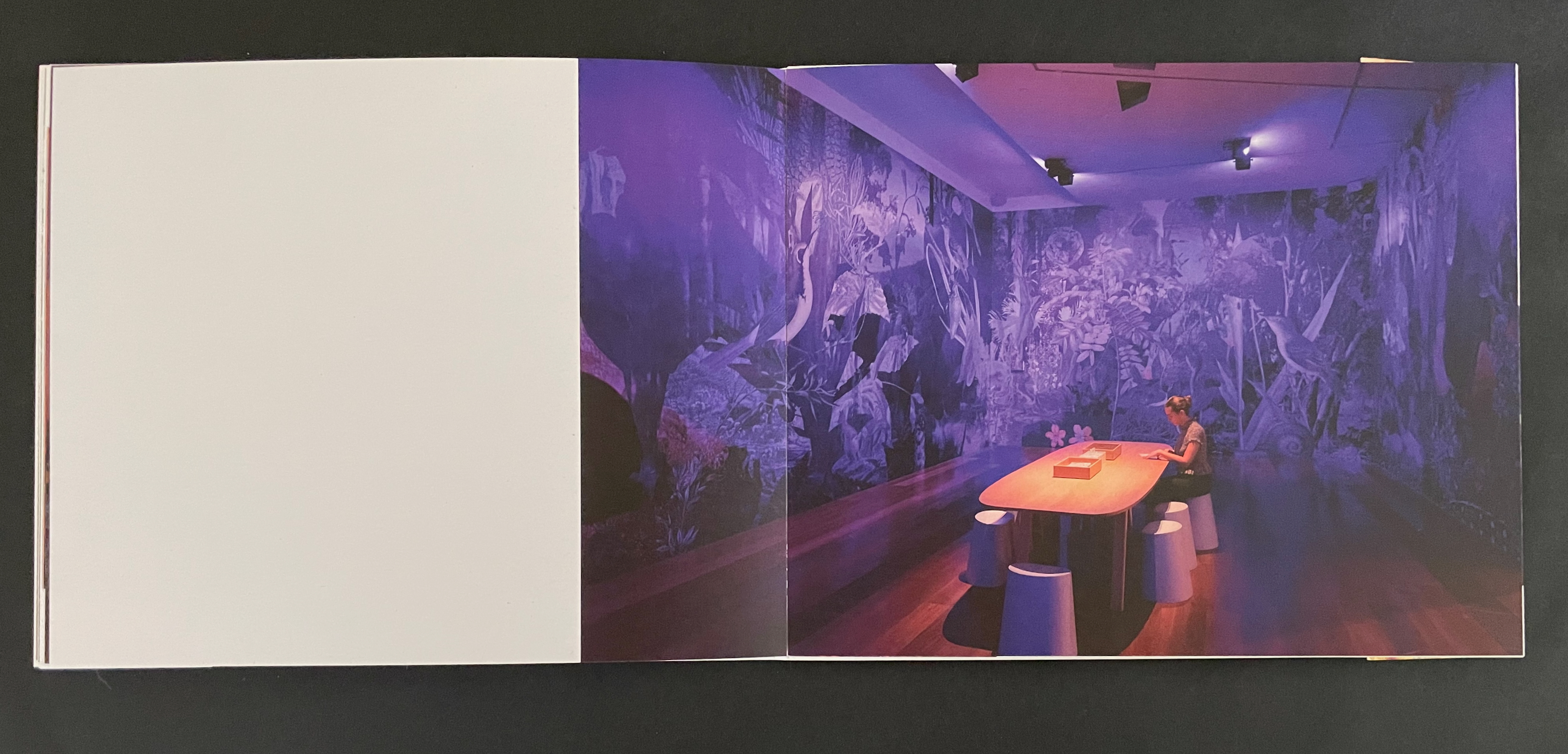
The Remaking of Things (2023)
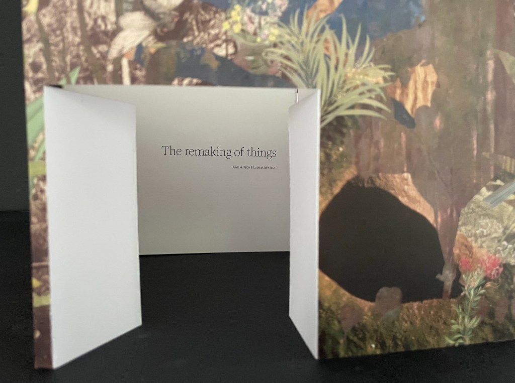
The Remaking of Things (2023) Gracia Haby & Louise Jennison Folded container with tab-and-slot closure, holding belly-band-secured front cover fold out, part of card cover casing a perfect bound book. Container: H186 x W228 x D15 mm. Book: H180 x W222 mm. [36] panels. Edition of 100, of which this is #25. Acquired from Vamp & Tramp, 21 May 2025. Photos: Books On Books Collection.
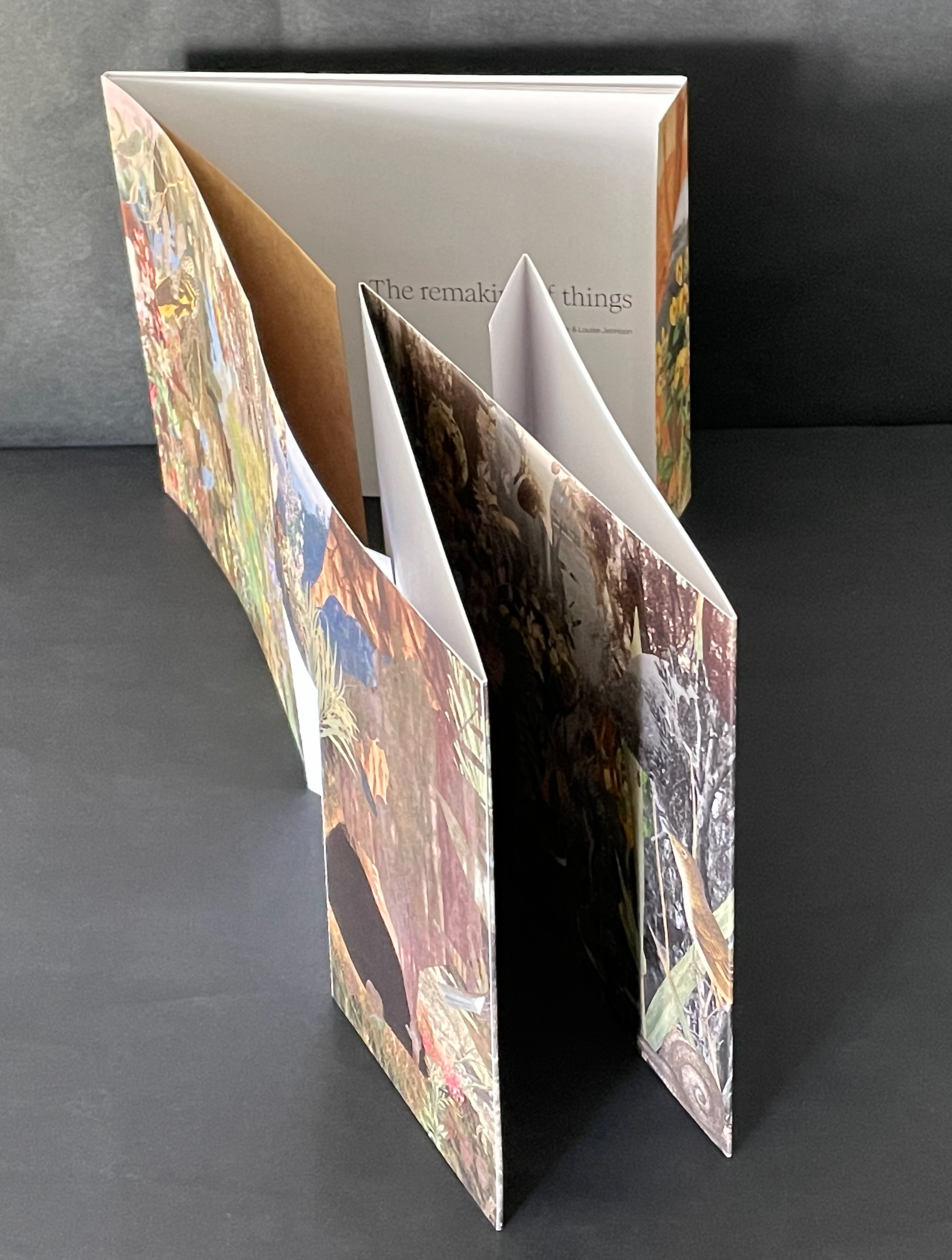
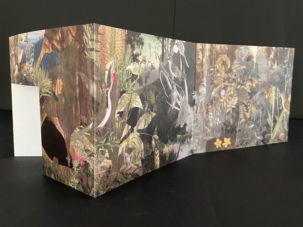
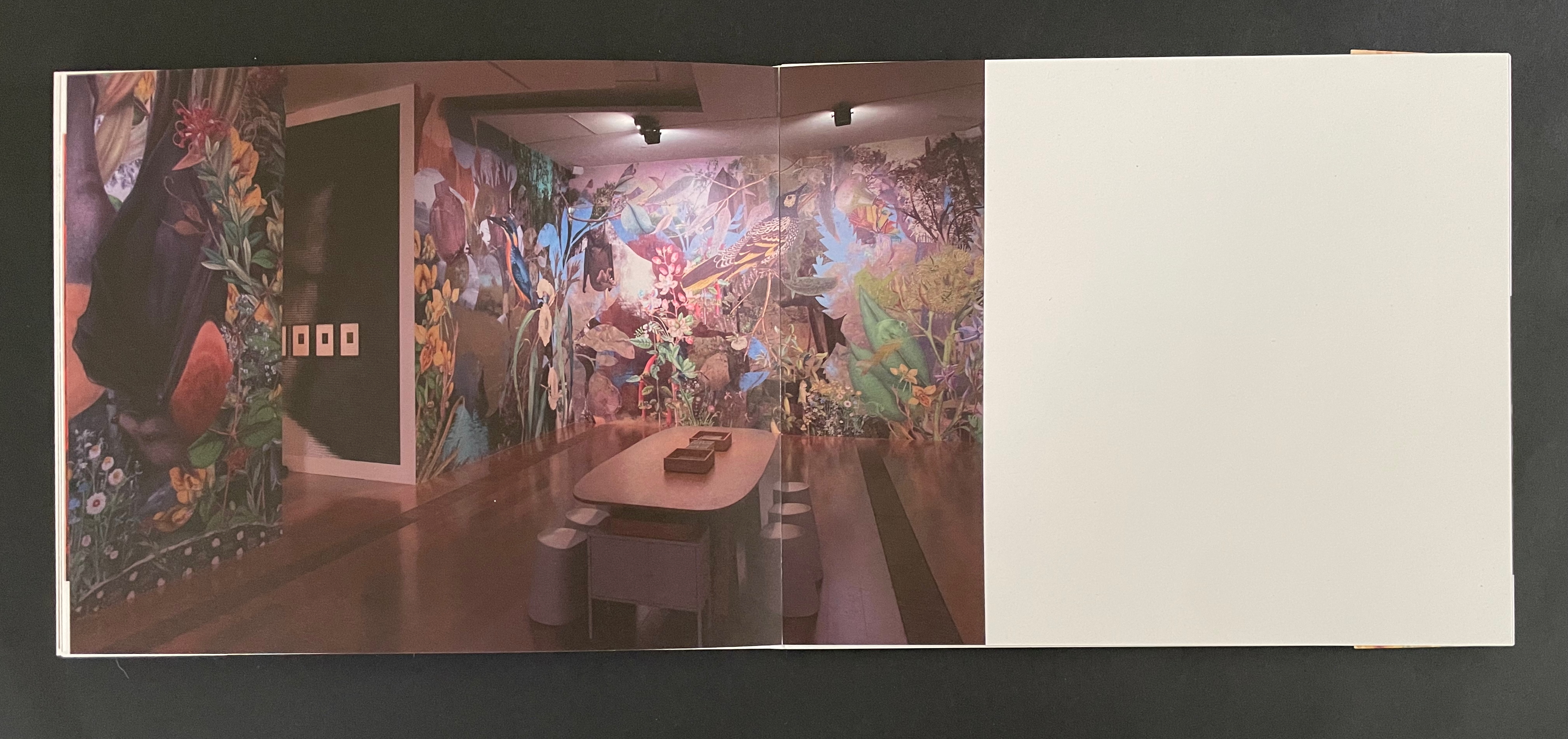
From 24 May through 20 August 2023, the Ian Potter Centre (NGV Australia) held hosted an installation of The Remaking of Things. This work produced for the exhibition comprises a silvery tab-and-slot folder, holding a casebound softcover artist’s book whose front cover opens into a desktop installation, making you wish for a sip of Alice’s “Drink me” potion or bite of the Caterpillar’s magic mushroom.
Tab-and-slot folder made of Silver Metalised Polyester satin paper 300 gsm, router cut, printed on a swissQprint inkjet printer. Image from Nicholas Caire‘s Fairy scene at the Landslip, Black’s Spur (c. 1878)
Although the work continues their archival poetics, drawing on “100 individual pieces in the NGV collection, spanning painting and photography by way of ceramics and silverware, textiles and works on paper”, it has its origin in Haby & Jennison’s restored eucalyptus forest habitat for the Grey-heading flying fox, the animal featured on the “wall” that serves for the front cover.
Front cover with and without belly band.
As the front cover unfolds, a double door appears, cut into one of the other walls. “Walking” to the right around the walls, you see the images that, enlarged, occupied the exhibition walls in Melbourne.
Within the exhibition rooms, a 24-minute for 24 hours sound track played as the lighting changed. Within the book, photographs of the exhibition rooms provide a sense of the visual experience and its scale.
The images within the book are likely to send you back to the images on your desktop installation. There, it is much easier to register James Sowerby‘s etching Tetratheca juncea (1793), John Lewin’s Warty-face Honey-sucker (1822), Richard Bunbury‘s Green native fuchsia (1844), Anne Paulson’s Sketches of Victorian bush flowers (c. 1861), Fanny Anne Charsley‘s The Wildflowers of Melbourne (1867), Eugene von Guérard‘s Ferntree gully (1867), Tom Humphrey‘s Summer walk (c. 1888), F.E. Striezel‘s Kookaburra carving (1915), A. Shelden‘s Possum and banksia (1920s), E.G. Adamson‘s Snow coral (1930s-40s), Grace Cossington Smith’s Bottlebrushes (1935), NASA’s Lunar Crater (1969), and the dozens of others listed in the center of the book that can be found on the NGV website. As Haby & Jennison indicate in the work, they “invite you to enter the pages of the book in a similar spirit as you would the gallery”. Across time, etchings, paintings, carvings, inkwells, snuff boxes, glass plate negatives, digital photographs and a host of other artefacts, they create a complex habitat of interconnectedness of art and species.
Given that aim, it is surprising that the fold-out cover is constructed for viewing around rather than within. Double-sided printing of the cover might have done the trick and offered an additional opportunity to show the change of lighting.
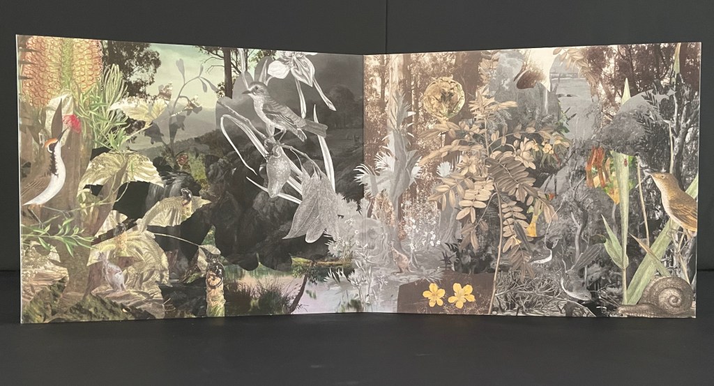
Looking for Green, Remaining Hopeful (2024)
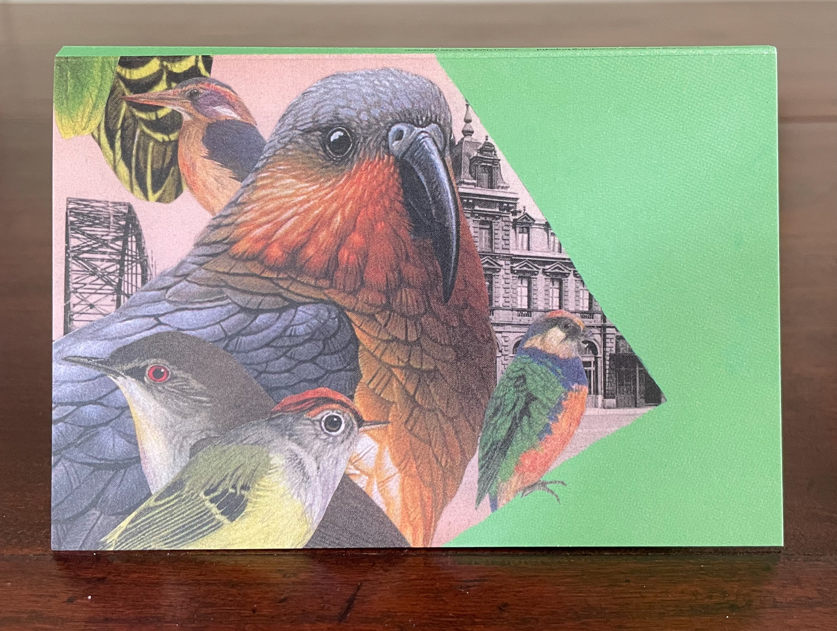
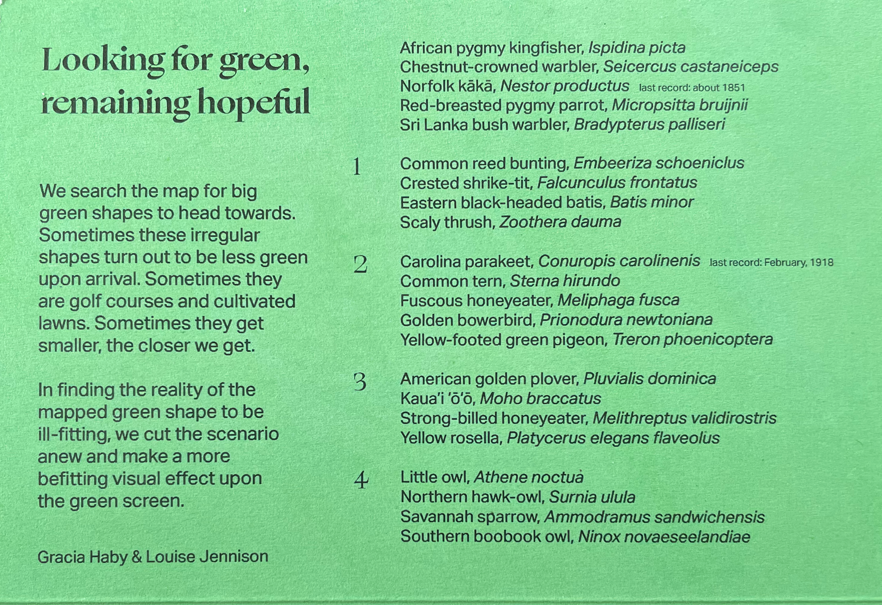
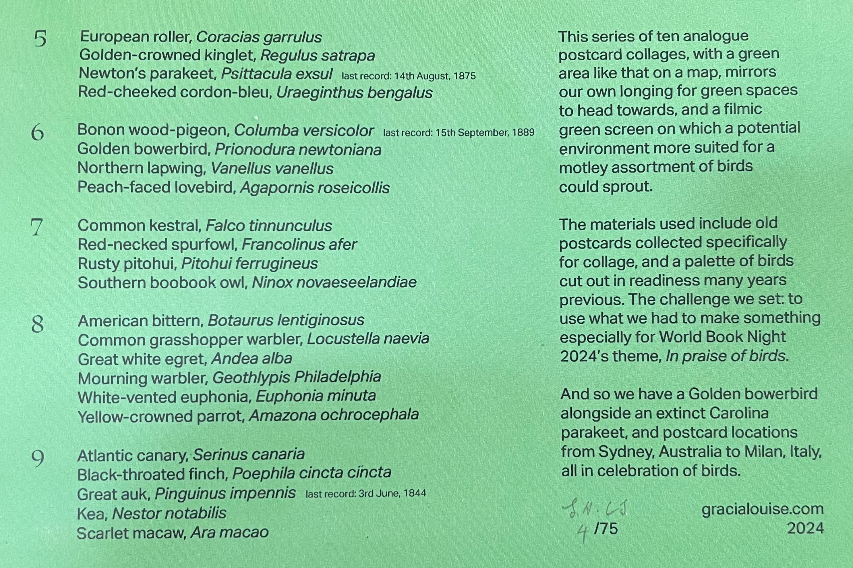
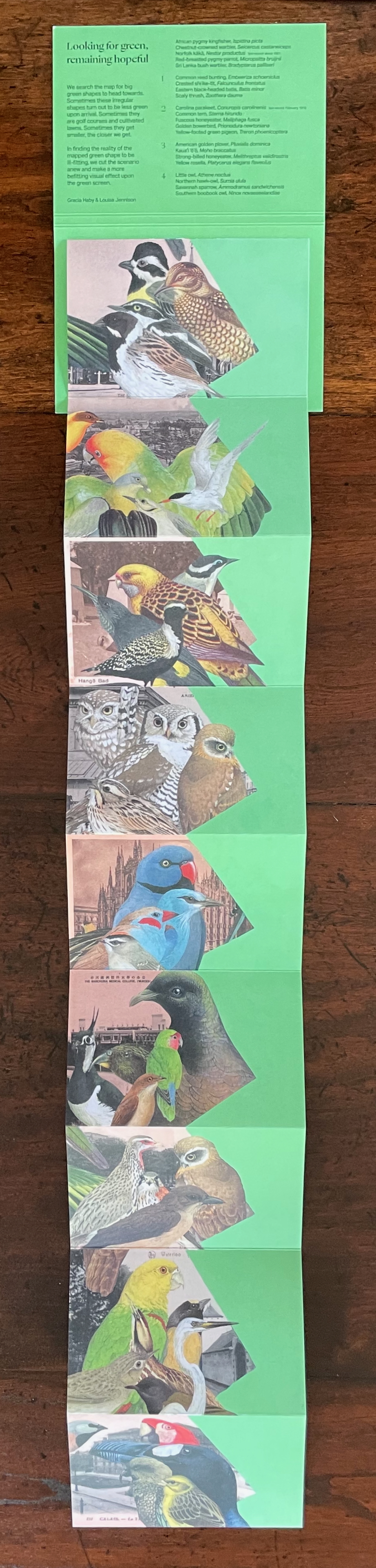
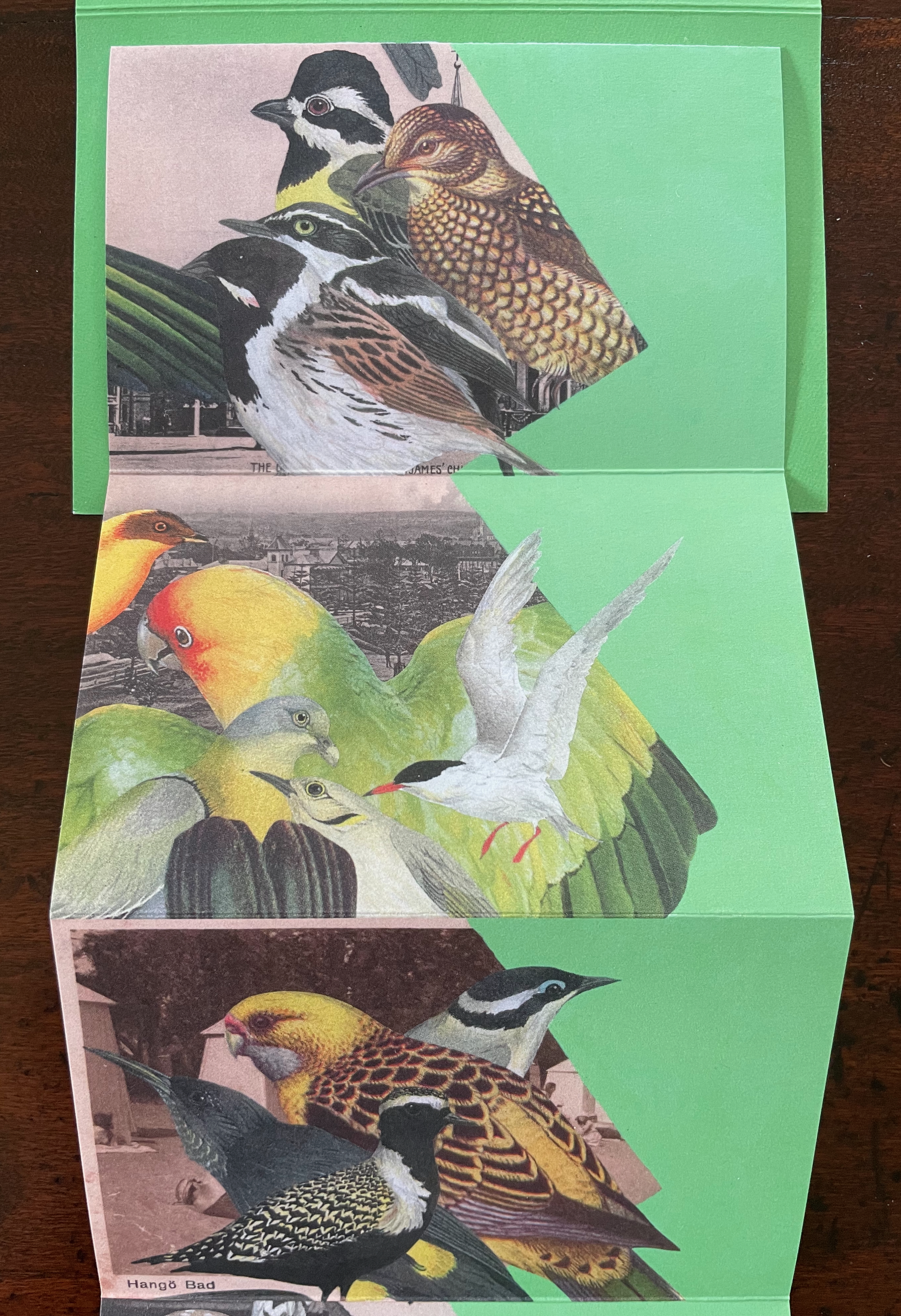
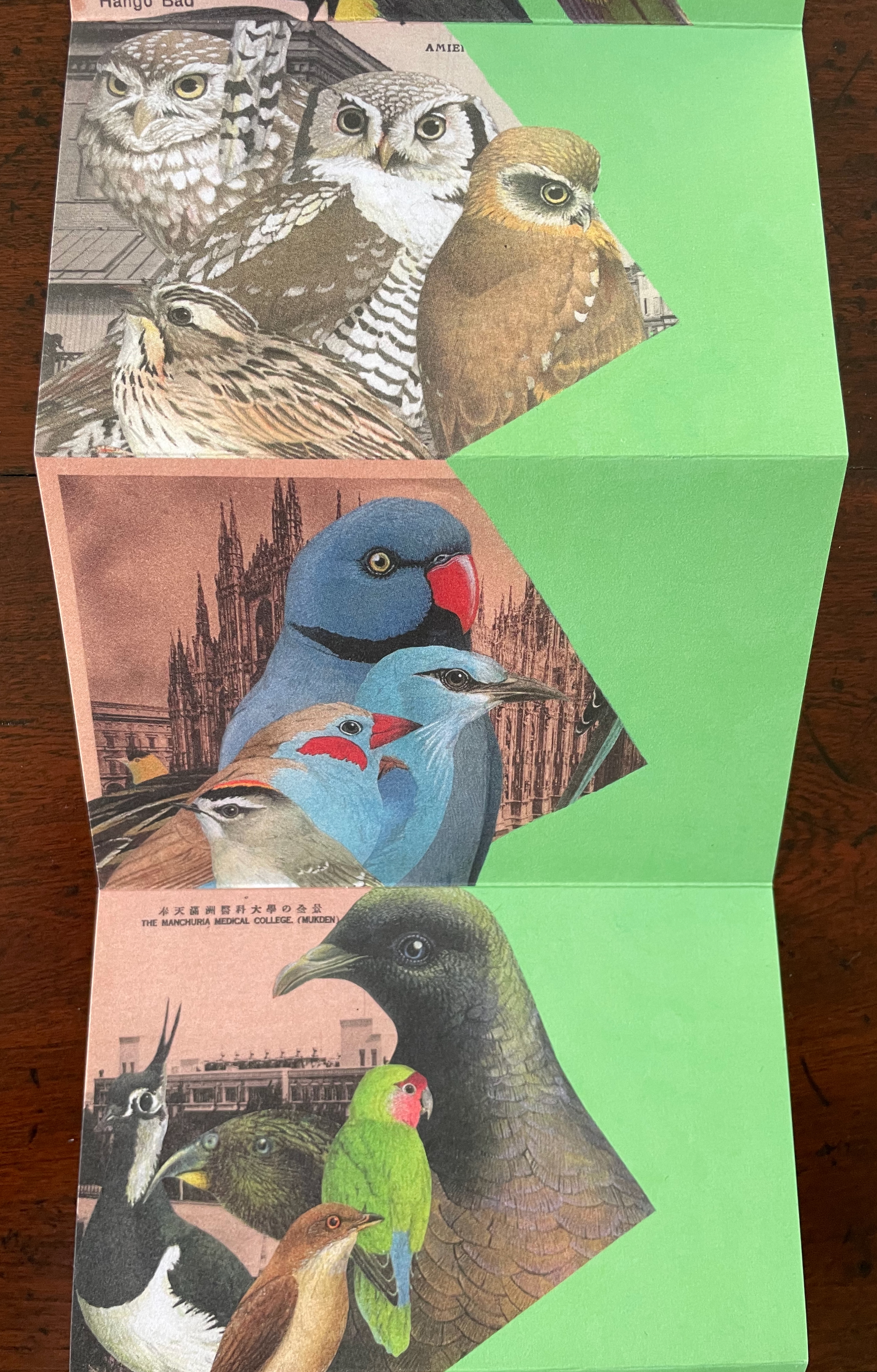
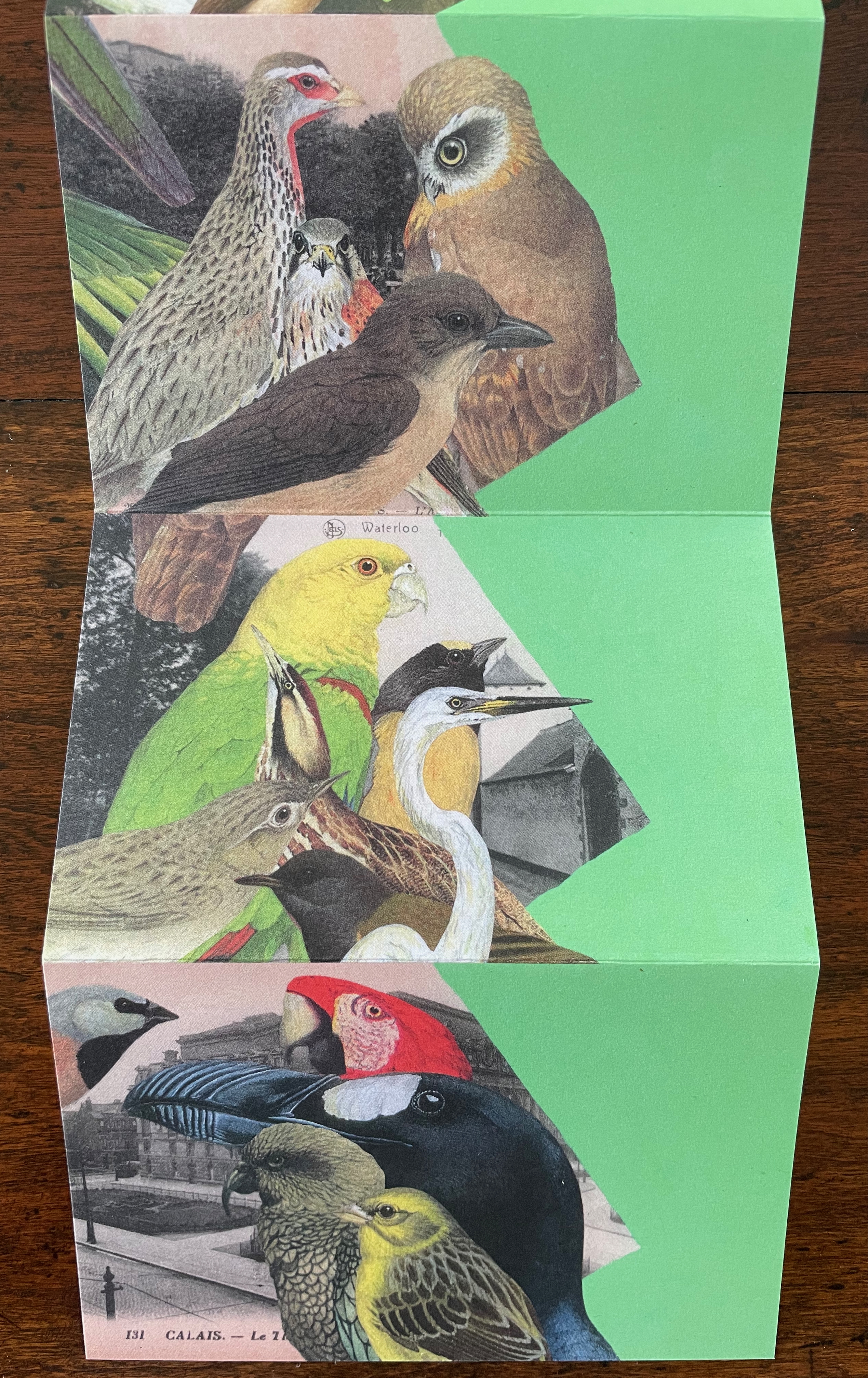
Looking for Green, Remaining Hopeful(2024) Gracia Haby & Louise Jennison Accordion book. H135 x W92 mm (closed), W802 mm (open). [9] panels. Edition of 75, of which this is #4. Acquired from the artists, 21 February 2026. Photos: Books On Books Collection.
World Book Night’s 2024 theme was “in praise of birds”. Using old postcards from various locations and cut outs collected over the years, Gracia Haby and Louise Jennison selected 45 birds to arrange in this vertical collage in response. The Indigo Digital CMYK used on ecoStar 100 gsm for the body and ecoStar 300 gsm for the cover delivers the vibrant avian colors against a chroma-key-like green screen background. The choice of the green screen effect has layers of significance. One layer is its obvious echo of the “green” choice of 100% recycled paper. Another, not so obvious, requires the textual explanation from the covers:
A green screen enables video makers to fill in the background or environment behind actors after filming. Haby & Jennison’s mimicry of it says that we need to provide these avian actors with more befitting environments than those in the sepia and gray toned backgrounds. Against the minatory background, the exuberant “motley assortment of birds” points in signposts to the “potential environment” left to be filled in on the green screen.
Despite its format, this is not a perforated pack of postcards to be detached and dispatched. You want to see and keep it all at once, as prompted by the vertical zigzagging against the green screen. But you will want also to examine it panel by panel, as prompted by the key on the covers and the detail of the images. In doing so, you sense the celebration and take the warning that this conference of birds being celebrated may disperse into extinction as has happened with the Norfolk kākā (last recorded sighting, about 1851), Carolina parakeet (last recorded sighting, February 1918), Newton’s parakeet (last recorded sighting, 14 August 1875), Bonon wood-pigeon (last recorded sighting, 15 September 1889), and Great Auk (last recorded sighting, 3 June 1844).
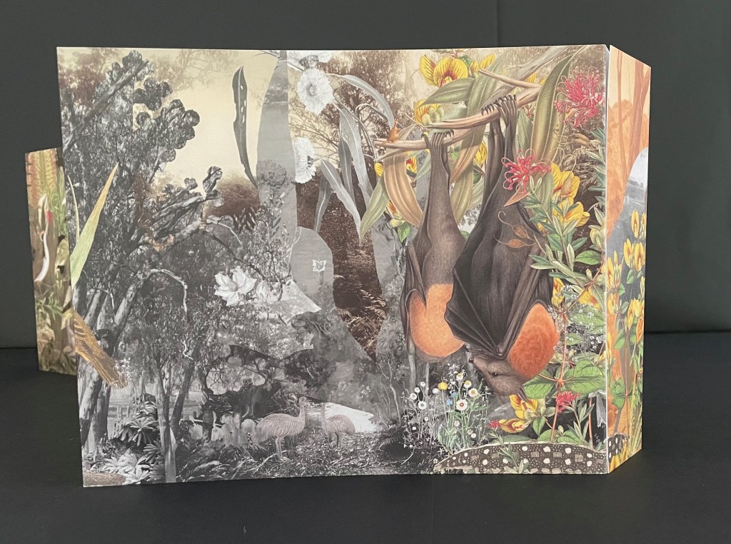
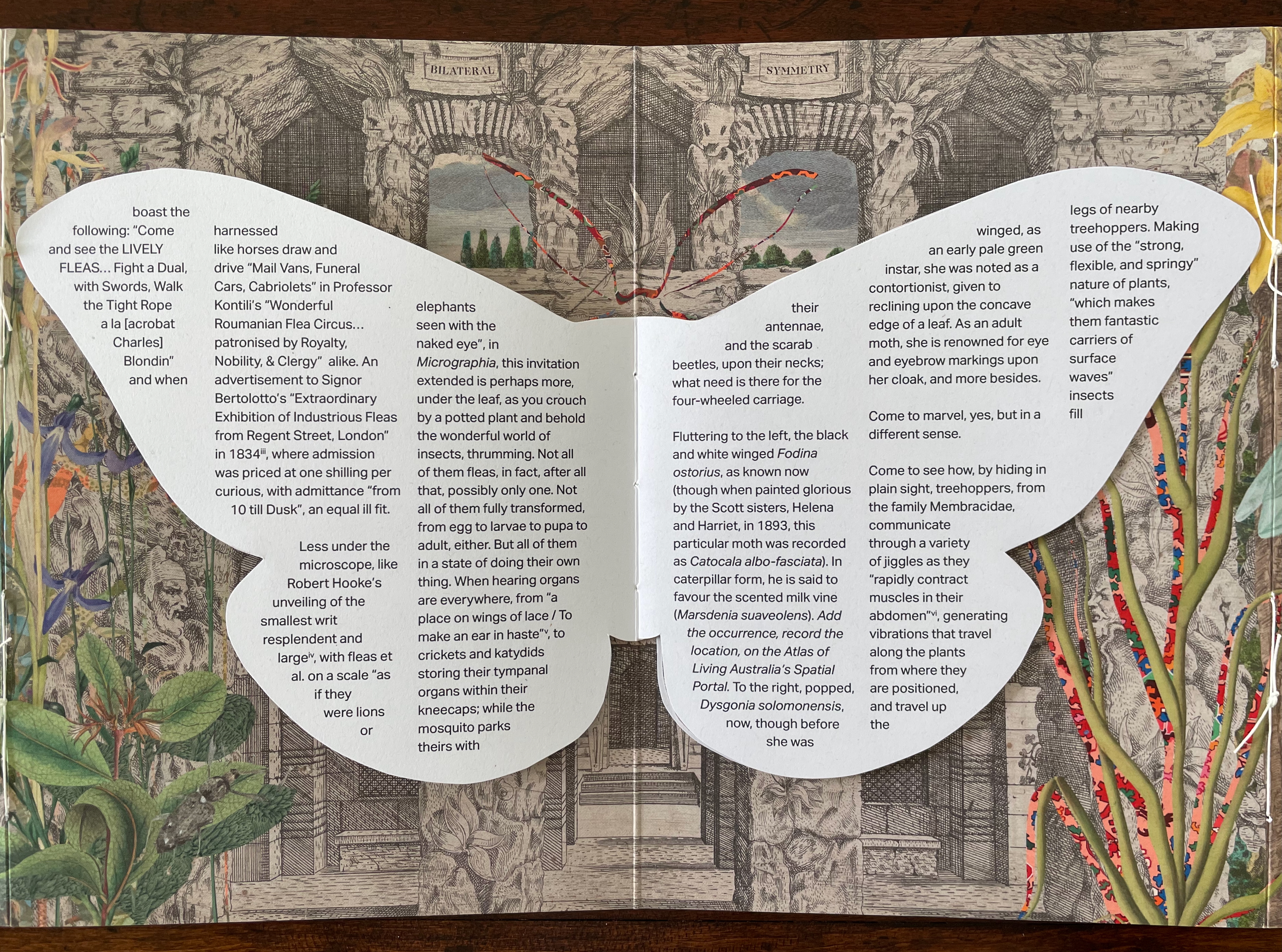
Bilateral Symmetry (2024)
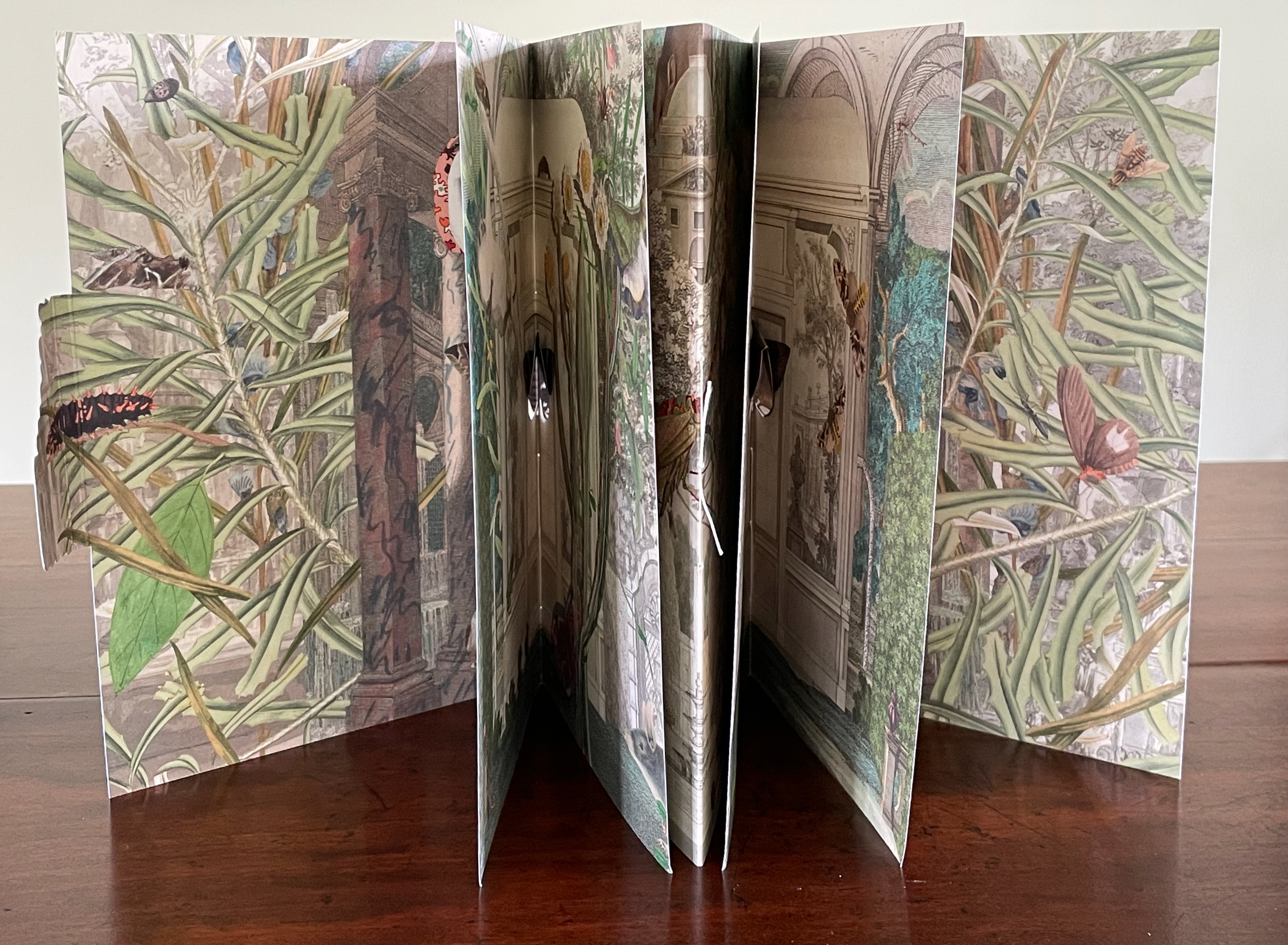
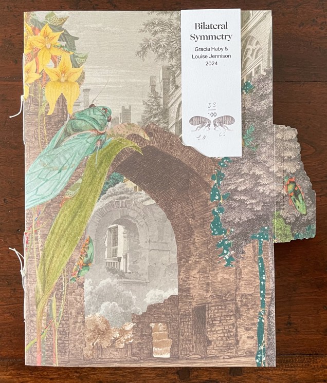
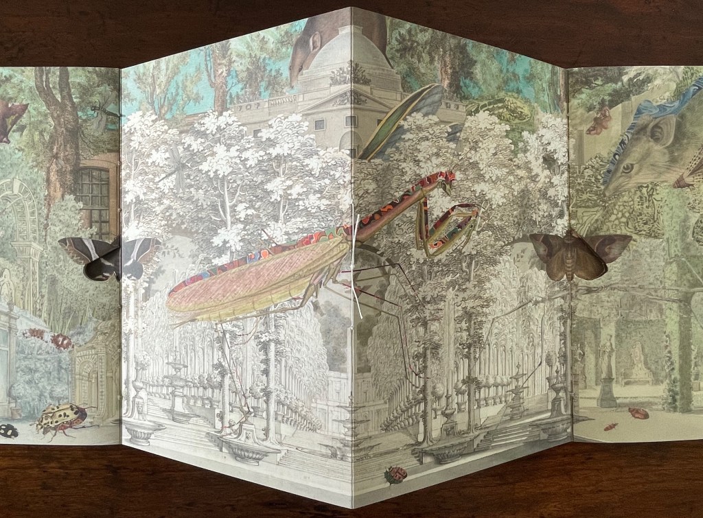
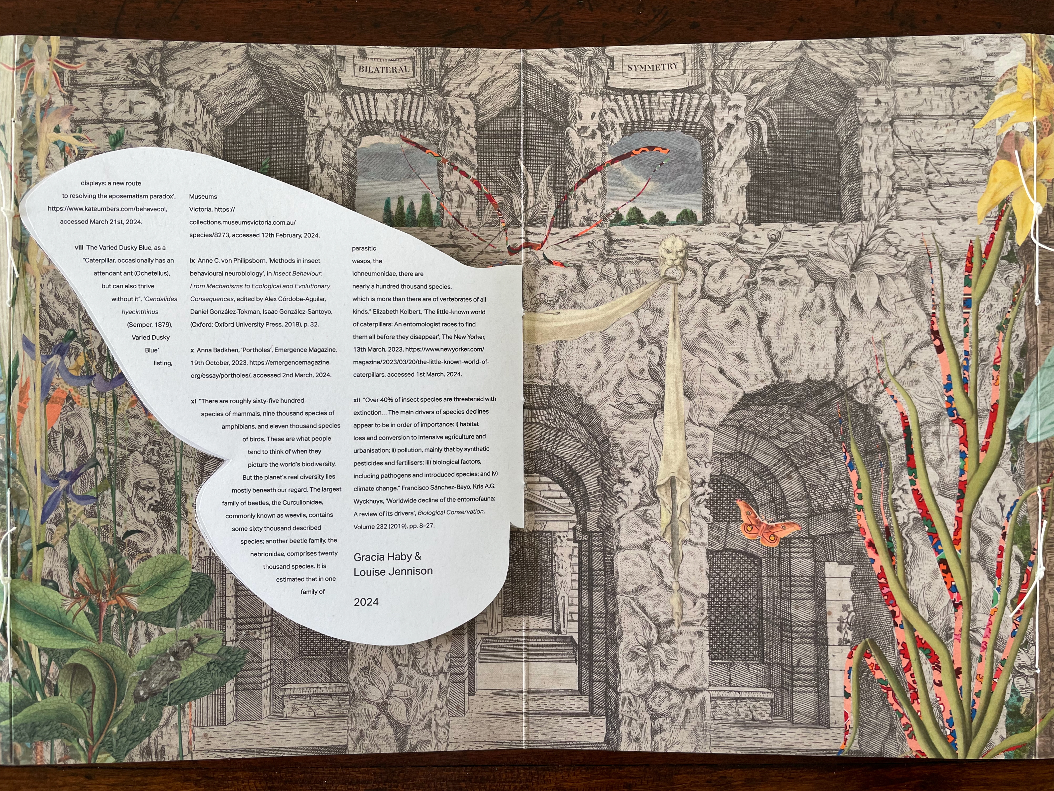
Bilateral Symmetry(2024) Gracia Haby & Louise Jennison Self-enclosing barn-fold artist’s book with tab-and-slot closure, pamphlet stitched, and pop-up components. H240 x W174 mm. [24] pages. Edition of 100. Acquired from the artists, 21 February 2026. Photos: Books On Books Collection.
Bilateral Symmetry (2024) is the most successful of the four of artist’s books in the collection. Every element supports its exploration of perception and bilateral symmetry: the sewing, the barn-fold structure, cut outs and pop-ups, the page spreads and alignment, the choice of imagery from the natural world and architecture, and presentation of text across moth-shaped pages.
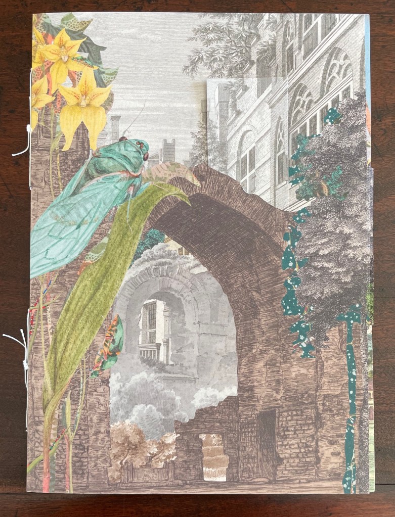
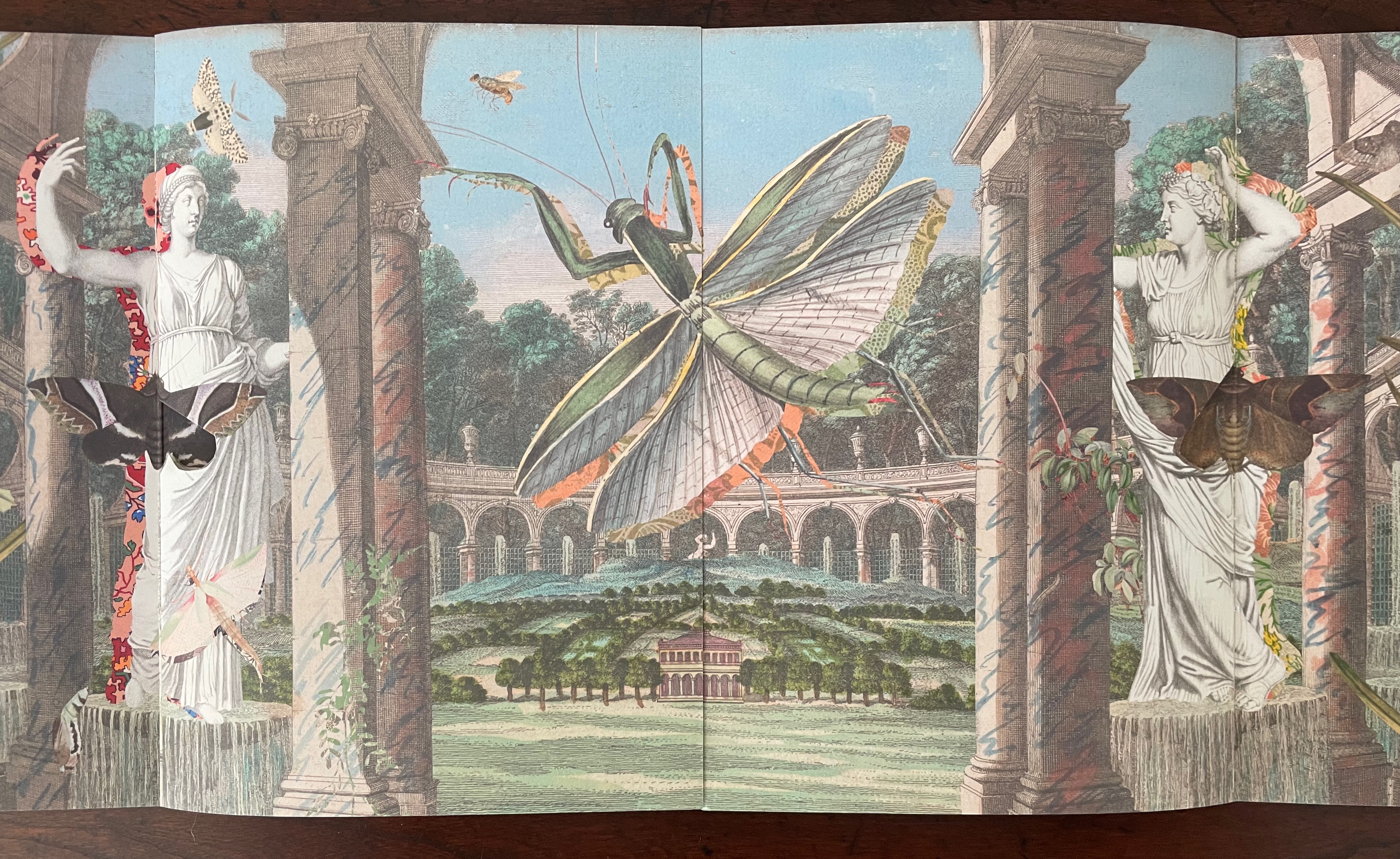
From the start, it combines surprising trompe l’oeil with startling juxtapositions. On the front cover, a bookmark aligns with the architecture behind a ruined arch overseen by a giant lacewing perched on a tree-size plant leaf.
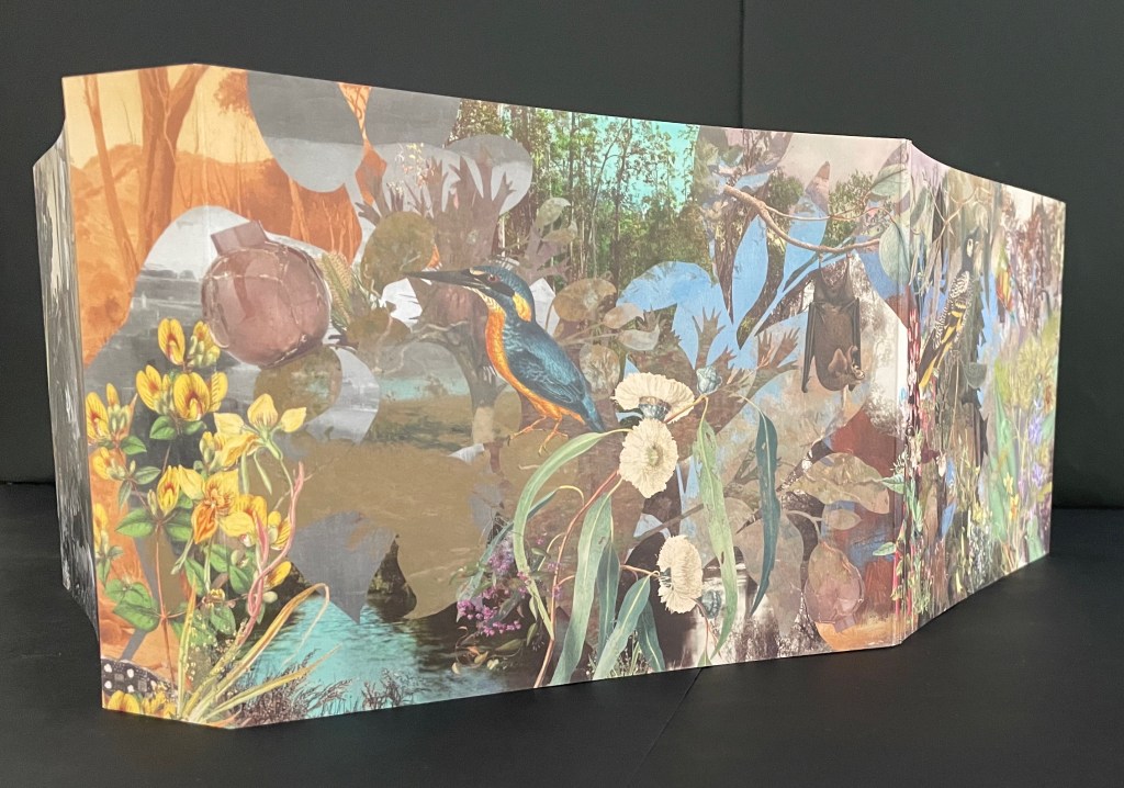
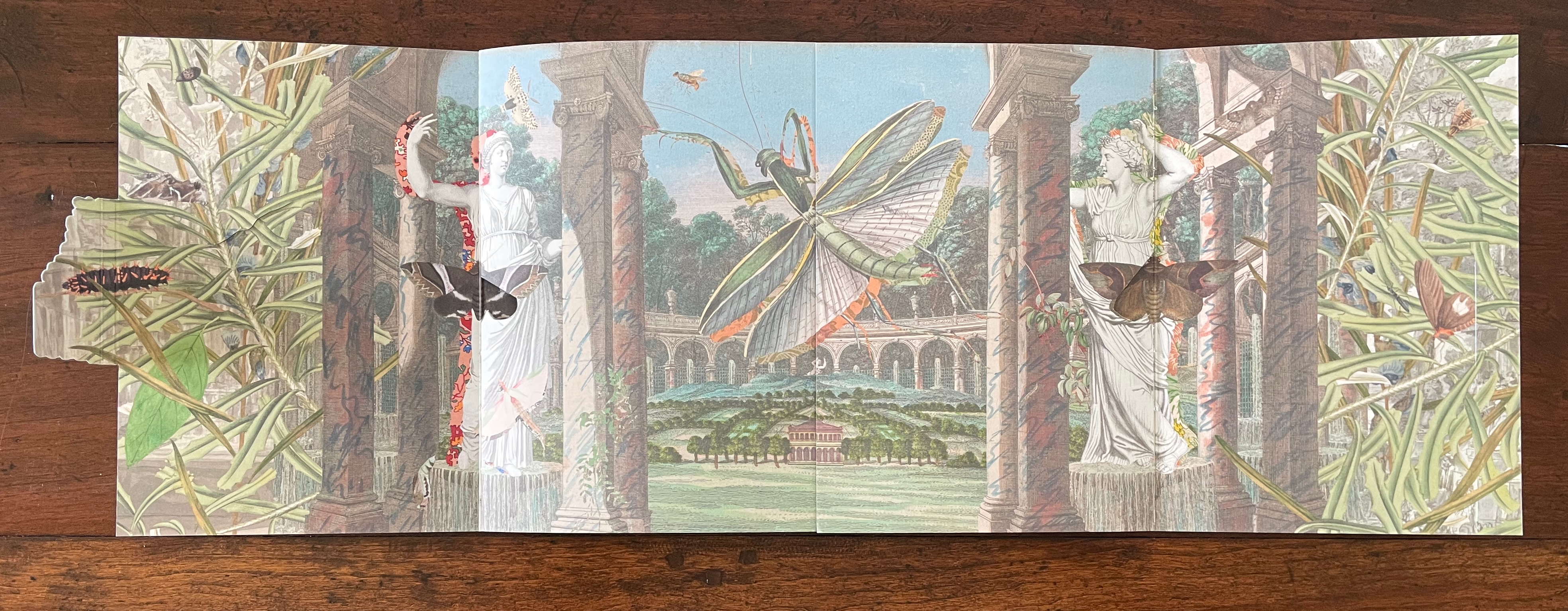
Opening the barn-fold book reveals a new set of perspectival surprises. Inside, there are two booklets facing each other. The edge of the recto page of the booklet on the left aligns with the edge of the verso page of the booklet on the right to form an image across a four-page spread. Between the two foregrounded columns and statues, we see a neatly divided and aligned building in a small formal landscape. Beyond the building and landscape, an arcade with statuary curves symmetrically to the left and to the right. In fact, the arcade extends in a circle that comes around to the columns and statues through which we are looking. But the proportions are impossible or, at least, surreal. Of course, the huge dragonfly, also neatly split by the pages meeting in the center, offers a strange perspective especially alongside the collage of other insects. Even the marbled columns offer peculiarities. Some are rounded, some are squared, some start square at the foot but end rounded at the capital. And the statuary, collaged with insects, are shadowed with bright marbled patterns.
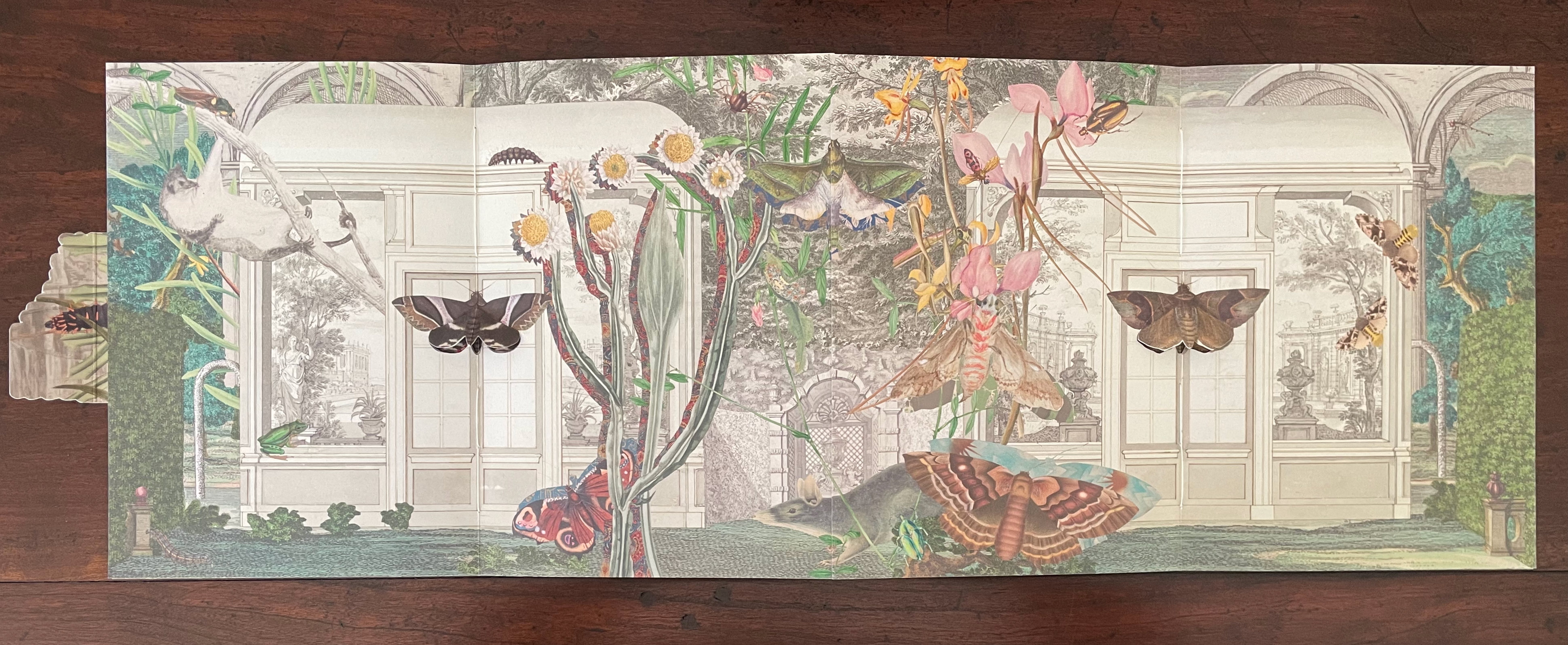
With the turn to the next set of facing spreads, the two statues and view through the arcade disappear, yet the moths that were posed against them remain as lepidopteral pop-ups against double doors in the middle of seemingly detached greenhouse walls. On the left, a flying squirrel attributed to Louisa Atkinson (ca. 1849-72) hangs from a branch intruding through an open arch in the wall. Diversity and trompe l’oeil strain at the work’s bilateral symmetry.
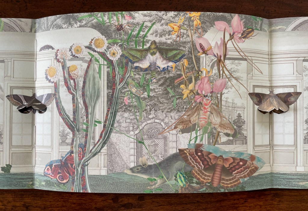
The final spread on this side of the book displays further distortions challenging our perception — even of bilateral symmetry but somehow nevertheless underscoring the theme. The Scotts’ pop-up moths, each centered a booklet’s spine, are flanked by Atkinson‘s far too small ringtailed oppossum on the left and by Gerard Kreft‘s far too large water rat to the right, peering down on the scene. The huge mantis in the center hangs mid air against the formal tree lined garden abnormally far in the background. The garden is perspectivally more distant than the domed edifice behind it, and an impossibly large rodent peeps over it. Although the central rodent and mantis are not symmetrically divided, and although the scenes to the left and right of the spine are not symmetrical, the central spine bisects the garden and dome precisely. Likewise the left and right spines bisect the Scotts’ moths precisely, underscoring the theme of bilateral symmetry. Meanwhile, the spreads have reiterated the point about the variety and diversity of insects, flora, and mammals.
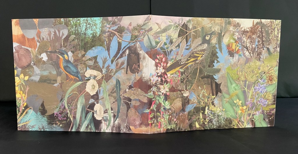
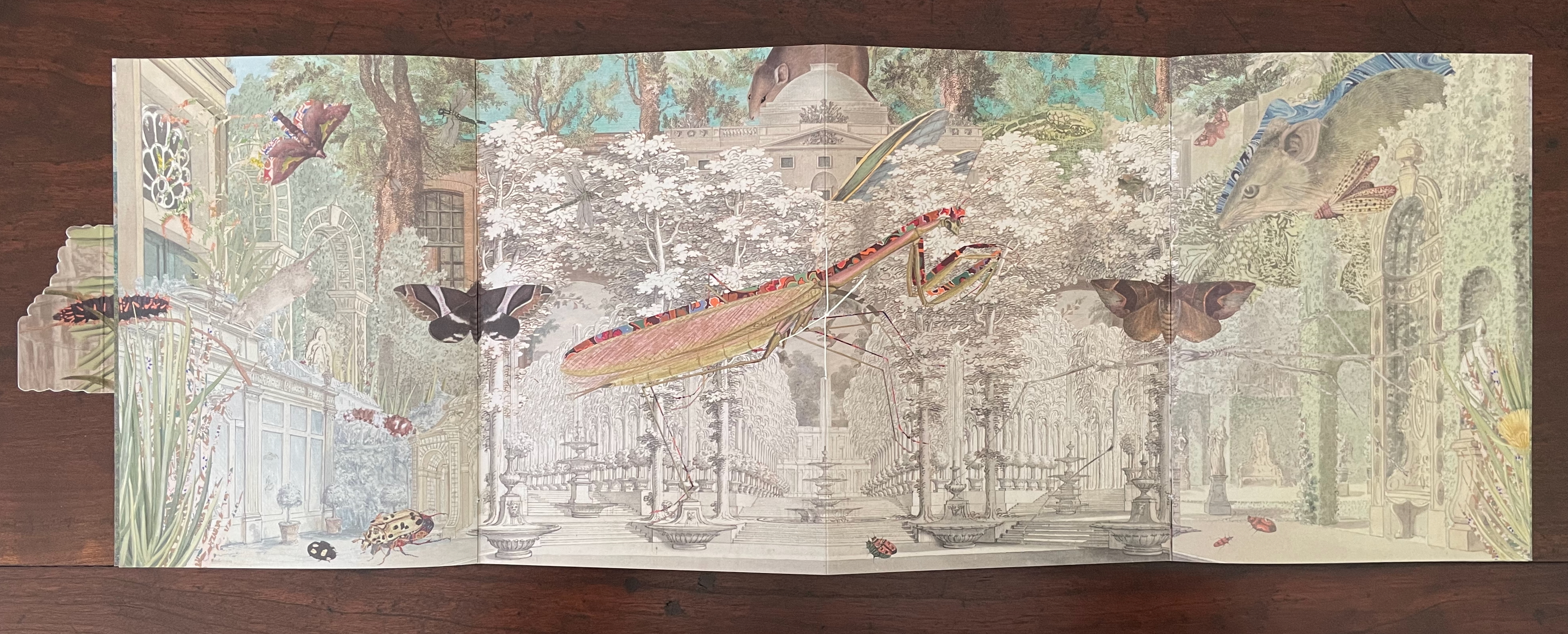
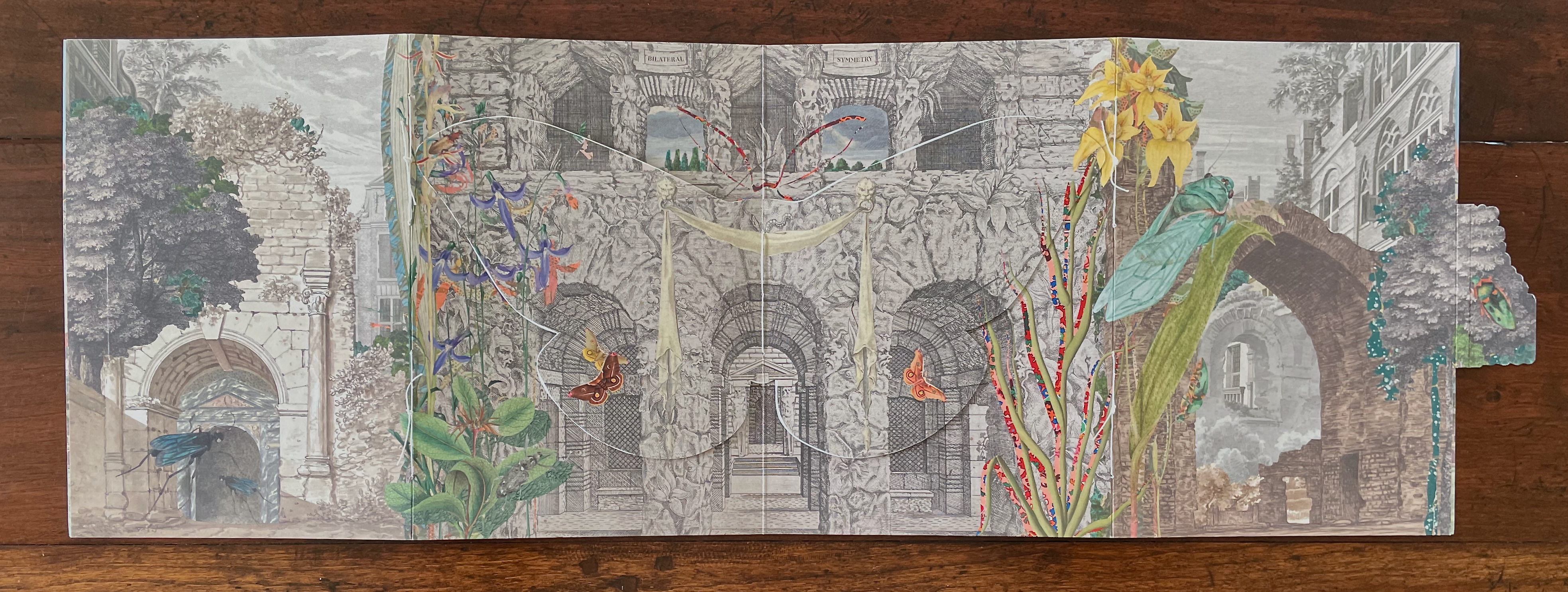
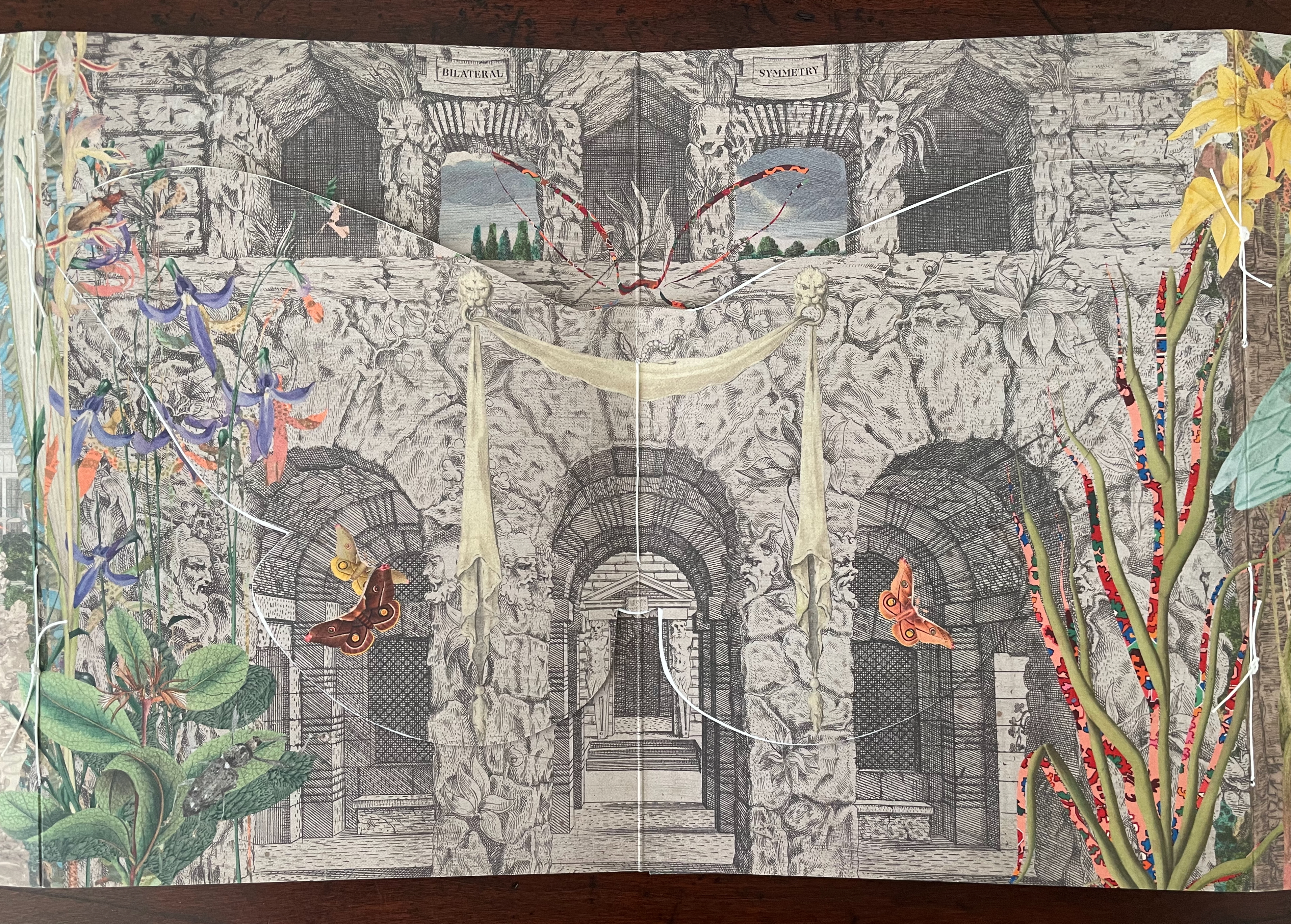
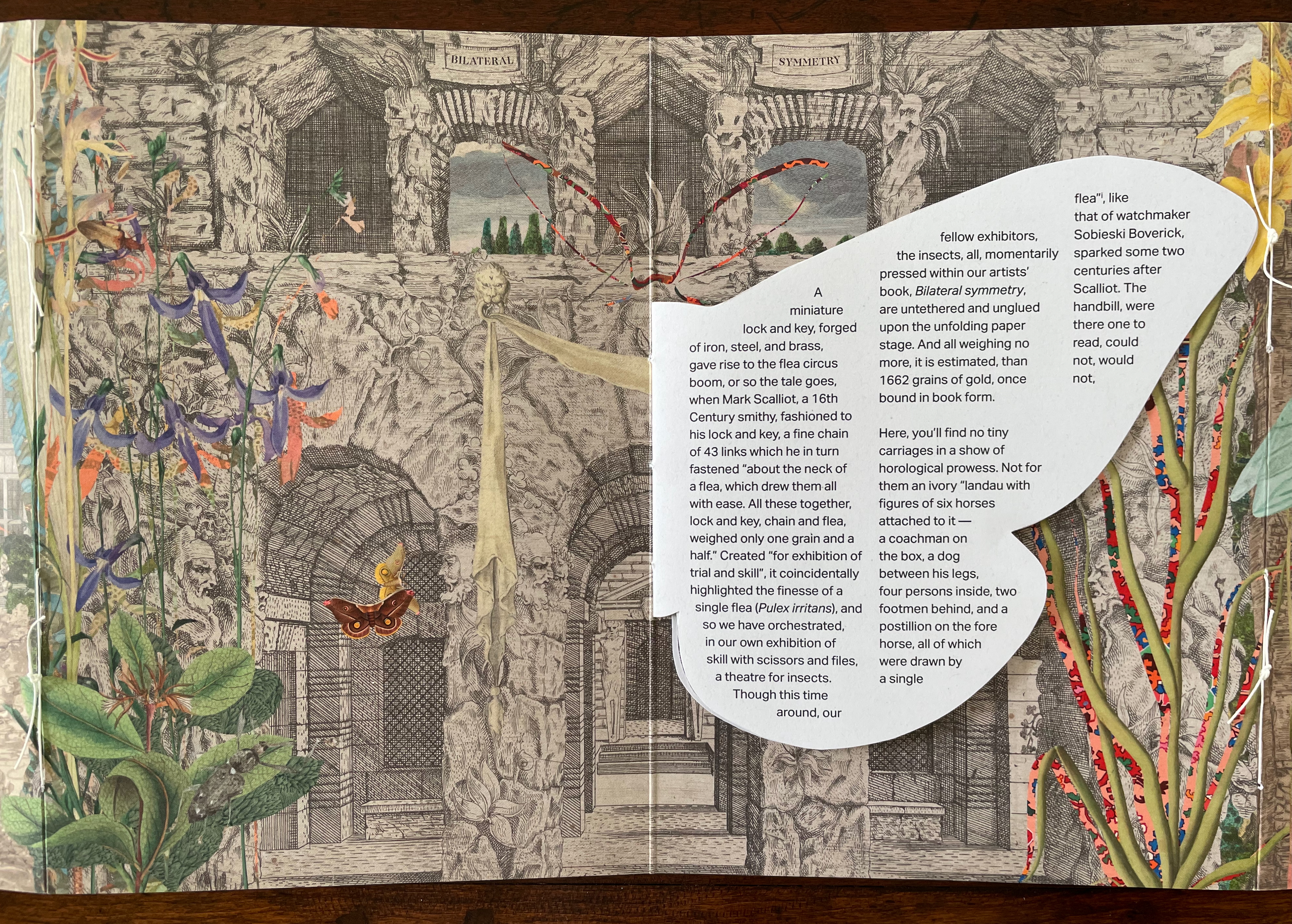
On the reverse side of the book, between the splayed-out back and front covers of the two booklets, a cut out moth with wings spread disappears in trompe l’oeil fashion into the facade against which it has alighted. Above the moth, the two-word title of the book appears on two engraved banners hanging over the two parallel open archways centered between two shuttered archways. Two Harriet Scott Emperor Gum moths hover in the two archways shown on the lower lobes of the cut out moth’s wings. (Did I mention how every element supports the exploration of bilateral symmetry?)
The book’s text appears on the reverse side of the cut out moth’s wings. As you turn to the first wing/page of text or turn to the last wing/page, you may notice how the two Emperor Gum moths have “jumped” from the cut out’s wings to the background underneath each wing. A sort of slow motion persistence of vision, it is another perceptual trick alongside the trompe l’oeil of the cut out moth.
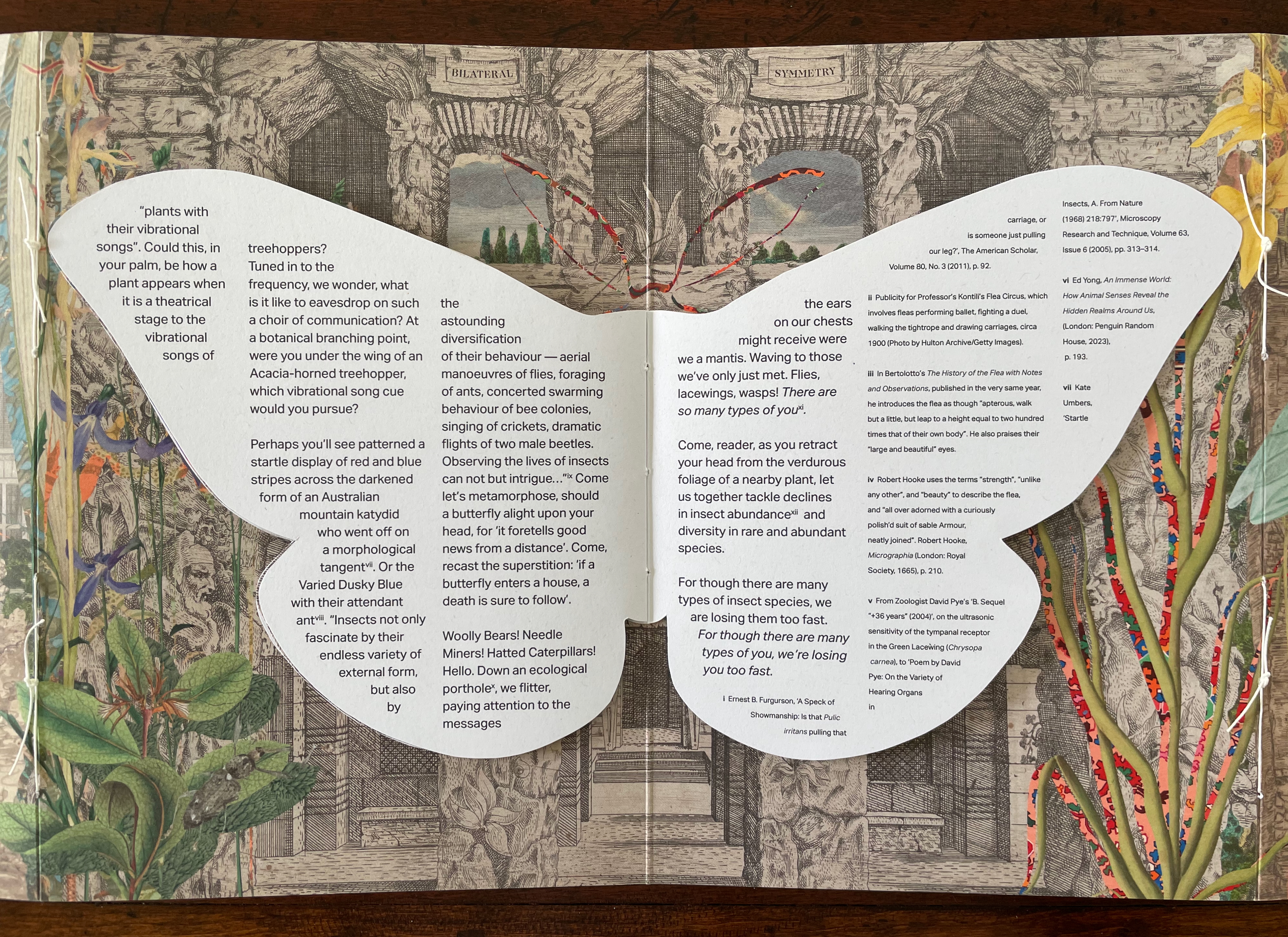
The first paragraph of text picks up on this theme of visual legerdemain by recalling the first flea circus impresario Mark Scalliot. That is a rhetorical means of introducing Bilateral Symmetry as a “theatre for insects” and posing the depicted insects as “fellow exhibitors”, which in turn is a rhetorical sleight of hand by which Haby and Jennison place themselves and the insects on an equal footing as performers and artists. The equation elevates the insects from the hucksterism of the flea circus — “Not for them an ivory “landau with figures of six horses attached to it ….” and, in the next paragraph, even raises these performers over Robert Hooke’s fleas as large as “elephants seen with the naked eye”. The exhibitors of Bilateral Symmetry invite you to better Hooke’s microscope by crouching “by a potted plant and behold[ing] the wonderful world of insects, thrumming”.
Leaning into entomomorphism, the artists invite us “[d]own an ecological porthole [to] flitter, paying attention to the messages the ears on our chests might receive were we a mantis”. Familiar by now with the artists’ message, we know this leads to the ecological observation of declining diversity, but up to this point, their artistry has been primarily about visual perception. This is not to gainsay the message, but as important as the message is, their marvelous handling of the media (the archival sources, the innovative book structure, and the collage) and reorienting of our perspective do more than simply make us receptive to it. Only in its final two paragraphs does the text exhort the reader to care and do something about the decline in insect diversity. The paragraphs preceding them conjure a world of insect perception and behavior that is as surreal as the whimsical perceptual distortions of the collage. The collage may include insects registered as endangered, but the text does not identify them. If text and collage were to have included endangered insects such as the Angled Tiger butterfly, Beautiful Petaltail dragonfly, Illidge’s Ant-blue (Butterfly), Queen Alexandra’s Birdwing Butterfly, Fan-winged Katydids, or Zaprochilus ninae (Bush crickets), might we have arrived at the same exhortation on our own?
With its blend of architectural ruins and artificial landscaping with oversized and undersized insects at various stages of metamorphosis, Bilateral Symmetry urges a shift of perspective in our perception of nature and our interconnectedness. With its structural embodiment of bilateral symmetry and diversity, it offers a rich example of the perceptual and perspectival shift it urges.
Further Reading
“Carol Barton“. 10 August 2024. Books On Books Collection.
“Caren Florance“. 30 April 2026. Books On Books Collection. In particular, see L OO P (2019).
“Ernst Huebner“. 21 July 2023. Books On Books Collection.
“Willow Legge“. 16 February 2021. Books On Books Collection.
Handmade Path (2021) Lu Jingren, Amanda Degener, and Peng Wu Black-inked card wrapper with magnetic closure. Handbound, handsewn, handmade paper cover book. H285 x W220 x D40 mm. 268pages. Edition of 350, of which this is #152. Acquired from Amanda Degener, 5 December 2022. Photos: Books On Books.
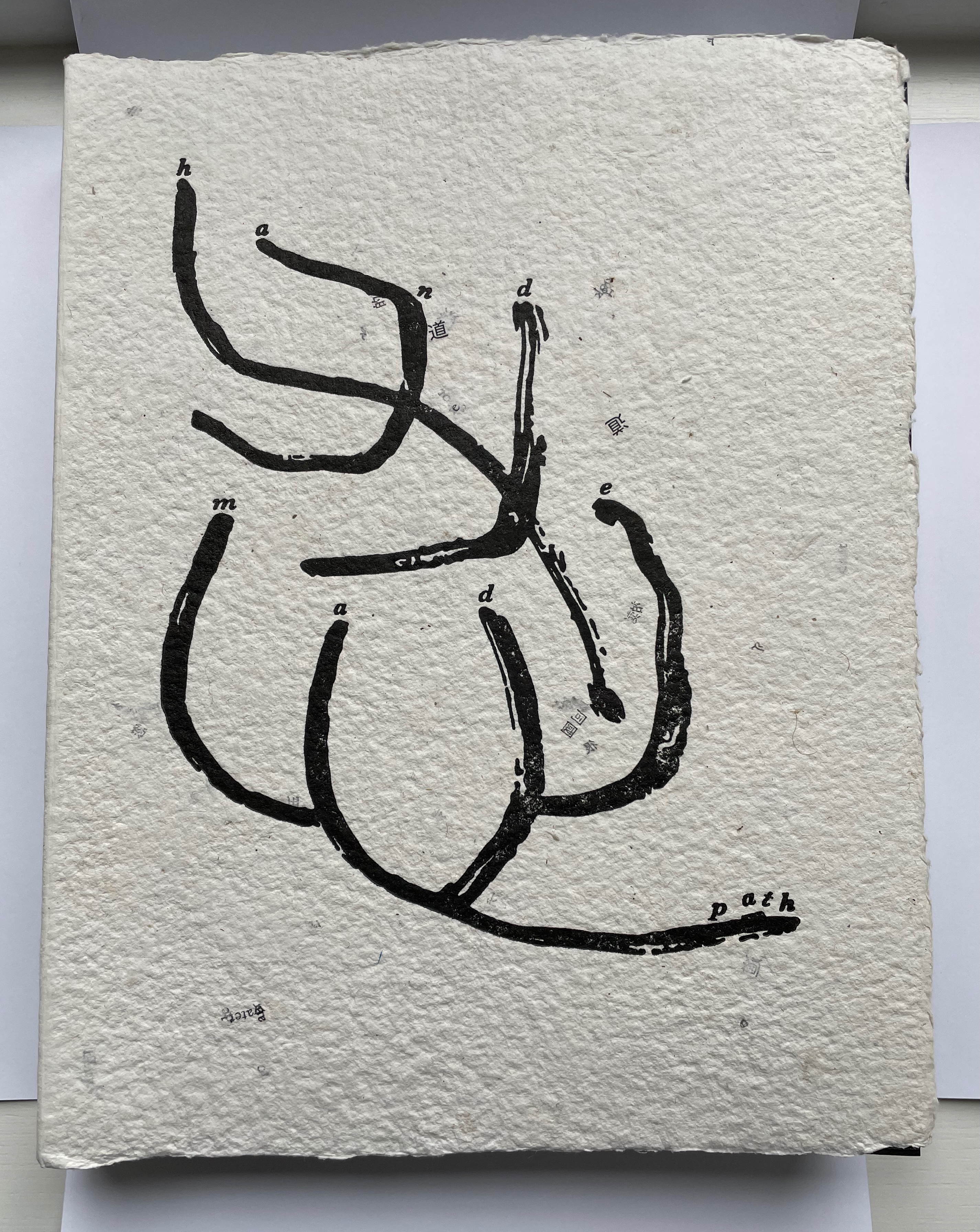
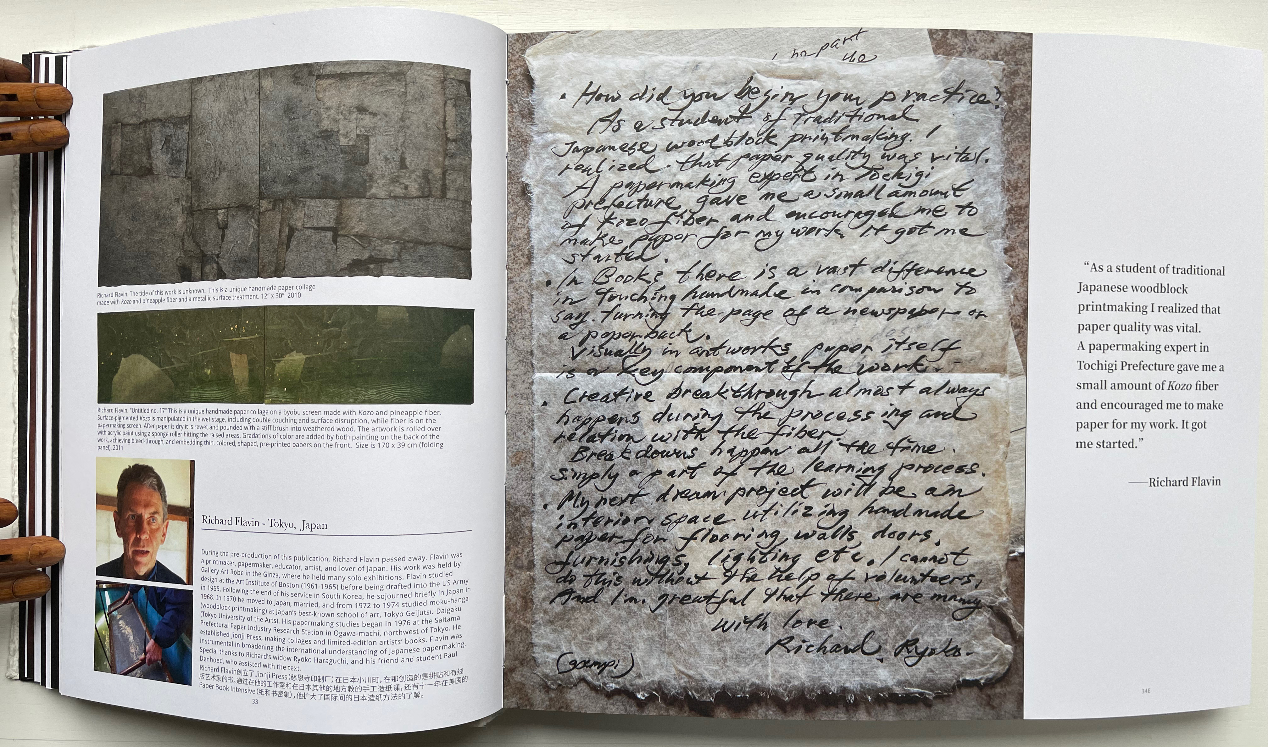
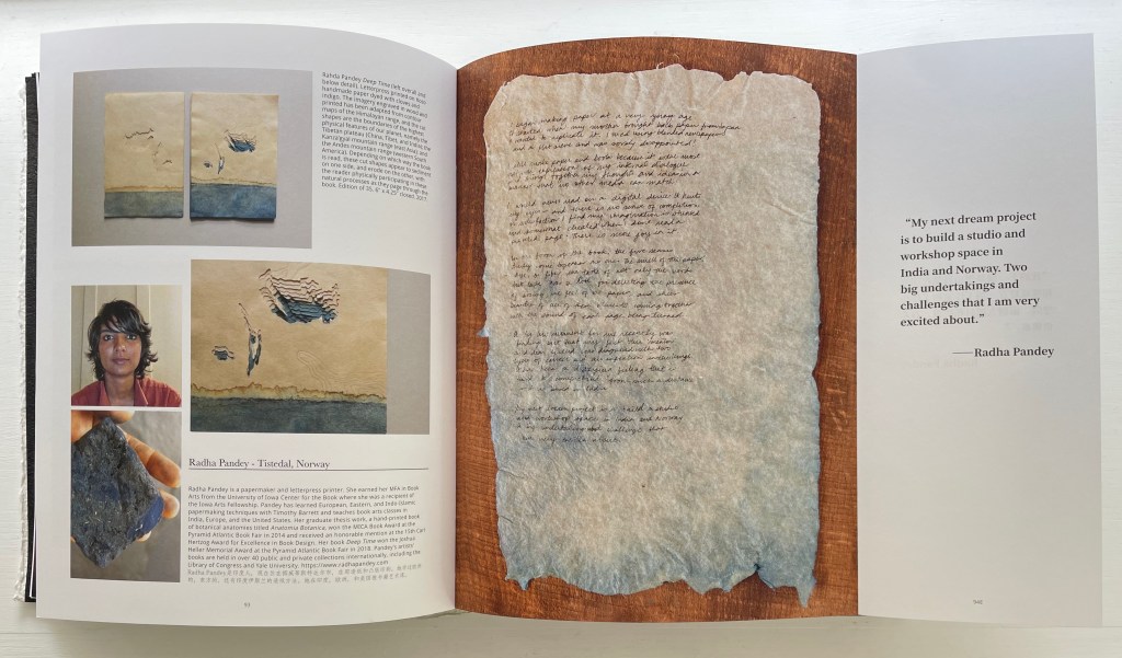
Handmade Path presents 57 artists of paper and book who responded to 6 questions circulated by the editors. The editors asked the artists to provide handwritten replies to the questions as well as images of both their work and of their hands.
How did you begin your practice?
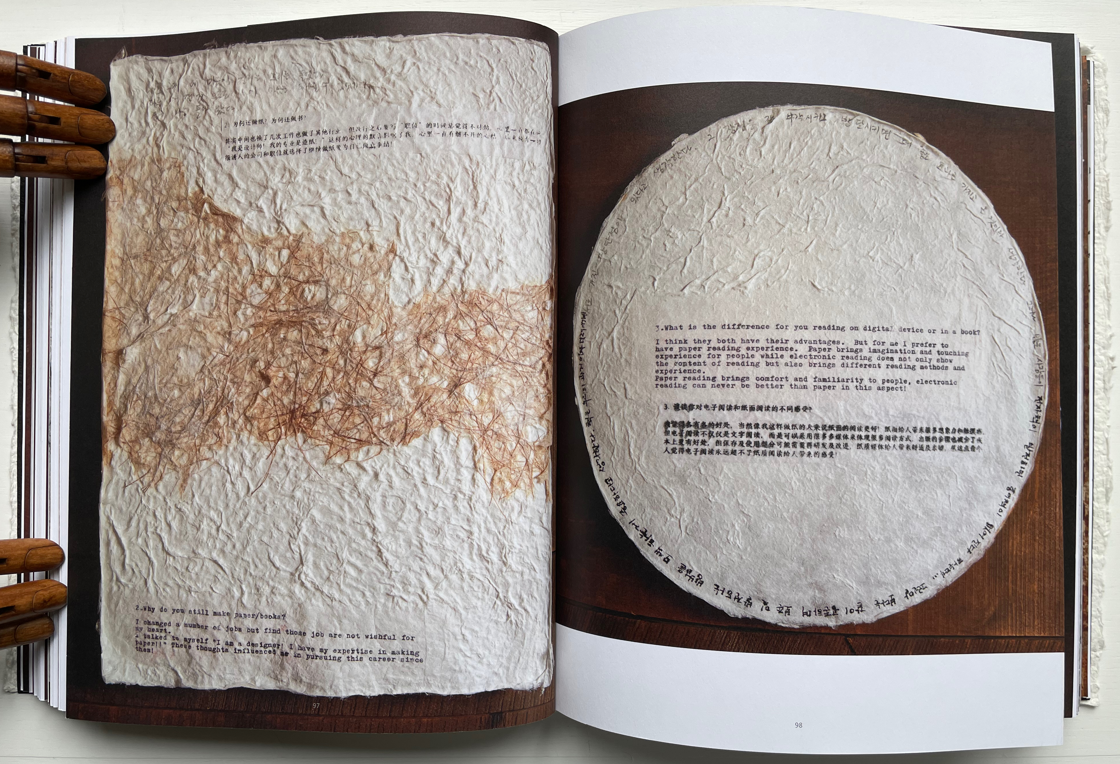
Why do you still make paper / books?
What is the difference for you reading on digital device or in a book?
In what way do you understand the 5 senses of paper/book: vision, touch, hearing, smelling, tasting?
Share with us some moments; eitherbreakthroughs or break downs in your work?
What is your next dream project?
Not all of the respondents replied in handwriting, but many sent their replies on material that reflected their work. The late Richard Flavin’s contribution arrived on gampi paper. Becky Beamer inked her reply on a gray handmade sheet. Radha Pandey’s came on indigo tinted handmade paper.
Richard Flavin
Becky Beamer
Radha Pandey
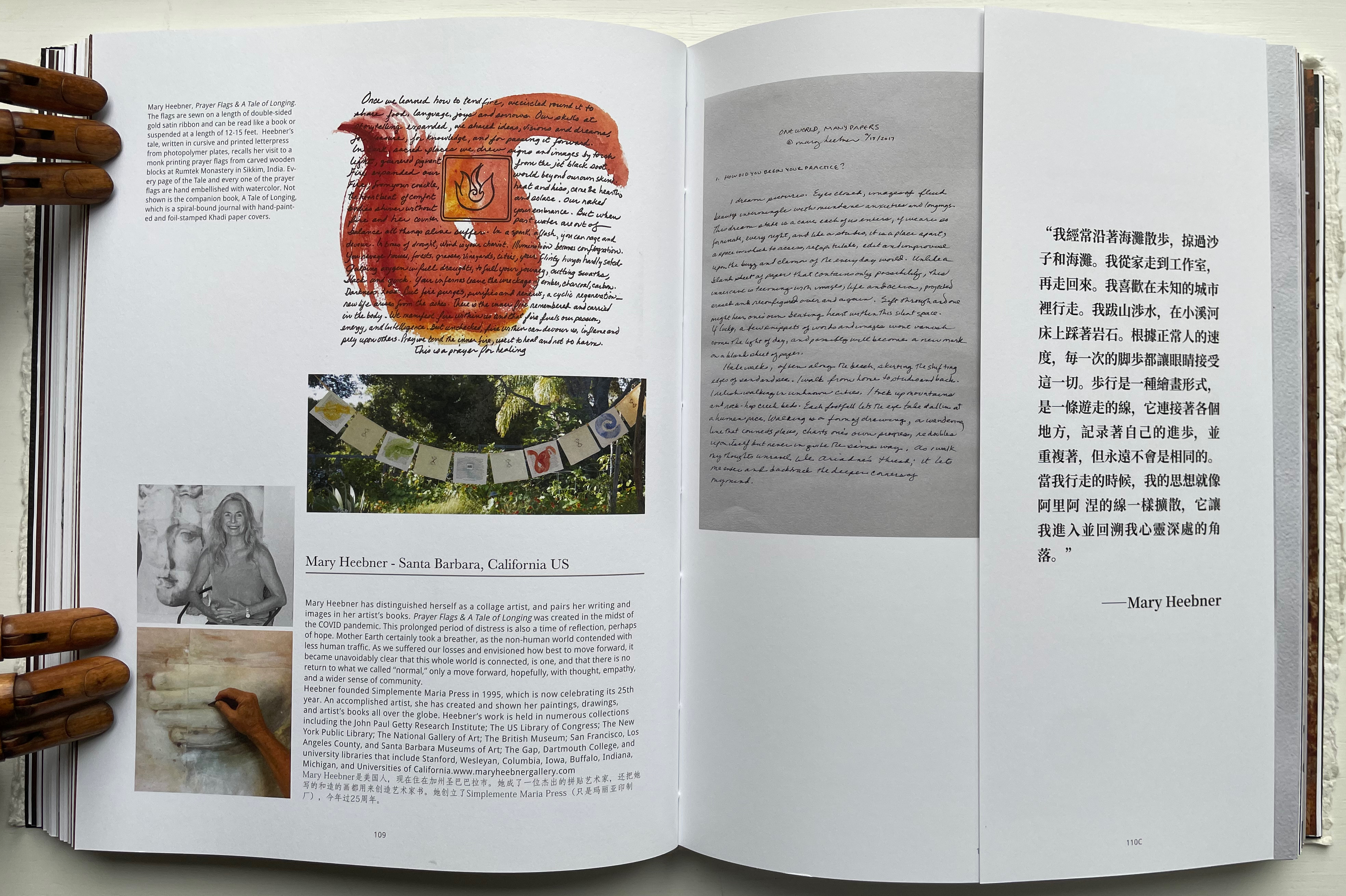
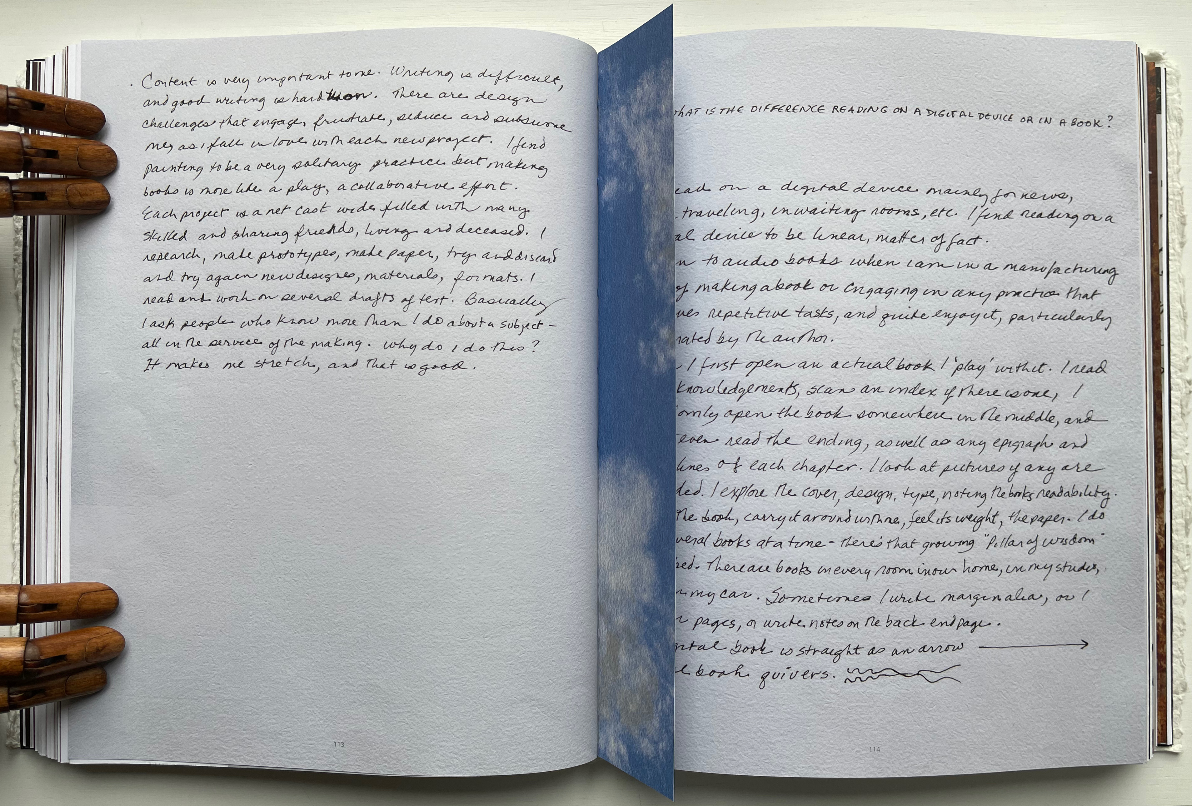
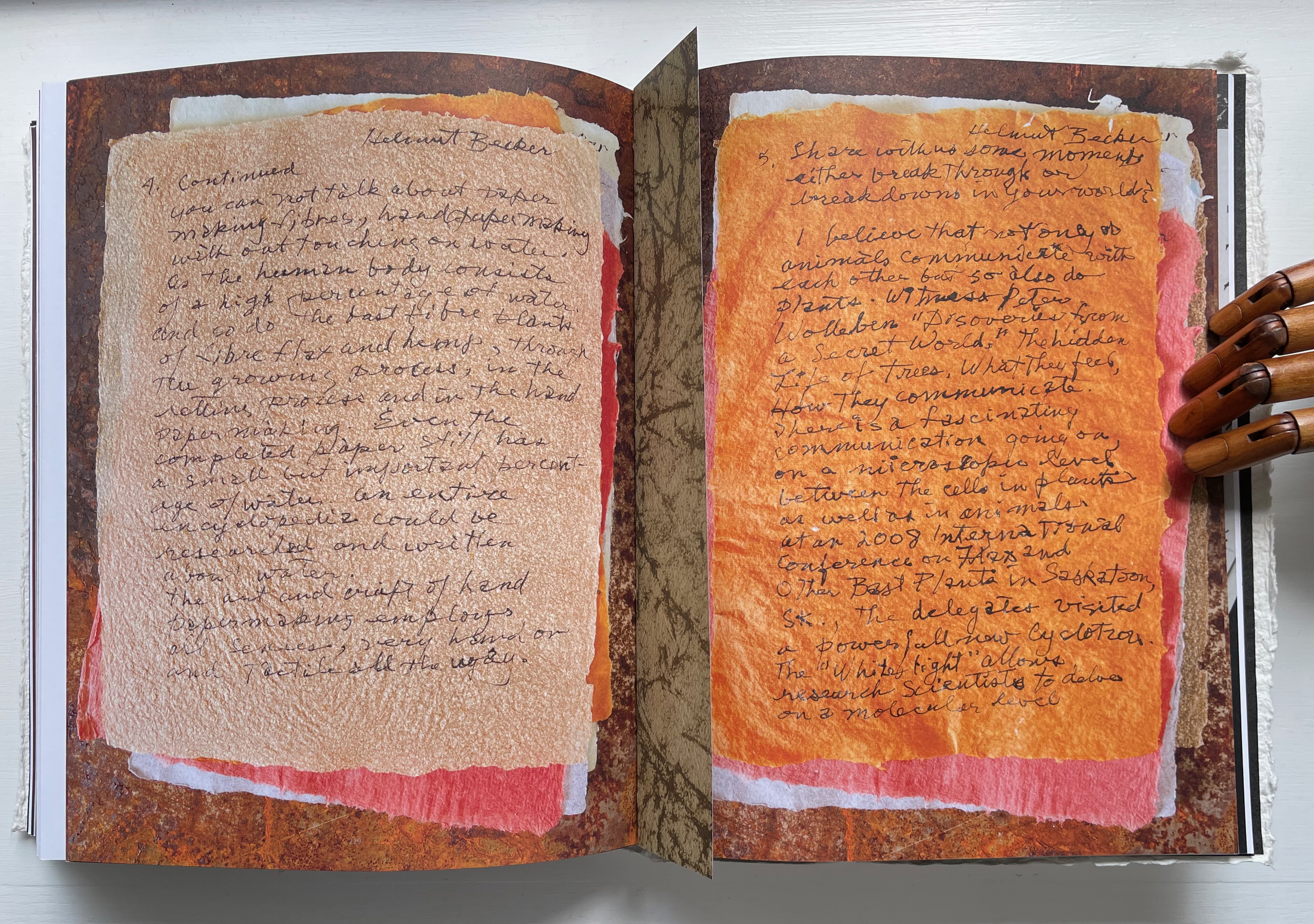
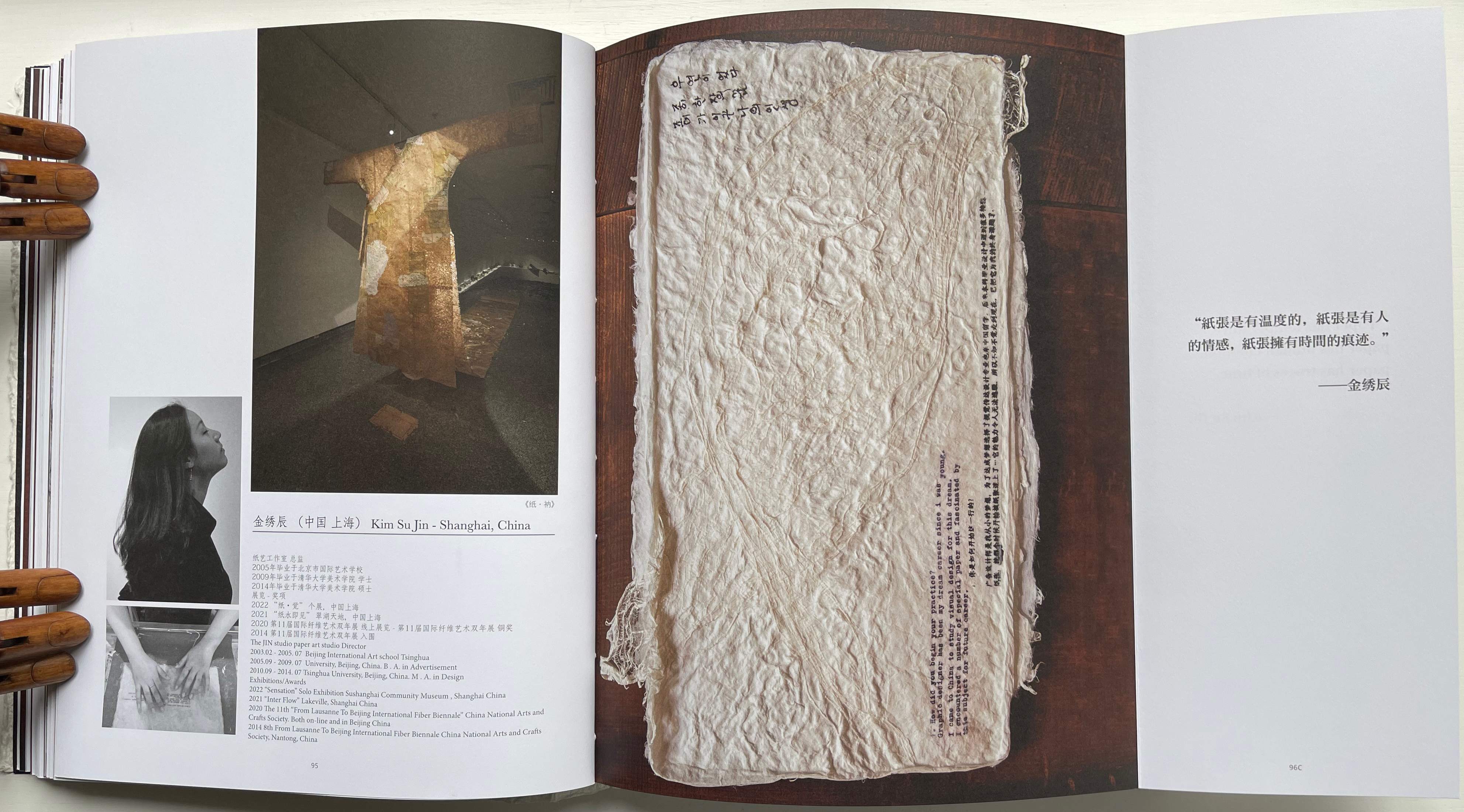
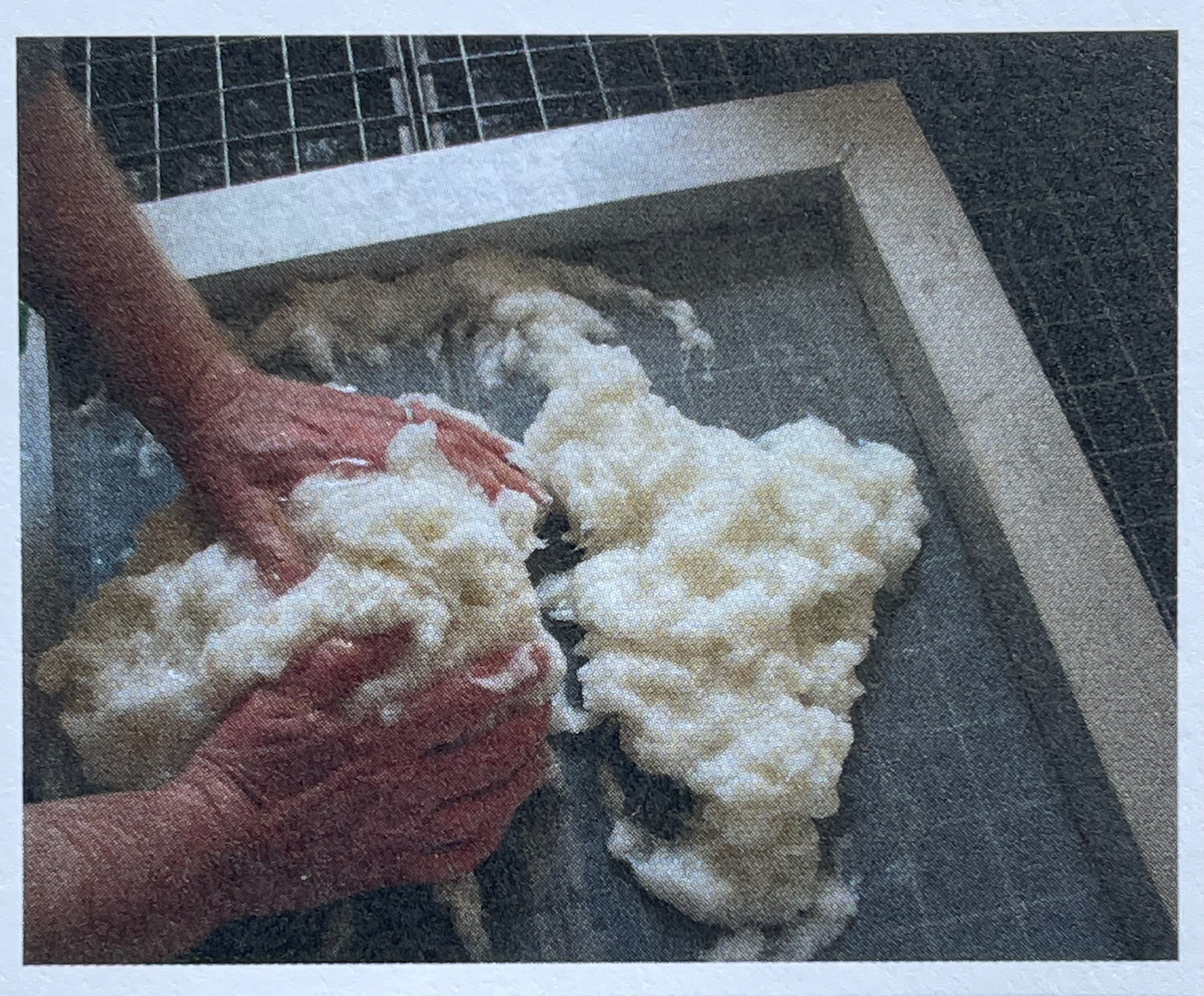
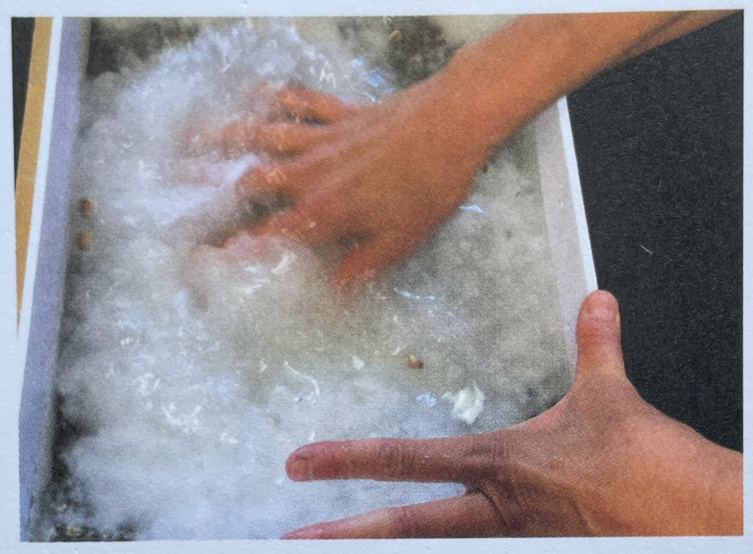
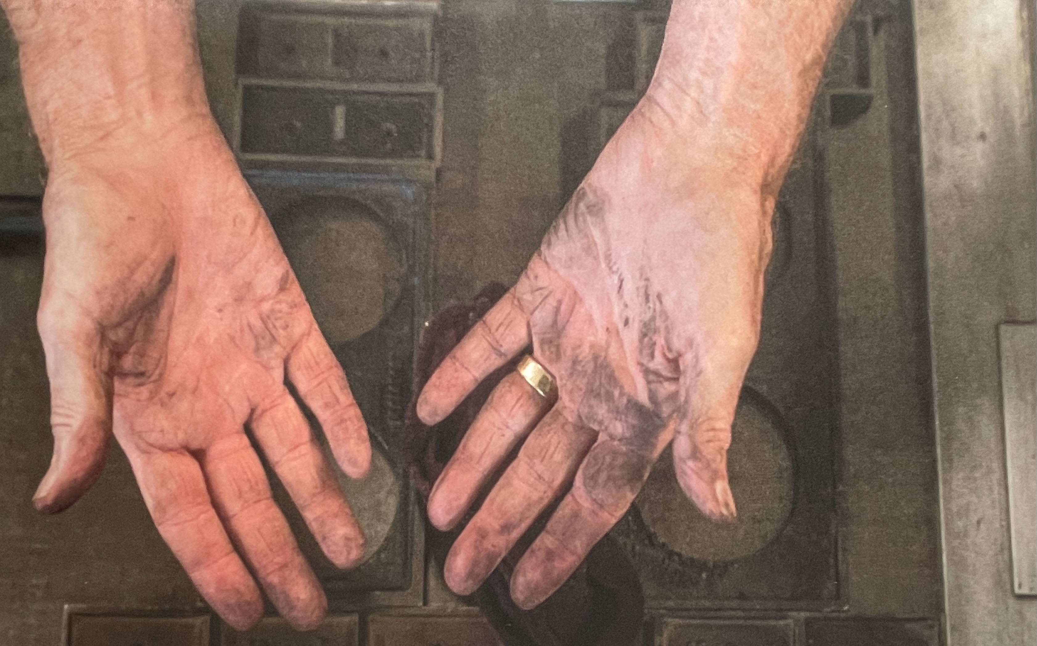
Jack Mader photographed these contributions in ways that render them visually haptic. It places that fourth question — “In what way do you understand the 5 senses of paper / book: vision, touch, hearing, smelling, tasting?” — at the core of the book. You’d swear you can feel the velvet texture of Mary Heebner’s 11 pages. Or the roughness of Helmut Becker’s colored handmade sheets or of Su Jin Kim’s white sculptural responses. The request for images of the artists’ hands naturally added to this sensory effect. There’s the glutinous wetness of pulp between the fingers of Jean Michel Letellier and Helen Hiebert and the imagined smell of the ink on George Roberts’ hands.
Mary Heebner
Helmut Becker
Kim Su Jin
Left: Jean Michel Letellier’s hands. Right: Helen Hiebert’s hands.
George Roberts’ hands.
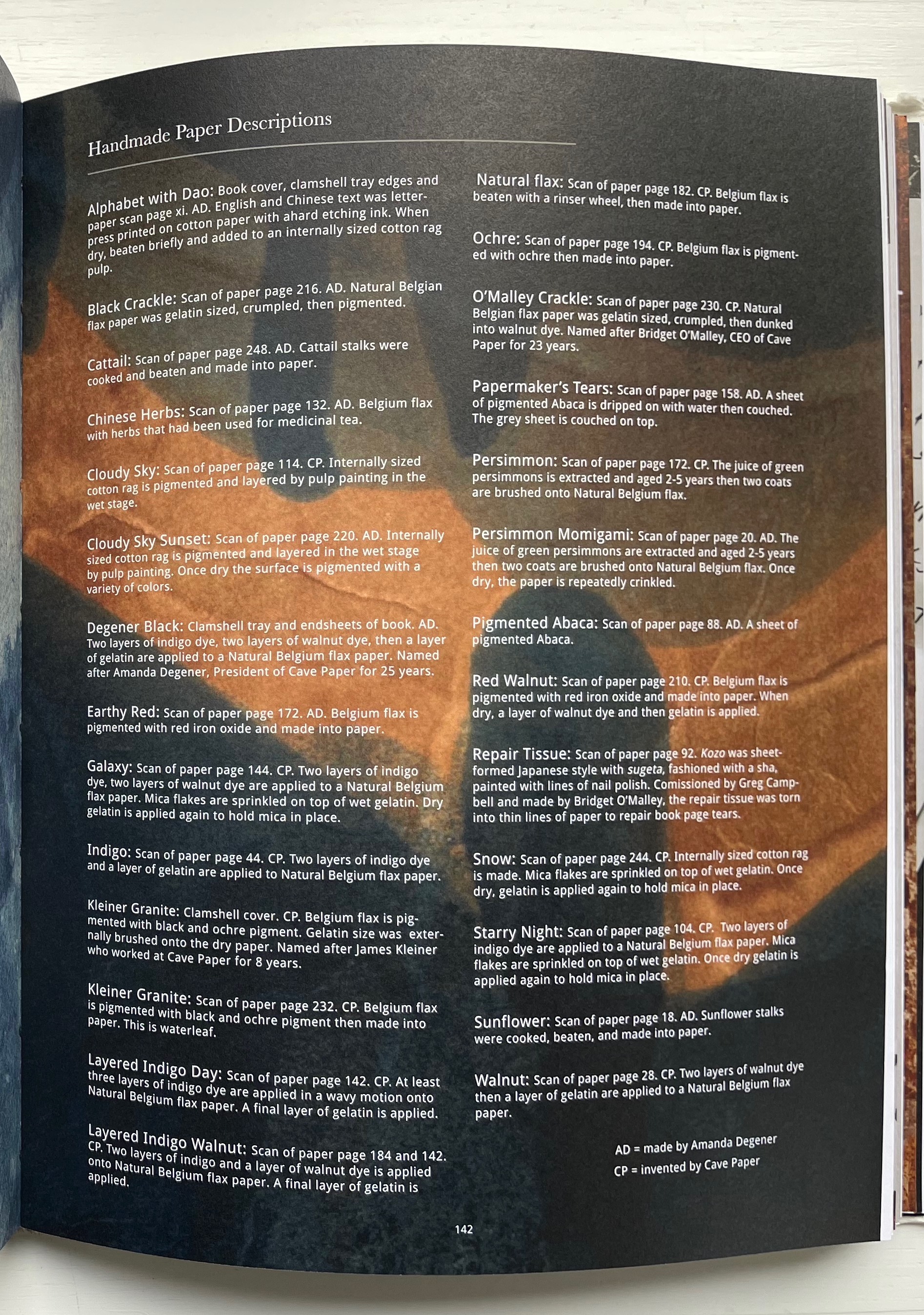
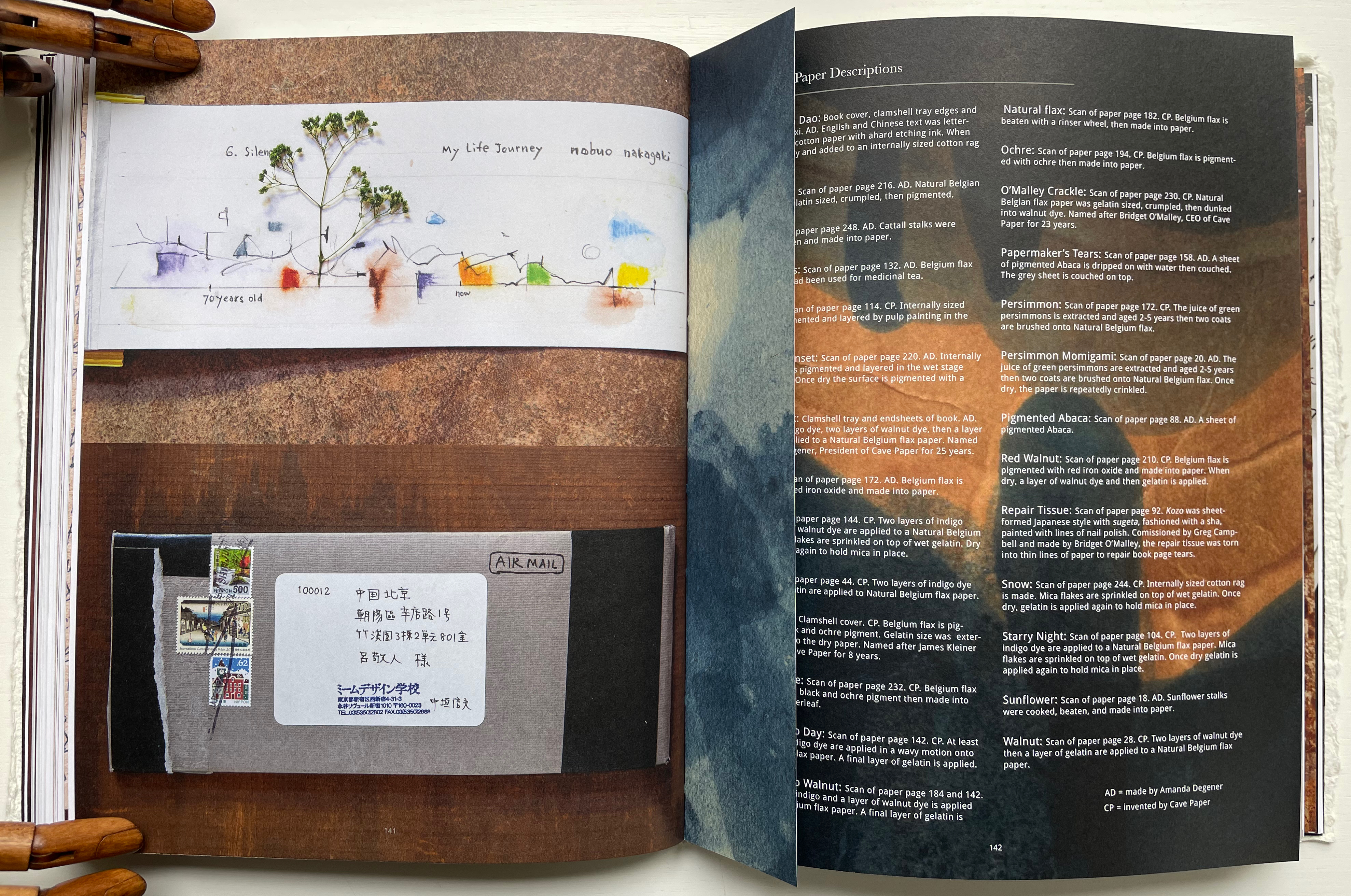
Throughout the book are truncated pages that act almost like bookmarks. Only midway through do we learn that they bear scanned images of handmade paper from Amanda Degener and Cave Paper. Degener provides an index describing the handmade papers, which oddly appears at page 142. Not only does it function as an index, it delivers information expected in a colophon. It even describes the paper used for the book’s cover, endpapers, and the clamshell tray. But nevermind, it’s all part of diving into the artists’ process and practice.
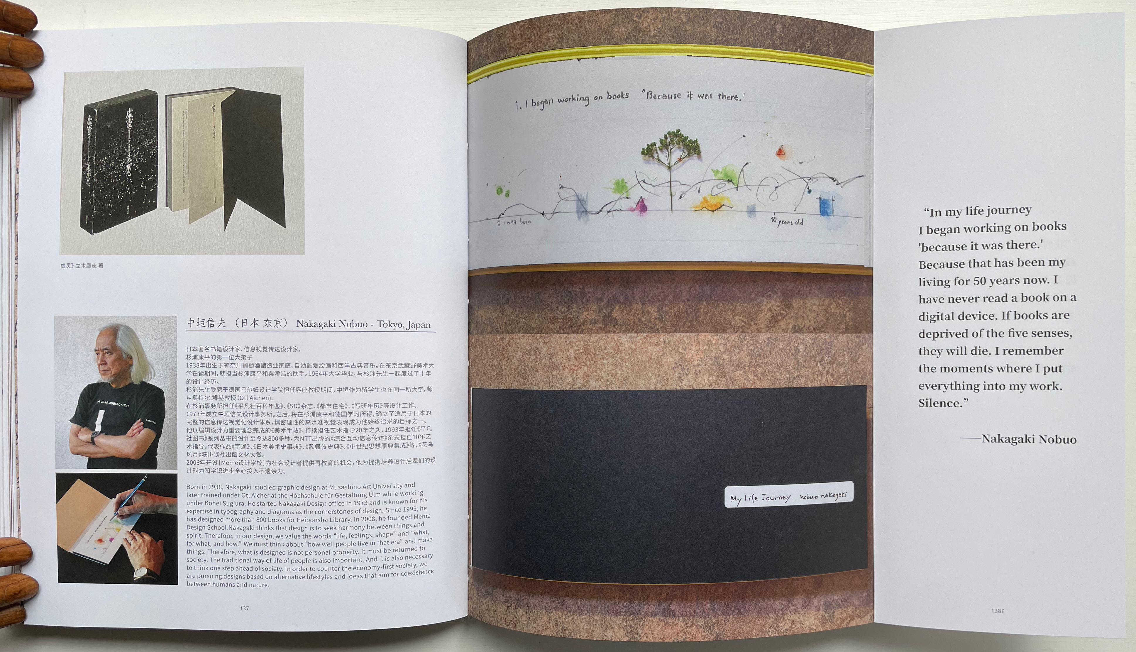
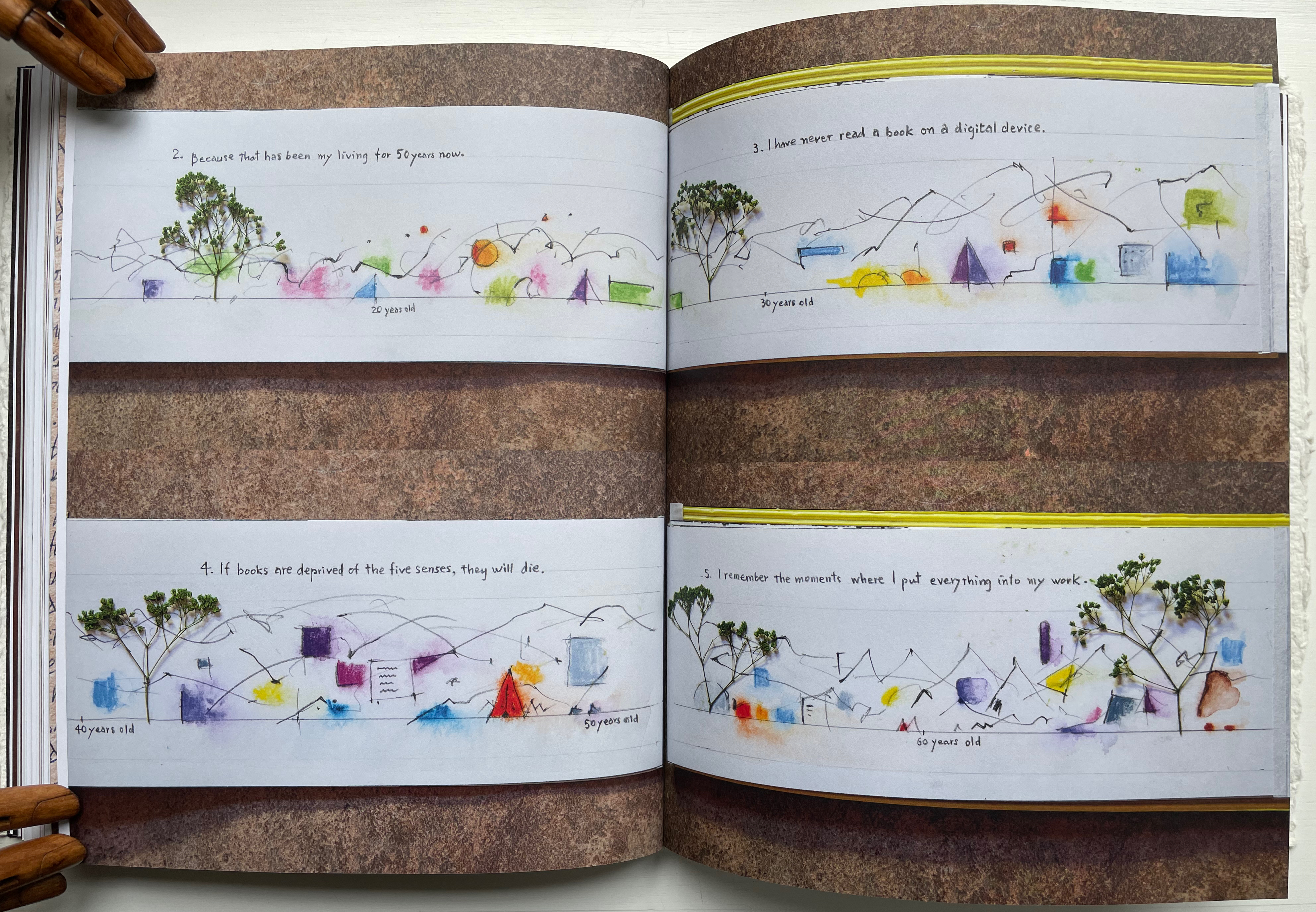
Quite appropriately this midway index appears just after the entry for Nakagaki Nabuo, whose response to the opening question “How did you begin your practice?” comes in the form of an autobiographical handmade artist’s book. In the pages presenting his book, we see the artist, his hands at work on the book, and Mader’s precise photography of the book and its airmail envelope, followed by the bookmark-like stub with its image of Cave Paper’s Layered Indigo Day paper.
Nakagaki Nabuo and his hands at work.
Nakagaki’s My Life Journey
Verso: Nakagaki’s answer to question 6: “What is your next dream project?” Recto: “Handmade Paper Descriptions” index/colophon.
In their preface, the editors write:
Although reading is a private activity we are not alone; we are cooperating with the book, bringing it into ourselves. Reading is not only about transplanting ourselves to the beyond, but we modify ourselves to see the world differently. Our vision or purpose for Handmade Path is for you to participate in this collaboration.
Just holding Handmade Path and constantly feeling its Alphabet Dao cover, navigating its foldouts alternating Chinese with English according to the contributor, being tempted to lift a contributor’s sheet of paper from the photos, hearing the snap and creak of sewn pages turning, and absorbing the contributors’ testaments, we cannot help but be drawn into participating with the book. In doing so, we learn that, as Paulette Myers-Rich puts it, “Paper is not a substrate — it is story” (p. 197).
Hamady, Walter; Samuel Haatoum; and Hermann Zapf. 1982. Papermaking by Hand : A Book of Suspicions. Perry Township, Dane County, Wisconsin, USA: Perishable Press Limited.
Thomas, Peter, and Donna Thomas. 1999. Paper from Plants. Santa Cruz, Calif: Verf. You can find images of this and others by the artists online in the Special Collections website of the University of Wisconsin-Milwaukee Libraries.
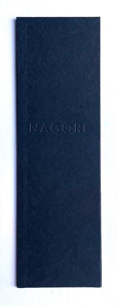
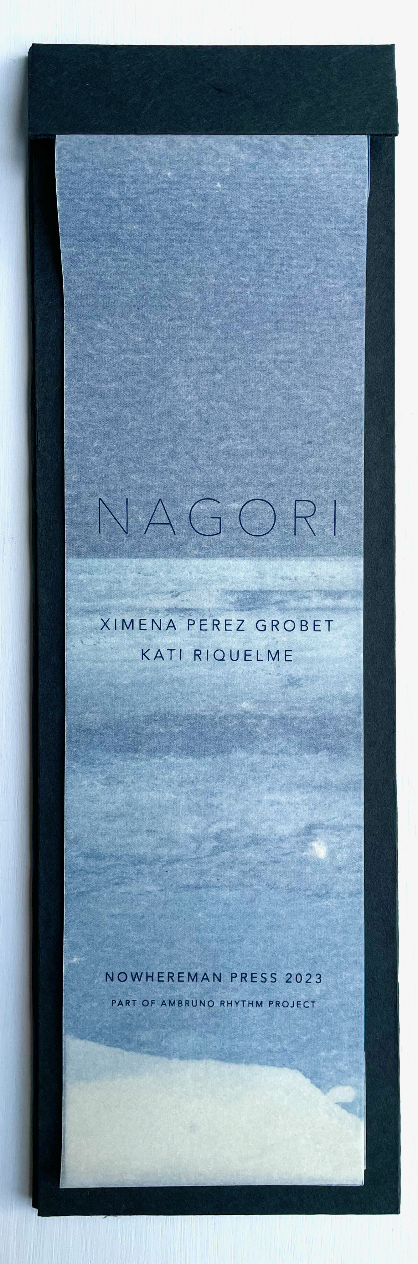
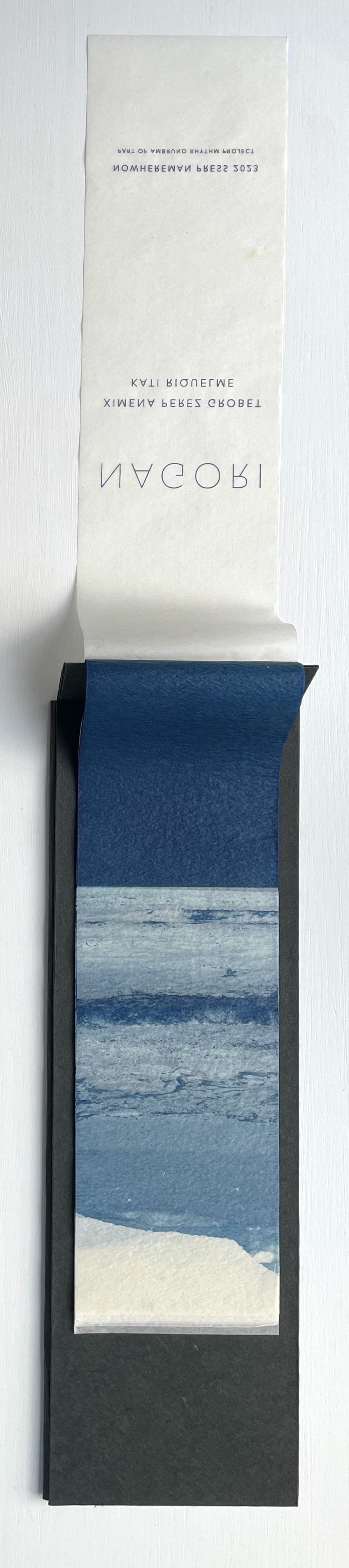
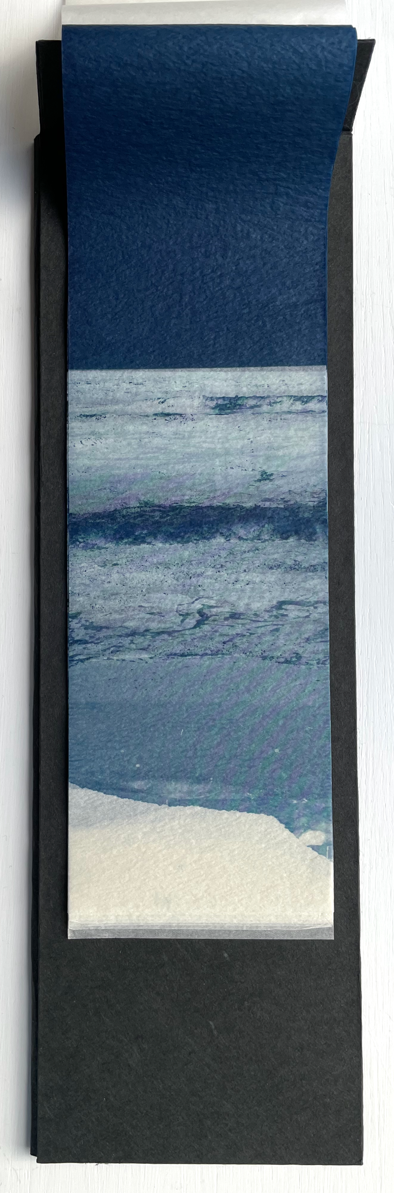
Nagori (2023) Ximena Pérez Grobet and Kati Riquelme Clothbound hardcover. H153 x W47 mm. Edition of 33, of which this is #14. Acquired from Ximena Pérez Grobet, 5 February 2024. Photos: Books On Books Collection. Permission to display from Ximena Pérez Grobet.
The Japanese word nagori has several meanings. Beware translation applications, but embrace the online discoveries that lead to Ryōko Sekiguchi, the Japanese expatriate writer, and Victor Burgin, the British conceptual artist and writer, who cites her. With Sekiguchi, you will find that it means “nostalgia for the season leaving us”, the longing for the taste of an early season fruit evoked by its late season taste, or a room’s sense of waiting for the return of someone who has just left. With Burgin, before he cites Sekiguchi, you will first find nagori‘s etymology — nami-nokori, referring to the remnant, remains or traces of receding waves. Burgin’s etymological explanation is obviously the most applicable to this collaborative artists’ book, but after you have put the book aside, you may feel a lingering nostalgia for the experience of it akin to the sensuousness Sekiguchi evokes.
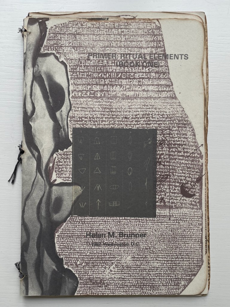
Primer: Ritual Elements (Book One)(1982) Helen M. Brunner Softcover, pamphlet-stitched. H239 x W155 mm. 22 pages. Binding adapted from a design by Barbara Press, developed under the instruction of Hedi Kyle. Edition of 300. Acquired from JP Antiquarian Books, 14 February 2024. Photos: Books On Books Collection.
Primer is an unusually made booklet. Stitched with black cotton thread over three signatures, its two outer signatures are of white wove Curtis rag paper, the inner signature is of parchment or a translucent paper, and four 5-panel thumbnail accordions in translucent paper are glued to the beginning of the last outer signature. More unusual is that the booklet’s edges appear burnt into unevenness, yet there is no odor of ash. The edges of the sewing holes also appear burnt, one page has a scorch mark in its center, and even the edges of the collaged items appear to have been burnt before being photographed. The breadth of collaged items — from cave markings to cuneiform to Rosetta Stone to film strips or slides — is not unusual given the title; you would expect a primer on ritual elements to address a prehistoric to historic range of petroglyphs, pictographs, symbols, letters, photographs, etc. But most unusual — and perhaps the point of the work — is that the legible text undermines the aim suggested by the title. The script on the back cover makes the subversion plainest.
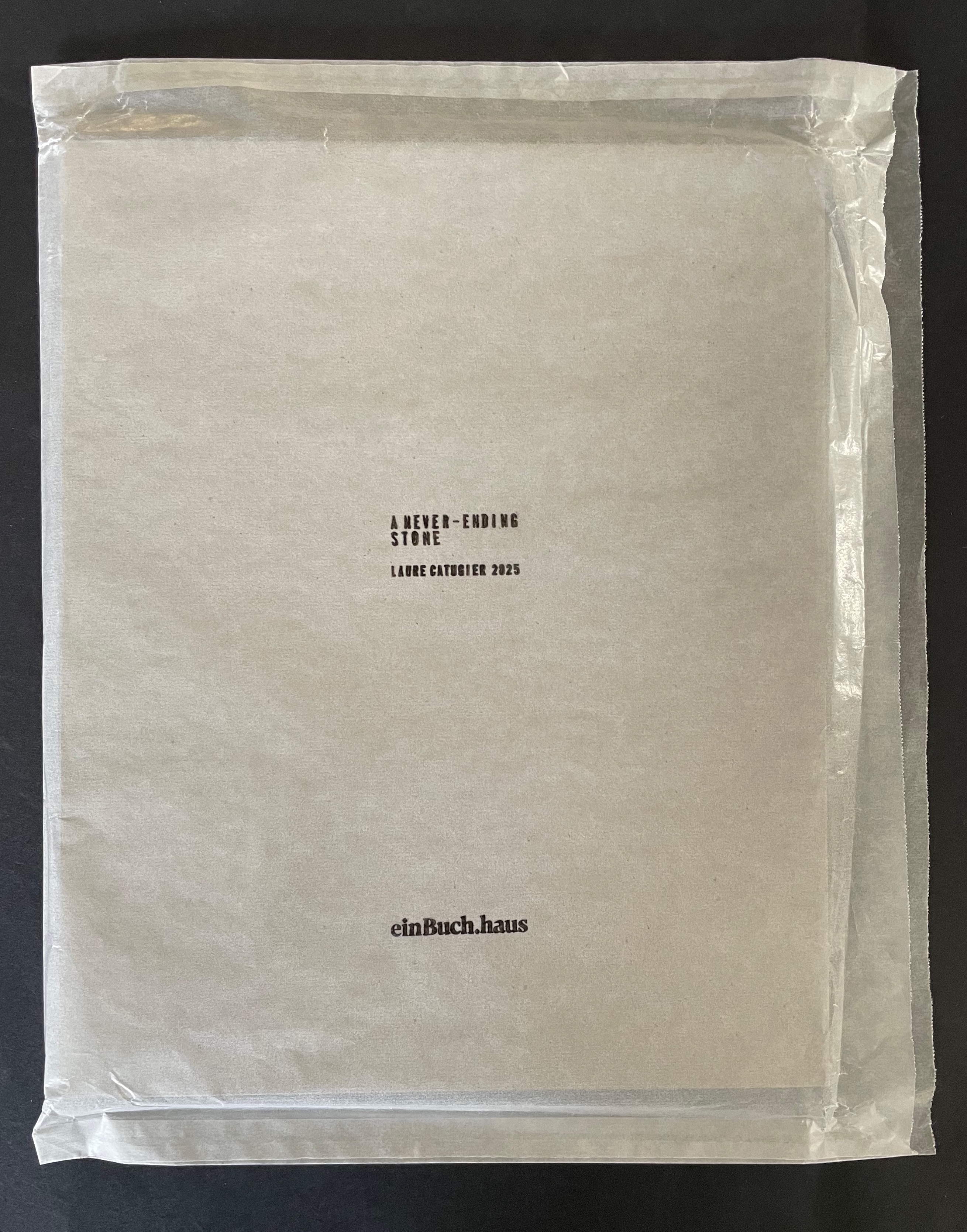
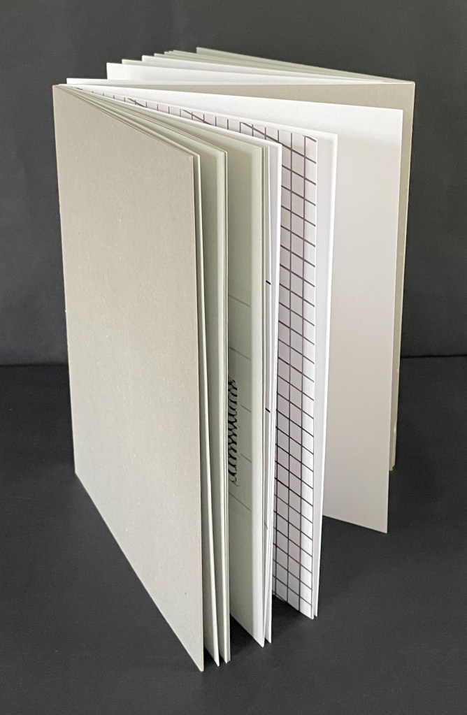
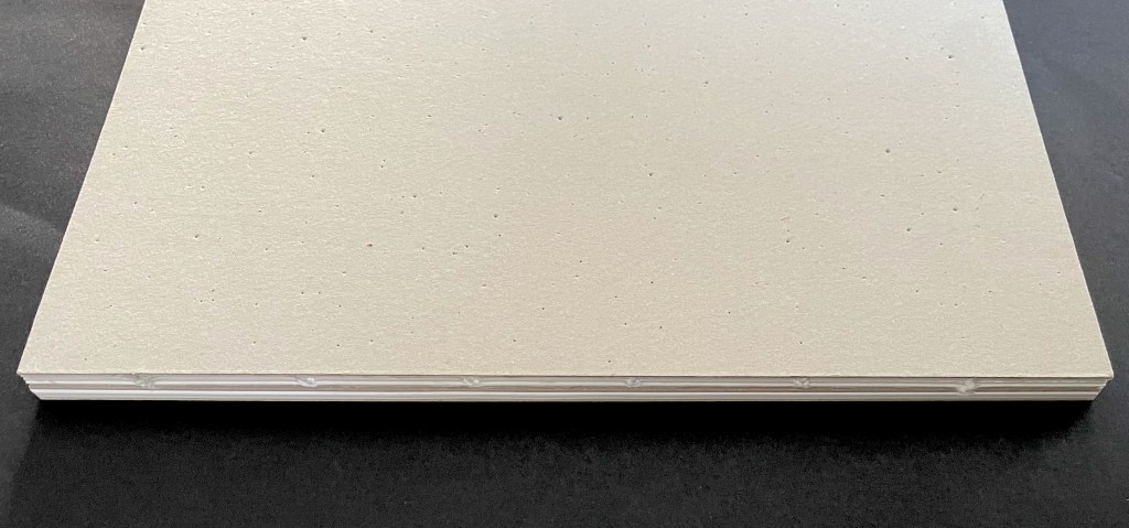
A Never-Ending Stone (2025) Laure Catugier Open spine, dos-à-dos with grey bookbinding board. 210 x H260 x 210 mm. 104 pages. Edition of 250. Acquired from einBuch.haus, 3 December 2025. Photos: Books On Books Collection.
A Never-Ending Stone is Laure Catugier’s first monographic catalog. Her skill with collage, alignment, shadows, materials, and the book format transform it into an artist’s book very much driven by her fascination with architecture and especially the architectural theories and practice of Oskar and Zofia Hansen. The Hansens eclectically embraced “human-scale” architecture, “environment art”, and what they called the “open form” structure, using space and time as its key elements. The Hansens also proposed that the architect should not be the all-knowing expert but should partner with clients as co-authors of their space, respecting how their interior and outside activities and relations with one another defined them and their space. Though somewhat a forerunner to User-Centered Design, Open Form radically aimed at structures that would evolve with interaction with the user and, as they unfolded, also align with nature.
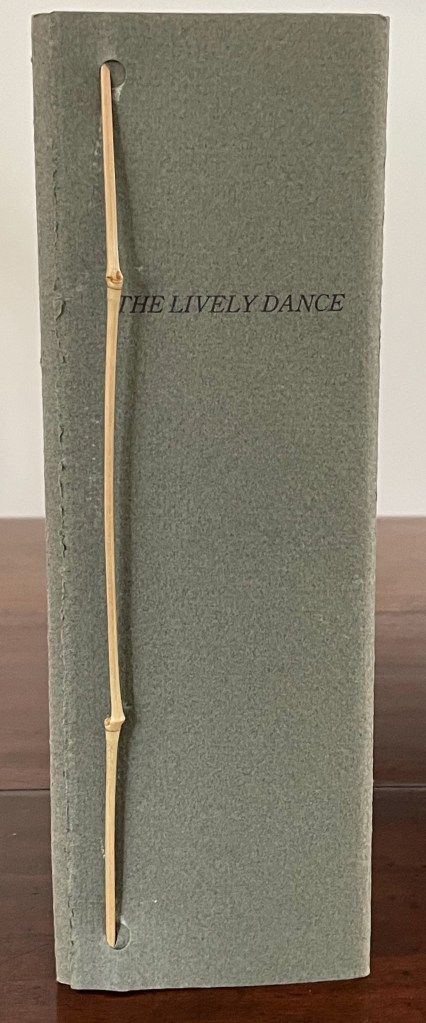
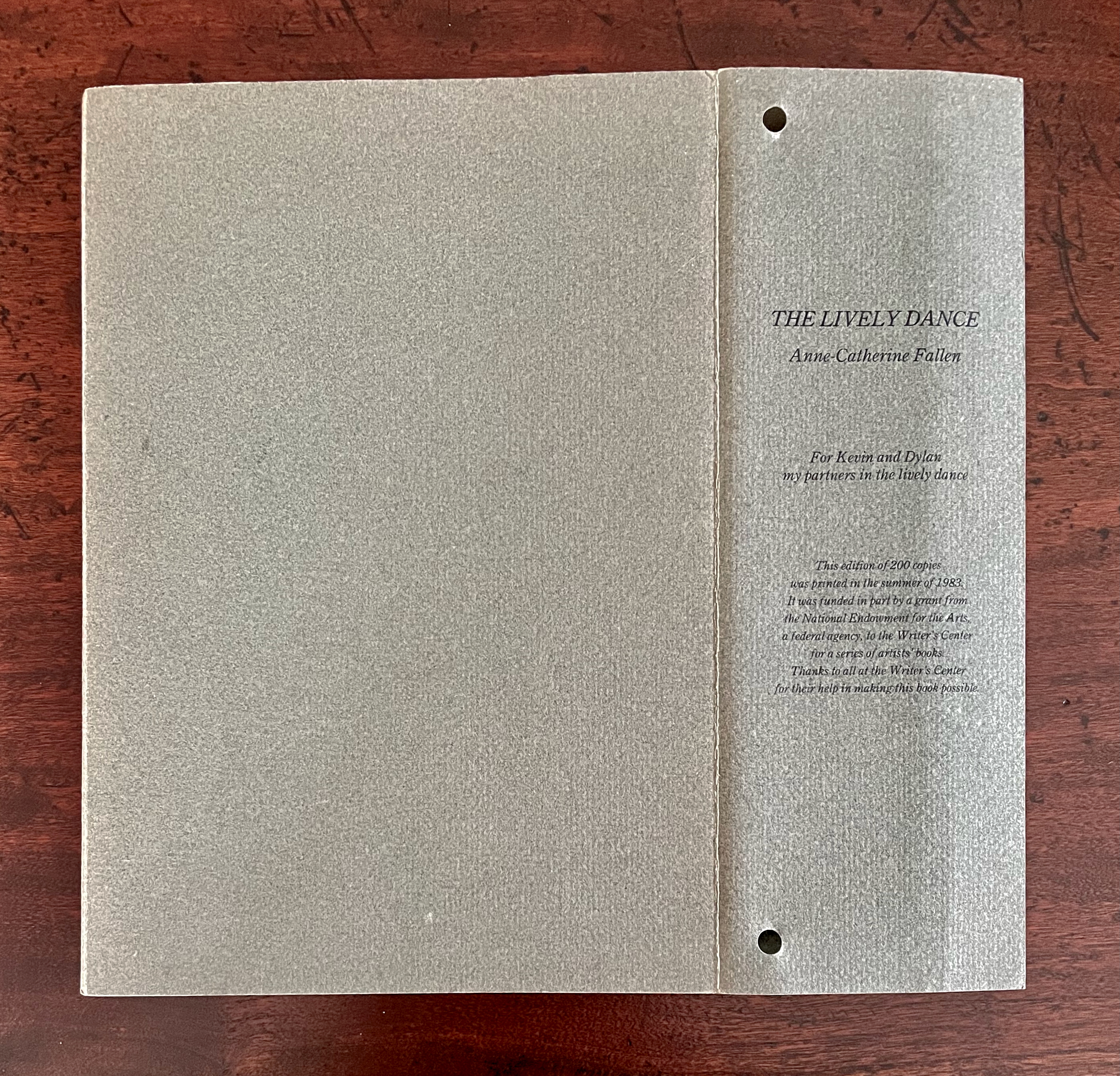
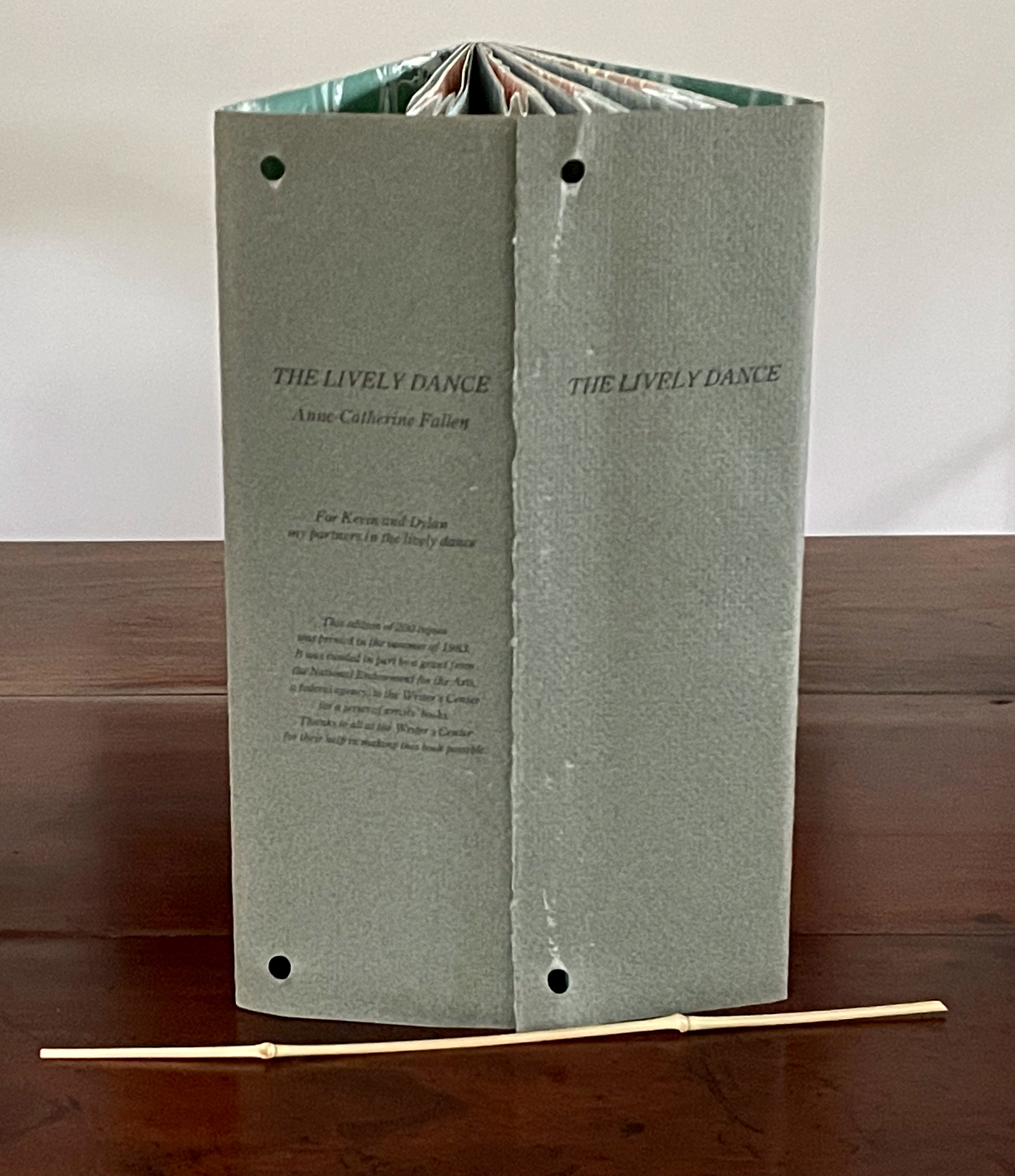
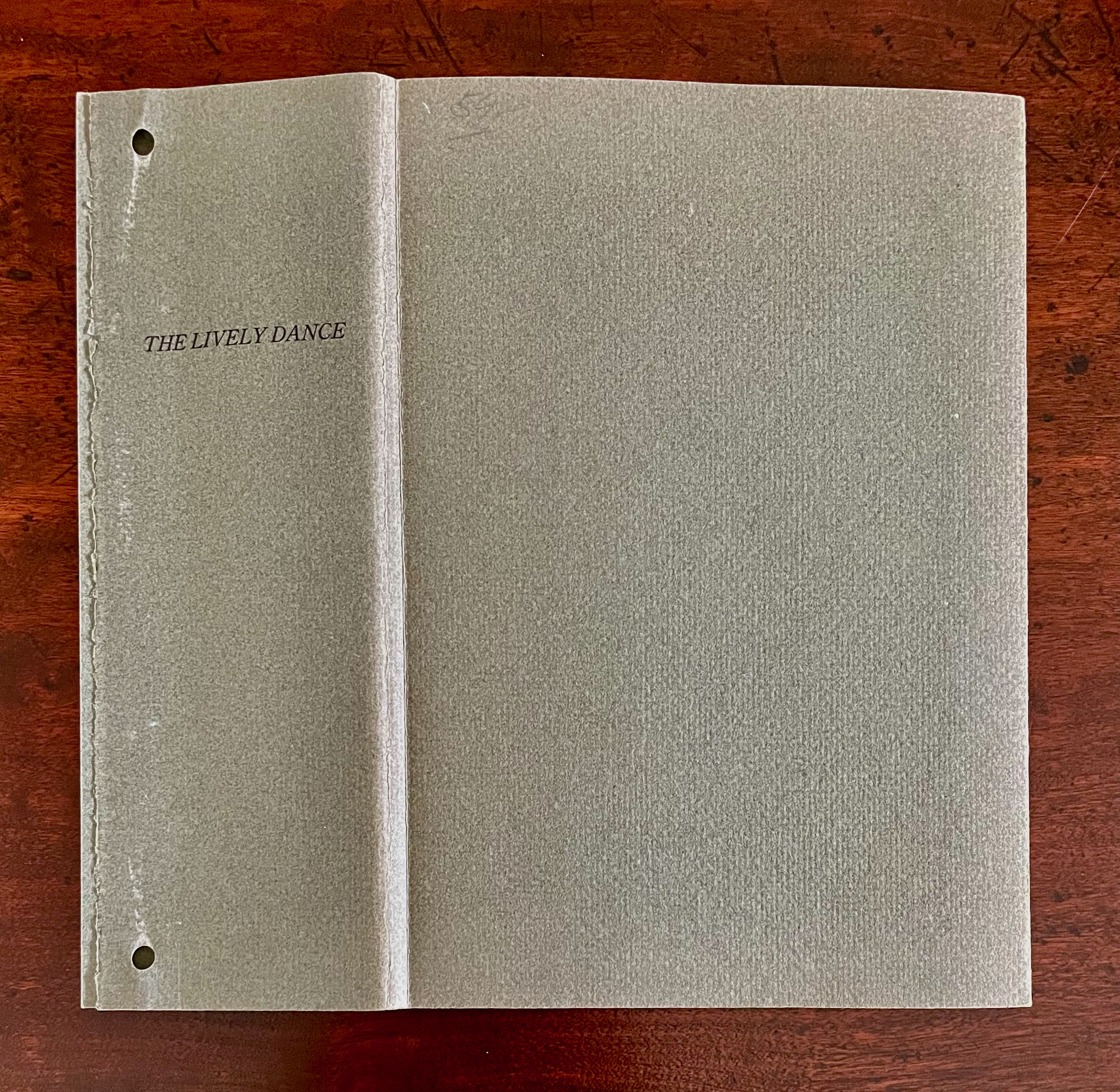
The Lively Dance (1983) Anne-Catherine Fallen Handbound book, sewn; endflaps secured at fore edge with bamboo twig to create wedge-shaped book. Laid flat, H223 x W157 mm; wedge fore edge, W75 mm. [18] pages. Edition of 200. Acquired from Stand 132, Zurich. 18 January 2026. Photos: Books On Books Collection. Displayed with the artists permission.
The Lively Dance is an elaborate and simple artist’s book. It consists of an eleven-line poem arranged across ten of eighteen pages displaying a stand of bamboo. Four pleated sheets of translucent paper, also displaying the stand of bamboo, overlap and bind those ten pages at the fore edge. Here is the book’s opening double-page spread with the translucent overlay first in place and then pulled back to reveal the poem’s invitation: “Come join the solemn dance”.
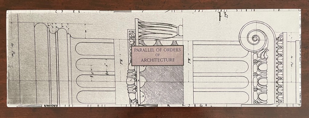
Parallel Orders of Architecture (2024) Tony Broad Box with illustrated paper over boards with title board pastedown on top; enclosing three volumes. First volume: double-sided accordion with single- and triple panel inserts. Second volume: pop-up between illustrated paper over boards with magnet closure. Third volume: pop-up within French-fold box covered with illustrated paper over boards with magnet closure. Box: H137 x W413 x D45 mm. First volume: H130 x W110 x D30 mm. Second volume: H130 x W120 mm. Third volume: H130 x W120 x D38 mm. First volume: 60 panels. Second volume: spiral pop-up. Third volume: 4-layer pop-up. Unique. Acquired from the artist, 23 July 2025. Photos: Books On Books Collection.
Tony Broad’s Parallel Orders of Architecture (2024) consists of three differently structured volumes enclosed in a handmade illustrated box. The first is a double-sided accordion with single- and triple-panel inserts on both sides. The second is a single-panel pop-up book. The third is a variant on the tunnel book. With the raised outlay on its cover and the platformed interior, the box offers yet another order of structure that runs in parallel with the architectural orders from which Broad draws his inspiration.