Un Coup de Dés Jamais N’Abolira le Hasard – Ein Würfelwurf niemals tilgt den Zufall (1995)
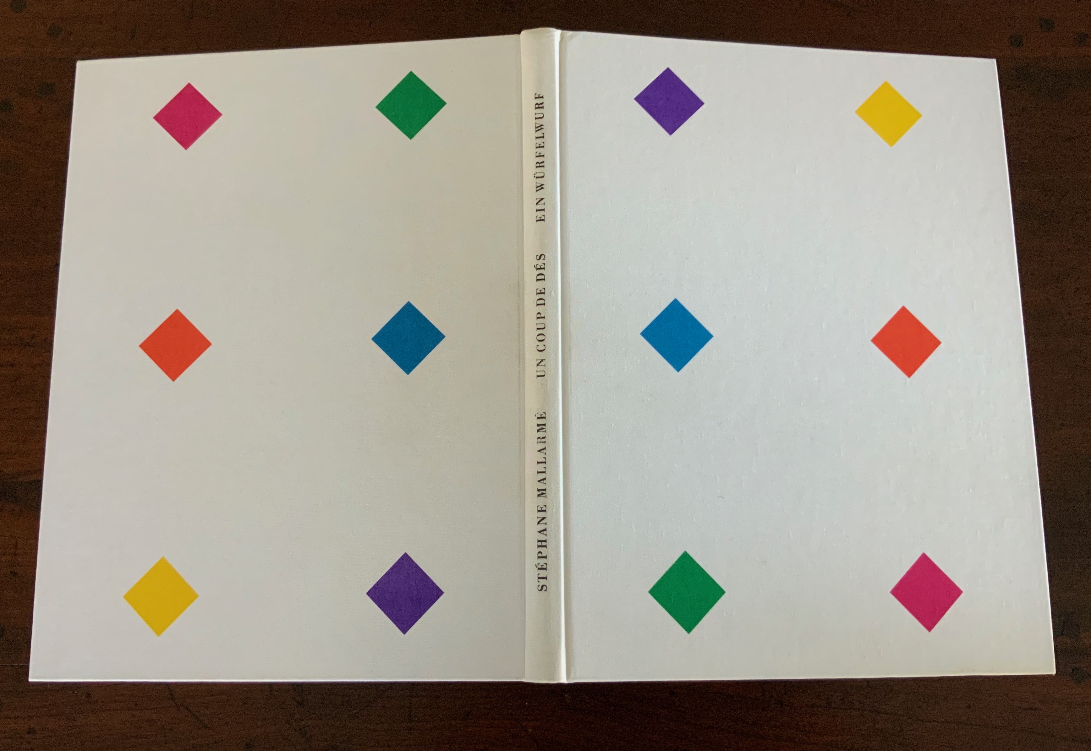

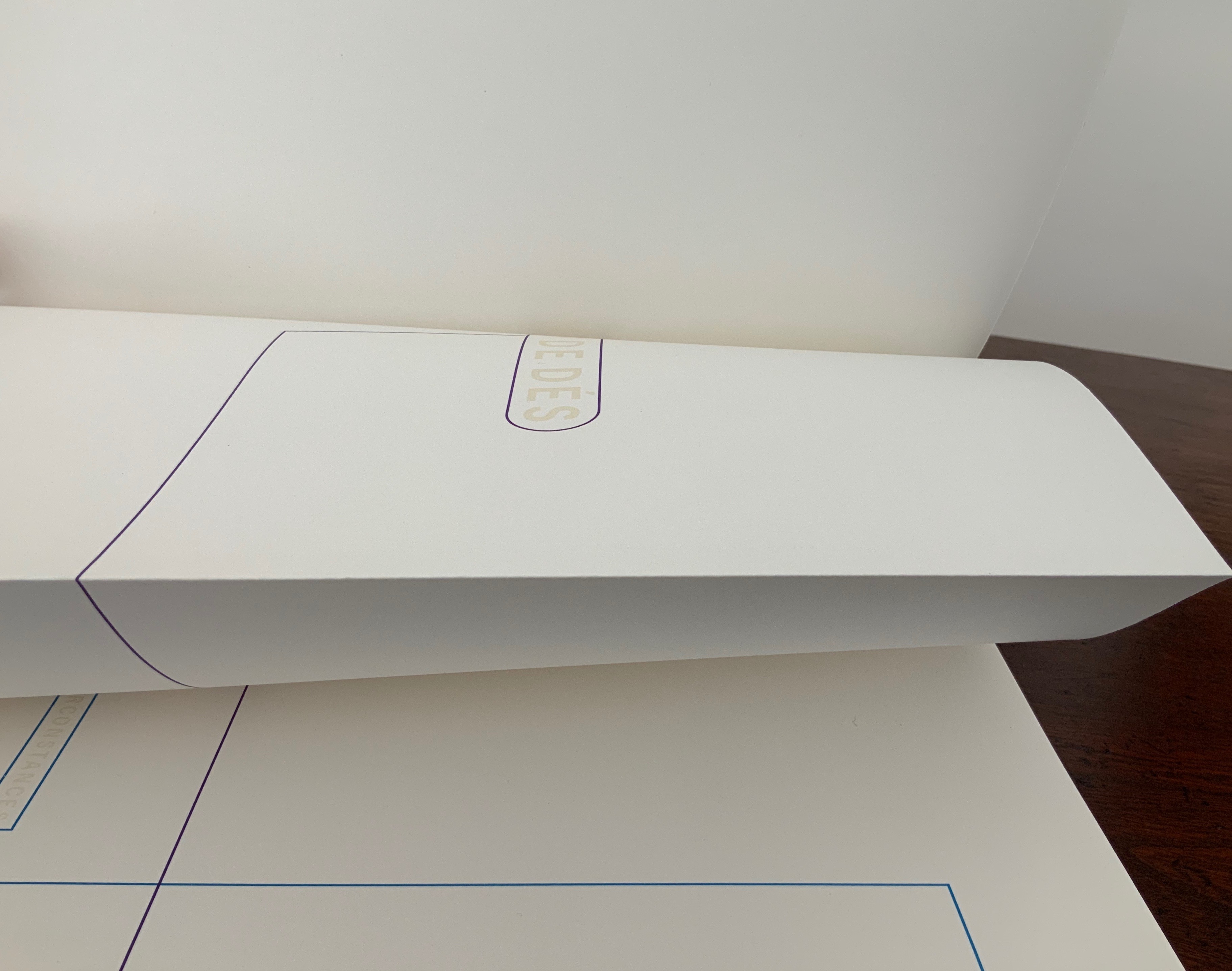


Un Coup de Dés jamais n’abolira le Hasard: Poème – Ein Würfelwurf niemals tilgt den Zufall: Ein Gedicht (1995)
Klaus Detjen
Casebound. H300 x W255 mm, 85 pages. Acquired from Stefan Schuelke Fine Books, 30 June 2020.
Photos: Books On Books Collection.
This work strikes a curious chord with two exhibitions from 2016 and 2018 — “Reading as Art” at the Bury Art Museum and “The Art of Reading” at the Museum Meermanno, respectively. The works in both exhibitions not only challenged notions of the book and ways of reading but posed the act of making as a form of reading and the act of reading as a form of making. By prefacing this French-German edition of Un Coup de Dés with a book-arts-driven “transcreation”, Klaus Detjen demonstrates that the act of making also implies the act of translating. Typographer, designer, scholar and recipient of the Leipzig Gutenberg Prize for 2017, Detjen has used color, shape, line and binding here as his tools of translation and interpretation.
To use the term “transcreation” here may be taking liberties with Haroldo de Campos’s portmanteau for the idea of “translation as recreation”, or translating with creativity and therefore making “translation-art”. The term and definition perhaps better describe works such as those shown in The New Concrete: Visual Poetry in the 21st Century edited by Victoria Bean and Chris McCabe. But then De Campos and his brother, Augusto, singled out Un Coup de Dés as one of the cornerstones (along with Ezra Pound, James Joyce and e.e. cummings) for their group Noigrandres, and Mallarmé’s poem certainly fits the bill of the ideal target of transcreation:
The more intricate the text is the more seducing it is to “recreate” it. Of course in a translation of this type, not only the signified but also the sign itself is translated, that is, the sign’s tangible self, its very materiality (sonorous properties, graphical-visual properties…. Haroldo de Campos, “Translation as Creation and Criticism”, p. 315.
This notoriously difficult poem to translate (or even comprehend) with its cascade of metaphors and symbols (the central ones being a shipwreck and a constellation) appears three times in Detjen’s volume: first, in French with Detjen’s interpretive design, then in French and finally in German. All three instances follow the typography and layout of the first book edition of the poem as published in 1914 by Gallimard. Detjen’s own treatment of the poem very much focuses on the edition’s graphical-visual properties.
In that edition, the rhythm and position of the lines, the font and all the font sizes are precisely specified. Nine typographical motifs structure the poem. They are additionally highlighted in the front part of our book with colors, the meaning of which will be discussed later. Font sizes, styles (roman or italics) and the colors of the motifs used are as follows: First double-page spread: UN COUP DE DÉS, 11.25 mm, blue-violet / Second DS: QUAND BIEN MEME, 3.5 mm, cyan-blue / Third DS: que, 3.5 mm, green / Sixth DS: COMME SI, 5.25 mm, magenta; Une insinuation, 3.5 mm, yellow / Eighth DS 8: SI, 5.25 mm, magenta red / Ninth DS: C’ÉTAIT, 4.5 mm, orange red; autrement qu’hallucination, 2.5 mm, yellow; issu stellaire, 2.5 mm yellow. Klaus Detjen, “Zum Gestaltung”, p.81 (my translation).
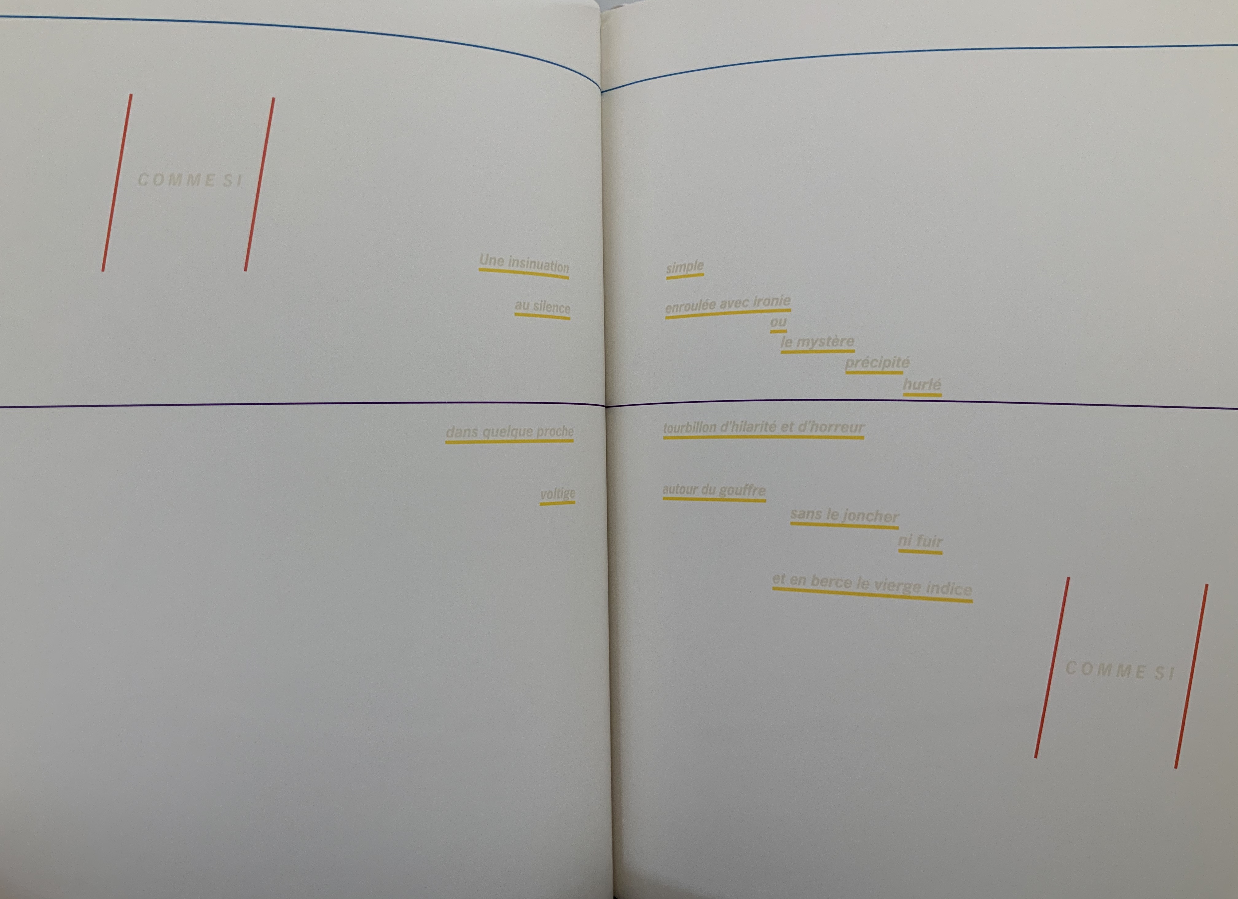

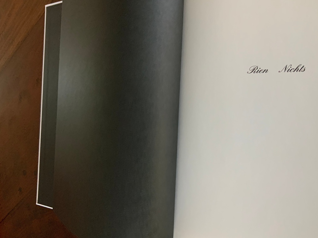
The colored linear frames, threads and markings give the nine typographical motifs additional structuring. Detjen intends them to highlight the reading order to guide the reader through the text like a score. Detjen’s later discussion of their meaning, however, focuses mainly on les blancs, the white space around the text of the poem. Taking Mallarmé at his word in the poem’s foreword, Detjen seizes on the whiteness of the surrounding space and runs to the prismatic metaphor that the spectrum of colors is simply the decomposition of white light. Detjen also notes that the unorthodox Rien/Nichts printed on the volume’s opening page alludes to the expanse of blank space enclosing the lines of text and, in support, quotes from Mallarmé’s “Crisis of Verse”:
Everything is suspended, an arrangement of fragments with alternations and confrontations, adding up to a total rhythm, which would be the poem stilled, in the blanks; … Mallarmé, “Crisis of Verse”, p. 209.
From all this, Detjen avers that it is
as if Mallarmé did not want to have his poem depicted, that is, printed, but perhaps only thought or, at best, whispered. Or did the author see the poem printed in white on white paper? Detjen, “Zum Gestaltung”, p. 82 (my translation).
Following that line of thought, Detjen switched from Mallarmé’s preferred classical serif typeface to News Gothic Bold after experimentation showed that sans serif enabled him to print legibly in flat white on white paper. Confirming his primary focus on the expanse of blank whiteness, Detjen even concludes his afterword by quoting Jorge Luis Borges on Mallarmé:
The impersonal color white itself — is it not utterly Mallarmé? Borges, “Narrative Art and Magic”, p. 79.
In his heavy emphasis on les blancs, Detjen ends up not doing justice to other more subtle aspects of his design artistry. Before he comes to the poem’s expanse of whiteness, note how the opening page of Rien/Nichts follows the black pastedowns and endpapers — the absence of light contrasting as much with the cover’s pure white as with the poem’s blank spaces.
Note how the colors to come in his interpretive version appear in dice shapes arranged on the front and back white covers to suggest the faces of a pair of dice. The whole volume becomes ein Würfelwurf, un coup de dés, a throw of the dice, which echoes Mallarmé’s obsession with le Livre — that work that everything in the world comes to be.

More subtly, Detjen combines the uncut folios with the colored shapes and markings to suggest “rigging” for the foundering ship and a “mapping” for the constellation. The turning uncut folios become billowing sails or rising and falling waves, across which the rigging cuts and the constellation shines.

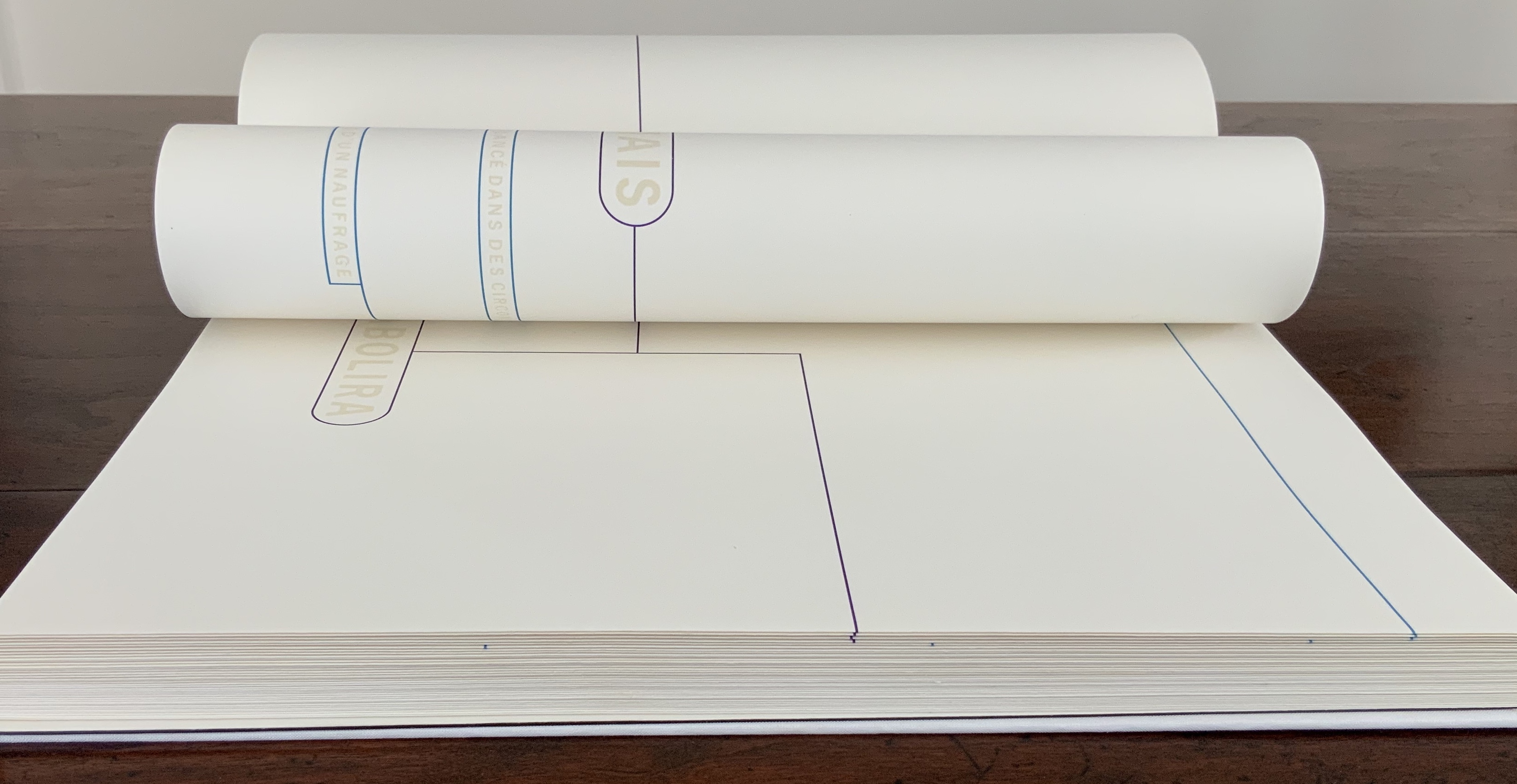


Detjen’s visual and physical “transcreation” underscores why the French and German translations are not side by side, page for page. How could they be given the way the poem’s words work with the type, the page, the double-page spread and folios? All of which meets de Campos’s definition of the ideal target for transcreation — where the work’s signified, sign and materiality are intricately bound to one another.
In Detjen’s version preceding the French and German versions, the act of translation and interpretation meets the act of creating a work of art.
Further Reading
Bean, Victoria, and Chris McCabe, eds. The New Concrete: Visual Poetry in the 21st Century (London: Hayward Publishing, 2015).
Borges, Jorge Luis. “Narrative Art and Magic” [1932]. Trans. Suzanne Jill Levine; ed. Eliot Weinberger. In Selected Non-Fictions (New York: Penguin Books, 1999), pp. 75-82.
Campos, Haroldo de. “Translation as Creation and Criticism” [1963]. Trans. Diana Gibson and Haroldo de Campos. In A. S. Bessa and O. Cisneros, eds., Novas: Selected Writings (Evanston, IL: Northwestern University Press, 2007), pp. 312-326.
Cisneros, Odile. “From Isomorphism to Cannibalism: The Evolution of Haroldo de Campos’s Translation Concepts“, Érudit: At the crossroads of translating and writing: Poetics and experiments, Volume 25, Number 2, 2012, pp.15-44. Posted 8 October 2013. Accessed 22 August 2020.
Jaruga, Rodolfo. “Ezra Pound’s Arrival in Brazil“, Make It New: The Ezra Pound Society Magazine, Volume 4.1-2, September 2017. Accessed 22 August 2020.
Mallarmé, Stéphane. “Crisis of Verse” [1897]. Trans. Barbara Johnson. In Divagations (Cambridge, MA: Harvard University Press, 2009), pp. 201-11.
Paola, Modesta de. “Translation in Visual Arts”, Interartive, August 2013. Accessed 22 August 2020.