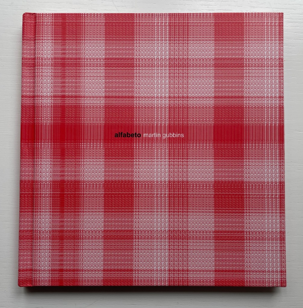
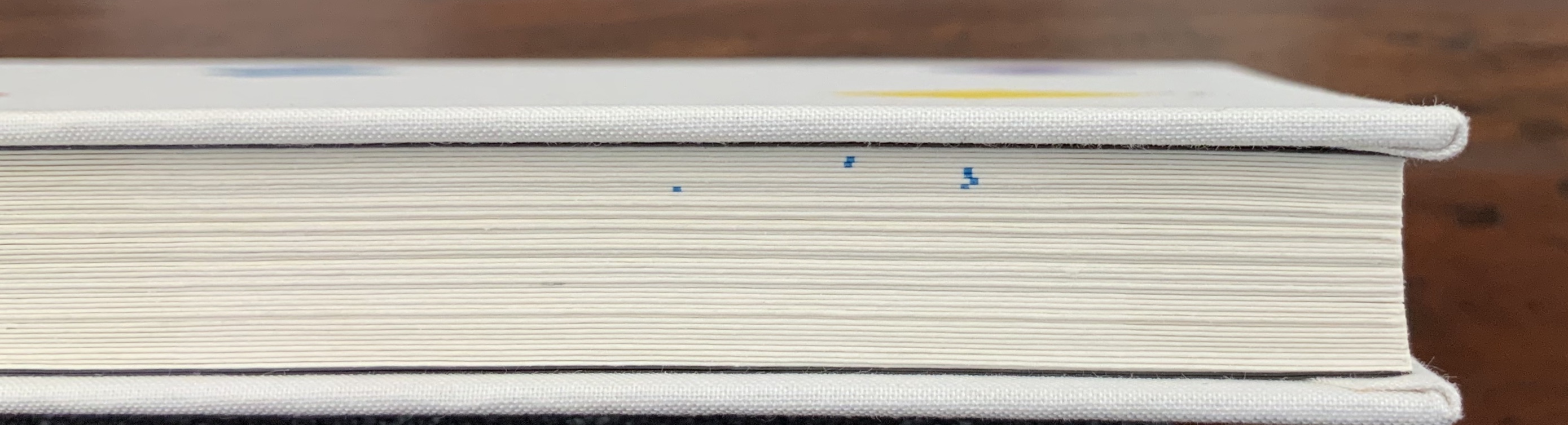
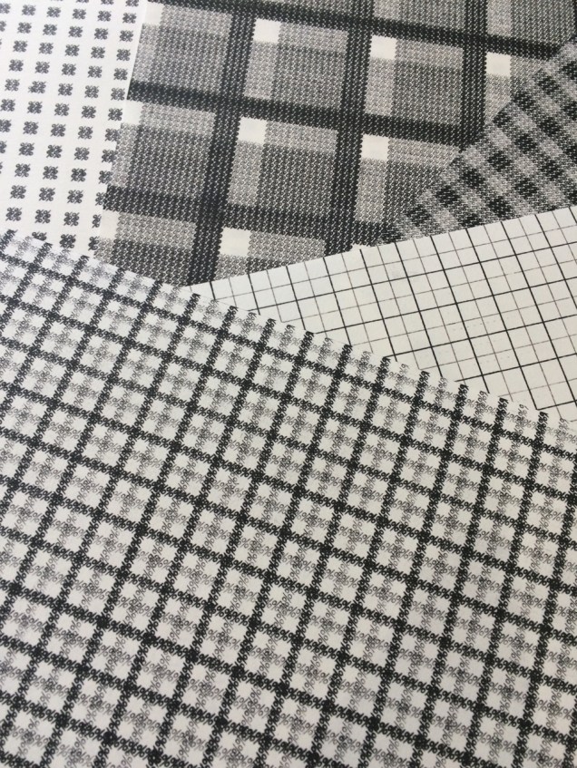
Alfabeto (2017) Martín Gubbins Hardback. 180 x 180 mm. 60 pages. Acquired from Naranja Publicaciones, 28 July 2022. Photos: Books On Books Collection.
Each letter of the Spanish alphabet is printed in sans serif across a full page to create a grid-like or plaid-like pattern. All letters are printed once in black on white paper and twice in white on black paper; with sheets facing one another. For the English-speaking reader, that’s a bonus of two pages for the ñ.
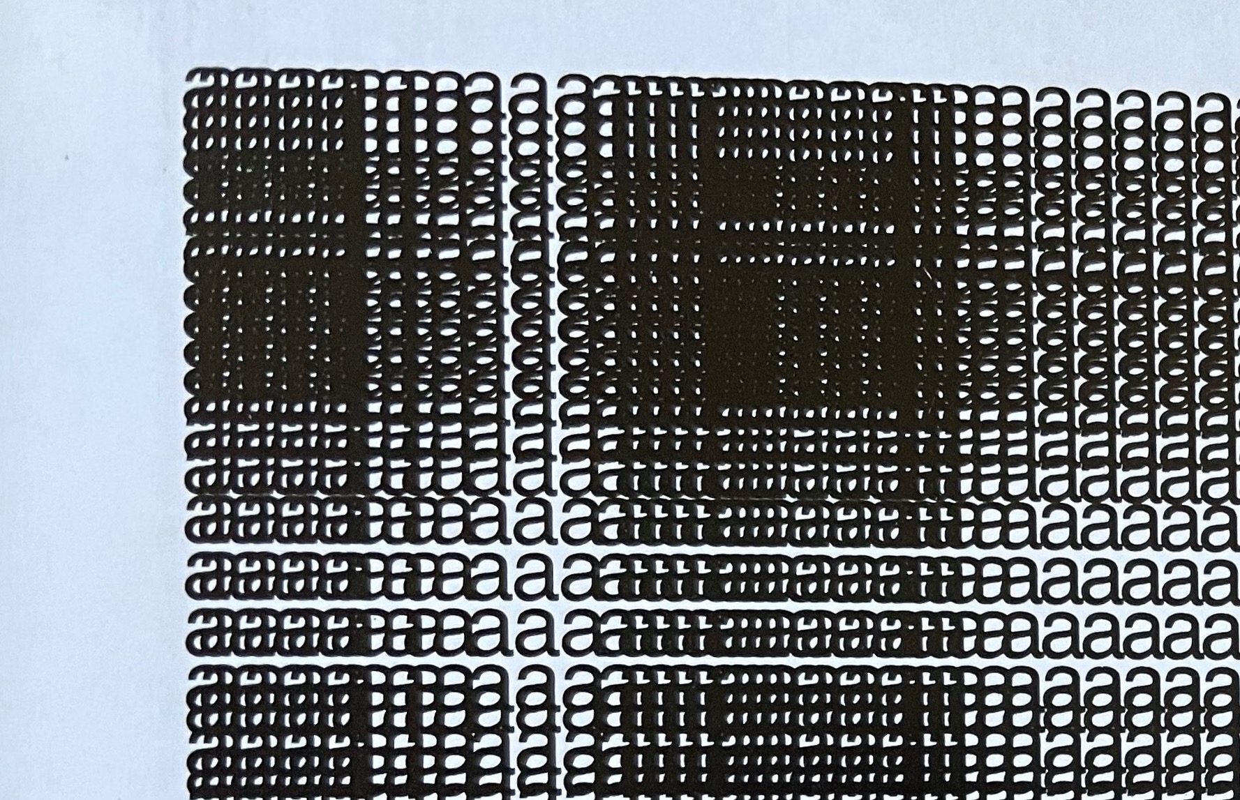
Held at normal reading length, the double-page spreads do have a plaid effect, but inspected closely, the effect becomes that of wire mesh from which the letters leap out from the less tightly woven spots.
Unsurprisingly the plaids are as distinct from, and similar to, one another as letter shapes are. Sometimes, as with the letter b, an illusion of three dimensionality takes hold.
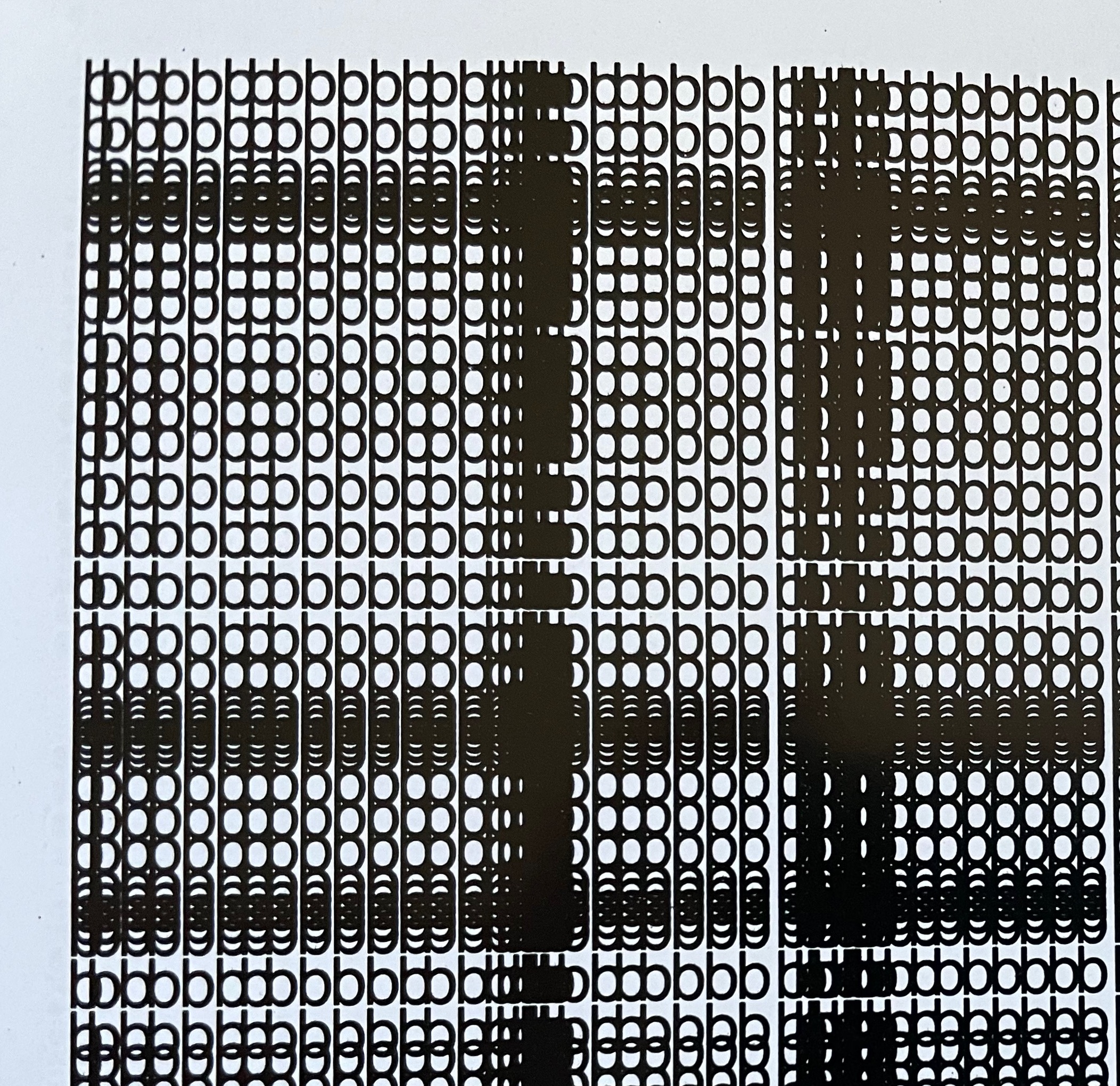
The most surprising — though they should not be — are the letters i and l. With no crossbar, bowl or curve, they cannot create a plaid pattern. Rather, their black on white, white on black patterns look like barcodes.
Gubbins One of the founding members of the Foro de Escritores (www.fde.cl) Chilean version of Bob Cobbing’s Writers Forum in London, and noted figure in the avant-garde poetry scene in Latin America. Gubbins has collaborated with the American poet and artist John M. Bennett, in whose honor
Some visual artists call this kind of work a “tapuscript“. Some throw it together under the heading of language art or concrete or visual poetry. Karl Kempton prefers the term “visual text art” over any other. Conceding the term to cover the broad genre, works like Alfabeto that cover the entire alphabet in sequence — or even play with its sequence — might deserve the sub generic term “visual alphabet art”. Kempton himself, Roberto de Vicq de Cumptich, Raffaella della Olga, Sharon Werner & Sharon Forss — as well as many of the artists in Victoria Bean and Chris McCabe’s anthology and those in Philip Davenport’s — surely provide a sufficient number of examples.
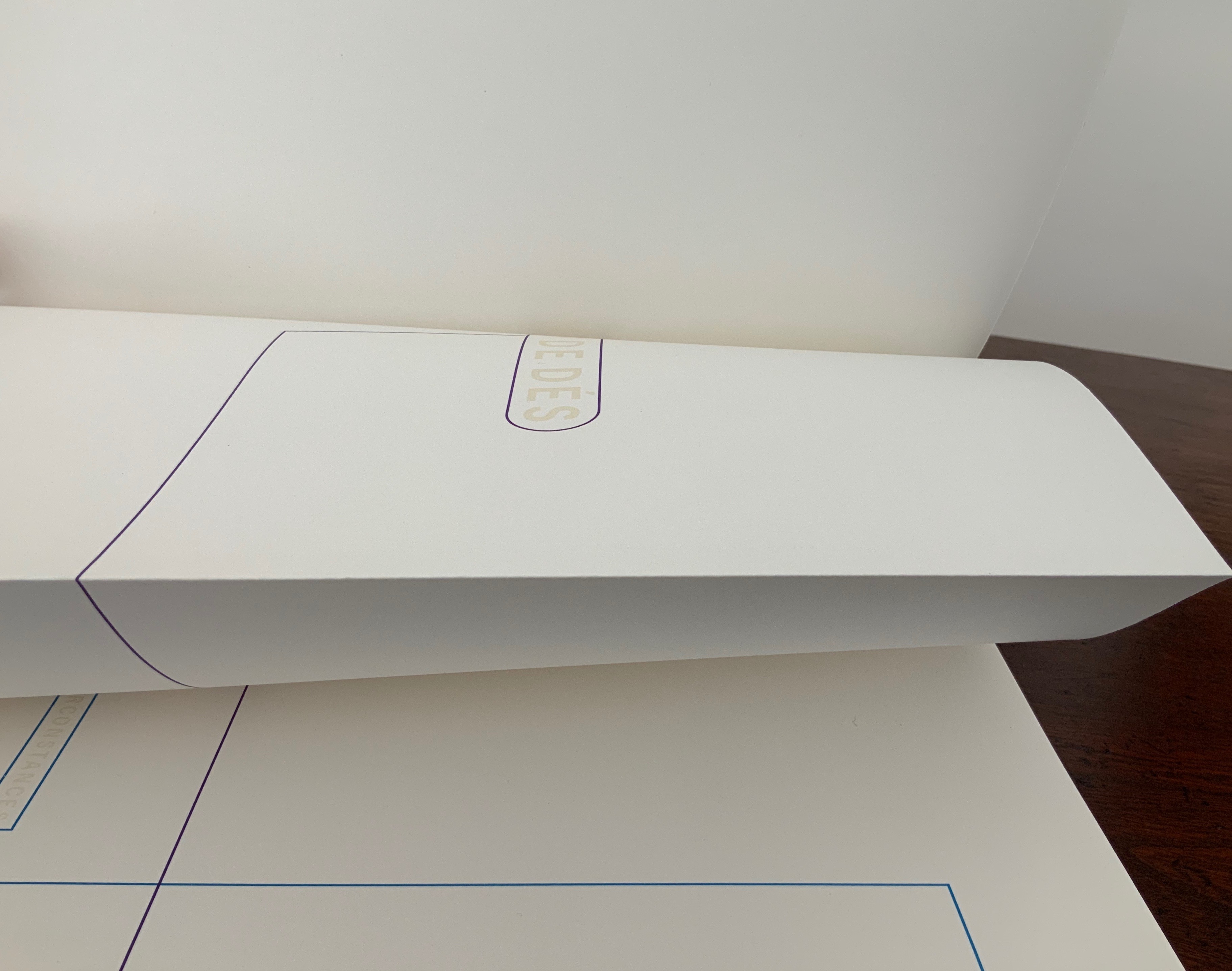
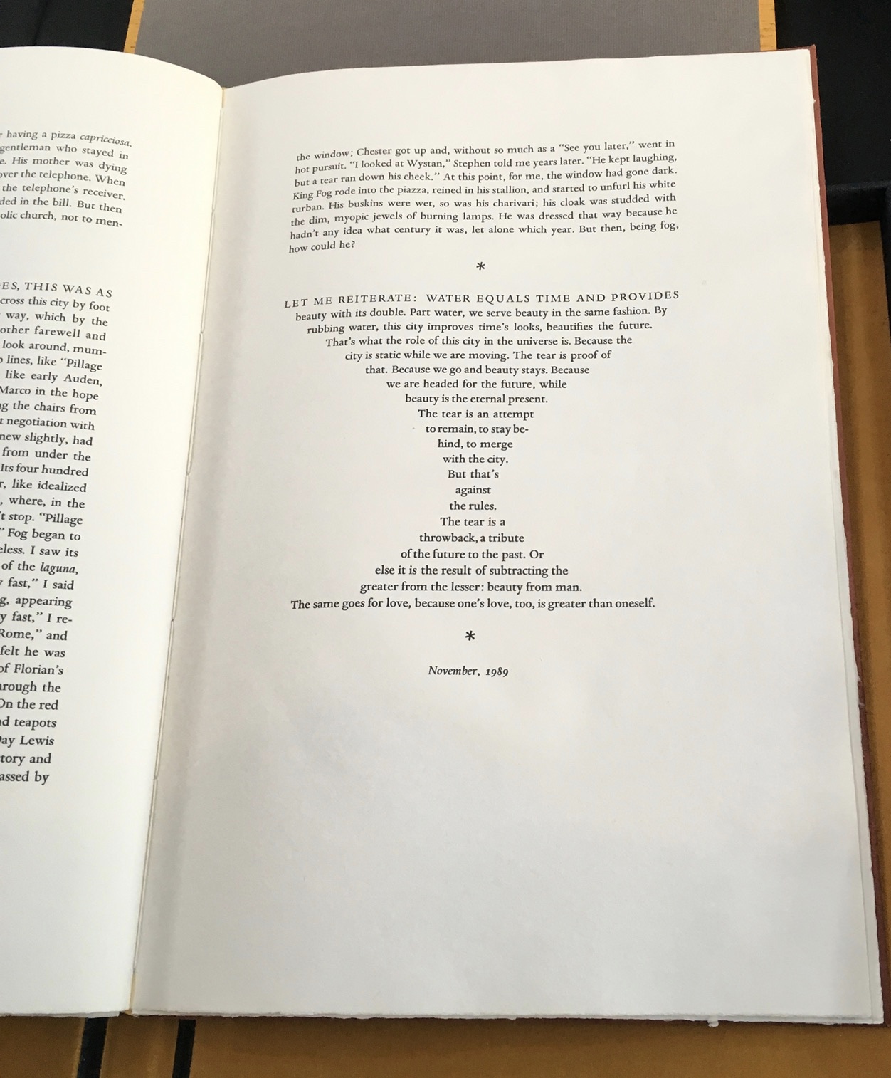
This work strikes a curious chord with two exhibitions from 2016 and 2018 — “Reading as Art” at the Bury Art Museum and “The Art of Reading” at the Museum Meermanno, respectively. The works in both exhibitions not only challenged notions of the book and ways of reading but posed the act of making as a form of reading and the act of reading as a form of making. By prefacing this French-German edition of Un Coup de Dés with a book-arts-driven “transcreation”, Klaus Detjen demonstrates that the act of making also implies the act of translating. Typographer, designer, scholar and recipient of the Leipzig Gutenberg Prize for 2017, Detjen has used color, shape, line and binding here as his tools of translation and interpretation.
To use the term “transcreation” here may be taking liberties with Haroldo de Campos’s portmanteau for the idea of “translation as recreation”, or translating with creativity and therefore making “translation-art”. The term and definition perhaps better describe works such as those shown in The New Concrete: Visual Poetry in the 21st Century edited by Victoria Bean and Chris McCabe. But then De Campos and his brother, Augusto, singled out Un Coup de Dés as one of the cornerstones (along with Ezra Pound, James Joyce and e.e. cummings) for their group Noigrandres, and Mallarmé’s poem certainly fits the bill of the ideal target of transcreation:
The more intricate the text is the more seducing it is to “recreate” it. Of course in a translation of this type, not only the signified but also the sign itself is translated, that is, thesign’s tangible self, its very materiality (sonorous properties, graphical-visual properties…. Haroldo de Campos, “Translation as Creation and Criticism”, p. 315.
This notoriously difficult poem to translate (or even comprehend) with its cascade of metaphors and symbols (the central ones being a shipwreck and a constellation) appears three times in Detjen’s volume: first, in French with Detjen’s interpretive design, then in French and finally in German. All three instances follow the typography and layout of the first book edition of the poem as published in 1914 by Gallimard. Detjen’s own treatment of the poem very much focuses on the edition’s graphical-visual properties.
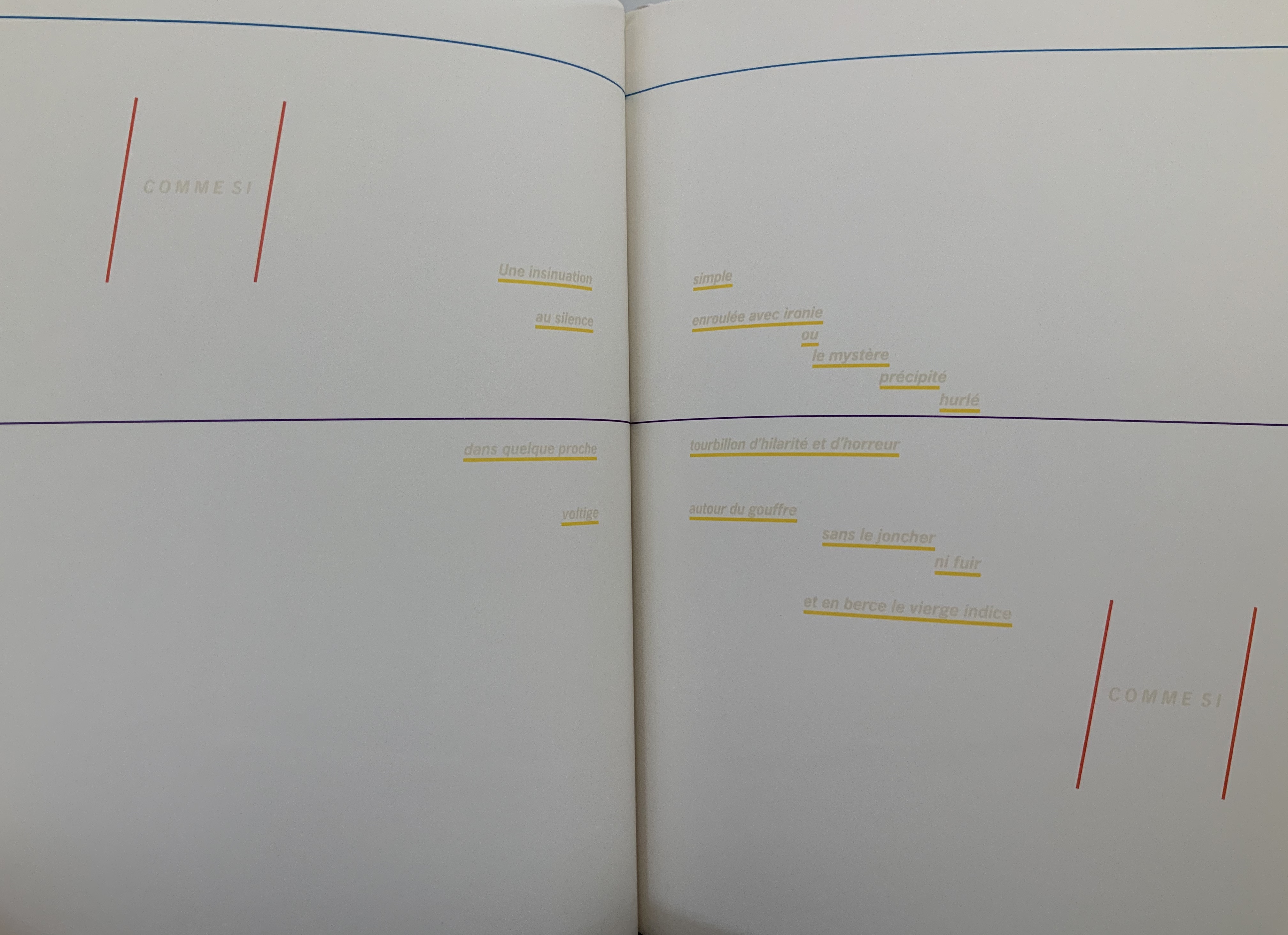
In that edition, the rhythm and position of the lines, the font and all the font sizes are precisely specified. Nine typographical motifs structure the poem. They are additionally highlighted in the front part of our book with colors, the meaning of which will be discussed later. Font sizes, styles (roman or italics) and the colors of the motifs used are as follows: First double-page spread: UN COUP DE DÉS, 11.25 mm, blue-violet / Second DS: QUAND BIEN MEME, 3.5 mm, cyan-blue / Third DS: que, 3.5 mm, green / Sixth DS: COMME SI, 5.25 mm, magenta; Une insinuation, 3.5 mm, yellow / Eighth DS 8: SI, 5.25 mm, magenta red / Ninth DS: C’ÉTAIT, 4.5 mm, orange red; autrement qu’hallucination, 2.5 mm, yellow; issu stellaire, 2.5 mm yellow. Klaus Detjen, “Zum Gestaltung”, p.81 (my translation).
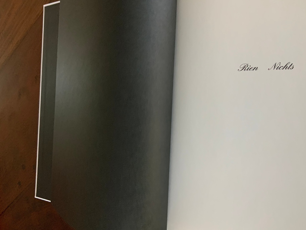
The colored linear frames, threads and markings give the nine typographical motifs additional structuring. Detjen intends them to highlight the reading order to guide the reader through the text like a score. Detjen’s later discussion of their meaning, however, focuses mainly on les blancs, the white space around the text of the poem. Taking Mallarmé at his word in the poem’s foreword, Detjen seizes on the whiteness of the surrounding space and runs to the prismatic metaphor that the spectrum of colors is simply the decomposition of white light. Detjen also notes that the unorthodox Rien/Nichts printed on the volume’s opening page alludes to the expanse of blank space enclosing the lines of text and, in support, quotes from Mallarmé’s “Crisis of Verse”:
Everything is suspended, an arrangement of fragments with alternations and confrontations, adding up to a total rhythm, which would be the poem stilled, in the blanks; … Mallarmé, “Crisis of Verse”, p. 209.
From all this, Detjen avers that it is
as if Mallarmé did not want to have his poem depicted, that is, printed, but perhaps only thought or, at best, whispered. Or did the author see the poem printed in white on white paper? Detjen, “Zum Gestaltung”, p. 82 (my translation).
Following that line of thought, Detjen switched from Mallarmé’s preferred classical serif typeface to News Gothic Bold after experimentation showed that sans serif enabled him to print legibly in flat white on white paper. Confirming his primary focus on the expanse of blank whiteness, Detjen even concludes his afterword by quoting Jorge Luis Borges on Mallarmé:
The impersonal color white itself — is it not utterly Mallarmé? Borges, “Narrative Art and Magic”, p. 79.
In his heavy emphasis on les blancs, Detjen ends up not doing justice to other more subtle aspects of his design artistry. Before he comes to the poem’s expanse of whiteness, note how the opening page of Rien/Nichts follows the black pastedowns and endpapers — the absence of light contrasting as much with the cover’s pure white as with the poem’s blank spaces.
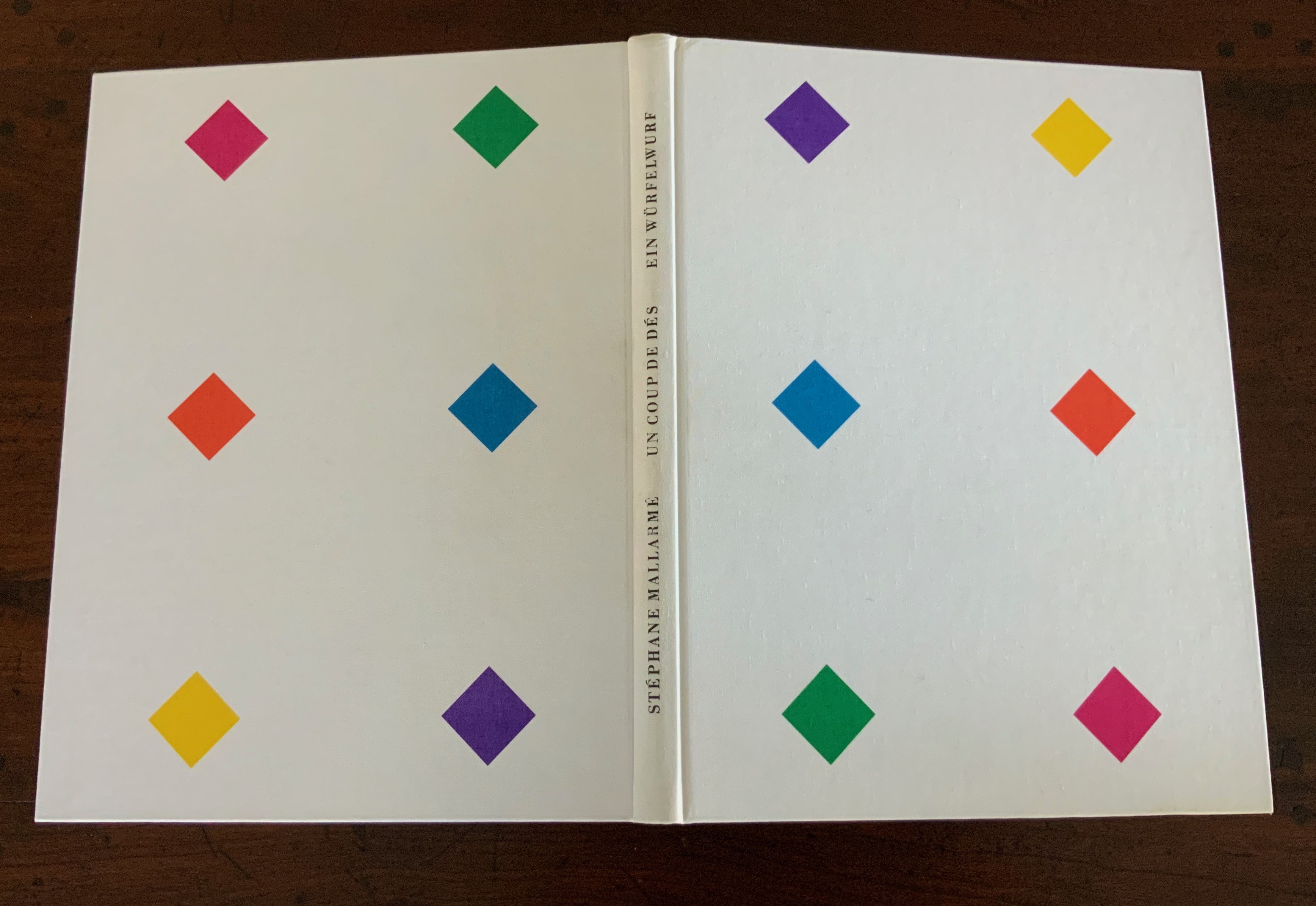
Note how the colors to come in his interpretive version appear in dice shapes arranged on the front and back white covers to suggest the faces of a pair of dice. The whole volume becomes ein Würfelwurf, un coup de dés, a throw of the dice, which echoes Mallarmé’s obsession with le Livre — that work that everything in the world comes to be.
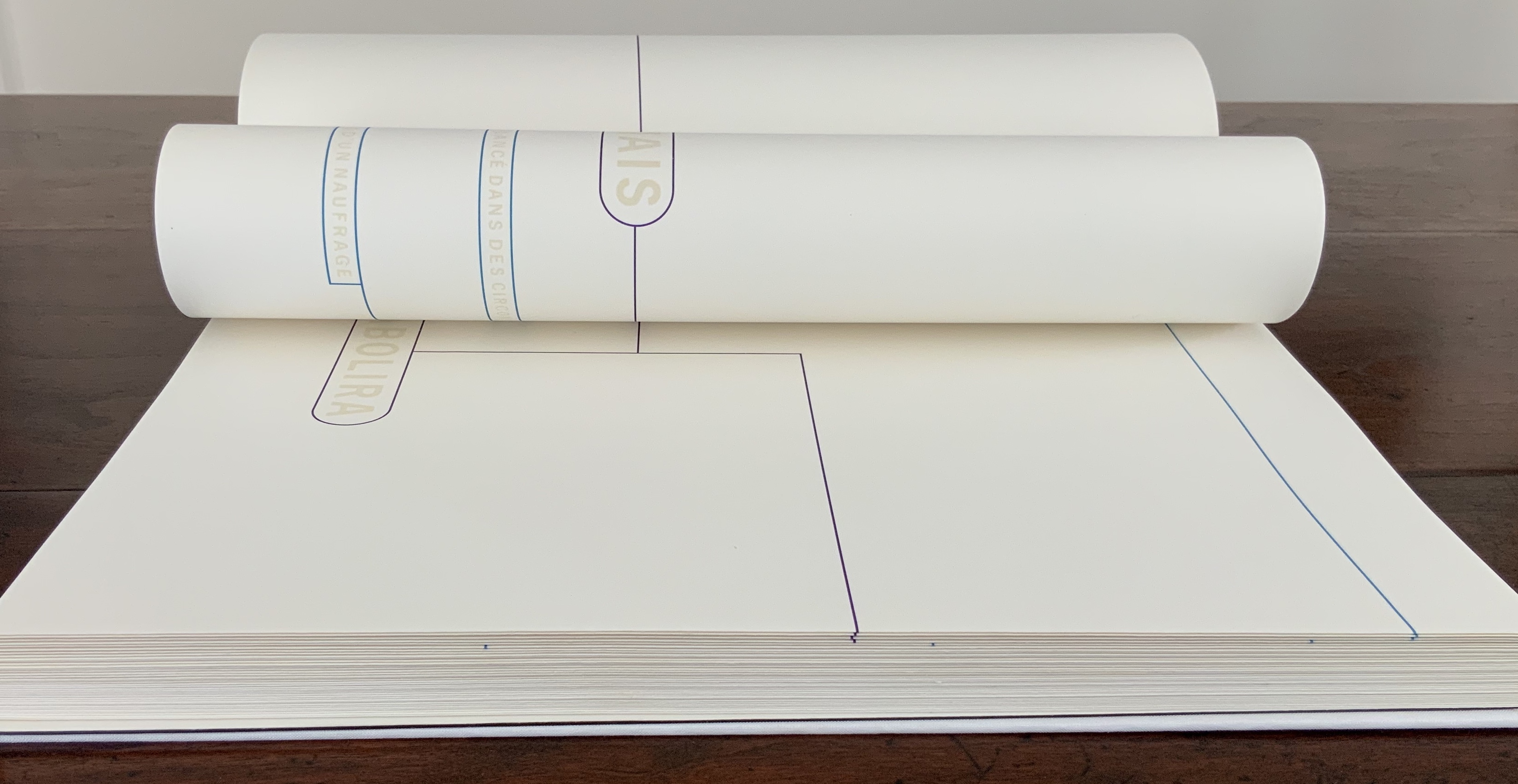
More subtly, Detjen combines the uncut folios with the colored shapes and markings to suggest “rigging” for the foundering ship and a “mapping” for the constellation. The turning uncut folios become billowing sails or rising and falling waves, across which the rigging cuts and the constellation shines.
Detjen’s visual and physical “transcreation” underscores why the French and German translations are not side by side, page for page. How could they be given the way the poem’s words work with the type, the page, the double-page spread and folios? All of which meets de Campos’s definition of the ideal target for transcreation — where the work’s signified, sign and materiality are intricately bound to one another.
In Detjen’s version preceding the French and German versions, the act of translation and interpretation meets the act of creating a work of art.
Borges, Jorge Luis. “Narrative Art and Magic” [1932]. Trans. Suzanne Jill Levine; ed. Eliot Weinberger. In Selected Non-Fictions (New York: Penguin Books, 1999), pp. 75-82.
Campos, Haroldo de. “Translation as Creation and Criticism” [1963]. Trans. Diana Gibson and Haroldo de Campos. In A. S. Bessa and O. Cisneros, eds., Novas: Selected Writings (Evanston, IL: Northwestern University Press, 2007), pp. 312-326.
Jaruga, Rodolfo. “Ezra Pound’s Arrival in Brazil“, Make It New: The Ezra Pound Society Magazine, Volume 4.1-2, September 2017. Accessed 22 August 2020.
Mallarmé, Stéphane. “Crisis of Verse” [1897]. Trans. Barbara Johnson. In Divagations(Cambridge, MA: Harvard University Press, 2009), pp. 201-11.
The seventh biennial Codex book fair and symposium in Berkeley and Richmond, California have come to a close. Of what use it is now to explain how to enjoy them, you be the judge. Your first step is to read the story in Mark Twain’s Roughing It of “Jim Blaine and His Grandfather’s Ram”. Being the story of a story — book art being so self-reflexive and all — it is the best way to commence:
Every now and then, in these days, the boys used to tell me I ought to get one Jim Blaine to tell me the stirring story of his grandfather’s old ram—but they always added that I must not mention the matter unless Jim was drunk at the time—just comfortably and sociably drunk.
Not to advise drink before the fair.
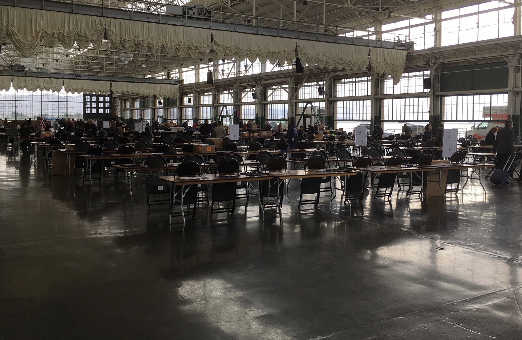
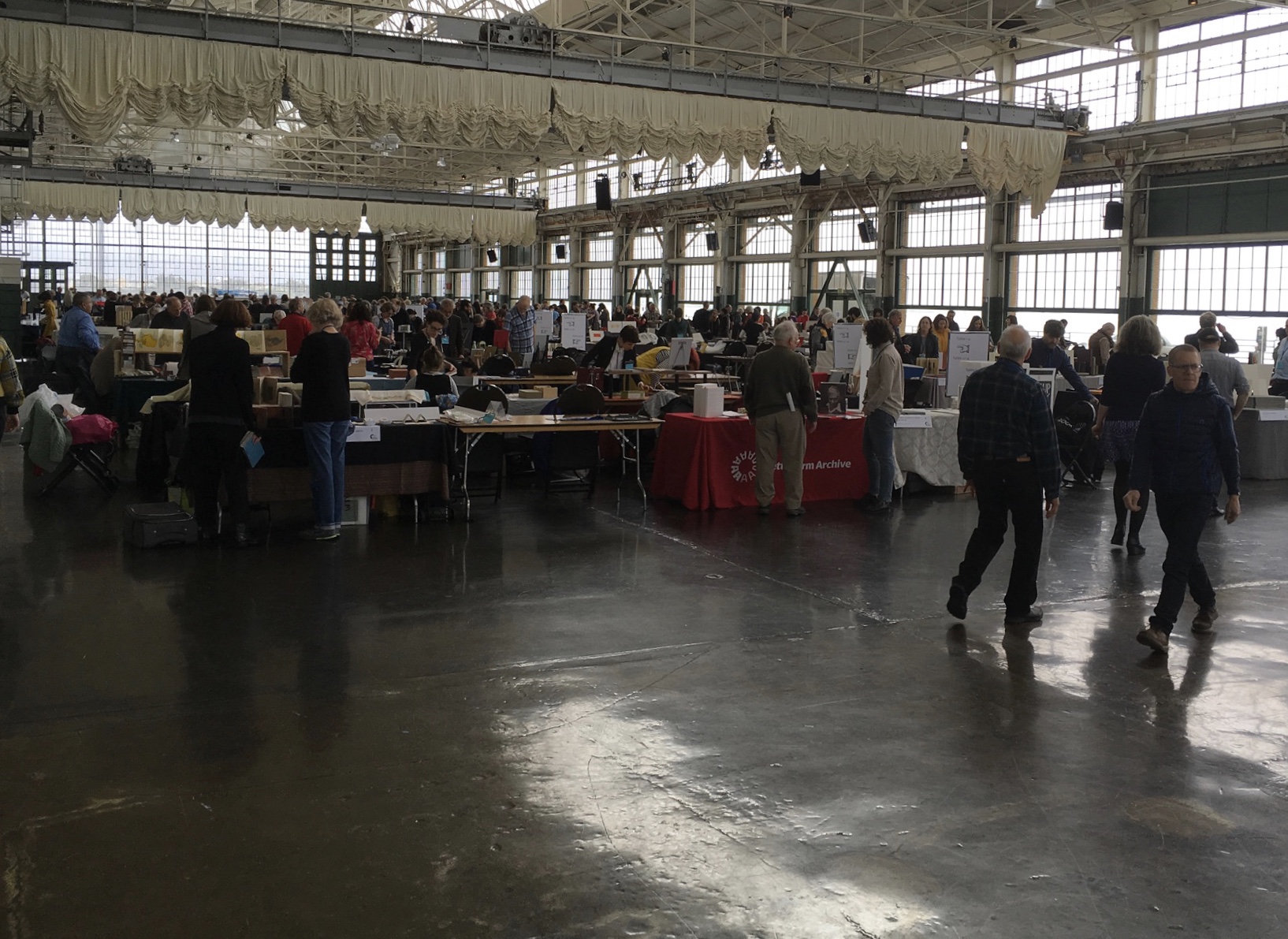
For the start of this Codex, rain and mist hover outside the hangar. The polished concrete floor looks wet but isn’t — so first-time visitors step to avoid slips that won’t really occur. The old-timers though stride from table to table arms wide, bussing each other on the cheek or humping crates around and placing and re-placing their works for the right effect. Arriving early to watch adds a certain enjoyment.
At last, one evening I hurried to his cabin, for I learned that this time his situation was such that … he was tranquilly, serenely, symmetrically drunk—not a hiccup to mar his voice, not a cloud upon his brain thick enough to obscure his memory. As I entered, he was sitting upon an empty powder- keg, with a clay pipe in one hand and the other raised to command silence. … On the pine table stood a candle, and its dim light revealed “the boys” sitting here and there on bunks, candle-boxes, powder-kegs, etc. They said: “Sh—! Don’t speak—he’s going to commence.”
‘I don’t reckon them times will ever come again. There never was a more bullier old ram than what he was. Grandfather fetched him from Illinois—got him of a man by the name of Yates—Bill Yates—maybe you might have heard of him; his father was a deacon—Baptist—and he was a rustler, too; a man had to get up ruther early to get the start of old Thankful Yates; it was him that put the Greens up to jining teams with my grandfather when he moved west.
‘Seth Green was prob’ly the pick of the flock; he married a Wilkerson—Sarah Wilkerson—good cretur, she was—one of the likeliest heifers that was ever raised in old Stoddard, everybody said that knowed her. She could heft a bar’l of flour as easy as I can flirt a flapjack. And spin? Don’t mention it! Independent? Humph! When Sile Hawkins come a browsing around her, she let him know that for all his tin he couldn’t trot in harness alongside of her. You see, Sile Hawkins was—no, it warn’t Sile Hawkins, after all—it was a galoot by the name of Filkins—I disremember his first name; but he was a stump—come into pra’r meeting drunk, one night, hooraying for Nixon, becuz he thought it was a primary …
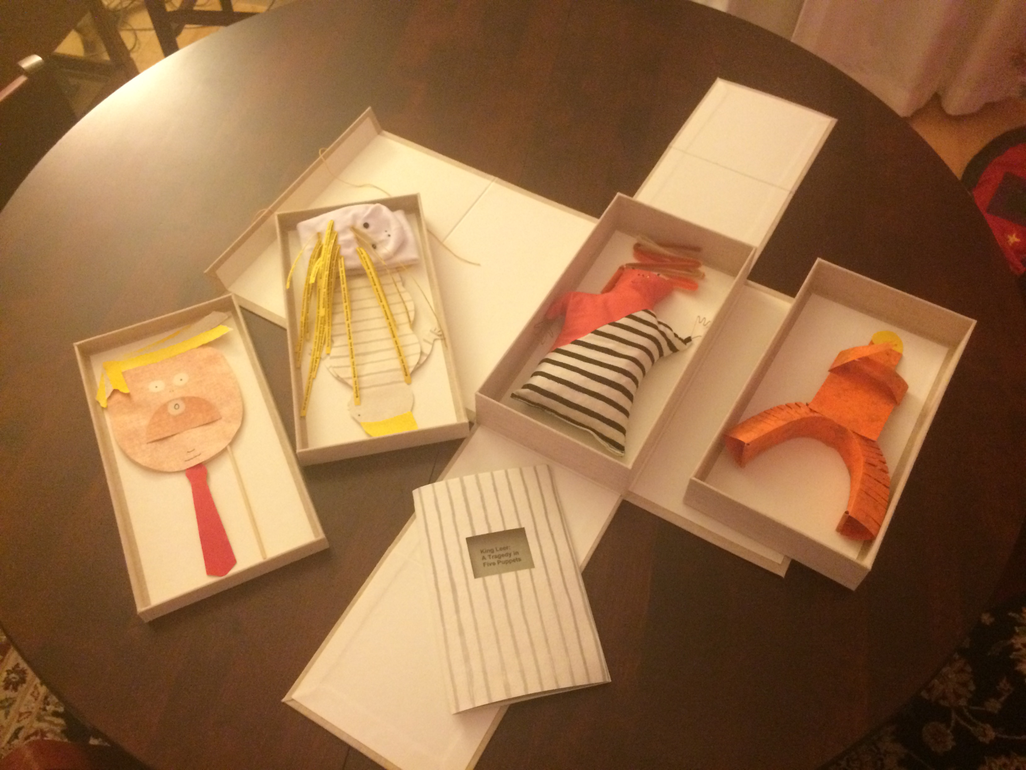
Which reminds me of Emily Martin and her politically biting King Leer —
King Leer: A Tragedy in Five Puppets (2018) Emily Martin
There is plenty more somber work to go around: Lorena Velázquez from Mexico has followed up her powerful Cuarenta y tres with Exit, her hope in our turbulent times;
Barcelona’s Ximena Perez Grobet has 2.10.1968-2018on display, commemorating the 50th anniversary of the Tlatelolco massacre in Mexico City; Sue Anderson and Gwen Harrison from Australia offer Phantomwise Flew the Black Cockatoo, an indictment of a cruel welfare system; and there is Islam Aly from Egypt with Inception, Bedaya, inspired by stories and journeys of refugees. Book art everywhere wears its heart on its cover.
Still, book artists are a convivial bunch and cheerful in their internationality. On Monday evening, Mary Heebner (Simplemente Maria Press) and her husband photographer Macduff Everton are in the Berkeley City Club’s off-limits members’ room settling down to a bottle of Santa Barbara red, and here come upstate New Yorker Leonard Seastone (Tidelines Press), Anglo-German Caroline Saltzwedel (Hirundo Press), Irishman Jamie Murphy (The Salvage Press) and Geordie David Esslemont (Solmentes Press). Macduff is launched on a tale about running into Queen Elizabeth on her horse-riding visit to Ronald Reagan’s ranch, when David remembers rounding down a path in the Lake District during an art residency to find Prince Charles legging it up the same — by which time Macduff has just returned from his room with a bottle of single malt — which reminds Caroline of a stormy weather hike along Hadrian’s Wall, where Macduff diverts onto a tale of nearly being blown off the same and making his shaky, near-death way back to a bed-and-breakfast for a hot bath and terrible food from the grumpy owners, which launches Leonard onto the story about his local Russian butcher/grocer/refugee who refuses to sell him salad but insists on providing chiropractic services one day and adopts Leonard as his only friend in the US with whom he can have true political debate. Jamie still wants to know why the Russian wouldn’t sell Leonard any salad.
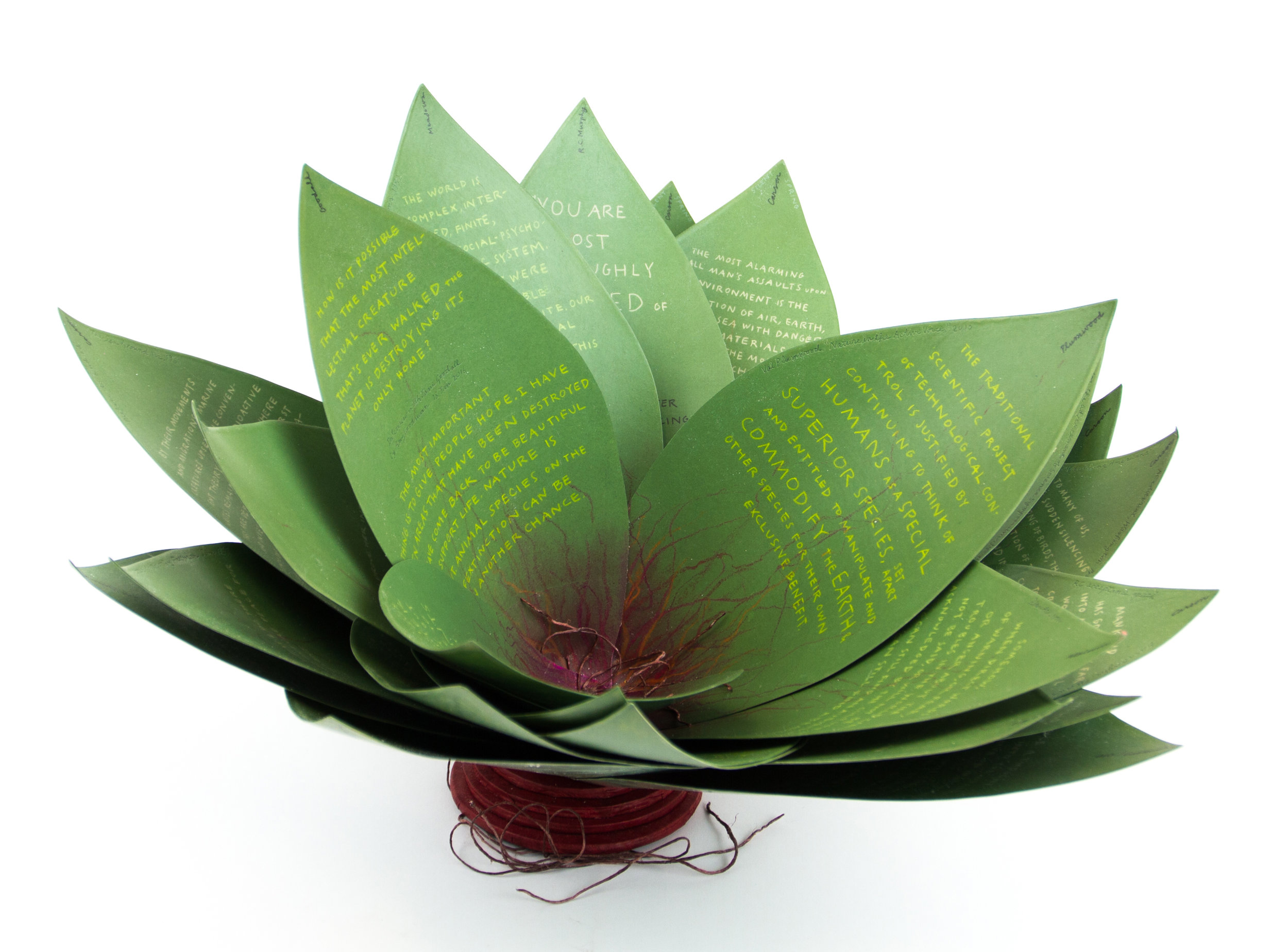
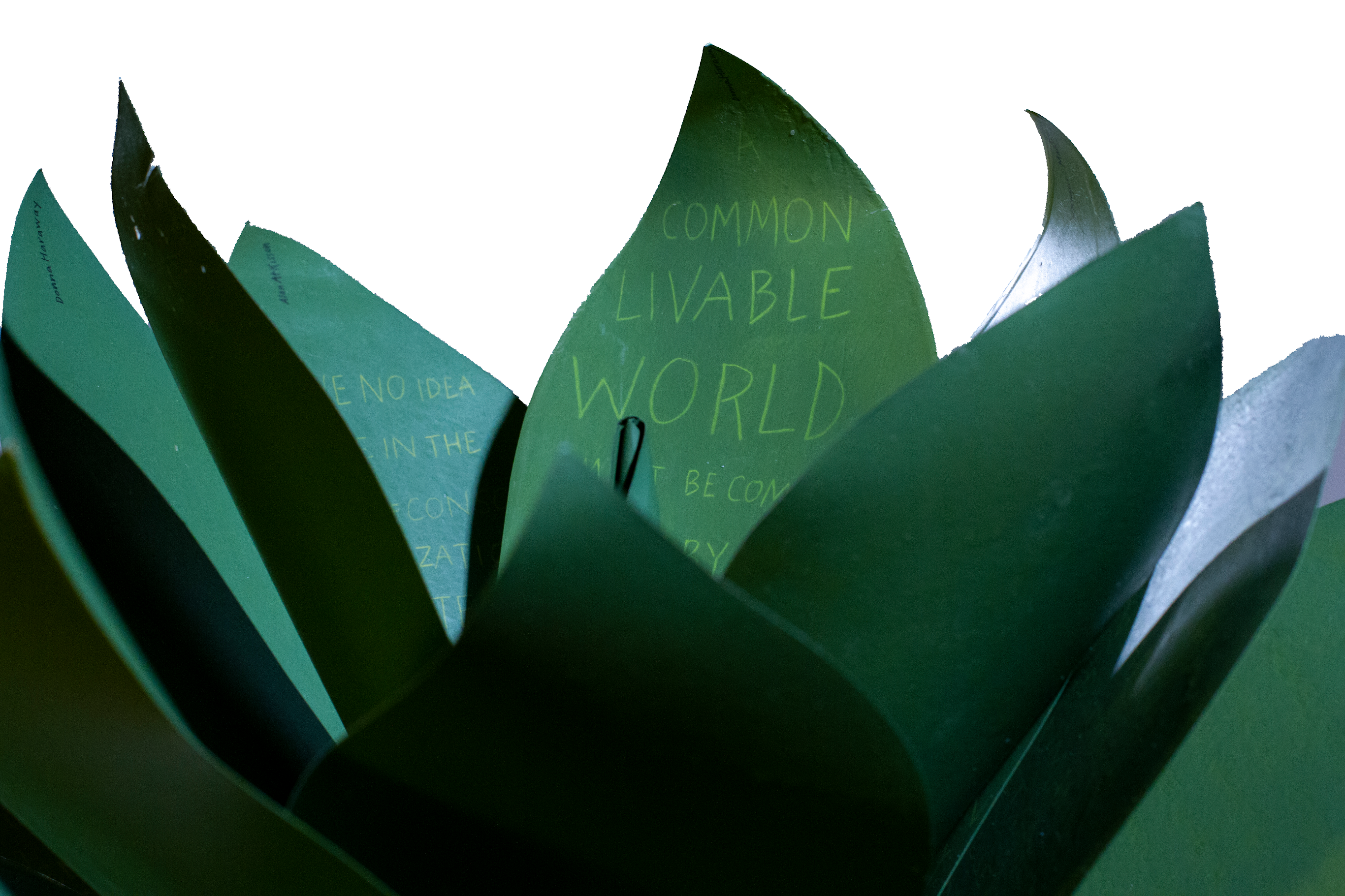
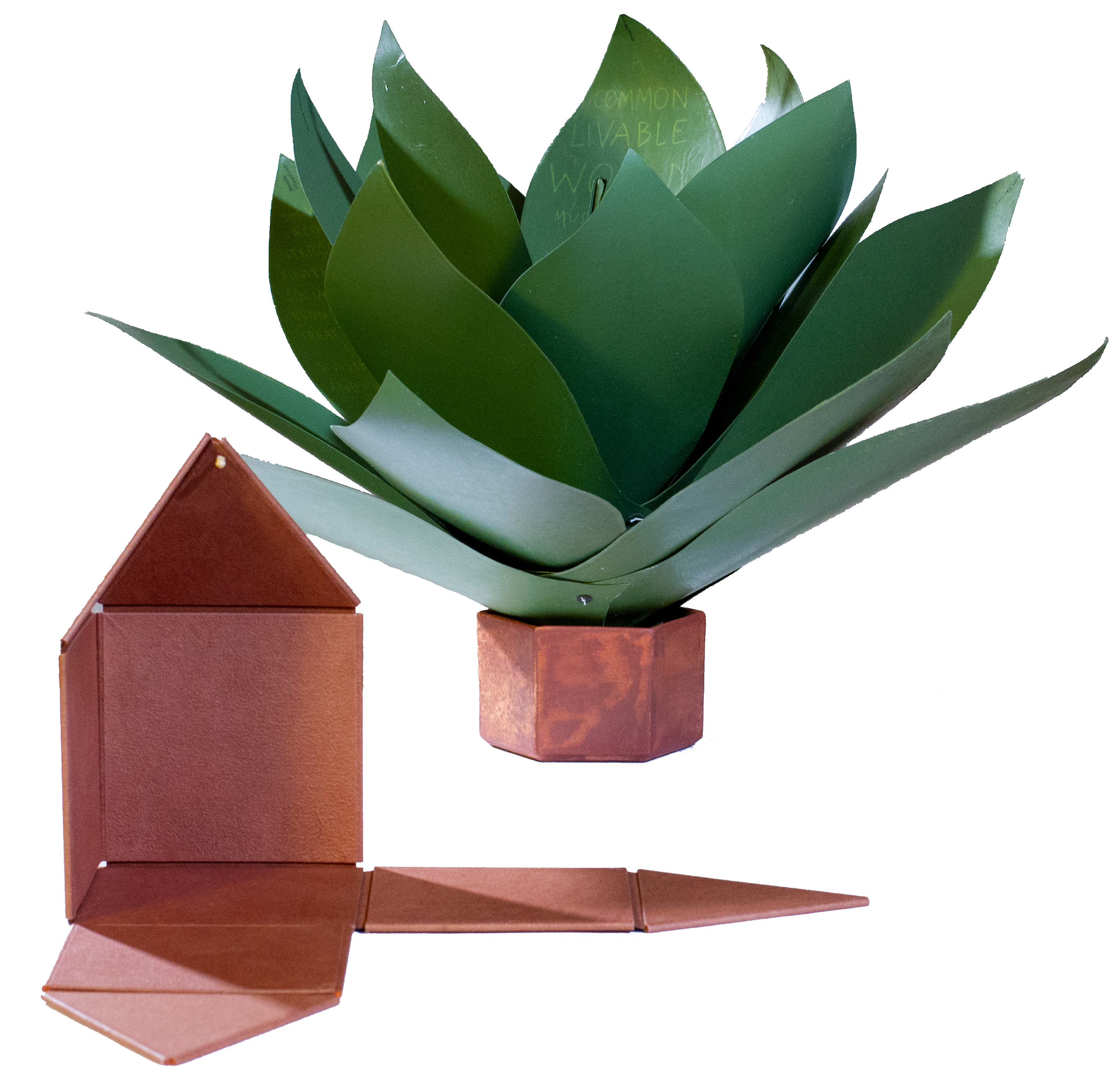
Speaking of greens — Robin Price’s prototype for Witnessing Ecology: the agave plant book again displays that thread of social concern, but this work and Price herself draw attention to another thread of enjoyment to pursue: the recurrence of collaboration among book artists. One artist leads to another.
Witnessing Ecology: the agave plant book (2019) Robin Price Photo: Mike Rhodes
As with the now-famous The Anatomy Lesson by Joyce Cutler-Shaw, Price has joined forces again with Daniel Kelm on the agave plant book, Kelm also collaborated with Ken Botnick on the long-gestating Diderot Project on display here just a few tables away, Botnick collaborated with the novelist and translator William Gass on A Defense of the Book, who in turn with the photographer Michael Eastman — who lives over in Oakland — created the digital-only book Abstractions Arrive: Having Been There All the Time. Whatever the medium, the book just naturally encourages collaboration — and chance. As Price’s book Counting on Chance implies and as so many book artists echo — as does Jim Blaine —
‘… There ain’t no such a thing as an accident. When my uncle Lem was leaning up agin a scaffolding once, sick, or drunk, or suthin, an Irishman with a hod full of bricks fell on him out of the third story and broke the old man’s back in two places. People said it was an accident. Much accident there was about that. He didn’t know what he was there for, but he was there for a good object. If he hadn’t been there the Irishman would have been killed. Nobody can ever make me believe anything different from that. Uncle Lem’s dog was there. Why didn’t the Irishman fall on the dog? Becuz the dog would a seen him a coming and stood from under. That’s the reason the dog warn’t appinted. A dog can’t be depended on to carry out a special providence. Mark my words it was a put-up thing. Accidents don’t happen, boys. Uncle Lem’s dog—I wish you could a seen that dog. He was a reglar shepherd—or ruther he was part bull and part shepherd—splendid animal; belonged to parson Hagar before Uncle Lem got him.’
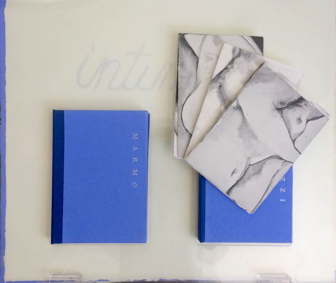
Chance, luck or accident — if you are to enjoy this book fair, you need to count on them, not just allow for them. How likely was it that in pursuit of Mary Heebner’s Intimacy: Drawing with light, Drawn from stone, I would be caught up with that crew in the off-limits members’ club?
Intimacy: Drawing with light, Drawn from Stone (2017) Mary Heebner
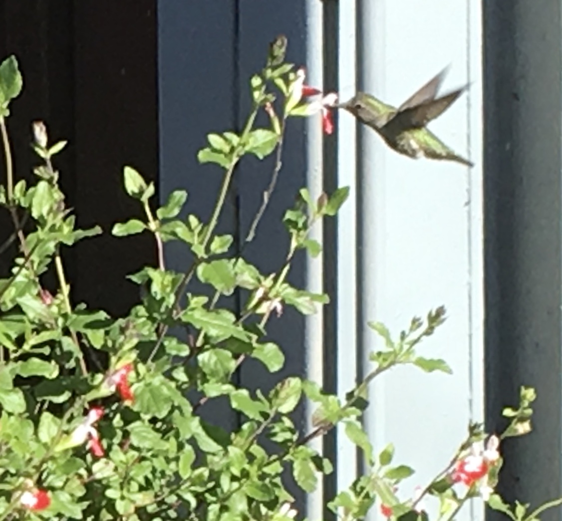
Or if I weren’t staying a good walking distance from the symposium, how would I have come across a hummingbird in the cold of February after being delighted with Sue Leopard’s Hummingbird?
Hagar is a common Nordic name. But how likely was it that Twain would use that particular name in his California mining-camp story and that Codex VII is hosting “Codex Nordica”? Mark my words it was a put-up thing.
That not one of the symposium presenters introducing us to “Codex Nordica” is named Hagar should not be held against the organizers. Their choices — Åse Eg Jørgensen (co-editor of Pist Protta, Denmark’s longest running contemporary artists’ journal), Tatjana Bergelt (multilingual, of German-Russian-Jewish culture and settled in Finland), Thomas Millroth (art historian from Malmö) — are entertaining, informative and good humoured (proof at least for the Danes that they can’t all be Hamlet or Søren Kierkegaard). What they have to say and show speaks to book art’s uncanny rhyming across geographies and times.
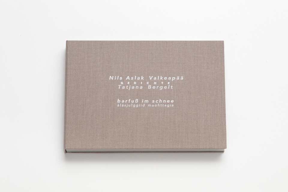
With every issue the outcome of guest editing, artists’ contributions and a mandate to be unlike any previous issue, Pist Protta is a cross between Other Books and So, the collaborative, gallery-challenging venture of Ulises Carrión in the last century, and Brad Freeman’s US-based Journal of Artists’ Books.Printed Matter has faithfully carried every issue of Pist Protta, so there is little excuse to be unaware of it and its liveliness. Fitting for someone who thinks of herself as a collage of cultures, Tatjana Bergelt’s barfuß im Schnee-álásjulggiid muohttagis (“Barefoot in the Snow”) is a photo-collage of old maps, satellite maps, poetic texts, landscapes and portraits of the Sámi, the dwindling inhabitants of the northern parts of Norway, Sweden, Finland and the Murmansk Oblast. It reminds me of UK-based Nancy Campbell’s Vantar/Missing.
Vantar/Missing (2014) Nancy Campbell Digitally printed on Munken Polar, hand-sewn binding with hand-incised design, edition of 300
Both works delve into the vulnerable and disappearance — be it culture, gender or environment. Vantar‘s cold diptychs recording the mountain snow cover and barely perceptible signs of life in the ghost town Siglufjörður chime with Bergelt’s final slide:
“From Finland barefoot in snow”, Codex VII, 4 February 2019 Tatjana Bergelt
barfuß im Schnee-álásjulggiid muohttagis (2015) Tatjana Bergelt 2 books in linen cassette, edition of 4, in each book 6 poems by Nils Aslak Valkeapää in Sámi, Finnish and German languages, translations P.Sammallahti, C.Schlosser
The bus from the symposium in Berkeley to the fair itself in Richmond is another chance for chance to play its role. One day I’m sitting next to Amanda Degener (Cave Paper), who delights in our common acquaintance with Ioana Stoian and Eric Gjerde; the next, it’s Jeanne Drewes (Library of Congress), who introduces me to Mark Dimunation (Library of Congress), who regales us and the collector Duke Collier with tales of the British artist Ken Campbell. But the terrible thing about chance is that it takes up so much time and, at the same time, shows you what you wish you had more time for.
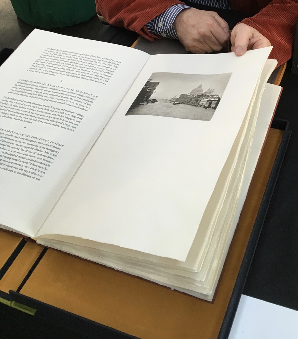
Recto: note the vaporetto in the image.Verso: think of the registration magic.The conclusion to Watermark and Koch’s homage to Aldus Manutius
Or to Russell Maret discussing his work Character Traits and Geoffroy Tory’s Champ Fleury: The Art and Science of the Proportion of the Attic or Ancient Roman Letters, According to the Human Body and Face (1529):
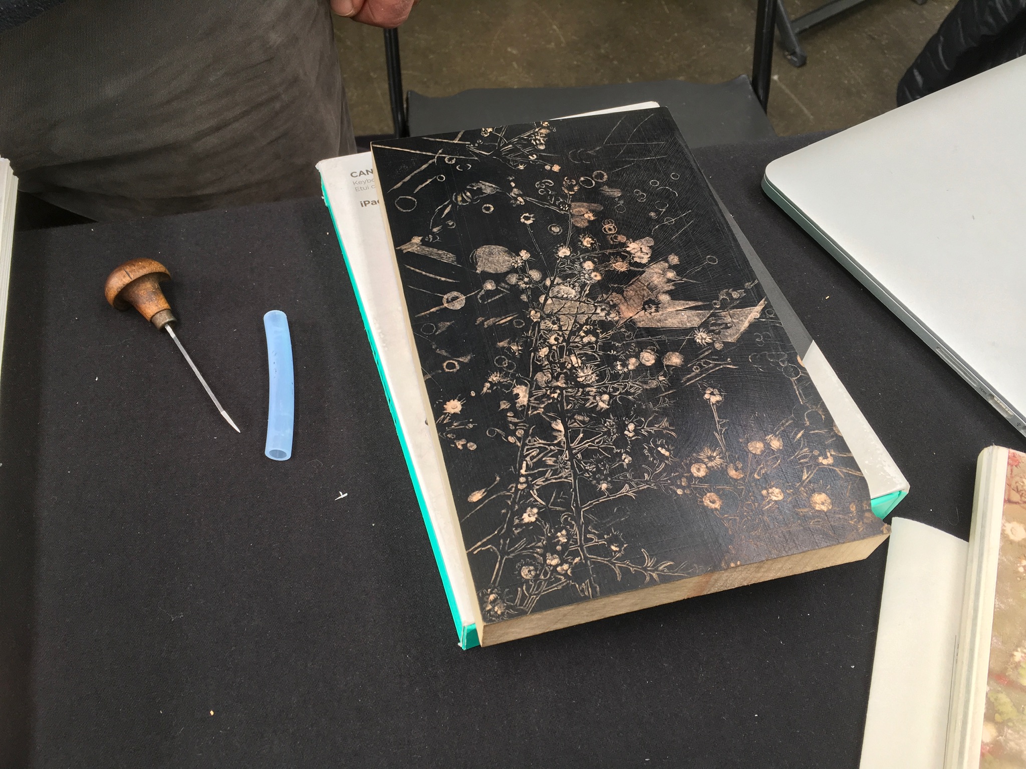
Or to Gaylord Schanilec (Midnight Paper Sales) enjoying his work on a woodblock:
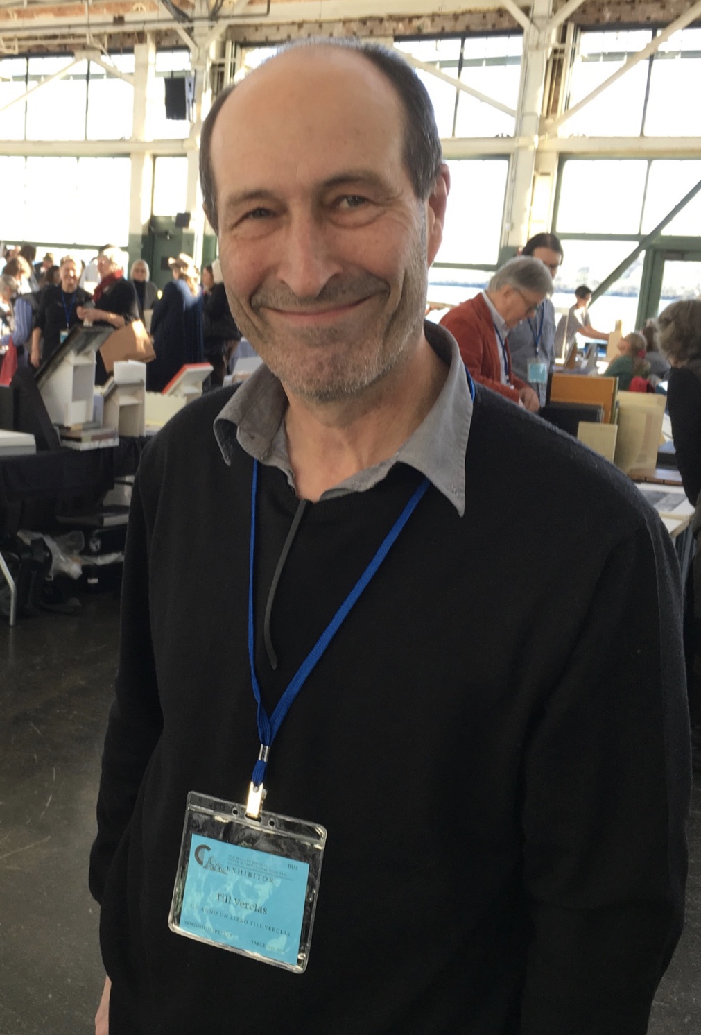
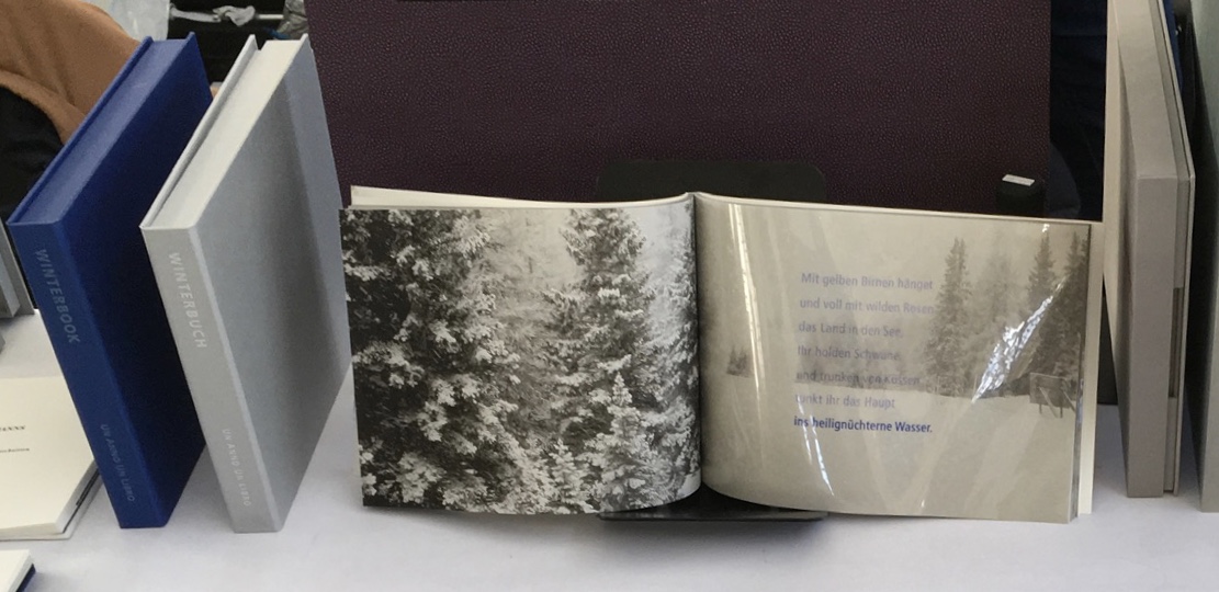
Or to Till Verclas (Un Anno Un Libro) explaining how his children helped achieve the effect of snow falling over Friedrich Hölderlin‘s words in Winterbuch:
Or to Sam Winston (ARC Editions) sharing his Reading Closed Books, which like Darkness Visible, sprang from his 7 Days performance in a blacked-out studio:
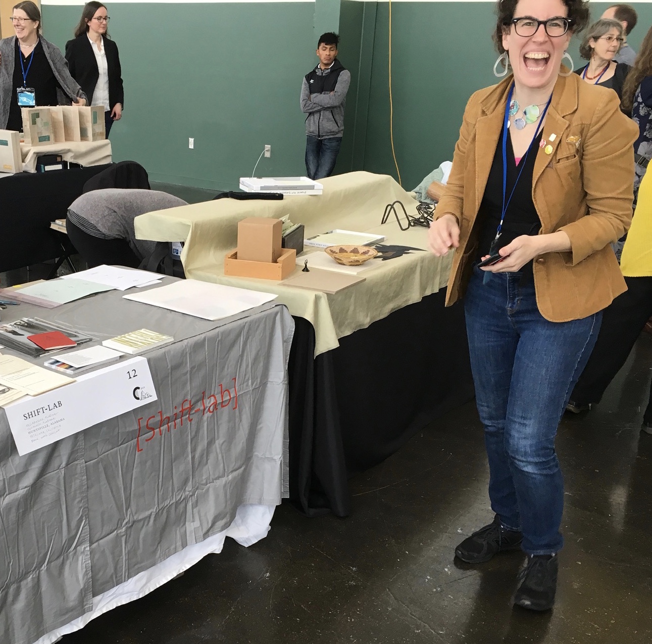
Sam is kind enough to introduce me to his colleagues at ARC Editions (Victoria Bean, Rick Myers and Haein Song). Individually and together, they are forces to watch. Myers’ An Excavation, which I’d had the pleasure to see previously in The Hague, can be partly experienced in these videos, and Song’s fine bindings and artist’s books must be seen. Bean’s symposium talk is on Check, her portfolio of typewriter prints featuring fifty writers, from Oscar Wilde to Joan Didion, and the checks they wore, and on Flag, the follow-up series of artist’s books that takes a writer from Check and uses colour, cloth and typewriter prints to explore an individual work by that writer.
Slide from “Flag”, Codex VII, 5 February 2019 Victoria Bean
Typewriter prints from Check by Victoria Bean
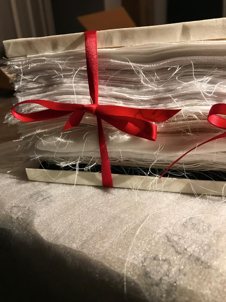
Tess (2019) Victoria Bean The red and black ribbons and white linen are drawn from images in Hardy’s Tess of the D’Urbervilles symbolizing Tess and critical events of her life and death.
Detail of Tess Victoria Bean
Detail of Tess Victoria Bean
Check and Flag illustrate that bright enjoyable thread that shows up again and again at Codex and book art at its prime — the integration of letter, image, material, form, process and subject in a way that self-consciously calls attention to them yet yields a work of art that simply is — on its own terms.
Which, if you have read “Jim Blaine and His Grandfather’s Ram”, ought to remind you that
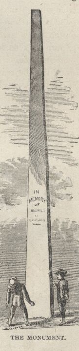
… Parson Hagar belonged to the Western Reserve Hagars; prime family; his mother was a Watson; one of his sisters married a Wheeler; they settled in Morgan county, and he got nipped by the machinery in a carpet factory and went through in less than a quarter of a minute; his widder bought the piece of carpet that had his remains wove in, and people come a hundred mile to ‘tend the funeral. There was fourteen yards in the piece.
‘She wouldn’t let them roll him up, but planted him just so—full length. The church was middling small where they preached the funeral, and they had to let one end of the coffin stick out of the window. They didn’t bury him—they planted one end, and let him stand up, same as a monument.
With its 222 exhibitors here weaving the threads of book art and the book arts, Codex VII is a monument to enjoy. As for that old ram, you will have to read the story — and prepare for Codex VIII.
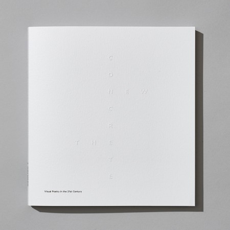
The New Concrete: Visual Poetry in the 21st Century is a testament on where this art made of letters has been and where it goes. We have put a sharp focus on the word ‘new’ in our title, exploring how image manipulation, cut and paste, digital text and the internet have all influenced work in this area. One of the most exciting strands can be seen in the work of James Hoff and Eric Zboya who use algorithms and viruses to form work in which text is in the back – rather than foreground; the ghost of the machine of visual poetics. This isn’t a book that could have been made through simply surfing the web. We asked all 106 contributors to suggest names of poets or artists that we should consider for the book. Visual poets spiralled into more visual poets. We have looked at well over 500 possible candidates. Enjoy the knowledge with us.
Among the Books On Books favorites included in this volume are Sam Winston, Julie Johnstone, Ian Hamilton Finlay and Vito Acconci. For a related MoMA exhibition of artists engaged in the material use of letters, words and language (Ecstatic Alphabets, Heaps of Language), click here.
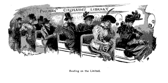
Did you read on New York Times Interactive how text is succumbing to the sound and blurry of podcasts, YouTube, talking assistants, Netflix, face-reading phones, Instagram and augmented reality? We are passing through an internet portal turning our evolution from orality to literacy in on itself — where “text recedes to the background, and sounds and images become the universal language”.
The seemingly unintentional irony of delivering the welcome by text rather than by podcast or tweeted looping video meme undermines the hyperventilation a bit. But we should not roll our eyes and move on. The NYTI journalists are reminding us to pay attention.
Our literacy has always been multimodal (read and hear the orality in the opening text of Genesis in the The Douay Version). With each new medium it rapidly becomes more multimodal. In Ringing the Changes on “The End of Books”, there’s the tongue-in-cheek evidence from 1894.
“The End of Books”, Scribner’s Magazine (August 1894) Louis Octave Uzanne
In Literacies, Mary Kalantzis and Bill Cope at the University of Illinois, Urbana-Champaign, trace its occurrence back to the mid-twentieth century age of radio and television. And not that long ago (2012), Amazon released Immersion Reading, enabling audio in sync with ebook reading.Leaving aside the apocalyptic speculation on the fate of letters, we should take the point: our literacies are entangled and evolve together. Putting the more scholarly view of differences between orality and text alongside the post-text Futurists’ observations about tweets, memes and other social media, we can see why we would benefit from closer attention to that entanglement and evolution.
Here is Walter J. Ong:
Oral folk prefer, especially in formal discourse, not the soldier, but the brave soldier; not the princess, but the beautiful princess; not the oak, but the sturdy oak. Oral expression thus carries a load of epithets and other formulary baggage which high literacy rejects as cumbersome and tiresomely redundant because of its aggregative weight … (Orality and Literacy: The Technologizing of the Word. London: Methuen, 1982, pp.31, 37-49).
Here is the post-text future:
An information system dominated by pictures and sounds prizes emotion over rationality. It’s a world where slogans and memes have more sticking power than arguments. — Farhad Manjoo
Here is Ong:
Writing fosters abstractions that disengage knowledge from the arena where human beings struggle with one another. It separates the knower from the known. By keeping knowledge embedded in the human lifeworld, orality situates knowledge within a context of struggle.
Here is the post-text future:
Doyle Canning, who wrote a book on using memes for political movements and co-founded the Center for Story-Based Strategy, said people have now realized memes are replacing nuanced political debate.
“People in 2016 declined to take seriously the impact of the memes and clung to this narrative that rational policy discourse would triumph, … And it didn’t.”
“Now politics,” she said, is just “a battle of the memes.” — Nellie Bowles
These comparisons/contrasts underscore Kalantzis’ and Cope’s educational earnestness about the importance of teaching to these entangled and evolving literacies as perhaps the only systematic means we have of offering children social equity and a chance at social equality. Imbuing their literacies with critical thinking skills is paramount. The art of living depends on the art of reading.
At the Museum Meermanno in The Hague, you can step into this increasingly busy intersection of literacies at an exhibition called The Art of Reading. The exhibition is divided into six rooms labeled “Reading is Turning the Page”, “Reading is Seeing”, Reading is Touching”, “Reading is Remembering”, “Reading is Concentrating” and “Reading is Reacting”. Unusually the art is not simply on display. Touching is allowed. Paul van Capelleveen, one of the curators organizing the show, insisted that each work be touchable. As a curator at the Dutch national library and advisor to the Museum Meermanno (The House of the Book), he felt strongly that the challenges of multimodal literacy cannot be understood “under glass”.
Physicality or the haptic is an affordance that print literacy lords over digital literacy. We know where we are in a print book because we can feel as well as see where we are. Welcome then to the first room “Reading is Turning the Page”, where William Kentridge turns the tables on that claim. As you watch the “film of the book” across the room, you can try your hand at flipping the pages of the physical copy like a flipbook to mimic the video. Look closely though. The page numbers are not sequential.
2nd Hand Reading (2014) Page 2388 then 2390?
And the entries are not in alphabetical order.
2nd Hand Reading (2014) “Inquest” before “Heterogenesis”?
When the order of text, numerals, narrative and images collide, we are left with the literacy of art — be it digital or physical. Which brings you to the next room: “Reading is Touching”.
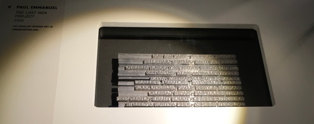
The names of South African soldiers, both black and white, killed in the First World War, are set in hot metal type then impressed without ink on flesh. Photographed and filmed, the names fade away. In the exhibition, a voice from the touchscreen device repeats, “Touch me, touch me”. Each touch upon the screen — on the skin before you — advances the work running as a video on the touchscreen. Touching is the only way to read all of the names of the dead as they fade away. This work is but one of several that make up The Lost Men Project.
In this room of touch, you move from sorrow to sorrow. Glass and ink do not separate you from them very much.
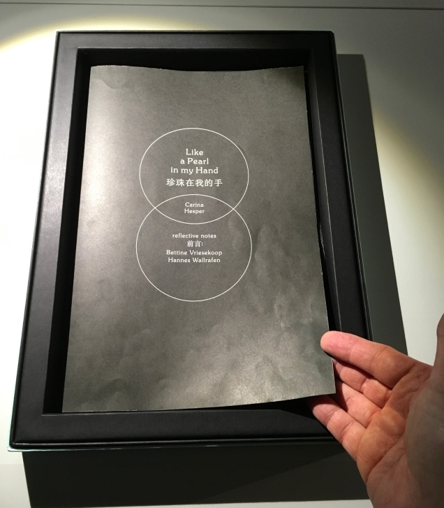
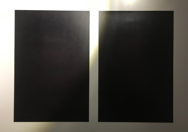
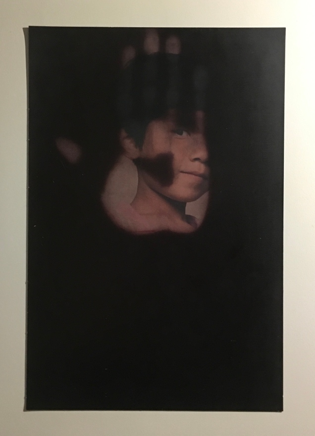
Two pages from Like a Pearl in My Hand
To read the pages of Like a Pearl in My Hand, you must rest your hands on them then lift your hands away.
The face revealed on each page is the face of a blind or visually impaired child in a Chinese orphanage. As you read the page, the face fades into blackness.
The artist’s book is associated with Bethel China, a charity for the visually impaired. Click on the image above to visit the charity’s site.
The next room is “Reading is Seeing”.
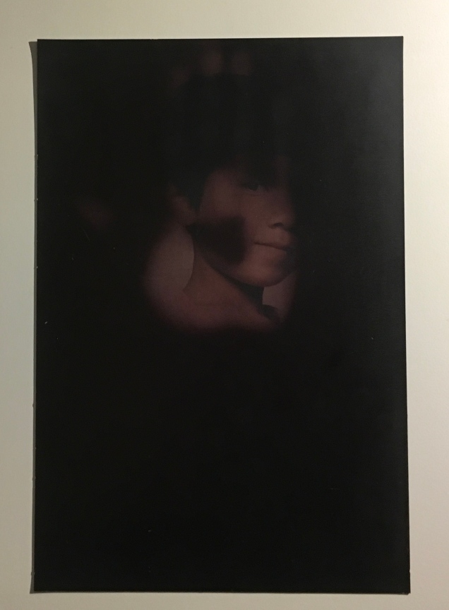
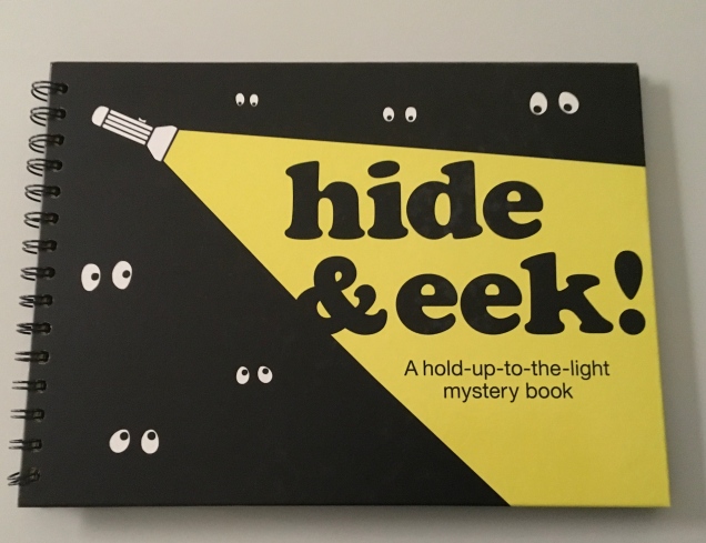
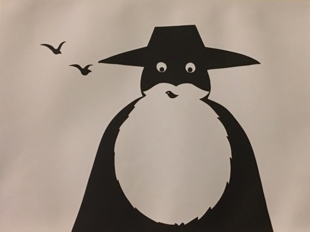
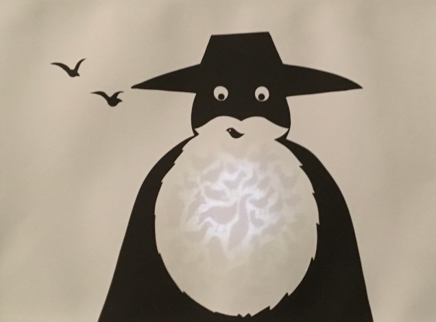
Were the curators being tone deaf with this juxtaposition? No, it is the bluntness and earnestness of recognition that literacies and our sensibilities are jumbled up. The literacy of art does that. It can move us from somberness to whimsy and back. The first work in this room of sight is a children’s flashlight (or torch) book; the next, a device for the visually impaired; the next, an augmented reality app on iPads.
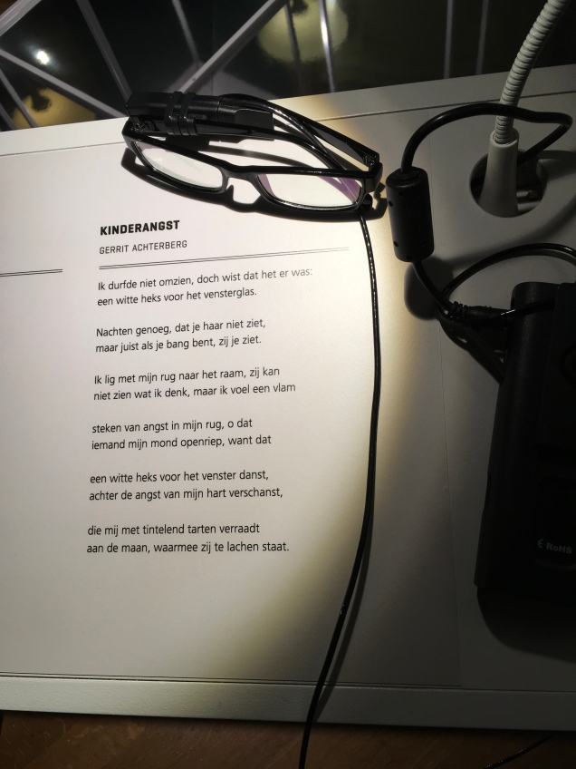
OrCam MyEye 2.0 (2017) Amnon Shashua and Ziv Aviram An artificial vision device with a lightweight smart camera that instantly reads text aloud –in this case, a poem by Gerrit Achterberg (Kinderangst or Childhood Fear).
The curators deftly paced the impact of these rooms. Something from the one before lingers with you in the next, or something in the next reminds you of the one before.
“Reading is Remembering” is the next room. Here the artists play with re-membering text vs dis-membering text, recalling vs forgetting, excavating vs filling in, deconstructing to reconstruct, destroying to create.
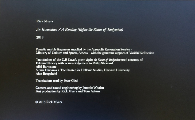
Rick Myers was commissioned by the Onassis Cultural Center to commemorate the Greek poet Constantine Cavafy. The work he proposed required permission to obtain Pentelic marble fragments (quarrying is restricted for the purpose of restoring the Acropolis) and grinding them into dust. He then sourced four different translations of Cavafy’s poem “Before the Statue of Endymion”, arranged a reading and recording of each, and, for each, cut a stencil. The chronologically first translation’s stencil was positioned on stretched plastic film suspended over speakers. The marble dust was sifted onto the black plastic through the stencil, leaving the legible white text on the black background with which the video starts after the credits above. As the recording of the chronologically second translation plays, the sound’s vibration obliterates the marble dust words of the first translation. Then comes the turn of the second stenciled translation to be obliterated by the third’s recorded reading. And so on.
An instant from “An Excavation, A Reading” (2013) Rick Myers
Here, then, is a work of art that simultaneously endorses and refutes the premise that text recedes in favor of some new universal language of sound and image. It is a textual palimpsest in motion where sound dissipates the text of the past, making way for the next version of the text to be dissipated by the sound of the third and the text of the third to be dissipated by the sound of the fourth. A moment of the work is captured in Victoria Bean and Chris McCabe’s The New Concrete (see below). The work runs a little over three minutes, excerpts can be found here, but the experience under the exhibition room’s banner provides an unsurpassable frame for the work.
Inspired by The Royal Road Test by Ed Ruscha, Mason Williams and Patrick Blackwell (the crew that filmed a Royal typewriter being thrown out of a Buick travelling at 90mph), Simon Morris had seventy-eight students cut out all of the words from Freud’s The Interpretation of Dreams. On Sunday, June 1st, 2003, he “threw the words out of the window of a Renault Clio Sport on Redbridge Road, Crossways, Dorset, traveling at a speed of 90mph, approximately 122 miles southwest of Freud’s psychoanalytical couch in London. The action freed the words from the structural unity of Freud’s text as it subjected them to an ‘aleatory moment’ – a seemingly random act of utter madness.” The work on display consists of a Ruscha-like book (right down to the plastic spiral binding) and a film of the epic literary littering.
If you are expecting the next room — “Reading is Concentrating” — to help you gather any scattered thoughts or words, think again.
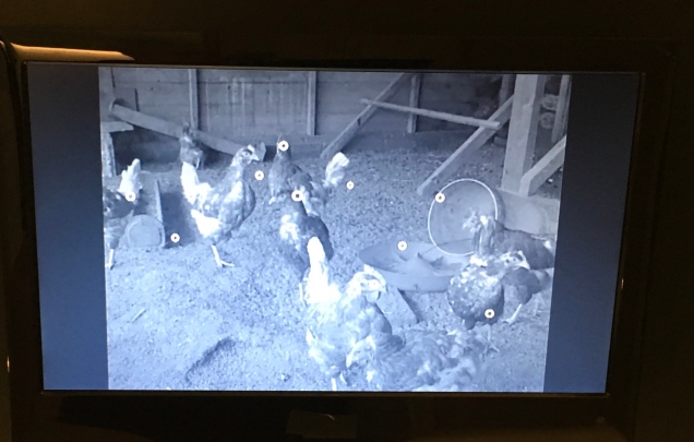
Marinus van Dijke’s work draws your eye and ear first. Chickens clucking and strutting onscreen, superimposed small white circles the size of a chicken’s eye jerking and gliding across the screen, a sheet of paper being laid over the screen (ah, it’s a screen within a screen), and then a hand with pen enters the frame, picks a circle and, trying to track it, leaves a scrawl on the paper.
Van Dijke’s work echoes Jan Dibbets’ Robin Redbreast’s Territory: Sculpture 1969, April — June, which Germano Celant included in his Book as Artwork show in 1973. Like the deliberate echo of Morris/Ruscha, this chance echo of Van Dijke/Dibbets recalls the grounding of contemporary textual and book art in the conceptualism of the 1960s/70s.
Robin Redbreast’s Territory: Sculpture 1969, April — June (1970) Jan Dibbets
Dibbets documented the flight patterns of this highly territorial bird and presented that in a book as a conceptualization of an “as if” sculpture drawn in space.
Robin Redbreast’s Territory: Sculpture 1969, April — June (1970) Jan Dibbets
There was admittedly some “artistic license” in Dibbets’ documentation — somewhat the same as when Van Dijke’s tracing pen cannot keep up with the peripatetic circles, which are projections of the chickens’ eye movements as they hunt for food.
“Reading is Reacting” is the last room. Here it seems that printed text comes out on top. Over in one corner is a Dutch encyclopedia, stacked vertically four feet high.
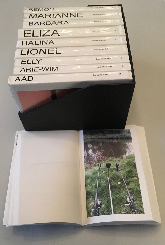
In the opposite corner, on shelves from floor to ceiling, is the Dutch version of Michael Mandiberg’s Print Wikipedia. The paperbacks scattered on the display table began their textual lives online.
Jack Tweetbundel (2015) Jan Dirk van der Burg Unsolicited autobiography created from the subject’s Twitter feed.
Although printed text seems to be having the last word, attend to the curators’ last words on your way out:
Reading and writing have become increasingly open arenas: there are more readers than ever before, there are more books and publication outlets, which can reach vast readerships thanks to the internet. Readers feel more empowered and are able to combine or alter texts found online. Readers become writers. Online texts have therefore come to resemble oral literature, in that they are constantly changing and being passed on from one person to another, retold — sometimes differently. They are unstable and at the same time highly accessible.
Text in books appear to be fixed, but annotations and deletions change the printed text, just as editorial changes alter a page on the internet…. Even so, printed texts are in principle less changeable than those posted online. This makes them appear inviolable and irrefutable. Some people fear that young people believe everything they read on the internet. That is nothing new. Philosophers from Socrates to Locke thought that written or printed texts would be accepted as the absolute truth.
Where do we stand today? … How reading will develop in the future is unclear, but one thing is sure: connection and interaction will be key to that development.
Leaving The Art of Reading and thinking again about a post-text future, you can be sure of one other thing: the art of living will still depend on the art of reading.