Bookmarking Book Art – Jorge Méndez Blake

Mallarmé’s Library (2011)

Biblioteca Mallarmé (2011)

Jorge Méndez Blake

Metal, wood, mirror, resin, plexiglass + drawing. 95x180x150 cm (table) 50×70 cm (drawing). Photos: Courtesy of Estudio Jorge Méndez Blake.

Silvia Ortiz, founder of the gallery Travesía Cuatro in Madrid, writes

In this exhibition entitled Biblioteca Mallarmé, the artist establishes once again the link between his artwork, literature and architecture. On this occasion Jorge Méndez Blake reformulates the concept of library, this time to a library-shipwreck, a library stranded on the coast, as a wreck. 4 November 2011 – 1is 6 February 2012. Accessed 4 September 2020.

Photo: Courtesy of Estudio Jorge Méndez Blake.

Photo: Courtesy of Estudio Jorge Méndez Blake.

All of the works making up the exhibition pay homage to Un Coup de Dés. In keeping with the sub-genre of the homage to an homage, though, this work eponymous with the exhibition draws on Marcel Broodthaers’ homage to the same poem. With its colorfulness, it might also be drawing on Mario Diacono’s JCT 1, a MeTrica n’ABOOlira (1968), Ian Wallace’s Image/Text (1979) or Klaus Detjen’s Ein Würfelwurf niemals tilgt den Zufall (1995). With its three-dimensionality, also perhaps on Geraldo de Barros’s Jogos de Dados (1980s), Albert Dupont’s Désir-Hasard-Dés (2000), or Kathy Bruce’s Navigating the Abyss (2008). Probably not, but this gathering of artists attests to how much Mallarmé’s poem has permeated the genre of book art and its permutations.

Méndez Blake’s originality here arrives in the juxtaposition of the poem’s shipwreck in the form of resinous burnt detritus on the table and flotsam in the print on the wall with the mixed-media blocks on the table recalling books on library display as well as Broodthaers’ rectangular black redactions in his homage or appropriation. Appropriation is very much a theme in this work and the exhibition.

Exhibition view, Travesía Cuatro, Madrid, Spain.

Du fond d’un naufrage (2011)

Du fond d’un naufrage (2011)

Jorge Méndez Blake

Bricks and book. 1.61×1.20×1.06 cm. Photo: Courtesy of Estudio Jorge Méndez Blake.

Another work in the exhibition, Du fond d’un naufrage (2011), differs in material and shape from any previous homage to the poem. The work’s title (“from the bottom of a shipwreck”) comes from a line in Mallarmé’s poem, and cheekily, the volume at the bottom of the gap between the bricks is Mallarmé’s Collected Poems and Other Verse (Oxford University Press).

Toute Pensée Émet un Coup de Dés (2012-2019)

Toute Pensée Émet un Coup de Dés (2012-2019)

Jorge Méndez Blake

Photo: Courtesy of Estudio Jorge Méndez Blake.

Not in the exhibition but continuing the association with Un Coup de Dés and the theme of appropriation, Toute Pensée Émet un Coup de Dés (2012-2019) is a series of nine drawings that

reproduces classic shipwreck paintings using colored pencil. Classic painters used often the strategy of bending the mast, as a way to show the instability of the ship in the storm. These drawings go through an editing process, in which an image of the original painting is cropped and rotated X degrees to achieve the mast verticality and to make the scene look as if the ships were avoiding the fatal destiny. But by “fixing” the mast, the whole landscape loses its horizontality. Correspondence, Estudio Jorge Méndez Blake, 4 August 2020.

Further Reading

Large-Scale Installations (Updated 3 August 2020)”, Bookmarking Book Art, 3 August 2020.

Peden, Georgia. “Denver’s MCA exhibits adapted literary illustrations”, DU Clarion 9 October 2017. Accessed 23 August 2020.

Books On Books Collection – Klaus Detjen

Un Coup de Dés Jamais N’Abolira le Hasard – Ein Würfelwurf niemals tilgt den Zufall (1995)

Un Coup de Dés jamais n’abolira le Hasard: Poème – Ein Würfelwurf niemals tilgt den Zufall: Ein Gedicht (1995)
Klaus Detjen
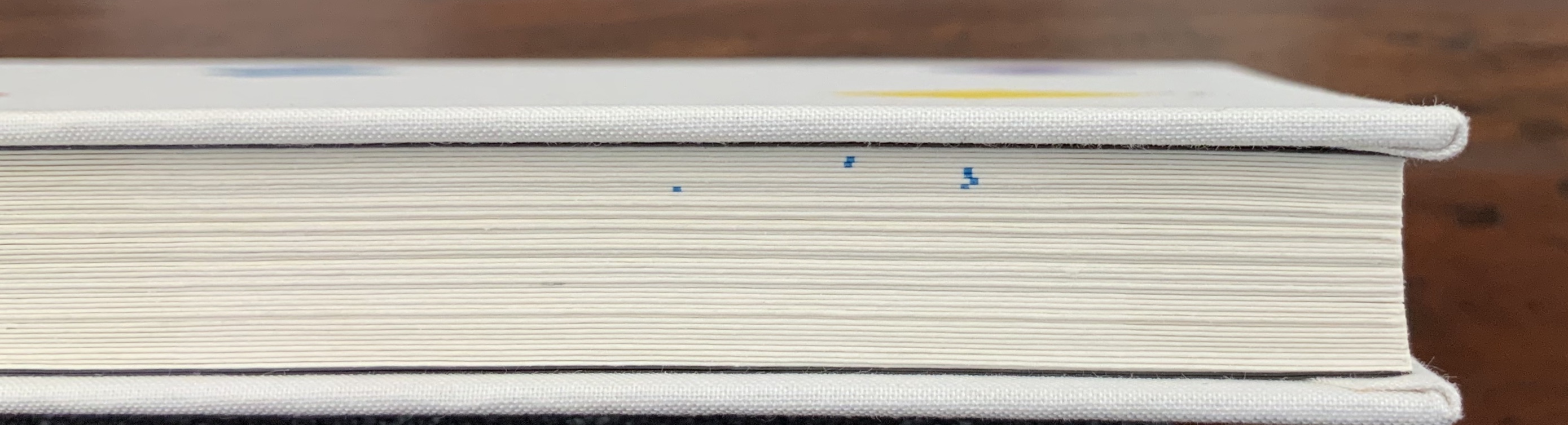
Casebound. H300 x W255 mm, 85 pages. Acquired from Stefan Schuelke Fine Books, 30 June 2020.
Photos: Books On Books Collection.

This work strikes a curious chord with two exhibitions from 2016 and 2018 — “Reading as Art” at the Bury Art Museum and “The Art of Reading” at the Museum Meermanno, respectively. The works in both exhibitions not only challenged notions of the book and ways of reading but posed the act of making as a form of reading and the act of reading as a form of making. By prefacing this French-German edition of Un Coup de Dés with a book-arts-driven “transcreation”, Klaus Detjen demonstrates that the act of making also implies the act of translating. Typographer, designer, scholar and recipient of the Leipzig Gutenberg Prize for 2017, Detjen has used color, shape, line and binding here as his tools of translation and interpretation.

To use the term “transcreation” here may be taking liberties with Haroldo de Campos’s portmanteau for the idea of “translation as recreation”, or translating with creativity and therefore making “translation-art”. The term and definition perhaps better describe works such as those shown in The New Concrete: Visual Poetry in the 21st Century edited by Victoria Bean and Chris McCabe. But then De Campos and his brother, Augusto, singled out Un Coup de Dés as one of the cornerstones (along with Ezra Pound, James Joyce and e.e. cummings) for their group Noigrandres, and Mallarmé’s poem certainly fits the bill of the ideal target of transcreation:

The more intricate the text is the more seducing it is to “recreate” it. Of course in a translation of this type, not only the signified but also the sign itself is translated, that is, the sign’s tangible self, its very materiality (sonorous properties, graphical-visual properties…. Haroldo de Campos, “Translation as Creation and Criticism”, p. 315.

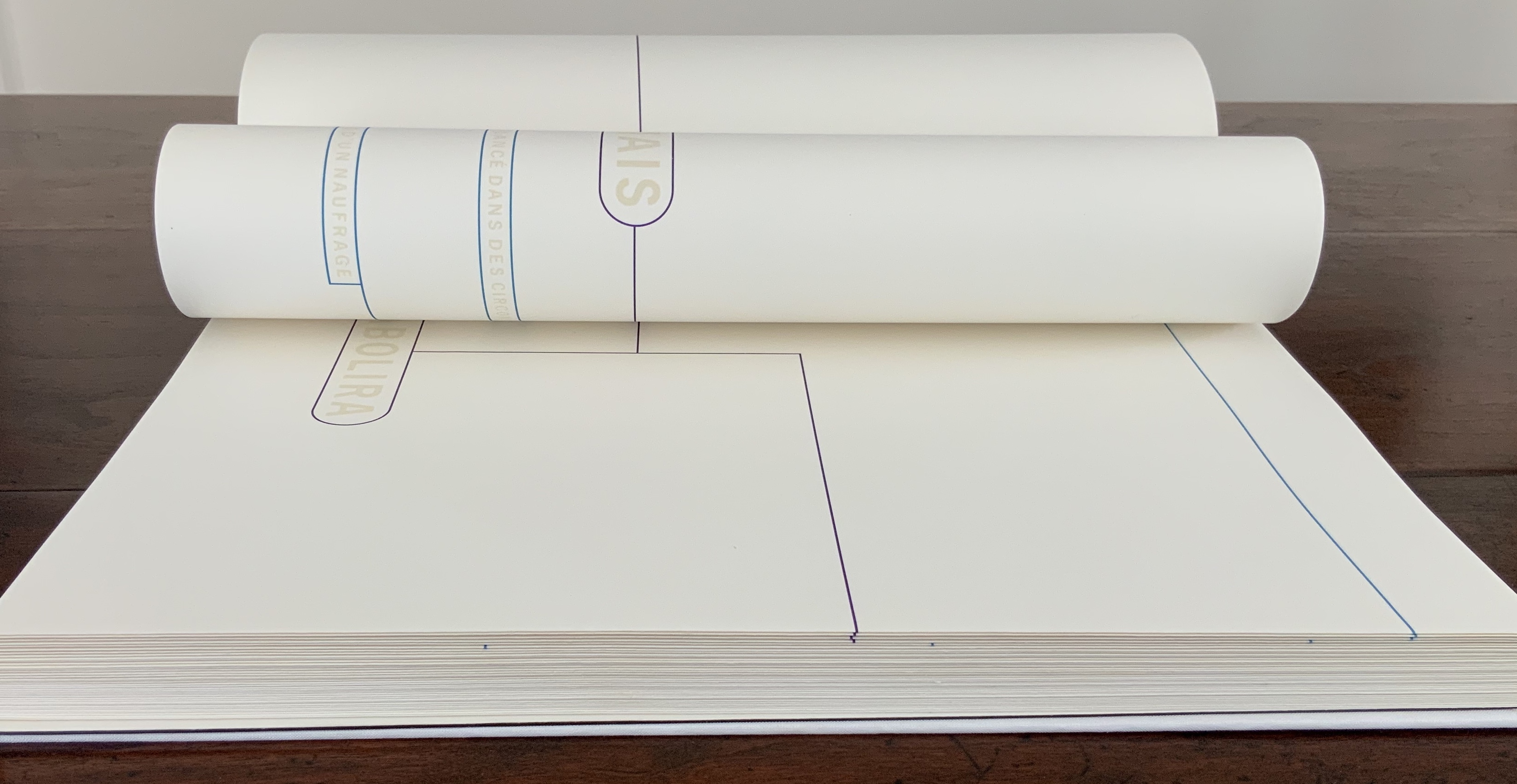
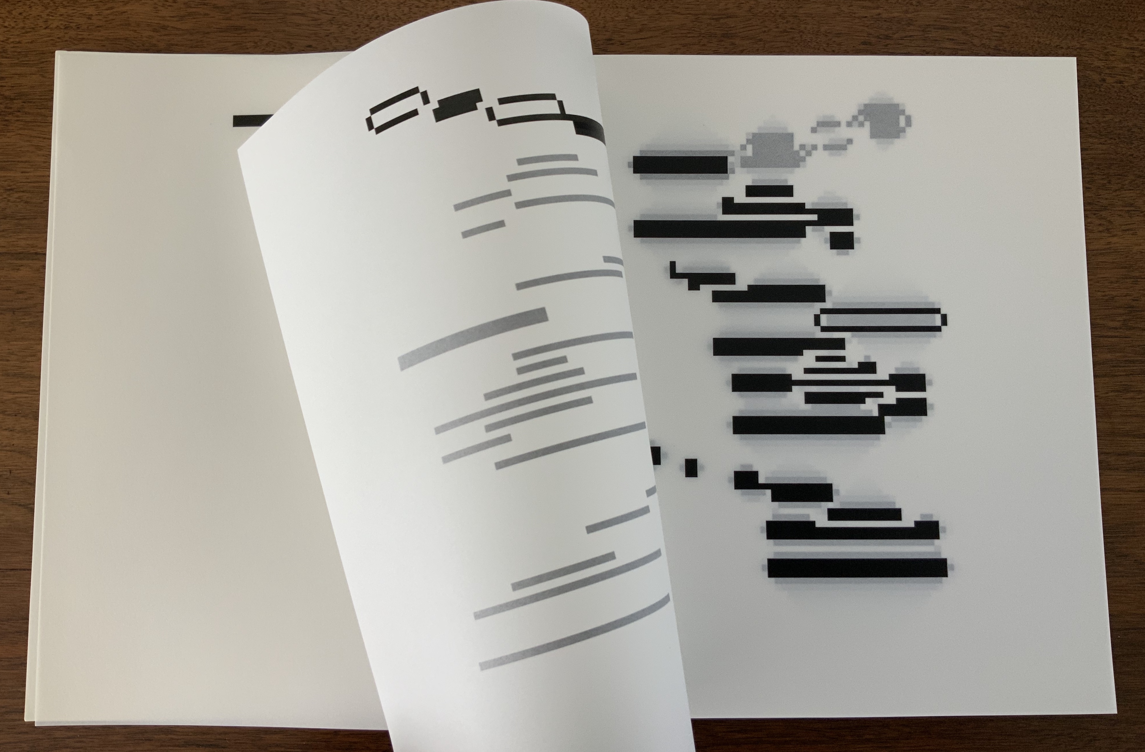
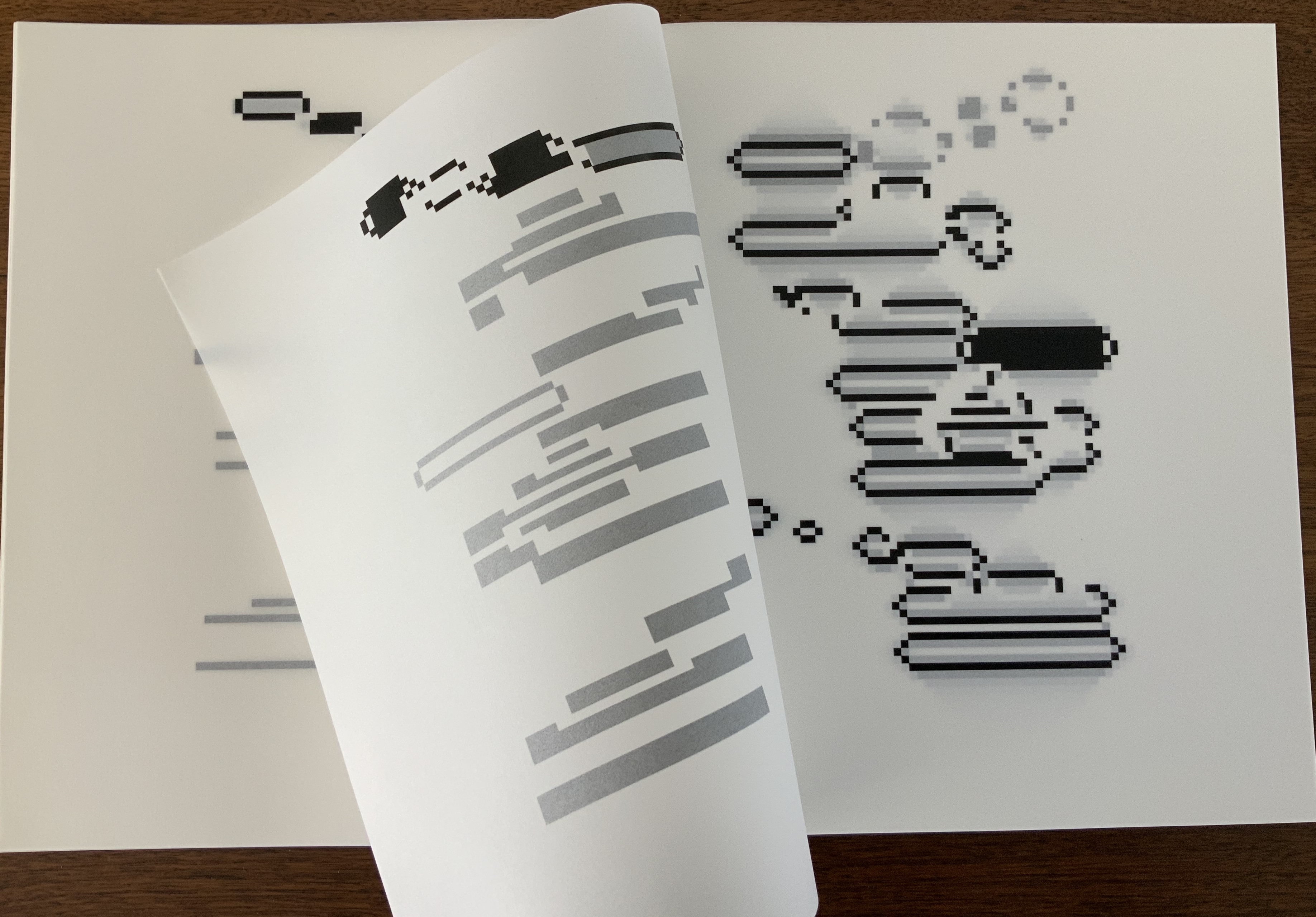
This notoriously difficult poem to translate (or even comprehend) with its cascade of metaphors and symbols (the central ones being a shipwreck and a constellation) appears three times in Detjen’s volume: first, in French with Detjen’s interpretive design, then in French and finally in German. All three instances follow the typography and layout of the first book edition of the poem as published in 1914 by Gallimard. Detjen’s own treatment of the poem very much focuses on the edition’s graphical-visual properties.

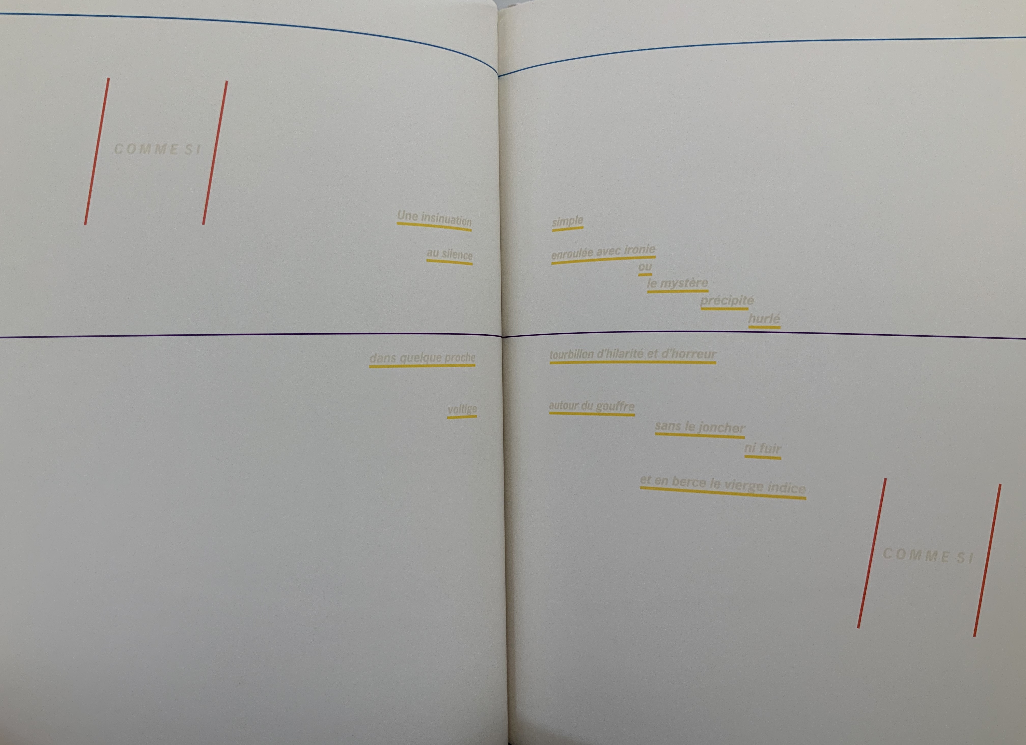
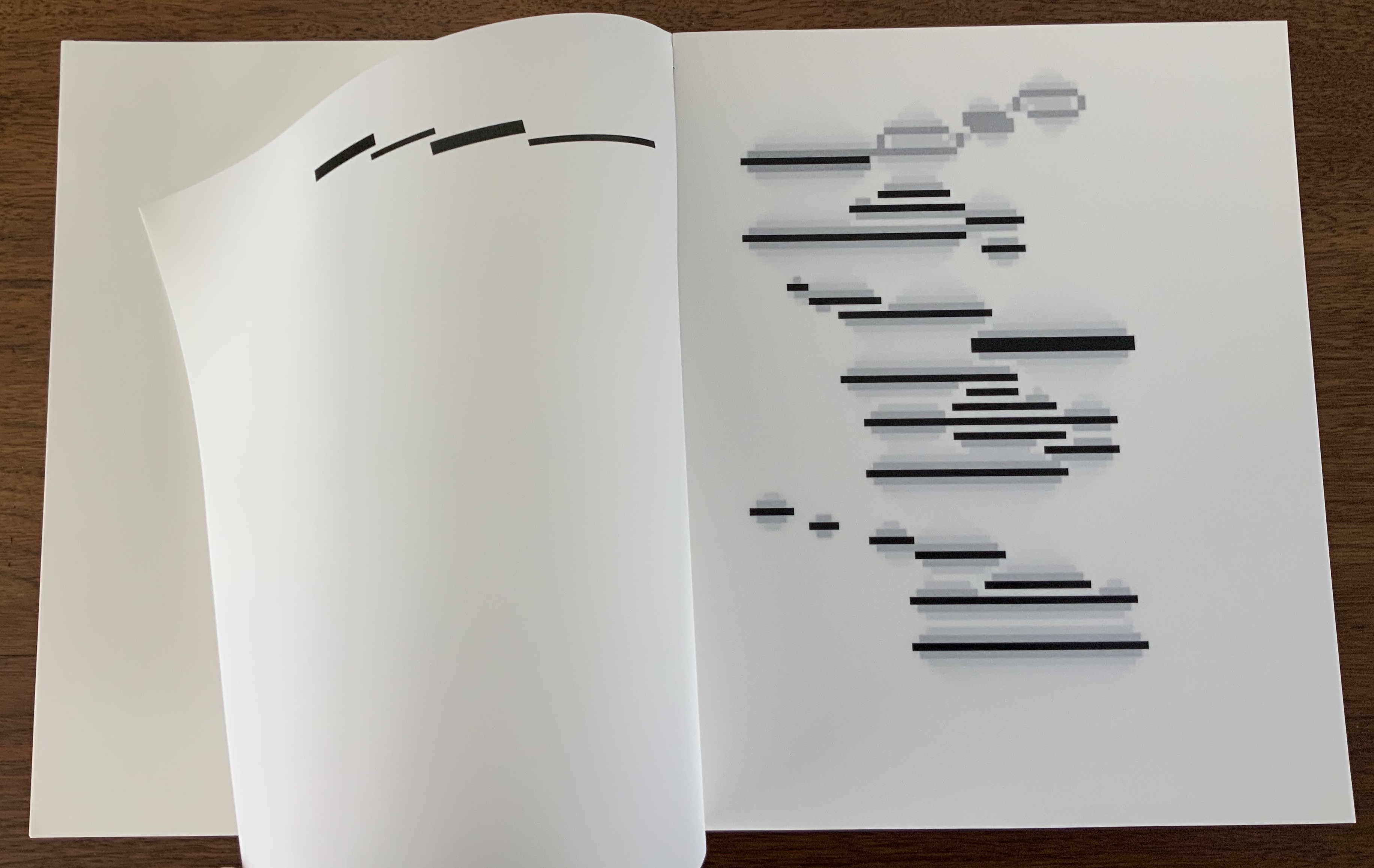
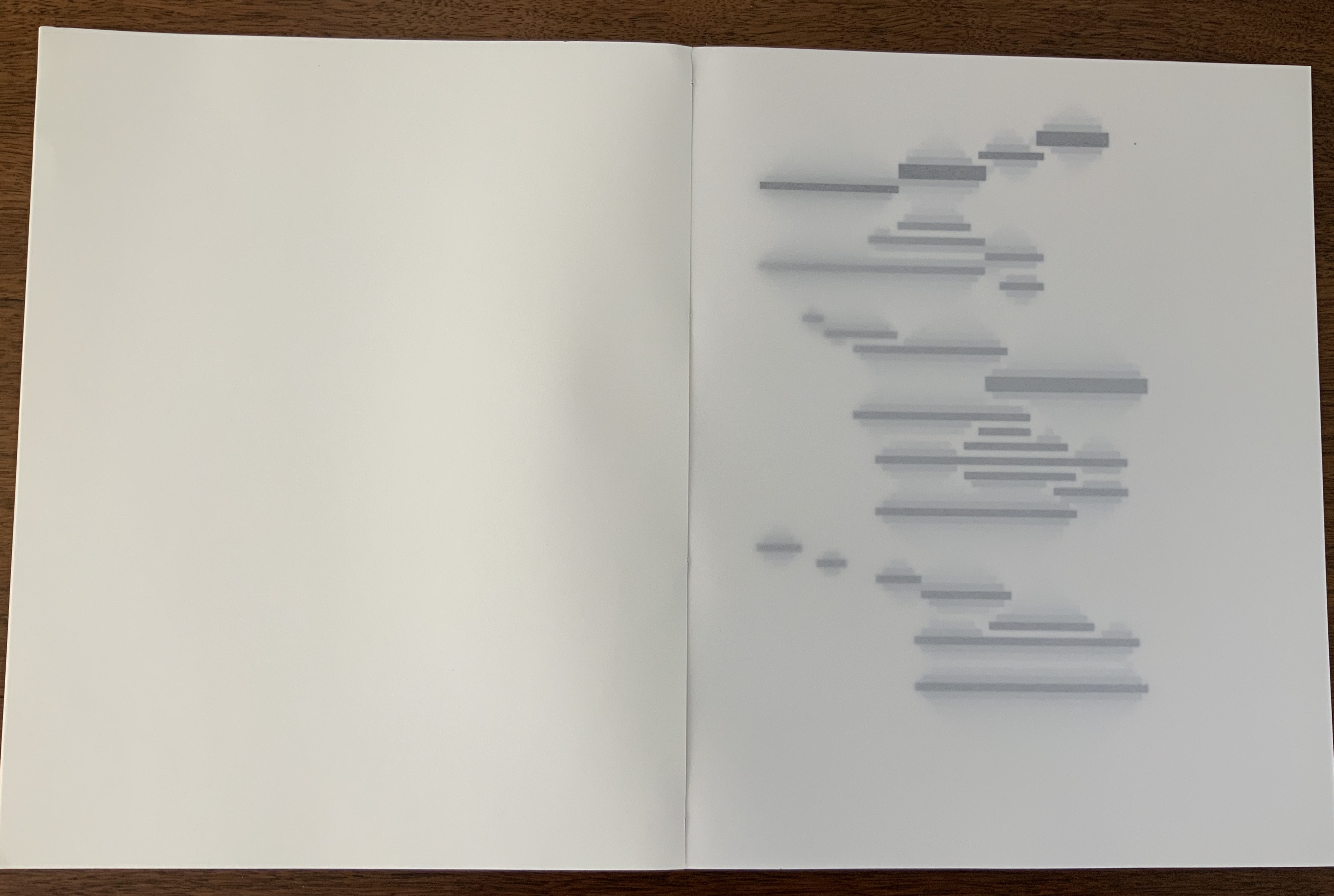
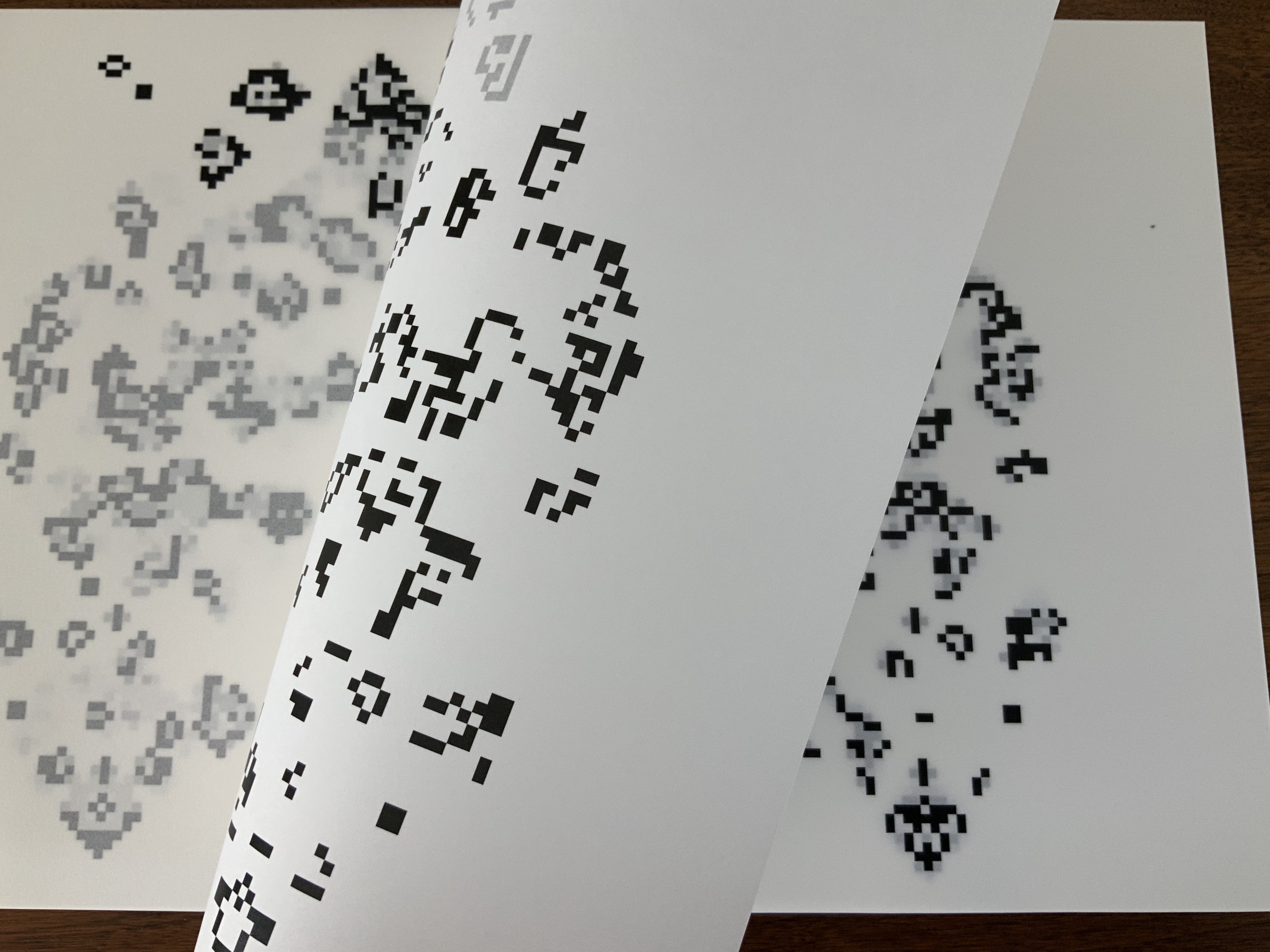
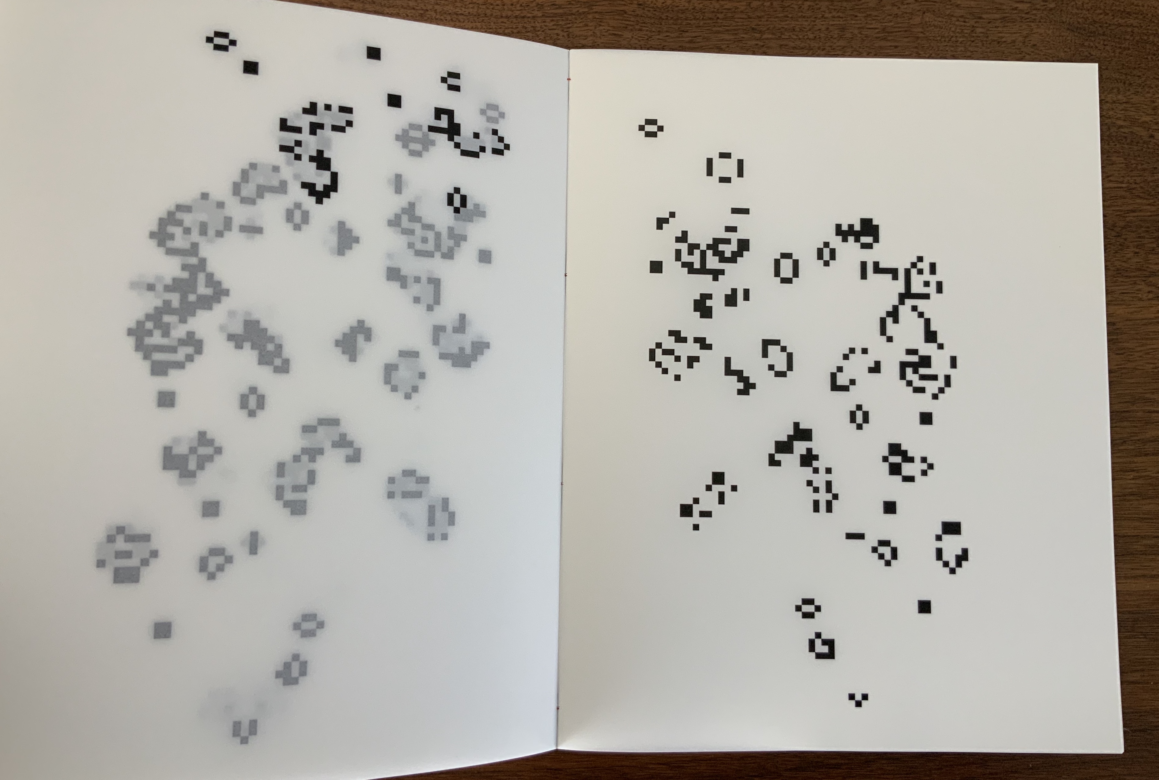
In that edition, the rhythm and position of the lines, the font and all the font sizes are precisely specified. Nine typographical motifs structure the poem. They are additionally highlighted in the front part of our book with colors, the meaning of which will be discussed later. Font sizes, styles (roman or italics) and the colors of the motifs used are as follows: First double-page spread: UN COUP DE DÉS, 11.25 mm, blue-violet / Second DS: QUAND BIEN MEME, 3.5 mm, cyan-blue / Third DS: que, 3.5 mm, green / Sixth DS: COMME SI, 5.25 mm, magenta; Une insinuation, 3.5 mm, yellow / Eighth DS 8: SI, 5.25 mm, magenta red / Ninth DS: C’ÉTAIT, 4.5 mm, orange red; autrement qu’hallucination, 2.5 mm, yellow; issu stellaire, 2.5 mm yellow. Klaus Detjen, “Zum Gestaltung”, p.81 (my translation).

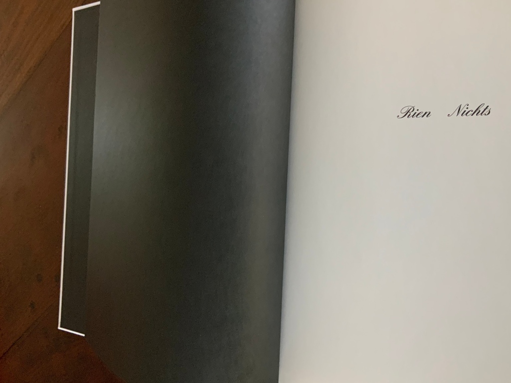
The colored linear frames, threads and markings give the nine typographical motifs additional structuring. Detjen intends them to highlight the reading order to guide the reader through the text like a score. Detjen’s later discussion of their meaning, however, focuses mainly on les blancs, the white space around the text of the poem. Taking Mallarmé at his word in the poem’s foreword, Detjen seizes on the whiteness of the surrounding space and runs to the prismatic metaphor that the spectrum of colors is simply the decomposition of white light. Detjen also notes that the unorthodox Rien/Nichts printed on the volume’s opening page alludes to the expanse of blank space enclosing the lines of text and, in support, quotes from Mallarmé’s “Crisis of Verse”:

Everything is suspended, an arrangement of fragments with alternations and confrontations, adding up to a total rhythm, which would be the poem stilled, in the blanks; … Mallarmé, “Crisis of Verse”, p. 209.

From all this, Detjen avers that it is

as if Mallarmé did not want to have his poem depicted, that is, printed, but perhaps only thought or, at best, whispered. Or did the author see the poem printed in white on white paper? Detjen, “Zum Gestaltung”, p. 82 (my translation).

Following that line of thought, Detjen switched from Mallarmé’s preferred classical serif typeface to News Gothic Bold after experimentation showed that sans serif enabled him to print legibly in flat white on white paper. Confirming his primary focus on the expanse of blank whiteness, Detjen even concludes his afterword by quoting Jorge Luis Borges on Mallarmé:

The impersonal color white itself — is it not utterly Mallarmé? Borges, “Narrative Art and Magic”, p. 79.

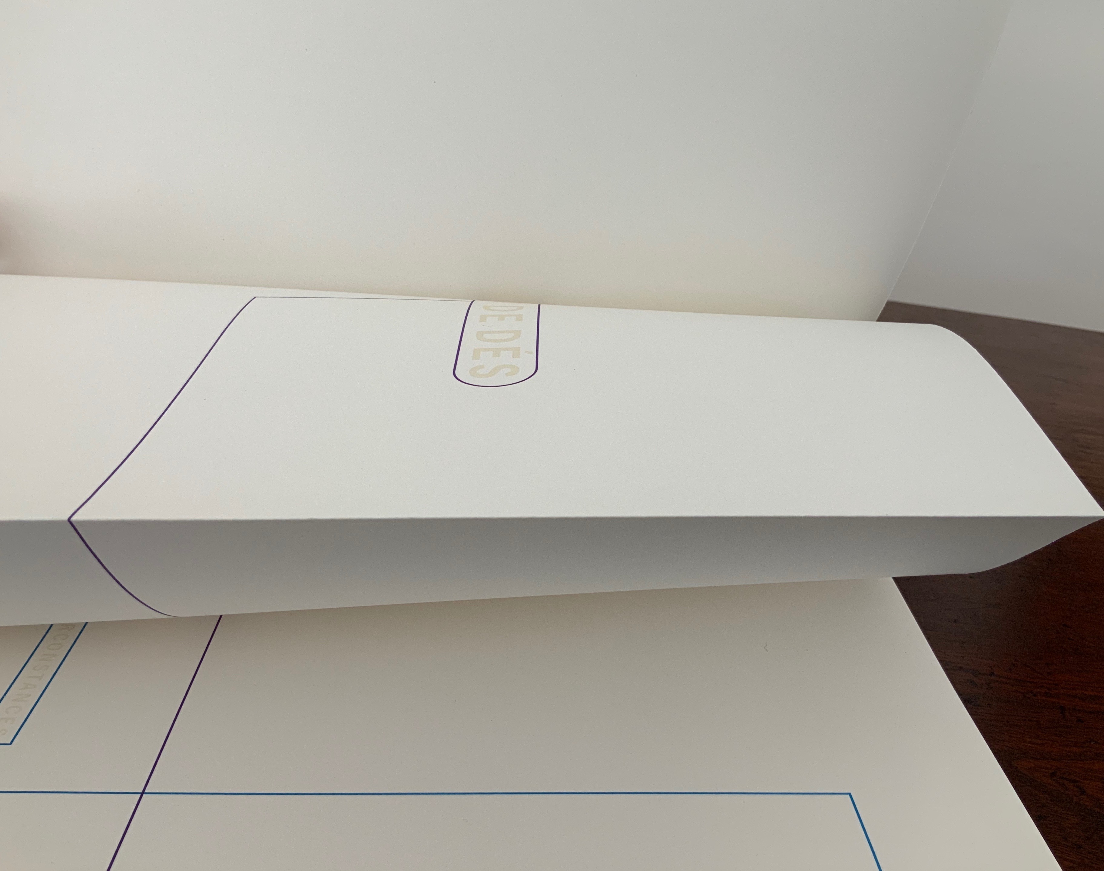
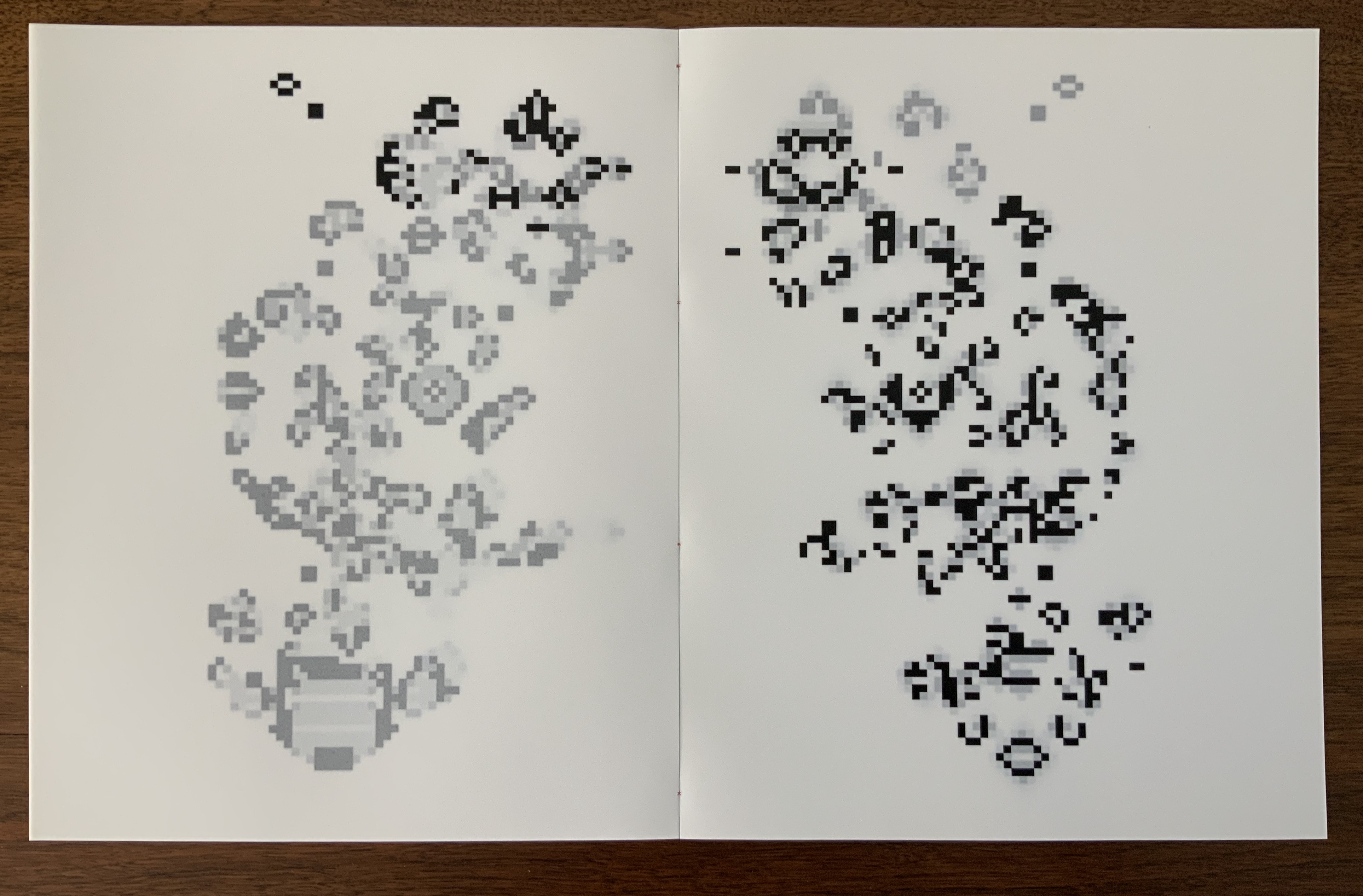
In his heavy emphasis on les blancs, Detjen ends up not doing justice to other more subtle aspects of his design artistry. Before he comes to the poem’s expanse of whiteness, note how the opening page of Rien/Nichts follows the black pastedowns and endpapers — the absence of light contrasting as much with the cover’s pure white as with the poem’s blank spaces.

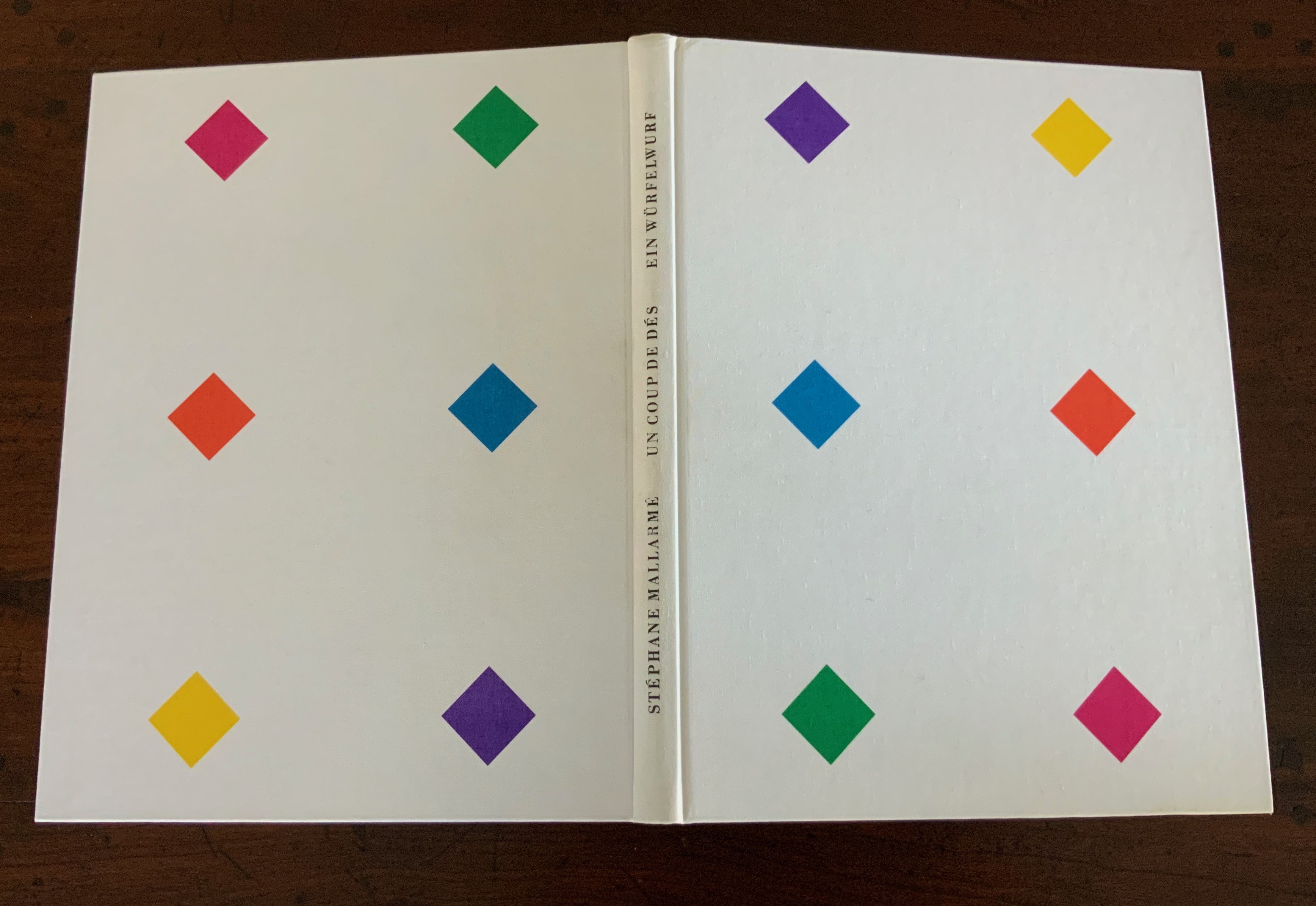
Note how the colors to come in his interpretive version appear in dice shapes arranged on the front and back white covers to suggest the faces of a pair of dice. The whole volume becomes ein Würfelwurf, un coup de dés, a throw of the dice, which echoes Mallarmé’s obsession with le Livre — that work that everything in the world comes to be.

More subtly, Detjen combines the uncut folios with the colored shapes and markings to suggest “rigging” for the foundering ship and a “mapping” for the constellation. The turning uncut folios become billowing sails or rising and falling waves, across which the rigging cuts and the constellation shines.

Detjen’s visual and physical “transcreation” underscores why the French and German translations are not side by side, page for page. How could they be given the way the poem’s words work with the type, the page, the double-page spread and folios? All of which meets de Campos’s definition of the ideal target for transcreation — where the work’s signified, sign and materiality are intricately bound to one another.

In Detjen’s version preceding the French and German versions, the act of translation and interpretation meets the act of creating a work of art.

Further Reading

Bean, Victoria, and Chris McCabe, eds. The New Concrete: Visual Poetry in the 21st Century (London: Hayward Publishing, 2015).

Borges, Jorge Luis. “Narrative Art and Magic” [1932]. Trans. Suzanne Jill Levine; ed. Eliot Weinberger. In Selected Non-Fictions (New York: Penguin Books, 1999), pp. 75-82.

Campos, Haroldo de. “Translation as Creation and Criticism” [1963]. Trans. Diana Gibson and Haroldo de Campos. In A. S. Bessa and O. Cisneros, eds., Novas: Selected Writings (Evanston, IL: Northwestern University Press, 2007), pp. 312-326.

Cisneros, Odile. “From Isomorphism to Cannibalism: The Evolution of Haroldo de Campos’s Translation Concepts“, Érudit: At the crossroads of translating and writing: Poetics and experiments, Volume 25, Number 2, 2012, pp.15-44. Posted 8 October 2013. Accessed 22 August 2020.

Jaruga, Rodolfo. “Ezra Pound’s Arrival in Brazil“, Make It New: The Ezra Pound Society Magazine, Volume 4.1-2, September 2017. Accessed 22 August 2020.

Mallarmé, Stéphane. “Crisis of Verse” [1897]. Trans. Barbara Johnson. In Divagations (Cambridge, MA: Harvard University Press, 2009), pp. 201-11.

Paola, Modesta de. “Translation in Visual Arts”, Interartive, August 2013. Accessed 22 August 2020.

Books On Books Collection – Benjamin Lord

The Abolition of Chance: Sequence (2019)

The Abolition of Chance: Sequence (2019)
Benjamin Lord
Laid finish card cover; hand-assembled perfect binding with inlaid red linen thread;
70 pages printed on translucent cellulose paper. H10 1/2″ x W8 1/4.
Edition of 50, unnumbered. Acquired from the artist, 24 April 2020. Photos: Books On Books Collection.

The title of Benjamin Lord’s book names what Mallarmé’s Un Coup de Dés declares can never be accomplished by a throw of the dice: the abolition of chance. Taking the predicate of Mallarmé’s title (its verb and object), elevating it to the title position, substituting the word “sequence” for the subtitle Poéme, and placing it in a cover layout reminiscent of the 1913 NRF edition of Mallarmé’s book, Lord’s cover raises expectations and questions. Perhaps chance can be abolished? Perhaps by a certain sequence — of words?

Bowling over the textual expectations raised by the cover, the interior pages offer only images — images that gradually shift from linearly arranged black rectangles to what seem to be digitally generated Rorschach tests, shifting QR codes or snapshots of a bitmap computer game, all blurred by the turning of the translucent paper. The translucency and images add another layer to each page and double-spread of images and also add another set of expectations and questions. What determined the starting point of those arranged rectangles? What drives the sequence of their change?

Without Lord’s own description of the work, a highly developed form of art-historical, science-historical visual genius is required to answer those questions. A genius with the visual recall to recognize that “The first spread of the book copies the last spread of Marcel Broodthaer’s book Un coup de dés jamais n’abolira le hasard (A throw of the dice will never abolish chance), made in 1969.” A genius that can recognize the sequence as being “generated using a simple mathematical formula known as the Game of Life, originally devised by the mathematician John Conway, also in the year 1969.

Blocking out Mallarmé’s words with black bars of varying sizes corresponding to the poem’s typography and turning Poème into Image, Broodthaers’s homage has provided the starting point to several works of visual homage: Derek Beaulieu, Jérémie Bennequin, Klaus Detjen, Sammy Engramer, Cerith Wyn Evans, Rainier Lericolais, Alexandra Leykauf, Michael Maranda, Guido Molinari, Michalis Pichler and Eric Zboya. To their common starting point, each brings to bear his or her own approach. For Lord’s approach, the term “starting point” is more properly “seed”. In Conway’s Game of Life, a seed is any pattern of square cells, some filled (“live”), some unfilled (“dead”). Here are two basic patterns:

On the left is a “still-life” seed known as “Boat”; on the right is “Gosper’s glider gun”, an obviously more complicated pattern named after its creator, Bill Gosper. A forerunner of simulation games, Conway’s game poses a set of simple rules to be played out within an infinite grid:

  1. Any live cell with fewer than two live neighbours dies, as if by underpopulation.
  2. Any live cell with two or three live neighbours lives on to the next generation.
  3. Any live cell with more than three live neighbours dies, as if by overpopulation.
  4. Any dead cell with exactly three live neighbours becomes a live cell, as if by reproduction.

Here is Gosper’s glider gun, activated by the Game of Life’s rules encoded in a GIF:

Lord’s seed is the image of the last double-page spread in Broodthaers’ version of Un Coup de Dés.

Like a more complex glider gun, it generates the subsequent double-page spread images, each image being the seed for the next image. As Lord puts it,

The lines of Mallarmé’s poem inflate into balloons which expand and then pop into nothingness, or collide with each other to generate debris, or collapse into thicker bars. The image fragments into a vibratory bitmap constellation of expansions and contractions, in which interactions between forms continuously generate new forms, in a way that is neither random nor intuitive.

This 21st century American artist turning with a 20th century paintbrush dipped into the words of a 19th century French poet via a 20th century Belgian artist calls to mind The Education of Henry Adams. Throughout, Adams refers to himself in the third person. Post-Broodthaers, there is something “third-person-ish” — of being at two removes — in Lord’s homage and those of Beaulieu et al. above. But there is more to the recollection than grammar. Consider this passage from The Education in which “one” writes,

Historians undertake to arrange sequences,–called stories, or histories–assuming in silence a relation of cause and effect. These assumptions, hidden in the depths of dusty libraries, have been astounding, but commonly unconscious and childlike; so much so, that if any captious critic were to drag them to light, historians would probably reply, with one voice, that they had never supposed themselves required to know what they were talking about. Adams, for one, had toiled in vain to find out what he meant….he insisted on a relation of sequence, and if he could not reach it by one method, he would try as many methods as science knew. Satisfied that the sequence of men led to nothing and that the sequence of their society could lead no further, while the mere sequence of time was artificial, and the sequence of thought was chaos, he turned at last to the sequence of force; and thus it happened that, after ten years’ pursuit, he found himself lying in the Gallery of Machines at the Great Exposition of 1900, his historical neck broken by the sudden irruption of forces totally new. Chapter XXV

Adams and his third-person self were in Paris in May 1897, when Un Coup de Dés first appeared in the quarterly Cosmopolis. Despite their proximity, a common interest in quarterlies and the popular press, and a near obsession with the electrical forces of the dynamo, the men’s two paths did not cross. Adams mentions Mallarmé in a letter only in passing.

Sartre called Mallarmé the poet of nothingness. Its title and Lord’s description of The Abolition of Chance as a “constellation of expansions and contractions, in which interactions between forms continuously generate new forms, in a way that is neither random nor intuitive” suggest an alternative to nothingness. The final double-page spread does present a pattern of live cells. Lord, perhaps like his fellow American, responds to nothingness with a type of Buddhist repose, if not affirmation, much as Adams responded to the memorial for his wife that he had commissioned from Augustus St. Gaudens:

His first step, on returning to Washington, took him out to the cemetery known as Rock Creek, to see the bronze figure which St. Gaudens had made for him in his absence. Naturally every detail interested him; every line; every touch of the artist; every change of light and shade; every point of relation; every possible doubt of St. Gaudens’s correctness of taste or feeling; so that, as the spring approached, he was apt to stop there often to see what the figure had to tell him that was new; but, in all that it had to say, he never once thought of questioning what it meant. … From the Egyptian Sphinx to the Kamakura Daibuts; from Prometheus to Christ; from Michael Angelo to Shelley, art had wrought on this eternal figure almost as though it had nothing else to say. The interest of the figure was not in its meaning, but in the response of the observer. Chapter XXI

Further Reading

Derek Beaulieu”, Books On Books Collection, 19 June 2020.

Jérémie Bennequin“, Books On Books Collection, 11 April 2020.

Sammy Engramer”, Books On Books Collection, 1 June 2020.

Cerith Wyn Evans”, Books On Books Collection, 16 April 2020.

Michaud, François. Alexandra Leykauf: Chateau de Bagatelle (Nürnberg: Verlag fur moderne Kunst Nürnberg, 2010)

Guido Molinari”, Books On Books Collection, 13 April 2020.

Eric Zboya“, Books On Books Collection, 1 June 2020.